Embed Size (px)
Citation preview
DETAILED CLASS ANALYSIS OF MUSIC MAGAZINE ONE NME
ANALYSE THE FRONT COVER, CONTENTS PAGE AND DOUBLE PAGE SPREAD OF MAGAZINE 1 (NME DIZZEE
RASCAL EDITION, SEPT 2009)Shivani Mohan
Front Cover
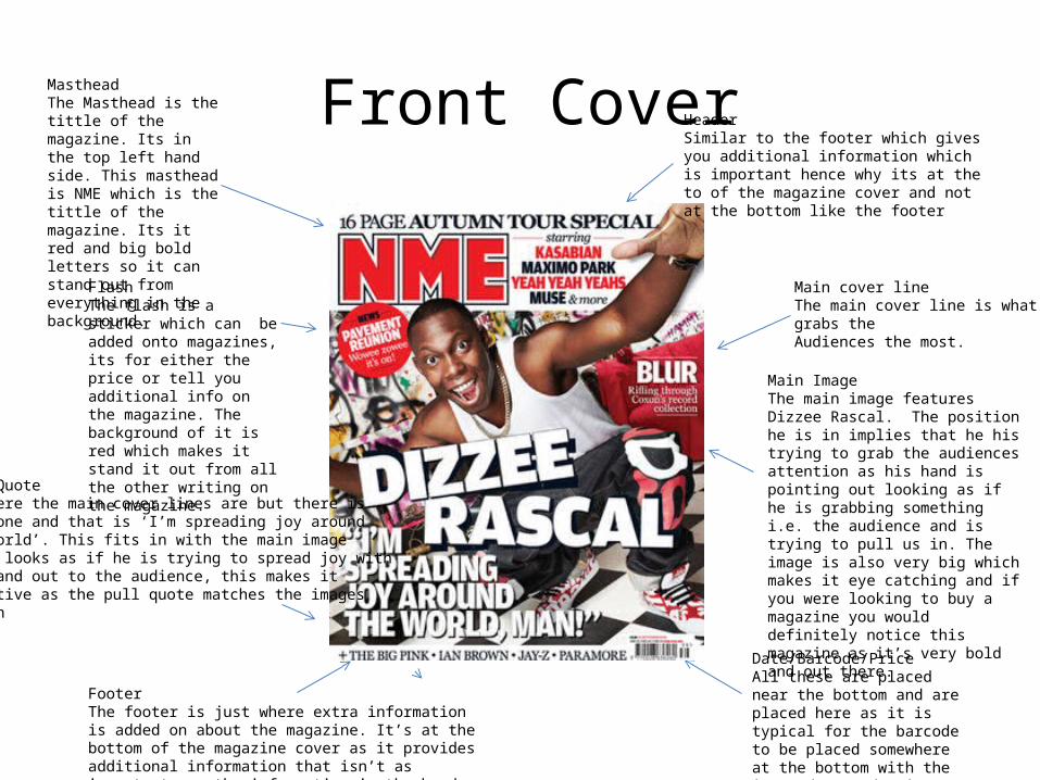
Main ImageThe main image features Dizzee Rascal. The position he is in implies that he his trying to grab the audiences attention as his hand is pointing out looking as if he is grabbing something i.e. the audience and is trying to pull us in. The image is also very big which makes it eye catching and if you were looking to buy a magazine you would definitely notice this magazine as it’s very bold and out there.
FlashThe flash is a sticker which can be added onto magazines, its for either the price or tell you additional info on the magazine. The background of it is red which makes it stand it out from all the other writing on the magazine.
MastheadThe Masthead is the tittle of the magazine. Its in the top left hand side. This masthead is NME which is the tittle of the magazine. Its it red and big bold letters so it can stand out from everything in the background.
Main cover lineThe main cover line is what grabs the Audiences the most.
Date/Barcode/PriceAll these are placed near the bottom and are placed here as it is typical for the barcode to be placed somewhere at the bottom with the issue date and price next to it.
FooterThe footer is just where extra information is added on about the magazine. It’s at the bottom of the magazine cover as it provides additional information that isn’t as important as the information in the header.
HeaderSimilar to the footer which gives you additional information which is important hence why its at the to of the magazine cover and not at the bottom like the footer
Pull QuoteIs where the main cover lines are but there isOnly one and that is ‘I’m spreading joy around The world’. This fits in with the main imageAs it looks as if he is trying to spread joy withHis hand out to the audience, this makes it Effective as the pull quote matches the images action
Audience
• Who is the target audience for the NME?The target audience for NME are people who are into very rock and indie sort of music• How does the NME attract it’s audience?NME attract its audience by having either a rock or indie artist to be the cover. The colour schemes used are quite laid back but still out there, also by the cover lines and bits of additional information which are interesting to people who are into those sorts of genres.
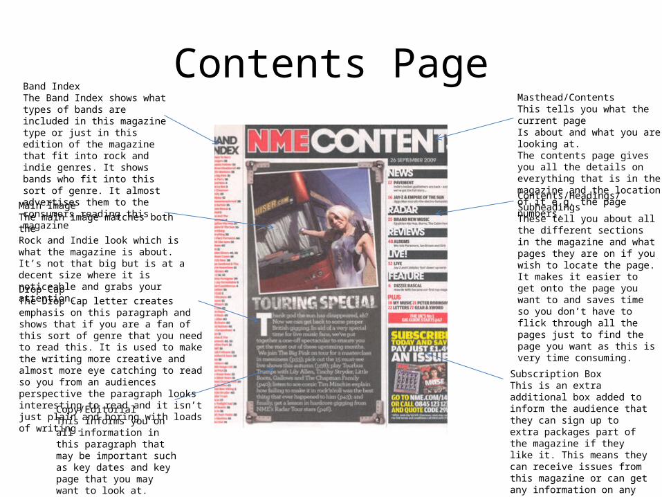
Contents PageMasthead/ContentsThis tells you what the current page Is about and what you are looking at.The contents page gives you all the details on everything that is in the magazine and the location of it e.g. the page numbers.
Band IndexThe Band Index shows what types of bands are included in this magazine type or just in this edition of the magazine that fit into rock and indie genres. It shows bands who fit into this sort of genre. It almost advertises them to the consumers reading this magazine
Main ImageThe main image matches both theRock and Indie look which is what the magazine is about. It’s not that big but is at a decent size where it is noticeable and grabs your attention.
Drop CapThe Drop Cap letter creates emphasis on this paragraph and shows that if you are a fan of this sort of genre that you need to read this. It is used to make the writing more creative and almost more eye catching to read so you from an audiences perspective the paragraph looks interesting to read and it isn’t just plain and boring with loads of writing.
Copy/EditorialThis informs you on all information in this paragraph that may be important such as key dates and key page that you may want to look at.
Subscription BoxThis is an extra additional box added to inform the audience that they can sign up to extra packages part of the magazine if they like it. This means they can receive issues from this magazine or can get any information on any upcoming events etc.
Contents/Headings/SubheadingsThese tell you about all the different sections in the magazine and what pages they are on if you wish to locate the page. It makes it easier to get onto the page you want to and saves time so you don’t have to flick through all the pages just to find the page you want as this is very time consuming.
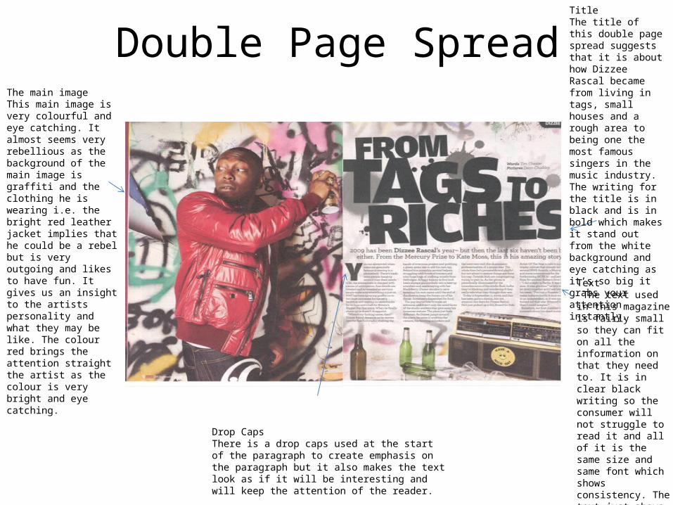
Double Page SpreadThe main imageThis main image is very colourful and eye catching. It almost seems very rebellious as the background of the main image is graffiti and the clothing he is wearing i.e. the bright red leather jacket implies that he could be a rebel but is very outgoing and likes to have fun. It gives us an insight to the artists personality and what they may be like. The colour red brings the attention straight the artist as the colour is very bright and eye catching.
TitleThe title of this double page spread suggests that it is about how Dizzee Rascal became from living in tags, small houses and a rough area to being one the most famous singers in the music industry. The writing for the title is in black and is in bold which makes it stand out from the white background and eye catching as it’s so big it grabs your attention instantly.
Drop CapsThere is a drop caps used at the start of the paragraph to create emphasis on the paragraph but it also makes the text look as if it will be interesting and will keep the attention of the reader.
Text The text used in this magazine is fairly small so they can fit on all the information on that they need to. It is in clear black writing so the consumer will not struggle to read it and all of it is the same size and same font which shows consistency. The text just above the main paragraph is in a bigger font size as its important information that tells the audience what the main text will be about
Three elements that connect the different parts of the magazine are the text size and how they all vary at different sizes. The biggest size shows what the current page will be about and the smaller text tells you what you need to know in detail. The images are also relevant as they link in with the genre of the magazine and aren’t irrelevant.
Background History of NME
NME was created by Theodore Smythson and is a journalism publication in the UK that has been posting issues since 1952. It originally started as a music newspaper then gradually moved and changed to a magazine format in the 1980’s. It was the first British paper to include a song from the singles chart. Before it change its format into being a magazine it was the best selling British music newspaper in 1970. During 1972 – 1976 it closely had associates with rock and that’s when the newspaper slowly started turning into a magazine.