Embed Size (px)
Citation preview

Tsunami Hazard MessagingUsing Emoticons, Emoji and
Graphical Lexicons
Michael Kozuch, PhD2015
The 2004 Indonesia Earthquake generated a tsunami that reached beyond Thailand.
Few knew the warning signs.
Tsunami hazard signs on the west coast of the US are simple and visual.
While the sign is effective, it does notwarn of tsunami created remotely, nor inform viewers about receding sea levels.
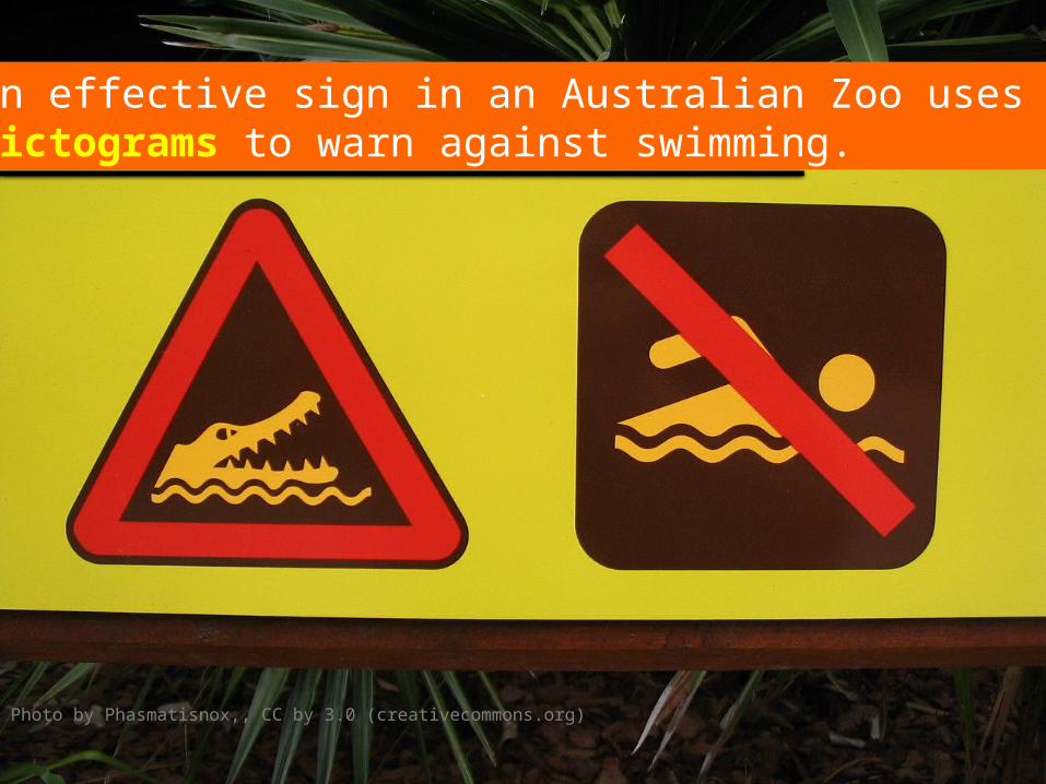
An effective sign in an Australian Zoo uses pictograms to warn against swimming.
Photo by Phasmatisnox,, CC by 3.0 (creativecommons.org)
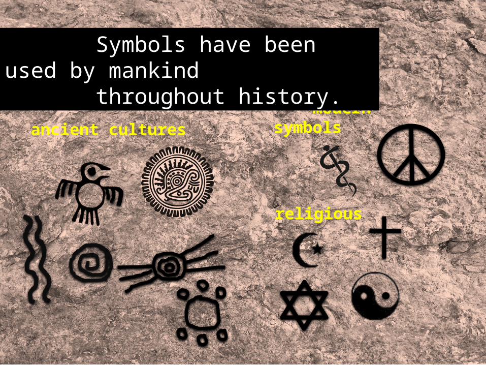
ancient cultures
religious
modern symbols
Symbols have been used by mankind throughout history.
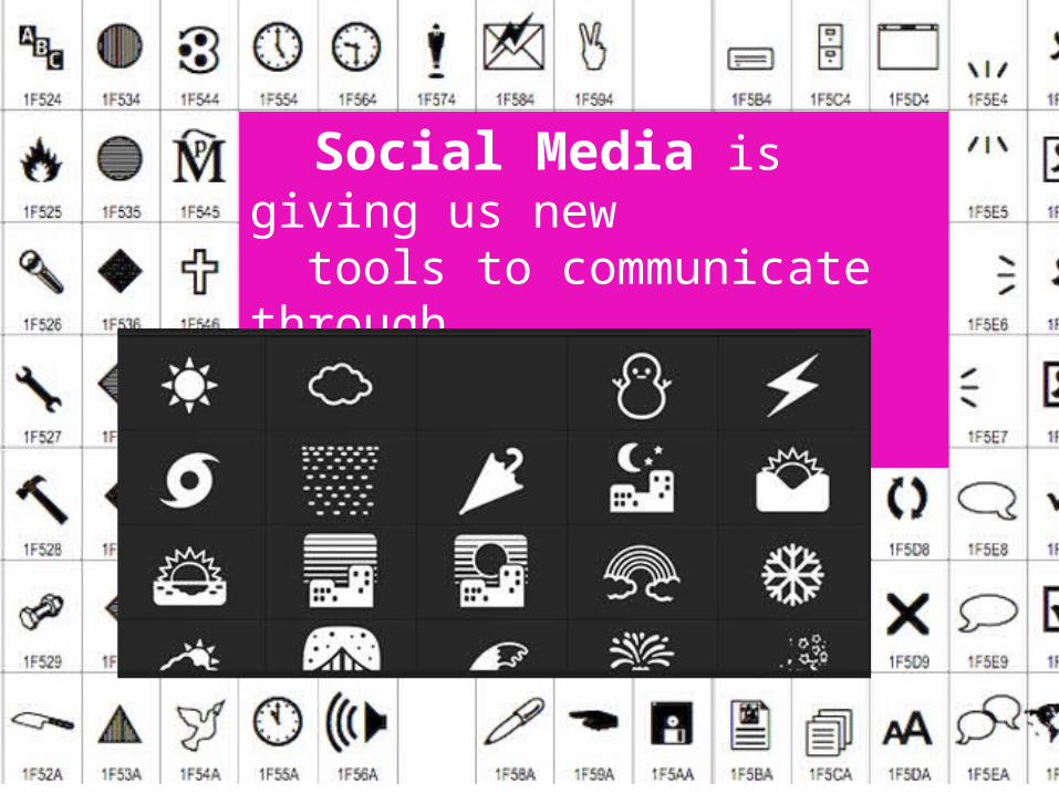
Social Media is giving us new tools to communicate through emoji symbols and graphics.
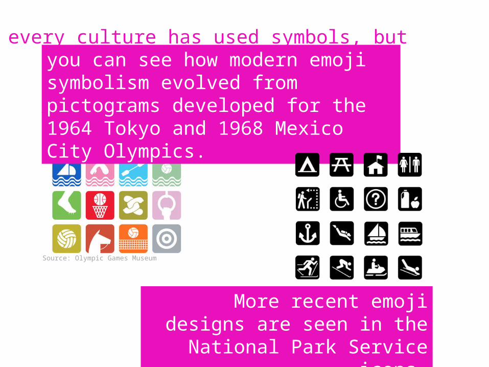
you can see how modern emoji symbolism evolved from pictograms developed for the 1964 Tokyo and 1968 Mexico City Olympics.
More recent emoji designs are seen in the National Park Service icons.
every culture has used symbols, but
Source: Olympic Games Museum
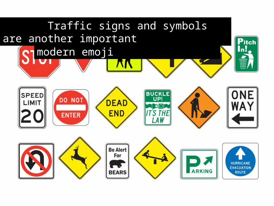
pictogram that predates modern emoji Traffic signs and symbols are another important
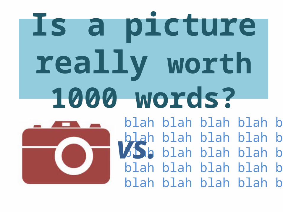
Is a picture really worth 1000 words?
blah blah blah blah blah blah blah blah blah blah blah blah blah blah blah blah blah blah blah blah blah blah blah blah blah
vs.
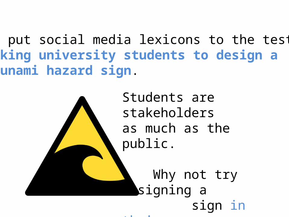
We put social media lexicons to the test byasking university students to design atsunami hazard sign.
Students are stakeholdersas much as the public.
Why not try designing a sign in their own language?
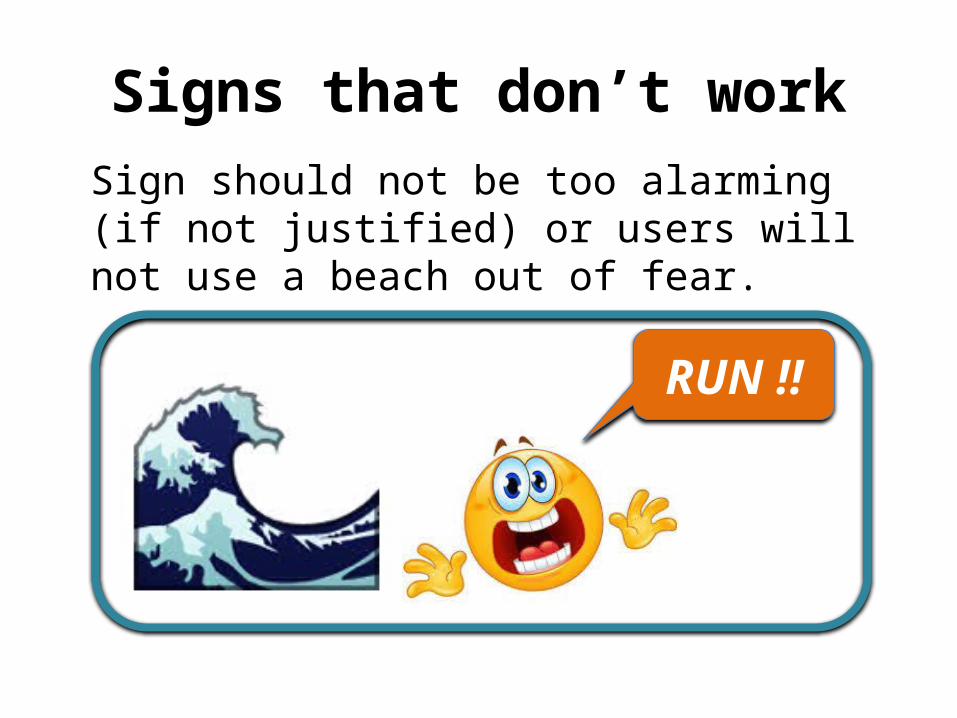
Signs that don’t workSign should not be too alarming (if not justified) or users will not use a beach out of fear.
RUN !!

resultsThe results are interesting and show a broad range of solutions that we can group as follows:
• Graphics and text• Color and design• Emoji and symbols• Emphasis on text
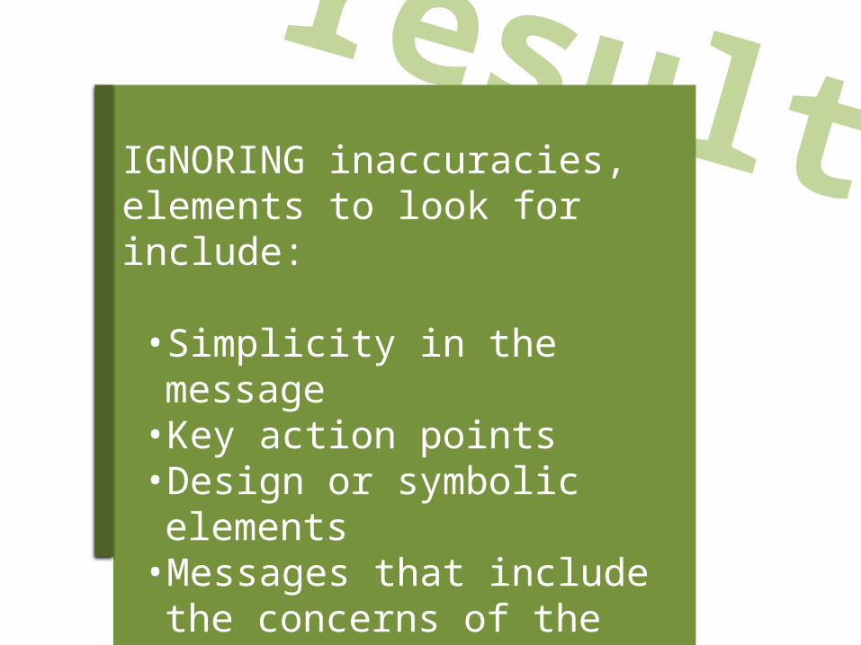
resultsIGNORING inaccuracies, elements to look for include:
• Simplicity in the message• Key action points• Design or symbolic elements•Messages that include the
concerns of the public
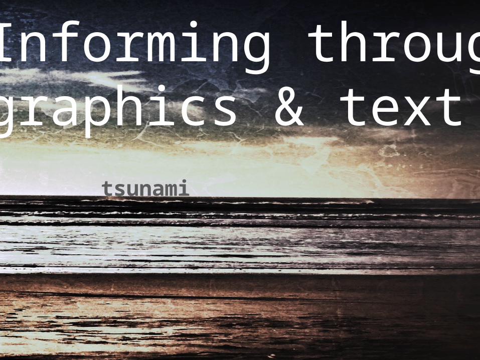
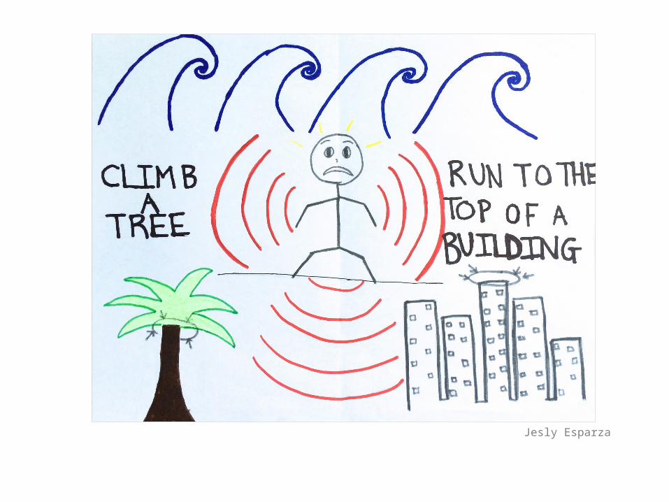
Informing throughgraphics & text
tsunami
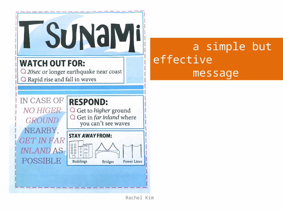
Rachel Kim
a simple but effective message
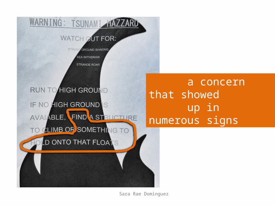
Sara Rae Dominguez
a concern that showed up in numerous signs
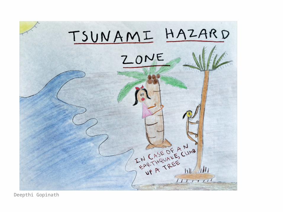
Deepthi Gopinath
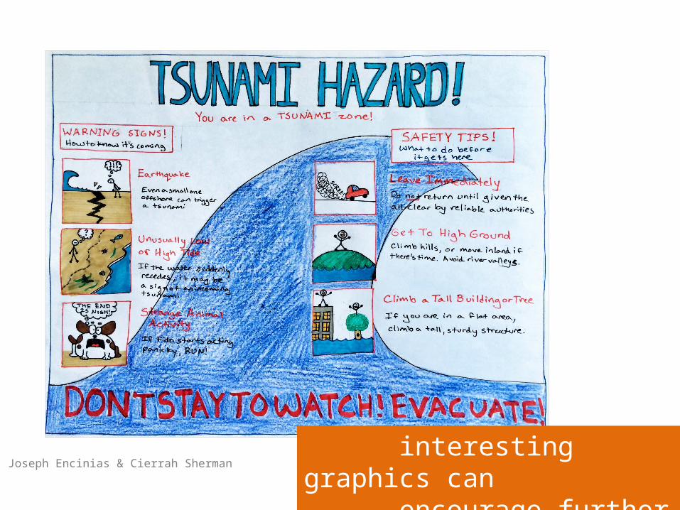
Joseph Encinias & Cierrah Sherman interesting graphics can encourage further reading
Joshua Ocampo
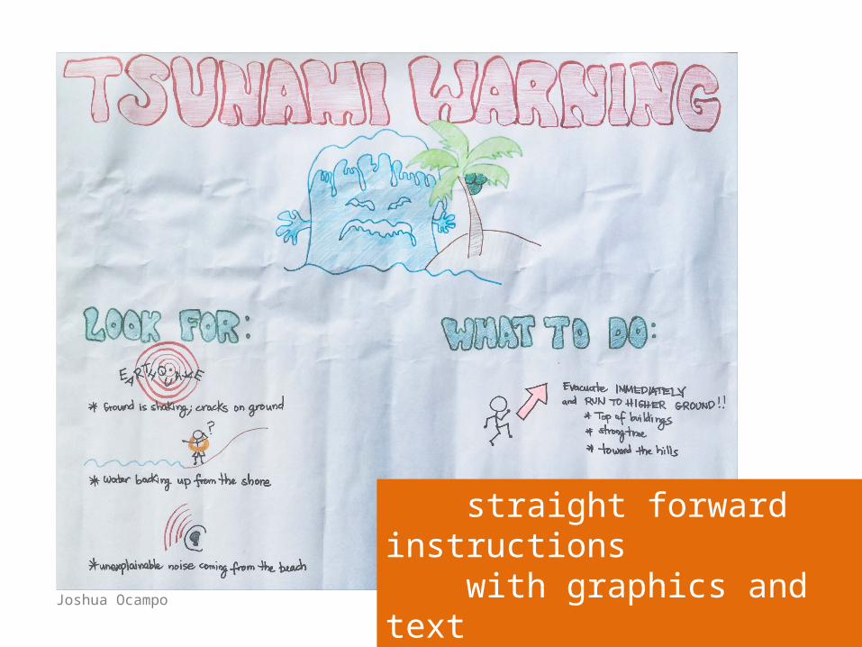
straight forward instructions with graphics and text
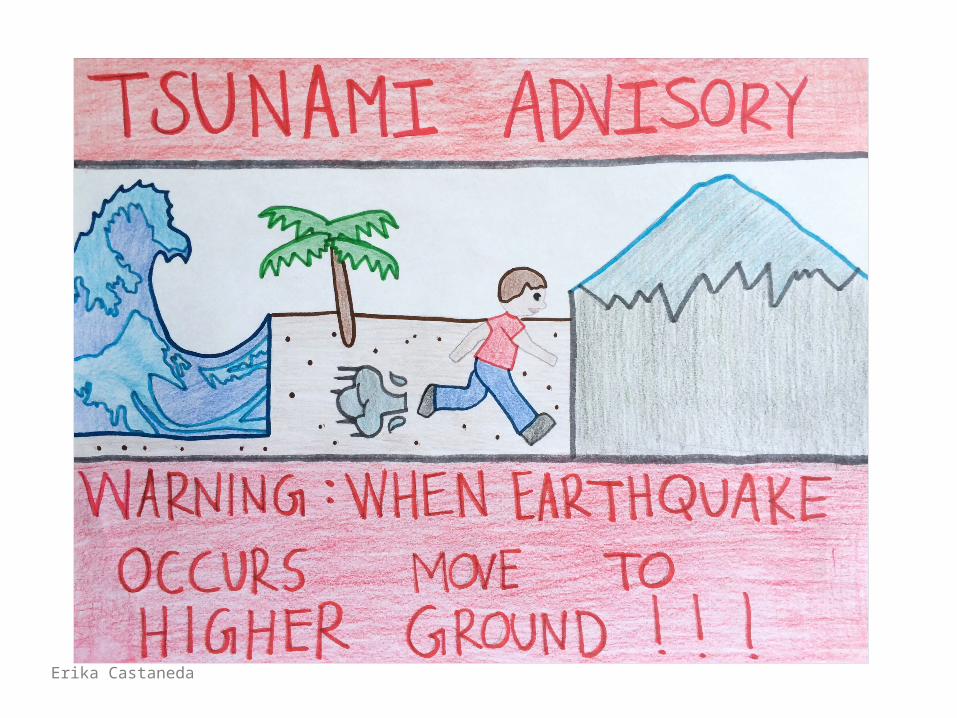
Erika Castaneda

Bianca Magallon
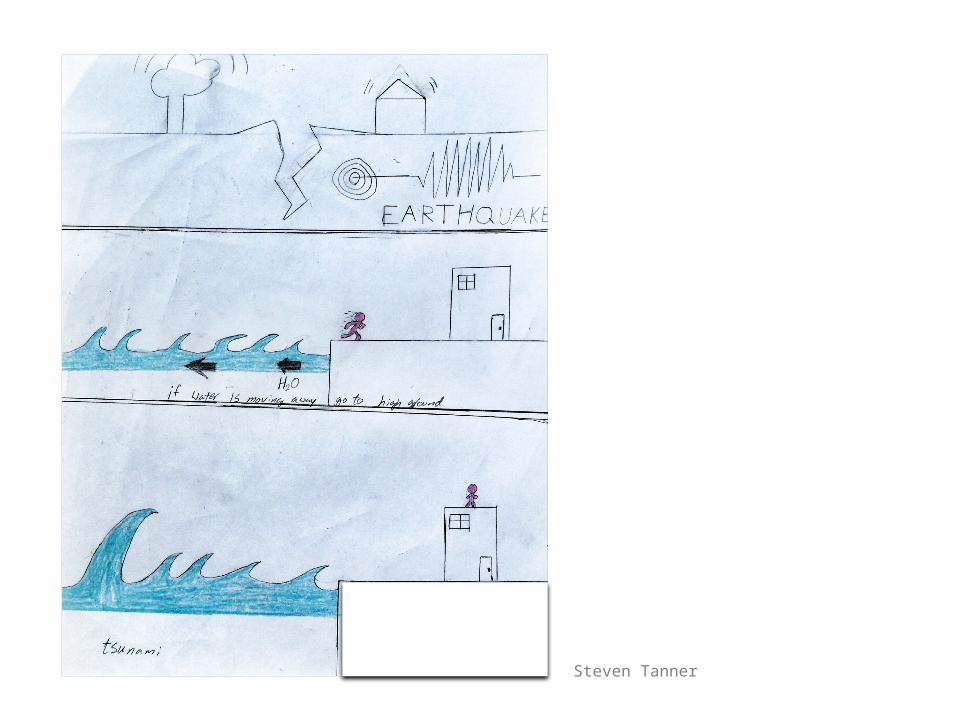
Steven Tanner

Bernard Juan P.
effective combination of graphics and text
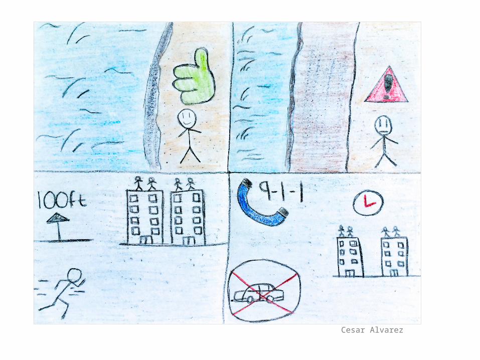
Cesar Alvarez
Attracting readerswith COLOR
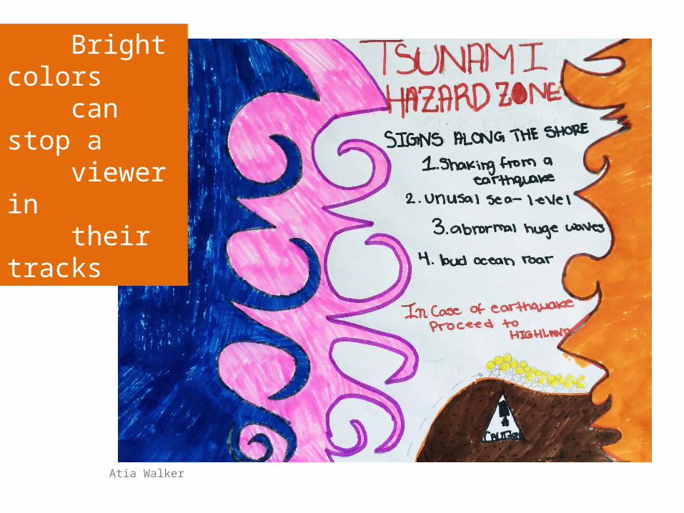
Atia Walker
Bright colors can stop a viewer in their tracks
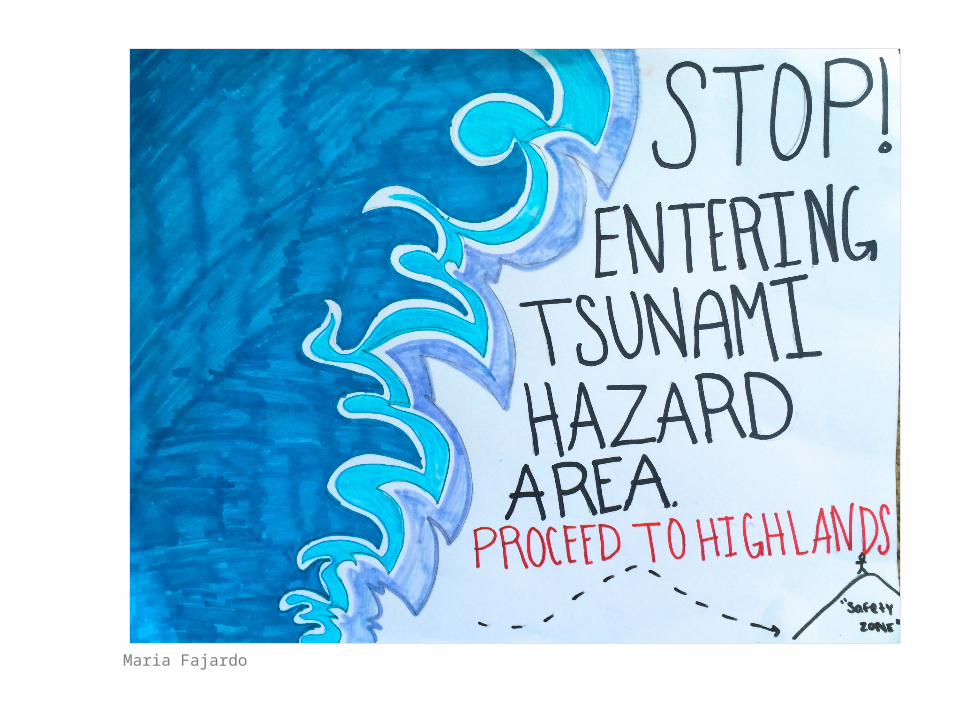
Maria Fajardo
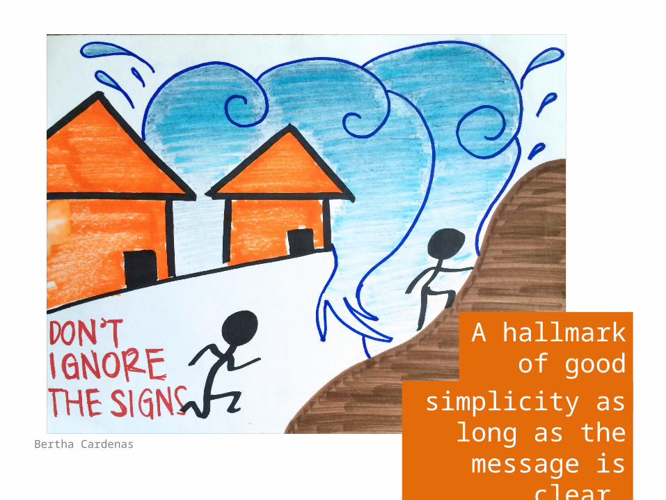
Bertha Cardenas
A hallmark of good design is
simplicity as long as the message is clear.
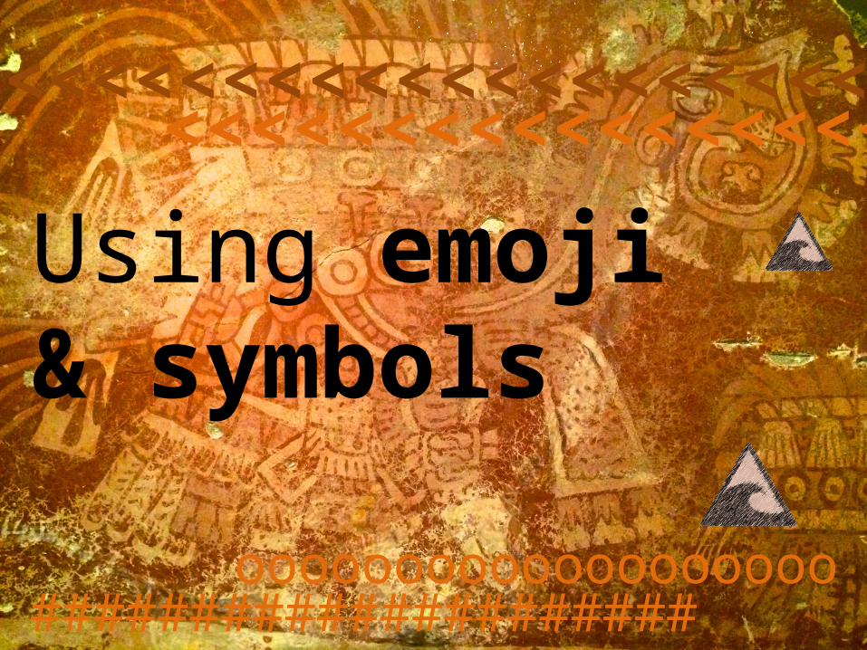
Using emoji& symbols
<<<<<<<<<<<<<<<<<<<<<<<<<<<<<<<<<<<<<<<<
#####################ooooooooooooooooooo
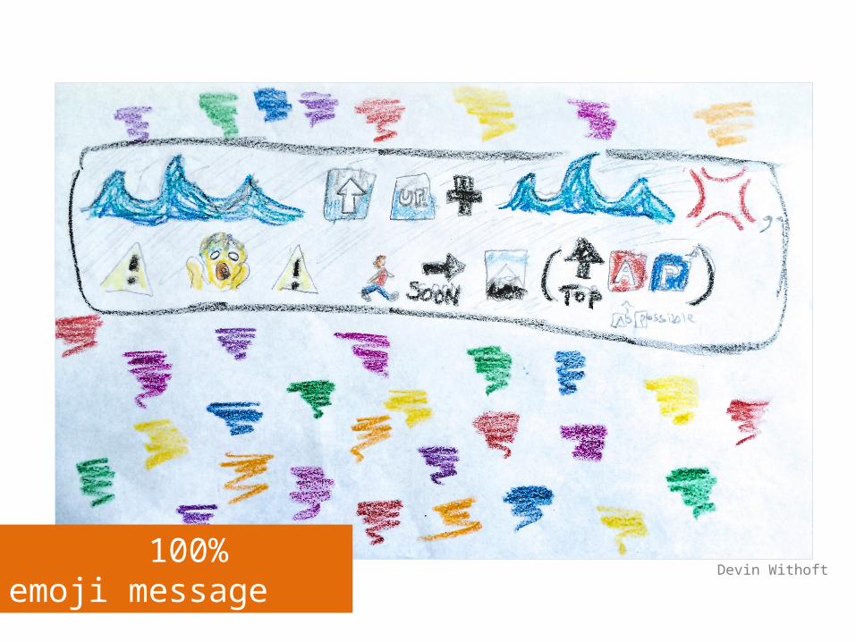
100% emoji messageDevin Withoft
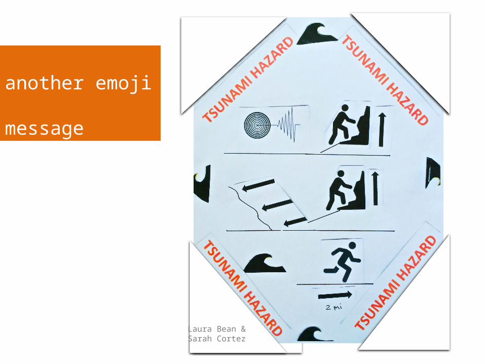
Laura Bean &Sarah Cortez
another emoji message
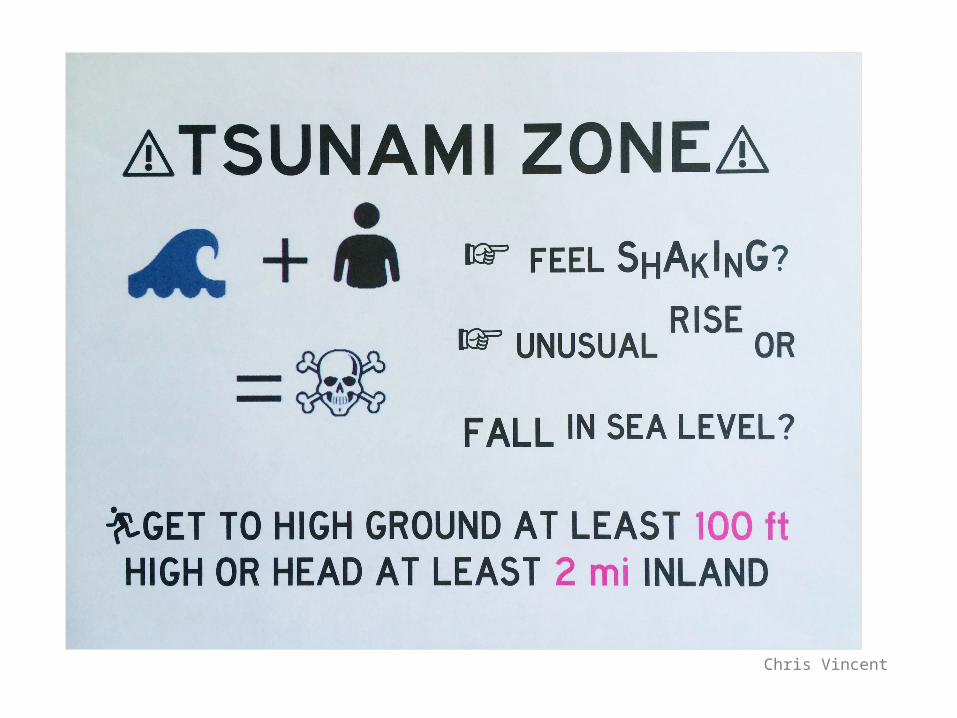
Chris Vincent
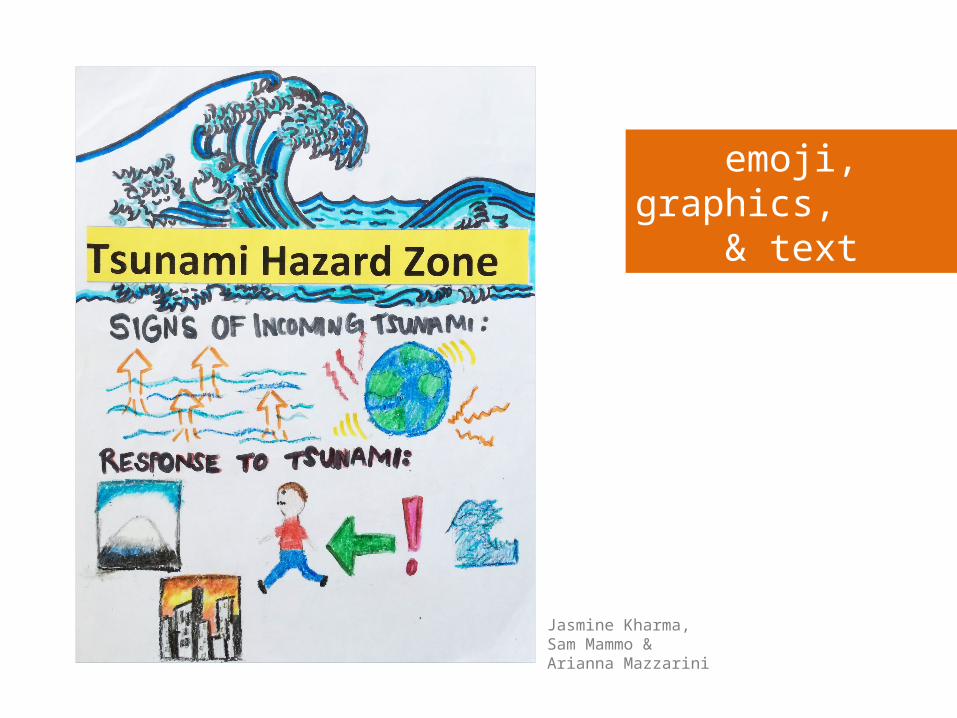
Jasmine Kharma,Sam Mammo &Arianna Mazzarini
emoji, graphics, & text
Jesly Esparza
vs
kEmphasis on text
A
Nq8
2 L
f
u
c
ox w
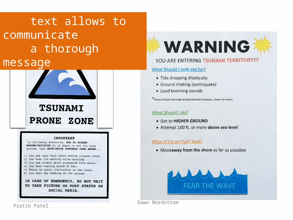
Pratik PatelDawn Nordstrom
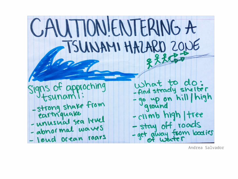
text allows to communicate a thorough message
Andrea Salvador
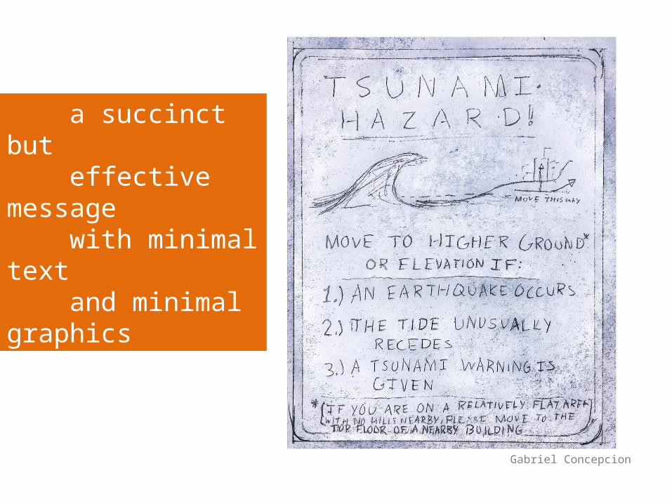
Gabriel Concepcion
a succinct but effective message with minimal text and minimal graphics
The Take Away
Hazard signs are a marketing exercise to get attention and convey your message.
marketing exercise
Signs that are too formal, ill placed, or too wordy might not grab the attention of all your stakeholders.
The Take Away

The Take Away
Attention grabbers for all ages combine • color• hand drawn graphics • social media lexicons
1
The Take Away
2More graphics, less text keeps the sign “international”
The Take Away
3 Sign location is critical, at a height and location that is visible to all ages.
The Take Away
4 Stakeholder designers are invaluable on the team.
The Take AwayKeep the message:
• Simple and accurate
• Effective for a range of age groups, literacy abilities, and gender
• On target with action points
References to iconographic design:
Kim, J. 2012, Trends in Olympic Pictograph Design: A comparitive study using Olympic Games’ Sports Symbols, Parsons Journal for Information Mapping, Vol. IV(4) p. 12.
http://blogs.walkerart.org/design/2014/03/20/lance-wyman-mexico-68-olympics-tlatelolco-massacre
http://www.smithsonianmag.com/arts-culture/the-history-of-the-olympic-pictograms-how-designers-hurdled-the-language-barrier-4661102/?no-ist
____________________________Only a few of the student designs are presented here, but I am grateful to all the Cal State East Bay students who participated in the study. – M. Kozuch
references