Embed Size (px)
Citation preview
Colour- the masthead stands out as there is a bright background with a bold masthead.
Image- the use of overlap on the images makes them more stand out and as it is over lapping the masthead this shows that the magazine is popular and people are not looking for the title butt hey understand how the magazine front cover will appear.Typography- the use of
typography is used to make the magazine cover stand out. They have used bold typography with capitals which makes it stand out on the magazine and draws the attention of the reader.
Image- the use of more than one image will give the buyer little sneak peeks of what the magazine contents. The use of several small images draws the buyers in to pick up the magazine and find out what the image is. This then could create interest in a purchase of the magazine.
Colour scheme- the use of a colour scheme will interest a buyer as if they are constantly buying issue after issue of the magazine, they will recognize the colour of the magazine and when purchasing the next issue the magazine will be clear to explain and clearly visible to find.
Masthead- the masthead has a clear and visible typography. They have incorporated a image within the masthead to make it seem quite flashy and different to other mastheads in other types of magazines.
Price and Barcode- the price is visible at the bottom with the issue number and barcode visible. This makes it easier for the buyer to see how much the price of the issue is and also what issue they are looking at purchasing.
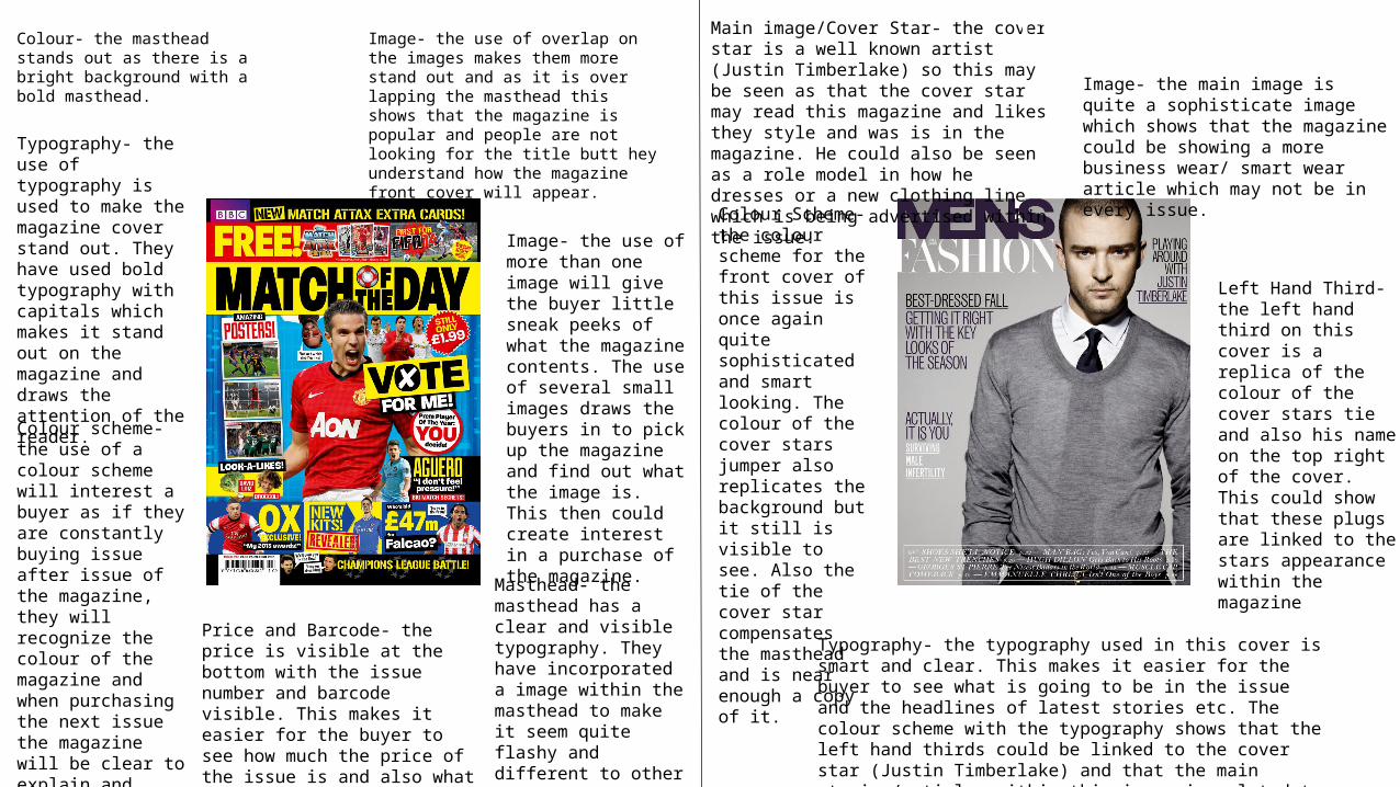
Image- the main image is quite a sophisticate image which shows that the magazine could be showing a more business wear/ smart wear article which may not be in every issue.
Main image/Cover Star- the cover star is a well known artist (Justin Timberlake) so this may be seen as that the cover star may read this magazine and likes they style and was is in the magazine. He could also be seen as a role model in how he dresses or a new clothing line which is being advertised within the issue.
Colour Scheme- the colour scheme for the front cover of this issue is once again quite sophisticated and smart looking. The colour of the cover stars jumper also replicates the background but it still is visible to see. Also the tie of the cover star compensates the masthead and is near enough a copy of it.
Left Hand Third- the left hand third on this cover is a replica of the colour of the cover stars tie and also his name on the top right of the cover. This could show that these plugs are linked to the stars appearance within the magazine
Typography- the typography used in this cover is smart and clear. This makes it easier for the buyer to see what is going to be in the issue and the headlines of latest stories etc. The colour scheme with the typography shows that the left hand thirds could be linked to the cover star (Justin Timberlake) and that the main stories/articles within this issue is related to him.
Title Page Analysis
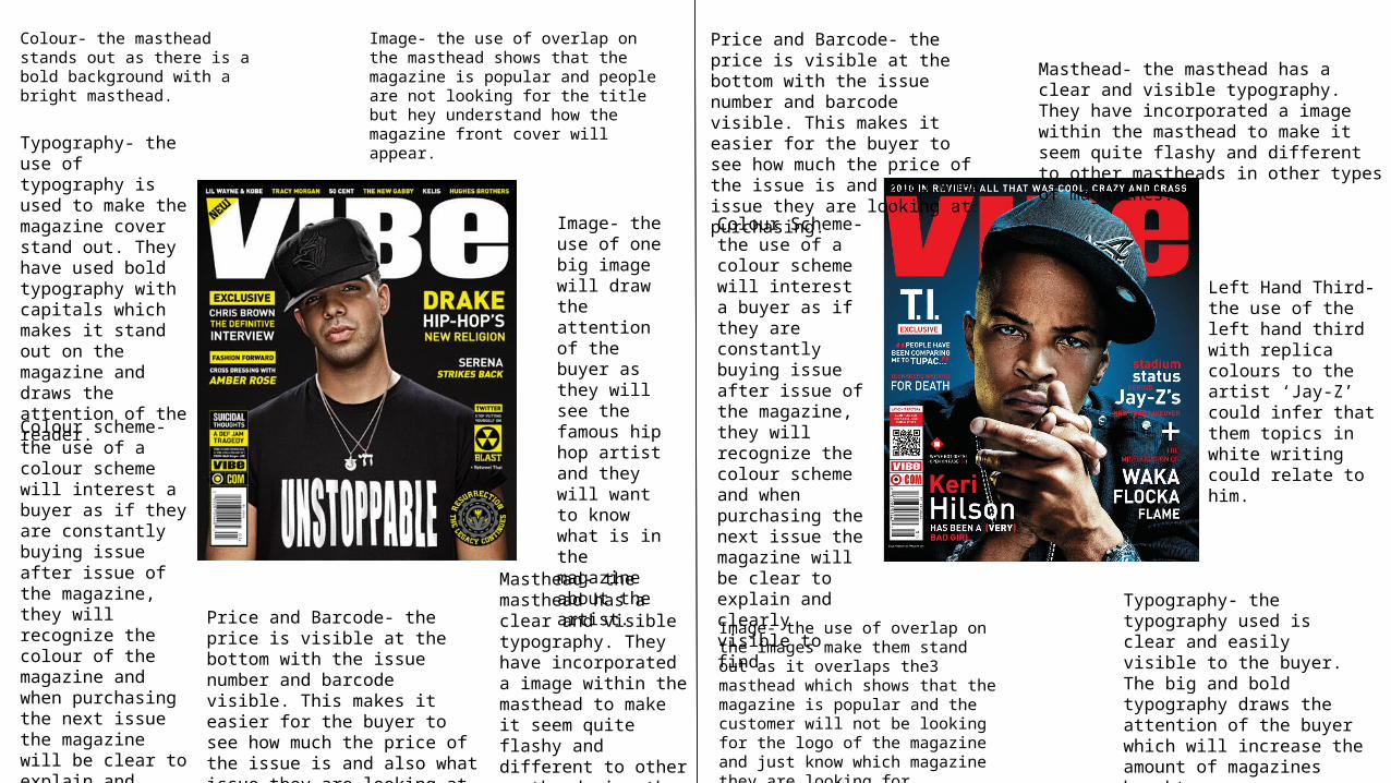
Colour- the masthead stands out as there is a bold background with a bright masthead.
Image- the use of overlap on the masthead shows that the magazine is popular and people are not looking for the title but hey understand how the magazine front cover will appear.
Typography- the use of typography is used to make the magazine cover stand out. They have used bold typography with capitals which makes it stand out on the magazine and draws the attention of the reader.
Image- the use of one big image will draw the attention of the buyer as they will see the famous hip hop artist and they will want to know what is in the magazine about the artist.
Colour scheme- the use of a colour scheme will interest a buyer as if they are constantly buying issue after issue of the magazine, they will recognize the colour of the magazine and when purchasing the next issue the magazine will be clear to explain and clearly visible to find.
Masthead- the masthead has a clear and visible typography. They have incorporated a image within the masthead to make it seem quite flashy and different to other mastheads in other types of magazines.
Image- the use of overlap on the images make them stand out as it overlaps the3 masthead which shows that the magazine is popular and the customer will not be looking for the logo of the magazine and just know which magazine they are looking for.
Colour Scheme- the use of a colour scheme will interest a buyer as if they are constantly buying issue after issue of the magazine, they will recognize the colour scheme and when purchasing the next issue the magazine will be clear to explain and clearly visible to find.
Left Hand Third- the use of the left hand third with replica colours to the artist ‘Jay-Z’ could infer that them topics in white writing could relate to him.
Typography- the typography used is clear and easily visible to the buyer. The big and bold typography draws the attention of the buyer which will increase the amount of magazines bought.
Price and Barcode- the price is visible at the bottom with the issue number and barcode visible. This makes it easier for the buyer to see how much the price of the issue is and also what issue they are looking at purchasing.
Price and Barcode- the price is visible at the bottom with the issue number and barcode visible. This makes it easier for the buyer to see how much the price of the issue is and also what issue they are looking at purchasing.
Masthead- the masthead has a clear and visible typography. They have incorporated a image within the masthead to make it seem quite flashy and different to other mastheads in other types of magazines.
Title Page Analysis
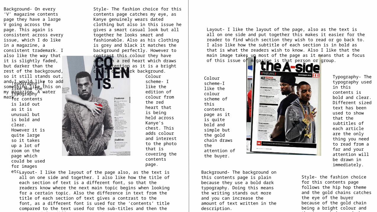
Background- On every ‘V’ magazine contents page they have a large V going across the page. This again is consistent across every issue, which I do like in a magazine, a consistent trademark. I also like the way that it is slightly faded, but darker than the rest of the background, so it still stands out, and I would like to add something like this on my magazine. A water mark.
Style- The fashion choice for this contents page catches my eye, as Kanye genuinely wears dated clothing but also in this issue he gives a smart casual look but all together he looks smart and fashionable. Also as his clothing is grey and black it matches the background perfectly. However to contrast this colour they have added in a red heart which draws your attention as it is a bright colour on a dark background.
Typography- I like how the typography for contents is laid out as it is unusual but is bold and clear. However it is quite large so it takes up a lot of room on the page which could be used for images etc.
Colour scheme- I like the edition of colour from the red heart that is being held across Kanye's chest. This adds colour and interest to the photo that is covering the contents page.
Layout- I like the layout of the page also, as the text is all on one side and together. I also like how the title of each section of text is a different font, so that the readers know where the next main topic begins when looking for a certain topic. Also the difference in text from the title of each section of text gives a contrast to the font, as a different font is used for the ‘contents’ title compared to the text used for the sub-titles and then the text used for different page numbers.
Style- the fashion choice for this contents page follows the hip hop theme and the gold chains catches the eye of the buyer because of the gold chain being a bright colour and the jumper being a dark colour.
Colour scheme-I like the colour scheme of this contents page as it is quite bold and simple but the gold chain draws the attention of the buyer.
Layout- I like the layout of the page, also as the text is all on one side and put together this makes it easier for the reader to find which section they wish to read or go back to. I also like how the subtitle of each section is in bold as that is what the readers wish to know. Also I like that the main image takes up most of the page as it means that a focus of this issue of magazine is that person or group.
Background- The background on this contents page is plain because they use a bold dark typography. Doing this means the writing stands out more and you can increase the amount of text written in the description.
Typography- The typography used in this contents is bold and clear. Different sized text has been used to show that the subtitles of each article are the only thing you need to read from a far and your attention will be drawn in immediately.
Contents Page Analysis
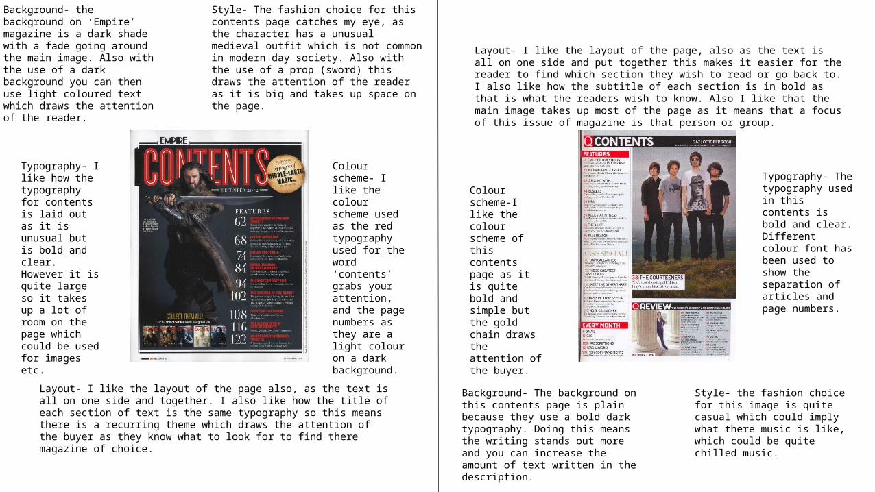
Background- the background on ‘Empire’ magazine is a dark shade with a fade going around the main image. Also with the use of a dark background you can then use light coloured text which draws the attention of the reader.
Style- The fashion choice for this contents page catches my eye, as the character has a unusual medieval outfit which is not common in modern day society. Also with the use of a prop (sword) this draws the attention of the reader as it is big and takes up space on the page.
Typography- I like how the typography for contents is laid out as it is unusual but is bold and clear. However it is quite large so it takes up a lot of room on the page which could be used for images etc.
Colour scheme- I like the colour scheme used as the red typography used for the word ‘contents’ grabs your attention, and the page numbers as they are a light colour on a dark background.
Layout- I like the layout of the page also, as the text is all on one side and together. I also like how the title of each section of text is the same typography so this means there is a recurring theme which draws the attention of the buyer as they know what to look for to find there magazine of choice.
Style- the fashion choice for this image is quite casual which could imply what there music is like, which could be quite chilled music.
Colour scheme-I like the colour scheme of this contents page as it is quite bold and simple but the gold chain draws the attention of the buyer.
Layout- I like the layout of the page, also as the text is all on one side and put together this makes it easier for the reader to find which section they wish to read or go back to. I also like how the subtitle of each section is in bold as that is what the readers wish to know. Also I like that the main image takes up most of the page as it means that a focus of this issue of magazine is that person or group.
Background- The background on this contents page is plain because they use a bold dark typography. Doing this means the writing stands out more and you can increase the amount of text written in the description.
Typography- The typography used in this contents is bold and clear. Different colour font has been used to show the separation of articles and page numbers.
Contents Page Analysis
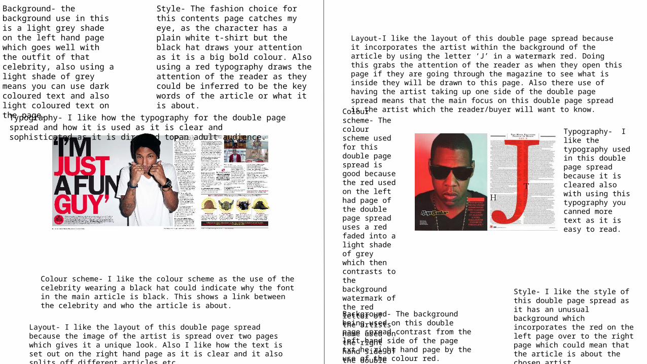
Double Page Spread AnalysisBackground- the background use in this is a light grey shade on the left hand page which goes well with the outfit of that celebrity, also using a light shade of grey means you can use dark coloured text and also light coloured text on the page.
Style- The fashion choice for this contents page catches my eye, as the character has a plain white t-shirt but the black hat draws your attention as it is a big bold colour. Also using a red typography draws the attention of the reader as they could be inferred to be the key words of the article or what it is about.
Typography- I like how the typography for the double page spread and how it is used as it is clear and sophisticated as it is directed to an adult audience.
Colour scheme- I like the colour scheme as the use of the celebrity wearing a black hat could indicate why the font in the main article is black. This shows a link between the celebrity and who the article is about.
Layout- I like the layout of this double page spread because the image of the artist is spread over two pages which gives it a unique look. Also I like how the text is set out on the right hand page as it is clear and it also splits off different articles etc.
Style- I like the style of this double page spread as it has an unusual background which incorporates the red on the left page over to the right page which could mean that the article is about the chosen artist.
Colour scheme- The colour scheme used for this double page spread is good because the red used on the left had page of the double page spread uses a red faded into a light shade of grey which then contrasts to the background watermark of the red letter of the artists name used on the right hand side of the double page spread.
Layout-I like the layout of this double page spread because it incorporates the artist within the background of the article by using the letter ‘J’ in a watermark red. Doing this grabs the attention of the reader as when they open this page if they are going through the magazine to see what is inside they will be drawn to this page. Also there use of having the artist taking up one side of the double page spread means that the main focus on this double page spread is the artist which the reader/buyer will want to know.
Background- The background being used on this double page spread contrast from the left hand side of the page txt he right hand page by the use of the colour red.
Typography- I like the typography used in this double page spread because it is cleared also with using this typography you canned more text as it is easy to read.
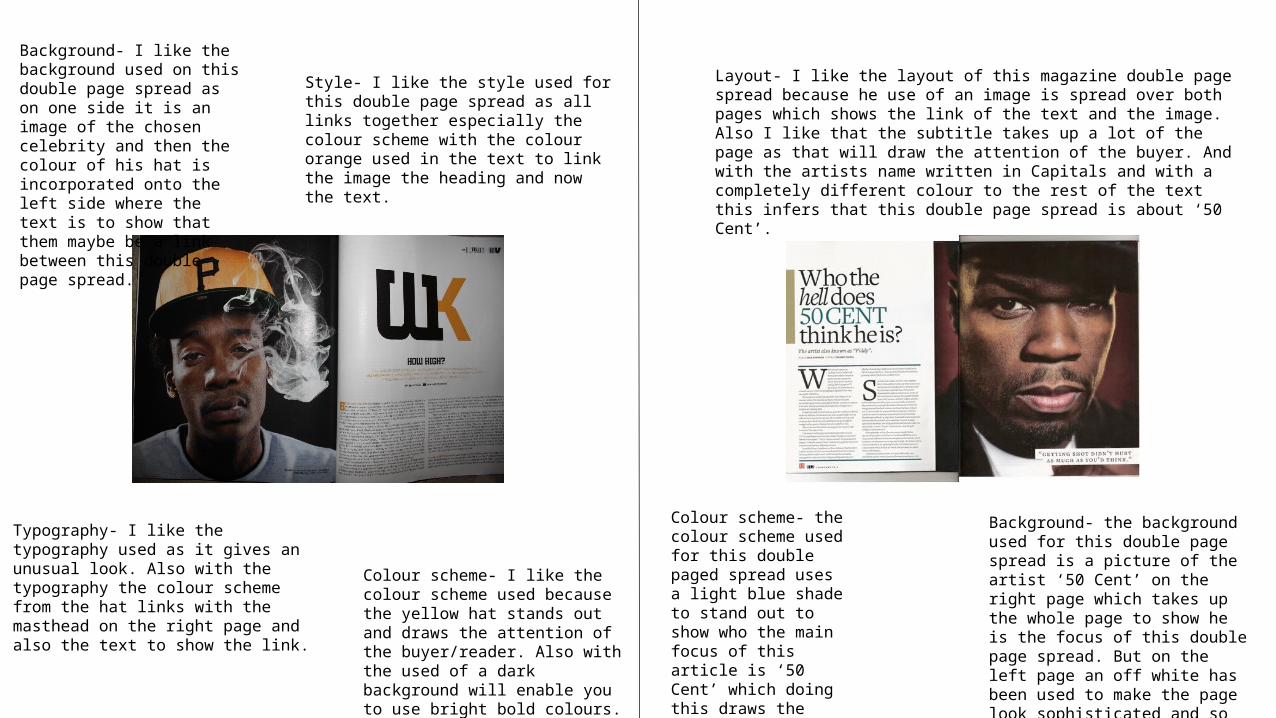
Double Page Spread AnalysisStyle- I like the style used for this double page spread as all links together especially the colour scheme with the colour orange used in the text to link the image the heading and now the text.
Typography- I like the typography used as it gives an unusual look. Also with the typography the colour scheme from the hat links with the masthead on the right page and also the text to show the link.
Colour scheme- I like the colour scheme used because the yellow hat stands out and draws the attention of the buyer/reader. Also with the used of a dark background will enable you to use bright bold colours.
Colour scheme- the colour scheme used for this double paged spread uses a light blue shade to stand out to show who the main focus of this article is ‘50 Cent’ which doing this draws the attention of the reader.
Layout- I like the layout of this magazine double page spread because he use of an image is spread over both pages which shows the link of the text and the image. Also I like that the subtitle takes up a lot of the page as that will draw the attention of the buyer. And with the artists name written in Capitals and with a completely different colour to the rest of the text this infers that this double page spread is about ‘50 Cent’.
Background- the background used for this double page spread is a picture of the artist ‘50 Cent’ on the right page which takes up the whole page to show he is the focus of this double page spread. But on the left page an off white has been used to make the page look sophisticated and so more text can be put onto the page.
Background- I like the background used on this double page spread as on one side it is an image of the chosen celebrity and then the colour of his hat is incorporated onto the left side where the text is to show that them maybe be a link between this double page spread.