Embed Size (px)
Citation preview
Rio Brown
MAGAZINE COVER
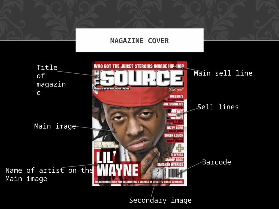
MAGAZINE COVER
Title of magazine
Main image
Barcode
Main sell line
Name of artist on the Main image
Sell lines
Secondary image
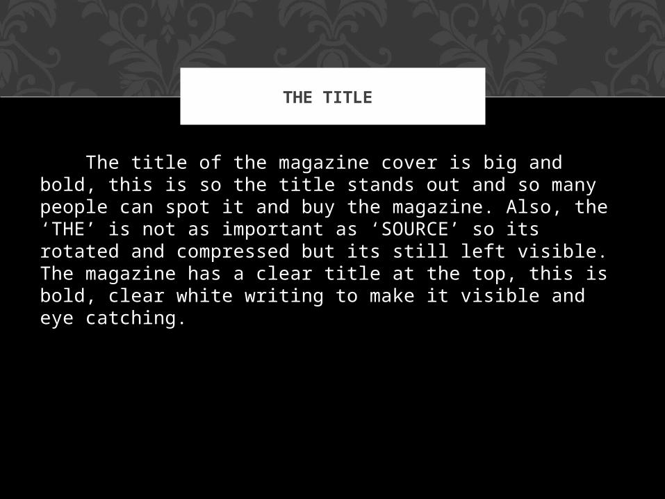
The title of the magazine cover is big and bold, this is so the title stands out and so many people can spot it and buy the magazine. Also, the ‘THE’ is not as important as ‘SOURCE’ so its rotated and compressed but its still left visible. The magazine has a clear title at the top, this is bold, clear white writing to make it visible and eye catching.
THE TITLE
Block capitals in white for all titles. Text that is not a title is capitalized on each word and is coloured in black.
The gold sticks out against the rest of the cover, attracting attention but still looking like part of the magazine style. This is partly because the main image of Lil Wayne is wearing a gold necklace.
The border of this text is slightly transparent so that the close-up is less observed by text.
The celebrity's name is the largest part of the text apart from the title of the magazine, to attract potential readers.
COLOURING AND TEXT
The colour theme is based around the central picture, Lil Wayne is wearing a large red cap which takes up most of the upper portion of the cover, so that the rest of the magazine is styled to complement this, as the colour scheme of the magazine is black, white, red and gold.
Barcode:
The barcode is in the bottom right where it attracts the least attention, this is because of how people read, the y start at the top and then scroll their eyes lower, reading left to right as they do so.
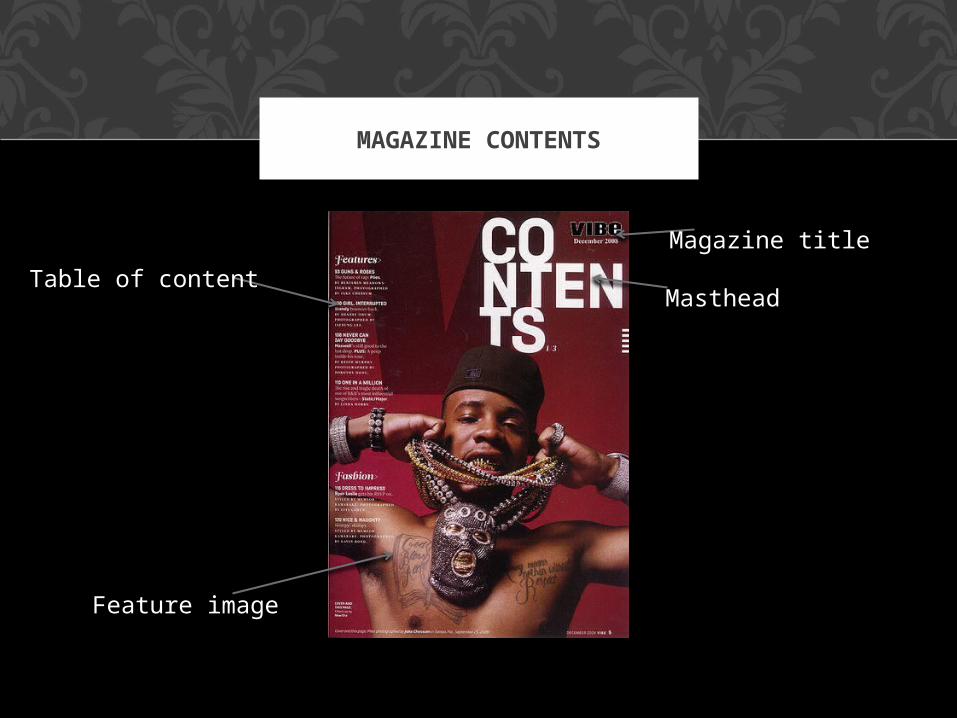
MAGAZINE CONTENTS
Table of content
Feature image
Masthead
Magazine title
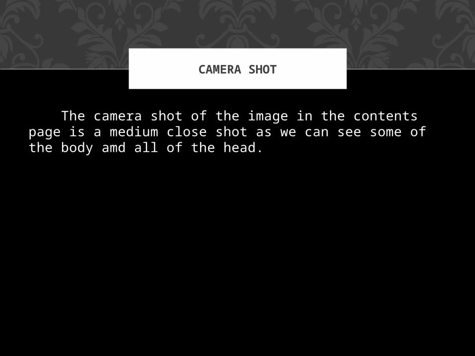
The camera shot of the image in the contents page is a medium close shot as we can see some of the body amd all of the head.
CAMERA SHOT