Embed Size (px)
Citation preview

Android Material Design

Goal

Topics
● What is Material?
● Guidelines for color, text and layout
● Guidelines for motion, interaction and transitions
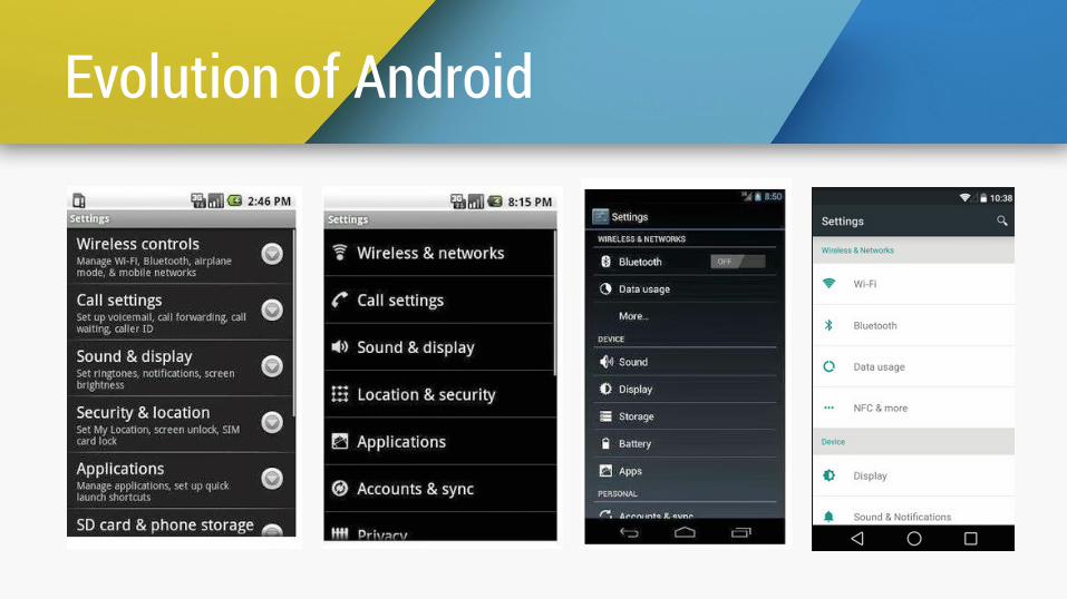
Evolution of Android

Pre- “Material”
● Lack of coherent look and feel
● Poor transitions and animations
● UI/UX Fragmentation

“Material”Definition, rules and limitations

Introducing “Material” Design

Introducing “Material” Design

Introducing “Material” Design

What is “Material”?
● Hypothetical material out of which all UI elements, such as buttons, pages etc are constructed
● “Material” has realistic physical properties, akin to paper; for e.g. it casts and receives shadows
● These guidelines for “Material” provides a unified design language for all Android experiences

“Material” casts shadows

“Material” cannot overlap

All “Materials” have different “Elevations”
Buttons and interactive objects have responsive elevation, i.e. their elevation changes when users interact with them

“Material” can split, combine and reshape

Material Stats
200k+ Material Apps
40%+ Since Material

Key Takeaways
• Material is a digital “fabric”
• Materail casts shadows
• Material can split, combine and reshape

“Bold, Graphic & Intentional”Style Guide for Color, Text and Layout

Color - Bold hues, muted environments
Inspired by architecture, road signs, pavement marking tape etc

Color should be unexpected and vibrant.

Color Palettes - Express your brand

Color Palettes - Adaptive Colors

Palette Swatches
23
• Vibrant. Palette.getVibrantSwatch() • Vibrant dark. Palette.getDarkVibrantSwatch() • Vibrant light. Palette.getLightVibrantSwatch() • Muted. Palette.getMutedSwatch() • Muted dark. Palette.getDarkMutedSwatch() • Muted light. Palette.getLightMutedSwatch()

Typography - Roboto & Noto

Typography - Font Sizes

Avoid too many type sizes and styles.

Layout - Floating Action Button
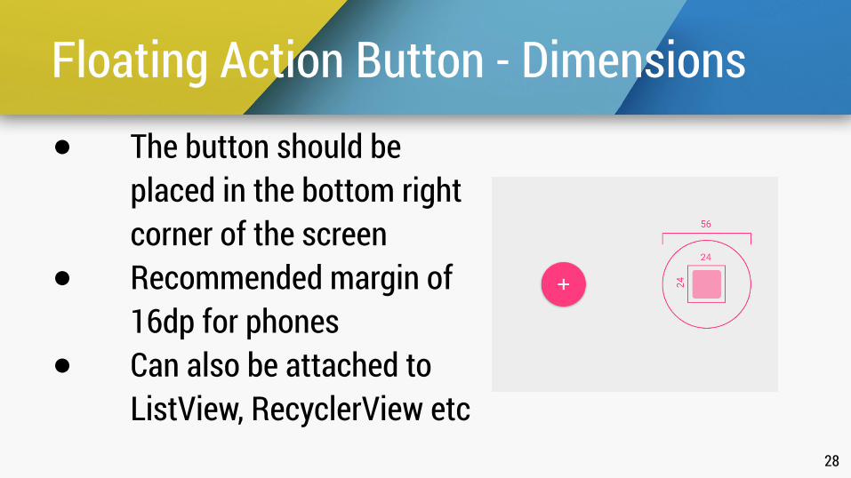
Floating Action Button - Dimensions
28
● The button should be placed in the bottom right corner of the screen
● Recommended margin of 16dp for phones
● Can also be attached to ListView, RecyclerView etc

Layout - Floating Action Button

Not every screen needs FAB.

Key Takeaways
• Use Palette to develop your brand colors
• Use dynamic type for best UX
• Only one FAB per screen if necessary

Meaningful MotionGuide for motion, interaction and transitions
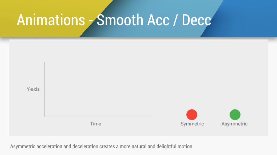
Animations - Smooth Acc / Decc
Asymmetric acceleration and deceleration creates a more natural and delightful motion.

Interactions - Radial Ripple & Elevate

35
Ripple All The Things

Transition - Shared Element

Transition - Shared Element

38
Be Careful!

Transition - Circular Reveal, Child Parent

Key Takeaways
• Gotta love Ripples!
• Provide visual continuity using hero transitions
• Show or hide a group of elements with circular reveal

SummaryVisual language focused on good design principles ● “Material” - Hypothetical material Inspired by Paper
and Ink but with additional rules ● “Bold, Graphic & Intentional” - Foundational
elements of print based design ● “Meaningful Motion” - Focuses attention and
maintains continuity in user experience
Demo