Embed Size (px)
Citation preview
UNIT 2Server Controls
By: Hitesh Santani
What is ASP.Net?
By: Hitesh Santani
ASP .Net is an approach of .Net to develop websites. We can use it to develop web pages. An ASP .Net websites consist of web pages which are
actually .aspx files.
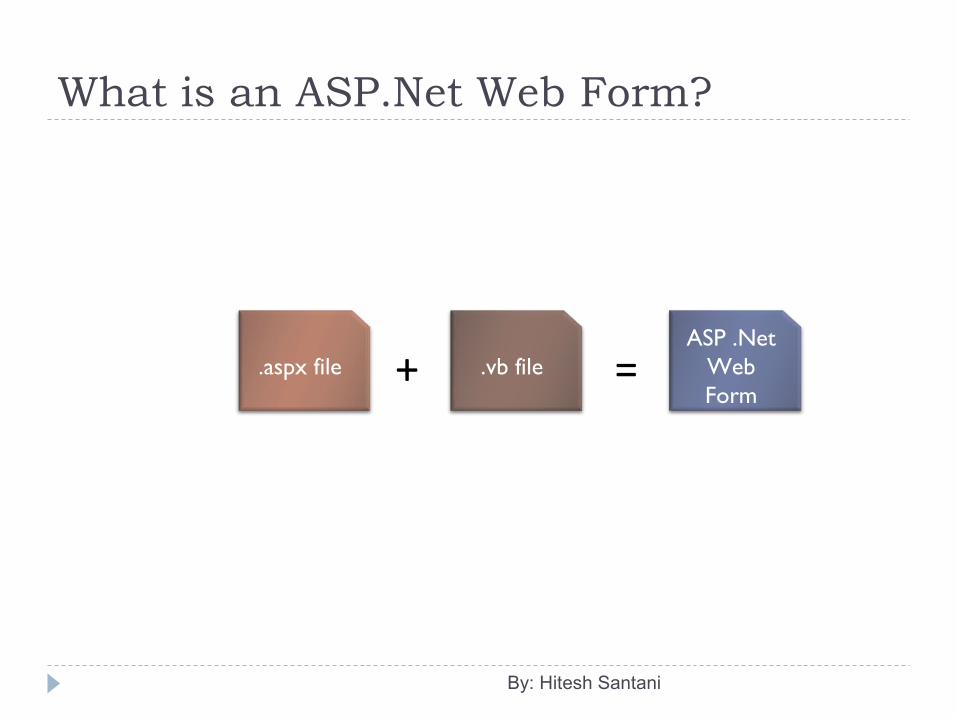
What is an ASP.Net Web Form?
By: Hitesh Santani
.aspx file .vb file+ =ASP .Net
Web Form

What is an ASP.Net Web Form?
By: Hitesh Santani
• An .aspx page is used to create web pages into an ASP .Net website.
• One .aspx page consists of two files.– .aspx file– .vb or .cs file
• .aspx file contains the presentable layout (HTML/CSS) of the web page.
• .vb file contains the server side code of the web page.
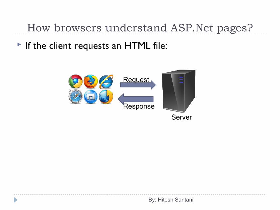
How browsers understand ASP.Net pages?
If the client requests an HTML file:
By: Hitesh Santani
Request
Response
Server
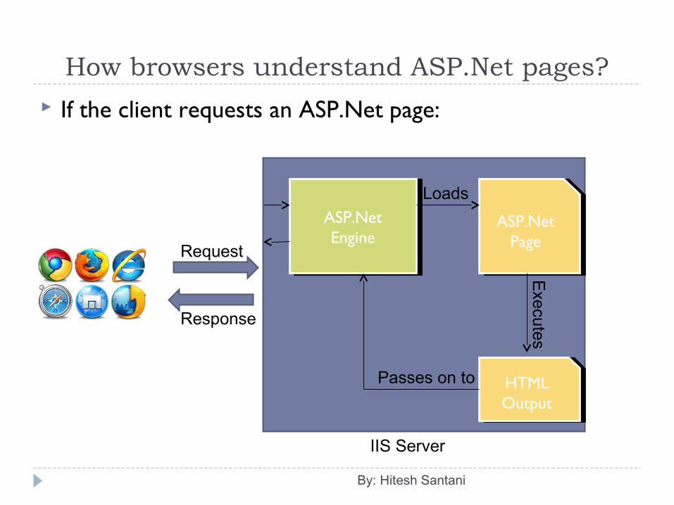
How browsers understand ASP.Net pages?
If the client requests an ASP.Net page:
By: Hitesh Santani
Request
Response
IIS Server
ASP.NetEngine
ASP.NetEngine
ASP.Net Page
ASP.Net Page
Loads
Execute s
HTMLOutputHTMLOutput
Passes on to
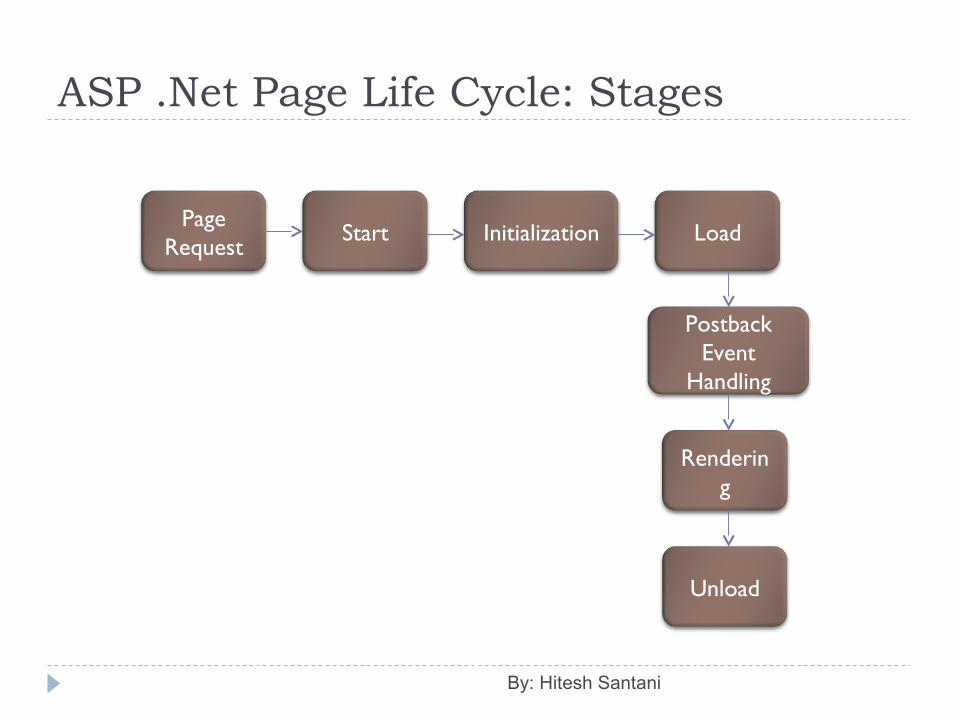
ASP .Net Page Life Cycle: Stages
By: Hitesh Santani
Page Request
Start Initialization Load
Postback Event
Handling
Rendering
Unload

ASP .Net Page Life Cycle: Stages
By: Hitesh Santani
Page Request: The page request occurs before the page life cycle begins. When the page is requested by a user, ASP.NET determines whether the page needs to be parsed and compiled or whether a cached version of the page can be sent in response without running the page.
Start: In the start stage, page properties such as Request and Response are set. At this stage, the page also determines whether the request is a postback or a new request and sets the IsPostBack property.
Initialization: During page initialization, controls on the page are available and each control's UniqueID property is set. A master page and themes are also applied to the page if applicable. If the current request is a postback, the postback data has not yet been loaded and control property values have not been restored to the values from view state.
Load: During load, if the current request is a postback, control properties are loaded with information recovered from view state and control state.
Postback Event Handling: If the request is a postback, control event handlers are called. After that, the Validate method of all validator controls is called, which sets the IsValid property of individual validator controls and of the page.
Rendering: Before rendering, view state is saved for the page and all controls. During the rendering stage, the page calls the Render method for each control, providing a text writer that writes its output to the OutputStream object of the page's Response property.
Unload: The Unload event is raised after the page has been fully rendered, sent to the client, and is ready to be discarded. At this point, page properties such as Response and Request are unloaded and cleanup is performed.
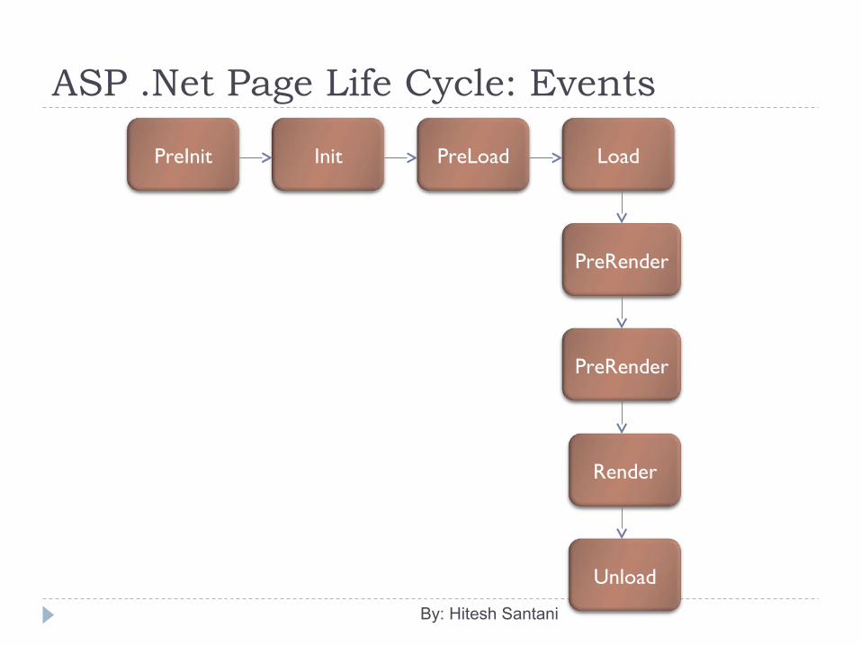
ASP .Net Page Life Cycle: Events
By: Hitesh Santani
PreInit Init PreLoad Load
PreRender
Render
Unload
PreRender
ASP .Net Page Life Cycle: Events
By: Hitesh Santani
PreInit: Raised after the start stage is complete and before the initialization stage begins. Check the IsPostBack property to determine whether this is the first time the page is being processed. Set a master page dynamically. Set the Theme property dynamically.
Init: Raised after all controls have been initialized and any skin settings have been applied. The Init event of individual controls occurs before the Init event of the page. Use this event to read or initialize control properties.
PreLoad: Raised after the page loads view state for itself and all controls, and after it processes postback data that is included with the Request instance.
Load: The Page object calls the OnLoad method on the Page object, and then recursively does the same for each child control until the page and all controls are loaded. The Load event of individual controls occurs after the Load event of the page. Use the OnLoad event method to set properties in controls and to establish database connections.
Control events: Use these events to handle specific control events, such as a Button control's Click event or a TextBox control's TextChanged event.
PreRender: Raised after the Page object has created all controls that are required in order to render the page, including child controls of composite controls. The Page object raises the PreRender event on the Page object, and then recursively does the same for each child control. The PreRender event of individual controls occurs after the PreRender event of the page.
Render: This is not an event; instead, at this stage of processing, the Page object calls this method on each control. All ASP.NET Web server controls have a Render method that writes out the control's markup to send to the browser. If you create a custom control, you typically override this method to output the control's markup. However, if your custom control incorporates only standard ASP.NET Web server controls and no custom markup, you do not need to override the Render method.
Unload: Raised for each control and then for the page.
What is Post Back? A Postback is an action taken by an interactive web page,
when the entire page and its contents are sent to the server for processing some information, then the server posts the same page back to the browser.
To check whether the page is posted back or it’s the first request for the page, we can use IsPostBack prperty of the Page.
Once the page is posted back, IsPostBack property becomes true.
By: Hitesh Santani
ASP.Net in-built objects: Using these objects, we can have to access to different
information. Request Object: Gives access to all the info submitted by the
user. Response Object: Gives access to the output stream through
which we can prepare the output for the user. Session Object: Gives access to the session of the user so that
we can store his/her information to share between multiple pages.
Server Object: Gives access to information related to the server on which the site running.
Application Object: Gives ability to store information which can be shared by all the users.
By: Hitesh Santani
Server Controls ASP.Net Server Controls are objects in an ASP.Net web page
that runs when the page is requested and are seen in the output of the page.
Many server controls are created based upon the HTML form elements.
Many server controls provide complex functionalities such as calendar control.
All server controls are understood by and executed on the server.
All server controls must be placed inside a form tag with runat=“server” attribute.
All server controls must have runat attribute with value “server”. (runat=“server”)
By: Hitesh Santani
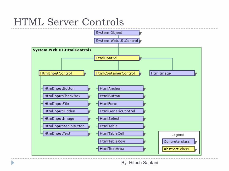
Types of Server Controls HTML Server Controls
HTML Form Elements with runat=“server” attribute which makes them accessible to the server-side code.
Web Server Controls Standard Controls Rich Controls Validation Controls Navigation Controls Login Controls
By: Hitesh Santani
Control Class All server controls are derived from this Control class. Its namespace is System.Web.UI It applies to the Page class as well. You can use an object of this class to refer any control as
it is parent of all the server controls.
By: Hitesh Santani
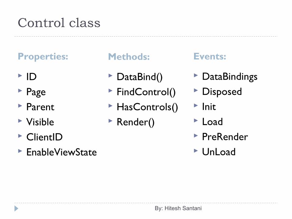
Control class
Properties: Methods:
ID Page Parent Visible ClientID EnableViewState
DataBind() FindControl() HasControls() Render()
By: Hitesh Santani
Events:
DataBindings Disposed Init Load PreRender UnLoad
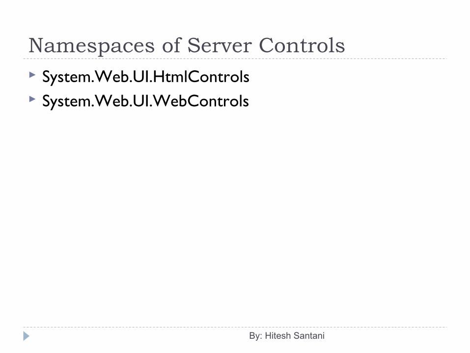
Namespaces of Server Controls System.Web.UI.HtmlControls System.Web.UI.WebControls
By: Hitesh Santani
HTML Server Controls
By: Hitesh Santani
HTML Server Controls HTML server controls are useful for migrating ASP
applications to ASP.Net applications. You can also turn any HTML tag into a server control
and if there is no direct class, ASP.Net will use the HtmlGenericControl class.
To change an ordinary HTML element into a server control, simply add the runat=”server” attribute to the element tag.
By: Hitesh Santani
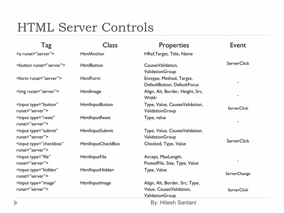
HTML Server ControlsTag Class Properties Event
<a runat=”server”> HtmlAnchor HRef,Target, Title, Name
ServerClick<button runat=”server”> HtmlButton CausesValidation, ValidationGroup
<form runat=”server”> HtmlForm Enctype, Method, Target, DefaultButton, DefaultFocus -
<img runat=”server”> HtmlImage Align, Alt, Border, Height, Src, Width -
<input type=”button” runat=”server”>
HtmlInputButton Type, Value, CausesValidation, ValidationGroup ServerClick
<input type=”reset” runat=”server”>
HtmlInputReset Type, value-
<input type=”submit” runat=”server”>
HtmlInputSubmit Type, Value, CausesValidation, ValidationGroup
ServerClick<input type=”checkbox” runat=”server”>
HtmlInputCheckBox Checked, Type, Value
<input type=”file” runat=”server”>
HtmlInputFile Accept, MaxLength, PostedFile, Size, Type, Value -
<input type=”hidden” runat=”server”>
HtmlInputHidden Type, ValueServerChange
<input type=”image” runat=”server”>
HtmlInputImage Align, Alt, Border, Src, Type, Value, CausesValidation, ValidationGroup
ServerClick
By: Hitesh Santani
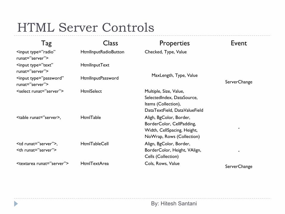
HTML Server ControlsTag Class Properties Event
<input type=”radio” runat=”server”>
HtmlInputRadioButton Checked, Type, Value
ServerChange
<input type=”text” runat=”server”>
HtmlInputText
MaxLength, Type, Value<input type=”password” runat=”server”>
HtmlInputPassword
<select runat=”server”> HtmlSelect Multiple, Size, Value, SelectedIndex, DataSource, Items (Collection), DataTextField, DataValueField
<table runat=”server>, HtmlTable Aligh, BgColor, Border, BorderColor, CellPadding, Width, CellSpacing, Height, NoWrap, Rows (Collection)
-
<td runat=”server”>,<th runat=”server”>
HtmlTableCell Align, BgColor, Border, BorderColor, Height, VAlign, Cells (Collection)
-
<textarea runat=”server”> HtmlTextArea Cols, Rows, ValueServerChange
By: Hitesh Santani
HTML Server Controls ServerClick
The ServerClick event is simply a click that is processed on the server side. It is provided by most button controls and it allows to take action immediately.
ServerChange The ServerChange event responds when a change has been
made to a text or selection control. This event doesn’t occur until the page is posted back. The
ServerChange event occurs for all changed controls, followed by appropriate ServerClick.
By: Hitesh Santani
WebControl class: All the web controls are inherited from the WebControl
base class. The WebControl class is derived from Control class. So,
many of its properties and methods – such as Controls, Visible and FindControl() are similar to those of the HTML server controls.
It inherits methods and events of the Control class.
By: Hitesh Santani
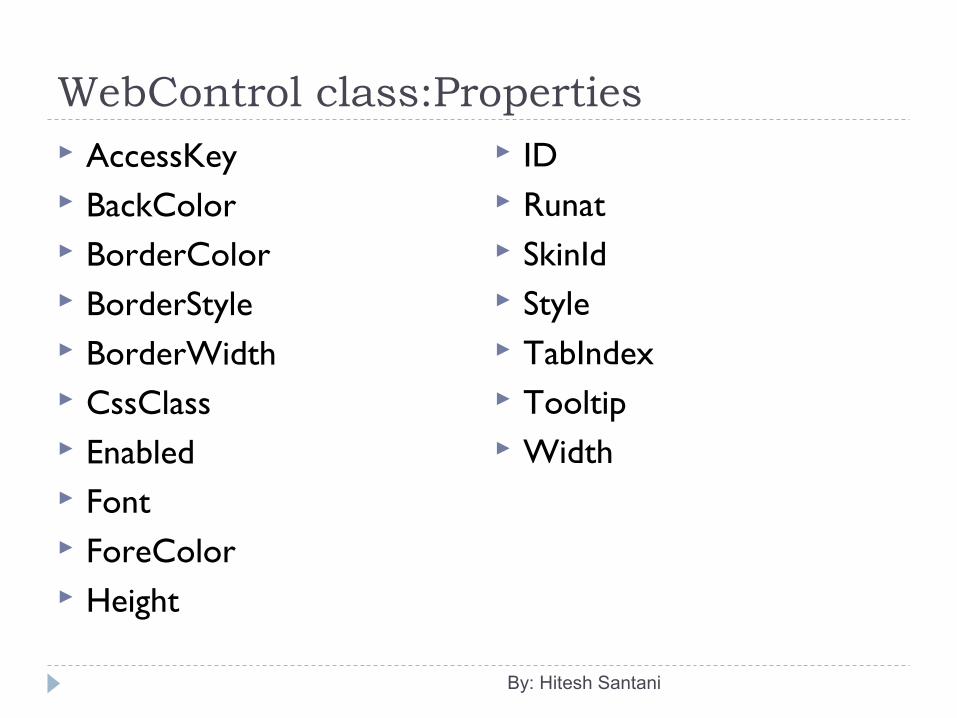
WebControl class:Properties AccessKey BackColor BorderColor BorderStyle BorderWidth CssClass Enabled Font ForeColor Height
ID Runat SkinId Style TabIndex Tooltip Width
By: Hitesh Santani
Standard Controls All standard controls are defined the
System.Web.UI.WebControl namespace. Web controls have the features, such as automatic
postback. Basic Web Controls have same functionality as HTML server controls.
Standard Controls inherit all the properties, methods and events of WebControl class and in additions; these controls also have their own properties, methods and events.
By: Hitesh Santani
Standard Controls: Label Control The label control is used to display information to the
user. Its ASP.Net tag is <asp:Label> and HTML tag is
<span>...</span>. Properties:
Text AssociatedControlID
Example:<asp:Label ID="Label1" runat="server" Text="Label“ > </asp:Label>
By: Hitesh Santani
By: Hitesh Santani
Standard Controls: TextBox Control The TextBox control is an input control that allows user
to enter a text. By default, it displays a single line text box. TextBox control can also be used to display a multiline
text box or a text box that masks user input by changing the value.
Its ASP.Net tag is <asp:TextBox /> and HTMl tags are <input type=”text” />, <input type=”password” /> and <textarea>.
Example:<asp:TextBox ID="TextBox1" runat="server"></asp:TextBox>
By: Hitesh Santani
By: Hitesh Santani
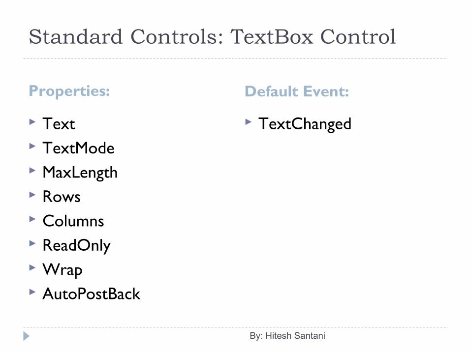
Standard Controls: TextBox Control
Properties: Default Event:
Text TextMode MaxLength Rows Columns ReadOnly Wrap AutoPostBack
TextChanged
By: Hitesh Santani
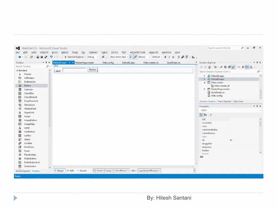
Standard Controls: Button Control The Button control is used to create a push button on
the Web page. You can create either a Submit button or a Command
button. By default, a Button control is a Submit button. A Submit button does not have a command name
specified by the CommandName property associated with the button and simply posts the Web page back to the server.
Its ASP.Net tag is <asp:Button /> and HTML tags are <input type=”button” /> or <input type=”submit” />.
Example:<asp:Button ID="Button1" runat="server"
Text="Button" /> By: Hitesh Santani
By: Hitesh Santani
Standard Controls: Button Control
Properties: Default Event:
Text CausesValidation PostBackUrl ValidationGroup UseSubmitBehavior TextAlign
Click
By: Hitesh Santani
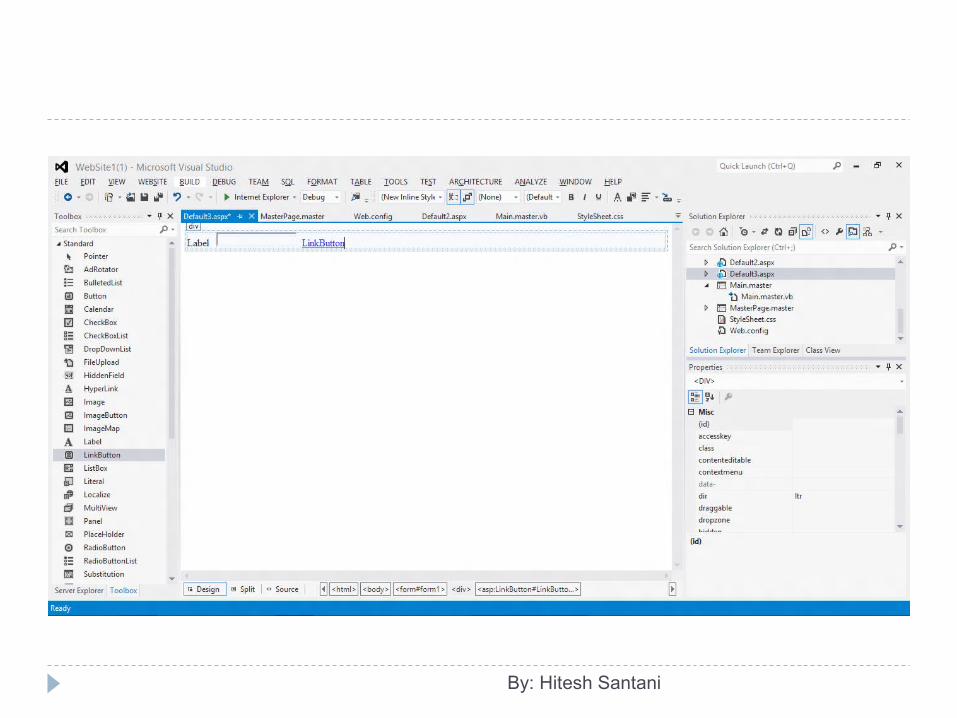
Standard Controls: Link Button Control The LinkButton control is used to create a hyperlink style
button on the web page. The LinkButton control has the same appearance as a
HyperLink control but has the same functionality as a Button control.
Its ASP.Net tag is <asp:LinkButton /> and HTML tag is <a>...</a>.
Its properties, methods and default event are same as Button control, except it does not contain UseSubmitBehavior property of Button control.
Example: <asp:LinkButton ID="LinkButton1" runat="server">LinkButton</asp:LinkButton>
By: Hitesh Santani
By: Hitesh Santani
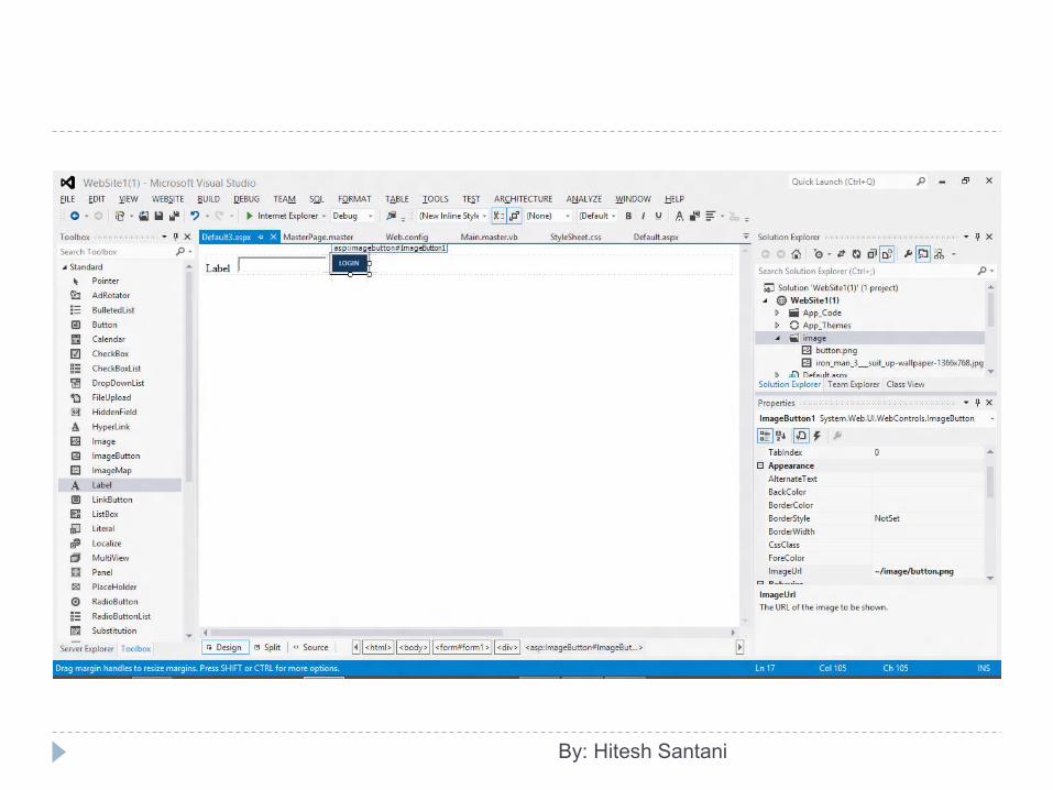
Standard Controls: Image Button Control
The ImageButton control is used to display an image that responds to mouse clicks.
By using the OnClick event handler, you can programmatically determine the coordinates where the image is clicked.
Its ASP.Net tag is <asp:ImageButton /> and HTML tag is <input type=”image” />.
Example: <asp:ImageButton ID="ImageButton1" runat="server" Height="25px"
ImageUrl="~/image/button.png" />
By: Hitesh Santani
By: Hitesh Santani
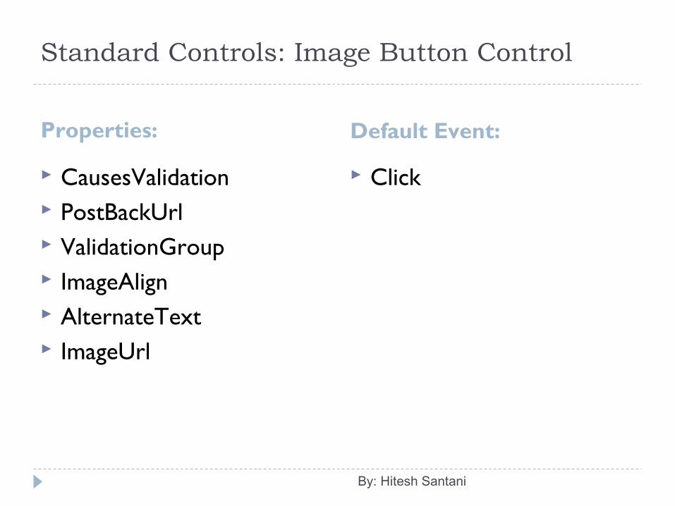
Standard Controls: Image Button Control
Properties: Default Event:
CausesValidation PostBackUrl ValidationGroup ImageAlign AlternateText ImageUrl
Click
By: Hitesh Santani
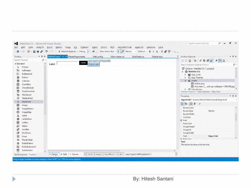
Standard Controls: HyperLink Control
The HyperLink Control is used to create a link to another web page. This control is displayed as text specified by the Text property.
It can also be displayed as an image specified by the ImageUrl property. If both the Text and ImageUrl properties are set, the ImageUrl property takes precedence. If the image is unavailable, the text in the Text property is displayed.
Its ASP.Net tag is <asp:HyperLink /> and HTML tag is <a>...</a>.
Example:<asp:HyperLink ID="HyperLink1" runat="server">HyperLink</asp:HyperLink>
By: Hitesh Santani
By: Hitesh Santani
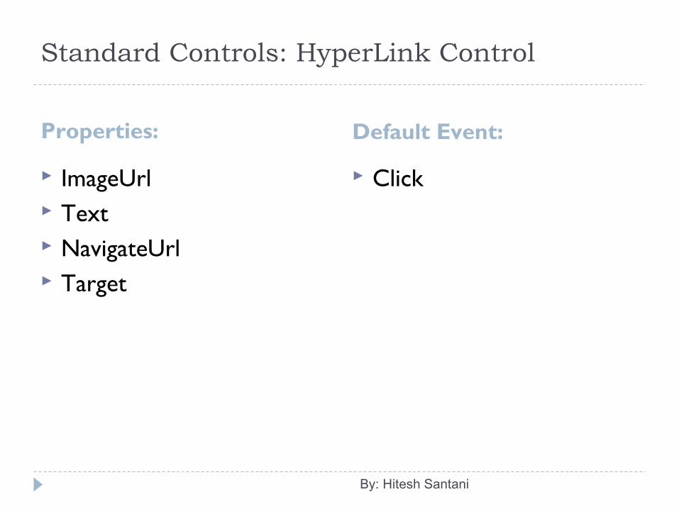
Standard Controls: HyperLink Control
Properties: Default Event:
ImageUrl Text NavigateUrl Target
Click
By: Hitesh Santani
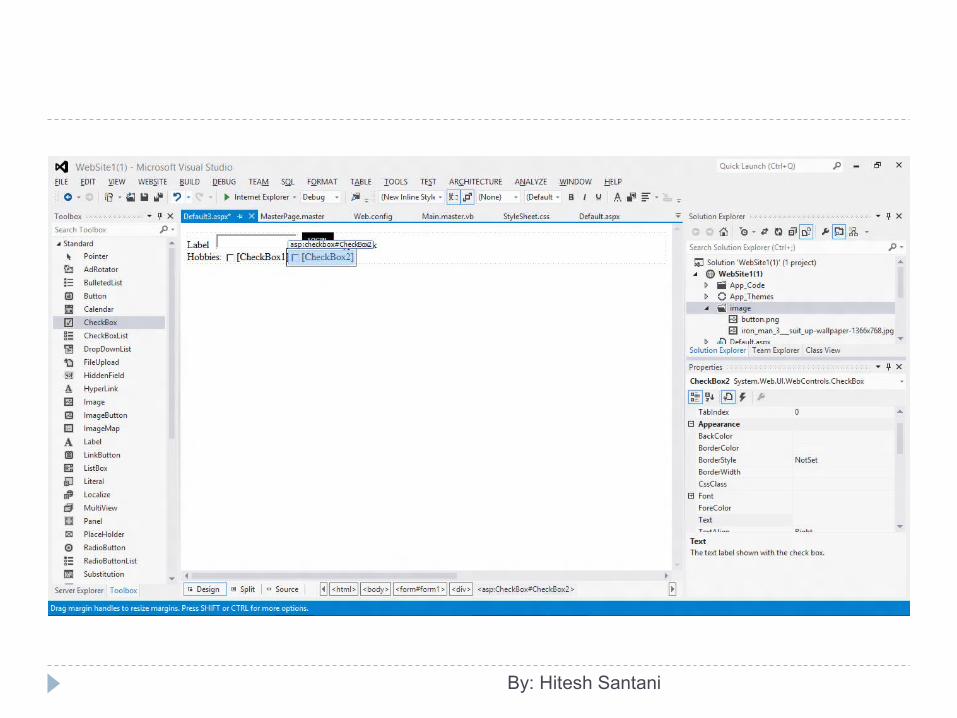
Standard Controls: CheckBox Control The CheckBox control is used to allow user to select
one or more choice from various values. Its ASP.Net tag is <asp:CheckBox /> and HTML tag is
<input type=”checkbox” />. Example:<asp:CheckBox ID="CheckBox1" runat="server"
Text="Reading" />
By: Hitesh Santani
By: Hitesh Santani
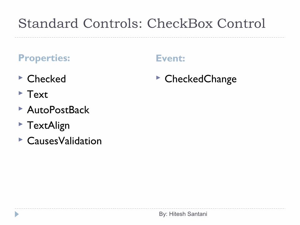
Standard Controls: CheckBox Control
Properties: Event:
Checked Text AutoPostBack TextAlign CausesValidation
CheckedChange
By: Hitesh Santani
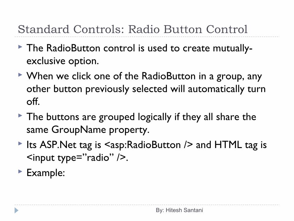
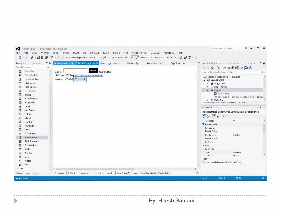
Standard Controls: Radio Button Control
The RadioButton control is used to create mutually-exclusive option.
When we click one of the RadioButton in a group, any other button previously selected will automatically turn off.
The buttons are grouped logically if they all share the same GroupName property.
Its ASP.Net tag is <asp:RadioButton /> and HTML tag is <input type=”radio” />.
Example:
By: Hitesh Santani
By: Hitesh Santani
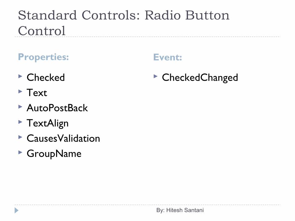
Standard Controls: Radio Button Control
Properties: Event:
Checked Text AutoPostBack TextAlign CausesValidation GroupName
CheckedChanged
By: Hitesh Santani

Standard Controls: List Controls
The list controls generate list boxes, drop-down lists, and other repeating controls that can be either bound to a data source such as a database or programmatically filled with items.
Most of the list controls allow the user to select one or more items.
The items in a List control are stored in the form of ListItem, which is a class. But in ASP.Net, it is considered as a control.
By: Hitesh Santani
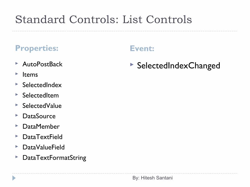
Standard Controls: List Controls
Properties: Event:
AutoPostBack Items SelectedIndex SelectedItem SelectedValue DataSource DataMember DataTextField DataValueField DataTextFormatString
SelectedIndexChanged
By: Hitesh Santani
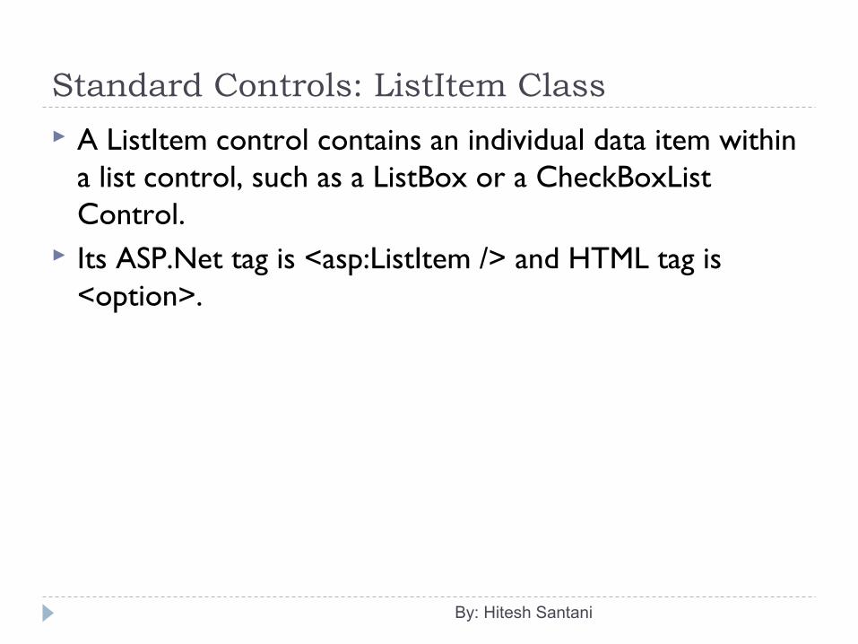
Standard Controls: ListItem Class
A ListItem control contains an individual data item within a list control, such as a ListBox or a CheckBoxList Control.
Its ASP.Net tag is <asp:ListItem /> and HTML tag is <option>.
By: Hitesh Santani
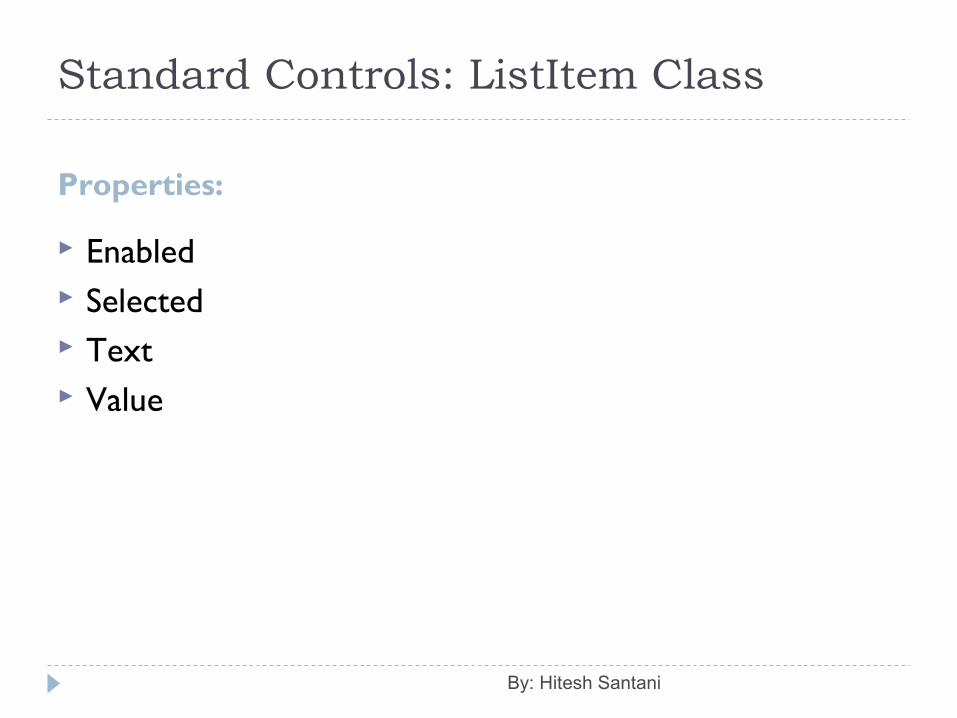
Standard Controls: ListItem Class
Properties:
Enabled Selected Text Value
By: Hitesh Santani
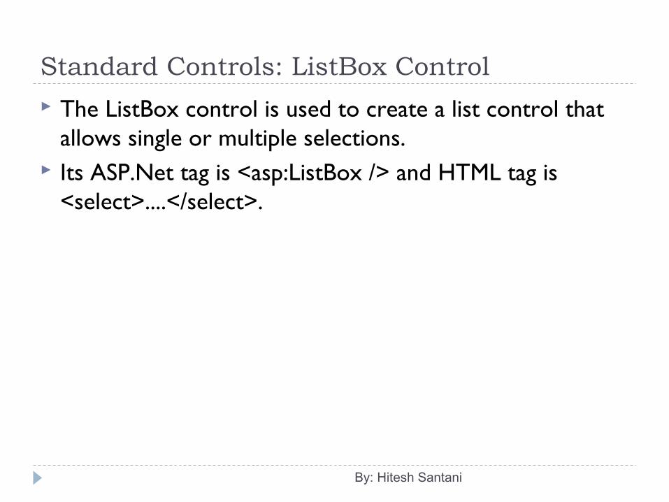
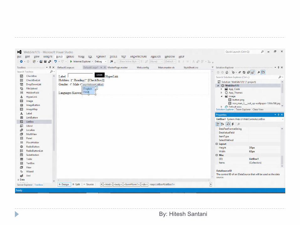
Standard Controls: ListBox Control
The ListBox control is used to create a list control that allows single or multiple selections.
Its ASP.Net tag is <asp:ListBox /> and HTML tag is <select>....</select>.
By: Hitesh Santani
By: Hitesh Santani
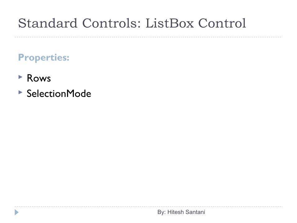
Standard Controls: ListBox Control
Properties:
Rows SelectionMode
By: Hitesh Santani
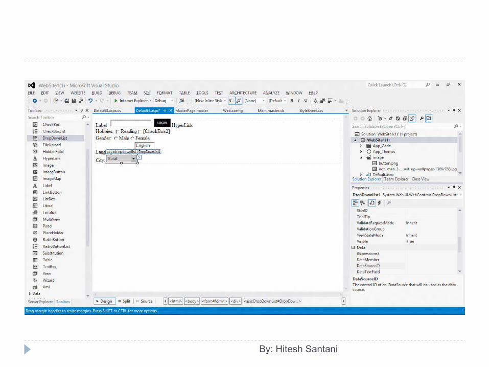
Standard Controls: DropDownList Control
The DropDownList control is used to create a single-selection dropdown list control.
You can set the appearance of the DropDownList control by setting the the BorderColor, BorderStyle and BorderWidth properties.
Its ASP.Net tag is <asp:DropDownList /> and HTML tag is <select>....</select>.
By: Hitesh Santani
By: Hitesh Santani
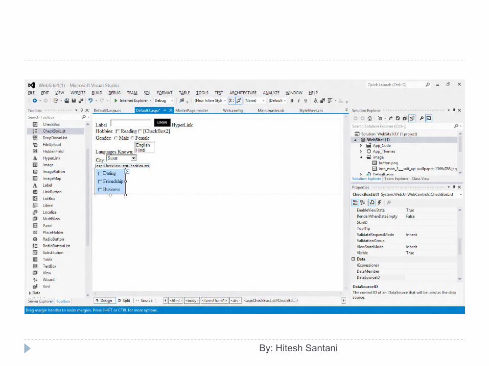
Standard Controls: CheckBoxList Control The CheckBoxList control is used to provide a multi
selection check box group that can also be generated dynamically with data binding.
To check which item is checked, you can use Selected property.
Its ASP.Net tag is <asp:CheckBoxList />.
By: Hitesh Santani
By: Hitesh Santani
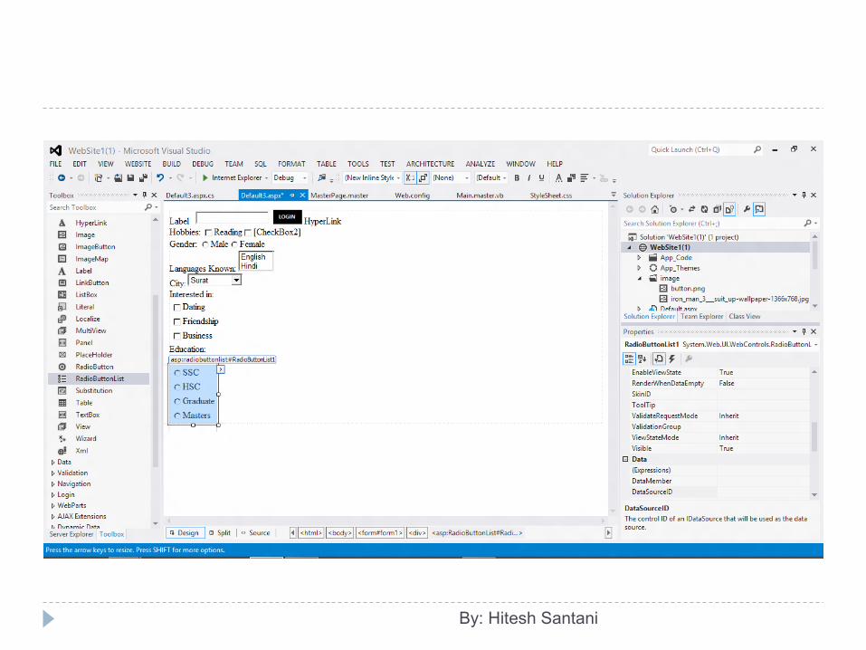
Standard Controls: RadioButtonList Control The RadioButtonList control is used to provide a single-
selection radio button group that can also be generated dynamically with data binding.
To check which item is selected, you can use SelectedItem property.
By: Hitesh Santani
By: Hitesh Santani
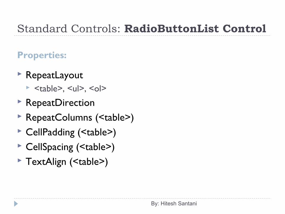
Standard Controls: RadioButtonList Control
Properties:
RepeatLayout <table>, <ul>, <ol>
RepeatDirection RepeatColumns (<table>) CellPadding (<table>) CellSpacing (<table>) TextAlign (<table>)
By: Hitesh Santani
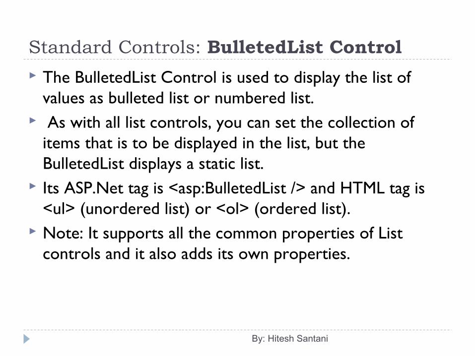
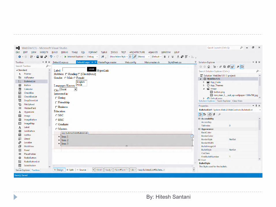
Standard Controls: BulletedList Control The BulletedList Control is used to display the list of
values as bulleted list or numbered list. As with all list controls, you can set the collection of
items that is to be displayed in the list, but the BulletedList displays a static list.
Its ASP.Net tag is <asp:BulletedList /> and HTML tag is <ul> (unordered list) or <ol> (ordered list).
Note: It supports all the common properties of List controls and it also adds its own properties.
By: Hitesh Santani
By: Hitesh Santani
Standard Controls: BulletedList Control
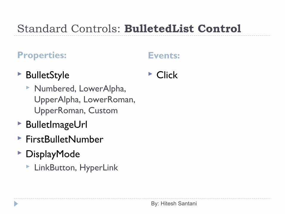
Properties:
BulletStyle Numbered, LowerAlpha,
UpperAlpha, LowerRoman, UpperRoman, Custom
BulletImageUrl FirstBulletNumber DisplayMode
LinkButton, HyperLink
By: Hitesh Santani
Events:
Click
Standard Controls: Literal Control The Literal control is used to reserve a location on the
web page to display text. The Literal control is similar to the Label control except
the Literal control does not allow you to apply a style to the displayed text.
Its ASP.Net tag is <asp:Literal />. Properties:
Text
By: Hitesh Santani

Standard Controls: Image Control The Image control is used to display any valid image
supported by the requesting browser on the web page. Its ASP.Net tag is <asp:Image/> and HTML tag is <img />. Properties
AlternateText ImageAlign ImageUrl DescriptionUrl
By: Hitesh Santani
Standard Controls: ImageMap Control The ImageMap control is used to create an image that
contains hot spot regions. When a user clicks on hot spot region, the control can
either generate a postback to the server or navigate to a specified URL.
Its ASP.Net tag is <asp:ImageMap /> and HTML tag is <map>.
You can also specify one hot spot region to navigate to a URL and another hot spot region to post back to the server.
ImageMap control supports all the properties of Image control and it has its own set of properties as well.
By: Hitesh Santani
Standard Controls: ImageMap Control
Properties:
HotSpots (collection of HotSpot objects) CircleHotSpot (Properties:
Radius, X, Y) RectangleHotSpot (Properties:
Top, Right, Bottom, Left) PolygonHotSpot (Properties:
Cooridnates) HotSpotMode (Navigate or
Postback or Inactive)
By: Hitesh Santani
Events:
Click
Standard Controls: FileUpload Control The FileUpload control is used to display a textbox
control and a browse button which enable users to select a file on the client and upload it to the web server.
You can specify the file to upload by entering the full path of the local computer in the text box of the control.
You can also select the file by clicking and Browse button and then selecting the file in the Select File dialog box.
Its ASP.Net tag is <asp:FileUpload /> and HTML tag is <input type=”file”>.
By: Hitesh Santani
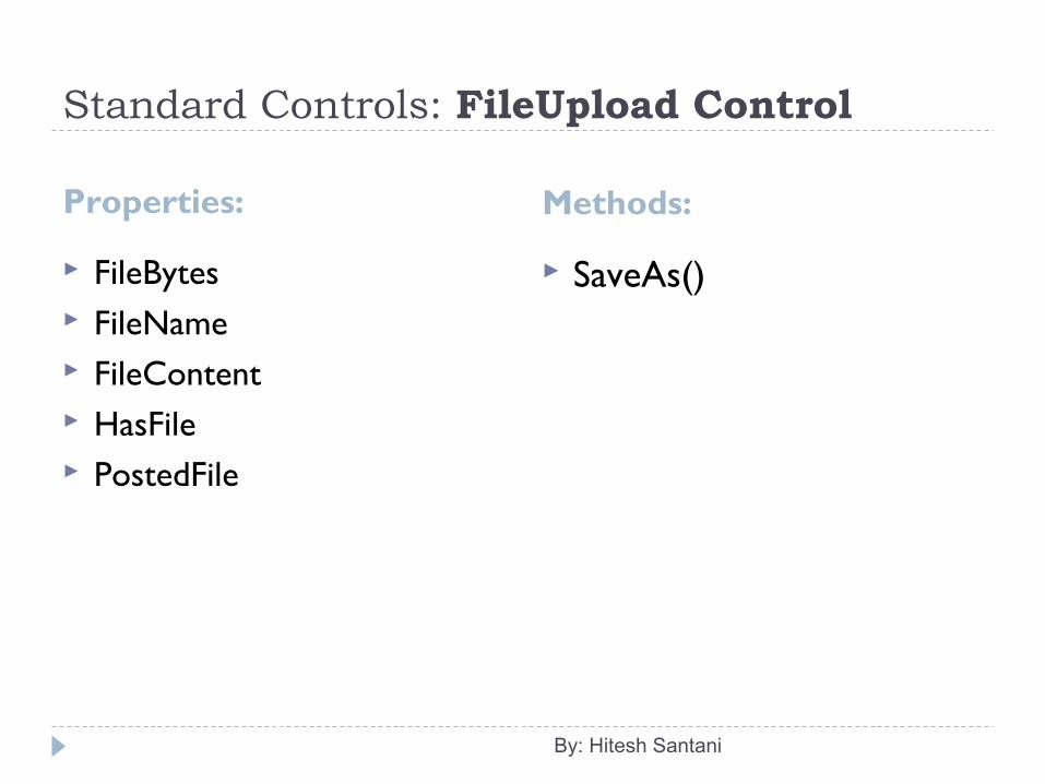
Standard Controls: FileUpload Control
Properties:
FileBytes FileName FileContent HasFile PostedFile
By: Hitesh Santani
Methods:
SaveAs()
Standard Controls: Panel Control The Panel control is used as a container for other
controls. It is useful when you want to generate controls
programmatically, or hide/show a group of controls. Its ASP.Net tag is <asp:Panel> and HTML tag is
<div>...</div>.
By: Hitesh Santani
Standard Controls: Panel Control
Properties:
BackImageUrl Direction GroupingText HorizontalAlign Scrollbars Wrap
By: Hitesh Santani
Standard Controls: PlaceHolder Control The PlaceHolder control is used as a container to store
server controls that are dynamically added to the web page.
It just holds the place on the page. It does not give any visible output.
You can use the Control.Controls collection to add or remove a control in the PlaceHolder control.
It doesn’t have a specific property. Its ASP.Net tag is <asp:PlaceHolder />.
By: Hitesh Santani
Standard Controls: MultiView Control The MultiView control is used as a container for a group of
View controls. It allows you to define a group of View controls, where each
View control contains child controls. You can also use the MultiView control to create wizards. Only one View control at a time can be defined as an active
view within the MultiView control. When a View control is defined as the active view, the child
controls that it contains are rendered to the client. You can also use SetActiveView() method to set the active
View at runtime. Its ASP.Net tag is <asp:MultiView /> and <asp:View />.
By: Hitesh Santani
Standard Controls: MultiView Control
Properties:
ActiveViewIndex Views
By: Hitesh Santani
ActiveViewChanged
Events:
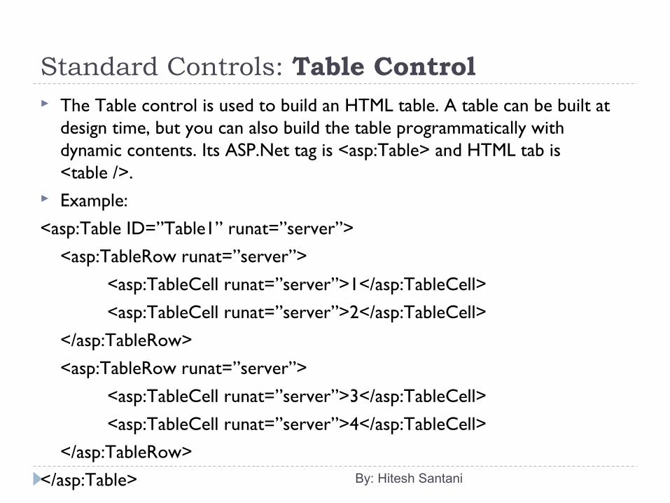
Standard Controls: Table Control The Table control is used to build an HTML table. A table can be built at
design time, but you can also build the table programmatically with dynamic contents. Its ASP.Net tag is <asp:Table> and HTML tab is <table />.
Example:
<asp:Table ID=”Table1” runat=”server”>
<asp:TableRow runat=”server”>
<asp:TableCell runat=”server”>1</asp:TableCell>
<asp:TableCell runat=”server”>2</asp:TableCell>
</asp:TableRow>
<asp:TableRow runat=”server”>
<asp:TableCell runat=”server”>3</asp:TableCell>
<asp:TableCell runat=”server”>4</asp:TableCell>
</asp:TableRow></asp:Table> By: Hitesh Santani
Standard Controls: Table Control
Properties:
HorizontalAlignment Rows GridLines
By: Hitesh Santani
Standard Controls: TableRow Class The TableRow class is used to represent a row in the Table
control. This class allows you to control how the contents of the row are displayed.
Its ASP.Net tag is <asp:TableRow /> and HTML tag is <tr />. Properties:
HorizontalAlignment: It gets or sets the horizontal alignment of the Table control on the page.
VerticalAlignment: It gets or sets the vertical alignment of the contents in the row.
By: Hitesh Santani
Standard Controls: TableCell Class The TableCell class is used to represent a cell in a Table control. The
TableCell class allows you to control how the contents of the cell are displayed. Its ASP.Net tag is <asp:TableCell /> and HTML tag is <td />.
Properties: HorizontalAlignment: It gets or sets the horizontal alignment of the
Table control on the page. VerticalAlignment: It gets or sets the vertical alignment of the contents
in the row. Text: It gets or sets the text contents of the cell. Wrap: It gets or sets a value that indicates whether the contents of the
cell can be wrapped or not. RowSpan: It gets or sets the number of rows in the Table control that
the cell spans. ColumnSpan: It gets or sets the number of columns in the Table control
that the cell spans.By: Hitesh Santani
Rich Controls Rich controls are web controls which have complex user
interface elements. It renders itself with a complex sequence of HTML elements
and may even use client-side javascript. There are two Rich Controls:
Calendar Control AdRotator Control
By: Hitesh Santani
Rich Controls: Calendar Control The Calendar control is used to create a rich functionality and
good looking calendar that shows one month at a time. The user can move from month to month, select a date and
even select a range of days. Its ASP.Net tag is <asp:Calendar />.
By: Hitesh Santani
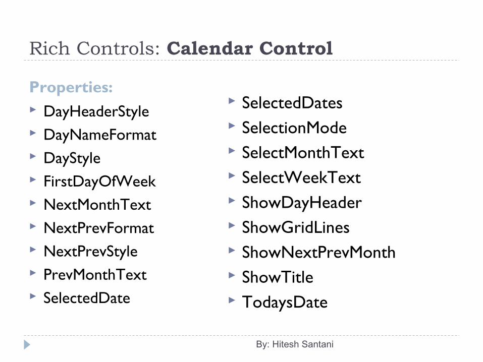
Rich Controls: Calendar Control
Properties: DayHeaderStyle DayNameFormat DayStyle FirstDayOfWeek NextMonthText NextPrevFormat NextPrevStyle PrevMonthText SelectedDate
By: Hitesh Santani
SelectedDates SelectionMode SelectMonthText SelectWeekText ShowDayHeader ShowGridLines ShowNextPrevMonth ShowTitle TodaysDate
Rich Controls: Calendar Control
Events: SelectionChanged
By: Hitesh Santani
Rich Controls: AdRotator Control The AdRotator control is used to randomly select the banner
from the list that is specified in the external XML file. Before using AdRotator control, you need to create the XML
file. Its ASP.Net tag is <asp:AdRotator />.
By: Hitesh Santani
Rich Controls: AdRotator Control
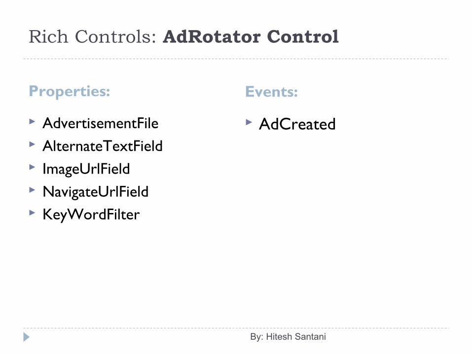
Properties: Events:
AdvertisementFile AlternateTextField ImageUrlField NavigateUrlField KeyWordFilter
AdCreated
By: Hitesh Santani
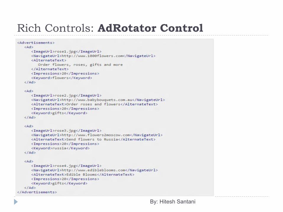
Rich Controls: AdRotator Control Steps to create the XML file for the adRotator control.
Right click on the Website in the Solution Explorer. Select Add New Item from the Popup menu. Select XML File Template from the wizard. Give appropriate name and click on Add button. Now, write down ad information that you want to provide to the
AdRotator control.
By: Hitesh Santani
Rich Controls: AdRotator Control Following are the elements of XML file used for storing
information of advertisements: ImageUrl: The absolute or relative path of the image. NavigateUrl: The URL of a page to link to if the user clicks the ad. AlternateText: The text displayed in place of the image when the
image specified by the ImageUrl property is not available. Keyword: A category for the advertisement, so you can filter. Impressions: A number that indicates the importance of the ad. The
larger the number, the more often the ad is displayed.
By: Hitesh Santani
Rich Controls: AdRotator Control
By: Hitesh Santani
Validation Controls These controls allow you to validate an input control against
several standard or user-defined rules. If validation fails, you can prevent page processing or allow
these controls to show error messages in the page. In Visual Studio, these controls are found in the Validation tab
of the toolbox.
By: Hitesh Santani
Validation Controls: BaseValidator Class The BaseValidator class provides the core implementation for
all validation controls. Validation controls are used to validate user input in an
associated input control. When the user enters a value that does not match the
validation criteria, the validation control displays an error message.
Because a validation control is separated from the input control, you can position the error message anywhere on the page relative to the input control.
ASP.Net provides several validation controls that perform specific types of validation.
By: Hitesh Santani
Validation Controls: BaseValidator Class
Properties:
ControlToValidate ErrorMessage Text Display IsValid SetFocusOnError PropertiesValid ValidationGroup ValidationEmptyText
All validation controls except ValidationSummary control inherits all the common properties of BaseValidator class.
By: Hitesh Santani
Validation Controls: RequiredFieldValidator The RequiredFieldValidator control is used to make an input
control a required/compulsory field. It checks whether the control is empty or not when the form
is submitted. Multiple validators can also be associated with the same input
control. Properties:
InitialValue: It gets or sets the initial value of the field.
By: Hitesh Santani
Validation Controls: RangeValidator The RangeValidator control is used to test whether the value
of an input control is within specified range or not. Properties:
MinimumValue: It gets or sets the minimum value of the validation range.
MaximumValue: It gets or sets the maximum value of the validation range.
Type: It gets or sets the data type that the values being compared are converted to begore the comparison is made. Data types supported are String, Integer, Double, Date, Currency.
By: Hitesh Santani
Validation Controls: CompareValidator The CompareValidator control is used to compare the value entered by
the user in an input control, such as a TextBox control, with the value entered in another input control or a constant value.
The CompareValidtor control passes validation if the value of the input control matches the criteria.
Properties: ControlToValidate: It gets or sets the input control to compare with
the input control being validated. ValueToCompare: It gets or sets a constant value to compare with the
value entered by the user in the input control being validated. Operator: It gets or sets the comparison operation to perform. Type: It gets or sets the data type that the values being compared are
converted to before the comparison is made. Data types supported are String, Integer, Double, Date and Currencey.
By: Hitesh Santani
Validation Controls: RegularExpressionValidator
The RegularExpression Validator control is used to check whether the value of an input control matches a pattern defined by a regular expression.
This type of validation allows you to check email addresses, telephone numbers and postal codes.
Properties: ValidationExpression: It gets or sets the regular expression that
determines the pattern used to validate a field. There are various predefined expressions available, so you can also use them.
By: Hitesh Santani
Validation Controls: ValidationSummary The ValidationSummary control is used to summarize the
error messages from all validators on a web page in a single location. You can also summarize the error messages from particular group of validators using ValidationSummary.
Properties: DisplayMode: It gets or sets the display mode of the validation
summary (List, BulletList, SingleParagraph). ShowSummary: It gets or sets a value indicating whether the
validation summary is displayed or not. ShowMessageBox: It gets or sets a value indicating whether the
validation summary is displayed in a message box or not.
By: Hitesh Santani
Validation Controls: CustomValidator The CustomValidator control is used to provide a user-
defined validation function for an input control. Validation controls always perform validation on the server.
They also have complete client-side implementation that allows script-enabled browsers to perform validation on the client.
To create a server-side validation function, you need to provide a handler for the ServerValidate event that performs the validation.
The value of the input control that is to be validated can be accessed by using the Value property of the ServerValidateEventArgs object passed into the event handler as a parameter.
By: Hitesh Santani
Validation Controls: CustomValidator The result of the validation is then stored in the IsValid
property of the ServerValidateEventArgs object. To create a client-side validation function, first add the server-
side validation function. Next, add the client-side validation script function to the ASP.Net page (.aspx).
Properties: ClientValidationFunction: It gets or sets the name of the client script
validation function. Default Event – ServerValidate
By: Hitesh Santani
Navigation Controls Navigation is the fundamental component of any website.
Navigation controls allow you to design and display site maps and also allow the user to navigate from one page to another.
By: Hitesh Santani
Navigation Controls: SiteMapPathControl The SiteMapPath Control is used for defining the navigation
structure of the website. You can bind this control to TreeView and Menu controls. It
is made of Nodes(root, parent, current). Its ASP.Net tag is <asp:SiteMapPath />.
By: Hitesh Santani
Navigation Controls: SiteMapPathControl
Properties:
PathDirection PathSeperator SiteMapProvider RootNodeStyle CurrentNodeStyle NodeStyle
By: Hitesh Santani
Navigation Controls: Web.sitemap File You need web.sitemap file to create a Site Map for the
website. When you add the web.sitemap file to your website, it
automatically gets attached with the SiteMapPath control. To add a web.sitemap file in your website, follow the below
given steps: Right click on the website in Solution Explorer. Select Add New Item. Select Site Map template from the wizard. Give appropriate name. Click on Add button.
By: Hitesh Santani
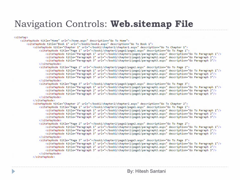
Navigation Controls: Web.sitemap File The web.sitemap file contains <siteMap> and <siteMapNode>
tags in it. You can define the site map with <siteMapNode>. The site map file must contain <siteMap> node. The
<siteMap> tag can only have one <siteMapNode> child node. Each <siteMapNode> can have several child nodes. Each
<siteMapNode> has attributes defining page title and URL.
By: Hitesh Santani
Navigation Controls: Web.sitemap File
By: Hitesh Santani
Navigation Controls: TreeView Control The TreeView control is used to display hierarchical data,
such as a table of contents or file directory or sitemap links, in a tree structure.
It supports data binding that allows the nodes of the control to be bound to XML, tabular or relational data.
It also provides site navigation through integration with the SiteMapDataSource control.
The Node text of the TreeView control can be displayed as either plain text or hyperlinks and can also have check box next to each node.
Its ASP.Net tag is <asp:TreeView />.
By: Hitesh Santani
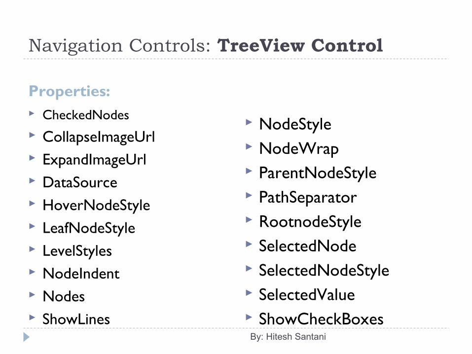
Navigation Controls: TreeView Control
Properties: CheckedNodes CollapseImageUrl ExpandImageUrl DataSource HoverNodeStyle LeafNodeStyle LevelStyles NodeIndent Nodes ShowLines
NodeStyle NodeWrap ParentNodeStyle PathSeparator RootnodeStyle SelectedNode SelectedNodeStyle SelectedValue ShowCheckBoxes
By: Hitesh Santani
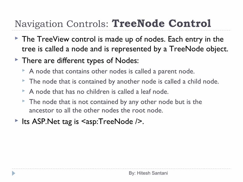
Navigation Controls: TreeNode Control The TreeView control is made up of nodes. Each entry in the
tree is called a node and is represented by a TreeNode object. There are different types of Nodes:
A node that contains other nodes is called a parent node. The node that is contained by another node is called a child node. A node that has no children is called a leaf node. The node that is not contained by any other node but is the
ancestor to all the other nodes the root node. Its ASP.Net tag is <asp:TreeNode />.
By: Hitesh Santani
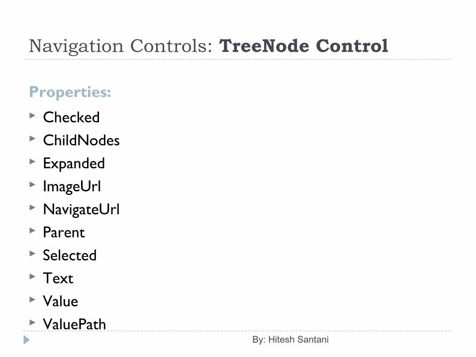
Navigation Controls: TreeNode Control
Properties: Checked ChildNodes Expanded ImageUrl NavigateUrl Parent Selected Text Value ValuePath
By: Hitesh Santani
Navigation Controls: Menu Control The Menu control is used to display a menu in a Web Forms
page. It can also be used with SiteMapDataSource control for
navigating a web site. It supports dynamically creation of the menus, customizable
appearance, and data bindings. When the user clicks a menu item, it can either navigate to a
linked web page or simply post back to the server. Its ASP.Net tag is <asp:Menu />. You can also set a data source in the Menu control by
selecting <New Data Source> Option.
By: Hitesh Santani
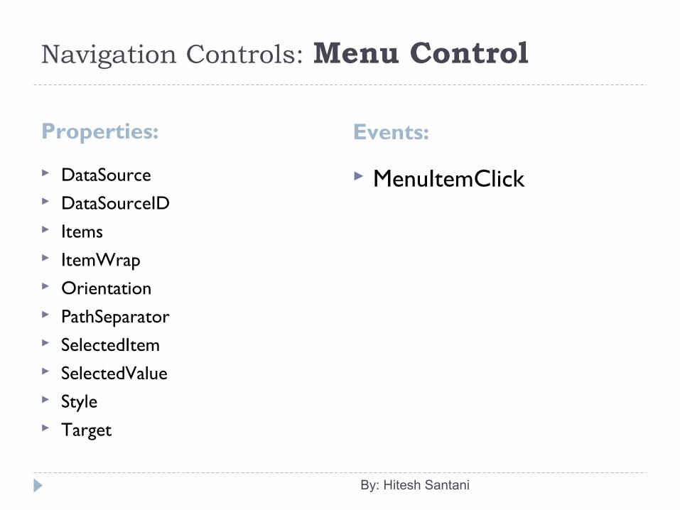
Navigation Controls: Menu Control
Properties: Events:
DataSource DataSourceID Items ItemWrap Orientation PathSeparator SelectedItem SelectedValue Style Target
MenuItemClick
By: Hitesh Santani
Navigation Controls: MenuItem Object The Menu control is made up of items. It is represented by
MenuItem object. Its ASP.net tag is <asp:MenuItems />.
By: Hitesh Santani
Navigation Controls: MenuItem Object
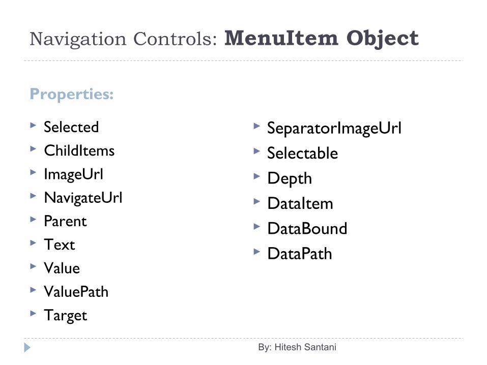
Properties:
Selected ChildItems ImageUrl NavigateUrl Parent Text Value ValuePath Target
SeparatorImageUrl Selectable Depth DataItem DataBound DataPath
By: Hitesh Santani
Login Controls These controls support an ASP.Net model for authenticating
users against a database and tracking their status. The model is called forms authentication. They are available in Login Controls tab in the ToolBox.
When you use built-in Login Controls, they use ASPNETDB.mdf database which is automatically created with the default tables.
By: Hitesh Santani
Login Controls: Login Control The Login control is used to display a user interface for user
authentication. It contains text boxes for the username and password and a
checkbox. A check box allows users to indicate whether user want the server
to store their identity using ASP.Net membership and will be automatically authenticated next time when the user visit the same site.
If you use the Login control with ASP.Net membership, you do not need to write code to perform authentication.
But, if you want to create your own authentication logic, you can handle the Login control’s Authenticate event and add custom authentication code.
Its default event is Authenticate(). Its ASP.Net tag is <asp:Login />.By: Hitesh Santani
Login Controls: Login Control Its default event is Authenticate(). When the user logged into the web site and has been
authenticated then LoggedIn() event is fired. When the login error is detected, LogginError() event is fired.
By: Hitesh Santani
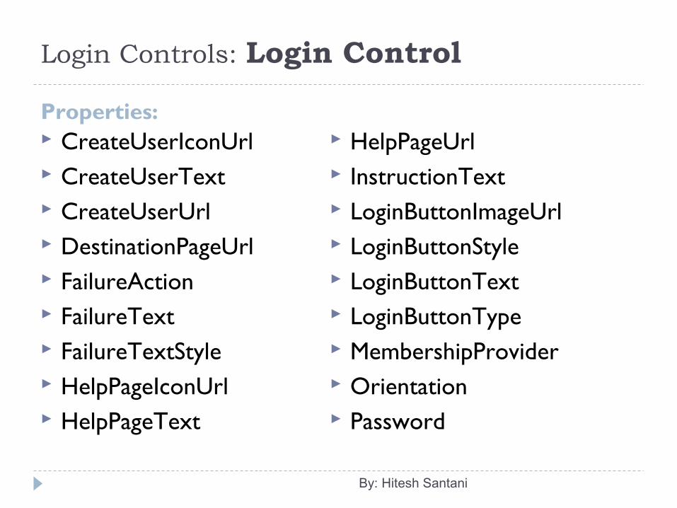
Login Controls: Login Control
Properties: CreateUserIconUrl CreateUserText CreateUserUrl DestinationPageUrl FailureAction FailureText FailureTextStyle HelpPageIconUrl HelpPageText
HelpPageUrl InstructionText LoginButtonImageUrl LoginButtonStyle LoginButtonText LoginButtonType MembershipProvider Orientation Password
By: Hitesh Santani
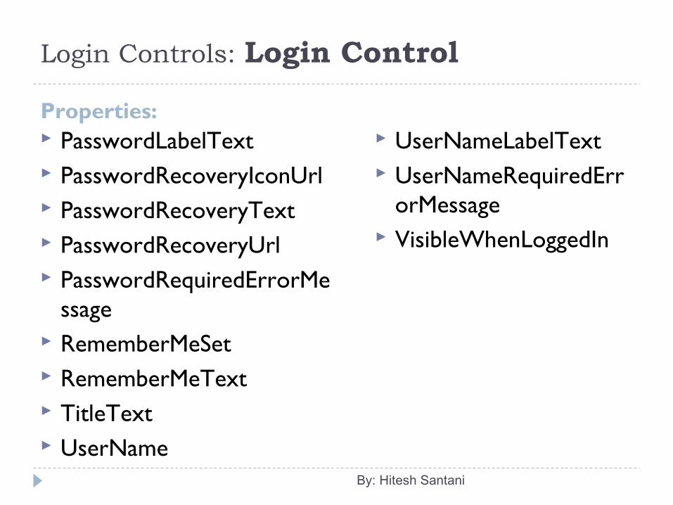
Login Controls: Login Control
Properties: PasswordLabelText PasswordRecoveryIconUrl PasswordRecoveryText PasswordRecoveryUrl PasswordRequiredErrorMe
ssage RememberMeSet RememberMeText TitleText UserName
UserNameLabelText UserNameRequiredErr
orMessage VisibleWhenLoggedIn
By: Hitesh Santani
Login Controls: LoginStatus Control The LoginStatus control is used to display a login link for users
who are not authenticated and a logout link for users who are authenticated.
The login link takes the user to a login page and logout link resets the current user’s identity to an anonymous user.
Its ASP.Net tag is <asp:LoginStatus />.
By: Hitesh Santani
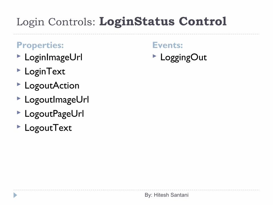
Login Controls: LoginStatus Control
Properties: LoginImageUrl LoginText LogoutAction LogoutImageUrl LogoutPageUrl LogoutText
LoggingOut
By: Hitesh Santani
Events:
Login Controls: LoginView Control The LoginView control is used to display different information
to anonymous and logged-in users. The control displays one of the two templates: The
Anonymous Template or the LoggedInTemplate. You can design these templates by adding markup and
controls that display information appropriate for anonymous and authenticated users.
Its ASP.Net tag is <asp:LoginView />.
By: Hitesh Santani
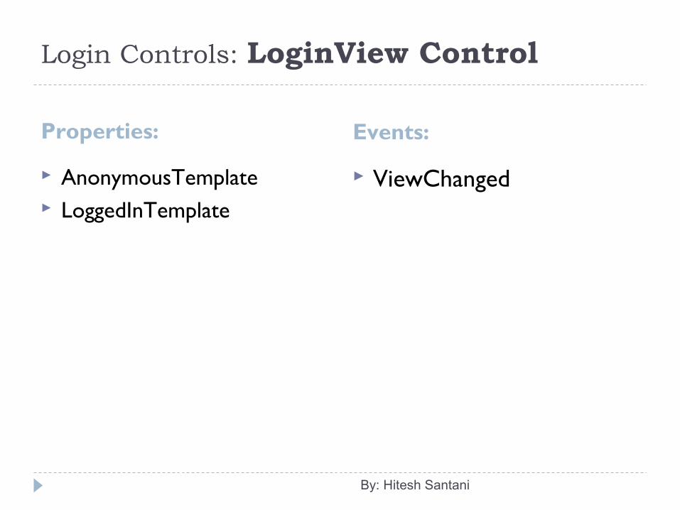
Login Controls: LoginView Control
Properties: Events:
AnonymousTemplate LoggedInTemplate
ViewChanged
By: Hitesh Santani
Login Controls: LoginName Control The LoginName control is used to display a user’s login name
if the user has logged in using ASP.Net membership. Alternatively, if your site uses integrated Windows
authentication, the control displays the user’s Windows account name.
It means that, it displays the name contained in the User property of the page.
Its ASP.Net tag is <asp:LoginName />. Properties:
FormatString: It provides a string containing the format item for displaying user name.
By: Hitesh Santani
Login Controls: PasswordRecovery Control The PasswordRecovery control is used to retrieve the user
password based on the e-mail address that was used when the account was created.
It sends an email message containing a password to the user. You can configure ASP.Net membership to store passwords
using non-reversible encryption. In that case, the PasswordRecovery control generates a new
password instead of sending the original password to the user. You can also configure membership to include a security
question that the user must answer to recover a password.
By: Hitesh Santani
Login Controls: PasswordRecovery Control If you do, PasswordRecovery control asks the question and
checks the answer before recovering the password. The PasswordRecovery control requires that your application
can forward email message to a SMTP server. In short, it assists the users who have forgotten their
passwords. Its ASP.Net tag is <asp:LoginName />.
By: Hitesh Santani
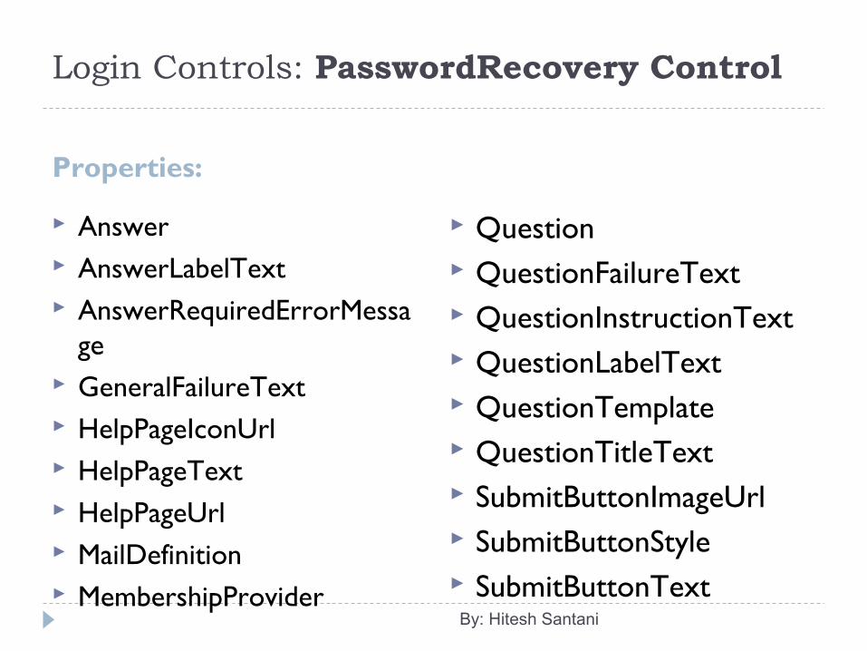
Login Controls: PasswordRecovery Control
Properties:
Answer AnswerLabelText AnswerRequiredErrorMessa
ge GeneralFailureText HelpPageIconUrl HelpPageText HelpPageUrl MailDefinition MembershipProvider
Question QuestionFailureText QuestionInstructionText QuestionLabelText QuestionTemplate QuestionTitleText SubmitButtonImageUrl SubmitButtonStyle SubmitButtonText
By: Hitesh Santani
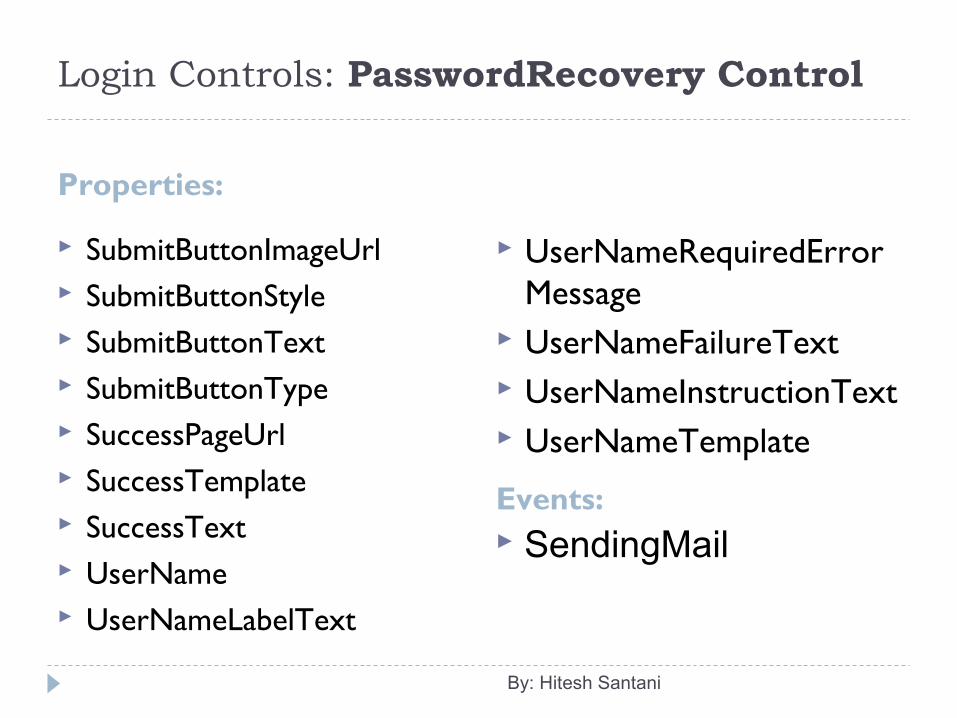
Login Controls: PasswordRecovery Control
Properties:
Events:
SubmitButtonImageUrl SubmitButtonStyle SubmitButtonText SubmitButtonType SuccessPageUrl SuccessTemplate SuccessText UserName UserNameLabelText
UserNameRequiredErrorMessage
UserNameFailureText UserNameInstructionText UserNameTemplate
By: Hitesh Santani
SendingMail
Login Controls: ChangePassword Control The ChangePassword control is used to allow the users to
change their password. It simply queries the user name as well as the old password
from the user. Then it requires the user to enter the new password and
confirm the new password. If the user is already logged on, the control automatically hides
the text box for the user name and uses the name of the authenticated user.
The control also includes support for sending an email message about the new password.
It is made up of two template views that are displayed to the user.
By: Hitesh Santani
Login Controls: ChangePassword Control The first is the ChangePasswordTemplate which displays the
user interface used to gather the data required to change the user password.
The second template is the Success Template, which defines the user interface that is displayed after a user password has been successfully changed.
Its ASP.Net tag is <asp:ChangePassword />.
By: Hitesh Santani
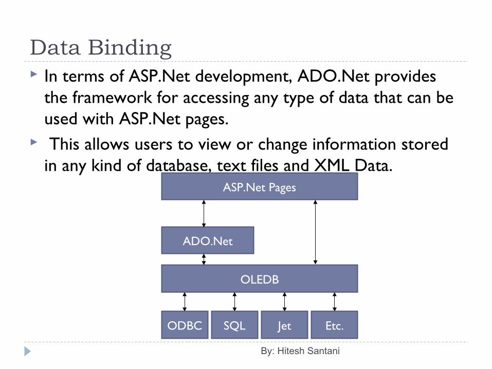
Data Binding In terms of ASP.Net development, ADO.Net provides
the framework for accessing any type of data that can be used with ASP.Net pages.
This allows users to view or change information stored in any kind of database, text files and XML Data.
By: Hitesh Santani
ASP.Net Pages
ADO.Net
OLEDB
ODBC SQL Jet Etc.
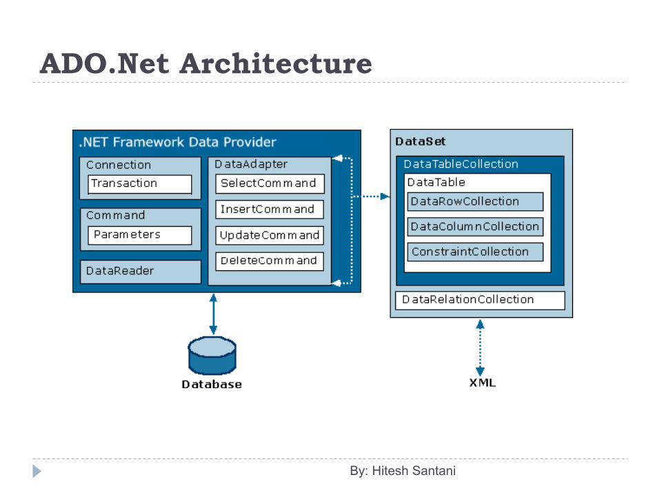
ADO.Net Architecture
By: Hitesh Santani
The data access with ADO.Net consists of two parts: Data Provider DataSet
ADO.Net allows us to interact with different types of data sources and different types of data bases. There are many set of classes that allow you to access different types of databases.
By: Hitesh Santani
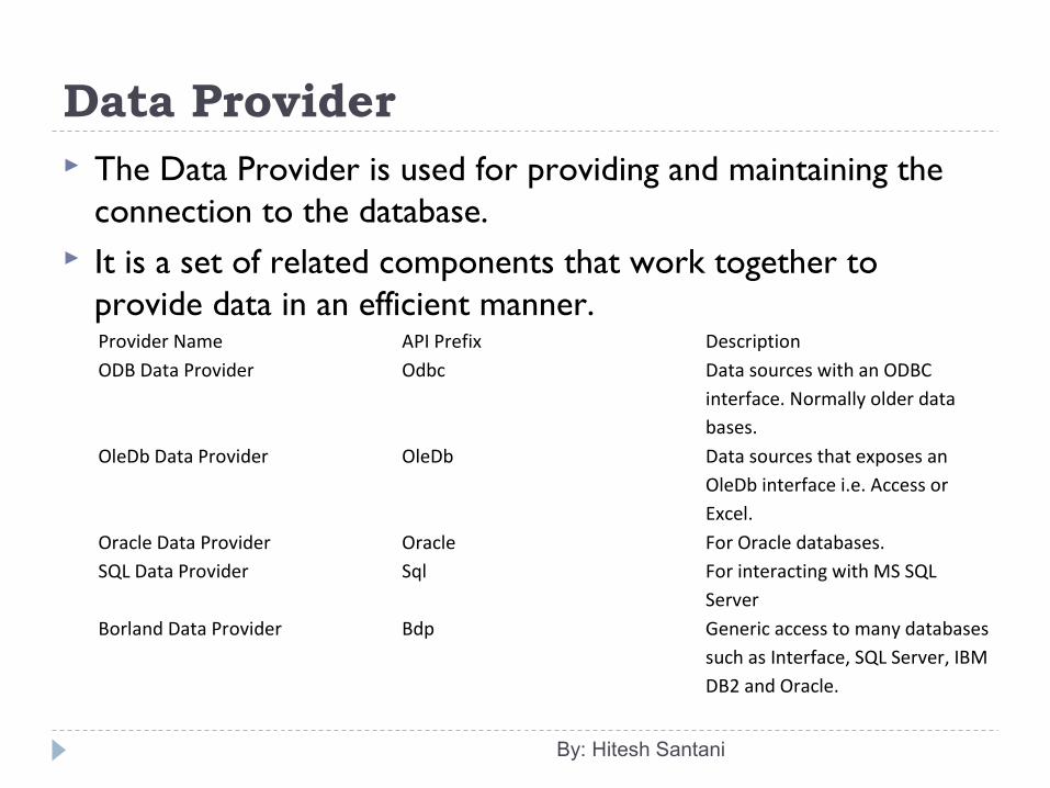
Data Provider The Data Provider is used for providing and maintaining the
connection to the database. It is a set of related components that work together to
provide data in an efficient manner.
By: Hitesh Santani
Provider Name API Prefix DescriptionODB Data Provider Odbc Data sources with an ODBC
interface. Normally older data bases.
OleDb Data Provider OleDb Data sources that exposes an OleDb interface i.e. Access or Excel.
Oracle Data Provider Oracle For Oracle databases.SQL Data Provider Sql For interacting with MS SQL
ServerBorland Data Provider Bdp Generic access to many databases
such as Interface, SQL Server, IBM DB2 and Oracle.
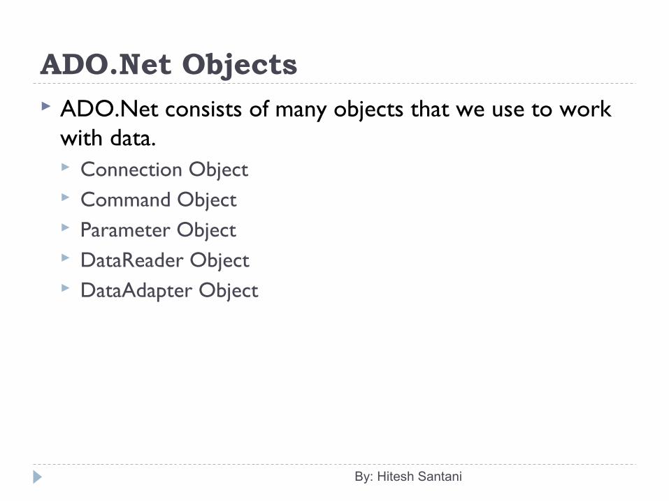
ADO.Net Objects ADO.Net consists of many objects that we use to work
with data. Connection Object Command Object Parameter Object DataReader Object DataAdapter Object
By: Hitesh Santani
Connection Object To establish connection with a database, you must have
an object. The connection helps to identify the database server, the
database name, user name, password and other parameters that are required for connecting to the database.
Connection String: A string that specifies information about a data source and the means of connecting to it, is called Connection String. It is passed in code to underlying driver or provider in order to initiate the connection.
By: Hitesh Santani
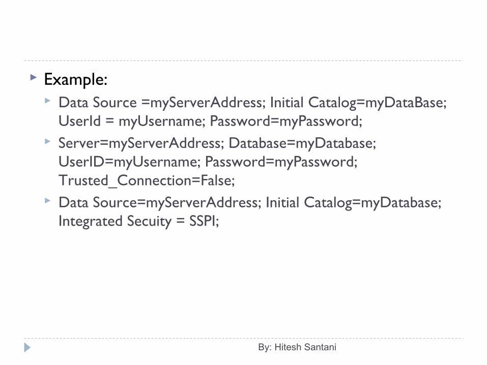
Example: Data Source =myServerAddress; Initial Catalog=myDataBase;
UserId = myUsername; Password=myPassword; Server=myServerAddress; Database=myDatabase;
UserID=myUsername; Password=myPassword; Trusted_Connection=False;
Data Source=myServerAddress; Initial Catalog=myDatabase; Integrated Secuity = SSPI;
By: Hitesh Santani
SqlConnection Class The purpose of creating a SqlConnection object is that
you can connect to SQL Server database. Other ADO.Net objects such as a SqlCommand and a
SqlDataAdapter use a connection object as a parameter. The sequence of operations that occurs with SqlConnection is as follows: Instantiate the SqlConnection. Open the connection. Pass the connection to other ADO.Net objects. Perform database operations with the other ADO.Net
objects. Close the connection.
By: Hitesh Santani
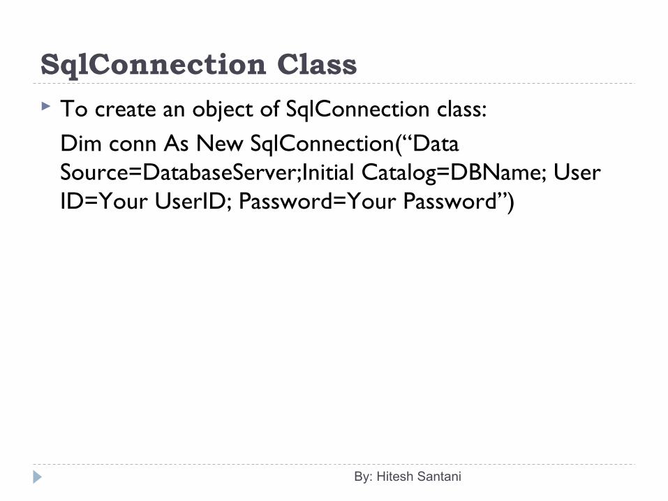
SqlConnection Class To create an object of SqlConnection class:
Dim conn As New SqlConnection(“Data Source=DatabaseServer;Initial Catalog=DBName; User ID=Your UserID; Password=Your Password”)
By: Hitesh Santani
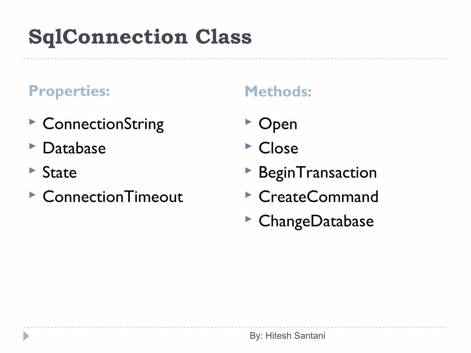
SqlConnection Class
Properties: Methods:
ConnectionString Database State ConnectionTimeout
Open Close BeginTransaction CreateCommand ChangeDatabase
By: Hitesh Santani
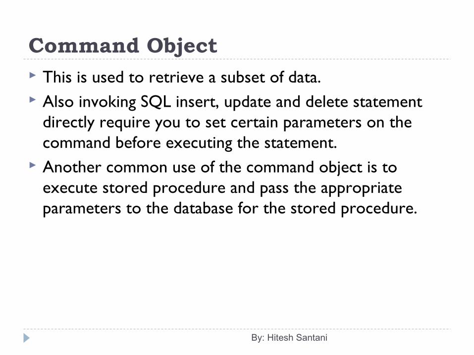
Command Object This is used to retrieve a subset of data. Also invoking SQL insert, update and delete statement
directly require you to set certain parameters on the command before executing the statement.
Another common use of the command object is to execute stored procedure and pass the appropriate parameters to the database for the stored procedure.
By: Hitesh Santani
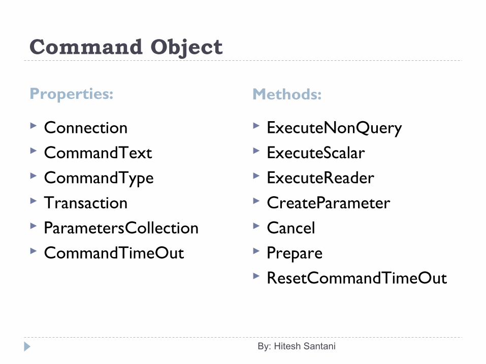
Command Object
Properties: Methods:
Connection CommandText CommandType Transaction ParametersCollection CommandTimeOut
ExecuteNonQuery ExecuteScalar ExecuteReader CreateParameter Cancel Prepare ResetCommandTimeOut
By: Hitesh Santani
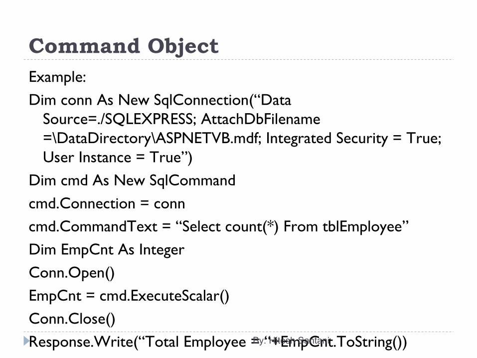
Command ObjectExample:Dim conn As New SqlConnection(“Data
Source=./SQLEXPRESS; AttachDbFilename =\DataDirectory\ASPNETVB.mdf; Integrated Security = True; User Instance = True”)
Dim cmd As New SqlCommandcmd.Connection = conncmd.CommandText = “Select count(*) From tblEmployee”Dim EmpCnt As IntegerConn.Open()EmpCnt = cmd.ExecuteScalar()Conn.Close()Response.Write(“Total Employee = “+EmpCnt.ToString())By: Hitesh Santani
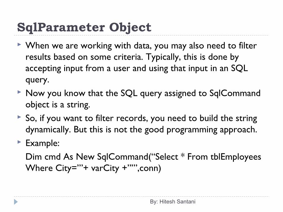
SqlParameter Object When we are working with data, you may also need to filter
results based on some criteria. Typically, this is done by accepting input from a user and using that input in an SQL query.
Now you know that the SQL query assigned to SqlCommand object is a string.
So, if you want to filter records, you need to build the string dynamically. But this is not the good programming approach.
Example:Dim cmd As New SqlCommand(“Select * From tblEmployees Where City=’”+ varCity +”’”,conn)
By: Hitesh Santani
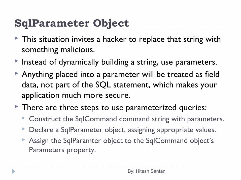
SqlParameter Object This situation invites a hacker to replace that string with
something malicious. Instead of dynamically building a string, use parameters. Anything placed into a parameter will be treated as field
data, not part of the SQL statement, which makes your application much more secure.
There are three steps to use parameterized queries: Construct the SqlCommand command string with parameters. Declare a SqlParameter object, assigning appropriate values. Assign the SqlParamter object to the SqlCommand object’s
Parameters property.
By: Hitesh Santani
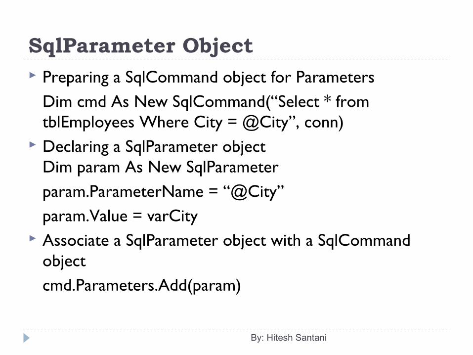
SqlParameter Object Preparing a SqlCommand object for Parameters
Dim cmd As New SqlCommand(“Select * from tblEmployees Where City = @City”, conn)
Declaring a SqlParameter objectDim param As New SqlParameterparam.ParameterName = “@City”param.Value = varCity
Associate a SqlParameter object with a SqlCommand objectcmd.Parameters.Add(param)
By: Hitesh Santani
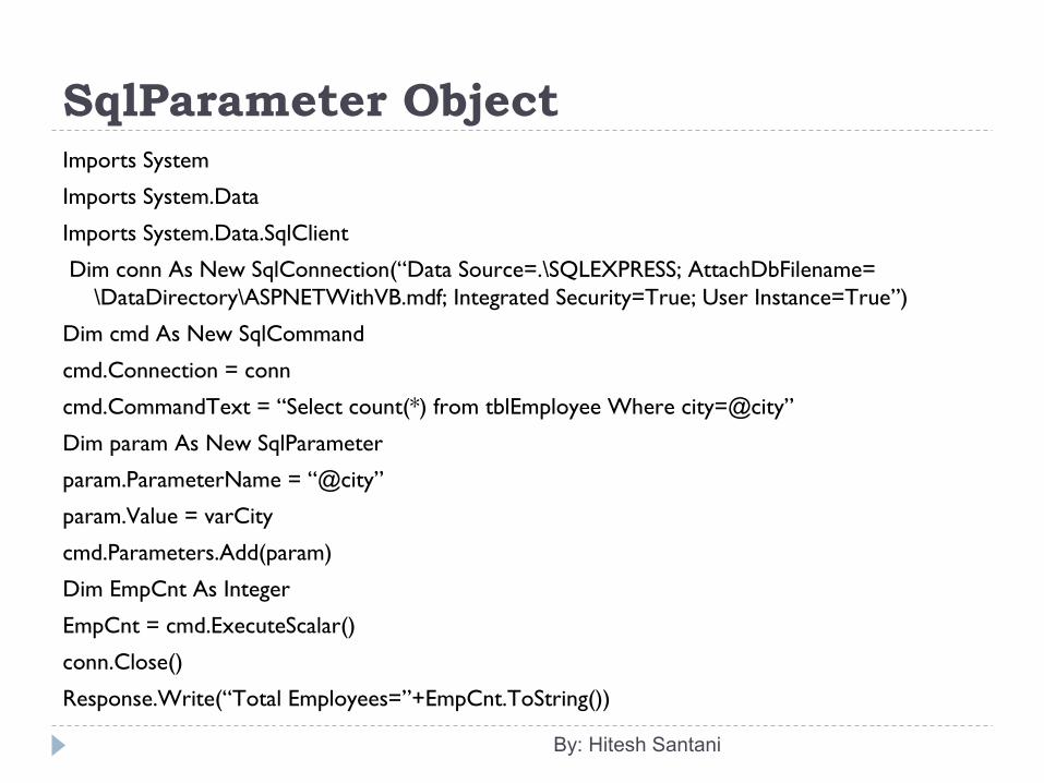
SqlParameter ObjectImports System
Imports System.Data
Imports System.Data.SqlClient
Dim conn As New SqlConnection(“Data Source=.\SQLEXPRESS; AttachDbFilename= \DataDirectory\ASPNETWithVB.mdf; Integrated Security=True; User Instance=True”)
Dim cmd As New SqlCommand
cmd.Connection = conn
cmd.CommandText = “Select count(*) from tblEmployee Where city=@city”
Dim param As New SqlParameter
param.ParameterName = “@city”
param.Value = varCity
cmd.Parameters.Add(param)
Dim EmpCnt As Integer
EmpCnt = cmd.ExecuteScalar()
conn.Close()
Response.Write(“Total Employees=”+EmpCnt.ToString())
By: Hitesh Santani
DataReader Object A SqlDataReader is used to read data in the most
efficient manner. You cannot use it for writing data. You can read forward-
only and in sequential manner from SqlDataReader. Once you have read some data, you must save it because
you will not be able to go back and read it again. A single row of data is in the memory at a time. When the SqlDataReader object is created the pointer is
placed before the first row.
By: Hitesh Santani
DataReader Object: Properties FieldCount HasRows IsClosed RecordsAffected Item
By: Hitesh Santani
DataReader Object: Methods Read Close IsDBNull GetSchemaTable GetName(index) GetOrdinal(string name) GetFieldType(index)/GetFieldType(FieldName) GetValue(index)/GetValue(FieldName): . It returns the
value in the form of object. GetValues() NextResult()
By: Hitesh Santani
DataReader Object Steps to create a DataReader:
Create a connection and open it. Create a command object with the appropriate select
query. Use the command.ExecuteReader() method to get a
DataReader object of the above select query. Move through the rows using Read() method. Close the DataReader object and the connection.
By: Hitesh Santani
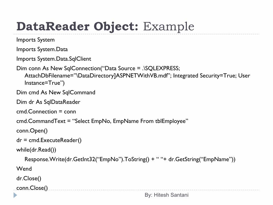
DataReader Object: ExampleImports System
Imports System.Data
Imports System.Data.SqlClient
Dim conn As New SqlConnection(“Data Source = .\SQLEXPRESS; AttachDbFilename=”\DataDirectory]ASPNETWithVB.mdf”; Integrated Security=True; User Instance=True”)
Dim cmd As New SqlCommand
Dim dr As SqlDataReader
cmd.Connection = conn
cmd.CommandText = “Select EmpNo, EmpName From tblEmployee”
conn.Open()
dr = cmd.ExecuteReader()
while(dr.Read())
Response.Write(dr.GetInt32(“EmpNo”).ToString() + “ “+ dr.GetString(“EmpName”))
Wend
dr.Close()
conn.Close()By: Hitesh Santani