Embed Size (px)
Citation preview
Bootstrap Responsive Layouts Finally! Truly simple adaptive design
Let's talk about
� Layout fundamentals � Bootstrap's strategy for responsive layouts � What devices are supported � How to change the layout on different devices
by just adding a few classes � Showing and hiding on different devices
3
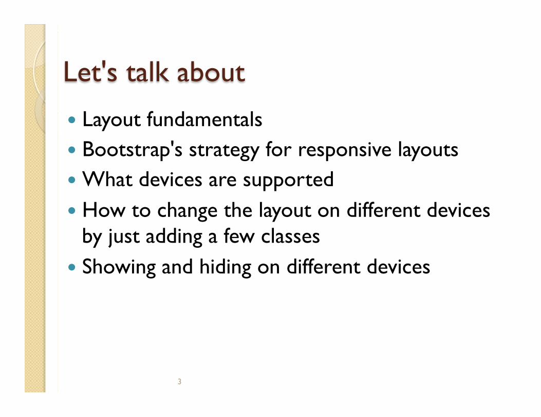
Responsive layouts are the way to go in today's device-driven world
� Always add this line: <meta name="viewport" content="width=device-width, initial-scale=1.0">
4
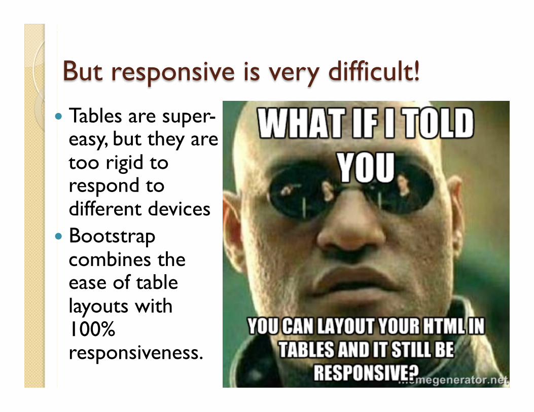
But responsive is very difficult! � Tables are super-
easy, but they are too rigid to respond to different devices
� Bootstrap combines the ease of table layouts with 100% responsiveness.
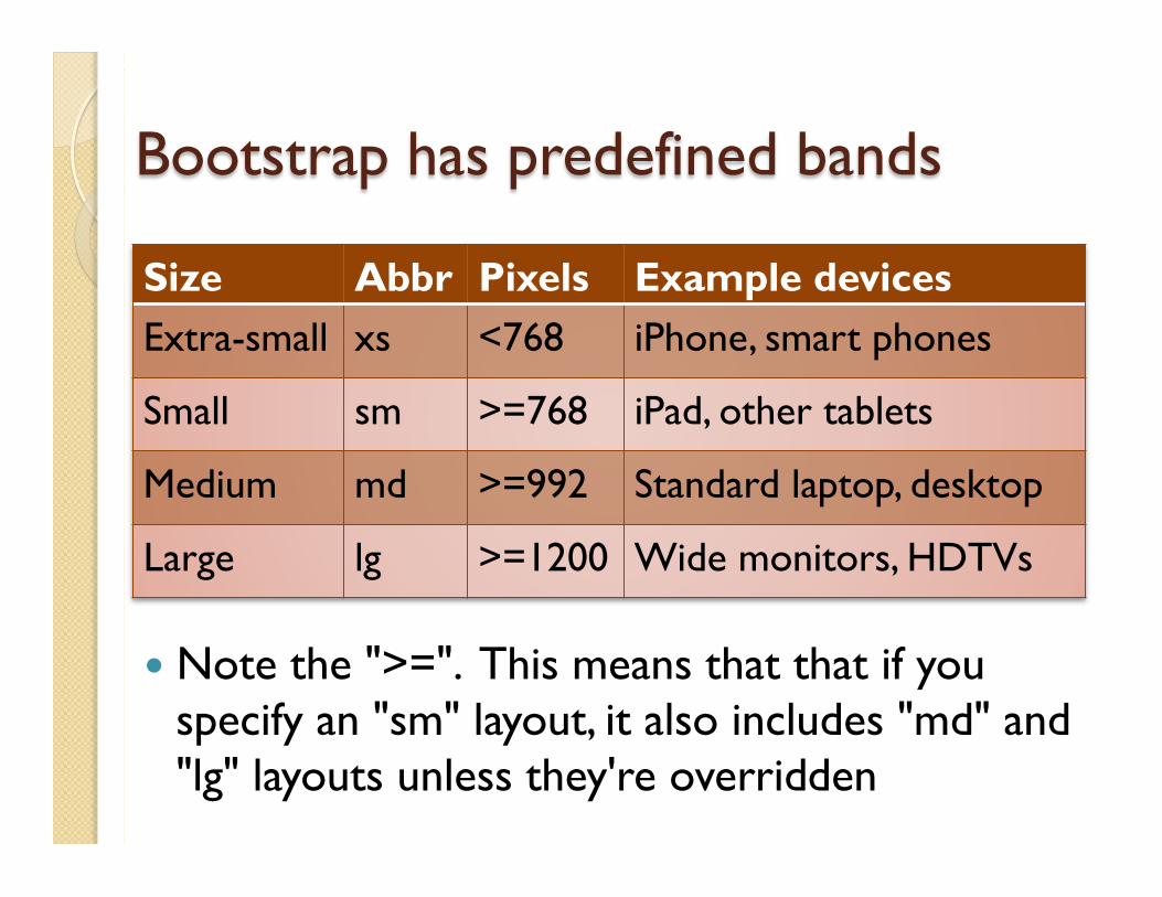
Bootstrap has predefined bands
� Note the ">=". This means that that if you specify an "sm" layout, it also includes "md" and "lg" layouts unless they're overridden
Size Abbr Pixels Example devices Extra-small xs <768 iPhone, smart phones
Small sm >=768 iPad, other tablets
Medium md >=992 Standard laptop, desktop
Large lg >=1200 Wide monitors, HDTVs
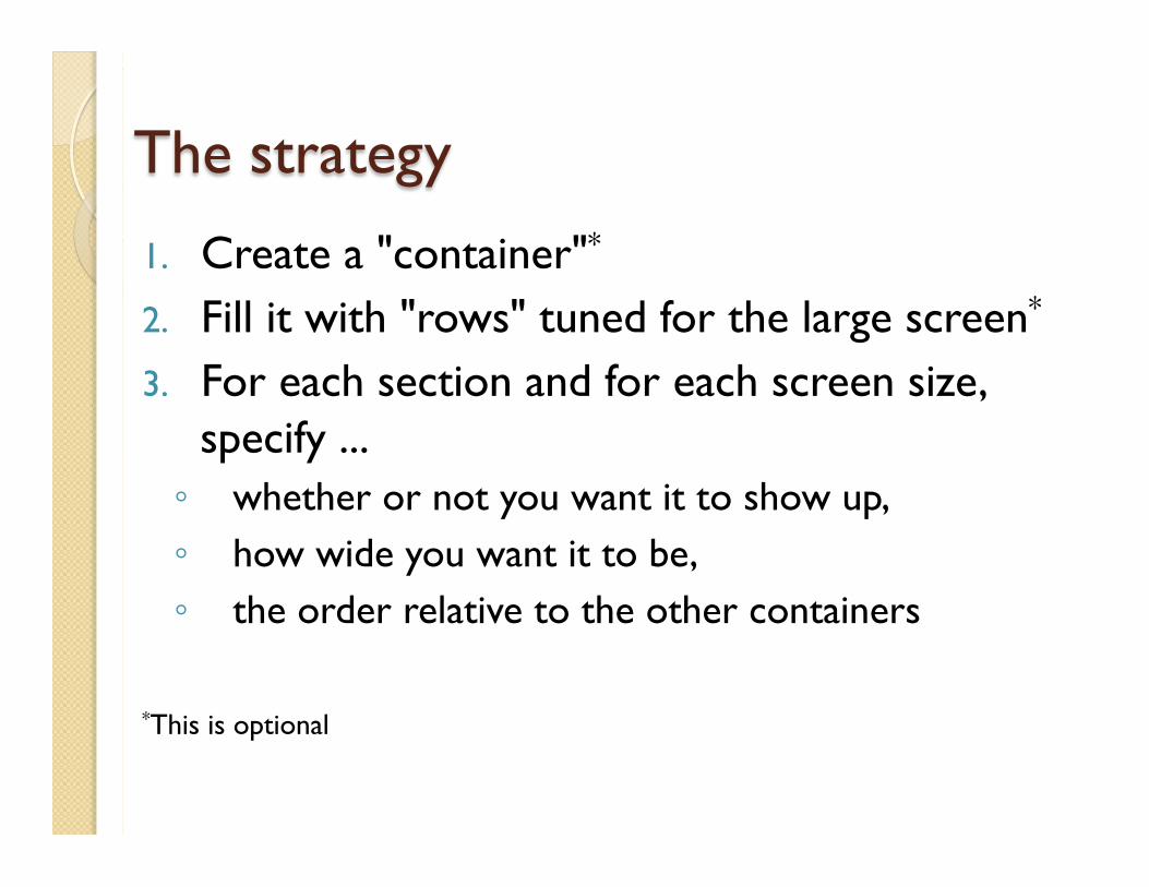
The strategy
1. Create a "container"*
2. Fill it with "rows" tuned for the large screen*
3. For each section and for each screen size, specify ... ◦ whether or not you want it to show up, ◦ how wide you want it to be, ◦ the order relative to the other containers
*This is optional
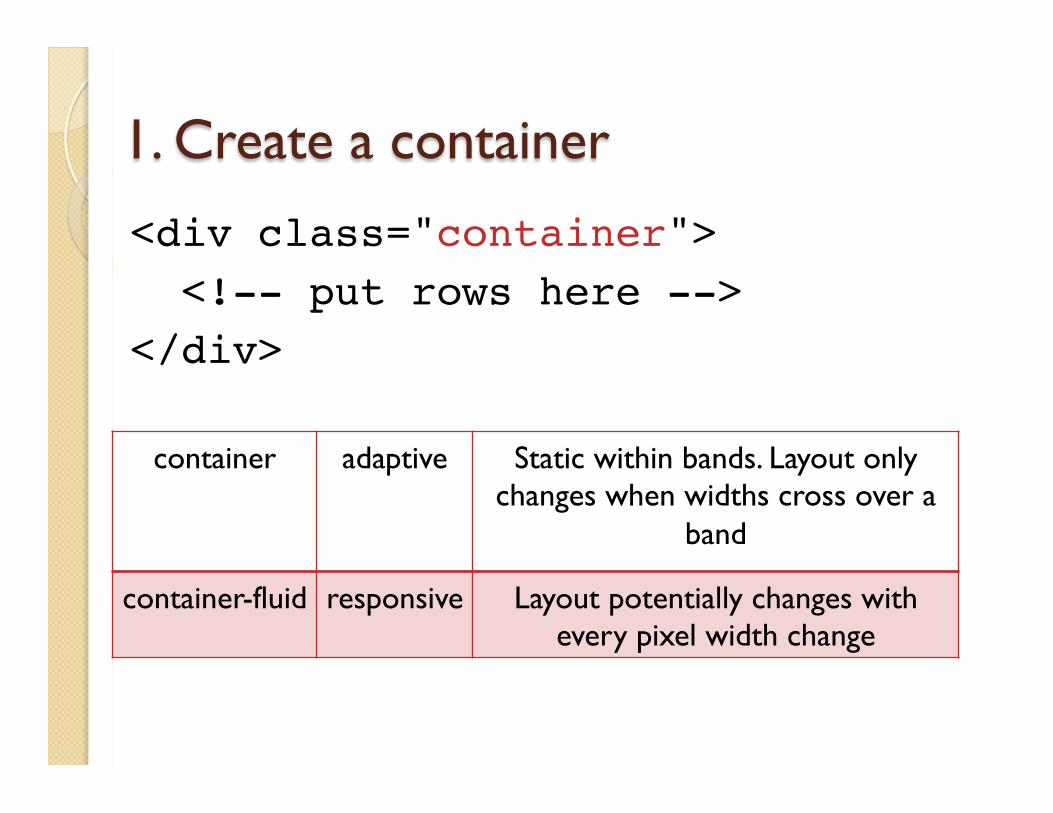
1. Create a container
<div class="container"> <!-- put rows here --></div>
container adaptive Static within bands. Layout only changes when widths cross over a
band
container-fluid responsive Layout potentially changes with every pixel width change
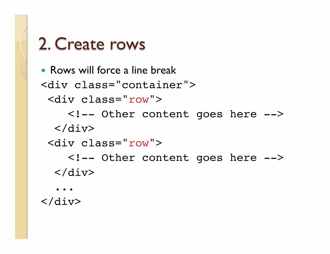
2. Create rows � Rows will force a line break <div class="container"> <div class="row"> <!-- Other content goes here --> </div> <div class="row"> <!-- Other content goes here --> </div> ...</div>
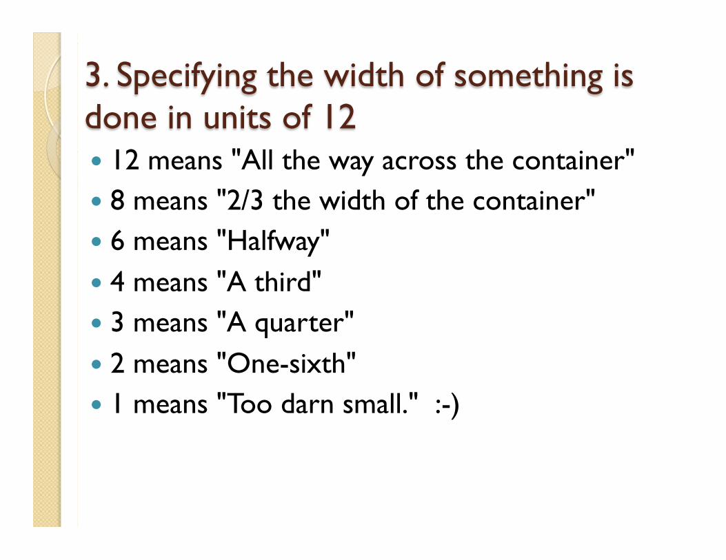
3. Specifying the width of something is done in units of 12 � 12 means "All the way across the container" � 8 means "2/3 the width of the container" � 6 means "Halfway" � 4 means "A third" � 3 means "A quarter" � 2 means "One-sixth" � 1 means "Too darn small." :-)
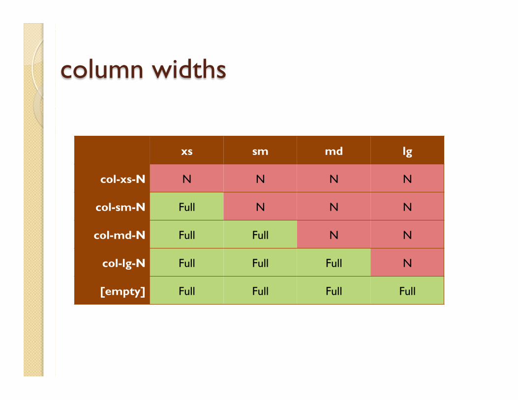
column widths
xs sm md lg
col-xs-N N N N N
col-sm-N Full N N N
col-md-N Full Full N N
col-lg-N Full Full Full N
[empty] Full Full Full Full
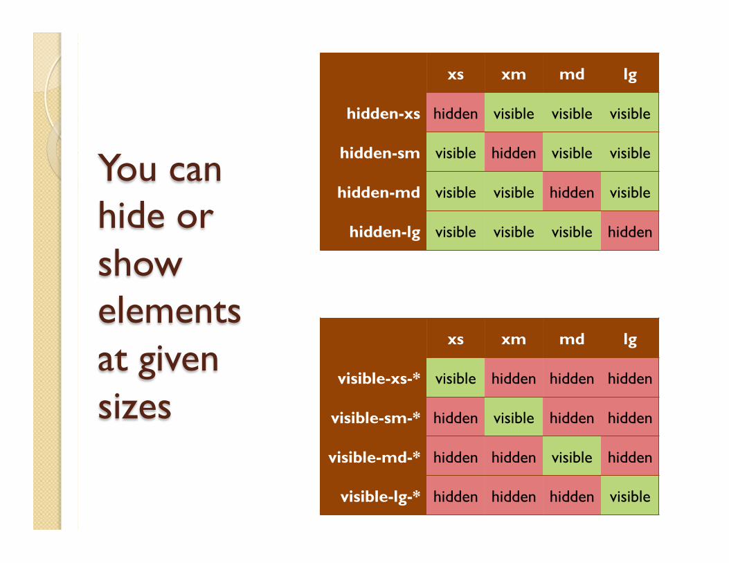
You can hide or show elements at given sizes
xs xm md lg
hidden-xs hidden visible visible visible
hidden-sm visible hidden visible visible
hidden-md visible visible hidden visible
hidden-lg visible visible visible hidden
xs xm md lg
visible-xs-* visible hidden hidden hidden
visible-sm-* hidden visible hidden hidden
visible-md-* hidden hidden visible hidden
visible-lg-* hidden hidden hidden visible
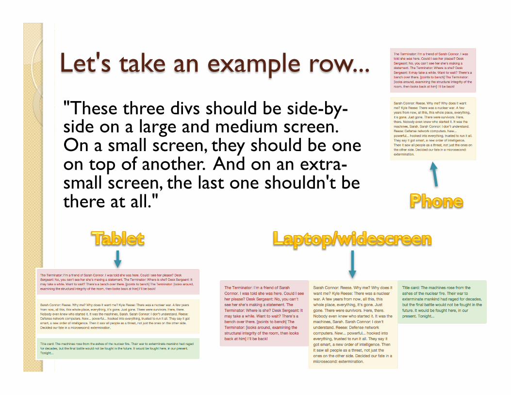
Let's take an example row...
"These three divs should be side-by-side on a large and medium screen. On a small screen, they should be one on top of another. And on an extra-small screen, the last one shouldn't be there at all."
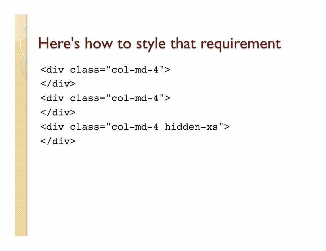
Here's how to style that requirement
<div class="col-md-4"></div><div class="col-md-4"></div><div class="col-md-4 hidden-xs"></div>
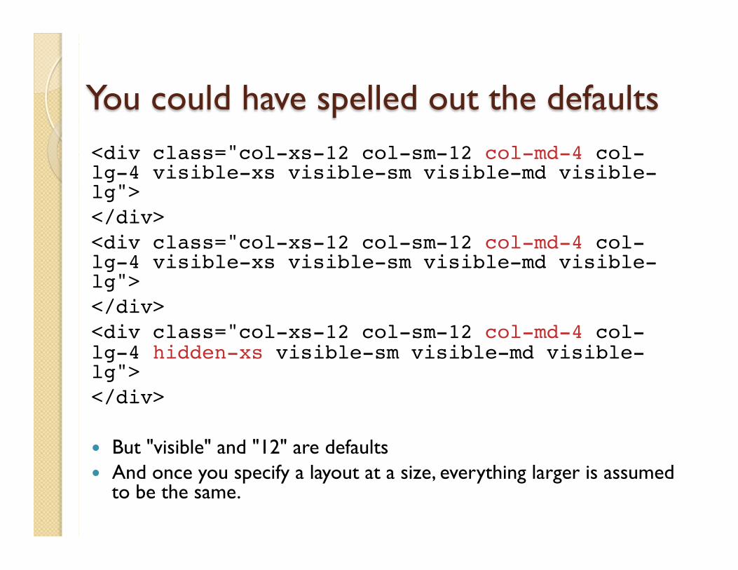
You could have spelled out the defaults <div class="col-xs-12 col-sm-12 col-md-4 col-lg-4 visible-xs visible-sm visible-md visible-lg"></div><div class="col-xs-12 col-sm-12 col-md-4 col-lg-4 visible-xs visible-sm visible-md visible-lg"></div><div class="col-xs-12 col-sm-12 col-md-4 col-lg-4 hidden-xs visible-sm visible-md visible-lg"></div>
� But "visible" and "12" are defaults � And once you specify a layout at a size, everything larger is assumed
to be the same.
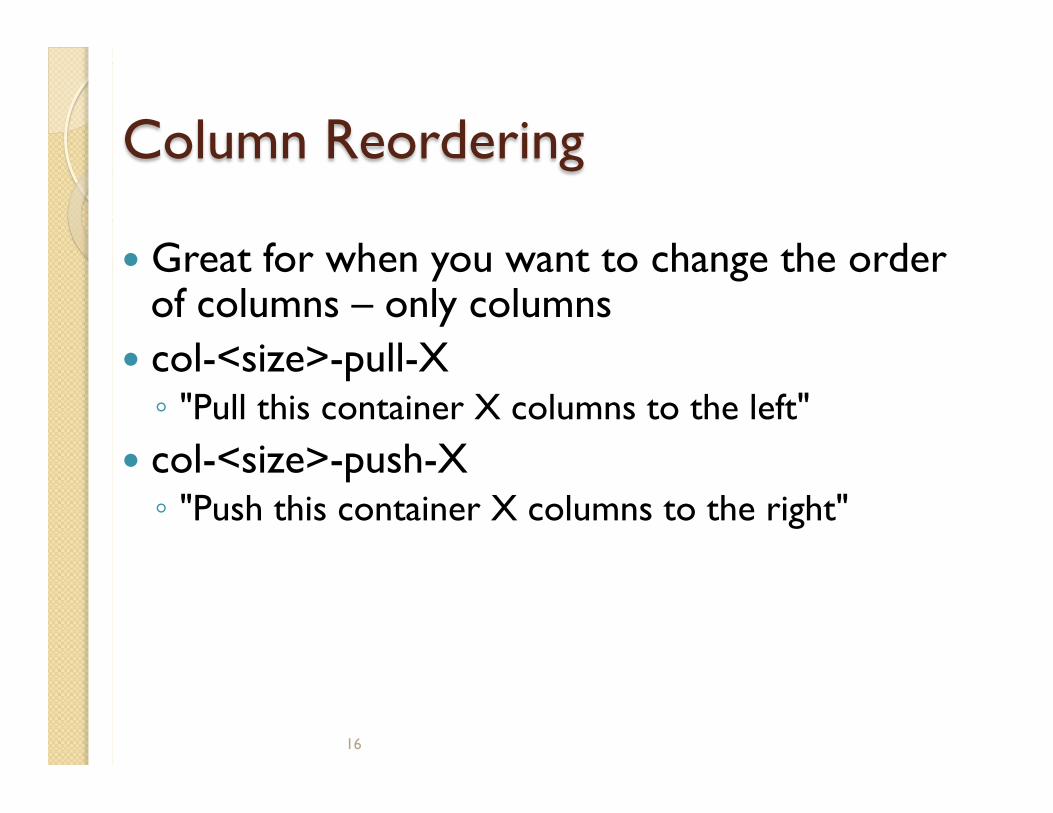
Column Reordering
� Great for when you want to change the order of columns – only columns
� col-<size>-pull-X ◦ "Pull this container X columns to the left"
� col-<size>-push-X ◦ "Push this container X columns to the right"
16
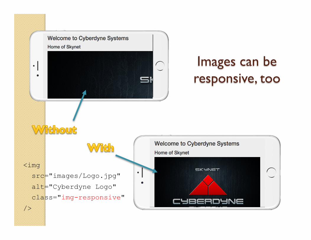
Images can be responsive, too
<img
src="images/Logo.jpg"
alt="Cyberdyne Logo"
class="img-responsive"
/>
Demo: Simple transition Hands-on responsiveness
tl;dr We've covered � Layout fundamentals � Bootstrap's strategy for responsive layouts � What devices are supported � How to change the layout on different devices
by just adding a few classes � Showing and hiding on different devices