Embed Size (px)
Citation preview
V1.01
Embracing the Mobile Frontier and Reaching the Digital Natives
Jonathan [email protected]@jwall
@jayburling
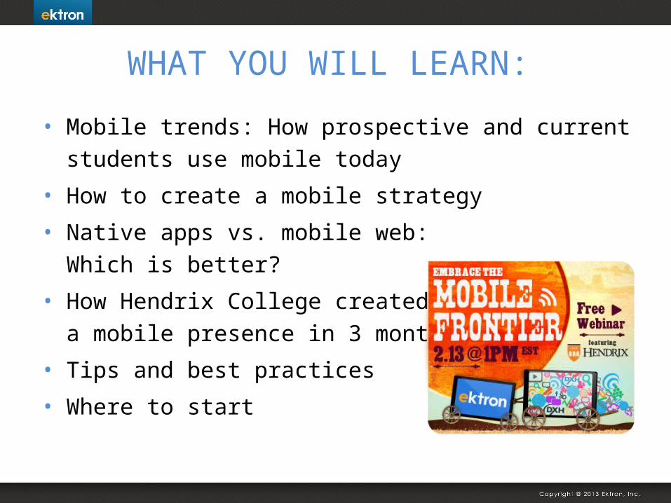
WHAT YOU WILL LEARN:
• Mobile trends: How prospective and current students use mobile today
• How to create a mobile strategy
• Native apps vs. mobile web: Which is better?
• How Hendrix College created a mobile presence in 3 months
• Tips and best practices
• Where to start

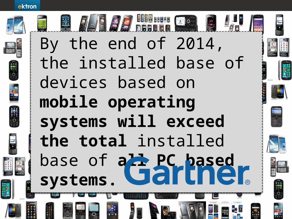
By the end of 2014, the installed base of devices based on mobile operating systems will exceed the total installed base of all PC based systems.
5
Born 1976 - Deceased… ???
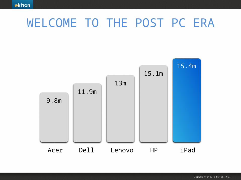
Acer Dell Lenovo HP iPad
9.8m11.9m
13m
15.1m15.4m
WELCOME TO THE POST PC ERA
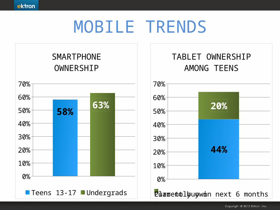
MOBILE TRENDS
0%
10%
20%
30%
40%
50%
60%
70%
58%63%
SMARTPHONE OWNERSHIP
Teens 13-17 Undergrads
0%
10%
20%
30%
40%
50%
60%
70%
44%
20%
TABLET OWNERSHIP AMONG TEENS
Currently ownPlan to buy in next 6 months
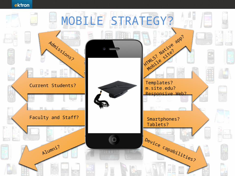
Admissions?
Current Students?
Faculty and Staff?
Alumni?
Device capabilities?
HTML5? N
ative app?
Mobile si
te?
Templates? m.site.edu?Responsive Web?
Smartphones? Tablets?
MOBILE STRATEGY?
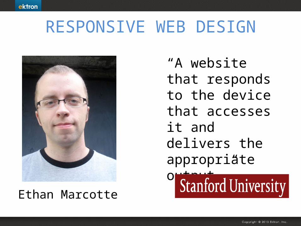
RESPONSIVE WEB DESIGN
“A website that responds to the device that accesses it and delivers the appropriate output.”
Ethan Marcotte
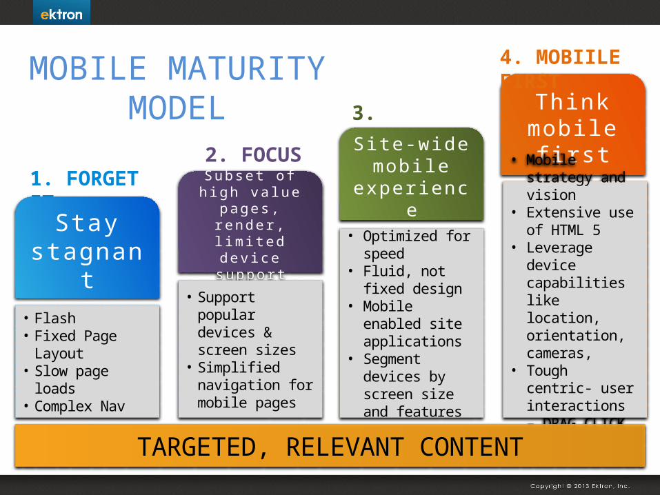
MOBILE MATURITY MODEL
1. FORGET IT
Stay stagnant
• Flash• Fixed Page
Layout• Slow page loads• Complex Nav
2. FOCUSSubset o f
h igh va lue pages , render , l im i ted dev i ce suppor t
• Support popular devices & screen sizes
• Simplified navigation for mobile pages
3. FRIENDLYSite-wide
mobile experience
• Optimized for speed
• Fluid, not fixed design
• Mobile enabled site applications
• Segment devices by screen size and features
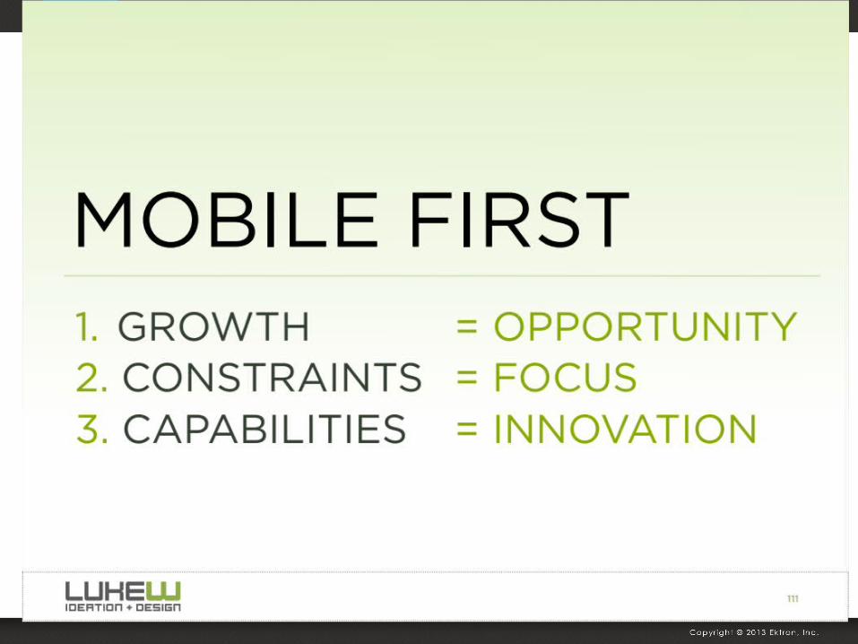
Think mobile
fi rst
• Mobile strategy and vision
• Extensive use of HTML 5
• Leverage device capabilities like location, orientation, cameras,
• Tough centric- user interactions – DRAG CLICK PRESS
4. MOBIILE FIRST
TARGETED, RELEVANT CONTENT
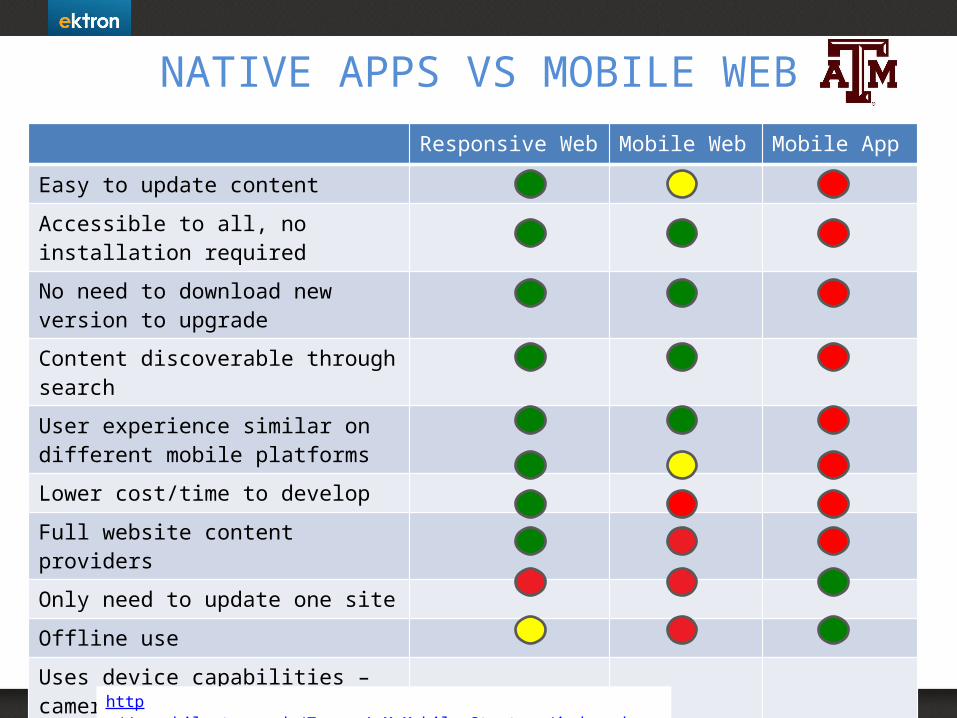
NATIVE APPS VS MOBILE WEBResponsive Web Mobile Web Mobile App
Easy to update content
Accessible to all, no installation required
No need to download new version to upgrade
Content discoverable through search
User experience similar on different mobile platforms
Lower cost/time to develop
Full website content providers
Only need to update one site
Offline use
Uses device capabilities – camera, accelerometer
http://gomobile.tamu.edu/Texas_A_M_Mobile_Strategy/index.php
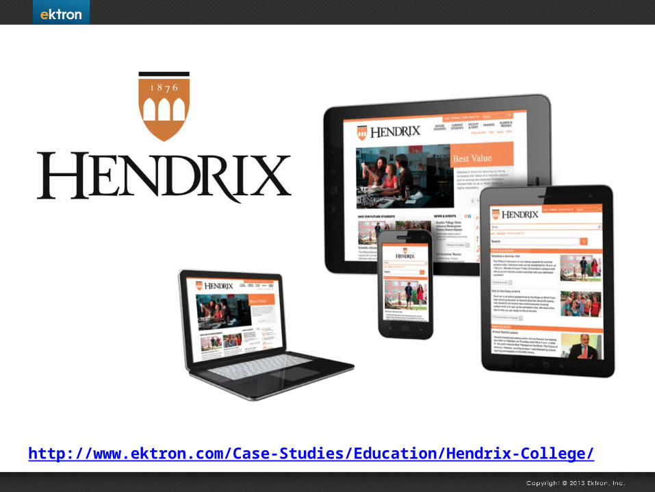
http://www.ektron.com/Case-Studies/Education/Hendrix-College/
HENDRIX WEB AND MOBILE GOALS
• Provide ALL of the site’s content
• Reach our constituents where they are now
• Be device agnostic• Reach all of our users,
but focus on Prospective Students
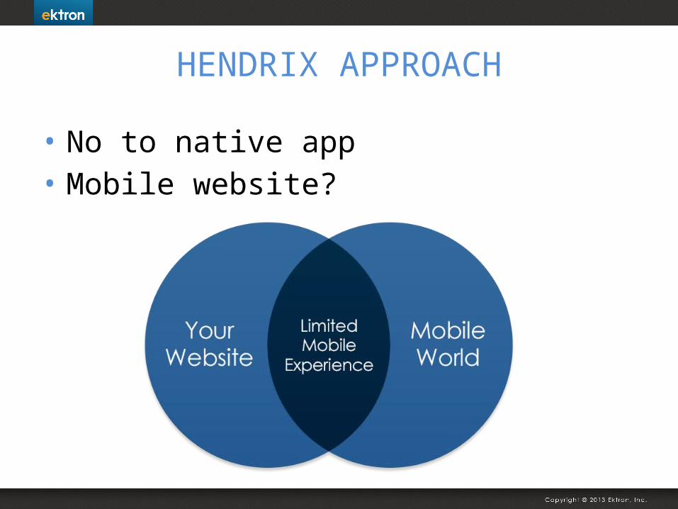
HENDRIX APPROACH
• No to native app• Mobile website?
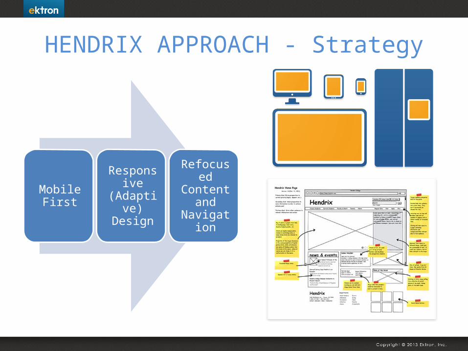
HENDRIX APPROACH - Strategy
Mobile First
Responsive (Adaptive)
Design
Refocused Content
and Navigation
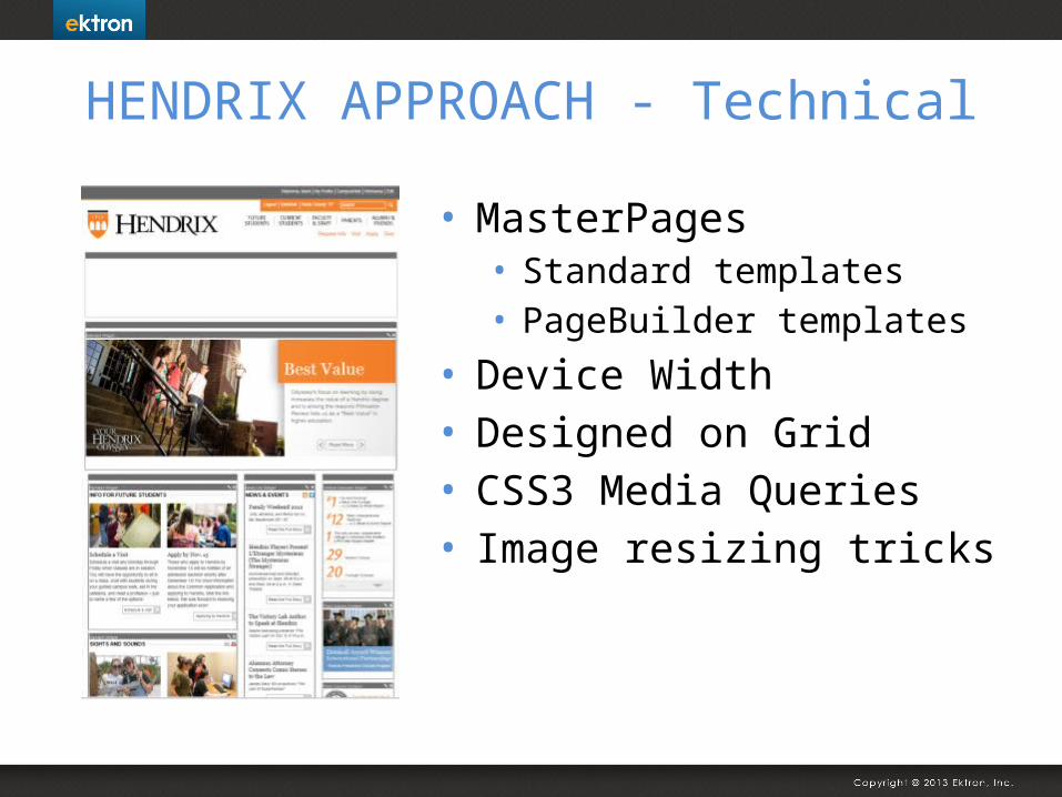
HENDRIX APPROACH - Technical
• MasterPages• Standard templates• PageBuilder templates
• Device Width• Designed on Grid• CSS3 Media Queries• Image resizing tricks
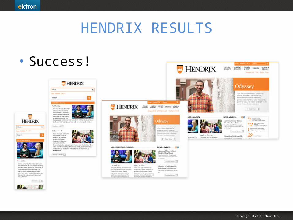
HENDRIX RESULTS
• Success!
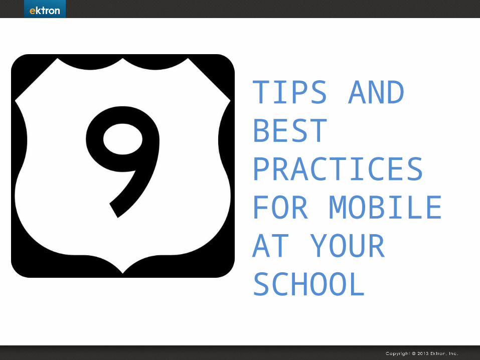
TIPS AND BEST PRACTICES FOR MOBILE AT YOUR SCHOOL
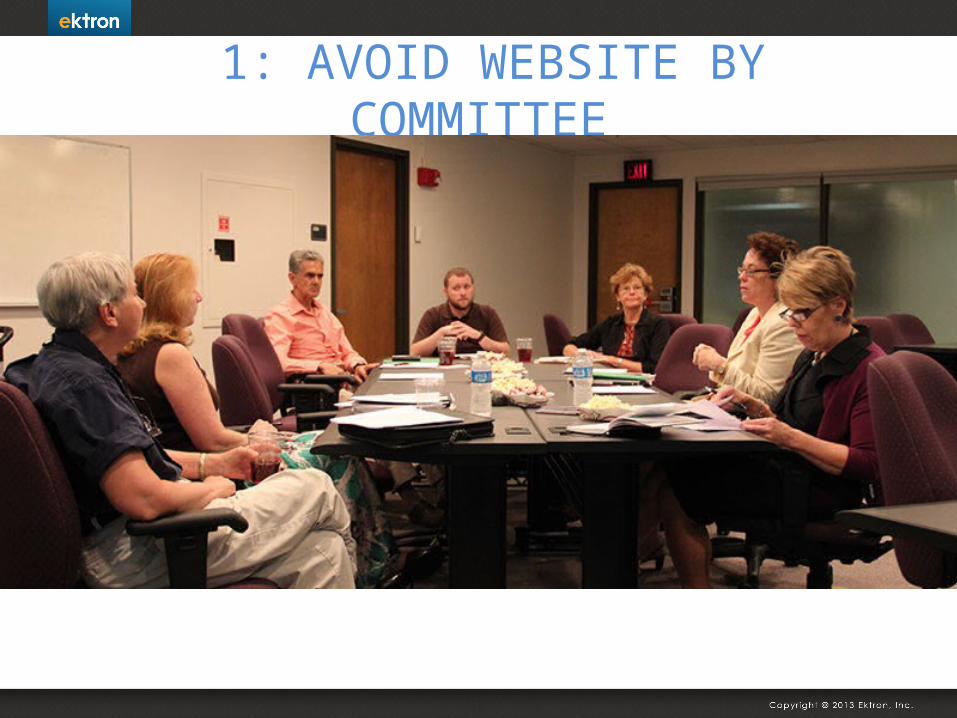
1: AVOID WEBSITE BY COMMITTEE
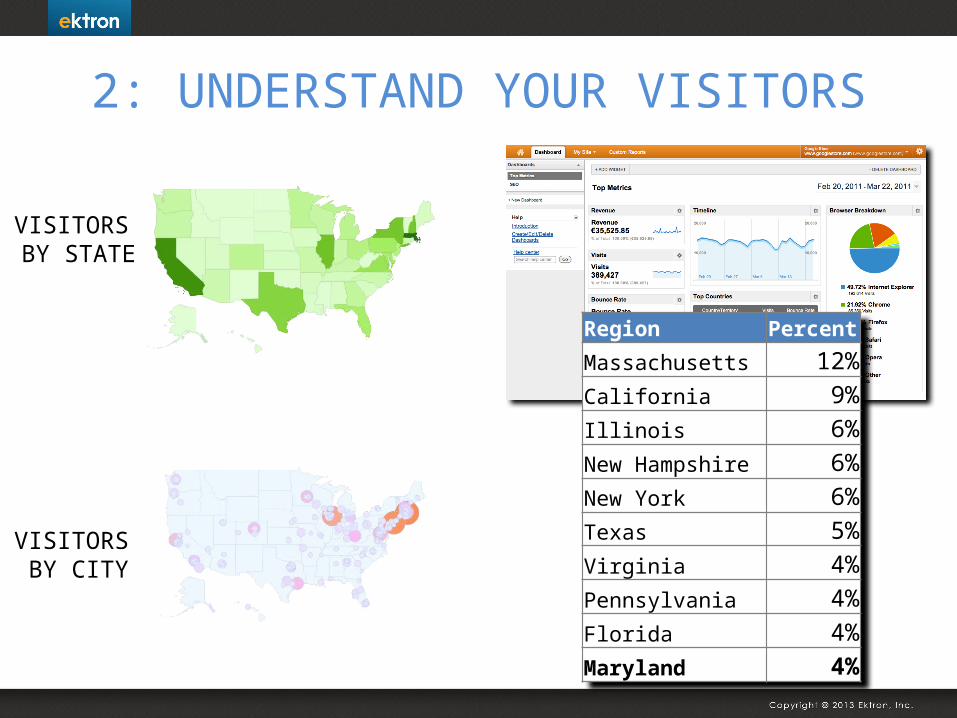
2: UNDERSTAND YOUR VISITORS
RegionPercent
Massachusetts 12%California 9%Illinois 6%New Hampshire 6%New York 6%Texas 5%Virginia 4%Pennsylvania 4%Florida 4%Maryland 4%
VISITORS BY STATE
VISITORS BY CITY
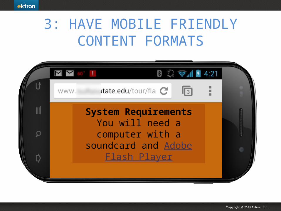
3: HAVE MOBILE FRIENDLY CONTENT FORMATS
System RequirementsYou will need a computer with a
soundcard and Adobe Flash Player
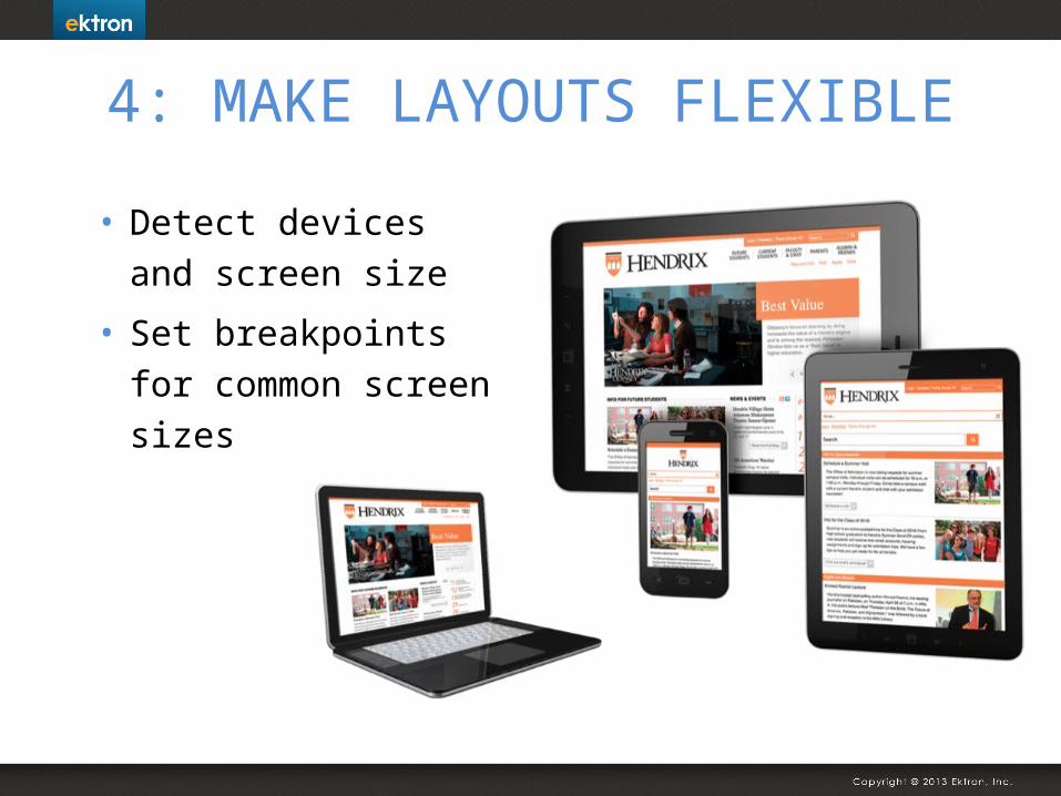
4: MAKE LAYOUTS FLEXIBLE
• Detect devices and screen size
• Set breakpoints for common screen sizes
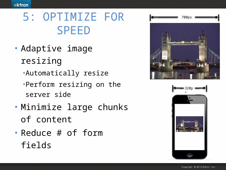
5: OPTIMIZE FOR SPEED
• Adaptive image resizing• Automatically resize
• Perform resizing on the server side
• Minimize large chunks of content
• Reduce # of form fields
320px
700px
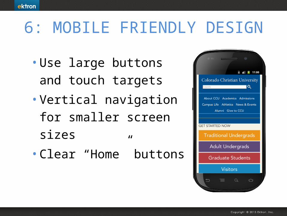
6: MOBILE FRIENDLY DESIGN
• Use large buttons and touch targets
• Vertical navigation for smaller screen sizes
• Clear “Home” buttons
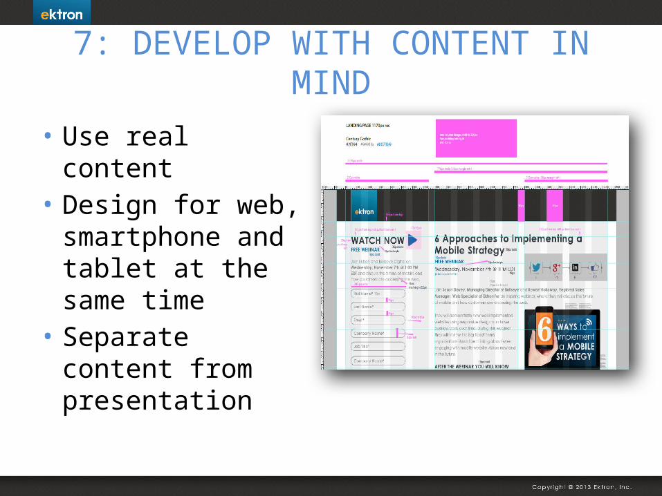
7: DEVELOP WITH CONTENT IN MIND
• Use real content
• Design for web, smartphone and tablet at the same time
• Separate content from presentation
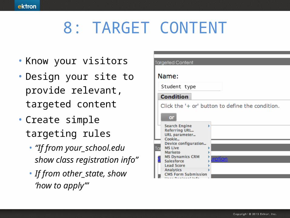
8: TARGET CONTENT
• Know your visitors
• Design your site to provide relevant, targeted content
• Create simple targeting rules• “If from your_school.edu
show class registration info”
• If from other_state, show ‘how to apply’”
Student type
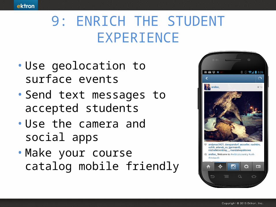
9: ENRICH THE STUDENT EXPERIENCE
• Use geolocation to surface events
• Send text messages to accepted students
• Use the camera and social apps
• Make your course catalog mobile friendly
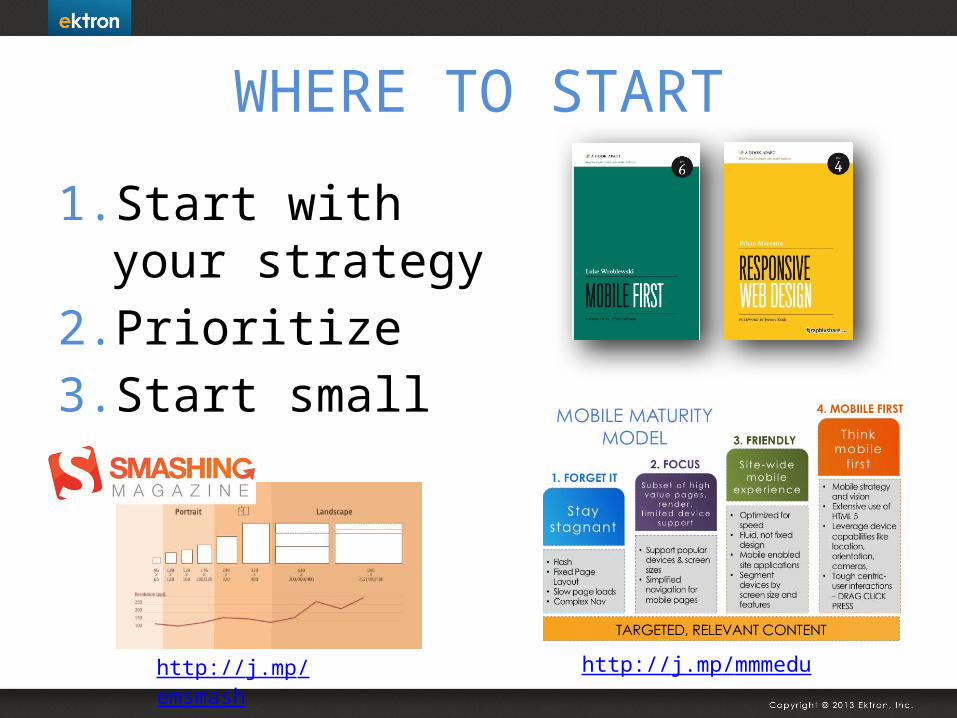
WHERE TO START
1. Start with your strategy
2. Prioritize3. Start small
http://j.mp/emsmash http://j.mp/mmmedu