Embed Size (px)
Citation preview
AS MEDIA COURSEWORKHARRY CROUCH
PROJECT EXPLANATION
• For this project, the final outcome will be a finished Music Magazine cover page, contents page and double page spread article. However, firstly I will be undergoing a preliminary project of making a Sixth Form magazine which will consist of just the Cover Slide and the Contents Page. I will be researching a variety of different stuff which will enable me to make my magazine properly to the target audience I will be marketing my product at. This research will consist of things such as cover page analysis, representation of cover stars analysis, contents page analysis, audience profiles as well as a variety of other important and useful things.
• Preliminary task: using DTP and an image manipulation program, produce the front page of a new school/college magazine, featuring a photograph of a student in medium close-up plus some appropriately laid-out text and a masthead. Additionally candidates must produce a DTP mock-up of the layout of the contents page to demonstrate their grasp of their program.
• Main task: The front page, contents and double page spread of a new music magazine.
• You will be assessed on 3 aspects of the coursework.
• Research ands planning – 20 marks
• Production – 60 marks
• Evaluation – 20 marks
PRELIMINARY TASK
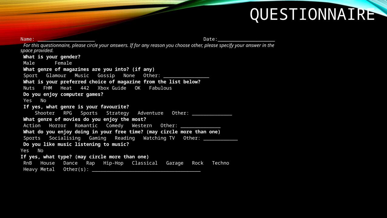
QUESTIONNAIREName: ____________________ Date:____________________ For this questionnaire, please circle your answers. If for any reason you choose other, please specify your answer in the space provided. What is your gender? Male Female What genre of magazines are you into? (if any) Sport Glamour Music Gossip None Other: ________________ What is your preferred choice of magazine from the list below? Nuts FHM Heat 442 Xbox Guide OK Fabulous Do you enjoy computer games? Yes No If yes, what genre is your favourite? Shooter RPG Sports Strategy Adventure Other: ______________ What genre of movies do you enjoy the most? Action Horror Romantic Comedy Western Other: ______________ What do you enjoy doing in your free time? (may circle more than one) Sports Socialising Gaming Reading Watching TV Other: ____________ Do you like music listening to music?Yes NoIf yes, what type? (may circle more than one) RnB House Dance Rap Hip-Hop Classical Garage Rock Techno Heavy Metal Other(s): ______________________________________
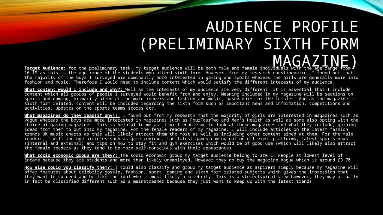
AUDIENCE PROFILE (PRELIMINARY SIXTH FORM
MAGAZINE)Target Audience: for the preliminary task, my target audience will be both male and female individuals with the age range from 16-19 as this is the age range of the students who attend sixth form. However, from my research questionnaire, I found out that the majority of the boys I surveyed are dominantly more interested in gaming and sports whereas the girls are generally more into fashion and music. Therefore I would need to include content which would satisfy the different interests of my audience.
What content would I include and why?: Well as the interests of my audience are very different, it is essential that I include content which all groups of people I surveyed would benefit from and enjoy. Meaning included in my magazine will be sections on sports and gaming, primarily aimed at the male readers and fashion and music, based more for the females. And as the magazine is sixth form related, content will be included regarding the sixth form such as important news and information, competitions and activities, updates on the sports teams scores etc.
What magazines do they read(if any)?: I found out from my research that the majority of girls are interested in magazines such as vogue whereas the boys are more interested in magazines such as FourFourTwo and Men’s Health as well as some also opting with the choice of gaming magazines. This is helpful to me as it will enable me to look at these magazines and what they include, gaining ideas from them to put into my magazine. For the female readers of my magazine, I will include articles on the latest fashion trends UK music charts as this will likely attract them the most as well as including other content aimed at them. For the male readers, I will include articles such as game reviews, the latest games coming out on different platforms, latest sports news (internal and external) and tips on how to stay fit and gym exercises which would be of good use (which will likely also attract the female readers as they tend to be more self-conscious with their appearance)
What socio economic group are they?: The socio economic group my target audience belong to are E: People at lowest level of income because they are students and more than likely unemployed. However they do buy the magazine Vogue which is around £3.70.
How else could you classify them?: I could also classify and group my target audience as aspirers simply because my magazine will offer features about celebrity gossip, fashion, sport, gaming and sixth form related subjects which gives the impression that they want to succeed and be like the idol who is most likely a celebrity. This is a stereotypical view however, they may actually in fact be classified different such as a mainstreamer because they just want to keep up with the latest trends.
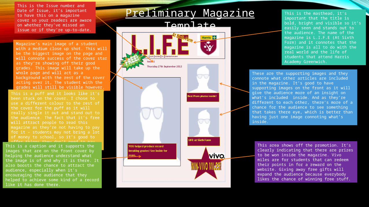
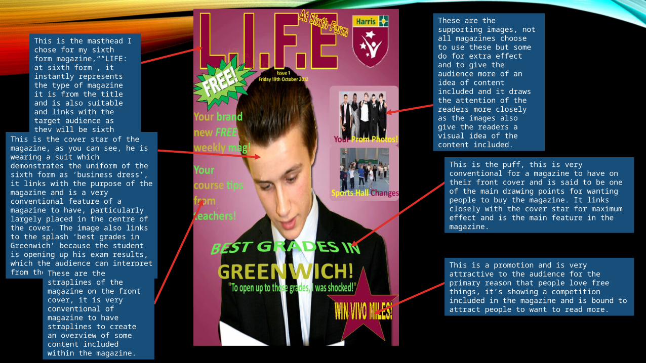
Magazine’s main image of a student with a medium close up shot. This will be the biggest image on the page and will connote success of the cover star as they’re showing off their good grades. This image will take up the whole page and will act as a background with the rest of the cover acting over it, The student with the grades will still be visible however.
Preliminary Magazine Template
This area shows off the promotion. It’s clearly indicating that there are prizes to be won inside the magazine. Vivo miles are for students that can redeem their points in for a reward on the website. Giving away free gifts will expand the audience because everybody likes the chance of winning free stuff.
This is a puff and it looks like it’s been stuck on the cover. I chose to use a different colour to the rest of the cover for the puff as it will really single it out and stand out to the audience. The fact that it’s free will attract people to read this magazine as they’re not having to pay for it – students may not bring a lot of money to school, so it’s good to offer things they don’t need to pay for.
These are the supporting images and they connote what other articles are included in the magazine. It’s good to have supporting images on the front as it will give the audience more of an insight on what’s included inside. And as they’re different to each other, there’s more of a chance for the audience to see something that takes there eye, which is better than having just one image connoting what’s inside.
This is a caption and it supports the images that are on the front cover by helping the audience understand what the image is of and why it is there. It also boosts the chance to attract the audience, especially when it’s encouraging the audience that they helped to achieve some kind of a record like it has done there.
This is the masthead, it’s important that the title is bold, bright and visible so it’s easily seen and stands out to the audience. The name of the magazine is L.I.F.E (At Sixth Form) and it connotes that the magazine is all to do with the real world and the life of students that attend Harris Academy Greenwich.
This is the Issue number and Date of Issue, it’s important to have this on a magazine cover so your readers are aware on whether they’ve missed an issue or if they’re up-to-date.
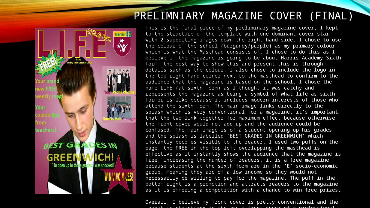
PRELIMNIARY MAGAZINE COVER (FINAL)This is the final piece of my preliminary magazine cover, I kept to the structure of the template with one dominant cover star with 2 supporting images down the right hand side. I chose to use the colour of the school (burgundy/purple) as my primary colour which is what the Masthead consists of, I chose to do this as I believe if the magazine is going to be about Harris Academy Sixth form, the best way to show this and present this is through details such as the colour. I also chose to include the logo in the top right hand corner next to the masthead to confirm to the audience that the magazine is based on the school. I chose the name LIFE (at sixth form) as I thought it was catchy and represents the magazine as being a symbol of what life as sixth former is like because it includes modern interests of those who attend the sixth form. The main image links directly to the splash which is very conventional for a magazine, it’s important that the two link together for maximum effect because otherwise the front cover would not add up and the audience could be confused. The main image is of a student opening up his grades and the splash is labelled ‘BEST GRADES IN GREENWICH’ which instantly becomes visible to the reader. I used two puffs on the page, the FREE in the top left overlapping the masthead is effective as it instantly shows the audience that the magazine is free, increasing the number of readers, it is a free magazine because students at the sixth form are in the ‘E’ socio-economic group, meaning they are of a low income so they would not necessarily be willing to pay for the magazine. The puff in the bottom right is a promotion and attracts readers to the magazine as it is offering a competition with a chance to win free prizes.
Overall, I believe my front cover is pretty conventional and the layout is structured in the way a front cover of a professional magazine is set out with straplines on the side as well as supporting images (if included), the splash at the bottom, cover star central being the main focus with the masthead aligned in the top left.
PRELIMINARY MAGAZINE CONTENTS (FINAL)
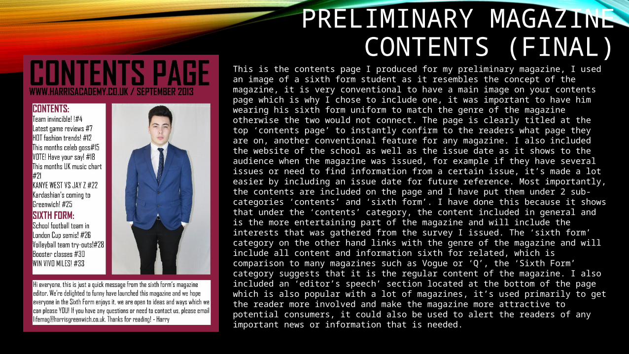
This is the contents page I produced for my preliminary magazine, I used an image of a sixth form student as it resembles the concept of the magazine, it is very conventional to have a main image on your contents page which is why I chose to include one, it was important to have him wearing his sixth form uniform to match the genre of the magazine otherwise the two would not connect. The page is clearly titled at the top ‘contents page’ to instantly confirm to the readers what page they are on, another conventional feature for any magazine. I also included the website of the school as well as the issue date as it shows to the audience when the magazine was issued, for example if they have several issues or need to find information from a certain issue, it’s made a lot easier by including an issue date for future reference. Most importantly, the contents are included on the page and I have put them under 2 sub-categories ‘contents’ and ‘sixth form’. I have done this because it shows that under the ‘contents’ category, the content included in general and is the more entertaining part of the magazine and will include the interests that was gathered from the survey I issued. The ‘sixth form’ category on the other hand links with the genre of the magazine and will include all content and information sixth for related, which is comparison to many magazines such as Vogue or ‘Q’, the ‘Sixth Form’ category suggests that it is the regular content of the magazine. I also included an ‘editor’s speech’ section located at the bottom of the page which is also popular with a lot of magazines, it’s used primarily to get the reader more involved and make the magazine more attractive to potential consumers, it could also be used to alert the readers of any important news or information that is needed.
This is the masthead I chose for my sixth form magazine, “LIFE: at sixth form”, it instantly represents the type of magazine it is from the title and is also suitable and links with the target audience as they will be sixth formers.
This is the cover star of the magazine, as you can see, he is wearing a suit which demonstrates the uniform of the sixth form as ‘business dress’, it links with the purpose of the magazine and is a very conventional feature of a magazine to have, particularly largely placed in the centre of the cover. The image also links to the splash ‘best grades in Greenwich’ because the student is opening up his exam results, which the audience can interpret from the image.
These are the straplines of the magazine on the front cover, it is very conventional of magazine to have straplines to create an overview of some content included within the magazine.
These are the supporting images, not all magazines choose to use these but some do for extra effect and to give the audience more of an idea of content included and it draws the attention of the readers more closely as the images also give the readers a visual idea of the content included.
This is the puff, this is very conventional for a magazine to have on their front cover and is said to be one of the main drawing points for wanting people to buy the magazine. It links closely with the cover star for maximum effect and is the main feature in the magazine.
This is a promotion and is very attractive to the audience for the primary reason that people love free things, it’s showing a competition included in the magazine and is bound to attract people to want to read more.
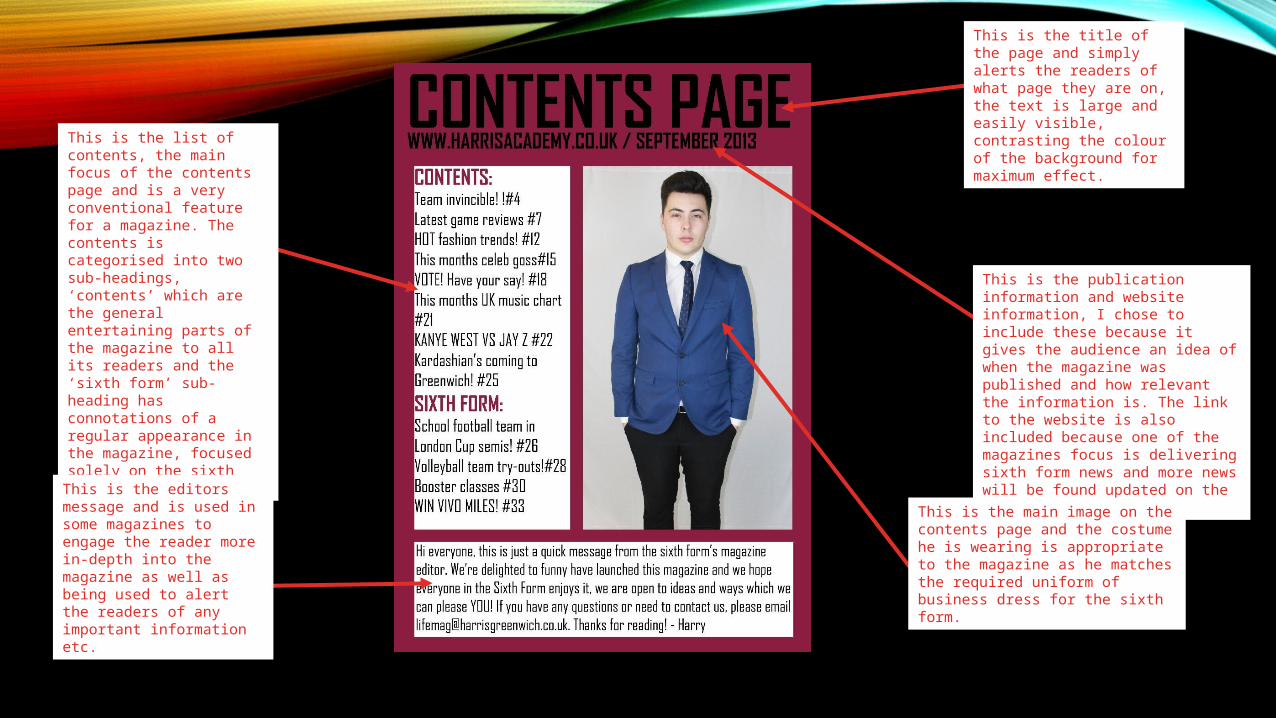
This is the list of contents, the main focus of the contents page and is a very conventional feature for a magazine. The contents is categorised into two sub-headings, ‘contents’ which are the general entertaining parts of the magazine to all its readers and the ‘sixth form’ sub-heading has connotations of a regular appearance in the magazine, focused solely on the sixth form.
This is the editors message and is used in some magazines to engage the reader more in-depth into the magazine as well as being used to alert the readers of any important information etc.
This is the title of the page and simply alerts the readers of what page they are on, the text is large and easily visible, contrasting the colour of the background for maximum effect.
This is the publication information and website information, I chose to include these because it gives the audience an idea of when the magazine was published and how relevant the information is. The link to the website is also included because one of the magazines focus is delivering sixth form news and more news will be found updated on the website.
This is the main image on the contents page and the costume he is wearing is appropriate to the magazine as he matches the required uniform of business dress for the sixth form.
WHAT I HAVE GAINED FROM THE PRELIMINARY PROJECT
• From the preliminary project I managed to gain a lot of skills and more of an understanding of the conventions of a magazine and why magazines choose to do certain things. I learnt a lot of key words which will be beneficial to my course and will help with my main project of constructing a music magazine front cover, contents page and double page spread. I am now aware of what I need to do in order to improve my production skills and make a very professional music magazine.
MUSIC MAGAZINE

RESEARCH
TARGET AUDIENCE• From my questionnaire that I created for the public to get an idea of what types of magazines they are in to as well
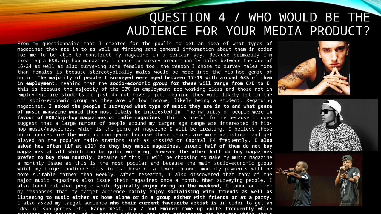
as finding some general information about them in order for me to be able to construct my magazine in a certain way. Because primarily I’m creating a R&B/hip-hop magazine, I chose to survey predominantly males between the age of 16-24 as well as also surveying some females too, the reason I chose to survey males more than females is because stereotypically males would be more into the hip-hop genre of music. The majority of people I surveyed were aged between 17-19 with around 63% of them in employment, meaning that the socio-economic group for these will range from C/D to E, this is because the majority of the 63% in employment are working class and those not in employment are students or just do not have a job, meaning they will likely fit in the ‘E’ socio-economic group as they are of low income, likely being a student. Regarding magazines, I asked the people I surveyed what type of music they are in to and what genre of music magazine would they most likely be interested in, The majority of people were in favour of R&B/hip-hop magazines or indie magazines, this is useful for me because it does suggest that a large number of people around my target age range are interested in hip-hop music/magazines, which is the genre of magazine I will be creating. I believe these music genres are the most common genre because these genres are more mainstream and get played on the popular radio stations such as Kiss100 or Capital FM frequently. I also asked how often (if at all) do they buy music magazines, around half of them do not buy magazines at all which can be quite worrying, however the other half do buy magazines prefer to buy them monthly, because of this, I will be choosing to make my music magazine a monthly issue as this is the most popular and because the main socio-economic group which my target audience fits in is those of a lower income, monthly payments will be more suitable rather than weekly. After research, I also discovered that many of the major music magazines also issue their magazines once a month. When surveying people, I also found out what people would typically enjoy doing on the weekend, I found out from my responses that my target audience mainly enjoy socialising with friends as well as listening to music either at home alone or in a group either with friends or at a party. I also asked my target audience who their current favourite artist is in order to get an idea of sub-genres etc, Kanye West, Jay Z and Eminem came up quite frequently which suggests the majority of my target audience are into mainstream hip-hop/rap which shows that my music magazine should involve contents from stars in the industry like these. Finally, I asked people within my target audience if they had ever been to a concert of an R&B/hip-hop artist and around 67% of people asked said yes with 100% saying they would like to go to a concert/go again. I’ve managed to gain some important information from my survey and it has given me an idea of the content to include which would benefit and entertain them.
TARGET AUDIENCE / SURVEY RECAP
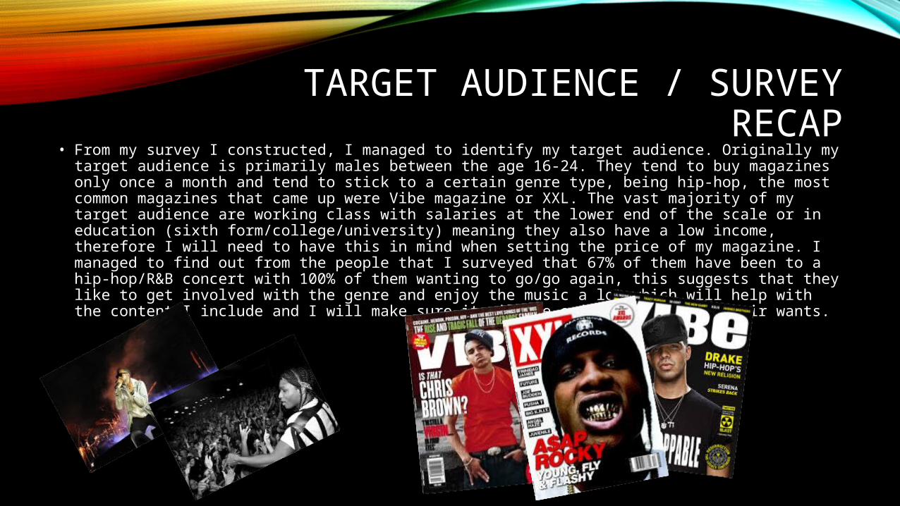
• From my survey I constructed, I managed to identify my target audience. Originally my target audience is primarily males between the age 16-24. They tend to buy magazines only once a month and tend to stick to a certain genre type, being hip-hop, the most common magazines that came up were Vibe magazine or XXL. The vast majority of my target audience are working class with salaries at the lower end of the scale or in education (sixth form/college/university) meaning they also have a low income, therefore I will need to have this in mind when setting the price of my magazine. I managed to find out from the people that I surveyed that 67% of them have been to a hip-hop/R&B concert with 100% of them wanting to go/go again, this suggests that they like to get involved with the genre and enjoy the music a lot which will help with the content I include and I will make sure it will be enjoyable and fit their wants.
This information connotes that the magazine gets more male readers than female readers. Because of this, Q Magazine is going to aim slightly more of its content at a male audience as they top the gender that reads this magazine. They do make sure that they produce content that is readable for everyone though however.
This information shows that the majority of the Q audience are higher up in the Socio-economic ladder. These are people such as bankers, lawyers, teachers, nurses etc. This connotes that the magazine attracts the more sophisticated and hard-working people. However, 32% of the audience are lower in the socio-economic ladder, these range from skilled workers down to unemployed people or students. So the magazine must produce all kinds of content to relate to all kinds of people.
This age range connotes that the majority of readers of Q magazine are within the 15-24 age range, topping it with 38%. From this information you can also tell that the older the age range gets, the less amount of readers that there is, so this magazine is definitely aimed at a younger audience. Advertising companies would want to advertise in this magazine if their audience is for young to middle-aged people as they’re the majority of readers for this magazine.
Q Magazine Audience
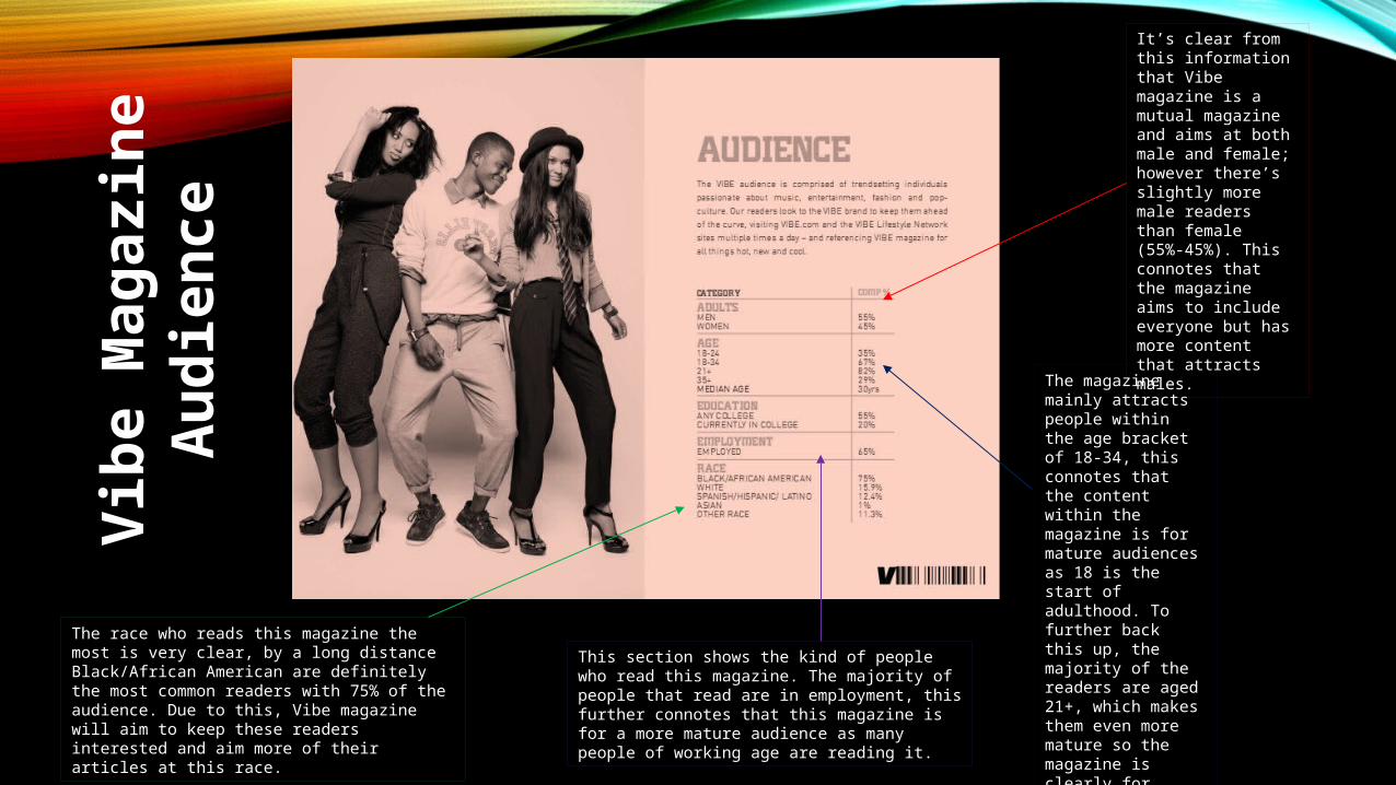
The race who reads this magazine the most is very clear, by a long distance Black/African American are definitely the most common readers with 75% of the audience. Due to this, Vibe magazine will aim to keep these readers interested and aim more of their articles at this race.
This section shows the kind of people who read this magazine. The majority of people that read are in employment, this further connotes that this magazine is for a more mature audience as many people of working age are reading it.
The magazine mainly attracts people within the age bracket of 18-34, this connotes that the content within the magazine is for mature audiences as 18 is the start of adulthood. To further back this up, the majority of the readers are aged 21+, which makes them even more mature so the magazine is clearly for people of a higher age.
It’s clear from this information that Vibe magazine is a mutual magazine and aims at both male and female; however there’s slightly more male readers than female (55%-45%). This connotes that the magazine aims to include everyone but has more content that attracts males.
Vib
e M
ag
azin
e
Au
die
nce
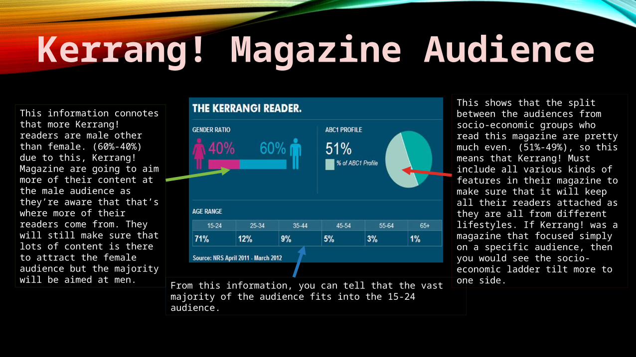
This shows that the split between the audiences from socio-economic groups who read this magazine are pretty much even. (51%-49%), so this means that Kerrang! Must include all various kinds of features in their magazine to make sure that it will keep all their readers attached as they are all from different lifestyles. If Kerrang! was a magazine that focused simply on a specific audience, then you would see the socio-economic ladder tilt more to one side.
This information connotes that more Kerrang! readers are male other than female. (60%-40%) due to this, Kerrang! Magazine are going to aim more of their content at the male audience as they’re aware that that’s where more of their readers come from. They will still make sure that lots of content is there to attract the female audience but the majority will be aimed at men.
From this information, you can tell that the vast majority of the audience fits into the 15-24 audience.
Kerrang! Magazine Audience
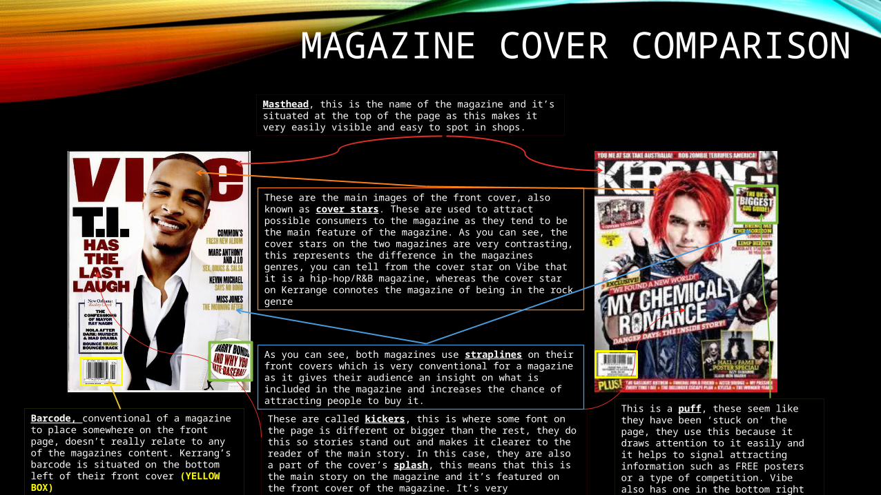
MAGAZINE COVER COMPARISONMasthead, this is the name of the magazine and it’s situated at the top of the page as this makes it very easily visible and easy to spot in shops.
These are the main images of the front cover, also known as cover stars. These are used to attract possible consumers to the magazine as they tend to be the main feature of the magazine. As you can see, the cover stars on the two magazines are very contrasting, this represents the difference in the magazines genres, you can tell from the cover star on Vibe that it is a hip-hop/R&B magazine, whereas the cover star on Kerrange connotes the magazine of being in the rock genre
As you can see, both magazines use straplines on their front covers which is very conventional for a magazine as it gives their audience an insight on what is included in the magazine and increases the chance of attracting people to buy it.
These are called kickers, this is where some font on the page is different or bigger than the rest, they do this so stories stand out and makes it clearer to the reader of the main story. In this case, they are also a part of the cover’s splash, this means that this is the main story on the magazine and it’s featured on the front cover of the magazine. It’s very conventional for a magazine to have its main story strapline stand out from the rest of the page.
This is a puff, these seem like they have been ‘stuck on’ the page, they use this because it draws attention to it easily and it helps to signal attracting information such as FREE posters or a type of competition. Vibe also has one in the bottom right of their cover (GREEN BOX)
Barcode, conventional of a magazine to place somewhere on the front page, doesn’t really relate to any of the magazines content. Kerrang’s barcode is situated on the bottom left of their front cover (YELLOW BOX)
MAGAZINE COVER ANNOTATION
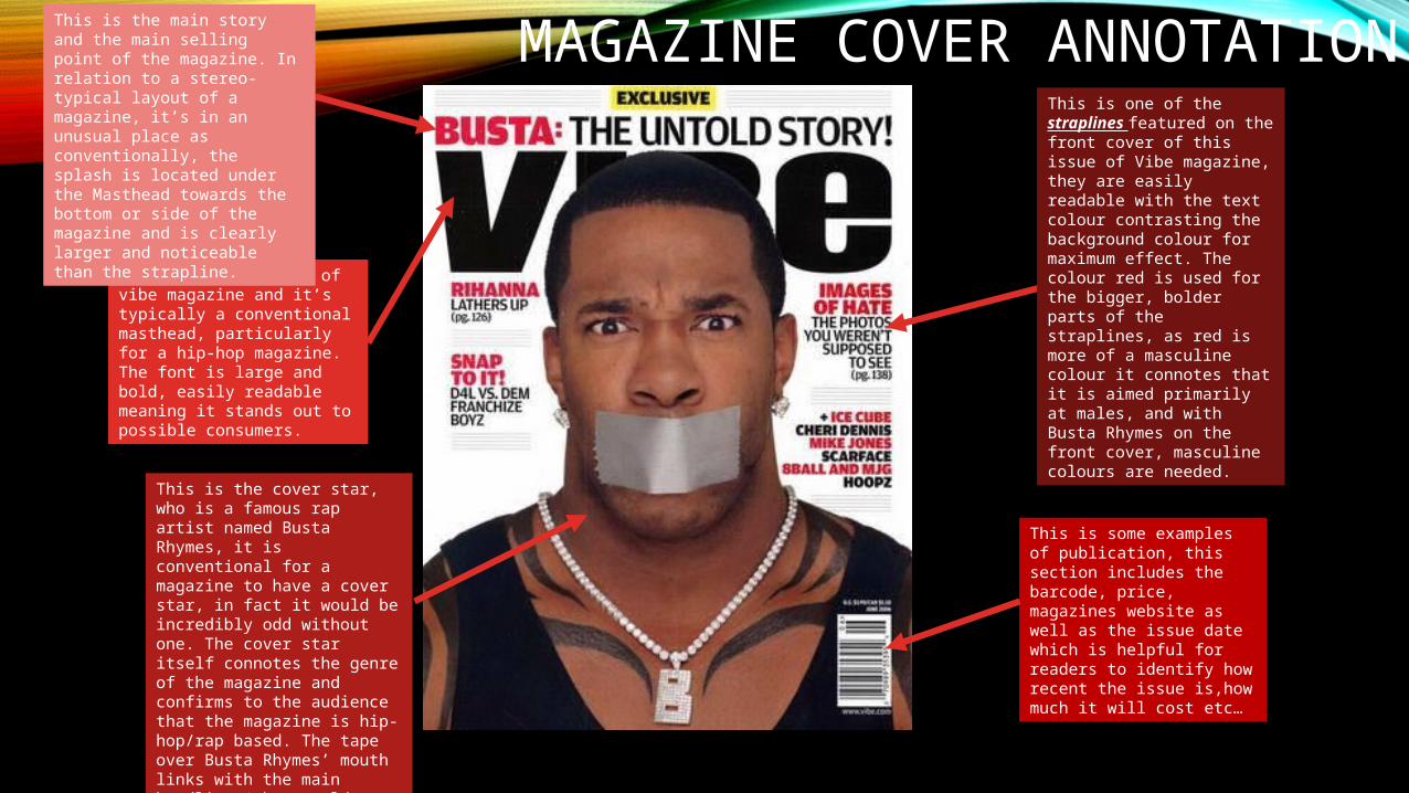
This is the Masthead of vibe magazine and it’s typically a conventional masthead, particularly for a hip-hop magazine. The font is large and bold, easily readable meaning it stands out to possible consumers.
This is one of the straplines featured on the front cover of this issue of Vibe magazine, they are easily readable with the text colour contrasting the background colour for maximum effect. The colour red is used for the bigger, bolder parts of the straplines, as red is more of a masculine colour it connotes that it is aimed primarily at males, and with Busta Rhymes on the front cover, masculine colours are needed.
This is the cover star, who is a famous rap artist named Busta Rhymes, it is conventional for a magazine to have a cover star, in fact it would be incredibly odd without one. The cover star itself connotes the genre of the magazine and confirms to the audience that the magazine is hip-hop/rap based. The tape over Busta Rhymes’ mouth links with the main headline ‘the untold story’.
This is the main story and the main selling point of the magazine. In relation to a stereo-typical layout of a magazine, it’s in an unusual place as conventionally, the splash is located under the Masthead towards the bottom or side of the magazine and is clearly larger and noticeable than the strapline.
This is some examples of publication, this section includes the barcode, price, magazines website as well as the issue date which is helpful for readers to identify how recent the issue is,how much it will cost etc…
ANNOTATION OF CONTENTS PAGE
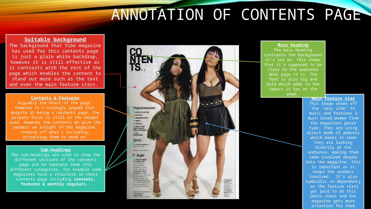
Suitable backgroundThe background that Vibe magazine has used for this contents page is just a plain
white backdrop, however it is still effective as it contrasts with the rest of the page which
enables the content to stand out more such as the text and even the main feature stars.
Main feature starThis image shows off the ‘sexy side’ to music and features 2 much loved women from the magazines genre type. They
are using direct mode of address which makes it seem they are looking directly at the audience, making them seem
involved deeper into the magazine, this is important as it keeps the readers involved.
It’s also symbiotic co-dependency as the feature
stars get paid to do this photo shoot and the magazine gets more attention for them being
in it, therefore a wider audience.
Contents & FeaturesArguably the heart of the page, however it’s strongly
argued that despite it being a contents page, the primary focus is still on the images used. However the contents do give the readers an insight of the magazine, showing off what’s including, attracting
them to read on.
Main headingThe main heading contrasts the
background it’s set on, this shows that it’s supposed to be
clear to the audience what page it is. The font is also big and bold which adds to the impact it has
on the page.
Sub-headingsThe sub-headings are used to show the different
sections of the contents page and to separate them into different categories, for example some
magazines have a structure on their contents page including contents, features & monthly regulars..
ANNOTATION OF CONTENTS PAGE 2
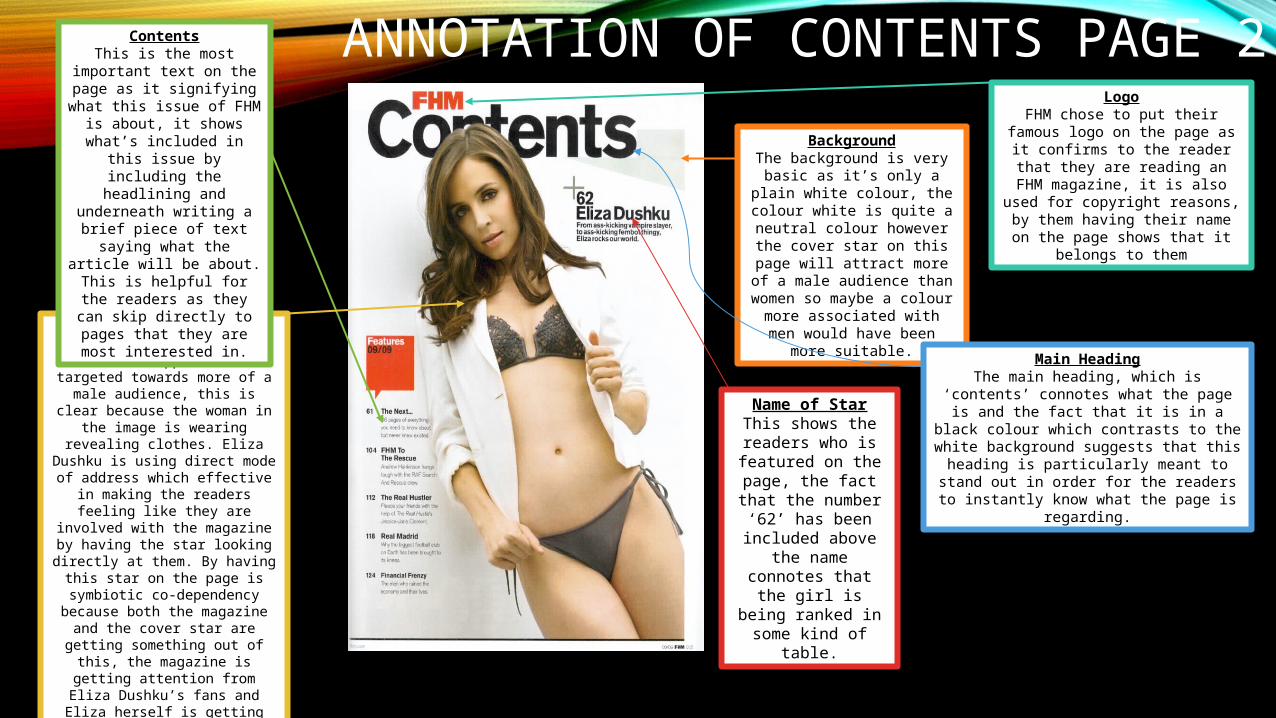
Main feature starThe main image connotes that it’s supposed to be targeted towards more of a male audience, this is clear because the woman in the
image is wearing revealing clothes. Eliza Dushku is using direct mode of
address which effective in making the readers feeling like they are involved with the magazine by
having the star looking directly at them. By having this star on the
page is symbiotic co-dependency because both the magazine and the cover star are getting something out
of this, the magazine is getting attention from Eliza Dushku’s fans and Eliza herself is getting paid to feature on the page, therefore they
are both benefiting.
ContentsThis is the most important
text on the page as it signifying what this issue of
FHM is about, it shows what’s included in this issue by including the headlining and underneath writing a
brief piece of text saying what the article will be about. This is helpful for the readers as
they can skip directly to pages that they are most
interested in.
BackgroundThe background is very basic
as it’s only a plain white colour, the colour white is quite a neutral colour however the cover star on this page will
attract more of a male audience than women so maybe a colour
more associated with men would have been more suitable.
LogoFHM chose to put their famous logo
on the page as it confirms to the reader that they are reading an FHM
magazine, it is also used for copyright reasons, by them having
their name on the page shows that it belongs to them
Main HeadingThe main heading, which is ‘contents’ connotes what the page is and the fact that it is in a black colour which contrasts to the white background suggests that this heading is particularly meant to stand out in order for the readers to instantly
know what the page is regarding.
Name of StarThis shows the readers who is
featured on the page, the fact that the
number ‘62’ has been included above the name connotes that
the girl is being ranked in some kind
of table.
ANNOTATION OF CONTENTS PAGE 3
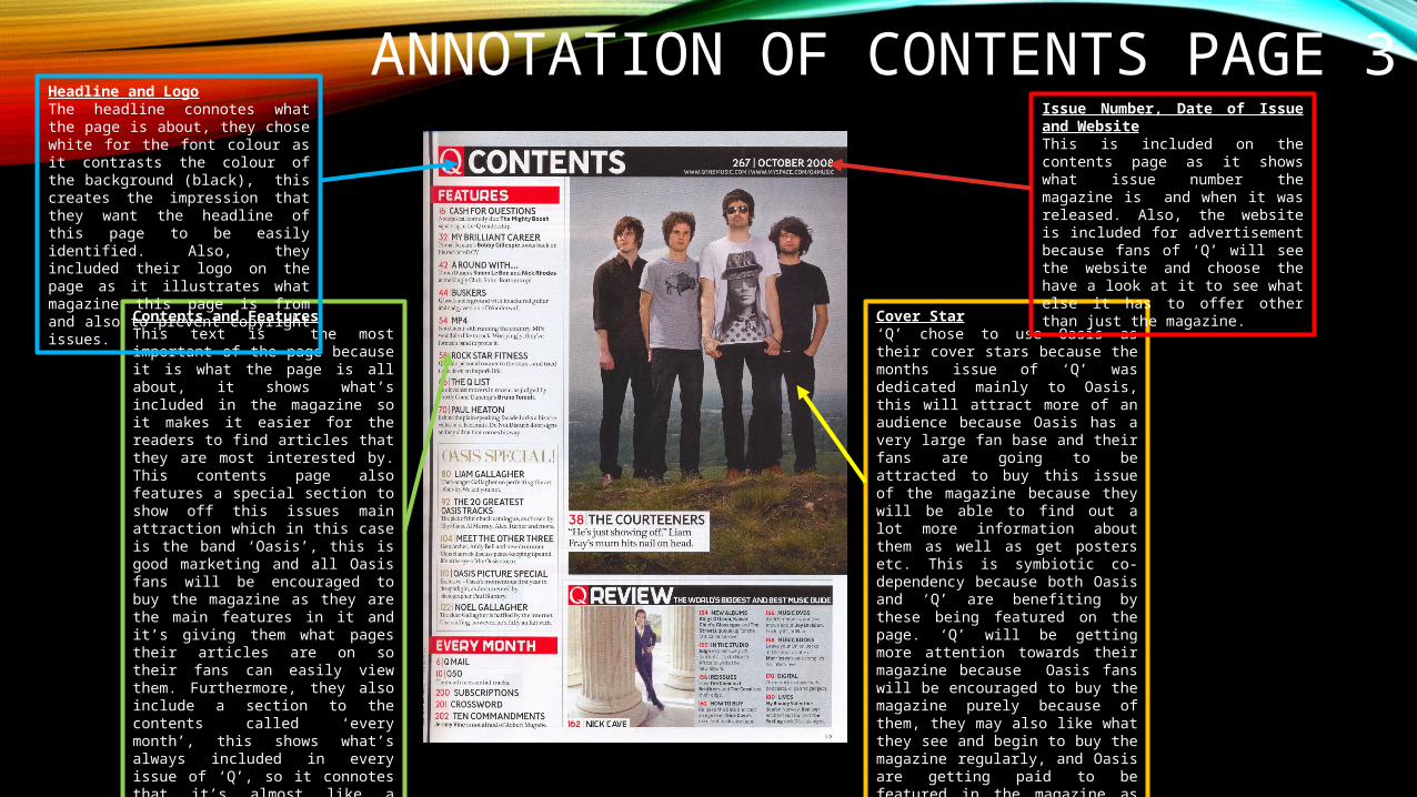
Cover Star‘Q’ chose to use Oasis as their cover stars because the months issue of ‘Q’ was dedicated mainly to Oasis, this will attract more of an audience because Oasis has a very large fan base and their fans are going to be attracted to buy this issue of the magazine because they will be able to find out a lot more information about them as well as get posters etc. This is symbiotic co-dependency because both Oasis and ‘Q’ are benefiting by these being featured on the page. ‘Q’ will be getting more attention towards their magazine because Oasis fans will be encouraged to buy the magazine purely because of them, they may also like what they see and begin to buy the magazine regularly, and Oasis are getting paid to be featured in the magazine as well as increasing the chance of them increasing their fan base because ‘Q’ readers may read about the band and like what they see therefore they may begin to become fans of Oasis too,
Issue Number, Date of Issue and WebsiteThis is included on the contents page as it shows what issue number the magazine is and when it was released. Also, the website is included for advertisement because fans of ‘Q’ will see the website and choose the have a look at it to see what else it has to offer other than just the magazine.
Contents and FeaturesThis text is the most important of the page because it is what the page is all about, it shows what’s included in the magazine so it makes it easier for the readers to find articles that they are most interested by. This contents page also features a special section to show off this issues main attraction which in this case is the band ‘Oasis’, this is good marketing and all Oasis fans will be encouraged to buy the magazine as they are the main features in it and it’s giving them what pages their articles are on so their fans can easily view them. Furthermore, they also include a section to the contents called ‘every month’, this shows what’s always included in every issue of ‘Q’, so it connotes that it’s almost like a tradition for the magazine to include these things in it, possibly because it’s interesting for their fans so they include what pages they can find the stuff on to make it easier for them.
Headline and LogoThe headline connotes what the page is about, they chose white for the font colour as it contrasts the colour of the background (black), this creates the impression that they want the headline of this page to be easily identified. Also, they included their logo on the page as it illustrates what magazine this page is from and also to prevent copyright issues.
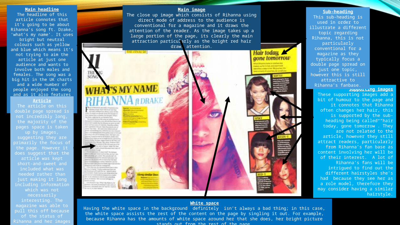
Supporting imagesThese supporting images add a bit of
humour to the page and it connotes that Rihanna often changes her hair, this is
supported by the sub-heading being called “hair today, gone tomorrow”. They are not related to the article, however they still attract readers,
particularly from Rihanna’s fan base as content involving her will be of their
interest. A lot of Rihanna’s fans will be intrigued to find out the different
hairstyles she’s had because they see her as a role model, therefore they may
consider having a similar hairstyle.
Sub-headingThis sub-heading is used in order to illustrate a different
topic regarding Rihanna, this is not particularly
conventional for a magazine as they typically focus a
double page spread on just one topic, however this is still
attractive to Rihanna’s fanbase.
Main imageThe close up image which consists of Rihanna using direct mode of address to the audience is conventional for a magazine and it draws the attention of the reader. As the image takes up a large portion of the page, its clearly the main attraction particularly as the bright red
hair draws attention.
Main headlineThe headline of this article
connotes that it’s going to be about Rihanna’s song ft. Drake, ‘what’s
my name’. It uses bright but neutral colours such as yellow and blue which means it’s not trying to aim the article at just one audience
and wants to involve both males and females. The song was a big hit in the UK charts and a wide number of people enjoyed the
song and as it also features Drake, his fan base may also be attracted
to this article.
ArticleThe article on this double
page spread is not incredibly long, the majority of the
pages space is taken up by images, suggesting they are
primarily the focus of the page. However it does
suggest that the article was kept short-and-sweet and included what was needed
rather than just making it long including information which
was not necessarily interesting. The magazine
was able to pull this off because of the status of Rihanna and her images alone are very attracting.
White spaceHaving the white space in the background definitely isn’t always a bad thing; in this case, the white space assists the rest of the content on the page by singling it out. For example, because Rihanna has the amounts of white space around her that she does,
her bright picture stands out from the rest of the page.
PLANNING
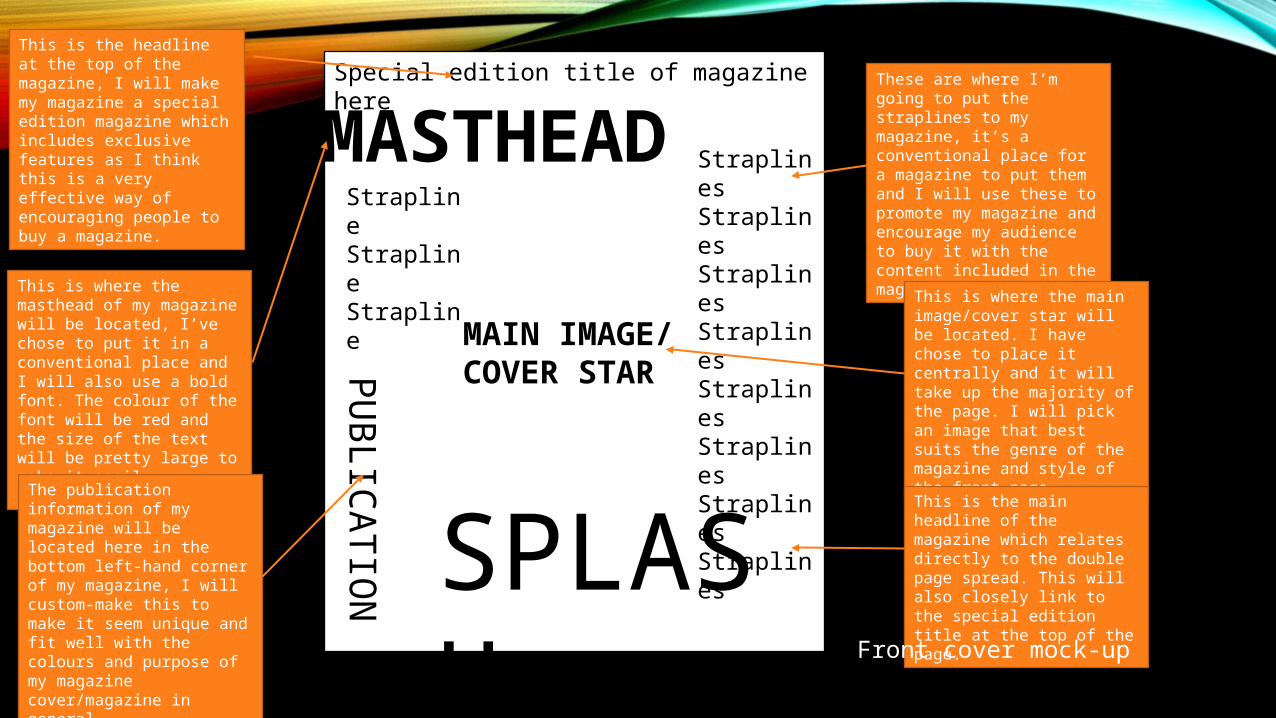
MASTHEADSpecial edition title of magazine here
MAIN IMAGE/COVER STAR
StraplinesStraplinesStraplinesStraplinesStraplinesStraplinesStraplinesStraplines
StraplineStraplineStrapline
SPLASH
PU
BLIC
ATIO
N
This is where the masthead of my magazine will be located, I’ve chose to put it in a conventional place and I will also use a bold font. The colour of the font will be red and the size of the text will be pretty large to make it easily readable.
This is the headline at the top of the magazine, I will make my magazine a special edition magazine which includes exclusive features as I think this is a very effective way of encouraging people to buy a magazine.
These are where I’m going to put the straplines to my magazine, it’s a conventional place for a magazine to put them and I will use these to promote my magazine and encourage my audience to buy it with the content included in the magazine.
This is where the main image/cover star will be located. I have chose to place it centrally and it will take up the majority of the page. I will pick an image that best suits the genre of the magazine and style of the front page.
This is the main headline of the magazine which relates directly to the double page spread. This will also closely link to the special edition title at the top of the page.
The publication information of my magazine will be located here in the bottom left-hand corner of my magazine, I will custom-make this to make it seem unique and fit well with the colours and purpose of my magazine cover/magazine in general.
Front cover mock-up
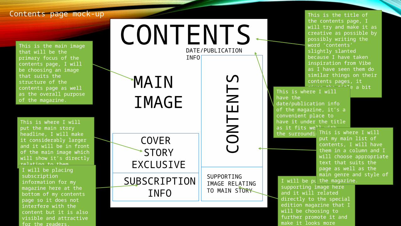
CONTENTSDATE/PUBLICATION INFO
CO
NTEN
TS
SUPPORTING IMAGE RELATING TO MAIN STORY
MAIN IMAGE
COVER STORY
EXCLUSIVE
SUBSCRIPTIONINFO
This is the title of the contents page, I will try and make it as creative as possible by possibly writing the word ‘contents’ slightly slanted because I have taken inspiration from Vibe as I have seen them do similar things on their contents pages, it gives the title a bit of flair.
This is the main image that will be the primary focus of the contents page, I will be choosing an image that suits the structure of the contents page as well as the overall purpose of the magazine.
This is where I will have the date/publication info of the magazine, it’s a convenient place to have it under the title as it fits well with the surroundings.
I will be putting a supporting image here and it will related directly to the special edition magazine that I will be choosing to further promote it and make it looks more realistic.
This is where I will put the main story headline, I will make it considerably larger and it will be in front of the main image which will show it’s directly relating to them.
I will be placing subscription information for my magazine here at the bottom of my contents page so it does not interfere with the content but it is also visible and attractive for the readers.
This is where I will put my main list of contents, I will have them in a column and I will choose appropriate text that suits the page as well as the main genre and style of the magazine.
Contents page mock-up
MAGAZINE MASTHEAD RESEARCH
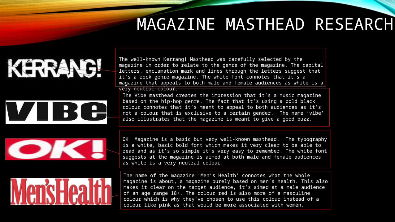
The well-known Kerrang! Masthead was carefully selected by the magazine in order to relate to the genre of the magazine. The capital letters, exclamation mark and lines through the letters suggest that it’s a rock genre magazine. The white font connotes that it’s a magazine that appeals to both male and female audiences as white is a very neutral colour.
The Vibe masthead creates the impression that it’s a music magazine based on the hip-hop genre. The fact that it’s using a bold black colour connotes that it’s meant to appeal to both audiences as it’s not a colour that is exclusive to a certain gender. The name ‘vibe’ also illustrates that the magazine is meant to give a good buzz.
The name of the magazine ‘Men’s Health’ connotes what the whole magazine is about, a magazine purely based on men’s health. This also makes it clear on the target audience, it’s aimed at a male audience of an age range 18+. The colour red is also more of a masculine colour which is why they’ve chosen to use this colour instead of a colour like pink as that would be more associated with women.
OK! Magazine is a basic but very well-known masthead. The typography is a white, basic bold font which makes it very clear to be able to read and as it’s so simple it’s very easy to remember. The white font suggests at the magazine is aimed at both male and female audiences as white is a very neutral colour.
NAME OF MAGAZINE / MAGAZINE
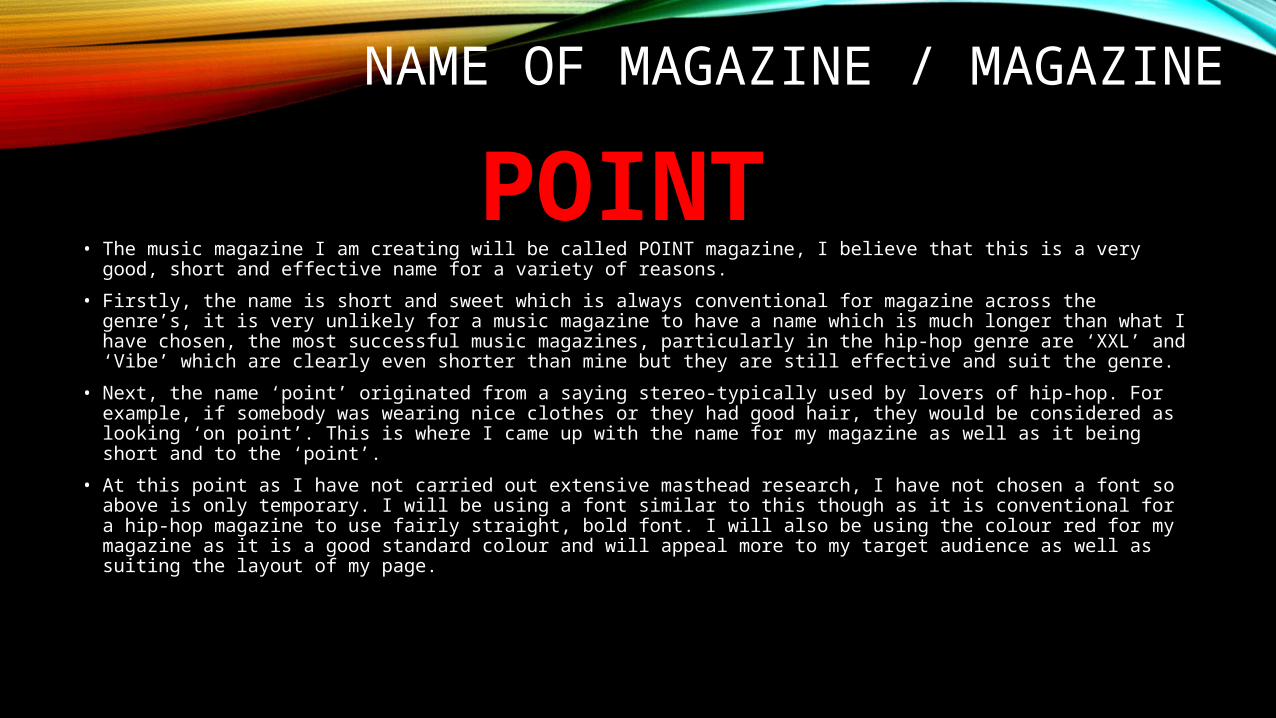
• The music magazine I am creating will be called POINT magazine, I believe that this is a very good, short and effective name for a variety of reasons.
• Firstly, the name is short and sweet which is always conventional for magazine across the genre’s, it is very unlikely for a music magazine to have a name which is much longer than what I have chosen, the most successful music magazines, particularly in the hip-hop genre are ‘XXL’ and ‘Vibe’ which are clearly even shorter than mine but they are still effective and suit the genre.
• Next, the name ‘point’ originated from a saying stereo-typically used by lovers of hip-hop. For example, if somebody was wearing nice clothes or they had good hair, they would be considered as looking ‘on point’. This is where I came up with the name for my magazine as well as it being short and to the ‘point’.
• At this point as I have not carried out extensive masthead research, I have not chosen a font so above is only temporary. I will be using a font similar to this though as it is conventional for a hip-hop magazine to use fairly straight, bold font. I will also be using the colour red for my magazine as it is a good standard colour and will appeal more to my target audience as well as suiting the layout of my page.
POINT
MY MAGAZINE MASTHEAD PLANNING
POINT –POINT –POINT –POINT -
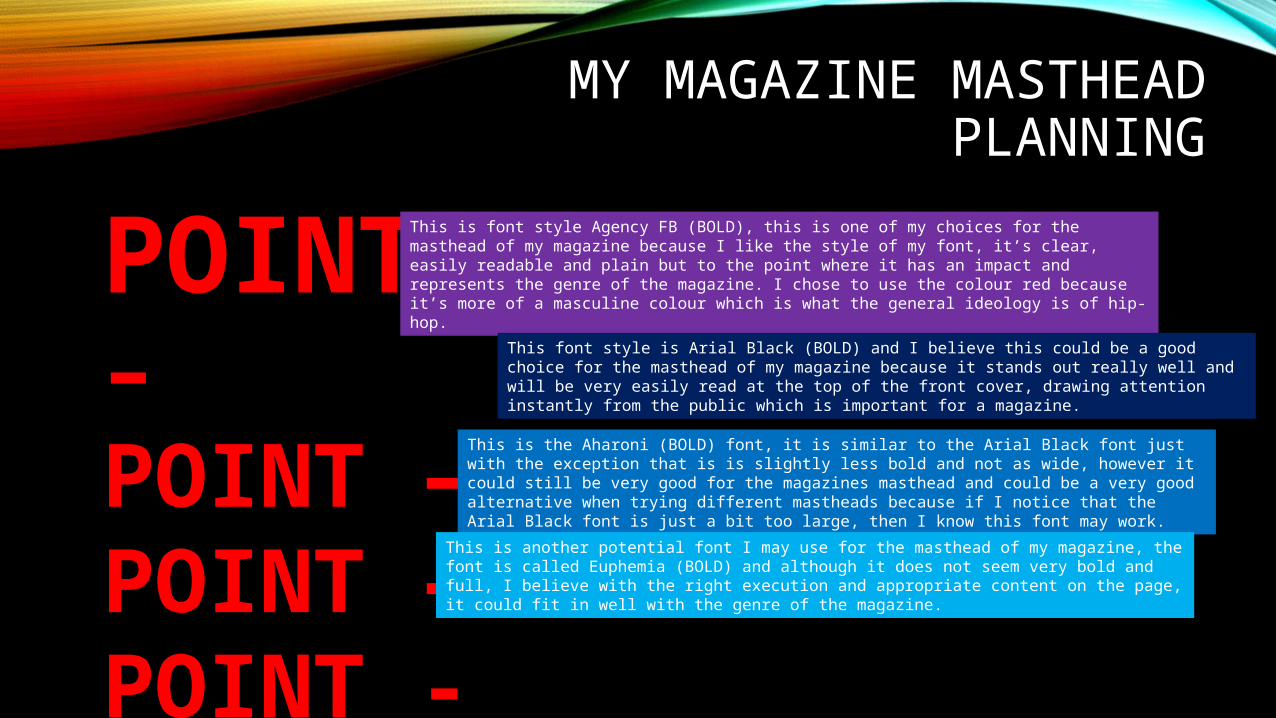
This is font style Agency FB (BOLD), this is one of my choices for the masthead of my magazine because I like the style of my font, it’s clear, easily readable and plain but to the point where it has an impact and represents the genre of the magazine. I chose to use the colour red because it’s more of a masculine colour which is what the general ideology is of hip-hop.
This font style is Arial Black (BOLD) and I believe this could be a good choice for the masthead of my magazine because it stands out really well and will be very easily read at the top of the front cover, drawing attention instantly from the public which is important for a magazine.
This is the Aharoni (BOLD) font, it is similar to the Arial Black font just with the exception that is is slightly less bold and not as wide, however it could still be very good for the magazines masthead and could be a very good alternative when trying different mastheads because if I notice that the Arial Black font is just a bit too large, then I know this font may work.
This is another potential font I may use for the masthead of my magazine, the font is called Euphemia (BOLD) and although it does not seem very bold and full, I believe with the right execution and appropriate content on the page, it could fit in well with the genre of the magazine.
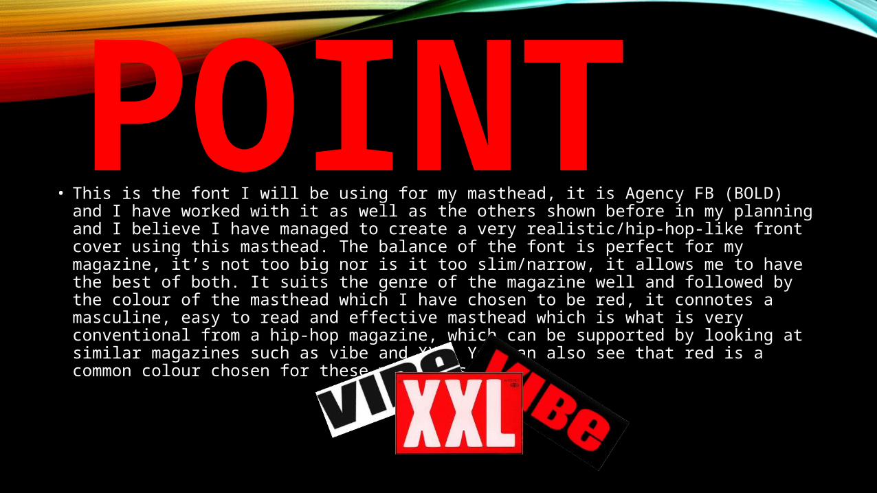
POINT• This is the font I will be using for my masthead, it is Agency FB (BOLD) and I have worked
with it as well as the others shown before in my planning and I believe I have managed to create a very realistic/hip-hop-like front cover using this masthead. The balance of the font is perfect for my magazine, it’s not too big nor is it too slim/narrow, it allows me to have the best of both. It suits the genre of the magazine well and followed by the colour of the masthead which I have chosen to be red, it connotes a masculine, easy to read and effective masthead which is what is very conventional from a hip-hop magazine, which can be supported by looking at similar magazines such as vibe and XXL. You can also see that red is a common colour chosen for these magazines.
REPRESENTATION OF COVER STAR
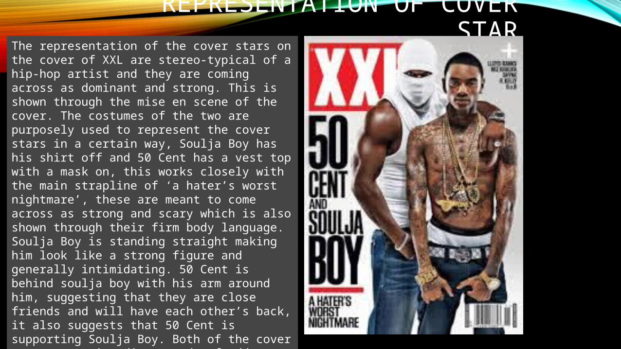
The representation of the cover stars on the cover of XXL are stereo-typical of a hip-hop artist and they are coming across as dominant and strong. This is shown through the mise en scene of the cover. The costumes of the two are purposely used to represent the cover stars in a certain way, Soulja Boy has his shirt off and 50 Cent has a vest top with a mask on, this works closely with the main strapline of ‘a hater’s worst nightmare’, these are meant to come across as strong and scary which is also shown through their firm body language. Soulja Boy is standing straight making him look like a strong figure and generally intimidating. 50 Cent is behind soulja boy with his arm around him, suggesting that they are close friends and will have each other’s back, it also suggests that 50 Cent is supporting Soulja Boy. Both of the cover stars are using direct mode of address, again representing them as strong and dominating as well as intimidating in relation to the main strapline.
REPRESENTATION OF COVER STAR
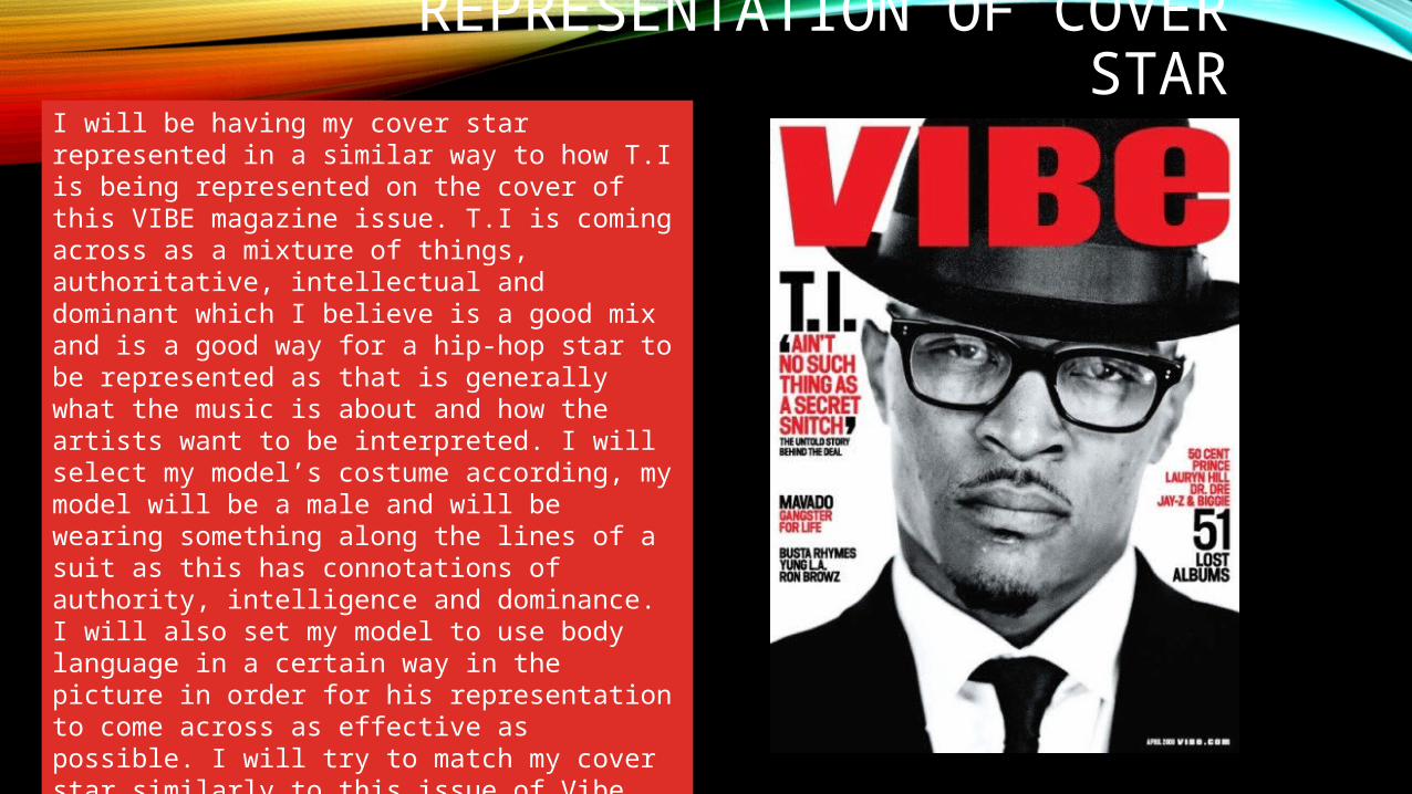
I will be having my cover star represented in a similar way to how T.I is being represented on the cover of this VIBE magazine issue. T.I is coming across as a mixture of things, authoritative, intellectual and dominant which I believe is a good mix and is a good way for a hip-hop star to be represented as that is generally what the music is about and how the artists want to be interpreted. I will select my model’s costume according, my model will be a male and will be wearing something along the lines of a suit as this has connotations of authority, intelligence and dominance. I will also set my model to use body language in a certain way in the picture in order for his representation to come across as effective as possible. I will try to match my cover star similarly to this issue of Vibe magazine as it is clearly showing the representation which I am aiming for.
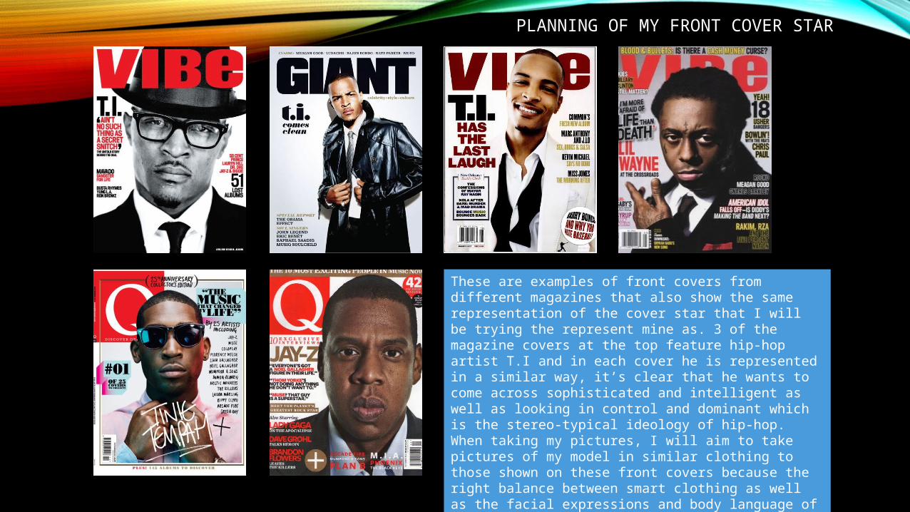
These are examples of front covers from different magazines that also show the same representation of the cover star that I will be trying the represent mine as. 3 of the magazine covers at the top feature hip-hop artist T.I and in each cover he is represented in a similar way, it’s clear that he wants to come across sophisticated and intelligent as well as looking in control and dominant which is the stereo-typical ideology of hip-hop. When taking my pictures, I will aim to take pictures of my model in similar clothing to those shown on these front covers because the right balance between smart clothing as well as the facial expressions and body language of my cover star will demonstrate representation of my model as sophisticated but still dominant and in control.
PLANNING OF MY FRONT COVER STAR
IMAGES / WEEK 1
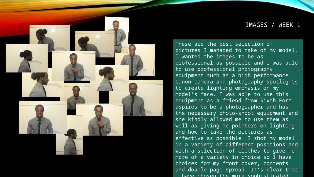
These are the best selection of pictures I managed to take of my model. I wanted the images to be as professional as possible and I was able to use professional photography equipment such as a high performance Canon camera and photography spotlights to create lighting emphasis on my model’s face. I was able to use this equipment as a friend from Sixth Form aspires to be a photographer and has the necessary photo-shoot equipment and she kindly allowed me to use them as well as giving me pointers on lighting and how to take the pictures as effective as possible. I shot my model in a variety of different positions and with a selection of clothes to give me more of a variety in choice so I have choices for my front cover, contents and double page spread. It’s clear that I have chosen the more sophisticated look because this is going to work well with the main feature of the magazine which is the ‘Man of the Year’ comp.
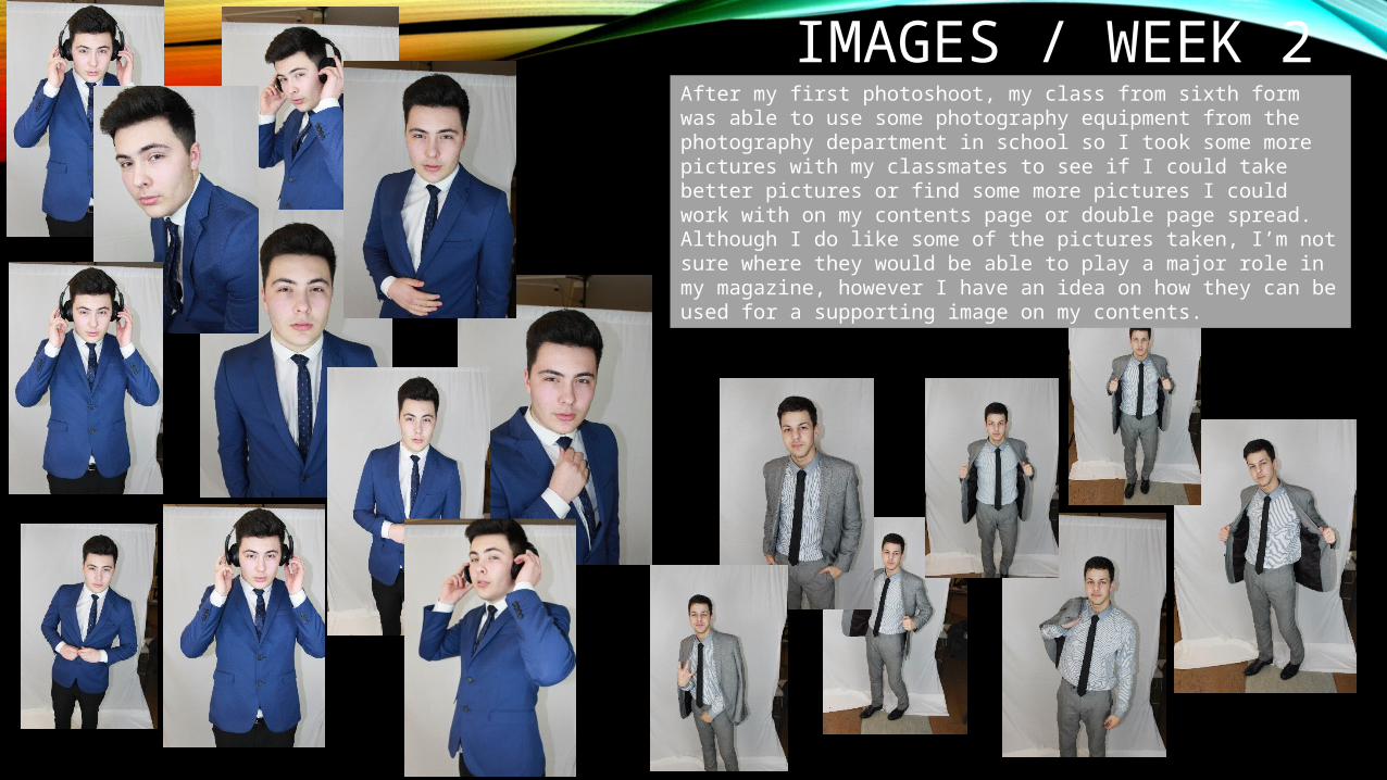
IMAGES / WEEK 2After my first photoshoot, my class from sixth form was able to use some photography equipment from the photography department in school so I took some more pictures with my classmates to see if I could take better pictures or find some more pictures I could work with on my contents page or double page spread. Although I do like some of the pictures taken, I’m not sure where they would be able to play a major role in my magazine, however I have an idea on how they can be used for a supporting image on my contents.
STRAPLINE PLANNING
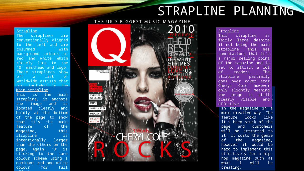
Puff/StraplineThis is a puff and it includes information and included content in the magazine in a more creative way. The feature looks like it’s been stuck of the page and customers will be attracted to it, it suits the genre of the magazine, however it would be hard to implement this effectively for a hip-hop magazine such as what I will be creating.
StraplineThis strapline is fairly large despite it not being the main strapline, this has connotations that it’s a major selling point of the magazine and is set to attract a lot of readers. The strapline partially goes over cover star Cheryl Cole however only slightly meaning the image is still clearly visible and effective.
StraplineThe straplines are conventionally aligned to the left and are columned with background colours of red and white which closely link to the ‘Q’ masthead and logo. These straplines show off a list of worldwide artists that are included in the magazine to attract readers.
Main straplineThis is the main strapline, it anchors the image and is located clearly and boldly at the bottom of the page to show that it’s the main feature of the magazine, this strapline is intentionally larger than the others on the page. Again, ‘Q’ is sticking to the same colour scheme using a dominant red and white colour for full effect.
DOUBLE PAGE SPREAD PLANNING
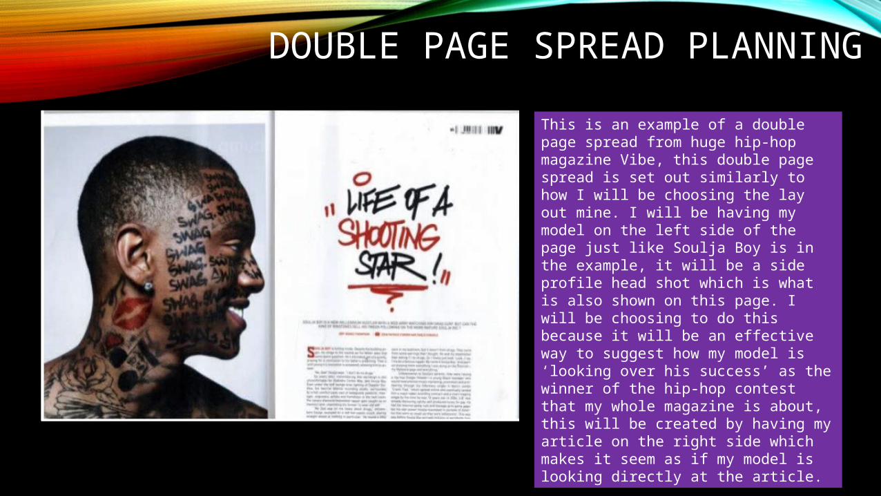
This is an example of a double page spread from huge hip-hop magazine Vibe, this double page spread is set out similarly to how I will be choosing the lay out mine. I will be having my model on the left side of the page just like Soulja Boy is in the example, it will be a side profile head shot which is what is also shown on this page. I will be choosing to do this because it will be an effective way to suggest how my model is ‘looking over his success’ as the winner of the hip-hop contest that my whole magazine is about, this will be created by having my article on the right side which makes it seem as if my model is looking directly at the article.
STRAPLINE PLANNING
MAN OF THE YEAR
CONTENDERS
INSIDE
OFWGKTATYLER KEEPS
CREATING
MIGUEL“LET MY
LOVEADORN
YOU”
MY NAME IS WHAT?MY NAME IS WHO?MY NAME IS…*CHICKA CHICKA*
SLIM SHADY
These are the straplines that I have chosen to use, I believe they strongly suit the genre of my magazine and are up-to-date and enticing, encouraging the readers to want to buy my magazine. I will be using one dominant font which was Agency FB which is also the font I will be using for my masthead as seen on the previous slide, I chose to do this as it keeps the balance of the cover right and keeps to conventions, making it look as professional as possible. The colours I have chose to use are red and white, suitable for the hip-hop genre of my magazine andthe colours balance out well over the background of my magazine which I will be
setting as black so these are fully visible and effective. I will be using a good mix of regular and bold font for my straplines to further show effect and for key parts of the straplines to stand out. I did choose one different font for my straplines and that’s for the ‘slim shady’ strapline to the left. I used Xpress Heavy SF so this strapline in particular would stand out and be very effecting because one of the biggest hip-hop stars ever is Eminem and the strapline is a quote from one of his songs which will be noticeable to my readers and they will understand the change of tone in the song when he says ‘slim shady’ in this phrase.These straplines will wrap around my main cover star which is why I’ve aligned them accordingly to best fit the structure of my front cover, the straplines are all relevant and suit the purpose of my magazine.
FRONT COVER IMAGE
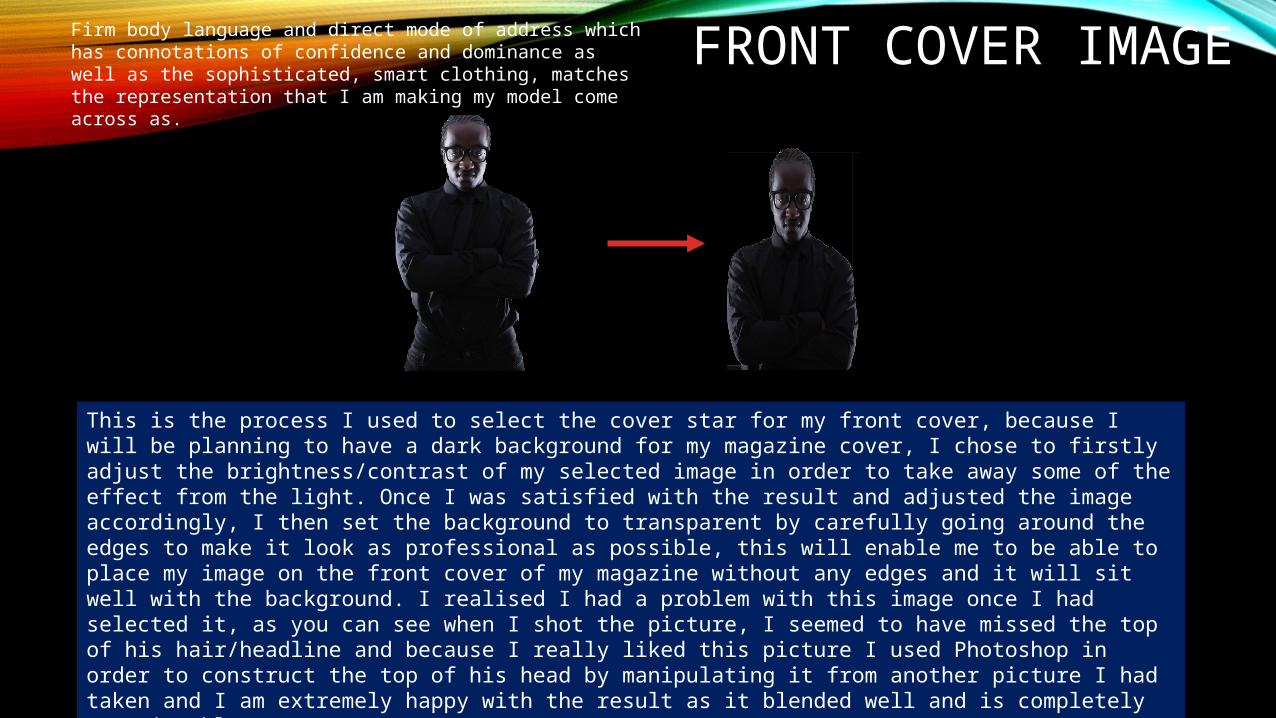
This is the process I used to select the cover star for my front cover, because I will be planning to have a dark background for my magazine cover, I chose to firstly adjust the brightness/contrast of my selected image in order to take away some of the effect from the light. Once I was satisfied with the result and adjusted the image accordingly, I then set the background to transparent by carefully going around the edges to make it look as professional as possible, this will enable me to be able to place my image on the front cover of my magazine without any edges and it will sit well with the background. I realised I had a problem with this image once I had selected it, as you can see when I shot the picture, I seemed to have missed the top of his hair/headline and because I really liked this picture I used Photoshop in order to construct the top of his head by manipulating it from another picture I had taken and I am extremely happy with the result as it blended well and is completely unnoticeable.
Firm body language and direct mode of address which has connotations of confidence and dominance as well as the sophisticated, smart clothing, matches the representation that I am making my model come across as.
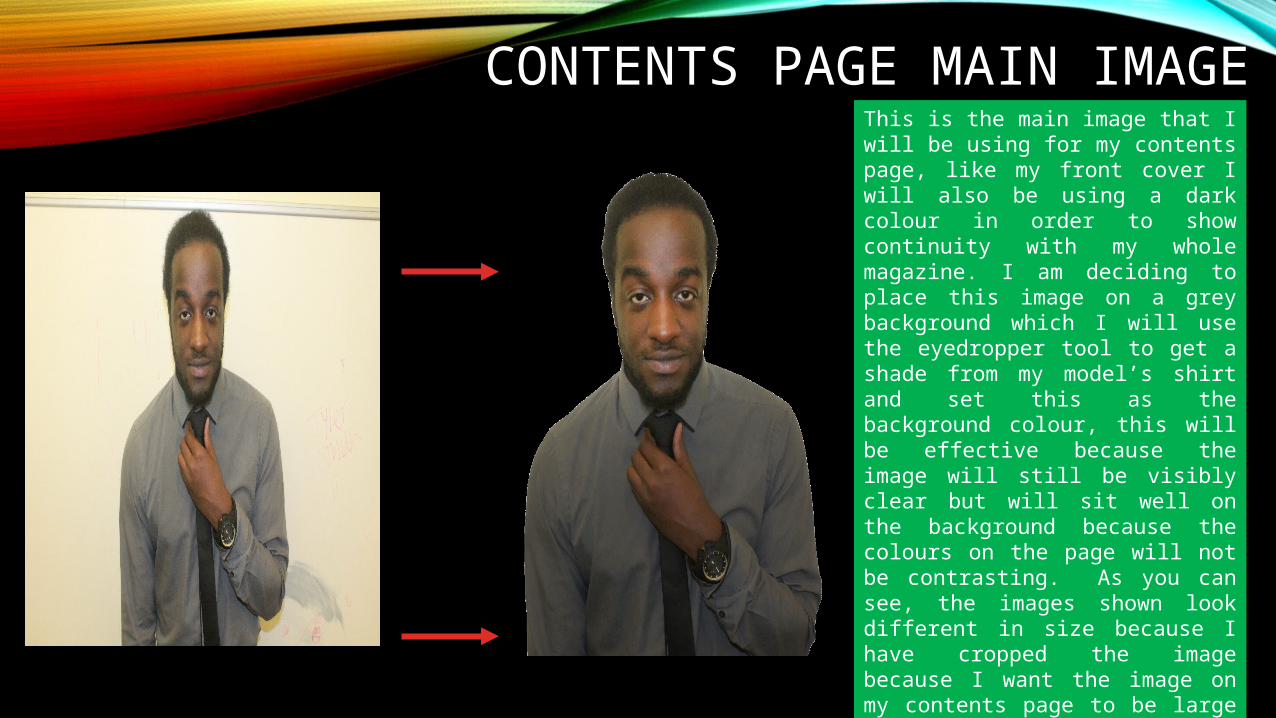
CONTENTS PAGE MAIN IMAGEThis is the main image that I will be using for my contents page, like my front cover I will also be using a dark colour in order to show continuity with my whole magazine. I am deciding to place this image on a grey background which I will use the eyedropper tool to get a shade from my model’s shirt and set this as the background colour, this will be effective because the image will still be visibly clear but will sit well on the background because the colours on the page will not be contrasting. As you can see, the images shown look different in size because I have cropped the image because I want the image on my contents page to be large and take up the majority of the page from top to bottom and I will have text overlapping him such as the title at the top of the page.
SUPPORTING IMAGES ON CONTENTS
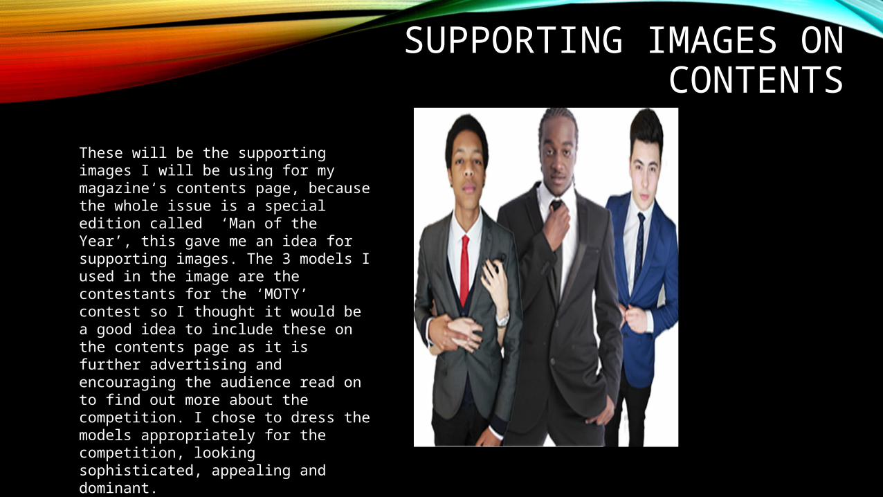
These will be the supporting images I will be using for my magazine‘s contents page, because the whole issue is a special edition called ‘Man of the Year’, this gave me an idea for supporting images. The 3 models I used in the image are the contestants for the ‘MOTY’ contest so I thought it would be a good idea to include these on the contents page as it is further advertising and encouraging the audience read on to find out more about the competition. I chose to dress the models appropriately for the competition, looking sophisticated, appealing and dominant.
DOUBLE PAGE SPREAD IMAGE
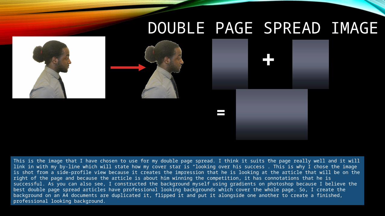
This is the image that I have chosen to use for my double page spread. I think it suits the page really well and it will link in with my by-line which will state how my cover star is “looking over his success”. This is why I chose the image is shot from a side-profile view because it creates the impression that he is looking at the article that will be on the right of the page and because the article is about him winning the competition, it has connotations that he is successful. As you can also see, I constructed the background myself using gradients on photoshop because I believe the best double page spread articles have professional looking backgrounds which cover the whole page. So, I create the background on an A4 documents are duplicated it, flipped it and put it alongside one another to create a finished, professional looking background.
+
=
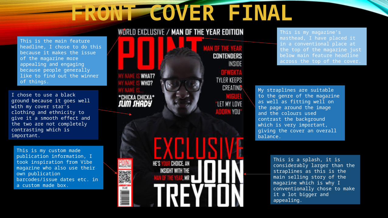
FRONT COVER FINALThis is my magazine’s masthead, I have placed it in a conventional place at the top of the magazine just below main feature headline across the top of the cover.
This is a splash, it is considerably larger than the straplines as this is the main selling story of the magazine which is why I conventionally chose to make it a lot bigger and appealing.
This is my custom made publication information, I took inspiration from Vibe magazine who also use their own publication barcodes/issue dates etc. in a custom made box.
This is the main feature headline, I chose to do this because it makes the issue of the magazine more appealing and engaging because people generally like to find out the winner of things.
My straplines are suitable to the genre of the magazine as well as fitting well on the page around the image and the colours used contrast the background which is very important, giving the cover an overall balance.
I chose to use a black ground because it goes well with my cover star’s clothing and ethnicity to give it a smooth effect and the two are not completely contrasting which is important.
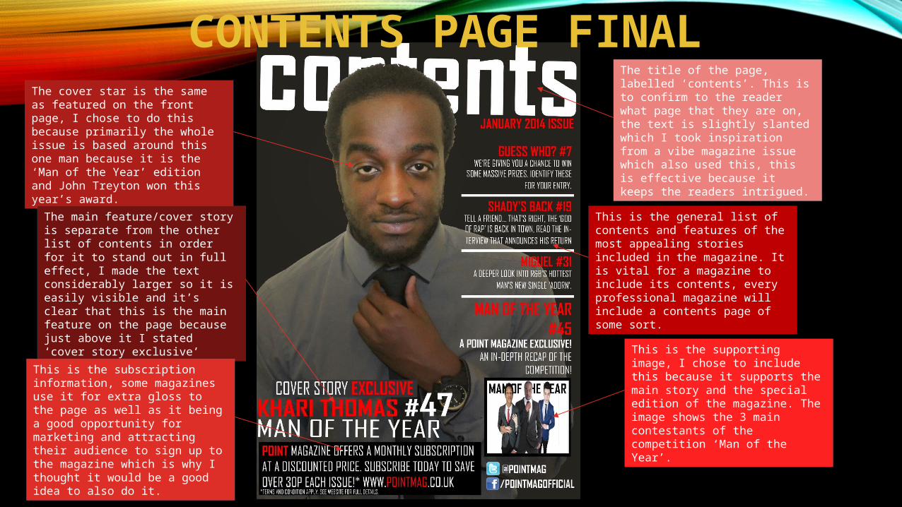
CONTENTS PAGE FINALThe title of the page, labelled ‘contents’. This is to confirm to the reader what page that they are on, the text is slightly slanted which I took inspiration from a vibe magazine issue which also used this, this is effective because it keeps the readers intrigued.
This is the general list of contents and features of the most appealing stories included in the magazine. It is vital for a magazine to include its contents, every professional magazine will include a contents page of some sort.
The cover star is the same as featured on the front page, I chose to do this because primarily the whole issue is based around this one man because it is the ‘Man of the Year’ edition and John Treyton won this year’s award.
The main feature/cover story is separate from the other list of contents in order for it to stand out in full effect, I made the text considerably larger so it is easily visible and it’s clear that this is the main feature on the page because just above it I stated ‘cover story exclusive’
This is the subscription information, some magazines use it for extra gloss to the page as well as it being a good opportunity for marketing and attracting their audience to sign up to the magazine which is why I thought it would be a good idea to also do it.
This is the supporting image, I chose to include this because it supports the main story and the special edition of the magazine. The image shows the 3 main contestants of the competition ‘Man of the Year’.
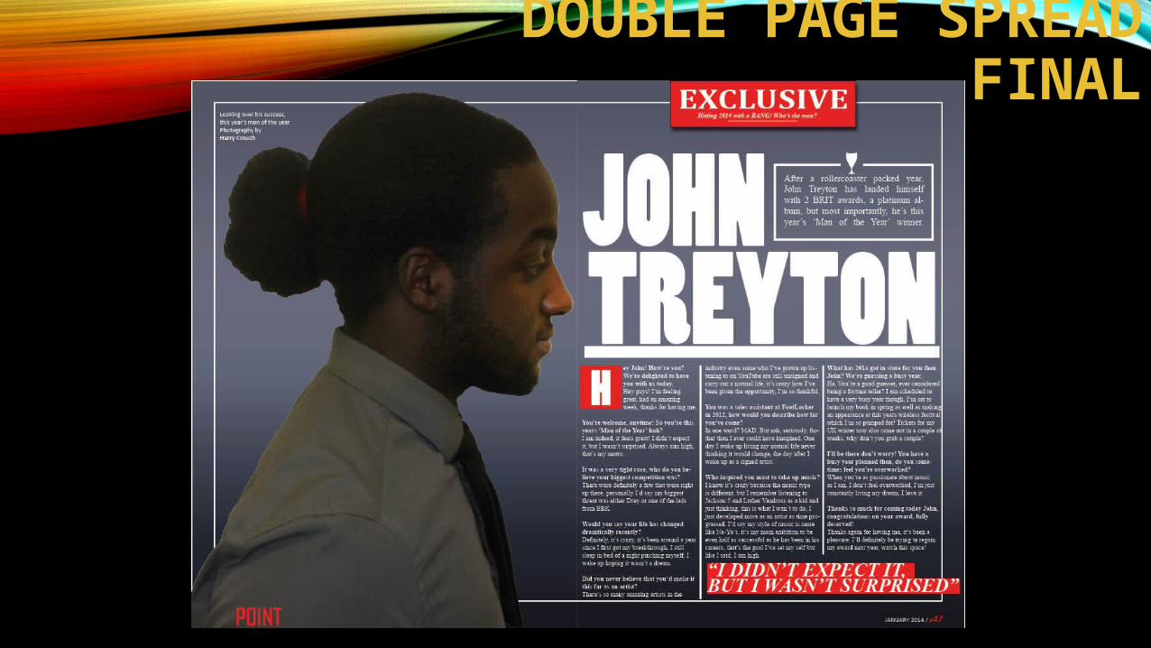
DOUBLE PAGE SPREAD FINAL
EVALUATION
QUESTION 1 / IN WHAT WAYS DOES YOUR MEDIA PRODUCT USE, DEVELOP
OR CHALLENGE FORMS AND CONVENTIONS OF REAL MEDIA
PRODUCTS
•Click here to be redirected to Prezi for question 1 of my evaluation
QUESTION 2 / HOW DOES YOUR PRODUCT REPRESENT PARTICULAR SOCIAL GROUPS?
•Click here to be redirected to Prezi for question 2 of my evaluation
QUESTION 3 / WHAT KIND OF MEDIA INSTITUTION MIGHT DISTRIBUTE YOUR MEDIA
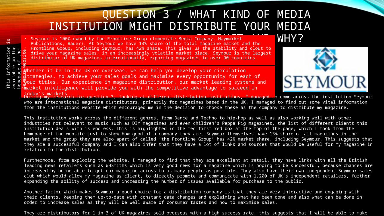
PRODUCT AND WHY? • Seymour is 100% owned by the Frontline Group (Immediate Media Company, Haymarket Publications, Bauer). At Seymour we have 13% share of the total magazine market and the Frontline Group, including Seymour, has 42% share. This gives us the stability and clout to drive your magazine sales, in an increasingly volatile market place. Seymour is the largest distributor of UK magazines internationally, exporting magazines to over 90 countries.
Whether it be in the UK or overseas, we can help you develop your circulation strategies, to achieve your sales goals and maximise every opportunity for each of your titles. Our experience in magazine distribution, our market leading systems and market intelligence will provide you with the competitive advantage to succeed in today’s markets
During my research for question 3, looking at different distribution institutions, I managed to come across the institution Seymour who are international magazine distributors, primarily for magazines based in the UK. I managed to find out some vital information from the institutions website which encouraged me in the decision to choose these as the company to distribute my magazine.
This institution works across the different genres, from Dance and Techno to hip-hop as well as also working well with other industries not relevant to music such as DIY magazines and even children’s Peppa Pig magazines, the list of different clients this institution deals with is endless. This is highlighted in the red first red box at the top of the page, which I took from the homepage of the website just to show how good of a company they are. Seymour themselves have 13% share of all magazines in the market and the group they are also apart of called ‘the Frontline Group’ has 42% market share, including Seymour. This suggests that they are a successful company and I can also infer that they have a lot of links and sources that would be useful for my magazine in relation to the distribution.
Furthermore, from exploring the website, I managed to find that they are excellent at retail, they have links with all the British leading news retailers such as WHSmiths which is very good news for a magazine which is hoping to be successful, because chances are increased by being able to get our magazine across to as many people as possible. They also have their own independent Seymour sales club which would allow my magazine as client, to directly promote and communicate with 1,200 of UK’s independent retailers, further expanding the ability of success and increasing the number of issues available for purchase to the public.
Another factor which makes Seymour a good choice for a distribution company is that they are very interactive and engaging with their clients, keeping them up-to-date with constant data changes and explaining what has been done and also what can be done in order to increase sales as they will be well aware of consumer tastes and how to maximise sales.
They are distributors for 1 in 3 of UK magazines sold overseas with a high success rate, this suggests that I will be able to make my music magazine global and reach a wider market range, particularly as my magazine is hip-hop based and countries such as the USA are very into their hip-hop music like we are in the UK.
Th
is info
rmati
on is
availa
ble
on t
he h
om
epag
e
of
the S
eym
our
websi
te.
QUESTION 4 / WHO WOULD BE THE AUDIENCE FOR YOUR MEDIA PRODUCT?
From my questionnaire that I created for the public to get an idea of what types of magazines they are in to as well as finding some general information about them in order for me to be able to construct my magazine in a certain way. Because primarily I’m creating a R&B/hip-hop magazine, I chose to survey predominantly males between the age of 16-24 as well as also surveying some females too, the reason I chose to survey males more than females is because stereotypically males would be more into the hip-hop genre of music. The majority of people I surveyed were aged between 17-19 with around 63% of them in employment, meaning that the socio-economic group for these will range from C/D to E, this is because the majority of the 63% in employment are working class and those not in employment are students or just do not have a job, meaning they will likely fit in the ‘E’ socio-economic group as they are of low income, likely being a student. Regarding magazines, I asked the people I surveyed what type of music they are in to and what genre of music magazine would they most likely be interested in, The majority of people were in favour of R&B/hip-hop magazines or indie magazines, this is useful for me because it does suggest that a large number of people around my target age range are interested in hip-hop music/magazines, which is the genre of magazine I will be creating. I believe these music genres are the most common genre because these genres are more mainstream and get played on the popular radio stations such as Kiss100 or Capital FM frequently. I also asked how often (if at all) do they buy music magazines, around half of them do not buy magazines at all which can be quite worrying, however the other half do buy magazines prefer to buy them monthly, because of this, I will be choosing to make my music magazine a monthly issue as this is the most popular and because the main socio-economic group which my target audience fits in is those of a lower income, monthly payments will be more suitable rather than weekly. After research, I also discovered that many of the major music magazines also issue their magazines once a month. When surveying people, I also found out what people would typically enjoy doing on the weekend, I found out from my responses that my target audience mainly enjoy socialising with friends as well as listening to music either at home alone or in a group either with friends or at a party. I also asked my target audience who their current favourite artist is in order to get an idea of sub-genres etc, Kanye West, Jay Z and Eminem came up quite frequently which suggests the majority of my target audience are into mainstream hip-hop/rap which shows that my music magazine should involve contents from stars in the industry like these. Finally, I asked people within my target audience if they had ever been to a concert of an R&B/hip-hop artist and around 67% of people asked said yes with 100% saying they would like to go to a concert/go again.
QUESTION 5 / HOW DID YOU ATTRACT / ADDRESS YOUR AUDIENCE
•Click here to be redirected to Prezi for question 5 of my evaluation
QUESTION 6 / WHAT HAVE YOU LEARNT ABOUT TECHNOLOGIES FROM THE PROCESS OF
CONSTRUCTING THIS PRODUCT?
Click here to be redirected to Prezi for question 6 of my evaluation
QUESTION 7 / LOOKING BACK AT YOUR PRELIMINARY TASK, WHAT DO YOU FEEL YOU HAVE LEARNT IN THE
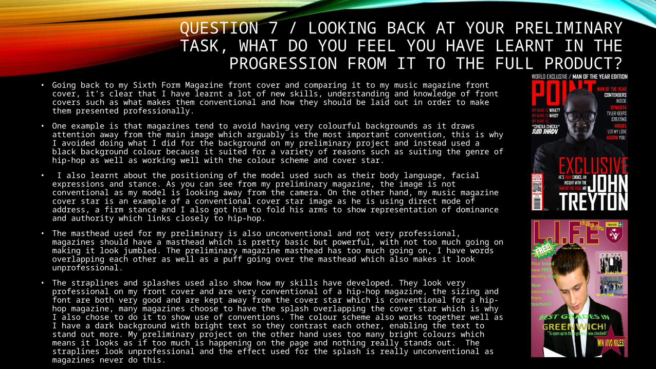
PROGRESSION FROM IT TO THE FULL PRODUCT?• Going back to my Sixth Form Magazine front cover and comparing it to my music magazine front cover, it’s
clear that I have learnt a lot of new skills, understanding and knowledge of front covers such as what makes them conventional and how they should be laid out in order to make them presented professionally.
• One example is that magazines tend to avoid having very colourful backgrounds as it draws attention away from the main image which arguably is the most important convention, this is why I avoided doing what I did for the background on my preliminary project and instead used a black background colour because it suited for a variety of reasons such as suiting the genre of hip-hop as well as working well with the colour scheme and cover star.
• I also learnt about the positioning of the model used such as their body language, facial expressions and stance. As you can see from my preliminary magazine, the image is not conventional as my model is looking away from the camera. On the other hand, my music magazine cover star is an example of a conventional cover star image as he is using direct mode of address, a firm stance and I also got him to fold his arms to show representation of dominance and authority which links closely to hip-hop.
• The masthead used for my preliminary is also unconventional and not very professional, magazines should have a masthead which is pretty basic but powerful, with not too much going on making it look jumbled. The preliminary magazine masthead has too much going on, I have words overlapping each other as well as a puff going over the masthead which also makes it look unprofessional.
• The straplines and splashes used also show how my skills have developed. They look very professional on my front cover and are very conventional of a hip-hop magazine, the sizing and font are both very good and are kept away from the cover star which is conventional for a hip-hop magazine, many magazines choose to have the splash overlapping the cover star which is why I also chose to do it to show use of conventions. The colour scheme also works together well as I have a dark background with bright text so they contrast each other, enabling the text to stand out more. My preliminary project on the other hand uses too many bright colours which means it looks as if too much is happening on the page and nothing really stands out. The straplines look unprofessional and the effect used for the splash is really unconventional as magazines never do this.
QUESTION 7 / LOOKING BACK AT YOUR PRELIMINARY TASK, WHAT DO YOU FEEL YOU HAVE LEARNT IN THE
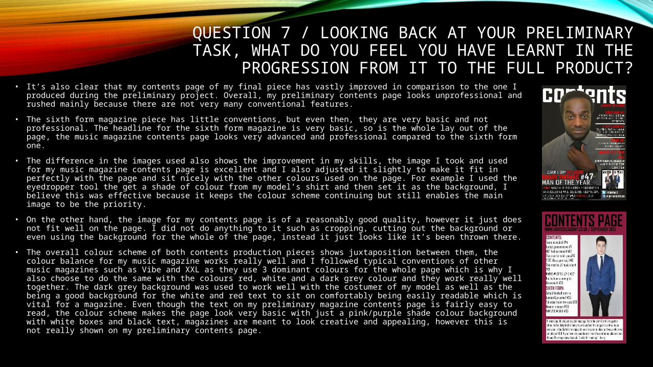
PROGRESSION FROM IT TO THE FULL PRODUCT?• It’s also clear that my contents page of my final piece has vastly improved in comparison to the one I produced during
the preliminary project. Overall, my preliminary contents page looks unprofessional and rushed mainly because there are not very many conventional features.
• The sixth form magazine piece has little conventions, but even then, they are very basic and not professional. The headline for the sixth form magazine is very basic, so is the whole lay out of the page, the music magazine contents page looks very advanced and professional compared to the sixth form one.
• The difference in the images used also shows the improvement in my skills, the image I took and used for my music magazine contents page is excellent and I also adjusted it slightly to make it fit in perfectly with the page and sit nicely with the other colours used on the page. For example I used the eyedropper tool the get a shade of colour from my model’s shirt and then set it as the background, I believe this was effective because it keeps the colour scheme continuing but still enables the main image to be the priority.
• On the other hand, the image for my contents page is of a reasonably good quality, however it just does not fit well on the page. I did not do anything to it such as cropping, cutting out the background or even using the background for the whole of the page, instead it just looks like it’s been thrown there.
• The overall colour scheme of both contents production pieces shows juxtaposition between them, the colour balance for my music magazine works really well and I followed typical conventions of other music magazines such as Vibe and XXL as they use 3 dominant colours for the whole page which is why I also choose to do the same with the colours red, white and a dark grey colour and they work really well together. The dark grey background was used to work well with the costumer of my model as well as the being a good background for the white and red text to sit on comfortably being easily readable which is vital for a magazine. Even though the text on my preliminary magazine contents page is fairly easy to read, the colour scheme makes the page look very basic with just a pink/purple shade colour background with white boxes and black text, magazines are meant to look creative and appealing, however this is not really shown on my preliminary contents page.