Embed Size (px)
DESCRIPTION
(This version of the presentation is oriented at a web performance audience, and includes some mobile design 101 content)Mobile Web Design is complicated, and several design paradigms have been created to help deal with the challenges the mobile landscape creates. Amongst other implications, each paradigm also carries its own performance pitfalls, which can turn a well designed site into a horribly slow user experience. This presentation covers the top design paradigms - Dedicated Websites (mdot) and Responsive Web Design, gives some background on each, and digs into the performance do's and don'ts for your design of choice.
Citation preview

Akamai Confidential
Performance Implications of Mobile Design
Guy Podjarny
@guypod
http://guypo.com/

©2012 AkamaiFaster ForwardTM
Agenda
• Quick Intro to top Mobile Design Paradigms• Review each Paradigm• Explain Key Implementation Points• Dig into top performance problem• Show what went wrong• Discuss how you can fix it
• Share tools that can help• And how to use them
• Summary

©2012 AkamaiFaster ForwardTM
Who Am I #1: Ex-CTO of Blaze.io (now Akamai)

©2012 AkamaiFaster ForwardTM
Who Am I #2: Blaze Mobitest
• Mobile Web Performance Measurement• Free Online Service: http://akamai.com/mobitest/
• Now Open-Source!• For more details: http://bit.ly/open-source-mobitest

©2012 AkamaiFaster ForwardTM
Who Am I #3: Mobile Performance Researcher
http://guypo.com/

©2012 AkamaiFaster ForwardTM
Waterfall Charts
Waterfall Chart Start Render
Resource(Request/Response)
Doc Complete,(a.k.a. onload,Load Time)

Akamai Confidential
Quick Intro to Mobile Design

©2012 AkamaiFaster ForwardTM

©2012 AkamaiFaster ForwardTM
Dedicated Sites (mdot)
m.walmart.com
URL/Website Per Device Profile
www.walmart.com

©2012 AkamaiFaster ForwardTM
Why Dedicated Websites?
• Historical Reasons• More established and better understood• Hard to change existing desktop websites• Different owners inside/outside the company
• Better Reasons• Less sensitive to specific browsers• Helps align to native apps• Easier to get perfect site for that context (Maybe)

©2012 AkamaiFaster ForwardTM
Responsive Web Design
One URL, Adapt to screen size
www.bostonglobe.com

©2012 AkamaiFaster ForwardTM
Mobile First & Desktop First: RWD Variations
Mobile First(Progressive Enhancement)
Desktop First(Graceful Degradation)

©2012 AkamaiFaster ForwardTM
Why Responsive Websites?
• Broader Device Support• Support the endless screen size permutations• No Need for User-Agent Mapping
• Easier to maintain• Maintain one website instead of multiples
• Future Friendly• Anticipates future devices• Better suited for handling new types of devices • http://futurefriend.ly/

©2012 AkamaiFaster ForwardTM
Responsive Shades of Grey
• Responsiveness is a property of a website• A dedicated mobile website can be responsive• A website can respond “only a little bit”
• Display Size is not the only variable• Can respond to hardware properties (e.g. camera)• Can respond to data availability (e.g. location)
• Server-side code can help too (a.k.a. RESS)• Though responsiveness is primarily client-side

Akamai Confidential
Dedicated Sites (mdot)

©2012 AkamaiFaster ForwardTM
Dedicated Sites don’t create new performance
problems
Still have old problems, but that’s not related to mobile design
Mdot

©2012 AkamaiFaster ForwardTM
Small Mobile Site, Small Waterfall Chart
m.cnn.com , iPhone 4, iOS 5.0

©2012 AkamaiFaster ForwardTM
Big Desktop/Tablet Site, Big Waterfall Chart
www.cnn.comiPad 2iOS 5

©2012 AkamaiFaster ForwardTM
RedirectsDedicated Sites Top Performance Problem
m.www.

©2012 AkamaiFaster ForwardTM
Redirects are expensive!
www.espn.com2 redirects, 1.3 seconds lost

©2012 AkamaiFaster ForwardTM
User-Agent Detection FAIL
Nexus S XOOM iPad 2

©2012 AkamaiFaster ForwardTM
Solution: Client-Side Detection

©2012 AkamaiFaster ForwardTM
Late Redirect using scripts are even slower
www.disney.com2 redirects + JS Redirect, 3 seconds lost

©2012 AkamaiFaster ForwardTM
Could get nasty
www.garmin.com3 redirects + JS Redirect, 3.6 seconds lost

©2012 AkamaiFaster ForwardTM
Redirects – What To Do?
• Replace redirects with client-specific HTML• Your CDN/load-balancer can help!
• Minimize Redirects• Merge redirect chains
• Use HTTP Redirects, not JS redirects• Keep the client-side detection as backup• Detect most devices server-side
• Cache HTTP Redirects on the CDN• Makes the extra round trip shorter
• Use HTTP 301 Redirect, with a future Expiry• 302/303/307 redirects not cached by iOS and others

Akamai Confidential
Responsive Web Design

©2012 AkamaiFaster ForwardTM
RWD Implementation 101
• Fluid Design• Turn absolute sizes into relative sizes
• Breakpoints• Ethan Marcotte (@beep) / Stephen Hay @stephenhay: “Expand window until it looks like shit. Time to insert a breakpoint!”
• CSS Media Queries• Change CSS more significantly at breakpoints• Examples: Hide Columns, Collapse Menus, Remove bg imgs
• Using min/max width controls default view• Determines what non-conforming browsers will display
©2012 AkamaiFaster ForwardTM
Live
Demo
©2012 AkamaiFaster ForwardTM
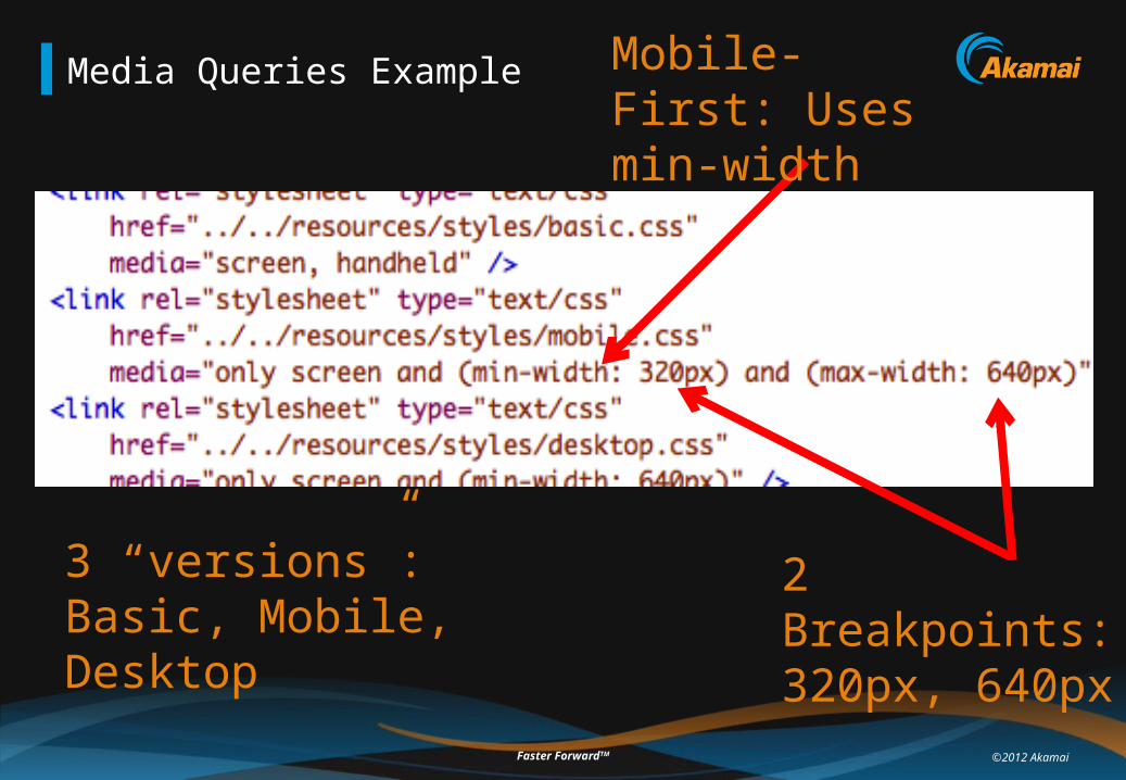
Media Queries Example
2 Breakpoints: 320px, 640px
3 “versions”: Basic, Mobile, Desktop
Mobile-First: Uses min-width

©2012 AkamaiFaster ForwardTM
RWD Implementation 201
• Extend support with scripted DOM manipulations• Not all browsers support media queries (e.g. IE 6-8)• Due to JS Support concerns, used mainly for enhancement• Often required for responding to features
• Beware: Widths are not accurate or consistent• Leave some buffer…
• Use EMs instead of PXs for absolute sizes• Better handling for zoom or font size differences

©2012 AkamaiFaster ForwardTM
Responsive Web Design Top Performance
Problem: Over-Downloading
Responsive Web Design
©2012 AkamaiFaster ForwardTM
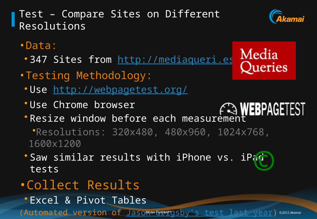
Test – Compare Sites on Different Resolutions
• Data: • 347 Sites from http://mediaqueri.es/
• Testing Methodology:• Use http://webpagetest.org/• Use Chrome browser• Resize window before each measurement
•Resolutions: 320x480, 480x960, 1024x768, 1600x1200• Saw similar results with iPhone vs. iPad tests
• Collect Results• Excel & Pivot Tables
(Automated version of Jason Grigsby’s test last year)
©

©2012 AkamaiFaster ForwardTM
Responsive Sites Load Times & Size, by Resolution
320x480 640x960 1024x768 1600x12000
5001,0001,5002,0002,5003,0003,5004,000
Load Time* by Resolution (ms)
320x480 640x960 1024x768 1600x12000
200
400
600
800
1,000
1,200
Page Size by Resolution (KB)
* Over Cable Speed (5 Mbps down, 1 Mbps up, 28ms RTT)
©2012 AkamaiFaster ForwardTM
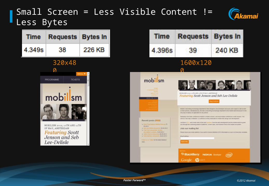
Small Screen = Less Visible Content != Less Bytes
320x4801600x1200

©2012 AkamaiFaster ForwardTM
Some depressing stats…
86%
11%
3%
Roughly Same Size
A Bit Smaller (50-90%)
Much Smaller (<50%)
Page sizeSmallest Screen (320x480)
vs.Biggest Screen (1600x1200)

©2012 AkamaiFaster ForwardTM
Big Site, Big Waterfall
1600x1200

©2012 AkamaiFaster ForwardTM
Small Site, Big Waterfall
320x480

©2012 AkamaiFaster ForwardTM
Download and Hide
Rich Side-bar, holds ads and more
Display set to none

©2012 AkamaiFaster ForwardTM
Hidden content is still downloaded
Display set to none,resources are still downloaded!
Hidden background
Images are not!

©2012 AkamaiFaster ForwardTM
Download and Shrink
Smaller Screen, Same Size Image

©2012 AkamaiFaster ForwardTM
Media queries don’t prevent CSS downloads
Separate CSS per media
320x480
“Wrong” CSS loaded- Possibly deferred to
just before onload- WebKit Bug 39455
- Conditions may change (e.g. rotate device)
- Scripts may use it
basic.cssmobile.css
desktop.css
“Right” CSS loaded

©2012 AkamaiFaster ForwardTM
Excess DOM
320x4801600x1200
Simplicitynot
reflected in DOM
1402 elements3485 nodes
1398 elements3491 nodes

©2012 AkamaiFaster ForwardTM
• Download and Hide• Download and Shrink• Extra CSS Download• Excess DOM
RWD Woes

Akamai Confidential
What Can We Do About It?!

©2012 AkamaiFaster ForwardTM
Images accounts for most mobile pages size
Stats from http://mobile.httparchive.com/

©2012 AkamaiFaster ForwardTM
Responsive Images
128px, 2.9 KB240px, 6.8 KB
320px, 10.6 KB
480px, 21.3 KB
Full Res, 50.1 KB
Site:lonelyplanet.com
Device:iPhone 4
Before: 867 KB
After: 570 KB

©2012 AkamaiFaster ForwardTM
Responding Up (or badly?)
ipad_hero.jpg
113 KBServed to Desktop
ipad_hero_2x.jpg
360 KBServed to New iPad

©2012 AkamaiFaster ForwardTM
Standardizing Responsive Images
@srcset
<picture>
VS.
https://github.com/scottjehl/picturefill

©2012 AkamaiFaster ForwardTM
Responsive Images
• Responsive Images = Serve lower res images to smaller screens• Optionally load full res image in the background
• Lots of great resources on how to do it• Cloud Four blog - Education• Sencha.io Src – Free Server-Side Image Resizing• https://github.com/scottjehl/picturefill - Client-Side Selector
• Responsive images apply to CSS too!• Especially to background images

©2012 AkamaiFaster ForwardTM
Load Images via CSS
Full Details: http://timkadlec.com/2012/04/media-query-asset-downloading-results/

©2012 AkamaiFaster ForwardTM
Or load images via JavaScript
• Same loader can:• Apply responsive images• Load only visible images, including only above-the-fold images
• Interferes with speculative look-ahead parsing
©2012 AkamaiFaster ForwardTM
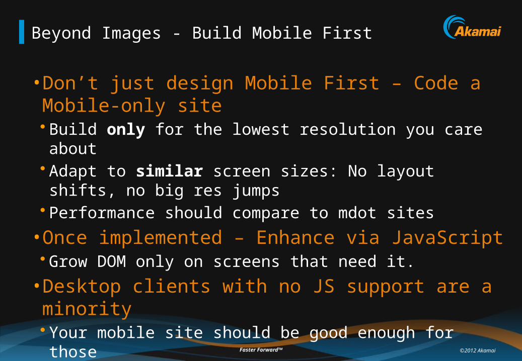
Beyond Images - Build Mobile First
• Don’t just design Mobile First – Code a Mobile-only site• Build only for the lowest resolution you care about• Adapt to similar screen sizes: No layout shifts, no big res jumps• Performance should compare to mdot sites
• Once implemented – Enhance via JavaScript• Grow DOM only on screens that need it.
• Desktop clients with no JS support are a minority• Your mobile site should be good enough for those• Don’t sacrifice the performance of 99% for the remaining 1%

©2012 AkamaiFaster ForwardTM
Enhancing via JavaScript – Tips & Tricks
• Split your files by layout/resolution• Duplicating content on the server is ok• Duplicating download is not
• Use Inline JavaScript to decide the layout• Then use external (cacheable) files to apply it• document.write() all CSS files (and other links) in one inline script!
• Put scripts that change design at the top• JavaScript blocks rendering• Will avoid FOUC – Flash Of Unstyled Content• Put all other scripts at the bottom
320px
480px
1600px
var css = ‘small.css’;if (window.innerWidth > 640) css = ‘large.css’;else if (window.innerWidth >= 320) css = ‘medium.css’;document.write(‘<link type=“stylesheet” rel=“stylesheet” href=“’+css+’”/>’);
©2012 AkamaiFaster ForwardTM
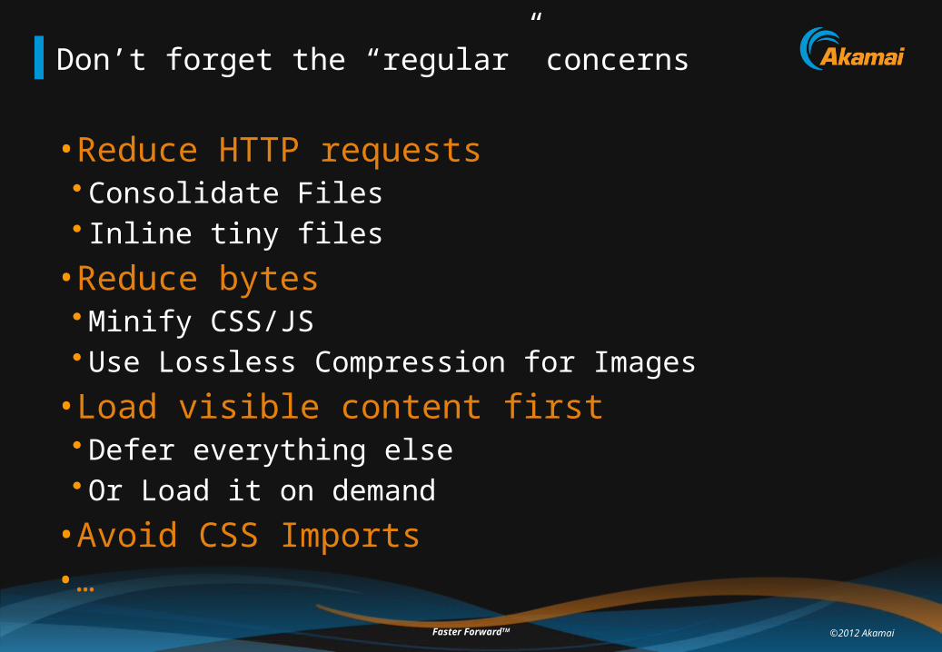
Don’t forget the “regular” concerns
• Reduce HTTP requests• Consolidate Files• Inline tiny files
• Reduce bytes• Minify CSS/JS• Use Lossless Compression for Images
• Load visible content first• Defer everything else• Or Load it on demand
• Avoid CSS Imports• …

©2012 AkamaiFaster ForwardTM
Now you can be Responsive AND Fast!

©2012 AkamaiFaster ForwardTM
Measure!
• Mobitest • Online service: http://mobitest.akamai.com/• Install local open-source version (details)
• Google’s Pcapperf• Convert network capture to waterfall charts• http://pcapperf.appspot.com/
• Stoyan Stefanov’s “icy”• HTTP insight into iOS HTTP requests• https://github.com/stoyan/icy
• @firt’s iWebInspector• Remote debugger for iOS simulator• http://www.iwebinspector.com/
56

©2012 AkamaiFaster ForwardTM
Testing different screen dimensions
• Run webpagetest script with resizing• Use Chrome as agent (not supported on other browsers)• Sample script (tab delimited):
setviewportsize 320 480navigate http://bdconf.org/
• Many other scripting options:https://sites.google.com/a/webpagetest.org/docs/using-webpagetest/scripting
• Figure out the viewport dimensions you want to simulate• http://www.websitedimensions.com/

Akamai Confidential
Summary

©2012 AkamaiFaster ForwardTM
Summary
• Choosing your mobile design is HARD• There are many factors to consider
• Design Decision have Performance Implications• Mdot Primary Concern: Redirects• RWD Primary Concern: Over-Downloading
• Either design paradigm can be made fast• Performance should be built in – not bolted on• Measure!• Make perf testing a part the core functionality test

Akamai Confidential
Performance Implications of Mobile Design
Questions?
Guy Podjarny
@guypod
http://guypo.com/