Embed Size (px)
Citation preview
Web Design Trends for 2013
What designers should consider when designing responsive websites
The 10 trends here are a compilation from this free e-book:
http://www.awwwards.com/web-design-and-mobile-trends-for-2013-ebook-download-it-for-free.html
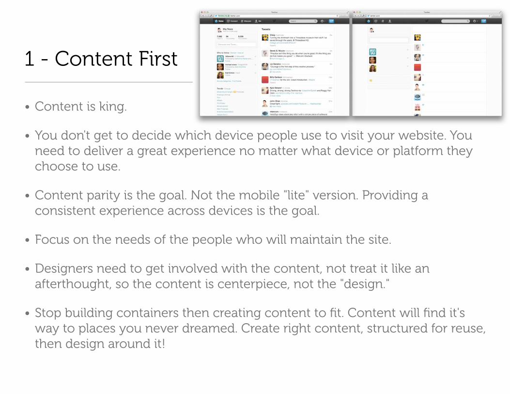
1 - Content First
• Content is king.
• You don't get to decide which device people use to visit your website. You need to deliver a great experience no matter what device or platform they choose to use.
• Content parity is the goal. Not the mobile "lite" version. Providing a consistent experience across devices is the goal.
• Focus on the needs of the people who will maintain the site.
• Designers need to get involved with the content, not treat it like an afterthought, so the content is centerpiece, not the "design."
• Stop building containers then creating content to fit. Content will find it's way to places you never dreamed. Create right content, structured for reuse, then design around it!

2 - Simplicity of Design Interaction
• Simple and stark interfaces, taking away what is superfluous
• Single column designs and single page websites - Flexbox help create interesting layouts per device
• More space, less clutter, a lot less decoration, simple, bold, clear layouts.
• More websites inspired by print design.
• Focus on typography and getting the best out of HD displays
• This is the end of fixed screen format and the end of the pixel!
• Parallax scrolling is not trendy. Okay if used appropriately.
https://lowdi.com/

3 - User Centered Design
• Power of storytelling in reaching audiences and creating products that resonate with people
• Don't deprecate style, but embrace it as a way create personality. "In a marketplace of bewildering clutter, products with a damn opinion are by far the most interesting."-Cennydd Bowles
• No matter how beautiful a website, the average user only wants to spend 10 seconds on it
• Focus not on HOW but on WHY
• People are time constrained and task focused
http://alistapart.com/column/looking-beyond-user-centered-designAn contradictory perspective:
http://www.paznow.com/ucd/

4 - App Style Interfaces
• Past two years: flat metro-style design started with Microsoft
• Flat CSS3 buttons, links, icons, and other UI features
• Less is more with limited elements — colors, shapes, features
• High use of strong colors, typography, cubes
• Focuses on content
http://designm.ag/inspiration/34-flat-layouts-design-inspiration/
http://www.101webdesigns.com/2013/03/metro-style-designs/

5 - Unification of Desktop and Mobile Versions
• No more separate web apps or separate websites for mobile devices. 10% of traffic coming from mobile.
• Device agnostic design, resolution independent, responsive, adaptive content with mobile being first thought.
• Experts used to advice to adapt content to mobile, but now people argue for unification.
• See http://mediaqueri.es/ for inspiration

6 - SVG and Responsive Techniques
• Multi-platform and cross-platform technologies such as SVG, webfonts, design with typography and icon fonts
• SVG - scalable vector graphics - no more creating multiple graphics for different screen types
• SVG-first approach when creating graphics for web pages to create "scalable web design"
http://css-tricks.com/using-svg/

7 - Flat colors and no more skeuomorphism
• Visual trends include: simplicity, minimalism, clear layouts, app-style interfaces, designs focusing on typography, less decoration, flat styles, flat colors
• These trends server the needs to create scalable elements with excellent performance on 3G connections and non-western mobile market users
• The future is not about adornments. It’s about typography, color, motion.
http://www.fastcodesign.com/1670760/will-apples-tacky-software-design-philosophy-cause-a-revolt

8 - Technology Agnostic
• HTML/CSS/Javascript - "primordial soup"
• Growing interest in WebGL - sound and moving images
• Two spectrums - design and technology getting simultaneously bigger and smaller:
• Desktop technologies evolving in hardware acceleration, 3D in the browser, etc., without having to rely on plugins.
• Mobile access requires simpler, faster sites
• Push/pull between the two spectrums
http://www.chromeexperiments.com/webgl/

9 - Device sensors and interaction
• Getting the best out of mobile technology
• Creating new user experiences
• Touch-enabled devices will be more ubiquitous, so lots of experimentation with touch interactions
• Test all site navigation on touch-devices, not just iOS devices
http://lab.maltewassermann.com/viewport-resizer/
http://mashable.com/2012/12/11/responsive-web-design/
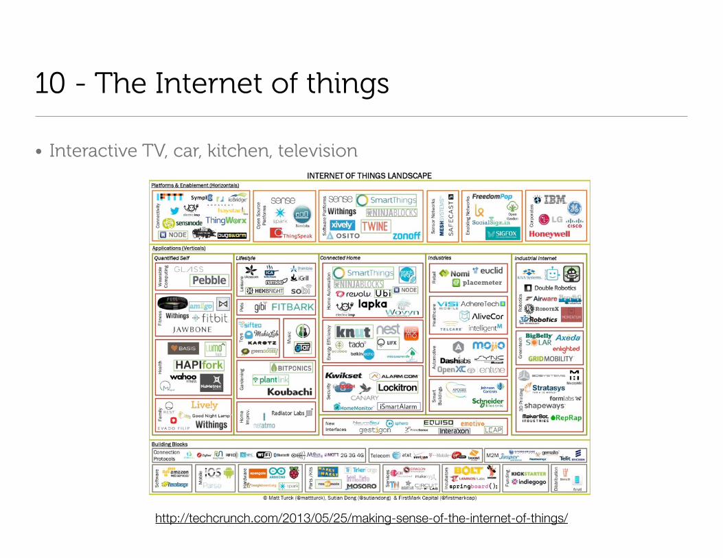
10 - The Internet of things
• Interactive TV, car, kitchen, television
http://techcrunch.com/2013/05/25/making-sense-of-the-internet-of-things/

What you need to know
The barrier for entry for new designers and developers is high, higher than it used to be

1 - Projects and Tools
• HTML5 Boilerplate, Bootstrap, Github, and others help systematize the process, allowing developers to focus on their ideas rather than on implementation.
• Builder tools will help with technological hurdle - look for more GUIs to make web development easier for designers -http://wpjumpstart.com
http://twitter.github.io/bootstrap/
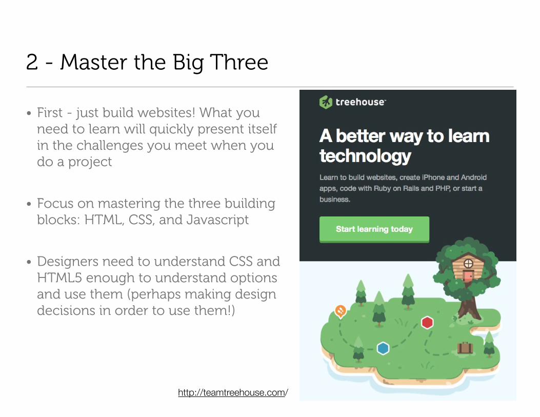
2 - Master the Big Three
• First - just build websites! What you need to learn will quickly present itself in the challenges you meet when you do a project
• Focus on mastering the three building blocks: HTML, CSS, and Javascript
• Designers need to understand CSS and HTML5 enough to understand options and use them (perhaps making design decisions in order to use them!)
http://teamtreehouse.com/
3 - Think Fast and Responsive
• CSS3 instead of graphics for:
• Drop shadows
• Typography
• Rounded corners
• Gradients
• Rollover effects
• Borders
• Concepts:
• Repeating elements, no full-size elements
• No standard dimensions - you can control HOW your content will be displayed
• Scalability (navigation, graphics, and text)
• Technology:
• SVG
• Font icons
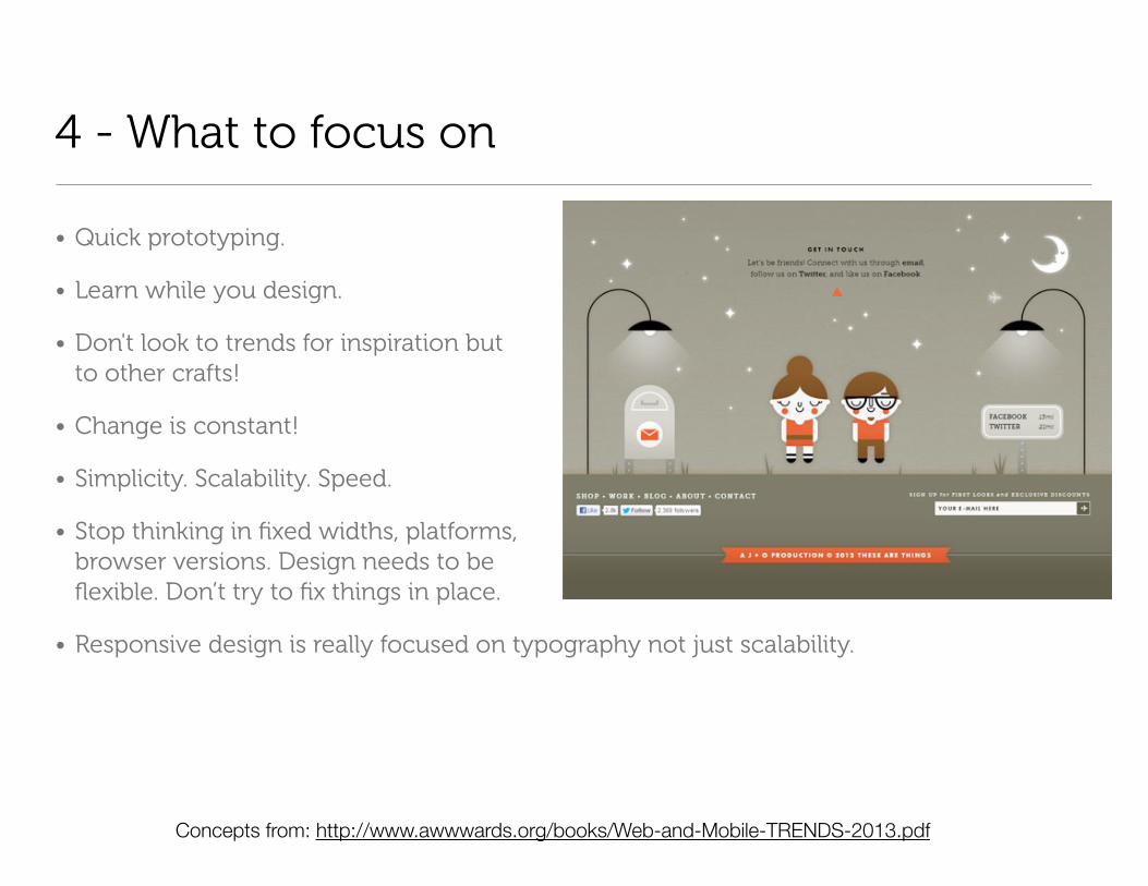
4 - What to focus on
• Quick prototyping.
• Learn while you design.
• Don't look to trends for inspiration but to other crafts!
• Change is constant!
• Simplicity. Scalability. Speed.
• Stop thinking in fixed widths, platforms, browser versions. Design needs to be flexible. Don’t try to fix things in place.
• Responsive design is really focused on typography not just scalability.
Concepts from: http://www.awwwards.org/books/Web-and-Mobile-TRENDS-2013.pdf

4 - Follow the Leaders
• Hello Monday Creative - http://www.hellomonday.com
• Paul Lee Design - http://www.paulleedesign.com
• Best Made - http://www.bestmadeco.com/
• Julius Tarng - http://tarng.com
• Mike Kus - http://mikekus.com/
• Blank & Co. - http://www.blankandco.com/
• Michael Dick - http://m1k3.net/
• http://trentwalton.com/category/articles
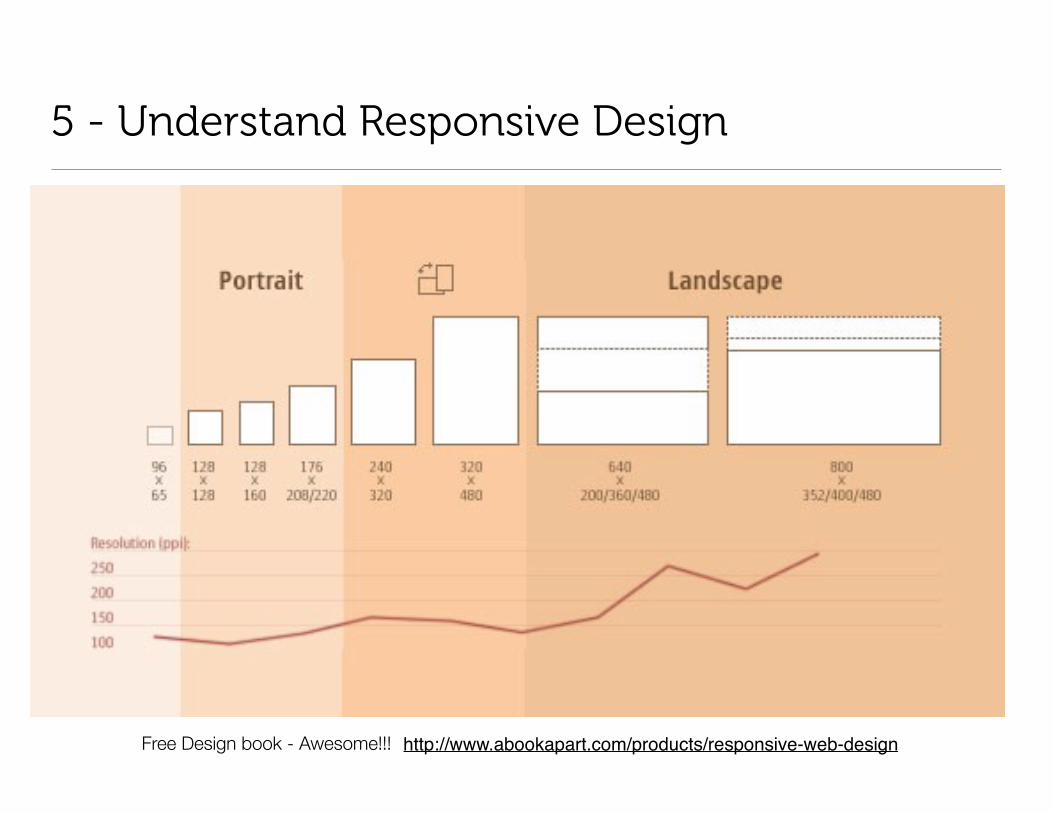
5 - Understand Responsive Design
http://www.abookapart.com/products/responsive-web-designFree Design book - Awesome!!!
Responsive Design Articles
• About Responsive Web Designhttp://www.alistapart.com/articles/responsive-web-design/
• Beginner’s Guide to Responsive Web Designhttp://blog.teamtreehouse.com/beginners-guide-to-responsive-web-design
• Guidelines for Responsive Designhttp://coding.smashingmagazine.com/2011/01/12/guidelines-for-responsive-web-design/#more-75660
• 5 Useful CSS Tricks for Responsive Designhttp://webdesignerwall.com/tutorials/5-useful-css-tricks-for-responsive-design

Responsive Design Concepts
• Think percentages and ratios, e.g. 80/20 or 70/30 for a content/sidebar area
• As the screen size decreases, the ratios are maintained, but the content within the container compresses, such as lines of text will wrap. Essentially, the "box" of content gets narrower and taller.
• Containers "float" side by side in a layout. Then, at smaller screen sizes, the float is removed, and the sidebar falls below the content area and both containers are 100% width.
• Everything in the containers, pictures and text, can also be sized as needed, floated or stacked.
• Elements can be hidden or appear at various screen sizes. You might have a decorative item that is too large for mobile, so you hide it on mobile, and then show another decorative element on the mobile.
• Don't design for a device. Find where your design "breaks" and make changes at that breaking point. Allow the design to flow between the breaking points.

6 - Understand @media queries
• 320px
• 480px
• 600px
• 768px
• 900px
• 1200px
CSS2 allows you to specify stylesheet for specific media type such as
screen or print. Now CSS3 makes it even more efficient by adding media
queries. You can add expressions to media type to check for certain
conditions and apply different stylesheets. For example, you can have one
stylesheet for large displays and a different stylesheet specifically for
mobile devices. It is quite powerful because it allows you to tailor to
different resolutions and devices without changing the content.”
From: http://webdesignerwall.com/tutorials/css3-media-queries
http://lab.maltewassermann.com/viewport-resizer/

7 - Embrace Typography
• http://alistapart.com/topic/typography-web-fonts
• http://nicolasgallagher.com/css-typography-experiment/
• http://neography.com/journal/css-transforms-font-face-experiment/
• Typekit.com (subscription free with Adobe Creative Cloud)
• Fonts.com (subscription)
• http://www.google.com/fonts/
• Webfont icons you can use and how to use them: http://www.hongkiat.com/blog/webfont-icons/
• How to turn your icons into a webfont: http://www.webdesignerdepot.com/2013/04/how-to-turn-your-icons-into-a-web-font/

Tips, Tricks, and Tools
Things that will help you design and code more quickly
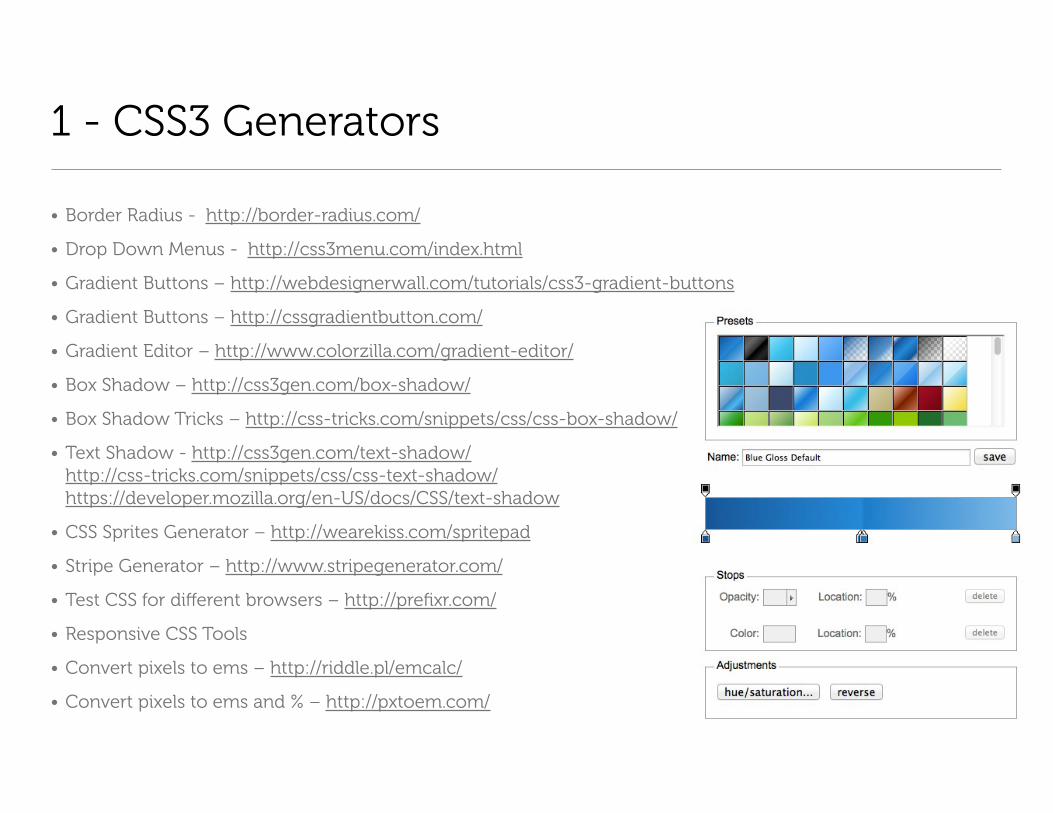
1 - CSS3 Generators
• Border Radius - http://border-radius.com/
• Drop Down Menus - http://css3menu.com/index.html
• Gradient Buttons – http://webdesignerwall.com/tutorials/css3-gradient-buttons
• Gradient Buttons – http://cssgradientbutton.com/
• Gradient Editor – http://www.colorzilla.com/gradient-editor/
• Box Shadow – http://css3gen.com/box-shadow/
• Box Shadow Tricks – http://css-tricks.com/snippets/css/css-box-shadow/
• Text Shadow - http://css3gen.com/text-shadow/http://css-tricks.com/snippets/css/css-text-shadow/https://developer.mozilla.org/en-US/docs/CSS/text-shadow
• CSS Sprites Generator – http://wearekiss.com/spritepad
• Stripe Generator – http://www.stripegenerator.com/
• Test CSS for different browsers – http://prefixr.com/
• Responsive CSS Tools
• Convert pixels to ems – http://riddle.pl/emcalc/
• Convert pixels to ems and % – http://pxtoem.com/
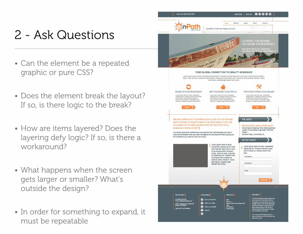
2 - Ask Questions
• Can the element be a repeated graphic or pure CSS?
• Does the element break the layout? If so, is there logic to the break?
• How are items layered? Does the layering defy logic? If so, is there a workaround?
• What happens when the screen gets larger or smaller? What's outside the design?
• In order for something to expand, it must be repeatable
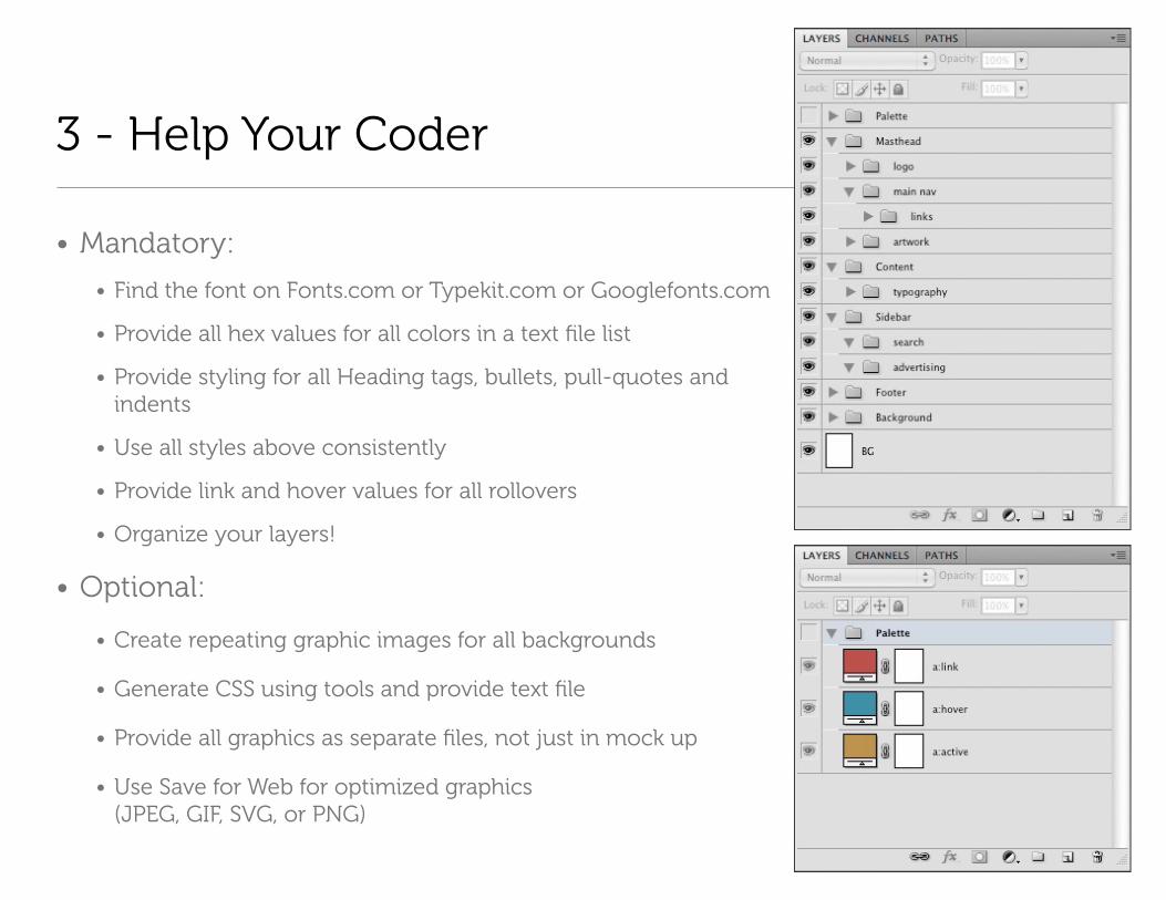
3 - Help Your Coder
• Mandatory:
• Find the font on Fonts.com or Typekit.com or Googlefonts.com
• Provide all hex values for all colors in a text file list
• Provide styling for all Heading tags, bullets, pull-quotes and indents
• Use all styles above consistently
• Provide link and hover values for all rollovers
• Organize your layers!
• Optional:
• Create repeating graphic images for all backgrounds
• Generate CSS using tools and provide text file
• Provide all graphics as separate files, not just in mock up
• Use Save for Web for optimized graphics (JPEG, GIF, SVG, or PNG)
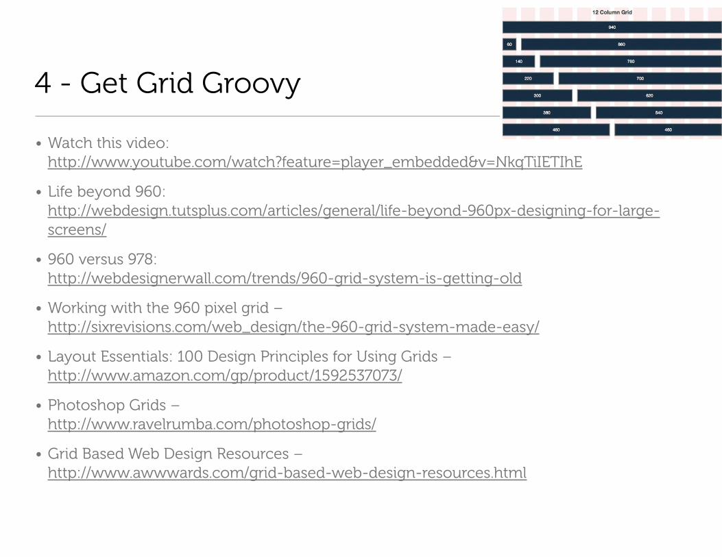
4 - Get Grid Groovy
• Watch this video: http://www.youtube.com/watch?feature=player_embedded&v=NkqTiIETIhE
• Life beyond 960: http://webdesign.tutsplus.com/articles/general/life-beyond-960px-designing-for-large-screens/
• 960 versus 978: http://webdesignerwall.com/trends/960-grid-system-is-getting-old
• Working with the 960 pixel grid – http://sixrevisions.com/web_design/the-960-grid-system-made-easy/
• Layout Essentials: 100 Design Principles for Using Grids – http://www.amazon.com/gp/product/1592537073/
• Photoshop Grids – http://www.ravelrumba.com/photoshop-grids/
• Grid Based Web Design Resources – http://www.awwwards.com/grid-based-web-design-resources.html

5 - Mock it, don't belabor it
http://www.balsamiq.com/