Embed Size (px)
Citation preview

Social Action

Logo
Here I started off with drawing the logo out on paper to create an original drawing of my character. I think scanned it and turned it into a digital image using photoshop. I is simple and plain with clean lines, something that would be appealing to children.
The face of the crab is cute and appealing. I chose the colours that I had worked out in my research, using pastel blues and oranges.
The text is also a font that I found in my research, I made this a darker colour to contrast

logo 1

Logo developmentHere I started with an idea that is inspired by my mood board and also my previous logo that I had created. I wanted to stick with the crab idea of the mascot, making it a different shape, but keeping it the same style, with the same kind of shapes and colours.
I also wanted to keep the SAS present in this logo, so they are still related together, and I did this by hiding their original logo into the design of the crabs shell detail. I then went on to adding more and more little details to make my cartoon look more professional.
I added the shape around and the text underneath the crab to give it a more logo feeling, that the picture was more together and that it could be placed on posters and clothing.

Logo 2

Experimenting
Here I tried different variants of the logo by mixing up the two separate logos together. This still created the theme and was on going with the feeling of the logo I wanted to create, but gave a bit more diversity. Even though these logos do look good, I still prefer the originals because of how I made the colours of the original match and go together, as they were chosen especially to go together when I was making them.
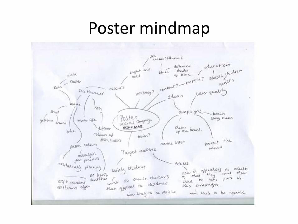
Poster mindmap
Poster outline
The basic idea of what my poster is going to be is that the poster will be aimed at children still, but also adults, it is made to please both aesthetically, so that the adults will be more likely to let their children be a part of the campaign that is originally aimed at the children. I think it is important for parents to not only like but also appreciate the artwork on the posters, so they can put their trust into it, and let their children be a part of the campaign.
I will make my poster match the theme of the logo, with no black outlines, just soft edges. The colours will be light and pastels, keeping a theme running throughout the whole project. The poster will be telling children why they should pick up litter on the beach, or there will be consequences, telling them the honest true will make children more proactive, educating and telling other people they know what they have learned.
Poster
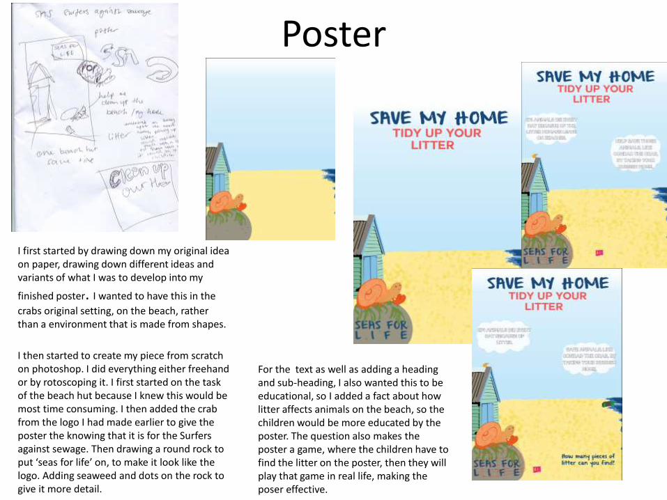
I first started by drawing down my original idea on paper, drawing down different ideas and variants of what I was to develop into my
finished poster. I wanted to have this in the
crabs original setting, on the beach, rather than a environment that is made from shapes.
I then started to create my piece from scratch on photoshop. I did everything either freehand or by rotoscoping it. I first started on the task of the beach hut because I knew this would be most time consuming. I then added the crab from the logo I had made earlier to give the poster the knowing that it is for the Surfers against sewage. Then drawing a round rock to put ‘seas for life’ on, to make it look like the logo. Adding seaweed and dots on the rock to give it more detail.
For the text as well as adding a heading and sub-heading, I also wanted this to be educational, so I added a fact about how litter affects animals on the beach, so the children would be more educated by the poster. The question also makes the poster a game, where the children have to find the litter on the poster, then they will play that game in real life, making the poser effective.

Poster 1

Poster 2
This time I wanted to do a different take on the educational poster, using more pictures and less text, which would be more suitable for younger children, and children who find it difficult to read. The poster tells the children through pictures what to look out for and what to tidy up on the beach. This idea is similar to the last in the way that the poster initiates a sort of game for the children to play, to match up and find litter that is matching to the poster, making tidying up fun.
I rotoscoped the images on here to give the most cartoony and infant feel as possible, it also gave me chance to keep the theme of the soft colours and edges running as a theme, to keep it consistent so that everything matches.
The font is consistent with the logo theme, this matches them up and shows that they can be displayed together or separately and the audience will know what company it is representing.

Poster 2

Merchandise (mind map)

Mood board
A t-shirt will be a good place to start for a design because of how versatile the shape is, it is a square and gives a lot of room for any design without the design being restricted or distorted. I think that a beaker will be
more difficult because of the size of it, it will not allow a detailed design, because it will not be visible on the beaker as there is only limited space. The design will also become distorted a bit because of the curve of the beaker. I think this applies to a lot of beach toys and items, e.g. beach balls, beach tennis racquet.
I think the body board is a good idea to design because of the size and shape of the place where the design will go. Also because of how relevant it is, it is like a child’s surfboard.

Here for the merchandise I wanted to create designs for simple items that are suitable for children to use and wear. I chose the t-shirt because it can apply to anyone, but the design makes it more targeted at children. I then also wanted to create a hat that mainly focused on the logo, to be a quick and simple design that related to my previous work and linked them together. Then I also wanted to create a design for a body-board, continuing with the idea of ‘litter patrol’ making the body board have a police pattern on it because children will then be more excited to have this item because it looks important and like it is an authority
I carried out these designs by creating new work and building on existing work I had already created previously. I re-used the logo mainly to keep the link between the separate items and also to build more of a connection between the audience and the character.
I developed my work in photoshop and created new designs and traced over already existing shapes to create an accurate design.

Finished merchandise

Membership form flat plans
Surfers against sewage: seas for life (title)
A cartoon picture rotoscoped of Conrad the crab in the sea or something similar, holding up a sign saying thanks
Childs and adults explanation of what this membership includes and where the money goes, and information of where children's events can be found.
logoDisclaimer explaining you have to over 18 to fill in this form.
Front
Sub heading & (Childs
information).
Logo
Sub heading & offer on membership e.g. buy 1 year and get a
month free.
Sub heading & payment option, address (email
and home), and payment details.

Surfers against sewage: seas for life (title)
A cartoon picture rotoscoped of Conrad the crab in the sea or something similar, holding up a sign saying thanks
Childs and adults explanation of what this membership includes and where the money goes, and information of where children's events can be found.
logo
Disclaimer explaining you have to over 18 to fill in this form.
Sub heading & (Childs information).
Logo
Sub heading & offer on membership e.g. buy 1 year and get a
month free.
Sub heading & payment option, address (email
and home), and payment details.

A cartoon picture rotoscoped of Conrad the crab in the sea or something similar, holding up a sign saying thanks
Childs and adults explanation of what this membership includes and where the money goes, and information of where children's events can be found.
logoDisclaimer explaining you have to over 18 to fill in this form.
Sub heading & (Childs
information).
Logo
Sub heading & offer on membership e.g. buy 1 year and get a
month free.
Sub heading & payment option, address (email
and home), and payment details.
Membership form development
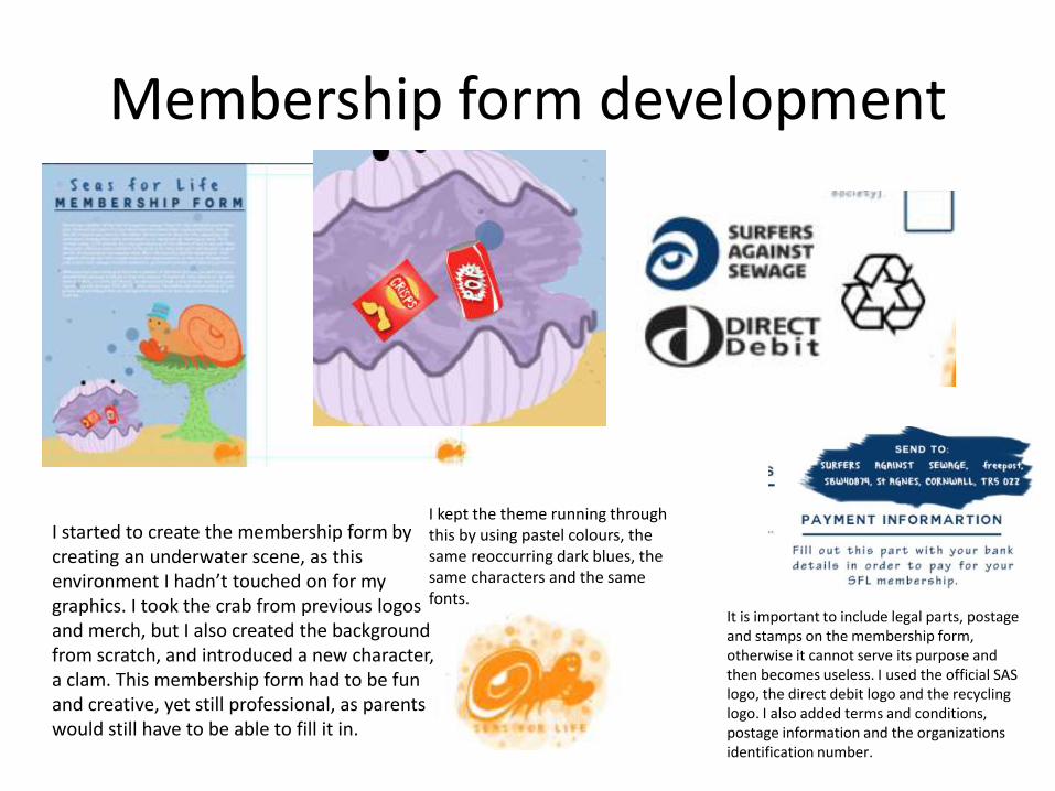
I started to create the membership form by creating an underwater scene, as this environment I hadn’t touched on for my graphics. I took the crab from previous logos and merch, but I also created the background from scratch, and introduced a new character, a clam. This membership form had to be fun and creative, yet still professional, as parents would still have to be able to fill it in.
I kept the theme running through this by using pastel colours, the same reoccurring dark blues, the same characters and the same fonts.
It is important to include legal parts, postage and stamps on the membership form, otherwise it cannot serve its purpose and then becomes useless. I used the official SAS logo, the direct debit logo and the recycling logo. I also added terms and conditions, postage information and the organizations identification number.

Membership form
