Embed Size (px)
Citation preview
Magazine Cover 1 Production Process (LO4) Olivia Lewis-Brown
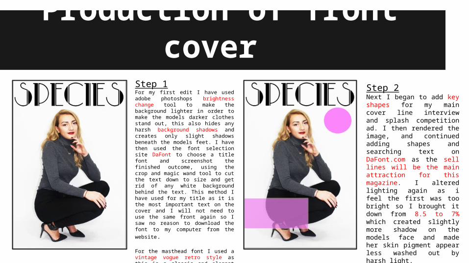
Production of front cover Step 1For my first edit I have used adobe photoshops brightness change tool to make the background lighter in order to make the models darker clothes stand out, this also hides any harsh background shadows and creates only slight shadows beneath the models feet. I have then used the font selection site DaFont to choose a title font and screenshot the finished outcome, using the crop and magic wand tool to cut the text down to size and get rid of any white background behind the text. This method I have used for my title as it is the most important text on the cover and I will not need to use the same front again so I saw no reason to download the
font to my computer from the website.
For the masthead font I used a vintage vogue retro style as this is a classic and elegant design often used in high fashion magazines such as vogue and vanity fair.
Step 2Next I began to add key shapes for my main cover line interview and splash competition ad. I then rendered the image, and continued adding shapes and searching text on DaFont.com as the sell lines will be the main attraction for this magazine. I altered lighting again as i feel the first was too bright so I brought it down from 8.5 to 7% which created slightly more shadow on the models face and made her skin pigment appear less washed out by harsh light.
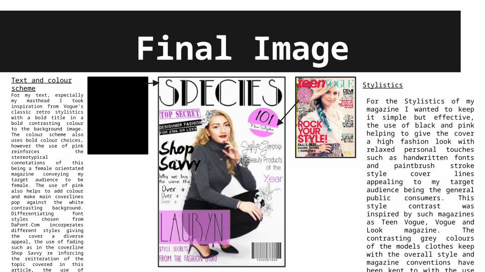
Final ImageText and colour schemeFor my text, especially my masthead I took inspiration from Vogue’s classic retro stylistics with a bold title in a bold contrasting colour to the background image. The colour scheme also uses bold colour choices, however the use of pink reinforces the stereotypical connotations of this being a female orientated magazine conveying my target audience to be female. The use of pink also helps to add colour and make main coverlines pop against the white contrasting background. Differentiating font styles chosen from DaFont.Com incorperates different styles giving the cover a diverse appeal, the use of fading such as in the coverline Shop Savvy re inforcing the reitteration of the topic covered in this article, the use of language repertition inspiring interest through a conventional magazine ad tactic. The paintbrush effect in the Shop Savvy font also breaks up the almost formal style of the magazine. The hand written style of other articles such as Simply gorgeous and Style Secrets, gives a personal touch to the overall style of the magazine
Stylistics
For the Stylistics of my magazine I wanted to keep it simple but effective, the use of black and pink helping to give the cover a high fashion look with relaxed personal touches such as handwritten fonts and paintbrush stroke style cover lines appealing to my target audience being the general public consumers. This style contrast was inspired by such magazines as Teen Vogue, Vogue and Look magazine. The contrasting grey colours of the models clothes keep with the overall style and magazine conventions have been kept to with the use of barcodes, splash ads and main cover line interviews with a featured star who appears on the cover.
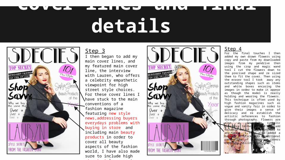
Cover lines and final details Step 3I then began to add my main cover lines, and my featured main cover line, the interview with Lauren, who offers a celebrity empathetic viewpoint for high street style choices. For these cover lines I have stuck to the main conventions of a fashion magazine featuring new style news,addressing buyers everydays problems with buying in store and including main beauty products in order to cover all beauty aspects of the fashion world, I have also made sure to include high street style so as to appeal to my main consumers being the everyday public, and their available price range on the high street.
Step 4For the final touches I then added my own drawn flowers using copy and paste from my downloaded images from my pendrive then using the crop and magic wand tool I cut the flowers down to the precised shape and re sized them to fit the cover. Then using the eraser tool I took away any outstanding shapes such as stems and white boxes encasing the images in order to make it appear as though the model is really holding and wearing the flowers. This technique is often used by high fashion magazines such as vogue and vanity fair in order to give their images a sense of delicacy and re establish the artistic references to fashion through photography. Flowers are also a powerful symbolic reference to beauty and can add valuable detail and femininity to any image. I then also added a barcode to stick with traditional conventions of a magazine covers essential selling elements.