Embed Size (px)
Citation preview
MAIN FRONT COVER IMAGE

Shot 1• I like this shot because it the higher
angle makes it more alternative than a eye-level shot. This reflects the alternative style of music that my magazine produces. I like the contrast of black dress against a white background.
• I don’t like it, however, because the flash was too bright and makes her look very pale. Also the camera was too high up so a lot of her body cannot be seen. This restricts the way she is seen on my magazine because I wanted her to be a music artist and a fashion icon; if you cannot see her clothes then she cannot be stylish. Also I wanted a longer shot than this so that the text on the front cover can go around it. I also don’t like that it is landscape rather than portrait.
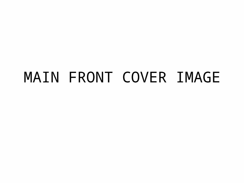
Shot 2• This shot is similar to shot 1 but from
further back to show more of her body. This is good because you can see what she is wearing and it is slightly more conventional as a front cover than a high angle shot. I think that it looks better without the flash because she looks warmer and less washed out. The white background makes it simple to focus on the main figure and it allows me to add text around her.
• I don’t like the expression she is pulling and would prefer something different for my front cover to show the artist as happier and to give off a more positive personality. I also don’t like the lighting from below because low angle lighting has connotations of horror etc. so would be unsuitable here.
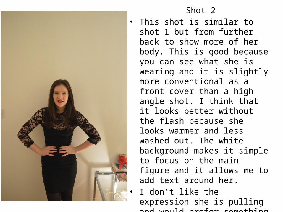
Shot 3• This shot is from a low angle, I used a low
angle because I wanted to show her as powerful. I also did it to experiment with an unconventional angle which will contribute to my alternative music genre. I also like the position she is in with both her hands on her hips because this shows confidence and her facial expression shows that she is happy.
• However I don’t like it because it is too dark as the lighting is from behind so the features cannot be distinguished very well. The low angle is also associated with the viewer being helpless against the person in the picture which is not what I want to express on my front cover because I want the reader to relate to the artist, which would work better with an eye-level shot.
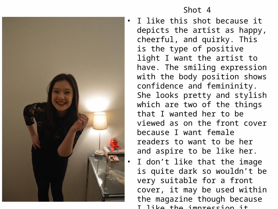
Shot 4• I like this shot because it depicts the
artist as happy, cheerful, and quirky. This is the type of positive light I want the artist to have. The smiling expression with the body position shows confidence and femininity. She looks pretty and stylish which are two of the things that I wanted her to be viewed as on the front cover because I want female readers to want to be her and aspire to be like her.
• I don’t like that the image is quite dark so wouldn’t be very suitable for a front cover, it may be used within the magazine though because I like the impression it gives of the artist. I think that because it is quite dark, there is little detail on the dress so would not look as good on a larger scale that fills up a cover.
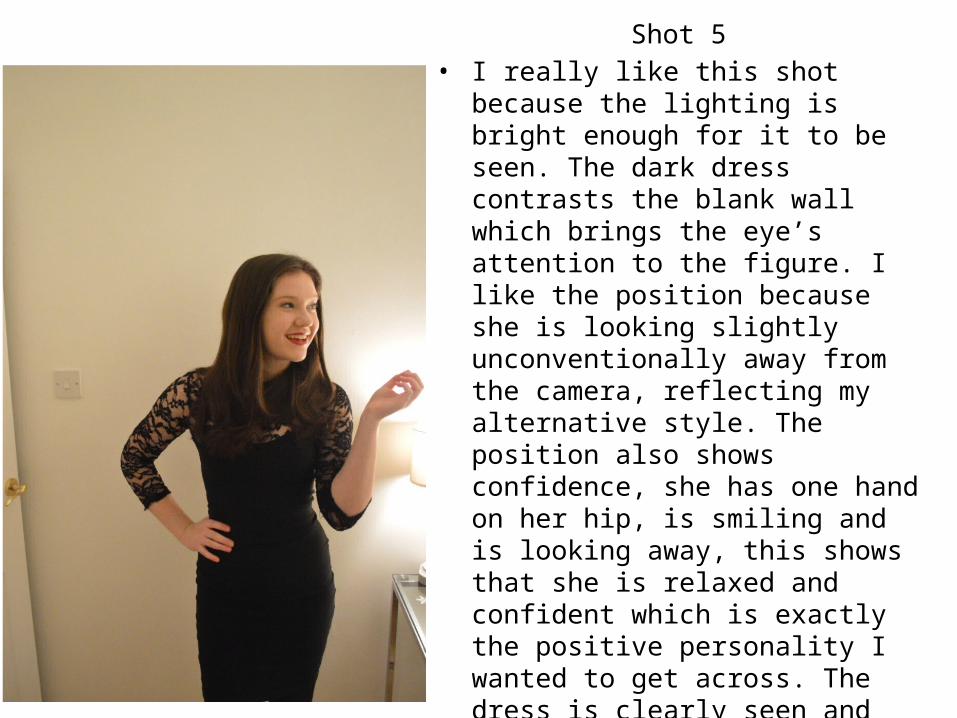
Shot 5• I really like this shot because the lighting
is bright enough for it to be seen. The dark dress contrasts the blank wall which brings the eye’s attention to the figure. I like the position because she is looking slightly unconventionally away from the camera, reflecting my alternative style. The position also shows confidence, she has one hand on her hip, is smiling and is looking away, this shows that she is relaxed and confident which is exactly the positive personality I wanted to get across. The dress is clearly seen and shows her as stylish.
• If I use this image I will have it in the centre of the page and will edit some colours/brightness/contrast etc. on Photoshop to create a more alternative/indie style picture.

MY MAIN FRONT COVER IMAGEI have chosen shot 5 as my main front cover image because it shows confidence and happiness in the posture and facial expression. It is a medium-long shot so there is lots of opportunity for it to be enlarged. It shows the artist as pretty and stylish to make readers aspire to be like her. I have found some relating magazine covers that are similar and have inspired my idea and choice from Rolling Stone magazine.