Embed Size (px)
Citation preview
Q-2014 Contents analysis
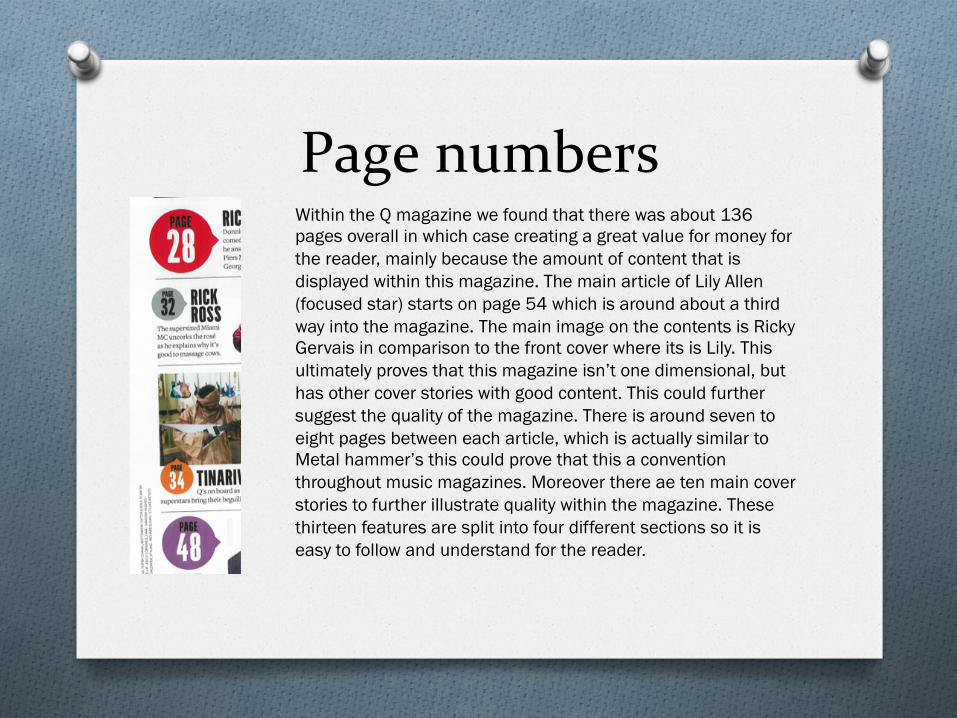
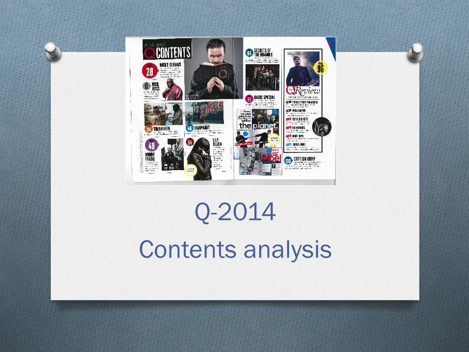
Page numbers Within the Q magazine we found that there was about 136 pages overall in which case creating a great value for money for the reader, mainly because the amount of content that is displayed within this magazine. The main article of Lily Allen (focused star) starts on page 54 which is around about a third way into the magazine. The main image on the contents is Ricky Gervais in comparison to the front cover where its is Lily. This ultimately proves that this magazine isn’t one dimensional, but has other cover stories with good content. This could further suggest the quality of the magazine. There is around seven to eight pages between each article, which is actually similar to Metal hammer’s this could prove that this a convention throughout music magazines. Moreover there ae ten main cover stories to further illustrate quality within the magazine. These thirteen features are split into four different sections so it is easy to follow and understand for the reader.
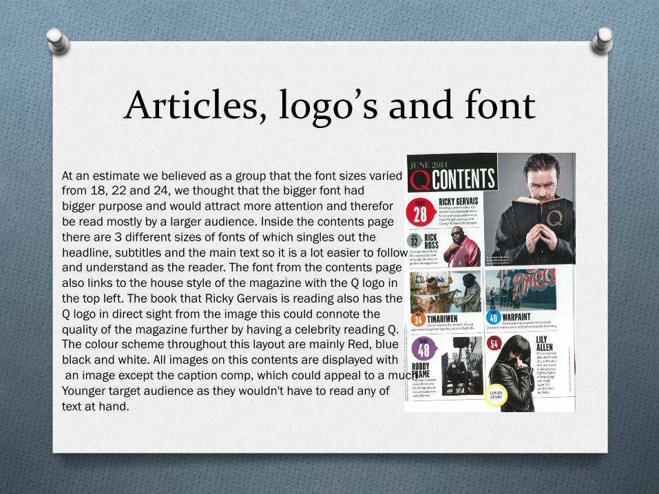
Articles, logo’s and font At an estimate we believed as a group that the font sizes varied from 18, 22 and 24, we thought that the bigger font had bigger purpose and would attract more attention and therefor be read mostly by a larger audience. Inside the contents page there are 3 different sizes of fonts of which singles out the headline, subtitles and the main text so it is a lot easier to follow and understand as the reader. The font from the contents page also links to the house style of the magazine with the Q logo in the top left. The book that Ricky Gervais is reading also has the Q logo in direct sight from the image this could connote the quality of the magazine further by having a celebrity reading Q. The colour scheme throughout this layout are mainly Red, blue black and white. All images on this contents are displayed with an image except the caption comp, which could appeal to a much Younger target audience as they wouldn't have to read any of text at hand.
Images, Page numbers and house style
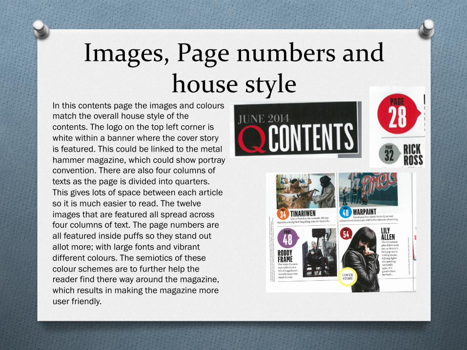
In this contents page the images and colours match the overall house style of the contents. The logo on the top left corner is white within a banner where the cover story is featured. This could be linked to the metal hammer magazine, which could show portray convention. There are also four columns of texts as the page is divided into quarters. This gives lots of space between each article so it is much easier to read. The twelve images that are featured all spread across four columns of text. The page numbers are all featured inside puffs so they stand out allot more; with large fonts and vibrant different colours. The semiotics of these colour schemes are to further help the reader find there way around the magazine, which results in making the magazine more user friendly.
Representations, genre’s and images.
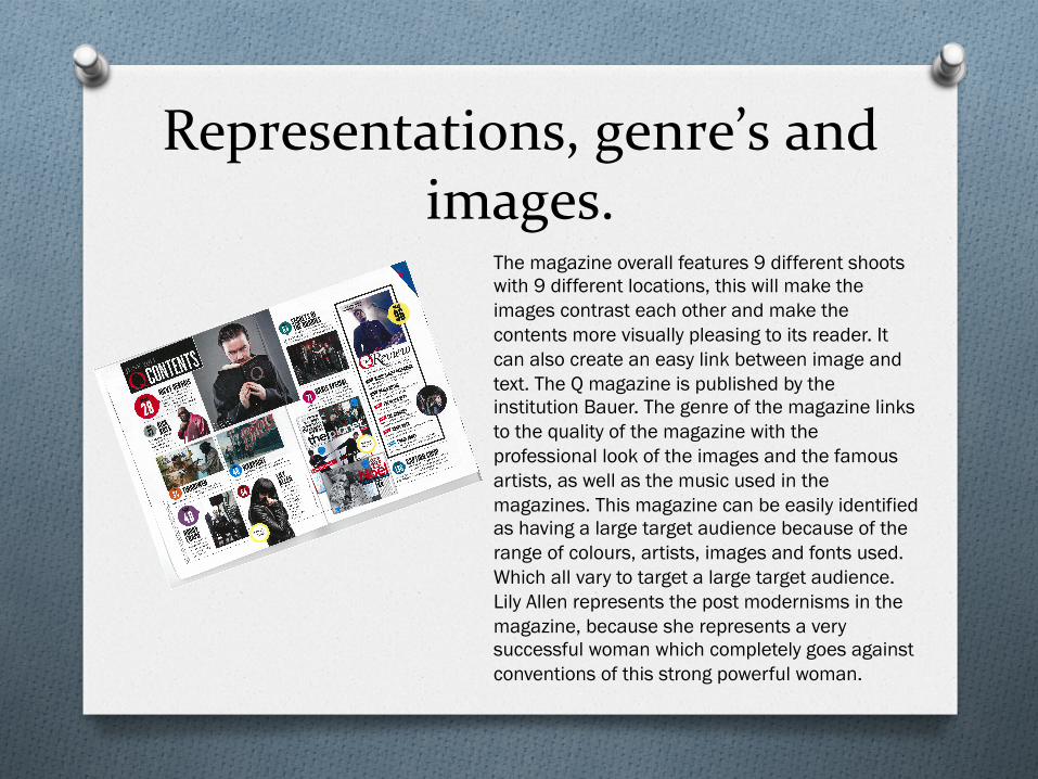
The magazine overall features 9 different shoots with 9 different locations, this will make the images contrast each other and make the contents more visually pleasing to its reader. It can also create an easy link between image and text. The Q magazine is published by the institution Bauer. The genre of the magazine links to the quality of the magazine with the professional look of the images and the famous artists, as well as the music used in the magazines. This magazine can be easily identified as having a large target audience because of the range of colours, artists, images and fonts used. Which all vary to target a large target audience. Lily Allen represents the post modernisms in the magazine, because she represents a very successful woman which completely goes against conventions of this strong powerful woman.