Embed Size (px)
Citation preview
Kristy Lai
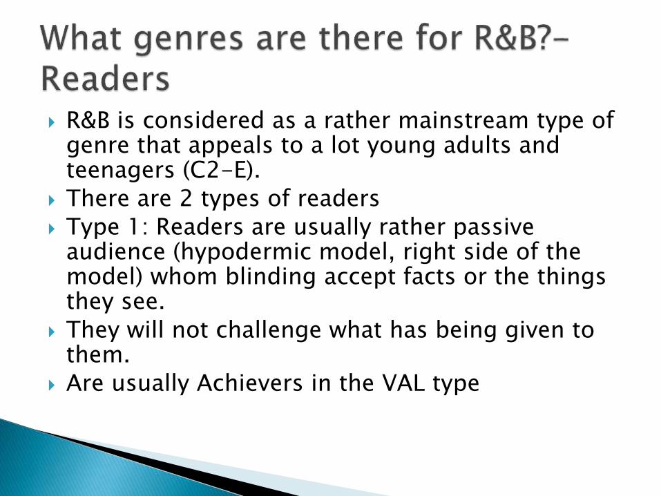
R&B is considered as a rather mainstream type of genre that appeals to a lot young adults and teenagers (C2-E).
There are 2 types of readers
Type 1: Readers are usually rather passive audience (hypodermic model, right side of the model) whom blinding accept facts or the things they see.
They will not challenge what has being given to them.
Are usually Achievers in the VAL type
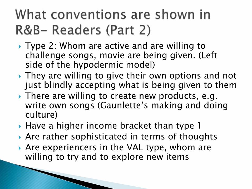
Type 2: Whom are active and are willing to challenge songs, movie are being given. (Left side of the hypodermic model)
They are willing to give their own options and not just blindly accepting what is being given to them
There are willing to create new products, e.g. write own songs (Gaunlette’s making and doing culture)
Have a higher income bracket than type 1
Are rather sophisticated in terms of thoughts
Are experiencers in the VAL type, whom are willing to try and to explore new items
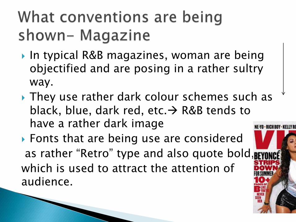
In typical R&B magazines, woman are being objectified and are posing in a rather sultry way.
They use rather dark colour schemes such as black, blue, dark red, etc. R&B tends to have a rather dark image
Fonts that are being use are considered
as rather “Retro” type and also quote bold,
which is used to attract the attention of audience.
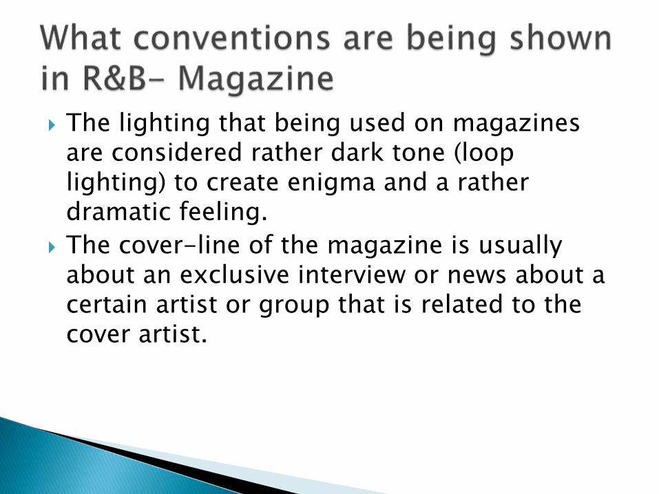
The lighting that being used on magazines are considered rather dark tone (loop lighting) to create enigma and a rather dramatic feeling.
The cover-line of the magazine is usually about an exclusive interview or news about a certain artist or group that is related to the cover artist.
There are 2 types of R&B artists with different portrayals, one focuses mainly on the portrayal of women
Type 1: The artist shows and exposes a lot of her skin during album jacket photo shoots or interviews. the consumers would rather focus on the photos instead of the song’s quality itself.
The songs they produce surround the theme of sex, love, etc.
The beat or style of song would have a distinctive and additive beat to it to attract the audience’s attention.
The dances or music video representation usual shows of the artist dancing sultry and in a rather sensual wayWindship’s notion of complicity hoping to gain more audience and hoping to earn praise.
The artist would take a rather soft and mellow approach.
The artist does not show a lot of skin, and changes the attention to their voice and the music they are singing.
The songs they sing are not as upbeat as the mainstream R&B songs that are in the market
Audience vary from year to year, therefore if the artist does not have a breakthrough song; they would most likely not succeeded in the music industry.
The songs they sing still surrounds the theme of love, but sometimes may sing about other perspective and just about have fun or to party around.
My magazine is a R&B and inspirational magazine.
My primary audience is the income bracket of B2- C2, while my secondary audience C2-E.
The colour scheme of my magazine does follow the usually colour scheme of having dark colours. (Blue and black)
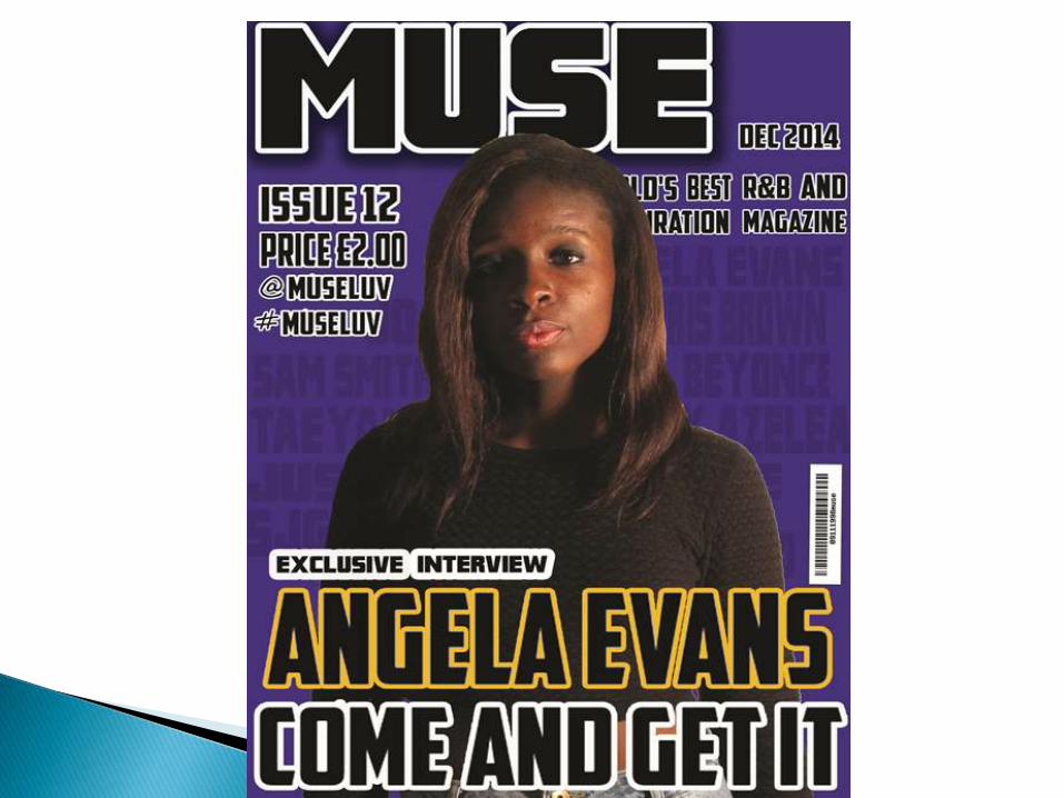
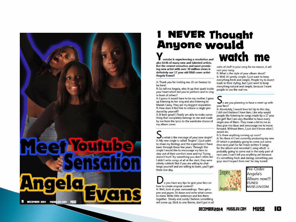
The cover page shows an photo of a new cover artist-Angela Evans
The lighting that is being used is loop lighting, which is a rather uncommon type of lighting that is being used other magazines use high key lighting which exposes the artist’s face clearly I wanted to create enigma and to build hype to attract the audience’s attention.
Angela is dress in a rather modest outfit which does not reveal a lot of her skin
She has a serious facial expression and her head is being slightly up suggests an idea of her confidence and strong-willed against the convention/ideology of her being passive and being looked as a object Gauntlett’s empowered woman
A medium shot of her suggest an idea the audience does not know her well known to know what she is about and what she is going to bring out to the audience
I did not state what is going to be in the magazine and instead just wrote the names of featured artist at the back of Angela’s photo instead of the traditional cover-line that all magazines use to attract attention
I wanted my audience to actually think and discover what is going to be inside the magazine instead of me stating what is going to be on it
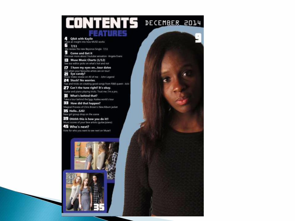
The contents page states what is going to be in the magazine
As my target audience is for a rather sophisticated audience, I added elements of tips on creating music or writing songs for the audience to learn how to and not just to blindly accept and listen to pop/r&bsongs Gauntlett’s making and doing culture
I also wanted to audience to engage in the process of them choosing what they wanted to see on the next issue of the magazine instead of us choosing are on the right side of the hypothermic model.
My audience are rather active and engaging than other audiences.
Angela Evans is a new artist that writes and produces her own songs challenges what is available on the market by making her own
She encourages her fans and supporters to step out of their comfort zone and to try doing music themselves
Artists usually do not encourage fans to try making their own products, but just to blindly asking them to accept it.
Her theme of her songs is to lift the hearts of her fans and to give her fans strength to try new things
She produces her own album and is in-charge of the whole process of her album very uncommon as only a few artists do so as there are a team of people to help them do that
For the layout of my magazine. I decided to divide the text and the photos of my magazine into half as it is easier of my readers to read it.
It is a common way to do so, but the content of my article gives readers a deeper understanding of the artist’s style of music and also a deeper understanding of her own personal self.
The tone of the interview is in a rather causal tone and light-hearted, hoping readers to feel more comfortable and personal when reader itusually a formal tone is used during interviews
I used a rather bold font to attract the attention of the audience.
I stuck with the house style of my magazine throughout my production. (font and colour)
I added a bar code onto my cover page.
I also added a price and issue onto the front cover.
I put the usernames of different social media sites I used on my magazine to interact with fans.)
For my contents page and double page spread, on the bottom of my magazine, I added the date, magazine name, issue, page number and website address to make it as realistic as possible.
However, the words are not aligned and some parts are not tidy enough.
I also tried putting lines are separators to divide text into different sections.
Overall I think I did a decent job in completing the whole magazine and tried my best in creating a magazine typed like production.
The part where I could have done better is to stick to the original ideas of my product as I have changed a bit of my production to adapt to the circumstances of my production
My cover page shot was original a medium long shot, but due to some editing issues, I had to cut the photo a bit in order to make the photo presentable
The layout of my magazine is a bit messy in terms of the layout of my cover page
Everything looks squashed up
I should have also put some text on the right side of my magazine instead of putting it in just one page.
I should have also used more people as my models to make my magazine more interesting.
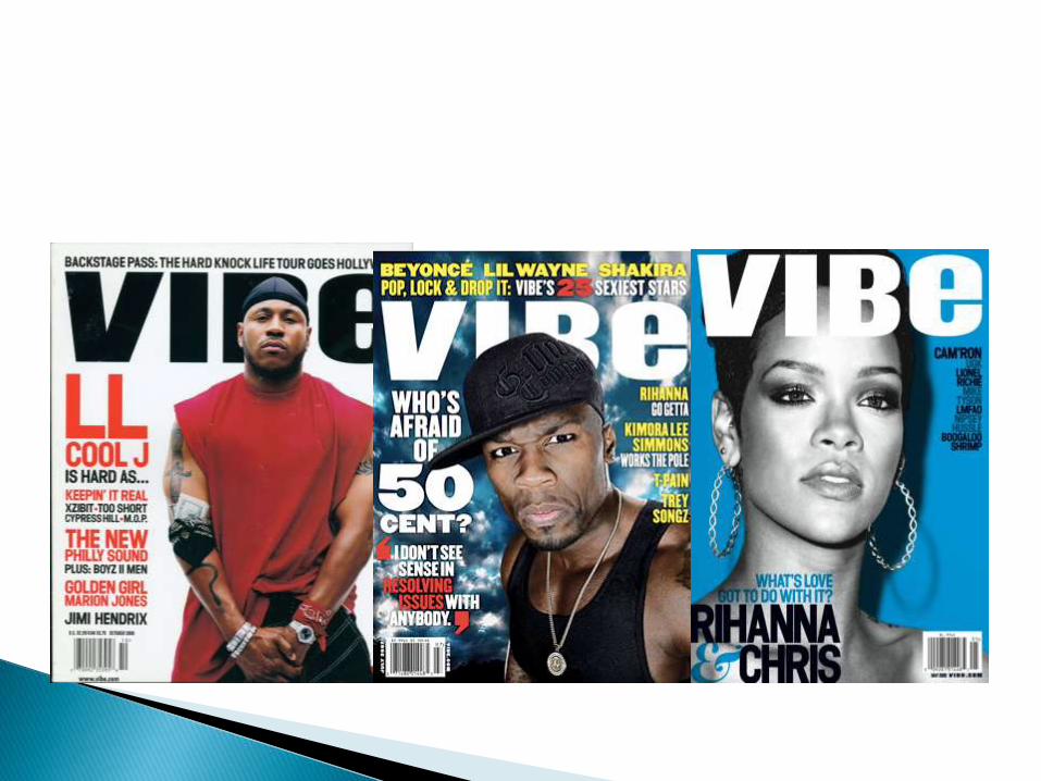
VIBE magazine is distributed by interMedia partners
The genre of the magazine surrounds the theme of hip-hop, rap and R&B.
The audience they aim for is from ages 18-34
However, the content they produce and the style of layout is similar to my produce.
They take also a darker approach in terms of the color of the layout.
They also took a similar approach in terms of marketing and distributing their product through online distribution
They used social media sites such as facebook and twitter to interact and socialise with fans.