Embed Size (px)
Citation preview
in what way does your media product use, develop or challenge forms and conventions of media
products?
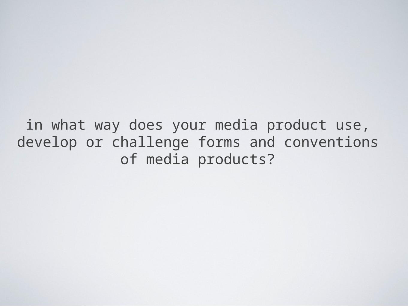
Front CoverConventions of a front cover- Masthead usually carries through the same theme/ colour scheme throughout the magazine-One main Images usually a head and shoulders shot- Main image is the main story, clearly advertised more than the others. -Other images linking to the main stories on the cover-Teasing headlines making the reader want to read on and turn to the article- Banners/ text boxes to attract the readers attention -Barcode- Selling techniques for e.g “Buy it or regret it!” -Price- Articles with there page number showing-Issue number and Date released- Colours are bold, bright and eye- catching-Very busy, hardly any white space this will immediately attract the attention from other competitive magazines.
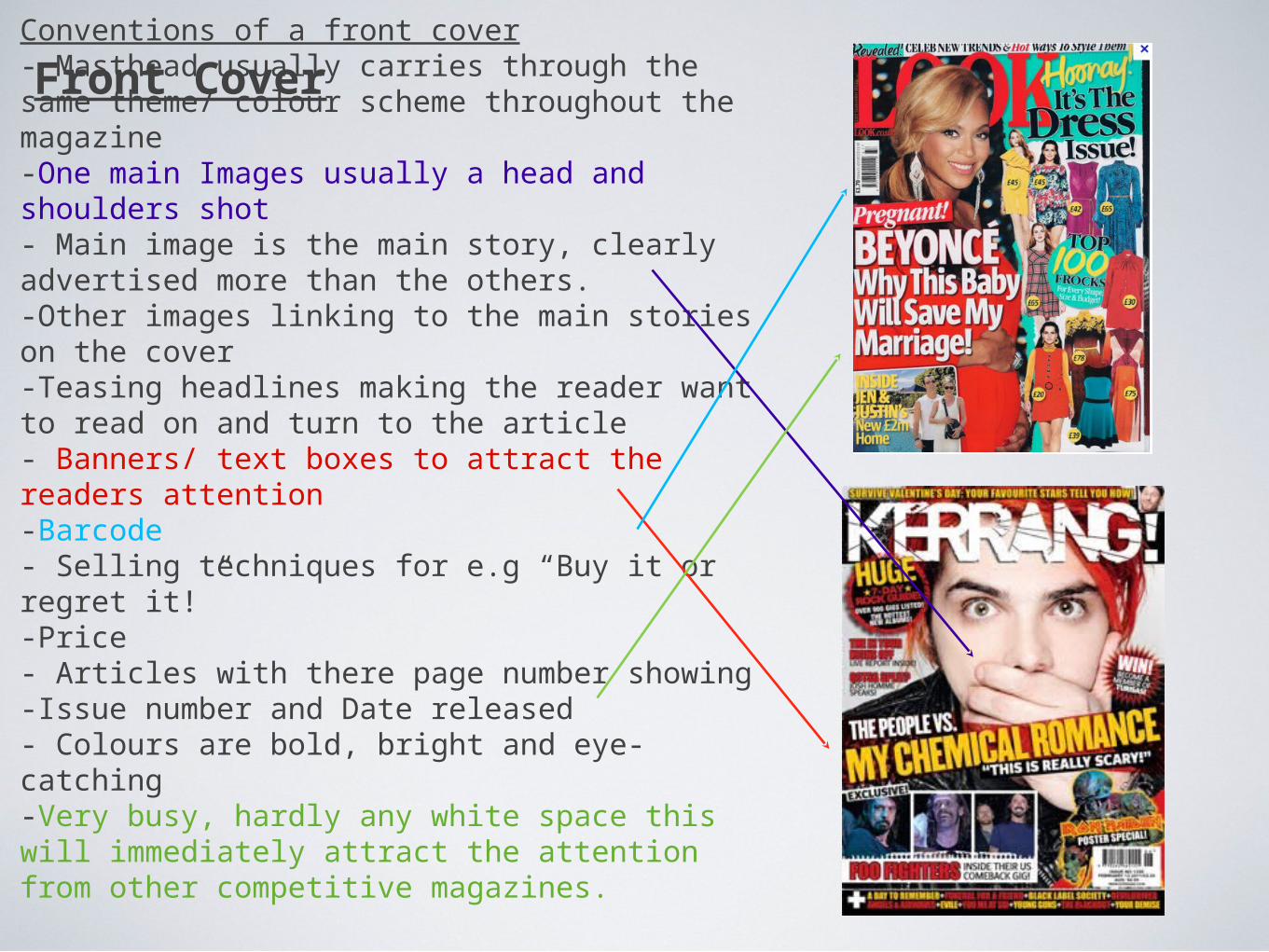
My Front CoverFollowed conventions- Kept the main image a head and shoulders shot- The masthead I had kept the same font throughout my Contents page and double page spread also the colour scheme stayed similar with just a few different tweaks to add a fresh new vibe.- Added a selling line “Britians answer to a FRESH RnB magazine”- to advertise my magazine and the selling point that “Fresh n Fly” is new, urban and fresh. Also in the UK market there is not any mainstream RnB magazines so the magazine is also showing how it is new to the market.- Used a barcode, date, issue number and price.Challenged conventions- I wanted to make the magazine fairly minimalistic so my front cover was not as busy as the usual magazines, however I felt this made the magazine look more professional and less intimidating. - I didn’t put the articles page numbers on the front cover as I feel that information should be displayed in the contents page.
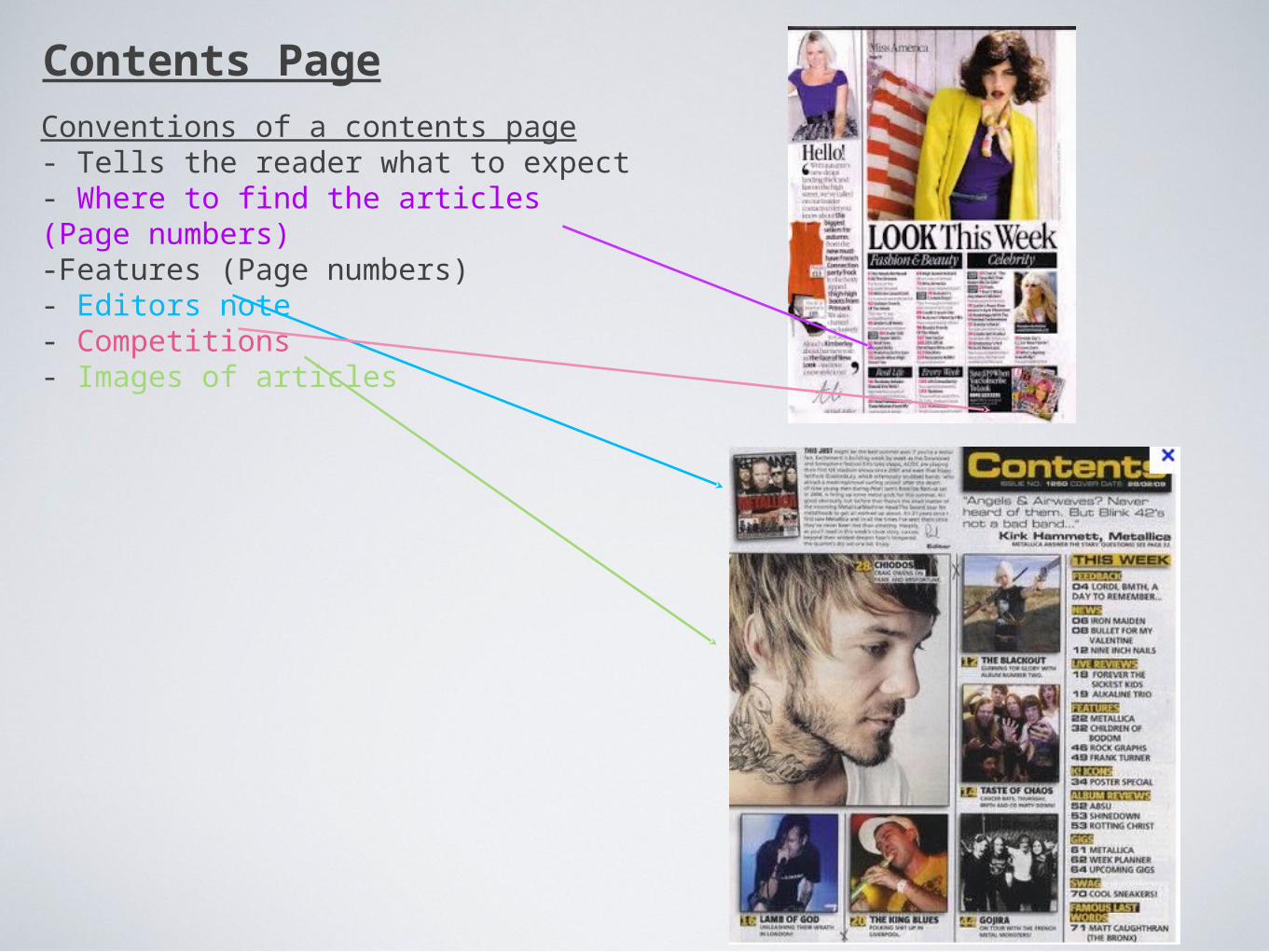
Contents PageConventions of a contents page- Tells the reader what to expect- Where to find the articles (Page numbers)-Features (Page numbers)- Editors note- Competitions- Images of articles
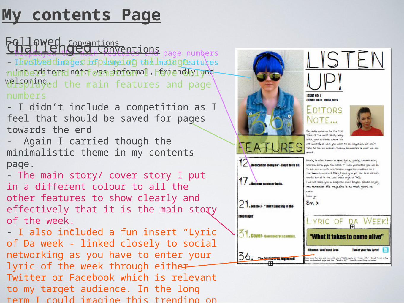
Followed Conventions - Displayed the main features and page numbers- Involved images of some of the main features- The editors note was informal, friendly and welcoming.Challenged Conventions- Instead of displaying all page numbers and information I have only displayed the main features and page numbers- I didn’t include a competition as I feel that should be saved for pages towards the end- Again I carried though the minimalistic theme in my contents page. - The main story/ cover story I put in a different colour to all the other features to show clearly and effectively that it is the main story of the week. - I also included a fun insert “Lyric of Da week”- linked closely to social networking as you have to enter your lyric of the week through either Twitter or Facebook which is relevant to my target audience. In the long term I could imagine this trending on Twitter.
My contents Page
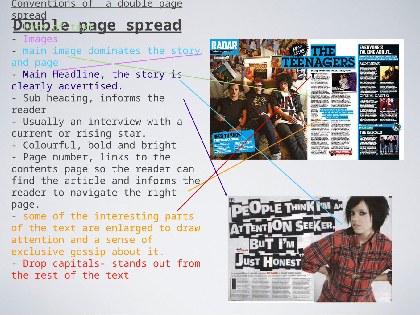
Double page spreadConventions of a double page spread- Lots of text- Images- main image dominates the story and page- Main Headline, the story is clearly advertised.- Sub heading, informs the reader- Usually an interview with a current or rising star.- Colourful, bold and bright- Page number, links to the contents page so the reader can find the article and informs the reader to navigate the right page.- some of the interesting parts of the text are enlarged to draw attention and a sense of exclusive gossip about it. - Drop capitals- stands out from the rest of the text
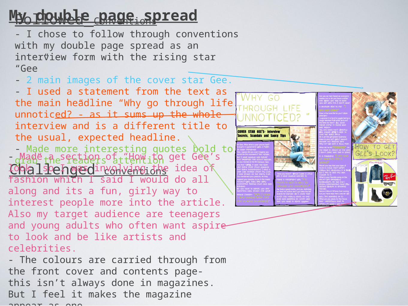
My double page spreadFollowed Conventions- I chose to follow through conventions with my double page spread as an interview form with the rising star “Gee”- 2 main images of the cover star Gee.- I used a statement from the text as the main headline “Why go through life unnoticed?”- as it sums up the whole interview and is a different title to the usual, expected headline. - Made more interesting quotes bold to grab the readers attention
Challenged conventions- Made a section of “How to get Gee’s look” so I was involving the idea of fashion which I said I would do all along and its a fun, girly way to interest people more into the article. Also my target audience are teenagers and young adults who often want aspire to look and be like artists and celebrities. - The colours are carried through from the front cover and contents page- this isn’t always done in magazines. But I feel it makes the magazine appear as one.- Didn’t want too much text as it can be boring and put the reader off.