Embed Size (px)
Citation preview

Question 2How effective is the combination of your media main product with
ancillary texts?
Digipak:• With the digipak for Vanilla’s album I needed to adapt the style of my music video
into the album artwork. For my first panel I used a screenshot of me holding the smoke grenade in a barn. The smoke was used as a recurring motif in my music video with the dragon and factory as well. So, by incorporating it into my digipak I am advancing this motif and forming a much stronger and coherent style.
• The first panel shows me composed in the centre of the frame with the smoke venturing all the way to the left and right side of the image. With the orange smoke and light coloured bricks in the background it gives the front cover a very warm feel which is carried onto the warmness of panel 4. To the right I have contrasted my panel 1 with Vanilla’s panel 1 for the original album. The colour scheme and font are very similar. Obviously his ideas and my own had a large amount of overlay. The electronic chill genre supplies the music industry with a large amount of minimalistic digipaks which explore and celebrate art and photography.
• My music video focused a lot on cinematography which is something I wanted to bring across in my digipak. All 4 panels needed to represent the artist and genre whilst also having a strong sense of the quality of imagery. I think this is achieved with the first panel dues to its strong sense of composition and continuation of the smoke motif.

Digipak:• Artists like SBTRKT now use photography as their album artwork as
apposed to computer generate images/symbols. The image to the right shows the front cover from their ‘Hold On’ EP. The photo is a portrait of a man wearing a mask who has moved his head whilst taking the picture, therefore creating a sense of motion. The smoke from my first panel in a sense also creates the idea that there is movement in the image.
• This artwork emphasises both the artist and the person who produced it because it is a piece of art by itself. Arguably my first panel could be seen in the same way because of its aesthetic feel and controlled composition. This artwork for SBTRKT continues to reinforce the idea that music of this genre uses mostly minimalistic imagery to create
• an idea of what their music sounds like. The music is very simple, repetitive, and hip-hop influenced. The artwork of this genre tends to use a central composition as a convention that continues the idea of a minimalistic piece of work. This style of artwork usually appeals to the audience of the electronic chill genre.

Digipak:
• For my second and third panel I used another screenshot, which is the first image you see when you watch the music video. I wanted these two panels two flow very well together and the best way to achieve this was to use a panoramic photo. These two photos combined together portrays the beauty of the Fens that I put across in my music video. This again helps me to create a more coherent style that is projected in my music video and print productions. The two panels shows the main actress from my music video composed on both the left and right hand side. Even though she is seen to be the main focal points of the panels she is surrounded by the emptiness of the countryside that creates a sense of isolation. The idea of isolation is another motif I created in my music video. This was created through the idea that the girl was always seen alone. So, with these two panels I managed to continue the coherent style and isolation from my music video.

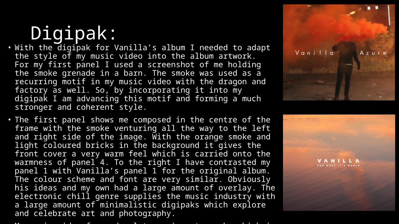
Digipak:• Panel 4 of my digipak shows a sunset over a river with the track list of
the album composed on the left in the centre. This exact shot isn’t used in the music video, but the location is. Just to the left of this shot is the factory that is seen to be polluting the air towards the end of my music video. By using the same location I have continued the coherency of all of my work.
• This panel is very similar to Brand New's Deja-Entendu back cover which is to the right. This artwork shows a dark orange sky with a pool of water composed below. The Deja-Entendu cover is much stronger in terms of tone, contrast and colour, yet the subject matter is still the same which is what creates the relationship between the two.
• The colour pallets of panel 1 and 4 are very similar. They both have a very strong sense of warmth due to the orange tones that are used. The connection between the two panels ensures the digipak works together as a whole and advances the coherency of the overall product.

Poster:• The poster that I have chosen to produce uses the
same image as panel 2 and 3. This creates an even stronger coherence across the package. The photo is used in a very different way in this poster because of the extended scope of the sky. However, its not enough to break the link between all three productions. The typography also helps to complement the quality of the photography with its composition in the frame. There is an equal balance between the albums release date and the name of the artist. The composition of the whole piece curves outwards from the top of the image downwards to a peak at the bottom. This helps for the viewers eyes to easily make its way through each stage of the poster and view each section of it.

Overall:
• I think that through my music video, digipak and poster I have created a range of products which all compliment one another in a way that forms a coherent relationship. All three productions have links with their photography, subject matter and composition that tie them all together to create an effect package. There is clear advertisement of the artist and the titles of the song and album in each production. This ensures I have given the artist and good amount of recognition in each production which also ensures the relationship between them is as strong as possible.