Embed Size (px)
Citation preview
Creating Our Logo
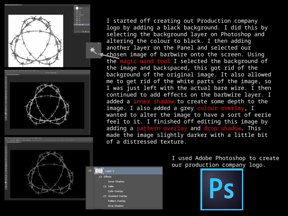
I started off creating out Production company logo by adding a black background. I did this by selecting the background layer on Photoshop and altering the colour to black. I then adding another layer on the Panel and selected our chosen image of barbwire onto the screen. Using the magic wand tool I selected the background of the image and backspaced, this got rid of the background of the original image. It also allowed me to get rid of the white parts of the image, so I was just left with the actual bare wire. I then continued to add effects on the barbwire layer. I added a inner shadow to create some depth to the image. I also added a grey colour overlay, I wanted to alter the image to have a sort of eerie feel to it. I finished off editing this image by adding a pattern overlay and drop shadow. This made the image slightly darker with a little bit of a distressed texture.
I used Adobe Photoshop to create our production company logo.
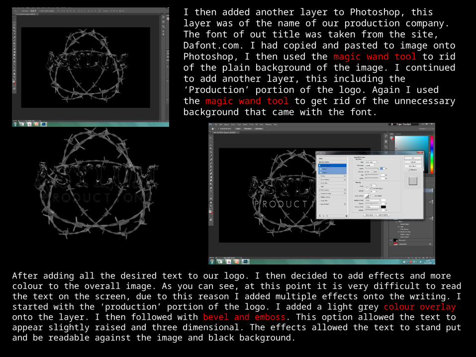
I then added another layer to Photoshop, this layer was of the name of our production company. The font of out title was taken from the site, Dafont.com. I had copied and pasted to image onto Photoshop, I then used the magic wand tool to rid of the plain background of the image. I continued to add another layer, this including the ‘Production’ portion of the logo. Again I used the magic wand tool to get rid of the unnecessary background that came with the font.
After adding all the desired text to our logo. I then decided to add effects and more colour to the overall image. As you can see, at this point it is very difficult to read the text on the screen, due to this reason I added multiple effects onto the writing. I started with the ‘production’ portion of the logo. I added a light grey colour overlay onto the layer. I then followed with bevel and emboss. This option allowed the text to appear slightly raised and three dimensional. The effects allowed the text to stand put and be readable against the image and black background.
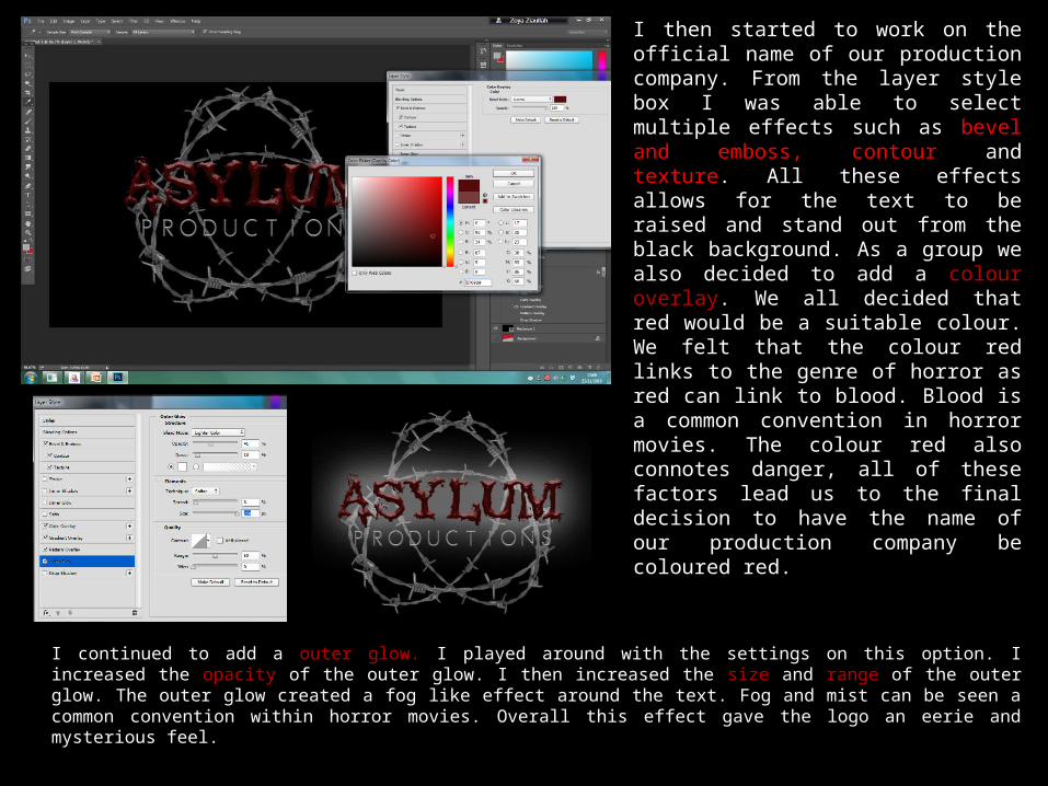
I then started to work on the official name of our production company. From the layer style box I was able to select multiple effects such as bevel and emboss, contour and texture. All these effects allows for the text to be raised and stand out from the black background. As a group we also decided to add a colour overlay. We all decided that red would be a suitable colour. We felt that the colour red links to the genre of horror as red can link to blood. Blood is a common convention in horror movies. The colour red also connotes danger, all of these factors lead us to the final decision to have the name of our production company be coloured red.
I continued to add a outer glow. I played around with the settings on this option. I increased the opacity of the outer glow. I then increased the size and range of the outer glow. The outer glow created a fog like effect around the text. Fog and mist can be seen a common convention within horror movies. Overall this effect gave the logo an eerie and mysterious feel.
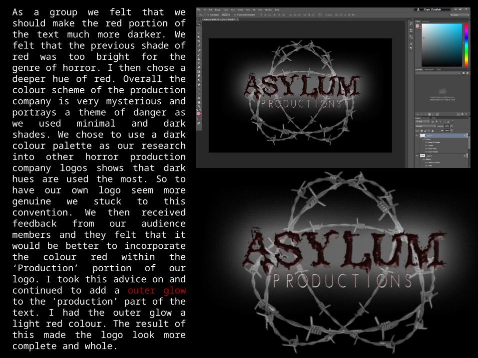
As a group we felt that we should make the red portion of the text much more darker. We felt that the previous shade of red was too bright for the genre of horror. I then chose a deeper hue of red. Overall the colour scheme of the production company is very mysterious and portrays a theme of danger as we used minimal and dark shades. We chose to use a dark colour palette as our research into other horror production company logos shows that dark hues are used the most. So to have our own logo seem more genuine we stuck to this convention. We then received feedback from our audience members and they felt that it would be better to incorporate the colour red within the ‘Production’ portion of our logo. I took this advice on and continued to add a outer glow to the ‘production’ part of the text. I had the outer glow a light red colour. The result of this made the logo look more complete and whole.
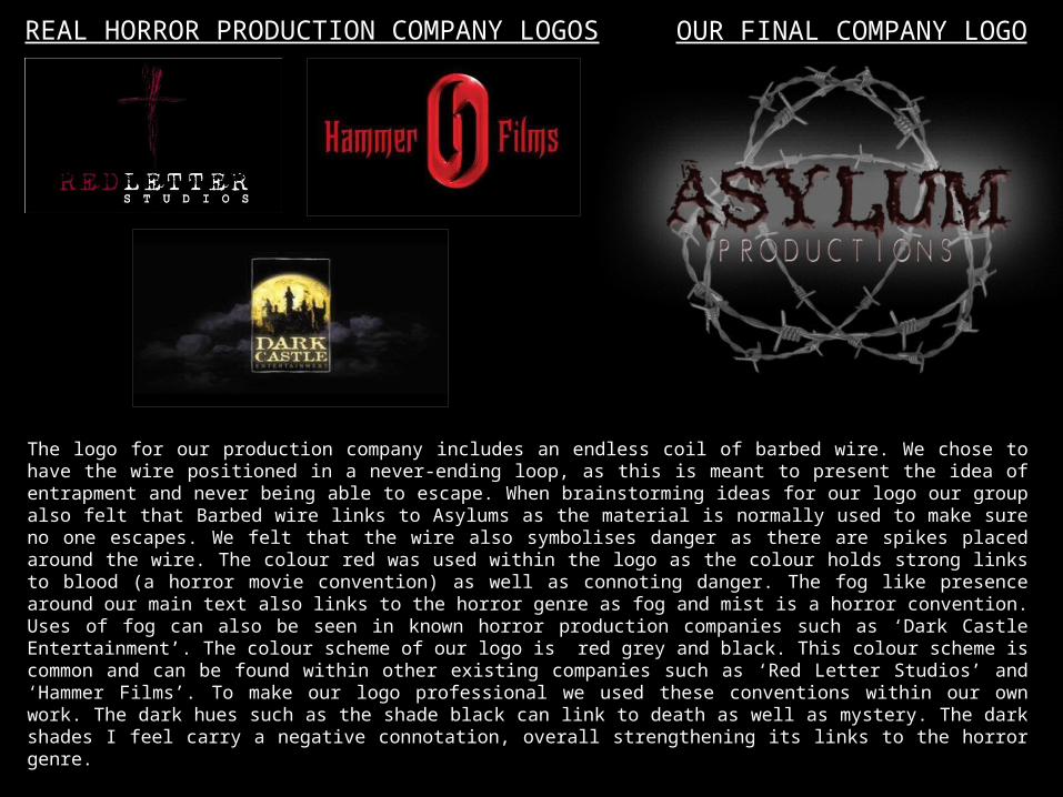
OUR FINAL COMPANY LOGOREAL HORROR PRODUCTION COMPANY LOGOS
The logo for our production company includes an endless coil of barbed wire. We chose to have the wire positioned in a never-ending loop, as this is meant to present the idea of entrapment and never being able to escape. When brainstorming ideas for our logo our group also felt that Barbed wire links to Asylums as the material is normally used to make sure no one escapes. We felt that the wire also symbolises danger as there are spikes placed around the wire. The colour red was used within the logo as the colour holds strong links to blood (a horror movie convention) as well as connoting danger. The fog like presence around our main text also links to the horror genre as fog and mist is a horror convention. Uses of fog can also be seen in known horror production companies such as ‘Dark Castle Entertainment’. The colour scheme of our logo is red grey and black. This colour scheme is common and can be found within other existing companies such as ‘Red Letter Studios’ and ‘Hammer Films’. To make our logo professional we used these conventions within our own work. The dark hues such as the shade black can link to death as well as mystery. The dark shades I feel carry a negative connotation, overall strengthening its links to the horror genre.
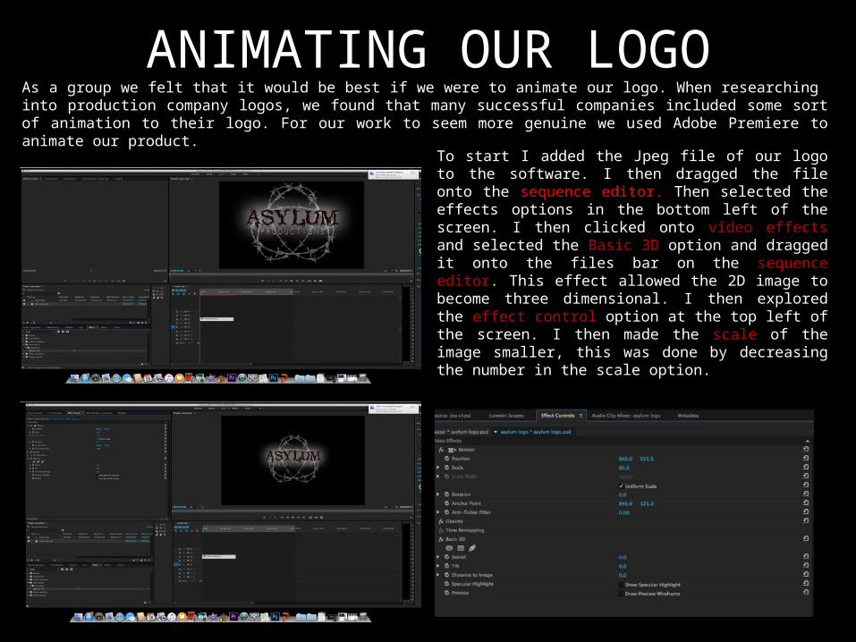
ANIMATING OUR LOGOAs a group we felt that it would be best if we were to animate our logo. When researching into production company logos, we found that many successful companies included some sort of animation to their logo. For our work to seem more genuine we used Adobe Premiere to animate our product.
To start I added the Jpeg file of our logo to the software. I then dragged the file onto the sequence editor. Then selected the effects options in the bottom left of the screen. I then clicked onto video effects and selected the Basic 3D option and dragged it onto the files bar on the sequence editor. This effect allowed the 2D image to become three dimensional. I then explored the effect control option at the top left of the screen. I then made the scale of the image smaller, this was done by decreasing the number in the scale option.
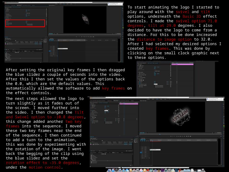
To start animating the logo I started to play around with the swivel and tilt options, underneath the Basic 3D effect controls. I made the swivel option 71.0 degrees, tilt at 29.0 degrees. I also decided to have the logo to come from a distance. For this to be done increased the distance to image option to 32.0. After I had selected my desired options I created key frames. This was done by clicking on the small clock graphic next to these options.
After setting the original key frames I then dragged the blue slider a couple of seconds into the video. After this I then set the values of the options back the 0.0, which are the default values. This automatically allowed the software to add key frames on the effect controls.The next steps allowed the logo to turn slightly as it fades out of the screen. I moved further into the video. I then changed the Tilt and Swivel option to -10.0 degrees, this change added another two key frames into the sequence. I moved these two key frames near the end of the sequence. I then continued to add a turn to the animation, this was done by experimenting with the rotation of the image. I went back the begging of the clip using the blue slider and set the rotation effect to -35.0 degrees, under the motion control.
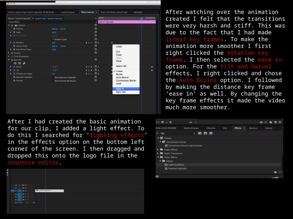
After watching over the animation created I felt that the transitions were very harsh and stiff. This was due to the fact that I had made linear key frames. To make the animation more smoother I first right clicked the rotation key frame. I then selected the ease in option. For the tilt and Swivel effects, I right clicked and chose the Auto Bezier option. I followed by making the distance key frame ‘ease in’ as well. By changing the key frame effects it made the video much more smoother.
After I had created the basic animation for our clip, I added a light effect. To do this I searched for ‘lighting effects’ in the effects option on the bottom left corner of the screen. I then dragged and dropped this onto the logo file in the sequence editor.
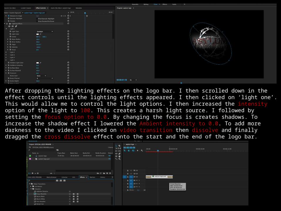
After dropping the lighting effects on the logo bar. I then scrolled down in the effect controls until the lighting effects appeared. I then clicked on ‘light one’. This would allow me to control the light options. I then increased the intensity option of the light to 100. This creates a harsh light source. I followed by setting the focus option to 0.0. By changing the focus is creates shadows. To increase the shadow effect I lowered the Ambient intensity to 0.0. To add more darkness to the video I clicked on video transition then dissolve and finally dragged the cross dissolve effect onto the start and the end of the logo bar.
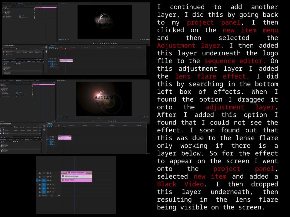
I continued to add another layer, I did this by going back to my project panel, I then clicked on the new item menu and then selected the Adjustment layer. I then added this layer underneath the logo file to the sequence editor. On this adjustment layer I added the lens flare effect. I did this by searching in the bottom left box of effects. When I found the option I dragged it onto the adjustment layer. After I added this option I found that I could not see the effect. I soon found out that this was due to the lense flare only working if there is a layer below. So for the effect to appear on the screen I went onto the project panel, selected new item and added a Black Video. I then dropped this layer underneath, then resulting in the lens flare being visible on the screen.
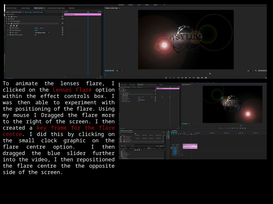
To animate the lenses flare, I clicked on the Lenses Flare option within the effect controls box. I was then able to experiment with the positioning of the flare. Using my mouse I Dragged the flare more to the right of the screen. I then created a key frame for the flare centre. I did this by clicking on the small clock graphic on the flare centre option. I then dragged the blue slider further into the video, I then repositioned the flare centre the the opposite side of the screen.
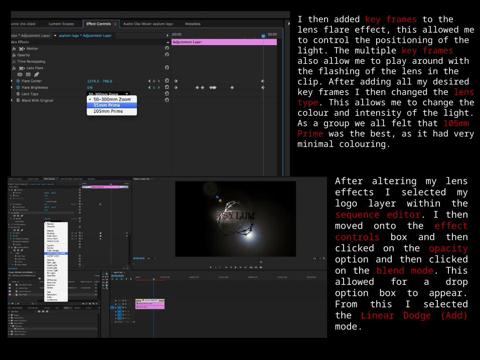
I then added key frames to the lens flare effect, this allowed me to control the positioning of the light. The multiple key frames also allow me to play around with the flashing of the lens in the clip. After adding all my desired key frames I then changed the lens type. This allows me to change the colour and intensity of the light. As a group we all felt that 105mm Prime was the best, as it had very minimal colouring.
After altering my lens effects I selected my logo layer within the sequence editor. I then moved onto the effect controls box and then clicked on the opacity option and then clicked on the blend mode. This allowed for a drop option box to appear. From this I selected the Linear Dodge (Add) mode.
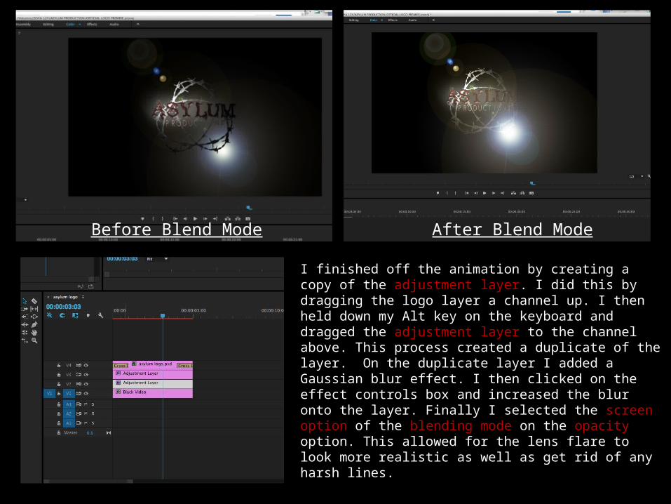
Before Blend Mode After Blend Mode
I finished off the animation by creating a copy of the adjustment layer. I did this by dragging the logo layer a channel up. I then held down my Alt key on the keyboard and dragged the adjustment layer to the channel above. This process created a duplicate of the layer. On the duplicate layer I added a Gaussian blur effect. I then clicked on the effect controls box and increased the blur onto the layer. Finally I selected the screen option of the blending mode on the opacity option. This allowed for the lens flare to look more realistic as well as get rid of any harsh lines.