Embed Size (px)
Citation preview

Objects and Controls
Appeon PowerBuilder® 2019 R2
FOR WINDOWS

DOCUMENT ID: DC37787-01-1900-01
LAST REVISED: March 24, 2020
Copyright © 2019 Appeon. All rights reserved.
This publication pertains to Appeon software and to any subsequent release until otherwiseindicated in new editions or technical notes. Information in this document is subject tochange without notice. The software described herein is furnished under a license agreement,and it may be used or copied only in accordance with the terms of that agreement.
Upgrades are provided only at regularly scheduled software release dates. No part of thispublication may be reproduced, transmitted, or translated in any form or by any means,electronic, mechanical, manual, optical, or otherwise, without the prior written permission ofAppeon Inc.
Appeon and other Appeon products and services mentioned herein as well as their respectivelogos are trademarks or registered trademarks of Appeon Inc.
SAP and other SAP products and services mentioned herein as well as their respective logosare trademarks or registered trademarks of SAP and SAP affiliate company.
Java and all Java-based marks are trademarks or registered trademarks of Oracle and/or itsaffiliates in the U.S. and other countries.
Unicode and the Unicode Logo are registered trademarks of Unicode, Inc.
All other company and product names mentioned may be trademarks of the respectivecompanies with which they are associated.
Use, duplication, or disclosure by the government is subject to the restrictions set forthin subparagraph (c)(1)(ii) of DFARS 52.227-7013 for the DOD and as set forth in FAR52.227-19(a)-(d) for civilian agencies.
Appeon Inc., 1/F, Shell Industrial Building, 12 Lee Chung Street, Chai Wan District, HongKong.

Contents1 PowerBuilder System Objects and Controls .......................................................... 1
1.1 What are system objects? ........................................................................... 11.2 System object properties, events, and functions ......................................... 11.3 System object inheritance hierarchy ............................................................ 2
1.3.1 Undocumented base class objects .................................................... 21.4 Viewing system objects ............................................................................... 3
2 System Object Properties, Events, and Functions ................................................ 42.1 ADOResultSet object ................................................................................... 42.2 Animation control ......................................................................................... 52.3 Application object ......................................................................................... 82.4 ArrayBounds object .................................................................................... 112.5 CheckBox control ....................................................................................... 122.6 ClassDefinition object ................................................................................ 162.7 CoderObject object .................................................................................... 182.8 CommandButton control ............................................................................ 202.9 CompressorObject object .......................................................................... 242.10 Connection object (obsolete) ................................................................... 252.11 ContextInformation object ........................................................................ 302.12 ContextKeyword object ............................................................................ 312.13 CORBACurrent object (obsolete) ............................................................ 322.14 CORBAObject object (obsolete) .............................................................. 342.15 CrypterObject object ................................................................................ 352.16 DotNetAssembly object ............................................................................ 362.17 DotNetObject object ................................................................................. 372.18 DataStore object ...................................................................................... 382.19 DataWindow control ................................................................................. 472.20 DataWindowChild object .......................................................................... 652.21 DatePicker control .................................................................................... 722.22 DropDownListBox control ........................................................................ 802.23 DropDownPictureListBox control ............................................................. 872.24 DynamicDescriptionArea object ............................................................... 952.25 DynamicStagingArea object ..................................................................... 972.26 EditMask control ...................................................................................... 982.27 EnumerationDefinition object ................................................................. 1062.28 EnumerationItemDefinition object .......................................................... 1082.29 Environment object ................................................................................ 1082.30 Error object ............................................................................................ 1102.31 ErrorLogging object ................................................................................ 1112.32 Exception object .................................................................................... 1122.33 ExtractorObject object ............................................................................ 1132.34 Graph object .......................................................................................... 1152.35 grAxis object .......................................................................................... 1212.36 grDispAttr object .................................................................................... 1242.37 GroupBox control ................................................................................... 1262.38 HProgressBar control ............................................................................. 1302.39 HScrollBar control .................................................................................. 133

2.40 HTrackBar control .................................................................................. 1362.41 HTTPClient object .................................................................................. 1402.42 Inet object .............................................................................................. 1412.43 InkEdit control ........................................................................................ 1422.44 InkPicture control ................................................................................... 1492.45 InternetResult object .............................................................................. 1552.46 JSONGenerator object ........................................................................... 1562.47 JSONPackage object ............................................................................. 1572.48 JSONParser object ................................................................................ 1592.49 Line control ............................................................................................ 1612.50 ListBox control ....................................................................................... 1632.51 ListView control ...................................................................................... 1692.52 ListViewItem object ................................................................................ 1802.53 mailFileDescription object ...................................................................... 1822.54 mailMessage object ............................................................................... 1822.55 mailRecipient object ............................................................................... 1842.56 mailSession object ................................................................................. 1852.57 MDIClient object ..................................................................................... 1862.58 Menu object ........................................................................................... 1872.59 MenuCascade object ............................................................................. 1922.60 Message object ...................................................................................... 1962.61 MLSync object ....................................................................................... 1972.62 MLSynchronization object ...................................................................... 2002.63 MonthCalendar control ........................................................................... 2032.64 MultiLineEdit control ............................................................................... 2082.65 OAuthClient object ................................................................................. 2152.66 OAuthRequest object ............................................................................. 2162.67 OLEControl control ................................................................................ 2172.68 OLECustomControl control (OCX) ......................................................... 2232.69 OLEObject object ................................................................................... 2292.70 OLEStorage object ................................................................................. 2312.71 OLEStream object .................................................................................. 2322.72 OLETxnObject object ............................................................................. 2332.73 Oval control ............................................................................................ 2352.74 Picture control ........................................................................................ 2372.75 PictureButton control .............................................................................. 2402.76 PictureHyperLink control ........................................................................ 2452.77 PictureListBox control ............................................................................ 2492.78 Pipeline object ....................................................................................... 2572.79 ProfileCall object .................................................................................... 2582.80 ProfileClass object ................................................................................. 2592.81 ProfileLine object ................................................................................... 2602.82 ProfileRoutine object .............................................................................. 2612.83 Profiling object ....................................................................................... 2632.84 RadioButton control ............................................................................... 2642.85 Rectangle control ................................................................................... 2692.86 ResourceResponse object ..................................................................... 2712.87 RESTClient object .................................................................................. 272

2.88 ResultSet object ..................................................................................... 2742.89 ResultSets object (obsolete) .................................................................. 2752.90 RibbonBar control .................................................................................. 2752.91 RibbonApplicationButtonItem control ..................................................... 2832.92 RibbonApplicationMenu control ............................................................. 2832.93 RibbonCategoryItem control .................................................................. 2852.94 RibbonCheckBoxItem control ................................................................ 2852.95 RibbonComboBoxItem control ............................................................... 2872.96 RibbonGroupItem control ....................................................................... 2882.97 RibbonLargeButtonItem control ............................................................. 2892.98 RibbonMenu control ............................................................................... 2902.99 RibbonMenuItem control ........................................................................ 2912.100 RibbonPanelItem control ...................................................................... 2922.101 RibbonSmallButtonItem control ............................................................ 2932.102 RibbonTabButtonItem control .............................................................. 2942.103 RichTextEdit control ............................................................................. 2962.104 RoundRectangle control ...................................................................... 3062.105 RuntimeError object ............................................................................. 3082.106 ScriptDefinition object .......................................................................... 3102.107 SimpleTypeDefinition object ................................................................ 3132.108 SingleLineEdit control .......................................................................... 3132.109 SSLCallBack object (obsolete) ............................................................ 3182.110 SSLServiceProvider object (obsolete) ................................................. 3192.111 StaticHyperLink control ........................................................................ 3202.112 StaticText control ................................................................................. 3252.113 SyncParm object .................................................................................. 3302.114 Tab control ........................................................................................... 3312.115 Throwable object .................................................................................. 3382.116 Timing object ....................................................................................... 3392.117 TokenRequest object ........................................................................... 3402.118 TokenResponse object ........................................................................ 3412.119 TraceActivityNode object ..................................................................... 3422.120 TraceBeginEnd object .......................................................................... 3442.121 TraceError object ................................................................................. 3442.122 TraceESQL object ................................................................................ 3452.123 TraceFile object ................................................................................... 3462.124 TraceGarbageCollect object ................................................................ 3472.125 TraceLine object .................................................................................. 3482.126 TraceObject object ............................................................................... 3492.127 TraceRoutine object ............................................................................. 3502.128 TraceTree object .................................................................................. 3512.129 TraceTreeError object .......................................................................... 3522.130 TraceTreeESQL object ........................................................................ 3532.131 TraceTreeGarbageCollect object ......................................................... 3542.132 TraceTreeLine object ........................................................................... 3552.133 TraceTreeNode object ......................................................................... 3562.134 TraceTreeObject object ....................................................................... 3572.135 TraceTreeRoutine object ..................................................................... 358

2.136 TraceTreeUser object .......................................................................... 3592.137 TraceUser object .................................................................................. 3602.138 Transaction object ................................................................................ 3602.139 TransactionServer object ..................................................................... 3622.140 TreeView control .................................................................................. 3642.141 TreeViewItem object ............................................................................ 3742.142 TypeDefinition object ........................................................................... 3752.143 ULSync object ...................................................................................... 3772.144 UserObject object ................................................................................ 3772.145 VariableCardinalityDefinition object ..................................................... 3822.146 VariableDefinition object ...................................................................... 3832.147 VProgressBar control ........................................................................... 3852.148 VScrollBar control ................................................................................ 3882.149 VTrackBar control ................................................................................ 3912.150 WebBrowser control ............................................................................. 3952.151 Window control .................................................................................... 4062.152 WSConnection object (Obsolete) ......................................................... 419
3 Property Descriptions and Usage ...................................................................... 4223.1 Accelerator ............................................................................................... 4223.2 AccessibleDescription .............................................................................. 4233.3 AccessibleName ...................................................................................... 4233.4 AccessibleRole ......................................................................................... 4233.5 Activation .................................................................................................. 4253.6 AdditionalOpts .......................................................................................... 4263.7 Alignment ................................................................................................. 4263.8 AllowEdit .................................................................................................. 4273.9 AnimationName ........................................................................................ 4283.10 AnimationTime ....................................................................................... 4283.11 AuthenticateParms ................................................................................. 4293.12 AutoArrange ........................................................................................... 4293.13 AutoHScroll ............................................................................................ 4303.14 Automatic ............................................................................................... 4303.15 AutoPlay ................................................................................................. 4313.16 AutoReadData ........................................................................................ 4313.17 AutoScale ............................................................................................... 432
3.17.1 For Graph controls ...................................................................... 4323.17.2 For ribbon controls ...................................................................... 433
3.18 AutoSize ................................................................................................. 4333.19 AutosizeHeight ....................................................................................... 4343.20 AutoSkip ................................................................................................. 4353.21 AutoVScroll ............................................................................................ 4353.22 BackColor ............................................................................................... 4363.23 BeginX .................................................................................................... 4373.24 BeginY .................................................................................................... 4373.25 BoldSelectedText ................................................................................... 4383.26 Border .................................................................................................... 4383.27 BorderColor ............................................................................................ 4393.28 BorderStyle ............................................................................................ 439
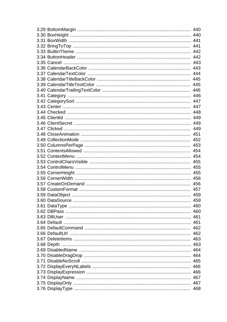
3.29 BottomMargin ......................................................................................... 4403.30 BoxHeight ............................................................................................... 4403.31 BoxWidth ................................................................................................ 4413.32 BringToTop ............................................................................................ 4413.33 BuiltinTheme .......................................................................................... 4423.34 ButtonHeader ......................................................................................... 4423.35 Cancel .................................................................................................... 4433.36 CalendarBackColor ................................................................................ 4433.37 CalendarTextColor ................................................................................. 4443.38 CalendarTitleBackColor ......................................................................... 4453.39 CalendarTitleTextColor .......................................................................... 4453.40 CalendarTrailingTextColor ..................................................................... 4463.41 Category ................................................................................................. 4463.42 CategorySort .......................................................................................... 4473.43 Center .................................................................................................... 4473.44 Checked ................................................................................................. 4483.45 ClientId ................................................................................................... 4493.46 ClientSecret ............................................................................................ 4493.47 Clicked ................................................................................................... 4493.48 CloseAnimation ...................................................................................... 4513.49 CollectionMode ...................................................................................... 4523.50 ColumnsPerPage ................................................................................... 4533.51 ContentsAllowed .................................................................................... 4543.52 ContextMenu .......................................................................................... 4543.53 ControlCharsVisible ............................................................................... 4553.54 ControlMenu ........................................................................................... 4553.55 CornerHeight .......................................................................................... 4553.56 CornerWidth ........................................................................................... 4563.57 CreateOnDemand .................................................................................. 4563.58 CustomFormat ....................................................................................... 4573.59 DataObject ............................................................................................. 4593.60 DataSource ............................................................................................ 4593.61 DataType ................................................................................................ 4603.62 DBPass .................................................................................................. 4603.63 DBUser ................................................................................................... 4613.64 Default .................................................................................................... 4613.65 DefaultCommand ................................................................................... 4623.66 DefaultUrl ............................................................................................... 4623.67 DeleteItems ............................................................................................ 4633.68 Depth ...................................................................................................... 4633.69 DisabledName ........................................................................................ 4643.70 DisableDragDrop .................................................................................... 4643.71 DisableNoScroll ...................................................................................... 4653.72 DisplayEveryNLabels ............................................................................. 4663.73 DisplayExpression .................................................................................. 4663.74 DisplayName .......................................................................................... 4673.75 DisplayOnly ............................................................................................ 4673.76 DisplayType ........................................................................................... 468

3.77 DocumentName ..................................................................................... 4683.78 DragAuto ................................................................................................ 4693.79 DragIcon ................................................................................................. 4693.80 DropDownCalendar ................................................................................ 4703.81 DropDownRight ...................................................................................... 4713.82 DropLines ............................................................................................... 4713.83 EditLabels .............................................................................................. 4723.84 EditMode ................................................................................................ 4723.85 Elevation ................................................................................................ 4733.86 Enabled .................................................................................................. 4733.87 EncryptionKey ........................................................................................ 4743.88 EndX ...................................................................................................... 4743.89 EndY ...................................................................................................... 4753.90 ErrorText ................................................................................................ 475
3.90.1 For MLSynchronization, MLSync objects .................................... 4753.90.2 For DotNetAssembly objects ....................................................... 475
3.91 Escapement ........................................................................................... 4763.92 ExtendedOpts ........................................................................................ 4773.93 ExtendedSelect ...................................................................................... 4773.94 FaceName .............................................................................................. 4783.95 Factoid ................................................................................................... 4783.96 FillColor .................................................................................................. 4803.97 FillPattern ............................................................................................... 4803.98 FirstDayOfWeek ..................................................................................... 4813.99 FixedLocations ....................................................................................... 4813.100 FixedWidth ........................................................................................... 4823.101 FocusOnButtonDown ........................................................................... 4823.102 FocusRectangle ................................................................................... 4833.103 FontCharSet ......................................................................................... 4833.104 FontFamily ........................................................................................... 4843.105 FontPitch .............................................................................................. 4853.106 FontWeight ........................................................................................... 4853.107 Format .................................................................................................. 4863.108 Frame ................................................................................................... 4873.109 FreeDBLibraries ................................................................................... 4883.110 GrantType ............................................................................................ 4893.111 GraphType ........................................................................................... 4893.112 HasButtons ........................................................................................... 4903.113 HasLines .............................................................................................. 4903.114 HeaderFooter ....................................................................................... 4903.115 Height ................................................................................................... 4913.116 HideSelection ....................................................................................... 4923.117 HideTabHeader .................................................................................... 4923.118 HidePanelText ...................................................................................... 4933.119 Host ...................................................................................................... 4933.120 HScrollBar ............................................................................................ 4943.121 HSplitScroll ........................................................................................... 4943.122 HTextAlign ............................................................................................ 495

3.123 Icon ...................................................................................................... 4953.124 IgnoreCase ........................................................................................... 4963.125 IgnoreDefaultButton ............................................................................. 4963.126 IgnorePressure ..................................................................................... 4973.127 Increment ............................................................................................. 4973.128 Indent ................................................................................................... 4983.129 InkAntiAliased ...................................................................................... 4983.130 InkColor ................................................................................................ 4993.131 InkEnabled ........................................................................................... 4993.132 InkHeight .............................................................................................. 5003.133 InkMode ............................................................................................... 5003.134 InkWidth ............................................................................................... 5013.135 InputFieldBackColor ............................................................................. 5023.136 InputFieldNamesVisible ........................................................................ 5023.137 InputFieldsVisible ................................................................................. 5033.138 InsertAsText ......................................................................................... 5033.139 Invert .................................................................................................... 5043.140 Italic ...................................................................................................... 5043.141 Item[ ] ................................................................................................... 5053.142 ItemHandle ........................................................................................... 5053.143 ItemPictureIndex[ ] ............................................................................... 5053.144 ItemType .............................................................................................. 5063.145 Label .................................................................................................... 5073.146 LabelWrap ............................................................................................ 5083.147 LargePictureHeight .............................................................................. 5083.148 LargePictureMaskColor ........................................................................ 5093.149 LargePictureName[ ] ............................................................................ 5093.150 LargePictureWidth ................................................................................ 5103.151 LayoutRTL ............................................................................................ 5113.152 LeftMargin ............................................................................................ 5123.153 LeftText ................................................................................................ 5123.154 Legend ................................................................................................. 5133.155 Level ..................................................................................................... 5133.156 Limit ...................................................................................................... 5143.157 LineColor .............................................................................................. 5153.158 LinesAtRoot .......................................................................................... 5153.159 LinesPerPage ....................................................................................... 5163.160 LineStyle .............................................................................................. 5163.161 LinkUpdateOptions ............................................................................... 5173.162 LiveScroll .............................................................................................. 5173.163 LogFileName ........................................................................................ 5183.164 LogOpts ................................................................................................ 5183.165 MajorGridLine ....................................................................................... 5193.166 MajorDivisions ...................................................................................... 5193.167 MajorTic ............................................................................................... 5203.168 Map3DColors ....................................................................................... 5203.169 Mask ..................................................................................................... 5213.170 MaskDataType ..................................................................................... 523

3.171 MaxBox ................................................................................................ 5233.172 MaximumValue .................................................................................... 5243.173 MaxDate ............................................................................................... 5243.174 MaxPosition .......................................................................................... 5253.175 MaxSelectCount ................................................................................... 5253.176 MaxValDateTime .................................................................................. 5263.177 MenuName ........................................................................................... 5273.178 Method ................................................................................................. 5273.179 MinBox ................................................................................................. 5273.180 MinDate ................................................................................................ 5283.181 MinimumValue ..................................................................................... 5293.182 MinMax ................................................................................................. 5293.183 MinorDivisions ...................................................................................... 5303.184 MinorGridLine ....................................................................................... 5303.185 MinorTic ............................................................................................... 5313.186 MinPosition ........................................................................................... 5313.187 MinValDateTime ................................................................................... 5323.188 MLPass ................................................................................................ 5333.189 MLServerVersion ................................................................................. 5333.190 MLUser ................................................................................................. 5333.191 Modified ................................................................................................ 534
3.191.1 For InkEdit, RichText controls ................................................... 5343.191.2 For RibbonComboBoxItem controls ........................................... 534
3.192 MonthBackColor ................................................................................... 5353.193 MultiSelect ............................................................................................ 5353.194 NewLine ............................................................................................... 5363.195 Multiline ................................................................................................ 5363.196 ObjectRevision ..................................................................................... 5373.197 OpenAnimation .................................................................................... 5383.198 OriginalSize .......................................................................................... 5393.199 OriginLine ............................................................................................. 5403.200 OverlapPercent .................................................................................... 5403.201 PaperHeight ......................................................................................... 5413.202 PaperOrientation .................................................................................. 5413.203 PaperWidth .......................................................................................... 5423.204 Password ............................................................................................. 5433.205 Password ............................................................................................. 5433.206 Password ............................................................................................. 5433.207 PerpendicularText ................................................................................ 5443.208 Perspective .......................................................................................... 5443.209 PicturesAsFrame .................................................................................. 5453.210 PictureHeight ........................................................................................ 5453.211 PictureIndex ......................................................................................... 5463.212 PictureMaskColor ................................................................................. 5473.213 PictureName ........................................................................................ 548
3.213.1 For picture controls .................................................................... 5483.213.2 For ribbon controls ..................................................................... 549
3.214 PictureName[ ] ..................................................................................... 550

3.215 PictureOnRight ..................................................................................... 5503.216 PictureWidth ......................................................................................... 5513.217 Placeholder .......................................................................................... 5523.218 Pointer .................................................................................................. 5523.219 PopMenu .............................................................................................. 5533.220 PopupWindow ...................................................................................... 5543.221 Port ....................................................................................................... 5543.222 Position ................................................................................................ 5543.223 PowerTipText ....................................................................................... 555
3.223.1 For picture controls .................................................................... 5553.223.2 For ribbon controls ..................................................................... 556
3.224 PowerTipDescription ............................................................................ 5563.225 PowerTips ............................................................................................ 5563.226 PrimaryLine .......................................................................................... 5573.227 ProcessOption ...................................................................................... 5573.228 ProgressWindowName ......................................................................... 5583.229 Publication ............................................................................................ 5583.230 RaggedRight ........................................................................................ 5593.231 RecognitionTimer ................................................................................. 5593.232 Render3D ............................................................................................. 5603.233 Resizable ............................................................................................. 5603.234 ReturnCode .......................................................................................... 5613.235 ReturnsNullWhenError ......................................................................... 5613.236 ReturnsVisible (obsolete) ..................................................................... 5613.237 RightMargin .......................................................................................... 5613.238 RightToLeft ........................................................................................... 5623.239 Rotation ................................................................................................ 5633.240 RulerBar ............................................................................................... 5633.241 RoundTo .............................................................................................. 5643.242 RoundToUnit ........................................................................................ 5643.243 ScaleType ............................................................................................ 5653.244 ScaleValue ........................................................................................... 5663.245 Scope ................................................................................................... 5663.246 Scrolling ............................................................................................... 5663.247 ScrollRate ............................................................................................. 5673.248 SecondaryLine ..................................................................................... 5673.249 SecureProtocol ..................................................................................... 5683.250 SecureProtocol ..................................................................................... 5693.251 Selected ............................................................................................... 5693.252 SelectedStartPos ................................................................................. 5713.253 SelectedTab ......................................................................................... 5713.254 SelectedTextLength ............................................................................. 5723.255 SelectionChanged ................................................................................ 5733.256 Series ................................................................................................... 5733.257 SeriesSort ............................................................................................ 5743.258 SetStep ................................................................................................ 5743.259 ShadeBackEdge .................................................................................. 5753.260 Shortcut ................................................................................................ 575

3.261 ShowList ............................................................................................... 5763.262 ShowHeader ........................................................................................ 5763.263 ShowPicture ......................................................................................... 5773.264 ShowText ............................................................................................. 5773.265 ShowUpDown ...................................................................................... 5783.266 SmallPictureHeight ............................................................................... 5783.267 SmallPictureMaskColor ........................................................................ 5793.268 SmallPictureName[ ] ............................................................................ 5793.269 SmallPictureWidth ................................................................................ 5803.270 Sorted ................................................................................................... 5813.271 SortType ............................................................................................... 5813.272 SpacesVisible (obsolete) ..................................................................... 5823.273 Spacing ................................................................................................ 5823.274 Spin ...................................................................................................... 5833.275 StatePictureHeight ............................................................................... 5833.276 StatePictureMaskColor ......................................................................... 5843.277 StatePictureName[ ] ............................................................................. 5843.278 StatePictureWidth ................................................................................ 5853.279 Status ................................................................................................... 5863.280 StdHeight ............................................................................................. 5863.281 StdWidth ............................................................................................... 5873.282 SyncRegistryKey .................................................................................. 5873.283 TabBackColor ...................................................................................... 5883.284 TabOrder .............................................................................................. 5893.285 TabPosition .......................................................................................... 5893.286 TabStop[ ] ............................................................................................. 5903.287 TabTextColor ....................................................................................... 5903.288 TabsVisible (obsolete) ......................................................................... 5913.289 Tag ....................................................................................................... 5913.290 Text ...................................................................................................... 592
3.290.1 For Menus and controls that display text and DatePickercontrols .................................................................................................... 5923.290.2 For Ribbon controls ................................................................... 593
3.291 TextCase .............................................................................................. 5933.292 TextColor .............................................................................................. 5933.293 TextSize ............................................................................................... 5943.294 ThreeState ........................................................................................... 5953.295 ThirdState ............................................................................................. 5963.296 TimeOut ............................................................................................... 5963.297 Title ...................................................................................................... 5973.298 TitleBackColor ...................................................................................... 5973.299 TitleBar ................................................................................................. 5983.300 TitleTextColor ....................................................................................... 5983.301 TodayCircle .......................................................................................... 5993.302 TodaySection ....................................................................................... 5993.303 TokenLocation ...................................................................................... 6003.304 ToolbarAlignment ................................................................................. 6003.305 ToolbarHeight ....................................................................................... 601

3.306 ToolbarVisible ...................................................................................... 6013.307 ToolbarWidth ........................................................................................ 6023.308 ToolbarX ............................................................................................... 6023.309 ToolbarY ............................................................................................... 6023.310 ToolBar ................................................................................................. 6033.311 TopMargin ............................................................................................ 6033.312 TrailingTextColor .................................................................................. 6043.313 Transparency ....................................................................................... 6043.314 Transparent .......................................................................................... 6053.315 ULTrans ............................................................................................... 6063.316 Underline .............................................................................................. 6063.317 UndoDepth (obsolete) .......................................................................... 6073.318 UnitsPerColumn ................................................................................... 6073.319 UnitsPerLine ......................................................................................... 6083.320 URL ...................................................................................................... 6083.321 UseCodeTable ..................................................................................... 6093.322 UseLogFile ........................................................................................... 6093.323 UseMouseForInput ............................................................................... 6103.324 UserName ............................................................................................ 6103.325 UseWindow .......................................................................................... 6113.326 Value .................................................................................................... 6113.327 View ..................................................................................................... 6123.328 Visible ................................................................................................... 6123.329 VScrollBar ............................................................................................ 6133.330 VTextAlign ............................................................................................ 6143.331 WeekNumbers ..................................................................................... 6143.332 Weight .................................................................................................. 6153.333 Width .................................................................................................... 6153.334 WindowDockOptions ............................................................................ 6163.335 WindowDockState ................................................................................ 6163.336 WindowObject ...................................................................................... 6173.337 WindowState ........................................................................................ 6183.338 WindowType ........................................................................................ 6183.339 WordWrap ............................................................................................ 6193.340 X ........................................................................................................... 6203.341 Y ........................................................................................................... 620
4 About Display Formats and Scrolling ................................................................ 6224.1 Using colors with display formats ............................................................ 6224.2 Using date display formats ...................................................................... 6234.3 Using number display formats ................................................................. 6244.4 Using string display formats .................................................................... 6254.5 Using time display formats ...................................................................... 6254.6 Scrolling in windows and user objects ..................................................... 627
Index ...................................................................................................................... 629


PowerBuilder System Objects and Controls Appeon PowerBuilder® 2019 R2
Objects and Controls Page 1
1 PowerBuilder System Objects and ControlsAbout this chapter
This chapter provides overview information about PowerBuilder system objects and controls.This chapter also lists the PowerBuilder system objects not included in this book and explainswhy they are not included.
1.1 What are system objects?
System objects
PowerBuilder system class objects are the built-in objects you use to develop yourapplication. PowerBuilder system objects include objects such as windows and menus, aswell as graphical controls and predefined entities that you can reference in your application,such as the Message and Error objects.
Controls
PowerBuilder controls are a subset of system objects that you place in windows or userobjects. Typically, they are graphical objects that allow users to interact with your applicationor that you use to enhance the design of your windows.
System structures
PowerBuilder system structures are a subset of system objects that contain properties thatdescribe the state of other system objects or the system itself. For example, the Environmentobject is a structure that holds information about the computing platform the PowerBuilderApplication object is running on.
1.2 System object properties, events, and functions
Properties
Each system object has a number of properties associated with it that define itscharacteristics. For example, the CheckBox control has Height and Width properties thatcontrol its size and a BackColor property that controls its background color. You can set thevalue of object properties within scripts or with the object's Property sheets available withinthe painters.
Events
PowerBuilder applications are event-driven. For example, when a user clicks a button,chooses an item from a menu, or enters data into an edit box, an event is triggered. You writescripts using PowerScript, the PowerBuilder language, that specify the processing that shouldhappen when the event is triggered. PowerBuilder passes arguments to events, such as thecoordinates of the pointer, that help your application figure out what the user did to triggerthe event. For most events, you can specify a return code to affect what happens next, such astriggering another event.
Controls, with the exception of the GroupBox and the drawing objects (Line, Oval,Rectangle, and RoundRectangle), always have events related to them. Some system objects,such as system structures, have no events associated with them.
Functions

PowerBuilder System Objects and Controls Appeon PowerBuilder® 2019 R2
Objects and Controls Page 2
PowerScript provides a rich assortment of built-in functions you can use to act upon theobjects and controls in your application. For each system object, there is a set of these built-infunctions that can act on it. You use these functions in scripts to manipulate the object.
1.3 System object inheritance hierarchy
Inheritance
One of the most powerful features of PowerBuilder is inheritance. It enables you to buildwindows, user objects, and menus that are derived from existing objects. When you build anobject that inherits from another object, you create a hierarchy (or tree structure) of ancestorand descendant objects.
Base class object
The object at the top of the hierarchy is a base class object, and the other objects aredescendants of this object. Each descendant inherits its definition from its ancestor. The baseclass object typically implements generalized processing, and each descendant modifies theinherited processing as needed.
System object hierarchy
The PowerBuilder system objects compose such a hierarchy. At the top of the hierarchy is thePowerObject, the base class from which all the objects and controls described in this bookdescend. The hierarchy also contains other (generic) base class objects that are not typicallyused in application development but are necessary parts of the logical organization of thehierarchy.
1.3.1 Undocumented base class objects
Base class objects whose primary function is to provide generic properties and functionsfor descendant objects are not documented, since these objects typically are not used inapplications. The base class system objects that are not documented are:
ClassDefinitionObjectConnectObjectCPlusPlusDragObjectDrawObjectDWObjectExtObjectFunction_ObjectGraphicObjectNonVisualObjectOmControlOmCustomControlOmEmbeddedControlOmObjectOmStorageOmStreamORBPBtoCPPObject

PowerBuilder System Objects and Controls Appeon PowerBuilder® 2019 R2
Objects and Controls Page 3
PowerObjectRemoteObjectServiceStructureWindowObject
1.4 Viewing system objectsUsing the Browser
From within PowerBuilder, you can use the PowerBuilder Browser to see a complete list ofsystem objects and their properties, events, and functions.
• To display the system objects, select the System tab of the Browser. The default display isto list the objects alphabetically.
• To see the objects displayed hierarchically, place the cursor in the left pane, press the rightmouse button, and select Show Hierarchy.
• To display a specific object's properties, events, or functions, select the object in the leftpane and then double-click the Properties, Events, or Functions item in the right pane.
For information about using the PowerBuilder Browser, see the Section 12.4, “Browsing theclass hierarchy”.
Using online Help
You can also use PowerBuilder online Help to view more descriptive Help topics about theproperties, events, and functions for system objects and controls.
• If you know the name of the system object or control, use the Index tab to go directly to thecorrect topic.
• To see a list of the system objects and controls for which Help topics exist, select Objectsand Controls from the Help contents list.
• In the Browser, select Help from the pop-up menu for the system object or control or oneof its functions.
Help not available for base objects
If you select Help from the pop-up menu for a base object that descends fromNonVisualObject, the Help topic for NonVisualObject displays. For other baseobjects, the Help topic for the Browser displays.

System Object Properties, Events, and Functions Appeon PowerBuilder® 2019 R2
Objects and Controls Page 4
2 System Object Properties, Events, andFunctionsAbout this chapter
This chapter lists the properties, events, and functions of PowerBuilder system objects andcontrols. This chapter does not include base class objects.
Contents
The objects and controls are listed alphabetically.
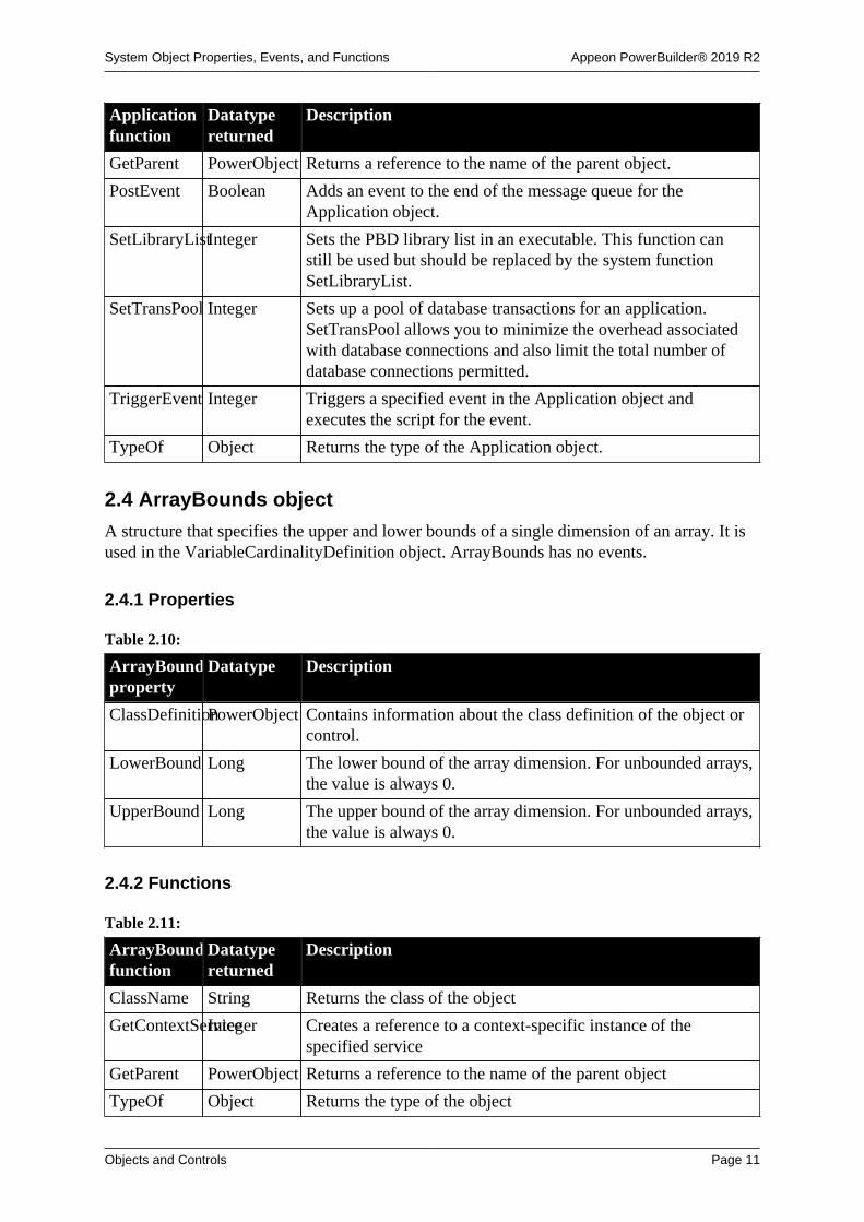
2.1 ADOResultSet objectThe ADOResultSet object provides the ability to use ActiveX Data Object (ADO) record setsto return a result set to a client and to manipulate ADO Recordsets in PowerBuilder.
2.1.1 Properties
Table 2.1:
ADOResultSetproperty
Datatype Description
ClassDefinitionPowerObject An object of type PowerObject containing information about theclass definition of the object or control
2.1.2 Events
Table 2.2:
ADOResultSetevent
Occurs
Constructor When the object is created
Destructor When the object is destroyed
2.1.3 Functions
Table 2.3:
ADOResultSetfunction
Datatypereturned
Description
ClassName String Returns the name assigned to the object
GetContextServiceInteger Creates a reference to a context-specific instance of thespecified service
GetParent PowerObject Returns a reference to the name of the parent object
GetRecordSetInteger Returns the current ADO Recordset
PostEvent Boolean Adds an event to the end of the message queue for the object
SetRecordSet Integer Sets up the ADOResultSet object to get data from the passedADO Recordset

System Object Properties, Events, and Functions Appeon PowerBuilder® 2019 R2
Objects and Controls Page 5
ADOResultSetfunction
Datatypereturned
Description
SetResultSet Integer Populates a new ADOResultSet object with data from thepassed ResultSet object
TriggerEvent Integer Triggers a specific event in the object and executes the script forthe event.
TypeOf Object Returns the type of the object
2.2 Animation controlAnimation controls can display Audio-Video Interleaved (AVI) clips that come froman uncompressed AVI file or from an AVI file compressed using run-length encoding(BI_RLE8).
2.2.1 Properties
Table 2.4:
Animationproperty
Datatype Description
AccessibleDescriptionString A description of the control and/or its purpose for use byaccessibility tools such as readers for visually impaired users.
AccessibleNameString A label that briefly describes the control, such as the text in abutton or the name of a menu item.
AccessibleRoleAccessibleRole(enumerated)
Describes what kind of user interface element the control is.
AnimationNameString Specifies the name of the file that contains the AVI clip. TheAVI clip cannot have a sound channel.
AutoPlay Boolean Specifies whether the animation starts as soon as the AVI clip isopened. Values are:
TRUE -- Control plays automatically when opened.
FALSE -- Control does not play automatically when opened(default).
Border Boolean Specifies whether the control has a border. Values are:
TRUE -- Control has a border.
FALSE -- Control does not have a border.
BorderStyle BorderStyle(enumerated)
Specifies the style of the border of the control. Values are:
StyleBox!
StyleLowered!
StyleRaised!
StyleShadowBox!
BringToTop Boolean Specifies whether PowerBuilder moves the control to the top ofthe front-to-back order of the window. Values are:

System Object Properties, Events, and Functions Appeon PowerBuilder® 2019 R2
Objects and Controls Page 6
Animationproperty
Datatype Description
TRUE -- Control moved to top.
FALSE -- Control not moved to top.
ClassDefinitionPowerObject An object of type PowerObject containing information about theclass definition of the object or control.
DragAuto Boolean Specifies whether PowerBuilder puts the control automaticallyinto Drag mode. Values are:
TRUE -- When the control is clicked, the control isautomatically in Drag mode.
FALSE -- When the control is clicked, the control is notautomatically in Drag mode. You have to put the control intoDrag mode manually by using the Drag function.
DragIcon String Specifies the name of the stock icon or the file containing theicon you want to use to display when the user drags the control(the ICO file). The default icon is a box the size of the control.
When the user drags the control, the icon displays when thecontrol is over an area in which the control can be dropped (avalid drop area). When the control is over an area that is not avalid drop area, the No-Drop icon displays.
Enabled Boolean Specifies whether the control is enabled (can be selected).Values are:
TRUE -- Control can be selected.
FALSE -- Control cannot be selected.
Height Integer Specifies the height of the control, in PowerBuilder units.
OriginalSize Boolean Specifies whether the width and height properties of ananimation control are set to the size of the AVI clip. Values are:
TRUE -- Width and height set to original values.
FALSE -- Existing width and height not changed.
In the Window painter, setting OriginalSize to true overrides theexisting width and height.
Pointer String Specifies the name of the stock pointer or the file containing thepointer used for the control.
PowerTipTextLong Specifies a PowerTip for the control.
TabOrder Integer Specifies the tab value of the animation within the window (0means the user cannot tab to the control).
Tag String Specifies the tag value assigned to the control.
Transparent Boolean Specifies whether the background of the control matches thebackground of the window it is on, creating a transparent effect.Values are:

System Object Properties, Events, and Functions Appeon PowerBuilder® 2019 R2
Objects and Controls Page 7
Animationproperty
Datatype Description
TRUE -- Control is transparent.
FALSE -- Control is not transparent.
Visible Boolean Specifies whether the control is visible. Values are:
TRUE -- Control is visible.
FALSE -- Control is not visible.
Width Integer Specifies the width of the control, in PowerBuilder units.
X Integer Specifies the X position (distance from the left edge of thewindow), in PowerBuilder units.
Y Integer Specifies the Y position (distance from the top of the window),in PowerBuilder units.
2.2.2 Events
Table 2.5:
Animationevent
Occurs
Clicked When the control is clicked (selected)
Constructor Immediately before the Open event occurs in the window
Destructor Immediately after the Close event occurs in the window
DoubleClicked When the control is double-clicked (selected and activated)
DragDrop When a dragged control is dropped on the control
DragEnter When a dragged control enters the control
DragLeave When a dragged control leaves the control
DragWithin When a dragged control is within the control
GetFocus Just before the control receives focus (before it is selected and becomesactive)
Help When the user presses the F1 key or drags the context help button(question mark) from the title bar to a menu item or control
LoseFocus When the control loses focus (becomes inactive)
Other When a Windows message occurs that is not a PowerBuilder event
RButtonDown When the right mouse button is pressed on the control
Start When an animation has started playing
Stop When an animation has stopped playing

System Object Properties, Events, and Functions Appeon PowerBuilder® 2019 R2
Objects and Controls Page 8
2.2.3 Functions
Table 2.6:
Animationfunction
Datatypereturned
Description
ClassName String Returns the name assigned to the control
Drag Integer Starts or ends the dragging of the control
GetContextServiceInteger Creates a reference to a context-specific instance of thespecified service
GetParent PowerObject Returns a reference to the name of the parent object
Hide Integer Makes the control invisible
Move Integer Moves the control to a specified location
Play Integer Starts playing the AVI clip in the control
PointerX Integer Returns the distance of the pointer from the left edge of thecontrol
PointerY Integer Returns the distance of the pointer from the top of the control
PostEvent Boolean Adds an event to the end of the message queue for the control
Resize Integer Changes the size of the control
Seek Integer Displays a specified frame in an AVI clip
SetFocus Integer Sets focus to the control
SetPosition Integer Specifies the position of the control in the front-to-back order ofthe window
SetRedraw Integer Controls automatic redrawing of the control after each change inits properties
Show Integer Makes the control visible
Stop Integer Stops playing the AVI clip in the control
TriggerEvent Integer Triggers a specified event in the control and executes the scriptfor the event
TypeOf Object Returns the type of the control
2.3 Application object
An application is a collection of PowerBuilder windows and objects that providefunctionality for user activities, such as order entry or accounting activities. The Applicationobject is the entry point into the applications.
When a user runs an application, the Open event of the Application object is fired. The Openevent triggers the script that initiates all the activity in the application.

System Object Properties, Events, and Functions Appeon PowerBuilder® 2019 R2
Objects and Controls Page 9
2.3.1 Properties
Table 2.7:
Application
property
Datatype Description
AppName String Specifies the name of the Application object.
ClassDefinitionPowerObject An object of type PowerObject containing information about theclass definition of the object or control.
DDETimeOutInteger Specifies the number of seconds PowerBuilder acting as theDDE client waits before giving up when trying to communicatewith a server using DDE (the default is 20 seconds).
DisplayName String User-readable name for your application. This name isdisplayed, for example, in OLE dialog boxes that show theapplication's name. If you do not specify a value, the value ofAppName is used for DisplayName.
DWMessageTitleString Specifies the title of the message box for any runtimeDataWindow errors encountered in the application. If youchange the value of this property in script, the new value isrecognized only for DataWindows created (or painted) after thenew value is set.
FreeDBLibrariesBoolean Specifies whether you want PowerBuilder to free databaseinterface libraries upon disconnecting from the database. Thedefault is FALSE (PowerBuilder does not free the libraries upondisconnecting).
MicroHelpDefaultString Specifies the default text of the MicroHelp object (theMicroHelp text that displays when you initiate a PowerBuildersession). The default is Ready.
RightToLeft Boolean Specifies that characters should be displayed in right-to-left order in MessageBoxes displayed when you call theMessageBox function. The application must be running on anoperating system that supports right-to-left display. Values are:
TRUE -- Message box text displays in right-to-left order. Thetext of the MessageBox buttons displays in the language of theRightToLeft version of Windows (Arabic or Hebrew) only ifyou are running a localized version of PowerBuilder. Otherwise,the text of the MessageBox buttons displays in English.
FALSE -- Characters display in left-to-right order.
ToolbarFrameTitleString Specifies the text that displays as the title for the FrameBarwhen it is floating.
ToolbarPopMenuTextString Allows you to change the toolbar location text (Left, Top, Right,Bottom, Floating) in the Application's toolbar pop-up menu.Specify the text as a comma-separated list of items.
ToolbarSheetTitleString Specifies the text that displays as the title for the SheetBar whenit is floating.
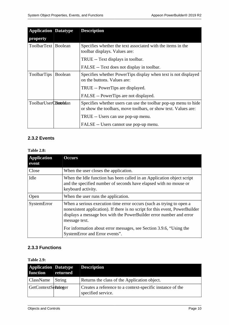
System Object Properties, Events, and Functions Appeon PowerBuilder® 2019 R2
Objects and Controls Page 10
Application
property
Datatype Description
ToolbarText Boolean Specifies whether the text associated with the items in thetoolbar displays. Values are:
TRUE -- Text displays in toolbar.
FALSE -- Text does not display in toolbar.
ToolbarTips Boolean Specifies whether PowerTips display when text is not displayedon the buttons. Values are:
TRUE -- PowerTips are displayed.
FALSE -- PowerTips are not displayed.
ToolbarUserControlBoolean Specifies whether users can use the toolbar pop-up menu to hideor show the toolbars, move toolbars, or show text. Values are:
TRUE -- Users can use pop-up menu.
FALSE -- Users cannot use pop-up menu.
2.3.2 Events
Table 2.8:
Applicationevent
Occurs
Close When the user closes the application.
Idle When the Idle function has been called in an Application object scriptand the specified number of seconds have elapsed with no mouse orkeyboard activity.
Open When the user runs the application.
SystemError When a serious execution time error occurs (such as trying to open anonexistent application). If there is no script for this event, PowerBuilderdisplays a message box with the PowerBuilder error number and errormessage text.
For information about error messages, see Section 3.9.6, “Using theSystemError and Error events”.
2.3.3 Functions
Table 2.9:
Applicationfunction
Datatypereturned
Description
ClassName String Returns the class of the Application object.
GetContextServiceInteger Creates a reference to a context-specific instance of thespecified service.
System Object Properties, Events, and Functions Appeon PowerBuilder® 2019 R2
Objects and Controls Page 11
Applicationfunction
Datatypereturned
Description
GetParent PowerObject Returns a reference to the name of the parent object.
PostEvent Boolean Adds an event to the end of the message queue for theApplication object.
SetLibraryListInteger Sets the PBD library list in an executable. This function canstill be used but should be replaced by the system functionSetLibraryList.
SetTransPool Integer Sets up a pool of database transactions for an application.SetTransPool allows you to minimize the overhead associatedwith database connections and also limit the total number ofdatabase connections permitted.
TriggerEvent Integer Triggers a specified event in the Application object andexecutes the script for the event.
TypeOf Object Returns the type of the Application object.
2.4 ArrayBounds object
A structure that specifies the upper and lower bounds of a single dimension of an array. It isused in the VariableCardinalityDefinition object. ArrayBounds has no events.
2.4.1 Properties
Table 2.10:
ArrayBoundsproperty
Datatype Description
ClassDefinitionPowerObject Contains information about the class definition of the object orcontrol.
LowerBound Long The lower bound of the array dimension. For unbounded arrays,the value is always 0.
UpperBound Long The upper bound of the array dimension. For unbounded arrays,the value is always 0.
2.4.2 Functions
Table 2.11:
ArrayBoundsfunction
Datatypereturned
Description
ClassName String Returns the class of the object
GetContextServiceInteger Creates a reference to a context-specific instance of thespecified service
GetParent PowerObject Returns a reference to the name of the parent object
TypeOf Object Returns the type of the object

System Object Properties, Events, and Functions Appeon PowerBuilder® 2019 R2
Objects and Controls Page 12
2.5 CheckBox controlCheckBox controls are small square boxes used to set independent options. When they areselected, they display a mark (typically, either an X or a check mark). When they are notselected, they are empty.
Since check boxes are independent of each other, you can group them without affecting theirbehavior. Grouping check boxes makes the window easier for the user to understand and use.
Typically, check boxes have two states: on and off. You can also use a third state, unknownor unspecified. In the third state, the check is grayed.
2.5.1 Properties
Table 2.12:
CheckBoxproperty
Datatype Description
AccessibleDescriptionString A description of the control and/or its purpose for use byaccessibility tools such as readers for visually impaired users.
AccessibleNameString A label that briefly describes the control, such as the text in abutton or the name of a menu item.
AccessibleRoleAccessibleRole(enumerated)
Describes what kind of user interface element the control is.
Automatic Boolean Specifies whether the control displays a mark when the userclicks it. Values are:
TRUE -- Displays mark when clicked.
FALSE -- Does not display mark when clicked.
BackColor Long Specifies the numeric value of the background color: -2to 16,777,215. For more information about color, seeSection 10.636, “RGB”.
BorderStyle BorderStyle(enumerated)
Specifies the style of the border of the control. Values are:
StyleLowered!
StyleRaised!
BringToTop Boolean Specifies whether PowerBuilder moves the control to the top ofthe front-to-back order. Values are:
TRUE -- Move to the top.
FALSE -- Do not move to the top.
Checked Boolean Specifies whether the control is selected. Values are:
TRUE -- Control is selected.
FALSE -- Control is not selected.
ClassDefinitionPowerObject An object of type PowerObject containing information about theclass definition of the object or control.
DragAuto Boolean Specifies whether PowerBuilder puts the control automaticallyinto Drag Mode. Values are:

System Object Properties, Events, and Functions Appeon PowerBuilder® 2019 R2
Objects and Controls Page 13
CheckBoxproperty
Datatype Description
TRUE -- When the control is clicked, the control isautomatically in Drag Mode.
FALSE -- When the control is clicked, the control is notautomatically in Drag Mode. You have to put the control intoDrag Mode manually by using the Drag function.
DragIcon String Specifies the name of the stock icon or the file containing theicon you want to display when the user drags the control (theICO file). The default icon is a box the size of the control.
When the user drags the control, the icon displays when thecontrol is over an area in which the control can be dropped (avalid drop area). When the control is over an area that is not avalid drop area, the No-Drop icon displays.
Enabled Boolean Specifies whether the control is enabled (can be clicked).Values are:
TRUE -- Control can be clicked.
FALSE -- Control cannot be clicked.
FaceName String Specifies the name of the typeface in which the text of thecontrol displays; for example, arial or courier.
FontCharSet FontCharSet(enumerated)
Specifies the font character set used for the text in the control.The application must be running on an appropriate versionof PowerBuilder under an operating system that supports theselected character set. For a complete list of possible values,see the list of properties for the FontCharSet variable on theEnumerated tab page of the Browser.
FontFamily FontFamily(enumerated)
Specifies the font family (type style) used for the text in thecontrol. Values are:
AnyFont!
Decorative!
Modern!
Roman!
Script!
Swiss!
FontPitch FontPitch(enumerated)
Specifies the pitch (spacing) of the font used for the text in thecontrol. Values are:
Default!
Fixed!
Variable!
Height Integer Specifies the height of the control, in PowerBuilder units.

System Object Properties, Events, and Functions Appeon PowerBuilder® 2019 R2
Objects and Controls Page 14
CheckBoxproperty
Datatype Description
Italic Boolean Specifies whether the text in the control is italic. Values are:
TRUE -- Text is italic.
FALSE -- Text is not italic.
LeftText Boolean Specifies whether the text displays on the left of the control.Values are:
TRUE -- Text displays on left.
FALSE -- Text displays on right.
Typically, you set this property to false so the text appears onthe right of the control.
Pointer String Specifies the name of the stock pointer or the file containing thepointer used for the control.
RightToLeft Boolean Specifies that characters should be displayed in right-to-leftorder. The application must be running on an operating systemthat supports right-to-left display. Values are:
TRUE -- Characters display in right-to-left order.
FALSE -- Characters display in left-to-right order.
TabOrder Integer Specifies the tab value of the control within the window (0means the user cannot tab to the control).
Tag String Specifies the tag value assigned to the control.
Text String Specifies the text that displays next to the control.
TextColor Long Specifies the numeric value of the color used for text:-2 to 16,777,215. For more information about color, seeSection 10.636, “RGB”.
TextSize Integer Specifies the size of the text in the control, in points. Forbackward compatibility, the size is stored as a negative number;for example, 10-point text size is stored as -10.
ThirdState Boolean Specifies whether the control is in the third state when thecontrol has been defined to have three states. Values are:
TRUE -- Control is in third state.
FALSE -- Control is not in third state.
ThreeState Boolean Specifies whether the control has three states. Typically,CheckBox controls have only two states, such as on and off.Values are:
TRUE -- Control has three states.
FALSE -- Control does not have three states.
Underline Boolean Specifies whether the text in the control is underlined. Valuesare:

System Object Properties, Events, and Functions Appeon PowerBuilder® 2019 R2
Objects and Controls Page 15
CheckBoxproperty
Datatype Description
TRUE -- Text is underlined.
FALSE -- Text is not underlined.
Visible Boolean Specifies whether the control is visible. Values are:
TRUE -- Control is visible.
FALSE -- Control is not visible.
Weight Integer Specifies the stroke weight of the text in the control; forexample, 400 for normal or 700 for bold.
Width Integer Specifies the width of the control, in PowerBuilder units.
X Integer Specifies the X position (the distance from the left edge of thewindow), in PowerBuilder units.
Y Integer Specifies the Y position (the distance from the top of thewindow), in PowerBuilder units.
2.5.2 Events
Table 2.13:
CheckBox event Occurs
Clicked When the control is clicked (selected or unselected)
Constructor Immediately before the Open event occurs in the window
Destructor Immediately after the Close event occurs in the window
DragDrop When a dragged control is dropped on the control
DragEnter When a dragged control enters the control
DragLeave When a dragged control leaves the control
DragWithin When a dragged control is within the control
GetFocus Just before the control receives focus (before it is selected and becomesactive)
Help When the user presses the F1 key or drags the context help button(question mark) from the title bar to a menu item or control
LoseFocus When the control loses focus (becomes inactive)
Other When a Windows message occurs that is not a PowerBuilder event
RButtonDown When the right mouse button is pressed on the control
2.5.3 Functions
Table 2.14:
CheckBoxfunction
Datatypereturned
Description
ClassName String Returns the name assigned to the control

System Object Properties, Events, and Functions Appeon PowerBuilder® 2019 R2
Objects and Controls Page 16
CheckBoxfunction
Datatypereturned
Description
Drag Integer Starts or ends the dragging of the control
GetContextServiceInteger Creates a reference to a context-specific instance of thespecified service
GetParent PowerObject Returns a reference to the name of the parent object
Hide Integer Makes the control invisible
Move Integer Moves the control to a specified location
PointerX Integer Returns the distance of the pointer from the left edge of thecontrol
PointerY Integer Returns the distance of the pointer from the top of the control
PostEvent Boolean Adds an event to the end of the message queue for the control
Print Integer Prints the control
Resize Integer Changes the size of the control
SetFocus Integer Sets focus to the control
SetPosition Integer Specifies the position of the control in the front-to-back order ofthe window
SetRedraw Integer Controls automatic redrawing of the control after each change inits Properties
Show Integer Makes the control visible
TriggerEvent Integer Triggers a specified event in the control and executes the scriptfor the event
TypeOf Object Returns the type of the control
2.6 ClassDefinition objectA ClassDefinition object is a PowerBuilder object that provides information about the classdefinition of a PowerBuilder object. You can examine a class in a PowerBuilder library or theclass associated with an instantiated object.
All the properties are read-only. You cannot change the class definition using theClassDefinition object. The ClassDefinition object has no events.
The ClassDefinition object lets you check:
The name of the classThe library the class was loaded fromThe class definition of its ancestor, if anyThe class definition of its parent or container object, if anyWhether the class is autoinstantiatedWhether the class is a system class (defined by PowerBuilder) or a user-defined object(defined in a PowerBuilder PBL)The classes the object contains, such as the controls contained in a windowThe variables and scripts defined in the class
Class names are always reported as lowercase, as you see them in the Browser.

System Object Properties, Events, and Functions Appeon PowerBuilder® 2019 R2
Objects and Controls Page 17
Global functions and variables
Call FindFunctionDefinition to get a ScriptDefinition object describing theglobal function. Global variables are included in the VariableList array in theClassDefinition object for the Application object.
2.6.1 Properties
Table 2.15:
ClassDefinitionproperty
Datatype Description
Ancestor ClassDefinitionAn object that represents the ancestor class. Ancestor is NULLwhen the ClassDefinition is describing PowerObject.
Category TypeCategorySpecifies whether the type is simple, enumerated, ora class or structure. For a class definition, the value isClassOrStructureType!.
ClassDefinitionPowerObject An object of type PowerObject containing information about theclass definition of the object or control.
DataTypeOf String The system class name of the object. DataTypeOf is a stringrepresentation of a value of the Object enumerated datatype.Values are lowercase with no exclamation point. Sample valuesinclude:
windowstringanydropdownlistbox
For objects you have defined, the datatype is the system classfrom which your object is inherited.
IsAutoinstantiateBoolean Indicates whether the class is an autoinstantiated class.
IsStructure Boolean Indicates whether the class is a structure.
IsSystemTypeBoolean Indicates whether the class is a system class -- that is, one ofthe classes defined within PowerBuilder as opposed to a classdefined in a PBL by a user.
IsVariableLengthBoolean Specifies whether the datatype has a fixed size. Values are:
TRUE -- The datatype is variable length, meaning the datatypeis a string, any, blob, or unbounded array.
FALSE -- The datatype is a fixed length.
IsVisualType Boolean Indicates whether the class is a visual (displayable) or non-visual type. Values are:
TRUE -- The class is visual, for example, a window or acontrol.
FALSE -- The class is non-visual, for example, a class userobject or a simple datatype.

System Object Properties, Events, and Functions Appeon PowerBuilder® 2019 R2
Objects and Controls Page 18
ClassDefinitionproperty
Datatype Description
LibraryName String The fully qualified name of the library the class was loadedfrom.
Name String The name of the class. For a nested class, the name is returnedin the form of libraryEntryName`className.
NestedClassList[ ]ClassDefinitionAn unbounded array of objects representing the nested classesand local structures for the object.
The array is empty if there are no nested classes. Call theUpperBound function to find out the number of nested classes.
ParentClass ClassDefinitionAn object that represents the parent class that this class is nestedwithin. The value is NULL if the class is not a nested class.
ScriptList[ ] ScriptDefinitionAn unbounded array of objects representing the scriptsimplemented or defined in the collapsed class hierarchy.
The array is empty if there are no scripts. Call the UpperBoundfunction to find out the number of scripts.
VariableList[ ]VariableDefinitionAn unbounded array of objects representing the properties orshared variables in the collapsed class hierarchy.
The array is empty if there are no variables. Call theUpperBound function to find out the number of variables.
2.6.2 Functions
Table 2.16:
ClassDefinitionfunction
Datatypereturned
Description
ClassName String Returns the class of the object.
FindMatchingFunctionScriptDefinitionFinds a function that matches the specified name and argumentlist.
GetContextServiceInteger Creates a reference to a context-specific instance of thespecified service.
GetParent PowerObject Returns a reference to the name of the parent object.
TypeOf Object Returns the type of the object.
2.7 CoderObject object
The CoderObject object encodes and decodes the blob or string data using the popularencoders such as Hex, Base64, URL etc.
Note
This object cannot be referenced in .NET Web Service or .NET Assemblycomponents, otherwise the component will fail to be deployed.
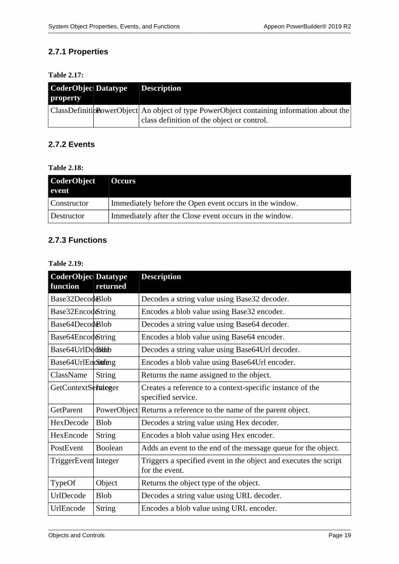
System Object Properties, Events, and Functions Appeon PowerBuilder® 2019 R2
Objects and Controls Page 19
2.7.1 Properties
Table 2.17:
CoderObjectproperty
Datatype Description
ClassDefinitionPowerObject An object of type PowerObject containing information about theclass definition of the object or control.
2.7.2 Events
Table 2.18:
CoderObjectevent
Occurs
Constructor Immediately before the Open event occurs in the window.
Destructor Immediately after the Close event occurs in the window.
2.7.3 Functions
Table 2.19:
CoderObjectfunction
Datatypereturned
Description
Base32DecodeBlob Decodes a string value using Base32 decoder.
Base32EncodeString Encodes a blob value using Base32 encoder.
Base64DecodeBlob Decodes a string value using Base64 decoder.
Base64EncodeString Encodes a blob value using Base64 encoder.
Base64UrlDecodeBlob Decodes a string value using Base64Url decoder.
Base64UrlEncodeString Encodes a blob value using Base64Url encoder.
ClassName String Returns the name assigned to the object.
GetContextServiceInteger Creates a reference to a context-specific instance of thespecified service.
GetParent PowerObject Returns a reference to the name of the parent object.
HexDecode Blob Decodes a string value using Hex decoder.
HexEncode String Encodes a blob value using Hex encoder.
PostEvent Boolean Adds an event to the end of the message queue for the object.
TriggerEvent Integer Triggers a specified event in the object and executes the scriptfor the event.
TypeOf Object Returns the object type of the object.
UrlDecode Blob Decodes a string value using URL decoder.
UrlEncode String Encodes a blob value using URL encoder.

System Object Properties, Events, and Functions Appeon PowerBuilder® 2019 R2
Objects and Controls Page 20
2.8 CommandButton controlYou use a CommandButton to carry out an action. For example, you can use an OK button toconfirm a deletion or a Cancel button to cancel the requested deletion.
2.8.1 Properties
Table 2.20:
CommandButtonproperty
Datatype Description
AccessibleDescriptionString A description of the control and/or its purpose for use byaccessibility tools such as readers for visually impaired users.
AccessibleNameString A label that briefly describes the control, such as the text in abutton or the name of a menu item.
AccessibleRoleAccessibleRole(enumerated)
Describes what kind of user interface element the control is.
BringToTop Boolean Specifies whether PowerBuilder moves the control to the top ofthe front-to-back order of the window. Values are:
TRUE -- Move to the top.
FALSE -- Do not move to the top.
Cancel Boolean Specifies whether the control acts as the Cancel button. (TheCancel button receives a Clicked event if the user presses Esc.)Values are:
TRUE -- Acts as the Cancel button.
FALSE -- Does not act as the Cancel button.
ClassDefinitionPowerObject An object of type PowerObject containing information about theclass definition of the object or control.
Default Boolean Specifies whether the control is the default control. The defaultcontrol has a thick border and receives a Clicked event if theuser presses Enter without selecting a control. Values are:
TRUE -- Acts as the default.
FALSE -- Does not act as the default.
Editable controls
Default behavior can be affected by editable controls on thewindow. For more information, see Users Guide.
DragAuto Boolean Specifies whether PowerBuilder puts the control automaticallyinto Drag Mode. Values are:
TRUE -- When the control is clicked, the control isautomatically in Drag Mode.
FALSE -- When the control is clicked, the control is notautomatically in Drag Mode. You have to put the control intoDrag Mode manually by using the Drag function.

System Object Properties, Events, and Functions Appeon PowerBuilder® 2019 R2
Objects and Controls Page 21
CommandButtonproperty
Datatype Description
DragIcon String Contains the name of the stock icon or the file containing theicon you want to display when the user drags the control (theICO file). The default icon is a box the size of the control.
When the user drags the control, the icon displays when thecontrol is over an area in which the control can be dropped (avalid drop area). When the control is over an area that is not avalid drop area, the No-Drop icon displays.
Enabled Boolean Specifies whether the control is enabled (can be clicked).Values are:
TRUE -- Control is enabled.
FALSE -- Control is not enabled.
FaceName String Specifies the name of the typeface in which the text of thecontrol displays (for example, arial or courier).
FlatStyle Boolean Specifies that the edge of the button displays only when themouse hovers over it. This is the button style used in theMicrosoft Rebar (coolbar) control. Values are:
TRUE -- Button has a flat appearance.
FALSE -- Button does not have a flat appearance.
FontCharSet FontCharSet(enumerated)
Specifies the font character set used for the text in the control.The application must be running on an appropriate versionof PowerBuilder under an operating system that supports theselected character set. For a complete list of possible values,see the list of properties for the FontCharSet variable on theEnumerated tab page of the Browser.
FontFamily FontFamily(enumerated)
Specifies the font family (type style) used for the text in thecontrol. Values are:
AnyFont!
Decorative!
Modern!
Roman!
Script!
Swiss!
FontPitch FontPitch(enumerated)
Specifies the pitch (spacing) of the font used for the text in thecontrol. Values are:
Default!
Fixed!
Variable!

System Object Properties, Events, and Functions Appeon PowerBuilder® 2019 R2
Objects and Controls Page 22
CommandButtonproperty
Datatype Description
Height Integer Specifies the height of the control, in PowerBuilder units.
Italic Boolean Specifies whether the text in the control is italic. Values are:
TRUE -- Text is italic.
FALSE -- Text is not italic.
Pointer String Specifies the name of the stock pointer of the file containing thepointer that is used for the control.
TabOrder Integer Specifies the tab value of the control within the window (0means the user cannot tab to the control).
Tag String Specifies the tag value assigned to the control.
Text String Specifies the text that displays in the control.
TextSize Integer Specifies the size of the text in the control, in points. Forbackward compatibility, the size is stored as a negative number;for example, 10-point text size is stored as -10.
Underline Boolean Specifies whether the text in the control is underlined. Valuesare:
TRUE -- Text is underlined.
FALSE -- Text is not underlined.
Visible Boolean Specifies whether the control is visible.
TRUE -- Control is visible.
FALSE -- Control is not visible.
Weight Integer Specifies the stroke weight of the text in the control; forexample, 400 for normal or 700 for bold.
Width Integer Specifies the width of the control, in PowerBuilder units.
X Integer Specifies the X position (the distance from the left edge of thewindow), in PowerBuilder units.
Y Integer Specifies the Y position (the distance from the top of thewindow), in PowerBuilder units.
2.8.2 Events
Table 2.21:
CommandButtonevent
Occurs
Clicked When the control is clicked
Constructor Immediately before the Open event occurs in the window
Destructor Immediately after the Close event occurs in the window
DragDrop When a dragged control is dropped on the control

System Object Properties, Events, and Functions Appeon PowerBuilder® 2019 R2
Objects and Controls Page 23
CommandButtonevent
Occurs
DragEnter When a dragged control enters the control
DragLeave When a dragged control leaves the control
DragWithin When a dragged control is within the control
GetFocus Before the control receives focus (before it is selected and becomesactive)
Help When the user presses the F1 key or drags the context help button(question mark) from the title bar to a menu item or control
LoseFocus When the control loses focus (becomes inactive)
Other When a Windows message occurs that is not a PowerBuilder event
RButtonDown When the right mouse button is pressed on the control
2.8.3 Functions
Table 2.22:
CommandButtonfunction
Datatypereturned
Description
ClassName String Returns the name assigned to the control
Drag Integer Starts or ends the dragging of the control
GetContextServiceInteger Creates a reference to a context-specific instance of thespecified service
GetParent PowerObject Returns a reference to the name of the parent object
Hide Integer Makes the control invisible
Move Integer Moves the control to a specified location
PointerX Integer Returns the distance of the pointer from the left edge of thecontrol
PointerY Integer Returns the distance of the pointer from the top of the control
PostEvent Boolean Adds an event to the end of the message queue for the control
Print Integer Prints the control
Resize Integer Changes the size of the control
SetFocus Integer Sets focus to the control
SetPosition Integer Specifies the position of the control in the front-to-back order ofthe window
SetRedraw Integer Controls automatic redrawing of the control after each change inits properties
Show Integer Makes the control visible
TriggerEvent Integer Triggers a specified event in the control and executes the scriptfor the event
TypeOf Object Returns the control type of the control
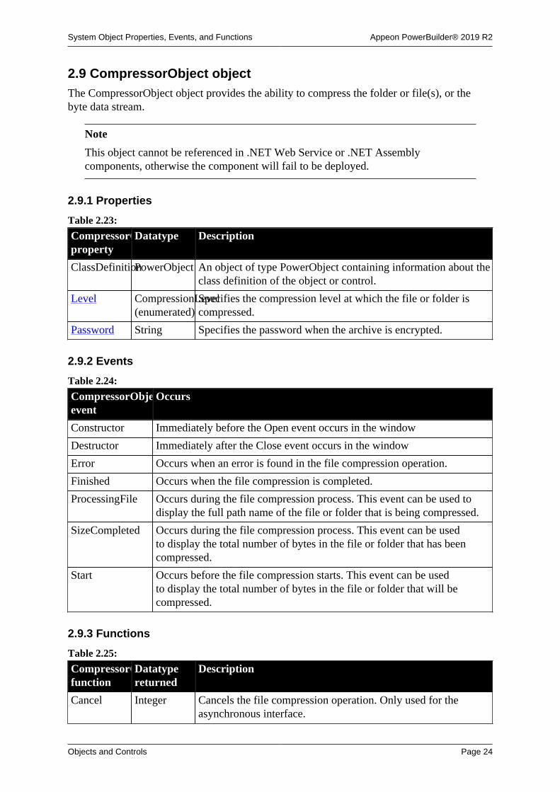
System Object Properties, Events, and Functions Appeon PowerBuilder® 2019 R2
Objects and Controls Page 24
2.9 CompressorObject objectThe CompressorObject object provides the ability to compress the folder or file(s), or thebyte data stream.
Note
This object cannot be referenced in .NET Web Service or .NET Assemblycomponents, otherwise the component will fail to be deployed.
2.9.1 Properties
Table 2.23:
CompressorObjectproperty
Datatype Description
ClassDefinitionPowerObject An object of type PowerObject containing information about theclass definition of the object or control.
Level CompressionLevel(enumerated)
Specifies the compression level at which the file or folder iscompressed.
Password String Specifies the password when the archive is encrypted.
2.9.2 Events
Table 2.24:
CompressorObjectevent
Occurs
Constructor Immediately before the Open event occurs in the window
Destructor Immediately after the Close event occurs in the window
Error Occurs when an error is found in the file compression operation.
Finished Occurs when the file compression is completed.
ProcessingFile Occurs during the file compression process. This event can be used todisplay the full path name of the file or folder that is being compressed.
SizeCompleted Occurs during the file compression process. This event can be usedto display the total number of bytes in the file or folder that has beencompressed.
Start Occurs before the file compression starts. This event can be usedto display the total number of bytes in the file or folder that will becompressed.
2.9.3 Functions
Table 2.25:
CompressorObjectfunction
Datatypereturned
Description
Cancel Integer Cancels the file compression operation. Only used for theasynchronous interface.

System Object Properties, Events, and Functions Appeon PowerBuilder® 2019 R2
Objects and Controls Page 25
CompressorObjectfunction
Datatypereturned
Description
ClassName String Returns the name assigned to the control
Compress Integer Compresses the folder or one or more files, or the byte datastream.
GetContextServiceInteger Creates a reference to a context-specific instance of thespecified service
GetParent PowerObject Returns a reference to the name of the parent object
PostEvent Boolean Adds an event to the end of the message queue for the object
TriggerEvent Integer Triggers a specified event in the control and executes the scriptfor the event
TypeOf Object Returns the type of the object
2.10 Connection object (obsolete)
Obsolete object
Connection object is obsolete, because EAServer is no longer supported sincePowerBuilder 2017. An obsolete feature is no longer eligible for technical support andwill no longer be enhanced, although it is still available.
The Connection object specifies the parameters that PowerBuilder uses to connect toEAServer. You can customize the Connection object by defining a class user objectinherited from the built-in Connection object. The user object has three events: Constructor,Destructor, and Error.
For more information about creating a custom Connection object, see Chapter 15, Workingwith User Objects.
For information about connecting to J2EE servers using the EJBConnection object, seeSection 27.5, “Connecting to the server” and the Section 2.1, “EJBConnection”.
2.10.1 Properties
Table 2.26:
Connectionproperty
Datatype Description
Application String (Optional) Specifies the default package to be used forEAServer components. If you specify the default package in theApplication property, you do not need to specify a package inthe second parameter of the CreateInstance function.
ClassDefinitionPowerObject An object of type PowerObject containing information about theclass definition of the object or control.
ConnectString(obsolete)
String Obsolete property. Used for distributed PowerBuilderconnections.
Driver String The communications driver used for the connection.

System Object Properties, Events, and Functions Appeon PowerBuilder® 2019 R2
Objects and Controls Page 26
Connectionproperty
Datatype Description
ErrCode Long Code indicating the success or failure of the most recentoperation. Values are:
0 -- Success
50 -- Distributed service error
52 -- Distributed communications error
53 -- Requested server not active
54 -- Server not accepting requests
55 -- Request terminated abnormally
56 -- Response to request incomplete
57 -- Not connected
58 -- Object instance does not exist
62 -- Server busy
75 -- Server forced client to disconnect
80 -- Server timed out client connection
87 -- Connection to server has been lost
92 -- Required property is missing or invalid
ErrText String Text indicating the success or failure of the most recentoperation.
Handle Objhandle Internal use only.
Location String Specifies the host name and port number for theEAServer server. Alternatively, the Location property canspecify a fully-qualified URL that uses one of the followingformats:
iiop://host:port
iiops://host:port
http://host:port
https://host:port
To take advantage of EAServer's load balancing and failoversupport, you can also specify a semicolon-separated listof server locations (for example, "iiop://srv1:9000;iiop://srv2:9000").
Options String Specifies one or more communications options. If you specifymore than one option, you need to separate the options withcommas.
EAServer clients can use the Options property of theConnection object to set ORB and SSL property values. Each

System Object Properties, Events, and Functions Appeon PowerBuilder® 2019 R2
Objects and Controls Page 27
Connectionproperty
Datatype Description
ORB property value you specify must begin with ORB. Forexample, you can specify the path and name of the log file byspecifying a value for ORBLogFile.
See "Options" next.
Password String The password that will be used to connect to the server.
Trace(obsolete)
String Obsolete property. Used for distributed PowerBuilderconnections.
UserID String The name or ID of the user who will connect to the server.
Options
Table 2.27:
Option Description
ORBHttp Specifies whether the ORB should use HTTP tunneling to connect to theserver. A setting of true specifies HTTP tunneling. The default is false.This parameter can also be set in an environment variable, JAG_HTTP.Some firewalls may not allow IIOP packets through, but almost all allowHTTP packets through. When connecting through such firewalls, set thisproperty to false.
ORBIdleConnectionTimeoutSpecifies the time, in seconds, that a connection is allowed to sit idle.When the timeout expires, the ORB closes the connection. The default is0, which specifies that connections can never time out. The connectiontimeout does not affect the life of proxy instance references; the ORBmay close and reopen connections transparently between proxy methodcalls. Specifying a finite timeout for your client applications can improveserver performance. If many instances of the client run simultaneously, afinite client connection timeout limits the number of server connectionsthat are devoted to idle clients. A finite timeout also allows rebalancingof server load in an application that uses a cluster of servers.
ORBLogIIOP Specifies whether the ORB should log IIOP protocol trace information.A setting of true enables logging. The default is false. This parametercan also be set in an environment variable, JAG_LOGIIOP. Whenthis parameter is enabled, you must set the ORBLogFile option (or thecorresponding environment variable) to specify the file where protocollog information is written.
ORBLogFile Sets the path and name of the file to which to log client execution statusand error messages. This parameter can also be set in an environmentvariable, JAG_LOGFILE. The default setting is no log.
ORBCodeSet Sets the code set that the client uses. This parameter can also be set in anenvironment variable, JAG_CODESET. The default setting is utf8.
ORBRetryCount Specifies the number of times to retry when the initial attempt to connectto the server fails. This parameter can also be set in an environmentvariable, JAG_RETRYCOUNT. The default is 5.

System Object Properties, Events, and Functions Appeon PowerBuilder® 2019 R2
Objects and Controls Page 28
Option Description
ORBRetryDelay Specifies the delay, in milliseconds, between retry attempts when theinitial attempt to connect to the server fails. This parameter can also beset in an environment variable, JAG_RETRYDELAY. The default is2000.
ORBProxyHost Specifies the machine name or the IP address of an SSL proxy.
ORBProxyPort Specifies the port number of the SSL proxy.
ORBWebProxyHostSpecifies the host name or IP address of an HTTP proxy server thatsupports generic Web tunneling, sometimes called connect-basedtunneling. There is no default for this property, and you must specifyboth the host name and port number properties. You can also specify theproperty by setting the environment variable JAG_WEBPROXYHOST.
ORBWebProxyPortWhen generic Web tunneling is enabled by setting ORBWebProxyHost,specifies the port number at which the HTTP proxy server acceptsconnections. There is no default for this property, and you must specifyboth a host name and port. You can also specify the property by settingthe environment variable JAG_WEBPROXYPORT.
ORBHttpExtraHeaderAn optional setting to specify what extra information is appended to theheader of each HTTP packet sent to a proxy server (specified with theORBWebProxyHost parameter). You can also specify the property bysetting the property JAG_HTTPEXTRAHEADER.
There is no need to set this property unless you have configured theORB to connect through an HTTP proxy server, and your HTTP proxyserver has special protocol requirements. By default, the following line isappended to each packet:
User-agent: Jaguar/major.minor
where major and minor are the major and minor version numbers of yourEAServer client software, respectively.
You can set this property to specify text to be included at the end of eachHTTP header. If multiple lines are included in the setting, they mustbe separated by carriage return and line feed characters. If the settingdoes not include a "User-agent: " line, then the default setting above isincluded in the HTTP header.
ORBsocketReuseLimitSpecifies the number of times a network connection can be reused to callmethods from one server. The default is 0, which indicates no limit. Thedefault is ideal for short-lived clients. The default may not be appropriatefor a long-running client program that calls many methods from serversin a cluster. If sockets are reused indefinitely, the client may build anaffinity for servers that it has already connected to rather than randomlydistributing its server-side processing load among all the servers in thecluster. In these cases, the property should be tuned to best balance clientperformance against cluster load distribution. In Appeon testing, a settingof 10 to 30 proved to be a good starting point. If the reuse limit is toolow, client performance degrades.

System Object Properties, Events, and Functions Appeon PowerBuilder® 2019 R2
Objects and Controls Page 29
Option Description
ORBcertificateLabelSpecifies the client certificate to use if the connection requires mutualauthentication. The label is a simple name that identifies an X.509certificate/private key in a PKCS #11 token.
Required for mutual authentication.
ORBqop Specifies the name of a security characteristic to use.
Required for SSL.
ORBcacheSize Specifies the size of the SSL session ID cache. Default is 100.
ORBpin Specifies the PKCS #11 token PIN. This is required for logging into a PKCS #11 token for client authentication and for retrieving trustinformation.
Required for SSL.
ORBuserdata Optional string that can be used to provide user-specified contextinformation.
ORBentrustIniFileSpecifies the path name for the Entrust INI file that provides informationon how to access Entrust.
Required when the ORBuseEntrustid property is set to true.
ORBentrustUserProfileSpecifies the full path to the file containing an Entrust user profile.Optional when the Entrust single-login feature is available, requiredotherwise.
ORBuseEntrustID Specifies whether to use the Entrust ID or the Sybase PKCS #11 tokenfor authentication. This is a Boolean property. If set to FALSE, SybasePKCS #11 token properties are valid and Entrust-specific properties areignored. If set to true, Entrust-specific properties are valid and SybasePKCS #11 token properties are ignored.
ORBentrustPasswordSpecifies the password for logging in to Entrust with the specified userprofile. Optional when the Entrust single-login feature is available,required otherwise.
2.10.2 Events
Table 2.28:
Connectionevent
Occurs
Constructor When the Connection object is created
Destructor When the Connection object is destroyed
Error When a client request cannot be satisfied

System Object Properties, Events, and Functions Appeon PowerBuilder® 2019 R2
Objects and Controls Page 30
2.10.3 Functions
Table 2.29:
Connectionfunction
Datatypereturned
Description
ClassName String Returns the class of the object
ConnectToServer(obsolete)
Long Connects a client application to a server application
CreateInstanceLong Creates an instance of a remote object on a server
DisconnectServerLong Disconnects a client application from a server application
GetContextServiceInteger Creates a reference to a context-specific instance of thespecified service
GetParent PowerObject Returns a reference to the name of the parent object
GetServerInfo(obsolete)
Long Obsolete function
Lookup(obsolete)
Long Allows a PowerBuilder client to create an instance of anEAServer component
Obsolete function
Lookup is an obsolete function, because EAServer is no longersupported since PowerBuilder 2017.
PostEvent Boolean Adds an event to the end of the message queue for the object
RemoteStopConnection(obsolete)
Long Obsolete function
RemoteStopListening(obsolete)
Long Obsolete function
TriggerEvent Integer Triggers a specified event in the object and executes the scriptfor the event
TypeOf Object Returns the type of the object
2.11 ContextInformation objectThe ContextInformation object provides information about an application's executioncontext, including current version information. Using this information, you can modifydisplay characteristics and application behavior.
2.11.1 Properties
Table 2.30:
ContextInformationproperty
Datatype Description
ClassDefinitionPowerObject An object of type PowerObject containing information about theclass definition of the object or control
Handle Long Internal use only

System Object Properties, Events, and Functions Appeon PowerBuilder® 2019 R2
Objects and Controls Page 31
2.11.2 Events
Table 2.31:
ContextInformationevent
Occurs
Constructor Immediately before the Open event occurs in the window
Destructor Immediately after the Close event occurs in the window
2.11.3 Functions
Table 2.32:
ContextInformationfunction
Datatypereturned
Description
ClassName String Returns the name assigned to the object.
GetCompanyNameInteger Returns the company name for the current execution context.
GetContextServiceInteger Creates a reference to a context-specific instance of thespecified service.
GetFixesVersionInteger Returns the fix level for the current PowerBuilder executioncontext.
GetHostObjectInteger Provides a reference to the context's host object.
GetMajorVersionInteger Returns the major version for the current PowerBuilderexecution context.
GetMinorVersionInteger Returns the minor version for the current PowerBuilderexecution context.
GetName Integer Returns the name for the current execution context.
GetParent PowerObject Returns a reference to the name of the parent object.
GetShortNameInteger Returns the short name for the current PowerBuilder executioncontext.
GetVersionNameInteger Returns complete version information for the currentPowerBuilder execution context.
PostEvent Boolean Adds an event to the end of the message queue for the object.
TriggerEvent Integer Triggers a specific event in the object and executes the script forthe event.
TypeOf Object Returns the type of the object.
2.12 ContextKeyword object
The ContextKeyword object provides environment information for the current context. Inthe default environment, the ContextKeyword object provides host workstation environmentvariables.

System Object Properties, Events, and Functions Appeon PowerBuilder® 2019 R2
Objects and Controls Page 32
2.12.1 Properties
Table 2.33:
ContextKeywordproperty
Datatype Description
ClassDefinitionPowerObject An object of type PowerObject containing information about theclass definition of the object or control
Handle Long Internal use only
2.12.2 Events
Table 2.34:
ContextKeywordevent
Occurs
Constructor Immediately before the Open event occurs in the window
Destructor Immediately after the Close event occurs in the window
2.12.3 Functions
Table 2.35:
ContextKeywordfunction
Datatypereturned
Description
ClassName String Returns the name assigned to the object
GetContextKeywordsInteger Retrieves one or more values associated with a specifiedkeyword
GetContextServiceInteger Creates a reference to a context-specific instance of thespecified service
GetParent PowerObject Returns a reference to the name of the parent object
PostEvent Boolean Adds an event to the end of the message queue for the object
TriggerEvent Integer Triggers a specific event in the object and executes the script forthe event
TypeOf Object Returns the type of the object
2.13 CORBACurrent object (obsolete)
Obsolete object
CORBACurrent object is obsolete, because EAServer is no longer supported sincePowerBuilder 2017.
The CORBACurrent service object provides information about the EAServer transactionassociated with a calling thread and enables the caller to control the transaction. TheCORBACurrent object supports most of the methods defined by the CORBACurrentinterface.
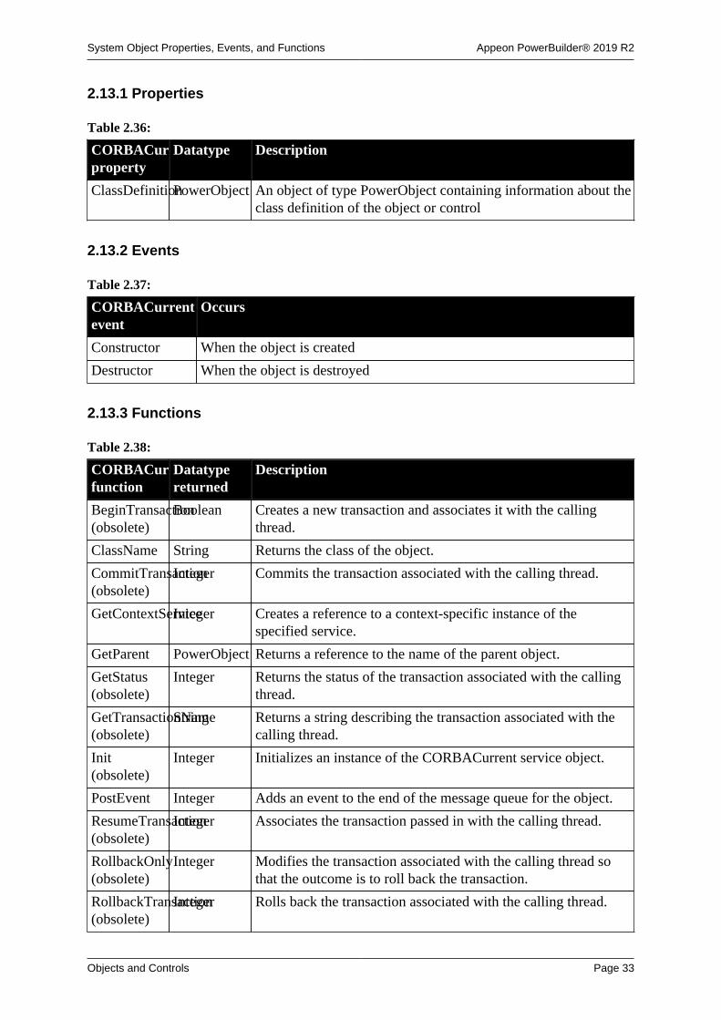
System Object Properties, Events, and Functions Appeon PowerBuilder® 2019 R2
Objects and Controls Page 33
2.13.1 Properties
Table 2.36:
CORBACurrentproperty
Datatype Description
ClassDefinitionPowerObject An object of type PowerObject containing information about theclass definition of the object or control
2.13.2 Events
Table 2.37:
CORBACurrentevent
Occurs
Constructor When the object is created
Destructor When the object is destroyed
2.13.3 Functions
Table 2.38:
CORBACurrentfunction
Datatypereturned
Description
BeginTransaction(obsolete)
Boolean Creates a new transaction and associates it with the callingthread.
ClassName String Returns the class of the object.
CommitTransaction(obsolete)
Integer Commits the transaction associated with the calling thread.
GetContextServiceInteger Creates a reference to a context-specific instance of thespecified service.
GetParent PowerObject Returns a reference to the name of the parent object.
GetStatus(obsolete)
Integer Returns the status of the transaction associated with the callingthread.
GetTransactionName(obsolete)
String Returns a string describing the transaction associated with thecalling thread.
Init(obsolete)
Integer Initializes an instance of the CORBACurrent service object.
PostEvent Integer Adds an event to the end of the message queue for the object.
ResumeTransaction(obsolete)
Integer Associates the transaction passed in with the calling thread.
RollbackOnly(obsolete)
Integer Modifies the transaction associated with the calling thread sothat the outcome is to roll back the transaction.
RollbackTransaction(obsolete)
Integer Rolls back the transaction associated with the calling thread.

System Object Properties, Events, and Functions Appeon PowerBuilder® 2019 R2
Objects and Controls Page 34
CORBACurrentfunction
Datatypereturned
Description
SetTimeout(obsolete)
Boolean Sets the timeout value for the top-level transaction. Thetransaction is rolled back if it does not complete before thetimeout expires.
SuspendTransaction(obsolete)
UnsignedlongSuspends the transaction associated with the calling thread andreturns a handle to the transaction.
TriggerEvent Integer Triggers a specified event in the object and executes the scriptfor the event.
TypeOf Object Returns the type of the object.
2.14 CORBAObject object (obsolete)
Obsolete object
CORBAObject object is obsolete, because EAServer is no longer supported sincePowerBuilder 2017.
The CORBAObject object gives PowerBuilder clients access to several standard CORBAmethods. All proxy objects generated for EAServer components using the EAServer proxygenerator are descendants of CORBAObject.
2.14.1 Properties
Table 2.39:
CORBAObjectproperty
Datatype Description
ClassDefinitionPowerObject An object of type PowerObject containing information about theclass definition of the object or control.
2.14.2 Events
Table 2.40:
CORBAObjectevent
Occurs
Constructor When the object is created
Destructor When the object is destroyed
2.14.3 Functions
Table 2.41:
CORBAObjectfunction
Datatypereturned
Description
ClassName String Returns the name assigned to the object

System Object Properties, Events, and Functions Appeon PowerBuilder® 2019 R2
Objects and Controls Page 35
CORBAObjectfunction
Datatypereturned
Description
_Is_A(obsolete)
Boolean Checks to see whether a CORBA object is an instance of a classthat implements a particular interface
_Narrow(obsolete)
Long Converts a CORBA object reference from a general super-typeto a more specific sub-type
GetContextServiceInteger Creates a reference to a context-specific instance of thespecified service
GetParent PowerObject Returns a reference to the name of the parent object
PostEvent Boolean Adds an event to the end of the message queue for the object
TriggerEvent Integer Triggers a specific event in the object and executes the script forthe event
TypeOf Object Returns the type of the object
2.15 CrypterObject objectThe CrypterObject object encrypts and decrypts the data using the popular algorithms.
Note
This object cannot be referenced in .NET Web Service or .NET Assemblycomponents, otherwise the component will fail to be deployed.
2.15.1 Properties
Table 2.42:
CoderObjectproperty
Datatype Description
ClassDefinitionPowerObject An object of type PowerObject containing information about theclass definition of the object or control.
2.15.2 Events
Table 2.43:
CoderObjectevent
Occurs
Constructor Immediately before the Open event occurs in the window.
Destructor Immediately after the Close event occurs in the window.
2.15.3 Functions
Table 2.44:
CrypterObjectfunction
Datatypereturned
Description
AsymmetricDecryptBlob Decrypts a blob value using asymmetric algorithm.
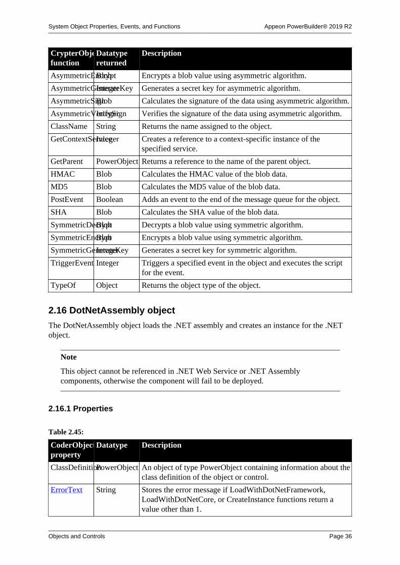
System Object Properties, Events, and Functions Appeon PowerBuilder® 2019 R2
Objects and Controls Page 36
CrypterObjectfunction
Datatypereturned
Description
AsymmetricEncryptBlob Encrypts a blob value using asymmetric algorithm.
AsymmetricGenerateKeyInteger Generates a secret key for asymmetric algorithm.
AsymmetricSignBlob Calculates the signature of the data using asymmetric algorithm.
AsymmetricVerifySignInteger Verifies the signature of the data using asymmetric algorithm.
ClassName String Returns the name assigned to the object.
GetContextServiceInteger Creates a reference to a context-specific instance of thespecified service.
GetParent PowerObject Returns a reference to the name of the parent object.
HMAC Blob Calculates the HMAC value of the blob data.
MD5 Blob Calculates the MD5 value of the blob data.
PostEvent Boolean Adds an event to the end of the message queue for the object.
SHA Blob Calculates the SHA value of the blob data.
SymmetricDecryptBlob Decrypts a blob value using symmetric algorithm.
SymmetricEncryptBlob Encrypts a blob value using symmetric algorithm.
SymmetricGenerateKeyInteger Generates a secret key for symmetric algorithm.
TriggerEvent Integer Triggers a specified event in the object and executes the scriptfor the event.
TypeOf Object Returns the object type of the object.
2.16 DotNetAssembly object
The DotNetAssembly object loads the .NET assembly and creates an instance for the .NETobject.
Note
This object cannot be referenced in .NET Web Service or .NET Assemblycomponents, otherwise the component will fail to be deployed.
2.16.1 Properties
Table 2.45:
CoderObjectproperty
Datatype Description
ClassDefinitionPowerObject An object of type PowerObject containing information about theclass definition of the object or control.
ErrorText String Stores the error message if LoadWithDotNetFramework,LoadWithDotNetCore, or CreateInstance functions return avalue other than 1.

System Object Properties, Events, and Functions Appeon PowerBuilder® 2019 R2
Objects and Controls Page 37
2.16.2 Events
Table 2.46:
CoderObjectevent
Occurs
Constructor Immediately before the Open event occurs in the window.
Destructor Immediately after the Close event occurs in the window.
2.16.3 Functions
Table 2.47:
CrypterObjectfunction
Datatypereturned
Description
ClassName String Returns the name assigned to the object.
CreateInstanceInteger Creates an instance of the C# object and associates it with theDotNetObject object.
GetContextServiceInteger Creates a reference to a context-specific instance of thespecified service.
GetDotNetCoreVersionString Gets the version number of the .NET Core runtime.
GetParent PowerObject Returns a reference to the name of the parent object.
LoadWithDotNetFrameworkInteger Loads a .NET framework assembly.
LoadWithDotNetCoreInteger Loads a .NET Core assembly.
PostEvent Boolean Adds an event to the end of the message queue for the object.
TriggerEvent Integer Triggers a specified event in the object and executes the scriptfor the event.
TypeOf Object Returns the object type of the object.
2.17 DotNetObject objectThe DotNetObject object is associated with the C# object and calls C# object's functions/properties directly.
Note
This object cannot be referenced in .NET Web Service or .NET Assemblycomponents, otherwise the component will fail to be deployed.
2.17.1 Properties
Table 2.48:
CoderObjectproperty
Datatype Description
handle longptr The handle of the object.
ClassDefinitionPowerObject An object of type PowerObject containing information about theclass definition of the object or control.

System Object Properties, Events, and Functions Appeon PowerBuilder® 2019 R2
Objects and Controls Page 38
2.17.2 Events
Table 2.49:
CoderObjectevent
Occurs
Constructor Immediately before the Open event occurs in the window.
Destructor Immediately after the Close event occurs in the window.
2.17.3 Functions
Table 2.50:
CrypterObjectfunction
Datatypereturned
Description
ClassName String Returns the name assigned to the object.
GetContextServiceInteger Creates a reference to a context-specific instance of thespecified service.
GetParent PowerObject Returns a reference to the name of the parent object.
PostEvent Boolean Adds an event to the end of the message queue for the object.
TriggerEvent Integer Triggers a specified event in the object and executes the scriptfor the event.
TypeOf Object Returns the object type of the object.
2.18 DataStore objectA DataStore is a nonvisual DataWindow control. DataStores act just like DataWindowcontrols except that many of the visual properties associated with DataWindow controls donot apply to DataStores. Because you can print DataStores, PowerBuilder provides someevents and functions for DataStores that pertain to the visual presentation of the data.
However, graph functions such as CategoryCount, CategoryName, GetData, SeriesCount,and so forth depend on the visual graph control, which is not created for a DataStore object.These functions return an error value or an empty string when used with DataStores.
2.18.1 Properties
Table 2.51:
DataStoreproperty
Datatype Description
DataObject String Specifies the name of the DataWindow or Report objectassociated with the control.
ClassDefinitionPowerObject An object of type PowerObject containing information about theclass definition of the object or control.
Object DWObject Used for the direct manipulation of objects within aDataWindow object from a script. These objects can be, forexample, columns or text objects.

System Object Properties, Events, and Functions Appeon PowerBuilder® 2019 R2
Objects and Controls Page 39
2.18.2 Events
Some but not all DataStore events have return codes that you can use to determine whataction will be taken after the event occurs. You set the return codes in a RETURN statementin the event script.
Table 2.52:
DataStore event Occurs
Constructor Immediately before the Open event occurs in the window.
DBError When a database error occurs in the DataStore.
Return codes:
0 - (Default) Display the error message.
1 - Do not display the error message.
Destructor Immediately after the Close event occurs in the window.
Error When an error is found in a data or property expression for aDataWindow object.
ItemChanged When the AcceptText and Update functions are called for the DataStore.
Return codes:
0 - (Default) Accept the data value.
1 - Reject the data value and do not allow focus to change.
2 - Reject the data value but allow focus to change.
ItemError When a value imported into a DataStore from a string or file doesnot pass the validation rules for its column. Can also occur when theAcceptText and Update functions are called for the DataStore.
Return codes:
0 - (Default) Reject the data value and show an error message box.
1 - Reject the data value with no message box.
2 - Accept the data value.
3 - Reject the data value but allow focus to change.
If the return code is 0 or 1 (rejects the data), the field with the incorrectdata regains the focus.
Printend When the printing of the DataStore ends.
PrintPage Before each page of the DataStore is formatted for printing.
Return codes:
0 - Do not skip a page.
1 - Skip a page.
PrintStart When the printing of the DataStore starts.
RetrieveEnd When the retrieval for the DataStore is complete.
RetrieveRow After a row has been retrieved.

System Object Properties, Events, and Functions Appeon PowerBuilder® 2019 R2
Objects and Controls Page 40
DataStore event OccursReturn codes:
0 - (Default) Continue.
1 - Stop the retrieval.
RetrieveStart When the retrieval for the DataStore is about to begin.
Return codes:
0 - (Default) Continue.
1 - Do not perform the retrieval.
2 - Do not reset the rows and buffers before retrieving the data from thedatabase.
SQLPreview After a Retrieve, Update, or ReselectRow function call and immediatelybefore the SQL statement is submitted to the DBMS.
The following return codes specify the action that takes place when theevent occurs after an Update function call only:
0 - (Default) Continue.
1 - Stop.
2 - Skip this request and execute the next request.
UpdateEnd When all the updates from the DataStore to the database are complete.
UpdateStart After an Update function call and just before changes in the DataStore aresent to the database.
Return codes:
0 - (Default) Continue.
1 - Do not perform the update.
2.18.3 Functions
Table 2.53:
DataStorefunction
Datatypereturned
Description
AcceptText Integer Applies the contents of the DataStore's edit control to thecurrent item in the DataStore buffer.
CategoryCountInteger Returns the number of categories in the specified graph.(Returns an error value or an empty string for DataStores.)
CategoryNameString Returns the name of the specified category in the specifiedgraph. (Returns an error value or an empty string forDataStores.)
ClassName String Returns the name assigned to the DataStore.
ClearValues Integer Deletes all items from the value list associated with thespecified column in the DataStore.

System Object Properties, Events, and Functions Appeon PowerBuilder® 2019 R2
Objects and Controls Page 41
DataStorefunction
Datatypereturned
Description
Clipboard Integer Copies the specified graph in the DataStore to the clipboard.
CopyRTF String Returns the selected text, pictures, and input fields in aDataStore as a string with rich text formatting. Bitmaps andinput fields are included in the string.
Create Integer Creates a DataWindow object using the specified source codeand replaces the DataWindow object in the specified DataStorewith the new DataWindow object.
CreateFrom Integer Creates a DataStore object from the passed ResultSet object.
DataCount Long Returns the number of data points in the specified series in thespecified graph. (Returns an error value or an empty string forDataStores.)
DBCancel Integer Cancels a database retrieval in progress.
DeletedCountLong Returns the number of rows that have been deleted from theDataStore but have not yet been updated in the associateddatabase table.
DeleteRow Integer Deletes the specified row from the DataStore.
Describe String Returns requested information about the structure of theDataStore.
ExportJson String Exports data from the DataWindow control, DataStore object,or DataWindowChild object to the JSON string.
ExportRowAsJsonString Exports a data row from the DataWindow control, DataStoreobject, or DataWindowChild object to the JSON string.
Filter Integer Moves rows that do not meet the current filter criteria to thefilter buffer.
FilteredCountInteger Returns the number of rows that do not meet the current filtercriteria.
Find Long Returns the number of the first row that meets the search criteriawithin a specified search range in the detail area of a DataStore.
FindCategory Integer Returns the number of the specified category in the specifiedgraph. (Returns an error value or an empty string forDataStores.)
FindGroupChangeLong Searches starting at a specified row for the first break for thespecified group in the DataStore.
FindRequired Integer Identifies the required columns that the user has not filled.
FindSeries Integer Returns the number of the specified series in the specifiedgraph. (Returns an error value or an empty string forDataStores.)
GenerateHTMLFormInteger Creates an HTML Form element containing columns for oneor more rows. Also returns an HTML Style element containingstyle sheet information.

System Object Properties, Events, and Functions Appeon PowerBuilder® 2019 R2
Objects and Controls Page 42
DataStorefunction
Datatypereturned
Description
GenerateResultSetLong Returns an EAServer result set from a PowerBuilder user objectrunning as a component on EAServer.
Obsolete function
GenerateResultSet is an obsolete function, because EAServer isno longer supported since PowerBuilder 2017.
GetBorderStyleBorder(enumerated)
Returns a Border enumerated datatype indicating the borderstyle of the specified column in the DataStore. Borderenumerated datatypes are:
Box!
Lowered!
NoBorder!
Raised!
ResizeBorder!
ShadowBox!
Underline!
GetChanges Long Retrieves changes made to a DataStore into a blob. Thisfunction is used primarily in distributed applications.
GetChild Integer Stores in the specified variable the name of the childDataWindow in the specified column.
GetClickedColumnInteger Obtains the number of the column the user clicked or double-clicked in a DataStore.
GetClickedRowLong Obtains the number of the row the user clicked or double-clicked in a DataStore.
GetColumn Integer Returns the number of the current column in the DataStore.
GetColumnNameString Returns the name of the current column in the DataStore.
GetContextServiceInteger Creates a reference to a context-specific instance of thespecified service.
GetData Double Returns the value of the specified data in the specified series inthe specified graph. (Returns an error value or an empty stringfor DataStores.)
GetDataPieExplodeInteger Reports the percentage that a pie slice is exploded in apie graph. (Returns an error value or an empty string forDataStores.)
GetDataStyle Integer Finds out the appearance of a data point in a graph. (Returns anerror value or an empty string for DataStores.)
GetDataValueInteger Returns the value of the specified data in the specified series inthe specified graph. (Returns an error value or an empty stringfor DataStores.)
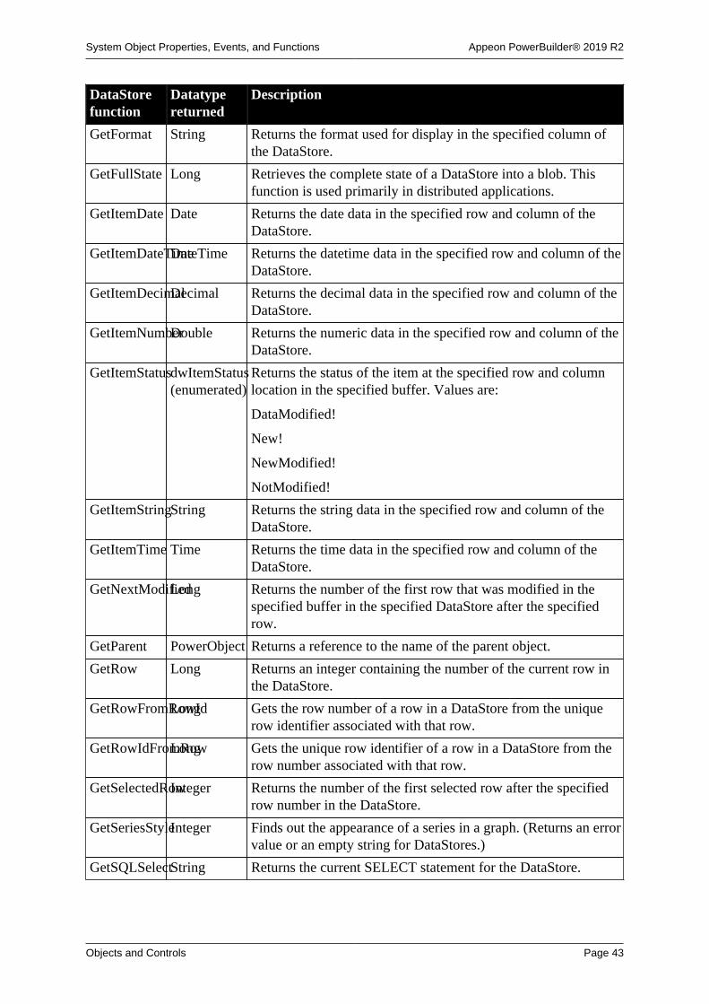
System Object Properties, Events, and Functions Appeon PowerBuilder® 2019 R2
Objects and Controls Page 43
DataStorefunction
Datatypereturned
Description
GetFormat String Returns the format used for display in the specified column ofthe DataStore.
GetFullState Long Retrieves the complete state of a DataStore into a blob. Thisfunction is used primarily in distributed applications.
GetItemDate Date Returns the date data in the specified row and column of theDataStore.
GetItemDateTimeDateTime Returns the datetime data in the specified row and column of theDataStore.
GetItemDecimalDecimal Returns the decimal data in the specified row and column of theDataStore.
GetItemNumberDouble Returns the numeric data in the specified row and column of theDataStore.
GetItemStatusdwItemStatus(enumerated)
Returns the status of the item at the specified row and columnlocation in the specified buffer. Values are:
DataModified!
New!
NewModified!
NotModified!
GetItemStringString Returns the string data in the specified row and column of theDataStore.
GetItemTime Time Returns the time data in the specified row and column of theDataStore.
GetNextModifiedLong Returns the number of the first row that was modified in thespecified buffer in the specified DataStore after the specifiedrow.
GetParent PowerObject Returns a reference to the name of the parent object.
GetRow Long Returns an integer containing the number of the current row inthe DataStore.
GetRowFromRowIdLong Gets the row number of a row in a DataStore from the uniquerow identifier associated with that row.
GetRowIdFromRowLong Gets the unique row identifier of a row in a DataStore from therow number associated with that row.
GetSelectedRowInteger Returns the number of the first selected row after the specifiedrow number in the DataStore.
GetSeriesStyleInteger Finds out the appearance of a series in a graph. (Returns an errorvalue or an empty string for DataStores.)
GetSQLSelectString Returns the current SELECT statement for the DataStore.

System Object Properties, Events, and Functions Appeon PowerBuilder® 2019 R2
Objects and Controls Page 44
DataStorefunction
Datatypereturned
Description
GetStateStatusLong Retrieves the current status of the internal state flags for aDataWindow and places this information in a blob. Thisfunction is used primarily in distributed applications.
GetText String Returns the text in the edit control over the current row andcolumn of the DataStore.
GetTrans Integer Returns the values in the DataStore Transaction object.
GetValidate String Returns the validation rule used in the specified column of theDataStore.
GetValue String Returns the specified item in the value list for the specifiedcolumn.
GroupCalc Integer Recalculates the breaks in the groups in the DataStore.
ImportClipboardLong Copies data from the clipboard to the DataStore.
ImportFile Long Copies data from a file to the DataStore.
ImportJson Long Inserts data from a JSON string into the DataStore.
ImportJsonByKeyLong Inserts data from a JSON string into the DataStore according tothe JSON key name.
ImportRowFromJsonLong Inserts a data row from a JSON string into a DataWindowcontrol, DataStore object, or DataWindowChild object.
ImportString Long Copies data from a string to the DataStore.
InsertDocumentInteger Inserts a rich text format or plain text file into a DataStore.You use a function parameter to specify how the new content isadded:
• It can be inserted at the insertion point
• It can replace all existing content
This function applies only to DataStores whose content has theRichText presentation style.
InsertRow Long Inserts a new initialized row before the specified row in theDataStore.
IsSelected Boolean Returns true if the specified row in the DataStore is selected;returns false if the row is not selected or is greater than thenumber of rows in the DataStore.
ModifiedCountLong Returns the number of rows that have been modified in theDataStore but have not yet been updated in the associateddatabase table.
Modify String Uses the specification contained in a string to modify theDataStore.
PasteRTF Long Pastes rich text data from a string into a DataStore whosecontent has the RichText presentation style.

System Object Properties, Events, and Functions Appeon PowerBuilder® 2019 R2
Objects and Controls Page 45
DataStorefunction
Datatypereturned
Description
PostEvent Boolean Adds an event to the end of the message queue for theDataStore.
Print Integer Sends the content of the DataStore to the current printer. Thisfunction has several syntaxes.
PrintCancel Integer Cancels the print job and deletes the spool file (if any) when thecontent of the DataStore is sent to print.
This function has two syntaxes. Use Syntax 1 when Syntax 1 ofthe Print function was used to send it to print.
ReselectRow Integer Accesses the database to reselect all columns that can beupdated and refreshes all timestamp columns in a row in theDataStore.
Reset Integer Clears all the data from a DataStore.
ResetDataColorsInteger Resets the color of a data point to the color specified forthe series. (Returns an error value or an empty string forDataStores.)
ResetTransObjectInteger Stops the DataStore from using a programmer-definedTransaction object (thereafter, the DataStore uses its internalTransaction object).
ResetUpdate Integer Resets the update flags for the DataStore.
Retrieve Long Causes the DataStore to retrieve rows from the database.
RowCount Long Returns the number of rows currently available in the DataStore(all the rows retrieved minus any deleted rows plus any insertedrows minus any rows that have been filtered out).
RowsCopy Integer Copies a range of rows from one DataStore to anotherDataStore (or DataWindow control) or from one buffer toanother within a single DataStore.
RowsDiscard Integer Discards a range of rows. The rows cannot be restored unlessretrieved from the database.
RowsMove Integer Clears a range of rows from a DataStore and inserts the rows inanother DataStore (or DataWindow control) or another buffer ofthe same DataStore.
SaveAs Integer Saves the content of the DataStore to the specified file, inthe specified format, with or without column headings at thebeginning
SaveAsAscii Long Saves the content of a DataStore into a standard ASCII text file.
SaveNativePDFToBlobInteger Saves the PDF file into a blob variable when you use the PDFlibmethod to save data from a DataWindow object to a PDF file.
SelectRow Integer Selects or deselects the specified row of the DataStore.
SeriesCount Integer Returns the number of series in the specified graph. (Returns anerror value or an empty string for DataStores.)
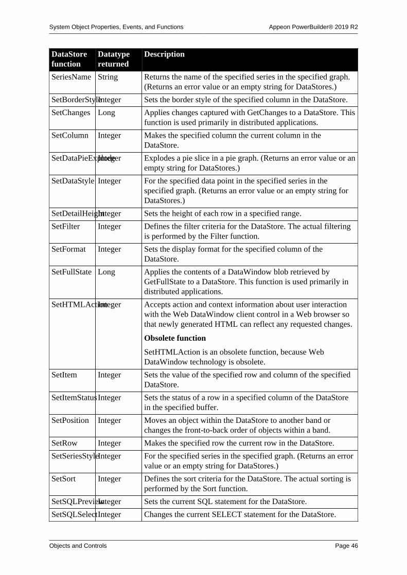
System Object Properties, Events, and Functions Appeon PowerBuilder® 2019 R2
Objects and Controls Page 46
DataStorefunction
Datatypereturned
Description
SeriesName String Returns the name of the specified series in the specified graph.(Returns an error value or an empty string for DataStores.)
SetBorderStyleInteger Sets the border style of the specified column in the DataStore.
SetChanges Long Applies changes captured with GetChanges to a DataStore. Thisfunction is used primarily in distributed applications.
SetColumn Integer Makes the specified column the current column in theDataStore.
SetDataPieExplodeInteger Explodes a pie slice in a pie graph. (Returns an error value or anempty string for DataStores.)
SetDataStyle Integer For the specified data point in the specified series in thespecified graph. (Returns an error value or an empty string forDataStores.)
SetDetailHeightInteger Sets the height of each row in a specified range.
SetFilter Integer Defines the filter criteria for the DataStore. The actual filteringis performed by the Filter function.
SetFormat Integer Sets the display format for the specified column of theDataStore.
SetFullState Long Applies the contents of a DataWindow blob retrieved byGetFullState to a DataStore. This function is used primarily indistributed applications.
SetHTMLActionInteger Accepts action and context information about user interactionwith the Web DataWindow client control in a Web browser sothat newly generated HTML can reflect any requested changes.
Obsolete function
SetHTMLAction is an obsolete function, because WebDataWindow technology is obsolete.
SetItem Integer Sets the value of the specified row and column of the specifiedDataStore.
SetItemStatusInteger Sets the status of a row in a specified column of the DataStorein the specified buffer.
SetPosition Integer Moves an object within the DataStore to another band orchanges the front-to-back order of objects within a band.
SetRow Integer Makes the specified row the current row in the DataStore.
SetSeriesStyleInteger For the specified series in the specified graph. (Returns an errorvalue or an empty string for DataStores.)
SetSort Integer Defines the sort criteria for the DataStore. The actual sorting isperformed by the Sort function.
SetSQLPreviewInteger Sets the current SQL statement for the DataStore.
SetSQLSelectInteger Changes the current SELECT statement for the DataStore.

System Object Properties, Events, and Functions Appeon PowerBuilder® 2019 R2
Objects and Controls Page 47
DataStorefunction
Datatypereturned
Description
SetText Integer Replaces the text in the edit control at the current row andcolumn of the DataStore with the specified text.
SetTrans Integer Sets values in the DataStore's internal Transaction object.
SetTransObjectInteger Sets the Transaction object for the DataStore and providescontrol over the transaction, including the ability to commitfrom a script.
SetValidate Integer Changes the validation rule used for the specified column of theDataStore.
SetValue Integer Sets the value of the specified item in the value list or the codetable of the specified column of the DataStore.
SetWSObject Integer Causes a DataStore (or DataWindow control) to use aprogrammer-specified connection object. The connection objectprovides the information necessary for communicating with aWeb service data source.
ShareData Integer Shares data between a primary DataStore (or DataWindowcontrol) and a secondary DataStore (or DataWindow control).
ShareDataOffInteger Turns off sharing for the DataStore. If the DataStore is primary,all secondary DataStores (or DataWindow controls) aredisconnected and their DataWindow objects no longer containdata.
Sort Integer Sorts the rows of the DataStore based on its current sort criteria.
TriggerEvent Integer Triggers a specified event in the DataStore and executes thescript for the event.
TypeOf Object Returns the type of the DataStore.
Update Integer Sends to the database all inserts, deletes, and updates of theDataStore.
2.19 DataWindow control
You place DataWindow controls in a window or user object and then specify theDataWindow object you want to use within them to display and manipulate data in thewindow.
A DataWindow object allows users to display, manipulate, and update database or otherinformation. You build DataWindow objects in the DataWindow painter.
For information about DataWindow objects, see Part VI, “Working with DataWindows”.
Obsolete functions
Several DataWindow control functions are described as obsolete, which means thatalthough the function operates as usual in this release, it will be removed in a futurerelease. You should replace all use of these functions as soon as possible.
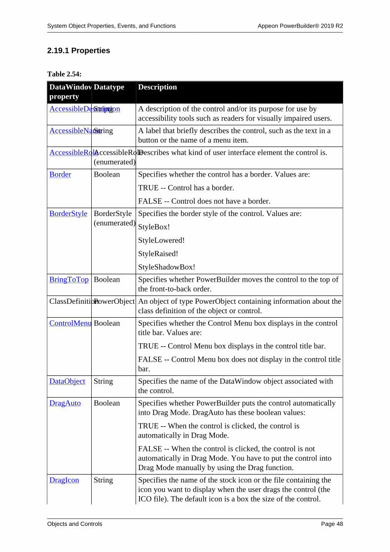
System Object Properties, Events, and Functions Appeon PowerBuilder® 2019 R2
Objects and Controls Page 48
2.19.1 Properties
Table 2.54:
DataWindowproperty
Datatype Description
AccessibleDescriptionString A description of the control and/or its purpose for use byaccessibility tools such as readers for visually impaired users.
AccessibleNameString A label that briefly describes the control, such as the text in abutton or the name of a menu item.
AccessibleRoleAccessibleRole(enumerated)
Describes what kind of user interface element the control is.
Border Boolean Specifies whether the control has a border. Values are:
TRUE -- Control has a border.
FALSE -- Control does not have a border.
BorderStyle BorderStyle(enumerated)
Specifies the border style of the control. Values are:
StyleBox!
StyleLowered!
StyleRaised!
StyleShadowBox!
BringToTop Boolean Specifies whether PowerBuilder moves the control to the top ofthe front-to-back order.
ClassDefinitionPowerObject An object of type PowerObject containing information about theclass definition of the object or control.
ControlMenu Boolean Specifies whether the Control Menu box displays in the controltitle bar. Values are:
TRUE -- Control Menu box displays in the control title bar.
FALSE -- Control Menu box does not display in the control titlebar.
DataObject String Specifies the name of the DataWindow object associated withthe control.
DragAuto Boolean Specifies whether PowerBuilder puts the control automaticallyinto Drag Mode. DragAuto has these boolean values:
TRUE -- When the control is clicked, the control isautomatically in Drag Mode.
FALSE -- When the control is clicked, the control is notautomatically in Drag Mode. You have to put the control intoDrag Mode manually by using the Drag function.
DragIcon String Specifies the name of the stock icon or the file containing theicon you want to display when the user drags the control (theICO file). The default icon is a box the size of the control.

System Object Properties, Events, and Functions Appeon PowerBuilder® 2019 R2
Objects and Controls Page 49
DataWindowproperty
Datatype Description
When the user drags the control, the icon displays when thecontrol is over an area in which the control can be dropped (avalid drop area). When the control is over an area that is not avalid drop area, the No-Drop icon displays.
Enabled Boolean Specifies whether the control is enabled (can be selected).Values are:
TRUE -- Control is enabled.
FALSE -- Control is not enabled.
Height Integer Specifies the height of the DataWindow control, inPowerBuilder units.
HScrollBar Boolean Specifies whether a horizontal scroll bar displays in the controlwhen all the data cannot be displayed at one time. Values are:
TRUE -- Horizontal scroll bar is displayed.
FALSE -- Horizontal scroll bar is not displayed.
HSplitScroll Boolean Specifies whether the split bar displays in the control. Valuesare:
TRUE -- Split bar is displayed.
FALSE -- Split bar is not displayed.
Icon String Specifies the name of the ICO file that contains the icon thatdisplays when the DataWindow control is minimized.
LiveScroll Boolean Scrolls the rows in the DataWindow control while the user ismoving the scroll box.
MaxBox Boolean Specifies whether a Maximize Box displays in the DataWindowcontrol title bar. Values are:
TRUE -- Maximize Box displays.
FALSE -- Maximize Box does not display.
MinBox Boolean Specifies whether a Minimize Box displays in the DataWindowcontrol title bar. Values are:
TRUE -- Minimize Box displays.
FALSE -- Minimize Box does not display.
Object DWObject Used for the direct manipulation of objects within aDataWindow object from a script. These objects can be, forexample, columns or text objects.
Resizable Boolean Specifies whether the DataWindow control is resizable. Valuesare:
TRUE -- DataWindow is resizable.
FALSE -- DataWindow is not resizable.

System Object Properties, Events, and Functions Appeon PowerBuilder® 2019 R2
Objects and Controls Page 50
DataWindowproperty
Datatype Description
RightToLeft Boolean Specifies that characters should be displayed in right-to-leftorder. The application must be running on an operating systemthat supports right-to-left display. Values are:
TRUE -- Characters display in right-to-left order.
FALSE -- Characters display in left-to-right order.
TabOrder Integer Specifies the tab value of the DataWindow control within thewindow or user object (0 means the user cannot tab to thecontrol).
Tag String Specifies the tag value assigned to the DataWindow control.
Title String Specifies the text that displays in the DataWindow control titlebar.
TitleBar Boolean Specifies whether a title bar displays in the DataWindowcontrol. The user can move the DataWindow control only if ithas a title bar. Values are:
TRUE -- Title bar is displayed in control.
FALSE -- No title bar is displayed in control.
Visible Boolean Specifies whether the DataWindow control is visible. Valuesare:
TRUE -- Control is visible.
FALSE -- Control is not visible.
VScrollBar Boolean Specifies whether a vertical scroll bar displays in the controlwhen not all the data can be displayed at one time. Values are:
TRUE -- Vertical scroll bar is displayed.
FALSE -- Vertical scroll bar is not displayed.
Width Integer Specifies the width of the DataWindow control, inPowerBuilder units.
X Integer Specifies the X position (the distance from the left edge of thewindow), in PowerBuilder units.
Y Integer Specifies the Y position (the distance from the top edge of thewindow), in PowerBuilder units.
2.19.2 Events
Some but not all DataWindow events have return codes that you can use to determine whataction is taken after the event occurs. You set the return codes in a RETURN statement in theevent script.

System Object Properties, Events, and Functions Appeon PowerBuilder® 2019 R2
Objects and Controls Page 51
Table 2.55:
DataWindowevent
Occurs
ButtonClicked When the user clicks a button.
ButtonClicking When the user clicks a button. This event occurs before theButtonClicked event.
Clicked When the user clicks between fields in the DataWindow control.
Return codes:
0 - (Default) Continue processing.
1 - Stop processing.
Collapsed When a node in a TreeView DataWindow has collapsed.
Collapsing Before a node in a TreeView DataWindow collapses.
Constructor Immediately before the Open event occurs in the window.
DBError When a database error occurs in the DataWindow control.
Destructor Immediately after the Close event occurs in the window.
DoubleClicked When the user double-clicks between fields in the DataWindow control.
For a RichText presentation style DataWindow, when the user double-clicks in the text.
DragDrop When a dragged control is dropped on the DataWindow control.
DragEnter When a dragged control enters the DataWindow control.
DragLeave When a dragged control leaves the DataWindow control.
DragWithin When a dragged control is within the DataWindow control.
EditChanged When a user types in an edit control in the DataWindow control.
Error When an error is found in a data or property expression for aDataWindow object.
Expanded When a node in a TreeView DataWindow has expanded.
Expanding Before a node in a TreeView DataWindow expands.
GetFocus Just before the DataWindow control receives focus (before it is selectedand becomes active).
Help When the user presses the F1 key or drags the context help button(question mark) from the title bar to a menu item or control.
ItemChanged When a field in the DataWindow has been modified and loses focus (forexample, the user presses Enter, the Tab key, or an arrow key, or clicksthe mouse on another field within the DataWindow).
Return codes:
0 - (Default) Accept the data value.
1 - Reject the data value and do not allow focus to change.
2 - Reject the data value but allow focus to change.

System Object Properties, Events, and Functions Appeon PowerBuilder® 2019 R2
Objects and Controls Page 52
DataWindowevent
Occurs
ItemError When a field has been modified, the field loses focus (for example, theuser presses Enter, Tab, or an arrow key, or clicks the mouse on anotherfield), and the field does not pass the validation rules for its column.
Return codes:
0 - (Default) Reject the data value and show an error message box.
1 - Reject the data value with no message box.
2 - Accept the data value.
3 - Reject the data value but allow focus to change.
If the Return code is 0 or 1 (rejects the data), the field with the incorrectdata regains the focus.
ItemFocusChangedWhen the current item in the control changes.
LoseFocus When the DataWindow control loses focus (becomes inactive).
Other When a Windows message occurs that is not a PowerBuilder event.
Printend When the printing of the DataWindow ends.
PrintPage Before each page of the DataWindow is formatted for printing.
Return codes:
0 - Do not skip a page.
1 - Skip a page.
PrintStart When the printing of the DataWindow starts.
RButtonDown When the right mouse button is pressed on the control.
For a RichText presentation style DataWindow, if PopUp Menu hasbeen turned on, this event is not triggered when the right mouse button ispressed.
Resize When the user or a script resizes a DataWindow control.
RetrieveEnd When the retrieval for the DataWindow is complete.
RetrieveRow After a row has been retrieved.
Return codes:
0 - (Default) Continue.
1 - Stop the retrieval.
RetrieveStart When the retrieval for the DataWindow is about to begin.
Return codes:
0 - (Default) Continue.
1 - Do not perform the retrieval.
2 - Do not reset the rows and buffers before retrieving the data from thedatabase.
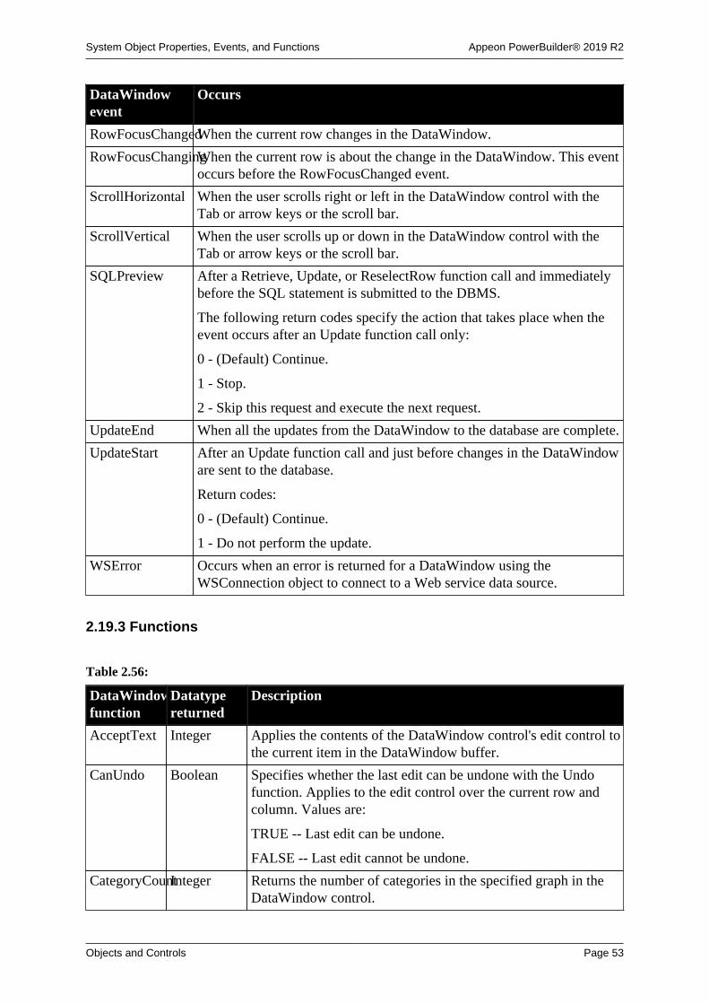
System Object Properties, Events, and Functions Appeon PowerBuilder® 2019 R2
Objects and Controls Page 53
DataWindowevent
Occurs
RowFocusChangedWhen the current row changes in the DataWindow.
RowFocusChangingWhen the current row is about the change in the DataWindow. This eventoccurs before the RowFocusChanged event.
ScrollHorizontal When the user scrolls right or left in the DataWindow control with theTab or arrow keys or the scroll bar.
ScrollVertical When the user scrolls up or down in the DataWindow control with theTab or arrow keys or the scroll bar.
SQLPreview After a Retrieve, Update, or ReselectRow function call and immediatelybefore the SQL statement is submitted to the DBMS.
The following return codes specify the action that takes place when theevent occurs after an Update function call only:
0 - (Default) Continue.
1 - Stop.
2 - Skip this request and execute the next request.
UpdateEnd When all the updates from the DataWindow to the database are complete.
UpdateStart After an Update function call and just before changes in the DataWindoware sent to the database.
Return codes:
0 - (Default) Continue.
1 - Do not perform the update.
WSError Occurs when an error is returned for a DataWindow using theWSConnection object to connect to a Web service data source.
2.19.3 Functions
Table 2.56:
DataWindowfunction
Datatypereturned
Description
AcceptText Integer Applies the contents of the DataWindow control's edit control tothe current item in the DataWindow buffer.
CanUndo Boolean Specifies whether the last edit can be undone with the Undofunction. Applies to the edit control over the current row andcolumn. Values are:
TRUE -- Last edit can be undone.
FALSE -- Last edit cannot be undone.
CategoryCountInteger Returns the number of categories in the specified graph in theDataWindow control.

System Object Properties, Events, and Functions Appeon PowerBuilder® 2019 R2
Objects and Controls Page 54
DataWindowfunction
Datatypereturned
Description
CategoryNameString Returns the name of the specified category in the specifiedgraph in the DataWindow control.
ClassName String Returns the name assigned to the DataWindow control.
Clear Integer Clears (deletes) the selected text in the edit control of theDataWindow control.
For a RichText presentation style DataWindow, clears theselected text in the DataWindow.
ClearValues Integer Deletes all items from the value list associated with thespecified column in the DataWindow control.
Clipboard Integer Copies the specified graph in the DataWindow control to theclipboard.
Copy Integer Copies the selected text in the edit control over the current rowand column of the DataWindow control to the clipboard.
For a RichText presentation style DataWindow, copies theselected text in the DataWindow control.
CopyRTF String Returns the selected text, pictures, and input fields in aDataWindow control as a string with rich text formatting.Bitmaps and input fields are included in the string.
Create Integer Creates a DataWindow object using the specified sourcecode and replaces the DataWindow object in the specifiedDataWindow control with the new DataWindow object.
CrosstabDialogInteger Displays the Crosstab Definition dialog box so the user canmodify the definition of a crosstab DataWindow object duringexecution.
Cut Integer Cuts the selected text from the edit control over the current rowand column of the DataWindow and stores it in the clipboard.
For a RichText presentation style DataWindow, cuts theselected text in the DataWindow control.
DataCount Long Returns the number of data points in the specified series in thespecified graph in the DataWindow control.
DBCancel Integer Cancels a database retrieval in progress.
DBErrorCodeLong Returns the error code (number) generated by a database error.
Obsolete function
DBErrorCode is an obsolete function and will be discontinuedin a future release. Database error codes are now available asevent arguments.
DBErrorMessageString Returns a string containing the text of the error messagegenerated by a database error.
Obsolete function

System Object Properties, Events, and Functions Appeon PowerBuilder® 2019 R2
Objects and Controls Page 55
DataWindowfunction
Datatypereturned
Description
DBErrorMessage is an obsolete function and will bediscontinued in a future release. Database error messages arenow available as event arguments.
DeletedCountLong Returns the number of rows that have been deleted from theDataWindow control but have not yet been updated in theassociated database table.
DeleteRow Integer Deletes the specified row from the DataWindow control.
Describe String Returns requested information about the structure of theDataWindow control.
Drag Integer Starts or ends the dragging of the DataWindow control.
ExportJson String Exports data from the DataWindow control, DataStore object,or DataWindowChild object to the JSON string.
ExportRowAsJsonString Exports a data row from the DataWindow control, DataStoreobject, or DataWindowChild object to the JSON string.
Filter Integer Displays specific rows of the DataWindow control based on itscurrent filter.
FilteredCountInteger Returns the number of rows that are not visible because of thecurrent filter.
Find Long Syntax 1: Finds the next row in a DataWindow control in whichdata meets a specified condition.
Syntax 2: For Rich Text presentation style Data Windows, findsthe specified text in the control and highlights the text if found.You can specify search direction and whether to match wholewords and case.
FindCategory Integer Returns the number of the specified category in the specifiedgraph in the DataWindow control.
FindGroupChangeLong Searches starting at a specified row for the first break for thespecified group in the DataWindow control.
FindNext Integer Finds the next occurrence of text in the control and highlights it,using criteria set up in a previous call of the Find function.
This function applies only to DataWindow controls whosecontent has the RichText presentation style.
FindRequired Integer Identifies the required columns that the user has not filled.
FindSeries Integer Returns the number of the specified series in the specified graphin the DataWindow control.
GenerateHTMLFormInteger Creates an HTML Form element containing columns for oneor more rows. Also returns an HTML Style element containingstyle sheet information.
GenerateResultSetLong Returns an EAServer result set from a PowerBuilder user objectrunning as a component on EAServer.

System Object Properties, Events, and Functions Appeon PowerBuilder® 2019 R2
Objects and Controls Page 56
DataWindowfunction
Datatypereturned
Description
Obsolete function
GenerateResultSet is an obsolete function, because EAServer isno longer supported since PowerBuilder 2017.
GetBandAtPointerString Returns the string containing the band in which the pointeris currently located followed by a tab character (~t) and thenumber of the row associated with the band.
GetBorderStyleBorder(enumerated)
Returns a Border enumerated datatype indicating the borderstyle of the specified column in the DataWindow control.Values are:
Box!
Lowered!
NoBorder!
Raised!
ResizeBorder!
ShadowBox!
Underline!
GetChanges Long Retrieves changes made to a DataWindow into a blob. Thisfunction is used primarily in distributed applications.
GetChild Integer Stores in the specified variable the name of the childDataWindow in the specified column.
GetClickedColumnInteger Returns the number of the column in the DataWindow controlthat the user clicked or double-clicked.
GetClickedRowLong Returns the number of the row in the DataWindow control thatthe user clicked or double-clicked.
GetColumn Integer Returns the number of the current column in the DataWindowcontrol.
GetColumnNameString Returns the name of the current column in the DataWindowcontrol.
GetContextServiceInteger Creates a reference to a context-specific instance of thespecified service.
GetData Double Returns the value of the specified data in the specified seriesin the specified graph in the DataWindow control. See alsoGetDataValue.
GetDataPieExplodeInteger Reports the percentage that a pie slice is exploded in a piegraph.
GetDataLabellingInteger Determines whether the data at a given data point is labeled in aDirectX 3D graph.

System Object Properties, Events, and Functions Appeon PowerBuilder® 2019 R2
Objects and Controls Page 57
DataWindowfunction
Datatypereturned
Description
GetDataStyle Integer Finds out the appearance of a data point in a graph. Each datapoint in a series can have individual appearance settings. Thereare different syntaxes, depending on what settings you want tocheck.
GetDataTransparencyInteger Obtains the transparency percentage of a series in a DirectX 3Dgraph.
GetDataValueInteger Returns the value of the specified data in the specified series inthe specified graph in the DataWindow control.
GetFormat String Returns the format used for display in the specified column ofthe DataWindow control.
GetFullState Long Retrieves the complete state of a DataWindow into a blob. Thisfunction is used primarily in distributed applications.
GetItemDate Date Returns the date data in the specified row and column of theDataWindow control.
GetItemDateTimeDateTime Returns the datetime data in the specified row and column of theDataWindow control.
GetItemDecimalDecimal Returns the decimal data in the specified row and column of theDataWindow control.
GetItemNumberDouble Returns the numeric data in the specified row and column of theDataWindow control.
GetItemStatusdwItemStatus(enumerated)
Returns the status of the item at the specified row and columnlocation in the specified buffer. Values are:
DataModified!
New!
NewModified!
NotModified!
GetItemStringString Returns the string data in the specified row and column of theDataWindow control.
GetItemTime Time Returns the time data in the specified row and column of theDataWindow control.
GetMessageTextString Obtains the message text generated by a crosstab DataWindowobject in the DataWindow control.
Obsolete function
GetMessageText is an obsolete function and will bediscontinued in a future release. Message text is now availableas an argument in a user-defined DataWindow event associatedwith the token pbm_dwnmessagetext.

System Object Properties, Events, and Functions Appeon PowerBuilder® 2019 R2
Objects and Controls Page 58
DataWindowfunction
Datatypereturned
Description
GetNextModifiedLong Returns the number of the first row that was modified in thespecified buffer in the specified DataWindow control after thespecified row.
GetObjectAtPointerString Returns the string containing the name of the column or graphiccontrol under the pointer in the DataWindow control, then a tabcharacter (~t), and then the row number.
GetParent PowerObject Returns a reference to the name of the parent object.
GetRow Long Returns an integer containing the number of the current row inthe DataWindow control.
GetRowFromRowIdLong Gets the row number of a row in a DataWindow control fromthe unique row identifier associated with that row.
GetRowIdFromRowLong Gets the unique row identifier of a row in a DataWindowcontrol from the row number associated with that row.
GetSelectedRowInteger Returns the number of the first selected row after the specifiedrow number in the DataWindow control.
GetSeriesLabellingInteger Obtains the series labelling for a DirectX 3D graph.
GetSeriesStyleInteger Finds out the appearance of a series in a graph. There areseveral syntaxes, depending on what settings you want.
GetSeriesTransparencyInteger Obtains the transparency percentage of a series in a DirectX 3Dgraph.
GetSQLPreviewString Returns the current SQL statement the DataWindow control issubmitting to the database.
Obsolete function
GetSQLPreview is an obsolete function and will bediscontinued in a future release. SQL syntax is now available asan event argument.
GetSQLSelectString Returns the current SELECT statement for the DataWindowcontrol.
GetStateStatusLong Retrieves the current status of the internal state flags for aDataWindow and places this information in a blob. Thisfunction is used primarily in distributed applications.
GetText String Returns the text in the edit control over the current row andcolumn of the DataWindow control.
GetTrans Integer Returns the values in the DataWindow Transaction object.
GetUpdateStatusInteger Stores the number of the row that will be updated in a variable,and the dwBuffer enumerated datatype identifying the buffercontaining the row in another variable.
Obsolete function

System Object Properties, Events, and Functions Appeon PowerBuilder® 2019 R2
Objects and Controls Page 59
DataWindowfunction
Datatypereturned
Description
GetUpdateStatus is an obsolete function and will bediscontinued in a future release. Update status is now availableas an argument in the DataWindow control DBError andSQLPreview events.
GetValidate String Returns the validation rule used in the specified column of theDataWindow control.
GetValue String Returns the specified item in the value list for the specifiedcolumn.
GroupCalc Integer Recalculates the breaks in the groups in the DataWindowcontrol.
Hide Integer Makes the control invisible.
ImportClipboardLong Copies data from the clipboard to the DataWindow control.
ImportFile Long Copies data from a file to the DataWindow control.
ImportJson Long Inserts data from a JSON string into the DataWindow control.
ImportJsonByKeyLong Inserts data from a JSON string into the DataWindow controlaccording to the JSON key name.
ImportRowFromJsonLong Inserts a data row from a JSON string into a DataWindowcontrol, DataStore object, or DataWindowChild object.
ImportString Long Copies data from a string to the DataWindow control.
InsertDocumentInteger Inserts a rich text format or plain text file into a DataWindowcontrol. You use a function parameter to specify how the newcontent is added:
• It can be inserted at the insertion point.
• It can replace all existing content.
This function applies only to DataWindow controls whosecontent has the RichText presentation style.
InsertRow Long Inserts a new initialized row before the specified row in theDataWindow control.
IsSelected Boolean Returns true if the specified row in the DataWindow is selected;returns false if the row is not selected or is greater than thenumber of rows in the DataWindow control.
LineCount Integer Determines the number of lines in an edit control that allowsmultiple lines.
ModifiedCountLong Returns the number of rows that have been modified in theDataWindow control but have not yet been updated in theassociated database table.
Modify String Uses the specification contained in a string to modify theDataWindow control.

System Object Properties, Events, and Functions Appeon PowerBuilder® 2019 R2
Objects and Controls Page 60
DataWindowfunction
Datatypereturned
Description
Move Integer Moves the specified DataWindow control to a specifiedlocation.
ObjectAtPointergrObjectTypeReturns the number of the series the pointer is over and thenumber of the data point in the graph in the DataWindowcontrol and identifies the object type.
OLEActivate Integer Activates OLE for the OLE object in the specified row andcolumn of the DataWindow control.
Paste Integer Inserts the contents of the clipboard into the edit control overthe current row and column in the DataWindow control.
PasteRTF Long Pastes rich text data from a string into a DataWindow controlwhose content has the RichText presentation style.
PointerX Integer Returns the distance of the pointer from the left edge of theDataWindow control.
PointerY Integer Returns the distance of the pointer from the top of theDataWindow control.
Position Integer Syntax 1: Reports the insertion point's position in the editcontrol over the current row and column of the DataWindowcontrol.
Syntax 2: Reports the line and column position of the insertionpoint or the start and end of selected text in a DataWindowcontrol whose content has the RichText presentation style.
PostEvent Boolean Adds an event to the end of the message queue for theDataWindow control.
Print Integer Sends the content of the DataWindow control to the currentprinter. This function has several syntaxes.
PrintCancel Integer Cancels the print job and deletes the spool file (if any) when thecontent of the DataWindow control is sent to print.
This function has two syntaxes. Use Syntax 1 when Syntax1 of the Print function is used to send the content of theDataWindow control to the current printer.
ReplaceText Integer Replaces the selected text in the edit control with the specifiedstring.
ReselectRow Integer Accesses the database to reselect all columns that can beupdated and refreshes all timestamp columns in a row in theDataWindow control.
Reset Integer Clears all the data from a DataWindow control.
Reset Integer Deletes the data, the categories, or the series from a graphwithin a DataWindow object with an external data source.
ResetDataColorsInteger Resets the color of a data point to the color specified for theseries.

System Object Properties, Events, and Functions Appeon PowerBuilder® 2019 R2
Objects and Controls Page 61
DataWindowfunction
Datatypereturned
Description
ResetTransObjectInteger Stops the DataWindow control from using a programmer-defined Transaction object (thereafter, the DataWindow uses itsinternal Transaction object).
ResetUpdate Integer Resets the update flags for the DataWindow control.
Resize Integer Changes the width and height of the DataWindow control.
Retrieve Long Retrieves rows from the database for the DataWindow control.
RowCount Long Returns the number of rows currently available in theDataWindow control (all the rows retrieved minus any deletedrows plus any inserted rows minus any rows that have beenfiltered out).
RowsCopy Integer Copies a range of rows from one DataWindow controlto another or from one buffer to another within a singleDataWindow control.
RowsDiscard Integer Discards a range of rows. The rows cannot be restored unlessretrieved from the database.
RowsMove Integer Clears a range of rows from a DataWindow control and insertsthe rows in another DataWindow control or another buffer ofthe same DataWindow control.
SaveAs Integer Saves the data represented in the specified graph in theDataWindow control to the specified file, in the specifiedformat.
SaveAs Integer Saves the content of the DataWindow control to the specifiedfile, in the specified format, with or without column headings atthe beginning.
SaveAsAscii Long Saves the content of a DataWindow into a standard ASCII textfile.
SaveNativePDFToBlobInteger Saves the PDF file into a blob variable when you use the PDFlibmethod to save data from a DataWindow object to a PDF file.
Scroll Integer Scrolls the edit control of a DataWindow control in thespecified direction the specified number of lines.
ScrollNextPageLong Syntax 1: Scrolls forward by the number of rows showing in theDataWindow (when the DataWindow control contents does nothave the RichText presentation style).
Syntax 2: Scrolls to the next page of the document in aDataWindow control whose content has the RichTextpresentation style.
ScrollNextRowLong Scrolls the DataWindow control to the next row.ScrollNextRow changes the current row but not the currentcolumn.

System Object Properties, Events, and Functions Appeon PowerBuilder® 2019 R2
Objects and Controls Page 62
DataWindowfunction
Datatypereturned
Description
ScrollPriorPageLong Syntax 1: Scrolls backward by the number of rows showing inthe DataWindow (when the DataWindow control content doesnot have the RichText presentation style).
Syntax 2: Scrolls to the prior page of the document ina DataWindow control whose content has the RichTextpresentation style.
ScrollPriorRowLong Scrolls to the previous row. The ScrollPriorRow functionchanges the current row in the DataWindow control but doesnot change the current column.
ScrollToRow Integer Causes the control to scroll to the specified row. ScrollToRowchanges the current row in the DataWindow control but doesnot change the current column.
SelectedLengthInteger Reports the total number of characters and spaces (length) inthe selected text in the edit control over the current row andcolumn.
SelectedLine Integer Reports the line number in the edit control over the current rowand column.
SelectedStart Integer Reports the starting position in the edit control over the currentrow and column.
SelectedText String Reports what text (if any) is selected in the edit control over thecurrent row and column of the DataWindow control.
SelectRow Integer Selects or deselects the specified row in the DataWindowcontrol.
SelectText Integer Syntax 1: Selects text in the edit control of a DataWindowcontrol (other than one whose content is in the RichTextpresentation style). You specify where the selection begins andhow many characters to select.
Syntax 2: Selects text beginning and ending at the specified lineand character positions in a DataWindow control whose contentis in the RichText presentation style.
SelectTextAllInteger Selects all the content of a DataWindow control with theRichText presentation style.
SelectTextLineInteger Selects the line containing the insertion point in a DataWindowcontrol with the RichText presentation style.
SelectTextWordInteger Selects the word containing the insertion point in aDataWindow control with the RichText presentation style.
SeriesCount Integer Returns the number of series in the specified graph in theDataWindow control.
SeriesName String Returns the name of the specified series in the specified graph inthe DataWindow control.

System Object Properties, Events, and Functions Appeon PowerBuilder® 2019 R2
Objects and Controls Page 63
DataWindowfunction
Datatypereturned
Description
SetActionCodeInteger Defines the action a DataWindow control takes following anevent.
Obsolete function
SetActionCode is an obsolete function and will be discontinuedin a future release. You now set return codes in a returnstatement in the event script.
SetBorderStyleInteger Sets the border style of the specified column in theDataWindow control.
SetChanges Long Applies changes captured with GetChanges to a DataWindow.This function is used primarily in distributed applications.
SetColumn Integer Makes the specified column the current column in theDataWindow control.
SetDataPieExplodeInteger Explodes a pie slice in a pie graph.
SetDataLabellingInteger Sets the series label for a DirectX 3D graph.
SetDataStyle Integer For the specified data point in the specified series in thespecified graph in the DataWindow control:
Syntax 1: Sets the data point's color.
Syntax 2: Sets the line style and width for the data point.
Syntax 3: Sets the fill pattern or symbol for the data point.
SetDataTransparencyInteger Sets the transparency percentage for a data point in a series in aDirectX 3D graph.
SetDetailHeightInteger Sets the height of each row in a specified range.
SetFilter Integer Defines the filter criteria for the DataWindow control. Theactual filtering is performed by the Filter function.
SetFocus Integer Sets focus to the DataWindow control.
SetFormat Integer Sets the display format for the specified column of theDataWindow control.
SetFullState Long Applies the contents of a DataWindow blob retrieved byGetFullState to a DataWindow. This function is used primarilyin distributed applications.
SetHTMLActionInteger Accepts action and context information about user interactionwith the Web DataWindow client control in a Web browser sothat newly generated HTML can reflect any requested changes.
Obsolete function
SetHTMLAction is an obsolete function, because WebDataWindow technology is obsolete.
SetItem Integer Sets the value of the specified row and column of the specifiedDataWindow control.

System Object Properties, Events, and Functions Appeon PowerBuilder® 2019 R2
Objects and Controls Page 64
DataWindowfunction
Datatypereturned
Description
SetItemStatusInteger Sets the status of a row in a specified column of theDataWindow control in the specified buffer.
SetPosition Integer Syntax 1: Specifies whether the DataWindow control alwaysdisplays on top in the front-to-back order within the window.
Syntax 2: Moves an object within the DataWindow to anotherband or changes the front-to-back order of objects within aband.
SetRedraw Integer Controls automatic redrawing of the DataWindow control aftereach change in its properties or contents.
SetRow Integer Makes the specified row the current row in the DataWindowcontrol.
SetRowFocusIndicatorInteger Sets the current row indicator for the DataWindow control.
SetSeriesLabellingInteger Sets the series label for a DirectX 3D graph.
SetSeriesStyleInteger For the specified series in the specified graph in theDataWindow control:
Syntax 1: Sets the series color.
Syntax 2: Sets the linestyle and width.
Syntax 3: Sets the fill pattern or symbol for data markers in theseries.
Syntax 4: Specifies that the series is an overlay.
SetSort Integer Defines the sort criteria for the DataWindow control. The actualsorting is performed by the Sort function.
SetSeriesTransparencyInteger Sets the transparency percentage of a series in a DirectX 3Dtype graph.
SetSQLPreviewInteger Sets the current SQL statement for the DataWindow control.
SetSQLSelectInteger Changes the current SELECT statement for the DataWindowcontrol.
SetTabOrder Integer Changes the tab value of the specified column in theDataWindow control.
SetText Integer Replaces the text in the edit control at the current row andcolumn of the DataWindow control with the specified text.
SetTrans Integer Sets values in the DataWindow control's internal Transactionobject.
SetTransObjectInteger Sets the Transaction object for the DataWindow control andprovides control over the transaction, including the ability tocommit from a script.
SetValidate Integer Changes the validation rule used for the specified column of theDataWindow control.

System Object Properties, Events, and Functions Appeon PowerBuilder® 2019 R2
Objects and Controls Page 65
DataWindowfunction
Datatypereturned
Description
SetValue Integer Sets the value of the specified item in the value list or the codetable of the specified column of the DataWindow control.
SetWSObject Integer Causes a DataWindow control to use a programmer-specifiedconnection object. The connection object provides theinformation necessary for communicating with a Web servicedata source.
ShareData Integer Shares data between a primary DataWindow control and asecondary DataWindow control.
ShareDataOffInteger Turns off sharing for the DataWindow control. If that control isthe primary DataWindow control, all secondary DataWindowcontrols are disconnected and their DataWindow objects nolonger contain data.
Show Integer Makes the DataWindow control visible.
ShowHeadFootInteger In a RichText presentation style DataWindow control, displaysthe panels for editing the header and footer or hides the panelsand returns to editing the main text.
Sort Integer Sorts the rows of the DataWindow control based on its currentsort criteria.
TextLine String Reports information about the edit control over the current rowand column.
TriggerEvent Integer Triggers a specified event in the DataWindow control andexecutes the script for the event.
TypeOf Object Returns the type of the control.
Undo Integer Cancels the last edit in the edit control over the current row andcolumn.
Update Integer Sends to the database all inserts, deletes, and updates of theDataWindow control.
2.20 DataWindowChild object
A DataWindowChild object is a nested report or a DropDownDataWindow within aDataWindow object. For example, a DataWindow object that populates a column having theDropDownDataWindow edit style is a DataWindowChild object.
The DataWindowChild object is used for accessing DataWindow objects independently fromDataWindow functionality, and it inherits from the system Structure object because it needsstorage and autoinstantiation.
A DataWindowChild object has no events.

System Object Properties, Events, and Functions Appeon PowerBuilder® 2019 R2
Objects and Controls Page 66
Obsolete functions
Several DataWindowChild functions are described as obsolete, which means thatalthough the functions operate as usual in this release, they will be removed in afuture release. You should replace all use of these functions as soon as possible.
2.20.1 Properties
Table 2.57:
DataWindowChildproperty
Datatype Description
ClassDefinitionPowerObject An object of type PowerObject containing information about theclass definition of the object or control.
2.20.2 Functions
Table 2.58:
DataWindowChildfunction
Datatypereturned
Description
AcceptText Integer Applies the contents of the edit control to the current item in theDataWindowChild buffer.
ClassName String Returns the name assigned to the DataWindowChild.
ClearValues String Deletes all the items from a value list or code table associatedwith a DataWindow column.
CrosstabDialogInteger Displays the Crosstab Definition dialog box so that the user canmodify the definition of a crosstab DataWindow object duringexecution.
DBCancel Integer Cancels a database retrieval in progress.
DBErrorCodeLong Returns the error code (number) generated by a database error.
Obsolete function
DBErrorCode is an obsolete function and will be discontinuedin a future release. Database error codes are now available asevent arguments.
DBErrorMessageString Returns a string containing the text of the error messagegenerated by a database error.
Obsolete function
DBErrorMessage is an obsolete function and will bediscontinued in a future release. Database error messages arenow available as event arguments.
DeletedCountLong Returns the number of rows that have been deleted fromthe DataWindowChild but have not yet been updated in theassociated database table.
DeleteRow Integer Deletes the specified row from the DataWindowChild.

System Object Properties, Events, and Functions Appeon PowerBuilder® 2019 R2
Objects and Controls Page 67
DataWindowChildfunction
Datatypereturned
Description
Describe String Returns requested information about the structure of theDataWindowChild.
ExportJson String Exports data from the DataWindow control, DataStore object,or DataWindowChild object to the JSON string.
ExportRowAsJsonString Exports a data row from the DataWindow control, DataStoreobject, or DataWindowChild object to the JSON string.
Filter Integer Displays specific rows of the DataWindowChild based on itscurrent filter.
FilteredCountInteger Returns the number of rows that are not visible because of theDataWindowChild's current filter.
Find Long Returns the number of the first row that meets the searchcriteria within a specified search range in the detail area of aDataWindowChild.
FindGroupChangeLong Searches starting at a specified row for the first break for thespecified group in the DataWindowChild.
GetBandAtPointerString Returns the string containing the band in which the pointeris currently located followed by a tab character (~t) and thenumber of the row associated with the band.
GetBorderStyleBorder(enumerated)
Returns a Border enumerated datatype indicating the borderstyle of the specified column in the DataWindowChild. Valuesare:
Box!
Lowered!
NoBorder!
Raised!
ResizeBorder!
ShadowBox!
Underline!
GetChanges Long Retrieves changes made to a DataWindow into a blob. Thisfunction is used primarily in distributed applications.
GetChild Integer Provides a reference to a child DataWindow or to a report in acomposite DataWindow, which you can use in DataWindowfunctions to manipulate that DataWindow or report.
GetClickedColumnInteger Returns the number of the column in the DataWindowChild thatthe user clicked or double-clicked.
GetClickedRowLong Returns the number of the row in the DataWindowChild that theuser clicked or double-clicked.

System Object Properties, Events, and Functions Appeon PowerBuilder® 2019 R2
Objects and Controls Page 68
DataWindowChildfunction
Datatypereturned
Description
GetColumn Integer Returns the number of the current column in theDataWindowChild.
GetColumnNameString Returns the name of the current column in theDataWindowChild.
GetContextServiceInteger Creates a reference to a context-specific instance of thespecified service.
GetFormat String Returns the format used for display in the specified column ofthe DataWindowChild.
GetItemDate Date Returns the date data in the specified row and column of theDataWindowChild.
GetItemDateTimeDateTime Returns the datetime data in the specified row and column of theDataWindowChild.
GetItemDecimalDecimal Returns the decimal data in the specified row and column of theDataWindowChild.
GetItemNumberDouble Returns the numeric data in the specified row and column of theDataWindowChild.
GetItemStatusdwItemStatus(enumerated)
Returns the status of the item at the specified row and columnlocation in the specified buffer. Values are:
DataModified!
New!
NewModified!
NotModified!
GetItemStringString Returns the string data in the specified row and column of theDataWindowChild.
GetItemTime Time Returns the time data in the specified row and column of theDataWindowChild.
GetNextModifiedLong Returns the number of the first row that was modified in thespecified buffer in the specified DataWindowChild after thespecified row.
GetObjectAtPointerString Returns the string containing the name of the DataWindowChildcolumn or graphic control under the pointer in theDataWindowChild, then a tab character (~t), and then the rownumber.
GetParent PowerObject Returns a reference to the name of the parent object.
GetRow Long Returns an integer containing the number of the current row inthe DataWindowChild.
GetRowFromRowIdLong Gets the row number of a row in a DataWindow control fromthe unique row identifier associated with that row.

System Object Properties, Events, and Functions Appeon PowerBuilder® 2019 R2
Objects and Controls Page 69
DataWindowChildfunction
Datatypereturned
Description
GetRowIdFromRowLong Gets the unique row identifier of a row in a DataWindowcontrol from the row number associated with that row.
GetSelectedRowInteger Returns the number of the first selected row after the specifiedrow number in the DataWindowChild.
GetSQLPreviewString Returns the current SQL statement the DataWindowChild issubmitting to the database.
Obsolete function
GetSQLPreview is an obsolete function and will bediscontinued in a future release. SQL syntax is now available asan event argument.
GetSQLSelectString Returns the current SELECT statement for theDataWindowChild.
GetText String Returns the text in the edit control over the current row andcolumn of the DataWindowChild.
GetTrans Integer Returns the values in the DataWindowChild Transaction object.
GetUpdateStatusInteger Stores the number of the row that will be updated in a variableand the dwBuffer enumerated datatype identifying the buffercontaining the row in another variable.
Obsolete function
GetUpdateStatus is an obsolete function and will bediscontinued in a future release. Update status is now availableas an argument in the DataWindow DBError and SQLPreviewevents.
GetValidate String Returns the validation rule used in the specified column of theDataWindowChild.
GetValue String Returns the specified item in the value list for the specifiedcolumn.
GroupCalc Integer Recalculates the breaks in the groups in the DataWindowChild.
ImportClipboardLong Copies data from the clipboard to the DataWindowChild.
ImportFile Long Copies data from a file to the DataWindowChild.
ImportJson Long Inserts data from a JSON string into the DataWindowChild.
ImportJsonByKeyLong Inserts data from a JSON string into the DataWindowChildaccording to the JSON key name.
ImportRowFromJsonLong Inserts a data row from a JSON string into a DataWindowcontrol, DataStore object, or DataWindowChild object.
ImportString Long Copies data from a string to the DataWindowChild.
InsertRow Long Inserts a new initialized row before the specified row in theDataWindowChild.
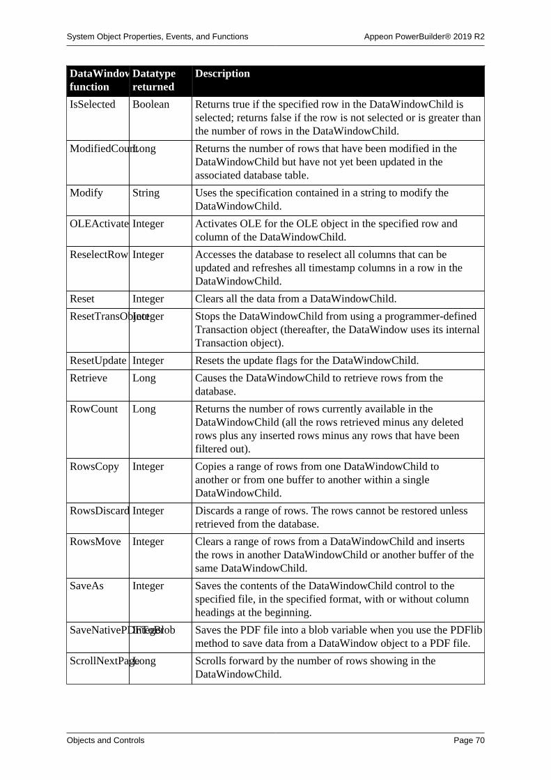
System Object Properties, Events, and Functions Appeon PowerBuilder® 2019 R2
Objects and Controls Page 70
DataWindowChildfunction
Datatypereturned
Description
IsSelected Boolean Returns true if the specified row in the DataWindowChild isselected; returns false if the row is not selected or is greater thanthe number of rows in the DataWindowChild.
ModifiedCountLong Returns the number of rows that have been modified in theDataWindowChild but have not yet been updated in theassociated database table.
Modify String Uses the specification contained in a string to modify theDataWindowChild.
OLEActivate Integer Activates OLE for the OLE object in the specified row andcolumn of the DataWindowChild.
ReselectRow Integer Accesses the database to reselect all columns that can beupdated and refreshes all timestamp columns in a row in theDataWindowChild.
Reset Integer Clears all the data from a DataWindowChild.
ResetTransObjectInteger Stops the DataWindowChild from using a programmer-definedTransaction object (thereafter, the DataWindow uses its internalTransaction object).
ResetUpdate Integer Resets the update flags for the DataWindowChild.
Retrieve Long Causes the DataWindowChild to retrieve rows from thedatabase.
RowCount Long Returns the number of rows currently available in theDataWindowChild (all the rows retrieved minus any deletedrows plus any inserted rows minus any rows that have beenfiltered out).
RowsCopy Integer Copies a range of rows from one DataWindowChild toanother or from one buffer to another within a singleDataWindowChild.
RowsDiscard Integer Discards a range of rows. The rows cannot be restored unlessretrieved from the database.
RowsMove Integer Clears a range of rows from a DataWindowChild and insertsthe rows in another DataWindowChild or another buffer of thesame DataWindowChild.
SaveAs Integer Saves the contents of the DataWindowChild control to thespecified file, in the specified format, with or without columnheadings at the beginning.
SaveNativePDFToBlobInteger Saves the PDF file into a blob variable when you use the PDFlibmethod to save data from a DataWindow object to a PDF file.
ScrollNextPageLong Scrolls forward by the number of rows showing in theDataWindowChild.

System Object Properties, Events, and Functions Appeon PowerBuilder® 2019 R2
Objects and Controls Page 71
DataWindowChildfunction
Datatypereturned
Description
ScrollNextRowLong Scrolls the DataWindowChild to the next row. ScrollNextRowchanges the current row but does not change the current column.
ScrollPriorPageLong Scrolls backward by the number of rows showing in theDataWindowChild.
ScrollPriorRowLong Scrolls to the previous row. The ScrollPriorRow functionchanges the current row in the DataWindowChild but does notchange the current column.
ScrollToRow Integer Causes the control to scroll to the specified row. ScrollToRowchanges the current row in the DataWindowChild but does notchange the current column.
SelectRow Integer Selects or deselects the specified row of the DataWindowChild.
SetBorderStyleInteger Sets the border style of the specified column in theDataWindowChild.
SetChanges Long Applies changes captured with GetChanges to a DataWindow.This function is used primarily in distributed applications.
SetColumn Integer Makes the specified column the current column in theDataWindowChild.
SetDetailHeightInteger Sets the height of each row in a specified range.
SetFilter Integer Defines the filter criteria for the DataWindowChild. The actualfiltering is performed by the Filter function.
SetFormat Integer Sets the display format for the specified column of theDataWindowChild.
SetItem Integer Sets the value of the specified row and column of the specifiedDataWindowChild.
SetItemStatusInteger Sets the status of a row in a specified column of theDataWindowChild in the specified buffer.
SetPosition Integer Moves an object within the DataWindowChild to another bandor changes the front-to-back order of objects within a band.
SetRedraw Integer Controls automatic redrawing of the DataWindowChild aftereach change in its properties or contents.
SetRow Integer Makes the specified row the current row in theDataWindowChild.
SetRowFocusIndicatorInteger Sets the current row indicator for the DataWindowChild.
SetSort Integer Defines the sort criteria for the DataWindowChild. The actualsorting is performed by the Sort function.
SetSQLPreviewInteger Sets the current SQL statement for the DataWindowChild.
SetSQLSelectInteger Changes the current SELECT statement for theDataWindowChild.

System Object Properties, Events, and Functions Appeon PowerBuilder® 2019 R2
Objects and Controls Page 72
DataWindowChildfunction
Datatypereturned
Description
SetTabOrder Integer Changes the tab value of the specified column in theDataWindowChild.
SetText Integer Replaces the text in the edit control at the current row andcolumn of the DataWindowChild with the specified text.
SetTrans Integer Sets values in the DataWindowChild's internal Transactionobject.
SetTransObjectInteger Sets the Transaction object for the DataWindowChild andprovides control over the transaction, including the ability tocommit from a script.
SetValidate Integer Changes the validation rule used for the specified column of theDataWindowChild.
SetValue Integer Sets the value of the specified item in the value list or the codetable of the specified column of the DataWindowChild.
SetWSObject Integer Causes a DataWindowChild to use a programmer-specifiedconnection object. The connection object provides theinformation necessary for communicating with a Web servicedata source.
ShareData Integer Shares data between a primary DataWindowChild and asecondary DataWindowChild.
ShareDataOffInteger Turns off sharing for the DataWindowChild. If that object is theprimary DataWindowChild, all secondary DataWindowChildobjects are disconnected and their DataWindow objects nolonger contain data.
Sort Integer Sorts the rows of the DataWindowChild based on its currentsort criteria.
TypeOf Object Returns the type of the control.
Update Integer Sends to the database all inserts, deletes, and updates of theDataWindowChild.
2.21 DatePicker control
A DatePicker control makes it easy for users to select a date. It has two parts: a drop-down list box that displays the date in a selected format, and a grid that resembles theMonthCalendar control. Unlike the MonthCalendar control, which can be used to select arange of dates, the DatePicker control is used to select a single date.

System Object Properties, Events, and Functions Appeon PowerBuilder® 2019 R2
Objects and Controls Page 73
2.21.1 Properties
Table 2.59:
DatePickerproperty
Datatype Description
Accelerator Integer Specifies the ASCII value of the key you want to assign as theaccelerator key for a control.
AccessibleDescriptionString Describes the control and/or its purpose for use by accessibilitytools such as readers for visually impaired users.
AccessibleNameString A label that briefly describes the control, such as the text in abutton or the name of a menu item.
AccessibleRoleAccessibleRole(enumerated)
Describes the kind of user interface element that the control is.
AllowEdit Boolean Specifies whether the user can select the text string in thecontrol and edit it. Values are:
TRUE -- The user can select the text string in the control andedit it.
FALSE -- The user can change the date only by modifying onepart of the date at a time or by selecting a date from the drop-down calendar (default).
Border Boolean Specifies whether the control has a border. Values are:
TRUE -- Control has a border (default).
FALSE -- Control does not have a border.
BorderStyle BorderStyle(enumerated)
Specifies the style of the border of the control. Values are:
StyleBox!
StyleLowered!
StyleRaised!
StyleShadowBox!
BringToTop Boolean Specifies whether PowerBuilder moves the control to the top ofthe front-to-back order in the window. Values are:
TRUE -- Control moved to top.
FALSE -- Control not moved to top.
CalendarBackColorLong Specifies the numeric value of the background color of thecalendar: -2 to 16,777,215. For more information aboutcolor, see Section 10.636, “RGB”. The default is WindowBackground.
This property does not work on the Windows 7/8.1/10Windows7/8.1/10 operating system.
CalendarFontCharsetFontCharSet(enumerated)
Specifies the font character set used for the text in the calendar.The default is ansi!. For a complete list of possible values,see the list of properties for the FontCharSet variable on the
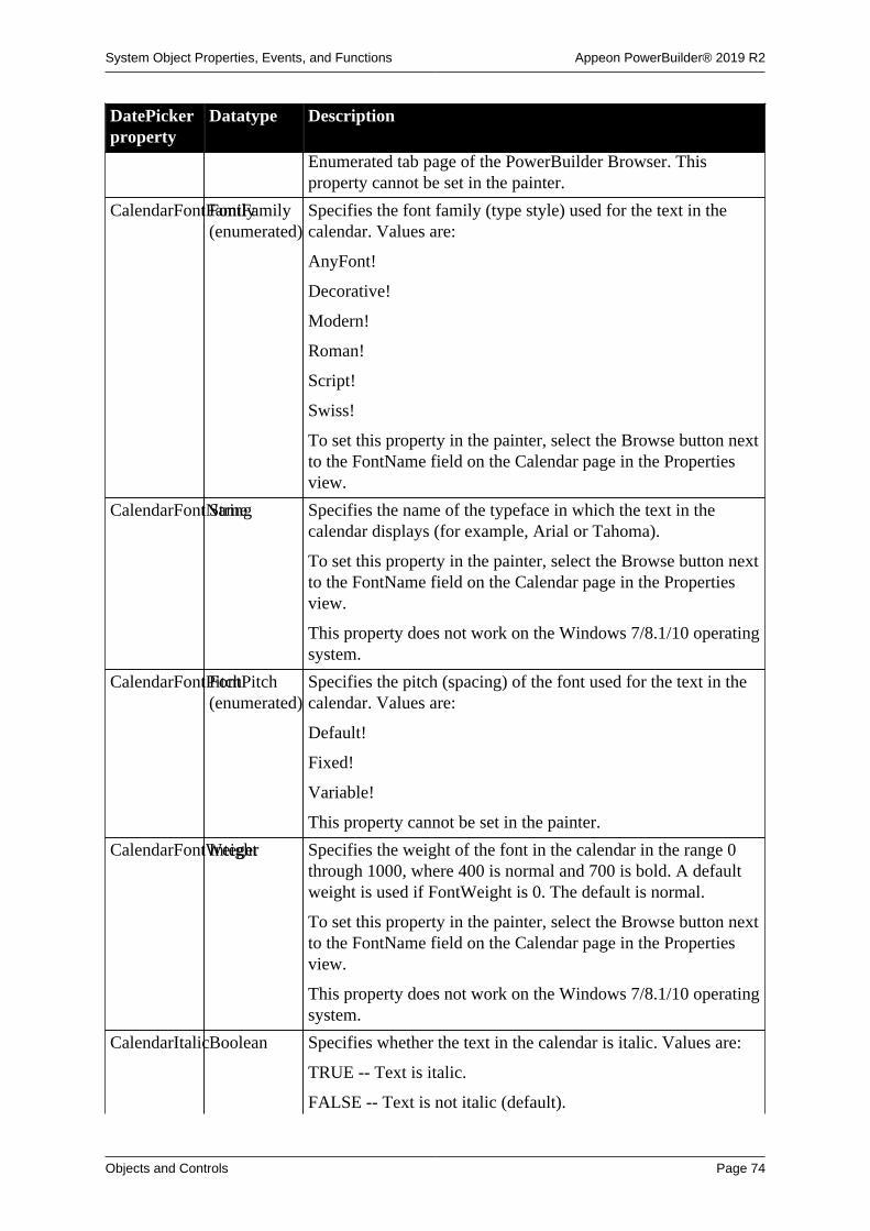
System Object Properties, Events, and Functions Appeon PowerBuilder® 2019 R2
Objects and Controls Page 74
DatePickerproperty
Datatype Description
Enumerated tab page of the PowerBuilder Browser. Thisproperty cannot be set in the painter.
CalendarFontFamilyFontFamily(enumerated)
Specifies the font family (type style) used for the text in thecalendar. Values are:
AnyFont!
Decorative!
Modern!
Roman!
Script!
Swiss!
To set this property in the painter, select the Browse button nextto the FontName field on the Calendar page in the Propertiesview.
CalendarFontNameString Specifies the name of the typeface in which the text in thecalendar displays (for example, Arial or Tahoma).
To set this property in the painter, select the Browse button nextto the FontName field on the Calendar page in the Propertiesview.
This property does not work on the Windows 7/8.1/10 operatingsystem.
CalendarFontPitchFontPitch(enumerated)
Specifies the pitch (spacing) of the font used for the text in thecalendar. Values are:
Default!
Fixed!
Variable!
This property cannot be set in the painter.
CalendarFontWeightInteger Specifies the weight of the font in the calendar in the range 0through 1000, where 400 is normal and 700 is bold. A defaultweight is used if FontWeight is 0. The default is normal.
To set this property in the painter, select the Browse button nextto the FontName field on the Calendar page in the Propertiesview.
This property does not work on the Windows 7/8.1/10 operatingsystem.
CalendarItalicBoolean Specifies whether the text in the calendar is italic. Values are:
TRUE -- Text is italic.
FALSE -- Text is not italic (default).

System Object Properties, Events, and Functions Appeon PowerBuilder® 2019 R2
Objects and Controls Page 75
DatePickerproperty
Datatype Description
For more information, see Italic. To set this property in thepainter, select the Browse button next to the FontName field onthe Calendar page in the Properties view.
This property does not work on the Windows 7/8.1/10 operatingsystem.
CalendarTextColorLong Specifies the numeric value of the text color in the calendar:
-2 to 16,777,215. For more information about color, seeSection 10.636, “RGB”. The default is Window Text.
This property does not work on the Windows 7/8.1/10 operatingsystem.
CalendarTextSizeInteger Specifies the size of text in the calendar. The default is 9. To setthis property in the painter, select the Browse button next to theFontName field on the Calendar page in the Properties view.
CalendarTitleBackColorLong Specifies the numeric value of the background color of thecalendar's title: -2 to 16,777,215. For more information aboutcolor, see Section 10.636, “RGB”.
This property does not work on the Windows 7/8.1/10 operatingsystem.
CalendarTitleTextColorLong Specifies the numeric value of the color used for text in thecalendar's title: -2 to 16,777,215. For more information aboutcolor, see Section 10.636, “RGB”.
This property does not work on the Windows 7/8.1/10 operatingsystem.
CalendarTrailingTextColorLong Specifies the numeric value of the color used for leadingand trailing days in the calendar: -2 to 16,777,215. For moreinformation about color, see Section 10.636, “RGB”.
This property does not work on the Windows 7/8.1/10 operatingsystem.
CalendarUnderlineBoolean Specifies that text in the calendar is underlined. The defaultis false. To set this property in the painter, select the Browsebutton next to the FontName field on the Calendar page in theProperties view.
This property does not work on the Windows 7/8.1/10 operatingsystem.
ClassDefinitionPowerObject An object of type PowerObject containing information about theclass definition of the object or control.
CustomFormatString Specifies a custom format for the display of the date in aDatePicker control.
DateValue Date Gets the date value assigned to the control. The default is thecurrent date. This property cannot be set in the painter and

System Object Properties, Events, and Functions Appeon PowerBuilder® 2019 R2
Objects and Controls Page 76
DatePickerproperty
Datatype Description
should not be set in script. Use the Value property to set the datevalue.
DragAuto Boolean Specifies whether PowerBuilder puts the control automaticallyinto Drag mode. Values are:
TRUE -- When the control is clicked, the control isautomatically in Drag mode.
FALSE -- When the control is clicked, the control is notautomatically in Drag mode. You have to put the control intoDrag mode manually by using the Drag function.
DragIcon String Specifies the name of the stock icon or the file containing theicon you want to display when the user drags the control (theICO file). The default icon is a box the size of the control.
When the user drags the control, the icon displays when thecontrol is over an area in which the control can be dropped (avalid drop area). When the control is over an area that is not avalid drop area, the No-Drop icon displays.
DropDownRightBoolean Specifies whether the drop-down calendar is aligned with theright or left side of the DatePicker control. Values are:
TRUE -- The calendar is aligned with the right side of thecontrol.
FALSE -- The calendar is aligned with the left side of thecontrol (default).
Enabled Boolean Specifies whether the control is enabled (can be selected).Values are:
TRUE -- Control can be selected (default).
FALSE -- Control cannot be selected.
FaceName String Specifies the name of the typeface in which the text of thecontrol displays (for example, Arial or Tahoma).
FirstDayOfWeekWeekDay(enumerated)
Specifies which day of the week displays on the left in thecalendar.
FontCharSet FontCharSet(enumerated)
Specifies the font character set used for the text in the control.The default is ansi!. For a complete list of possible values,see the list of properties for the FontCharSet variable on theEnumerated tab page of the Browser.
FontFamily FontFamily(enumerated)
Specifies the font family (type style) used for the text in thecontrol. Values are:
AnyFont!
Decorative!
Modern!

System Object Properties, Events, and Functions Appeon PowerBuilder® 2019 R2
Objects and Controls Page 77
DatePickerproperty
Datatype Description
Roman!
Script!
Swiss!
FontPitch FontPitch(enumerated)
Specifies the pitch (spacing) of the font used for the text in thecontrol. Values are:
Default!
Fixed!
Variable!
FontWeight Integer Specifies the weight of the font in the control in the range 0through 1000, where 400 is normal and 700 is bold. A defaultweight is used if FontWeight is 0.
Format DateTimeValue(enumerated)
Specifies the format of the date displayed in a DatePickercontrol. Values are:
DtfCustom!
DtfLongDate!
DtfShortDate!
DtfTime!
Height Integer Specifies the height of the control in PowerBuilder units.
Italic Boolean Specifies whether the text in the control is italic. Values are:
TRUE -- Text is italic.
FALSE -- Text is not italic (default).
MaxDate Date Specifies the latest date the user can select from the calendar.The default is December 31, 2999.
MinDate Date Specifies the earliest date the user can select from the calendar.The default is January 1, 1800.
Pointer String Specifies the name of the stock pointer or the file containing thepointer used for the control.
RightToLeft Boolean Specifies that characters should be displayed in right-to-leftorder.
ShowUpDownBoolean Specifies whether the control uses an up-down control to changethe date and/or time. Values are:
TRUE -- The control has an up-down control.
FALSE -- The control has a drop-down arrow that displays acalendar (default).
This property cannot be changed at runtime.

System Object Properties, Events, and Functions Appeon PowerBuilder® 2019 R2
Objects and Controls Page 78
DatePickerproperty
Datatype Description
TabOrder Integer Specifies the tab value of the control within the window (0means the user cannot tab to the control).
Tag String Specifies the tag value assigned to the control.
Text String Gets the text associated with the control. The string returnedis equivalent to the Value property with the Format orCustomFormat applied. This property cannot be set in thepainter and should not be set in script.
TextSize Integer Specifies the size of the text in the control, in points. Forbackward compatibility, the size is stored as a negative number;for example, 10-point text size is stored as -10.
TimeValue Time Gets the time value assigned to the control. The default is thecurrent time. This property cannot be set in the painter andshould not be set in script. Use the Value property to set thetime value.
TodayCircle Boolean Specifies whether the border of today's date on the calendardisplays in red. Values are:
TRUE -- The Today circle is displayed (default).
FALSE -- The Today circle is not displayed.
TodaySectionBoolean Specifies whether the label "Today:" followed by the currentdate displays at the bottom of the calendar. Values are:
TRUE -- The Today section is displayed (default).
FALSE -- The Today section is not displayed.
This property does not work correctly on the Windows 7/8.1/10operating system.
Underline Boolean Specifies whether the text in the control is underlined. Valuesare:
TRUE -- Text is underlined.
FALSE -- Text is not underlined (default).
Value DateTime Specifies the date/time value assigned to the control. Thedefault is the current date and time.
Visible Boolean Specifies whether the control is visible. Values are:
TRUE -- Control is visible (default).
FALSE -- Control is not visible.
WeekNumbersBoolean Specifies whether a number representing the number of theweek in the year displays to the left of each row in the calendar.Values are:
TRUE -- Week numbers are displayed.
FALSE -- Week numbers are not displayed (default).

System Object Properties, Events, and Functions Appeon PowerBuilder® 2019 R2
Objects and Controls Page 79
DatePickerproperty
Datatype Description
This property does not work correctly on the Windows 7/8.1/10operating system.
Width Integer Specifies the width of the control in PowerBuilder units.
X Integer Specifies the X position (the distance from the left edge of thewindow) in PowerBuilder units.
Y Integer Specifies the Y position (the distance from the top of thewindow) in PowerBuilder units.
2.21.2 Events
Table 2.60:
DatePickerevent
Occurs
Clicked When the control is clicked (selected) with the left mouse button
CloseUp When the user has selected a date from the drop-down calendar and thecalendar closes
Constructor Immediately before the Open event occurs in the window
Destructor Immediately after the Close event occurs in the window
DoubleClicked When the control is clicked twice with the left mouse button
DragDrop When a dragged control is dropped on the control
DragEnter When a dragged control enters the control
DragLeave When a dragged control leaves the control
DragWithin When a dragged control is within the control
DropDown When the user has clicked the drop-down arrow in a DatePicker controlbefore the drop-down calendar displays
GetFocus Just before the control receives focus (before it is selected and becomesactive)
Help When the user presses the F1 key or drags the context help button(question mark) from the title bar to a menu item or control
LoseFocus When the control loses focus (becomes inactive)
Other When a Controls message occurs that is not a PowerBuilder event
PreCreateWindow This event is reserved for future use
RButtonDown When the right mouse button is pressed on the control
UserString When the user has edited the contents of the control and the control haslost focus
ValueChanged When the Value property in a DatePicker control changes

System Object Properties, Events, and Functions Appeon PowerBuilder® 2019 R2
Objects and Controls Page 80
2.21.3 Functions
Table 2.61:
DatePickerfunction
Datatypereturned
Description
ClassName String Returns the name assigned to the control
Drag Integer Starts or ends the dragging of the control
GetCalendar Long This function is reserved for future use
GetContextServiceInteger Creates a reference to a context-specific instance of thespecified service
GetParent PowerObject Returns a reference to the name of the parent object
GetText String Returns the text displayed in the control
GetToday Date Returns the date that the calendar uses as today's date
GetValue Integer Returns the date and time in the Value property
Hide Integer Makes the control invisible
Move Integer Moves the control to a specified location
PointerX Integer Returns the distance of the pointer from the left edge of thecontrol
PointerY Integer Returns the distance of the pointer from the top of the control
PostEvent Boolean Adds the specified event to the end of the event queue for thespecified object
Print Integer Prints the control
Resize Integer Changes the size of the control
SetFocus Integer Sets focus to the specified control
SetPosition Integer Specifies the position of the control in the front-to-back order ofthe window
SetRedraw Integer Controls automatic redrawing of the control after each change inits properties
SetToday Integer Sets the value that is used by the calendar as today's date
SetValue Integer Sets the date and time in the Value property
Show Integer Makes the control visible
TriggerEvent Integer Triggers a specified event in the control and executes the scriptfor the event
TypeOf Object Returns the type of the control
2.22 DropDownListBox control
A DropDownListBox control combines the features of a ListBox and a SingleLineEdit. Insome DropDownListBoxes, the user can select an item by entering the name of the item inthe text box. In other DropDownListBoxes, the user cannot modify the text box and mustclick the item or enter the first character of the item to select it.

System Object Properties, Events, and Functions Appeon PowerBuilder® 2019 R2
Objects and Controls Page 81
Making the list display
In the development environment, if the list portion of the DropDownListBox is notdisplayed because ShowList is set to FALSE, the user must click the down arrow atthe end of the text box to display it.
2.22.1 Properties
Table 2.62:
DropDownListBoxproperty
Datatype Description
Accelerator Integer The ASCII value of the accelerator key you want to assign asthe accelerator for the control.
AccessibleDescriptionString A description of the control and/or its purpose for use byaccessibility tools such as readers for visually impaired users.
AccessibleNameString A label that briefly describes the control, such as the text in abutton or the name of a menu item.
AccessibleRoleAccessibleRole(enumerated)
Describes what kind of user interface element the control is.
AllowEdit Boolean Specifies whether the user can enter text in the text box portionof the control. Values are:
TRUE -- Can enter text in the text box.
FALSE -- Cannot enter text in the text box.
AllowEdit must be true when ShowList is true.
AutoHScroll Boolean Specifies whether the text box portion of the control scrollshorizontally automatically when data is entered or deleted.Values are:
TRUE -- TextBox scrolls horizontally automatically.
FALSE -- TextBox does not scroll horizontally automatically.
BackColor Long Specifies the numeric value of the background color: -2to 16,777,215. For more information about color, seeSection 10.636, “RGB”.
Border Boolean Specifies whether the control has a border. However, settingthis property to FALSE has no effect on the DropDownListBoxcontrol.
BorderStyle BorderStyle(enumerated)
Specifies the style of the border of the control. Values are:
StyleBox!
StyleLowered!
StyleRaised!
StyleShadowBox!

System Object Properties, Events, and Functions Appeon PowerBuilder® 2019 R2
Objects and Controls Page 82
DropDownListBoxproperty
Datatype Description
BringToTop Boolean Specifies whether PowerBuilder will move the control to the topof the front-to-back order in the window. Values are:
TRUE -- Control moved to top.
FALSE -- Control not moved to top.
ClassDefinitionPowerObject An object of type PowerObject containing information about theclass definition of the object or control.
DragAuto Boolean Specifies whether PowerBuilder puts the control automaticallyinto Drag mode. Values are:
TRUE -- When the control is clicked, the control isautomatically put in Drag mode.
FALSE -- When the control is clicked, the control is notautomatically put in Drag mode. You have to put the controlinto Drag mode manually by using the Drag function.
DragIcon String Specifies the name of the stock icon or the file containing theicon you want to display when the user drags the control (theICO file). The default icon is a box the size of the control.
When the user drags the control, the icon displays when thecontrol is over an area in which the control can be dropped (avalid drop area). When the control is over an area that is not avalid drop area, the No-Drop icon displays.
Enabled Boolean Specifies whether the control is enabled (can be selected).Values are:
TRUE -- Control is enabled.
FALSE -- Control is not enabled.
FaceName String Specifies the name of the typeface in which the text of thecontrol displays (for example, arial or courier).
FontCharSet FontCharSet(enumerated)
Specifies the font character set used for the text in the control.The application must be running on an appropriate versionof PowerBuilder under an operating system that supports theselected character set. For a complete list of possible values,see the list of properties for the FontCharSet variable on theEnumerated tab page of the Browser.
FontFamily FontFamily(enumerated)
Specifies the font family (type style) used for the text in thecontrol. Values are:
AnyFont!
Decorative!
Modern!
Roman!

System Object Properties, Events, and Functions Appeon PowerBuilder® 2019 R2
Objects and Controls Page 83
DropDownListBoxproperty
Datatype Description
Script!
Swiss!
FontPitch FontPitch(enumerated)
Specifies the pitch (spacing) of the font used for the text in thecontrol. Values are:
Default!
Fixed!
Variable!
Height Integer Specifies the height of the control, in PowerBuilder units.
HScrollBar Boolean Specifies whether a horizontal scroll bar is displayed in thecontrol. Values are:
TRUE -- Horizontal scroll bar is displayed
FALSE -- Horizontal scroll bar is not displayed
ImeMode Integer Specifies the input method editor mode. This property isrelevant only to applications running on a Japanese version ofPowerBuilder.
Italic Boolean Specifies whether the text in the control is italic. Values are:
TRUE -- Text is italic
FALSE -- Text is not italic
Item[ ] String array Specifies the contents of the ListBox portion of theDropDownListBox.
Limit Integer Specifies the maximum number of characters (0 to 32,767)the user can enter in the SingleLineEdit portion of theDropDownListBox (0 means unlimited).
Pointer String Specifies the name of the stock pointer or the file containing thepointer that will be used for the control.
RightToLeft Boolean Specifies that characters should be displayed in right-to-leftorder. The application must be running on an operating systemthat supports right-to-left display. Values are:
TRUE -- Characters display in right-to-left order
FALSE -- Characters display in left-to-right order
ShowList Boolean Specifies whether the option list always displays in the ListBoxportion of the DropDownListBox when the control displays.Values are:
TRUE -- Option list always displays.
FALSE -- Option list displays only when the user clicks thedown arrow.

System Object Properties, Events, and Functions Appeon PowerBuilder® 2019 R2
Objects and Controls Page 84
DropDownListBoxproperty
Datatype Description
This property is usually set to false. Note that AllowEdit mustbe true when ShowList is true.
Sorted Boolean Specifies whether the ListBox portion of the DropDownListBoxis automatically sorted in ascending order. Values are:
TRUE -- ListBox automatically sorted.
FALSE -- ListBox not sorted.
TabOrder Integer Specifies the tab value of the control within the window (0means the user cannot tab to the control).
Tag String Specifies the tag value assigned to the control.
Text String Specifies the text in the control.
TextColor Long Specifies the numeric value of the color used for text:-2 to 16,777,215. For more information about color, seeSection 10.636, “RGB”.
TextSize Integer Specifies the size of the text in the control, in points. Forbackward compatibility, the size is stored as a negative number;for example, 10-point text size is stored as -10.
Underline Boolean Specifies whether the text in the control is underlined. Valuesare:
TRUE -- Text is underlined.
FALSE -- Text is not underlined.
Visible Boolean Specifies whether the control is visible. Values are:
TRUE -- Control is visible.
FALSE -- Control is not visible.
VScrollBar Boolean Specifies whether a vertical scroll bar is displayed in thecontrol. Values are:
TRUE -- Vertical scroll bar is displayed.
FALSE -- Vertical scroll bar is not displayed.
Weight Integer Specifies the stroke weight of the text in the control; forexample, 400 for normal or 700 for bold.
Width Integer Specifies the width of the control, in PowerBuilder units.
X Integer Specifies the X position (the distance from the left edge of thewindow), in PowerBuilder units.
Y Integer Specifies the Y position (the distance from the top of thewindow), in PowerBuilder units.

System Object Properties, Events, and Functions Appeon PowerBuilder® 2019 R2
Objects and Controls Page 85
2.22.2 Events
Table 2.63:
DropDownListBoxevent
Occurs
Constructor Immediately before the Open event occurs in the window
Destructor Immediately after the Close event occurs in the window
DoubleClicked When the control is double-clicked (selected and activated)
DragDrop When a dragged control is dropped on the control
DragEnter When a dragged control enters the control
DragLeave When a dragged control leaves the control
DragWithin When a dragged control is within the control
GetFocus Just before the control receives focus (before it is selected and becomesactive)
Help When the user presses the F1 key or drags the context help button(question mark) from the title bar to a menu item or control
LoseFocus When the control loses focus (becomes inactive)
Modified When the control loses focus, the text has been changed, and Enter orTab is pressed.
Other When a Windows message occurs that is not a PowerBuilder event
RButtonDown When the right mouse button is pressed on the control
SelectionChanged When an item is selected in the ListBox portion of theDropDownListBox
2.22.3 Functions
Table 2.64:
DropDownListBoxfunction
Datatypereturned
Description
AddItem Integer Adds a new item to the end of the ListBox portion of thecontrol.
The AddItem function does not update the Item[ ] property ofthis control.
ClassName String Returns the name assigned to the control.
Clear Integer Clears the selected text from the control (but does not place it inthe clipboard).
Copy Integer Copies (but does not delete) the selected text from the control tothe clipboard.
Cut Integer Cuts (deletes) the selected text (if any) from the control andplaces it in the clipboard.
DeleteItem Integer Deletes the item indicated by the index from the ListBoxportion of the control.

System Object Properties, Events, and Functions Appeon PowerBuilder® 2019 R2
Objects and Controls Page 86
DropDownListBoxfunction
Datatypereturned
Description
DirList Boolean Populates the ListBox portion of the DropDownListBox with alist of the files of the specified type that match the specified filepattern.
DirSelect Boolean Retrieves the current selection from the specified control andputs it in the specified variable.
Drag Integer Starts or ends the dragging of the control.
FindItem Integer Finds the first item in the ListBox portion of the control (afterthe specified index) that begins with a specified string.
GetContextServiceInteger Creates a reference to a context-specific instance of thespecified service.
GetParent PowerObject Returns a reference to the name of the parent object.
Hide Integer Makes the control invisible (hidden).
InsertItem Integer Adds a new item to the ListBox portion of theDropDownListBox before the item indicated by the index.
Move Integer Moves the control to a specified location.
Paste Integer Inserts the contents of the clipboard (if any) at the cursorlocation in the control.
PointerX Integer Returns the distance of the pointer from the left edge of thecontrol.
PointerY Integer Returns the distance of the pointer from the top of the control.
Position Integer Returns the position of the cursor in the control.
PostEvent Boolean Adds an event to the end of the message queue for control.
Print Integer Prints the control.
ReplaceText Integer Replaces the selected text in the control with the specifiedstring.
Reset Integer Deletes all items from the control.
Resize Integer Changes the size of the control.
SelectedLengthInteger Returns the length of the selected text in the control.
SelectedStart Integer Returns the starting position of the selected text (if any) in thecontrol.
SelectedText String Returns a string containing the selected text (if any) from thecontrol (the AllowEdit property must be true).
SelectItem Integer Finds and highlights an item in the control. Use Syntax 1 whenyou know the text of the item but not its position. Use Syntax 2when you know the position of the item in the control's list oryou want to clear the current selection.
SelectText Integer Selects the text in the control specified by the starting positionand length; when the control has focus, highlights the text.

System Object Properties, Events, and Functions Appeon PowerBuilder® 2019 R2
Objects and Controls Page 87
DropDownListBoxfunction
Datatypereturned
Description
SetFocus Integer Sets focus in the first item in the box.
SetPosition Integer Specifies the position of the control in the front-to-back order ofthe window.
SetRedraw Integer Controls automatic redrawing of the control after each change inits properties.
Show Integer Makes the control visible.
Text String Returns the text of the item in the ListBox portion of theDropDownListBox that is identified by the index.
TotalItems Integer Returns the total number of items in the ListBox portion of theDropDownListBox.
TriggerEvent Integer Triggers a specified event in the control and executes the scriptfor the event.
TypeOf Control Returns the type of the control.
2.23 DropDownPictureListBox control
A DropDownPictureListBox control is similar to a DropDownListBox, but with the additionof pictures associated with the items in the list.
The pictures used in this control can be bitmaps (BMP file), icons (ICO file), cursors (CURfile), GIF (but not animated GIF) files, or JPEG files.
Making the list display
In the development environment, if the list portion of the DropDownPictureListBox isnot displayed because ShowList is set to FALSE, the user must click the down arrowat the end of the text box to display it.
2.23.1 Properties
Table 2.65:
DropDownPictureListBoxproperty
Datatype Description
Accelerator Integer The ASCII value of the accelerator key you want to assign asthe accelerator for the control.
AccessibleDescriptionString A description of the control and/or its purpose for use byaccessibility tools such as readers for visually impaired users.
AccessibleNameString A label that briefly describes the control, such as the text in abutton or the name of a menu item.
AccessibleRoleAccessibleRole(enumerated)
Describes what kind of user interface element the control is.

System Object Properties, Events, and Functions Appeon PowerBuilder® 2019 R2
Objects and Controls Page 88
DropDownPictureListBoxproperty
Datatype Description
AllowEdit Boolean Specifies whether the user can enter text in the text box portionof the control. Values are:
TRUE -- Can enter text in the text box.
FALSE -- Cannot enter text in the text box.
AllowEdit must be true when ShowList is true.
AutoHScroll Boolean Specifies whether the text box portion of the control scrollshorizontally automatically when data is entered or deleted.Values are:
TRUE -- Text box scrolls horizontally automatically.
FALSE -- Text box does not scroll horizontally automatically.
BackColor Long Specifies the numeric value of the background color: -2to 16,777,215. For more information about color, seeSection 10.636, “RGB”.
Border Boolean Specifies whether the control has a border. Note that setting thisproperty to FALSE has no effect on the control; it always has aborder. Values are:
TRUE -- Control has a border.
FALSE -- Not applicable.
BorderStyle BorderStyle(enumerated)
Specifies the style of the border of the control. Values are:
StyleBox!
StyleLowered!
StyleRaised!
StyleShadowBox!
BringToTop Boolean Specifies whether PowerBuilder will move the control to the topof the front-to-back order in the window. Values are:
TRUE -- Control moved to top.
FALSE -- Control not moved to top.
ClassDefinitionPowerObject An object of type PowerObject containing information about theclass definition of the object or control.
DragAuto Boolean Specifies whether PowerBuilder puts the control automaticallyinto Drag Mode. Values are:
TRUE -- When the control is clicked, the control isautomatically in Drag Mode.
FALSE -- When the control is clicked, the control is notautomatically in Drag Mode. You have to manually put thecontrol into Drag Mode by using the Drag function.

System Object Properties, Events, and Functions Appeon PowerBuilder® 2019 R2
Objects and Controls Page 89
DropDownPictureListBoxproperty
Datatype Description
DragIcon String Specifies the name of the stock icon or the file containing theicon you want to display when the user drags the control (theICO file). The default icon is a box the size of the control.
When the user drags the control, the icon displays when thecontrol is over an area in which the control can be dropped (avalid drop area). When the control is over an area that is not avalid drop area, the No-Drop icon displays.
Enabled Boolean Specifies whether the control is enabled (can be selected).Values are:
TRUE -- Control is enabled.
FALSE -- Control is not enabled.
FaceName String Specifies the name of the typeface in which the text of thecontrol displays (for example, arial or courier).
FontCharSet FontCharSet(enumerated)
Specifies the font character set used for the text in the control.The application must be running on an appropriate versionof PowerBuilder under an operating system that supports theselected character set. For a complete list of possible values,see the list of properties for the FontCharSet variable on theEnumerated tab page of the Browser.
FontFamily FontFamily(enumerated)
Specifies the font family (type style) used for the text in thecontrol. Values are:
AnyFont!
Decorative!
Modern!
Roman!
Script!
Swiss!
FontPitch FontPitch(enumerated)
Specifies the pitch (spacing) of the font used for the text in thecontrol. Values are:
Default!
Fixed!
Variable!
Height Integer Specifies the height of the control, in PowerBuilder units.
HScrollBar Boolean Specifies whether a horizontal scroll bar is displayed in thecontrol. Values are:
TRUE -- Horizontal scroll bar is displayed.

System Object Properties, Events, and Functions Appeon PowerBuilder® 2019 R2
Objects and Controls Page 90
DropDownPictureListBoxproperty
Datatype Description
FALSE -- Horizontal scroll bar is not displayed.
ImeMode Integer Specifies the input method editor mode. This property isrelevant only to applications running on a Japanese version ofPowerBuilder.
Italic Boolean Specifies whether the text in the control is italic. Values are:
TRUE -- Text is italic.
FALSE -- Text is not italic.
Item[ ] String array Specifies the initial item strings in the ListBox portion of theDropDownPictureListBox. This array is not updated afterinitialization.
ItemPictureIndex[ ]Integer Initial picture index for each item in the Item property array.These values are not updated after initialization.
Limit Integer Specifies the maximum number of characters (0 to 32,767)the user can enter in the SingleLineEdit portion of theDropDownPictureListBox (0 means unlimited).
PictureHeightInteger Specifies the height of the picture, in pixels.
This property can be set only when there are no images in theimage list. If the value is 0 at the time the first image is added,the size of that image is used to set the size of the rest of theimages added.
PictureMaskColorLong Specifies the numeric value of the color to be used to maskuser-defined bitmaps added through the initial picture array orwith the AddPicture function. System-defined bitmaps knowtheir mask color and this color is ignored. This value is usedwhen a picture is added, and therefore can be changed betweenAddPicture calls.
Values can be: -2 to 16,777,215.
For more information about color, see Section 10.636, “RGB”.
PictureName[ ]String Specifies the names of the files containing the pictures addedduring initialization. The file extension BMP, ICO, GIF, JPG, orJPEG is required.
This property is not updated after initialization.
PictureWidth Integer Specifies the width of the picture, in pixels.
This property can be set only when there are no images in theimage list. If the value is 0 at the time the first image is added,the size of that image is used to set the size of the rest of theimages added.

System Object Properties, Events, and Functions Appeon PowerBuilder® 2019 R2
Objects and Controls Page 91
DropDownPictureListBoxproperty
Datatype Description
Pointer String Specifies the name of the stock pointer or the file containing thepointer that will be used for the control.
RightToLeft Boolean Specifies that characters should be displayed in right-to-leftorder. The application must be running on an operating systemthat supports right-to-left display. Values are:
TRUE -- Characters display in right-to-left order.
FALSE -- Characters display in left-to-right order.
ShowList Boolean Specifies whether the option list always displays in the ListBoxportion of the DropDownPictureListBox when the controldisplays. Values are:
TRUE -- Option list always displays.
FALSE -- Option list displays only when the user clicks thedown arrow.
This property is usually set to false. AllowEdit must betrue when ShowList is true.
Sorted Boolean Specifies whether the ListBox portion of theDropDownPictureListBox is automatically sorted in ascendingorder. Values are:
TRUE -- ListBox automatically sorted.
FALSE -- ListBox not sorted.
TabOrder Integer Specifies the tab value of the control within the window (0means the user cannot tab to the control).
Tag String Specifies the tag value assigned to the control.
Text String Specifies the text in the control.
TextColor Long Specifies the numeric value of the color used for text:-2 to 16,777,215. For more information about color, seeSection 10.636, “RGB”.
TextSize Integer Specifies the size of the text in the control, in points. Forbackward compatibility, the size is stored as a negative number;for example, 10-point text size is stored as -10.
Underline Boolean Specifies whether the text in the control is underlined. Valuesare:
TRUE -- Text is underlined.
FALSE -- Text is not underlined.
Visible Boolean Specifies whether the control is visible. Values are:
TRUE -- Control is visible.
FALSE -- Control is not visible.

System Object Properties, Events, and Functions Appeon PowerBuilder® 2019 R2
Objects and Controls Page 92
DropDownPictureListBoxproperty
Datatype Description
VScrollBar Boolean Specifies whether a vertical scroll bar is displayed in thecontrol. Values are:
TRUE -- Vertical scroll bar is displayed.
FALSE -- Vertical scroll bar is not displayed.
Weight Integer Specifies the stroke weight of the text in the control; forexample, 400 for normal or 700 for bold.
Width Integer Specifies the width of the control, in PowerBuilder units.
X Integer Specifies the X position (the distance from the left edge of thewindow), in PowerBuilder units.
Y Integer Specifies the Y position (the distance from the top of thewindow), in PowerBuilder units.
2.23.2 Events
Table 2.66:
DropDownPictureListBox event
Occurs
Constructor Immediately before the Open event occurs in the window.
Destructor Immediately after the Close event occurs in the window.
DoubleClicked When the control is double-clicked (selected and activated).
DragDrop When a dragged control is dropped on the control.
DragEnter When a dragged control enters the control.
DragLeave When a dragged control leaves the control.
DragWithin When a dragged control is within the control.
GetFocus Just before the control receives focus (before it is selected and becomesactive).
Help When the user presses the F1 key or drags the context help button(question mark) from the title bar to a menu item or control.
LoseFocus When the control loses focus (becomes inactive).
Modified When the control loses focus, the text has been changed, and enter or tabis pressed.
Other When a Windows message occurs that is not a PowerBuilder event.
RButtonDown When the right mouse button is pressed on the control.
SelectionChanged When an item is selected in the ListBox portion of theDropDownPictureListBox.
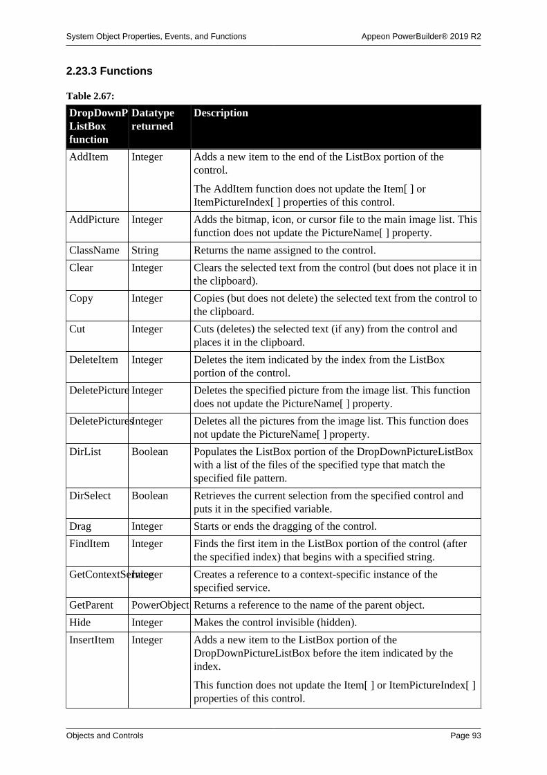
System Object Properties, Events, and Functions Appeon PowerBuilder® 2019 R2
Objects and Controls Page 93
2.23.3 Functions
Table 2.67:
DropDownPictureListBoxfunction
Datatypereturned
Description
AddItem Integer Adds a new item to the end of the ListBox portion of thecontrol.
The AddItem function does not update the Item[ ] orItemPictureIndex[ ] properties of this control.
AddPicture Integer Adds the bitmap, icon, or cursor file to the main image list. Thisfunction does not update the PictureName[ ] property.
ClassName String Returns the name assigned to the control.
Clear Integer Clears the selected text from the control (but does not place it inthe clipboard).
Copy Integer Copies (but does not delete) the selected text from the control tothe clipboard.
Cut Integer Cuts (deletes) the selected text (if any) from the control andplaces it in the clipboard.
DeleteItem Integer Deletes the item indicated by the index from the ListBoxportion of the control.
DeletePicture Integer Deletes the specified picture from the image list. This functiondoes not update the PictureName[ ] property.
DeletePicturesInteger Deletes all the pictures from the image list. This function doesnot update the PictureName[ ] property.
DirList Boolean Populates the ListBox portion of the DropDownPictureListBoxwith a list of the files of the specified type that match thespecified file pattern.
DirSelect Boolean Retrieves the current selection from the specified control andputs it in the specified variable.
Drag Integer Starts or ends the dragging of the control.
FindItem Integer Finds the first item in the ListBox portion of the control (afterthe specified index) that begins with a specified string.
GetContextServiceInteger Creates a reference to a context-specific instance of thespecified service.
GetParent PowerObject Returns a reference to the name of the parent object.
Hide Integer Makes the control invisible (hidden).
InsertItem Integer Adds a new item to the ListBox portion of theDropDownPictureListBox before the item indicated by theindex.
This function does not update the Item[ ] or ItemPictureIndex[ ]properties of this control.

System Object Properties, Events, and Functions Appeon PowerBuilder® 2019 R2
Objects and Controls Page 94
DropDownPictureListBoxfunction
Datatypereturned
Description
Move Integer Moves the control to a specified location.
Paste Integer Inserts the contents of the clipboard (if any) at the cursorlocation in the control.
PointerX Integer Returns the distance of the pointer from the left edge of thecontrol.
PointerY Integer Returns the distance of the pointer from the top of the control.
Position Integer Returns the position of the cursor in the control.
PostEvent Boolean Adds an event to the end of the message queue for control.
Print Integer Prints the control.
ReplaceText Integer Replaces the selected text in the control with the specifiedstring.
Reset Integer Deletes all items from the control.
Resize Integer Changes the size of the control.
SelectedLengthInteger Returns the length of the selected text in the control.
SelectedStart Integer Returns the starting position of the selected text (if any) in thecontrol.
SelectedText String Returns a string containing the selected text (if any) from thecontrol (the AllowEdit property must be true).
SelectItem Integer Finds and highlights an item in the control. Use Syntax 1 whenyou know the text of the item but not its position. Use Syntax 2when you know the position of the item in the control's list oryou want to clear the current selection.
SelectText Integer Selects the text in the control specified by the starting positionand length; when the control has focus, highlights the text.
SetFocus Integer Sets focus in the first item in the box.
SetPosition Integer Specifies the position of the control in the front-to-back order ofthe window.
SetRedraw Integer Controls automatic redrawing of the control after each change inits properties.
Show Integer Makes the control visible.
Text String Returns the text of the item in the ListBox portion of theDropDownPictureListBox identified by the index.
TotalItems Integer Returns the total number of items in the ListBox portion of theDropDownPictureListBox.
TriggerEvent Integer Triggers a specified event in the control and executes the scriptfor the event.
TypeOf Control Returns the type of the control.

System Object Properties, Events, and Functions Appeon PowerBuilder® 2019 R2
Objects and Controls Page 95
2.24 DynamicDescriptionArea object
DynamicDescriptionArea is a PowerBuilder system object that stores information about theinput and output parameters used in Format 4 of dynamic SQL.
PowerBuilder provides a global DynamicDescriptionArea named SQLDA that you can usewhen you need a DynamicDescriptionArea variable. If necessary, you can declare and createadditional variables of this type using this system object as the datatype.
For more information about using dynamic SQL, see Section 8.2, “Using dynamic SQL”.
2.24.1 Properties
Table 2.68:
DynamicDescriptionAreaproperty
Datatype Description
ClassDefinitionPowerObject An object of type PowerObject containing information about theclass definition of the object or control.
NumInputs Integer Specifies the number of input parameters found in the dynamicSQL PREPARE statement.
PowerBuilder populates this property when theDESCRIBE statement is executed.
NumOutputs Integer Specifies the number of output parameters found in thePREPARE statement.
If the database supports output parameter description,PowerBuilder populates this property when theDESCRIBE statement is executed. If the database does notsupport output parameter description, PowerBuilder populatesthis property when the FETCH statement is executed.
InParmType[ ]ParmType(enumerated)
Array containing values specifying the datatype of each inputparameter. Values are:
TypeBoolean!
TypeByte!
TypeDate!
TypeDateTime!
TypeDecimal!
TypeDouble!
TypeInteger!
TypeLong!
TypeLongLong!
TypeReal!
TypeString!

System Object Properties, Events, and Functions Appeon PowerBuilder® 2019 R2
Objects and Controls Page 96
DynamicDescriptionAreaproperty
Datatype Description
TypeTime!
TypeUInt!
TypeULong!
TypeUnknown!
OutParmType[ ]ParmType(enumerated)
Array containing values specifying the datatype of each outputparameter returned.
2.24.2 Events
Table 2.69:
DynamicDescriptionAreaevent
Occurs
Constructor Immediately before the Open event occurs
Destructor Immediately after the Close event occurs
2.24.3 Functions
Table 2.70:
DynamicDescriptionAreafunction
Datatypereturned
Description
ClassName String Returns the name assigned to the object.
GetContextServiceInteger Creates a reference to a context-specific instance of thespecified service.
GetDynamicDateDate Obtains data of type Date from the DynamicDescriptionAreaafter you have executed a dynamic SQL statement.
Use GetDynamicDate when the value of OutParmType isTypeDate! for the value in the array that you want to retrieve.
GetDynamicDateTimeDateTime Obtains data of type DateTime from theDynamicDescriptionArea after you have executed a dynamicSQL statement.
Use GetDynamicDateTime when the value of OutParmTypeis TypeDateTime! for the value in the array that you want toretrieve.
GetDynamicDecimalLongLong Obtains numeric data from the DynamicDescriptionArea afteryou have executed a dynamic SQL statement.
Use GetDynamicDecimal when the value of OutParmType isTypeDecimal! or TypeLongLong! for the value in the array thatyou want to retrieve.

System Object Properties, Events, and Functions Appeon PowerBuilder® 2019 R2
Objects and Controls Page 97
DynamicDescriptionAreafunction
Datatypereturned
Description
GetDynamicNumberDouble Obtains numeric data from the DynamicDescriptionArea afteryou have executed a dynamic SQL statement.
Use GetDynamicNumber when the value of OutParmType isTypeByte!, TypeInteger!, TypeDouble!, TypeLong!, TypeReal!,or TypeBoolean! for the value in the array that you want toretrieve.
GetDynamicStringString Obtains data of type String from the DynamicDescriptionAreaafter you have executed a dynamic SQL statement.
Use GetDynamicString when the value of OutParmType isTypeString! for the value in the array that you want to retrieve.
GetDynamicTimeTime Obtains data of type Time from the DynamicDescriptionAreaafter you have executed a dynamic SQL statement.
Use GetDynamicTime when the value of OutParmType isTypeTime! for the value in the array that you want to retrieve.
GetParent PowerObject Returns a reference to the name of the parent object.
PostEvent Boolean Adds the specified event to the end of the message queue for theobject.
SetDynamicParmInteger Specifies a value for an input parameter in theDynamicDescriptionArea that will be used in the SQL OPEN orEXECUTE statement.
Use SetDynamicParm to fill the parameters in the inputparameter descriptor array in the DynamicDescriptionArea.
TriggerEvent Integer Triggers a specified event in the object and executes the scriptfor the event.
TypeOf Object Returns the type of the object.
2.25 DynamicStagingArea object
DynamicStagingArea is a PowerBuilder system object that stores information for use indynamic SQL statements.
The DynamicStagingArea object is the only connection between the execution of astatement and a Transaction object and is used internally by PowerBuilder. You cannotaccess information in DynamicStagingArea, and there are no properties associated withDynamicStagingArea.
PowerBuilder provides a global DynamicStagingArea variable named SQLSA that you canuse when you need a DynamicStagingArea variable. If necessary, you can declare and createadditional variables of this type using this system object as the datatype.
For more information about using dynamic SQL, see Section 8.2, “Using dynamic SQL”.

System Object Properties, Events, and Functions Appeon PowerBuilder® 2019 R2
Objects and Controls Page 98
2.25.1 Properties
Table 2.71:
DynamicStagingAreaproperty
DataType Description
ClassDefinitionPowerObject An object of type PowerObject containing information about theclass definition of the object or control
2.25.2 Events
Table 2.72:
DynamicStagingAreaevent
Occurs
Constructor Immediately before the Open event occurs
Destructor Immediately after the Close event occurs
2.25.3 Functions
Table 2.73:
DynamicStagingAreafunction
Datatypereturned
Description
ClassName String Returns the name assigned to the object
GetContextServiceInteger Creates a reference to a context-specific instance of thespecified service
GetParent PowerObject Returns a reference to the name of the parent object
PostEvent Boolean Adds the specified event to the end of the message queue for theobject
TriggerEvent Integer Triggers a specified event in the object and executes the scriptfor the event
TypeOf Object Returns the type of the object
2.26 EditMask controlAn EditMask is a box similar to a SingleLineEdit in which the user can enter and edit oneline of text. The type and number of characters entered is restricted by the edit mask, and theappearance of the text is specified by the edit mask. For example, you can use an EditMask toformat a telephone number or date automatically as the user enters it.
2.26.1 Properties
Table 2.74:
EditMaskproperty
Datatype Description
Accelerator Integer Specifies the ASCII value of the key you want to assign as theaccelerator key for the control.

System Object Properties, Events, and Functions Appeon PowerBuilder® 2019 R2
Objects and Controls Page 99
EditMaskproperty
Datatype Description
AccessibleDescriptionString A description of the control and/or its purpose for use byaccessibility tools such as readers for visually impaired users.
AccessibleNameString A label that briefly describes the control, such as the text in abutton or the name of a menu item.
AccessibleRoleAccessibleRole(enumerated)
Describes what kind of user interface element the control is.
Alignment Alignment(enumerated)
Specifies the alignment of text in the control. Values are:
Center!
Justify!
Left!
Right!
AutoHScroll Boolean Specifies whether PowerBuilder automatically scrolls left orright when data is entered into or deleted from the control.Values are:
TRUE -- Scrolls horizontally automatically.
FALSE -- Does not scroll automatically.
AutoSkip Boolean Specifies whether to skip to the next control when the lastcharacter in the edit mask has been entered. Values are:
TRUE -- Skip to the next control automatically.
FALSE -- Do not skip to the next control.
AutoVScroll Boolean Specifies whether PowerBuilder automatically scrolls up ordown when data is entered into or deleted from the control.Values are:
TRUE -- Scrolls vertically automatically.
FALSE -- Scrolling not automatic.
BackColor Long Specifies the numeric value of the background color: -2to 16,777,215. For more information about color, seeSection 10.636, “RGB”.
Border Boolean Specifies whether the control has a border. Values are:
TRUE -- Control has a border.
FALSE -- Control does not have a border.
BorderStyle BorderStyle(enumerated)
Specifies the style of the border of the control. Values are:
StyleBox!
StyleLowered!
StyleRaised!
StyleShadowBox!

System Object Properties, Events, and Functions Appeon PowerBuilder® 2019 R2
Objects and Controls Page 100
EditMaskproperty
Datatype Description
BringToTop Boolean Specifies whether PowerBuilder moves the control to the top ofthe front-to-back order in the window:
TRUE -- Control moved to top.
FALSE -- Control not moved to top.
CalendarBackColorLong Specifies the numeric value of the background color of thecalendar: -2 to 16,777,215. For more information aboutcolor, see Section 10.636, “RGB”. The default is WindowBackground.
This property does not work on the Windows 7/8.1/10 operatingsystem.
CalendarTextColorLong Specifies the numeric value of the text color in the calendar:-2to 16,777,215. For more information about color, seeSection 10.636, “RGB”. The default is Window Text.
This property does not work on the Windows 7/8.1/10 operatingsystem.
CalendarTitleBackColorLong Specifies the numeric value of the background color of thecalendar's title: -2 to 16,777,215. For more information aboutcolor, see Section 10.636, “RGB”.
This property does not work on the Windows 7/8.1/10 operatingsystem.
CalendarTitleTextColorLong Specifies the numeric value of the color used for text in thecalendar's title: -2 to 16,777,215. For more information aboutcolor, see Section 10.636, “RGB”.
This property does not work on the Windows 7/8.1/10 operatingsystem.
CalendarTrailingTextColorLong Specifies the numeric value of the color used for leadingand trailing days in the calendar: -2 to 16,777,215. For moreinformation about color, see Section 10.636, “RGB”.
This property does not work on the Windows 7/8.1/10 operatingsystem.
ClassDefinitionPowerObject An object of type PowerObject containing information about theclass definition of the object or control.
DisplayData String Specifies the data that initially displays in the control.
DisplayOnly Boolean Specifies whether the text in the control is display only andcannot be changed by the user. Values are:
TRUE -- Text is display only.
FALSE -- Text can be changed by user.
DragAuto Boolean Specifies whether PowerBuilder puts the control automaticallyinto Drag mode. Values are:

System Object Properties, Events, and Functions Appeon PowerBuilder® 2019 R2
Objects and Controls Page 101
EditMaskproperty
Datatype Description
TRUE -- When the control is clicked, the control isautomatically in Drag mode.
FALSE -- When the control is clicked, the control is notautomatically in Drag mode. You have to manually put thecontrol into Drag mode by using the Drag function.
DragIcon String Specifies the name of the stock icon or the file containing theicon you want to display when the user drags the control (theICO file). The default icon is a box the size of the control.
When the user drags the control, the icon displays when thecontrol is over an area in which the control can be dropped (avalid drop area). When the control is over an area that is not avalid drop area, the No-Drop icon displays.
DropDownCalendarBoolean Whether a drop-down calendar displays in a control with a Dateor DateTime edit mask. Values are:
Yes -- Drop-down calendar control displays.
No -- (Default) Drop-down calendar control does not display.
DropDownRightBoolean Specifies whether the drop-down calendar is aligned with theright or left side of the control. Values are:
TRUE -- The calendar is aligned with the right side of thecontrol.
FALSE -- The calendar is aligned with the left side of thecontrol (default).
Enabled Boolean Specifies whether the control is enabled (can be selected):
TRUE -- Control is enabled.
FALSE -- Control is not enabled.
FaceName String Specifies the name of the typeface in which the text of thecontrol displays (for example, arial or courier).
FontCharSet FontCharSet(enumerated)
Specifies the font character set used for the text in the control.For a complete list of possible values, see the list of propertiesfor the FontCharSet variable on the Enumerated tab page of theBrowser.
FontFamily FontFamily(enumerated)
Specifies the font family (type style) used for the text in thecontrol. Values are:
AnyFont!
Decorative!
Modern!
Roman!
Script!

System Object Properties, Events, and Functions Appeon PowerBuilder® 2019 R2
Objects and Controls Page 102
EditMaskproperty
Datatype Description
Swiss!
FontPitch FontPitch(enumerated)
Specifies the pitch (spacing) of the font used for the text in thecontrol. Values are:
Default!
Fixed!
Variable!
Height Integer Specifies the height of the control, in PowerBuilder units.
HScrollBar Boolean Specifies whether a horizontal scroll bar displays in the controlwhen all the data cannot be displayed at one time. Values are:
TRUE -- Horizontal scroll bar displayed.
FALSE -- Horizontal scroll bar not displayed.
HideSelectionBoolean Specifies whether selected text stays selected (highlighted) evenwhen the control does not have focus:
TRUE -- Text does not stay highlighted.
FALSE -- Text stays highlighted.
IgnoreDefaultButtonBoolean Specifies whether the Clicked event for the window's Defaultcommand button is triggered when user presses Enter. Valuesare:
TRUE -- Do not trigger Clicked event; add new line in control.
FALSE -- Trigger Clicked event; do not add new line in control(default).
ImeMode Integer Specifies the input method editor mode. This property isrelevant only to applications running on a Japanese version ofPowerBuilder.
Increment Double Specifies the increment of the spin.
Italic Boolean Specifies whether the text in the control is italic. Values are:
TRUE -- Text is italic.
FALSE -- Text is not italic.
Limit Integer Specifies the maximum number of characters (0 to 32,767) thatcan be entered in the control (0 means unlimited).
Mask String Specifies the mask to use to format and edit data in the control.
MaskDataTypeMaskDataType(enumerated)
Specifies the datatype of the control. Values are:
DateMask!
DateTimeMask!
DecimalMask!
NumericMask!

System Object Properties, Events, and Functions Appeon PowerBuilder® 2019 R2
Objects and Controls Page 103
EditMaskproperty
Datatype Description
StringMask!
TimeMask!
MinMax String Specifies the minimum and maximum values for the spin.
Pointer String Specifies the name of the stock pointer or the file containing thepointer used for the control.
RightToLeft Boolean Specifies that characters should be displayed in right-to-leftorder. The application must be running on an operating systemthat supports right-to-left display. Values are:
TRUE -- Characters display in right-to-left order.
FALSE -- Characters display in left-to-right order.
Spin Boolean Specifies whether to scroll through the spin values. Values are:
TRUE -- Scroll through the spin values.
FALSE -- Do not scroll through the spin values.
TabOrder Integer Specifies the tab value of the control within the window (0means the user cannot tab to the control).
TabStop[ ] Integer Specifies the positions of tab stops in the control.
Tag String Specifies the tag value assigned to the control.
Text String Specifies the text that displays in the control.
TextColor Long Specifies the color to be used for the text in the control. Formore information about color, see Section 10.636, “RGB”.
TextCase TextCase(enumerated)
Specifies the case used to display text the user enters. Valuesare:
AnyCase!
Lower!
Upper!
TextSize Integer Specifies the size of the text in the control, in points. Forbackward compatibility, the size is stored as a negative number;for example, 10-point text size is stored as -10.
Underline Boolean Specifies whether the text in the control is underlined. Valuesare:
TRUE -- Text is underlined.
FALSE -- Text is not underlined.
UseCodeTableBoolean Specifies whether PowerBuilder uses the code table for thecolumn to validate data. Values are:
TRUE -- Uses code table to validate data.
FALSE -- Does not use code table to validate data.
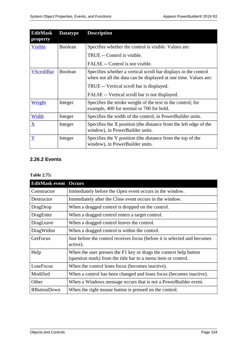
System Object Properties, Events, and Functions Appeon PowerBuilder® 2019 R2
Objects and Controls Page 104
EditMaskproperty
Datatype Description
Visible Boolean Specifies whether the control is visible. Values are:
TRUE -- Control is visible.
FALSE -- Control is not visible.
VScrollBar Boolean Specifies whether a vertical scroll bar displays in the controlwhen not all the data can be displayed at one time. Values are:
TRUE -- Vertical scroll bar is displayed.
FALSE -- Vertical scroll bar is not displayed.
Weight Integer Specifies the stroke weight of the text in the control; forexample, 400 for normal or 700 for bold.
Width Integer Specifies the width of the control, in PowerBuilder units.
X Integer Specifies the X position (the distance from the left edge of thewindow), in PowerBuilder units.
Y Integer Specifies the Y position (the distance from the top of thewindow), in PowerBuilder units.
2.26.2 Events
Table 2.75:
EditMask event Occurs
Constructor Immediately before the Open event occurs in the window.
Destructor Immediately after the Close event occurs in the window.
DragDrop When a dragged control is dropped on the control.
DragEnter When a dragged control enters a target control.
DragLeave When a dragged control leaves the control.
DragWithin When a dragged control is within the control.
GetFocus Just before the control receives focus (before it is selected and becomesactive).
Help When the user presses the F1 key or drags the context help button(question mark) from the title bar to a menu item or control.
LoseFocus When the control loses focus (becomes inactive).
Modified When a control has been changed and loses focus (becomes inactive).
Other When a Windows message occurs that is not a PowerBuilder event.
RButtonDown When the right mouse button is pressed on the control.

System Object Properties, Events, and Functions Appeon PowerBuilder® 2019 R2
Objects and Controls Page 105
2.26.3 Functions
Table 2.76:
EditMaskfunction
Datatypereturned
Description
CanUndo Boolean Returns true if the Undo function can be used to undo the lastedit in the control and returns false if it cannot.
ClassName String Returns the name assigned to the control.
Clear Integer Clears the selected text (if any) from the control but does notplace it in the clipboard.
Copy Integer Copies (but does not delete) the selected text (if any) from thecontrol to the clipboard.
Cut Integer Cuts (deletes) the selected text (if any) from the control andplaces it in the clipboard.
Drag Integer Starts or ends the dragging of the control.
GetContextServiceInteger Creates a reference to a context-specific instance of thespecified service.
GetData Integer Obtains the unformatted data in the control.
GetParent PowerObject Returns a reference to the name of the parent object.
Hide Integer Makes the control invisible.
LineCount Integer Returns the number of lines in the EditMask in the window.
LineLength Integer Returns the length of the line in which the cursor is positioned.
Move Integer Moves the control to the specified location.
Paste Integer Inserts the contents of the clipboard at the insertion point in thespecified control.
PointerX Integer Returns the distance of the pointer from the left edge of thecontrol.
PointerY Integer Returns the distance of the pointer from the top of the control.
Position Integer Returns the position of the insertion point in the control.
PostEvent Boolean Adds the specified event to the end of the message queue for thecontrol.
Print Integer Prints the control.
ReplaceText Integer Replaces the currently selected text with the specified string. Ifno text is selected, inserts the text at the insertion point.
Resize Integer Changes the width and height of the control.
Scroll Integer Moves the contents of the control up or down the specifiednumber of lines.
SelectedLengthInteger Returns the total number of characters and spaces (length) in theselected text in the control.
SelectedLine Integer Returns the number of the line where the insertion point islocated in the control.

System Object Properties, Events, and Functions Appeon PowerBuilder® 2019 R2
Objects and Controls Page 106
EditMaskfunction
Datatypereturned
Description
SelectedStart Integer Returns the position of the first character in the selected text inthe control.
SelectedText String Determines what if any text is selected in the control.
SelectText Integer Selects text in the control beginning at the specified positionand continuing for the specified number of characters.
SetFocus Integer Sets focus to the control.
SetMask Integer Specifies the contents and datatype of the edit mask for thecontrol.
SetPosition Integer Specifies the position of the control in the front-to-back order ofthe window.
SetRedraw Integer Controls automatic redrawing of the control after each change inits properties.
Show Integer Makes the control visible.
TextLine String Returns the entire text of the line in which the insertion point iscurrently located.
TriggerEvent Integer Triggers a specified event in the control and executes the scriptfor the event.
TypeOf Object Returns the type of the control.
Undo Integer Cancels the previous editing function performed in the control.
2.27 EnumerationDefinition object
Information about the type of a variable when it is an enumerated datatype.EnumerationDefinition is inherited from TypeDefinition. It has no events.
2.27.1 Properties
Table 2.77:
EnumerationDefinitionproperty
Datatype Description
Category TypeCategorySpecifies whether the type is simple, enumerated, or a class orstructure. Values are:
SimpleType!
EnumeratedType!
ClassOrStructureType!
ClassDefinitionPowerObject An object of type PowerObject containing information about theclass definition of the object or control.
DataTypeOf String The system class name or simple datatype of the variable.DataTypeOf is a string representation of a value of the Object

System Object Properties, Events, and Functions Appeon PowerBuilder® 2019 R2
Objects and Controls Page 107
EnumerationDefinitionproperty
Datatype Description
enumerated datatype. Values are lowercase with no exclamationpoint. Sample values include:
window
string
any
dropdownlistbox
For objects you have defined, the datatype is the system classfrom which your object is inherited.
Enumeration[ ]EnumerationItemDefinitionAn array of the name-value pairs for all the items in theenumeration.
IsStructure Boolean Indicates whether the type is a structure. Always FALSE.
IsSystemTypeBoolean Indicates whether the class is a system class -- that is, one ofthe classes defined within PowerBuilder as opposed to a classdefined in a PBL by a user.
IsVariableLengthBoolean Specifies whether the datatype has a fixed size. Always true.
Values are:
TRUE -- The datatype is of variable length, meaning thedatatype is a string, any, blob, or unbounded array.
FALSE -- The datatype is a fixed length.
IsVisualType Boolean Indicates whether the type is a visual or nonvisual type. Alwaysfalse.
LibraryName String The fully qualified name of the library the class was loadedfrom. The library can no longer contain the class. If a programmanipulates the contents of libraries, the class could have beenmoved or deleted after it was loaded.
Name String The name of the class. For a nested class, the name is returnedin the form of libraryEntryName`className.
2.27.2 Functions
Table 2.78:
EnumerationDefinitionfunction
Datatypereturned
Description
ClassName String Returns the name assigned to the object.
GetContextServiceInteger Creates a reference to a context-specific instance of thespecified service.
GetParent PowerObject Returns a reference to the name of the parent object.
TypeOf Object Returns the type of the object.

System Object Properties, Events, and Functions Appeon PowerBuilder® 2019 R2
Objects and Controls Page 108
2.28 EnumerationItemDefinition object
A class that provides information about the value names and the associated numeric valuesfor an enumerated datatype. It is used in the EnumerationDefinition class. It has no events.
2.28.1 Properties
Table 2.79:
EnumerationItemDefinitionproperty
Datatype Description
ClassDefinitionPowerObject An object of type PowerObject containing information about theclass definition of the object or control.
Name String The name of an enumerated value. For example, Left! is anamed value of the enumerated datatype Alignment.
Value Long The numeric value associated with the name. For example, 0 isthe value PowerBuilder associates with Left!
The numeric value is important only if you are constructingsource code for an object. Within PowerBuilder, you use thenamed value so that the datatype is correct.
2.28.2 Functions
Table 2.80:
EnumerationItemDefinitionfunction
Datatypereturned
Description
ClassName String Returns the name assigned to the object.
GetContextServiceInteger Creates a reference to a context-specific instance of thespecified service.
GetParent PowerObject Returns a reference to the name of the parent object.
TypeOf Object Returns the type of the object.
2.29 Environment object
The Environment object is a system structure used to hold information about the computingplatform the PowerBuilder application is running on. You populate the Environment objectusing the GetEnvironment function.
The Environment object has no events.
For more information about the GetEnvironment function, see Section 10.249,“GetEnvironment”.

System Object Properties, Events, and Functions Appeon PowerBuilder® 2019 R2
Objects and Controls Page 109
2.29.1 Properties
Table 2.81:
Environmentproperty
Datatype Description
CharSet CharSet(enumerated)
The international character set used by PowerBuilder. Valuesinclude:
• CharSetAnsi!
• CharSetUnicode!
• CharSetDBCS!
• CharSetDBCSJapanese!
The values CharSetAnsiArabic! and CharSetAnsiHebrew! arenot valid choices in PowerBuilder 6 or later.
ClassDefinitionPowerObject An object of type PowerObject containing information about theclass definition of the object or control.
CPUType CPUTypes(enumerated)
The type of CPU. For a complete list of CPUTypes values, seethe Enumerated tab of the Browser.
Language LanguageID
(enumerated)
Specifies the value of the language setting for the machine. Fora complete list of LanguageID values, see the Enumerated tab ofthe Browser.
MachineCodeBoolean Specifies whether the application executable is machine code(compiled). Values are:
TRUE -- Executable is machine code.
FALSE -- Executable is not machine code (pseudo-code).
NumberOfColorsLongLong Number of colors on the screen.
OSFixesRevisionInteger The maintenance version of the operating system.
OSMajorRevisionInteger The major version of the operating system. For example, thisvalue would be 6 for Windows Server 2012 or Windows 7 or8.1, and 10 for Windows Server 2016 or 2019, or Windows 10.For a complete list, see Operating System Version on MSDN.
OSMinorRevisionInteger The point release of the operating system. For example, thisvalue would be 0 for Windows 10, or Windows Server 2019,2016, or 2008, 1 for Windows 7, 2 for Windows 8. For acomplete list, see Operating System Version on MSDN.
OSType OSTypes(enumerated)
Operating system or environment. For a complete list ofOSType values, see the Enumerated tab of the Browser.
PBBuildNumberInteger The build number of this version of PowerBuilder.
PBFixesRevisionInteger The maintenance version of PowerBuilder.
PBMajorRevisionInteger The major version of PowerBuilder.

System Object Properties, Events, and Functions Appeon PowerBuilder® 2019 R2
Objects and Controls Page 110
Environmentproperty
Datatype Description
PBMinorRevisionInteger The point release of PowerBuilder. 0 indicates GA, 1 indicatesR2, and 2 indicates R3.
PBType PBTypes(enumerated)
Version of the PowerBuilder product. For a complete list ofPBType values, see the Enumerated tab of the Browser.
ProcessBitnessInteger Identifies whether the application is a 32-bit or 64-bit process.Values are:
32 -- stands for 32-bit
64 -- stands for 64-bit
ScreenHeight Long Height of the screen in pixels.
ScreenWidth Long Width of the screen in pixels.
Win16(obsolete)
Boolean Indicates the type of the operating system in which theapplication executable is running. Values are:
TRUE -- Executable is running under a 16-bit operating system.
FALSE -- Executable is running under a 32-bit operatingsystem.
2.29.2 Functions
Table 2.82:
Environmentfunction
Datatypereturned
Description
ClassName String Returns the name assigned to the object.
GetContextServiceInteger Creates a reference to a context-specific instance of thespecified service.
GetParent PowerObject Returns a reference to the name of the parent object.
TypeOf Object Returns the type of the object.
2.30 Error object
The Error object is used to record execution-time errors. You can access the Error objectfrom a script (typically in the SystemError event) to learn which error occurred and where itoccurred. You can also customize your own version of the Error object by defining a classuser object inherited from the built-in Error object.
For more information about creating a custom Error object, see Chapter 15, Working withUser Objects. For information on using try-catch blocks to catch runtime and user-definedexceptions, see Section 3.9, “Exception handling in PowerBuilder” and the Section 7.16,“TRY...CATCH...FINALLY...END TRY”.
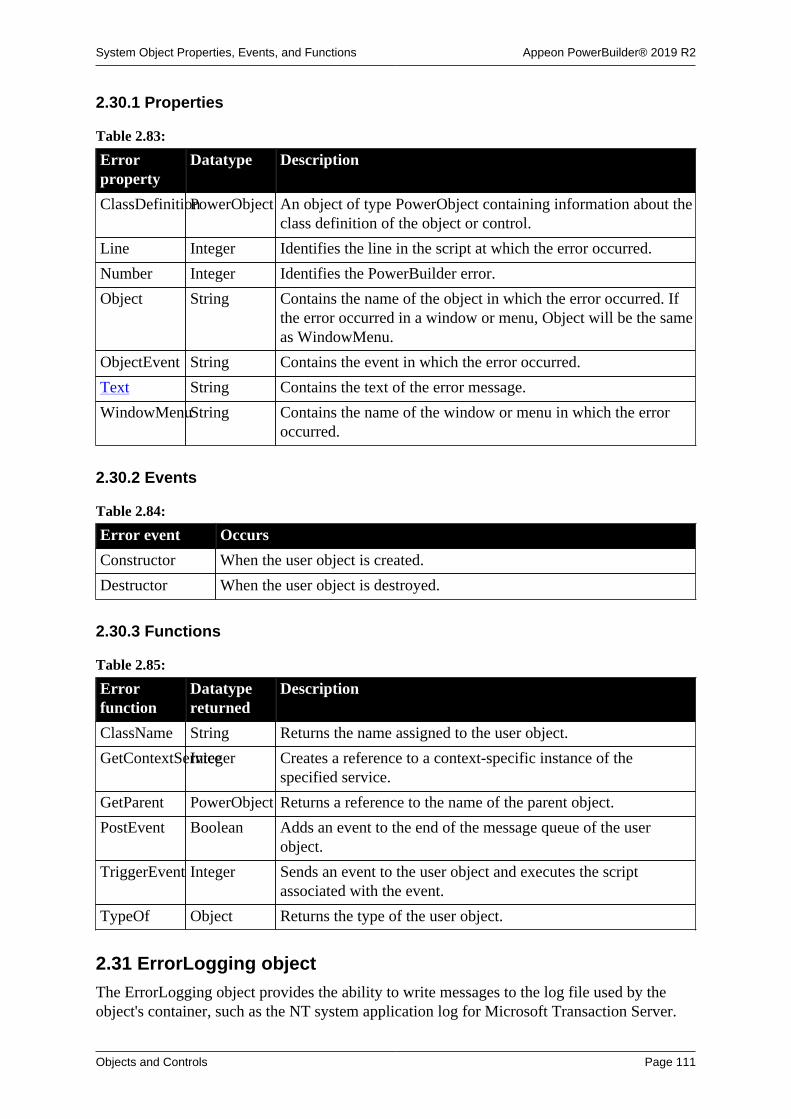
System Object Properties, Events, and Functions Appeon PowerBuilder® 2019 R2
Objects and Controls Page 111
2.30.1 Properties
Table 2.83:
Errorproperty
Datatype Description
ClassDefinitionPowerObject An object of type PowerObject containing information about theclass definition of the object or control.
Line Integer Identifies the line in the script at which the error occurred.
Number Integer Identifies the PowerBuilder error.
Object String Contains the name of the object in which the error occurred. Ifthe error occurred in a window or menu, Object will be the sameas WindowMenu.
ObjectEvent String Contains the event in which the error occurred.
Text String Contains the text of the error message.
WindowMenuString Contains the name of the window or menu in which the erroroccurred.
2.30.2 Events
Table 2.84:
Error event Occurs
Constructor When the user object is created.
Destructor When the user object is destroyed.
2.30.3 Functions
Table 2.85:
Errorfunction
Datatypereturned
Description
ClassName String Returns the name assigned to the user object.
GetContextServiceInteger Creates a reference to a context-specific instance of thespecified service.
GetParent PowerObject Returns a reference to the name of the parent object.
PostEvent Boolean Adds an event to the end of the message queue of the userobject.
TriggerEvent Integer Sends an event to the user object and executes the scriptassociated with the event.
TypeOf Object Returns the type of the user object.
2.31 ErrorLogging objectThe ErrorLogging object provides the ability to write messages to the log file used by theobject's container, such as the NT system application log for Microsoft Transaction Server.

System Object Properties, Events, and Functions Appeon PowerBuilder® 2019 R2
Objects and Controls Page 112
2.31.1 Properties
Table 2.86:
ErrorLoggingproperty
Datatype Description
ClassDefinitionPowerObject An object of type PowerObject containing information about theclass definition of the object or control.
2.31.2 Events
Table 2.87:
ErrorLoggingevent
Occurs
Constructor When the object is created.
Destructor When the object is destroyed.
2.31.3 Functions
Table 2.88:
ErrorLoggingfunction
Datatypereturned
Description
ClassName String Returns the name assigned to the object.
GetContextServiceInteger Creates a reference to a context-specific instance of thespecified service.
GetParent PowerObject Returns a reference to the name of the parent object.
Log None Writes a string to the log file maintained by the object'scontainer.
PostEvent Boolean Adds an event to the end of the message queue for the object.
TriggerEvent Integer Triggers a specific event in the object and executes the script forthe event.
TypeOf Object Returns the type of the object.
2.32 Exception objectThe Exception object inherits from the Throwable object and is the base class for user-defined or "checked" exceptions. A function or user-defined event must declare each checkedexception it throws, and a caller to a function or event that throws a checked exception musteither catch the exception or throw the exception itself.
Unlike RuntimeError objects, Exception objects do not have built-in properties that provideinformation about the location where the error occurred.
The CORBAUserException system object inherits from Exception. This object maps to theCORBA_USER_EXCEPTION object that can be thrown from CORBA applications whenuser-defined exceptions have not been handled. Unlike the CORBASystemException objectand its descendants, the CORBAUserException object is a checked exception and must bedeclared and caught like other checked exceptions.
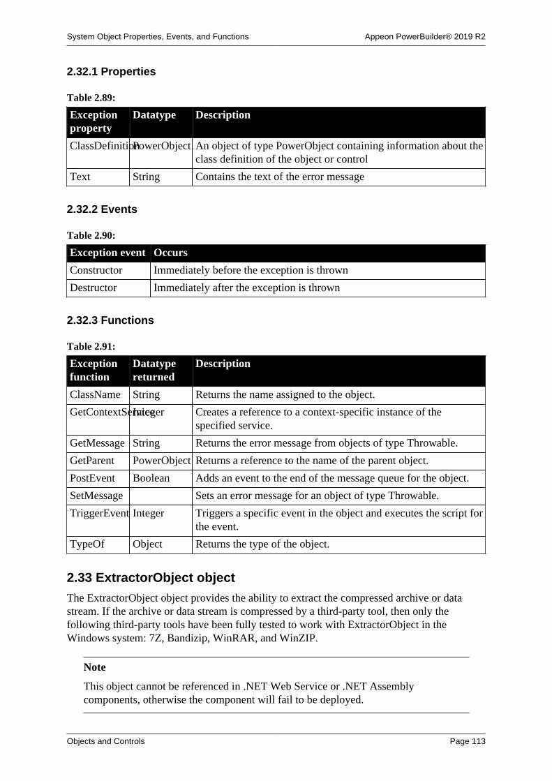
System Object Properties, Events, and Functions Appeon PowerBuilder® 2019 R2
Objects and Controls Page 113
2.32.1 Properties
Table 2.89:
Exceptionproperty
Datatype Description
ClassDefinitionPowerObject An object of type PowerObject containing information about theclass definition of the object or control
Text String Contains the text of the error message
2.32.2 Events
Table 2.90:
Exception event Occurs
Constructor Immediately before the exception is thrown
Destructor Immediately after the exception is thrown
2.32.3 Functions
Table 2.91:
Exceptionfunction
Datatypereturned
Description
ClassName String Returns the name assigned to the object.
GetContextServiceInteger Creates a reference to a context-specific instance of thespecified service.
GetMessage String Returns the error message from objects of type Throwable.
GetParent PowerObject Returns a reference to the name of the parent object.
PostEvent Boolean Adds an event to the end of the message queue for the object.
SetMessage Sets an error message for an object of type Throwable.
TriggerEvent Integer Triggers a specific event in the object and executes the script forthe event.
TypeOf Object Returns the type of the object.
2.33 ExtractorObject object
The ExtractorObject object provides the ability to extract the compressed archive or datastream. If the archive or data stream is compressed by a third-party tool, then only thefollowing third-party tools have been fully tested to work with ExtractorObject in theWindows system: 7Z, Bandizip, WinRAR, and WinZIP.
Note
This object cannot be referenced in .NET Web Service or .NET Assemblycomponents, otherwise the component will fail to be deployed.

System Object Properties, Events, and Functions Appeon PowerBuilder® 2019 R2
Objects and Controls Page 114
2.33.1 Properties
Table 2.92:
ExtractorObjectproperty
Datatype Description
ClassDefinitionPowerObject An object of type PowerObject containing information about theclass definition of the object or control.
Password String Specifies the password when the archive is encrypted.
2.33.2 Events
Table 2.93:
ExtractorObjectevent
Occurs
Constructor Immediately before the Open event occurs in the window.
Destructor Immediately after the Close event occurs in the window.
Error Occurs when an error is found in the file extraction operation.
Finished Occurs when the file extraction is completed.
ProcessingFile Occurs during the file extraction process. This event can be used todisplay the full path name of the file that is being decompressed.
SizeCompleted Occurs during the file extraction process. This event can be used todisplay the total number of bytes in the file that has been decompressed.
Start Occurs before the file extraction starts. This event can be used to displaythe total number of bytes in the file that will be decompressed.
2.33.3 Functions
Table 2.94:
ExtractorObjectfunction
Datatypereturned
Description
Cancel Integer Cancels the file extraction operation. Only used for theasynchronous interface.
ClassName String Returns the name assigned to the object.
Extract Integer Extracts the compressed archive or data stream.
GetContextServiceInteger Creates a reference to a context-specific instance of thespecified service.
GetFilesCountLong Gets the number of files contained in the archive.
GetFilesList Integer Gets the list of files in the compressed package.
GetParent PowerObject Returns a reference to the name of the parent object.
PostEvent Boolean Adds an event to the end of the message queue for the control.
TriggerEvent Integer Triggers a specified event in the control and executes the scriptfor the event.
TypeOf Object Returns the type of the object.

System Object Properties, Events, and Functions Appeon PowerBuilder® 2019 R2
Objects and Controls Page 115
2.34 Graph object
A graph is a representation of a series of data points (values). The graph can have a singleseries of values or multiple series.
2.34.1 Properties
Table 2.95:
Graphproperty
Datatype Description
AccessibleDescriptionString A description of the control and/or its purpose for use byaccessibility tools such as readers for visually impaired users.
AccessibleNameString A label that briefly describes the control, such as the text in abutton or the name of a menu item.
AccessibleRoleAccessibleRole(enumerated)
Describes what kind of user interface element the control is.
BackColor Long Specifies the numeric value of the background color: -2to 16,777,215. For more information about color, seeSection 10.636, “RGB”.
Border Boolean Specifies whether the control has a border.
BorderStyle BorderStyle(enumerated)
Specifies the style of the border of the control. Values are:
StyleBox!
StyleLowered!
StyleRaised!
StyleShadowBox!
BringToTop Boolean Specifies whether PowerBuilder moves the control to the top ofthe front-to-back order of the window or DataWindow control.
Category grAxis Specifies the properties of the category axis of the graph.
CategorySort grSortType Specifies how the categories are sorted.
ClassDefinitionPowerObject An object of type PowerObject containing information about theclass definition of the object or control.
Depth Integer Specifies the percent the depth is of the width of the graph.
DragAuto Boolean Specifies whether PowerBuilder puts the graph automaticallyinto Drag mode. Values are:
TRUE -- When the control is clicked, the control isautomatically in Drag mode.
FALSE -- When the control is clicked, the control is notautomatically in Drag mode. You have to manually put thecontrol into Drag mode by using the Drag function.
DragIcon String Specifies the name of the stock icon or the file containing theicon you want to display when the user drags a control (theICO file). The default icon is a box the size of the control.

System Object Properties, Events, and Functions Appeon PowerBuilder® 2019 R2
Objects and Controls Page 116
Graphproperty
Datatype Description
When the user drags a control, the icon displays when thecontrol is over an area in which the control can be dropped (avalid drop area). When the control is over an area that is not avalid drop area, the No-Drop icon displays.
Elevation Integer Specifies the angle of front-to-back elevation.
Enabled Boolean Specifies whether the control is enabled (can be selected).Values are:
TRUE -- Control can be selected.
FALSE -- Control cannot be selected.
FocusRectangleBoolean Specifies whether a dotted rectangle (the focus rectangle)frames the control when it has focus. Values are:
TRUE -- Control will be framed when it has focus.
FALSE -- Control will not be framed when it has focus.
GraphType grGraphType(enumerated)
Specifies the type of the graph. Values are:
Area3D!
AreaGraph!
Bar3DGraph!
Bar3DObjGraph!
BarGraph!
BarStack3DObjGraph!
BarStackGraph!
Col3DGraph!
Col3DObjGraph!
ColGraph!
ColStack3DObjGraph!
ColStackGraph!
Line3D!
LineGraph!
Pie3D!
PieGraph!
ScatterGraph!
Height Integer Specifies the height of the control, in PowerBuilder units.
Legend grLegendType(enumerated)
Specifies the alignment of the text in the graph legend. Valuesare:
AtBottom!

System Object Properties, Events, and Functions Appeon PowerBuilder® 2019 R2
Objects and Controls Page 117
Graphproperty
Datatype Description
AtLeft!
AtRight!
AtTop!
NoLegend!
LegendDispAttrgrDispAttr Specifies the type style for the text in the graph legend,including the text style, size, color, and rotation.
OverlapPercentInteger Specifies the percent of the width of the data markers by whichdifferent series in a graph overlap.
Perspective Integer Specifies the distance the graph is from the front of the window.
PieDispAttr grDispAttr Specifies properties of the text in pie graph labels, including thetext style, size, color, and rotation.
Pointer String Contains the name of the stock pointer or the file containing thepointer used for the graph.
Render3D Boolean Indicates whether the 3D graph is rendered in the DirectX style.
Rotation Integer Specifies how much to rotate the graph from left to right.
Series grAxis Specifies the series in the graph.
SeriesSort grSortType Specifies how the series are sorted.
ShadeColor Long Specifies the color used for the shading in the graph.
Spacing Integer Specifies the space between data markers in the graph as apercent.
TabOrder Integer Specifies the tab value of the control in the tabbing sequence (0means the user cannot tab to the control).
Tag String Specifies the tag value of the control.
TextColor Long Specifies the color to be used for the text in the control.
Title String Specifies the text of the title for the graph.
TitleDispAttr grDispAttr Specifies the type style for the text in the graph title, includingthe text style, size, color, and rotation.
Values grAxis Specifies the values of the value axis of the graph.
Visible Boolean Specifies whether the control is visible. Values are:
TRUE -- Control is visible.
FALSE -- Control is not visible.
Width Integer Specifies the stroke weight of text in the control; for example,400 for normal or 700 for bold.
X Integer Specifies the X position (the distance from the left edge of theparent window), in PowerBuilder units.
Y Integer Specifies the Y position (the distance from the top of the parentwindow), in PowerBuilder units.

System Object Properties, Events, and Functions Appeon PowerBuilder® 2019 R2
Objects and Controls Page 118
2.34.2 Events
Table 2.96:
Graph event Occurs
Clicked When the control is clicked (selected or unselected)
Constructor Immediately before the Open event occurs in the window
Destructor Immediately after the Close event occurs in the window
DoubleClicked When the control is double-clicked (selected or unselected)
DragDrop When a dragged control is dropped on the control
DragEnter When a dragged control enters the control
DragLeave When dragged control leaves the control
DragWithin When a dragged control is within the control
GetFocus Just before the control receives focus (before it is selected and becomesactive)
Help When the user presses the F1 key or drags the context help button(question mark) from the title bar to a menu item or control
LoseFocus When the control loses focus (becomes inactive)
Other When a Windows message occurs that is not a PowerBuilder event
RButtonDown When the right mouse button is pressed on the control
2.34.3 Functions
Table 2.97:
Graphfunction
Datatypereturned
Description
AddCategory Integer Adds a category to the graph.
AddData Long Adds a value to the end of the specified series for the graph.
AddSeries Integer Adds a series to the graph and assigns the series a number.
CategoryCountInteger Counts the categories in the graph.
CategoryNameString Obtains the name of the specified category in the graph.
ClassName String Returns the name assigned to the control.
Clipboard Integer Copies the graph in bitmap (BMP) format to the clipboard.
DataCount Long Returns the number of data points in a specified series in thegraph.
DeleteCategoryInteger Deletes the specified category and the data values in the seriesfrom the graph.
DeleteData Integer Deletes the data value in the specified data point in the specifiedseries in the graph.
DeleteSeries Integer Deletes the specified series and the data values in the seriesfrom the graph.
Drag Integer Starts or ends dragging of the control.
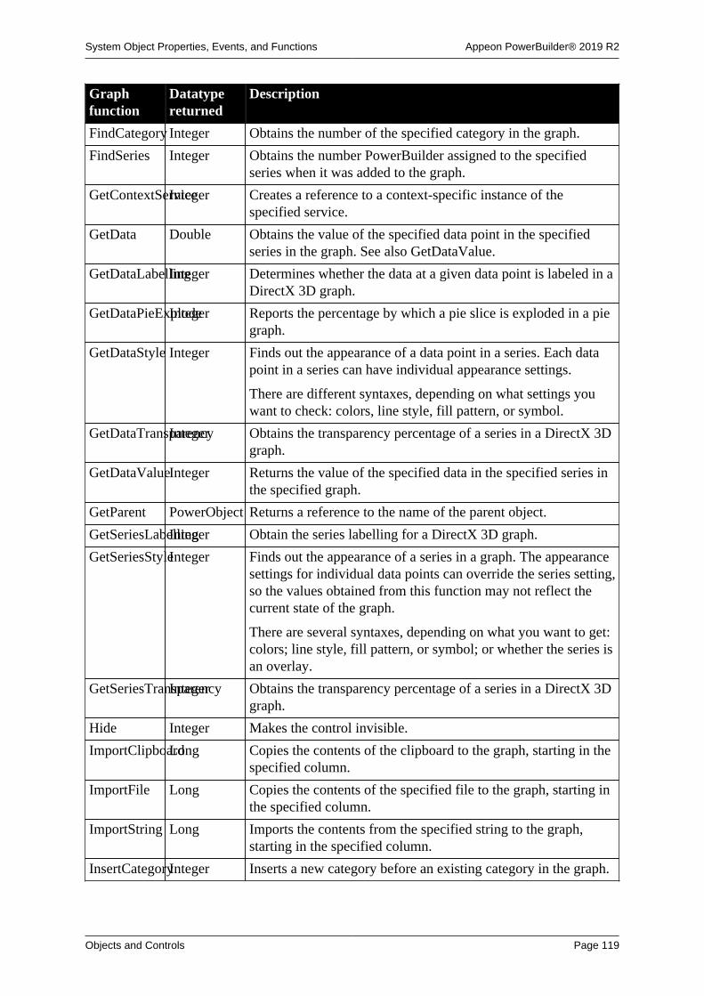
System Object Properties, Events, and Functions Appeon PowerBuilder® 2019 R2
Objects and Controls Page 119
Graphfunction
Datatypereturned
Description
FindCategory Integer Obtains the number of the specified category in the graph.
FindSeries Integer Obtains the number PowerBuilder assigned to the specifiedseries when it was added to the graph.
GetContextServiceInteger Creates a reference to a context-specific instance of thespecified service.
GetData Double Obtains the value of the specified data point in the specifiedseries in the graph. See also GetDataValue.
GetDataLabellingInteger Determines whether the data at a given data point is labeled in aDirectX 3D graph.
GetDataPieExplodeInteger Reports the percentage by which a pie slice is exploded in a piegraph.
GetDataStyle Integer Finds out the appearance of a data point in a series. Each datapoint in a series can have individual appearance settings.
There are different syntaxes, depending on what settings youwant to check: colors, line style, fill pattern, or symbol.
GetDataTransparencyInteger Obtains the transparency percentage of a series in a DirectX 3Dgraph.
GetDataValueInteger Returns the value of the specified data in the specified series inthe specified graph.
GetParent PowerObject Returns a reference to the name of the parent object.
GetSeriesLabellingInteger Obtain the series labelling for a DirectX 3D graph.
GetSeriesStyleInteger Finds out the appearance of a series in a graph. The appearancesettings for individual data points can override the series setting,so the values obtained from this function may not reflect thecurrent state of the graph.
There are several syntaxes, depending on what you want to get:colors; line style, fill pattern, or symbol; or whether the series isan overlay.
GetSeriesTransparencyInteger Obtains the transparency percentage of a series in a DirectX 3Dgraph.
Hide Integer Makes the control invisible.
ImportClipboardLong Copies the contents of the clipboard to the graph, starting in thespecified column.
ImportFile Long Copies the contents of the specified file to the graph, starting inthe specified column.
ImportString Long Imports the contents from the specified string to the graph,starting in the specified column.
InsertCategoryInteger Inserts a new category before an existing category in the graph.

System Object Properties, Events, and Functions Appeon PowerBuilder® 2019 R2
Objects and Controls Page 120
Graphfunction
Datatypereturned
Description
InsertData Long Inserts a new data point into the graph before a specified datapoint and moves existing data points to the right.
InsertSeries Integer Inserts a new series before an existing series in the graph.
ModifyData Integer Changes the value of the specified data point in the specifiedseries in the graph to the specified value, and optionallymodifies the data for the specified tick mark.
Move Integer Moves the control to a specified location.
ObjectAtPointerGrObjectTypeStores the number of the series the pointer is over in the graphand the number of the specified data point in reference values,and identifies the object type.
PointerX Integer Returns the distance of the pointer from the left edge of thecontrol.
PointerY Integer Returns the distance of the pointer from the top of the control.
PostEvent Boolean Adds an event to the end of the message queue for the control.
Print Integer Prints the control.
Reset Integer Deletes data in the graph as specified.
ResetDataColorsInteger Resets the color of a data point to the series color.
Resize Integer Changes the size of the control.
SaveAs Integer Saves the contents of the graph to a file in the specified format.
SeriesCount Integer Determines how many series there are in the graph.
SeriesName String Obtains the name of the specified series in the graph.
SetDataPieExplodeInteger Explodes a pie slice in a pie graph.
SetDataLabellingInteger Set the data label for a DirectX 3D graph.
SetDataStyle Integer Specifies the appearance of a data point in a graph.
There are several syntaxes, depending on what you want to set:colors, line style and width, or fill pattern or symbol.
SetDataTransparencyInteger Sets the transparency percentage of a data point in a series in aDirectX 3D.
SetFocus Integer Sets focus to the control.
SetPosition Integer Specifies the position of the control in the front-to-back order ofthe window.
SetRedraw Integer Controls automatic redrawing of the control after a change in itsproperties.
SetSeriesLabellingInteger Set the series label for a DirectX 3D graph.
SetSeriesStyleInteger Specifies the appearance of a series in a graph.

System Object Properties, Events, and Functions Appeon PowerBuilder® 2019 R2
Objects and Controls Page 121
Graphfunction
Datatypereturned
Description
There are several syntaxes, depending on what you want tochange: colors, line style and width, fill pattern or symbol, orwhether the series is an overlay.
SetSeriesTransparencyInteger Sets the transparency percentage of a series in a DirectX 3Dgraph.
Show Integer Makes the control visible.
TriggerEvent Integer Triggers a specified event in the control and executes the scriptfor the event.
TypeOf Object Returns the type of the control.
2.35 grAxis objectThe PowerBuilder class grAxis is used as part of a graph control. Each graph has threegrAxis objects: Category, Series, and Values.
To refer to a property of an axis, use this syntax:
graphcontrolname.axisname.property
For example:
gr_1.Series.AutoScale
A grAxis object has no events.
2.35.1 Properties
Table 2.98:
grAxisproperty
Datatype Description
AutoScale Boolean Specifies whether PowerBuilder scales the axis automatically.Values are:
TRUE -- Automatically scale.
FALSE -- Do not automatically scale.
ClassDefinitionPowerObject An object of type PowerObject containing information about theclass definition of the object or control.
DataType grAxisDataType(enumerated)
Specifies the datatype of the axis. Values are:
AdtDate!
AdtDateTime!
AdtDefault!
AdtDouble!
AdtText!
AdtTime!

System Object Properties, Events, and Functions Appeon PowerBuilder® 2019 R2
Objects and Controls Page 122
grAxisproperty
Datatype Description
DispAttr grDispAttr(object)
Settings that control the appearance of the text that labels theaxis divisions.
DisplayEveryNLabelsInteger Specifies which major axis divisions to label. For example, 2means label every other tick mark. Use 0 to let the graph selectthe optimum number of labels to use. If the labels are too long,they are clipped.
DropLines LineStyle(enumerated)
Specifies the type of drop line for the axis. Values are:
Transparent! -- No line appears.
Continuous! -- A solid line.
Dash!
Dot!
DashDot!
DashDotDot!
Frame LineStyle(enumerated)
Specifies the type of line used for the frame. See DropLines inthis table for the list of values.
Label String Specifies the axis label.
LabelDispAttrgrDispAttr(object)
Settings that control the appearance of the axis label text.
MajorDivisionsInteger Specifies the number of major divisions on the axis.
MajorGridLineLineStyle(enumerated)
Specifies the type of line for the major grid.
See DropLines in this table for the list of values.
MajorTic grTicType(enumerated)
Specifies the type of the major tick marks. Values are:
NoTic!
Inside!
Outside!
Straddle!
MaximumValueDouble Specifies the maximum value for the axis when its datatype isnumeric.
MaxValDateTimeDateTime Specifies the maximum value for the axis when its datatype isdate or time.
MinimumValueDouble Specifies the minimum value for the axis when its datatype isnumeric.
MinorDivisionsInteger Specifies the number of minor divisions on the axis.
MinorGridLineLineStyle(enumerated)
Specifies the type of line for the minor grid. See DropLines inthis table for the list of values.
MinorTic grTicType(enumerated)
Specifies the type of the minor tick marks. Values are:

System Object Properties, Events, and Functions Appeon PowerBuilder® 2019 R2
Objects and Controls Page 123
grAxisproperty
Datatype Description
NoTic!
Inside!
Outside!
Straddle!
MinValDateTimeDateTime Specifies the minimum value for the axis when its datatype isdate or time.
OriginLine LineStyle(enumerated)
Specifies the type of origin line for the axis. See DropLines inthis table for the list of values.
PrimaryLine LineStyle(enumerated)
Specifies the type of primary line for the axis. See DropLines inthis table for the list of values.
RoundTo Double Specifies the value to which you want to round the axis values.
RoundToUnitgrRoundToType(enumerated)
Specifies the units for the rounding value. The units must beappropriate for the axis datatype. Values are listed below.
For an axis of any datatype:
RndDefault!
For an axis of any numeric datatype:
RndNumber!
For an axis of type date or DateTime:
RndYears!
RndMonths!
RndDays!
For an axis of type time or DateTime:
RndHours!
RndMinutes!
RndSeconds!
RndMicroseconds!
ScaleType grScaleType(enumerated)
Specifies the type of scale used for the axis. Values are:
Linear!
Log10!
Loge!
ScaleValue grScaleValue(enumerated)
Specifies the scale of values on the axis. Values are:
Actual!
Cumulative!
Percentage!

System Object Properties, Events, and Functions Appeon PowerBuilder® 2019 R2
Objects and Controls Page 124
grAxisproperty
Datatype Description
CumPercent!
SecondaryLineLineStyle(enumerated)
Specifies the type of secondary line for the axis. See DropLinesin this table for the list of values.
ShadeBackEdgeBoolean Specifies whether the back edge of the axis is shaded. Valuesare:
TRUE -- Shaded.
FALSE -- Not shaded.
2.35.2 Functions
Table 2.99:
grAxisfunction
Datatypereturned
Description
ClassName String Returns the name assigned to the object
GetContextServiceInteger Creates a reference to a context-specific instance of thespecified service
GetParent PowerObject Returns a reference to the name of the parent object
TypeOf Object Returns the type of the object
2.36 grDispAttr objectThe PowerBuilder class grDispAttr is used to specify the appearance of text objects ona graph. There are grDispAttr objects for graph Titles, Legends, Pie Graph text, and two(DispAttr and LabelDispAttr) for each of the three axes (Category, Series, and Value) in agraph.
To refer to a property of a grDispAttr property, use this syntax:
graphcontrolname.axisname.grdispattrname.property
For example:
gr_1.Series.DispAttr.Italicgr_1.Category.LabelDispAttr.DisplayExpression
A grDispAttr object has no events.
2.36.1 Properties
Table 2.100:
grDispAttrproperty
Datatype Description
Alignment Alignment(enumerated)
Specifies the alignment of the text. Values are:
Center!
Justify!
Left!
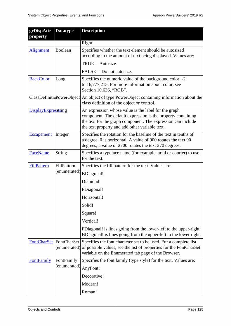
System Object Properties, Events, and Functions Appeon PowerBuilder® 2019 R2
Objects and Controls Page 125
grDispAttrproperty
Datatype Description
Right!
Alignment Boolean Specifies whether the text element should be autosizedaccording to the amount of text being displayed. Values are:
TRUE -- Autosize.
FALSE -- Do not autosize.
BackColor Long Specifies the numeric value of the background color: -2to 16,777,215. For more information about color, seeSection 10.636, “RGB”.
ClassDefinitionPowerObject An object of type PowerObject containing information about theclass definition of the object or control.
DisplayExpressionString An expression whose value is the label for the graphcomponent. The default expression is the property containingthe text for the graph component. The expression can includethe text property and add other variable text.
Escapement Integer Specifies the rotation for the baseline of the text in tenths ofa degree. 0 is horizontal. A value of 900 rotates the text 90degrees; a value of 2700 rotates the text 270 degrees.
FaceName String Specifies a typeface name (for example, arial or courier) to usefor the text.
FillPattern FillPattern(enumerated)
Specifies the fill pattern for the text. Values are:
BDiagonal!
Diamond!
FDiagonal!
Horizontal!
Solid!
Square!
Vertical!
FDiagonal! is lines going from the lower-left to the upper-right.BDiagonal! is lines going from the upper-left to the lower right.
FontCharSet FontCharSet(enumerated)
Specifies the font character set to be used. For a complete listof possible values, see the list of properties for the FontCharSetvariable on the Enumerated tab page of the Browser.
FontFamily FontFamily(enumerated)
Specifies the font family (type style) for the text. Values are:
AnyFont!
Decorative!
Modern!
Roman!

System Object Properties, Events, and Functions Appeon PowerBuilder® 2019 R2
Objects and Controls Page 126
grDispAttrproperty
Datatype Description
Script!
Swiss!
FontPitch FontPitch(enumerated)
Specifies the pitch (character spacing) for the text. Values are:
Default!
Fixed!
Variable!
Format String Specifies the display format for the text.
Italic Boolean Specifies whether the text is italic. Values are:
TRUE -- Text is italic.
FALSE -- Text is not italic.
TextColor Long Specifies the color of the text. The color is a numeric value:-2 to 16,777,215. For more information about color, seeSection 10.636, “RGB”.
TextSize Integer Specifies the point size of the text. For backward compatibility,the size is stored as a negative number; for example, 10-pointtext size is stored as -10.
Underline Boolean Specifies whether the text is underlined. Values are:
TRUE -- Text is underlined.
FALSE -- Text is not underlined.
Weight Integer Specifies the stroke weight of the text. Sample values are 400for normal or 700 for bold.
2.36.2 Functions
Table 2.101:
grDispAttrfunction
Datatypereturned
Description
ClassName String Returns the name assigned to the user object.
GetContextServiceInteger Creates a reference to a context-specific instance of thespecified service.
GetParent PowerObject Returns a reference to the name of the parent object.
TypeOf Object Returns the type of the user object.
2.37 GroupBox controlA GroupBox is a box used to group related controls. For example, you can use a GroupBoxto group a series of RadioButtons or CommandButtons. The user cannot select the GroupBoxbut can select controls within the GroupBox. If the GroupBox contains RadioButtons, theuser can select only one RadioButton in the GroupBox at a time.

System Object Properties, Events, and Functions Appeon PowerBuilder® 2019 R2
Objects and Controls Page 127
When you hide or show a GroupBox, PowerBuilder does not automatically hide or show thecontrols in the GroupBox.
2.37.1 Properties
Table 2.102:
GroupBoxproperty
Datatype Description
AccessibleDescriptionString A description of the control and/or its purpose for use byaccessibility tools such as readers for visually impaired users.
AccessibleNameString A label that briefly describes the control, such as the text in abutton or the name of a menu item.
AccessibleRoleAccessibleRole(enumerated)
Describes what kind of user interface element the control is.
BackColor Long Specifies the numeric value of the background color: -2to 16,777,215. For more information about color, seeSection 10.636, “RGB”.
BorderStyle BorderStyle(enumerated)
Specifies the style of the border of the control. Values are:
StyleLowered!
StyleRaised!
BringToTop Boolean Specifies whether PowerBuilder moves the control to the top ofthe front-to-back order of the window.
ClassDefinitionPowerObject An object of type PowerObject containing information about theclass definition of the object or control.
DragAuto Boolean Specifies whether PowerBuilder puts the control automaticallyinto Drag mode. Values are:
TRUE -- When the control is clicked, the control isautomatically in Drag mode.
FALSE -- When the control is clicked, the control is notautomatically in Drag mode. You have to manually put thecontrol into Drag mode by using the Drag function.
DragIcon String Specifies the name of the stock icon or the file containing theicon you want to display when the user drags the control (theICO file). The default icon is a box the size of the control.
When the user drags the control, the icon displays when thecontrol is over an area in which the control can be dropped (avalid drop area). When the control is over an area that is not avalid drop area, the No-Drop icon displays.
Enabled Boolean Specifies whether the text of the GroupBox is visible or grayed.Values are:
TRUE -- Text is visible.
FALSE -- Text is grayed.

System Object Properties, Events, and Functions Appeon PowerBuilder® 2019 R2
Objects and Controls Page 128
GroupBoxproperty
Datatype Description
FaceName String Specifies the name of the typeface in which the text of thecontrol displays (for example, arial or courier).
FontCharSet FontCharSet(enumerated)
Specifies the font character set used for the text in the control.For a complete list of possible values, see the list of propertiesfor the FontCharSet variable on the Enumerated tab page of theBrowser.
FontFamily FontFamily(enumerated)
Specifies the font family (type style) used for the text in thecontrol. Values are:
AnyFont!
Decorative!
Modern!
Roman!
Script!
Swiss!
FontPitch FontPitch(enumerated)
Specifies the pitch (spacing) of the font used for the text in thecontrol. Values are:
Default!
Fixed!
Variable!
Height Integer Specifies the height of the control, in PowerBuilder units.
Italic Boolean Indicates whether the text in the control is italic. Values are:
TRUE -- Text is italic.
FALSE -- Text is not italic.
Pointer String Specifies the name of the stock pointer or the file containing thepointer used for the control.
RightToLeft Boolean Specifies that characters should be displayed in right-to-leftorder. The application must be running on an operating systemthat supports right-to-left display. Values are:
TRUE -- Characters display in right-to-left order.
FALSE -- Characters display in left-to-right order.
TabOrder Integer Specifies the tab value of the control within the window (0means the user cannot tab to the control).
Tag String Specifies the tag value assigned to the control.
Text String Specifies the text that displays in the control title.

System Object Properties, Events, and Functions Appeon PowerBuilder® 2019 R2
Objects and Controls Page 129
GroupBoxproperty
Datatype Description
TextColor Long Specifies the numeric value of the color used for text:-2 to 16,777,215. For more information about color, seeSection 10.636, “RGB”.
TextSize Integer Specifies the size of the text in the control, in points. Forbackward compatibility, the size is stored as a negative number;for example, 10-point text size is stored as -10.
Underline Boolean Indicates whether the text in the control is underlined. Valuesare:
TRUE -- Text is underlined.
FALSE -- Text is not underlined.
Visible Boolean Specifies whether the control is visible. Values are:
TRUE -- Control is visible.
FALSE -- Control is not visible.
Weight Integer Specifies the stroke weight of the text in the control; forexample, 400 for normal or 700 for bold.
Width Integer Specifies the width of the control, in PowerBuilder units.
X Integer Specifies the X position (the distance from the left edge of thewindow), in PowerBuilder units.
Y Integer Specifies the Y position (the distance from the top of thewindow), in PowerBuilder units.
2.37.2 Events
Table 2.103:
GroupBox event Occurs
Constructor Immediately before the Open event occurs in the window
Destructor Immediately after the Close event occurs in the window
Help When the user presses the F1 key or drags the context help button(question mark) from the title bar to a menu item or control
Other When a Windows message occurs that is not a PowerBuilder event
2.37.3 Functions
Table 2.104:
GroupBoxfunction
Datatypereturned
Description
ClassName String Returns the name assigned to the control.
Drag Integer Starts or ends the dragging of the control.
GetContextServiceInteger Creates a reference to a context-specific instance of thespecified service.

System Object Properties, Events, and Functions Appeon PowerBuilder® 2019 R2
Objects and Controls Page 130
GroupBoxfunction
Datatypereturned
Description
GetParent PowerObject Returns a reference to the name of the parent object.
Hide Integer Makes the control invisible.
Move Integer Moves the control to a specified location.
PointerX Integer Returns the distance of the pointer from the left edge of thecontrol.
PointerY Integer Returns the distance of the pointer from the top of the control.
PostEvent Boolean Adds an event to the end of the message queue for the control.
Print Integer Prints the control.
Resize Integer Changes the size of the control.
SetFocus Integer Sets focus to the specified control.
SetPosition Integer Specifies the position of the control in the front-to-back order ofthe window.
SetRedraw Integer Controls automatic redrawing of the control after each change inits properties.
Show Integer Makes the control visible.
TriggerEvent Integer Triggers the specified event in the control and executes thescript for the event.
TypeOf Object Returns the type of the control.
2.38 HProgressBar controlYou can use a progress bar to indicate the progress of a lengthy operation, such as aninstallation program that copies a large number of files. The HProgressBar control is ahorizontal rectangle that fills with the system highlight color as the operation progresses.
2.38.1 Properties
Table 2.105:
HProgressBarproperty
Datatype Description
AccessibleDescriptionString A description of the control and/or its purpose for use byaccessibility tools such as readers for visually impaired users.
AccessibleNameString A label that briefly describes the control, such as the text in abutton or the name of a menu item.
AccessibleRoleAccessibleRole(enumerated)
Describes what kind of user interface element the control is.
BringToTop Boolean Specifies whether PowerBuilder moves the control to the top ofthe front-to-back order. Values are:
TRUE -- Control moved to top.
FALSE -- Control not moved to top.
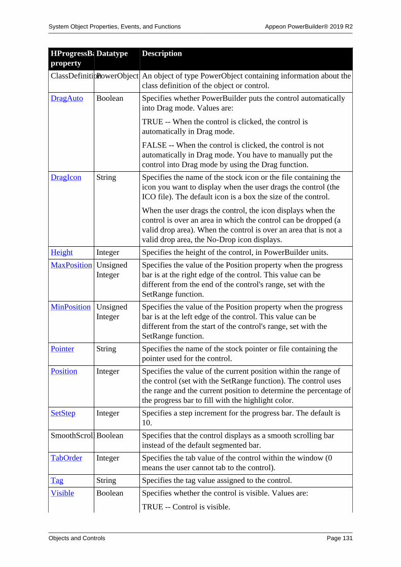
System Object Properties, Events, and Functions Appeon PowerBuilder® 2019 R2
Objects and Controls Page 131
HProgressBarproperty
Datatype Description
ClassDefinitionPowerObject An object of type PowerObject containing information about theclass definition of the object or control.
DragAuto Boolean Specifies whether PowerBuilder puts the control automaticallyinto Drag mode. Values are:
TRUE -- When the control is clicked, the control isautomatically in Drag mode.
FALSE -- When the control is clicked, the control is notautomatically in Drag mode. You have to manually put thecontrol into Drag mode by using the Drag function.
DragIcon String Specifies the name of the stock icon or the file containing theicon you want to display when the user drags the control (theICO file). The default icon is a box the size of the control.
When the user drags the control, the icon displays when thecontrol is over an area in which the control can be dropped (avalid drop area). When the control is over an area that is not avalid drop area, the No-Drop icon displays.
Height Integer Specifies the height of the control, in PowerBuilder units.
MaxPosition UnsignedInteger
Specifies the value of the Position property when the progressbar is at the right edge of the control. This value can bedifferent from the end of the control's range, set with theSetRange function.
MinPosition UnsignedInteger
Specifies the value of the Position property when the progressbar is at the left edge of the control. This value can bedifferent from the start of the control's range, set with theSetRange function.
Pointer String Specifies the name of the stock pointer or file containing thepointer used for the control.
Position Integer Specifies the value of the current position within the range ofthe control (set with the SetRange function). The control usesthe range and the current position to determine the percentage ofthe progress bar to fill with the highlight color.
SetStep Integer Specifies a step increment for the progress bar. The default is10.
SmoothScroll Boolean Specifies that the control displays as a smooth scrolling barinstead of the default segmented bar.
TabOrder Integer Specifies the tab value of the control within the window (0means the user cannot tab to the control).
Tag String Specifies the tag value assigned to the control.
Visible Boolean Specifies whether the control is visible. Values are:
TRUE -- Control is visible.

System Object Properties, Events, and Functions Appeon PowerBuilder® 2019 R2
Objects and Controls Page 132
HProgressBarproperty
Datatype Description
FALSE -- Control is not visible.
Width Integer Specifies the width of the control, in PowerBuilder units.
X Integer Specifies the X position (the distance from the left edge of thewindow), in PowerBuilder units).
Y Integer Specifies the Y position (the distance from the top of thewindow), in PowerBuilder units.
2.38.2 Events
Table 2.106:
HProgressBarevent
Occurs
Clicked When the left mouse button is pressed on the control
Constructor Immediately before the Open event occurs in the window
Destructor Immediately after the Close event occurs in the window
DoubleClicked When the left mouse button is double-clicked on the control
DragDrop When a dragged control is dropped on the control
DragEnter When a dragged control enters the control
DragLeave When a dragged control leaves the control
DragWithin When a dragged control is within the control
GetFocus Just before the control receives focus (before it is selected and becomesactive)
Help When the user presses the F1 key or drags the context help button(question mark) from the title bar to a menu item or control
LoseFocus When the control loses focus (becomes inactive)
Other When a Windows message occurs that is not a PowerBuilder event
RButtonDown When the right mouse button is pressed on the control
2.38.3 Functions
Table 2.107:
HProgressBarfunction
Datatypereturned
Description
ClassName String Returns the name assigned to the control.
Drag Integer Starts or ends the dragging of the control.
GetContextServiceInteger Creates a reference to a context-specific instance of thespecified service.
GetParent PowerObject Returns a reference to the name of the parent object.
Hide Integer Makes the control invisible.

System Object Properties, Events, and Functions Appeon PowerBuilder® 2019 R2
Objects and Controls Page 133
HProgressBarfunction
Datatypereturned
Description
Move Integer Moves the control to a specified location.
OffsetPos Integer Moves the control's current position by the amount specified.
PointerX Integer Returns the distance of the pointer from the left edge of thecontrol.
PointerY Integer Returns the distance of the pointer from the top of the control.
PostEvent Boolean Adds an event to the end of the message queue for control.
Print Integer Prints the control.
Resize Integer Changes the size of the control.
SetFocus Integer Sets the focus to the control.
SetPosition Integer Specifies the position of the control in the front-to-back order ofthe window.
SetRange Integer Sets the range of the control. The control uses the range and thecurrent position to determine the percentage of the progress barto fill with the highlight color.
SetRedraw Integer Controls automatic redrawing of the control after each change inits properties.
Show Integer Makes the control visible.
StepIt Integer Moves the control's current position by the amount specified bythe value of the SetStep property.
TriggerEvent Integer Triggers a specified event in the control and executes the scriptfor the event.
TypeOf Object Returns the type of the control.
2.39 HScrollBar controlAn HScrollBar is a horizontal bar with arrows at either end and a scroll box. Typically,you use an HScrollBar control as a slider control employed by users to specify a value on acontinuous scale, or as a way to display graphically information to the user.
Usage note
The HScrollBar control is not the horizontal scroll bar that displays to allow the userto scroll through information in a control.
2.39.1 Properties
Table 2.108:
HScrollBarproperty
Datatype Description
AccessibleDescriptionString A description of the control and/or its purpose for use byaccessibility tools such as readers for visually impaired users.

System Object Properties, Events, and Functions Appeon PowerBuilder® 2019 R2
Objects and Controls Page 134
HScrollBarproperty
Datatype Description
AccessibleNameString A label that briefly describes the control, such as the text in abutton or the name of a menu item.
AccessibleRoleAccessibleRole(enumerated)
Describes what kind of user interface element the control is.
BringToTop Boolean Specifies whether PowerBuilder moves the control to the top ofthe front-to-back order. Values are:
TRUE -- Control moved to top.
FALSE -- Control not moved to top.
ClassDefinitionPowerObject An object of type PowerObject containing information about theclass definition of the object or control.
DragAuto Boolean Specifies whether PowerBuilder puts the control automaticallyinto Drag mode. Values are:
TRUE -- When the control is clicked, the control isautomatically in Drag mode.
FALSE -- When the control is clicked, the control is notautomatically in Drag mode. You have to manually put thecontrol into Drag mode by using the Drag function.
DragIcon String Specifies the name of the stock icon or the file containing theicon you want to display when the user drags the control (theICO file). The default icon is a box the size of the control.
When the user drags the control, the icon displays when thecontrol is over an area in which the control can be dropped (avalid drop area). When the control is over an area that is not avalid drop area, the No-Drop icon displays.
Height Integer Specifies the height of the control, in PowerBuilder units.
MaxPosition Integer Specifies the value of the Position property when the scroll boxis at the right edge of the control.
MinPosition Integer Specifies the value of the Position property when the scroll boxis at the left edge of the control.
Pointer String Specifies the name of the stock pointer or file containing thepointer used for the control.
Position Integer Specifies a value between MinPosition and MaxPositionspecifying the position of the scroll box.
StdHeight Boolean Specifies whether PowerBuilder uses the standard height for thecontrol. Values are:
TRUE -- Standard height used for control.
FALSE -- Standard height not enforced for the control.
TabOrder Integer Specifies the tab value of the control within the window (0means the user cannot tab to the control).

System Object Properties, Events, and Functions Appeon PowerBuilder® 2019 R2
Objects and Controls Page 135
HScrollBarproperty
Datatype Description
Tag String Specifies the tag value assigned to the control.
Visible Boolean Specifies whether the control is visible. Values are:
TRUE -- Control is visible.
FALSE -- Control is not visible.
Width Integer Specifies the width of the control, in PowerBuilder units.
X Integer Specifies the X position (the distance from the left edge of thewindow), in PowerBuilder units.
Y Integer Specifies the Y position (the distance from the top of thewindow), in PowerBuilder units.
2.39.2 Events
Table 2.109:
HScrollBarevent
Occurs
Constructor Immediately before the Open event occurs in the window
Destructor Immediately after the Close event occurs in the window
DragDrop When a dragged control is dropped on the control
DragEnter When a dragged control enters the control
DragLeave When a dragged control leaves the control
DragWithin When a dragged control is within the control
GetFocus Just before the control receives focus (before it is selected and becomesactive)
Help When the user presses the F1 key or drags the context help button(question mark) from the title bar to a menu item or control
LineLeft When the left arrow of the control is clicked
LineRight When the right arrow of the control is clicked
LoseFocus When the control loses focus (becomes inactive)
Moved When the scroll box is moved (use the Position property to determine thenew location)
Other When a Windows message occurs that is not a PowerBuilder event
PageLeft When the open space to the left of the scroll box is clicked
PageRight When the open space to the right of the scroll box is clicked
RButtonDown When the right mouse button is pressed on the control

System Object Properties, Events, and Functions Appeon PowerBuilder® 2019 R2
Objects and Controls Page 136
2.39.3 Functions
Table 2.110:
HScrollBarfunction
Datatypereturned
Description
ClassName String Returns the name assigned to the control
Drag Integer Starts or ends the dragging of the control
GetContextServiceInteger Creates a reference to a context-specific instance of thespecified service
GetParent PowerObject Returns a reference to the name of the parent object
Hide Integer Makes the control invisible
Move Integer Moves the control to a specified location
PointerX Integer Returns the distance of the pointer from the left edge of thecontrol
PointerY Integer Returns the distance of the pointer from the top of the control
PostEvent Boolean Adds an event to the end of the message queue for control
Print Integer Prints the control
Resize Integer Changes the size of the control
SetFocus Integer Sets the focus to the control
SetPosition Integer Specifies the position of the control in the front-to-back order ofthe window
SetRedraw Integer Controls automatic redrawing of the control after each change inits properties
Show Integer Makes the control visible
TriggerEvent Integer Triggers a specified event in the control and executes the scriptfor the event
TypeOf Object Returns the type of the control
2.40 HTrackBar control
Like a scroll bar, a trackbar is used as a scrolling control, but clicking on the trackbar slidermoves it in discrete increments instead of continuously. The HTrackBar control has a seriesof tick marks along the bottom of the trackbar channel.
To enable this control to be used properly from the keyboard, you must add code to theLineLeft, LineRight, PageLeft, and PageRight events. The code you add should change theslider Position property by the appropriate value and then pass the new slider position to theobject or objects you associate with the trackbar control. You must code the Moved event ifyou want the trackbar control to pass on the slider position after the slider is dragged with amouse.

System Object Properties, Events, and Functions Appeon PowerBuilder® 2019 R2
Objects and Controls Page 137
Usage note
Use a trackbar when you want the user to select a discrete value. For example, youcan use a trackbar to enable a user to select a timer interval or the size of a window.
2.40.1 Properties
Table 2.111:
HTrackBarproperty
Datatype Description
AccessibleDescriptionString A description of the control and/or its purpose for use byaccessibility tools such as readers for visually impaired users.
AccessibleNameString A label that briefly describes the control, such as the text in abutton or the name of a menu item.
AccessibleRoleAccessibleRole(enumerated)
Describes what kind of user interface element the control is.
BringToTop Boolean Specifies whether PowerBuilder moves the control to the top ofthe front-to-back order. Values are:
TRUE -- Control moved to top.
FALSE -- Control not moved to top.
ClassDefinitionPowerObject An object of type PowerObject containing information about theclass definition of the object or control.
DragAuto Boolean Specifies whether PowerBuilder puts the control automaticallyinto Drag mode. Values are:
TRUE -- When the control is clicked, the control isautomatically in Drag mode.
FALSE -- When the control is clicked, the control is notautomatically in Drag mode. You have to manually put thecontrol into Drag mode by using the Drag function.
DragIcon String Specifies the name of the stock icon or the file containing theicon you want to display when the user drags the control (theICO file). The default icon is a box the size of the control.
When the user drags the control, the icon displays when thecontrol is over an area in which the control can be dropped (avalid drop area). When the control is over an area that is not avalid drop area, the No-Drop icon displays.
Height Integer Specifies the height of the control, in PowerBuilder units.
LineSize Integer Specifies how far the slider moves in response to keyboardinput from the arrow keys. Setting LineSize to 1 indicatesmoving 1 increment in the range of values specified by theMaxPosition and MinPosition properties.
MaxPosition Integer Specifies the value of the Position property when the slider is atthe right edge of the control.

System Object Properties, Events, and Functions Appeon PowerBuilder® 2019 R2
Objects and Controls Page 138
HTrackBarproperty
Datatype Description
MinPosition Integer Specifies the value of the Position property when the slider is atthe left edge of the control.
PageSize Integer Specifies how far the slider moves in response to clicking inthe slider channel area or pressing the Page keys. The defaultsize is the difference between the MaxPosition and MinPositionproperties divided by 5.
Pointer String Specifies the name of the stock pointer or file containing thepointer used for the control.
Position Integer Specifies a value between MinPosition and MaxPositionspecifying the position of the slider.
Slider Boolean Specifies whether or not the trackbar contains a slider.
SliderSize Integer Specifies the size of the slider on the trackbar. A value of 0makes the slider the default size.
TabOrder Integer Specifies the tab value of the control within the window (0means the user cannot tab to the control).
Tag String Specifies the tag value assigned to the control.
TickFrequencyInteger Specifies tick mark frequency. Setting TickFrequency to 1indicates 1 tick mark for each increment in the trackbar range ofvalues.
TickMarks HTickMarks(enumerated)
Specifies where tickmarks should be displayed. Values are:
HTicksOnBottom!
HTicksOnTop!
HTicksOnBoth!
HTicksOnNeither!
Visible Boolean Specifies whether the control is visible. Values are:
TRUE -- Control is visible.
FALSE -- Control is not visible.
Width Integer Specifies the width of the control, in PowerBuilder units.
X Integer Specifies the X position (the distance from the left edge of thewindow), in PowerBuilder units.
Y Integer Specifies the Y position (the distance from the top of thewindow), in PowerBuilder units.
2.40.2 Events
Table 2.112:
HTrackBarevent
Occurs
Constructor Immediately before the Open event occurs in the window

System Object Properties, Events, and Functions Appeon PowerBuilder® 2019 R2
Objects and Controls Page 139
HTrackBarevent
Occurs
Destructor Immediately after the Close event occurs in the window
DragDrop When a dragged control is dropped on the control
DragEnter When a dragged control enters the control
DragLeave When a dragged control leaves the control
DragWithin When a dragged control is within the control
GetFocus Just before the control receives focus (before it is selected and becomesactive)
Help When the user presses the F1 key or drags the context help button(question mark) from the title bar to a menu item or control
LineLeft When the left arrow key is clicked
LineRight When the right arrow key is clicked
LoseFocus When the control loses focus (becomes inactive)
Moved When the slider is moved (use the Position property to determine the newlocation)
Other When a Windows message occurs that is not a PowerBuilder event
PageLeft When the Page Up key is clicked or when mouse clicks are made to theleft of the slider in the trackbar channel
PageRight When the Page Down key is clicked or when mouse clicks are made tothe right of the slider in the trackbar channel
RButtonDown When the right mouse button is pressed on the control
2.40.3 Functions
Table 2.113:
HTrackBarfunction
Datatypereturned
Description
ClassName String Returns the name assigned to the control.
Drag Integer Starts or ends the dragging of the control.
GetContextServiceInteger Creates a reference to a context-specific instance of thespecified service.
GetParent PowerObject Returns a reference to the name of the parent object.
Hide Integer Makes the control invisible.
Move Integer Moves the control to a specified location.
PointerX Integer Returns the distance of the pointer from the left edge of thecontrol.
PointerY Integer Returns the distance of the pointer from the top of the control.
PostEvent Boolean Adds an event to the end of the message queue for control.
Print Integer Prints the control.

System Object Properties, Events, and Functions Appeon PowerBuilder® 2019 R2
Objects and Controls Page 140
HTrackBarfunction
Datatypereturned
Description
Resize Integer Changes the size of the control.
SelectionRangeInteger Sets a selection range for the trackbar. When you select a range,a blue line is drawn in the channel of the trackbar and twoarrows are drawn where the tickmarks are placed to indicate thebeginning and end of the selection range.
SetFocus Integer Sets the focus to the control.
SetPosition Integer Specifies the position of the control in the front-to-back order ofthe window.
SetRedraw Integer Controls automatic redrawing of the control after each change inits properties.
Show Integer Makes the control visible.
TriggerEvent Integer Triggers a specified event in the control and executes the scriptfor the event.
TypeOf Object Returns the type of the control.
2.41 HTTPClient objectThe HTTPClient object is a base object for sending HTTP requests and receiving HTTPresponses from a resource identified by a URI. Compared to the Inet object, the HTTPClientobject is easier to use and supports more methods (Get/Post/Put/Delete) and more SSLprotocols (TLS 1.0, TLS 1.1, TLS 1.2, SSL 2.0, and SSL 3.0).
Note
It is not recommended to use this object to process large data (20 MB or 100,000 datarows can be considered as large data based on our tests), because this object will call athird-party library which is memory intensive.
Note
This object cannot be referenced in .NET Web Service or .NET Assemblycomponents, otherwise the component will fail to be deployed.
2.41.1 Properties
Table 2.114:
HTTPClientproperty
Datatype Description
AutoReadDataBoolean Whether the program reads the response body automatically.
SecureProtocolInteger The secure protocol.
TimeOut Long The timeout seconds.
ClassDefinitionPowerObject An object of type PowerObject containing information about theclass definition of the object or control.

System Object Properties, Events, and Functions Appeon PowerBuilder® 2019 R2
Objects and Controls Page 141
2.41.2 Events
Table 2.115:
HTTPClientevent
Occurs
Constructor Immediately before the Open event occurs in the window.
Destructor Immediately after the Close event occurs in the window.
2.41.3 Functions
Table 2.116:
HTTPClientfunction
Datatypereturned
Description
ClassName String Returns the name assigned to the object.
ClearRequestHeadersInteger Clears the headers of the request.
GetContextServiceInteger Creates a reference to a context-specific instance of thespecified service.
GetParent PowerObject Returns a reference to the name of the parent object.
GetRequestHeaderString Gets the request header by name.
GetRequestHeadersString Gets all of the request headers' information.
GetResponseBodyInteger Gets the response body.
GetResponseHeaderString Gets the response header by name.
GetResponseHeadersString Gets all of the response headers' information.
GetResponseStatusCodeLong Gets the response status code.
GetResponseStatusTextString Gets the response status description.
PostData Integer Sends the data with POST method.
PostDataEnd Integer Finishes sending the data with POST method.
PostDataStart Integer Starts sending the data with POST method.
PostEvent Boolean Adds an event to the end of the message queue for the object.
ReadData Integer Reads the response body.
SendRequest Integer Sends the request to the server.
SetRequestHeaderInteger Sets the request header.
SetRequestHeadersInteger Sets all of the request headers' information.
TriggerEvent Integer Triggers a specific event in the object and executes the script forthe event.
TypeOf Object Returns the type of the object.
2.42 Inet objectThe Inet object provides the ability to display a Web page in the default browser, access theHTML for a specified page, and send data to a CGI, ISAPI, or NSAPI program.

System Object Properties, Events, and Functions Appeon PowerBuilder® 2019 R2
Objects and Controls Page 142
2.42.1 Properties
Table 2.117:
Inetproperty
Datatype Description
ClassDefinitionPowerObject An object of type PowerObject containing information about theclass definition of the object or control.
2.42.2 Events
Table 2.118:
Inet event Occurs
Constructor Immediately before the Open event occurs in the window.
Destructor Immediately after the Close event occurs in the window.
2.42.3 Functions
Table 2.119:
Inetfunction
Datatypereturned
Description
ClassName String Returns the name assigned to the object.
GetContextServiceInteger Creates a reference to a context-specific instance of thespecified service.
GetParent PowerObject Returns a reference to the name of the parent object.
GetURL Integer Returns HTML for the specified URL.
HyperLinkToURLInteger Opens the default Web browser, displaying the specified URL.
PostEvent Boolean Adds an event to the end of the message queue for the object.
PostURL Integer Performs an HTTP Post, allowing a PowerBuilder application tosend a request through CGI, NSAPI, or ISAPI.
TriggerEvent Integer Triggers a specific event in the object and executes the script forthe event.
TypeOf Object Returns the type of the object.
2.43 InkEdit control
An InkEdit control collects pen input (ink) on a Tablet PC and converts it to text. It is usedwith the handwriting recognition engine ("recognizer") that is part of the Tablet PC platform.
Using with animation features
InkEdit controls may not paint correctly when you use animation features.

System Object Properties, Events, and Functions Appeon PowerBuilder® 2019 R2
Objects and Controls Page 143
2.43.1 Properties
Table 2.120:
InkEditproperty
Datatype Description
AccessibleDescriptionString A description of the control and/or its purpose for use byaccessibility tools such as readers for visually impaired users.
AccessibleNameString A label that briefly describes the control, such as the text in abutton or the name of a menu item.
AccessibleRoleAccessibleRole(enumerated)
Describes what kind of user interface element the control is.
Alignment Alignment(enumerated)
Specifies the alignment of text in the control. Values are:
Center!
Justify!
Left!
Right!
BackColor Long Specifies the numeric value of the background color: -2to 16,777,215. For more information about color, seeSection 10.636, “RGB”.
Border Boolean Specifies whether the control has a border. Values are:
TRUE -- Control has a border.
FALSE -- Control does not have a border.
BorderStyle BorderStyle(enumerated)
Specifies the border style of the control. Values are:
StyleBox!
StyleLowered!
StyleRaised!
StyleShadowBox!
BringToTop Boolean Specifies whether PowerBuilder moves the control to the top ofthe front-to-back order.
ClassDefinitionPowerObject An object of type PowerObject containing information about theclass definition of the object or control.
DisplayOnly Boolean Specifies whether the text is display only and cannot be changedby the user. Values are:
TRUE -- Text cannot be changed by user.
FALSE -- Text can be changed by user.
DragAuto Boolean Specifies whether PowerBuilder puts the control automaticallyinto Drag mode. Values are:
TRUE -- When the control is clicked, the control isautomatically in Drag mode.

System Object Properties, Events, and Functions Appeon PowerBuilder® 2019 R2
Objects and Controls Page 144
InkEditproperty
Datatype Description
FALSE -- When the control is clicked, the control is notautomatically in Drag mode. You have to manually put thecontrol into Drag mode by using the Drag function.
DragIcon String Specifies the name of the stock icon or the file containing theicon you want to display when the user drags the control (theICO file). The default icon is a box the size of the control.
When the user drags the control, the icon displays when thecontrol is over an area in which the control can be dropped (avalid drop area). When the control is over an area that is not avalid drop area, the No-Drop icon displays.
Enabled Boolean Specifies whether the control is enabled (can be selected).Values are:
TRUE -- Control can be clicked.
FALSE -- Control cannot be clicked.
FaceName String Specifies the name of the typeface in which the text of thecontrol displays (for example, Arial or Courier).
Factoid String Specifies a context for ink recognition. Set this property if theinput data is of a known type, such as a date or Web address, toconstrain the search for a recognition result.
FontCharSet FontCharSet(enumerated)
Specifies the font character set used for the text in the control.The application must be running on an appropriate versionof PowerBuilder under an operating system that supports theselected character set. For a complete list of possible values, seethe list of properties for the FontCharSet enumerated datatypeon the Enumerated tab page of the Browser.
FontFamily FontFamily(enumerated)
Specifies the font family (type style) used for the text in thecontrol. Values are:
AnyFont!
Decorative!
Modern!
Roman!
Script!
Swiss!
FontPitch FontPitch(enumerated)
Specifies the font pitch used for the text in the control. Valuesare:
Default!
Fixed!
Variable!

System Object Properties, Events, and Functions Appeon PowerBuilder® 2019 R2
Objects and Controls Page 145
InkEditproperty
Datatype Description
Height Integer Specifies the height of the control, in PowerBuilder units.
HScrollBar Boolean Specifies whether a horizontal scroll bar displays. Values are:
TRUE -- Horizontal scroll bar displays.
FALSE -- Horizontal scroll bar does not display.
IgnorePressureBoolean A drawing attribute that specifies whether the drawn inkgets wider as the pressure of the pen tip on the tablet surfaceincreases. Values are:
TRUE -- Pressure from the pen tip is ignored.
FALSE -- The width of the ink increases with the pressure ofthe pen tip (default).
InkAntiAliasedBoolean A drawing attribute that specifies whether the foreground andbackground colors along the edge of the drawn ink are blended(antialiased) to make the stroke smoother and sharper. Valuesare:
TRUE -- The ink stroke appears smoother and sharper (default).
FALSE -- The ink stroke is not antialiased.
InkColor Long A drawing attribute that specifies the current ink color. Thedefault color is black.
InkHeight Integer A drawing attribute that specifies the height of the side of therectangular pen tip in pixels. The default is 1pixel.
InkMode InkMode(enumerated)
Specifies whether ink collection is enabled and whether ink onlyor ink and gestures are collected. Values are:
CollectInk! -- Only ink is collected.
CollectInkAndGestures! -- Ink and gestures are collected(default).
InkDisabled! -- Ink collection is disabled (the control behaveslike a multiline edit control).
InkTransparencyInteger A drawing attribute that specifies the transparency of drawn ink.The range of values is from 0 for totally opaque (the default) to255 for totally transparent.
InkWidth Integer A drawing attribute that specifies the width of the pen in pixels.The default is 53 pixels. If the IgnorePressure property is notset, the actual width varies between .5 times the value of theWidth property for minimum pressure and 1.5 times its valuefor maximum pressure.
InsertAsText Boolean Specifies whether the ink is inserted as text or as ink. Valuesare:
TRUE -- The ink is inserted as text (default).

System Object Properties, Events, and Functions Appeon PowerBuilder® 2019 R2
Objects and Controls Page 146
InkEditproperty
Datatype Description
FALSE -- The ink is inserted as ink.
Italic Boolean Specifies whether the text in the control is italic. Values are:
TRUE -- Text is italic.
FALSE -- Text is not italic (default).
Limit Integer Specifies the maximum number of characters (0 to 32,767) thatcan be entered in the control (0 means unlimited).
Modified Boolean Specifies whether the text in the control has been modified sinceit was opened or last saved. Modified is the control's "dirty"flag, indicating that the control is in an unsaved state. Valuesare:
TRUE -- The control has been modified.
FALSE -- The control has not been modified.
When the first change is made to a newly opened or savedcontrol, PowerBuilder sets the Modified property to true andtriggers the Modified event.
PenTip InkPenTip(enumerated)
A drawing attribute that specifies whether the pen tip is round orrectangular. Values are:
PenTipBall! -- The pen tip is round (default).
PenTipRectangle! -- The pen tip is rectangular.
Pointer String Specifies the name of the stock pointer or the file containing thepointer used for the control.
RecognitionTimerLong Specifies the time period in milliseconds between the last inkstroke and the start of text recognition. The default is 2000 (twoseconds).
RightToLeft Boolean Specifies that characters should be displayed in right-to-leftorder. The application must be running on an operating systemthat supports right-to-left display. Values are:
TRUE -- Characters display in right-to-left order.
FALSE -- Characters display in left-to-right order.
Status InkEditStatus(enumerated)
A read-only property available at runtime that provides thecurrent status of the control so that the user does not needto monitor the Stroke event. Values are CollectingInk!,RecognizingInk!, and Idle!.
TabOrder Integer Specifies the tab value of the control within the window (0means the user cannot tab to the control).
Tag String Specifies the tag value assigned to the control.
Text String Specifies the text that displays in the control.

System Object Properties, Events, and Functions Appeon PowerBuilder® 2019 R2
Objects and Controls Page 147
InkEditproperty
Datatype Description
TextColor Long Specifies the numeric value of the color used for text: -2 to16,777,215.
TextSize Integer Specifies the size of the text in the control, in points.
For backward compatibility, the size is stored as a negativenumber; for example, 10-point text size is stored as -10.
Underline Boolean Specifies whether the text in the control is underlined. Valuesare:
TRUE -- Text is underlined.
FALSE -- Text is not underlined (default).
UseMouseForInputBoolean Specifies whether the mouse can be used for input on a TabletPC. Values are:
TRUE -- The mouse can be used for input.
FALSE -- The mouse cannot be used for input (default).
Visible Boolean Specifies whether the control is visible. Values are:
TRUE -- Control is visible (default).
FALSE -- Control is not visible.
VScrollBar Boolean Specifies whether a vertical scroll bar is displayed on the rightof the control. Values are:
TRUE -- Vertical scroll bar is displayed.
FALSE -- Vertical scroll bar is not displayed.
Weight Integer Specifies the stroke weight of the text in the control; forexample, 400 for normal (default) or 700 for bold.
Width Integer Specifies the width of the control, in PowerBuilder units.
X Integer Specifies the X position (the distance from the left edge of thewindow), in PowerBuilder units.
Y Integer Specifies the Y position (the distance from the top of thewindow), in PowerBuilder units.
2.43.2 Events
Table 2.121:
InkEdit event Occurs
Constructor When the object is created, immediately before the Open event occurs inthe window.
Destructor When the object is destroyed, immediately after the Close event occurs inthe window.
DragDrop When a dragged control is dropped on the control.
DragEnter When a dragged control enters the control.

System Object Properties, Events, and Functions Appeon PowerBuilder® 2019 R2
Objects and Controls Page 148
InkEdit event Occurs
DragLeave When a dragged control leaves the control.
DragWithin When a dragged control is within the control.
Gesture When a gesture has occurred.
GetFocus Just before the control receives focus (before it is selected and becomesactive).
Help When the user presses the F1 key or drags the context help button(question mark) from the title bar to a menu item or control.
LoseFocus When the control loses focus (becomes inactive).
Moved When a control has been changed and loses focus.
Other When a Windows message occurs that is not a PowerBuilder event.
RButtonDown When the right mouse button is pressed on the control.
RecognitionResultWhen a recognition has occurred.
Stroke When a stroke has occurred.
2.43.3 Functions
Table 2.122:
InkEditfunction
Datatypereturned
Description
ClassName String Returns the name of the control.
Clear Integer Clears the selected text (if any) from the control (but does notplace it in the clipboard).
Copy Integer Copies (but does not delete) the selected text (if any) from thecontrol to the clipboard.
Cut Integer Cuts (deletes) the selected text (if any) from the control to theclipboard.
Drag Integer Starts or ends the dragging of an InkEdit item.
GetContextServiceInteger Creates a reference to a context-specific instance of thespecified service.
GetParent PowerObject Returns a reference to the name of the parent object.
Hide Integer Hides the specified InkEdit item.
Move Integer Moves a control or object to a specified location.
Paste Integer Inserts the contents of the clipboard (if any) at the insertionpoint in the control.
PointerX Integer Determines the distance from the left edge of an object to thepointer location.
PointerY Integer Determines the distance from the top edge of an object to thepointer location.
Position Integer Returns the position of the insertion point in the control.

System Object Properties, Events, and Functions Appeon PowerBuilder® 2019 R2
Objects and Controls Page 149
InkEditfunction
Datatypereturned
Description
PostEvent Boolean Adds the event to the end of the event queue of an object.
Print Integer Includes this object in a print job. Only the part visible on thescreen is printed.
Resize Integer Resizes a control to the specified dimensions.
RecognizeTextInteger Specifies that ink recognition should occur.
ReplaceText Integer Replaces the currently selected text (if any) with the specifiedstring. If no text is selected, the ReplaceText function inserts thetext at the insertion point.
SelectedLengthInteger Returns the length of the selected text (if any) in the control.
SelectedText String Returns a string with the selected text (if any) from the control.
SelectText Long Selects the text specified by the starting position and length.
SetFocus Integer Sets focus for a specified object or control.
SetPosition Integer Sets the position of the InkEdit control in the front-to-backorder within a window.
SetRedraw Integer Controls the automatic redraw of an object after its propertieshave changed.
Show Integer Makes an object or control visible if it is hidden. If the object isalready visible, Show brings it to the top.
TriggerEvent Integer Triggers a specified event in the control and executes the scriptfor the event.
TypeOf Object Returns the type of the control.
2.44 InkPicture controlAn InkPicture control collects pen input ("ink") on a Tablet PC and layers it on a picture. Itis used to collect ink annotations to a picture or signatures. It has no handwriting recognitioncapability.
Using with animation features
InkPicture controls may not paint correctly when you use animation features.
2.44.1 Properties
Table 2.123:
InkPictureproperty
Datatype Description
AutoErase Boolean Specifies whether the auto erase feature available on somestyluses is turned on. Values are:
TRUE -- AutoErase is turned on.
FALSE -- AutoErase is turned off (default).

System Object Properties, Events, and Functions Appeon PowerBuilder® 2019 R2
Objects and Controls Page 150
InkPictureproperty
Datatype Description
BackColor Long Specifies the numeric value of the background color: -2to 16,777,215. For more information about color, seeSection 10.636, “RGB”.
Border Boolean Specifies whether the control has a border. Values are:
TRUE -- Control has a border.
FALSE -- Control does not have a border.
BorderStyle BorderStyle(enumerated)
Specifies the border style of the control. Values are:
StyleBox!
StyleLowered!
StyleRaised!
StyleShadowBox!
BringToTop Boolean Specifies whether PowerBuilder moves the control to the top ofthe front-to-back order.
ClassDefinitionPowerObject An object of type PowerObject containing information about theclass definition of the object or control.
CollectionModeInkCollectionMode(enumerated)
Specifies whether ink only, gestures only, or ink and gesturesare collected. Values are:
GestureOnly! -- Only gestures are collected.
InkOnly! -- Only ink is collected (default).
InkAndGesture! -- Ink and gestures are collected.
DragAuto Boolean Specifies whether PowerBuilder puts the control automaticallyinto Drag mode. Values are:
TRUE -- When the control is clicked, the control isautomatically in Drag mode.
FALSE -- When the control is clicked, the control is notautomatically in Drag mode. You have to manually put thecontrol into Drag mode by using the Drag function.
DragIcon String Specifies the name of the stock icon or the file containing theicon you want to display when the user drags the control (theICO file). The default icon is a box the size of the control.
When the user drags the control, the icon displays when thecontrol is over an area in which the control can be dropped (avalid drop area). When the control is over an area that is not avalid drop area, the No-Drop icon displays.
DynamicRenderingBoolean Specifies whether the ink is rendered (displayed in the control)as it is drawn. The default is true.
EditMode InkPicEditModeSpecifies whether the editing mode of the control is set fordrawing ink, editing ink, or deleting ink. Values are:

System Object Properties, Events, and Functions Appeon PowerBuilder® 2019 R2
Objects and Controls Page 151
InkPictureproperty
Datatype Description
InkPicDeleteMode! -- Ink is deleted.
InkPicInkMode! -- Ink can be drawn (default).
InkPicSelectMode! -- Ink is selected for editing.
Enabled Boolean Specifies whether the control is enabled (can be selected).Values are:
TRUE -- Control can be clicked.
FALSE -- Control cannot be clicked.
EraserMode Integer Specifies whether ink is removed by stroke or point. Values are:
0 -- Ink is removed by stroke (default).
1 -- Ink is removed by point.
EraserWidth Integer Specifies the width of the eraser pen tip in pixels. The default is212 pixels.
Height Integer Specifies the height of the control, in PowerBuilder units.
HighContrastInkBoolean Specifies whether ink is rendered in a single color whenthe system is in high contrast mode and draws the selectionrectangle and handles in high contrast. Values are:
TRUE -- Ink is rendered in a single color in high contrast mode(default).
FALSE -- Ink is not rendered in a single color in high contrastmode.
IgnorePressureBoolean A drawing attribute that specifies whether the drawn inkgets wider as the pressure of the pen tip on the tablet surfaceincreases. Values are:
TRUE -- Pressure from the pen tip is ignored.
FALSE -- The width of the ink increases with the pressure ofthe pen tip (default).
InkAntiAliasedBoolean A drawing attribute that specifies whether the foreground andbackground colors along the edge of the drawn ink are blended(antialiased) to make the stroke smoother and sharper. Valuesare:
TRUE -- The ink stroke appears smoother and sharper (default).
FALSE -- The ink stroke is not antialiased.
InkColor Long A drawing attribute that specifies the current ink color. Thedefault color is black.
InkEnabled Boolean Specifies whether the InkPicture control collects pen input.Values are:
TRUE -- The control collects pen input (default).

System Object Properties, Events, and Functions Appeon PowerBuilder® 2019 R2
Objects and Controls Page 152
InkPictureproperty
Datatype Description
FALSE -- The control does not collect pen input and no pen-related events fire.
InkFileName String Specifies the name of the file that the ink was loaded from.
InkHeight Integer A drawing attribute that specifies the height of the side of therectangular pen tip in pixels. The default is 1.
InkTransparencyInteger A drawing attribute that specifies the transparency of drawn ink.The range of values is from 0 for totally opaque (the default) to255 for totally transparent.
InkWidth Integer A drawing attribute that specifies the width of the pen in pixels.The default is 53. If the IgnorePressure property is not set, theactual width varies between .5 times the value of the Widthproperty for minimum pressure and 1.5 times its value formaximum pressure.
MarginX Integer Specifies the x-axis margin around the control in PowerBuilderunits. The default value is 0.
MarginY Integer Specifies the y-axis margin around the control in PowerBuilderunits. The default value is 0.
PenTip InkPenTip(enumerated)
A drawing attribute that specifies whether the pen tip is round orrectangular. Values are:
PenTipBall! -- The pen tip is round (default).
PenTipRectangle! -- The pen tip is rectangular.
PictureFileNameString Specifies the name of a file that contains the picture for thecontrol. The default is an empty string. Supported formats areBMP, GIF, JPEG, PNG, and TIF.
PictureSizeModeDisplaySizeModeSpecifies how the picture is displayed in the control. Values are:
InkPicAutoSize! -- The control is resized to display the entirepicture.
InkPicCentered! -- The picture is centered in the control.
InkPicNormal! -- The picture is displayed in the upper-leftcorner of the control and any part of the picture that does not fitin the control is clipped (default).
InkPicStretched! -- The picture is stretched to fill the control.
Pointer String Specifies the name of the stock pointer or the file containing thepointer used for the control.
PowerTipTextString Specifies a PowerTip for the control.
Status InkPicStatus Read-only property available at runtime that provides thecurrent status of the control so that the user does not need tomonitor the Stroke event. Values are CollectingInk! and Idle!.

System Object Properties, Events, and Functions Appeon PowerBuilder® 2019 R2
Objects and Controls Page 153
InkPictureproperty
Datatype Description
TabOrder Integer Specifies the tab value of the control within the window (0means the user cannot tab to the control.
Tag String Specifies the tag value assigned to the control.
Visible Boolean Specifies whether the control is visible. Values are:
TRUE -- Control is visible (default).
FALSE -- Control is not visible.
Width Integer Specifies the width of the control, in PowerBuilder units.
X Integer Specifies the X position (the distance from the left edge of thewindow), in PowerBuilder units.
Y Integer Specifies the Y position (the distance from the top of thewindow), in PowerBuilder units.
2.44.2 Events
Table 2.124:
InkPictureevent
Occurs
Clicked When the left mouse button is clicked in the control
Constructor When the object is created, immediately before the Open event occurs inthe window
Destructor When the object is destroyed, immediately after the Close event occurs inthe window
DragDrop When a dragged control is dropped on the control
DragEnter When a dragged control enters the control
DragLeave When a dragged control leaves the control
DragWithin When a dragged control is within the control
Gesture When a gesture has occurred
GetFocus Just before the control receives focus (before it is selected and becomesactive)
Help When the user presses the F1 key or drags the context help button(question mark) from the title bar to a menu item or control
LoseFocus When the control loses focus (becomes inactive)
Other When a Windows message occurs that is not a PowerBuilder event
RButtonDown When the right mouse button is pressed on the control
SelectionChanged When an item in the control is selected
SelectionChangingWhen the selection is changing. Return 1 to prevent the selection fromchanging or 0 to allow it
SizeChanged When the control has been resized

System Object Properties, Events, and Functions Appeon PowerBuilder® 2019 R2
Objects and Controls Page 154
InkPictureevent
Occurs
Stroke When a stroke has occurred
2.44.3 Functions
Table 2.125:
InkPicturefunction
Datatypereturned
Description
ClassName String Returns the name of the control.
Drag Integer Starts or ends the dragging of a InkEdit item.
GetContextServiceInteger Creates a reference to a context-specific instance of thespecified service.
GetParent PowerObject Returns a reference to the name of the parent object.
Hide Integer Hides the specified InkEdit item.
LoadInk Integer Loads ink from a file or blob.
LoadPicture Integer Loads a picture from a file or blob.
Move Integer Moves a control or object to a specified location.
PointerX Integer Determines the distance from the left edge of an object to thepointer location.
PointerY Integer Determines the distance from the top edge of an object to thepointer location.
PostEvent Boolean Adds the event to the end of the event queue of an object.
Print Integer Includes this object in a print job. Only the part visible on thescreen is printed.
ResetInk Integer Clears ink from the control.
ResetPicture Integer Clears a picture from the control.
Resize Integer Resizes a control to the specified dimensions.
Save Integer Saves a picture and optionally any overlay ink to a file or blobin one of the following formats: bitmap, JPEG, GIF, TIF, orPNG.
SaveInk Integer Saves ink to a file or blob in one of the following formats: InkSerialized Format (ISF), GIF, Base-64 encoded ISF, or Base-64encoded GIF.
SetFocus Integer Sets focus for a specified object or control.
SetPosition Integer Sets the position of the InkEdit control in the front-to-backorder within a window.
SetRedraw Integer Controls the automatic redraw of an object after its propertieshave changed.
Show Integer Makes an object or control visible if it is hidden. If the object isalready visible, Show brings it to the top.
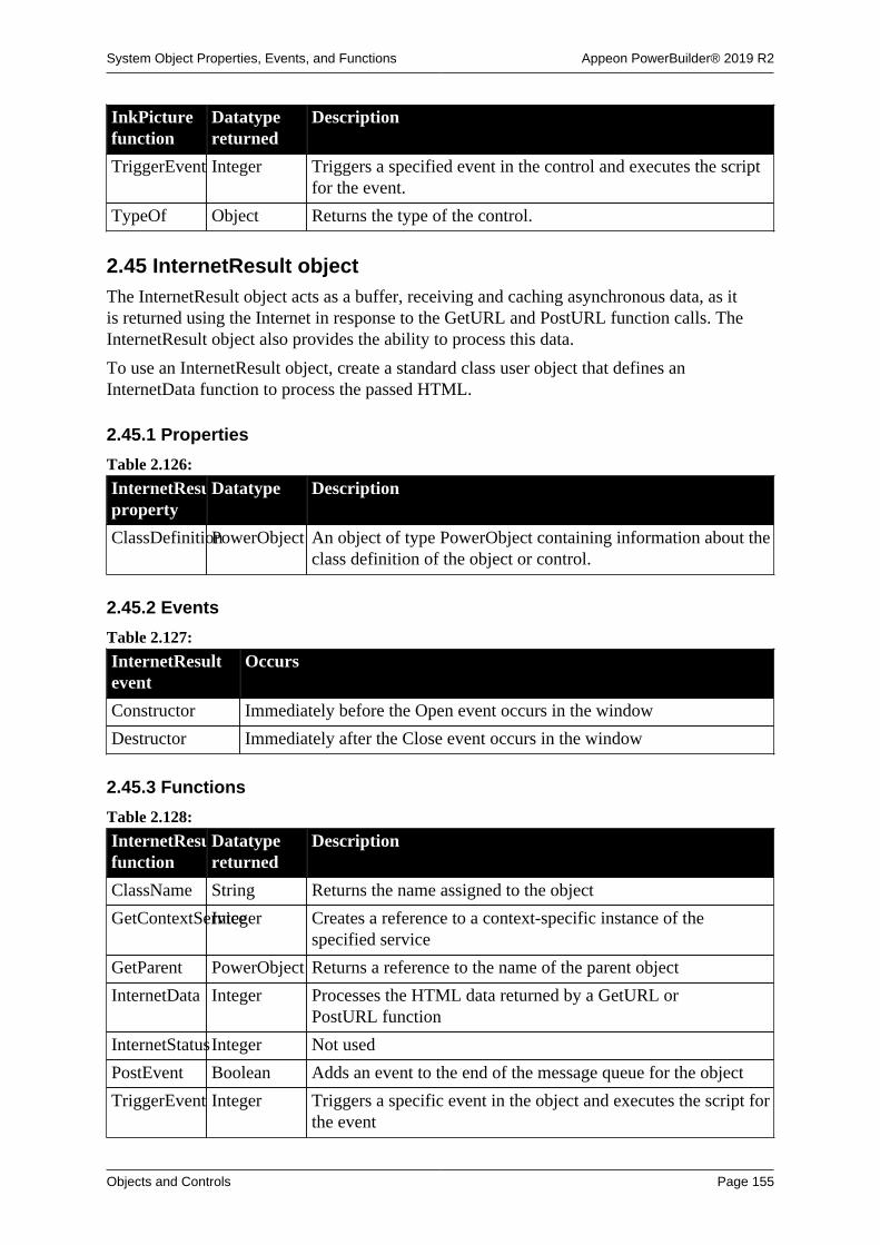
System Object Properties, Events, and Functions Appeon PowerBuilder® 2019 R2
Objects and Controls Page 155
InkPicturefunction
Datatypereturned
Description
TriggerEvent Integer Triggers a specified event in the control and executes the scriptfor the event.
TypeOf Object Returns the type of the control.
2.45 InternetResult objectThe InternetResult object acts as a buffer, receiving and caching asynchronous data, as itis returned using the Internet in response to the GetURL and PostURL function calls. TheInternetResult object also provides the ability to process this data.
To use an InternetResult object, create a standard class user object that defines anInternetData function to process the passed HTML.
2.45.1 Properties
Table 2.126:
InternetResultproperty
Datatype Description
ClassDefinitionPowerObject An object of type PowerObject containing information about theclass definition of the object or control.
2.45.2 Events
Table 2.127:
InternetResultevent
Occurs
Constructor Immediately before the Open event occurs in the window
Destructor Immediately after the Close event occurs in the window
2.45.3 Functions
Table 2.128:
InternetResultfunction
Datatypereturned
Description
ClassName String Returns the name assigned to the object
GetContextServiceInteger Creates a reference to a context-specific instance of thespecified service
GetParent PowerObject Returns a reference to the name of the parent object
InternetData Integer Processes the HTML data returned by a GetURL orPostURL function
InternetStatusInteger Not used
PostEvent Boolean Adds an event to the end of the message queue for the object
TriggerEvent Integer Triggers a specific event in the object and executes the script forthe event

System Object Properties, Events, and Functions Appeon PowerBuilder® 2019 R2
Objects and Controls Page 156
InternetResultfunction
Datatypereturned
Description
TypeOf Object Returns the type of the object
2.46 JSONGenerator objectThe JSONGenerator object provides the ability to construct the JSON objects with the rootitem being either an object or an array. It supports adding values, objects, or arrays to theconstructed JSON object.
Note
It is not recommended to use this object to process large data (20 MB or 100,000 datarows can be considered as large data based on our tests), because this object will call athird-party library which is memory intensive.
Note
This object cannot be referenced in .NET Web Service or .NET Assemblycomponents, otherwise the component will fail to be deployed.
2.46.1 Properties
Table 2.129:
JSONGeneratorproperty
Datatype Description
ClassDefinitionPowerObject An object of type PowerObject containing information about theclass definition of the object or control.
2.46.2 Events
Table 2.130:
JSONGeneratorevent
Occurs
Constructor Immediately before the Open event occurs in the window
Destructor Immediately after the Close event occurs in the window
2.46.3 Functions
Table 2.131:
JSONGeneratorfunction
Datatypereturned
Description
AddItemArrayLong Adds the child item of JSONArrayItem type.
AddItemBlob Long Adds the child item of JSONStringItem type.
AddItemBooleanLong Adds the child item of JSONBooleanItem type.
AddItemDate Long Adds the child item of JSONStringItem type.

System Object Properties, Events, and Functions Appeon PowerBuilder® 2019 R2
Objects and Controls Page 157
JSONGeneratorfunction
Datatypereturned
Description
AddItemDateTimeLong Adds the child item of JSONStringItem or JSONNumberItemtype.
AddItemNull Long Adds the child item of JSONNullItem type.
AddItemNumberLong Adds the child item of JSONNumberItem type.
AddItemObjectLong Adds the child item of JSONObjectItem type.
AddItemStringLong Adds the child item of JSONStringItem type.
AddItemTimeLong Adds the child item of JSONStringItem type.
ClassName String Returns the name assigned to the object
CreateJSONArrayLong Creates the array as root item to initialize instance.
CreateJSONObjectLong Creates the object as root item to initialize instance.
GetContextServiceInteger Creates a reference to a context-specific instance of thespecified service
GetJSONBlobBlob Gets the JSON blob data.
GetJSONStringString Gets the JSON string data.
GetParent PowerObject Returns a reference to the name of the parent object
PostEvent Boolean Adds an event to the end of the message queue for the object
SaveToFile Integer Saves the JSON data to the local file.
TriggerEvent Integer Triggers a specific event in the object and executes the script forthe event
TypeOf Object Returns the type of the object
2.47 JSONPackage object
The JSONPackage object provides the ability to merge data in a JSON object or extractdata from a JSON object. Merging and extracting can occur at both the client side and theserver side. The resulted JSON can be posted from the client to the server via HTTPClient, orretrieved from the server to the client via RESTClient.
For the JSON string that can be loaded by the JSONPackage object, see Section 18.1,“Supported JSON formats”.
Note
It is not recommended to use this object to process large data (20 MB or 100,000 datarows can be considered as large data based on our tests), because this object will call athird-party library which is memory intensive.
Note
This object cannot be referenced in .NET Web Service or .NET Assemblycomponents, otherwise the component will fail to be deployed.

System Object Properties, Events, and Functions Appeon PowerBuilder® 2019 R2
Objects and Controls Page 158
Note
The data to be merged can be from DataWindow, DataStore, DataWindowChild, orfrom an existing JSON.
Composite, Crosstab, OLE 2.0, and RichText DataWindows are unsupported.
2.47.1 Properties
Table 2.132:
JSONPackageproperty
Datatype Description
IgnoreCase Boolean A boolean value that specifies whether to ignore the case forkey.
ClassDefinitionPowerObject An object of type PowerObject containing information about theclass definition of the object or control.
ReturnsNullWhenErrorBoolean Specifies whether the getting value function returns a null valuewhen error occurs.
2.47.2 Events
Table 2.133:
JSONPackageevent
Occurs
Constructor When the object is created.
Destructor When the object is destroyed.
2.47.3 Functions
Table 2.134:
JSONPackagefunction
Datatypereturned
Description
ClassName String Returns the name assigned to the object.
Clear Integer Deletes all of the keys.
ContainsKey Boolean Checks if the key name exists.
GetContextServiceInteger Creates a reference to a context-specific instance of thespecified service.
GetJSONBlobBlob Gets the JSON blob data.
GetJSONStringString Gets the JSON string data.
GetKey String Gets the key name.
GetParent PowerObject Returns a reference to the name of the parent object.
GetValue String Gets the value of the key.
GetValueBlobBlob Gets the blob value of the key.

System Object Properties, Events, and Functions Appeon PowerBuilder® 2019 R2
Objects and Controls Page 159
JSONPackagefunction
Datatypereturned
Description
GetValueBooleanBoolean Gets the boolean value of the key.
GetValueDateDate Gets the date value of the key.
GetValueDateTimeDateTime Gets the datetime value of the key.
GetValueNumberNumber Gets the number value of the key.
GetValueStringString Gets the string value of the key.
GetValueTimeTime Gets the time value of the key.
GetValueToDataWindowLong Gets the value of the key and inserts it into a DataWindowcontrol, DataStore object, or DataWindowChild object.
KeyCount Long Gets the total number of keys.
LoadFile String Loads a JSON file.
LoadString String Loads a JSON string.
PostEvent Boolean Adds an event to the end of the message queue for the object.
Remove Integer Removes a key.
SaveToFile Integer Saves the JSON data to the local file.
SetValue Integer Sets the value of the key.
SetValueBlobInteger Sets the blob value for a key.
SetValueBooleanInteger Sets the boolean value for a key.
SetValueByDataWindowInteger Sets the value of the key using the data from a DataWindowcontrol, DataStore object, or DataWindowChild object.
SetValueDateInteger Sets the date value for a key.
SetValueDateTimeInteger Sets the datetime value for a key.
SetValueNumberInteger Sets the number value for a key.
SetValueStringInteger Sets the string value for a key.
SetValueTimeInteger Sets the time value for a key.
TriggerEvent Integer Triggers a specific event in the object and executes the script forthe event.
TypeOf Object Returns the type of the object.
2.48 JSONParser objectThe JSONParser object provides the ability to load the JSON-formatted data from a stringor from a TXT file into a JSON object, and then parse the JSON object to get the child itemcount, get the handle, key name or value of any specified item, etc.
Note
It is not recommended to use this object to process large data (20 MB or 100,000 datarows can be considered as large data based on our tests), because this object will call athird-party library which is memory intensive.

System Object Properties, Events, and Functions Appeon PowerBuilder® 2019 R2
Objects and Controls Page 160
Note
This object cannot be referenced in .NET Web Service or .NET Assemblycomponents, otherwise the component will fail to be deployed.
2.48.1 Properties
Table 2.135:
JSONParserproperty
Datatype Description
ClassDefinitionPowerObject An object of type PowerObject containing information about theclass definition of the object or control.
ReturnsNullWhenErrorBoolean Specifies whether the getting item function returns a null valuewhen error occurs.
2.48.2 Events
Table 2.136:
JSONParserevent
Occurs
Constructor Immediately before the Open event occurs in the window
Destructor Immediately after the Close event occurs in the window
2.48.3 Functions
Table 2.137:
JSONParserfunction
Datatypereturned
Description
ClassName String Returns the name assigned to the object.
ContainsKey Boolean Checks if the key name exists.
GetChildCountLong Gets the child item count.
GetChildItem Long Gets the child item handle.
GetChildKey String Gets the key name of child item.
GetContextServiceInteger Creates a reference to a context-specific instance of thespecified service.
GetItemArrayLong Gets the handle value of the child array item.
GetItemBlob Blob Gets the blob value of the item.
GetItemBooleanBoolean Gets the boolean value of the item.
GetItemDate Date Gets the date value of the item.
GetItemDateTimeDateTime Gets the datetime value of the item.

System Object Properties, Events, and Functions Appeon PowerBuilder® 2019 R2
Objects and Controls Page 161
JSONParserfunction
Datatypereturned
Description
GetItemNumberDouble Gets the double value of the item.
GetItemObjectLong Gets the handle value of the child object item.
GetItemStringString Gets the string value of the item.
GetItemTime Time Gets the time value of the item.
GetItemType JSONItemType
(enumerated)
Gets the type of item. Values are:
JsonStringItem! -- Type of the JSON node whose key value pairis a string, such as "name":"evan".
JsonNumberItem! -- Type of the JSON node whose key valuepair is a number, such as "id":1001.
JsonBooleanItem! -- Type of the JSON node whose key valuepair is a boolean, such as "active":true.
JsonNullItem! -- Type of the JSON node whose key value pairis null, such as "remark": null.
JsonObjectItem! -- Type of the JSON node whosekey value pair is an object, such as "date_object":{"datetime":7234930293, "date": "2017-09-21", "time":"12:00:00"}.
JsonArrayItem! -- Type of the JSON node whose keyvalue pair is an array, such as "department_array":[999999, {"name":"Website"}, {"name":"PowerBuilder"},{"name":"IT"}].
GetParent PowerObject Returns a reference to the name of the parent object.
GetRootItem Long Gets the root item handle.
LoadFile String Loads a JSON file. The JSON file cannot contain specialcharacters such as ~r~n or ~t, otherwise, LoadFile will throwthe error "Invalid encoding in string".
LoadString String Loads a JSON string. The JSON string cannot contain specialcharacters such as ~r~n or ~t, otherwise, LoadString will throwthe error "Invalid encoding in string".
PostEvent Boolean Adds an event to the end of the message queue for the object.
TriggerEvent Integer Triggers a specific event in the object and executes the script forthe event.
TypeOf Object Returns the type of the object.
2.49 Line control
A line drawing object is a single straight solid or dashed line.

System Object Properties, Events, and Functions Appeon PowerBuilder® 2019 R2
Objects and Controls Page 162
2.49.1 Properties
Table 2.138:
Lineproperty
Datatype Description
BeginX Integer Specifies the X position of one end of the line (the distancefrom the left edge of the window), in PowerBuilder units.
BeginY Integer Specifies the Y position of one end of the line (the distancefrom the top of the window), in PowerBuilder units.
ClassDefinitionPowerObject An object of type PowerObject containing information about theclass definition of the object or control.
EndX Integer Specifies the X position of the other end of the line (the distancefrom the left edge of the window), in PowerBuilder units.
EndY Integer Specifies the Y position of the other end of the line (the distancefrom the top of the window), in PowerBuilder units.
LineColor Long Specifies the numeric value of the line color: -2 to 16,777,215.For more information about color, see Section 10.636, “RGB”.
LineStyle LineStyle(enumerated)
Specifies the style of the line. Values are:
Continuous!
Dash!
DashDot!
DashDotDot!
Dot!
Transparent!
LineThicknessInteger Specifies the thickness of the line, in PowerBuilder units.If LineThickness is greater than one pixel (about threePowerBuilder units), the LineStyle is Continuous!.
Tag String Specifies the tag value assigned to the control.
Visible Boolean Specifies whether the control is visible. Values are:
TRUE -- Control is visible.
FALSE -- Control is not visible.
2.49.2 Events
Table 2.139:
Error event Occurs
Constructor When the user object is created.
Destructor When the user object is destroyed.

System Object Properties, Events, and Functions Appeon PowerBuilder® 2019 R2
Objects and Controls Page 163
2.49.3 Functions
Table 2.140:
Linefunction
Datatypereturned
Description
ClassName String Returns the name assigned to the control
GetContextServiceInteger Creates a reference to a context-specific instance of thespecified service
GetParent PowerObject Returns a reference to the name of the parent object
Hide Integer Makes the control invisible
Move Integer Moves the control to a specified location
Resize Integer Changes the length of the control (changes the settings of theBeginX BeginY, EndX, and EndY properties)
Show Integer Makes the control visible
TypeOf Object Returns the type of the control
2.50 ListBox controlA ListBox displays available options or values. If more options or values exist than candisplay in the ListBox at one time or the text exceeds the width of the ListBox, the ListBoxhas one or two (vertical or horizontal) scroll bars.
2.50.1 Properties
Table 2.141:
ListBoxproperty
Datatype Description
Accelerator Integer Specifies the ASCII value of the key you want to assign as theaccelerator key for a control.
AccessibleDescriptionString A description of the control and/or its purpose for use byaccessibility tools such as readers for visually impaired users.
AccessibleNameString A label that briefly describes the control, such as the text in abutton or the name of a menu item.
AccessibleRoleAccessibleRole(enumerated)
Describes what kind of user interface element the control is.
BackColor Long Specifies the numeric value of the background color: -2to 16,777,215. For more information about color, seeSection 10.636, “RGB”.
Border Boolean Specifies whether the control has a border. Values are:
TRUE -- Control has a border.
FALSE -- Control does not have a border.
BorderStyle BorderStyle(enumerated)
Specifies the style of the border of the control. Values are:
StyleBox!

System Object Properties, Events, and Functions Appeon PowerBuilder® 2019 R2
Objects and Controls Page 164
ListBoxproperty
Datatype Description
StyleLowered!
StyleRaised!
StyleShadowBox!
BringToTop Boolean Specifies whether PowerBuilder moves the control to the top ofthe front-to-back order. Values are:
TRUE -- Control moved to top.
FALSE -- Control not moved to top.
ClassDefinitionPowerObject An object of type PowerObject containing information about theclass definition of the object or control.
DisableNoScrollBoolean Specifies behavior of a scroll bar. Values are:
TRUE -- The scroll bar is always visible but is disabled whenall the items can be accessed without it.
FALSE -- The scroll bar is displayed only if it is necessary(based on the number of items and the height of the list box).
DragAuto Boolean Specifies whether PowerBuilder puts the control automaticallyinto Drag mode. Values are:
TRUE -- When the control is clicked, the control isautomatically in Drag mode.
FALSE -- When the control is clicked, the control is notautomatically in Drag mode. You have to manually put thecontrol into Drag mode by using the Drag function.
DragIcon String Specifies the name of the stock icon or the file containing theicon you want to display when the user drags the control (theICO file). The default icon is a box the size of the control.
When the user drags the control, the icon displays when thecontrol is over an area in which the control can be dropped (avalid drop area). When the control is over an area that is not avalid drop area, the No-Drop icon displays.
Enabled Boolean Specifies whether the control is enabled (can be selected).Values are:
TRUE -- Control can be selected.
FALSE -- Control cannot be selected.
ExtendedSelectBoolean Specifies whether users can select multiple items in the list boxat one time. Values are:
TRUE -- Users can select multiple items by clicking on an itemand dragging the mouse up or down to select items; using Clickor Shift+ Click to select a sequential group of items; or usingCtrl+ Click on multiple items.

System Object Properties, Events, and Functions Appeon PowerBuilder® 2019 R2
Objects and Controls Page 165
ListBoxproperty
Datatype Description
FALSE -- Users cannot select multiple items.
Used with MultiSelect
The MultiSelect property allows users to select multiple itemsin a list box by simply clicking on the items. If MultiSelect= true and ExtendedSelect = true, then the behavior ofExtendedSelect takes precedence.
FaceName String Specifies the name of the typeface in which the text of thecontrol displays (for example, arial or courier).
FontCharSet FontCharSet(enumerated)
Specifies the font character set used for the text in the control.For a complete list of possible values, see the list of propertiesfor the FontCharSet variable on the Enumerated tab page of theBrowser.
FontFamily FontFamily(enumerated)
Specifies the font family (type style) used for the text in thecontrol. Values are:
AnyFont!
Decorative!
Modern!
Roman!
Script!
Swiss!
FontPitch FontPitch(enumerated)
Specifies the pitch (spacing) of the font used for the text in thecontrol. Values are:
Default!
Fixed!
Variable!
Height Integer Specifies the height of the control, in PowerBuilder units.
HScrollBar Boolean Specifies whether a horizontal scroll bar displays. Values are:
TRUE -- Horizontal scroll bar displays.
FALSE -- Horizontal scroll bar does not display.
Italic Boolean Specifies whether the text in the control is italic. Values are:
TRUE -- Text is italic.
FALSE -- Text is not italic.
Item[ ] String Specifies the items in the control.
MultiSelect Boolean Specifies whether users can select multiple items in the ListBoxat one time. Values are:
TRUE -- Users can select multiple items.
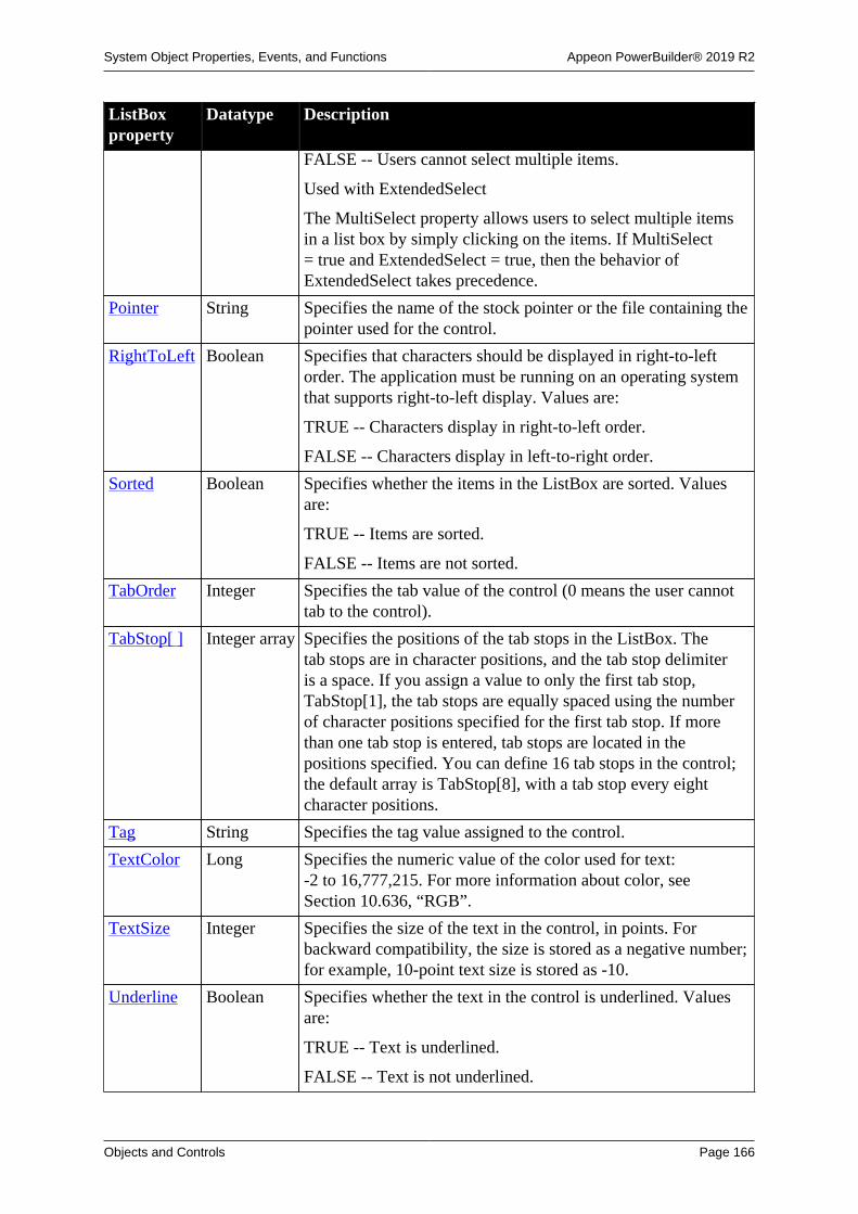
System Object Properties, Events, and Functions Appeon PowerBuilder® 2019 R2
Objects and Controls Page 166
ListBoxproperty
Datatype Description
FALSE -- Users cannot select multiple items.
Used with ExtendedSelect
The MultiSelect property allows users to select multiple itemsin a list box by simply clicking on the items. If MultiSelect= true and ExtendedSelect = true, then the behavior ofExtendedSelect takes precedence.
Pointer String Specifies the name of the stock pointer or the file containing thepointer used for the control.
RightToLeft Boolean Specifies that characters should be displayed in right-to-leftorder. The application must be running on an operating systemthat supports right-to-left display. Values are:
TRUE -- Characters display in right-to-left order.
FALSE -- Characters display in left-to-right order.
Sorted Boolean Specifies whether the items in the ListBox are sorted. Valuesare:
TRUE -- Items are sorted.
FALSE -- Items are not sorted.
TabOrder Integer Specifies the tab value of the control (0 means the user cannottab to the control).
TabStop[ ] Integer array Specifies the positions of the tab stops in the ListBox. Thetab stops are in character positions, and the tab stop delimiteris a space. If you assign a value to only the first tab stop,TabStop[1], the tab stops are equally spaced using the numberof character positions specified for the first tab stop. If morethan one tab stop is entered, tab stops are located in thepositions specified. You can define 16 tab stops in the control;the default array is TabStop[8], with a tab stop every eightcharacter positions.
Tag String Specifies the tag value assigned to the control.
TextColor Long Specifies the numeric value of the color used for text:-2 to 16,777,215. For more information about color, seeSection 10.636, “RGB”.
TextSize Integer Specifies the size of the text in the control, in points. Forbackward compatibility, the size is stored as a negative number;for example, 10-point text size is stored as -10.
Underline Boolean Specifies whether the text in the control is underlined. Valuesare:
TRUE -- Text is underlined.
FALSE -- Text is not underlined.

System Object Properties, Events, and Functions Appeon PowerBuilder® 2019 R2
Objects and Controls Page 167
ListBoxproperty
Datatype Description
Visible Boolean Specifies whether the control is visible. Values are:
TRUE -- Control is visible.
FALSE -- Control is not visible.
VScrollBar Boolean Specifies whether a vertical scroll bar is displayed on the rightof the ListBox. Values are:
TRUE -- Vertical scroll bar is displayed.
FALSE -- Vertical scroll bar is not displayed.
Weight Integer Specifies the stroke weight of the text in the control; forexample, 400 for normal or 700 for bold.
Width Integer Specifies the width of the control, in PowerBuilder units.
X Integer Specifies the X position (the distance from the left edge of thewindow), in PowerBuilder units.
Y Integer Specifies the Y position (the distance from the top of thewindow), in PowerBuilder units.
2.50.2 Events
Table 2.142:
ListBox event Occurs
Constructor Immediately before the Open event occurs in the window
Destructor Immediately after the Close event occurs in the window
DoubleClicked When the control is double-clicked (selected and activated)
DragDrop When a dragged control is dropped on the control
DragEnter When a dragged control enters the control
DragLeave When a dragged control leaves the control
DragWithin When a dragged control is within the control
GetFocus Just before the control receives focus (before it is selected and becomesactive)
Help When the user presses the F1 key or drags the context help button(question mark) from the title bar to a menu item or control
LoseFocus When the control loses focus (becomes inactive)
Other When a Controls message occurs that is not a PowerBuilder event
RButtonDown When the right mouse button is pressed on the control
SelectionChanged When an item in the control is selected

System Object Properties, Events, and Functions Appeon PowerBuilder® 2019 R2
Objects and Controls Page 168
2.50.3 Functions
Table 2.143:
ListBoxfunction
Datatypereturned
Description
AddItem Integer Adds a new item to the end of the ListBox. If the Sortedproperty of the control is true, the items are sorted again afterthe item is added.
The AddItem function does not update the Item[ ] property ofthis control.
ClassName String Returns the name assigned to the control.
DeleteItem Integer Deletes the item indicated by the index from the ListBox.
DirList Boolean Populates the ListBox with a list of the files of the specifiedtype that match the specified file pattern.
DirSelect Boolean Returns the current selection for the control and puts it in thespecified variable.
Drag Integer Starts or ends the dragging of a control.
FindItem Integer Finds the first item in the ListBox (after the specified index) thatbegins with the specified string.
GetContextServiceInteger Creates a reference to a context-specific instance of thespecified service.
GetParent PowerObject Returns a reference to the name of the parent object.
Hide Integer Makes the control invisible.
InsertItem Integer Adds a new item to the ListBox before the item indicated by theindex. If the Sorted property of the control is true, the items aresorted again after the item is added.
Move Integer Moves the control to a specified location.
PointerX Integer Returns the distance of the pointer from the left edge of thecontrol.
PointerY Integer Returns the distance of the pointer from the top of the control.
PostEvent Boolean Adds an event to the end of the message queue for the control.
Print Integer Prints the control.
Reset Integer Removes all items from the control.
Resize Integer Changes the size of the control.
SelectedIndexInteger Returns the index of the item in the ListBox that is currentlyselected. If more than one item is selected, returns the index ofthe first selected item.
SelectedItem String Returns the text of the first selected item.
SelectItem Integer Finds and highlights an item in the control. Use Syntax 1 whenyou know the text of the item but not its position. Use Syntax 2

System Object Properties, Events, and Functions Appeon PowerBuilder® 2019 R2
Objects and Controls Page 169
ListBoxfunction
Datatypereturned
Description
when you know the position of the item in the control's list oryou want to clear the current selection.
SelectItem has no effect on a ListBox whose MultiSelectproperty is true. Instead, use SetState to select items withoutaffecting the selected state of other items in the list.
SetFocus Integer Sets focus to the control.
SetPosition Integer Specifies the position of the control in the front-to-back order ofthe window.
SetRedraw Integer Controls automatic redrawing of the control after each change inits properties.
SetState Integer Sets the state (highlighted or not highlighted) of the itemindicated by the specified index. SetState works only formultiselect controls (those for which the MultiSelect property istrue).
SetTop Integer Scrolls the items in the control so that the item indicated by thespecified index is at the top of the control.
Show Integer Makes the control visible.
State Integer Returns 1 if the item specified by the specified index is selected(highlighted) and 0 if the item is not selected.
Text String Returns the text of the item in the control identified by thespecified index.
Top Integer Returns the index number of the item currently at the top of thecontrol.
TotalItems Integer Returns the total number of items in the control.
TotalSelected Integer Returns the total number of items selected in the control.
TriggerEvent Integer Triggers a specified event in the control and executes the scriptfor the event.
TypeOf Object Returns the type of the control.
2.51 ListView controlA ListView displays list information to the user. Each item of the ListView consists of textand pictures, which can be manipulated during application runtime.
2.51.1 Properties
Table 2.144:
ListViewproperty
Datatype Description
Accelerator Integer Specifies the ASCII value of the accelerator key assigned forthe control.

System Object Properties, Events, and Functions Appeon PowerBuilder® 2019 R2
Objects and Controls Page 170
ListViewproperty
Datatype Description
AccessibleDescriptionString A description of the control and/or its purpose for use byaccessibility tools such as readers for visually impaired users.
AccessibleNameString A label that briefly describes the control, such as the text in abutton or the name of a menu item.
AccessibleRoleAccessibleRole(enumerated)
Describes what kind of user interface element the control is.
AutoArrange Boolean Specifies whether PowerBuilder arranges icons automatically inlarge and small icon views.
BackColor Long Specifies the numeric value of the background color: -2to 16,777,215. For more information about color, seeSection 10.636, “RGB”.
Border Boolean Specifies whether the control has a border. Values are:
TRUE -- Control has a border.
FALSE -- Control does not have a border.
BorderStyle BorderStyle(enumerated)
Specifies the border style of the control. Values are:
StyleBox!
StyleLowered!
StyleRaised!
StyleShadowBox!
BringToTop Boolean Specifies whether PowerBuilder moves the control to the top ofthe front-to-back order.
ButtonHeaderBoolean Specifies whether the column titles in report view appear asbuttons.
CheckBoxes Boolean Specifies whether the state images are replaced by check boxes.The check boxes are set to unchecked by default. The ListViewcontrol processes mouse and keyboard input to toggle thechecked state. Values are:
• TRUE -- Check boxes are displayed.
• FALSE -- Check boxes are not displayed.
The state of an item's check box can be determined by checkingthe state picture index for the item:
Unchecked = 1
Checked = 2
ClassDefinitionPowerObject An object of type PowerObject containing information about theclass definition of the object or control.

System Object Properties, Events, and Functions Appeon PowerBuilder® 2019 R2
Objects and Controls Page 171
ListViewproperty
Datatype Description
DeleteItems Boolean Specifies whether the user can delete a ListView item from aListView control by pressing Delete.
DragAuto Boolean Specifies whether PowerBuilder puts the control automaticallyinto Drag mode. Values are:
TRUE -- When the control is clicked, the control isautomatically in Drag mode.
FALSE -- When the control is clicked, the control is notautomatically in Drag mode. You have to manually put thecontrol into Drag mode by using the Drag function.
DragIcon String Specifies the name of the stock icon or the file containing theicon you want to display when the user drags the control (theICO file). The default icon is a box the size of the control.
When the user drags the control, the icon displays when thecontrol is over an area in which the control can be dropped (avalid drop area). When the control is over an area that is not avalid drop area, the No-Drop icon displays.
EditLabels Boolean Specifies whether the user can edit the labels in a control byclicking on a selected item. Note that the item must be selectedfirst, by clicking on it.
Enabled Boolean Specifies whether the control is enabled (can be clicked).Values are:
TRUE -- Control can be clicked.
FALSE -- Control cannot be clicked.
ExtendedSelectBoolean Specifies whether users can select multiple items in the list boxat one time. Values are:
TRUE -- Users can select multiple items by selecting outside allitems and dragging to create a rectangle enclosing the desireditems; by using Click or Shift+ Click to select a sequentialgroup of items; or by using Ctrl+ Click on multiple items.
FALSE -- Users cannot select multiple items.
FaceName String Specifies the name of the typeface in which the text of thecontrol displays (for example, Arial or Courier).
FixedLocationsBoolean Specifies whether the user cannot drag items to new positions ina control.
FontCharSet FontCharSet(enumerated)
Specifies the font character set used for the text in the control.The application must be running on an appropriate versionof PowerBuilder under an operating system that supports theselected character set. For a complete list of possible values,see the list of properties for the FontCharSet variable on theEnumerated tab page of the Browser.

System Object Properties, Events, and Functions Appeon PowerBuilder® 2019 R2
Objects and Controls Page 172
ListViewproperty
Datatype Description
FontFamily FontFamily(enumerated)
Specifies the font family (type style) used for the text in thecontrol. Values are:
AnyFont!
Decorative!
Modern!
Roman!
Script!
Swiss!
FontPitch FontPitch(enumerated)
Specifies the font pitch used for the text in the control. Valuesare:
Default!
Fixed!
Variable!
FullRowSelectBoolean Specifies whether an entire row can be selected in report view.Values are:
• TRUE -- In report view, an entire row can be selected.
• FALSE -- In report view, just the item in the first column canbe selected.
GridLines Boolean Specifies whether the report view displays gridlines:
• TRUE -- In report view, gridlines are displayed.
• FALSE -- In report view, gridlines are not displayed.
HeaderDragDropBoolean Specifies whether column headers can be dragged to movecolumns in report view:
• TRUE -- In report view, column headers can be dragged.
• FALSE -- In report view, dragging column headers does notmove the columns.
Height Integer Specifies the height of the control, in PowerBuilder units.
HideSelectionBoolean Specifies whether selected text stays selected (highlighted) evenwhen the control does not have focus. Values are:
TRUE -- Text does not stay highlighted.
FALSE -- Text stays highlighted.
ImeMode Integer Specifies the input method editor mode. This property isrelevant only to applications running on a Japanese version ofPowerBuilder.

System Object Properties, Events, and Functions Appeon PowerBuilder® 2019 R2
Objects and Controls Page 173
ListViewproperty
Datatype Description
Italic Boolean Specifies whether the text in the control is italic. Values are:
TRUE -- Text is italic.
FALSE -- Text is not italic.
Item[ ] String Specifies the items in the control. Not updated afterinitialization.
ItemPictureIndex[ ]Integer Identifies the picture associated with the item. The picture indexitself is associated with a specific icon, bitmap, or cursor. Notupdated after initialization.
LabelWrap Boolean Specifies whether long labels wrap under the ListView item in alarge icon view. Values are:
TRUE -- Labels wrap.
FALSE -- Labels do not wrap.
LabelWrap does not apply to list, report, or small icon views.
LargePictureHeightInteger Specifies the size, in pixels, for the height of the picture used inthe large icon view.
In a script, this value can be set only before a large picture hasbeen added to the large picture index list.
If the large picture height is 0, PowerBuilder uses the height ofthe first picture added to the large picture index.
LargePictureMaskColorLong Specifies the color to be transparent when used in a largeicon view. This color is used when the picture is added atinitialization or with the function AddLargePicture.
LargePictureName[ ]String Specifies the name of the picture used in large icon view. Thepicture can be an icon, cursor, or bitmap supplied by the user ora stock picture from the PowerBuilder library. Not updated afterinitialization.
LargePictureWidthInteger Specifies the size, in pixels, for the width of the picture used inthe large icon view.
In a script, this value can be set only before a large picture hasbeen added to the large picture index list.
If the large picture width is 0, PowerBuilder uses the width ofthe first picture added to the large picture index.
LayoutRTL Boolean Specifies that the layout of the control should be a mirror imageof the standard layout. Values are:
TRUE -- Elements in the control are right justified.
FALSE -- Elements in the control are left justified (default).
OneClickActivateBoolean Specifies whether one click initiates the ItemActivate event:

System Object Properties, Events, and Functions Appeon PowerBuilder® 2019 R2
Objects and Controls Page 174
ListViewproperty
Datatype Description
• TRUE -- One click fires the ItemActivate event, causesthe item to change color as the mouse moves over it (hottracking), and causes the mouse to change to a hand cursorwhen it is over the item.
• FALSE -- The item does not turn color as the mouse movesover it (assuming that TrackSelect = false) and the mousedoes not change to a hand cursor when it is over the item(assuming that TwoClickActivate = false).
However, the ItemActivate event is always initiated whenan item is double-clicked, even though OneClickActivate =false and TwoClickActivate = false.
Pointer String Specifies the name of the stock pointer or the file containing thepointer used for the control.
RightToLeft Boolean Specifies that characters should be displayed in right-to-leftorder. The application must be running on an operating systemthat supports right-to-left display. Values are:
TRUE -- Characters display in right-to-left order.
FALSE -- Characters display in left-to-right order (default).
Scrolling Boolean Specifies whether the user can scroll vertically when not all ofthe items in a control are visible. Values are:
TRUE -- Scrolling is enabled.
FALSE -- Scrolling is disabled.
ShowHeader Boolean Specifies whether column titles appear in a report view. Valuesare:
TRUE -- Titles appear in a report view.
FALSE -- Titles do not appear in a report view.
SmallPictureHeightInteger Specifies the size, in pixels, for the height of the picture used inthe small icon view.
In a script, this value can be set only before a small picture hasbeen added to the small picture index list.
If the small picture height is 0, PowerBuilder uses the height ofthe first picture added to the small picture index.
SmallPictureMaskColorLong Specifies the color to be transparent when used in a small iconview. Used when the picture is added at initialization or with thefunction AddSmallPicture.
SmallPictureName[ ]String Specifies the name of the picture used in small icon view. Thepicture can be an icon, cursor, or bitmap supplied by the user or

System Object Properties, Events, and Functions Appeon PowerBuilder® 2019 R2
Objects and Controls Page 175
ListViewproperty
Datatype Description
a stock picture from the PowerBuilder library. Not updated afterinitialization.
SmallPictureWidthInteger Specifies the size, in pixels, for the width of the picture used inthe small icon view.
In a script, this value can be set only before a small picture hasbeen added to the small picture index list.
If the small picture width is 0, PowerBuilder uses the width ofthe first picture added to the small picture index.
SortType grSortType Specifies whether items are sorted alphabetically based on theitem label. Values are:
Ascending!
Descending!
UserDefinedSort!
Unsorted!
StatePictureHeightInteger Specifies the size, in pixels, for the height of the state picture.
In a script, this value can be set only before a state picture hasbeen added to the state picture index list.
If the state picture height is 0, PowerBuilder uses the height ofthe first picture added to the state picture index list.
StatePictureMaskColorLong Specifies the color to be transparent when used in a statepicture. Used when the picture is added at initialization or withthe function AddStatePicture.
StatePictureName[ ]String Specifies the name of the picture used as the state picture. Thepicture can be an icon, cursor, or bitmap supplied by the user ora stock picture from the PowerBuilder library. Not updated afterinitialization.
StatePictureWidthInteger Specifies the size, in pixels, for the width of the state picture.
In a script, this value can be set only before a state picture hasbeen added to the state picture index list.
If the state picture width is 0, PowerBuilder uses the width ofthe first picture added to the state picture index list.
TabOrder Integer Specifies the tab value of the control within the window (0means the user cannot tab to the control).
Tag String Specifies the tag value assigned to the control.
TextColor Long Specifies the numeric value of the color used for text: -2 to16,777,215.
TextSize Integer Specifies the size of the text in the control, in points.

System Object Properties, Events, and Functions Appeon PowerBuilder® 2019 R2
Objects and Controls Page 176
ListViewproperty
Datatype Description
For backward compatibility, the size is stored as a negativenumber; for example, 10-point text size is stored as -10.
TrackSelect Boolean Specifies whether items appear in a different color when themouse moves over them (hot tracking) and whether an item isselected if the mouse pauses over it. Values are:
TRUE -- An item changes color when the mouse moves over it,and an item is selected if the mouse pauses over it.
FALSE -- An item does not change color nor is it selected whenthe mouse moves over or pauses on it.
TwoClickActivateBoolean Specifies whether two clicks initiate the ItemActivate event:
TRUE -- Clicking twice (one click to select the item, one clickto activate) fires the ItemActivate event, causes the item tochange color as the mouse moves over it (hot tracking), andcauses the mouse to change to a hand cursor when it is over theitem.
FALSE -- The item does not turn color as the mouse movesover it (assuming that TrackSelect = false) and the mouse doesnot change to a hand cursor when it is over the item (assumingthat OneClickActivate = false).
However, the ItemActivate event is always initiated when anitem is double-clicked, even though TwoClickActivate = false.
Underline Boolean Specifies whether the text in the control is underlined. Valuesare:
TRUE -- Text is underlined.
FALSE -- Text is not underlined.
UnderlineColdBoolean When the OneClickActivate property is true, this propertyspecifies whether hot tracking (color of items changes whenmouse moves over them) is turned on and items not highlightedare underlined.
TRUE -- Hot tracking is turned on and nonhighlighted items areunderlined.
FALSE -- Nonhighlighted items are not underlined.
UnderlineHot Boolean When either the OneClickActivate or TwoClickActivateproperty is true, this property specifies whether hot tracking(color of items changes when mouse moves over them) is turnedon and items that are highlighted are underlined.
TRUE -- Hot tracking is turned on and highlighted items areunderlined.
FALSE -- Highlighted items are not underlined.

System Object Properties, Events, and Functions Appeon PowerBuilder® 2019 R2
Objects and Controls Page 177
ListViewproperty
Datatype Description
View ListViewViewSpecifies the layout of the ListBox. Valid values are:
ListViewLargeIcon! -- Items are arranged from left to right.Uses large pictures.
ListViewSmallIcon! -- Items are arranged from left to right.Uses small pictures.
ListViewList! -- Items are arranged from top to bottom. Usessmall pictures.
ListViewReport! -- Items are arranged from top to bottom.Uses small pictures. Additional columns of information can beassociated with each item. At least one column must be createdto view data in this view.
Visible Boolean Specifies whether the control is visible. Values are:
TRUE -- Control is visible.
FALSE -- Control is not visible.
Weight Integer Specifies the stroke weight of the text in the control; forexample, 400 for normal or 700 for bold.
Width Integer Specifies the width of the control, in PowerBuilder units.
X Integer Specifies the X position (the distance from the left edge of thewindow), in PowerBuilder units.
Y Integer Specifies the Y position (the distance from the top of thewindow), in PowerBuilder units.
2.51.2 Events
Table 2.145:
ListView event Occurs
BeginDrag When the user begins a drag operation with the left mouse button. Ifthe DragAuto property is set to true, the drag begins automatically. Ifthe DragAuto property is set to false, the drag operation must be doneprogrammatically.
BeginLabelEdit When the user starts to edit a ListView item label. Return 1 to preventsetting to the new text. Return 0 to accept the new text.
BeginRightDrag When the user begins a drag operation with the right mouse button. Ifthe DragAuto property is set to true, the drag begins automatically. Ifthe DragAuto property is set to false, the drag operation must be doneprogrammatically.
Clicked When the control is clicked.
ColumnClick When the column is clicked
Constructor When the object is created, immediately before the Open event occurs inthe window.

System Object Properties, Events, and Functions Appeon PowerBuilder® 2019 R2
Objects and Controls Page 178
ListView event Occurs
DeleteAllItems When all items in a ListView are deleted.
DeleteItem When a ListView item is deleted.
Destructor When the object is destroyed, immediately after the Close event occurs inthe window.
DoubleClicked When the control is double-clicked.
DragDrop When a dragged control is dropped on the ListView control.
DragEnter When a dragged control enters the control, including entering the narrowborder around the display area.
DragLeave When a dragged control leaves the control, including leaving by crossinginto the tab page display area.
DragWithin When a dragged control is within the control but not on a ListView item.
EndLabelEdit When the user finishes editing a ListView item label. Return 1 to preventsetting to the new text. Return 0 to accept the new text.
GetFocus Just before the control receives focus (before it is selected and becomesactive).
Help When the user presses the F1 key or drags the context help button(question mark) from the title bar to a menu item or control.
InsertItem When an item is being inserted.
ItemActivate When an item is double-clicked, or when the item is single-clicked if theproperty OneClickActivate = true, or when the item is clicked twice if theproperty TwoClickActivate = true.
ItemChanged When an item has changed.
ItemChanging When an item is changing. Return 1 to prevent the change, or 0 to acceptthe change.
Key When the user presses a key.
LoseFocus When the control loses focus (becomes inactive).
Other When a Windows message occurs that is not a PowerBuilder event.
RightClicked When the control is right-clicked.
RightDoubleClickedWhen the control is right-double-clicked.
Sort When two items are compared.
Return codes:
1 -- if item 1 > item 2.
0 -- if item 1 = item 2.
-1 -- if item 1 < item 2.

System Object Properties, Events, and Functions Appeon PowerBuilder® 2019 R2
Objects and Controls Page 179
2.51.3 Functions
Table 2.146:
ListViewfunction
Datatypereturned
Description
AddColumn Integer Adds a column to a ListView control report view.
AddItem Integer Adds an item to a ListView control.
AddLargePictureInteger Adds an icon, cursor, or bitmap to the large image list.
AddSmallPictureInteger Adds an icon, cursor, or bitmap to the small image list.
AddStatePictureInteger Adds an icon, cursor, or bitmap to the state image list.
Arrange Integer Arranges the items in a ListView control large or small iconview.
ClassName String Returns the name of the control.
DeleteColumnInteger Deletes a column from a ListView control.
DeleteColumnsInteger Deletes all columns from a ListView control.
DeleteItem Integer Deletes an item from a ListView control.
DeleteItems Integer Deletes all items from a ListView control.
DeleteLargePictureInteger Deletes a specified icon, cursor, or bitmap from the large imagelist.
DeleteLargePicturesInteger Deletes all icons, cursors, and bitmaps from the large image list.
DeleteSmallPictureInteger Deletes a specified icon, cursor, or bitmap from the small imagelist.
DeleteSmallPicturesInteger Deletes all icons, cursors, and bitmaps from the small image list.
DeleteStatePictureInteger Deletes a specified icon, cursor, or bitmap from the state imagelist.
DeleteStatePicturesInteger Deletes all icons, cursors, and bitmaps from the large state list.
Drag Integer Starts or ends the dragging of a ListView item.
EditLabel Integer Starts editing a specific ListView item label.
FindItem Integer Searches for the next item that satisfies the specified searchcriteria.
GetColumn Integer Syntax 1: Does not apply to a ListView control.
Syntax 2: Returns the properties of a specified column in aListView control report view.
GetContextServiceInteger Creates a reference to a context-specific instance of thespecified service.
GetItem Integer Retrieves information for a specified item.
GetOrigin Integer Finds the X and Y coordinates of the upper-left corner of theListView item.
GetParent PowerObject Returns a reference to the name of the parent object.
Hide Integer Hides the specified ListView item.

System Object Properties, Events, and Functions Appeon PowerBuilder® 2019 R2
Objects and Controls Page 180
ListViewfunction
Datatypereturned
Description
InsertColumn Integer Inserts a column into a ListView control report view.
InsertItem Integer Inserts an item into a ListView control.
Move Integer Moves a control or object to a specified location.
PointerX Integer Determines the distance from the left edge of an object to thepointer location.
PointerY Integer Determines the distance from the top edge of an object to thepointer location.
PostEvent Boolean Adds the event to the end of the event queue of an object.
Print Integer Includes this object in a print job. Only the part visible on thescreen is printed.
Resize Integer Resizes a control to the specified dimensions.
SelectedIndexInteger Returns the number of the selected item in a ListView control.
SetColumn Integer Syntax 1: Does not apply to a ListView control.
Syntax 2: Sets the properties of a particular column in aListView control report view.
SetFocus Integer Sets focus for a specified object or control.
SetItem Integer Sets the values for a given ListView item.
SetOverlayPictureInteger Maps a picture index to an overlay picture index. Only fouroverlay picture indexes are available.
SetPosition Integer Sets the position of the ListView control in the front-to-backorder within a window.
SetRedraw Integer Controls the automatic redraw of an object after its propertieshave changed.
Show Integer Makes an object or control visible if it is hidden. If the object isalready visible, Show brings it to the top.
Sort Integer Sorts the items in a ListView control.
TotalColumnsInteger Returns the number of columns in a ListView control reportview.
TotalItems Integer Returns the number of items in a ListView control.
TotalSelected Integer Returns the number of selected items in a ListView control.
TriggerEvent Integer Triggers a specified event in the control and executes the scriptfor the event.
TypeOf Object Returns the type of the control.
2.52 ListViewItem object
A ListViewItem object is a system structure that populates a ListView control.ListViewItems have no events.

System Object Properties, Events, and Functions Appeon PowerBuilder® 2019 R2
Objects and Controls Page 181
2.52.1 Properties
Table 2.147:
ListViewItemproperty
Datatype Description
ClassDefinitionPowerObject An object of type PowerObject containing information about theclass definition of the object or control.
CutHighlightedBoolean Specifies whether the item is the target of a cut operation.Values are:
TRUE -- The item is the target of a cut operation.
FALSE -- The item is not the target of a cut operation.
Data Any Assigns any user-defined data to a ListView item.
DropHighlightedBoolean Specifies whether the item is the target of a DragDropoperation. Values are:
TRUE -- The item is the target of a DragDrop operation.
FALSE -- The item is not the target of a DragDrop operation.
HasFocus Boolean Specifies whether the item has focus. Values are:
TRUE -- The item has focus.
FALSE -- The item does not have focus.
ItemX Integer Identifies the X location of the item relative to the upper-leftcorner of the control.
ItemY Integer Identifies the Y location of the item relative to the upper-leftcorner of the control.
Label String Identifies the string label associated with the item.
OverlayPictureIndexInteger Identifies the overlay picture associated with the item.
PictureIndex Integer Identifies the large and small picture associated with the item.
Selected Boolean Specifies whether the item is selected. Values are:
TRUE -- The item is selected.
FALSE -- The item is not selected.
StatePictureIndexInteger Identifies the state picture associated with the item.
2.52.2 Functions
Table 2.148:
ListViewItemfunction
Datatypereturned
Description
ClassName String Returns the name assigned to the object.
GetContextServiceInteger Creates a reference to a context-specific instance of thespecified service.
GetParent PowerObject Returns a reference to the parent of the object.

System Object Properties, Events, and Functions Appeon PowerBuilder® 2019 R2
Objects and Controls Page 182
ListViewItemfunction
Datatypereturned
Description
TypeOf Object Returns the type of the object.
2.53 mailFileDescription objectThe mailFileDescription object is a system structure containing information about anattachment file to a mail message. A mailFileDescription object has no events.
2.53.1 Properties
Table 2.149:
mailFileDescriptionproperty
Datatype Description
ClassDefinitionPowerObject An object of type PowerObject containing information about theclass definition of the object or control.
FileType mailFileType(enumerated)
Specifies the type of the attachment file. Values are:
mailAttach! -- data file.
mailOLE! -- embedded OLE object.
mailOLEStatic! -- static OLE object.
Only mailAttach! is supported for Extended MAPI. If youspecify the other value (mailOLE! or mailOLEStatic! ), it willwork as mailAttach!
Filename String Specifies the name of the attachment file.
Pathname String Specifies the full path of the attachment file including the filename.
Position UnsignedlongSpecifies the position of the attachment file within the messagebody. Required when sending multiple attachments.
2.53.2 Functions
Table 2.150:
mailFileDescriptionfunction
Datatypereturned
Description
ClassName String Returns the class of an object.
GetContextServiceInteger Creates a reference to a context-specific instance of thespecified service.
GetParent PowerObject Returns a reference to the name of the parent object.
TypeOf Object Returns the type of the object.
2.54 mailMessage objectThe mailMessage object is a system structure containing information about a specific mailmessage. A mailMessage object has no events.

System Object Properties, Events, and Functions Appeon PowerBuilder® 2019 R2
Objects and Controls Page 183
2.54.1 Properties
Table 2.151:
mailMessageproperty
Datatype Description
AttachmentFile[ ]mailFileDescriptionSpecifies the file attachment for the current message. AmailFileDescription array contains information about anattachment file.
ClassDefinitionPowerObject An object of type PowerObject containing information about theclass definition of the object or control.
ConversationIDString Specifies the conversation thread ID for the current message.
DateReceivedString Indicates the date on which the current message was received.
MessageSent Boolean Indicates whether the current message has been sent to the mailserver. (Read-only at runtime only.)
TRUE -- Message has been sent to mail server.
FALSE -- Message has not yet been sent.
MessageTypeString Indicates the type of the current message. A value other thannull or an empty string indicates use by an application otherthan interpersonal mail. (Runtime only.)
NoteText String Specifies the content of the message body. (Runtime only.)
ReceiptRequestedBoolean Indicates whether a return receipt is requested for the currentmessage. (Runtime only.)
TRUE -- Return receipt requested.
FALSE -- Return receipt not requested.
Recipient[ ] mailRecipientSpecifies the recipient of the current message. For mailSend,mailOriginator! is not a valid value for the Recipient property.The valid values are mailto!, mailcc!, and mailbcc!. To specifythat the sender receive a copy of the message, use mailcc!.
Subject String Specifies the subject line, displayed in the message header, forthe current message.
Unread Boolean Indicates whether or not the message has been read. (Read-onlyat runtime only.)
TRUE -- Message has not been read.
FALSE -- Message has been read.
2.54.2 Functions
Table 2.152:
mailMessagefunction
Datatypereturned
Description
ClassName String Returns the class of the object

System Object Properties, Events, and Functions Appeon PowerBuilder® 2019 R2
Objects and Controls Page 184
mailMessagefunction
Datatypereturned
Description
GetContextServiceInteger Creates a reference to a context-specific instance of thespecified service
GetParent PowerObject Returns a reference to the name of the parent object
TypeOf Object Returns the type of the object
2.55 mailRecipient object
The mailRecipient object is a system structure containing information about the recipient ofa mail message. You populate the mailRecipient structure using the mailAddress function. AmailRecipient object has no events.
For information about the mailAddress function, see Section 10.486, “mailAddress”.
2.55.1 Properties
Table 2.153:
mailRecipientproperty
Datatype Description
Address String Specifies the electronic mail address of the current mailrecipient. (Runtime only.)
ClassDefinitionPowerObject An object of type PowerObject containing information about theclass definition of the object or control.
EntryID Blob Binary entry identifier information used internally.
Name String Specifies the name of the current mail recipient. (Runtime only.)
RecipientTypemailRecipientType(enumerated)
Specifies the type of the current mail recipient. Values are:
mailBCC!
mailCC!
mailOriginator!
mailTo!
2.55.2 Functions
Table 2.154:
mailRecipientfunction
Datatypereturned
Description
ClassName String Returns the class of the object
GetContextServiceInteger Creates a reference to a context-specific instance of thespecified service
GetParent PowerObject Returns a reference to the name of the parent object
TypeOf Object Returns the type of the object

System Object Properties, Events, and Functions Appeon PowerBuilder® 2019 R2
Objects and Controls Page 185
2.56 mailSession objectThe mailSession nonvisual object signs on and establishes a messaging application programinterface (MAPI) session.
2.56.1 Properties
Table 2.155:
mailSessionproperty
Datatype Description
ClassDefinitionPowerObject An object of type PowerObject containing information about theclass definition of the object or control
MessageID[ ] String Contains the IDs of the messages in a user's mail inbox
SessionID Long Contains the handle of the current messaging session
2.56.2 Events
Table 2.156:
mailSessionevent
Occurs
Constructor When the object is created
Destructor When the object is destroyed
2.56.3 Functions
Table 2.157:
mailSessionfunction
Datatypereturned
Description
ClassName String Returns the class of the object
GetContextServiceInteger Creates a reference to a context-specific instance of thespecified service
GetParent PowerObject Returns a reference to the name of the parent object
mailAddress mailReturnCodeUpdates the mailRecipient array for a mail message
mailDeleteMessagemailReturnCodeDeletes a mail message from the user's electronic mail inbox
mailGetMessagesmailReturnCodePopulates the MessageID array of a mailSession object with themessage IDs in the user's inbox
mailHandle UnsignedLongObtains the handle of a mailSession object
mailLogoff mailReturnCodeEnds the mail session, breaking the connection between thePowerBuilder application and mail
mailLogon mailReturnCodeEstablishes a mail session for the PowerBuilder application
mailReadMessagemailReturnCodeOpens a mail message whose ID is stored in the mail session'smessage array
mailRecipientDetailsmailReturnCodeDisplays a dialog box with the specified recipient's addressinformation

System Object Properties, Events, and Functions Appeon PowerBuilder® 2019 R2
Objects and Controls Page 186
mailSessionfunction
Datatypereturned
Description
mailResolveRecipientmailReturnCodeObtains a valid electronic mail address based on a partial or fulluser name and optionally updates information in the system'saddress list if the user has privileges to do so
mailSaveMessagemailReturnCodeCreates a new message in the user's inbox or replaces anexisting message
mailSend mailReturnCodeSends a mail message
PostEvent Integer Adds an event to the end of the message queue for the object
TriggerEvent Integer Triggers a specified event in the object and executes the scriptfor the event
TypeOf Object Returns the type of the object
2.57 MDIClient objectAn MDI window is a frame window in which you can open multiple document windows(sheets) and move among the sheets.
An MDIClient object is the area in which open sheets display in a standard MDI frame. Ina standard MDI window, PowerBuilder sizes the MDIClient so that it fills the space insidethe frame. For example, if the frame has a menu bar and MicroHelp, the MDIClient fillsthe space between the sides of the frame and the space below the menu bar and above theMicroHelp.
In a custom MDI window, you determine the size of the client area. For example, when aframe has buttons below the menu bar in the frame, you size the client area so it begins belowthe buttons.
An MDIClient object has no associated events.
2.57.1 Properties
Table 2.158:
MDIClientproperty
Datatype Description
BackColor Long Specifies the numerical value of the background color:-2 to 16,777,215. For more information about color, seeSection 10.636, “RGB”.
BringToTop Boolean Specifies whether PowerBuilder moves the MDIClient object tothe top of the front-to-back order. Values are:
TRUE -- Object moved to top.
FALSE -- Object not moved to top.
ClassDefinitionPowerObject An object of type PowerObject containing information about theclass definition of the object or control.
Height Integer Specifies the height of the MDIClient object, in PowerBuilderunits.

System Object Properties, Events, and Functions Appeon PowerBuilder® 2019 R2
Objects and Controls Page 187
MDIClientproperty
Datatype Description
MicroHelpHeightInteger Holds the height of the MicroHelp in the MDIClient object.
If the style of the MDI window is MDI Frame (no MicroHelp),MicroHelpHeight is 0; otherwise, it is the height of theMicroHelp.
You cannot set the value of this property.
Tag String Specifies the tag value assigned to the MDIClient object.
Visible Boolean Specifies whether the MDIClient object is visible. Values are:
TRUE -- Object is visible.
FALSE -- Object is not visible.
Width Integer Specifies the width of the MDIClient object, in PowerBuilderunits.
X Integer Specifies the X position (the distance from the left edge of theMDI frame window), in PowerBuilder units.
Y Integer Specifies the Y position (the distance from the top of the MDIframe window), in PowerBuilder units.
2.57.2 Functions
Table 2.159:
MDIClientfunction
Datatypereturned
Description
ClassName String Returns the name assigned to the MDIClient object.
GetContextServiceInteger Creates a reference to a context-specific instance of thespecified service.
GetParent PowerObject Returns a reference to the name of the parent object.
Hide Integer Makes the MDIClient object invisible.
Move Integer Moves the MDIClient object to a specified location.
Resize Integer Changes the size of the MDIClient object.
SetRedraw Integer Controls automatic redrawing of the MDIClient object aftereach change in its properties. To reduce flicker when the usercloses all the sheets, set SetRedraw to FALSE.
Show Integer Makes the MDIClient object visible.
TypeOf Object Returns the type of the object.
2.58 Menu object
In PowerBuilder, you use the Menu painter to create menus and toolbars. Typically, menusare lists of items (usually commands or options) that a user can select in the currently activewindow. Menus can display in a menu bar, in a drop-down or cascading menu, or as pop-

System Object Properties, Events, and Functions Appeon PowerBuilder® 2019 R2
Objects and Controls Page 188
up menus. A toolbar is associated with a menu, and its toolbar buttons act as shortcuts forchoosing items from the menu.
PowerBuilder provides a Menu system object used to develop menus. A Menu objectcan contain other Menu objects that appear, for example, as the items in a drop-down orcascading menu. When the user clicks a Menu object, a Clicked event is triggered. If there isa drop-down or cascading menu under the clicked object, the script for the Clicked event forthe object is executed, and then the menu displays. If there is no menu under the object, thescript for the Clicked event for the object is executed.
Menus that you import or upgrade from earlier versions of PowerBuilder use the Traditionalmenu style by default. Menus with a Contemporary style have a three-dimensional menuappearance similar to those in Microsoft Office 2003 and Visual Studio 2005, and caninclude bitmap and menu title bands.
2.58.1 Properties
Table 2.160:
Menuproperty
Datatype Description
BitmapBackColorLong Background color of the bitmap band of the menu. (Default issilver.)
BitmapGradientBoolean Background of the bitmap band to a gradient style.
Checked Boolean Specifies whether the Menu object is selected. The state of thechecked property is reflected in the toolbar button. Values are:
TRUE -- Object is selected.
FALSE -- Object is not selected.
ClassDefinitionPowerObject An object of type PowerObject containing information about theclass definition of the object or control.
Default Boolean Specifies whether the menu item is the default and appears ina bold typeface. Only one item within a menu should be set todefault.
In context menus, the Default property is used to indicate theaction that would have been performed if the user had double-clicked on the object rather than right-clicked on it.
The property is also used to indicate which operation wouldhave been performed if the item had been dragged with the leftmouse button rather than the right mouse button.
Values are:
TRUE -- Menu item is bolded.
FALSE -- Menu item is not bolded.
Enabled Boolean Specifies whether the Menu object is enabled (can be clicked).The state of the enabled property is reflected in the toolbarbutton. Values are:

System Object Properties, Events, and Functions Appeon PowerBuilder® 2019 R2
Objects and Controls Page 189
Menuproperty
Datatype Description
TRUE -- Object is enabled.
FALSE -- Object is not enabled.
FaceName String Font face name.
Italic Boolean Italic font.
Item[ ] Menu Specifies the Menu objects under a Menu object.
MenuAnimationBoolean Visual sizing cue to the menu item bitmap when the associatedmenu item is selected. This property is ignored if theMenuImage property is not assigned.
MenuBackColorLong Background color of the menu.
MenuBitmapsBoolean Bitmap band for the menu.
MenuHighlightColorLong Menu highlight color. The default is the default Windowshighlight color.
MenuImage String Bitmap image to be used with the menu item. This property isignored if the MenuBitmaps property for the menu object is notselected or is set to false. If you change MenuImage at runtime,the height of the image does not change, therefore you shouldavoid assigning a larger or smaller bitmap dynamically.
MenuItemTypeMenuItemType(enumerated)
Allows you to identify special Menu objects that are useddifferently on different platforms. Values are:
MenuItemTypeAbout!
MenuItemTypeExit!
MenuItemTypeHelp!
MenuItemTypeNormal!
MenuStyle MenuStyle(enumerated)
Overall menu style. Values are: contemporarymenu! andtraditionalmenu!
MenuTextColorLong Menu text color. (Default is the Windows menu text color.)
MenuTitles Boolean Menu title band.
MenuTitleTextString Label for a menu item that has a cascading submenu. The labeltext is set vertically in a column to the left of the submenuitems and the bitmaps for submenu items, if any. If the verticallabel text is longer than the height of all the submenu items,the label text is cut from the end. This property is ignored if theMenuTitles property for the menu object is not selected.
MergeOption MenuMergeOption(enumerated)
Specifies how the object is affected when an OLE object isactivated. Values are:
EditMenu!
Exclude!
FileMenu!

System Object Properties, Events, and Functions Appeon PowerBuilder® 2019 R2
Objects and Controls Page 190
Menuproperty
Datatype Description
HelpMenu!
Merge!
WindowMenu!
For more information about MergeOption, see Chapter 22,Using OLE in an Application.
MicroHelp String Specifies the text of the MicroHelp for the object.
ParentWindowWindow Specifies the window that owns the Menu object.
ShiftToRight Boolean Specifies whether the Menu object shifts down or to the rightwhen other Menu objects are added in a descendant menu.Values are:
TRUE -- Object shifts to right.
FALSE -- Object shifts down.
Shortcut Integer Specifies the shortcut key for the Menu object. This propertyshould be set only in the Menu painter. It cannot be set atruntime.
Tag String Specifies the tag value assigned to the Menu object.
Text String Specifies the text in the Menu object.
TextSize Integer Font character size in points for menu items. This property doesnot apply to the Traditional menu style, and it does not apply tothe main menu bar, which has a fixed height of 8 points.
TitleBackColorLong Background color of the title panel.
TitleGradient Boolean Background gradient style for the title panel.
ToolbarAnimationBoolean Specifies animation for the toolbar image. You can selectthe ToolbarAnimation check box on the Toolbar tab in theProperties view for each menu item unless you are using thetraditional toolbar style for the current menu object. If you donot select an image for the ToolbarItemName property of amenu item, the selection you make for the ToolbarAnimationproperty is ignored.
ToolbarBackColorLong Background color of the menu toolbar.
ToolbarGradientBoolean Gradient of the menu toolbar background.
ToolbarHighlightColorLong Highlight color for the toolbar buttons when they are selected.
ToolbarItemBarIndexInteger Specifies which toolbar the Menu object is on when multipletoolbars exist. If setting this index results in the object being thefirst item on a new toolbar, the toolbar is implicitly created. Ifsetting this index results in emptying a toolbar, the toolbar isimplicitly destroyed.
ToolbarItemDownBoolean Specifies how the toolbar button appears. Values are:

System Object Properties, Events, and Functions Appeon PowerBuilder® 2019 R2
Objects and Controls Page 191
Menuproperty
Datatype Description
TRUE -- Toolbar button appears down.
FALSE -- Toolbar button appears up.
This property is automatically reset when any button is pressedusing the mouse.
ToolbarItemDownNameString Specifies the name of the toolbar icon associated with the Menuobject when it is down.
ToolbarItemNameString Specifies the name of a stock toolbar picture you want to use torepresent an item in the toolbar or a string containing the nameof a bitmap file.
ToolbarItemOrderInteger Specifies the order of the item in the toolbar.
ToolbarItemSpaceInteger Specifies the amount of empty space before the item in thetoolbar.
ToolbarItemTextString Specifies the text that displays in the toolbar item when thedisplay text option is on for toolbars.
ToolbarItemVisibleBoolean Specifies whether the toolbar item displays. Values are:
TRUE -- The toolbar item is visible.
FALSE -- The toolbar item is not visible.
If any toolbar item has a ToolbarItemName assigned, an emptytoolbar displays even if this property has been set to false forall toolbar items. To control display of the toolbar, use theToolbarVisible property of the window.
ToolbarStyle ToolbarStyle(enumerated)
Overall style of the menu toolbar. Values are:contemporarytoolbar! and traditionaltoolbar!
ToolbarTextColorLong Color of the text in menu toolbar.
Underline Boolean Underline font.
Visible Boolean Specifies whether the Menu object is visible. Values are:
TRUE -- Object is visible.
FALSE -- Object is not visible.
Weight Integer Font weight.
2.58.2 Events
Table 2.161:
Menu event Occurs
Clicked When the Menu object is clicked (selected or unselected)
Help When the user presses the F1 key or drags the context help button(question mark) from the title bar to a menu item or control

System Object Properties, Events, and Functions Appeon PowerBuilder® 2019 R2
Objects and Controls Page 192
Menu event Occurs
Selected When the user moves to the Menu object using the arrow keys or themouse
2.58.3 Functions
Table 2.162:
Menufunction
Datatypereturned
Description
Check Integer Displays a check mark next to the Menu object and sets theChecked property.
ClassName String Returns the class of the Menu object.
Disable Integer Disables (and grays) the Menu object so that it cannot beselected and unsets the Enabled property.
Enable Integer Enables the Menu object so that it can be selected and displaysit normally (not grayed) and sets the Enabled property.
GetContextServiceInteger Creates a reference to a context-specific instance of thespecified service.
GetParent PowerObject Returns a reference to the name of the parent object.
Hide Integer Makes the Menu object invisible.
PopMenu Integer Displays the Menu object at the specified location.
PostEvent Integer Adds an event to the end of the message queue for the Menuobject.
Show Integer Makes the Menu object visible.
TriggerEvent Integer Triggers a specified event in the Menu object and executes thescript for the event.
TypeOf Object Returns the type of the control.
Uncheck Integer Removes the check mark next to the Menu object and sets theChecked property to FALSE.
2.59 MenuCascade objectMenu objects contained within a MenuCascade object appear as a drop-down button palette.
2.59.1 Properties
Table 2.163:
MenuCascadeproperty
Datatype Description
Checked Boolean Specifies whether the Menu object is selected. The state of thechecked property is reflected in the toolbar button. Values are:
TRUE -- Object is selected.
FALSE -- Object is not selected.

System Object Properties, Events, and Functions Appeon PowerBuilder® 2019 R2
Objects and Controls Page 193
MenuCascadeproperty
Datatype Description
ClassDefinitionPowerObject An object of type PowerObject containing information about theclass definition of the object or control.
Columns Integer Specifies the number of columns in the drop-down buttonpalette.
CurrentItem Menu Specifies the Menu object that is currently displayed on themain toolbar as the representative (active) button for the drop-down button palette.
Default Boolean Specifies whether the menu item is the default and appears ina bold typeface. Only one item within a menu should be set todefault.
In context menus, the Default property is used to indicate theaction that would have been performed if the user had double-clicked on the object rather than right-clicked on it.
The property is also used to indicate which operation wouldhave been performed if the item had been dragged with the leftmouse button rather than the right mouse button.
Values are:
TRUE -- Menu item is bolded.
FALSE -- Menu item is not bolded.
DropDown Boolean Specifies whether the Menu objects contained in theMenuCascade object display as a drop-down button palette.Values are:
TRUE -- Menu objects contained in the MenuCascade objectare displayed as a drop-down button palette.
FALSE -- Menu objects contained in the MenuCascade objectare displayed as normal toolbar items.
Enabled Boolean Specifies whether the Menu object is enabled (can be clicked).The state of the enabled property is reflected in the toolbarbutton. Values are:
TRUE -- Object is enabled.
FALSE -- Object is not enabled.
Item[ ] Menu Specifies the Menu objects under a Menu object.
MenuItemTypeMenuItemType
(enumerated)
Allows you to identify special menu items that are useddifferently on different platforms. Values are:
MenuItemTypeAbout!
MenuItemTypeExit!
MenuItemTypeHelp!
MenuItemTypeNormal!

System Object Properties, Events, and Functions Appeon PowerBuilder® 2019 R2
Objects and Controls Page 194
MenuCascadeproperty
Datatype Description
MergeOption MenuMerge-Option(enumerated)
Specifies how the object is affected when an OLE 2.0 object isactivated. Values are:
EditMenu!
Exclude!
FileMenu!
HelpMenu!
Merge!
WindowMenu!
For more information about MergeOption, see Chapter 22,Using OLE in an Application.
MicroHelp String Specifies the text of the MicroHelp for the object.
ParentWindowWindow Specifies the window that owns the Menu object.
ShiftToRight Boolean Specifies whether the Menu object shifts down or to the rightwhen other Menu objects are added in a descendant menu.Values are:
TRUE -- Object shifts to right.
FALSE -- Object shifts down.
Shortcut Integer Specifies the shortcut key for the object. This property shouldbe set only in the Menu painter. It cannot be set at runtime.
Tag String Specifies the tag value assigned to the Menu object.
Text String Specifies the text in the Menu object.
ToolbarItemDownBoolean Specifies how the toolbar button appears. Values are:
TRUE -- Toolbar button appears down.
FALSE -- Toolbar button appears up.
This property is automatically reset when any button is pressedusing the mouse.
ToolbarItemDownNameString Specifies the name of the toolbar icon associated with the Menuobject when it is down.
ToolbarItemBarIndexInteger Specifies which toolbar the object is on when multiple toolbarsexist. If setting this index results in the item being the first itemon a new toolbar, the toolbar is implicitly created. If setting thisindex results in emptying a toolbar, the toolbar is implicitlydestroyed.
ToolbarItemNameString Specifies the name of a stock toolbar picture you want to use torepresent an item in the toolbar or a string containing the nameof a bitmap file.
ToolbarItemOrderInteger Specifies the order of the item in the toolbar.

System Object Properties, Events, and Functions Appeon PowerBuilder® 2019 R2
Objects and Controls Page 195
MenuCascadeproperty
Datatype Description
ToolbarItemSpaceInteger Specifies the amount of empty space before the item in thetoolbar.
ToolbarItemTextString Specifies the text that displays in the toolbar item when thedisplay text option is on for toolbars.
ToolbarItemVisibleBoolean Specifies whether the toolbar item displays. Values are:
TRUE -- Toolbar item is visible.
FALSE -- Toolbar item is not visible.
Visible Boolean Specifies whether the Menu object is visible. Values are:
TRUE -- Object is visible.
FALSE -- Object is not visible.
2.59.2 Events
Table 2.164:
MenuCascadeevent
Occurs
Clicked When the Menu object is clicked (selected or unselected)
Help When the user presses the F1 key or drags the context help button(question mark) from the title bar to a menu item or control
Selected When the user moves to the Menu object using the arrow keys or themouse
2.59.3 Functions
Table 2.165:
MenuCascadefunction
Datatypereturned
Description
Check Integer Displays a check mark next to the Menu object and sets theChecked property
ClassName String Returns the class of the Menu object
Disable Integer Disables (and grays) the Menu object so that it cannot beselected and unsets the Enabled property
Enable Integer Enables the Menu object so that it can be selected, displays itnormally (not grayed), and sets the Enabled property
GetContextServiceInteger Creates a reference to a context-specific instance of thespecified service
GetParent PowerObject Returns a reference to the name of the parent object
Hide Integer Makes the Menu object invisible

System Object Properties, Events, and Functions Appeon PowerBuilder® 2019 R2
Objects and Controls Page 196
MenuCascadefunction
Datatypereturned
Description
PopMenu Integer Displays the Menu object at the specified location
PostEvent Integer Adds an event to the end of the message queue for the Menuobject
Show Integer Makes the Menu object visible
TriggerEvent Integer Triggers a specified event in the Menu object and executes thescript for the event
TypeOf Object Returns the type of the control
Uncheck Integer Removes the check mark next to the Menu object and sets theChecked property to FALSE
2.60 Message object
The Message object is used to process events that are not defined by PowerBuilder, tocommunicate parameters between windows when you open and close them, and to specifywhether optional parameters are used in TriggerEvent or PostEvent.
You can also customize your own version of the Message object by defining a class userobject inherited from the built-in Message object.
For more information about creating a custom Message object, see Chapter 15, Working withUser Objects.
2.60.1 Properties
The first four properties of the Message object correspond to the first four properties of theMicrosoft Windows message structure:
Table 2.166:
Messageproperty
Datatype Description
Handle Long The handle of the window or control.
Number UnsignedInt The number that identifies the event (this number comes fromWindows).
WordParm Long The word parameter for the event (this parameter comes fromWindows). The parameter's value and meaning are determinedby the event.
LongParm Long The long parameter for the event (this number comes fromWindows). The parameter's value and meaning are determinedby the event.
ClassDefinitionPowerObject An object of type PowerObject containing information about theclass definition of the object or control.
DoubleParm Double A numeric or a numeric variable.
StringParm String A string or a string variable.

System Object Properties, Events, and Functions Appeon PowerBuilder® 2019 R2
Objects and Controls Page 197
Messageproperty
Datatype Description
PowerObjectParmPowerObject Any PowerBuilder object type including structures.
Processed Boolean A boolean value set in the script for the user-defined event orthe Other event. Values are:
TRUE -- The script processed the event; do not call the defaultwindow process (DefWindowProc) after the event has beenprocessed.
FALSE -- (Default) Call DefWindowProc after the event hasbeen processed.
ReturnValue Long When Message.Processed is true, specifies the value youwant returned to Windows. This property is ignored whenMessage.Processed is false.
2.60.2 Events
Table 2.167:
Message event Occurs
Constructor When the user object is created
Destructor When the user object is destroyed
2.60.3 Functions
Table 2.168:
Messagefunction
Datatypereturned
Description
ClassName String Returns the name assigned to the user object
GetContextServiceInteger Creates a reference to a context-specific instance of thespecified service
GetParent PowerObject Returns a reference to the name of the parent object
PostEvent Boolean Adds an event to the end of the message queue of the userobject
TriggerEvent Integer Sends an event to the user object and executes the scriptassociated with the event
TypeOf Object Returns the type of the user object
2.61 MLSync object
An MLSync object is derived from the MLSynchronization object base class. Its primaryfunction is to launch dbmlsync.exe, a separate process that synchronizes a SQL Anywhereremote database with a consolidated database. The MLSync properties control the optionsused for the synchronization. MLSync events represent callbacks that are automaticallytriggered by dbmlsync.exe at specific times during the synchronization process.

System Object Properties, Events, and Functions Appeon PowerBuilder® 2019 R2
Objects and Controls Page 198
2.61.1 Properties
Table 2.169:
MLSyncproperty
Datatype Description
AdditionalOptsString Used to pass additional dbmlsync options.
AuthenticateParmsString Used with authenticate_parameters connection script.Equivalent to the -ap "parm1,parm2" dbmlsync option.
DataSource String The ODBC data source name used to connect to aSQL Anywhere remote database. Equivalent to the -c"dsn=myDSN" dbmlsync option, where myDSN is the datasource name.
DBPass String Password for the SQL Anywhere remote database. Equivalentto the -c "pwd=myPassword" dbmlsync option, wheremyPassword is the password for the database connection.
DBUser String User ID for the SQL Anywhere remote database. Equivalent tothe -c "uid=myUserID" dbmlsync option, where myUserID isthe user ID for the database connection.
EncryptionKeyString Encryption key for SQL Anywhere remote database. Equivalentto the -c "dbkey=myKey" dbmlsync option, where myKey is theencryption key for the database.
ErrorText String Contains error and diagnostic messages generated when anMLSync function is called incorrectly.
ExtendedOptsString Extended dbmlsync options. Equivalent to the -e"extops" dbmlsync option.
Host String The machine name for the synchronization server. Equivalentto the -e "adr='host=machineName'" dbmlsync option, wheremachineName is the host machine.
LogFileNameString Creates a log file at this path if UseLogFile=true. Equivalent tothe -o logfilename dbmlsync option, where logfilename is thefull name of the log file you want to create.
LogOpts String Additional dbmlsync options to control logging output.
MLPass String The MobiLink password needed to connect tothe synchronization server. Equivalent to the -mppassword dbmlsync option.
MLServerVersionLong The version of the SQL Anywhere remote database andsynchronization server.
MLUser String The MobiLink user name needed to connect to thesynchronization server. Equivalent to the -u username dbmlsyncoption.
ObjectRevisionLong You increment this value each time you rebuild the MLSyncobject with new default property values. At runtime, if a newObjectRevision value is detected, the default property values are

System Object Properties, Events, and Functions Appeon PowerBuilder® 2019 R2
Objects and Controls Page 199
MLSyncproperty
Datatype Description
written to the Windows registry and used to initialize MLSync.For subsequent synchronizations, MLSync is initialized usingthe property values obtained from the Windows registry.
Port String The port number for the synchronization server. Equivalent tothe -e "adr='port=portno'" dbmlsync option, where portno is thenumber of the port you use for synchronization.
ProcessOptionSyncProcessType(enumerated)
Sets the direction for synchronization. Values areDownloadOnly!, UploadOnly!, and Bidirectional! (default).
ProgressWindowNameString Specifies the class name of a progress window generated bythe MobiLink Synchronization Wizard. The progress windowis an optional selection in the synchronization wizard, or acustomized user-defined window. It should contain the samecallback events as the MLSync object. An MLSync object thatis generated by the wizard automatically triggers the appropriatewindow event in order to display synchronization progress.
Publication String The publication to be processed. If more than one publicationis specified, you must separate each name with a comma.Equivalent to the -n pub1,pub2 dbmlsync option.
SyncRegistryKeyString Location in the Windows registry where MLSync propertyvalues from a previous synchronization are stored. TheMobiLink Synchronization Wizard generates a synchronizationoptions window that allows an end user to customize theMLSync properties at runtime and save these settings when theSetSyncRegistryProperties function is triggered.
UseLogFile Boolean If true, creates a synchronization log.
UseWindow Boolean Used at runtime by the objects that are generated by thesynchronization wizard. When set to true, the generatedfunctions create a progress window to display status informationabout the synchronization process.
WindowObjectWindow Instance of a synchronization progress window. The class nameof WindowObject must match the ProgressWindowName value.
2.61.2 Events
Table 2.170:
MLSync event Occurs
BeginDownload At the beginning of the download procedure
BeginLogScan Before dbmlsync scans the transaction log to assemble the upload
BeginSync At the beginning of the synchronization
BeginUpload At the beginning of the upload procedure
ConnectMobiLink When dbmlsync connects to the MobiLink server

System Object Properties, Events, and Functions Appeon PowerBuilder® 2019 R2
Objects and Controls Page 200
MLSync event Occurs
DisconnectMobiLinkImmediately after disconnecting from the synchronization server
DisplayMessage On display of an informational message
EndDownload At the end of download processing
EndLogScan After the scan of the transaction log completes for upload
EndSync At the end of synchronization
EndUpload After transmission of the upload to the synchronization server
ErrorMessage On display of an error message
FileMessage On display of a file message
ProgressIndex Periodically whenever the synchronization triggers updates to a progressbar
SyncPreview Returns generated dbmlsync command arguments immediately prior tolaunching the process
UploadAck On completion of upload processing
WaitForUploadAckWhen the synchronization process starts a new waiting period for uploadacknowledgement
WarningMessage On display of a warning message
2.61.3 Functions
Table 2.171:
MLSyncfunction
Datatypereturned
Description
CancelSync Integer Cancels a synchronization that is in progress
GetCommandStringString Returns the command string that is generated from the currentMLSync property values
GetDbmlsyncPathString Returns the full path and file name of dbmlsync.exe that isinstalled on the workstation.
GetObjectRevisionFromRegistryInteger Returns the current synchronization build number from theWindows registry
GetSyncRegistryPropertiesInteger Retrieves the ObjectRevision property saved in the Windowsregistry by a previous call to SetSyncRegistryProperties
SetNewMobiLinkPasswordInteger Changes the MobiLink password on the consolidated database
SetParm Integer Passes SyncParm object properties to an MLSync object
SetSyncRegistryPropertiesInteger Writes synchronization property values to the Windows registry
Synchronize Integer Launches a synchronization process using the MLSynccommand string properties that have been set
2.62 MLSynchronization objectThe MLSynchronization object is an abstract class from which MLSync objects are derived.

System Object Properties, Events, and Functions Appeon PowerBuilder® 2019 R2
Objects and Controls Page 201
2.62.1 Properties
Table 2.172:
MLSynchronizationproperty
Datatype Description
AdditionalOptsString Used to pass additional dbmlsync options.
AuthenticateParmsString Used with authenticate_parameters connection script.
ErrorText String Contains error and diagnostic messages generated when afunction is called incorrectly.
ExtendedOptsString Extended dbmlsync options.
Host String The machine name for the synchronization server.
LogFileNameString Creates a log file at this path if UseLogFile=true.
LogOpts String Additional dbmlsync options to control logging output.
MLPass String The MobiLink password passed to the synchronization server.
MLServerVersionLong The version of the SQL Anywhere remote database andsynchronization server.
MLUser String The MobiLink user name passed to the synchronization server.
ObjectRevisionLong At runtime, if a new ObjectRevision value is detected, thedefault property values are written to the Windows Registryand used to initialize objects of type MLSync. For subsequentsynchronizations, MLSync is initialized using the propertyvalues obtained from the Windows registry.
Port String The port number for the synchronization server.
ProcessOptionSyncProcessType(enumerated)
Sets the direction for synchronization. Values areDownloadOnly!, UploadOnly!, and Bidirectional! (default).
ProgressWindowNameString Name of a user-defined customized window or a windowgenerated by the MobiLink synchronization wizard to indicatesynchronization progress.
Publication String The publication to be processed.
SyncRegistryKeyString Location in the Windows registry where MLSync propertyvalues from a previous synchronization are stored.
UseLogFile Boolean If true, creates a synchronization log.
UseWindow Boolean Used by the synchronization wizard to determine whether tocreate a progress window to display status information about thesynchronization process.
WindowObjectWindow Synchronization progress window.

System Object Properties, Events, and Functions Appeon PowerBuilder® 2019 R2
Objects and Controls Page 202
2.62.2 Events
Table 2.173:
MLSynchronizationevent
Occurs
BeginDownload At the beginning of the download procedure
BeginSync At the beginning of the synchronization
BeginUpload At the beginning of the upload procedure
ConnectMobiLink When the MobiLink synchronization server connects to the consolidateddatabase server
DisconnectMobiLinkImmediately after disconnecting from the synchronization server
DisplayMessage On display of an informational message
EndDownload At the end of download processing
EndSync At the end of synchronization
EndUpload After transmission of the upload to the synchronization server
ErrorMessage On display of an error message
FileMessage On display of a file message
ProgressIndex Periodically during synchronization after updates to a synchronizationprogress bar
SyncPreview Returns generated dbmlsync command arguments immediately prior tolaunching the process
UploadAck On completion of upload processing
WaitForUploadAckWhen the synchronization process starts a new waiting period for uploadacknowledgement
WarningMessage On display of a warning message
2.62.3 Functions
Table 2.174:
MLSynchronizationfunction
Datatypereturned
Description
CancelSync Integer Cancels a synchronization that is in progress
GetObjectRevisionFromRegistryInteger Retrieves the ObjectRevision property saved in the Windowsregistry by a previous call to SetSyncRegistryProperties
GetSyncRegistryPropertiesInteger Retrieves synchronization property values from the Windowsregistry
SetNewMobiLinkPasswordInteger Changes the MobiLink password on the consolidated database
SetParm Integer Passes SyncParm object properties to a synchronization object
SetSyncRegistryPropertiesInteger Writes synchronization property values to the Windows registry
Synchronize Integer Launches a synchronization process using the command stringproperties that have been set

System Object Properties, Events, and Functions Appeon PowerBuilder® 2019 R2
Objects and Controls Page 203
2.63 MonthCalendar controlA MonthCalendar control provides a calendar-like user interface that makes it easy for usersto enter or select dates.
2.63.1 Properties
Table 2.175:
MonthCalendarproperty
Datatype Description
Accelerator Integer Specifies the ASCII value of the key you want to assign as theaccelerator key for a control.
AccessibleDescriptionString A description of the control and/or its purpose for use byaccessibility tools such as readers for visually impaired users.
AccessibleNameString A label that briefly describes the control, such as the text in abutton or the name of a menu item.
AccessibleRoleAccessibleRole(enumerated)
Describes what kind of user interface element the control is.
AutoSize Boolean Specifies whether the calendar is sized automatically to hold asingle month. Values are:
TRUE -- The calendar sizes to hold a single month (default).
FALSE -- The calendar does not size to hold a single month.
BackColor Long Specifies the numeric value of the background color of thecontrol: -2 to 16,777,215. For more information about color, seeSection 10.636, “RGB”.
Border Boolean Specifies whether the control has a border. Values are:
TRUE -- Control has a border.
FALSE -- Control does not have a border.
BorderStyle BorderStyle(enumerated)
Specifies the style of the border of the control. Values are:
StyleBox!
StyleLowered!
StyleRaised!
StyleShadowBox!
BringToTop Boolean Specifies whether PowerBuilder moves the control to the top ofthe front-to-back order in the window. Values are:
TRUE -- Control moved to top.
FALSE -- Control not moved to top.
ClassDefinitionPowerObject An object of type PowerObject containing information about theclass definition of the object or control.
DragAuto Boolean Specifies whether PowerBuilder puts the control automaticallyinto Drag mode. Values are:

System Object Properties, Events, and Functions Appeon PowerBuilder® 2019 R2
Objects and Controls Page 204
MonthCalendarproperty
Datatype Description
TRUE -- When the control is clicked, the control isautomatically in Drag mode.
FALSE -- When the control is clicked, the control is notautomatically in Drag mode. You have to put the control intoDrag mode manually by using the Drag function.
DragIcon String Specifies the name of the stock icon or the file containing theicon you want to display when the user drags the control (theICO file). The default icon is a box the size of the control.
When the user drags the control, the icon displays when thecontrol is over an area in which the control can be dropped (avalid drop area). When the control is over an area that is not avalid drop area, the No-Drop icon displays.
Enabled Boolean Specifies whether the control is enabled (can be selected).Values are:
TRUE -- Control can be selected.
FALSE -- Control cannot be selected.
FaceName String Specifies the name of the typeface in which the text of thecontrol displays (for example, arial or courier).
This property does not work on the Windows 7/8.1/10 operatingsystem.
FirstDayOfWeekWeekDay(enumerated)
Specifies which day of the week displays on the left in thecalendar.
FontCharSet FontCharSet(enumerated)
Specifies the font character set used for the text in the control.For a complete list of possible values, see the list of propertiesfor the FontCharSet variable on the Enumerated tab page of theBrowser.
FontFamily FontFamily(enumerated)
Specifies the font family (type style) used for the text in thecontrol. Values are:
AnyFont!
Decorative!
Modern!
Roman!
Script!
Swiss!
FontPitch FontPitch(enumerated)
Specifies the pitch (spacing) of the font used for the text in thecontrol. Values are:
Default!
Fixed!

System Object Properties, Events, and Functions Appeon PowerBuilder® 2019 R2
Objects and Controls Page 205
MonthCalendarproperty
Datatype Description
Variable!
Height Integer Specifies the height of the control, in PowerBuilder units.
Italic Boolean Specifies whether the text in the control is italic. Values are:
TRUE -- Text is italic.
FALSE -- Text is not italic.
This property does not work on the Windows 7/8.1/10 operatingsystem.
MaxSelectCountInteger Specifies the maximum number of days the user can select fromthe calendar. The default is 1.
MonthBackColorLong Specifies the numeric value of the background color of amonth: -2 to 16,777,215. For more information about color, seeSection 10.636, “RGB”.
This property does not work on the Windows 7/8.1/10 operatingsystem.
Pointer String Specifies the name of the stock pointer or the file containing thepointer used for the control.
RightToLeft Boolean Specifies that characters should be displayed in right-to-leftorder.
ScrollRate Integer Specifies the number of months the calendar scrolls when theuser clicks a scroll button.
TabOrder Integer Specifies the tab value of the control within the window (0means the user cannot tab to the control.
Tag String Specifies the tag value assigned to the control.
TextColor Long Specifies the numeric value of the color used for text within amonth: -2 to 16,777,215. For more information about color, seeSection 10.636, “RGB”.
This property does not work on the Windows 7/8.1/10 operatingsystem.
TextSize Integer Specifies the size of the text in the control, in points. Forbackward compatibility, the size is stored as a negative number;for example, 10-point text size is stored as -10.
This property does not work on the Windows 7/8.1/10 operatingsystem.
TitleBackColorLong Specifies the numeric value of the background color of thecalendar's title: -2 to 16,777,215. For more information aboutcolor, see Section 10.636, “RGB”.
This property does not work on the Windows 7/8.1/10 operatingsystem.

System Object Properties, Events, and Functions Appeon PowerBuilder® 2019 R2
Objects and Controls Page 206
MonthCalendarproperty
Datatype Description
TitleTextColorLong Specifies the numeric value of the color used for text in thecalendar's title: -2 to 16,777,215. For more information aboutcolor, see Section 10.636, “RGB”.
This property does not work on the Windows 7/8.1/10 operatingsystem.
TodayCircle Boolean Specifies whether the border of today's date on the calendardisplays in red. Values are:
TRUE -- The Today circle is displayed (default).
FALSE -- The Today circle is not displayed.
TodaySectionBoolean Specifies whether the label "Today:" followed by the currentdate displays at the bottom of the calendar. Values are:
TRUE -- The Today section is displayed (default).
FALSE -- The Today section is not displayed.
This property does not work correctly on the Windows 7/8.1/10operating system.
TrailingTextColorLong Specifies the numeric value of the color used for leadingand trailing days in the calendar: -2 to 16,777,215. For moreinformation about color, see Section 10.636, “RGB”.
This property does not work on the Windows 7/8.1/10 operatingsystem.
Underline Boolean Specifies whether text is underlined.
This property does not work in MonthCalendar controls on theWindows 7/8.1/10 operating system.
Visible Boolean Specifies whether the control is visible. Values are:
TRUE -- Control is visible.
FALSE -- Control is not visible.
WeekNumbersBoolean Specifies whether a number representing the number of theweek in the year displays to the left of each row in the calendar.Values are:
TRUE -- Week numbers are displayed.
FALSE -- Week numbers are not displayed (default).
Weight Integer This property is not relevant in MonthCalendar controls.
Width Integer Specifies the width of the control, in PowerBuilder units.
X Integer Specifies the X position (the distance from the left edge of thewindow), in PowerBuilder units.
Y Integer Specifies the Y position (the distance from the top of thewindow), in PowerBuilder units.

System Object Properties, Events, and Functions Appeon PowerBuilder® 2019 R2
Objects and Controls Page 207
2.63.2 Events
Table 2.176:
MonthCalendarevent
Occurs
Clicked When the control is clicked (selected) with the left mouse button
Constructor Immediately before the Open event occurs in the window
DateChanged Immediately after a date is selected
Destructor Immediately after the Close event occurs in the window
DoubleClicked When the control is clicked twice with the left mouse button
DragDrop When a dragged control is dropped on the control
DragEnter When a dragged control enters the control
DragLeave When a dragged control leaves the control
DragWithin When a dragged control is within the control
GetFocus Just before the control receives focus (before it is selected and becomesactive)
Help When the user presses the F1 key or drags the context help button(question mark) from the title bar to a menu item or control
LoseFocus When the control loses focus (becomes inactive)
Other When a Controls message occurs that is not a PowerBuilder event
RButtonDown When the right mouse button is pressed on the control
2.63.3 Functions
Table 2.177:
MonthCalendarfunction
Datatypereturned
Description
ClassName String Returns the name assigned to the control
ClearBoldDatesInteger Clears bold format of dates in calendar
Drag Integer Starts or ends the dragging of the control
GetContextServiceInteger Creates a reference to a context-specific instance of thespecified service
GetDateLimitsInteger Retrieves the maximum and minimum date limits specified forthe calendar
GetDisplayRangeInteger Retrieves the date range of displayed months and returns thenumber of displayed months
GetParent PowerObject Returns a reference to the name of the parent object
GetSelectedDateInteger Retrieves the selected date
GetSelectedRangeInteger Retrieves the range of selected dates
GetToday Date Returns the date that the calendar uses as today's date

System Object Properties, Events, and Functions Appeon PowerBuilder® 2019 R2
Objects and Controls Page 208
MonthCalendarfunction
Datatypereturned
Description
Hide Integer Makes the control invisible
Move Integer Moves the control to a specified location
PointerX Integer Returns the distance of the pointer from the left edge of thecontrol
PointerY Integer Returns the distance of the pointer from the top of the control
PostEvent Boolean Adds the specified event to the end of the event queue for thespecified object
Print Integer Prints the control
Resize Integer Changes the size of the control
SetBoldDate Integer Displays the specified date in bold
SetDateLimitsInteger Sets the maximum and minimum date limits for the calendar
SetFocus Integer Sets focus to the specified control
SetPosition Integer Specifies the position of the control in the front-to-back order ofthe window
SetRedraw Integer Controls automatic redrawing of the control after each change inits properties
SetSelectedDateInteger Selects a specified date
SetSelectedRangeInteger Sets the range of selected dates
SetToday Integer Sets the value that is used by the calendar as today's date
Show Integer Makes the control visible
TriggerEvent Integer Triggers a specified event in the control and executes the scriptfor the event
TypeOf Object Returns the type of the control
2.64 MultiLineEdit controlA MultiLineEdit control is a box in which the user can enter and edit more than one line oftext. You typically use a MultiLineEdit as an input field.
2.64.1 Properties
Table 2.178:
MultiLineEditproperty
Datatype Description
Accelerator Integer Specifies the ASCII value of the key you want to assign as theaccelerator key for a control.
AccessibleDescriptionString A description of the control and/or its purpose for use byaccessibility tools such as readers for visually impaired users.
AccessibleNameString A label that briefly describes the control, such as the text in abutton or the name of a menu item.

System Object Properties, Events, and Functions Appeon PowerBuilder® 2019 R2
Objects and Controls Page 209
MultiLineEditproperty
Datatype Description
AccessibleRoleAccessibleRole(enumerated)
Describes what kind of user interface element the control is.
Alignment Alignment(enumerated)
Specifies the text alignment in the control. Values are:
Center!
Justify!
Left!
Right!
AutoHScroll Boolean Specifies whether the control automatically scrolls horizontallywhen data is entered or deleted. Values are:
TRUE -- Control automatically scrolls horizontally.
FALSE -- Control does not automatically scroll horizontally.
AutoVScroll Boolean Specifies whether the control automatically scrolls verticallywhen data is entered or deleted. Values are:
TRUE -- Control automatically scrolls vertically.
FALSE -- Control wraps.
BackColor Long Specifies the numeric value of the background color: -2to 16,777,215. For more information about color, seeSection 10.636, “RGB”.
Border Boolean Specifies whether the control has a border. Values are:
TRUE -- Control has a border.
FALSE -- Control does not have a border.
BorderStyle BorderStyle(enumerated)
Specifies the style of the border of the control. Values are:
StyleBox!
StyleLowered!
StyleRaised!
StyleShadowBox!
BringToTop Boolean Specifies whether PowerBuilder moves the control to the top ofthe front-to-back order in the window. Values are:
TRUE -- Control moved to top.
FALSE -- Control not moved to top.
ClassDefinitionPowerObject An object of type PowerObject containing information about theclass definition of the object or control.
DisplayOnly Boolean Specifies whether the text is display only and cannot be changedby the user. Values are:
TRUE -- Text cannot be changed by user.

System Object Properties, Events, and Functions Appeon PowerBuilder® 2019 R2
Objects and Controls Page 210
MultiLineEditproperty
Datatype Description
FALSE -- Text can be changed by user.
DragAuto Boolean Specifies whether PowerBuilder puts the control automaticallyinto Drag mode. Values are:
TRUE -- When the control is clicked, the control isautomatically in Drag mode.
FALSE -- When the control is clicked, the control is notautomatically in Drag mode. You have to manually put thecontrol into Drag mode by using the Drag function.
DragIcon String Specifies the name of the stock icon or the file containing theicon you want to display when the user drags the control (theICO file). The default icon is a box the size of the control.
When the user drags the control, the icon displays when thecontrol is over an area in which the control can be dropped (avalid drop area). When the control is over an area that is not avalid drop area, the No-Drop icon displays.
Enabled Boolean Specifies whether the control is enabled (can be selected).Values are:
TRUE -- Control can be selected.
FALSE -- Control cannot be selected.
FaceName String Specifies the name of the typeface in which the text of thecontrol displays (for example, Arial or Tahoma).
FontCharSet FontCharSet(enumerated)
Specifies the font character set used for the text in the control.For a complete list of possible values, see the list of propertiesfor the FontCharSet variable on the Enumerated tab page of theBrowser.
FontFamily FontFamily(enumerated)
Specifies the font family (type style) used for the text in thecontrol. Values are:
AnyFont!
Decorative!
Modern!
Roman!
Script!
Swiss!
FontPitch FontPitch(enumerated)
Specifies the pitch (spacing) of the font used for the text in thecontrol. Values are:
Default!
Fixed!
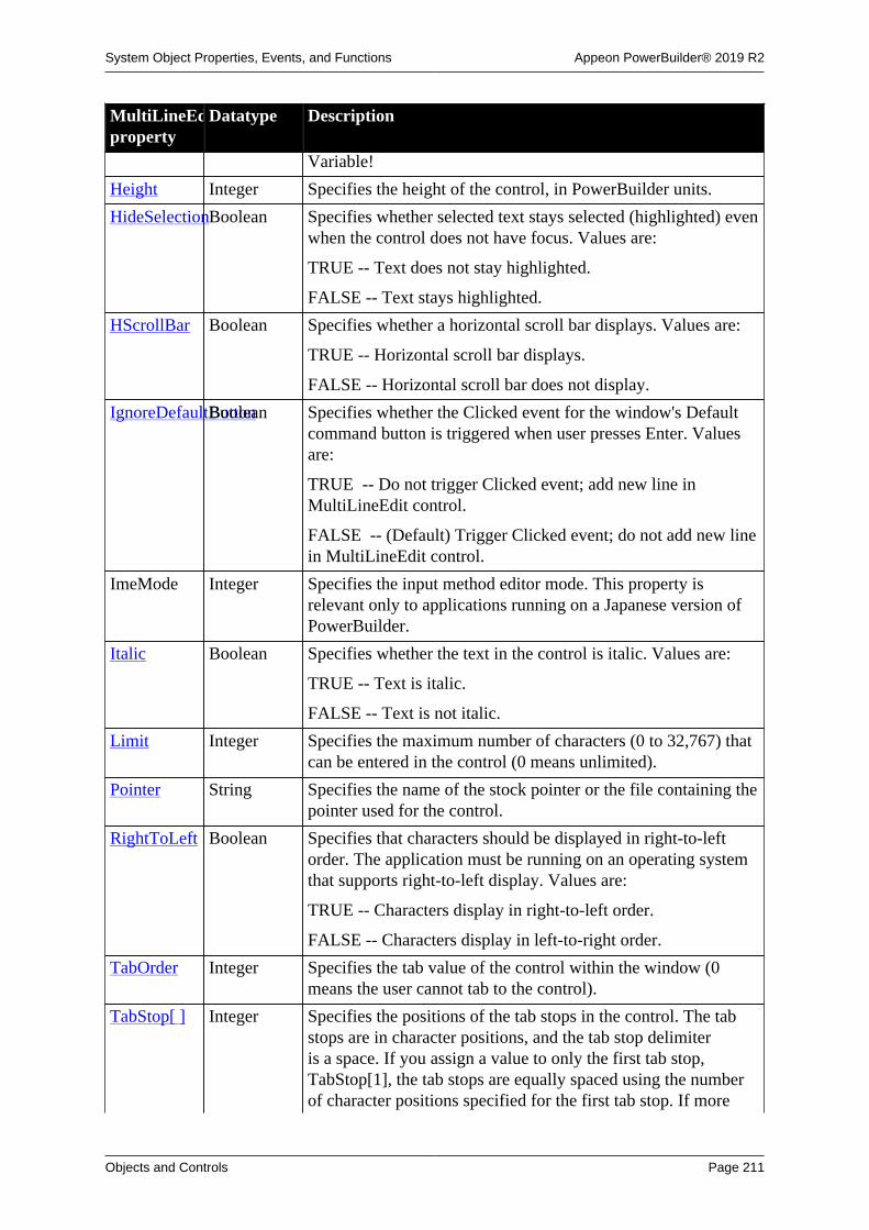
System Object Properties, Events, and Functions Appeon PowerBuilder® 2019 R2
Objects and Controls Page 211
MultiLineEditproperty
Datatype Description
Variable!
Height Integer Specifies the height of the control, in PowerBuilder units.
HideSelectionBoolean Specifies whether selected text stays selected (highlighted) evenwhen the control does not have focus. Values are:
TRUE -- Text does not stay highlighted.
FALSE -- Text stays highlighted.
HScrollBar Boolean Specifies whether a horizontal scroll bar displays. Values are:
TRUE -- Horizontal scroll bar displays.
FALSE -- Horizontal scroll bar does not display.
IgnoreDefaultButtonBoolean Specifies whether the Clicked event for the window's Defaultcommand button is triggered when user presses Enter. Valuesare:
TRUE -- Do not trigger Clicked event; add new line inMultiLineEdit control.
FALSE -- (Default) Trigger Clicked event; do not add new linein MultiLineEdit control.
ImeMode Integer Specifies the input method editor mode. This property isrelevant only to applications running on a Japanese version ofPowerBuilder.
Italic Boolean Specifies whether the text in the control is italic. Values are:
TRUE -- Text is italic.
FALSE -- Text is not italic.
Limit Integer Specifies the maximum number of characters (0 to 32,767) thatcan be entered in the control (0 means unlimited).
Pointer String Specifies the name of the stock pointer or the file containing thepointer used for the control.
RightToLeft Boolean Specifies that characters should be displayed in right-to-leftorder. The application must be running on an operating systemthat supports right-to-left display. Values are:
TRUE -- Characters display in right-to-left order.
FALSE -- Characters display in left-to-right order.
TabOrder Integer Specifies the tab value of the control within the window (0means the user cannot tab to the control).
TabStop[ ] Integer Specifies the positions of the tab stops in the control. The tabstops are in character positions, and the tab stop delimiteris a space. If you assign a value to only the first tab stop,TabStop[1], the tab stops are equally spaced using the numberof character positions specified for the first tab stop. If more

System Object Properties, Events, and Functions Appeon PowerBuilder® 2019 R2
Objects and Controls Page 212
MultiLineEditproperty
Datatype Description
than one tab stop is entered, tab stops are located in thepositions specified. You can define 16 tab stops in the control;the default array is TabStop[8], with a tab stop every eightcharacter positions.
Tag String Specifies the tag value assigned to the control.
Text String Specifies the text that displays in the control.
TextCase TextCase(enumerated)
Specifies the case in which text entered in the control displays.Values are:
AnyCase!
Lower!
Upper!
TextColor Long Specifies the numeric value of the color used for text:-2 to 16,777,215. For more information about color, seeSection 10.636, “RGB”.
TextSize Integer Specifies the size of the text in the control, in points. Forbackward compatibility, the size is stored as a negative number;for example, 10-point text size is stored as -10.
Underline Boolean Specifies whether the text in the control is underlined. Valuesare:
TRUE -- Text is underlined.
FALSE -- Text is not underlined.
Visible Boolean Specifies whether the control is visible. Values are:
TRUE -- Control is visible.
FALSE -- Control is not visible.
VScrollBar Boolean Specifies whether a vertical scroll bar is displayed on the rightof the control. Values are:
TRUE -- Vertical scroll bar is displayed.
FALSE -- Vertical scroll bar is not displayed.
Weight Integer Specifies the stroke weight of the text in the control; forexample, 400 for normal or 700 for bold.
Width Integer Specifies the width of the control, in PowerBuilder units.
X Integer Specifies the X position (the distance from the left edge of thewindow), in PowerBuilder units.
Y Integer Specifies the Y position (the distance from the top of thewindow), in PowerBuilder units.

System Object Properties, Events, and Functions Appeon PowerBuilder® 2019 R2
Objects and Controls Page 213
2.64.2 Events
Table 2.179:
MultiLineEditevent
Occurs
Constructor Immediately before the Open event occurs in the window
Destructor Immediately after the Close event occurs in the window
DragDrop When a dragged control is dropped on the control
DragEnter When a dragged control enters the control
DragLeave When a dragged control leaves the control
DragWithin When a dragged control is within the control
GetFocus Just before the control receives focus (before it is selected and becomesactive)
Help When the user presses the F1 key or drags the context help button(question mark) from the title bar to a menu item or control
LoseFocus When the control loses focus (becomes inactive)
Modified When a control has been changed and loses focus
Other When a Controls message occurs that is not a PowerBuilder event
RButtonDown When the right mouse button is pressed on the control
2.64.3 Functions
Table 2.180:
MultiLineEditfunction
Datatypereturned
Description
CanUndo Boolean Returns true if the Undo function can be used to undo the lastedit in the control and returns false if it cannot
ClassName String Returns the name assigned to the control
Clear Integer Clears the selected text (if any) from the control (but does notplace it in the clipboard)
Copy Integer Copies (but does not delete) the selected text (if any) from thecontrol to the clipboard
Cut Integer Cuts (deletes) the selected text (if any) from the control to theclipboard
Drag Integer Starts or ends the dragging of the control
GetContextServiceInteger Creates a reference to a context-specific instance of thespecified service
GetParent PowerObject Returns a reference to the name of the parent object
Hide Integer Makes the control invisible
LineCount Integer Returns the number of lines in the MultiLineEdit

System Object Properties, Events, and Functions Appeon PowerBuilder® 2019 R2
Objects and Controls Page 214
MultiLineEditfunction
Datatypereturned
Description
LineLength Integer Returns the length of the line in which the insertion point ispositioned
Move Integer Moves the control to a specified location
Paste Integer Inserts the contents of the clipboard (if any) at the insertionpoint in the control
PointerX Integer Returns the distance of the pointer from the left edge of thecontrol
PointerY Integer Returns the distance of the pointer from the top of the control
Position Integer Returns the position of the insertion point in the control
PostEvent Boolean Adds the specified event to the end of the event queue for thespecified object
Print Integer Prints the control
ReplaceText Integer Replaces the currently selected text (if any) with the specifiedstring. If no text is selected, the ReplaceText function inserts thetext at the insertion point
Resize Integer Changes the size of the control
Scroll Integer Moves the contents of the control up or down by the specifiednumber of lines
SelectedLengthInteger Returns the length of the selected text (if any) in the control
SelectedLine Integer Returns the number of the line in which the insertion point iscurrently located
SelectedStart Integer Returns the starting position of the selected text (if any) in thecontrol
SelectedText String Returns a string with the selected text (if any) from the control
SelectText Integer Selects the text specified by the starting position and length
SetFocus Integer Sets focus to the specified control
SetPosition Integer Specifies the position of the control in the front-to-back order ofthe window
SetRedraw Integer Controls automatic redrawing of the control after each change inits properties
Show Integer Makes the control visible
TextLine String Returns the entire text of the line in which the insertion point iscurrently located
TriggerEvent Integer Triggers a specified event in the control and executes the scriptfor the event
TypeOf Object Returns the type of the control
Undo Integer Cancels the previous editing function performed in the control

System Object Properties, Events, and Functions Appeon PowerBuilder® 2019 R2
Objects and Controls Page 215
2.65 OAuthClient object
The OAuthClient object provides interfaces for obtaining the access token and protectedresources.
Note
This object cannot be referenced in .NET Web Service or .NET Assemblycomponents, otherwise the component will fail to be deployed.
2.65.1 Properties
Table 2.181:
OAuthClientproperty
Datatype Description
ClassDefinitionPowerObject An object of type PowerObject containing information about theclass definition of the object or control.
2.65.2 Events
Table 2.182:
OAuthClientevent
Occurs
Constructor Immediately before the Open event occurs in the window.
Destructor Immediately after the Close event occurs in the window.
2.65.3 Functions
Table 2.183:
OAuthClientfunction
Datatypereturned
Description
AccessToken Integer Sends a request to get token information.
ClassName String Returns the name assigned to the object.
GetContextServiceInteger Creates a reference to a context-specific instance of thespecified service.
GetParent PowerObject Returns a reference to the name of the parent object.
PostEvent Boolean Adds the specified event to the end of the event queue for thespecified object.
RequestResourceInteger Sends a request to get resource.
TriggerEvent Integer Triggers a specified event in the control and executes the scriptfor the event
TypeOf Object Returns the type of the object.

System Object Properties, Events, and Functions Appeon PowerBuilder® 2019 R2
Objects and Controls Page 216
2.66 OAuthRequest objectThe OAuthRequest object can use the access token to obtain each property of the HTTPrequest of the protected resource, including the server address, the request header, the secureprotocol, the timeout value etc.
Note
This object cannot be referenced in .NET Web Service or .NET Assemblycomponents, otherwise the component will fail to be deployed.
2.66.1 Properties
Table 2.184:
OAuthRequestproperty
Datatype Description
ClassDefinitionPowerObject An object of type PowerObject containing information about theclass definition of the object or control.
Method String HTTP method for sending authentication requests. Values are:
GET – HTTP get method;
POST – HTTP post method.
SecureProtocolInteger Specifies the secure protocol with the integer value. Values are:
0 – All secure protocols. This is a default value;
1 – TLS1.0;
2 – TLS1.1;
3 – TLS1.2.
Timeout Long Specifies the timeout seconds. The default value is 60 and 0indicates no timeout.
URL String Specifies the request URL.
2.66.2 Functions
Table 2.185:
OAuthRequestfunction
Datatypereturned
Description
ClassName String Returns the name assigned to the object.
ClearHeaders Integer Clears the headers of the request.
GetBody Integer Gets the body into string.
GetContextServiceInteger Creates a reference to a context-specific instance of thespecified service.
GetHeader String Gets the request header by name.
GetHeaders String Gets the header of all of the requests.
GetParent PowerObject Returns a reference to the name of the parent object.

System Object Properties, Events, and Functions Appeon PowerBuilder® 2019 R2
Objects and Controls Page 217
OAuthRequestfunction
Datatypereturned
Description
SetAccessTokenInteger Sets the access token.
SetBody Integer Sets the request body.
SetHeader Integer Sets the request header.
SetHeaders Integer Sets the header information of all of the requests.
TypeOf Object Returns the type of the object.
2.67 OLEControl control
An OLEControl placed in a window can contain an object, such as a spreadsheet or wordprocessing document, that was created by an OLE-aware application. The PowerBuilderapplication's user can activate the object and edit it in the application in which it was created(the server application).
OLE controls are displayed in the OLE tab of the Browser as Insertable Objects.
For more information about using OLE in an application, see Chapter 22, Using OLE in anApplication.
2.67.1 Properties
Table 2.186:
OLEControlproperty
Datatype Description
AccessibleDescriptionString A description of the control and/or its purpose for use byaccessibility tools such as readers for visually impaired users.
AccessibleNameString A label that briefly describes the control, such as the text in abutton or the name of a menu item.
AccessibleRoleAccessibleRole(enumerated)
Describes what kind of user interface element the control is.
Activation omActivation Specifies how the OLE object will be activated.
BackColor Long Specifies the numeric value of the background color: -2to 16,777,215. For more information about color, seeSection 10.636, “RGB”.
BinaryIndex Integer Internal use only.
BinaryKey String Internal use only.
Border Boolean Specifies whether the control has a border. Values are:
TRUE -- Control has a border.
FALSE -- Control does not have a border.
BorderStyle BorderStyle(enumerated)
Specifies the style of the border of the control. Values are:
StyleBox!
StyleLowered!

System Object Properties, Events, and Functions Appeon PowerBuilder® 2019 R2
Objects and Controls Page 218
OLEControlproperty
Datatype Description
StyleRaised!
StyleShadowBox!
BringToTop Boolean Specifies whether PowerBuilder moves the control to the top ofthe front-to-back order. Values are:
TRUE -- Control moved to top.
FALSE -- Control not moved to top.
ClassDefinitionPowerObject An object of type PowerObject containing information about theclass definition of the object or control.
ClassLongNameString (Read-only) The long name for the server application associatedwith the OLE object in the control.
ClassShortNameString (Read-only) The short name for the server applicationassociated with the OLE object in the control.
ContentsAllowedomContentsAllowedSpecifies whether the OLE object in the control must beembedded or linked or whether either method is allowed whenInsert is called at runtime.
DisplayName String User-readable name for your OLE control when the controlis activated in place. This name is displayed in OLE dialogboxes and windows that show the object's name. If you do notspecify a value, the name of the control (such as ole_1) is usedfor DisplayName.
DisplayType omDisplayTypeSpecifies how the OLE object will be displayed in the control.The control can display the actual contents or an icon torepresent the object, or the document can be displayed as anActiveX document.
DocFileNameString (Read-only) The name of the file containing the object. If theobject has never been saved to a disk file, then the value of thisproperty is " ".
DragAuto Boolean Specifies whether PowerBuilder puts the control automaticallyinto Drag mode. Values are:
TRUE -- When the control is clicked, the control isautomatically in Drag mode.
FALSE -- When the control is clicked, the control is notautomatically in Drag mode. You have to manually put thecontrol into Drag mode by using the Drag function.
DragIcon String Specifies the name of the stock icon or the file containing theicon you want to display when the user drags the control (theICO file). The default icon is a box the size of the control.
When the user drags the control, the icon displays when thecontrol is over an area in which the control can be dropped (a

System Object Properties, Events, and Functions Appeon PowerBuilder® 2019 R2
Objects and Controls Page 219
OLEControlproperty
Datatype Description
valid drop area). When the control is over an area that is not avalid drop area, the No-Drop icon displays.
Enabled Boolean Specifies whether the control is enabled (can be selected).Values are:
TRUE -- Control can be selected.
FALSE -- Control cannot be selected.
FocusRectangleBoolean Specifies whether a dotted rectangle (the focus rectangle)frames the control when it has focus. Values are:
TRUE -- Control framed when it has focus.
FALSE -- Control not framed when it has focus.
Height Integer Specifies the height of the control, in PowerBuilder units.
IsDragTarget Boolean Specifies whether an OLE object can be dropped on the control.Values are:
TRUE -- OLE object can be dropped on control.
FALSE -- OLE object cannot be dropped on control.
LinkItem String (Read-only) The entire link name of the item to which theobject is linked. For example, if the object is linked to C:\FILENAME.XLS!A1:B2, then LinkItem would contain C:\FILENAME.XLS!A1:B2.
LinkUpdateOptionsomLinkUpdateOptionsSpecifies how a linked object in the control is updated. Ifautomatic, the link is updated when the object is opened andwhenever the object changes in the server application. Ifmanual, the link is not updated.
Object omObject Used in scripts to apply server commands to the linked orembedded OLE object within the control.
ObjectData Blob If the object is embedded, the object itself is stored as a blob inthe ObjectData property.
If the object is linked, this property contains the linkinformation and the cached image (for display).
ParentStorageomStorage (Read-only) Specifies the parent storage.
Pointer String Specifies the name of the stock pointer or the file containing thepointer used for the control.
Resizable Boolean Specifies whether the control is resizable. Values are:
TRUE -- Control is resizable.
FALSE -- Control is not resizable.
SizeMode SizeMode
(enumerated)
Specifies the size mode for the OLE document. Choices are:
Clip! -- The object's image displays full size. If it is larger thanthe OLE control, the image is clipped by the control's borders.

System Object Properties, Events, and Functions Appeon PowerBuilder® 2019 R2
Objects and Controls Page 220
OLEControlproperty
Datatype Description
Stretch! -- The object's image is resized to fit into and fill theOLE container control. This is the default value.
TabOrder Integer Specifies tab value of the control within the window (0 meansthe user cannot tab to the control).
Tag String Specifies the tag value assigned to the control.
Visible Boolean Specifies whether the control is visible. Values are:
TRUE -- Control is visible.
FALSE -- Control is not visible.
Width Integer Specifies the width of the control, in PowerBuilder units.
X Integer Specifies the X position (the distance from the left edge of thewindow), in PowerBuilder units.
Y Integer Specifies the Y position (the distance from the top of thewindow), in PowerBuilder units.
2.67.2 Events
Table 2.187:
OLEControlevent
Occurs
Clicked When the control is clicked (selected or unselected)
Close Just before a window is removed from display (closed)
Constructor Immediately before the Open event occurs in the window
DataChange When the server application notifies the control that data has changed
Destructor Immediately after the Close event occurs in the window
DoubleClicked When the control is double-clicked (and possibly activated)
DragDrop When a dragged control is dropped on the control
DragEnter When a dragged control enters the control
DragLeave When a dragged control leaves the control
DragWithin When a dragged control is within the control
Error During OLE automation when an error occurs
ExternalExceptionDuring OLE automation when the OLE server generates an exceptionduring command execution (getting and setting properties, callingfunctions)
GetFocus Just before the control receives focus (and possibly becomes activated)
Help When the user presses the F1 key or drags the context help button(question mark) from the title bar to a menu item or control
LoseFocus When the control loses focus (becomes inactive).

System Object Properties, Events, and Functions Appeon PowerBuilder® 2019 R2
Objects and Controls Page 221
OLEControlevent
Occurs
Other When an operating environment message occurs that is not aPowerBuilder event
PropertyChanged When an OLE Server supporting notifications sends this message to thecontrol
PropertyRequestEditWhen an OLE Server supporting notifications sends this message to thecontrol
RButtonDown When the right mouse button is pressed in the control
Rename When the server application notifies the control that the object has beenrenamed
Save When the server application notifies the control that the data has beensaved
SaveObject When the server application saves the object in the control
ViewChange When the server application notifies the control that the view shown tothe user has changed
2.67.3 Functions
Table 2.188:
OLEControlfunction
Datatypereturned
Description
Activate Integer Activates the object server either in place or offsite
ClassName String Returns the name assigned to the control
Clear Integer Releases the OLE object and deletes references to it withoutupdating storage
Copy Integer Copies the contents of the control to the clipboard
Cut Integer Copies the contents of the control to the clipboard and clears thecontrol
DoVerb Integer Executes the specified verb
Drag Integer Puts the object into drag mode
GetContextServiceInteger Creates a reference to a context-specific instance of thespecified service
GetData Integer Returns data in a caller-supplied format from an OLE serverthat supports Uniform Data Transfer
GetNativePointerInteger Returns a pointer to the underlying OLE object
GetParent PowerObject Returns a reference to the name of the parent object
Hide Integer Makes the control invisible
InsertClass Integer Inserts a new object created from a class ID
InsertFile Integer Inserts a new object where the source is a template file
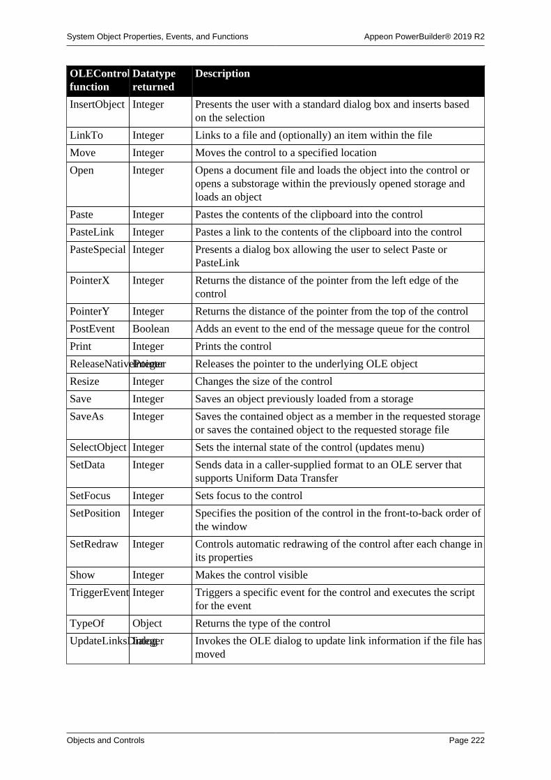
System Object Properties, Events, and Functions Appeon PowerBuilder® 2019 R2
Objects and Controls Page 222
OLEControlfunction
Datatypereturned
Description
InsertObject Integer Presents the user with a standard dialog box and inserts basedon the selection
LinkTo Integer Links to a file and (optionally) an item within the file
Move Integer Moves the control to a specified location
Open Integer Opens a document file and loads the object into the control oropens a substorage within the previously opened storage andloads an object
Paste Integer Pastes the contents of the clipboard into the control
PasteLink Integer Pastes a link to the contents of the clipboard into the control
PasteSpecial Integer Presents a dialog box allowing the user to select Paste orPasteLink
PointerX Integer Returns the distance of the pointer from the left edge of thecontrol
PointerY Integer Returns the distance of the pointer from the top of the control
PostEvent Boolean Adds an event to the end of the message queue for the control
Print Integer Prints the control
ReleaseNativePointerInteger Releases the pointer to the underlying OLE object
Resize Integer Changes the size of the control
Save Integer Saves an object previously loaded from a storage
SaveAs Integer Saves the contained object as a member in the requested storageor saves the contained object to the requested storage file
SelectObject Integer Sets the internal state of the control (updates menu)
SetData Integer Sends data in a caller-supplied format to an OLE server thatsupports Uniform Data Transfer
SetFocus Integer Sets focus to the control
SetPosition Integer Specifies the position of the control in the front-to-back order ofthe window
SetRedraw Integer Controls automatic redrawing of the control after each change inits properties
Show Integer Makes the control visible
TriggerEvent Integer Triggers a specific event for the control and executes the scriptfor the event
TypeOf Object Returns the type of the control
UpdateLinksDialogInteger Invokes the OLE dialog to update link information if the file hasmoved

System Object Properties, Events, and Functions Appeon PowerBuilder® 2019 R2
Objects and Controls Page 223
2.68 OLECustomControl control (OCX)
The PowerBuilder class OLECustomControl is a container for OLE custom controls, alsoknown as ActiveX controls or OCXs. When you create a PowerBuilder OLE custom controlcontainer, the Insert Object dialog prompts you to select the control to insert in the container.Your choices are the controls that have been registered in the system registry. If a control isnot registered by its install process, you can register it in the Insert Object dialog box.
The Browser also displays registered controls. Select the OLE tab of the Browser and double-click OLE Custom Controls.
2.68.1 Properties
In OLE terminology, font information and the display name are called ambient properties.Ambient properties provide default information that the custom control can use, if it isprogrammed to recognize and use such information.
PowerBuilder does not display text for the control, so it does not use the font and displayname properties directly. If the control is programmed to recognize ambient properties, itcan use the values PowerBuilder provides when the control displays text or needs a name todisplay in a title bar.
Table 2.189:
OLECustomControlproperty
Datatype Description
AccessibleDescriptionString A description of the control and/or its purpose for use byaccessibility tools such as readers for visually impaired users.
AccessibleNameString A label that briefly describes the control, such as the text in abutton or the name of a menu item.
AccessibleRoleAccessibleRole(enumerated)
Describes what kind of user interface element the control is.
Alignment Alignment(enumerated)
Specifies the text alignment in the control. Values are:
Center!
Justify!
Left!
Right!
BackColor Long Specifies the numeric value of the background color: -2to 16,777,215. For more information about color, seeSection 10.636, “RGB”.
BinaryIndex Integer Internal use only.
BinaryKey String Internal use only.
Border Boolean Specifies whether the control has a border. Values are:
TRUE -- Control has a border.
FALSE -- Control does not have a border.

System Object Properties, Events, and Functions Appeon PowerBuilder® 2019 R2
Objects and Controls Page 224
OLECustomControlproperty
Datatype Description
BorderStyle BorderStyle(enumerated)
Specifies the style of the border of the control. Values are:
StyleBox!
StyleLowered!
StyleRaised!
StyleShadowBox!
BringToTop Boolean Specifies whether PowerBuilder moves the control to the top ofthe front-to-back order (set at runtime only). Values are:
TRUE -- Control moved to top.
FALSE -- Control not moved to top.
Cancel Boolean Specifies whether the control acts as the Cancel button in thewindow (the Cancel button receives a Clicked event if the userpresses Esc). Values are:
TRUE -- Control is the Cancel button.
FALSE -- Control is not the Cancel button.
ClassDefinitionPowerObject An object of type PowerObject containing information about theclass definition of the object or control.
ClassLongNameString Specifies the long name for the server application associatedwith the OLE object in the control (read-only).
ClassShortNameString Specifies the short name for the server application associatedwith the OLE object in the control (read-only).
DisplayName String Specifies a user-readable name for your OLE control. Thisname is displayed in OLE dialog boxes and windows that showthe object's name. If you do not specify a value, the name of thecontrol (such as ole_1) is used for DisplayName.
Default Boolean Specifies whether the button-style OLE control is the defaultcontrol in the window (the default control has a thick borderand receives a Clicked event if the user presses Enter withoutselecting a control).
This property applies only to controls that act like commandbuttons.
Values are:
TRUE -- Control is the default control.
FALSE -- Control is not the default control.
Editable controls
Default behavior can be affected by editable controls on thewindow. For more information, see the Users Guide.

System Object Properties, Events, and Functions Appeon PowerBuilder® 2019 R2
Objects and Controls Page 225
OLECustomControlproperty
Datatype Description
DragAuto Boolean Specifies whether PowerBuilder puts the control automaticallyinto Drag mode. Values are:
TRUE -- When the control is clicked, the control isautomatically in Drag mode.
FALSE -- When the control is clicked, the control is notautomatically in Drag mode. You have to manually put thecontrol into Drag mode by using the Drag function.
DragIcon String Specifies the name of the stock icon or the file containing theicon you want to display when the user drags the control (theICO file). The default icon is a box the size of the control.
When the user drags the control, the icon displays when thecontrol is over an area in which the control can be dropped (avalid drop area). When the control is over an area that is not avalid drop area, the No-Drop icon displays.
Enabled Boolean Specifies whether the control is enabled (can be selected).Values are:
TRUE -- Control can be selected.
FALSE -- Control cannot be selected.
FaceName String Specifies a typeface name (for example, arial or courier)that you want the control to use for text (when the control isdesigned to use this ambient property).
FocusRectangleBoolean Specifies whether a dotted rectangle (the focus rectangle)frames the control when it has focus. Values are:
TRUE -- Control framed when it has focus.
FALSE -- Control not framed when it has focus.
FontCharSet FontCharSet(enumerated)
Specifies the font character set that you want the control touse for text (when the control is designed to use this ambientproperty). For a complete list of possible values, see the list ofproperties for the FontCharSet variable on the Enumerated tabpage of the Browser.
FontFamily FontFamily(enumerated)
Specifies the font family (type style) that you want the controlto use for text (when the control is designed to use this ambientproperty). Values are:
AnyFont!
Decorative!
Modern!
Roman!
Script!

System Object Properties, Events, and Functions Appeon PowerBuilder® 2019 R2
Objects and Controls Page 226
OLECustomControlproperty
Datatype Description
Swiss!
FontPitch FontPitch(enumerated)
Specifies the pitch (character spacing) that you want the controlto use for text (when the control is designed to use this ambientproperty). Values are:
Default!
Fixed!
Variable!
Height Integer Specifies the height of the control, in PowerBuilder units.
IsDragTarget Boolean Specifies whether data can be dropped on the control. Valuesare:
TRUE -- Data can be dropped on control.
FALSE -- Data cannot be dropped on control.
Italic Boolean Specifies that you want the control to display text in italic (whenthe control is designed to use this ambient property). Values are:
TRUE -- Text is italic.
FALSE -- Text is not italic.
Object omObject Specifies the link information that connects the control to theserver's data.
Pointer String Specifies the name of the stock pointer or the file containing thepointer used for the control.
TabOrder Integer Specifies tab value of the control within the window (0 meansthe user cannot tab to the control).
Tag String Specifies the tag value assigned to the control.
TextColor Long Specifies the color that you want the control to use for text(when the control is designed to use this ambient property).The color is a numeric value: -2 to 16,777,215. For moreinformation about color, see Section 10.636, “RGB”.
TextSize Integer Specifies the point size that you want the control to use fordisplaying text (when the control is designed to use this ambientproperty). For backward compatibility, the size is stored as anegative number; for example, 10-point text size is stored as-10.
Underline Boolean Specifies that you want the control to underline text (when thecontrol is designed to use this ambient property). Values are:
TRUE -- Text is underlined.
FALSE -- Text is not underlined.
Visible Boolean Specifies whether the control is visible. Values are:
TRUE -- Control is visible.

System Object Properties, Events, and Functions Appeon PowerBuilder® 2019 R2
Objects and Controls Page 227
OLECustomControlproperty
Datatype Description
FALSE -- Control is not visible.
Weight Integer Specifies the stroke weight that you want the control to use fortext (when the control is designed to use this ambient property).Sample values are 400 for normal or 700 for bold.
Width Integer Specifies the width of the control, in PowerBuilder units.
X Integer Specifies the X position (the distance from the left edge of thewindow), in PowerBuilder units.
Y Integer Specifies the Y position (the distance from the top of thewindow), in PowerBuilder units.
2.68.2 Events
The PowerBuilder Script painter displays PowerBuilder events and events defined by thecontrol inserted in the control.
To get information about an event that does not appear in this list, check the documentationfor the control.
Table 2.190:
OLECustomControlevent
Occurs
Clicked When the control is clicked (selected or unselected).
Constructor Immediately before the Open event occurs in the window.
DataChange When the server application notifies the control that data has changed.
Destructor Immediately after the Close event occurs in the window.
DoubleClicked When the control is double-clicked (and possibly activated).
DragDrop When a dragged control is dropped on the control.
DragEnter When a dragged control enters the control.
DragLeave When a dragged control leaves the control.
DragWithin When a dragged control is within the control.
Error During OLE automation when an error occurs.
ExternalExceptionDuring OLE automation when the OLE server generates an exceptionduring command execution (getting and setting properties, callingfunctions).
GetFocus Just before the control receives focus (and possibly becomes activated).
Help When the user presses the F1 key or drags the context help button(question mark) from the title bar to a menu item or control.
LoseFocus When the control loses focus (becomes inactive).
Other When an operating environment message occurs that is not aPowerBuilder event.

System Object Properties, Events, and Functions Appeon PowerBuilder® 2019 R2
Objects and Controls Page 228
OLECustomControlevent
Occurs
PropertyChanged When an OLE Server supporting notifications sends a message that aproperty value has been changed.
PropertyRequestEditWhen an OLE Server supporting notifications sends a message that aproperty value is about to be changed.
RButtonDown When the right mouse button is pressed in the control.
2.68.3 Functions
Table 2.191:
OLECustomControlfunction
Datatypereturned
Description
ClassName String Returns the name assigned to the control
Drag Integer Puts the object into drag mode
GetContextServiceInteger Creates a reference to a context-specific instance of thespecified service
GetData Integer Returns data in a format you specify from an OLE server thatsupports Uniform Data Transfer
GetNativePointerInteger Returns a pointer to the underlying OLE object
GetParent PowerObject Returns a reference to the name of the parent object
Hide Integer Makes the control invisible
Move Integer Moves the control to a specified location
PointerX Integer Returns the distance of the pointer from the left edge of thecontrol
PointerY Integer Returns the distance of the pointer from the top of the control
PostEvent Boolean Adds an event to the end of the message queue for the control
Print Integer Prints the control
ReleaseNativePointerInteger Releases pointer to underlying OLE object
Resize Integer Changes the size of the control
SetData Integer Sends data in a caller-supplied format to an OLE server thatsupports Uniform Data Transfer
SetFocus Integer Sets focus to the control
SetPosition Integer Specifies the position of the control in the front-to-back order ofthe window
SetRedraw Integer Controls automatic redrawing of the control after each change inits properties
Show Integer Makes the control visible
TriggerEvent Integer Triggers a specific event for the control and executes the scriptfor the event

System Object Properties, Events, and Functions Appeon PowerBuilder® 2019 R2
Objects and Controls Page 229
OLECustomControlfunction
Datatypereturned
Description
TypeOf Object Returns the type of the control
2.69 OLEObject object
The OLEObject object acts as a proxy for a remote OLE object.
You can customize your own version of the OLEObject object by defining a standard classuser object inherited from the built-in OLEObject. You can then access the OLEObjectConstructor, Destructor, Error, and ExternalException events by writing scripts that containcode for the events.
Coding Error and ExternalException events
If you code the Error and ExternalException events, any active exception handler fora RuntimeError will not be processed. However, you can throw an exception in thescripts for these events, and you can make the arguments of these events availablefor exception handling by putting the arguments in a string in a throw statement thatpasses the string to the exception handler.
OLEObject objects are displayed in the OLE tab of the Browser as Programmable Objects.
For more information about creating a custom OLEObject object, see Chapter 15, Workingwith User Objects.
For more information about using the OLEObject object in an application, see Chapter 22,Using OLE in an Application.
OLEObject is a dynamic object
In order to support OLE, OLEObject is a dynamic object. The PowerBuilder compileraccept property names and function names and parameter lists that are not alreadydefined for the object. If the properties or functions do not exist during execution, youget a runtime error.
2.69.1 Properties
Table 2.192:
OLEObjectproperty
Datatype Description
ClassDefinitionPowerObject An object of type PowerObject containing information about theclass definition of the object or control.
Handle Objhandle Internal use only.

System Object Properties, Events, and Functions Appeon PowerBuilder® 2019 R2
Objects and Controls Page 230
2.69.2 Events
Table 2.193:
OLEObjectevent
Occurs
Constructor When the user object is created.
Destructor When the user object is destroyed.
Error When an error is found in a data or property expression for an externalobject.
ExternalExceptionWhen the evaluation of an expression involving properties of an externalobject causes an error. This type of event occurs before the Error event.
2.69.3 Functions
Table 2.194:
OLEObjectfunction
Datatypereturned
Description
ClassName String Returns the name assigned to the user object
ConnectToNewObjectInteger Creates a new instance of the class and connects to it
ConnectToNewRemoteObjectInteger Creates a new OLE object in the specified remote serverapplication and associates the new object with a PowerBuilderOLEObject variable
ConnectToObjectInteger Opens a specified file and connects to the corresponding serverapplication
ConnectToRemoteObjectInteger Associates an OLE object with a PowerBuilder OLEObjectvariable and starts the server application
DisconnectObjectInteger Releases all objects previously connected
GetAutomationNativePointerInteger Returns a pointer to the underlying OLE object
GetContextServiceInteger Creates a reference to a context-specific instance of thespecified service
GetParent PowerObject Returns a reference to the name of the parent object
IsAlive Boolean Determines whether a server object is defunct
PostEvent Boolean Adds an event to the end of the message queue of the userobject
ReleaseAutomationNativePointerInteger Releases the pointer to the underlying OLE object
SetAutomationLocaleInteger Sets the language locale to be used for automation programmingon the object
SetAutomationPointerInteger Sets the automation pointer of an OLEObject object to the valueof the automation pointer of another object
SetAutomationTimeoutInteger Sets the number of milliseconds that a PowerBuilder clientwaits before canceling an OLE procedure call to the server

System Object Properties, Events, and Functions Appeon PowerBuilder® 2019 R2
Objects and Controls Page 231
OLEObjectfunction
Datatypereturned
Description
TriggerEvent Integer Sends an event to the user object and executes the scriptassociated with the event
TypeOf Object Returns the type of the user object
2.70 OLEStorage objectThe OLEStorage object acts as a proxy for an open OLE storage.
You can customize your own version of the OLEStorage object by defining a class userobject inherited from the built-in OLEStorage object.
For more information about creating a custom OLEStorage object, see Chapter 15, Workingwith User Objects.
For more information about using the OLEStorage object in an application, see Chapter 22,Using OLE in an Application.
2.70.1 Properties
Table 2.195:
OLEStorageproperty
Datatype Description
ClassDefinitionPowerObject An object of type PowerObject containing information about theclass definition of the object or control.
DocumentNameString Specifies the name of the storage currently open. For a rootlevel storage, this is the name of the file containing the storage.For substorages, this is the member name of the substorage.
2.70.2 Events
Table 2.196:
OLEStorageevent
Occurs
Constructor When the user object is created.
Destructor When the user object is destroyed.
2.70.3 Functions
Table 2.197:
OLEStoragefunction
Datatypereturned
Description
ClassName String Returns the name assigned to the user object
Clear Integer Releases any storage previously opened
Close Integer Saves the storage and any controls and streams open on thestorage, commits the changes, then releases the storage. (Sameas calling Save, then Clear.)

System Object Properties, Events, and Functions Appeon PowerBuilder® 2019 R2
Objects and Controls Page 232
OLEStoragefunction
Datatypereturned
Description
GetContextServiceInteger Creates a reference to a context-specific instance of thespecified service
GetParent PowerObject Returns a reference to the name of the parent object
MemberDeleteInteger Deletes the specified member
MemberExistsInteger Specifies whether the specified member exists
MemberRenameInteger Renames the specified member
Open Integer Opens the storage from a file or opens a substorage within thespecified storage object
PostEvent Boolean Adds an event to the end of the message queue of the userobject
Save Integer Saves the storage and any controls open on that storage andcommits the changes
SaveAs Integer Copies the storage and any controls open on that new storageto a new file or substorage, commits the changes, then releasesoriginal storage
TriggerEvent Integer Sends an event to the user object and executes the scriptassociated with the event
TypeOf Object Returns the type of the user object
2.71 OLEStream object
The OLEStream object acts as a proxy for an OLE stream.
You can customize your own version of the OLEStream object by defining a class user objectinherited from the built-in OLEStream object.
For more information about creating a custom OLEStream object, see Chapter 15, Workingwith User Objects.
For more information about using the OLEStream object in an application, see Chapter 22,Using OLE in an Application.
2.71.1 Properties
Table 2.198:
OLEStreamproperty
Datatype Description
ClassDefinitionPowerObject An object of type PowerObject containing information about theclass definition of the object or control.
Name String Specifies the member name of the stream within its parentstorage.
Storage OMStorage (Read-only) Specifies the storage containing the stream.Streams are always opened from within an OLEStorage object.

System Object Properties, Events, and Functions Appeon PowerBuilder® 2019 R2
Objects and Controls Page 233
2.71.2 Events
Table 2.199:
OLEStreamevent
Occurs
Constructor When the user object is created.
Destructor When the user object is destroyed.
2.71.3 Functions
Table 2.200:
OLEStreamfunction
Datatypereturned
Description
ClassName String Returns the name assigned to the user object.
Close Integer Releases any stream previously opened.
GetContextServiceInteger Creates a reference to a context-specific instance of thespecified service.
GetParent PowerObject Returns a reference to the name of the parent object.
Length Integer Obtains the length of the open stream.
Open Integer Opens the specified stream from the storage.
PostEvent Boolean Adds an event to the end of the message queue of the userobject.
Read Integer Reads from the stream.
Seek Integer Moves within the stream.
TriggerEvent Integer Sends an event to the user object and executes the scriptassociated with the event.
TypeOf Object Returns the type of the user object.
Write Long Writes to the stream.
2.72 OLETxnObject objectThe OLETxnObject object provides explicit control of MTS transactions to PowerBuilderclients using the SetComplete and SetAbort functions. OLETxnObject inherits from theOLEObject object.
2.72.1 Properties
Table 2.201:
OLETxnObjectproperty
Datatype Description
ClassDefinitionPowerObject An object of type PowerObject containing information about theclass definition of the object or control
Handle Objhandle Internal use only

System Object Properties, Events, and Functions Appeon PowerBuilder® 2019 R2
Objects and Controls Page 234
2.72.2 Events
Table 2.202:
OLETxnObjectevent
Occurs
Constructor When the object is created.
Destructor When the object is destroyed.
Error When an error is found in a data or property expression for an externalobject.
ExternalExceptionWhen the evaluation of an expression involving properties of an externalobject causes an error. This type of event occurs before the Error event.
2.72.3 Functions
Table 2.203:
OLETxnObjectfunction
Datatypereturned
Description
ClassName String Returns the name assigned to the user object.
ConnectToNewObjectInteger Creates a new instance of the class within the transactioncontext it is associated with and connects to it.
ConnectToNewRemoteObject Integer Not used.
ConnectToObjectInteger Not used.
ConnectToRemoteObjectInteger Not used.
DisconnectObjectInteger Releases all objects previously connected.
GetAutomationNativePointerInteger Returns a pointer to the underlying OLE object.
GetContextServiceInteger Creates a reference to a context-specific instance of thespecified service.
GetParent PowerObject Returns a reference to the name of the parent object.
IsAlive Boolean Determines whether a server object is defunct.
PostEvent Boolean Adds an event to the end of the message queue of the userobject.
ReleaseAutomationNativePointerInteger Releases the pointer to the underlying OLE object.
SetAbort Integer Aborts the current transaction.
SetAutomationLocaleInteger Sets the language locale to be used for automation programmingon the object.
SetAutomationPointerInteger Sets the automation pointer of the OLETxnObject object to thevalue of the automation pointer of another object.
SetAutomationTimeoutInteger Sets the number of milliseconds that a PowerBuilder clientwaits before canceling an OLE procedure call to the server.
SetComplete Integer Attempts to commit the current transaction.

System Object Properties, Events, and Functions Appeon PowerBuilder® 2019 R2
Objects and Controls Page 235
OLETxnObjectfunction
Datatypereturned
Description
TriggerEvent Integer Sends an event to the user object and executes the scriptassociated with the event.
TypeOf Object Returns the type of the user object.
2.73 Oval controlAn oval is a filled or outlined round or elliptical drawing object that you typically use fordesign effects (for example, you can put a CommandButton or a picture in an oval). Thegrouping does not affect the behavior of the controls in the oval.
2.73.1 Properties
Table 2.204:
Ovalproperty
Datatype Description
ClassDefinitionPowerObject An object of type PowerObject containing information about theclass definition of the object or control.
FillColor Long Specifies the numeric value of the color used to fill the control:2 to 16,777,215. For more information about color, seeSection 10.636, “RGB”.
FillPattern FillPattern(enumerated)
Specifies the hatch pattern used to fill the control. Values are:
BDiagonal!
Diamond!
FDiagonal!
Horizontal!
Solid!
Square!
Vertical!
FDiagonal! is lines going from the lower-left to the upper-right.BDiagonal! is lines going from the upper-left to the lower right.
Height Integer Specifies the height of the control, in PowerBuilder units.
LineColor Long Specifies the numeric value of the line color: -2 to 16,777,215.For more information about color, see Section 10.636, “RGB”.
LineStyle LineStyle(enumerated)
Specifies the style of the line used to draw the control. Valuesare:
Continuous!
Dash!
DashDot!
DashDotDot!

System Object Properties, Events, and Functions Appeon PowerBuilder® 2019 R2
Objects and Controls Page 236
Ovalproperty
Datatype Description
Dot!
Transparent!
LineThicknessInteger Specifies the thickness of the line used to draw the control, inPowerBuilder units. If LineThickness is greater than one pixel(about four PowerBuilder units), the LineStyle is Continuous!.
Tag String Specifies the tag value assigned to the control.
Visible Boolean Specifies whether the control is visible. Values are:
TRUE -- Control is visible.
FALSE -- Control is not visible.
Width Integer Specifies the width of the control, in PowerBuilder units.
X Integer Specifies the X position (the distance from the left edge of thewindow), in PowerBuilder units.
Y Integer Specifies the Y position (the distance from the top of thewindow), in PowerBuilder units.
2.73.2 Events
Table 2.205:
Oval event Occurs
Constructor When the control is created
Destructor When the control is destroyed
2.73.3 Functions
Table 2.206:
Ovalfunction
Datatypereturned
Description
ClassName String Returns the name assigned to the control
GetContextServiceInteger Creates a reference to a context-specific instance of thespecified service
GetParent PowerObject Returns a reference to the name of the parent object
Hide Integer Makes the control invisible
Move Integer Moves the control to a specified location
PostEvent Boolean Adds an event to the end of the message queue for the control
Resize Integer Changes the size of the control
Show Integer Makes the control visible
TriggerEvent Integer Triggers a specified event in the control and executes the scriptfor the event
TypeOf Object Returns the type of the control

System Object Properties, Events, and Functions Appeon PowerBuilder® 2019 R2
Objects and Controls Page 237
2.74 Picture controlPicture controls can contain images in the following formats:
• Bitmaps, with .BMP or .RLE extensions
• Windows metafiles, with the .WMF extension
• GIF or animated GIF files, with the .GIF extension
• JPEG files, with .JPEG or .JPG extensions
• Portable Networks Graphics, with .PNG extension
You can create the image in another application or use a scanner to create it.
2.74.1 Properties
Table 2.207:
Pictureproperty
Datatype Description
AccessibleDescriptionString A description of the control and/or its purpose for use byaccessibility tools such as readers for visually impaired users.
AccessibleNameString A label that briefly describes the control, such as the text in abutton or the name of a menu item.
AccessibleRoleAccessibleRole(enumerated)
Describes what kind of user interface element the control is.
Border Boolean Specifies whether the control has a border. Values are:
TRUE -- Control has a border.
FALSE -- Control does not have a border.
BorderStyle BorderStyle(enumerated)
Specifies the style of the border of the control. Values are:
StyleBox!
StyleLowered!
StyleRaised!
StyleShadowBox!
BringToTop Boolean Specifies whether PowerBuilder moves the control to the top ofthe front-to-back order of the window. Values are:
TRUE -- Control moved to top.
FALSE -- Control not moved to top.
ClassDefinitionPowerObject An object of type PowerObject containing information about theclass definition of the object or control.
DragAuto Boolean Specifies whether PowerBuilder puts the control automaticallyinto Drag mode. Values are:
TRUE -- When the control is clicked, the control isautomatically in Drag mode.

System Object Properties, Events, and Functions Appeon PowerBuilder® 2019 R2
Objects and Controls Page 238
Pictureproperty
Datatype Description
FALSE -- When the control is clicked, the control is notautomatically in Drag mode. You have to manually put thecontrol into Drag mode by using the Drag function.
DragIcon String Specifies the name of the stock icon or the file containing theicon you want to display when the user drags the control (theICO file). The default icon is a box the size of the control.
When the user drags the control, the icon displays when thecontrol is over an area in which the control can be dropped (avalid drop area). When the control is over an area that is not avalid drop area, the No-Drop icon displays.
Enabled Boolean Specifies whether the control is enabled (can be selected).Values are:
TRUE -- Control can be selected.
FALSE -- Control cannot be selected.
FocusRectangleBoolean Specifies whether a dotted rectangle (focus rectangle) framesthe picture when it has focus. Values are:
TRUE -- Control is framed when it has focus.
FALSE -- Control is not framed when it has focus.
Height Integer Specifies the height of the control, in PowerBuilder units.
Invert Boolean Specifies whether the control displays with its colors inverted.Values are:
TRUE -- Colors are inverted.
FALSE -- Colors are not inverted.
Map3DColorsBoolean Specifies whether the system 3D colors are mapped to thecontrol. Values are:
TRUE -- Colors are mapped.
FALSE -- Colors are not mapped.
OriginalSize Boolean Specifies whether the width and height properties of a bitmapimage (picture) are set to their original values. Values are:
TRUE -- Width and height are set to original values.
FALSE -- Existing width and height are not changed.
In the Window painter, setting OriginalSize to true overrides theexisting width and height.
PictureName String Specifies the name of the file that contains the picture.
Pointer String Specifies the name of the stock pointer or the file containing thepointer used for the control.
PowerTipTextLong Specifies a PowerTip for the control.

System Object Properties, Events, and Functions Appeon PowerBuilder® 2019 R2
Objects and Controls Page 239
Pictureproperty
Datatype Description
TabOrder Integer Specifies the tab value of the picture within the window (0means the user cannot tab to the control).
Tag String Specifies the tag value assigned to the control.
Visible Boolean Specifies whether the control is visible. Values are:
TRUE -- Control is visible.
FALSE -- Control is not visible.
Width Integer Specifies the width of the control, in PowerBuilder units.
X Integer Specifies the X position (distance from the left edge of thewindow), in PowerBuilder units.
Y Integer Specifies the Y position (distance from the top of the window),in PowerBuilder units.
2.74.2 Events
Table 2.208:
Picture event Occurs
Clicked When the control is clicked (selected)
Constructor Immediately before the Open event occurs in the window
Destructor Immediately after the Close event occurs in the window
DoubleClicked When the control is double-clicked (selected and activated)
DragDrop When a dragged control is dropped on the control
DragEnter When a dragged control enters the control
DragLeave When a dragged control leaves the control
DragWithin When a dragged control is within the control
GetFocus Just before the control receives focus (before it is selected and becomesactive)
Help When the user presses the F1 key or drags the context help button(question mark) from the title bar to a menu item or control
LoseFocus When the control loses focus (becomes inactive)
Other When a Windows message occurs that is not a PowerBuilder event
RButtonDown When the right mouse button is pressed on the control
2.74.3 Functions
Table 2.209:
Picturefunction
Datatypereturned
Description
ClassName String Returns the name assigned to the control.
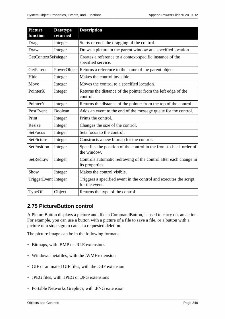
System Object Properties, Events, and Functions Appeon PowerBuilder® 2019 R2
Objects and Controls Page 240
Picturefunction
Datatypereturned
Description
Drag Integer Starts or ends the dragging of the control.
Draw Integer Draws a picture in the parent window at a specified location.
GetContextServiceInteger Creates a reference to a context-specific instance of thespecified service.
GetParent PowerObject Returns a reference to the name of the parent object.
Hide Integer Makes the control invisible.
Move Integer Moves the control to a specified location.
PointerX Integer Returns the distance of the pointer from the left edge of thecontrol.
PointerY Integer Returns the distance of the pointer from the top of the control.
PostEvent Boolean Adds an event to the end of the message queue for the control.
Print Integer Prints the control.
Resize Integer Changes the size of the control.
SetFocus Integer Sets focus to the control.
SetPicture Integer Constructs a new bitmap for the control.
SetPosition Integer Specifies the position of the control in the front-to-back order ofthe window.
SetRedraw Integer Controls automatic redrawing of the control after each change inits properties.
Show Integer Makes the control visible.
TriggerEvent Integer Triggers a specified event in the control and executes the scriptfor the event.
TypeOf Object Returns the type of the control.
2.75 PictureButton control
A PictureButton displays a picture and, like a CommandButton, is used to carry out an action.For example, you can use a button with a picture of a file to save a file, or a button with apicture of a stop sign to cancel a requested deletion.
The picture image can be in the following formats:
• Bitmaps, with .BMP or .RLE extensions
• Windows metafiles, with the .WMF extension
• GIF or animated GIF files, with the .GIF extension
• JPEG files, with .JPEG or .JPG extensions
• Portable Networks Graphics, with .PNG extension

System Object Properties, Events, and Functions Appeon PowerBuilder® 2019 R2
Objects and Controls Page 241
2.75.1 Properties
Table 2.210:
PictureButtonproperty
Datatype Description
AccessibleDescriptionString A description of the control and/or its purpose for use byaccessibility tools such as readers for visually impaired users.
AccessibleNameString A label that briefly describes the control, such as the text in abutton or the name of a menu item.
AccessibleRoleAccessibleRole(enumerated)
Describes what kind of user interface element the control is.
BackColor Long Specifies the numerical value of the background color of thewindow. Values are -2 to 16,777,215. For more informationabout color, see Section 10.636, “RGB”.
BringToTop Boolean Specifies whether PowerBuilder moves the control to the top ofthe front-to-back order of the window.
Cancel Boolean Specifies whether the control acts as the Cancel button (theCancel button receives a Clicked event if the user presses Esc).Values are:
TRUE -- Control acts as Cancel button.
FALSE -- Control does not act as Cancel button.
ClassDefinitionPowerObject An object of type PowerObject containing information about theclass definition of the object or control.
Default Boolean Specifies whether the control is the default PictureButton (thedefault PictureButton has a thick border and receives a Clickedevent if the user presses Enter without selecting an control).Values are:
TRUE -- Control is default PictureButton.
FALSE -- Control is not default PictureButton.
Editable controls
Default behavior can be affected by editable controls on thewindow. For more information, see the Users Guide.
DisabledNameString Specifies the name of the picture (bitmap image) that displayswhen the control is disabled. If the string has no extension,PowerBuilder adds an appropriate extension.
DragAuto Boolean Specifies whether PowerBuilder puts the control automaticallyinto Drag mode. Values are:
TRUE -- When the control is clicked, the control isautomatically in Drag mode.
FALSE -- When the control is clicked, the control is notautomatically in Drag mode. You have to manually put thecontrol into Drag mode by using the Drag function.

System Object Properties, Events, and Functions Appeon PowerBuilder® 2019 R2
Objects and Controls Page 242
PictureButtonproperty
Datatype Description
DragIcon String Specifies the name of the stock icon or the file containing theicon you want to display when the user drags the control (theICO file). The default icon is a box the size of the control.
When the user drags the control, the icon displays when thecontrol is over an area in which the control can be dropped (avalid drop area). When the control is over an area that is not avalid drop area, the No-Drop icon displays.
Enabled Boolean Specifies whether the control is enabled (can be selected).Values are:
TRUE -- Control is enabled.
FALSE -- Control is not enabled.
FaceName String Specifies the name of the typeface in which the text of thecontrol displays (for example, arial or courier).
FlatStyle Boolean Specifies that the edge of the button displays only when themouse hovers over it. This is the button style used in theMicrosoft Rebar (coolbar) control. Values are:
TRUE -- Button has a flat appearance.
FALSE -- Button does not have a flat appearance.
FontCharSet FontCharSet(enumerated)
Specifies the font character set used for the text in the control.For a complete list of possible values, see the list of propertiesfor the FontCharSet variable on the Enumerated tab page of theBrowser.
FontFamily FontFamily(enumerated)
Specifies the font family (type style) used for the text in thecontrol. Values are:
AnyFont!
Decorative!
Modern!
Roman!
Script!
Swiss!
FontPitch FontPitch(enumerated)
Specifies the pitch (spacing) of the font used for the text in thecontrol. Values are:
Default!
Fixed!
Variable!
Height Integer Specifies the height of the control, in PowerBuilder units.

System Object Properties, Events, and Functions Appeon PowerBuilder® 2019 R2
Objects and Controls Page 243
PictureButtonproperty
Datatype Description
HTextAlign Alignment(enumerated)
Specifies how the text in the control is aligned. Values are:
Center!
Justify!
Left!
Right!
Italic Boolean Specifies whether the text in the control is italic. Values are:
TRUE -- Text is italic.
FALSE -- Text is not italic.
Map3DColorsBoolean Specifies whether the system 3D colors are mapped to thecontrol. Values are:
TRUE -- Colors are mapped.
FALSE -- Colors are not mapped.
OriginalSize Boolean Specifies whether the width and height properties of a bitmapimage (picture) are set to their original values. Values are:
TRUE -- Width and height are set to original values.
FALSE -- Existing width and height are not changed to originalvalues.
In the Window painter, setting OriginalSize to true overrides theexisting width and height.
PictureName String Specifies the name of the file that contains the picture.
Pointer String Specifies the name of the stock pointer or the file containing thepointer used for the control.
PowerTipTextLong Specifies a PowerTip for the control.
TabOrder Integer Specifies the tab value of the control within the window (0means the user cannot tab to the control).
Tag String Specifies the tag value assigned to the control.
Text String Specifies the text that displays in the control.
TextColor Long Specifies the numeric value of the text color: -2 to 16,777,215.For more information about color, see Section 10.636, “RGB”.
This property applies only when the UserObject is a tab page.
TextSize Integer Specifies the size of the text in the control, in points. Forbackward compatibility, the size is stored as a negative number;for example, 10-point text size is stored as -10.
Underline Boolean Specifies whether the text in the control is underlined. Valuesare:
TRUE -- Text is underlined.

System Object Properties, Events, and Functions Appeon PowerBuilder® 2019 R2
Objects and Controls Page 244
PictureButtonproperty
Datatype Description
FALSE -- Text is not underlined.
Visible Boolean Specifies whether the control is visible. Values are:
TRUE -- Control is visible.
FALSE -- Control is not visible.
VTextAlign VTextAlign(enumerated)
Specifies how the text in the control is aligned. Values are:
Bottom!
MultiLine!
Top!
VCenter!
All these values except MultiLine! assume there is only one lineof text.
Weight Integer Specifies the stroke weight of the text in the control; forexample, 400 for normal or 700 for bold.
Width Integer Specifies the width of the control, in PowerBuilder units.
X Integer Specifies the X position (the distance from the left edge of thewindow), in PowerBuilder units.
Y Integer Specifies the Y position (the distance from the top of thewindow), in PowerBuilder units.
2.75.2 Events
Table 2.211:
PictureButtonevent
Occurs
Clicked When the control is clicked
Constructor Immediately before the Open event occurs in the window
Destructor Immediately after the Close event occurs in the window
DragDrop When a dragged control is dropped on the control
DragEnter When a dragged control enters the control
DragLeave When a dragged control leaves the control
DragWithin When a dragged control is within the control
GetFocus Just before the control receives focus (before it is selected and becomesactive)
Help When the user presses the F1 key or drags the context help button(question mark) from the title bar to a menu item or control
LoseFocus When the control loses focus (becomes inactive)
Other When a Windows message occurs that is not a PowerBuilder event

System Object Properties, Events, and Functions Appeon PowerBuilder® 2019 R2
Objects and Controls Page 245
PictureButtonevent
Occurs
RButtonDown When the right mouse button is pressed on the control
2.75.3 Functions
Table 2.212:
PictureButtonfunction
Datatypereturned
Description
ClassName String Returns the name assigned to the control.
Drag Integer Starts or ends the dragging of the control.
GetContextServiceInteger Creates a reference to a context-specific instance of thespecified service.
GetParent PowerObject Returns a reference to the name of the parent object.
Hide Integer Makes the control invisible.
Move Integer Moves the control to a specified location.
PointerX Integer Returns the distance of the pointer from the left edge of thecontrol.
PointerY Integer Returns the distance of the pointer from the top of the control.
PostEvent Boolean Adds an event to the end of the message queue for the control.
Print Integer Prints the control.
Resize Integer Changes the size of the control.
SetFocus Integer Sets focus to the specified control.
SetPosition Integer Specifies the position of the control in the front-to-back order ofthe window.
SetRedraw Integer Controls automatic redrawing of the control after each change inits properties.
Show Integer Makes the control visible.
TriggerEvent Integer Triggers a specified event in the control and executes the scriptfor the event.
TypeOf Object Returns the type of the control.
2.76 PictureHyperLink control
The PictureHyperLink control is a descendant of the Picture control. The URL property ofthe PictureHyperLink control enables you to provide a hot link to a Web page. When the userclicks the control, the user's Web browser opens to display the page you specify.
PictureHyperLink controls can contain images in the following formats:
• Bitmaps, with .BMP or .RLE extensions
• Windows metafiles, with the .WMF extension

System Object Properties, Events, and Functions Appeon PowerBuilder® 2019 R2
Objects and Controls Page 246
• GIF or animated GIF files, with the .GIF extension
• JPEG files, with .JPEG or .JPG extensions
• Portable Networks Graphics, with .PNG extension
Usage note
If you know that your users have Web browsers that support URL completion, youcan enter a partial address, such as:
appeon.com
You can, of course, enter a complete address, such as:
http://www.appeon.com
2.76.1 Properties
Table 2.213:
PictureHyperLinkproperty
Datatype Description
AccessibleDescriptionString A description of the control and/or its purpose for use byaccessibility tools such as readers for visually impaired users.
AccessibleNameString A label that briefly describes the control, such as the text in abutton or the name of a menu item.
AccessibleRoleAccessibleRole(enumerated)
Describes what kind of user interface element the control is.
Border Boolean Specifies whether the control has a border. Values are:
TRUE -- Control has a border.
FALSE -- Control does not have a border.
BorderStyle BorderStyle(enumerated)
Specifies the style of the border of the control. Values are:
StyleBox!
StyleLowered!
StyleRaised!
StyleShadowBox!
BringToTop Boolean Specifies whether PowerBuilder moves the control to the top ofthe front-to-back order of the window. Values are:
TRUE -- Control moved to top.
FALSE -- Control not moved to top.
ClassDefinitionPowerObject An object of type PowerObject containing information about theclass definition of the object or control.
DragAuto Boolean Specifies whether PowerBuilder puts the control automaticallyinto Drag mode. Values are:

System Object Properties, Events, and Functions Appeon PowerBuilder® 2019 R2
Objects and Controls Page 247
PictureHyperLinkproperty
Datatype Description
TRUE -- When the control is clicked, the control isautomatically in Drag mode.
FALSE -- When the control is clicked, the control is notautomatically in Drag mode. You have to manually put thecontrol into Drag mode by using the Drag function.
DragIcon String Specifies the name of the stock icon or the file containing theicon you want to display when the user drags the control (theICO file). The default icon is a box the size of the control.
When the user drags the control, the icon displays when thecontrol is over an area in which the control can be dropped (avalid drop area). When the control is over an area that is not avalid drop area, the No-Drop icon displays.
Enabled Boolean Specifies whether the control is enabled (can be selected).Values are:
TRUE -- Control can be selected.
FALSE -- Control cannot be selected.
FocusRectangleBoolean Specifies whether a dotted rectangle (focus rectangle) framesthe picture when it has focus. Values are:
TRUE -- Control will be framed when it has focus.
FALSE -- Control will not be framed when it has focus.
Height Integer Specifies the height of the control, in PowerBuilder units.
Invert Boolean Specifies whether the control displays with its colors inverted.Values are:
TRUE -- Colors are inverted.
FALSE -- Colors are not inverted.
Map3DColorsBoolean Specifies whether the system 3D colors are mapped to thecontrol. Values are:
TRUE -- Colors are mapped.
FALSE -- Colors are not mapped.
OriginalSize Boolean Specifies whether the width and height properties of a bitmapimage (picture) are set to their original values. Values are:
TRUE -- Width and height set to original values.
FALSE -- Existing width and height not changed.
In the Window painter, setting OriginalSize to true overrides theexisting width and height.
PictureName String Specifies the name of the file that contains the picture. The fileextension BMP, RLE, WMF, JPG, JPEG, or GIF is required.

System Object Properties, Events, and Functions Appeon PowerBuilder® 2019 R2
Objects and Controls Page 248
PictureHyperLinkproperty
Datatype Description
Pointer String Specifies the name of the stock pointer or the file containing thepointer used for the control.
PowerTipTextLong Specifies a PowerTip for the control.
TabOrder Integer Specifies the tab value of the picture within the window (0means the user cannot tab to the control).
Tag String Specifies the tag value assigned to the control.
URL String Specifies the URL to open in the user's Web browser whenthe picture is clicked, provided no Clicked event is coded. Thestatus text displays the URL when the mouse passes over thecontrol.
Visible Boolean Specifies whether the control is visible. Values are:
TRUE -- Control is visible.
FALSE -- Control is not visible.
Width Integer Specifies the width of the control, in PowerBuilder units.
X Integer Specifies the X position (distance from the left edge of thewindow), in PowerBuilder units.
Y Integer Specifies the Y position (distance from the top of the window),in PowerBuilder units.
2.76.2 Events
Table 2.214:
PictureHyperLinkevent
Occurs
Clicked When the control is clicked (selected)
Constructor Immediately before the Open event occurs in the window
Destructor Immediately after the Close event occurs in the window
DoubleClicked When the control is double-clicked (selected and activated)
DragDrop When a dragged control is dropped on the control
DragEnter When a dragged control enters the control
DragLeave When a dragged control leaves the control
DragWithin When a dragged control is within the control
GetFocus Just before the control receives focus (before it is selected and becomesactive)
Help When the user presses the F1 key or drags the context help button(question mark) from the title bar to a menu item or control
LoseFocus When the control loses focus (becomes inactive)
Other When a Windows message occurs that is not a PowerBuilder event

System Object Properties, Events, and Functions Appeon PowerBuilder® 2019 R2
Objects and Controls Page 249
PictureHyperLinkevent
Occurs
RButtonDown When the right mouse button is pressed on the control
2.76.3 Functions
Table 2.215:
PictureHyperLinkfunction
Datatypereturned
Description
ClassName String Returns the name assigned to the control.
Drag Integer Starts or ends the dragging of the control.
Draw Integer Draws a picture in the parent window at a specified location.
GetContextServiceInteger Creates a reference to a context-specific instance of thespecified service.
GetParent PowerObject Returns a reference to the name of the parent object.
Hide Integer Makes the control invisible.
Move Integer Moves the control to a specified location.
PointerX Integer Returns the distance of the pointer from the left edge of thecontrol.
PointerY Integer Returns the distance of the pointer from the top of the control.
PostEvent Boolean Adds an event to the end of the message queue for the control.
Print Integer Prints the control.
Resize Integer Changes the size of the control.
SetFocus Integer Sets focus to the control.
SetPicture Integer Constructs a new bitmap for the control.
SetPosition Integer Specifies the position of the control in the front-to-back order ofthe window.
SetRedraw Integer Controls automatic redrawing of the control after each change inits properties.
Show Integer Makes the control visible.
TriggerEvent Integer Triggers a specified event in the control and executes the scriptfor the event.
TypeOf Object Returns the type of the control.
2.77 PictureListBox control
A PictureListBox displays available options or values, which can include pictures. If moreoptions or values exist than can display in the PictureListBox at one time or the text exceedsthe width of the PictureListBox, the PictureListBox has one or two (vertical or horizontal)scroll bars.
PictureListBox controls can contain images in the following formats:

System Object Properties, Events, and Functions Appeon PowerBuilder® 2019 R2
Objects and Controls Page 250
• Bitmaps, with the .BMP extension
• Cursors, with the .CUR extension
• Icons, with the .ICO extension
• GIF files, with the .GIF extension, but not animated GIF files
• JPEG files, with .JPEG or .JPG extensions
• Portable Networks Graphics, with .PNG extension
2.77.1 Properties
Table 2.216:
PictureListBoxproperty
Datatype Description
Accelerator Integer Specifies the ASCII value of the key you want to assign as theaccelerator key for a control.
AccessibleDescriptionString A description of the control and/or its purpose for use byaccessibility tools such as readers for visually impaired users.
AccessibleNameString A label that briefly describes the control, such as the text in abutton or the name of a menu item.
AccessibleRoleAccessibleRole(enumerated)
Describes what kind of user interface element the control is.
BackColor Long Specifies the numeric value of the background color: -2to 16,777,215. For more information about color, seeSection 10.636, “RGB”.
Border Boolean Specifies whether the control has a border. Values are:
TRUE -- Control has a border.
FALSE -- Control does not have a border.
BorderStyle BorderStyle(enumerated)
Specifies the style of the border of the control. Values are:
StyleBox!
StyleLowered!
StyleRaised!
StyleShadowBox!
BringToTop Boolean Specifies whether PowerBuilder moves the control to the top ofthe front-to-back order. Values are:
TRUE -- Control moved to top.
FALSE -- Control not moved to top.
ClassDefinitionPowerObject An object of type PowerObject containing information about theclass definition of the object or control.
DisableNoScrollBoolean Specifies behavior of scroll bar. Values are:

System Object Properties, Events, and Functions Appeon PowerBuilder® 2019 R2
Objects and Controls Page 251
PictureListBoxproperty
Datatype Description
TRUE -- The scroll bar is always visible, but is disabled whenall the items can be accessed without it.
FALSE -- The scroll bar is displayed only if it is necessary(based on the number of items and the height of the list box).
DragAuto Boolean Specifies whether PowerBuilder puts the control automaticallyinto Drag mode. Values are:
TRUE -- When the control is clicked, the control isautomatically in Drag mode.
FALSE -- When the control is clicked, the control is notautomatically in Drag mode. You have to manually put thecontrol into Drag mode by using the Drag function.
DragIcon String Specifies the name of the stock icon or the file containing theicon you want to display when the user drags the control (theICO file). The default icon is a box the size of the control.
When the user drags the control, the icon displays when thecontrol is over an area in which the control can be dropped (avalid drop area). When the control is over an area that is not avalid drop area, the No-Drop icon displays.
Enabled Boolean Specifies whether the control is enabled (can be selected).Values are:
TRUE -- Control can be selected.
FALSE -- Control cannot be selected.
ExtendedSelectBoolean Specifies whether users can select multiple items in the list boxat one time. Values are:
TRUE -- Users can select multiple items by clicking on an itemand dragging the mouse up or down to select items; using Clickor Shift+ Click to select a sequential group of items; or usingCtrl+ Click on multiple items.
FALSE -- Users cannot select multiple items.
Used with MultiSelect
The MultiSelect property allows users to select multiple itemsin a list box by simply clicking on the items. If MultiSelect= true and ExtendedSelect = true, then the behavior ofExtendedSelect takes precedence.
FaceName String Specifies the name of the typeface in which the text of thecontrol displays (for example, arial or courier).
FontCharSet FontCharSet(enumerated)
Specifies the font character set used for the text in the control.For a complete list of possible values, see the list of properties

System Object Properties, Events, and Functions Appeon PowerBuilder® 2019 R2
Objects and Controls Page 252
PictureListBoxproperty
Datatype Description
for the FontCharSet variable on the Enumerated tab page of theBrowser.
FontFamily FontFamily(enumerated)
Specifies the font family (type style) used for the text in thecontrol. Values are:
AnyFont!
Decorative!
Modern!
Roman!
Script!
Swiss!
FontPitch FontPitch(enumerated)
Specifies the pitch (spacing) of the font used for the text in thecontrol. Values are:
Default!
Fixed!
Variable!
Height Integer Specifies the height of the control, in PowerBuilder units.
HScrollBar Boolean Specifies whether a horizontal scroll bar displays. Values are:
TRUE -- Horizontal scroll bar displays.
FALSE -- Horizontal scroll bar does not display.
Italic Boolean Specifies whether the text in the control is italic. Values are:
TRUE -- Text is italic.
FALSE -- Text is not italic.
Item[ ] String Specifies the items in the control. Not updated afterinitialization.
ItemPictureIndex[ ]Integer Specifies the picture index for each item in the Item propertyarray. Not updated after initialization.
MultiSelect Boolean Specifies whether users can select multiple items in thePictureListBox at one time. Values are:
TRUE -- Users can select multiple items.
FALSE -- Users cannot select multiple items.
Used with ExtendedSelect
The MultiSelect property allows users to select multiple itemsin a list box by simply clicking on the items. If MultiSelect= true and ExtendedSelect = true, then the behavior ofExtendedSelect takes precedence.
PictureHeightInteger Specifies height of the picture, in pixels.

System Object Properties, Events, and Functions Appeon PowerBuilder® 2019 R2
Objects and Controls Page 253
PictureListBoxproperty
Datatype Description
In a script, this property can be set only when there are noimages in the image list. If the value is 0 at the time the firstimage is added, the size of that image is used to set the size ofthe rest of the images added.
PictureMaskColorLong Specifies the numeric value of the color to be used to maskuser-defined bitmaps added through the initial picture array orwith the AddPicture function. System-defined bitmaps knowtheir mask color so this color is ignored. This value is usedwhen a picture is added, and therefore can be changed betweenAddPicture calls.
Values can be: -2 to 16,777,215.
For more information about color, see Section 10.636, “RGB”.
PictureName[ ]String Specifies the names of the files containing the pictures addedduring initialization. The file extension BMP, ICO, GIF, JPG orJPEG is required.
Not updated after initialization.
PictureWidth Integer Specifies width of the picture, in pixels.
In a script, this property can be set only when there are noimages in the image list. If the value is 0 at the time the firstimage is added, the size of that image is used to set the size ofthe rest of the images added.
Pointer String Specifies the name of the stock pointer or the file containing thepointer used for the control.
RightToLeft Boolean Specifies that characters should be displayed in right-to-leftorder. The application must be running on an operating systemthat supports right-to-left display. Values are:
TRUE -- Characters display in right-to-left order.
FALSE -- Characters display in left-to-right order.
Sorted Boolean Specifies whether the items in the PictureListBox are sorted.Values are:
TRUE -- Items are sorted.
FALSE -- Items are not sorted.
TabOrder Integer Specifies the tab value of the control (0 means the user cannottab to the control).
TabStop[ ] Integer array Specifies the positions of the tab stops in the PictureListBox.The tab stops are in character positions, and the tab stopdelimiter is a space. If you assign a value to only the first tabstop, TabStop[1], the tab stops are equally spaced using thenumber of character positions specified for the first tab stop. Ifmore than one tab stop is entered, tab stops are located in the

System Object Properties, Events, and Functions Appeon PowerBuilder® 2019 R2
Objects and Controls Page 254
PictureListBoxproperty
Datatype Description
positions specified. You can define 16 tab stops in the control;the default array is TabStop[8], with a tab stop every eightcharacter positions.
Tag String Specifies the tag value assigned to the control.
TextColor Long Specifies the numeric value of the color used for text:-2 to 16,777,215. For more information about color, seeSection 10.636, “RGB”.
TextSize Integer Specifies the size of the text in the control, in points. Forbackward compatibility, the size is stored as a negative number;for example, 10-point text size is stored as -10.
Underline Boolean Specifies whether the text in the control is underlined. Valuesare:
TRUE -- Text is underlined.
FALSE -- Text is not underlined.
Visible Boolean Specifies whether the control is visible. Values are:
TRUE -- Control is visible.
FALSE -- Control is not visible.
VScrollBar Boolean Specifies whether a vertical scroll bar is displayed on the rightof the PictureListBox. Values are:
TRUE -- Vertical scroll bar is displayed.
FALSE -- Vertical scroll bar is not displayed.
Weight Integer Specifies the stroke weight of the text in the control; forexample, 400 for normal or 700 for bold.
Width Integer Specifies the width of the control, in PowerBuilder units.
X Integer Specifies the X position (the distance from the left edge of thewindow), in PowerBuilder units.
Y Integer Specifies the Y position (the distance from the top of thewindow), in PowerBuilder units.
2.77.2 Events
Table 2.217:
PictureListBoxevent
Occurs
Constructor Immediately before the Open event occurs in the window
Destructor Immediately after the Close event occurs in the window
DoubleClicked When the control is double-clicked (selected and activated)
DragDrop When a dragged control is dropped on the control
DragEnter When a dragged control enters the control
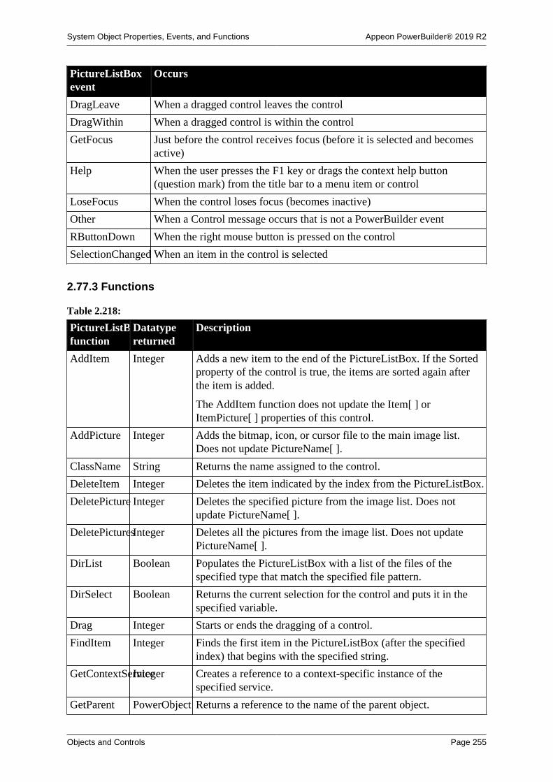
System Object Properties, Events, and Functions Appeon PowerBuilder® 2019 R2
Objects and Controls Page 255
PictureListBoxevent
Occurs
DragLeave When a dragged control leaves the control
DragWithin When a dragged control is within the control
GetFocus Just before the control receives focus (before it is selected and becomesactive)
Help When the user presses the F1 key or drags the context help button(question mark) from the title bar to a menu item or control
LoseFocus When the control loses focus (becomes inactive)
Other When a Control message occurs that is not a PowerBuilder event
RButtonDown When the right mouse button is pressed on the control
SelectionChanged When an item in the control is selected
2.77.3 Functions
Table 2.218:
PictureListBoxfunction
Datatypereturned
Description
AddItem Integer Adds a new item to the end of the PictureListBox. If the Sortedproperty of the control is true, the items are sorted again afterthe item is added.
The AddItem function does not update the Item[ ] orItemPicture[ ] properties of this control.
AddPicture Integer Adds the bitmap, icon, or cursor file to the main image list.Does not update PictureName[ ].
ClassName String Returns the name assigned to the control.
DeleteItem Integer Deletes the item indicated by the index from the PictureListBox.
DeletePicture Integer Deletes the specified picture from the image list. Does notupdate PictureName[ ].
DeletePicturesInteger Deletes all the pictures from the image list. Does not updatePictureName[ ].
DirList Boolean Populates the PictureListBox with a list of the files of thespecified type that match the specified file pattern.
DirSelect Boolean Returns the current selection for the control and puts it in thespecified variable.
Drag Integer Starts or ends the dragging of a control.
FindItem Integer Finds the first item in the PictureListBox (after the specifiedindex) that begins with the specified string.
GetContextServiceInteger Creates a reference to a context-specific instance of thespecified service.
GetParent PowerObject Returns a reference to the name of the parent object.

System Object Properties, Events, and Functions Appeon PowerBuilder® 2019 R2
Objects and Controls Page 256
PictureListBoxfunction
Datatypereturned
Description
Hide Integer Makes the control invisible.
InsertItem Integer Adds a new item to the PictureListBox before the item indicatedby the index. If the Sorted property of the control is true, theitems are sorted again after the item is added.
Move Integer Moves the control to a specified location.
PointerX Integer Returns the distance of the pointer from the left edge of thecontrol.
PointerY Integer Returns the distance of the pointer from the top of the control.
PostEvent Boolean Adds an event to the end of the message queue for the control.
Print Integer Prints the control.
Reset Integer Removes all items from the control.
Resize Integer Changes the size of the control.
SelectedIndexInteger Returns the index of the item in the PictureListBox that iscurrently selected. If more than one item is selected, it returnsthe index of the first selected item.
SelectedItem String Returns the text of the first selected item.
SelectItem Integer Finds and highlights an item in the control. Use Syntax 1 whenyou know the text of the item but not its position. Use Syntax 2when you know the position of the item in the control's list oryou want to clear the current selection.
SelectItem has no effect on a PictureListBox whose MultiSelectproperty is true. Instead, use SetState to select items withoutaffecting the selected state of other items in the list.
SetFocus Integer Sets focus to the control.
SetPosition Integer Specifies the position of the control in the front-to-back order ofthe window.
SetRedraw Integer Controls automatic redrawing of the control after each change inits properties.
SetState Integer Sets the state (highlighted or not highlighted) of the itemindicated by the specified index. SetState works only formultiselect controls (that is, those for which the MultiSelectproperty is true).
SetTop Integer Scrolls the items in the control so that the item indicated by thespecified index is at the top of the control.
Show Integer Makes the control visible.
State Integer Returns 1 if the item specified by the specified index is selected(highlighted) and 0 if the item is not selected.
Text String Returns the text of the item in the control that is identified bythe specified index.

System Object Properties, Events, and Functions Appeon PowerBuilder® 2019 R2
Objects and Controls Page 257
PictureListBoxfunction
Datatypereturned
Description
Top Integer Returns the index number of the item currently at the top of thecontrol.
TotalItems Integer Returns the total number of items in the control.
TotalSelected Integer Returns the total number of items selected in the control.
TriggerEvent Integer Triggers a specified event in the control and executes the scriptfor the event.
TypeOf Object Returns the type of the control.
2.78 Pipeline object
A Pipeline system object is used to manage a data pipeline during execution. You use aPipeline object by defining a standard class user object inherited from the built-in Pipelineobject in the User Object painter. You can then access the Pipeline events by writing scriptsthat contain code for the events.
For more information about piping data, see Chapter 17, Piping Data Between Data Sources.
2.78.1 Properties
Table 2.219:
Pipelineproperty
Datatype Description
ClassDefinitionPowerObject An object of type PowerObject containing information about theclass definition of the object or control
DataObject String The name of the pipeline object (the object created in theData Pipeline painter, but that you must assign dynamically atruntime)
RowsInError Long The number of rows the pipeline found in error (for example,rows containing a duplicate key)
RowsRead Long The number of rows read by the pipeline
RowsWritten Long The number of rows written by the pipeline
Syntax String The syntax used to create the pipeline object (the object createdin the Data Pipeline painter)
2.78.2 Events
Table 2.220:
Pipeline event Occurs
Constructor When the user object is created.
Destructor When the user object is destroyed.
PipeEnd When Start or Repair is completed.
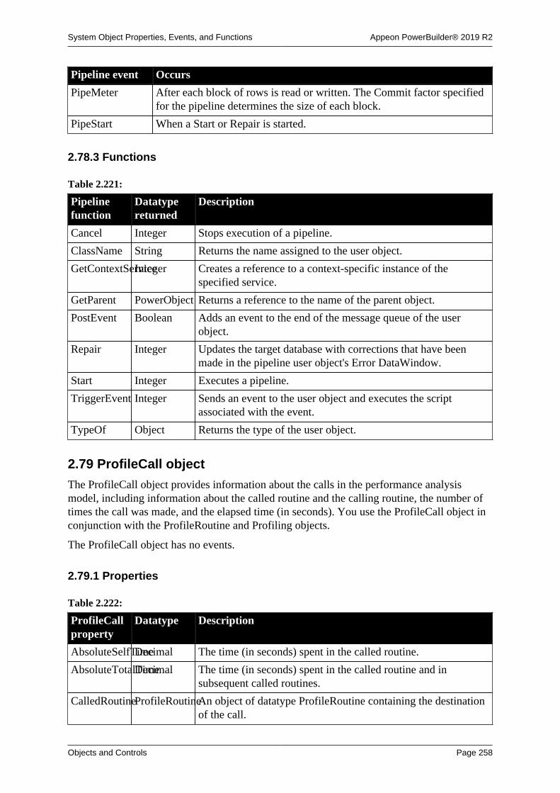
System Object Properties, Events, and Functions Appeon PowerBuilder® 2019 R2
Objects and Controls Page 258
Pipeline event Occurs
PipeMeter After each block of rows is read or written. The Commit factor specifiedfor the pipeline determines the size of each block.
PipeStart When a Start or Repair is started.
2.78.3 Functions
Table 2.221:
Pipelinefunction
Datatypereturned
Description
Cancel Integer Stops execution of a pipeline.
ClassName String Returns the name assigned to the user object.
GetContextServiceInteger Creates a reference to a context-specific instance of thespecified service.
GetParent PowerObject Returns a reference to the name of the parent object.
PostEvent Boolean Adds an event to the end of the message queue of the userobject.
Repair Integer Updates the target database with corrections that have beenmade in the pipeline user object's Error DataWindow.
Start Integer Executes a pipeline.
TriggerEvent Integer Sends an event to the user object and executes the scriptassociated with the event.
TypeOf Object Returns the type of the user object.
2.79 ProfileCall object
The ProfileCall object provides information about the calls in the performance analysismodel, including information about the called routine and the calling routine, the number oftimes the call was made, and the elapsed time (in seconds). You use the ProfileCall object inconjunction with the ProfileRoutine and Profiling objects.
The ProfileCall object has no events.
2.79.1 Properties
Table 2.222:
ProfileCallproperty
Datatype Description
AbsoluteSelfTimeDecimal The time (in seconds) spent in the called routine.
AbsoluteTotalTimeDecimal The time (in seconds) spent in the called routine and insubsequent called routines.
CalledRoutineProfileRoutineAn object of datatype ProfileRoutine containing the destinationof the call.

System Object Properties, Events, and Functions Appeon PowerBuilder® 2019 R2
Objects and Controls Page 259
ProfileCallproperty
Datatype Description
CallingLine ProfileLine An object of datatype ProfileLine containing the initiatingline of the call. If the call object represents an aggregation ofmultiple calls from a routine, an invalid object is returned.
CallingRoutineProfileRoutineAn object of datatype ProfileRoutine containing the routine thatinitiated the call.
ClassDefinitionPowerObject An object of type PowerObject containing information about theclass definition of the object or control.
HitCount Long The number of times the calling routine called the calledroutine.
PercentCalleeSelfTimeDouble AbsoluteSelfTime as a percentage of the total time (in seconds)the calling routine was active.
PercentCalleeTotalTimeDouble AbsoluteTotalTime as a percentage of the total time (inseconds) the calling routine was active.
PercentCallerTotalTimeDouble The total time (in seconds) spent in the calling routing as apercentage of the total time the calling routine was active.
2.79.2 Functions
Table 2.223:
ProfileCallfunction
Datatypereturned
Description
ClassName String Returns the name assigned to the object.
GetContextServiceInteger Creates a reference to a context-specific instance of thespecified service.
GetParent PowerObject Returns a reference to the name of the parent object.
TypeOf Object(enumerated)
Returns the type of the object.
2.80 ProfileClass objectThe ProfileClass object provides information about the classes in the performance analysismodel, including the routines that exist within a class. You use the ProfileClass object inconjunction with the Profiling object.
The ProfileClass object has no events.
2.80.1 Properties
Table 2.224:
ProfileClassproperty
Datatype Description
ClassDefinitionPowerObject An object of type PowerObject containing information about theclass definition of the object or control.

System Object Properties, Events, and Functions Appeon PowerBuilder® 2019 R2
Objects and Controls Page 260
ProfileClassproperty
Datatype Description
LibraryName String The name of the library that contains the class. The value is " "for system classes and embedded SQL statements.
Name String The name of the class or the string Embedded SQL to representall embedded SQL activities. Nested classes (like controls on awindow) have a name of the form class name>embedded classname.
2.80.2 Functions
Table 2.225:
ProfileClassfunction
Datatypereturned
Description
ClassName String Returns the name assigned to the object
GetContextServiceInteger Creates a reference to a context-specific instance of thespecified service
GetParent PowerObject Returns a reference to the name of the parent object
RoutineList ErrorReturn(enumerated)
Provides a list of the routines (defined as ProfileRoutineobjects) that exist in the model within a class
TypeOf Object(enumerated)
Returns the type of the object
2.81 ProfileLine objectThe ProfileLine object provides information about the lines in each routine in theperformance analysis model, including the number of times the line was hit, any calls madefrom the line, and the time (in seconds) spent on the line and in any called functions. You usethe ProfileLine object in conjunction with the ProfileRoutine and Profiling objects.
The ProfileLine object has no events.
2.81.1 Properties
Table 2.226:
ProfileLineproperty
Datatype Description
AbsoluteSelfTimeDecimal The time (in seconds) spent on this line itself. If the lineexecuted more than once, this is the total time spent on the line.
AbsoluteTotalTimeDecimal The time (in seconds) spent on this line and on lines called fromthis line. If the line executed more than once, this is the totaltime spent on the line and on called lines.
ClassDefinitionPowerObject An object of type PowerObject containing information about theclass definition of the object or control.
HitCount Long The number of times the line was called.

System Object Properties, Events, and Functions Appeon PowerBuilder® 2019 R2
Objects and Controls Page 261
ProfileLineproperty
Datatype Description
LineNumber Long The line number. Line 0 is a special line that represents the time(in seconds) taken to initialize the local variables (includingcalling constructors for autoinstantiated objects).
MaxSelfTimeDecimal The longest time (in seconds) spent just on this line. If the lineexecuted only once, this is the same as AbsoluteSelfTime.
MaxTotalTimeDecimal The longest time (in seconds) spent on this line and on calledlines. If the line executed only once, this is the same asAbsoluteTotalTime.
MinSelfTime Decimal The shortest time (in seconds) spent just on this line. If the lineexecuted only once, this is the same as AbsoluteSelfTime.
MinTotalTimeDecimal The shortest time (in seconds) spent on this line and oncalled lines. If the line executed only once, this is the same asAbsoluteTotalTime.
PercentSelfTimeDouble AbsoluteSelfTime as a percentage of the total time (in seconds)tracing was active.
PercentTotalTimeDouble AbsoluteTotalTime as a percentage of the total time (inseconds) tracing was active.
Routine ProfileRoutineThe routine that the line is in.
2.81.2 Functions
Table 2.227:
ProfileLinefunction
Datatypereturned
Description
ClassName String Returns the name assigned to the object
GetContextServiceInteger Creates a reference to a context-specific instance of thespecified service
GetParent PowerObject Returns a reference to the name of the parent object
OutgoingCallListErrorReturn(enumerated)
Provides a list of the calls (defined as ProfileCall objects) toother routines from a line
TypeOf Object(enumerated)
Returns the type of the object
2.82 ProfileRoutine object
The ProfileRoutine object provides information about the routines in the performanceanalysis model. It includes the time (in seconds) spent in the routine, any called routines, thenumber of times each routine was called, and the class to which the routine belongs. Youuse the ProfileRoutine object in conjunction with the Profiling and ProfileCall or ProfileLineobjects.
The ProfileRoutine object has no events.

System Object Properties, Events, and Functions Appeon PowerBuilder® 2019 R2
Objects and Controls Page 262
2.82.1 Properties
Table 2.228:
ProfileRoutineproperty
Datatype Description
AbsoluteSelfTimeDecimal The time (in seconds) spent in this routine. If the routineexecuted more than once, this is the total time spent in theroutine.
AbsoluteTotalTimeDecimal The time (in seconds) spent in this routine and in routines calledfrom this routine. If the routine executed more than once, this isthe total time spent in the routine and in called routines.
Class ProfileClass The class the routine is in. For embedded SQL activities, thevalue is Embedded SQL. For global and system functions, thevalue is an invalid object.
ClassDefinitionPowerObject An object of type PowerObject containing information about theclass definition of the object or control.
HitCount Long The number of times this routine was called or the number ofobjects created or destroyed.
Kind ProfileRoutineKind(enumerated)
The kind of routine node. Values are:
RoutineESQL! -- Represents an embedded SQL statement.
RoutineEvent! -- Represents an event.
RoutineFunction! -- Represents a function.
RoutineGarbageCollection! -- Represents a garbage collectionphase.
RoutineObjectCreation! -- Represents object creation.
RoutineObjectDestruction! -- Represents object destruction.
RoutineRoot! -- Represents the windowing system.
MaxSelfTimeDecimal The longest time (in seconds) spent in the routine itself.If the routine executed only once, this is the same asAbsoluteSelfTime.
MaxTotalTimeDecimal The longest time (in seconds) spent in the routine and in calledroutines. If the routine executed only once, this is the same asAbsoluteTotalTime.
MinSelfTime Decimal The shortest time (in seconds) spent in the routine itself.If the routine executed only once, this is the same asAbsoluteSelfTime.
MinTotalTimeDecimal The shortest time (in seconds) spent in the routine and in calledroutines. If the routine executed only once, this is the same asAbsoluteTotalTime.
Name String The name of the routine including the argument datatypes andreturn value. For embedded SQL activities, the value is thename of the statement (for example, SELECT). For object

System Object Properties, Events, and Functions Appeon PowerBuilder® 2019 R2
Objects and Controls Page 263
ProfileRoutineproperty
Datatype Description
creation or destruction, the value is Object Create or ObjectDestroy.
PercentSelfTimeDouble AbsoluteSelfTime as a percentage of the total time (in seconds)tracing was active.
PercentTotalTimeDouble AbsoluteTotalTime as a percentage of the total time (inseconds) tracing was active.
2.82.2 Functions
Table 2.229:
ProfileRoutinefunction
Datatypereturned
Description
ClassName String Returns the name assigned to the object
GetContextServiceInteger Creates a reference to a context-specific instance of thespecified service
GetParent PowerObject Returns a reference to the name of the parent object
IncomingCallListErrorReturn(enumerated)
Provides a list of the callers (defined as ProfileCall objects) ofthis routine
LineList ErrorReturn(enumerated)
Provides a list, in line order, of the lines (defined as ProfileLineobjects) in the routine
OutgoingCallListErrorReturn(enumerated)
Provides a list of the calls (defined as ProfileCall objects) toother routines from within this routine
TypeOf Object(enumerated)
Returns the type of the object
2.83 Profiling object
The Profiling object is used to analyze the performance of a PowerBuilder application. Itprovides a performance analysis model listing all the routines (both functions and events)logged in a given trace file. It includes the functions you call to name the trace file to beanalyzed, build the model, and list the classes and routines included in the model. Youuse the Profiling object in conjunction with the ProfileCall, ProfileClass, ProfileLine, andProfileRoutine objects.
The Profiling object has no events.
2.83.1 Properties
Table 2.230:
Profilingproperty
Datatype Description
ApplicationNameString The name of the application used to generate the trace file.

System Object Properties, Events, and Functions Appeon PowerBuilder® 2019 R2
Objects and Controls Page 264
Profilingproperty
Datatype Description
ClassDefinitionPowerObject An object of type PowerObject containing information about theclass definition of the object or control.
CollectionTimeDecimal The amount of time taken (in seconds) by the collection oftrace data. This time has already been accounted for in thetimestamps from the trace file (that is, the proper amount oftime is subtracted from the timestamps before they are put in thetrace file). If no model has been created, NULL is returned.
NumberOfActivitiesLong The total number of activities that exist in the trace file. Thevalue is 0 if this property is called before the trace file name isset.
TraceFileNameString The name of the trace file to use to build the model. The value isan empty string if the name has not been successfully set.
2.83.2 Functions
Table 2.231:
Profilingfunction
Datatypereturned
Description
BuildModel ErrorReturn(enumerated)
Builds a performance analysis model based on the previouslyspecified trace file
ClassList ErrorReturn(enumerated)
Provides a list of the classes (defined as ProfileClass objects)included in the model
ClassName String Returns the name assigned to the object
DestroyModelErrorReturn(enumerated)
Destroys the current performance analysis model
GetContextServiceInteger Creates a reference to a context-specific instance of thespecified service
GetParent PowerObject Returns a reference to the name of the parent object
RoutineList ErrorReturn(enumerated)
Provides a list of the routines (defined as ProfileRoutineobjects) included in the model
SetTraceFileNameErrorReturn Indicates the name of the trace file to use for analysis andvalidates the header format
SystemRoutineProfileRoutineProvides the routine node (defined as a ProfileRoutine object)representing the system root
TypeOf Object(enumerated)
Returns the type of the object
2.84 RadioButton control
A RadioButton is a small round button that is used to turn an option on and off. When theoption is on, the button has a dark center. When the option is off, the center is blank.

System Object Properties, Events, and Functions Appeon PowerBuilder® 2019 R2
Objects and Controls Page 265
In a GroupBox
RadioButtons are often grouped in a GroupBox. In this case, the user can select onlyone button in the group, and the group usually has a default button.
2.84.1 Properties
Table 2.232:
RadioButtonproperty
Datatype Description
AccessibleDescriptionString A description of the control and/or its purpose for use byaccessibility tools such as readers for visually impaired users.
AccessibleNameString A label that briefly describes the control, such as the text in abutton or the name of a menu item.
AccessibleRoleAccessibleRole(enumerated)
Describes what kind of user interface element the control is.
Automatic Boolean Specifies whether the control becomes dark when it is clicked.Values are:
TRUE -- Control becomes dark when clicked.
FALSE -- Control does not become dark when clicked.
BackColor Long Specifies the numeric value of the background color: -2to 16,777,215. For more information about color, seeSection 10.636, “RGB”.
BorderStyle BorderStyle(enumerated)
Specifies the style of the border of the control. Values are:
StyleLowered!
StyleRaised!
BringToTop Boolean Specifies whether PowerBuilder moves the control to the top ofthe front-to-back order in the window. Values are:
TRUE -- Control moved to top.
FALSE -- Control not moved to top.
Checked Boolean Specifies whether the item is selected (the center is dark).Values are:
TRUE -- Control is selected.
FALSE -- Control is not selected.
ClassDefinitionPowerObject An object of type PowerObject containing information about theclass definition of the object or control.
DragAuto Boolean Specifies whether PowerBuilder puts the control automaticallyinto Drag mode. Values are:
TRUE -- When the control is clicked, the control isautomatically in Drag mode.

System Object Properties, Events, and Functions Appeon PowerBuilder® 2019 R2
Objects and Controls Page 266
RadioButtonproperty
Datatype Description
FALSE -- When the control is clicked, the control is notautomatically in Drag mode. You have to manually put thecontrol into Drag mode by using the Drag function.
DragIcon String Specifies the name of the stock icon or the file containing theicon you want to display when the user drags the control (theICO file). The default icon is a box the size of the control.
When the user drags the control, the icon displays when thecontrol is over an area in which the control can be dropped (avalid drop area). When the control is over an area that is not avalid drop area, the No-Drop icon displays.
Enabled Boolean Specifies whether the control is enabled (can be selected).Values are:
TRUE -- Control is enabled.
FALSE -- Control is not enabled.
FaceName String Specifies the name of the typeface in which the text of thecontrol displays (for example, Helv or Courier).
FontCharSet FontCharSet(enumerated)
Specifies the font character set used for the text in the control.For a complete list of possible values, see the list of propertiesfor the FontCharSet variable on the Enumerated tab page of theBrowser.
FontFamily FontFamily(enumerated)
Specifies the font family (type style) used for the text in thecontrol. Values are:
AnyFont!
Decorative!
Modern!
Roman!
Script!
Swiss!
FontPitch FontPitch(enumerated)
Specifies the pitch (spacing) of the font used for the text in thecontrol. Values are:
Default!
Fixed!
Variable!
Height Integer Specifies the height of the control, in PowerBuilder units.
Italic Boolean Specifies whether the text in the control is italic. Values are:
TRUE -- Text is italic.
FALSE -- Text is not italic.

System Object Properties, Events, and Functions Appeon PowerBuilder® 2019 R2
Objects and Controls Page 267
RadioButtonproperty
Datatype Description
LeftText Boolean Specifies whether the text displays to the left of the control.Values are:
TRUE -- Text displays to the left.
FALSE -- Text does not display to the left.
Pointer String Specifies the name of the stock pointer or the file containing thepointer used for the control.
RightToLeft Boolean Specifies that characters should be displayed in right-to-leftorder. The application must be running on an operating systemthat supports right-to-left display. Values are:
TRUE -- Characters display in right-to-left order.
FALSE -- Characters display in left-to-right order.
TabOrder Integer Specifies the tab value of the control (0 means the user cannottab to the control). In a GroupBox, the up and down arrow keysare used to move among RadioButtons in a specified sequence.
To permit tabbing in a GroupBox, change the tab value ofthe GroupBox to 0 and assign nonzero tab values to theRadioButtons (the default tab value for the RadioButtons in aGroupBox is 0).
Tag String Specifies the tag value assigned to the control.
Text String Specifies the text that displays next to the control.
TextColor Long Specifies the numeric value of the color used for text:-2 to 16,777,215. For more information about color, seeSection 10.636, “RGB”.
TextSize Integer Specifies the size of the text in the control, in points. Forbackward compatibility, the size is stored as a negative number;for example, 10-point text size is stored as -10.
Underline Boolean Specifies whether the text in the control is underlined. Valuesare:
TRUE -- Text is underlined.
FALSE -- Text is not underlined.
Visible Boolean Specifies whether the control is visible. Values are:
TRUE -- Control is visible.
FALSE -- Control is not visible.
Weight Integer Specifies the stroke weight of the text in the control; forexample, 400 for normal or 700 for bold.
Width Integer Specifies the width of the control, in PowerBuilder units.
X Integer Specifies the X position (the distance from the left edge of thewindow), in PowerBuilder units.

System Object Properties, Events, and Functions Appeon PowerBuilder® 2019 R2
Objects and Controls Page 268
RadioButtonproperty
Datatype Description
Y Integer Specifies the Y position (the distance from the top of thewindow), in PowerBuilder units.
2.84.2 Events
Table 2.233:
RadioButtonevent
Occurs
Clicked When the control is clicked (selected or unselected)
Constructor Immediately before the Open event occurs in the window
Destructor Immediately after the Close event occurs in the window
DragDrop When a dragged control is dropped on the control
DragEnter When a dragged control enters the control
DragLeave When a dragged control leaves the control
DragWithin When a dragged control is within the control
GetFocus Just before the control receives focus (before it is selected and becomesactive)
Help When the user presses the F1 key or drags the context help button(question mark) from the title bar to a menu item or control
LoseFocus When the control loses focus (becomes inactive)
Other When a Windows message occurs that is not a PowerBuilder event
RButtonDown When the right mouse button is pressed on the control
2.84.3 Functions
Table 2.234:
RadioButtonfunction
Datatypereturned
Description
ClassName String Returns the name assigned to the control
Drag Integer Starts or ends the dragging of the control
GetContextServiceInteger Creates a reference to a context-specific instance of thespecified service
GetParent PowerObject Returns a reference to the name of the parent object
Hide Integer Makes the control invisible
Move Integer Moves the control to a specified location
PointerX Integer Returns the distance of the pointer from the left edge of thecontrol
PointerY Integer Returns the distance of the pointer from the top of the control

System Object Properties, Events, and Functions Appeon PowerBuilder® 2019 R2
Objects and Controls Page 269
RadioButtonfunction
Datatypereturned
Description
PostEvent Boolean Adds an event to the end of the message queue for control
Print Integer Prints the control
Resize Integer Changes the size of the control
SetFocus Integer Sets focus to the control
SetPosition Integer Specifies the position of the control in the front-to-back order ofthe window
SetRedraw Integer Controls automatic redrawing of the control after each change inits properties
Show Integer Makes the control visible
TriggerEvent Integer Triggers a specified event for the control and executes the scriptfor the event
TypeOf Object Returns the type of the control
2.85 Rectangle control
A rectangle is a filled or outlined rectangular form within a window and is typically used fordesign purposes. For example, you can put a CommandButton or a picture in a rectangle, oryou can use a rectangle behind and slightly offset from another control to create a shadoweffect. When you use a rectangle to group controls, the grouping does not affect the behaviorof the controls in the rectangle.
2.85.1 Properties
Table 2.235:
Rectangleproperty
Datatype Description
ClassDefinitionPowerObject An object of type PowerObject containing information about theclass definition of the object or control.
FillColor Long Specifies the numeric value of the color used to fill the control:-2 to 16,777,215. For more information about color, seeSection 10.636, “RGB”.
FillPattern FillPattern(enumerated)
Specifies the hatch pattern used to fill the control. Values are:
BDiagonal!
Diamond!
FDiagonal!
Horizontal!
Solid!
Square!
Vertical!

System Object Properties, Events, and Functions Appeon PowerBuilder® 2019 R2
Objects and Controls Page 270
Rectangleproperty
Datatype Description
FDiagonal! is lines going from the lower-left to the upper-right.BDiagonal! is lines going from the upper-left to the lower-right.
Height Integer Specifies the height of the control, in PowerBuilder units.
LineColor Long Specifies the numeric value of the line color: -2 to 16,777,215.For more information about color, see Section 10.636, “RGB”.
LineStyle LineStyle(enumerated)
Specifies the pattern of the line used to draw the control. Valuesare:
Continuous!
Dash!
DashDot!
DashDotDot!
Dot!
Transparent!
LineThicknessInteger Specifies the thickness of the line used to draw the control, inPowerBuilder units. If LineThickness is greater than one pixel(about four PowerBuilder units), the LineStyle is forced toContinuous!
Tag String Specifies the tag value assigned to the control.
Visible Boolean Specifies whether the control is visible. Values are:
TRUE -- Control is visible.
FALSE -- Control is not visible.
Width Integer Specifies the width of the control, in PowerBuilder units.
X Integer Specifies the X position (the distance from the left edge of thewindow), in PowerBuilder units.
Y Integer Specifies the Y position (the distance from the top of thewindow), in PowerBuilder units.
2.85.2 Events
Table 2.236:
Rectangle event Occurs
Constructor Immediately before the Open event occurs in the window
Destructor Immediately after the Close event occurs in the window

System Object Properties, Events, and Functions Appeon PowerBuilder® 2019 R2
Objects and Controls Page 271
2.85.3 Functions
Table 2.237:
Rectanglefunction
Datatypereturned
Description
ClassName String Returns the name assigned to the control
GetContextServiceInteger Creates a reference to a context-specific instance of thespecified service
GetParent PowerObject Returns a reference to the name of the parent object
Hide Integer Makes the control invisible
Move Integer Moves the control to a specified location
PostEvent Boolean Adds an event to the end of the message queue for the control
Resize Integer Changes the size of the control
Show Integer Makes the control visible
TriggerEvent Integer Triggers a specified event in the control and executes the scriptfor the event
TypeOf Object Returns the type of the control
2.86 ResourceResponse objectThe ResourceResponse object can obtain the response information of the protected resourcerequest, including the HTTP response headers and the protected resource returned from theserver.
Note
This object cannot be referenced in .NET Web Service or .NET Assemblycomponents, otherwise the component will fail to be deployed.
2.86.1 Properties
Table 2.238:
ResourceResponseproperty
Datatype Description
ClassDefinitionPowerObject An object of type PowerObject containing information about theclass definition of the object or control
2.86.2 Functions
Table 2.239:
ResourceResponsefunction
Datatypereturned
Description
ClassName String Returns the name assigned to the object.
GetBody Integer Gets the response body into string.

System Object Properties, Events, and Functions Appeon PowerBuilder® 2019 R2
Objects and Controls Page 272
ResourceResponsefunction
Datatypereturned
Description
GetContextServiceInteger Creates a reference to a context-specific instance of thespecified service.
GetHeader String Gets the response header by name.
GetHeaders String Gets the header of all responses by name.
GetParent PowerObject Returns a reference to the name of the parent object.
GetStatusCodeLong Gets the response status code.
GetStatusTextString Gets the response status description.
TypeOf Object Returns the type of the object.
2.87 RESTClient objectThe RESTClient object provides the ability to access the RESTful Web APIs. It loads theJSON-formatted string returned from the RESTful Web Service APIs into the DataWindowobject. The JSON string returned from the RESTFul Web Service APIs must be in the formatdescribed in Section 18.1, “Supported JSON formats”.
Note
This object cannot be referenced in .NET Web Service or .NET Assemblycomponents, otherwise the component will fail to be deployed.
Note
DataWindow object with the following presentation styles are unsupported:Composite, Crosstab, OLE 2.0, and RichText.
2.87.1 Properties
Table 2.240:
RESTClientproperty
Datatype Description
SecureProtocolInteger The secure protocol.
TimeOut Long The timeout seconds.
ClassDefinitionPowerObject An object of type PowerObject containing information about theclass definition of the object or control
2.87.2 Events
Table 2.241:
RESTClientevent
Occurs
Constructor When the object is created

System Object Properties, Events, and Functions Appeon PowerBuilder® 2019 R2
Objects and Controls Page 273
RESTClientevent
Occurs
Destructor When the object is destroyed
2.87.3 Functions
Table 2.242:
RESTClientfunction
Datatypereturned
Description
ClassName String Returns the name assigned to the object
ClearRequestHeadersInteger Clears headers of the request.
GetContextServiceInteger Creates a reference to a context-specific instance of thespecified service.
GetParent PowerObject Returns a reference to the name of the parent object.
GetJWTTokenInteger Gets the JWT token using the POST method.
GetOAuthTokenInteger Gets the OAuth 2.0 access token.
GetRequestHeaderString Gets the request header by name.
GetRequestHeadersString Gets all of the request headers information.
GetResponseHeaderString Gets the response header by name.
GetResponseHeadersString Gets all of the response headers information.
GetResponseStatusCodeLong Gets the response status code.
GetResponseStatusTextString Gets the response status description.
PostEvent Boolean Adds an event to the end of the message queue for the object.
Retrieve Long Retrieves data to the DataWindow, DataWindowChild, orDataStore from the RESTFul Web service.
RetrieveOne Long Retrieves one data row to the DataWindow, DataWindowChild,or DataStore from the RESTFul Web service.
SendDeleteRequestInteger Sends the HTTP DELETE request to the server and then getsthe content of the server response.
SendGetRequestInteger Sends the HTTP GET request to the server and then gets thecontent of the server response.
SendPatchRequestInteger Sends the HTTP PATCH request to the server and then gets thecontent of the server response.
SendPostRequestInteger Sends the HTTP POST request to the server and then gets thecontent of the server response.
SendPutRequestInteger Sends the HTTP PUT request to the server and then gets thecontent of the server response.
SetJWTTokenInteger Sets the JWT token string to the HTTP request header whichwill be sent to the server.
SetOAuthTokenInteger Sets the OAuth 2.0 token string to the HTTP request headerwhich will be sent to the server.

System Object Properties, Events, and Functions Appeon PowerBuilder® 2019 R2
Objects and Controls Page 274
RESTClientfunction
Datatypereturned
Description
SetRequestHeaderInteger Sets the request header.
SetRequestHeadersInteger Sets all of the request headers information.
Submit Integer Sends the data to the server via the HTTP POST method.
TriggerEvent Integer Triggers a specific event in the object and executes the script forthe event.
TypeOf Object Returns the type of the object.
2.88 ResultSet objectThe ResultSet object provides the ability to use ActiveX Data Object (ADO) recordsets to return a result set to a client. Use ResultSet objects with the CreateFrom andGenerateResultSet DataStore functions.
2.88.1 Properties
Table 2.243:
ResultSetproperty
Datatype Description
ClassDefinitionPowerObject An object of type PowerObject containing information about theclass definition of the object or control
2.88.2 Events
Table 2.244:
ResultSet event Occurs
Constructor When the object is created
Destructor When the object is destroyed
2.88.3 Functions
Table 2.245:
ResultSetfunction
Datatypereturned
Description
ClassName String Returns the name assigned to the object
GetContextServiceInteger Creates a reference to a context-specific instance of thespecified service
GetParent PowerObject Returns a reference to the name of the parent object
PostEvent Boolean Adds an event to the end of the message queue for the object
TriggerEvent Integer Triggers a specific event in the object and executes the script forthe event
TypeOf Object Returns the type of the object

System Object Properties, Events, and Functions Appeon PowerBuilder® 2019 R2
Objects and Controls Page 275
2.89 ResultSets object (obsolete)
Obsolete object
ResultSets object is obsolete, because EAServer is no longer supported sincePowerBuilder 2017.
The ResultSets object provides the ability to handle multiple result sets returned fromEAServer.
2.89.1 Properties
Table 2.246:
ResultSetsproperty
Datatype Description
ClassDefinitionPowerObject An object of type PowerObject containing information about theclass definition of the object or control
ResultSetList ResultSetobject
An array of ResultSet objects
2.89.2 Events
Table 2.247:
ResultSets event Occurs
Constructor When the object is created
Destructor When the object is destroyed
2.89.3 Functions
Table 2.248:
ResultSetsfunction
Datatypereturned
Description
ClassName String Returns the name assigned to the object.
GetContextServiceInteger Creates a reference to a context-specific instance of thespecified service.
GetParent PowerObject Returns a reference to the name of the parent object.
PostEvent Boolean Adds an event to the end of the message queue for the object.
TriggerEvent Integer Triggers a specific event in the object and executes the script forthe event.
TypeOf Object Returns the type of the object.
2.90 RibbonBar controlA RibbonBar control enables you to create ribbons that organize user commands into logicalgroups. A ribbon is a modern way of organizing user commands in user interfaces. A ribboncan replace the traditional menu bar and toolbars with tabbed pages (called Category); andeach Category splits into Panels that contain LargeButton (with or without RibbonMenu),

System Object Properties, Events, and Functions Appeon PowerBuilder® 2019 R2
Objects and Controls Page 276
SmallButton (with or without RibbonMenu), CheckBox, ComboBox, and Spin (currentlyunsupported).
For how to create a RibbonBar control, refer to Chapter 13, Working with RibbonBar.
Note
This control cannot be referenced in .NET Web Service or .NET Assemblycomponents, otherwise the component will fail to be deployed.
2.90.1 Properties
Table 2.249:
RibbonBarproperty
Datatype Description
AccessibleDescriptionString A description of the control and/or its purpose for use byaccessibility tools such as readers for visually impaired users.
AccessibleNameString A label that briefly describes the control, such as the text in abutton or the name of a menu item.
AccessibleRoleAccessibleRole(enumerated)
Describes what kind of user interface element the control is.
AutosizeHeightBoolean Specifies whether RibbonBar control automatically adjust itsheight. Values are:
TRUE -- Height is automatically adjusted according to thecontent. The Height property (no matter specified in the painteror in the scripts) will be ignored.
FALSE -- Height is determined by the Height property(specified in the painter or in the scripts).
BringToTop Boolean Specifies whether PowerBuilder moves the control to the top ofthe front-to-back order in the window. Values are:
TRUE -- Control moved to top.
FALSE -- Control not moved to top.
BuiltinThemeInteger Specifies the theme of the RibbonBar control.
ClassDefinitionPowerObject An object of type PowerObject containing information about theclass definition of the object or control.
DragAuto Boolean Specifies whether PowerBuilder puts the control automaticallyinto Drag mode. Values are:
TRUE -- When the control is clicked, the control isautomatically in Drag mode.
FALSE -- When the control is clicked, the control is notautomatically in Drag mode. You have to manually put thecontrol into Drag mode by using the Drag function.

System Object Properties, Events, and Functions Appeon PowerBuilder® 2019 R2
Objects and Controls Page 277
RibbonBarproperty
Datatype Description
DragIcon String Specifies the name of the stock icon or the file containing theicon you want to display when the user drags the control (theICO file). The default icon is a box the size of the control.
When the user drags the control, the icon displays when thecontrol is over an area in which the control can be dropped (avalid drop area). When the control is over an area that is not avalid drop area, the No-Drop icon displays.
Enabled Boolean Specifies whether the control is enabled (can be selected).Values are:
TRUE -- Control is enabled.
FALSE -- Control is not enabled.
FaceName String Specifies the name of the typeface in which the text of thecontrol displays (for example, Helv or Courier).
FontCharSet FontCharSet(enumerated)
Specifies the font character set used for the text in the control.For a complete list of possible values, see the list of propertiesfor the FontCharSet variable on the Enumerated tab page of theBrowser.
FontFamily FontFamily(enumerated)
Specifies the font family (type style) used for the text in thecontrol. Values are:
AnyFont!
Decorative!
Modern!
Roman!
Script!
Swiss!
FontPitch FontPitch(enumerated)
Specifies the pitch (spacing) of the font used for the text in thecontrol. Values are:
Default!
Fixed!
Variable!
Height Integer Specifies the height of the control, in PowerBuilder units.
HidePanelTextBoolean Specifies the panel text is invisible.
HideTabHeaderBoolean Specifies the tab header area is invisible.
Italic Boolean Specifies whether the text in the control is italic. Values are:
TRUE -- Text is italic.
FALSE -- Text is not italic.

System Object Properties, Events, and Functions Appeon PowerBuilder® 2019 R2
Objects and Controls Page 278
RibbonBarproperty
Datatype Description
Pointer String Specifies the name of the stock pointer or the file containing thepointer used for the control.
TabOrder Integer Specifies the tab value of the control (0 means the user cannottab to the control). In a GroupBox, the up and down arrow keysare used to move among RadioButtons in a specified sequence.
To permit tabbing in a GroupBox, change the tab value ofthe GroupBox to 0 and assign nonzero tab values to theRadioButtons (the default tab value for the RadioButtons in aGroupBox is 0).
Tag String Specifies the tag value assigned to the control.
TextSize Integer Specifies the size of the text in the control, in points. Forbackward compatibility, the size is stored as a negative number;for example, 10-point text size is stored as -10.
Transparency Integer Specifies the transparency of a window. Value is a percentage inthe range 0 (opaque) to 100 (completely transparent).
Underline Boolean Specifies whether the text in the control is underlined. Valuesare:
TRUE -- Text is underlined.
FALSE -- Text is not underlined.
Visible Boolean Specifies whether the control is visible. Values are:
TRUE -- Control is visible.
FALSE -- Control is not visible.
Weight Integer Specifies the stroke weight of the text in the control; forexample, 400 for normal or 700 for bold.
Width Integer Specifies the width of the control, in PowerBuilder units.
X Integer Specifies the X position (the distance from the left edge of thewindow), in PowerBuilder units.
Y Integer Specifies the Y position (the distance from the top of thewindow), in PowerBuilder units.
2.90.2 Events
Table 2.250:
RibbonBarevent
Occurs
CategoryCollapsedWhen the popup category is closed.
CategoryExpandedWhen the category is popped up.
CategorySelectionChangedAfter the selection changes to another category and when the category iscreated and the initial selection is established.
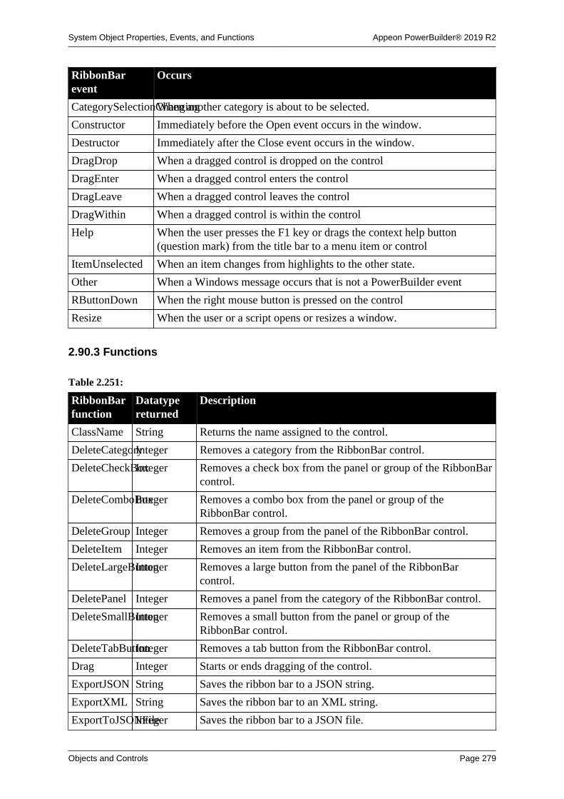
System Object Properties, Events, and Functions Appeon PowerBuilder® 2019 R2
Objects and Controls Page 279
RibbonBarevent
Occurs
CategorySelectionChangingWhen another category is about to be selected.
Constructor Immediately before the Open event occurs in the window.
Destructor Immediately after the Close event occurs in the window.
DragDrop When a dragged control is dropped on the control
DragEnter When a dragged control enters the control
DragLeave When a dragged control leaves the control
DragWithin When a dragged control is within the control
Help When the user presses the F1 key or drags the context help button(question mark) from the title bar to a menu item or control
ItemUnselected When an item changes from highlights to the other state.
Other When a Windows message occurs that is not a PowerBuilder event
RButtonDown When the right mouse button is pressed on the control
Resize When the user or a script opens or resizes a window.
2.90.3 Functions
Table 2.251:
RibbonBarfunction
Datatypereturned
Description
ClassName String Returns the name assigned to the control.
DeleteCategoryInteger Removes a category from the RibbonBar control.
DeleteCheckBoxInteger Removes a check box from the panel or group of the RibbonBarcontrol.
DeleteComboBoxInteger Removes a combo box from the panel or group of theRibbonBar control.
DeleteGroup Integer Removes a group from the panel of the RibbonBar control.
DeleteItem Integer Removes an item from the RibbonBar control.
DeleteLargeButtonInteger Removes a large button from the panel of the RibbonBarcontrol.
DeletePanel Integer Removes a panel from the category of the RibbonBar control.
DeleteSmallButtonInteger Removes a small button from the panel or group of theRibbonBar control.
DeleteTabButtonInteger Removes a tab button from the RibbonBar control.
Drag Integer Starts or ends dragging of the control.
ExportJSON String Saves the ribbon bar to a JSON string.
ExportXML String Saves the ribbon bar to an XML string.
ExportToJSONFileInteger Saves the ribbon bar to a JSON file.

System Object Properties, Events, and Functions Appeon PowerBuilder® 2019 R2
Objects and Controls Page 280
RibbonBarfunction
Datatypereturned
Description
ExportToXMLFileInteger Saves the ribbon bar to an XML file.
GetActiveCategoryInteger Gets the active category in the RibbonBar control.
GetApplicationButtonInteger Gets the application button that is set for the RibbonBar control.
GetBestHeightInteger Gets the height of the RibbonBar control which is automaticallyadjusted according to the content (when AutosizeHeight isenabled).
GetCategory Integer Gets the category in the RibbonBar control.
GetCategoryByIndexInteger Gets the category according to its index in the RibbonBarcontrol.
GetCategoryCountLong Determines the total number of categories in the RibbonBarcontrol.
GetCategoryIndexLong Gets the index of the category in the RibbonBar control.
GetCheckBoxInteger Gets the data associated with a specified check box.
GetChildItemByIndexInteger Gets the child item according to its index in the RibbonBarcontrol.
GetChildItemCountLong Determines the total number of items in a parent (Category,Panel, or Group) of the RiboonBar control.
GetComboBoxInteger Gets the data associated with a specified combo box.
GetContextServiceInteger Creates a reference to a context-specific instance of thespecified service.
GetGroup Integer Gets the data associated with a specified group.
GetItem Integer Gets an item according to the handle.
GetItemByTagInteger Gets an item according to the tag.
GetItemParentInteger Gets the parent item.
GetLargeButtonInteger Gets the data associated with a specified large button.
GetMenuByButtonHandleInteger Gets the menu associated with the button.
GetPanel Integer Gets the panel in the category of the RibbonBar control.
GetParent PowerObject Returns a reference to the name of the parent object.
GetSmallButtonInteger Gets the data associated with a specified small button.
GetTabButtonLong Gets the tab button in the RibbonBar control.
GetTabButtonByIndexInteger Gets the tab button according to its index in the RibbonBarcontrol.
GetTabButtonCountLong Determines the total number of tab buttons in the RibbonBarcontrol.
Hide Integer Makes the control invisible.
ImportJSON Integer Loads the ribbon bar from a JSON string.
ImportXML Integer Loads the ribbon bar from an XML string.

System Object Properties, Events, and Functions Appeon PowerBuilder® 2019 R2
Objects and Controls Page 281
RibbonBarfunction
Datatypereturned
Description
ImportFromJSONFileInteger Loads the ribbon bar from a JSON file.
ImportFromXMLFileInteger Loads the ribbon bar from an XML file.
InsertCategoryLong Inserts a category in the RibbonBar control.
InsertCategoryFirstLong Inserts a category as the first item in the RibbonBar control.
InsertCategoryLastLong Inserts a category as the last item in the RibbonBar control.
InsertCheckBoxLong Inserts a check box in the panel or group of the RibbonBarcontrol.
InsertCheckBoxFirstLong Inserts a check box as the first item in the panel or group of theRibbonBar control.
InsertCheckBoxLastLong Inserts a check box as the last item in the panel or group of theRibbonBar control.
InsertComboBoxLong Inserts a combo box in the panel or group of the RibbonBarcontrol.
InsertComboBoxFirstLong Inserts a combo box as the first item in the panel or group of theRibbonBar control.
InsertComboBoxLastLong Inserts a combo box as the last item in the panel or group of theRibbonBar control.
InsertGroup Long Inserts a group in the panel of the RibbonBar control.
InsertGroupFirstLong Inserts a group as the first item in the panel.
InsertGroupLastLong Inserts a group as the last item in the panel.
InsertLargeButtonLong Inserts a large button in the panel of the RibbonBar control.
InsertLargeButtonFirstLong Inserts a large button as the first item in the panel of theRibbonBar control.
InsertLargeButtonLastLong Inserts a large button as the last item in the panel of theRibbonBar control.
InsertPanel Long Inserts a panel in the category of the RibbonBar control.
InsertPanelFirstLong Inserts a panel as the first item in the category of the RibbonBarcontrol.
InsertPanelLastLong Inserts a panel as the last item in the category of the RibbonBarcontrol.
InsertSmallButtonLong Inserts a small button in the panel or group of the RibbonBarcontrol.
InsertSmallButtonFirstLong Inserts a small button as the first item in the panel or group ofthe RibbonBar control.
InsertSmallButtonLastLong Inserts a small button as the last item in the panel or group ofthe RibbonBar control.
InsertTabButtonLong Inserts a tab button in the RibbonBar control.
InsertTabButtonFirstLong Inserts a tab button as the first item in the RibbonBar control.
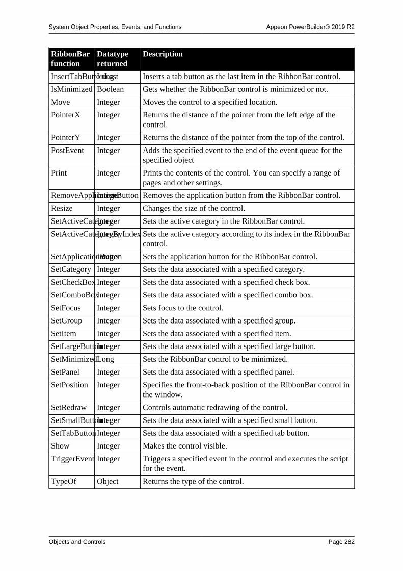
System Object Properties, Events, and Functions Appeon PowerBuilder® 2019 R2
Objects and Controls Page 282
RibbonBarfunction
Datatypereturned
Description
InsertTabButtonLastLong Inserts a tab button as the last item in the RibbonBar control.
IsMinimized Boolean Gets whether the RibbonBar control is minimized or not.
Move Integer Moves the control to a specified location.
PointerX Integer Returns the distance of the pointer from the left edge of thecontrol.
PointerY Integer Returns the distance of the pointer from the top of the control.
PostEvent Integer Adds the specified event to the end of the event queue for thespecified object
Print Integer Prints the contents of the control. You can specify a range ofpages and other settings.
RemoveApplicationButtonInteger Removes the application button from the RibbonBar control.
Resize Integer Changes the size of the control.
SetActiveCategoryInteger Sets the active category in the RibbonBar control.
SetActiveCategoryByIndexInteger Sets the active category according to its index in the RibbonBarcontrol.
SetApplicationButtonInteger Sets the application button for the RibbonBar control.
SetCategory Integer Sets the data associated with a specified category.
SetCheckBox Integer Sets the data associated with a specified check box.
SetComboBoxInteger Sets the data associated with a specified combo box.
SetFocus Integer Sets focus to the control.
SetGroup Integer Sets the data associated with a specified group.
SetItem Integer Sets the data associated with a specified item.
SetLargeButtonInteger Sets the data associated with a specified large button.
SetMinimizedLong Sets the RibbonBar control to be minimized.
SetPanel Integer Sets the data associated with a specified panel.
SetPosition Integer Specifies the front-to-back position of the RibbonBar control inthe window.
SetRedraw Integer Controls automatic redrawing of the control.
SetSmallButtonInteger Sets the data associated with a specified small button.
SetTabButtonInteger Sets the data associated with a specified tab button.
Show Integer Makes the control visible.
TriggerEvent Integer Triggers a specified event in the control and executes the scriptfor the event.
TypeOf Object Returns the type of the control.

System Object Properties, Events, and Functions Appeon PowerBuilder® 2019 R2
Objects and Controls Page 283
2.91 RibbonApplicationButtonItem control
A RibbonApplicationButtonItem control enables you to specify the items for an applicationbutton in the RibbonBar control.
2.91.1 Properties
Table 2.252:
RibbonApplicationButtonItemproperty
Datatype Description
ClassDefinitionPowerObject An object of type PowerObject containing information about theclass definition of the object or control.
Enabled Boolean Specifies whether the control is enabled (can be clicked).
ItemHandle Long Identifies the handle associated with the item.
Tag String Specifies the tag value assigned to the control.
Text String Specifies the text that displays in the control.
Visible Boolean Specifies whether the control is visible. Values are:
TRUE -- Control is visible.
FALSE -- Control is not visible.
2.91.2 Functions
Table 2.253:
RibbonApplicationButtonItemfunction
Datatypereturned
Description
ClassName String Returns the name assigned to the control.
GetContextServiceInteger Creates a reference to a context-specific instance of thespecified service.
GetMenu Integer Gets the menu that is associated with the ribbon button.
GetParent PowerObject Returns a reference to the name of the parent object.
PostEvent Integer Adds the specified event to the end of the event queue for thespecified object
SetMenu Integer Sets a menu to the ribbon button.
TriggerEvent Integer Triggers a specified event in the control and executes the scriptfor the event.
TypeOf Object Returns the type of the control.
2.92 RibbonApplicationMenu control
A RibbonApplicationMenu control enables you to specify the items for an application menuin the RibbonBar control.

System Object Properties, Events, and Functions Appeon PowerBuilder® 2019 R2
Objects and Controls Page 284
2.92.1 Functions
Table 2.254:
RibbonApplicationMenufunction
Datatypereturned
Description
AddMasterSeparatorItemLong Adds a separator item to the application menu.
ClassName String Returns the name assigned to the control.
ClearRecentItemsInteger Deletes all recent menu items.
DeleteMasterItemLong Deletes an item from an application menu.
DeleteRecentItemInteger Deletes a recent menu item.
GetContextServiceInteger Creates a reference to a context-specific instance of thespecified service.
GetMasterItemInteger Gets an item of the application menu.
GetMasterItemCountLong Determines the total number of menu items in an applicationmenu.
GetParent PowerObject Returns a reference to the name of the parent object.
GetRecentItemInteger Gets a recent menu item.
GetRecentItemCountLong Determines the total number of the recent menu items in anapplication menu.
GetRecentTitleInteger Gets the text of the recent menu.
InsertMasterItemLong Inserts an item at a specified position in an application menu.
InsertMasterItemFirstLong Inserts an item as the first item of the application menu.
InsertMasterItemLastLong Inserts an item as the last item of the application menu.
InsertRecentItemLong Inserts a recent menu item at a specified position in anapplication menu.
InsertRecentItemFirstLong Inserts a recent menu item as the first item of the applicationmenu.
InsertRecentItemLastLong Inserts a recent menu item as the last item of the applicationmenu.
PostEvent Integer Adds the specified event to the end of the event queue for thespecified object
SetMasterItemInteger Sets a menu item.
SetRecentItemInteger Sets a recent menu item.
SetRecentTitleInteger Sets the text for the recent menu.
TriggerEvent Integer Triggers a specified event in the control and executes the scriptfor the event.
TypeOf Object Returns the type of the control.

System Object Properties, Events, and Functions Appeon PowerBuilder® 2019 R2
Objects and Controls Page 285
2.93 RibbonCategoryItem control
A RibbonCategoryItem control enables you to specify the items for a category in theRibbonBar control.
2.93.1 Properties
Table 2.255:
RibbonCategoryItemproperty
Datatype Description
ClassDefinitionPowerObject An object of type PowerObject containing information about theclass definition of the object or control.
Enabled Boolean Specifies whether the control is enabled (can be clicked).
ItemHandle Long Identifies the handle associated with the item.
Tag String Specifies the tag value assigned to the control.
Text String Specifies the text that displays in the control.
Visible Boolean Specifies whether the control is visible. Values are:
TRUE -- Control is visible.
FALSE -- Control is not visible.
2.93.2 Functions
Table 2.256:
RibbonCategoryItemfunction
Datatypereturned
Description
ClassName String Returns the name assigned to the control.
GetContextServiceInteger Creates a reference to a context-specific instance of thespecified service.
GetParent PowerObject Returns a reference to the name of the parent object.
PostEvent Integer Adds the specified event to the end of the event queue for thespecified object
TriggerEvent Integer Triggers a specified event in the control and executes the scriptfor the event.
TypeOf Object Returns the type of the control.
2.94 RibbonCheckBoxItem control
A RibbonCheckBoxItem control enables you to specify the items for a check box in theRibbonBar control.

System Object Properties, Events, and Functions Appeon PowerBuilder® 2019 R2
Objects and Controls Page 286
2.94.1 Properties
Table 2.257:
RibbonCheckBoxItemproperty
Datatype Description
ClassDefinitionPowerObject An object of type PowerObject containing information about theclass definition of the object or control.
Checked Boolean Specifies whether the control is checked.
Clicked String Specifies the user click event name of the item.
Enabled Boolean Specifies whether the control is enabled (can be clicked).
ItemHandle Long Identifies the handle associated with the item.
PowerTipTextString Specifies the text to be displayed as a PowerTip for the item.
PowerTipDescriptionString Specifies the text to be displayed as a PowerTip description forthe item.
Selected String Specifies the selected event name of the item.
Shortcut String Specifies the shortcut key for the ribbon check box.
Tag String Specifies the tag value assigned to the control.
Text String Specifies the text that displays in the control.
ThirdState Boolean Specifies whether the control is in the third state when thecontrol has been defined to have three states.
ThreeState Boolean Specifies whether the control has three states.
Visible Boolean Specifies whether the control is visible. Values are:
TRUE -- Control is visible.
FALSE -- Control is not visible.
2.94.2 Functions
Table 2.258:
RibbonCheckBoxItemfunction
Datatypereturned
Description
ClassName String Returns the name assigned to the control.
GetContextServiceInteger Creates a reference to a context-specific instance of thespecified service.
GetParent PowerObject Returns a reference to the name of the parent object.
PostEvent Integer Adds the specified event to the end of the event queue for thespecified object
TriggerEvent Integer Triggers a specified event in the control and executes the scriptfor the event.
TypeOf Object Returns the type of the control.

System Object Properties, Events, and Functions Appeon PowerBuilder® 2019 R2
Objects and Controls Page 287
2.95 RibbonComboBoxItem control
A RibbonComboBoxItem control enables you to specify the items for a combo box in theRibbonBar control.
2.95.1 Properties
Table 2.259:
RibbonComboBoxItemproperty
Datatype Description
ClassDefinitionPowerObject An object of type PowerObject containing information about theclass definition of the object or control.
AllowEdit Boolean Specifies whether the user can enter text in the text box portionof the control.
AutoScale Boolean Specifies whether to automatically scale the width of control tothe content width of the item. (Default is TRUE.)
AutoHScroll Boolean Specifies whether the control is automatically horizontalscrolling.
BoxHeight Integer Specifies the height of a combobox control in PowerBuilderunits.
BoxWidth Integer Specifies the width of a combobox control in PowerBuilderunits.
HScrollBar Boolean Specifies whether the control has a horizontal scroll bar.
Modified String Specifies the modified event name of the item.
Enabled Boolean Specifies whether the control is enabled (can be clicked).
ItemHandle Long Identifies the handle associated with the item.
Label String Specifies the label of the control.
PictureName String Specifies the file name of the picture.
PictureHeightInteger Specifies in pixels the display height of all the pictures in thecontrol.
PictureWidth Integer Specifies in pixels the display width of all the pictures in thecontrol.
PowerTipTextString Specifies the text to be displayed as a PowerTip for the item.
PowerTipDescriptionString Specifies the text to be displayed as a PowerTip description forthe item.
Selected String Specifies the selected event name of the item.
SelectionChangedString Specifies the selection changed event name of the item.
Sorted String Specifies whether items in a combobox is sorted alphabetically.
Tag String Specifies the tag value assigned to the control.
Text String Specifies the text that displays in the control.
Visible Boolean Specifies whether the control is visible. Values are:

System Object Properties, Events, and Functions Appeon PowerBuilder® 2019 R2
Objects and Controls Page 288
RibbonComboBoxItemproperty
Datatype Description
TRUE -- Control is visible.
FALSE -- Control is not visible.
VScrollBar Boolean Specifies whether the control has a vertical scroll bar.
Width Boolean Specifies the width of the control in PowerBuilder units.
2.95.2 Functions
Table 2.260:
RibbonComboBoxItemfunction
Datatypereturned
Description
AddItem Integer Adds a new item to the list of values in a combobox.
ClassName String Returns the name assigned to the control.
DeleteItem Integer Deletes an item from the list of values for a combobox.
FindItem Integer Finds the next item in a combobox that begins with the specifiedsearch text.
GetBoxPictureListInteger Gets the files in the picture list search path of the application.
GetContextServiceInteger Creates a reference to a context-specific instance of thespecified service.
GetParent PowerObject Returns a reference to the name of the parent object.
InsertItem Integer Inserts an item into the list of values in a combobox.
PostEvent Integer Adds the specified event to the end of the event queue for thespecified object.
SelectedIndexInteger Gets the index of the currently selected item in the combobox.
SelectItem Integer Finds and highlights an item in the control.
SetBoxPictureListInteger Changes the files in the picture list search path of theapplication.
Text String Obtains the text of an item in a combobox.
TotalItems Integer Determines the total number of items in a combobox control.
TriggerEvent Integer Triggers a specified event in the control and executes the scriptfor the event.
TypeOf Object Returns the type of the control.
2.96 RibbonGroupItem control
A RibbonGroupItem control enables you to specify the items for a group in the RibbonBarcontrol.
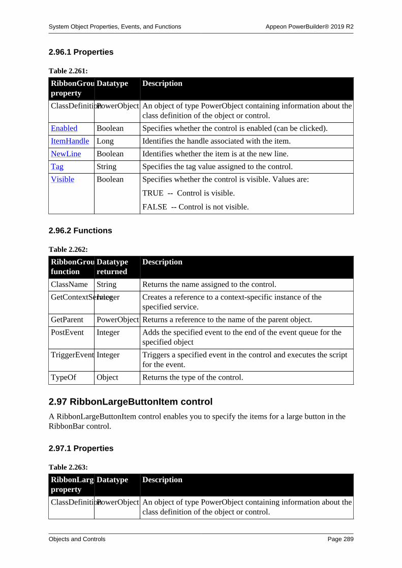
System Object Properties, Events, and Functions Appeon PowerBuilder® 2019 R2
Objects and Controls Page 289
2.96.1 Properties
Table 2.261:
RibbonGroupItemproperty
Datatype Description
ClassDefinitionPowerObject An object of type PowerObject containing information about theclass definition of the object or control.
Enabled Boolean Specifies whether the control is enabled (can be clicked).
ItemHandle Long Identifies the handle associated with the item.
NewLine Boolean Identifies whether the item is at the new line.
Tag String Specifies the tag value assigned to the control.
Visible Boolean Specifies whether the control is visible. Values are:
TRUE -- Control is visible.
FALSE -- Control is not visible.
2.96.2 Functions
Table 2.262:
RibbonGroupItemfunction
Datatypereturned
Description
ClassName String Returns the name assigned to the control.
GetContextServiceInteger Creates a reference to a context-specific instance of thespecified service.
GetParent PowerObject Returns a reference to the name of the parent object.
PostEvent Integer Adds the specified event to the end of the event queue for thespecified object
TriggerEvent Integer Triggers a specified event in the control and executes the scriptfor the event.
TypeOf Object Returns the type of the control.
2.97 RibbonLargeButtonItem control
A RibbonLargeButtonItem control enables you to specify the items for a large button in theRibbonBar control.
2.97.1 Properties
Table 2.263:
RibbonLargeButtonItemproperty
Datatype Description
ClassDefinitionPowerObject An object of type PowerObject containing information about theclass definition of the object or control.

System Object Properties, Events, and Functions Appeon PowerBuilder® 2019 R2
Objects and Controls Page 290
RibbonLargeButtonItemproperty
Datatype Description
Checked Boolean Specifies whether the control is checked.
Clicked String Specifies the user click event name of the item.
DefaultCommandBoolean Specifies whether the default command for a button is enabled.
Enabled Boolean Specifies whether the control is enabled (can be clicked).
ItemHandle Long Identifies the handle associated with the item.
PictureName String Specifies the file name of the picture.
PowerTipTextString Specifies the text to be displayed as a PowerTip for the item.
PowerTipDescriptionString Specifies the text to be displayed as a PowerTip description forthe item.
Selected String Specifies the selected event name of the item.
Shortcut String Specifies the shortcut key for the ribbon large button.
Tag String Specifies the tag value assigned to the control.
Text String Specifies the text that displays in the control.
Visible Boolean Specifies whether the control is visible. Values are:
TRUE -- Control is visible.
FALSE -- Control is not visible.
2.97.2 Functions
Table 2.264:
RibbonLargeButtonItemfunction
Datatypereturned
Description
ClassName String Returns the name assigned to the control.
GetContextServiceInteger Creates a reference to a context-specific instance of thespecified service.
GetMenu Integer Gets the menu that is associated with the ribbon button.
GetParent PowerObject Returns a reference to the name of the parent object.
PostEvent Integer Adds the specified event to the end of the event queue for thespecified object
SetMenu Integer Sets a menu to the ribbon button.
TriggerEvent Integer Triggers a specified event in the control and executes the scriptfor the event.
TypeOf Object Returns the type of the control.
2.98 RibbonMenu control
A RibbonMenu control enables you to create a menu in the RibbonBar control.

System Object Properties, Events, and Functions Appeon PowerBuilder® 2019 R2
Objects and Controls Page 291
2.98.1 Properties
Table 2.265:
RibbonMenuproperty
Datatype Description
ClassDefinitionPowerObject An object of type PowerObject containing information about theclass definition of the object or control.
2.98.2 Functions
Table 2.266:
RibbonMenufunction
Datatypereturned
Description
AddSeparatorItemLong Adds a separator item to the menu.
ClassName String Returns the name assigned to the control.
DeleteItem Long Deletes an item from the ribbon menu.
GetContextServiceInteger Creates a reference to a context-specific instance of thespecified service.
GetItem Integer Gets an item of the menu.
GetItemCountLong Determines the total number of menu items in a menu.
GetParent PowerObject Returns a reference to the name of the parent object.
InsertItem Long Inserts an item at a specified position in a ribbon menu.
InsertItemFirstLong Inserts an item as the first item in a ribbon menu.
InsertItemLastLong Inserts an item as the last item in a ribbon menu.
PostEvent Integer Adds the specified event to the end of the event queue for thespecified object
SetItem Integer Sets a menu item.
TriggerEvent Integer Triggers a specified event in the control and executes the scriptfor the event.
TypeOf Object Returns the type of the control.
2.99 RibbonMenuItem controlA RibbonMenuItem control enables you to specify the items for a menu in the RibbonBarcontrol.
2.99.1 Properties
Table 2.267:
RibbonMenuItemproperty
Datatype Description
ClassDefinitionPowerObject An object of type PowerObject containing information about theclass definition of the object or control.

System Object Properties, Events, and Functions Appeon PowerBuilder® 2019 R2
Objects and Controls Page 292
RibbonMenuItemproperty
Datatype Description
Checked Boolean Specifies whether the control is checked.
Clicked String Specifies the user click event name of the item.
Enabled Boolean Specifies whether the control is enabled (can be clicked).
ItemType Integer Specifies the item type for the control.
PictureName String Specifies the file name of the picture.
Selected String Specifies the selected event name of the item.
Shortcut String Specifies the shortcut key for the ribbon menu.
Tag String Specifies the tag value assigned to the control.
Text String Specifies the text that displays in the control.
Visible Boolean Specifies whether the control is visible. Values are:
TRUE -- Control is visible.
FALSE -- Control is not visible.
2.99.2 Functions
Table 2.268:
RibbonMenuItemfunction
Datatypereturned
Description
ClassName String Returns the name assigned to the control.
GetContextServiceInteger Creates a reference to a context-specific instance of thespecified service.
GetParent PowerObject Returns a reference to the name of the parent object.
PostEvent Integer Adds the specified event to the end of the event queue for thespecified object
TriggerEvent Integer Triggers a specified event in the control and executes the scriptfor the event.
TypeOf Object Returns the type of the control.
2.100 RibbonPanelItem controlA RibbonPanelItem control enables you to specify the items for a panel in the RibbonBarcontrol.
2.100.1 Properties
Table 2.269:
RibbonPanelItemproperty
Datatype Description
ClassDefinitionPowerObject An object of type PowerObject containing information about theclass definition of the object or control.

System Object Properties, Events, and Functions Appeon PowerBuilder® 2019 R2
Objects and Controls Page 293
RibbonPanelItemproperty
Datatype Description
Enabled Boolean Specifies whether the control is enabled (can be clicked).
ItemHandle Long Identifies the handle associated with the item.
PictureName String Specifies the file name of the picture.
Tag String Specifies the tag value assigned to the control.
Text String Specifies the text that displays in the control.
Visible Boolean Specifies whether the control is visible. Values are:
TRUE -- Control is visible.
FALSE -- Control is not visible.
2.100.2 Functions
Table 2.270:
RibbonPanelItemfunction
Datatypereturned
Description
ClassName String Returns the name assigned to the control.
GetContextServiceInteger Creates a reference to a context-specific instance of thespecified service.
GetParent PowerObject Returns a reference to the name of the parent object.
PostEvent Integer Adds the specified event to the end of the event queue for thespecified object
TriggerEvent Integer Triggers a specified event in the control and executes the scriptfor the event.
TypeOf Object Returns the type of the control.
2.101 RibbonSmallButtonItem control
A RibbonSmallButtonItem control enables you to specify the items for a small button in theRibbonBar control.
2.101.1 Properties
Table 2.271:
RibbonSmallButtonItemproperty
Datatype Description
ClassDefinitionPowerObject An object of type PowerObject containing information about theclass definition of the object or control.
Checked Boolean Specifies whether the control is checked.
Clicked String Specifies the user click event name of the item.

System Object Properties, Events, and Functions Appeon PowerBuilder® 2019 R2
Objects and Controls Page 294
RibbonSmallButtonItemproperty
Datatype Description
DefaultCommandBoolean Specifies whether the default command for a button is enabled.
Enabled Boolean Specifies whether the control is enabled (can be clicked).
ItemHandle Long Identifies the handle associated with the item.
PictureName String Specifies the file name of the picture.
PowerTipDescriptionString Specifies the text to be displayed as a PowerTip description forthe item.
PowerTipTextString Specifies the text to be displayed as a PowerTip for the item.
Selected String Specifies the selected event name of the item.
Shortcut String Specifies the shortcut key for the ribbon small button.
Tag String Specifies the tag value assigned to the control.
Text String Specifies the text that displays in the control.
Visible Boolean Specifies whether the control is visible. Values are:
TRUE -- Control is visible.
FALSE -- Control is not visible.
2.101.2 Functions
Table 2.272:
RibbonSmallButtonItemfunction
Datatypereturned
Description
ClassName String Returns the name assigned to the control.
GetContextServiceInteger Creates a reference to a context-specific instance of thespecified service.
GetMenu Integer Gets the menu that is associated with the ribbon button.
GetParent PowerObject Returns a reference to the name of the parent object.
PostEvent Integer Adds the specified event to the end of the event queue for thespecified object
SetMenu Integer Sets a menu to the ribbon button.
TriggerEvent Integer Triggers a specified event in the control and executes the scriptfor the event.
TypeOf Object Returns the type of the control.
2.102 RibbonTabButtonItem control
A RibbonTabButtonItem control enables you to specify the items for a tab in the RibbonBarcontrol.

System Object Properties, Events, and Functions Appeon PowerBuilder® 2019 R2
Objects and Controls Page 295
2.102.1 Properties
Table 2.273:
RibbonTabButtonItemproperty
Datatype Description
ClassDefinitionPowerObject An object of type PowerObject containing information about theclass definition of the object or control.
Checked Boolean Specifies whether the control is checked.
Clicked String Specifies the user click event name of the item.
DefaultCommandBoolean Specifies whether the default command for a button is enabled.
Enabled Boolean Specifies whether the control is enabled (can be clicked).
ItemHandle Long Identifies the handle associated with the item.
PictureName String Specifies the file name of the picture.
PowerTipTextString Specifies the text to be displayed as a PowerTip for the item.
PowerTipDescriptionString Specifies the text to be displayed as a PowerTip description forthe item.
Selected String Specifies the selected event name of the item.
Shortcut String Specifies the shortcut key for the ribbon tab button.
Tag String Specifies the tag value assigned to the control.
Text String Specifies the text that displays in the control.
Visible Boolean Specifies whether the control is visible. Values are:
TRUE -- Control is visible.
FALSE -- Control is not visible.
2.102.2 Functions
Table 2.274:
RibbonTabButtonItemfunction
Datatypereturned
Description
ClassName String Returns the name assigned to the control.
GetContextServiceInteger Creates a reference to a context-specific instance of thespecified service.
GetMenu Integer Gets the menu that is associated with the ribbon button.
GetParent PowerObject Returns a reference to the name of the parent object.
PostEvent Integer Adds the specified event to the end of the event queue for thespecified object
SetMenu Integer Sets a menu to the ribbon button.
TriggerEvent Integer Triggers a specified event in the control and executes the scriptfor the event.
TypeOf Object Returns the type of the control.
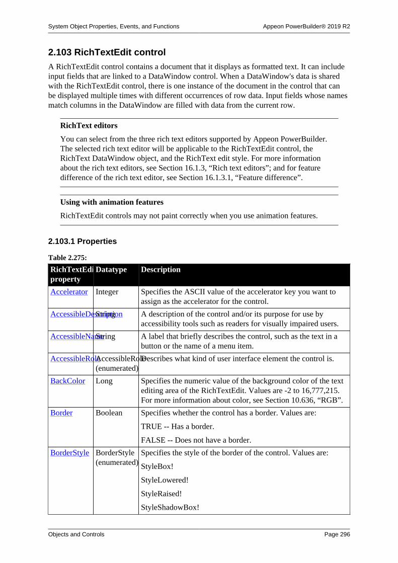
System Object Properties, Events, and Functions Appeon PowerBuilder® 2019 R2
Objects and Controls Page 296
2.103 RichTextEdit controlA RichTextEdit control contains a document that it displays as formatted text. It can includeinput fields that are linked to a DataWindow control. When a DataWindow's data is sharedwith the RichTextEdit control, there is one instance of the document in the control that canbe displayed multiple times with different occurrences of row data. Input fields whose namesmatch columns in the DataWindow are filled with data from the current row.
RichText editors
You can select from the three rich text editors supported by Appeon PowerBuilder.The selected rich text editor will be applicable to the RichTextEdit control, theRichText DataWindow object, and the RichText edit style. For more informationabout the rich text editors, see Section 16.1.3, “Rich text editors”; and for featuredifference of the rich text editor, see Section 16.1.3.1, “Feature difference”.
Using with animation features
RichTextEdit controls may not paint correctly when you use animation features.
2.103.1 Properties
Table 2.275:
RichTextEditproperty
Datatype Description
Accelerator Integer Specifies the ASCII value of the accelerator key you want toassign as the accelerator for the control.
AccessibleDescriptionString A description of the control and/or its purpose for use byaccessibility tools such as readers for visually impaired users.
AccessibleNameString A label that briefly describes the control, such as the text in abutton or the name of a menu item.
AccessibleRoleAccessibleRole(enumerated)
Describes what kind of user interface element the control is.
BackColor Long Specifies the numeric value of the background color of the textediting area of the RichTextEdit. Values are -2 to 16,777,215.For more information about color, see Section 10.636, “RGB”.
Border Boolean Specifies whether the control has a border. Values are:
TRUE -- Has a border.
FALSE -- Does not have a border.
BorderStyle BorderStyle(enumerated)
Specifies the style of the border of the control. Values are:
StyleBox!
StyleLowered!
StyleRaised!
StyleShadowBox!

System Object Properties, Events, and Functions Appeon PowerBuilder® 2019 R2
Objects and Controls Page 297
RichTextEditproperty
Datatype Description
BottomMarginLong Specifies the width of the bottom margin on the printed page.
BringToTop Boolean Specifies whether PowerBuilder moves the control to the top ofthe front-to-back order in the window. Values are:
TRUE -- Moves it to the top.
FALSE -- Does not move it to the top.
ClassDefinitionPowerObject An object of type PowerObject containing information about theclass definition of the object or control.
ControlCharsVisibleBoolean Specifies whether control characters (carriage returns, spaces,and tabs) are visible. Values are:
TRUE -- Control characters are visible.
FALSE -- Control characters are hidden.
DisplayOnly Boolean Specifies whether users can make changes to the content.Values are:
TRUE -- The content, including text and input files, isprotected (the user cannot edit it).
FALSE -- The user can edit the content.
DocumentNameString Specifies the name that displays in the print queue when theuser prints the contents of the control.
DragAuto Boolean (Obsolete) This property is no longer supported by theRichTextEdit control since PowerBuilder 12.6.
Specifies whether PowerBuilder puts the control automaticallyinto Drag mode. Values are:
TRUE -- When the control is clicked, the control isautomatically in Drag mode.
FALSE -- When the control is clicked, the control is notautomatically in Drag mode. You have to manually put thecontrol into Drag mode by using the Drag function.
DragIcon String Specifies the name of the stock icon or the file containing theicon you want to display when the user drags the control (theICO file). The default icon is a box the size of the control.
When the user drags the control, the icon displays when thecontrol is over an area in which the control can be dropped (avalid drop area). When the control is over an area that is not avalid drop area, the No-Drop icon displays.
Enabled Boolean Specifies whether the control is enabled (can be selected).Values are:
TRUE -- Can be selected.
FALSE -- Cannot be selected.

System Object Properties, Events, and Functions Appeon PowerBuilder® 2019 R2
Objects and Controls Page 298
RichTextEditproperty
Datatype Description
FaceName String Specifies the typeface used for text in the control.
FontCharSet FontCharSet(enumerated)
Specifies the character set for text in the control.
FontFamily FontFamily(enumerated)
Specifies the font family for text in the control.
FontPitch FontPitch(enumerated)
Specifies the spacing of the font used for text in the control.
HeaderFooter Boolean Specifies whether the RichTextEdit control has a header/footersection. This property must be set in the painter and cannot bechanged during execution. Values are:
TRUE -- The control has a header/footer section.
FALSE -- The control does not have a header/footer section.
If a document has a header or footer and is opened in a controlthat does not support a header/footer section, then header/footerinformation in the document is ignored. If the document is thensaved in the same file, the header/footer information is lost.
Height Integer Specifies the height of the control, in PowerBuilder units.
HScrollBar Boolean Specifies whether the RichTextEdit control has a horizontalscroll bar. Values are:
TRUE -- A scroll bar displays.
FALSE -- A scroll bar does not display.
ImeMode Integer Specifies the input method editor mode. This property isrelevant only to applications running on a Japanese version ofPowerBuilder.
InputFieldBackColorLong Specifies default background color for all input fields:-2 to 16,777,215. For more information about color, seeSection 10.636, “RGB”.
Limitation with the new control: For the new control, thisproperty will not take effect until you save the data into a PDFfile or print the data; which means, when you preview the UIin the design view or when you run the UI, you will always seethe background color is gray, only when you run the UI andsave the data to a PDF file or print the data, you will see thebackground color is changed to what you set.
InputFieldNamesVisibleBoolean Specifies whether input field names are displayed in inputfields, rather than the input field values. Values are:
TRUE -- Input fields display their names.
FALSE -- Input fields display their data.
InputFieldsVisibleBoolean Specifies whether input fields are visible. Values are:

System Object Properties, Events, and Functions Appeon PowerBuilder® 2019 R2
Objects and Controls Page 299
RichTextEditproperty
Datatype Description
TRUE -- Input fields are visible.
FALSE -- Input fields are hidden.
Italic Boolean Specifies default text formatting. Values are:
TRUE -- Text displays in italic format.
FALSE -- Text displays in standard format.
Maintained for forward compatibility with PowerBuilder .NET.In PowerBuilder applications, use the check box on the Font tabof the Properties view to set this property at initialization.
LeftMargin Long Specifies the width of the left margin on the printed page.
Modified Boolean Specifies whether the document has been modified since itwas opened or last saved. Modified is the control's "dirty" flag,indicating that the document is in an unsaved state. Values are:
TRUE -- The document has been modified.
FALSE -- The document has not been modified.
When the first change is made to a newly opened or saveddocument, PowerBuilder sets the Modified attribute and triggersthe Modified event.
PaperHeight Long Specifies the value for the display height of pages in the control.
PaperOrientationPaperOrientation(enumerated)Specifies the page orientation in the control.
PaperWidth Long Specifies the value for the display width of pages in the control.
PicturesAsFrameBoolean (Obsolete) This property is no longer supported by theRichTextEdit control since PowerBuilder 12.6.
When the value is true, graphics (bitmaps) are displayed asframes.
Pointer String Specifies the name of the stock pointer of the file containing thepointer that is used for the control.
PopMenu Boolean Specifies whether the user has access to a pop-up menu byclicking the right mouse button on the control. The menu allowsthe user to cut and paste, insert a file, and select formattingoptions. Values are:
TRUE -- Pop-up menu is enabled.
FALSE -- Pop-up menu is disabled.
Resizable Boolean Specifies whether the user can resize the control. Values are:
TRUE -- Control is resizable.
FALSE -- Control is not resizable.
RightMargin Long Specifies the width of the right margin on the printed page.

System Object Properties, Events, and Functions Appeon PowerBuilder® 2019 R2
Objects and Controls Page 300
RichTextEditproperty
Datatype Description
RulerBar Boolean Specifies whether a ruler bar is visible above the editing area.If visible, the user can use it to see measurements while settingtabs and margins on the tab bar (see the TabBar (obsolete)property). Values are:
TRUE -- Ruler bar is visible.
FALSE -- Ruler bar is hidden.
If the RichTextEdit pop-up menu is enabled, the user can use itto turn ruler bar display on and off (see the PopMenu property).
SelectedStartPosLong Specifies the starting position in a selected text string.Typically, you use this property to set the starting position ofa selected text string to the first letter of a word flagged by asupported ActiveX spell checker control.
SelectedTextLengthLong Specifies the length of text you want to highlight in a selectedtext string. Typically you use this property to obtain the lengthof a misspelled word that is flagged after passing the selectedtext string to a supported ActiveX spell checker control.
StatusBar Boolean Specifies whether a status bar is visible below the editing area.Values are:
TRUE -- Status bar is visible.
FALSE -- Status bar is hidden.
If the pop-up menu is enabled, the user can use it to turn thestatus bar display on and off (see the PopMenu property).
TabOrder Integer Specifies the tab value of the control within the window (0means the user cannot tab to the control).
Note that because a RichTextEdit allows tabs within its content,the user cannot tab away from the control.
Tag String Specifies the tag value assigned to the control.
TextSize Integer Specifies the point size of text in the control.
ToolBar Boolean Specifies whether a tool bar for formatting text is visible abovethe editing area. Values are:
TRUE -- Tool bar is visible.
FALSE -- Tool bar is not visible.
If the pop-up menu is enabled, the user can use it to turn tool bardisplay on and off (see the PopMenu property).
TopMargin Long Specifies the width of the top margin on the printed page.
Underline Boolean Specifies default text formatting. Values are:
TRUE -- Text displays with underlines.
FALSE -- Text displays without underlines.

System Object Properties, Events, and Functions Appeon PowerBuilder® 2019 R2
Objects and Controls Page 301
RichTextEditproperty
Datatype Description
Maintained for forward compatibility with PowerBuilder .NET.In PowerBuilder applications, use the check box on the Font tabof the Properties view to set this property at initialization.
Visible Boolean Specifies whether the control is visible:
TRUE -- Control is visible.
FALSE -- Control is not visible.
VScrollBar Boolean Specifies whether the RichTextEdit control has a vertical scrollbar. Values are:
TRUE -- A scroll bar displays.
FALSE -- A scroll bar does not display.
Weight Integer Specifies default text weight formatting for the control.Maintained for forward compatibility with PowerBuilder .NET.In PowerBuilder applications, use the Bold check box onthe Font tab of the Properties view to set bold text weightformatting at initialization.
Width Integer Specifies the width of the control, in PowerBuilder units.
WordWrap Boolean Determines whether large blocks of text that do not containspaces wrap automatically to the next line when the line reachesthe margin. Values are:
TRUE -- Automatic word wrap is enabled.
FALSE -- Automatic word wrap is disabled. Users cannot entercharacters beyond the right margin, and must move the cursorto a new line to continue entering text. If an inserted documentcontains a block of text too large to fit on a line, the nonfittingcharacters are hidden.
Limitation with the new control: For the new control, thisproperty is always true (even when it is set to false, it is treatedas true).
X Integer Specifies the X position (the distance from the left edge of thewindow), in PowerBuilder units.
Y Integer Specifies the Y position (the distance from the top of thewindow), in PowerBuilder units.
2.103.2 Events
Table 2.276:
RichTextEditevent
Occurs
Constructor Immediately before the Open event occurs in the window.
Destructor Immediately after the Close event occurs in the window.

System Object Properties, Events, and Functions Appeon PowerBuilder® 2019 R2
Objects and Controls Page 302
RichTextEditevent
Occurs
DoubleClicked When the user double-clicks anywhere in the RichTextEdit control.
DragDrop When a dragged control is dropped on the control.
DragEnter When a dragged control enters the control.
DragLeave When a dragged control leaves the control.
DragWithin When a dragged control is within the control.
FileExists When the document in the RichTextEdit is saved to a file, but a file of thespecified name already exists.
GetFocus Just before the control receives focus (before it is selected and becomesactive).
Help When the user presses the F1 key or drags the context help button(question mark) from the title bar to a menu item or control.
InputFieldSelectedWhen the user selects an input field by double-clicking it.
Key When the user presses a key.
LoseFocus When the control loses focus (becomes inactive).
Modified When the first change is made to the contents of the RichTextEditcontrol, and it has not been saved.
In the Modified event script, you can set a flag indicating that thedocument needs to be saved.
MouseDown When the left or middle mouse button is pressed on the control.
MouseMove When the mouse has moved within the control.
MouseUp When the left or middle mouse button is released on the control.
Other When a Windows message occurs that is not a PowerBuilder event.
PictureSelected When the user selects a picture by clicking it.
RButtonDown When the right mouse button is pressed on the control. If the pop-upmenu is enabled, this event does not occur.
RButtonUp When the right mouse button is released on the control.
2.103.3 Functions
Table 2.277:
RichTextEditfunction
Datatypereturned
Description
CanUndo Boolean Returns true if there is an editing function that can be undone.
ClassName String Returns the name assigned to the control.
Clear Long Clears selected text (if any) from the control, but does not placeit in the clipboard.
ClearAll Long Clears all content from the specified control, but does not placeit in the clipboard.

System Object Properties, Events, and Functions Appeon PowerBuilder® 2019 R2
Objects and Controls Page 303
RichTextEditfunction
Datatypereturned
Description
Copy Long Copies (but does not delete) the selected contents of theRichTextEdit control (if any) to the clipboard.
CopyRTF String Copies the selected contents of the RichTextEdit control to astring in rich text format.
Cut Long Cuts (deletes) the selected contents from the RichTextEditcontrol (if any) to the clipboard.
DataSource Integer Associates a DataWindow with the RichTextEdit control,matching columns with input fields of the same name.
Drag Integer Starts or ends dragging of the control.
Find Integer Finds text in the control.
Enhancement of the new control: For the new control, the Findfunction can not only find the text string, but also can find thecarriage return characters and some special characters.
FindNext Integer Finds the next occurrence of text specified with the Findfunction.
GetAlignmentAlignment Obtains the alignment of the selected text.
GetContextServiceInteger Creates a reference to a context-specific instance of thespecified service.
GetParagraphSettingLong Gets the size of the indentation, left margin, or right margin ofthe paragraph containing the insertion point.
GetParent PowerObject Returns a reference to the name of the parent object.
GetSpacing Spacing Obtains the line spacing of the selected text.
GetTextColorLong Returns the color of the selected text.
GetTextStyle Boolean Obtains font settings for the selected text.
Hide Integer Makes the control invisible.
InputFieldChangeDataInteger Modifies the data value for all input fields of the given inputfield name.
InputFieldCurrentNameString Gets the name of the selected input field.
InputFieldDeleteCurrentInteger Deletes the current occurrence of the selected input field. (Thatis, this function does not delete all input fields of the samename, only the current occurrence.)
InputFieldGetDataString Obtains the data in the specified input field.
InputFieldInsertInteger Inserts the named input field at the insertion point.
InputFieldLocateString Locates an input field. You can find any occurrence of an inputfield or an input field with a specific name.
InsertDocumentInteger Inserts the named file in the RichTextEdit control. The file canreplace the current contents or be added at the insertion point.
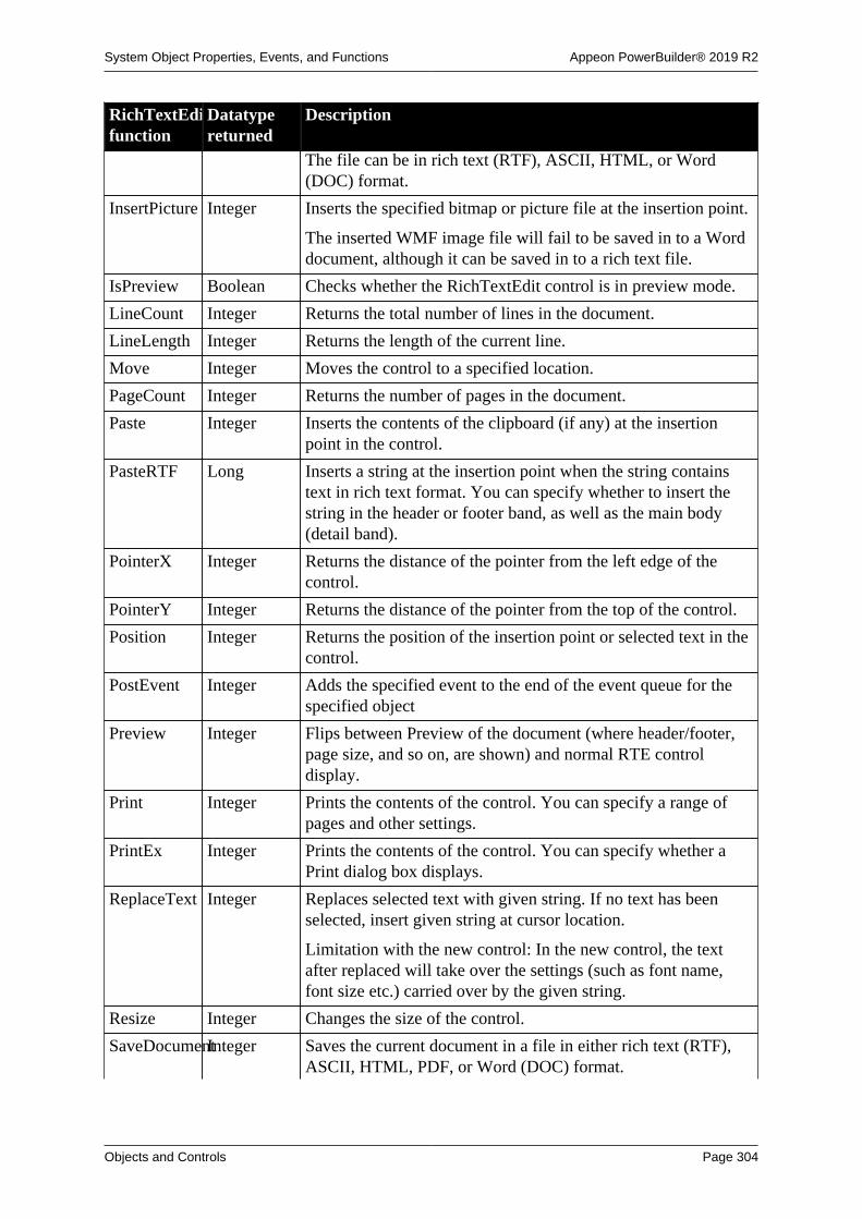
System Object Properties, Events, and Functions Appeon PowerBuilder® 2019 R2
Objects and Controls Page 304
RichTextEditfunction
Datatypereturned
Description
The file can be in rich text (RTF), ASCII, HTML, or Word(DOC) format.
InsertPicture Integer Inserts the specified bitmap or picture file at the insertion point.
The inserted WMF image file will fail to be saved in to a Worddocument, although it can be saved in to a rich text file.
IsPreview Boolean Checks whether the RichTextEdit control is in preview mode.
LineCount Integer Returns the total number of lines in the document.
LineLength Integer Returns the length of the current line.
Move Integer Moves the control to a specified location.
PageCount Integer Returns the number of pages in the document.
Paste Integer Inserts the contents of the clipboard (if any) at the insertionpoint in the control.
PasteRTF Long Inserts a string at the insertion point when the string containstext in rich text format. You can specify whether to insert thestring in the header or footer band, as well as the main body(detail band).
PointerX Integer Returns the distance of the pointer from the left edge of thecontrol.
PointerY Integer Returns the distance of the pointer from the top of the control.
Position Integer Returns the position of the insertion point or selected text in thecontrol.
PostEvent Integer Adds the specified event to the end of the event queue for thespecified object
Preview Integer Flips between Preview of the document (where header/footer,page size, and so on, are shown) and normal RTE controldisplay.
Print Integer Prints the contents of the control. You can specify a range ofpages and other settings.
PrintEx Integer Prints the contents of the control. You can specify whether aPrint dialog box displays.
ReplaceText Integer Replaces selected text with given string. If no text has beenselected, insert given string at cursor location.
Limitation with the new control: In the new control, the textafter replaced will take over the settings (such as font name,font size etc.) carried over by the given string.
Resize Integer Changes the size of the control.
SaveDocumentInteger Saves the current document in a file in either rich text (RTF),ASCII, HTML, PDF, or Word (DOC) format.

System Object Properties, Events, and Functions Appeon PowerBuilder® 2019 R2
Objects and Controls Page 305
RichTextEditfunction
Datatypereturned
Description
When saving multi-byte characters to a TXT file, use the UTF8encoding rather than the ANSI encoding.
Limitation with the new control: In the new control, whensaving to HTML, the image will lose some quality and will besaved as individual files separately from the document and thereference to the image file uses the absolute path.
Scroll Integer Scrolls the RichTextEdit the specified direction the specifiednumber of lines.
ScrollNextPageInteger Scrolls forward to the next page in the RichTextEdit document.If the current page is the last page of a document instance,scrolls to the next instance.
ScrollNextRowLong Scrolls the RichTextEdit to the next row and document instance.
ScrollPriorPageLong Scrolls back to the prior page in the RichTextEdit document. Ifthe current page is the first page of a document instance, scrollsto the prior instance.
ScrollPriorRowLong Scrolls the RichTextEdit to the prior row and documentinstance.
ScrollToRow Long Causes the control to scroll to the specified row and documentinstance.
SelectedColumnInteger Returns the number of the character column just after theinsertion point.
SelectedLengthLong Returns the length of the selected text.
SelectedLine Long Returns the number of the line in which the insertion point iscurrently located within the document instance.
SelectedPage Long Returns the number of the page in which the insertion point iscurrently located within the document instance.
Limitation with the new control: For the new control, theSelectedPage function returns the number of the page which isbeing viewed (rather than where the insertion point is placed).
SelectedStart Integer Returns the starting position of the selected text (if any) fromthe beginning of the line.
SelectedText String Returns a string containing the selected text from the control.
SelectText Long Selects text in the RichTextEdit control.
SelectTextAllInteger Selects all text in the control.
SelectTextLineInteger Selects all text in the line in which the insertion point iscurrently located.
SelectTextWordInteger Selects the word in which the insertion point is currentlylocated.
SetAlignmentInteger Sets the alignment for the selected paragraphs.

System Object Properties, Events, and Functions Appeon PowerBuilder® 2019 R2
Objects and Controls Page 306
RichTextEditfunction
Datatypereturned
Description
SetFocus Integer Sets focus to the RichTextEdit control.
SetParagraphSettingInteger Specifies the size of the paragraph's indentation, left margin, orright margin.
SetPosition Integer Specifies the control's position in the front-to-back order withinthe window.
SetRedraw Integer Controls automatic redrawing of the control.
SetSpacing Integer Sets the line spacing for the selected paragraphs.
SetTextColor Integer Sets the color of the selected text.
SetTextStyle Integer Sets the font properties of the selected text.
Show Integer Makes the RichTextEdit control visible.
ShowHeadFootInteger Allows editing of the header and footer in the RichTextEditdocument.
TextLine String Returns the entire text of the line in which the insertion point iscurrently located.
TriggerEvent Integer Triggers a specified event in the control and executes the scriptfor the event.
TypeOf Object Returns the type of the control.
Undo Integer Cancels the previous editing function performed in the control,if the editing function can be undone. (Some editing functionscannot be undone.)
2.104 RoundRectangle control
A RoundRectangle is a filled or outlined rectangular drawing object with rounded cornersthat you typically use for design purposes (for example, you can put a CommandButton ora picture in a RoundRectangle). When you use a RoundRectangle to group controls, thegrouping does not affect the behavior of the controls in the RoundRectangle.
2.104.1 Properties
Table 2.278:
RoundRectangleproperty
Datatype Description
ClassDefinitionPowerObject An object of type PowerObject containing information about theclass definition of the object or control.
CornerHeight Integer Specifies the radius of the vertical part of the corners of thecontrol, in PowerBuilder units.
CornerWidth Integer Specifies the radius of the horizontal part of the corners of thecontrol, in PowerBuilder units.

System Object Properties, Events, and Functions Appeon PowerBuilder® 2019 R2
Objects and Controls Page 307
RoundRectangleproperty
Datatype Description
FillColor Long Specifies the numeric value of the color used to fill the control:-2 to 16,777,215. For more information about color, seeSection 10.636, “RGB”.
FillPattern FillPattern(enumerated)
Specifies the hatch pattern used to fill the control. Values are:
BDiagonal!
Diamond!
FDiagonal!
Horizontal!
Solid!
Square!
Vertical!
FDiagonal! is lines going from the lower-left to the upper-right.BDiagonal! is lines going from the upper-left to the lower right.
Height Integer Specifies the height of the control, in PowerBuilder units.
LineColor Long Specifies the numeric value of the line color: -2 to 16,777,215.For more information about color, see Section 10.636, “RGB”.
LineStyle LineStyle(enumerated)
Specifies the style of the line used to draw the control. Valuesare:
Continuous!
Dash!
DashDot!
DashDotDot!
Dot!
Transparent!
LineThicknessInteger Specifies the thickness of the line used to draw the control, inPowerBuilder units. If LineThickness is greater than one pixel(about four PowerBuilder units), the LineStyle is Continuous!.
Tag String Specifies the tag value assigned to the control.
Visible Boolean Specifies whether the control is visible. Values are:
TRUE -- Control is visible.
FALSE -- Control is not visible.
Width Integer Specifies the width of the control, in PowerBuilder units.
X Integer Specifies the X position (the distance from the left edge of thewindow), in PowerBuilder units.
Y Integer Specifies the Y position (the distance from the top of thewindow), in PowerBuilder units.

System Object Properties, Events, and Functions Appeon PowerBuilder® 2019 R2
Objects and Controls Page 308
2.104.2 Events
Table 2.279:
RoundRectangleevent
Occurs
Constructor Immediately before the Open event occurs in the window.
Destructor Immediately after the Close event occurs in the window.
2.104.3 Functions
Table 2.280:
RoundRectanglefunction
Datatypereturned
Description
ClassName String Returns the name assigned to the control.
GetContextServiceInteger Creates a reference to a context-specific instance of thespecified service.
GetParent PowerObject Returns a reference to the name of the parent object.
Hide Integer Makes the control invisible.
Move Integer Moves the control to a specified location.
Resize Integer Changes the size of the control.
Show Integer Makes the control visible.
TypeOf Object Returns the type of the control.
2.105 RuntimeError objectThe RuntimeError object inherits from the Throwable object and is used by the PowerBuildervirtual machine (PBVM) to throw runtime errors. Runtime errors are also called uncheckedexceptions. You do not need to declare where they might be thrown and you do not need tocatch them as you do checked exceptions.
When a RuntimeError is thrown, its properties are populated automatically with the runtimeinformation associated with the line where the error occurred. If a RuntimeError is nothandled, the Application object SystemError event is triggered and the global Error object ispopulated with the runtime information.
The following derived types provide more robust error-handling capabilities:
• DivideByZeroError -- thrown when an attempt is made to divide by zero.
• NullObjectError -- thrown when an attempt is made to access an object using a nullreference.
• PBXRuntimeError -- thrown when an unknown error occurs in a PowerBuilder extension.
• CORBASystemException -- thrown when a CORBA system exception is thrown fromEAServer.
• DWRuntimeError -- thrown when a DataWindow error occurs that is not handled by anError event script.

System Object Properties, Events, and Functions Appeon PowerBuilder® 2019 R2
Objects and Controls Page 309
• OLERuntimeError -- thrown when an OLE error occurs that is not handled by anocx_error, ExternalException, or Error event script
Additional objects that map to standard CORBA exception types inherit fromCORBASystemException. The PowerBuilder exception class name is the same as theCORBA exception name without underscore characters. For example, CORBAFreeMemmaps to CORBA_FREE_MEM. You can view the list of CORBASystemException types inthe PowerBuilder System Tree or in the Browser.
The descendants of RuntimeError allow you to handle specific runtime errors. For example,you can catch only NullObjectError exceptions in a specific block of code. Alternatively, youcan catch all runtime errors with a single CATCH statement. Except for PBXRuntimeError,the error information available in the descendant objects is also available in the RuntimeErrorobject.
PBXRuntimeError has an additional property, DLLName, that identifies the name of thePowerBuilder extension DLL in which the error occurred.
2.105.1 Properties
Table 2.281:
RuntimeErrorproperty
Datatype Description
ClassDefinitionPowerObject An object of type PowerObject containing information about theclass definition of the object or control
Class String Name of the class where the exception occurred
Description String (OLERuntimeError only) Textual description of the exception
DLLName String (PBXRuntimeError only) Name of the PowerBuilder extensionDLL where the exception occurred
HelpFile String (OLERuntimeError only) Full file name of Help file containinginformation about the exception
HelpContext UnsignedLong(OLERuntimeError only) Help context ID of the topic in theHelp file containing information about the exception
Line Integer Line number where the exception occurred
Number Integer Number of the PowerBuilder error
ObjectName String Name of the object where the exception occurred
RoutineNameString Name of the event or routine where the exception occurred
Source String (OLERuntimeError only) Source of the exception
Text String Text associated with the type of exception
2.105.2 Events
Table 2.282:
RuntimeErrorevent
Occurs
Constructor When the exception is thrown

System Object Properties, Events, and Functions Appeon PowerBuilder® 2019 R2
Objects and Controls Page 310
RuntimeErrorevent
Occurs
Destructor Immediately after the exception is thrown
2.105.3 Functions
Table 2.283:
RuntimeErrorfunction
Datatypereturned
Description
ClassName String Returns the name assigned to the object
GetContextServiceInteger Creates a reference to a context-specific instance of thespecified service
GetMessage String Returns the error message from objects of type Throwable
GetParent PowerObject Returns a reference to the name of the parent object
PostEvent Boolean Adds an event to the end of the message queue for the object
SetMessage Sets an error message for an object of type Throwable
TriggerEvent Integer Triggers a specific event in the object and executes the script forthe event
TypeOf Object Returns the type of the object
2.106 ScriptDefinition object
Information about a script associated with a class definition. ScriptDefinition is used in theClassDefinition object.
You cannot instantiate a ScriptDefinition object for a particular script independently of aClassDefinition object. Instead you access the ScriptDefinition instances that are elements ofthe ScriptList array of a ClassDefinition instance.
The ScriptDefinition object has information about:
• The script's name and whether it is a function or an event
• The return type, arguments, and local variables
• The source code
• Whether the script is defined locally or in an ancestor
• External function declarations
A ScriptDefinition object has no events.

System Object Properties, Events, and Functions Appeon PowerBuilder® 2019 R2
Objects and Controls Page 311
2.106.1 Properties
Table 2.284:
ScriptDefinitionproperty
Datatype Description
Access VarAccess The access level of the script (what objects can call the script).Values are:
Private!
Public!
Protected!
System!
AliasName String The alias value for an external function. The value is an emptystring ("") for scripts that are not aliased external functions.Corresponds to the ALIAS FOR keyword in the externalfunction declaration.
ArgumentListVariableDefinitionAn unbounded array whose elements are VariableDefinitionobjects, one object per argument. The array is empty if there areno arguments.
ClassDefinitionPowerObject An object of type PowerObject containing information about theclass definition of the object or control.
EventId Long The numeric event ID for an event. For events that do not havean ID, the value is -1.
EventIdNameString The event ID name for an event. For events that do not have anID, the value is an empty string ("").
ExternalUserFunctionString The file name of the DLL containing the external user function.The value is an empty string ("") for scripts that are not externaluser functions. Corresponds to the LIBRARY keyword in theexternal function declaration.
IsExternalEventBoolean Indicates whether this is an external event. External events areautomatically generated events that get dispatched elsewhere.
IsLocallyDefinedBoolean Indicates whether the event is defined at this level in theinheritance hierarchy. Values are:
TRUE -- The event is defined at this level of the object'sinheritance hierarchy.
FALSE -- The event is defined at an ancestor level.
IsLocallyDefined is not applicable to functions.
IsLocallyScriptedBoolean Indicates whether the script is implemented at this level in theinheritance hierarchy. Values are:
TRUE -- There is code for the event or function at this level ofthe object's inheritance hierarchy.

System Object Properties, Events, and Functions Appeon PowerBuilder® 2019 R2
Objects and Controls Page 312
ScriptDefinitionproperty
Datatype Description
FALSE -- There is no code for the event or function at thislevel.
IsRPCFunctionBoolean Whether this is an RPC function. Values are:
TRUE -- Is an RPC function.
FALSE -- Is not an RPC function.
Corresponds to the RPCFUNC keyword in a declaration for astored procedure.
IsScripted Boolean Whether the event has a definition but no code at any level ofthe collapsed inheritance hierarchy. Values are:
TRUE -- The event has a script at some level of the object'sinheritance hierarchy.
FALSE -- The event does not have a script.
Only events can be defined but not scripted. For functions,IsScripted is always true.
Kind ScriptKind Whether the script is a function or event. Values are:
ScriptEvent!
ScriptFunction!
LocalVariableListVariableDefinitionAn unbounded array whose elements are VariableDefinitionobjects, one object per local variable. The array is empty if thereare no local variables.
Name String The name of the script.
ReturnType TypeDefinitionThe type information of the return value. For scripts that donot return anything, ReturnType is an invalid object. Use theIsValid function to test the value.
Source String The source code for the script. Source is an empty string ("")if the source is not available (for example, when running anexecutable).
SystemFunctionString For built-in PowerBuilder functions, the file name of the DLLcontaining the function. The value is an empty string ("") forscripts that are not built-in PowerBuilder functions.
2.106.2 Functions
Table 2.285:
ScriptDefinitionfunction
Datatypereturned
Description
ClassName String Returns the name assigned to the object.
GetContextServiceInteger Creates a reference to a context-specific instance of thespecified service.

System Object Properties, Events, and Functions Appeon PowerBuilder® 2019 R2
Objects and Controls Page 313
ScriptDefinitionfunction
Datatypereturned
Description
GetParent PowerObject Returns a reference to the name of the parent object.
TypeOf Object Returns the type of the object.
2.107 SimpleTypeDefinition object
Information about the type of a scalar variable. SimpleTypeDefinition is inherited fromTypeDefinition and has no additional properties or functions.
For the list of properties and functions, see the TypeDefinition object.
2.108 SingleLineEdit control
A SingleLineEdit is a box in which the user can enter a single line of text. You typically use aSingleLineEdit as an input field.
2.108.1 Properties
Table 2.286:
SingleLineEditproperty
Datatype Description
Accelerator Integer Specifies the ASCII value of the key you want to assign as theaccelerator key for a control.
AccessibleDescriptionString A description of the control and/or its purpose for use byaccessibility tools such as readers for visually impaired users.
AccessibleNameString A label that briefly describes the control, such as the text in abutton or the name of a menu item.
AccessibleRoleAccessibleRole(enumerated)
Describes what kind of user interface element the control is.
AutoHScroll Boolean Specifies whether the control automatically scrolls horizontallywhen data is entered or deleted. Values are:
TRUE -- Control automatically scrolls horizontally.
FALSE -- Control does not automatically scroll horizontally.
BackColor Long Specifies the numeric value of the background color: -2to 16,777,215. For more information about color, seeSection 10.636, “RGB”.
Border Boolean Specifies whether the control has a border. Values are:
TRUE -- Control has a border.
FALSE -- Control does not have a border.
BorderStyle BorderStyle(enumerated)
Specifies the style of the border of the control. Values are:
StyleBox!
StyleLowered!

System Object Properties, Events, and Functions Appeon PowerBuilder® 2019 R2
Objects and Controls Page 314
SingleLineEditproperty
Datatype Description
StyleRaised!
StyleShadowBox!
BringToTop Boolean Specifies whether PowerBuilder moves the control to the top ofthe front-to-back order in the window. Values are:
TRUE -- Control moved to top.
FALSE -- Control not moved to top.
ClassDefinitionPowerObject An object of type PowerObject containing information about theclass definition of the object or control.
DisplayOnly Boolean Specifies whether the text in the control is display only andcannot be changed by the user. Values are:
TRUE -- Text cannot be changed by user.
FALSE -- Text can be changed by user.
DragAuto Boolean Specifies whether PowerBuilder puts the control automaticallyinto Drag mode. Values are:
TRUE -- When the control is clicked, the control isautomatically in Drag mode.
FALSE -- When the control is clicked, the control is notautomatically in Drag mode. You have to manually put thecontrol into Drag mode by using the Drag function.
DragIcon String Specifies the name of the stock icon or the file containing theicon you want to display when the user drags the control (theICO file). The default icon is a box the size of the control.
When the user drags the control, the icon displays when thecontrol is over an area in which the control can be dropped (avalid drop area). When the control is over an area that is not avalid drop area, the No-Drop icon displays.
Enabled Boolean Specifies whether the control is enabled (can be selected).Values are:
TRUE -- Control can be selected.
FALSE -- Control cannot be selected.
FaceName String Specifies the name of the typeface in which the text of thecontrol displays (for example, arial or courier).
FontCharSet FontCharSet(enumerated)
Specifies the font character set used for the text in the control.For a complete list of possible values, see the list of propertiesfor the FontCharSet variable on the Enumerated tab page of theBrowser.
FontFamily FontFamily(enumerated)
Specifies the font family (type style) used for the text in thecontrol. Values are:

System Object Properties, Events, and Functions Appeon PowerBuilder® 2019 R2
Objects and Controls Page 315
SingleLineEditproperty
Datatype Description
AnyFont!
Decorative!
Modern!
Roman!
Script!
Swiss!
FontPitch FontPitch(enumerated)
Specifies the pitch (spacing) of the font used for the text in thecontrol. Values are:
Default!
Fixed!
Variable!
Height Integer Specifies the height of the control, in PowerBuilder units.
HideSelectionBoolean Specifies whether selected text stays selected (highlighted) evenwhen the control does not have focus. Values are:
TRUE -- Text does not stay highlighted.
FALSE -- Text stays highlighted.
ImeMode Integer Specifies the input method editor mode. This property isrelevant only to applications running on a Japanese version ofPowerBuilder.
Italic Boolean Specifies whether the text in the control is italic. Values are:
TRUE -- Text is italic.
FALSE -- Text is not italic.
Limit Integer Specifies the maximum number of characters (0 to 32,767) thatcan be entered in the control (0 means unlimited).
Password Boolean Specifies whether the control is a password field (whetherasterisks appear when the user types characters). Values are:
TRUE -- Control is a password field.
FALSE -- Control is not a password field.
PlaceHolder String Specifies a short description for the expected value of the inputfield.
Pointer String Specifies the name of the stock pointer or the file containing thepointer used for the control.
RightToLeft Boolean Specifies that characters should be displayed in right-to-leftorder. The application must be running on an operating systemthat supports right-to-left display. Values are:
TRUE -- Characters display in right-to-left order.

System Object Properties, Events, and Functions Appeon PowerBuilder® 2019 R2
Objects and Controls Page 316
SingleLineEditproperty
Datatype Description
FALSE -- Characters display in left-to-right order.
TabOrder Integer Specifies the tab value of the control within the window (0means the user cannot tab to the control).
Tag String Specifies the tag value assigned to the control.
Text String Specifies the text that displays in the control.
TextCase TextCase(enumerated)
Specifies the case in which text entered in the control displays.Values are:
AnyCase!
Lower!
Upper!
TextColor Long Specifies the numeric value of the color used for text:-2 to 16,777,215. For more information about color, seeSection 10.636, “RGB”.
TextSize Integer Specifies the size of the text in the control, in points. Forbackward compatibility, the size is stored as a negative number;for example, 10-point text size is stored as -10.
Underline Boolean Specifies whether the text in the control is underlined. Valuesare:
TRUE -- Text is underlined.
FALSE -- Text is not underlined.
Visible Boolean Specifies whether the control is visible. Values are:
TRUE -- Control is visible.
FALSE -- Control is not visible.
Weight Integer Specifies the stroke weight of the text in the control; forexample, 400 for normal or 700 for bold.
Width Integer Specifies the width of the control, in PowerBuilder units.
X Integer Specifies the X position (the distance from the left edge of thewindow), in PowerBuilder units.
Y Integer Specifies the Y position (the distance from the top of thewindow), in PowerBuilder units.
2.108.2 Events
Table 2.287:
SingleLineEditevent
Occurs
Constructor Immediately before the Open event occurs in the window
Destructor Immediately after the Close event occurs in the window

System Object Properties, Events, and Functions Appeon PowerBuilder® 2019 R2
Objects and Controls Page 317
SingleLineEditevent
Occurs
DragDrop When a dragged control is dropped on the control
DragEnter When a dragged control enters the control
DragLeave When a dragged control leaves the control
DragWithin When a dragged control is within the control
GetFocus Just before the control receives focus (before it is selected and becomesactive)
Help When the user presses the F1 key or drags the context help button(question mark) from the title bar to a menu item or control
LoseFocus When the control loses focus (becomes inactive)
Modified When the control text has been changed and the user presses Enter or Tabor changes focus to another control
Other When a Windows message occurs that is not a PowerBuilder event
RButtonDown When the right mouse button is pressed on the control
2.108.3 Functions
Table 2.288:
SingleLineEditfunction
Datatypereturned
Description
CanUndo Boolean Returns true if the Undo function can be used to undo the lastedit in the control and returns false if it cannot.
ClassName String Returns the name assigned to the control.
Clear Integer Clears the selected text (if any) from the control (but does notplace it in the clipboard).
Copy Integer Copies (but does not delete) the selected text (if any) from thecontrol to the clipboard.
Cut Integer Cuts (deletes) the selected text (if any) from the control andplaces it in the clipboard.
Drag Integer Starts or ends the dragging of a control.
GetContextServiceInteger Creates a reference to a context-specific instance of thespecified service.
GetParent PowerObject Returns a reference to the name of the parent object.
Hide Integer Makes the control invisible.
Move Integer Moves the control to a specified location.
Paste Integer Inserts the contents of the clipboard (if any) at the insertionpoint in the control and replaces the selected text (if any).
PointerX Integer Returns the distance of the pointer from the left edge of thecontrol.
PointerY Integer Returns the distance of the pointer from the top of the control.

System Object Properties, Events, and Functions Appeon PowerBuilder® 2019 R2
Objects and Controls Page 318
SingleLineEditfunction
Datatypereturned
Description
Position Integer Returns the position of the insertion point in the control.
PostEvent Boolean Adds an event to the end of the message queue for control.
Print Integer Prints the control.
ReplaceText Integer Replaces the currently selected text (if any) with the specifiedstring. If no text is selected, inserts the text at the currentinsertion point.
Resize Integer Changes the size of the control.
SelectedLengthInteger Returns the length of the selected text (if any) in the control.
SelectedStart Integer Returns the starting position of the selected text (if any) in thecontrol.
SelectedText String Returns a string with the selected text (if any) from the control.
SelectText Integer Selects the text in the control specified by the starting positionand length.
SetFocus Integer Sets focus to the control.
SetPosition Integer Specifies the position of the control in the front-to-back order ofthe window.
SetRedraw Integer Controls automatic redrawing of the control after each change inits properties.
Show Integer Makes the control visible.
TriggerEvent Integer Triggers a specified event in the control and executes the scriptfor the event.
TypeOf Object Returns the type of the control.
Undo Integer Cancels the previous editing function performed in the control.
2.109 SSLCallBack object (obsolete)
Obsolete object
SSLCallBack object is obsolete, because EAServer is no longer supported sincePowerBuilder 2017.
The SSLCallBack object provides PowerBuilder clients with the ability to handle SSLcallbacks from EAServer.
2.109.1 Properties
Table 2.289:
SSLCallBackproperty
Datatype Description
ClassDefinitionPowerObject An object of type PowerObject containing information about theclass definition of the object or control.
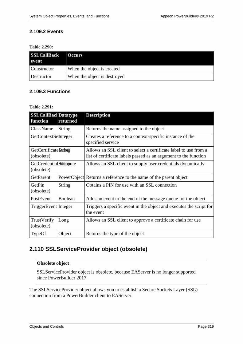
System Object Properties, Events, and Functions Appeon PowerBuilder® 2019 R2
Objects and Controls Page 319
2.109.2 Events
Table 2.290:
SSLCallBackevent
Occurs
Constructor When the object is created
Destructor When the object is destroyed
2.109.3 Functions
Table 2.291:
SSLCallBackfunction
Datatypereturned
Description
ClassName String Returns the name assigned to the object
GetContextServiceInteger Creates a reference to a context-specific instance of thespecified service
GetCertificateLabel(obsolete)
String Allows an SSL client to select a certificate label to use from alist of certificate labels passed as an argument to the function
GetCredentialAttribute(obsolete)
String Allows an SSL client to supply user credentials dynamically
GetParent PowerObject Returns a reference to the name of the parent object
GetPin(obsolete)
String Obtains a PIN for use with an SSL connection
PostEvent Boolean Adds an event to the end of the message queue for the object
TriggerEvent Integer Triggers a specific event in the object and executes the script forthe event
TrustVerify(obsolete)
Long Allows an SSL client to approve a certificate chain for use
TypeOf Object Returns the type of the object
2.110 SSLServiceProvider object (obsolete)
Obsolete object
SSLServiceProvider object is obsolete, because EAServer is no longer supportedsince PowerBuilder 2017.
The SSLServiceProvider object allows you to establish a Secure Sockets Layer (SSL)connection from a PowerBuilder client to EAServer.

System Object Properties, Events, and Functions Appeon PowerBuilder® 2019 R2
Objects and Controls Page 320
2.110.1 Properties
Table 2.292:
SSLServiceProviderproperty
Datatype Description
ClassDefinitionPowerObject An object of type PowerObject containing information about theclass definition of the object or control
2.110.2 Events
Table 2.293:
SSLServiceProviderevent
Occurs
Constructor When the object is created
Destructor When the object is destroyed
2.110.3 Functions
Table 2.294:
SSLServiceProviderfunction
Datatypereturned
Description
ClassName String Returns the name assigned to the object
GetContextServiceInteger Creates a reference to a context-specific instance of thespecified service
GetGlobalProperty(obsolete)
String Returns the value of an SSL global property
GetParent PowerObject Returns a reference to the name of the parent object
PostEvent Boolean Adds an event to the end of the message queue for the object
SetGlobalProperty(obsolete)
Long Sets the value of an SSL global property
TriggerEvent Integer Triggers a specific event in the object and executes the script forthe event
TypeOf Object Returns the type of the object
2.111 StaticHyperLink controlThe StaticHyperLink control is a descendant of the StaticText control. The URL property ofthe StaticHyperLink control enables you to provide a hot link to a Web page. When the userclicks the control, the user's Web browser opens to display the page you specify.
Usage note
If you know that your users have browsers that support URL completion, you canenter a partial address, such as appeon.com.You can always enter a complete address,such as http://www.appeon.com.

System Object Properties, Events, and Functions Appeon PowerBuilder® 2019 R2
Objects and Controls Page 321
2.111.1 Properties
Table 2.295:
StaticHyperLinkproperty
Datatype Description
AccessibleDescriptionString A description of the control and/or its purpose for use byaccessibility tools such as readers for visually impaired users.
AccessibleNameString A label that briefly describes the control, such as the text in abutton or the name of a menu item.
AccessibleRoleAccessibleRole(enumerated)
Describes what kind of user interface element the control is.
Alignment Alignment(enumerated)
Specifies the text alignment in the control. Values are:
Left!
Center!
Right!
BackColor Long Specifies the numeric value of the background color: -2to 16,777,215. For more information about color, seeSection 10.636, “RGB”.
Border Boolean Specifies whether the control has a border. Values are:
TRUE -- Control has a border.
FALSE -- Control does not have a border.
BorderColor Long Specifies the numerical value of the border color: -2 to16,777,215.
BorderStyle BorderStyle(enumerated)
Specifies the style of the border of the control. Values are:
StyleBox!
StyleLowered!
StyleRaised!
StyleShadowBox!
BringToTop Boolean Specifies whether PowerBuilder moves the control to the top ofthe front-to-back order of the window. Values are:
TRUE -- Control moved to top.
FALSE -- Control not moved to top.
ClassDefinitionPowerObject An object of type PowerObject containing information about theclass definition of the object or control.
DisabledLookBoolean Specifies whether the control appears to be enabled.
DragAuto Boolean Specifies whether PowerBuilder puts the control automaticallyinto Drag mode. Values are:
TRUE -- When the control is clicked, the control isautomatically in Drag mode.

System Object Properties, Events, and Functions Appeon PowerBuilder® 2019 R2
Objects and Controls Page 322
StaticHyperLinkproperty
Datatype Description
FALSE -- When the control is clicked, the control is notautomatically in Drag mode. You have to manually put thecontrol into Drag mode by using the Drag function.
DragIcon String Specifies the name of the stock icon or the file containing theicon you want to display when the user drags the control (theICO file). The default icon is a box the size of the control.
When the user drags the control, the icon displays when thecontrol is over an area in which the control can be dropped (avalid drop area). When the control is over an area that is not avalid drop area, the No-Drop icon displays.
Enabled Boolean Specifies whether the control is enabled (can be selected).Values are:
TRUE -- Control can be selected.
FALSE -- Control cannot be selected.
FaceName String Specifies the name of the typeface in which the text of thecontrol displays (for example, Arial or Courier).
FillPattern FillPattern(enumerated)
Specifies the hatch pattern used to fill the control. Values are:
BDiagonal!
Diamond!
FDiagonal!
Horizontal!
Solid!
Square!
Vertical!
FDiagonal! is lines going from the lower-left to the upper-right.BDiagonal! is lines going from the upper-left to the lower right.
FocusRectangleBoolean Specifies whether a dotted rectangle (focus rectangle) framesthe control when it has focus. Values are:
TRUE -- Control framed when it has focus
FALSE -- Control not framed when it has focus
FontCharSet FontCharSet(enumerated)
Specifies the font character set used for the text in the control.For a complete list of possible values, see the list of propertiesfor the FontCharSet variable on the Enumerated tab page of theBrowser.
FontFamily FontFamily(enumerated)
Specifies the font family (type style) used for the text in thecontrol. Values are:
AnyFont!

System Object Properties, Events, and Functions Appeon PowerBuilder® 2019 R2
Objects and Controls Page 323
StaticHyperLinkproperty
Datatype Description
Decorative!
Modern!
Roman!
Script!
Swiss!
FontPitch FontPitch(enumerated)
Specifies the pitch (spacing) of the font used for the text in thecontrol. Values are:
Default!
Fixed!
Variable!
Height Integer Specifies the height of the rectangular box that contains thecontrol, in PowerBuilder units.
Italic Boolean Specifies whether the text in the control is italic. Values are:
TRUE -- Text is italic.
FALSE -- Text is not italic.
Pointer String Specifies the name of the stock pointer or the file containing thepointer used for the control.
RightToLeft Boolean Specifies that characters should be displayed in right-to-leftorder. The application must be running on an operating systemthat supports right-to-left display. Values are:
TRUE -- Characters display in right-to-left order.
FALSE -- Characters display in left-to-right order.
TabOrder Integer Specifies the tab value of the control within the window (0 isthe default and means the user cannot tab to the control).
Tag String Specifies the tag value assigned to the control.
Text String Specifies the text that displays in the control.
TextColor Long Specifies the numeric value of the text color in the control:-2 to 16,777,215. For more information about color, seeSection 10.636, “RGB”.
TextSize Integer Specifies the size of the text in the control, in points. Forbackward compatibility, the size is stored as a negative number;for example, 10-point text size is stored as -10.
Underline Boolean Specifies whether the text in the control is underlined. Valuesare:
TRUE -- Text is underlined.
FALSE -- Text is not underlined.

System Object Properties, Events, and Functions Appeon PowerBuilder® 2019 R2
Objects and Controls Page 324
StaticHyperLinkproperty
Datatype Description
URL String Specifies the URL to open in the user's Web browser when thetext control is clicked, provided no Clicked event is coded. Thestatus text displays the URL when the mouse passes over thecontrol.
Visible Boolean Specifies whether the control is visible. Values are:
TRUE -- Control is visible.
FALSE -- Control is not visible.
Weight Integer Specifies the stroke weight of the text in the control; forexample, 400 for normal or 700 for bold.
Width Integer Specifies the width of the rectangular box that contains thecontrol, in pixels.
X Integer Specifies the X position (the distance from the left edge of thewindow), in PowerBuilder units.
Y Integer Specifies the Y position (the distance from the top of thewindow), in PowerBuilder units.
2.111.2 Events
Table 2.296:
StaticHyperLinkevent
Occurs
Clicked When the control is clicked (selected)
Constructor Immediately before the Open event occurs in the window
Destructor Immediately after the Close event occurs in the window
DoubleClicked When the control is double-clicked (selected and activated)
DragDrop When a dragged control is dropped on the control
DragEnter When a dragged control enters the control
DragLeave When a dragged control leaves the control
DragWithin When a dragged control is within the control
GetFocus Just before the control receives focus (before it is selected and becomesactive)
Help When the user presses the F1 key or drags the context help button(question mark) from the title bar to a menu item or control
LoseFocus When the control loses focus (becomes inactive)
Other When a Windows message occurs that is not a PowerBuilder event
RButtonDown When the right mouse button is pressed on the control
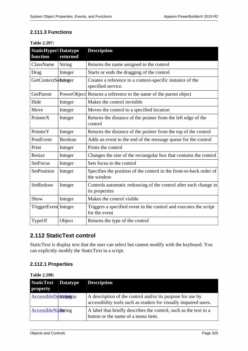
System Object Properties, Events, and Functions Appeon PowerBuilder® 2019 R2
Objects and Controls Page 325
2.111.3 Functions
Table 2.297:
StaticHyperLinkfunction
Datatypereturned
Description
ClassName String Returns the name assigned to the control
Drag Integer Starts or ends the dragging of the control
GetContextServiceInteger Creates a reference to a context-specific instance of thespecified service.
GetParent PowerObject Returns a reference to the name of the parent object
Hide Integer Makes the control invisible
Move Integer Moves the control to a specified location
PointerX Integer Returns the distance of the pointer from the left edge of thecontrol
PointerY Integer Returns the distance of the pointer from the top of the control
PostEvent Boolean Adds an event to the end of the message queue for the control
Print Integer Prints the control
Resize Integer Changes the size of the rectangular box that contains the control
SetFocus Integer Sets focus to the control
SetPosition Integer Specifies the position of the control in the front-to-back order ofthe window
SetRedraw Integer Controls automatic redrawing of the control after each change inits properties
Show Integer Makes the control visible
TriggerEvent Integer Triggers a specified event in the control and executes the scriptfor the event
TypeOf Object Returns the type of the control
2.112 StaticText control
StaticText is display text that the user can select but cannot modify with the keyboard. Youcan explicitly modify the StaticText in a script.
2.112.1 Properties
Table 2.298:
StaticTextproperty
Datatype Description
AccessibleDescriptionString A description of the control and/or its purpose for use byaccessibility tools such as readers for visually impaired users.
AccessibleNameString A label that briefly describes the control, such as the text in abutton or the name of a menu item.

System Object Properties, Events, and Functions Appeon PowerBuilder® 2019 R2
Objects and Controls Page 326
StaticTextproperty
Datatype Description
AccessibleRoleAccessibleRole(enumerated)
Describes what kind of user interface element the control is.
Alignment Alignment(enumerated)
Specifies the text alignment in the control. Values are:
Left!
Center!
Right!
BackColor Long Specifies the numeric value of the background color: -2to 16,777,215. For more information about color, seeSection 10.636, “RGB”.
Border Boolean Specifies whether the control has a border. Values are:
TRUE -- Control has a border.
FALSE -- Control does not have a border.
BorderColor Long Specifies the numerical value of the border color: -2 to16,777,215.
BorderStyle BorderStyle(enumerated)
Specifies the style of the border of the control. Values are:
StyleBox!
StyleLowered!
StyleRaised!
StyleShadowBox!
BringToTop Boolean Specifies whether PowerBuilder moves the control to the top ofthe front-to-back order of the window. Values are:
TRUE -- Control moved to top.
FALSE -- Control not moved to top.
ClassDefinitionPowerObject An object of type PowerObject containing information about theclass definition of the object or control.
DisabledLookBoolean Specifies whether the control appears to be enabled.
DragAuto Boolean Specifies whether PowerBuilder puts the control automaticallyinto Drag mode. Values are:
TRUE -- When the control is clicked, the control isautomatically in Drag mode.
FALSE -- When the control is clicked, the control is notautomatically in Drag mode. You have to manually put thecontrol into Drag mode by using the Drag function.
DragIcon String Specifies the name of the stock icon or the file containing theicon you want to display when the user drags the control (theICO file). The default icon is a box the size of the control.

System Object Properties, Events, and Functions Appeon PowerBuilder® 2019 R2
Objects and Controls Page 327
StaticTextproperty
Datatype Description
When the user drags the control, the icon displays when thecontrol is over an area in which the control can be dropped (avalid drop area). When the control is over an area that is not avalid drop area, the No-Drop icon displays.
Enabled Boolean Specifies whether the control is enabled (can be selected).Values are:
TRUE -- Control can be selected.
FALSE -- Control cannot be selected.
FaceName String Specifies the name of the typeface in which the text of thecontrol displays (for example, Arial or Courier).
FillPattern FillPattern(enumerated)
Specifies the hatch pattern used to fill the control. Values are:
BDiagonal!
Diamond!
FDiagonal!
Horizontal!
Solid!
Square!
Vertical!
FDiagonal! is lines going from the lower-left to the upper-right.BDiagonal! is lines going from the upper-left to the lower right.
FocusRectangleBoolean Specifies whether a dotted rectangle (focus rectangle) framesthe control when it has focus. Values are:
TRUE -- Control framed when it has focus.
FALSE -- Control not framed when it has focus.
FontCharSet FontCharSet(enumerated)
Specifies the font character set used for the text in the control.For a complete list of possible values, see the list of propertiesfor the FontCharSet variable on the Enumerated tab page of theBrowser.
FontFamily FontFamily(enumerated)
Specifies the font family (type style) used for the text in thecontrol. Values are:
AnyFont!
Decorative!
Modern!
Roman!
Script!
Swiss!
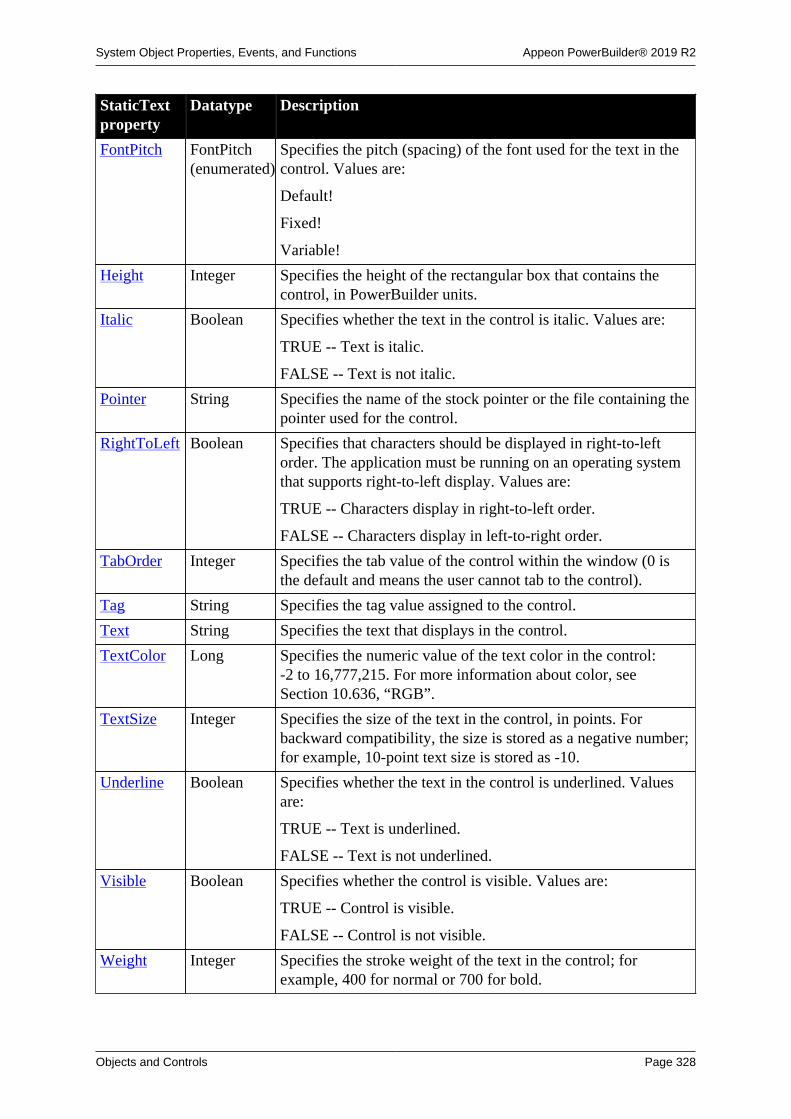
System Object Properties, Events, and Functions Appeon PowerBuilder® 2019 R2
Objects and Controls Page 328
StaticTextproperty
Datatype Description
FontPitch FontPitch(enumerated)
Specifies the pitch (spacing) of the font used for the text in thecontrol. Values are:
Default!
Fixed!
Variable!
Height Integer Specifies the height of the rectangular box that contains thecontrol, in PowerBuilder units.
Italic Boolean Specifies whether the text in the control is italic. Values are:
TRUE -- Text is italic.
FALSE -- Text is not italic.
Pointer String Specifies the name of the stock pointer or the file containing thepointer used for the control.
RightToLeft Boolean Specifies that characters should be displayed in right-to-leftorder. The application must be running on an operating systemthat supports right-to-left display. Values are:
TRUE -- Characters display in right-to-left order.
FALSE -- Characters display in left-to-right order.
TabOrder Integer Specifies the tab value of the control within the window (0 isthe default and means the user cannot tab to the control).
Tag String Specifies the tag value assigned to the control.
Text String Specifies the text that displays in the control.
TextColor Long Specifies the numeric value of the text color in the control:-2 to 16,777,215. For more information about color, seeSection 10.636, “RGB”.
TextSize Integer Specifies the size of the text in the control, in points. Forbackward compatibility, the size is stored as a negative number;for example, 10-point text size is stored as -10.
Underline Boolean Specifies whether the text in the control is underlined. Valuesare:
TRUE -- Text is underlined.
FALSE -- Text is not underlined.
Visible Boolean Specifies whether the control is visible. Values are:
TRUE -- Control is visible.
FALSE -- Control is not visible.
Weight Integer Specifies the stroke weight of the text in the control; forexample, 400 for normal or 700 for bold.

System Object Properties, Events, and Functions Appeon PowerBuilder® 2019 R2
Objects and Controls Page 329
StaticTextproperty
Datatype Description
Width Integer Specifies the width of the rectangular box that contains thecontrol, in pixels.
X Integer Specifies the X position (the distance from the left edge of thewindow), in PowerBuilder units.
Y Integer Specifies the Y position (the distance from the top of thewindow), in PowerBuilder units.
2.112.2 Events
Table 2.299:
StaticText event Occurs
Clicked When the control is clicked (selected)
Constructor Immediately before the Open event occurs in the window
Destructor Immediately after the Close event occurs in the window
DoubleClicked When the control is double-clicked (selected and activated)
DragDrop When a dragged control is dropped on the control
DragEnter When a dragged control enters the control
DragLeave When a dragged control leaves the control
DragWithin When a dragged control is within the control
GetFocus Just before the control receives focus (before it is selected and becomesactive)
Help When the user presses the F1 key or drags the context help button(question mark) from the title bar to a menu item or control
LoseFocus When the control loses focus (becomes inactive)
Other When a Windows message occurs that is not a PowerBuilder event
RButtonDown When the right mouse button is pressed on the control
2.112.3 Functions
Table 2.300:
StaticTextfunction
Datatypereturned
Description
ClassName String Returns the name assigned to the control
Drag Integer Starts or ends the dragging of the control
GetContextServiceInteger Creates a reference to a context-specific instance of thespecified service
GetParent PowerObject Returns a reference to the name of the parent object
Hide Integer Makes the control invisible
Move Integer Moves the control to a specified location

System Object Properties, Events, and Functions Appeon PowerBuilder® 2019 R2
Objects and Controls Page 330
StaticTextfunction
Datatypereturned
Description
PointerX Integer Returns the distance of the pointer from the left edge of thecontrol
PointerY Integer Returns the distance of the pointer from the top of the control
PostEvent Boolean Adds an event to the end of the message queue for the control
Print Integer Prints the control
Resize Integer Changes the size of the rectangular box that contains thecontrol.
SetFocus Integer Sets focus to the control
SetPosition Integer Specifies the position of the control in the front-to-back order ofthe window
SetRedraw Integer Controls automatic redrawing of the control after each change inits properties.
Show Integer Makes the control visible
TriggerEvent Integer Triggers a specified event in the control and executes the scriptfor the event
TypeOf Object Returns the type of the control
2.113 SyncParm object
A SyncParm object is a system structure that you can use to obtain runtime properties froma synchronization option window, and then pass these property values to an MLSync object.The SyncParm object has no events or functions.
2.113.1 Properties
Table 2.301:
SyncParmproperty
Datatype Description
AuthenticateParmsString Used to pass parameters to an authenticate_parametersconnection script.
DBPass String Password for the SQL Anywhere remote database.
DBUser String User ID for the SQL Anywhere remote database.
EncryptionKeyString Encryption key for SQL Anywhere remote database.
MLPass String The MobiLink password passed to the synchronization server.
MLUser String The MobiLink user name passed to the synchronization server.
ReturnCode Long Return code from the synchronization options window(generated by the MobiLink synchronization wizard). Valuesare:
• 0 = Success.

System Object Properties, Events, and Functions Appeon PowerBuilder® 2019 R2
Objects and Controls Page 331
SyncParmproperty
Datatype Description
• -1 = Error.
• 100 = Cancel.
UlTrans Transaction Not currently used. Reserved for the connected transactionobject to an UltraLite remote database.
2.114 Tab controlA Tab control contains tab pages, which are user objects that contain controls. Tab pagescan be defined within the Tab control or they can be defined in the User Object painter andinserted into the Tab control.
Each tab page can have its own label, picture, and background color.
All tab pages share the same font settings.
Tab Position controls where the tabs on the tab pages are displayed. Tabs can be displayed onany one of the four edges of the Tab control. They can also be displayed on opposite edgeswith the tabs before or after the selected tab jumping to the other edge.
2.114.1 Properties
Table 2.302:
Tabproperty
Datatype Description
AccessibleDescriptionString A description of the control and/or its purpose for use byaccessibility tools such as readers for visually impaired users.
AccessibleNameString A label that briefly describes the control, such as the text in abutton or the name of a menu item.
AccessibleRoleAccessibleRole(enumerated)
Describes what kind of user interface element the control is.
Alignment Alignment(enumerated)
Specifies the alignment of the text labeling all the tabs. Valuesare:
Left!
Center!
Right!
BackColor Long Specifies the numeric value of the background color: -2to 16,777,215. For more information about color, seeSection 10.636, “RGB”.
BoldSelectedTextBoolean Specifies whether the text for the selected tab is bold. Valuesare:
TRUE -- The text on the selected tab is bold.
FALSE -- The text on the selected tab has the same setting asthe other tabs.

System Object Properties, Events, and Functions Appeon PowerBuilder® 2019 R2
Objects and Controls Page 332
Tabproperty
Datatype Description
BringToTop Boolean Specifies whether PowerBuilder moves the control to the top ofthe front-to-back order in the window. Values are:
TRUE -- Moves to the top.
FALSE -- Does not move to the top.
ClassDefinitionPowerObject An object of type PowerObject containing information about theclass definition of the object or control.
CreateOnDemandBoolean Specifies whether PowerBuilder creates graphicalrepresentations of controls on all tab pages when the Tabcontrol is created. Values are:
TRUE -- Graphical representations of tab pages are not createduntil the tab page is selected.
FALSE -- (Default) Graphical representations of tab pages arecreated when the Tab control is created.
Control[ ] UserObject Specifies the array of tab pages within the Tab control.
DragAuto Boolean Specifies whether PowerBuilder puts the control automaticallyinto Drag mode. Values are:
TRUE -- When the control is clicked, the control isautomatically in Drag mode.
FALSE -- When the control is clicked, the control is notautomatically in Drag mode. You have to manually put thecontrol into Drag mode by using the Drag function.
DragIcon String Specifies the name of the stock icon or the file containing theicon you want to display when the user drags the control (theICO file). The default icon is a box the size of the control.
When the user drags the control, the icon displays when thecontrol is over an area in which the control can be dropped (avalid drop area). When the control is over an area that is not avalid drop area, the No-Drop icon displays.
Enabled Boolean Specifies whether the control is enabled (can be selected).Values are:
TRUE -- Can be selected.
FALSE -- Cannot be selected.
FaceName String Specifies the name of the typeface used for the text labels ontabs (for example, Arial or Courier). Only TrueType fontsdisplay correctly on vertical tabs.
FixedWidth Boolean Specifies whether tabs have a fixed width, meaning they do notshrink to the length of their text labels. Values are:
TRUE -- Tab width is fixed; the width is determined by thelongest text label.

System Object Properties, Events, and Functions Appeon PowerBuilder® 2019 R2
Objects and Controls Page 333
Tabproperty
Datatype Description
FALSE -- Tab width adjusts to the length of the text labels.
FocusOnButtonDownBoolean Specifies whether each tab gets focus when the user clicks on it.Values are:
TRUE -- The tab the user clicks on gets focus; a dottedrectangle marks the tab.
FALSE -- The tab does not get focus.
In either case, the selected tab page comes to the front.
The dotted focus rectangle appears on the tab when the userclicks on it a second and subsequent times even if this propertyis set to false.
FontCharSet FontCharSet(enumerated)
Specifies the character set for the text labels on the tabs. Fora complete list of possible values, see the list of properties forthe FontCharSet variable on the Enumerated tab page of theBrowser.
FontFamily FontFamily(enumerated)
Specifies the font family (type style) for the text labels on thetabs. Values are:
AnyFont!
Decorative!
Modern!
Roman!
Script!
Swiss!
FontPitch FontPitch(enumerated)
Specifies the pitch (spacing) of the font for text labels on thetabs. Values are:
Default!
Fixed!
Variable!
Height Integer Specifies the height of the control, in PowerBuilder units.
Italic Boolean Specifies whether the text on the tabs is italic. Values are:
TRUE -- Text labels are italic.
FALSE -- Text labels are not italic.
Multiline Boolean Specifies whether the tabs can appear in more than one row.Values are:
TRUE -- If there is not room for all the tabs in a single row, thetabs are arranged in multiple rows.

System Object Properties, Events, and Functions Appeon PowerBuilder® 2019 R2
Objects and Controls Page 334
Tabproperty
Datatype Description
FALSE -- If there is not room for all the tabs in a single row,a dual arrow control displays to allow the user to scroll to tabsthat do not fit.
PerpendicularTextBoolean Specifies whether the tab labels are drawn perpendicular to thetab page. Values are:
TRUE -- Text is perpendicular to the edge of the tab page,resulting in narrower tabs.
FALSE -- Text runs along the edge of the tab page, resulting inwider tabs.
PictureOnRightBoolean Specifies whether a picture that is part of the tab label is to theright or left of the text. Values are:
TRUE -- The picture is on the right.
FALSE -- The picture is on the left.
Pointer String Specifies the name of the stock pointer or the file containing thepointer used for the control.
PowerTips Boolean Specifies whether PowerTipText for a tab page is displayed asa PowerTip (a pop-up label for the tab) when the mouse pointerpauses over the tab. PowerTips are useful if the tabs are labeledwith pictures. Values are:
TRUE -- PowerTipText, if any, displays as a pop-up label foreach tab.
FALSE -- No PowerTips are displayed.
RaggedRight Boolean Specifies whether tabs are stretched so that they fill space alongthe edge of the control. Values are:
TRUE -- Tabs remain the size determined by their label textand the FixedWidth property.
FALSE -- Tabs are stretched to fill the edge.
SelectedTab Integer Specifies the index number of the selected tab. The defaultvalue is 1, and the integer must be in the range 1 to N, where Nis the number of tab pages.
ShowPicture Boolean Specifies whether the picture selected for each tab is displayed.Values are:
TRUE -- The picture for each tab, if any, is displayed.
FALSE -- No pictures are displayed.
ShowText Boolean Specifies whether the text specified for each tab label isdisplayed. Values are:
TRUE -- The text for each tab is displayed.
FALSE -- The text for each tab is not displayed.

System Object Properties, Events, and Functions Appeon PowerBuilder® 2019 R2
Objects and Controls Page 335
Tabproperty
Datatype Description
TabOrder Integer Specifies the tab value of the control within the window (0means the user cannot tab to the control).
TabPosition TabPosition(enumerated)
Specifies where the tabs appear around the Tab control. Valuesare:
• TabsOnBottom! -- Tabs are at the bottom.
• TabsOnBottomAndTop! -- Tabs before the selected tabare on top; the selected tab itself and tabs after it are on thebottom.
• TabsOnLeft! -- Tabs are on the left.
• TabsOnLeftAndRight! -- Tabs before the selected tab and theselected tab itself are on the left; tabs after the selected tab areon the right.
• TabsOnRight! -- Tabs are on the right.
• TabsOnRightAndLeft! -- Tabs before the selected tab are onthe left; the selected tab and tabs after it are on the right.
• TabsOnTop! -- Tabs are on top.
• TabsOnTopAndBottom! -- Tabs before the selected tab andthe selected tab itself are on top; tabs after the selected tab areon the bottom.
Tag String Specifies the tag value assigned to the control.
TextSize Integer Specifies the size of the text in the control, in points. Forbackward compatibility, the size is stored as a negative number;for example, 10-point text size is stored as -10.
Underline Boolean Specifies whether the text on the tabs is underlined. Values are:
TRUE -- Text labels are underlined.
FALSE -- Text labels are not underlined.
Visible Boolean Specifies whether the control is visible. Values are:
TRUE -- Is visible.
FALSE -- Is not visible.
Weight Integer Specifies the stroke weight of the text in the control; forexample, 400 for normal or 700 for bold.
Width Integer Specifies the width of the control, in PowerBuilder units.
X Integer Specifies the X position (the distance from the left edge of thewindow), in PowerBuilder units.

System Object Properties, Events, and Functions Appeon PowerBuilder® 2019 R2
Objects and Controls Page 336
Tabproperty
Datatype Description
Y Integer Specifies the Y position (the distance from the top of thewindow), in PowerBuilder units.
2.114.2 Events
Table 2.303:
Tab Event Occurs
Clicked When the user clicks in the Tab control, except in the display area of thetab page. For the tab page, the Clicked event (pbm_bnclicked) for theuser object is triggered instead.
Constructor When the object is created, immediately before the Open event occurs inthe window.
Destructor When the object is destroyed, immediately after the Close event occurs inthe window.
DoubleClicked When the user double-clicks in the Tab control, except in the displayarea of the tab page. For the tab page, the DoubleClicked event(pbm_bndoubleclicked) for the user object is triggered instead.
DragDrop When a dragged control is dropped in the tab area of the control.
DragEnter When a dragged control enters the control, including entering the narrowborder around the display area.
DragLeave When a dragged control leaves the control, including leaving by crossinginto the tab page display area.
DragWithin When a dragged control is within the control, but not within the tab pagedisplay area.
GetFocus Just before the control receives focus (before it is selected and becomesactive).
Help When the user presses the F1 key or drags the context help button(question mark) from the title bar to a menu item or control.
Key When the user presses a key.
LoseFocus When the control loses focus (becomes inactive).
Other When a Windows message occurs that is not a PowerBuilder event.
RightClicked When the user clicks with the right mouse button in the Tab control,except in the display area of the tab page. If the user right-clickson the tab page, the controls or user objects on the tab page get anRButtonDown event.
RightDoubleClickedWhen the user double-clicks with the right mouse button in the Tabcontrol, except in the display area of the tab page. For the tab page, theRightDoubleClicked event (pbm_rbuttondblclk) for the user object istriggered instead.
SelectionChanged Just after the selection changes to another tab. SelectionChanged istriggered when the tab is created and the initial selection is established.

System Object Properties, Events, and Functions Appeon PowerBuilder® 2019 R2
Objects and Controls Page 337
Tab Event Occurs
SelectionChangingJust before the selection changes to another tab. To prevent the selectionfrom changing, return 1 in the event script. SelectionChanging istriggered when the tab is created and the initial selection is established.
2.114.3 Functions
Table 2.304:
Tabfunction
Datatypereturned
Description
ClassName String Returns the name assigned to the control.
CloseTab Integer Closes a tab page that was opened with the OpenTab function.
Drag Integer Starts or ends dragging of the control.
GetContextServiceInteger Creates a reference to a context-specific instance of thespecified service.
GetParent PowerObject Returns a reference to the parent of the Tab control.
Hide Integer Makes the control invisible.
Move Integer Moves the control to a specified location.
MoveTab Integer Moves a tab to a new position in the order of tabs.
OpenTab Integer Opens the specified user object as a tab page, making itsproperties available to scripts.
OpenTabWithParmInteger Opens the user object as a tab page, making its propertiesavailable to scripts, and stores a parameter in the Messageobject.
PointerX Integer Returns the distance of the pointer from the left edge of thecontrol.
PointerY Integer Returns the distance of the pointer from the top of the control.
PostEvent Integer Adds the specified event to the end of the event queue for thespecified object.
Print Integer Prints the contents of the control. You can specify a range ofpages and other settings.
Resize Integer Changes the size of the tab page to the size specified in thewidth and height arguments.
SelectTab Integer Selects a tab page.
SetFocus Integer Sets focus to the Tab control.
SetPosition Integer Specifies the control's position in the front-to-back order withinthe window.
SetRedraw Integer Controls automatic redrawing of the control.
Show Integer Makes the control visible.
TabPostEventInteger Adds an event to the end of the message queues for each of thetab pages.

System Object Properties, Events, and Functions Appeon PowerBuilder® 2019 R2
Objects and Controls Page 338
Tabfunction
Datatypereturned
Description
TabTriggerEventInteger Sends an event to every tab page and, for each page, executesthe script associated with the event.
TriggerEvent Integer Triggers a specified event in the control and executes the scriptfor the event.
TypeOf Object Returns the type of the control.
2.115 Throwable object
The Throwable datatype is the base class for all throwable objects. These include exceptionsand error objects.
2.115.1 Properties
Table 2.305:
Throwableproperty
Datatype Description
ClassDefinitionPowerObject An object of type PowerObject containing information about theclass definition of the object or control.
Text String Contains the text of the error message.
2.115.2 Events
Table 2.306:
Throwableevent
Occurs
Constructor When the exception is thrown.
Destructor Immediately after the exception is thrown.
2.115.3 Functions
Table 2.307:
Throwablefunction
Datatypereturned
Description
ClassName String Returns the name assigned to the object.
GetContextServiceInteger Creates a reference to a context-specific instance of thespecified service.
GetMessage String Returns the error message from objects of type Throwable.
GetParent PowerObject Returns a reference to the name of the parent object.
PostEvent Boolean Adds an event to the end of the message queue for the object.
SetMessage Sets an error message for an object of type Throwable.

System Object Properties, Events, and Functions Appeon PowerBuilder® 2019 R2
Objects and Controls Page 339
Throwablefunction
Datatypereturned
Description
TriggerEvent Integer Triggers a specific event in the object and executes the script forthe event.
TypeOf Object Returns the type of the object.
2.116 Timing object
Timing is a nonvisual system object that can be used when a Timer event cannot beassociated with a window. To use a timing object, create a standard class user object thatinherits from the Timing system class, and then create an instance of the inherited timingobject.
2.116.1 Properties
Table 2.308:
Timingproperty
Datatype Description
ClassDefinitionPowerObject An object of type PowerObject containing information about theclass definition of the object or control.
Interval Double (Read-only) The minimum number of seconds the timing objectwaits between calls to the Timer event. This property is initiallyset to NULL and is modified whenever the Start function iscalled.
Running Boolean (Read-only) True if the timing object has been started and iscurrently running. False if the timing object is not running.
2.116.2 Events
Table 2.309:
Timing event Occurs
Constructor Immediately before the Open event occurs in the window
Destructor Immediately after the Close event occurs in the window
Timer When a specified number of seconds elapses after the Start function hasbeen called
2.116.3 Functions
Table 2.310:
Timingfunction
Datatypereturned
Description
ClassName String Returns the name assigned to the object

System Object Properties, Events, and Functions Appeon PowerBuilder® 2019 R2
Objects and Controls Page 340
Timingfunction
Datatypereturned
Description
GetContextServiceInteger Creates a reference to a context-specific instance of thespecified service
GetParent PowerObject Returns a reference to the name of the parent object
PostEvent Boolean Adds an event to the end of the message queue for the object
Start Integer Activates the timing object using a specified interval
Stop Integer Deactivates the timing object
TriggerEvent Integer Triggers a specific event in the object and executes the script forthe event
TypeOf Object Returns the type of the object
2.117 TokenRequest objectThe TokenRequest object can get or set the properties for the access token request, includingthe address of the authorization server, the OAuth 2.0 authorization process, the scope of theaccess request, the secure protocol, the timeout value etc.
Note
This object cannot be referenced in .NET Web Service or .NET Assemblycomponents, otherwise the component will fail to be deployed.
2.117.1 Properties
Table 2.311:
TokenRequestproperty
Datatype Description
ClassDefinitionPowerObject An object of type PowerObject containing information about theclass definition of the object or control.
ClientId String Identifier of the registered client issued by the authorizationserver. If the program sets the "Authorization" request header,this property will be ignored.
ClientSecret String Password of the registered client issued by the authorizationserver. If the program sets the "Authorization" request header,this property will be ignored.
GrantType String The type of the authorization process. Values are:
• password – Resource Owner Password Credentials Grant;
• client_credentials – Client Credentials Grant;
• placeholder string – Extension Grant.
Method String HTTP method for sending the authentication request. Valuesare:

System Object Properties, Events, and Functions Appeon PowerBuilder® 2019 R2
Objects and Controls Page 341
TokenRequestproperty
Datatype Description
GET – HTTP get method;
POST – HTTP post method.
Password String The password of the resource owner.
Scope String The scope of the access request.
SecureProtocolInteger Specifies the secure protocol with the integer value. Values are:
0 – All secure protocols. This is a default value;
1 – TLS1.0;
2 – TLS1.1;
3 – TLS1.2.
Timeout Long Specifies the timeout seconds. The default value is 60 and 0 isno timeout.
TokenLocationString The URL of the authorization server.
UserName String The name of the resource owner.
2.117.2 Functions
Table 2.312:
TokenRequestfunction
Datatypereturned
Description
AppendParamInteger Appends the parameter to the request for Extension Grant only.
ClassName String Returns the name assigned to the object.
ClearHeaders Integer Clears the header of the request.
ClearParams Integer Clears all of the parameters appended by the AppendParamfunction.
GetContextServiceInteger Creates a reference to a context-specific instance of thespecified service.
GetHeader String Gets the request header by name.
GetHeaders String Gets the header of all of the requests.
GetParent PowerObject Returns a reference to the name of the parent object.
SetHeader Integer Sets the request header by name.
SetHeaders Integer Sets the header information of all of the requests.
TypeOf Object Returns the type of the object.
2.118 TokenResponse object
The TokenResponse object can get the information of the access token response returned bythe authorization server, including the access token, the refresh token, the HTTP responseheader etc.

System Object Properties, Events, and Functions Appeon PowerBuilder® 2019 R2
Objects and Controls Page 342
Note
This object cannot be referenced in .NET Web Service or .NET Assemblycomponents, otherwise the component will fail to be deployed.
2.118.1 Properties
Table 2.313:
TokenResponseproperty
Datatype Description
ClassDefinitionPowerObject An object of type PowerObject containing information about theclass definition of the object or control.
2.118.2 Functions
Table 2.314:
TokenResponsefunction
Datatypereturned
Description
ClassName String Returns the name assigned to the object.
GetAccessTokenString Gets the access token returned by authorization server.
GetBody Integer Gets the response body into string.
GetContextServiceInteger Creates a reference to a context-specific instance of thespecified service.
GetExpiresIn Long Gets lifetime of the access token returned by authorizationserver.
GetHeader String Gets the response header by name.
GetHeaders String Gets the header of all responses by name.
GetParent PowerObject Returns a reference to the name of the parent object.
GetRefreshTokenString Gets the refresh token returned by authorization server.
GetStatusCodeLong Gets the response status code.
GetStatusTextString Gets the response status description.
GetTokenErrorString Gets the error information returned by the Authorization Serverif the request privilege grant failed.
GetTokenTypeString Gets the access token type returned by authorization server.
TypeOf Object Returns the type of the object.
2.119 TraceActivityNode object
The TraceActivityNode object provides information about the nodes in a trace file, includingthe type of activity represented by a node. You use the TraceActivityNode object inconjunction with the TraceFile object.

System Object Properties, Events, and Functions Appeon PowerBuilder® 2019 R2
Objects and Controls Page 343
The TraceActivityNode object has no events.
2.119.1 Properties
Table 2.315:
TraceActivityNodeproperty
Datatype Description
ActivityType TraceActivity(enumerated)
A value of the enumerated datatype TraceActivity that identifiesthe activity represented by the node. Values are:
ActBegin! -- Start and finish of logging.
ActError! -- Occurrences of system errors and warnings.
ActESQL! -- Embedded SQL statement entry and exit.
ActGarbageCollect! -- Start and finish of garbage collection
ActLine! -- Routine line hits.
ActObjectCreate! -- Object creation.
ActObjectDestroy! -- Object destruction.
ActRoutine! -- Routine entry and exit.
ActUser! -- Occurrences of an activity you selected.
Category TraceCategory(enumerated)
The category of the activity represented by the node. Values are:
TraceAtomic! -- The node is an activity that occurred in a singlestatement.
TraceIn! -- The node is the beginning of an activity that spansseveral statements.
TraceOut! -- The node is the end of an activity that spannedseveral statements.
ClassDefinitionPowerObject An object of type PowerObject containing information about theclass definition of the object or control.
TimerValue Decimal The timer value (in seconds) when the activity occurred.
2.119.2 Functions
Table 2.316:
TraceActivityNodefunction
Datatypereturned
Description
ClassName String Returns the name assigned to the object.
GetContextServiceInteger Creates a reference to a context-specific instance of thespecified service.
GetParent PowerObject Returns a reference to the name of the parent object.
TypeOf Object(enumerated)
Returns the type of the object.

System Object Properties, Events, and Functions Appeon PowerBuilder® 2019 R2
Objects and Controls Page 344
2.120 TraceBeginEnd objectThe TraceBeginEnd object provides information about a node in a trace file identified as anoccurrence of a logging start or finish. To access the extra properties of the TraceBeginEndobject, you assign a TraceActivityNode object whose activity type is ActBegin! to theTraceBeginEnd object.
The TraceBeginEnd object has no events.
2.120.1 Properties
Table 2.317:
TraceBeginEndproperty
Datatype Description
ActivityType TraceActivity(enumerated)
The value ActBegin! which identifies the activity representedby the node as an occurrence of a logging start or finish.
Category TraceCategory(enumerated)
The category of the activity represented by the node. Values are:
TraceIn! -- The node is the beginning of an activity that spansseveral statements.
TraceOut! -- The node is the end of an activity that spannedseveral statements.
ClassDefinitionPowerObject An object of type PowerObject containing information about theclass definition of the object or control.
Message String The message passed in for the TraceBegin function. For theTraceEnd function, the value is " ".
TimerValue Decimal The timer value (in seconds) when the activity occurred.
2.120.2 Functions
Table 2.318:
TraceBeginEndfunction
Datatypereturned
Description
ClassName String Returns the name assigned to the object
GetContextServiceInteger Creates a reference to a context-specific instance of thespecified service
GetParent PowerObject Returns a reference to the name of the parent object
TypeOf Object(enumerated)
Returns the type of the object
2.121 TraceError objectThe TraceError object provides information about a node in a trace file identified as anoccurrence of a system error or warning, including the error message and severity level. Toaccess the extra properties of the TraceError object, you assign a TraceActivityNode objectwhose activity type is ActError! to the TraceError object.
The TraceError object has no events.
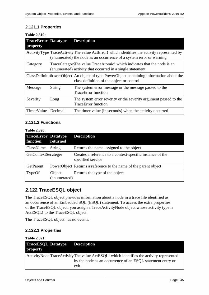
System Object Properties, Events, and Functions Appeon PowerBuilder® 2019 R2
Objects and Controls Page 345
2.121.1 Properties
Table 2.319:
TraceErrorproperty
Datatype Description
ActivityType TraceActivity(enumerated)
The value ActError! which identifies the activity represented bythe node as an occurrence of a system error or warning
Category TraceCategory(enumerated)
The value TraceAtomic! which indicates that the node is anactivity that occurred in a single statement
ClassDefinitionPowerObject An object of type PowerObject containing information about theclass definition of the object or control
Message String The system error message or the message passed to theTraceError function
Severity Long The system error severity or the severity argument passed to theTraceError function
TimerValue Decimal The timer value (in seconds) when the activity occurred
2.121.2 Functions
Table 2.320:
TraceErrorfunction
Datatypereturned
Description
ClassName String Returns the name assigned to the object
GetContextServiceInteger Creates a reference to a context-specific instance of thespecified service
GetParent PowerObject Returns a reference to the name of the parent object
TypeOf Object(enumerated)
Returns the type of the object
2.122 TraceESQL objectThe TraceESQL object provides information about a node in a trace file identified asan occurrence of an Embedded SQL (ESQL) statement. To access the extra propertiesof the TraceESQL object, you assign a TraceActivityNode object whose activity type isActESQL! to the TraceESQL object.
The TraceESQL object has no events.
2.122.1 Properties
Table 2.321:
TraceESQLproperty
Datatype Description
ActivityNode TraceActivityThe value ActESQL! which identifies the activity representedby the node as an occurrence of an ESQL statement entry orexit.
System Object Properties, Events, and Functions Appeon PowerBuilder® 2019 R2
Objects and Controls Page 346
TraceESQLproperty
Datatype Description
Category TraceCategoryThe category of the activity represented by the node. Values are:
TraceIn! -- The node is the beginning of an activity that spansseveral statements.
TraceOut! -- The node is the end of an activity that spannedseveral statements.
ClassDefinitionPowerObject An object of type PowerObject containing information about theclass definition of the object or control.
Name String The name of the ESQL statement.
TimerValue Decimal The timer value (in seconds) when the activity occurred.
2.122.2 Functions
Table 2.322:
TraceESQLfunction
Datatypereturned
Description
ClassName String Returns the name assigned to the object
GetContextServiceInteger Creates a reference to a context-specific instance of thespecified service
GetParent PowerObject Returns a reference to the name of the parent object
TypeOf Object(enumerated)
Returns the type of the object
2.123 TraceFile object
The TraceFile object is used to access the contents of a trace file created from a PowerBuilderapplication. Unlike the Profiling and TraceTree objects, the TraceFile object does notprovide properties and functions to create an analysis model. You use the TraceFile objectin conjunction with the TraceActivityNode, TraceBeginEnd, TraceError, TraceESQL,TraceGarbageCollect, TraceLine, TraceObject, TraceRoutine, and TraceUser objects.
The TraceFile object has no events.
2.123.1 Properties
Table 2.323:
TraceFileproperty
Datatype Description
ApplicationNameString The name of the application used to generate the trace file.
ClassDefinitionPowerObject An object of type PowerObject containing information about theclass definition of the object or control.

System Object Properties, Events, and Functions Appeon PowerBuilder® 2019 R2
Objects and Controls Page 347
TraceFileproperty
Datatype Description
CollectionTimeDecimal The amount of time (in seconds) taken by the collection oftrace data. This time has already been accounted for in thetimestamps from the trace file, that is, the proper amount of timehas been subtracted from the timestamps before they are put inthe trace file. The value is NULL if the file is not open.
LastError ErrorReturn(enumerated)
The error code for the last error that occurred.
NumberOfActivitiesLong The number of activities that exist in the trace file.
FileName String The name of the opened trace file. The value is an empty stringif the file is not open.
2.123.2 Functions
Table 2.324:
TraceFilefunction
Datatypereturned
Description
ClassName String Returns the name assigned to the object.
Close ErrorReturn(enumerated)
Closes the open trace file.
GetContextServiceInteger Creates a reference to a context-specific instance of thespecified service.
GetParent PowerObject Returns a reference to the name of the parent object.
NextActivity TraceActivityNodeProvides the next activity in the trace stream. If there are nomore activities, or if the file is not open, an invalid object isreturned. Use the LastError property to determine what kind oferror occurred.
Open ErrorReturn(enumerated)
Opens for reading the trace file with the passed name.
Reset ErrorReturn(enumerated)
Resets the stream to the beginning of the trace file.
TypeOf Object(enumerated)
Returns the type of the object.
2.124 TraceGarbageCollect object
The TraceGarbageCollect object provides information about a node in a trace fileidentified as an occurrence of garbage collection. To access the extra properties of theTraceGarbageCollect object, you assign a TraceActivityNode object whose activity type isActGarbageCollect! to the TraceGarbageCollect object.
The TraceGarbageCollect object has no events.

System Object Properties, Events, and Functions Appeon PowerBuilder® 2019 R2
Objects and Controls Page 348
2.124.1 Properties
Table 2.325:
TraceGarbageCollectproperty
Datatype Description
ActivityType TraceActivity(enumerated)
The value ActGarbageCollect! which identifies the activityrepresented by the node as an occurrence of garbage collectionstart or finish.
Category TraceCategory(enumerated)
The category of the activity represented by the node. Values are:
TraceIn! -- The node is the beginning of an activity that spansseveral statements.
TraceOut! -- The node is the end of an activity that spannedseveral statements.
ClassDefinitionPowerObject An object of type PowerObject containing information about theclass definition of the object or control.
TimerValue Decimal The timer value (in seconds) when the activity occurred.
2.124.2 Functions
Table 2.326:
TraceGarbageCollectfunction
Datatypereturned
Description
ClassName String Returns the name assigned to the object.
GetContextServiceInteger Creates a reference to a context-specific instance of thespecified service.
GetParent PowerObject Returns a reference to the name of the parent object.
TypeOf Object(enumerated)
Returns the type of the object.
2.125 TraceLine objectThe TraceLine object provides information about a node in a trace file identified as anoccurrence of a routine line hit. To access the extra properties of the TraceLine object, youassign a TraceActivityNode object whose activity type is ActLine! to the TraceLine object.
The TraceLine object has no events.
2.125.1 Properties
Table 2.327:
TraceLineproperty
Datatype Description
ActivityType TraceActivity(enumerated)
The value ActLine! which identifies the activity represented bythe node as an occurrence of a routine line hit
Category TraceCategory(enumerated)
The value TraceAtomic! which indicates that the node is anactivity that occurred in a single statement

System Object Properties, Events, and Functions Appeon PowerBuilder® 2019 R2
Objects and Controls Page 349
TraceLineproperty
Datatype Description
ClassDefinitionPowerObject An object of type PowerObject containing information about theclass definition of the object or control
LineNumber UnsignedLongThe line number
TimerValue Decimal The timer value (in seconds) when the activity occurred
2.125.2 Functions
Table 2.328:
TraceLinefunction
Datatypereturned
Description
ClassName String Returns the name assigned to the object
GetContextServiceInteger Creates a reference to a context-specific instance of thespecified service
GetParent PowerObject Returns a reference to the name of the parent object
TypeOf Object(enumerated)
Returns the type of the object
2.126 TraceObject objectThe TraceObject object provides information about a node in a trace file identified asthe creation or destruction of an object. To access the extra properties of the TraceObjectobject, you assign a TraceActivityNode object whose activity type is ActObjectCreate! orActObjectDestroy! to the TraceObject object. The TraceObject object has no events.
2.126.1 Properties
Table 2.329:
TraceObjectproperty
Datatype Description
ActivityType TraceActivity(enumerated)
The value ActObjectCreate! or ActObjectDestroy! whichidentifies the activity represented by the node as the creation ordestruction of an object.
Category TraceCategory(enumerated)
The category of the activity represented by the node. Values are:
TraceIn! -- The node is the beginning of an activity that spansseveral statements.
TraceOut! -- The node is the end of an activity that spannedseveral statements.
ClassDefinitionPowerObject An object of type PowerObject containing information about theclass definition of the object or control.
ClassName String The name of the class that is the type of the object. Nestedclasses (like controls in windows) have a name of the form classname`embedded class name.
System Object Properties, Events, and Functions Appeon PowerBuilder® 2019 R2
Objects and Controls Page 350
TraceObjectproperty
Datatype Description
IsCreate Boolean True if the node represents the creation of an object and false ifthe node represents the destruction of an object.
LibraryName String The name of the library that contains the class of the object. Thevalue is " " for system classes.
ObjectID UnsignedLongA unique identifier for the object.
TimerValue Decimal The timer value (in seconds) when the activity occurred.
2.126.2 Functions
Table 2.330:
TraceObjectfunction
Datatypereturned
Description
ClassName String Returns the name assigned to the object.
GetContextServiceInteger Creates a reference to a context-specific instance of thespecified service.
GetParent PowerObject Returns a reference to the name of the parent object.
TypeOf Object(enumerated)
Returns the type of the object.
2.127 TraceRoutine object
The TraceRoutine object provides information about a node in a trace file identified as anoccurrence of a routine. To access the extra properties of the TraceRoutine object, you assigna TraceActivityNode object whose activity type is ActRoutine! to the TraceRoutine object.The TraceRoutine object has no events.
2.127.1 Properties
Table 2.331:
TraceRoutineproperty
Datatype Description
ActivityType TraceActivity(enumerated)
The value ActRoutine! which identifies the activity representedby the node as an occurrence of a routine entry or exit.
Category TraceCategory(enumerated)
The category of the activity represented by the node. Values are:
TraceIn! -- The node is the beginning of an activity that spansseveral statements.
TraceOut! -- The node is the end of an activity that spannedseveral statements.
ClassDefinitionPowerObject An object of type PowerObject containing information about theclass definition of the object or control.

System Object Properties, Events, and Functions Appeon PowerBuilder® 2019 R2
Objects and Controls Page 351
TraceRoutineproperty
Datatype Description
ClassName String The name of the class that contains the routine. The value is " "for system functions. Nested classes (like controls in windows)have a name of the form class name`embedded class name.
IsEvent Boolean True if the routine is an event and false if the routine is afunction.
LibraryName String The name of the library that contains the class that includes theroutine. The value is " " for system classes.
Name String The name of the routine including the parameter datatypes andreturn value.
ObjectID UnsignedLongThe object ID for the object on which the routine is executing.The ID is 0 if the routine executing is a global or systemroutine.
TimerValue Decimal The timer value (in seconds) when the activity occurred.
2.127.2 Functions
Table 2.332:
TraceRoutinefunction
Datatypereturned
Description
ClassName String Returns the name assigned to the object
GetContextServiceInteger Creates a reference to a context-specific instance of thespecified service
GetParent PowerObject Returns a reference to the name of the parent object
TypeOf Object(enumerated)
Returns the type of the object
2.128 TraceTree objectThe TraceTree object is used to analyze the performance of a PowerBuilder application.It provides a tree model listing all the nodes logged in a given trace file. It includes thefunctions you call to name the trace file to be analyzed, build the tree model, and listthe top-level entries in the tree model. You use the TraceTree object in conjunctionwith the TraceTreeNode, TraceTreeError, TraceTreeESQL, TraceTreeGarbageCollect,TraceTreeLine, TraceTreeObject, TraceTreeRoutine, and TraceTreeUser objects.
The TraceTree object has no events.
2.128.1 Properties
Table 2.333:
TraceTreeproperty
Datatype Description
ApplicationNameString The name of the application used to generate the trace file.
System Object Properties, Events, and Functions Appeon PowerBuilder® 2019 R2
Objects and Controls Page 352
TraceTreeproperty
Datatype Description
ClassDefinitionPowerObject An object of type PowerObject containing information about theclass definition of the object or control.
CollectionTimeDecimal The amount of time (in seconds) taken by the collection oftrace data. This time has already been accounted for in thetimestamps from the trace file (the proper amount of time hasbeen subtracted from the timestamps before they are put in thetrace file). The value is NULL if no model was built.
NumberOfActivitiesLong The total number of activities that exist in the trace file. Thevalue is 0 if this is called before the trace file name is set.
TraceFileNameString The name of the trace file to use to build the model. The value isan empty string if the name has not been successfully set.
2.128.2 Functions
Table 2.334:
TraceTreefunction
Datatypereturned
Description
BuildModel ErrorReturn
(enumerated)
Builds a tree model based on the previously specified trace file
ClassName String Returns the name assigned to the object
DestroyModelErrorReturn
(enumerated)
Destroys the current tree model
EntryList ErrorReturn
(enumerated)
Provides a list of top-level entries (defined as TraceTreeNodeobjects) included in the model
GetContextServiceInteger Creates a reference to a context-specific instance of thespecified service
GetParent PowerObject Returns a reference to the name of the parent object
SetTraceFileNameErorReturn Indicates the name of the trace file to use for analysis andcreates the format of the file header
TypeOf Object(enumerated)
Returns the type of the object
2.129 TraceTreeError object
The TraceTreeError object provides information about a tree model node identified as anoccurrence of a system error or warning, including the error message and severity level. Toaccess the extra properties of the TraceTreeError object, you assign a TraceTreeNode objectwhose activity type is ActError! to the TraceTreeError object.
The TraceTreeError object has no events.

System Object Properties, Events, and Functions Appeon PowerBuilder® 2019 R2
Objects and Controls Page 353
2.129.1 Properties
Table 2.335:
TraceTreeErrorproperty
Datatype Description
ActivityType TraceActivity(enumerated)
The value ActError! which identifies the activity represented bythe node as an occurrence of a system error or warning
ClassDefinitionPowerObject An object of type PowerObject containing information about theclass definition of the object or control
Message String The system error message or the message passed to theTraceError function
ParentNode TraceTreeNodeThe parent of this node
Severity Long The system error severity or the severity argument passed to theTraceError function
TimerValue Decimal The timer value (in seconds) when the activity occurred
2.129.2 Functions
Table 2.336:
TraceTree-Errorfunction
Datatypereturned
Description
ClassName String Returns the name assigned to the object
GetContextServiceInteger Creates a reference to a context-specific instance of thespecified service
GetParent PowerObject Returns a reference to the name of the parent object
TypeOf Object(enumerated)
Returns the type of the object
2.130 TraceTreeESQL objectThe TraceTreeESQL object provides information about a tree model node identified asan occurrence of an Embedded SQL (ESQL) statement. To access the extra propertiesof the TraceTreeESQL object, you assign a TraceTreeNode object whose activity type isActESQL! to the TraceTreeESQL object.
The TraceTreeESQL object has no events.
2.130.1 Properties
Table 2.337:
TraceTreeESQL propertyDatatype Description
ActivityNode TraceActivity(enumerated)
The value ActESQL! which identifies the activity representedby the node as an occurrence of an ESQL statement entry andexit

System Object Properties, Events, and Functions Appeon PowerBuilder® 2019 R2
Objects and Controls Page 354
TraceTreeESQL propertyDatatype Description
ClassDefinitionPowerObject An object of type PowerObject containing information about theclass definition of the object or control
EnterTimerValueDecimal The timer value (in seconds) of the entry for this statement
ExitTimerValueDecimal The timer value (in seconds) of the exit for this statement
Name String The name of the ESQL statement
ParentNode TraceTreeNodeThe parent of this node
2.130.2 Functions
Table 2.338:
TraceTreeESQL functionDatatypereturned
Description
ClassName String Returns the name assigned to the object
GetContextServiceInteger Creates a reference to a context-specific instance of thespecified service
GetParent PowerObject Returns a reference to the name of the parent object
TypeOf Object(enumerated)
Returns the type of the object
2.131 TraceTreeGarbageCollect objectThe TraceTreeGarbageCollect object provides information about a tree model node identifiedas an occurrence of garbage collection, including the children or classes and routinescalled by that node. To access the extra properties of the TraceTreeGarbageCollect object,you assign a TraceTreeNode object whose activity type is ActGarbageCollect! to theTraceTreeGarbageCollect object.
The TraceTreeGarbageCollect object has no events.
2.131.1 Properties
Table 2.339:
TraceTreeGarbageCollectproperty
Datatype Description
ActivityType TraceActivity(enumerated)
The value ActGarbageCollect! which identifies the activityrepresented by the node as garbage collection start and finish.
ClassDefinitionPowerObject An object of type PowerObject containing information about theclass definition of the object or control.
EnterTimerValueDecimal The timer value (in seconds) of the entry for the garbagecollector.
ExitTimerValueDecimal The timer value (in seconds) of the exit for the garbagecollector.
ParentNode TraceTreeNodeThe parent of this node.

System Object Properties, Events, and Functions Appeon PowerBuilder® 2019 R2
Objects and Controls Page 355
2.131.2 Functions
Table 2.340:
TraceTreeGarbageCollectfunction
Datatypereturned
Description
ClassName String Returns the name assigned to the object
GetChildrenListErrorReturn(enumerated)
Provides a list of the children (defined as TraceTreeNodeobjects) of this routine
GetContextServiceInteger Creates a reference to a context-specific instance of thespecified service
GetParent PowerObject Returns a reference to the name of the parent object
TypeOf Object(enumerated)
Returns the type of the object
2.132 TraceTreeLine objectThe TraceTreeLine object provides information about a tree model node identified as anoccurrence of a routine line hit. To access the extra properties of the TraceTreeLine object,you assign a TraceTreeNode object whose activity type is ActLine! to the TraceTreeLineobject.
The TraceTreeLine object has no events.
2.132.1 Properties
Table 2.341:
TraceTreeLineproperty
Datatype Description
ActivityType TraceActivity(enumerated)
The value ActLine! which identifies the activity represented bythe node as an occurrence of a routine line hit
ClassDefinitionPowerObject An object of type PowerObject containing information about theclass definition of the object or control
LineNumber UnsignedLongThe line number
ParentNode TraceTreeNodeThe parent of this node
TimerValue Decimal The timer value (in seconds) when the activity occurred
2.132.2 Functions
Table 2.342:
TraceTreeLinefunction
Datatypereturned
Description
ClassName String Returns the name assigned to the object.
GetContextServiceInteger Creates a reference to a context-specific instance of thespecified service.
GetParent PowerObject Returns a reference to the name of the parent object.

System Object Properties, Events, and Functions Appeon PowerBuilder® 2019 R2
Objects and Controls Page 356
TraceTreeLinefunction
Datatypereturned
Description
TypeOf Object(enumerated)
Returns the type of the object.
2.133 TraceTreeNode objectThe TraceTreeNode object provides information about the nodes in the tree model,including the type of activity represented by the node. You use the TraceTreeNode object inconjunction with the TraceTree object.
The TraceTreeNode object has no events.
2.133.1 Properties
Table 2.343:
TraceTreeNodeproperty
Datatype Description
ActivityType TraceActivity(enumerated)
A value of the enumerated datatype TraceActivity that identifiesthe activity represented by the node. Values are:
ActBegin! -- Start and finish of logging.
ActError! -- Occurrences of system errors and warnings.
ActESQL! -- Embedded SQL statement entry and exit.
ActGarbageCollect! -- Start and finish of garbage collection.
ActLine! -- Routine line hits.
ActObjectCreate! -- Object creation.
ActObjectDestroy! -- Object destruction.
ActRoutine! -- Routine entry and exit.
ActUser! -- Occurrences of an activity you selected.
ClassDefinitionPowerObject An object of type PowerObject containing information about theclass definition of the object or control.
ParentNode TraceTreeNodeThe parent of this node. If the parent is a top-level node, that is,a node returned by the EntryList function, the value is an invalidobject.
2.133.2 Functions
Table 2.344:
TraceTreeNodefunction
Datatypereturned
Description
ClassName String Returns the name assigned to the object
GetContextServiceInteger Creates a reference to a context-specific instance of thespecified service

System Object Properties, Events, and Functions Appeon PowerBuilder® 2019 R2
Objects and Controls Page 357
TraceTreeNodefunction
Datatypereturned
Description
GetParent PowerObject Returns a reference to the name of the parent object
TypeOf Object(enumerated)
Returns the type of the object
2.134 TraceTreeObject objectThe TraceTreeObject object provides information about a tree model node identified as anoccurrence of an object. To access the extra properties of the TraceTreeObject object, youassign a TraceTreeNode object whose activity type is ActObjectCreate! or ActObjectDestroy!to the TraceTreeObject object.
The TraceTreeObject object has no events.
2.134.1 Properties
Table 2.345:
TraceTreeObjectproperty
Datatype Description
ActivityType TraceActivity(enumerated)
The value ActObjectCreate! or ActObjectDestroy! whichidentifies the activity represented by the node as object creationor destruction.
ClassDefinitionPowerObject An object of type PowerObject containing information about theclass definition of the object or control.
ClassName String The name of the class that is the object type.
EnterTimerValueDecimal The timer value (in seconds) when the activity began.
ExitTimerValueDecimal The timer value (in seconds) when the activity ended.
IsCreate Boolean True if the node represents the creation of an object and false ifit represents the destruction of an object.
ObjectID UnsignedLongThe internal identifier for the object.
ParentNode TraceTreeNodeThe parent of this node.
2.134.2 Functions
Table 2.346:
TraceTreeObjectfunction
Datatypereturned
Description
ClassName String Returns the name assigned to the object.
GetChildrenListErrorReturn(enumerated)
Provides a list of the children (defined as TraceTreeNodeobjects) of this object.
GetContextServiceInteger Creates a reference to a context-specific instance of thespecified service.
GetParent PowerObject Returns a reference to the name of the parent object.

System Object Properties, Events, and Functions Appeon PowerBuilder® 2019 R2
Objects and Controls Page 358
TraceTreeObjectfunction
Datatypereturned
Description
TypeOf Object(enumerated)
Returns the type of the object.
2.135 TraceTreeRoutine object
The TraceTreeRoutine object provides information about a tree model node identified as anoccurrence of a routine. To access the extra properties of the TraceTreeRoutine object, youassign a TraceTreeNode object whose activity type is ActRoutine! to the TraceTreeRoutineobject.
The TraceTreeRoutine object has no events.
2.135.1 Properties
Table 2.347:
TraceTreeRoutineproperty
Datatype Description
ActivityType TraceActivity(enumerated)
The value ActRoutine! which identifies the activity representedby the node as an occurrence of a routine entry and exit.
ClassDefinitionPowerObject An object of type PowerObject containing information about theclass definition of the object or control.
ClassName String The name of the class that contains the routine. The value is " "for system functions. Nested classes (like controls on a window)have a name of the form class name`embedded class name.
EnterTimerValueDecimal The timer value (in seconds) of the entry for this call.
ExitTimerValueDecimal The timer value (in seconds) of the exit for this call.
IsEvent Boolean True if the routine is an event and false if the routine is afunction.
LibraryName String The name of the library that contains the class that contains theroutine. The value is " " for system classes.
Name String The name of the routine including the argument datatypes andreturn value.
ObjectID UnsignedLongThe internal ID for the object on which the routine is executing.The value is 0 for global and system functions.
ParentNode TraceTreeNodeThe parent of this node.
2.135.2 Functions
Table 2.348:
TraceTreeRoutinefunction
Datatypereturned
Description
ClassName String Returns the name assigned to the object.

System Object Properties, Events, and Functions Appeon PowerBuilder® 2019 R2
Objects and Controls Page 359
TraceTreeRoutinefunction
Datatypereturned
Description
GetChildrenListErrorReturn(enumerated)
Provides a list of the children (defined as TraceTreeNodeobjects) of this routine.
GetContextServiceInteger Creates a reference to a context-specific instance of thespecified service.
GetParent PowerObject Returns a reference to the name of the parent object.
TypeOf Object(enumerated)
Returns the type of the object.
2.136 TraceTreeUser objectThe TraceTreeUser object provides information about a tree model node identified asan occurrence of an activity you selected for logging, including the activity argumentand message. To access the extra properties of the TraceTreeUser object, you assign aTraceTreeNode object whose activity type is ActUser! to the TraceTreeUser object.
The TraceTreeUser object has no events.
2.136.1 Properties
Table 2.349:
TraceTreeUserproperty
Datatype Description
ActivityType TraceActivity(enumerated)
The value ActUser! which identifies the activity represented bythe node as an occurrence of an activity you selected
Argument Long The argument passed to the TraceUser function
ClassDefinitionPowerObject An object of type PowerObject containing information about theclass definition of the object or control
Message String The message passed to the TraceUser function
ParentNode TraceTreeNodeThe parent of this node
TimerValue Decimal The timer value (in seconds) when the activity occurred
2.136.2 Functions
Table 2.350:
TraceTreeUserfunction
Datatypereturned
Description
ClassName String Returns the name assigned to the object
GetContextServiceInteger Creates a reference to a context-specific instance of thespecified service
GetParent PowerObject Returns a reference to the name of the parent object
TypeOf Object(enumerated)
Returns the type of the object

System Object Properties, Events, and Functions Appeon PowerBuilder® 2019 R2
Objects and Controls Page 360
2.137 TraceUser objectThe TraceUser object provides information about a node in a trace file identified asan occurrence of an activity you selected for logging, including the activity argumentand message. To access the extra properties of the TraceUser object, you assign aTraceActivityNode object whose activity type is ActUser! to the TraceUser object.
The TraceUser object has no events.
2.137.1 Properties
Table 2.351:
TraceUserproperty
Datatype Description
ActivityType TraceActivity(enumerated)
The value ActUser! which identifies the activity represented bythe node as an occurrence of an activity you selected.
Argument Long The argument passed to the TraceUser function.
Category TraceCategory(enumerated)
The value TraceAtomic! which indicates that the node is anactivity that occurred in a single statement.
ClassDefinitionPowerObject An object of type PowerObject containing information about theclass definition of the object or control.
Message String The message passed to the TraceUser function.
TimerValue Decimal The timer value (in seconds) when the activity occurred.
2.137.2 Functions
Table 2.352:
TraceUserfunction
Datatypereturned
Description
ClassName String Returns the name assigned to the object.
GetContextServiceInteger Creates a reference to a context-specific instance of thespecified service.
GetParent PowerObject Returns a reference to the name of the parent object.
TypeOf Object(enumerated)
Returns the type of the object.
2.138 Transaction objectThe Transaction object specifies the parameters that PowerBuilder uses to connect to adatabase.
You can customize your own version of the Transaction object by defining a class user objectinherited from the built-in Transaction object.
For more information about creating a custom Transaction object, see Chapter 15, Workingwith User Objects.
For more information about using the Transaction object in an application, see Chapter 12,Using Transaction Objects.

System Object Properties, Events, and Functions Appeon PowerBuilder® 2019 R2
Objects and Controls Page 361
2.138.1 Properties
Table 2.353:
Transactionproperty
Datatype Description
AutoCommit Boolean The automatic commit indicator. Values are:
TRUE -- Commit automatically after every database activity.
FALSE -- Do not commit automatically after every databaseactivity.
ClassDefinitionPowerObject An object of type PowerObject containing information about theclass definition of the object or control.
Database String The name of the database with which you are connecting.
DBMS String PowerBuilder vendor identifier.
DBParm String DBMS-specific parameters.
DBPass String The password used to connect to the database.
Lock String The isolation level.
LogID String The name or ID of the user who logs in to the server.
LogPass String The password used to log in to the server.
ServerName String The name of the server on which the database resides.
SQLCode Long The success or failure code of the most recent operation.
Return codes:
0 -- Success
100 -- Not found
-1 -- Error (use SQLDBCode or SQLErrText to obtain thedetails)
SQLDBCode Long The database vendor's error code.
SQLErrText String The database vendor's error message.
SQLNRows Long The number of rows affected (the database vendor supplies thisnumber, so the meaning might not be the same in every DBMS)
SQLReturnDataString DBMS-specific information
UserID String The name or ID of the user who will connect to the database
2.138.2 Events
Table 2.354:
Transactionevent
Occurs
Constructor When the user object is created
DBNotification When an Oracle 10g server sends a notification that a database operationhas occurred

System Object Properties, Events, and Functions Appeon PowerBuilder® 2019 R2
Objects and Controls Page 362
Transactionevent
Occurs
DBError When a database error occurs in the transaction
Destructor When the user object is destroyed
SQLPreview Occurs immediately before a SQL statement is submitted to the DBMS
2.138.3 Functions
Table 2.355:
Transactionfunction
Datatypereturned
Description
ClassName String Returns the name assigned to the user object
DBHandle Long Returns the handle for your DBMS
GetContextServiceInteger Creates a reference to a context-specific instance of thespecified service
GetParent PowerObject Returns a reference to the name of the parent object
PostEvent Boolean Adds an event to the end of the message queue of the userobject
SyntaxFromSQLString Generates DataWindow source code based on aSQL SELECT statement
TriggerEvent Integer Sends an event to the user object and executes the scriptassociated with the event
TypeOf Object Returns the type of the user object
2.139 TransactionServer objectThe TransactionServer object provides information about the current transaction context andenables a component running in a transaction server to control the transaction and its own lifecycle.
2.139.1 Properties
Table 2.356:
TransactionServerproperty
Datatype Description
ClassDefinitionPowerObject An object of type PowerObject containing information about theclass definition of the object or control
2.139.2 Events
Table 2.357:
TransactionServerevent
Occurs
Constructor When the object is created

System Object Properties, Events, and Functions Appeon PowerBuilder® 2019 R2
Objects and Controls Page 363
TransactionServerevent
Occurs
Destructor When the object is destroyed
2.139.3 Functions
Table 2.358:
TransactionServerfunction
Datatypereturned
Description
ClassName String Returns the name assigned to the object.
CreateInstanceInteger Creates an instance of a component running on the COM+server. This function is called from within a component instancerunning on COM+.
DisableCommitInteger Declares that the component's transaction updates areinconsistent and cannot be committed in their present state.
EnableCommitInteger Declares that the component's work might be incomplete but itstransaction updates are consistent and can be committed.
GetContextServiceInteger Creates a reference to a context-specific instance of thespecified service.
GetParent PowerObject Returns a reference to the name of the parent object.
ImpersonateClientInteger Allows the component to take on the security attributes of theclient for the duration of a call.
IsCallerInRoleInteger Indicates whether an object's direct caller is in a specified role(either individually or as part of a group).
IsImpersonatingBoolean Queries whether the component is impersonating the client.
IsInTransaction(obsolete)
Boolean Indicates whether the component is executing in a transaction.
IsSecurityEnabledBoolean Indicates whether or not security is enabled for the component
IsTransactionAborted(obsolete)
Boolean Determines whether the current transaction has already beenaborted.
Lookup(obsolete)
Long Allows a component to create an instance of another componentrunning on the same EAServer host.
Obsolete function
Lookup is an obsolete function, because EAServer is no longersupported since PowerBuilder 2017.
PostEvent Boolean Adds an event to the end of the message queue for the object.
RevertToSelf Integer If the component is impersonating the client, restores thecomponent's security attributes.
SetAbort Integer Declares that the component cannot complete its work for thecurrent transaction and that the transaction should be rolledback. The component instance will be deactivated when themethod returns.

System Object Properties, Events, and Functions Appeon PowerBuilder® 2019 R2
Objects and Controls Page 364
TransactionServerfunction
Datatypereturned
Description
SetComplete Integer Declares that the transaction in which a component isparticipating should be committed and the component instanceshould be deactivated.
TriggerEvent Integer Triggers a specific event in the object and executes the script forthe event.
TypeOf Object Returns the type of the object.
Which Integer Returns 0 if the object is not running in a transaction server, 1 ifrunning in EAServer, or 2 if running in Microsoft MTS or IIS4.
2.140 TreeView controlA TreeView control is a hierarchical display of information. Each item in a TreeView controlconsists of text and pictures, which can be manipulated during program runtime.
2.140.1 Properties
Table 2.359:
TreeViewproperty
Datatype Description
Accelerator Integer Specifies the ASCII value of the accelerator key you want to usefor the control.
AccessibleDescriptionString A description of the control and/or its purpose for use byaccessibility tools such as readers for visually impaired users.
AccessibleNameString A label that briefly describes the control, such as the text in abutton or the name of a menu item.
AccessibleRoleAccessibleRole(enumerated)
Describes what kind of user interface element the control is.
BackColor Long Specifies the numeric value of the background color: -2to 16,777,215. For more information about color, seeSection 10.636, “RGB”.
Border Boolean Specifies whether the control has a border. Values are:
TRUE -- Control has a border.
FALSE -- Control does not have a border.
BorderStyle BorderStyle(enumerated)
Specifies the border style of the control. Values are:
StyleBox!
StyleLowered!
StyleRaised!
StyleShadowBox!
BringToTop Boolean Specifies whether PowerBuilder moves the control to the top ofthe front-to-back order. Values are:

System Object Properties, Events, and Functions Appeon PowerBuilder® 2019 R2
Objects and Controls Page 365
TreeViewproperty
Datatype Description
TRUE -- Control is on top of other controls.
FALSE -- Control is not on top of other controls.
CheckBoxes Boolean Specifies whether the state images are replaced by check boxes.The check boxes are set to unchecked by default. The TreeViewcontrol processes mouse and keyboard input to toggle thechecked state. Values are:
TRUE -- Check boxes are displayed.
FALSE -- Check boxes are not displayed.
The state of an item's check box can be determined by checkingthe state picture index for the item:
Unchecked = 1
Checked = 2
ClassDefinitionPowerObject An object of type PowerObject containing information about theclass definition of the object or control.
DeleteItems Boolean Specifies whether the user can delete a TreeView item from aTreeView control using the Delete key. Values are:
TRUE -- The user can delete items from the control.
FALSE -- The user cannot delete items from the control.
DisableDragDropBoolean Disable Drag Drop determines whether events for dragging,such as BeginDrag, are triggered when the user clicks on anitem and drags. Values are:
TRUE -- Drag events are not triggered.
FALSE -- Drag events are triggered.
DragAuto Boolean Specifies whether PowerBuilder puts the control automaticallyinto Drag mode. Values are:
TRUE -- When the control is clicked, the control isautomatically in Drag mode.
FALSE -- When the control is clicked, the control is notautomatically in Drag mode. You have to manually put thecontrol into Drag mode by using the Drag function.
In either case, DisableDragDrop must be set to false fordragging to occur.
DragIcon String Specifies the name of the stock icon or the file containing theicon you want to display when the user drags the control (theICO file). The default icon is a box the size of the control.
When the user drags the control, the icon displays when thecontrol is over an area in which the control can be dropped (a

System Object Properties, Events, and Functions Appeon PowerBuilder® 2019 R2
Objects and Controls Page 366
TreeViewproperty
Datatype Description
valid drop area). When the control is over an area that is not avalid drop area, the No-Drop icon displays.
EditLabels Boolean Specifies whether the user can edit the item labels in a controlby clicking on a selected item. Values are:
TRUE -- The user can edit item labels.
FALSE -- The user cannot edit item labels.
Enabled Boolean Specifies whether the control is enabled (can be clicked).Values are:
TRUE -- Control can be clicked.
FALSE -- Control cannot be clicked.
FaceName String Specifies the name of the typeface in which the text of thecontrol displays (for example, arial or courier).
FontCharSet FontCharSet(enumerated)
Specifies the font character set used for the text in the control.The application must be running on an appropriate versionof PowerBuilder under an operating system that supports theselected character set. For a complete list of possible values,see the list of properties for the FontCharSet variable on theEnumerated tab page of the Browser.
FontFamily FontFamily(enumerated)
Specifies the font family (type style) used for the text in thecontrol. Values are:
AnyFont!
Decorative!
Modern!
Roman!
Script!
Swiss!
FontPitch FontPitch(enumerated)
Specifies the font pitch for the text in the control. Values are:
Default!
Fixed!
Variable!
FullRowSelectBoolean Specifies whether full row selection is enabled. Values are:
TRUE -- Clicking anywhere on a row causes the entire row tobe selected, and selecting any item in the row causes the entirerow to be highlighted.
FALSE -- Selecting one item in a row does not cause the entirerow to be highlighted or selected.

System Object Properties, Events, and Functions Appeon PowerBuilder® 2019 R2
Objects and Controls Page 367
TreeViewproperty
Datatype Description
This property cannot be used in conjunction with HasLines =TRUE.
HasButtons Boolean Specifies whether TreeView parent items have + and - buttonsassociated with them to indicate whether they are expanded (-)or collapsed (+). Values are:
TRUE -- Parent items have buttons.
FALSE -- Parent items do not have buttons.
If SingleExpand is set to true to specify that only one item canbe expanded, more than one item can be expanded by clickingon the item buttons if HasButtons is also true.
HasLines Boolean Specifies whether TreeView items are connected by lines.Values are:
TRUE -- Items are connected by lines.
FALSE -- Items are not connected by lines.
Height Integer Specifies the height of the control, in PowerBuilder units.
HideSelectionBoolean Specifies whether selected text stays selected (highlighted) evenwhen the control does not have focus. Values are.
TRUE -- Text does not stay highlighted.
FALSE -- Text stays highlighted.
ImeMode Integer Specifies the input method editor mode. This property isrelevant only to applications running on a Japanese version ofPowerBuilder.
Indent Integer Specifies the size, in PowerBuilder units, that TreeView itemsare indented. Negative values are accepted but the items areoutdented beyond the left edge of the control.
Room is always reserved for the regular picture, whether or notit is displayed. An indent of less than 90 has no effect for thestandard picture width. Set PictureWidth to 0 to remove extraspace.
Italic Boolean Specifies whether the text in the control is italic. Values are:
TRUE -- Text is italic.
FALSE -- Text is not italic.
LayoutRTL Boolean Specifies that the layout of the control should be a mirror imageof the standard layout. Values are:
TRUE -- Elements in the control are right justified
FALSE -- Elements in the control are left justified (default).
LinesAtRoot Boolean Specifies whether PowerBuilder will connect TreeView rootitems with lines. Values are:

System Object Properties, Events, and Functions Appeon PowerBuilder® 2019 R2
Objects and Controls Page 368
TreeViewproperty
Datatype Description
TRUE -- TreeView control connects root items with lines whenHasLines is also true.
FALSE -- Control does not connect root items with lines.
PictureHeightInteger Specifies the size, in pixels, for the height of the TreeView itempicture.
In a script, this value can be set only before a picture has beenadded to the picture index list.
If the picture height is 0, PowerBuilder uses the height of thefirst picture added to the picture index list.
PictureMaskColorLong Specifies the color to be transparent when used in a TreeViewitem picture. Used when the picture is added at initializationor with the function AddPicture, and can be changed betweenadds.
PictureName[ ]String Specifies the names of the files containing the pictures addedduring initialization. The file extension BMP, ICO, GIF, JPG orJPEG is required.
Not updated after initialization.
PictureWidth Integer Specifies the size, in pixels, for the width of the TreeView itempicture.
In a script, this value can be set only before a picture has beenadded to the picture index list.
If the picture width is 0, PowerBuilder uses the width of the firstpicture added to the picture index list.
Pointer String Specifies the name of the stock pointer or the file containing thepointer used for the control.
RightToLeft Boolean Specifies that characters should be displayed in right-to-leftorder. The application must be running on an operating systemthat supports right-to-left display. Values are:
TRUE -- Characters display in right-to-left order.
FALSE -- Characters display in left-to-right order (default).
SingleExpandBoolean Specifies whether only the selected TreeView item is allowed tobe expanded. A single mouse click selects an item.
TRUE -- When an item is selected, it is automatically expandedand the previously selected item is automatically collapsed.
FALSE -- More than one item can be expanded at a time.
Note that if HasButtons = true, more than one item can beexpanded at a time by clicking on the item buttons.
SortType grSortType Selects the sort method. Values are:

System Object Properties, Events, and Functions Appeon PowerBuilder® 2019 R2
Objects and Controls Page 369
TreeViewproperty
Datatype Description
Ascending! -- Alphabetic by label.
Descending! -- Reverse-alphabetic by label.
UserDefinedSort! -- According to the script in the Sort event.
Unsorted! -- Not sorted.
When SortType specifies sorting, sorting happensautomatically. For Unsorted!, you can call functions foralphabetic sorting.
StatePictureHeightInteger Specifies the size, in pixels, for the height of the state picture.
In a script, this value can be set only before a state picture hasbeen added to the state picture list.
If the state picture height is 0, PowerBuilder uses the height ofthe first picture added to the state picture index list.
StatePictureMaskColorLong Specifies the color to be transparent when used in a statepicture. Used when the picture is added at initialization or withthe function AddStatePicture, and can be changed betweenadds.
StatePictureName[ ]String Specifies the name of the picture used as the state picture. Thestate picture is displayed to the left of the regular picture. Theitem is shifted right to make room for it.
The picture can be an icon, cursor, or bitmap supplied by theuser or a stock picture from the PowerBuilder library. Notupdated after initialization.
StatePictureWidthInteger Specifies the size in pixels for the width of the state picture.
In a script, this value can be set only before a state picture hasbeen added to the state picture list.
If the state picture width is 0, PowerBuilder uses the width ofthe first picture added to the state picture index list.
TabOrder Integer Specifies the tab value of the control within the window (0means the user cannot tab to the control).
Tag String Specifies the tag value assigned to the control.
TextColor Long Specifies the numeric value of the color used for text: -2 to16,777,215.
TextSize Integer Specifies the size of the text in the control, in points.
For backward compatibility, the size is stored as a negativenumber; for example, 10-point text size is stored as -10.
ToolTips Boolean Specifies whether an item's label should be displayed in atooltip if the label is cut off by the right edge of the control.Values are:

System Object Properties, Events, and Functions Appeon PowerBuilder® 2019 R2
Objects and Controls Page 370
TreeViewproperty
Datatype Description
TRUE -- Tooltips displaying the label text are displayed whenthe label is cut off on the right side. This is the default.
FALSE -- Tooltips are not displayed.
TrackSelect Boolean Specifies whether items appear in a different color when themouse moves over them (hot tracking). Values are:
TRUE -- An item changes color when the mouse moves over it.
FALSE -- An item does not change color when the mousemoves over or pauses on it.
Underline Boolean Specifies whether the text in the control is underlined. Valuesare:
TRUE -- Text is underlined.
FALSE -- Text is not underlined.
Visible Boolean Specifies whether the control is visible. Values are:
TRUE -- Control is visible.
FALSE -- Control is not visible.
Weight Integer Specifies the stroke weight of the text in the control; forexample, 400 for normal or 700 for bold.
Width Integer Specifies the width of the control, in PowerBuilder units.
X Integer Specifies the X position (the distance from the left edge of thewindow), in PowerBuilder units.
Y Integer Specifies the Y position (the distance from the top of thewindow), in PowerBuilder units.
2.140.2 Events
Table 2.360:
TreeView event Occurs
BeginDrag When the user begins a drag operation with the left mouse button. Ifthe DragAuto property is set to true, the drag begins automatically. Ifthe DragAuto property is set to false, the drag operation must be doneprogrammatically.
BeginLabelEdit When the user starts to edit a TreeView item label. Return 1 to preventsetting to the new text. Return 0 to accept the new text.
BeginRightDrag When the user begins a drag operation with the right mouse button. Ifthe DragAuto property is set to true, the drag begins automatically. Ifthe DragAuto property is set to false, the drag operation must be doneprogrammatically.
Clicked When the control is clicked.

System Object Properties, Events, and Functions Appeon PowerBuilder® 2019 R2
Objects and Controls Page 371
TreeView event Occurs
Constructor When the object is created, immediately before the Open event occurs inthe window.
DeleteItem When a TreeView item is deleted.
Destructor When the object is destroyed, immediately after the Close event occurs inthe window.
DoubleClicked When the control is double-clicked.
DragDrop When a dragged control is dropped on the TreeView control.
DragEnter When a dragged control enters the control, including entering the narrowborder around the display area.
DragLeave When a dragged control leaves the control, including leaving by crossinginto the tab page display area.
DragWithin When a dragged control is within the control, but not on a TreeViewitem.
EndLabelEdit When the user finishes editing a TreeView item label. Return 1 to preventsetting to the new text. Return 0 to accept the new text.
GetFocus Just before the control receives focus (before it is selected and becomesactive).
Help When the user presses the F1 key or drags the context help button(question mark) from the title bar to a menu item or control.
ItemCollapsed When an item has collapsed.
ItemCollapsing When an item is collapsing. Return 1 to prevent collapsing or 0 to allowit.
ItemExpanded When an item has expanded.
ItemExpanding When an item is expanding. Return 1 to prevent expansion or 0 to allowit.
If you want to populate the children each time an item expands, do it inthe ItemExpanding event.
If no children are created during the ItemPopulate or Item Expandingevents, the item does not expand.
ItemPopulate When an item is expanding for the first time. Return 1 to preventexpansion or 0 to allow it.
If no children are created during the ItemPopulate or Item Expandingevents, the item does not expand.
Key When the user presses a key.
LoseFocus When the control loses focus (becomes inactive).
Notify When a TreeView control sends a wm_notify message to its parent.
Other When a Windows message occurs that is not a PowerBuilder event.
RightClicked When the control is right-clicked.
RightDoubleClickedWhen the control is right double-clicked.

System Object Properties, Events, and Functions Appeon PowerBuilder® 2019 R2
Objects and Controls Page 372
TreeView event Occurs
SelectionChanged When the selection has changed.
SelectionChangingWhen the selection is changing. Return 1 to prevent the selection fromchanging or 0 to allow it.
Sort When sorting occurs and the SortType property is set toUserDefinedSort! The event occurs for each pair of items being sorted.
2.140.3 Functions
Table 2.361:
TreeViewfunction
Datatypereturned
Description
AddPicture Integer Adds an icon, cursor, or bitmap to the image list. Does notupdate PictureName.
AddStatePictureInteger Adds an icon, cursor, or bitmap to the state image list. Does notupdate StatePictureName.
ClassName String Returns the name of the control.
CollapseItem Integer Collapses the specified TreeView item.
DeleteItem Integer Deletes the specified TreeView item and all its children, if any.
DeletePicture Integer Deletes the specified icon, cursor, or bitmap from the image list.
DeletePicturesInteger Deletes all icons, cursors, or bitmaps from the image list.
DeleteStatePictureInteger Deletes the specified icon, cursor, or bitmap from the stateimage list.
DeleteStatePicturesInteger Deletes all icons, cursors, or bitmaps from the state image list.
Drag Integer Starts or ends the dragging of a TreeView item.
EditLabel Integer Starts the editing of a specific TreeView item label.
ExpandAll Integer Expands the children and subsequent levels for the specifiedTreeView item.
ExpandItem Integer Expands the specified TreeView item.
FindItem Long Returns the handle for the specified TreeView item.
GetContextServiceInteger Creates a reference to a context-specific instance of thespecified service.
GetItem Integer Retrieves information for a specified item.
GetItemAtPointerInteger Gets the handle or the index of the item under the cursor.
GetParent PowerObject Returns a reference to the name of the parent object.
Hide Integer Hides the specified TreeView item.
InsertItem Long Inserts a specified item at a specified position and level in aTreeView control.
InsertItemFirstLong Inserts a specified item as the first item at a specified level.
InsertItemLastLong Inserts a specified item as the last item at a specified level.

System Object Properties, Events, and Functions Appeon PowerBuilder® 2019 R2
Objects and Controls Page 373
TreeViewfunction
Datatypereturned
Description
InsertItemSortLong Inserts a specified item at a specified level in the correctalphabetic position, if possible.
Move Integer Moves a control or object to a specified location.
PointerX Integer Determines the distance from the left edge of an object to thepointer location.
PointerY Integer Determines the distance from the top edge of an object to thepointer location.
PostEvent Boolean Adds the event to the end of the event queue of an object.
Print Integer Includes an object or lines of text in a print job.
Resize Integer Resizes a control to the specified dimensions.
SelectItem Integer Highlights an item in the control, making it the current item.
SetDropHighlightInteger Designates the specified TreeView item as the target of aDragDrop operation.
SetFirstVisibleInteger Sets the specified TreeView item as the first item visible ina TreeView control. If there are enough items to allow it, thespecified item scrolls to the top of the control. If not, it isselected.
SetFocus Integer Sets the focus for a specified object or control.
SetItem Integer Sets the information for the specified TreeView item.
SetLevelPicturesInteger Specifies a picture index for all TreeView items at a specificlevel in a TreeView control.
SetOverlayPictureInteger Maps a picture index to an overlay picture index. Only fouroverlay picture indexes are available.
SetPosition Integer Sets the position of the TreeView control in the front-to-backorder within a window.
SetRedraw Integer Controls the automatic redraw of an object after its propertieshave changed.
Show Integer Makes an object or control visible, if it is hidden. If the object isalready visible, Show brings it to the top.
Sort Integer Sorts the children of a specified TreeView item according to themethod of the SortType property or alphabetically if SortType isUnsorted!.
SortAll Integer Sorts the children of an item and all subsequent levels accordingto the method of the SortType property or alphabetically ifSortType is Unsorted!.
TriggerEvent Integer Triggers a specified event in the control and executes the scriptfor the event.
TypeOf Object Returns the type of the control.

System Object Properties, Events, and Functions Appeon PowerBuilder® 2019 R2
Objects and Controls Page 374
2.141 TreeViewItem objectA TreeViewItem is a system structure that populates the properties for individual items in aTreeView control. A TreeViewItem has no events.
2.141.1 Properties
Table 2.362:
TreeViewItemproperty
Datatype Description
Bold Boolean Specifies whether the item is bold. Values are:
TRUE -- The item is bold.
FALSE -- The item is not bold.
Children Boolean Specifies whether the item has children. Values are:
TRUE -- The item has children.
FALSE -- The item does not have children.
You can use this property to make the TreeView behave asthough it has children, even when it does not. You can do this toget ItemPopulate and ItemExpanding events when the item doesnot yet have any children.
ClassDefinitionPowerObject An object of type PowerObject containing information about theclass definition of the object or control.
CutHighLightedBoolean Specifies whether the item is the target of a cut operation.Values are:
TRUE -- The item is the target of a cut operation.
FALSE -- The item is not the target of a cut operation.
Data Any Assigns any user-defined data to a TreeView item.
DropHighLightedBoolean Specifies whether the item is the target of a DragDropoperation. Values are:
TRUE -- The item is the target of a DragDrop operation.
FALSE -- The item is not the target of a DragDrop operation.
Expanded Boolean Specifies whether the item is expanded. Values are:
TRUE -- The item is expanded.
FALSE -- The item is not expanded.
ExpandedOnceBoolean Specifies whether the item has been expanded at least once, alsomeaning the item has been populated with children. Values are:
TRUE -- The item has been expanded once.
FALSE -- The item has not been expanded once.
HasFocus Boolean Specifies whether the item has focus. Values are:
TRUE -- The item has focus.

System Object Properties, Events, and Functions Appeon PowerBuilder® 2019 R2
Objects and Controls Page 375
TreeViewItemproperty
Datatype Description
FALSE -- The item does not have focus.
ItemHandle Long Identifies the handle associated with the item.
Label String Identifies the string label associated with the item.
Level Integer Indicates the level of the item in the TreeView control.
OverlayPictureIndexInteger Identifies the overlay picture associated with the item. Theoverlay picture is displayed on top of the item's picture. If 0, nooverlay is displayed.
PictureIndex Integer Identifies the picture displayed to the left of the item label. If0, no picture appears and the space specified by the TreeView'sPictureWidth property is blank.
SelectedPictureIndexInteger Identifies the picture associated with the item when it isselected. If 0, no picture is displayed when selected.
Selected Boolean Specifies whether the item is selected. Values are:
TRUE -- The item is selected.
FALSE -- The item is not selected.
StatePictureIndexInteger Identifies the state picture associated with the item. The statepicture appears to the left of the regular picture. If 0, no statepicture appears and no space is reserved for the picture.
2.141.2 Functions
Table 2.363:
TreeViewItemfunction
Datatypereturned
Description
ClassName String Returns the name assigned to the object.
GetContextServiceInteger Creates a reference to a context-specific instance of thespecified service.
GetParent PowerObject Returns a reference to the name of the parent object.
TypeOf Object Returns the type of the object.
2.142 TypeDefinition object
TypeDefinition is used in the VariableDefinition class.
Information about the type of a variable. The variable can be a single value, an object,or an array. TypeDefinition is an abstract class that is the ancestor of ClassDefinition,SimpleTypeDefinition, and EnumerationDefinition. It has no events.

System Object Properties, Events, and Functions Appeon PowerBuilder® 2019 R2
Objects and Controls Page 376
2.142.1 Properties
Table 2.364:
TypeDefinitionproperty
Datatype Description
Category TypeCategorySpecifies whether the type is simple, enumerated, or a class orstructure. Values are:
SimpleType!
EnumeratedType!
ClassOrStructureType!
ClassDefinitionPowerObject An object of type PowerObject containing information about theclass definition of the object or control.
DataTypeOf String The system class name or simple datatype of the variable.DataTypeOf is a string representation of a value of the Objectenumerated datatype. Values are lowercase with no exclamationpoint. Sample values include:
window
string
any
dropdownlistbox
For objects you have defined, the datatype is the system classfrom which your object is inherited.
IsStructure Boolean Indicates whether the type is a structure.
IsSystemTypeBoolean Indicates whether the type is defined by PowerBuilder asopposed to a type defined in a PBL by a user.
IsVariableLengthBoolean Specifies whether the datatype has a fixed size. Values are:
TRUE -- The datatype is variable length, meaning the datatypeis a string, any, blob, or unbounded array.
FALSE -- The datatype is a fixed length.
IsVisualType Boolean Indicates whether the type is a visual (displayable) or nonvisualtype. Values are:
TRUE -- The type is visual, for example, a window or acontrol.
FALSE -- The type is non-visual, for example, a class userobject or a simple datatype.
LibraryName String The fully qualified name of the library the type was loadedfrom. The library might no longer contain the type. If a programmanipulates the contents of libraries, its class could have beenmoved or deleted after it was loaded.
Name String The name of the type. For a nested type, the name is returned inthe form of libraryEntryName`typeName

System Object Properties, Events, and Functions Appeon PowerBuilder® 2019 R2
Objects and Controls Page 377
2.142.2 Functions
Table 2.365:
TypeDefinitionfunction
Datatypereturned
Description
ClassName String Returns the name assigned to the object
GetContextServiceInteger Creates a reference to a context-specific instance of thespecified service
GetParent PowerObject Returns a reference to the name of the parent object
TypeOf Object Returns the type of the object
2.143 ULSync objectThe ULSync object is derived from the MLSynchronization base class but is not supported inthe current release.
2.144 UserObject objectUserObjects are custom visual objects that you can build to supplement the standardPowerBuilder objects. UserObjects can display information, request information from a user,and respond to mouse or keyboard actions. You can also create a TabPage UserObject. Usethe User Object painter to build UserObjects.
When you place a visible UserObject in a window, you are actually placing a UserObjectcontrol in the window. The control holds an instance of the UserObject you select for thewindow.
2.144.1 Properties
Table 2.366:
UserObjectproperty
Datatype Description
BackColor Long Specifies the numeric value of the background color: -2to 16,777,215. For more information about color, seeSection 10.636, “RGB”.
Border Boolean Specifies whether the object has a border. Values are:
TRUE -- Object has a border.
FALSE -- Object does not have a border.
BorderStyle BorderStyle(enumerated)
Specifies the style of the border of the object. Values are:
StyleBox!
StyleLowered!
StyleRaised!
StyleShadowBox!
BringToTop Boolean Specifies whether PowerBuilder moves the object to the top ofthe front-to-back order of the window. Values are:

System Object Properties, Events, and Functions Appeon PowerBuilder® 2019 R2
Objects and Controls Page 378
UserObjectproperty
Datatype Description
TRUE -- Object moved to top.
FALSE -- Object not moved to top.
ClassDefinitionPowerObject An object of type PowerObject containing information about theclass definition of the object or control.
ClassName String (External user objects only) Returns the name assigned to theobject.
ColumnsPerPageInteger Specifies the number of columns on a scroll page. The defaultis 0 (10 columns per page). For information, see Scrolling inwindows and user objects.
PowerBuilder multiplies UnitsPerColumn by ColumnsPerPageto determine how many PowerBuilder units to scroll the objecthorizontally when the user clicks in the scroll bar.
Control[ ] WindowObjectSpecifies the control's objects. You cannot change the contentsof this array in a script.
DragAuto Boolean Specifies whether PowerBuilder puts the object automaticallyinto Drag mode. Values are:
TRUE -- When the object is clicked, it is automatically in Dragmode.
FALSE -- When the object is clicked, it is not automaticallyin Drag mode. You have to manually put the object into Dragmode by using the Drag function.
DragIcon String Specifies the name of the stock icon or the file containing theicon you want to display when the user drags the object (theICO file). The default icon is a box the size of the object.
When the user drags the object, the icon displays when theobject is over an area in which the object can be dropped (avalid drop area). When the object is over an area that is not avalid drop area, the No-Drop icon displays.
Enabled Boolean Specifies whether the object is enabled (can be selected). Valuesare:
TRUE -- Object can be selected.
FALSE -- Object cannot be selected.
Height Integer Specifies the height of the object, in PowerBuilder units.
HScrollBar Boolean Specifies whether a horizontal scroll bar displays. Values are:
TRUE -- Horizontal scroll bar displays.
FALSE -- Horizontal scroll bar does not display.
LibraryName String (External user objects only) The name of the dynamic-linklibrary (DLL) that contains an external user object class.

System Object Properties, Events, and Functions Appeon PowerBuilder® 2019 R2
Objects and Controls Page 379
UserObjectproperty
Datatype Description
LinesPerPage Integer Specifies the number of lines on a page. The default is 0 (10lines per page). For information, see Scrolling in windows anduser objects.
PowerBuilder multiplies UnitsPerLine by LinesPerPage todetermine how many PowerBuilder units to scroll the objectvertically when the user clicks in the scroll bar.
ObjectType UserObjects(enumerated)
Specifies the type of user object. Valid values are:
CustomVisual!
ExternalVisual!
PictureMaskColorLong Specifies the numeric value of the color in the picturethat is changed to the background color. Values can be:-2 to 16,777,215. For more information about color, seeSection 10.636, “RGB”.
This property applies only when PictureName is a bitmap andonly when the UserObject is a tab page.
PictureName String Specifies a value of the Pointer enumerated datatype or thefilename of the bitmap, cursor, or icon or to be displayed on thetab.
This property applies only when the UserObject is a tab page.
Pointer String Specifies the name of the stock pointer or the file containing thepointer used for the object.
PowerTipTextString Specifies text to be displayed as a PowerTip for the tab whenthe Tab control's PowerTips property is true. This propertyapplies only when the UserObject is a tab page.
Style Long Specifies any additional style bits you want to use to controlhow the object displays (external user object only).
TabBackColorLong Specifies the numeric value of the tab background color:-2 to 16,777,215. For more information about color, seeSection 10.636, “RGB”.
This property applies only when the UserObject is a tab page. Itis not supported on Windows XP because the current XP themecontrols the appearance of the tab.
TabTextColorLong Specifies the numeric value of the tab text color: -2to 16,777,215. For more information about color, seeSection 10.636, “RGB”.
This property applies only when the UserObject is a tab page.
TabOrder Integer Specifies tab value of the control within the user object (0means the user cannot tab to the control).
Tag String Specifies the tag value assigned to the object.

System Object Properties, Events, and Functions Appeon PowerBuilder® 2019 R2
Objects and Controls Page 380
UserObjectproperty
Datatype Description
Text String Specifies the text that displays in the object.
UnitsPerColumnInteger Specifies the number of PowerBuilder units to be scrolled rightor left when a user clicks the left or right arrow in the horizontalscroll bar in a window or user object. The default is 0 (1/100 ofthe width of the window).
To make the end of the scroll bar match the content,UnitsPerLine must be set according to the content width. Forinformation, see Scrolling in windows and user objects.
PowerBuilder multiplies UnitsPerColumn by ColumnsPerPageto determine the number of PowerBuilder units to scroll thewindow horizontally when the user clicks in the scroll bar.
UnitsPerLine Integer Specifies the number of PowerBuilder units to be scrolled up ordown when a user clicks the up or down arrow in the verticalscroll bar in a window or user object. The default is 0 (1/100 ofthe window height).
To make the end of the scroll bar match the content,UnitsPerLine must be set according to the content length. Forinformation, see Scrolling in windows and user objects.
PowerBuilder multiplies UnitsPerLine by LinesPerPage todetermine the number of PowerBuilder units to scroll thewindow vertically when the user clicks in the scroll bar.
Visible Boolean Specifies whether the object is visible. Values are:
TRUE -- Object is visible.
FALSE -- Object is not visible.
VScrollBar Boolean Specifies whether a vertical scroll bar displays. Values are:
TRUE -- Vertical scroll bar displays.
FALSE -- Vertical scroll bar does not display.
Width Integer Specifies the width of the object, in PowerBuilder units.
X Integer Specifies the X position (distance from the left edge of screen)of the object, in PowerBuilder units.
Y Integer Specifies the Y position (distance from the top of screen) of theobject, in PowerBuilder units.
2.144.2 Events
Table 2.367:
UserObjectevent
Occurs
Constructor Immediately before the Open event occurs in the window

System Object Properties, Events, and Functions Appeon PowerBuilder® 2019 R2
Objects and Controls Page 381
UserObjectevent
Occurs
Destructor Immediately after the Close event occurs in the window
DragDrop When a dragged control is dropped on the object
DragEnter When a dragged control enters the object
DragLeave When a dragged control leaves the object
DragWithin When a dragged control is within the object
Help When the user presses the F1 key or drags the context help button(question mark) from the title bar to a menu item or control
Other When a Windows message occurs that is not a PowerBuilder event
RButtonDown When the right mouse button is pressed on the object
2.144.3 Functions
Table 2.368:
UserObjectfunction
Datatypereturned
Description
AddItem Integer Adds item to list.
ClassName String Returns the name assigned to the object.
CloseUserObjectInteger Removes the specified user object from view, closes it, andexecutes its Destructor event.
CreatePage Integer Creates a tab page if it has not already been created.
DeleteItem Integer Deletes item from list.
Drag Integer Starts or ends the dragging of the object.
GetContextServiceInteger Creates a reference to a context-specific instance of thespecified service.
GetParent PowerObject Returns a reference to the name of the parent object.
Hide Integer Makes the object invisible.
InsertItem Integer Inserts item in list.
Move Integer Places the object in a new location specified by the X and Yarguments.
OpenUserObjectInteger Displays the specified user object, making its propertiesavailable to scripts.
OpenUserObjectWithParmInteger Displays the specified user object, making its propertiesavailable to scripts, and stores a parameter in the system'sMessage object.
PageCreated Boolean Reports whether a tab page has been created.
PointerX Integer Returns the distance from the left edge of the screen to thepointer, in PowerBuilder units.

System Object Properties, Events, and Functions Appeon PowerBuilder® 2019 R2
Objects and Controls Page 382
UserObjectfunction
Datatypereturned
Description
PointerY Integer Returns the distance from the top of the screen to the pointer, inPowerBuilder units.
PostEvent Boolean Adds an event to the end of the message queue for the object.
Print Integer Prints the object.
Resize Integer Changes the size of the object based on the width and height.
SetFocus Integer Sets focus to the object.
SetPosition Integer Specifies the position of the object in the front-to-back order ofthe window.
SetRedraw Integer Turns on or off automatic redrawing of the object after everychange.
Show Integer Makes the object visible.
TriggerEvent Integer Sends an event to the object and executes the script associatedwith the event.
TypeOf Object Returns the type of the object.
2.145 VariableCardinalityDefinition object
A class that provides information about the cardinality of a variable. It reports whether theassociated variable is a single instance or an array. If it is an array, you can get informationabout the dimensions. VariableCardinalityDefinition is used in the VariableDefinition object.It has no events.
2.145.1 Properties
Table 2.369:
VariableCardinalityDefinitionproperty
Datatype Description
ArrayDefinition[ ]ArrayBounds When the associated variable's Cardinality is BoundedArray!,an array with an ArrayBounds object for each dimension in thearray being described.
When Cardinality is UnboundedArray!, ArrayDefinition has asingle ArrayBounds object with LowerBound and UpperBoundproperties both set to 0. The extent of the array is not part of theclass definition.
Not valid when Cardinality is ScalarType!
Cardinality VariableCardinalityTypeThe cardinality of the associated variable. Values are:
ScalarType!
UnboundedArray!
BoundedArray!
System Object Properties, Events, and Functions Appeon PowerBuilder® 2019 R2
Objects and Controls Page 383
VariableCardinalityDefinitionproperty
Datatype Description
ClassDefinitionPowerObject An object of type PowerObject containing information about theclass definition of the object or control.
2.145.2 Functions
Table 2.370:
VariableCardinalityDefinitionfunction
Datatypereturned
Description
ClassName String Returns the name assigned to the object
GetContextServiceInteger Creates a reference to a context-specific instance of thespecified service
GetParent PowerObject Returns a reference to the name of the parent object
TypeOf Object Returns the type of the object
2.146 VariableDefinition objectA class describing the characteristics of a variable, property, or argument. VariableDefinitionis used as a property in the ClassDefinition and ScriptDefinition objects. It has no events.
You cannot start with a variable in your application and get a VariableDefinition object forit. Instead, you access the VariableDefinition instances that are elements of the VariableListarray of a ClassDefinition instance or the ArgumentList array of a ScriptDefinition instance.
The VariableDefinition object has information about:
• The variable's name and type
• Whether the variable is a scalar or an array and information about the array
• The variable's initial value, whether the value overrides an ancestor's value, and whetherthe variable is a constant
• The read and write access levels for the variable
• The scope of the variable (global, shared, instance, local, argument), including whether thevariable is an argument and how the argument is passed
2.146.1 Properties
Table 2.371:
VariableDefinitionproperty
Datatype Description
CallingConventionArgCallingConventionThe way an argument is passed when Kind isVariableArgument! Values are:
ByReferenceArgument!
ByValueArgument!

System Object Properties, Events, and Functions Appeon PowerBuilder® 2019 R2
Objects and Controls Page 384
VariableDefinitionproperty
Datatype Description
ReadOnlyArgument!
VarListArgument!
VarListArgument! applies only to arguments for built-inPowerBuilder functions. They are shown as ellipses in theBrowser. For an example, see Section 9.100, “ImportString”.
Cardinality VariableCardinalityDefinitionCardinality information for the variable.
ClassDefinitionPowerObject An object of type PowerObject containing information about theclass definition of the object or control.
InitialValue Any The initial value of the variable. Not valid when Kind isVariableArgument!.
IsConstant Boolean Indicates whether the variable is a constant. Not valid whenKind is VariableArgument!.
IsControl Boolean Indicates whether the variable is a control defined as a nestedclass within its parent, rather than an instance variable witha control class as its datatype. Valid only when Kind isVariableInstance!.
IsUserDefinedBoolean Indicates whether the variable is a user-defined variable, insteadof a property or variable defined by PowerBuilder.
Always true for local variables. True for arguments if thefunction was also user-defined.
Kind VariableKind The scope of the variable. Values are:
VariableGlobal!
VariableShared!
VariableInstance!
VariableArgument!
VariableLocal!
Global variables are found only in the Application object.Argument and local variables are found only in scripts.
Name String The name of the variable.
OverridesAncestorValueBoolean Indicates whether the current initial value overridesan ancestor's initial value. Valid only when Kind isVariableInstance!
ReadAccess VarAccess The read access to the variable. Values are:
Private!
Public!
Protected!
System!

System Object Properties, Events, and Functions Appeon PowerBuilder® 2019 R2
Objects and Controls Page 385
VariableDefinitionproperty
Datatype Description
Not valid when Kind is VariableArgument! or VariableLocal!
TypeInfo TypeDefinitionType information for the variable.
WriteAccess VarAccess The write access to the variable. Values are:
Private!
Public!
Protected!
System!
Not valid for VariableArgument! or VariableLocal!
2.146.2 Functions
Table 2.372:
VariableDefinitionfunction
Datatypereturned
Description
ClassName String Returns the name assigned to the object
GetContextServiceInteger Creates a reference to a context-specific instance of thespecified service
GetParent PowerObject Returns a reference to the name of the parent object
TypeOf Object Returns the type of the object
2.147 VProgressBar controlYou can use a progress bar to indicate the progress of a lengthy operation, such as aninstallation program that copies a large number of files. The VProgressBar control is avertical rectangle that fills with the system highlight color as the operation progresses.
2.147.1 Properties
Table 2.373:
VProgressBarproperty
Datatype Description
AccessibleDescriptionString A description of the control and/or its purpose for use byaccessibility tools such as readers for visually impaired users.
AccessibleNameString A label that briefly describes the control, such as the text in abutton or the name of a menu item.
AccessibleRoleAccessibleRole(enumerated)
Describes what kind of user interface element the control is.
BringToTop Boolean Specifies whether PowerBuilder moves the control to the top ofthe front-to-back order. Values are:
TRUE -- Control moved to top.

System Object Properties, Events, and Functions Appeon PowerBuilder® 2019 R2
Objects and Controls Page 386
VProgressBarproperty
Datatype Description
FALSE -- Control not moved to top.
ClassDefinitionPowerObject An object of type PowerObject containing information about theclass definition of the object or control.
DragAuto Boolean Specifies whether PowerBuilder puts the control automaticallyinto Drag mode. Values are:
TRUE -- When the control is clicked, the control isautomatically in Drag mode.
FALSE -- When the control is clicked, the control is notautomatically in Drag mode. You have to manually put thecontrol into Drag mode by using the Drag function.
DragIcon String Specifies the name of the stock icon or the file containing theicon you want to display when the user drags the control (theICO file). The default icon is a box the size of the control.
When the user drags the control, the icon displays when thecontrol is over an area in which the control can be dropped (avalid drop area). When the control is over an area that is not avalid drop area, the No-Drop icon displays.
Height Integer Specifies the height of the control, in PowerBuilder units.
MaxPosition UnsignedInteger
Specifies the value of the Position property when the progressbar is at the top of the control. This value can be different fromthe end of the control's range, set with the SetRange function.
The default value is 100.
MinPosition UnsignedInteger
Specifies the value of the Position property when theprogress bar is at the bottom of the control. This value canbe different from the start of the control's range, set with theSetRange function.
The default value is 0.
Pointer String Specifies the name of the stock pointer or file containing thepointer used for the control.
Position Integer Specifies the value of the current position within the range ofthe control (set with the SetRange function). The control usesthe range and the current position to determine the percentage ofthe progress bar to fill with the highlight color.
SetStep Integer Specifies a step increment for the progress bar. The default is10.
SmoothScroll Boolean Specifies that the control displays as a smooth scrolling barinstead of the default segmented bar.
TabOrder Integer Specifies the tab value of the control within the window (0means the user cannot tab to the control).
Tag String Specifies the tag value assigned to the control.

System Object Properties, Events, and Functions Appeon PowerBuilder® 2019 R2
Objects and Controls Page 387
VProgressBarproperty
Datatype Description
Visible Boolean Specifies whether the control is visible. Values are:
TRUE -- Control is visible.
FALSE -- Control is not visible.
Width Integer Specifies the width of the control, in PowerBuilder units.
X Integer Specifies the X position (the distance from the left edge of thewindow), in PowerBuilder units.
Y Integer Specifies the Y position (the distance from the top of thewindow), in PowerBuilder units.
2.147.2 Events
Table 2.374:
VProgressBarevent
Occurs
Clicked When the left mouse button is pressed on the control
Constructor Immediately before the Open event occurs in the window
Destructor Immediately after the Close event occurs in the window
DoubleClicked When the left mouse button is double-clicked on the control
DragDrop When a dragged control is dropped on the control
DragEnter When a dragged control enters the control
DragLeave When a dragged control leaves the control
DragWithin When a dragged control is within the control
GetFocus Just before the control receives focus (before it is selected and becomesactive)
Help When the user presses the F1 key or drags the context help button(question mark) from the title bar to a menu item or control
LoseFocus When the control loses focus (becomes inactive)
Other When a Windows message occurs that is not a PowerBuilder event
RButtonDown When the right mouse button is pressed on the control
2.147.3 Functions
Table 2.375:
VProgressBarfunction
Datatypereturned
Description
ClassName String Returns the name assigned to the control
Drag Integer Starts or ends the dragging of the control

System Object Properties, Events, and Functions Appeon PowerBuilder® 2019 R2
Objects and Controls Page 388
VProgressBarfunction
Datatypereturned
Description
GetContextServiceInteger Creates a reference to a context-specific instance of thespecified service
GetParent PowerObject Returns a reference to the name of the parent object
Hide Integer Makes the control invisible
Move Integer Moves the control to a specified location
OffsetPos Integer Moves the control's current position by the amount specified
PointerX Integer Returns the distance of the pointer from the left edge of thecontrol
PointerY Integer Returns the distance of the pointer from the top of the control
PostEvent Boolean Adds an event to the end of the message queue for the control
Print Integer Prints the control
Resize Integer Changes the size of the control
SetFocus Integer Sets the focus to the control
SetPosition Integer Specifies the position of the control in the front-to-back order ofthe window
SetRange Integer Sets the range of the control. The control uses the range and thecurrent position to determine the percentage of the progress barto fill with the highlight color
SetRedraw Integer Controls automatic redrawing of the control after each change inits properties
Show Integer Makes the control visible
StepIt Integer Moves the control's current position by the amount specified bythe value of the SetStep property
TriggerEvent Integer Triggers a specified event in the control and executes the scriptfor the event
TypeOf Object Returns the type of the control
2.148 VScrollBar control
A VScrollBar is a vertical bar with arrows at either end and a scroll box. Typically, you use aVScrollBar control as a slider control for users to specify a value on a continuous scale, or asa way to display information graphically to the user.
Usage note
The VScrollBar control is not the vertical scroll bar that displays to allow the user toscroll through information in a control or window.

System Object Properties, Events, and Functions Appeon PowerBuilder® 2019 R2
Objects and Controls Page 389
2.148.1 Properties
Table 2.376:
VScrollBarproperty
Datatype Description
AccessibleDescriptionString A description of the control and/or its purpose for use byaccessibility tools such as readers for visually impaired users.
AccessibleNameString A label that briefly describes the control, such as the text in abutton or the name of a menu item.
AccessibleRoleAccessibleRole(enumerated)
Describes what kind of user interface element the control is.
BringToTop Boolean Specifies whether PowerBuilder moves the control to the top ofthe front-to-back order of the window. Values are:
TRUE -- Control moved to top.
FALSE -- Control not moved to top.
ClassDefinitionPowerObject An object of type PowerObject containing information about theclass definition of the object or control.
DragAuto Boolean Specifies whether PowerBuilder puts the control automaticallyinto Drag mode. Values are:
TRUE -- When the control is clicked, the control isautomatically in Drag mode.
FALSE -- When the control is clicked, the control is notautomatically in Drag mode. You have to manually put thecontrol into Drag mode by using the Drag function.
DragIcon String Specifies the name of the stock icon or the file containing theicon you want to display when the user drags the control (theICO file). The default icon is a box the size of the control.
When the user drags the control, the icon displays when thecontrol is over an area in which the control can be dropped (avalid drop area). When the control is over an area that is not avalid drop area, the No-Drop icon displays.
Height Integer Specifies the height of the control, in PowerBuilder units.
MaxPosition Integer Specifies the value of the Position property when the scroll boxis at the bottom of the scroll bar.
MinPosition Integer Specifies the value of the Position property when the scroll boxis at the top of the scroll bar.
Pointer String Specifies the name of the stock pointer or the file containing thepointer used for the control.
Position Integer Specifies the value between MinPosition and MaxPosition thatindicates the position of the scroll box.
StdWidth Boolean Specifies whether the standard scroll bar width is used for theVScrollBar. Values are:

System Object Properties, Events, and Functions Appeon PowerBuilder® 2019 R2
Objects and Controls Page 390
VScrollBarproperty
Datatype Description
TRUE -- Standard width used.
FALSE -- Standard width not enforced for the control.
TabOrder Integer Specifies the tab value of the control within the window (0means the user cannot tab to the control).
Tag String Specifies the tag value assigned to the control.
Visible Boolean Specifies whether the control is visible. Values are:
TRUE -- Control is visible.
FALSE -- Control is not visible.
Width Integer Specifies the width of the control, in PowerBuilder units.
X Integer Specifies the X position (the distance from the left edge of thewindow), in PowerBuilder units.
Y Integer Specifies the Y position (the distance from the top of thewindow), in PowerBuilder units.
2.148.2 Events
Table 2.377:
VScrollBarevent
Occurs
Constructor Immediately before the Open event occurs in the window
Destructor Immediately after the Close event occurs in the window
DragDrop When a dragged control is dropped on the control
DragEnter When a dragged control enters the control
DragLeave When a dragged control leaves the control
DragWithin When a dragged control is within the control
GetFocus Just before the control receives focus (before it is selected and becomesactive)
Help When the user presses the F1 key or drags the context help button(question mark) from the title bar to a menu item or control
LineDown When the down arrow of the control is clicked
LineUp When the up arrow of the control is clicked
LoseFocus When the control loses focus (becomes inactive)
Moved When the scroll box is moved (use the Position property to determine thenew location)
Other When a Windows message occurs that is not a PowerBuilder event.
PageDown When the open space below the scroll box is clicked
PageUp When the open space above the scroll box is clicked

System Object Properties, Events, and Functions Appeon PowerBuilder® 2019 R2
Objects and Controls Page 391
VScrollBarevent
Occurs
RButtonDown When the right mouse button is pressed on the control
2.148.3 Functions
Table 2.378:
VScrollBarfunction
Datatypereturned
Description
ClassName String Returns the name assigned to the control
Drag Integer Starts or ends the dragging of the control
GetContextServiceInteger Creates a reference to a context-specific instance of thespecified service
GetParent PowerObject Returns a reference to the name of the parent object
Hide Integer Makes the control invisible
Move Integer Moves the control to a specified location
PointerX Integer Returns the distance of the pointer from the left edge of thecontrol
PointerY Integer Returns the distance of the pointer from the top of the control
PostEvent Boolean Adds an event to the end of the message queue for the control
Print Integer Prints the control
Resize Integer Changes the size of the control
SetFocus Integer Sets focus to the specified control
SetPosition Integer Specifies the position of the control in the front-to-back order ofthe window
SetRedraw Integer Controls automatic redrawing of the control after each change inits properties
Show Integer Makes the control visible
TriggerEvent Integer Triggers a specified event in the control and executes the scriptfor the event
TypeOf Object Returns the type of the control
2.149 VTrackBar control
Like a scroll bar, a trackbar is used as a scrolling control, but clicking on the trackbar slidermoves it in discrete increments instead of continuously. The VTrackBar control has a seriesof tick marks to the right of the trackbar channel.
To enable this control to be used properly from the keyboard, you must add code to theLineDown, LineUp, PageDown, and PageUp events. The code you add should change theslider Position property by the appropriate value and then pass the new slider position to theobject or objects you associate with the trackbar control. You must code the Moved event if

System Object Properties, Events, and Functions Appeon PowerBuilder® 2019 R2
Objects and Controls Page 392
you want the trackbar control to pass on the slider position after the slider is dragged with amouse.
Usage note
Use a trackbar when you want the user to select a discrete value. For example, youmight use a trackbar to enable a user to select a timer interval or the size of a window.
2.149.1 Properties
Table 2.379:
VTrackBarproperty
Datatype Description
AccessibleDescriptionString A description of the control and/or its purpose for use byaccessibility tools such as readers for visually impaired users.
AccessibleNameString A label that briefly describes the control, such as the text in abutton or the name of a menu item.
AccessibleRoleAccessibleRole(enumerated)
Describes what kind of user interface element the control is.
BringToTop Boolean Specifies whether PowerBuilder moves the control to the top ofthe front-to-back order. Values are:
TRUE -- Control moved to top.
FALSE -- Control not moved to top.
ClassDefinitionPowerObject An object of type PowerObject containing information about theclass definition of the object or control.
DragAuto Boolean Specifies whether PowerBuilder puts the control automaticallyinto Drag mode. Values are:
TRUE -- When the control is clicked, the control isautomatically in Drag mode.
FALSE -- When the control is clicked, the control is notautomatically in Drag mode. You have to manually put thecontrol into Drag mode by using the Drag function.
DragIcon String Specifies the name of the stock icon or the file containing theicon you want to display when the user drags the control (theICO file). The default icon is a box the size of the control.
When the user drags the control, the icon displays when thecontrol is over an area in which the control can be dropped (avalid drop area). When the control is over an area that is not avalid drop area, the No-Drop icon displays.
Height Integer Specifies the height of the control, in PowerBuilder units.
LineSize Integer Specifies how far the slider moves in response to keyboardinput from the arrow keys.

System Object Properties, Events, and Functions Appeon PowerBuilder® 2019 R2
Objects and Controls Page 393
VTrackBarproperty
Datatype Description
MaxPosition Integer Specifies the value of the Position property when the slider is atthe bottom of the control.
MinPosition Integer Specifies the value of the Position property when the slider is atthe top of the control.
PageSize Integer Specifies how far the slider moves in response to keyboardor mouse input. Setting PageSize to 1 indicates moving 1increment in the range of values.
Pointer String Specifies the name of the stock pointer or file containing thepointer used for the control.
Position Integer Specifies a value between MinPosition and MaxPositionspecifying the position of the slider.
Slider Boolean Specifies whether or not the trackbar contains a slider.
SliderSize Integer Specifies the size of the slider on the trackbar.
TabOrder Integer Specifies the tab value of the control within the window (0means the user cannot tab to the control).
Tag String Specifies the tag value assigned to the control.
TickFrequencyInteger Specifies tick mark frequency. Setting TickFrequency to 1indicates 1 tick mark for each increment in the trackbar range ofvalues.
TickMarks VTickMarks(enumerated)
Specifies where tickmarks should be displayed. Values are:
VTicksOnRight!
VTicksOnLeft!
VTicksOnBoth!
VTicksOnNeither!
Visible Boolean Specifies whether the control is visible. Values are:
TRUE -- Control is visible.
FALSE -- Control is not visible.
Width Integer Specifies the width of the control, in PowerBuilder units.
X Integer Specifies the X position (the distance from the left edge of thewindow), in PowerBuilder units.
Y Integer Specifies the Y position (the distance from the top of thewindow), in PowerBuilder units.

System Object Properties, Events, and Functions Appeon PowerBuilder® 2019 R2
Objects and Controls Page 394
2.149.2 Events
Table 2.380:
VTrackBarevent
Occurs
Constructor Immediately before the Open event occurs in the window
Destructor Immediately after the Close event occurs in the window
DragDrop When a dragged control is dropped on the control
DragEnter When a dragged control enters the control
DragLeave When a dragged control leaves the control
DragWithin When a dragged control is within the control
GetFocus Just before the control receives focus (before it is selected and becomesactive)
Help When the user presses the F1 key or drags the context help button(question mark) from the title bar to a menu item or control
LineDown When the down arrow key is clicked
LineUp When the up arrow key is clicked
LoseFocus When the control loses focus (becomes inactive)
Moved When the slider is moved (use the Position property to determine the newlocation)
Other When a Windows message occurs that is not a PowerBuilder event
PageDown When the Page Down key is clicked or when mouse clicks are madebelow the slider in the trackbar channel
PageUp When the Page Up key is clicked or when mouse clicks are made abovethe slider in the trackbar channel
RButtonDown When the right mouse button is pressed on the control
2.149.3 Functions
Table 2.381:
VTrackBarfunction
Datatypereturned
Description
ClassName String Returns the name assigned to the control.
Drag Integer Starts or ends the dragging of the control.
GetContextServiceInteger Creates a reference to a context-specific instance of thespecified service.
GetParent PowerObject Returns a reference to the name of the parent object.
Hide Integer Makes the control invisible.
Move Integer Moves the control to a specified location.
PointerX Integer Returns the distance of the pointer from the left edge of thecontrol.

System Object Properties, Events, and Functions Appeon PowerBuilder® 2019 R2
Objects and Controls Page 395
VTrackBarfunction
Datatypereturned
Description
PointerY Integer Returns the distance of the pointer from the top of the control.
PostEvent Boolean Adds an event to the end of the message queue for control.
Print Integer Prints the control.
Resize Integer Changes the size of the control.
SelectionRangeInteger Sets a selection range for the trackbar. When you select a range,a blue line is drawn in the channel of the trackbar and twoarrows are drawn where the tickmarks are placed to indicate thebeginning and end of the selection range.
SetFocus Integer Sets the focus to the control.
SetPosition Integer Specifies the position of the control in the front-to-back order ofthe window.
SetRedraw Integer Controls automatic redrawing of the control after each change inits properties.
Show Integer Makes the control visible.
TriggerEvent Integer Triggers a specified event in the control and executes the scriptfor the event.
TypeOf Object Returns the type of the control.
2.150 WebBrowser controlThe WebBrowser control can be used to create a Web browser that can communicatebetween a Web page and the PowerBuilder client.
The control:
• Supports browsing web page that contains JavaScript
• Supports browsing HTML and HTML5 pages
• Supports browsing videos at common formats in web page (MPEG-4 ASP, H.264, andH.265 formats are unsupported)
• Supports playing flash (with the flash plug-in installed by the user)
• Supports printing web pages as PDFs and responding to the print events
• Supports browsing web pages that support multiple languages
• Supports the various HTTPS protocols
• Supports the right-mouse context menus
• Supports browsing a PDF file online
• Supports web page zoom in/out
• Supports browsing local files (including htm, gif, jpg, jpeg, png, swf, txt, c, cpp, pdf, etc.)

System Object Properties, Events, and Functions Appeon PowerBuilder® 2019 R2
Objects and Controls Page 396
• Supports responding to the error event from the server certificate
• Supports dynamically configuring the file download location and proxy settings.
And does not support:
• callback of the popup window
• cookie manipulation interface
• request irrelevant to the browser
• responding to the keyboard actions (such as F5)
• searching within the web page
• drag & drop in the web page
• Google Developer tools
• loading the local file from different origins via file:/// (you will have to use http or https).
Note
This control cannot be referenced in .NET Web Service or .NET Assemblycomponents, otherwise the component will fail to be deployed.
Configuring WebBrowser
Use the global functions WebBrowserSet and WebBrowserGet to configure and get the path,user agent and proxy settings for WebBrowser.
Packaging WebBrowser
If the WebBrowser control is used in the application, the developer needs to select the"WebBrowser Support" option in the PowerBuilder Runtime Packager to package theWebBrowser components (and the "pbcef190" folder) into the PowerBuilder runtimeinstaller.
WebBrowser control vs. Microsoft Web Browser OLE control
The new WebBrowser control has the following advantages over the Microsoft Web BrowserOLE control:
• Supports HTML5
• Provides more control on download
• Able to set the default URL
• Shorter dot notation to access functions or properties
The new WebBrowser control has the following disadvantages compared to the MicrosoftWeb Browser OLE control:
• Fewer options on the right-click popup menu
• Does not support the web page Document interface

System Object Properties, Events, and Functions Appeon PowerBuilder® 2019 R2
Objects and Controls Page 397
• Unable to get the current URL through properties or functions
For differences on properties/functions/events of WebBrowser control vs. Microsoft WebBrowser OLE control, refer to the following sections.
2.150.1 Properties
Table 2.382:
WebBrowserproperty
Datatype Description
AccessibleDescriptionString A description of the control and/or its purpose for use byaccessibility tools such as readers for visually impaired users.
AccessibleNameString A label that briefly describes the control, such as the text in abutton or the name of a menu item.
AccessibleRoleAccessibleRole(enumerated)
Describes what kind of user interface element the control is.
Border Boolean Specifies whether the window has a border. Values are:
• TRUE -- Has a border.
• FALSE -- Does not have a border.
BorderStyle BorderStyle(enumerated)
Specifies the style of the border of the object. Values are:
StyleBox!
StyleLowered!
StyleRaised!
StyleShadowBox!
BringToTop Boolean Specifies whether PowerBuilder moves the window to the top ofthe front-to-back order. Values are:
• TRUE -- Moves to the top.
• FALSE -- Does not move to the top.
ClassDefinitionPowerObject An object of type PowerObject containing information about theclass definition of the object or control.
ContextMenu Boolean Specifies whether users can use the right mouse button menu onthe web page.
When this property is changed at runtime, the Web page willneed to be refreshed or navigated again for the property to takeeffect.
DefaultUrl String The URL address that the control opens by default.
This property can only be set in the painter and cannot bechanged at runtime.
DragAuto Boolean Specifies whether PowerBuilder puts the control automaticallyinto Drag mode. Values are:
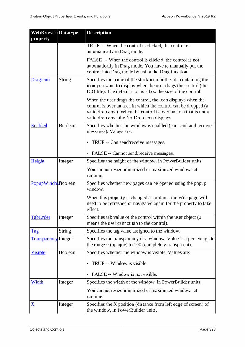
System Object Properties, Events, and Functions Appeon PowerBuilder® 2019 R2
Objects and Controls Page 398
WebBrowserproperty
Datatype Description
TRUE -- When the control is clicked, the control isautomatically in Drag mode.
FALSE -- When the control is clicked, the control is notautomatically in Drag mode. You have to manually put thecontrol into Drag mode by using the Drag function.
DragIcon String Specifies the name of the stock icon or the file containing theicon you want to display when the user drags the control (theICO file). The default icon is a box the size of the control.
When the user drags the control, the icon displays when thecontrol is over an area in which the control can be dropped (avalid drop area). When the control is over an area that is not avalid drop area, the No-Drop icon displays.
Enabled Boolean Specifies whether the window is enabled (can send and receivemessages). Values are:
• TRUE -- Can send/receive messages.
• FALSE -- Cannot send/receive messages.
Height Integer Specifies the height of the window, in PowerBuilder units.
You cannot resize minimized or maximized windows atruntime.
PopupWindowBoolean Specifies whether new pages can be opened using the popupwindow.
When this property is changed at runtime, the Web page willneed to be refreshed or navigated again for the property to takeeffect.
TabOrder Integer Specifies tab value of the control within the user object (0means the user cannot tab to the control).
Tag String Specifies the tag value assigned to the window.
Transparency Integer Specifies the transparency of a window. Value is a percentage inthe range 0 (opaque) to 100 (completely transparent).
Visible Boolean Specifies whether the window is visible. Values are:
• TRUE -- Window is visible.
• FALSE -- Window is not visible.
Width Integer Specifies the width of the window, in PowerBuilder units.
You cannot resize minimized or maximized windows atruntime.
X Integer Specifies the X position (distance from left edge of screen) ofthe window, in PowerBuilder units.

System Object Properties, Events, and Functions Appeon PowerBuilder® 2019 R2
Objects and Controls Page 399
WebBrowserproperty
Datatype Description
The values of the X coordinates in all windows except childwindows are measured from the left side of the screen. In childwindows, they are measured from the left side of the workspaceof the parent window.
The workspace is the area between the sides of the window (notincluding the thickness of the frame, toolbar, or scroll bar, ifany) and the top and bottom of the window (not including thethickness of the border or the title bar, menu bar, toolbar, orscroll bar, if any).
You cannot move a maximized window at runtime.
Y Integer Specifies the Y position (distance from the top of the screen) ofthe window, in PowerBuilder units.
The values of the Y coordinates in all windows except childwindows are measured from the top of the screen. In childwindows, they are measured from the top of the workspace ofthe parent window.
The workspace is the area between the sides of the window (notincluding the thickness of the frame, toolbar, or scroll bar, ifany) and the top and bottom of the window (not including thethickness of the border or the title bar, menu bar, toolbar, orscroll bar, if any).
You cannot move a maximized window at runtime.
2.150.2 Events
Table 2.383:
WebBrowserevent
Occurs
AddressChange When a frame's address changes
Clicked When the user clicks in an unoccupied area of the window (any area withno visible, enabled object).
CertificateError When failed to validate the server certificate.
Constructor Immediately before the Open event occurs in the window
Destructor Immediately after the Close event occurs in the window
DownloadingStart Before a download begins.
DownloadingStateChangedWhen the download status or progress information has been updated
DragDrop When a dragged control is dropped on the window.
DragEnter When a dragged control enters the window.
DragLeave When a dragged control leaves the window.
DragWithin When a dragged control is within the window.

System Object Properties, Events, and Functions Appeon PowerBuilder® 2019 R2
Objects and Controls Page 400
WebBrowserevent
Occurs
GetFocus Just before the control receives focus (before it is selected and becomesactive)
Help When the user presses the F1 key or drags the context help button(question mark) from the title bar to a menu item or control
LoseFocus When the control loses focus (becomes inactive)
NavigationError When the navigation fails or is cancelled
NavigationProgressIndexWhen the overall page loading progress has changed
NavigationStart After a navigation has been committed and before the browser beginsloading contents in the frame
NavigationStateChangedWhen the navigation state changes
Other When a Windows message occurs that is not a PowerBuilder event.
PdfPrintFinished When the process of printing Web page as PDF is completed
RButtonDown When the right mouse button is pressed in an unoccupied area of thewindow (any area with no visible, enabled object).
ResourceRedirect When a resource load is redirected
TitleTextChanged When the page title changes
2.150.3 Functions
Table 2.384:
WebBrowserfunction
Datatypereturned
Description
CancelDownloadInteger Cancels the downloading progress of files.
ClassName String Returns the name assigned to the control.
Drag Integer Starts or ends the dragging of the object.
GetContextServiceInteger Creates a reference to a context-specific instance of thespecified service.
GetParent PowerObject Returns a reference to the name of the parent object.
GetSource String Gets the HTML source code for the current page’ s main frame.
GoBack Integer Goes back from the current page to the last page browsed.
GoForward Integer Jumps from the current page to the next page.
Hide Integer Makes the object invisible.
Move Integer Places the object in a new location specified by the X and Yarguments.
Navigate Integer Browses the specified page.
PauseDownloadInteger Suspends the downloading progress of files.
PointerX Integer Returns the distance of the pointer from the left edge of thecontrol

System Object Properties, Events, and Functions Appeon PowerBuilder® 2019 R2
Objects and Controls Page 401
WebBrowserfunction
Datatypereturned
Description
PointerY Integer Returns the distance of the pointer from the top of the control
PostEvent Boolean Adds an event to the end of the message queue for the control
Print Integer Prints the control
PrintAsPDF Integer Prints the current web page as PDF.
Refresh Integer Refreshes the current page.
Resize Integer Changes the size of the control
ResumeDownloadInteger Resumes the downloading progress of files that were suspended.
SetFocus Integer Sets focus to the control
SetPosition Integer Specifies the position of the control in the front-to-back order ofthe window
SetRedraw Integer Controls automatic redrawing of the control after each change inits Properties
Show Integer Makes the control visible
StopNavigationInteger Stops navigating the source.
TriggerEvent Integer Triggers a specified event in the control and executes the scriptfor the event
TypeOf Object Returns the type of the control
Zoom Integer Scales the current view with the specified zoom ratio.
2.150.4 Properties of Microsoft Web Browser OLE vs. WebBrowser
Table 2.385:
Microsoft Web Browser OLE WebBrowser
Visible Visible
Height Height
Width Width
N/A DefaultUrl
ContextMenu
PopupWindow
Border
BringToTop
Enabled
BorderStyle
TabOrder
Tag
LocationUrl N/A

System Object Properties, Events, and Functions Appeon PowerBuilder® 2019 R2
Objects and Controls Page 402
LocationName
AddressBar
Application
Busy
Container
Document
FullName
FullScreen
HWND
Left
MenuBar
Name
Offline
Parent
Path
ReadyState
RegisterAsBrowser
RegisterAsDropTarget
Resizable
Silent
StatusBar
StatusText
TheaterMode
ToolBar
Top
TopLevelContainer
Type
2.150.5 Events of Microsoft Web Browser OLE vs. WebBrowser
Table 2.386:
Microsoft Web Browser OLE WebBrowser
Constructor Constructor
NavigateError NavigationError
BeforeNavigate2 NavigationStart

System Object Properties, Events, and Functions Appeon PowerBuilder® 2019 R2
Objects and Controls Page 403
StatustextChange (returns the proxy first, andthen the URL etc.)
NavigationStateChanged (returns cangobackand cangoforward)
TitleChange TitleTextChanged
ProgressChange (returns the amount of thecompleted items)
NavigationProgressIndex (returns thepercentage of completion)
DownloadComplete DownloadingStateChanged
N/A AddressChange
ResourceRedirect
PdfPrintFinished
DownloadingStart
DownloadBegin
BeforeScriptExecute
ClientToHostWindow
CommandStateChange
DocumentComplete
FileDownload
NavigateComplete2
NewProcess
NewWindow2
NewWindow3
OnFullScreen
OnMenuBar
OnQuit
OnstatusBar
OnTheaterMode
OnToolBar
OnVisible
PrintTemplateInstantiation
PrintTemplateTeardown
PrivacyImpactedStateChange
PropertyChange
RedirectXDomainBlocked
SetPhishingFilterStatus
SetSecureLockIcon
ThirdPartyUrlBlocked
N/A

System Object Properties, Events, and Functions Appeon PowerBuilder® 2019 R2
Objects and Controls Page 404
UpdatePageStatus
WebWorkerFinsihed
WebWorkerStarted
WindowClosing
WindowSetHeight
WindowSetResizable
WindowSetLeft
WindowSetTop
WindowSetWidth
WindowStateChanged
2.150.6 Functions of Microsoft Web Browser OLE vs. WebBrowser
Table 2.387:
Microsoft Web Browser OLE WebBrowser
Navigate Navigate
GoBack GoBack
GoForward GoForward
Refresh Refresh
(in the right-click popup menu) PrintAsPDF
ProgressChange (via NavigationProgressIndex event)
N/A Zoom
GetSource
PauseDownload
ResumeDownload
CancelDownload
StopNavigation
AddressBar
BeforeNavigate
ClientToWindow
CommandStateChange
DownloadBegin
DownloadComplete
ExecWB
FrameBeforeNavigate
FrameNavigateComplete
N/A

System Object Properties, Events, and Functions Appeon PowerBuilder® 2019 R2
Objects and Controls Page 405
FrameNewWindow
FullScreen
GetProperty
GoHome
GoSearch
Height
Left
MenuBar
NavigateComplete
NewWindow
Offline
PropertyChange
PutProperty
Int QueryStatusWB
Quit
RegisterAsBrowser
RegisterAsDropTarget
Resizable
Silent
ShowBrowserBar
StatusBar
StatusText
StatusTextChange
Stop
TheaterMode
TitleChange
ToolBar
Top
Visible
Width
WindowActivate
WindowMove
WindowResize

System Object Properties, Events, and Functions Appeon PowerBuilder® 2019 R2
Objects and Controls Page 406
2.151 Window control
Windows are the main interface between the user and a PowerBuilder application. Windowscan display information, request information from a user, and respond to the user's mouse orkeyboard actions.
The definition of a window includes properties, events, and functions. The propertiesdetermine the style of the window -- how it looks. The events are actions in the window;when an event is triggered, the associated script is executed. The functions can trigger eventsin the window, manipulate or change the window, or provide information about the window.
Dockable windows are obsolete
Dockable windows become obsolete at the release of PowerBuilder 2019 R2.Obsolete features are no longer eligible for technical support and will no longer beenhanced. Customers who use dockable windows in their applications can choose tocontinue using the feature without support or migrate to normal floating windows.
2.151.1 Properties
Every window has a style that determines how it looks to the user. That style is governed byvalues assigned to the properties of the window.
Table 2.388:
Windowproperty
Datatype Description
AccessibleDescriptionString A description of the control and/or its purpose for use byaccessibility tools such as readers for visually impaired users.
AccessibleNameString A label that briefly describes the control, such as the text in abutton or the name of a menu item.
AccessibleRoleAccessibleRole(enumerated)
Describes what kind of user interface element the control is.
AnimationTimeInteger Specifies how long an animation specified with theOpenAnimation or CloseAnimation property plays. Value is apositive integer in the range 1 to 5000 milliseconds. The defaultis 200 milliseconds.
BackColor Long Specifies the numerical value of the background color of thewindow. Values are -2 to 16,777,215. For more informationabout color, see Section 10.636, “RGB”.
Border Boolean Specifies whether the window has a border. Values are:
• TRUE -- Has a border.
• FALSE -- Does not have a border.
BringToTop Boolean Specifies whether PowerBuilder moves the window to the top ofthe front-to-back order. Values are:
• TRUE -- Moves to the top.

System Object Properties, Events, and Functions Appeon PowerBuilder® 2019 R2
Objects and Controls Page 407
Windowproperty
Datatype Description
• FALSE -- Does not move to the top.
Center Boolean Causes the window to be centered when it is created or sized.Values are:
• TRUE -- Window is centered.
• FALSE -- Window is not centered.
ClassDefinitionPowerObject An object of type PowerObject containing information about theclass definition of the object or control.
ClientEdge Boolean Specifies whether the client area of the window appears sunkenwithin the frame.
• TRUE -- Client area appears sunken.
• FALSE -- Client area does not appear sunken.
CloseAnimationWindowAnimationStyle(enumerated)
Specifies an optional animation effect that displays when thewindow closes.
ColumnsPerPageInteger Specifies the number of columns on a page. The default is 0 (10columns per page). For information, see Scrolling in windowsand user objects.
PowerBuilder multiplies UnitsPerColumn by ColumnsPerPageto determine the number of PowerBuilder units to scroll thewindow horizontally when the user clicks in the scroll bar.
ContextHelp Boolean When WindowType = Response!, this property specifieswhether the small question mark button appears in the title bar.The question mark button can fire the Help event on the controlthat is clicked next.
• TRUE -- Question mark button is displayed in title bar nextto minimize button in Response windows.
• FALSE -- Question mark button is not displayed.
Control[ ] WindowObjectContains the controls in the window. You should not change thecontents of this array in a script.
ControlMenu Boolean Specifies whether the Control Menu box displays in the title bar.Values are:
• TRUE -- Displays in title bar.
• FALSE -- Does not display in title bar.
Enabled Boolean Specifies whether the window is enabled (can send and receivemessages). Values are:
• TRUE -- Can send/receive messages.

System Object Properties, Events, and Functions Appeon PowerBuilder® 2019 R2
Objects and Controls Page 408
Windowproperty
Datatype Description
• FALSE -- Cannot send/receive messages.
Height Integer Specifies the height of the window, in PowerBuilder units.
You cannot resize minimized or maximized windows atruntime.
HScrollBar Boolean Specifies whether a horizontal scroll bar displays in thewindow. Values are:
• TRUE -- A scroll bar displays.
• FALSE -- A scroll bar does not display.
Icon String Specifies a stock icon or an ICO file that displays when thewindow is minimized.
The default value is AppIcon!, which is the icon selected forthe Application object. If no icon is selected for the Applicationobject, the Windows logo is used.
LinesPerPage Integer Specifies the number of lines on a page. The default is 0 (10lines per page). For information, see Scrolling in windows anduser objects.
PowerBuilder multiplies UnitsPerLine by LinesPerPage todetermine the number of PowerBuilder units to scroll thewindow vertically when the user clicks in the scroll bar.
MaxBox Boolean Specifies whether a Maximize Box displays in the title bar.Values are:
• TRUE -- Maximize Box displays.
• FALSE -- Maximize Box does not display.
MenuID Menu Specifies the ID of a menu.
PowerBuilder uses MenuID internally. To change the menufor a window from a script, use the ChangeMenu function; todisplay a pop-up menu, use the PopMenu function. In bothfunctions, enter the fully qualified name to identify the menu orMenu object.
MenuName String Specifies the name of a menu.
PowerBuilder uses MenuName internally. To change the menufor a window from a script, use the ChangeMenu function; todisplay a pop-up menu, use the PopMenu function. In bothfunctions, enter the fully qualified name to identify the menu orMenu object.
MinBox Boolean Specifies whether a Minimize Box displays in the title bar.Values are:

System Object Properties, Events, and Functions Appeon PowerBuilder® 2019 R2
Objects and Controls Page 409
Windowproperty
Datatype Description
• TRUE -- Minimize Box displays.
• FALSE -- Minimize Box does not display.
OpenAnimationWindowAnimationStyle(enumerated)
Specifies an optional animation effect that displays when thewindow opens.
PaletteWindowBoolean When WindowType = Popup!, this property specifies thatthe window has an appearance appropriate for small palettewindows that display over the application.
• TRUE -- Pop-up window displays as the topmost windowwith a smaller Close button in the title bar and no Minimizeor Maximize buttons.
• FALSE -- No change in appearance.
Pointer String Specifies the name of the file containing the pointer that is usedfor the window.
Resizable Boolean Specifies whether the window is resizable. Values are:
• TRUE -- Window is resizable.
• FALSE -- Window is not resizable.
RightToLeft Boolean Specifies that characters should be displayed in right-to-leftorder. The application must be running on an operating systemthat supports right-to-left display. Values are:
• TRUE -- Characters display in right-to-left order.
• FALSE -- Characters display in left-to-right order.
Tag String Specifies the tag value assigned to the window.
Tabs Enumerated Properties for the shapes of the tabs:
• windowdocktabslanted!
• windowdocktabrectangular!
• windowdocktabsingleslanted!
Location of the close button on a tab, if any:
• windowdocktabclosebuttonnone!
• windowdocktabclosebuttononactive!
• windowdocktabclosebuttonshared!
Colors of tabs:

System Object Properties, Events, and Functions Appeon PowerBuilder® 2019 R2
Objects and Controls Page 410
Windowproperty
Datatype Description
• gradients are available
• default to theme colors is available
Icon and Scroll Button for tabbed windows or documents:
• TabbedWindowTabIcon / TabbedDocumentTabIcon
• TabbedWindowTabScroll / TabbedDocumentTabScroll
TabbedWindow andDocumentTitle Bars
Enumerated Colors of tabbed window and document title bars:
• TabbedWindowActiveTabBackColor /TabbedDocumentActiveTabBackColor
• TabbedWindowActiveTabGradientBackColor /TabbedDocumentActiveTabGradientBackColor
• TabbedWindowActiveTabTextColor /TabbedDocumentActiveTabTextColor
• TabbedWindowInActiveTabBackColor /TabbedDocumentInActiveTabBackColor
• TabbedWindowInActiveTabGradientBackColor /TabbedDocumentInActiveTabGradientBackColor
• TabbedWindowInActiveTabTextColor /TabbedDocumentInActiveTabTextColor
• TabbedWindowMouseoverTabBackColor /TabbedDocumentMouseoverTabBackColor
• TabbedWindowMouseoverTabGradientBackColor /TabbedDocumentMouseoverTabGradientBackColor
• TabbedWindowMouseoverTabTextColor /TabbedDocumentMouseoverTabTextColor
• TabbedWindowTabsAreaColor /TabbedDocumentTabsAreaColor
• TabbedWindowTabsAreaGradientColor /TabbedDocumentTabsAreaGradientColor
• TabbedWindowTabsAreaGradientVert /TabbedDocumentTabsAreaGradientVert
Title bar states:

System Object Properties, Events, and Functions Appeon PowerBuilder® 2019 R2
Objects and Controls Page 411
Windowproperty
Datatype Description
• TitleBarActiveColor / TitleBarInActiveColor
• TitleBarActiveGradientColor /TitleBarInActiveGradientColor
• TitleBarActiveGradientVert / TitleBarInActiveGradientVert
• TitleBarActiveaTextColor / TitleBarInActiveTextColor
Title String Specifies the text of the window title.
TitleBar Boolean Specifies whether a title bar displays. Values are:
• TRUE -- Title bar displays.
• FALSE -- No title bar displays.
The user can move a window only if it has a title bar.
ToolbarAlignmentToolbarAlignment(enumerated)
In an MDI frame window, specifies where the toolbar displays.Values are:
• AlignAtBottom!
• AlignAtLeft!
• AlignAtRight!
• AlignAtTop!
• Floating!
ToolbarHeightInteger In an MDI frame window, specifies the height of the toolbarwhen it is a floating toolbar.
ToolbarVisibleBoolean In an MDI frame window, specifies whether the toolbardisplays. Values are:
• TRUE -- Toolbar displays.
• FALSE -- Toolbar does not display.
ToolbarWidthInteger In an MDI frame window, specifies the width of the toolbarwhen it is a floating toolbar.
ToolbarX Integer In an MDI frame window, specifies the X coordinate (distancefrom the left edge of the window, in PowerBuilder units) of thetoolbar when it is a floating toolbar.
ToolbarY Integer In an MDI frame window, specifies the Y coordinate (distancefrom the top of the window, in PowerBuilder units) of thetoolbar when it is a floating toolbar.

System Object Properties, Events, and Functions Appeon PowerBuilder® 2019 R2
Objects and Controls Page 412
Windowproperty
Datatype Description
Transparency Integer Specifies the transparency of a window. Value is a percentage inthe range 0 (opaque) to 100 (completely transparent).
UnitsPerColumnInteger Specifies the number of PowerBuilder units to be scrolled rightor left when a user clicks the left or right arrow in the horizontalscroll bar in a window or user object. The default is 0 (1/100 ofthe width of the window).
To make the end of the scroll bar match the content,UnitsPerLine must be set according to the content width. Forinformation, see Scrolling in windows and user objects.
PowerBuilder multiplies UnitsPerColumn by ColumnsPerPageto determine the number of PowerBuilder units to scroll thewindow horizontally when the user clicks in the scroll bar.
UnitsPerLine Integer Specifies the number of PowerBuilder units to be scrolled up ordown when a user clicks the up or down arrow in the verticalscroll bar in a window or user object. The default is 0 (1/100 ofthe window height).
To make the end of the scroll bar match the content,UnitsPerLine must be set according to the content length. Forinformation, see Scrolling in windows and user objects.
PowerBuilder multiplies UnitsPerLine by LinesPerPage todetermine the number of PowerBuilder units to scroll thewindow vertically when the user clicks in the scroll bar.
Visible Boolean Specifies whether the window is visible. Values are:
• TRUE -- Window is visible.
• FALSE -- Window is not visible.
VScrollBar Boolean Specifies whether a vertical scroll bar displays. Values are:
• TRUE -- Scroll bar displays.
• FALSE -- Scroll bar does not display.
Width Integer Specifies the width of the window, in PowerBuilder units.
You cannot resize minimized or maximized windows atruntime.
WindowDockOptionsWindowDockOptions(enumerated)
WindowDockOptions are for child windows to specify howthey can be opened:
• WindowDockOptionAll!
• WindowDockOptionTabbedDocumentOnly!
• WindowDockOptionDockedOnly!

System Object Properties, Events, and Functions Appeon PowerBuilder® 2019 R2
Objects and Controls Page 413
Windowproperty
Datatype Description
• WindowDockOptionFloatOnly!
• WindowDockOptionTabbedDocumentAndDockedOnly!
• WindowDockOptionTabbedDocumentAndFloatOnly!
• WindowDockOptionDockedAndFloatOnly!
WindowDockStateWindowDockState(enumerated)
Specifies the docking behaviors for the sheets that open in theMDI (multiple document interface) frame window. Values are:
• WindowDockStateDocked!
• WindowDockStateFloating!
• WindowDockStateTabbedDocument!
• WindowDockStateTabbedWindow!
WindowState WindowState(enumerated)
Specifies the state in which you want to run a window. Valuesare:
• Maximized!
• Minimized!
• Normal!
Do not change the WindowState property in the Open event of awindow opened as a sheet.
WindowType WindowType(enumerated)
Specifies the type of window. Values are:
• Child!
• Main!
• MDI!
• MDIHelp!
• MDIDock!
• MDIDockHelp!
• Popup!
• Response!
X Integer Specifies the X position (distance from left edge of screen) ofthe window, in PowerBuilder units.

System Object Properties, Events, and Functions Appeon PowerBuilder® 2019 R2
Objects and Controls Page 414
Windowproperty
Datatype Description
The values of the X coordinates in all windows except childwindows are measured from the left side of the screen. In childwindows, they are measured from the left side of the workspaceof the parent window.
The workspace is the area between the sides of the window (notincluding the thickness of the frame, toolbar, or scroll bar, ifany) and the top and bottom of the window (not including thethickness of the border or the title bar, menu bar, toolbar, orscroll bar, if any).
You cannot move a maximized window at runtime.
Y Integer Specifies the Y position (distance from the top of the screen) ofthe window, in PowerBuilder units.
The values of the Y coordinates in all windows except childwindows are measured from the top of the screen. In childwindows, they are measured from the top of the workspace ofthe parent window.
The workspace is the area between the sides of the window (notincluding the thickness of the frame, toolbar, or scroll bar, ifany) and the top and bottom of the window (not including thethickness of the border or the title bar, menu bar, toolbar, orscroll bar, if any).
You cannot move a maximized window at runtime.
2.151.2 Events
Scripts for events in a window and the controls in the window determine how the windowbehaves. Scripts control the action that is initiated when an event occurs within the window.
Table 2.389:
Window event Occurs
Activate Just before the window becomes active. When an Activate event occurs,the first object in the tab order for the window gets focus. If there are noenabled objects in the window, the window gets focus.
Clicked When the user clicks in an unoccupied area of the window (any area withno visible, enabled object).
Close When the window is closed.
CloseQuery When you remove a window from display (close it). When you close awindow, PowerBuilder triggers the CloseQuery event and then inspectsthe value of Message.ReturnValue. If the Message.ReturnValue is 1, thewindow cannot be closed.
Closing any window causes PowerBuilder to close all child and pop-up windows that it opened, and closing an MDI Frame window causes

System Object Properties, Events, and Functions Appeon PowerBuilder® 2019 R2
Objects and Controls Page 415
Window event OccursPowerBuilder to close all sheet windows within it. Any window thusclosed can set Message.ReturnValue to cancel the close operation.
Deactivate When the window becomes inactive.
DoubleClicked When the user double-clicks in an unoccupied area of the window (anyarea with no visible, enabled object).
DragDrop When a dragged control is dropped on the window.
DragEnter When a dragged control enters the window.
DragLeave When a dragged control leaves the window.
DragWithin When a dragged control is within the window.
Help When the user presses the F1 key or drags the context help button(question mark) from the title bar to a menu item or control.
Hide Just before the window is hidden.
HotLinkAlarm After a Dynamic Data Exchange (DDE) server application has sent new(changed) data and the client DDE application has received it.
Key When the user presses a key and the insertion point is not in aRichTextEdit or DataWindow edit control.
MouseDown When the user presses the left mouse button in an unoccupied area of thewindow (any area with no visible, enabled object).
MouseMove When the pointer is moved within the window.
MouseUp When the user releases the left mouse button in an unoccupied area of thewindow (any area with no visible, enabled object).
Open When a script executes the Open function for a window. The eventoccurs after the window has been opened but before it is displayed.
Other When a Windows message occurs that is not a PowerBuilder event.
RButtonDown When the right mouse button is pressed in an unoccupied area of thewindow (any area with no visible, enabled object).
RemoteExec When a DDE client application has sent a command.
RemoteHotLinkStartWhen a DDE client application wants to start a hot link.
RemoteHotLinkStopWhen a DDE client application wants to end a hot link.
RemoteRequest When a DDE client application requests data.
RemoteSend When a DDE client application has sent data.
Resize When the user or a script opens or resizes a window.
Show When a script executes the Show function for this window. The eventoccurs just before the window is displayed.
SystemKey When the user presses Alt or Alt plus another key, except when theinsertion point is in a DataWindow control or RichTextEdit control.
Timer When a specified number of seconds elapses after the Timer function hasbeen called.
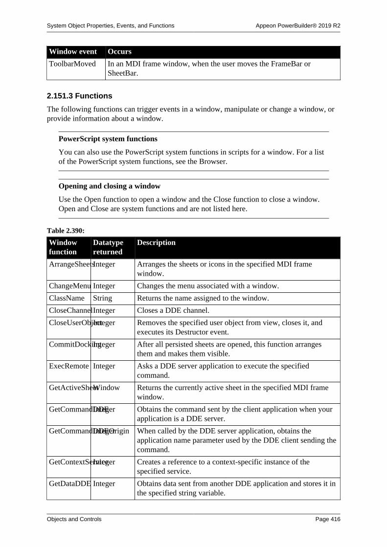
System Object Properties, Events, and Functions Appeon PowerBuilder® 2019 R2
Objects and Controls Page 416
Window event Occurs
ToolbarMoved In an MDI frame window, when the user moves the FrameBar orSheetBar.
2.151.3 Functions
The following functions can trigger events in a window, manipulate or change a window, orprovide information about a window.
PowerScript system functions
You can also use the PowerScript system functions in scripts for a window. For a listof the PowerScript system functions, see the Browser.
Opening and closing a window
Use the Open function to open a window and the Close function to close a window.Open and Close are system functions and are not listed here.
Table 2.390:
Windowfunction
Datatypereturned
Description
ArrangeSheetsInteger Arranges the sheets or icons in the specified MDI framewindow.
ChangeMenu Integer Changes the menu associated with a window.
ClassName String Returns the name assigned to the window.
CloseChannelInteger Closes a DDE channel.
CloseUserObjectInteger Removes the specified user object from view, closes it, andexecutes its Destructor event.
CommitDockingInteger After all persisted sheets are opened, this function arrangesthem and makes them visible.
ExecRemote Integer Asks a DDE server application to execute the specifiedcommand.
GetActiveSheetWindow Returns the currently active sheet in the specified MDI framewindow.
GetCommandDDEInteger Obtains the command sent by the client application when yourapplication is a DDE server.
GetCommandDDEOriginInteger When called by the DDE server application, obtains theapplication name parameter used by the DDE client sending thecommand.
GetContextServiceInteger Creates a reference to a context-specific instance of thespecified service.
GetDataDDE Integer Obtains data sent from another DDE application and stores it inthe specified string variable.

System Object Properties, Events, and Functions Appeon PowerBuilder® 2019 R2
Objects and Controls Page 417
Windowfunction
Datatypereturned
Description
GetDataDDEOriginInteger Determines the origin of data from a hot-linked DDE serverapplication or a DDE client application and, if successful, storesthe application's DDE identifiers in the specified strings.
GetFirstSheet Window Returns the top sheet in the MDI frame.
GetNextSheetWindow Returns the sheet that is behind the specified sheet in the MDIframe.
GetParent PowerObject Returns a reference to the name of the parent object.
GetRemote Integer Asks a DDE server application to provide data and stores thatdata in the specified variable.
GetToolbar Integer Gets the values of the Visible, Alignment, and Title propertiesof the toolbar.
GetToolbarPosInteger Gets position information (coordinates) for a floating toolbar.
Hide Integer Makes the window invisible.
LoadDockingStateInteger Loads two arrays of equal size: type names of persisted sheetsand the corresponding IDs.
Move Integer Places the window in a new location specified by the X and Yarguments.
The Move function does not move a maximized or minimizedwindow.
OpenChannel Long Opens a channel to a DDE server application.
OpenSheet Integer Opens a sheet within an MDI (multiple document interface)frame window and creates a menu item for selecting the sheeton the specified menu.
OpenSheetAsDocumentInteger Opens a sheet as a document within an MDI frame window fordockable windows.
OpenSheetDockedInteger Opens a sheet docked in a specified position within an MDIframe window for dockable windows.
OpenSheetFromDockingStateInteger Opens one or more persisted sheets within an MDI framewindow for dockable windows.
OpenSheetInTabGroupInteger Opens a sheet in a tab group within an MDI frame window fordockable windows.
OpenSheetWithParmInteger Opens a sheet within an MDI (multiple document interface)frame window and creates a menu item for selecting the sheeton the specified menu, as OpenSheet does and also stores aparameter in the system's Message object.
OpenSheetWithParmAsDocumentInteger Opens a sheet as a document within an MDI frame windowfor dockable windows and stores a parameter in the system'sMessage object.

System Object Properties, Events, and Functions Appeon PowerBuilder® 2019 R2
Objects and Controls Page 418
Windowfunction
Datatypereturned
Description
OpenSheetWithParmDockedInteger Opens a sheet docked in a specified position within an MDIframe window for dockable windows and stores a parameter inthe system's Message object .
OpenSheetWithParmFromDockingStateInteger Opens one or more persisted sheets within an MDI framewindow for dockable windows and stores a parameter in thesystem's Message object.
OpenSheetWithParmInTabGroupInteger Opens a sheet in a tab group within an MDI frame windowfor dockable windows and stores a parameter in the system'sMessage object.
OpenUserObjectInteger Displays the specified user object, making its propertiesavailable to scripts.
OpenUserObjectWithParmInteger Displays the specified user object, making its propertiesavailable to scripts, and stores a parameter in the system'sMessage object.
ParentWindowWindow Returns the parent window of the window.
PointerX Integer Returns the distance from the left edge of the screen to thepointer.
PointerY Integer Returns the distance from the top of the screen to the pointer.
PostEvent Boolean Adds an event to the end of the message queue for the window.
Print Integer Prints the window.
Resize Integer Changes the size of the window to the size specified in thewidth and height arguments.
The Resize function does not resize a minimized or maximizedwindow.
RespondRemoteInteger Sends a DDE message indicating whether the command or datareceived from a remote DDE application was acceptable.
SaveDockingStateInteger Stores the MDI state in the registry.
SetDataDDE Integer Sends data to a DDE client application when PowerBuilder isacting as a DDE server.
SetFocus Integer Sets focus to the specified window.
SetMicroHelpInteger Sets the MicroHelp text in the specified MDI frame window.
SetPosition Integer Specifies the position of the window in the front-to-back orderof the application.
SetRedraw Integer Turns on or off automatic redrawing of the window after everychange.
SetRemote Integer Asks a DDE server application to accept data and store it in thespecified location.
SetSheetID Integer Sets the unique identifier for an open sheet.

System Object Properties, Events, and Functions Appeon PowerBuilder® 2019 R2
Objects and Controls Page 419
Windowfunction
Datatypereturned
Description
SetToolbar Integer Sets the values of the Visible, Alignment, and Title properties ofthe toolbar.
SetToolbarPosInteger Sets the position of a fixed toolbar.
Show Integer Makes the window visible.
StartHotLink Integer Establishes a hot link with a DDE server application so thatPowerBuilder is notified immediately of any changes in thespecified data.
StartServerDDEInteger Establishes your application as a DDE server.
StopHotLink Integer Terminates a hot link with a DDE server application.
StopServerDDEInteger Causes your application to stop acting as a DDE serverapplication.
TriggerEvent Integer Sends an event to a window control and executes the scriptassociated with the event.
TypeOf Object Returns the type of the window.
WorkSpaceHeightInteger Returns the height of the workspace of the specified window.
The workspace is the area between the sides of the window (notincluding the thickness of the frame, toolbar, or scroll bar, ifany) and the top and bottom of the window (not including thethickness of the border or the title bar, menu bar, toolbar, orscroll bar, if any).
WorkSpaceWidthInteger Returns the width of the workspace of the specified window.
WorkSpaceX Integer Returns the distance from the left edge of the screen to the leftedge of the workspace of the specified window.
WorkSpaceY Integer Returns the distance from the top of the screen to the top of theworkspace of the specified window.
2.152 WSConnection object (Obsolete)
The WSConnection object lets you set user-related, session-related, and authenticationinformation when you connect to and process data from a Web service data source.
2.152.1 Properties
Table 2.391:
WSConnectionproperty
Datatype Description
AuthenticationModeString Specifies the authentication mode you want to use. This canbe "basic" or "digest". These AuthenticationMode valuesare described on the Microsoft MSDN Web site at http://msdn.microsoft.com/en-us/library/aa833874(VS.80).aspx.

System Object Properties, Events, and Functions Appeon PowerBuilder® 2019 R2
Objects and Controls Page 420
WSConnectionproperty
Datatype Description
ClassDefinitionPowerObject An object of type PowerObject containing information about theclass definition of the object or control.
ClientCertificateFileString The name of the certificate file or files you want to use toconnect to a Web service. The string value could include localfiles with a full path and URLs to remote certificate files. Youmust use a semicolon as a separator for multiple files.
Endpoint String Specifies a URL for the remote Web Service and tells the WebService engine where the Web service resides. If the endpointis not set, the Web Service engine uses the default endpointembedded in the WSDL file.
Password String Specifies the password of the user who will consume the Webservice.
ProxyServerHostNameString Specifies the name of the proxy server host if the client machineis behind a firewall.
ProxyServerPasswordString Specifies a password for the current user if a proxy serverrequests a user name and password. If the client machine isdirectly connected to the Internet, this property does not need tobe set.
ProxyServerPortUInteger Specifies the port number of a proxy server if the client machineis behind a firewall.
ProxyServerUserNameString Specifies the user name for a proxy server if the client machineis behind a firewall. If the client machine is directly connectedto the Internet, this property does not need to be set.
Timeout Long Specifies the timeout period in seconds when invoking the Webservice. The default value is 0, which does not set a timeoutperiod for the Web service connection on the client side. (TheWeb service might still have a timeout value on the server side.)
UserDomain String Specifies the domain the user is working in. This property isused together with UserName and Password properties for afully qualified user identification.
UserName String Specifies the name of the user who will consume the Webservice.
UseWindowsIntegratedAuthenticationBoolean Specifies whether the connection object uses integratedWindows authentication. Values are:
TRUE -- The application uses Windows authentication.
FALSE -- The application does not use Windowsauthentication.
If this option is set to true, you do not need to set the UserName,Password, or UserDomain properties.

System Object Properties, Events, and Functions Appeon PowerBuilder® 2019 R2
Objects and Controls Page 421
2.152.2 Events
Table 2.392:
WSConnectionevent
Occurs
Constructor Immediately before the Open event occurs in the window
Destructor Immediately after the Close event occurs in the window
2.152.3 Functions
Table 2.393:
WSConnectionfunction
Datatypereturned
Description
ClassName String Returns the name assigned to the control
GetContextServiceInteger Creates a reference to a context-specific instance of thespecified service
GetParent PowerObject Returns a reference to the name of the parent object
PostEvent Boolean Adds an event to the end of the message queue for control
TriggerEvent Integer Triggers a specified event in the control and executes the scriptfor the event
TypeOf Object Returns the type of the control

Property Descriptions and Usage Appeon PowerBuilder® 2019 R2
Objects and Controls Page 422
3 Property Descriptions and UsageAbout this chapter
This chapter lists the properties for PowerBuilder controls. For properties specific to controlsin DataWindow objects, see Section 3.2, “Controls in a DataWindow and their properties”.
Contents
The properties are listed alphabetically.
3.1 AcceleratorApplies to
Controls that accept user input, including list boxes, MultiLineEdit, SingleLineEdit,ListView, EditMask, and TreeView
Description
Accelerator keys allow users to select an item (that is, change focus) with a keystroke ratherthan the mouse. An underlined character in the item's name or label tells the user whatkey to press. The user presses it in combination with the Alt key. If the currently selectedcontrol is not an editable control (such as a SingleLineEdit, MultiLineEdit, ListBox, orDropDownListBox), you need only press the accelerator key.
Accelerator keys are different from shortcut keys, which are defined key combinations thatprovide a quick way to accomplish certain tasks.
Table 3.1:
PowerBuilder term Windows term
accelerator key mnemonic access character
shortcut key shortcut key or accelerator key
Usage
In a painter
To select a character as an accelerator key
• Type the character into the Accelerator box on the General page of the control'sProperties view.
For example, to set m as the accelerator, type m in the box.
Accelerators for unlabeled controls
To show the user what accelerator key to use for an unlabeled control or box, defineStaticText to act as a label. Include an ampersand (&) before the character you wantunderlined. For example, in the StaticText control's General page, set the Text property toa value like Edit &Maintenance Data for a drop-down list that has m as an accelerator key.If you want an ampersand to display in the text, type two ampersands, and if you want anampersand to display and serve as the accelerator key, type three ampersands.
In scripts

Property Descriptions and Usage Appeon PowerBuilder® 2019 R2
Objects and Controls Page 423
The Accelerator property is an integer consisting of the ASCII value of the accelerator key.Both of the following lines set m as the accelerator character for a MultiLineEdit control:
mle_1.Accelerator=77mle_1.Accelerator = ASC("M")
3.2 AccessibleDescriptionApplies to
Windows and controls that inherit from DragObject
Description
A description of the control and/or its purpose for use by accessibility tools such as readersfor visually impaired users. You do not need to supply a description if the AccessibleNameand AccessibleRole properties adequately describe the control, as in the case of a button withthe label OK. You should provide a description for a picture or report control.
Usage
In a painter
On the Other page in the Properties view, type a description in the AccessibleDescription textbox.
In a script
The Accessible Description property takes a string value. The following statement sets theAccessibleDescription property for a command button in a Window:
cb_1.accessibledescription = "Deletes selected text"
3.3 AccessibleNameApplies to
Windows and controls that inherit from DragObject
Description
A label that briefly describes the control, such as the text in a button or the name of a menuitem, for use by accessibility tools such as readers for visually impaired users.
Usage
In a painter
On the Other page in the Properties view, type a name in the AccessibleName text box.
In a script
The AccessibleName property takes a string value. The following statement sets theAccessibleName property for a command button in a Window:
cb_1.accessiblename = "Delete"
3.4 AccessibleRoleApplies to
Windows and controls that inherit from DragObject
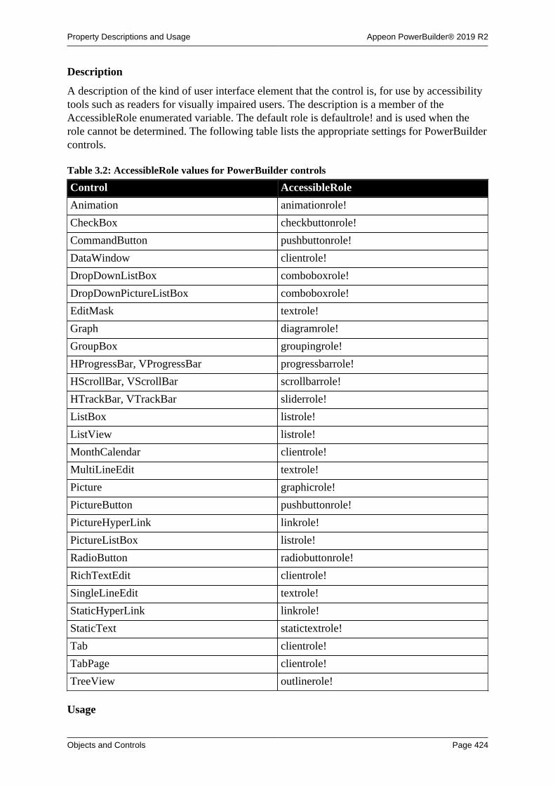
Property Descriptions and Usage Appeon PowerBuilder® 2019 R2
Objects and Controls Page 424
Description
A description of the kind of user interface element that the control is, for use by accessibilitytools such as readers for visually impaired users. The description is a member of theAccessibleRole enumerated variable. The default role is defaultrole! and is used when therole cannot be determined. The following table lists the appropriate settings for PowerBuildercontrols.
Table 3.2: AccessibleRole values for PowerBuilder controls
Control AccessibleRole
Animation animationrole!
CheckBox checkbuttonrole!
CommandButton pushbuttonrole!
DataWindow clientrole!
DropDownListBox comboboxrole!
DropDownPictureListBox comboboxrole!
EditMask textrole!
Graph diagramrole!
GroupBox groupingrole!
HProgressBar, VProgressBar progressbarrole!
HScrollBar, VScrollBar scrollbarrole!
HTrackBar, VTrackBar sliderrole!
ListBox listrole!
ListView listrole!
MonthCalendar clientrole!
MultiLineEdit textrole!
Picture graphicrole!
PictureButton pushbuttonrole!
PictureHyperLink linkrole!
PictureListBox listrole!
RadioButton radiobuttonrole!
RichTextEdit clientrole!
SingleLineEdit textrole!
StaticHyperLink linkrole!
StaticText statictextrole!
Tab clientrole!
TabPage clientrole!
TreeView outlinerole!
Usage

Property Descriptions and Usage Appeon PowerBuilder® 2019 R2
Objects and Controls Page 425
In a painter
On the Other page in the Properties view, select a role from the AccessibleRole drop-downlist.
In a script
The AccessibleRole property takes a value of the AccessibleRole enumerated variable. Thefollowing statement sets the AccessibleRole property for a command button in a Window:
cb_1.accessiblerole = pushbuttonrole!
3.5 Activation
Applies to
OLE controls
Description
Specifies how the user activates the control. Choices are:
• Double Click
When the user double-clicks on the control, the server application is activated.
• Get Focus
When the user clicks or tabs to the control, the server is activated. If you also write a scriptfor the GetFocus event, do not call MessageBox or any function that results in a change infocus.
• Manual
The control can be activated programmatically only with the Activate function.
During development, you activate the object in the Window painter.
Usage
In a painter
To specify how the object is activated:
• Select the desired setting from the Activation drop-down list on the General page of thecontrol's Properties view.
The control can always be activated programmatically, regardless of the Activationsetting.
In scripts
The Activation property takes a value of the omActivation enumerated datatype.
This example changes the Activation property type to ActivateOnGetFocus! for the objectole_1:
ole_1.Activation = ActivateOnGetFocus!

Property Descriptions and Usage Appeon PowerBuilder® 2019 R2
Objects and Controls Page 426
3.6 AdditionalOpts
Applies to
MLSynchronization and MLSync objects
Description
Specifies a command line option or a list of command line options for thedbmlsync synchronization command.
For information about available command line options, you can click the Usage buttonnext to the Additional Options text box on the MobiLink Client Additional Options page ofthe MobiLink wizard, or you could open the chapter on synchronization parameters in theMobiLink Clients book.
Usage
In a painter
To specify additional command line options
• On the Settings page of the object's Properties view, type the options you want in theAdditional Options text box.
In scripts
You can include a string with multiple options to be added to a synchronization call.
For example, the following line sets log file verbosity for all messages except connectioninformation and the MobiLink password (-v+), allows you to run in a minimized window (-q), and closes the window on completion of synchronization (-k option):
mySync_1.AdditionalOpts = '-v+ -q -k'
3.7 Alignment
Applies to
Controls that display text
Description
For most controls that display text, the alignment property specifies the alignment of all thetext in the control. Text can be centered, left aligned, or right aligned.
For RichTextEdit controls, each paragraph has its own alignment setting, including Center,Left, Right, and Justify.
Usage
In a painter
To specify text alignment for controls other than RichTextEdit:
• On the General page of the control's Properties view, select an alignment from theAlignment drop-down list, or click the Left, Center, and Right alignment buttons in theStyleBar. Use the StyleBar to set the alignment for several selected objects at once.

Property Descriptions and Usage Appeon PowerBuilder® 2019 R2
Objects and Controls Page 427
To align text in paragraphs in RichTextEdit controls:
1. Select text in the paragraphs to be aligned.
2. Right-click on the selection to display the text object's property sheet, and select thealignment setting.
To allow alignment at runtime (RichTextEdit only):
• On the Document tab page of the control's Properties view, check either the Toolbar orthe PopMenu check box.
At runtime, users select the text to align with the mouse and then right-click on the textto invoke a pop-up menu, or select an alignment button on the StyleBar.
In scripts
The datatype of the Alignment property is the Alignment enumerated datatype. It has fourvalues: Center!, Left!, and Right! apply to all controls with text; Justify! applies only toRichTextEdit controls.
For example, the following line specifies center alignment for a MultiLineEdit control:
mle_1.Alignment = Center!
3.8 AllowEditApplies to
DropDownListBox, DropDownPictureListBox, DatePicker, and RibbonComboBoxItemcontrols
Description
When AllowEdit is enabled in a drop-down list, the user can edit the selection in the text boxof the control. If AllowEdit is not enabled, the user can only make a selection from the listand cannot edit the selection.
In a DatePicker control, the user can modify the date in the control by picking a date fromthe drop-down calendar or by modifying the selected part of the date (year, month, or day)in the control if the format of the part is numeric. When AllowEdit is enabled, pressing F2 orplacing the cursor in the control selects all the text in the control for editing. When the controlloses focus, the text in the control reverts to its original value and the UserString event isfired. In the UserString event script, you can parse the string entered by the user and changethe value in the control if the string passes validation.
To change the date by modifying one part of the date at a time when AllowEdit is enabled,the user can tab into the control and use the arrow keys to move between parts of the date.
When a part of the date is changed, the change is retained if it is valid. If the user enters ayear, month, or day that is out of the range specified for the control, that value reverts to itsprevious value. If the user enters a day that is greater than the number of days in the month inthe control, or a month greater than 12, the second digit entered is retained in the control.
Usage
In a painter

Property Descriptions and Usage Appeon PowerBuilder® 2019 R2
Objects and Controls Page 428
To allow editing:
• On the General page of the control's Properties view, select the AllowEdit check box.
In scripts
The AllowEdit property takes a boolean value.
This example sets AllowEdit for a DropDownListBox:
ddlb_1.AllowEdit = TRUE
3.9 AnimationNameApplies to
Animation controls
Description
Specifies the name of the AVI file that contains the animation to be associated with theAnimation control. The AVI file must be an uncompressed file or a file compressed usingrun-length encoding (BI_RLE8). You cannot use an AVI file that has a sound channel; it willnot display in the control.
Usage
In a painter
To specify an AVI file for the control:
• Click the browse (...) button next to the AnimationName field to select a file.
In scripts
The AutoPlay property takes a string value. The following line sets the AnimationNameproperty for a control called am_1:
am_1.AnimationName = "C:\work\avifiles\Search.AVI"
3.10 AnimationTimeApplies to
Window controls
Description
Specifies the time in milliseconds that an opening or closing animation effect associated witha window takes to complete.
Usage
Use the AnimationTime property to control the number of milliseconds an opening or closinganimation takes to execute. The value must be a positive integer in the range 1 to 5000milliseconds. The default value is 200 milliseconds. While an opening or closing animationexecutes, the application waits for it to complete, so in general you should keep the animationtime short.
In a painter
Property Descriptions and Usage Appeon PowerBuilder® 2019 R2
Objects and Controls Page 429
To set the AnimationTime property on a window:
• Select or type a value in the AnimationTime spin control on the General page of thewindow's Properties view.
In scripts
The following statement sets the AnimationTime property for the w_splash window to 500milliseconds:
w_splash.AnimationTime = 300
See also
CloseAnimation
OpenAnimation
3.11 AuthenticateParms
Applies to
MLSync and SyncParm objects
Description
Specifies a comma-separated list of authentication parameters for the remote databaseconnection to the MobiLink synchronization server. If you set the AuthenticateParmsproperty on an MLSync object, or if you call SetParm after setting the AuthenticateParmsproperty on a SyncParm object, PowerBuilder inserts a -ap option with theAuthenticateParms value in the MLSync object's subsequent Synchronize call.
Usage
At design time, you can enter AuthenticateParms values on the General tab of the Propertiesview for an MLSync object. At runtime, application users can enter AuthenticateParmsvalues on the Subscriptions tab page of the default synchronization options window generatedby the MobiLink wizard.
In scripts
You can modify AuthenticateParms values in PowerScript directly on the synchronizationobject or indirectly, by setting it on the SyncParms object before calling SetParm.
SyncParms ParmsMLSync mySynclong rcmySync = CREATE MLSyncParms.MLUser = '50'Parms.MLPass = 'xyz123'Parms.AuthenticateParams = 'param1, param2, param3'mySync.SetParm(Parms) rc = mySync.Synchronize()
3.12 AutoArrange
Applies to
ListView controls

Property Descriptions and Usage Appeon PowerBuilder® 2019 R2
Objects and Controls Page 430
Description
When AutoArrange is enabled, PowerBuilder arranges icons automatically in large and smallicon views.
Usage
In a painter
To enable automatic icon arrangement:
• Select the AutoArrange check box on the General page of the ListView control'sProperties view.
In scripts
The AutoArrange property takes a boolean value. The following line specifies automaticarrangement of icons in a ListView.
lv_1.AutoArrange = TRUE
3.13 AutoHScrollApplies to
DropDownListBox, DropDownPictureListBox, EditMask, MultiLineEdit, SingleLineEdit,RibbonComboBoxItem controls
Description
When automatic horizontal scrolling is enabled, text in the control scrolls left or rightautomatically when the user enters or deletes data. When automatic horizontal scrolling is notenabled, text does not scroll left or right as the user changes data, and data that exceeds thewidth of the line provided is ignored.
Usage
In a painter
To enable automatic horizontal scrolling:
• Select the AutoHScroll check box on the General page of the object's Properties view.
In scripts
The AutoHScroll property takes a boolean value.
For example, this statement enables automatic right and left scrolling as the user enters ormodifies data in the edit box of a DropDownListBox control:
ddlb_1.AutoHScroll = TRUE
This property cannot be set at runtime for EditMask controls.
3.14 AutomaticApplies to
CheckBox and RadioButton controls

Property Descriptions and Usage Appeon PowerBuilder® 2019 R2
Objects and Controls Page 431
Description
When the Automatic property is enabled, the state of the control changes automatically whenthe user selects it. Typically, the state toggles between selected and not selected. For checkboxes, if the ThreeState property has been enabled, the state of the control also toggles to athird state.
When this property is enabled, a mark is displayed in the control when the control's state isselected and no mark is displayed when the control's state is not selected. For check boxes, ifthe ThreeState property is enabled, a grayed out mark is displayed for the third state.
Usage
In a painter
To enable automatic state change:
• Select the Automatic check box on the General page of the control's Properties view.
In scripts
The Automatic property takes a boolean value. This example sets a CheckBox so that its statechanges each time it is selected.
cbx_1.Automatic = TRUE
3.15 AutoPlayApplies to
Animation controls
Description
When the AutoPlay property is enabled, the AVI clip starts playing as soon as the animationcontrol is opened.
Usage
In a painter
To start the animation automatically:
• Select the Autoplay check box on the General page of the control's Properties view.
In scripts
The AutoPlay property takes a boolean value. The following line sets the AutoPlay propertyto true:
am_1.AutoPlay = TRUE
3.16 AutoReadDataApplies to
HTTPClient objects
Description

Property Descriptions and Usage Appeon PowerBuilder® 2019 R2
Objects and Controls Page 432
When the AutoReadData property is enabled, the program reads the response bodyautomatically. Values are:
TRUE – (Default) The program reads the response body automatically.
FALSE – The program will not read the response body automatically.
Usage
In a painter
To read the response body automatically:
• Select the AutoReadData check box on the General page of the object's Properties view.
In scripts
The AutoReadData property takes a boolean value.
Integer li_rcBlob lblb_photo, lblb_NextDataHttpClient lnv_HttpClient
lnv_HttpClient = Create HttpClient
// Not to read data automatically after sending request (default is true)lnv_HttpClient.AutoReadData = false
// Send request using GET methodli_rc = lnv_HttpClient.SendRequest("GET", "http://demo.appeon.com/PB/webapi_client/employee/102/photo")
// Receive large dataif li_rc = 1 and lnv_HttpClient.GetResponseStatusCode() = 200 then do while true li_rc = lnv_HttpClient.ReadData(lblb_NextData, 1024*16) if li_rc = 0 then exit // Finish receiving data if li_rc = -1 then exit // Error occurred lblb_photo += lblb_NextData loopend if
3.17 AutoScale
3.17.1 For Graph controls
Applies to
grAxis objects in Graph controls
Description
AutoScale is a property of the Category and Value grAxis objects that are part of graphcontrols. There are three grAxis objects: Category, Series, and Values.
Autoscale specifies whether or not to scale the axis of the Graph automatically to theminimum and maximum values for the data.
Usage
In a painter

Property Descriptions and Usage Appeon PowerBuilder® 2019 R2
Objects and Controls Page 433
To enable autoscaling:
1. Display the Axis tab page on the graph's Properties view.
2. Select the desired Axis from the Axis drop-down list.
3. Select the AutoScale check box, if it is enabled.
AutoScale is enabled only if it is applicable to the selected graph type and axis.
In scripts
The AutoScale property takes a boolean value.
The following line turns off autoscaling for the Values axis in the Graph gr_emp.
gr_emp.Values.AutoScale = FALSE
3.17.2 For ribbon controls
Applies to
RibbonComboBoxItem controls
Description
Specifies whether or not to automatically scale the width of control to the content width ofthe item. (Default is TRUE.)
When this property is set to FALSE, the width of control is determined by the Width and/orBoxWidth properties; if the Width and/or BoxWidth properties are set to 0 or not specified,the width is determined by the program.
Usage
RibbonComboBoxItem lr_ComboBox
lr_ComboBox.AutoScale = falselr_ComboBox.Width = 500lr_ComboBox.BoxWidth = 200
3.18 AutoSize
Applies to
MonthCalendar controls and grDispAttr objects within Graph controls
Description
For MonthCalendar controls, when the AutoSize property is on, the calendar is sized tohold a single month. If you change other properties that affect size, such as TextSize andTodaySection, the calendar resizes automatically both at design time and runtime.
For grDispAttr objects, the AutoSize property allows PowerBuilder to change the font sizeof the text object automatically according to the amount of text being displayed. If automaticsizing is not enabled, you must set the text size.
Usage
In a painter
Property Descriptions and Usage Appeon PowerBuilder® 2019 R2
Objects and Controls Page 434
To enable automatic sizing of calendar controls:
• Select the AutoSize check box on the General page in the Properties view.
To enable automatic sizing of text objects in graphs:
1. Display the Text tab page of the control's Properties view.
2. Select a text object from the Text Object list.
3. Select the AutoSize check box.
If you clear the AutoSize check box for a specific text object, set the text size for thatobject by selecting a value from the TextSize list.
In scripts
The AutoSize property takes a boolean value.
For the MonthCalendar control, AutoSize is true by default. This example turns autosizingoff for a MonthCalendar control:
mc_1.AutoSize = false
For grDispAttr objects, AutoSize can be set using the grDispAttr object for each textcomponent.
This example turns autosizing off for the graph control's title and then sets a specific text size.
gr_1.TitleDispAttr.AutoSize = FALSEgr_1.TitleDispAttr.TextSize = 10
This example turns autosizing off for the label of the Category Axis of the graph control andthen sets a specific text size.
gr_1.Category.LabelDispAttr.AutoSize = FALSEgr_1.Category.LabelDispAttr.TextSize = 8
3.19 AutosizeHeightApplies to
RibbonBar controls
Description
Specifies whether RibbonBar control automatically adjust its height. When it is TRUE,height is automatically adjusted according to the content. The Height property (no matterspecified in the painter or in the scripts) will be ignored. When it is FALSE, height isdetermined by the Height property (specified in the painter or in the scripts).
Usage
In a painter
To enable automatic height of RibbonBar controls:
• Select the AutosizeHeight check box on the Other page in the Properties view.
In scripts

Property Descriptions and Usage Appeon PowerBuilder® 2019 R2
Objects and Controls Page 435
The AutosizeHeight property takes a boolean value. AutosizeHeight is true by default.
This example turns off the AutosizeHeight feature:
rbb_1.AutosizeHeight = false
3.20 AutoSkipApplies to
EditMask controls
Description
When the AutoSkip property is enabled, the user's cursor automatically skips to the nextcontrol in the tabbing order after entering all the characters allowed by the mask. If AutoSkipis not enabled, the cursor does not skip automatically to the next control.
Usage
In a painter
To enable Auto Skip:
• Select the AutoSkip check box on the Mask tab page of the EditMask control'sProperties view.
In scripts
The AutoSkip property takes a boolean value. This example enables automatic skipping tothe next control.
em_1.AutoSkip = TRUE
3.21 AutoVScrollApplies to
EditMask, MultiLineEdit controls
Description
When automatic vertical scrolling is enabled, text in the control scrolls up or downautomatically when the user enters or modifies data. When automatic vertical scrolling is notenabled, text does not scroll up or down automatically as the user changes data, and data thatexceeds the height of the space provided is ignored.
Usage
In a painter
To enable automatic vertical scrolling:
• Select the AutoVScroll check box on the General page of the object's Properties view.
In scripts
The AutoVScroll property takes a boolean value. The following example enables automaticvertical scrolling:
Property Descriptions and Usage Appeon PowerBuilder® 2019 R2
Objects and Controls Page 436
mle_1.AutoVscroll = TRUE
This property cannot be set at runtime for EditMask controls.
3.22 BackColorApplies to
Windows and most controls
Description
The BackColor property defines the color to be used for the background of an object. Whenyou are defining the background color in a painter, some of the choices take their values fromthe current Windows color scheme or from custom colors. To add your own colors to thecolor drop-down list, select Design>Custom Colors before displaying the Properties view.You can also choose Transparent.
Usage
In a painter
To set the background color for a window, MonthCalendar control, or graph:
• Select a color from the BackColor drop-down list on the General page in the window'sor graph's Properties view.
To set the background color for other controls:
• Select a color from the BackColor drop-down list on the Font tab page in the control'sProperties view.
To set the background color for text objects in graphs:
1. Select the desired text object in the Text Object list box on the Text tab page of thegraph control's Properties view.
2. Select a color from the BackColor drop-down list.
In scripts
The BackColor property takes a long (-2 to 16,777,215) that specifies the numerical value ofthe background color of windows and other objects. The BackColor value is a combination ofvalues for the red, green, and blue components of the color.
If you do not know the long value for the color, choose Design>Custom Colors to determinethe red, green, and blue values and then call the RGB function to specify the color in a script.
The following example sets yellow as the background color for a graph control:
gr_1.BackColor = RGB(255, 255, 0)
For text displayed in the graph, BackColor is a property of a text component, such as labelson an axis.
The following example sets background color to blue for text labels on the Category axis ofthe graph control:
gr_1.Category.LabelDispAttr.BackColor = RGB(0, 128, 255)

Property Descriptions and Usage Appeon PowerBuilder® 2019 R2
Objects and Controls Page 437
3.23 BeginX
Applies to
Line controls
Description
The BeginX property specifies the X position in PowerBuilder units of the beginning of theline.
The X coordinate is the distance from the left edge of the window or custom user object. Ifthe object is a main window or custom user object, the distance is relative to the screen. If itis not a main window, the distance is relative to the parent window unless it is opened in anMDI frame window, in which case the distance is relative to the MDI frame.
Usage
In a painter
To specify the beginning X coordinate of the line:
• Insert the line. If you want to change the beginning location, change the value of theBeginX field on the Position tab page of the line's Properties view.
In scripts
The BeginX property takes an integer value. The following example sets the beginning ofthe line at 1000 PowerBuilder units from the left edge of the window or user object and 500PowerBuilder units from the top edge:
ln_1.BeginX = 1000ln_1.BeginY = 500
3.24 BeginY
Applies to
Line controls
Description
The BeginY property specifies the Y position in PowerBuilder units of the beginning of theline.
The Y coordinate is the distance from the top edge of the window or custom user object. Ifthe object is a main window or custom user object, the distance is relative to the screen. If itis not a main window, the distance is relative to the parent window unless it is opened in anMDI frame window, in which case the distance is relative to the MDI frame.
Usage
In a painter
To specify the beginning Y coordinate of the line:
• Insert the line. If you want to change the beginning location, change the value of theBeginY field on the Position tab page of the line's Properties view.

Property Descriptions and Usage Appeon PowerBuilder® 2019 R2
Objects and Controls Page 438
In scripts
The BeginY property takes an integer value. The following example sets the beginning ofthe line at 500 PowerBuilder units from the top edge of the window or user object and 1000PowerBuilder units from the left edge:
ln_1.BeginY = 500ln_1.BeginX = 1000
3.25 BoldSelectedText
Applies to
Tab controls
Description
When the BoldSelectedText property is enabled, the label for a tab page becomes bold whenthe user selects the tab page. If this property is not enabled, the tab text of the selected tabpage has the same appearance as the tab text of the other tab pages.
Usage
In a painter
To enable the BoldSelectedText property:
• Select the BoldSelectedText check box on the General page of the Tab control'sProperties view.
In scripts
The BoldSelectedText property takes a boolean value. The following example specifies thatlabels on tab pages of the tab_1 control are bold when they are selected:
tab_1.BoldSelectedText = TRUE
3.26 Border
Applies to
Windows, other controls
Description
When the Border property is enabled, the window or control has a border.
Some controls and window types always have borders, whether or not the Border property isenabled.
Usage
In a painter
To specify a border:
• Select the Border check box on the General page of the window's or control's Propertiesview.

Property Descriptions and Usage Appeon PowerBuilder® 2019 R2
Objects and Controls Page 439
In scripts
The Border property takes a boolean value. The following example specifies that a static textcontrol should display a border and sets the border style to 3D Lowered:
st_1.Border = TRUEst_1.BorderStyle = StyleLowered!
3.27 BorderColor
Applies to
StaticText and StaticHyperLink controls
Description
BorderColor defines the color to be used for the border around a StaticText orStaticHyperLink control. The color is visible only with the Box border style.
To add your own colors to the BorderColor list, select Design>Custom Color beforedisplaying the Properties view.
Usage
In a painter
To specify a border color:
1. Select the Border check box on the General page of the control's Properties view.
2. Select StyleBox! from the BorderStyle list.
3. Select the desired color from the BorderColor list on the General page.
In scripts
The BorderColor property takes a long value. If you do not know the long value for the color,choose Design>Custom Colors to determine the red, green, and blue values and then call theRGB function to specify the color in a script.
This example enables the display of a border, specifies the Box border style, and thenspecifies red as the border color for StaticText control st_1:
st_1.Border = TRUEst_1.BorderStyle = StyleBox!st_1.BorderColor = RGB(255,0,0)
3.28 BorderStyle
Applies to
Most controls
Description
The BorderStyle property lets you define the border appearance of a control. Styles include3D Lowered, 3D Raised, Box, and Shadow Box.
Usage
Property Descriptions and Usage Appeon PowerBuilder® 2019 R2
Objects and Controls Page 440
In a painter
To set the border style:
• Select the desired style from the BorderStyle list on the General page of the control'sProperties view.
To turn the border off, uncheck the Border check box on the General page.
In scripts
To change the appearance of the border, set Border to true and set the BorderStyle property toa value of the BorderStyle enumerated datatype.
The following example sets the border for a DropDownListBox.
ddlb_1.Border = TRUEddlb_1.BorderStyle = StyleLowered!
3.29 BottomMargin
Applies to
RichTextEdit controls
Description
The BottomMargin property specifies the size in inches of the bottom margin on the printedpage.
Usage
In a painter
To set the bottom margin:
• Enter the desired size in inches in the BottomMargin field of the Document tab page ofthe RichTextEdit control's Properties sheet.
In scripts
The BottomMargin property takes a long value. The following example sets the bottommargin of a printed page of a RichTextEdit control to 1 inch:
rte_1.BottomMargin = 1
3.30 BoxHeight
Applies to
RibbonComboBoxItem controls
Description
The BoxHeight property specifies the height of a combobox control in PowerBuilder units.
Usage
In a painter

Property Descriptions and Usage Appeon PowerBuilder® 2019 R2
Objects and Controls Page 441
To set the box height of a control:
• Enter the desired width in the Box Height edit box on the Other tab page of the control'sProperties view, or select the control and resize it with your cursor.
In scripts
The BoxHeight property takes a long value. The following example sets the BoxHeight of aribbon combobox to 30 PBUs:
rcb_1.BoxHeight = 30
3.31 BoxWidth
Applies to
RibbonComboBoxItem controls
Description
The BoxWidth property specifies the width of a combobox control in PowerBuilder units.If AutoScale is True, this property will be ignored; if AutoScale is False and this property isspecified with an invalid value (such as 0), the width will be determined by the program.
Usage
In a painter
To set the box width of a control:
• Enter the desired width in the Box Width edit box on the Other tab page of the control'sProperties view, or select the control and resize it with your cursor.
In scripts
The BoxWidth property takes a long value. The following example sets the BoxWidth of aribbon combobox to 200 PBUs:
RibbonComboBoxItem lr_ComboBox
lr_ComboBox.AutoScale = falselr_ComboBox.Width = 500lr_ComboBox.BoxWidth = 200
3.32 BringToTop
Applies to
Windows and controls
Description
For windows, this property specifies whether PowerBuilder moves the window to the top ofthe front-to-back order. For windows, this property can be set only in scripts.
For controls, this property specifies whether PowerBuilder moves the control to the top of thefront-to-back order within the window.
Usage

Property Descriptions and Usage Appeon PowerBuilder® 2019 R2
Objects and Controls Page 442
In a painter
To set BringToTop property for controls:
1. Select the control.
2. Right-click on the control and select Bring to Front or Send to Back from the Pop-upmenu, or select Format>Bring to Front or Format>Send to Back from the menu bar.
In scripts
BringToTop takes a boolean value.
This statement brings the window in front of other windows in the application:
w_1.BringToTop = TRUE
3.33 BuiltinThemeApplies to
RibbonBar controls
Description
Specifies the theme of the RibbonBar. If the application is set with a theme, then the themeselected for the application will take effect and this BuiltinTheme property will be ignored.
Default is 0. Currently the default is mapping to Flat Design Blue. Values are:
0 -- Default
1 -- Flat Design Blue
2 -- Flat Design Dark
3 -- Flat Design Grey
4 -- Flat Design Silver
Usage
In a painter
To set BuiltinTheme property for RibbonBar:
1. Select the RibbonBar control.
2. Select a theme from the BuiltinTheme list on the General page of the control's Propertiesview.
In scripts
This statement selects the Flat Design Dark theme for the RibbonBar control:
rbb_1.BuiltinTheme = 2
3.34 ButtonHeaderApplies to
ListView controls

Property Descriptions and Usage Appeon PowerBuilder® 2019 R2
Objects and Controls Page 443
Description
When the ButtonHeader property is enabled, the column titles in a ListView's report viewappear as pushable buttons instead of labels.
Usage
In a painter
To set the ButtonHeader property:
• Select the ButtonHeader check box on the General page of the ListView control'sProperties view.
In scripts
The ButtonHeader property is only relevant to a report view in a ListView control. To enablereport view, you must write a script that establishes columns with the AddColumn andSetColumn functions, and then populate the columns using the SetItem function.
See Chapter 9, Using Lists in a Window for more information about using report view.
The ButtonHeader property takes a boolean value. The following example specifies a buttonheader for a report in a ListView:
lv_1.ButtonHeader = TRUE
3.35 CancelApplies to
CommandButton, PictureButton, OLECustomControl controls
Description
Cancel defines whether the Esc key activates the button or control. If the Cancel property isenabled, the Esc key triggers the control's Clicked event. If Cancel is not enabled, the controldoes not respond to the Esc key.
If you enable Cancel for more than one control, the last one set responds to the Esc key.
Usage
In a painter
To enable the Cancel property:
• Select the Cancel check box on the General page of the control's Properties view.
In scripts
The Cancel property takes a boolean value. The following line allows the CommandButton torespond to the Esc key:
cb_1.Cancel = TRUE
3.36 CalendarBackColorApplies to

Property Descriptions and Usage Appeon PowerBuilder® 2019 R2
Objects and Controls Page 444
DatePicker and EditMask controls
Description
The CalendarBackColor property defines the color to be used for the background of thecalendar that displays when you click on the down arrow in a DatePicker control or anEditMask control with the DropDownCalendar property set to true. When you are definingthe background color in a painter, some of the choices take their values from the currentWindows color scheme or from custom colors. To add your own colors to the color drop-down list, select Design>Custom Colors before displaying the Properties view.
Usage
This property does not work on the Windows 7/8.1/10 operating system.
In a painter
To set the background color for the calendar in a DatePicker or EditMask control:
• Select a color from the BackColor drop-down list on the Calendar page in the control'sProperties view.
In scripts
The CalendarBackColor property takes a long (-2 to 16,777,215) that specifies the numericalvalue of the background color . The CalendarBackColor value is a combination of values forthe red, green, and blue components of the color.
If you do not know the long value for the color, choose Design>Custom Colors to determinethe red, green, and blue values and then call the RGB function to specify the color in a script.
The following example sets yellow as the background color for the calendar in a DatePickercontrol:
dp_1.CalendarBackColor = RGB(255, 255, 0)
3.37 CalendarTextColorApplies to
DatePicker and EditMask controls
Description
The CalendarTextColor property specifies the color to be used for text in the calendar in aDatePicker control or an EditMask control with the DropDownCalendar property set to true.
Usage
This property does not work on the Windows 7/8.1/10 operating system.
In a painter
To set the text color for the calendar in a DatePicker or EditMask control:
• Select a color from the TextColor drop-down list on the Calendar page in the control'sProperties view.
In scripts

Property Descriptions and Usage Appeon PowerBuilder® 2019 R2
Objects and Controls Page 445
The CalendarTextColor property is a long indicating the color to be used for the text for anobject. If you do not know the long value for the color, choose Design>Custom Colors todetermine the red, green, and blue values and then call the RGB function to specify the colorin a script.
The following line sets the text color for the calendar in a DatePicker control to blue:
dp_1.CalendarTextColor = RGB(0,0,255)
3.38 CalendarTitleBackColor
Applies to
DatePicker and EditMask controls
Description
The CalendarTitleBackColor property defines the color to be used for the background of thecalendar's title.
Usage
This property does not work on the Windows 7/8.1/10 operating system.
In a painter
Select a color from the CalendarTitleBackColor drop-down list on the Calendar page in theProperties view.
In scripts
The CalendarTitleBackColor property takes a long (-2 to 16,777,215) that specifiesthe numerical value of the background color of the month or months in a calendar. TheCalendarTitleBackColor value is a combination of values for the red, green, and bluecomponents of the color.
If you do not know the long value for the color, choose Design>Custom Colors to determinethe red, green, and blue values and then call the RGB function to specify the color in a script.
The following example sets pale green as the background color for titles:
dp_1.CalendarTitleBackColor = RGB(128, 255, 128)
3.39 CalendarTitleTextColor
Applies to
DatePicker and EditMask controls
Description
The CalendarTitleTextColor property specifies the color used for text in the calendar's title.
Usage
This property does not work on the Windows 7/8.1/10 operating system.
In a painter
Select the desired color from the TitleTextColor drop-down list on the Calendar tab page ofthe Properties view.

Property Descriptions and Usage Appeon PowerBuilder® 2019 R2
Objects and Controls Page 446
In scripts
The CalendarTitleTextColor property is a long indicating the color to be used for the titlefor a calendar in a DatePicker control or an EditMask control with the DropDownCalendarproperty set to true. If you do not know the long value for the color, choose Design>CustomColors to determine the red, green, and blue values and then call the RGB function to specifythe color in a script.
For example, the following line sets the title text color for the control dp_1:
dp_1.CalendarTitleTextColor = RGB(0,0,255)
3.40 CalendarTrailingTextColorApplies to
DatePicker and EditMask controls
Description
The CalendarTrailingTextColor property specifies the color used for text for leading andtrailing days in the calendar.
Usage
This property does not work on the Windows 7/8.1/10 operating system.
In a painter
Select the desired color from the TrailingTextColor drop-down list on the Calendar tab pageof the Properties view.
In scripts
The CalendarTrailingTextColor property is a long indicating the color to be used for leadingand trailing days in the calendar. These are days in months that are partly displayed in thecalendar. In a calendar showing a single month, they are the last few days of the precedingmonth and the next few days of the following month. In a calendar showing the three monthsJuly to September, the leading days are the last few days of June and the trailing days are thefirst few days of October. The default color is the color defined for Disabled Text.
If you do not know the long value for the color, choose Design>Custom Colors to determinethe red, green, and blue values and then call the RGB function to specify the color in a script.
The following line sets the trailing text color for the calendar in a DatePicker control to"Inactive Title Bar":
dp_1.CalendarTrailingTextColor = 134217731
3.41 CategoryApplies to
Graph controls
Description
The Category property of the Graph control allows you to specify the properties of thecategory axis of the graph. The category axis is an object (of the type grAxis) within theGraph control.
Property Descriptions and Usage Appeon PowerBuilder® 2019 R2
Objects and Controls Page 447
Usage
In a painter
To set the properties of the Category Axis of a graph control:
1. Display the Axis tab page of the graph control's Properties view.
2. Select Category from the Axis drop-down list.
3. Set the desired values on the Axis tab page.
In scripts
The datatype of the Category property is grAxis, which is a type of object that has its ownproperties for controlling the appearance of the axis. Use the following syntax to specifyvalues for the category axis:
GraphControlName.Category.grAxisProperty = value
The following example sets the label of the category axis of a graph control:
gr_1.Category.Label = "Types of Products"
3.42 CategorySortApplies to
Graph controls
Description
The CategorySort property specifies how the categories are sorted: ascending, descending, orunsorted.
Usage
In a painter
To specify how the categories are sorted:
• Select the desired sort type from the CategorySort drop-down list on the General page ofthe graph control's Properties view.
In scripts
The CategorySort property takes a value of the grSortType enumerated datatype, which hasthe values Ascending!, Descending!, Unsorted!, and UserDefinedSort!.
The following example specifies that the categories should be unsorted:
gr_1.CategorySort = Unsorted!
3.43 CenterApplies to
Windows
Description
Property Descriptions and Usage Appeon PowerBuilder® 2019 R2
Objects and Controls Page 448
Causes the window to be centered on the screen when it is created or sized.
Usage
In a painter
To set the Center property for a window:
• Select the Center check box on the General page of the window's Properties view.
In scripts
The Center property takes a boolean value. The following example sets the Center propertyfor the window, w_mine:
w_mine.Center = TRUE
3.44 CheckedApplies to
CheckBox, RadioButton controls, and Menu objects
Ribbon controls (including RibbonTabButtonItem, RibbonLargeButtonItem,RibbonSmallButtonItem, RibbonCheckBoxItem, and RibbonMenuItem)
Description
When the value of the Checked property is TRUE, the item or control is selected.
Table 3.3:
Control Displayed when selected
CheckBox X displays in the check box
Menu item Check mark displays next to the item
RadioButton Center of button becomes dark
If Checked is false, the item or control is not selected.
Usage
In a painter
To set the Checked property on a control:
• Select the Checked check box on the General page of the control's Properties view.
To set the Checked property on a menu item:
1. Select the menu item in the Menu painter.
2. Select the Checked check box on the General page.
In scripts
The Checked property takes a boolean value. The following example sets the Checkedproperty of a RadioButton to true, which causes the button to be selected.
rb_1.Checked = TRUE

Property Descriptions and Usage Appeon PowerBuilder® 2019 R2
Objects and Controls Page 449
For menu items in drop-down or cascading menus, you can also use the Check andUncheck functions. See the descriptions of those functions for examples of equivalent syntax.
3.45 ClientIdApplies to
TokenRequest object
Description
Identifier of the registered client issued by the authorization server. If the program sets the"Authorization" request header, this property will be ignored.
Usage
In a script
The ClientId property takes a string value. The following statement sets the ClientIdproperty:
string ls_clientidTokenRequest lnv_TokenRequest
lnv_TokenRequest.clientid = ls_clientid
3.46 ClientSecretApplies to
TokenRequest object
Description
Password of the registered client issued by the authorization server. If the program sets the"Authorization" request header, this property will be ignored.
Usage
In a script
The ClientSecret property takes a string value. The following statement sets the ClientSecretproperty:
string ls_clientsecretTokenRequest lnv_TokenRequest
lnv_TokenRequest.clientsecret = ls_clientsecret
3.47 ClickedApplies to
Ribbon controls (including RibbonTabButtonItem, RibbonLargeButtonItem,RibbonSmallButtonItem, RibbonCheckBoxItem, and RibbonMenuItem)
Description
Specifies the clicked event name of the item. For more about the Clicked user event, seeClicked.
Usage

Property Descriptions and Usage Appeon PowerBuilder® 2019 R2
Objects and Controls Page 450
In a script
This example uses the RibbonTabButton as an example.
RibbonTabButtonItem lr_TabButtonlr_TabButton.Clicked = "Ue_TabButtonClicked"
//Ue_TabButtonClicked user event must have a long parameter for receiving //the handle of TabButton where the mouse is clicking, as belowevent type long ue_tabbuttonclicked(long itemhandle);RibbonTabButtonItem lr_TabButtonrbb_1.GetTabButton(ItemHandle,lr_TabButton)//...Return 1end event
This example uses the RibbonMenu as an example.
//Ue_MenuClicked user event must have three long parameters for receiving the //handle of Tab/Large/Small Button and the level-one and level-two sequence //numbers of menu. Each MenuItem can bind with different events or the same event.
//In the following example, the same event is bound to get RibbonMenu:event type long ue_menuclicked(long itemhandle, long index, long subindex);Integer li_ReturnRibbonMenu lr_MenuRibbonMenuItem lr_MenuItem
li_Return = rbb_1.GetMenuByButtonHandle (ItemHandle, lr_Menu)If li_Return = 1 Then If SubIndex = 0 Then li_Return = lr_Menu.GetItem (Index, lr_MenuItem) //... Else li_Return = lr_Menu.GetItem (Index, SubIndex, lr_MenuItem) //... End IfElse Return 0End If
Return 1end event
This example gets the master item of the RibbonApplicationMenu.
//Ue_MasterMenuClicked user event must have three Long parameters for receiving the//handle of Application Button and the level-one and level-two sequence numbers//of Master Menu. Each MenuItem can bind with different events or the same event.
//In the following example, the same event is bound to get RibbonApplicationMenu:event type long ue_mastermenuclicked(long itemhandle, long index, long subindex);Integer li_ReturnRibbonApplicationMenu lr_MenuRibbonMenuItem lr_MenuItem
li_Return = rbb_1.GetMenuByButtonHandle(ItemHandle, lr_Menu)If li_Return = 1 Then If SubIndex = 0 Then li_Return = lr_Menu.GetMasterItem(Index, lr_MenuItem) //... Else li_Return = lr_Menu.GetMasterItem(Index,SubIndex, lr_MenuItem) //... End If

Property Descriptions and Usage Appeon PowerBuilder® 2019 R2
Objects and Controls Page 451
Else Return 0End If
Return 1end event
This example gets the recent item of the RibbonApplicationMenu.
//Ue_RecentMenuClicked user event must have two Long parameters for receiving the//handle of Application Button and the level-one sequence number of Recent Menu.//Each MenuItem can bind with different events or the same event.
//In the following example, the same event is bound to get RibbonApplicationMenu.event type long ue_recentmenuclicked(long itemhandle, long index);Integer li_ReturnRibbonApplicationMenu lr_MenuRibbonMenuItem lr_MenuItem
li_Return = rbb_1.GetMenuByButtonHandle(ItemHandle,lr_Menu)If li_Return = 1 Then li_Return = lr_Menu.GetRecentItem(Index,lr_MenuItem) //...Else Return 0End If
Return 1end event
3.48 CloseAnimationApplies to
Window controls
Description
Specifies an optional animation effect that displays when the window closes.
Usage
The CloseAnimation property takes a value of the WindowAnimationStyle enumeratedvariable. For "slide" values, the whole window appears to slide from the direction selected.For "roll" values, the window does not move but its display is cleared from the directionselected. Values are:
• NoAnimation! (default) -- The window closes with no animation.
• TopSlide! -- The window slides from the top to the bottom of its extent.
• BottomSlide! -- The window slides from the bottom to the top of its extent.
• LeftSlide! -- The window slides from the left to the right of its extent.
• RightSlide! -- The window slides from the right to the left of its extent.
• TopRoll! -- The window rolls from the top to the bottom of its extent.
• BottomRoll! -- The window rolls from the bottom to the top of its extent.

Property Descriptions and Usage Appeon PowerBuilder® 2019 R2
Objects and Controls Page 452
• LeftRoll! -- The window rolls from the left to the right of its extent.
• RightRoll! -- The window rolls from the right to the left of its extent.
• FadeAnimation! -- The window fades out.
• CenterAnimation! -- The window collapses from the center.
You can modify the animation properties at any time and use them for any window type.They are most often used in pop-up windows.
FadeAnimation! can be used only in top-level windows. It does not work in child windows.In MDI applications, you cannot use FadeAnimation! for sheet windows. Fading affectsthe transparency of the window, and sheet windows in MDI applications always inherit thetransparency of the frame window.
Also, if the Transparency property of a frame or main window is set to a value above 0, theTopRoll!, BottomRoll!, LeftRoll!, RightRoll!, and CenterAnimation! settings do not workwith sheet windows or child windows. All settings work correctly for frame windows.
While the animation executes, the application waits for it to complete. Use theAnimationTime property to control the number of milliseconds the animation takes toexecute.
The window's CloseQuery event is triggered before the animation begins. The Close event istriggered when the animation has completed.
In a painter
To set the CloseAnimation property on a window:
• Select a value from the CloseAnimation drop-down list on the General page of thewindow's Properties view.
In scripts
The following example sets the CloseAnimation property of the w_splash window toFadeAnimation!:
w_splash.CloseAnimation = FadeAnimation!
See also
AnimationTime
OpenAnimation
3.49 CollectionModeApplies to
InkPicture controls
Description
Specifies whether ink only, gestures only, or ink and gestures are collected.
Usage

Property Descriptions and Usage Appeon PowerBuilder® 2019 R2
Objects and Controls Page 453
In a painter
To specify the mode of ink collection:
• Select a value from the CollectionMode drop-down list on the Ink page in the Propertiesview.
In scripts
The CollectionMode property takes a value of the InkCollectionMode enumerated variable.Values are:
• InkOnly! -- Only ink is collected, creating a stroke. The Gesture event is not triggered.
• InkAndGesture! -- Ink and single-stroke gestures are collected (the default).
• GestureOnly! -- Only gestures are collected. Gestures can be single or multiple strokes.CollectionMode must be set to GestureOnly! for the double-tap gesture to be recognized.
This example specifies that the InkPicture control will recognize gestures but not collect ink:
ie_1.InkCollectionMode = GestureOnly!
3.50 ColumnsPerPageApplies to
Windows and user objects
Description
The ColumnsPerPage property determines the number of columns on a page for scrollingpurposes. The default is 0 (10 columns per page). PowerBuilder multiplies UnitsPerColumnby ColumnsPerPage to determine the number of PowerBuilder units to scroll the windowhorizontally when the user clicks in the scroll bar.
For information on calculating ColumnsPerPage and UnitsPerColumn, see Scrolling inwindows and user objects.
Usage note
To control the vertical scroll bar in a window or user object, use the UnitsPerLine andLinesPerPage properties.
Usage
In a painter
To set the ColumnsPerPage property:
• Enter the desired number (between 1 and 100) in the ColumnsPerPage option on theScroll tab page of the window's Properties view.
In scripts
The ColumnsPerPage property takes an integer value between 1 and 100. The following linesets ColumnsPerPage for a window to 20:

Property Descriptions and Usage Appeon PowerBuilder® 2019 R2
Objects and Controls Page 454
This.ColumnsPerPage = 20
3.51 ContentsAllowedApplies to
OLE controls
Description
Specifies whether the OLE object in the control must be embedded or linked or whethereither type of OLE object can be inserted at runtime.
Usage
In a painter
To set the ContentsAllowed property:
• Select the desired option from the Contents drop-down list on the General page of thecontrol's property page.
Choices are Any, Embedded, or Linked.
In scripts
The datatype of the ContentsAllowed property is omContentsAllowed. The followingexample sets the value of the ContentsAllowed property to linked:
ole_1.ContentsAllowed = ContainsLinkedOnly!
3.52 ContextMenuApplies to
WebBrowser controls
Description
When the ContextMenu property is enabled, users are able to use the right mouse buttonmenu on the web page. The default value is TRUE. The right mouse button menu for theWeb page includes: Back, Forward, Print, View page source, Undo, Redo, Cut, Copy, Delete,Paste, and Select all.
When this property is changed at runtime, the Web page will need to be refreshed ornavigated again for the property to take effect.
Usage
In a painter
To set the ContextMenu property:
• Select the ContextMenu check box on the General page of the control's Properties view.
In scripts
The ContextMenu property takes a boolean value. This example sets ContextMenu for theWebBrowser control:

Property Descriptions and Usage Appeon PowerBuilder® 2019 R2
Objects and Controls Page 455
wb_1.ContextMenu = TRUE
3.53 ControlCharsVisibleApplies to
RichTextEdit controls
Description
Specifies whether control characters (carriage returns, spaces, and tabs) are visible. Thisproperty can be enabled and disabled by the user at runtime from the toolbar and from theProperties item of the pop-up menu, if the PopMenu property is enabled.
Usage
In a painter
To make control characters visible:
• Select the ControlCharsVisible check box on the Document tab page in the Propertiesview of the RichTextEdit control.
In scripts
The ControlCharsVisible property takes a boolean value. The following line enables displayof control characters in a RichTextEdit control:
rte_1.ControlCharsVisible = TRUE
3.54 ControlMenuApplies to
Windows and DataWindow controls
Description
The Control Menu property specifies whether the Control Menu box appears in the title barof the Window or DataWindow control.
Usage
In a painter
To display the Control Menu box:
• Select the ControlMenu check box on the General page of the window's or DataWindowcontrol's Properties view.
In scripts
The ControlMenu property takes a boolean value. The following example specifies that theControl Menu box will appear in the title bar of the DataWindow control dw_1.
dw_1.ControlMenu = TRUE
3.55 CornerHeightApplies to

Property Descriptions and Usage Appeon PowerBuilder® 2019 R2
Objects and Controls Page 456
RoundRectangle controls
Description
The Corner Height property sets the radius of the vertical part of the corners of aRoundRectangle control. The radius is in PowerBuilder units.
Usage
In a painter
To set the CornerHeight property:
• Enter an integer in the CornerHeight field on the General page of the control's Propertiesview.
In scripts
The CornerHeight property takes an integer. This example sets the corner height for aRoundRectangle rr_1:
rr_1.CornerHeight = 10
3.56 CornerWidthApplies to
RoundRectangle controls
Description
The Corner Width property sets the radius of the horizontal part of the corners of aRoundRectangle control. The radius is in PowerBuilder units.
Usage
In a painter
To set the CornerWidth property:
• Enter an integer in the CornerWidth field on the General page of the control's Propertiesview.
In scripts
The CornerWidth property takes an integer. This example sets the corner width for aRoundRectangle rr_1:
rr_1.CornerWidth = 10
3.57 CreateOnDemandApplies to
Tab controls
Description
When CreateOnDemand is enabled, all controls on all tab pages of a Tab control areinstantiated when the Tab control is created, but the Constructor event of controls on hidden

Property Descriptions and Usage Appeon PowerBuilder® 2019 R2
Objects and Controls Page 457
tab pages is not triggered until the user views the tab page either by clicking on the tab pageor by calling the SelectTab function (the SelectTab function sets the SelectedTab property).Until the Constructor event for a control has run, a graphical representation of the control isnot created, and its handle is not available. Constructor events for controls on the selected tabpage are always triggered when the Tab control is created.
A window opens more quickly if the creation of a graphical representation is delayed for tabpages with many controls. However, scripts cannot refer to a control on a tab page until itsConstructor event has run and a graphical representation has been created.
Usage
In a painter
To set the CreateOnDemand property:
• Select the CreateOnDemand check box on the General page of the tab control'sProperties view.
In scripts
The CreateOnDemand property takes a boolean value. The following example specifies thatgraphical representations of tab pages are not created until the tab page is selected:
tab_1.CreateOnDemand = TRUE
For more information about using this property in scripts, see Chapter 7, Using Tab Controlsin a Window.
3.58 CustomFormat
Applies to
DatePicker controls
Description
The CustomFormat property specifies a custom format for the display of the date in aDatePicker control. You must set the Format property to the enumerated value dtfCustom! forthe CustomFormat to take effect.
The format strings in the following table can be combined to format the date and time. If youwant to include string literals in the CustomFormat string, enclose them in single quotes toensure that the letters they contain are not interpreted as format strings.
Table 3.4:
Format string Description
d The one- or two-digit day.
dd The two-digit day. Single-digit day valuesare preceded by 0.
ddd The three-character weekday abbreviation.
dddd The full weekday name.
h The one- or two-digit hour in 12-hour format.

Property Descriptions and Usage Appeon PowerBuilder® 2019 R2
Objects and Controls Page 458
Format string Description
hh The two-digit hour in 12-hour format. Single-digit values are preceded by 0.
H The one- or two-digit hour in 24-hour format.
HH The two-digit hour in 24-hour format. Single-digit values are preceded by 0.
m The one- or two-digit minute.
mm The two-digit minute. Single-digit values arepreceded by 0.
M The one- or two-digit month.
MM The two-digit month. Single-digit values arepreceded by 0.
MMM The three-character month abbreviation.
MMMM The full month name.
s The one- or two-digit second.
ss The two-digit second. Single-digit values arepreceded by 0.
t The one-letter abbreviation for AM or PM inuppercase (AM displays as A).
tt AM or PM in uppercase.
X A callback field used to query the user fora portion of the custom format. This formatstring is not supported in PowerBuilder.
y The one-digit year (2007 displays as "7").
yy The two-digit year (2007 displays as "07").
yyy or yyyy The full year (2007 displays as "2007").
Usage
In the painter
To set the CustomFormat property:
1. Select dtfcustom! from the Format drop-down list on the General page of the control'sProperties view.
2. Specify a custom format in the Custom Format field.
This custom format displays the date and time at 8 p.m. on the first day of 2007 as January 1,2007 08:00:00 PM:
MMMM d, yyyy hh:mm:ss tt
This custom format displays the same time on the last day of 2006 as December 31, 200720:00:00 PM:

Property Descriptions and Usage Appeon PowerBuilder® 2019 R2
Objects and Controls Page 459
MMMM d, yyyy HH:mm:ss
In scripts
The CustomFormat property takes a string value. The following statements set the Formatproperty to allow a custom format, then set the custom format to display the full month name,the two-digit date followed by a comma, and the full year:
dp_1.Format = dtfCustom!dp_1.CustomFormat = 'MMMM dd, yyyy'
3.59 DataObject
Applies to
DataWindow controls and DataStore objects
Description
The DataObject property specifies the name of the DataWindow object or Report objectassociated with the DataWindow control or DataStore.
Usage
In a painter
To specify the name of the DataWindow object contained in a DataWindow control:
• Enter the name of an existing DataWindow object in the DataObject field on the Generalproperty page of the DataWindow control's Properties view, or use the Browse button toselect an object.
In scripts
The DataObject property takes a string. This example specifies d_employ as the DataWindowobject in the DataWindow control dw_1.
dw_1.DataObject = 'd_employ'
Reinitializing the DataWindow control or DataStore
Setting the DataObject to an empty string reinitializes the DataWindow control orDataStore and removes all storage associated with the previous DataObject.
3.60 DataSource
Applies to
MLSync objects
Description
Specifies the ODBC data source name used to connect to a SQL Anywhere remote database.Setting this property is equivalent to using the -c "dsn=myDSN" dbmlsync option, wheremyDSN is the data source name.
Usage

Property Descriptions and Usage Appeon PowerBuilder® 2019 R2
Objects and Controls Page 460
This is a required property of the synchronization object. If the property value is not setbefore a synchronize call, the synchronization fails and an error string is saved to thesynchronization object's ErrorText property.
At design time, you can enter a DataSource property value on the SQL Anywhere Connecttab of the Properties view for an MLSync object. At runtime, application users can enterDataSource values in the DSN text box on the SQL Anywhere tab page of the defaultsynchronization options window generated by the MobiLink wizard.
In scripts
You can modify DataSource values in script as follows:
mlSync.DataSource = 'myDSN'
3.61 DataTypeApplies to
grAxis objects in Graph controls
Description
DataType is a property of the grAxis objects that can be part of graph controls. There arethree grAxis objects: Category, Series, and Values.
DataType specifies the type of data that is assigned to the axis. Possible datatypes areNumber, Date, DateTime, Default, Double, Text, and Time.
Usage
In a painter
To specify datatype:
1. Display the Axis tab page of the graph control's Properties view.
2. Select the desired Axis type from the Axis drop-down list.
3. Select the desired datatype from the DataType drop-down list.
In scripts
The DataType property takes a value of type grAxisDataType.
The following line sets the DataType of the Values axis of a graph:
gr_1.Values.DataType = AdtDate!
3.62 DBPassApplies to
MLSync and SyncParm objects
Description
Password for the SQL Anywhere remote database. Setting this property value is equivalentto including the -c "pwd=myPassword" dbmlsync option, where myPassword is the passwordfor the database connection.

Property Descriptions and Usage Appeon PowerBuilder® 2019 R2
Objects and Controls Page 461
Usage
At design time, you can enter a DBPass value on the SQL Anywhere Connect tab of theProperties view for an MLSync object. At runtime, application users can enter DBPass valueson the SQL Anywhere tab page of the default synchronization options window generated bythe MobiLink wizard.
In scripts
You can modify DBPass values in script as follows:
mySync.DBPass = 'myPassword'
3.63 DBUserApplies to
MLSync and SyncParm objects
Description
User ID for the SQL Anywhere remote database. Setting this property value is equivalent toincluding the -c "uid=myUserID" dbmlsync option, where myUserID is the user name for thedatabase connection.
Usage
At design time, you can enter a DBUser value on the SQL Anywhere Connect tab of theProperties view for an MLSync object. At runtime, application users can enter DBUservalues on the SQL Anywhere tab page of the default synchronization options windowgenerated by the MobiLink wizard.
In scripts
You can modify DBUser values in script as follows:
mySync.DBUser = 'myUserID'
3.64 DefaultApplies to
CommandButton, PictureButton, OLECustomControl controls
Description
The Default property specifies that the control is the default button. If Default is true, theselected control has a thick border and receives a Clicked event when the user presses Enter(unless the user has tabbed to another control). If Default is false, the control is not thedefault and pressing Enter does not affect it unless the user tabs to it.
Setting focus
If the window contains an editable field, such as a MultiLineEdit, then the defaultbutton behaves as expected (receives the Clicked event when the user presses Enter)when focus is on the editable field. When the user presses Tab to move focus toanother button (not the default), pressing Enter fires the Clicked event for the buttonthat currently has focus.

Property Descriptions and Usage Appeon PowerBuilder® 2019 R2
Objects and Controls Page 462
If the window does not contain an editable field, use SetFocus or tab order to make sure thedefault button behaves as documented above.
You can make a CommandButton, PictureButton, or OLECustomControl control the defaultbutton so that it responds to the Enter key. If you check Default for more than one control, thelast one set acts as the default.
Usage
In a painter
To enable the Default property
• Select the Default check box on the General page of the control's Properties view.
In scripts
The Default property takes a boolean value. To set a PictureButton as the default button, usea line like the following:
pb_1.Default = TRUE
3.65 DefaultCommand
Applies to
RibbonTabButtonItem, RibbonLargeButtonItem, RibbonSmallButtonItem controls
Description
The DefaultCommand property specifies whether a button has its own command when it isassociated with a menu (a dropdown list of related commands). (Default is TRUE.)
When it is TRUE, the button has its own command, and users can click the upper part of thebutton to execute the command; when FALSE, the button does not have its own command,and users will expand or collapse the associated menu when clicking any part of the button.
Usage
In a painter
To enable the Default Command property
• Select the Default Command check box on the General page of the control's Propertiesview.
In scripts
The DefaultCommand property takes a boolean value. To enable the default command for aribbon button, use a line like the following:
rtb_1.DefaultCommand = TRUE
3.66 DefaultUrl
Applies to
WebBrowser controls

Property Descriptions and Usage Appeon PowerBuilder® 2019 R2
Objects and Controls Page 463
Description
The DefaultUrl property specifies the URL address that the control opens by default. Thedefault value is “about:blank”.
Usage
In a painter
To set the DefaultUrl property
• Input the URL address in the Default URL text box on the General page of the control'sProperties view.
In scripts
The DefaultUrl property takes a string value, but it can be set only in the control's Propertiesview. The value cannot be changed during execution.
3.67 DeleteItems
Applies to
ListView, TreeView controls
Description
When the DeleteItems property is true, the user can delete items from the ListView orTreeView with the Delete key. When DeleteItems is false, the user cannot delete items.
Usage
In a painter
To allow users to delete items from the control:
• Select the DeleteItems check box on the General page of the control's Properties view.
In scripts
The DeleteItems property takes a boolean value. The following example disables deletion ofListView items by the user:
lv_1.DeleteItems = FALSE
3.68 Depth
Applies to
Graph controls
Description
For 3-D graphs, specifies the depth of the graph as a percentage of its width. The default is100 percent.
Usage
In a painter
Property Descriptions and Usage Appeon PowerBuilder® 2019 R2
Objects and Controls Page 464
To set the Depth property:
1. Display the General page of the graph control's Properties view.
2. Select a 3-D type of graph from the GraphType drop-down list.
3. Use the Depth slider control to set the Depth to the desired percentage of width.
In scripts
The Depth property takes an integer. This example specifies that the depth of the graph is50% of its width:
gr_1.Depth = 50
3.69 DisabledNameApplies to
PictureButton controls
Description
The DisabledName property specifies the name of a picture file to be displayed when thePictureButton is disabled. The picture can be in the following formats:
• bitmap (.BMP)
• runlength encoded (.RLE)
• Windows metafile (.WMF)
• GIF (.GIF)
• JPEG (.JPG or .JPEG)
Usage
In a painter
To specify a picture to be displayed when the button is disabled:
• Enter the name of the file in the DisabledName field on the General page of the control'sProperties view, or use the Browse button next to the DisabledName field to select a file.
In scripts
The DisabledName property takes a string containing the name of a file. The string caninclude the path. This example specifies the picture controls.bmp for the disabled view of thePictureButton:
pb_1.DisabledName = "d:\pbhelp\controls.bmp"
3.70 DisableDragDropApplies to

Property Descriptions and Usage Appeon PowerBuilder® 2019 R2
Objects and Controls Page 465
TreeView controls
Description
The DisableDragDrop property determines whether events for dragging, such as BeginDrag,are triggered when the user clicks on an item within the control and drags. DisableDragDropaffects only the dragging of items within the control.
When DisableDragDrop is true, no drag events occur when the user tries to drag an item. Toimplement drag and drop, write scripts for the appropriate dragging events.
DisableDragDrop also affects when selection occurs. When it is true, an item the user clicksis selected when the mouse button is pressed down. When it is false, the item is selectedwhen the mouse button is released.
Usage
In a painter
To disable drag and drop within the TreeView control:
• Select the DisableDragDrop check box on the General page of the control's Propertiesview.
In scripts
The DisableDragDrop property takes a boolean value. The following example prevents dragevents from being triggered within a TreeView control:
tv_1.DisableDragDrop = TRUE
3.71 DisableNoScrollApplies to
ListBox and PictureListBox controls
Description
The DisableNoScroll property specifies the behavior of a scroll bar in a list box. If theproperty is enabled, the scroll bar is always visible, but it is disabled when all the items canbe accessed without it. If the property is disabled, the scroll bar is displayed only if it isnecessary, based on the number of items and the height of the ListBox or PictureListBox.
Usage
In a painter
To make the scroll bar always visible but disabled when not needed:
• Select the DisableNoScroll check box on the General page of the control's Propertiesview.
In scripts
The DisableNoScroll property takes a boolean value. This example for a ListBox displays thescroll bar only when needed:
lb_1.DisableNoScroll = FALSE

Property Descriptions and Usage Appeon PowerBuilder® 2019 R2
Objects and Controls Page 466
3.72 DisplayEveryNLabels
Applies to
grAxis objects of Graph controls
Description
DisplayEveryNLabels is a property of the grAxis objects that can be part of graph controls.There are three grAxis objects: Category, Series, and Values.
This property specifies which major divisions to label on the selected axis in the graph. Forexample, a value of 2 means to label every other tick mark. Use 0 to let the graph select theoptimum number of labels to use.
Usage
In a painter
To specify the number of major divisions to label:
1. Display the Axis tab page in the graph's Properties view.
2. Select the desired Axis from the Axis drop-down list.
3. Use the spin control to select a number from 0 to 100 in the DisplayEveryNLables field.
In scripts
The DisplayEveryNLabels property takes an integer. The following example sets labeling atevery 10 tick marks for the Series Axis:
gr_1.Series.DisplayEveryNLabels = 10
3.73 DisplayExpression
Applies to
grDispAttr objects within Graph controls
Description
The DisplayExpression property specifies an expression whose value is the label for aspecified text object within the Graph control.
The default expression is the value of the property containing the text for the graphcomponent.
Usage
In a painter
To specify a display expression for a text object:
1. Display the Text tab page of the Graph control's Properties view.
2. Select the text object for which you want to define a display expression from the TextObject list box.

Property Descriptions and Usage Appeon PowerBuilder® 2019 R2
Objects and Controls Page 467
The default value of the DisplayExpression property is displayed in theDisplayExpression field.
3. Specify the display expression in the Display Expression field, or click the More buttonto display the Modify Expression dialog box.
In scripts
The DisplayExpression property can be set using the grDispAttr object for each textcomponent. DisplayExpression takes a string, which can contain an expression.
The following example appends today's date to the title of the graph:
gr_1.TitleDispAttr.DisplayExpression = 'title + " " + Today()'
3.74 DisplayNameApplies to
Application object, OLE controls
Description
DisplayName is a user-readable name for your application or OLE control. This name isdisplayed in OLE dialog boxes and windows that show the object's name. If you do notspecify a value, the name of the control (such as ole_1) or application (value of the AppNameproperty) is used for Display Name.
Usage
In a painter
To set a DisplayName for an OLE control:
• Enter the name in the DisplayName field of the General page of the control's Propertiesview.
To set a DisplayName for an application:
1. Open the application in the Application painter.
2. Enter the name in the DisplayName field of the General page of the application'sProperties view.
In scripts
The DisplayName property takes a string. The following example sets a name for an OLEcontrol:
ole_1.DisplayName = 'My Project'
3.75 DisplayOnlyApplies to
MultiLineEdit, SingleLineEdit, RichTextEdit, EditMask controls
Description

Property Descriptions and Usage Appeon PowerBuilder® 2019 R2
Objects and Controls Page 468
When the Display Only property is enabled, users cannot change the text in an editablecontrol. If the property is not enabled, users can change the text.
Usage
In a painter
To specify that text is display only:
• Select the Display Only check box on the General page of the control's Properties view.
In scripts
The DisplayOnly property takes a boolean value. The following example specifies that text ina MultiLineEdit control cannot be changed:
mle_1.DisplayOnly = TRUE
3.76 DisplayTypeApplies to
OLE controls
Description
The DisplayType property specifies how the OLE object is displayed in the control. Thecontrol can display the actual contents, an icon to represent the object, or as an ActiveXdocument. ActiveX documents fill the space of the object container and have access to allfeatures of the server application.
Usage
In a painter
To set the display type of the control:
• Select the desired value from the Display Type drop-down list on the General page ofthe control's Properties view.
In scripts
The DisplayType property takes a value of the omDisplayType enumerated datatype. Valuesare:
• DisplayAsContent
• DisplayAsActiveXDocument!
• DisplayAsIcon!
The following example sets the DisplayType to icon:
ole_1.DisplayType = DisplayAsIcon!
3.77 DocumentNameApplies to

Property Descriptions and Usage Appeon PowerBuilder® 2019 R2
Objects and Controls Page 469
RichTextEdit controls
Description
The Document Name property specifies the name that appears in the print queue when theuser prints the contents of the control.
Usage
In a painter
To set the document name for printing:
• Enter the document name in the Document Name for Printing field on the Document tabpage of the control's Properties view.
In scripts
The DocumentName property takes a string. The following example specifies a documentname for the print queue for a RichTextEdit control:
rte_1.DocumentName = 'Report 1'
3.78 DragAuto
Applies to
Draggable controls
Description
The DragAuto property determines whether PowerBuilder puts the control into drag modeautomatically. If the property is enabled, when the user clicks the control and starts draggingit, PowerBuilder puts the control in drag mode. Clicking the control triggers a DragDropevent, not a Clicked event.
If DragAuto is not enabled, then when the user clicks the control, PowerBuilder does notput the control in drag mode. You have to call the Drag function to put the control into dragmode.
Usage
In a painter
To set DragAuto:
• Select the DragAuto check box on the Other tab page of the control's Properties view.
In scripts
Most controls have a DragAuto property. It takes a boolean value. The following examplesets drag mode for a CommandButton.
cb_1.DragAuto = TRUE
3.79 DragIcon
Applies to

Property Descriptions and Usage Appeon PowerBuilder® 2019 R2
Objects and Controls Page 470
Draggable controls
Description
The DragIcon property specifies the icon to display when the user drags the control. Thedefault icon is a box the size of the control.
When the user drags a control, the icon displays when the cursor is over an area in whichthe user can drop the control (a valid drop area). When the cursor is over an area that is not avalid drop area, the no-drop icon displays.
Usage
In a painter
To specify the drag icon:
1. Display the Other tab page of the control's Properties view.
2. Click the down arrow on the DragIcon field and select a stock icon from the list of stockicons, or use the Browse button to select another icon (.ICO) file.
In scripts
The DragIcon property takes a string containing the name of the icon file you want to displaywhen the user drags the control. You can specify a stock icon or any icon filename.
The following example sets the drag icon for a ListBox to an icon called arrow.ico:
lb_1.DragIcon = 'c:\examples\arrow.ico'
This example sets the drag icon to the stock icon Question:
lb_1.DragIcon = 'Question!'
3.80 DropDownCalendar
Applies to
EditMask controls
Description
Specifies that the control uses a drop-down calendar to display and select dates when theMaskDataType is DateMask! or DateTimeMask!.
Usage
In a painter
To set the DropDownCalendar property:
• Select or clear the DropDownCalendar check box on the Mask page in the Propertiesview
In scripts
The DropDownCalendar property takes a boolean value. The default is false. This examplespecifies that the EditMask control uses a drop-down calendar:

Property Descriptions and Usage Appeon PowerBuilder® 2019 R2
Objects and Controls Page 471
em_1.DropDownCalendar = true
3.81 DropDownRightApplies to
DatePicker and EditMask controls
Description
Specifies whether the drop-down calendar is aligned with the right or left side of theDatePicker or EditMask control.
Usage
In a painter
To set the DropDownRight property:
• Select or clear the DropDownRight check box on the General page in the Propertiesview for DatePicker controls or the Calendar page for EditMask controls
In scripts
The DropDownRight property takes a boolean value. The default is false (the calendar isleft aligned). This example specifies that the calendar is aligned with the right side of theDatePicker control:
dp_1.DropDownRight = true
3.82 DropLinesApplies to
grAxis objects in Graph controls
Description
A drop line is a line that extends from a data point to its axis. Drop lines are not available forall graph types.
Usage
In a painter
To set the drop line type:
1. Display the Axis tab page of the graph control's Properties view.
2. Select the desired Axis from the Axis drop-down list.
3. Select the type of line desired from the DropLines drop-down list.
In scripts
The DropLines property takes a value of the LineStyle enumerated datatype.
The following example sets dashed lines for the drop lines in the Series axis:
gr_1.Series.DropLines = Dash!

Property Descriptions and Usage Appeon PowerBuilder® 2019 R2
Objects and Controls Page 472
3.83 EditLabelsApplies to
ListView and TreeView controls
Description
When EditLabels is enabled, the user can edit labels in the ListView or TreeView byselecting the item, clicking on the label, and then adding or deleting characters. WhenEditLabels is not enabled, the labels are not editable.
Usage
In a painter
To enable editing of labels:
• Select the Edit Labels check box on the General page of the control's Properties view.
In scripts
The EditLabels property takes a boolean value. The following example enables editing oflabels in a TreeView:
tv_1.EditLabels = TRUE
3.84 EditModeApplies to
InkPicture controls
Description
Specifies whether the editing mode of the control is set for drawing ink, editing ink, ordeleting ink.
Usage
In a painter
To specify the mode of ink collection:
• Select a value from the EditMode drop-down list on the Ink page in the Properties view.
In scripts
The EditMode property takes a value of the InkPicEditMode enumerated variable. Valuesare:
• InkPicDeleteMode! -- Ink is deleted.
• InkPicInkMode! -- Ink can be drawn (default).
• InkPicSelectMode! -- Ink is selected for editing.
This example specifies that the InkPicture control delete any ink under the tip of the stylus:
ie_1.EditMode = InkPicDeleteMode!

Property Descriptions and Usage Appeon PowerBuilder® 2019 R2
Objects and Controls Page 473
3.85 Elevation
Applies to
Graph controls
Description
Elevation determines how much of the full perspective of a 3D graph is visible. It specifiesthe angle of front-to-back elevation.
Elevation is disabled for 2D graphs.
Usage
In a painter
To change the elevation of a 3-D graph:
• Move the Elevation slider on the General page of the graph's Properties view.
In scripts
The Elevation property takes an integer value. The following example specifies an elevationof 35:
gr_1.Elevation = 35
3.86 Enabled
Applies to
All graphic controls except drawing objects and progress, scroll, and track bars.
Ribbon controls (including RibbonApplicationButtonItem, RibbonTabButtonItem,RibbonCategoryItem, RibbonPanelItem, RibbonGroupItem, RibbonLargeButtonItem,RibbonSmallButtonItem, RibbonCheckBoxItem, RibbonComboBoxItem, andRibbonMenuItem)
Description
When the Enabled property is enabled, the control can have focus. Users can select thecontrol by clicking on it. If the control is included in the tab order, users can tab to it.
If the Enabled property is not enabled, the control cannot have focus and the user cannotselect it.
For a MonthCalendar control, the enabled property enables or disables keyboard input.
Enabled does not affect whether the control is visible (see Visible).
Usage
In a painter
To set the Enabled property:
• Select the Enabled check box on the General page of the control's Properties view.
In scripts

Property Descriptions and Usage Appeon PowerBuilder® 2019 R2
Objects and Controls Page 474
The Enabled property takes a boolean value. Most controls have an Enabled property. Thisexample sets Enabled for a CommandButton:
cb_1.Enabled = TRUE
3.87 EncryptionKeyApplies to
MLSynchronization, MLSync, and SyncParm objects
Description
Specifies an encryption key for SQL Anywhere remote database. Setting this property isequivalent to using the -c "dbkey=myKey" dbmlsync option, where myKey is the encryptionkey for the database.
Usage
At design time, you can enter an encryption key value on the SQL Anywhere Connect tab ofthe Properties view for an MLSync object. At runtime, application users can enter encryptionkey values on the SQL Anywhere tab page of the default synchronization options windowgenerated by the MobiLink wizard.
In scripts
You can modify the EncryptionKey values in script as follows:
mySync_1.EncryptionKey = "myKey"
3.88 EndXApplies to
Line controls
Description
The EndX property specifies the X coordinate of the end of the line in PowerBuilder units.
The X coordinate is the distance from the left edge of the window or custom user object. Ifthe object is a main window or custom user object, the distance is relative to the screen. If itis not a main window, the distance is relative to the parent window unless it is opened in anMDI frame window, in which case the distance is relative to the MDI frame.
Usage
In a painter
To set the X coordinate of the end of the line:
• Insert the line. If you want to change the ending location, change the value of the EndXfield on the Position tab page of the line's Property view.
In scripts
The EndX property takes an integer value. This example sets the X coordinate of the end ofthe line:
ln_1.EndX = 1200

Property Descriptions and Usage Appeon PowerBuilder® 2019 R2
Objects and Controls Page 475
3.89 EndYApplies to
Line controls
Description
The EndY property specifies the Y coordinate of the end of the line in PowerBuilder units.
The Y coordinate is the distance from the top edge of the window or custom user object. Ifthe object is a main window or custom user object, the distance is relative to the screen. If itis not a main window, the distance is relative to the parent window unless it is opened in anMDI frame window, in which case the distance is relative to the MDI frame.
Usage
In a painter
To set the Y coordinate of the end of the line:
• Insert the line. If you want to change the ending location, change the value of the EndYfield on the Position tab page of the line's Property view.
In scripts
The EndY property takes an integer value. This example sets the Y coordinate of the end ofthe line:
ln_1.EndY = 1200
3.90 ErrorText
3.90.1 For MLSynchronization, MLSync objects
Applies to
MLSynchronization, MLSync objects
Description
Write-only property used to store error and diagnostic messages generated when asynchronization function is called incorrectly.
Usage
The ErrorText value is returned to the synchronization object from the MobiLink Server.
In scripts
In the Clicked event of a command button, you can cause the ErrorText value to display inthe multiline edit box of a status window as follows:
parent.mle_error.text = mlsync.errortext
3.90.2 For DotNetAssembly objects
Applies to
DotNetAssembly objects
Property Descriptions and Usage Appeon PowerBuilder® 2019 R2
Objects and Controls Page 476
Description
This property stores the error and diagnostic messages returned from C# ifLoadWithDotNetFramework/LoadWithDotNetCore or CreateInstance functions return avalue other than 1; for example, when LoadWithDotNetFramework function failed to finda valid assembly or dependent file is missing; or CreateInstance function failed to find theconstructor function etc.
The property value will be cleared after the function is successfully called.
In scripts
DotNetObject lcs_objDotNetAssembly lcs_asslong ll_return//Instantiates the objectlcs_ass = create DotNetAssemblylcs_obj = create DotNetObject//Loads the DLLll_return = lcs_ass.LoadWithDotNetFramework ("OraClient.dll", false)if ll_return < 0 then //Prompts a message when failed to load DLL messagebox ("LoadDll Failed", lcs_ass.errortext) returnend if//Creates the instancell_return = lcs_ass.createinstance ("OraClient.class1", lcs_obj)if ll_return < 0 then //Prompts a message when failed to create instance messagebox ("CreateInstance Failed", lcs_ass.errortext) returnend if
3.91 Escapement
Applies to
grDispAttr objects in a graph control
Description
This property specifies the rotation for the baseline of the Axis text objects in a graph control.
Usage
In a painter
To set the rotation of text objects within a graph:
1. Display the Text tab of the graph's Properties view.
2. Select the desired text object from the Text Object list box.
3. Use the Escapement spin control to set the desired value.
In scripts
Escapement takes an integer value that specifies the rotation in tenths of a degree. 0 ishorizontal. A value of 900 rotates the text 90 degrees; 450 rotates the text 45 degrees. Thefollowing example sets the rotation of the Value Axis Label to 90 degrees:

Property Descriptions and Usage Appeon PowerBuilder® 2019 R2
Objects and Controls Page 477
gr_1.Value.LabelDispAttr.Escapement = 900
3.92 ExtendedOptsApplies to
MLSynchronization and MLSync objects
Description
Specifies a command line option or a list of command line options for thedbmlsync synchronization command.
For information about available command line options, you can click the Usage buttonnext to the Extended Options text box on the MobiLink Client Additional Options page ofthe MobiLink wizard, or you can open the chapter on synchronization parameters in theMobiLink Clients book.
Usage
In a painter
On the Settings page of the object's Properties view, type the options you want in theExtended Options text box.
In scripts
You can include a string with extended options to be added to a synchronization call.
For example, the following line sets the script version to "test":
mySync_1.ExtendedOpts = "sv = test"
On the next Synchronize call from the MLSync object mySync_1, PowerBuilder adds the -eextended option with the value that you set:
dbmlsync -e "sv=test"
3.93 ExtendedSelectApplies to
ListBox, PictureListBox, ListView controls
Description
ExtendedSelect specifies whether users can select more than one item in a ListBox orListView at one time. When ExtendedSelect is enabled, users can select multiple items byclicking on an item and dragging the mouse up or down to select items, using Click or Shift+Click to select a sequential group of items, or using Control+Click on multiple items. WhenExtendedSelect is not enabled, users cannot select multiple items.
Usage note
If both MultiSelect and ExtendedSelect are enabled, then the behavior ofExtendedSelect takes precedence.
Usage
In a painter

Property Descriptions and Usage Appeon PowerBuilder® 2019 R2
Objects and Controls Page 478
To enable extended select:
• Select the Extended Select check box on the General page of the control's property page.
In scripts
The ExtendedSelect property takes a boolean value. The following example lets the userselect multiple items using extended selection techniques for a ListBox lb_1:
lb_1.ExtendedSelect = TRUE
3.94 FaceNameApplies to
Controls that can display text
Description
The FaceName property specifies the typeface used for text in the control. For tab controls,the property specifies the typeface for text labels on tabs.
The typefaces available for your use are those installed on your system. Keep in mind that thefonts available to you may not be available where you deploy your application.
Usage
This property does not work in MonthCalendar controls on the Windows 7/8.1/10 operatingsystem.
In a painter
To set the typeface of text in a control:
• Select a typeface from the FaceName list box on the Font tab page of the control'sProperties view.
To set the typeface of text objects in a graph control:
1. Display the Text tab page of the graph control's Properties view.
2. Select the desired text object from the Text Object list box.
3. Select a typeface from the FaceName list box.
In scripts
The FaceName property takes a string value. The following example sets the font for textlabels on tab pages of a tab control to the Arial typeface:
tab_1.FaceName = "Arial"
3.95 FactoidApplies to
InkEdit controls
Description

Property Descriptions and Usage Appeon PowerBuilder® 2019 R2
Objects and Controls Page 479
Specifies a context for ink recognition in an InkEdit control. Set this property if the inputdata is of a known datatype, such as a date, to constrain the search for a recognition result.Possible values include digit, email, Web, date, time, number, currency, percent, andtelephone.
Usage
In a painter
To specify a factoid for an InkEdit control:
• Select a factoid from the drop-down list.
The following values are available. After the Default and None factoids, the drop-downlist displays factoids for special formats in alphabetical order, followed by single characterfactoids and Asian language factoids.
Table 3.5:
Factoid Description
Default Returns recognizer to the default setting. For Western languages, the defaultsetting includes the user and system dictionaries, various punctuation marks,and the Web and Number factoids. For Eastern languages, the default settingincludes all characters supported by the recognizer.
None Disables all factoids, dictionaries, and the language model.
Currency Currency in pounds, dollars, euros, and yen.
Date Dates written in English; for example 8/19/2005, Aug 19, 2005, or Friday,August 19, 2005.
E-mail Email addresses.
Filename Windows file name paths. The name cannot include the followingcharacters: / : " < > |
Number Numeric values, including ordinals, decimals, separators, common suffixes,and mathematical symbols. This factoid includes the Currency and Timefactoids.
Percent A number followed by the percent symbol.
Postal Code Postal codes as written in English, for example 01730 or CT17 9PW.
SystemDictionary
Words in the system dictionary only.
Telephone Telephone numbers as written in English, for example (555) 555 5555 or+44 1234 123456.
Time Times as written in English, for example 15:05 or 3:05 pm.
Web Various URL formats.
Word List Words on the word list associated with the recognizer context only.
Digit A single digit (0-9).
One Char A single ANSI character.
Upper Char A single uppercase character.
Property Descriptions and Usage Appeon PowerBuilder® 2019 R2
Objects and Controls Page 480
In addition, the following Asian language factoids are available:
Table 3.6:
Bopomofo Kanji Common
Hangul Common Katakana
Hiragana Korean Common
Jamo Simplified Chinese Common
Japanese Common Traditional Chinese Common
In scripts
The Factoid property takes a string value.
This example sets the Factoid property to Telephone for the control ie_1:
ie_1.Factoid = Telephone
3.96 FillColorApplies to
Oval, Rectangle, RoundRectangle controls
Description
The FillColor property defines the color used to fill the control. When you are definingthe background color in a painter, some of the choices take their values from the currentWindows color scheme or from custom colors.
To add your own colors to the color drop-down list, select Design>Custom Colors beforedisplaying the Properties view.
Usage
In a painter
To set the fill color:
• Select the desired color from the Fill Color drop-down list on the General page of thecontrol's Properties view.
In scripts
The FillColor property takes a long value (-2 to 16,777,215) that specifies the numericalvalue of the background color of windows and other objects. The FillColor value is acombination of values for the red, green, and blue components of the color. If you do notknow the long value for the color, choose Design>Custom Colors to determine the red, green,and blue values and then call the RGB function to specify the color in a script.
This example specifies yellow as the fill color for the RoundRectangle rr_display:
rr_display.FillColor=RGB(255,255,0)
3.97 FillPatternApplies to

Property Descriptions and Usage Appeon PowerBuilder® 2019 R2
Objects and Controls Page 481
Oval, Rectangle, RoundRectangle, StaticText, and StaticHyperLink controls
Description
The FillPattern property specifies the hatch pattern used to fill the control.
For drawing objects, the pattern uses the FillColor for the background and the LineColor forthe foreground lines.
For StaticText and StaticHyperLink controls, the pattern uses the BackColor for thebackground and the TextColor for the foreground lines. The text and the pattern lines use thesame color.
Usage
In a painter
To set the fill pattern:
• Select the desired hatch pattern from the Fill Pattern drop-down list on the General pageof the control's Properties view.
In scripts
The FillPattern property takes a value of the FillPattern enumerated datatype.
The following example sets a diamond fill for a StaticText control:
st_1.FillPattern = Diamond!
3.98 FirstDayOfWeekApplies to
DatePicker, MonthCalendar controls
Description
Specifies which day of the week displays on the left in the calendar.
Usage
In a painter
To set the FirstDayOfWeek property:
• Select a day from the FirstDayOfWeek drop-down list on the Calendar page in theProperties view for DatePicker controls or the General page in the Properties view forMonthCalendar controls.
In scripts
The FirstDayOfWeek property takes a value of the enumerated variable WeekDay. Thisexample sets Monday as the first day of the week for a MonthCalendar control:
mc_1.FirstDayOfWeek = Monday!
3.99 FixedLocationsApplies to

Property Descriptions and Usage Appeon PowerBuilder® 2019 R2
Objects and Controls Page 482
ListView controls
Description
When the FixedLocations property is enabled, the user cannot drag items to new positions inthe control. When Fixed Locations is not enabled and DragAuto is enabled, the user can dragitems to new positions.
Usage
In a painter
To set the FixedLocation property:
• Select the Fixed Locations check box on the General page of the control's Propertiesview
In scripts
The FixedLocations property takes a boolean value. The following example enables draggingof items within a ListView.
lv_1.DragAuto = TRUElv_1.FixedLocations = FALSE
3.100 FixedWidth
Applies to
Tab controls
Description
When the FixedWidth property is enabled, tabs have a fixed width. The width is determinedby the longest tab label. When FixedWidth is not enabled, tabs shrink to the length of theirtext labels.
Usage
In a painter
To set the FixedWidth property:
• Select the Fixed Width check box on the General page of the tab control's Propertiesview.
In scripts
The FixedWidth property takes a boolean value. The following example specifies that tabs inthe control tab_1 have a fixed width:
tab_1.FixedWidth = TRUE
3.101 FocusOnButtonDown
Applies to
Tab controls
Property Descriptions and Usage Appeon PowerBuilder® 2019 R2
Objects and Controls Page 483
Description
When the FocusOnButtonDown property is enabled, each tab page gets focus when the userclicks on it. A dotted rectangle marks the tab page. If FocusOnButtonDown is not enabled,the clicked tab page does not display the focus rectangle. In either case, the selected tab pagecomes to the front.
Usage
In a painter
To set the FocusOnButtonDown property:
• Select the Focus On Button Down check box on the General page of the tab control'sProperties view.
In scripts
The FocusOnButtonDown property takes a boolean value. The following example specifiesthat tab pages within the control tab_1 display the focus rectangle when clicked:
tab_1.FocusOnButtonDown = TRUE
3.102 FocusRectangle
Applies to
Graph, Picture, PictureHyperLink, OLE, OLE Custom Control, StaticText, andStaticHyperLink controls
Description
When the FocusRectangle property is enabled, a dotted rectangle (the focus rectangle)displays when the control has focus. If this property is not enabled, the focus rectangle doesnot appear.
Usage
In a painter
To set the FocusRectangle property:
• Select the Focus Rectangle check box on the General page of the control's Propertiesview.
In scripts
The FocusRectangle property takes a boolean value. The following example specifies that afocus rectangle will appear when the StaticText control has focus:
st_1.FocusRectangle = TRUE
3.103 FontCharSet
Applies to
Controls that can display text

Property Descriptions and Usage Appeon PowerBuilder® 2019 R2
Objects and Controls Page 484
Description
This property specifies the font character set to be used for the text in the control. Charactersets and font typefaces are related, so choosing the wrong character set can cause a differentfont to be used than the one expected.
When working in a painter, setting the font face name property causes the correct characterset to be selected.
Usage
In a painter
To set the font character set:
• Select a font character set from the FontCharSet list box on the Font tab page of thecontrol's Properties view.
To set the font character set of text objects in a graph control:
1. Display the Text tab page of the graph control's Properties view.
2. Select the desired text object from the Text Object list box.
3. Select a font character set from the FontCharSet list box.
In scripts
The FontCharSet takes a value of the FontCharSet enumerated datatype. The followingexample sets the character set for a static text control to ANSI:
st_1.FontCharSet = ANSI!
3.104 FontFamilyApplies to
Controls that can display text
Description
The FontFamily property sets the type style used for the text in the control.
When working in a painter, setting the font face name causes the correct font family to beselected.
Usage
In a painter
To set the font type style:
• Select a font style from the FontFamily list box on the Font tab page of the control'sProperties view.
To set the font type style of text objects in a graph control:
1. Display the Text tab page of the graph control's Properties view.

Property Descriptions and Usage Appeon PowerBuilder® 2019 R2
Objects and Controls Page 485
2. Select the desired text object from the Text Object list box.
3. Select a font style from the FontFamily list box.
In scripts
The FontFamily property takes a value of the FontFamily enumerated datatype. Thefollowing example sets the FontFamily for a static text control to Roman:
st_1.FontFamily = Roman!
3.105 FontPitchApplies to
Controls that can display text
Description
The FontPitch property specifies the spacing of the font used for the text in the control.
When working in a painter, setting the font face name causes the correct font pitch to beselected.
Usage
In a painter
To set the font spacing:
• Select a font spacing from the FontPitch list box on the Font tab page of the control'sProperties view.
To set the font spacing of text objects in a graph control:
1. Display the Text tab page of the graph control's Properties view.
2. Select the desired text object from the Text Object list box.
3. Select a font spacing from the FontPitch list box.
In scripts
The FontPitch property takes a value of the FontPitch enumerated datatype. The followingexample sets the font pitch for a static text control:
st_1.FontPitch = Fixed!
3.106 FontWeightApplies to
DatePicker controls
Description
The FontWeight property specifies the stroke weight of the text in the control.
Usage

Property Descriptions and Usage Appeon PowerBuilder® 2019 R2
Objects and Controls Page 486
In the painter
To set the stroke weight of all text in a control:
• Display the Font page in the control's Properties view and select the Bold check box, orselect the control and click the B button on the StyleBar.
In scripts
The FontWeight property takes an integer value. A value of 400 indicates a normal weight,and 700 indicates a bold weight. The following example sets the text labels of the tab pagesof a tab control to bold:
dp_1.FontWeight = 700
3.107 Format
Applies to
DatePicker controls and grDispAttr objects in a graph control
Description
DatePicker controls
The Format property for DatePicker controls specifies the format of the date displayed in theDatePicker control. The property takes a value of the DateTimeFormat enumerated variable.Long and short date and time formats are determined by the regional settings in the Windowscontrol panel on the local computer. Values are:
DtfCustom! -- use the format specified in the CustomFormat property
DtfLongDate! -- display a long date (default)
DtfShortDate! -- display a short date
DtfTime!-- display a time
grDispAttr objects
The Format property for grDispAttr objects allows you to define display formats for textobjects in graphs. Display formats are masks in which certain characters have specialsignificance.
The characters you use for formatting depend on the datatype of the data. PowerBuildersupports four kinds of display formats:
• Numbers
• Strings
• Dates
• Times
You can specify colors in any display format by specifying a color keyword before theformat.

Property Descriptions and Usage Appeon PowerBuilder® 2019 R2
Objects and Controls Page 487
For more information about using colors and each kind of display format, see Using colorswith display formats and the sections that follow it. For more information about definingdisplay formats, see Section 22.4, “Defining display formats”.
Usage
In a painter
To set the display format for a DatePicker control:
• Select a value from the Format drop-down list on the General page in the Propertiesview.
To set the display format for a text object:
1. Display the Text tab page of the graph control's Properties view.
2. Select a text object in the Text Object list box.
3. Enter an expression in the DisplayExpression field or select a format from the Formatdrop-down list.
In scripts
The following line specifies that the DatePicker control should use the short date format:
dp_1.Format = dtfShortDate!
The CustomFormat property takes a string value. The following statements set the Formatproperty to allow a custom format, then set the custom format to display the full month nameand the two-digit date followed by a comma, and the full year:
dp_1.Format = dtfCustom!dp_1.CustomFormat = "MMMM dd, yyyy"
For grDispAttr objects, each type of display format uses special characters that have specialmeaning for that format. The Format property takes a string value composed of these specialcharacters.
The following example specifies a format for numeric data that always displays three digits,with two decimal places:
gr__1.Values.DispAttr.Format = "0.00"
The following example specifies a string format for alphanumeric data:
gr_1.Category.dispAttr.Format = "@@@/AAA"
3.108 FrameApplies to
grAxis objects in Graph controls
Description
The Frame property specifies the line style used in the frame for an axis of a 3D Graph. Theframe is the side of the 3D box associated with the selected axis.
Property Descriptions and Usage Appeon PowerBuilder® 2019 R2
Objects and Controls Page 488
Usage
In a painter
To set the Frame line style of an Axis:
1. Select a 3D graph style on the General page of the graph control's Properties view. Notall 3D graph styles support the Frame property.
2. Display the Axis tab page of the Properties view and select the desired axis from theAxis drop-down list.
3. Select the desired line style from the Frame drop-down list in the Line Style group.
In scripts
The Frame property takes a value of the LineStyle enumerated datatype.
This example specifies a dashed line for the Series axis frame of Graph gr_1:
gr_1.Series.Frame = Dash!
3.109 FreeDBLibrariesApplies to
Application object
Description
Determines whether PowerBuilder libraries are held in memory after PowerBuilderdisconnects from a database.
Usage
Prior to PowerBuilder 8, PowerBuilder automatically freed database interface libraries whenit disconnected from the database. To enhance performance and resolve process initializationissues with certain database management systems, PowerBuilder no longer frees the databaseinterface libraries by default when it disconnects. The FreeDBLibraries property on theApplication object enables you to force the release of these libraries upon disconnecting fromthe database.
This is a runtime property only. To free libraries held in memory after PowerBuilderdisconnects from a database at design time, select the Free Database Driver Libraries OnDisconnect check box on the General page of the System Options dialog box. Design-timeand runtime libraries are always cleared from memory on shutdown of PowerBuilder.
For more information on the design-time selection for freeing database interface libraries, seeSection 1.2, “Accessing data in PowerBuilder”.
In the application painter
To free PowerBuilder libraries upon disconnecting from a database:
• Select the FreeDBLibraries check box on the General page of the application'sProperties view.
In scripts

Property Descriptions and Usage Appeon PowerBuilder® 2019 R2
Objects and Controls Page 489
The FreeDBLibraries property takes a boolean value. The following example sets theproperty to clear memory and release PowerBuilder libraries after disconnecting from adatabase at runtime:
my_app.FreeDBLibraries = TRUE
3.110 GrantType
Applies to
TokenRequest object
Description
The type of the authorization process. Values are:
• password – Resource Owner Password Credentials Grant;
• client_credentials – Client Credentials Grant;
• placeholder string – Extension Grant.
Usage
In a script
The GrantType property takes a string value. The following statement sets the GrantTypeproperty:
TokenRequest lnv_TokenRequest
lnv_TokenRequest.granttype = "client_credentials"
3.111 GraphType
Applies to
Graph controls
Description
The GraphType property specifies the kind of graph: Area, Bar, Column, Line, Pie, orScatter.
Usage
In a painter
To select the graph type:
• Select the type of graph desired from the Graph Type drop-down list on the Generalpage of the graph's Properties view.
The graph displayed in the control changes to show an example of the selected type.
The type of graph you select affects what properties are available on other tabs.
In scripts
Property Descriptions and Usage Appeon PowerBuilder® 2019 R2
Objects and Controls Page 490
The GraphType property takes a value of the grGraphType enumerated datatype. Thefollowing example defines the Graph gr_1 as a 3D pie chart:
gr_1.GraphType=Pie3D!
3.112 HasButtonsApplies to
TreeView controls
Description
When HasButtons is enabled, PowerBuilder displays + and - buttons next to parent items.The buttons indicate whether an item is expanded (-) or collapsed (+).
Usage
In a painter
To enable the display of buttons:
• Select the HasButtons check box on the General page of the control's Properties view.
In scripts
The HasButtons property takes a boolean value. The following line specifies thatPowerBuilder will display + and - buttons in a TreeView:
tv_1.HasButtons = TRUE
3.113 HasLinesApplies to
TreeView controls
Description
When the HasLines property is enabled, PowerBuilder connects tree items by lines.
Usage
In a painter
To enable connecting TreeView items:
• Select the HasLines check box on the General page of the control's Properties view.
In scripts
The HasLines property takes a boolean value. The following line specifies that PowerBuilderwill display lines connecting tree items:
tv_1.HasLines = TRUE
3.114 HeaderFooterApplies to

Property Descriptions and Usage Appeon PowerBuilder® 2019 R2
Objects and Controls Page 491
RichTextEdit controls
Description
The HeaderFooter property specifies whether the control has a header/footer section. Youmust write a menu or button script to allow users to display the header and footer editingpanels.
See Chapter 16, Implementing Rich Text for more information about using RichTextEditcontrols.
Caution
If the RichTextEdit control does not have a header/footer section and you open adocument that has a header and footer section, the header and footer is ignored. If youlater save the document from within the control using the same file name, the headerand footer in the original document are lost.
Usage
In a painter
To enable the header/footer section in the control:
• Select the Header-Footer check box on the Document tab page of the control's Propertiesview.
In scripts
The HeaderFooter property takes a boolean value, but it can be set only in the control'sProperties view. The value cannot be changed during execution.
Use the ShowHeadFoot function to display the header and footer editing panels duringruntime.
3.115 Height
Applies to
Visible controls, windows
Description
The Height property specifies the height of a control or window in PowerBuilder units (themaximum value is 32,765).
Usage
In a painter
To set the height of a control or window
• Enter the desired height in the Height edit box on the Other tab page of the object'sProperties view, or select the control or window and resize it with your cursor.
In scripts

Property Descriptions and Usage Appeon PowerBuilder® 2019 R2
Objects and Controls Page 492
The Height property takes an integer value specifying the height of an object in PowerBuilderunits. The following example sets the height of a DataWindow control dw_1:
dw_1.Height = 750
It is illegal to resize a minimized or maximized sheet or frame. Changing the Width or Heightproperty for a minimized or maximized window is not supported.
3.116 HideSelectionApplies to
SingleLineEdit, MultiLineEdit, EditMask, ListView, TreeView controls
Description
If the HideSelection property is enabled, selected text does not stay selected (highlighted)when the control does not have focus. If this property is not enabled, selected text stayshighlighted when the control loses focus.
Usage
In a painter
To enable HideSelection:
• Select the Hide Selection check box on the General page of the control's Propertiesview.
In scripts
The HideSelection property takes a boolean value. The following example specifies thatselected text in a SingleLineEdit is always highlighted.
sle_1.HideSelection = FALSE
3.117 HideTabHeaderApplies to
RibbonBar controls
Description
Specifies the tab header area to be invisible.(Default is FALSE.) If RibbonBar is minimized,this HideTabHeader property cannot be set to TRUE.
Values are:
TRUE – Specifies the tab header area to be invisible.
FALSE – Specifies the tab header area to be visible.
Usage
In a painter
To set HideTabHeader property for RibbonBar:
1. Select the RibbonBar control.

Property Descriptions and Usage Appeon PowerBuilder® 2019 R2
Objects and Controls Page 493
2. Select the HideTabHeader check box on the General page of the control's Propertiesview.
In scripts
This statement hides the tab header of the RibbonBar control:
rbb_1.HideTabHeader = true
3.118 HidePanelTextApplies to
RibbonBar controls
Description
Specifies the panel text to be invisible.(Default is FALSE.)
Values are:
TRUE – Specifies the panel text to be invisible.
FALSE – Specifies the panel text to be visible.
Usage
In a painter
To set HidePanelText property for RibbonBar:
1. Select the RibbonBar control.
2. Select the HidePanelText check box on the General page of the control's Propertiesview.
In scripts
This statement hides the panel text of the RibbonBar control:
rbb_1.HidePanelText = true
3.119 HostApplies to
MLSynchronization and MLSync objects
Description
Specifies the machine name for the MobiLink synchronization server.
Usage
At design time, you can enter a value for Host on the MLServer tab of the Properties viewfor an MLSync object. At runtime, application users can enter a value for the Host machineon the MLServer tab page of the default synchronization options window generated by theMobiLink wizard.
If the host name is defined by subscriptions in the remote database, you do not need to setthis property.

Property Descriptions and Usage Appeon PowerBuilder® 2019 R2
Objects and Controls Page 494
In scripts
You can change the Host name in script as follows:
mySync_1.Host = "myMachineName"
3.120 HScrollBarApplies to
DataWindow, DropDownListBox, DropDownPictureListBox, EditMask, InkEdit, ListBox,PictureListBox, MultiLineEdit, RichTextEdit, and RibbonComboBoxItem controls, userobjects, and windows
Description
When the HScroll Bar property is enabled, a horizontal scroll bar appears when all of thedata cannot be displayed at one time. If this property is not enabled, no horizontal scroll barappears.
Usage
In a painter
To set a horizontal scroll bar for controls:
• Select the HScroll Bar check box on the General page of the control's Properties view.
To set a horizontal scroll bar for windows or user objects:
• Select the HScroll Bar check box on the Scroll tab page of the window's or object'sProperties view.
In scripts
The HScrollBar property takes a boolean value. The following example allows a horizontalscroll bar to appear when needed in a ListBox.
lb_1.HScrollBar = TRUE
This property cannot be set at runtime for EditMask controls.
3.121 HSplitScrollApplies to
DataWindow controls
Description
If the HSplit Scroll property is enabled, the user can split the DataWindow control into twopanes with separate scroll bars. The user moves the split bar to divide the DataWindowcontrol into two panes.
If this property is not enabled, the user cannot split the DataWindow control.
Usage
In a painter

Property Descriptions and Usage Appeon PowerBuilder® 2019 R2
Objects and Controls Page 495
To allow splitting the control into two panes:
• Select the HSplit Scrolling check box on the General page of the control's Propertiesview.
In scripts
The HSplitScroll property takes a boolean value. The following example allows splitting of aDataWindow control dw_1:
dw_1.HSplitScroll = TRUE
3.122 HTextAlign
Applies to
PictureButton controls
Description
The HTextAlign property specifies whether text in the PictureButton control is right aligned,left aligned, or centered horizontally.
Usage
In a painter
To set the horizontal alignment of text:
• Select the desired alignment from the Horizontal Alignment drop-down list on theGeneral tab of the control's Properties view, or use the Left, Right, and Center alignmentbuttons on the StyleBar.
In scripts
The HTextAlign property takes a value of the Alignment enumerated datatype.
The following example specifies right alignment for text in a PictureButton.
pb_1.HTextAlign = Right!
3.123 Icon
Applies to
DataWindow controls and windows
Description
The Icon property specifies the icon to display when the DataWindow control or window isminimized. You can specify a stock icon or any icon file name.
Usage
In a painter
To specify an icon for minimization:
1. Display the Icon tab page of the window's or control's Properties view.
Property Descriptions and Usage Appeon PowerBuilder® 2019 R2
Objects and Controls Page 496
2. Specify an Icon Name by selecting a stock icon from the Stock Icons list box, or use theBrowse button to select another icon (.ICO) file.
After you have selected an icon, the image is displayed on the Icon tab page.
In scripts
The Icon property takes a string containing the name of the icon file you want to displaywhen the window or control is minimized. You can specify a stock icon or any icon filename.
This example sets the icon for a window to an icon file called arrow.ico:
w_1.Icon = 'c:\examples\arrow.ico'
This example sets the icon for a window to the stock icon Rectangle:
w_1.Icon = 'Rectangle!'
3.124 IgnoreCaseApplies to
JSONPackage controls
Description
Specifies whether to ignore the case for key. Values are:
• TRUE – Ignores the case for key. This is the default value.
• FALSE – Respects the case for key.
Usage
In scripts
The IgnoreCase property takes a boolean value. The default is true.
The following example specifies that the case for key is respected:
boolean lb_existJsonPackage lnv_package
lnv_package = create JsonPackagelnv_package.ignorecase = false
// package the datalnv_package.SetValue("d_employee", dw_employee)//lb_exist returns falselb_exist = lnv_package.ContainsKey("D_EMPLOYEE")//lb_exist returns truelb_exist = lnv_package.ContainsKey("d_employee")
3.125 IgnoreDefaultButtonApplies to
EditMask, MultiLineEdit controls
Description

Property Descriptions and Usage Appeon PowerBuilder® 2019 R2
Objects and Controls Page 497
The IgnoreDefaultButton property specifies whether the Clicked event for the window'sdefault button is triggered when user presses Enter.
When this property is enabled, pressing Enter does not trigger the Clicked event, but insteadadds a new line in the control.
When this property is not enabled, pressing Enter does trigger the Clicked event and a newline is not added in the control.
Usage
In a painter
To set the IgnoreDefaultButton property:
• Select the Ignore Default Button check box on the General page of the control'sProperties view.
In scripts
The IgnoreDefaultButton property takes a boolean value. The default is false.
The following example specifies that pressing Enter does not trigger the Clicked event for thewindow's default button and adds a new line in the MultiLineEdit control instead:
mle_1.IgnoreDefaultButton = TRUE
3.126 IgnorePressureApplies to
InkEdit, InkPicture controls
Description
A drawing attribute that specifies whether the drawn ink gets wider as the pressure of the pentip on the tablet surface increases.
Usage
In a painter
To specify that the pressure of the pen tip should be ignored:
• Select the IgnorePressure check box on the Ink page in the Properties view.
In scripts
The IgnorePressure property takes a boolean value.
This example sets the IgnorePressure property to true for the control ie_1:
ie_1.IgnorePressure = TRUE
3.127 IncrementApplies to
EditMask controls
Description

Property Descriptions and Usage Appeon PowerBuilder® 2019 R2
Objects and Controls Page 498
When an EditMask control has been defined as a spin control (that is, a control with up anddown arrows the user clicks to cycle through predefined values), the Increment propertyspecifies the increment of the spin arrows.
Increment is valid only for numeric and date datatypes. In a date datatype, the incrementapplies only to the year.
Usage
In a painter
To set the increment of a spin control:
1. Select the Spin Control check box on the Mask tab page of the control's Properties view.
The Increment field becomes active.
2. Select the mask datatype from the Type drop-down list.
3. Enter an increment value in the Spin Increment field.
In scripts
The Increment property takes a double. The following line specifies an increment of 10 for anEditMask:
em_1.Increment = 10.0
3.128 IndentApplies to
TreeView controls
Description
The Indent property specifies how far each level of the TreeView is indented. The numericvalue you type is the indentation amount in PowerBuilder units.
Usage
In a painter
To set the indentation of items in a tree view control:
• Enter the amount of the indentation, in PowerBuilder units, in the Indentation field ofthe General page of the control's Properties view.
In scripts
The Indent property takes an integer value. The following script sets an indentation of 100PowerBuilder units:
tv_1.Indent = 100
3.129 InkAntiAliasedApplies to
Property Descriptions and Usage Appeon PowerBuilder® 2019 R2
Objects and Controls Page 499
InkEdit, InkPicture controls
Description
A drawing attribute that specifies whether the foreground and background colors along theedge of the drawn ink are blended (antialiased) to make the stroke smoother and sharper.
Usage
In a painter
To specify that the foreground and background colors are not blended:
• Clear the InkAntiAliased check box on the Ink page in the Properties view.
In scripts
The InkAntiAliased property takes a boolean value.
This example sets the InkAntiAliased property to false for the control ie_1:
ie_1.InkAntiAliased = FALSE
3.130 InkColorApplies to
InkEdit, InkPicture controls
Description
A drawing attribute that specifies the current ink color. The default color is black.
Usage
In a painter
To specify a color for the ink drawn in an InkEdit or InkPicture control:
• Select a color from the InkColor drop-down list on the Ink page in the Properties view.
In scripts
The InkColor property takes a long value.
This example sets the InkColor property to the long value for magenta for the control ip_1:
ip_1.InkColor = 16711935
This example in the Moved event of a trackbar control sets the InkColor property using theRGB function and the scroll position selected by the user:
ip_1.InkColor = RGB(scrollpos/4, scrollpos/16, scrollpos/64)
3.131 InkEnabledApplies to
InkPicture controls
Description
Property Descriptions and Usage Appeon PowerBuilder® 2019 R2
Objects and Controls Page 500
Specifies whether ink collection is enabled.
Usage
In a painter
To specify that an InkPicture control can collect ink:
• Select the InkEnabled check box on the Ink page in the Properties view.
In scripts
The InkEnabled property takes a boolean value.
The value of the property is always false on systems that do not have the Tablet PC SDKinstalled. You must set this property to false before changing the MarginX and MarginYproperties, and you should set it to false before closing an application. Before changing thisproperty, make sure the control is not collecting ink by checking the Status property.
This example checks that the ip_1 control is not collecting ink, then disables ink collection:
IF ip_1.Status = Idle! THEN ip_1.InkEnabled = FALSEELSE MessageBox("Please try again later", & "Ink is being collected.")END IF
3.132 InkHeightApplies to
InkEdit, InkPicture controls
Description
A drawing attribute that specifies the height of the side of the rectangular pen tip in pixels.The default is 53 pixels. This property has no effect on the ball pen tip.
Usage
In a painter
To specify the height of the ink drawn in an InkEdit or InkPicture control:
• Type or select a value in the InkHeight spin control on the Ink page in the Propertiesview.
In scripts
The InkHeight property takes an integer value.
This example in the Moved event of a trackbar control sets the InkHeight property using thescroll position in the trackbar selected by the user:
ip_1.InkHeight = int(scrollpos)
3.133 InkModeApplies to
InkEdit controls
Property Descriptions and Usage Appeon PowerBuilder® 2019 R2
Objects and Controls Page 501
Description
Specifies whether ink collection is enabled and whether ink only or ink and gestures arecollected.
Usage
In a painter
To specify the mode of ink collection:
• Select a value from the InkMode drop-down list on the Ink page in the Properties view.
In scripts
The InkMode property takes a value of the InkMode enumerated variable. Values are:
• CollectInk! -- Only ink is collected.
• CollectInkAndGestures! -- Ink and gestures are collected (default).
• InkDisabled! -- Ink collection is disabled.
The value of the property is always InkDisabled! on systems that do not have an inkrecognizer installed.
This example specifies that the InkEdit control will collect ink but ignore gestures:
ie_1.InkMode = CollectInk!
3.134 InkWidthApplies to
InkEdit, InkPicture controls
Description
A drawing attribute that specifies the width of the pen in pixels. The default is 53 pixels. Ifthe IgnorePressure property is not set, the actual width varies between .5 times the value ofthe Width property for minimum pressure and 1.5 times its value for maximum pressure.
The pen tip can be a ball or a rectangle. The InkWidth property specifies the diameter of theball tip and the width of the rectangular tip.
Usage
In a painter
To specify the width of the ink drawn in an InkEdit or InkPicture control:
• Type or select a value in the InkWidth spin control on the Ink page in the Propertiesview.
In scripts
The InkWidth property takes an integer value.
This example sets the InkWidth property for ie_1 to 106:

Property Descriptions and Usage Appeon PowerBuilder® 2019 R2
Objects and Controls Page 502
ie_1.InkWidth = 106
3.135 InputFieldBackColorApplies to
RichTextEdit controls
Description
The InputFieldBackColor property sets the color for the background of input fields inthe RichTextEdit control. This item can also be selected by the user at runtime from theProperties item of the pop-up menu.
Usage
In a painter
To set the background color of input fields:
• Select the desired color from the Background Field Color drop-down list on theDocument page of the control's Properties view.
To add your own colors to the color drop-down list, select Design>Custom Colors beforedisplaying the Properties view.
In scripts
The InputFieldBackColor property takes a long (-2 to 16,777,215) that defines thebackground color for input fields. The value is a combination of values for the red, green,and blue components of the color. If you do not know the long value for the color, chooseDesign>Custom Colors to determine the red, green, and blue values and then call theRGB function to specify the color in a script.
This statement makes the input fields red.
rte_1.InputFieldBackColor = RGB(255, 0, 0)
3.136 InputFieldNamesVisibleApplies to
RichTextEdit controls
Description
When the InputFieldNamesVisible property is enabled, the control displays input field namesrather than input field values. When this property is not enabled, the RichTextEdit controldisplays the input field values.
You can set this property in a RichTextEdit control only at runtime using scripts. Thisproperty can also be enabled and disabled by the user at runtime from the properties item ofthe pop-up menu.
Usage
In a painter
The InputFieldNamesVisible property cannot be set at design time for the RichTextEditcontrol.

Property Descriptions and Usage Appeon PowerBuilder® 2019 R2
Objects and Controls Page 503
In scripts
The InputFieldNamesVisible property takes a boolean value. The following example causesinput fields to display data rather than field names:
rte_1.InputFieldNamesVisible = FALSE
3.137 InputFieldsVisible
Applies to
RichTextEdit controls
Description
When the InputFieldVisible property is enabled, input fields appear on the RichTextEditcontrol
Usage
In a painter
To make input fields visible:
• Select the Fields Visible check box on the Document tab page of the control's propertypage.
In scripts
The InputFieldsVisible property takes a boolean value. The following example specifies thatinput fields are visible in a RichTextEdit control:
rte_1.InputFieldsVisible = TRUE
3.138 InsertAsText
Applies to
InkEdit controls
Description
Specifies whether the ink is inserted as text or as ink.
Usage
In a painter
To specify that ink added to the InkEdit control is not converted to text:
• Clear the InsertAsText check box on the Ink page in the Properties view.
In scripts
The InsertAsText property takes a boolean value. By default, ink is converted to text aftera brief pause. If you want the ink to be displayed as ink in the control instead of beingconverted to text, set the value of the InsertAsText property to false:
ie_1.InsertAsText = FALSE

Property Descriptions and Usage Appeon PowerBuilder® 2019 R2
Objects and Controls Page 504
3.139 InvertApplies to
Picture and PictureHyperLink controls
Description
If the Invert property is enabled, PowerBuilder displays the picture with its colors inverted. Ifthis property is not enabled, the picture appears in its normal color.
Usage
In a painter
To invert colors in a picture control:
• Select the Invert Image check box on the General page of the control's property page.
In scripts
The Invert property takes a boolean value. The following example specifies that a Picturecontrol, p_1, will appear in its normal colors:
p_1.Invert = FALSE
3.140 ItalicApplies to
Controls that display text
Description
Italic is a property of text in a control.
Usage
In a painter
To italicize all text items in a control:
• Select the Italic check box on the Font tab page of the control's property page, or selectthe control and then click the I button on the StyleBar.
To italicize a text objects in a graph control:
1. Display the Text tab page of the graph control's Properties view.
2. Select the desired text object from the Text Object list box.
3. Select the Italic check box.
In scripts
The Italic property takes a boolean value. The following example italicizes the text in aStaticText control:
st_1.Italic = TRUE
This example italicizes the label of the Value axis of a graph control:

Property Descriptions and Usage Appeon PowerBuilder® 2019 R2
Objects and Controls Page 505
gr_1.Values.LabelDispAttr.Italic = TRUE
3.141 Item[ ]
Applies to
ListView, ListBox, PictureListBox, DropDownListBox, DropDownPictureListBox, andToolbar controls
Description
The Item property array specifies the items in the control. This array is not updated afterinitialization.
Usage
In a painter
To add items to a control:
• Enter the items on the Items tab page of the control's Properties view.
In scripts
The Item[] property is an array of strings, but it is not updated after initialization. Use theAddItem or appropriate InsertItem function instead.
3.142 ItemHandle
Applies to
RibbonApplicationButtonItem, RibbonTabButtonItem, RibbonCategoryItem,RibbonPanelItem, RibbonGroupItem, RibbonLargeButtonItem, RibbonSmallButtonItem,RibbonCheckBoxItem, RibbonComboBoxItem controls
Description
Identifies the handle associated with the item. Value is read-only.
Examples
Integer li_ReturnLong ll_HandleRibbonCategoryItem lr_Category
ll_Handle = rbb_1.InsertCategoryLast ("Category")li_Return = rbb_1.GetCategoryByIndex (1, lr_Category)If li_Return = 1 Then lr_Category.Text = "Category2" li_Return = rbb_1.SetCategory (lr_Category.ItemHandle, lr_Category) //the following two SetItem scripts have the same affect //li_Return = rbb_1.SetItem(lr_Category.ItemHandle, lr_Category) //li_Return = rbb_1.SetItem(lr_Category)
End If
3.143 ItemPictureIndex[ ]
Applies to

Property Descriptions and Usage Appeon PowerBuilder® 2019 R2
Objects and Controls Page 506
PictureListBox, DropDownPictureListBox, ListView
Description
The ItemPictureIndex property array identifies the pictures associated with items in thecontrol. This array is not updated after initialization.
Usage
In a painter
To associate pictures with list items:
1. Display the Pictures tab page in the control's Properties view and add the pictures to beused in the control to the PictureName list.
For ListView controls, add pictures to the PictureName lists on the LargePicture,SmallPicture, and State tab pages.
2. Display the Items tab page in the Properties view and add text to the Item list.
3. In the ItemPictureIndex list, add the index number for a picture (from the PictureNamelists) on the appropriate lines for the items with which you want to associate pictures.
In scripts
You add pictures to controls with the AddPicture function and add items to these controlswith the AddItem or InsertItem functions. You use picture indexes in the AddItem andInsertItem functions to associate pictures with the items. See Chapter 9, Using Lists in aWindow for more information.
3.144 ItemType
Applies to
RibbonMenuItem controls
Description
Specifies the type of the item (Default is 0). Values are:
• Normal(0) -- Only can be inserted in RibbonApplicationMenu’s master item andRibbonMenu’s item.
• Separator(1) -- Only can be inserted in RibbonApplicationMenu’s master item andRibbonMenu’s item.
• Recent(2) -- Only can be inserted in RibbonApplicationMenu’s recent item.
Inserting an item with the wrong type would be invalid and return -1.
Examples
RibbonMenuItem lr_MenuItem1, lr_MenuItem2, lr_MenuItem3
lr_MenuItem1.ItemType = 0lr_MenuItem2.ItemType = 1
Property Descriptions and Usage Appeon PowerBuilder® 2019 R2
Objects and Controls Page 507
lr_MenuItem3.ItemType = 2
3.145 Label
Applies to
grAxis objects in Graph controls, ListViewItem objects, TreeViewItem objects,RibbonComboBoxItem objects
Description
Within graphs
The Label property specifies the label of an axis of the graph.
Within ListView, TreeView, RibbonBar controls
The Label property specifies the label associated with a ListViewItem, TreeViewItem,or RibbonComboBoxItem object.You cannot manipulate items in TreeView controls in apainter. You must write scripts to add items to a TreeView.
Usage
In a painter
To specify an Axis label in a graph control:
1. Display the Axis tab page of the graph control's Properties view.
2. Select the desired axis from the Axis drop-down list.
3. Enter the label text in the Label text field.
To specify labels for items in a ListView control:
1. Display the Items tab page of the ListView control's Properties view.
2. For each item, enter label text in the appropriate Text field.
In scripts
The Label property takes a string value. The following example sets text for the label on theValues axis of graph gr_1.
gr_1.Values.Label = 'Lawsuits per 1000'
To add or insert an item with a label into a ListView control, use the AddItem orInsertItem functions. For example, this line adds an item to ListView control lv_1, specifyingthe label and picture index for the item:
lv_1.AddItem ( "Oranges", 1)
To change the label, get the item from the ListView and set the item's Label property:
ListViewItem lvilv_1.GetItem(4, lvi)lvi.Label = "Apples" lv_1.SetItem(4, lvi)

Property Descriptions and Usage Appeon PowerBuilder® 2019 R2
Objects and Controls Page 508
To add or insert items in a TreeView control, use the InsertItem, InsertItemFirst,InsertItemLast, or InsertItemSort functions.
For more information, see Chapter 8, Using TreeView Controls and Section 9.4, “UsingListView controls”.
3.146 LabelWrap
Applies to
ListView controls
Description
When the LabelWrap property is enabled, long ListView item labels wrap in a large iconview. If LabelWrap is not enabled, labels are displayed on a single line. LabelWrap does notapply to report, list, or small icon views.
Usage
In a painter
To enable label wrap for a ListView control:
• Select the Label Wrap check box on the General page of the control's Properties view.
In scripts
The LabelWrap property takes a boolean value. The following line enables word wrapping oflabels in a ListView:
lv_1.LabelWrap = TRUE
3.147 LargePictureHeight
Applies to
ListView controls
Description
The LargePictureHeight property specifies the display height of all the pictures in the LargeIcon view of the ListView control. The size is specified in pixels.
If you choose the value (Default) in the painter, or set the value to 0, PowerBuilder uses theheight of the first picture in the array as the height for all the pictures. The other choices inthe painter, 16 and 32, are standard pixel heights for icons.
Usage
In a painter
To set the large picture height:
• Select a value from the Height drop-down list on the Large Picture tab page of thecontrol's Properties view.
In scripts

Property Descriptions and Usage Appeon PowerBuilder® 2019 R2
Objects and Controls Page 509
The LargePictureHeight property takes an integer value. This value can be set only before thefirst call to the AddLargePicture function or after calling DeleteLargePictures. If this value isset to 0, then the size of the first picture is used to set the size of large pictures.
The following line sets the height for large pictures in a ListView to 32 pixels:
lv_1.LargePictureHeight = 32
For more information about scripting ListView controls, see Section 9.4, “Using ListViewcontrols”.
3.148 LargePictureMaskColorApplies to
ListView controls
Description
The mask color is the color in the picture that is transparent when the picture is displayed.
Select the color to mask newly added user-defined bitmaps. In scripts, you can change themask color before adding each picture. Each image uses the mask color that was in effectwhen it was added.
Usage
In a painter
To specify a picture mask color:
• Select a color from the Picture Mask Color drop-down list on the Large Picture tab pageof the control's Properties view.
To add your own colors to the color drop-down list, select Design>Custom Colorsbefore displaying the Properties view.
In scripts
The LargePictureMaskColor property takes a long (-2 to 16,777,215) that specifies thenumerical value of the background color. This property is used when each bitmap is addedand, therefore, can be changed between AddLargePicture calls.
The LargePictureMaskColor value is a combination of values for the red, green, and bluecomponents of the color. If you do not know the long value for a particular color, chooseDesign>Custom Colors to determine the red, green, and blue values and then call the RGBfunction to specify the color in a script.
The following example sets yellow as the mask color for user-defined bitmaps in a ListView:
lv_1.LargePictureMaskColor = RGB(255, 255, 0)
3.149 LargePictureName[ ]Applies to
ListView controls
Description

Property Descriptions and Usage Appeon PowerBuilder® 2019 R2
Objects and Controls Page 510
PowerBuilder stores ListView images in several indexed arrays of images. You can associatean image with a specific ListView item when you create a ListView in the painter or use theAddItem and InsertItem functions at execution time.
You identify a specific image by its index number. Because the same index number refersto both the large picture and the small picture for the item (depending on which view isselected), you need to make sure the images for each position in the array are compatible.Thetype of image used is determined by the value of the View property of the control.
Usage
In a painter
To specify images for the Large Icon view
1. Select the Large Picture tab page from the ListView control's Properties view.
2. Do one of the following:
• In the rows provided in the Picture Name field, type the complete path and name ofthe files containing the desired pictures.
• Use the Browse button.
• Select one or more pictures from the Stock Pictures list.
The order of the picture names specified here should match the picture name order usedfor the Small Icon view.
3. Use the row numbers from this Picture Name list to specify the Picture Index for eachList View Item on the Items tab page.
In scripts
The LargePictureName property takes a string value. You cannot use the LargePictureNameproperty to update the image list during execution. Use the AddLargePicture function to addlarge pictures to a ListView control. For example:
lv_1.AddLargePicture("c:\ArtGal\bmps\celtic.bmp")
When you add a large picture to a ListView control, it is given the next available pictureindex in the ListView.
For more information about scripting ListView controls, see Section 9.4, “Using ListViewcontrols”.
3.150 LargePictureWidthApplies to
ListView controls
Description
The LargePictureWidth property specifies the display width of all the pictures in the LargeIcon view of the ListView control. The size is specified in pixels.

Property Descriptions and Usage Appeon PowerBuilder® 2019 R2
Objects and Controls Page 511
If you choose the value (Default) in the painter, or set the value to 0, PowerBuilder uses thewidth of the first picture in the array as the width for all the pictures. The other choices in thepainter, 16 and 32, are standard pixel widths for icons.
Usage
In a painter
To set the large picture width:
• Select a value from the Width drop-down list on the Large Picture tab page of thecontrol's Properties view.
In scripts
The LargePictureWidth property takes an integer value. This value can be set only before thefirst call to the AddLargePicture function or after calling DeleteLargePictures. If this value isset to 0, then the size of the first picture is used to set the size of large pictures.
The following line sets the width for large pictures in a ListView to 32 pixels:
lv_1.LargePictureWidth = 32
For more information about scripting ListView controls, see Section 9.4, “Using ListViewcontrols”.
3.151 LayoutRTLApplies to
ListView and TreeView controls
Description
The LayoutRTL property specifies that the layout of the control should be a mirror imageof the standard layout. Scroll bars display at the left of the control. In a ListView, icons areright justified. In a TreeView, the root-level icon is right justified and its label displays to theleft of the icon. Lower levels are indented from the right. Unlike the RightToLeft property,which affects the display of characters, the LayoutRTL property does not require an operatingsystem that supports right-to-left display. Values are:
• TRUE -- Elements in the control are right justified.
• FALSE -- Elements in the control are left justified (default).
For best results, set this property in the painter so that you can see its effect. Setting thisproperty at runtime can have unexpected results.
Usage
In a painter
To set the LayoutRTL property:
• Select the RTL Layout check box on the Other page in the control's Properties view.
In scripts

Property Descriptions and Usage Appeon PowerBuilder® 2019 R2
Objects and Controls Page 512
The LayoutRTL property takes a boolean value.
The following line sets the LayoutRTL property of a ListView control to true:
lv_1.LayoutRTL = TRUE
The following lines determine the value of the LayoutRTL property for a TreeView control:
boolean bRTLbRTL = tv_1.LayoutRTL
3.152 LeftMargin
Applies to
RichTextEdit controls
Description
The LeftMargin property specifies the size in inches of the left margin on the printed page.
Usage
In a painter
To set the left margin:
• Enter the desired size in inches in the Left Margin field of the Document tab page of theRichTextEdit control's property page.
In scripts
The LeftMargin property takes a long value. The following line sets the left margin of aRichTextEdit to 1 inch:
rte_1.LeftMargin = 1
3.153 LeftText
Applies to
CheckBox, RadioButton controls
Description
If the LeftText property is enabled, the text for a CheckBox or RadioButton appears to theleft of the button. If LeftText is not enabled, the text appears to the right of the control. Youcan also specify left or right alignment with the left and right StyleBar buttons.
Usage note
When the LeftText property is enabled and you align multiple CheckBoxes orRadioButtons to the left, PowerBuilder may align the text but not the boxes orbuttons. This is because PowerBuilder aligns the complete control.
Usage
In a painter

Property Descriptions and Usage Appeon PowerBuilder® 2019 R2
Objects and Controls Page 513
To place text to the left:
• Select the Left Text check box on the General page of the control's Properties view.
In scripts
The LeftText property takes a boolean value. The following line puts the text for a CheckBoxto the left of the box:
cbx_1.LeftText = TRUE
3.154 Legend
Applies to
Graph controls
Description
The value of the Legend property specifies the placement of the graph's legend, or that thereshould be no legend.
Usage
In a painter
To set the location of the legend:
• Select the desired location from the Legend drop-down list on the General page of thecontrol's Properties view.
In scripts
The Legend property takes a value of the grLegendType enumerated datatype. The followingexample sets the location of the legend to below the graph:
gr_1.Legend = AtBottom!
3.155 Level
Applies to
CompressorObject objects
Description
The value of the Level property specifies the compression level at which the file or folderis compressed. This property takes a value of the CompressionLevel enumerated variable.Values are:
• CompressionLevelNormal! -- This is the default value.
• CompressionLevelFastest!
• CompressionLevelFast!
• CompressionLevelStore! -- No compression.

Property Descriptions and Usage Appeon PowerBuilder® 2019 R2
Objects and Controls Page 514
• CompressionLevelMaximum!
• CompressionLevelBest!
Different compression tool provides different compression rate for each level:
Zip
• Store – No compression
• Fastest and Fast – 32 fast bytes, 1 pass (Same as the default Fast level in 7zip)
• Normal, Maximum and Best– 32 fast bytes, 1 pass (Same as the default Normal level in7zip)
7Zip
• Store – No compression
• Fastest and Fast – 32 fast bytes, 1 MB dictionary (Same as the default Fast level in 7zip)
• Normal, Maximum and Best– 32 fast bytes, 16 MB dictionary (Same as the default Normallevel in 7zip)
GZip
• Store – No compression
• Fastest and Fast – 500,000 byte dictionary, 1 pass (Same as the default Fast level in 7zip)
• Normal, Maximum and Best– 900,000 byte dictionary, 1 pass (Same as the default Normallevel in 7zip)
TAR
• Store, Fastest, Fast, Normal, Maximum and Best – No compression
3.156 LimitApplies to
DropDownListBox, DropDownPictureListBox, EditMask, InkEdit, MultiLineEdit,SingleLineEdit controls
Description
The Limit property controls the number of characters the user can enter in the control.
Usage
In a painter
To set the maximum number of characters allowed:
• Type the number of characters that the user can enter in the control in the Limit field ofthe General page of the control's Properties view.

Property Descriptions and Usage Appeon PowerBuilder® 2019 R2
Objects and Controls Page 515
0 indicates an unlimited number of characters.
In scripts
The Limit property takes an integer value.
The following example sets 256 as the maximum number of characters for the MultiLineEditmle_1:
mle_1.Limit = 256
3.157 LineColor
Applies to
Line, Oval, Rectangle, RoundRectangle controls
Description
The line color is the color for the border and the lines in the control's fill pattern.
Usage
In a painter
To change the line color:
• Select a color from the Line Color drop-down list on the General page of the control'sproperty sheet, or select a color from the Background Color option on the Style Bar.
Using the StyleBar lets you change the line color for several selected objects at the sametime. To add your own colors to the color drop-down list, select Design>Custom Colorsbefore opening the Properties view.
In scripts
The LineColor property takes a long value. If you do not know the long value for the color,choose Design>Custom Colors to determine the red, green, and blue values and then call theRGB function to specify the color in a script.
The following statement specifies red as the line color for a Rectangle:
r_1.LineColor = RGB(255,0,0)
3.158 LinesAtRoot
Applies to
TreeView controls
Description
When LinesAtRoot is enabled, PowerBuilder connects all root items in a TreeView withlines.
Usage
In a painter

Property Descriptions and Usage Appeon PowerBuilder® 2019 R2
Objects and Controls Page 516
To specify that root items in a TreeView are connected:
• Select the Lines At Root check box on the General page of the control's property page.
In scripts
The LinesAtRoot property takes a boolean value.
The following line specifies that all root items in a TreeView are connected:
tv_1.LinesAtRoot = TRUE
3.159 LinesPerPageApplies to
User objects and windows
Description
The LinesPerPage property determines the number of lines on a page for scrolling purposes.PowerBuilder multiplies Units Per Line by Lines Per Page to determine the number ofPowerBuilder units to scroll the window vertically when the user clicks in the scroll bar.
For information on calculating LinesPerPage and UnitsPerLine, see Scrolling in windows anduser objects.
To control the horizontal scroll bar in a window or user object, use the UnitsPerColumn andColumnsPerPage properties.
Usage
In a painter
To set the LinesPerPage property:
• Enter the desired number (between 1 and 100) in the Lines Per Page option on the Scrolltab page of the window's Properties view.
In scripts
The LinesPerPage property takes an integer value between 1 and 100. The following line setsLinesPerPage for a window to 20:
This.LinesPerPage = 20
3.160 LineStyleApplies to
Line, Oval, Rectangle, RoundRectangle controls
Description
The LineStyle property specifies the appearance of a line object or the border around otherdrawing objects.
Usage
In a painter

Property Descriptions and Usage Appeon PowerBuilder® 2019 R2
Objects and Controls Page 517
To set the line style:
• Select a line style from the Line Style drop-down list on the General page of thecontrol's Properties view.
In scripts
The LineStyle property takes a value of the LineStyle enumerated datatype. The followingexample sets a dashed line for a Rectangle:
r_1.LineStyle = Dash!
3.161 LinkUpdateOptions
Applies to
OLE controls
Description
The LinkUpdateOptions property specifies how a linked object in an OLE control is updated.There are two options: automatic and manual. If automatic is chosen, the link is updatedwhen the object is opened and whenever the object changes in the server application. Ifmanual is chosen, the link is not updated.
Usage
In a painter
To set the Link Update option:
• Choose Automatic or Manual from the Link Update drop-down list on the General pageof the control's Properties view.
In scripts
The LinkUpdateOptions property takes a value of the omLinkUpdateOptions enumerateddatatype.
The following example sets the OLE control's update option to automatic:
ole_1.LinkUpdateOptions = LinkUpdateAutomatic!
3.162 LiveScroll
Applies to
DataWindow controls
Description
When the LiveScroll property is enabled, the rows in the DataWindow control scroll whilethe user is moving the scroll box. If this property is not enabled, the rows do not scroll untilthe user releases the scroll box.
Usage
In a painter

Property Descriptions and Usage Appeon PowerBuilder® 2019 R2
Objects and Controls Page 518
To enable live scrolling in a DataWindow control:
• Select the Live Scrolling check box on the General page of the control's Properties view.
In scripts
The LiveScroll property takes a boolean value.
The following example allows scrolling while the user moves the scroll box in theDataWindow control:
This.LiveScroll = TRUE
3.163 LogFileNameApplies to
MLSynchronization and MLSync objects
Description
Specifies the full name of the log file for the synchronization process.
Usage
At design time, you can enter a value for the log file name on the Logging tab of theProperties view for an MLSync object. At runtime, application users can enter a value forthe log file name on the Settings tab page of the default synchronization options windowgenerated by the MobiLink wizard.
In scripts
You can change the log file name in script as follows:
mySync_1.logfilename = "c:\documents\mylogfile.txt"
3.164 LogOptsApplies to
MLSynchronization and MLSync objects
Description
Specifies dbmlsync options to control logging output.
Usage
At design time, you can enter a value for LogOpts in the Log Options text box on theLogging tab of the Properties view for an MLSync object. At runtime, application users canenter a value for LogOpts in the Logging text box on the Settings tab page of the defaultsynchronization options window generated by the MobiLink wizard.
Logging options are indicated with a short text description on the MobiLink Client LoggingOptions page of the MobiLink wizard.
In scripts
You can change the logging options in script as follows:
mySync_1.LogOpts = "-v+"

Property Descriptions and Usage Appeon PowerBuilder® 2019 R2
Objects and Controls Page 519
The -v+ value logs all synchronization information except the connection string and theMobiLink password.
3.165 MajorGridLineApplies to
grAxis objects in Graph controls
Description
The major grid for an axis extends from the tick marks on the axis across the data area ofthe graph. The minor grid lines fall between the tick marks and display when the number ofdivisions is 2 or greater.
The MajorGridLine property specifies the line style for the major grid.
Usage
In a painter
To set the line style for a major grid line:
1. Display the Axis tab page of the graph control's Properties view and select the desiredaxis from the Axis drop-down list.
2. Select the desired line style from the MajorGridLine drop-down list in the MajorDivisions group.
In scripts
The MajorGridLine property takes a value of the LineStyle enumerated datatype.
This example specifies a dashed line for the major grid line on the Value axis of Graph gr_1:
gr_1.Value.MajorGridLine = Dash!
3.166 MajorDivisionsApplies to
grAxis objects in Graph controls
Description
The MajorDivisions property specifies the number of divisions or ticks on the axis, notcounting the origin point.
The default value of 0 means the graph uses a MajorDivision value optimized for the data andsuppresses MinorDivision ticks.
Usage
In a painter
To specify the number of major divisions on an axis:
1. Display the Axis tab page from the graph's Properties view and select the desired axisfrom the Axis drop-down list.

Property Descriptions and Usage Appeon PowerBuilder® 2019 R2
Objects and Controls Page 520
2. Use the spin control in the MajorDivisions field of the Major Divisions group to specifythe desired number of divisions.
In scripts
The MajorDivisions property takes an integer specifying the number of major divisions on anaxis.
The following example sets 10 ticks on the major grid of the Values axis of a graph.
gr_1.Values.MajorDivisions = 10
3.167 MajorTicApplies to
grAxis objects in Graph controls
Description
The MajorTic property specifies how ticks overlap the axis for the major grid. Ticks can beplaced on the inside of the axis line, on the outside, or straddling it; or there can be no ticksvisible.
Usage
In a painter
To specify the type of major tick marks:
1. Display the Axis tab page of the control's Properties view and select the desired axisfrom the Axis drop-down list.
2. Select the desired type of tick mark from the MajorTick drop-down list box in the MajorDivision group.
In scripts
The MajorTic property takes a value of the grTicType enumerated datatype.
The following line sets ticks on the major grid to straddle the grid:
gr_1.Values.MajorTic = Straddle!
3.168 Map3DColorsApplies to
Picture, PictureHyperlink, and PictureButton controls
Description
Maps the silver and other gray colors in the bitmap associated with the control to the buttonhighlight, button face, or button shadow colors set in the Windows control panel. Whenthis property is false (the default), the control uses the standard PowerBuilder button colorsdefined in the bitmap.
Use this feature if you want to place a control containing a picture on a window and have thepicture blend in with the background color of the window when the window's background is

Property Descriptions and Usage Appeon PowerBuilder® 2019 R2
Objects and Controls Page 521
using Button Face for a 3D effect. The control's picture then takes on the 3D colors the userhas selected on the Appearance page of the Display Properties dialog box in the Windowscontrol panel.
The window's background must be set to Button Face. To make the image blend in withthe window, give it a background color in the range between RGB(160,160,160) andRGB(223,223,223), such as silver. Lighter shades of gray map to the button highlight colorand darker shades to the button shadow color.
This option can affect other colors used in the bitmap. It does not affect the control's bordersettings, and it has no effect if there is no image associated with the control.
Usage
In a painter
To set 3DColor mapping:
• Select the 3D Color check box on the General page of the control's Properties view.
In scripts
The Map3DColors property takes a boolean value. The following example sets 3D colormapping for a PictureButton:
pb_1.Map3DColors = TRUE
3.169 Mask
Applies to
EditMask controls
Description
The Mask property controls the characters the user can enter in the control and also theformatting of the characters. You must use special characters to define the mask, dependingon the mask type defined with the MaskDataType property.
PowerBuilder supports six mask types:
• DateMask!
• DateTimeMask!
• DecimalMask!
• NumericMask!
• StringMask!
• TimeMask!
Characters that have special significance for each mask type display in the Mask drop-downlist. Characters that do not have special meaning for the format appear as is in the EditMaskcontrol.

Property Descriptions and Usage Appeon PowerBuilder® 2019 R2
Objects and Controls Page 522
For most mask types, the special characters you can use in a mask are the same as those youcan use in a display format. For more information about using each kind of display format,see About Display Formats and Scrolling. For more information about defining displayformats, see Section 22.4, “Defining display formats”.
The special characters you can use in string edit masks are different from those you can usein string display formats.
Table 3.7: Special characters for string edit masks
Character Meaning
! Uppercase -- displays all characters withletters in uppercase
^ Lowercase -- displays all characters withletters in lowercase
# Number -- displays only numbers
a Alphanumeric -- displays only letters andnumbers
X Any character -- displays all characters
If you use the "#" or "a" special characters in a mask, then Unicode characters, spaces, andother characters that are not alphanumeric do not display.
Usage
In a painter
To specify an edit mask:
1. Display the Mask tab page of the control's Properties view.
2. Select the mask datatype from the MaskDataType drop-down list.
3. Type the mask characters in the Mask field, or click the right arrow at the end of theMask field and select one or more of the mask character examples displayed in the pop-up menu.
The pop-up menu examples change based on the mask datatype you selected in theMaskDataType list.
In scripts
The Mask property takes a string value and can be used to obtain the value of a mask. Itcannot be used to set the value.
The following example uses the SetMask function to set the datatype and string format fora mask, and then uses the Mask property to obtain the value of the string format. The maskspecifies that the first letter in the string is displayed in uppercase and the next nine charactersin lowercase. If the string has more than ten characters, they do not display:
string ls_mask

Property Descriptions and Usage Appeon PowerBuilder® 2019 R2
Objects and Controls Page 523
em_1.SetMask(StringMask!, '!^^^^^^^^^')ls_mask = em_1.Mask
3.170 MaskDataType
Applies to
EditMask controls
Description
This property specifies the datatype of the control. The special characters used to define themask differ depending on the datatype of the mask control.
Usage
In a painter
To select the mask datatype:
• Select the desired type from the Type drop-down list box in the Options group on theMask tab.
The examples of special characters displayed in the Masks field change to show thecharacters relevant to the selected mask datatype.
In scripts
The MaskDataType property takes a value of the MaskDataType enumerated datatype andcan be used to obtain the datatype of a mask. It cannot be used to set the datatype.
The following example uses the SetMask function to set the datatype and date format for amask, and then uses the Mask property to obtain the value of the date format:
MaskDataType l_mdt
em_1.SetMask(DateMask!, 'mm/dd/yy')l_mdt = em_1.MaskDataType
3.171 MaxBox
Applies to
DataWindow controls, Windows
Description
The MaxBox property specifies whether a Maximize box is displayed on the control's titlebar.
Usage
In a painter
To display a Maximize box on a DataWindow control:
1. Select the TitleBar check box on the General page of the control's Properties view.
2. Select the MaxBox check box on the General page.

Property Descriptions and Usage Appeon PowerBuilder® 2019 R2
Objects and Controls Page 524
To display a Maximize box in a window:
• If the MaxBox check box is grayed out, select the Title Bar check box on the Generalpage of the window's Properties view, then select the MaxBox check box.
For certain types of windows, having a title bar is not the default and therefore theMaxBox check box can be grayed out until you select the TitleBar check box.
In scripts
The MaxBox property takes a boolean value.
The following example specifies that the DataWindow control should have a title bar with aMaximize box:
dw_1.TitleBar = TRUEdw_1.MaxBox = TRUE
3.172 MaximumValue
Applies to
grAxis objects in Graph controls
Description
The MaximumValue property specifies the maximum value for an axis when the axisdatatype is numeric. This property is not used if the Autoscale property is enabled.
Usage
In a painter
To set the maximum value of an axis with a numeric datatype:
1. Display the Axis tab page of the graph's Properties view and select the desired axis fromthe Axis drop-down list.
2. Make sure that the Autoscale check box is not checked.
3. Select adtDouble! from the DataType drop-down list.
4. Specify the desired maximum numeric value in the MaximumValue field.
This value should be larger than the maximum data value being graphed.
In scripts
The MaximumValue property takes a double value.
The following line sets a maximum value for an Axis with a datatype of double.
gr_1.Values.DataType = AdtDouble!gr_1.Values.MaximumValue = 500000.00
3.173 MaxDate
Applies to

Property Descriptions and Usage Appeon PowerBuilder® 2019 R2
Objects and Controls Page 525
DatePicker controls
Description
Specifies the maximum date that the user can select in the calendar.
Usage
In a painter
To set the MaxDate property:
• Select a date from the drop-down calendar or type a date in the MaxDate field on theGeneral page in the Properties view.
In scripts
The MaxDate property takes a Date value. The default is December 31, 2999. You canchange this setting to restrict the range of dates a user can select. This example sets MaxDateto June 30, 2007:
dp_1.MaxDate = Date("2007/06/30")
3.174 MaxPosition
Applies to
HProgressBar, VProgressBar, HScrollBar, VScrollBar, HTrackBar, VTrackBar controls
Description
The MaxPosition property specifies the value of the Position property when the progressindicator, scroll box, or slider is at the bottom of the vertical control or the right edge of thehorizontal control. For a progress bar, this value can be different from the end of the control'srange, set with the SetRange function.
Usage
In a painter
To specify the maximum position of the progress indicator, scroll box, or slider:
• Enter an integer value into the Max Position field of the General tab of the control'sProperties view.
In scripts
The MaxPosition property takes an integer value.
The following example specifies that the value of the Position property is 120 when a scrollbox is in the maximum position:
vsb_1.MaxPosition = 120
3.175 MaxSelectCount
Applies to

Property Descriptions and Usage Appeon PowerBuilder® 2019 R2
Objects and Controls Page 526
MonthCalendar controls
Description
Specifies the maximum number of days the user can select in the calendar.
Usage
In a painter
To set the MaxSelectCount property:
• Select a number from the MaxSelectCount spin control on the General page in theProperties view.
In scripts
The MaxSelectCount property takes an integer value between 1 and 360. The default is31. You can change this setting to enable users to select fewer or more than 31 days in thecalendar and before calling the SetSelectedRange function if you want to set a different limit.This example sets MaxSelectCount to 7:
mc_1.MaxSelectCount = 7
3.176 MaxValDateTime
Applies to
grAxis objects in Graph controls
Description
The MaxValDateTime property specifies the maximum value for an axis when the axisdatatype is date or time. This property is not used if the Autoscale property is enabled.
Usage
In a painter
To set the maximum value of an axis with a date or time datatype:
1. Display the Axis tab page of the graph's Properties view and select the desired axis fromthe Axis drop-down list.
2. Make sure that the Autoscale check box is not checked.
3. Select adtDate!, adtTime!, or adtDateTime! from the DataType drop-down list.
4. Specify the desired maximum date or time value in the MaximumValue field.
This value should be larger than the maximum data value being graphed.
In scripts
The MaxValDateTime property takes a value of the DateTime datatype.
The following example sets the MaxValDateTime property for an Axis with a datatype ofdate:

Property Descriptions and Usage Appeon PowerBuilder® 2019 R2
Objects and Controls Page 527
gr_1.Values.DataType = AdtDate!gr_1.Values.MaxValDateTime = 12/31/1999
3.177 MenuName
Applies to
Windows
Description
The MenuName property specifies the menu object that is the menu for the window.
Usage
In a painter
To specify a menu:
• Enter a menu name in the Menu Name field on the General page of the window'sProperties view, or use the Browse button to choose a menu object from the current oranother PBL.
In scripts
The MenuName property takes a string containing the name of a menu object. PowerBuilderuses it internally to identify the menu. Do not change this property in a script. Instead, use theChangeMenu or PopMenu functions to display a menu.
3.178 Method
Applies to
TokenRequest and OAuthRequest objects
Description
HTTP method for sending the authentication request. Values are:
GET – HTTP get method;
POST – HTTP post method.
Usage
In a script
The Method property takes a string value. The following statement sets the Method propertyto "POST":
TokenRequest lnv_TokenRequest
lnv_TokenRequest.method = "POST"
3.179 MinBox
Applies to
DataWindow controls, Windows

Property Descriptions and Usage Appeon PowerBuilder® 2019 R2
Objects and Controls Page 528
Description
The MinBox property specifies whether a Minimize box is displayed on the control's title bar.
Usage
In a painter
To display a Minimize box on a DataWindow control:
1. Select the TitleBar check box on the General page of the control's Properties view.
2. Select the MinBox check box on the General page.
To display a Minimize box in a window:
• If the MinBox check box is grayed out, select the TitleBar check box on the Generalpage of the window's Properties view, then select the MinBox check box.
For certain types of windows, having a title bar is not the default and therefore theMinBox check box can be grayed out until you select the TitleBar check box.
In scripts
The MinBox property takes a boolean value.
The following example specifies that the DataWindow control should have a title bar with aMinimize box:
dw_1.TitleBar = TRUEdw_1.MinBox = TRUE
3.180 MinDate
Applies to
DatePicker controls
Description
Specifies the minimum date that the user can select in the calendar.
Usage
In a painter
To set the MinDate property:
• Select a date from the drop-down calendar or type a date in the MinDate field on theGeneral page in the Properties view.
In scripts
The MinDate property takes a Date value. The default is January 1, 1800. You can changethis setting to restrict the range of dates a user can select. This example sets MinDate toSeptember 1, 2006:
dp_1.MinDate = Date("2006/09/01")

Property Descriptions and Usage Appeon PowerBuilder® 2019 R2
Objects and Controls Page 529
3.181 MinimumValue
Applies to
grAxis objects in Graph controls
Description
The MinimumValue property specifies the minimum value for an axis when the axis datatypeis numeric. This property is not used if the Autoscale property is enabled.
Usage
In a painter
To set the minimum value of an axis with a numeric datatype:
1. Display the Axis tab page of the graph's Properties view and select the desired axis fromthe Axis drop-down list.
2. Make sure that the Autoscale check box is not checked.
3. Select adtDouble! from the DataType drop-down list.
4. Specify the desired minimum numeric value in the MinimumValue field.
This value should be smaller than the minimum data value being graphed.
In scripts
The MinimumValue property takes a double value.
The following line sets a minimum value for an Axis with a datatype of double:
gr_1.Values.DataType = AdtDouble!gr_1.Values.MinimumValue = 0.00
3.182 MinMax
Applies to
EditMask controls
Description
The value of the MinMax property specifies the minimum and maximum values allowedwhen the EditMask functions as a spin control.
You can specify minimum and maximum values only for date and numeric datatypes. Fordates, enter a full date (for example, 1/1/2003), although the minimum and maximum valuesaffect only the year. The user can scroll freely through the days and months.
Usage
In a painter
To set the minimum and maximum spin values:
1. Select the Spin Control check box on the Mask tab page of the control's Properties view.

Property Descriptions and Usage Appeon PowerBuilder® 2019 R2
Objects and Controls Page 530
2. Enter minimum and maximum values in the Min and Max fields in the Spin Rangegroup.
In scripts
The MinMax property takes a string value. The values are separated with two tildes (~~).
The following example sets the minimum and maximum spin for an Edit Mask em_1:
em_1.MinMax = ("100 ~~ 10000")
3.183 MinorDivisions
Applies to
grAxis objects in Graph controls
Description
The MinorDivisions property specifies the number of spaces between major ticks. To seeminor ticks, specify a value of two or greater because the last minor tick is overlaid by thenext major tick.
The default value of 0 in the MajorDivisions field means the graph uses a MajorDivisionvalue optimized for the data and suppresses MinorDivision ticks.
Usage
In a painter
To specify the number of minor divisions on an axis:
1. Display the Axis tab page from the graph's Properties view and select the desired axisfrom the Axis drop-down list.
2. Use the spin control in the MinorDivisions field of the Minor Divisions group to specifythe desired number of divisions.
In scripts
The MinorDivisions property takes an integer specifying the number of minor divisions on anaxis.
The following example sets 10 ticks on the minor grid of the Values axis of a graph.
gr_1.Values.MinorDivisions = 10
3.184 MinorGridLine
Applies to
grAxis objects in Graph controls
Description
The minor grid for an axis extends from the tick marks on the axis across the data area ofthe graph. The minor grid lines fall between the tick marks and display when the number ofdivisions is two or greater.

Property Descriptions and Usage Appeon PowerBuilder® 2019 R2
Objects and Controls Page 531
The MinorGridLine property specifies the line style for the minor grid.
Usage
In a painter
To set the line style for a minor grid line:
1. Display the Axis tab page of the graph control's Properties view and select the desiredaxis from the Axis drop-down list.
2. Select the desired line style from the MinorGridLine drop-down list in the MinorDivisions group.
In scripts
The MinorGridLine property takes a value of the LineStyle enumerated datatype.
This example specifies a dotted line for the minor grid line on the Value axis of Graph gr_1:
gr_1.Value.MinorGridLine = Dot!
3.185 MinorTic
Applies to
grAxis objects in Graph controls
Description
The MinorTic property specifies how ticks overlap the axis for the minor grid. Ticks can beplaced on the inside of the axis line, on the outside, or straddling it; or there can be no ticksvisible.
Usage
In a painter
To specify the type of minor tick marks:
1. Display the Axis tab page of the control's Properties view and select the desired axisfrom the Axis drop-down list.
2. Select the desired type of tick mark from the MinorTicks drop-down list box in theMinor Division group.
In scripts
The MinorTic property takes a value of the grTicType enumerated datatype.
The following line sets ticks on the minor grid to outside the grid:
gr_1.Values.MinorTic = Outside!
3.186 MinPosition
Applies to

Property Descriptions and Usage Appeon PowerBuilder® 2019 R2
Objects and Controls Page 532
HProgressBar, VProgressBar, HScrollBar, VScrollBar, HTrackBar, VTrackBar controls
Description
The MinPosition property specifies the value of the Position property when the progressindicator, scroll box, or slider is at the top of the vertical control or the left edge of thehorizontal control. For a progress bar, this value can be different from the start of thecontrol's range, set with the SetRange function.
Usage
In a painter
To specify the minimum position of the progress indicator, scroll box, or slider:
• Enter an integer value into the Min Position field of the General tab of the control'sProperties view.
In scripts
The MinPosition property takes an integer value.
The following example specifies that the value of the Position property will be 0 when ascroll box is in the minimum position:
vsb_1.MinPosition = 0
3.187 MinValDateTime
Applies to
grAxis objects in Graph controls
Description
The MinValDateTime property specifies the minimum value for an axis when the axisdatatype is date or time. This property is not used if the Autoscale property is enabled.
Usage
In a painter
To set the minimum value of an axis with a date or time datatype:
1. Display the Axis tab page of the graph's Properties view and select the desired axis fromthe Axis list.
2. Make sure that the Autoscale check box is not checked.
3. Select adtDate!, adtTime!, or adtDateTime! from the DataType drop-down list.
4. Specify the desired minimum date or time value in the MinimumValue field.
This value should be smaller than the minimum data value being graphed.
In scripts
The MinValDateTime property takes a value of the DateTime datatype.

Property Descriptions and Usage Appeon PowerBuilder® 2019 R2
Objects and Controls Page 533
The following example sets the MinValDateTime property for an Axis with a datatype ofdate:
gr_1.Values.DataType = AdtDate!gr_1.Values.MinValDateTime = 01/31/1900
3.188 MLPass
Applies to
MLSynchronization, MLSync, and SyncParm objects
Description
Specifies the MobiLink password passed to the synchronization server.
Usage
At design time, you can enter a value for MLPass on the General tab of the Properties viewfor an MLSync object. At runtime, application users can enter a value for MLPass in theMLPassword text box on the Subscriptions tab page of the default synchronization optionswindow generated by the MobiLink wizard.
In scripts
You can set the MobiLink password in script as follows:
mySync_1.MLPass = "myMLPassword"
You can also set a new MobiLink password with the SetNewMobiLinkPassword function.
3.189 MLServerVersion
Applies to
MLSynchronization and MLSync objects
Description
Specifies the MobiLink server version. You can use 9, 10, 11, 12, 16, or 17 as the serverversion.
Usage
This is a required property of the synchronization object. If the property value has not beenset before a synchronize call, the synchronization fails and an error string is saved to thesynchronization object's ErrorText property.
At design time, you can enter a value for MLServerVersion on the General tab of theProperties view for an MLSync object.
In scripts
You can set the MobiLink server version in script as follows:
mySync_1.MLServerVersion = 17
3.190 MLUser
Applies to

Property Descriptions and Usage Appeon PowerBuilder® 2019 R2
Objects and Controls Page 534
MLSynchronization, MLSync, and SyncParm objects
Description
Specifies the user name passed to the MobiLink synchronization server.
Usage
This is a required property of the synchronization object. If the property value has not beenset before a synchronize call, the synchronization fails and an error string is saved to thesynchronization object's ErrorText property.
At design time, you can enter a value for MLUser on the General tab of the Propertiesview for an MLSync object. At runtime, application users can enter a value for MLUser inthe MLUser text box on the Subscriptions tab page of the default synchronization optionswindow generated by the MobiLink wizard.
In scripts
You can set the MobiLink password in script as follows:
mySync_1.MLUser = "me"
3.191 Modified
3.191.1 For InkEdit, RichText controls
Applies to
InkEdit, RichText controls
Description
Specifies whether the text in the control has been modified since it was opened or last saved.Modified is the control's "dirty" flag, indicating that the control is in an unsaved state.
Usage
The value of the Modified property controls the Modified event. If the property is false, theevent occurs when the first change occurs to the contents of the control. The change alsocauses the property to be set to true, which suppresses the Modified event. You can restartchecking for changes by setting the property back to false.
In scripts
The Modified property takes a boolean value. The following example sets the Modifiedproperty of the InkEdit control ie_1 to false so that the Modified event is enabled:
ie_1.Modified = FALSE
3.191.2 For RibbonComboBoxItem controls
Applies to
RibbonComboBoxItem controls
Description
Specifies the modified event name of the item. For more about the Modified user event, seeModified.

Property Descriptions and Usage Appeon PowerBuilder® 2019 R2
Objects and Controls Page 535
Usage
In scripts
//Ue_ComboBoxModified user event must have a long parameter for //receiving the handle of ComboBox that is modifiedevent type long ue_comboboxmodified(long itemhandle);RibbonComboBoxItem lr_ComboBoxrbb_1.GetComboBox(ItemHandle,lr_ComboBox)//...return 1end event
3.192 MonthBackColor
Applies to
MonthCalendar controls
Description
The MonthBackColor property defines the color to be used for the background of a month inthe calendar.
Usage
This property does not work on the Windows 7/8.1/10 operating system.
In a painter
Select a color from the MonthBackColor drop-down list on the General page in the Propertiesview.
In scripts
The MonthBackColor property takes a long (-2 to 16,777,215) that specifies the numericalvalue of the background color of the month or months in a calendar. The MonthBackColorvalue is a combination of values for the red, green, and blue components of the color.
If you do not know the long value for the color, choose Design>Custom Colors to determinethe red, green, and blue values and then call the RGB function to specify the color in a script.
The following example sets yellow as the background color for months:
mc_1.MonthBackColor = RGB(255, 255, 0)
3.193 MultiSelect
Applies to
ListBox, PictureListBox controls
Description
The MultiSelect property specifies whether users can select multiple items in the list boxat one time. When it is enabled, users can select multiple items by clicking them. WhenMultiSelect is not enabled, users cannot select multiple items at once.
If MultiSelect and ExtendedSelect are both enabled, then the behavior of ExtendedSelecttakes precedence. For ExtendedSelect, the user must press Shift or Ctrl when clickingadditional items.

Property Descriptions and Usage Appeon PowerBuilder® 2019 R2
Objects and Controls Page 536
Usage
In a painter
To enable multiple selections from the list:
• Select the MultiSelect check box on the General page of the control's Properties view.
In scripts
The MultiSelect property takes a boolean value. The following example allows multipleselections in the ListBox lb_1:
lb_1.MultiSelect = TRUE
3.194 NewLine
Applies to
RibbonGroupItem controls
Description
Identifies whether the item is at the new line. (Default is FALSE.)
The group (one or more) in the same panel will be displayed in one line, unless the NewLineproperty is set to true, or there are controls of different type before or after the group.
Usage
Long ll_Handle_Category, ll_Handle_Panel, ll_Handle_GroupRibbonGroupItem lr_Group, lr_Group2
ll_Handle_Category = rbb_1.InsertCategoryFirst ("Category")ll_Handle_Panel = rbb_1.InsertPanelFirst (ll_Handle_Category, "Panel", "AddSmall!")ll_Handle_Group = rbb_1.InsertGroupFirst (ll_Handle_Panel, lr_Group)rbb_1.InsertCheckBoxFirst (ll_Handle_Group, "CheckBox1", "Ue_CheckBoxClicked")lr_Group2.NewLine = truell_Handle_Group = rbb_1.InsertGroupLast (ll_Handle_Panel, lr_Group2)rbb_1.InsertCheckBoxFirst (ll_Handle_Group, "CheckBox2", "Ue_CheckBoxClicked2")
3.195 Multiline
Applies to
Tab controls
Description
When Multiline is enabled, the tabs can appear in more than one row if there is not room forall the tabs in a single row. When Multiline is not enabled, a dual arrow control appears toallow the user to scroll to tabs that do not fit.
Usage
In a painter
To enable multiline display of tabs:
• Select the Multiline check box on the General page of the control's Properties view.

Property Descriptions and Usage Appeon PowerBuilder® 2019 R2
Objects and Controls Page 537
In scripts
The Multiline property takes a boolean value. The following line allows tabs to be arrangedin multiple rows when necessary:
tab_1.Multiline = TRUE
3.196 ObjectRevision
Applies to
MLSynchronization and MLSync objects
Description
Specifies the build number for synchronization property values that are stored in the clientregistry.
Usage
When you deploy a new version of an application that includes a wizard-generatedsynchronization object, you can make sure that values for synchronization object propertiesare written to the application user's registry by incrementing the value of the ObjectRevisionproperty. Code in the synchonization object's Contructor event checks the value of thisproperty against the value stored during a previous synchronization.
If the value of the ObjectRevision property is higher than the value stored in the registry,property values of the synchronization object are written to the registry, replacing any valuespreviously stored there. The property values written to the registry are: AdditionalOpts,DownloadOnly, ExtendedOpts, Host, LogFileName, LogOpts, MLServerVersion, MLUser,ObjectRevision, Port, Publication, UploadOnly, UseLogFile, and UseWindow.
Secured properties such as AuthenticateParms, DBPass, and EncryptionKey are never writtento the registry.
In a painter
On the Settings tab of the Properties view for an MLSync object, type the value you want forthe ObjectRevision property in the Object Revision Number text box.
In scripts
The following code is similar to code in the Constructor event of the MLSync objectgenerated by the MobiLink synchronization wizard. It checks the ObjectRevision valueagainst the revision number stored in the registry. If the registry value is less than the value ofthe ObjectRevision value, the object's synchronization properties are written to the registry.Otherwise, the synchronization object retrieves the values stored in the registry:
long rc = 1long RegistryRevisionif this.ObjectRevision > 0 and & this.SyncRegistryKey <> "" then RegistryRevision = & this.GetObjectRevisionFromRegistry() if RegistryRevision < this.ObjectRevision then rc = this.SetSyncRegistryProperties() else rc = this.GetSyncRegistryProperties() end if
Property Descriptions and Usage Appeon PowerBuilder® 2019 R2
Objects and Controls Page 538
end ifreturn rc
3.197 OpenAnimation
Applies to
Window controls
Description
Specifies an optional animation effect that displays when the window opens.
Usage
The OpenAnimation property takes a value of the WindowAnimationStyle enumeratedvariable. For "slide" values, the whole window appears to slide into view from the directionselected. For "roll" values, the window is painted from the direction selected. Values are:
• NoAnimation! (default) -- The window displays with no animation.
• TopSlide! -- The window slides from the top to the bottom of its extent.
• BottomSlide! -- The window slides from the bottom to the top of its extent.
• LeftSlide! -- The window slides from the left to the right of its extent.
• RightSlide! -- The window slides from the right to the left of its extent.
• TopRoll! -- The window rolls from the top to the bottom of its extent.
• BottomRoll! -- The window rolls from the bottom to the top of its extent.
• LeftRoll! -- The window rolls from the left to the right of its extent.
• RightRoll! -- The window rolls from the right to the left of its extent.
• FadeAnimation! -- The window fades in.
• CenterAnimation! -- The window expands from the center.
You can modify the animation properties at any time and use them for any window type.They are most often used in pop-up windows. FadeAnimation! can be used only in top-level windows. It does not work in child windows. In MDI applications, you cannot useFadeAnimation! for sheet windows. Fading affects the transparency of the window, and sheetwindows in MDI applications always inherit the transparency of the frame window.
Some controls, such as InkEdit, InkPicture, and RichTextEdit controls, may not paintproperly when you use animation features. For example, if you place an InkPicture control ona window, the image in the control does not display when the animation completes until thecontrol is clicked.
While the animation executes, the application waits for it to complete. Use theAnimationTime property to control the number of milliseconds the animation takes toexecute.

Property Descriptions and Usage Appeon PowerBuilder® 2019 R2
Objects and Controls Page 539
The window's Open event is triggered before the animation starts, allowing any code thatchanges the size or layout of the window to complete before it is painted.
In a painter
To set the OpenAnimation property on a window:
• Select a value from the OpenAnimation drop-down list on the General page of thewindow's Properties view
In scripts
The following example sets the OpenAnimation property of the w_about window toCenterAnimation!:
w_about.OpenAnimation = CenterAnimation!
See also
AnimationTime
CloseAnimation
3.198 OriginalSizeApplies to
Picture, PictureButton, PictureHyperLink, and Animation controls
Description
The OriginalSize property specifies whether the width and height of the picture are set totheir original values.
For Animation controls, it specifies whether the width and height properties of the Animationcontrol are set to the size of the AVI clip.
In the painter, if you use the mouse to resize the control or if you set the Width or Heightproperties on the Position tab, the OriginalSize property becomes disabled and the check boxbecomes unchecked.
Usage
In a painter
To set the picture to its original size:
• Select the OriginalSize check box on the General page of the control's Properties view.
In scripts
The OriginalSize property takes a boolean value. The following line sets the OriginalSizeproperty to false:
p_1.OriginalSize = FALSE
You should not try to change the width or height of a picture control when OriginalSize is setto true, because it can lead to unexpected behavior. In this example, the OriginalSize propertyis checked and set to false before the control is doubled in size:

Property Descriptions and Usage Appeon PowerBuilder® 2019 R2
Objects and Controls Page 540
integer li_width, li_heightli_width = p_1.width * 2li_height = p_1.height * 2parent.setredraw(false)p_1.setredraw(false)
if p_1.originalsize then p_1.originalsize = FALSEp_1.width = li_widthp_1.height = li_heightp_1.setredraw(TRUE)parent.setredraw(TRUE)
The SetRedraw function must be called only when the image is very large. Before performingmultiple resize operations of large JPEG images, set the name of the picture to an emptystring temporarily to avoid unnecessary lengthy recompilations.
3.199 OriginLine
Applies to
grAxis objects in Graph controls
Description
The OriginLine property specifies the style of the line that represents the value zero for thataxis in the graph. In the painter, the line style settings for an axis are disabled if the axis is notappropriate for the graph type.
Usage
In a painter
To select an origin line style:
1. Display the Axis tab page from the graph's Properties view and select the desired axisfrom the Axis drop-down list.
2. Select the desired line style from the OriginLine list in the Line Style group.
In scripts
The OriginLine property takes a value of the LineStyle enumerated datatype. The followingstatement makes the Values axis origin line a dashed line:
gr_1.Values.OriginLine = Dash!
3.200 OverlapPercent
Applies to
Graph controls
Description
Overlap specifies how much 2D bar and column data markers in different series in a graphoverlap. The number you specify is a percentage of the width of the data marker. Thisproperty is not applicable to all graph types.
Usage

Property Descriptions and Usage Appeon PowerBuilder® 2019 R2
Objects and Controls Page 541
In a painter
To set overlap for bar or column graphs:
1. Select the desired 2D graph type from the GraphType list on the General page of thecontrol's Properties view.
2. Use the OverlapPercent slide control to select the desired percentage of overlap.
In scripts
The OverlapPercent property takes an integer value. The following line sets the overlap to10%:
gr_1.OverlapPercent = 10
3.201 PaperHeightApplies to
RichTextEdit
Description
Sets the value for the display height of pages inside the control.
Usage
By default, the value you set for display height is multiplied by 1/1000 of an inch. Anapplication user can change the display units at runtime when you enable the PopMenuproperty of the RichTextEdit control. This allows the application user to bring up the RichText Object dialog box and change the current units to 1/1000 of a centimeter. If the userswitches the current units to centimeters, the values you set for PaperHeight and PaperWidthare multiplied by 2.54.
By default, the value you set for PaperHeight is used for printing as well as for screendisplay. When you set this value or the PaperWidth value, the default value in the Size drop-down list on the Print Specifications page of the Rich Text Object dialog box changes toCustomized. Application users can modify the print specifications from the Rich Text Objectdialog box at runtime, but only if you set the PopMenu property of the rich text object to true.
In scripts
The PaperHeight property takes a long value.
The following line sets the display height of a RichTextEdit to 11 inches.
rte_1.PaperHeight = 11000
3.202 PaperOrientationApplies to
RichTextEdit
Description
Sets the orientation of document pages inside the control by switching the values forPaperHeight and PaperWidth.

Property Descriptions and Usage Appeon PowerBuilder® 2019 R2
Objects and Controls Page 542
Usage
In scripts
The PaperOrientation property takes an OrientationType enumerated value. Permitted valuesare PaperPortrait! and PaperLandscape!.
If you set the value to PaperPortrait! and the current PaperWidth is larger than the currentPaperHeight, PowerBuilder switches these values so that the PaperHeight is larger. Ifyou set the value to PaperPortrait! and the current PaperWidth is smaller than the currentPaperHeight, PowerBuilder does not exchange these values.
If you set the value to PaperLandscape! and the current PaperHeight is larger than the currentPaperWidth, PowerBuilder switches these values so that the PaperWidth is larger. If youset the value to PaperLandscape! and the current PaperHeight is smaller than the currentPaperWidth, PowerBuilder does not exchange these values.
The following line sets the display orientation of a RichTextEdit to landscape.
rte_1.PaperOrientation = PaperLandscape!
By default, the value you set for PaperOrientation is used for printing as well as for screendisplay. The value in the Orientation drop-down list on the Print Specifications page of theRich Text Object dialog box changes to the orientation value that you set for this property.Application users can modify print specifications from the Rich Text Object dialog box atruntime, but only if you set the PopMenu property of the rich text object to true.
3.203 PaperWidthApplies to
RichTextEdit
Description
Sets the value for the display width of pages inside the control.
Usage
By default, the value you set for display width is multiplied by 1/1000 of an inch. Anapplication user can change the display units at runtime when you enable the PopMenuproperty of the RichTextEdit control. This allows the application user to bring up the RichText Object dialog box and change the current units to 1/1000 of a centimeter. If the userswitches the current units to centimeters, the values you set for PaperHeight and PaperWidthare multiplied by 2.54.
By default, the value you set for PaperWidth is used for printing as well as for screen display.When you set this value or the PaperHeight value, the default value in the Size drop-down liston the Print Specifications page of the Rich Text Object dialog box changes to Customized.Application users can modify the print specifications from the Rich Text Object dialog box atruntime, but only if you set the PopMenu property of the rich text object to true.
In scripts
The PaperWidth property takes a long value.
The following line sets the display width of a RichTextEdit to 8 inches.
rte_1.PaperWidth = 8000

Property Descriptions and Usage Appeon PowerBuilder® 2019 R2
Objects and Controls Page 543
3.204 Password
Applies to
SingleLineEdit controls
Description
The Password property specifies whether the control is a password field, in which charactersthe user types appear as asterisks (*). If Password is not enabled, the characters appear as theuser types them.
Usage
In a painter
To make the control a password field:
• Select the Password check box on the General page of the control's Properties view.
In scripts
The Password property takes a boolean value.
The following example sets the SingleLineEdit to a password field so that characters typed inappear as asterisks.
sle_1.Password = TRUE
3.205 Password
Applies to
TokenRequest object
Description
The Password property specifies the password of the resource owner.
Usage
In a script
The Password property takes a string value. The following statement sets the Passwordproperty:
string ls_passwordTokenRequest lnv_TokenRequest
lnv_TokenRequest.password = ls_password
3.206 Password
Applies to
CompressorObject and ExtractorObject objects
Description
The Password property specifies the password when the archive is encrypted.

Property Descriptions and Usage Appeon PowerBuilder® 2019 R2
Objects and Controls Page 544
3.207 PerpendicularText
Applies to
Tab controls
Description
When PerpendicularText is enabled, the tab labels are drawn perpendicular to the tab page,resulting in narrower tabs. When PerpendicularText is not enabled, text runs parallel to theedge of the tab page, resulting in wider tabs.
Usage
In a painter
To select a perpendicular orientation for tab text:
• Select the Perpendicular Text check box on the General page of the control's Propertiesview.
In scripts
The PerpendicularText property takes a boolean value.
The following line specifies that tab labels are perpendicular to the tab page.
tab_1.PerpendicularText = TRUE
3.208 Perspective
Applies to
Graph controls Properties view
Description
Perspective controls the distance of a 3D graph from the front of the window. Perspective isnot available for 2D graphs.
Usage
In a painter
To change the perspective of a 3D graph:
1. Select the desired 3D graph type from the GraphType list on the General page of thegraph control's Properties view.
2. Use the Perspective slide control to change the graph perspective.
In scripts
The Perspective property takes an integer value from 1 to 100. The larger the number, thegreater the distance from the front of the window and the smaller the graph appears.
To set the distance (and size) of the graph, use a line like the following:
gr_1.Perspective = 25

Property Descriptions and Usage Appeon PowerBuilder® 2019 R2
Objects and Controls Page 545
3.209 PicturesAsFrameApplies to
RichTextEdit controls
Description
When PicturesAsFrame is enabled, any bitmaps used in the control appear as empty frames.If this property is not enabled, graphics appear normally.
PicturesAsFrame can also be enabled by the user at runtime from the properties item on thepop-up menu.
Usage
In a painter
To display graphics as empty frames:
• Select the PicturesAsFrame check box on the Document tab page of the control'sProperties view.
In scripts
The PicturesAsFrame property takes a boolean value.
The following line specifies that graphics in a RichTextEdit appear as frames:
rte_1.PicturesAsFrame = TRUE
3.210 PictureHeightApplies to
PictureListBox, DropDownPictureListBox, TreeView, Toolbar, RibbonComboBoxItemcontrols
Description
The PictureHeight property specifies in pixels the display height of all the pictures in thecontrol. In a script, this property can be set only if there are no images in the PictureNameproperty array. In the painter, you can change this value whether or not there are images inthe Picture list.
Usage
In a painter
To set the picture height:
• Select the desired value from the Height drop-down list on the Pictures tab page of thecontrol's Properties view.
The choices of 16 and 32 are standard pixel heights for icons. If you select Default,PowerBuilder uses the height of the first picture in the PictureName array as the heightfor all the pictures.
In scripts
Property Descriptions and Usage Appeon PowerBuilder® 2019 R2
Objects and Controls Page 546
The PictureHeight property takes an integer value. This value can be set only before the firstcall to the AddPicture function or after calling DeletePictures. If this value is set to 0, thenthe size of the first picture in the PictureName property array is used as the height for all thepictures.
The following line sets the height for a TreeView's pictures to 16 pixels.
tv_1.PictureHeight = 16
3.211 PictureIndexApplies to
ListViewItem, TreeViewItem
Description
The PictureIndex property identifies pictures in the control's Picture list. For ListViewItems,the index identifies the large, small, and state picture associated with the item.
For TreeViewItems, the index identifies the picture displayed to the left of the item label.If the index is 0, no picture is displayed. You can set the PictureIndex property only forTreeViewItems with scripts, but you can add pictures to the control's Picture list in thepainter.
Usage
In a painter
To associate pictures with a Listview item:
1. Select the Large Picture tab page, Small Picture tab page, or State tab page from theListView control's Properties view.
2. Do one of the following:
• In the rows provided in the Picture Name field, type the complete path and name ofthe files containing the desired pictures.
• Use the Browse button.
• Select one or more pictures from the Stock Pictures list.
3. Select the Items tab page from the ListView control's Properties view.
4. Use the row numbers from the Picture Name list to specify the Picture Index for eachList View Item on the Items tab page.
To add pictures to a TreeView control's picture list:
1. Select the Pictures tab page from the TreeView control's Properties view.
2. Do one of the following:
• In the rows provided in the Picture Name field, type the complete path and name ofthe files containing the desired pictures.

Property Descriptions and Usage Appeon PowerBuilder® 2019 R2
Objects and Controls Page 547
• Use the Browse button.
• Select one or more pictures from the Stock Pictures list.
You associate pictures in the TreeView control's picture list with TreeViewItems usingscripts.
In scripts
This example illustrates how to get a ListViewItem object and change the value ofPictureIndex:
listviewitem lvilv_1.GetItem(4, lvi)lvi.PictureIndex = 2lv_1.SetItem(4, lvi)
For more information about scripting ListView and TreeView controls, see Section 9.4,“Using ListView controls” and Chapter 8, Using TreeView Controls.
3.212 PictureMaskColorApplies to
PictureListBox, DropDownPictureListBox, TreeView controls, TabPage user objects
Description
The PictureMaskColor property specifies the color in the picture that is transparent when thepicture is displayed. You can change the mask color before adding each picture. Each imageuses the mask color that was in effect when it was added.
Usage
In a painter
To add your own colors to the color drop-down list, select Design>Custom Colors beforedisplaying the Properties view.
To set the picture mask color for ListBox and TreeView controls:
1. Select the Pictures tab page of the control's Properties view.
2. Select the desired color from the Picture Mask Color drop-down list box.
To set the picture mask color for TabPage objects in a tab control:
1. Select the desired TabPage object of the tab control.
2. Select the Picture tab page of the TabPage object's Properties view.
3. Select the desired color from the Picture Mask Color drop-down list box.
To set the picture mask color for a TabPage user object:
1. Select the TabPage tab page of the user object's Properties view.

Property Descriptions and Usage Appeon PowerBuilder® 2019 R2
Objects and Controls Page 548
2. Select the desired color from the Picture Mask Color drop-down list box.
The mask color selected for the user object can be changed after it has been inserted intoa tab control.
In scripts
The PictureMaskColor property takes a long value (-2 to 16,777,215) that specifies thenumerical value of the mask color. The PictureMaskColor value is a combination of valuesfor the red, green, and blue components of the color. If you do not know the long value for aparticular color, choose Design>Custom Colors to determine the red, green, and blue valuesand then call the RGB function to specify the color in a script. In scripts, this property is usedwhen each picture is added and, therefore, can be changed between AddPicture calls.
The following example sets yellow as the mask color for pictures in aDropDownPictureListBox:
ddplb_1.PictureMaskColor = RGB(255, 255, 0)
3.213 PictureName
3.213.1 For picture controls
Applies to
Picture, PictureButton, and PictureHyperLink controls, UserObject used as tab page
Description
The PictureName property specifies the name of the file that contains the picture displayed inthe control. For PictureButton controls, the picture specified by the PictureName property isthe one that is displayed when the button is enabled.
The picture can be in the following formats:
• bitmap (.BMP)
• runlength encoded (.RLE)
• Windows metafile (.WMF)
• GIF (.GIF)
• JPEG (.JPG or .JPEG)
Usage
In a painter
To specify the picture for a Picture control and for the enabled state of a PictureButton:
• Enter the name of the file in the PictureName field on the General page of the control'sProperties view, or use the ellipsis button next to the PictureName field to select a filefrom the Select Image dialog box.
Property Descriptions and Usage Appeon PowerBuilder® 2019 R2
Objects and Controls Page 549
In scripts
The PictureName property takes a string value.
The following line selects a picture file for a PictureButton pb_1:
pb_1.PictureName = "c:\pictures\pb1.bmp"
3.213.2 For ribbon controls
Applies to
RibbonTabButtonItem, RibbonPanelItem, RibbonLargeButtonItem, RibbonSmallButtonItem,RibbonComboBoxItem, RibbonMenuItem controls
Description
The PictureName property specifies the name of the file that contains the picture displayedin the control. The picture will be displayed in 16*16 pixels for RibbonTabButtonItem,RibbonPanelItem, RibbonSmallButtonItem, and RibbonComboBoxItem, in 32*32 pixels forRibbonLargeButtonItem, and in 16*16 for RibbonMenuItem in RibbonMenu or 32*32 pixelsfor RibbonMenuItem in RibbonApplicationMenu.
The picture for panel will be shown when the panel is collapsed (a panel is collapsed orexpanded automatically when the window is resized).
When the menu is displayed in the recent item list, the picture will not show.
The picture is recommended to be the following formats:
• Bitmaps (.BMP)
• Portable Networks Graphics (.PNG)
Usage
In the RibbonBar Builder
To insert the picture name in the XML editor of the RibbonBar Builder:
1. Place the cursor in the empty string of the PictureName element in the XML editor, ordouble click to select the value of the PictureName element, and then click the SelectImage button from the toolbar of the RibbonBar Builder.
2. In the Select Image dialog, select to use a custom image or a built-in image, and thenclick OK.
The selected image name will be inserted into the value of the PictureName element.
In scripts
The PictureName property takes a string value.
The following line selects the picture file for two tab buttons:
RibbonTabButtonItem lr_TabButton, lr_TabButton2
lr_TabButton.PictureName = "AddSmall!"lr_TabButton2.PictureName = "png\add.png"

Property Descriptions and Usage Appeon PowerBuilder® 2019 R2
Objects and Controls Page 550
3.214 PictureName[ ]Applies to
TreeView, PictureListBox, DropDownPictureListBox, Toolbar controls
Description
The PictureName[ ] property specifies an indexed array of files containing the pictures usedin the control. You can add pictures to the array in the painter, or use the AddPicture functionat execution. However, adding or deleting pictures during execution does not update thePictureName property array.
The pictures can be in the following formats:
• bitmap (.BMP)
• GIF (.GIF)
• JPEG (.JPG or .JPEG)
• icon (.ICO)
Usage
In a painter
To add pictures to the PictureName array:
1. Select the Pictures tab page from the control's Properties view.
2. Do one of the following:
• In the rows provided in the Picture Name field, type the complete path and name ofthe files containing the desired pictures.
• Use the Browse button.
• Select one or more pictures from the Stock Pictures list.
In scripts
The PictureName property array is populated at initialization and cannot be updated duringexecution.
The following example adds a picture to a TreeView control and associates it with a newTreeView item:
long ll_tviinteger li_picli_pic = tv_1.AddPicture("c:\images\new.gif")ll_tvi = tv_1.FindItem(RootTreeItem!, 0)tv_1.InsertItemFirst(ll_tvi, "New", li_picture)
3.215 PictureOnRightApplies to

Property Descriptions and Usage Appeon PowerBuilder® 2019 R2
Objects and Controls Page 551
Tab controls
Description
When the PictureOnRight property is enabled, the picture, if any, that is part of the tab labelis to the right of the text. When PictureOnRight is not enabled, the picture is to the left of thetab label text.
Usage
In a painter
To specify pictures to the right of text on tab labels:
• Select the Pictures on Right check box on the General page of the tab control'sProperties view.
In scripts
The PictureOnRight property takes a boolean value.
The following line puts pictures to the right of the tab labels:
tab_1.PictureOnRight = TRUE
3.216 PictureWidthApplies to
PictureListBox, DropDownPictureListBox, TreeView, Toolbar, RibbonComboBoxItemcontrols
Description
The PictureWidth property specifies in pixels the display width of all the pictures in thecontrol. In a script, this property can be set only if there are no images in the PictureNameproperty array. In the painter, you can change this value whether or not there are images inthe Picture list.
Usage
In a painter
To set the picture width:
• Select the desired value from the Width drop-down list on the Pictures tab page of thecontrol's Properties view.
The choices of 16 and 32 are standard pixel widths for icons. If you select Default,PowerBuilder uses the width of the first picture in the PictureName array as the widthfor all the pictures.
In scripts
The PictureWidth property takes an integer value. This value can be set only before the firstcall to the AddPicture function or after calling DeletePictures. If this value is set to 0, thenthe size of the first picture in the PictureName property array is used as the width for all thepictures.

Property Descriptions and Usage Appeon PowerBuilder® 2019 R2
Objects and Controls Page 552
The following line sets the width for a TreeView's pictures to 16 pixels:
tv_1.PictureWidth = 16
3.217 Placeholder
Applies to
SingleLineEdit controls
Description
The Placeholder property specifies a short description for the expected value of the inputfield. The Placeholder value can be used as a text label or hint; hence can help to reduce thenumber of UI controls.
You will need to run the application to see the Placeholder value, and the Placeholder valuewill not be displayed 1) if the Text property is set (the Text value will be displayed first); or2) when the input field has focus.
Usage
In a painter
To specify the placeholder for a SingleLineEdit control:
• Enter the desired text in the Placeholder field on the General page of the control'sProperties view.
In scripts
The Placeholder property takes a string value.
The following line sets the placeholder value for a SingleLineEdit control:
sle_1.placeholder = "Input the user name here"
3.218 Pointer
Applies to
All controls
Description
The Pointer property specifies the pointer image displayed when the pointer is over a control.
Rich text objects
The RichTextEdit control supports only the pointers included in the list of stockpointers on the Other tab of the Properties view. The RichText DataWindow supportsonly the pointers listed on the Pointer tab page of the Rich Text Object property sheet.
If no pointer is specified, the default pointer is "IBeam!" when the rich text control iseditable and "Arrow!" when the control is read-only.
Usage

Property Descriptions and Usage Appeon PowerBuilder® 2019 R2
Objects and Controls Page 553
In a painter
To specify a pointer:
1. Select the Other tab page from the control's Properties view.
2. Do one of the following:
• Type the complete path and name of the file containing the pointer image in thePointer text box.
• Use the Browse button.
• Click the down arrow to display a list of stock pointers and select a pointer from thelist.
In scripts
The Pointer property takes a string containing either a file name or the name of one of thePointer enumerated datatypes.
Both of the following lines set the I-beam as the pointer for CommandButton cb_1.
cb_1.Pointer = 'Beam!'cb_1.Pointer = 'd:\archive\IBEAM.BMP'
3.219 PopMenu
Applies to
RichTextEdit controls
Description
When PopMenu is enabled, the user has access to a pop-up menu by clicking the right mousebutton on the control. The pop-up menu allows the user to cut and paste, insert a file, andselect formatting properties.
The pop-up menu can be disabled by the user at runtime from the Properties item on themenu itself.
Usage
In a painter
To enable the pop-up menu:
• Select the Pop-up Menu check box on the Document tab page of the control's Propertiesview.
In scripts
The PopMenu property takes a boolean value.
The following line enables the pop-up menu for a RichTextEdit:
rte_1.PopMenu = TRUE

Property Descriptions and Usage Appeon PowerBuilder® 2019 R2
Objects and Controls Page 554
3.220 PopupWindowApplies to
WebBrowser controls
Description
When the PopupWindow property is enabled, new pages are allowed to open using the popupwindow. The default value is TRUE.
When this property is changed at runtime, the Web page will need to be refreshed ornavigated again for the property to take effect.
Usage
In a painter
To set the PopupWindow property:
• Select the PopupWindow check box on the General page of the control's Propertiesview.
In scripts
The PopupWindow property takes a boolean value. This example sets PopupWindow for theWebBrowser control:
wb_1.PopupWindow = TRUE
3.221 PortApplies to
MLSynchronization, MLSync, and SyncParm objects
Description
Specifies the port used for the MobiLink synchronization server.
Usage
At design time, you can enter a value for Port on the MLServer tab of the Properties viewfor an MLSync object. At runtime, application users can enter a value for the port onthe MLServer tab page of the default synchronization options window generated by theMobiLink wizard.
If the port is defined by subscriptions in the remote database, you do not need to set thisproperty. Default ports are 2439 for TCP/IP connections, 80 for HTTP connections, and 443for HTTPS connections.
In scripts
You can change the port name in script as follows:
mySync_1.port = 443
3.222 PositionApplies to

Property Descriptions and Usage Appeon PowerBuilder® 2019 R2
Objects and Controls Page 555
HProgressBar, VProgressBar, HScrollBar, VScrollBar, HTrackBar, VTrackBar controls
Description
Position specifies where the scroll box or slider appears when the scroll bar or track baris first displayed at runtime. For a progress bar, Position specifies the value of the currentposition within the range of the control (set with the SetRange function). The control uses therange and the current position to determine the percentage of the progress bar to fill with thehighlight color.
Usage
In a painter
To set the initial position of the progress indicator, scroll box, or slider:
• Type a number that is between the values you have specified in MinPosition andMaxPosition.
In scripts
The Position property takes an integer value. It must be used in conjunction withMaxPosition and MinPosition.
For example, if a vertical scroll bar's minimum is 0 and maximum is 100, this statementpositions the scroll box 80 percent of the way toward the bottom:
vsb_1.Position = 80
3.223 PowerTipText
3.223.1 For picture controls
Applies to
InkPicture, Picture, PictureButton, and PictureHyperlink controls, and UserObjects with tabpages
Description
Displays a PowerTip when the user moves a cursor over the control or over the tab area of thetab page.
Usage
In a painter
To set the PowerTip:
1. In the Window painter, display the General page of the control's Properties view, or inthe User Object painter, display the TabPage tab of the UserObject's Properties view.
2. Type a PowerTip in the box for the PowerTipText field.
In scripts
The PowerTipText property takes a string value.
The following line adds a PowerTip for tabpage_2 on tab control tab_1:

Property Descriptions and Usage Appeon PowerBuilder® 2019 R2
Objects and Controls Page 556
tab_1.tabpage_2.PowerTipText = "Cancel the operation"
This adds a PowerTip for a PictureButton control:
pb_1.PowerTipText = "This button opens a new form"
3.223.2 For ribbon controls
Applies to
RibbonTabButtonItem, RibbonLargeButtonItem, RibbonSmallButtonItem,RibbonCheckBoxItem, and RibbonComboBoxItem controls
Description
Displays a PowerTip when the user moves a cursor over the control. The text will be in bold.
Usage
In scripts
The PowerTipText property takes a string value.
The following line adds a PowerTip for the tab button:
RibbonTabButtonItem lr_TabButtonlr_TabButton.PowerTipText = "Add TipText"
3.224 PowerTipDescription
Applies to
RibbonTabButtonItem, RibbonLargeButtonItem, RibbonSmallButtonItem,RibbonCheckBoxItem, and RibbonComboBoxItem controls
Description
Displays a PowerTip detailed description when the user moves a cursor over the control. IfPowerTipText is set, PowerTipDescription shows below the PowerTipText.
Usage
In scripts
The following line adds a PowerTipDescription for the tab button:
RibbonTabButtonItem lr_TabButtonlr_TabButton.PowerTipDescription = "Add TipDescription"
3.225 PowerTips
Applies to
Tab controls
Description
When the PowerTips property is enabled, any PowerTip text defined for a tab page isdisplayed as pop-up text when the mouse pointer pauses over the tab. PowerTips are useful ifthe tabs are labeled with pictures.
Usage

Property Descriptions and Usage Appeon PowerBuilder® 2019 R2
Objects and Controls Page 557
In a painter
To enable the display of PowerTip text:
• Select the Power Tips check box on the General page of the Tab control's Propertiesview.
In scripts
The PowerTips property takes a boolean value. The following line allows display ofPowerTips for each tab page.
tab_1.PowerTips = TRUE
3.226 PrimaryLineApplies to
grAxis objects in Graph controls
Description
The PrimaryLine property specifies the line style for the primary line used for the axis itself.The line style settings for an axis are disabled if the axis is not appropriate for the graph type.Primary lines are not visible if the line style is set to transparent!.
Usage
In a painter
To set the primary line style for an axis:
1. Display the Axis tab page from the graph's Properties view and select the desired axisfrom the Axis drop-down list.
2. Select the desired line style from the PrimaryLine drop-down list in the Line Stylegroup.
In scripts
The PrimaryLine property takes a value of the LineStyle enumerated datatype. The followingline sets the PrimaryLine property for the Values axis of a Graph to a dash:
gr_1.Values.PrimaryLine = Dash!
3.227 ProcessOptionApplies to
MLSynchronization and MLSync objects
Description
Specifies the direction for synchronization events. This property takes a value of theenumerated datatype SyncProcessType. Setting this property is equivalent to including the -uo dbmlsync option.
Usage

Property Descriptions and Usage Appeon PowerBuilder® 2019 R2
Objects and Controls Page 558
In a painter
On the Settings page of the object's Properties view, select the ProcessOption value that youwant from the Process Option drop-down list. Values are UploadOnly!, DownloadOnly!, orBidirectional!.
In scripts
You can modify ProcessOption values in script as follows:
mySync_1.ProcessOption = UploadOnly!
3.228 ProgressWindowNameApplies to
MLSynchronization and MLSync objects
Description
Specifies the name of a progress or status window used by the MobiLink synchronizationapplication.
Usage
The MobiLink wizard generates a progress window that you can modify and use with all yourMobiLink applications.
At design time, you can enter a value for ProgressWindowName on the Logging tab of theProperties view for an MLSync object. The progress window displays during synchronizationonly if the UseWindow property is set to true.
In scripts
You can change the progress window name in script as follows:
mySync_1.progresswindowname = & "w_mycustomized_progress_window"
3.229 PublicationApplies to
MLSynchronization and MLSync objects
Description
Specifies the publication or publications to be updated during a synchronization. Setting thisproperty is equivalent to including the -n dbmlsync option.
Usage
This is a required property of the synchronization object. If the property value has not beenset before a synchronize call, the synchronization fails and an error string is saved to thesynchronization object's ErrorText property.
At design time, you can enter the Publication property value on the General tab of theProperties view for an MLSync object.
The default synchronization options window generated by the MobiLink wizard containsa Publications text box that is visible but disabled. At runtime, application users can view

Property Descriptions and Usage Appeon PowerBuilder® 2019 R2
Objects and Controls Page 559
Publication values on the Subscriptions tab page of the default synchronization optionswindow, but they cannot change those values unless you enable the text box field.
In scripts
You can modify Publication values in script as follows:
mlSync.Publication = "pubs1, pubs2"
3.230 RaggedRightApplies to
Tab controls
Description
When RaggedRight is enabled, tab size is determined by the label text and the Fixed Widthsetting. If RaggedRight is not enabled, tabs are stretched so that they fill space along the edgeof the control.
Usage
In a painter
To set the RaggedRight property:
• Select the Ragged Right check box on the General page of the tab control's Propertiesview.
When this check box is selected, the tabs are sized based on their label text and whetherthe Fixed Width check box is selected.
In scripts
The RaggedRight property takes a boolean value. The following line specifies that tabs arestretched to fill the edge of the control:
tab_1.RaggedRight = FALSE
3.231 RecognitionTimerApplies to
InkEdit controls
Description
Specifies the time period in milliseconds between the last ink stroke and the start of textrecognition.
Usage
In a painter
To specify that ink added to the InkEdit control is not converted to text:
• Clear the InsertAsText check box on the Ink page in the Properties view.
In scripts
Property Descriptions and Usage Appeon PowerBuilder® 2019 R2
Objects and Controls Page 560
The RecognitionTimer property takes a long value. By default, ink is converted to textafter two seconds (2000 milliseconds). If you want to give the user more time to enter text,increase the RecognitionTimer value.
This example sets the interval between the last stroke and the beginning of text recognition toone minute (60000 milliseconds):
ie_1.RecognitionTimer = 60000
3.232 Render3DApplies to
Graph controls and Graph DataWindows
Description
You can check this option to render 3D graphs in the DirectX style.
Usage
In a painter
To change a graph to the DirectX style
• Select the Render3D check box on the General page in the Properties view.
In scripts
The Render3D property takes a boolean value.
This statement sets a Graph control gr_1 to the DirectX 3D style.
gr_1.Render3D = TRUE
This statement sets a DataWindow in the Graph presentation style to the DirectX 3D style.
dw_1.Object.gr_1.Render3D = TRUE
3.233 ResizableApplies to
DataWindow, OLE, and RichTextEdit controls and windows
Description
A resizable window or control has a thick border, and the user can use the mouse or thekeyboard to resize it.
Usage
In a painter
To allow a user to resize a window or control:
• Select the Resizeable check box on the General page of the window's or control'sProperties view.
In scripts

Property Descriptions and Usage Appeon PowerBuilder® 2019 R2
Objects and Controls Page 561
The Resizable property takes a boolean value.
This statement makes the DataWindow control dw_1 resizable.
dw_1.Resizable = TRUE
3.234 ReturnCodeApplies to
SyncParm objects
Description
Stores the return code from a synchronization operation.
Usage
You can check the return code to determine whether synchronization was successful. Thecode returned is 0 for success, -1 for failure, and 100 if the synchronization was cancelled.
3.235 ReturnsNullWhenErrorApplies to
JSONPackage and JSONParser objects
Description
Specifies whether the getting value function returns a null value when error occurs. Valuesare:
• TRUE -- (Default) The getting value function returns null.
• FALSE -- The getting value function throws an exception.
3.236 ReturnsVisible (obsolete)Applies to
RichTextEdit controls
Description
When the ReturnsVisible property is enabled, characters for carriage returns in the text willdisplay.
Obsolete property
This property is replaced by the ControlCharsVisible property.
3.237 RightMarginApplies to
RichTextEdit controls
Description
The RightMargin property specifies the size in inches of the right margin on the printed page.

Property Descriptions and Usage Appeon PowerBuilder® 2019 R2
Objects and Controls Page 562
Usage
In a painter
To set the right margin:
• Enter the desired size in inches in the Right Margin field of the Document tab page ofthe RichTextEdit control's property page.
In scripts
The RightMargin property takes a long value.
The following line sets the right margin of a RichTextEdit to 1 inch.
rte_1.RightMargin = 1
3.238 RightToLeftApplies to
Application and Window objects, and CheckBox, DataWindow, DatePicker,DropDownListBox, DropDownPictureListBox, EditMask, GroupBox, InkEdit, ListBox,ListView, MonthCalendar, MultiLineEdit, PictureListBox, RadioButton, SingleLineEdit,StaticHyperLink, StaticText, and TreeView controls
Description
The RightToLeft property specifies that characters should be displayed in right-to-left order.The application must be running on an operating system that supports right-to-left display.Values are:
• TRUE -- Characters display in right-to-left order.
• FALSE -- Characters display in left-to-right order (default).
When you want to display Arabic or Hebrew text for message and buttons, set theRightToLeft property of the Application object to true. The characters of the message displayfrom right to left. However, the button text continues to display in English unless you arerunning a localized version of PowerBuilder.
This property has no effect on other aspects of the control's layout. For ListView andTreeView controls, use the LayoutRTL property to display a mirror image of the standardlayout.
For best results, set this property in the painter so that you can see its effect. Setting thisproperty at runtime can have unexpected results.
For the TreeView DataWindow style, this property can be set in the developmentenvironment but it cannot be set at runtime.
Usage
In a painter
To set the RightToLeft property:
• Select the RightToLeft check box on the General page in the control's Properties view.

Property Descriptions and Usage Appeon PowerBuilder® 2019 R2
Objects and Controls Page 563
In scripts
The RightToLeft property takes a boolean value.
The following line sets the RightToLeft property of a SingleLineEdit control to true:
sle_1.RightToLeft = TRUE
3.239 RotationApplies to
Graph controls
Description
The Rotation property specifies the rotation from left to right of 3D graphs. Rotation isdisabled for 2D graphs.
Usage
In a painter
To set the rotation of the graph:
1. Select a 3D graph type from the GraphType list on the General page of the graphcontrol's Properties view.
2. Move the Rotation slider to change the graph's rotation.
In scripts
The Rotation property takes an integer value.
The following example rotates the graph 45 degrees to the left:
gr_1.Rotation = -45
3.240 RulerBarApplies to
RichTextEdit controls
Description
When the RulerBar property is enabled, a ruler bar appears above the editing area of thecontrol. The user can use it to set tabs and margins on the tab bar.
The ruler bar can also be enabled and disabled by the user at runtime from the Properties itemon the pop-up menu, if the PopMenu property of the control has been set to true.
Usage
In a painter
To make the ruler bar visible:
• Select the Ruler Bar check box on the Document tab page of the control's Propertiesview.

Property Descriptions and Usage Appeon PowerBuilder® 2019 R2
Objects and Controls Page 564
In scripts
The RulerBar property takes a boolean value.
The following line makes the ruler bar appear in a RichTextEdit:
rte_1.RulerBar = TRUE
3.241 RoundTo
Applies to
grAxis objects in Graph controls
Description
When the AutoScale property is enabled, the RoundTo and RoundToUnit properties specifyhow to round the end points and tick marks of an axis. Rounding affects axis labels, not graphdata.
The RoundTo property specifies the value to which you want to round the axis values, in theunits specified by the RoundToUnit property.
Usage
In a painter
To set the value to which to round axis values:
1. Display the Axis tab page from the graph control's Properties view and select the desiredaxis from the Axis list.
2. Turn on autoscaling by checking the AutoScale check box.
3. Choose the datatype of the axis by selecting an option from the DataType drop-downlist.
4. Enter a value in the RoundTo edit field.
In scripts
The RoundTo property takes a double value indicating the multiple to which you want toround axis tick marks.
The following example sets the datatype of the Values axis to date, sets the unit for roundingto months, and then sets the rounding value to six months:
gr_1.Values.DataType = AdtDate!gr_1.Values.RoundToUnit = RndMonths!gr_1.Values.RoundTo = 6
3.242 RoundToUnit
Applies to
grAxis objects in Graph controls
Description

Property Descriptions and Usage Appeon PowerBuilder® 2019 R2
Objects and Controls Page 565
When the AutoScale property is enabled, the RoundTo and RoundToUnit properties specifyhow to round the end points and tick marks of an axis. Rounding affects axis labels, not graphdata.
The RoundToUnit property specifies the type of units that should be used for the rounding.The type of units that can be specified are based on the datatype of the axis. For example, fora date axis, you might round tick marks to the nearest five years or to every third month.
Usage
In a painter
To specify the type of unit to be used for rounding:
1. Display the Axis tab page of the graph control's Properties view and select the desiredaxis from the Axis list.
2. Turn on autoscaling by checking the AutoScale check box.
3. Choose the datatype of the axis by selecting an option from the DataType drop-downlist.
4. Choose the desired unit from the RoundToUnit drop-down list.
In scripts
The RoundToUnit property takes a value of the enumerated datatype grRoundToType. Whenyou set this property in scripts, make sure the value is compatible with the datatype of theaxis.
The following example sets the datatype of the Values axis to date and then sets the unit forrounding to months and the number of months to which to round:
gr_1.Values.DataType = AdtDate!gr_1.Values.RoundToUnit = RndMonths!gr_1.Values.RoundTo = 6
3.243 ScaleType
Applies to
grAxis objects in Graph controls
Description
The ScaleType property specifies the scale used for an axis. An axis can have linear orlogarithmic scaling. The default is Linear. Other values are Log10 and LogE.
Usage
In a painter
To select the scale type for an axis:
1. Display the Axis tab page of the graph control's Properties view and select the desiredaxis from the Axis list.

Property Descriptions and Usage Appeon PowerBuilder® 2019 R2
Objects and Controls Page 566
2. Select the desired type from the ScaleType drop-down list in the Scale group.
In scripts
The ScaleType property takes a value of the grScaleType enumerated datatype.
To set the scale type of the Values axis of gr_1 to log 10, use a line like the following:
gr_1.Values.ScaleType=Log10!
3.244 ScaleValue
Applies to
grAxis objects in Graph controls
Description
The ScaleValue property specifies the scale of values on the axis. You cannot set thisproperty in the painter.
Usage
In scripts
The ScaleValue property takes a value of the grScaleValue enumerated datatype.
The following line sets the ScaleValue of the Values axis of a graph:
gr_1.Values.ScaleValue = Actual!
3.245 Scope
Applies to
TokenRequest object
Description
The scope of the access request.
Usage
In a script
The Scope property takes a string value. The following statement sets the Scope property:
string ls_scopeTokenRequest lnv_TokenRequest
lnv_TokenRequest.scope = ls_scope
3.246 Scrolling
Applies to
ListView controls
Description
When Scrolling is enabled, the user can scroll vertically when some of the items in aListView control are not visible. When Scrolling is not enabled, the user cannot scroll.

Property Descriptions and Usage Appeon PowerBuilder® 2019 R2
Objects and Controls Page 567
Usage
In a painter
To enable scrolling:
• Select the Scrolling check box on the General page of the control's Properties view.
In scripts
The Scrolling property takes a boolean value. The following line enables scrolling whennecessary in a ListView:
lv_1.Scrolling = TRUE
3.247 ScrollRate
Applies to
MonthCalendar controls
Description
Specifies the number of months the calendar scrolls when the user clicks a scroll button.
Usage
In a painter
To set the ScrollRate property:
• Select a number from the ScrollRate spin control on the General page in the Propertiesview.
In scripts
The ScrollRate property takes an integer value. The default is 1, which means that thecalendar scrolls by one month, regardless of how many months display. This example setsScrollRate to 3:
mc_1.ScrollRate = 3
3.248 SecondaryLine
Applies to
grAxis objects in Graph controls
Description
The SecondaryLine property specifies the style of the lines used in the axis parallel to andopposite the primary axis in the graph.
Usage
In a painter
The line style settings for an axis are disabled in the painter if the axis is not appropriate forthe graph type.
Property Descriptions and Usage Appeon PowerBuilder® 2019 R2
Objects and Controls Page 568
To set the secondary line style:
1. Display the Axis tab from the graph control's Properties view and select the desired axisfrom the Axis list.
2. Select the desired line style from the SecondaryLine drop-down list in the Line Stylegroup.
In scripts
The SecondaryLine property takes a value of the LineStyle enumerated datatype. Thefollowing example sets the SecondaryLine property of the Values axis of a graph to a dash:
gr_1.Values.SecondaryLine = Dash!
3.249 SecureProtocolApplies to
HTTPClient and RestClient objects
Description
The SecureProtocol property specifies the secure protocol. Values are:
0 – All secure protocols. This is the default value. It will detect and use the secure protocol inthe following order: TLS 1.2, TLS 1.1, SSL 2.0/SSL 3.0/TLS 1.0.
1 – SSL 2
2 – SSL 3
3 – TLS 1.0
4 – TLS 1.1
5 – TLS 1.2
Usage
In a painter
To set the secure protocol:
• Select the secure protocol from the secureProtocol list on the General page in theobject's Properties view.
In scripts
The SecureProtocol property takes an integer value. The following example sets theSecureProtocol property to TLS 1.0:
HttpClient lnv_HttpClient lnv_HttpClient = Create HttpClient
Constant Integer SECURE_PROTOCOL_TLS1 = 3
// Set secure protocol to TLS1.0lnv_HttpClient.SecureProtocol = SECURE_PROTOCOL_TLS1 // default is 0, means all secure protocols
Property Descriptions and Usage Appeon PowerBuilder® 2019 R2
Objects and Controls Page 569
// Send GET requestlnv_HttpClient.SendRequest("GET", "https://demo.appeon.com/PB/webapi_client/employee/102")
3.250 SecureProtocol
Applies to
TokenRequest and OAuthRequest objects
Description
Specifies the secure protocol with the integer value. Values are:
0 – All secure protocols. This is a default value.
1 – TLS1.0;
2 – TLS1.1;
3 – TLS1.2.
Usage
In scripts
The SecureProtocol property takes an integer value. The following example sets theSecureProtocol property to TLS 1.0:
TokenRequest lnv_TokenRequest
lnv_TokenRequest.secureprotocol = 1
3.251 Selected
Applies to
Ribbon controls (including RibbonTabButtonItem, RibbonLargeButtonItem,RibbonSmallButtonItem, RibbonCheckBoxItem, RibbonComboBoxItem, andRibbonMenuItem)
Description
Specifies the selected event name of the item. For more about the Selected user event, seeSelected.
Usage
In a script
This example uses the RibbonTabButton as an example.
RibbonTabButtonItem lr_TabButtonlr_TabButton.Selected = "Ue_TabButtonSelected"
//Ue_TabButtonSelected user event must have a long parameter for receiving //the handle of TabButton where the mouse is hovering, as belowevent type long ue_tabbuttonselected(long itemhandle);RibbonTabButtonItem lr_TabButtonrbb_1.GetTabButton(ItemHandle,lr_TabButton)//...Return 1end event

Property Descriptions and Usage Appeon PowerBuilder® 2019 R2
Objects and Controls Page 570
This example uses the RibbonMenu as an example.
//Ue_MenuSelected user event must have three long parameters for receiving the //handle of Tab/Large/Small Button and the level-one and level-two sequence //numbers of menu. Each MenuItem can bind with different events or the same event.
//In the following example, the same event is bound to get RibbonMenu:
event type long ue_menuselected(long itemhandle, long index, long subindex);Integer li_ReturnRibbonMenu lr_MenuRibbonMenuItem lr_MenuItem
li_Return = rbb_1.GetMenuByButtonHandle(ItemHandle, lr_Menu)If li_Return = 1 Then If SubIndex = 0 Then li_Return = lr_Menu.GetItem(Index, lr_MenuItem) //... Else li_Return = lr_Menu.GetItem(Index,SubIndex, lr_MenuItem) //... End IfElse Return 0End If
Return 1end event
This example gets the master menu of the RibbonApplicationMenu.
//Ue_MasterMenuSelected user event must have three Long parameters for receiving//the handle of Application Button and the level-one and level-two sequence //number of Master Menu. Each MenuItem can bind with different events or the same events.
//In the following example, the same event is bound to get RibbonApplicationMenu:
event type long ue_mastermenuselected(long itemhandle, long index, long subindex);Integer li_ReturnRibbonApplicationMenu lr_MenuRibbonMenuItem lr_MenuItem
li_Return = rbb_1.GetMenuByButtonHandle(ItemHandle, lr_Menu)If li_Return = 1 Then If SubIndex = 0 Then li_Return = lr_Menu.GetMasterItem(Index, lr_MenuItem) //... Else li_Return = lr_Menu.GetMasterItem(Index, SubIndex, lr_MenuItem) //... End IfElse Return 0End If
Return 1end event
This example gets the recent menu of the RibbonApplicationMenu.
//Ue_RecentMenuSelected user event must have two Long parameters for receiving //the handle of ApplicationButton and the level-one sequence number of Recent //Menu. Each MenuItem can bind with different events or the same event.
Property Descriptions and Usage Appeon PowerBuilder® 2019 R2
Objects and Controls Page 571
//In the following example, the same event is bound to get RibbonApplicationMenu.event type long ue_recentmenuselected(long itemhandle, long index);Integer li_ReturnRibbonApplicationMenu lr_MenuRibbonMenuItem lr_MenuItem
li_Return = rbb_1.GetMenuByButtonHandle(ItemHandle,lr_Menu)If li_Return = 1 Then li_Return = lr_Menu.GetRecentItem(Index,lr_MenuItem) //...Else Return 0End If
Return 1end event
3.252 SelectedStartPosApplies to
RichTextEdit controls
Description
The SelectedStartPos property specifies the starting position in a selected text string.
Usage
Typically, you use the SelectedStartPos property to set the starting position of a selectedtext string to the first letter of a word that is flagged by a supported ActiveX spell checkingcontrol.
See Chapter 16, Implementing Rich Text for more information about spell checking text inRichTextEdit controls.
In a painter
The SelectedStartPos property cannot be set in a design-time painter.
In scripts
The SelectedStartPos property takes a long value.
The following code in a ReplaceWord event for the Wintertree Software WSpell ActiveXcontrol sets the starting position in the text string that is being spell checked to the offsetposition of a misspelled word. After setting the starting position, the SelectedTextLengthsetting causes the entire misspelled word to be highlighted, and the ReplaceText call replacesit with a word that the user selects in a WSpell dialog box.
string str str = wspell.object.MisspelledWord rte_1.SelectedStartPos = wspell.object.WordOffset rte_1.SelectedTextLength = Len(str) rte_1.ReplaceText(wspell.object.ReplacementWord)
3.253 SelectedTabApplies to
Tab controls

Property Descriptions and Usage Appeon PowerBuilder® 2019 R2
Objects and Controls Page 572
Description
The SelectedTab property specifies the index number of the selected tab page in the tabcontrol. As the user selects tabs in the Tab control, the value of SelectedTab changes toreflect the currently selected tab.
Usage
In a painter
To specify the selected tab:
• Enter a number in the Selected Tab field on the General page of the control's Propertiesview.
The number should be in the range 1 to N where N is the number of tab pages in the tabcontrol.
In scripts
The SelectedTab property takes an integer value. The default value is 1, and the integer mustbe in the range 1 to N, where N is the number of tab pages.
The following line sets the index number of the selected tab page in the Tab control tab_1 to3:
tab_1.SelectedTab = 3
3.254 SelectedTextLengthApplies to
RichTextEdit controls
Description
The SelectedTextLength property specifies the length of text you want to highlight in aselected text string.
Usage
Typically you use this property to obtain the length of a misspelled word that is flagged afterpassing the selected text string to a supported ActiveX spell checking control.
See Chapter 16, Implementing Rich Text for more information about spell checking text inRichTextEdit controls.
In a painter
The SelectedTextLength property cannot be set in a design-time painter.
In scripts
The SelectedTextLength property takes a long value. The following code in aMixedCaseWord or ReplaceWord event for the Wintertree Software WSpell ActiveX controlcauses a word flagged by the control to be highlighted for its entire length, beginning with theword's offset position in the text string that you are spell checking:
string strword strword = wspell.object.MisspelledWord rte_1.SelectedStartPos = wspell.object.WordOffset

Property Descriptions and Usage Appeon PowerBuilder® 2019 R2
Objects and Controls Page 573
rte_1.SelectedTextLength = Len(strword)
3.255 SelectionChangedApplies to
RibbonComboBoxItem controls
Description
Specifies the selection changed event name of the item. For more about the SelectionChangeduser event, see SelectionChanged.
Usage
In a script
//Ue_ComboBoxSelectionChanged user event must have two long parameters for //receiving the handle and sequence number of ComboBox which is selectedevent type long ue_comboboxselectionchanged(long itemhandle, long index);Integer li_ReturnString ls_Text
RibbonComboBoxItem lr_ComboBoxli_Return = rbb_1.GetComboBox(ItemHandle,lr_ComboBox)If li_Return = 1 Then ls_Text = lr_ComboBox.Text(Index)End If
Return 1end event
3.256 SeriesApplies to
Graph controls
Description
The Series property is used to define the properties of the Series axis in a graph. The Seriesaxis is valid for 3D graphs only.
Usage
In a painter
To define the properties of the Series axis of a 3D graph:
1. Select a 3D graph type from the GraphType list on the General page of the graphcontrol's Properties view.
2. Display the Axis tab page of the graph control's Properties view and select Series in theAxis list.
All the properties of the Series axis can be set from the Axis tab page.
In scripts
The Series axis is an object of type grAxis within the Graph control. The Series object has itsown properties for controlling the appearance of the axis.

Property Descriptions and Usage Appeon PowerBuilder® 2019 R2
Objects and Controls Page 574
The following line sets the scale type of the Series axis of gr_1 to log 10:
gr_1.Series.Scaletype = Log10!
3.257 SeriesSortApplies to
Graph controls
Description
The SeriesSort property specifies how the series are sorted: ascending, descending, orunsorted.
Usage
In a painter
To specify how the series are sorted:
• Select the desired sort type from the SeriesSort drop-down list on the General page ofthe graph control's Properties view.
In scripts
The datatype of the CategorySort property is the grSortType enumerated datatype, which hasthe values Ascending!, Descending!, Unsorted!, and UserDefinedSort!.
The following example specifies that the series should be unsorted:
gr_1.SeriesSort = Unsorted!
3.258 SetStepApplies to
HProgressBar and VProgressBar controls
Description
A progress bar has a range and a current position. The SetStep property allows you to setthe size of the increments by which the current position advances as progress is shown. Thedefault value is 10.
Usage
In a painter
To set the increment size:
• Use the spin control or enter an integer in the SetStep text box on the General page ofthe control's Properties view.
In a script
SetStep takes an integer value. In the following example, the range of the progress bar is setto 0 to 500, and the step value is set to 50:
hpb_1.setrange(0,500)

Property Descriptions and Usage Appeon PowerBuilder® 2019 R2
Objects and Controls Page 575
hpb_1.setstep = 50
3.259 ShadeBackEdge
Applies to
grAxis objects in Graph controls
Description
Specifies whether the back edge of an axis is shaded. Applies only to 3D graphs. The shadecolor is a property of the graph, not the axis.
Usage
In a painter
To shade the back edge of an axis in a 3D graph:
1. Select a 3D graph type from the GraphType list on the General page of the graphcontrol's Properties view.
2. Select a shade color from the ShadeColor list on the General page.
3. Display the Axis tab page of the graph control's Properties view and select the desiredaxis from the Axis list.
4. Select the ShadeBackEdge check box on the Axis tab page.
In scripts
The ShadeBackEdge property takes a boolean value. The following example selects the shadecolor for the graph and then specifies that the back edge of the Category axis in a 3D graph isshaded:
gr_1.ShadeColor = RGB(240,250,150)gr_1.Category.ShadeBackEdge = TRUE
3.260 Shortcut
Applies to
RibbonCheckBoxItem, RibbonLargeButtonItem, RibbonMenuItem, RibbonSmallButtonItem,and RibbonTabButtonItem controls
Description
Specifies the shortcut key for the ribbon controls. The shortcut key is a combination of keysthat a user can press to select an item whether or not the item is displayed.
For RibbonMenuItem controls, a user can also specify accelerator keys. See Text for moreinformation.
Usage
In scripts
The shortcut key for ribbon controls can only be set in scripts.

Property Descriptions and Usage Appeon PowerBuilder® 2019 R2
Objects and Controls Page 576
The Shortcut property takes a string value. The following example specifies that a ribbon tabbutton can be selected when the user presses the CTRL, ALT, and A keys at the same time:
RibbonTabButtonItem lr_TabButtonlr_TabButton.Shortcut = "Ctrl+Alt+A"
3.261 ShowList
Applies to
DropDownListBox, DropDownPictureListBox controls
Description
If the ShowList property is enabled, the option list is always displayed. If this property is notenabled, the list is displayed only when the user clicks on the control's down arrow.
Usage
In a painter
To specify that the option list should always be displayed:
• Select the Always Show List check box on the General page of the control's Propertiesview.
In scripts
The ShowList property takes a boolean value. The following example specifies that the list ofchoices for the DropDownListBox should always be displayed:
ddlb_1.ShowList = TRUE
Note that the AllowEdit property must also be true when ShowList is true.
3.262 ShowHeader
Applies to
ListView controls
Description
When the ShowHeader property is enabled, column titles appear in the report view of aListView control. When ShowHeader is not enabled, column titles do not appear in the reportview.
To enable report view in a ListView control, you must write a script that establishes andpopulates columns. See Section 9.4, “Using ListView controls” for more information aboutenabling report view.
Usage
In a painter
To specify a header for report view:
• Select the Show Header check box on the General page of the control's Properties view.

Property Descriptions and Usage Appeon PowerBuilder® 2019 R2
Objects and Controls Page 577
In scripts
The ShowHeader property takes a boolean value. The following line enables display of aheader in report view.
lv_1.ShowHeader = TRUE
3.263 ShowPictureApplies to
Tab controls
Description
When the ShowPicture property is enabled, the picture specified for each tab, if any, isdisplayed. When this property is not enabled, no pictures appear.
You can use ShowPicture with ShowText to display a picture and a text label, picture only,text label only, or no label at all.
Usage
In a painter
To show the pictures on the tab pages in the tab control:
• Select the Show Pictures check box on the General page of the tab control's Propertiesview.
In scripts
The ShowPicture property takes a boolean value. The following line allows the picture, ifany, to appear for each tab:
tab_1.ShowPicture = TRUE
3.264 ShowTextApplies to
Tab controls
Description
When the ShowText property is enabled, the text specified for each tab, if any, is displayed.When this property is not enabled, no text appears.
You can use ShowText with ShowPicture to display a picture and a text label, picture only,text label only, or no label at all.
Usage
In a painter
To show the text on the tab pages in the tab control:
• Select the Show Text check box on the General page of the tab control's Properties view.
In scripts

Property Descriptions and Usage Appeon PowerBuilder® 2019 R2
Objects and Controls Page 578
The ShowText property takes a boolean value. The following line allows the text, if any, toappear for each tab:
tab_1.ShowText = TRUE
3.265 ShowUpDown
Applies to
DatePicker controls
Description
Specifies whether an up-down control is used to change the date in the DatePicker control.
The ShowUpDown property takes a boolean value. The default is false. When ShowUpDownis set to true, the drop-down arrow in the DatePicker control is replaced with an up-downcontrol. The user can select individual elements in the date and/or time in the control (year,month, day, hours, minutes, and seconds) and increase or decrease them by one unit using theup or down arrows.
This property cannot be changed at runtime.
Usage
In a painter
To set the ShowUpDown property:
• Select or clear the ShowUpDown check box on the General page in the Properties view
3.266 SmallPictureHeight
Applies to
ListView controls
Description
The SmallPictureHeight property specifies the display height of all the pictures in the SmallIcon view of the ListView control. The size is specified in pixels.
If you choose the value (Default) in the painter, or set the value to 0, PowerBuilder uses theheight of the first picture in the array as the height for all the pictures. The other choices inthe painter, 16 and 32, are standard pixel heights for icons.
The type of picture used is determined by the value of the View property of the control.
Usage
In a painter
To set the small picture height:
• Select a value from the Height drop-down list on the Small Picture tab page of thecontrol's Properties view.
In scripts

Property Descriptions and Usage Appeon PowerBuilder® 2019 R2
Objects and Controls Page 579
The SmallPictureHeight property takes an integer value. This value can be set only before thefirst call to the AddSmallPicture function or after calling DeleteSmallPictures. If this value isset to 0, then the size of the first picture is used to set the size of small pictures.
The following line sets the height for small pictures in a ListView to 16 pixels:
lv_1.SmallPictureHeight = 16
For more information about scripting ListView controls, see Section 9.4, “Using ListViewcontrols”.
3.267 SmallPictureMaskColorApplies to
ListView controls
Description
The mask color is the color in the picture that is transparent when the picture is displayed.
Select the color to mask newly added user-defined bitmaps. In scripts, you can change themask color before adding each picture. Each image uses the mask color that was in effectwhen it was added.
Usage
In a painter
To specify a picture mask color:
• Select a color from the Picture Mask Color drop-down list on the Small Picture tab pageof the control's Properties view.
To add your own colors to the color drop-down list, select Design>Custom Colorsbefore displaying the Properties view.
In scripts
The SmallPictureMaskColor property takes a long (-2 to 16,777,215) that specifies thenumerical value of the background color. This property is used when each bitmap is addedand, therefore, can be changed between AddSmallPicture calls.
The SmallPictureMaskColor value is a combination of values for the red, green, and bluecomponents of the color. If you do not know the long value for a particular color, chooseDesign>Custom Colors to determine the red, green, and blue values and then call the RGBfunction to specify the color in a script.
The following example sets yellow as the mask color for user-defined bitmaps in a ListView:
lv_1.SmallPictureMaskColor = RGB(255, 255, 0)
3.268 SmallPictureName[ ]Applies to
ListView controls
Description

Property Descriptions and Usage Appeon PowerBuilder® 2019 R2
Objects and Controls Page 580
PowerBuilder stores ListView images in several indexed arrays of images. You can associatean image with a specific ListView item when you create a ListView in the painter or use theAddItem and InsertItem functions at execution time.
You identify a specific image by its index number. Because the same index number refersto both the large picture and the small picture for the item (depending on which view isselected), you need to make sure the images for each position in the array are compatible. Thetype of picture used in the control is determined by the value of the control's View property.
Usage
In a painter
To specify images for the Small Icon view
1. Select the Small Picture tab page from the ListView control's Properties view.
2. Do one of the following:
• In the rows provided in the Picture Name field, type the complete path and name ofthe files containing the desired pictures.
• Use the Browse button.
• Select one or more pictures from the Stock Pictures list.
The order of the picture names specified here should match the picture name order usedfor the Large Icon view.
3. Use the row numbers from this Picture Name list to specify the Picture Index for eachList View Item on the Items tab page.
In scripts
The SmallPictureName property takes a string value. You cannot use the SmallPictureNameproperty to update the image list during execution. Use the AddSmallPicture function to addsmall pictures to a ListView control. For example:
lv_1.AddSmallPicture("c:\ArtGal\bmps\celtic.bmp")
When you add a small picture to a ListView control, it is given the next available pictureindex in the ListView.
For more information about scripting ListView controls, see Section 9.4, “Using ListViewcontrols”.
3.269 SmallPictureWidthApplies to
ListView controls
Description
The SmallPictureWidth property specifies the display width of all the pictures in the SmallIcon view of the ListView control. The size is specified in pixels.

Property Descriptions and Usage Appeon PowerBuilder® 2019 R2
Objects and Controls Page 581
If you choose the value (Default) in the painter, or set the value to 0, PowerBuilder uses thewidth of the first picture in the array as the width for all the pictures. The other choices in thepainter, 16 and 32, are standard pixel widths for icons.
Usage
In a painter
To set the small picture width:
• Select a value from the Width drop-down list on the Small Picture tab page of thecontrol's Properties view.
In scripts
The SmallPictureWidth property takes an integer value. This value can be set only before thefirst call to the AddSmallPicture function or after calling DeleteSmallPictures. If this value isset to 0, then the size of the first picture is used to set the size of small pictures.
The following line sets the width for small pictures in a ListView to 16 pixels.
lv_1.SmallPictureWidth = 16
For more information about scripting ListView controls, see Section 9.4, “Using ListViewcontrols”.
3.270 SortedApplies to
DropDownListBox, DropDownPictureListBox, ListBox, PictureListBox,RibbonComboBoxItem controls
Description
Items in a list box can be sorted alphabetically. If the Sorted property is enabled, the items inthe list box are sorted in ascending order. If this property is not enabled, the items in the listbox are not sorted and are displayed in the order in which they were added.
Usage
In a painter
To enable automatic sorting:
• Select the Sorted check box on the General page of the control's Properties view.
In scripts
The Sorted property takes a boolean value. The following line specifies that items in theListBox lb_1 are sorted:
lb_1.Sorted = TRUE
3.271 SortTypeApplies to
ListView, TreeView controls

Property Descriptions and Usage Appeon PowerBuilder® 2019 R2
Objects and Controls Page 582
Description
The SortType property specifies how items should be sorted. Items can be sortedalphabetically based on the item names or according to user-defined rules. If you specify auser-defined or unsorted sort type, define your sort criteria in the Sort event of the control.
In TreeView controls, each parent item's children form their own sorted list. For moreinformation, see Section 8.3.4, “Sorting items”.
Usage
In a painter
To specify how items should be sorted:
• Select the desired sort type from the Sort drop-down list on the General page of thecontrol's Properties view.
In scripts
The SortType property takes a value of the grSortType enumerated datatype. The followingline specifies Unsorted for the items in a ListView.
lv_1.SortType = Unsorted!
3.272 SpacesVisible (obsolete)Applies to
RichTextEdit controls
Description
When SpacesVisible is enabled, spaces in the text are marked by a dot in the RichTextEditcontrol. If this property is not enabled, spaces appear as blanks only.
Obsolete property
This property is replaced by the ControlCharsVisible property.
3.273 SpacingApplies to
Graph controls
Description
Spacing defines the gap (space) between data markers in a graph as a percent of the width ofthe markers. For example, in a bar graph, 100 is the width of one bar; 50 is half a bar.
Usage
In a painter
To change the spacing of data markers:
• Select the desired spacing percentage using the Spacing slider on the General page of thegraph control's Properties view.

Property Descriptions and Usage Appeon PowerBuilder® 2019 R2
Objects and Controls Page 583
In scripts
The Spacing property takes an integer value.
The following line specifies 120 percent of the bar width as the space between bars in a barGraph:
gr_1.Spacing = 120
3.274 Spin
Applies to
EditMask controls
Description
The Spin property specifies whether the control is defined as a spin control that contains upand down arrows that the user can click to cycle through fixed values.
Usage
In a painter
To make an EditMask into a spin control:
• Select the Spin Control check box on the Mask tab page of the control's Properties view.
In scripts
The Spin property takes a boolean value.
The following line specifies that the user can cycle through values in an EditMask:
em_1.Spin = TRUE
3.275 StatePictureHeight
Applies to
ListView, TreeView controls
Description
The StatePictureHeight property specifies the display height of all the state pictures. The sizeis specified in pixels.
If you choose the value (Default) in the painter, or set the value to 0, PowerBuilder uses theheight of the first picture in the array as the height for all the pictures. The other choices inthe painter, 16 and 32, are standard pixel heights for icons.
Usage
In a painter
To set the state picture height:
• Select a value from the Height drop-down list on the State tab page of the control'sProperties view.

Property Descriptions and Usage Appeon PowerBuilder® 2019 R2
Objects and Controls Page 584
In scripts
The StatePictureHeight property takes an integer value. This value can be set only before thefirst call to the AddStatePicture function or after calling DeleteStatePictures. If this value isset to 0, then the size of the first picture is used to set the size of state pictures.
The following line sets the height for state pictures in a ListView to 16 pixels.
lv_1.StatePictureHeight = 16
For more information about scripting ListView controls, see Section 9.4, “Using ListViewcontrols”.
3.276 StatePictureMaskColorApplies to
ListView, TreeView controls
Description
The mask color is the color in the picture that is transparent when the picture is displayed.
Select the color to mask newly added user-defined bitmaps. You can change the mask colorbefore adding each picture. Each image uses the mask color that was in effect when it wasadded.
Usage
In a painter
To specify a picture mask color:
• Select a color from the Picture Mask Color drop-down list on the State Picture tab pageof the control's Properties view.
To add your own colors to the color drop-down list, select Design>Custom Colorsbefore displaying the Properties view.
In scripts
The StatePictureMaskColor property takes a long (-2 to 16,777,215) that specifies thenumerical value of the background color. This property is used when each bitmap is addedand, therefore, can be changed between AddStatePicture calls.
The StatePictureMaskColor value is a combination of values for the red, green, and bluecomponents of the color. If you do not know the long value for a particular color, chooseDesign>Custom Colors to determine the red, green, and blue values and then call the RGBfunction to specify the color in a script.
The following example sets yellow as the mask color for user-defined bitmaps in a ListView:
lv_1.StatePictureMaskColor = RGB(255, 255, 0)
3.277 StatePictureName[ ]Applies to
ListView, TreeView controls
Property Descriptions and Usage Appeon PowerBuilder® 2019 R2
Objects and Controls Page 585
Description
PowerBuilder stores ListView images in several indexed arrays of images. State pictures aredisplayed to the left of ListView items and their pictures, if they have them.
You can associate a state image with a ListView control only with scripts.
You identify a specific image by its index number.
Usage
In a painter
To specify State images:
1. Select the State tab page from the ListView control's Properties view.
2. Do one of the following:
• In the rows provided in the Picture Name field, type the complete path and name ofthe files containing the desired pictures.
• Use the Browse button.
• Select one or more pictures from the Stock Pictures list.
3. Use the row numbers from this Picture Name list as the index number when setting theState picture index in scripts.
In scripts
The StatePictureName property takes a string value. You cannot use the StatePictureNameproperty to update the image list during execution. Use the AddStatePicture function to addState pictures to a ListView control. For example:
integer indexindex = lv_1.AddStatePicture("c:\ArtGal\ico\star.ico")lv_1.StatePictureIndex = index
For more information about scripting ListView controls, see Section 9.4, “Using ListViewcontrols”.
3.278 StatePictureWidthApplies to
ListView, TreeView controls
Description
The StatePictureWidth property specifies the display width of all the state pictures. The sizeis specified in pixels.
If you choose the value (Default) in the painter, or set the value to 0, PowerBuilder uses thewidth of the first picture in the array as the width for all the pictures. The other choices in thepainter, 16 and 32, are standard pixel widths for icons.
Usage

Property Descriptions and Usage Appeon PowerBuilder® 2019 R2
Objects and Controls Page 586
In a painter
To set the state picture width:
• Select a value from the Width drop-down list on the State tab page of the control'sProperties view.
In scripts
The StatePictureWidth property takes an integer value. This value can be set only before thefirst call to the AddStatePicture function or after calling DeleteStatePictures. If this value isset to 0, then the size of the first picture is used to set the size of state pictures.
The following line sets the width for state pictures in a ListView to 16 pixels:
lv_1.StatePictureWidth = 16
For more information about scripting ListView controls, see Section 9.4, “Using ListViewcontrols”.
3.279 StatusApplies to
InkEdit, InkPicture controls
Description
A read-only property available at runtime that provides the current status of the control sothat the user does not need to monitor the Stroke event to be sure that a stroke has beencompleted.
Usage
In scripts
The Status property for InkEdit controls takes a value of the InkEditStatus enumeratedvariable. Values are InkEditCollectingInk!, InkEditRecognizingInk!, and InkEditIdle!.
The Status property for InkPicture controls takes a value of the InkPicStatus enumeratedvariable. Values are CollectingInk! and Idle!.
This code in a button's Clicked event checks that the status of the InkEdit control is idlebefore setting the UseMouseForInput property to true:
IF ie_1.Status = InkEditIdle! THEN ie_1.UseMouseForInput = TRUEELSE MessageBox("Please try again later", & "Text is being recognized.")END IF
3.280 StdHeightApplies to
HScrollBar
Description
If you enable the StdHeight property, the HScrollBar displays with the standard height foryour system.

Property Descriptions and Usage Appeon PowerBuilder® 2019 R2
Objects and Controls Page 587
Usage
In a painter
To enable standard height:
• Select the StdHeight check box on the General page of the control's Properties view.
In scripts
The StdHeight property takes a boolean value. At runtime, as long as StdHeight is true,setting the Height property has no effect. If you set the StdHeight property to true, the scrollbar displays with the standard height. If you set the StdHeight property to false, the scroll bardisplays with the height specified in the Height property.
The following line specifies that height for an HScrollBar, instead of being standard, is set tothe height specified in the Height property.
hsb_1.StdHeight = FALSE
3.281 StdWidth
Applies to
VScrollBar controls
Description
If you enable the StdWidth option, the VScrollBar displays with the standard width for yoursystem.
Usage
In a painter
To enable standard width:
• Select the StdWidth check box on the General page of the control's Properties view.
In scripts
The StdWidth property takes a boolean value. At runtime, as long as StdWidth is true, settingthe Width property has no effect. If you set the StdWidth property to true, the scroll bardisplays with the standard width. If you set the StdWidth property to false, the scroll bardisplays with the width specified in the Width property.
The following line specifies that width for a VScrollBar, instead of being standard, is set tothe width specified in the Width property.
vsb_1.StdWidth = FALSE
3.282 SyncRegistryKey
Applies to
MLSynchronization and MLSync objects
Description

Property Descriptions and Usage Appeon PowerBuilder® 2019 R2
Objects and Controls Page 588
Specifies the Windows registry key on the client computer where synchronization propertyvalues are stored.
Usage
At design time, you can enter a value for SyncRegistryKey on the Settings tab of theProperties view for an MLSync object.
In scripts
You can enter a synchronization registry key in script as follows:
mySync_1.syncregistrykey = & "Software\Sybase\PowerBuilder\19.0\myApp"
PowerBuilder prepends an "HKEY_CURRENT_USER\" prefix to the value you enter, and a"MobiLink" suffix.
3.283 TabBackColor
Applies to
TabPage objects and UserObjects when they are tab pages
Description
The TabBackColor property allows you to select the color of the tab on the tab page.
Windows XP
This property in not supported on Windows XP because the current XP themecontrols the appearance of the tab on a tab page.
Usage
In a painter
To add your own colors to the color drop-down list, select Design>Custom Colors beforedisplaying the Properties view.
To set the background color for the tab:
1. Select the desired tab page on the tab control.
2. Select the TabPage tab in the Properties view.
3. Select the desired color in the TabBackColor drop-down list.
You can set the color of the body of the tab page on its General tab.
In scripts
The TabBackColor property takes a long value (-2 to 16,777,215) that specifies the numericalvalue of a color. The TabBackColor value is a combination of values for the red, green, andblue components of the color.
If you do not know the long value for the color, choose Design>Custom Colors to determinethe red, green, and blue values and then call the RGB function to specify the color in a script.

Property Descriptions and Usage Appeon PowerBuilder® 2019 R2
Objects and Controls Page 589
The following example sets blue as the background color for a tab:
tab_1.tabpage_2.TabBackColor = RGB(0, 0, 255)
3.284 TabOrder
Applies to
Visible controls within a window.
Description
TabOrder specifies the order in which the control receives focus when the user tabs amongcontrols within a window. Setting the TabOrder for a control to 0 means that the controlcannot be tabbed to.
Usage
In a painter
To set tab order for controls within a window:
1. Select Format>Tab Order from the menu bar.
Numbers indicating the tab order for each visible control are displayed in red on thewindow.
2. Select the number you want to change and type in a new number between 0 and 9999.
The actual value of the number does not matter; only the relative values among controlsmatter.
3. Select Format>Tab Order from the menu bar again to save the tab order.
In scripts
The TabOrder property takes an integer value between 0 and 9999. The value of 0 removesthe control from the tab order.
The following example sets the tab order for three controls. The EditMask control is tabbedto after the ListView control and before the CommandButton:
lv_1.TabOrder = 10em_1.TabOrder = 15cb_1.TabOrder = 20
3.285 TabPosition
Applies to
Tab controls
Description
Tabs can appear on any side of the Tab control (top, bottom, left, right) or on opposite sides.
When you select two sides (for example, top and bottom), the selected tab divides the tabsso that tabs before it appear on one side and tabs after it appear on the opposite side. Theselected tab itself appears on the first side of the pair.

Property Descriptions and Usage Appeon PowerBuilder® 2019 R2
Objects and Controls Page 590
Usage
In a painter
To set the position of tab pages in a tab control:
• Select the desired type of position from the TabPosition drop-down list on the Generalpage of the tab control's Properties view.
In scripts
The datatype of the TabPosition property is the TabPosition enumerated datatype.
The following example positions tabs on the top and bottom of the Tab control. Tabs beforethe selected tab and the selected tab itself are on top. Tabs after the selected tab are on thebottom.
tab_1.TabPosition = TabsOnTopAndBottom!
3.286 TabStop[ ]Applies to
MultiLineEdit, EditMask, ListBox, PictureListBox controls
Description
The TabStop property array allows you to specify a repeating tab stop or tab stops at arbitrarypositions. The tab stops are indicated by character positions.
If you specify one value, the tab stops are equally spaced using that value. If more than onetab stop is specified, tab stops are located in the character positions entered. The default is tabstops every 8 character positions.
Usage
In a painter
To specify tab stops:
• Enter the character positions for each tab stop desired in the TabStop field on theGeneral page of the control's Properties view.
In scripts
The TabStop[ ] property is a signed integer array containing the positions of the tab stops.The tab stops are in character positions.
The following lines define two tab stops at character positions 5 and 15.
lb_1.tabstop[1] = 5lb_1.tabstop[2] = 15
3.287 TabTextColorApplies to
TabPage objects and UserObjects when they are tab pages
Description

Property Descriptions and Usage Appeon PowerBuilder® 2019 R2
Objects and Controls Page 591
The TabTextColor property allows you to select the color for the tab's text.
Usage
In a painter
To add your own colors to the color drop-down list, select Design>Custom Colors beforedisplaying the Properties view.
To change the tab text color:
1. Select the desired tab page on the tab control.
2. Select the TabPage tab in the Properties view.
3. Select the desired color in the TabTextColor drop-down list.
In scripts
The TabTextColor property takes a long value (-2 to 16,777,215) that specifies the numericalvalue of a color. The TabTextColor value is a combination of values for the red, green, andblue components of the color.
If you do not know the long value for the color, choose Design>Custom Colors to determinethe red, green, and blue values and then call the RGB function to specify the color in a script.
The following example sets yellow as the text color for a tab.
tab_1.tabpage_2.TabTextColor = RGB(255, 255, 0)
3.288 TabsVisible (obsolete)Applies to
RichTextEdit controls
Description
When the TabsVisible property is enabled, a text symbol appears for tabs in text in theRichTextEdit control.
Obsolete property
This property is replaced by the ControlCharsVisible property.
3.289 TagApplies to
All controls, user objects, and menus
Description
The Tag property can hold any text you want to associate with the control. It is up to you howyou use that text.
Usage
In a painter

Property Descriptions and Usage Appeon PowerBuilder® 2019 R2
Objects and Controls Page 592
To specify a tag for a control:
• Enter the desired text in the Tag field on the General page of the object's Propertiesview.
In scripts
The tag property takes a string value.
The following line uses the object's Tag property to set MicroHelp in an MDI frame (the codecould be in a GetFocus event or, for a Menu object, the Selected event).
w_frame.SetMicroHelp(This.Tag)
3.290 Text
3.290.1 For Menus and controls that display text and DatePicker controls
Applies to
Menus and controls that display text and DatePicker controls
Description
The Text property specifies the text displayed in the menu object or control.
For menus, if a Menu item has a shortcut key (for example, F1 or Alt+a), Text includes theshortcut key. If the Text property of a Menu item is a single dash (-), the item displays as aseparator (a horizontal line the width of the menu), and all other properties for the item areignored.
In DatePicker controls, the Text property is a read-only property that is equivalent to theValue property with the specified Format or CustomFormat applied. The Text property set fora DatePicker control must be capable of being converted to a DateTime value. This propertycannot be set in the painter.
Usage
In a painter
To specify text to be displayed in a Menu item or control:
• Enter the desired text in the Text field on the General page of the object's Propertiesview.
In scripts
The Text property takes a string value. The following line specifies that the text of a checkbox is Male:
cb_1.Text = "Male"
The following statements set the Format property to allow a custom format, then set thecustom format, then return the text of the DatePicker control to the string variable ls_text:
string ls_textdp_1.Format = dtfCustom!dp_1.CustomFormat = "MMMM dd, yyyy"ls_text = dp_1.text

Property Descriptions and Usage Appeon PowerBuilder® 2019 R2
Objects and Controls Page 593
3.290.2 For Ribbon controls
Applies to
Ribbon controls (including RibbonApplicationButtonItem, RibbonTabButtonItem,RibbonCategoryItem, RibbonPanelItem, RibbonLargeButtonItem, RibbonSmallButtonItem,RibbonCheckBoxItem, RibbonComboBoxItem, and RibbonMenuItem)
Description
The Text property specifies the text displayed in the menu object or control.
For RibbonMenuItem, the user can assign an accelerator key by typing an ampersand (&)before the letter in the menu item text. For example, &File designates the F in File as anaccelerator key. The user can also assign shortcut keys to ribbon menus, see Shortcut fordetails.
Usage
In scripts
The Text property for ribbon controls can only be set in scripts.
The Text property takes a string value. The following line specifies &Open as the menu textwith the O underlined as the accelerator key:
RibbonMenuItem lnv_menuItemlnv_menuItem.Text ="&Open"
3.291 TextCase
Applies to
EditMask, MultiLineEdit, SingleLineEdit controls
Description
The TextCase property lets you constrain the case of text entered by the user. The text can bedisplayed as the user types it, as all lowercase, or as all uppercase.
Usage
In a painter
To select the case used to display text entered by users:
• Select the desired text case from the TextCase drop-down list on the General tag page inthe control's Properties view.
In scripts
The TextCase property takes a value of the TextCase enumerated datatype. The followingline sets the case for a MultiLineEdit to all uppercase:
mle_1.TextCase = Upper!
3.292 TextColor
Applies to

Property Descriptions and Usage Appeon PowerBuilder® 2019 R2
Objects and Controls Page 594
Controls and objects that display text
Description
The TextColor property specifies the color to be used for text in the control.
For the MonthCalendar control, TextColor is the color used to display text within a month.
Usage
This property does not work in MonthCalendar controls on the Windows 7/8.1/10 operatingsystem.
In a painter
To set the text color for most controls:
• Select the desired color from the TextColor drop-down list on the Font tab page for thecontrol.
To set the text color for graph objects and MonthCalendar controls:
• Select the desired color from the TextColor drop-down list on the General page of theProperties view.
To set the text color for text objects within graphs:
1. Select the Text tab page from the graph's Properties view.
2. Select the desired text object from TextObject drop-down list.
3. Select a color from the TextColor drop-down list.
In scripts
The TextColor property is a long indicating the color to be used for the background for anobject. If you do not know the long value for the color, choose Design>Custom Colors todetermine the red, green, and blue values and then call the RGB function to specify the colorin a script.
In graphs, the TextColor property is a property of the graph object as well as of grDistAttrobjects within the graph. For example, the following line sets text color for all the text objectsin the Series Axis:
gr_1.Series.DispAttr.TextColor = RGB(0,0,255)
3.293 TextSize
Applies to
Controls that can display text
Description
The TextSize property specifies the point size of the text in the control.
Usage

Property Descriptions and Usage Appeon PowerBuilder® 2019 R2
Objects and Controls Page 595
This property does not work in MonthCalendar controls on the Windows 7/8.1/10 operatingsystem.
In a painter
To set the size of all the text in a control:
• Display the Font tab page of the control's Properties view and select the desired pointsize from the Size drop-down list, or select the control and then set the point size usingthe Font Size list box on the StyleBar.
To set the size of a text object in a graph control:
1. Display the Text tab page of the graph control's Properties view and select the desiredtext object from the Text Object list.
2. Select the desired point size from the TextSize list.
To set the size of text in a menu:
• Display the Appearance tab page of the top-level menu object's Properties view, selectcontemporarymenu! from the Menu Style list, and select the desired point size from theTextSize list.
This property does not apply to menu items in the menu bar, which have a fixed size of8 points.
In scripts
The TextSize property takes an integer value that indicates the point size. The followingexample sets the point size of a static text control:
st_1.TextSize = 12
This example sets the point size of the label of the Value axis of a graph control:
gr_1.Values.LabelDispAttr.TextSize = 12
3.294 ThreeStateApplies to
CheckBox, RibbonCheckBoxItem controls
Description
The ThreeState property specifies whether or not the control can have three states. Typically,the state toggles between selected and not selected. For check boxes, if the ThreeStateproperty has been enabled, the state of the control also toggles to a third state. A grayed-outmark is displayed for the third state.
Usage
In a painter
To allow the check box to have three states:
• Select the ThreeState check box on the General page of the control's Properties view.

Property Descriptions and Usage Appeon PowerBuilder® 2019 R2
Objects and Controls Page 596
In scripts
The ThreeState property takes a boolean value. The following lines specify that a CheckBoxcan have three states and that it starts out in the third state:
cbx_1.ThreeState = TRUEcbx_1.ThirdState = TRUE
3.295 ThirdState
Applies to
CheckBox, RibbonCheckBoxItem controls
Description
The ThirdState property specifies whether the CheckBox is in the third state (neither selectednor unselected).
For a check box to be in the third state, the ThreeState property must also be enabled.
Usage
In a painter
To specify that a check box is in the third state:
• Check both the ThreeState and the ThirdState check boxes on the General page of thecontrol's Properties view.
In scripts
The ThirdState property takes a boolean value. The following lines specify that a CheckBoxcan have three states and that it starts out in the third state:
cbx_1.ThreeState = TRUEcbx_1.ThirdState = TRUE
3.296 TimeOut
Applies to
HTTPClient, RestClient, TokenRequest, OAuthRequest objects
Description
The TimeOut property specifies the timeout seconds. The default value is 60 and 0 means notimeout.
Usage
In a painter
To specify the timeout seconds:
• Use the spin control or enter a long value in the timeout text box on the General page ofthe object's Properties view.
In scripts

Property Descriptions and Usage Appeon PowerBuilder® 2019 R2
Objects and Controls Page 597
The TimeOut property takes a long value. The following line sets the TimeOut property to 30seconds:
HttpClient lnv_HttpClient lnv_HttpClient = Create HttpClient
//Set timeout to 30 secondslnv_HttpClient.Timeout = 30
//Send GET requestlnv_HttpClient.SendRequest("GET", " http://demo.appeon.com/PB/webapi_client/employee/102")
3.297 TitleApplies to
DataWindow controls, Graph controls, Windows
Description
The Title property specifies the title text of the control or window. In a window orDataWindow control, this value is displayed only if the TitleBar property is also enabled.
Usage
In a painter
To specify title text:
• Type the title text in the Title field and select the TitleBar check box on the Generalpage of the control's Properties view.
In scripts
The Title property takes a string value. The following lines set a title for a DataWindowcontrol dw_1:
dw_1.TitleBar = TRUEdw_1.Title = "Monthly Report"
3.298 TitleBackColorApplies to
MonthCalendar controls
Description
The TitleBackColor property defines the color to be used for the background of the calendar'stitle.
Usage
This property does not work on the Windows 7/8.1/10 operating system.
In a painter
Select a color from the TitleBackColor drop-down list on the General page in the Propertiesview.
In scripts

Property Descriptions and Usage Appeon PowerBuilder® 2019 R2
Objects and Controls Page 598
The TitleBackColor property takes a long (-2 to 16,777,215) that specifies the numericalvalue of the background color of the month or months in a calendar. The TitleBackColorvalue is a combination of values for the red, green, and blue components of the color.
If you do not know the long value for the color, choose Design>Custom Colors to determinethe red, green, and blue values and then call the RGB function to specify the color in a script.
The following example sets pale green as the background color for titles:
mc_1.TitleBackColor = RGB(128, 255, 128)
3.299 TitleBar
Applies to
DataWindow controls, Windows
Description
The TitleBar property specifies whether the DataWindow control or window displays a titlebar. The user can move a window or DataWindow control only if it has a title bar.
If the window type is a main or MDI frame window with or without MicroHelp, the TitleBarproperty is always enabled. When the title bar is enabled, you can choose whether to includethe control menu and the maximize and minimize boxes in the title bar.
Usage
In a painter
To display a title bar:
• Select the TitleBar check box on the General page of the DataWindow control's orwindow's Properties view.
In scripts
For DataWindow controls, the TitleBar property can be modified in a script. It cannot bemodified for Windows.
The TitleBar property takes a boolean value. The following line specifies that a title bar willappear in a DataWindow control dw_1:
dw_1.TitleBar = TRUE
3.300 TitleTextColor
Applies to
MonthCalendar controls
Description
The TitleTextColor property specifies the color used for text in the calendar's title.
Usage
This property does not work in MonthCalendar controls on the Windows 7/8.1/10 operatingsystem.

Property Descriptions and Usage Appeon PowerBuilder® 2019 R2
Objects and Controls Page 599
In a painter
Select the desired color from the TitleTextColor drop-down list on the General tab page ofthe Properties view.
In scripts
The TitleTextColor property is a long indicating the color to be used for the title for acalendar. If you do not know the long value for the color, choose Design>Custom Colors todetermine the red, green, and blue values and then call the RGB function to specify the colorin a script.
For example, the following line sets the title text color for the control mc_1:
mc_1.TitleTextColor = RGB(0,0,255)
3.301 TodayCircle
Applies to
DatePicker, MonthCalendar controls
Description
Specifies whether a red circle or rectangle displays to highlight today's date on the calendar.The shape of the indicator depends on your operating system and display settings. If theTodaySection property is true, the indicator displays to its left.
Usage
In a painter
To set the TodayCircle property:
• Select or clear the TodayCircle check box on the Calendar page in the Properties viewfor a DatePicker control or the General page in the Properties view for a MonthCalendarcontrol.
In scripts
The TodayCircle property takes a boolean value. The default is true. This example turns theTodayCircle off in a DatePicker control:
dp_1.TodayCircle = false
3.302 TodaySection
Applies to
DatePicker, MonthCalendar controls
Description
Specifies whether the label "Today:" followed by the current date displays at the bottom ofthe calendar. If the TodayCircle property is true, a red rectangle displays to the left of theToday section.
Usage
Property Descriptions and Usage Appeon PowerBuilder® 2019 R2
Objects and Controls Page 600
In a painter
To set the TodaySection property:
• Select or clear the TodaySection check box on the Calendar page in the Properties viewfor a DatePicker control or the General page in the Properties view for a MonthCalendarcontrol.
In scripts
The TodaySection property takes a boolean value. The default is true. This example turns theTodaySection off in the calendar for a DatePicker control:
dp_1.TodaySection = false
3.303 TokenLocation
Applies to
TokenRequest objects
Description
The URL of the authorization server.
Usage
In scripts
The TokenLocation property takes a string value. The following line sets the TokenLocationproperty:
TokenRequest lnv_TokenRequest
lnv_TokenRequest.Tokenlocation = "http://demo.appeon.com/pb/identityserver/connect/token"
3.304 ToolbarAlignment
Applies to
Windows
Description
In an MDI frame window, Alignment specifies where the toolbar displays.
Usage
In a painter
To specify the toolbar alignment:
• Select the desired alignment type from the ToolbarAlignment drop-down list on theToolbar tab page of the window's Properties view.
In scripts
The ToolbarAlignment property takes a value of the ToolbarAlignment enumerated datatype.

Property Descriptions and Usage Appeon PowerBuilder® 2019 R2
Objects and Controls Page 601
The following line specifies how the toolbar for window w_1 is aligned in the toolbar dock:
This.ToolbarAlignment = AlignAtRight!
3.305 ToolbarHeight
Applies to
Windows
Description
For MDI frame windows, the ToolbarHeight property specifies the height of the toolbar whenit is a floating toolbar.
Usage
In a painter
To specify toolbar height:
• Enter the desired height in the ToolbarHeight field on the Toolbar tab page in thewindow's Properties view.
In scripts
The ToolbarHeight property takes an integer value. The following line sets toolbar height fora window:
This.ToolbarHeight = 100
3.306 ToolbarVisible
Applies to
Windows
Description
For MDI frame windows, ToolbarVisible specifies whether the toolbar is displayed.
Usage
The ToolbarVisible property overrides the ToolbarItemVisible property for individual toolbaritems.
In a painter
To make the toolbar visible:
• Select the ToolbarVisible check box on the Toolbar tab page of the window's Propertiesview.
In scripts
The ToolbarVisible property takes a boolean value. The following line specifies that thetoolbar for a window displays:
This.ToolbarVisible = TRUE

Property Descriptions and Usage Appeon PowerBuilder® 2019 R2
Objects and Controls Page 602
3.307 ToolbarWidthApplies to
Windows
Description
For MDI frame windows, the ToolbarWidth property specifies the width of the toolbar whenit is a floating toolbar.
Usage
In a painter
To specify toolbar width:
• Enter the desired width in the ToolbarWidth field on the Toolbar tab page in thewindow's Properties view.
In scripts
The ToolbarWidth property takes an integer value. The following line sets toolbar width for awindow:
This.ToolbarWidth = 500
3.308 ToolbarXApplies to
Windows
Description
The ToolbarX property specifies the X coordinate in PowerBuilder units of the toolbar whenit is a floating toolbar. The X coordinate is the distance from the left edge of the window orscreen.
Usage
In a painter
To specify the X coordinate of the toolbar:
• Enter the desired value, in PowerBuilder units, in the ToolbarX field on the Toolbar tabpage of the window's Properties view.
In scripts
The ToolbarX property takes an integer value.
The following line specifies a distance of approximately 5 pixels from the left edge of thewindow for a toolbar:
This.ToolbarX = 20
3.309 ToolbarYApplies to

Property Descriptions and Usage Appeon PowerBuilder® 2019 R2
Objects and Controls Page 603
Windows
Description
The ToolbarY property specifies the Y coordinate in PowerBuilder units of the toolbar whenit is a floating toolbar. The Y coordinate is the distance from the top of the window or screen.
Usage
In a painter
To specify the Y coordinate of the toolbar:
• Enter the desired value, in PowerBuilder units, in the ToolbarY field on the Toolbar tabpage of the window's Properties view.
In scripts
The ToolbarY property takes an integer value. The following line specifies a distance ofapproximately 4 pixels from the top of the window for a toolbar:
This.ToolbarX = 15
3.310 ToolBarApplies to
RichTextEdit controls
Description
When the ToolBar property is enabled, a toolbar for formatting text displays above theediting area of the RichTextEdit control. The toolbar includes bolding, italics, underscore,strikeout, alignment, spacing, superscript, subscript, tabs, display of text symbols such asparagraph returns, and text color. If the control is not wide enough, the tool bar is truncated.
The toolbar can also be enabled and disabled at runtime by the user from the Properties itemon the pop-up menu, if the PopMenu property has been set to true.
Usage
In a painter
To display the toolbar in a RichTextEdit control:
• Select the ToolBar check box on the Document tab page of the control's Property view.
In scripts
The ToolBar property takes a boolean value. The following line makes a toolbar display in aRichTextEdit:
rte_1.ToolBar = TRUE
3.311 TopMarginApplies to
RichTextEdit controls

Property Descriptions and Usage Appeon PowerBuilder® 2019 R2
Objects and Controls Page 604
Description
The TopMargin property specifies the size in inches of the top margin on the printed page.
Usage
In a painter
To set the top margin:
• Enter the desired size in inches in the Top Margin field of the Document tab page of theRichTextEdit control's Property view.
In scripts
The TopMargin property takes a long value. The following line sets the top margin of aRichTextEdit to 1 inch:
rte_1.TopMargin = 1
3.312 TrailingTextColor
Applies to
MonthCalendar controls
Description
The TrailingTextColor property specifies the color used for text for leading and trailing daysin the calendar.
Usage
This property does not work on the Windows 7/8.1/10 operating system.
In a painter
Select the desired color from the TrailingTextColor drop-down list on the General tab page ofthe Properties view.
In scripts
The TrailingTextColor property is a long indicating the color to be used for leading andtrailing days in the calendar. These are days in months that are partly displayed in thecalendar. In a calendar showing a single month, they are the last few days of the precedingmonth and the next few days of the following month. In a calendar showing the three monthsJuly to September, the leading days are the last few days of June and the trailing days are thefirst few days of October. The default color is Disabled Text.
If you do not know the long value for the color, choose Design>Custom Colors to determinethe red, green, and blue values and then call the RGB function to specify the color in a script.
The following line sets the trailing text color for the control mc_1 to "Inactive Title Bar":
mc_1.TrailingTextColor = 134217731
3.313 Transparency
Applies to

Property Descriptions and Usage Appeon PowerBuilder® 2019 R2
Objects and Controls Page 605
CheckBox, DropDownListBox, DropDownPictureListBox, EditMask, Graph, GroupBox,ListView, MultiLineEdit, PictureButton, RadioButton, RichTextEdit, SingleLineEdit,StaticHyperlink, Tab, TreeView, UserObject, and Window controls
Description
Specifies the transparency of a window.
Usage
The Transparency property takes an integer value in the range 0 to 100, where 0 means thatthe window is opaque and 100 that is completely transparent. This property is useful whenyou want a non-modal dialog box or window to remain visible but become semi-transparentwhen the user's focus has shifted to another area.
In MDI applications, sheet windows always have the same transparency as the framewindow. The transparency setting of the sheet window is ignored.
In a painter
To make the window transparent:
• Select or type a value in the Transparency spin control on the General page of thewindow's Properties view.
In scripts
Changes in the Transparency property take effect immediately.
The following statement sets Transparency to 25%:
w_popup.Transparency = 25
The following statement in the Moved event of a HTrackbar control sets the transparencybased on the setting in the track bar:
w_popup.Transparency = scrollpos
3.314 TransparentApplies to
Animation controls
Description
When the Transparent property is enabled, the animation control uses the same backgroundcolor as its container, giving it a transparent appearance. You should also set the Borderproperty to false.
Usage
In a painter
To make the control appear to be transparent:
• Select the Transparent check box on the General page of the control's Properties view.
In scripts

Property Descriptions and Usage Appeon PowerBuilder® 2019 R2
Objects and Controls Page 606
The Transparent property takes a boolean value. The following line sets the Transparentproperty to true:
am_1.Transparent = TRUE
3.315 ULTrans
Applies to
SyncParm objects
Description
Not currently used.
Usage
Reserved for the connected transaction object to an UltraLite remote database.
3.316 Underline
Applies to
Controls that display text
Description
Underline is a property of text in a control.
Usage
This property does not work in MonthCalendar controls on the Windows 7/8.1/10 operatingsystem.
In a painter
To underline all text items in a control:
• Select the Underline check box on the Font tab page of the control's property page, orselect the control and then click the U button on the StyleBar.
To underline a text object in a graph control:
1. Display the Text tab page of the graph control's Properties view and select the desiredtext object from the Text Object list.
2. Select the Underline check box on the Text tab page.
In scripts
The Underline property takes a boolean value. The following example underlines the text in aStaticText control:
st_1.Underline = TRUE
This example underlines the label of the Value axis of a graph control:
gr_1.Values.LabelDispAttr.Underline = TRUE

Property Descriptions and Usage Appeon PowerBuilder® 2019 R2
Objects and Controls Page 607
3.317 UndoDepth (obsolete)
Applies to
RichTextEdit controls
Description
The UndoDepth property specifies the maximum number of editing changes that theUndo function will undo. Each time you call Undo, one more editing change is restored. TheCanUndo function returns false when there are no more changes to undo.
Obsolete property
This property is ignored. The maximum undo depth is 50. This value cannot bechanged at either design time or runtime.
3.318 UnitsPerColumn
Applies to
Windows and user objects
Description
UnitsPerColumn specifies the number of PowerBuilder units you want to scroll right or leftwhen the user clicks the left or right arrow in the horizontal scroll bar in a window or userobject. The default is 0 (1/100 of the width of the window or user object). PowerBuildercontrols horizontal scrolling automatically when Units Per Column is 0.
PowerBuilder multiplies Units Per Column by Columns Per Page to determine the number ofPowerBuilder units to scroll the window horizontally when the user clicks in the scroll bar.
For information on calculating ColumnsPerPage and UnitsPerColumn, see Scrolling inwindows and user objects.
Usage note
To control the vertical scroll bar in a window or user object, use the UnitsPerLine andLinesPerPage properties.
Usage
In a painter
To specify the UnitsPerColumn property:
• Enter the desired number of PowerBuilder units in the UnitsPerColumn field on theScroll tab page of the window's Properties view.
In scripts
The UnitsPerColumn property takes an integer value.
The following statement sets Units Per Column to 12, which is appropriate for a contentwidth of 1650:

Property Descriptions and Usage Appeon PowerBuilder® 2019 R2
Objects and Controls Page 608
This.UnitsPerColumn = 12
3.319 UnitsPerLine
Applies to
Windows, user objects
Description
UnitsPerLine specifies the number of PowerBuilder units you want to scroll up or downwhen the user clicks the up or down arrow in the vertical scroll bar in a window or userobject. The default is 0 (1/100 of the window or user object height). When UnitsPerLine is 0,PowerBuilder controls vertical scrolling automatically.
PowerBuilder multiplies UnitsPerPage by UnitsPerLine to determine the number ofPowerBuilder units to scroll the window or user object vertically when the user clicks in thescroll bar.
For information on calculating LinesPerPage and UnitsPerLine, see Scrolling in windows anduser objects.
Usage note
To control horizontal scrolling in a window or user object, use the UnitsPerColumnand ColumnsPerPage properties.
Usage
In a painter
To set the UnitsPerLine property:
• Enter the desired number of PowerBuilder units in the UnitsPerLine field on the Scrolltab page of the window's Properties view.
In scripts
The UnitsPerLine property takes an integer value.
The following statement sets UnitsPerLine to 17, which is appropriate for a content length of2400:
lb_1.UnitsPerLine = 17
3.320 URL
Applies to
OAuthRequest objects
Description
Specifies the request URL.
Usage
In scripts
Property Descriptions and Usage Appeon PowerBuilder® 2019 R2
Objects and Controls Page 609
The URL property takes a string value. The following line sets the URL property:
OAuthRequest lnv_OAuthRequest
lnv_OAuthRequest.url = "http://demo.appeon.com/pb/webapi_client/identity/departments"
3.321 UseCodeTableApplies to
EditMask controls
Description
When an EditMask control has been defined as a spin control (that is, a control with up anddown arrows the user clicks to cycle through predefined values), a code table can be used tovalidate data.
The UseCodeTable property specifies whether the control uses a code table to validate data.
Usage
In a painter
To specify use of a code table for an EditMask control:
1. Select the Spin Control and Code Table check boxes on the Mask tab page of thecontrol's Properties view.
An area appears on the lower half of the tab page where you can enter values for thecode table.
2. Specify Display Values and their corresponding Data Values.
Use the Insert button to insert items within this list.
In scripts
The UseCodeTable property takes a boolean value. This example specifies that the EditMaskcontrol should use its code table to validate data:
em_1.UseCodeTable = TRUE
You can specify the contents of the code table in scripts by using the DisplayData property.Enter the Display values and their corresponding Data values as a text string, with theDisplay and Data pairs separated by tabs and the pairs separated by slashes. For example:
em_1.DisplayData = "Black 1/White 2/Red 3"
3.322 UseLogFileApplies to
MLSynchronization and MLSync objects
Description
Specifies whether to log synchronization processing information.
Usage

Property Descriptions and Usage Appeon PowerBuilder® 2019 R2
Objects and Controls Page 610
At design time, you can select the Save to Log File check box on the Logging tab of theProperties view for an MLSync object. You must also supply a log file name or set theLogFileName property if you want to save synchronization information.
At runtime, application users can select or clear the Use Log File check box on the Settingstab page of the default synchronization options window generated by the MobiLink wizard.
In scripts
You can change the UseLogFile value in script as follows:
mySync_1.UseLogFile = true
3.323 UseMouseForInputApplies to
InkEdit, InkPicture controls
Description
Specifies whether the mouse can be used for input on a Tablet PC. This property has no effecton other computers.
Usage
In a painter
To specify that ink can be added using a mouse:
• Select the UseMouseForInput check box on the Ink page in the Properties view.
In scripts
The UseMouseForInput property takes a boolean value. Do not change this property atruntime while the control is collecting or recognizing ink.
This code in a button's Clicked event checks that the status of the InkEdit control is idlebefore setting the UseMouseForInput property to true:
IF ie_1.Status = InkEditIdle! THEN ie_1.UseMouseForInput = TRUEELSE MessageBox("Please try again later", & "Text is being recognized.")END IF
3.324 UserNameApplies to
TokenRequest objects
Description
The name of the resource owner.
Usage
In scripts
The UserName property takes a string value. The following line sets the UserName property:
string ls_username

Property Descriptions and Usage Appeon PowerBuilder® 2019 R2
Objects and Controls Page 611
TokenRequest lnv_TokenRequest
lnv_TokenRequest.username = ls_username
3.325 UseWindowApplies to
MLSynchronization and MLSync objects
Description
Specifies whether to display a progress window during synchronization.
Usage
At design time, you can select the Use Progress Window check box on the Logging tab of theProperties view for an MLSync object. You must also supply a progress window name or setthe ProgressWindowName property if you want to display a progress window.
At runtime, application users can select the Display if Available radio button option on theSettings tab page of the default synchronization options window generated by the MobiLinkwizard. Otherwise users can select the Do Not Display radio button option to prevent aprogress window from displaying.
In scripts
You can change the UseWindow value in script as follows:
mySync_1.UseWindow = true
3.326 ValueApplies to
DatePicker controls
Description
Specifies the date/time value assigned to the control. The date part of the Value property usesthe format for short dates specified in the regional settings in the Windows control panel onthe local computer. The time part of the Value property uses the time format specified inregional settings.
The Value defaults to the current date and time.
Usage
In the painter
To set the Value property:
• Select a date from the Value drop-down calendar on the General page of the Propertiesview or type a date and optional time into the Value box.
In scripts
The Value property takes a DateTime value. The value you assign must be capable of beinginterpreted as a DateTime value. You can use the DateValue and TimeValue properties toextract the date and time parts of the Value property.
Property Descriptions and Usage Appeon PowerBuilder® 2019 R2
Objects and Controls Page 612
This example sets the Value property to midday on July 1, 2005. The display format dependson the value of the Format and CustomFormat properties and the regional settings for dateand time on the local computer:
dp_1.Value = DateTime(Date("2005/07/01"),Time("12:00:00"))
3.327 ViewApplies to
ListView controls
Description
A ListView has four ways to display its items:
• Large icon view
Items are arranged from left to right and the user can move items around when drag anddrop is enabled. Each item's picture is taken from the large picture list, and the item label isbelow the picture.
• Small icon view
Same as large icon view except each item's picture is taken from the small picture list, andthe item label is to the right of the picture.
• List view
Items are arranged from top to bottom. Each item's picture is taken from the small picturearray.
• Report view
Items are arranged from top to bottom with one or more columns of information for eachitem. You must write a script to set up the columns.
Usage
In a painter
To select the view type:
• Select the desired view type from the View drop-down list on the General page of thecontrol's Properties view.
In scripts
The View property takes a value of the ListViewView enumerated datatype.
The following line specifies that small pictures appear for the items in the ListBox:
lv_1.View = ListViewSmallIcon!
3.328 VisibleApplies to
Controls, windows, user objects, menus

Property Descriptions and Usage Appeon PowerBuilder® 2019 R2
Objects and Controls Page 613
Ribbon controls (including RibbonApplicationButtonItem, RibbonTabButtonItem,RibbonCategoryItem, RibbonPanelItem, RibbonGroupItem, RibbonLargeButtonItem,RibbonSmallButtonItem, RibbonCheckBoxItem, RibbonComboBoxItem, andRibbonMenuItem)
Description
The Visible property specifies whether the object, window object, or Menu object is visible.
Usage
The Visible property for ribbon controls can only be set in scripts.
In a painter
To set the Visible property:
• Select the Visible check box on the General page of the object's Properties view.
In scripts
The Visible property takes a boolean value. The following line specifies that MultiLineEditmle_1 is visible:
mle_1.Visible = TRUE
You can use the Show and Hide functions to change the visibility of an object.
Usage note
You cannot use the Visible property or the Show or Hide functions to show or hidean MDI sheet or a drop-down or cascading menu or any menu that has an MDI framewindow as its parent window.
3.329 VScrollBar
Applies to
DataWindow, DropDownListBox, DropDownPictureListBox, EditMask, InkEdit, ListBox,MultiLineEdit, PictureListBox, RichTextEdit, RibbonComboBoxItem controls, windows,user objects
Description
When the VScrollBar property is enabled, PowerBuilder adds a vertical scroll bar to the rightof a window or other control when the contents of the object are outside the borders.
Usage
In a painter
To allow display of a vertical scroll bar:
• Select the VScrollBar check box on the General or Scroll tab page of the object'sProperties view.
In scripts

Property Descriptions and Usage Appeon PowerBuilder® 2019 R2
Objects and Controls Page 614
The VScrollBar property is a boolean value.
This example displays a vertical scroll bar in a DataWindow control:
dw_1.VScrollBar = TRUE
This property cannot be set at runtime for EditMask controls.
3.330 VTextAlign
Applies to
PictureButton controls
Description
The HTextAlign property specifies how the text label for the PictureButton control is alignedin relation to the picture.
Usage
In a painter
To set the vertical alignment of text:
• Select the desired alignment from the VTextAlign drop-down list on the General tab ofthe control's Properties view.
In scripts
The VTextAlign property takes a value of the VTextAlign enumerated datatype.
The following example specifies bottom alignment for text in a PictureButton:
pb_1.VTextAlign = Bottom!
3.331 WeekNumbers
Applies to
DatePicker, MonthCalendar controls
Description
Specifies whether a number displays to the left of each row of dates to indicate the number ofthe week in the year. For example, January 1 falls in the first week in the year, so the number1 would display to the left of its row of data if this property is set to true.
Usage
In a painter
To set the WeekNumbers property:
• Select or clear the WeekNumbers check box on the Calendar page in the Properties viewfor DatePicker controls or the General page in the Properties view for MonthCalendarcontrols.
In scripts

Property Descriptions and Usage Appeon PowerBuilder® 2019 R2
Objects and Controls Page 615
The WeekNumbers property takes a boolean value. The default is false. These statementsturn the WeekNumbers property on for a DatePicker control and a MonthCalendar control:
dp_1.WeekNumbers = truemc_1.WeekNumbers = true
3.332 WeightApplies to
Controls that can display text
Description
The Weight property specifies the stroke weight of the text in the control.
Usage
In a painter
To set the stroke weight of all text in a control:
• Display the Font tab page of the control's Properties view and select the Bold check box,or select the control and then click the B button on the StyleBar.
To set the stroke weight of a text object in a graph control:
1. Display the Text tab page of the graph control's Properties view and select the desiredtext object from the Text Object list box.
2. Select the Bold check box.
In scripts
The Weight property takes an integer value. 400 indicates a normal weight and 700 indicatesa bold weight. The following example sets the text labels of the tab pages of a tab control tobold:
tab_1.Weight = 700
3.333 WidthApplies to
Visible controls, windows
Description
The Width property specifies the width of a control or window in PowerBuilder units (themaximum value is 32,765).
Usage
In a painter
To set the width of a control or window
• Enter the desired width in the Width edit box on the Other tab page of the object'sProperties view, or select the control or window and resize it with your cursor.

Property Descriptions and Usage Appeon PowerBuilder® 2019 R2
Objects and Controls Page 616
In scripts
The Width property takes an integer value specifying the width of an object in PowerBuilderunits. The following example sets the width of a DataWindow control dw_1:
dw_1.Width = 750
It is illegal to resize a minimized or maximized sheet or frame. Changing the Width or Heightproperty for a minimized or maximized window is not supported.
3.334 WindowDockOptions
Applies to
Child Windows
Description
WindowDockOptions are for child windows to specify how they can be opened:
• WindowDockOptionAll!
• WindowDockOptionTabbedDocumentOnly!
• WindowDockOptionDockedOnly!
• WindowDockOptionFloatOnly!
• WindowDockOptionTabbedDocumentAndDockedOnly!
• WindowDockOptionTabbedDocumentAndFloatOnly!
• WindowDockOptionDockedAndFloatOnly!
Usage
In a painter
To set the window docking:
• Select the desired state from the WindowDockOptions drop-down list on the Dockingtab page of the window's Properties view.
In scripts
You cannot specify the initial state of the window before it has been opened. You can changeits display state afterwards while the window is open.
The WindowDockOptions property takes a value of the WindowDockOptions enumerateddatatype. The following line sets the dock options for the current window:
This.WindowDockOptions = windowdockoptionfloatonly!
3.335 WindowDockState
Applies to

Property Descriptions and Usage Appeon PowerBuilder® 2019 R2
Objects and Controls Page 617
Windows
Description
The WindowDockState property specifies how the MDI windows are first displayed. Thestate can be:
• Docked
The sheet is open and fixed in position relative to the Window object. The docked state isthe default.
• Floating
Users can move a floating sheet around or even outside the Window object.
• TabbedDocument
Sheets that appear tabbed in the same area of the Window.
• TabbedWindow
Docked windows that occupy the same area of the Window are in a tabbed group. The tabsare at the bottom.
Usage
In a painter
To set the window state:
• Select the desired option from the WindowDockState drop-down list on the Position tabpage of the window's Properties view.
In scripts
You cannot specify the initial state of the window before it has been opened. You can changeits display state afterwards while the window is open.
The WindowDockState property takes a value of the WindowDockState enumerateddatatype. The following line sets the Docked state for the current window:
This.WindowDockState = WindowDockStateDocked!
3.336 WindowObjectApplies to
MLSynchronization and MLSync objects
Description
Specifies an instance of a synchronization progress window. The class name ofWindowObject must match the value of the ProgressWindowName property.
Usage
In scripts
You can set the WindowObject value in script as follows:

Property Descriptions and Usage Appeon PowerBuilder® 2019 R2
Objects and Controls Page 618
mySync_1.WindowObject = w_myProgressWindow
3.337 WindowStateApplies to
Windows
Description
The WindowState property specifies how the window is first displayed. The state can be:
• Maximized
Enlarge the window to its maximum size.
• Minimized
Shrink the window to an icon.
• Normal (Default)
Display the window as it is defined in the painter.
Usage
In a painter
To set the window state:
• Select the desired state from the WindowState drop-down list on the Position tab page ofthe window's Properties view.
In scripts
You cannot specify the initial state of the window before it has been opened. You can changeits display state afterwards while the window is open.
The WindowState property takes a value of the WindowState enumerated datatype. Thefollowing line sets the Maximized state for the current window:
This.WindowState = Maximized!
3.338 WindowTypeApplies to
Windows
Description
The value of this property specifies the type of window.
Table 3.8: Window types
Child A window that is dependent on a main window and can exist only within themain (parent) window.
Main A standalone overlapped window that can be independent of all otherwindows.

Property Descriptions and Usage Appeon PowerBuilder® 2019 R2
Objects and Controls Page 619
MDI An MDI frame without a MicroHelp status bar.
MDIHelp An MDI frame with a MicroHelp status bar.
MDIDock A dockable MDI frame without a MicroHelp status bar.
MDIDockHelpA dockable MDI frame with a MicroHelp status bar.
Popup A window that usually displays in response to an event within a window, butcan exist outside of the window and, in some cases, after the window thatopened it is closed.
Response A window that displays to obtain information from the user and cannot losefocus or be closed until the user responds.
Usage
In a painter
To specify the window type:
• Select the desired type from the WindowType drop-down list on the General page of thewindow's Properties view.
In scripts
You cannot change a window's WindowType property dynamically at runtime.
3.339 WordWrap
Applies to
RichTextEdit controls
Description
WordWrap determines how a rich text control displays large blocks of text that do notcontain spaces or other word-breaking characters (tab characters or end-of-line markers, butnot hyphens). If the last word in a block of text is too large to fit on a line when WordWrapis enabled, the rich text control splits the word and displays the nonfitting characters on thefollowing line.
When WordWrap is disabled, users cannot enter characters (other than word-breakingcharacters) beyond the right margin, and must move the cursor to a new line to continueentering text. If a document is inserted when WordWrap is disabled, and the documentconatins a block of text too large to fit on a line, the rich text control hides the nonfittingcharacters, even when the text eventually breaks to a new line because of a space or otherword-breaking character. .
WordWrap can be enabled or disabled by the user at runtime from the Properties item on thepop-up menu when the PopMenu property is enabled. If characters from an inserted text arehidden because WordWrap is disabled, and the user subsequently enables WordWrap, thehidden characters will be displayed on the next line of the rich text control. If the same text isinserted when WordWrap is enabled, and the user subsequently disables WordWrap, the richtext control hides previously visible characters that had wrapped to the next line.
Usage

Property Descriptions and Usage Appeon PowerBuilder® 2019 R2
Objects and Controls Page 620
In a painter
To enable word wrap:
• Select the WordWrap check box on the Document tab page of the control's Propertiesview.
In scripts
The WordWrap property takes a boolean value.
The following line enables word wrapping for a RichTextEdit control:
rte_1.WordWrap = TRUE
3.340 XApplies to
Controls, windows
Description
The X property specifies the X coordinate of an object or control in PowerBuilder units (themaximum value is 32,765).
The X coordinate is the distance from the left edge of the window or custom user object. Ifthe object is a main window or custom user object, the distance is relative to the screen. If itis not a main window, the distance is relative to the parent window unless it is opened in anMDI frame window, in which case the distance is relative to the MDI frame.
Usage
In a painter
To set the X coordinate:
• Enter the desired X coordinate, in PowerBuilder units, in the X field of the Other tabpage of the object's Properties view, or drag and drop the control to the desired location.
In scripts
The X property takes an integer value. The following line sets the distance from the left edgeof a window for a DataWindow control dw_1:
dw_1.X = 215
You can also set the X and Y properties of a control using the Move function.
It is illegal to move a maximized sheet or frame. Changing the X or Y property for amaximized window is ignored.
3.341 YApplies to
Controls, windows
Description

Property Descriptions and Usage Appeon PowerBuilder® 2019 R2
Objects and Controls Page 621
The Y property specifies the Y coordinate of an object or control in PowerBuilder units (themaximum value is 32,765). The Y coordinate is the distance from the top of the window oruser object. If the object is a main window or custom user object, the distance is relative tothe screen. If it is not a main window, the distance is relative to the parent window unless it isopened in an MDI frame window, in which case the distance is relative to the MDI frame.
Usage
In a painter
To set the Y coordinate:
• Enter the desired Y coordinate, in PowerBuilder units, in the Y field of the Other tabpage of the object's Properties view, or drag and drop the control to the desired location.
In scripts
The Y property takes an integer value. The following line sets the distance from the top of thewindow for a DataWindow control dw_1:
dw_1.Y = 215
You can also set the X and Y properties of a control using the Move function.
It is illegal to move a maximized sheet or frame. Changing the X or Y property for amaximized window is ignored.

About Display Formats and Scrolling Appeon PowerBuilder® 2019 R2
Objects and Controls Page 622
4 About Display Formats and ScrollingAbout this chapter
This chapter describes how to use specific display formats with PowerBuilder controls andprovides information about scrolling in PowerBuilder windows and user objects.
4.1 Using colors with display formats
Applies to
Display formats
Description
You can define a color for each display format section by specifying a color keyword beforethe format. The color keyword is the name of the color, or a number that is the color's RGBvalue, enclosed in square brackets. For example:
[RED]m/d/yy[255]m/d/yy
The following table lists the named color keywords.
Table 4.1: Named color keywords
[BLACK] [MAGENTA]
[BLUE] [RED]
[CYAN] [WHITE]
[GREEN] [YELLOW]
The formula for combining primary color values into a number is:
256 * 256 * blue + 256 * green + red = number
where the amount of each primary color is specified as a value from 0 to 255. For example, tospecify cyan, substitute 255 for blue, 255 for green, and 0 for red. The result is 16776960.
The following table lists the blue, green, and red values you can use in the formula to specifyother colors.
Table 4.2: Values used to specify colors
Blue Green Red Number Color
0 0 255 255 Red
0 255 0 65280 Green
0 128 255 32768 Dark Green
255 0 0 16711680 Blue
0 255 255 65535 Yellow
0 128 128 328896 Brown
255 255 0 16776960 Cyan
About Display Formats and Scrolling Appeon PowerBuilder® 2019 R2
Objects and Controls Page 623
Blue Green Red Number Color
192 192 192 12632256 Light Gray
4.2 Using date display formatsApplies to
Display formats
Description
A date display format can have two sections. The first section is required. The second sectionis optional and specifies how to represent NULLs:
date-format;null-format
The following table shows characters that have special meaning in date display formats.
Table 4.3: Special characters in date display formats
Character Meaning Example
d Day number with no leadingzero
9
dd Day number with leadingzero if appropriate
09
ddd Day name abbreviation Mon
dddd Day name Monday
m Month number with noleading zero
6
mm Month number with leadingzero if appropriate
06
mmm Month name abbreviation Jun
mmmm Month name June
yy Two-digit year 97
yyyy Four-digit year 1997
Colons, slashes, and spaces display as entered in the mask.
Usage
If users specify a two-digit year in a DataWindow object, PowerBuilder assumes the dateis the 20th century if the year is greater than or equal to 50. If the year is less than 50,PowerBuilder assumes the 21st century.
For example:
• 1/1/85 is interpreted as January 1, 1985
• 1/1/40 is interpreted as January 1, 2040
Examples

About Display Formats and Scrolling Appeon PowerBuilder® 2019 R2
Objects and Controls Page 624
The following table shows how the date Friday, Jan. 30, 2003, displays when different formatmasks are applied.
Table 4.4: Date format examples
Format Displays
[red]m/d/yy 1/30/03 (in red)
d-mmm-yy 30-Jan-03
dd-mmmm 30-January
mmm-yy Jan-03
dddd, mmm d, yyyy Friday, Jan 30, 2003
4.3 Using number display formatsApplies to
Display formats
Description
A number display format can have up to four sections. Only the first is required.
Positive-format;negative-format;zero-format;null-format
The following table shows characters that have special meaning in number display formats.
Table 4.5: Special characters in number display formats
Character Meaning
# A number
0 A required number; a number will display forevery 0 in the mask
Dollar signs, percent signs, decimal points, parentheses, and spaces display as entered in themask.
These keywords tell PowerBuilder to determine an appropriate format based on systemsettings:
• [General]
• [Currency]
Examples
The following table shows how the values 5, -5, and .5 display when different format masksare applied.
Table 4.6: Number format examples
Sample format 5 -5 .5
[General] 5 -5 0.5
0 5 -5 1

About Display Formats and Scrolling Appeon PowerBuilder® 2019 R2
Objects and Controls Page 625
Sample format 5 -5 .5
0.00 5.00 -5.00 0.50
#,##0 5 -5 1
#,##0.00 5.00 -5.00 0.50
$#,##0;($#,##0) $5 ($5) $1
$#,##0;-$#,##0 $5 -$5 $1
$#,##0;[RED]($#,##0)
$5 ($5) $1
$#,##0.00;($#,##0.00)
$5.00 ($5.00) $0.50
$#,##0.00;[RED]($#,##0.00)
$5.00 ($5.00) $0.50
0% 500% -500% 50%
0.00% 500.00% -500.00% 50.00%
0.00E+00 5.00E+00 -5.00E+00 5.00E-01
4.4 Using string display formats
Applies to
Display formats
Description
A string display format can have two sections. The first section is required. The secondsection is optional and specifies how to represent NULLs.
string-format;null-format
The following table shows characters that have special meaning in string display formats.
Table 4.7: Special characters in string display formats
Character Meaning
@ A character
All other characters (including spaces) display as entered in the mask.
Examples
This format mask:
[red](@@@) @@@-@@@@
displays the string 800YESCELT in red as:
(800) YES-CELT
4.5 Using time display formats
Applies to

About Display Formats and Scrolling Appeon PowerBuilder® 2019 R2
Objects and Controls Page 626
Display formats
Description
A time display format can have two sections. The first section is required and contains theformat for times. The second section is optional and specifies how to represent NULLs.
time-format;null-format
The following table shows characters that have special meaning in time display formats.
Table 4.8: Special characters in time display formats
Character Meaning
h Hour with no leading zero (for example, 1).
hh Hour with leading zero if appropriate (for example, 01).
m Minute with no leading zero (must follow h or hh).
mm Minute with leading zero if appropriate (must follow h or hh).
s Second with no leading zero (must follow m or mm).
ss Second with leading zero (must follow m or mm).
ffffff Microseconds with no leading zeros. You can enter one to six f's; each frepresents a fraction of a second (must follow s or ss).
AM/PM Two-character, upper-case abbreviation (AM or PM as appropriate).
am/pm Two-character, lower-case abbreviation (am or pm as appropriate).
A/P One-character, upper-case abbreviation (A or P as appropriate).
a/p One-character, lower-case abbreviation (a or p as appropriate).
Colons, slashes, and spaces display as entered in the mask.
The keyword [Time] tells PowerBuilder to use the time format specified in the MicrosoftWindows control panel.
Usage
24-hour format is the default. Times display in 24-hour format unless you specify AM/PM,am/pm, A/P, or a/p.
Examples
The following table shows how the time 9:45:33:234567 PM displays when different formatmasks are applied.
Table 4.9: Time format examples
Format Displays
h:mm AM/PM 9:45 PM
hh:mm A/P 09:45 P
h:mm:ss am/pm 9:45:33 pm
h:mm 21:45
h:mm:ss 21:45:33

About Display Formats and Scrolling Appeon PowerBuilder® 2019 R2
Objects and Controls Page 627
Format Displays
h:mm:ss:f 21:45:33:2
h:mm:ss:fff 21:45:33:234
h:mm:ss:ffffff 21:45:33:234567
m/d/yy h:mm 1/30/03 21:45
4.6 Scrolling in windows and user objects
For scrolling purposes, PowerBuilder divides the window content into 100 lines and 100columns. Lines, columns, and pages for scrolling do not correlate with any visible aspect ofthe window (such as the viewable area).
A line or a column is the amount scrolled by clicking a scroll bar arrow. There are 100 linesand 100 columns in the control being scrolled, regardless of the area occupied by the contentof the window or user object. To get to the end of the scroll bar, the user can click 100 timeson the scroll bar arrow.
A page is the amount scrolled by clicking in the scroll bar, not on the scroll bar arrows.
Vertical versus horizontal scrolling
The procedures in the following sections define vertical scrolling, determined by theUnitsPerLine and LinesPerPage properties, but the same formulas apply to horizontalscrolling, determined by the UnitsPerColumn and ColumnsPerPage properties.
Relating scrolling to height of content
If you want the bottommost content in the window to be visible when the user reaches theend of the scroll bar, you need to set the value of the control's UnitsPerLine property so that100 lines cover the entire contents.
To determine the value for UnitsPerLine:
1. Resize the window to include all the contents.
2. Look at the value of the Height option on the Position tab page of the window'sProperties view.
The height is shown in PowerBuilder units (PBUs).
3. Divide 75% of the value of the Height option by 100 to get the number of PBUs eachline should include:
UnitsPerLine = height * .75 / 100
Using 75% of the total height in this calculation keeps the end of the contents visiblewhen the scroll bar reaches the end, instead of scrolling just out of sight.
Relating scrolling to page size
When the user clicks in the scroll bar, not on the scroll bar arrows, the control scrolls by apage. The page size is calculated using this formula:
pagesize = LinesPerPage * UnitsPerLine

About Display Formats and Scrolling Appeon PowerBuilder® 2019 R2
Objects and Controls Page 628
Therefore, you can use the LinesPerPage property in conjunction with the UnitsPerLineproperty to set the page size for scrolling.
To determine the value for LinesPerPage
1. Calculate the value of the UnitsPerLine property, as shown above.
2. Size the window to its desired final size.
3. Determine the height of the visible window area by looking at the value of the Heightoption on the Position tab page of the window's Properties view.
4. Decide how much of the window you want to have scroll every time the scroll bar isclicked. This will give you the page size in PBUs.
For example, if the visible window area height is 1200 PBUs and you want 1/4 of thewindow to scroll with each click, then the page size should be 300 PBUs.
5. Calculate the value of the LinesPerPage property.
For example:
LinesPerPage = 300 / UnitsPerLine
Scrolling using a fixed number of clicks
Alternatively, if you want to let the user get to the bottom of the content in a given number ofclicks, regardless of the visible window area, set LinesPerPage using this formula:
LinesPerPage = 100 / number of clicks
Index Appeon PowerBuilder® 2019 R2
Objects and Controls Page 629
Index
AAccelerator (property for PowerScriptcontrols), 422AccessibleDescription (property forPowerScript controls), 423AccessibleName (property for PowerScriptcontrols), 423AccessibleRole (property for PowerScriptcontrols), 423Activation (property for PowerScriptcontrols), 425AdditionalOpts (property for PowerScriptcontrols), 426ADOResultSet object, 4Alignment (property for PowerScriptcontrols), 426AllowEdit (property for PowerScriptcontrols), 427Animation control, 5AnimationName (property for PowerScriptcontrols), 428AnimationTime (property for PowerScriptcontrols), 428Application object, 8ArrayBounds object, 11AuthenticateParms (property for PowerScriptcontrols), 429AutoArrange (property for PowerScriptcontrols), 429AutoHScroll (property for PowerScriptcontrols), 430Automatic (property for PowerScriptcontrols), 430AutoPlay (property for PowerScriptcontrols), 431AutoReadData (property for PowerScriptcontrols), 431AutoScale (property for PowerScriptcontrols), 432AutoSize (property for PowerScriptcontrols), 433AutosizeHeight (property for PowerScriptcontrols), 434AutoSkip (property for PowerScriptcontrols), 435
AutoVScroll (property for PowerScriptcontrols), 435
BBackColor (property for PowerScriptcontrols), 436BeginX (property for PowerScript controls),437BeginY (property for PowerScript controls),437BoldSelectedText (property for PowerScriptcontrols), 438Border (property for PowerScript controls),438BorderColor (property for PowerScriptcontrols), 439BorderStyle (property for PowerScriptcontrols), 439BottomMargin (property for PowerScriptcontrols), 440BoxHeight (property for PowerScriptcontrols), 440BoxWidth (property for PowerScriptcontrols), 441BringToTop (property for PowerScriptcontrols), 441BuiltinTheme (property for PowerScriptcontrols), 442ButtonHeader (property for PowerScriptcontrols), 442
CCalendarBackColor (property forPowerScript controls), 443CalendarTextColor (property for PowerScriptcontrols), 444CalendarTitleBackColor (property forPowerScript controls), 445CalendarTitleTextColor (property forPowerScript controls), 445CalendarTrailingTextColor (property forPowerScript controls), 446Cancel (property for PowerScript controls),443Category (property for PowerScript controls),446CategorySort (property for PowerScriptcontrols), 447

Index Appeon PowerBuilder® 2019 R2
Objects and Controls Page 630
Center (property for PowerScript controls),447CheckBox control, 12Checked (property for PowerScript controls),448ClassDefinition object, 16Clicked (property for PowerScript controls),449ClientId (property for PowerScript controls),449ClientSecret (property for PowerScriptcontrols), 449CloseAnimation (property for PowerScriptcontrols), 451CoderObject object, 18CollectionMode (property for PowerScriptcontrols), 452ColumnsPerPage (property for PowerScriptcontrols), 453CommandButton control, 20CompressorObject control, 24Connection object, 25ContentsAllowed (property for PowerScriptcontrols), 454ContextInformation object, 30ContextKeyword object, 31ContextMenu (property for PowerScriptcontrols), 454ControlCharsVisible (property forPowerScript controls), 455ControlMenu (property for PowerScriptcontrols), 455CORBACurrent object, 32CORBAObject object, 34CornerHeight (property for PowerScriptcontrols), 455CornerWidth (property for PowerScriptcontrols), 456CreateOnDemand (property for PowerScriptcontrols), 456CrypterObject object, 35CustomFormat (property for PowerScriptcontrols), 457
DDataObject (property for PowerScriptcontrols), 459
DataSource (property for PowerScriptcontrols), 459DataStore object, 38DataType (property for PowerScriptcontrols), 460DataWindow control, 47DataWindowChild object, 65date display formats, 623DatePicker control, 72DBPass (property for PowerScript controls),460DBUser (property for PowerScript controls),461Default (property for PowerScript controls),461DefaultCommand (property for PowerScriptcontrols), 462DefaultUrl (property for PowerScriptcontrols), 462DeleteItems (property for PowerScriptcontrols), 463Depth (property for PowerScript controls),463DisabledName (property for PowerScriptcontrols), 464DisableDragDrop (property for PowerScriptcontrols), 464DisableNoScroll (property for PowerScriptcontrols), 465display formats
date, 623number, 624string, 625time, 625use colors, 622
DisplayEveryNLabels (property forPowerScript controls), 466DisplayExpression (property for PowerScriptcontrols), 466DisplayName (property for PowerScriptcontrols), 467DisplayOnly (property for PowerScriptcontrols), 467DisplayType (property for PowerScriptcontrols), 468DocumentName (property for PowerScriptcontrols), 468DotNetAssembly object, 36

Index Appeon PowerBuilder® 2019 R2
Objects and Controls Page 631
DotNetObject object, 37DragAuto (property for PowerScriptcontrols), 469DragIcon (property for PowerScriptcontrols), 469DropDownCalendar (property forPowerScript controls), 470DropDownListBox control, 80DropDownPictureListBox control, 87DropDownRight (property for PowerScriptcontrols), 471DropLines (property for PowerScriptcontrols), 471DynamicDescriptionArea object, 95DynamicStagingArea object, 97
EEditLabels (property for PowerScriptcontrols), 472EditMask control, 98EditMode (property for PowerScriptcontrols), 472Elevation (property for PowerScriptcontrols), 473Enabled (property for PowerScript controls),473EncryptionKey (property for PowerScriptcontrols), 474EndX (property for PowerScript controls),474EndY (property for PowerScript controls),475EnumerationDefinition object, 106EnumerationItemDefinition object, 108Environment object, 108Error object, 110ErrorLogging object, 111ErrorText (property for PowerScriptcontrols), 475Escapement (property for PowerScriptcontrols), 476Exception object, 112ExtendedOpts (property for PowerScriptcontrols), 477ExtendedSelect (property for PowerScriptcontrols), 477ExtractorObject control, 113
FFaceName (property for PowerScriptcontrols), 478Factoid (property for PowerScript controls),478FillColor (property for PowerScriptcontrols), 480FillPattern (property for PowerScriptcontrols), 480FirstDayOfWeek (property for PowerScriptcontrols), 481FixedLocations (property for PowerScriptcontrols), 481FixedWidth (property for PowerScriptcontrols), 482FocusOnButtonDown (property forPowerScript controls), 482FocusRectangle (property for PowerScriptcontrols), 483FontCharSet (property for PowerScriptcontrols), 483FontFamily (property for PowerScriptcontrols), 484FontPitch (property for PowerScriptcontrols), 485FontWeight (property for PowerScriptcontrols), 485Format (property for PowerScript controls),486Frame (property for PowerScript controls),487FreeDBLibraries (property for PowerScriptcontrols), 488
GGrantType (property for PowerScriptcontrols), 489Graph object, 115GraphType (property for PowerScriptcontrols), 489grAxis object, 121grDispAttr object, 124GroupBox control, 126
HHasButtons (property for PowerScriptcontrols), 490HasLines (property for PowerScriptcontrols), 490

Index Appeon PowerBuilder® 2019 R2
Objects and Controls Page 632
HeaderFooter (property for PowerScriptcontrols), 490Height (property for PowerScript controls),491HidePanelText (property for PowerScriptcontrols), 493HideSelection (property for PowerScriptcontrols), 492HideTabHeader (property for PowerScriptcontrols), 492Host (property for PowerScript controls), 493HProgressBar control, 130HScrollBar (property for PowerScriptcontrols), 494HScrollBar control, 133HSplitScroll (property for PowerScriptcontrols), 494HTextAlign (property for PowerScriptcontrols), 495HTrackBar control, 136HTTPClient object, 140
IIcon (property for PowerScript controls), 495IgnoreCase (property for PowerScriptcontrols), 496IgnoreDefaultButton (property forPowerScript controls), 496IgnorePressure (property for PowerScriptcontrols), 497Increment (property for PowerScriptcontrols), 497Indent (property for PowerScript controls),498Inet object, 141InkAntiAliased (property for PowerScriptcontrols), 498InkColor (property for PowerScript controls),499InkEdit control, 142InkEnabled (property for PowerScriptcontrols), 499InkHeight (property for PowerScriptcontrols), 500InkMode (property for PowerScript controls),500InkPicture control, 149
InkWidth (property for PowerScriptcontrols), 501InputFieldBackColor (property forPowerScript controls), 502InputFieldNamesVisible (property forPowerScript controls), 502InputFieldsVisible (property for PowerScriptcontrols), 503InsertAsText (property for PowerScriptcontrols), 503InternetResult object, 155Invert (property for PowerScript controls),504Italic (property for PowerScript controls),504Item[ ] (property for PowerScript controls),505ItemHandle (property for PowerScriptcontrols), 505ItemPictureIndex[ ] (property forPowerScript controls), 505ItemType (property for PowerScriptcontrols), 506
JJSONGenerator object, 156JSONPackage object, 157JSONParser object, 159
LLabel (property for PowerScript controls),507LabelWrap (property for PowerScriptcontrols), 508LargePictureHeight (property forPowerScript controls), 508LargePictureMaskColor (property forPowerScript controls), 509LargePictureName[ ] (property forPowerScript controls), 509LargePictureWidth (property for PowerScriptcontrols), 510LayoutRTL (property for PowerScriptcontrols), 511LeftMargin (property for PowerScriptcontrols), 512LeftText (property for PowerScript controls),512

Index Appeon PowerBuilder® 2019 R2
Objects and Controls Page 633
Legend (property for PowerScript controls),513Level (property for PowerScript controls),513Limit (property for PowerScript controls),514Line control, 161LineColor (property for PowerScriptcontrols), 515LinesAtRoot (property for PowerScriptcontrols), 515LinesPerPage (property for PowerScriptcontrols), 516LineStyle (property for PowerScriptcontrols), 516LinkUpdateOptions (property forPowerScript controls), 517ListBox control, 163ListView control, 169ListViewItem object, 180LiveScroll (property for PowerScriptcontrols), 517LogFileName (property for PowerScriptcontrols), 518LogOpts (property for PowerScript controls),518
MmailFileDescription object, 182mailMessage object, 182mailRecipient object, 184mailSession object, 185MajorDivisions (property for PowerScriptcontrols), 519MajorGridLine (property for PowerScriptcontrols), 519MajorTic (property for PowerScriptcontrols), 520Map3DColors (property for PowerScriptcontrols), 520Mask (property for PowerScript controls),521MaskDataType (property for PowerScriptcontrols), 523MaxBox (property for PowerScript controls),523MaxDate (property for PowerScriptcontrols), 524
MaximumValue (property for PowerScriptcontrols), 524MaxPosition (property for PowerScriptcontrols), 525MaxSelectCount (property for PowerScriptcontrols), 525MaxValDateTime (property for PowerScriptcontrols), 526MDIClient object, 186Menu object, 187MenuCascade object, 192MenuName (property for PowerScriptcontrols), 527Message object, 196Method (property for PowerScript controls),527MinBox (property for PowerScript controls),527MinDate (property for PowerScript controls),528MinimumValue (property for PowerScriptcontrols), 529MinMax (property for PowerScript controls),529MinorDivisions (property for PowerScriptcontrols), 530MinorGridLine (property for PowerScriptcontrols), 530MinorTic (property for PowerScriptcontrols), 531MinPosition (property for PowerScriptcontrols), 531MinValDateTime (property for PowerScriptcontrols), 532MLPass (property for PowerScript controls),533MLServerVersion (property for PowerScriptcontrols), 533MLSync object, 197MLSynchronization object, 200MLUser (property for PowerScript controls),533Modified (property for PowerScriptcontrols), 534MonthBackColor (property for PowerScriptcontrols), 535MonthCalendar control, 203
Index Appeon PowerBuilder® 2019 R2
Objects and Controls Page 634
Multiline (property for PowerScriptcontrols), 536MultiLineEdit control, 208MultiSelect (property for PowerScriptcontrols), 535
NNewLine (property for PowerScriptcontrols), 536number display formats, 624
OOAuthClient object, 215OAuthRequest object, 216ObjectRevision (property for PowerScriptcontrols), 537OLEControl control, 217OLECustomControl control (OCX), 223OLEObject object, 229OLEStorage object, 231OLEStream object, 232OLETxnObject object, 233OpenAnimation (property for PowerScriptcontrols), 538OriginalSize (property for PowerScriptcontrols), 539OriginLine (property for PowerScriptcontrols), 540Oval control, 235OverlapPercent (property for PowerScriptcontrols), 540
PPaperHeight (property for PowerScriptcontrols), 541PaperOrientation (property for PowerScriptcontrols), 541PaperWidth (property for PowerScriptcontrols), 542Password (property for PowerScriptcontrols), 543, 543, 543PerpendicularText (property for PowerScriptcontrols), 544Perspective (property for PowerScriptcontrols), 544Picture control, 237PictureButton control, 240PictureHeight (property for PowerScriptcontrols), 545
PictureHyperLink control, 245PictureIndex (property for PowerScriptcontrols), 546PictureListBox control, 249PictureMaskColor (property for PowerScriptcontrols), 547PictureName (property for PowerScriptcontrols), 548PictureName[ ] (property for PowerScriptcontrols), 550PictureOnRight (property for PowerScriptcontrols), 550PicturesAsFrame (property for PowerScriptcontrols), 545PictureWidth (property for PowerScriptcontrols), 551Pipeline object, 257Placeholder (property for PowerScriptcontrols), 552Pointer (property for PowerScript controls),552PopMenu (property for PowerScriptcontrols), 553PopupWindow (property for PowerScriptcontrols), 554Port (property for PowerScript controls), 554Position (property for PowerScript controls),554PowerBuilder controls
properties, 422PowerTipDescription (property forPowerScript controls), 556PowerTips (property for PowerScriptcontrols), 556PowerTipText (property for PowerScriptcontrols), 555PrimaryLine (property for PowerScriptcontrols), 557ProcessOption (property for PowerScriptcontrols), 557ProfileCall object, 258ProfileClass object, 259ProfileLine object, 260ProfileRoutine object, 261Profiling object, 263ProgressWindowName (property forPowerScript controls), 558

Index Appeon PowerBuilder® 2019 R2
Objects and Controls Page 635
Publication (property for PowerScriptcontrols), 558
RRadioButton control, 264RaggedRight (property for PowerScriptcontrols), 559RecognitionTimer (property for PowerScriptcontrols), 559Rectangle control, 269Render3D (property for PowerScriptcontrols), 560Resizable (property for PowerScriptcontrols), 560ResourceResponse object, 271RESTClient object, 272ResultSet object, 274ResultSets object, 275ReturnCode (property for PowerScriptcontrols), 561ReturnsNullWhenError (property forPowerScript controls), 561ReturnsVisible (property for PowerScriptcontrols), 561RibbonApplicationButtonItem control, 283RibbonApplicationMenu control, 283RibbonBar control, 275RibbonCategoryItem control, 285RibbonCheckBoxItem control, 285RibbonComboBoxItem control, 287RibbonGroupItem control, 288RibbonLargeButtonItem control, 289RibbonMenu control, 290RibbonMenuItem control, 291RibbonPanelItem control, 292RibbonSmallButtonItem control, 293RibbonTabButtonItem control, 294RichTextEdit control, 296RightMargin (property for PowerScriptcontrols), 561RightToLeft (property for PowerScriptcontrols), 562Rotation (property for PowerScript controls),563RoundRectangle control, 306RoundTo (property for PowerScriptcontrols), 564
RoundToUnit (property for PowerScriptcontrols), 564RulerBar (property for PowerScript controls),563RuntimeError object, 308
SScaleType (property for PowerScriptcontrols), 565ScaleValue (property for PowerScriptcontrols), 566Scope (property for PowerScript controls),566ScriptDefinition object, 310scroll in windows and user objects, 627Scrolling (property for PowerScript controls),566ScrollRate (property for PowerScriptcontrols), 567SecondaryLine (property for PowerScriptcontrols), 567SecureProtocol (property for PowerScriptcontrols), 568, 569Selected (property for PowerScript controls),569SelectedStartPos (property for PowerScriptcontrols), 571SelectedTab (property for PowerScriptcontrols), 571SelectedTextLength (property forPowerScript controls), 572SelectionChanged (property for PowerScriptcontrols), 573Series (property for PowerScript controls),573SeriesSort (property for PowerScriptcontrols), 574SetStep (property for PowerScript controls),574ShadeBackEdge (property for PowerScriptcontrols), 575Shortcut (property for PowerScript controls),575ShowHeader (property for PowerScriptcontrols), 576ShowList (property for PowerScriptcontrols), 576

Index Appeon PowerBuilder® 2019 R2
Objects and Controls Page 636
ShowPicture (property for PowerScriptcontrols), 577ShowText (property for PowerScriptcontrols), 577ShowUpDown (property for PowerScriptcontrols), 578SimpleTypeDefinition object, 313SingleLineEdit control, 313SmallPictureHeight (property forPowerScript controls), 578SmallPictureMaskColor (property forPowerScript controls), 579SmallPictureName[ ] (property forPowerScript controls), 579SmallPictureWidth (property for PowerScriptcontrols), 580Sorted (property for PowerScript controls),581SortType (property for PowerScriptcontrols), 581SpacesVisible (property for PowerScriptcontrols), 582Spacing (property for PowerScript controls),582Spin (property for PowerScript controls), 583SSLCallBack object, 318SSLServiceProvider object, 319StatePictureHeight (property for PowerScriptcontrols), 583StatePictureMaskColor (property forPowerScript controls), 584StatePictureName[ ] (property forPowerScript controls), 584StatePictureWidth (property for PowerScriptcontrols), 585StaticHyperLink control, 320StaticText control, 325Status (property for PowerScript controls),586StdHeight (property for PowerScriptcontrols), 586StdWidth (property for PowerScriptcontrols), 587string display formats, 625SyncParm object, 330SyncRegistryKey (property for PowerScriptcontrols), 587system objects
about, 1inheritance hierarchy, 2properties; events; and functions, 1view, 3
TTab control, 331TabBackColor (property for PowerScriptcontrols), 588TabOrder (property for PowerScriptcontrols), 589TabPosition (property for PowerScriptcontrols), 589TabStop[ ] (property for PowerScriptcontrols), 590TabsVisible (property for PowerScriptcontrols), 591TabTextColor (property for PowerScriptcontrols), 590Tag (property for PowerScript controls), 591Text (property for PowerScript controls), 592TextCase (property for PowerScriptcontrols), 593TextColor (property for PowerScriptcontrols), 593TextSize (property for PowerScript controls),594ThirdState (property for PowerScriptcontrols), 596ThreeState (property for PowerScriptcontrols), 595Throwable object, 338time display formats, 625TimeOut (property for PowerScript controls),596Timing object, 339Title (property for PowerScript controls), 597TitleBackColor (property for PowerScriptcontrols), 597TitleBar (property for PowerScript controls),598TitleTextColor (property for PowerScriptcontrols), 598TodayCircle (property for PowerScriptcontrols), 599TodaySection (property for PowerScriptcontrols), 599

Index Appeon PowerBuilder® 2019 R2
Objects and Controls Page 637
TokenLocation (property for PowerScriptcontrols), 600TokenRequest object, 340TokenResponse object, 341ToolBar (property for PowerScript controls),603ToolbarAlignment (property for PowerScriptcontrols), 600ToolbarHeight (property for PowerScriptcontrols), 601ToolbarVisible (property for PowerScriptcontrols), 601ToolbarWidth (property for PowerScriptcontrols), 602ToolbarX (property for PowerScriptcontrols), 602ToolbarY (property for PowerScriptcontrols), 602TopMargin (property for PowerScriptcontrols), 603TraceActivityNode object, 342TraceBeginEnd object, 344TraceError object, 344TraceESQL object, 345TraceFile object, 346TraceGarbageCollect object, 347TraceLine object, 348TraceObject object, 349TraceRoutine object, 350TraceTree object, 351TraceTreeError object, 352TraceTreeESQL object, 353TraceTreeGarbageCollect object, 354TraceTreeLine object, 355TraceTreeNode object, 356TraceTreeObject object, 357TraceTreeRoutine object, 358TraceTreeUser object, 359TraceUser object, 360TrailingTextColor (property for PowerScriptcontrols), 604Transaction object, 360TransactionServer object, 362Transparency (property for PowerScriptcontrols), 604Transparent (property for PowerScriptcontrols), 605TreeView control, 364
TreeViewItem object, 374TypeDefinition object, 375
UULSync object, 377ULTrans (property for PowerScript controls),606Underline (property for PowerScriptcontrols), 606UndoDepth (property for PowerScriptcontrols), 607UnitsPerColumn (property for PowerScriptcontrols), 607UnitsPerLine (property for PowerScriptcontrols), 608URL (property for PowerScript controls),608UseCodeTable (property for PowerScriptcontrols), 609UseLogFile (property for PowerScriptcontrols), 609UseMouseForInput (property forPowerScript controls), 610UserName (property for PowerScriptcontrols), 610UserObject object, 377UseWindow (property for PowerScriptcontrols), 611
VValue (property for PowerScript controls),611VariableCardinalityDefinition object, 382VariableDefinition object, 383View (property for PowerScript controls),612Visible (property for PowerScript controls),612VProgressBar control, 385VScrollBar (property for PowerScriptcontrols), 613VScrollBar control, 388VTextAlign (property for PowerScriptcontrols), 614VTrackBar control, 391
WWebBrowser control, 395

Index Appeon PowerBuilder® 2019 R2
Objects and Controls Page 638
WeekNumbers (property for PowerScriptcontrols), 614Weight (property for PowerScript controls),615Width (property for PowerScript controls),615Window control, 406WindowDockOptions (property forPowerScript controls), 616WindowDockState (property for PowerScriptcontrols), 616WindowObject (property for PowerScriptcontrols), 617WindowState (property for PowerScriptcontrols), 618WindowType (property for PowerScriptcontrols), 618WordWrap (property for PowerScriptcontrols), 619WSConnection object, 419
XX (property for PowerScript controls), 620
YY (property for PowerScript controls), 620


