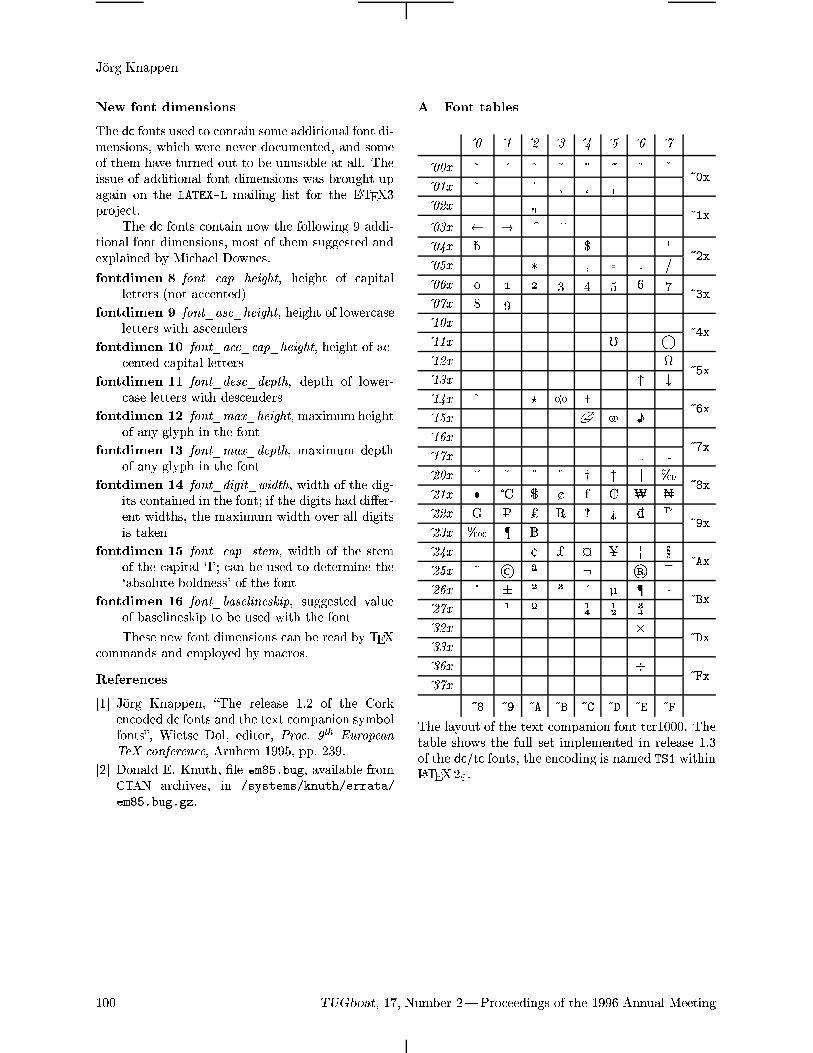
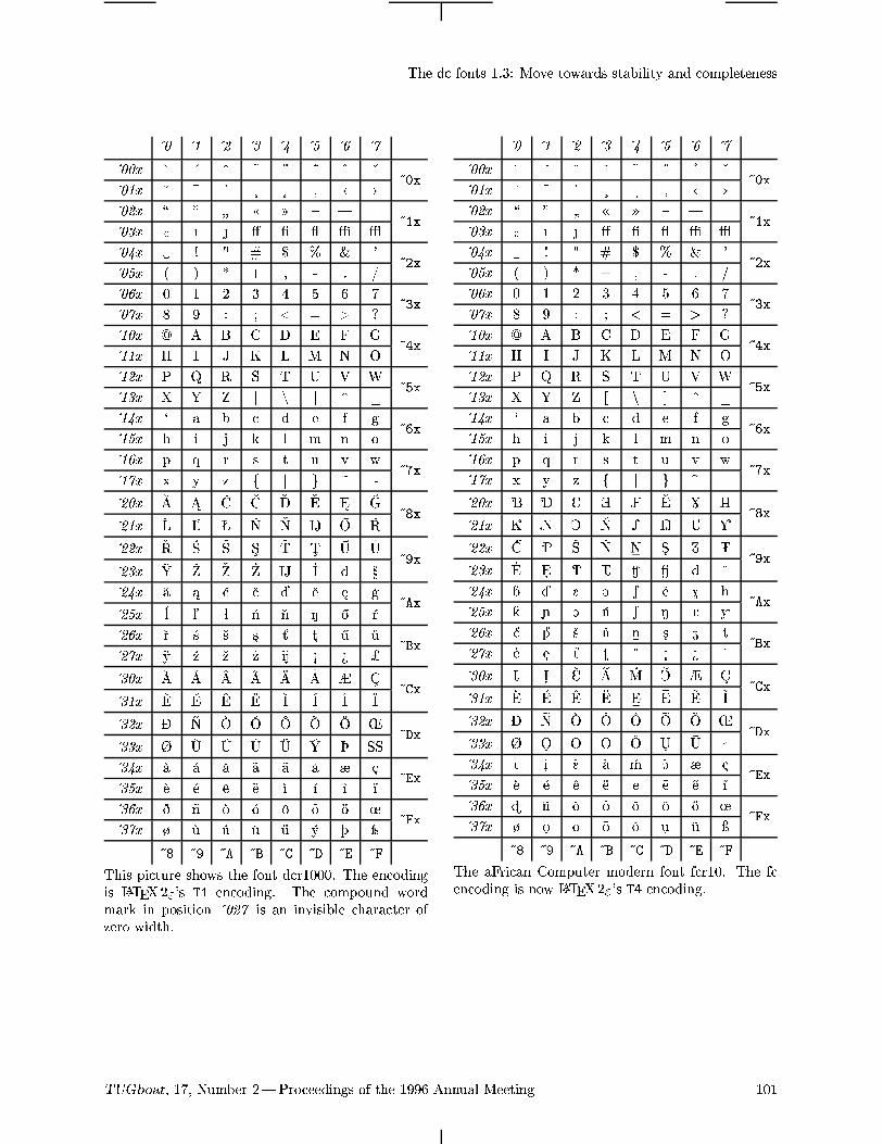
Embed Size (px)
Citation preview
TUGBOAT
Volume 17, Number 2 / June 1996
1996 Annual Meeting Proceedings
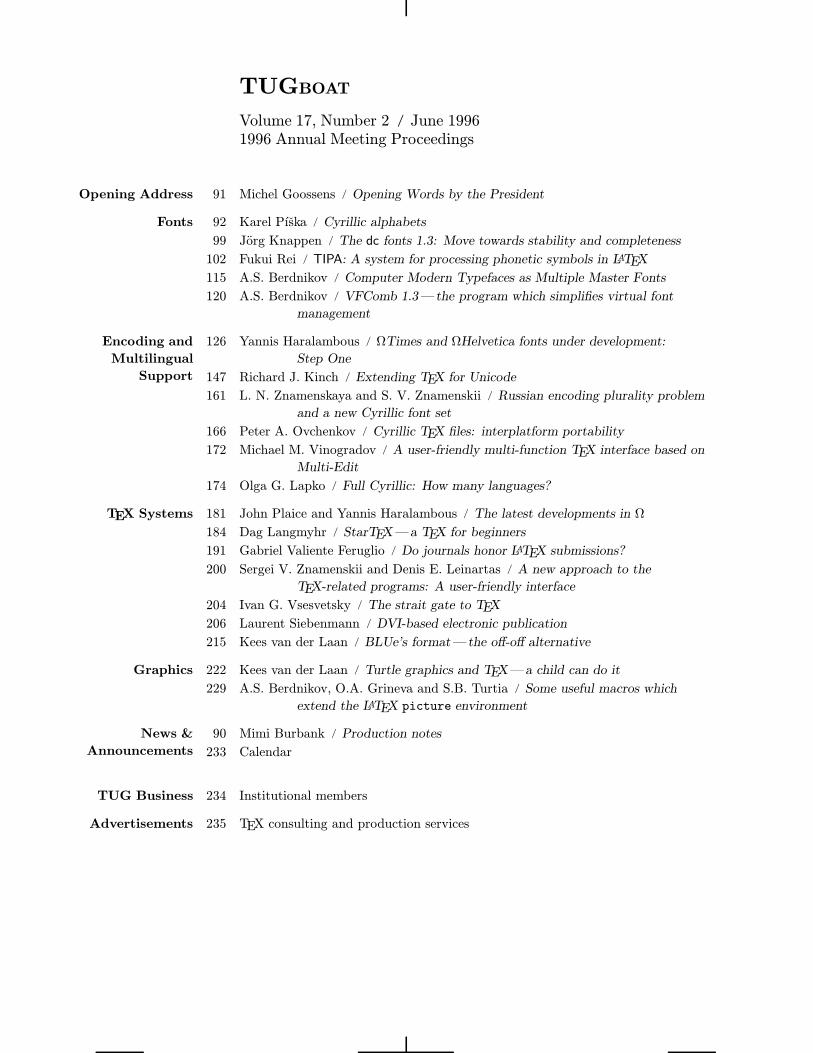
Opening Address 91 Michel Goossens / Opening Words by the President
Fonts 92 Karel Pıska / Cyrillic alphabets
99 Jorg Knappen / The dc fonts 1.3: Move towards stability and completeness
102 Fukui Rei / TIPA: A system for processing phonetic symbols in LATEX
115 A.S. Berdnikov / Computer Modern Typefaces as Multiple Master Fonts
120 A.S. Berdnikov / VFComb 1.3—the program which simplifies virtual font
management
Encoding and
Multilingual
Support
126 Yannis Haralambous / ΩTimes and ΩHelvetica fonts under development:
Step One
147 Richard J. Kinch / Extending TEX for Unicode
161 L. N. Znamenskaya and S. V. Znamenskii / Russian encoding plurality problem
and a new Cyrillic font set
166 Peter A. Ovchenkov / Cyrillic TEX files: interplatform portability
172 Michael M. Vinogradov / A user-friendly multi-function TEX interface based on
Multi-Edit
174 Olga G. Lapko / Full Cyrillic: How many languages?
TEX Systems 181 John Plaice and Yannis Haralambous / The latest developments in Ω
184 Dag Langmyhr / StarTEX—a TEX for beginners
191 Gabriel Valiente Feruglio / Do journals honor LATEX submissions?
200 Sergei V. Znamenskii and Denis E. Leinartas / A new approach to the
TEX-related programs: A user-friendly interface
204 Ivan G. Vsesvetsky / The strait gate to TEX
206 Laurent Siebenmann / DVI-based electronic publication
215 Kees van der Laan / BLUe’s format—the off-off alternative
Graphics 222 Kees van der Laan / Turtle graphics and TEX—a child can do it
229 A.S. Berdnikov, O.A. Grineva and S.B. Turtia / Some useful macros which
extend the LATEX picture environment
News &
Announcements
90 Mimi Burbank / Production notes
233 Calendar
TUG Business 234 Institutional members
Advertisements 235 TEX consulting and production services
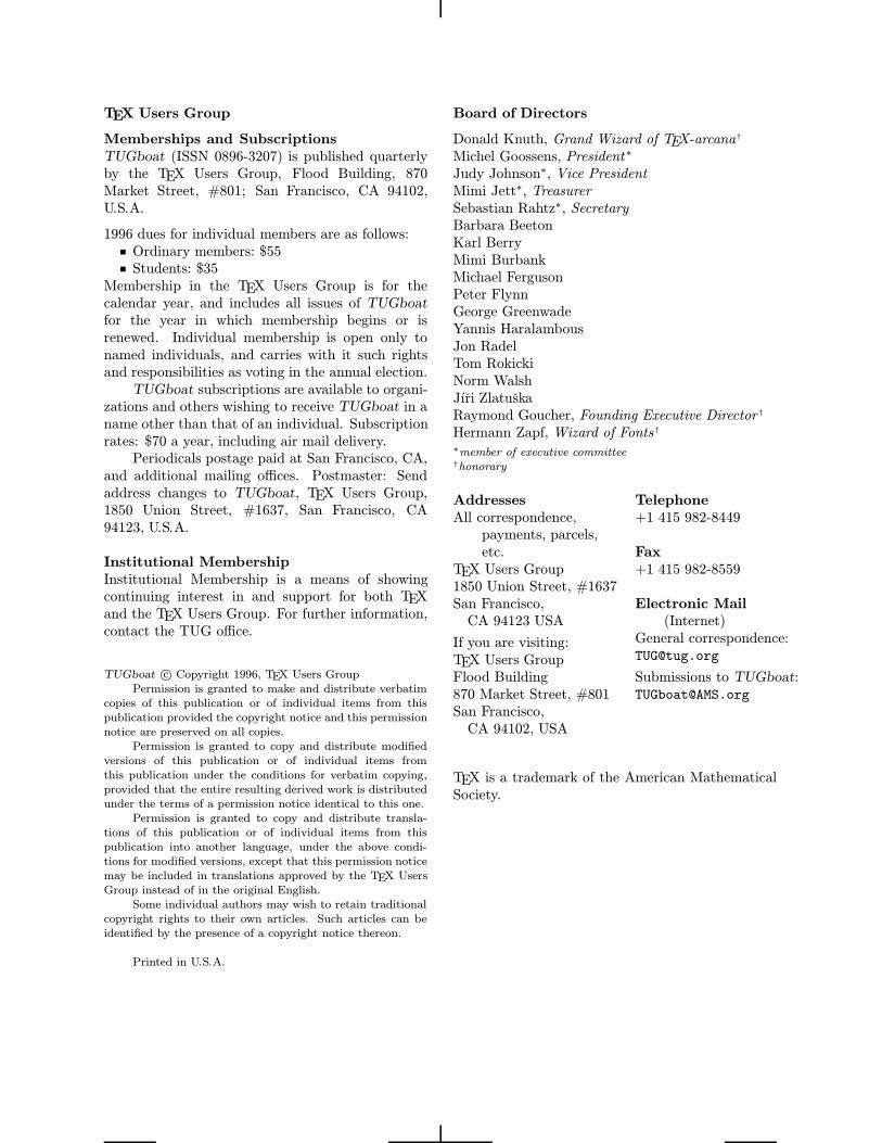
TEX Users Group
Memberships and Subscriptions
TUGboat (ISSN 0896-3207) is published quarterlyby the TEX Users Group, Flood Building, 870Market Street, #801; San Francisco, CA 94102,U.S.A.
1996 dues for individual members are as follows:Ordinary members: $55Students: $35
Membership in the TEX Users Group is for thecalendar year, and includes all issues of TUGboatfor the year in which membership begins or isrenewed. Individual membership is open only tonamed individuals, and carries with it such rightsand responsibilities as voting in the annual election.TUGboat subscriptions are available to organi-
zations and others wishing to receive TUGboat in aname other than that of an individual. Subscriptionrates: $70 a year, including air mail delivery.Periodicals postage paid at San Francisco, CA,
and additional mailing offices. Postmaster: Sendaddress changes to TUGboat, TEX Users Group,1850 Union Street, #1637, San Francisco, CA94123, U.S.A.
Institutional Membership
Institutional Membership is a means of showingcontinuing interest in and support for both TEXand the TEX Users Group. For further information,contact the TUG office.
TUGboat c© Copyright 1996, TEX Users Group
Permission is granted to make and distribute verbatim
copies of this publication or of individual items from this
publication provided the copyright notice and this permission
notice are preserved on all copies.
Permission is granted to copy and distribute modified
versions of this publication or of individual items from
this publication under the conditions for verbatim copying,
provided that the entire resulting derived work is distributed
under the terms of a permission notice identical to this one.
Permission is granted to copy and distribute transla-
tions of this publication or of individual items from this
publication into another language, under the above condi-
tions for modified versions, except that this permission notice
may be included in translations approved by the TEX Users
Group instead of in the original English.
Some individual authors may wish to retain traditional
copyright rights to their own articles. Such articles can be
identified by the presence of a copyright notice thereon.
Printed in U.S.A.
Board of Directors
Donald Knuth, Grand Wizard of TEX-arcana†
Michel Goossens, President∗
Judy Johnson∗, Vice PresidentMimi Jett∗, TreasurerSebastian Rahtz∗, SecretaryBarbara BeetonKarl BerryMimi BurbankMichael FergusonPeter FlynnGeorge GreenwadeYannis HaralambousJon RadelTom RokickiNorm WalshJıri ZlatuskaRaymond Goucher, Founding Executive Director †
Hermann Zapf, Wizard of Fonts†
∗member of executive committee†honorary
Addresses
All correspondence,payments, parcels,etc.
TEX Users Group1850 Union Street, #1637San Francisco,CA 94123 USA
If you are visiting:TEX Users GroupFlood Building870 Market Street, #801San Francisco,CA 94102, USA
Telephone
+1 415 982-8449
Fax
+1 415 982-8559
Electronic Mail
(Internet)General correspondence:[email protected]
Submissions to TUGboat:[email protected]
TEX is a trademark of the American MathematicalSociety.
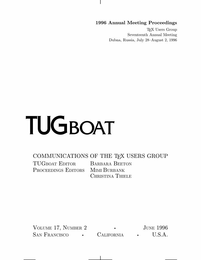
1996 Annual Meeting Proceedings
TEX Users Group
Seventeenth Annual Meeting
Dubna, Russia, July 28–August 2, 1996
COMMUNICATIONS OF THE TEX USERS GROUP
TUGBOAT EDITOR BARBARA BEETONPROCEEDINGS EDITORS MIMI BURBANK
CHRISTINA THIELE
VOLUME 17, NUMBER 2 • JUNE 1996
SAN FRANCISCO • CALIFORNIA • U.S.A.
Production Notes
What’s different this year?
My goodness—much! This is the second annualTUGmeeting to be held outside North America, andthe first meeting that takes place in a country witha non-Latin alphabet.This is also the first (and probably the last)
year to attempt to present the Proceedings issue ofTUGboat before the actual meeting. We have hadvarying success in this regard, and will most likelyreturn to our former schedule in 1997, if only be-cause a pre-conference publication schedule does notallow authors and editors sufficient time to properlyfine-tune the final version of a text. As a result of thedelay in receiving articles from some authors, thereare articles in this issue which have not been re-viewed. Russian typographic styles differ from thoseof TUGboat, and these differences may be noted ina variety of articles in this issue.Many of our speakers present material that is
actually “work-in-progress” and is in some cases de-pendent upon discussions and input from others ina particular area of expertise who attend the annualmeetings. Therefore, some of the material to be pre-sented at the conference in Dubna will be appearingin future issues of TUGboat. Look in the next issuefor a more detailed report of the TUG’96 Conferencein Dubna and list of participants.Of the total number of articles submitted, four-
teen were by Russian authors, thirrteen were by au-thors whose primary language was not English, andtwo articles were submitted by North American au-thors—surely a tribute to the international flavorof TUG.1
Macros
During the three-month process of editing these pro-ceedings, I’ve had the opportunity to use at leastthree different versions of LATEX2ε macros. Look inthe next issue for an article by Robin Fairbairns onthe current state of the TUGboat style files.Only five articles were submitted as plain TEX
source; the others were submitted as LATEX2ε.
Fonts
A large area of focus at the TUG’96 meeting willbe on “languages”, “encoding” and “fonts”. The is-sue is set primarily in Computer Modern (or DC,
1 What an experience for someone whose first language is
’merkan and who speaks English as a ‘second language’.
version 1.3) fonts, using Malyshev’s BaKoMa Post-Script Type 1 versions.2 The Ω article by Haralam-bous necessitated the creation of proper .tfm filesfrom .afm files provided by the author. The arti-cle by O. Lapko used special Cyrillic fonts, a resultof the ongoing Russian Cyrillic font project. Thewncyr fonts developed at the University of Washing-ton and distributed by the American MathematicalSociety were also widely used in this issue.Owing to the wide variation in Cyrillic fonts
(the two mentioned above are far from being theonly ones in existence) and methods for using them,many of the Cyrillic examples were included in theform of PostScript graphics prepared by the authors,so that additional fonts would not have to be in-stalled and incorporated into the TUGboat stylesfor just one use.
Output
The editor will have to confess to many problemsduring the editing and production of this issue andany remaining errors are mine (MB). Without helpfrom my co-editor, Christina Thiele, and all of theproduction team members, final output would havebeen impossible. Final output was prepared at SCRIon an IBM RS6000 running AIX, using the Web2Cimplementation of TEX. Output was printed on aQMS 680 print system at 600 dpi.
⋄ Mimi Burbank
Supercomputer Computations
Research Institute
Florida State University
Tallahassee, FL 32306–4502
⋄ Christina Thiele
15 Wiltshire Circle
Nepean, Ontario
K2J 4K9, Canada
2 Jorge Knappen’s article on page 99 required the upgrade
from 1.2 to 1.3 for this issue.
90 TUGboat, Volume 17 (1996), No. 2—Proceedings of the 1996 Annual Meeting
Opening Words by the President
Michel GoossensCERN, Geneva, Switzerland
A lot has happened in those twelve months since thelast TUG Conference (the 16th) in St. Petersburg(Florida). We now know that the revolution inthe area of electronic documents is here to stay.It becomes more and more commonplace to findindividuals connecting from home computers to theInternet, and even in Europe “going global” startsto become affordable, with most PTT’s now offeringISDN lines at prices comparable to normal telephoneconnections and many cable operators providingInternet services.TEX users worldwide are finally beginning to
profit fully from these electronic wonders, and cannow download everything they need from a CTANsite via the Internet, or put one of several CD-ROMswhich appeared over the last twelve months (onefor MS-DOS by NTG, one containing the CTANarchives by DANTE, and a TDS-based plug-and-play one for Unix by TUG, GUTenberg and UK-TUG) in their CD-drive. Efforts to regularly updatethese CD-ROMs and extending the target domainto Microsoft Windows (NT and 95), and Macintoshare already underway, so that I have good hopesthat dealing with TEX will one day become almost assimple as running Word, WordPerfect, or other easy-to-install commercial products. At the same timetranslation programs between LATEX sources andvarious electronic hyper-formats, such as HTML,Acrobat, have been further improved. It is thus fairto say that LATEX users are certainly not the worstplaced to fully profit in an almost effortless mannerfrom both the typographic excellence of the TEX en-gine and the easy integration of their documents inthe global information hyperhighway. Therefore, Iwould like to thank all individuals who have workedhard to develop these important tools and I canonly hope that they will contribute to make TEXbetter known in the PC commodity market, wherethe action in the world of electronic publishing (andcomputing in general) will be more and more con-centrated in the future.I am writing these words a fews weeks before
the start of TUG’96, the 17th TUG Annual Meet-ing, taking place in the Joint Institute for NuclearResearch (JINR) in Dubna (Russia). It is only the
second time that TUG’s Annual Meeting has takenplace outside of North America (the first time wasin 1993, in Aston, Birmingham, United Kingdom).Moreover, this time we are moving beyond the Eng-lish-speaking world altogether, as we are guests inthe heart of Russia, the largest country in the world,spanning eleven time zones, and where the majorityof the 150 million inhabitants speak Russian, whichis written using the non-Latin Cyrillic alphabet. Isincerely thank CyrTUG for the invitation to cometo Russia, and JINR for helping with the technicalorganization of the Conference. It shows that TEX istruly international and knows no borders, and thatit is an ideal vehicle to promote friendship, and fos-ter cultural exchanges and scientific collaboration.The subject area covered by the papers at this
Conference shows the diversity of the TEX culture inthe world, more particularly in Central and EasternEurope. When reading the articles, one may some-times be struck by a “funny” or “unexpected” not-very-English-sounding expression, but this merelyshows the true richness of all contributions. Itunderlines the fact that various approaches existto attain a certain goal, and reading about thesesolutions often opens up new horizons. And thenthere are the “classics”, like Omega, the dc fonts,“Blue”, whose steady improvements we have beenfollowing over the years, as well as the efforts ofthe LATEX3-team providing us each semester with amore robust LATEX2ε, and the promises of eTEX, asannounced at TUG’95. All this makes it clear thatTEX is more alive than ever, and looking for a seaton the front row when Unicode, hypersurfing, andvirtual (ir)reality take over the world.Let me conclude by expressing my gratitude
to the TUGboat Production Team, especially Mimiand Christina, for their tremendous effort on thepresent proceedings. I also want to thank all au-thors, for their continued support by communicat-ing their work to the wider TEX community, thusincreasing the pool of TEX-pertise available to ev-erybody. And, last but not least, let me mentionthe support of DANTE, GUTenberg, NTG, andUKTUG, who donated funds to the TUG Bursaryor otherwise contributed in kind to the Conference.
TUGboat, Volume 17 (1996), No. 2—Proceedings of the 1996 Annual Meeting 91
Cyrillic Alphabets
Karel PıskaInstitute of Physics, Academy of Sciences180 40 Prague, Czech [email protected], [email protected]
URL: http://www-hep.fzu.cz/~piska/
Abstract
A collection of Cyrillic-based language alphabets is presented. The contributioncontains the data about more than 50 languages using Cyrillic script. A “Unicode-like” coded font is used for the rendering of the Cyrillic texts. The aim is to takepart in creating a universal Cyrillic font for TEX and the Ω project and to furtherhelp languages using Cyrillic join the TEX community.
Introduction
Cyrillic-based alphabets are (or have been) used bynations in the Russian Federation, and a numberof nations in Europe and Asia, including manynations of the former USSR now beyond the Russianborder. The article aims to present a list of currentlyexisting written languages using the Cyrillic scriptand having a codified literary form.Most of the character encoding systems for
Cyrillic used in Russia, Ukraine, Belarus, and alsothe UCS/Unicode [5] standard are based on theRussian alphabet. They contain a continuous or-dered code sequence only for Russian letters. Othercharacters are non-standard, they are missing orthey are coded “accidentally”. I will call these char-acters “additional” (relative to the usual computerencoding standards!). Many Cyrillic alphabets wereborrowed from the Russian alphabet. We can con-sider their “non-Russian” letters being “additional”or “new”, often they were created (appended) as“new” characters. Of course, the previous assertionis not true for languages which have traditionallyused Cyrillic script –Belarusian, Ukrainian, Serbian,Macedonian and Bulgarian.One of my most important sources has been
.!. 8;O@52A:89 and .!. @82=8= (1960). Un-fortunately this unique book may be obsolete today.I would be very grateful for corrections and remarksand also references to another sources; especiallyif the reader is an expert in any language. Pleasecontact me by email. More information about lan-guages can be found on myWWW Home Page (e.g.,complete alphabetical orders). And please overlookmy lack of knowledge of English.
Language Names and Codes
The ISO standard 639-2 (1993) and the Ethnologuebase eth (1990) contain the English names of lan-guages and also their three-letter codes. Anothersource of language names I have used is Webster’sDictionary (1989). Unfortunately the English andinternational terminology is not stabilized. WhenI began translation from Russian I could not findunambiguous names for languages in English. Onthe other hand, the Russian names are fixed in mostcases.One example, “04K359A:89 (O7K:)”, is evident
in Russian – but I have not selected the best exam-ples from the following variants: Adyghe, Adyge,Adygey, Adygei, Adighe, Circassian, Lower Cir-cassian, West Circassian, Kinkh, Kjkax, Cherkes.Therefore, I have decided to present one (rarely two)language name(s) in Russian and one (maximallytwo) name(s) in English (often selected “arbitrar-ily”). The ISO and eth language codes are alsoshown in the table of languages which use Cyrillic.If the first code (ISO) is not defined or the codes aredifferent then the second code (eth) is presented.
Real Font
The B5 font family (borrowing from the ComputerModern) is a bank of Cyrillic glyphs correspondingto the Ω project (Haralambous and Plaice, 1995).The proposed encoding of a real 8-bit font is basedon Unicode (ISO-IEC 10646-1, 1993)—more ex-actly, "04xx mod "100. Thus the character codesare well defined and standardized. This can simplifycommunication between authors supporting and im-proving the fonts.The table of the b5r12 font (Computer Modern
Cyrillic Roman 12 point) is on the last page of the
92 TUGboat, 17, Number 2—Proceedings of the 1996 Annual Meeting
Cyrillic Alphabets
article. I repeat: the real font is only a bank ofglyphs and cannot be used autonomously in a simpleand effective way.
Virtual Font
A virtual font was created for the present article toenable access to Cyrillic letters using ASCII char-acters. For creating .tfm files for virtual fonts,the program VFComb (Berdnikov and Turtia, 1995)was used. It allows the definition (or redefinition),mapping, ligature and kerning data once for all fontsizes, and then merging them with metric informa-tion of the real fonts (reading proper list files). It isnecessary to mention that every font in TEX (real orvirtual) can contain no more than 256 charactersand it is complicated, or impossible, using fontswith many characters. This is a good reason forintroducing Ω – the 16-bit extension of TEX. Thevirtual font used in this article combines a real fontwith Unicode-like encoding (mod "100), a font withalternative glyphs (located separately) and severalcharacters from the original CM (e.g., parentheses).The way of referencing the “I’s” is shown in thefollowing example.A segment from the .tbf file (input file for VF-Comb)
(LIGTABLE
(LABEL C I)
(LIG C 1 O 006)
(LIG C 2 O 007)
(LIG C 3 O 300)
(LIG C 4 O 342)
(LIG C 5 O 344)
(STOP)
(LABEL C i)
(LIG C 1 O 022)
(LIG C 2 O 211)
(LIG C 4 O 343)
(LIG C 5 O 345)
(STOP)
)
results‘Ii’ => 8 % “Standard” ‘I’‘I1i1’ => V % Ukrainian/Belarusian ‘I’‘I2i2’ => W % Ukrainian ‘YI’‘I3’ => À % Caucasian aspiration sign “?0;>G:0”‘I4i4’ => âã % Tadzhik ‘I’ with stress‘I5i5’ => äå
Cyrillic Character Set and Unicode
The ISO/IEC 10646-1/Unicode (1993 E) coversmost of the letters used in current living written
languages uses a Cyrillic-alphabet (in my opinion).I would like to add the following comments:
• I have no data about other characters; forexample, punctuation marks, special signs andother symbols.
• I don’t present information about additionalcharacters not in current use.
• Old Cyrillic is omitted and is not a subject ofinquiry in this paper.
• Regarding the variant forms: more alternativeglyphs may be stored in a font bank and thenselected to depict a particular character. Thisproblem is solvable in TEX.
• Regarding letters with diacritics: there are im-portant differences in the three distinct appli-cations of diacritical marks (with possible dis-agreement in different languages).
1. The accented symbol denotes the distinctletter as opposed to the same symbol with-out an accent and it may even be posi-tioned independently in the alphabet.
2. An accent can be used to modify the sym-bols representing vowels and consonants:for example; vowels can be marked forlength or nasalization, consonants can bemarked for palatalization. The presence ofthe accent when writing is significant butunlike the above item, the combinationdoes not constitute a new or special letter,and therefore would be alphabetized in thesame position as the letter without such adiacritic.
3. An accent is used to mark stress. These“stressed” letters are not part of the writ-ing system but are, nevertheless, necessaryfor entries in dictionaries and textbooks.A few examples illustrate the use of stressmarks (above, right or below):
0:Fe=B, &′"ac′cent mark′, r Akze.nt
Alphabetical Orders and Sort
The greater number of languages using Cyrillic inRussia and the former USSR have adopted wordsfrom Russian or, with modifications, in the originalform (especially proper names) and their alphabetsinclude all Russian letters. Not often exceptions areUkrainian, Belarusian, Moldaviancyror Abkhazian.Alphabetical orders of distinct languages may
be different. “Additional” letters have been ap-pended to the end or may occur in the middleof alphabets. Two letters may be located in the
TUGboat, 17, Number 2—Proceedings of the 1996 Annual Meeting 93
Karel Pıska
opposite order. And then the order of similar oreven identical words in dictionaries or indexes maybe different.Examples (1960, 1990)1 2
Russian Ukrainian,L < .N < /O .N < /O < ,L20;LA < 20;OBLAO 20;OB8AO < 20;LA?>;LA:89 < ?>;NA ?>;NA < ?>;LAL:89A0;L=K9 < A0;NB A0;NB < A0;L=89
Correspondence Cyrillic vs. Latin
Many languages now written in Cyrillic used Latin-like alphabets in the 1930s (e.g., Tatar or Kazakh).Several languages have used both Latin and Cyrillicalphabets—at the last count these included Serbo-Croatian, Kurdish, Moldavian, and Azerbaijani.Several nations are preparing projects to migratefrom Cyrillic to Latin. The alphabetical ordersfor Cyrillic and Latin are different but I am sureit will be possible to define algorithms for auto-matic transliteration, use of common hyphenationpatterns and compile and print texts from the onesource, in either writing system, to produce for areader the script with which she/he is familiar.
Cyrillic Letters and Symbols
The table contains the Cyrillic characters defined inthe Unicode standard. Russian letters (used in mostalphabets) and old Cyrillic letters and symbols areomitted in the list. Corresponding symbolic namesof characters can be found in [5, 6]. It would toolong to present them here.Example: CYRILLIC CAPITAL LETTER IO is theUnicode name for "0401 => .
Explanatory notes and comments
cyr The Cyrillic-alphabet languages presented herealso uses other alphabets (usually Latin-like).Languages using the following letters are unknown(to me):1. ÁÂ2. for òó I have two candidates – 2 letters undefinedin Unicode:#C(=^)? in Chuvash andUu (=^)? in Karachay-Balkar.
1 Referee’s note: The Ukrainian Academy of Scienceschanged the official order of the Ukrainian alphabet in 1991(or thereabouts), and the soft sign is no longer the last letterof the alphabet.
2 Author’s note: Reworking and reprinting of all thedictionaries of any language will not be easy. I will keepthis example to demonstrate “real life” changes.
The confusion perhaps may be in my sources or inUnicode.
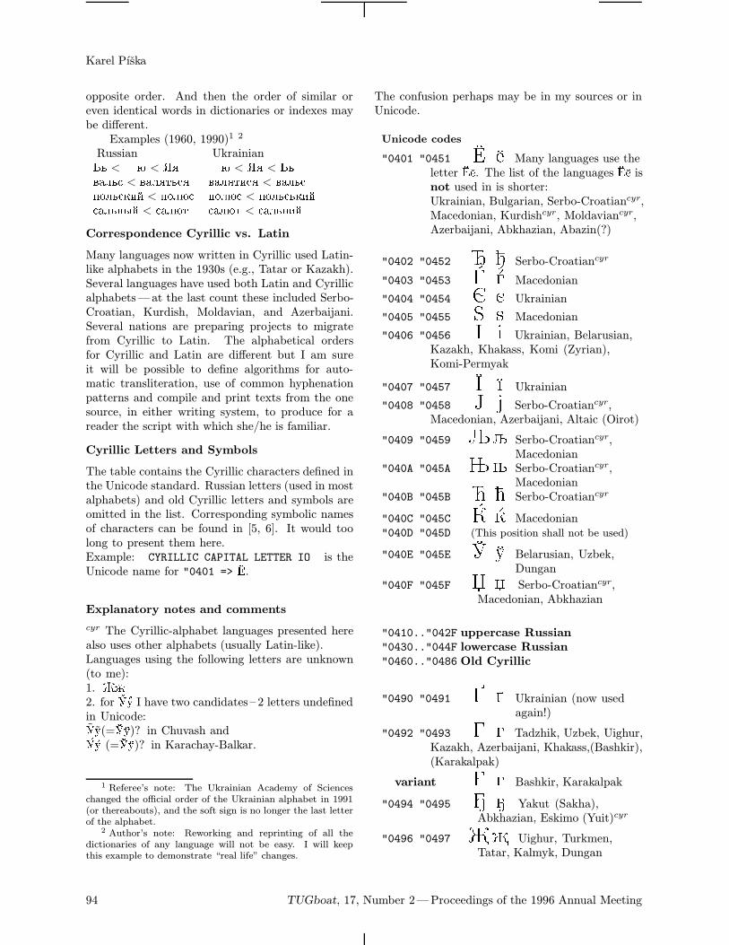
Unicode codes
"0401 "0451 Q Many languages use theletter Q. The list of the languages Q isnot used in is shorter:Ukrainian, Bulgarian, Serbo-Croatiancyr,Macedonian, Kurdishcyr, Moldaviancyr,Azerbaijani, Abkhazian, Abazin(?)
"0402 "0452 R Serbo-Croatiancyr
"0403 "0453 S Macedonian
"0404 "0454 T Ukrainian
"0405 "0455 U Macedonian
"0406 "0456 V Ukrainian, Belarusian,Kazakh, Khakass, Komi (Zyrian),Komi-Permyak
"0407 "0457 W Ukrainian"0408 "0458 X Serbo-Croatiancyr,
Macedonian, Azerbaijani, Altaic (Oirot)
"0409 "0459 Y Serbo-Croatiancyr,Macedonian
"040A "045A Z Serbo-Croatiancyr,Macedonian
"040B "045B [ Serbo-Croatiancyr
"040C "045C \ Macedonian"040D "045D (This position shall not be used)
"040E "045E ^ Belarusian, Uzbek,Dungan
"040F "045F _ Serbo-Croatiancyr,Macedonian, Abkhazian
"0410.."042F uppercase Russian"0430.."044F lowercase Russian"0460.."0486 Old Cyrillic
"0490 "0491 Ukrainian (now usedagain!)
"0492 "0493 Tadzhik, Uzbek, Uighur,Kazakh, Azerbaijani, Khakass,(Bashkir),(Karakalpak)
variant G g Bashkir, Karakalpak
"0494 "0495 Yakut (Sakha),Abkhazian, Eskimo (Yuit)cyr
"0496 "0497 Uighur, Turkmen,Tatar, Kalmyk, Dungan
94 TUGboat, 17, Number 2—Proceedings of the 1996 Annual Meeting
Cyrillic Alphabets
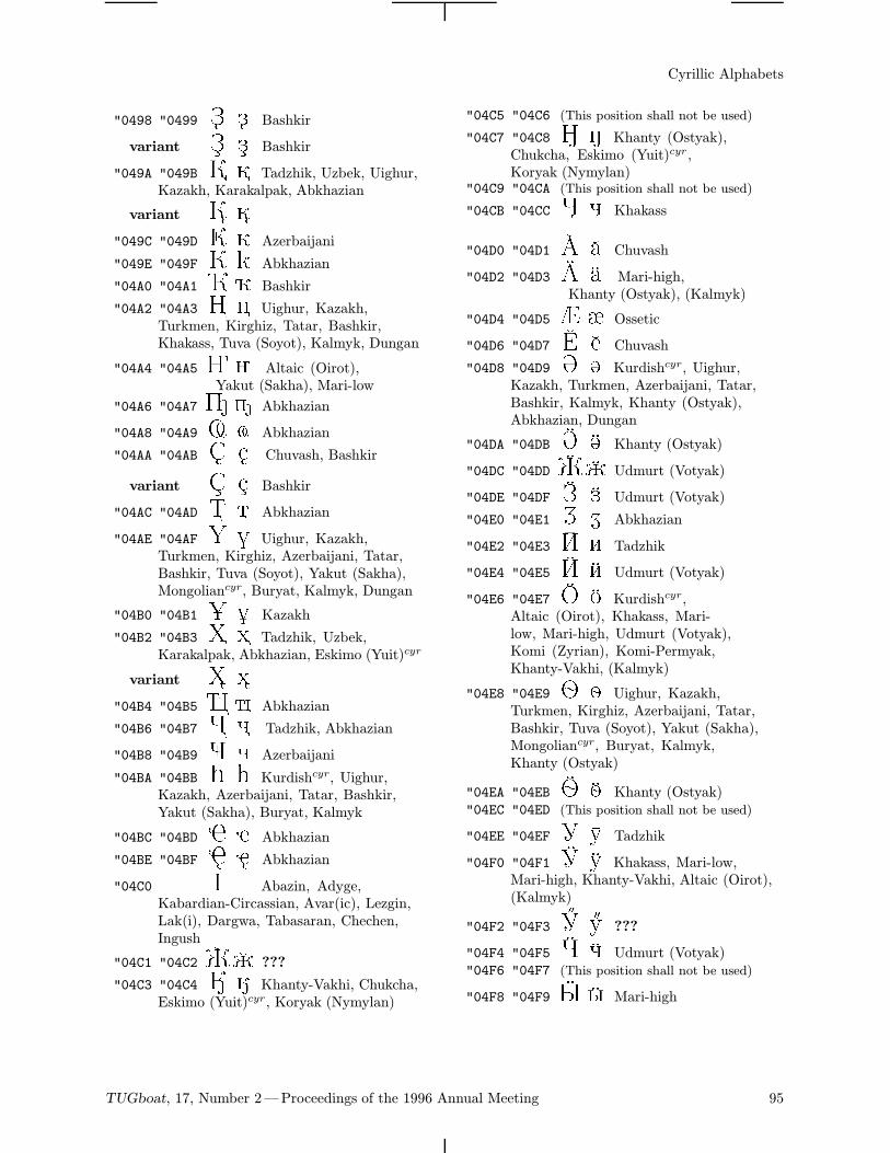
"0498 "0499 Bashkir
variant Z z Bashkir
"049A "049B Tadzhik, Uzbek, Uighur,Kazakh, Karakalpak, Abkhazian
variant K k"049C "049D Azerbaijani
"049E "049F Abkhazian
"04A0 "04A1 ¡ Bashkir
"04A2 "04A3 ¢ £ Uighur, Kazakh,Turkmen, Kirghiz, Tatar, Bashkir,Khakass, Tuva (Soyot), Kalmyk, Dungan
"04A4 "04A5 ¤ ¥ Altaic (Oirot),Yakut (Sakha), Mari-low
"04A6 "04A7 ¦§ Abkhazian
"04A8 "04A9 ¨ © Abkhazian
"04AA "04AB ª « Chuvash, Bashkir
variant S s Bashkir
"04AC "04AD ¬ Abkhazian
"04AE "04AF ® ¯ Uighur, Kazakh,Turkmen, Kirghiz, Azerbaijani, Tatar,Bashkir, Tuva (Soyot), Yakut (Sakha),Mongoliancyr, Buryat, Kalmyk, Dungan
"04B0 "04B1 ° ± Kazakh
"04B2 "04B3 ² ³ Tadzhik, Uzbek,Karakalpak, Abkhazian, Eskimo (Yuit)cyr
variant X x"04B4 "04B5 ´ µ Abkhazian
"04B6 "04B7 ¶ · Tadzhik, Abkhazian
"04B8 "04B9 ¸ ¹ Azerbaijani
"04BA "04BB º » Kurdishcyr, Uighur,Kazakh, Azerbaijani, Tatar, Bashkir,Yakut (Sakha), Buryat, Kalmyk
"04BC "04BD ¼ ½ Abkhazian
"04BE "04BF ¾ ¿ Abkhazian
"04C0 À Abazin, Adyge,Kabardian-Circassian, Avar(ic), Lezgin,Lak(i), Dargwa, Tabasaran, Chechen,Ingush
"04C1 "04C2 ÁÂ ???
"04C3 "04C4 Ã Ä Khanty-Vakhi, Chukcha,Eskimo (Yuit)cyr, Koryak (Nymylan)
"04C5 "04C6 (This position shall not be used)
"04C7 "04C8 Ç È Khanty (Ostyak),Chukcha, Eskimo (Yuit)cyr ,Koryak (Nymylan)
"04C9 "04CA (This position shall not be used)
"04CB "04CC Ë Ì Khakass
"04D0 "04D1 Ð Ñ Chuvash
"04D2 "04D3 Ò Ó Mari-high,Khanty (Ostyak), (Kalmyk)
"04D4 "04D5 Ô Õ Ossetic
"04D6 "04D7 Ö × Chuvash
"04D8 "04D9 Ø Ù Kurdishcyr, Uighur,Kazakh, Turkmen, Azerbaijani, Tatar,Bashkir, Kalmyk, Khanty (Ostyak),Abkhazian, Dungan
"04DA "04DB Ú Û Khanty (Ostyak)
"04DC "04DD ÜÝ Udmurt (Votyak)
"04DE "04DF Þ ß Udmurt (Votyak)
"04E0 "04E1 à á Abkhazian
"04E2 "04E3 â ã Tadzhik
"04E4 "04E5 ä å Udmurt (Votyak)
"04E6 "04E7 æ ç Kurdishcyr,Altaic (Oirot), Khakass, Mari-low, Mari-high, Udmurt (Votyak),Komi (Zyrian), Komi-Permyak,Khanty-Vakhi, (Kalmyk)
"04E8 "04E9 è é Uighur, Kazakh,Turkmen, Kirghiz, Azerbaijani, Tatar,Bashkir, Tuva (Soyot), Yakut (Sakha),Mongoliancyr, Buryat, Kalmyk,Khanty (Ostyak)
"04EA "04EB ê ë Khanty (Ostyak)"04EC "04ED (This position shall not be used)
"04EE "04EF î ï Tadzhik
"04F0 "04F1 ð ñ Khakass, Mari-low,Mari-high, Khanty-Vakhi, Altaic (Oirot),(Kalmyk)
"04F2 "04F3 ò ó ???
"04F4 "04F5 ô õ Udmurt (Votyak)"04F6 "04F7 (This position shall not be used)
"04F8 "04F9 ø ù Mari-high
TUGboat, 17, Number 2—Proceedings of the 1996 Annual Meeting 95
Karel Pıska
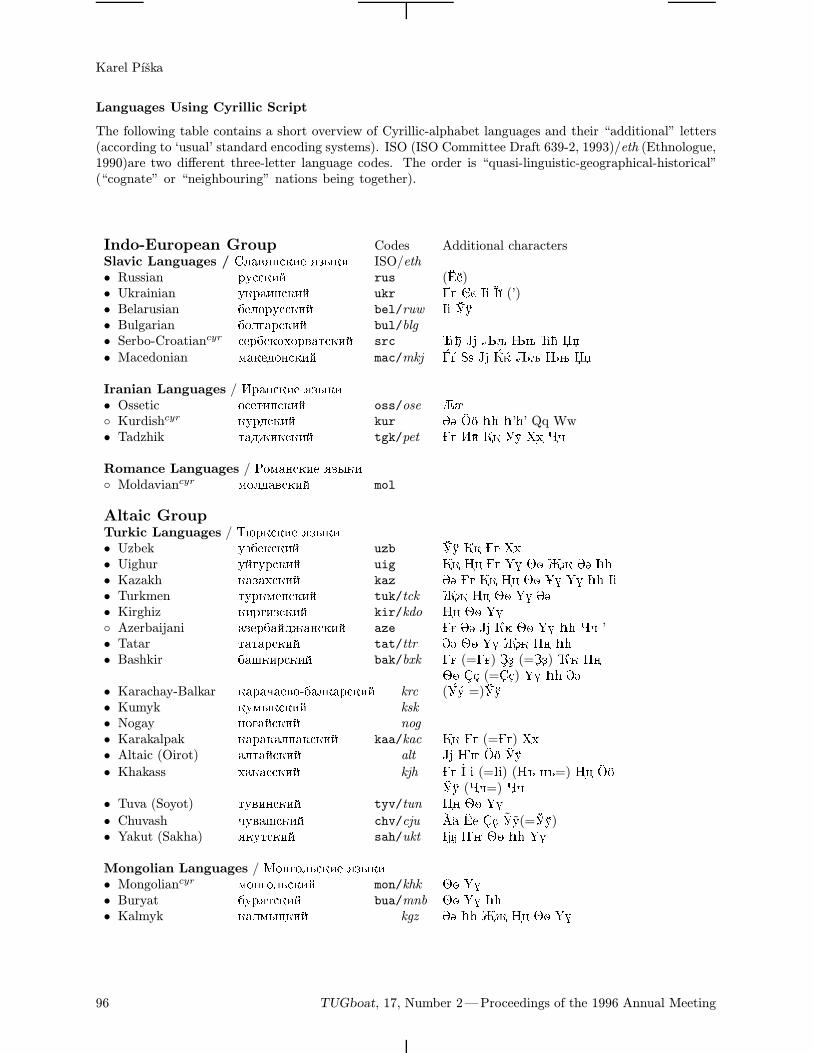
Languages Using Cyrillic Script
The following table contains a short overview of Cyrillic-alphabet languages and their “additional” letters(according to ‘usual’ standard encoding systems). ISO (ISO Committee Draft 639-2, 1993)/eth (Ethnologue,1990)are two different three-letter language codes. The order is “quasi-linguistic-geographical-historical”(“cognate” or “neighbouring” nations being together).
Indo-European Group Codes Additional charactersSlavic Languages / !;02O=A:85 O7K:8 ISO/eth• Russian @CAA:89 rus (Q)• Ukrainian C:@08=A:89 ukr T V W (’)• Belarusian 15;>@CAA:89 bel/ruw V ^• Bulgarian 1>;30@A:89 bul/blg
• Serbo-Croatiancyr A5@1A:>E>@20BA:89 src R X Y Z [ _• Macedonian <0:54>=A:89 mac/mkj S U X \ Y Z _
Iranian Languages / @0=A:85 O7K:8• Ossetic >A5B8=A:89 oss/ose ÔÕ Kurdishcyr :C@4A:89 kur ØÙ æç º» º’»’ Qq Ww• Tadzhik B0468:A:89 tgk/pet âã îï ²³ ¶·
Romance Languages / ><0=A:85 O7K:8 Moldaviancyr <>;402A:89 mol
Altaic GroupTurkic Languages / "N@:A:85 O7K:8• Uzbek C715:A:89 uzb ^ ²³• Uighur C93C@A:89 uig ¢£ ®¯ èé ØÙ º»• Kazakh :070EA:89 kaz ØÙ ¢£ èé °± ®¯ º» V• Turkmen BC@:<5=A:89 tuk/tck ¢£ èé ®¯ ØÙ• Kirghiz :8@387A:89 kir/kdo ¢£ èé ®¯ Azerbaijani 075@109460=A:89 aze ØÙ X èé ®¯ º» ¸¹ ’• Tatar B0B0@A:89 tat/ttr ØÙ èé ®¯ ¢£ º»• Bashkir 10H:8@A:89 bak/bxk Gg (=) Zz (=) ¡ ¢£
èé Ss (=ª«) ®¯ º» ØÙ• Karachay-Balkar :0@0G052>-10;:0@A:89 krc (Uu =)^• Kumyk :C<K:A:89 ksk
• Nogay =>309A:89 nog
• Karakalpak :0@0:0;?0:A:89 kaa/kac Gg (=) ²³• Altaic (Oirot) 0;B09A:89 alt X ¤¥ æç ðñ• Khakass E0:0AA:89 kjh I V (=V) (J =J=) ¢£ æç
ðñ (¶·=) ËÌ• Tuva (Soyot) BC28=A:89 tyv/tun ¢£ èé ®¯• Chuvash GC20HA:89 chv/cju ÐÑ Ö× ª« #C(=^)• Yakut (Sakha) O:CBA:89 sah/ukt ¤¥ èé º» ®¯
Mongolian Languages / >=3>;LA:85 O7K:8• Mongoliancyr <>=3>;LA:89 mon/khk èé ®¯• Buryat 1C@OBA:89 bua/mnb èé ®¯ º»• Kalmyk :0;<KF:89 kgz ØÙ º» ¢£ èé ®¯
96 TUGboat, 17, Number 2—Proceedings of the 1996 Annual Meeting
Cyrillic Alphabets
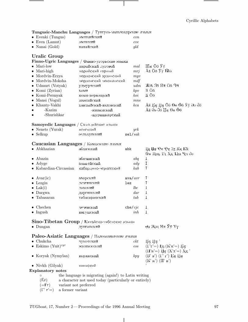
Tungusic-Manchu Languages / "C=3CA>-<0=LG6C@A:85 O7K:8• Evenki (Tungus) M25=:89A:89 evn
• Even (Lamut) M25=A:89 eve
• Nanai (Gold) =0=09A:89 gld
Uralic GroupFinno-Ugric Languages / $8==>-C3>@LA:85 O7K:8• Mari-low <0@89A:89 ;C3>2>9 mal ¤¥ æç ðñ• Mari-high <0@89A:89 3>@=K9 mrj ÒÓ æç ðñ øù• Mordvin-Erzya <>@4>2A:89 M@7O=A:89 myv
• Mordvin-Moksha <>@4>2A:89 <>:H0=A:89 mdf
• Udmurt (Votyak) C4<C@BA:89 udm ÜÝ Þß äå æç ôõ• Komi (Zyrian) :><8 kpv V æç• Komi-Permyak :><8-?5@<OF:89 koi V æç• Mansi (Vogul) <0=A89A:89 mns
• Khanty-Vakhi E0=BK9A:89-20E>2A:89 kca ÒÓ ÃÄ ÇÈ æç èé êë ðñ ØÙ ÚÛ• -Kazim -:07K<A:89 ÒÓ ØÙ ÚÛ ÇÈ èé êë• -Shurishkar -HC@8H:0@A:89
Samoyedic Languages / !0<>489A:85 O7K:8• Nenets (Yurak) =5=5F:89 yrk
• Selkup A5;L:C?A:89 sel/sak
Caucasian Languages / 02:07A:85 O7K:8• Abkhazian 01E07A:89 abk _ ¼½ ¾¿ àá
¨© ¦§ ¬ ²³ ´µ ¶· ØÙ• Abazin 01078=A:89 abq À• Adyge 04K359A:89 ady À• Kabardian-Circassian :010@48=>-G5@:5AA:89 kab À
• Avar(ic) 020@A:89 ava/avr À• Lezgin ;5738=A:89 lez À• Lak(i) ;0:A:89 lbe À• Dargwa 40@38=A:89 dar À• Tabasaran B010A0@0=A:89 tab À
• Chechen G5G5=A:89 che/cjc À• Ingush 8=3CHA:89 inh À
Sino-Tibetan Group / 8B09A:>-B815BA:85 O7K:8• Dungan 4C=30=A:89 ØÙ ¢£ ^ ®¯
Paleo-Asiatic Languages / 0;5>0780BA:85 O7K:8• Chukcha GC:>BA:89 ckt ÃÄ ÇÈ ’• Eskimo (Yuit)cyr MA:8<>AA:89 ess (’3’=) (’:’=) ÃÄ
(’=’=) ÇÈ (%’E’=) ²³ ’• Koryak (Nymylan) :>@O:A:89 kpy (’ 2’) (’ 3’) ÃÄ ÇÈ
(’ :’) (’ =’)• Nivkh (Gilyak) =82EA:89 ’
Explanatory notes the language is migrating (again!) to Latin writing(Q) a character not used today (particularly or entirely)(=) variant not preferred(’ 3’=) a former variant
TUGboat, 17, Number 2—Proceedings of the 1996 Annual Meeting 97
Karel Pıska
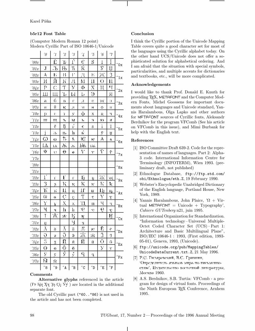
b5r12 Font Table
(Computer Modern Roman 12 point)Modern Cyrillic Part of ISO 10646-1/Unicode
0 1 2 3 4 5 6 7
00x ˝0x
01x 02x
˝1x03x 04x ! " # $ % & '
˝2x05x ( ) * + , - . /06x 0 1 2 3 4 5 6 7
˝3x07x 8 9 : ; < = > ?10x @ A B C D E F G
˝4x11x H I J K L M N O12x Q R S T U V W
˝5x13x X Y Z [ \ ^ _14x ` a b c d e f g
˝6x15x h i j k l m16x p q r s t u v w
˝7x17x
20x˝8x
21x
22x ˝9x
23x 24x ¡ ¢ £ ¤ ¥ ¦ §
˝Ax25x ¨ © ª « ¬ ® ¯26x ° ± ² ³ ´ µ ¶ ·
˝Bx27x ¸ ¹ º » ¼ ½ ¾ ¿30x À Á Â Ã Ä Ç
˝Cx31x È Ë Ì32x Ð Ñ Ò Ó Ô Õ Ö ×
˝Dx33x Ø Ù Ú Û Ü Ý Þ ß34x à á â ã ä å æ ç
˝Ex35x è é ê ë î ï36x ð ñ ò ó ô õ
˝Fx37x ø ù
˝8 ˝9 ˝A ˝B ˝C ˝D ˝E ˝F
CommentsAlternative glyphs referenced in the article
(Gg Kk Xx Zz Ss Uu ) are located in the additionalseparate font.The old Cyrillic part ("60.."86) is not used in
the article and has not been completed.
Conclusion
I think the Cyrillic portion of the Unicode MappingTable covers quite a good character set for most ofthe languages using the Cyrillic alphabet today. Onthe other hand UCS/Unicode does not offer a so-phisticated solution for alphabetical ordering. AndI am afraid that the situation with special symbols,particularities, and multiple accents for dictionariesand textbooks, etc., will be more complicated.
Acknowledgements
I would like to thank Prof. Donald E. Knuth forproviding TEX, METAFONT and the Computer Mod-ern Fonts, Michel Goossens for important docu-ments about languages and Unicode standard, Yan-nis Haralambous, Olga Lapko and other authorsfor METAFONT sources of Cyrillic fonts, AleksandrBerdnikov for the program VFComb (See his articleon VFComb in this issue), and Mimi Burbank forhelp with the English text.
References
[1] ISO Committee Draft 639-2. Code for the repre-sentation of names of languages. Part 2: Alpha-3 code. International Information Centre forTerminology (INFOTERM), Wien 1993. (pre-liminary draft, not published)
[2] Ethnologue Database, ftp://ftp.std.com/obi/Ethnologue/eth.Z, 19 February 1990.
[3] Webster’s Encyclopedic Unabridged Dictionaryof the English language, Portland House, NewYork, 1989.
[4] Yannis Haralambous, John Plaice, ’Ω + Vir-tual METAFONT = Unicode + Typography’,Cahiers GUTenberg n21, juin 1995.
[5] International Organization for Standardization.“Information technology–Universal Multiple-Octet Coded Character Set (UCS) –Part 1:Architecture and Basic Multilingual Plane”,ISO/IEC 10646-1 : 1993, (First edition, 1993-05-01), Geneva, 1993, (Unicode).
[6] ftp://unicode.org/pub/MappingTables/UnicodeDataCurrent.txt.Z, 21 May 1996.
[7] .!. 8;O@52A:89, .!. @82=8=,‘?@545;8B5;L O7K:>2 <8@0 ?> ?8AL<5==>-ABO<’, 740B5;LAB2> 2>AB>G=>9 ;8B5@0BC@K,>A:20 1960.
[8] A.S. Berdnikov, S.B. Turtia: VFComb - a pro-gram for design of virtual fonts. Proceedings ofthe Ninth European TEX Conference, Arnhem1995.
98 TUGboat, 17, Number 2—Proceedings of the 1996 Annual Meeting
TIPA: A System for Processing Phonetic Symbols in LATEX
Fukui ReiDepartment of Asian and Pacific Linguistics, Institute of Cross-Cultural Studies, Faculty of Letters,University of Tokyo, Hongo 7-3-1, Bunkyo-ku, TOKYO 113 [email protected]
Introduction
TIPA1 is a system for processing IPA (International
Phonetic Alphabet) symbols in LATEX. It is basedon TSIPA2 but both METAFONT source codes andLATEX macros have been thoroughly rewritten sothat it can be considered as a new system.Among many features of TIPA, the following
are the new features as compared with TSIPA or anyother existing systems for processing IPA symbols.
• A new 256 character encoding for phonetic sym-bols (‘T3’), which includes all the symbols anddiacritics found in the recent versions of IPAand some non-IPA symbols.
• Complete support of LATEX2ε.
• Roman, slanted, bold, bold extended and sansserif font styles.
• Easy input method in the IPA environment.
• Extended macros for accents and diacritics.3
• A flexible system of macros for ‘tone letters’.
• An optional package (vowel.sty) for drawingvowel diagrams.4
• A slightly modified set of fonts that go wellwhen used with Times Roman and Helveticafonts.
1 TIPA stands for TEX IPA or Tokyo IPA. The primaryftp site in which the latest version of TIPA is placed isftp://tooyoo.L.u-tokyo.ac.jp/pub/TeX/tipa, and also itis mirrored onto the directory fonts/tipa of the CTANarchives.
2 TSIPA was made in 1992 by Kobayashi Hajime, FukuiRei and Shirakawa Shun. It is available from a CTAN archive.One problem with TSIPA was that symbols already in-
cluded in OT1, T1 or Math fonts are excluded, because ofthe limitation of its 128 character encoding. As a result, astring of phonetic representation had to be often composedof symbols from different fonts, disabling the possibility ofautomatic inter-word kerning. And also too many symbolshad to be realized as macros.
3 These macros are now defined in a separate file called‘exaccent.sty’ in order for the authors of other packages tobe able to make use of them. The idea of separating thesemacros from other ones was suggested by Frank Mittelbach.
4 This package (vowel.sty) can be used independentlyfrom the TIPA package. Documentation is also made sepa-rately in ‘vowel.tex’ so that no further mention will be madehere.
TIPA Encoding
Selection of symbols The selection of TIPA pho-netic symbols5 was made based on the followingworks.
• Phonetic Symbol Guide [9] (henceforth abbre-viated as PSG).
• The official IPA charts of ’49, ’79, ’89 and ’93versions.
• Recent articles published in the JIPA6, suchas “Report on the 1989 Kiel Convention” [6],“Further report on the 1989 Kiel Convention”[7], “Computer Codes for Phonetic Symbols”[3], “Council actions on revisions of the IPA”[8], etc.
• An unpublished paper by J. C. Wells: “Com-puter-coding the IPA: a proposed extension ofSAMPA” [10].
• Popular textbooks on phonetics.
More specifically, TIPA contains all the sym-bols, including diacritics, defined in the ’79, ’89 and’93 versions of IPA. And in the case of the ’49 versionof IPA, which is described in the Principles [5],there are too many obsolete symbols and only thosesymbols that had had some popularity at least forsome time or for some group of people are included.Besides IPA symbols, TIPA also contains sym-
bols that are useful for the following areas of pho-netics and linguistics.
• Symbols used in the American phonetics (e.g.¯, £, ±, «, etc.).• Symbols used in the historical study of Indo-European languages (e.g. þ, ß, ÿ, Þ, º, », andaccents such as a, e, etc.).• Symbols used in the phonetic description oflanguages in East Asia (e.g. ¥, §, ¢, , µ, etc.).• Diacritics used in ‘extIPA Symbols for Disor-dered Speech’ [4] and ‘VoQS (Voice QualitySymbols)’ [1] (e.g.
n, f
"", m, etc).
It should be also noted that TIPA includes allthe necessary elements of ‘tone letters’, enabling
5 In the case of TSIPA, the selection of symbols was basedon “Computer coding of the IPA: Supplementary Report” [2].
6 Journal of the International Phonetic Association.
102 TUGboat, 17, Number 2—Proceedings of the 1996 Annual Meeting
TIPA: A System for Processing Phonetic Symbols in LATEX
all the theoretically possible combinations of thetone letter system. In the recent publication of theInternational Phonetic Association tone letters areadmitted as an official way of representing tonesbut the treatment of tone letters is quite insuffi-cient in that only a limited number of combina-tion is allowed. This is apparently due to the factthat there has been no ‘portable’ way of combiningsymbols that can be used across various computerenvironments. Therefore TEX’s productive systemof macro is an ideal tool for handling a system liketone letters.In the process of writing METAFONT source
codes for TIPA phonetic symbols there have beenmany problems besides the one with the selectionof symbols. One of such problems was that some-times the exact shape of a symbol was unclear.For example, the shapes of the symbols such as Â(Stretched C), J (Curly-tail J) differ according tosources. This is partly due to the fact that theIPA has been continuously revised for the past fewdecades, and partly due to the fact that differentways of computerizing phonetic symbols on differentsystems have resulted in the diversity of the shapesof phonetic symbols.Although there is no definite answer to such a
problem yet, it seems to me that it is a privilege ofthose working with METAFONT to have a systematicway of controlling the shapes of phonetic symbols.
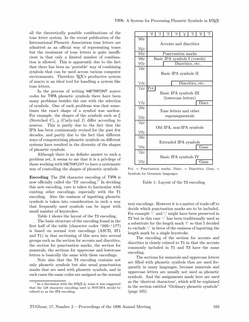
Encoding The 256 character encoding of TIPA isnow officially called the ‘T3’ encoding.7 In decidingthis new encoding, care is taken to harmonize withexisting other encodings, especially with the T1encoding. Also the easiness of inputting phoneticsymbols is taken into consideration in such a waythat frequently used symbols can be input withsmall number of keystrokes.Table 1 shows the layout of the T3 encoding.The basic structure of the encoding found in the
first half of the table (character codes ’000-’177)is based on normal text encodings (ASCII, OT1and T1) in that sectioning of this area into severalgroups such as the section for accents and diacritics,the section for punctuation marks, the section fornumerals, the sections for uppercase and lowercaseletters is basically the same with these encodings.Note also that the T3 encoding contains not
only phonetic symbols but also usual punctuationmarks that are used with phonetic symbols, and insuch cases the same codes are assigned as the normal
7 In a discussion with the LATEX2ε team it was suggestedthat the 128 character encoding used in WSUIPA would berefered to as the OT3 encoding.
’0 ’1 ’2 ’3 ’4 ’5 ’6 ’7
’00x
Accents and diacritics’04x
’05x Punctuation marks’06x Basic IPA symbols I (vowels)’07x Diacritics, etc.’10x
Basic IPA symbols II
’13x Diacritics, etc.’14x Pct.
Basic IPA symbols III(lowercase letters)
’17x Diacr.’20x
Tone letters and other
’23x suprasegmentals
’24x
Old IPA, non-IPA symbols’27x
’30x
Extended IPA symbols’33x Gmn.’34x
Basic IPA symbols IV’37x Gmn.
Pct. = Punctuation marks, Diacr. = Diacritics, Gmn. =
Symbols for Germanic languages.
Table 1: Layout of the T3 encoding
text encodings. However it is a matter of trade-off todecide which punctuation marks are to be included.For example ‘:’ and ‘;’ might have been preserved inT3 but in this case ‘:’ has been traditionally used asa substitute for the length mark ‘:’ so that I decidedto exclude ‘:’ in favor of the easiness of inputting thelength mark by a single keystroke.The encoding of the section for accents and
diacritics is closely related to T1 in that the accentscommonly included in T1 and T3 have the sameencoding.The sections for numerals and uppercase letters
are filled with phonetic symbols that are used fre-quently in many languages, because numerals anduppercase letters are usually not used as phoneticsymbols. And the assignments made here are usedas the ‘shortcut characters’, which will be explainedin the section entitled “Ordinary phonetic symbols”(page 105).
TUGboat, 17, Number 2—Proceedings of the 1996 Annual Meeting 103
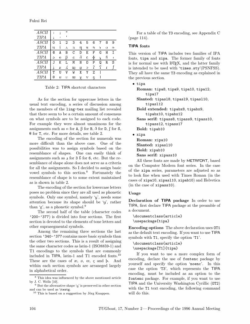
Fukui Rei
ASCII : ; "
TIPA : ; "ASCII 0 1 2 3 4 5 6 7 8 9
TIPA 0 1 2 3 4 5 6 7 8 9ASCII @ A B C D E F G H I
TIPA @ A B C D E F G H IASCII J K L M N O P Q R S
TIPA J K L M N O P Q R SASCII T U V W X Y Z |
TIPA T U V W X Y Z |
Table 2: TIPA shortcut characters
As for the section for uppercase letters in theusual text encoding, a series of discussion amongthe members of the ling-tex mailing list revealedthat there seem to be a certain amount of consensuson what symbols are to be assigned to each code.For example they were almost unanimous for theassignments such as A for A, B for B, D for D, S for S,T for T, etc. For more details, see table 2.The encoding of the section for numerals was
more difficult than the above case. One of thepossibilities was to assign symbols based on theresemblance of shapes. One can easily think ofassignments such as 3 for 3 á for 6, etc. But the re-semblance of shape alone does not serve as a criteriafor all the assignments. So I decided to assign basicvowel symbols to this section.8 Fortunately theresemblance of shape is to some extent maintainedas is shown in table 2.The encoding of the section for lowercase letters
poses no problem since they are all used as phoneticsymbols. Only one symbol, namely ‘g’, needs someattention because its shape should be ‘g’, ratherthan ‘g’, as a phonetic symbol.9
The second half of the table (character codes’200-’377) is divided into four sections. The firstsection is devoted to the elements of tone letters andother suprasegmental symbols.Among the remaining three sections the last
section ’340-’377 contains more basic symbols thanthe other two sections. This is a result of assigningthe same character codes as latin-1 (ISO8859-1) andT1 encodings to the symbols that are commonlyincluded in TIPA, latin-1 and T1 encoded fonts.10
These are the cases of æ, ø, œ, c and þ. Andwithin each section symbols are arraneged largelyin alphabetical order.
8 This idea was influenced by the above mentioned articleby J. C. Wells [10].
9 But the alternative shape ‘¤’ is preserved in other sectionand can be used as \textg.10 This is based on a suggestion by Jorg Knappen.
For a table of the T3 encoding, see Appendix C(page 114).
TIPA fonts
This version of TIPA includes two families of IPAfonts, tipa and xipa. The former family of fontsis for normal use with LATEX, and the latter familyis intended to be used with ‘times.sty’(PSNFSS).They all have the same T3 encoding as explained inthe previous section.
• tipa
Roman: tipa8, tipa9, tipa10, tipa12,tipa17
Slanted: tipasl8, tipasl9, tipasl10,tipasl12
Bold extended: tipabx8, tipabx9,tipabx10, tipabx12
Sans serif: tipass8, tipass9, tipass10,tipass12, tipass17
Bold: tipab10
• xipa
Roman: xipa10Slanted: xipasl10Bold: xipab10Sans serif: xipass10
All these fonts are made by METAFONT, basedon the Computer Modern font series. In the caseof the xipa series, parameters are adjusted so asto look fine when used with Times Roman (in thecases of xipa10, xipasl10, xipab10) and Helvetica(in the case of xipass10).
Usage
Declaration of TIPA package In order to useTIPA, first declare TIPA package at the preamble ofa document.
\documentclassarticle
\usepackagetipa
Encoding options The above declaration uses OT1as the default text encoding. If you want to use TIPAsymbols with T1, specify the option ‘T1’.
\documentclassarticle
\usepackage[T1]tipa
If you want to use a more complex form ofencoding, declare the use of fontenc package byyourself and specify the option ‘noenc’. In thiscase the option ‘T3’, which represents the TIPAencoding, must be included as an option to thefontenc package. For example, if you want to useTIPA and the University Washington Cyrillic (OT2)with the T1 text encoding, the following commandwill do this.
104 TUGboat, 17, Number 2—Proceedings of the 1996 Annual Meeting
TIPA: A System for Processing Phonetic Symbols in LATEX
\documentclassarticle
\usepackage[T3,OT2,T1]fontenc
\usepackage[noenc]tipa
By default, TIPA includes the fontenc packageinternally but the option noenc suppresses this.
Using TIPA with PSNFSS In order to use TIPAwith times.sty, declare the use of times.sty be-fore declaring tipa packages.
\documentclassarticle
\usepackagetimes
\usepackagetipa
Font description files T3ptm.fd and T3phv.fdare automatically loaded by the above declaration.
Other options TIPA can be extended by the op-tions tone, extra.If you want to use the optional package for
‘tone letters’, add ‘tone’ option to the \usepackagecommand that declares tipa package.
\usepackage[tone]tipa
And if you want to use diacritics for extIPA andVoQS, specify ‘extra’ option.
\usepackage[extra]tipa
Finally there is one more option called ‘safe’,which is used to suppress definitions of some possibly‘dangerous’ commands of TIPA.
\usepackage[safe]tipa
More specifically, the following commands aresuppressed by declaring the safe option. Explana-tion on the function of each command will be givenlater.
• \s (equivalent to \textsyllabic)• \* (already defined in plain TEX)• \|, \:, \;, \! (already defined in LATEX)
Input Commands for Phonetic Symbols
Ordinary phonetic symbols TIPA phonetic sym-bols can be input by the following two ways.
1. Input macro names in the normal text environ-ment.
2. Input macro names or shortcut characters with-in the follwoing groups or environment.
• \textipa...11
• \tipaencoding ...
• \beginIPA ... \endIPA
(These groups and environment will be hence-forth refered to as the IPA environment.)
11 I personally prefer a slightly shorter name like \iparather than \textipa but this command was named afterthe general convention of LATEX2ε. The same can be said toall the symbol names beginning with \text.
A shortcut character refers to a single characterthat is assigned to a specific phonetic symbol andthat can be directly input by an ordinary keyboard.In TIPA fonts, the character codes for numeralsand uppercase letters in the normal ASCII encodingare assigned to such shortcut characters, becausenumerals and uppercase letters are usually not usedas phonetic symbols. And additional shortcut char-acters for symbols such as æ, œ, ø may also be used ifyou are using a T1 encoded font and an appropriateinput system for it.The following pair of examples show the same
phonetic transcription of a English word that areinput by the above mentioned two input methods.
Input1 : [\textsecstress\textepsilon kspl\textschwa\textprimstress ne
\textsci\textesh\textschwa n]
Output1 : [Ekspl@"neIS@n]
Input2 : \textipa[""Ekspl@"neIS@n]
Output2 : [Ekspl@"neIS@n]
It is apparent that inputting in the IPA en-vironment is far easier than in the normal textenvironment. Moreover, although the outputs ofthe above examples look almost the same, they arenot identical, exactly speaking. This is becausein the IPA environment automatic kerning betweensymbols is enabled, as is illustrated by the followingpair of examples.
Input1 : v\textturnv v w\textsca wy\textturny y [\textesh]
Output1 : v2v wÀw yLy [S]
Input2 : \textipav2v w\textsca w yLy [S]
Output2 : v2v wÀw yLy [S]
Table 2 shows most of the shortcut characterstogether with the corresponding characters in theASCII encoding.
Naming of phonetic symbols Every TIPA pho-netic symbol has a unique symbol name, such asTurned A, Hooktop B, Schwa.12Also each symbolhas a corresponding control sequence name, suchas \textturna, \texthtb, \textschwa. The nameused as a control sequence is usually an abbreviatedform of the corresponding symbol name with a prefix\text. The conventions used in the abbreviation areas follows.
• Suffixes and endings such as ‘-ive’, ‘-al’, ‘-ed’are omitted.
12 The naming was made based on the literature listed inthe section entitled “Selection of Symbols” (page 102). Andusers of TSIPA should be careful because TIPA’s naming isslightly modified from that of TSIPA.
TUGboat, 17, Number 2—Proceedings of the 1996 Annual Meeting 105
Fukui Rei
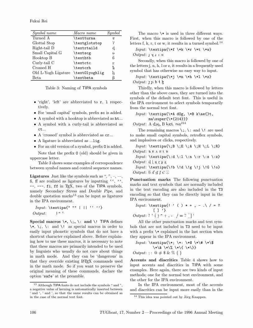
Symbol name Macro name Symbol
Turned A \textturna 5Glottal Stop \textglotstop PRight-tail D \textrtaild ãSmall Capital G \textscg åHooktop B \texthtb áCurly-tail C \textctc CCrossed H \textcrh èOld L-Yogh Ligature \textOlyoghlig ¬Beta \textbeta B
Table 3: Naming of TIPA symbols
• ‘right’, ‘left’ are abbreviated to r, l respec-tively.
• For ‘small capital’ symbols, prefix sc is added.
• A symbol with a hooktop is abbreviated as ht...
• A symbol with a curly-tail is abbreviated asct...
• A ‘crossed’ symbol is abbreviated as cr...
• A ligature is abbreviated as ...lig.
• For an old version of a symbol, prefix O is added.
Note that the prefix O (old) should be given inuppercase letter.Table 3 shows some examples of correspondence
between symbol names and control sequence names.
Ligatures Just like the symbols such as “, ”, –, —,fi, ff are realized as ligatures by inputting ‘‘, ’’,--, ---, fi, ff in TEX, two of the TIPA symbols,namely Secondary Stress and Double Pipe, anddouble quotation marks13 can be input as ligaturesin the IPA environment.
Input : \textipa" "" | || ‘‘ ’’
Output : " | ` ''
Special macros \*, \;, \: and \! TIPA defines\*, \;, \: and \! as special macros in order toeasily input phonetic symbols that do not have ashortcut character explained above. Before explain-ing how to use these macros, it is necessary to notethat these macros are primarily intended to be usedby linguists who usually do not care about thingsin math mode. And they can be ‘dangerous’ inthat they override existing LATEX commands usedin the math mode. So if you want to preserve theoriginal meaning of these commands, daclare theoption ‘safe’ at the preamble.
13 Although TIPA fonts do not include the symbols “ and ”,a negative value of kerning is automatically inserted between‘ and ‘, ’ and ’, so that the same results can be obtained asin the case of the normal text font.
The macro \* is used in three different ways.First, when this macro is followed by one of theletters f, k, r, t or w, it results in a turned symbol.14
Input : \textipa\*f \*k \*r \*t \*w
Output : Í © ô Ø û
Secondly, when this macro is followed by one ofthe letters j, n, h, l or z, it results in a frequently usedsymbol that has otherwise no easy way to input.
Input : \textipa\*j \*n \*h \*l \*z
Output : é ñ è ì Ð
Thirdly, when this macro is followed by lettersother than the above cases, they are turned into thesymbols of the default text font. This is useful inthe IPA environment to select symbols temporarilyfrom the normal text font.
Input : \textipa\*A dOg, \*B k\aet,ma\super\*214
Output : A dOg, B kæt, ma214
The remaining macros \;, \: and \! are usedto make small capital symbols, retroflex symbols,and implosives or clicks, respectively.
Input : \textipa\;B \;E \;A \;H \;L \;R
Output : à £ À Ë Ï öInput : \textipa\:d \:l \:n \:r \:s \:z
Output : ã í ï ó ù üInput : \textipa\!b \!d \!g \!j \!G \!o
Output : á â ä ê É ò
Punctuation marks The following punctuationmarks and text symbols that are normally includedin the text encoding are also included in the T3encoding so that they can be directly input in theIPA environment.
Input : \textipa! ’ ( ) * + , - .\ / = ?[ ] ‘
Output : ! ' ( ) * + , - . / = ? [ ] `
All the other punctuation marks and text sym-bols that are not included in T3 need to be inputwith a prefix \* explained in the last section whenthey appear in the IPA environment.
Input : \textipa\*; \*: \*@ \*\# \*\$\*\& \*\% \*\ \*\
Output : ; : @ # $ & %
Accents and diacritics Table 4 shows how toinput accents and diacritics in TIPA with someexamples. Here again, there are two kinds of inputmethods; one for the normal text environment, andthe other for the IPA environment.In the IPA environment, most of the accents
and diacritics can be input more easily than in the
14 This idea was pointed out by Jorg Knappen.
106 TUGboat, 17, Number 2—Proceedings of the 1996 Annual Meeting
TIPA: A System for Processing Phonetic Symbols in LATEX
Input in the normal Input in the IPA Output
text environment environment
\’a \’a a\"a \"a a\ a \~a a\ra \ra a\textsyllabicm \sm m
"\textsubumlauta \"*a a\textsubtildea \~*a a\textsubringa \r*a a\textdotacutee \.’e e
\textgravedote \‘.e e\textacutemacrona \’=a a\textcircumdota \^.a a\texttildedota \~.a a\textbrevemacrona \u=a a
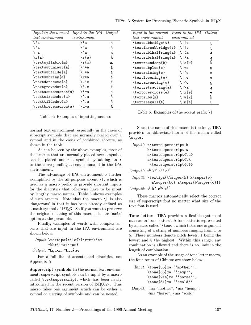
Table 4: Examples of inputting accents
normal text environment, especially in the cases ofsubscript symbols that are normally placed over asymbol and in the cases of combined accents, asshown in the table.As can be seen by the above examples, most of
the accents that are normally placed over a symbolcan be placed under a symbol by adding an *to the corresponding accent command in the IPAenvironment.The advantage of IPA environment is further
exemplified by the all-purpose accent \|, which isused as a macro prefix to provide shortcut inputsfor the diacritics that otherwise have to be inputby lengthy macro names. Table 5 shows examplesof such accents. Note that the macro \| is also‘dangerous’ in that it has been already defined asa math symbol of LATEX. So if you want to preservethe original meaning of this macro, declare ‘safe’option at the preamble.Finally, examples of words with complex ac-
cents that are input in the IPA environment areshown below.
Input : \textipa*\|ck\r*mt\’om*bhr\’=at\=er
Output : *kmtom *bhrater
For a full list of accents and diacritics, seeAppendix A
Superscript symbols In the normal text environ-ment, superscript symbols can be input by a macrocalled \textsuperscript, which has been newlyintroduced in the recent version of LATEX2ε. Thismacro takes one argument which can be either asymbol or a string of symbols, and can be nested.
Input in the normal Input in the IPA Output
text environment environment
\textsubbridget \|[t t\textinvsubbridget \|]t t\textsublhalfringa \|(a a\textsubrhalfringa \|)a a\textroundcapk \|ck k\textsubpluso \|+o o\textraisinge \|’e e\textloweringe \|‘e e\textadvancingo \|<o o\textretractinga \|>a a\textovercrosse \|xe e\textsubwk \|wk k\textseagullt \|mt t
Table 5: Examples of the accent prefix \|
Since the name of this macro is too long, TIPAprovides an abbreviated form of this macro called\super.
Input1 : t\textsuperscript hk\textsuperscript w
a\textsuperscriptbc
a\textsuperscriptb%
\textsuperscriptc
Output1 : th kw abc abc
Input2 : \textipat\superh k\superwa\superbc a\superb\superc
Output2 : th kw abc abc
These macros automatically select the correctsize of superscript font no matter what size of thetext font is used.
Tone letters TIPA provides a flexible system ofmacros for ‘tone letters’. A tone letter is representedby a macro called ‘\tone’, which takes one argumentconsisting of a string of numbers ranging from 1 to5. These numbers denote pitch levels, 1 being thelowest and 5 the highest. Within this range, anycombination is allowed and there is no limit in thelength of combination.As an example of the usage of tone letter macro,
the four tones of Chinese are show below.
Input : \tone55ma ‘‘mother’’,\tone35ma ‘‘hemp’’,
\tone214ma ‘‘horse’’,
\tone51ma ‘‘scold’’
Output :|ma “mother”, |ma “hemp”,|ma “horse”, |ma “scold”
TUGboat, 17, Number 2—Proceedings of the 1996 Annual Meeting 107
Fukui Rei
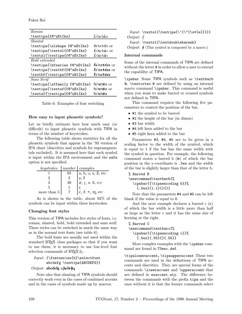
Roman
\textipaf@"nEtIks f@"nEtIksSlanted
\textipa\slshape f@"nEtIks f@"nEtIks or\textipa\textslf@"nEtIks f@"nEtIks or\textsl\textipaf@"nEtIks f@"nEtIks
Bold extended
\textipa\bfseries f@"nEtIks f@"nEtIks or\textipa\textbff@"nEtIks f@"nEtIks or\textbf\textipaf@"nEtIks f@"nEtIks
Sans Serif
\textipa\sffamily f@"nEtIks f@"nEtIks or\textipa\textsff@"nEtIks f@"nEtIks or\textsf\textipaf@"nEtIks f@"nEtIks
Table 6: Examples of font switching
How easy to input phonetic symbols?
Let us briefly estimate here how much easy (ordifficult) to input phonetic symbols with TIPA interms of the number of keystrokes.The following table shows statistics for all the
phonetic symbols that appear in the ’93 version ofIPA chart (diacritics and symbols for suprasegmen-tals excluded). It is assumed here that each symbolis input within the IPA environment and the safeoption is not specified.
keystrokes number examples
1 65 a, b, @, A, B, etc.2 2 ø, 3 30 æ, ú, à, á, etc.5 1 ç
more than 5 7 Å, Ü, , î, etc.
As is shown in the table, about 92% of thesymbols can be input within three keystrokes.
Changing font styles
This version of TIPA includes five styles of fonts, i.e.roman, slanted, bold, bold extended and sans serif.These styles can be switched in much the same wayas in the normal text fonts (see table 6).The bold fonts are usually not used within the
standard LATEX class packages so that if you wantto use them, it is necessary to use low-level fontselection commands of LATEX2ε.
Input : \fontseriesb\selectfontabcdefg \textipaABCDEFG
Output : abcdefg ABCDEFG
Note also that slanting of TIPA symbols shouldcorrectly work even in the cases of combined accentsand in the cases of symbols made up by macros.
Input : \textsl\textipa\’\"\u*e
Output : e
Input : \textsl\textdoublebaresh
Output : S (This symbol is composed by a macro.)
Internal commands
Some of the internal commands of TIPA are definedwithout the letter @ in order to allow a user to extendthe capability of TIPA.
\ipabar Some TIPA symbols such as \textbarbb, \textcrtwo 2 are defined by using an internalmacro command \ipabar. This command is usefulwhen you want to make barred or crossed symbolsnot defined in TIPA.This command requires the following five pa-
rameters to control the position of the bar.
• #1 the symbol to be barred
• #2 the height of the bar (in dimen)
• #3 bar width
• #4 left kern added to the bar
• #5 right kern added to the bar
Parameters #3, #4, #5 are to be given in ascaling factor to the width of the symbol, whichis equal to 1 if the bar has the same width withthe symbol in question. For example, the followingcommand states a barred b (b) of which the barposition in the y-coordinate is .5ex and the widthof the bar is slightly larger than that of the letter b.
% Barred B
\newcommand\textbarb%
\ipabar\tipaencoding b%
.5ex1.1
Note that the parameters #4 and #5 can be leftblank if the value is equal to 0.And the next example declares a barred c (c)
of which the bar width is a little more than halfas large as the letter c and it has the same size ofkerning at the right.
% Barred C
\newcommand\textbarc%
\ipabar\tipaencoding c%
.5ex.55.55
More complex examples with the \ipabar com-mand are found in T3enc.def.
\tipaloweraccent, \tipaupperaccent These twocommands are used in the definitions of TIPA ac-cents and diacritics. They are special forms of thecommands \loweraccent and \upperaccent thatare defined in exaccent.sty. The difference be-tween the commands with the prefix tipa and theones without it is that the former commands select
108 TUGboat, 17, Number 2—Proceedings of the 1996 Annual Meeting
TIPA: A System for Processing Phonetic Symbols in LATEX
accents from a T3 encoded font while the latter onesdo so from the current text font.These commands take two parameters, the code
of the accent (in decimal, octal or hexadecimalnumber) and the symbol to be accented, as shownbelow.
Input : \tipaupperaccent0a
Output : a
Optionally, these commands can take a extraparameter to adjust the vertical position of theaccent. Such an adjustment is sometimes necessaryin the definition of a nested accent. The nextexample shows TIPA’s definition of the ‘CircumflexDot Accent’ (e.g. a).
% Circumflex Dot Accent
\newcommand\textcircumdot[1]%
\tipaupperaccent[-.2ex]2%
\tipaupperaccent[-.1ex]10#1
This definition states that a dot accent is placedover a symbol thereby reducing the vertical distancebetween the symbol and the dot by .1ex and acircumflex accent is placed over the dot and thedistance between the two accents is reduced by .2ex.If you want to make a combined accent not
included in TIPA, you can do so fairly easily by usingthese two commands together with the optionalparameter. For more examples of these commands,see tipa.sty and extraipa.sty.
\tipaLoweraccent, \tipaUpperaccent These twocommands differ from the two commands explaindabove in that the first parameter should be a symbol(or any other things, typically an \hbox), ratherthan the code of the accent. They are special casesof the commands \Loweraccent and \Upperaccentand the difference between the two pairs of com-mands is the same as before.The next example makes a schwa an accent.
Input : \tipaUpperaccent[.2ex]%\lower.8ex\hbox%
\textipa\super@a
Output :@a
Acknowledgments
First of all, many thanks are due to the co-authorsof TSIPA, Kobayashi Hajime and Shirakawa Shun.Kobayashi Hajime was the main font designer ofTSIPA. Shirakawa Shun worked very hard in de-ciding encoding, checking the shapes of symbols andwriting the Japanese version of document. TIPA wasimpossible without TSIPA.I would like to thank also Jorg Knappen whose
insightful comments helped greatly in many ways
the development of TIPA. I was also helped andencouraged by Christina Thiele, Martin Haase, KirkSullivan and many other members of the ling-texmailing list.At the last stage of the development of TIPA
Frank Mittelbach gave me precious comments onhow to incorporate various TIPA commands into theNFSS. I would like to thank also Barbara Beetonwho kindly read over the preliminary draft of thisdocument and gave me useful comments.
References
[1] Martin J. Ball, John Esling, and Craig Dickson.VoQS: Voice Quality Symbols. 1994, 1994.
[2] John Esling. Computer coding of the IPA: Sup-plementary report. Journal of the InternationalPhonetic Association, 20(1):22–26, 1990.
[3] John H. Esling and Harry Gaylord. Computercodes for phonetic symbols. Journal of theInternational Phonetic Association, 23(2):83–97, 1993.
[4] ICPLA. extIPA Symbols for Disorderd Speech.1994, 1994.
[5] IPA. The Principles of the International Pho-netic Association, 1949.
[6] IPA. Report on the 1989 Kiel Convention.Journal of the International Phonetic Associ-
ation, 19(2):67–80, 1989.
[7] IPA. Further report on the 1989 Kiel Con-vention. Journal of the International PhoneticAssociation, 20(2):22–24, 1990.
[8] IPA. Council actions on revisions of the IPA.Journal of the International Phonetic Associa-
tion, 23(1):32–34, 1993.
[9] Geoffrey K. Pullum and William A. Ladusaw.Phonetic Symbol Guide. The University ofChicago Press, 1986.
[10] John C. Wells. Computer-coding the IPA: aproposed extension of SAMPA. Revised draft1995 04 28, 1995.
Appendix
A A List of TIPA Symbols
For each symbol the following information is shown:(1) the symbol, (2) input method in the normal textenvironment (and a shortcut method that can beused within the IPA environment in parenthesis),(3) the name of the symbol.
Vowels and Consonants
a a Lower-case A
TUGboat, 17, Number 2—Proceedings of the 1996 Annual Meeting 109
Fukui Rei
5 \textturna(5) Turned AA \textscripta(A) Script A6 \textturnscripta(6) Turned Script Aæ \ae AshÀ \textsca(\;A) Small Capital A15
2 \textturnv(2) Turned V16
b b Lower-case Bº \textsoftsign Soft Sign» \texthardsign Hard Signá \texthtb(\!b) Hooktop Bà \textscb(\;B) Small Capital B \textcrb Crossed Bb \textbarb Barred BB \textbeta(B) Betac c Lower-case Cc \textbarc Barred CÁ \texthtc Hooktop Cc \vc C Wedgeç \cc C CedillaC \textctc(C) Curly-tail CÂ \textstretchc Stretched C17
d d Lower-case D¡ \textcrd Crossed Dd \textbard Barred Dâ \texthtd(\!d) Hooktop Dã \textrtaild(\:d) Right-tail D¢ \textctd Curly-tail Ddz \textdzlig D-Z Ligaturedý \textdctzlig D-Curly-tail Z Ligatureà \textdyoghlig D-Yogh Ligature¢ý \textctdctzlig
Curly-tail D-Curly-tail Z LigatureD \dh (D) Ethe e Lower-case E@ \textschwa(@) SchwaÄ \textrhookschwa Right-hook Schwa9 \textreve(9) Reversed E£ \textsce(\;E) Small Capital EE \textepsilon(E) EpsilonÅ \textcloseepsilon Closed Epsilon3 \textrevepsilon(3) Reversed EpsilonÇ \textrhookrevepsilon
Right-hook Reversed EpsilonÆ \textcloserevepsilon
Closed Reversed Epsilon
15 This symbol is fairly common among Chinese phoneti-cians.16 In PSG this symbol is called ‘Inverted V’ but it is
apparently a mistake.17 The shape of this symbol differs according to the
sources. In PSG and recent articles in JIPA, it is ‘stretched’toward both the ascender and descender regions and thewhole shape looks like a thick staple. In the old days,however, it was streched only toward the ascender and thewhole shape looked more like a stretched c.
f f Lower-case Fg \textg(g) Lower-case Gg \textbarg Barred Gg \textcrg Crossed Gä \texthtg(\!g) Hooktop G¤ g (\textg) Text Gå \textscg(\;G) Small Capital GÉ \texthtscg(\!G) Hooktop Small Capital GG \textgamma(G) GammaÈ \textbabygamma Baby Gamma7 \textramshorns(7) Ram’s Hornsh h Lower-case Hÿ \texthvlig H-V Ligatureè \textcrh Crossed HH \texthth(H) Hooktop HÊ \texththeng Hooktop Heng4 \textturnh(4) Turned HË \textsch(\;H) Small Capital Hi i Lower-case I \i Undotted I1 \textbari(1) Barred IÌ \textiota Iota¥ \textlhti Left-hooktop I18
¦ \textlhtlongi Left-hooktop Long I§ \textvibyi Viby I19
§ \textraisevibyi Raised Viby II \textsci(I) Small Capital Ij j Lower-case J \j Undotted JJ \textctj(J) Curly-tail J20
¨ \textscj(\;J) Small Capital J \v\j J Wedgeé \textbardotlessj Barred Dotless JÍ \textObardotlessj Old Barred Dotless Jê \texthtbardotlessj(\!j)
Hooktop Barred Dotless J21
k k Lower-case KÎ \texthtk Hooktop K© \textturnk(\*k) Turned Kl l Lower-case L
18 The four symbols ¥, ¦, § and § are mainly used amongChinese linguists. These symbols are based on “det svenskalandsmalsalfabetet” and introduced to China by BernhardKarlgren. The original shapes of these symbols were in italicas was always the case with “det svenska landsmalsalfabetet”.It seems that the Chinese linguists who wanted to continueto use these symbols in IPA changed their shapes upright.19 I call this symbol ‘Viby I’, based on the following
description by Bernhard Karlgren: “Une voyelle tres analoguea § se rencontre dans certains dial. suedois; on l’appelle ‘i deViby’.”(Etudes sur la phonologie chinoise, 1915–26, p. 295)20 In the official IPA charts of ’89 and ’93, this symbol has
a dish serif on top of the stem, rather than the normal slopedserif found in the letter j. I found no reason why it shouldhave a dish serif here, so I changed it to a normal sloped serif.21 In PSG the shape of this symbol slightly differs. Here I
followed the shape found in IPA ’89, ’93.
110 TUGboat, 17, Number 2—Proceedings of the 1996 Annual Meeting
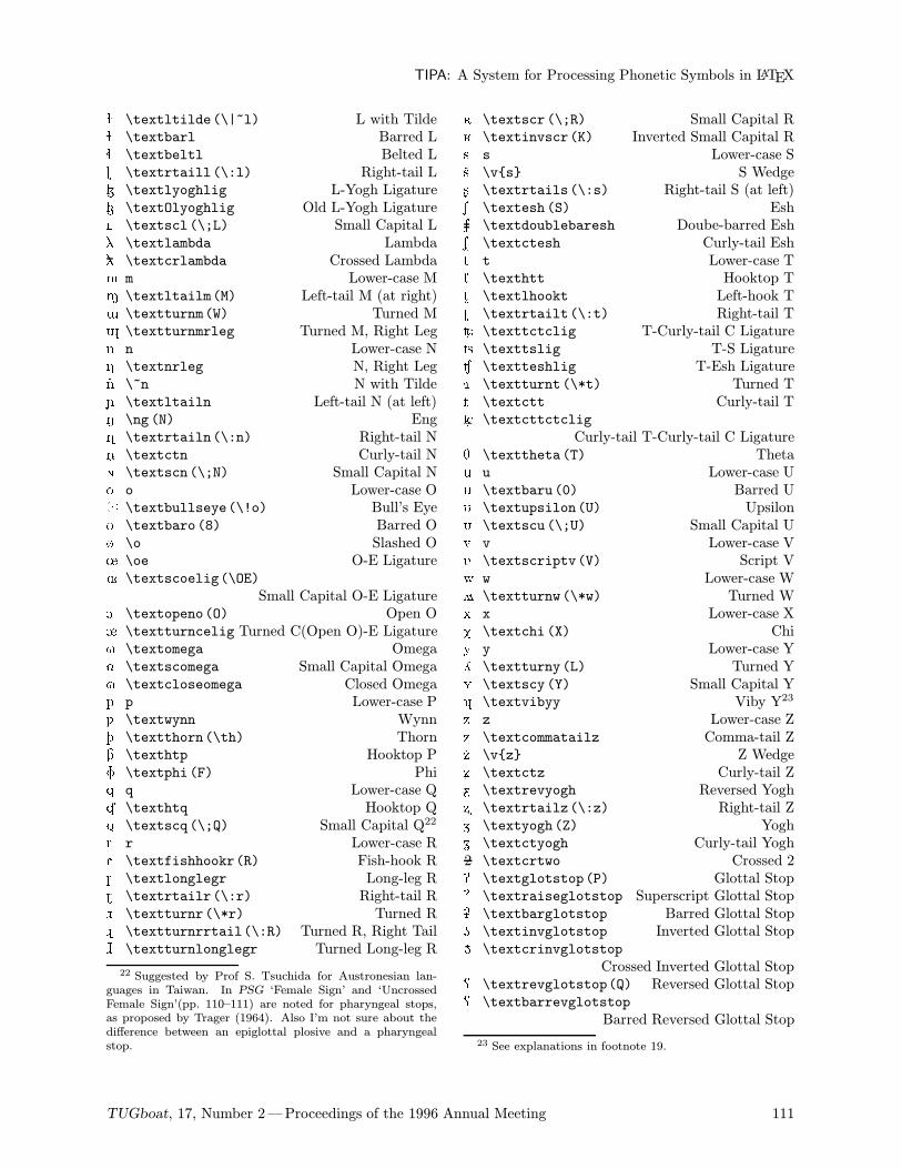
TIPA: A System for Processing Phonetic Symbols in LATEX
ë \textltilde(\|~l) L with Tildeª \textbarl Barred Lì \textbeltl Belted Lí \textrtaill(\:l) Right-tail LÐ \textlyoghlig L-Yogh Ligature¬ \textOlyoghlig Old L-Yogh LigatureÏ \textscl(\;L) Small Capital L« \textlambda Lambda« \textcrlambda Crossed Lambdam m Lower-case MM \textltailm(M) Left-tail M (at right)W \textturnm(W) Turned Mî \textturnmrleg Turned M, Right Legn n Lower-case N® \textnrleg N, Right Legn \~n N with Tildeñ \textltailn Left-tail N (at left)N \ng (N) Engï \textrtailn(\:n) Right-tail N \textctn Curly-tail Nð \textscn(\;N) Small Capital No o Lower-case Oò \textbullseye(\!o) Bull’s Eye8 \textbaro(8) Barred Oø \o Slashed O÷ \oe O-E Ligature× \textscoelig(\OE)
Small Capital O-E LigatureO \textopeno(O) Open O¯ \textturncelig Turned C(Open O)-E Ligature° \textomega Omega± \textscomega Small Capital OmegaÑ \textcloseomega Closed Omegap p Lower-case Pß \textwynn Wynnþ \textthorn(\th) ThornÒ \texthtp Hooktop PF \textphi(F) Phiq q Lower-case QÓ \texthtq Hooktop Q² \textscq(\;Q) Small Capital Q22
r r Lower-case RR \textfishhookr(R) Fish-hook RÔ \textlonglegr Long-leg Ró \textrtailr(\:r) Right-tail Rô \textturnr(\*r) Turned Rõ \textturnrrtail(\:R) Turned R, Right TailÕ \textturnlonglegr Turned Long-leg R
22 Suggested by Prof S. Tsuchida for Austronesian lan-guages in Taiwan. In PSG ‘Female Sign’ and ‘UncrossedFemale Sign’(pp. 110–111) are noted for pharyngeal stops,as proposed by Trager (1964). Also I’m not sure about thedifference between an epiglottal plosive and a pharyngealstop.
ö \textscr(\;R) Small Capital RK \textinvscr(K) Inverted Small Capital Rs s Lower-case Ss \vs S Wedgeù \textrtails(\:s) Right-tail S (at left)S \textesh(S) EshS \textdoublebaresh Doube-barred Esh³ \textctesh Curly-tail Esht t Lower-case TÖ \texthtt Hooktop T´ \textlhookt Left-hook Tú \textrtailt(\:t) Right-tail TtC \texttctclig T-Curly-tail C Ligature¶ \texttslig T-S LigatureÙ \textteshlig T-Esh LigatureØ \textturnt(\*t) Turned Tµ \textctt Curly-tail TµC \textcttctclig
Curly-tail T-Curly-tail C LigatureT \texttheta(T) Thetau u Lower-case U0 \textbaru(0) Barred UU \textupsilon(U) UpsilonÚ \textscu(\;U) Small Capital Uv v Lower-case VV \textscriptv(V) Script Vw w Lower-case Wû \textturnw(\*w) Turned Wx x Lower-case XX \textchi(X) Chiy y Lower-case YL \textturny(L) Turned YY \textscy(Y) Small Capital Y· \textvibyy Viby Y23
z z Lower-case ZÞ \textcommatailz Comma-tail Zz \vz Z Wedgeý \textctz Curly-tail Z¹ \textrevyogh Reversed Yoghü \textrtailz(\:z) Right-tail ZZ \textyogh(Z) Yogh¸ \textctyogh Curly-tail Yogh2 \textcrtwo Crossed 2P \textglotstop(P) Glottal Stop¼ \textraiseglotstop Superscript Glottal StopÜ \textbarglotstop Barred Glottal StopÛ \textinvglotstop Inverted Glottal StopÛ \textcrinvglotstop
Crossed Inverted Glottal StopQ \textrevglotstop(Q) Reversed Glottal StopÝ \textbarrevglotstop
Barred Reversed Glottal Stop
23 See explanations in footnote 19.
TUGboat, 17, Number 2—Proceedings of the 1996 Annual Meeting 111
Fukui Rei
| \textpipe(|) Pipe \textdoublebarpipe Double-barred Pipe=/ \textdoublebarslash Double-barred Slash \textdoublepipe(||) Double Pipe! ! Exclamation Point
Suprasegmentals
" \textprimstress(") Vertical Stroke (Superior) \textsecstress("") Vertical Stroke (Inferior): \textlengthmark(:) Length Mark; \texthalflength(;) Half-length Mark \textvertline Vertical Line \textdoublevertline Double Vertical Line
< \textbottomtiebar(\t*) Bottom Tie Bar \textglobfall Downward Diagonal Arrow \textglobrise Upward Diagonal Arrow \textdownstep Down Arrow24
\textupstep Up Arrow
Accents and Diacritics
e \‘e Grave Accente \’e Acute Accente \^e Circumflex Accente \~e Tildee \"e Umlaute \He Double Acute Accente \re Ringe \ve Wedgee \ue Brevee \=e Macrone \.e Dote \ce Cedillee \textpolhooke(\ke)
Polish Hook (Ogonek Accent) e \textdoublegravee(\H*e)
Double Grave Accente\textsubgravee(\‘*e)
Subscript Grave Accente\textsubacutee(\’*e)
Subscript Acute Accente\textsubcircume(\^*e)
Subscript Circumflex Accentg \textroundcapg(\|cg) Round Capa \textacutemacrona(\’=a)
Acute Accent with Macrona \textvbaraccenta Vertical Bar Accenta \textdoublevbaraccenta
Double Vertical Bar Accente \textgravedote(\‘.e) Grave Dot Accente \textdotacutee(\’.e) Dot Acute Accenta \textcircumdota(\^.a)
Circumflex Dot Accent24 The shapes of \textdownstep and \textupstep differ
according to sources. Here I followed the shapes found in therecent IPA charts.
a \texttildedota(\~.a) Tilde Dot Accenta \textbrevemacrona(\u=a)
Breve Macron Accenta \textringmacrona(\r=a)
Ring Macron Accents \textacutewedges(\v’s)
Acute Wedge Accenta \textdotbrevea Dot Breve Accentt \textsubbridget(\|[t) Subscript Bridged \textinvsubbridged(\|]t)
Inverted Subscript Bridgen \textsubsquaren Subscript Squareo \textsubrhalfringo(\|)o)
Subscript Right Half-ring25
o \textsublhalfringo(\|(o)Subscript Left Half-ring
k \textsubwk(\|wk) Subscript Wg \textoverwg Over Wt \textseagullt(\|mt) Seagulle \textovercross\e(\|xe) Over-crossO \textsubplus\textopeno(\|+O)
Subscript Plus26
E \textraising\textepsilon(\|’E)Raising Sign
e \textloweringe(\|‘e) Lowering Signu \textadvancingu(\|<u) Advancing Sign@ \textretracting\textschwa(\|>@)
Retracting Signe\textsubtildee(\~*e) Subscript Tilde
e\textsubumlaute(\"*e) Subscript Umlaut
u\textsubringu(\r*u) Subscript Ring
e\textsubwedgee(\v*e) Subscript Wedge
e\textsubbare(\=*e) Subscript Bar
e\textsubdote(\.*e) Subscript Dot
e\textsubarche Subscript Arch
m"\textsyllabicm(\sm) Syllabicity Mark
t& \textsuperimposetildet(\|~t)Superimposed Tilde
t^ t\textcorner Cornert_ t\textopencorner Open Corner@~ \textschwa\rhoticity Rhoticityb b\textceltpal Celtic Palatalization Markk½ k\textlptr Left Pointerk¾ k\textrptr Right Pointerp p\textrectangle Rectangle27
25 Diacritics \textsubrhalfring and \textsublhalfringcan be placed after a symbol by inputting, for example,[e\textsubrhalfring] [e].26 The diacritics such as \textsubplus, \textraising,
\textlowering \textadvancing and \textretracting can beplaced after a symbol by inputting [e\textsubplus] [e],for example.27 This symbol is used among Japanese linguists as a dia-
critical symbol indicating no audible release (IPA ^), becausethe symbol ^ is used to indicate pitch accent in Japanese.
112 TUGboat, 17, Number 2—Proceedings of the 1996 Annual Meeting
TIPA: A System for Processing Phonetic Symbols in LATEX
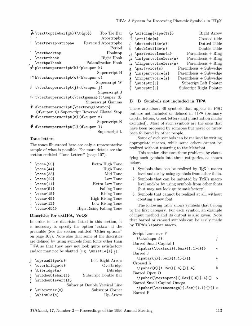
>gb \texttoptiebargb(\tgb) Top Tie Bar' ’ Apostrophe\ \textrevapostrophe Reversed Apostrophe. . Period# \texthooktop Hooktop$ \textrthook Right Hook% \textpalhook Palatalization Hookph p\textsuperscripth(p\super h)
Superscript Hkw k\textsuperscriptw(k\super w)
Superscript Wtj t\textsuperscriptj(t\super j)
Superscript JtG t\textsuperscript\textgamma(t\super G)
Superscript GammadQ d\textsuperscript\textrevglotstop(d\super Q) Superscript Reversed Glottal Stop
dn d\textsuperscriptn(d\super n)Superscript N
dl d\textsuperscriptl(d\super l)Superscript L
Tone letters
The tones illustrated here are only a representativesample of what is possible. For more details see thesection entitled “Tone Letters” (page 107).
| \tone55 Extra High Tone| \tone44 High Tone| \tone33 Mid Tone| \tone22 Low Tone| \tone11 Extra Low Tone| \tone51 Falling Tone| \tone15 Rising Tone| \tone45 High Rising Tone| \tone12 Low Rising Tone| \tone454 High Rising Falling Tone
Diacritics for extIPA, VoQS
In order to use diacritics listed in this section, itis necessary to specify the option ‘extra’ at thepreamble (See the section entitled “Other options”on page 105). Note also that some of the diacriticsare defined by using symbols from fonts other thanTIPA so that they may not look quite satisfactoryand/or may not be slanted (e.g. \whistles s
↑).
s↔\spreadlipss Left Right Arrow
v \overbridgev Overbridgen \bibridgen Bibridget\subdoublebart Subscript Double Bar
f""\subdoublevertf
Subscript Double Vertical Linev^\subcornerv Subscript Corner
s↑\whistles Up Arrow
Ts→\sliding\ipaTs Right Arrow
m \crtildem Crossed tilde..a \dottedtildea Dotted Tildes \doubletildes Double Tilden \partvoicelessn Parenthesis + Ring
n\inipartvoicelessn Parenthesis + Ring
n\finpartvoicelessn Parenthesis + Ring
s \partvoices Parenthesis + Subwedge
s\inipartvoices Parenthesis + Subwedge
s\finpartvoices Parenthesis + Subwedge
J½\sublptrJ Subscript Left Pointer
J¾\subrptrJ Subscript Right Pointer
B B Symbols not included in TIPA
There are about 40 symbols that appear in PSGbut are not included or defined in TIPA (ordinarycapital letters, Greek letters and punctuation marksexcluded). Most of such symbols are the ones thathave been proposed by someone but never or rarelybeen followed by other people.Some of such symbols can be realized by writing
appropriate macros, while some others cannot berealized without resorting to the Metafont.This section discusses these problems by classi-
fying such symbols into three categories, as shownbelow.
1. Symbols that can be realized by TEX’s macrolevel and/or by using symbols from other fonts.
2. Symbols that can be imitated by TEX’s macrolevel and/or by using symbols from other fonts(but may not look quite satisfactory).
3. Symbols that cannot be realized at all, withoutcreating a new font.
The following table shows symbols that belongto the first category. For each symbol, an exampleof input method and its output is also given. Notethat barred or crossed symbols can be easily madeby TIPA’s \ipabar macro.
Script Lowe-case F\itshape f f
Barred Small Capital I\ipabar\textsci.5ex1.1 IBarred J\ipabarj.5ex1.1 jCrossed K\ipabark1.2ex.6.4 kBarred Open O\ipabar\textopeno.5ex.6.4 OBarred Small Capital Omega\ipabar\textscomega.5ex1.1 ±Barred P
TUGboat, 17, Number 2—Proceedings of the 1996 Annual Meeting 113
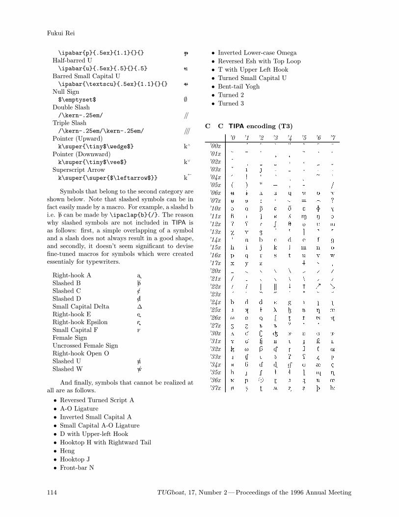
Fukui Rei
\ipabarp.5ex1.1 pHalf-barred U\ipabaru.5ex.5.5 uBarred Small Capital U\ipabar\textscu.5ex1.1 ÚNull Sign$\emptyset$ ∅Double Slash/\kern-.25em/ //Triple Slash/\kern-.25em/\kern-.25em/ ///Pointer (Upward)k\super\tiny$\wedge$ k∧
Pointer (Downward)k\super\tiny$\vee$ k∨
Superscript Arrowk\super\super$\leftarrow$ k
←
Symbols that belong to the second category areshown below. Note that slashed symbols can be infact easily made by a macro. For example, a slashd bi.e. b/ can be made by \ipaclapb/. The reasonwhy slashed symbols are not included in TIPA isas follows: first, a simple overlapping of a symboland a slash does not always result in a good shape,and secondly, it doesn’t seem significant to devisefine-tuned macros for symbols which were createdessentialy for typewriters.
Right-hook A a$Slashed B b/Slashed C c/Slashed D d/Small Capital Delta ∆
Right-hook E e$Right-hook Epsilon E$Small Capital F f
Female SignUncrossed Female SignRight-hook Open OSlashed U u/Slashed W w/
And finally, symbols that cannot be realized atall are as follows.
• Reversed Turned Script A
• A-O Ligature
• Inverted Small Capital A
• Small Capital A-O Ligature
• D with Upper-left Hook
• Hooktop H with Rightward Tail
• Heng
• Hooktop J
• Front-bar N
• Inverted Lower-case Omega
• Reversed Esh with Top Loop
• T with Upper Left Hook
• Turned Small Capital U
• Bent-tail Yogh
• Turned 2
• Turned 3
C C TIPA encoding (T3)
’0 ’1 ’2 ’3 ’4 ’5 ’6 ’7
’00x ’01x ’02x ’03x ’04x ! " # $ % & '’05x ( ) * + , - . /’06x 0 1 2 3 4 5 6 7’07x 8 9 : ; < = > ?’10x @ A B C D E F G’11x H I J K L M N O’12x P Q R S T U V W’13x X Y Z [ \ ] ^ _’14x ` a b c d e f g’15x h i j k l m n o’16x p q r s t u v w’17x x y z | ~ ’20x ’21x ’22x ’23x ’24x ¡ ¢ £ ¤ ¥ ¦ §’25x ¨ © ª « ¬ ® ¯’26x ° ± ² ³ ´ µ ¶ ·’27x ¸ ¹ º » ¼ ½ ¾’30x À Á Â Ã Ä Å Æ Ç’31x È É Ê Ë Ì Í Î Ï’32x Ð Ñ Ò Ó Ô Õ Ö ×’33x Ø Ù Ú Û Ü Ý Þ ß’34x à á â ã ä å æ ç’35x è é ê ë ì í î ï’36x ð ñ ò ó ô õ ö ÷’37x ø ù ú û ü ý þ ÿ
114 TUGboat, 17, Number 2—Proceedings of the 1996 Annual Meeting
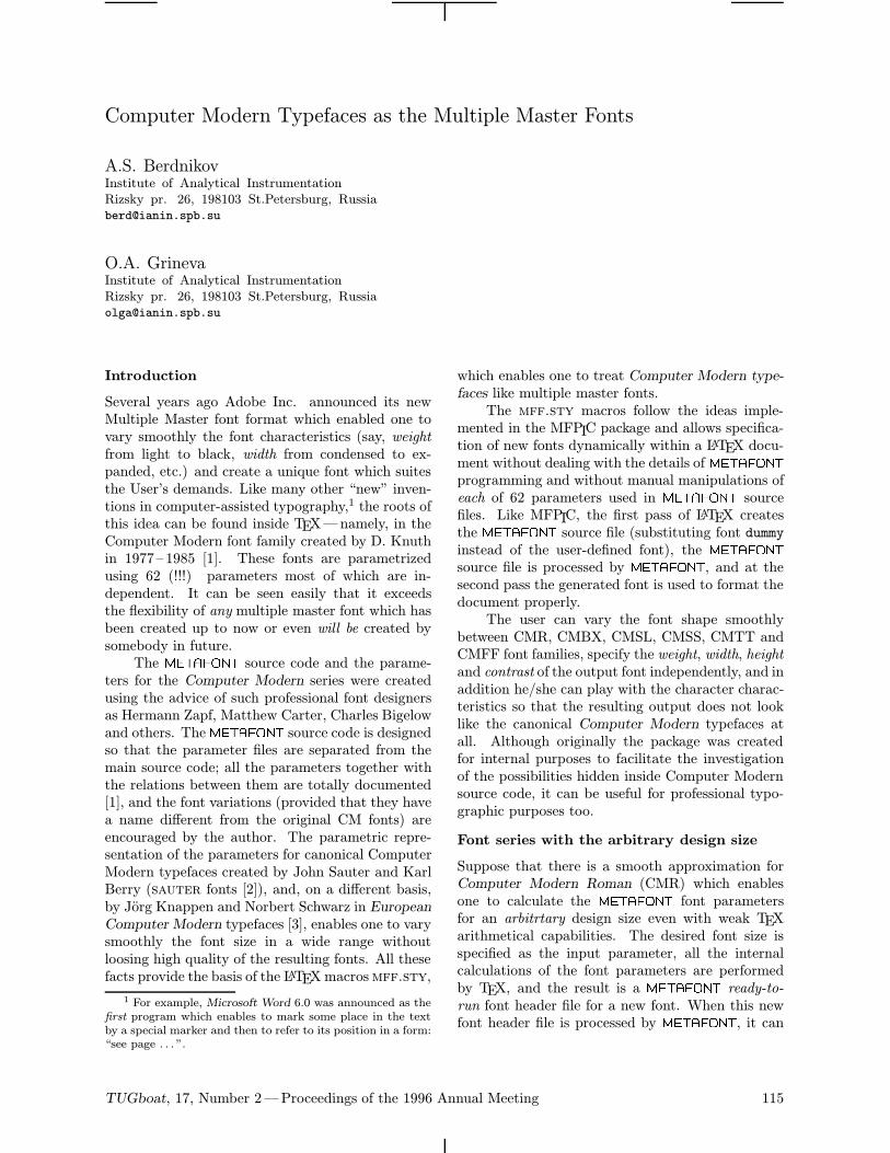
Computer Modern Typefaces as the Multiple Master Fonts
A.S. BerdnikovInstitute of Analytical InstrumentationRizsky pr. 26, 198103 St.Petersburg, [email protected]
O.A. GrinevaInstitute of Analytical InstrumentationRizsky pr. 26, 198103 St.Petersburg, [email protected]
Introduction
Several years ago Adobe Inc. announced its newMultiple Master font format which enabled one tovary smoothly the font characteristics (say, weightfrom light to black, width from condensed to ex-panded, etc.) and create a unique font which suitesthe User’s demands. Like many other “new” inven-tions in computer-assisted typography,1 the roots ofthis idea can be found inside TEX—namely, in theComputer Modern font family created by D. Knuthin 1977– 1985 [1]. These fonts are parametrizedusing 62 (!!!) parameters most of which are in-dependent. It can be seen easily that it exceedsthe flexibility of any multiple master font which hasbeen created up to now or even will be created bysomebody in future.The METAFONT source code and the parame-
ters for the Computer Modern series were createdusing the advice of such professional font designersas Hermann Zapf, Matthew Carter, Charles Bigelowand others. The METAFONT source code is designedso that the parameter files are separated from themain source code; all the parameters together withthe relations between them are totally documented[1], and the font variations (provided that they havea name different from the original CM fonts) areencouraged by the author. The parametric repre-sentation of the parameters for canonical ComputerModern typefaces created by John Sauter and KarlBerry (sauter fonts [2]), and, on a different basis,by Jorg Knappen and Norbert Schwarz in EuropeanComputer Modern typefaces [3], enables one to varysmoothly the font size in a wide range withoutloosing high quality of the resulting fonts. All thesefacts provide the basis of the LATEXmacrosmff.sty,
1 For example, Microsoft Word 6.0 was announced as the
first program which enables to mark some place in the text
by a special marker and then to refer to its position in a form:
“see page . . . ”.
which enables one to treat Computer Modern type-faces like multiple master fonts.The mff.sty macros follow the ideas imple-
mented in the MFPIC package and allows specifica-tion of new fonts dynamically within a LATEX docu-ment without dealing with the details of METAFONTprogramming and without manual manipulations ofeach of 62 parameters used in METAFONT sourcefiles. Like MFPIC, the first pass of LATEX createsthe METAFONT source file (substituting font dummyinstead of the user-defined font), the METAFONTsource file is processed by METAFONT, and at thesecond pass the generated font is used to format thedocument properly.The user can vary the font shape smoothly
between CMR, CMBX, CMSL, CMSS, CMTT andCMFF font families, specify the weight, width, heightand contrast of the output font independently, and inaddition he/she can play with the character charac-teristics so that the resulting output does not looklike the canonical Computer Modern typefaces atall. Although originally the package was createdfor internal purposes to facilitate the investigationof the possibilities hidden inside Computer Modernsource code, it can be useful for professional typo-graphic purposes too.
Font series with the arbitrary design size
Suppose that there is a smooth approximation forComputer Modern Roman (CMR) which enablesone to calculate the METAFONT font parametersfor an arbitrtary design size even with weak TEXarithmetical capabilities. The desired font size isspecified as the input parameter, all the internalcalculations of the font parameters are performedby TEX, and the result is a METAFONT ready-to-run font header file for a new font. When this newfont header file is processed by METAFONT, it can
TUGboat, 17, Number 2—Proceedings of the 1996 Annual Meeting 115
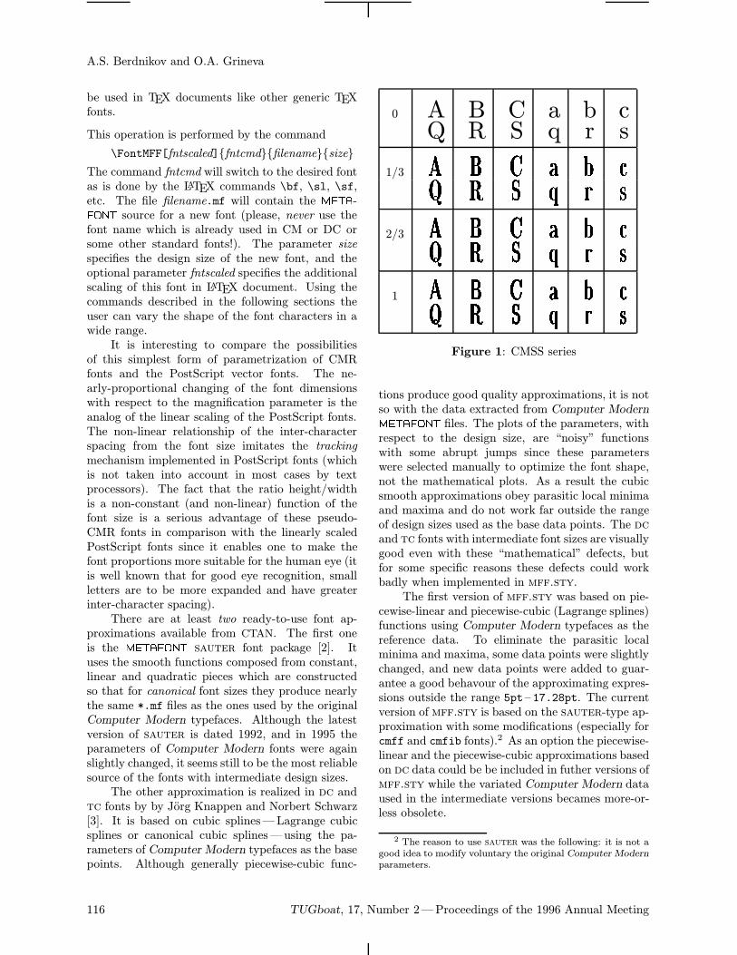
A.S. Berdnikov and O.A. Grineva
be used in TEX documents like other generic TEXfonts.
This operation is performed by the command
\FontMFF[fntscaled]fntcmdfilenamesize
The command fntcmd will switch to the desired fontas is done by the LATEX commands \bf, \sl, \sf,etc. The file filename.mf will contain the META-FONT source for a new font (please, never use thefont name which is already used in CM or DC orsome other standard fonts!). The parameter sizespecifies the design size of the new font, and theoptional parameter fntscaled specifies the additionalscaling of this font in LATEX document. Using thecommands described in the following sections theuser can vary the shape of the font characters in awide range.It is interesting to compare the possibilities
of this simplest form of parametrization of CMRfonts and the PostScript vector fonts. The ne-arly-proportional changing of the font dimensionswith respect to the magnification parameter is theanalog of the linear scaling of the PostScript fonts.The non-linear relationship of the inter-characterspacing from the font size imitates the trackingmechanism implemented in PostScript fonts (whichis not taken into account in most cases by textprocessors). The fact that the ratio height/widthis a non-constant (and non-linear) function of thefont size is a serious advantage of these pseudo-CMR fonts in comparison with the linearly scaledPostScript fonts since it enables one to make thefont proportions more suitable for the human eye (itis well known that for good eye recognition, smallletters are to be more expanded and have greaterinter-character spacing).There are at least two ready-to-use font ap-
proximations available from CTAN. The first oneis the METAFONT sauter font package [2]. Ituses the smooth functions composed from constant,linear and quadratic pieces which are constructedso that for canonical font sizes they produce nearlythe same *.mf files as the ones used by the originalComputer Modern typefaces. Although the latestversion of sauter is dated 1992, and in 1995 theparameters of Computer Modern fonts were againslightly changed, it seems still to be the most reliablesource of the fonts with intermediate design sizes.The other approximation is realized in dc and
tc fonts by by Jorg Knappen and Norbert Schwarz[3]. It is based on cubic splines—Lagrange cubicsplines or canonical cubic splines—using the pa-rameters of Computer Modern typefaces as the basepoints. Although generally piecewise-cubic func-
0 A B C a b cQ R S q r s
1/3 A B C a b cQ R S q r s
2/3 A B C a b cQ R S q r s
1 A B C a b cQ R S q r sFigure 1: CMSS series
tions produce good quality approximations, it is notso with the data extracted from Computer ModernMETAFONT files. The plots of the parameters, withrespect to the design size, are “noisy” functionswith some abrupt jumps since these parameterswere selected manually to optimize the font shape,not the mathematical plots. As a result the cubicsmooth approximations obey parasitic local minimaand maxima and do not work far outside the rangeof design sizes used as the base data points. The dcand tc fonts with intermediate font sizes are visuallygood even with these “mathematical” defects, butfor some specific reasons these defects could workbadly when implemented in mff.sty.The first version of mff.sty was based on pie-
cewise-linear and piecewise-cubic (Lagrange splines)functions using Computer Modern typefaces as thereference data. To eliminate the parasitic localminima and maxima, some data points were slightlychanged, and new data points were added to guar-antee a good behavour of the approximating expres-sions outside the range 5pt– 17.28pt. The currentversion of mff.sty is based on the sauter-type ap-proximation with some modifications (especially forcmff and cmfib fonts).2 As an option the piecewise-linear and the piecewise-cubic approximations basedon dc data could be be included in futher versions ofmff.sty while the variated Computer Modern dataused in the intermediate versions becames more-or-less obsolete.
2 The reason to use sauter was the following: it is not a
good idea to modify voluntary the original Computer Modern
parameters.
116 TUGboat, 17, Number 2—Proceedings of the 1996 Annual Meeting
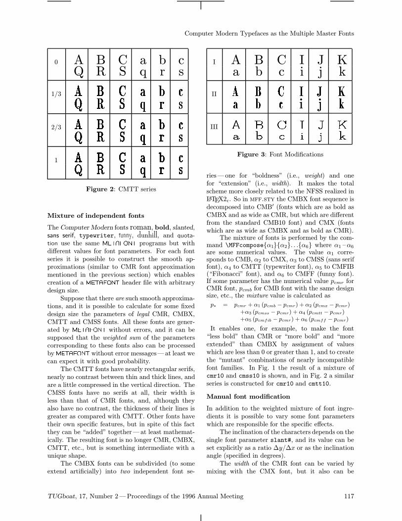
Computer Modern Typefaces as the Multiple Master Fonts
0 A B C a b cQ R S q r s
1/3 A B C a b cQ R S q r s
2/3 A B C a b cQ R S q r s
1 A B C a b cQ R S q r s
Figure 2: CMTT series
Mixture of independent fonts
The Computer Modern fonts roman, bold, slanted,sans serif, typewriter, funny, dunhill, and quota-tion use the same METAFONT programs but withdifferent values for font parameters. For each fontseries it is possible to construct the smooth ap-proximations (similar to CMR font approximationmentioned in the previous section) which enablescreation of a METAFONT header file with arbitrarydesign size.Suppose that there are such smooth approxima-
tions, and it is possible to calculate for some fixeddesign size the parameters of legal CMR, CMBX,CMTT and CMSS fonts. All these fonts are gener-ated by METAFONT without errors, and it can besupposed that the weighted sum of the parameterscorresponding to these fonts also can be processedby METAFONT without error messages—at least wecan expect it with good probability.The CMTT fonts have nearly rectangular serifs,
nearly no contrast between thin and thick lines, andare a little compressed in the vertical direction. TheCMSS fonts have no serifs at all, their width isless than that of CMR fonts, and, although theyalso have no contrast, the thickness of their lines isgreater as compared with CMTT. Other fonts havetheir own specific features, but in spite of this factthey can be “added” together—at least mathemat-ically. The resulting font is no longer CMR, CMBX,CMTT, etc., but is something intermediate with aunique shape.The CMBX fonts can be subdivided (to some
extend artificially) into two independent font se-
I A B C I J Ka b c i j k
II A B C I J Ka b c i j k
III A B C I J Ka b c i j k
Figure 3: Font Modifications
ries—one for “boldness” (i.e., weight) and onefor “extension” (i.e., width). It makes the totalscheme more closely related to the NFSS realized inLATEX2ǫ. So in mff.sty the CMBX font sequence isdecomposed into CMB′ (fonts which are as bold asCMBX and as wide as CMR, but which are differentfrom the standard CMB10 font) and CMX (fontswhich are as wide as CMBX and as bold as CMR).The mixture of fonts is performed by the com-
mand \MFFcomposeα1α2. . .α6 where α1 –α6are some numerical values. The value α1 corre-sponds to CMB, α2 to CMX, α3 to CMSS (sans seriffont), α4 to CMTT (typewriter font), α5 to CMFIB(“Fibonacci” font), and α6 to CMFF (funny font).If some parameter has the numerical value pcmr forCMR font, pcmb for CMB font with the same designsize, etc., the mixture value is calculated as
p∗ = pcmr + α1 (pcmb − pcmr) + α2 (pcmx − pcmr)+α3 (pcmss − pcmr) + α4 (pcmtt − pcmr)+α5 (pcmfib − pcmr) + α6 (pcmff − pcmr)
It enables one, for example, to make the font“less bold” than CMR or “more bold” and “moreextended” than CMBX by assignment of valueswhich are less than 0 or greater than 1, and to createthe “mutant” combinations of nearly incompatiblefont families. In Fig. 1 the result of a mixture ofcmr10 and cmss10 is shown, and in Fig. 2 a similarseries is constructed for cmr10 and cmtt10.
Manual font modification
In addition to the weighted mixture of font ingre-dients it is possible to vary some font parameterswhich are responsible for the specific effects.The inclination of the characters depends on the
single font parameter slant#, and its value can beset explicitly as a ratio ∆y/∆x or as the inclinationangle (specified in degrees).The width of the CMR font can be varied by
mixing with the CMX font, but it also can be
TUGboat, 17, Number 2—Proceedings of the 1996 Annual Meeting 117
A.S. Berdnikov and O.A. Grineva
scaled explicitly by some factor specified by the user.Although this scaling skips some fine tuning of thefont parameters, it can be advantageous to use itin some situations. For example, if we deal withCMTT fonts or CMSS fonts, mixing with CMXresults also in some variation of the character shapeswhich can have an undesirable effect.Similarly, the weight, i.e., the “boldness” of the
characters, which can be controlled by mixing withCMB, can be defined also as a direct scaling of thefont parameters which are responsible for this effect.The weight of “thin lines” and “thick lines” canbe scaled independently, and in addition the usercan specify explicitly the contrast—i.e., the ratiobetween thick and thin strokes of the characters.The height of the vertical elements of the char-
acters can be varied by the user with greater flexi-bility. That is, it is possible to scale independently
• the general height and the depth of the charac-ters;
• the height of the capital characters, brackets,digits, etc., and the ascenders of the characterslike ‘b’, ‘t’;
• the depth of commas and the ascenders of thecharacters like ‘Q’, ‘y’;
• the height of digits and the position of thehorizontal bar for mathematical signs like +,−.
If several height factors are specified, their effect iscombined. For example, the font cmdunh10 can bederived exactly from cmr10 by proper specificationof all these factors.Finally, the special scaling factors can be used
to produce the special effects:
• scale the fine connection between thin and thicklines in ‘h’, ‘m’, ‘n’;
• scale the thickness of sharp corners in letters‘A’, ‘V’, ‘w’;
• scale the diameters of dots in ‘i’, ‘:’ and bulbsin ‘a’, ‘c’;
• scale the curvature of the serif footnotes.
and the logical flags can control the level of ligaturesand to switch on/off square dots, sans serif mode,monospace mode, etc.Fig. 3 demonstrates the examples of such mod-
ifications:
• font (I) is the standard cmr10 scaled at 1.8times,
• font (II) differs from cmr10 by scaling the widthby 0.8, the height by 1.2 and the width of boldlines by 1.5;
• font (III) differs from cmr10 by scaling thewidth by 1.2, the height by 0.8, the ascendersand descenders by 1.25, the width of bold linesby 0.8 and the width of thin lines by 2.4.
All the commands which allow performance of thesemodifications are described in mff.sty manual indetails.
Automatic check of font parameters
Each specification of mff.sty parameters producesa unique font which belongs to the CMR/MF (Com-puter Modern Roman Master Font) font family andwith a unique name specified by the user. Not all ofthese fonts are too pleasant, and not each variationof the parameters result to a font which is well-distinguished from the others. But at least it is aninteresting toy for font maniacs.There is a list of mutual relations between font
parameters which are assumed implicitly in META-FONT programs for Computer Modern typefaces [1].Although in reality most METAFONT source filesviolate these conditions, it is safer if the font pa-rameters calculated by mff.sty satisfy them. Thecommand \MFFcheck sets the mode when theseconditions are checked and the variable values arecorrected if necessary. Nethertheless, several inter-esting effects can be achieved only without such au-tomatic correction. The mode of automatic checkingcan be switched off by the command \MFFcheck.
Switch to other font classes
The LATEX2ε NFSS classifies TEX font families in away which is different from the logical structure ofMETAFONT programs. That is, the italic and smallcaps are at the same family roman, together withbold and slanted fonts, although they are pro-duced by a different driver files. Similarly, roman,typewriter and sans serif fonts are different familieswhile they are generated by the same METAFONTscript and their parameters can be varied so thatone family is smoothly converted to another family.In mff.sty, there is no sharp boundary be-
tween roman, bold, slanted, typewriter, sansserif, quotation, funny and dunhill fonts—each fontis smoothly converted to another one, while italicand small caps fonts are quite different. Themff.sty macros assign different classes to thesefonts to distinguish such differences from the fontfamilies used in NFSS. The following font classescan be used:
CMR Computer Modern Roman;
CMTI Computer Modern Text Italic;
CMCSC Computer Modern Small Caps;
118 TUGboat, 17, Number 2—Proceedings of the 1996 Annual Meeting
Computer Modern Typefaces as the Multiple Master Fonts
CMRZ CMZ Computer Modern Roman/Cyrillicby N. Glonti and A. Samarin;
CMRIZ CMZ Computer Modern Text Italic/Cy-rillic;
CMCCSC CMZ Computer Modern Small Caps/Cyrillic;
LHR LH Computer Modern Roman/Cyrillic byO. Lapko and A. Khodulev;
LHTI LH Computer Modern Text Italic/Cyrillic;
LHCSC LH Computer Modern Small Caps/Cyril-lic.
The interface for DC fonts [3] is under development.
The set of font classes can be extended easilywhen the METAFONT program is based on the sameset of parameters as Computer Modern fonts: Theonly thing to do is to specify the macro whichwrites the font identifier value and the operatorgenerate with the corresponding file name.
Acknowledgements
The authors would like to express their warmestthanks to Kees van der Laan for organization andrealization of the Euro-Bus project which enabledthe Russian delegation to take part in EuroTEX-95,and to Ph.Taylor for his activity in breaking downthe barriers between West and East.This research was partially supported by a
grant from the Dutch Organization for ScientificResearch (NWO grant No 07-30-007).
References
[1] Donald E. Knuth. Computer Modern Type-faces, (Computers & Typesetting series). Ad-dison-Wesley, 1986.
[2] John Sauter. Building Computer Modern fonts.TUGboat, 7 (1986), pp. 151 – 152.
[3] Jorg Knappen. The release 1.2 of the Cork en-coded DC fonts and the text companion symbol
fonts. Proceedings of the 9th EuroTEX Confer-ence, Arnhem, 1995.
[4] A. Khodulev and I. Mahovaya. On TEX experi-ence in MIR Publishers. Proceedings of the 7thEuroTEX Conference, Prague, 1992.
[5] O. Lapko.MAKEFONT as a part of CyrTUG –EmTEX package. Proceedings of the 8th Eu-roTEX Conference, Gdansk, 1994.
TUGboat, 17, Number 2—Proceedings of the 1996 Annual Meeting 119
VFComb 1.3—the program which simplifies the virtual font management
A.S. BerdnikovInstitute of Analytical Instrumentation
Rizsky pr. 26, 198103 St.Petersburg, Russia
S.B. TurtiaInstitute of Analytical Instrumentation
Rizsky pr. 26, 198103 St.Petersburg, Russia
The MS DOS program VFComb enables one tosimplify the design of the virtual fonts.[1]1 Its mainpurpose was to facilitate the integration of CMfonts with Cyrillic LL fonts created by O. Lapkoand A. Khodulev [2, 3] but it can be used forother applications too. It uses the information from.tfm files (converted to ASCII form by TFtoPL)and the ASCII data files created by the User onits input, and produces the .vpl file on its output(the .vpl file can be converted later to the virtualfont using VPtoVF). The characteristic feature ofthe program is that it can assemble the ligaturetables and metric information from various fonts andcombine it with the user-defined metric informationand ligature/kerning data. VFComb supports thefull syntax of .pl files and .vpl files as it wasdefined by D.E. Knuth and adds new commands likesymbolic variables or conditional operators, whichsimplifies the creation and the debugging of thevirtual fonts.The description of the previous version 1.2
(which is the first version distributed far outsidethe home computer) can be found in [4]. Thisversion has only the Russian manual which preventsits wide distribution among TEX community. Thecurrent version has the English manual, but exceptthis “new feature” a lot of additional improvementsare added. The main features of the program aredescribed below while the complete information canbe found inside the manual.The program will be put on the CTAN archives
following TUG’96 together with the source code andwill be available to TEX community on a freewarebasis. Since this MS DOS program is written onBorland Pascal and uses some specific features ofthis language, it is hardly portable to any other
1 It is assumed that you are familiar with the virtual fonts.If it is not so, it is highly recommended that you read [1]before proceeding further.
platform “as is”, but it is not too difficult to transferit to portable ANSI C (volunteers are welcome).
Virtual fonts for TEX formats with national
alphabets
Although everything which can be done by VFCombcould be realized also by explicit usage of PL andVPL file syntax (as well as everything which canbe done manually by .pl and .vpl files can bedone with VFComb), some typical operations withthe virtual fonts are performed with its help easierthan by manual editing of .pl and .vpl The typicalproblem of this type is the adaptation of standardTEX formats to national alphabets—this problemis especially important for Cyrillic alphabets sincemost Cyrillic letters cannot be created as the com-bination of the Latin (English) letters with someaccents.The standard solution of this problem is to
combine the English part taken from ComputerModern family with the national fonts which extendthe Computer Modern family and which containin the upper part of ASCII table (codes 128– 255)the national symbols. The best way how to doit is to create the virtual font whose lower partrefers to original CM fonts, and upper part refersto the national fonts— it is just the way which wasrecommended by D. Knuth.[1] The advantage of thisapproach is that it is possible to keep the changesin CM fonts and in national fonts separately, andin addition, it is possible to economize disk spacesince it is not necessary to keep two copies of eachComputer Modern character—one as the originalCM font which is necessary for original TEX formats,and the second one as the lower part in the combinednational font.The combination of the lower part of one font
and the upper part of another font, or even thejoining all the characters from one font and all
120 TUGboat, 17, Number 2—Proceedings of the 1996 Annual Meeting
VFComb 1.3—the program which simplifies the virtual font management
the characters from another font (provided that nocharacter code is encountered twice) can be done byVFComb using few commands. If some charactersare to be discarded from the font or moved tothe different positions of the ASCII table, it doesnot makes the command script more complicated.The resulting virtual font contains proper metricinformation for each character borrowed from thesource metric information and the correct mappingof the characters into individual real fonts.The similar operation can be performed also by
the program TFMerge (IHEP TEXware, Protvino),but VFComb performs additional operations. Thatis, in addition to joining metric and ligature/kerninginformation from each font into one virtual font, itis necessary to add cross-ligature and cross-kerninginformation for the pairs of characters taken fromdifferent fonts. VFComb enables one to add metric,ligature and kerning data taken from its script file(which makes the original script a little bit morecomplicated). The important feature is that thisadditional data can contain variables and logicalstructures, from which one can generate the wholeCM family of the virtual typefaces with nationalcharacters using just the same pseudo-programwrit-ten on VFComb command language.Except the operations described above, VF-
Comb is capable of performing the following opera-tions if it is specified by the user in its script:
• discard the ligature tables of some real fonts;
• include in the virtual font the full ligature tableof the real font;
• include in the virtual font only those characterswhich are declared explicitly in user-defineddata, and discard the elements of the ligaturetables which correspond to non-included char-acters of the real font;
• automatically add to the virtual fonts the char-acters which are not included explicitly by theuser but which are joined with the already in-cluded characters through ligature table data,or by specifications NEXTLARGER and VARCHAR.
These features allow creation of the desired virtualfonts for national alphabets with less effort and withmore reliability than by manual manipulations with.pl and .vpl files.
Virtual fonts for colored printing
Another problem is the application of the virtualfonts to multicolored printing. Suppose that it isnecessary to print text where different charactershave different colors. From TEX-compiler’s pointof view it means that the characters with different
colors are assigned to different fonts, and it is a taskfor the dvi driver to decide how to print these fontsin desired colors.The colored printing is collected from the over-
lapped sheets where each sheet of text or graphicsis printed by individual monocolor passes. To makethe templates for monocolor printing it is necessaryto organize the output of the .dvi file so that in onepass only yellow characters are printed, in anotherpass only blue characters are printed, etc., whilethe characters which have the green color are to beprinted twice— in blue as well as in yellow. Theeasiest way to teach dvi driver how to do it is tocreate different subdirectories with virtual fonts—one subdirectory for each elementary color. Thevirtual font files placed in the subdirectory for yellowprinting (which corresponds to the yellow fonts) willrefer to the actual *.pk files if and only if the yellowcolor is assigned to this character—otherwise it willrefer to empty character. The subdirectories forother colors are organized similarly. As soon asthe yellow printing is performed, the dvi driver isconfigured so that it takes the virtual fonts from the“yellow” subdirectory, and for the output in othercolors a corresponding reconfiguration of the dvidriver is performed.If the mapping of the empty characters into the
dummy font is performed, it results to the wrongbehaviour of the dvi driver: the characters in thedummy font have zero size, and this means that thenext character after the empty character is shiftedto the left (as compared with the desired behaviour)a the distance equal to the width of the skippedcharacter. To prevent this effect it is necessary toinsert into the virtual font the explicit dvi com-mands which move the current output position tothe right by the distance representing the width ofthe skipped character. This operation is performedby VFComb by a single command: the user assignsthe attribute NULLCHARACTER to the correspondingreal font, and for the characters of this font theempty mapping will be performed instead of map-ping the real font characters.
Substitution of CM fonts instead of
PostScript fonts for DVI Viewers
The next problem where the usage of the virtualfonts is advantageous is the visualization of the doc-ument which was compiled using PostScript fonts.Generally, the screen viewer cannot process thePostScript characters, and it is necessary to remapthe PostScript font characters into some .pk fontwhich can be displayed by the viewer—say, sometypefaces from the Computer Modern family.
TUGboat, 17, Number 2—Proceedings of the 1996 Annual Meeting 121
A.S. Berdnikov and S.B. Turtia
Such remapping can be performed using virtualfont mechanism, but if it is done without specialprecautions the screen view can be far from theprinted output. The reason is that CM charactershave a width different from the PostScript font (thefact that they have a different graphical image isnot so essential). As in the previous case, the screenoutput will be shifted to the left on the distancewhich is the difference between the width of thePostScript character and the CM character if nospecial precautions are taken. To make the correctoutput, it is necessary to add to the virtual fontthe explicit dvi commands which correct the currentoutput position.To make corresponding virtual font automati-
cally, VFComb allows the user to specify for the realfonts two .pl files with the metric information: thefirst one is for the nominal characters which are usedby TEX to compile the .dvi file (in our case it is thePostScript .afm file converted to .tfm format), andthe second one is for the real characters which areused when the .dvi file is displayed (or printed).If such information is specified by the user, thecommands to correct properly the current outputposition are inserted into the virtual font.This operation works if both fonts have the
same coding scheme–namely, the characters usedby TEX and the characters used by dvi viewer havethe same code value. If not, the operation of re-mapping inside an already-mapped font is required,and this could be very complicated and result in avery complicated scheme of virtual font generation.To solve this problem, it is assumed that the correctmetric information for the “true” font (i.e., for thefont used in compilation of the .dvi file), is alreadyavailable. The special operators in VFComb enablethe user to load this information and to correct theproper character width.
Other features
The other features incorporated in VFComb 1.3 are:
• improved syntax for VFComb commands;
• improved logical operators:
• implementation of string variables in VFCombscript files;
• specification of variable values in command lineamong other parameters;
• specification of the names of the real and virtualfonts inside VFComb scripts instead of com-mand line;
• correction of some bugs, including the obliga-tory conversion to uppercase all input charac-ters together with the font names;
• automatic computation of the metric informa-tion for the characters composed from user-defined dvi commands.
All of these improvements ensure easier use of theprogram. For example, after implementation of thenew features, the generation of the virtual fonts forthe LL/LH family (used in the CyrTUG Cyrillicversion of TEX/LATEX/AMS-TEX) is performed us-ing just one script file of VFComb instead multipleheader files (see the example below).
Comparison with FontInst
There is another package for manipulating withvirtual fonts—namely, FontInst by Alan Jeffrey.Although there are many similar features betweenFontInst and VFComb, these tools are designed tosolve different tasks.The main purpose of FontInst is to create new
font families for LATEX2ε using existing PostScriptfonts. FontInst contains high-level operators whichenable one to perform this task in several com-mands, and it is written totally in TEX, whichguarantees its high portability. In addition, FontInstcontains special TEX macro commands which enablethe user to do nearly anything with virtual fonts,without direct editing of .vpl files; but, in this casethe “program” written in FontInst commands maybe comparable in length to the .vpl file.VFComb is designad to solve different prob-
lems— it was designed mainly to simplify the in-tegration of new alphabets into TEX so that theLatin part of Computer Modern Typefaces is leftunchanged. It cannot read .afm files and it cannotcreate .fd files. If you wish to use it to create virtualfonts for PostScript, you can do so, but you needsome additional utilities (afm2tfm) and many moremanual operations than you need with FontInst.Similarly, you can make virtual fonts like that
created by VFComb using FontInst as well, but thiswill require manual manipulations which are com-parable to the direct editing of .vpl files. Althoughone can expect in future more convergence betweenFontInst and VFComb, currently these programs donot intersect in this respect. If you wish to createvirtual fonts for font families derived from Post-Script, please use FontInst, and you will economizea lot of your time. If you wish to make virtual fontswhich solves any of the problems described in thispaper, VFComb may be more suitable.
Example
The syntax of VFComb commands is similar to thatof .vpl files. It means that it is more suitable
122 TUGboat, 17, Number 2—Proceedings of the 1996 Annual Meeting
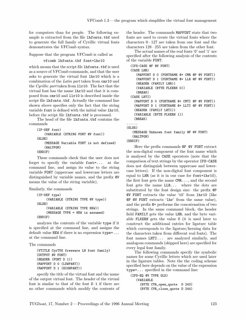
VFComb 1.3—the program which simplifies the virtual font management
for computers than for people. The following ex-ample is extracted from the file lhfonts.tbf usedto generate the full family of Cyrillic virtual fontsdemonstrates the VFComb syntax.
Suppose that the program VFComb is called as
vfcomb lhfonts.tbf font=lhr10
which means that the script file lhfonts.tbf is usedas a source ofVFComb commands, and that the userasks to generate the virtual font lhr10 which is acombination of the Latin part taken from cmr10 andthe Cyrillic part taken from llr10. The fact that thevirtual font has the name lhr10 and that it is com-posed from cmr10 and llr10 is described inside thescript file lhfonts.tbf. Actually the command lineshown above specifies only the fact that the stringvariable font is defined with the initial value lhr10,before the script file lhfonts.tbf is processed.The head of the file lhfonts.tbf contains the
commands
(IF-DEF font)
(VARIABLE (STRING FONT @V font))
(ELSE)
(MESSAGE Variable FONT is not defined)
(HALTPGM)
(ENDIF)
These commands check that the user does notforget to specify the variable font=... at thecommand line, and assign its value to the stringvariable FONT (uppercase and lowercase letters aredistinguished by variable names, and the prefix @Vmeans the value of the string variable).
Similarly, the commands
(IF-DEF type)
(VARIABLE (STRING TYPE @V type))
(ELSE)
(VARIABLE (STRING TYPE NEW))
(MESSAGE TYPE = NEW is assumed)
(ENDIF)
analyzes the contents of the variable type if itis specified at the command line, and assigns thedefault value NEW if there is no expression type=...at the command line.
The commands
(VTITLE CyrTUG freeware LH font family)
(OUTPUT @V FONT)
(HEADER (FONT D 1))
(MAPFONT D 0 (LOWPART))
(MAPFONT D 1 (HIGHPART))
specify the title of the virtual font and the nameof the output virtual font. The header of the virtualfont is similar to that of the font D 1 if there areno other commands which modify the contents of
the header. The commands MAPFONT state that twofonts are used to create the virtual fonts where thecharacters 0 – 127 are taken from one font and thecharacters 128– 255 are taken from the other font.The actual names of the real fonts ‘0’ and ‘1’ are
specified after the following analysis of the contentsof the variable FONT:
(IFS-CASE @F @V FONT)
(CASE LHR)
(MAPFONT D 0 (FONTNAME @+ CMR @P @V FONT))
(MAPFONT D 1 (FONTNAME @+ LLR @P @V FONT))
(HEADER (FAMILY LHR))
(VARIABLE (BYTE FLKERN 0))
(BREAK)
(CASE LHTI)
(MAPFONT D 0 (FONTNAME @+ CMTI @P @V FONT))
(MAPFONT D 1 (FONTNAME @+ LLTI @P @V FONT))
(HEADER (FAMILY LHTI))
(VARIABLE (BYTE FLKERN 1))
(BREAK)
......
(ELSE)
(MESSAGE Unknown font family @F @V FONT)
(HALTPGM)
(ENDIF)
Here the prefix commands @F @V FONT extractthe non-digital component of the font name whichis analysed by the CASE operators (note that thecomparison of text strings by the operator IFS-CASEdoes not distinguish between uppercase and lower-case letters). If the non-digital font component isequal to LHR (as it is in our case for font=lhr10),the first font gets the name CMR..., and the secondfont gets the name LLR... where the dots aresubstituted by the font design size: the prefix @P@V FONT extracts the value ‘10’ from lhr10 (like@F @V FONT extracts ‘lhr’ from the same value),and the prefix @+ performs the concatenation of twostrings. In the same command block, the headerfield FAMILY gets the value LHR, and the byte vari-able FLKERN gets the value 0 (it is used later toconstruct the additional entries for ligature tablewhich corresponds to the ligature/kerning data forthe characters taken from different real fonts). Thefont names LHTI... are analyzed similarly, andanalogous commands (skipped here) are specified forevery legal font family.The following commands specify the symbolic
names for some Cyrillic letters which are used laterin the ligature tables. Note the the coding schemespecified here depends on the value of the expressiontype=... specified in the command line:
(IFS-EQ @V TYPE OLD)
(VARIABLE
(BYTE CYR_open_quote D 243)
(BYTE CYR_close_quote D 244)
TUGboat, 17, Number 2—Proceedings of the 1996 Annual Meeting 123
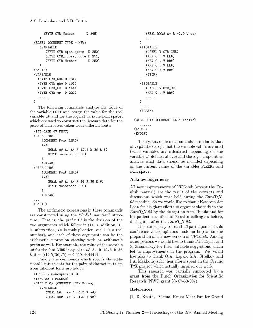
A.S. Berdnikov and S.B. Turtia
(BYTE CYR_Number D 245)
)
(ELSE) (COMMENT TYPE = NEW)
(VARIABLE
(BYTE CYR_open_quote D 250)
(BYTE CYR_close_quote D 251)
(BYTE CYR_Number D 252)
)
(ENDIF)
(VARIABLE
(BYTE CYR_GHE D 131)
(BYTE CYR_ghe D 163)
(BYTE CYR_ER D 144)
(BYTE CYR_er D 224)
......
)
The following commands analyze the value ofthe variable FONT and assign the value for the realvariable u# and for the logical variable monospace,which are used to construct the ligature data for thepairs of characters taken from different fonts:
(IFS-CASE @V FONT)
(CASE LHR5)
(COMMENT Font LHR5)
(VAR
(REAL u# A/ A/ R 12.5 R 36 R 5)
(BYTE monospace D 0)
)
(BREAK)
(CASE LHR6)
(COMMENT Font LHR6)
(VAR
(REAL u# A/ A/ R 14 R 36 R 6)
(BYTE monospace D 0)
)
(BREAK)
...
(ENDIF)
The arithmetic expressions in these commandsare constructed using the “Polish notation” struc-ture. That is, the prefix A/ is the division of thetwo arguments which follow it (A+ is addition, A-is subtraction, A* is multiplication and R is a realnumber), and each of these arguments can be thearithmetic expression starting with an arithmeticprefix as well. For example, the value of the variableu# for the font LHR5 is equal to A/ A/ R 12.5 R 36R 5 = ((12.5/36)/5) = 0.069444444444.Finally, the commands which specify the addi-
tional ligature data for the pairs of characters takenfrom different fonts are added:
(IF-EQ V monospace D 0)
(IF-CASE V FLKERN)
(CASE D 0) (COMMENT KERN Roman)
(VARIABLE
(REAL k# A* R -0.5 V u#)
(REAL kk# A* R -1.5 V u#)
(REAL kkk# A* R -2.0 V u#)
......
)
(LIGTABLE
(LABEL V CYR_GHE)
(KRN C . V kk#)
(KRN C , V kk#)
(KRN C : V kk#)
(KRN C ; V kk#)
(STOP)
)
(LIGTABLE
(LABEL V CYR_ER)
(KRN C . V kk#)
.....
)
.....
(BREAK)
(CASE D 1) (COMMENT KERN Italic)
......
(ENDIF)
(ENDIF)
The syntax of these commands is similar to thatof .vpl files except that the variable values are used(some variables are calculated depending on thevariable u# defined above) and the logical operatorsanalyze what data should be included dependingon the current values of the variables FLKERN andmonospace.
Acknowledgements
All new improvements of VFComb (except the En-glish manual) are the result of the contacts anddiscussions which were held during the EuroTEX-95 meeting. So we would like to thank Kees van derLaan for his giant efforts to organise the visit to theEuroTEX-95 by the delegation from Russia and forhis patient attention to Russian colleagues before,during and after the EuroTEX-95.It is not so easy to recall all participants of this
conference whose opinions made an impact on thepreparation of the new version of VFComb. Amongother persons we would like to thank Phil Taylor andS. Znamensky for their valuable suggestions whichled to improvements in the program. We wouldlike also to thank O.A. Lapko, S.A. Strelkov andI.A. Makhovaya for their efforts spent on the CyrillicTEX project which actually inspired our work.This research was partially supported by a
grant from the Dutch Organization for ScientificResearch (NWO grant No 07-30-007).
References
[1] D. Knuth, “Virtual Fonts: More Fun for Grand
124 TUGboat, 17, Number 2—Proceedings of the 1996 Annual Meeting
VFComb 1.3—the program which simplifies the virtual font management
Wizards”, TUGBoat 11 (1993), No. 1, pp.13 –23.
[2] A. Khodulev, I. Mahovaya. “On TEX experienceof MIR Publishers”, Proceedings of the 7th Eu-roTEX Conference, Prague, 1992.
[3] O. Lapko. “MAKEFONT as a part of CyrTUG–EmTEX package”, Proceedings of the 8th Eu-roTEX Conference, Gdansk, 1994.
[4] A.S. Berdnikov, S.B. Turtia. “VFComb—a pro-gram for design of virtual fonts”, Proceedings ofthe 9th EuroTEX Conference, Arnhem, 1995.
TUGboat, 17, Number 2—Proceedings of the 1996 Annual Meeting 125
ΩTimes and ΩHelvetica Fonts Under Development: Step One
Yannis HaralambousAtelier Fluxus Virus, 187, rue Nationale, F-59 800 Lille, [email protected]
John PlaiceDepartement d’informatique, Universite Laval, Ste-Foy (Quebec) Canada G1K [email protected]
The Truth Is Out There
—Chris CARTER, The X-Files (1993)
Introduction
ΩTimes and ΩHelvetica will be public domainvirtual Times- and Helvetica-like fonts based uponreal PostScript fonts, which we call “Glyph Con-tainers”. They will contain all necessary charactersfor typesetting efficiently (that is, with TEX quality)in all languages and systems using the Latin, Greek,Cyrillic, Arabic, Hebrew and Tifinagh alphabets andtheir derivatives. All Unicode characters will becovered, although the set of glyphs of our Ω fontswill not be limited to these; after all, our goal is high-quality typography, which requires more glyphs thanwould be required for mere information interchange.Other alphabets will follow (the obvious first
candidates are Coptic, Armenian and Georgian) aswell as mathematical symbols, dingbats, etc.
Why PostScript instead of METAFONT? META-FONT is the ultimate tool for font development.Extending Computer Modern fonts to the Unicodeencoding is still one of our goals. We have starteddeveloping a set of fonts we call “Unicode Com-puter Modern” fonts, using techniques such as Vir-tual METAFONT (virtual fonts are created directlyby METAFONT using the gftotxt utility for textoutput). Nevertheless, we realized that the taskof writing METAFONT code for some thousands ofcharacters (including code for typewriter style) is atremendous task, which will take several years.So we have decided to take a small break
from METAFONTing, and to develop in a limitedtime period PostScript fonts that will cover amaximum number of languages and will give theTEX community a good reason to switch to Ω.
Why Times and Helvetica? First of all because,after Computer Modern, they are the most widelyused fonts in the TEX community. Many journals
and publishers request that their texts be typesetin Times; Helvetica (especially the bold series) isoften used as a titling font. Like Computer Modern,Times is a very neutral font that can be used in awide range of documents, ranging from poetry totechnical documentation. . .It would surely be more fun to prepare a
Bembo- or Stempel Garamond-like font for the serifspart and a Gill Sans- or Univers-like one for thesans-serifs part; but these can hardly be used in thescientific/technical area, and that’s perhaps whereTEX (and hence potentially Ω) is used the most.
When will the Ω fonts be finished? Thedevelopment of ΩTimes and ΩHelvetica fonts isdivided into four steps:
1. Drawing of PostScript outlines and packagingof Glyph Container fonts.
2. Development of virtual code, based on the realfonts of step one.
3. Kerning of virtual fonts.
4. Development of LATEX code and Ω TranslationProcesses necessary for the use of these fonts.
For the time being (June 1996) we have donethe biggest part of step one, and this is what wepresent in this paper. We hope to have finished withsteps two, three and four before the next teTEX CD-ROM in December 1996.
We want your support! Please keep in mind:
The choice and shapes of glyphs presented inthis paper are only a first attempt. We needyour feedback to improve them, so that youcan use them efficiently.
In the tables we present only Times family andmedium series fonts (except in the case of Tifinagh,which is also presented in the Helvetica family).Up-to-date tables of the remaining fonts can beconsulted on our Ω WWW server
http://www.ens.fr/omega
126 TUGboat, 17, Number 2—Proceedings of the 1996 Annual Meeting
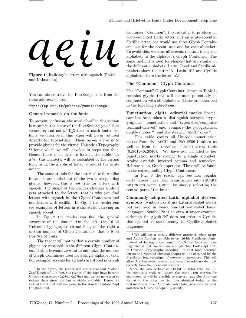
ΩTimes and ΩHelvetica Fonts Under Development: Step One
Figure 1: Italic-style letters with ogonek (Polishand Lithuanian)
You can also retrieve the PostScript code from thesame address, or from
ftp://ftp.ens.fr/pub/tex/yannis/omega
General remarks on the fonts
To prevent confusion, the word “font” in this sectionis meant in the sense of the PostScript Type 1 fontstructure; and not of TEX text or math fonts: thefonts we describe in this paper will never be useddirectly for typesetting. Their raison d’etre is toprovide glyphs for the virtual Unicode+TypographyΩ fonts which we will develop in steps two–four.Hence, there is no need to look in the tables fora ‘e’: this character will be assembled by the virtualfont, using the glyphs of letter ‘e’ and of the acuteaccent.The same stands for the letter ‘c’ with cedilla:
it can be assembled out of the two correspondingglyphs; however, this is not true for letters withogonek: the shape of the ogonek changes while itgets attached to the letter; that is why you findletters with ogonek in the Glyph Containers andnot letters with cedilla. In Fig. 1 the reader cansee examples of letters in italic style, carrying anogonek accent.In Fig. 2 the reader can find the general
structure of the fonts:1 On the left, the 16-bitUnicode+Typography virtual font, on the right acertain number of Glyph Containers, that is 8-bitPostScript fonts.The reader will notice that a certain number of
glyphs are repeated in the different Glyph Contain-ers. This is because we want to minimize the numberof Glyph Containers used for a single-alphabet text.For example, accents for all fonts are stored in Glyph
1 In the figure, the reader will notice real font “AdobeZapf Dingbats”. In fact, the glyphs of this font have becomeUnicode characters (0x2701–0x27be) and we see no reason toredraw them since this font is widely available. Hence thevirtual 16-bit font will also point to the standard Adobe ZapfDingbats font.
Container “Common”; theoretically, to produce anacute-accented Latin letter and an acute-accentedCyrillic letter, one would use three Glyph Contain-ers: one for the accent, and one for each alphabet.To avoid this, we store all accents relevant to a givenalphabet, in the alphabet’s Glyph Container. Thesame method is used for shapes that are similar inthe different alphabets: Latin, Greek and Cyrillic al-phabets share the letter ‘A’, Latin, IPA and Cyrillicalphabets share the letter ‘a’.2
The “Common” Glyph Container
The “Common” Glyph Container, shown in Table 1,contains glyphs that will be used potentially inconjunction with all alphabets. These are describedin the following subsections.
Punctuation, digits, editorial marks Specialcare has been taken to distinguish between “typo-graphical” punctuation and “typewriter/computerterminal-derived” one: compare the typographicaldouble quotes lm and the straight ‘ASCII’ ones ".This table covers all Unicode punctuation
marks from the ASCII and ISO 8859-1 tables aswell as from the general punctuation table(0x2010–0x2046). We have not included a fewpunctuation marks specific to a single alphabet:Arabic asterisk, inverted comma and semicolon,Hebrew colon, Greek upper dot. These will be foundin the corresponding Glyph Containers.In Fig. 3 the reader can see how regular
curly braces have been transformed into squarebrackets with quill, by simply reflecting thecentral part of the brace.
Commonly adopted Latin alphabet derived
symbols Symbols like A use Latin alphabet lettersbut are used in many non-Latin-alphabet basedlanguages. Symbol z is an even stranger example:although the glyph ‘N’ does not exist in Cyrillic,this symbol is used mainly in Cyrillic-alphabetlanguages.
2 We will use a totally different approach when dvipsand Adobe Acrobat are able to use 16-bit PostScript fonts.Instead of having many ‘small’ PostScript fonts and one‘big’ virtual font, we will use a single ‘big’ PostScript font,in Unicode+Typography encoding. In that font, accentedletters and repeated identical shapes will be obtained by thePostScript font technique of composite characters. This willallow Acrobat users to select and copy Unicode-encoded textdirectly from the document window.Since the two techniques (16-bit + 8-bit real, vs. 16-
bit composite real) will share the same .tfm metrics forcharacters, it will be possible to convert .dvi files from oneformat to the other, so that files obtained today by thefirst method will be “Acrobat-ready” later, whenever Acrobatswitches to Unicode (hopefully soon!).
TUGboat, 17, Number 2—Proceedings of the 1996 Annual Meeting 127
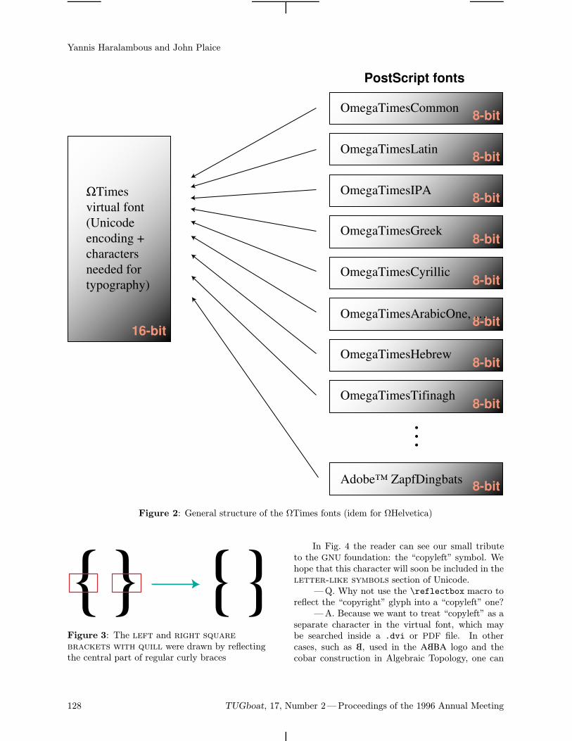
Yannis Haralambous and John Plaice
OmegaTimesCommon
OmegaTimesLatin
OmegaTimesIPA
OmegaTimesGreek
OmegaTimesCyrillic
OmegaTimesHebrew
OmegaTimesTifinagh
Adobe™ ZapfDingbats
…
ΩTimes
virtual font
(Unicode
encoding +
characters
needed for
typography)
PostScript fonts
16-bit
8-bit
8-bit
8-bit
8-bit
8-bit
8-bit
8-bit
8-bit
8-bit
OmegaTimesArabicOne, …
Figure 2: General structure of the ΩTimes fonts (idem for ΩHelvetica)
Figure 3: The left and right squarebrackets with quill were drawn by reflectingthe central part of regular curly braces
In Fig. 4 the reader can see our small tributeto the GNU foundation: the “copyleft” symbol. Wehope that this character will soon be included in theletter-like symbols section of Unicode.
—Q. Why not use the \reflectbox macro toreflect the “copyright” glyph into a “copyleft” one?
—A. Because we want to treat “copyleft” as aseparate character in the virtual font, which maybe searched inside a .dvi or PDF file. In othercases, such as B, used in the A BBA logo and thecobar construction in Algebraic Topology, one can
128 TUGboat, 17, Number 2—Proceedings of the 1996 Annual Meeting
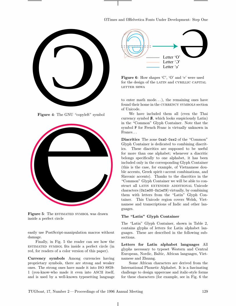
ΩTimes and ΩHelvetica Fonts Under Development: Step One
Figure 4: The GNU “copyleft” symbol
Figure 5: The estimated symbol was drawninside a perfect circle
easily use PostScript-manipulation macros withoutdamage.Finally, in Fig. 5 the reader can see how the
estimated symbol fits inside a perfect circle (inred, for readers of a color version of this paper).
Currency symbols Among currencies havingproprietary symbols, there are strong and weakerones. The strong ones have made it into ISO 8859-1 (you-know-who made it even into ASCII itself,and is used by a well-known typesetting language
Letter ‘O’Letter ‘C’
Letter ‘e’
C
e
Figure 6: How shapes ‘C’, ‘O’ and ‘e’ were usedfor the design of the latin and cyrillic capitalletter shwa
to enter math mode. . . ), the remaining ones havefound their home in the currency symbols sectionof Unicode.We have included them all (even the Thai
currency symbol è, which looks suspiciously Latin)in the “Common” Glyph Container. Note that thesymbol Ñ for French Franc is virtually unknown inFrance. . .
Diacritics The zone 0xa0–0xe2 of the “Common”Glyph Container is dedicated to combining diacrit-ics. These diacritics are supposed to be usefulfor more than one alphabet; whenever a diacriticbelongs specifically to one alphabet, it has beenincluded only in the corresponding Glyph Container(this is the case, for example, of Vietnamese dou-ble accents, Greek spirit+accent combinations, andSlavonic accents). Thanks to the diacritics in the“Common” Glyph Container we will be able to con-struct all latin extended additional Unicodecharacters (0x1e00–0x1ef9) virtually, by combiningthem with letters from the “Latin” Glyph Con-tainer. This Unicode region covers Welsh, Viet-namese and transcriptions of Indic and other lan-guages.
The “Latin” Glyph Container
The “Latin” Glyph Container, shown in Table 2,contains glyphs of letters for Latin alphabet lan-guages. These are described in the following sub-sections.
Letters for Latin alphabet languages Allglyphs necessary to typeset Western and CentralEuropean, Nordic, Baltic, African languages, Viet-namese and Zhuang.Some African characters are derived from the
International Phonetic Alphabet. It is a fascinatingchallenge to design uppercase and italic-style formsfor these characters (for example, see in Fig. 6 the
TUGboat, 17, Number 2—Proceedings of the 1996 Annual Meeting 129
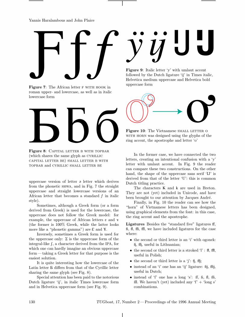
Yannis Haralambous and John Plaice
Figure 7: The African letter f with hook inroman upper- and lowercase, as well as in italiclowercase form
Figure 8: Capital letter b with topbar(which shares the same glyph as cyrilliccapital letter be) small letter b withtopbar and cyrillic small letter be
uppercase version of letter © letter which derivesfrom the phonetic shwa, and in Fig. 7 the straightuppercase and straight lowercase versions of anAfrican letter that becomes a standard f in italicstyle).Sometimes, although a Greek form (or a form
derived from Greek) is used for the lowercase, theuppercase does not follow the Greek model: forexample, the uppercase of African letters ™ and ≠(the former is 100% Greek, while the latter looksmore like a “phonetic gamma”) are ä and ç.Inversely, sometimes a Greek form is used for
the uppercase only: ô is the uppercase form of theintegral-like π, a character derived from the IPA, forwhich one can hardly imagine an obvious uppercaseform—taking a Greek letter for that purpose is theeasiest solution.It is quite interesting how the lowercase of the
Latin letter Å differs from that of the Cyrillic lettersharing the same glyph (see Fig. 8).Special attention has been paid to the notorious
Dutch ligature ‘ij’, in italic Times lowercase formand in Helvetica uppercase form (see Fig. 9).
Figure 9: Italic letter ‘y’ with umlaut accentfollowed by the Dutch ligature ‘ij’ in Times italic,Helvetica medium uppercase and Helvetica bolduppercase form
Figure 10: The Vietnamese small letter owith horn was designed using the glyphs of thering accent, the apostrophe and letter ‘o’
In the former case, we have connected the twoletters, creating an intentional confusion with a ‘y’letter with umlaut accent. In Fig. 9 the readercan compare these two constructions. On the otherhand, the shape of the uppercase sans serif ‘IJ’ isderived from that of the letter ‘U’: this is commonDutch titling practice.The characters ^ and ~ are used in Breton.
They are not (yet) included in Unicode, and havebeen brought to our attention by Jacques Andre.Finally, in Fig. 10 the reader can see how the
“horn” of Vietnamese letters has been designed,using graphical elements from the font: in this case,the ring accent and the apostrophe.
Ligatures Besides the “standard five” ligatures Ã,Õ, Œ, œ, –, we have included ligatures for the casewhere:
• the second or third letter is an ‘i’ with ogonek:—, “, useful in Lithuanian;
• the second or third letter is a stroked ‘l’ : ”, ‘,useful in Polish;
• the second or third letter is a ‘j’: ’, ÷;
• instead of an ‘i’ one has an ‘ij’ ligature: ◊,ÿ,useful in Dutch;
• instead of ‘f’ one has a long ‘s’: Ÿ, ⁄, ¤, ‹,›. We haven’t (yet) included any ‘f’ + ‘long s’combinations.
130 TUGboat, 17, Number 2—Proceedings of the 1996 Annual Meeting
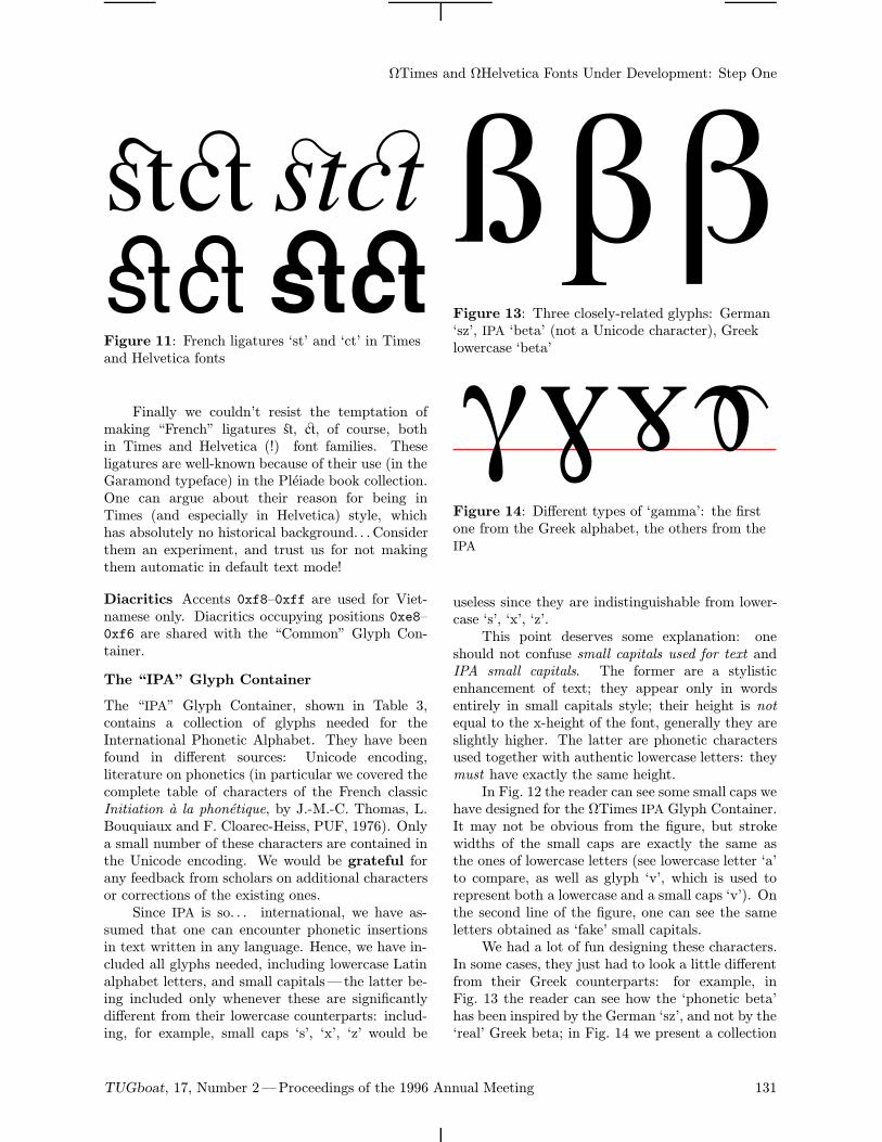
ΩTimes and ΩHelvetica Fonts Under Development: Step One
Figure 11: French ligatures ‘st’ and ‘ct’ in Timesand Helvetica fonts
Finally we couldn’t resist the temptation ofmaking “French” ligatures fi, fl, of course, bothin Times and Helvetica (!) font families. Theseligatures are well-known because of their use (in theGaramond typeface) in the Pleiade book collection.One can argue about their reason for being inTimes (and especially in Helvetica) style, whichhas absolutely no historical background. . . Considerthem an experiment, and trust us for not makingthem automatic in default text mode!
Diacritics Accents 0xf8–0xff are used for Viet-namese only. Diacritics occupying positions 0xe8–0xf6 are shared with the “Common” Glyph Con-tainer.
The “IPA” Glyph Container
The “IPA” Glyph Container, shown in Table 3,contains a collection of glyphs needed for theInternational Phonetic Alphabet. They have beenfound in different sources: Unicode encoding,literature on phonetics (in particular we covered thecomplete table of characters of the French classicInitiation a la phonetique, by J.-M.-C. Thomas, L.Bouquiaux and F. Cloarec-Heiss, PUF, 1976). Onlya small number of these characters are contained inthe Unicode encoding. We would be grateful forany feedback from scholars on additional charactersor corrections of the existing ones.Since IPA is so. . . international, we have as-
sumed that one can encounter phonetic insertionsin text written in any language. Hence, we have in-cluded all glyphs needed, including lowercase Latinalphabet letters, and small capitals—the latter be-ing included only whenever these are significantlydifferent from their lowercase counterparts: includ-ing, for example, small caps ‘s’, ‘x’, ‘z’ would be
Figure 13: Three closely-related glyphs: German‘sz’, IPA ‘beta’ (not a Unicode character), Greeklowercase ‘beta’
Figure 14: Different types of ‘gamma’: the firstone from the Greek alphabet, the others from theIPA
useless since they are indistinguishable from lower-case ‘s’, ‘x’, ‘z’.This point deserves some explanation: one
should not confuse small capitals used for text andIPA small capitals. The former are a stylisticenhancement of text; they appear only in wordsentirely in small capitals style; their height is notequal to the x-height of the font, generally they areslightly higher. The latter are phonetic charactersused together with authentic lowercase letters: theymust have exactly the same height.In Fig. 12 the reader can see some small caps we
have designed for the ΩTimes IPA Glyph Container.It may not be obvious from the figure, but strokewidths of the small caps are exactly the same asthe ones of lowercase letters (see lowercase letter ‘a’to compare, as well as glyph ‘v’, which is used torepresent both a lowercase and a small caps ‘v’). Onthe second line of the figure, one can see the sameletters obtained as ‘fake’ small capitals.We had a lot of fun designing these characters.
In some cases, they just had to look a little differentfrom their Greek counterparts: for example, inFig. 13 the reader can see how the ‘phonetic beta’has been inspired by the German ‘sz’, and not by the‘real’ Greek beta; in Fig. 14 we present a collection
TUGboat, 17, Number 2—Proceedings of the 1996 Annual Meeting 131
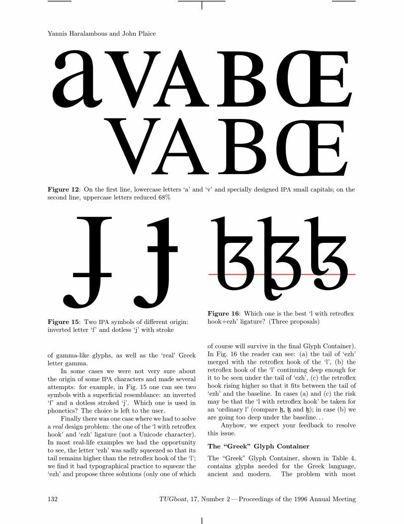
Yannis Haralambous and John Plaice
Figure 12: On the first line, lowercase letters ‘a’ and ‘v’ and specially designed IPA small capitals; on thesecond line, uppercase letters reduced 68%
Figure 15: Two IPA symbols of different origin:inverted letter ‘f’ and dotless ‘j’ with stroke
of gamma-like glyphs, as well as the ‘real’ Greekletter gamma.In some cases we were not very sure about
the origin of some IPA characters and made severalattempts: for example, in Fig. 15 one can see twosymbols with a superficial resemblance: an inverted‘f’ and a dotless stroked ‘j’. Which one is used inphonetics? The choice is left to the user.Finally there was one case where we had to solve
a real design problem: the one of the ‘l with retroflexhook’ and ‘ezh’ ligature (not a Unicode character).In most real-life examples we had the opportunityto see, the letter ‘ezh’ was sadly squeezed so that itstail remains higher than the retroflex hook of the ‘l’;we find it bad typographical practice to squeeze the‘ezh’ and propose three solutions (only one of which
Figure 16: Which one is the best ‘l with retroflexhook+ezh’ ligature? (Three proposals)
of course will survive in the final Glyph Container).In Fig. 16 the reader can see: (a) the tail of ‘ezh’merged with the retroflex hook of the ‘l’, (b) theretroflex hook of the ‘l’ continuing deep enough forit to be seen under the tail of ‘ezh’, (c) the retroflexhook rising higher so that it fits between the tail of‘ezh’ and the baseline. In cases (a) and (c) the riskmay be that the ‘l with retroflex hook’ be taken foran ‘ordinary l’ (compare ù, ¯ and ö); in case (b) weare going too deep under the baseline. . .Anyhow, we expect your feedback to resolve
this issue.
The “Greek” Glyph Container
The “Greek” Glyph Container, shown in Table 4,contains glyphs needed for the Greek language,ancient and modern. The problem with most
132 TUGboat, 17, Number 2—Proceedings of the 1996 Annual Meeting
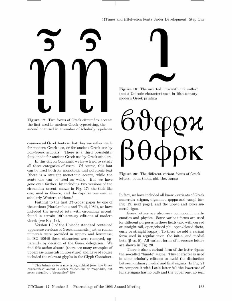
ΩTimes and ΩHelvetica Fonts Under Development: Step One
Figure 17: Two forms of Greek circumflex accent:the first used in modern Greek typesetting, thesecond one used in a number of scholarly typefaces
commercial Greek fonts is that they are either madefor modern Greek use, or for ancient Greek use bynon-Greek scholars. There is a third possibility:fonts made for ancient Greek use by Greek scholars.In this Glyph Container we have tried to satisfy
all three categories of users. Of course, this fontcan be used both for monotonic and polytonic text(there is a straight monotonic accent, while theacute one can be used as well). But we havegone even farther, by including two versions of thecircumflex accent, shown in Fig. 17: the tilde-likeone, used in Greece, and the cap-like one used inscholarly Western editions.3
Faithful to the first TUGboat paper by one ofthe authors (Haralambous and Thull, 1989), we haveincluded the inverted iota with circumflex accent,found in certain 19th-century editions of modernGreek (see Fig. 18).Version 1.0 of the Unicode standard contained
uppercase versions of Greek numerals, just as romannumerals were provided in upper- and lowercase;in ISO 10646 these characters were removed, ap-parently by decision of the Greek delegation. Wefind this action absurd (there are many examples ofuppercase numerals in literature) and have of courseincluded the relevant glyphs in the Glyph Container.
3 This brings us to a nice typographical joke: the Greek“circumflex” accent is either “tilde”-like or “cap”-like, butnever actually. . . “circumflex”-like!
Figure 18: The inverted ‘iota with circumflex’(not a Unicode character) used in 19th-centurymodern Greek printing
Figure 20: The different variant forms of Greekletters: beta, theta, phi, rho, kappa
In fact, we have included all known variants of Greeknumerals: stigma, digamma, qoppa and sampi (seeFig. 19, next page), and the upper and lower nu-meral signs.Greek letters are also very common in math-
ematics and physics. Some variant forms are usedfor different purposes in these fields (rho with curvedor straight tail, open/closed phi, open/closed theta,curly or straight kappa). To these we add a variantform used in regular text: the initial and medialbeta (b vs. 1). All variant forms of lowercase lettersare shown in Fig. 20.There is also a variant form of the letter sigma:
the so-called “lunate” sigma. This character is usedin some scholarly editions to avoid the distinctionbetween ordinary medial and final sigmas. In Fig. 21we compare it with Latin letter ‘c’: the lowercase oflunate sigma has no bulb and the upper one, no serif
TUGboat, 17, Number 2—Proceedings of the 1996 Annual Meeting 133
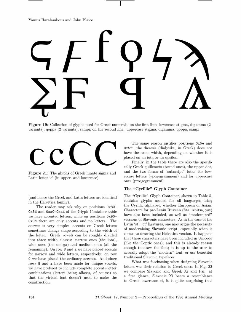
Yannis Haralambous and John Plaice
Figure 19: Collection of glyphs used for Greek numerals; on the first line: lowercase stigma, digamma (2variants), qoppa (2 variants), sampi; on the second line: uppercase stigma, digamma, qoppa, sampi
Figure 21: The glyphs of Greek lunate sigma andLatin letter ‘c’ (in upper- and lowercase)
(and hence the Greek and Latin letters are identicalin the Helvetica family).The reader may ask why on positions 0x80–
0x8d and 0xa0–0xad of the Glyph Container tablewe have accented letters, while on positions 0x90–0x9d there are only accents and no letters. Theanswer is very simple: accents on Greek letterssometimes change shape according to the width ofthe letter. Greek vowels can be roughly dividedinto three width classes: narrow ones (the iota),wide ones (the omega) and medium ones (all theremaining). On row 8 and a we have placed accentsfor narrow and wide letters, respectively; on row9 we have placed the ordinary accents. And sincerows 8 and a have been made for unique vowels,we have prefered to include complete accent+lettercombinations (letters being aliases, of course) sothat the virtual font doesn’t need to make theconstruction.
The same reason justifies positions 0x5e and0x5f: the dieresis (dialytika, in Greek) does nothave the same width, depending on whether it isplaced on an iota or an upsilon.Finally, in the table there are also the specifi-
cally Greek guillemets (round ones), the upper dot,and the two forms of “subscript” iota: for low-ercase letters (ypogegrammeni) and for uppercaseones (prosgegrammeni).
The “Cyrillic” Glyph Container
The “Cyrillic” Glyph Container, shown in Table 5,contains glyphs needed for all languages usingthe Cyrillic alphabet, whether European or Asian.Characters for pre-Lenin Russian (fita, izhitsa, yat)have also been included, as well as “modernized”versions of Slavonic characters. As in the case of theLatin ‘st’, ‘ct’ ligatures, one may argue the necessityof modernizing Slavonic script, especially when itcomes to drawing the Helvetica version. It happensthat these characters have been included in Unicode(like the Coptic ones), and this is already reasonenough to draw the font; it is up to the user toactually adopt the “modern” font, or use beautifultraditional Slavonic typefaces.What was fascinating when designing Slavonic
letters was their relation to Greek ones. In Fig. 22we compare Slavonic and Greek Xi and Psi: ata first glance, Slavonic Xi bears a resemblanceto Greek lowercase xi, it is quite surprising that
134 TUGboat, 17, Number 2—Proceedings of the 1996 Annual Meeting
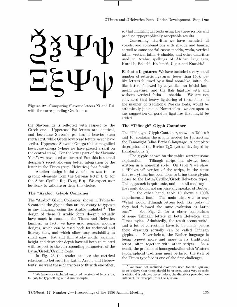
ΩTimes and ΩHelvetica Fonts Under Development: Step One
Figure 22: Comparing Slavonic letters Xi and Psiwith the corresponding Greek ones
the Slavonic xi is reflected with respect to theGreek one. Uppercase Psi letters are identical,and lowercase Slavonic psi has a heavier stem(with serif, while Greek lowercase letters never haveserifs). Uppercase Slavonic Omega + is a magnifiedlowercase omega (where we have placed a serif onthe central stem). For the lower part of the SlavonicYus / we have used an inverted Psi: this is a smalldesigner’s secret allowing better integration of theletter in the Times (resp. Helvetica) font family.Another design initiative of ours was to use
graphic elements from the Serbian letter ! 1, forthe Asian Cyrillic å ú, § ¥, Ø ø. We expect userfeedback to validate or deny this choice.
The “Arabic” Glyph Container
The “Arabic” Glyph Container, shown in Tables 6–8 contains the glyphs that are necessary to typesetin any language using the Arabic alphabet.4 Thedesign of these Ω Arabic fonts doesn’t actuallyhave much in common the Times and Helveticafamilies; in fact, we have used popular moderndesigns, which can be used both for technical andliterary text, and which allow easy readability insmall sizes. Fat and thin stroke width, ascenderheight and descender depth have all been calculatedwith respect to the corresponding parameters of theLatin/Greek/Cyrillic fonts.In Fig. 23 the reader can see the metrical
relationship between the Latin, Arabic and Hebrewfonts: we want these characters to fit with one other,
4 We have also included undotted versions of letters ba,fa, qaf, for typesetting of old manuscripts.
so that multilingual texts using the three scripts willproduce typographically acceptable results.Concerning diacritics we have included all
vowels, and combinations with shadda and hamza,as well as some special cases: madda, wesla, verticalfatha, vertical fatha + shadda, and other diacriticsused in Arabic spellings of African languages,Kurdish, Baluchi, Kashmiri, Uigur and Kazakh.5
Esthetic Ligatures We have included a very smallnumber of esthetic ligatures (fewer than 150): ba-like letters followed by a final noon-like, initial fa-like letters followed by a ya-like, an initial lam-meem ligature, and the llah ligature with andwithout vertical fatha + shadda. We are notconvinced that heavy ligaturing of these fonts, inthe manner of traditional Naskhi fonts, would beesthetically judicious. Nevertheless, we are open toany suggestion on possible ligatures that might beadded.
The “Tifinagh” Glyph Container
The “Tifinagh” Glyph Container, shown in Tables 9and 10, contains the glyphs needed for typesettingthe Tamazight (alias Berber) language. A completedescription of the Berber TEX system developed byHaralambous [2].The glyphs shown on the tables warrant some
explanation. Tifinagh script has always beenwritten in a non-serif style. On table 9 we showa “Helvetica” version of the script, in the sensethat everything has been done to bring these glyphscloser to the Latin/Cyrillic/Greek Helvetica types.This approach is quite safe, and— in all modesty—the result should not surprise any speaker of Berber.On the other hand, table 10 shows a 100%
experimental font! The main idea was to say:“What would Tifinagh letters look like today ifthey had followed the same evolution as Latinones?” See Fig. 24 for a closer comparisonof some Tifinagh letters in both Helvetica andTimes styles. Admittedly, the result seems weird,and a lot of corrections have to be made beforethese drawings actually can be called Tifinaghglyphs. . . Nevertheless, the Berber language isbeing typeset more and more in its traditionalscript, often together with other scripts. As aresult, the problem of homogenization with Westerntypographical traditions must be faced; the style ofthe Times typeface is one of the first challenges.
5 We have not included diacritics used for the Qur’an,as we believe that these should be printed using very specifictraditional typefaces; nevertheless, the diacritics provided aresufficient for excerpts from the Qur’an.
TUGboat, 17, Number 2—Proceedings of the 1996 Annual Meeting 135
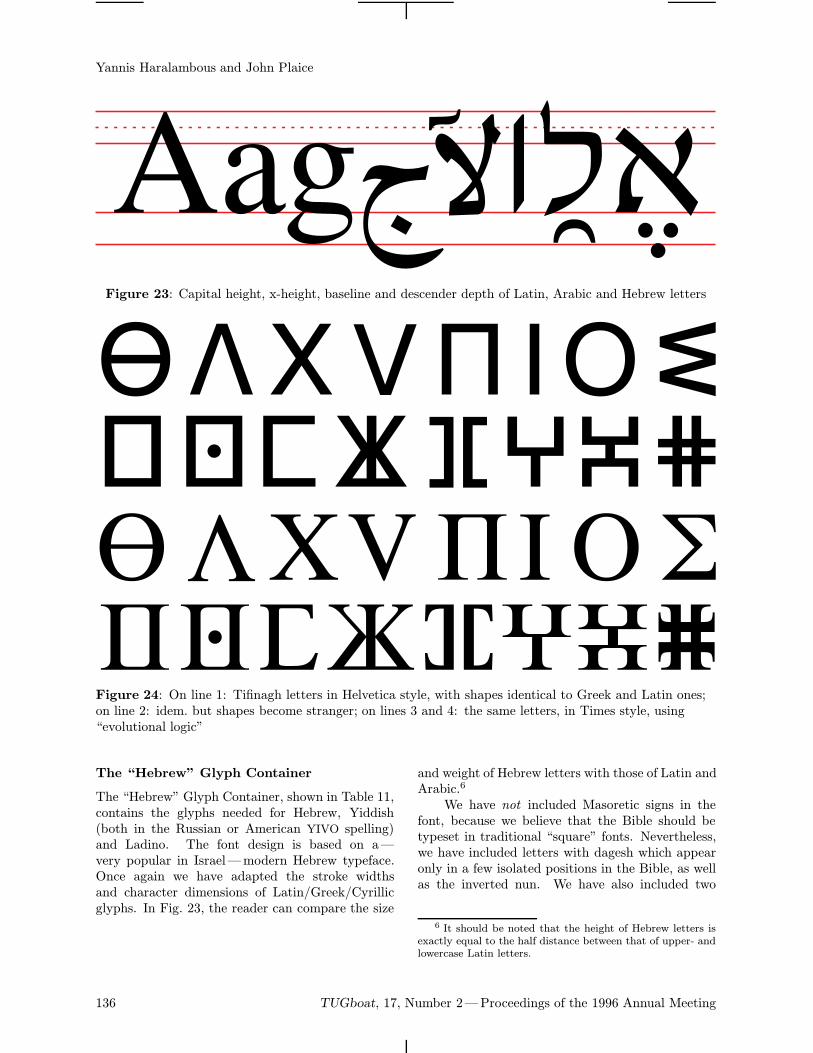
Yannis Haralambous and John Plaice
Figure 23: Capital height, x-height, baseline and descender depth of Latin, Arabic and Hebrew letters
Figure 24: On line 1: Tifinagh letters in Helvetica style, with shapes identical to Greek and Latin ones;on line 2: idem. but shapes become stranger; on lines 3 and 4: the same letters, in Times style, using“evolutional logic”
The “Hebrew” Glyph Container
The “Hebrew” Glyph Container, shown in Table 11,contains the glyphs needed for Hebrew, Yiddish(both in the Russian or American YIVO spelling)and Ladino. The font design is based on a—very popular in Israel—modern Hebrew typeface.Once again we have adapted the stroke widthsand character dimensions of Latin/Greek/Cyrillicglyphs. In Fig. 23, the reader can compare the size
and weight of Hebrew letters with those of Latin andArabic.6
We have not included Masoretic signs in thefont, because we believe that the Bible should betypeset in traditional “square” fonts. Nevertheless,we have included letters with dagesh which appearonly in a few isolated positions in the Bible, as wellas the inverted nun. We have also included two
6 It should be noted that the height of Hebrew letters isexactly equal to the half distance between that of upper- andlowercase Latin letters.
136 TUGboat, 17, Number 2—Proceedings of the 1996 Annual Meeting
ΩTimes and ΩHelvetica Fonts Under Development: Step One
different forms of the lamed-aleph ligature (with andwithout left stroke), used in older texts.
References
[1] Haralambous, Yannis and Klaus Thull. “Type-setting modern Greek with 128-character codes.”TUGboat 10,3 (1989), pages 354—359.
[2] Haralambous, Yannis. Un systeme TEX
berbere. Actes de la table ronde internationalepPhonologie et notation usuelle dans le domaineberbereq. Paris: Institut National des Langueset Civilisations Orientales, 1993. [Forthcomingin the Cahiers GUTenberg thematic issue onSemitic scripts.]
TUGboat, 17, Number 2—Proceedings of the 1996 Annual Meeting 137
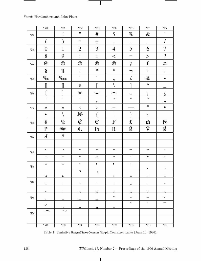
Yannis Haralambous and John Plaice
"x0 "x1 "x2 "x3 "x4 "x5 "x6 "x7
"2x ! " # $ % & '( ) * + , - . /
"3x 0 1 2 3 4 5 6 78 9 : ; < = > ?
"4x @ A B C D E F GH I J K L M N O
"5x P Q R S T U V WX Y Z [ \ ] ^ _
"6x ` a b c d e f gh i j k l m n o
"7x p q r s t u v wx y z | ~
"8x Ä Å Ç É Ñ Ö Ü áà â ä ã å ç é è
"9x ê ë
"Ax † ° ¢ £ § • ¶ ß® © ™ ´ ¨ ≠ Æ Ø
"Bx ∞ ± ≤ ≥ ¥ µ ∂ ∑∏ π ∫ ª º Ω æ ø
"Cx ¿ ¡ ¬ √ ƒ ≈ ∆ «» … À Ã Õ Œ œ
"Dx – — “ ” ‘ ’ ÷ ◊ÿ Ÿ ⁄ ¤ ‹ › fi fl
"Ex ‡ ·
"x8 "x9 "xA "xB "xC "xD "xE "xF
Table 1: Tentative OmegaTimesCommon Glyph Container Table (June 10, 1996).
138 TUGboat, 17, Number 2—Proceedings of the 1996 Annual Meeting
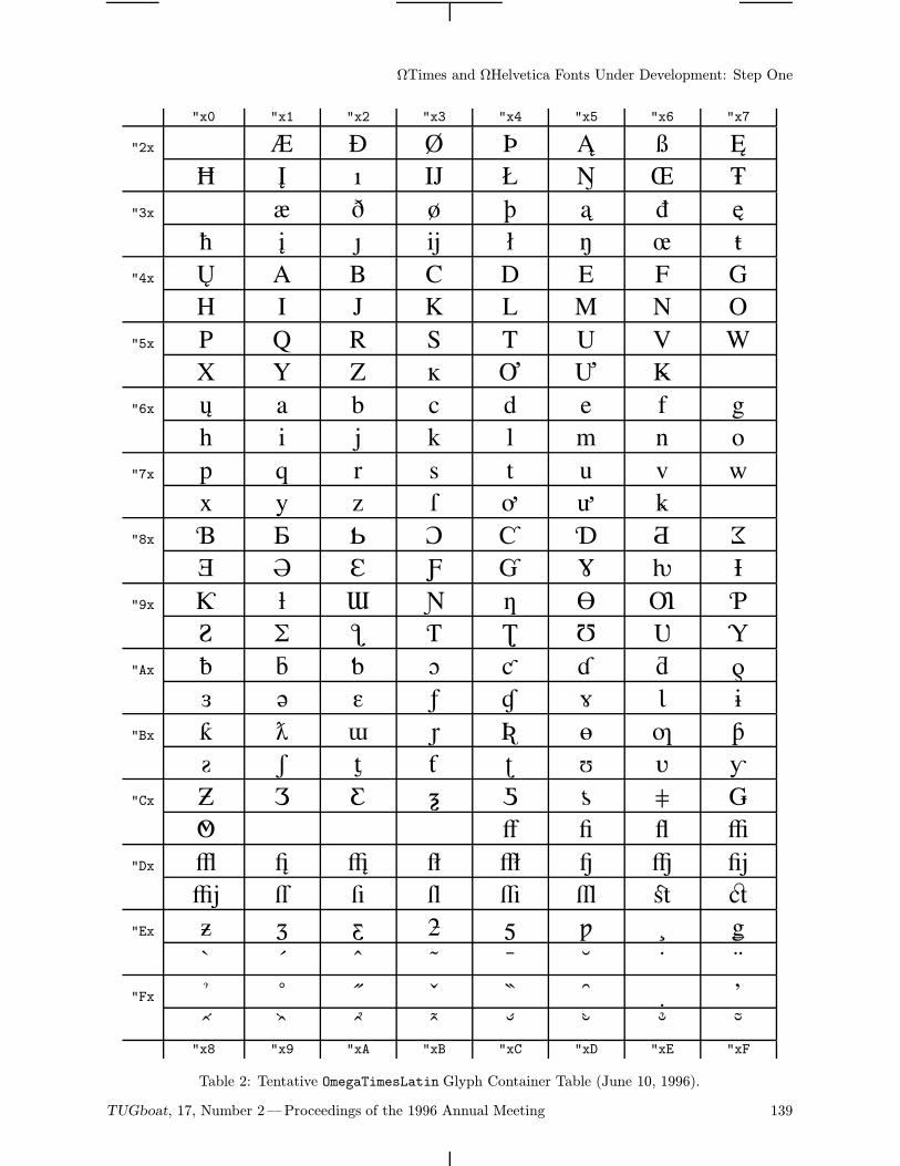
ΩTimes and ΩHelvetica Fonts Under Development: Step One
"x0 "x1 "x2 "x3 "x4 "x5 "x6 "x7
"2x ! " # $ % & '( ) * + , - . /
"3x 1 2 3 4 5 6 78 9 : ; < = > ?
"4x @ A B C D E F GH I J K L M N O
"5x P Q R S T U V WX Y Z [ \ ] ^
"6x ` a b c d e f gh i j k l m n o
"7x p q r s t u v wx y z | ~
"8x Ä Å Ç É Ñ Ö Ü áà â ä ã å ç é è
"9x ê ë í ì î ï ñ óò ô ö õ ú ù û ü
"Ax † ° ¢ £ § • ¶ ß® © ™ ´ ¨ ≠ Æ Ø
"Bx ∞ ± ≤ ≥ ¥ µ ∂ ∑∏ π ∫ ª º Ω æ ø
"Cx ¿ ¡ ¬ √ ƒ ≈ ∆ «» Ã Õ Œ œ
"Dx – — “ ” ‘ ’ ÷ ◊ÿ Ÿ ⁄ ¤ ‹ › fi fl
"Ex ‡ · ‚ „ ‰ Â Ê ÁË È Í Î Ï Ì Ó Ô
"Fx Ò Ú Û Ù ı ˆ ˜¯ ˘ ˙ ˚ ¸ ˝ ˛ ˇ"x8 "x9 "xA "xB "xC "xD "xE "xF
Table 2: Tentative OmegaTimesLatin Glyph Container Table (June 10, 1996).
TUGboat, 17, Number 2—Proceedings of the 1996 Annual Meeting 139
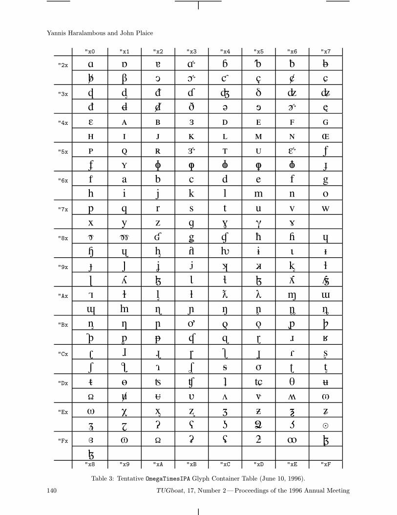
Yannis Haralambous and John Plaice
"x0 "x1 "x2 "x3 "x4 "x5 "x6 "x7
"2x ! " # $ % & '( ) * + , - . /
"3x 0 1 2 3 4 5 6 78 9 : ; < = > ?
"4x @ A B C D E F GH I J K L M N O
"5x P Q R S T U V WX Y Z [ \ ] ^ _
"6x ` a b c d e f gh i j k l m n o
"7x p q r s t u v wx y z | ~
"8x Ä Å Ç É Ñ Ö Ü áà â ä ã å ç é è
"9x ê ë í ì î ï ñ óò ô ö õ ú ù û ü
"Ax † ° ¢ £ § • ¶ ß® © ™ ´ ¨ ≠ Æ Ø
"Bx ∞ ± ≤ ≥ ¥ µ ∂ ∑∏ π ∫ ª º Ω æ ø
"Cx ¿ ¡ ¬ √ ƒ ≈ ∆ «» … À Ã Õ Œ œ
"Dx – — “ ” ‘ ’ ÷ ◊ÿ Ÿ ⁄ ¤ ‹ › fi fl
"Ex ‡ · ‚ „ ‰ Â Ê ÁË È Í Î Ï Ì Ó Ô
"Fx Ò Ú Û Ù ı ˆ ˜
¯"x8 "x9 "xA "xB "xC "xD "xE "xF
Table 3: Tentative OmegaTimesIPA Glyph Container Table (June 10, 1996).
140 TUGboat, 17, Number 2—Proceedings of the 1996 Annual Meeting
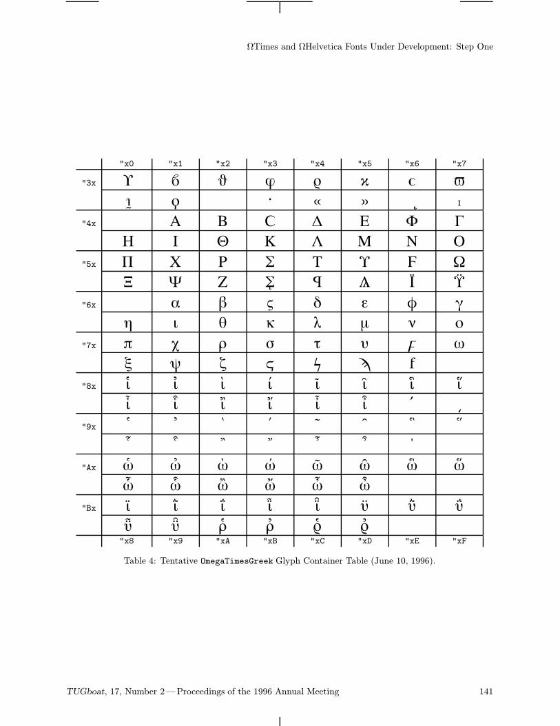
ΩTimes and ΩHelvetica Fonts Under Development: Step One
"x0 "x1 "x2 "x3 "x4 "x5 "x6 "x7
"3x 0 1 2 3 4 5 6 78 9 ; < = > ?
"4x A B C D E F GH I J K L M N O
"5x P Q R S T U V WX Y Z [ \ ] ^ _
"6x a b c d e f gh i j k l m n o
"7x p q r s t u v wx y z | ~
"8x Ä Å Ç É Ñ Ö Ü áà â ä ã å ç é è
"9x ê ë í ì î ï ñ óò ô ö õ ú ù û
"Ax † ° ¢ £ § • ¶ ß® © ™ ´ ¨ ≠
"Bx ∞ ± ≤ ≥ ¥ µ ∂ ∑∏ π ∫ ª º Ω"x8 "x9 "xA "xB "xC "xD "xE "xF
Table 4: Tentative OmegaTimesGreek Glyph Container Table (June 10, 1996).
TUGboat, 17, Number 2—Proceedings of the 1996 Annual Meeting 141
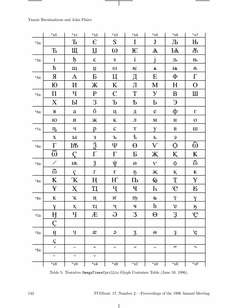
Yannis Haralambous and John Plaice
"x0 "x1 "x2 "x3 "x4 "x5 "x6 "x7
"2x ! " # $ % & '( ) * + , - . /
"3x 0 1 2 3 4 5 6 78 9 : ; < = > ?
"4x @ A B C D E F GH I J K L M N O
"5x P Q R S T U V WX Y Z [ \ ] ^
"6x ` a b c d e f gh i j k l m n o
"7x p q r s t u v wx y z | ~
"8x Ä Å Ç É Ñ Ö Ü áà â ä ã å ç é è
"9x ê ë í ì î ï ñ óò ô ö õ ú ù û ü
"Ax † ° ¢ £ § • ¶ ß® © ™ ´ ¨ ≠ Æ Ø
"Bx ∞ ± ≤ ≥ ¥ µ ∂ ∑∏ π ∫ ª º Ω æ ø
"Cx ¿ ¡ ¬ √ ƒ ≈ ∆ «»
"Dx – — “ ” ‘ ’ ÷ ◊ÿ
"Ex ‡ · ‚ „ ‰ Â Ê ÁË È Í"x8 "x9 "xA "xB "xC "xD "xE "xF
Table 5: Tentative OmegaTimesCyrillic Glyph Container Table (June 10, 1996).
142 TUGboat, 17, Number 2—Proceedings of the 1996 Annual Meeting
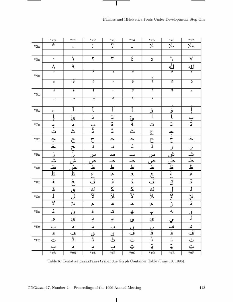
ΩTimes and ΩHelvetica Fonts Under Development: Step One
"x0 "x1 "x2 "x3 "x4 "x5 "x6 "x7
"2x ! " # $ % & '
"3x 0 1 2 3 4 5 6 78 9 > ?
"4x @ A B C D E F GH I J K L M N O
"5x P Q R S T U V WX Y Z [ \ ] ^ _
"6x ` a b c d e f gh i j k l m n o
"7x p q r s t u v wx y z | ~
"8x Ä Å Ç É Ñ Ö Ü áà â ä ã å ç é è
"9x ê ë í ì î ï ñ óò ô ö õ ú ù û ü
"Ax † ° ¢ £ § • ¶ ß® © ™ ´ ¨ ≠ Æ Ø
"Bx ∞ ± ≤ ≥ ¥ µ ∂ ∑∏ π ∫ ª º Ω æ ø
"Cx ¿ ¡ ¬ √ ƒ ≈ ∆ «» … À Ã Õ Œ œ
"Dx – — “ ” ‘ ’ ÷ ◊ÿ Ÿ ⁄ ¤ ‹ › fi fl
"Ex ‡ · ‚ „ ‰ Â Ê ÁË È Í Î Ï Ì Ó Ô
"Fx Ò Ú Û Ù ı ˆ ˜¯ ˘ ˙ ˚ ¸ ˝ ˛ ˇ"x8 "x9 "xA "xB "xC "xD "xE "xF
Table 6: Tentative OmegaTimesArabicOne Glyph Container Table (June 10, 1996).
TUGboat, 17, Number 2—Proceedings of the 1996 Annual Meeting 143
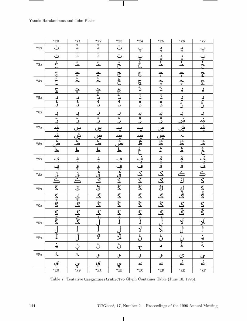
Yannis Haralambous and John Plaice
"x0 "x1 "x2 "x3 "x4 "x5 "x6 "x7
"2x ! " # $ % & '( ) * + , - . /
"3x 0 1 2 3 4 5 6 78 9 : ; < = > ?
"4x @ A B C D E F GH I J K L M N O
"5x P Q R S T U V WX Y Z [ \ ] ^ _
"6x ` a b c d e f gh i j k l m n o
"7x p q r s t u v wx y z | ~
"8x Ä Å Ç É Ñ Ö Ü áà â ä ã å ç é è
"9x ê ë í ì î ï ñ óò ô ö õ ú ù û ü
"Ax † ° ¢ £ § • ¶ ß® © ™ ´ ¨ ≠ Æ Ø
"Bx ∞ ± ≤ ≥ ¥ µ ∂ ∑∏ π ∫ ª º Ω æ ø
"Cx ¿ ¡ ¬ √ ƒ ≈ ∆ «» … À Ã Õ Œ œ
"Dx – — “ ” ‘ ’ ÷ ◊ÿ Ÿ ⁄ ¤ ‹ › fi fl
"Ex ‡ · ‚ „ ‰ Â Ê ÁË È Í Î Ï Ì Ó Ô
"Fx Ò Ú Û Ù ı ˆ ˜¯ ˘ ˙ ˚ ¸ ˝ ˛ ˇ"x8 "x9 "xA "xB "xC "xD "xE "xF
Table 7: Tentative OmegaTimesArabicTwo Glyph Container Table (June 10, 1996).
144 TUGboat, 17, Number 2—Proceedings of the 1996 Annual Meeting
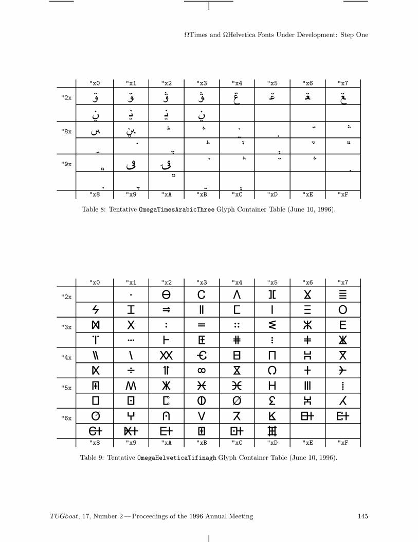
ΩTimes and ΩHelvetica Fonts Under Development: Step One
"x0 "x1 "x2 "x3 "x4 "x5 "x6 "x7
"2x ! " # $ % & '( ) * +
"8x Ä Å Ç É Ñ Ö Ü áà â ä ã å ç é è
"9x ê ë í ì î ï ñ óò ô ö õ ú"x8 "x9 "xA "xB "xC "xD "xE "xF
Table 8: Tentative OmegaTimesArabicThree Glyph Container Table (June 10, 1996).
"x0 "x1 "x2 "x3 "x4 "x5 "x6 "x7
"2x ! " # $ % & '
( ) * + , - . /
"3x 0 1 2 3 4 5 6 7
8 9 : ; < = > ?
"4x @ A B C D E F G
H I J K L M N O
"5x P Q R S T U V W
X Y Z [ \ ] ^ _
"6x ` a b c d e f g
h i j k l m"x8 "x9 "xA "xB "xC "xD "xE "xF
Table 9: Tentative OmegaHelveticaTifinagh Glyph Container Table (June 10, 1996).
TUGboat, 17, Number 2—Proceedings of the 1996 Annual Meeting 145
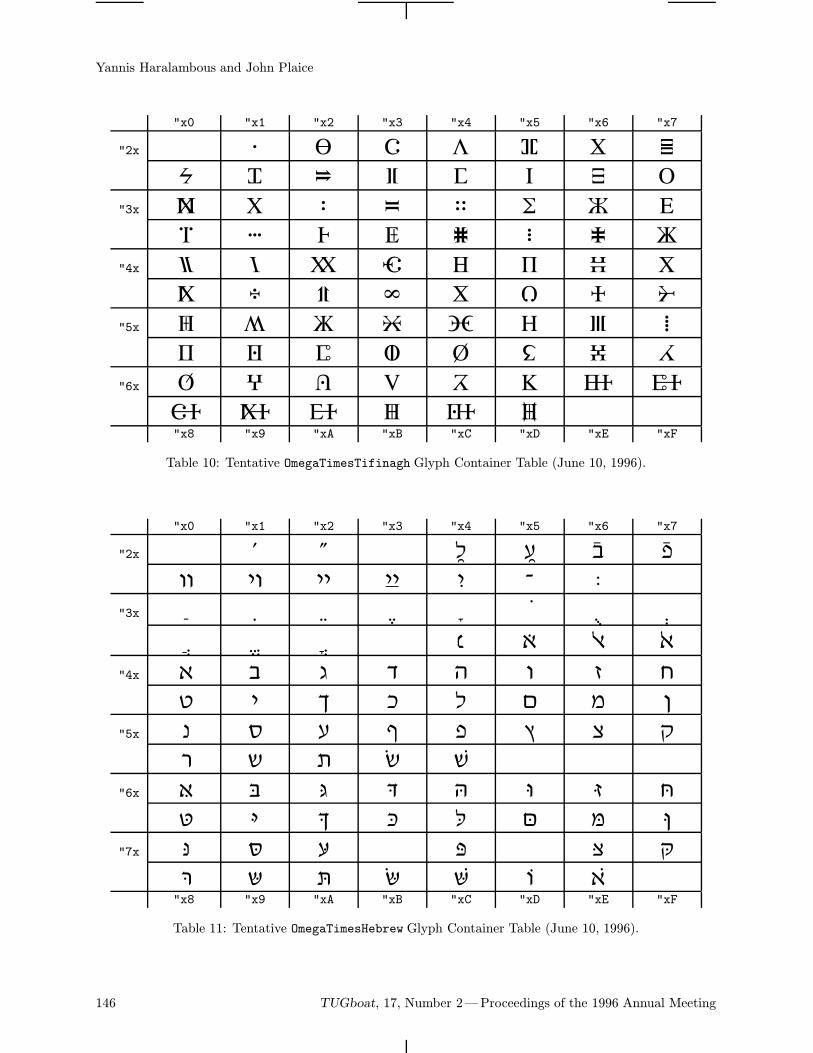
Yannis Haralambous and John Plaice
"x0 "x1 "x2 "x3 "x4 "x5 "x6 "x7
"2x ! " # $ % & '
( ) * + , - . /
"3x 0 1 2 3 4 5 6 7
8 9 : ; < = > ?
"4x @ A B C D E F G
H I J K L M N O
"5x P Q R S T U V W
X Y Z [ \ ] ^ _
"6x ` a b c d e f g
h i j k l m"x8 "x9 "xA "xB "xC "xD "xE "xF
Table 10: Tentative OmegaTimesTifinagh Glyph Container Table (June 10, 1996).
"x0 "x1 "x2 "x3 "x4 "x5 "x6 "x7
"2x ! " $ % & '( ) * + , - .
"3x 0 1 2 3 4 5 6 78 9 : < = > ?
"4x @ A B C D E F GH I J K L M N O
"5x P Q R S T U V WX Y Z [ \
"6x ` a b c d e f gh i j k l m n o
"7x p q r t v wx y z | ~"x8 "x9 "xA "xB "xC "xD "xE "xF
Table 11: Tentative OmegaTimesHebrew Glyph Container Table (June 10, 1996).
146 TUGboat, 17, Number 2—Proceedings of the 1996 Annual Meeting
Extending TEX for Unicode
Richard J. Kinch6994 Pebble Beach CtLake Worth FL 33467 USATelephone (561) 966-8400FAX (561) [email protected]
URL: http://styx.ios.com/~kinch
Abstract
TEX began its “childhood” with 7-bit-encoded fonts, and has entered adolescencewith 8-bit encodings such as the Cork standard. Adulthood will require TEXto embrace 16-bit encoding standards such as Unicode. Omega has debuted asa well-designed extension of the TEX formatter to accommodate Unicode, butmuch new work remains to extend the fonts and DVI translation that make upthe bulk of a complete TEX implementation. Far more than simply doubling thewidth of some variables, such an extension implies a massive reorganization ofmany components of TEX.We describe the many areas of development needed to bring TEX fully into
multi-byte encoding. To describe and illustrate these areas, we introduce theTrueTEX
r© Unicode edition, which implements many of the extensions usingthe Windows Graphics Device Interface and TrueType scalable font technology.
Integrating TEX and Unicode
You cannot use TEX for long without discoveringthat character encoding is a big, messy issue in everyimplementation. The promise of Unicode, a 16-bitcharacter-encoding standard [15, 14], is to clean upthe mess and simplify the issues.While Omega [5, 13] has upgraded TEX-to-DVI
translation to handle Unicode [3], the fonts andDVI-to-device translators are far too entrenched innarrow encodings to be easily upgraded. This paperwill develop the concepts needed to create UnicodeTEX fonts and DVI translators, and exhibit ourprogress in the TrueTEX Unicode edition.A fully Unicode-capable TEX brings many
substantial benefits:
• TEX will work smoothly with non-TEX fonts.While TEX already has a degree of access to8-bit PostScript and TrueType fonts, there aremany limitations that Unicode can eliminate.
• TEX will eliminate the last vestiges of its deep-seated bias for the English language and US ver-sions of multilingual platforms like Windows. Itwill adapt freely and instantaneously to otherlanguages, not just in the documents produced,but in its run-time messages and user interface.This flexibility is crucial to quality software,
especially to a commercial product in an inter-national marketplace.• With access to Unicode fonts, the naturalability of TEX to process the large character setsof the Asian continent will be realized. Methodssuch as the Han unification will be accessible.
• TEX will install with fewer font and driver files.Many 8-bit fonts will fit into one 16-bit font,and in systems like Windows, which treat fontsas a system-wide resource, fewer fonts are anadvantage. Only one application will be neededto translate from Unicode DVI to output device.• TEX documents will convert to other portableforms (like PDF, OpenDoc, or HTML) and willwork with Windows OLE, without tricks andwithout pain.• Computer Modern and other TEX fonts will beusable in non-TEX Unicode applications. The8-bit encoding problems have broken ComputerModern on every variety of Microsoft Windows.• When 16-bit encodings overcome the resistanceof the past—and we have every reason to hopethat they will—TEX will play a continuing rolein software of the future, instead of becomingan antique.
Claiming these promises involves some trouble alongthe way, but without 16 bits to use for encoding, wewill never have a solid solution.
TUGboat, 17, Number 2—Proceedings of the 1996 Annual Meeting 147
Richard J. Kinch
Let us survey in the rest of this paper what isneeded to achieve these various aspects of integrat-ing TEX and Unicode.
Omega and Unicode
The goal of our work has been to create a Unicode-capable DVI translator, and to reorganize the TEXfonts into a Unicode encoding. TEX itself (thatis, the formatter) already has a Unicode successor,namely Omega.The chief advance of Omega is that it gener-
alizes the TEX formatter to handle wider encod-ings. What Omega is less concerned with is theDVI format (which has always provided for widerencodings, up to 32 bits), the encoding of the exist-ing TEX fonts, and the translation of .dvi files foroutput devices. In fact, Omega has side-stepped DVItranslation altogether with its extended xdvicopytranslation, whereby Omega operates within the oldenvironment of 8-bit TEX fonts and the old DVItranslators. Since Unicode rendering is supportedonWindows but not on other popular TEX platforms(UNIX, DOS, etc.), a devotion to Omega’s porta-bility requires that Omega use the old fonts andDVI translators. Lacking any compulsion to extendthe DVI translators for Unicode, the Omega projecthas justifiably invested most of its effort into earlierstages of the typesetting process [4, page 426].Our Unicode TEX fonts and Unicode DVI
translator, while having a natural connection toOmega, are capable of connecting TEX82 to Unicodeas well. Through the mechanism of virtual fonts [11],TEX can access Unicoded fonts while using its old8-bit encodings itself.
What’s the fuss?
Wishing for 16 bits of Unicode sounds like, heypresto, we just widen some integer types, doublesome constants, and type “make” somewhere very,very high in a directory tree. The task is far fromthis simple for several reasons:One, TEX and TEXware is full of 256-member
tables which enumerate all code points. Thesewould have to grow to 65,536 members. WhileHaralambous and Plaice want us to agree thatthis is “impossible” for practical reasons [6], theyassume that we are not going to re-implement the8-bit-encoded software for sparse arrays. Applyingsparse-array techniques to manage per-characterdata will avoid an impossible increase in executiontime and/or memory, although it will require aninitial extra effort to upgrade the software.
Two, these tables have to be stored in files,and we need to carefully and deliberately extendthe file formats to handle the extensions. Not onlycould we come up with a bad design that limits usunnecessarily in the future, but all the old TEXwarehas to be upgraded, and then we have to port theupgrades.Three, we must rationalize the old ad-hoc
character sets into a big union set. Just catalogingand managing this data is a large task: manytens of thousands of items, where we used to haveonly hundreds before. Some degree of databasemanagement tools must be applied to get the codesinto a form which we can compile into software; itis not enough to just type in some array initializershere and there.Encoding standards are necessarily incomplete
or imprecise in some aspects, and none fit theTEX enterprise. While many of the Unicode mathsymbols were taken from TEX, many of the TEXcharacters are missing from Unicode. But Unicodeis about the closest encoding to TEX math thatwe can expect from an unspecialized encoding, andwith Unicode we gain a powerful connection tomultilingual character sets.
Extending Computer Modern to Unicode
A “rational” encoding establishes a mapping of char-acter names to unique integers, and this mappingdoes not vary from font to font. The ComputerModern fonts were not encoded rationally. Forexample, code 0x7b is overloaded about 8 differentcharacters, and character dotlessi appears in differ-ent codes in different fonts. Given an 8-bit limiton encoding, this was inevitable. But this makesfor many troubles; moving up to a rational, 16-bitencoding is a clean solution.Computer Modern is also “incomplete” in the
sense that if you made a table having on one axisthe list of all the specific styles (Roman, Italic,typewriter, sans serif, etc.) and on the other axisall the characters in all the fonts (A–Z, punctuation,diacritics, math symbols, etc.), the table would havelots of holes when it came to what METAFONTsource exists. Commercial text fonts have all ofthese holes filled, or at least the regions populatedin the table are rectangular. In Computer Modernthe regions are randomly shaped.Furthermore, the character axis of this (very
large) imaginary table is missing many charactersconsidered important in non-TEX encodings. Forexample, ANSI characters like florin, perthousand,
148 TUGboat, 17, Number 2—Proceedings of the 1996 Annual Meeting
Extending TEX for Unicode
cent, currency, yen, brokenbar, etc., are not imple-mented in Computer Modern. Certain of these sym-bols can be unapologetically composed from exist-ing Computer Modern symbols: a Roman multiplyor divide would come from the math symbol font,trademark from the T and M of a smaller opticalsize, and so on. But many other characters willjust have to be autographed anew in METAFONT(at least one related work is in progress [6]).The job of extending Computer Modern to be a
rational and complete set of fonts first requires thatwe reorganize the existing characters into a clean,16-bit encoding. Then we are in a strong positionto fill in the missing characters.We not only want to give TEX access to 16-bit-
encoded fonts, we also want the converse: non-TEXapplications to have access to the Computer Modernfonts in TrueType form. This mandates adherenceto the Unicode standard wherever possible, andan organized method to manage the non-Unicodecharacters in Computer Modern.Here is a list of the components we consider
essential to a Unicode rationalization of ComputerModern. In this list we take a different approachfrom Haralambous’ Unicode Computer Modernproject [7], which is aimed at producing virtual fontswhich resolve to 8-bit .pk fonts from METAFONT.Our aim is a set of Unicoded TrueType fonts.
• A METAFONT-to-outline converter, a very diffi-cult although not impossible task, as illustratedin MetaFog [9].
• A database system to treat the convertedComputer Modern glyphs as atoms, for inputto a TrueType font-builder.
• A database of character names which covers allthe characters in the TEX fonts and in Unicode.We call the grand union TEX character setTeXunion, in the same way that we denotethe Unicode characters as the Unicode char-acter set. (We will use Small Caps to indi-cate a formal set.) TeXunion contains 1108characters by the present inventory. Produc-ing this database involves some work becausethere are no standards for TEX character names(that is, single-word alphanumeric names suchas are used in PostScript encodings). The stan-dard Unicode character descriptions are lengthyphrases instead of single words, making themunjoinable to the TEX names. For example, theUnicode standard provides the verbose entryfor the code 0x00ab, “left-pointing doubleangle quotation mark”. The PostScript
names1 in common use come from an assort-ment of sources, and they exhibit inconsisten-cies, conflicts, and ambiguities which frustratecomputation of set projections and joins.
• A database of TEX encodings, which tells whichcharacters appear in which TEX fonts. TEXuses a gumbo of no less than 28 (!) distinctencodings (Table 1). This number may comeas a surprise, but has been hidden by the webof METAFONT source files. The sum of all TEXencodings constitutes a database of 3415 name-to-code pairs, each name being taken from the1108 members of TeXunion. We designatethis set of encodings (that is, a set of mappingsof names to integers) as TeXencod.
As if the miasmic fog of encoding conventionswere not confused enough, small-caps fontspresent still more encoding problems. Theyrepresent an axis of variation that is hardlydefined in the usual set of font parameters.We must consider small-caps characters to bedifferent from their corresponding parents. Ifthis is not done, then there is no way tocompose virtual small-caps fonts from theirlowercase counterparts, because we would haveno way of knowing which characters are toshrink (a jumbled set of letters and accentedletters) and which do not (punctuation andall the rest). Thus, for each encoding usedanywhere by a small-caps font, we must makea duplicate small-caps version (altering thelowercase character names to small-caps names)of the encoding in the list of all the encodings.Thus we have a csc2 for roman2, t1csc for t1,and so on.
To produce these duplicate encodings, weneed a rule to convert lowercase names (bothletters a–z and diacritical letters) to small-capslowercase names and back. We have simplybeen appending “sc” to the name (this worksbecause there are no collisions with names thathappen already to end in “sc”). For example, asmall-caps letter “a” is “asc”.
Adobe has been appending “small” to theirnames (this often causes character names toexceed a traditional limit of 15 characters inlength), as in the MacExpert encoding [2]. Thisis done in an irregular manner by appendingto the uppercase character names (for example,
1 There is an attempt at standardization in PostScript-style names from the Association for Font InformationInterchange (AFII), but the standard is proprietary and onpaper only. The names are serial numbers as opposed toabbreviated descriptions.
TUGboat, 17, Number 2—Proceedings of the 1996 Annual Meeting 149
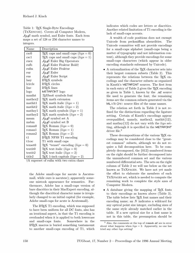
Richard J. Kinch
Table 1: TEX Single-Byte Encodings(TeXencod). Covers all Computer Modern,AMS math symbol, and Euler fonts. Each itemmaps a set of 128 or 256 character names tointegers.
Name Description
csc0 TEX caps and small caps (ligs = 0)csc1 TEX caps and small caps (ligs = 1)euex AMS Euler Big Operatorseufb AMS Euler Fraktur Bold†eufm AMS Euler Fraktureur AMS Eulereus AMS Euler Scriptlasy LATEX symbolslcircle LATEX circlesline LATEX lineslogo METAFONT logomanfnt TEXbook symbols fontmathex2 TEX math extensionmathit1 TEX math italic (ligs = 1)mathit2 TEX math italic (ligs = 2)mathsy1 TEX math symbols (ligs = 1)mathsy2 TEX math symbols (ligs = 2)msam AMS symbol set Amsbm AMS symbol set Broman0 TEX Roman (ligs = 0)roman1 TEX Roman (ligs = 1)roman2 TEX Roman (ligs = 2)t1 LATEX NFSS T1 encodingt1csc T1 with small capstexset0 TEX “texset” encoding (ligs = 0)textit0 TEX text italic (ligs = 0)textit2 TEX text italic (ligs = 2)title2 TEX 1-inch capitals (ligs = 2)†A superset of eufm with two extra chars
the Adobe small-caps for aacute is Aacutes-mall, while ours is aacutesc); apparently some-one mistook appearance for semantics. Fur-thermore, Adobe has a small-caps version ofbare diacritics in their MacExpert encoding, al-though the diacritical character name is irregu-larly changed to an initial capital (for example,Adobe small-caps for acute is Acutesmall).
The LATEX T1 encoding, which was supposedto have been uniform for all DC fonts, also hasan irrational aspect, in that the T1 encoding isoverloaded when it is applied to both lowercaseand small-caps fonts. Somewhere in theLATEX macros is buried something tantamountto another small-caps encoding of T1, which
indicates which codes are letters or diacritics.Another related limitation of T1 encoding is thelack of small-caps accents.
A wealth of code positions does not exemptUnicode from pecksniffian absurdities. TheUnicode committee will not provide encodingsfor a small-caps alphabet (small-caps being amatter of typography and not information con-tent), although they provide encodings for somesmall-caps characters (which appear in olderencoding standards subsumed by Unicode).
• A rationalization of the TEX character sets intotheir largest common subsets (Table 2). Thisrepresents the relations between the TEX en-codings and the character subsets as organizedin Knuth’s METAFONT sources. The first itemin each entry of Table 2 gives the TEX encodingas given in Table 1, known by the .mf sourcefile used to generate the font; the remainingitems are the common subsets generated via theMETAFONT source files of the same names.
The relation set forth in Table 2 is not re-fined for the distinctions regarding the ligaturesetting. Certain of Knuth’s encodings appearoverqualified, namely, mathex2, mathit12,and mathsy12 do not vary with the ligs set-ting, although it is specified in the METAFONTdriver file.2
These decompositions of the various TEX en-codings may be considered close to the “great-est common” subsets, although we do not re-quire a full decomposition here. To be com-pletely decomposed, the 012-numbered itemson the right should be further decomposed intothe unnumbered common set and the variousnumbered differential sets. The sets on the rightcolumn of Table 2 we will use below as the setknown as TeXpages. We have not yet madethe effort to elaborate the members of eachTeXpages set, which is needed to compute theremaining work to complete the style axes ofComputer Modern.
• A database giving the mapping of TEX fontsto their encodings as known above (Table 3).The table below lists TEX font names and theirencoding name; an N indicates a wildcard forany optical point size integer, excluding sizes ofthe same style already matched earlier in thetable. If a new optical size for a font name isnot in this table, the presumption should be
2 Also, the comments at the top of romsub.mf are in errorabout what happens when ligs = 2. Apparently, no one hastried any other ligs setting!
150 TUGboat, 17, Number 2—Proceedings of the 1996 Annual Meeting
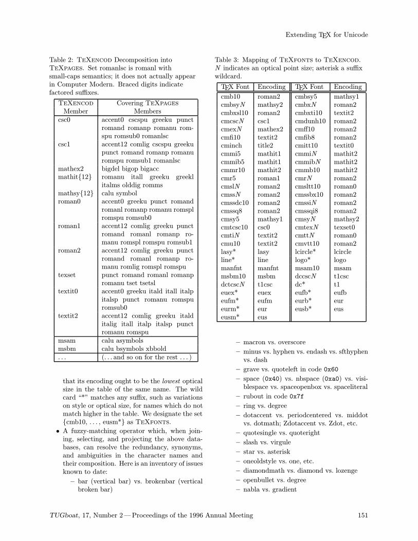
Extending TEX for Unicode
Table 2: TeXencod Decomposition intoTeXpages. Set romanlsc is romanl withsmall-caps semantics; it does not actually appearin Computer Modern. Braced digits indicatefactored suffixes.
TeXencod Covering TeXpagesMember Memberscsc0 accent0 cscspu greeku punct
romand romanp romanu rom-spu romsub0 romanlsc
csc1 accent12 comlig cscspu greekupunct romand romanp romanuromspu romsub1 romanlsc
mathex2 bigdel bigop bigaccmathit12 romanu itall greeku greekl
italms olddig rommsmathsy12 calu symbolroman0 accent0 greeku punct romand
romanl romanp romanu romsplromspu romsub0
roman1 accent12 comlig greeku punctromand romanl romanp ro-manu romspl romspu romsub1
roman2 accent12 comlig greeku punctromand romanl romanp ro-manu romlig romspl romspu
texset punct romand romanl romanpromanu tset tsetsl
textit0 accent0 greeku itald itall italpitalsp punct romanu romspuromsub0
textit2 accent12 comlig greeku italditalig itall italp italsp punctromanu romspu
msam calu asymbolsmsbm calu bsymbols xbbold. . . (. . . and so on for the rest . . . )
that its encoding ought to be the lowest opticalsize in the table of the same name. The wildcard “*” matches any suffix, such as variationson style or optical size, for names which do notmatch higher in the table. We designate the setcmb10, . . . , eusm* as TeXfonts.
• A fuzzy-matching operator which, when join-ing, selecting, and projecting the above data-bases, can resolve the redundancy, synonyms,and ambiguities in the character names andtheir composition. Here is an inventory of issuesknown to date:
– bar (vertical bar) vs. brokenbar (verticalbroken bar)
Table 3: Mapping of TeXfonts to TeXencod.N indicates an optical point size; asterisk a suffixwildcard.
TEX Font Encoding TEX Font Encoding
cmb10 roman2 cmbsy5 mathsy1cmbsyN mathsy2 cmbxN roman2cmbxsl10 roman2 cmbxti10 textit2cmcscN csc1 cmdunh10 roman2cmexN mathex2 cmff10 roman2cmfi10 textit2 cmfib8 roman2cminch title2 cmitt10 textit0cmmi5 mathit1 cmmiN mathit2cmmib5 mathit1 cmmibN mathit2cmmr10 mathit2 cmmb10 mathit2cmr5 roman1 cmrN roman2cmslN roman2 cmsltt10 roman0cmssN roman2 cmssbx10 roman2cmssdc10 roman2 cmssiN roman2cmssq8 roman2 cmssqi8 roman2cmsy5 mathsy1 cmsyN mathsy2cmtcsc10 csc0 cmtexN texset0cmtiN textit2 cmttN roman0cmu10 textit2 cmvtt10 roman2lasy* lasy lcircle* lcircleline* line logo* logomanfnt manfnt msam10 msammsbm10 msbm dccscN t1cscdctcscN t1csc dc* t1euex* euex eufb* eufbeufm* eufm eurb* eureurm* eur eusb* euseusm* eus
– macron vs. overscore
– minus vs. hyphen vs. endash vs. sfthyphenvs. dash
– grave vs. quoteleft in code 0x60
– space (0x40) vs. nbspace (0xa0) vs. visi-blespace vs. spaceopenbox vs. spaceliteral
– rubout in code 0x7f
– ring vs. degree
– dotaccent vs. periodcentered vs. middotvs. dotmath; Zdotaccent vs. Zdot, etc.
– quotesingle vs. quoteright
– slash vs. virgule
– star vs. asterisk
– oneoldstyle vs. one, etc.
– diamondmath vs. diamond vs. lozenge
– openbullet vs. degree
– nabla vs. gradient
TUGboat, 17, Number 2—Proceedings of the 1996 Annual Meeting 151
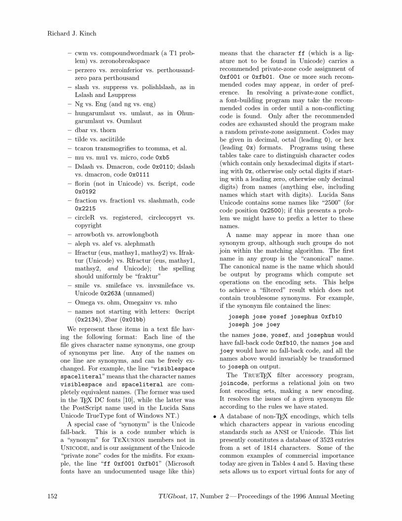
Richard J. Kinch
– cwm vs. compoundwordmark (a T1 prob-lem) vs. zeronobreakspace
– perzero vs. zeroinferior vs. perthousand-zero para perthousand
– slash vs. suppress vs. polishlslash, as inLslash and Lsuppress
– Ng vs. Eng (and ng vs. eng)
– hungarumlaut vs. umlaut, as in Ohun-garumlaut vs. Oumlaut
– dbar vs. thorn
– tilde vs. asciitilde
– tcaron transmogrifies to tcomma, et al.
– mu vs. mu1 vs. micro, code 0xb5
– Dslash vs. Dmacron, code 0x0110; dslashvs. dmacron, code 0x0111
– florin (not in Unicode) vs. fscript, code0x0192
– fraction vs. fraction1 vs. slashmath, code0x2215
– circleR vs. registered, circlecopyrt vs.copyright
– arrowboth vs. arrowlongboth
– aleph vs. alef vs. alephmath
– Ifractur (eus, mathsy1, mathsy2) vs. Ifrak-tur (Unicode) vs. Rfractur (eus, mathsy1,mathsy2, and Unicode); the spellingshould uniformly be “fraktur”
– smile vs. smileface vs. invsmileface vs.Unicode 0x263A (unnamed)
– Omega vs. ohm, Omegainv vs. mho
– names not starting with letters: 0script(0x2134), 2bar (0x01bb)
We represent these items in a text file hav-ing the following format: Each line of thefile gives character name synonyms, one groupof synonyms per line. Any of the names onone line are synonyms, and can be freely ex-changed. For example, the line “visiblespacespaceliteral”means that the character namesvisiblespace and spaceliteral are com-pletely equivalent names. (The former was usedin the TEX DC fonts [10], while the latter wasthe PostScript name used in the Lucida SansUnicode TrueType font of Windows NT.)
A special case of “synonym” is the Unicodefall-back. This is a code number which isa “synonym” for TeXunion members not inUnicode, and is our assignment of the Unicode“private zone” codes for the misfits. For exam-ple, the line “ff 0xf001 0xfb01” (Microsoftfonts have an undocumented usage like this)
means that the character ff (which is a lig-ature not to be found in Unicode) carries arecommended private-zone code assignment of0xf001 or 0xfb01. One or more such recom-mended codes may appear, in order of pref-erence. In resolving a private-zone conflict,a font-building program may take the recom-mended codes in order until a non-conflictingcode is found. Only after the recommendedcodes are exhausted should the program makea random private-zone assignment. Codes maybe given in decimal, octal (leading 0), or hex(leading 0x) formats. Programs using thesetables take care to distinguish character codes(which contain only hexadecimal digits if start-ing with 0x, otherwise only octal digits if start-ing with a leading zero, otherwise only decimaldigits) from names (anything else, includingnames which start with digits). Lucida SansUnicode contains some names like “2500” (forcode position 0x2500); if this presents a prob-lem we might have to prefix a letter to thesenames.
A name may appear in more than onesynonym group, although such groups do notjoin within the matching algorithm. The firstname in any group is the “canonical” name.The canonical name is the name which shouldbe output by programs which compute setoperations on the encoding sets. This helpsto achieve a “filtered” result which does notcontain troublesome synonyms. For example,if the synonym file contained the lines:
joseph jose yosef josephus 0xfb10
joseph joe joey
the names jose, yosef, and josephus wouldhave fall-back code 0xfb10, the names joe andjoey would have no fall-back code, and all thenames above would invariably be transformedto joseph on output.
The TrueTEX filter accessory program,joincode, performs a relational join on twofont encoding sets, making a new encoding.It resolves the issues of a given synonym fileaccording to the rules we have stated.
• A database of non-TEX encodings, which tellswhich characters appear in various encodingstandards such as ANSI or Unicode. This listpresently constitutes a database of 3523 entriesfrom a set of 1814 characters. Some of thecommon examples of commercial importancetoday are given in Tables 4 and 5. Having thesesets allows us to export virtual fonts for any of
152 TUGboat, 17, Number 2—Proceedings of the 1996 Annual Meeting
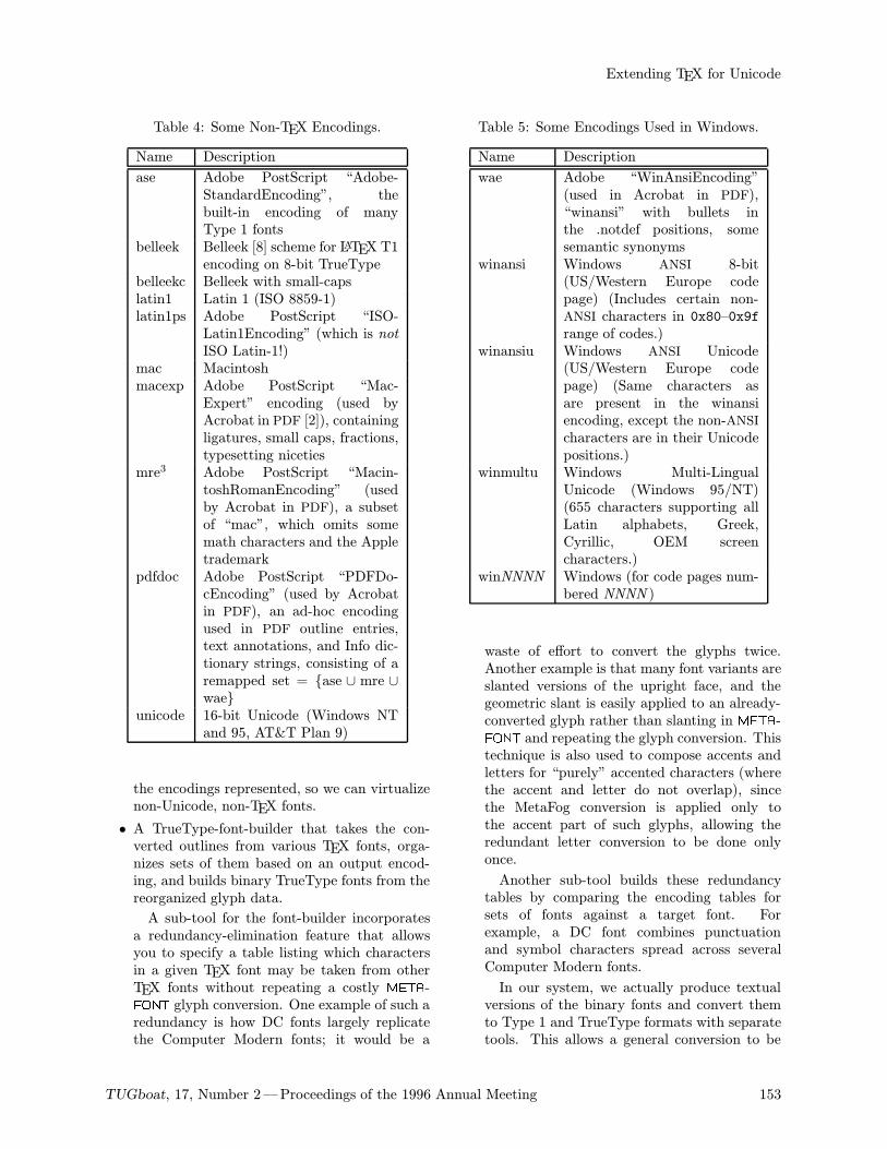
Extending TEX for Unicode
Table 4: Some Non-TEX Encodings.
Name Description
ase Adobe PostScript “Adobe-StandardEncoding”, thebuilt-in encoding of manyType 1 fonts
belleek Belleek [8] scheme for LATEX T1encoding on 8-bit TrueType
belleekc Belleek with small-capslatin1 Latin 1 (ISO 8859-1)latin1ps Adobe PostScript “ISO-
Latin1Encoding” (which is notISO Latin-1!)
mac Macintoshmacexp Adobe PostScript “Mac-
Expert” encoding (used byAcrobat in PDF [2]), containingligatures, small caps, fractions,typesetting niceties
mre3 Adobe PostScript “Macin-toshRomanEncoding” (usedby Acrobat in PDF), a subsetof “mac”, which omits somemath characters and the Appletrademark
pdfdoc Adobe PostScript “PDFDo-cEncoding” (used by Acrobatin PDF), an ad-hoc encodingused in PDF outline entries,text annotations, and Info dic-tionary strings, consisting of aremapped set = ase ∪ mre ∪wae
unicode 16-bit Unicode (Windows NTand 95, AT&T Plan 9)
the encodings represented, so we can virtualizenon-Unicode, non-TEX fonts.
• A TrueType-font-builder that takes the con-verted outlines from various TEX fonts, orga-nizes sets of them based on an output encod-ing, and builds binary TrueType fonts from thereorganized glyph data.
A sub-tool for the font-builder incorporatesa redundancy-elimination feature that allowsyou to specify a table listing which charactersin a given TEX font may be taken from otherTEX fonts without repeating a costly META-FONT glyph conversion. One example of such aredundancy is how DC fonts largely replicatethe Computer Modern fonts; it would be a
Table 5: Some Encodings Used in Windows.
Name Description
wae Adobe “WinAnsiEncoding”(used in Acrobat in PDF),“winansi” with bullets inthe .notdef positions, somesemantic synonyms
winansi Windows ANSI 8-bit(US/Western Europe codepage) (Includes certain non-ANSI characters in 0x80–0x9frange of codes.)
winansiu Windows ANSI Unicode(US/Western Europe codepage) (Same characters asare present in the winansiencoding, except the non-ANSIcharacters are in their Unicodepositions.)
winmultu Windows Multi-LingualUnicode (Windows 95/NT)(655 characters supporting allLatin alphabets, Greek,Cyrillic, OEM screencharacters.)
winNNNN Windows (for code pages num-bered NNNN )
waste of effort to convert the glyphs twice.Another example is that many font variants areslanted versions of the upright face, and thegeometric slant is easily applied to an already-converted glyph rather than slanting in META-FONT and repeating the glyph conversion. Thistechnique is also used to compose accents andletters for “purely” accented characters (wherethe accent and letter do not overlap), sincethe MetaFog conversion is applied only tothe accent part of such glyphs, allowing theredundant letter conversion to be done onlyonce.
Another sub-tool builds these redundancytables by comparing the encoding tables forsets of fonts against a target font. Forexample, a DC font combines punctuationand symbol characters spread across severalComputer Modern fonts.
In our system, we actually produce textualversions of the binary fonts and convert themto Type 1 and TrueType formats with separatetools. This allows a general conversion to be
TUGboat, 17, Number 2—Proceedings of the 1996 Annual Meeting 153
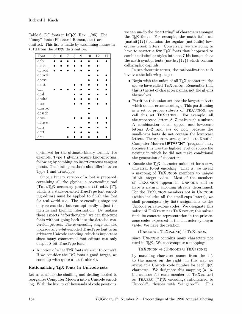
Richard J. Kinch
Table 6: DC fonts in LATEX (Rev. 1/95). The“funny” fonts (Fibonacci Roman, etc.) areomitted. This list is made by examining names in*.fd from the LATEX distribution.
Font 5 6 7 8 9 10 12 17dcb • • • • • • • •dcbx • • • • • • •dcbxsl • • • • • • •dcbxti • • •dccsc • • •dcitt • • • • •dcr • • • • • • • •dcsl • • • • •dcsltt • • • •dcss • • • • •dcssbx •dcssdc •dcssi • • • • •dctcsc • • •dcti • • • • • •dctt • • • •dcu • • • • • •
optimized for the ultimate binary format. Forexample, Type 1 glyphs require knot-pivoting,following by combing, to insert extrema tangentpoints. The hinting methods also differ betweenType 1 and TrueType.
Once a binary version of a font is prepared,containing all the glyphs, a re-encoding tool(TrueTEX accessory program ttf_edit [17],which is a stack-oriented TrueType font encod-ing editor) must be applied to finish the fontfor real-world use. The re-encoding stage notonly re-encodes, but can optionally adjust themetrics and kerning information. By makingthese aspects “afterthoughts” we can fine-tunefonts without going back into the detailed con-version process. The re-encoding stage can alsoupgrade any 8-bit-encoded TrueType font to anarbitrary Unicode encoding, which is importantsince many commercial font editors can onlyoutput 8-bit TrueType fonts.
• A notion of what TEX fonts we want to convert.If we consider the DC fonts a good target, wecome up with quite a list (Table 6).
Rationalizing TEX fonts in Unicode sets
Let us consider the shuffling and dealing needed toreorganize Computer Modern into a Unicode encod-ing. With the luxury of thousands of code positions,
we can un-do the “scattering” of characters amongstthe TEX fonts. For example, the math italic set(mathit12) contains the regular (not italic) low-ercase Greek letters. Conversely, we are going tohave to scatter a few TEX fonts that happened tocombine dissimilar styles into one 7-bit font, such asthe math symbol fonts (mathsy12) which containcalligraphic capitals.In set-theoretic terms, the rationalization task
involves the following steps:
• Begin with the union of all TEX characters, theset we have called TeXunion. Remember thatthis is the set of character names, not the glyphsthemselves.
• Partition this union set into the largest subsetswhich do not cross encodings. This partitioningis a set of proper subsets of TeXunion; wecall this set TeXpages. For example, allthe uppercase letters A–Z make such a subset.A combination of all upper- and lowercaseletters A–Z and a–z do not, because thesmall-caps fonts do not contain the lowercaseletters. These subsets are equivalent to Knuth’sComputer ModernMETAFONT “program” files,because this was the highest level of source filenesting in which he did not make conditionalthe generation of characters.
• Encode the TEX character union set for a new,universal 16-bit encoding. That is, we inventa mapping of TeXunion members to unique16-bit integer codes. Most of the membersof TeXunion appear in Unicode and sohave a natural encoding already determined.For the TeXunion members not in Unicode(which includes all the small-caps letters), weshall promulgate (by fiat) assignments to theUnicode private-zone codes. We designate thissubset of TeXunion asTeXpzone; this subsetfinds its concrete representation in the private-zone codes expressed in the character synonymtable. We have the relation
(Unicode ∪TeXpzone) ⊃ TeXunion,
since Unicode contains many characters notused in TEX. We can compute a mapping:
TeXunion 7→ (Unicode ∪TeXpzone)
by matching character names from the leftto the names on the right; in this way wearrive at a Unicode code number for each TEXcharacter. We designate this mapping (a 16-bit number for each member of TeXunion)as TeXeru (“TEX encodings rationalized toUnicode”, rhymes with “kangaroo”). This
154 TUGboat, 17, Number 2—Proceedings of the 1996 Annual Meeting
Extending TEX for Unicode
mapping is the key result of rationalizingComputer Modern into Unicode.
• We can think again of a large table having, onone axis, the TEX fonts, on the other, the mem-bers of TeXpages, and bullets wherever Com-puter Modern implements METAFONT glyphs.This table will be sparsely and irregularly pop-ulated. The sparseness reflects the fact thatthe TEX fonts cover a wide range of characters,while the variations in style mostly are typo-graphic distinctions on alphabets and punctu-ation; in other words, TEX provides more thana few symbols sets, in contrast to the simpleANSI/Symbol set distinction in 8-bit Windowsfonts. The irregularity in this imaginary tableresults from the ad-hoc arrangment of TeX-pages among TeXfonts. The sparseness isnot a deficiency, but we ought to have some goalin mind for the rational extension of ComputerModern and the other TEX fonts to populateareas of this table for the sake of regularity.Realizing this goal would require drafting ofnew METAFONT code and translation to out-lines. This is similar to how the DC font projectextended Computer Modern to the rational T1encoding.
• At this stage we are ready to determine a list ofactual Computer Modern Unicode fonts whichwill cover TeXfonts. While Haralambousretained 8-bit PK fonts as the actual fonts forvirtual Unicode fonts [7, 6], we will create aconverse realization, namely Unicode TrueTypefonts as the actual fonts for virtual CM, T1, orUT1 encodings.Using the imaginary table just described, wecan take the union of row subsets such thatcolumns are not overlapped. If we want tomaintain stylistic uniformity within individualfonts, we merge rows subject to a personaldecision as to which rows “belong together”in a stylistic sense. On the other hand, if wewant to minimize the number of actual fontsand don’t mind different styles in a single font,we can make a “knapsack” optimization to packthe rows as tightly as possible. (Indeed, if wediscard the Unicode conformity, we could putall of Computer Modern into a single Unicodefont!) In any case, this collapsing of rowsinvolves imprecise judgments to arrive at anoptimized reduced set of fonts.Implicit in this reduction is the factoring ofwildcarded optical sizes that was introducedin TeXfonts; we call this reduced set offonts TeXinUni, which will have a similar
wildcarding to its parent TeXfonts, but fewermembers in parallel with the reduction.
• To produce each real Unicode font (a memberof TeXinUni), we assemble the glyphs andmetrics from TeXfonts and install them viaTeXeru into each code of the mapped-toTeXinUni member.
• We must finally produce Omega virtual fonts(that is, .xvp files) which will map 8-bit DVIcodes from the old TEX fonts into TeXerucodes in TeXinUni members. For this we usethe TrueTEX metric exporter to generate an.xvp file, and XVPtoXVF to convert this to an.xvf file; the .xfm file also produced containsthe same information as the METAFONT .tfmand may be discarded if only TEX82 is to beused for formatting.
Generating Unicode virtual fonts for
non-TEX fonts
Let us consider a converse task: instead of con-verting single-byte-encoded Computer Modern fontsinto Unicode fonts, let us assume we have a Unicodefont in TrueType form, and want to make it usablewith TEX or Omega. To use a font TEX (and Omega)require a .tfm (or .xfm) metric file and a .vf (or.xvf) virtual font file. The virtual font is neces-sary only if a remapped encoding or composition isneeded (usually the case).To generate metric and virtual font files for
Unicode fonts in Windows, TrueTEX provides aFile + Export Metrics item which takes the userthrough several steps which illustrate the elementsof such a translation:
• First, the user selects the font from the Win-dows standard font-selection dialog. For exam-ple, in Windows, standard fonts include Arial(a Helvetica clone), Courier, and Times NewRoman (a Times Roman clone), together withtheir bold and/or italic variations. Windowswill also install other TrueType fonts or (withAdobe Type Manager) Type 1 fonts. After theuser selects a font, TrueTEX has a “font han-dle” with which it can access all the geometricinformation needed to calculate global and per-character metric quantities for the font.
• Second, the user must select names for theoutput .xvp file. Font names in Windows areverbose strings containing several words (suchas, “Times New Roman Regular (TrueType)”),while TEX insists on a single-word alphabeticname; therefore TrueTEX selects a TEX-stylename for the font based on the TrueType file
TUGboat, 17, Number 2—Proceedings of the 1996 Annual Meeting 155
Richard J. Kinch
name (such as “times”). The metric output inthis case would be a file times.xvp.
• Third, the user must specify the “input” and“output” encodings for the virtual font. Theinput encoding is the encoding of the actualfont, typically ANSI or Unicode. The outputencoding is the virtual encoding which theuser desires to construct for TEX’s point ofview, and is typically a member of TeXencod.TrueTEX uses encodings in the form of .codfiles (each line contains a hex code field followedby the character name field) or .afm (AdobeFont Metric [1]) files4 To select an encoding, theuser selects an item from a list which TrueTEXpresents, each item giving a description ofthe encoding (for example, “TEXRoman withligs = 2” corresponds to the roman2.cod file).
The user can also browse for encoding files in-stead of selecting from the canned list. The usercan edit custom encoding files (which are justtext files in afm format), and thereby gains com-plete flexibility of input versus output encodingin the virtual fonts, including automatic pro-duction of composites for missing input charac-ters. The ttf edit [17] program originates afmencoding tables from existing TrueType fonts,allowing maximal compatibility with randomly-encoded fonts.
• User input is now complete. TrueTEX beginsanalysis of the information provided by formingin-memory encoding tables from the encodingfiles (using sparse-array techniques to managelarge, sparse code ranges). TrueTEX sorts andindexes the tables for fast content-addressibilityby either code or character name, assembles theglobal metrics in xvp terms for the font, andvisits each input code in the font to build a tableof per-character metrics and ligatures. xvp filebuilding may now begin.
• For each output character name, TrueTEXdetermines if an exact match exists to aninput name, and thus to an input code.If there is such an exact match, TrueTEXemits xvp commands which give the character’smetrics and which re-map the TEX PUT/SETcommands to the Unicode positions.
• For output characters which have no exact toinput characters, TrueTEX invokes the “com-position engine.” If the composition engine can
4.afm files need not contain metrics; they can simply
define an encoding for a dummy font, using only the C, CH,and N fields of the CharMetrics table. We thus maintaincompatibility with other afm-reading software and avoidinventing yet another file format.
compose or substitute a glyph for the character,it emits the xvp commands for the metrics andother actions. If the composition engine is“stumped”, TrueTEX emits an xvp commentto note that the character is unencoded.
Note that virtual fonts can use more than oneinput font to produce a virtual output font. Thiswould allow, for example, a text font, an expert font(such as might contain ligatures), and a symbol font(such as might contain math symbols) to contributeto a single TEX Unicode font. Another use for thistechnique would be the assembling of a Unicodefont from the old bit-mapped PK fonts. TrueTEXsupports all of the TEX and Omega-extended virtualfont mechanisms, but does not yet directly supportmultiple input fonts for metric export (or bit-mapped fonts, for that matter), although an expertuser can merge multiple virtual-property-list files toproduce such a virtual font.
Composing missing characters
The Unicode and TeXunion sets are disjoint, butthe virtual font mechanism allows users to createvirtual TeXunion characters missing from a Uni-code font with various composition or substitutionmethods. TrueTEX uses this technique to createcompletely populated virtual fonts when the under-lying TrueType fonts are missing accented charac-ters or ligatures.To allow for easy upgrading, the “composition
engine” in TrueTEX uses a user-modifiable scriptin a PostScript-like language to control the compo-sition and substitution process. By changing thescript, the user can add new composition methods orsubstitution rules, or adapt the methods to varioustypographic conventions. TrueTEX, using its ownmini-PostScript interpreter, interprets this script atmetric-export time, which means that users whospeak PostScript and know a bit of font designcan customize the composer. A good script yieldsa much better TEX virtual font, since commercialfonts are typically missing characters that TEX con-siders important, and the script can fill in most ofthe missing pieces.When the composition script receives control
from TrueTEX, all the encoding and metric infor-mation for the font and input and output encodingsare defined as PostScript arrays and dictionaries.The standard composition script in TrueTEX im-plements the following techniques:
• Accent-plus-letter composition: if the nameimplies that the character is an accentedletter, the script decomposes the name into
156 TUGboat, 17, Number 2—Proceedings of the 1996 Annual Meeting
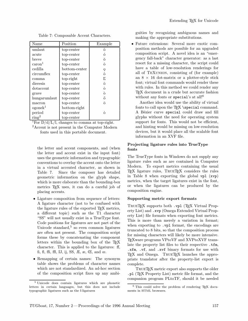
Extending TEX for Unicode
Table 7: Composable Accent Characters.
Name Position Example
umlaut top-center oacute top-center obreve top-center ocaron1 top-center ocedilla bottom-center ocircumflex top-center ocomma top-right L’dieresis top-center odotaccent top-center ograve top-center ohungarumlaut top-center omacron top-center oogonek1 bottom-rightperiod top-center oring2 top-center1For D/d/L/l, changes to comma at top-right.2Accent is not present in the Computer Modernfonts used in this portable document.
the letter and accent components, and (whenthe letter and accent exist in the input font)uses the geometric information and typographicconventions to overlay the accent onto the letterin a virtual accented character, as shown inTable 7. Since the composer has detailedgeometric information on the glyph shape,which is more elaborate than the bounding-boxmetrics TEX uses, it can do a careful job ofplacing accents.
• Ligature composition from sequence of letters:A ligature character (not to be confused withthe ligature rules of the exported TEX metrics,a different topic) such as the T1 character“SS” will not usually exist in a TrueType font.Code positions for ligatures are not part of theUnicode standard,5 so even common ligaturesare often not present. The composition scriptforms these by concatenating the componentletters within the bounding box of the TEXcharacter. This is applied to the ligatures: ff,fi, fl, ffi, ffl, IJ, ij, SS, Æ, æ, Œ, and œ.
• Remapping of certain names: The synonymtable shows the problems of character nameswhich are not standardized. An ad-hoc sectionof the composition script fixes up any ambi-
5 Unicode does contain ligatures which are phoneticletters in certain languages, but this does not includetypographic ligatures such as the f-ligatures
guities by recognizing ambiguous names andmaking the appropriate substitutions.
• Future extensions: Several more exotic com-position methods are possible for an upgradedcomposition script. A novel idea is an “emer-gency fall-back” character generator: as a lastresort for a missing character, the script couldhave a table of low-resolution renderings forall of TeXunion, consisting of (for example)an 8 × 16 dot-matrix or a plotter-style stickfont; virtual font commands would render thesewith rules. In this method we could render anyTEX document in a crude but accurate fashionwithout any fonts or special’s at all!6
Another idea would use the ability of virtualfonts to call upon the TEX \special command.A Bezier curve special could draw and fillglyphs without the need for operating systemsupport for fonts. This would not be efficient,and hinting would be missing on low-resolutiondevices, but it would place all the scalable fontinformation in an XVF file.
Projecting ligature rules into TrueType
fonts
The TrueType fonts in Windows do not supply anyligature rules such as are contained in ComputerModern. To export metrics containing the usualTEX ligature rules, TrueTEX considers the rulesin Table 8 when exporting the global vpl (xvp)metrics, when the target ligatures exist in the font,or when the ligatures can be produced by thecomposition engine.
Supporting metric export formats
TrueTEX supports both .vpl (TEX Virtual Prop-erty List) and .xvp (Omega Extended Virtual Prop-erty List) file formats when exporting font metrics.This is more than merely a variation in format;when exporting to .vpl format, the encodings aretruncated to 8 bits, so that the composition processfor missing characters will likely be more intensive.TEXware programs VPtoVF and XVPtoXVF trans-late the property list files to their respective .tfm,.xfm, .vf, and .xvf binary formats for use withTEX and Omega. TrueTEX launches the appro-priate translator after the property-list export iscomplete.TrueTEX metric export also supports the older
.pl (TEX Property List) metric file format, and thecompanion program PLtoTF, should it be needed
6 This could solve the problem of rendering TEX docu-ments in HTML browsers.
TUGboat, 17, Number 2—Proceedings of the 1996 Annual Meeting 157
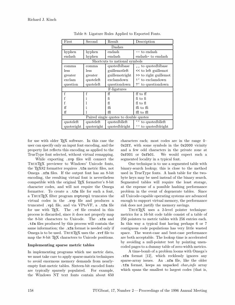
Richard J. Kinch
Table 8: Ligature Rules Applied to Exported Fonts.
First Second Result Description
Dasheshyphen hyphen endash -- to endashendash hyphen emdash endash- to emdash
Shortcuts to national symbolscomma comma quotedblbase ,, to quotedblbaseless less guillemotleft << to left guillemotgreater greater guillemotright >> to right guillemotexclam quoteleft exclamdown !‘ to exclamdownquestion quoteleft questiondown ?‘ to questiondown
F-ligaturesf f ff ff to fff i fi fi to fif l fl fl to flff i ffi ffi to ffiff l ffl ffl to ffl
Paired single quotes to double quotesquoteleft quoteleft quotedblleft ‘‘ to quotedblleftquoteright quoteright quotedblright ’’ to quotedblright
for use with older TEX software. In this case theuser can specify only an input font encoding, and theproperty list reflects this encoding as applied to theTrueType font selected, without virtual remapping.While exporting .xvp files will connect the
TrueTEX previewer to Windows’ Unicode fonts,the TEX82 formatter requires .tfm metric files, notOmega .xfm files. If the output font has an 8-bitencoding, the resulting virtual font is neverthelesscompatible with the original TEX formatter’s 8-bitcharacter codes, and will not require the Omegaformatter. To create a .tfm file for such a font,a TrueTEX filter program xvptovpl truncates thevirtual codes in the .xvp file and produces atruncated .vpl file, and via VPtoVF, a .tfm filefor use with TEX. The .vf file created in thisprocess is discarded, since it does not properly mapthe 8-bit characters to Unicode. The .xfm and.tfm files produced by this process will contain thesame information; the .xfm format is needed only ifOmega is to be used. TrueTEX uses the .xvf file tomap the 8-bit TEX characters to Unicode positions.
Implementing sparse metric tables
In implementing programs which use metric data,we must take care to apply sparse-matrix techniquesto avoid enormous memory demands from nearly-empty font-metric tables. Sixteen-bit encoded fontsare typically sparsely populated. For example,the Windows NT text fonts contain about 650
characters each; most codes are in the range 0–0x2ff, with some symbols in the 0x2000 vicinityand a few odd characters in the private zone at0xf001 or 0xfb01. We would expect such asegmented locality in a typical font.One technique is to use a segmented table with
binary-search lookup; this is close to the methodused in TrueType fonts. A hash table for the two-byte keys may be used instead of the binary search.Segmented tables will require the least storage,at the expense of a possible hashing performanceproblem in the event of degenerate tables. Sinceall Unicode-capable operating systems are advancedenough to support virtual memory, the performancerisk does not justify the memory savings.TrueTEX uses a 2-level pointer technique:
metrics for a 16-bit code table consist of a table of256 pointers to metric tables with 256 entries each.In this way a typical font having perhaps 6 or 7contiguous code populations has very little wastedspace. The worst-case and best-case performanceare both acceptable. The lookup time is acceleratedby avoiding a null-pointer test by pointing unen-coded pages to a dummy table of zero-width metrics.A time-bomb of a problem looms with Omega’s
.xfm format [12], which recklessly ignores anysparse-array issues. An .xfm file, like the older.tfm format, keeps an unpacked char info arraywhich spans the smallest to largest codes (that is,
158 TUGboat, 17, Number 2—Proceedings of the 1996 Annual Meeting
Extending TEX for Unicode
the interval [bc, ec]). Since the Unicode private-zone population typically extends through 0xfb00,practically all fonts will have a char info of about126 KB, almost all wasted space. This will result ina typical .xfm file being 130 KB, instead of about4 KB that a simple sparse-array technique wouldprovide. It is imperative that we upgrade the .xfmformat and xfm-reading programs to better handlesparse encodings.7
Summary
Let us review the areas of development needed toextend all of TEX to Unicode:
• Extending the .tfm file format and its run-time forms to large, sparsely populated fonts,without sacrificing backward compatibility andwithout exploding file lengths. We haveseen that the .xfm format can represent theinformation, although it needs improvement forsparsely populated fonts.
• Extending Computer Modern and other meta-fonts to fully populate the appropriate Unicodepositions. A complete Unicode text font re-quires about 500 symbols. While it is unlikelythat all the styles of Computer Modern will re-ceive the attention to fill the tables completely,we can at least insert legible placeholders.
• Creating a formal database of TEX characternames, joinable to the Unicode official names.Some standard is necessary for any develop-ment, and there is no reason to favor anyone’sfavorite names. What is crucial is that theregistry be initiated now, so that TEX softwareauthors have an early start on making inter-changeable fonts and documents. While TEXusers cannot themselves dictate the standardUnicode names, we can at least make a stand-in version for our own use (since none seem toexist at present), and if an acceptable set ofUnicode names comes along, we can adopt itlater.
• Creating a formal database of all 28 TEXfont encodings and their 31 greatest commonsubsets, joinable to Unicode and other encodingstandards. The TrueTEX tables are availableto all for examination and use [16]. Once theseare improved by public usage and scrutiny, theyshould be adopted as a formal standard forTEX.
7 The .vf and .xvf virtual font formats have alwayspacked sparse per-character information, so they need no suchattention.
• Identifying and assigning non-Unicode TEXcharacter names to the Unicode private zone,thereby promoting inter-operability of UnicodeTEX implementations. These should be con-cretely represented in a synonym table, whichalso needs to be published. There are manypotential conflicts, and taking counsel from asmany different users of TEX as possible is theonly way to maximize the compatibility of theresult. The Omega project has already startedto stake out claims on the virgin Unicode realestate [4, Table 4, page 425] for Ω-Babel. Thereare no doubt synonyms and ambiguities outsideour own experience; one can only hope there issufficient room for all interested parties.• Extending DVI translators to accommodatethe extended .tfm, .vf, and .dvi formats,including sparse-array techniques for efficientrun-time performance. The Omega project hasissued this call to “DVI-ware developers” [4,page 426, Conclusion], although with surprisingaplomb for the implications. We herebyrespond with our implementation in TrueTEX,and invite others to build on our experience.• Promulgating the ongoing TeXeru, the TEX-in-Unicode mapping, based on a seasoned reg-istry. An ongoing authority for additions andcorrections will be vital. This authority will beresponsible for registering new TEX characternames and avoiding Unicode conflicts.• Changing the plain TEX and LaTEX macros toaccommodate the 16-bit encoding extensions,while maintaining backward compatibility froma single source. This is a tall order, and one wehave not touched.• Extending \special handling for 16-bit char-acter sets. Now we open up the carousing com-mand of TEX to a whole new vista of revelry,with the gift of tongues. This is another itemthat we shall put off for now.• Implementing TEX and DVI translation user in-terfaces in selectable languages. While Omegaprocesses in Unicode, it talks to the user in theold 8-bit fashion. Perhaps it is a bit much toexpect a Web2C TEX change file to incorporatewchar t and other Unicode constructs of the Cprogramming language. But DVI translatorsfor Windows NT and other Unicode-capableplatforms should have this designed in fromthe start. A properly designed application canbe reimplemented for another language by anynon-programmer who knows the applicationand can translate the messages; no program-ming or recompilation is required.
TUGboat, 17, Number 2—Proceedings of the 1996 Annual Meeting 159
Richard J. Kinch
• Establishing provisions for orderly extensionof the fonts and character sets, so that newTEX fonts, characters, and encodings may beincorporated into later versions. Having madethe effort to retrofit METAFONT output foran altogether different way of encoding, wewould hope that font designers recognize theshortcomings of the 7- and 8-bit encodings andkeep the promises of Unicode in mind.
• Rationalizing the TEX fonts into orthogonalstyles and weights (such as cmmb10 and cmmr10,for example). As TEX users we don’t care aboutthis, but if Computer Modern is to be acceptedin non-TEX applications, the style axes willhave to be fully varied and populated along theconventional ranges.
• Providing a means for creating virtual fontsfor non-TEX Unicode fonts in TrueType orType 1 format. Although this capability isavailable now only in the commercial TrueTEXUnicode edition, a new TEXware stand-alonetool could interpret TrueType font files (orwhatever typeface technology is supportingUnicode rendering) and join the encoding andother information into an .xvp file.
References
[1] Adobe Systems Incorporated. Portable Doc-ument Format Reference Manual. Reading,Mass.: Addison-Wesley, 1993.
[2] Adobe Systems Incorporated. Adobe Font Met-rics (AFM) File Format Specification, Version4.1, October 1995. [Published in PDF andPostScript form at ftp://ftp.adobe.com.]
[3] Fairbairns, Robin. “Omega—Why Bother withUnicode?” TUGboat 16,3 (1995), pages 325–328.
[4] Haralambous, Yannis, John Plaice, and Jo-hannes Braams “Never Again Active Charac-ters! Ω-Babel.” TUGboat 16,4 (1995), pages418– 427.
[5] Haralambous, Yannis. “Ω, a TEX ExtensionIncluding Unicode and Featuring Lex-like Fil-tering Processes.” Proceedings of the EighthEuropean TEX Conference, Gdansk, Poland,1994, pages 153– 166. [There is an Omega Webpage at http://www.ens.fr/omega. See alsothe Omega FTP site [12].]
[6] Haralambous, Yannis, and John Plaice. “Ω +Virtual METAFONT = Unicode + Typogra-phy (First Draft).” ftp://nef.ens.fr/pub/tex/yannis/omega/cernomeg.ps.gz, January1996.
[7] Haralambous, Yannis. “The Unicode ComputerModern Project.” [A document link on theOmega Web page [5].]
[8] Kinch, Richard. “Belleek: TEX Virtual T1-Encoded Fonts for Windows TrueType.” Avail-able on the author’s Web site as a LATEX docu-ment in belleek.zip. [The Belleek software isan implementation of T1-encoded fonts usingTrueType scaling technology under MicrosoftWindows. Belleek consists of TrueType fontswhich render elements of METAFONT glyphsin scalable form, plus TEX virtual fonts whichremap and compose T1 characters from theseelements.]
[9] Kinch, Richard. “MetaFog: Converting META-FONT Shapes to Contours.” TUGboat 16,3(1995), pages 233– 243.
[10] Knappen, Jorg. “The European ComputerModern Fonts.” CTAN file: tex-archive/fonts/dc/mf/dcdoc.tex.
[11] Knuth, Donald. “Virtual Fonts: More Fun forGrand Wizards.” TUGboat 11,1 (1990), pages13 – 24.
[12] Plaice, John, and Yannis Haralambous. “DraftDocumentation for the Ω System.” ftp://nef.ens.fr/pub/tex/yannis/omega/first.tex,February 1995. [See also the Omega Web page[5].]
[13] Plaice, John. “Progress in the Ω Project.”TUGboat 15,3 (1994), pages 320– 324.
[14] The Unicode Consortium, Inc. http://www.unicode.org. [This site holds files listing codesand descriptive phrases. There are no samplecharacter images, and there are no PostScriptnames. A monograph gives paper images [15].]
[15] Addison-Wesley Publishing Company. TheUnicode Standard: Worldwide Character En-coding, Version 1.0, Volumes I and II.
[16] The encodings (consisting at present of 46 en-coding sets containing over 9000 pairs, repre-sented in .afm format) herein listed in Tables 1,4, and 5, are available via the author’s Web site.
[17] The programs ttf_edit and joincode forDOS, Windows, and Linux are available via theauthor’s Web site.
160 TUGboat, 17, Number 2—Proceedings of the 1996 Annual Meeting
Russian Encoding Plurality Problem and a New Cyrillic Font Set
L.N. Znamenskaya and S.V. ZnamenskiiKrasnoyarsk State University, Svobodnyi prospekt 79, 660041 Krasnoyarsk, Russia
Abstract
To run TEX with cyrillic in network is a problem. Various widespread Cyrilliccoding tables under DOS, UNIX and other OS are incompartible. The ASCIIRussian text imported from a different system usually become completely un-readable. The new set of fonts, TDS and some other tools give a solution of theproblem for the east-European Cyrillic typsertting users.
TEX has become the one of the best known means ofcommunication between scientific people. To solvethe problem of plural incompatible Russian TEXsystems, the Russian Foundation for Basic Research(RFBR) proposed the idea of creation of a standardnon-commercial Russian TEX distribution. There-fore, half a year ago the new “Russian TEX” projectwas begim under RFBR support. An importantfeature of the project is to determine the best systemwhich is able to work in a LAN, with various clientplatforms and operating systems.The new TDS (TEX Directory Structure) stan-
dard gives us the perfect base for a such system. Theproblem we find here is specific for the Cyrillic-basedlanguages. It is the Russian encoding pluralityproblem. For example there exists several widely-used Russian coding tables under UNIX. EvenMicrosoftr uses completely different coding tablesfor Russian text under DOS and Windowsr on thesame PC. At the same time, in different directo-ries on CTAN, we can find METAFONT sources forCyrillic fonts with the same name cmrz10 but withdifferent Russian letter“A” character codes.
Fonts
The first thing we have had to do was to selectan available Cyrillic extended standard TEX fontset and fix new names in order to reflect a codingtable in the name of font. As soon as we foundthe CyrTUG LH fonts not to be available for non-commercial RFBR distribution for free, we asked N.Glonty and A. Samarin for a permission to use theirfonts, as they are the first and the most widely usedTEX fonts in Russia. After a period of a monthand a half, we received the very kind and gratefulpermission to use or modify the fonts or their sourcesfor RFBR distribution and we appreciate very muchsuch a generous solution. Unfortunately, we could
not wait so long and and at this point in time,the development of the new Russian extension ofa CM TEX font family was at the kerning stage.It so happened that we obtained the extra Russianextension of CM font family.We tried to realise the following aims in this
new font set:
• to keep the original CM font sources unchange-able to input by extension sources in order toprovide appropriate Latin text when typeset-ting using the new fonts;
• to make text and letters more habitual for theRussian eye, keeping the traditional CM fontspeculiarity;
• to make letter darkness in text more uniform;
• to make all CM source based fonts, includingconcrete available for Russian typesetting;
• to avoid possible low-resolution font-creationerrors causing problems while using automaticfont generation; and
• to lay the foundation for future support of allCyrillic-based alphabets of the Russian people.
We used CM macros, fragments of CM codesand a bit of cmcyr code. The acroLH font familyhas been used just for comparison in the first stage.When the new fonts were almost ready it was
decided to compare their typesetting quality withthe one of the best sources of widely distributedfonts—the Samarin and Glonty Cyrillic fonts. Alarge mathematical paper has been printed at 10and 12 points on a 600dpi HP LaserJet4 printer,the same text in two copies printed with differentfont sets. There was a blank page in each copy forexperts to write their opinion. The RFBR experts(physicists and mathematicians) compared the two,and determined that the both Russian font familiesare of the same good quality.
TUGboat, 17, Number 2—Proceedings of the 1996 Annual Meeting 161
L.N. Znamenskaya and S.V. Znamenskii
What should we do with the new fonts names?The first idea was to use the fontname scheme. Inthis way, we made the name of extended 8-bit fontmuch too different from the name of correspondingstandard 7-bit CM font. As a result users wouldhave a problems while adopting new styles and usingthe TEX primitive font selection commands. To re-duce such problems we decided to create a font namefrom RF (Russian Font + Russian Foundation); touse the third char (digit) in the name to point tothe coding table, and to end by using the same charsequence as that used by the corresponding CM font.One can see the examples on tables.The empty boxes in font tables will be filled by
other Cyrillic letters in next version of fonts. It isimpossible to support all Cyrillic-based languages bythe same 8-bit coding table—the number of differ-ent letters is more than 256. The project is workingon a coding table which would allow typesettingon more than sixty Cyrillic-based languages withthe use of accents or virtual fonts or \charsubdef.The list of languages to be supported in such away contains all of the Cyrillic-based languages ofRussia.
Russian encoding plurality problem
We need to support the typical situation of anentire TEX file system residing on a server, withclients working under different operation systemsusing various Russian encodings. The main problemis to select the appropriate procedure for inputtingTEX files with any encoding.Our way to solve this problem is to create an
executable which would recognize the Cyrillic codingof a file in the correct way, and then recode itautomatically to conform to the local coding.Why not? Anybody who reads Russian can
easily convert the text in the right coding from thesame text in the wrong coding. But as soon as wetry to look more carefully at the problem, we see themultiple problems.
The coding tables one-to-one correspondence
as a part of problem If a binary file is occasion-ally to be recoded as Cyrillic, it is useful to havethe capability of recovering an accidently-convertedfile. The networking forse problem to be more diffi-cult: multiple convertions must preserve the originalinformation. We cannot see a way to solve thisproblem without the additional difficulty of creatinga proper conversion algorithm. It is natural topreserve the ASCII first 128 positions of code table.In the last 128 positions, we have to put one-to-one
correspondence between each set of coding tables ina consistent way.Unfortunately, this is not possible. The set
of symbols in this part of the coding tables differsvery much from one table to other. Therefore wehave to permit the Rchar to change meaning duringconversions. We try to considerably decrease the setof possible meaning changes. The desirable solutionis to split the set of all possible char meanings ofthe 128 equivalence classes such that any conver-sion can change the symbol meaning only inside itsequivalence class. This is also impossible. Some ofthe meanings will necessarily be found in differentclasses and the best thing we can do is to use theless valuable meanings for such a mess. You can seethe summary of a various available information onCyrillic coding tables [1]–[8] and our proposals onthe one-to-one table correspondence in a huge tablebellow. In this table the numbers 0, 1, 2, 3, 4, 5respectively denote ISO8859-5, CP1251, PC866, -8,MacOS, and PC855.
The problem of other Cyrillic languages Thereare more then 60 Cyrillic-based languages and someof them still have not settled coding tables. Mostof the files contains a lot of the non-text commands.There is a lot of software which puts a non-ASCIIchars into file and the program has to distinguish,as far as is possible, the right Cyrillic words fromthe combinations of such symbols.We therefore cannot use only the char set in-
formation of the file to discover the coding table ofdocument. Another problem we see is that somecoding tables use the same char set. As we needto get a right solution for a short file, it is alsoinadequate just to count the number of each lettersappearing in text. A more precise instrument wouldbe to count the number of each combinations of twoletters appearing in the document.This effective approach require more them 128
kilobytes of memory for an intermediate data stor-age. The natural algorithm to perform a properstatistical analysis of this data includes multiplecomputing of logarithms and is not fast enough–especially on a PC. How to find a way to get theacceptable result in a simple and fast way?The next idea was to select two sets of pos-
sible strings of length 2: the set, A, of frequently-appearing Cyrillic text bicharacter strings and a set,U , of commonly unused Cyrillic text bicharacterstrings. The executable counts the numbers NA andNU of strings from A and U , respectively, appearingin the file. The number C = NA−NU
NA+NUwill show if this
file looks as Cyrillic text or not. Such a number can
162 TUGboat, 17, Number 2—Proceedings of the 1996 Annual Meeting
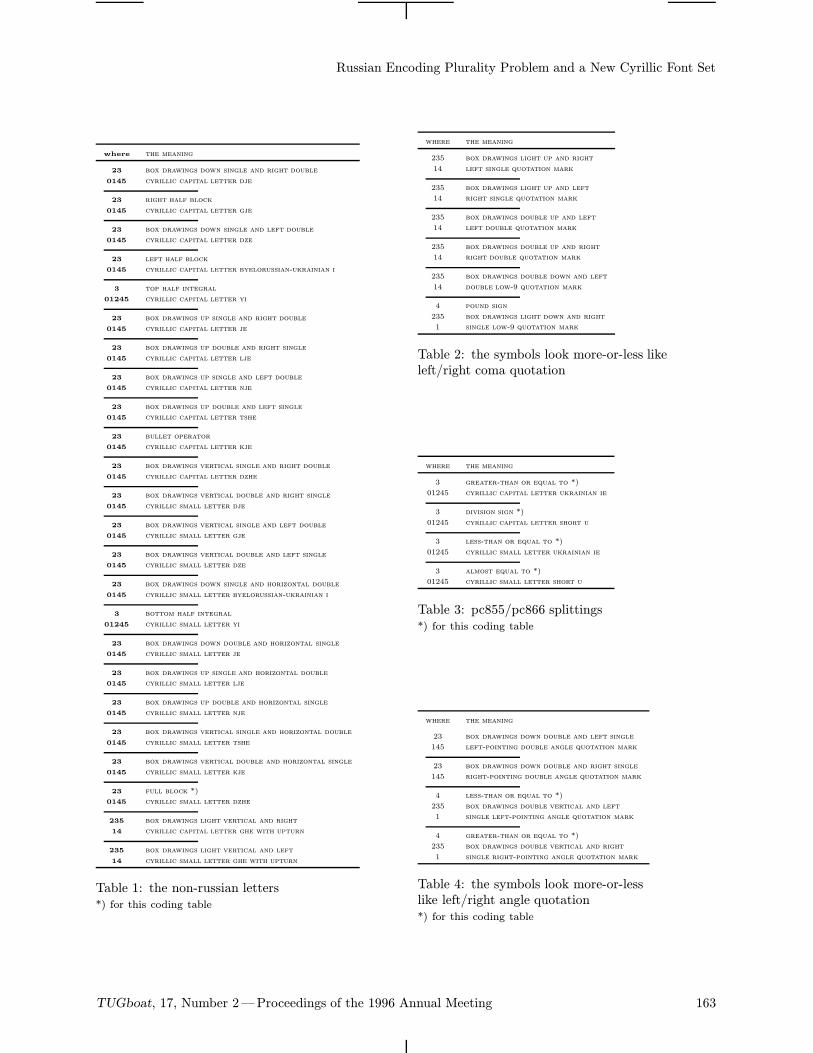
Russian Encoding Plurality Problem and a New Cyrillic Font Set
where the meaning
23 box drawings down single and right double
0145 cyrillic capital letter dje
23 right half block
0145 cyrillic capital letter gje
23 box drawings down single and left double
0145 cyrillic capital letter dze
23 left half block
0145 cyrillic capital letter byelorussian-ukrainian i
3 top half integral
01245 cyrillic capital letter yi
23 box drawings up single and right double
0145 cyrillic capital letter je
23 box drawings up double and right single
0145 cyrillic capital letter lje
23 box drawings up single and left double
0145 cyrillic capital letter nje
23 box drawings up double and left single
0145 cyrillic capital letter tshe
23 bullet operator
0145 cyrillic capital letter kje
23 box drawings vertical single and right double
0145 cyrillic capital letter dzhe
23 box drawings vertical double and right single
0145 cyrillic small letter dje
23 box drawings vertical single and left double
0145 cyrillic small letter gje
23 box drawings vertical double and left single
0145 cyrillic small letter dze
23 box drawings down single and horizontal double
0145 cyrillic small letter byelorussian-ukrainian i
3 bottom half integral
01245 cyrillic small letter yi
23 box drawings down double and horizontal single
0145 cyrillic small letter je
23 box drawings up single and horizontal double
0145 cyrillic small letter lje
23 box drawings up double and horizontal single
0145 cyrillic small letter nje
23 box drawings vertical single and horizontal double
0145 cyrillic small letter tshe
23 box drawings vertical double and horizontal single
0145 cyrillic small letter kje
23 full block *)
0145 cyrillic small letter dzhe
235 box drawings light vertical and right
14 cyrillic capital letter ghe with upturn
235 box drawings light vertical and left
14 cyrillic small letter ghe with upturn
Table 1: the non-russian letters*) for this coding table
where the meaning
235 box drawings light up and right
14 left single quotation mark
235 box drawings light up and left
14 right single quotation mark
235 box drawings double up and left
14 left double quotation mark
235 box drawings double up and right
14 right double quotation mark
235 box drawings double down and left
14 double low-9 quotation mark
4 pound sign
235 box drawings light down and right
1 single low-9 quotation mark
Table 2: the symbols look more-or-less likeleft/right coma quotation
where the meaning
3 greater-than or equal to *)
01245 cyrillic capital letter ukrainian ie
3 division sign *)
01245 cyrillic capital letter short u
3 less-than or equal to *)
01245 cyrillic small letter ukrainian ie
3 almost equal to *)
01245 cyrillic small letter short u
Table 3: pc855/pc866 splittings*) for this coding table
where the meaning
23 box drawings down double and left single
145 left-pointing double angle quotation mark
23 box drawings down double and right single
145 right-pointing double angle quotation mark
4 less-than or equal to *)
235 box drawings double vertical and left
1 single left-pointing angle quotation mark
4 greater-than or equal to *)
235 box drawings double vertical and right
1 single right-pointing angle quotation mark
Table 4: the symbols look more-or-lesslike left/right angle quotation*) for this coding table
TUGboat, 17, Number 2—Proceedings of the 1996 Annual Meeting 163
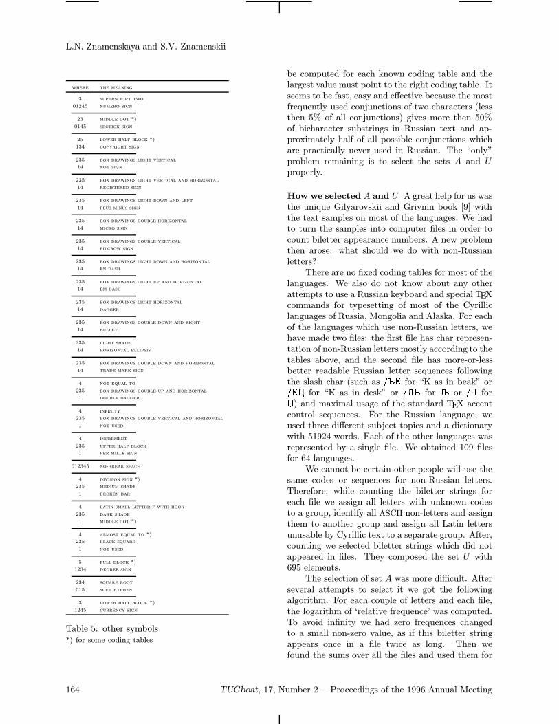
L.N. Znamenskaya and S.V. Znamenskii
where the meaning
3 superscript two
01245 numero sign
23 middle dot *)
0145 section sign
25 lower half block *)
134 copyright sign
235 box drawings light vertical
14 not sign
235 box drawings light vertical and horizontal
14 registered sign
235 box drawings light down and left
14 plus-minus sign
235 box drawings double horizontal
14 micro sign
235 box drawings double vertical
14 pilcrow sign
235 box drawings light down and horizontal
14 en dash
235 box drawings light up and horizontal
14 em dash
235 box drawings light horizontal
14 dagger
235 box drawings double down and right
14 bullet
235 light shade
14 horizontal ellipsis
235 box drawings double down and horizontal
14 trade mark sign
4 not equal to
235 box drawings double up and horizontal
1 double dagger
4 infinity
235 box drawings double vertical and horizontal
1 not used
4 increment
235 upper half block
1 per mille sign
012345 no-break space
4 division sign *)
235 medium shade
1 broken bar
4 latin small letter f with hook
235 dark shade
1 middle dot *)
4 almost equal to *)
235 black square
1 not used
5 full block *)
1234 degree sign
234 square root
015 soft hyphen
3 lower half block *)
1245 currency sign
Table 5: other symbols*) for some coding tables
be computed for each known coding table and thelargest value must point to the right coding table. Itseems to be fast, easy and effective because the mostfrequently used conjunctions of two characters (lessthen 5% of all conjunctions) gives more then 50%of bicharacter substrings in Russian text and ap-proximately half of all possible conjunctions whichare practically never used in Russian. The “only”problem remaining is to select the sets A and Uproperly.
How we selected A and U A great help for us wasthe unique Gilyarovskii and Grivnin book [9] withthe text samples on most of the languages. We hadto turn the samples into computer files in order tocount biletter appearance numbers. A new problemthen arose: what should we do with non-Russianletters?There are no fixed coding tables for most of the
languages. We also do not know about any otherattempts to use a Russian keyboard and special TEXcommands for typesetting of most of the Cyrilliclanguages of Russia, Mongolia and Alaska. For eachof the languages which use non-Russian letters, wehave made two files: the first file has char represen-tation of non-Russian letters mostly according to thetables above, and the second file has more-or-lessbetter readable Russian letter sequences followingthe slash char (such as /_K for “K as in beak” or/KC for “K as in desk” or /L^ for or /C for) and maximal usage of the standard TEX accentcontrol sequences. For the Russian language, weused three different subject topics and a dictionarywith 51924 words. Each of the other languages wasrepresented by a single file. We obtained 109 filesfor 64 languages.We cannot be certain other people will use the
same codes or sequences for non-Russian letters.Therefore, while counting the biletter strings foreach file we assign all letters with unknown codesto a group, identify all ASCII non-letters and assignthem to another group and assign all Latin lettersunusable by Cyrillic text to a separate group. After,counting we selected biletter strings which did notappeared in files. They composed the set U with695 elements.The selection of set A was more difficult. After
several attempts to select it we got the followingalgorithm. For each couple of letters and each file,the logarithm of ‘relative frequence’ was computed.To avoid infinity we had zero frequences changedto a small non-zero value, as if this biletter stringappears once in a file twice as long. Then wefound the sums over all the files and used them for
164 TUGboat, 17, Number 2—Proceedings of the 1996 Annual Meeting
Russian Encoding Plurality Problem and a New Cyrillic Font Set
selection. The most frequent 314 couples consist ofonly Russian letters and almost each word containsat least one of such biletter strings. We had toavoid the effects of possible usage of other TEXnames for non-Russian letters, or other coding tableswhich may correlate only to the Russian part of ourcoding table. Therefore we used only 306 of thesecouples without the biletter strings which our specialnotations for non-russian letters could produce.In this way, the Cyrillic coding recognition al-
gorithm was finished.
Availability
The METAFONT sources of RF font family andsources of cyrillic coding recognition algorithm willbe available from RFBR TEX server via anonymousftp: ftp.tex.math.ru.
Acknowledgements
This work was inspired and supported by RussianFoundation for Basic Research, grant 96-07-89406.
References
[1] A. Chernov. Registration of a Cyrillic CharacterSet. RFC 1489, RELCOM Development Team,July 1993.
[2] J. Reynolds, J. Postel. Assigned Numbers. RFC1700, USC/Information Sciences Institute, Oc-tober 1994.
[3] T.Greenwood, J. H. Jenkins. ISO 8859-5 (1988)to Unicode. Unicode Inc. January 1995.
[4] M. Siugnard, L. Hoerth. cp1251 WinCyrillic toUnicode table. Unicode Inc. March 1995.
[5] M. Siugnard, L. Hoerth. cp10007 MacCyrillic toUnicode table. Unicode Inc. March 1995.
[6] M. Siugnard, L. Hoerth. cp855 DOSCyrillic toUnicode table. Unicode Inc. March 1995.
[7] M. Siugnard, L. Hoerth. cp866 DOSCyrillicRus-sian to Unicode table. Unicode Inc. March 1995.
[8] P. Edberg. MacOS Ukrainian [to Unicode]. Uni-code Inc. April 1995.
[9] R.S. Gilrovski$i, V.S. Grivnin. Opre-
delitel~ zykov mira po pis~mennosti.
Izd-e tret~e, ispravlennoe i dopolnennoe.
M.: Nauka, 1964.
TUGboat, 17, Number 2—Proceedings of the 1996 Annual Meeting 165
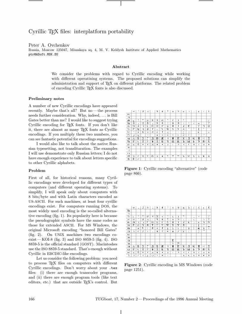
Cyrillic TEX files: interplatform portability
Peter A. OvchenkovRussia, Moscow 125047, Miusskaya sq. 4, M. V. Keldysh Institute of Applied Mathematics
Abstract
We consider the problems with regard to Cyrillic encoding while workingwith different operatining systems. The proposed solutions can simplify theadministration and support of TEX on different platforms. The related problemof encoding Cyrillic TEX fonts is also discussed.
Preliminary notes
A number of new Cyrillic encodings have appearedrecently. Maybe that’s all? But no—the processneeds further consideration. Why, indeed, . . . is BillGates better than me? I would like to suggest tryingCyrillic encoding for TEX fonts. If you don’t likeit, there are almost as many TEX fonts as Cyrillicencodings. If you multiply these two numbers, youcan see fantastic potential for encodings suggestions.I would also like to talk about the native Rus-
sian typesetting, not translitaration. The examplesI will use demonstrate only Russian letters; I do nothave enough experience to talk about letters specificto other Cyrillic alphabets.
Problem
First of all, for historical reasons, many Cyril-lic encodings were developed for different types ofcomputers (and different operating systems). Tosimplify, I will speak only about computers with8 bits/byte and with Latin characters encoded asUS-ASCII. For such machines, at least four cyrillicencodings exist. For computers running DOS, themost widely used encoding is the so-called alterna-tive encoding (fig. 1). Its popularity here is becausethe pseudographic symbols have the same codes asthose for extended ASCII. For MS Windows, theoriginal Microsoft encoding “honored Bill Gates”(fig. 2). On UNIX machines two encodings co-exist—KOI-8 (fig. 3) and ISO 8859-5 (fig. 4). ISO8859-5 is the official standard (GOST). Macintoshesuse the ISO 8859-5 standard. That’s enough withoutCyrillic in EBCDIC-like encodings.Let us consider the following problem: you need
to process TEX files on computers with differentCyrillic encodings. Don’t worry about your .texfiles: (i) there are enough transcoder programs,and (ii) there are enough program tools (like texteditors, etc.) that are outside TEX’s control. But
0 1 2 3 4 5 6 7 8 9 a b c d e f0x1x2x ! " # $ % & ' ( ) * + , - . /3x 0 1 2 3 4 5 6 7 8 9 : ; < = > ?4x @ A B C D E F G H I J K L M N O5x P Q R S T U V W X Y Z [ \ ] ^ _6x ` a b c d e f g h i j k l m n o7x p q r s t u v w x y z | ~
8x À Á Â Ã Ä È Æ Ç È É Ê Ë Ì Í Î Ï9x Ð Ñ Ò Ó Ô Õ Ö × Ø Ù Ú Û Ü Ý Þ ßax à á â ã ä å æ ç è é ê ë ì í î ïbxcxdxex ð ñ ò ó ô õ ö ÷ ø ù ú û ü ý þ ÿfx ¸ ¹
Figure 1: Cyrillic encoding “alternative” (codepage 866).
0 1 2 3 4 5 6 7 8 9 a b c d e f0x1x2x ! " # $ % & ' ( ) * + , - . /3x 0 1 2 3 4 5 6 7 8 9 : ; < = > ?4x @ A B C D E F G H I J K L M N O5x P Q R S T U V W X Y Z [ \ ] ^ _6x ` a b c d e f g h i j k l m n o7x p q r s t u v w x y z | ~8x9xax ¸bx ¹ ºcx À Á Â Ã Ä Å Æ Ç È É Ê Ë Ì Í Î Ïdx Ð Ñ Ò Ó Ô Õ Ö × Ø Ù Ú Û Ü Ý Þ ßex à á â ã ä å æ ç è é ê ë ì í î ïfx ð ñ ò ó ô õ ö ÷ ø ù ú û ü ý þ ÿ
Figure 2: Cyrillic encoding in MS Windows (codepage 1251).
166 TUGboat, 17, Number 2—Proceedings of the 1996 Annual Meeting
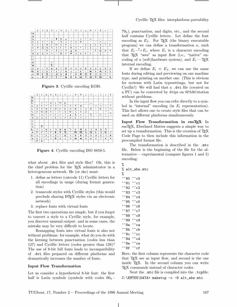
Cyrillic TEX files: interplatform portability
0 1 2 3 4 5 6 7 8 9 a b c d e f0x1x2x ! " # $ % & ' ( ) * + , - . /3x 0 1 2 3 4 5 6 7 8 9 : ; < = > ?4x @ A B C D E F G H I J K L M N O5x P Q R S T U V W X Y Z [ \ ] ^ _6x ` a b c d e f g h i j k l m n o7x p q r s t u v w x y z | ~8x9xax ¹bx ¸cx þ à á ö ä å ô ã õ è é ê ë ì í îdx ï ÿ ð ñ ò ó æ â ü û ç ø ý ù ÷ úex Þ Á Â Ö Ä Å Ô Ã Õ È É Ê Ë Ì Í Îfx Ï ß Ð Ñ Ò Ó Æ Â Ü Û × Ø Ý Ù × Ú
Figure 3: Cyrillic encoding KOI8.
0 1 2 3 4 5 6 7 8 9 a b c d e f0x1x2x ! " # $ % & ' ( ) * + , - . /3x 0 1 2 3 4 5 6 7 8 9 : ; < = > ?4x @ A B C D E F G H I J K L M N O5x P Q R S T U V W X Y Z [ \ ] ^ _6x ` a b c d e f g h i j k l m n o7x p q r s t u v w x y z | ~8x9xax ¸bx À Á Â Ã Ä È Æ Ç È É Ê Ë Ì Í Î Ïcx Ð Ñ Ò Ó Ô Õ Ö × Ø Ù Ú Û Ü Ý Þ ßdx à á â ã ä å æ ç è é ê ë ì í î ïex ð ñ ò ó ô õ ö ÷ ø ù ú û ü ý þ ÿfx º ¹
Figure 4: Cyrillic encoding ISO 8859-5.
what about .dvi files and style files? Oh, this isthe chief problem for the TEX administrator in aheterogeneous network. He (or she) must:
1. define as letters (catcode 11) Cyrillic letters forall encodings in usage (during format genera-tion)
2. transcode styles with Cyrillic styles (this wouldpreclude sharing LATEX styles via an electronicnetwork)
3. replace fonts with virtual fonts
The first two operations are simple, but if you forgetto convert a style to a Cyrillic style, for example,you discover unusual output: and in some cases, themistake may be very difficult to locate.Remapping fonts into virtual fonts is also not
without problems: for example, what do you do withthe kerning between punctuation (codes less than127) and Cyrillic letters (codes greater than 128)?The use of 8-bit full fonts leads to incompatibilityof .dvi files prepared on different platforms anddramatically increases the number of fonts.
Input Flow Transformation
Let us consider a hypothetical 8-bit font: the firsthalf is Latin symbols (symbols with codes 00h –
79h), punctuation, and digits, etc., and the secondhalf contains Cyrillic letters. Let define the fontencoding as Ef . For TEX (the binary executableprogram) we can define a transformation κ, such
that Eeκ−→Ei, where Ee is a character encoding
that TEX “sees” as input flow (i.e., “native” en-coding of a (soft)hardware system), and Ei—TEXinternal encoding.If we define Ei ≡ Ef , we can use the same
fonts during editing and previewing on one machinetype, and printing on another one. (This is obviousfor systems with Latin typesettings, but not forCyrillic!) We will had that a .dvi file (created ona PC) can be converted by dvips on SPARCstationwithout problems.In the input flow you can refer directly to a sym-
bol in “internal” encoding (in Ei representation).This fact allows one to create style files that can beused on different platforms simultaneously.
Input Flow Transformation in emTEX InemTEX, Eberhard Mattes suggests a simple way toset up κ transformation. This is the creation of TEXCode Page to then include this information in theprecompiled format file.The transformation is described in the .mtc
file. Below is the beginning of the file for the al-ternative—experimental (compare figures 1 and 5)encoding:
%
% alt_abs.mtc
%
^^80 ^^c0
^^81 ^^c1
^^82 ^^c2
^^83 ^^c3
^^84 ^^c4
^^85 ^^c5
^^86 ^^c6
^^87 ^^c7
^^88 ^^c8
^^89 ^^c9
^^8a ^^ca
^^8b ^^cb
^^8c ^^cc
^^8d ^^cd
^^8e ^^ce
^^8f ^^cf
Here, the first column represents the character codethat TEX see as input flow, and second is the oneinside TEX. In the second column you can writeTEX commands instead of character codes.Next the .mtc file is compiled into the .tcpfile:
C:\EMTEX\DATA> maketcp -c -8 alt_abs.mtc
TUGboat, 17, Number 2—Proceedings of the 1996 Annual Meeting 167
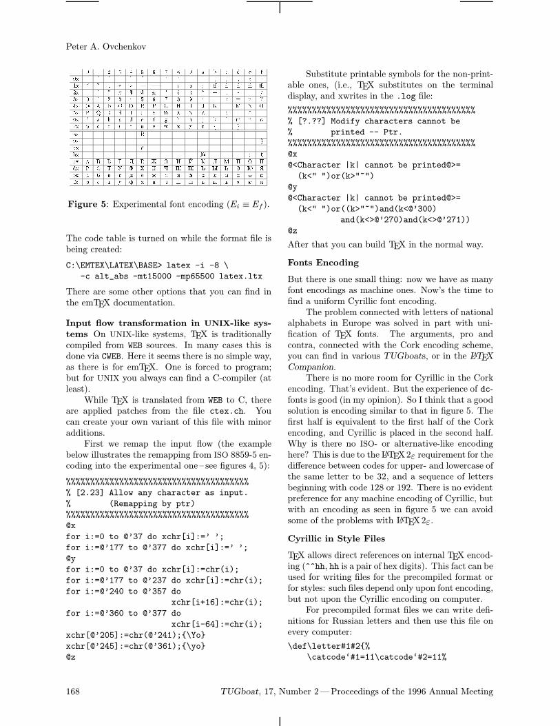
Peter A. Ovchenkov
0 1 2 3 4 5 6 7 8 9 a b c d e f0x 1x 2x ! " # $ % & ' ( ) * + , - . /3x 0 1 2 3 4 5 6 7 8 9 : ; < = > ?4x @ A B C D E F G H I J K L M N O5x P Q R S T U V W X Y Z [ \ ] ^ _6x ` a b c d e f g h i j k l m n o7x p q r s t u v w x y z | ~ 8x ¸9x ax ¹bx º ½ ¾ ¿cx À Á Â Ã Ä Å Æ Ç È É Ê Ë Ì Í Î Ïdx Ð Ñ Ò Ó Ô Õ Ö × Ø Ù Ú Û Ü Ý Þ ßex à á â ã ä å æ ç è é ê ë ì í î ïfx ð ñ ò ó ô õ ö ÷ ø ù ú û ü ý þ ÿ
Figure 5: Experimental font encoding (Ei ≡ Ef ).
The code table is turned on while the format file isbeing created:
C:\EMTEX\LATEX\BASE> latex -i -8 \
-c alt_abs -mt15000 -mp65500 latex.ltx
There are some other options that you can find inthe emTEX documentation.
Input flow transformation in UNIX-like sys-
tems On UNIX-like systems, TEX is traditionallycompiled from WEB sources. In many cases this isdone via CWEB. Here it seems there is no simple way,as there is for emTEX. One is forced to program;but for UNIX you always can find a C-compiler (atleast).While TEX is translated from WEB to C, there
are applied patches from the file ctex.ch. Youcan create your own variant of this file with minoradditions.First we remap the input flow (the example
below illustrates the remapping from ISO 8859-5 en-coding into the experimental one – see figures 4, 5):
%%%%%%%%%%%%%%%%%%%%%%%%%%%%%%%%%%%%%%
% [2.23] Allow any character as input.
% (Remapping by ptr)
%%%%%%%%%%%%%%%%%%%%%%%%%%%%%%%%%%%%%%
@x
for i:=0 to @’37 do xchr[i]:=’ ’;
for i:=@’177 to @’377 do xchr[i]:=’ ’;
@y
for i:=0 to @’37 do xchr[i]:=chr(i);
for i:=@’177 to @’237 do xchr[i]:=chr(i);
for i:=@’240 to @’357 do
xchr[i+16]:=chr(i);
for i:=@’360 to @’377 do
xchr[i-64]:=chr(i);
xchr[@’205]:=chr(@’241);\Yo
xchr[@’245]:=chr(@’361);\yo
@z
Substitute printable symbols for the non-print-able ones, (i.e., TEX substitutes on the terminaldisplay, and xwrites in the .log file:
%%%%%%%%%%%%%%%%%%%%%%%%%%%%%%%%%%%%%%%
% [?.??] Modify characters cannot be
% printed -- Ptr.
%%%%%%%%%%%%%%%%%%%%%%%%%%%%%%%%%%%%%%%
@x
@<Character |k| cannot be printed@>=
(k<" ")or(k>"~")
@y
@<Character |k| cannot be printed@>=
(k<" ")or((k>"~")and(k<@’300)
and(k<>@’270)and(k<>@’271))
@z
After that you can build TEX in the normal way.
Fonts Encoding
But there is one small thing: now we have as manyfont encodings as machine ones. Now’s the time tofind a uniform Cyrillic font encoding.The problem connected with letters of national
alphabets in Europe was solved in part with uni-fication of TEX fonts. The arguments, pro andcontra, connected with the Cork encoding scheme,you can find in various TUGboats, or in the LATEXCompanion.There is no more room for Cyrillic in the Cork
encoding. That’s evident. But the experience of dc-fonts is good (in my opinion). So I think that a goodsolution is encoding similar to that in figure 5. Thefirst half is equivalent to the first half of the Corkencoding, and Cyrillic is placed in the second half.Why is there no ISO- or alternative-like encodinghere? This is due to the LATEX2ε requirement for thedifference between codes for upper- and lowercase ofthe same letter to be 32, and a sequence of lettersbeginning with code 128 or 192. There is no evidentpreference for any machine encoding of Cyrillic, butwith an encoding as seen in figure 5 we can avoidsome of the problems with LATEX2ε.
Cyrillic in Style Files
TEX allows direct references on internal TEX encod-ing (^^hh, hh is a pair of hex digits). This fact can beused for writing files for the precompiled format orfor styles: such files depend only upon font encoding,but not upon the Cyrillic encoding on computer.For precompiled format files we can write defi-
nitions for Russian letters and then use this file onevery computer:
\def\letter#1#2%
\catcode‘#1=11\catcode‘#2=11%
168 TUGboat, 17, Number 2—Proceedings of the 1996 Annual Meeting
Cyrillic TEX files: interplatform portability
\uccode‘#1=‘#1\lccode‘#1=‘#2%
\uccode‘#2=‘#1\lccode‘#2=‘#2%
\language=\l@russian
\letter^^c0^^e0%
\letter^^c1^^e1%
\letter^^c2^^e2%
\letter^^c3^^e3%
Or, we can do the same with styles:
\addto\captionsrussian%
\def\prefacename%
^^cf^^f0^^e5^^e4^^e0^^f1^^eb^^ee^^e2%
^^e8^^e5%
\def\refname%
^^cb^^e8^^f2^^e5^^f0^^e0^^f2^^f3^^f0^^e0
\def\abstractname%
^^c0^^ed^^ed^^ee^^f2^^e0^^f6^^e8^^ff%
\def\bibname%
^^c1^^e8^^e1^^e8^^eb^^e8^^ee^^e3^^f0%
^^e0^^f4^^e8^^ff%
\def\chaptername^^c3^^eb^^e0^^e2^^e0%
\def\appendixname%
^^cf^^f0^^e8^^eb^^ee^^e6^^e5^^ed^^e8^^e5
\def\contentsname%
^^d1^^ee^^e4^^e5^^f0^^e6^^e0^^ed^^e8^^e5
\def\listfigurename%
^^d1^^ef^^e8^^f1^^ee^^ea %
^^f0^^e8^^f1^^f3^^ed^^ea^^ee^^e2%
\def\listtablename%
^^d1^^ef^^e8^^f1^^ee^^ea %
^^f2^^e0^^e1^^eb^^e8^^f6%
\def\indexname^^c8^^ed^^e4^^e5^^ea^^f1
\def\figurename%
^^d0^^e8^^f1^^f3^^ed^^ee^^ea%
\def\tablename%
^^d2^^e0^^e1^^eb^^e8^^f6^^e0%
\def\partname^^d7^^e0^^f1^^f2^^fc%
\def\enclname^^e2^^ea^^eb.%
\def\ccname^^e8^^e7%
\def\headtoname^^e2%
\def\pagename%
^^f1^^f2^^f0^^e0^^ed^^e8^^f6^^e0%
\def\seename^^f1^^ec.%
\def\alsoname^^f1^^ec.~^^f2^^e6.%
Of course, this is not very readable, but this isdone by a style developer, and only once for everymachine-specific encoding of Cyrillic fonts.One note: this mechanism cannot be applied
to hyphenation patterns. TEX doesn’t expectEi-symbols representation (^^hh) inside command\patterns.
TUGboat, 17, Number 2—Proceedings of the 1996 Annual Meeting 169
On-Screen Compile Menu
The Compile menu is activated by pressing thecorresponding key. This menu includes:1. Compiling for formats: Plain-TEX, AMS-TEX,LATEX or AMS-LATEX. One can also use variouscompilers, for example, 286-compiler and big-compiler. These menu items are realized bycalls of corresponding batch-files. Automaticprocessing can be used to find compile errors;
2. Variants of a view. In particular, one can usea view with manual input of options;
3. Variants of printing, similar to the view ones.Various output devices can be used, such asdot matrix and laser printers;
4. Additional menu items; for example, one caninclude a call of Russian spell-checker.
It is easily to add, to modify or to delete menuitems by using standard Multi-Edit tools.
Automatic error handling
Errors identified during compiling are handled inthe following way:– The cursor is positioned at the location of thefirst error found;– The corresponding error message appears inthe upper line of the window;– The log-file displayed in the OUTPUT windowpoints to the corresponding error message,which shows only the first two lines. If thisis insufficient, then the cursor in the OUTPUTwindow can be moved by pressing 〈F11〉 or〈Alt+Esc〉. In this case the OUTPUT windowwill increase up to seven lines. To move thecursor in the text window, press 〈F11〉 or〈Alt+Esc〉 again and the OUTPUT window willdecrease up to two lines.
172 TUGboat, 17, Number 2—Proceedings of the 1996 Annual Meeting
Michael M. Vinogradov
AUser-Friendly Multi-Function TEX Interface Based on Multi-Edit
Michael M. VinogradovInstitute of Economic Forecasting, Moscow
Abstract
The aim of this paper is to describe the set of Multi-Edit macros createdfor easily processing of TEX files. Note that the standard version of Multi-Edithas some tools to work with TEX files, but these tools are not very convenient.Therefore we have created our own set of macros, which allows us to processthe whole file or to compile and view any selected block of text, such ascomplicated formulas, for example. Also, there are additional tools for handlingsome standard situations.
To find the next compile error, simply press the〈NxtErr〉 key.
Block Compile
To compile and view a portion of a text (for ex-ample, a complicated formula), select the fragmentand use a special macro, invoked by pressing thecorresponding combination of keys. Various TEXformats (Plain-TEX, AMS-TEX, LATEX or AMS-LATEX) may be used also. The selected block maycontain user-defined TEX macros. These macrosshould be placed on the beginning of the file andthe line
%%% End of Leading Block
after them. How many of the signs % is notimportant. All definitions found above this line willbe added into the selected block when it is compiled.If this line is absent, no macros and definitions willbe added. If additional definitions are placed in theanother file and then included via either \input or\documentstyle, etc., these commands also shouldbe placed above the percented line just mentioned.If one needs to omit some commands, then thecorresponding lines should be marked
%%% Skip line
For example, the typical beginning of a LATEX filemay be marked as follows:
\documentstyle[12pt,fleqn,draft]article
\newcommand\smbl\rm smbl
\newcommand\alalpha
\input footline.tex %%% Skip line
\begindocument
%%% End of Leading Block
After the file has been compiled, the logfile contain-ing the selected block and error messages appearsin the OUTPUT window.
Additional macros
Additional possibilities can be divided into twotypes: macros that are useful for all TEX users andthose useful for Russian TEX users only.
For all TEX users.
1. A database can be used to insert some TEXcommands and macros. This database containsa set of commonly used macros for Plain-TEX, AMS-TEX and LATEX. Commands maybe inserted on the cursor place or so as tosurround a selected block.
2. Users can locate opening and closing parenthe-ses or curly brackets, as well as check for anymissing opening or closing brackets.
For Russian TEX users.
1. For those whose English-language skills needassistance, there is a a special database con-taining more than five hundreds basic sentencesoften used when writing English mathematicalpapers. The idea is adapted from Sosinsky.A part of this book is included in the HELPsystem to explain how to use the database.
2. Should the Russian TEX user forget to swichthe keyboard layout, the file can still be pro-cessed without re-typing the text in the properregister.
3. Capitalization of a word, line or block can bechanged to either upper- or lowercase. Thismacro works independently of the alphabet inuse (Russian or English).
Conclusion
Most of these abilities can also be added to Multi-Edit for Windows. Thus we offer the TEX user afriendly multi-function Windows interface.
References
Sosinsky, A. How to Write a Mathematical Paper inEnglish.
TUGboat, 17, Number 2—Proceedings of the 1996 Annual Meeting 173
A User-Friendly Multi-Function TEX Interface Based on Multi-Edit
Full Cyrillic: How Many Languages?
Olga G. LapkoRussia, 129820, MoscowPervy Rizhsky per., 2Mir [email protected]
A Brief History of Cyrillic
The Slavonic writing was invented by St. Cyrill andSt. Method. Now there are two well-known Slavonicwritings: Glagolitic and Cyrillic.Historians are not sure whether the author of
both was St. Cyrill or whether Cyrillic script wascreated by St. Method while St. Cyrill invented theGlagolitic alphabet. In any case, in this paper wewill deal about the alphabet nowadays called “Cyril-lic.”The birthday of Cyrillic is considered to be the
end of May 863. May 24 was declared by UNESCOas the day of Cyrillic. By coincidence, the first con-ference of the Cyrillic TEX Users Group, CyrTUG,was held May 24–25, 1991.The Cyrillic alphabet is based on the Greek al-
phabet. There were 43 letters in this alphabet. Upuntil the beginning of the 20th century, four addi-tional letters existed; these are absent in the modernRussian alphabet: ‘u’, ‘s’, ‘c’, and ‘i’.Nowadays Cyrillic script is used not only by
Slavonic people, but also by other nations of the for-mer USSR. Historically, many of these nations usedother scripts. Some Soviet republics such as Mid-dle Asian republics, Azerbaijan, and the Russianautonomic republics, used the Arabian script. InSiberia, the old Mongolian vertical script was used inthe Buryat language, and the Dzayapandin verticalscript was used in the Kalmyk language. Soon af-ter the October Revolution many languages startedto use the Latin script with additional letters. InAbkhasia, the Georgian alphabet was used for a fewyears. At the end of 20s and 30s, almost all lan-guages of the USSR changed from using Latin scriptto Cyrillic. In many languages new letters were cre-ated (see fig. 1).Outside Russia, Cyrillic is used in Bulgaria, Ser-
bia, Macedonia and Mongolia. The Bulgarian lan-guage now uses only letters of the modern Russianalphabet, but earlier ‘k’ and ‘c’ were also used. InMacedonian and Serbian the following additionalletters are used: ‘j’, ‘Y’, ‘Z’, with ‘S’, ‘\’, ‘s’ inMacedonian only, and ‘_’, ‘[’, ‘R’ in Serbian. The
Mongolian language uses Russian letters with twoadditions: ‘é’, ‘¯’.One may also find Cyrillic letters used in scripts
based on the Latin alphabet. Examples are the Chi-nese languages: Y, Lahu, Lisu, Myao, Juang, as wellas several African languages.
History of the full Cyrillic font project
The LHFONTS1 package was created as a part ofthe CyrTUG-EmTEX package, which is distributedamong Russian and non-Russian users who useCyrillic. LHFONTS offers the LH Cyrillic font fam-ily; these fonts are based on the WNCYR fonts ofthe CYRILLIC package—part of AMS-TEX.The main task of the LHFONTS package was
to create the Cyrillic fonts family, an extension ofstandard text fonts of Computer Modern, which alsocorresponds to Russian typesetting traditions.First this package offered two more or less
popular encoding schemes:2 Alternative—an 8-bitLatin-Russian font encoding analogous to MS-DOS’sCode Page 866, mainly used by Russian MS-DOSusers; and the Washington or WNCYR—a 7-bit en-coding for typesetting with transliteration, which ismainly used by non-Russian users.The Cyrillic character encodings are described
in special files— lbcoding.mf (Alternate encoding)and wncoding.mf (WNCYR encoding). One canchoose between these files by changing the valueof one of the following variables: altcoding,vfcoding or wncoding. These variables alsodetermine the font layout:
altcoding Standard Computer Modern in the lowerpart of table plus Russian letters and ad-ditional punctuation marks in the upperone; Alternate encoding: encoding filelbcoding.mf
1 This package was originally named MAKEFONT, butwas renamed to avoid confusion with the utility of the samename on the 4AllTEX CD-ROM, produced by the Nederland-stalige TEX Gebruikersgroep.
2 The package also offered virtual encoding: rather condi-tional 7-bit encoding which combines Cyrillic and Latin fonts.
174 TUGboat, 17, Number 2—Proceedings of the 1996 Annual Meeting
Full Cyrillic: How Many Languages?
vfcoding Russian letters and added punctuationmarks in the upper part of table— for thefollowing combining with Computer Mod-ern in virtual font; Alternate encoding:encoding file lbcoding.mf
wncoding Cyrillic letters for Slavonic languages withnecessary input ligatures, standard andadditional punctuation marks in the lowerpart of table; WNCYR encoding: encodingfile wncoding.mf
The values of these variables are determined indriver files (ld??font.mf) by default. The headerof these files (for ex. ldrmfont.mf) contains thefollowing lines:
if unknown wncoding: wncoding:=0; fi
if unknown vfcoding: vfcoding:=0; fi
...
altcoding:=1-wncoding-vfcoding;
if wncoding<>0: input wncoding;
else: input lbcoding; fi
...
Variables altcoding, vfcoding and wncoding maybe set by hand in the file header or at the start ofthe METAFONT run.The LHFONTS package contains font headers
named lh*.mf and ll*.mfThe files lh*.mf (56 files) are virtually identical
to cm*.mf except for the last line:
generate <driver-file>
that is, the standard Computer Modern driver filewas changed to the analogous file for the LH fonts.These file headers generate a full 8-bit Latin-Cyrillicfont.The files ll*.mf (also 56 files) contain only the
following line:
vfcoding=1; input <header-file lh*>;
thus the command vfcoding:=1; sets generation ofRussian letters and punctuation marks only.Since theWNCYR encoding was an optional en-
coding in this package, the files wn*.mf were notcreated, but documentation explains how to createfonts with theWNCYR encoding using a similar one-line header file as follows:
wncoding=1; input <header-file lh*>;
The LH Cyrillic font family offers typesettingin Russian and other languages using the Russianpart of the Cyrillic alphabet—that is Virtual andAlternate encoding.TheWNCYR encoding also offers typesetting in
modern Slavonic texts using Cyrillic and 19th cen-tury Russian text. But there are a lot of languages
which use the Cyrillic alphabet with added letters.The following sections discuss this problem.
The Global Cyrillic font as the material forΩ project
Some time ago the multilingual project Ω wasstarted. One of the authors of Ω, Yannis Haralam-bous, began to create a full Cyrillic font. He offeredthis font to CyrTUG for further work.The data for this font was taken from the Cyril-
lic part of the Unicode table.3 But this table stilldoes not cover all Cyrillic letters; some old Cyrillicletters and national letters are missing. Probablythe full assortment of accented vowels is necessary,which are not included in Unicode.The font created during this work had more
than 256 letters and marks. This font assortmentshould be further extended and improved. Duringthe testing of this font, I created shortened variants,or split it into a few fonts. The two Cyrillic Uni-code fonts were extended with glyphs for charactersnot included in Unicode and created by the methodsdescribed in this paper (see the Appendix).The methods of partial font creation may use-
fully improve the economy of use of the computer’smemory. One may create a big 256-letter (Unicode)font and then use a virtual font to achieve the nec-essary encoding. Alternatively, one may create thefont immediately in its required encoding.
How TEX helps METAFONT. Creation ofcoding and ligature-kerning tables
To create a font, METAFONT needs program descrip-tions for letters (a lot of them), information aboutlettercodes, and kerning and ligature data.Now there are a few well-known encodings of
Cyrillic. They differ in which characters they holdand in what order (see the Appendix). So, for everyencoding, a separate file is needed.Since TEX cannot use a font containing lig-
atures or kerning information relating to externalcharacters, we cannot use the same table, with allCyrillic letters, for every font: we must create a sep-arate table for each encoding. There are five tablesfor the different font shapes of the text fonts of theComputer Modern family: they are included in thedriver files. We must create the same number oftables for every encoding.
3 Unicode—International Standard ISO/IEC 10646–1,first edition, 1993.05.01. Information Technology—Univer-sal Multiple Octet Coded Character Set (UCS) Part 1: Ar-chitecture and Basic Multilingual Plane (Table 11, Row 04,Cyrillic).
TUGboat, 17, Number 2—Proceedings of the 1996 Annual Meeting 175
Olga G. Lapko
Furthermore, for each font and each encodingwe must create a header file (the Computer Modernfamily has 56 text fonts).As you can see the number of files will be very
large, and they will often duplicate each other.The best solution is to create three files which
contain all the information that could potentiallybe duplicated. The first one contains a table withall the Cyrillic glyphs and signs and all supportedencodings. The second one contains data on liga-ture and kerning for the complete font repertoire.The third file contains the table of font names andsizes and the necessary command lines for every fontheader file. The data for every font in every encod-ing would be taken from these files and the neces-sary header files created. All these files are createdby TEX. TEX also can create the file containing alluccodes, lccodes and mathcodes for a given font.
Preparing font headers As mentioned above, weuse the parameters of the Computer Modern textfonts for creating Cyrillic fonts. First, the headerfiles for the LHFONTS package were copied fromheader files of the Computer Modern family, chang-ing the only line (See the section entitled “Historyof the full Cyrillic font project”). To avoid unneces-sary duplication, we create header files which loadthe necessary Computer Modern header file, substi-tuting the standard driver file with the driver of LHCyrillic fonts. This task, for example, was solved inthe Polish fonts package, in there is a special trickyfile fik_mik.mf which substitutes standard driverswith Polish ones. One of the authors of this file, Bo-guslav Yackovski, allowed us to use this file in theLHFONTS package.Now it is necessary to create header files for font
creation which include one or a few lines only.The EmTEX package supports a command opera-
tor in its MFJob program, which enables one to writenecessary short commands for the METAFONT run.By using this, we can avoid creation of a lot of fileswith the only line:
input fik_mik_; use_driver;
For font generation on other platforms we mustcreate these files in any case. For quick gener-ation of the files I used the file dcstdedt.texfrom DCFONTS. The original file includes thetable with all font names and font sizes. Wemodified the file, providing a possibility to addthe line (\mainfontspecific macro), which canswitch on variables vfcoding:=1; or wncoding:=1;when necessary, and the parameter for a few fonts,which switch on necessary shape. To specify us-age of different encodings we must change the fontnames, so the first two letters are changed to macro
\fonttwoletters; these two letters are set by theuser according to the necessary encoding at the startof TEX’s run. A fragment of such a file for font head-ers is shown below:
% by default full Cyrillic Font (Unicode)
% is generated
\ifx\mainfontspecific\undefined
\def\mainfontspecificvfcoding:=1;\fi
\ifx\fonttwoletters\undefined
\edef\fonttwolettersuc\fi
\long\def\FontsToBeGenerated
\tablevalues %
( ... 8 9 10 ... 17.28[17] ) %
\makefont\fonttwoletters r %
( ... 8 9 10 ... 17.28[17] )()
...
\makefont\fonttwoletters tt %
( ... 8 9 10 ... )(specific:=0;)
By default there is creation of a set of file head-ers and encoding for the global Cyrillic font in Uni-code (see fig. 1) in this file and the file of encodingdata.
Preparing the encoding file and files of liga-ture/kerning tables The encoding files are cre-ated from the file which contains the table of allCyrillic glyphs and signs and all well-known (or atleast necessary) encodings.
% by default full Cyrillic Font (Unicode)
% is generated
\ifx\fonttwoletters\undefined
\def\fonttwolettersuc\fi
\def\nolettercode*
\long\def\CodesToBeGenerated
\tablevalues ( uc lh wn ... )
\makecod CYR_A CYRA ( 10 80 41[A] ... )
\makecod CYR_BE CYRB ( 11 81 41[B] ... )
...
\makecod CYR_LJE CYRLJE ( 09 * 01[LJ] ... )
We can see that this table is analogous to theprevious one. Macros, analogous to macros for cre-ating font headers, were used for creating the encod-ing files.Now we must create tables of ligatures and
kerns. In the Computer Modern fonts these tablesare in the font driver files. In the LH fonts the tablesare in separate files. As we said above, we need tocreate five tables of ligatures and kernings for textfonts: 1) for roman and sans serif shape; 2) for italicshape; 3) for caps and small caps shape, for whichtwo tables are actually necessary, separately for the
176 TUGboat, 17, Number 2—Proceedings of the 1996 Annual Meeting
Full Cyrillic: How Many Languages?
uppercase and small saps letters; and 4) for largefonts like cminch.The Cyrillic font is very large, but one may see
that almost all Cyrillic letters can be identified in afew shape groups. We determined 14 groups for up-percase letters, 14 groups for lowercase letters and17 groups for italic letters in Cyrillic font. The let-ters in these groups sometimes repeat the shape (orcontour) of Latin ones, so one may use the ComputerModern table as a base.The file of kerning and ligature data retains the
shape grouping of letters, so every new letter will beadded to an appropriate group. At the beginningof each group we place a “typical” Latin letter as acomment. When the new letter appears it may beadded into a necessary group:
\writeLigif wn:
\writeLig ligtable CYR_ZE: "1"=:CYR_ZHE,
"H"=:CYR_ZHE, "h"=:CYR_ZHE; % "Z"
\writeLigfi
\Ligtab %A
\LetterCYR_A \LetterCYR_A_acute
\LetterCYR_LIT_YUS
...
%b
\LetterCYR_HARD_SIGN\LetterCYR_YATZ
...
%R
\WriteLigif serifs:
\LetterCYR_BIG_YUS
...
\WriteLigfi
%
%O
\KernCYR_Ok#\KernCYR_O_lcommak#
\KernCYR_O_acutek#
...
\KernCYR_ABKH_Ok#
%
...
\EndLigtab
We may create a font for kern testing by takingthe characteristic examples from these letter groups(see Appendix).For creation of the necessary ligature and kern-
ing pair tables, we use data from the encoding filewhich was created just before them. Now the liga-tures are used inWNCYR encoding only without anychanges from the original Washington State Univer-sity fonts.In addition to the tables of ligature/kerning,
TEX creates a uccode/lccode/mathcode file and afile ???cod.tex, which is used by russianb.ldf4.
4 The Russian language-specific file for the Babel system.
How METAFONT generates only necessary let-ters TEX has thus created files necessary for en-coding and ligature and kerning pair tables. NowMETAFONT must generate only the necessary glyphsrequired for the given encoding.From the very beginning the LH font family sup-
ported different encodings. Since in different codingschemes Cyrillic letters occupy different places, incharacter descriptions (beginchar command), ex-plicit character codes have been replaced with theirsymbolic names. For example, the description of thelowercase Cyrillic letter ‘a’ starts with:
cmchar "Lowercase Russian letter a";
beginchar(CYR_a,9.25u#,x_height#,0);
...
In the description of uppercase letters we addedthe line: if lower_case: ... fi for redefinition ofa code in the font “Small Caps”:
cmchar "Uppercase Russian letter A";
beginchar(CYR_A,13u#,cap_height#,0);
if lower_case: charcode:=CYR_a; fi
...
In plain METAFONT the definition of thebeginchar command has the following lines:
def beginchar(expr c,w_sharp,h_sharp,d_sharp) =
begingroup
charcode:=if known c: byte c else: 0 fi;
...
enddef;
which means that a letter with an unrecognizedcode number is set to position ‘0’.For the LH fonts, a letter or a sign whose code is
not recognized must be skipped, so the begincharcommand is redefined in the following way:
let plain_beginchar=beginchar;
def beginchar(expr c,w_sharp,h_sharp,d_sharp) =
iff known c: %
plain_beginchar(c,w_sharp,h_sharp,d_sharp);
enddef;
What needs to be done when it is necessary to cre-ate the Cyrillic font only, but letters and signs ofstandard Computer Modern have got code numbersin beginchar so they are always determined? Thethree variables which were mentioned in the sectionon the History of the Full Cyrillic Font Project, de-termined three different encodings. Now they mayswitch on the following:
TUGboat, 17, Number 2—Proceedings of the 1996 Annual Meeting 177
Olga G. Lapko
altcoding Standard Computer Modern in the lowerpart plus Cyrillic letters and added punc-tuation marks in necessary encoding in theupper one
vfcoding Cyrillic letters and added punctuationmarks in the upper, lower, or in both partsof the table— for next combining withLatin part in virtual font or for full Cyrillicfont creation (for example Unicode)
wncoding this set was not changed—Cyrillic lettersfor Slavonic languages with necessary lig-atures, standard and additional punctua-tion marks in the lower part of the table;WNCYR encoding
Now the encoding files, lbcoding.mf orwncoding.mf switched on by these variables, setnecessary selection of Cyrillic letters and their en-coding. In fact, the file wncoding.mf for WNCYRencoding was not changed. The file lbcoding.mfswitches the necessary encoding. When we have thenecessary files, we can create the font.
References
[1] K. M. Musaev, \Alfavity zykov narodovSSSR", Moskva, \Nauka", 1965.
[2] R. S. Gilrevski, V. S. Grivnin, Opre-delitel~ zykov mira po pis~mennostm,Moskva, \Izdatel~stvo vostoqno liter-atury", 1960.
[3] E. I. Ubrtova, Nekotorye voprosy grafikii orfografii pis~mennosti zykov naro-dov SSSR, pol~zuwihs alfavitami narussko osnove, Moskva, 1959.
[4] Moskovska sinodal~na tipografi, Ob-razcy liter cerkovnyh, rossiskih, gre-qeskih, latinskih, gruzinskih, evres-kih, nemeckih i proqih, nahodwihs vMoskovsko sinodal~no tipografi, Mos-kva, 1826.
[5] Obrazcy xriftov, Uzbekska SSR. Sovetnarodnyh komissarov, ridiqeskoe izda-tel~stvo, Tipografi, Samarkand, 1928.
[6] Tatarski zyk i novye informacionnyetehnologii. Vypusk 2, Izdatel~stvo Kazan-skogo universiteta. 1995.
[7] zyki narodov SSSR, 5 t., Moskva, 196668.[8] Andrei B. Khodulev and Irina A. Makhovaya,“On TEX experience in Mir Publishers”, Pro-ceedings of the 7th EUROTEX Conference,Prague, pp. 37–43, 1992.
[9] Olga G. Lapko, “MAKEFONT as part ofCyrTUG-EmTEX package”, Proceedings of the8th EUROTEX Conference, Gdansk, Poland,pp. 110–114, 1994.
[10] Fry Edmund, “Pantographia containing ac-curate copies of all the known alphabets inthe world together with an English explana-tion of the regular force or power of each let-ter, to which are added specimens of all well-authenticated oral languages; forming a com-prehensive digest of phonology”, Cooper andWilson, London, 1799.
[11] Katzner Kenneth, “The languages of theworld”, London, Henley:
[12] The World’s major languages, ed. by BernardComrie, London, Sydney, 1987. Rout ledge&KeganPaul, 1977.
[13] Y. Haralambous, J. Plaice, “Typesetting in theCyrillic alphabet with Ω—The Basic Ideas”,August 24, 1994.
[14] DC-Fonts, Beschreibung der Kodebelegung:TEX 256 Zeichen— internationaler Zeichensetz,22. Marz 1992.
A Appendix
Figure 1: Unicode encoding; Cyrillic part
0: 16: 32: ! " # $ % & '() *+ , -. /48: 0 1 2 3 4 5 6 7 8 9 : ; < = > ?64: @ A B C D E F G H I J K L M N O80: Q R S T U V W X Y Z [ \ ^ _96: ` a b cd e f ghij klm n o112: p q r s t u v w x y z | ~ 128: 144: 160: ¡ ¢ £ ¤ ¥¦ § ¨ © ª « ¬ ® ¯176: ° ± ² ³ ´ µ ¶ · ¸ ¹ º » ¼ ½ ¾ ¿192: ÀÁ Â Ã Ä Ç È Ë Ì208: Ð Ñ Ò Ó Ô Õ Ö × Ø Ù Ú ÛÜ Ý Þ ß224: à á â ã ä å æ ç è é ê ë î ï240: ð ñ ò ó ô õ ø ù
Since the Latin part is unchanged and uses the TEXencoding scheme the next examples show only theCyrillic part of the font.
178 TUGboat, 17, Number 2—Proceedings of the 1996 Annual Meeting
Full Cyrillic: How Many Languages?
Figure 2: Cyrillic letters which are not includedin Unicode
0: 16: 32: ! " # $ % & ' ( ) * + , - . /48: 0 1 2 3 4 5 6 764: @ A B C D E F G H I J K L M N O80: P Q R S T U V W X Y Z [ \ ] ^ _96: ` a b c d e f gh i j k l m n o112: p q r s128: 144: 160: ¡ ¢176:192:208:224:240: ó
Figure 3: MS DOS cp866 encoding
128: 144: ! " # $ % & '() *+ , -. /160: 0 1 2 3 4 5 6 7 8 9 : ; < = > ?176:192:208:224: @ A B C D E F G H I J K L M N O240: Q T W ^ < >
Figure 4: Washington encoding
0: 16: 32: ! " # $ % & ' ( ) * + , - . /48: 0 1 2 3 4 5 6 7 8 9 : ; < = > ?64: @ A B C D E F G H I J K L M N O80: P Q R S T U VWX Y Z [ \ ] ^ _96: ` a b c d e f g h i j k l m n o112: p q r s t u v w x y z | ~
Figure 5: KOI-8 (Unix platform) encoding
128: < > 144:160: Q176: 192: N 0 1 F 4 5 D 3 E 8 9 : ; < = >208: ? O @ A B C 6 2 L K 7 H M I G J224: . & $ % 240: / ! " # ,+ ( -) ' *
Figure 6: ISO 8859-5 encoding
128: < >144:160: 176: 192: ! " # $ % & '() *+ , -. /208: 0 1 2 3 4 5 6 7 8 9 : ; < = > ?224: @ A B C D E F G H I J K L M N O240: Q R S T U V W X Y Z [ \ ^ _
Figure 7: Apple Macintosh encoding
128: 144: ! " # $ % & '() *+ , -. /160: R S176: V T W Y Z192: X < > [ \ U208: ^ _ Q224: 0 1 2 3 4 5 6 7 8 9 : ; < = > ?240: @ A B C D E F G H I J K L M N
Figure 8: Windows 1251 encoding
128: S 144: R Y Z \ [ _160: ^ < 176: V Q T > X U W192: 208: ! " # $ % & '() *+ , -. /224: 0 1 2 3 4 5 6 7 8 9 : ; < = > ?240: @ A B C D E F G H I J K L M N O
TUGboat, 17, Number 2—Proceedings of the 1996 Annual Meeting 179
Olga G. Lapko
Figure 9: Example of national encoding: Tatarencoding
128: 144: ! " # $ % & '() *+ , -. /160: 0 1 2 3 4 5 6 7 8 9 : ; < = > ?176:192:208:224: @ A B C D E F G H I J K L M N O240: Q Ø Ù è é ° ± ¢ £ º » < >
180 TUGboat, 17, Number 2—Proceedings of the 1996 Annual Meeting
StarTEX—A TEX for Beginners
Dag LangmyhrDepartment of Informatics
University of Oslo
Norway
Abstract
This article describes StarTEX, a new TEX format for students writing their firstreport and other novice users. Its aim is to provide a simpler and more robusttool for users with no previous knowledge of TEX and LATEX.
The problem
Students taking courses at our department are re-quired to write short project reports, and LATEX [2]has been the preferred tool. Several years experi-ence has, however, shown us that LATEX is not idealfor this.This project report is the first encounter most
students have with LATEX, and they face many prob-lems:
• The major problem is the error messages. Theyare very terse at best, and since they are some-times produced by LATEX and at other times byTEX, understanding the messages requires rea-sonably good knowledge of both systems. Moststudents tend to look only at the line numberswhen examining their error logs.
• LATEX is not very robust; trivial syntax errorscan cause a serious burst of confusing error mes-sages, like when you forget a \\ prior to \hlinein an array environment.
You can also experience undesired effects ifyou use the commands incorrectly, for instanceif you write
\abstracttext
rather than the correct
\beginabstract
text
\endabstract
This error produces no error message, but willcause the whole article to be set in a smallerfont.
• LATEX does not hide the primitive commandsof TEX, making it possible for the users to ac-cess them accidentally. For example, one of ourusers defined a macro for her name:
\def \else Else Hansen
This error alone produced more then 100 errormessages.
• LATEX uses ten special characters: #, $, %, &,~, ^, _, , and \. Users need to rememberthat these characters are special, and they mustlearn which commands are necessary to producethem if they are required in the text. Fewerspecial characters would be an advantage.
• The command notation \xxx used in LATEX of-ten causes problems with the space followingit.
• LATEX has borrowed its error recovery philos-ophy from plain TEX: the user is expected tomanually correct each detected error to allowLATEX to proceed. The problem with this ap-proach is that you will get many confusing errormessages if you do not correct the error prop-erly.
None of our students use this interactive re-covery facility; they either restart after havingdiscovered the first error, or they let the pro-cessing run to completion without any interac-tion. An automatic error recovery scheme likethat employed by compilers would be a greatbenefit for these users.
• LATEX provides a mixture of structural mark-up commands as well as visual mark-up. Theadvantage is that experienced users can achievethe visual appearance they desire; the disad-vantage is that less experienced users—partic-ularly those who have used other document pro-cessing tools— spend too much of their timetrying to coerce LATEX into producing exactlythe layout they think is proper.
• LATEX is a large system and running it is not asfast as for instance plain TEX. For instance, a21/2 page sample document takes from 2.8 sec-onds on a Sun SparcStation20 to 8.7 seconds
184 TUGboat, 17, Number 2—Proceedings of the 1996 Annual Meeting
StarTEX—A TEX for Beginners
on a Silicon Graphics Indy. Since novice userstend to process their documents very frequentlyto remove errors or test the effect of a feature,execution times do matter—even in this range.
The requirements
All these problems indicate that LATEX in its presentform is not the tool we want for our students, atleast not for their first report. We want a documentprocessing program with the following properties:
• It must be based on TEX to achieve the desiredquality in mathematical formulae.
• It should use a different notation for its mark-up commands; one which caused less confusionconcerning spaces and has fewer special charac-ters.
• It must hide all the internal TEX commands;this is the only safe way to avoid students usingthem accidentally.
• It must be small and easy to understand, sothat it may easily be adapted to the particularneed of each installations.
• It should contain structural mark-up commandsonly, and no visual mark-up.
• It should be robust.
• It should produce better error messages. If pos-sible, no messages from TEX should ever ap-pear. If this is impossible, error messages fromTEX should be preceded by a message producedby the new tool.
• Since most students tend to just disregard allmessages about under- and over-full boxes, itshould try to reduce the number of such mes-sages.
• It should run in nonstop mode and use auto-matic error recovery to detect as many genuineerrors as possible.
• It should be as fast as plain TEX.
• The command handling should be insensitive touppercase and lowercase. This is not an impor-tant issue, but case confusion has caused prob-lems for some.
The solution
Attempting to achieve the goals mentioned above,StarTEX was designed. The name was chosen toindicate that it was a Starters’ TEX.StarTEX is a new format, and is thus a simple
cousin of AMS-TEX [5] and LATEX. It is built on topof the plain TEX [1] commands.
The notation
At the EuroTEX conference in Arhem in Septem-ber last year, Philip Taylor [6] proposed a differentnotation for (LA)TEX commands:
<xxx> rather than \xxx.
I decided to use this notation in StarTEX as it solvesmany of our problems:
• Spaces following the command are no longer aproblem. There is no need for special rules like“When a space comes after a control word, it isignored by TEX.” [1, p. 8].
• Only one special character is needed: <. Thecharacters #, $, %, &, ~, ^, _, , and \ can bedefined to be just ordinary characters.
• The command name may contain almost anycharacter, not just letters.
• The scheme is easy to implement: all that is re-quired is to make < an active character, and letthe corresponding command regard everythingup to the following > as a parameter.
• Since all commands are called through this in-terface, it is easy to make all internal TEX com-mands invisible.
• It is easy to check whether the user commandis defined, and provide suitable error recoveryif it is not.
• It is easy to \lowercase the user command,thus making the command handling insensitiveto case.
• This command notation is the same as in HTML[4] with which many students are familiar.
I could have used any bracketing symbol pair, like[xxx] or xxx or /xxx\, but I chose <xxx> becauseit resembles HTML and because < and > are not usedvery frequently.
Command parameters A few commands need aparameter to specify non-printing matter like a filename or a label. I chose to use square brackets forthis, as in
<ref>[label]
Using a special notation indicates more clearly thatthe parameter is not to be typeset.
The command set
The set of available StarTEX commands was chosenwith the following aims in mind:
• There should be sufficient commands for writ-ing a student report, but otherwise there shouldbe as few commands as possible.
• There should be no commands for visual mark-up, only structural specifications.
TUGboat, 17, Number 2—Proceedings of the 1996 Annual Meeting 185
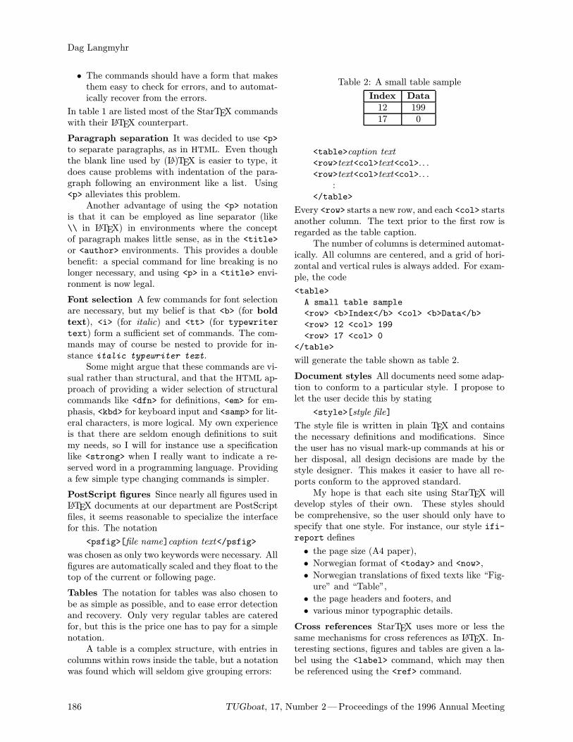
Dag Langmyhr
• The commands should have a form that makesthem easy to check for errors, and to automat-ically recover from the errors.
In table 1 are listed most of the StarTEX commandswith their LATEX counterpart.
Paragraph separation It was decided to use <p>to separate paragraphs, as in HTML. Even thoughthe blank line used by (LA)TEX is easier to type, itdoes cause problems with indentation of the para-graph following an environment like a list. Using<p> alleviates this problem.Another advantage of using the <p> notation
is that it can be employed as line separator (like\\ in LATEX) in environments where the conceptof paragraph makes little sense, as in the <title>or <author> environments. This provides a doublebenefit: a special command for line breaking is nolonger necessary, and using <p> in a <title> envi-ronment is now legal.
Font selection A few commands for font selectionare necessary, but my belief is that <b> (for boldtext), <i> (for italic) and <tt> (for typewritertext) form a sufficient set of commands. The com-mands may of course be nested to provide for in-stance italic typewriter text.Some might argue that these commands are vi-
sual rather than structural, and that the HTML ap-proach of providing a wider selection of structuralcommands like <dfn> for definitions, <em> for em-phasis, <kbd> for keyboard input and <samp> for lit-eral characters, is more logical. My own experienceis that there are seldom enough definitions to suitmy needs, so I will for instance use a specificationlike <strong> when I really want to indicate a re-served word in a programming language. Providinga few simple type changing commands is simpler.
PostScript figures Since nearly all figures used inLATEX documents at our department are PostScriptfiles, it seems reasonable to specialize the interfacefor this. The notation
<psfig>[file name]caption text</psfig>
was chosen as only two keywords were necessary. Allfigures are automatically scaled and they float to thetop of the current or following page.
Tables The notation for tables was also chosen tobe as simple as possible, and to ease error detectionand recovery. Only very regular tables are cateredfor, but this is the price one has to pay for a simplenotation.A table is a complex structure, with entries in
columns within rows inside the table, but a notationwas found which will seldom give grouping errors:
Table 2: A small table sample
Index Data
12 19917 0
<table>caption text
<row>text<col>text<col>. . .<row>text<col>text<col>. . .
:</table>
Every <row> starts a new row, and each <col> startsanother column. The text prior to the first row isregarded as the table caption.The number of columns is determined automat-
ically. All columns are centered, and a grid of hori-zontal and vertical rules is always added. For exam-ple, the code
<table>
A small table sample
<row> <b>Index</b> <col> <b>Data</b>
<row> 12 <col> 199
<row> 17 <col> 0
</table>
will generate the table shown as table 2.
Document styles All documents need some adap-tion to conform to a particular style. I propose tolet the user decide this by stating
<style>[style file]
The style file is written in plain TEX and containsthe necessary definitions and modifications. Sincethe user has no visual mark-up commands at his orher disposal, all design decisions are made by thestyle designer. This makes it easier to have all re-ports conform to the approved standard.My hope is that each site using StarTEX will
develop styles of their own. These styles shouldbe comprehensive, so the user should only have tospecify that one style. For instance, our style ifi-report defines
• the page size (A4 paper),
• Norwegian format of <today> and <now>,
• Norwegian translations of fixed texts like “Fig-ure” and “Table”,
• the page headers and footers, and
• various minor typographic details.
Cross references StarTEX uses more or less thesame mechanisms for cross references as LATEX. In-teresting sections, figures and tables are given a la-bel using the <label> command, which may thenbe referenced using the <ref> command.
186 TUGboat, 17, Number 2—Proceedings of the 1996 Annual Meeting

StarTEX—A TEX for Beginners
StarTEX LATEX
Document bounds <body>text</body> \begindocumenttext\enddocument
Document style \style[style file] \documentclassstyle file
Document <title>text</title> \titletext
head <author>text</author> \authortext
<info>text</info> \datetext
Font <b>text</b> \textbftext
change <i>text</i> \textittext
<tt>text</tt> \texttttext
Paragraph break <p> 〈blank line〉Mathematical <math>formula</math> \(formula\)
formula <displaymath>formula</displaymath> \[formula\]
Sectioning <h1>text</h1> \sectiontext
<h2>text</h2> \subsectiontext
<h3>text</h3> \subsubsectiontext
<h4>text</h4> \paragraphtext
Itemized <list> \beginitemize
list <item> . . . \item . . .: :
</list> \enditemize
Enumerated <list> \beginenumerate
list <numitem> . . . \item . . .: :
</list> \endenumerate
Description <list> \begindescription
list <textitem>text</textitem> . . . \item[text] . . .: :
</list> \enddescription
PostScript <psfig>[file name]caption text \beginfigure
figure </psfig> \captioncaption text
\begincenter
\epsfigfile=file name,. . . \endcenter
\endfigure
Table <table>caption text \begintable
<row>text<col>text<col>. . . \captioncaption text
<row>text<col>text<col>. . . \begincenter
: \begintabular|c|. . . \hline</table> text& text& . . . \\ \hline
text& text& . . . \\ \hline:
\endtabular
\endcenter
\endtable
Footnote <footnote>text</footnote> \footnotetext
Unformatted text <code>text</code> \beginverbatimtext\endverbatim
Cross <label>[label] \labellabel
references <ref>[label] \reflabel, \pagereflabelComments <comment>text</comment> %text〈end-of-line〉User macro <define><name>definition〈end-of-line〉 \newcommand\namedefinition
Table 1: StarTEX command overview
TUGboat, 17, Number 2—Proceedings of the 1996 Annual Meeting 187
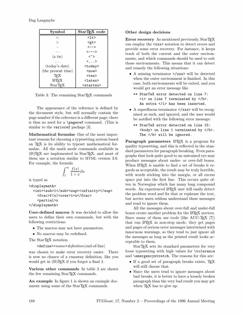
Dag Langmyhr
Symbol StarTEX code
< <lt>
> <gt>
– <-->
— <--->
〈a tie〉 <~>
. . . <...>
〈today’s date〉 <today>
〈the present time〉 <now>
TEX <tex>
LATEX <latex>
StarTEX <startex>
Table 3: The remaining StarTEX commands
The appearance of the reference is defined bythe document style, but will normally contain thepage number if the reference is a different page; thereis thus no need for a \pageref command. (This issimilar to the varioref package [3].
Mathematical formulae One of the most impor-tant reasons for choosing a typesetting system basedon TEX is its ability to typeset mathematical for-mulae. All the math mode commands available in(LA)TEX are implemented in StarTEX, and most ofthem use a notation similar to HTML version 3.0.For example, the formula∫
∞
1
f(x)
1 + x∂x
is typed as
<displaymath>
<int><sub>1</sub><sup><infinity></sup>
<frac>f(x)<over>1+x</frac>
<partial>x
</displaymath>
User-defined macros It was decided to allow theusers to define their own commands, but with thefollowing restrictions:
• The macros may not have parameters.
• No macros may be redefined.
The StarTEX notation
<define><name>definition〈end-of-line〉
was chosen to make error recovery easier. Thereis now no chance of a runaway definition, like youwould get in (LA)TEX if you forgot a final .
Various other commands In table 3 are shownthe few remaining StarTEX commands.
An example In figure 1 is shown an example doc-ument using some of the StarTEX commands.
Other design decisions
Error recovery As mentioned previously, StarTEXcan employ the <xxx> notation to detect errors andprovide some error recovery. For instance, it keepstrack of both the current and the outer environ-ments, and which commands should be used to exitthose environments. This means that it can detectand remedy the following situations:
• A missing terminator </xxx> will be detectedwhen the outer environment is finished. In thiscase, both environments will be exited, and youwould get an error message like
** StarTeX error detected on line 7:
<i> on line 7 terminated by </b>.
An extra </i> has been inserted.
• A superfluous terminator </xxx> will be recog-nized as such, and ignored, and the user wouldbe notified with the following error message:
** StarTeX error detected on line 15:
<body> on line 1 terminated by </b>.
The </b> will be ignored.
Paragraph parameters LATEX is a program forquality typesetting, and this is reflected in the stan-dard parameters for paragraph breaking. Even para-graphs that look quite good to an untrained eye mayproduce messages about under- or over-full boxes.When LATEX is unable to find a set of breaks it re-gards as acceptable, the result may be truly horrible,with words sticking into the margin, or all excessspace put into the first line. This occurs quite of-ten in Norwegian which has many long compoundwords. An experienced LATEX user will easily detectthe problem word and fix that or rephrase the text,but novice users seldom understand these messagesand tend to ignore them.All the messages about over-full and under-full
boxes create another problem for the LATEX novices.Since many of them use tools (like AUC-TEX [7])that run LATEX in non-stop mode, they get pagesand pages of serious error messages intertwined withinnocuous warnings, so they tend to just ignore allthe messages as long as the printed result looks ac-ceptable to them.StarTEX sets its standard parameters for very
loose typesetting with high values for \toleranceand \emergencystretch. The reasons for this are:
• If a good set of paragraph breaks exists, TEXwill still choose that.
• Since the users tend to ignore messages aboutbad breaks, it is better to have a loosely brokenparagraph than the very bad result you may getwhen TEX has to give up.
188 TUGboat, 17, Number 2—Proceedings of the 1996 Annual Meeting
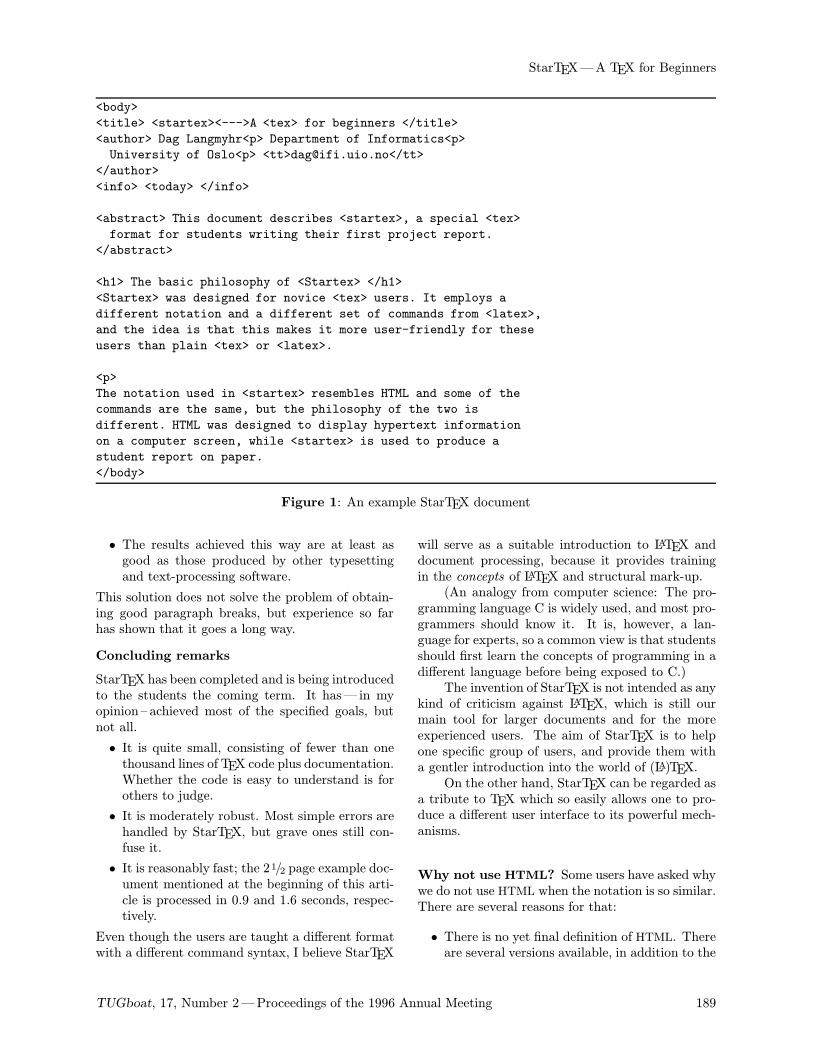
StarTEX—A TEX for Beginners
<body>
<title> <startex><--->A <tex> for beginners </title>
<author> Dag Langmyhr<p> Department of Informatics<p>
University of Oslo<p> <tt>[email protected]</tt>
</author>
<info> <today> </info>
<abstract> This document describes <startex>, a special <tex>
format for students writing their first project report.
</abstract>
<h1> The basic philosophy of <Startex> </h1>
<Startex> was designed for novice <tex> users. It employs a
different notation and a different set of commands from <latex>,
and the idea is that this makes it more user-friendly for these
users than plain <tex> or <latex>.
<p>
The notation used in <startex> resembles HTML and some of the
commands are the same, but the philosophy of the two is
different. HTML was designed to display hypertext information
on a computer screen, while <startex> is used to produce a
student report on paper.
</body>
Figure 1: An example StarTEX document
• The results achieved this way are at least asgood as those produced by other typesettingand text-processing software.
This solution does not solve the problem of obtain-ing good paragraph breaks, but experience so farhas shown that it goes a long way.
Concluding remarks
StarTEX has been completed and is being introducedto the students the coming term. It has— in myopinion – achieved most of the specified goals, butnot all.
• It is quite small, consisting of fewer than onethousand lines of TEX code plus documentation.Whether the code is easy to understand is forothers to judge.
• It is moderately robust. Most simple errors arehandled by StarTEX, but grave ones still con-fuse it.
• It is reasonably fast; the 21/2 page example doc-ument mentioned at the beginning of this arti-cle is processed in 0.9 and 1.6 seconds, respec-tively.
Even though the users are taught a different formatwith a different command syntax, I believe StarTEX
will serve as a suitable introduction to LATEX anddocument processing, because it provides trainingin the concepts of LATEX and structural mark-up.(An analogy from computer science: The pro-
gramming language C is widely used, and most pro-grammers should know it. It is, however, a lan-guage for experts, so a common view is that studentsshould first learn the concepts of programming in adifferent language before being exposed to C.)The invention of StarTEX is not intended as any
kind of criticism against LATEX, which is still ourmain tool for larger documents and for the moreexperienced users. The aim of StarTEX is to helpone specific group of users, and provide them witha gentler introduction into the world of (LA)TEX.On the other hand, StarTEX can be regarded as
a tribute to TEX which so easily allows one to pro-duce a different user interface to its powerful mech-anisms.
Why not use HTML? Some users have asked whywe do not use HTML when the notation is so similar.There are several reasons for that:
• There is no yet final definition of HTML. Thereare several versions available, in addition to the
TUGboat, 17, Number 2—Proceedings of the 1996 Annual Meeting 189
Dag Langmyhr
inventions of various software companies. No-body knows what HTML will look like a fewyears from now.
• HTML is growing very complex, with many con-structs of little interest to the student writinga report.
• It is difficult to write a robust parser of HTMLin TEX.
Availability If anyone is interested in obtaining acopy of StarTEX, they can find it available for anony-mous ftp on ftp.ifi.uio.no in the directory pub/tex/startex.
References
[1] Knuth, Donald E, The TEXbook, Addison-Wes-ley, 1991.
[2] Lamport, Leslie, LATEX user’s guide and refer-ence manual, Addison-Wesley, 1994.
[3] Mittelbach, Frank, “The varioref package”,Part of the LATEX2ε distribution.
[4] Raggett, Dave, “HyperText markup languagespecification version 3.0 draft”, Available athttp://www.w3.org/pub/WWW/MarkUp/html3/.
[5] Spivak, Michael, The joy of TEX, AmericanMathematical Society, 1986. The guide to AMS-TEX.
[6] Taylor, Philip, “TEX: an unsuitable languagefor document markup?”, Talk given at the Eu-roTEX 1995 conference; does not appear in theproceedings.
[7] Thorup, Kresten Krab, “AUC TEX”, AnEmacs mode for editing (LA)TEX code; availablefrom http://www.iesd.auc.dk/\symbol126amanda/auctex/.
190 TUGboat, 17, Number 2—Proceedings of the 1996 Annual Meeting
Do Journals Honor LATEX Submissions?
Gabriel Valiente FeruglioTechnical University of Catalonia
Departament of Software
E-08028 Barcelona, Catalonia, Spain
URL: http://www-lsi.upc.es/\~valiente/
Introduction
This note addresses the survival of LATEX in theacademic world, and it does it from the perspectiveof electronic publishing of LATEX articles in scientificjournals. Such a perspective is necessarily limited,since survival of LATEX in the academic world willundoubtely depend on a multitude of factors, oftenintertwined, but it is quite interesting in itself sinceit will provide further motivation for PhD students,young scientists, and teaching assistants to adoptLATEX as an integral solution for their typesettingneeds along their academic lives, from writing a PhDthesis to typesetting class notes, research articles,and textbooks.In fact, the original motivation for writing
down this note was to attract potential LATEX usersamong PhD students by showing them still anotherbenefit of adopting LATEX for their typesetting tasks,namely that scientific journals accept and encourageelectronic submission of LATEX sources. Such wasalso the motivation behind the chapter on electronicpublishing in the author’s recent LATEX textbook[12].An extensive research over the Internet was
then conducted in order to find all journals thataccept electronic submission of LATEX articles insource form. Despite many journals not even men-tioning the possibility for TEX or LATEX submissions,the research shows that LATEX use has spread wellbeyond the traditional subject areas of computerscience, mathematics and physics.The section entitled “Dynamics of LATEX sub-
missions” gives an overview of the whole process ofLATEX article submission, processing, and publish-ing. The results of the research over the Internetare summarized in in the section entitled “Journals”and they are discussed in the section entitled “Dis-cussion”. As a direct consequence of that discussion,the creation of a Technical Working Group to sup-port and coordinate publisher’s efforts is proposed inthe section entitled “Conclusions”. The data result-
ing from the research over the Internet is presentedin Appendix A.
Dynamics of LATEX submissions
Submission of articles marked up with LATEX mayhave different pros and cons for the people involved,from author and academic editor to reviewer andpublisher. The whole process of submitting, pro-cessing and publishing a LATEX journal submissionis briefly reviewed in the following in order to putsome of the issues involved in the right perspective:
1. The author writes a LATEX article.
2. The author submits the article to one of thejournal’s academic editors.
3. The academic editor selects one or more review-ers and sends them the article.
4. The reviewers judge the article and advise theacademic editor on acceptance.
5. The academic editor decides to accept thearticle, with or without changes, or to rejectit.
6. On acceptance, the —probably revised— articleis sent over to the publisher.
7. The publisher processes the article.
8. Although the author can obtain galley proofs(laser printer output), in some cases the pub-lisher sends a page proof (phototypesetter out-put) to the author.
9. The publisher —usually a technical editor ora copy editor— applies final corrections to thearticle.
10. The article is included in a journal issue, eitherprinted and/or electronic, and the issue isdistributed.
Compared to traditional manuscript submis-sion and processing, submission of LATEX sourcesoffers many advantages:
Faster delivery LATEX sources can be sent by elec-tronic mail or by ftp, a delivery method thatis much faster than regular mail or even couriermail and much cheaper than the latter. This
TUGboat, 17, Number 2—Proceedings of the 1996 Annual Meeting 191
Gabriel Valiente Feruglio
is an interesting issue, since an article is sentseveral times, at least three: author to aca-demic editor, academic editor to each of thereviewers, and academic editor to publisher.It must be noticed, however, that editor andreviewers can still communicate by any meansthey choose about the review, including —butnot limited to— further LATEX sources
1, irre-spective of whether the submission was a LATEXsource.
Reduced proof-reading Since there is no need ofre-keying the submitted article from a papercopy, there is no real need for the publisher tosend galley proofs to the author. No typingerrors are (supposed to be) introduced in thearticle2.
Shorter publication time Bypassing the typeset-ter and reducing or even eliminating proof-read-ing, production of page proofs is much fasterand the overall cost of publication is reduced.
Reliability Whenever the publisher makes a LATEXmacro package available, the author can com-pile the article and obtain a preprint which is al-most identical to the published article, perhapsdiffering only in page numbering and journalidentification. Layout problems can be fixedby the author even before first submitting thearticle, contributing then to a further reductionin publication time and cost. The dark sideof this issue is a burden on the author, whogets distracted from the article’s content andbecomes more of a copy editor.
Availability The author has an almost final ver-sion of the submitted article, which can befurther distributed —usually in the form of aDVI or PostScript file— by electronic mail, ftp,the World-Wide Web (WWW), or a preprintarchive [10]. This is indeed a highly contro-versial issue, since it affects the interests of thepublisher, but as long as authors do not transfer
1 In the case of the Rewriting Techniques and Applica-tions conferences, for instance, review reports are standardLATEX document templates which the conference organizerssend to the reviewers, who fill them in and send back to theorganizers, who then send over to the authors, and the wholeprocess takes place over electronic mail.
2 During the review of the book “On Being a Machine,Vol. 1: Formal Aspects of Artificial Intelligence,” by A.Narayanan (Ellis Horwood, 1988) I had found over 300typographic mistakes which the author attributed to thepublisher’s re-keying of the submission. A. Narayanan movedthen to LATEX and provided Ellis Horwood with camera-readycopies for the second volume, “On Being a Machine, Vol. 2:Philosophy of Artificial Intelligence” (Ellis Horwood, 1990).The review appeared in Artificial Intelligence 12(4):96–97,1991.
copyright to publishers they are entitled to, say,put their articles in their WWW home pages.Some kind of balance will surely have to befound between author’s interest in having theirwork as broadly disseminated as possible andpublisher’s economic interest which makes sucha dissemination possible3.
There are, however, some disadvantages to thesubmission and processing of LATEX sources:
Processing burden Processing the LATEX submis-sion by academic editor and reviewers can bemuch of a burden on them. They need to assurethat they get the complete submission, whichoften consists of several LATEX source files anda set of EPS illustrations. The submission mayfail to compile due to missing parts, requiredLATEX macro packages not available at theirinstallation, errors in included EPS figures, etc.It should not be overseen that most academiceditors and almost all reviewers are not paid fortheir services.
Investment in learning Publishing staff and type-setters need to invest in learning TEX —whichshows a steep learning curve— and in settingup and maintaining a whole TEX system, in-cluding high-resolution output devices and theirdrivers, integration of text and images, etc.
Some of these issues may explain why manyjournals accept and process LATEX submissions butin most cases the academic editors prefer papersubmissions; see Discussion below.
Journals
Finding out those journals that accept electronicsubmission of articles marked up with LATEX wouldhave not been possible if publishers did not offerjournal information on the Internet. As a matter offact, most publishers already maintain home pagesfor their journals on the World-Wide Web, and inmany cases these pages offer extensive informationfor authors.The following list gives the number of journals
found within each scientific field that accept LATEX
3 A first step in this direction has been taken recentlyby Elsevier Science for the Electronic Notes in TheoreticalComputer Science series of Conference Proceedings, wherebyauthors are forbidden to make their contributions availableby anonymous ftp or ever the WWW but are allowed insteadto include links from their WWW pages to Elsevier Science’sown WWW pages, where full access to articles is onlygranted to people accessing from an institution which holdsa subscription to the Theoretical Computer Science journal.
192 TUGboat, 17, Number 2—Proceedings of the 1996 Annual Meeting
Do Journals Honor LATEX Submissions?
submissions, according to the Science and Engineer-ing Field Classification made by the National Sci-ence Foundation. The classification scheme is avail-able at http://www.qrc.com/nsf/srs/rdexp/.
• Computer Sciences . . . . . . . . . . . . . . . . . . . . . . . . 97
• Mathematical Sciences . . . . . . . . . . . . . . . . . . . . 89
• Engineering . . . . . . . . . . . . . . . . . . . . . . . . . . . . . . . 77
• Physical Sciences . . . . . . . . . . . . . . . . . . . . . . . . . .61
• Life Sciences . . . . . . . . . . . . . . . . . . . . . . . . . . . . . . 51
• Environmental Sciences . . . . . . . . . . . . . . . . . . . 18
• Social Sciences . . . . . . . . . . . . . . . . . . . . . . . . . . . . 18
• Other Sciences (Multidisciplinary) . . . . . . . . . . 7
Total . . . . . . . . . . . . . . . . . . . . . . . . . . . . . . . . . . . . 418
As can be seen from the previous list, adoptionof LATEX in scientific publishing has spread wellbeyond the traditional subject areas of computerscience, mathematics and physics. Notice, however,that for each journal accepting submissions of arti-cles marked up with LATEX there may be up to tenjournals in the same field which do not accept LATEXsubmissions.
Discussion
Some of the issues behind the situation described inthe section entitled “Journals” are depicted in thefollowing in the form of short provocative statements,which are not meant to be definitive assertions butto rather spark further debate within the TEX com-munity about the future of LATEX in the academicworld.
Publishers regret to accept LATEX submis-
sions because it doesn’t pay off Let alone pub-lishers who have never heard about LATEX, even forthose who care about LATEX keeping up with LATEXdevelopments may represent too big an overhead.Take for instance Springer Verlag, who has evenreplaced its well-known llncsmacro package by theLATEX 2.09 formats (NFSS version 1) CLMono01 andCLMult01.As a matter of fact, the proof is that almost two
years after the first release of LATEX2ε, relatively fewscientific publishers have updated their LATEX macropackages to LATEX2ε.Moreover, many publishers argue that setting
up a TEX system, keeping it up-to-date, and polish-ing LATEX submissions to match their house styles isusually more expensive and time-consuming than re-keying the submitted articles from author-suppliedhard copies.
Publishers do not get articles marked up with
LATEX for publication One of the reasons why
most publishers in the fields of environmental, life,and social sciences do not honor LATEX submissionsis that they rarely get articles marked up with LATEXfor publication. As a matter of fact, authors seemto be the driving force behind the adoption of LATEXby scientific publishers.
Publishers force authors to submit standard
LATEX articles Publishers complain that it isalmost impossible to have authors submit articlesmarked up with standard LATEX, that is, withoutauthor-defined macros, while authors complain thatpublishers limit their creativity by forcing them tocomply with some LATEX macro package [7]. Maybeboth sides are right in their complaints, but thetruth is that publishers have a good deal of workat polishing LATEX submissions and resolving macroname clashes, while it is both unreasonable andcontrary to LATEX’s philosophy to forbid authorsdefining new macros in their articles.A solution to both sides of the problem can
be foreseen in the form of either an extension tothe LATEX kernel, a macro package or some kindof utility program, which would expand all author-defined macros and output a standard LATEX articlesource. The question is, what exactly is a standardLATEX article source?
Journals honor LATEX submissions but aca-
demic editors do not Although many publish-ers have all the hardware, software and know-howneeded to process LATEX submissions, however, aca-demic editors for each of the journals they publishalways have the last word.Take, for instance, some of the major scientific
publishers which are moving into electronic publi-cation [11]. Elsevier Science accepts, in principle,LATEX submissions for all of its 1100 journals butacademic editors for only 7 of them are willing toaccept LATEX submissions.A similar pattern is repeated for other pub-
lishers. Academic editors at Springer Verlag onlyaccept LATEX submissions for 8 of its 350 journals,at John Wiley & Sons only 9 out of 326 journals do,at Blackwell Science only one out of 200 journalsdoes, and at Academic Press only two out of 175journals accept LATEX submissions.The question is, why do most academic editors
desencourage submission of articles marked up withLATEX, even though publishers provide them withrunning TEX systems and house styles already en-coded in LATEX macro packages?
Journals may no longer honor LATEX submis-
sions as they move electronic Electronic jour-nals, as well as preprint databases [10], accept any
TUGboat, 17, Number 2—Proceedings of the 1996 Annual Meeting 193
Gabriel Valiente Feruglio
ASCII submission but in most cases prefer TEX orLATEX, at least in the fields of engineering and com-puter, mathematical, and physical sciences. Whenit comes to environmental, life, and social sciences,however, it is much more common to find journalswhich only accept either RTF or HTML submissions.LATEX to HTML conversion may be seen as a
practical solution. LaTeX2HTML [3] even allows theinclusion of hypertext links in articles. In practice,however, it may sacrifice typographical quality, sinceall mathematical formulas, figures and tables areconverted to GIF (Graphics Interchange Format)images or PostScript pictures, which in most caseshave a low resolution and cannot be zoomed in andout without distorting the image.In addition, LaTeX2HTML fragments a well-
structured LATEX document into too many little files.Although the degree of splitting can be controlled bya parameter, it is set to a high value by default and,in practice, this turns reading the document with anHTML browser into a kind of...As HTML develops into HTML3, with some
degree of support for mathematics and tables, itis possible that HTML takes over as the preferredformat for submission to electronic journals in thefields of engineering and computer, mathematical,and physical sciences as well.Conversion of TEX and LATEX into SGML [8, 1]
may help to avoid HTML ever displacing LATEX asone of the preferred formats for submitting articlesto scientific journals, since the scientific publishingindustry seems to be moving definitely towardsSGML.
Conclusion
An author may have to deal with many publishers,and therefore may need to comply with differentTEX macro packages and instructions to authors.Adoption of LATEX by an author may prove tobe, in that sense, a rewarding decision as long aspublishers encode their house styles in LATEX macropackages. This would let authors concentrate onscientific content while keeping LATEX training needsdown to a point somewhere between [6] and [4].An ideal situation would be for the author to
write a standard article-class LATEX document andto later add a
\usepackagepublisher
mark, or even better a
\usepackage[journal]publisher
mark, right before submitting it to the publisher.In practice, however, complying with the author
instructions for a particular journal may involve
various changes to the original LATEX source, rangingfrom low-level font selection to high-level macrosfor theorem-like environments, inclusion of encap-sulated PostScript figures, and author affiliation.Such a high degree of transparency of publisher
styles with respect to the standard LATEX article-class can only be reached by a serious standardiza-tion effort. Maybe the time has come for the TEXUsers Group to set up a new Technical WorkingGroup (TWG), with the goal of coordinating pub-lishers’ efforts at encoding their journal styles inLATEX macro packages. Such a TWG should alsoliason with the LATEX3 Project Team in order toenhance the standard LATEX article.cls documentclass and perhaps also book.cls and report.cls,by including more structural information in the frontmatter which would offer a standard interface toauthors and could also be easily adapted to theparticular needs of different publishers. As a matterof fact, some publisher packages that show the needfor such an enhancement have been available forseveral years, among which Springer [9], ElsevierScience [2], DANTE [5], and many others.In any case, the author sincerely hopes not to be
charged with the whole task just because of havinghad such a bright idea.
Acknowledgement
I am very grateful to Barbara Beeton, SebastianRahtz and Christina Thiele for early comments onthe very idea of this paper, and to the anonymousreferees, whose suggestions have led to a substantialimprovement of the article.
References
[1] Anne Bruggemann-Klein. Wissenschaftlichespublizieren im umbruch. Informatik—
Forschung und Entwicklung, 10:171–179,1995.
[2] Elsevier. Preparing Articles with LATEX:
Instructions to Authors for preparing
Compuscripts. Electronic document availableat http://www.tex.ac.uk/tex-archive/
macros/latex/contrib/supported/
elsevier/, 1995.
[3] Michel Goossens and Janne Saarela. TEX toHTML and back. TUGboat, 16(2):174–214,1995.
[4] Leslie Lamport. LATEX: A Document Prepara-tion System. Addison-Wesley, Reading, Mas-sachusetts, 2nd edition, 1994.
[5] Gerd Neugebauer. Eine klasse fur dieTEXnische komodie. Die TEXnische Komodie,
194 TUGboat, 17, Number 2—Proceedings of the 1996 Annual Meeting
Do Journals Honor LATEX Submissions?
4/95:6–15, 1996.
[6] Tobias Oetiker, Hubert Partl, Irene Hyna, andElisabeth Schlegl. The not so short Introduc-tion to LATEX2ε. Electronic document avail-able at http://www.tex.ac.uk/tex-archive/info/lshort/, 1995.
[7] Nico Poppelier. Two sides of the fence. TUG-boat, 12(3):353–358, 1991.
[8] Sebastian Rahtz. Another look at LATEX toSGML conversion. TUGboat, 16(3):315–324,1995.
[9] Springer-Verlag. Instructions for Authors us-ing LATEX and the Springer Macro Package
CLMono01 or CLMult01. Electronic documentavailable at ftp://trick.ntp.springer.de/pub/tex/latex/clmomu01/, 1995.
[10] Gary Taubes. Electronic preprints pointthe way to author empowerment. Science,271(5250):767, February 1996.
[11] Gary Taubes. Science journals go wired. Sci-ence, 271(5250):764, February 1996.
[12] Gabriel Valiente. Composicio de textos
cientıfics amb LATEX. Edicions UPC, Barcelona,1996.
A Journals accepting manuscripts marked
up with LATEX
This appendix lists journals for which at leastone of the editors accepts electronic submissionswritten using LATEX, grouped by publisher. AnHTML version of this list is available on the In-ternet at the address http://www-lsi.upc.es/\~valiente/journals.html that links about 40publishers and more than 400 journals to their homepages on the World-Wide Web. Any help to make itmore complete and to keep it up-to-date is warmlywelcome.
Academia Scientiarum Fennica
• Annales Academiæ Scientiarum Fennicæ
Academic Press
• Analytical Biochemistry
• J. of Approximation Theory
American Astronomical Society
• Astrophysical J.
• Astrophysical J. Supplement
• Astrophysical J. Letters
• Astronomical J.
American Institute of Physics
• The J. of the Acoustical Society of America
American Mathematical Society
• Bulletin of the AMS• Electronic Research Announcements of the AMS• J. of the AMS• Mathematics of Computation• Notices of the AMS• Proc. of the AMS• Trans. of the AMS
American Physical Society
• Physical Review A• Physical Review B• Physical Review C• Physical Review D• Physical Review E• Physical Review Letters• Reviews of Modern Physics
Association for Computing Machinery
• ACM Trans. on Mathematical Software• Comm. of the ACM• J. of the ACM• IEEE/ACM Trans. on Networking• J. of Experimental Algorithmics• Trans. on Computer Systems• Trans. on Computer-Human Interaction• Trans. on Design Automation of Electronic Systems• Trans. on Graphics• Trans. on Information Systems• Trans. on Mathematical Software• Trans. on Modeling and Computer Simulation• Trans. on Prog. Languages and Systems
Birkhauser Verlag
• Aequationes Mathematicae• Algebra Universalis• Aquatic Sciences• Archiv der Mathematik• Botanica Helvetica• Chemoecology• Circuits, Systems, and Signal Processing• Commentarii Mathematici Helvetici• Computational and Applied Mathematics• Computational Complexity• Eclogae Geologicae Helvetiae• Elemente der Mathematik• EXPERIENTIA• Fresenius Environmental Bulletin• Geometric and Functional Analysis• Helvetica Physica Acta• Inflammation Research• Insectes Sociaux• Integral Equations and Operator Theory• J. of Evolutionary Biology• J. of Geometry• J. of Mathematical Systems, Estimation, and Control• MapleTech• Medical Microbiology Letters• Medicine• Nonlinear Differential Equations and Applications• NTM• Pure and Applied Geophysics• Resultate der Mathematik• Selecta Mathematica, New Series• Sozial- und Praventivmedizin• Zeitschrift fur angewandte Mathematik und Physik
TUGboat, 17, Number 2—Proceedings of the 1996 Annual Meeting 195
Gabriel Valiente Feruglio
Blackwell Publishers
• Computer Graphics Forum
Cameron University, Oklahoma
• Southwest J. of Pure and Applied Mathematics
Chapman & Hall
• Optical and Quantum Electronics
Computer Society of South Africa
• The South African Computer J.
Deutsche Mathematiker-Vereinigung
• Documenta Mathematica
DANTE
• Die TEXnische Komodie
Elsevier Science
• Artificial Intelligence
• Discrete Applied Mathematics
• Discrete Mathematics
• Electronic Notes in Theoretical Computer Science
• Linear Algebra and its Applications
• New Astronomy
• Theoretical Computer Science
Heldermann Verlag Berlin
• Beitrage zur Algebra und Geometrie
• J. of Lie Theory
Institute of Electrical and Electronics Engi-neers
• Computer
• IEEE Annals of the History of Computing
• IEEE Computational Science & Engineering
• IEEE Computer Graphics and Applications
• IEEE Design & Test of Computers
• IEEE Electron Device Letters
• IEEE Expert
• IEEE J. on Selected Areas in Communications
• IEEE J. on Selected Topics in Quantum Electronics
• IEEE J. of Microelectromechanical Systems
• IEEE J. of Quantum Electronics
• IEEE J. of Solid-State Circuits
• IEEE Micro
• IEEE Microwave and Guided Wave Letters
• IEEE MultiMedia
• IEEE Parallel & Distributed Technology
• IEEE Photonics Technology Letters
• IEEE Signal Processing Letters
• IEEE Software
• IEEE Trans. on Antennas and Propagation
• IEEE Trans. on Applied Superconductivity
• IEEE Trans. on Automatic Control
• IEEE Trans. on Biomedical Engineering
• IEEE Trans. on Circuits and Systems for Video Tech-nology
• IEEE Trans. on Circuits and Systems I: FundamentalTheory and Applications
• IEEE Trans. on Circuits and Systems II: Analog andDigital Signal Processing
• IEEE Trans. on Communications
• IEEE Trans. on Components, Packaging, and Manufac-turing Technology Part A
• IEEE Trans. on Components, Packaging, and Manufac-turing Technology Part B
• IEEE Trans. on Components, Packaging, and Manufac-turing Technology Part C
• IEEE Trans. on Computer-Aided Design of IntegratedCircuits and Systems
• IEEE Trans. on Computers
• IEEE Trans. on Control Systems Technology
• IEEE Trans. on Education
• IEEE Trans. on Electromagnetic Compatability
• IEEE Trans. on Electron Devices
• IEEE Trans. on Engineering Management
• IEEE Trans. on Fuzzy Systems
• IEEE Trans. on Geoscience and Remote Sensing
• IEEE Trans. on Image Processing
• IEEE Trans. on Industrial Electronics
• IEEE Trans. on Industry Applications
• IEEE Trans. on Information Theory
• IEEE Trans. on Instrumentation and Measurement
• IEEE Trans. on Knowledge & Data Engineering
• IEEE Trans. on Magnetics
• IEEE Trans. on Medical Imaging
• IEEE Trans. on Mechatronics
• IEEE Trans. on Microwave Theory and Techniques
• IEEE Trans. on Neural Networks
• IEEE Trans. on Nuclear Science
• IEEE Trans. on Oceanic Engineering
• IEEE Trans. on Parallel & Distributed Systems
• IEEE Trans. on Pattern Analysis & Machine Intelli-gence
• IEEE Trans. on Plasma Science
• IEEE Trans. on Power Electronics
• IEEE Trans. on Professional Communication
• IEEE Trans. on Rehabilitation Engineering
• IEEE Trans. on Robotics and Automation
• IEEE Trans. on Semiconductor Manufacturing
• IEEE Trans. on Signal Processing
• IEEE Trans. on Software Engineering
• IEEE Trans. on Speech and Audio Processing
• IEEE Trans. on Systems, Man, and Cybernetics PartA: Systems and Humans
• IEEE Trans. on Systems, Man, and Cybernetics Part B:Cybernetics
• IEEE Trans. on Ultrasonics, Ferroelectrics, and Fre-quency Control
• IEEE Trans. on Very Large Scale Integration (VLSI)Systems
• IEEE Trans. on Visualization & Computer Graphics
• IEEE Trans. on VLSI Systems
• IEEE/ACM Trans. on Networking
• IEEE/OSA J. of Lightwave Technology
• Proc. of the IEEE
196 TUGboat, 17, Number 2—Proceedings of the 1996 Annual Meeting
Do Journals Honor LATEX Submissions?
Institute of Physics Publishing
• Bioimaging
• Classical and Quantum Gravity
• Distributed Systems Engineering
• European J. of Physics
• High Performance Polymers
• Inverse Problems
• J. of Micromechanics and Microengineering
• J. of Physics A: Mathematical and General
• J. of Physics B: Atomic, Molecular and Optical Physics
• J. of Physics: Condensed Matter
• J. of Physics D: Applied Physics
• J. of Physics G: Nuclear and Particle Physics
• J. of Radiological Protection
• Measurement Science and Technology
• Modelling and Simulation in Materials Science andEngineering
• Nanotechnology
• Network: Computation in Neural Systems
• Nonlinearity
• Physics Education
• Physics in Medicine and Biology
• Physiological Measurement
• Plasma Physics and Controlled Fusion
• Plasma Sources Science and Technology
• Public Understanding of Science
• Pure and Applied Optics
• Quantum and Semiclassical Optics
• Reports on Progress in Physics
• Semiconductor Science and Technology
• Smart Materials and Structures
• Superconductor Science and Technology
• Waves in Random Media
IOS Press
• AI Communications
• Asymptotic Analysis
• BioFactors
• Bio-Medical Materials and Engineering
• Chinese Science Bulletin (Kexue Tongbao)
• Education for Information
• Environmental Policy and Law
• Fundamenta Informaticæ
• Human Systems Management
• Information and Systems Engineering
• Information Infrastructure and Policy
• Information Services and Use
• Information Technology for Development
• Int. J. of Applied Electromagnetics and Mechanics
• Int. J. of Risk and Safety in Medicine
• J. of Computer Security
• J. of Economic and Social Measurement
• J. of Environmental Sciences
• J. of High Speed Networks
• Pharmacotherapy
• Reviews in Toxicology
• Space Communications
• Spectroscopy: An Int. J.
• Statistical J. of the United Nations Economic Commis-sion for Europe
• Technology and Health Care
Kent State University
• Electronic Trans. on Numerical Analysis
Kluwer Academic Publishers
• Acta Applicandae Mathematicae
• Adsorption
• Analog Integrated Circuits and Signal Processing
• Applied Cardiopulmonary Pathophysiology
• Applied Categorical Structures
• Applied Composite Materials
• Applied Intelligence
• Applied Scientific Research
• Aquatic Geochemistry
• Archives of Suicide Research
• Astrophysics and Space Science
• Automated Software Engineering
• Autonomous Robots
• Biodegradation
• Biogeochemistry
• Bioseparation
• Biotherapy
• Boundary-Layer Meteorology
• Celestial Mechanics and Dynamical Astronomy
• Climatic Change
• Compositio Mathematica
• Computational Economics
• Computational Optimization and Applications
• Computers and the Humanities
• Crime, Law and Social Change
• Cytotechnology
• Design Automation for Embedded Systems
• Designs, Codes and Cryptography
• Discrete Event Dynamic Systems
• Distributed and Parallel Databases
• Documenta Ophthalmologica
• Dynamics and Control
• Earth, Moon and Planets
• Economics of Planning
• Educational Studies in Mathematics
• Empirica
• Entomologia Experimentalis et Applicata
• Environmental Monitoring and Assessment
• Euphytica
• European J. of Health Law
• European J. of Population
• Experimental Astronomy
• Financial Engineering and the Japanese Markets
• Formal Methods in System Design
• Gazette
• Genetic Resources and Crop Evolution
• Genetica
• Geology and Mining (Geologie en Mijnbouw)
• Geometriae Dedicata
• Geriatric Nephrology and Urology
• Hydrobiologia
• Instructional Science
• Interface Science
• Int. J. of Clinical Monitoring and Computing
TUGboat, 17, Number 2—Proceedings of the 1996 Annual Meeting 197
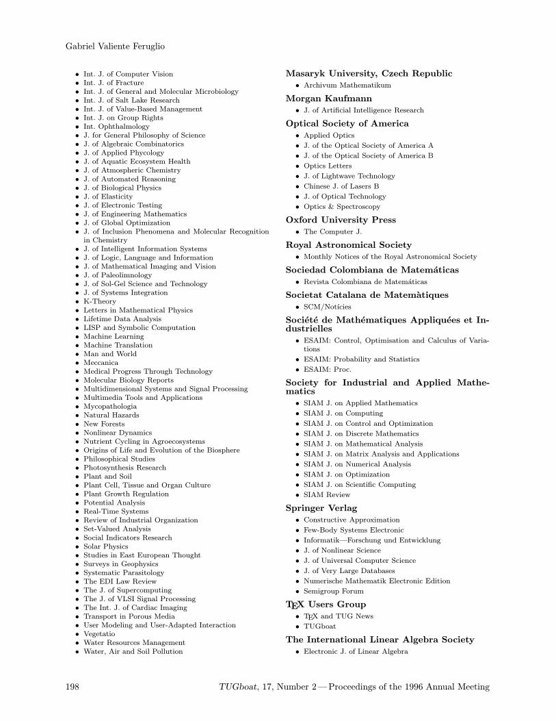
Gabriel Valiente Feruglio
• Int. J. of Computer Vision• Int. J. of Fracture• Int. J. of General and Molecular Microbiology• Int. J. of Salt Lake Research• Int. J. of Value-Based Management• Int. J. on Group Rights• Int. Ophthalmology• J. for General Philosophy of Science• J. of Algebraic Combinatorics• J. of Applied Phycology• J. of Aquatic Ecosystem Health• J. of Atmospheric Chemistry• J. of Automated Reasoning• J. of Biological Physics• J. of Elasticity• J. of Electronic Testing• J. of Engineering Mathematics• J. of Global Optimization• J. of Inclusion Phenomena and Molecular Recognitionin Chemistry
• J. of Intelligent Information Systems• J. of Logic, Language and Information• J. of Mathematical Imaging and Vision• J. of Paleolimnology• J. of Sol-Gel Science and Technology• J. of Systems Integration• K-Theory• Letters in Mathematical Physics• Lifetime Data Analysis• LISP and Symbolic Computation• Machine Learning• Machine Translation• Man and World• Meccanica• Medical Progress Through Technology• Molecular Biology Reports• Multidimensional Systems and Signal Processing• Multimedia Tools and Applications• Mycopathologia• Natural Hazards• New Forests• Nonlinear Dynamics• Nutrient Cycling in Agroecosystems• Origins of Life and Evolution of the Biosphere• Philosophical Studies• Photosynthesis Research• Plant and Soil• Plant Cell, Tissue and Organ Culture• Plant Growth Regulation• Potential Analysis• Real-Time Systems• Review of Industrial Organization• Set-Valued Analysis• Social Indicators Research• Solar Physics• Studies in East European Thought• Surveys in Geophysics• Systematic Parasitology• The EDI Law Review• The J. of Supercomputing• The J. of VLSI Signal Processing• The Int. J. of Cardiac Imaging• Transport in Porous Media• User Modeling and User-Adapted Interaction• Vegetatio• Water Resources Management• Water, Air and Soil Pollution
Masaryk University, Czech Republic
• Archivum Mathematikum
Morgan Kaufmann
• J. of Artificial Intelligence Research
Optical Society of America
• Applied Optics
• J. of the Optical Society of America A
• J. of the Optical Society of America B
• Optics Letters
• J. of Lightwave Technology
• Chinese J. of Lasers B
• J. of Optical Technology
• Optics & Spectroscopy
Oxford University Press
• The Computer J.
Royal Astronomical Society
• Monthly Notices of the Royal Astronomical Society
Sociedad Colombiana de Matematicas
• Revista Colombiana de Matematicas
Societat Catalana de Matematiques
• SCM/Notıcies
Societe de Mathematiques Appliquees et In-dustrielles
• ESAIM: Control, Optimisation and Calculus of Varia-tions
• ESAIM: Probability and Statistics
• ESAIM: Proc.
Society for Industrial and Applied Mathe-matics
• SIAM J. on Applied Mathematics
• SIAM J. on Computing
• SIAM J. on Control and Optimization
• SIAM J. on Discrete Mathematics
• SIAM J. on Mathematical Analysis
• SIAM J. on Matrix Analysis and Applications
• SIAM J. on Numerical Analysis
• SIAM J. on Optimization
• SIAM J. on Scientific Computing
• SIAM Review
Springer Verlag
• Constructive Approximation
• Few-Body Systems Electronic
• Informatik—Forschung und Entwicklung
• J. of Nonlinear Science
• J. of Universal Computer Science
• J. of Very Large Databases
• Numerische Mathematik Electronic Edition
• Semigroup Forum
TEX Users Group
• TEX and TUG News
• TUGboat
The International Linear Algebra Society
• Electronic J. of Linear Algebra
198 TUGboat, 17, Number 2—Proceedings of the 1996 Annual Meeting
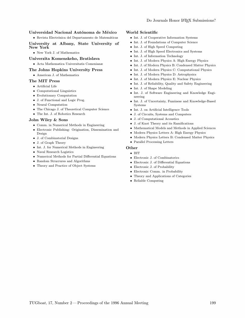
Do Journals Honor LATEX Submissions?
Universidad Nacional Autonoma de Mexico
• Revista Electronica del Departamento de Matematicas
University at Albany, State University ofNew York
• New York J. of Mathematics
Univerzita Komenskeho, Bratislava
• Acta Mathematica Universitatis Comenianæ
The Johns Hopkins University Press
• American J. of Mathematics
The MIT Press
• Artificial Life
• Computational Linguistics
• Evolutionary Computation
• J. of Functional and Logic Prog.
• Neural Computation
• The Chicago J. of Theoretical Computer Science
• The Int. J. of Robotics Research
John Wiley & Sons
• Comm. in Numerical Methods in Engineering
• Electronic Publishing: Origination, Dissemination andDesign
• J. of Combinatorial Designs
• J. of Graph Theory
• Int. J. for Numerical Methods in Engineering
• Naval Research Logistics
• Numerical Methods for Partial Differential Equations
• Random Strucrures and Algorithms
• Theory and Practice of Object Systems
World Scientific
• Int. J. of Cooperative Information Systems
• Int. J. of Foundations of Computer Science
• Int. J. of High Speed Computing
• Int. J. of High Speed Electronics and Systems
• Int. J. of Information Technology
• Int. J. of Modern Physics A: High Energy Physics
• Int. J. of Modern Physics B: Condensed Matter Physics
• Int. J. of Modern Physics C: Computational Physics
• Int. J. of Modern Physics D: Astrophysics
• Int. J. of Modern Physics E: Nuclear Physics
• Int. J. of Reliability, Quality and Safety Engineering
• Int. J. of Shape Modeling
• Int. J. of Software Engineering and Knowledge Engi-neering
• Int. J. of Uncertainty, Fuzziness and Knowledge-BasedSystems
• Int. J. on Artificial Intelligence Tools
• J. of Circuits, Systems and Computers
• J. of Computational Acoustics
• J. of Knot Theory and its Ramifications
• Mathematical Models and Methods in Applied Sciences
• Modern Physics Letters A: High Energy Physics
• Modern Physics Letters B: Condensed Matter Physics
• Parallel Processing Letters
Other
• BIT
• Electronic J. of Combinatorics
• Electronic J. of Differential Equations
• Electronic J. of Probability
• Electronic Comm. in Probability
• Theory and Applications of Categories
• Reliable Computing
TUGboat, 17, Number 2—Proceedings of the 1996 Annual Meeting 199
A New Approach to the TEX-related Programs: A User-friendly Interface
Sergei V. Znamenskii and Denis E. LeinartasDepartment of Mathematics Krasnoyarsk State University, Svobodnyi prospekt 79, 660041 Krasnoyarsk,
Russia
[email protected], [email protected]
Abstract
Various TEX-related programs such as TEX, METAFONT, BM2FONT, DVISCR,DVIPS, BibTEX, and others have to use sophisticated command line options andconfiguration files to work cooperatively. Modifying the configuration of such acomplicated system becomes a problem. A good solution is a hypertext-basedlanguage based on an intellegent shell which provides an easy interface for TEX-users.
The number of various configuration options to usein a command line or in environment to start aTEX-related program has become somewhat enor-mous. The appropriate choice of an option set touse depends in a rather sophisticated way on hard-ware configuration, desirable interface and a lot ofinstalled software-specific features.Therefore the proper modification of a TEX sys-
tem configuration becomes a problem to the ordi-nary user even if he uses some shell to facilitate thework. There exists a wide variety of TEX shells anddifferent users have different opinions on the sub-ject of which shell is better. The TEXShell V2.7.1by von Jorgen Schlegelmilch (available on CTAN) iscurrently the most popular non-commercial shell inRussia to run under DOS. It provides a convenientuser interface. For example, the user can changeprinters by just selecting appropriate item in themenu system; change any command line options;save changed configurations completely or partially;use various configurations for different directories;to run TEX, preview or print a file; and other ac-tions – by just hitting a ‘hot’ key from the inter-nal editor. The user may find and correct errorsin a source file(s) easily and get complete hyper-text help on LATEX and shell functions. The usercan switch the color selection of TEX commands andcontrol symbols, add any custom batch file or pro-gram to the user menu from inside the editor, or usehis favorite external editor, etc. The shell supportsthe new emTEX directory system under DOS andOS/2 and uses less then 1k of memory when TEXor the previewer is executing. The 4TEX shell (lastrelease 3.26) provides more-or-less similar features,but TEXShell seems to be a bit more easy to use, es-pecially with a set of different configurations. Doesanybody really need more?
The TEX user certainly can be happy workingwith the TEXShell or any other convenient shell withthe same facilities. Problems arised in the case heneeds to:
• control, on the screen, the margins to be usedon printed paper;
• install another printer;
• use some new emTEX features (such as bookletprinting);
• use one of the very nice extra utilities such asBM2FONT or MFPIC which depends on printerfont set; and/or
• repeat all the actions above simultaneously.
In such cases, the user will have to look into thedocumentation and perhaps write new configurationand batch files again and again without any hope ofgetting a final version. If you only change printers,for example, You usually have to change the path towrite BM2FONT and MFPIC .pk font files, recalcu-late the extension set to start GFTOPK execution,defining resolution, font directories, screen marginsand scaling options for the previewer. Moreover, inorder to determine the correct way configuration,you need to collect information from a set of docu-mentation files with the size of hundreds of kilobytes.None of the existing shells can do it automati-
cally. It is a task for human intellect. And nobodyis able to “teach” any existing shell to perform thiskind of job. You should know all of the interre-lations between a type of printer, a resolution setand mode for METAFONT to make the whole systemwork correctly. Moreover, the interrelations men-tioned above may also depend on font directories,existence of .pk files and other machine-dependentconditions which you should check before you may
200 TUGboat, 17, Number 2—Proceedings of the 1996 Annual Meeting
A New Approach to the TEX-related Programs: A User-friendly Interface
achieve success. The new version of the same pro-gram usually handles the environment and the com-mand line options in different way. It is really diffi-cult.The experimental TEX shell was designed as
emTEX-based, with the support of RFBR to makethe following extremely easy:
• the use of any TEX–METAFONT interface-basedpackages such as MFPIC;
• the use of other packages such as BM2FONT;
• the change of printer driver or changing to an-other svga mode;
• the ability to see the same margins on screen asthose on the printed page;
• different configurations for different kinds of jobs(different journals for example);
• writing all temporary files (.log, .dvi, etc.)to a special directory; and
• the support of all features of the current emTEXdistribution.
The test version of the shell was created basedon the TX sources by Ricard Torres ([email protected])and which are available on CTAN (a very simple andeffective shell for work with TEX under DOS) andsuccessfully tested in the Krasnoyarsk State Uni-versity, several institutions at Krasnoyarsk and inthe Information and Publication Centre of SteklovMathematical Institute (Moscow). After we replacethe temporary Russian fonts with the standard setand probably some other changes as proposed bythe project, the shell will be freely available fromthe RFBR Russian TEX server ftp.tex.math.ru viaanonymous ftp as an add-on package to the currentemTEX distribution.Though it is not the purpose of this paper to
describe our shell completely, we need to give someinformation on it. It contains an extremely smallmenu, which saves screen space allowing the userto see a maximum of the program finished beforeoutput. The menu size depends on the number offiles to work with and the number of currently avail-able commands. One available command is Set (hitthe “S” key) to call a set configuration menu inwhich you can select (change) a printer resolution,svga mode, portrait or landscape mode, output di-rections, or printer behavior (for two-side printing,etc.). The format is normally selected automatically,but you can change it if Hit the <E> key (Edit) tocall the default editor; hit <T> to TEX a file; hit<V> to preview the file; and so on. Usually the shellgives a prompt for the next command, and you canjust press <SPACE> to approve the command. If youwork with LATEX files, the default sequence for the
first time to run will be <T> <T> <V> <E>. WithMAKEINDEX the sequence will be <T> <M> <T> <V> <E>and with MFPIC <T> <F> <T> <V> <E> where <F>starts METAFONT in the appropriate mode, startsGF2PK and generates the correct output files. Un-fortunately there is no on-line help available in ourshell at this time.As soon as we announced that we were about
to place this shell into the base of a non-commercial“Russian TEX” distribution, the biggest disagree-ment became what set of packages was to be sup-ported. Almost everybody wanted to restrict thenumber or packages to use as much as possible, butinsisted upon the inclusion of the packages he knowbest. How to resolve this discussion? The only waywe can see is to make a TEX shell to use a widelyvariable set of packages which are easy to installand use – “unpack an play”. The TDS (TEX direc-tory structure) standard gives us a chance to makethe packages extremely independent upon operatingsystems. The more we try to configure the shell for anew package, which is complex yet still easy-to-use,the more time we spend checking and correcting allof the places in the configuration files which affectthe package behavior.Thus we need a new approach to the shell and
user interface. It should be a shell with some fea-tures of the human mind, or an “intelligent” shell.What does that mean? Are we to develop a sys-
tem of artificial intellect only to start TEX-relatedprograms? Of course not! But we want our shell tobe able to check logical conditions and change thebehavior according to the current situation. Thismay be useful not only in the configuration but inthe interface too. It isn’t necessary to have a menuitem “Print” if there is no .dvi file, as well as thereis no need to run METAFONT if an .mf file does notexist. It would also be better if the shell would leadus through the menus, choosing the next reasonableitem; i.e., after running TEX, the next action is pre-viewing and after that it is another edition in themost cases. The user can agree with the shell bypressing <ENTER> or choosing something else if hewants. We believe such advantages makes work abit more convenient.In addition to this, we consider a fully detailed,
context-dependent HELP as a very important partof the shell. Being concerned with TEX for aboutthree years we have come to the conclusion thatusers sometimes want to have a more detailed expla-nation of every menu item than the existing shellssupport.How can we improve this service? Nowadays
hypertext structures are very much appreciated in
TUGboat, 17, Number 2—Proceedings of the 1996 Annual Meeting 201
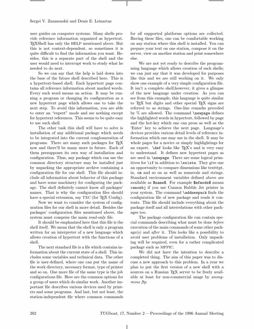
Sergei V. Znamenskii and Denis E. Leinartas
user guides on computer systems. Many shells pro-vide reference information organized as hypertext.TEXShell has only the HELP mentioned above. Butthis is not context-dependent, so sometimes it isquite difficult to find the information you want. Be-sides, this is a separate part of the shell and theuser would need to interrupt work to study what heneeded to do next.So we can say that the help is laid down into
the base of the future shell described here. This isa hypertext-based shell. Each hypertext page con-tains all reference information about marked words.Every such word means an action. It may be run-ning a program or changing its configuration as anew hypertext page which allows one to take thenext step. To avoid this information, you are ableto enter an “expert” mode and see nothing exceptfor hypertext references. This seems to be quite easyto use such shell.The other task this shell will have to solve is
installation of any additional package which needsto be integrated into the current conglomeration ofprograms. There are many such packages for TEXnow and there’ll be many more in future. Each ofthem presupposes its own way of installation andconfiguration. Thus, any package which can use thecommon directory structure may be installed justby unpacking the appropriate archive containing aconfiguration file for our shell. This file should in-clude all information about behavior of this packageand have some machinery for configuring the pack-age. The shell definitely cannot know all packages’names. That is why the configuration files shouldhave a special extension, say TXC (for TEX Config).Now we want to consider the system of config-
uration files for our shell in more detail. Besides thepackages’ configuration files mentioned above, thesystem must comprise the main read-only file.It should be emphasized here that this file is the
shell itself. We mean that the shell is only a programwritten for an interpreter of a new language whichallows creation of hypertext with the functions of ashell.The next standard file is a file which contains in-
formation about the current state of a shell. This in-cludes some variables and technical data. The otherfile is user-defined, where one can put the name ofthe work directory, necessary format, type of printerand so on. One more file of the same type is the jobconfigurations file. Here are the common options fora group of users which do similar work. Another im-portant file describes various devices used by print-ers and some programs. And last, but not least, thestation-independent file where common commands
for all supported platforms options are collected.Having these files, one can be comfortable workingon any station where this shell is installed. You canprepare your text on one station, compose it on theserver, view on another station and print somewhereelse.We are not yet ready to describe the program-
ming language which allows creation of such shells;we can just say that it was developed for purposeslike this and we are still working on it. We onlyshow one example of a very simple configuration file.It isn’t a complete shell;however, it gives a glimpseof the new language under creation: As you cansee from this example, this language is quite similarto TEX but digits and other special TEX signs arereferred to as strings. One-line remarks precededby % are allowed. The command \newpage definesthe highlighted words in hypertext, followed by pageand the hot-key which one can press as well as the‘Enter’ key to achieve the next page. Language’sdevices provides various detail levels of reference in-formation which one may use in the shell. It may bewhole pages for a novice or simply highlightings foran expert. \def looks like TEX’s and is very easyto understand. It defines new hypertext pages asare used in \newpage. There are some logical prim-itives for \if in addition to \exists. They give onean opportunity to compare dimensions like textttpt,in, cm and so on as well as numerals and strings.Standard environment variables defined above areavailable as $name$. For example $mfmode$ meanscanonbj if you use Cannon Bubble Jet printer inyour system. The command \addnewpack finds theconfiguration file of new package and reads it con-tents. This file should include everything about thepackage itself and all interrelations with other pack-ages too.The package configuration file can contain spe-
cial commands describing what must be done beforeexecution of the main commands of some other pack-age(s) and after it. This looks like a possibility toavoid user problems of installation. Only unpack-ing will be required, even for a rather complicatedpackage such as MFPIC.We did not have the intention to describe a
completed thing. The aim of this paper was to dis-cuss a new approach to this problem. In a year weplan to put the first version of a new shell with asources on a Russian TEX server to be freely avail-able at least for non-commercial usage by anony-mous ftp.
202 TUGboat, 17, Number 2—Proceedings of the 1996 Annual Meeting
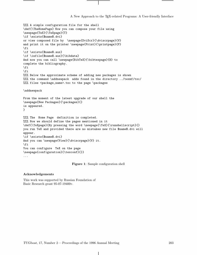
A New Approach to the TEX-related Programs: A User-friendly Interface
%%% A simple configuration file for the shell
\def\TheHomePage Now you can compose your file using
\newpageTeX\TeXpageT
\if \exists$name$.dvi
or view composed file by \newpageDviScr\dviscrpageV
and print it on the printer \newpagePrint\printpageP
\fi
\if \exists$name$.aux
\if \infile$name$.aux\bibdata
And now you can call \newpageBibTeX\bibtexpageB to
complete the bibliography.
\fi
\fi
%%% Below the approximate scheme of adding new packages is shown
%%% the command \addnewpack adds found in the directory ../texmf/txc/
%%% files <package_name>.txc to the page \packages
\addnewpack
From the moment of the latest upgrade of our shell the
\newpageNew Packages\packages
is appeared.
%%% The Home Page definition is completed.
%%% Now we should define the pages mentioned in it
\def\TeXpageBy pressing the word \newpage\TeX\runshellscript
you run TeX and provided there are no mistakes new file $name$.dvi will
appear.
\if \exists$name$.dvi
And you can \newpageView\dviscrpageV it.
\fi
You can configure TeX on the page
\newpageconfiguration\texconf
...
Figure 1: Sample configuration shell
Acknowledgements
This work was supported by Russian Foundation ofBasic Research grant 95-07-19400v.
TUGboat, 17, Number 2—Proceedings of the 1996 Annual Meeting 203
The Strait Gate to TEX
Ivan G. VsesvetskyIoffe Physico-Technical Institute, 26, Polytechnicheskaya str., 194021, St Petersburg, Russia
Abstract
TEX is the best . . . It is ‘ideal’ ! So why has it not gained the world? Because (1)it’s not for everybody; and (2) this world is REAL, not ideal. There exist a realcompetition between TEX and, say, Ventura.This article shows how capabilities of TeX can be enhanced to a level
surpassing ‘professional’ typesetting.
What this Article is About
For more than three years Ioffe Institute has pre-pared camera-ready copy for four physical journals(about 1000 A4 pages of 11pt text plus illustrationsper month). plain TEX with CyrTUG russificationand local styles are used. This article is an attemptto generalize the experience of a small TEX publish-ing bureau.All speculations are emphasized for easy skip-
ping.
Why TEX?
The journals were published for years with metaltype. In about 1991, the type became too old andthe publisher (“Nauka”) moved to DOS Ventura.It appeared that doing formulae with Ventura is ahard manual toil was quite toilsome and the editors(they are all from the Ioffe Institute) turned to ourcomputing center, which had some experience withscientific publishing. Thus, from April 1993, thejournals are produced using TEX.
Problems
It would be strange if we did not encounter problemsattempting to emulate metal type with TEX.
Personnel education NonTEXnical people con-sider TEX too complex for a human being withouta university mathematical education. Most our TEXtypists were mainframe operators before 1993.
Limitations of emTEX Up to 1993, we usedPCTEX and TurboTEX. These commercial imple-mentations gently died in the Ioffe Institute afterthe appearence of wonderful emTEX.Only one part of emTEX caused some prob-
lems— dvi drivers for DOS—they abort quite oftenon our documents that are filled with graphics andvirtual fonts.
The main reason for using DVIPS is the inabil-ity of emTEX to please our editors— it cannot dolandscape tables.
Free software is. . . good or bad?Bad. Because it is not debugged.DVIPS supports emTEX \specials, but some-
times PCX files are displayed as a black boxes (veryrarely), and at other times raster graphics are dis-torted.Good. Because we can debug it ourselves.The availability of the source code for DVIPS
made it possible to overcome the above errors.
DVIPS is slow Most grahics typed in the jour-nals are hand drawings scanned to PCX format.DVIPS, preparing its PostScript output, unpacksthem (expanding thee to four times) and codes themin hexadecimal (a 2-fold increase). The resultinggiantic file (30–50MB at 300 dpi resolution) can takefrom three to five hours to print. It is rather easyto estimate the resources needed for 600 or 1200 dpi(last year we got such devices).After some experimenting, the algorithm of
(rather) fast graphics decompression was coded inPostScript [1] and the compression counterpart wasincluded in DVIPS. Now DVIPS works 1.5–2 timesslower than emTEX driver on the same file, and thiscoefficient does not grow with printer resolution. Af-ter CCITT ‘FAX’ compression [2] was implementedin DVIPS for the new PostScript Level 2 printers, itruns even faster than DVIHPLJ of emTEX. Patchesfor DVIPS are available on request.
Lack of fonts Good Cyrillic TEX fonts are scarce.Up until now, it was not a problem—the editors arehappy with the Washington Cyrillic fonts.
Placement of illustrations is not easy with TEX.Here Ventura (or Word, etc.) certainly wins. Itseems to me that the problem cannot be solved within
204 TUGboat, 17, Number 2—Proceedings of the 1996 Annual Meeting
The Strait Gate to TEX
TEX—content (visual in this case) should not begenerated automatically.
Prospects
We are planning to move to LATEX.We are beginning to use PostScript fonts. Prob-
lems with screen preview in emTEX are solved usingps2pk program. Matching different fonts and theiradaptation to DVIPS is done with quite simple AWKscripts.
Conclusions
The ex-Soviet desktop publishing market is ratherstrange. It seems that the only professional typeset-ting software available here is free TEX. Its ‘free-ness’ is imaginary of course—you must spend (atleast your time) on personnel education, softwaredebugging and tuning, etc.
References
[1] Adobe, Postscript Language Reference Manual,Addison-Wesley, 1990.
[2] Brown, Wayne and Barry Shepherd, GraphicFile Formats, Prentice-Hall, 1994.
TUGboat, 17, Number 2—Proceedings of the 1996 Annual Meeting 205
DVI-based Electronic Publication
Laurent Siebenmann
Matematiques, Batiment 425, Universite de Paris-Sud, F-91405, Orsay, France
Abstract
This article offers an introduction to three proposals that would make TEX’s orig-inal device-independent output format dvi more useful for electronic publicationof scientific documents.
The race is on to establish formats for publishing theworld’s scientific literature in purely electronic form.Let us first recall the technological circumstancesthat have set this race in motion.It is widely believed that the Internet now has
the capacity necessary to deliver scientific articlesin just a few seconds to any computer on the In-ternet—via WWW (World Wide Web), and alsoolder systems such as FTP (File Transfer Protocol).Hopefully, the costs for Internet transmission will re-main quite negligible in spite of commercialization.Rapid access (hard disk) storage cost per page inan electronic library is already negligible. Providedefficient storage formats are used, the cost is nowless than one cent per page for the 4-year life-spanof a hard disk—and it is still rapidly falling.However, there are serious traffic congestion
problems that currently nearly freeze the Internetfor key portions of the 24-hour day throughoutconsiderable parts of the world. Thus, a coupleof complications should be kept in mind. Firstly,although delivery via Internet is the favored vehicle,alternative delivery formats may have to take onan important slice of the action, notably compactread-only optical disks, known as CD-ROMs. Thisdelivery format is slow and chunky, but its cost islow, and its capacity is probably orders of magni-tude greater than those of the Internet. Secondly,a congested Internet will be more tolerable if wehave a particularly efficient standard for sciencesuch as dvi.Optimists expect that public fascination with
bulky imagery available on the Internet will pushdata transport speeds and cost efficiency on the In-ternet ahead of and beyond the needs of the browsingscientist. But this assumes that scientists use effi-cient norms insulated from technological inflation.The leading candidates among electronic for-
mats for the mathematical sciences seem to be:
tex : TEX’s ASCII typescript input format definedby Knuth and elaborated by TEX markup for-
mats such as Plain, LATEX and others. Thisformat usually must be enriched by \special-ly included graphics objects. Hence it shouldperhaps be called the tex etc format.
dvi : TEX’s binary device-independent output for-mat. Similarly, we will talk of a dvi etc formatthat evolves with the \special additives andtheir attendant software.
ps : the Adobe PostScript page description lan-guage, accepted by a majority of ‘laser’ printers,i.e., laser printers.
pdf : Adobe’s format for its (currently) freewareviewer, Acrobat, nourished by its commercialps to pdf converter, Distiller.
html : the WWW Internet format used by mostbrowsers. Mathematical material has beenskimpily served, except through numerous bit-maps, and these have proved cumbersome.However, direct support for simple mathemat-ics is being implemented under version 3 ofhtml.
How do these formats measure up to expecta-tions of users of the scientific literature? For me,the major fault today of all of these formats (judgedalong with the software and hardware that supportthem) is low bandwidth for browsing. Indeed, onestill assimilates far less of interest in an hour ofelectronic browsing than in a well-run physical li-brary. The hypertext features and net references(via URLs) are worthy innovations, but they do notfully compensate for slowness.I believe that this is a sign that browsers (also
called viewers or previewers or screen drivers) arein their infancy. Their speed should improve withincreased microprocessor power—provided systemcomplexity does not outstrip the power increase.The 10-fold increase in processor clock speed from8 to 80mhz in about 10 years augurs well. As doesthe doubling of bus width from 16 to 32 bits. Onebad omen is that the resolution of images will lag
206 TUGboat, 17, Number 2—Proceedings of the 1996 Annual Meeting
DVI-based Electronic Publication
behind—if the progress from 70 dpi to 100 dpi in10 years is any indication.Equally worrying is the widely heard predic-
tion that Internet services will be too expensivefor third-world countries and also for any scientistswithout robust financial support. It is based onthe observation that the Internet is being inexorablycommercialized.One can hope that a combination of growth
and competition will make the necessary servicesaffordable. However, there is a grave problem cast-ing its shadow on this optimism—it can be statedas follows. Prices tend to be as high as a marketcan bear,1 while science teachers and researchershave relatively little financial clout (and studentseven less). Thus, we would be wise to ask whetherscientists will not be playing a losing game in thesame Internet league as business and professionalgroups.My answer is the same as for transmission
speed. To assure excellent service from the Internetin spite of lacking financial clout, scientists shouldadopt their own particularly efficient methods ofelectronic publication. So efficient that even third-world scientists will have adequate access to theelectronic literature.In the struggle for effective communication, the
scientists’ secret weapon is TEX. Secret becauseTEX’s inherent complexity will (I believe) restrict itsuse to a small circle centered on the scientific com-munity in which it was developed. Donald Knuthpaid extraordinary attention to efficient operationof TEX: the input tex typescripts and the binaryoutput dvi page description files have informationdensity comparable to that of ordinary ASCII prose(to within a factor rarely worse than two or three).Like prose they are compressible to well under 50%.To some of you, the idea that electronic pub-
lishing with TEX should be done ‘on the cheap’is revolting. I claim that flexibility of design canallow the same TEX systems to do electronic pub-lishing involving sophisticated typography and hightech— for example color MPEG animations. Better,I want the same posting to serve both poor andrich scientists: a poorly equipped reader might seea still, black-and-white image instead of the coloranimation, but he should be able browse the sameposting.In prospective summary, our goal should be to
extend the domain of extraordinary efficiency of TEXfrom the paper publishing world of the 1980s to
1 This occurs particularly with monopolies and oligopo-lies, which are widespread in the world communications in-dustry.
the electronic publishing world of tomorrow—andwithout sacrificing high-tech ambitions.To return to a more specific question: In what
format should science be electronically published?Probably no one format will prove superior in allrespects. Scientists should reckon carefully wheretheir best interests lie, and be ready to provide somedevelopment effort at crucial points.The tex format (in LATEX dialect) is cur-
rently standard on the pioneering preprint serverftp://xxx.lanl.gov, initiated by Paul Ginsparg. Myarticle [7] can be interpreted as an attempt to makePlain TEX as efficient and as archival a markupsystem as LATEX but by a radically new approach:macro compilation. In my view, however, tex for-mat is best for author and publisher; I believe it istoo complex and fragile for the reader.The dvi format, although intended for the job
by Knuth, seems to be in a checkmate positionwhere browsable publication is paramount. As I willnow explain, it could lose out entirely if not furtherdeveloped.The pdf article format is browsable since both
text and graphics are more-or-less instantly viewable(as well as printable). Exotic languages can behandled because pdf tends to include necessary fontsor the relevant parts thereof.In contrast, a dvi article format is, as of today,
probably only printable at best. Here is a quickrundown on the difficulties which it faces and whichare addressed by my three proposals. The printabil-ity of eps graphics inclusions seems to depend onfuture implementation of a proposed standard for\special syntax recently published by Rokicki [5].The browsability of eps graphics is a largely un-solved problem except for the lucky few who havea ‘dvi-to-ps’ converter and an exceptionally goodPostScript viewer. Finally, where one of the moreexotic European languages such as Polish and Czechis involved, both printing and browsing currentlyusually depend on the weighty EC (alias DC) fontcollection (outside of Europe, expect to be disap-pointed when you call for it!).On the other hand, this dvi format, which
was designed by Knuth’s collaborator David Fuchs,has one signal advantage. It is by far the simplestformat for the representation of TEX output; indeedit is presented in Knuth [3], along with helpfulcommentary, in less than 10 pages. Alternativeformats such as ps, and pdf are easily ten timesas complex. Therefore dvi is comparatively easy tointerpret and transform. For example, dvi is readilyconverted to ps, while the (possibly useful) inverse
TUGboat, 17, Number 2—Proceedings of the 1996 Annual Meeting 207
Laurent Siebenmann
conversion of ps to dvi plus eps seems never to havebeen attempted.I will focus on the following three proposals,
which are intended to help the dvi format to avoidcheckmate and then, just possibly, to go on to sur-pass all competitors! Originally, I explained theseinnovations on Internet discussion lists, and my of-ten eminent interlocutors made significant contribu-tions. Where the text of this article is concerned,particular thanks are due to Hans Hagen and TomasRokicki for some close criticism. Each proposal re-mains tentative in the sense that it is just a sketchedplan for action waiting for support. Developers canimmediately examine many details by consulting thelist archives indicated below, or by contacting mepersonally.
• The first proposal is a set of small auxiliary‘atomic’ fonts to complement Knuth’s (atomic!)Computer Modern CM fonts so as to serve all Euro-pean languages with a Latin (non-Cyrillic) alphabet.Here is a (last?) opportunity to make Knuth’s orig-inal CM fonts part of an efficient and durable inter-national system. The new auxiliary fonts would un-doubtedly be extracted from the rather comprehen-sive EC font system currently being completed. Be-yond the English-speaking world, typesetting wouldnormally use virtual fonts with composite accentedcharacters based on these atomic fonts. A utilitysuch as Peter Breitenlohner’s dvicopy would finallyconvert the resulting dvi files to the more portableform using only the atomic fonts. The strong pointsof this scheme are unrivaled efficiency, and compati-bility with the core of TEX users who have no reasonto abandon Knuth’s CM fonts.
• The second proposal is the notion of a ‘multi-standard’ graphics object for inclusion in a TEXdocument. This notion was initially designed tosolve the old problem of providing portable pre-viewing of eps (encapsulated PostScript) graphics.But it promises much wider compatibility: a singledvi-based posting should be able to serve all themultifarious graphics formats, and all the abilitiesand debilities of TEX viewers and printers in allcomputer environments. At least one programmer ofa dvi viewer has been developing very much the sortof mechanism I recommend, namely HippocratesSendoukas, with his viewer DVIWin for PCs. Thenear-coincidence of our independently thought-outideas is a good omen, suggesting that, in the presentinstance, there may be essentially one way to skinthe cat neatly.
• The third proposal can be viewed either as avery general approach to implementing any standard
for ‘special’ syntax or, alternatively, as a way toachieve dvi portability without such a standard. Oneach of the major platforms, one creates a freelyavailable utility program converting a (candidate)standard for specials to the native format of anyselected TEX dvi interpreter on that platform. Theonus of implementation of a standard can therebybe entirely shifted from the implementors of TEXscreen and printer drivers to the publishers of dvi-based postings. A low-profile utility project will bediscussed in some detail.
An ‘atomic’ complement to CM fonts
One problem with dvi postings is specifically a Eu-ropean one. No single font encoding quite managesto cover the needs of all European languages thatuse a Latin-based alphabet. It is well known thatKnuth’s CM fonts are not sufficient for the Poles,and Czechs. Even the basic EC font encoding (theCork norm) with numerous accented letters is notsufficient for the Latvians, Welsh and others. Thereare quite simply more than 256 characters in all.The auxiliary text font series tc of the EC collection[4] will probably have to be combined with virtualfonts to bring them under the common EC roof.This will tend to render non-portable the dvi filesinvolving such languages.As for the Cyrillic alphabet of our hosts at
Dubna, so few accents are used in modern scientificRussian, that conceivably just one 256-characterencoding including compound characters may sufficefor use by scientists—much as classical CM sufficesin the English-speaking world.My suggestion for the Latin alphabets is to
supplement Knuth’s CM fonts by a single parallelseries for auxiliary ‘atomic’ characters. It wouldcontain chiefly separate accents, in distinct versionsfor lower- and uppercase letters. But it would alsoinclude some notoriously troublesome characters, forexample, the Slovak character © (typed as \v l),which is difficult to render reliably and beautifullyfrom atomic characters. Such troublesome charac-ters are to be treated as atomic.Note that the intervention of virtual fonts
makes it possible to assemble composite charactersfrom ‘atoms’ in distinct fonts; thus, the CM fontsneed not be modified in any way in order to be thecore of such a system.To achieve optimal typographic quality the au-
thor will use virtual fonts—but the virtual fontsare to be subsequently ‘atomized’ and so eliminatedfrom the posted dvi file, for example by use ofBreitenlohner’s dvicopy. There is a significant ty-pographical benefit to be gained from the use of
208 TUGboat, 17, Number 2—Proceedings of the 1996 Annual Meeting
DVI-based Electronic Publication
virtual fonts: accent positioning can be adjustedto suit any national typography. For example thedieresis (Umlaut) accent is usually placed lower inGermany than Knuth’s, whose accent positioningseems most acceptable in France.This scheme is compatible with the (core) EC
fonts in the sense that virtual EC fonts (hopefullywith the true EC metrics) can be based on CMand the envisaged atomic complement to CM. Thisimposes inclusion of some miscellaneous charactersthat made their TEX debut in the Cork encoding.To be widely adopted for browsing electronic
scientific postings, such complementary atomic fontswill have to be made available in Adobe Type 1format, matching the BSR and BaKoMa Type 1 fontseries.A somewhat similar proposal (independent of
mine) for Adobe-distributed Type 1 fonts was madeby Pierre Mackay. It influenced the May 1995 en-coding named 8r (for 8bit raw) used by the PSNFSSfont system of LATEX fame. But 8r is not atomic—if it had been made atomic (as the sadly lacunaryAdobe Standard Encoding nearly was) that wouldhave denied access to numerous accented characterspresent in the Type 1 afb files and reduce them toextra baggage. In my view, the CM fonts of Knuthare unique and deserve unique treatment.The window of opportunity for acting on the
proposal above is opening up with the approachingcompletion by Jorg Knappen of the EC fonts. Themain discussion of this proposal took place on theMath Fonts list [2] from March through May 1994;hopefully, its archive will remain available. Tech-nical problems related to the notion of ‘drift’ arediscussed there.2
EPS graphics integration
The most glaring defect of dvi format has hithertobeen the lack of a standard ‘special’ syntax for in-clusion of graphics objects via TEX’s \special com-mand— for it tends to make dvi files non-portable.3
Where eps graphics (i.e., Encapsulated PostScriptgraphics) are concerned, a specific proposal for stan-dard ‘special’ syntax has recently been put forwardby Rokicki.
2 These problems (rather minor ones, I believe) could beentirely bannished by a TUG standard for dvi interpretation.
3 The tex format does not have an acute problem here.My boxedeps.tex (Feb. 1991; a TEX macro package availableon CTAN) first made tex typescripts using eps graphicsportable in spite of this lack of \special standardization.LATEX has recently adopted a similar approach (basically oneof systematically accommodating all extant syntaxes) andextended it to \special commands governing color, rotations,etc.
Unfortunately TEX screen viewers are, moreoften then not, unable to directly view eps graphics.Prompt to recognize this problem, Adobe providedstandard enhanced formats for screen viewing onMacintosh, and DOS (or MS Windows) systems.4
On Macintosh, the enhanced viewer file includes aPICT resource numbered 256 in the resource forkof the eps file; it contains either a “packbits” com-pressed bitmap or (more recently) vectorized PICTgraphics.5 On PCs, the file has a binary formatsometimes called EPSP; this has a characteristicheader, a segment for the eps file, and a segmentfor the bitmapped preview; the latter may be asimple tif bitmap with “packbits” compression, ora vectorized wmf. Here, tif means Tagged ImageFormat File (TIFF is the official acronym), and wmfmeans Windows MetaFile.If the enhanced PC and Macintosh viewer for-
mats had been one and the same format, it wouldsurely have been adopted overnight as a standard.But, as matters now stand, the enhanced eps filespose an annoying portability problem—and neitherseems to have been widely adopted on UNIX sys-tems—which tend to rely on PostScript interpretersfor graphics previewing.Thus, in practice, the standard proposed by
Rokicki will assure portability between printers butoften not between TEX viewers on different plat-forms. This puts dvi format in grave jeopardy asa publication format.The portable viewing problem for eps graphics
could (as noted above) be solved by setting up aviewing standard common to the Mac and PC plat-forms. Here is an obvious approach: have the epstext file myfig.eps accompanied by a parallel tifbitmap file myfig.tif. With modest effort, viewerbuilders on all platforms could derive the desiredpreview from the tif bitmap. Such bitmaps canbe displayed as fast as the surrounding text. Ifthe bitmap is scaled downwards (not upwards!) toits screen size, the image quality is usually good—at least for the line figures that dominate in themathematical sciences. For best quality, figure la-bels should be put in a TEX overlay. The syntaxproposed by Rokicki is adequate; so one merely en-hances the functionality to provide previewing usingthe tif bitmaps.
4 Adobe also provided a device-independent preview for-mat EPSI (I for Interchange). Alas, its bulk is high and itsquality low, and it is almost never used.
5 This view-enhanced Macintosh eps file format is univer-sally supported in the Macintosh world. The benefit justifiesthe considerable cost in space: typically the compressedvolume devoted to graphics is doubled.
TUGboat, 17, Number 2—Proceedings of the 1996 Annual Meeting 209
Laurent Siebenmann
This solution seems worth implementing since itwould solve an urgent problem. The basic function-ality, i.e., use of a parallel tif file to give a viewerimage corresponding to an eps file is already presentin the two MS Windows viewers DVIWin [6] andDVIWindo [9]. They are by Sendoukas and Y&YInc., respectively. Unfortunately, such a develop-ment seems unlikely to come about spontaneously. . .
Multi-standard graphics integration
The above potential solution for eps graphics inte-gration with previewing is a very particular case ofthe use of several graphics standards to represent asingle graphics object. Would it not be worthwhileto have a general scheme that goes well beyond theviewing problem as Adobe understood it ten yearsago? We need a multi-standard scheme that canprovide viewers with the very best screen represen-tations available for any given platform!This seems to me a bold enough idea to com-
mand the respect of a standards committee. I amhopeful that any number of distinct graphics normscan be handled by one and the same protocol so asto allow the same dvi file to serve on all platformsunder all circumstances. Sendoukas was perhaps thefirst to envisage this possibility; see the documenta-tion of his DVIWin.Fortunately, the sort of ‘special’ syntax pro-
posed by Rokicki seems adequate for the function-ality we want. For example:
\special:: object multifig=myfig
width=200 height=120
might be be interpreted as follows: there is a graph-ics object whose name root is myfig; its represen-tation norm is to be selected by the driver amongthose available; the image is to be linearly scaledto fit exactly onto the rectangle 200bp wide and120bp high, with its lower left corner located atthe TEX insertion point (all mentioned dimensionsare thereafter corrected by TEX’s magnification fac-tor). Thus, in this most convenient case, the imagerectangle (on paper or screen) is specified in the\special’s argument string viewed in isolation.More specifically, consider the integration of a
graphics object myfig that is represented as a high-resolution color bitmap myfig.jpg of JPEG normfor viewers that have such wonderful6 capabilities,and by a simple tif bitmap file7 myfig.tif de-
6 Notably unrivaled compactness and nearly perfect scal-ability.
7 Simple tif means black-white, ‘packbits’-compressed,and with strip structure but no tiles. This is the sort ofpreview that Adobe Illustrator can include inside eps files forPCs.
signed to serve as a lowest-common-denominatorformat for viewers without JPEG display capabil-ities. We explain the integration in terms of thisexample, which is one that possibly no TEX vieweryet handles today. Indeed, Possibly the one-fileeps-with-preview offered by Adobe blinded mostdevelopers to the virtues of the more general multi-standard scheme.Only the article author’s intended experience,
and that of the browsing reader needs to be de-scribed, for we have already indicated the sort of‘special’ syntax that TEX and the viewer will ma-nipulate behind the user’s back.The user will exploit a macro package for in-
tegration of multi-standard graphics; this packagewill have syntax similar to one of the several inte-gration packages for eps graphics.8 (The TEX userrarely wants to have to work with explicit figuredimensions!) Thus, figure placement and size will beadjusted using conventional macro commands suchas \ForceWidth0.75\hsize.Much as with LATEX’s cross-referencing, the
result of a first production cycle is likely to bedisappointing; typically the figure is crammed intoa squared-out box. This is because TEX is quiteunable to find out the shape or size of the figuresince both graphics files mentioned are binary andTEX reads only text files. But the viewer canconveniently take on that task,9 and the author isinstructed to preview and expect good results onsecond and later runs.If the viewer is able to accept JPEG files, pre-
viewing is in color, and, if not, the image is the blackand white familiar for eps previewing.To post the dvi file with its graphics inclusion,
the author packages it with the jpg and tif filesin a directory—whence the posting format namedvi etc. He should omit an ephemeral ASCII filemyfig.gdf, say, a temporary ‘graphics descriptionfile’, which is created by the viewer or alternativelyby the utility mentioned in the last note, and whichserves to pass on to TEX the bounding box informa-tion on the graphics object that TEX initially couldnot read.What happens when a user browses this dvi
etc posting with a different viewer supporting theproposed multi-standard? The user immediately
8 It can be derived from the existing version by relativelyminor generalizations.
9 Alternative: It would be more conventional to assignthis task to a utility that is to be run first off; on theother hand, one utility per platform would suffice, and adisappointing first run would be avoided. For example, onon PCs, a utility called TIFFTAGS can be used to deal withtif files.
210 TUGboat, 17, Number 2—Proceedings of the 1996 Annual Meeting
DVI-based Electronic Publication
sees the best image his viewer can offer on the basisof available files. But let us imagine that the usersees only the modest tif and is unhappy becausehe knows that his viewer can handle good-qualitygif images (but not jpg). Here the multi-standardagain comes to the rescue: it suffices to convert fromjpg to gif and the high-resolution images appear!10
Popular PICT and WMF scalable graph-ics become portable. The above JPEG exampleof multi-standard graphics integration is forward-looking. Here is an application that gives an imme-diate payoff. One creates a preprint posting usingthe Macintosh’s native vectorized PICT graphics(suffix pct) and the multi-standard ‘special’. Anotice with the electronic posting recommends thatusers on other platforms convert the PICT graphicsto their favorite local norm, which for PCs means aMicrosoft Windows MetaFile with extension wmf.11
The multi-standard graphics integration using a sin-gle ‘special’ syntax will assure that the graphicsappear on the end-user’s screen as soon as a versionin his native norm is available. Successful viewingof vectorized graphics almost always implies optimalprinting, but not conversely.In summary, with multi-standard graphics in-
tegration, one can confidently use and post withTEX the native vectorized (scalable) linefigures ofMacintosh and Microsoft Windows. The viewing isthen of optimal quality at all scales; this includesthe labels if they are based on hinted outline fonts.A high degree of portability will be assured.Since there is, at long last, a technical working
group devoted to ‘special’ standards [5], let us wishthem the intelligence, openness, stamina and good-will necessary to deliver a powerful standard. Thelong-term health of TEX’s dvi format requires sucha standard.The Internet discussion of the above graphics
multi-standard proposal can be consulted on WWWas a hypermail archive:
http://math.albany.edu:8800/hm/emj/
10 There is a regrettable tendency among users to convertjpg files at an early stage to eps; this often means the file isencysted in the eps in a bulky form that moreover usuallycannot be exploited for screen viewing. A best possibleformat, such as jpg for color bitmaps, deserves to be postedas is.11 Powerful conversion utilities are becoming available on
most platforms. For the many users who refuse to becomeinvolved in conversions, one can hope thatWWW servers willsoon automatically supply to any WWW-connected viewerthe graphics norm(s) it requests. Sendoukas recommends analternative: viewers and printer drivers could ally themselveswith conversion utilities so that they become able to exploita broad spectrum of graphics norms.
Assisted portability of dvi files
The classic retort to pious predictions concerningfuture standards is: “Don’t hold your breath whilewaiting!” If the past is the measure of speed ofprogress with ‘special’ standards it could be anotherdecade before an official standard deals frontallywith multi-standard graphics. This educated skep-ticism drives me to propose an immediately ap-plicable scheme, one which is similar in spirit tothe boxedeps utility that I developed in the period1989–1991 to make tex typescripts with eps graph-ics immediately portable.This last proposal can be viewed either as a very
general approach to rapidly implementing standardsfor ‘special’ syntax (graphical or not!) or, alterna-tively, as a way to survive without such standards.
Zapping specials We first discuss a bite-sizedform of assisted portability. We consider a smallbut embarrassing problem that has conjecturallyheld back the dissemination of dvi files containingHyperTEX specials. The shortage of viewers thatsupport the specials is not the culprit. In principle,electronic science journal postings in dvi formatshould all include HyperTEX specials, since thesepotentially offer the revolutionary viewer featuresthat are making html and pdf postings so attrac-tive. The presence of these specials would be astrong incentive to TEX viewer modernization anda payoff to those who have installed HyperTEXviewers. So why are HyperTEX dvi files so rarelyposted? Mostly, I claim, because so many existingviewers and printer drivers complain loudly aboutunrecognized specials, and sometimes go so far asto halt processing. This is quite incompatible withmy own interpretation of Knuth’s intentions for the\special command (see The TEXbook, pages 228–229). I would say that he recommends a driverexecute only specials it understands; and that, forthose specials it does not understand, the drivershould do exactly nothing, gracefully. Clearly manyprogrammers have a different interpretation andespouse a less tolerant policy; and unfortunately,Rokicki does not clarify this issue.And so, my introductory challenge is: Find a
way to let existing HyperTEX specials circulate indvi files without wreaking havoc where HyperTEXis not supported. There is a practical response. Inview of the relative simplicity of the dvi format, onecan make available on all platforms a small utility toautomatically delete all specials from any dvi file.Thus, specials that cause a fuss can be suppressedwhenever necessary. In reality this ‘zapping’ would
TUGboat, 17, Number 2—Proceedings of the 1996 Annual Meeting 211
Laurent Siebenmann
probably be just one among several functions of advi utility.There is a related development that should be
mentioned here since it inspired the proposal forassisted dvi portability. Geoffrey Tobin has defineda new ASCII version dvl of dvi format along withconverters in both directions [8]. As it stands,Tobin’s system allows electronic publishers to adjustor update ‘special’ syntax using a programmableeditor. On the other hand, any autonomous andfully automatic utility for users would probablybetter operate directly on the binary dvi files.After the above ‘teaser’ featuring ‘special zap-
ping’, let us consider more important roles for utili-ties that propose to adapt dvi-based postings to theidiosyncrasies of viewers and printer drivers. Thereare many possible profiles for such dvi ‘localizer’utilities; I mention two.
A) High-profile utility Given any dvi file, thisutility would convert the specials in it to thoserequired by a driver to be specified (within bounds)by the user. Reasonable bounds might mean: tosuit any of the screen and printer drivers presenton the platform where the utility operates. Such autility would certainly be worthwhile, but it wouldbe of considerable size, and tiresome to construct,because specials and their syntaxes are numerousand various. There would also be a big maintenanceproblem since specials are proliferating; thus, onemight frequently encounter messages to the effectthat certain specials listed in the log file could notbe understood, and that, just possibly, a more recentversion of the utility would do a more thorough job.
B) Low-profile utility This would be designed toserve only quite restricted dvi files— for example,those adhering to an ad hoc specials standard. Thisseems very suitable for a group of electronic pub-lishers.Let us consider a hypothetical but plausible
instance. A group of electronic scientific journalsdecides that, for their current needs, a limited setof specials will suffice—say, those governing color,eps integration with bitmapped previewing, basichypertext, and net references (URLs). They postdvi files plus graphics files adhering to their adhoc standard and they build the corresponding util-ities for all platforms and post them conspicuously.I provisionally call both the format and the utilitydvi etc.I believe that such a low-profile scheme is ripe
for implementation. So let us examine how someobvious difficulties can be overcome.
Problem (i) The posted dvi had better not con-tain the ad hoc specials standard in an active form,since many users will be assaulted by complaintsfrom touchy drivers.
Solution: The posted dvi can have its ad hoc spe-cials removed to an external module, the ‘special’locations being remembered by a system of point-ers. Then the dvi file contains no true specialswhatsoever, and there will be no complaints if theuninformed user directly views the dvi. In that case,there should be a clear notice on a cover sheet (thefirst dvi page displayed!) indicating that all specialsare currently inactive and should be activated byuse of the dvi etc utility. When that is done, thecover sheet changes to indicate for which driver(s)the dvi is now suitable and how versions for otherdrivers can be obtained.
Problem (ii) It should be possible to arrange forautomated reception and viewing of downloadeddocuments.
Solution: Scenarios for automation will vary. Sup-posing (for example) that the reception platformis Macintosh, Mime conventions can assign to theauxiliary module brouwer.etc a type and creatorso as to launch the dvi etc utility. If this utilityhas been parametered for a specific dvi viewer andput on alert status, then conversion of the posting tothe format of the driver can proceed automaticallyand the localized dvi file can appear automaticallyin a window of the viewer.
Problem (iii) Graphics objects in viewer-readybitmapped form never have the same format forMS Windows and Macintosh systems. But, forsimplicity, it is highly desirable to have one andthe same graphics material for all platforms. Whatto do?
Solution (for b/w bitmaps): Since the conversionof the simplest tif to a bitmapped Macintosh PICTresource is not difficult to program, the externalmodule need only contain the tif bitmap. Theutility should therefore (as necessary) combine tifplus eps files to create the Macintosh or PC preview-enhanced eps file format of Adobe.Thus, an article brouwer can be posted in two
parts: brouwer.dvi, a classical dvi file (withoutspecials), and brouwer.etc, an auxiliary modulecontaining ‘special’ material. There is also a one-file alternative mentioned below.
Problem (iv) The ps and pdf formats present anarticle as a single file including the graphics. To
212 TUGboat, 17, Number 2—Proceedings of the 1996 Annual Meeting
DVI-based Electronic Publication
compete successfully, a dvi-based posting should beequally unified.
Solution: This problem more or less disappearsif each article is presented as a zip archive file.Zip is an interplatform standard for packaging andcompressing files and/or directories. It attends tosuch niceties as directory structure, the text versusbinary distinction, Macintosh types and creators,and UNIX permissions, etc.
Improved Solution: Anselm Lingnau [email protected] pointed out on theEMJ list that, at the risk of violating the letter ofthe law for dvi format, it is in practice possible toinsert an arbitrarily long segment of material into advi file without influencing its behavior under anyknown driver. (His aim was to include pk fonts indvi files.) More precisely, in the terminal segment:post 〈postamble〉 〈font definitions〉 post post q[4] 2223’s[≥4], one is free to insert extra stuff before thefour-byte pointer q[4] to the file offset of post.Thus, all the ‘special’ and graphics material for
an article can alternatively be located in a singlefile, which will itself behave as a dvi file. (This dvishould have a cover sheet that tells how it could beexploited more fully.)This insistance on a one-file format is somewhat
misguided. When interplatform standards such astif or eps are involved, it can be helpful to informedusers to present such files ‘tel quel’. For example, inthe absence of a viewer with adequate graphics capa-bilities, tif graphics could be viewed autonomously.Notice that in this low-profile dvi etc scheme,
the material a user fetches from a server is alwaysindependent of his computing platform, so it lendsitself to email delivery and to exchanges amongcolleagues, i.e., to situations where the sender hasno knowledge of the addressee’s platform. (However,to serve platforms not yet equipped with a dvi etcutility, it makes sense to dispense ‘prelocalized’dvi etc files suitably requested by email.)The dvi etc format is still in flux; it will have
to be designed with care for maximum flexibilitysince use of specials knows no bounds.
The politics of assisted dvi portability Thisnew strategy—particularly in the above low-profileform—seems to have many advantages:
(a) the total amount of work involved is hopefullyless than if individual driver builders were allasked to retrofit a new standard;
(b) by creating such a coherent system of utilitiesone can provide a universally valid distributionformat without having to extract assent andeffort from every last driver builder;
(c) upgrading such a format is a pay-as-you-goaffair, which can be transparent to the end-userand to the driver builders;
(d) competing formats can coexist peacefully;
(e) a small cross-platform group of like-minded de-velopers is able to implement the system.
Scorecard
Here is a quick ranking of dvi format measuredagainst its two closest rivals, ps and pdf.
• reliability: dvi and ps are very reliable whereaspdf is still having numerous very serious teethingproblems. I will not discuss them except to pointout that they are providing a few years’ grace forthe TEX community to come up with a competitivedvi-based format.
• viewer availability: dvi and pdf rank aboutequal for scientists, while ps ranks last since ghost-script-based PostScript viewers are not widely in-stalled outside the UNIX world.12 This could changerapidly in the PC world. But, in the Macintoshworld, there is still no PostScript viewer that issuitable for browsing.
• format portability: The straggler is the dviformat: Only printed English text with mathematicsis currently portable in dvi format; graphics or other‘special’ enhancements are non-portable. That isnot good enough for dvi format to hold its own asa publication format. But the proposed standard[5] and the three proposals of this article are aimedat extending this portability to cover essentially allscientific publication in electronic form.
• print quality: dvi is the currently the win-ner because for most printers (PostScript and non-PostScript) there exist several good drivers. Forthe PostScript printers dvi and and pdf rank equaland offer optimal quality. The ps format is slightlyinferior in current practice; for, by tradition, non-scalable pk fonts of 300 or 600 dpi resolution areused.
• print convenience: ps files often pose problemsfor lack of a parent application to manage the print-ing operation. In particular, the printing of a partof a PostScript file is too often out of reach of thecasual user.
• graphics screen viewing quality: ps and pdfbeat dvi whenever the dvi viewer uses bitmappedpreviewing. However, provided figure labels are putin a TEX overlay, the bitmaps are usually quitesatisfactory.
12 Some ghostscript-based viewers will soon accept pdf.
TUGboat, 17, Number 2—Proceedings of the 1996 Annual Meeting 213
Laurent Siebenmann
• text (and math) screen viewing quality: ps ap-pears to be the loser. On PC and UNIX platforms,ghostscript-based viewers are available. But thereis a quality gap since the Type 1 hinting that makesATM (Adobe Type Manager) font rendering so re-markable is still poorly supported by the viewers.The ghostscript-based viewers are learning to usegrayscale blending (known as anti-aliasing) to re-place Type 1 hinting.13 If ATM and Type 1 fontsare available, dvi matches pdf quality, and bothprovide best quality. If not, pdf is far superior atmost magnifications.
• viewer speed: dvi viewers are faster with fewexceptions, often dramatically faster. Their bitmap-ped graphics are also fast. I consider slowness theworst failing of the ps and pdf viewers.
• file size: dvi is the winner: typically only2K octets per page once compressed. Even whencompressed, pdf is bulky because it is currentlynecessary to include (partially downloaded) Type 1fonts; 20K octets per page is typical for articles ofmoderate length.
• public acceptance: Only time will tell; the racehas only begun. A big piece of the pie is sure to go topdf since it is being actively promoted by a powerfulcorporation aiming at a nascent multi-billion dollarmarket: the totality of electronic publishing.
The prospects of dvi format
I have an undisguised bias in favor of dvi format forscientific postings, and for some good reasons:
(a) The TEX community is undisputed master ofthe dvi standard.
(b) dvi format is output by TEX; thus, so long asTEX dominates the composition of scientific docu-ments, dvi format will hopefully be convenientlyconvertible to all page description formats, includingnewcomers.14
(c) The comparative simplicity of the dvi formatmakes possible significant developments in return fora moderate effort.
(d) TEX viewer development has been the cuttingedge of TEXnology for many years. If pdf for-mat gains a near-monopoly position for browsablepostings, I fear there will be a dramatic wiltingback of TEX system development, particularly inthe public domain and shareware realms. Whena viewer falters, the linked TEX user interface also
13 In the PC world, a “ps” viewer exploiting anti-aliasinghas recently appeared; it is psview and the contact addressis [email protected] On the other hand, no electronic publisher would dream
of discarding the tex source files!
falters. Moreover, a monetary hurdle to electronicscience publication may then become a fact of life—one that is, alas, substantial for an individual butnegligible for an organization. (Acrobat Distillercosts several hundred dollars, as do commercial TEXsystems.)
The future role of the dvi format in electronicpublication of science has yet to be decided byprogramming and subsequent competition. I believethe three developments informally proposed in thisarticle could help TEX’s own dvi format to win arole that is viable, and indeed enviable.
References
[1] Electronic Math Journal List. Archive athttp://math.albany.edu:8800/hm/emj/; waisindex at http://nyjm.albany.edu:8000/SF/emjsearch.html; this list was organized byMark Steinberger and the author.
[2] Math font discussion list. [email protected]; see its archives on ftpcogs.sussex.ac.uk; this list was organized byAlan Jeffrey, [email protected].
[3] Knuth, D. TEX The Program. Reading, Mass.:Addison Wesley, 1986.
[4] Knappen, Jorg. “Release 1.2 of the dc-fonts:Improvements to the European letters and firstrelease of the text companion symbols.” TUG-boat 16,4 (1995), pages 381– 387.
[5] Rokicki, Tomas G. “A proposed standard forspecials.” TUGboat 16,4 (1995), pages 395– 401.[Compare earlier proposals by Don Hosek (1987),and Nelson Beebe (1990), archived on CTAN indviware/driv-standard/papers/.]
[6] Sendoukas, Hippocrates. DVIWin, a dvi viewerand printer driver forMSWindows, exploiting pkfonts. [Available on CTAN in dviware/dviwin/.]
[7] Siebenmann, L. “Occam’s Razor and MacroManagement.” Proceedings of the Ninth Euro-pean TEX Conference (Sept. 4–8, 1995, Papen-daal, Netherlands), 317 – 329. [Included in elec-tronic form in the distribution of Occam; seeCTAN in macros/generic/ or ftp://matups.math.u-psud.fr/pub/TeX/.]
[8] Tobin, G. DVL: A DVI Text Language. 1995. [Aportable package found on CTAN in dviware/dtl.]
[9] Y&Y Inc., DVIWindo, commercial dvi viewerand printer driver for MS Windows, exploitingType 1 fonts. See http://www.YandY.com.
214 TUGboat, 17, Number 2—Proceedings of the 1996 Annual Meeting
Introduction
In this short paper I will account for the historyand global aspects of BLUe’s format1 without goinginto too much detail. BLUe’s format was already onits way as I studied LATEX, AMS-TEX, TUGboatstyles, Spivak’s, and of course Knuth’s works, only Idid not realize it at the time. I envisioned a series ofmanuals: Publishing with LATEX, Publishing withTEX (PWT for short), Publishing with SGML, andPublishing with you-name-it. The idea was thatall these guides would essentially treat the sametypesetting goals with only the tool exchanged.
At BachoTEX94, where I presented “ManmacBLUes” and concluded by saying “If only therehad been a user’s guide for manmac, the (LA)TEXworld would look different,” Bogus law Jackowskichallenged me to write such a guide. I replied thatI had 2.5D METAFONT on my mind. Once home,however, I thought it over and at the EuroTEX94in Gdansk that fall I reported about the birth of aBLUe’s format which not only built on manmac butalso accounted for developments since the debut ofmanmac.
At EuroTEX95 I spoke about indexing on-the-fly within one pass, and about the databaseapproach to store and reuse formats, tools (add-ons), references, addresses, and pictures. A toolto assist conversion of a script towards other en-vironments also emerged, called BLUe-2-LATEX —nicknamed BLUe’s convertor assistant.
Now, at TUG96 I can look back, while contin-uing with 2.5D METAFONT, and say that BLUe’sformat is a personalized alternative to LATEX, and
1 BLUe stands for Mr. BLUe — my innocent userand relative of Ben Lee User of The TEXbook fame(Knuth 1986).
TUGboat, 17, Number 2 — Proceedings of the 1996 Annual Meeting 215
BLUe’s Format — the off-off alternative
BLUe’s Format — the off-off alternative
Kees van der LaanHunzeweg 57
9893 PB Garnwerd
The Netherlands
Email: [email protected]
Abstract
BLUe’s format is an independent set of TEX macros to assist self-publishingauthors with creating, formatting, exchanging and maintaining compuscripts.It comes with a user’s guide and TEXnical documentation. The format buildsupon manmac, upon functionalities provided in the TUGboat styles, and uponexperience gained by the AMS in TEX formatting.
off-off for the time being. The macros are shareware.The documentation is free for personal use.
Why?
I needed macros to provide computer-assisted han-dling of information, be it consumption or produc-tion and dessimination, and — something which Iunderstand — would serve a lifetime.
Looking back, BLUe’s format system is, on theone hand, an answer to such questions as:
– What has Knuth done in electronic publishing?– Why?– How?– How does he use it?– What can I do with it?
On the other hand, it integrates developmentssince.2
The user is me,3 but it might be worthwhilefor all those authors who:
– practise self-publishing– choose for English and ASCII– adhere to TEX formatting– favor minimal markup– like a lifetime tool, with goodies such as sta-
bility, consistency, simplicity, portability, gene-rality, flexibility, extensibility
– favor an open, documented system– prefer an extensible (formatting) language– support the public domain software credo
2 Compare Douglas Adams’ “The answer is 42 ifonly I knew the question.”3 Well, . . . and a few others. A Dutch student
reported “The way you describe Knuth’s markupmakes you feel that this is the natural way to markup scripts.”
However, the style-designer, and hacker, might findit interesting to see how to handle a bibliographyin one pass, how to index in one pass, how tocode a minimal markup macro on top of a two-partmacro with nearly the same functionalities, or howto provide for options without parsing arguments.
What is BLUe’s format?
BLUe’s format is a self-contained set of macros ontop of plain TEX and manmac, designed to assistauthors with creating, formatting, exchanging andmaintaining compuscripts. It comes with a user’sguide4 and TEXnical documentation. These last twohave appeared as articles in MAPs, the so-called“Paradigm series” (see references).
The format builds upon manmac (Knuth’smacros to typeset The TEXbook and The META-FONTbook), the functionalities provided by theTUGboat styles, and experience gained by the AMSin TEX formatting.
It contains a default note format, as well as aformat for reports, letters, and transparencies. Theletter format allows mail-merge with addresses pro-vided in a database. It also allows the typesettingof address labels. Graphics can be done via TEXalone by Knuth’s boxes of manmac or his pictureenvironment subset gkpmac,5 and by some turtlegraphics macros of my own. A ToC (Table of Con-tents) utility assists an author when developing atext. Indexing can be done in one pass, completelywithin TEX.
Add-ons, formats, references, and pictures arestored in databases, such that you don’t have to“pay” for what you don’t use, nor do you have tobe aware of the physical location. The latter isvery convenient when working on different systems.A convertor assistant — blue-2-LATEX — facilitatessubmitting compuscripts for regular publication.
Usage aspects
Each format has its specific tags. The default noteformat differs from the letter format, because thetask is different. The transparencies format sharesthe tags with the default but the markup is biasedby line-by-line processing, because it centres.
A template for the default note format readsas follows:
4 A Russian version is in progress.5 The macros used to typeset Concrete Mathe-
matics (Knuth 1988).
216 TUGboat, 17, Number 2 — Proceedings of the 1996 Annual Meeting
Kees van der Laan
\input blue.tex \loadindexmacros
\loadtocmacros
\bluetitle ...
\bluesubtitle ...
\blueissue ...
\bluekeywords ...
\blueabstract ...
\beginscript
\bluehead ...
<copy proper>
\pasteupindex\pasteuptoc
\endscript
A \blue<tag> takes a blank line as (implicit)terminator, and there are headings for three levels.
The token variables \author, \address, and\netaddress are provided with defaults, so they arenot needed in the source file.6 Bibliographic entriesare inserted into the database lit.dat; the look-and-feel of typeset references has been borrowedfrom the AMS. The markup of index reminders isconsistent with the approach taken by Knuth forThe TEXbook and The METAFONTbook.
Special paragraphs. All special paragraphs arecoded independently; they can be used with any fla-vor of TEX. Details are provided in the “Publishingwith TEX” user’s guide. Some highlights are notedhere.
The special paragraphs from manmac include\begindisplay and \enddisplay, \beginsyntaxand \endsyntax, and so on. Items take careof automatic sequencing, be it by numbers or byletters. The end separator is \smallbreak.
Verbatims have default ! as escape character.These verbatims are called semi-transparent. Fileverbatim inclusion goes via \bluefileverbatim.Pascal fragments can be marked up by brackettingthe fragment by \beginpascal end \endpascal,without inserting any additional markup into thecode — the formatting macros are loaded behind thescenes.
Binary trees can be marked up via \beginbin-tree and \endbintree. The specification of datafor a table goes via \data. Presentation of a tablecan be varied by using the attributes \framed and
6 Maybe I should provide these and others ina small file which can be customized more easily.Maybe I can even use \everyjob and prompt forthe personalized data, with an instruction at theend that \everyjob inactivate itself.
\ruled. Math markup has been extended by com-patible automatic forward cross-referencing. Thecreation of pictures has been separated from thereuse of pictures. For creation of pictures by TEXalone, Knuth’s manmac boxes and his subset of thepicture environment has been adopted. Addition-ally, I have developed some turtle graphics macros,which allow, for example, the typesetting of fractalsor (rotated) trees, all within TEX alone.
Design considerations
Specifications are needed for:– look-and-feel in print — typographic design– markup language — syntax and semantics– coding style — two-part macros, handling of
options, and so on
Typographic design. For the look-and-feel of theresult of a blue script in two-column I took over theTUGboat layout.
Markup language. I like the orthogonal ap-proach; for example, to treat the following elements:
/ Minimal tags//
Place within context
Options
independently from one other.
Conventions for control sequences. The gen-eral conventions include:
– \begin<tag>, \end<tag> pairs, which takeglobal options via \every<tag> and local op-tions via \this<tag>7
– \<tag>, the equivalent one-part macro– \blue<tag>, minimal variant– token variables \this<tag> and \every<tag>
for user guidance (also called options)– token variables \pre<tag> and \post<tag> for
controlling positioning within context– token variables to convey information, i.e., the
title– \pasteup<tag> to position the formatted text
element within its contextMore specifically, the following examples show thecontrol sequences for the section heads:
\blue<tag>... \<tag>... \begin<tag>
...
\end<tag>
optionally preceded by
7 Consistent with Knuth’s \every〈tag〉. . ..
TUGboat, 17, Number 2 — Proceedings of the 1996 Annual Meeting 217
BLUe’s Format — the off-off alternative
\every<tag>... \this<tag>...
Where the place within context (see below) differsfrom the default, supply:
\pre<tag>... \post<tag>...
Options For compuscripts, it is useful tospecify whether the latest version is at hand ornot. Another option is to specify \onecol.8 Withverbatims it is handy to supply catcode changesand to specify a verbatim input file. Pictures cantake different values from the default for their size,and some pictures allow visibility levels.Place within context Formatting can be
seen as placing elements within context. To param-eterize the place within context is a good approachbecause it provides the user or style designer withthe hooks needed for the look-and-feel of the result.A good example of this is \head and such, wherethe user can set the whitespace via their versions ofthe commands \prehead... and \posthead... .The same can be done for verbatims.
For tables the \postbtable token variable isalready used for measurements of the table. UsuallyI place the \vbox (which results from my btablemacro) in a math display, which is consistent withthe examples in The TEXbook.
I’m still considering how to format tables atthe beginning of a text and how to paste up theseboxes in the right place; this is similar to the listof references or my supporting ToC. The differencewith references is that we have usually many tables,and because box registers are limited available, wemight end up in trouble. The next best idea is toalso have the tables stored in a database and thenload them from there selectively, similar to what Ialready do with figures.
For the moment there is nothing special aboutfigures to be included in the database, as long asthey obey the syntax of a database element. Forfigures I have not yet provide a \prefigure or\postfigure. The pictures are delivered in an\hbox.Changing the defaults Token variables can
be changed in two ways:– assign new values to the token variables– extend the token variable with your extras
An example of the latter follows, showing cases ofappending to \post<tag> and then proceeding to\pre<tag>:
\post<tag>\ea\the\post<tag>
<your extensions>
%
8 Default is \twocol in the note format.
\def\preadd<your extensions>
\pre<tag>\ea\ea\preadd\the\pre<tag>
Coding
In this part some ideas behind the coding aresupplied. In the Paradigm series of articles, variouscases — such as two-part macros and one-part ontop, handling of options, coding of items, headings,and so on — were treated.
Conventions. Again, to follow Knuth’s lead, espe-cially as done in manmac, I have favored the so-calledtwo-part macros at the lowest level.
Starting with the rootname <tag>, compositemacro names have been created, using prefixes suchas blue, begin, this, every, pasteup, pre, postand end, and postfixes such as box and name.For example, the user will find \bluehead, \head,\beginhead, \endhead, \prehead and \posthead.However, not all possible combinations exist; forexample, \thishead is not provided.
For language-dependent names I have intro-duced definitions of the form \<tag>name, forexample, which is for use within the environmentskeywords, abstract and references.9
Where available macros have been used, I haveadded an extra level, to comply with my markupconventions. When the original macro name hadto be preserved for the outer level the name waschanged, usually by using a prefix pointing to thesource.
Beginning of the BLUe script. Design goalsinclude:
– several compuscripts can be processed in onerun
– preliminary matter can be provided in anyorder
– start with a rule in print– set title in bold– set authorname indented– store address information to be set at the end– set keywords in smaller type– set abstract ‘narrowed’ and in smaller type– set (small) table of contents– title and issue are used in running headline– running foot contains draft, page number and
copyrightThe typesetting of the preliminary matter is doneby \beginscript.
9 This is an aside because I consider English thelingua franca for scientific communication.
218 TUGboat, 17, Number 2 — Proceedings of the 1996 Annual Meeting
Kees van der Laan
Headers. Design goals include:– discourage setting the title alone at the end of
a page– typeset (flexible) vertical space before (large)
and after (medium) the title– gobble spaces at the beginning of the title– set the title in bold face (and the current size)
unindented– don’t indent the first line of the subsequent
textTemplates for the coding of heads come from TheTEXbook’s \beginsection and manmac’s \begin-chapter.
The above is only part of the story. In \reportI also needed to reuse the titles for the Tableof Contents, Table of Examples, and the runningheads. I could not combine storing and processingon the fly. The best I could achieve was to allowfor changes in category codes now and then. Thisis handy for math material appearing in titles;however, because the circumflex is used for otherpurposes, its catcode has to be temporarily changedto 7 in titles.
Selective loading. The specifications must:– load specified parts– prevent side-effects (work within a group)– separate typesetting from paste-up– cope in an elegant way with typos in macro
namesAt the heart of the coding lies the principle that
specified control sequences are redefined. This is incontrast with common usage, which seeks to preventa format or style file from being overwritten. Myuse is the opposite: I specify the names I want tohave selected via a definition and explicitly requirethis definition to be overridden.
The list element tag — also called an active listseparator — is fundamental. The idea is that thislist element tag can be defined such that we caneither use its arguments to form a definition — thatis, the macro is loaded — or we can just skip them.
One-pass handling of references. The goal isto:
– load only specified references from a database– store these– associate the names with their sequence number
for cross-referencing– separate typesetting from paste-up– cope with typos in the macros names in an
elegant wayVarious steps have to be integrated to:
– maintain a database of references
– provide a references macro to perform the tasksof selecting and formatting
– specify the list of names as argument to themacro10
– load selectively from the database– format the selected entries– prevent side-effects– redefine the names of the selected entries by
their number and store these globally– provide a paste-up tag
I have made use of the FIFO (first in first out)paradigm, so an unspecified number of entries canbe supplied.
Practicalities
When a compuscript is in the proofing phase wehave to get rid of overfull and underfull \hboxesand \vboxes. A pragmatic approach has beensummarized lucidly by Phil Taylor (1993): overfull\hboxes usually result from words which extendbeyond the righthand margin.
Get rid of overfull \hboxes. In writing in(LA)TEX about (LA)TEX — especially in narrow col-umns — long control sequence names often yieldproblems. Generally, the hyphenation algorithm isnot in action for such ‘words.’ Let us assume thatthese words are set in \tentt, then we can activatehyphenation and allow for some room via:
\hyphenchar\tentt=’055
%and room for example via
\tolerance500
\hbadness=499
\hfuzz=5pt
Get rid of underfull \hboxes and \vboxes.
These generally require adjustments to the textitself. Underfull \vboxes are usually the result ofboxes which don’t fit on the page and are thereforemoved to the next page or column, leaving anunderfull column or page behind them. We candecide to let these elements float via:
\topinsert%or \midinsert
<box material>
\endinsert
or otherwise adjust or rewrite the text. As yet, no\raggedbottom is provided.
What is not included?
No special hyphenations or font selection in thespirit of NFSS has been included, nor has the
10 It is used twice: for selecting and for formatting.
TUGboat, 17, Number 2 — Proceedings of the 1996 Annual Meeting 219
BLUe’s Format — the off-off alternative
use of encapsulated PostScript been treated in the“Publishing with TEX” user’s guide. As well, thereare no macros to handle tables larger than the pagesize.11 Of course, this list is by its very natureincomplete, but it rounds out the description ofthings one wants to know.
Related work
First a disclaimer. It is not possible to reallycompare blue.tex with other formats because eachhas its own goals. What follows has to be read asa rough indication of how blue.tex relates to theworks mentioned.
In a sense LATEX provides the functionalitiesI’m after; however, LATEX is too complex to masterfor me, and I don’t like its coding, or its appearancein print using the standard styles. LATEX aims ata general audience, while BLUe’s format is cus-tomized for my own purposes. Because of LATEX’scomplexity, customization is too time-consuming.Moreover, it is subject to change — it is only quasi-static — and from the results I have seen so far,its complexity has increased, alas, and the end tochanges not in sight. LATEX does not worry aboutadaptations to other formats because people in-volved with it consider LATEX a (de facto) standard.The concept of active documents is not in there,apart from what Knuth has already provided, albeitunder different names.
A quick survey of other macro sets revealedthat each has its own deficiencies, and none includedall the functionalities I was looking for. Doob’smacros for typesetting his “Gentle Introduction toTEX” (1990) are too limited, especially when weconsider the life-cycle of documents. Berry’s eplainbuilds upon plain alone. Spivak provides much ofLATEX’s functionalities in LAMS-TEX, but he avoidsplain’s math markup. The infotex macros of theFree Software Foundation look as if they had beendesigned bottom-up. What is the use of a meta-parsing macro — very clever, there is no questionabout that — if we can do without this functionalityin ordinary formats? No attempt for simplicity, nora set of common markup tags as a foundation tobuild upon.
The functionality of TUGboat’s output routinelies at the heart of the page makeup of blue.tex.However blue.tex goes much further than theTUGboat styles in, for example, the markup forpictures, references, (bordered) tables, verbatims,
11 It is not hard to provide a row separator whichwould allow splitting of the table, I guess.
math cross-referencing, indexing on-the-fly, all de-signed for use with AnyTEX; that is, it is not tiedup with plain exclusively.12 Add to that the wayreferences and pictures are selected from a databaseand one would have to agree that blue.tex is a leapforward. The coding of options is less monolithic,and the setup via modules with thin interfaces moreflexible. blue.tex is not a goal per se. It has an eyeopen to change in general, and adaptation towardsother contexts in particular.
Furthermore, as far as I’m aware of, nobodyhas paid sufficient attention to how to cope withthe balance of a personalized system in relation tothe outer world: using a stable format as basis,adaptable to requirements from the world outsidewhen the need arises.
Availability
blue.tex comprises some 118KBytes, fmt.dat is40K, tools.dat is 60K, lit.dat takes 78K, andpic.dat another 38K; address.dat is still verysmall. The transparencies macros have been in-corporated into the database fmt.dat, and, as ofMarch 1995, they are together with the letter andreport formats. Although this paper bears thetitle “BLUe’s Format,” the filenames are in lower-case letters only: blue.tex, fmt.dat, tools.dat,lit.dat, pic.dat, address.dat, and the articlefmt.art, in addition to the PWT user’s guide.All files available13 on the NTG’s 4AllTEX (double)CD-ROM from 1995, CTAN (in info/pwt, and fromthe NTG and GUST fileservers.
Looking back
The hardest thing has been to not mix up all theinfluences I have been exposed to. To stand backand decide about simple coding conventions wasnot easy, especially when the material has not yetbeen mastered completely. When to use tokenvariables and when to use definitions is also difficultwhen trying to prevent confusion at the user level.It is tempting to introduce parameter separators,but I have refrained from those in the outer-levelmacros, and have instead used the straightforwardparameter mechanism. Having gained some practice
12 For example, I have made the index macrosseparately available to cooperate with AnyTEX.13 Macros are shareware. The price is the mini-
mum of US$25 and the local price of 20 loaves ofbread, in dollars. CyrTUG members can join forfree.
220 TUGboat, 17, Number 2 — Proceedings of the 1996 Annual Meeting
Kees van der Laan
with the \this<tag> idea, I am still very pleasedwith it, especially because of its local character andabsence of parsing overhead.
Looking forward
BLUe’s format is stable. I use it whenever I have totypeset notes, letters, submisions for TEX bulletins,or transparencies. I guess it will grow along withmy needs. The “Publishing with TEX” user’s guideis also stable, although now and then some parts getimproved. For some time to come, I’ll be workingon METAFONT/MetaPost. After that I’ll embarkon Literare Programming— who knows how thatwill influence BLUe’s format.
Acknowledgements
I owe the TEX community much for borrowing freematerial to build upon, starting with what DonKnuth gave to the world. In particular I wouldlike to thank the NTG for allowing me to bringout earlier versions of my papers in the MAPspublications; I would also like to thank GUST forhaving invited me to lecture at BachoTEX94 aboutmanmac, and thank the attendees for having askedfor a manmac user’s guide. Thank you!
Conclusions
With respect to format or style development, macrowriting is a special way of programming; to embedthis within the realm of software engineering is areal challenge, and much needed.
It is still wishful thinking to hope for afull-fledged simple format which is easy to use,and whose marked up copy can be easily trans-formed into a representation suitable for othersituations. blue.tex comes close, mainly becauseI have thought more than twice about what Knuthhas provided, before writing anything of my own,and because of my handful of outer-markup tags(very few indeed). Therefore, I conclude that:
– a variety of tools is needed– blue.tex≡ manmac + TUGboat abbreviations
and output routine + variant formats + add-onsvariant formats ≡ report + letter + trans-parenciesadd-ons ≡ bordered table + crossrefs + gkppic+ turtle graphics + verbatim suite + index set+ . . .
– the principles include consistency, portability,longevity, flexibility, intelligibility, extensibility,and correctness
– user documentation is paramount– when attempting to keep up with Knuth, be
realisticWhen you consider book formatting you mightconsider customizing manmac.
My added value. I have integrated manmac anddevelopments since, such as:
– separation of specification and paste-up– specification of options via \this<tag>...
and \every<tag>...– parameterizations of \pre<tag>... and\post<tag>...
– formats, tools, addresses, literature and graph-ics databases
– one-pass bibliography handling– formatting references in the spirit of the AMS– cross-referencing of math and bibliography
items– outer and inner markup separation– a verbatim suite– a bordered table macro– a conversion tool for outer markup tags– report, letter and transparencies formats, in
addition to the default note– one- and two-column options for notes– one-pass indexing on-the-fly– . . . various other add-ons
Last but not least, a user’s guide and TEXnicaldocumentation are part of BLUe’s format system.
With respect to coding I have added theparadigm — a real pearl, to paraphrase Bentley14—to systematically and automatically add a one-partmacro with the same functionalities on top of atwo-part macro. My thesis is that the users canbenefit from blue.tex to typeset like craftsmen, toachieve the quality of Knuth.
The extra bonus is stability, and simplicity aswell. The disadavantage is investment in learn-ing which, by trial-and-error, takes a substantialamount of time. It all has to do with your at-titude, whether you believe that TEX proper willserve a lifetime, and whether you like to invest inlearning plain and manmac as a basis. The rewardis freedom. You are no longer dependent upon thegurus for what-and-when. Furthermore, I adhere to
14 Jon Bentley writes a regular column, “Pro-gramming Pearls”, for the Communications of theACM.
TUGboat, 17, Number 2 — Proceedings of the 1996 Annual Meeting 221
BLUe’s Format — the off-off alternative
De Vinne’s adage that “The last thing to learn issimplicity.”
The user is encouraged to peruse The TEXbook,and to also look at the markup in the file. I hopeyou will arrive at the same conclusion as I have:Knuth’s markup is unsurpassed. Then simplypractise Knuth’s minimal markup, have fun and allthe best.
References
Adams, D. The Hitchhiker’s Guide to the Galaxy .New York, Harmony Books, 1989.
Berry, K. eplain. Available from CTAN(/macros/eplain).
De Vinne, T.L. Invention of Printing . 1876. NewYork: Hart, 1969.
Doob, M. A Gentle Introduction to TEX . TEXniques13, Providence, Rhode Island: TEX Users Group,1990.
Knuth, D.E. The TEXbook. Reading, MA: Addison-Wesley, 1986.
Graham R.L, D.E. Knuth, O. Pastashnik. ConcreteMathematics. Reading, Mass.: Addison-Wesley,1988.
Spivak, M.D LAMS-TEX, The Synthesis. Texplora-tor, 1989.
Taylor, P. “A Pragmatic Approach to Paragraphs.”TUGboat, 14,2 (1993), pages 138–140.
van der Laan, K. “Paradigms— Headache?” MAPS94.2 (1994), pages 212 – 214.
van der Laan, K. “Paradigms— Plain’s Items Ex-tended.” MAPS 94.2 (1994), pages 210 – 211.
van der Laan, K. “Paradigms— Two-Part Macros.”MAPS 95.1 (1995), pages 200 – 204.
van der Laan, K. Publishing with TEX: BLUe’sSelection. Garnwerd, Holland, 1995. Availablefrom CTAN (info/pwt).
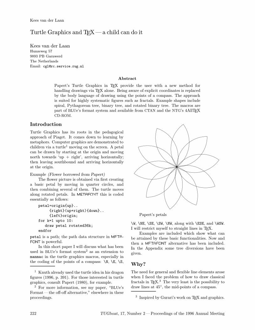
Introduction
Turtle Graphics has its roots in the pedagogicalapproach of Piaget. It comes down to learning bymetaphors. Computer graphics are demonstrated tochildren via a turtle1 moving on the screen. A petalcan be drawn by starting at the origin and movingnorth towards ‘up + right’, arriving horizontally;then leaving southbound and arriving horizontallyat the origin.
Example (Flower borrowed from Papert)The flower picture is obtained via first creating
a basic petal by moving in quarter circles, andthen combining several of them. The turtle movesalong rotated petals. In METAFONT this is codedessentially as follows:
petal=originup..
right(up+right)down..
leftorigin;
for k=1 upto 10:
draw petal rotated36k;
endfor
petal is a path; the path data structure in META-FONT is powerful.In this short paper I will discuss what has been
used in BLUe’s format system2 as an extension tomanmac in the turtle graphics macros, especially inthe coding of the points of a compass: \N, \E, \S,
1 Knuth already used the turtle idea in his dragonfigures (1996, p. 391). For those interested in turtlegraphics, consult Papert (1980), for example.2 For more information, see my paper, “BLUe’s
Format—the off-off alternative,” elsewhere in theseproceedings.
222 TUGboat, 17, Number 2—Proceedings of the 1996 Annual Meeting
Kees van der Laan
Turtle Graphics and TEX—a child can do it
Kees van der LaanHunzeweg 57
9893 PB Garnwerd
The Netherlands
Email: [email protected]
Abstract
Papert’s Turtle Graphics in TEX provide the user with a new method forhandling drawings via TEX alone. Being aware of explicit coordinates is replacedby the body language of drawing using the points of a compass. The approachis suited for highly systematic figures such as fractals. Example shapes includespiral, Pythagorean tree, binary tree, and rotated binary tree. The macros arepart of BLUe’s format system and available from CTAN and the NTG’s 4AllTEXCD-ROM.
Papert’s petals
\W, \NE, \SE, \SW, \NW, along with \ESE, and \WSW.I will restrict myself to straight lines in TEX.Examples are included which show what can
be attained by these basic functionalities. Now andthen a METAFONT alternative has been included.In the Appendix some tree diversions have beengiven.
Why?
The need for general and flexible line elements arosewhen I faced the problem of how to draw classicalfractals in TEX.
3 The very least is the possibility todraw lines at 45, the mid-points of a compass.
3 Inspired by Gurari’s work on TEX and graphics.
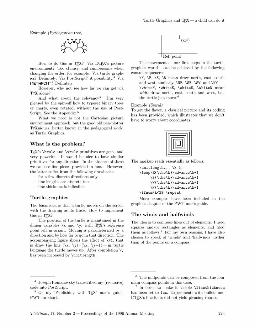
Example (Pythagorean tree)
How to do this in TEX? Via LATEX‘s pictureenvironment? Too clumsy, and cumbersome whenchanging the order, for example. Via turtle graph-ics? Definitely. Via PostScript? A possibility.4 ViaMETAFONT? Definitely.However, why not see how far we can get via
TEX alone?And what about the relevancy? I’m very
pleased by the spin-off how to typeset binary treesor charts, even rotated, without the use of Post-Script. See the Appendix.5
What we need is not the Cartesian pictureenvironment approach, but the good old pen-plotterTEXniques, better known in the pedagogical worldas Turtle Graphics.
What is the problem?
TEX’s \hrule and \vrule primitives are gems andvery powerful. It would be nice to have similarprimitives for any direction. In the absence of thesewe can use line pieces provided in fonts. However,the latter suffer from the following drawbacks:– for a few discrete directions only– line lengths are discrete too– line thickness is inflexible
Turtle graphics
The basic idea is that a turtle moves on the screenwith the drawing as its trace. How to implementthis in TEX?The position of the turtle is maintained in the
dimen variables \x and \y, with TEX’s referencepoint left invariant. Moving is parameterized by adirection and by how far to go in that direction. Theaccompanying figure shows the effect of \N1, thatis draw the line (\x, \y) – (\x, \y+1)— in turtlelanguage the turtle moves up. After completion \yhas been increased by \unitlength.
4 Joseph Romanovsky transcribed my (recursive)code into PostScript.5 Or my ‘Publishing with TEX’ user’s guide,
PWT for short.
TUGboat, 17, Number 2—Proceedings of the 1996 Annual Meeting 223
Turtle Graphics and TEX—a child can do it
Ref. point
(x,y)
The movements—our first steps in the turtlegraphics world—can be achieved by the followingcontrol sequences:– \N, \E, \S, \W mean draw north, east, southand west; similarly, \NE, \SE, \SW, and \NW– \whiteN, \whiteE, \whiteS, \whiteW meanwhite-draw north, east, south and west, i.e.,the turtle just moves6
Example (Spiral)To get the flavor, a classical picture and its codinghas been provided, which illustrates that we don’thave to worry about coordinates.
The markup reads essentially as follows:
\unitlength... \k=1;
\loop\E\the\k\advance\k+1
\S\the\k\advance\k+1
\W\the\k\advance\k+1
\N\the\k\advance\k+1
\ifnum\k<29 \repeat
More examples have been included in thegraphics chapter of the PWT user’s guide.
The winds and halfwinds
The idea is to compose lines out of elements. I usedsquares and/or rectangles as elements, and tiledthem as follows:7 For my own reasons, I have alsochosen to speak of ‘winds’ and ‘halfwinds’ ratherthan of the points on a compass.
6 The midpoints can be composed from the fourmain compass points in this case.7 In order to make it visible \linethickness
has been set to 1ex. Experiments with bullets andLATEX’s line fonts did not yield pleasing results.
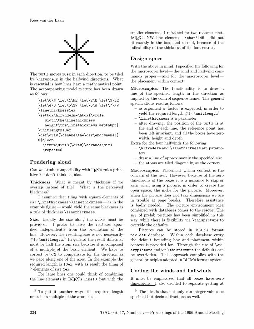
The turtle moves 10ex in each direction, to be tiledby \hlfwndelm in the halfwind directions. Whatis essential is how lines leave a mathematical point.The accompanying model picture has been drawnas follows:
\let\0\N \let\1\NE \let\2\E \let\3\SE
\let\4\S \let\5\SW \let\6\W \let\7\NW
\linethickness1ex
\setbox\hlfwndelm=\hbox\vrule
width\the\linethickness
height\the\linethickness depth0pt
\unitlength10ex
\def\draw\csname\the\dir\endcsname1
$$\loop
\ifnum\dir<8\draw\advance\dir1
\repeat$$
Pondering aloud
Can we attain compatibility with TEX’s rules prim-itives? I don’t think so, alas.
Thickness. What is meant by thickness if weoverlap instead of tile? What is the perceivedblackness?I assumed that tiling with square elements of
size \linethickness×\linethickness—as in theexample figure—would yield the same blackness asa rule of thickness \linethickness.
Size. Usually the size along the x-axis must beprovided. I prefer to have the real size spec-ified independently from the orientation of theline. However, the resulting size is not necessarily#1×\unitlength.8 In general the result differs atmost by half the atom size because it is composedof a multiple of the basic element. We have tocorrect by
√2 to compensate for the direction as
we pace along one of the axes. In the example therequired length is 10ex, with as result the tiling of7 elements of size 1ex.For large lines one could think of combining
the line elements in LATEX’s line10 font with the
8 To put it another way: the required lengthmust be a multiple of the atom size.
224 TUGboat, 17, Number 2—Proceedings of the 1996 Annual Meeting
Kees van der Laan
smaller elements. I refrained for two reasons: first,LATEX’s NW line element— \char’145—did notfit exactly in the box; and second, because of theinflexibility of the thickness of the font entries.
Design specs
With the above in mind, I specified the following forthe microscopic level— the wind and halfwind com-mands proper—and for the macroscopic level—the placement within context.
Microscopics. The functionality is to draw aline of the specified length in the direction asimplied by the control sequence name. The generalspecifications read as follows:– as argument a ‘factor’ is expected, in order toyield the required length #1×\unitlength9
– \linethickness is a parameter– after drawing, the position of the turtle is atthe end of each line, the reference point hasbeen left invariant, and all the boxes have zerowidth, height and depth
Extra for the four halfwinds the following:– \hlfwndelm and \linethickness are parame-ters– draw a line of approximately the specified size– the atoms are tiled diagonally, at the corners
Macroscopics. Placement within context is theconcern of the user. However, because of the zerodimensions of the boxes it is a nuisance to skip orkern when using a picture, in order to create theopen space, the niche for the picture. Moreover,when the picture does not take dimensions we arein trouble at page breaks. Therefore assistanceis badly needed. The picture environment ideacombined with databases comes to the rescue. Theuse of prefab pictures has been simplified in thisway, while there is flexibility via \thispicture tooverride the defaults.Pictures can be stored in BLUe’s format
pic.dat database. Within each database entrythe default bounding box and placement withincontext is provided for. Through the use of \ev-erypicture and/or \thispicture the defaults canbe overridden. This approach complies with thegeneral principles adopted in BLUe’s format system.
Coding the winds and halfwinds
It must be emphasized that all boxes have zerodimensions. I also decided to separate getting at
9 The idea is that not only can integer values bespecified but decimal fractions as well.
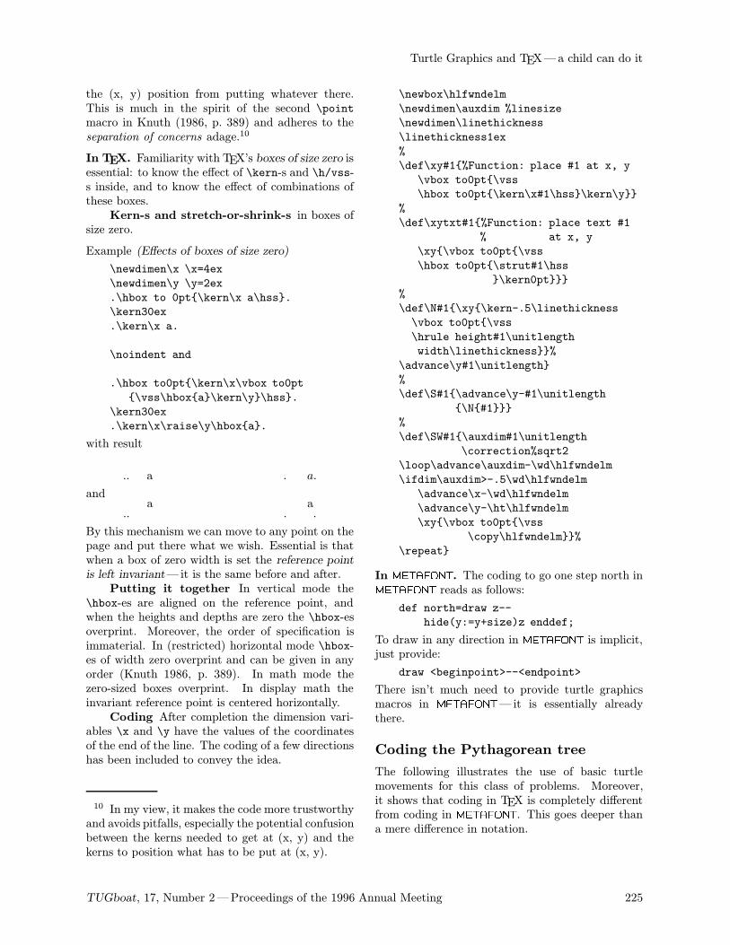
the (x, y) position from putting whatever there.This is much in the spirit of the second \pointmacro in Knuth (1986, p. 389) and adheres to theseparation of concerns adage.10
In TEX. Familiarity with TEX’s boxes of size zero isessential: to know the effect of \kern-s and \h/vss-s inside, and to know the effect of combinations ofthese boxes.Kern-s and stretch-or-shrink-s in boxes of
size zero.
Example (Effects of boxes of size zero)
\newdimen\x \x=4ex
\newdimen\y \y=2ex
.\hbox to 0pt\kern\x a\hss.
\kern30ex
.\kern\x a.
\noindent and
.\hbox to0pt\kern\x\vbox to0pt
\vss\hboxa\kern\y\hss.
\kern30ex
.\kern\x\raise\y\hboxa.
with result
. a. . a.
and
.
a. .
a.
By this mechanism we can move to any point on thepage and put there what we wish. Essential is thatwhen a box of zero width is set the reference pointis left invariant—it is the same before and after.Putting it together In vertical mode the
\hbox-es are aligned on the reference point, andwhen the heights and depths are zero the \hbox-esoverprint. Moreover, the order of specification isimmaterial. In (restricted) horizontal mode \hbox-es of width zero overprint and can be given in anyorder (Knuth 1986, p. 389). In math mode thezero-sized boxes overprint. In display math theinvariant reference point is centered horizontally.Coding After completion the dimension vari-
ables \x and \y have the values of the coordinatesof the end of the line. The coding of a few directionshas been included to convey the idea.
10 In my view, it makes the code more trustworthyand avoids pitfalls, especially the potential confusionbetween the kerns needed to get at (x, y) and thekerns to position what has to be put at (x, y).
TUGboat, 17, Number 2—Proceedings of the 1996 Annual Meeting 225
Turtle Graphics and TEX—a child can do it
\newbox\hlfwndelm
\newdimen\auxdim %linesize
\newdimen\linethickness
\linethickness1ex
%
\def\xy#1%Function: place #1 at x, y
\vbox to0pt\vss
\hbox to0pt\kern\x#1\hss\kern\y
%
\def\xytxt#1%Function: place text #1
% at x, y
\xy\vbox to0pt\vss
\hbox to0pt\strut#1\hss
\kern0pt
%
\def\N#1\xy\kern-.5\linethickness
\vbox to0pt\vss
\hrule height#1\unitlength
width\linethickness%
\advance\y#1\unitlength
%
\def\S#1\advance\y-#1\unitlength
\N#1
%
\def\SW#1\auxdim#1\unitlength
\correction%sqrt2
\loop\advance\auxdim-\wd\hlfwndelm
\ifdim\auxdim>-.5\wd\hlfwndelm
\advance\x-\wd\hlfwndelm
\advance\y-\ht\hlfwndelm
\xy\vbox to0pt\vss
\copy\hlfwndelm%
\repeat
In METAFONT. The coding to go one step north inMETAFONT reads as follows:
def north=draw z--
hide(y:=y+size)z enddef;
To draw in any direction in METAFONT is implicit,just provide:
draw <beginpoint>--<endpoint>
There isn’t much need to provide turtle graphicsmacros in METAFONT—it is essentially alreadythere.
Coding the Pythagorean tree
The following illustrates the use of basic turtlemovements for this class of problems. Moreover,it shows that coding in TEX is completely differentfrom coding in METAFONT. This goes deeper thana mere difference in notation.
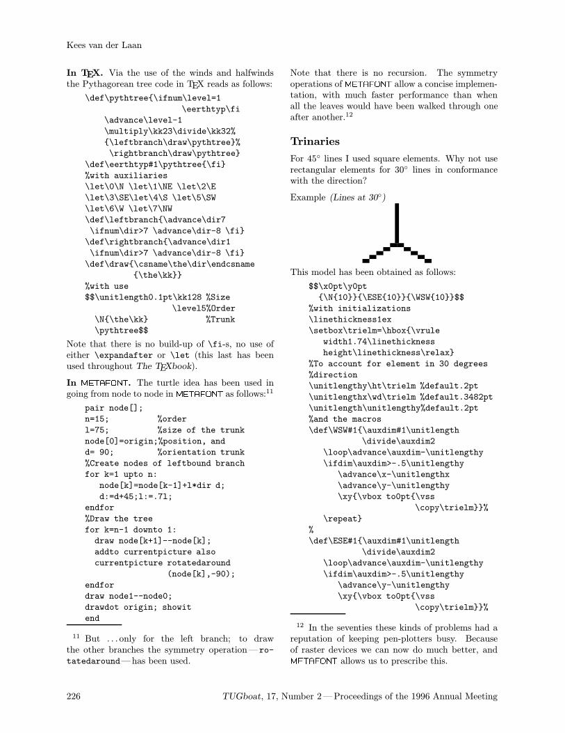
In TEX. Via the use of the winds and halfwindsthe Pythagorean tree code in TEX reads as follows:
\def\pythtree\ifnum\level=1
\eerthtyp\fi
\advance\level-1
\multiply\kk23\divide\kk32%
\leftbranch\draw\pythtree%
\rightbranch\draw\pythtree
\def\eerthtyp#1\pythtree\fi
%with auxiliaries
\let\0\N \let\1\NE \let\2\E
\let\3\SE\let\4\S \let\5\SW
\let\6\W \let\7\NW
\def\leftbranch\advance\dir7
\ifnum\dir>7 \advance\dir-8 \fi
\def\rightbranch\advance\dir1
\ifnum\dir>7 \advance\dir-8 \fi
\def\draw\csname\the\dir\endcsname
\the\kk
%with use
$$\unitlength0.1pt\kk128 %Size
\level5%Order
\N\the\kk %Trunk
\pythtree$$
Note that there is no build-up of \fi-s, no use ofeither \expandafter or \let (this last has beenused throughout The TEXbook).
In METAFONT. The turtle idea has been used ingoing from node to node in METAFONT as follows:11
pair node[];
n=15; %order
l=75; %size of the trunk
node[0]=origin;%position, and
d= 90; %orientation trunk
%Create nodes of leftbound branch
for k=1 upto n:
node[k]=node[k-1]+l*dir d;
d:=d+45;l:=.7l;
endfor
%Draw the tree
for k=n-1 downto 1:
draw node[k+1]--node[k];
addto currentpicture also
currentpicture rotatedaround
(node[k],-90);
endfor
draw node1--node0;
drawdot origin; showit
end
11 But . . . only for the left branch; to drawthe other branches the symmetry operation— ro-tatedaround—has been used.
226 TUGboat, 17, Number 2—Proceedings of the 1996 Annual Meeting
Kees van der Laan
Note that there is no recursion. The symmetryoperations of METAFONT allow a concise implemen-tation, with much faster performance than whenall the leaves would have been walked through oneafter another.12
Trinaries
For 45 lines I used square elements. Why not userectangular elements for 30 lines in conformancewith the direction?
Example (Lines at 30)
This model has been obtained as follows:
$$\x0pt\y0pt
\N10\ESE10\WSW10$$
%with initializations
\linethickness1ex
\setbox\trielm=\hbox\vrule
width1.74\linethickness
height\linethickness\relax
%To account for element in 30 degrees
%direction
\unitlengthy\ht\trielm %default.2pt
\unitlengthx\wd\trielm %default.3482pt
\unitlength\unitlengthy%default.2pt
%and the macros
\def\WSW#1\auxdim#1\unitlength
\divide\auxdim2
\loop\advance\auxdim-\unitlengthy
\ifdim\auxdim>-.5\unitlengthy
\advance\x-\unitlengthx
\advance\y-\unitlengthy
\xy\vbox to0pt\vss
\copy\trielm%
\repeat
%
\def\ESE#1\auxdim#1\unitlength
\divide\auxdim2
\loop\advance\auxdim-\unitlengthy
\ifdim\auxdim>-.5\unitlengthy
\advance\y-\unitlengthy
\xy\vbox to0pt\vss
\copy\trielm%
12 In the seventies these kinds of problems had areputation of keeping pen-plotters busy. Becauseof raster devices we can now do much better, andMETAFONT allows us to prescribe this.
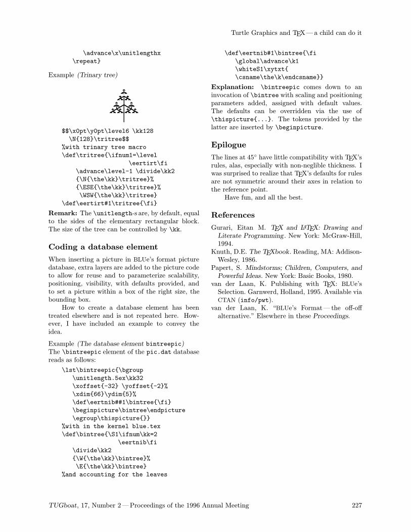
\advance\x\unitlengthx
\repeat
Example (Trinary tree)
$$\x0pt\y0pt\level6 \kk128
\N128\tritree$$
%with trinary tree macro
\def\tritree\ifnum1=\level
\eertirt\fi
\advance\level-1 \divide\kk2
\N\the\kk\tritree%
\ESE\the\kk\tritree%
\WSW\the\kk\tritree
\def\eertirt#1\tritree\fi
Remark: The \unitlength-s are, by default, equalto the sides of the elementary rectangular block.The size of the tree can be controlled by \kk.
Coding a database element
When inserting a picture in BLUe’s format picturedatabase, extra layers are added to the picture codeto allow for reuse and to parameterize scalability,positioning, visibility, with defaults provided, andto set a picture within a box of the right size, thebounding box.How to create a database element has been
treated elsewhere and is not repeated here. How-ever, I have included an example to convey theidea.
Example (The database element bintreepic)The \bintreepic element of the pic.dat databasereads as follows:
\lst\bintreepic\bgroup
\unitlength.5ex\kk32
\xoffset-32 \yoffset-2%
\xdim66\ydim5%
\def\eertnib##1\bintree\fi
\beginpicture\bintree\endpicture
\egroup\thispicture
%with in the kernel blue.tex
\def\bintree\S1\ifnum\kk=2
\eertnib\fi
\divide\kk2
\W\the\kk\bintree%
\E\the\kk\bintree
%and accounting for the leaves
TUGboat, 17, Number 2—Proceedings of the 1996 Annual Meeting 227
Turtle Graphics and TEX—a child can do it
\def\eertnib#1\bintree\fi
\global\advance\k1
\whiteS1\xytxt
\csname\the\k\endcsname
Explanation: \bintreepic comes down to aninvocation of \bintree with scaling and positioningparameters added, assigned with default values.The defaults can be overridden via the use of\thispicture.... The tokens provided by thelatter are inserted by \beginpicture.
Epilogue
The lines at 45 have little compatibility with TEX’srules, alas, especially with non-neglible thickness. Iwas surprised to realize that TEX’s defaults for rulesare not symmetric around their axes in relation tothe reference point.Have fun, and all the best.
References
Gurari, Eitan M. TEX and LATEX: Drawing andLiterate Programming . New York: McGraw-Hill,1994.Knuth, D.E. The TEXbook. Reading, MA: Addison-Wesley, 1986.Papert, S. Mindstorms; Children, Computers, andPowerful Ideas. New York: Basic Books, 1980.van der Laan, K. Publishing with TEX: BLUe’sSelection. Garnwerd, Holland, 1995. Available viaCTAN (info/pwt).van der Laan, K. “BLUe’s Format—the off-offalternative.” Elsewhere in these Proceedings.
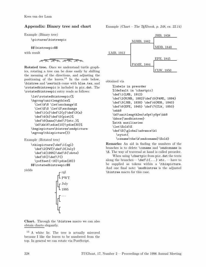
Appendix: Binary tree and chart
Example (Binary tree)
\pictures\bintreepic
$$\bintreepic$$
with result
Rotated tree. Once we understand turtle graph-ics, rotating a tree can be done easily by shiftingthe meaning of the directions, and adjusting thepositioning of the leaves.13 In the code below,\bintree and \eertnib come with blue.tex, and\rotatedbintreepic is included in pic.dat. The\rotatedbintreepic entry reads as follows:
\lst\rotatedbintreepic%
\bgroup\unitlength1ex%
\let\W\N \let\exchange\E
\let\E\S \let\S\exchange
\def\1x\def\2y\def\3a
\def\4b\def\5piet%
\def\6hans\def\7etc.%
\k0\kk16\xdim10\ydim30%
\beginpicture\bintree\endpicture
\egroup\thispicture
Example (Rotated tree)
\thispicture\def\1cgl
\def\2PWT\def\3July
\def\41995\def\5\dots
\def\6\def\7
\yoffset-16\ydim28
$$\rotatedbintreepic$$
yieldscgl
PWT
July
1995
. . .
Chart. Through the \bintree macro we can alsoobtain charts elegantly.
13 A white lie. The tree is actually mirroredbecause I like the leaves to be numbered from thetop. In general we can rotate via PostScript.
228 TUGboat, 17, Number 2—Proceedings of the 1996 Annual Meeting
Kees van der Laan
Example (Chart – The TEXbook, p. 248, ex. 22.14)
LMB, 1912
MJHB, 1882
JHB, 1838
MDB, 1840
PAME, 1884
EFE, 1845
CLW, 1850
obtained via
%labels in preorder
%(default in \chartpic)
\def\1LMB, 1912
\def\2MJHB, 1882\def\5PAME, 1884
\def\3JHB, 1838 \def\4MDB, 1840
\def\6EFE, 1845 \def\7CLW, 1850
\ekk8
\k0\unitlength2ex\x0pt\y0pt\kk8
\hbox\modbintree
%with auxiliaries
\let\Eold\E
\def\E\global\advance\k1
\xytxt
\csname\the\k\endcsname\Eold
Remarks: An aid in finding the numbers of thebranches is to delete \csname and \endcsname in\E. The way of traversal at hand is called preorder.When using \chartpic from pic.dat the texts
along the branches— \def\1... etc.—have tobe supplied as tokens within a \thispicture.And one final note: \modbintree is the adjusted\bintree macro for this case.
Some Useful Macros Which Extend the LATEX picture Environment
A.S. Berdnikov, O.A. Grineva and S.B. TurtiaInstitute of Analytical Instrumentation
Rizsky pr. 26, 198103 St.Petersburg, Russia
[email protected],[email protected],[email protected]
Abstract
The ability to create pictures using TEX/LATEX is relatively poor, and manyextensions – (epic/eepic, pictex, drawtex, xypic, mfpic, etc.) –were createdto extend this capability to a higher level. The package pmgraph.sty (poor-man-graphics) which is described herein is not as general as the ones mentionedabove. Not being too complicated, these macros appear to be useful in our work,and it seems that they can be also useful for other TEX-users.
The pmgraph.sty Package
This package is based on the use of the pseudo-graphical fonts which are used by generic LATEXwithout additional extensions—mainly because thevariations of PICTEX, METAFONT and new graph-ical font themes are already explored by other au-thors on a sufficiently higher level. To some extentthe purpose of our work was to see how far it waspossible to develop new useful graphical primitivesfor LATEX without the investment of the externalgraphical tools.The package pmgraph.sty offers the following
features:
• vectors with a set of slopes which are as generalas the line slopes are implemented in LATEX;• vectors with an arrow at the beginning, middleor end of the vector with various orientations ofthe arrow;• circles and circular arcs with almost arbitrarydiameters using magnified circle and circlewLATEX fonts;
• 1/4 circular arcs correctly positioned at thecenter or at the corner;
• an extended set of frames, which includes var-ious corner styles and optional multiple frameshadows with a variety of styles;
• tools which enable the user to extend thevariety of the frame styles and the shadow stylesas far as his/her imagination allows it; and
• automatic calculation of the picture size relativeto the current width of the text—this includespicture environments inside list environments.
Vectors
The number of angles for inclined lines which can beused in LATEX is limited to a great extent, but the
(1, 1) (1, 1) (4, 1) (4, 1) (5, 3) (3, 2)(2, 1) (2, 1) (4, 3) (4, 3) (5, 4) (4, 3)(3, 1) (3, 1) (5, 1) (4, 1) (6, 1) (4, 1)(3, 2) (3, 2) (5, 2) (3, 1) (6, 5) (4, 3)
Table 1: Relation between the line slopes and theapproximate vector slopes
-
6
?
*
1
3
7
:
>
!!!!!
"""""
#####
%%%%%
(((((
,,,,,
@@@@@R
AAAAAU
BBBBBN
CCCCCW
DDDDD
EEEEE
HHHHHjJJJJJ
LLLLL
PPPPPqQQQQQs
SSSSSw
TTTTT
XXXXXzZZZZZ~
\\\\\
````aaaaabbbbb
ccccc
eeeee
hhhhhlllll
@@@@@I
AAAAAK
BBBBBM
CCCCCO
DDDDD
EEEEE
HHHH
HY
JJJJJ]
LLLLL
PPPPPiQQQQQk
SSSSSo
TTTTT
XXXXXy
ZZZZZ
\\\\\
````
aaaa
abbbbb
ccccc
eeeee
hhhhh
lllll
)+
/
9 =
!!!!!"""""
#####
%%%%%
((((( ,,,,,
-
6
?
*
1
3
7
:
>
7
:
!!!!!1
"""""3
#####>
%%%%%7
(((((:,
,,,,>
@@@@@R
AAAAAU
BBBBBN
CCCCCW
DDDDDW
EEEEEW
HHHHHjJJJJJ
LLLLLN
PPPPPqQQQQQs
SSSSSw
TTTTT
XXXXXzZZZZZ~
\\\\\w
````zaaaaaqbbbbbs
ccccc~
eeeeew
hhhhhzlllll~
@@@@@I
AAAAAK
BBBBBM
CCCCCO
DDDDDO
EEEEEO
HHHH
HY
JJJJJ]
LLLLLM
PPPPPiQQQQQk
SSSSSo
TTTTT]
XXXXXy
ZZZZZ
\\\\\o
````y
aaaa
ai
bbbbbk
ccccc
eeeeeo
hhhhhy l
llll
)+
/
9 =
/
9 !!!!!)"""""+
#####=
%%%%%/
(((((9 ,,,,,=
Figure 1: LATEX and pmgraph vectors
number of angles for vectors is even more restricted.The variety of vectors can be increased if, instead ofthe strictly inclined arrows at the end of the inclinedlines, arrows with an approximate inclination areadded. Corresponding changes are incorporated inpmgraph where the relation between strict incli-nations and approximate inclinations are shown inTable 1. The implementation required the modifica-tion of internal LATEX commands such as \@svector,\@getlarrow, \@getrarrow and the user command\vector itself. As a result, the command \vectordraws vectors for all inclinations valid for LATEX linesas is shown in Fig. 1. The vectors are not as ideal asnormally required by TEX standards, but the resultsare acceptable for all inclinations, except (6, 1).LATEX allows one to put an arrow only at
the end of the vector. The \Vector command
TUGboat, 17, Number 2—Proceedings of the 1996 Annual Meeting 229
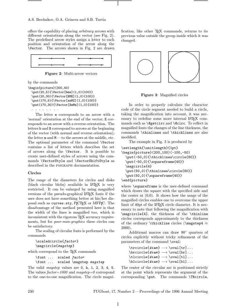
A.S. Berdnikov, O.A. Grineva and S.B. Turtia
offers the capability of placing arbitrary arrows withdifferent orientations along the vector (see Fig. 2).The predefined arrow styles assign a letter to eachposition and orientation of the arrow along the\Vector. The arrows shown in Fig. 2 are drawn
- - -
--
--
Figure 2: Multi-arrow vectors
by the commands
\beginpicture(300,40)
\put(20,5)\Vector[bme](1,0)100
\put(20,30)\Vector[BME](1,0)100
\put(170,5)\Vector[xmMZ](1,0)100
\put(170,30)\Vector[XmMz](1,0)100
. . . . . . . .
The letter e corresponds to an arrow with a‘normal’ orientation at the end of the vector; E cor-responds to an arrow with a reverse orientation. Theletters b and B correspond to arrows at the beginningof the vector (with normal and reverse orientation);the letter m and M—to the arrows at the middle, etc.The optional parameter of the command \Vectorcontains a list of letters which describes the setof arrows along the \Vector. It is possible tocreate user-defined styles of arrows using the com-mands \VectorStyle and \VectorShiftStyle asdescribed in the pmgraph documentation.
Circles
The range of the diameters for circles and disks(black circular blobs) available in LATEX is veryrestricted. It can be enlarged by using magnifiedversions of the pseudo-graphical LATEX fonts if theuser does not have something better at his/her dis-posal such as curves.sty, PICTEX or MFPIC. Thedisadvantage of the method presented here is thatthe width of the lines is magnified too, which isinconsistent with the rigorous TEX accuracy require-ments, but for poor-man-graphics these circles canbe satisfactory.The scaling of circular fonts is performed by the
commands
\scaledcirclefactor
\magcirclemagstep
which correspond to the TEX commands
\font ... scaled factor
\font ... scaled \magstep magstep
The valid magstep values are 0, h, 1, 2, 3, 4, 5.The values factor=1000 and magstep=0 correspondto the one-to-one magnification. The circle magni-
fication, like other TEX commands, returns to itsprevious value outside the group inside which it waschanged.
&%'$
&%'$
Figure 3: Magnified circles
In order to properly calculate the charactercode of the circle segment needed to build a circle,taking the magnification into account, it was nec-essary to redefine some more internal LATEX com-mands such as \@getcirc and \@circ. To reflect inmagnified fonts the changes of the line thickness, thecommands \thinlines and \thicklines are alsomodified.The example in Fig. 3 is produced by
\setlength\unitlength1pt
\beginpicture(200,100)(-100,-50)
\put(-50,0)\thicklines\circle80
\put(-50,0)\squareframe40
\magcircle4
\put(50,0)\thinlines\circle80
\put(50,0)\squareframe40
\endpicture
where \squareframe is the user-defined commandwhich draws the square with the specified side andthe center at (0,0). It shows how the usage of themagnified circles enables one to overcome the upperlimit of 40pt of the LATEX circle diameter. It is nec-essary to note that following the magnification with\magcircle4, the thickness of the \thinlinecircles corresponds approximately to the thicknessof the ordinary \thickline circles (\magstep4 ≈2000).Additional macros can draw 90 quarters of
circles explicitly without tricky refinement of theparameters of the command \oval:
\trcirclediam −→ \oval[tr]...
\brcirclediam −→ \oval[br]...
\tlcirclediam −→ \oval[tl]...
\blcirclediam −→ \oval[bl]...
The center of the circular arc is positioned strictlyat the point which represents the argument of thecorresponding \put. The commands \TRcircle,
230 TUGboat, 17, Number 2—Proceedings of the 1996 Annual Meeting
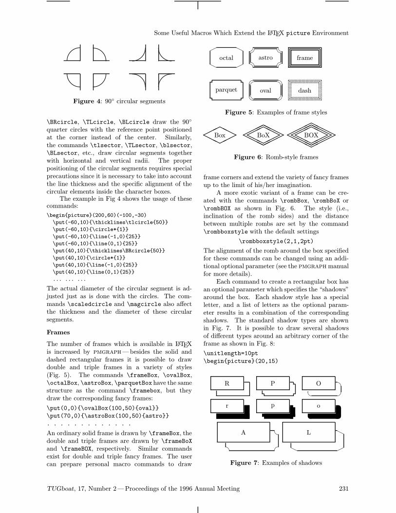
Some Useful Macros Which Extend the LATEX picture Environment'p&p$p%p %p$p &
p'p
Figure 4: 90 circular segments
\BRcircle, \TLcircle, \BLcircle draw the 90
quarter circles with the reference point positionedat the corner instead of the center. Similarly,the commands \tlsector, \TLsector, \blsector,\BLsector, etc., draw circular segments togetherwith horizontal and vertical radii. The properpositioning of the circular segments requires specialprecautions since it is necessary to take into accountthe line thickness and the specific alignment of thecircular elements inside the character boxes.The example in Fig 4 shows the usage of these
commands:
\beginpicture(200,60)(-100,-30)
\put(-60,10)\thicklines\tlcircle50
\put(-60,10)\circle*1
\put(-60,10)\line(-1,0)25
\put(-60,10)\line(0,1)25
\put(40,10)\thicklines\BRcircle50
\put(40,10)\circle*1
\put(40,10)\line(-1,0)25
\put(40,10)\line(0,1)25
... ... ...
The actual diameter of the circular segment is ad-justed just as is done with the circles. The com-mands \scaledcircle and \magcircle also affectthe thickness and the diameter of these circularsegments.
Frames
The number of frames which is available in LATEXis increased by pmgraph—besides the solid anddashed rectangular frames it is possible to drawdouble and triple frames in a variety of styles(Fig. 5). The commands \frameBox, \ovalBox,\octalBox, \astroBox, \parquetBox have the samestructure as the command \framebox, but theydraw the corresponding fancy frames:
\put(0,0)\ovalBox(100,50)oval
\put(70,0)\astroBox(100,50)astro
. . . . . . . . . . . . .
An ordinary solid frame is drawn by \frameBox, thedouble and triple frames are drawn by \frameBoXand \frameBOX, respectively. Similar commandsexist for double and triple fancy frames. The usercan prepare personal macro commands to draw
parquet
H
Hoctal
oval
astro
dash
frame
Figure 5: Examples of frame styles
HHH
HHH
Box
HHH
HHH
HHHH
HH
HH
BoX
HHH
HHH
HHHH
HH
HH
HHHH
HH
HH
BOX
Figure 6: Romb-style frames
frame corners and extend the variety of fancy framesup to the limit of his/her imagination.A more exotic variant of a frame can be cre-
ated with the commands \rombBox, \rombBoX or\rombBOX as shown in Fig. 6. The style (i.e.,inclination of the romb sides) and the distancebetween multiple rombs are set by the command\rombboxstyle with the default settings
\rombboxstyle(2,1,2pt)
The alignment of the romb around the box specifiedfor these commands can be changed using an addi-tional optional parameter (see the pmgraphmanualfor more details).Each command to create a rectangular box has
an optional parameter which specifies the “shadows”around the box. Each shadow style has a specialletter, and a list of letters as the optional param-eter results in a combination of the correspondingshadows. The standard shadow types are shownin Fig. 7. It is possible to draw several shadowsof different types around an arbitrary corner of theframe as shown in Fig. 8:
\unitlength=10pt
\beginpicture(20,15)
r
R
p
P
www oO
A H
H
L
Figure 7: Examples of shadows
TUGboat, 17, Number 2—Proceedings of the 1996 Annual Meeting 231
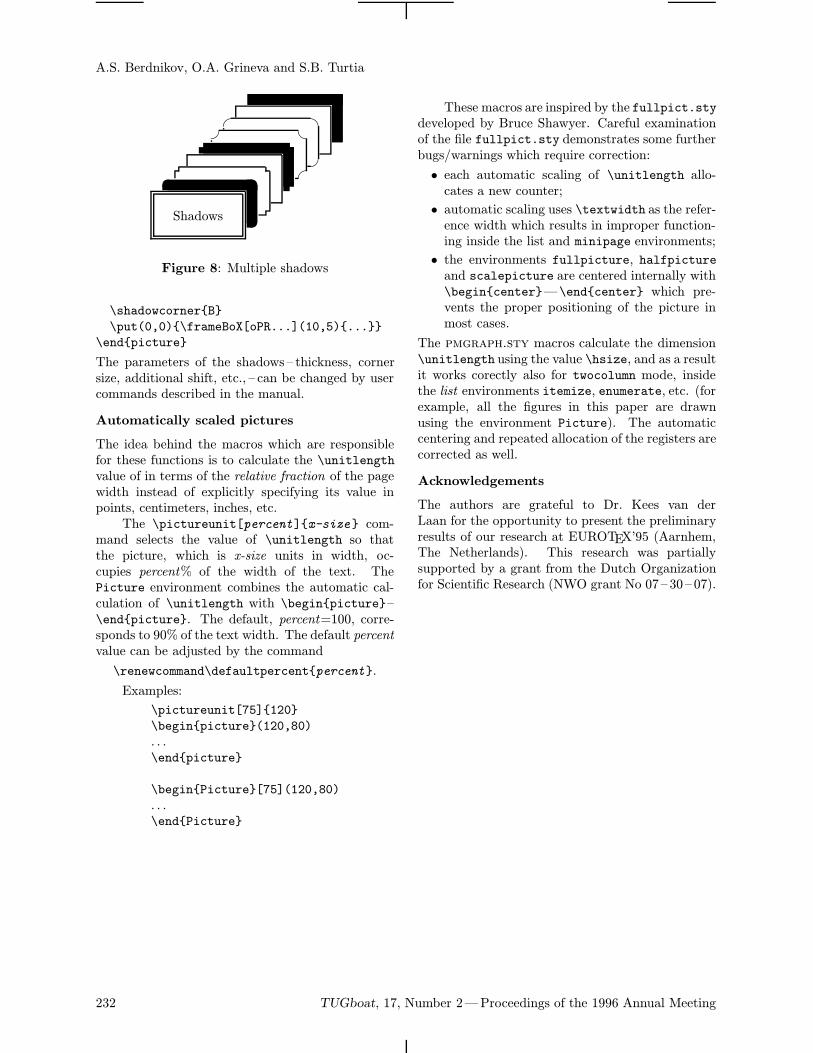
A.S. Berdnikov, O.A. Grineva and S.B. Turtia
www
Shadows
Figure 8: Multiple shadows
\shadowcornerB
\put(0,0)\frameBoX[oPR...](10,5)...
\endpicture
The parameters of the shadows – thickness, cornersize, additional shift, etc., – can be changed by usercommands described in the manual.
Automatically scaled pictures
The idea behind the macros which are responsiblefor these functions is to calculate the \unitlengthvalue of in terms of the relative fraction of the pagewidth instead of explicitly specifying its value inpoints, centimeters, inches, etc.The \pictureunit[percent]x-size com-
mand selects the value of \unitlength so thatthe picture, which is x-size units in width, oc-cupies percent% of the width of the text. ThePicture environment combines the automatic cal-culation of \unitlength with \beginpicture–\endpicture. The default, percent=100, corre-sponds to 90% of the text width. The default percentvalue can be adjusted by the command
\renewcommand\defaultpercentpercent.
Examples:
\pictureunit[75]120
\beginpicture(120,80)
. . .\endpicture
\beginPicture[75](120,80)
. . .\endPicture
These macros are inspired by the fullpict.stydeveloped by Bruce Shawyer. Careful examinationof the file fullpict.sty demonstrates some furtherbugs/warnings which require correction:
• each automatic scaling of \unitlength allo-cates a new counter;
• automatic scaling uses \textwidth as the refer-ence width which results in improper function-ing inside the list and minipage environments;
• the environments fullpicture, halfpictureand scalepicture are centered internally with\begincenter—\endcenter which pre-vents the proper positioning of the picture inmost cases.
The pmgraph.sty macros calculate the dimension\unitlength using the value \hsize, and as a resultit works corectly also for twocolumn mode, insidethe list environments itemize, enumerate, etc. (forexample, all the figures in this paper are drawnusing the environment Picture). The automaticcentering and repeated allocation of the registers arecorrected as well.
Acknowledgements
The authors are grateful to Dr. Kees van derLaan for the opportunity to present the preliminaryresults of our research at EUROTEX’95 (Aarnhem,The Netherlands). This research was partiallysupported by a grant from the Dutch Organizationfor Scientific Research (NWO grant No 07 – 30 – 07).
232 TUGboat, 17, Number 2—Proceedings of the 1996 Annual Meeting
1996
Jun 25 – 29 ALLC-ACH ’96: Joint InternationalConference, Association for Literary andLinguistic Computing /Association forComputers and the Humanities, Bergen,Norway. For information, contactEspen Ore ([email protected], Fax:+47 55 32 26 56) or visit http://www.hd.uib.no/allc-ach96.html.
Jun 26 DANTE TEX–Stammtisch,Hamburg, Germany. For information,contact Volker Huttenrauch([email protected] Wednesday, 18:00, details to be posted tothe tex-d-l list. ¡
Jul 2 DANTE TEX–Stammtisch at the UniversitatBremen, Germany. For information, contactMartin Schroder ([email protected];telephone 0421/2239425). First Tuesday (ifnot a holiday), 18:00, Universitat BremenMZH, 28359 Bremen, 4th floor, across fromthe elevator.
Jul 3 – 5 CNED96: 4th Colloque National sur l’Ecritet le Document, IRESTE: Institute deRecherche et d’Enseignement Superieure,Nantes, France. For information, contactthe Secretariat of the Colloquium,[email protected], or visithttp://www.ireste.fr/cned96.
Jul 4 DANTE TEX–Stammtisch at the UniversitatKarlsruhe, Germany. For information, contactKlaus Braune([email protected]; telephone0721/608-4031). First Thursday, 19:30,Rechenzentrum der Universitat Karlsruhe,Zirkel 2, 3.0G Raum 316.
Jul 18 – 21 SHARP 1996: Society for the History ofAuthorship, Reading and Publishing, FourthAnnual Conference, Worcester, Massachusetts.For information, contact the AmericanAntiquarian Society, [email protected].
Jul 28 –Aug 2
TUG 17th Annual Meeting:“Poly-TEX”, Dubna, Russia. For information,send e-mail to [email protected]. (See theCall for Papers, TUGboat 16 (4), p. 429.)
Jul 31 DANTE TEX–Stammtisch, Hamburg,Germany. (For details, see Jun 26.)
Aug 1 DANTE TEX–Stammtisch at the UniversitatKarlsruhe, Germany. (For details, see Jul 4.)
Aug 1 DANTE TEX–Stammtisch at the UniversitatBremen, Germany. For information, contactMartin Schroder ([email protected];telephone 0421/2239425). First Thursday (ifnot a holiday), 18:00, Universitat BremenMZH, 28359 Bremen, 4th floor, across fromthe elevator.
TUGboat, 17, Number 2 233
Calendar
Aug 20 TUGboat 17 (4): Deadline for receipt oftechnical manuscripts (tentative). Themeissue, contributions by invitation.
Aug 28 DANTE TEX–Stammtisch, Hamburg,Germany. (For details, see Jun 26.)
Sep 3 TUGboat 17 (3) (2nd regular issue):Deadline for receipt of news items, reports(tentative).
Sep 5 DANTE TEX–Stammtisch at the UniversitatBremen, Germany. (For details, see Aug 1.)
Sep 5 DANTE TEX–Stammtisch at the Universitat
Karlsruhe, Germany. (For details, see Jul 4.)
Sep 23 PODP, Workshop on Principles of DocumentProcessing, Xerox Palo Alto Research Center,Palo Alto, California. For information,visit the PODP Web page at http://www.cs.umbc.edu/conferences/podp/.
Sep 24 – 26 EP96, the International Conference onElectronic Documents, DocumentManipulation and Document Dissemination,Xerox Palo Alto Research Center, Palo Alto,California. Deadline for submission of papers:1 April 1996. For information, [email protected] or visit http://www.xsoft.com/XSoft/ep96.html.
Sep 25 DANTE TEX–Stammtisch, Hamburg,Germany. (For details, see Jun 26.)
Oct 10 DANTE TEX–Stammtisch at the UniversitatBremen, Germany. (For details, see Aug 1.)
Oct 25 NTG 18th Meeting, on “Graphics and TEX”,Universiteit Utrecht, The Netherlands.Preceded or followed by a 1-day course,“(LA)TEX and Graphics”, presented byBogus law Jackowski. For information,contact [email protected] or visithttp://www.ntg.nl/.
Nov 2 DANTE TEX–Stammtisch at the UniversitatBremen, Germany. (For details, see Aug 1.)
Nov 12 TUGboat 17 (4): Deadline for receipt ofnews items, reports (tentative).
Dec 5 DANTE TEX–Stammtisch at the UniversitatBremen, Germany. (For details, see Aug 1.)
Dec 8 – 12 SGML ’96, Toronto, Canada. For informationcontact the Graphic CommunicationsAssociation, Fax: +1 703-548-2867.
1997
May NTG 19th Meeting, Technische UniversiteitDelft, The Netherlands. For information,contact [email protected] or visithttp://www.ntg.nl/.
For additional information on TUG-sponsored events listed
above, contact the TUG office (415-982-8449, fax: 415-982-
8559, e-mail: [email protected]). For events sponsored by other
organizations, please use the contact address provided.
Status as of 31 May 1996
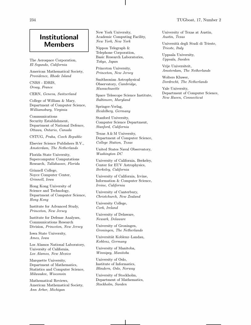
Institutional
Members
The Aerospace Corporation,
El Segundo, California
American Mathematical Society,
Providence, Rhode Island
CNRS - IDRIS,
Orsay, France
CERN, Geneva, Switzerland
College of William & Mary,
Department of Computer Science,
Williamsburg, Virginia
Communications
Security Establishment,
Department of National Defence,
Ottawa, Ontario, Canada
CSTUG, Praha, Czech Republic
Elsevier Science Publishers B.V.,
Amsterdam, The Netherlands
Florida State University,
Supercomputer Computations
Research, Tallahassee, Florida
Grinnell College,
Noyce Computer Center,
Grinnell, Iowa
Hong Kong University of
Science and Technology,
Department of Computer Science,
Hong Kong
Institute for Advanced Study,
Princeton, New Jersey
Institute for Defense Analyses,
Communications Research
Division, Princeton, New Jersey
Iowa State University,
Ames, Iowa
Los Alamos National Laboratory,
University of California,
Los Alamos, New Mexico
Marquette University,
Department of Mathematics,
Statistics and Computer Science,
Milwaukee, Wisconsin
Mathematical Reviews,
American Mathematical Society,
Ann Arbor, Michigan
New York University,
Academic Computing Facility,
New York, New York
Nippon Telegraph &
Telephone Corporation,
Basic Research Laboratories,
Tokyo, Japan
Princeton University,
Princeton, New Jersey
Smithsonian Astrophysical
Observatory, Cambridge,
Massachusetts
Space Telescope Science Institute,
Baltimore, Maryland
Springer-Verlag,
Heidelberg, Germany
Stanford University,
Computer Science Department,
Stanford, California
Texas A&M University,
Department of Computer Science,
College Station, Texas
United States Naval Observatory,
Washington DC
University of California, Berkeley,
Center for EUV Astrophysics,
Berkeley, California
University of California, Irvine,
Information & Computer Science,
Irvine, California
University of Canterbury,
Christchurch, New Zealand
University College,
Cork, Ireland
University of Delaware,
Newark, Delaware
University of Groningen,
Groningen, The Netherlands
Universitat Koblenz–Landau,
Koblenz, Germany
University of Manitoba,
Winnipeg, Manitoba
University of Oslo,
Institute of Informatics,
Blindern, Oslo, Norway
University of Stockholm,
Department of Mathematics,
Stockholm, Sweden
234 TUGboat, 17, Number 2
University of Texas at Austin,
Austin, Texas
Universita degli Studi di Trieste,
Trieste, Italy
Uppsala University,
Uppsala, Sweden
Vrije Universiteit,
Amsterdam, The Netherlands
Wolters Kluwer,
Dordrecht, The Netherlands
Yale University,
Department of Computer Science,
New Haven, Connecticut
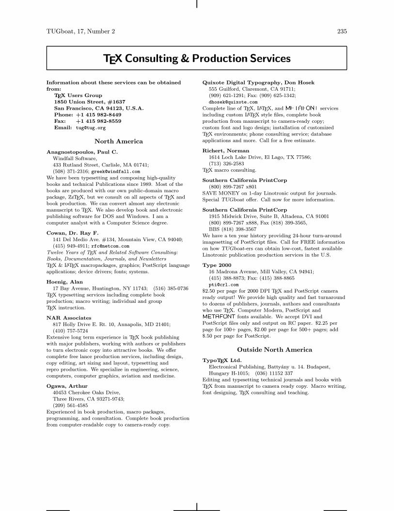
Information about these services can be obtained
from:
TEX Users Group
1850 Union Street, #1637
San Francisco, CA 94123, U.S.A.
Phone: +1 415 982-8449
Fax: +1 415 982-8559
Email: [email protected]
North America
Anagnostopoulos, Paul C.
Windfall Software,433 Rutland Street, Carlisle, MA 01741;(508) 371-2316; [email protected]
We have been typesetting and composing high-qualitybooks and technical Publications since 1989. Most of thebooks are produced with our own public-domain macropackage, ZzTEX, but we consult on all aspects of TEX andbook production. We can convert almost any electronicmanuscript to TEX. We also develop book and electronicpublishing software for DOS and Windows. I am acomputer analyst with a Computer Science degree.
Cowan, Dr. Ray F.
141 Del Medio Ave. #134, Mountain View, CA 94040;(415) 949-4911; [email protected]
Twelve Years of TEX and Related Software Consulting:
Books, Documentation, Journals, and Newsletters
TEX & LATEX macropackages, graphics; PostScript languageapplications; device drivers; fonts; systems.
Hoenig, Alan
17 Bay Avenue, Huntington, NY 11743; (516) 385-0736TEX typesetting services including complete bookproduction; macro writing; individual and groupTEX instruction.
NAR Associates
817 Holly Drive E. Rt. 10, Annapolis, MD 21401;(410) 757-5724
Extensive long term experience in TEX book publishingwith major publishers, working with authors or publishersto turn electronic copy into attractive books. We offercomplete free lance production services, including design,copy editing, art sizing and layout, typesetting andrepro production. We specialize in engineering, science,computers, computer graphics, aviation and medicine.
Ogawa, Arthur
40453 Cherokee Oaks Drive,Three Rivers, CA 93271-9743;(209) 561-4585
Experienced in book production, macro packages,programming, and consultation. Complete book productionfrom computer-readable copy to camera-ready copy.
TUGboat, 17, Number 2 235
TEXConsulting &Production Services
Quixote Digital Typography, Don Hosek
555 Guilford, Claremont, CA 91711;(909) 621-1291; Fax: (909) 625-1342;[email protected]
Complete line of TEX, LATEX, and METAFONT servicesincluding custom LATEX style files, complete bookproduction from manuscript to camera-ready copy;custom font and logo design; installation of customizedTEX environments; phone consulting service; databaseapplications and more. Call for a free estimate.
Richert, Norman
1614 Loch Lake Drive, El Lago, TX 77586;(713) 326-2583
TEX macro consulting.
Southern California PrintCorp
(800) 899-7267 x801SAVE MONEY on 1-day Linotronic output for journals.Special TUGboat offer. Call now for more information.
Southern California PrintCorp
1915 Midwick Drive, Suite B, Altadena, CA 91001(800) 899-7267 x888, Fax (818) 399-3565,BBS (818) 398-3567
We have a ten year history providing 24-hour turn-aroundimagesetting of PostScript files. Call for FREE informationon how TUGboat-ers can obtain low-cost, fastest availableLinotronic publication production services in the U.S.
Type 2000
16 Madrona Avenue, Mill Valley, CA 94941;(415) 388-8873; Fax: (415) [email protected]
$2.50 per page for 2000 DPI TEX and PostScript cameraready output! We provide high quality and fast turnaroundto dozens of publishers, journals, authors and consultantswho use TEX. Computer Modern, PostScript andMETAFONT fonts available. We accept DVI andPostScript files only and output on RC paper. $2.25 perpage for 100+ pages, $2.00 per page for 500+ pages; add$.50 per page for PostScript.
Outside North America
TypoTEX Ltd.
Electronical Publishing, Battyany u. 14. Budapest,Hungary H-1015; (036) 11152 337
Editing and typesetting technical journals and books withTEX from manuscript to camera ready copy. Macro writing,font designing, TEX consulting and teaching.