Embed Size (px)
Citation preview
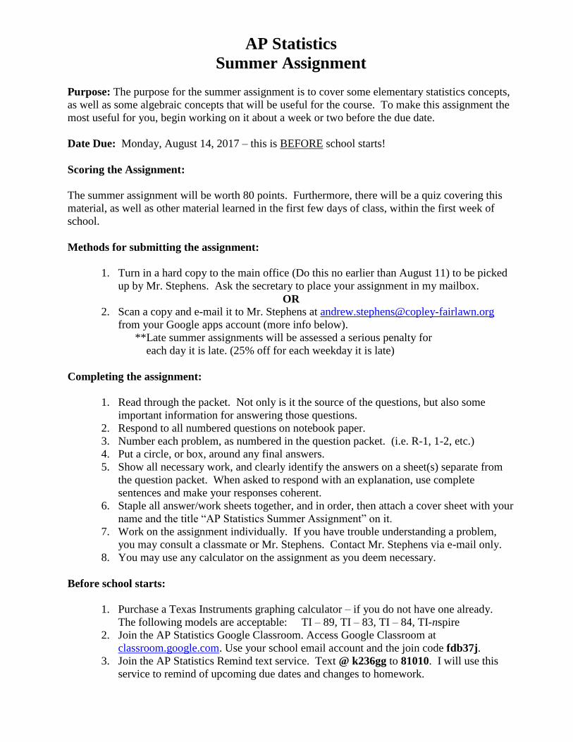
AP Statistics
Summer Assignment
Purpose: The purpose for the summer assignment is to cover some elementary statistics concepts,
as well as some algebraic concepts that will be useful for the course. To make this assignment the
most useful for you, begin working on it about a week or two before the due date.
Date Due: Monday, August 14, 2017 – this is BEFORE school starts!
Scoring the Assignment:
The summer assignment will be worth 80 points. Furthermore, there will be a quiz covering this
material, as well as other material learned in the first few days of class, within the first week of
school.
Methods for submitting the assignment:
1. Turn in a hard copy to the main office (Do this no earlier than August 11) to be picked
up by Mr. Stephens. Ask the secretary to place your assignment in my mailbox.
OR
2. Scan a copy and e-mail it to Mr. Stephens at [email protected]
from your Google apps account (more info below).
**Late summer assignments will be assessed a serious penalty for
each day it is late. (25% off for each weekday it is late)
Completing the assignment:
1. Read through the packet. Not only is it the source of the questions, but also some
important information for answering those questions.
2. Respond to all numbered questions on notebook paper.
3. Number each problem, as numbered in the question packet. (i.e. R-1, 1-2, etc.)
4. Put a circle, or box, around any final answers.
5. Show all necessary work, and clearly identify the answers on a sheet(s) separate from
the question packet. When asked to respond with an explanation, use complete
sentences and make your responses coherent.
6. Staple all answer/work sheets together, and in order, then attach a cover sheet with your
name and the title “AP Statistics Summer Assignment” on it.
7. Work on the assignment individually. If you have trouble understanding a problem,
you may consult a classmate or Mr. Stephens. Contact Mr. Stephens via e-mail only.
8. You may use any calculator on the assignment as you deem necessary.
Before school starts:
1. Purchase a Texas Instruments graphing calculator – if you do not have one already.
The following models are acceptable: TI – 89, TI – 83, TI – 84, TI-nspire
2. Join the AP Statistics Google Classroom. Access Google Classroom at
classroom.google.com. Use your school email account and the join code fdb37j.
3. Join the AP Statistics Remind text service. Text @ k236gg to 81010. I will use this
service to remind of upcoming due dates and changes to homework.
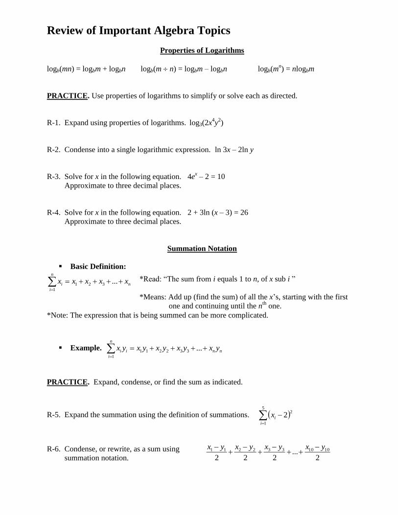
Review of Important Algebra Topics
Properties of Logarithms
logb(mn) = logbm + logbn logb(m n) = logbm – logbn logb(mn) = nlogbm
PRACTICE. Use properties of logarithms to simplify or solve each as directed.
R-1. Expand using properties of logarithms. log3(2x4y
2)
R-2. Condense into a single logarithmic expression. ln 3x – 2ln y
R-3. Solve for x in the following equation. 4ex – 2 = 10
Approximate to three decimal places.
R-4. Solve for x in the following equation. 2 + 3ln (x – 3) = 26
Approximate to three decimal places.
Summation Notation
Basic Definition:
n
i
ni xxxxx1
321 ...
*Note: The expression that is being summed can be more complicated.
Example.
n
i
nnii yxyxyxyxyx1
332211 ...
PRACTICE. Expand, condense, or find the sum as indicated.
R-5. Expand the summation using the definition of summations.
5
1
22
i
ix
R-6. Condense, or rewrite, as a sum using
summation notation.
2...
222
1010332211 yxyxyxyx
*Read: “The sum from i equals 1 to n, of x sub i ”
*Means: Add up (find the sum) of all the x’s, starting with the first
one and continuing until the nth
one.
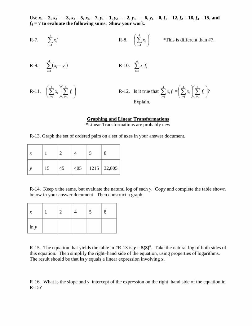
Use x1 = 2, x2 = – 3, x3 = 5, x4 = 7, y1 = 1, y2 = – 2, y3 = – 6, y4 = 0, f1 = 12, f2 = 18, f3 = 15, and
f4 = 7 to evaluate the following sums. Show your work.
R-7.
4
1
2
i
ix R-8.
24
1
i
ix *This is different than #7.
R-9.
4
1i
ii yx R-10.
4
1i
ii fx
R-11.
4
1
4
1 i
i
i
i fx R-12. Is it true that
4
1i
ii fx =
4
1
4
1 i
i
i
i fx ?
Explain.
Graphing and Linear Transformations
*Linear Transformations are probably new
R-13. Graph the set of ordered pairs on a set of axes in your answer document.
x
1
2
4
5
8
y
15
45
405
1215
32,805
R-14. Keep x the same, but evaluate the natural log of each y. Copy and complete the table shown
below in your answer document. Then construct a graph.
x
1
2
4
5
8
ln y
R-15. The equation that yields the table in #R-13 is y = 5(3)x. Take the natural log of both sides of
this equation. Then simplify the right–hand side of the equation, using properties of logarithms.
The result should be that ln y equals a linear expression involving x.
R-16. What is the slope and y–intercept of the expression on the right–hand side of the equation in
R-15?
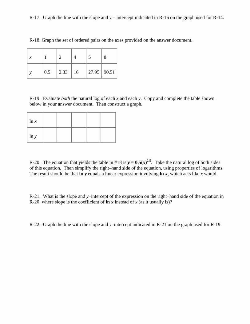
R-17. Graph the line with the slope and y – intercept indicated in R-16 on the graph used for R-14.
R-18. Graph the set of ordered pairs on the axes provided on the answer document.
x
1
2
4
5
8
y
0.5
2.83
16
27.95
90.51
R-19. Evaluate both the natural log of each x and each y. Copy and complete the table shown
below in your answer document. Then construct a graph.
ln x
ln y
R-20. The equation that yields the table in #18 is y = 0.5(x)2.5
. Take the natural log of both sides
of this equation. Then simplify the right–hand side of the equation, using properties of logarithms.
The result should be that ln y equals a linear expression involving ln x, which acts like x would.
R-21. What is the slope and y–intercept of the expression on the right–hand side of the equation in
R-20, where slope is the coefficient of ln x instead of x (as it usually is)?
R-22. Graph the line with the slope and y–intercept indicated in R-21 on the graph used for R-19.
Introduction to Statistics
Some of the following terms have been defined for you, but you must find definitions for the
others. The definitions provided come from The Practice of Statistics, 2nd
Edition by Daniel
Yates, David Moore, and Daren Starnes.
Fundamental Statistical Concepts
Individuals – objects described by a set of data. Individuals may be people, but they may also be
animals or things.
Variable – any characteristic of an individual. A variable can take different values for different
individuals.
Categorical (or Qualitative) Variable –
Quantitative Variable –
Distribution (of a variable) – indicates what values the variable takes and how often it takes those
values. A distribution is usually shown using a table.
PRACTICE. The following exercises can be found in The Practice of Statistics, 2nd
Edition by
Daniel Yates, David Moore, and Daren Starnes. They have been renumbered for this assignment.
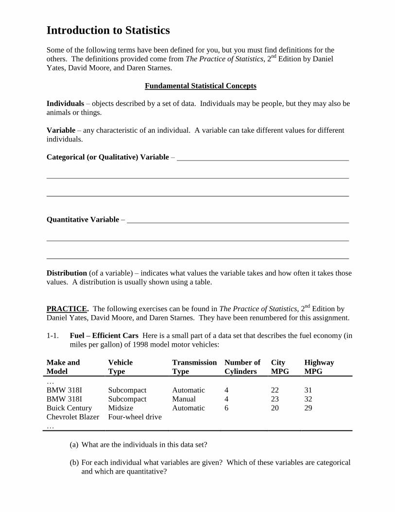
1-1. Fuel – Efficient Cars Here is a small part of a data set that describes the fuel economy (in
miles per gallon) of 1998 model motor vehicles:
Make and
Model
Vehicle
Type
Transmission
Type
Number of
Cylinders
City
MPG
Highway
MPG
…
BMW 318I Subcompact Automatic 4 22 31
BMW 318I Subcompact Manual 4 23 32
Buick Century Midsize Automatic 6 20 29
Chevrolet Blazer Four-wheel drive
…
(a) What are the individuals in this data set?
(b) For each individual what variables are given? Which of these variables are categorical
and which are quantitative?
1-2. Medical Study Variables Data from a medical study contain values of many variables for
each of the people who were subjects of the study. Which of the following variables are
categorical and which are quantitative?
(a) Gender (female or male)
(b) Age (years)
(c) Race (Asian, black, white, or other)
(d) Smoker (yes or no)
(e) Systolic blood pressure (millimeters of mercury)
(f) Level of calcium in the blood (micrograms per milliliter)
1-3. Popular magazines often rank cities in terms of how desirable it is to live and work in each
city. Describe five variables that you would measure for each city if you were designing
such a study. Give reasons for each of your choices.
Displaying Distributions with Graphs
Graphs of Categorical Variables:
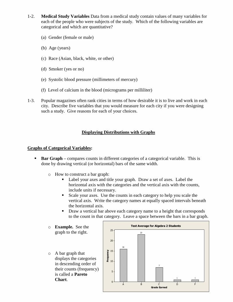
Bar Graph – compares counts in different categories of a categorical variable. This is
done by drawing vertical (or horizontal) bars of the same width.
o How to construct a bar graph:
Label your axes and title your graph. Draw a set of axes. Label the
horizontal axis with the categories and the vertical axis with the counts,
include units if necessary.
Scale your axes. Use the counts in each category to help you scale the
vertical axis. Write the category names at equally spaced intervals beneath
the horizontal axis.
Draw a vertical bar above each category name to a height that corresponds
to the count in that category. Leave a space between the bars in a bar graph.
o Example. See the
graph to the right.
o A bar graph that
displays the categories
in descending order of
their counts (frequency)
is called a Pareto
Chart.
FDCBA
25
20
15
10
5
0
Grade Earned
Fre
qu
en
cy
11
7
23
16
Test Average for Algebra 2 Students
100959085807570
Grade
Algebra 2 Final Grades
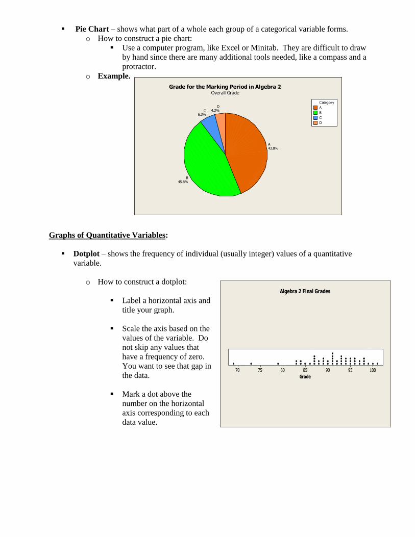
Pie Chart – shows what part of a whole each group of a categorical variable forms.
o How to construct a pie chart:
Use a computer program, like Excel or Minitab. They are difficult to draw
by hand since there are many additional tools needed, like a compass and a
protractor.
o Example.
Graphs of Quantitative Variables:
Dotplot – shows the frequency of individual (usually integer) values of a quantitative
variable.
o How to construct a dotplot:
Label a horizontal axis and
title your graph.
Scale the axis based on the
values of the variable. Do
not skip any values that
have a frequency of zero.
You want to see that gap in
the data.
Mark a dot above the
number on the horizontal
axis corresponding to each
data value.
A
B
C
D
CategoryD
4.2%C6.3%
B45.8%
A43.8%
Grade for the Marking Period in Algebra 2Overall Grade
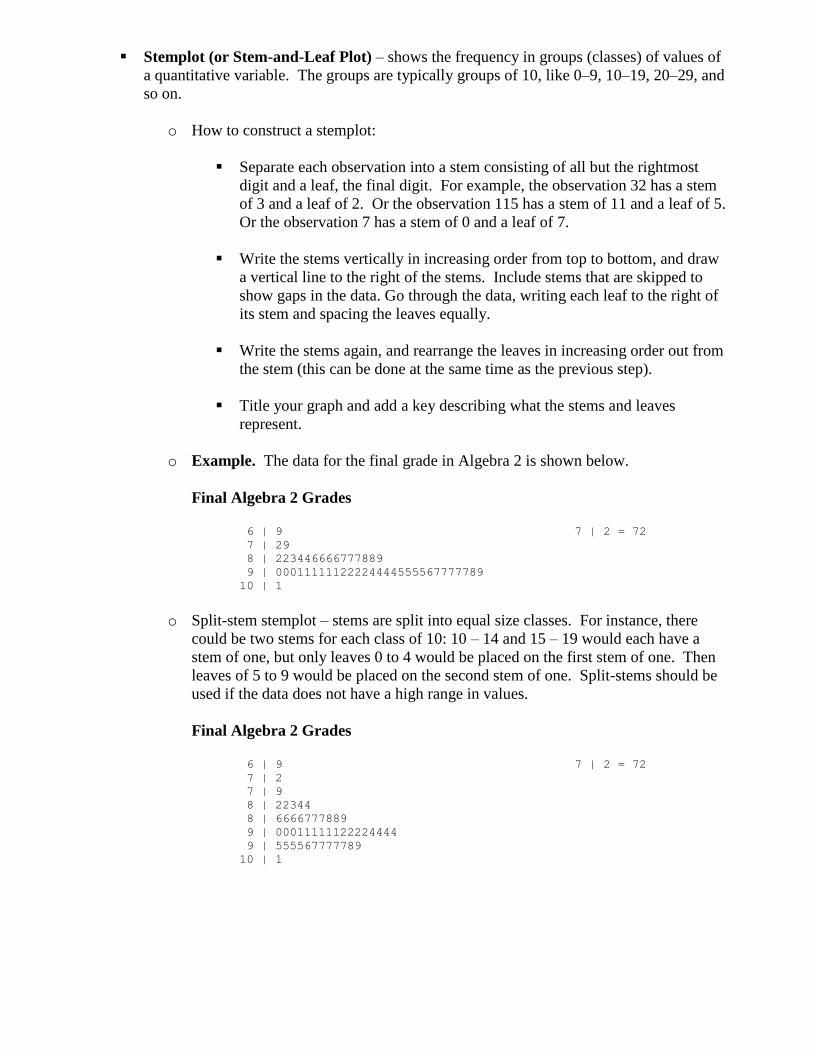
Stemplot (or Stem-and-Leaf Plot) – shows the frequency in groups (classes) of values of
a quantitative variable. The groups are typically groups of 10, like 0–9, 10–19, 20–29, and
so on.
o How to construct a stemplot:
Separate each observation into a stem consisting of all but the rightmost
digit and a leaf, the final digit. For example, the observation 32 has a stem
of 3 and a leaf of 2. Or the observation 115 has a stem of 11 and a leaf of 5.
Or the observation 7 has a stem of 0 and a leaf of 7.
Write the stems vertically in increasing order from top to bottom, and draw
a vertical line to the right of the stems. Include stems that are skipped to
show gaps in the data. Go through the data, writing each leaf to the right of
its stem and spacing the leaves equally.
Write the stems again, and rearrange the leaves in increasing order out from
the stem (this can be done at the same time as the previous step).
Title your graph and add a key describing what the stems and leaves
represent.
o Example. The data for the final grade in Algebra 2 is shown below.
Final Algebra 2 Grades
6 | 9 7 | 2 = 72
7 | 29
8 | 223446666777889
9 | 00011111122224444555567777789
10 | 1
o Split-stem stemplot – stems are split into equal size classes. For instance, there
could be two stems for each class of 10: 10 – 14 and 15 – 19 would each have a
stem of one, but only leaves 0 to 4 would be placed on the first stem of one. Then
leaves of 5 to 9 would be placed on the second stem of one. Split-stems should be
used if the data does not have a high range in values.
Final Algebra 2 Grades
6 | 9 7 | 2 = 72
7 | 2
7 | 9
8 | 22344
8 | 6666777889
9 | 00011111122224444
9 | 555567777789
10 | 1
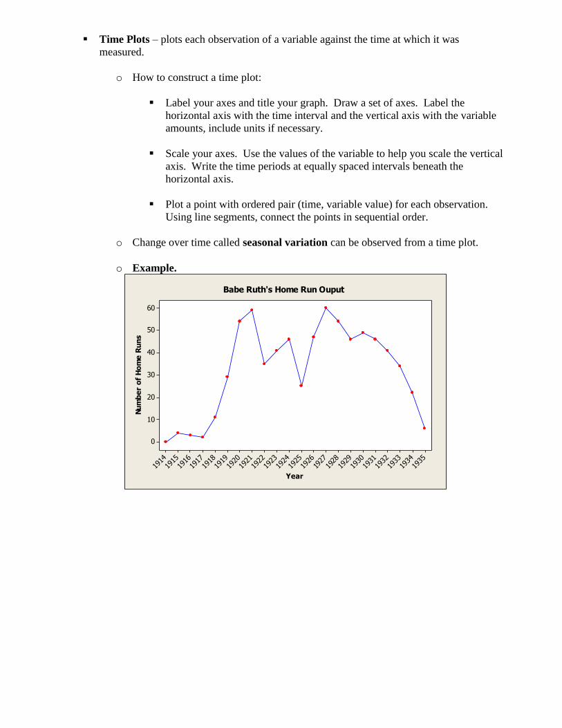
Time Plots – plots each observation of a variable against the time at which it was
measured.
o How to construct a time plot:
Label your axes and title your graph. Draw a set of axes. Label the
horizontal axis with the time interval and the vertical axis with the variable
amounts, include units if necessary.
Scale your axes. Use the values of the variable to help you scale the vertical
axis. Write the time periods at equally spaced intervals beneath the
horizontal axis.
Plot a point with ordered pair (time, variable value) for each observation.
Using line segments, connect the points in sequential order.
o Change over time called seasonal variation can be observed from a time plot.
o Example.
1935
1934
1933
1932
1931
1930
1929
1928
1927
1926
1925
1924
1923
1922
1921
1920
1919
1918
1917
1916
1915
1914
60
50
40
30
20
10
0
Year
Nu
mb
er
of
Ho
me
Ru
ns
Babe Ruth's Home Run Ouput
PRACTICE. The following exercises can be found in The Practice of Statistics, 2nd
Edition by
Yates, Moore, and Starnes. They have been renumbered for this assignment.
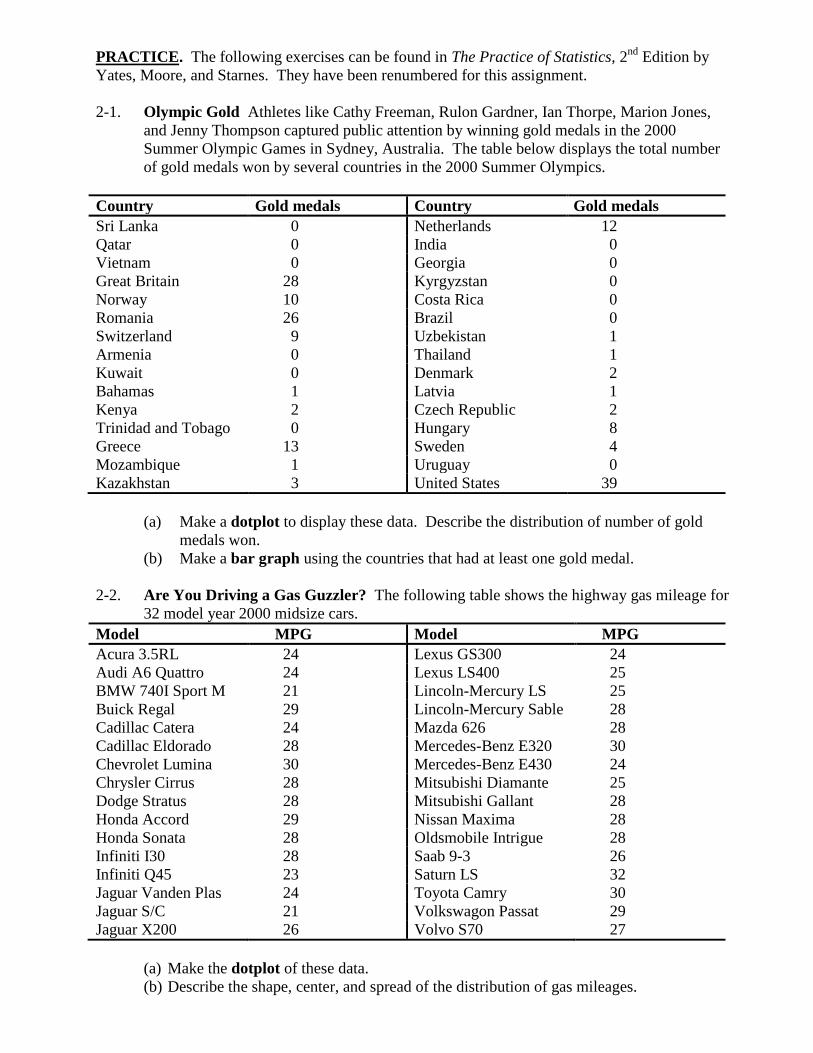
2-1. Olympic Gold Athletes like Cathy Freeman, Rulon Gardner, Ian Thorpe, Marion Jones,
and Jenny Thompson captured public attention by winning gold medals in the 2000
Summer Olympic Games in Sydney, Australia. The table below displays the total number
of gold medals won by several countries in the 2000 Summer Olympics.
Country Gold medals Country Gold medals
Sri Lanka 0 Netherlands 12
Qatar 0 India 0
Vietnam 0 Georgia 0
Great Britain 28 Kyrgyzstan 0
Norway 10 Costa Rica 0
Romania 26 Brazil 0
Switzerland 9 Uzbekistan 1
Armenia 0 Thailand 1
Kuwait 0 Denmark 2
Bahamas 1 Latvia 1
Kenya 2 Czech Republic 2
Trinidad and Tobago 0 Hungary 8
Greece 13 Sweden 4
Mozambique 1 Uruguay 0
Kazakhstan 3 United States 39
(a) Make a dotplot to display these data. Describe the distribution of number of gold
medals won.
(b) Make a bar graph using the countries that had at least one gold medal.
2-2. Are You Driving a Gas Guzzler? The following table shows the highway gas mileage for
32 model year 2000 midsize cars.
Model MPG Model MPG
Acura 3.5RL 24 Lexus GS300 24
Audi A6 Quattro 24 Lexus LS400 25
BMW 740I Sport M 21 Lincoln-Mercury LS 25
Buick Regal 29 Lincoln-Mercury Sable 28
Cadillac Catera 24 Mazda 626 28
Cadillac Eldorado 28 Mercedes-Benz E320 30
Chevrolet Lumina 30 Mercedes-Benz E430 24
Chrysler Cirrus 28 Mitsubishi Diamante 25
Dodge Stratus 28 Mitsubishi Gallant 28
Honda Accord 29 Nissan Maxima 28
Honda Sonata 28 Oldsmobile Intrigue 28
Infiniti I30 28 Saab 9-3 26
Infiniti Q45 23 Saturn LS 32
Jaguar Vanden Plas 24 Toyota Camry 30
Jaguar S/C 21 Volkswagon Passat 29
Jaguar X200 26 Volvo S70 27
(a) Make the dotplot of these data.
(b) Describe the shape, center, and spread of the distribution of gas mileages.
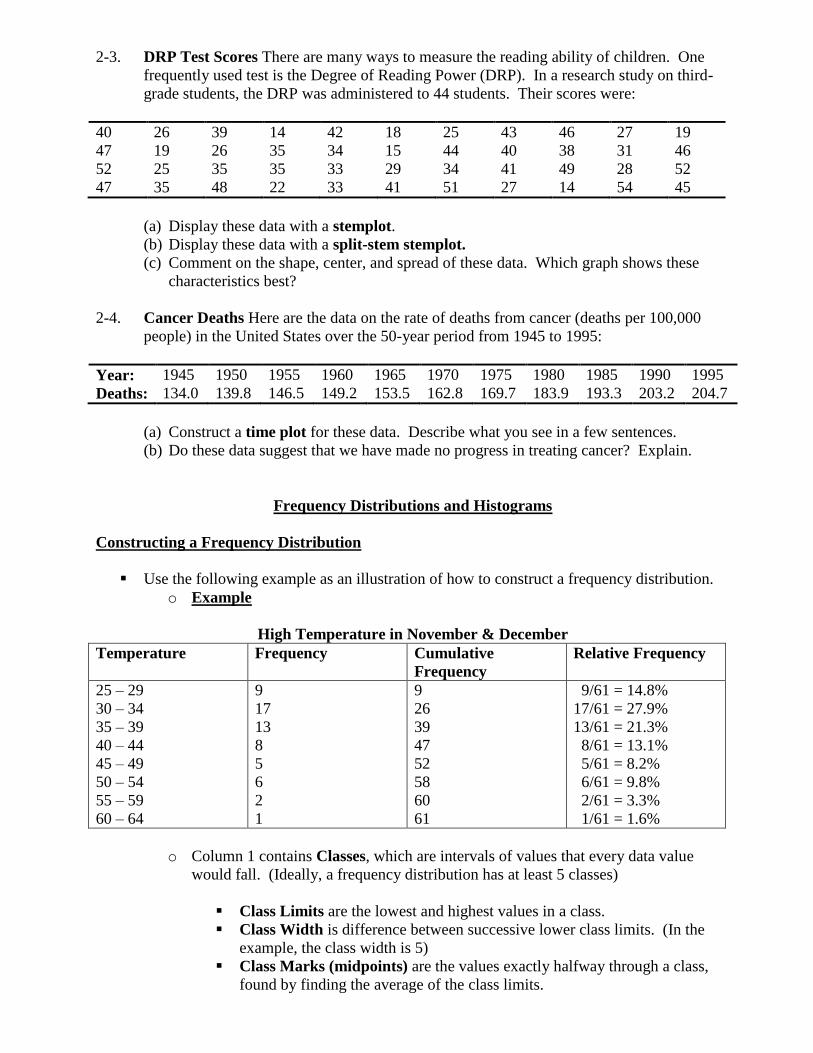
2-3. DRP Test Scores There are many ways to measure the reading ability of children. One
frequently used test is the Degree of Reading Power (DRP). In a research study on third-
grade students, the DRP was administered to 44 students. Their scores were:
40 26 39 14 42 18 25 43 46 27 19
47 19 26 35 34 15 44 40 38 31 46
52 25 35 35 33 29 34 41 49 28 52
47 35 48 22 33 41 51 27 14 54 45
(a) Display these data with a stemplot.
(b) Display these data with a split-stem stemplot.
(c) Comment on the shape, center, and spread of these data. Which graph shows these
characteristics best?
2-4. Cancer Deaths Here are the data on the rate of deaths from cancer (deaths per 100,000
people) in the United States over the 50-year period from 1945 to 1995:
Year: 1945 1950 1955 1960 1965 1970 1975 1980 1985 1990 1995
Deaths: 134.0 139.8 146.5 149.2 153.5 162.8 169.7 183.9 193.3 203.2 204.7
(a) Construct a time plot for these data. Describe what you see in a few sentences.
(b) Do these data suggest that we have made no progress in treating cancer? Explain.
Frequency Distributions and Histograms
Constructing a Frequency Distribution
Use the following example as an illustration of how to construct a frequency distribution.
o Example
High Temperature in November & December
Temperature Frequency Cumulative
Frequency
Relative Frequency
25 – 29
30 – 34
35 – 39
40 – 44
45 – 49
50 – 54
55 – 59
60 – 64
9
17
13
8
5
6
2
1
9
26
39
47
52
58
60
61
9/61 = 14.8%
17/61 = 27.9%
13/61 = 21.3%
8/61 = 13.1%
5/61 = 8.2%
6/61 = 9.8%
2/61 = 3.3%
1/61 = 1.6%
o Column 1 contains Classes, which are intervals of values that every data value
would fall. (Ideally, a frequency distribution has at least 5 classes)
Class Limits are the lowest and highest values in a class.
Class Width is difference between successive lower class limits. (In the
example, the class width is 5)
Class Marks (midpoints) are the values exactly halfway through a class,
found by finding the average of the class limits.
Classes may sometimes be only a single value
This column must be in all frequency distributions.
o Column 2 contains frequencies, which are the counts of how many data fall in that
particular class.
o Column 3 contains cumulative frequencies, which are the counts of how many
data fall in that particular class, or any class below that.
o Column 4 contains relative frequencies, which are the percentages (or ratios) of
the amount of data in that one particular class.
o Depending on the situation, maybe all or only one of columns 2 – 4 would be
needed in a frequency distribution.
o Sometimes a column for class mark is included, as well.
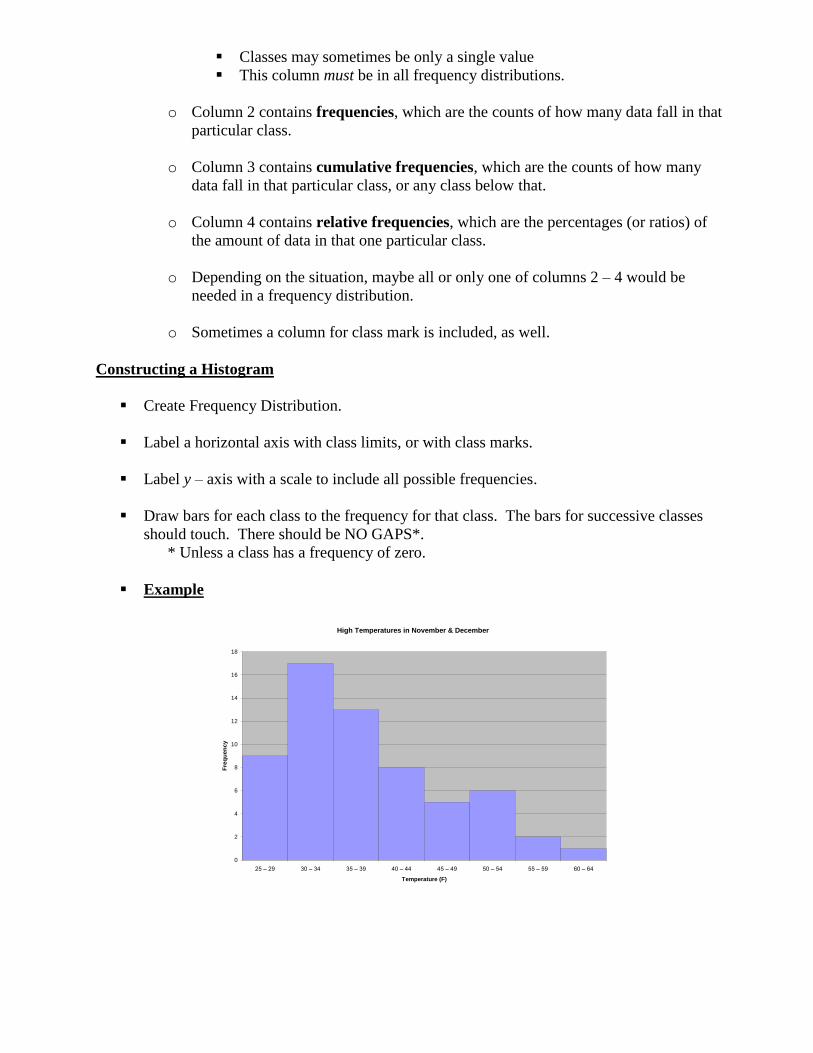
Constructing a Histogram
Create Frequency Distribution.
Label a horizontal axis with class limits, or with class marks.
Label y – axis with a scale to include all possible frequencies.
Draw bars for each class to the frequency for that class. The bars for successive classes
should touch. There should be NO GAPS*.
* Unless a class has a frequency of zero.
Example
High Temperatures in November & December
0
2
4
6
8
10
12
14
16
18
25 – 29 30 – 34 35 – 39 40 – 44 45 – 49 50 – 54 55 – 59 60 – 64
Temperature (F)
Fre
qu
en
cy
Distribution Shapes for Quantitative Observations
o Symmetric –
In general, the frequencies of the classes are low at either end of the distribution and
higher in the middle. Furthermore, the classes with the higher frequencies are in the
middle of the distribution, with the highest being in the absolute middle.
o Skewed Left –
In general, the frequencies are low on the left end of the distribution (classes with
lower data values numerically) and gradually increase throughout the distribution
with the highest frequency being on the right side of the distribution (but not
necessarily the very last class)
o Skewed Right –
In general, the frequencies are low on the right end of the distribution (classes with
higher data values numerically) and gradually increase throughout the distribution
with the highest frequency being on the left side of the distribution (but not
necessarily the very first class)
o Bimodal –
In general, there are two peaks in the distribution separated by a few classes, and
neither peak is in the middle of the distribution.
o Uniform –
In general, the classes have roughly the same frequencies (a purely uniform
distribution would have classes with exactly the same frequencies).
Ogive – a graph based on the cumulative frequencies of a frequency distribution.
o How to construct an ogive:
Label your axes and title your graph. Draw a set of axes. Label the
horizontal axis with the class limits of the classes and the vertical axis with
the cumulative frequency.
Plot a point at a frequency (or relative frequency) of zero for the first class
limit – this indicates that by this value there are no data values yet. Place a
point at the cumulative frequency (or relative frequency) for the first class at
the upper class limit for this class. Continue placing points for the
cumulative frequencies of a class above the upper class limit for that class.
Connect the points plotted with line segments. Give your graph a title.
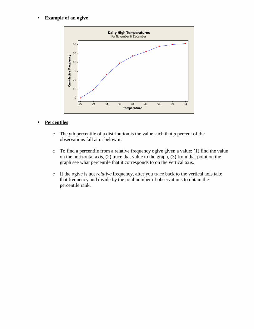
Example of an ogive
645954494439342925
60
50
40
30
20
10
0
Temperature
Cu
mu
lati
ve
Fre
qu
en
cy
Daily High Temperaturesfor November & December
Percentiles
o The pth percentile of a distribution is the value such that p percent of the
observations fall at or below it.
o To find a percentile from a relative frequency ogive given a value: (1) find the value
on the horizontal axis, (2) trace that value to the graph, (3) from that point on the
graph see what percentile that it corresponds to on the vertical axis.
o If the ogive is not relative frequency, after you trace back to the vertical axis take
that frequency and divide by the total number of observations to obtain the
percentile rank.
PRACTICE. The following exercises can be found in The Practice of Statistics, 2nd
Edition by
Yates, Moore, and Starnes. They have been renumbered for this assignment.
3-1. Where Do Older Folks Live? The following table gives the percentage of residents aged
65 or older in each of the 50 states.
State Percent State Percent State Percent
Alabama 13.1 Louisiana 11.5 Ohio 13.4
Alaska 5.5 Maine 14.1 Oklahoma 13.4
Arizona 13.2 Maryland 11.5 Oregon 13.2
Arkansas 14.3 Massachusetts 14.0 Pennsylvania 15.9
California 11.1 Michigan 12.5 Rhode Island 15.6
Colorado 10.1 Minnesota 12.3 South Carolina 12.2
Connecticut 14.3 Mississippi 12.2 South Dakota 14.3
Delaware 13.0 Missouri 13.7 Tennessee 12.5
Florida 18.3 Montana 13.3 Texas 10.1
Georgia 9.9 Nebraska 13.8 Utah 8.8
Hawaii 13.3 Nevada 11.5 Vermont 12.3
Idaho 11.3 New Hampshire 12.0 Virginia 11.3
Illinois 12.4 New Jersey 13.6 Washington 11.5
Indiana 12.5 New Mexico 11.4 West Virginia 15.2
Iowa 15.1 New York 13.3 Wisconsin 13.2
Kansas 13.5 North Carolina 12.5 Wyoming 11.5
Kentucky 12.5 North Dakota 14.4
(a) Construct a frequency distribution of these data. Record your class intervals,
frequencies, and cumulative frequencies. Use 5.0 as the first lower class limit, and a
class width of 2.0.
(b) Construct a histogram.
(c) Identify the distribution shape of the data, then comment on distribution of people aged
65 and over in the states. Do there appear to be any potential outliers?
(d) Construct a relative cumulative frequency graph (ogive) for these data.
(e) Use the ogive to answer the following questions:
In what percentage of states was the percentage of “65 and older” less than 15%?
What is the 40th
percentile of this distribution, and what does it tell us?
What percentile is associated with Ohio?
3-2. Chest out, Soldier! In 1846, a published paper provided chest measurements (in inches)
of 5738 Scottish militiamen. The following table displays the data in summary form.
Chest Size Count Chest Size Count
33 3 41 934
34 18 42 658
35 81 43 370
36 185 44 92
37 420 45 50
38 749 46 21
39 1073 47 4
40 1079 48 1
(a) Create a histogram of these data.
(b) Describe the shape, center, and spread of the chest measurements distribution. Why
might this information be useful?
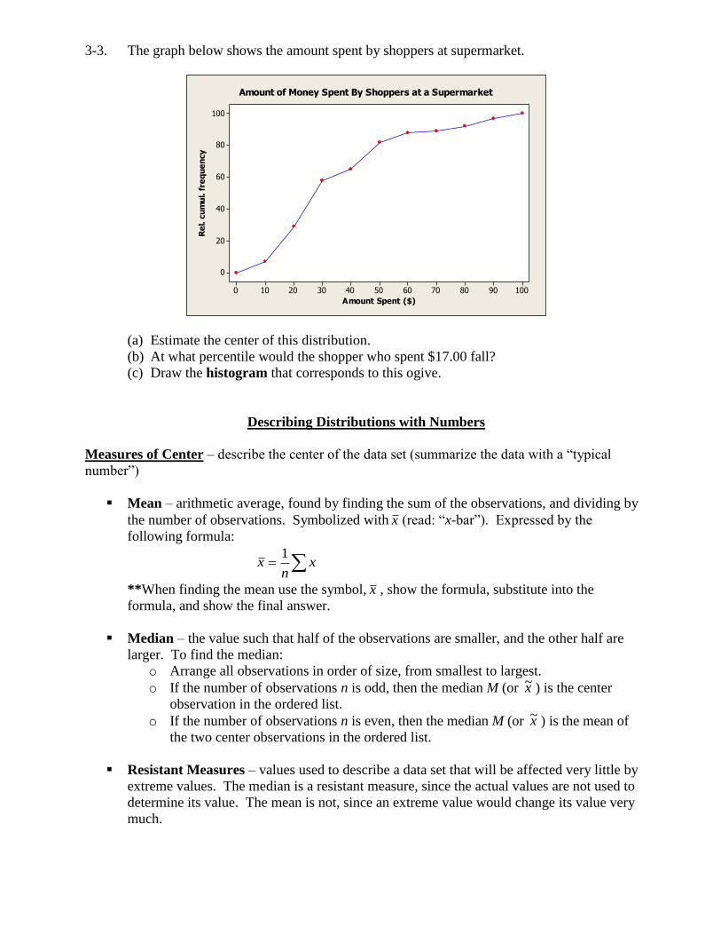
3-3. The graph below shows the amount spent by shoppers at supermarket.
1009080706050403020100
100
80
60
40
20
0
Amount Spent ($)
Re
l. c
um
ul. f
req
ue
ncy
Amount of Money Spent By Shoppers at a Supermarket
(a) Estimate the center of this distribution.
(b) At what percentile would the shopper who spent $17.00 fall?
(c) Draw the histogram that corresponds to this ogive.
Describing Distributions with Numbers
Measures of Center – describe the center of the data set (summarize the data with a “typical
number”)
Mean – arithmetic average, found by finding the sum of the observations, and dividing by
the number of observations. Symbolized with x (read: “x-bar”). Expressed by the
following formula:
xn
x1
**When finding the mean use the symbol, x , show the formula, substitute into the
formula, and show the final answer.
Median – the value such that half of the observations are smaller, and the other half are
larger. To find the median:
o Arrange all observations in order of size, from smallest to largest.
o If the number of observations n is odd, then the median M (or x~ ) is the center
observation in the ordered list.
o If the number of observations n is even, then the median M (or x~ ) is the mean of
the two center observations in the ordered list.
Resistant Measures – values used to describe a data set that will be affected very little by
extreme values. The median is a resistant measure, since the actual values are not used to
determine its value. The mean is not, since an extreme value would change its value very
much.
Comparing mean and median – For the following distributions shapes, a summary of
how mean and median compare is given.
o Symmetric – For a roughly symmetric distribution, the mean and median will be
approximately equal.
o Skewed Right – For a skewed right distribution, the mean will be larger than the
median.
o Skewed Left – For a skewed left distribution, the mean will be smaller than the
median.
Measures of Variation – a value that describes how different the data values are from each other,
or how different they tend to be from a measure of center (particularly the mean).
Range – the simplest (and least useful) value to determine the spread of a data set. The
range is calculated by finding the difference between the highest and lowest values of a
data set.
Measures of Relative Standing – a value that gives an indication of where in the ordered data that
a particular value would be found.
Percentile – see previous notes.
Median – see previous notes.
Quartiles – the values that split the data set into four equal sized parts, like the median
splits the data set into two equal sized parts.
o First Quartile, Q1 (Lower Quartile) – value such that 25% of the data values are
smaller than it, and 75% are larger.
o Second Quartile (Median) – value such that half of the data values are smaller
than it, and half are larger.
o Third Quartile, Q3 (Upper Quartile) – value such that 75% of the data values are
smaller than it, and 25% are larger.
o Inter-Quartile Range, IQR – is found by finding the difference between Q3 and
Q1
o Five-number Summary – synopsis of the data set consisting of the minimum
value, Q1, median, Q3, and the maximum value.
Checking for Outliers using the IQR:
o After finding the IQR, subtract 1.5*IQR from Q1. Any data value less than the
result would be considered an outlier.
o After finding the IQR, add 1.5*IQR to Q3. Any data value greater than this result
would be considered an outlier.
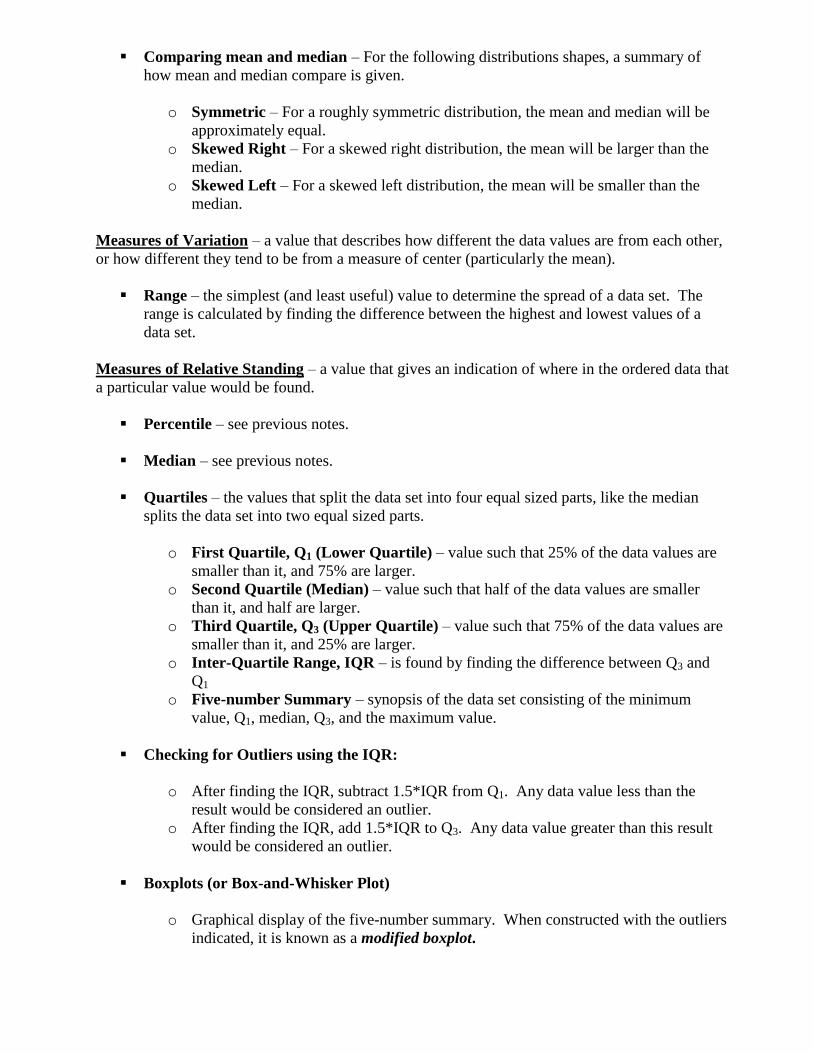
Boxplots (or Box-and-Whisker Plot)
o Graphical display of the five-number summary. When constructed with the outliers
indicated, it is known as a modified boxplot.
o How to construct a modified boxplot:
Find the five-number summary, IQR, and outliers.
Draw a vertical scale that would include all data values.
Plot the five number summary next to the scale with regular points. If there
any outliers indicate them with an asterisk, then plot the last data value that
would not be considered an outlier.
Draw a box from Q1 to Q3, with those points being at the center of their
respective sides of the box.
Draw a line in the box, through the median.
Connect a line segment from the lower quartile to the minimum (or last
value not considered an outlier), and one from the upper quartile to the
maximum (or last value not considered an outlier).
Example.
100
90
80
70
60
50
Gra
de
(o
ut
of
10
0)
Homework Grades
PRACTICE. The following exercises can be found in The Practice of Statistics, 2nd
Edition by
Yates, Moore, and Starnes. They have been renumbered for this assignment.
4-1. Joey’s first 14 quiz grades in the marking period were
86 84 91 75 78 80 74 87 76 96 82 90 98 93
(a) Use the formula to calculate the mean quiz grade.
(b) Suppose Joey has an unexcused absence for the fifteenth quiz and he receives a score
of zero. Determine his final quiz average. What property of the mean does this
situation illustrate? Write a sentence about the effect of the zero on Joey’s quiz
average that mentions this property.
(c) What kind of plot would best show Joey’s distribution of grades? Assume an 8-point
scale (A: 93 to 100, B: 85 to 92, etc.). Make an appropriate plot, and be prepared to
justify your choice.
4-2. Suppose a major league baseball team’s mean yearly salary for a player is $1.2 million, and
that the team has 25 players on its active roster. What is the team’s annual payroll for
players? If you knew only the median salary, would you be able to answer the question?
Why or why not?
4-3. Last year a small accounting firm paid each of its five clerks $22,000, two junior
accountants $50,000 each, and the firm’s owner $270,000. What is the mean salary paid at
this firm? How many employees earn less than the mean? What is the median salary?
Write a sentence to describe how an unethical recruiter could use statistics to mislead
prospective employees.
4-4. U.S. Incomes The distribution of individual incomes in the United States is strongly
skewed right. In 1997, the mean and median incomes of the top 1% of Americans were
$330,000 and $675,000. Which of these numbers is the mean and which is the median?
Explain your reasoning.
4-5. SSHA Scores Here are the scores on the Survey of Study Habits and Attitudes (SSHA) for
18 first-year college women:
154 109 137 115 152 140 154 178 101 103 126 126 137 165 165 129 200 148
and for 20 first-year college men:
108 140 114 91 180 115 126 92 169 146 109 132 75 88 113 151 70 115 187 104
(a) Find the 5 – number summary for each set of data.
(b) Find the Inter-quartile range for each set of data. Use the IQR to identify any
outliers.
(c) Make side-by-side boxplots to compare the distributions.
(d) Write a paragraph comparing the SSHA scores for men and women.
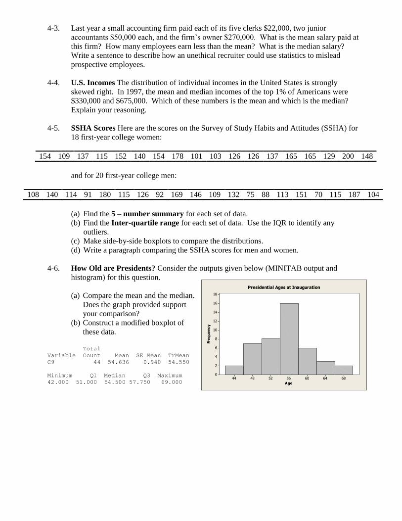
4-6. How Old are Presidents? Consider the outputs given below (MINITAB output and
histogram) for this question.
(a) Compare the mean and the median.
Does the graph provided support
your comparison?
(b) Construct a modified boxplot of
these data.
Total
Variable Count Mean SE Mean TrMean
C9 44 54.636 0.940 54.550
Minimum Q1 Median Q3 Maximum
42.000 51.000 54.500 57.750 69.000
68646056524844
18
16
14
12
10
8
6
4
2
0
Age
Fre
qu
en
cy
Presidential Ages at Inauguration