Embed Size (px)
Citation preview

Two newspaper pages from The Canterbury Times
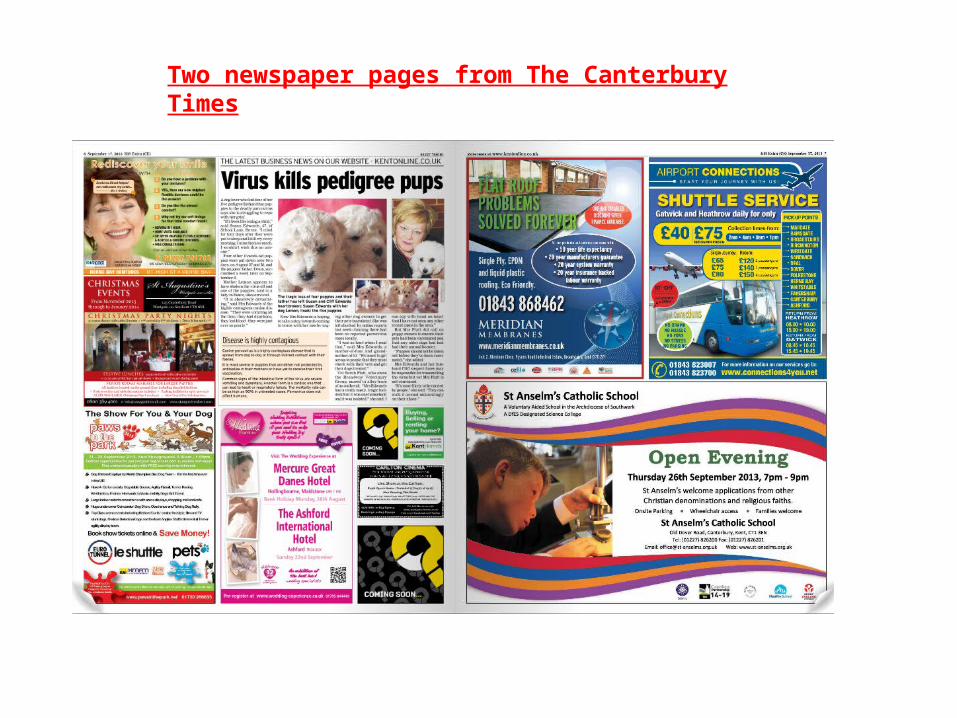
• The header at the top of the main article is used as a advertising agent, it illustrates that the newspaper advertises news online and through a website. It is written in capital letters to display the importance of the news. It stretches to about 2/3 of the A4 page, above the main article.
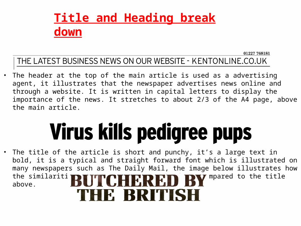
• The title of the article is short and punchy, it’s a large text in bold, it is a typical and straight forward font which is illustrated on many newspapers such as The Daily Mail, the image below illustrates how the similarities of the news paper title fonts compared to the title above.
Title and Heading break down
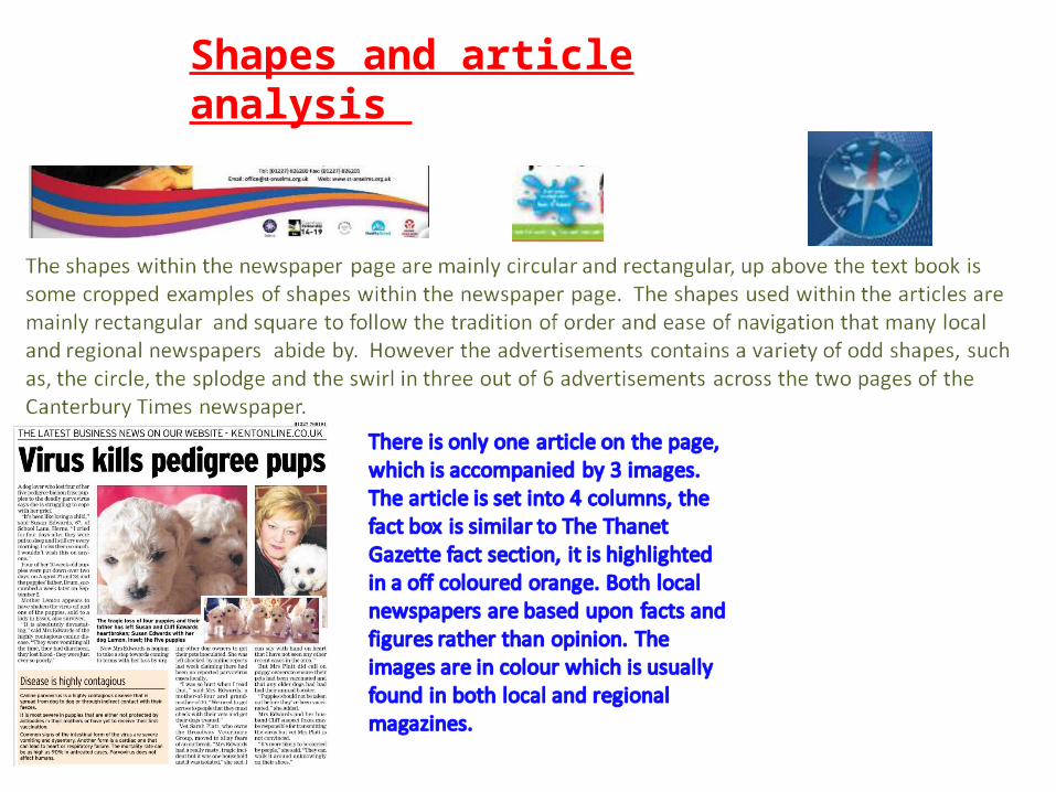
Shapes and article analysis
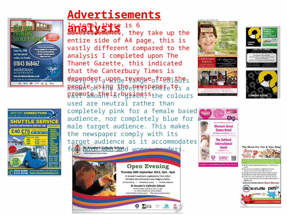
In total there is 6 advertisements, they take up the entire side of A4 page, this is vastly different compared to the analysis I completed upon The Thanet Gazette, this indicated that the Canterbury Times is dependent upon revenue from the people using the newspaper to promote their business.
Advertisements analysis
There is a wide range of colours shown on the adverts, there is a vast amount of green, the colours used are neutral rather than completely pink for a female based audience, nor completely blue for a male target audience. This makes the newspaper comply with its target audience as it accommodates for both men and women readers.