Embed Size (px)
Citation preview
Slide 1-1
Chapter 1
Introduction to Statistics
Slide 1-2
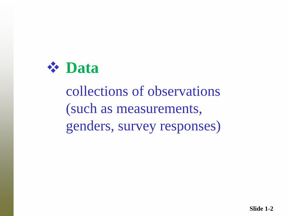
Data
collections of observations
(such as measurements,
genders, survey responses)
Slide 1-3
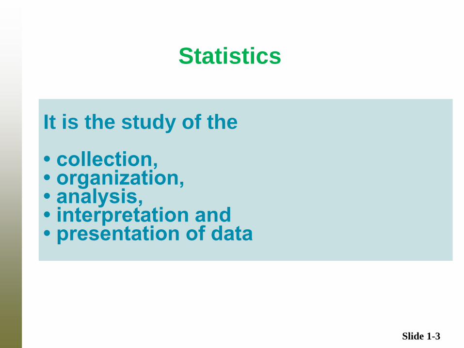
Statistics
It is the study of the • collection, • organization, • analysis, • interpretation and • presentation of data
Slide 1-4
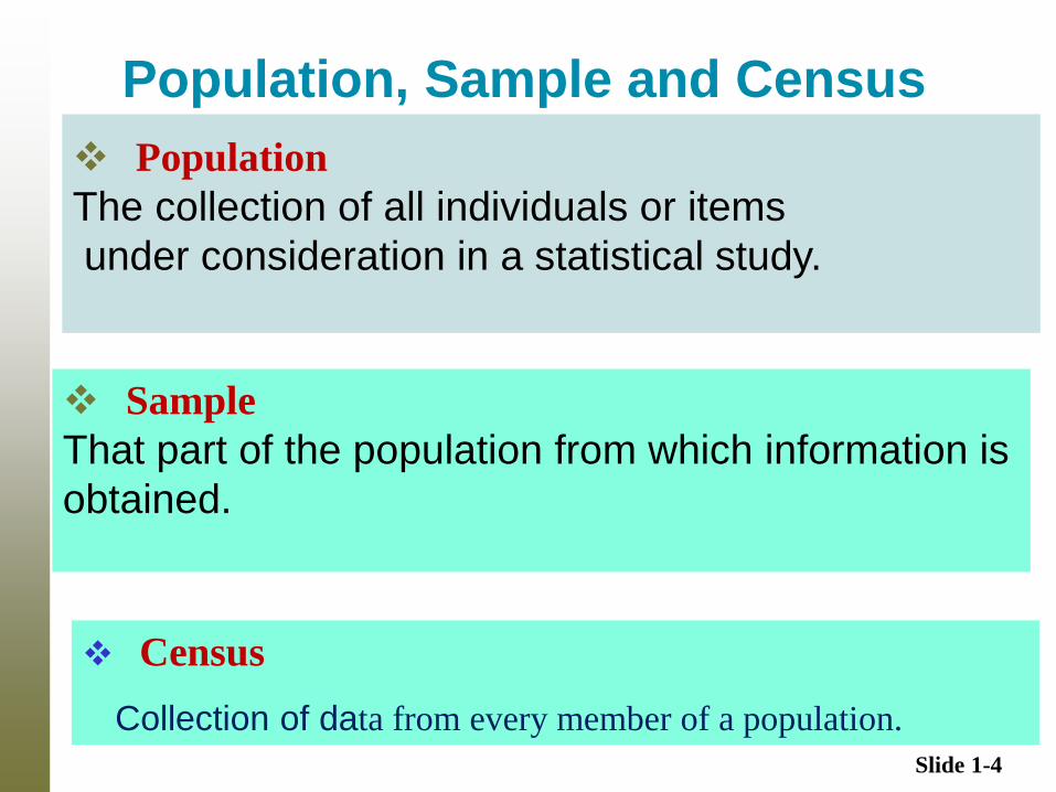
Population, Sample and Census
Sample
That part of the population from which information is
obtained.
Population
The collection of all individuals or items
under consideration in a statistical study.
Census
Collection of data from every member of a population.
Slide 1-5
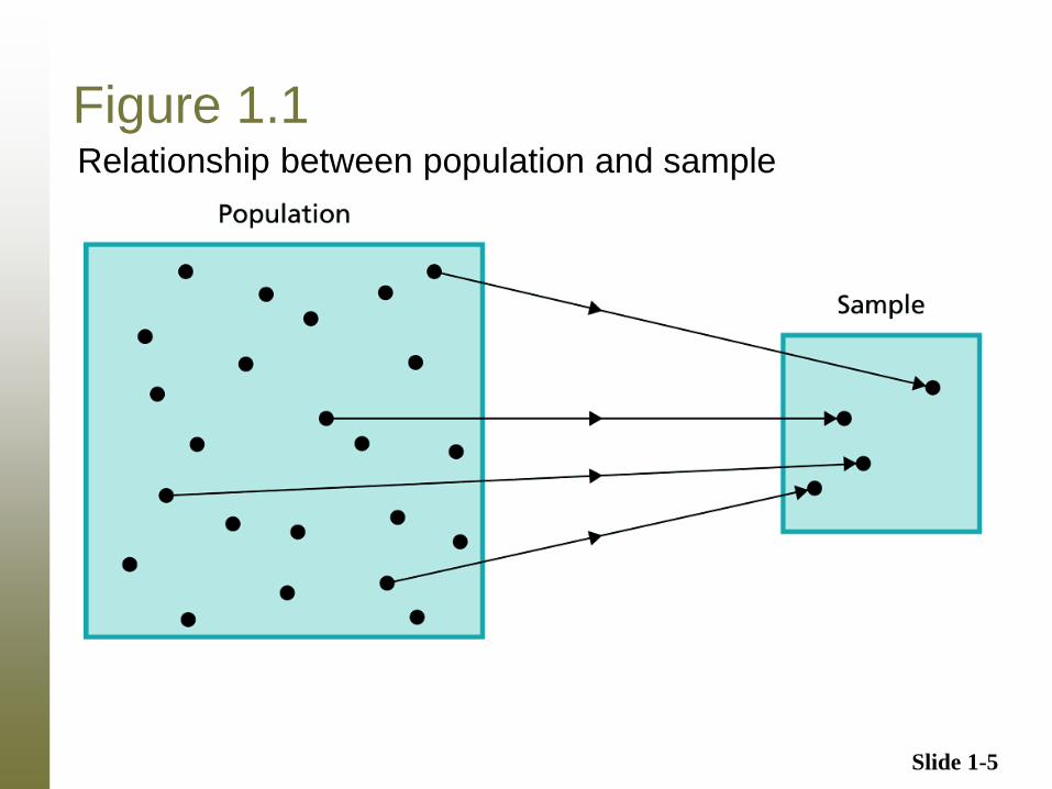
Figure 1.1 Relationship between population and sample
Slide 1-6
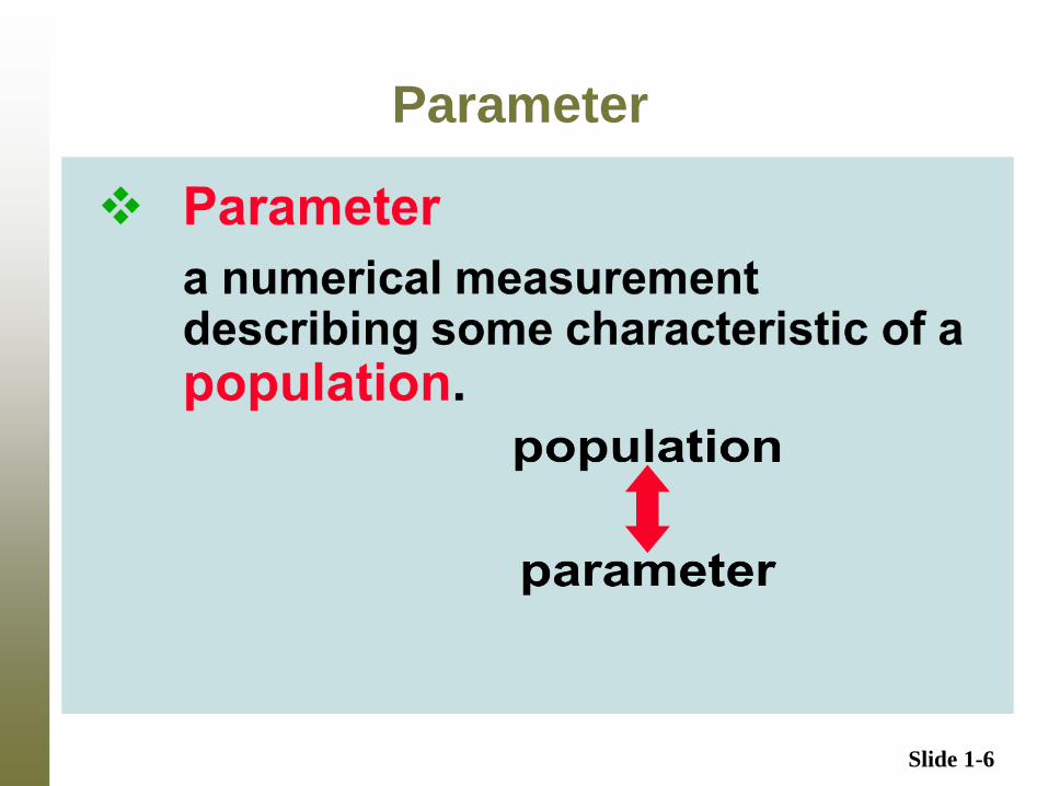
Parameter
Slide 1-7
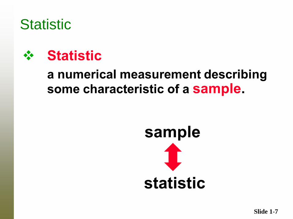
Statistic
Slide 1-8
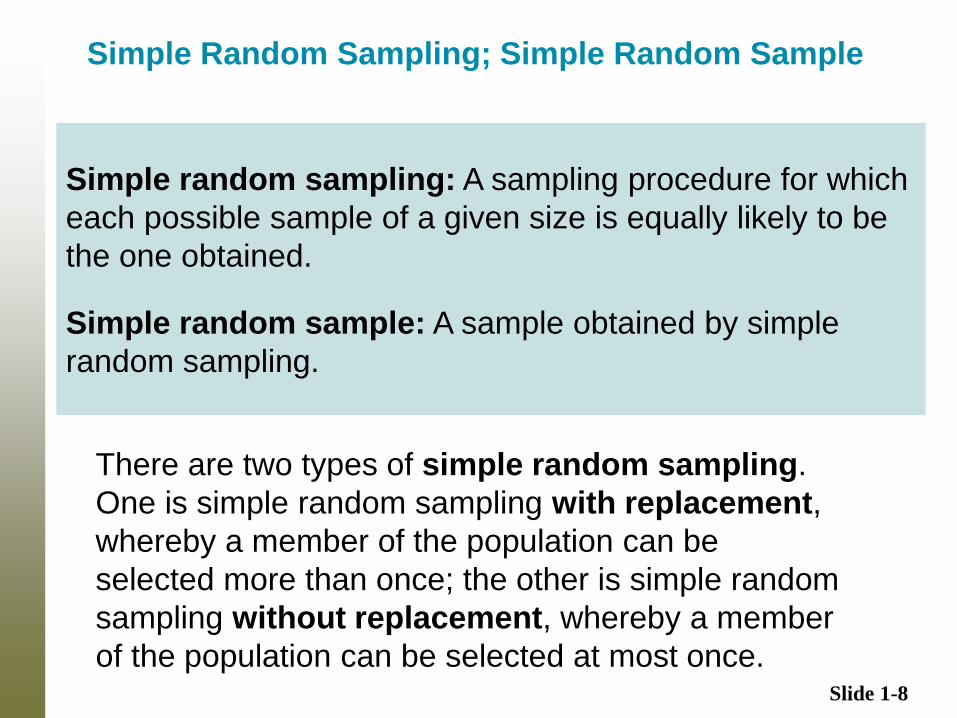
Simple Random Sampling; Simple Random Sample
There are two types of simple random sampling.
One is simple random sampling with replacement,
whereby a member of the population can be
selected more than once; the other is simple random
sampling without replacement, whereby a member
of the population can be selected at most once.
Simple random sampling: A sampling procedure for which
each possible sample of a given size is equally likely to be
the one obtained.
Simple random sample: A sample obtained by simple
random sampling.
Slide 1-9
Basic Data Types
Quantitative ( or numerical or measurement ) data
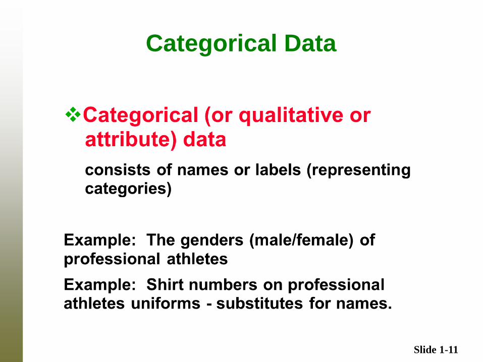
Categorical (or qualitative or attribute) data
Slide 1-10
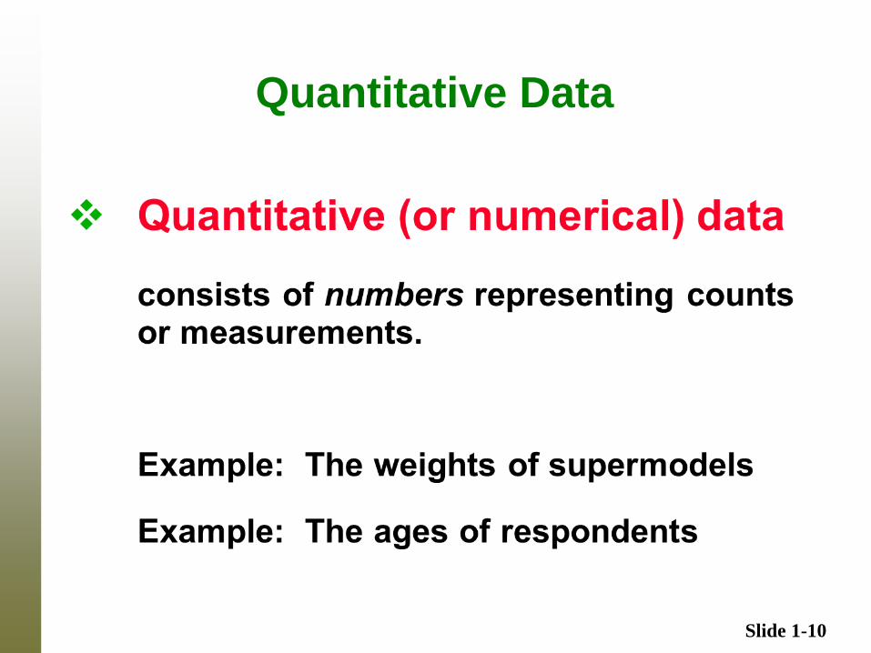
Quantitative Data
Slide 1-11
Categorical Data
Slide 1-12
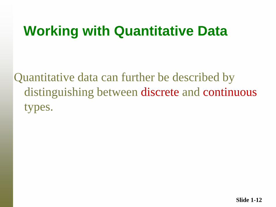
Working with Quantitative Data
Quantitative data can further be described by
distinguishing between discrete and continuous
types.
Slide 1-13
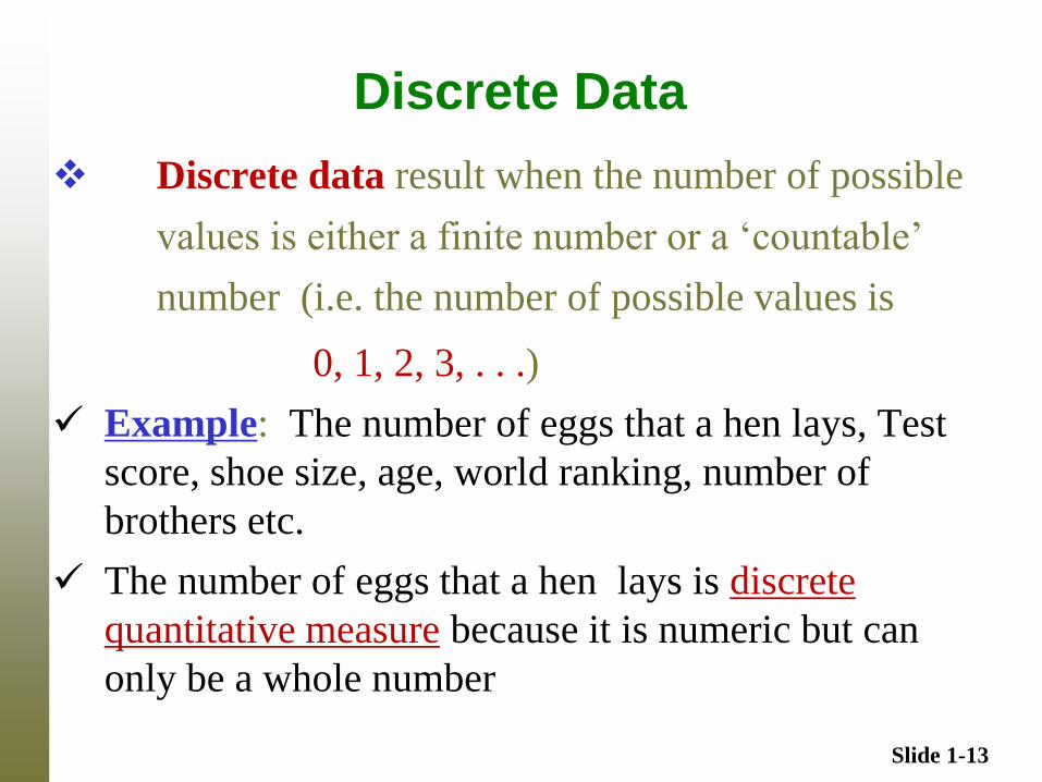
Discrete Data
Discrete data result when the number of possible
values is either a finite number or a ‘countable’
number (i.e. the number of possible values is
0, 1, 2, 3, . . .)
Example: The number of eggs that a hen lays, Test
score, shoe size, age, world ranking, number of
brothers etc.
The number of eggs that a hen lays is discrete
quantitative measure because it is numeric but can
only be a whole number
Slide 1-14
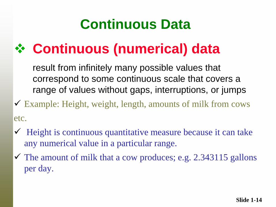
Continuous Data
Continuous (numerical) data
result from infinitely many possible values that
correspond to some continuous scale that covers a
range of values without gaps, interruptions, or jumps
Example: Height, weight, length, amounts of milk from cows
etc.
Height is continuous quantitative measure because it can take
any numerical value in a particular range.
The amount of milk that a cow produces; e.g. 2.343115 gallons
per day.
Slide 1-15
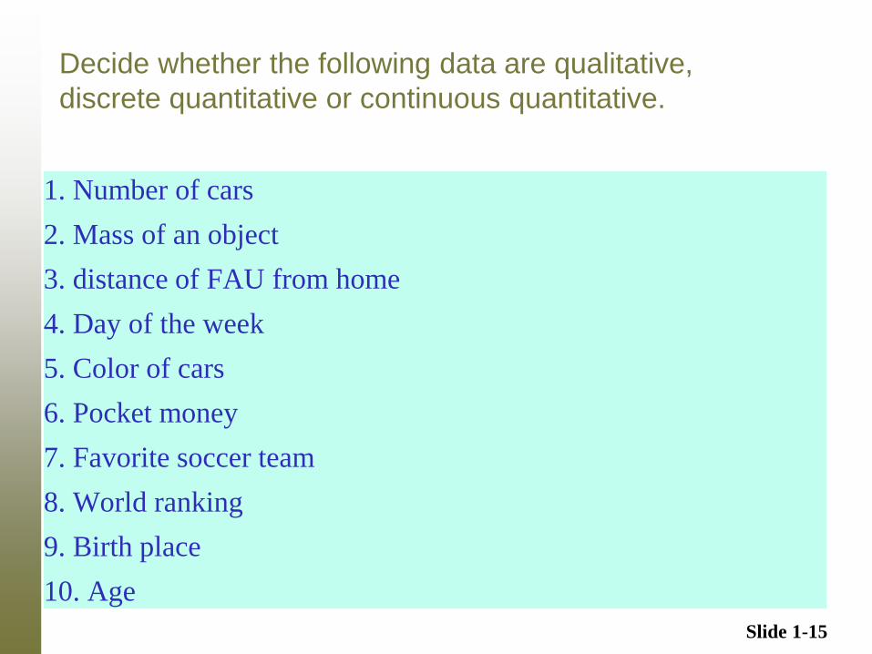
Decide whether the following data are qualitative,
discrete quantitative or continuous quantitative.
1. Number of cars
2. Mass of an object
3. distance of FAU from home
4. Day of the week
5. Color of cars
6. Pocket money
7. Favorite soccer team
8. World ranking
9. Birth place
10. Age
Slide 1-16
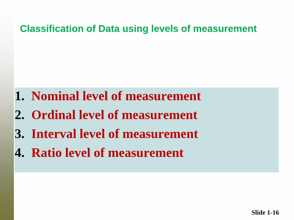
Classification of Data using levels of measurement
1. Nominal level of measurement
2. Ordinal level of measurement
3. Interval level of measurement
4. Ratio level of measurement
Slide 1-17
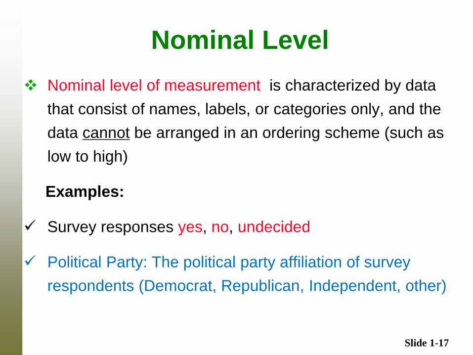
Nominal Level
Nominal level of measurement is characterized by data
that consist of names, labels, or categories only, and the
data cannot be arranged in an ordering scheme (such as
low to high)
Examples:
Survey responses yes, no, undecided
Political Party: The political party affiliation of survey
respondents (Democrat, Republican, Independent, other)
Slide 1-18
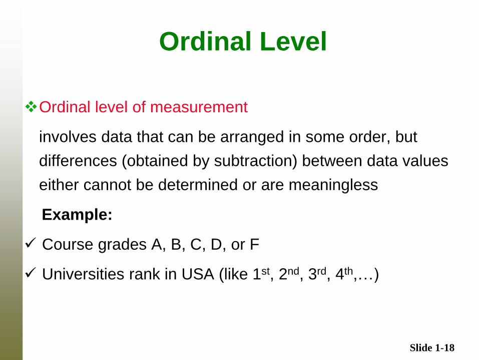
Ordinal Level
Ordinal level of measurement
involves data that can be arranged in some order, but
differences (obtained by subtraction) between data values
either cannot be determined or are meaningless
Example:
Course grades A, B, C, D, or F
Universities rank in USA (like 1st, 2nd, 3rd, 4th,…)
Slide 1-19
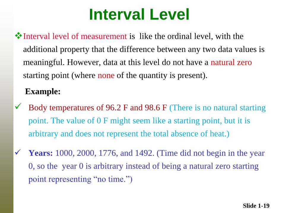
Interval Level
Interval level of measurement is like the ordinal level, with the
additional property that the difference between any two data values is
meaningful. However, data at this level do not have a natural zero
starting point (where none of the quantity is present).
Example:
Body temperatures of 96.2 F and 98.6 F (There is no natural starting
point. The value of 0 F might seem like a starting point, but it is
arbitrary and does not represent the total absence of heat.)
Years: 1000, 2000, 1776, and 1492. (Time did not begin in the year
0, so the year 0 is arbitrary instead of being a natural zero starting
point representing “no time.”)
Slide 1-20
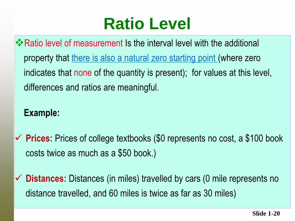
Ratio Level Ratio level of measurement Is the interval level with the additional
property that there is also a natural zero starting point (where zero
indicates that none of the quantity is present); for values at this level,
differences and ratios are meaningful.
Example:
Prices: Prices of college textbooks ($0 represents no cost, a $100 book
costs twice as much as a $50 book.)
Distances: Distances (in miles) travelled by cars (0 mile represents no
distance travelled, and 60 miles is twice as far as 30 miles)
Slide 1-21
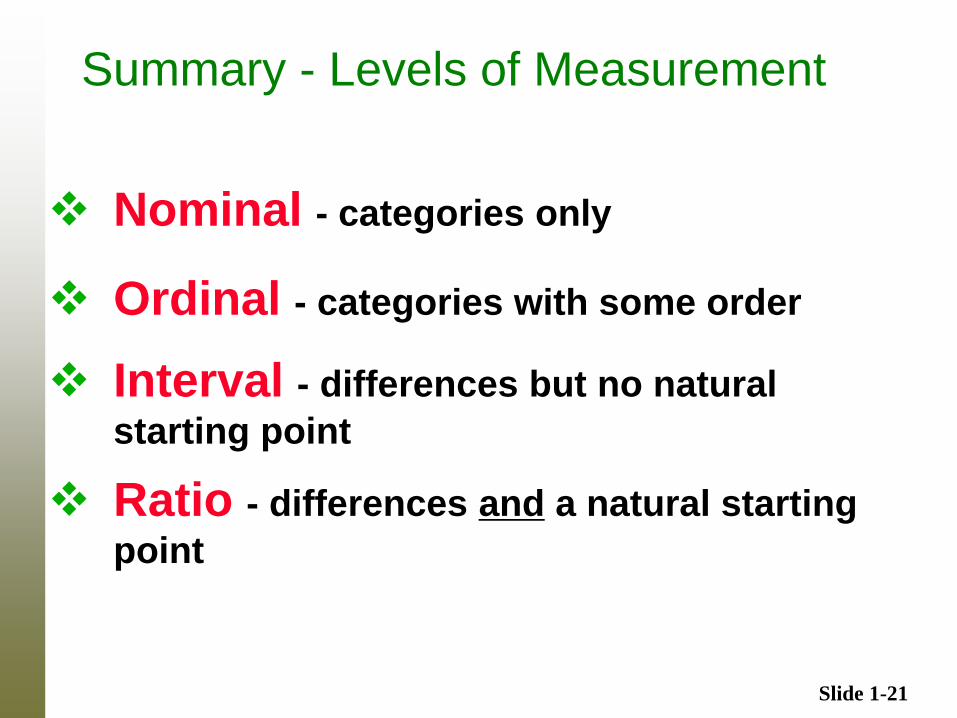
Summary - Levels of Measurement
Nominal - categories only
Ordinal - categories with some order
Interval - differences but no natural
starting point
Ratio - differences and a natural starting
point
Slide 1-22
Chapter 2
Summarizing and Graphing Data
Slide 1-23
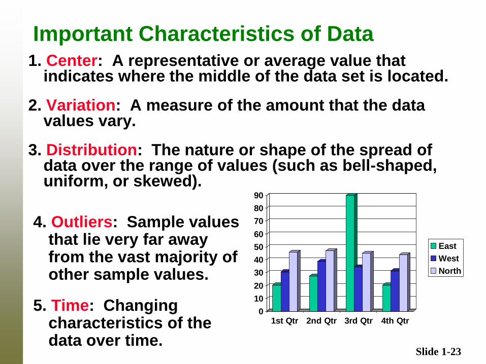
Important Characteristics of Data 1. Center: A representative or average value that
indicates where the middle of the data set is located.
2. Variation: A measure of the amount that the data values vary.
3. Distribution: The nature or shape of the spread of data over the range of values (such as bell-shaped, uniform, or skewed).
0
10
20
30
40
50
60
70
80
90
1st Qtr 2nd Qtr 3rd Qtr 4th Qtr
East
West
North
4. Outliers: Sample values that lie very far away from the vast majority of other sample values.
5. Time: Changing characteristics of the data over time.
Slide 1-24
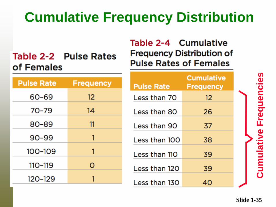
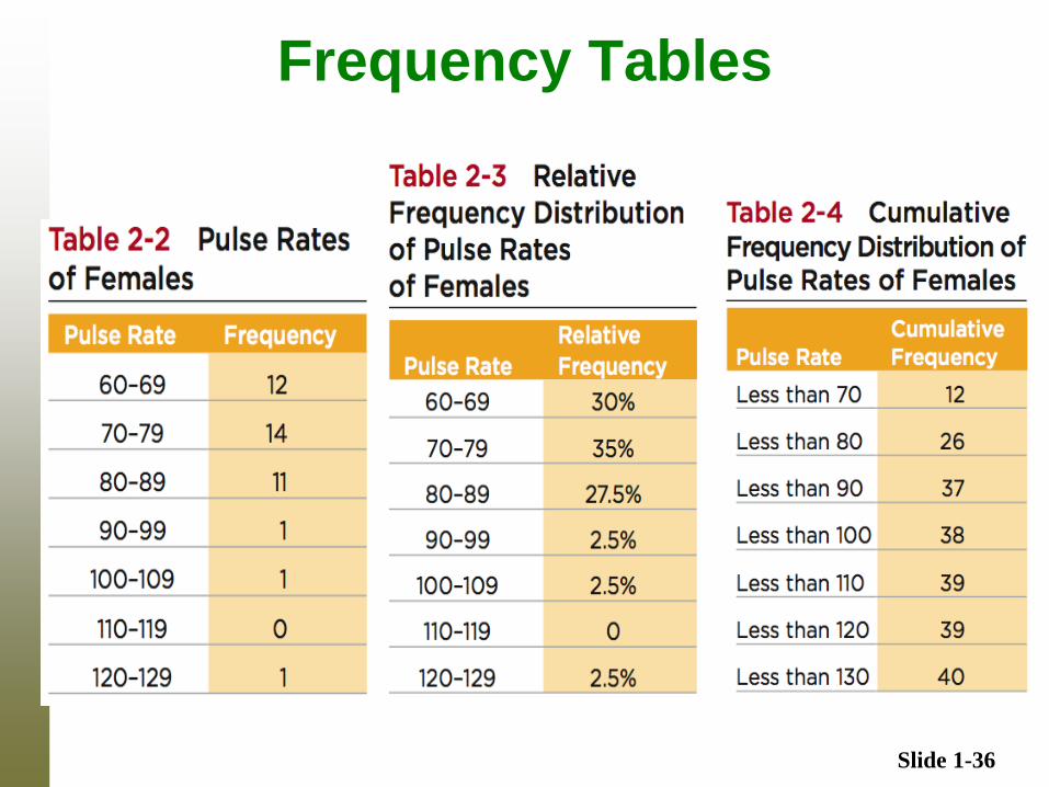
Frequency Distribution (or Frequency Table)
In statistics, a frequency distribution is an
arrangement of the values that one or more
variables take in a sample. Each entry in the
table contains the frequency or count of the
occurrences of values within a particular group
or interval, and in this way, the table
summarizes the distribution of values in the
sample.
Slide 1-25
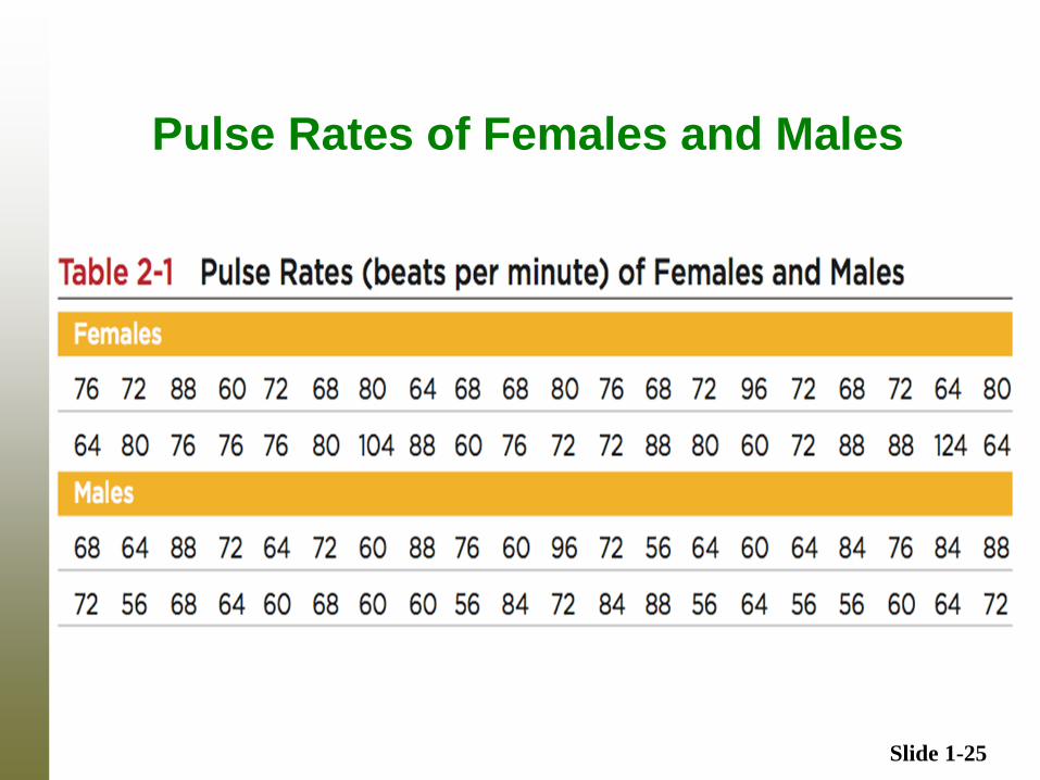
Pulse Rates of Females and Males
Slide 1-26
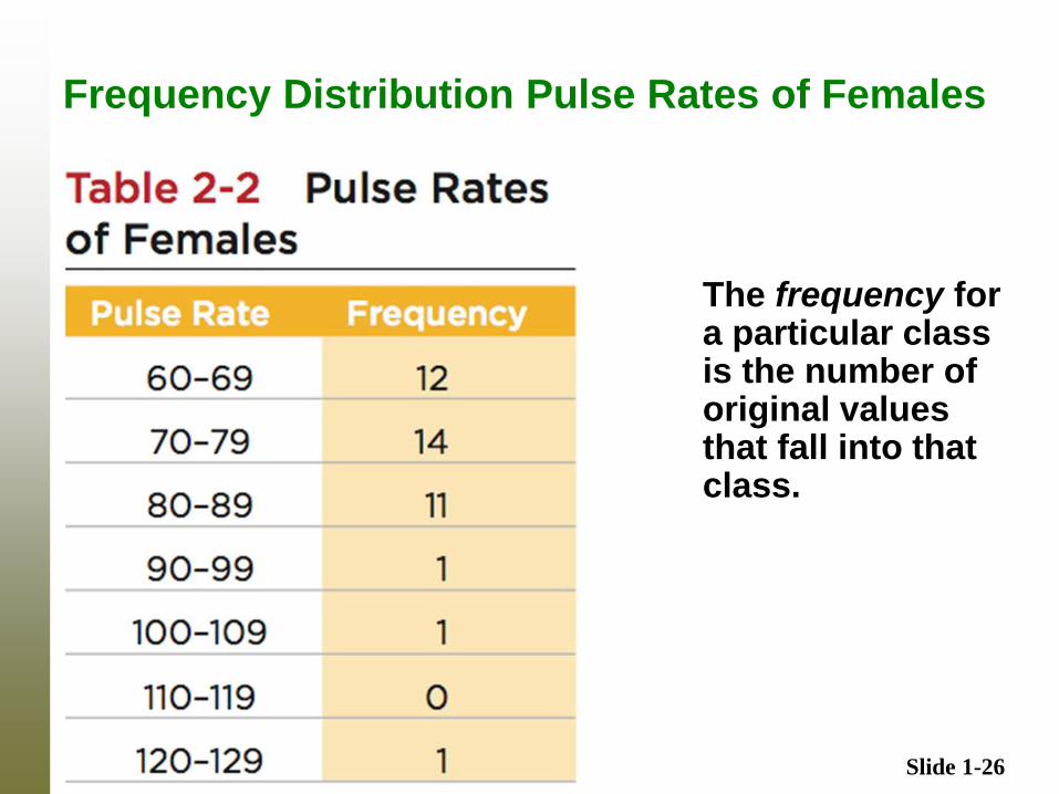
Frequency Distribution Pulse Rates of Females
The frequency for a particular class is the number of original values that fall into that class.
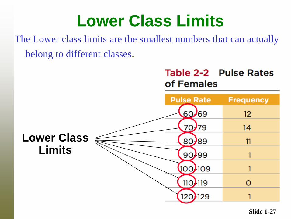
Slide 1-27
Lower Class Limits The Lower class limits are the smallest numbers that can actually
belong to different classes.
Lower Class Limits
Slide 1-28
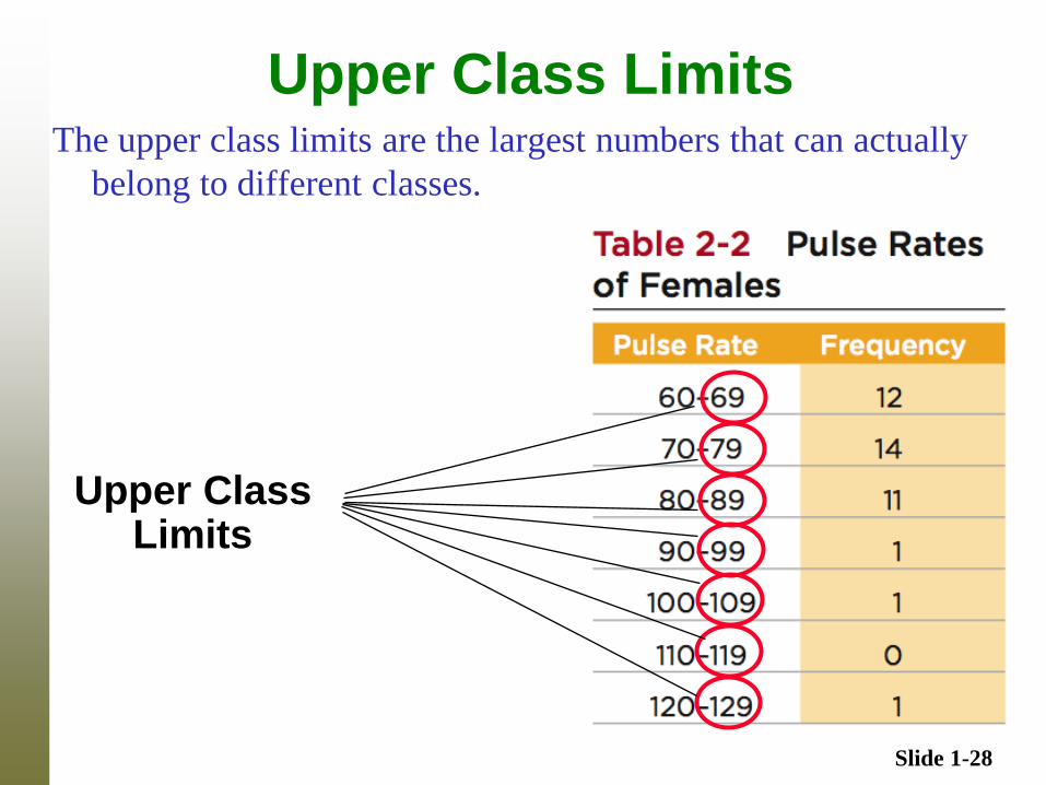
Upper Class Limits The upper class limits are the largest numbers that can actually
belong to different classes.
Upper Class Limits
Slide 1-29
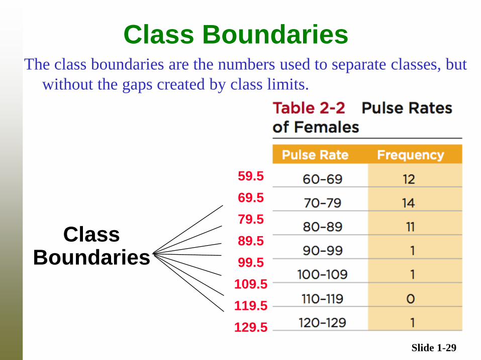
Class Boundaries The class boundaries are the numbers used to separate classes, but
without the gaps created by class limits.
59.5
69.5
79.5
89.5
99.5
109.5
119.5
129.5
Class Boundaries
Slide 1-30
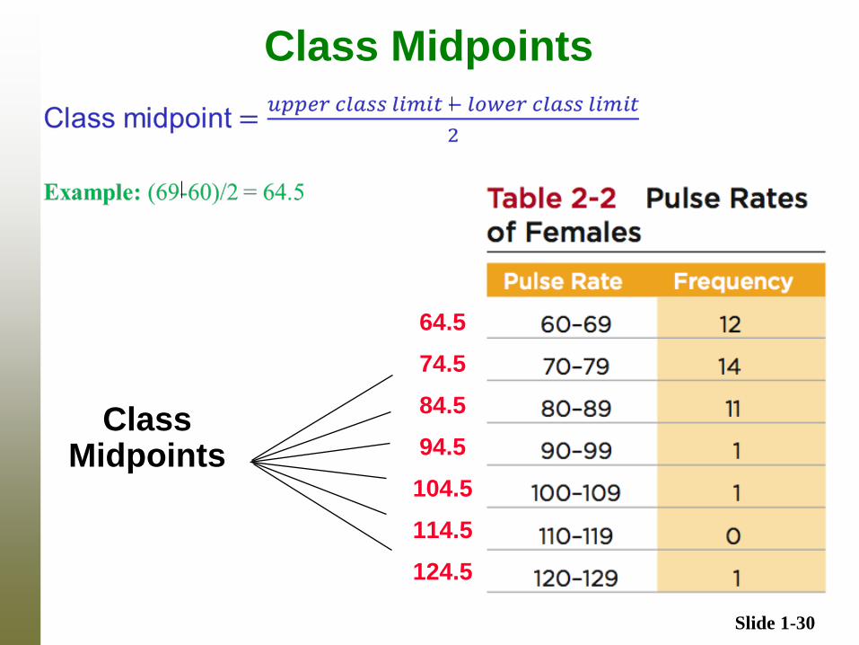
Class Midpoints
64.5
74.5
84.5
94.5
104.5
114.5
124.5
Class Midpoints
Slide 1-31
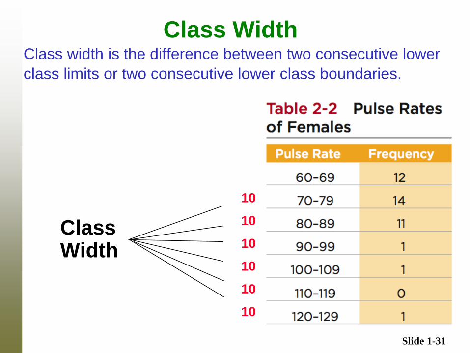
Class Width Class width is the difference between two consecutive lower
class limits or two consecutive lower class boundaries.
Class Width
10
10
10
10
10
10
Slide 1-32
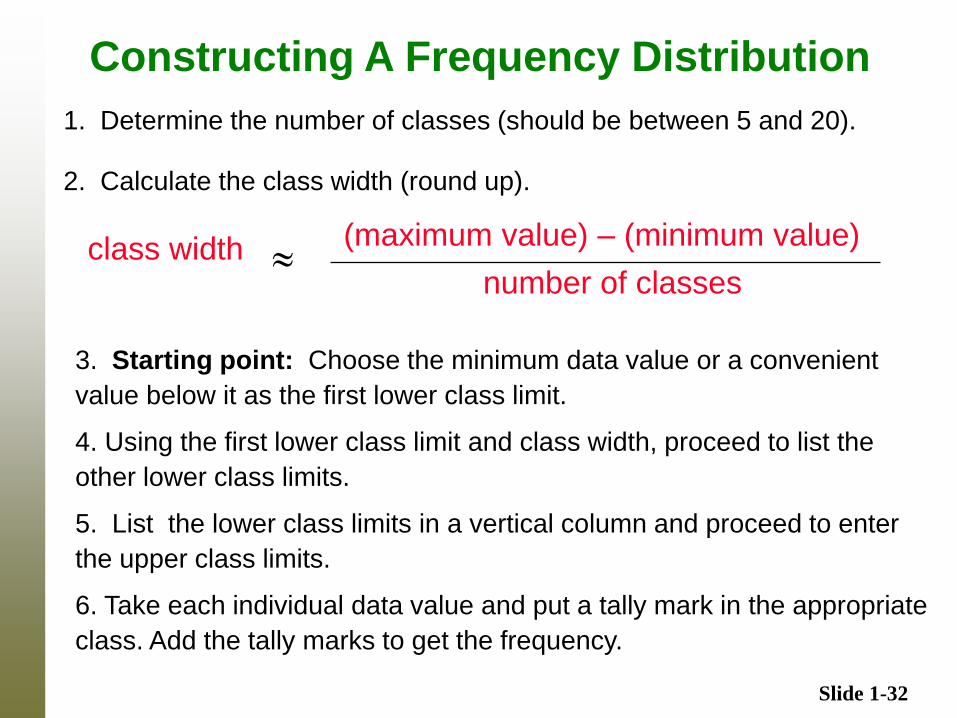
Constructing A Frequency Distribution
3. Starting point: Choose the minimum data value or a convenient
value below it as the first lower class limit.
4. Using the first lower class limit and class width, proceed to list the
other lower class limits.
5. List the lower class limits in a vertical column and proceed to enter
the upper class limits.
6. Take each individual data value and put a tally mark in the appropriate
class. Add the tally marks to get the frequency.
class width (maximum value) – (minimum value)
number of classes
1. Determine the number of classes (should be between 5 and 20).
2. Calculate the class width (round up).
Slide 1-33
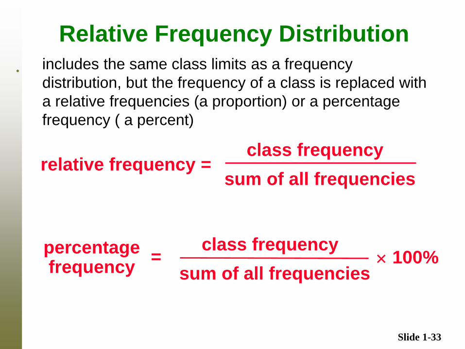
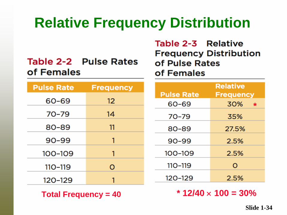
Relative Frequency Distribution
. includes the same class limits as a frequency
distribution, but the frequency of a class is replaced with
a relative frequencies (a proportion) or a percentage
frequency ( a percent)
relative frequency = class frequency
sum of all frequencies
percentage frequency
class frequency
sum of all frequencies 100% =
Slide 1-34
Relative Frequency Distribution
Total Frequency = 40 * 12/40 100 = 30%
*
Slide 1-35
Cumulative Frequency Distribution
Cu
mu
lati
ve F
req
uen
cie
s
Slide 1-36
Frequency Tables
Slide 1-37
Characteristic of Normal Distribution
It has a “bell” shape.
The frequencies start low, then increase to one or two high
frequencies, then decrease to a low frequency.
The distribution is approximately symmetric, with
frequencies preceding the maximum being roughly a mirror
image of those that follow the maximum.
Slide 1-38
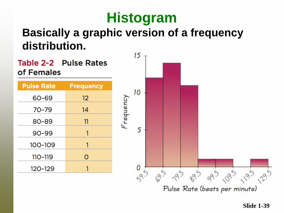
Histogram
A graph consisting of bars of equal width
drawn adjacent to each other (without gaps).
The horizontal scale represents the classes
of quantitative data values and the vertical
scale represents the frequencies. The
heights of the bars correspond to the
frequency values.
Slide 1-39
Histogram Basically a graphic version of a frequency
distribution.
Slide 1-40
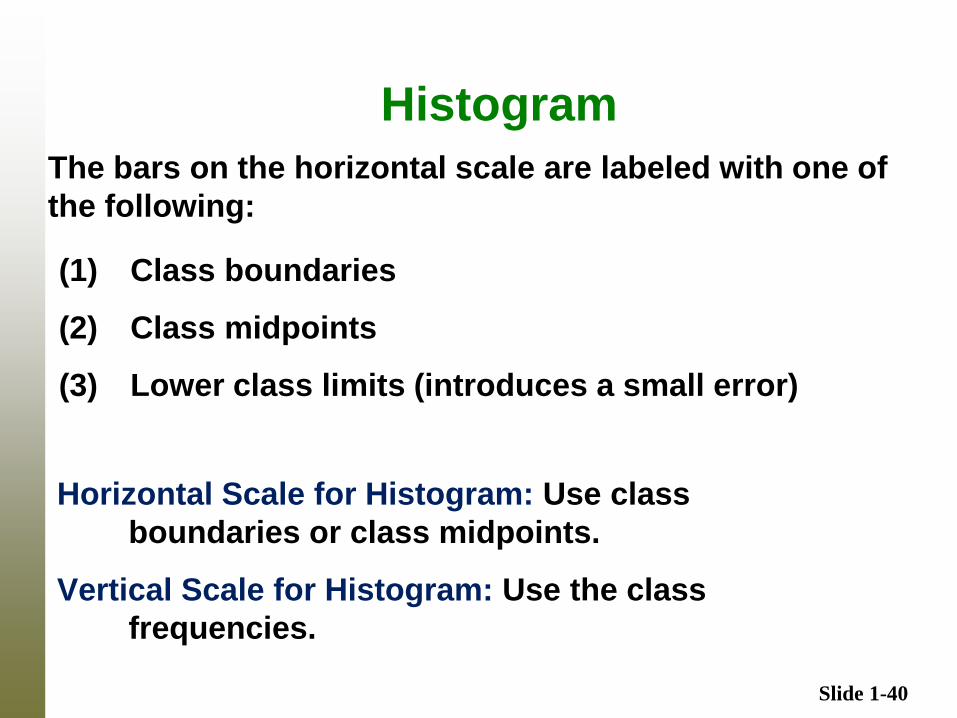
Histogram
The bars on the horizontal scale are labeled with one of
the following:
(1) Class boundaries
(2) Class midpoints
(3) Lower class limits (introduces a small error)
Horizontal Scale for Histogram: Use class
boundaries or class midpoints.
Vertical Scale for Histogram: Use the class
frequencies.
Slide 1-41
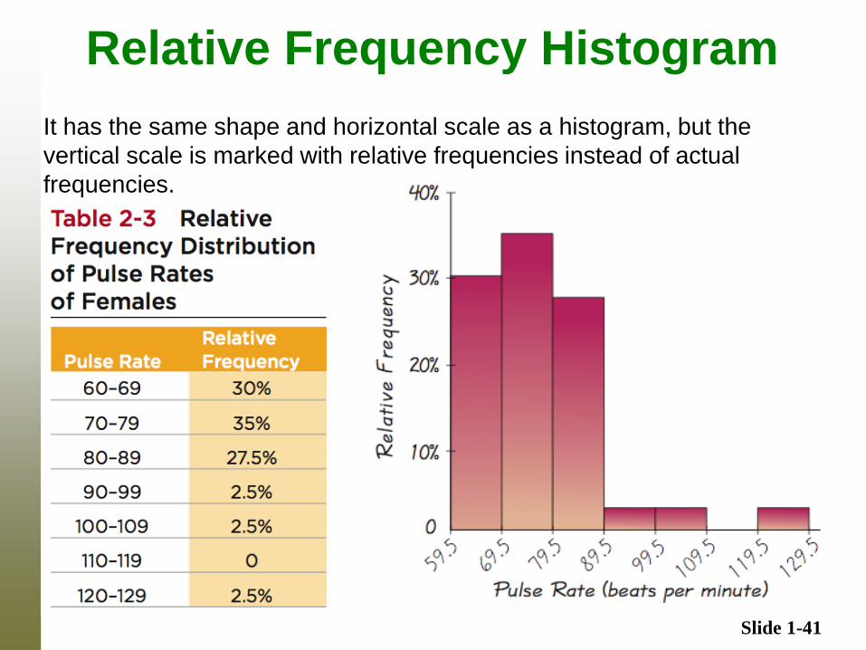
Relative Frequency Histogram
It has the same shape and horizontal scale as a histogram, but the
vertical scale is marked with relative frequencies instead of actual
frequencies.
Slide 1-42
Interpreting Histograms
When graphed, a normal distribution has a “bell” shape.
Characteristic of the bell shape are
(1) The frequencies increase to a maximum, and then
decrease, and
(2) symmetry, with the left half of the graph roughly a
mirror image of the right half.
The histogram on the next slide illustrates this.
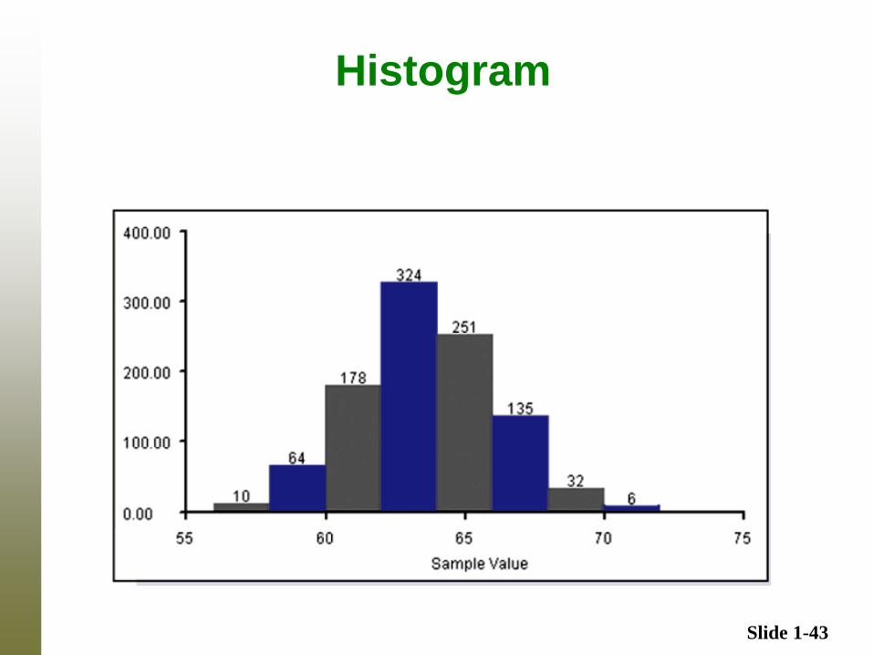
Slide 1-43
Histogram
Slide 1-44
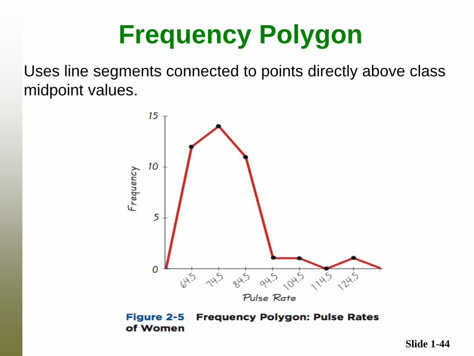
Frequency Polygon
Uses line segments connected to points directly above class
midpoint values.
Slide 1-45
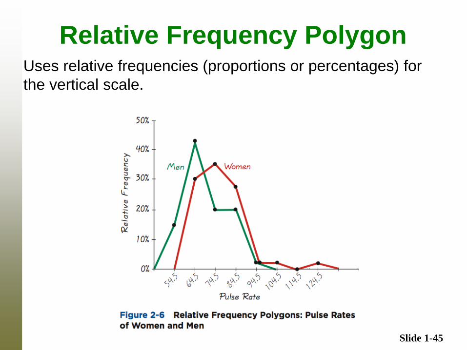
Relative Frequency Polygon Uses relative frequencies (proportions or percentages) for
the vertical scale.
Slide 1-46
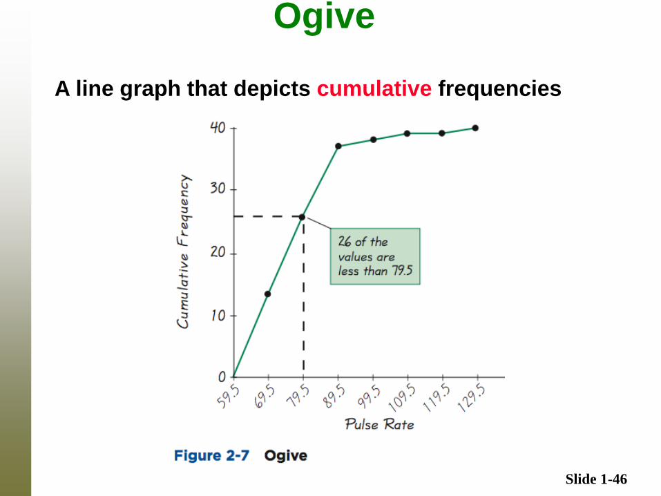
Ogive
A line graph that depicts cumulative frequencies
Slide 1-47
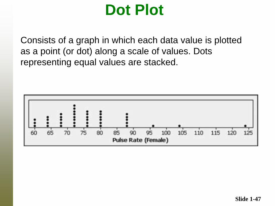
Dot Plot
Consists of a graph in which each data value is plotted
as a point (or dot) along a scale of values. Dots
representing equal values are stacked.
Slide 1-48
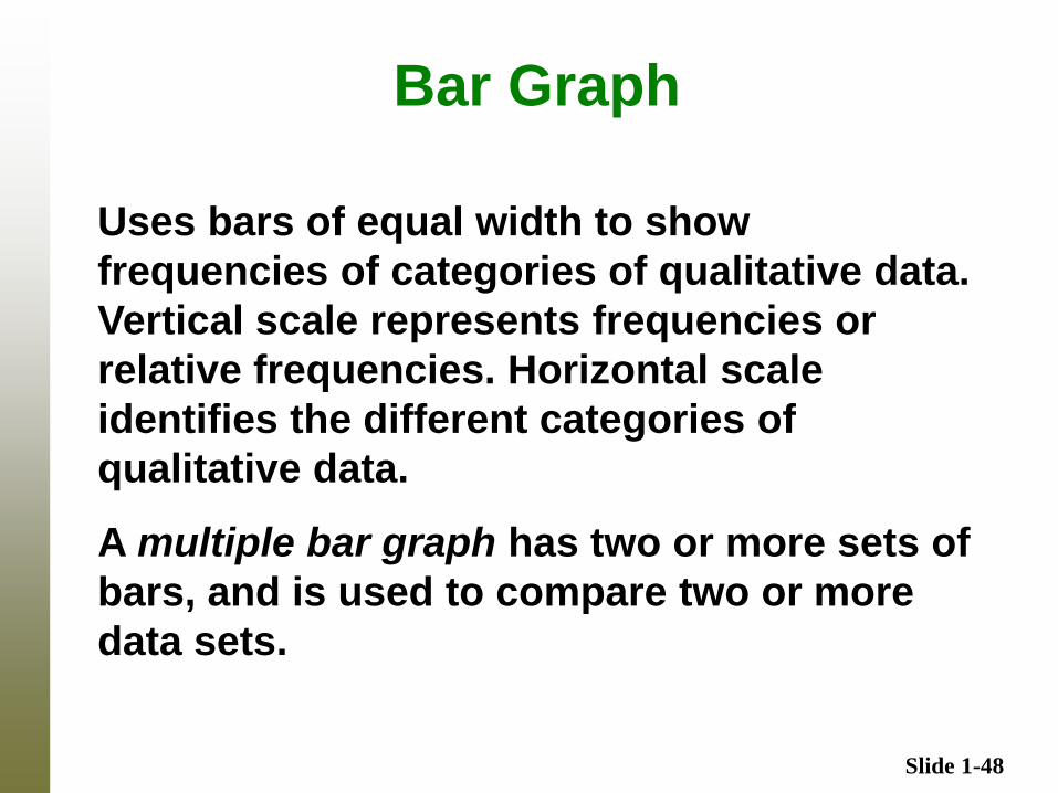
Bar Graph
Uses bars of equal width to show
frequencies of categories of qualitative data.
Vertical scale represents frequencies or
relative frequencies. Horizontal scale
identifies the different categories of
qualitative data.
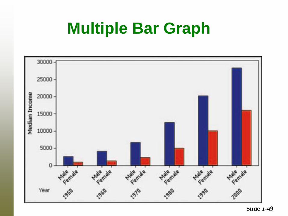
A multiple bar graph has two or more sets of
bars, and is used to compare two or more
data sets.
Slide 1-49
Multiple Bar Graph
Slide 1-50
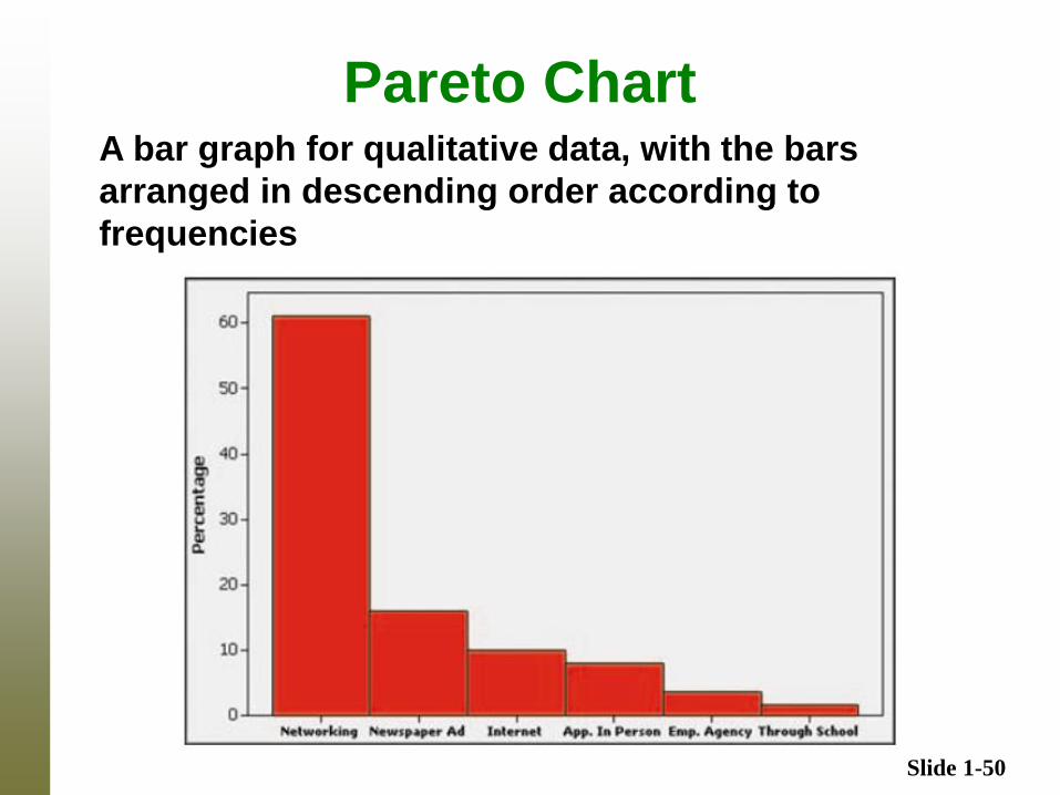
Pareto Chart A bar graph for qualitative data, with the bars
arranged in descending order according to
frequencies
Slide 1-51
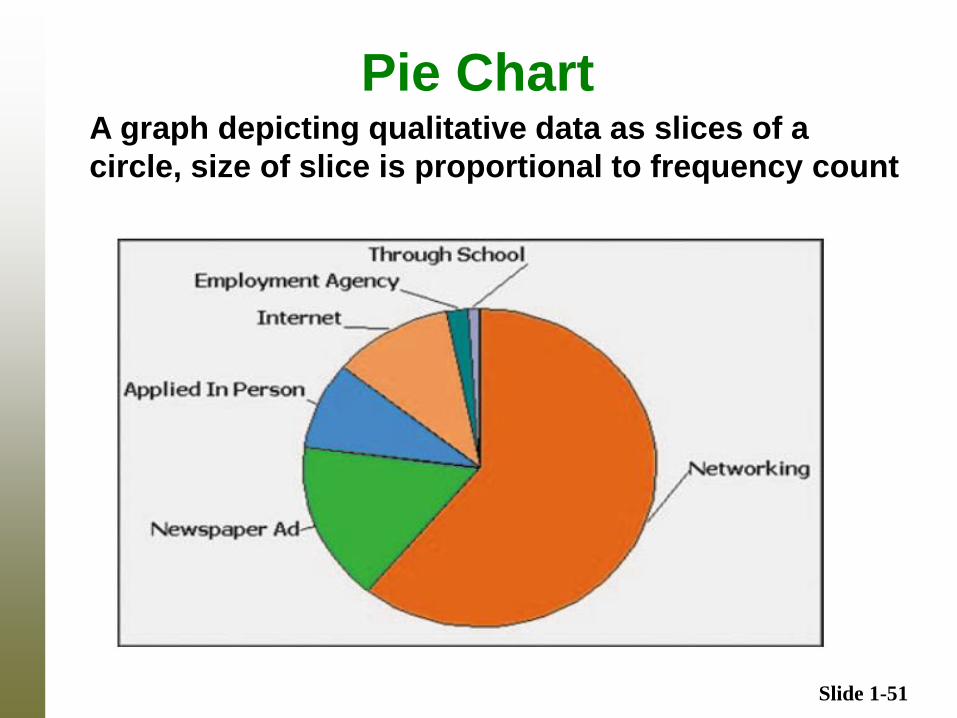
Pie Chart A graph depicting qualitative data as slices of a
circle, size of slice is proportional to frequency count
Slide 1-52
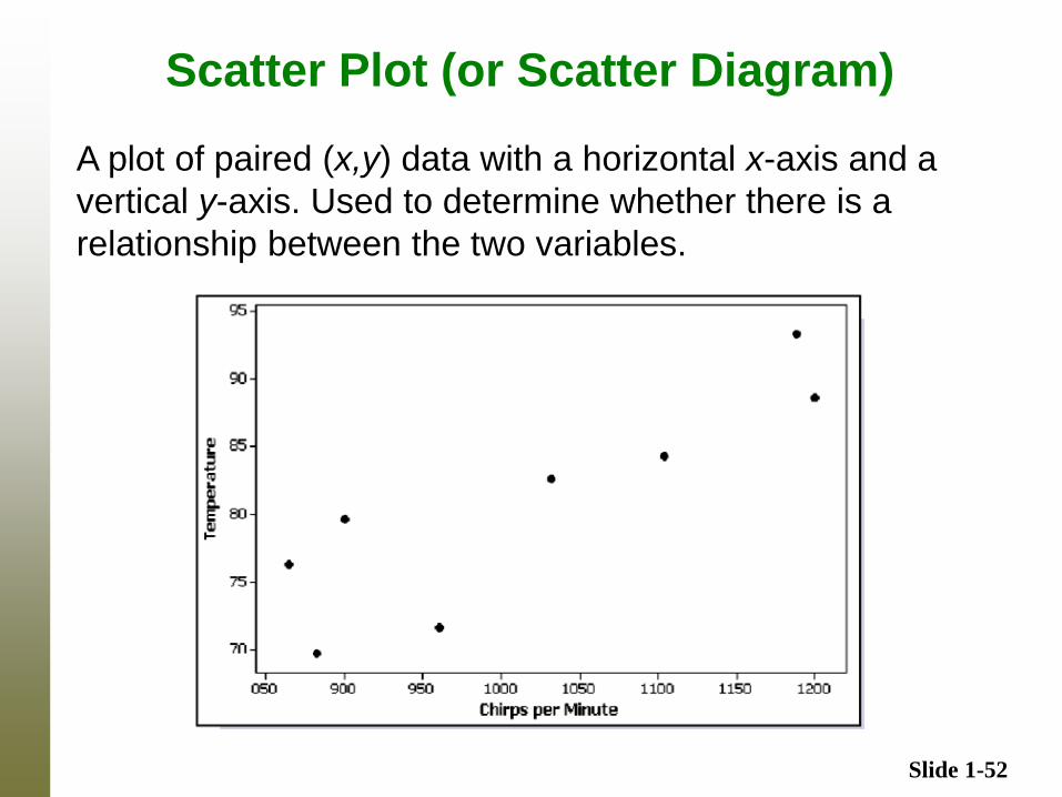
Scatter Plot (or Scatter Diagram)
A plot of paired (x,y) data with a horizontal x-axis and a
vertical y-axis. Used to determine whether there is a
relationship between the two variables.
Slide 1-53
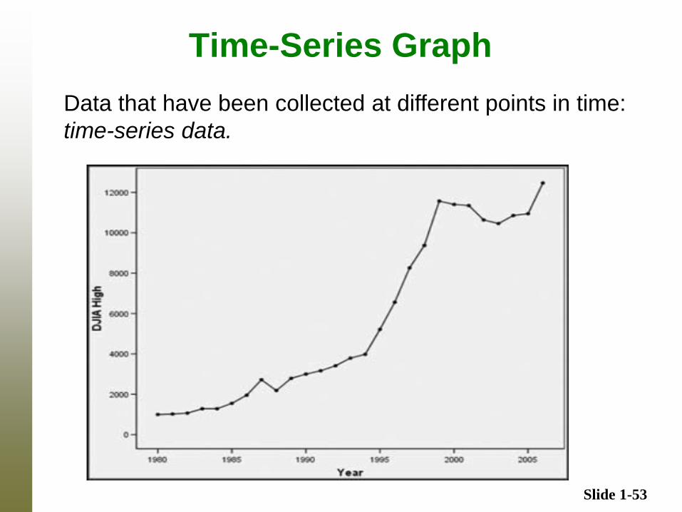
Time-Series Graph
Data that have been collected at different points in time:
time-series data.