Embed Size (px)
Citation preview
Emma Goodgion
Pippin Poppycock
1/1/2018
Color Theory – Crochet
Pippin Poppycock
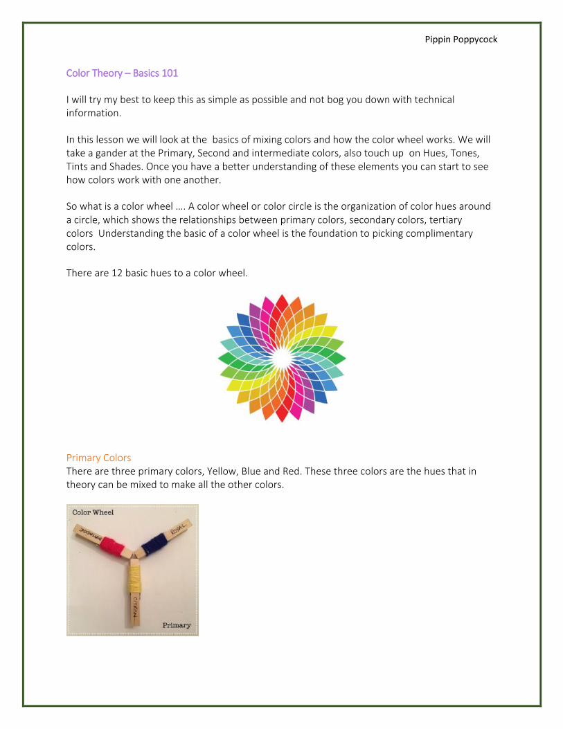
Color Theory – Basics 101
I will try my best to keep this as simple as possible and not bog you down with technical information.
In this lesson we will look at the basics of mixing colors and how the color wheel works. We will take a gander at the Primary, Second and intermediate colors, also touch up on Hues, Tones, Tints and Shades. Once you have a better understanding of these elements you can start to see how colors work with one another.
So what is a color wheel …. A color wheel or color circle is the organization of color hues around a circle, which shows the relationships between primary colors, secondary colors, tertiary colors Understanding the basic of a color wheel is the foundation to picking complimentary colors.
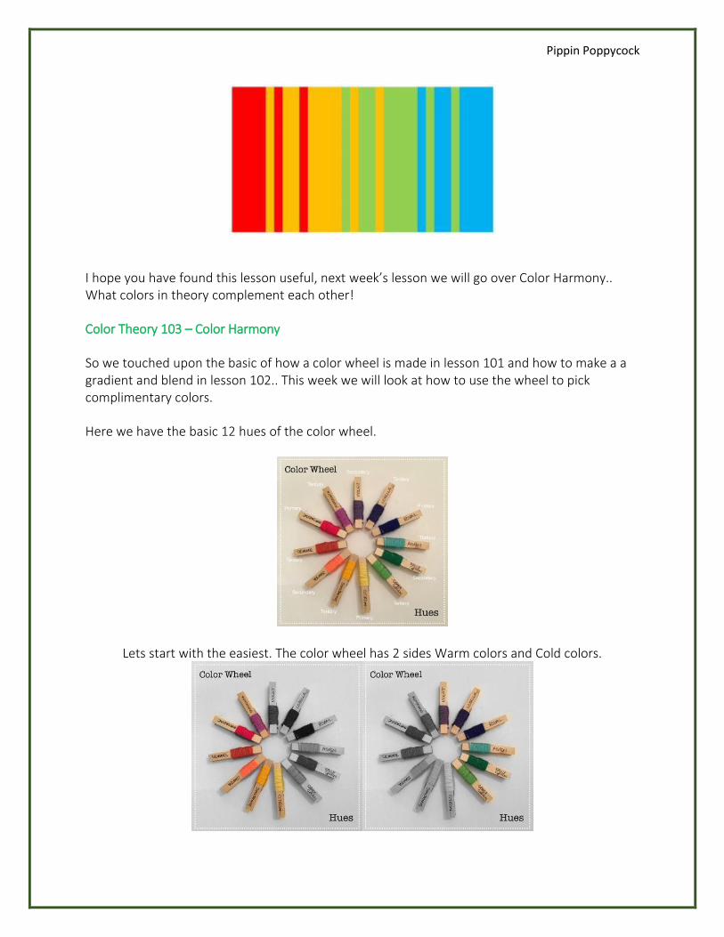
There are 12 basic hues to a color wheel.
Primary Colors There are three primary colors, Yellow, Blue and Red. These three colors are the hues that in theory can be mixed to make all the other colors.
Pippin Poppycock
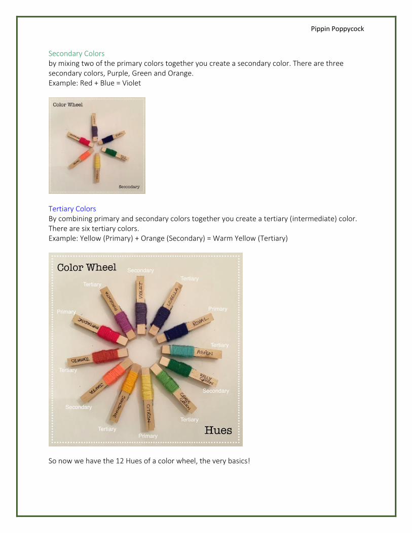
Secondary Colors by mixing two of the primary colors together you create a secondary color. There are three secondary colors, Purple, Green and Orange. Example: Red + Blue = Violet
Tertiary Colors By combining primary and secondary colors together you create a tertiary (intermediate) color. There are six tertiary colors. Example: Yellow (Primary) + Orange (Secondary) = Warm Yellow (Tertiary)
So now we have the 12 Hues of a color wheel, the very basics!
Pippin Poppycock
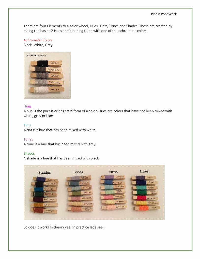
There are four Elements to a color wheel, Hues, Tints, Tones and Shades. These are created by taking the basic 12 Hues and blending them with one of the achromatic colors.
Achromatic Colors Black, White, Grey
Hues A hue is the purest or brightest form of a color. Hues are colors that have not been mixed with white, grey or black.
Tints A tint is a hue that has been mixed with white.
Tones A tone is a hue that has been mixed with grey.
Shades A shade is a hue that has been mixed with black
So does it work! In theory yes! In practice let’s see…
Pippin Poppycock
Here I have taken 7 bright Hues, as you can see they work well together.. Bright, cheerful and warm. Great for children’s color schemes
Here I worked up 7 Tints, as you can see they take a pastel effect, soft, mellow and calming, great for babies and spring color schemes
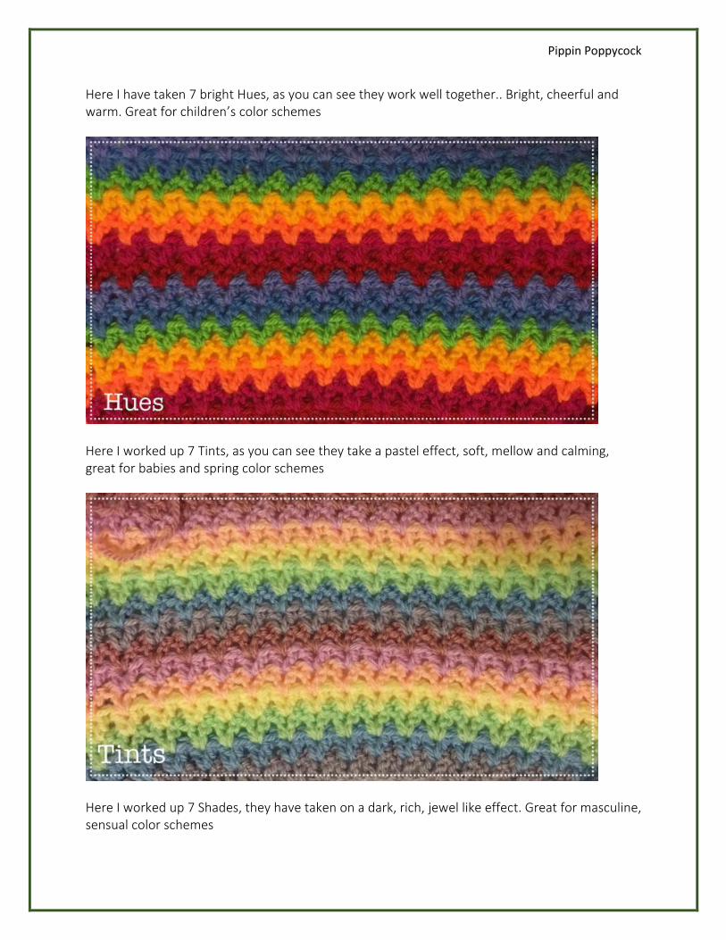
Here I worked up 7 Shades, they have taken on a dark, rich, jewel like effect. Great for masculine, sensual color schemes
Pippin Poppycock
Color Theory 102 – Blends Gradients and Ombre
Monochromatic Scheme is the technical term for blends, Gradients and ombre’s
In lesson 101 “The basics” we touched up on Tones, Tints and Shades. These elements of color theory are the basis to creating blends, Gradients and Ombre effects.
Think of Blends Gradients and Ombre as cake recipe, you start of with your dry ingredients and slowly add you wet ingredients, the more wet ingredients added the thinner/lighter the mixture becomes the more dry ingredients added the thicker/heavy the mixture becomes
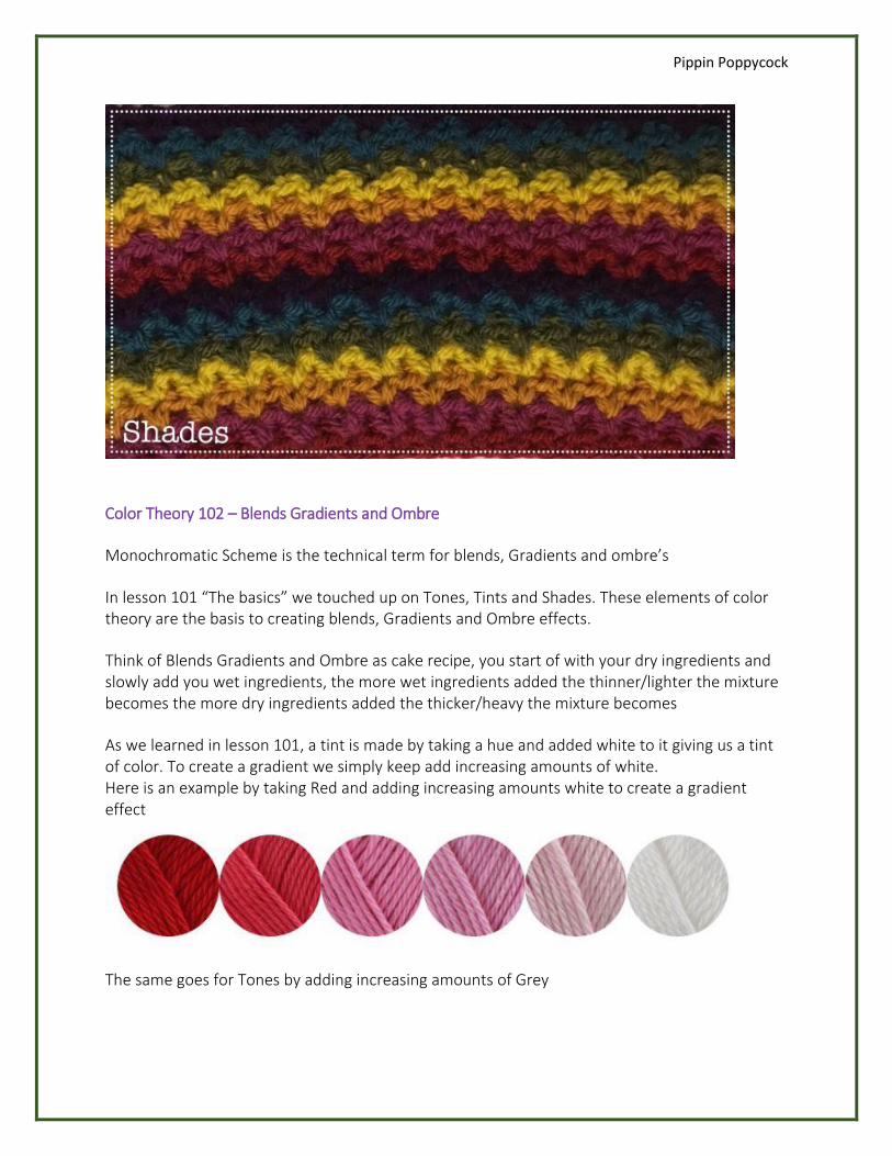
As we learned in lesson 101, a tint is made by taking a hue and added white to it giving us a tint of color. To create a gradient we simply keep add increasing amounts of white. Here is an example by taking Red and adding increasing amounts white to create a gradient effect
The same goes for Tones by adding increasing amounts of Grey
Pippin Poppycock
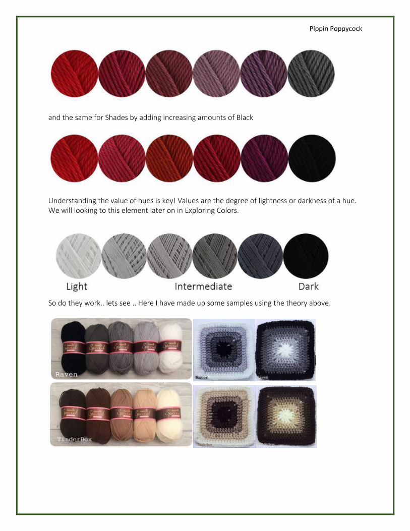
and the same for Shades by adding increasing amounts of Black
Understanding the value of hues is key! Values are the degree of lightness or darkness of a hue. We will looking to this element later on in Exploring Colors.
So do they work.. lets see .. Here I have made up some samples using the theory above.
Pippin Poppycock
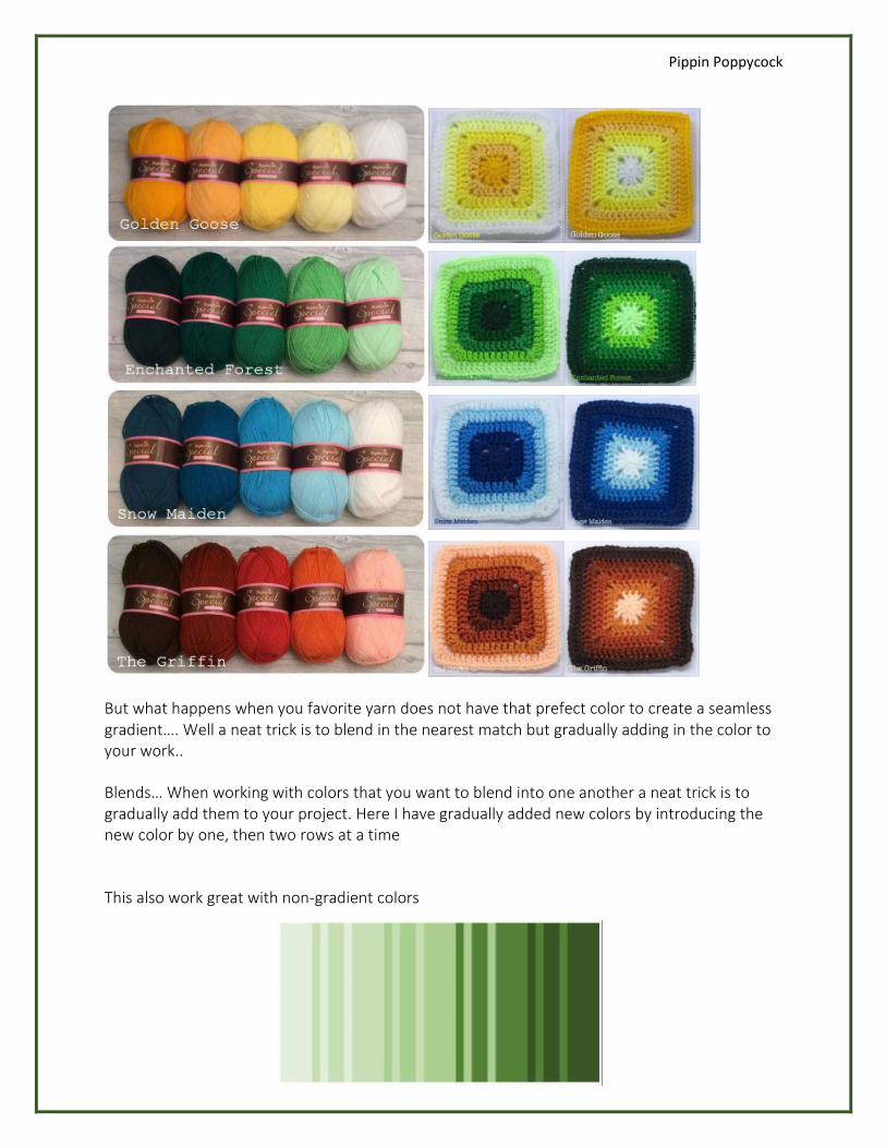
But what happens when you favorite yarn does not have that prefect color to create a seamless gradient…. Well a neat trick is to blend in the nearest match but gradually adding in the color to your work..
Blends… When working with colors that you want to blend into one another a neat trick is to gradually add them to your project. Here I have gradually added new colors by introducing the new color by one, then two rows at a time
This also work great with non-gradient colors
Pippin Poppycock
I hope you have found this lesson useful, next week’s lesson we will go over Color Harmony.. What colors in theory complement each other!
Color Theory 103 – Color Harmony
So we touched upon the basic of how a color wheel is made in lesson 101 and how to make a a gradient and blend in lesson 102.. This week we will look at how to use the wheel to pick complimentary colors.
Here we have the basic 12 hues of the color wheel.
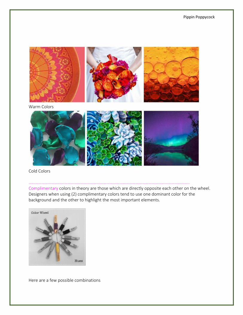
Lets start with the easiest. The color wheel has 2 sides Warm colors and Cold colors.
Pippin Poppycock
Warm Colors
Cold Colors
………………………………………………………………………………………………………………………………….. Complimentary colors in theory are those which are directly opposite each other on the wheel. Designers when using (2) complimentary colors tend to use one dominant color for the background and the other to highlight the most important elements.
Here are a few possible combinations
Pippin Poppycock
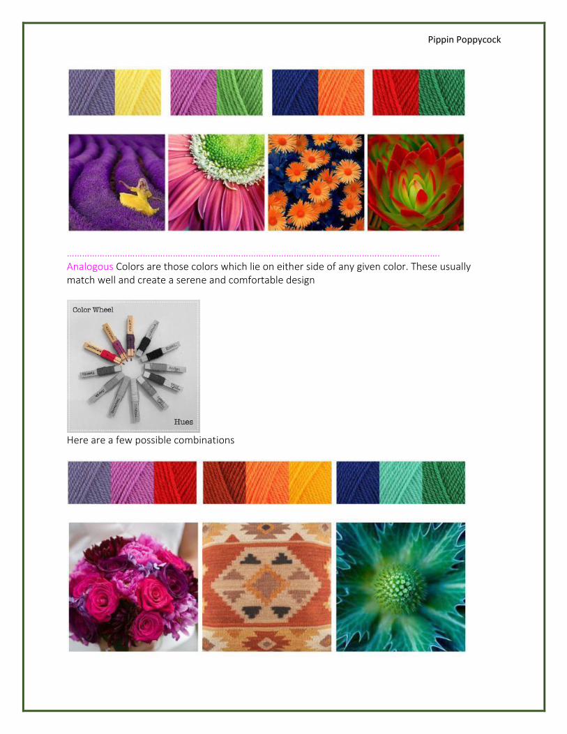
…………………………………………………………………………………………………………………………………. Analogous Colors are those colors which lie on either side of any given color. These usually match well and create a serene and comfortable design
Here are a few possible combinations
Pippin Poppycock
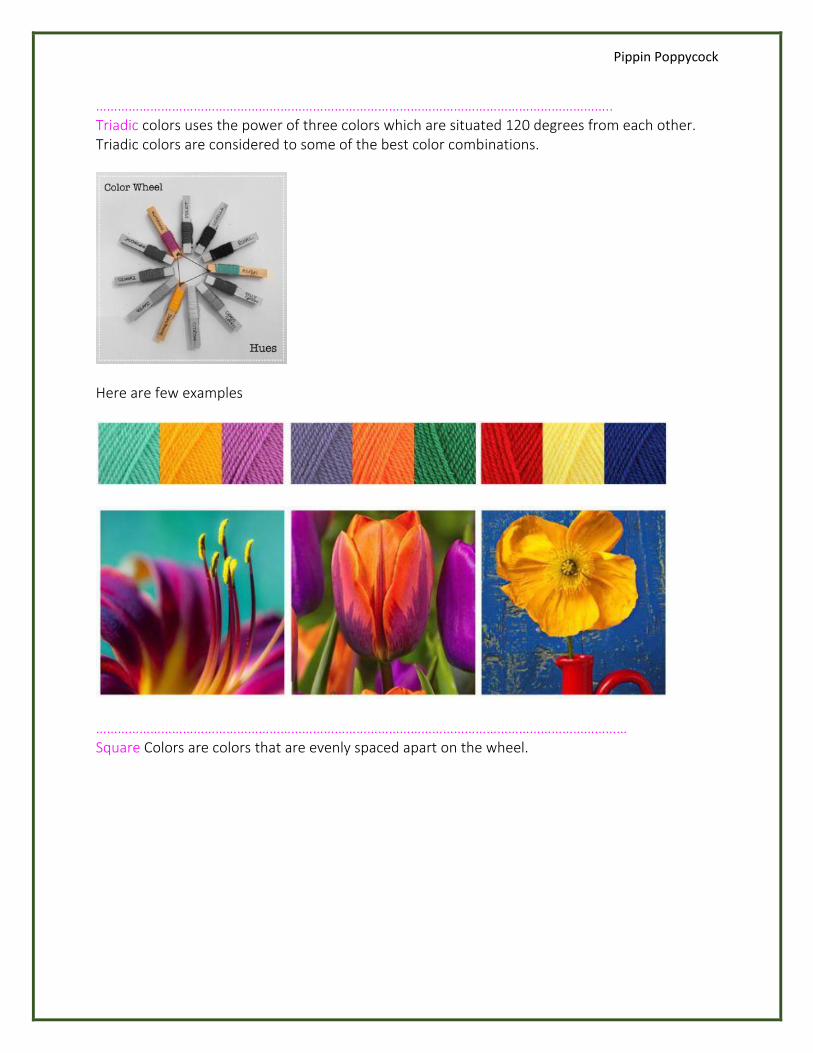
…………………………………………………………………………………………………………………………….. Triadic colors uses the power of three colors which are situated 120 degrees from each other. Triadic colors are considered to some of the best color combinations.
Here are few examples
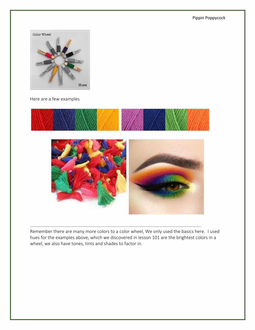
………………………………………………………………………………………………………………………………… Square Colors are colors that are evenly spaced apart on the wheel.
Pippin Poppycock
Here are a few examples
……………………………………………………………………………………………………………………………………. Remember there are many more colors to a color wheel, We only used the basics here. I used hues for the examples above, which we discovered in lesson 101 are the brightest colors in a wheel, we also have tones, tints and shades to factor in.
Pippin Poppycock
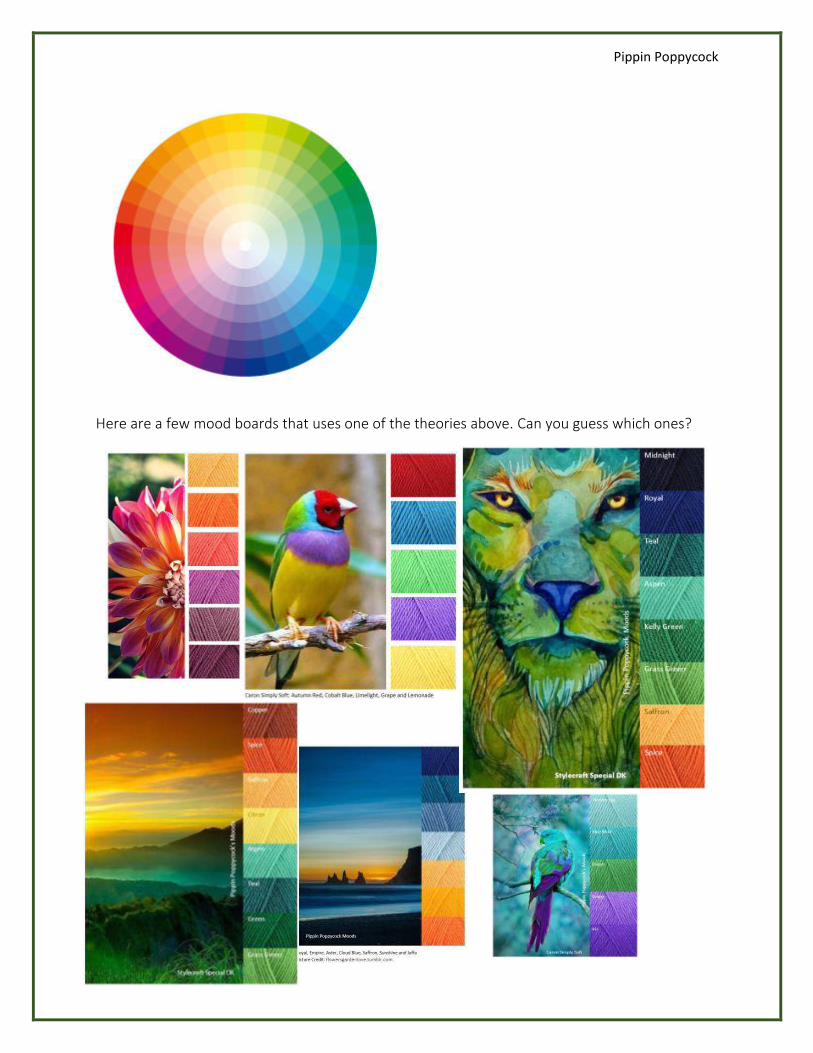
Here are a few mood boards that uses one of the theories above. Can you guess which ones?
Pippin Poppycock
Color Theory 104 – Exploring Colors
Tools
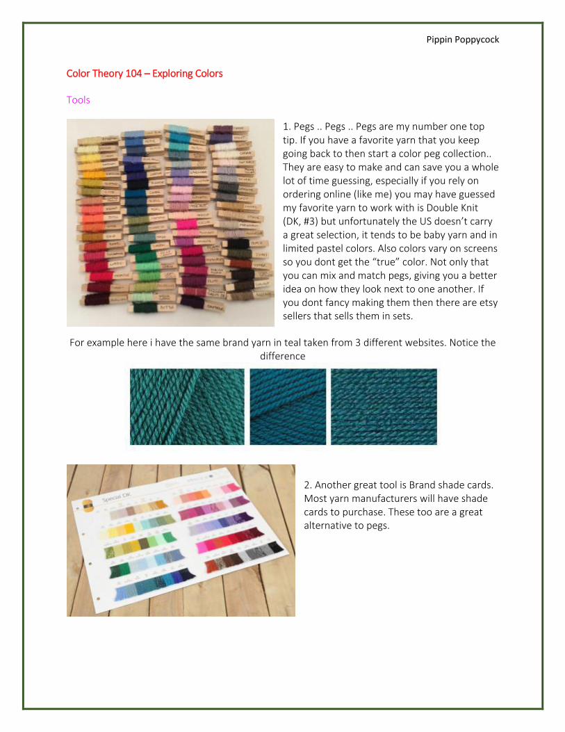
1. Pegs .. Pegs .. Pegs are my number one top tip. If you have a favorite yarn that you keep going back to then start a color peg collection.. They are easy to make and can save you a whole lot of time guessing, especially if you rely on ordering online (like me) you may have guessed my favorite yarn to work with is Double Knit (DK, #3) but unfortunately the US doesn’t carry a great selection, it tends to be baby yarn and in limited pastel colors. Also colors vary on screens so you dont get the “true” color. Not only that you can mix and match pegs, giving you a better idea on how they look next to one another. If you dont fancy making them then there are etsy sellers that sells them in sets.
For example here i have the same brand yarn in teal taken from 3 different websites. Notice the difference
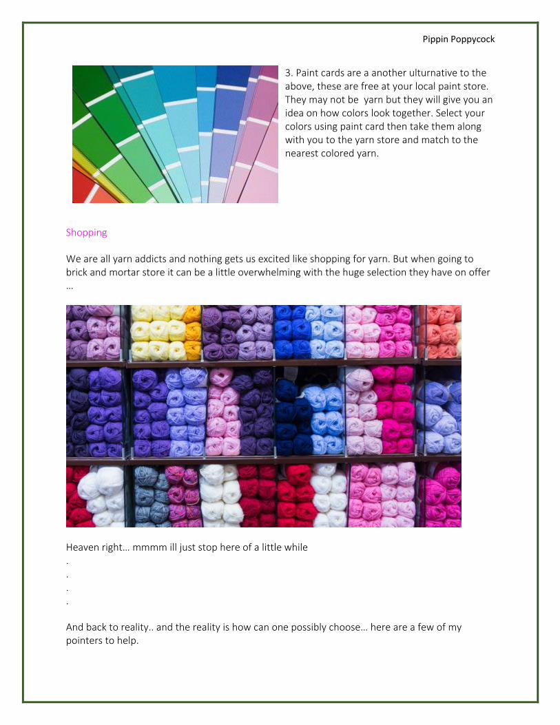
2. Another great tool is Brand shade cards. Most yarn manufacturers will have shade cards to purchase. These too are a great alternative to pegs.
Pippin Poppycock
3. Paint cards are a another ulturnative to the above, these are free at your local paint store. They may not be yarn but they will give you an idea on how colors look together. Select your colors using paint card then take them along with you to the yarn store and match to the nearest colored yarn.
Shopping
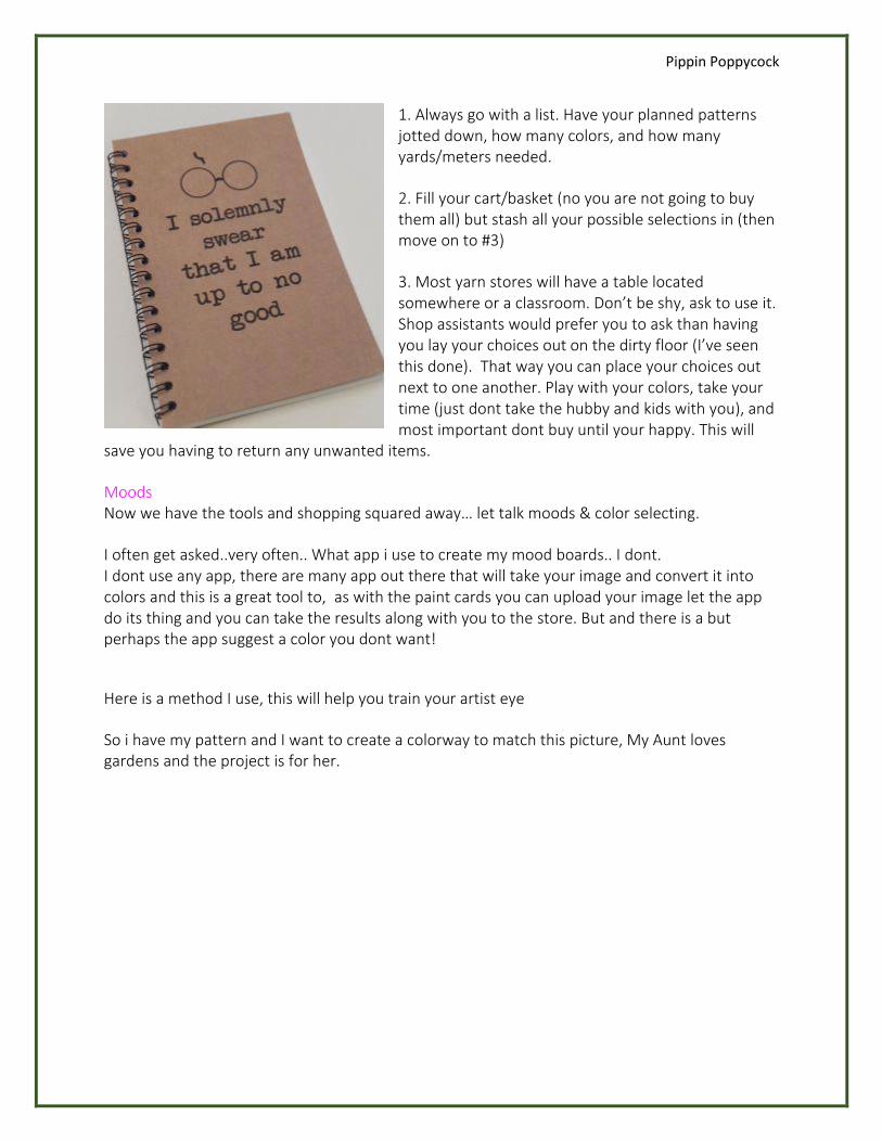
We are all yarn addicts and nothing gets us excited like shopping for yarn. But when going to brick and mortar store it can be a little overwhelming with the huge selection they have on offer …
Heaven right… mmmm ill just stop here of a little while . . . .
And back to reality.. and the reality is how can one possibly choose… here are a few of my pointers to help.
Pippin Poppycock
1. Always go with a list. Have your planned patterns jotted down, how many colors, and how many yards/meters needed.
2. Fill your cart/basket (no you are not going to buy them all) but stash all your possible selections in (then move on to #3)
3. Most yarn stores will have a table located somewhere or a classroom. Don’t be shy, ask to use it. Shop assistants would prefer you to ask than having you lay your choices out on the dirty floor (I’ve seen this done). That way you can place your choices out next to one another. Play with your colors, take your time (just dont take the hubby and kids with you), and most important dont buy until your happy. This will
save you having to return any unwanted items.
Moods Now we have the tools and shopping squared away… let talk moods & color selecting.
I often get asked..very often.. What app i use to create my mood boards.. I dont. I dont use any app, there are many app out there that will take your image and convert it into colors and this is a great tool to, as with the paint cards you can upload your image let the app do its thing and you can take the results along with you to the store. But and there is a but perhaps the app suggest a color you dont want!
Here is a method I use, this will help you train your artist eye
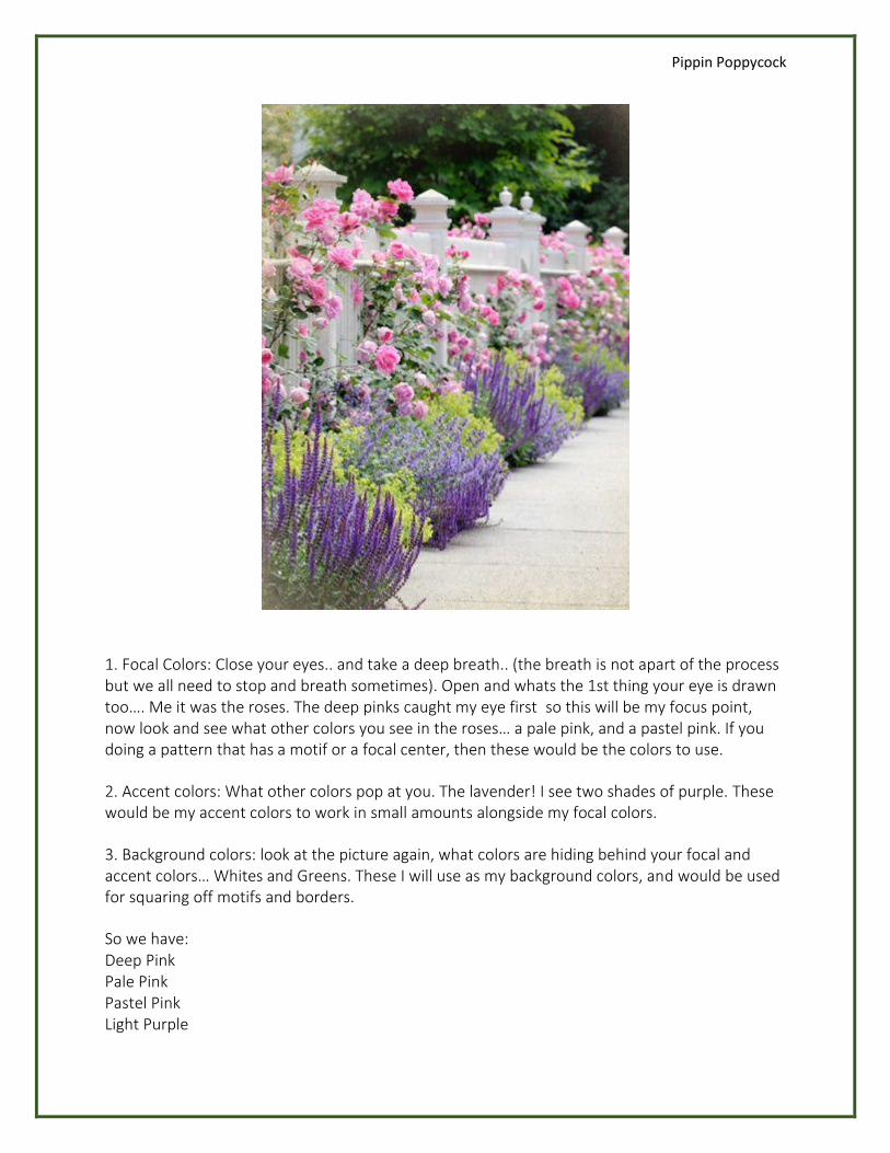
So i have my pattern and I want to create a colorway to match this picture, My Aunt loves gardens and the project is for her.
Pippin Poppycock
1. Focal Colors: Close your eyes.. and take a deep breath.. (the breath is not apart of the process but we all need to stop and breath sometimes). Open and whats the 1st thing your eye is drawn too…. Me it was the roses. The deep pinks caught my eye first so this will be my focus point, now look and see what other colors you see in the roses… a pale pink, and a pastel pink. If you doing a pattern that has a motif or a focal center, then these would be the colors to use.
2. Accent colors: What other colors pop at you. The lavender! I see two shades of purple. These would be my accent colors to work in small amounts alongside my focal colors.
3. Background colors: look at the picture again, what colors are hiding behind your focal and accent colors… Whites and Greens. These I will use as my background colors, and would be used for squaring off motifs and borders.
So we have: Deep Pink Pale Pink Pastel Pink Light Purple
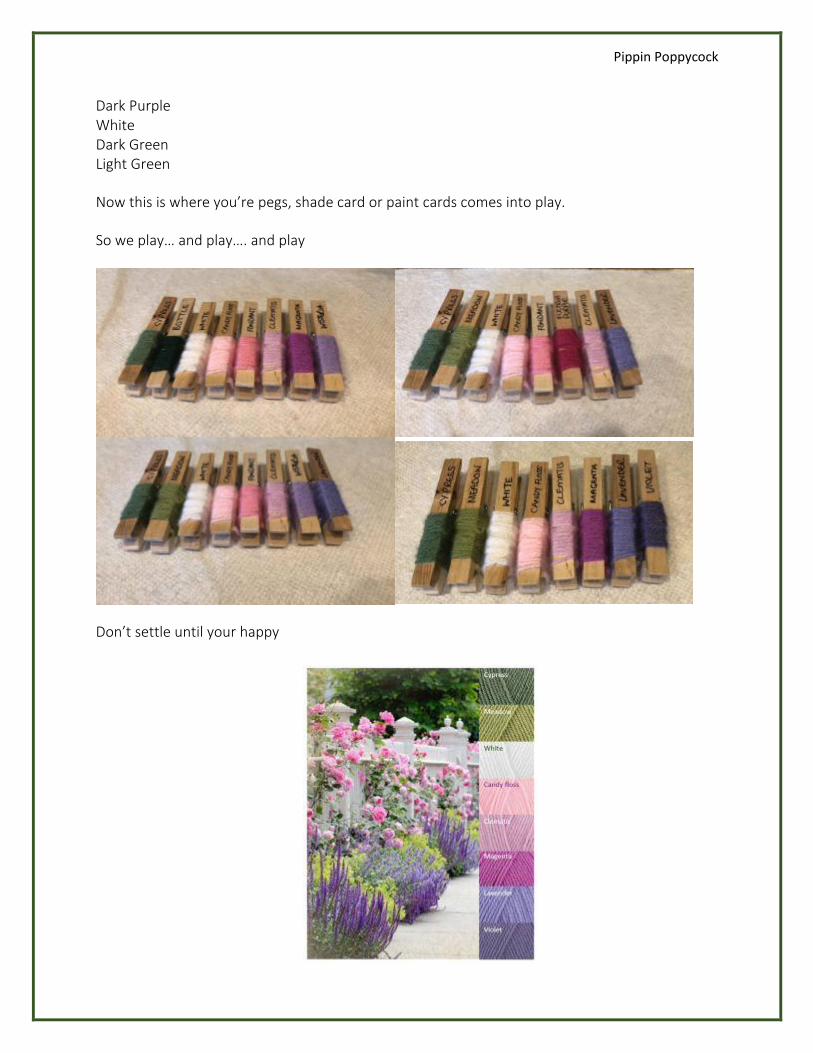
Pippin Poppycock
Dark Purple White Dark Green Light Green
Now this is where you’re pegs, shade card or paint cards comes into play.
So we play… and play…. and play
Don’t settle until your happy
Pippin Poppycock
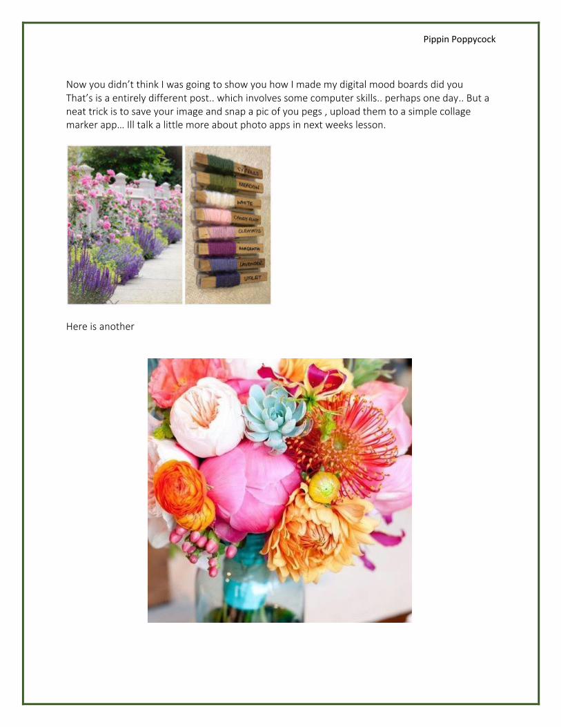
Now you didn’t think I was going to show you how I made my digital mood boards did you That’s is a entirely different post.. which involves some computer skills.. perhaps one day.. But a neat trick is to save your image and snap a pic of you pegs , upload them to a simple collage marker app… Ill talk a little more about photo apps in next weeks lesson.
Here is another
Pippin Poppycock
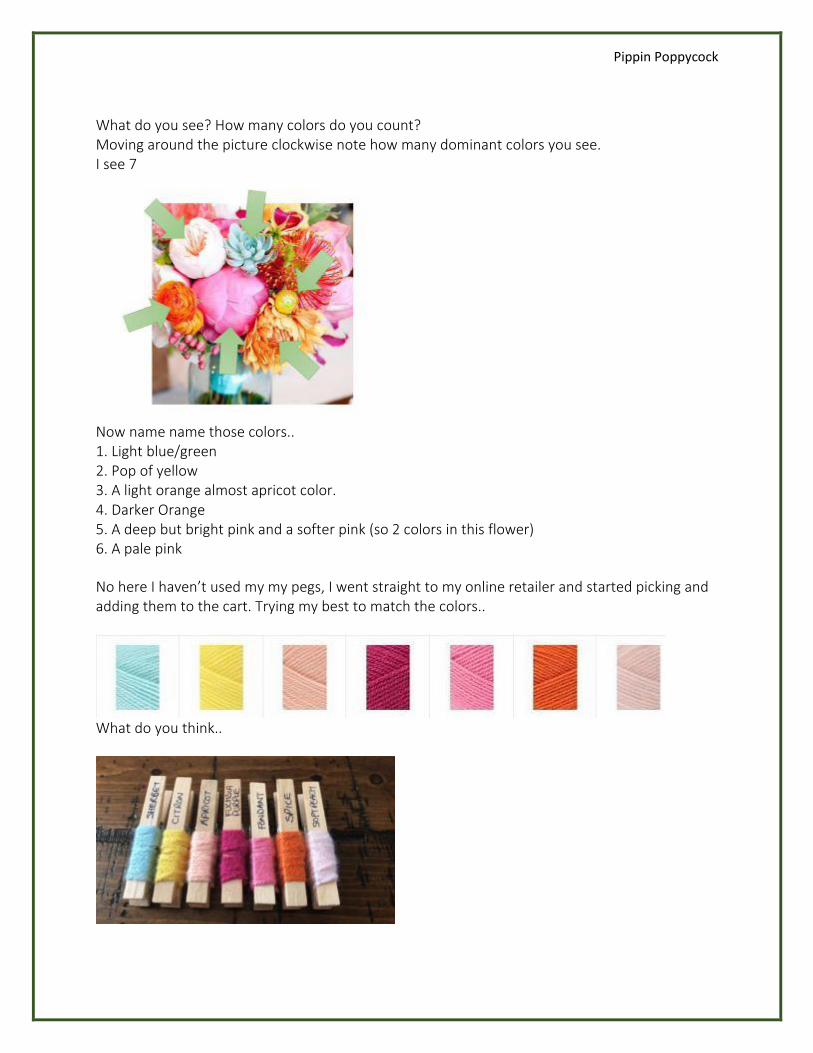
What do you see? How many colors do you count? Moving around the picture clockwise note how many dominant colors you see. I see 7
Now name name those colors.. 1. Light blue/green 2. Pop of yellow 3. A light orange almost apricot color. 4. Darker Orange 5. A deep but bright pink and a softer pink (so 2 colors in this flower) 6. A pale pink
No here I haven’t used my my pegs, I went straight to my online retailer and started picking and adding them to the cart. Trying my best to match the colors..
What do you think..
Pippin Poppycock
Color Theory 105 – Presentation is Key
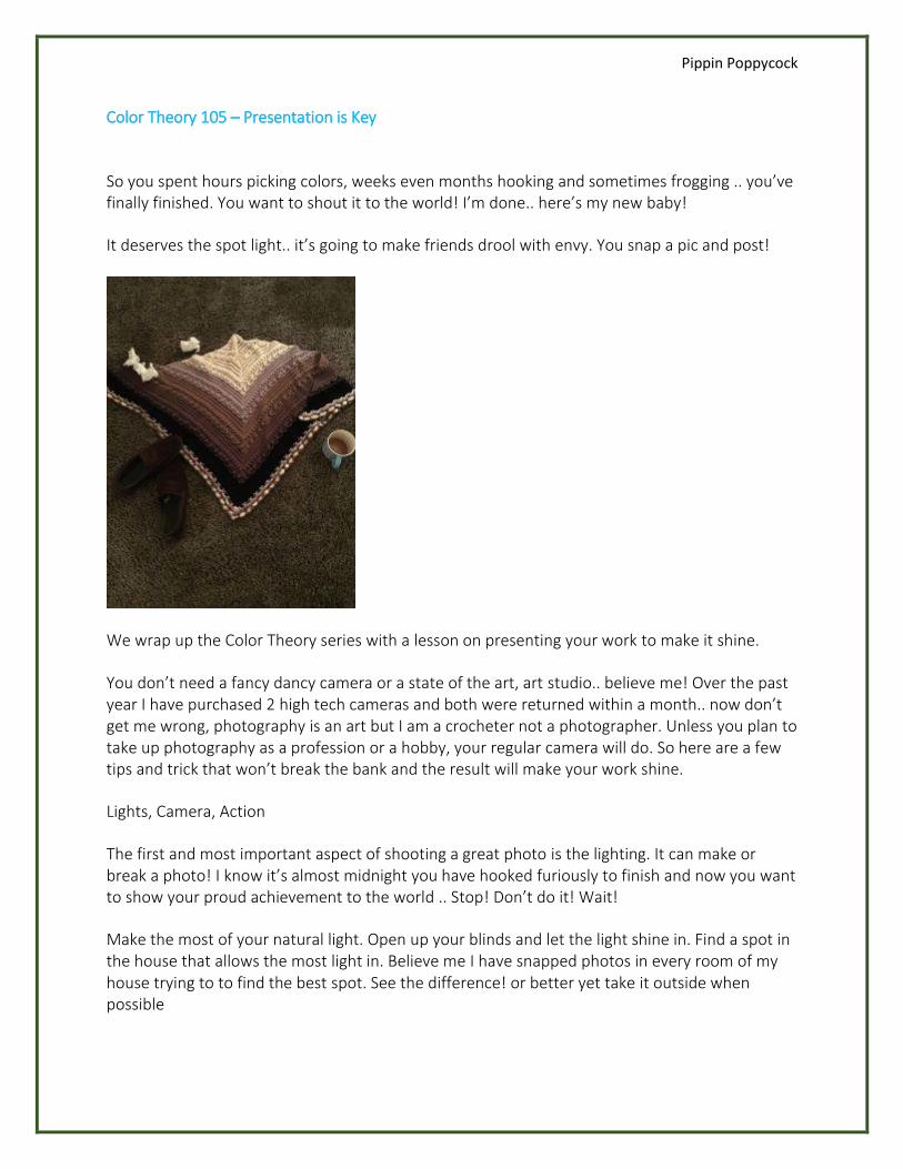
So you spent hours picking colors, weeks even months hooking and sometimes frogging .. you’ve finally finished. You want to shout it to the world! I’m done.. here’s my new baby!
It deserves the spot light.. it’s going to make friends drool with envy. You snap a pic and post!
We wrap up the Color Theory series with a lesson on presenting your work to make it shine.
You don’t need a fancy dancy camera or a state of the art, art studio.. believe me! Over the past year I have purchased 2 high tech cameras and both were returned within a month.. now don’t get me wrong, photography is an art but I am a crocheter not a photographer. Unless you plan to take up photography as a profession or a hobby, your regular camera will do. So here are a few tips and trick that won’t break the bank and the result will make your work shine.
Lights, Camera, Action
The first and most important aspect of shooting a great photo is the lighting. It can make or break a photo! I know it’s almost midnight you have hooked furiously to finish and now you want to show your proud achievement to the world .. Stop! Don’t do it! Wait!
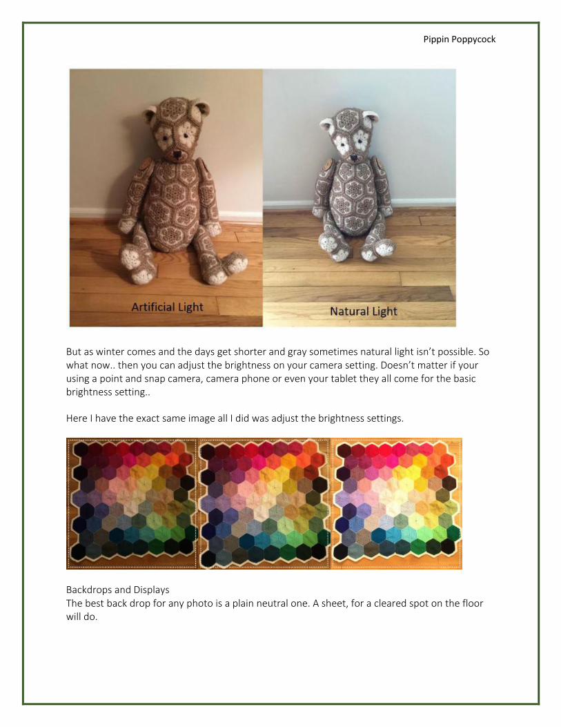
Make the most of your natural light. Open up your blinds and let the light shine in. Find a spot in the house that allows the most light in. Believe me I have snapped photos in every room of my house trying to to find the best spot. See the difference! or better yet take it outside when possible
Pippin Poppycock
But as winter comes and the days get shorter and gray sometimes natural light isn’t possible. So what now.. then you can adjust the brightness on your camera setting. Doesn’t matter if your using a point and snap camera, camera phone or even your tablet they all come for the basic brightness setting..
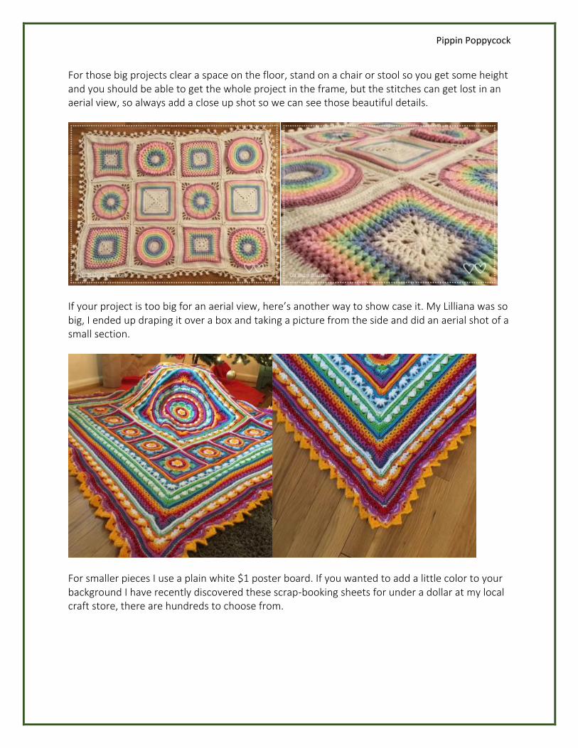
Here I have the exact same image all I did was adjust the brightness settings.
Backdrops and Displays The best back drop for any photo is a plain neutral one. A sheet, for a cleared spot on the floor will do.
Pippin Poppycock
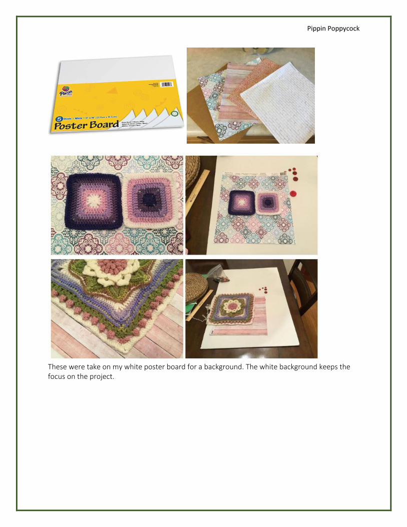
For those big projects clear a space on the floor, stand on a chair or stool so you get some height and you should be able to get the whole project in the frame, but the stitches can get lost in an aerial view, so always add a close up shot so we can see those beautiful details.
If your project is too big for an aerial view, here’s another way to show case it. My Lilliana was so big, I ended up draping it over a box and taking a picture from the side and did an aerial shot of a small section.
For smaller pieces I use a plain white $1 poster board. If you wanted to add a little color to your background I have recently discovered these scrap-booking sheets for under a dollar at my local craft store, there are hundreds to choose from.
Pippin Poppycock
These were take on my white poster board for a background. The white background keeps the focus on the project.
Pippin Poppycock
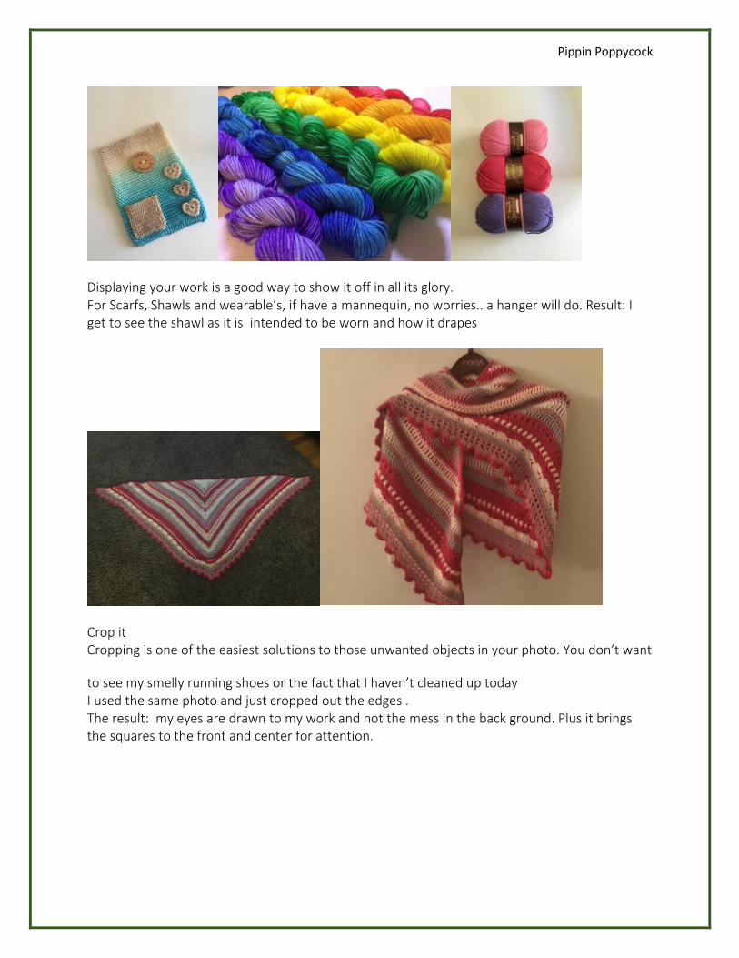
Displaying your work is a good way to show it off in all its glory. For Scarfs, Shawls and wearable’s, if have a mannequin, no worries.. a hanger will do. Result: I get to see the shawl as it is intended to be worn and how it drapes
Crop it Cropping is one of the easiest solutions to those unwanted objects in your photo. You don’t want
to see my smelly running shoes or the fact that I haven’t cleaned up today I used the same photo and just cropped out the edges . The result: my eyes are drawn to my work and not the mess in the back ground. Plus it brings the squares to the front and center for attention.
Pippin Poppycock
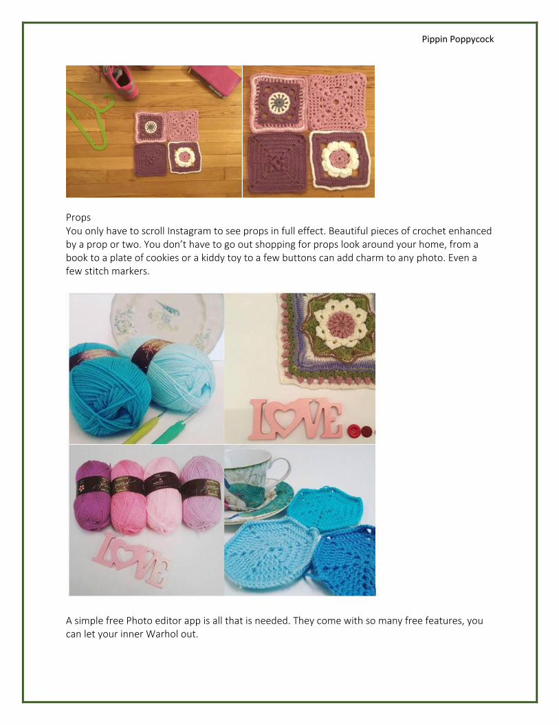
Props You only have to scroll Instagram to see props in full effect. Beautiful pieces of crochet enhanced by a prop or two. You don’t have to go out shopping for props look around your home, from a book to a plate of cookies or a kiddy toy to a few buttons can add charm to any photo. Even a few stitch markers.
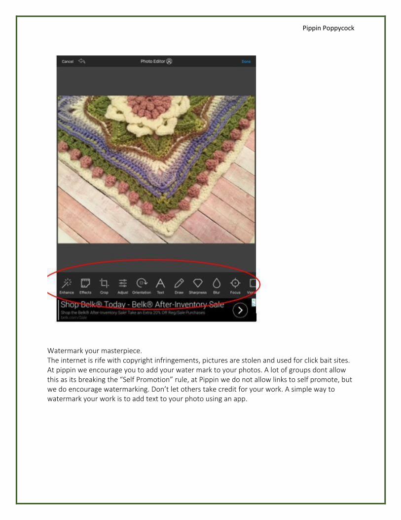
A simple free Photo editor app is all that is needed. They come with so many free features, you can let your inner Warhol out.
Pippin Poppycock
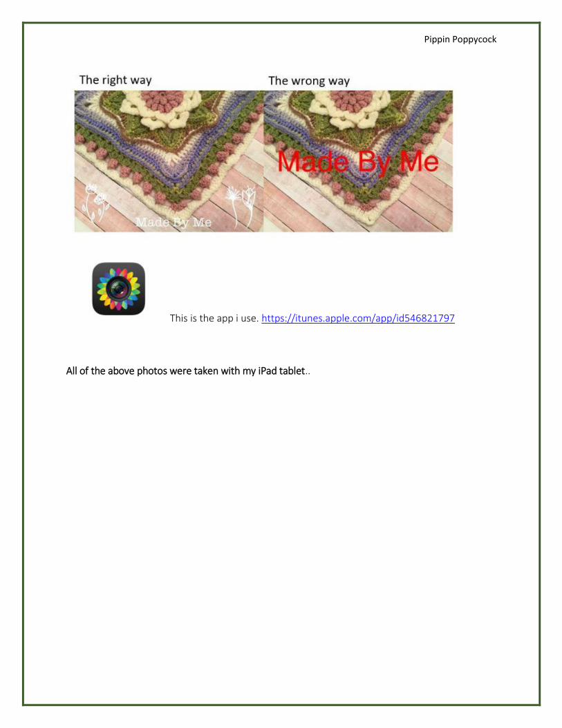
Watermark your masterpiece. The internet is rife with copyright infringements, pictures are stolen and used for click bait sites. At pippin we encourage you to add your water mark to your photos. A lot of groups dont allow this as its breaking the “Self Promotion” rule, at Pippin we do not allow links to self promote, but we do encourage watermarking. Don’t let others take credit for your work. A simple way to watermark your work is to add text to your photo using an app.
Pippin Poppycock
This is the app i use. https://itunes.apple.com/app/id546821797
All of the above photos were taken with my iPad tablet..