Embed Size (px)
Citation preview
Continuing Professional Development (CPD)
Learning objectives
1. Understand colour attributes and categories.
2. Understand the complexity of the interface between colour and human
response and the factors that influence this interface.
3. Review the diverse origins of beliefs about colour, and distinguish
evidence-based information from unsubstantiated claims.
4. Examine evidence-based information about colour.
5. Practical solutions for real problems in design and the built environment.
Zena O'Connor, PhD
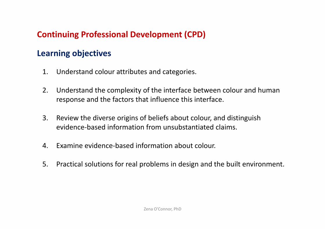
Attributes of colour: Hue, Saturation and Tone
Zena O'Connor, PhD
Most early colour theories and research studies focussed on hue only.
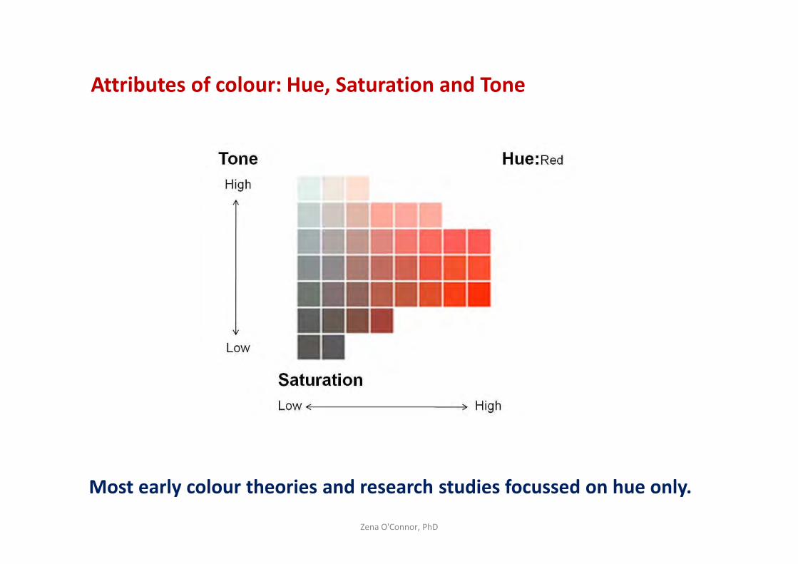
Categories of colour
Conventional colour – Broad colour categories – ‘red’, ‘blue’, ‘green’.
Substance colour – Colour in the form of pigments and paints.
Formula colour – Pantone, Resene, NCS, car colours, etc.
Spectral profile colour – Colour in the form of light-waves.
Zena O'Connor, PhD
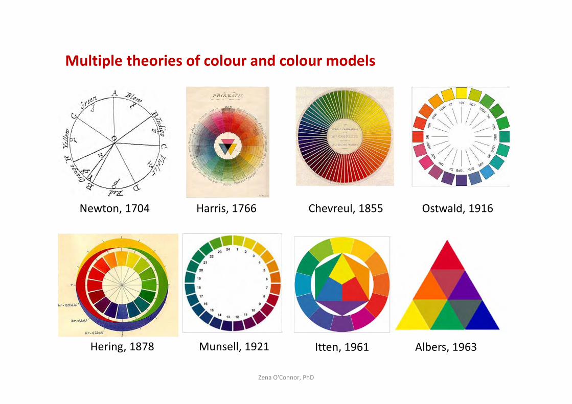
Multiple theories of colour and colour models
Zena O'Connor, PhD
Newton, 1704
Hering, 1878
Harris, 1766 Chevreul, 1855 Ostwald, 1916
Munsell, 1921 Itten, 1961 Albers, 1963
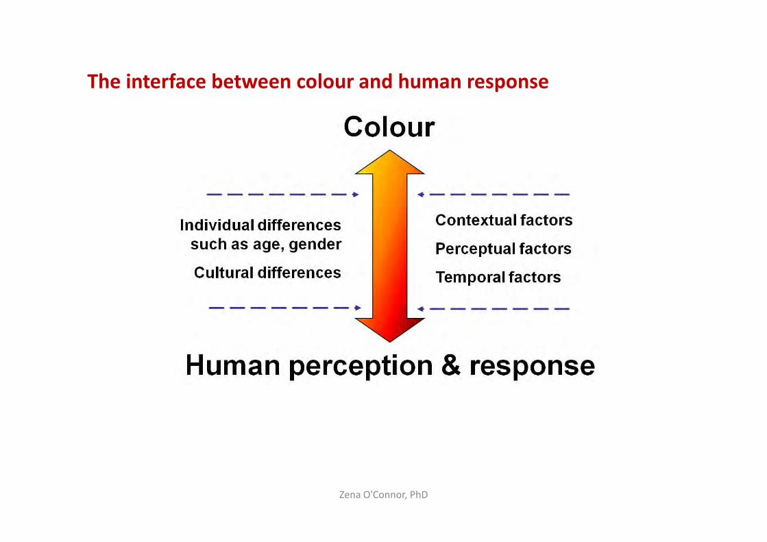
The interface between colour and human response
Zena O'Connor, PhD
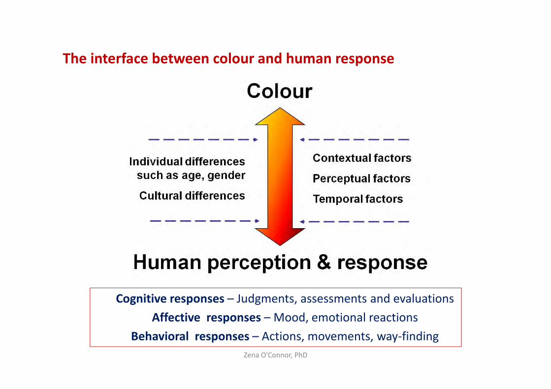
The interface between colour and human response
Zena O'Connor, PhD
Cognitive responses – Judgments, assessments and evaluations
Affective responses – Mood, emotional reactions
Behavioral responses – Actions, movements, way-finding
Theories about colour – Diverse origins & influences
• Correspondences – Elements, Seasons, geometric shapes, colours
• Traditional and New Age beliefs
• 19th & 20th century pseudo-scientific theories and fallacies
• Theories from art and design – Van Gogh, Albers, Eliasson
• Colour symbolism
• Late 20th and early 21st century scientific research
Zena O'Connor, PhD
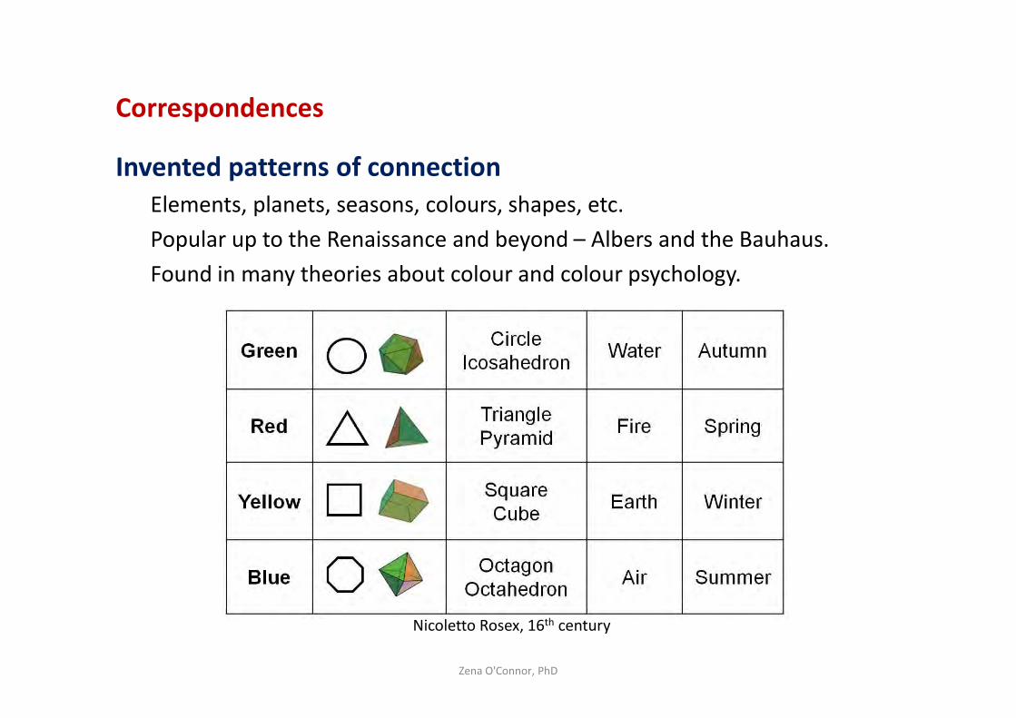
Correspondences
Invented patterns of connection
Elements, planets, seasons, colours, shapes, etc.
Popular up to the Renaissance and beyond – Albers and the Bauhaus.
Found in many theories about colour and colour psychology.
Zena O'Connor, PhD
Nicoletto Rosex, 16th century
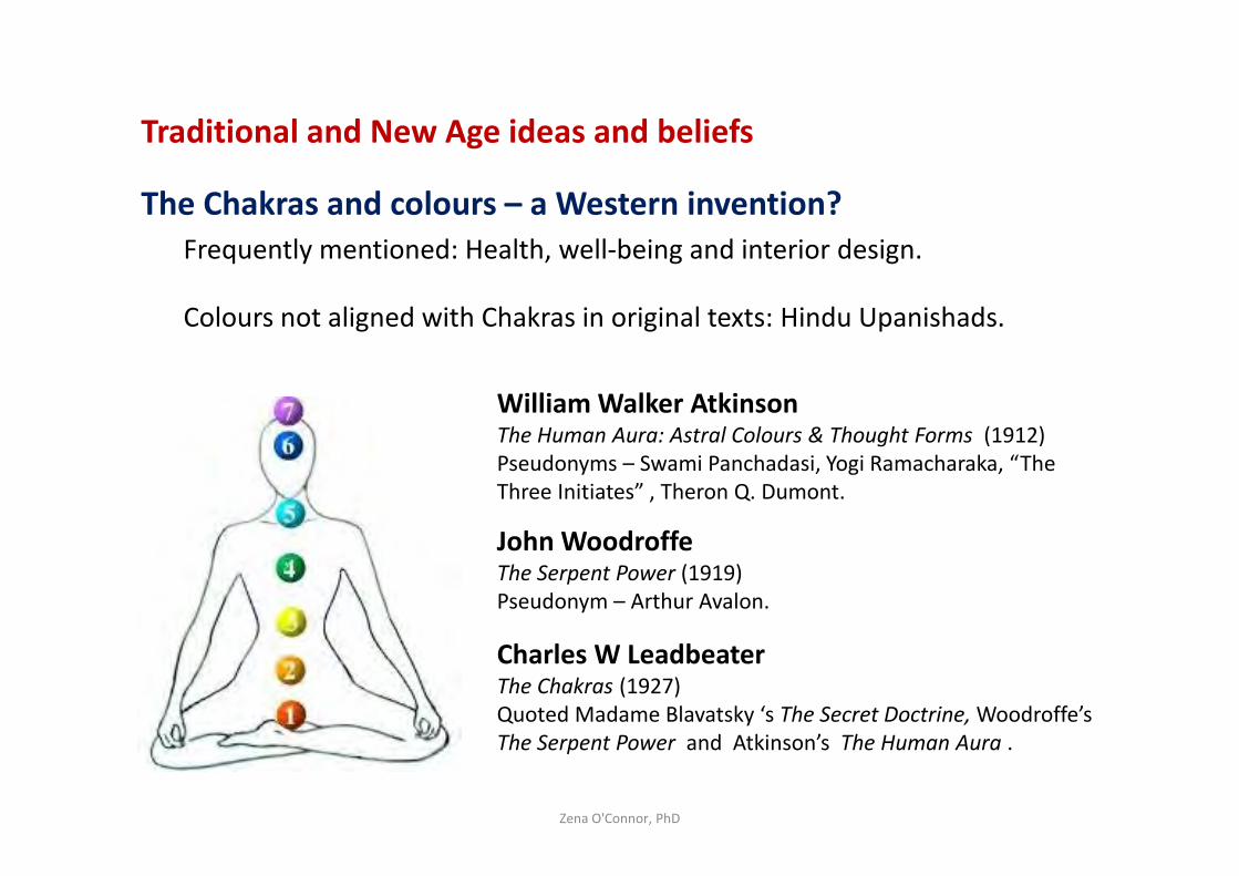
Traditional and New Age ideas and beliefs
The Chakras and colours – a Western invention?
Frequently mentioned: Health, well-being and interior design.
Colours not aligned with Chakras in original texts: Hindu Upanishads.
Zena O'Connor, PhD
William Walker AtkinsonThe Human Aura: Astral Colours & Thought Forms (1912)
Pseudonyms – Swami Panchadasi, Yogi Ramacharaka, “The
Three Initiates” , Theron Q. Dumont.
John WoodroffeThe Serpent Power (1919)
Pseudonym – Arthur Avalon.
Charles W Leadbeater The Chakras (1927)
Quoted Madame Blavatsky ‘s The Secret Doctrine, Woodroffe’s
The Serpent Power and Atkinson’s The Human Aura .
19th - 20th Century Pseudo-scientific theories about colour
Many of these theories were not evidence-based
Seth Pancoast – Blue and red light could cure ailments
Dinshah Ghadiali – Spectro-Chrome machine (jailed for fraud)
Edwin Babbitt – Chromo-Disk device (awarded himself Dr)
Goldstein and Gerard – studies lacked scientific methods
Faber Birren – successful colour consultant, widely quoted.
Zena O'Connor, PhD
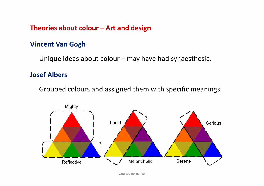
Theories about colour – Art and design
Vincent Van Gogh
Unique ideas about colour – may have had synaesthesia.
Josef Albers
Grouped colours and assigned them with specific meanings.
Zena O'Connor, PhD
Interface between colour and human response – Highly complex
Comprehensive research review for NASA (Wise et al, 1988).
Evidence-based information for spacecraft interior design.
Lighter colours – makes interior feel more open and less small.
Zena O'Connor, PhD
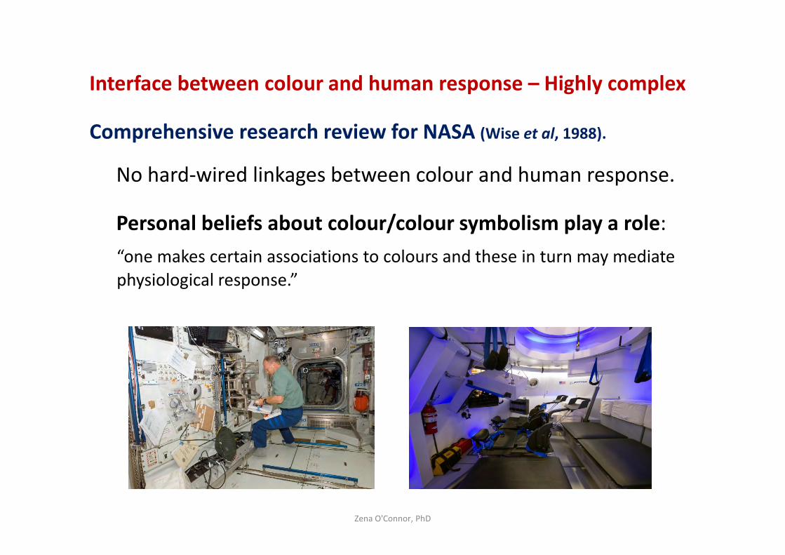
Interface between colour and human response – Highly complex
Comprehensive research review for NASA (Wise et al, 1988).
No hard-wired linkages between colour and human response.
Personal beliefs about colour/colour symbolism play a role:
“one makes certain associations to colours and these in turn may mediate
physiological response.”
Zena O'Connor, PhD
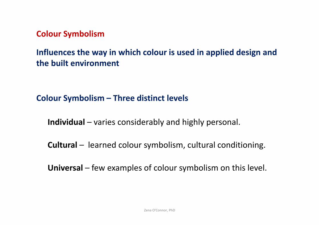
Colour Symbolism
Influences the way in which colour is used in applied design and
the built environment
Colour Symbolism – Three distinct levels
Individual – varies considerably and highly personal.
Cultural – learned colour symbolism, cultural conditioning.
Universal – few examples of colour symbolism on this level.
Zena O'Connor, PhD
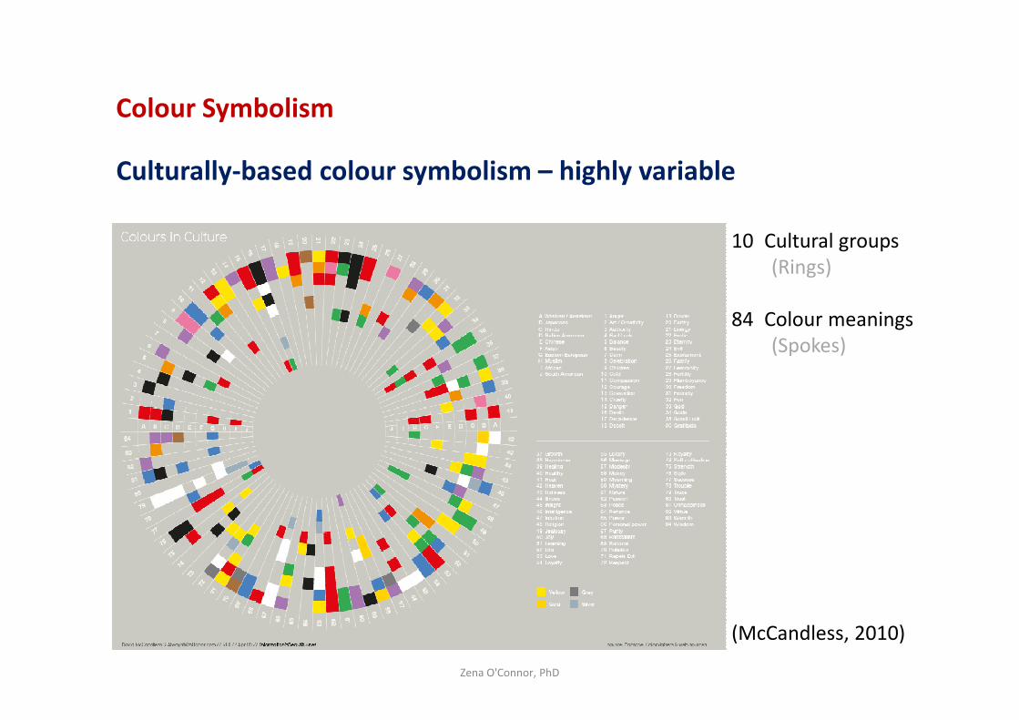
Colour Symbolism
Culturally-based colour symbolism – highly variable
Zena O'Connor, PhD
10 Cultural groups
(Rings)
84 Colour meanings
(Spokes)
(McCandless, 2010)
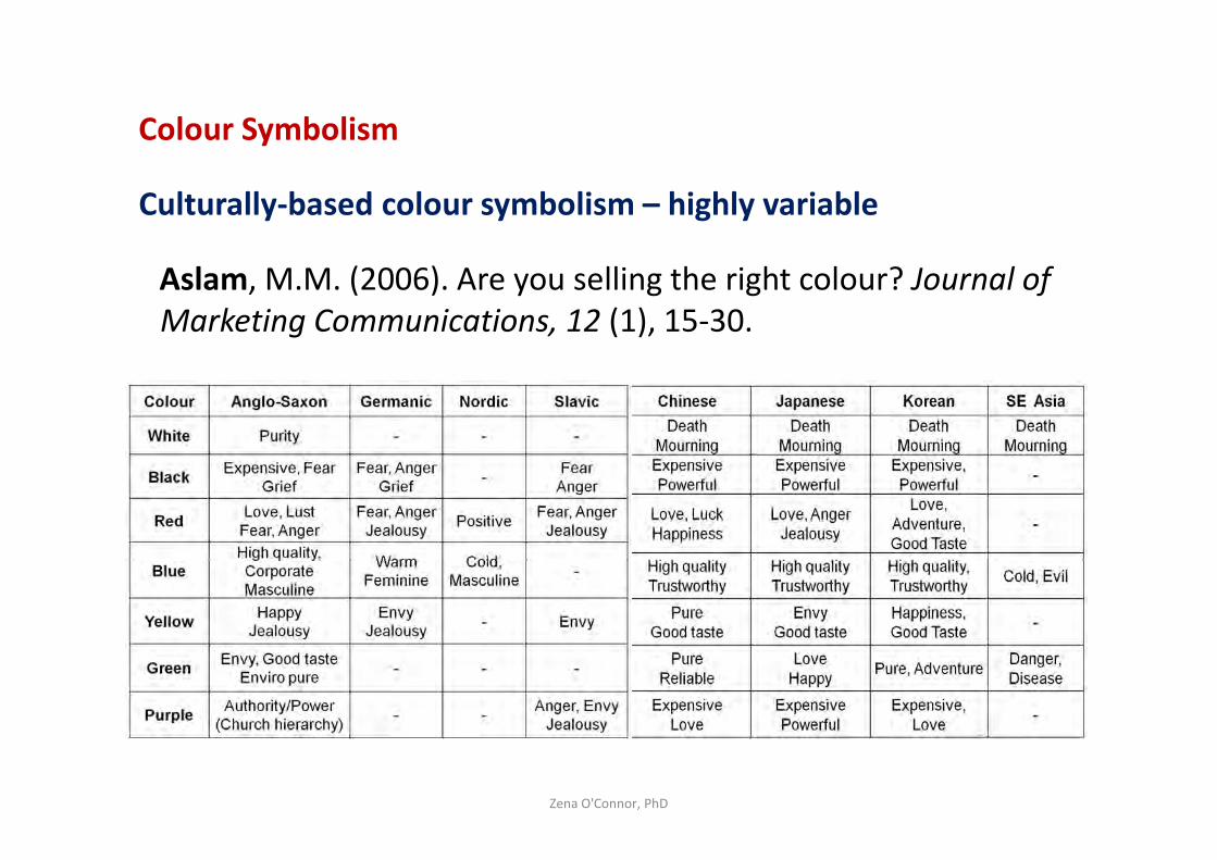
Colour Symbolism
Culturally-based colour symbolism – highly variable
Aslam, M.M. (2006). Are you selling the right colour? Journal of
Marketing Communications, 12 (1), 15-30.
Zena O'Connor, PhD
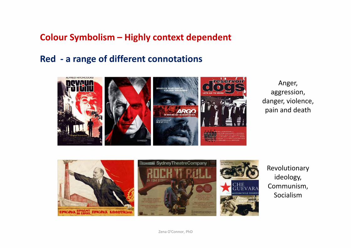
Colour Symbolism – Highly context dependent
Red - a range of different connotations
Zena O'Connor, PhD
Revolutionary
ideology,
Communism,
Socialism
Anger,
aggression,
danger, violence,
pain and death
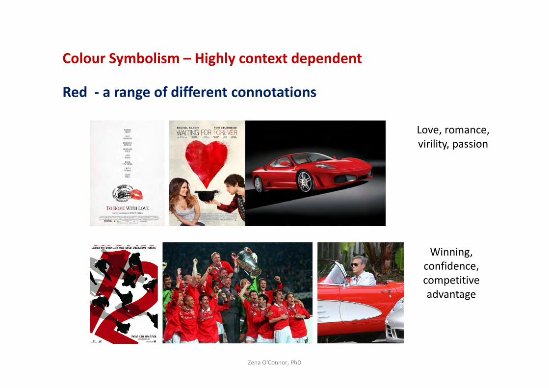
Colour Symbolism – Highly context dependent
Red - a range of different connotations
Zena O'Connor, PhD
Love, romance,
virility, passion
Winning,
confidence,
competitive
advantage
Evidence-based information about colour
Fixational Reflex
Saccades – 2-3 eye scanning movements per second.
What attracts the attention of saccades?
– Movement
– Noticeable contrast - tonal value, saturation and hue (Boynton,
1979; McPeek et al, 1999; Shang & Bishop, 2000).
Zena O'Connor, PhD
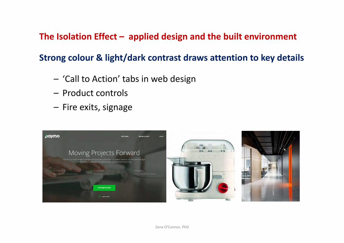
The Isolation Effect – applied design and the built environment
Strong colour & light/dark contrast draws attention to key details
– ‘Call to Action’ tabs in web design
– Product controls
– Fire exits, signage
Zena O'Connor, PhD
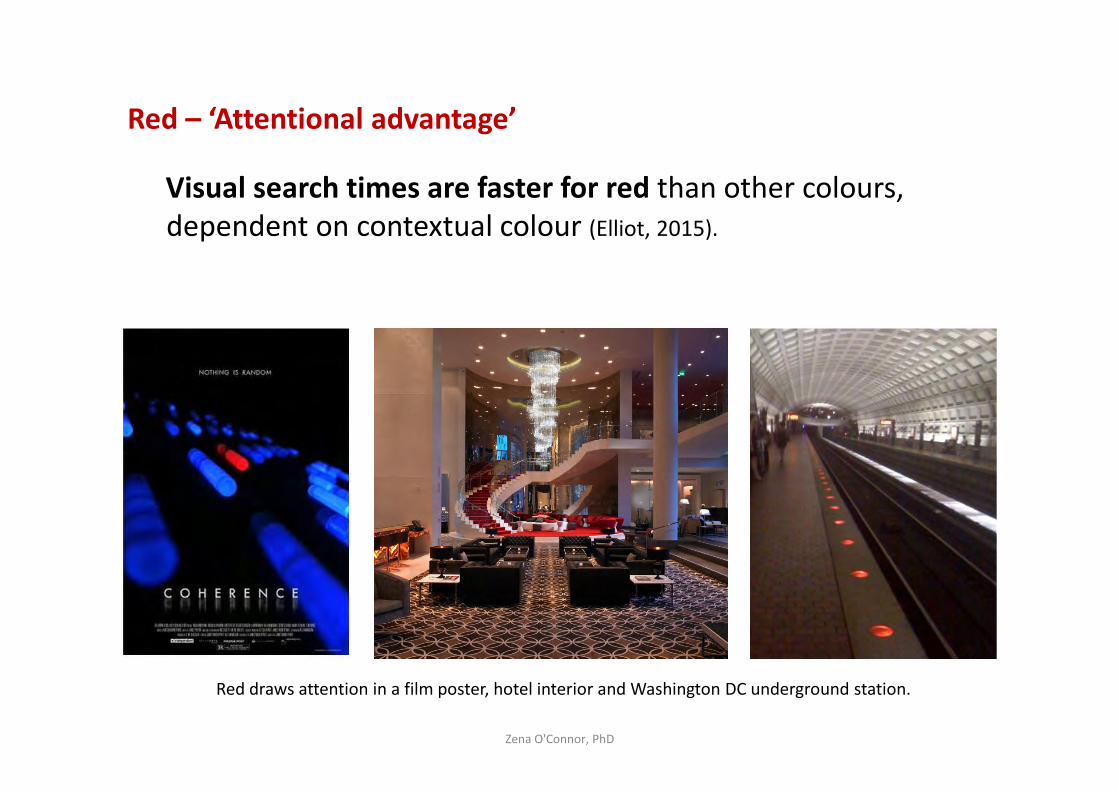
Red – ‘Attentional advantage’
Visual search times are faster for red than other colours,
dependent on contextual colour (Elliot, 2015).
Zena O'Connor, PhD
Red draws attention in a film poster, hotel interior and Washington DC underground station.
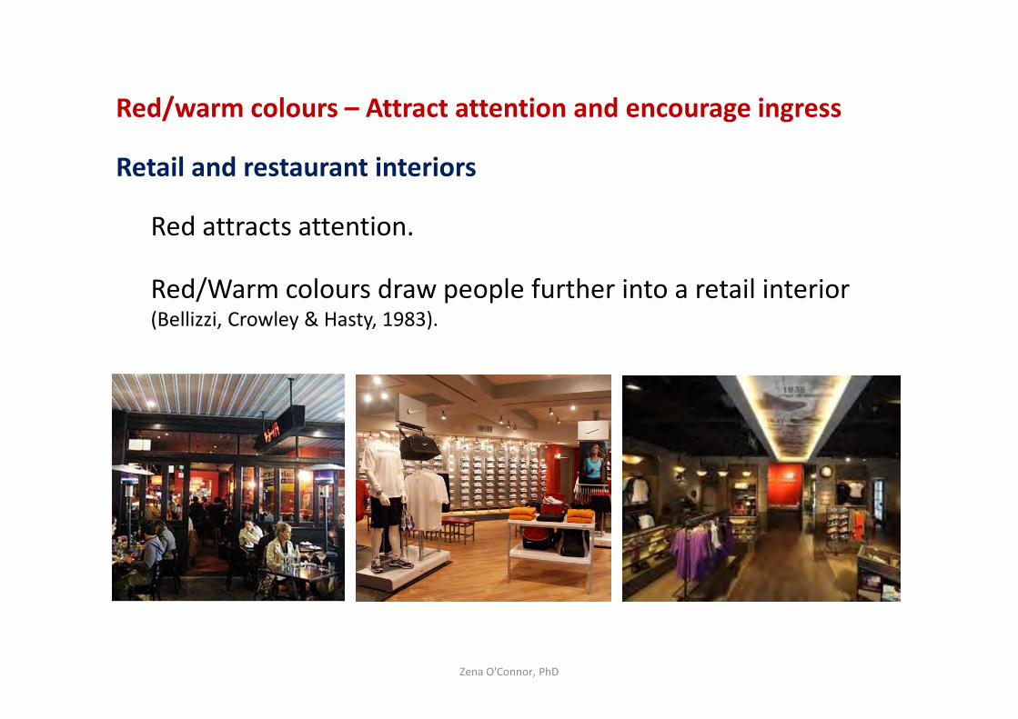
Red/warm colours – Attract attention and encourage ingress
Retail and restaurant interiors
Red attracts attention.
Red/Warm colours draw people further into a retail interior (Bellizzi, Crowley & Hasty, 1983).
Zena O'Connor, PhD
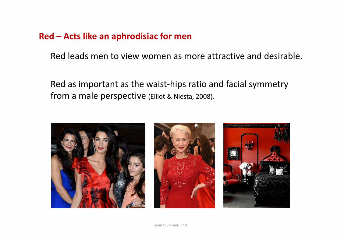
Red – Acts like an aphrodisiac for men
Red leads men to view women as more attractive and desirable.
Red as important as the waist-hips ratio and facial symmetry
from a male perspective (Elliot & Niesta, 2008).
Zena O'Connor, PhD
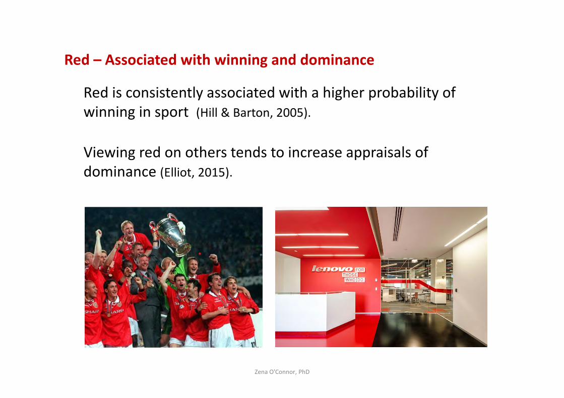
Red – Associated with winning and dominance
Red is consistently associated with a higher probability of
winning in sport (Hill & Barton, 2005).
Viewing red on others tends to increase appraisals of
dominance (Elliot, 2015).
Zena O'Connor, PhD
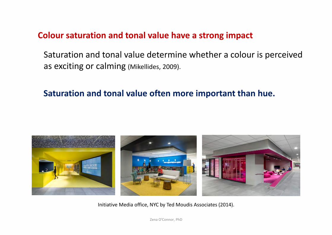
Colour saturation and tonal value have a strong impact
Saturation and tonal value determine whether a colour is perceived
as exciting or calming (Mikellides, 2009).
Saturation and tonal value often more important than hue.
Zena O'Connor, PhD
Initiative Media office, NYC by Ted Moudis Associates (2014).
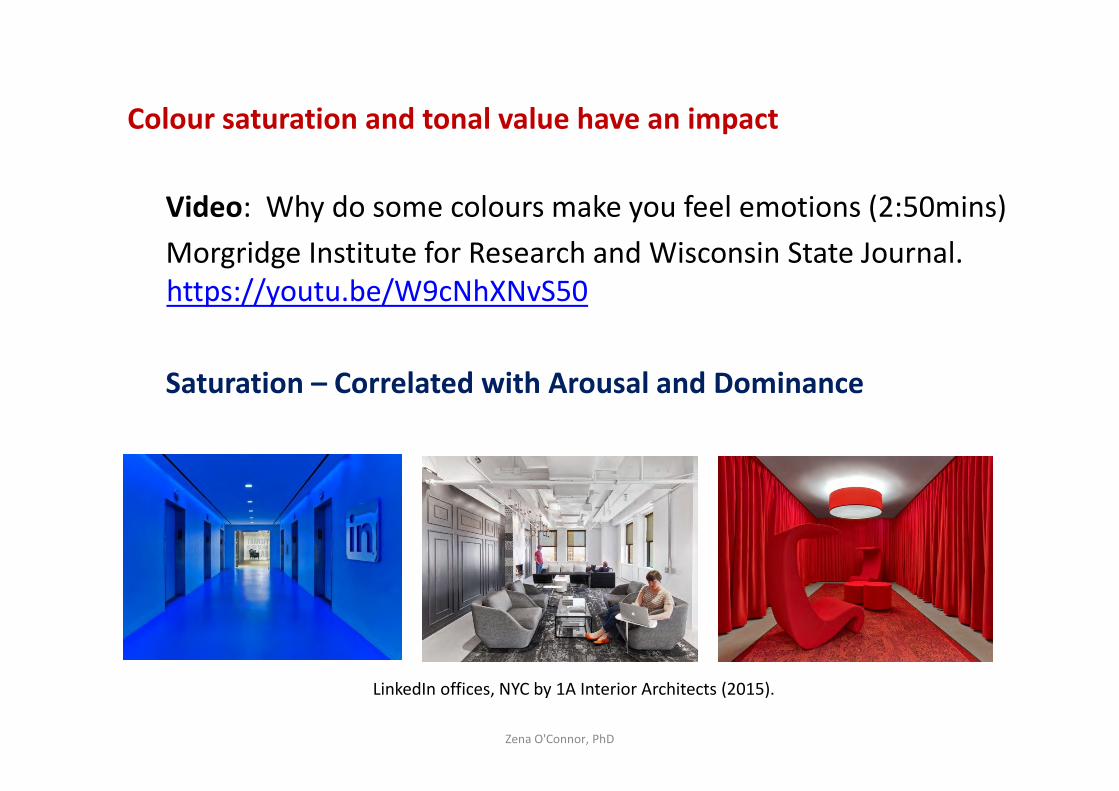
Colour saturation and tonal value have an impact
Video: Why do some colours make you feel emotions (2:50mins)
Morgridge Institute for Research and Wisconsin State Journal.
https://youtu.be/W9cNhXNvS50
Saturation – Correlated with Arousal and Dominance
Zena O'Connor, PhD
LinkedIn offices, NYC by 1A Interior Architects (2015).
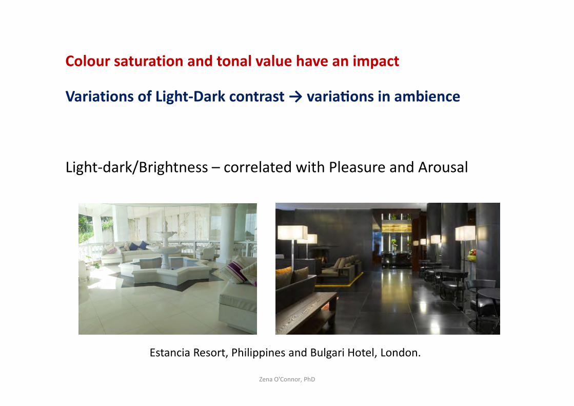
Colour saturation and tonal value have an impact
Variations of Light-Dark contrast → varia@ons in ambience
Light-dark/Brightness – correlated with Pleasure and Arousal
Zena O'Connor, PhD
Estancia Resort, Philippines and Bulgari Hotel, London.
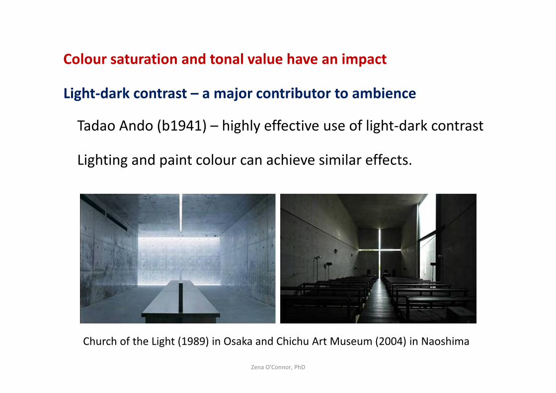
Colour saturation and tonal value have an impact
Light-dark contrast – a major contributor to ambience
Tadao Ando (b1941) – highly effective use of light-dark contrast
Lighting and paint colour can achieve similar effects.
Zena O'Connor, PhD
Church of the Light (1989) in Osaka and Chichu Art Museum (2004) in Naoshima
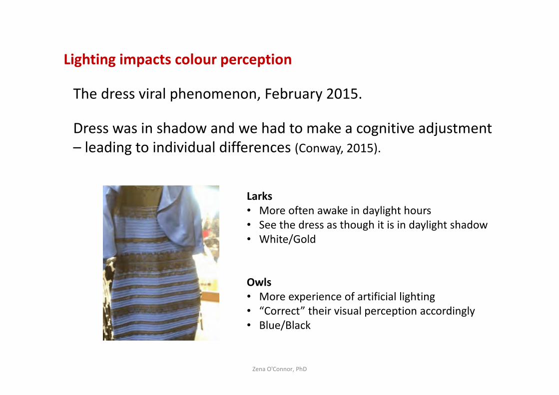
Lighting impacts colour perception
The dress viral phenomenon, February 2015.
Dress was in shadow and we had to make a cognitive adjustment
– leading to individual differences (Conway, 2015).
Zena O'Connor, PhD
Larks
• More often awake in daylight hours
• See the dress as though it is in daylight shadow
• White/Gold
Owls
• More experience of artificial lighting
• “Correct” their visual perception accordingly
• Blue/Black
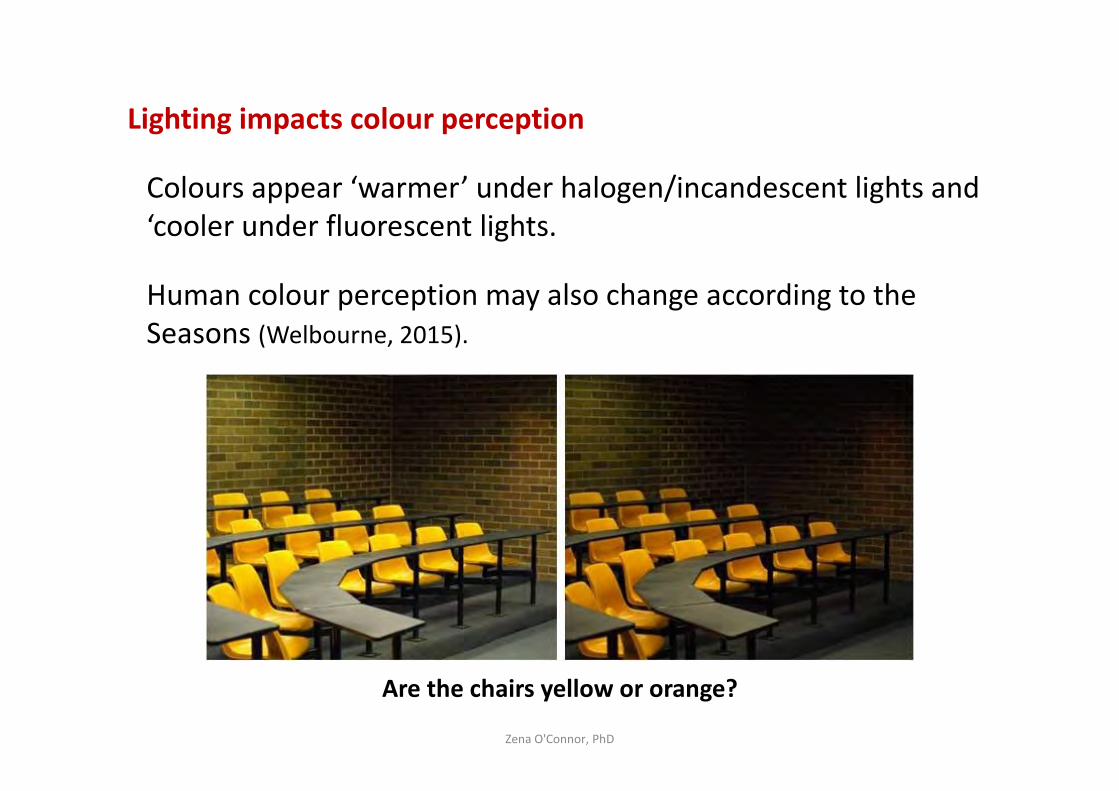
Lighting impacts colour perception
Colours appear ‘warmer’ under halogen/incandescent lights and
‘cooler under fluorescent lights.
Human colour perception may also change according to the
Seasons (Welbourne, 2015).
Zena O'Connor, PhD
Are the chairs yellow or orange?
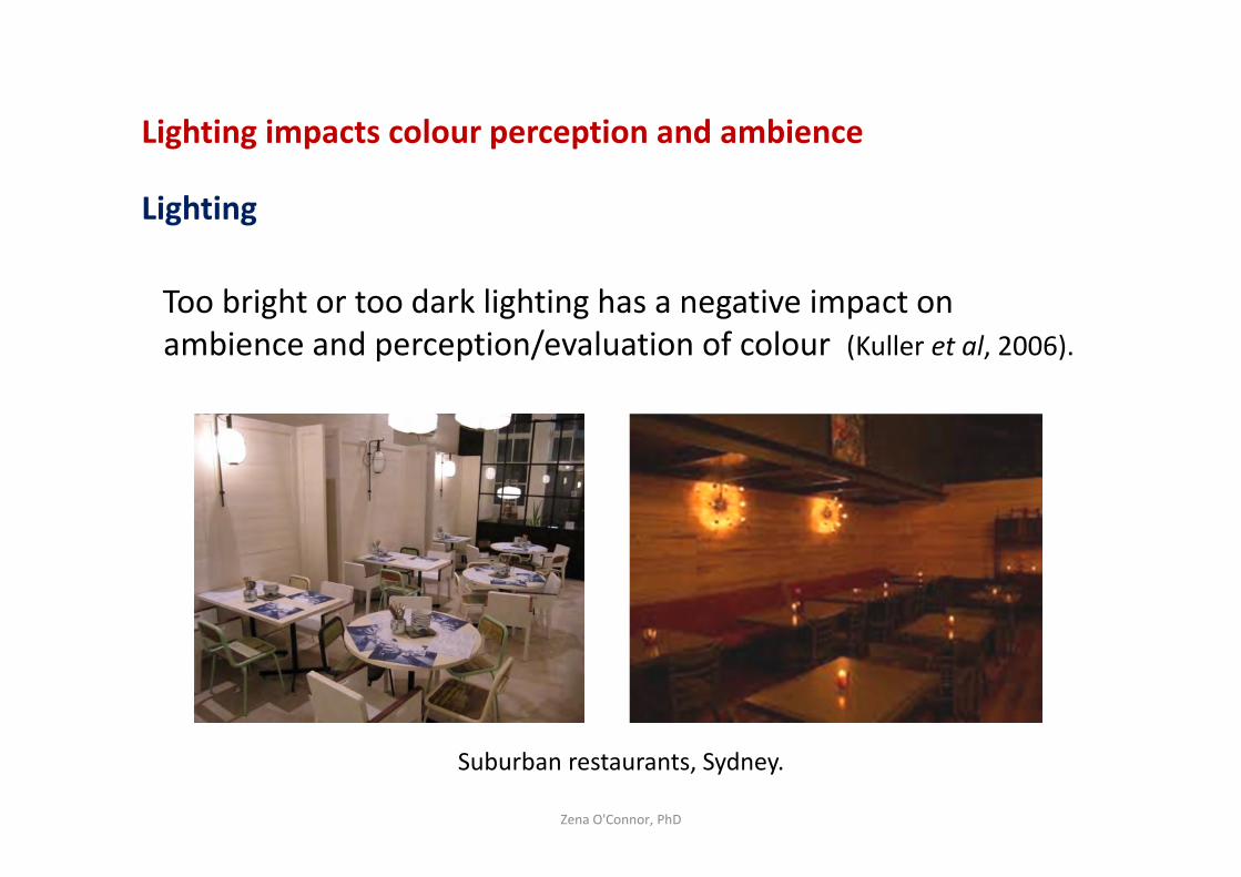
Lighting impacts colour perception and ambience
Lighting
Too bright or too dark lighting has a negative impact on
ambience and perception/evaluation of colour (Kuller et al, 2006).
Zena O'Connor, PhD
Suburban restaurants, Sydney.
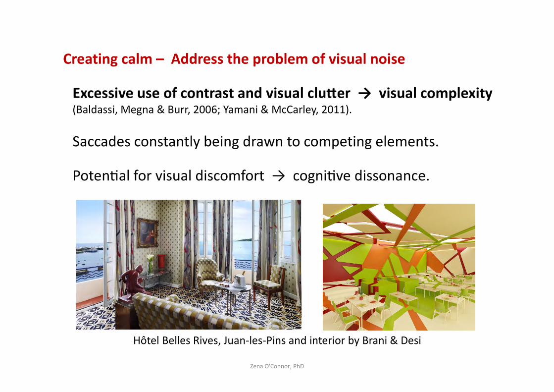
Creating calm – Address the problem of visual noise
Excessive use of contrast and visual cluBer → visual complexity (Baldassi, Megna & Burr, 2006; Yamani & McCarley, 2011).
Saccades constantly being drawn to competing elements.
PotenPal for visual discomfort → cogniPve dissonance.
Zena O'Connor, PhD
Hôtel Belles Rives, Juan-les-Pins and interior by Brani & Desi
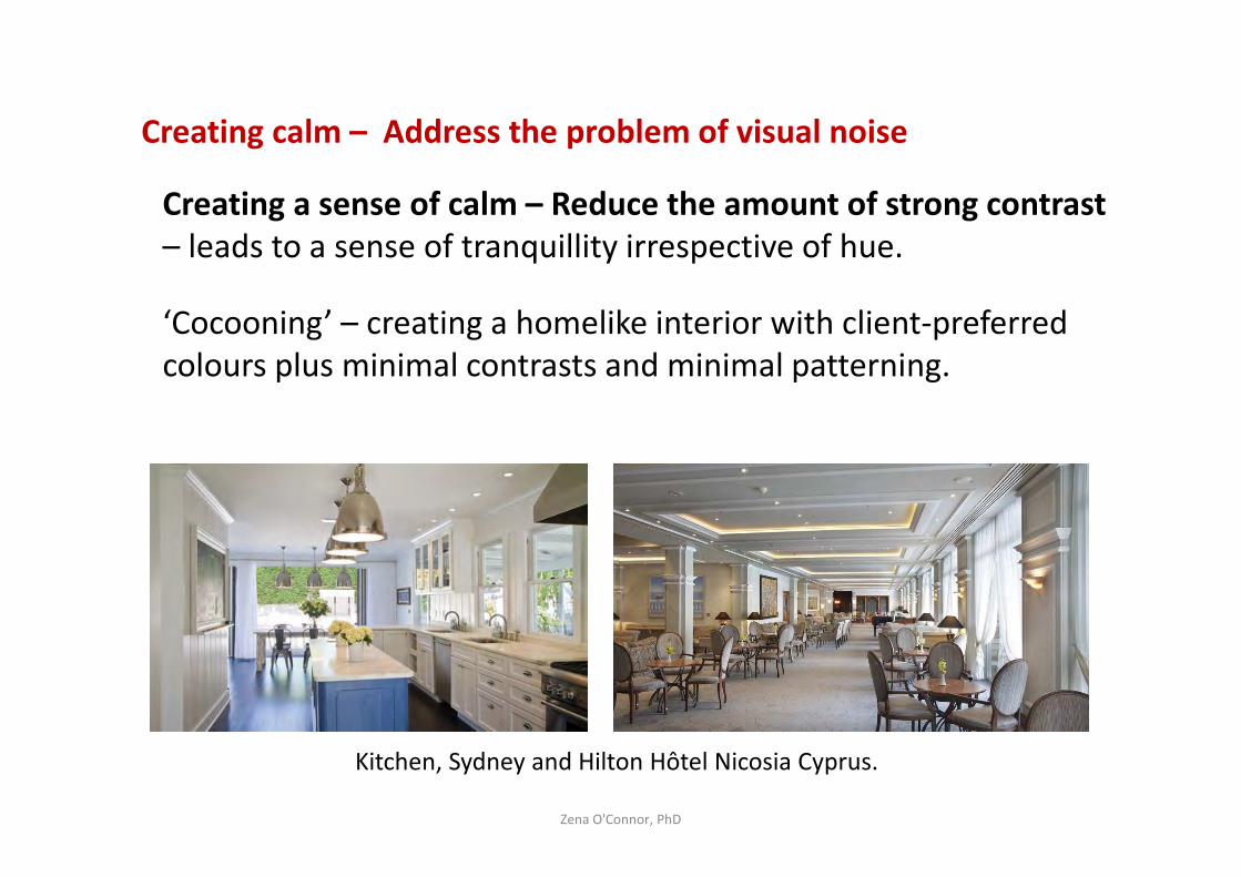
Creating calm – Address the problem of visual noise
Creating a sense of calm – Reduce the amount of strong contrast
– leads to a sense of tranquillity irrespective of hue.
‘Cocooning’ – creating a homelike interior with client-preferred
colours plus minimal contrasts and minimal patterning.
Zena O'Connor, PhD
Kitchen, Sydney and Hilton Hôtel Nicosia Cyprus.
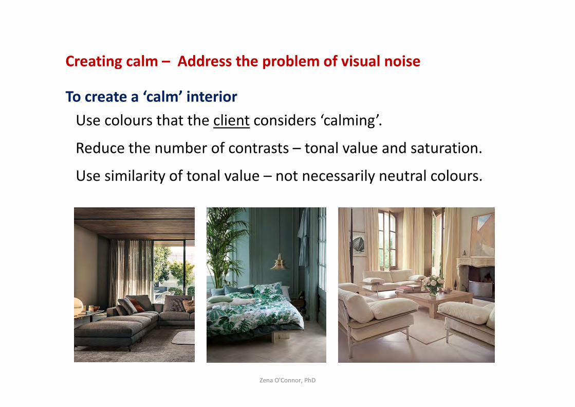
Creating calm – Address the problem of visual noise
To create a ‘calm’ interior
Use colours that the client considers ‘calming’.
Reduce the number of contrasts – tonal value and saturation.
Use similarity of tonal value – not necessarily neutral colours.
Zena O'Connor, PhD
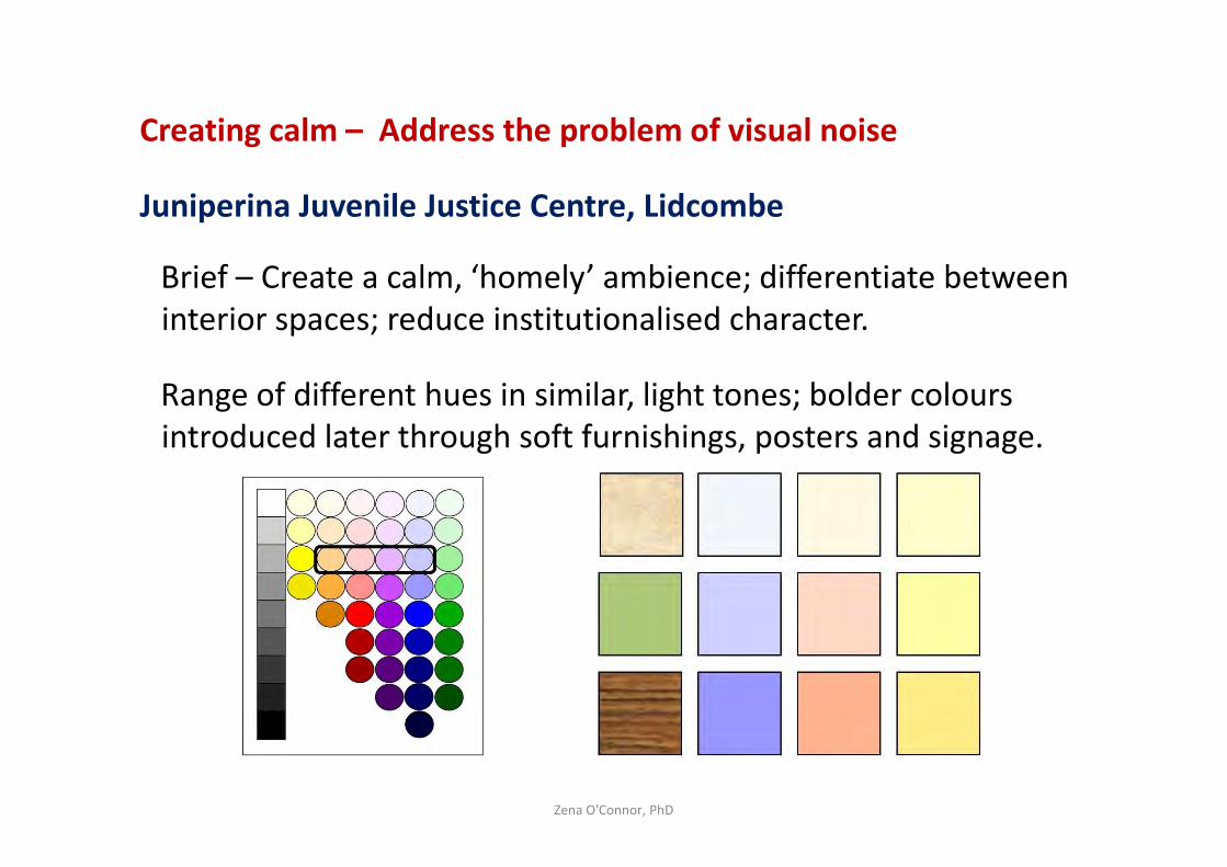
Creating calm – Address the problem of visual noise
Juniperina Juvenile Justice Centre, Lidcombe
Brief – Create a calm, ‘homely’ ambience; differentiate between
interior spaces; reduce institutionalised character.
Range of different hues in similar, light tones; bolder colours
introduced later through soft furnishings, posters and signage.
Zena O'Connor, PhD
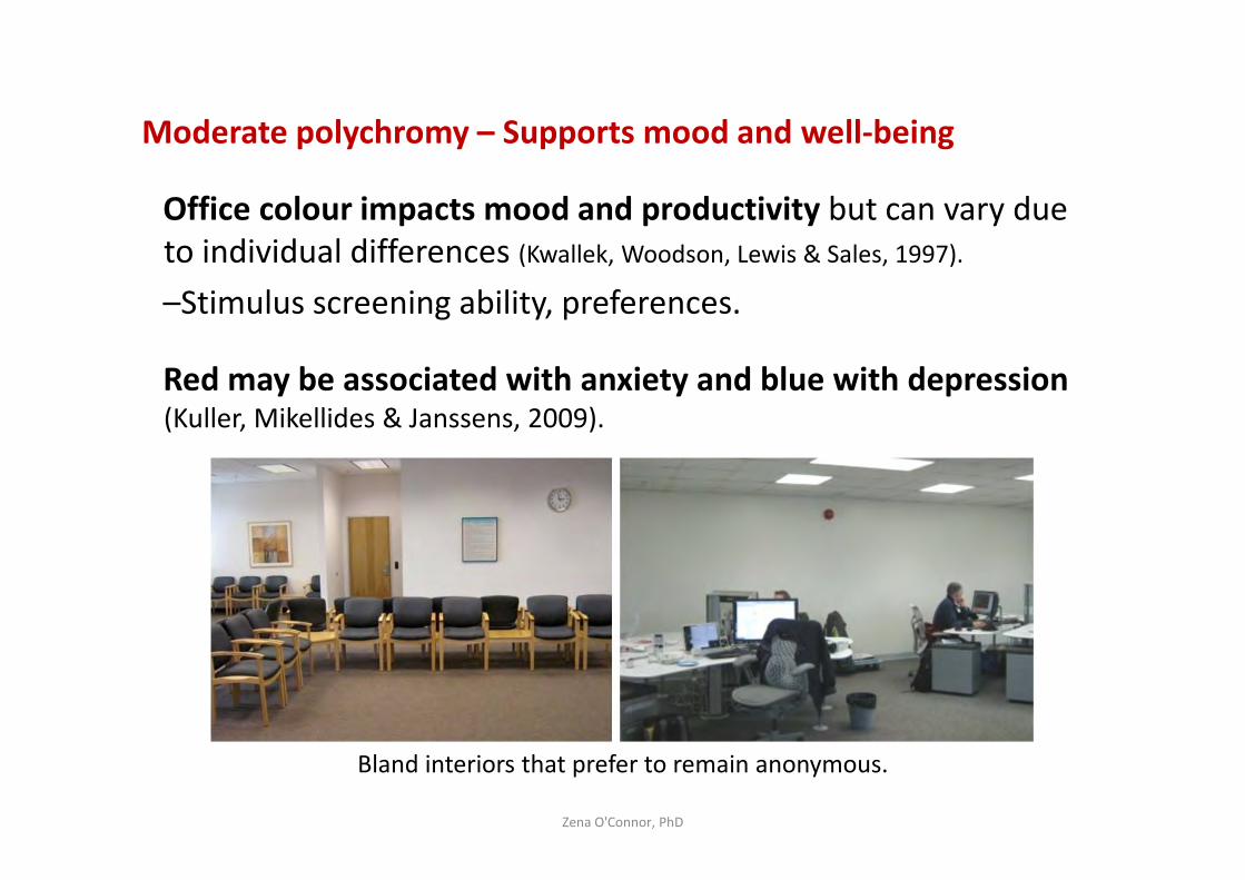
Moderate polychromy – Supports mood and well-being
Office colour impacts mood and productivity but can vary due
to individual differences (Kwallek, Woodson, Lewis & Sales, 1997).
–Stimulus screening ability, preferences.
Red may be associated with anxiety and blue with depression (Kuller, Mikellides & Janssens, 2009).
Zena O'Connor, PhD
Bland interiors that prefer to remain anonymous.
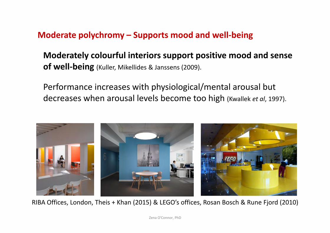
Moderate polychromy – Supports mood and well-being
Moderately colourful interiors support positive mood and sense
of well-being (Kuller, Mikellides & Janssens (2009).
Performance increases with physiological/mental arousal but
decreases when arousal levels become too high (Kwallek et al, 1997).
Zena O'Connor, PhD
RIBA Offices, London, Theis + Khan (2015) & LEGO’s offices, Rosan Bosch & Rune Fjord (2010)
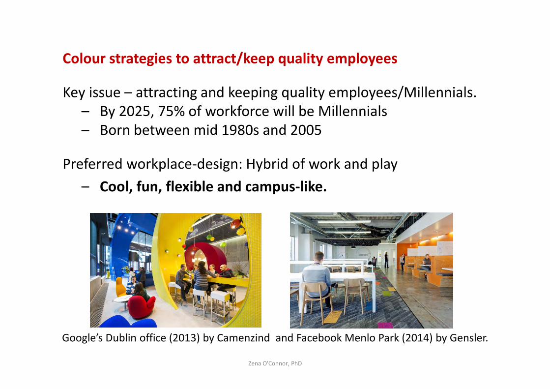
Colour strategies to attract/keep quality employees
Key issue – attracting and keeping quality employees/Millennials.
– By 2025, 75% of workforce will be Millennials
– Born between mid 1980s and 2005
Preferred workplace-design: Hybrid of work and play
– Cool, fun, flexible and campus-like.
Zena O'Connor, PhD
Google’s Dublin office (2013) by Camenzind and Facebook Menlo Park (2014) by Gensler.
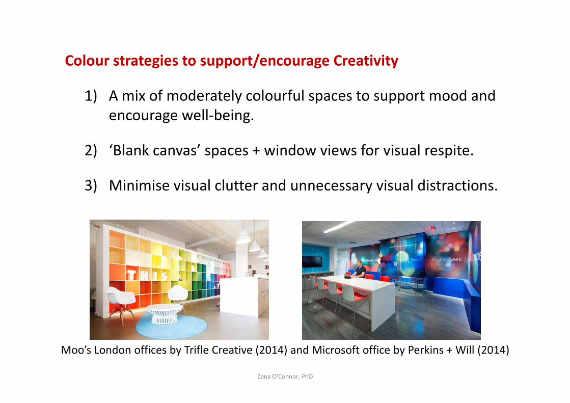
Colour strategies to support/encourage Creativity
1) A mix of moderately colourful spaces to support mood and
encourage well-being.
2) ‘Blank canvas’ spaces + window views for visual respite.
3) Minimise visual clutter and unnecessary visual distractions.
Zena O'Connor, PhD
Moo’s London offices by Trifle Creative (2014) and Microsoft office by Perkins + Will (2014)
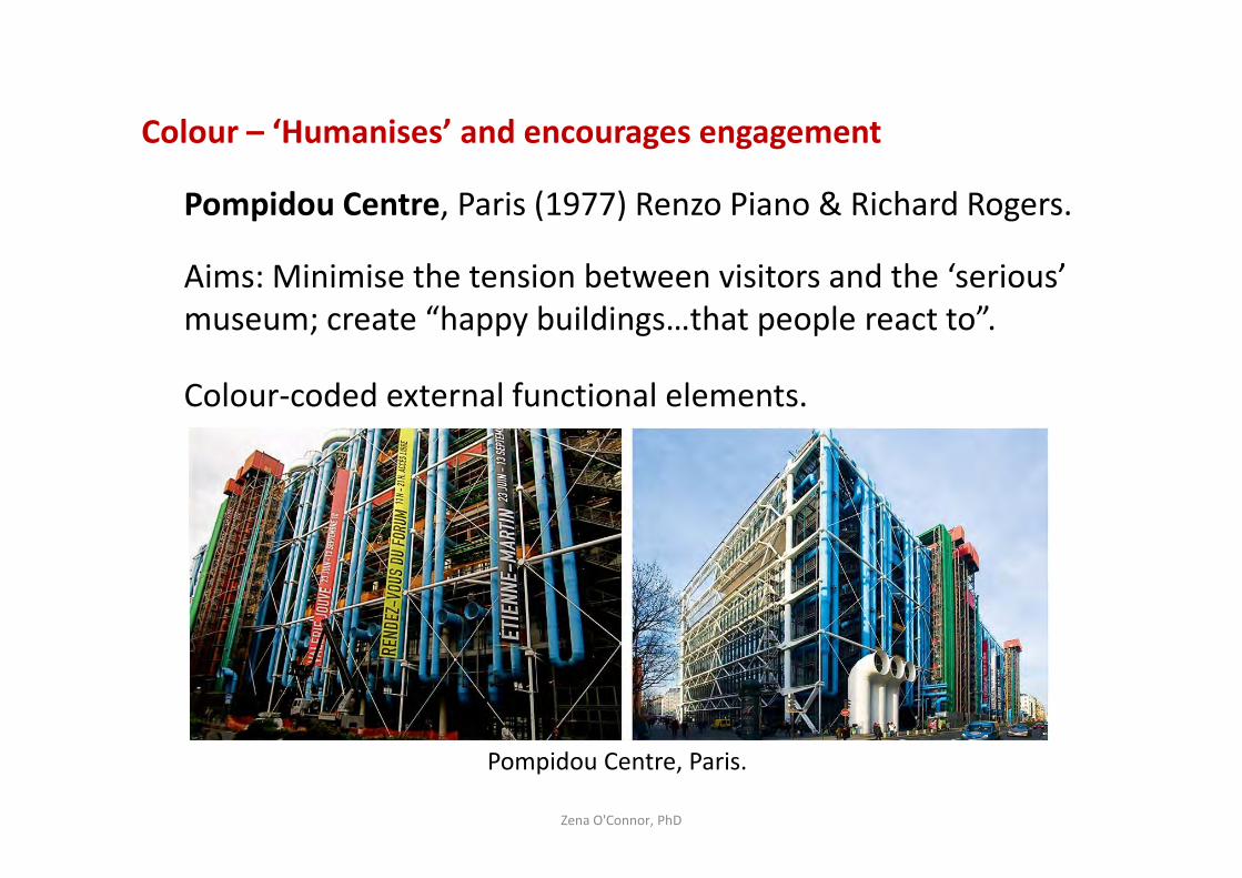
Colour – ‘Humanises’ and encourages engagement
Pompidou Centre, Paris (1977) Renzo Piano & Richard Rogers.
Aims: Minimise the tension between visitors and the ‘serious’
museum; create “happy buildings…that people react to”.
Colour-coded external functional elements.
Zena O'Connor, PhD
Pompidou Centre, Paris.
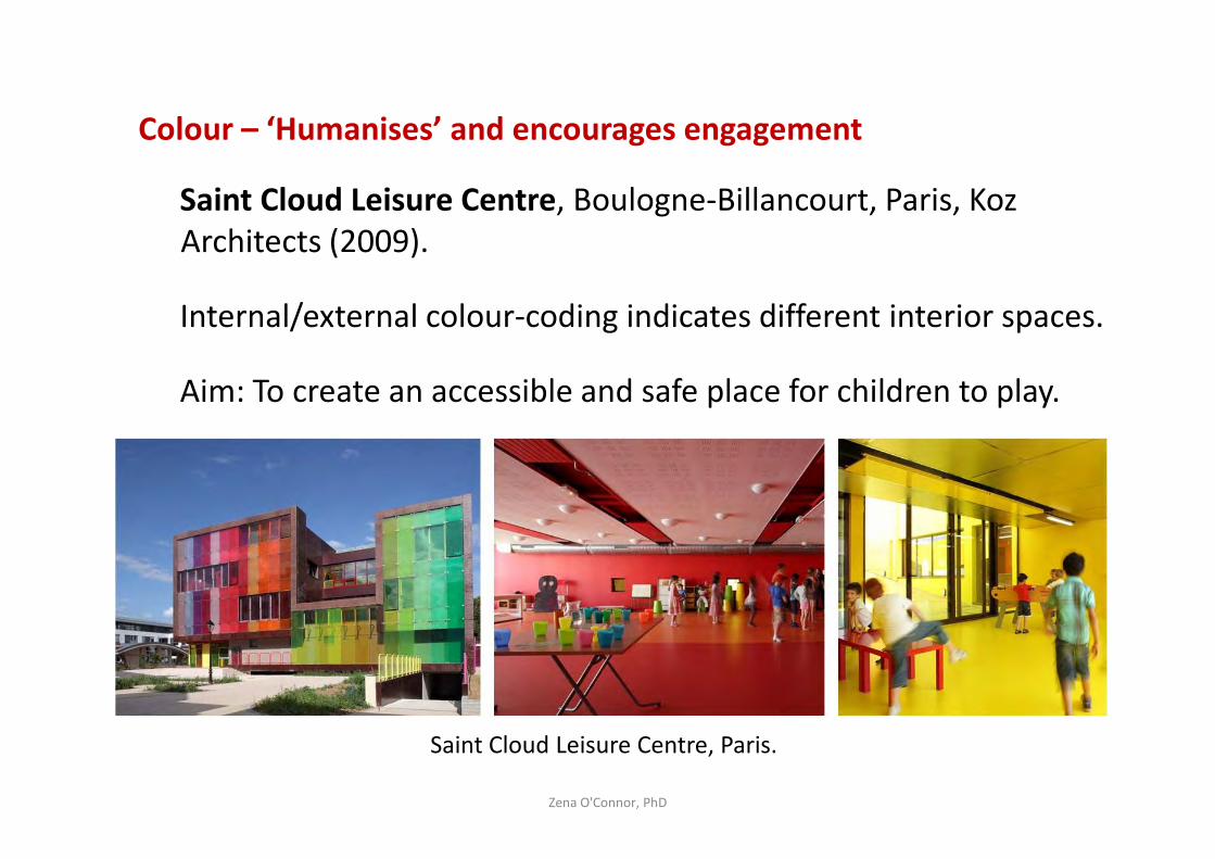
Colour – ‘Humanises’ and encourages engagement
Saint Cloud Leisure Centre, Boulogne-Billancourt, Paris, Koz
Architects (2009).
Internal/external colour-coding indicates different interior spaces.
Aim: To create an accessible and safe place for children to play.
Zena O'Connor, PhD
Saint Cloud Leisure Centre, Paris.
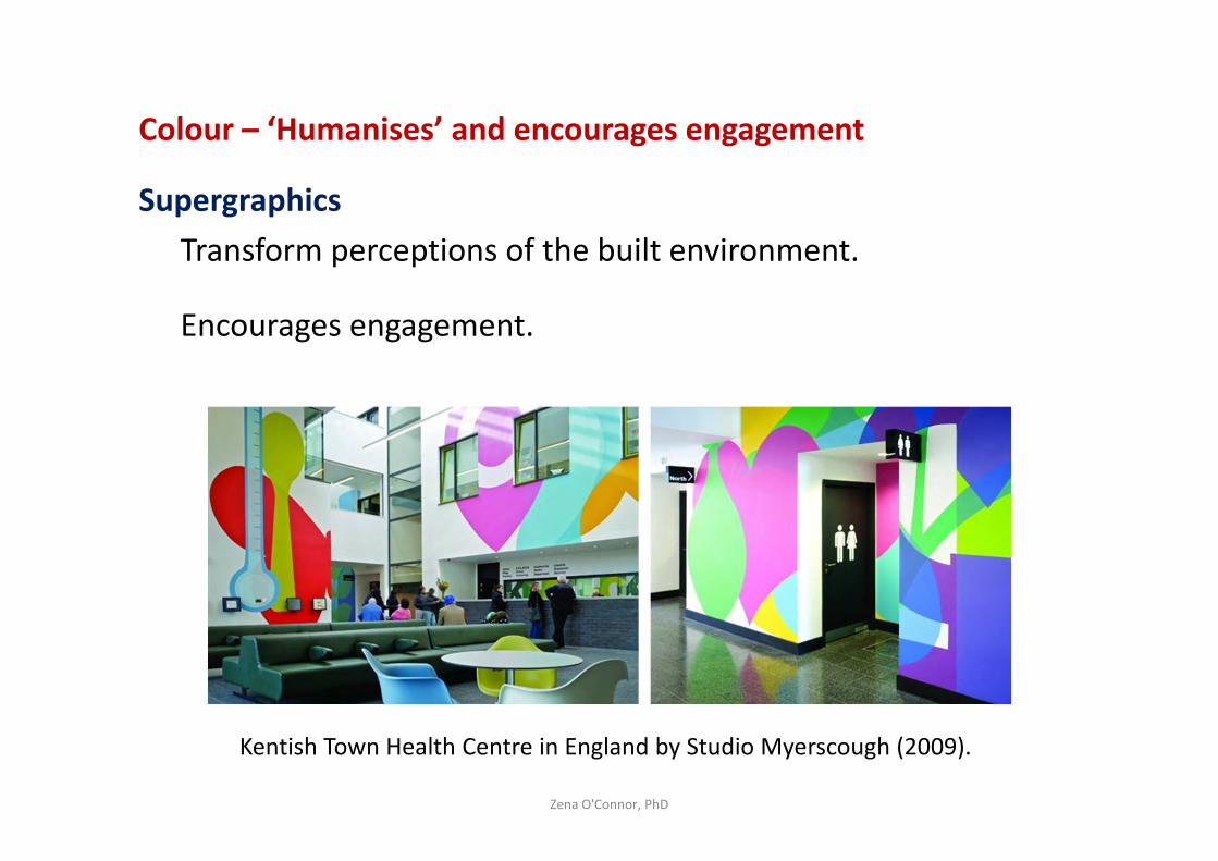
Colour – ‘Humanises’ and encourages engagement
Supergraphics
Transform perceptions of the built environment.
Encourages engagement.
Zena O'Connor, PhD
Kentish Town Health Centre in England by Studio Myerscough (2009).
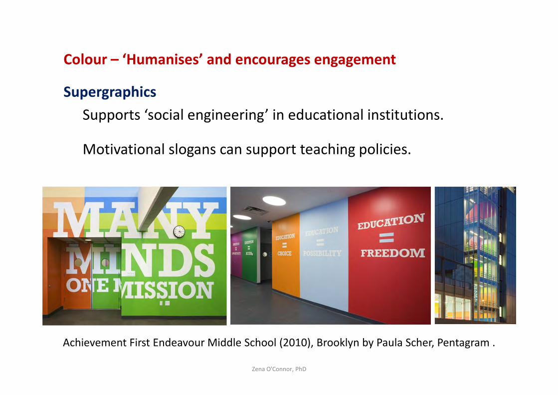
Colour – ‘Humanises’ and encourages engagement
Supergraphics
Supports ‘social engineering’ in educational institutions.
Motivational slogans can support teaching policies.
Zena O'Connor, PhD
Achievement First Endeavour Middle School (2010), Brooklyn by Paula Scher, Pentagram .
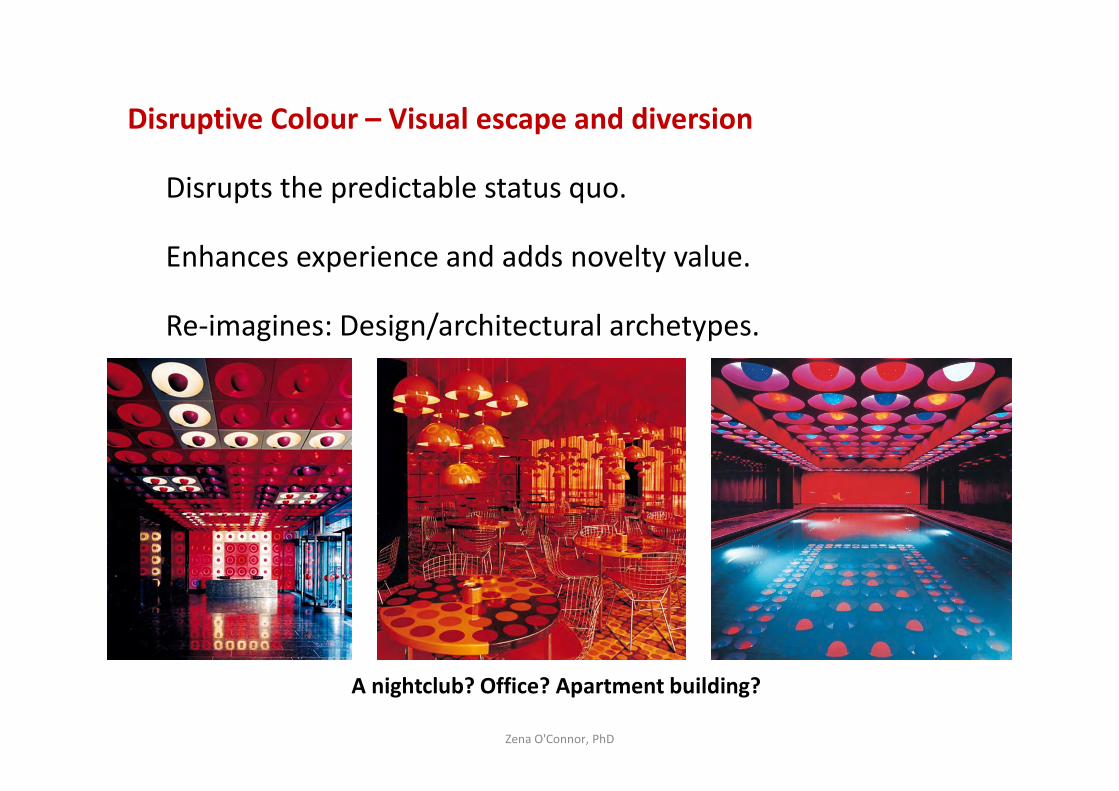
Disruptive Colour – Visual escape and diversion
Disrupts the predictable status quo.
Enhances experience and adds novelty value.
Re-imagines: Design/architectural archetypes.
Zena O'Connor, PhD
A nightclub? Office? Apartment building?

Disruptive Colour – Visual escape and diversion
Disrupts the predictable status quo.
Enhances experience and adds novelty value.
Re-imagines: Design/architectural archetypes.
Zena O'Connor, PhD
Spiegel Publishing House by Verner Panton, 1969.
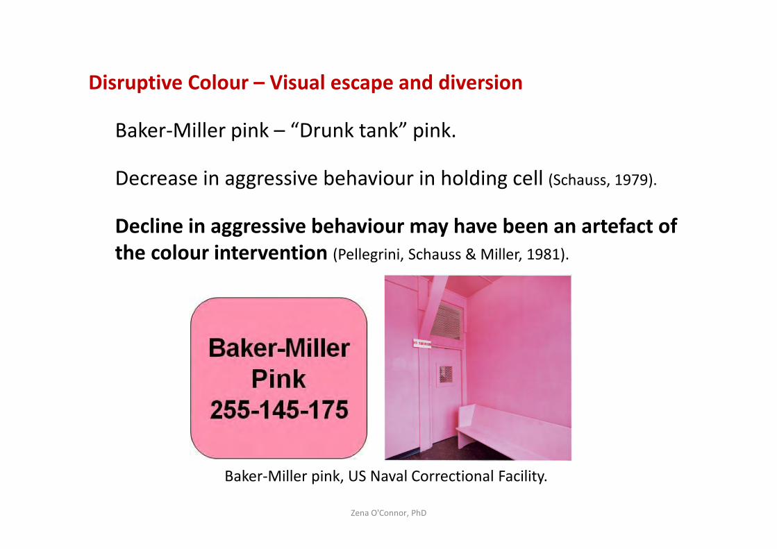
Disruptive Colour – Visual escape and diversion
Baker-Miller pink – “Drunk tank” pink.
Decrease in aggressive behaviour in holding cell (Schauss, 1979).
Decline in aggressive behaviour may have been an artefact of
the colour intervention (Pellegrini, Schauss & Miller, 1981).
Zena O'Connor, PhD
Baker-Miller pink, US Naval Correctional Facility.
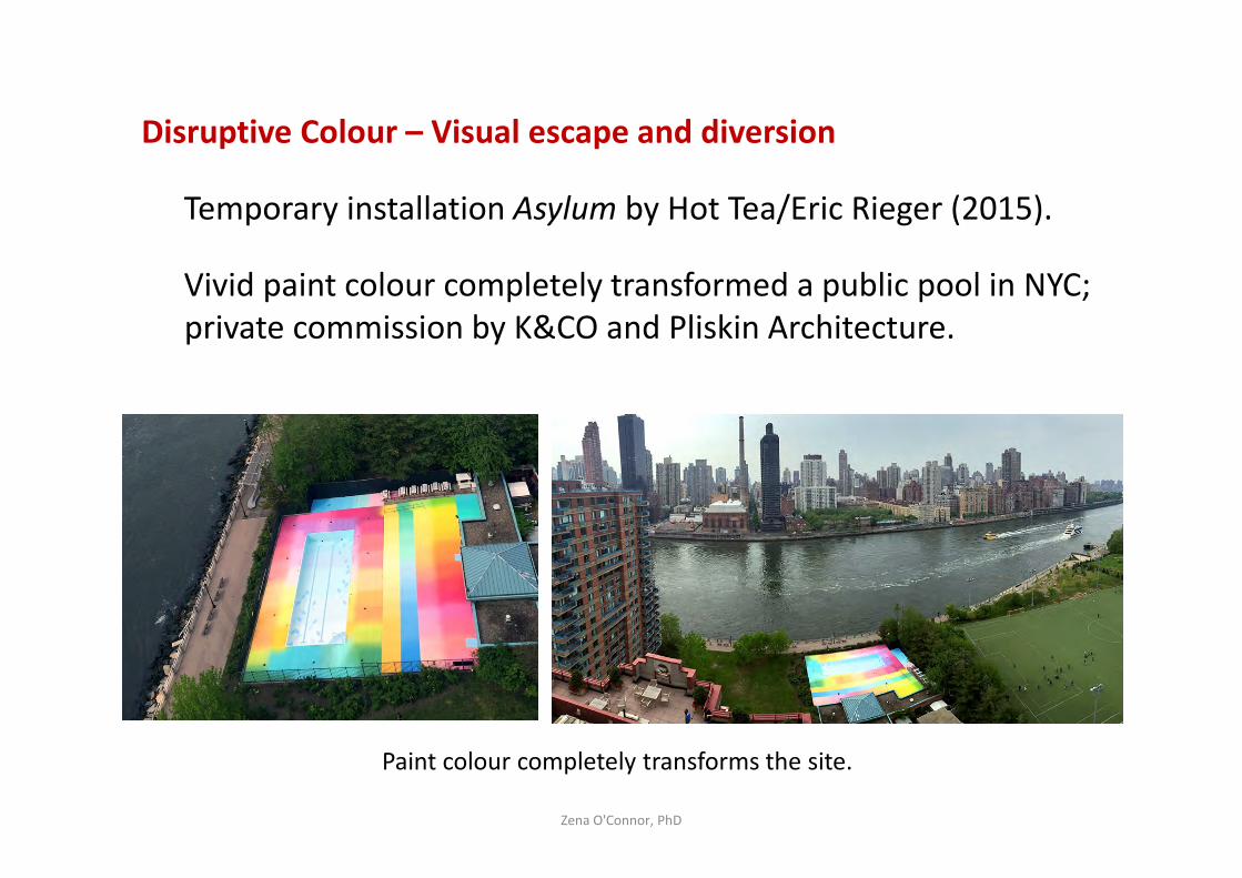
Disruptive Colour – Visual escape and diversion
Temporary installation Asylum by Hot Tea/Eric Rieger (2015).
Vivid paint colour completely transformed a public pool in NYC;
private commission by K&CO and Pliskin Architecture.
Zena O'Connor, PhD
Paint colour completely transforms the site.
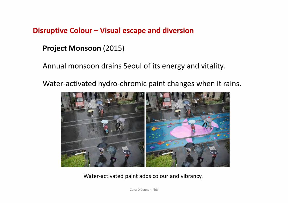
Disruptive Colour – Visual escape and diversion
Project Monsoon (2015)
Annual monsoon drains Seoul of its energy and vitality.
Water-activated hydro-chromic paint changes when it rains.
Zena O'Connor, PhD
Water-activated paint adds colour and vibrancy.
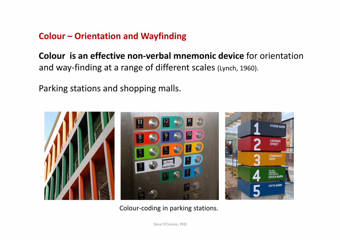
Colour – Orientation and Wayfinding
Colour is an effective non-verbal mnemonic device for orientation
and way-finding at a range of different scales (Lynch, 1960).
Parking stations and shopping malls.
Zena O'Connor, PhD
Colour-coding in parking stations.
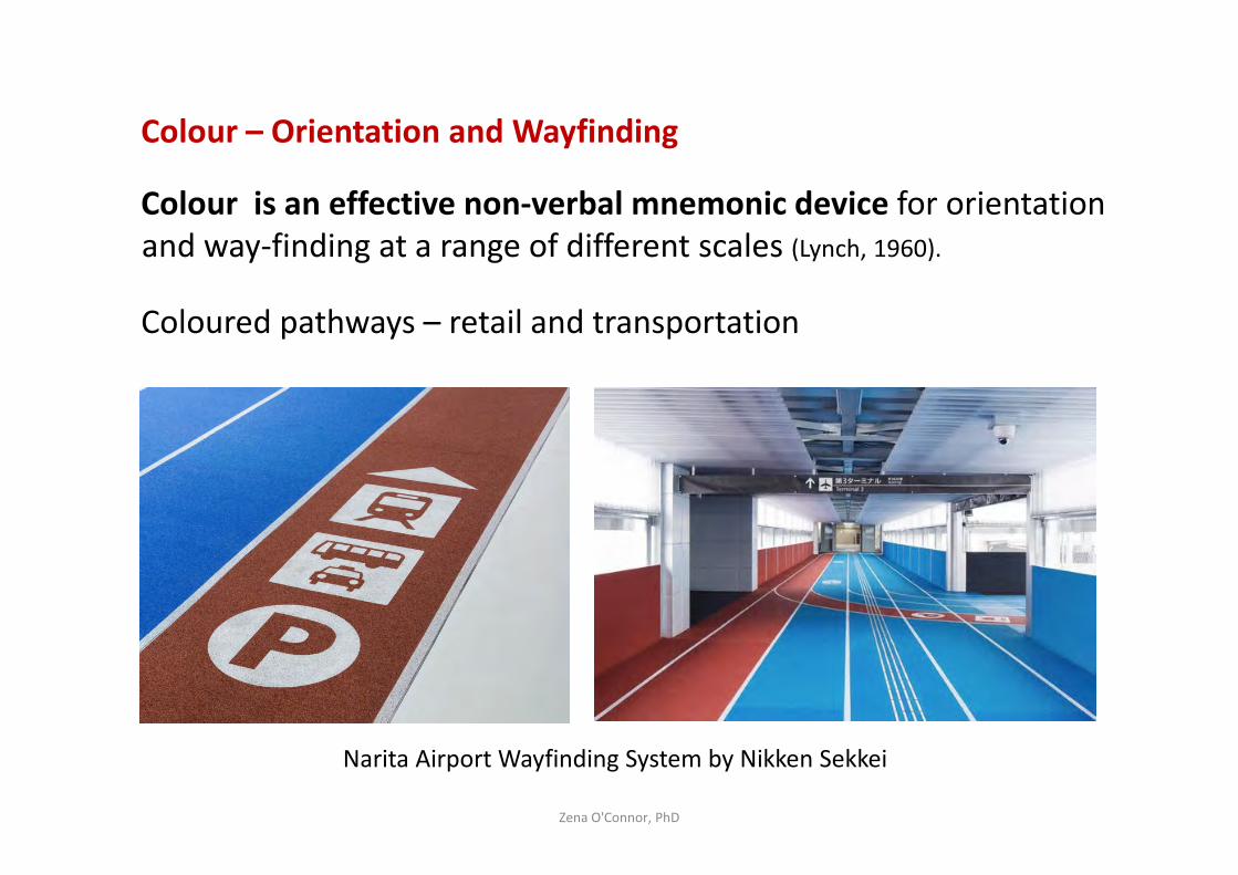
Colour – Orientation and Wayfinding
Colour is an effective non-verbal mnemonic device for orientation
and way-finding at a range of different scales (Lynch, 1960).
Coloured pathways – retail and transportation
Zena O'Connor, PhD
Narita Airport Wayfinding System by Nikken Sekkei
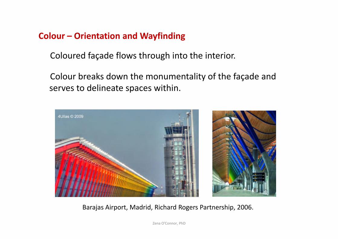
Colour – Orientation and Wayfinding
Coloured façade flows through into the interior.
Colour breaks down the monumentality of the façade and
serves to delineate spaces within.
Zena O'Connor, PhD
Barajas Airport, Madrid, Richard Rogers Partnership, 2006.
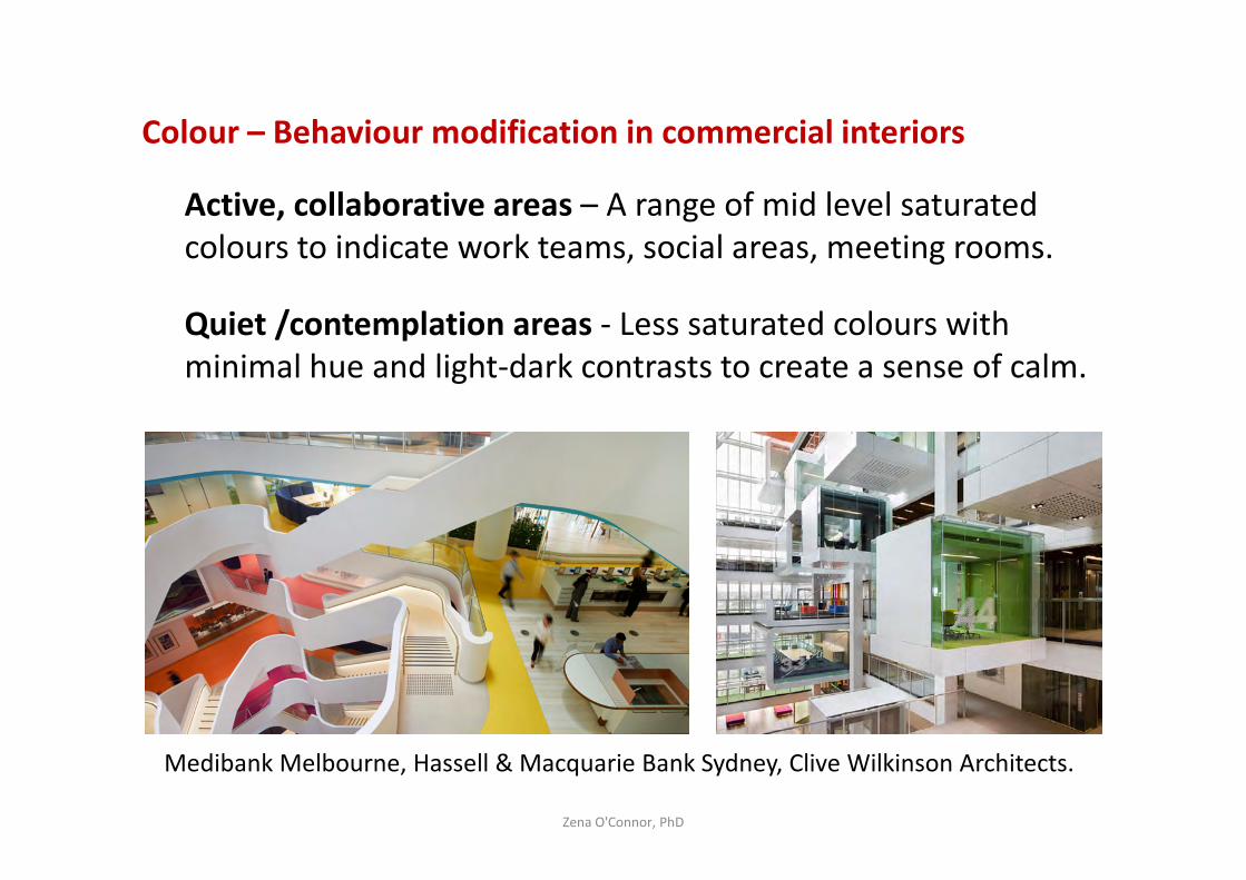
Colour – Behaviour modification in commercial interiors
Active, collaborative areas – A range of mid level saturated
colours to indicate work teams, social areas, meeting rooms.
Quiet /contemplation areas - Less saturated colours with
minimal hue and light-dark contrasts to create a sense of calm.
Zena O'Connor, PhD
Medibank Melbourne, Hassell & Macquarie Bank Sydney, Clive Wilkinson Architects.
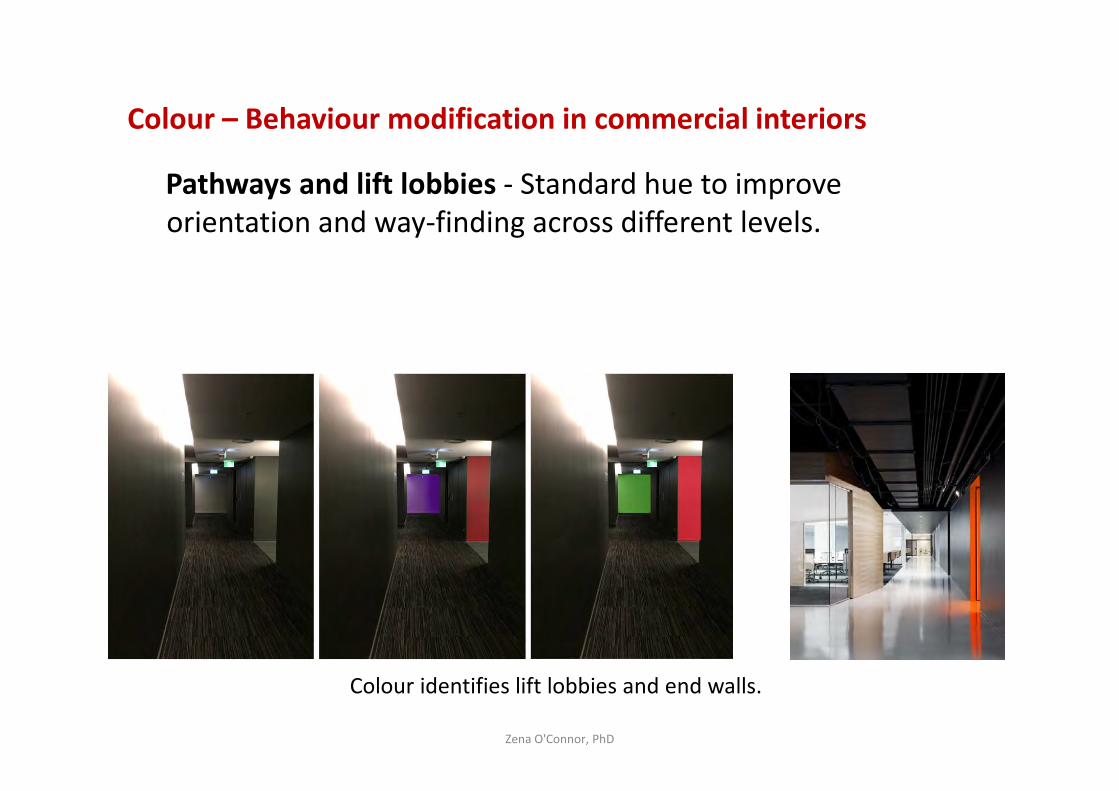
Colour – Behaviour modification in commercial interiors
Pathways and lift lobbies - Standard hue to improve
orientation and way-finding across different levels.
Zena O'Connor, PhD
Colour identifies lift lobbies and end walls.
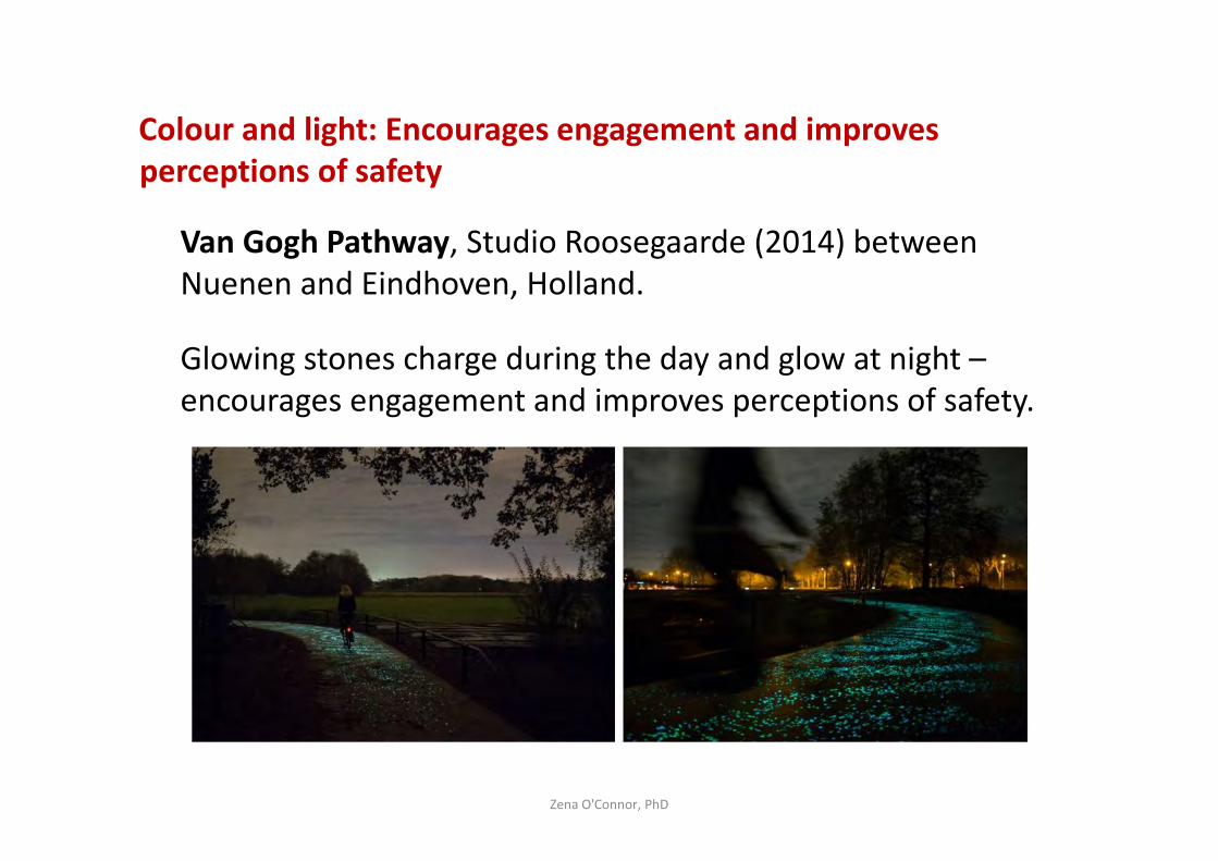
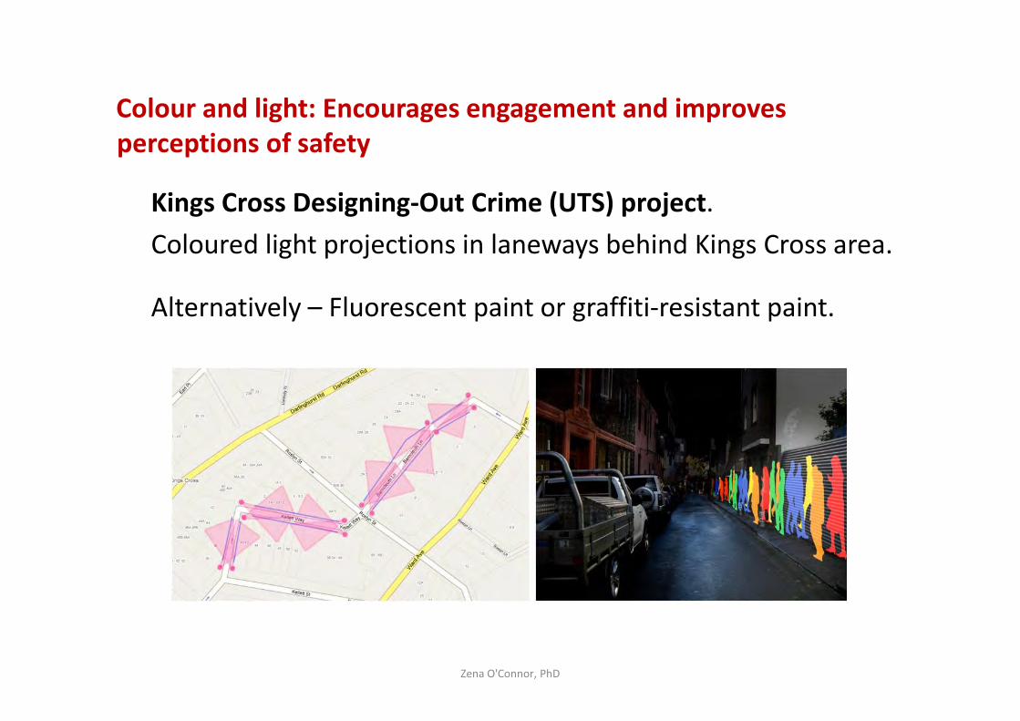
Colour and light: Encourages engagement and improves
perceptions of safety
Van Gogh Pathway, Studio Roosegaarde (2014) between
Nuenen and Eindhoven, Holland.
Glowing stones charge during the day and glow at night –
encourages engagement and improves perceptions of safety.
Zena O'Connor, PhD
Colour and light: Encourages engagement and improves
perceptions of safety
Kings Cross Designing-Out Crime (UTS) project.
Coloured light projections in laneways behind Kings Cross area.
Alternatively – Fluorescent paint or graffiti-resistant paint.
Zena O'Connor, PhD
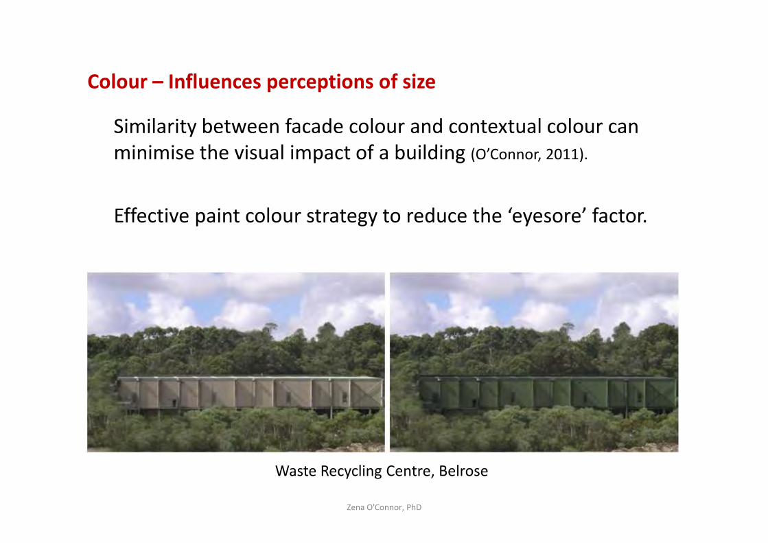
Colour – Influences perceptions of size
Similarity between facade colour and contextual colour can
minimise the visual impact of a building (O’Connor, 2011).
Effective paint colour strategy to reduce the ‘eyesore’ factor.
Zena O'Connor, PhD
Waste Recycling Centre, Belrose
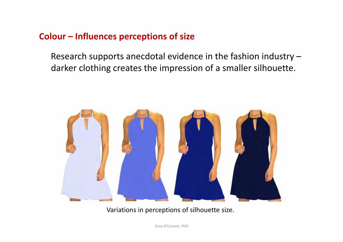
Colour – Influences perceptions of size
Research supports anecdotal evidence in the fashion industry –
darker clothing creates the impression of a smaller silhouette.
Zena O'Connor, PhD
Variations in perceptions of silhouette size.

Colour – Influences perceptions of size
Lighter tones:
– Lighter colours tend to visually enlarge an interior space (Simon & Toups, 2014, NASA report).
– Ceiling will appear marginally higher.
– Paint colour will appear lighter in a well-lit room.
Zena O'Connor, PhD
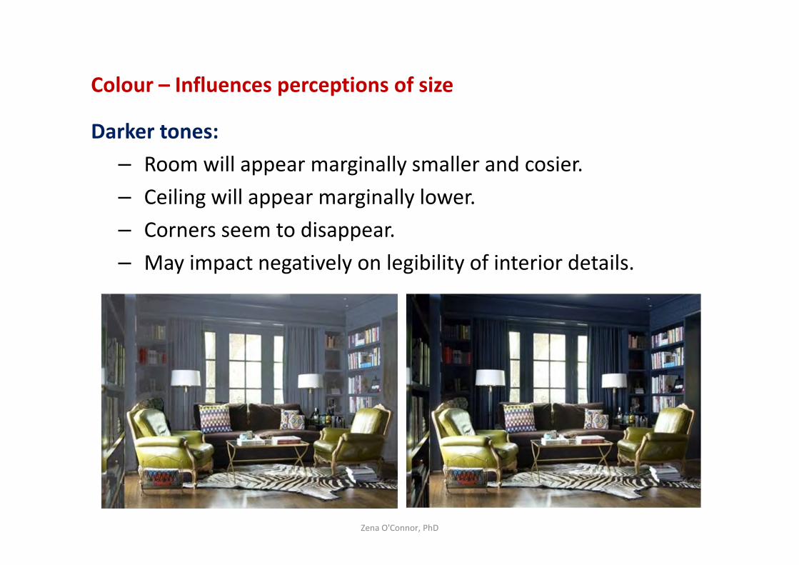
Colour – Influences perceptions of size
Darker tones:
– Room will appear marginally smaller and cosier.
– Ceiling will appear marginally lower.
– Corners seem to disappear.
– May impact negatively on legibility of interior details.
Zena O'Connor, PhD
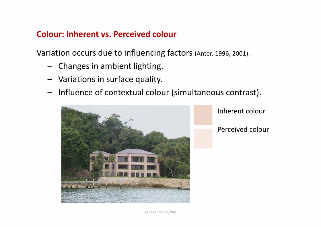
Colour: Inherent vs. Perceived colour
Variation occurs due to influencing factors (Anter, 1996, 2001).
– Changes in ambient lighting.
– Variations in surface quality.
– Influence of contextual colour (simultaneous contrast).
Zena O'Connor, PhD
Inherent colour
Perceived colour
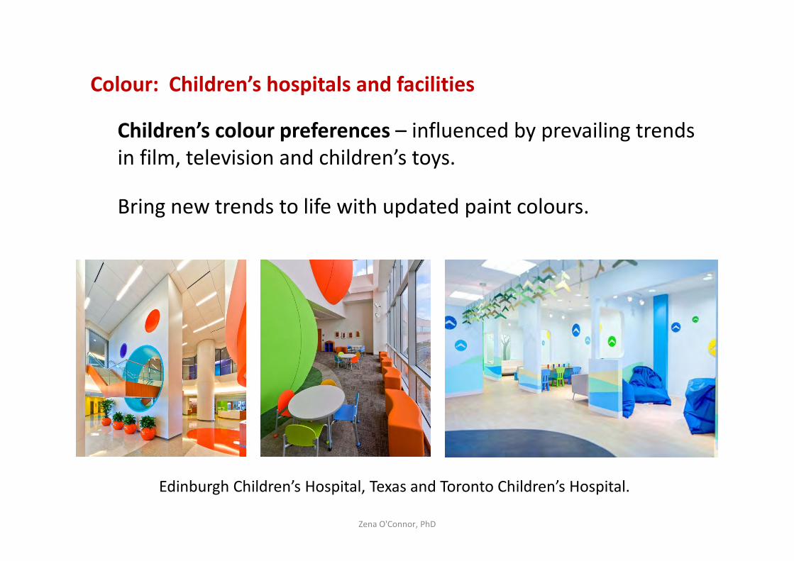
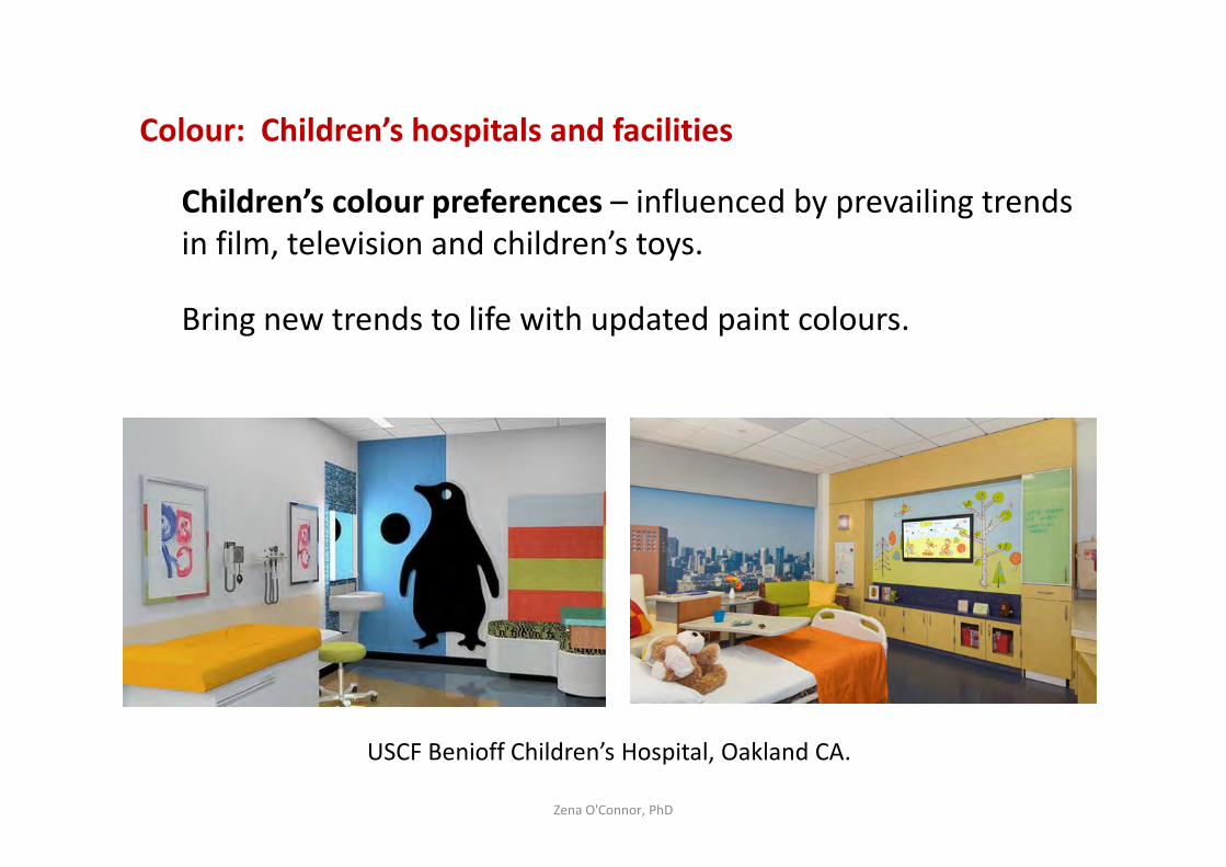
Colour: Children’s hospitals and facilities
Children’s colour preferences – influenced by prevailing trends
in film, television and children’s toys.
Bring new trends to life with updated paint colours.
Zena O'Connor, PhD
Edinburgh Children’s Hospital, Texas and Toronto Children’s Hospital.
Colour: Children’s hospitals and facilities
Children’s colour preferences – influenced by prevailing trends
in film, television and children’s toys.
Bring new trends to life with updated paint colours.
Zena O'Connor, PhD
USCF Benioff Children’s Hospital, Oakland CA.
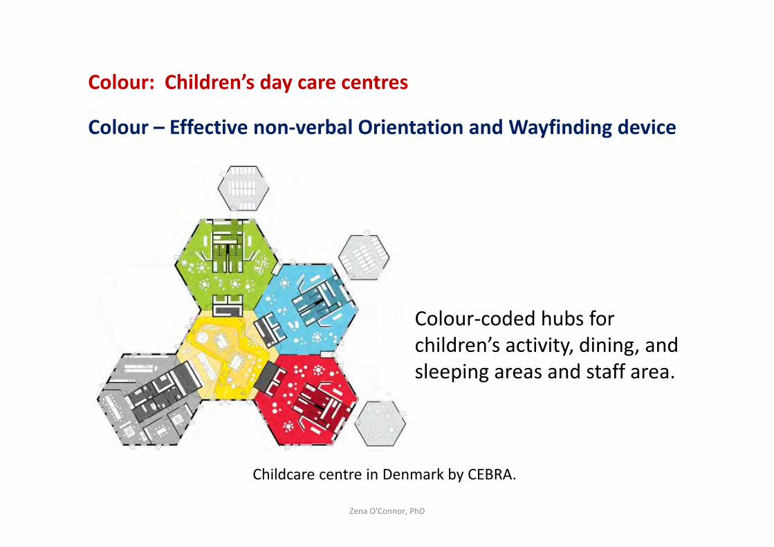
Colour: Children’s day care centres
Colour – Effective non-verbal Orientation and Wayfinding device
Zena O'Connor, PhD
Childcare centre in Denmark by CEBRA.
Colour-coded hubs for
children’s activity, dining, and
sleeping areas and staff area.
Colour: Children’s day care centres
Colour – Effective non-verbal Orientation and Wayfinding device
Play areas - Saturated contrasting colours to ignite imagination.
Dining areas - Neutral colours and minimal contrasts to
minimise excitement and agitation.
Reading areas - Darker colours to distinguish from play areas
and encourage quiet.
Sleeping areas - Minimise hue and saturation contrast to
minimise visual ‘noise’ and encourage a sense of calmness.
Zena O'Connor, PhD
Colour in healthcare environments
Lack of reliable, evidence-based information
Comprehensive review on colour in healthcare settings:
– Evidence is “conflicting, anecdotal and loosely-tested” (Schwartz & Tofle, 2005).
Zena O'Connor, PhD
Colour in healthcare environments
Influence of stimulus-screening ability
Investigation into colour in healthcare environments (Dijkstra,
Pieterse, & Pruyn 2008).
Stress-reducing effects of green and arousal-inducing effects of
orange in healthcare environments:
– More pronounced for people with low stimulus screening
ability than for those who are able to effectively screen out
complexity in the environment.
Zena O'Connor, PhD
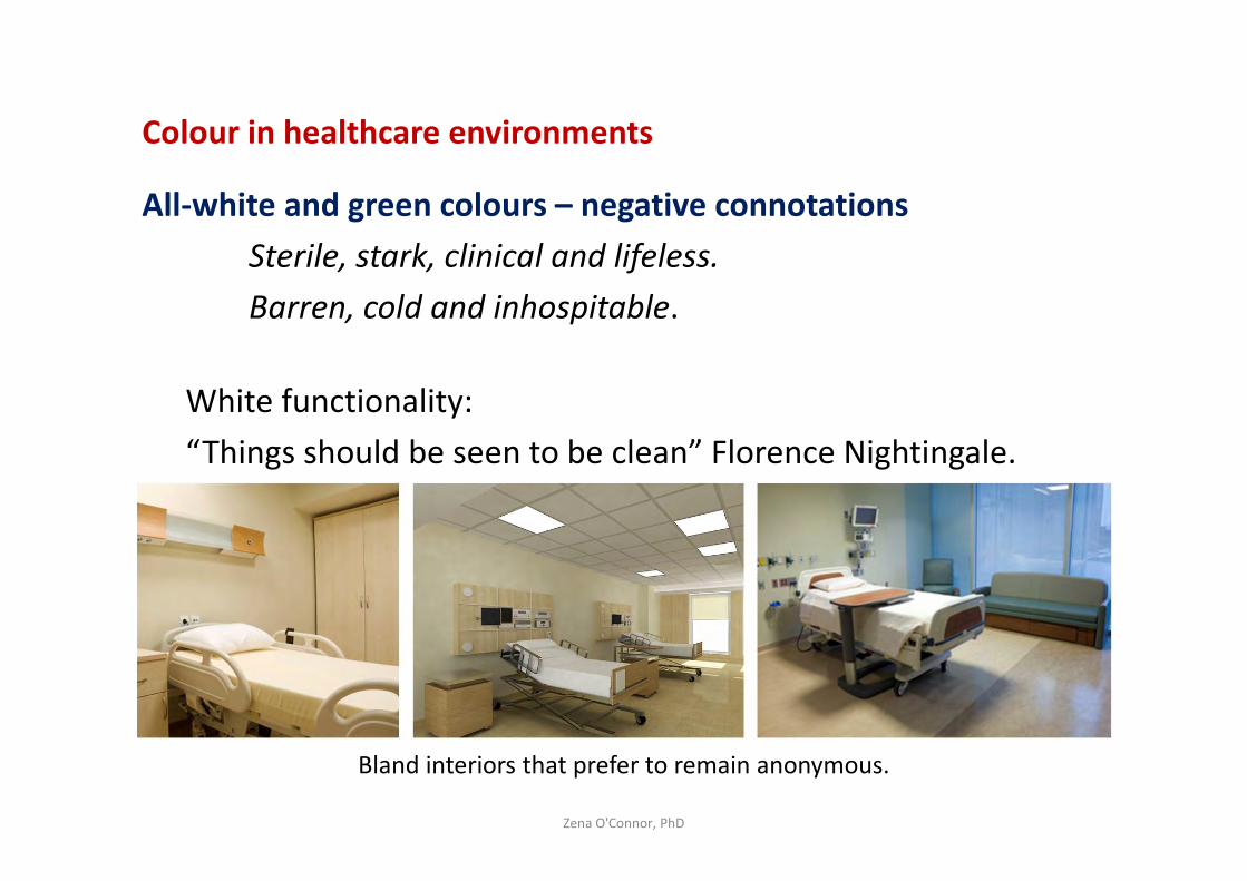
Colour in healthcare environments
All-white and green colours – negative connotations
Sterile, stark, clinical and lifeless.
Barren, cold and inhospitable.
White functionality:
“Things should be seen to be clean” Florence Nightingale.
Zena O'Connor, PhD
Bland interiors that prefer to remain anonymous.
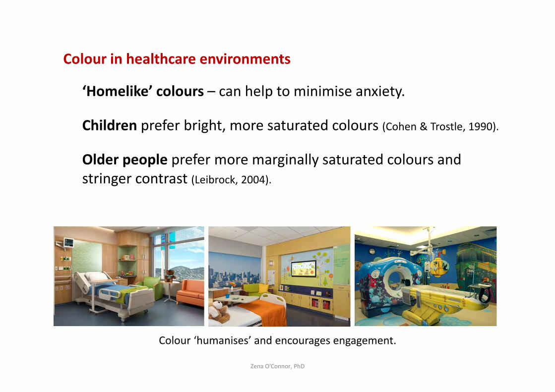
Colour in healthcare environments
‘Homelike’ colours – can help to minimise anxiety.
Children prefer bright, more saturated colours (Cohen & Trostle, 1990).
Older people prefer more marginally saturated colours and
stringer contrast (Leibrock, 2004).
Zena O'Connor, PhD
Colour ‘humanises’ and encourages engagement.
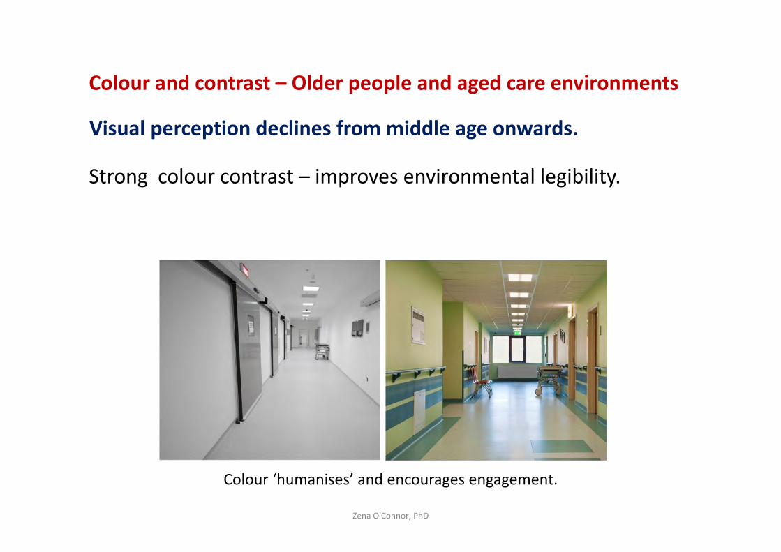
Colour and contrast – Older people and aged care environments
Visual perception declines from middle age onwards.
Strong colour contrast – improves environmental legibility.
Zena O'Connor, PhD
Colour ‘humanises’ and encourages engagement.
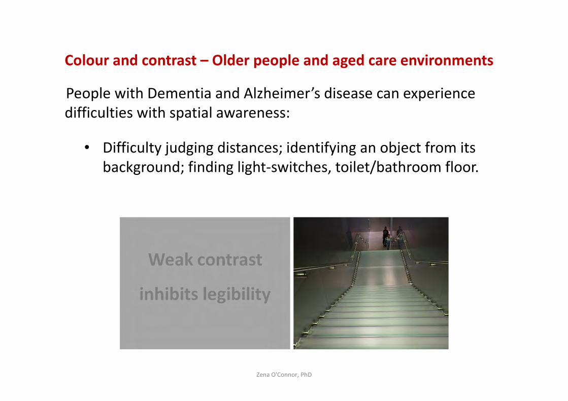
Colour and contrast – Older people and aged care environments
People with Dementia and Alzheimer’s disease can experience
difficulties with spatial awareness:
• Difficulty judging distances; identifying an object from its
background; finding light-switches, toilet/bathroom floor.
Zena O'Connor, PhD
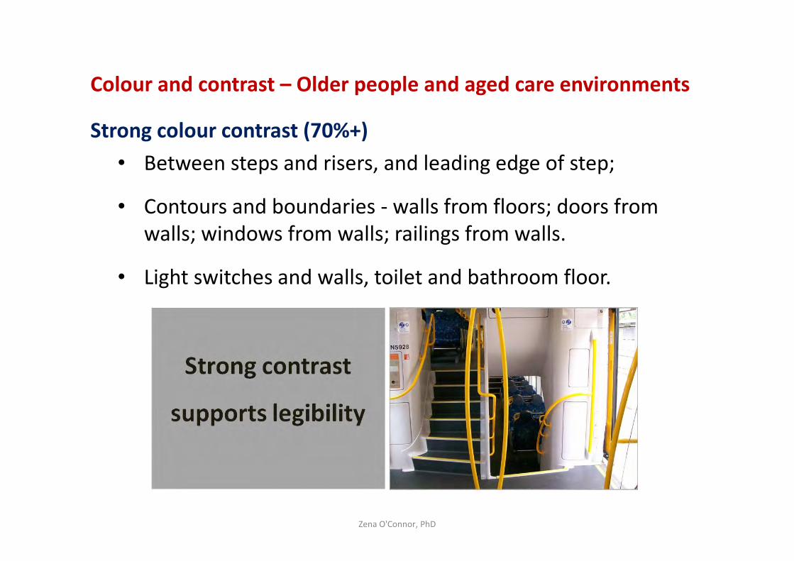
Colour and contrast – Older people and aged care environments
Strong colour contrast (70%+)
• Between steps and risers, and leading edge of step;
• Contours and boundaries - walls from floors; doors from
walls; windows from walls; railings from walls.
• Light switches and walls, toilet and bathroom floor.
Zena O'Connor, PhD
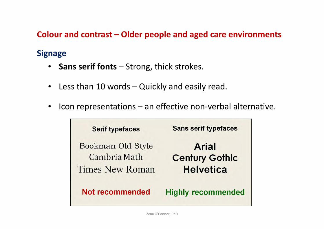
Colour and contrast – Older people and aged care environments
Signage
• Sans serif fonts – Strong, thick strokes.
• Less than 10 words – Quickly and easily read.
• Icon representations – an effective non-verbal alternative.
Zena O'Connor, PhD
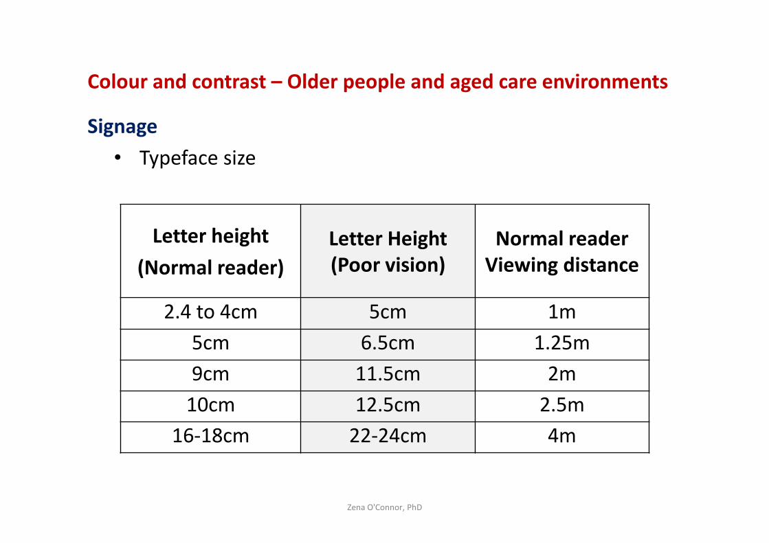
Colour and contrast – Older people and aged care environments
Signage
• Typeface size
Zena O'Connor, PhD
Letter height
(Normal reader)
Letter Height
(Poor vision)
Normal reader
Viewing distance
2.4 to 4cm 5cm 1m
5cm 6.5cm 1.25m
9cm 11.5cm 2m
10cm 12.5cm 2.5m
16-18cm 22-24cm 4m
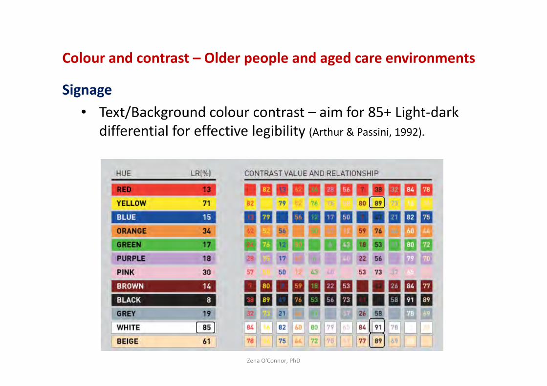
Colour and contrast – Older people and aged care environments
Signage
• Text/Background colour contrast – aim for 85+ Light-dark
differential for effective legibility (Arthur & Passini, 1992).
Zena O'Connor, PhD
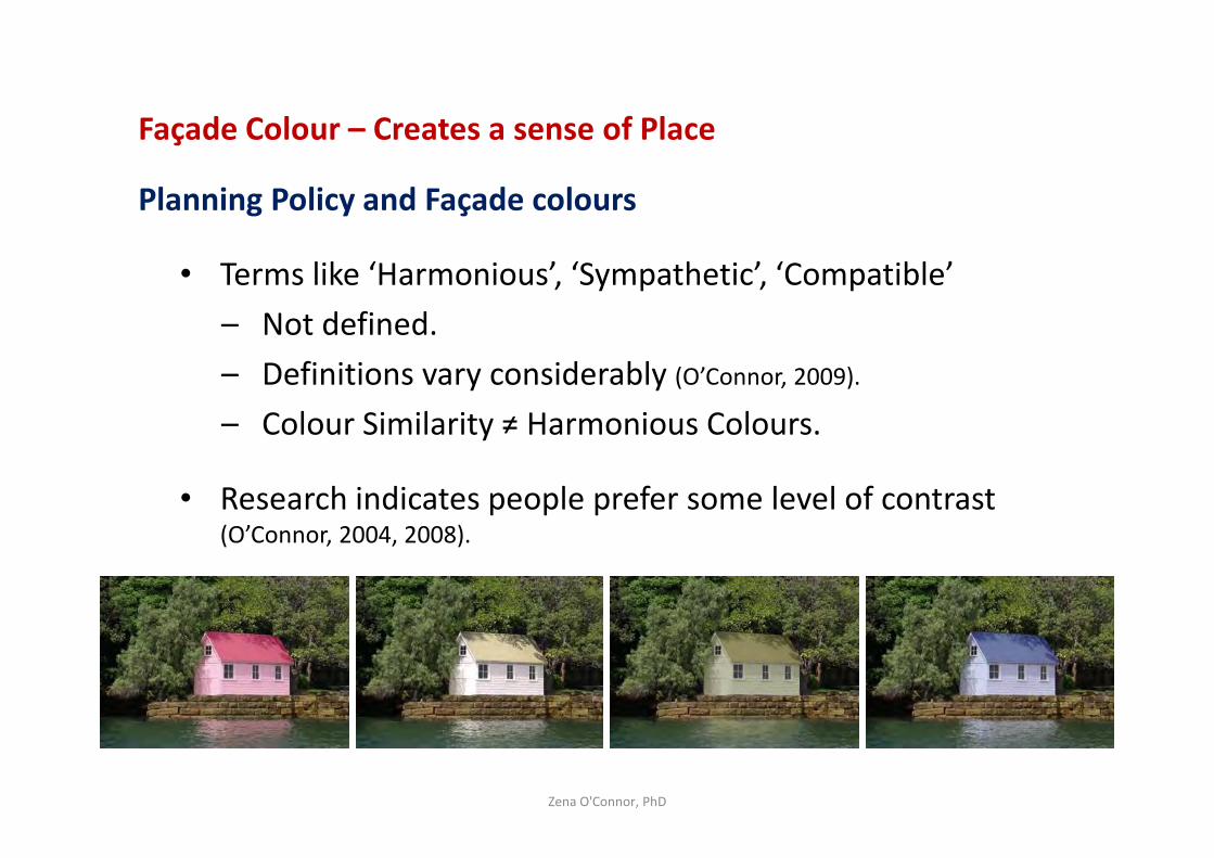
Façade Colour – Creates a sense of Place
Planning Policy and Façade colours
• Terms like ‘Harmonious’, ‘Sympathetic’, ‘Compatible’
– Not defined.
– Definitions vary considerably (O’Connor, 2009).
– Colour Similarity ≠ Harmonious Colours.
• Research indicates people prefer some level of contrast (O’Connor, 2004, 2008).
Zena O'Connor, PhD
Selected ReferencesAnter, K.F. (1996). Inherent and perceived colour in exterior architecture. Paper presented at the
Colour and Psychology Conference, Gothenburg.
Aslam, M.M. (2006). Are you selling the right colour? Journal of Marketing Communications, 12(1),
15-30.
Bellizzi, J.A, Crowley, A.E., & Hasty, R.W. (1983). The effects of color in store design. Journal of
Retailing, 59(1), 21-45.
Boynton, R.M. (1979). Human color vision. New York: Holt, Reinhart & Winston.
Elliot, A.J. (2015). Color and psychological functioning: A review of theoretical and empirical work.
Frontiers in Psychology, 6(4), 1-8.
Elliot, A.J, & Niesta, D. (2008). Romantic red: Red enhances men's attraction to women. Journal of
Personality and Social Psychology, 95(5), 1150-1164.
Hill, R.A, & Barton, R.A. (2005). Red enhances human performance in contests. Nature, 435, 293.
Kuller, R, Ballal, S, Laike, T, Mikellides, B, & Tonello, G. (2006). The impact of light and colour on
psychological mood: A cross-cultural study of indoor work environments. Ergonomics, 49(14),
1496-1507.
Kuller, R, Mikellides, B, & Janssens, J. (2009). Color, arousal, and performance - A comparison of
three experiments. Color Research and Application, 34(2), 141-152.
Kwallek, N, Woodson, H, Lewis, C.M, & Sales, C. (1997). Impact of three interior color schemes on
worker mood and performance relative to individual environmental sensitivity. Color Research
and Application, 22(2), 121-132.
Zena O'Connor, PhD
Selected ReferencesLynch, K. (1960). The image of the city. Cambridge: MIT Press.
Manav, B. (2007). Color-emotion associations and color preferences: A case study for residences.
Color Research and Application, 32(2), 144-150.
Mehrabian, A. (1977). Individual differences in stimulus screening and arousability. Journal of
Personality, 45, 237-250.
Mikellides, B. (1990). Color and psychological arousal. The Journal of Architectural and Planning
Research, 7(1), 13-20.
O'Connor, Z. (2011). Façade colour and judgments about building size and congruity. Journal of
Urban Design, 16(3), 397-404.
Park, Y, & Guerin, D.A. (2002). Meaning and preferences of interior color palettes among four
culture. Journal of Interior Design, 28(1), 27-39.
Welbourne, L.E, Morland, A.B, & Wade, A.R. (2015). Human colour perception changes between
seasons. Current Biology, 25(15), 646-647.
Whitfield, T.W.A, & Whelton, J. (2015). The arcane roots of colour psychology, chromotherapy, and
colour forecasting. Color Research and Application, 40(1), 99-106.
Whitfield, T. & Whiltshire, T.J. (1990). Color psychology: A critical review. Genetic, Social and
General Psychology Monographs, 116(4), 385-411.
Wise, B.K., Wise, J.A., & Beach, L.R. (1988). The human factors of color in environmental design: A
critical review. NASA Grant No. NCC 2-404. Moffett Field, CA: NASA Ames Research Centre.
Zena O'Connor, PhD
Zena O'Connor, PhD
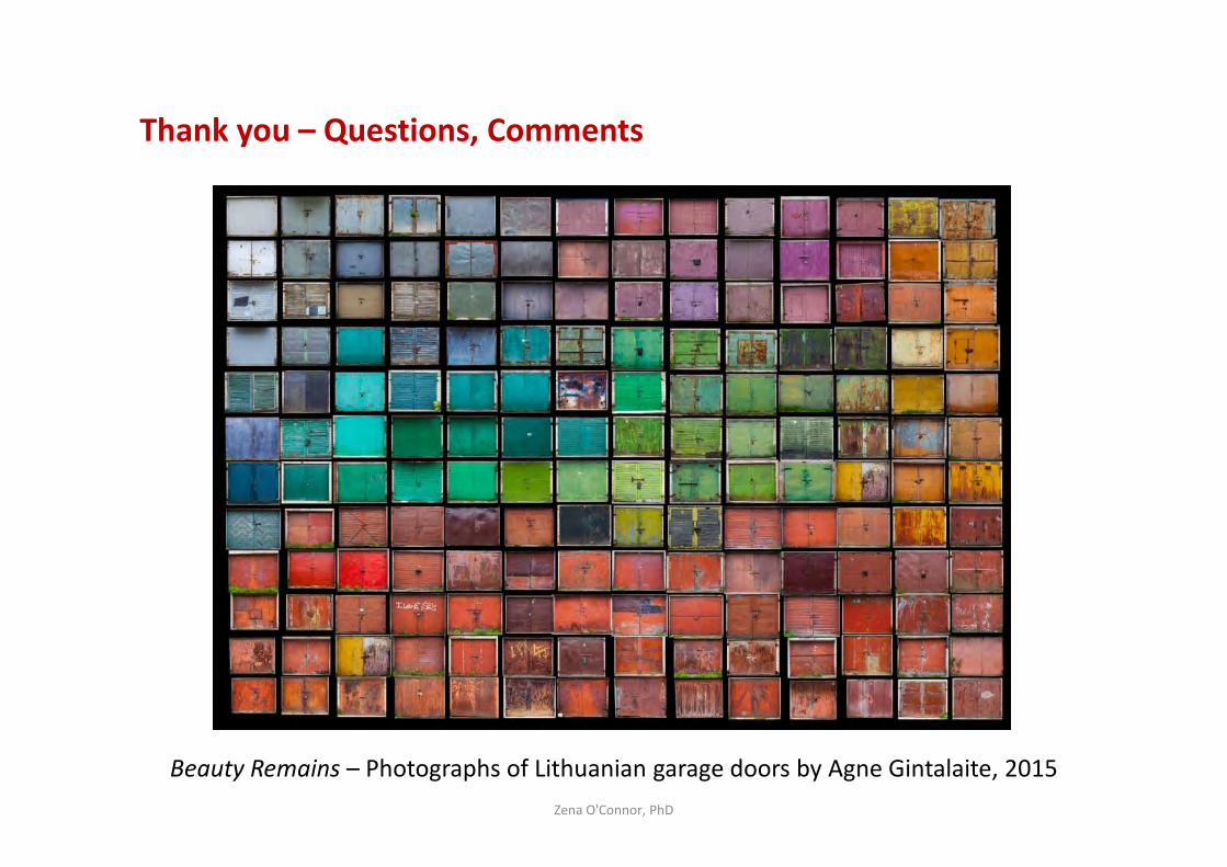
Thank you – Questions, Comments
Beauty Remains – Photographs of Lithuanian garage doors by Agne Gintalaite, 2015
Dr Zena O’Connor
An independent research consultant, Zena holds a PhD from the University of
Sydney, a Master’s Degree in Design (University of Technology, Sydney) and a
Bachelor’s Degree (University of Technology, Sydney).
Zena delivers evidence-based insight and research reports and seminars
relating to environment-behavior interactions and in particular colour in the
built environment, colour psychology, colour in logo design and branding, visual
literacy and colour mapping studies. Zena’s clients include a wide range of
organisations in the commercial, government and academic sectors.
http://zenaoconnor.com.au
Zena O'Connor, PhD