Embed Size (px)
Citation preview

This PDF is a selection from an out-of-print volume from the NationalBureau of Economic Research
Volume Title: Frontiers in Health Policy Research, Volume 3
Volume Author/Editor: Alan M. Garber, editor
Volume Publisher: MIT Press
Volume ISBN: 0-262-57141-2
Volume URL: http://www.nber.org/books/garb00-1
Publication Date: January 2000
Chapter Title: Comparing the Quality of Health Care Providers
Chapter Author: Mark McClellan, Douglas Staiger
Chapter URL: http://www.nber.org/chapters/c9832
Chapter pages in book: (p. 113 - 136)
5
Comparing the Quality of Health Care Providers
Mark McClellan, Stanford University and the NBER
Douglas Staiger, Dartmouth College and the NBER
Executive Summary
This article introduces a new approach for evaluating the quality of health careproviders, including an integrated solution to several problems that limit theusefulness of available methods. Our approach combines information from allthe quality indicators available for a provider (e.g., from other years, other pa-tients, or other indicators for the same patients) to estimate more accurately theprovider's previous or expected quality. The approach also provides an empiri-cal basis for comparing and combining alternative quality indicators, therebyenabling policy makers to choose among potential indicators, explore the po-tential bias in alternative measures, and increase the value of quality measuresfor assessing and improving care. Using hospital care for elderly heart attackpatients as an example, we demonstrate that these methods can be used to cre-ate reliable, precise predictions about provider quality. Comparing quality ofcare across providers may be far more feasible than many now believe.
I. Introduction
Comparing quality of care across providers is becoming increasinglyimportant, both as a contracting and quality improvement tool forhealth plans and payers, and as "report cards" to help consumers andothers compare quality of care. Examples include rankings of the"best" hospitals published by magazines such as US News & World Re-port, scorecards issued by state regulators in Pennsylvania and NewYork, and hospital quality reports produced by the Health Care Fi-nancing Administration (HCFA) and the Agency for Healthcare Re-search and Quality (AHRQ).
Despite enormous interest in developing such quality assessmenttools in health care, these measures have generated much controversyand skepticism. The problem with many of these rankings is that theysimply are not viewed as particularly informative (Hofer et al. 1999;
114 McClellan and Staiger
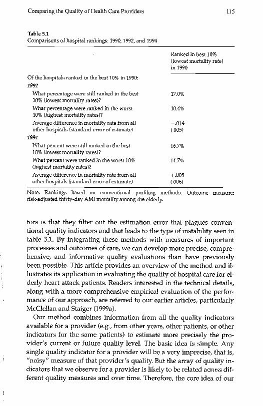
lezzoni 1997). This perception is especially true for measures based onimportant patient outcomes, which tend to be imprecise and particu-larly susceptible to differences in patient severity and comorbidity be-cause of the relatively small samples of patients seen by most providersin a single year. In particular, providers identified as providing highquality care in one year often appear to provide low quality care in thesubsequent year. For example, table 5.1 shows how hospitals identifiedin 1990 as the "best" (top 10 percent) hospitals on one common qualityindicator, thirty-day mortality rate following a heart attack, wereranked in subsequent years (this data is described in more detail be-low). Hospitals that were identified as the "best" in 1990 were nearly aslikely to be ranked among the worst (14.7 percent) as among the best(16.7 percent) by 1994. In fact, average mortality rates among these hos-pitals were actually higher than average by 1994. This type of evidencehas led many to wonder whether rankings based on such data do moreharm than good (Bindman 1999).
Most of the existing provider report cards have responded to theseperceived problems by moving away from an emphasis on serious out-comes of important health problems. For example, HEDIS measureshave emphasized screening and relatively common process measuresof care. Other evaluators have focused on larger hospitals or groups ofphysicians. Others have argued for expensive collection of detailedcase-mix measures to reduce noise and bias. Still others have advo-cated collecting large numbers of measures and aggregating them ac-cording to a priori rules.
These perceived problems with provider report cards have resultedin considerable debate over the uses of such information. But giventhe growing pressures placed on health care providers to provideefficient high quality care, the trend toward greater accountabilitywill continuewith increasing pressure to develop and apply mea-sures to finer levels of analysis (e.g., individual physicians, particulargroups of patients). Thus, the fundamental question is, can we developbetter methods for comparing quality across providers in suchsituations?
In a series of recent papers (McClellan and Staiger 1999a, 1999b;Geppert, McClellan, and Staiger 2000), we have developed methodsthat address these concerns and have applied our approach in ongoingwork to implement better quality evaluation and improvement meth-ods for private health plans, health care purchasing groups, andMedicare. We refer to our new quality indicators as "filtered" estimatesof provider quality because one of the key advantages of these indica-
Comparing the Quality of Health Care Providers 115
Table 5.1Comparisons of hospital rankings: 1990, 1992, and 1994
Of the hospitals ranked in the best 10% in 1990:1992
What percentage were still ranked in the best10% (lowest mortality rates)?What percentage were ranked in the worst10% (highest mortality rates)?
Average difference in mortality rate from allother hospitals (standard error of estimate)
1994
What percent were still ranked in the best10% (lowest mortality rates)?
What percent were ranked in the worst 10%(highest mortality rates)?Average difference in mortality rate from allother hospitals (standard error of estimate)
Ranked in best 10%(lowest mortality rate)in 1990
17.0%
10.4%
.014
16.7%
14.7%
+005
Note: Rankings based on conventional profiling methods. Outcome measure:risk-adjusted thirty-day AMI mortality among the elderly.
tors is that they filter out the estimation error that plagues conven-tional quality indicators and that leads to the type of instability seen intable 5.1. By integrating these methods with measures of importantprocesses and outcomes of care, we can develop more precise, compre-hensive, and informative quality evaluations than have previouslybeen possible. This article provides an overview of the method and il-lustrates its application in evaluating the quality of hospital care for el-derly heart attack patients. Readers interested in the technical details,along with a more comprehensive empirical evaluation of the perfor-mance of our approach, are referred to our earlier articles, particularlyMcClellan and Staiger (1999a).
Our method combines information from all the quality indicatorsavailable for a provider (e.g., from other years, other patients, or otherindicators for the same patients) to estimate more precisely the pro-vider's current or future quality level. The basic idea is simple. Anysingle quality indicator for a provider will be a very imprecise, that is,"noisy" measure of that provider's quality. But the array of quality in-dicators that we observe for a provider is likely to be related across dif-ferent quality measures and over time. Therefore, the core idea of our
116 McClellan and Staiger
method is to use these relationships between multiple measures andover time to extract a more accurate "signal" in each particular meas-ure. In addition to improving the precision of the estimated quality in-dicators, our method provides an empirical basis for comparingalternative quality indicators and exploring potential biases. This ap-proach enables one to choose among potential indicators and, in manycases, limit the number of quality indicators either collected orreported.
Our particular application of these methods illustrates many of thechallenges facing quality evaluation in health care. On one hand, heartdisease is the leading cause of death in the United States and is clearly acondition for which the quality of medical care may have a substantialimpact on an individual's health. On the other hand, most hospitalstreat relatively few heart attack patients in any given year, and conven-tional quality indicators of the most important outcomes, such as sur-vival, are imprecise because of the influence of many factors besideshospital quality. We use this example to demonstrate how our filteringmethods can be used to create reliable, precise predictions about pro-vider quality. In the conclusion, we discuss additional promising appli-cations of our work to improving health care quality.
II. Uses and Limitations of Conventional Quality Indicators
Uses of Quality Indicators
Comparing quality of care across providers is an increasingly impor-tant tool as the health care market is becoming more competitive. TheInstitute of Medicine (1990) has defined quality as "the degree to whichhealth services for individuals and populations increase the likelihoodof desired health outcomes and are consistent with current professionalknowledge." But to translate this general definition into concretequality indicators, one must ask how the indicators will be used andconsider the features that are required of a quality indicator in that use.
Why do we measure quality7 Ultimately, the goals are to help guidedecision making and improve quality of care. To achieve these goals,information on provider quality is used primarily in three ways: forcontracting with providers, for guiding consumers in making informedchoices among providers, and for identifying exemplary providers toserve as models of best practice.
Quality information is used in contracts between purchasers andproviders as a way of providing incentives to the provider to maintain
Comparing the Quality of Health Care Providers 117
quality of care. Such incentives have become an increasingly importantsafeguard because purchasers have moved toward capitation andother fixed-price contracts that place financial pressure on providers toreduce the cost of care. This use of quality information is largely back-ward looking, for example, basing financial rewards on whether theprovider achieved concrete and quantifiable quality standards over theprevious year.
Quality information is also used to guide consumers (and other pur-chasers such as employers and health plans) in making informedchoices among providers. In today's health care market, providers areincreasingly competing for patients on the basis of price, which in turnincreases the incentives for providers to reduce the amount of caregiven to patients. Not surprisingly, lack of accurate quality informationcan result in reduced quality in a competitive market (Dranove andSatterthwaite 1992). Therefore, providing purchasers with accuratequality information so that they can make informed trade-offs betweencost and quality is a cornerstone of competitive approaches (Enthovenand Kronick 1989). This use of quality information is largely forwardlooking, trying to forecast current or future quality based on availabledata from the past.
Finally, quality information is used to identify exemplary providerswho serve as models of best practice (or to identify low-quality provid-ers for some form of intervention). This approach is a management toolused to encourage the adoption of best practice as part of many qualityimprovement initiatives. This use of quality information also tends tobe forward looking, using data from the past to identify providers forwhich the quality of care is currently likely to be particularly good orbad.
Limitations of Conventional Quality Indicators
A key obstacle to using quality indicators in any of these ways is thesubstantial amount of imprecision associated with almost all importantmeasures of provider quality. Most serious health problems, such asheart attacks, are relatively infrequent; many hospitals may treat only afew dozen patients or fewer over an entire year. And most major out-comes, such as long-term mortality, will be influenced by an enormousnumber of factors other than the quality of the provider. Therefore, it isalmost impossible to assess any single outcome measure for a particu-lar provider with any degree of precision. As a result, these measuresare often poor indicators of past and future performance.
118 McClellan and Staiger
This lack of precision in conventional quality indicators limits theirpractical value. Contracts that reward providers based on an impreciseindicator provide weak incentives (because the reward is only weaklyrelated to actual quality of care) while exposing providers to unneces-sary financial risk. Inaccuracy can also lead to a lack of trust in the qual-ity indicators, leading both purchasers and health providers to ignorethe measures in decision making (Bindman 1999; Schneider and Ep-stein 1998). Finally, inaccuracy in conventional quality indicators willlead to a mislabeling of many ordinary providers as "exemplary" (aswas suggested in table 5.1), thereby limiting our ability to learn fromthe experience of successful providers.
The natural response to this lack of precision is to refocus attentionon measures for which the noise problem is less of an issue: healthplans or medical groups rather than individual physicians, large teach-ing hospitals rather than all hospitals in a community or preventivecare and common illnesses rather than more serious illness. For exam-ple, the National Committee for Quality Assurance (NCQA), one of theleading organizations in the development of quality assessment mea-sures, has focused on developing measures for which more than 400cases per sample can reasonably be collected in a specific time period(e.g., six months or a year). This approach rules out measures for smallproviders (e.g., physicians) and for nearly all conditions seriousenough to require hospital care.
This push toward more aggregation moves us in the wrong directionin terms of how consumers, purchasers, and health plans would like touse quality measures. Such aggregate measures provide poorly tar-geted incentives and are at best crude guides for identifying "exem-plary" providers. By excluding many providers from consideration, wereduce the relevance of the measures for guiding decisionsespeciallybecause quality problems are often greater for lower-volumeproviders.
Another response to the lack of precision in conventional quality in-dicators has been to collect and report information on a large numberof indicators in the hope that this will overcome the limitations of anyone indicator. Most provider report cards report information on severalquality indicators, including measures of patient satisfaction, preven-tive care, process of care, and patient outcomes such as death or impor-tant complications. For example, the California Healthcare Foundationmedical group report card (QA Tool) has almost 1,100 measures.
The multidimensionality of current quality information raises twoimportant concerns. First, the cost of collecting and processing this data
Comparing the Quality of Health Care Providers 119
is significant (Medicine & Health 1997). Some measures, such aslong-term mortality, require costly follow-up and necessarily involvelong reporting delays. Other measures require detailed chart review,which can be even more costly. Thus, from a practical perspective, wewould like to target scarce resources on a few core indicators and elimi-nate redundant or otherwise unnecessary measures, particularly thosethat require additional costly data collection or that lead to delay. A sec-ond problem with the multidimensionality of current quality reportcards is that the complexity makes them difficult to interpret. One ex-pects that many of the measures are capturing a similar dimension ofquality (e.g., surgical skill or quality of the staff in a particular specialtysuch as obstetrics). Thus, a systematic method that reduces manyclosely related measures into one, or identifies the one measure thatbest summarizes this dimension, would be valuable.
A final response to the perceived lack of reliability of conventionalquality indicators has been to collect more detailed information on pa-tient condition (severity and comorbidity), often from patient charts, tocontrol more effectively for differences in patient condition across pro-viders. The debate has been extensive over the potential bias in con-ventional quality indicators because of not controlling carefully forpatient condition, but the empirical evidence for the existence of bias ismixed (Landon et al. 1996; Krakauer et al. 1992; Park et al. 1990). Thisdebate is critical to the future of quality assessment because the highcost of gathering detailed information on patient condition can makequality assessment infeasible in the long term. For example, in a recentattempt to investigate this issue, HCFA collected chart information onall Medicare hospital admissions for cardiac conditions in 1994-1995,but the cost was over $100 per case (Jeffrey Newman, personal commu-nication, 1998). Obviously, it would be useful to have a systematicmethod for determining whether the additional expense of such mea-sures was necessary.
III. A Brief Overview of the Filtering Method
Past work comparing quality of care in hospitals has generally reliedon a single hospital outcome measure in a given year. For example, tocompare mortality rates at two hospitals, one would simply calculatethe average mortality rate at each hospital, generally adjusting for dif-ferences across hospitals in patient demographics and comorbidities,and assess whether the difference in this risk-adjusted mortality ratebetween the two hospitals was statistically significant. The limitation
120 McClellan and Staiger
of this approach is that the estimates of mortality rates at any givenhospital are generally imprecise because of the typically small samplesof patients treated at a given hospital. For example, in a sample with100 patients in each hospital, this approach generally cannot detect asignificant difference if one hospital is estimated to have a 16 percentmortality rate and the other a 24 percent mortality rate. Typically, qual-ity indicators are based on even smaller samples and the imprecision iseven greater.
As an alternative, one can combine information from all the outcomemeasures available for a given hospital (e.g., other years, other pa-tients, other outcomes for the same patients) to estimate more preciselya hospital's current quality. This approach is taken by McClellan andStaiger (1999a). We provide a nontechnical overview of the methodbelow.
Suppose we observe a vector of conventional quality indicators (M1)for each hospital (i). Each quality indicator is an estimate of the averageof some variable thought to be related to quality of care, based on asample of patients treated at that hospital over a specified period oftime (for example, one year). Thus, M1 might include measures ofrisk-adjusted mortality rates, average length of stay, rates of certaintreatments, complication rates, or patient satisfaction levels. Each ofthese measures may be available for a range of patient samples, such asheart attack patients, very low birthweight infants, or those differenti-ated by insurance coverage. In addition, M1 might include past years ofinformation on many of these measures. In other words, one can thinkof M1 as potentially including all of the conventional quality indicatorsthat have ever been collected for a given hospital.
Conventional quality indicators are based on a sample of patientsand are therefore imprecise estimates of what we really wish to meas-ure. In any given year, even a high quality hospital may have poor pa-tient outcomes because of chance events. This possibility is particularlylikely when a quality indicator is based on only a handful of patients,so that the outcome of one or two patients will materially influence thathospital's estimate. Thus, we can think of the observed vector of qual-ity indicators (Mi) as estimates of the true quality indicators (p) that areof interest:
= .Lj + (5.1)
where is the estimation error (which will tend to be larger for hospi-tals with smaller samples of patients).
Comparing the Quality of Health Care Providers 121
Our problem is how to use the entire vector of observed quality indi-cators for each hospital (Mi) to best predict true quality differencesacross hospitals (pa). Conceptually, we can think of our problem as sim-ilar to that of minimizing the prediction errors (vi) in a regression of theform:
= Mp + ,
(5.2)
where f3 is a matrix of regression coefficients that provides the weightsthat should optimally be put on each quality indicator to predict mostaccurately the true quality differences across hospitals. One would ex-pect these weights to vary by hospital because the precision of the ob-served quality indicators varies by hospital.
We cannot run a simple regression to estimate the weights in equa-tion (5.2) because the true quality differences across hospitals are unob-served. Therefore, conventional provider report cards simply reportthe observed quality indicators as the best estimates of the true qualitydifferences. This estimation is equivalent to assuming that each qualityindicator has no error and, by itself, is the best predictor of thetrue quality differencesthat is, the weight matrix in equation (5.2) (nj)has ones along the diagonal and zeros everywhere else.
But there are two problems with this approach. First, because thequality indicators (Mi) are estimated with error, we can improve themean squared error of the prediction by attenuating the coefficient to-ward zero. This attenuation should be greater for hospitals in whichthe quality indicators are not estimated precisely. This premise is thebasic idea behind Bayesian shrinkage estimators (Morris 1983): the ob-served variation in quality indicators will tend to overstate the amountof actual variation across hospitals, so by pulling all the estimates (es-pecially the more imprecise estimates) back toward the mean, we canimprove prediction accuracy. The second problem with the conven-tional method is that it does not use any of the information available inother quality indicators. If the true quality differences across hospitalsfor other outcomes (e.g., other years, other patients) are correlated withthe quality difference we are trying to predict, then using the informa-tion in estimates of these other quality indicators can improve predic-tion accuracy.
McClellan and Staiger (1999a) develop a simple method for creatingestimates of i, based on equation (5.2), that incorporates both theshrinkage idea and information from all available quality indicators.
122 McClellan and Staiger
The key to the solution is noting that estimating the optimal weights inequation (5.2) is analogous to estimating regression coefficients. The
standard formula for estimating the regression coefficients in equation(5.2) is:
= [Var(M)]1 Cov(M,t1) = [Var(i) + Var(e1)]1 Var(ji) (5.3)
Thus, to form the optimal predictions of true quality differences acrosshospitals based on equation (5.2) one needs to estimate two matrices:
The variance-covariance matrix of the estimation error of the ob-served quality indicators [Var()11. This matrix represents the preci-sion in each quality indicator at each hospital. This matrix can becalculated in a straightforward manner, as is currently done whenreporting the standard errors of conventional quality indicators.The variance-covariance matrix of the true quality differences acrosshospitals [VarQ.t)1. This matrix represents the correlation in truequality differences across measures and over time. To estimate thiswe note that Var(i) = Var(M) - Var(e). Thus, we can estimate the to-tal variance in true quality differences across hospitals by subtract-ing the variance in the estimation error from the variance in the ob-
served quality indicators.
Finally, we summarize the correlation across measures and over timewith a time-series model (a vector auto-regression), which allows theconstruction of out-of-sample forecasts. This type of time-series modelplaces little structure on the correlations and is commonly used as aflexible model for forecasting. For details of how this model is esti-mated and its empirical performance, see McClellan and Staiger(1999a).
To summarize, our method proceeds in three stages. First, we calcu-late a vector of conventional quality indicators for each hospital and for
as many years as data are available. Second, we estimate the varianceof the estimation error for the observed quality indicators [Var(s)] andthe variance of the true quality differences across hospitals [Var(iiYI asdiscussed above. Finally, we use these variance estimates to form pre-dictions of true quality differences across hospitals based on equation(5.2) and using optimal weights derived from equation (5.3). We refer
to estimates based on equation (5.2) as "filtered" estimates becausethese estimates seek to filter out the estimation error in the conven-tional quality indicators (and because our method is closely related tothe idea of filtering in time series).
Comparing the Quality of Health Care Providers 123
IV. Comparing Hospitals Based on Outcomes for Elderly HeartAttack Patients
In this section, we summarize some of our recent work applying thesemethods to compare hospitals based on their quality of care for elderlyheart attack patients (McClellan and Staiger 1999a, 1999b; Geppert,McClellan, and Staiger 2000). We begin by briefly describing the data.We then use three illustrative examples to demonstrate the value of ourfiltering method. First, we show that rankings based on the filteredmeasures are relatively stable over time and can forecast sizable differ-ences across hospitals two to four years in the future. Second, we showthat the filtered measures can be used to compare alternative qualityindicators, choose among potential indicators, and evaluate the bias inmeasures that do not fully control for differences in patient severityand comorbidity across hospitals. Finally, we show that the filteredmeasures can be used to make meaningful comparisons across hospi-tals in a large metropolitan region.
Data
We use the same data as in McClellan and Staiger (1999a) for this analy-sis. Our hospital performance measures include serious outcomesmortality, and cardiac complications requiring rehospitalizationforall elderly Medicare beneficiaries hospitalized with new occurrences ofacute myocardial infarction (AMI, or heart attacks) from 1984 through1994, as well as for all elderly beneficiaries hospitalized for ischemicheart disease (IHD) from 1984 through 1994. To evaluate quality of carefrom the standpoint of a person in the community experiencing heartdisease, we assign each patient to the hospital to which she was firstadmitted with that diagnosis. Our population includes over 200,000AMI patients and over 350,000 IHD patients per year. We limit ouranalysis of hospital performance to U.S. general short-term hospitalswith at least two admissions in each year, a total of 3,954 hospitals thatcollectively treated over 92 percent of these patients.
For each AMI and IHD patient, our mortality measure is whetherthe patient died (for any reason) within seven, thirty or 365 days ofadmission. Mortality information includes all out-of-hospital deaths.Our complication measure is whether the patient was readmitted(at any hospital) between thirty and 365 days of admission for a car-diac-related diagnosis. For each hospital, we construct risk-adjusted
124 McClellan and Staiger
outcome rates for each year and each diagnosis. These estimated hospi-tal-specific intercepts are from a patient level regression (run separately
by year, diagnosis, and outcome measure) that estimates the averageoutcome rate in each hospital, controlling for a fully interacted set of in-dicators for age, gender, black or nonblack race, and rural location.These estimates provide the conventional quality indicators on which
our filtered estimates are based.
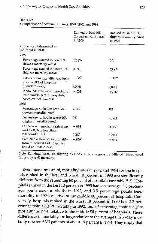
Identifying High-Quality Hospitals
As we saw in table 5.1, conventional quality indicators are unstable
over time and are poor predictors of future hospital performance. In ta-
ble 5.2, we show that this is not true when hospitals are ranked basedon our filtered quality estimates. As in table 5.1, we focus on thirty-dayAMI mortality as the outcome measure. Based on filtered estimates (us-
ing data available from 1984-1990), we identified the "best" and"worst" hospitals in 1990 as those in the top and bottom deciles in
terms of thirty-day AMI mortality. The "best" hospitals are those withthe best outcomes, those in the lowest decile of filtered mortality rates.Table 5.2 indicates how these best (column 1) and worst (column 2)hospitals performed two and four years later.
In contrast with conventional methods (see table 5.1), our filteringmethod can consistently identify best and worst hospitals and forecastfuture performance. Table 5.2 shows that, of the hospitals ranked in thebest 10 percent by filtered measures in 1990, 52.1 percent are still
ranked in the best 10 percent in 1992 and 42 percent are still in the best
10 percent in 1994. Almost none of these hospitals show up in the worst10 percent in 1992 and 1994. The performance of hospitals we rank inthe worst 10 percent in 1990 is similar, with 53.8 percent (43.4 percent)
remaining in the worst 10 percent in 1992 (1994), and none showing up
in the best 10 percent. Obviously, the difference between the results forconventional measures of thirty-day mortality (table 5.1) and the
filtered measures (table 5.2) reflect the fact that conventional quality in-dicators in any given year are quite imprecise. As a result, the correla-tion in a hospital's ranking from one year to the next is quitelowbelow 0.2 between any two given years for conventionalthirty-day AMI mortality rates. In contrast, filtered estimates ofthirty-day AMI mortality rates do not change much over time: filtered
estimates are correlated .96 between 1994 and 1992, and .89 between
1994 and 1990.
Comparing the Quality of Health Care Providers 125
Table 5.2Comparisons of hospital rankings: 1990, 1992, and 1994
Ranked in best 10% Ranked in worst 10%(lowest mortality rate) (highest mortality rates)in 1990 in 1990
Of the hospitals ranked asindicated in 1990:1992
Note: Rankings based on filtering methods. Outcome measure: Filtered risk-adjustedthirty-day AMI mortality.
Even more important, mortality rates in 1992 and 1994 for the hospi-tals ranked in the best and worst 10 percent in 1990 are significantlydifferent from the remaining 80 percent of hospitals (see table 5.2). Hos-pitals ranked in the best 10 percent in 1990 had, on average, 3.8 percent-age points lower mortality in 1992, and 3.5 percentage points lowermortality in 1994, relative to the middle 80 percent of hospitals. Con-versely, hospitals ranked in the worst 10 percent in 1990 had 3.7 per-centage points higher mortality in 1992, and 3.6 percentage points highermortality in 1994, relative to the middle 80 percent of hospitals. Thesedifferences in mortality are large relative to the average thirty-day mor-tality rate for AMI patients of about 19 percent in 1994. They imply that
Percentage ranked in best 10%(lowest mortality rates)
52.1% 0%
Percentage ranked in worst 10%(highest mortality rates)
0.3% 53.8%
Difference in mortality rate frommiddle 80% of hospitals
- .037 + .037
(Standard error) (.004) (.005)Predicted difference in mortalityfrom middle 80% of hospitals,based on 1990 forecast
- .038 + .042
1994
Percentage ranked in best 10%(lowest mortality rates)
42.0% 0%
Percentage ranked in worst 10%(highest mortality rates)
0% 43.4%
Difference in mortality rate frommiddle 80% of hospitals
- .035 + .036
(Standard error) (.004) (.006)Predicted difference in mortalityfrom middle 80% of hospitals,based on 1990 forecast
.029 +032
126 McClellan and Staiger
the hospitals we rank in the best 10 percent using filtered data in 1990
had a mortality rate of 15.5 percent in 1994, while the hospitals rankedin the worst 10 percent in 1990 had a mortality rate of 22.6 percent in1994. In fact, forecasts derived from the filtering methodology, basedonly on data available through 1990, accurately predicted these differ-
ences in 1992 and 1994 as seen in the fourth and eighth rows of table5.2. Thus, hospital rankings based on the filtered estimates appear to
identify large and persistent differences across hospitals in patient
outcomes.
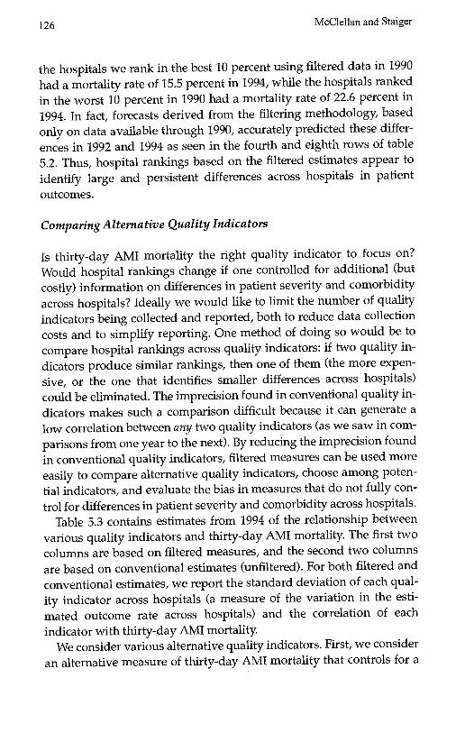
Comparing Alternative Quality Indicators
Is thirty-day AMI mortality the right quality indicator to focus on?Would hospital rankings change if one controlled for additional (butcostly) information on differences in patient severity and comorbidityacross hospitals? Ideally we would like to limit the number of qualityindicators being collected and reported, both to reduce data collectioncosts and to simplify reporting. One method of doing so would be tocompare hospital rankings across quality indicators: if two quality in-dicators produce similar rankings, then one of them (the more expen-sive, or the one that identifies smaller differences across hospitals)could be eliminated. The imprecision found in conventional quality in-dicators makes such a comparison difficult because it can generate alow correlation between any two quality indicators (as we saw in com-
parisons from one year to the next). By reducing the imprecision foundin conventional quality indicators, filtered measures can be used moreeasily to compare alternative quality indicators, choose among poten-tial indicators, and evaluate the bias in measures that do not fully con-
trol for differences in patient severity and comorbidity across hospitals.Table 5.3 contains estimates from 1994 of the relationship between
various quality indicators and thirty-day AMI mortality. The first twocolumns are based on filtered measures, and the second two columns
are based on conventional estimates (unfiltered). For both filtered andconventional estimates, we report the standard deviation of each qual-ity indicator across hospitals (a measure of the variation in the esti-mated outcome rate across hospitals) and the correlation of eachindicator with thirty-day AMI mortality.
We consider various alternative quality indicators. First, we consider
an alternative measure of thirty-day AMI mortality that controls for a
Comparing the Quality of Health Care Providers 127
Table 5.3Comparisons across alternative outcome measures (filtered versus conventional esti-mates)
aComparison of thirty-day AMI mortality adjusted for patient demographics withthirty-day AMI mortality adjusted for detailed patient risk factors is based on data fromHealth Care Financing Administration's (HCFA's) cooperative cardiovascular project.All other comparisons are based on measures derived from Medicare claims data asdescribed in the article.
detailed set of patient severity and comorbidity variables developedfrom comprehensive chart reviews; these patient data are far more de-tailed than the information available in claims These data, which weredeveloped for the hospitals in our study through HCFA's CooperativeCardiovascular Project, can provide evidence on whether rankingsbased on claims data are biased by the lack of detailed risk adjusters.We also compare thirty-day mortality to seven-day and one-year mor-tality for AMI patients. The correct amount of follow-up time is un-clear, and shorter-term mortality is generally cheaper to collect. In athird comparison, we consider a measure capturing a broader range ofadverse outcomes for AMI: either death or readmission for a cardiacdiagnosis within one year. We do not count readmissions in the firstthirty days as adverse events because many of these are for appropriatefollow-up care, e.g., bypass surgery. Finally, we consider a quality mdi-
Filtered estimates Conventional estimates
Standarddeviationacross hospitals
Correlationwith 30-dayAMI mortality
Standarddeviationacross hospitals
Correlationwith 30-dayAMI mortality
30-day AMImortality withdetailed riskadjustmenta .029 .91 .096 .91
7-day AMImortality .024 .99 .079 .82
30-day AMImortality .028 1 .095 1
1-year AMImortality .031 .95 .107 .75
Mortality orcardiac readmitwithin 1 year .032 .72 .109 .561-year IHDmortality .014 .62 .065 .04
128 McClellan and Staiger
cator for an entirely different sample of patients: one-year mortality forpatients with ischemic heart disease (IHD). Like AMI, IHD is a cardiaccondition and one would expect quality of care to be positively corre-lated across these two closely related medical conditions.
Two facts are apparent from table 5.3. First, the filtered measuresvary considerably across hospital (column 1), with a standard devia-tion of around 3 percentage points for the AMI measures (seven-day,thirty-day and one-year mortality and one-year mortality or readmit),and 1.4 percentage points for one-year IHD mortality. Conventional es-timates are considerably more variable for every quality indicator (col-umn 3), but most of this variation is a result of the noise in conventional
estimates.The second fact apparent from table 5.3 is that many of the filtered
measures are highly correlated. Most important, we find that thefiltered thirty-day AMI mortality rate (which controls only for differ-ences across hospitals in a limited set of patient demographics) ishighly correlated (0.91) with a filtered thirty-day AMI mortality ratebased on detailed risk adjustment. In other words, filtered AMI mortal-ity rates, based on limited risk-adjustment using only the patient vari-ables commonly available in claims data, generate essentially the samerankings as measures based on more detailed risk adjustment that re-quire more extensive data collection. Thus, for this example, there ap-pears to be little bias in hospital rankings that rely on AMI mortalitymeasures derived from claims data.
Filtered thirty-day AMI mortality rates are even more highly corre-lated (over 0.95) with seven-day and one-year mortality. In otherwords, filtered short-term (even seven-day) mortality rates generate es-sentially the same rankings as long-term mortality measures that re-quire more extensive patient follow-up. Thus, at least for AMIadmissions, there appears to be little reason to incur the extra costs anddelays involved in collecting long-term mortality information.
Finally, the correlation of filtered thirty-day mortality with the re-maining measures (AMI mortality or cardiac readmission within oneyear, one-year IHD mortality) is less strong but still above 0.6. Whilethese quality indicators are related to AMI mortality, they do seem tocapture independent information on hospital quality along other di-mensions. Thus, these two measures may provide useful additional in-formation for comparing hospitals.
Our conclusions would have been quite different if we had tried todo a similar analysis using conventional estimates of these quality mdi-
Comparing the Quality of Health Care Providers 129
cators. Because these conventional estimates are based on small sam-ples from a single year, they are imprecise. As a result, they tend tounderstate considerably the correlation between thirty-day AMI mor-tality and the alternative measures, especially when making compari-sons to a measure from a different sample of patients (e.g., one-yearIHD mortality) because the estimation error in such measures isuncorrelated. For other measures (e.g., thirty-day AMI mortality withdetailed risk adjustment) the conventional estimates remain highly cor-related because the noise in the two measures is highly correlatede.g.,a chance death for a few average patients will adversely affect bothmeasures.
Overall, this example illustrates how comparisons across filteredquality measures can be used to identify a subset of core quality indica-tors. This example provides an empirical basis on which to eliminateredundant measures (such as long-term mortality). It also provides anempirical basis on which to explore the potential bias in claims-basedmeasures.
Comparing Hospitals in a Metropolitan Market
One of the goals in developing quality indicators is to allow meaning-ful comparisons to be made across hospitals in a given region or mar-ket. Thus, from a practical standpoint, quality indicators must beprecise enough to allow one to identify consistently the best (andworst) hospitals in a market. The filtered estimates for thirty-day AMImortality are quite precise relative to conventional quality indicatorsand appear to be quite useful for comparing hospitals within markets(for example, see McClellan and Staiger 1999b).
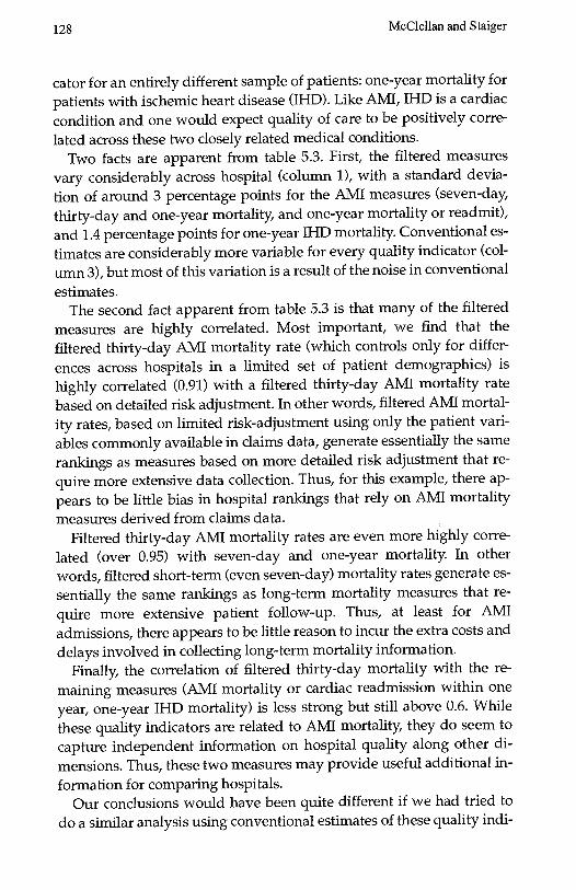
To illustrate this point, figure 5.1 presents plots of filtered and con-ventional estimates of thirty-day AMI mortality rates for 1994 (relativeto the national average) for twenty-six hospitals ranging in size fromfifteen to 175 AMI admissions and located in a large metropolitan area.In this figure, hospitals are ordered from left to right according to howthey rank among the twenty-six hospitals in terms of the filtered (bot-tom panel) and conventional (top panel) measures. The vertical axisgives the estimated mortality rate (relative to the national average),with a value of 0.1, for example, indicating that mortality at the hos-pital was ten percentage points below the national average. Confidencebars indicate a 1.4 standard error confidence interval around each hos-pital's estimate, so that hospitals with nonoverlapping confidence in-
130 McClellan and Staiger
.2 -
.1 -
0-
I I
0 5 10 15 20 28Hospital rank, by unfiltered AMI mortality
A. Unfiltered 30-day AMI mortality rates, 1994
.2 -
.1 -
I I
0 5 10 15 20 25Hospital rank, by filtered AMI mortality
B. Filtered 30-day AMI mortality rates
Figure 5.1Comparison of unfiltered (panel A) and filtered (panel B) 30-day AMI mortality rates athospitals in a large metropolitan region, 1994Absolute difference between each hospital's mortality rate and the national average in1994, adjusted for patient demographics. Error bars provide a 1.4 SE confidence interval,so that hospitals with nonoverlapping intervals are statistically different at the 5% level.The horizontal line marks the median mortality rate in the region. Hospitals labeled "H"and "L" were identified as high and low mortality hospitals, respectively, based onfiltered mortality rates in 1994.
-0
Comparing the Quality of Health Care Providers 131
tervals are statistically different at the 5 percent level. In each panel, wehave drawn a horizontal line through the median mortality rate in thearea as a reference point.
It is apparent that the filtered estimates (bottom panel) are muchmore precise than are the conventional estimates (top panel). Theconfidence intervals on the filtered estimates are roughly half the sizeof the intervals on the conventional estimates, with the improvement inprecision much greater for the smallest hospitals.1 The extreme esti-mates apparent in the conventional measures (a few hospitals with amortality more than fifteen percentage points away from the median)are not present in the filtered estimates. Nonetheless, the filtered esti-mates identify large differences in mortality rates: six hospitals(marked "L" in figure 5.1) have filtered confidence intervals lying en-tirely below the median, while another five hospitals (marked "H" infigure 5.1) have filtered confidence intervals lying entirely above themedian. The difference in average estimated mortality rates betweenhospitals in these low and high mortality groups is over eight percent-age points.
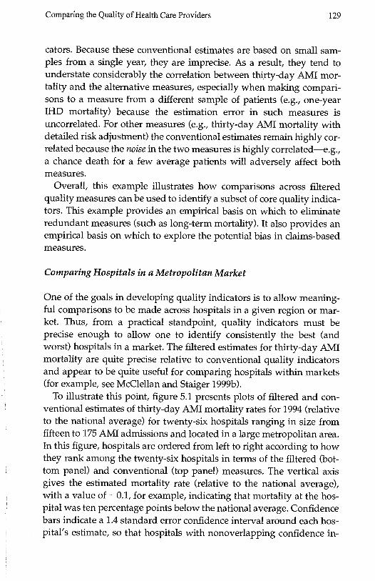
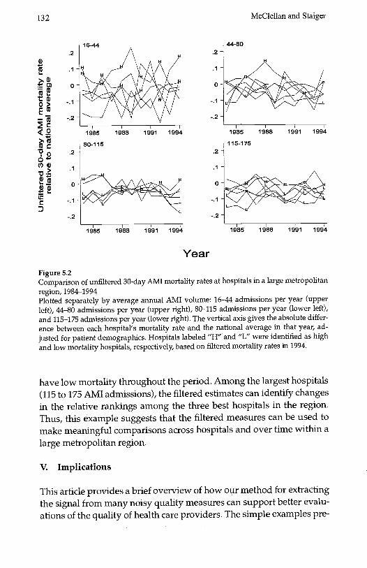
Another way to demonstrate the ability of the filtered estimates toidentify differences consistently across hospitals is to plot the measuresover time. Figure 5.2 plots conventional estimates of thirty-day AMImortality rates for each hospital in the region between 1984 and 1994.To reduce clutter, we have broken the sample into four roughly equalgroups based on the average annual number of AMI admissions ateach hospital over this time period, and we plot the data for each groupseparately. For comparison, we continue to label those hospitalsidentified by the filtered measures as having high (H) and low (L) mor-tality in 1994.
The imprecision in conventional estimates is immediately apparentfrom figure 5.2. The conventional mortality estimates change dramati-cally from year to year and follow no apparent pattern. As a result, it isnearly impossible to identify hospitals that have consistently low orhigh mortality, and equally impossible to discern any trends in thesemeasures over time.
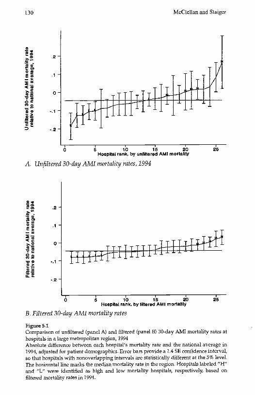
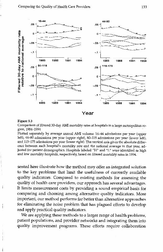
In contrast, the same plot using filtered data (figure 5.3) can identifyclearly the differences across hospitals and over time. Hospitals thatwere ranked as having high (H) mortality in 1994 have consistentlyhad high mortality over this period, although some showed more im-provement over time than others. Similarly, hospitals that were rankedas having low mortality in 1994 tended to be larger hospitals and to
132 McClellan and Staiger
4s.1-
w) 0--0> -.
-(>(3
Vo0(l)G)
.1
0-
C
16-44
1985
80-115
1988 1991 1994
1985 1988 1991 1994
Year
Figure 5.2Comparison of unfiltered 30-day AlvIl mortality rates at hospitals in a large metropolitanregion, 1984-1994Plotted separately by average annual Alvil volume: 16-44 admissions per year (upperleft), 44-80 admissions per year (upper right), 80-115 admissions per year (lower left),and 115-175 admissions per year (lower right). The vertical axis gives the absolute differ-ence between each hospital's mortality rate and the national average in that year, ad-justed for patient demographics. Hospitals labeled "H" and "L" were identified as highand low mortality hospitals, respectively, based on filtered mortality rates in 1994.
have low mortality throughout the period. Among the largest hospitals(115 to 175 AMI admissions), the filtered estimates can identify changesin the relative rankings among the three best hospitals in the region.Thus, this example suggests that the filtered measures can be used tomake meaningful comparisons across hospitals and over time within alarge metropolitan region.
V. Implications
This article provides a brief overview of how our method for extractingthe signal from many noisy quality measures can support better evalu-ations of the quality of health care providers. The simple examples pre-
.1 -
0-
.1 -
0-
44-80
1985 1988 1991 1994
115-1 75
1985 1988 1991 1994
Comparing the Quality of Health Care Providers 133
00
0
00
UIi-
.05
0'
-.05-
-.1 -
.05-
0-
-.05-
-.1'-
16-44.05 -
0-
-05 -
-.1 -
.05
0
-.05 -
-.1 -
44-80
1985
80-115
1988 1991 1994 1985
115-175
1988 1991 1994
L
1985 1988 1991 1994 1985 1988 1991 1994
YearFigure 5.3Comparison of filtered 30-day AMI mortality rates at hospitals in a large metropolitan re-gion, 1984-1994Plotted separately by average annual AMI volume: 16-44 admissions per year (upperleft), 44-80 admissions per year (upper right), 80-115 admissions per year (lower left),and 115-1 75 admissions per year (lower right). The vertical axis gives the absolute differ-ence between each hospital's mortality rate and the national average in that year, ad-justed for patient demographics. Hospitals labeled "H" and "L" were identified as highand low mortality hospitals, respectively, based on filtered mortality rates in 1994.
sented here illustrate how the method may offer an integrated solutionto the key problems that limit the usefulness of currently availablequality indicators. Compared to existing methods for assessing thequality of health care providers, our approach has several advantages.It limits measurement costs by providing a sound empirical basis forcomparing and choosing among alternative quality indicators. Moreimportant, our method performs far better than alternative approachesfor eliminating the noise problem that has plagued efforts to developand apply practical quality indicators.
We are applying these methods to a larger range of health problems,patient populations, and provider networks and integrating them intoquality improvement programs. These efforts require collaboration
134 McClellan and Staiger
among analysts, health plans, providers, purchasing groups, and gov-ernment agencies to collect and integrate relevant information for con-structing the quality measures and using them to help guide decisionmaking and improve provider quality.
One feature of our collaborative work is the use of meaningful qual-ity measures that would be difficult or impossible for individual partic-ipants in the collaboration to obtain. For example, the most importantperformance measures for serious health conditions like heart diseaseand cancer involve long-term outcomes (e.g., two-year mortality),which are costly or impossible for providers and health insurers to col-lect. In contrast, government agencies commonly collect mortality anddisease surveillance data needed for constructing such measures, butthey may not have information on the responsible medical groups orphysicians for the patients involved. Through the participation of all ofthese groups, constructing measures of quality for serious health con-ditions becomes feasible.
Another feature of our approach is the optimization of the use of de-tailed but costly clinical data to account for patient characteristics thatmay result in biased measures of quality. As we illustrated here, we in-clude some measures based on clinically detailed risk adjustment (e.g.,with data drawn from chart abstracts) for some of the patients in ouranalysis to evaluate potentially important differences across providersin patient severity of illness. Using these gold standard measures, wecan identify valid proxy measures that are less costly and more readilyavailable or adjust these measures appropriately. As a result, we canextract more reliable data about true provider quality from the lowercost measures. These steps minimize the overall resource burden of ourdata collection and measure development and improve their validity.
A third component of our collaboration involves integrating our newoutcome-based measures with those developed in established continu-ous quality improvement initiatives, for example, the standardizedmeasures of patient satisfaction and process of care developed by theNational Committee for Quality Assurance (NCQA). These measureshave been tested and applied extensively, but their relationship withimportant outcomes of care is not well understood. We are investigat-ing the relationship between performance in these dimensions of qual-ity and important outcomes of care to determine the extent to whichthese readily available measures can substitute for more comprehen-sive outcome evaluations.
The most important goal for many of our collaborators is to use thesemeasures to improve quality of care. First, we are identifying the struc-
Comparing the Quality of Health Care Providers 135
tural features and processes of care that are related most closely to im-portant outcomes and thus identifying specific practice changes thatare most likely to improve provider quality Our methods provide em-pirical evidence of the magnitude and direction of relationships be-tween these modifiable factors and outcomes. Such evidence can beused to ensure that continuous quality initiatives focus on identifyingand changing provider practices where there is the greatest opportu-nity for improving outcomes. Second, our methods can be used to ob-tain much more precise estimates of the impact of interventions such asprovider training or patient education.
Through all of these steps, our collaborative approach to qualityevaluation and improvement is developing performance measures thatare precise and reliable and therefore more acceptable to providers andpayers. This undertaking is complex and long term, but our results todate suggest that the potential for evidence-based quality improve-ment in health care is much greater than many experts now believe.
Notes
Prepared for the NBER conference on Frontiers in Health Policy Research, June 17, 1999,Washington DC. This article draws heavily on our own ongoing work and work withvarious collaborators. The National Institute of Aging, The Health Care Financing Ad-ministration, and the Olin Foundation provided financial support at various times forthis work. We thank Jon Skinner and Jeff Geppert for helpful comments on an earlierdraft. We also thank our collaborators, including Jeffrey Geppert, Jeffrey Horbar, ThomasKane, Haruko Noguchi, Jeannette Rogowski, and Yu-Chu Shen.
1. Note that one cannot make direct comparison across the two panels because hospitalsare ranked differently by the two measures.
References
Bindman, A. B., 1999. "Can Physician Profiles Be Trusted?" JAMA 281(22): 2142-2143.
Dranove, D., and M. A. Satterthwaite, 1992. "Monopolistic Competition When Price andQuality Are Imperfectly Observable." The RAND Journal of Economics 23(4): 518-534.
Enthoven, A., and R. Kronick, 1989. "A Consumer-Choice Health Plan for the 1990s: Uni-versal Health Insurance in a System Designed to Promote Quality and Economy." NewEngland Journal of Medicine 320(1): 29-37 (part 1) and 320(2): 94-101 (part 2).
Geppert, J., M. McClellan, and D. Staiger, 2000. "Hospital Quality, Treatment Effects, andHealth Outcomes: Analyzing Differences in Medical Practices." Manuscript, February2000.
Hofer, T. P., R. A. Hayward, S. Greenfield, E. H. Wagner, S. H. Kaplan, and W. G.Manning, 1999. "The Unreliability of Individual Physician 'Report Cards' for Assessingthe Costs and Quality of Care of a Chronic Disease." JAMA 281(22): 2098-21 05.
136 McClellan and Staiger
lezzoni, L., 1997. Risk Adjustment for Measuring Healthcare Outcomes. Chicago: Health Ad-
ministration Press.
Institute of Medicine (TOM), 1990. Medicare: A Strategy for Quality Assurance, I, Washing-ton, DC: National Academy Press.
Krakauer, H., R. C. Bailey, K. J. Skellan, et al., 1992. "Evaluation of the HCFA Model forthe Analysis of Mortality Following Hospitalization." Health Services Research 27(3):317-335.
Landon, B., L. I. lezzoni, A. S. Ash, et al., 1996. "Judging Hospitals by Severity-AdjustedMortality Rates: The Case of CABG Surgery." Inquiry 33(2): 155-166.
McClellan, M., and D. Staiger, 1999a. "The Quality of Health Care Providers." NationalBureau of Economic Research working paper.
McClellan, M., and D. Staiger, 1999b. "Comparing Hospital Quality at For-Profit andNot-for-Profit Hospitals." in D. Cutler (ed.), The Changing Hospital Industry: ComparingNot-for-Profit and For-Profit Institutions, Chicago: University of Chicago Press, 2000,pp. 93-112.
Medicine & Health, 1997. "Gauging Quality Regulation's Impact on Premium Costs," 51:1.
Morris, C., 1983. "Parametric Empirical Bayes Inference: Theory and Applications." JASA78(381): 47-55.
Park, R. E., R. H. Brook, J. Kosecoff, et al., 1990. "Explaining Variations in Hospital DeathRates: Randomness, Severity of Illness, Quality of Care." JAMA 264(4): 484-90.
Schneider, E. C., and A. M. Epstein, 1998. "Use of Public Performance Reports: A Surveyof Patients Undergoing Cardiac Surgery." JAMA 279(20): 1638-42.