Embed Size (px)
Citation preview
BMO Nesbitt Burns Inc. is a Member-Canadian Investor Protection Fund. Member of the Investment Industry Regulatory Organization of Canada. All figures in C$ unless otherwise noted
Error! Reference source not found. | Error! Reference source not found. Portfolio Strategy | December 2015
December 2015
Portfolio Strategy Equity Strategy: Roadmap for 2016 – Get Ready for the Global Recovery Stéphane Rochon, CFA, Equity Strategist
Looking out to 2016, we remain bullish on stocks globally and believe that equities generally continue to hold far better relative value than fixed income (our team emphasizes shorter duration bonds which have less interest rate risk). While we do not think interest rates will go up substantially next year, we do think an underappreciated risk could be a build-up in inflationary pressure in the back half of 2016. We will be monitoring wage inflation which could be the proverbial canary in the coal mine for a (slight) pickup in consumer price inflation which could, in turn, lead to higher interest rates. More on this further in the report.
Looking at North America equities specifically, we just turned slightly more bullish on Canada last month after emphasizing U.S. exposure relentlessly over the last four years. We expect the Canadian dollar return of the S&P/TSX Composite Index (the TSX) to at least keep pace with the S&P 500 Index (the S&P) over the next three or four quarters. With our fair value estimates yielding a value of approximately 15,000 for the TSX and 2,300 for the S&P, we see about 10% upside for both markets from current levels.
We continue to recommend exposure to Europe, which is benefitting from the European Central Bank’s (ECB) quantitative easing, a slight pickup in economic momentum, long term margin improvement potential and cheap valuations. Finally, a small position in emerging markets (with emphasis on emerging market consumers) appears appropriate after significant underperformance for markets such as China and Brazil over the last year.
Our more positive stance on Canada is not based on the dawn of a new commodity super cycle. As we stated in our last report, we still believe that we are in the midst of a protracted commodity bear market. In fact, Ned Davis Research, one of our research providers, recently noted that since the early 1800s, the average historical downturn for commodities has lasted 20 years (we are less than five years into the current downturn in our view). That being said, even in the midst of bear markets, rallies can be violent and profitable. Specifically, we think that oil prices have limited downside risk from here despite a still oversupplied market (Saudi Arabia continues to refuse to advocate a supply reduction from OPEC) thanks to a slight improvement in the supply/demand fundamentals. Given the TSX and Canadian dollar are so highly correlated to oil and copper prices we believe a more market weight position in energy stocks is now appropriate.
From a sector perspective we think that with reaccelerating economic momentum, investors will be well-served to overweight cyclicals such as financials, technology, industrials and some consumer discretionary stocks (i.e. we still like U.S. housing and auto related plays) and underweight expensive, defensive sectors such as utilities and telecoms.
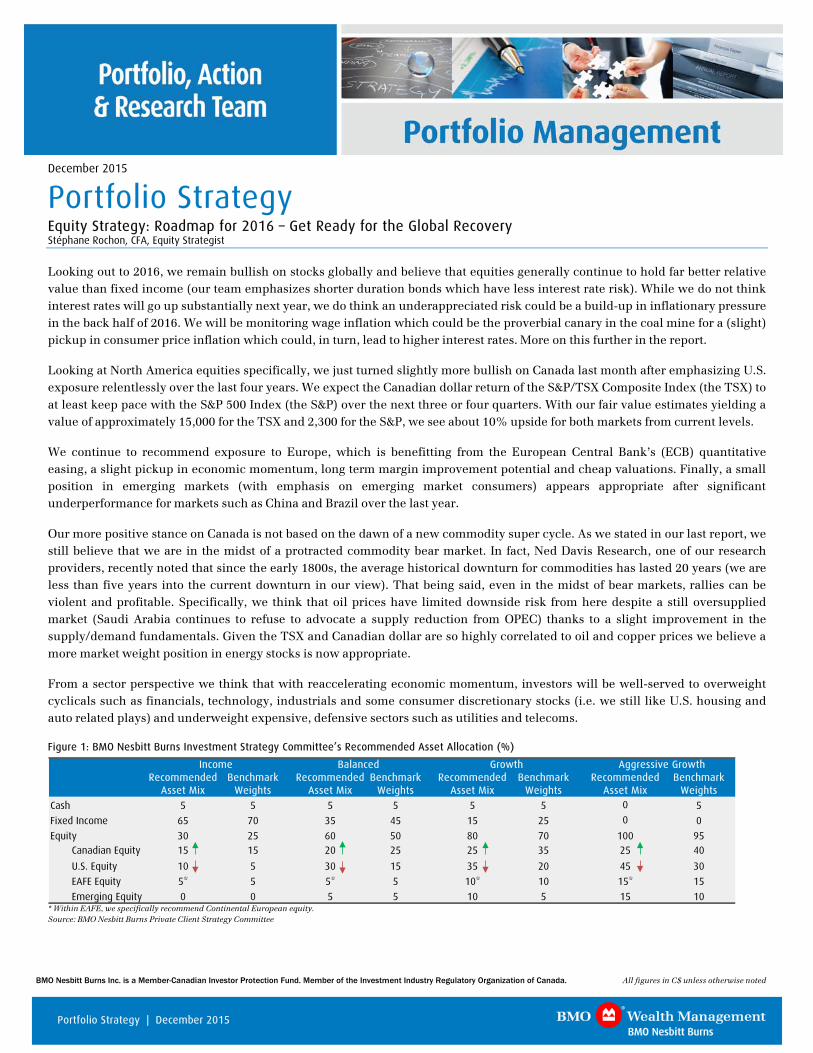
Figure 1: BMO Nesbitt Burns Investment Strategy Committee’s Recommended Asset Allocation (%)
Income Balanced Growth Aggressive GrowthRecommended Benchmark Recommended Benchmark Recommended Benchmark Recommended Benchmark
Asset Mix Weights Asset Mix Weights Asset Mix Weights Asset Mix Weights
Cash 5 5 5 5 5 5 0 5
Fixed Income 65 70 35 45 15 25 0 0
Equity 30 25 60 50 80 70 100 95Canadian Equity 15 15 20 25 25 35 25 40
U.S. Equity 10 5 30 15 35 20 45 30
EAFE Equity 5* 5 5* 5 10* 10 15* 15
Emerging Equity 0 0 5 5 10 5 15 10 * Within EAFE, we specifically recommend Continental European equity. Source: BMO Nesbitt Burns Private Client Strategy Committee
2 Portfolio Strategy | December 2015
We also think returns could be far greater for certain stocks exposed to our favourite themes: 1) the U.S. Housing and Auto Recovery and the “Wealth Virtuous Cycle”, 2) Canadian, U.S. and European financials which should benefit from the global recovery and the eventual normalization of interest rates and 3) the Commercial Construction Recovery and Reindustrialization of America.
We believe following these broad guidelines will help investor portfolios outperform in 2016. Please contact your BMO Nesbitt Burns Investment Advisor for specific recommendations.
Bonds are Expensive Globally
We continue to be underweight fixed income as bonds are quite expensive relative to other asset classes.
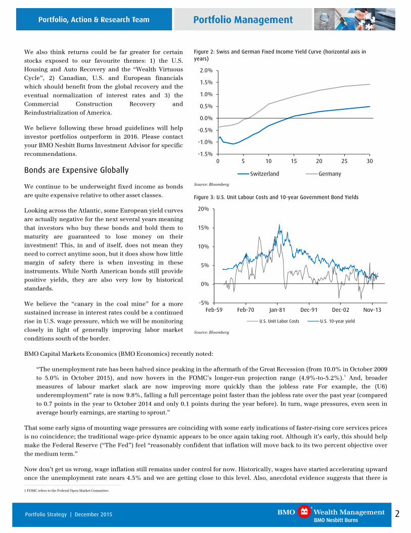
Looking across the Atlantic, some European yield curves are actually negative for the next several years meaning that investors who buy these bonds and hold them to maturity are guaranteed to lose money on their investment! This, in and of itself, does not mean they need to correct anytime soon, but it does show how little margin of safety there is when investing in these instruments. While North American bonds still provide positive yields, they are also very low by historical standards.
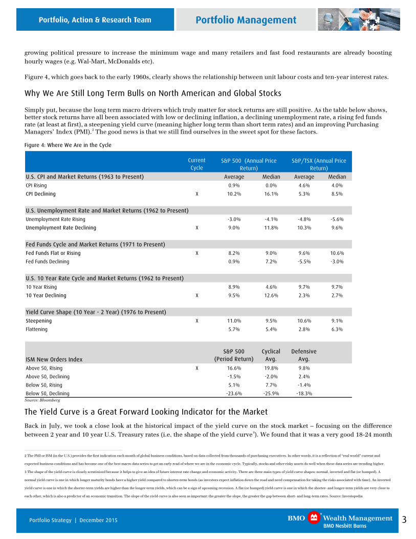
We believe the “canary in the coal mine” for a more sustained increase in interest rates could be a continued rise in U.S. wage pressure, which we will be monitoring closely in light of generally improving labor market conditions south of the border.
BMO Capital Markets Economics (BMO Economics) recently noted:
“The unemployment rate has been halved since peaking in the aftermath of the Great Recession (from 10.0% in October 2009 to 5.0% in October 2015), and now hovers in the FOMC’s longer-run projection range (4.9%-to-5.2%).1 And, broader measures of labour market slack are now improving more quickly than the jobless rate For example, the (U6) underemployment” rate is now 9.8%, falling a full percentage point faster than the jobless rate over the past year (compared to 0.7 points in the year to October 2014 and only 0.1 points during the year before). In turn, wage pressures, even seen in average hourly earnings, are starting to sprout.”
That some early signs of mounting wage pressures are coinciding with some early indications of faster-rising core services prices is no coincidence; the traditional wage-price dynamic appears to be once again taking root. Although it’s early, this should help make the Federal Reserve (“The Fed”) feel “reasonably confident that inflation will move back to its two percent objective over the medium term.”
Now don’t get us wrong, wage inflation still remains under control for now. Historically, wages have started accelerating upward once the unemployment rate nears 4.5% and we are getting close to this level. Also, anecdotal evidence suggests that there is 1 FOMC refers to the Federal Open Market Committee.
Figure 2: Swiss and German Fixed Income Yield Curve (horizontal axis in years)
-1.5%
-1.0%
-0.5%
0.0%
0.5%
1.0%
1.5%
2.0%
0 5 10 15 20 25 30
Switzerland Germany
Source: Bloomberg
Figure 3: U.S. Unit Labour Costs and 10-year Government Bond Yields
-5%
0%
5%
10%
15%
20%
Feb-59 Feb-70 Jan-81 Dec-91 Dec-02 Nov-13
U.S. Unit Labor Costs U.S. 10-year yield
Source: Bloomberg
3 Portfolio Strategy | December 2015
growing political pressure to increase the minimum wage and many retailers and fast food restaurants are already boosting hourly wages (e.g. Wal-Mart, McDonalds etc).
Figure 4, which goes back to the early 1960s, clearly shows the relationship between unit labour costs and ten-year interest rates.
Why We Are Still Long Term Bulls on North American and Global Stocks
Simply put, because the long term macro drivers which truly matter for stock returns are still positive. As the table below shows, better stock returns have all been associated with low or declining inflation, a declining unemployment rate, a rising fed funds rate (at least at first), a steepening yield curve (meaning higher long term than short term rates) and an improving Purchasing Managers’ Index (PMI).2 The good news is that we still find ourselves in the sweet spot for these factors.
Figure 4: Where We Are in the Cycle
Current Cycle
U.S. CPI and Market Returns (1963 to Present) Average Median Average Median
CPI Rising 0.9% 0.0% 4.6% 4.0%
CPI Declining X 10.2% 16.1% 5.3% 8.5%
U.S. Unemployment Rate and Market Returns (1962 to Present)
Unemployment Rate Rising -3.0% -4.1% -4.8% -5.6%
Unemployment Rate Declining X 9.0% 11.8% 10.3% 9.6%
Fed Funds Cycle and Market Returns (1971 to Present)
Fed Funds Flat or Rising X 8.2% 9.0% 9.6% 10.6%
Fed Funds Declining 0.9% 7.2% -5.5% -3.0%
U.S. 10 Year Rate Cycle and Market Returns (1962 to Present)
10 Year Rising 8.9% 4.6% 9.7% 9.7%
10 Year Declining X 9.5% 12.6% 2.3% 2.7%
Yield Curve Shape (10 Year - 2 Year) (1976 to Present)
Steepening X 11.0% 9.5% 10.6% 9.1%
Flattening 5.7% 5.4% 2.8% 6.3%
ISM New Orders IndexS&P 500
(Period Return)Cyclical
Avg.Defensive
Avg.
Above 50, Rising X 16.6% 19.8% 9.8%
Above 50, Declining -1.5% -2.0% 2.4%
Below 50, Rising 5.1% 7.7% -1.4%
Below 50, Declining -23.6% -25.9% -18.3%
S&P 500 (Annual Price Return)
S&P/TSX (Annual Price Return)
Source: Bloomberg
The Yield Curve is a Great Forward Looking Indicator for the Market
Back in July, we took a close look at the historical impact of the yield curve on the stock market – focusing on the difference between 2 year and 10 year U.S. Treasury rates (i.e. the shape of the yield curve3). We found that it was a very good 18-24 month
2 The PMI or ISM (in the U.S.) provides the first indication each month of global business conditions, based on data collected from thousands of purchasing executives. In other words, it is a reflection of “real world” current and
expected business conditions and has become one of the best macro data series to get an early read of where we are in the economic cycle. Typically, stocks and other risky assets do well when these data series are trending higher.
3 The shape of the yield curve is closely scrutinized because it helps to give an idea of future interest rate change and economic activity. There are three main types of yield curve shapes: normal, inverted and flat (or humped). A
normal yield curve is one in which longer maturity bonds have a higher yield compared to shorter-term bonds (as investors expect inflation down the road and need compensation for taking the risks associated with time). An inverted
yield curve is one in which the shorter-term yields are higher than the longer-term yields, which can be a sign of upcoming recession. A flat (or humped) yield curve is one in which the shorter- and longer-term yields are very close to
each other, which is also a predictor of an economic transition. The slope of the yield curve is also seen as important: the greater the slope, the greater the gap between short- and long-term rates. Source: Investopedia
4 Portfolio Strategy | December 2015
leading indicator for the stock market, which itself leads the real economy by about six months. In other words, the signals from the yield curve start to be felt by the stock market 12 to 18 months into the future, making it perhaps the best leading indicator for the stock market.
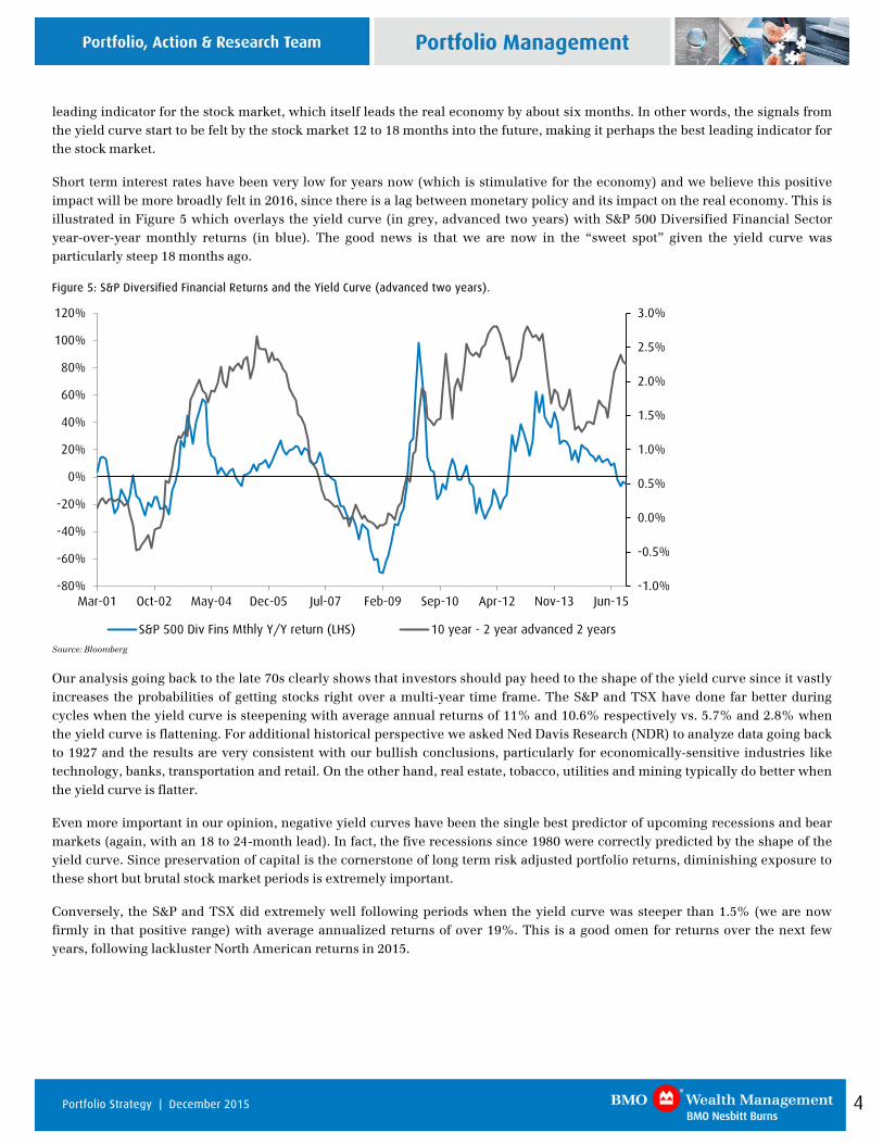
Short term interest rates have been very low for years now (which is stimulative for the economy) and we believe this positive impact will be more broadly felt in 2016, since there is a lag between monetary policy and its impact on the real economy. This is illustrated in Figure 5 which overlays the yield curve (in grey, advanced two years) with S&P 500 Diversified Financial Sector year-over-year monthly returns (in blue). The good news is that we are now in the “sweet spot” given the yield curve was particularly steep 18 months ago.
Figure 5: S&P Diversified Financial Returns and the Yield Curve (advanced two years).
-1.0%
-0.5%
0.0%
0.5%
1.0%
1.5%
2.0%
2.5%
3.0%
-80%
-60%
-40%
-20%
0%
20%
40%
60%
80%
100%
120%
Mar-01 Oct-02 May-04 Dec-05 Jul-07 Feb-09 Sep-10 Apr-12 Nov-13 Jun-15
S&P 500 Div Fins Mthly Y/Y return (LHS) 10 year - 2 year advanced 2 years
Source: Bloomberg
Our analysis going back to the late 70s clearly shows that investors should pay heed to the shape of the yield curve since it vastly increases the probabilities of getting stocks right over a multi-year time frame. The S&P and TSX have done far better during cycles when the yield curve is steepening with average annual returns of 11% and 10.6% respectively vs. 5.7% and 2.8% when the yield curve is flattening. For additional historical perspective we asked Ned Davis Research (NDR) to analyze data going back to 1927 and the results are very consistent with our bullish conclusions, particularly for economically-sensitive industries like technology, banks, transportation and retail. On the other hand, real estate, tobacco, utilities and mining typically do better when the yield curve is flatter.
Even more important in our opinion, negative yield curves have been the single best predictor of upcoming recessions and bear markets (again, with an 18 to 24-month lead). In fact, the five recessions since 1980 were correctly predicted by the shape of the yield curve. Since preservation of capital is the cornerstone of long term risk adjusted portfolio returns, diminishing exposure to these short but brutal stock market periods is extremely important.
Conversely, the S&P and TSX did extremely well following periods when the yield curve was steeper than 1.5% (we are now firmly in that positive range) with average annualized returns of over 19%. This is a good omen for returns over the next few years, following lackluster North American returns in 2015.
5 Portfolio Strategy | December 2015
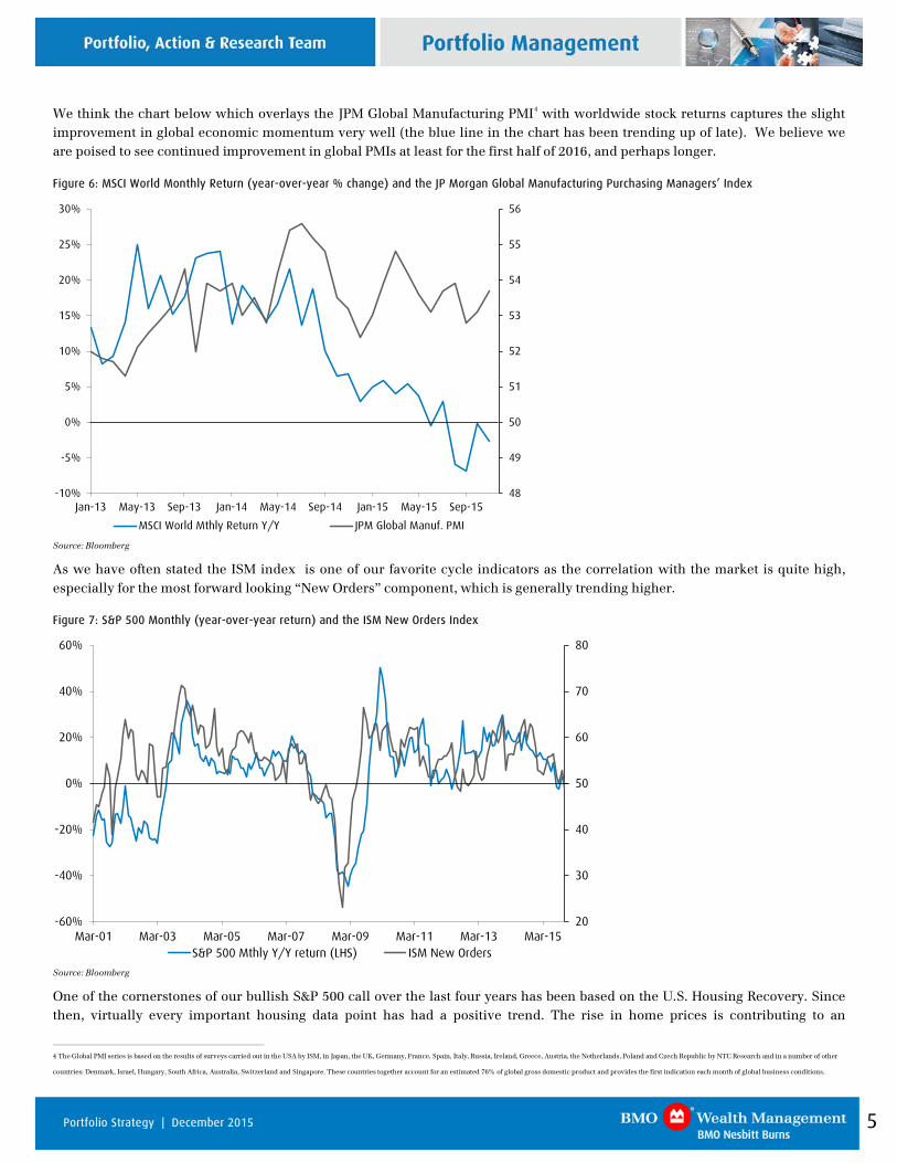
We think the chart below which overlays the JPM Global Manufacturing PMI4 with worldwide stock returns captures the slight improvement in global economic momentum very well (the blue line in the chart has been trending up of late). We believe we are poised to see continued improvement in global PMIs at least for the first half of 2016, and perhaps longer.
Figure 6: MSCI World Monthly Return (year-over-year % change) and the JP Morgan Global Manufacturing Purchasing Managers’ Index
48
49
50
51
52
53
54
55
56
-10%
-5%
0%
5%
10%
15%
20%
25%
30%
Jan-13 May-13 Sep-13 Jan-14 May-14 Sep-14 Jan-15 May-15 Sep-15
MSCI World Mthly Return Y/Y JPM Global Manuf. PMI
Source: Bloomberg
As we have often stated the ISM index is one of our favorite cycle indicators as the correlation with the market is quite high, especially for the most forward looking “New Orders” component, which is generally trending higher.
Figure 7: S&P 500 Monthly (year-over-year return) and the ISM New Orders Index
20
30
40
50
60
70
80
-60%
-40%
-20%
0%
20%
40%
60%
Mar-01 Mar-03 Mar-05 Mar-07 Mar-09 Mar-11 Mar-13 Mar-15S&P 500 Mthly Y/Y return (LHS) ISM New Orders
Source: Bloomberg
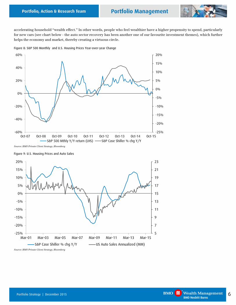
One of the cornerstones of our bullish S&P 500 call over the last four years has been based on the U.S. Housing Recovery. Since then, virtually every important housing data point has had a positive trend. The rise in home prices is contributing to an
4 The Global PMI series is based on the results of surveys carried out in the USA by ISM, in Japan, the UK, Germany, France, Spain, Italy, Russia, Ireland, Greece, Austria, the Netherlands, Poland and Czech Republic by NTC Research and in a number of other
countries: Denmark, Israel, Hungary, South Africa, Australia, Switzerland and Singapore. These countries together account for an estimated 76% of global gross domestic product and provides the first indication each month of global business conditions.
6 Portfolio Strategy | December 2015
accelerating household “wealth effect.” In other words, people who feel wealthier have a higher propensity to spend, particularly for new cars (see chart below - the auto sector recovery has been another one of our favourite investment themes), which further helps the economy and market, thereby creating a virtuous circle.
Figure 8: S&P 500 Monthly and U.S. Housing Prices Year-over-year Change
-25%
-20%
-15%
-10%
-5%
0%
5%
10%
15%
20%
-60%
-40%
-20%
0%
20%
40%
60%
Oct-07 Oct-08 Oct-09 Oct-10 Oct-11 Oct-12 Oct-13 Oct-14 Oct-15S&P 500 Mthly Y/Y return (LHS) S&P Case Shiller % chg Y/Y
Source: BMO Private Client Strategy, Bloomberg
Figure 9: U.S. Housing Prices and Auto Sales
5
7
9
11
13
15
17
19
21
23
-25%
-20%
-15%
-10%
-5%
0%
5%
10%
15%
20%
Mar-01 Mar-03 Mar-05 Mar-07 Mar-09 Mar-11 Mar-13 Mar-15
S&P Case Shiller % chg Y/Y US Auto Sales Annualized (MM)
Source: BMO Private Client Strategy, Bloomberg
7 Portfolio Strategy | December 2015
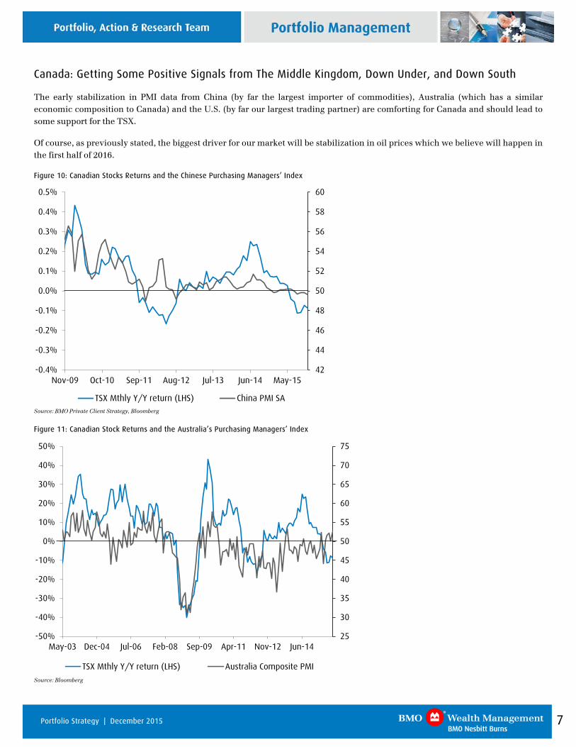
Canada: Getting Some Positive Signals from The Middle Kingdom, Down Under, and Down South
The early stabilization in PMI data from China (by far the largest importer of commodities), Australia (which has a similar economic composition to Canada) and the U.S. (by far our largest trading partner) are comforting for Canada and should lead to some support for the TSX.
Of course, as previously stated, the biggest driver for our market will be stabilization in oil prices which we believe will happen in the first half of 2016.
Figure 10: Canadian Stocks Returns and the Chinese Purchasing Managers’ Index
42
44
46
48
50
52
54
56
58
60
-0.4%
-0.3%
-0.2%
-0.1%
0.0%
0.1%
0.2%
0.3%
0.4%
0.5%
Nov-09 Oct-10 Sep-11 Aug-12 Jul-13 Jun-14 May-15
TSX Mthly Y/Y return (LHS) China PMI SA
Source: BMO Private Client Strategy, Bloomberg
Figure 11: Canadian Stock Returns and the Australia’s Purchasing Managers’ Index
25
30
35
40
45
50
55
60
65
70
75
-50%
-40%
-30%
-20%
-10%
0%
10%
20%
30%
40%
50%
May-03 Dec-04 Jul-06 Feb-08 Sep-09 Apr-11 Nov-12 Jun-14
TSX Mthly Y/Y return (LHS) Australia Composite PMI
Source: Bloomberg
8 Portfolio Strategy | December 2015
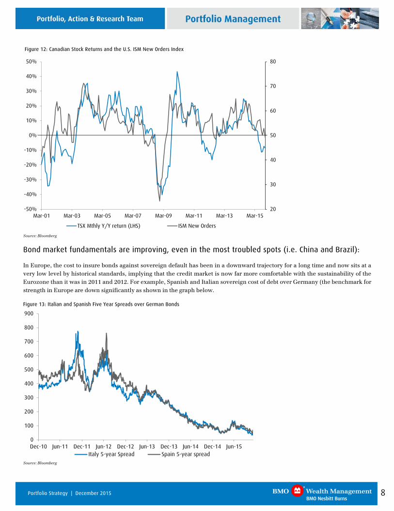
Figure 12: Canadian Stock Returns and the U.S. ISM New Orders Index
20
30
40
50
60
70
80
-50%
-40%
-30%
-20%
-10%
0%
10%
20%
30%
40%
50%
Mar-01 Mar-03 Mar-05 Mar-07 Mar-09 Mar-11 Mar-13 Mar-15
TSX Mthly Y/Y return (LHS) ISM New Orders
Source: Bloomberg
Bond market fundamentals are improving, even in the most troubled spots (i.e. China and Brazil):
In Europe, the cost to insure bonds against sovereign default has been in a downward trajectory for a long time and now sits at a very low level by historical standards, implying that the credit market is now far more comfortable with the sustainability of the Eurozone than it was in 2011 and 2012. For example, Spanish and Italian sovereign cost of debt over Germany (the benchmark for strength in Europe are down significantly as shown in the graph below.
Figure 13: Italian and Spanish Five Year Spreads over German Bonds
0
100
200
300
400
500
600
700
800
900
Dec-10 Jun-11 Dec-11 Jun-12 Dec-12 Jun-13 Dec-13 Jun-14 Dec-14 Jun-15Italy 5-year Spread Spain 5-year spread
Source: Bloomberg
9 Portfolio Strategy | December 2015
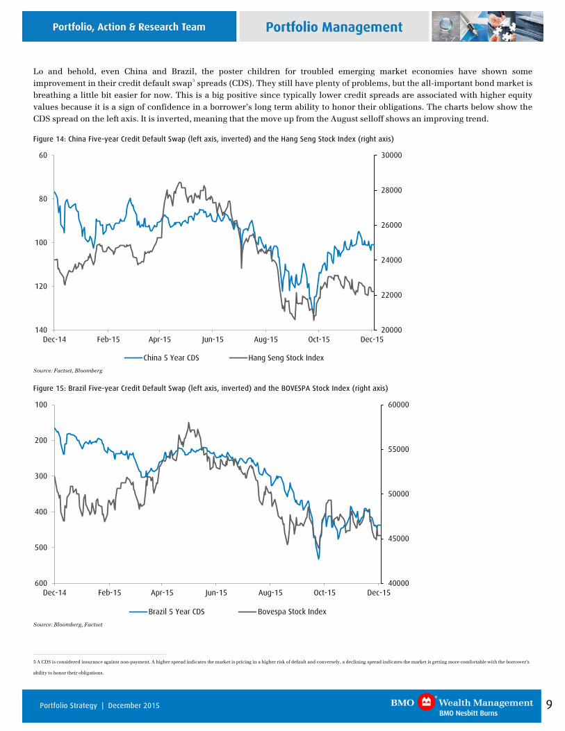
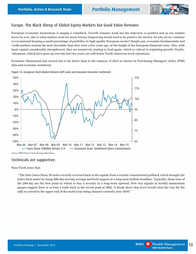
Lo and behold, even China and Brazil, the poster children for troubled emerging market economies have shown some improvement in their credit default swap5 spreads (CDS). They still have plenty of problems, but the all-important bond market is breathing a little bit easier for now. This is a big positive since typically lower credit spreads are associated with higher equity values because it is a sign of confidence in a borrower’s long term ability to honor their obligations. The charts below show the CDS spread on the left axis. It is inverted, meaning that the move up from the August selloff shows an improving trend.
Figure 14: China Five-year Credit Default Swap (left axis, inverted) and the Hang Seng Stock Index (right axis)
20000
22000
24000
26000
28000
3000060
80
100
120
140Dec-14 Feb-15 Apr-15 Jun-15 Aug-15 Oct-15 Dec-15
China 5 Year CDS Hang Seng Stock Index
Source: Factset, Bloomberg
Figure 15: Brazil Five-year Credit Default Swap (left axis, inverted) and the BOVESPA Stock Index (right axis)
40000
45000
50000
55000
60000100
200
300
400
500
600Dec-14 Feb-15 Apr-15 Jun-15 Aug-15 Oct-15 Dec-15
Brazil 5 Year CDS Bovespa Stock Index
Source: Bloomberg, Factset
5 A CDS is considered insurance against non-payment. A higher spread indicates the market is pricing in a higher risk of default and conversely, a declining spread indicates the market is getting more comfortable with the borrower’s
ability to honor their obligations.
10 Portfolio Strategy | December 2015
Europe. The Black Sheep of Global Equity Markets but Good Value Remains
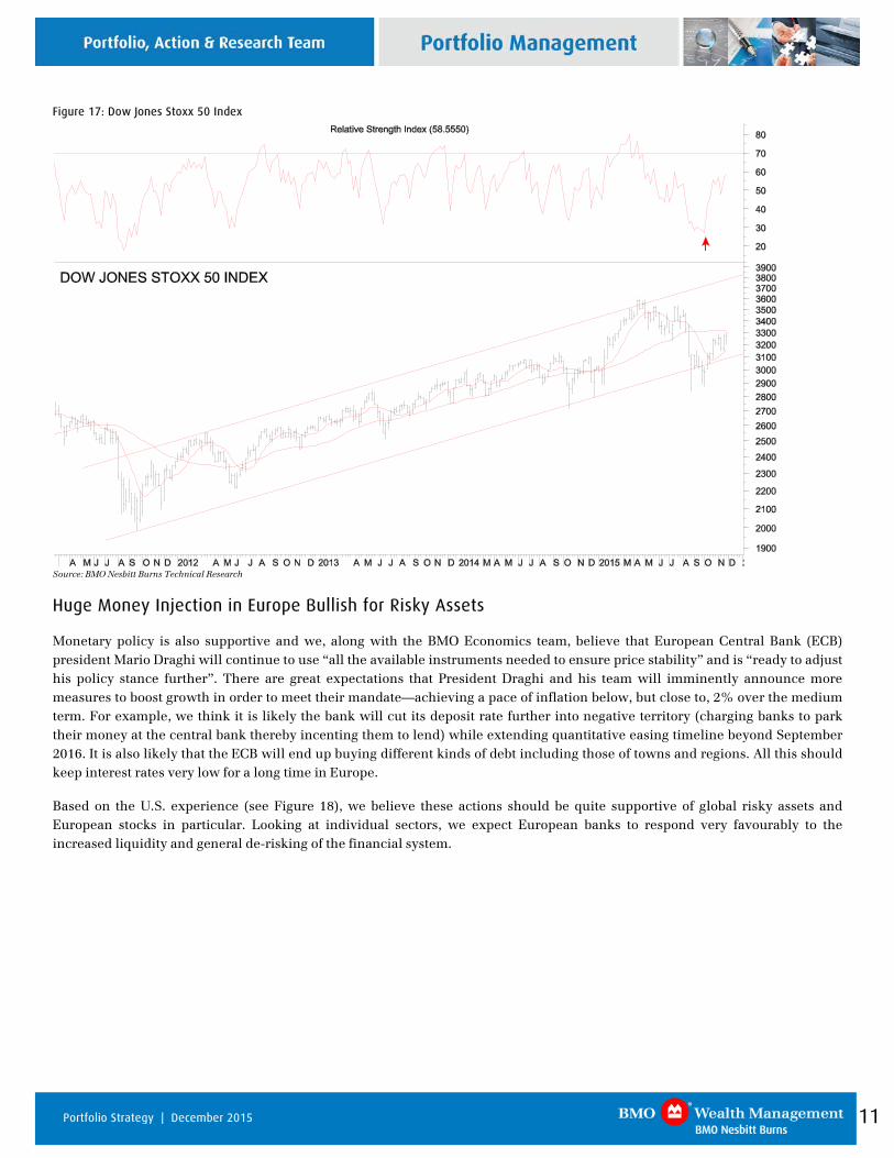
European economic momentum is staging a comeback. Growth remains weak but the trajectory is positive and as our readers know by now, this is what matters most for stock returns (improving trends tend to be positive for stocks). So why do we continue to recommend keeping a small percentage of portfolios in high quality European stocks? Simply put, economic fundamentals and credit markets remain far more favorable than they were a few years ago, at the height of the European financial crisis. Also, with bank capital considerably strengthened, they are tentatively starting to lend again, which is critical to reigniting growth. Finally, valuations, which have gone up over the last two years, are still below North American stock valuations.
Economic Momentum has slowed but is far better than in the summer of 2012 as shown by Purchasing Managers’ Index (PMI) data and economic sentiment.
Figure 16: European Stock Market Returns (left axis) and Eurozone Economic Sentiment
65
75
85
95
105
115
125
-50%
-40%
-30%
-20%
-10%
0%
10%
20%
30%
40%
50%
Mar-06 Mar-07 Mar-08 Mar-09 Mar-10 Mar-11 Mar-12 Mar-13 Mar-14 Mar-15Euro Stoxx 50Mthly Return Y/Y Eurozone Econ. Sentiment (Euro Commission)
Source: BMO Private Client Strategy, Bloomberg
Technicals are supportive:
Russ Visch notes that:
“The Dow Jones Stoxx 50 index recently reversed back to the upside from a routine countertrend pullback which brought the index back under its rising 200-day moving average and held support at a long-term bullish trendline. Typically, these tests of the 200-day are the best point in which to buy a security in a long-term uptrend. New buy signals in weekly momentum gauges suggest there is at least a trade back to the recent peak at 3602. A break above that level would clear the way for the rally to extend to the upper end of the multi-year rising channel currently near 3850.”
11 Portfolio Strategy | December 2015
Figure 17: Dow Jones Stoxx 50 Index
Source: BMO Nesbitt Burns Technical Research
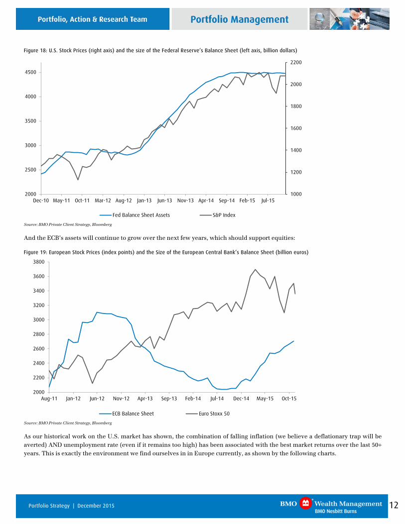
Huge Money Injection in Europe Bullish for Risky Assets
Monetary policy is also supportive and we, along with the BMO Economics team, believe that European Central Bank (ECB) president Mario Draghi will continue to use “all the available instruments needed to ensure price stability” and is “ready to adjust his policy stance further”. There are great expectations that President Draghi and his team will imminently announce more measures to boost growth in order to meet their mandate—achieving a pace of inflation below, but close to, 2% over the medium term. For example, we think it is likely the bank will cut its deposit rate further into negative territory (charging banks to park their money at the central bank thereby incenting them to lend) while extending quantitative easing timeline beyond September 2016. It is also likely that the ECB will end up buying different kinds of debt including those of towns and regions. All this should keep interest rates very low for a long time in Europe.
Based on the U.S. experience (see Figure 18), we believe these actions should be quite supportive of global risky assets and European stocks in particular. Looking at individual sectors, we expect European banks to respond very favourably to the increased liquidity and general de-risking of the financial system.
12 Portfolio Strategy | December 2015
Figure 18: U.S. Stock Prices (right axis) and the size of the Federal Reserve’s Balance Sheet (left axis, billion dollars)
1000
1200
1400
1600
1800
2000
2200
2000
2500
3000
3500
4000
4500
Dec-10 May-11 Oct-11 Mar-12 Aug-12 Jan-13 Jun-13 Nov-13 Apr-14 Sep-14 Feb-15 Jul-15
Fed Balance Sheet Assets S&P Index
Source: BMO Private Client Strategy, Bloomberg
And the ECB’s assets will continue to grow over the next few years, which should support equities:
Figure 19: European Stock Prices (index points) and the Size of the European Central Bank’s Balance Sheet (billion euros)
2000
2200
2400
2600
2800
3000
3200
3400
3600
3800
Aug-11 Jan-12 Jun-12 Nov-12 Apr-13 Sep-13 Feb-14 Jul-14 Dec-14 May-15 Oct-15
ECB Balance Sheet Euro Stoxx 50
Source: BMO Private Client Strategy, Bloomberg
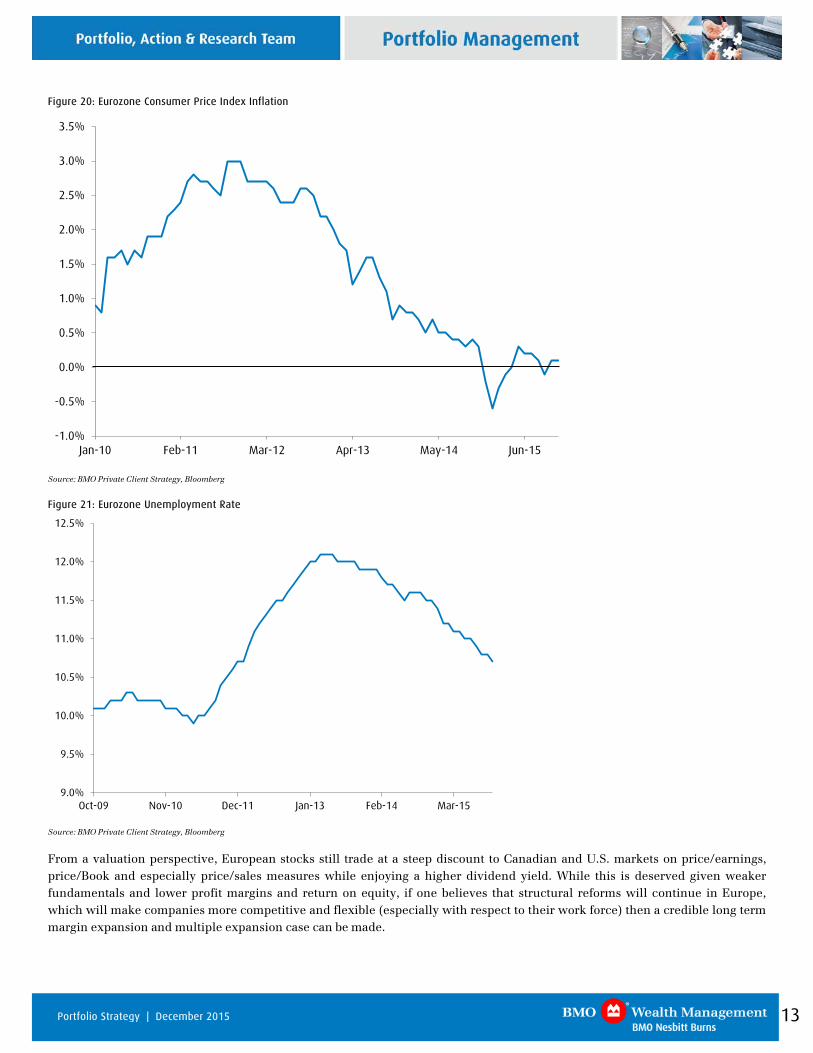
As our historical work on the U.S. market has shown, the combination of falling inflation (we believe a deflationary trap will be averted) AND unemployment rate (even if it remains too high) has been associated with the best market returns over the last 50+ years. This is exactly the environment we find ourselves in in Europe currently, as shown by the following charts.
13 Portfolio Strategy | December 2015
Figure 20: Eurozone Consumer Price Index Inflation
-1.0%
-0.5%
0.0%
0.5%
1.0%
1.5%
2.0%
2.5%
3.0%
3.5%
Jan-10 Feb-11 Mar-12 Apr-13 May-14 Jun-15
Source: BMO Private Client Strategy, Bloomberg
Figure 21: Eurozone Unemployment Rate
9.0%
9.5%
10.0%
10.5%
11.0%
11.5%
12.0%
12.5%
Oct-09 Nov-10 Dec-11 Jan-13 Feb-14 Mar-15
Source: BMO Private Client Strategy, Bloomberg
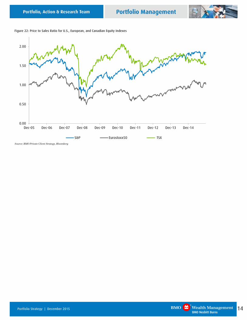
From a valuation perspective, European stocks still trade at a steep discount to Canadian and U.S. markets on price/earnings, price/Book and especially price/sales measures while enjoying a higher dividend yield. While this is deserved given weaker fundamentals and lower profit margins and return on equity, if one believes that structural reforms will continue in Europe, which will make companies more competitive and flexible (especially with respect to their work force) then a credible long term margin expansion and multiple expansion case can be made.
14 Portfolio Strategy | December 2015
Figure 22: Price to Sales Ratio for U.S., European, and Canadian Equity Indexes
0.00
0.50
1.00
1.50
2.00
Dec-05 Dec-06 Dec-07 Dec-08 Dec-09 Dec-10 Dec-11 Dec-12 Dec-13 Dec-14
S&P Eurostoxx50 TSX
Source: BMO Private Client Strategy, Bloomberg
15 Portfolio Strategy | December 2015
Market Valuations
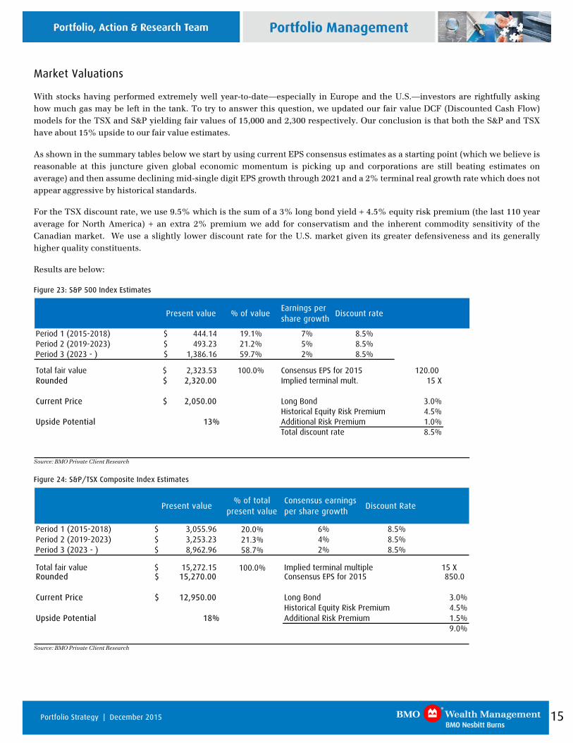
With stocks having performed extremely well year-to-date—especially in Europe and the U.S.—investors are rightfully asking how much gas may be left in the tank. To try to answer this question, we updated our fair value DCF (Discounted Cash Flow) models for the TSX and S&P yielding fair values of 15,000 and 2,300 respectively. Our conclusion is that both the S&P and TSX have about 15% upside to our fair value estimates.
As shown in the summary tables below we start by using current EPS consensus estimates as a starting point (which we believe is reasonable at this juncture given global economic momentum is picking up and corporations are still beating estimates on average) and then assume declining mid-single digit EPS growth through 2021 and a 2% terminal real growth rate which does not appear aggressive by historical standards.
For the TSX discount rate, we use 9.5% which is the sum of a 3% long bond yield + 4.5% equity risk premium (the last 110 year average for North America) + an extra 2% premium we add for conservatism and the inherent commodity sensitivity of the Canadian market. We use a slightly lower discount rate for the U.S. market given its greater defensiveness and its generally higher quality constituents.
Results are below:
Figure 23: S&P 500 Index Estimates
Present value % of valueEarnings per share growth
Discount rate
Period 1 (2015-2018) 444.14$ 19.1% 7% 8.5%Period 2 (2019-2023) 493.23$ 21.2% 5% 8.5%Period 3 (2023 - ) 1,386.16$ 59.7% 2% 8.5%
Total fair value 2,323.53$ 100.0% Consensus EPS for 2015 120.00 Rounded 2,320.00$ Implied terminal mult. 15 X
Current Price SPX 2,050.00$ Long Bond 3.0%Historical Equity Risk Premium 4.5%
Upside Potential 13% Additional Risk Premium 1.0%Total discount rate 8.5%
Source: BMO Private Client Research
Figure 24: S&P/TSX Composite Index Estimates
Present value % of total
present valueConsensus earnings per share growth
Discount Rate
Period 1 (2015-2018) 3,055.96$ 20.0% 6% 8.5%Period 2 (2019-2023) 3,253.23$ 21.3% 4% 8.5%Period 3 (2023 - ) 8,962.96$ 58.7% 2% 8.5%
Total fair value 15,272.15$ 100.0% Implied terminal multiple 15 XRounded 15,270.00$ Consensus EPS for 2015 850.0
Current Price TSEC-TSE 12,950.00$ Long Bond 3.0%ls Historical Equity Risk Premium 4.5%
Upside Potential 18% Additional Risk Premium 1.5%9.0%
Source: BMO Private Client Research
16 Portfolio Strategy | December 2015
Figure 25: S&P 500 Earnings Yield versus 10-year Treasury Yield
0.0
2.0
4.0
6.0
8.0
10.0
12.0
14.0
16.0
18.0
Feb-80 Feb-84 Feb-88 Feb-92 Feb-96 Feb-00 Feb-04 Feb-08 Feb-12
10 Year Treasury Yield S&P Earnings Yield Source: Bloomberg
Figure 26: S&P/TSX Earnings Yield versus 10-year Canada Bond Yield
0.0
2.0
4.0
6.0
8.0
10.0
12.0
Jun-94 Jun-96 Jun-98 Jun-00 Jun-02 Jun-04 Jun-06 Jun-08 Jun-10 Jun-12 Jun-14
10 Yr Bond Yield TSX Earnings Yield (TTM) Source: Bloomberg
Figure 27: S&P 500 Index Sector Total Returns to November 30, 2015
S&P 500 Index Sector Total Returns (%) MTD YTD
Cons. Discretionary -0.24 13.26Info. Technology 0.87 8.41Health Care -0.41 5.02Consumer Staples -1.10 3.63S&P 500 Index 0.30 3.01Telecom. Services -1.26 1.62Financials 1.90 0.61Industrials 0.93 -0.54Materials 0.83 -4.40Utilities -2.15 -6.87Energy -0.24 -12.48
Source: Bloomberg
Figure 28: S&P/TSX Composite Sector Total Returns to November 30, 2015
S&P/TSX Composite Index Sector Total Returns (%) MTD YTD
Info. Technology 7.59 14.30Consumer Staples 2.91 12.51Telecom. Services 0.03 10.93Cons. Discretionary -2.73 4.33Financials 0.97 1.54S&P/TSX Composite Index -0.23 -5.42Utilities -1.72 -5.47Industrials 1.04 -7.07Energy -3.69 -18.69Materials -1.13 -19.28Health Care 1.50 -26.35
Source: Bloomberg
17 Portfolio Strategy | December 2015
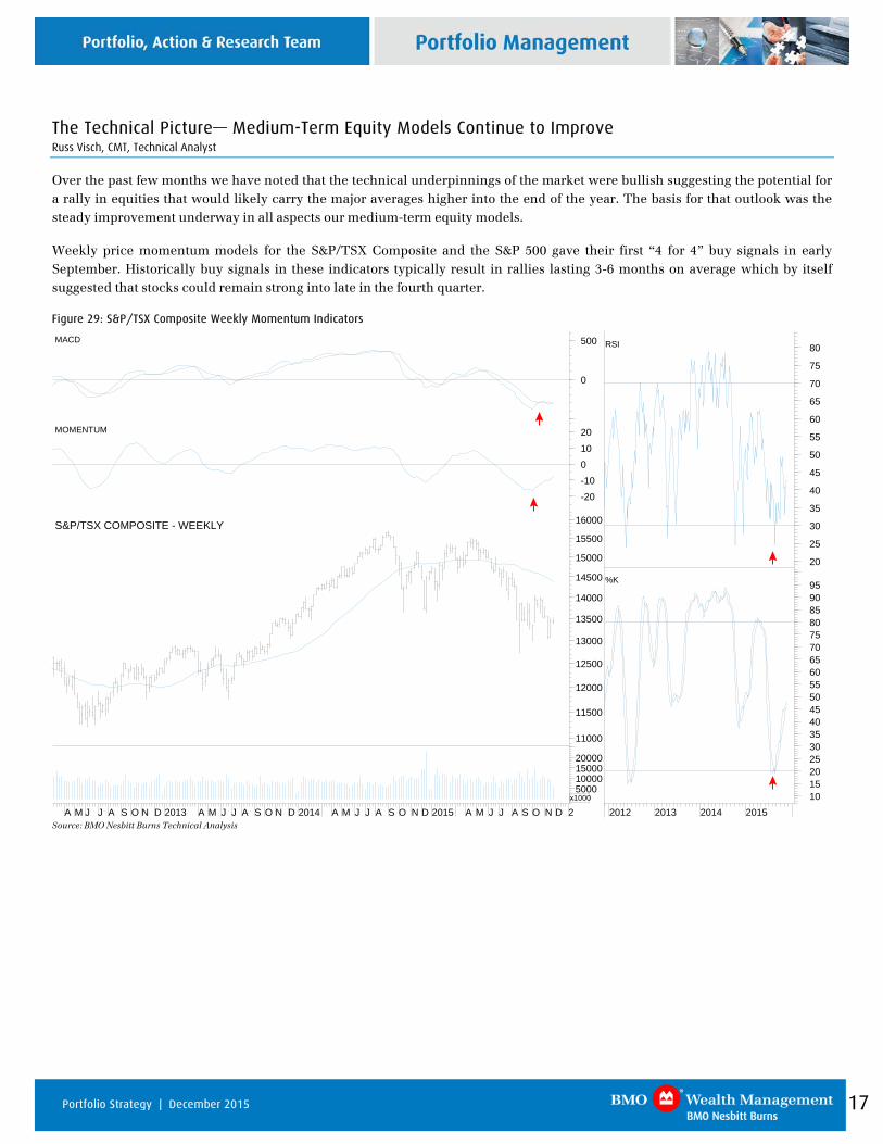
The Technical Picture— Medium-Term Equity Models Continue to Improve Russ Visch, CMT, Technical Analyst
Over the past few months we have noted that the technical underpinnings of the market were bullish suggesting the potential for a rally in equities that would likely carry the major averages higher into the end of the year. The basis for that outlook was the steady improvement underway in all aspects our medium-term equity models.
Weekly price momentum models for the S&P/TSX Composite and the S&P 500 gave their first “4 for 4” buy signals in early September. Historically buy signals in these indicators typically result in rallies lasting 3-6 months on average which by itself suggested that stocks could remain strong into late in the fourth quarter.
Figure 29: S&P/TSX Composite Weekly Momentum Indicators
2012 2013 2014 2015101520253035404550556065707580859095%K
20
25
30
35
40
45
50
55
60
65
70
75
80RSI
A M J J A S O N D 2013 A M J J A S O N D 2014 A M J J A S O N D 2015 A M J J A S O N D 2
5000100001500020000
x1000
11000
11500
12000
12500
13000
13500
14000
14500
15000
15500
16000S&P/TSX COMPOSITE - WEEKLY
-20-1001020MOMENTUM
0
500MACD
Source: BMO Nesbitt Burns Technical Analysis
18 Portfolio Strategy | December 2015
Figure 30: S&P 500 Weekly Momentum Indicators
2013 2014 2015
101520253035404550556065707580859095100105%K
25
30
35
40
45
50
55
60
65
70
75
80
85RSI
J A S O N D 2013 A M J J A S O N D 2014 M A M J J A S O N D 2015 M A M J J A S O N D
50001000015000
x100
1300
1400
1500
1600
1700
1800
1900
2000
2100
2200S&P 500 - WEEKLY
-20-15-10-5051015MOMENTUM
0
50
MACD
Source: BMO Nesbitt Burns Technical Analysis
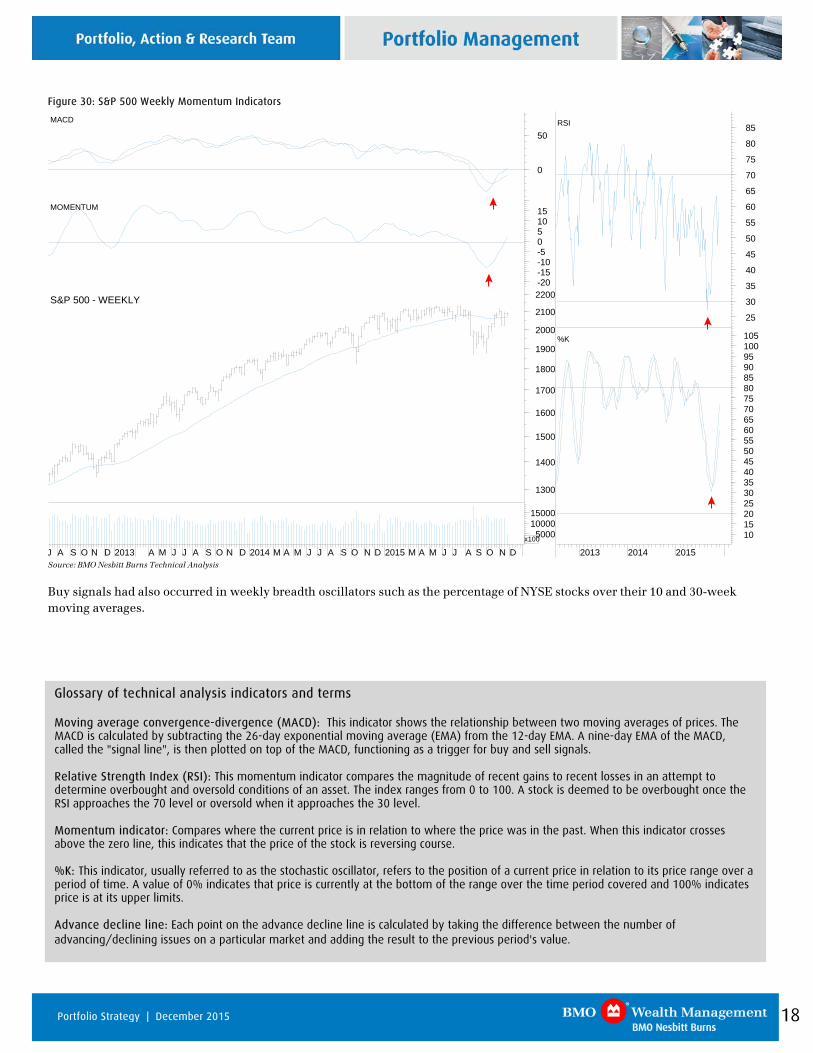
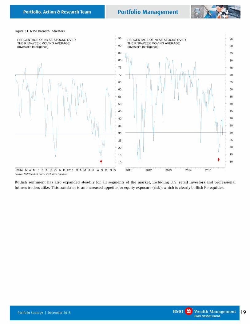
Buy signals had also occurred in weekly breadth oscillators such as the percentage of NYSE stocks over their 10 and 30-week moving averages.
Glossary of technical analysis indicators and terms Moving average convergence-divergence (MACD): This indicator shows the relationship between two moving averages of prices. The MACD is calculated by subtracting the 26-day exponential moving average (EMA) from the 12-day EMA. A nine-day EMA of the MACD, called the "signal line", is then plotted on top of the MACD, functioning as a trigger for buy and sell signals. Relative Strength Index (RSI): This momentum indicator compares the magnitude of recent gains to recent losses in an attempt to determine overbought and oversold conditions of an asset. The index ranges from 0 to 100. A stock is deemed to be overbought once the RSI approaches the 70 level or oversold when it approaches the 30 level. Momentum indicator: Compares where the current price is in relation to where the price was in the past. When this indicator crosses above the zero line, this indicates that the price of the stock is reversing course. %K: This indicator, usually referred to as the stochastic oscillator, refers to the position of a current price in relation to its price range over a period of time. A value of 0% indicates that price is currently at the bottom of the range over the time period covered and 100% indicates price is at its upper limits. Advance decline line: Each point on the advance decline line is calculated by taking the difference between the number of advancing/declining issues on a particular market and adding the result to the previous period's value.
19 Portfolio Strategy | December 2015
Figure 31: NYSE Breadth Indicators
2011 2012 2013 2014 2015
10
15
20
25
30
35
40
45
50
55
60
65
70
75
80
85
90
95PERCENTAGE OF NYSE STOCKS OVERTHEIR 30-WEEK MOVING AVERAGE(Investor's Intelligence)
2014 M A M J J A S O N D 2015 M A M J J A S O N D
10
15
20
25
30
35
40
45
50
55
60
65
70
75
80
85
90
95PERCENTAGE OF NYSE STOCKS OVERTHEIR 10-WEEK MOVING AVERAGE(Investor's Intelligence)
Source: BMO Nesbitt Burns Technical Analysis
Bullish sentiment has also expanded steadily for all segments of the market, including U.S. retail investors and professional futures traders alike. This translates to an increased appetite for equity exposure (risk), which is clearly bullish for equities.
20 Portfolio Strategy | December 2015
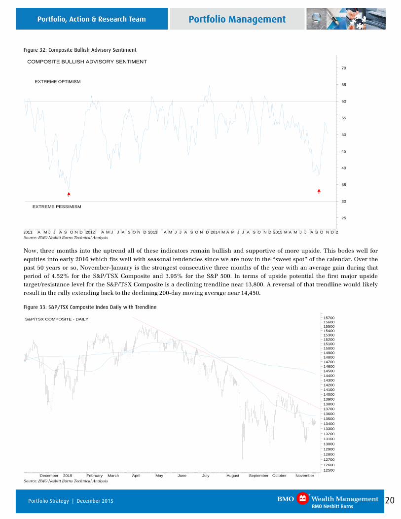
Figure 32: Composite Bullish Advisory Sentiment
2011 A M J J A S O N D 2012 A M J J A S O N D 2013 A M J J A S O N D 2014 M A M J J A S O N D 2015 M A M J J A S O N D 2
25
30
35
40
45
50
55
60
65
70COMPOSITE BULLISH ADVISORY SENTIMENT
EXTREME PESSIMISM
EXTREME OPTIMISM
Source: BMO Nesbitt Burns Technical Analysis
Now, three months into the uptrend all of these indicators remain bullish and supportive of more upside. This bodes well for equities into early 2016 which fits well with seasonal tendencies since we are now in the “sweet spot” of the calendar. Over the past 50 years or so, November-January is the strongest consecutive three months of the year with an average gain during that period of 4.52% for the S&P/TSX Composite and 3.95% for the S&P 500. In terms of upside potential the first major upside target/resistance level for the S&P/TSX Composite is a declining trendline near 13,800. A reversal of that trendline would likely result in the rally extending back to the declining 200-day moving average near 14,450.
Figure 33: S&P/TSX Composite Index Daily with Trendline
December 2015 February March April May June July August September October November125001260012700128001290013000131001320013300134001350013600137001380013900140001410014200143001440014500146001470014800149001500015100152001530015400155001560015700S&P/TSX COMPOSITE - DAILY
Source: BMO Nesbitt Burns Technical Analysis
21 Portfolio Strategy | December 2015
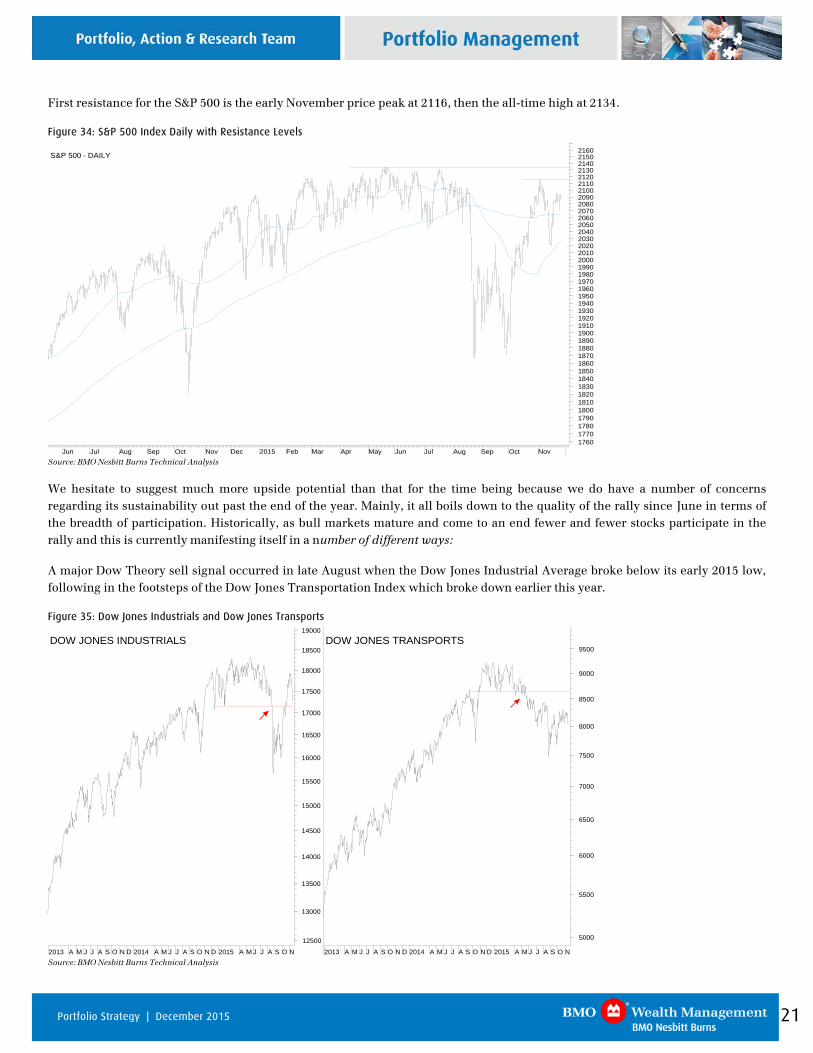
First resistance for the S&P 500 is the early November price peak at 2116, then the all-time high at 2134.
Figure 34: S&P 500 Index Daily with Resistance Levels
Jun Jul Aug Sep Oct Nov Dec 2015 Feb Mar Apr May Jun Jul Aug Sep Oct Nov17601770178017901800181018201830184018501860187018801890190019101920193019401950196019701980199020002010202020302040205020602070208020902100211021202130214021502160
S&P 500 - DAILY
Source: BMO Nesbitt Burns Technical Analysis
We hesitate to suggest much more upside potential than that for the time being because we do have a number of concerns regarding its sustainability out past the end of the year. Mainly, it all boils down to the quality of the rally since June in terms of the breadth of participation. Historically, as bull markets mature and come to an end fewer and fewer stocks participate in the rally and this is currently manifesting itself in a number of different ways:
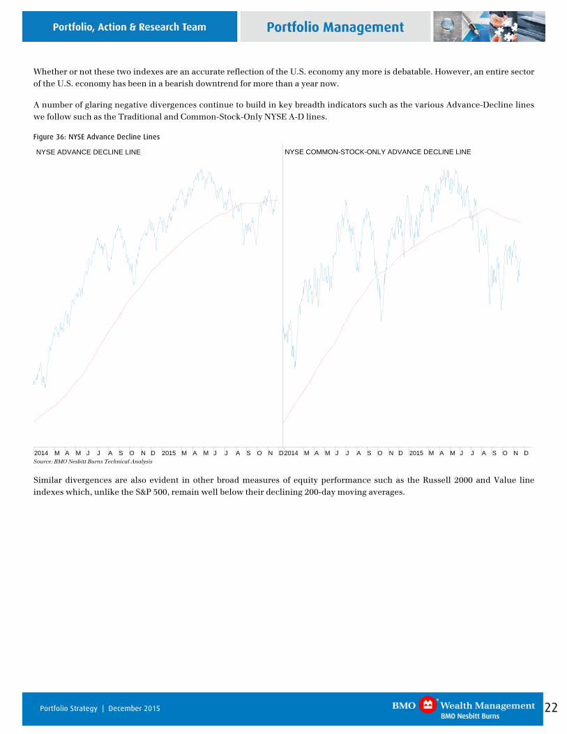
A major Dow Theory sell signal occurred in late August when the Dow Jones Industrial Average broke below its early 2015 low, following in the footsteps of the Dow Jones Transportation Index which broke down earlier this year.
Figure 35: Dow Jones Industrials and Dow Jones Transports
12500
13000
13500
14000
14500
15000
15500
16000
16500
17000
17500
18000
18500
19000
DOW JONES INDUSTRIALS
5000
5500
6000
6500
7000
7500
8000
8500
9000
9500DOW JONES TRANSPORTS
2013 A M J J A S O N D 2014 A M J J A S O N D 2015 A M J J A S O N2013 A M J J A S O N D 2014 A M J J A S O N D 2015 A M J J A S O N Source: BMO Nesbitt Burns Technical Analysis
22 Portfolio Strategy | December 2015
Whether or not these two indexes are an accurate reflection of the U.S. economy any more is debatable. However, an entire sector of the U.S. economy has been in a bearish downtrend for more than a year now.
A number of glaring negative divergences continue to build in key breadth indicators such as the various Advance-Decline lines we follow such as the Traditional and Common-Stock-Only NYSE A-D lines.
Figure 36: NYSE Advance Decline Lines
NYSE ADVANCE DECLINE LINE
2014 M A M J J A S O N D 2015 M A M J J A S O N D
NYSE COMMON-STOCK-ONLY ADVANCE DECLINE LINE
2014 M A M J J A S O N D 2015 M A M J J A S O N D Source: BMO Nesbitt Burns Technical Analysis
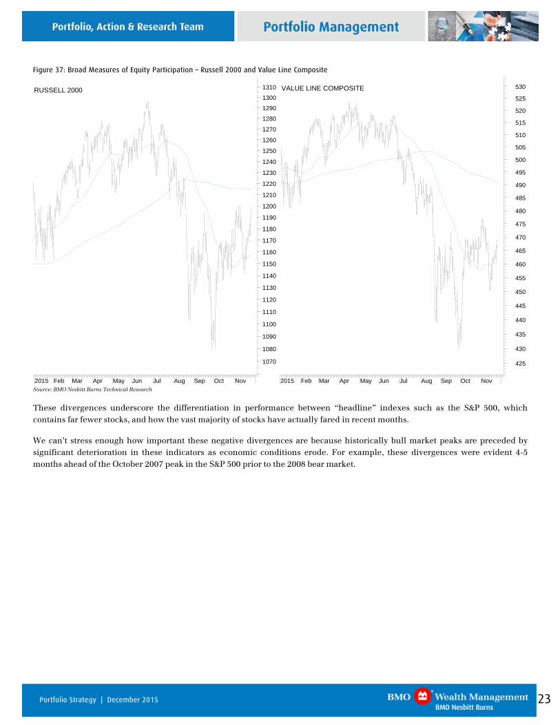
Similar divergences are also evident in other broad measures of equity performance such as the Russell 2000 and Value line indexes which, unlike the S&P 500, remain well below their declining 200-day moving averages.
23 Portfolio Strategy | December 2015
Figure 37: Broad Measures of Equity Participation – Russell 2000 and Value Line Composite
2015 Feb Mar Apr May Jun Jul Aug Sep Oct Nov
425
430
435
440
445
450
455
460
465
470
475
480
485
490
495
500
505
510
515
520
525
530VALUE LINE COMPOSITE
2015 Feb Mar Apr May Jun Jul Aug Sep Oct Nov
1070
1080
1090
1100
1110
1120
1130
1140
1150
1160
1170
1180
1190
1200
1210
1220
1230
1240
1250
1260
1270
1280
1290
1300
1310RUSSELL 2000
Source: BMO Nesbitt Burns Technical Research These divergences underscore the differentiation in performance between “headline” indexes such as the S&P 500, which contains far fewer stocks, and how the vast majority of stocks have actually fared in recent months.
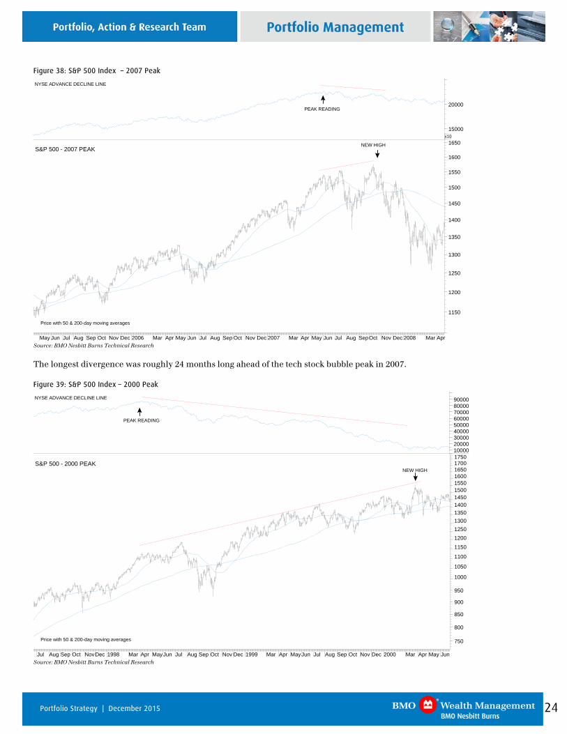
We can’t stress enough how important these negative divergences are because historically bull market peaks are preceded by significant deterioration in these indicators as economic conditions erode. For example, these divergences were evident 4-5 months ahead of the October 2007 peak in the S&P 500 prior to the 2008 bear market.
24 Portfolio Strategy | December 2015
Figure 38: S&P 500 Index – 2007 Peak
May Jun Jul Aug Sep Oct Nov Dec 2006 Mar Apr May Jun Jul Aug Sep Oct Nov Dec 2007 Mar Apr May Jun Jul Aug SepOct Nov Dec 2008 Mar Apr
1150
1200
1250
1300
1350
1400
1450
1500
1550
1600
1650S&P 500 - 2007 PEAK
Price with 50 & 200-day moving averages
NEW HIGH
15000
20000
x10
NYSE ADVANCE DECLINE LINE
PEAK READING
Source: BMO Nesbitt Burns Technical Research The longest divergence was roughly 24 months long ahead of the tech stock bubble peak in 2007.
Figure 39: S&P 500 Index – 2000 Peak
Jul Aug Sep Oct NovDec 1998 Mar Apr MayJun Jul Aug Sep Oct Nov Dec 1999 Mar Apr MayJun Jul Aug Sep Oct Nov Dec 2000 Mar Apr May Jun
750
800
850
900
950
1000
1050
1100
1150
120012501300135014001450150015501600165017001750
S&P 500 - 2000 PEAK
Price with 50 & 200-day moving averages
NEW HIGH
100002000030000400005000060000700008000090000NYSE ADVANCE DECLINE LINE
PEAK READING
Source: BMO Nesbitt Burns Technical Research
25 Portfolio Strategy | December 2015
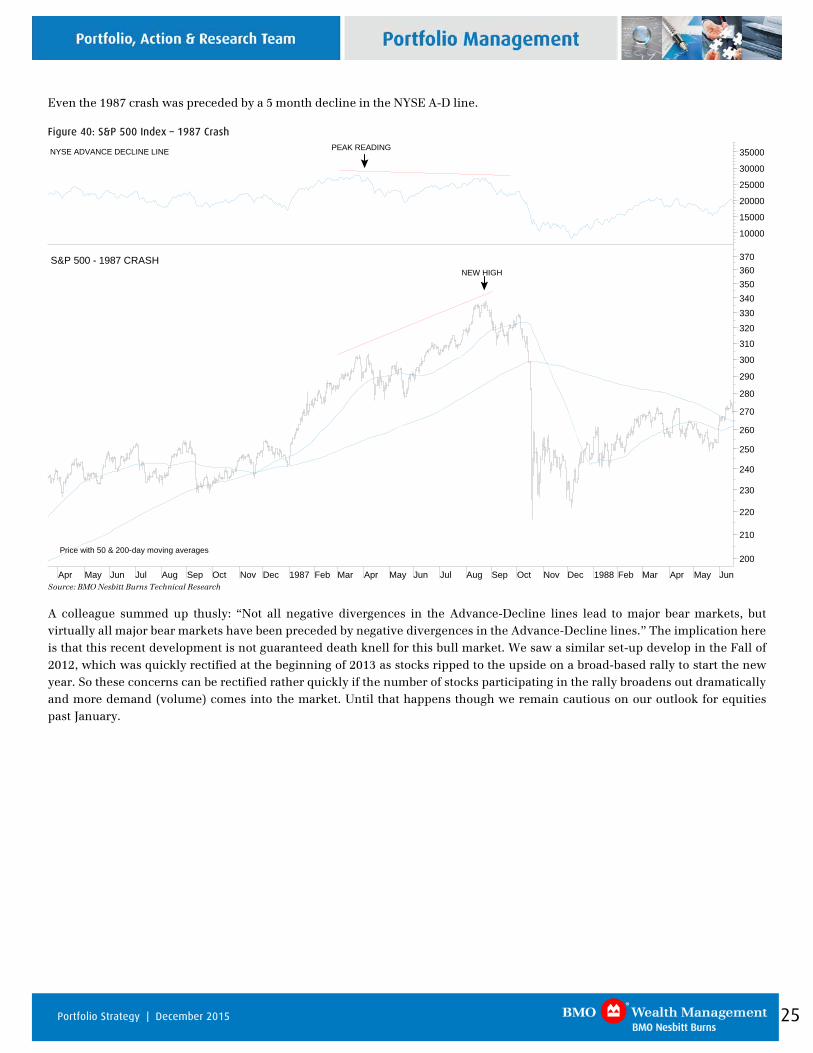
Even the 1987 crash was preceded by a 5 month decline in the NYSE A-D line.
Figure 40: S&P 500 Index – 1987 Crash
200
210
220
230
240
250
260
270
280
290
300
310
320
330340350360370S&P 500 - 1987 CRASH
Price with 50 & 200-day moving averages
NEW HIGH
10000
15000
20000
25000
30000
35000NYSE ADVANCE DECLINE LINE PEAK READING
Apr May Jun Jul Aug Sep Oct Nov Dec 1987 Feb Mar Apr May Jun Jul Aug Sep Oct Nov Dec 1988 Feb Mar Apr May Jun Source: BMO Nesbitt Burns Technical Research A colleague summed up thusly: “Not all negative divergences in the Advance-Decline lines lead to major bear markets, but virtually all major bear markets have been preceded by negative divergences in the Advance-Decline lines.” The implication here is that this recent development is not guaranteed death knell for this bull market. We saw a similar set-up develop in the Fall of 2012, which was quickly rectified at the beginning of 2013 as stocks ripped to the upside on a broad-based rally to start the new year. So these concerns can be rectified rather quickly if the number of stocks participating in the rally broadens out dramatically and more demand (volume) comes into the market. Until that happens though we remain cautious on our outlook for equities past January.
26 Portfolio Strategy | December 2015
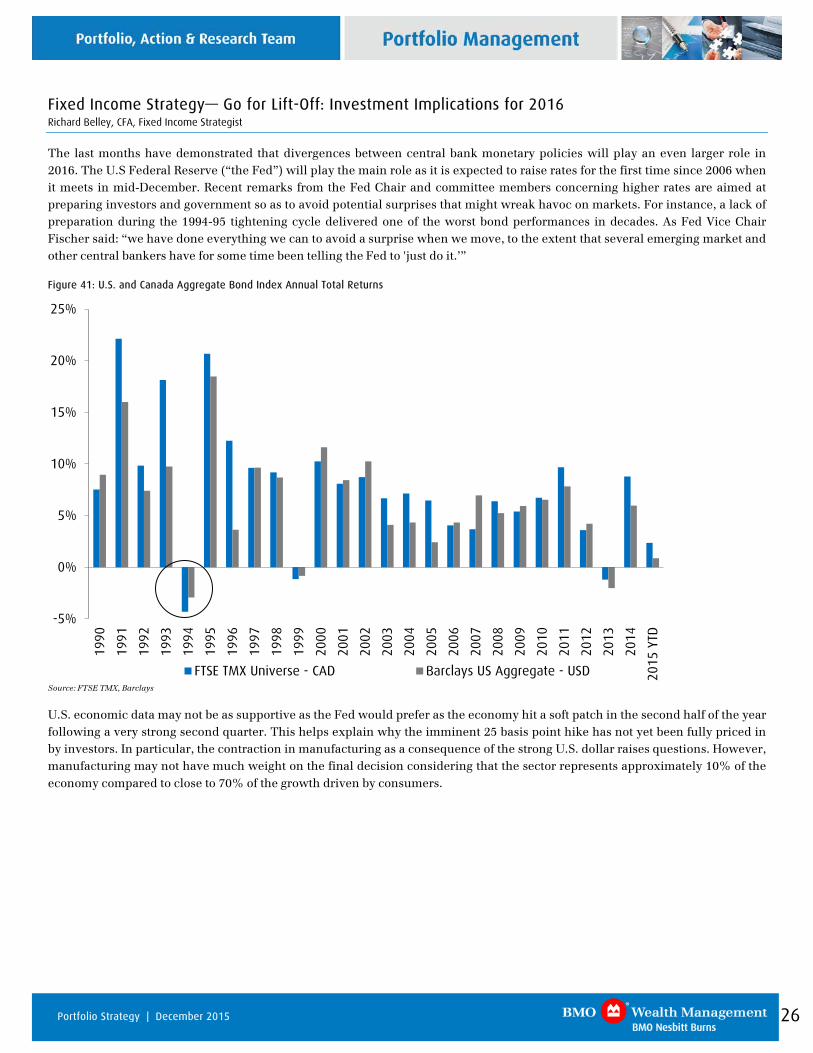
Fixed Income Strategy— Go for Lift-Off: Investment Implications for 2016 Richard Belley, CFA, Fixed Income Strategist
The last months have demonstrated that divergences between central bank monetary policies will play an even larger role in 2016. The U.S Federal Reserve (“the Fed”) will play the main role as it is expected to raise rates for the first time since 2006 when it meets in mid-December. Recent remarks from the Fed Chair and committee members concerning higher rates are aimed at preparing investors and government so as to avoid potential surprises that might wreak havoc on markets. For instance, a lack of preparation during the 1994-95 tightening cycle delivered one of the worst bond performances in decades. As Fed Vice Chair Fischer said: “we have done everything we can to avoid a surprise when we move, to the extent that several emerging market and other central bankers have for some time been telling the Fed to 'just do it.’”
Figure 41: U.S. and Canada Aggregate Bond Index Annual Total Returns
-5%
0%
5%
10%
15%
20%
25%
1990
1991
1992
1993
1994
1995
1996
1997
1998
1999
2000
2001
2002
2003
2004
2005
2006
2007
2008
2009
2010
2011
2012
2013
2014
2015
YTD
FTSE TMX Universe - CAD Barclays US Aggregate - USD
Source: FTSE TMX, Barclays
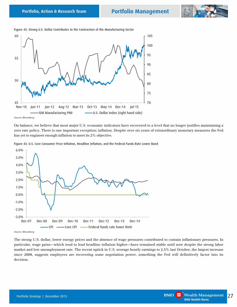
U.S. economic data may not be as supportive as the Fed would prefer as the economy hit a soft patch in the second half of the year following a very strong second quarter. This helps explain why the imminent 25 basis point hike has not yet been fully priced in by investors. In particular, the contraction in manufacturing as a consequence of the strong U.S. dollar raises questions. However, manufacturing may not have much weight on the final decision considering that the sector represents approximately 10% of the economy compared to close to 70% of the growth driven by consumers.
27 Portfolio Strategy | December 2015
Figure 42: Strong U.S. Dollar Contributes to the Contraction of the Manufacturing Sector
70
75
80
85
90
95
100
105
45
50
55
60
Nov-10 Jun-11 Jan-12 Aug-12 Mar-13 Oct-13 May-14 Dec-14 Jul-15
ISM Manufacturing PMI U.S. Dollar Index (right hand side) Source: Bloomberg
On balance, we believe that most major U.S. economic indicators have recovered to a level that no longer justifies maintaining a zero rate policy. There is one important exception; inflation. Despite over six years of extraordinary monetary measures the Fed has yet to engineer enough inflation to meet its 2% objective.
Figure 43: U.S. Core Consumer Price Inflation, Headline Inflation, and the Federal Funds Rate Lower Band
-3.0%
-2.0%
-1.0%
0.0%
1.0%
2.0%
3.0%
4.0%
5.0%
6.0%
Dec-07 Dec-08 Dec-09 Dec-10 Dec-11 Dec-12 Dec-13 Dec-14
CPI Core CPI Federal funds rate lower limit Source: Bloomberg
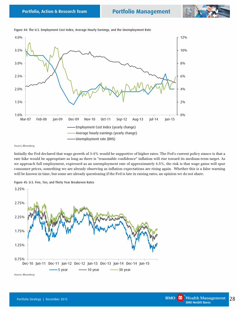
The strong U.S. dollar, lower energy prices and the absence of wage pressures contributed to contain inflationary pressures. In particular, wage gains—which tend to lead headline inflation higher—have remained stable until now despite the strong labor market and low unemployment rate. The recent uptick in U.S. average hourly earnings to 2.5% last October, the largest increase since 2009, suggests employees are recovering some negotiation power, something the Fed will definitively factor into its decision.
28 Portfolio Strategy | December 2015
Figure 44: The U.S. Employment Cost Index, Average Hourly Earnings, and the Unemployment Rate
0%
2%
4%
6%
8%
10%
12%
1.0%
1.5%
2.0%
2.5%
3.0%
3.5%
4.0%
Mar-07 Feb-08 Jan-09 Dec-09 Nov-10 Oct-11 Sep-12 Aug-13 Jul-14 Jun-15
Employment Cost Index (yearly change)
Average hourly earnings (yearly change)
Unemployment rate (RHS)
Source: Bloomberg
Initially the Fed declared that wage growth of 3-4% would be supportive of higher rates. The Fed's current policy stance is that a rate hike would be appropriate as long as there is "reasonable confidence" inflation will rise toward its medium-term target. As we approach full employment, expressed as an unemployment rate of approximately 4.5%, the risk is that wage gains will spur consumer prices, something we are already observing as inflation expectations are rising again. Whether this is a false warning will be known in time, but some are already questioning if the Fed is late in raising rates, an opinion we do not share.
Figure 45: U.S. Five, Ten, and Thirty Year Breakeven Rates
0.75%
1.25%
1.75%
2.25%
2.75%
3.25%
Dec-10 Jun-11 Dec-11 Jun-12 Dec-12 Jun-13 Dec-13 Jun-14 Dec-14 Jun-15
5 year 10 year 30 year
Source: Bloomberg
29 Portfolio Strategy | December 2015
Not all members of the Federal Reserve Open Market Committee believe in the necessity of raising rates as they lack confidence in the strength of the economy and the future trajectory of inflation. However, Fed Chair Janet Yellen will accept some dissention among committee members as long as she can demonstrate strong support for lift-off. Even if the Fed has not officially made a decision, barring any major economic downturn the Fed is a go for lift- off.
Market Expectations
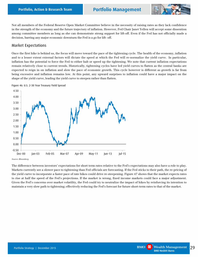
Once the first hike is behind us, the focus will move toward the pace of the tightening cycle. The health of the economy, inflation and to a lesser extent external factors will dictate the speed at which the Fed will re-normalize the yield curve. In particular, inflation has the potential to force the Fed to either halt or speed up the tightening. We note that current inflation expectations remain relatively close to current trends. Historically, tightening cycles have led yield curves to flatten as the central banks are expected to reign in on inflation and slow the pace of economic growth. This cycle however is different as growth is far from being excessive and inflation remains low. At this point, any upward surprises to inflation could have a major impact on the shape of the yield curve, leading the yield curve to steepen rather than flatten.
Figure 46: U.S. 2-30 Year Treasury Yield Spread
-0.50
0.00
0.50
1.00
1.50
2.00
2.50
3.00
3.50
4.00
4.50
Dec-00 Jan-03 Feb-05 Mar-07 Apr-09 May-11 Jun-13 Jul-15
Source: Bloomberg
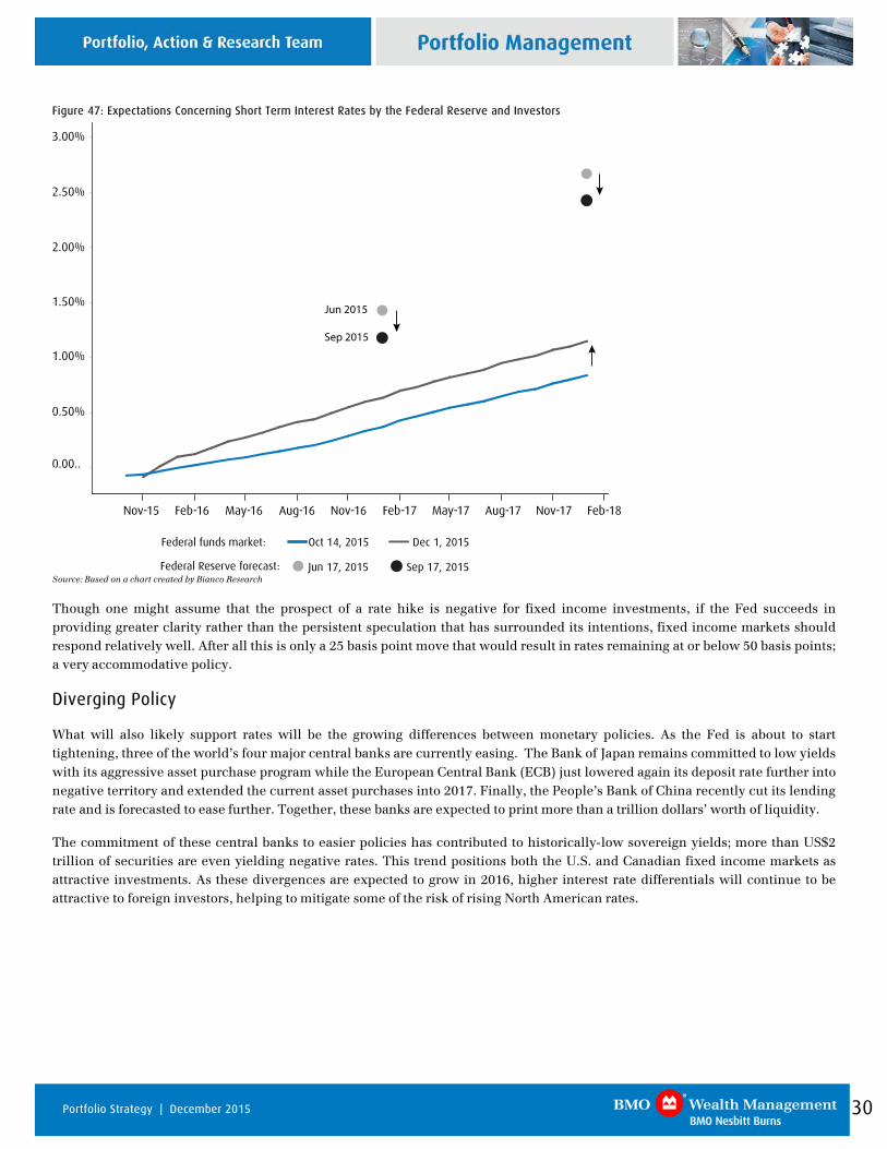
The difference between investors’ expectations for short term rates relative to the Fed’s expectations may also have a role to play. Markets currently see a slower pace to tightening than Fed officials are forecasting. If the Fed sticks to their path, the re-pricing of the yield curve to incorporate a faster pace of rate hikes could drive re-steepening. Figure 47 shows that the market expects rates to rise at half the speed of the Fed’s projections. If the market is wrong, fixed income markets could face a major adjustment. Given the Fed’s concerns over market volatility, the Fed could try to neutralize the impact of hikes by reinforcing its intention to maintain a very slow path to tightening; effectively reducing the Fed’s forecast for future short-term rates to that of the market.
30 Portfolio Strategy | December 2015
Figure 47: Expectations Concerning Short Term Interest Rates by the Federal Reserve and Investors
Nov-15 Feb-16 May-16 Aug-16 Nov-16 Feb-17 May-17 Aug-17 Nov-17 Feb-18
0.00..
0.50%
1.00%
1.50%
2.00%
2.50%
3.00%
Dec 1, 2015
Jun 17, 2015 Sep 17, 2015Federal Reserve forecast:
Federal funds market: Oct 14, 2015
6an 2015
Sep 2015
Source: Based on a chart created by Bianco Research
Though one might assume that the prospect of a rate hike is negative for fixed income investments, if the Fed succeeds in providing greater clarity rather than the persistent speculation that has surrounded its intentions, fixed income markets should respond relatively well. After all this is only a 25 basis point move that would result in rates remaining at or below 50 basis points; a very accommodative policy.
Diverging Policy
What will also likely support rates will be the growing differences between monetary policies. As the Fed is about to start tightening, three of the world’s four major central banks are currently easing. The Bank of Japan remains committed to low yields with its aggressive asset purchase program while the European Central Bank (ECB) just lowered again its deposit rate further into negative territory and extended the current asset purchases into 2017. Finally, the People’s Bank of China recently cut its lending rate and is forecasted to ease further. Together, these banks are expected to print more than a trillion dollars’ worth of liquidity.
The commitment of these central banks to easier policies has contributed to historically-low sovereign yields; more than US$2 trillion of securities are even yielding negative rates. This trend positions both the U.S. and Canadian fixed income markets as attractive investments. As these divergences are expected to grow in 2016, higher interest rate differentials will continue to be attractive to foreign investors, helping to mitigate some of the risk of rising North American rates.
31 Portfolio Strategy | December 2015
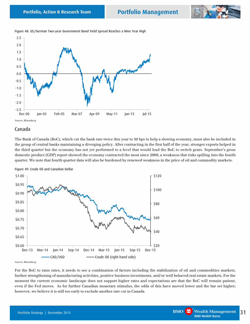
Figure 48: US/German Two-year Government Bond Yield Spread Reaches a Nine Year High
-2.5
-2.0
-1.5
-1.0
-0.5
0.0
0.5
1.0
1.5
2.0
2.5
Dec-00 Jan-03 Feb-05 Mar-07 Apr-09 May-11 Jun-13 Jul-15
Source: Bloomberg
Canada
The Bank of Canada (BoC), which cut the bank rate twice this year to 50 bps to help a slowing economy, must also be included in the group of central banks maintaining a diverging policy. After contracting in the first half of the year, stronger exports helped in the third quarter but the economy has not yet performed to a level that would lead the BoC to switch gears. September’s gross domestic product (GDP) report showed the economy contracted the most since 2009, a weakness that risks spilling into the fourth quarter. We note that fourth quarter data will also be burdened by renewed weakness in the price of oil and commodity markets.
Figure 49: Crude Oil and Canadian Dollar
$20
$40
$60
$80
$100
$120
$0.60
$0.65
$0.70
$0.75
$0.80
$0.85
$0.90
$0.95
$1.00
Dec-13 Mar-14 Jun-14 Sep-14 Dec-14 Mar-15 Jun-15 Sep-15 Dec-15
CAD/USD Crude Oil (right hand side)
Source: Bloomberg
For the BoC to raise rates, it needs to see a combination of factors including the stabilization of oil and commodities markets, further strengthening of manufacturing activities, positive business investments, and/or well behaved real estate markets. For the moment the current economic landscape does not support higher rates and expectations are that the BoC will remain patient, even if the Fed moves. As for further Canadian monetary stimulus, the odds of this have moved lower and the bar set higher; however, we believe it is still too early to exclude another rate cut in Canada.
32 Portfolio Strategy | December 2015
2016 Interest Rate Forecast
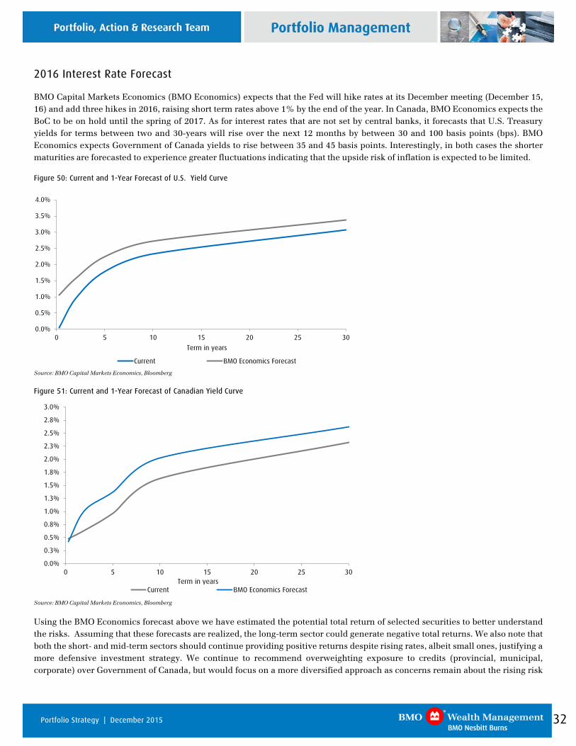
BMO Capital Markets Economics (BMO Economics) expects that the Fed will hike rates at its December meeting (December 15, 16) and add three hikes in 2016, raising short term rates above 1% by the end of the year. In Canada, BMO Economics expects the BoC to be on hold until the spring of 2017. As for interest rates that are not set by central banks, it forecasts that U.S. Treasury yields for terms between two and 30-years will rise over the next 12 months by between 30 and 100 basis points (bps). BMO Economics expects Government of Canada yields to rise between 35 and 45 basis points. Interestingly, in both cases the shorter maturities are forecasted to experience greater fluctuations indicating that the upside risk of inflation is expected to be limited.
Figure 50: Current and 1-Year Forecast of U.S. Yield Curve
0.0%
0.5%
1.0%
1.5%
2.0%
2.5%
3.0%
3.5%
4.0%
0 5 10 15 20 25 30
Term in years
Current BMO Economics Forecast
Source: BMO Capital Markets Economics, Bloomberg
Figure 51: Current and 1-Year Forecast of Canadian Yield Curve
0.0%
0.3%
0.5%
0.8%
1.0%
1.3%
1.5%
1.8%
2.0%
2.3%
2.5%
2.8%
3.0%
0 5 10 15 20 25 30Term in years
Current BMO Economics Forecast
Source: BMO Capital Markets Economics, Bloomberg
Using the BMO Economics forecast above we have estimated the potential total return of selected securities to better understand the risks. Assuming that these forecasts are realized, the long-term sector could generate negative total returns. We also note that both the short- and mid-term sectors should continue providing positive returns despite rising rates, albeit small ones, justifying a more defensive investment strategy. We continue to recommend overweighting exposure to credits (provincial, municipal, corporate) over Government of Canada, but would focus on a more diversified approach as concerns remain about the rising risk
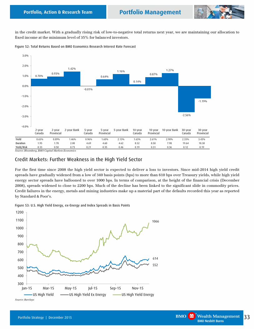
33 Portfolio Strategy | December 2015
in the credit market. With a gradually rising risk of low-to-negative total returns next year, we are maintaining our allocation to fixed income at the minimum level of 35% for balanced investors.
Figure 52: Total Returns Based on BMO Economics Research Interest Rate Forecast
Yield 0.65% 0.89% 1.46% 0.96% 1.60% 2.13% 1.63% 2.61% 2.90% 2.33% 3.43%
Duration 1.95 1.78 2.00 4.69 4.60 4.62 8.52 8.50 7.98 19.64 18.30
Yield/Risk 0.33 0.50 0.73 0.21 0.35 0.46 0.19 0.31 0.36 0.12 0.19
0.70%0.93%
1.42%
-0.01%
0.64%
1.16%
0.14%
0.87%1.27%
-2.56%
-1.19%
-4.0%
-3.0%
-2.0%
-1.0%
0.0%
1.0%
2.0%
3.0%
2-yearCanada
2-yearProvincial
2-year Bank 5-yearCanada
5-yearProvincial
5-year Bank 10-yearCanada
10-yearProvincial
10-year Bank 30-yearCanada
30-yearProvincial
Source: Bloomberg, BMO Capital Markets Economics
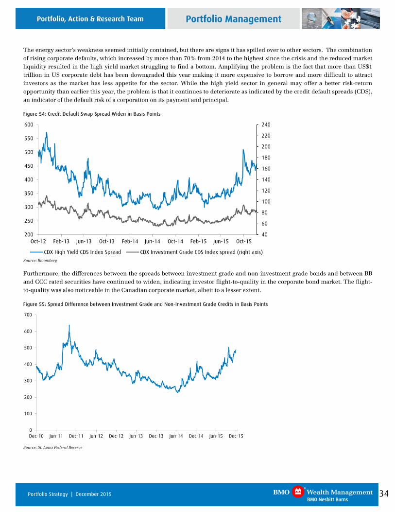
Credit Markets: Further Weakness in the High Yield Sector
For the first time since 2008 the high yield sector is expected to deliver a loss to investors. Since mid-2014 high yield credit spreads have gradually widened from a low of 340 basis points (bps) to more than 610 bps over Treasury yields, while high yield energy sector spreads have ballooned to over 1000 bps. In terms of comparison, at the height of the financial crisis (December 2008), spreads widened to close to 2200 bps. Much of the decline has been linked to the significant slide in commodity prices. Credit failures in the energy, metals and mining industries make up a material part of the defaults recorded this year as reported by Standard & Poor’s.
Figure 53: U.S. High Yield Energy, ex-Energy and Index Spreads in Basis Points
300
400
500
600
700
800
900
1000
1100
1200
Jan-15 Mar-15 May-15 Jul-15 Sep-15 Nov-15
US High Yield US High Yield Ex Energy US High Yield Energy
1066
614
552
Source: Barclays
34 Portfolio Strategy | December 2015
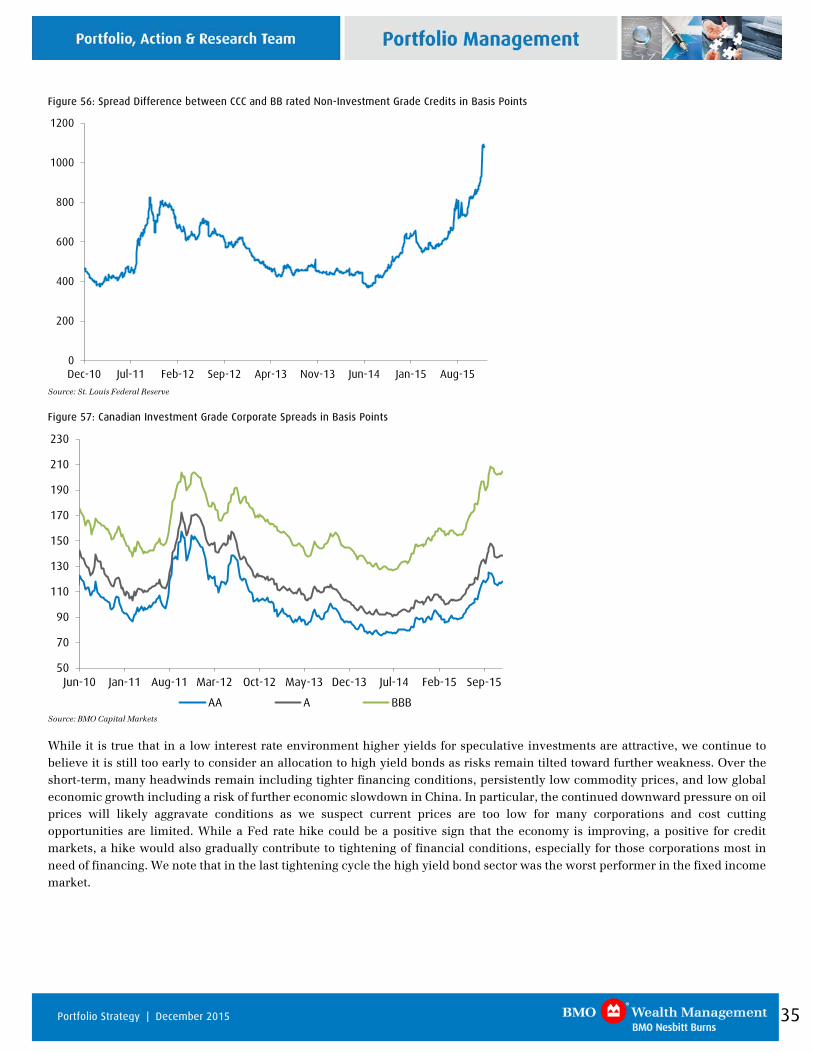
The energy sector’s weakness seemed initially contained, but there are signs it has spilled over to other sectors. The combination of rising corporate defaults, which increased by more than 70% from 2014 to the highest since the crisis and the reduced market liquidity resulted in the high yield market struggling to find a bottom. Amplifying the problem is the fact that more than US$1 trillion in US corporate debt has been downgraded this year making it more expensive to borrow and more difficult to attract investors as the market has less appetite for the sector. While the high yield sector in general may offer a better risk-return opportunity than earlier this year, the problem is that it continues to deteriorate as indicated by the credit default spreads (CDS), an indicator of the default risk of a corporation on its payment and principal.
Figure 54: Credit Default Swap Spread Widen in Basis Points
40
60
80
100
120
140
160
180
200
220
240
200
250
300
350
400
450
500
550
600
Oct-12 Feb-13 Jun-13 Oct-13 Feb-14 Jun-14 Oct-14 Feb-15 Jun-15 Oct-15
CDX High Yield CDS Index Spread CDX Investment Grade CDS Index spread (right axis)
Source: Bloomberg
Furthermore, the differences between the spreads between investment grade and non-investment grade bonds and between BB and CCC rated securities have continued to widen, indicating investor flight-to-quality in the corporate bond market. The flight-to-quality was also noticeable in the Canadian corporate market, albeit to a lesser extent.
Figure 55: Spread Difference between Investment Grade and Non-Investment Grade Credits in Basis Points
0
100
200
300
400
500
600
700
Dec-10 Jun-11 Dec-11 Jun-12 Dec-12 Jun-13 Dec-13 Jun-14 Dec-14 Jun-15 Dec-15
Source: St. Louis Federal Reserve
35 Portfolio Strategy | December 2015
Figure 56: Spread Difference between CCC and BB rated Non-Investment Grade Credits in Basis Points
0
200
400
600
800
1000
1200
Dec-10 Jul-11 Feb-12 Sep-12 Apr-13 Nov-13 Jun-14 Jan-15 Aug-15
Source: St. Louis Federal Reserve
Figure 57: Canadian Investment Grade Corporate Spreads in Basis Points
50
70
90
110
130
150
170
190
210
230
Jun-10 Jan-11 Aug-11 Mar-12 Oct-12 May-13 Dec-13 Jul-14 Feb-15 Sep-15
AA A BBB
Source: BMO Capital Markets
While it is true that in a low interest rate environment higher yields for speculative investments are attractive, we continue to believe it is still too early to consider an allocation to high yield bonds as risks remain tilted toward further weakness. Over the short-term, many headwinds remain including tighter financing conditions, persistently low commodity prices, and low global economic growth including a risk of further economic slowdown in China. In particular, the continued downward pressure on oil prices will likely aggravate conditions as we suspect current prices are too low for many corporations and cost cutting opportunities are limited. While a Fed rate hike could be a positive sign that the economy is improving, a positive for credit markets, a hike would also gradually contribute to tightening of financial conditions, especially for those corporations most in need of financing. We note that in the last tightening cycle the high yield bond sector was the worst performer in the fixed income market.
36 Portfolio Strategy | December 2015
Market Recap
North American bond markets turned in a mixed bag of performance in November. The Canadian bond market eked out a positive total return, while bonds in the U.S. lagged in negative territory. Expectations of a December rate increase by the Fed contributed to a steepening flattening of the Government of Canada yield curve with at the short-endterm rates increasing (under 3 years) while the middle to long end of the yield curve flattened somewhat, coming in 2 basis points (bps)and longer term rates remaining flat or falling a few basis points. The Canadian bond market, as represented by the FTSE TMX Canada Universe Bond Index, returned +0.10% for the month, taking the year-to-date total return to 2.36%. An abundance of supply was partly to blame for provincial spreads widening by an average of 4 bps in the month, giving back most of their gains from October.
The corporate sector benefited from a light new issue calendar and strong investor demand n November, outperforming the broad index by 0.35% and elevating its total return on a year to date basis to 2.10%. Spreads on average grinded in by 1 basis point and contributed to positive returns across all sub-sectors. In terms of sub-sector performance, Communication, Energy and Infrastructure were the best performers, while Real Estate and Securitization lagged the other sub-sectors.
Figure 58: FTSE-TMX Universe Bond Index Returns (For Period Ended November 30, 2015)
0.10%
0.36%
-0.08%
0.01%
0.02%
-0.43%
-0.79%
-0.39%
-0.19%
0.07%
2.36%
1.77%
3.62%
2.12%
0.60%
-1.50% -1.00% -0.50% 0.00% 0.50% 1.00% 1.50% 2.00% 2.50% 3.00% 3.50% 4.00%
Universe Bond Index
Long-Term Bond Index
Mid-Term Bond Index
Short-Term Bond Index
91 Day Treasury Bills
Year-to-date 3-Month Month-to-date
Source: FTSE TMX
The U.S. bond market, as measured by the Barclay’s Aggregate Index, fell 0.26% on the month, dragging down the year to date total return to 0.89%. The negative performance was spread across all term buckets as yields across the U.S. Treasury yield curve shifted higher.
Corporate bonds fell back into negative territory, dipping 22 bps on the month. Investors shied away from riskier non-investment grade corporates once again putting pressure on the high yield sub-sector. The Barclays U.S. Corporate High Yield Index fell sharply, realizing a -2.22% total return and plunging the year-to-date figure to -2.00%.

37 Portfolio Strategy | December 2015
General Disclosure
The information and opinions in this report were prepared by BMO Nesbitt Burns Inc. Portfolio, Action & Research Team (“BMO Nesbitt Burns”). This publication is protected by copyright laws. Views or opinions expressed herein may differ from the views and opinions expressed by BMO Capital Markets’ Research Department. No part of this publication or its contents may be copied, downloaded, stored in a retrieval system, further transmitted, or otherwise reproduced, stored, disseminated, transferred or used, in any form or by any means by any third parties, except with the prior written permission of BMO Nesbitt Burns. Any further disclosure or use, distribution, dissemination or copying of this publication, message or any attachment is strictly prohibited. If you have received this report in error, please notify the sender immediately and delete or destroy this report without reading, copying or forwarding. The opinions, estimates and projections contained in this report are those of BMO Nesbitt Burns as of the date of this report and are subject to change without notice. BMO Nesbitt Burns endeavours to ensure that the contents have been compiled or derived from sources that we believe are reliable and contain information and opinions that are accurate and complete. However, BMO Nesbitt Burns makes no representation or warranty, express or implied, in respect thereof, takes no responsibility for any errors and omissions contained herein and accepts no liability whatsoever for any loss arising from any use of, or reliance on, this report or its contents. Information may be available to BMO Nesbitt Burns or its affiliates that is not reflected in this report. This report is not to be construed as an offer to sell or solicitation of an offer to buy or sell any security. BMO Nesbitt Burns or its affiliates will buy from or sell to customers the securities of issuers mentioned in this report on a principal basis. BMO Nesbitt Burns, its affiliates, officers, directors or employees may have a long or short position in the securities discussed herein, related securities or in options, futures or other derivative instruments based thereon. BMO Nesbitt Burns or its affiliates may act as financial advisor and/or underwriter for the issuers mentioned herein and may receive remuneration for same. Bank of Montreal or its affiliates (“BMO”) has lending arrangements with, or provides other remunerated services to, many issuers covered by BMO Nesbitt Burns’ Portfolio, Action & Research Team. A significant lending relationship may exist between BMO and certain of the issuers mentioned herein. BMO Nesbitt Burns Inc. is a wholly owned subsidiary of Bank of Montreal. Dissemination of Reports: BMO Nesbitt Burns Portfolio, Action & Research Team’s reports are made widely available at the same time to all BMO Nesbitt Burns investment advisors. Additional Matters TO U.S. RESIDENTS: Any U.S. person wishing to effect transactions in any security discussed herein should do so through BMO Capital Markets Corp. (“BMO CM”) and/or BMO Nesbitt Burns Securities Ltd. (“BMO NBSL”) TO U.K. RESIDENTS: The contents hereof are intended solely for the use of, and may only be issued or passed onto, persons described in part VI of the Financial Services and Markets Act 2000 (Financial Promotion) Order 2001. BMO Wealth Management is the brand name for a business group consisting of Bank of Montreal and certain of its affiliates, including BMO Nesbitt Burns Inc., in providing wealth management products and services.
BMO Capital Markets is a Member-Canadian Investor Protection Fund and a Member of the Investment Industry Regulatory Organization of Canada.
BMO CM and BMO NBSL are Members of SIPC. ® BMO and the roundel symbol are registered trade-marks of Bank of Montreal, used under license. ® "Nesbitt Burns" is a registered trade-mark of BMO Nesbitt Burns Inc. If you are already a client of BMO Nesbitt Burns, please contact your investment Advisor for more information.
Company Specific Disclosures For Important Disclosures on the stocks discussed in this report, please go to: http://researchglobal.bmocapitalmarkets.com/Public/Company_Disclosure_Public.aspx
The authors of this report (or their household members) directly or beneficially own securities of this issuer: N/A
Ratings and Sector Key
BMO Capital Markets uses the following ratings system definitions:
OP = Outperform — Forecast to outperform the analyst’s coverage universe on a total return basis;
Mkt = Market Perform — Forecast to perform roughly in line with the analyst’s coverage universe on a total return basis;
Und = Underperform — Forecast to underperform the analyst’s coverage universe on a total return basis;
(S) = speculative investment;
NR = No rating at this time;
R = Restricted — Dissemination of research is currently restricted.
Prior BMO Capital Markets Rating System (January 4, 2010 – April 5, 2013):
http://researchglobal.bmocapitalmarkets.com/documents/2013/prior_rating_system.pdf
Other Important Disclosures For Other Important Disclosures on the stocks discussed in this report, please contact your BMO Nesbitt Burns Investment Advisor or go to http://researchglobal.bmocapitalmarkets.com/Public/Company_Disclosure_Public.aspx or write to Editorial Department, BMO Capital Markets, 3 Times Square, New York, NY 10036 or Editorial Department, BMO Capital Markets, 1 First Canadian Place, Toronto, Ontario, M5X 1H3.
Technical Analysis Disclaimer
Recommendations and opinions contained herein are based on Technical Analysis and do not necessarily reflect fundamental recommendations and opinions and may relate to companies which, in some instances, are not followed on a fundamental research basis.