Embed Size (px)
Citation preview
DESCRIBING DATA
Frequency Tables, Frequency
Distributions, and Graphic
Presentation
A raw data is the data obtained before
it is being processed or arranged.
Raw Data
2
A raw score is the score obtained by a
particular student in a particular test
before it is being processed or
arranged.
Example: Raw Score
3
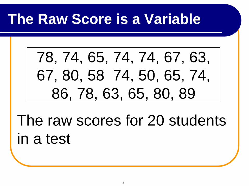
78, 74, 65, 74, 74, 67, 63,
67, 80, 58 74, 50, 65, 74,
86, 78, 63, 65, 80, 89
The raw scores for 20 students
in a test
The Raw Score is a Variable
4
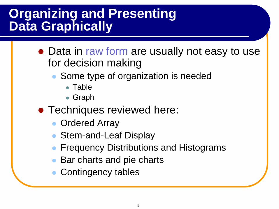
Data in raw form are usually not easy to use for decision making Some type of organization is needed
Table
Graph
Techniques reviewed here: Ordered Array
Stem-and-Leaf Display
Frequency Distributions and Histograms
Bar charts and pie charts
Contingency tables
Organizing and Presenting Data Graphically
5
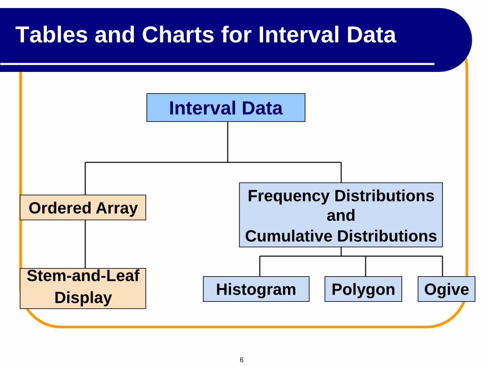
Interval Data
Ordered Array
Stem-and-Leaf
Display Histogram Polygon Ogive
Frequency Distributions
and
Cumulative Distributions
Tables and Charts for Interval Data
6
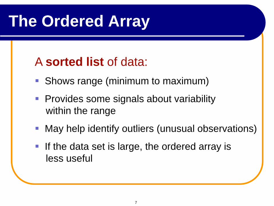
A sorted list of data:
Shows range (minimum to maximum)
Provides some signals about variability
within the range
May help identify outliers (unusual observations)
If the data set is large, the ordered array is
less useful
The Ordered Array
7
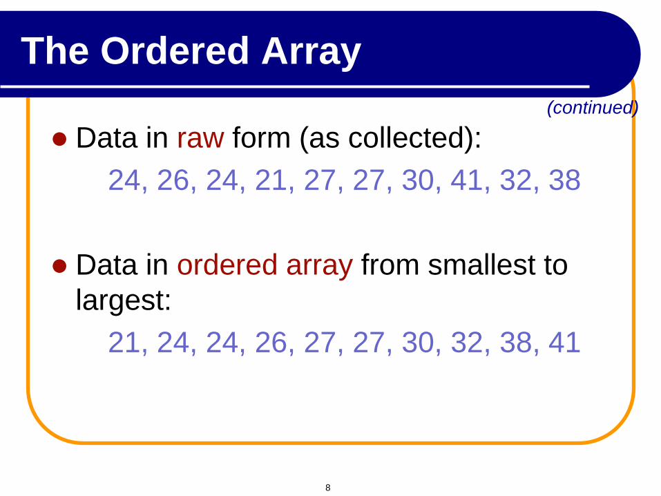
Data in raw form (as collected):
24, 26, 24, 21, 27, 27, 30, 41, 32, 38
Data in ordered array from smallest to
largest:
21, 24, 24, 26, 27, 27, 30, 32, 38, 41
(continued)
The Ordered Array
8
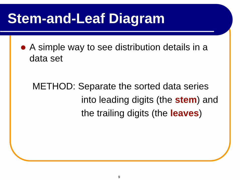
A simple way to see distribution details in a
data set
METHOD: Separate the sorted data series
into leading digits (the stem) and
the trailing digits (the leaves)
Stem-and-Leaf Diagram
9
Stem-and-Leaf
The major advantage to organizing the data into stem-and-leaf display is that we get a quick visual picture of the shape of the distribution.
Stem-and-leaf display is a statistical technique to present a set of data. Each numerical value is divided into two parts. The leading digit(s) becomes the stem and the trailing digit the leaf. The stems are located along the vertical axis, and the leaf values are stacked against each other along the horizontal axis.
Advantage of the stem-and-leaf display over a frequency distribution - the identity of each observation is not lost.
10
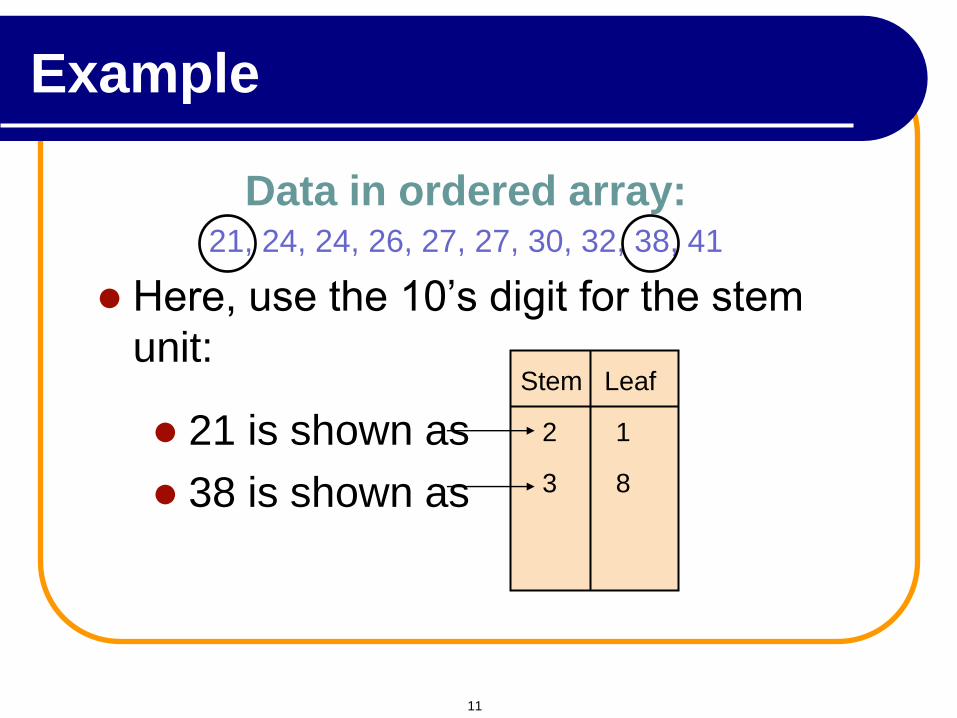
Here, use the 10’s digit for the stem
unit:
Data in ordered array: 21, 24, 24, 26, 27, 27, 30, 32, 38, 41
21 is shown as
38 is shown as
Stem Leaf
2 1
3 8
Example
11
Example
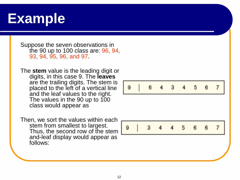
Suppose the seven observations in the 90 up to 100 class are: 96, 94, 93, 94, 95, 96, and 97.
The stem value is the leading digit or digits, in this case 9. The leaves are the trailing digits. The stem is placed to the left of a vertical line and the leaf values to the right. The values in the 90 up to 100 class would appear as
Then, we sort the values within each stem from smallest to largest. Thus, the second row of the stem-and-leaf display would appear as follows:
12
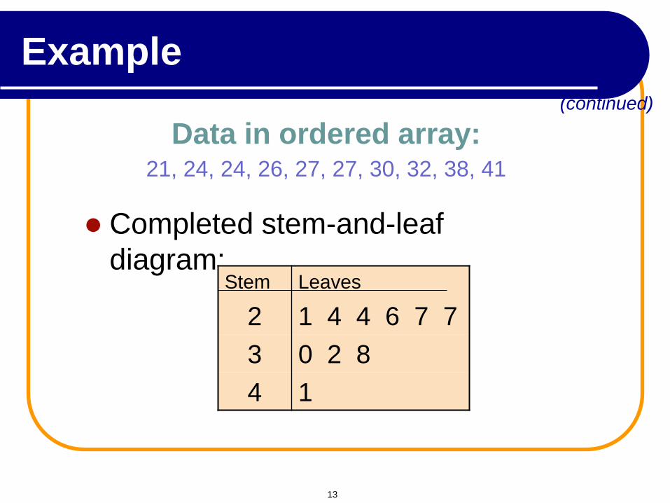
Completed stem-and-leaf
diagram: Stem Leaves
2 1 4 4 6 7 7
3 0 2 8
4 1
(continued)
Data in ordered array: 21, 24, 24, 26, 27, 27, 30, 32, 38, 41
Example
13
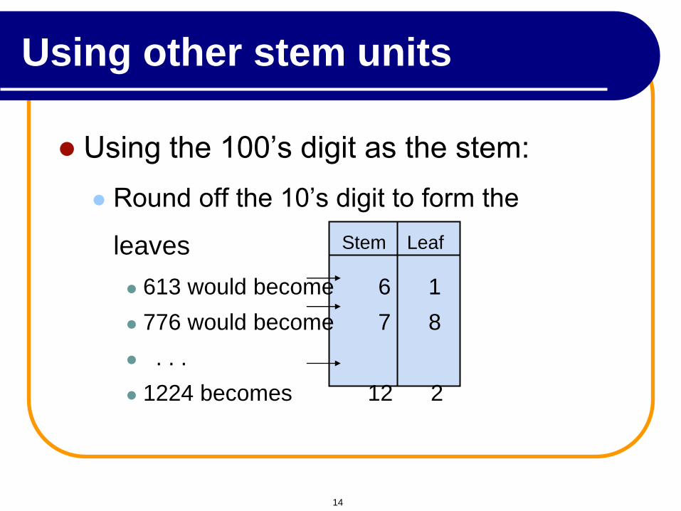
Using the 100’s digit as the stem:
Round off the 10’s digit to form the
leaves
613 would become 6 1
776 would become 7 8
. . .
1224 becomes 12 2
Stem Leaf
Using other stem units
14
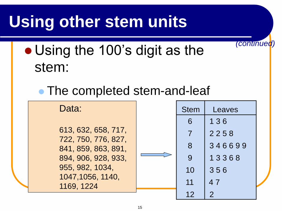
Using the 100’s digit as the
stem:
The completed stem-and-leaf
display:
Stem Leaves
(continued)
6 1 3 6
7 2 2 5 8
8 3 4 6 6 9 9
9 1 3 3 6 8
10 3 5 6
11 4 7
12 2
Data:
613, 632, 658, 717,
722, 750, 776, 827,
841, 859, 863, 891,
894, 906, 928, 933,
955, 982, 1034,
1047,1056, 1140,
1169, 1224
Using other stem units
15
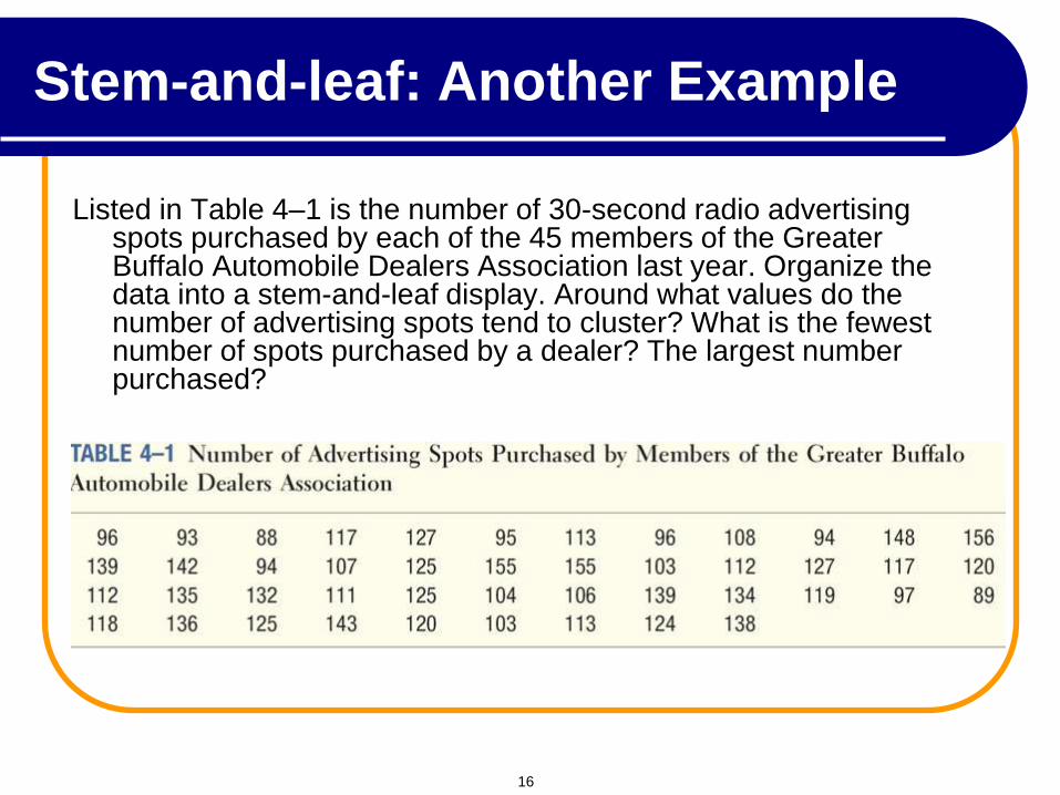
Stem-and-leaf: Another Example
Listed in Table 4–1 is the number of 30-second radio advertising spots purchased by each of the 45 members of the Greater Buffalo Automobile Dealers Association last year. Organize the data into a stem-and-leaf display. Around what values do the number of advertising spots tend to cluster? What is the fewest number of spots purchased by a dealer? The largest number purchased?
16
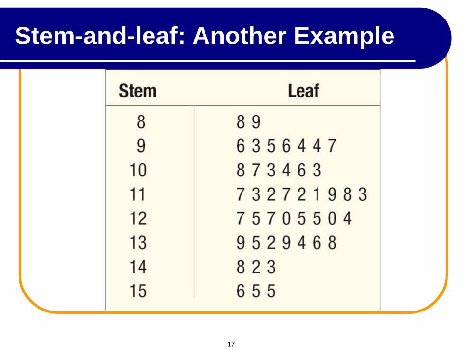
Stem-and-leaf: Another Example
17
What is a Frequency Distribution?
A frequency distribution is a list or a table …
containing class groupings (categories or ranges within which the data fall) ...
and the corresponding frequencies with which data fall within each grouping or category
Tabulating Numerical Data: Frequency Distributions
18
A frequency distribution is a way to
summarize data
The distribution condenses the raw data
into a more useful form...
and allows for a quick visual interpretation
of the data
Why Use Frequency
Distributions?
19
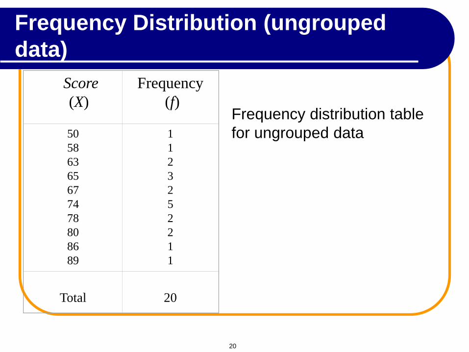
Score
(X)
Frequency
(f)
50
58
63
65
67
74
78
80
86
89
1
1
2
3
2
5
2
2
1
1
Total
20
Frequency distribution table
for ungrouped data
Frequency Distribution (ungrouped
data)
20
A Frequency
Distribution is a
grouping of data into
mutually exclusive
categories showing
the number of
observations in
each class.
Frequency Distribution (grouped
data)
21
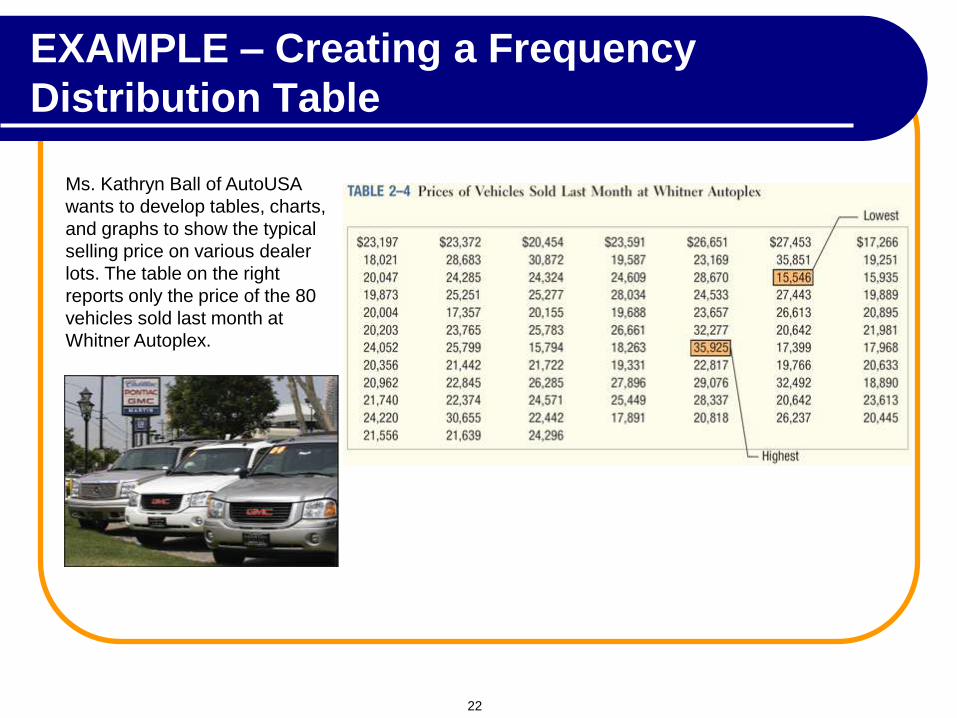
EXAMPLE – Creating a Frequency
Distribution Table
Ms. Kathryn Ball of AutoUSA
wants to develop tables, charts,
and graphs to show the typical
selling price on various dealer
lots. The table on the right
reports only the price of the 80
vehicles sold last month at
Whitner Autoplex.
22
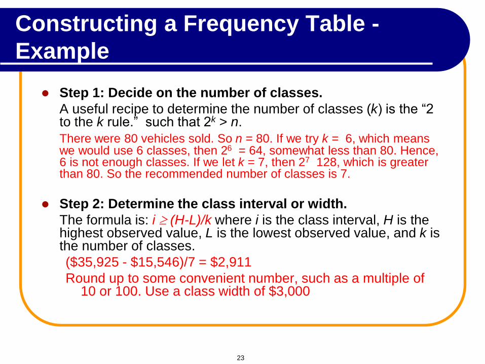
Constructing a Frequency Table -
Example
Step 1: Decide on the number of classes.
A useful recipe to determine the number of classes (k) is the “2 to the k rule.” such that 2k > n.
There were 80 vehicles sold. So n = 80. If we try k = 6, which means we would use 6 classes, then 26 = 64, somewhat less than 80. Hence, 6 is not enough classes. If we let k = 7, then 27 128, which is greater than 80. So the recommended number of classes is 7.
Step 2: Determine the class interval or width.
The formula is: i (H-L)/k where i is the class interval, H is the highest observed value, L is the lowest observed value, and k is the number of classes.
($35,925 - $15,546)/7 = $2,911
Round up to some convenient number, such as a multiple of 10 or 100. Use a class width of $3,000
23
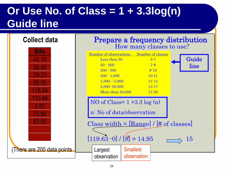
Largest
observation
Collect data
Bills
42.19
38.45
29.23
89.35
118.04
110.46
0.00
72.88
83.05
.
.
(There are 200 data points
Prepare a frequency distribution How many classes to use?
Number of observations Number of classes
Less then 50 5-7
50 - 200 7-9
200 - 500 9-10
500 - 1,000 10-11
1,000 – 5,000 11-13
5,000- 50,000 13-17
More than 50,000 17-20
Class width = [Range] / [# of classes]
[119.63 -0] / [8] = 14.95 15
Largest
observation Largest
observation
Smallest
observation Smallest
observation Smallest
observation
Smallest
observation Largest
observation
NO of Class= 1 +3.3 log (n)
n: No of data/observation
Guide
line
Or Use No. of Class = 1 + 3.3log(n)
Guide line
24
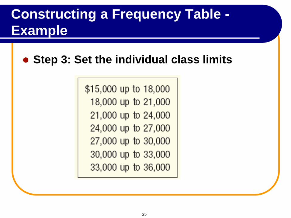
Step 3: Set the individual class limits
Constructing a Frequency Table -
Example
25
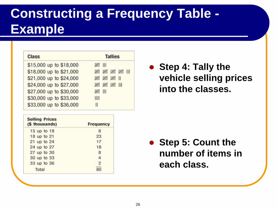
Step 4: Tally the
vehicle selling prices
into the classes.
Step 5: Count the
number of items in
each class.
Constructing a Frequency Table -
Example
26
Frequency Distribution –
Characteristics
Class midpoint: A point that divides a class into
two equal parts. This is the average of the
upper and lower class limits.
Class frequency: The number of observations
in each class.
Class interval: The class interval is obtained by
subtracting the lower limit of a class from the
lower limit of the next class.
27
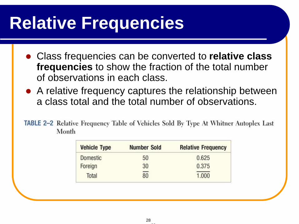
Relative Frequencies
Class frequencies can be converted to relative class frequencies to show the fraction of the total number of observations in each class.
A relative frequency captures the relationship between a class total and the total number of observations.
28
28
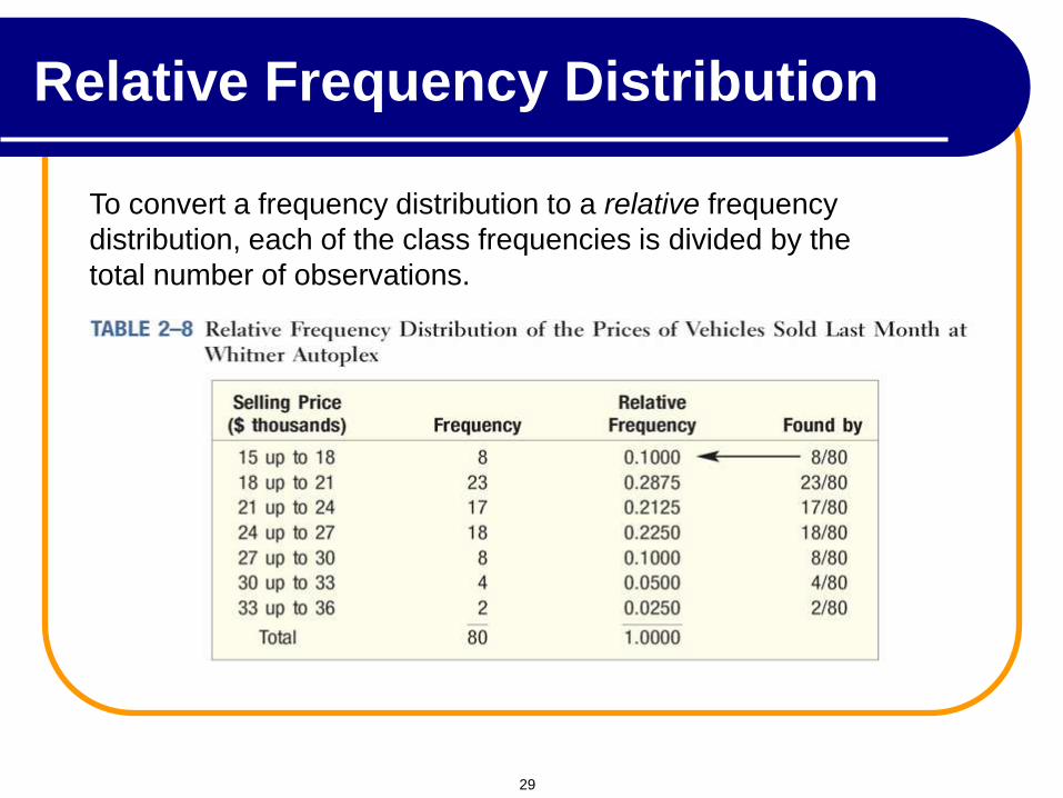
Relative Frequency Distribution
To convert a frequency distribution to a relative frequency
distribution, each of the class frequencies is divided by the
total number of observations.
29
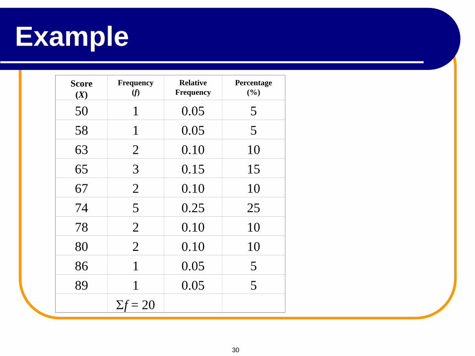
Score
(X)
Frequency
(f)
Relative
Frequency
Percentage
(%)
50
1
0.05
5
58
1
0.05
5
63
2
0.10
10
65
3
0.15
15
67
2
0.10
10
74
5
0.25
25
78
2
0.10
10
80
2
0.10
10
86
1
0.05
5
89
1
0.05
5
f = 20
Example
30
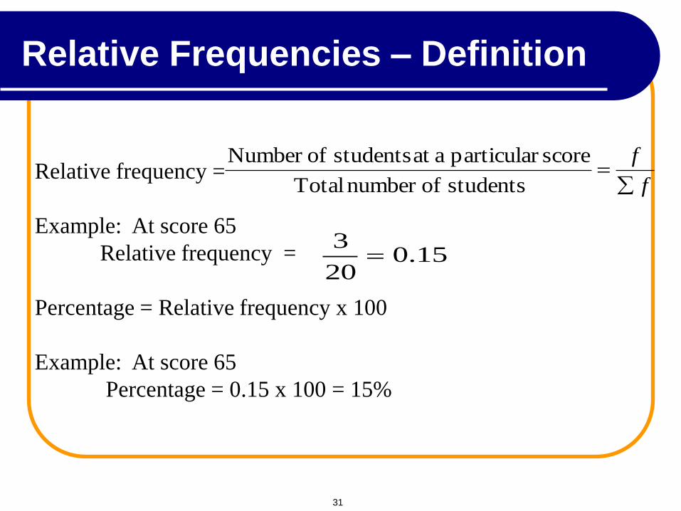
Relative frequency =
Example: At score 65
Relative frequency =
Percentage = Relative frequency x 100
Example: At score 65
Percentage = 0.15 x 100 = 15%
f
f
students ofnumber Total
score particular aat students ofNumber
15.020
3
Relative Frequencies – Definition
31
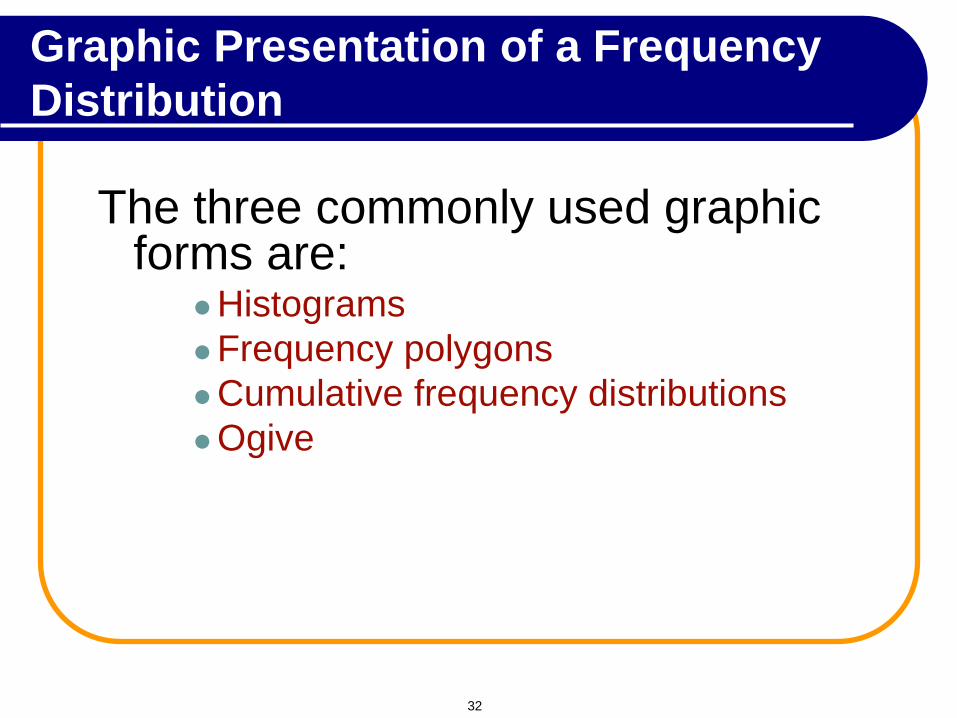
The three commonly used graphic forms are:
Histograms
Frequency polygons
Cumulative frequency distributions
Ogive
Graphic Presentation of a Frequency
Distribution
32
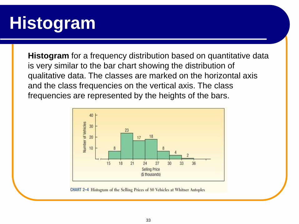
Histogram for a frequency distribution based on quantitative data
is very similar to the bar chart showing the distribution of
qualitative data. The classes are marked on the horizontal axis
and the class frequencies on the vertical axis. The class
frequencies are represented by the heights of the bars.
Histogram
33
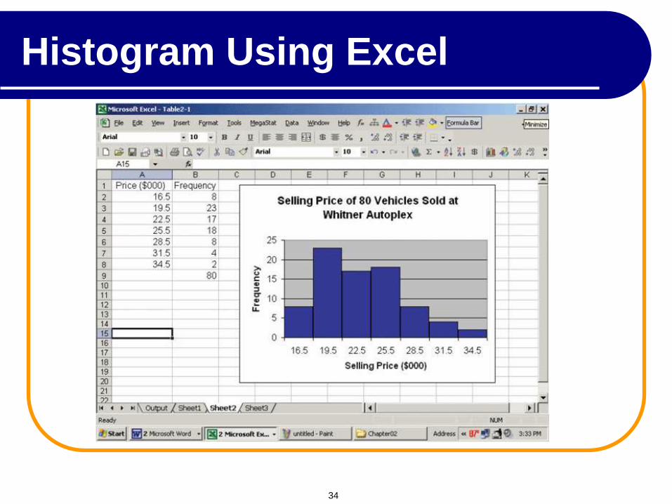
Histogram Using Excel
34
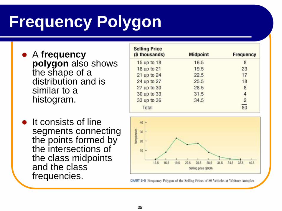
Frequency Polygon
A frequency polygon also shows the shape of a distribution and is similar to a histogram.
It consists of line segments connecting the points formed by the intersections of the class midpoints and the class frequencies.
35
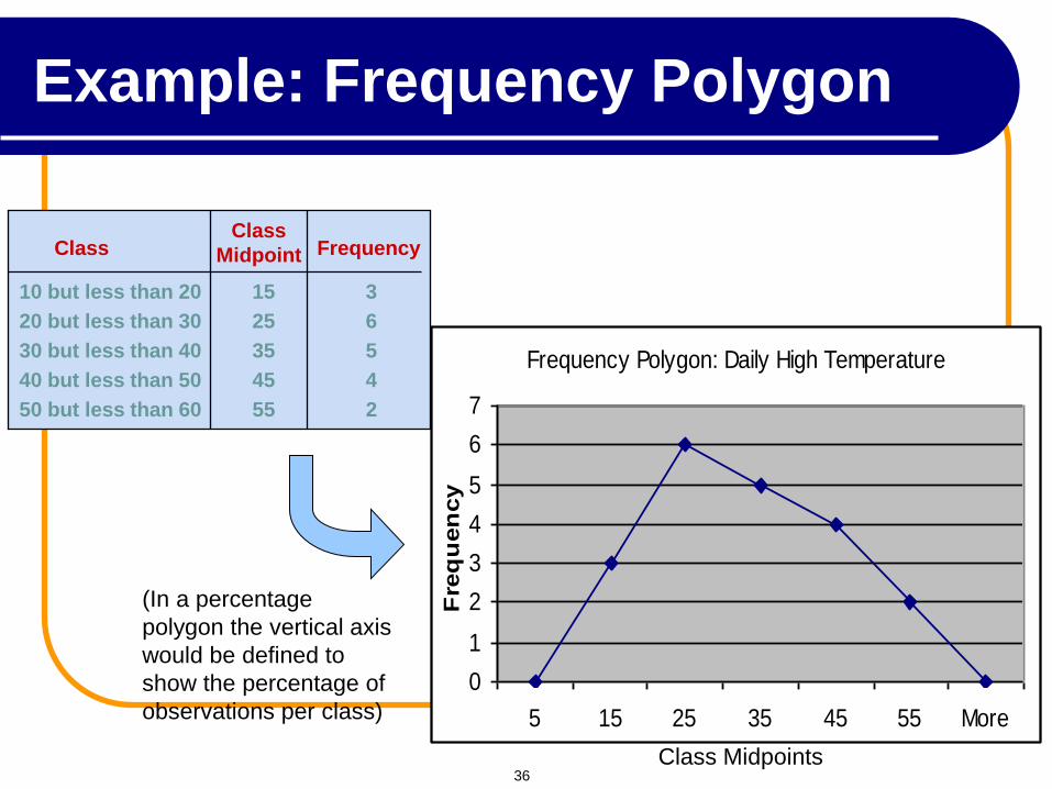
Frequency Polygon: Daily High Temperature
0
1
2
3
4
5
6
7
5 15 25 35 45 55 More
Fre
qu
en
cy
Class Midpoints
Class
10 but less than 20 15 3
20 but less than 30 25 6
30 but less than 40 35 5
40 but less than 50 45 4
50 but less than 60 55 2
Frequency Class
Midpoint
(In a percentage
polygon the vertical axis
would be defined to
show the percentage of
observations per class)
Example: Frequency Polygon
36
0
1
2
3
4
5
6
1 2 3 4 5 6 7 8 9 10
Skor
Kekera
pan
0
1
2
3
4
5
6
1 2 3 4 5 6 7 8 9 10
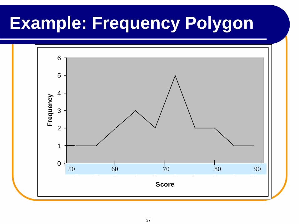
Score
Fre
qu
en
cy
50 60 70 80 90
Example: Frequency Polygon
37
0.00
0.05
0.10
0.15
0.20
0.25
0.30
1 2 3 4 5 6 7 8 9 10
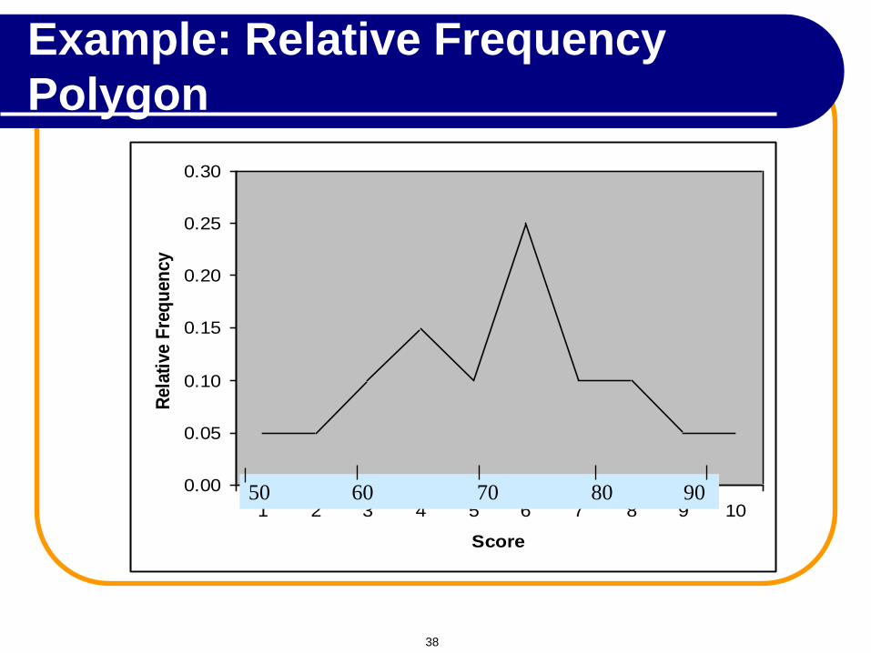
Score
Rela
tive F
req
uen
cy
50 60 70 80 90
Example: Relative Frequency
Polygon
38
0
5
10
15
20
25
30
1 2 3 4 5 6 7 8 9 10 11
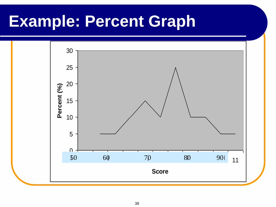
Score
Perc
en
t (%
)
50 60 70 80 90
Example: Percent Graph
39
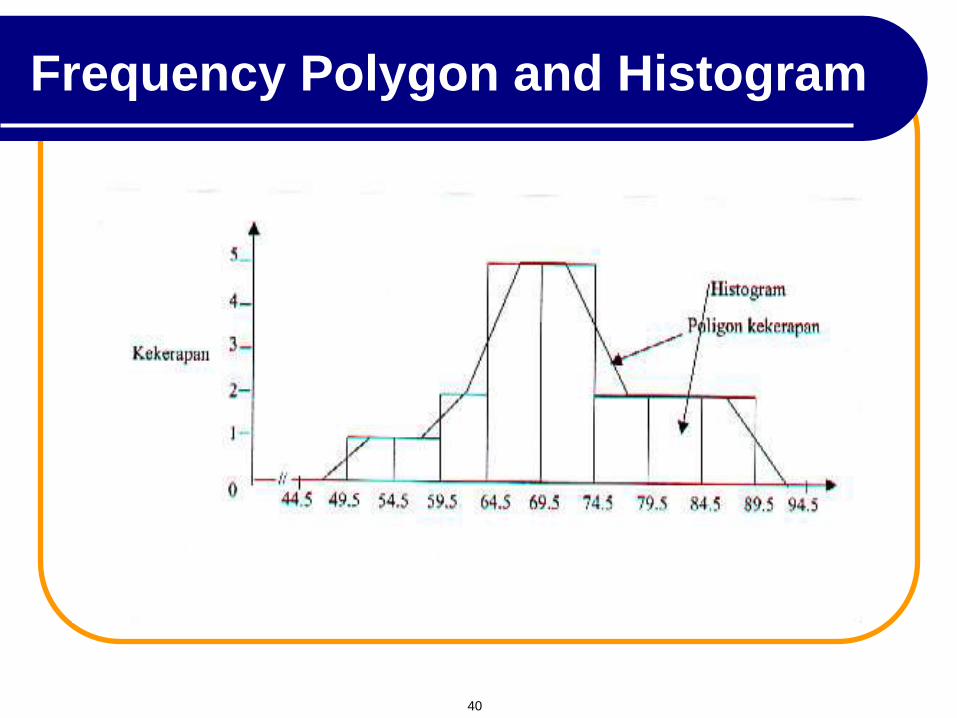
Frequency Polygon and Histogram
40
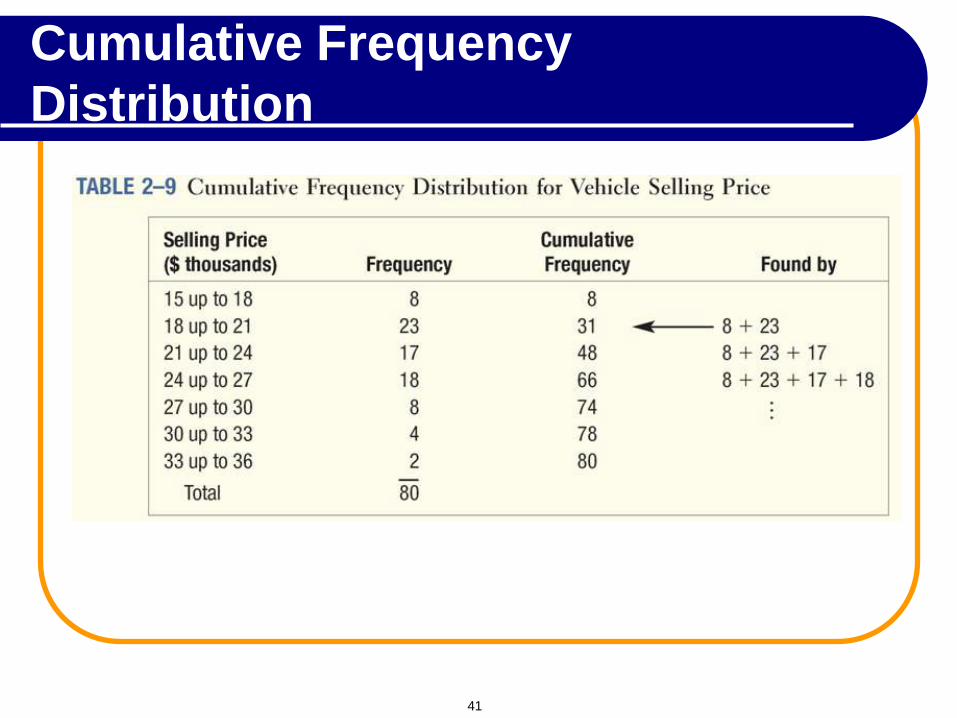
Cumulative Frequency
Distribution
41
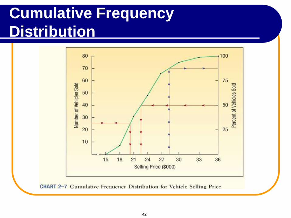
Cumulative Frequency
Distribution
42
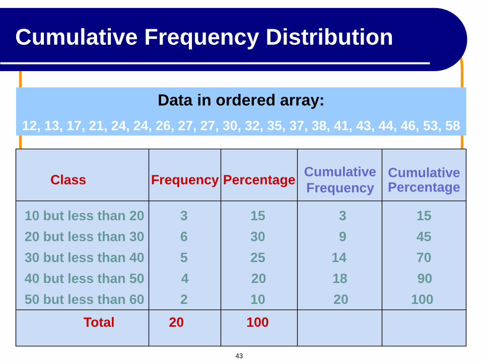
Class
10 but less than 20 3 15 3 15
20 but less than 30 6 30 9 45
30 but less than 40 5 25 14 70
40 but less than 50 4 20 18 90
50 but less than 60 2 10 20 100
Total 20 100
Percentage Cumulative Percentage
Data in ordered array:
12, 13, 17, 21, 24, 24, 26, 27, 27, 30, 32, 35, 37, 38, 41, 43, 44, 46, 53, 58
Frequency Cumulative
Frequency
Cumulative Frequency Distribution
43
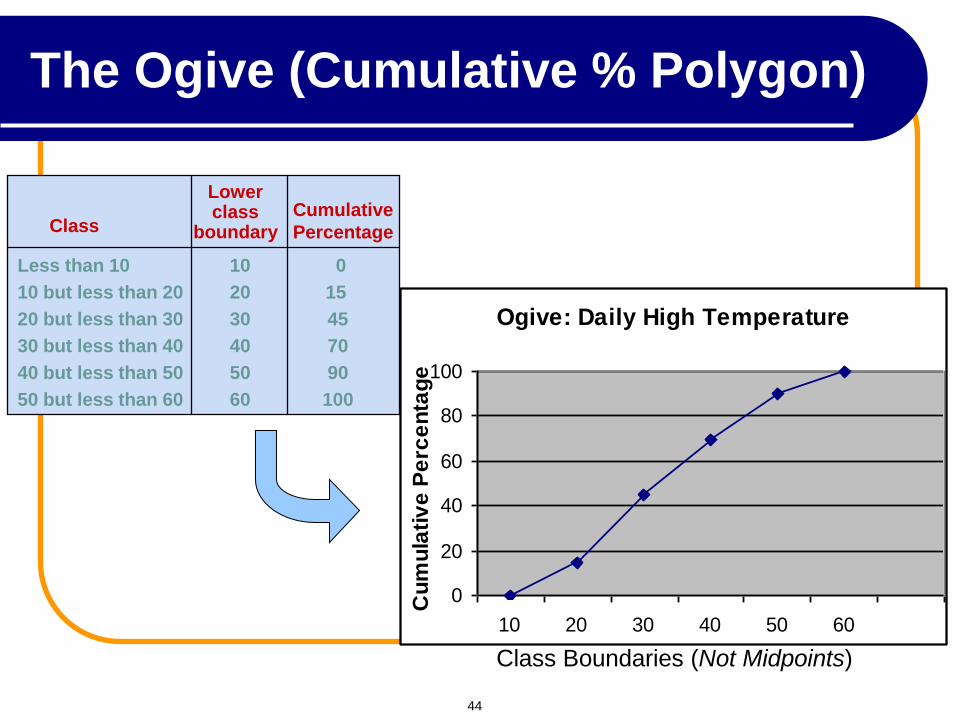
Ogive: Daily High Temperature
0
20
40
60
80
100
10 20 30 40 50 60
Cu
mu
lati
ve
Pe
rce
nta
ge
Class Boundaries (Not Midpoints)
Class
Less than 10 10 0
10 but less than 20 20 15
20 but less than 30 30 45
30 but less than 40 40 70
40 but less than 50 50 90
50 but less than 60 60 100
Cumulative
Percentage
Lower class
boundary
The Ogive (Cumulative % Polygon)
44
Score
(X)
Frequency
(f)
Cumulative
Frequency (cf)
Cumulative Relative
Frequency (crf)
Cumulative
Percent (cp)
50
1
1
0.05
5
58
1
2
0.10
10
63
2
4
0.20
20
65
3
7
0.35
35
67
2 9
0.45
45
74
5
14
0.70
70
78
2
16
0.80
80
80
2
18
0.90
90
86
1
19
0.95
95
89
1
20
1.00
100
f = 20
Cumulative Relative Frequency
Distribution
45
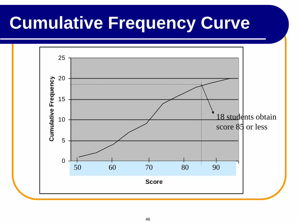
0
5
10
15
20
25
1 2 3 4 5 6 7 8 9 10
Score
Cu
mu
lati
ve
Fre
qu
en
cy
18 students obtain
score 85 or less
50 60 70 80 90
Cumulative Frequency Curve
46
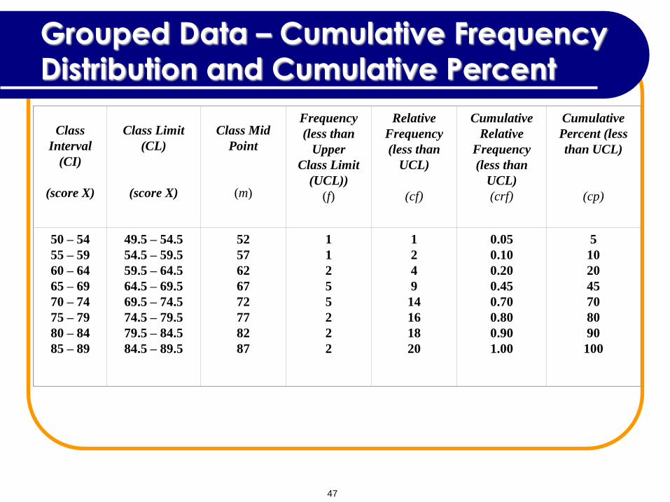
Grouped Data – Cumulative Frequency
Distribution and Cumulative Percent
Class
Interval
(CI)
(score X)
Class Limit
(CL)
(score X)
Class Mid
Point
(m)
Frequency
(less than
Upper
Class Limit
(UCL))
(f)
Relative
Frequency
(less than
UCL)
(cf)
Cumulative
Relative
Frequency
(less than
UCL)
(crf)
Cumulative
Percent (less
than UCL)
(cp)
50 – 54
55 – 59
60 – 64
65 – 69
70 – 74
75 – 79
80 – 84
85 – 89
49.5 – 54.5
54.5 – 59.5
59.5 – 64.5
64.5 – 69.5
69.5 – 74.5
74.5 – 79.5
79.5 – 84.5
84.5 – 89.5
52
57
62
67
72
77
82
87
1
1
2
5
5
2
2
2
1
2
4
9
14
16
18
20
0.05
0.10
0.20
0.45
0.70
0.80
0.90
1.00
5
10
20
45
70
80
90
100
47
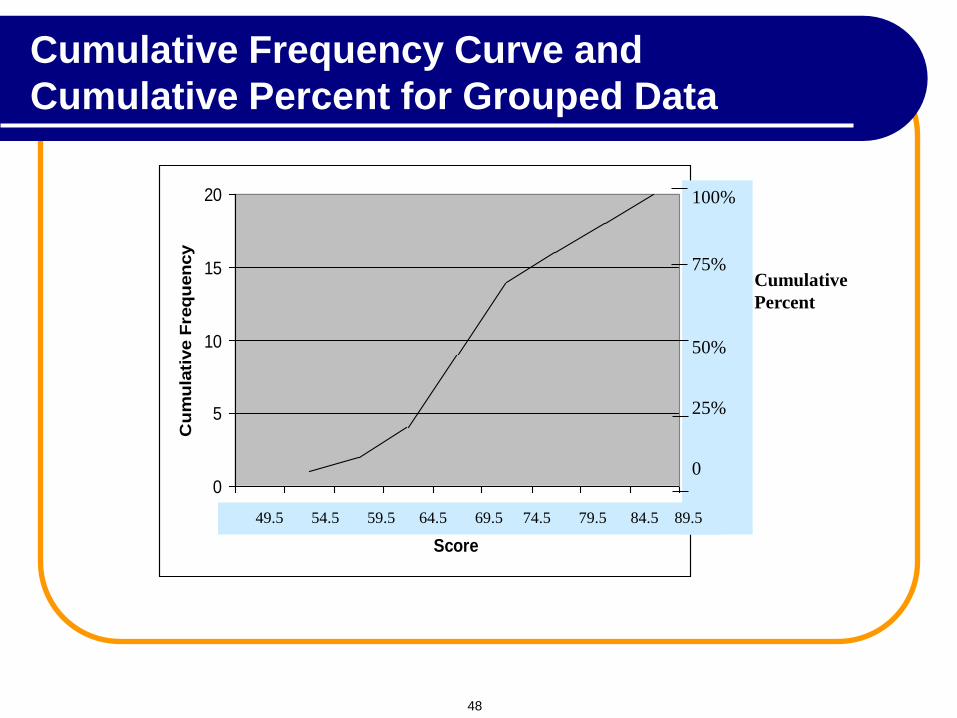
0
5
10
15
20
1 2 3 4 5 6 7 8 9
Score
Cu
mu
lati
ve F
req
uen
cy
100%
75%
50%
25%
0
Cumulative
Percent
49.5 54.5 59.5 64.5 69.5 74.5 79.5 84.5 89.5
Cumulative Frequency Curve and
Cumulative Percent for Grouped Data
48
Ogive
49
Orgive is a smooth cumulative frequency curve.
The curve moves from the left and increases
smoothly to the right.
The smooth increase is called monotonic.
OGIVE
Ogive
50
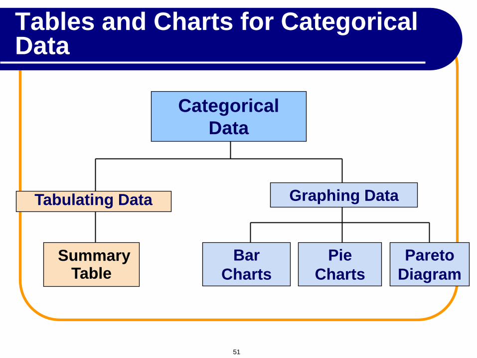
Categorical
Data
Graphing Data
Pie
Charts
Pareto
Diagram
Bar
Charts
Tabulating Data
Summary Table
Tables and Charts for Categorical Data
51
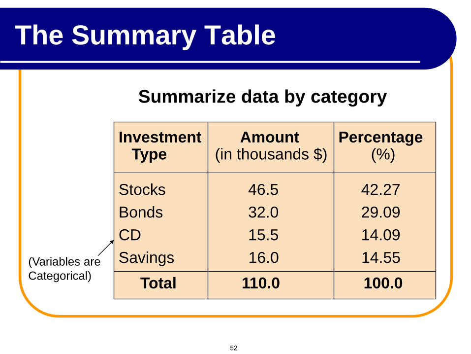
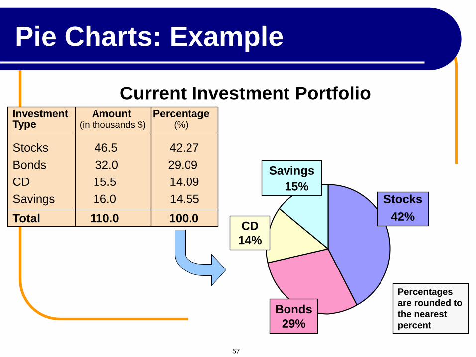
Investment Amount Percentage Type (in thousands $) (%) Stocks 46.5 42.27 Bonds 32.0 29.09 CD 15.5 14.09 Savings 16.0 14.55 Total 110.0 100.0
(Variables are
Categorical)
Summarize data by category
The Summary Table
52
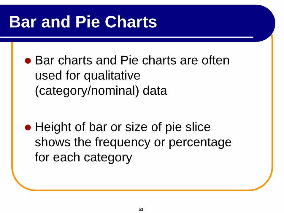
Bar charts and Pie charts are often
used for qualitative
(category/nominal) data
Height of bar or size of pie slice
shows the frequency or percentage
for each category
Bar and Pie Charts
53
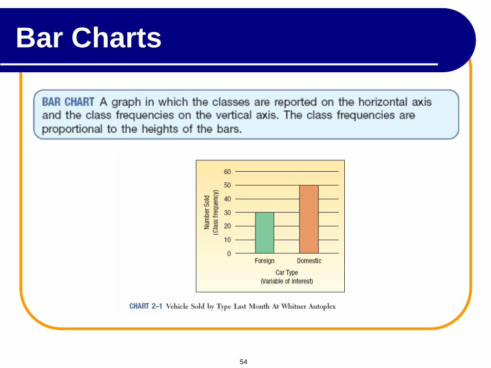
Bar Charts
54
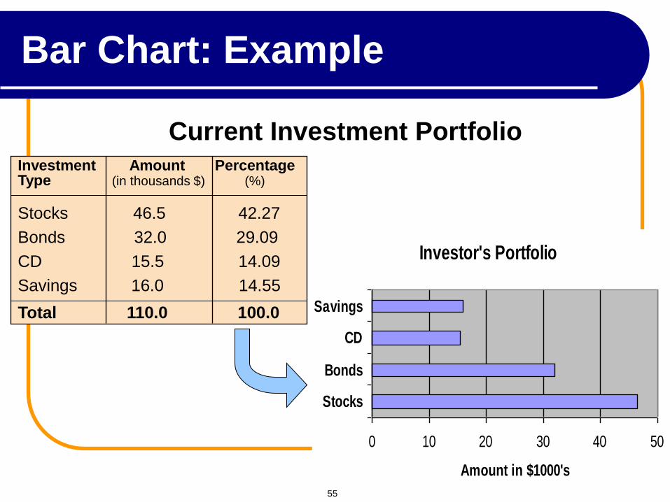
Bar Chart: Example
Investor's Portfolio
0 10 20 30 40 50
Stocks
Bonds
CD
Savings
Amount in $1000's
Investment Amount Percentage Type (in thousands $) (%) Stocks 46.5 42.27 Bonds 32.0 29.09 CD 15.5 14.09 Savings 16.0 14.55 Total 110.0 100.0
Current Investment Portfolio
55
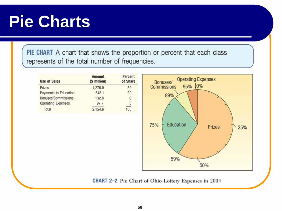
Pie Charts
56
Percentages
are rounded to
the nearest
percent
Current Investment Portfolio
Savings
15%
CD
14%
Bonds
29%
Stocks
42%
Investment Amount Percentage Type (in thousands $) (%) Stocks 46.5 42.27 Bonds 32.0 29.09 CD 15.5 14.09 Savings 16.0 14.55 Total 110.0 100.0
Pie Charts: Example
57
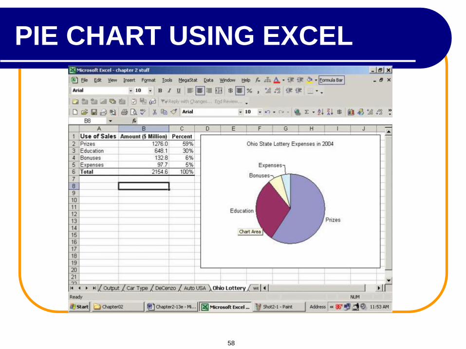
PIE CHART USING EXCEL
58
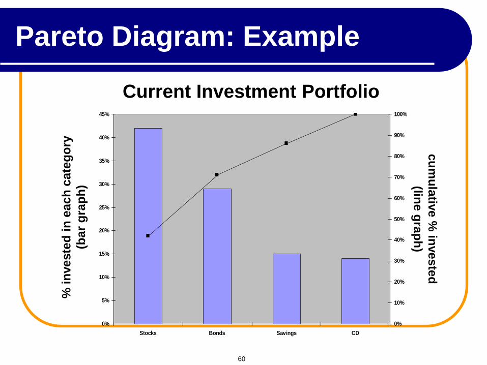
Pareto Diagram
Used to portray categorical data
A bar chart, where categories are shown in
descending order of frequency
A cumulative polygon is often shown in the
same graph
Used to separate the “vital few” from the “trivial
many”
59
cu
mu
lativ
e %
investe
d
(line g
rap
h)
% i
nveste
d i
n e
ach
cate
go
ry
(bar
gra
ph
)
0%
5%
10%
15%
20%
25%
30%
35%
40%
45%
Stocks Bonds Savings CD
0%
10%
20%
30%
40%
50%
60%
70%
80%
90%
100%
Current Investment Portfolio
Pareto Diagram: Example
60
Contingency Tables
A scatter diagram requires that both of the
variables be at least interval scale.
What if we wish to study the relationship
between two variables when one or both are
nominal or ordinal scale? In this case we tally
the results in a contingency table.
61
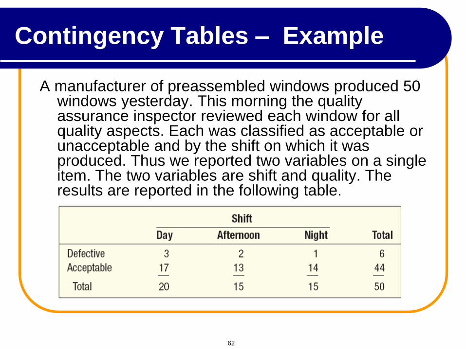
Contingency Tables – Example
A manufacturer of preassembled windows produced 50 windows yesterday. This morning the quality assurance inspector reviewed each window for all quality aspects. Each was classified as acceptable or unacceptable and by the shift on which it was produced. Thus we reported two variables on a single item. The two variables are shift and quality. The results are reported in the following table.
62
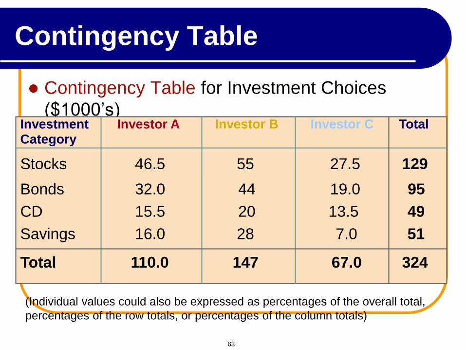
Contingency Table for Investment Choices
($1000’s) Investment Investor A Investor B Investor C Total Category
Stocks 46.5 55 27.5 129 Bonds 32.0 44 19.0 95 CD 15.5 20 13.5 49 Savings 16.0 28 7.0 51 Total 110.0 147 67.0 324
(Individual values could also be expressed as percentages of the overall total,
percentages of the row totals, or percentages of the column totals)
Contingency Table
63
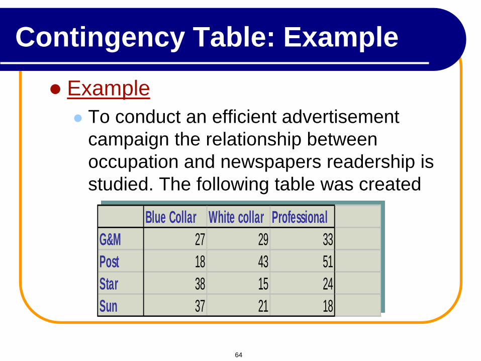
Example
To conduct an efficient advertisement
campaign the relationship between
occupation and newspapers readership is
studied. The following table was created
Blue Collar White collar Professional
G&M 27 29 33
Post 18 43 51
Star 38 15 24
Sun 37 21 18
Contingency Table: Example
64
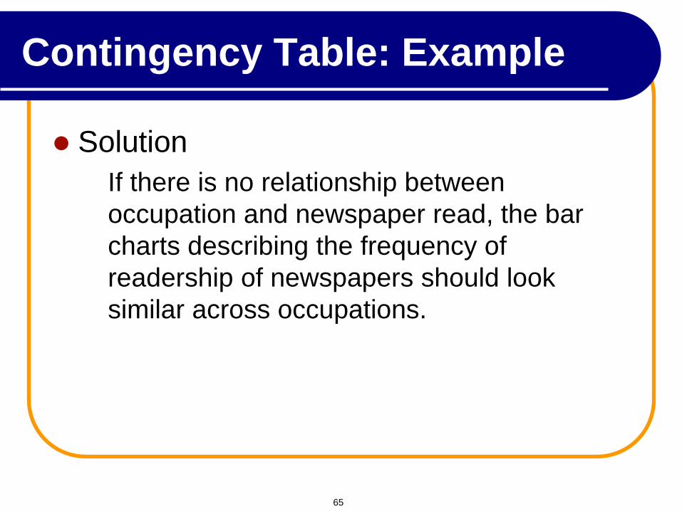
Solution
If there is no relationship between
occupation and newspaper read, the bar
charts describing the frequency of
readership of newspapers should look
similar across occupations.
Contingency Table: Example
65
Blue
0
10
20
30
40
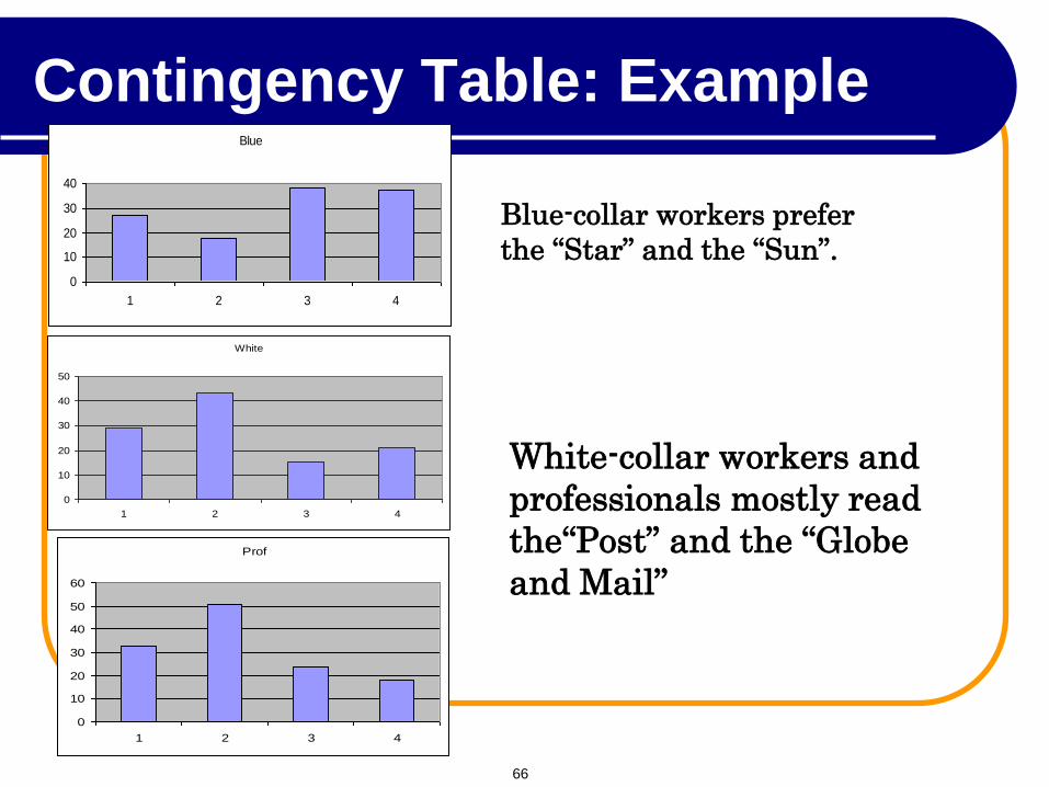
1 2 3 4
Blue-collar workers prefer
the “Star” and the “Sun”.
White-collar workers and
professionals mostly read
the“Post” and the “Globe
and Mail”
White
0
10
20
30
40
50
1 2 3 4
Prof
0
10
20
30
40
50
60
1 2 3 4
Contingency Table: Example
66
We create a contingency table.
This table lists the frequency for each
combination of values of the two
variables.
We can create a bar chart that
represent the frequency of occurrence
of each combination of values.
Graphing the Relationship Between
Two Nominal Variables
67
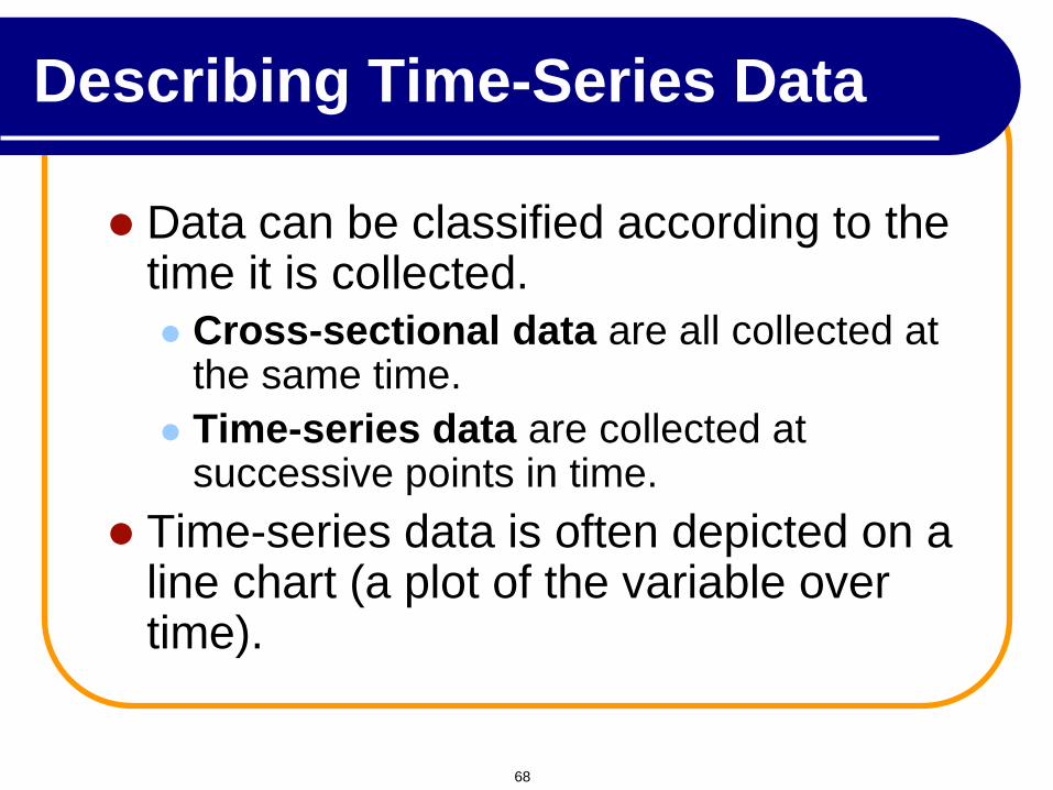
Data can be classified according to the time it is collected.
Cross-sectional data are all collected at the same time.
Time-series data are collected at successive points in time.
Time-series data is often depicted on a line chart (a plot of the variable over time).
Describing Time-Series Data
68
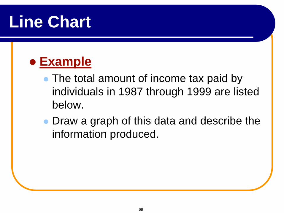
Example
The total amount of income tax paid by
individuals in 1987 through 1999 are listed
below.
Draw a graph of this data and describe the
information produced.
Line Chart
69
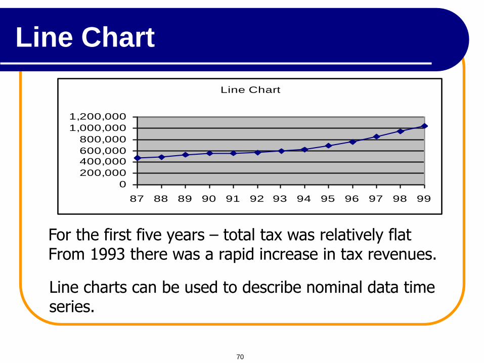
Line Chart
0
200,000
400,000600,000
800,000
1,000,000
1,200,000
87 88 89 90 91 92 93 94 95 96 97 98 99
For the first five years – total tax was relatively flat From 1993 there was a rapid increase in tax revenues.
Line charts can be used to describe nominal data time series.
Line Chart
70
Present data in a way that provides substance, statistics and design
Communicate complex ideas with clarity, precision and efficiency
Give the largest number of ideas in the most efficient manner
Excellence almost always involves several dimensions
Tell the truth about the data
Principles of Graphical Excellence
71
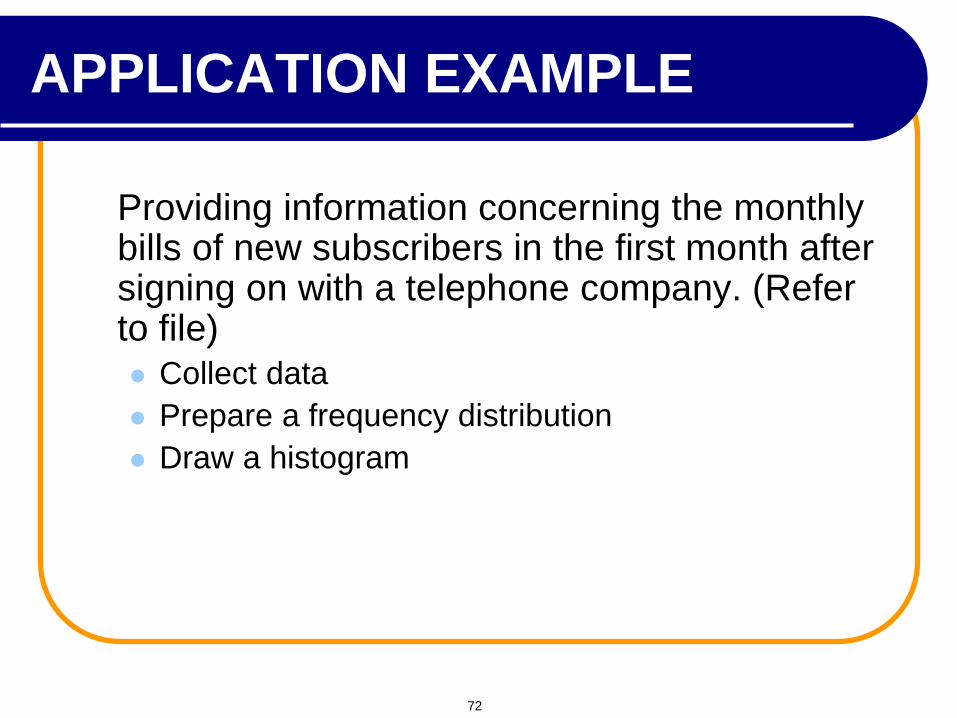
Providing information concerning the monthly bills of new subscribers in the first month after signing on with a telephone company. (Refer to file) Collect data
Prepare a frequency distribution
Draw a histogram
APPLICATION EXAMPLE
72
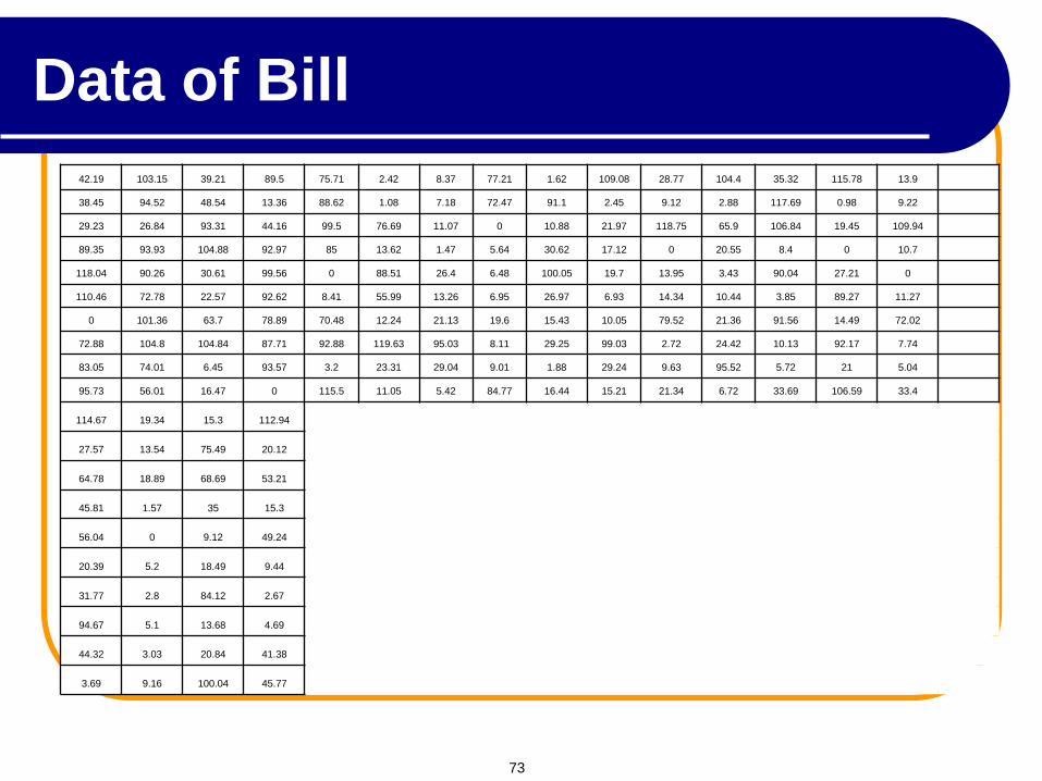
42.19 103.15 39.21 89.5 75.71 2.42 8.37 77.21 1.62 109.08 28.77 104.4 35.32 115.78 13.9 6.95
38.45 94.52 48.54 13.36 88.62 1.08 7.18 72.47 91.1 2.45 9.12 2.88 117.69 0.98 9.22 6.48
29.23 26.84 93.31 44.16 99.5 76.69 11.07 0 10.88 21.97 118.75 65.9 106.84 19.45 109.94 11.64
89.35 93.93 104.88 92.97 85 13.62 1.47 5.64 30.62 17.12 0 20.55 8.4 0 10.7 83.26
118.04 90.26 30.61 99.56 0 88.51 26.4 6.48 100.05 19.7 13.95 3.43 90.04 27.21 0 15.42
110.46 72.78 22.57 92.62 8.41 55.99 13.26 6.95 26.97 6.93 14.34 10.44 3.85 89.27 11.27 24.49
0 101.36 63.7 78.89 70.48 12.24 21.13 19.6 15.43 10.05 79.52 21.36 91.56 14.49 72.02 89.13
72.88 104.8 104.84 87.71 92.88 119.63 95.03 8.11 29.25 99.03 2.72 24.42 10.13 92.17 7.74 111.14
83.05 74.01 6.45 93.57 3.2 23.31 29.04 9.01 1.88 29.24 9.63 95.52 5.72 21 5.04 92.64
95.73 56.01 16.47 0 115.5 11.05 5.42 84.77 16.44 15.21 21.34 6.72 33.69 106.59 33.4 53.9
114.67 19.34 15.3 112.94
27.57 13.54 75.49 20.12
64.78 18.89 68.69 53.21
45.81 1.57 35 15.3
56.04 0 9.12 49.24
20.39 5.2 18.49 9.44
31.77 2.8 84.12 2.67
94.67 5.1 13.68 4.69
44.32 3.03 20.84 41.38
3.69 9.16 100.04 45.77
Data of Bill
73
Largest
observation
Collect data
Bills
42.19
38.45
29.23
89.35
118.04
110.46
0.00
72.88
83.05
.
.
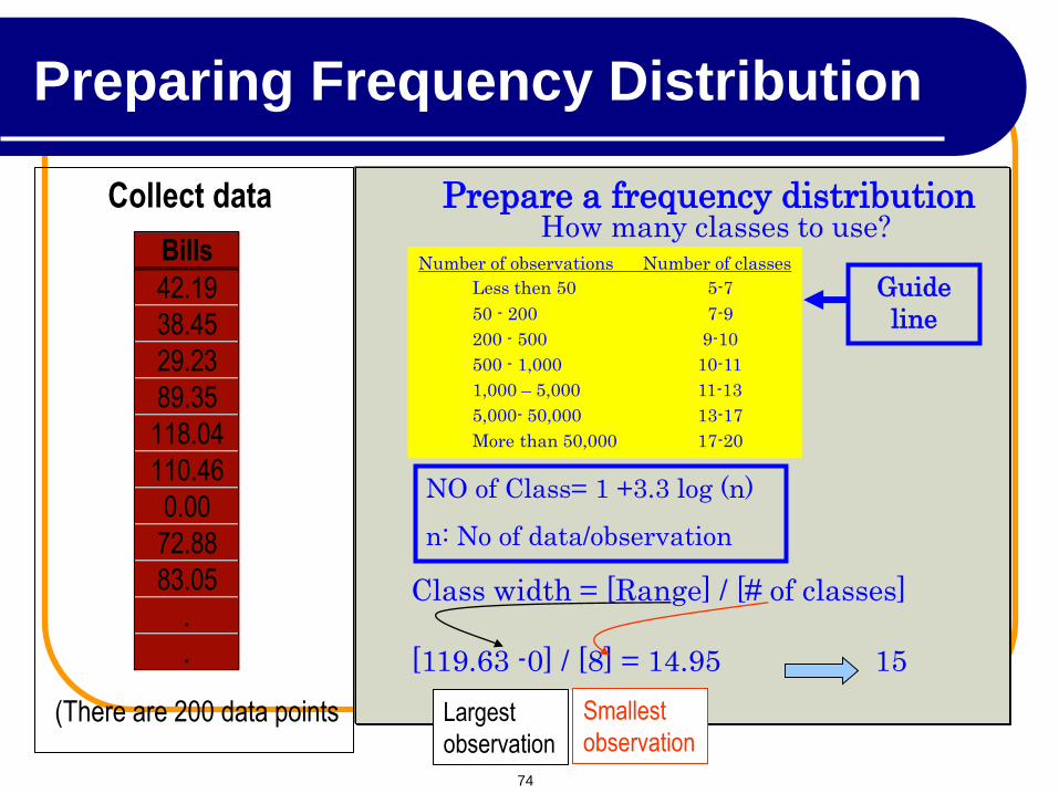
(There are 200 data points
Prepare a frequency distribution How many classes to use?
Number of observations Number of classes
Less then 50 5-7
50 - 200 7-9
200 - 500 9-10
500 - 1,000 10-11
1,000 – 5,000 11-13
5,000- 50,000 13-17
More than 50,000 17-20
Class width = [Range] / [# of classes]
[119.63 -0] / [8] = 14.95 15
Largest
observation Largest
observation
Smallest
observation Smallest
observation Smallest
observation
Smallest
observation Largest
observation
NO of Class= 1 +3.3 log (n)
n: No of data/observation
Guide
line
Preparing Frequency Distribution
74
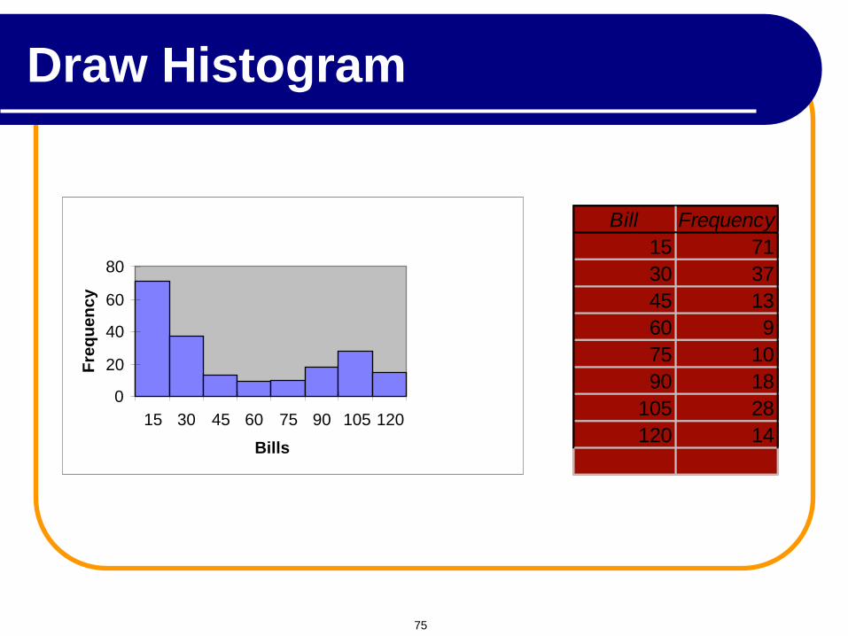
Draw a Histogram Bill Frequency
15 71
30 37
45 13
60 9
75 10
90 18
105 28
120 14
0
20
40
60
80
15 30 45 60 75 90 105 120
Bills
Fre
qu
en
cy
Draw Histogram
75
0
20
40
60
80 1
5
30
45
60
75
90
10
5
12
0
Bills
Fre
qu
en
cy
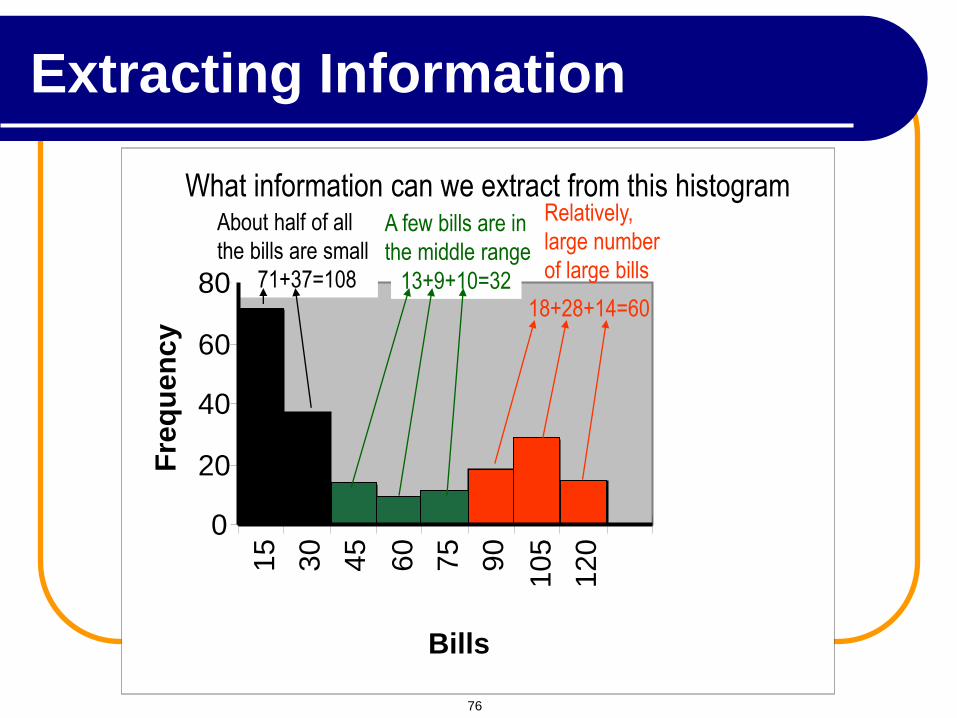
What information can we extract from this histogram
About half of all
the bills are small
71+37=108 13+9+10=32
A few bills are in
the middle range
Relatively,
large number
of large bills
18+28+14=60
Extracting Information
76
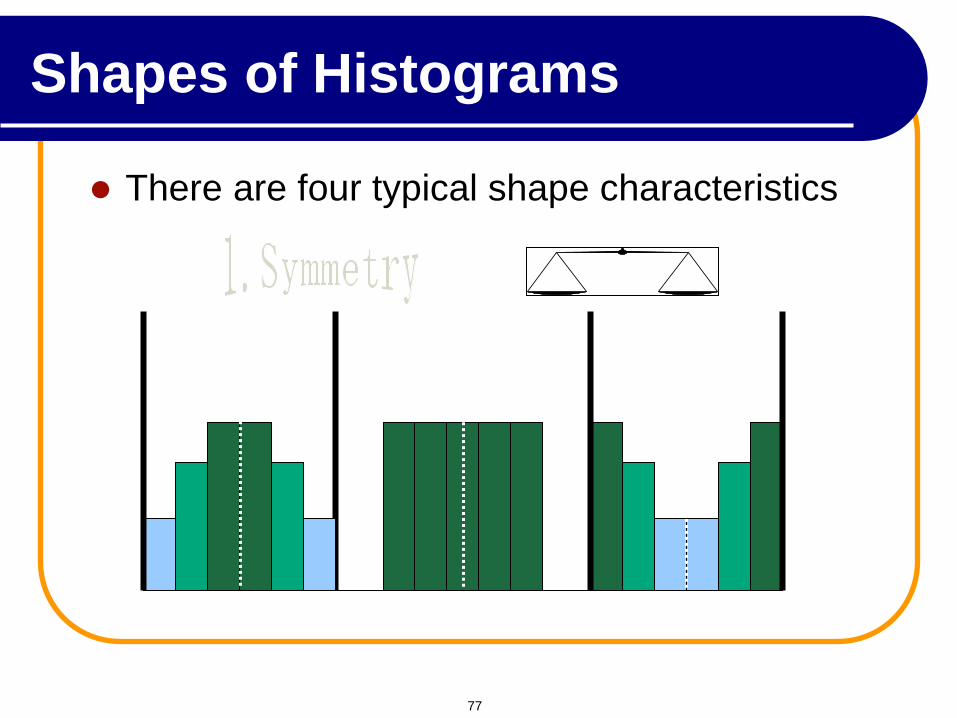
There are four typical shape characteristics
Shapes of Histograms
77
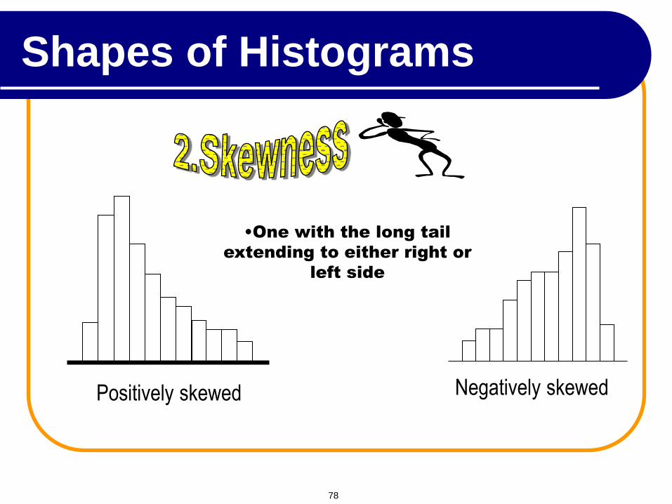
Positively skewed Negatively skewed
•One with the long tail
extending to either right or
left side
Shapes of Histograms
78
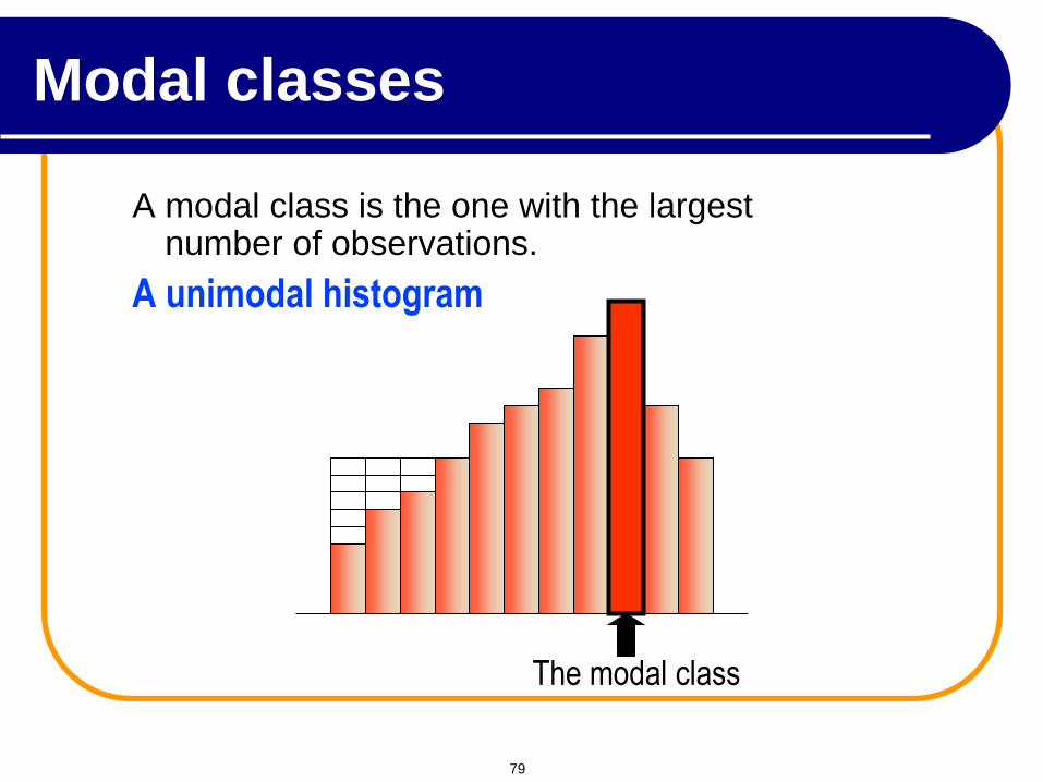
A modal class is the one with the largest number of observations.
A unimodal histogram
The modal class
Modal classes
79
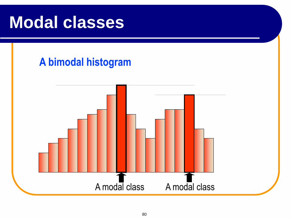
A bimodal histogram
A modal class A modal class
Modal classes
80
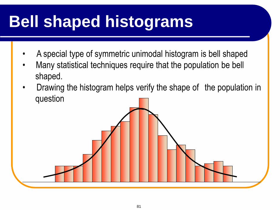
• A special type of symmetric unimodal histogram is bell shaped
• Many statistical techniques require that the population be bell
shaped.
• Drawing the histogram helps verify the shape of the population in
question
Bell shaped histograms
81
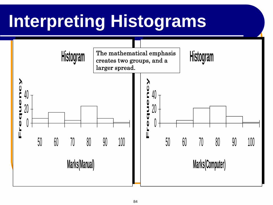
Example 2: Comparing students’ performance
Students’ performance in two statistics classes were compared.
The two classes differed in their teaching emphasis
Class A – mathematical analysis and development of theory.
Class B – applications and computer based analysis.
The final mark for each student in each course was recorded.
Draw histograms and interpret the results.
Interpreting Histograms
82
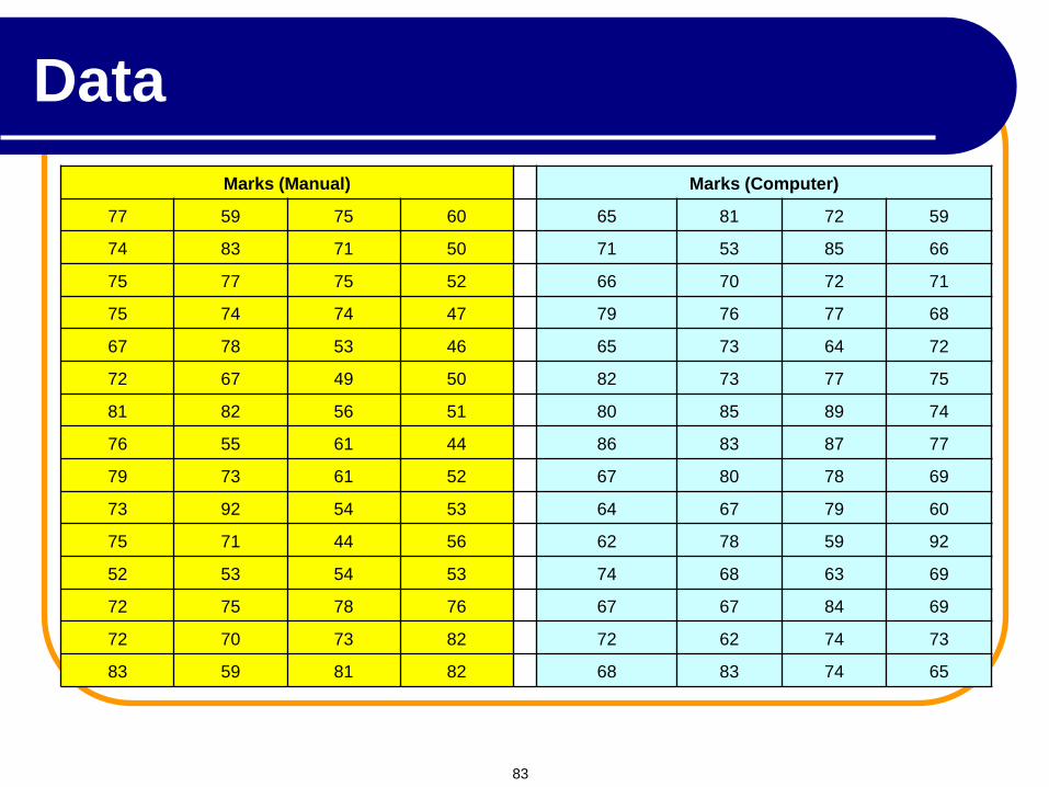
Marks (Manual) Marks (Computer)
77 59 75 60 65 81 72 59
74 83 71 50 71 53 85 66
75 77 75 52 66 70 72 71
75 74 74 47 79 76 77 68
67 78 53 46 65 73 64 72
72 67 49 50 82 73 77 75
81 82 56 51 80 85 89 74
76 55 61 44 86 83 87 77
79 73 61 52 67 80 78 69
73 92 54 53 64 67 79 60
75 71 44 56 62 78 59 92
52 53 54 53 74 68 63 69
72 75 78 76 67 67 84 69
72 70 73 82 72 62 74 73
83 59 81 82 68 83 74 65
Data
83
Histogram
02040
50 60 70 80 90 100
Marks(Manual)
Fre
qu
en
cy
Histogram
02040
50 60 70 80 90 100
Marks(Computer)
Fre
qu
en
cy
The mathematical emphasis
creates two groups, and a
larger spread.
Interpreting Histograms
84


![The Evolution of an Urban Lower Class Communityterm:name]/[node... · The Evolution of an Urban Lower Class Community ... skill to the three intra-lower-class status levels of the](https://img.pdfslide.net/doc/110x75/5b0e0de67f8b9ab7658d59bc/the-evolution-of-an-urban-lower-class-community-termnamenodethe-evolution.jpg)