Embed Size (px)
DESCRIPTION
A publication created by the students from BA (Hons) Design Futures & BA (Hons) Design Management for the Creative Industries based in the School of Art & Design at The University of Salford.
Citation preview
Class of 2010 Nabeela Akhtar
Charlotte Arrundale
Chris Barnard
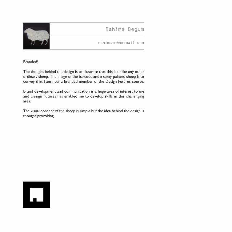
Rahima Begum
Sufiya Begum
Rikki Michelle Carney
Helen Cheung
Chris Davies
Samantha Davies
Hayley Dewar
Hannah Dodd
April Edwards
Amy Flitcroft
Philippa Givvons
Ian Glasgow
Anna Karen Hattersley
Foyez Haque
Maria Hills
Contributors
Bethany Hillyard
Stephanie Jones
Amy Joynes
Robyn Kelly
Francesca King
Zoe Hoi Man Kwan
Anthony Mather
Jade McMillan-Hainey
Jeremy Elliot N'Dure
Pauline Ng
Dimple M Patel
Ellie Pattinson
Christian Shields
Amy Louise Smith
Oliver Taylor
Scott Walker
Craig Weighman
Kerry-Marie Wilson
Roy Chilvers
“I can't understand why people are frightened of new
ideas. I'm frightened of the old ones.” John Cage, Composer and Philosopher, (1912 – 1992)
Ideas, and the development of ideas into innovative solutions, are at the very heart of creative design practice, and John
Cage in the above quotation articulates the clear link between ideas, boldness, and ambition. This book, and the integrated
website it links to, is an embodiment of ideas processed into creative output.
The students featured here will soon become graduates of BA(Hons) Design Futures, and BA(Hons) Design
Management for the Creative Industries, two courses which are interlinked and thrive on the generation, investigation and
development of ideas for purpose. Design decision-making is their business, and the graduate destinations they will progress
to shows the demand for these skills across the business and creative sector: Account Managers, Visual Designers, Interaction
Designers, Trend Forecasters, Fashion Buyers, Web Developers and Creative Entrepreneurs are typical. Innovation is central
to their approach to problem solving, and this book, together with the use of Augmented Reality (AR) techniques to drive
visitors to the linked website, is their statement of awareness and ambition. So, what is it about?
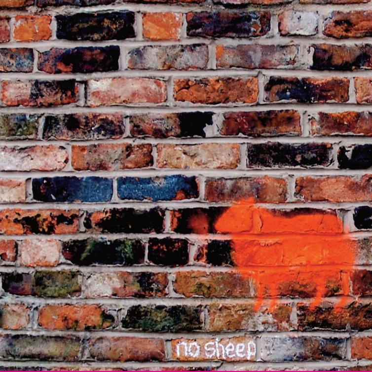
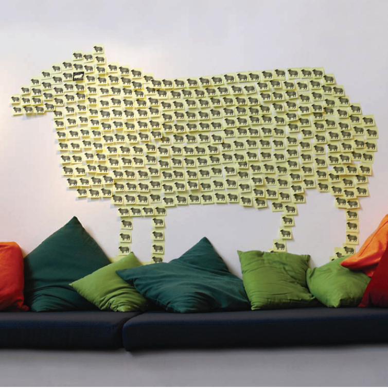
No Sheep’ is the concept vehicle conceived, designed, resourced, and produced by them in response to the
challenge of bringing material to the market which shows the different nature of their Degree courses, and the fact that
they emerge as strong, creative individuals. They may hold a common degree, but that not does not make them all the
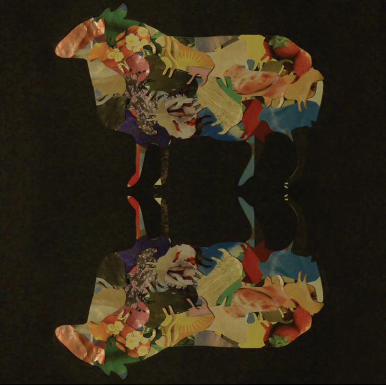
same. Neither are they timid, or looking to find safety in anonymity. Each student took the same cut-out stencil of a sheep,
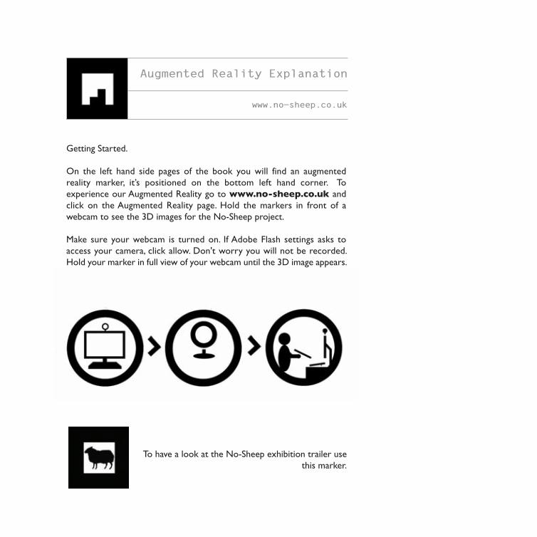
and used it to generate a visual response: one problem, many solutions, ideas in action. To show how print and web can be
used in an integrated way, each student’s page also has an AR marker which, if you visit the website, you can hold up to a
webcam and see more 3D visuals.
It is to their credit that they have also been able to enthuse and engage with quality industry backers, and we are grateful
to AND Partners for supplying financial support, and to You & Me Creative for their practical and expert production guidance.
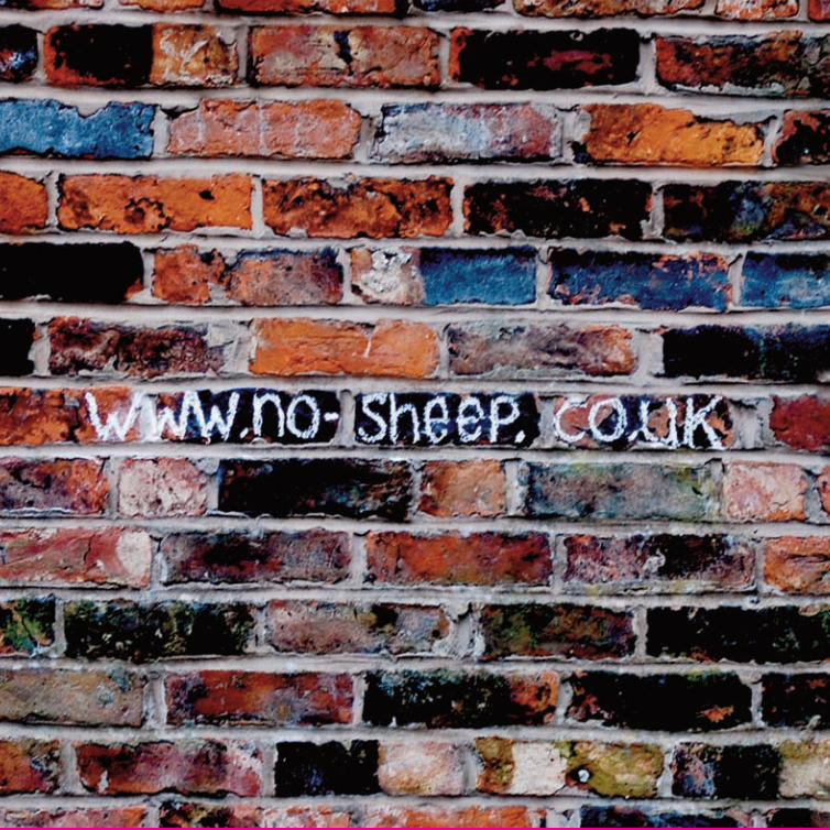
And now it’s your turn. Visit the website, www.no-sheep.co.uk download the sheep template, create your response, and
upload it so we can all see it. You must have an idea, we all do!
Roy Chilvers, Programme Leader
BA Design Futures
BA Design Management for the Creative Industries
When we were asked to sponsor ‘No Sheep’ it’d be easy to say we jumped
at the chance. But we didn’t. We insisted that the students make a formal
pitch for our investment.
We needed to know what the project was all about. What they wanted to
get out of it - collectively and as individuals. And, because we’re not in the
habit of dishing out big chunks of money for the sheer heck of it, we were
also keen to know “What’s in it for us?”
The pitch team suggested that And Partners - as a leading (their words
not ours) ideas and innovation company; a bunch of designers,
entrepreneurs, inventors and all round creative thinkers - should invest
our hard-earned cash wisely, in the next generation of bright, creative and
commercially switched-on minds.
And next time we’re recruiting, we just might get the pick of the crop from
this group of diversely talented, highly employable graduates; each prepared
to challenge conventional thinking and confidently head in their own
direction. We’re not looking for sheep.
Adrian Bentley
Head of Innovation
And Partners Waulk Mill, Bengal Street, Manchester M4 6LN
www.andclick.com // www.and-digital.com
Adrian Bentley
www.andclick.com
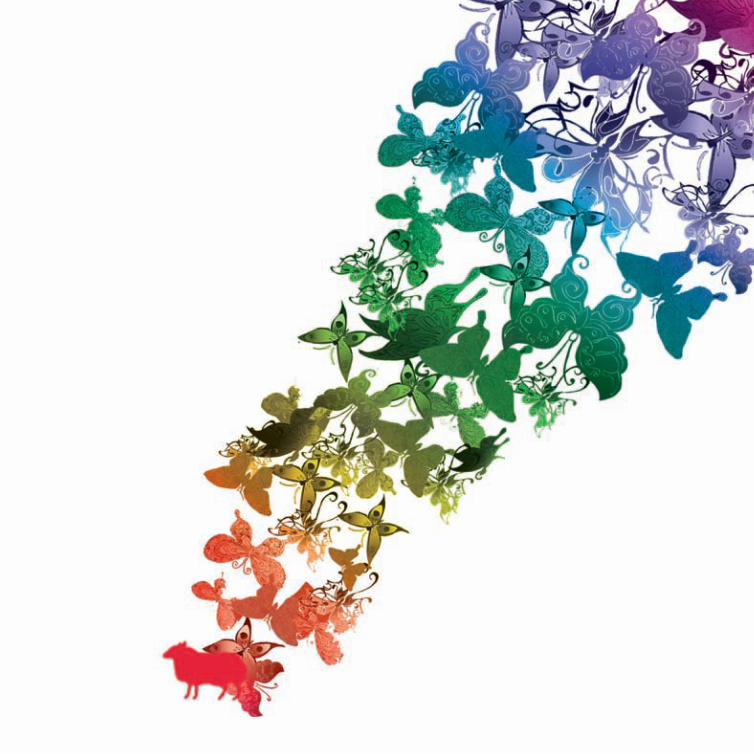
The optimistic colours illustrate my bold and playful attitude towards
design, with the butterflies representing an eclectic approach to idea
generation and my ability to look sideways in the search for big answers
to design questions. A journey is always undertaken. I explore diverse
ideas and take myself off the beaten track which often leads to a tangle of
seemingly unrelated threads, thoughts and musings. To ignore the possibility
of such tangles is to ignore the potential for generating innovative, engaging
and always beautiful solutions. Something I would never do.
I am the red sheep who is:
Original, Innovative, Confident, Subtle.
Nabeela Akhtar
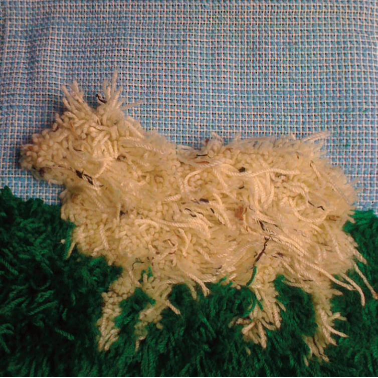
I approached this part of the brief looking at myself as a designer and the
experiences I have had during my time on the course. During this process,
I realised I am innovative and like to be hands on. I wanted these elements
to reflect in my sheep.
The design of my sheep shows off my personality. It is quirky, fun and stands
out
I decided to design my sheep to look a little scraggly and have a shaggy
textured feel. I did this by using rough edges, and using different lengths of
wool to give it a life like look. The sheep is expressionless but the shades
of the surrounding colours I have chosen create a happy ambience.
Charlotte Arrundale
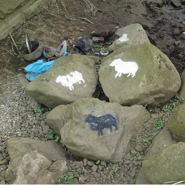
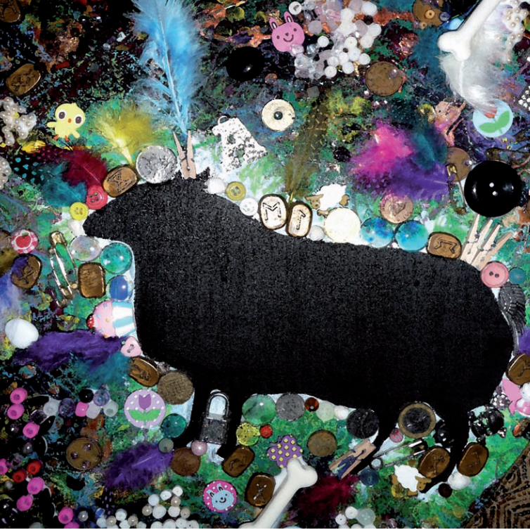
Creating art and design from ruin and decay has always fascinated me. I
have often found inspiration by experiencing imagery that changes my
perception of an object or environment.
Whilst searching my local area for ideas for some of my work, I stumbled
upon the remains of a makeshift camp, situated under a bridge. Scattered
amongst the saucepans, discarded clothes and broken children’s toys, was
evidence of serious poverty and drug-addiction. The camp had been set up
amongst some boulders on the edge of the river, and I decided to make
these stones my canvas.
Using water-soluble paint (to ensure that my work was strictly temporary)
I applied white sheep around the area, with black sheep leading the flock.
This adds to the metaphorical aspect of the project, with a black sheep
typically being an individual, or the ‘odd-one-out’.
Chris Barnard
Branded!
The thought behind the design is to illustrate that this is unlike any other
ordinary sheep. The image of the barcode and a spray-painted sheep is to
convey that I am now a branded member of the Design Futures course.
Brand development and communication is a huge area of interest to me
and Design Futures has enabled me to develop skills in this challenging
area.
The visual concept of the sheep is simple but the idea behind the design is
thought provoking .
Rahima Begum
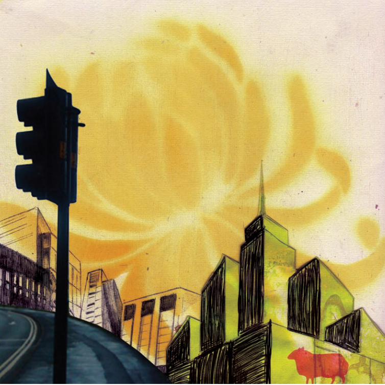
The sheep in the design is a symbol of confusion and doubt. It summarises
the feelings I experienced whilst trying to think of good ideas and the ‘head
lost in the clouds’, seemed particularly fitting at times.
I decided to take an experimental and approach with the design and used
a range of different mediums which is testimony to my willingness to be
creative and to be different. I can use many materials with comfort and
ease from spray-painting motifs to Biro-pens for sketching. My interests
include working manually to create raw illustrations and utilising different
media to create engaging styles and textures.
Design Futures has taught me a number of things, not only about what we
call ‘design’, but also about myself, and like the sheep in my design, I lost
myself and found myself through the course of this journey.
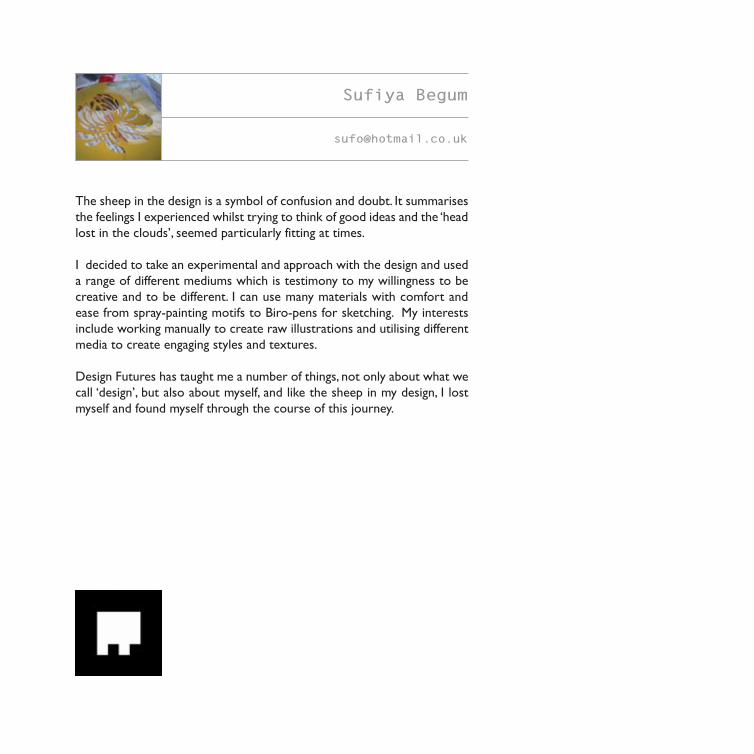
Sufiya Begum
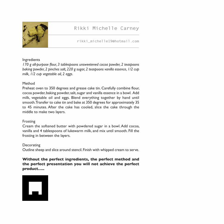
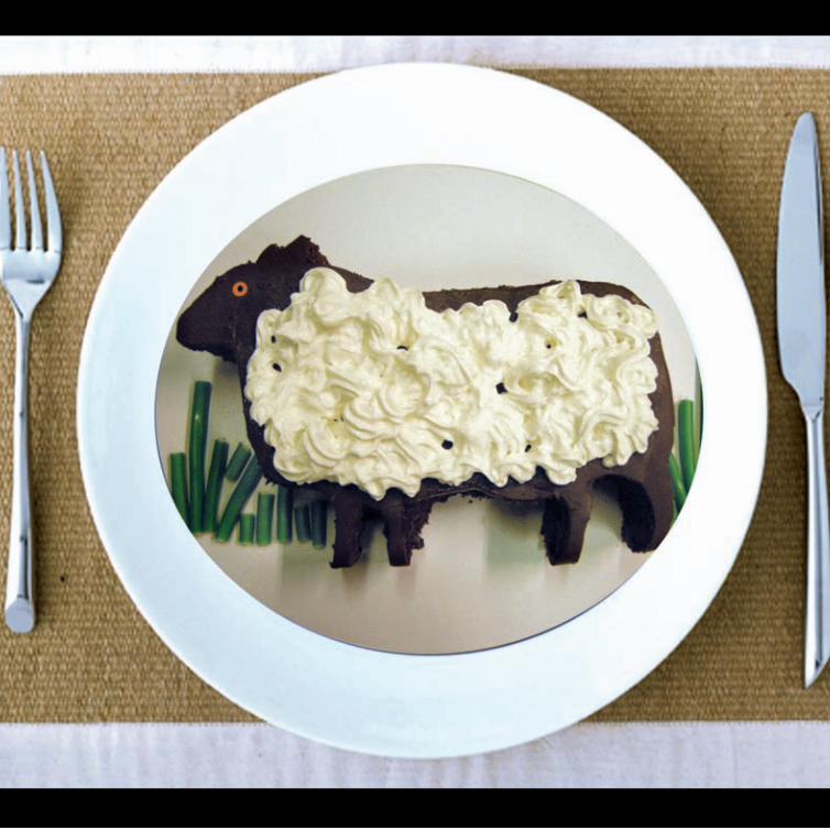
Ingredients
170 g all-purpose flour, 3 tablespoons unsweetened cocoa powder, 2 teaspoons
baking powder, 2 pinches salt, 220 g sugar, 2 teaspoons vanilla essence, 1/2 cup
milk, 1/2 cup vegetable oil, 2 eggs.
Method
Preheat oven to 350 degrees and grease cake tin. Carefully combine flour,
cocoa powder, baking powder, salt, sugar and vanilla essence in a bowl. Add
milk, vegetable oil and eggs. Blend everything together by hand until
smooth. Transfer to cake tin and bake at 350 degrees for approximately 35
to 45 minutes. After the cake has cooled, slice the cake through the
middle to make two layers.
Frosting
Cream the softened butter with powdered sugar in a bowl. Add cocoa,
vanilla and 4 tablespoons of lukewarm milk, and mix until smooth. Fill the
frosting in between the layers.
Decorating
Outline sheep and slice around stencil. Finish with whipped cream to serve.
Without the perfect ingredients, the perfect method and
the perfect presentation you will not achieve the perfect
product…..
Rikki Michelle Carney

When I was younger and had started to really get into music, I used to
make mix-tapes for friends and family. I used to record my favourite songs
off the radio and eventually record my first song using the built-in mic on
my stereo, straight onto cassette.
I filmed my first video recording to use on my first ever animation on a
camcorder that recorded onto Mini DV cassettes and when the band that
I was in wanted to record at a professional studio, we did so at a place
which still had full analogue recording.
I love the combination of music moving image, tapes and cassettes which
were there when I started getting into music and moving image.
I used this opportunity to create something that acknowledged parts of
my past, parts that have helped to make me the designer I am today, mixing
old with the new.
Helen Cheung
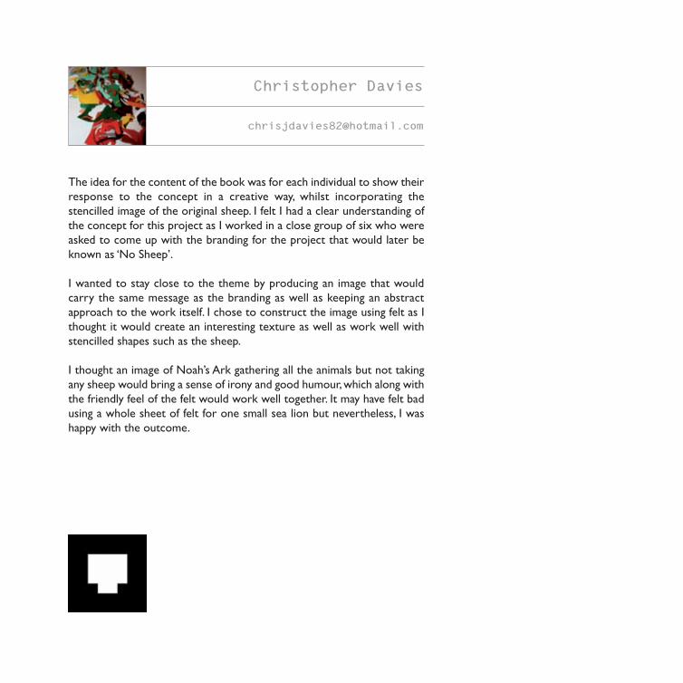
The idea for the content of the book was for each individual to show their
response to the concept in a creative way, whilst incorporating the
stencilled image of the original sheep. I felt I had a clear understanding of
the concept for this project as I worked in a close group of six who were
asked to come up with the branding for the project that would later be
known as ‘No Sheep’.
I wanted to stay close to the theme by producing an image that would
carry the same message as the branding as well as keeping an abstract
approach to the work itself. I chose to construct the image using felt as I
thought it would create an interesting texture as well as work well with
stencilled shapes such as the sheep.
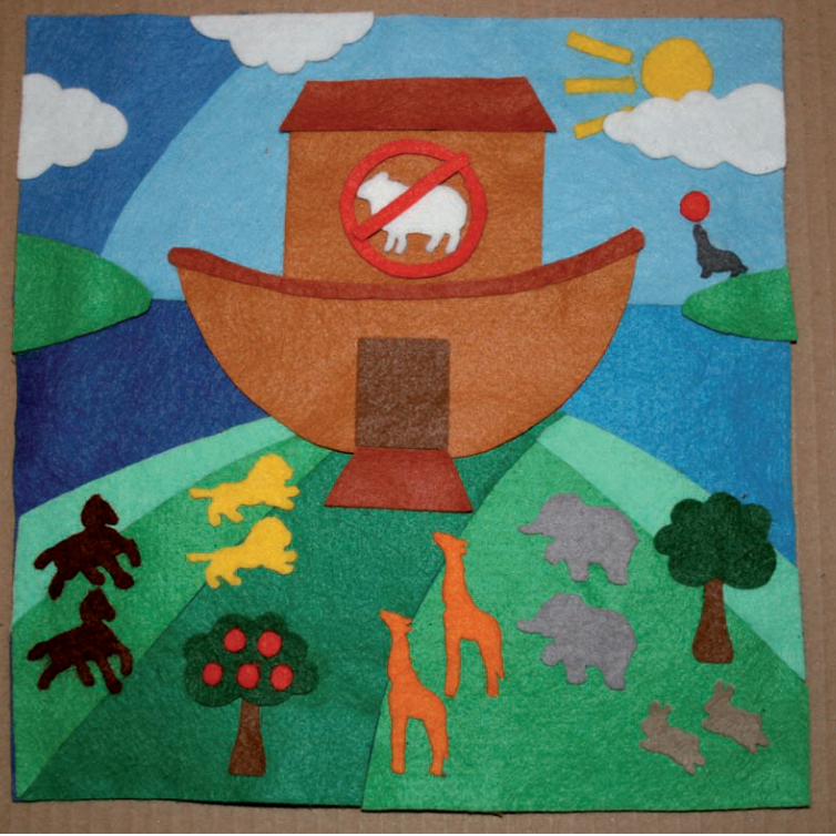
I thought an image of Noah’s Ark gathering all the animals but not taking
any sheep would bring a sense of irony and good humour, which along with
the friendly feel of the felt would work well together. It may have felt bad
using a whole sheet of felt for one small sea lion but nevertheless, I was
happy with the outcome.
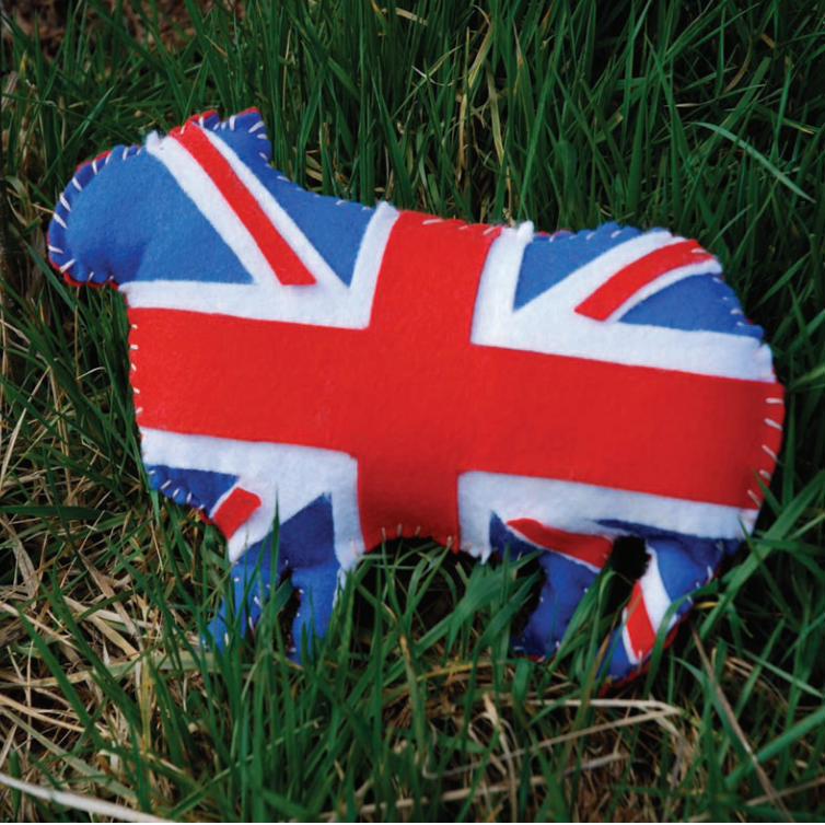
Christopher Davies

My creative inspiration for the sheep began with my passion for heritage
and nostalgia which has influenced previous components of my study. From
this I felt a great sense of traditionalism and to me that evokes an appetite
for celebrating all things British.
My sheep visual depicts my interpretation or notion of an idiosyncratic
Britain: a return to quaint, picturesque ideology. From this I became very
interested in taking inspiration from past products and re-developing them
for a modern and contemporary audience.
A personal important aspect of creating my representation was that I
didn’t have any computer influence to ensure the traditional aspect was
fulfilled I wanted to maintain a sense of quality and craft. I was solely
concerned with dexterity and workmanship.
Samantha Davies
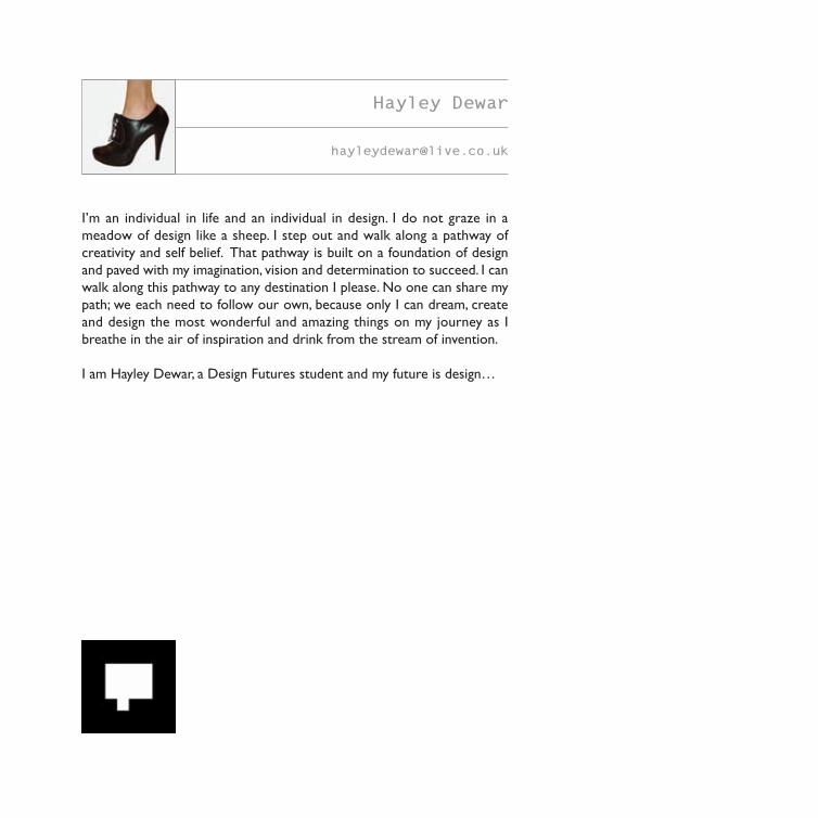
I’m an individual in life and an individual in design. I do not graze in a
meadow of design like a sheep. I step out and walk along a pathway of
creativity and self belief. That pathway is built on a foundation of design
and paved with my imagination, vision and determination to succeed. I can
walk along this pathway to any destination I please. No one can share my
path; we each need to follow our own, because only I can dream, create
and design the most wonderful and amazing things on my journey as I
breathe in the air of inspiration and drink from the stream of invention.
I am Hayley Dewar, a Design Futures student and my future is design…
Hayley Dewar
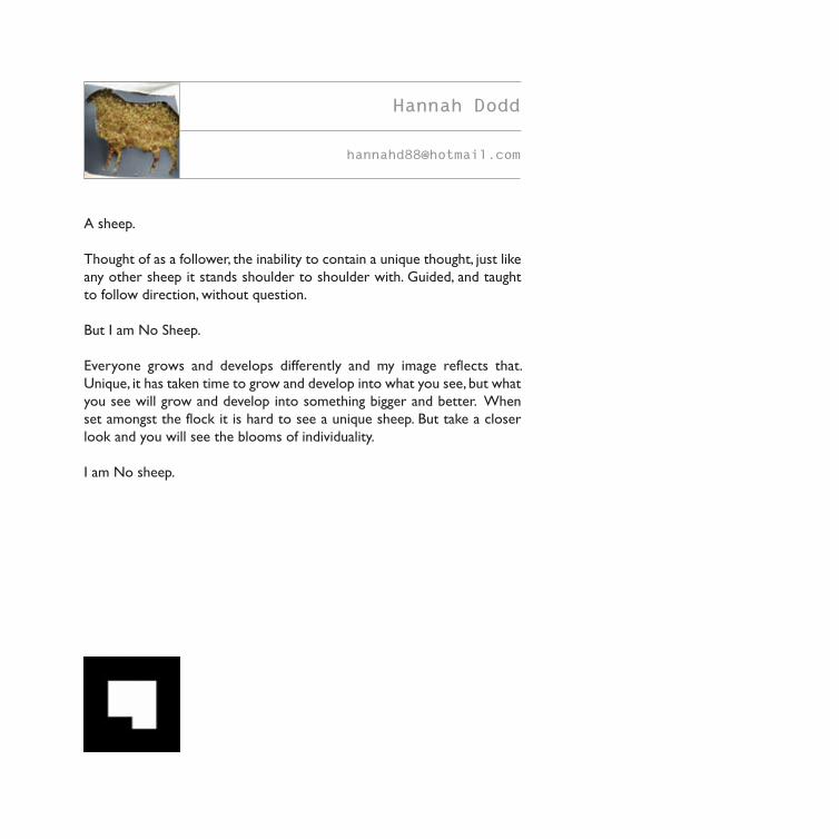
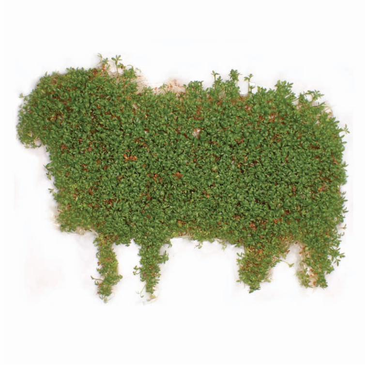
A sheep.
Thought of as a follower, the inability to contain a unique thought, just like
any other sheep it stands shoulder to shoulder with. Guided, and taught
to follow direction, without question.
But I am No Sheep.
Everyone grows and develops differently and my image reflects that.
Unique, it has taken time to grow and develop into what you see, but what
you see will grow and develop into something bigger and better. When
set amongst the flock it is hard to see a unique sheep. But take a closer
look and you will see the blooms of individuality.
I am No sheep.
Hannah Dodd

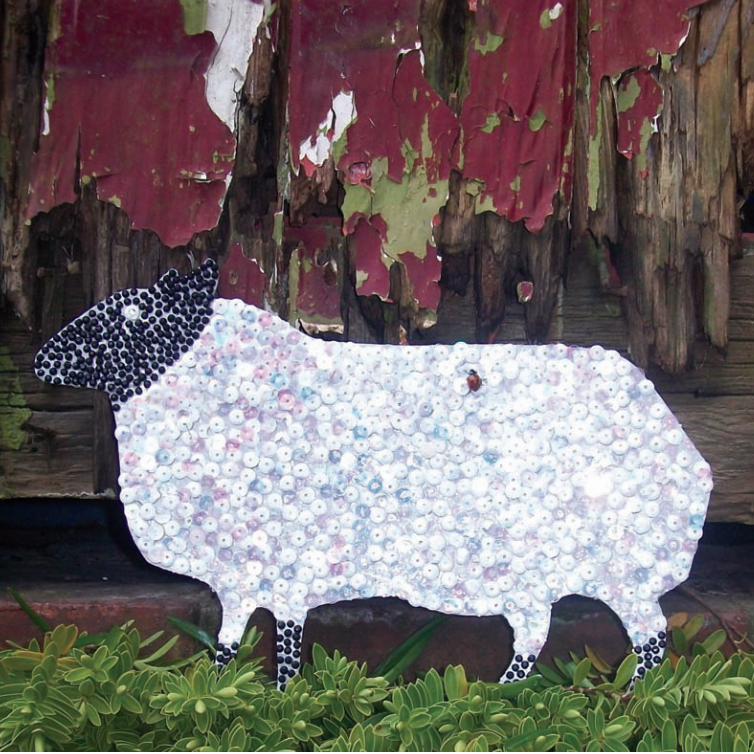
Studying Design Futures while at university has enabled me to develop my
design skills and also gain new skills such as putting together research
reports. I enjoy being able to apply both my analytical written work and
creativeness throughout my projects. I am a creative individual, who is
extrovert and sociable.
When designing my ‘No Sheep’ image, I wanted to produce something that
represented me and my creative side. I covered my sheep in sequins and
diamantes, representing me being a dedicated follower of fashion! When
looking for a location, I wanted to use an aged background with my sheep
standing out as bright and contemporary. This represents how I am
inspired by the old and new, and am able to find inspiration in all things
including those which may be overseen. Art and design is everywhere; the
door represents how age gives character and a beauty of its own, and how
this can be combined with modern design adding a contemporary twist to
everyday things.
By the way, the ladybird was incidental, but I felt that she lent something
to the overall picture so I let her stay!
April Edwards
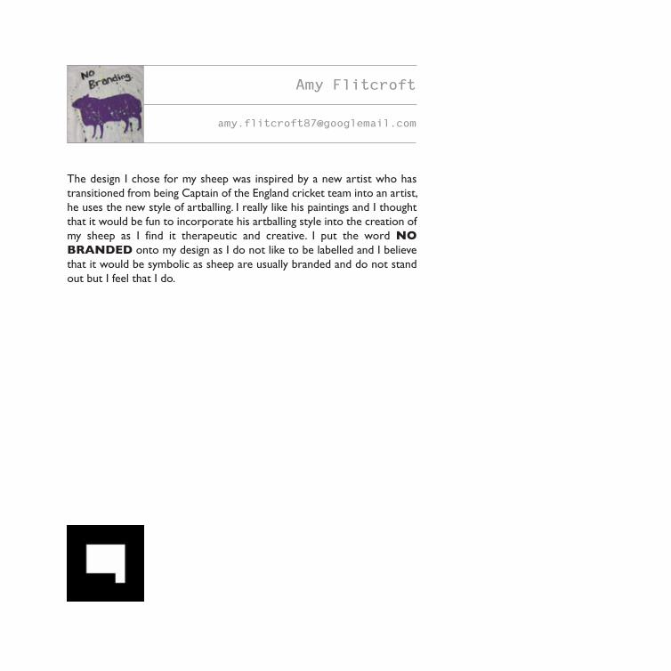
The design I chose for my sheep was inspired by a new artist who has
transitioned from being Captain of the England cricket team into an artist,
he uses the new style of artballing. I really like his paintings and I thought
that it would be fun to incorporate his artballing style into the creation of
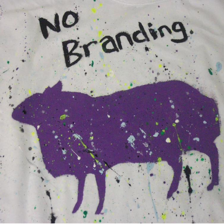
my sheep as I find it therapeutic and creative. I put the word NO
BRANDED onto my design as I do not like to be labelled and I believe
that it would be symbolic as sheep are usually branded and do not stand
out but I feel that I do.
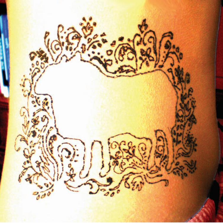
Amy Flitcroft

As a design student the idea is that we all do the same, follow the rest like
a flock of sheep. This is where the idea came for the book, for students as
an individual to interpret their idea of ‘NO SHEEP’ in a creative way. The
sheep idea is our ‘brand’ and I wanted to stay within the lines of branding
and as a result decided to somehow have the sheep on my body.
When designing my sheep I wanted to produce something that
represented me without use of words, but also to do something that set
me apart from the rest of the group.
I am interested in body art and decided on the use of henna instead of
permanent ink. This still shows my passion for creativity, individuality and
my enthusiasm towards the exploration of different cultures and
techniques without permanently branding myself with a sheep, of all
choices, on my body!
Philippa Givvons

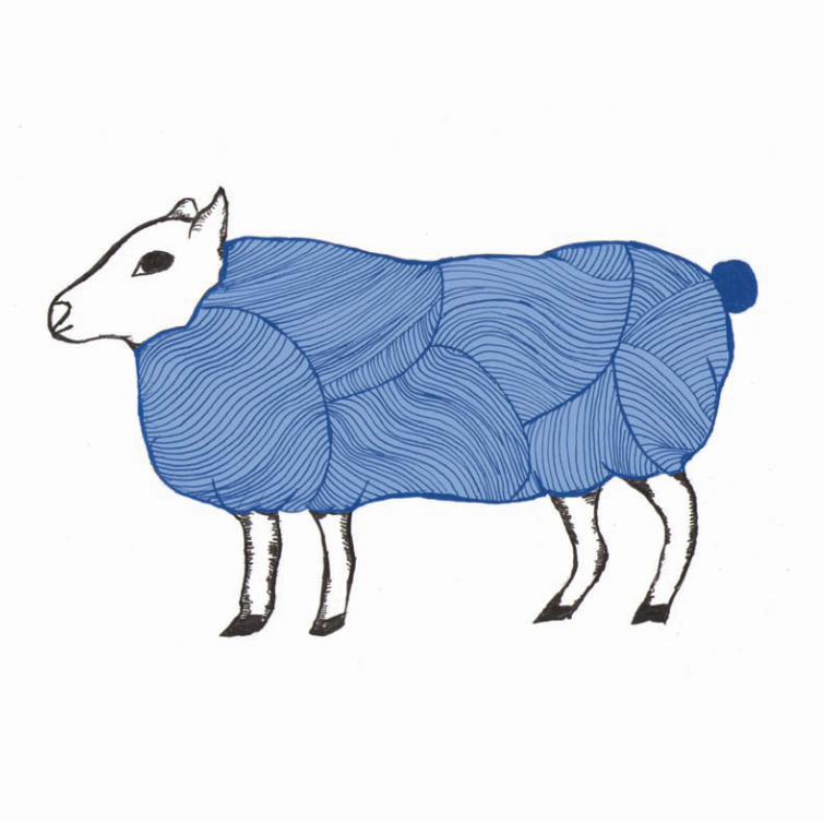
A Sheep… An animal that starts its life off as a lamb, then after a year it
turns into a hogget.
A male is called a Ram and a female is known as a Ewe. Today there are
millions of sheep on the planet and over 900 different breeds to choose
from. Sheep are kept as livestock in flocks and looked after by their
Shepherd.
We as designers are like sheep at the moment, we have been kept in a
flock (our course) and been looked after by a Shepherd (tutor). Now it is
time for us to leave the flock and find our own way.
People think of a black sheep being different or rebellious. I have decided
to express myself as a blue sheep to represent the colour of the sky or
fresh air. I want to bring my ‘fresh air’ into the industry and show my
passion for design and ability to work hard to get where I need to be.
Ian Glasgow
I’m not great at spontaneous prose. If a picture is worth a thousand words,
can’t I just slice off a bit of the one to right, slap it on this page and be
done?
No?
Worth a shot.
There are few things as beguiling, or terrifying, as a blank slate. On the one
hand, I’ve probably written and re-written this paragraph about a dozen
times, desperately trying to find a middle ground between asinine and
pretentious. On the other, I have no qualms about attacking an innocent
canvas until it resembles an explosion at a craft suppliers. These are the
dangers of potential, kids.
To me the joy of being a designer, an artist, a whatever-I-am-today is
always finding something new to play with. Give me some paper and a Biro
to doodle with and I’m happy as any overgrown child, but meanwhile
there’s a wellspring of ideas and not enough room in my head. It’s got to
go somewhere.
Throw everything at me. See what sticks.
Anna Hattersley

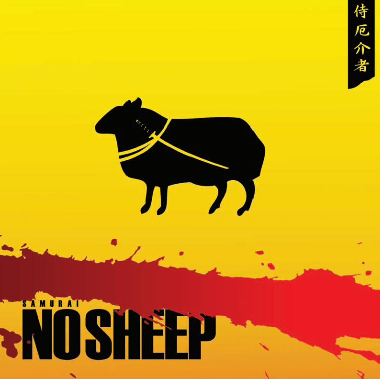
The ‘Samurai No Sheep’ came about when trying to define what
attributes a student of Design Futures has. Wherever I go, whoever I speak
to, the question soon arises after mentioning what I do. You can see it
coming......"Design Futures, what's that?"
My take on this is really a visual anecdote of how a Design Futures
student has journeyed through an intense practice of decision-making,
enduring high risk anxiety projects and following through with a design fit
for its purpose. To simply express this in ‘Samurai No Sheep’ terms, it is as
if all the Samurai’s strength, precision and focus is accumulated in each and
every swing of the sword.
When it came to designing the ‘Samurai No Sheep’ concept, it was a
surprise to find out that sheep never originated in Japan. I had to revise all
of this to reflect how fun and experimental it is being a student of Design
Futures and wanted to express this through my ‘no sheep’ attempt. Design
Futures is unique and one of a kind within the UK and here I have the
opportunity to show you a snippet of Design Futures in action.
Foyez Haque
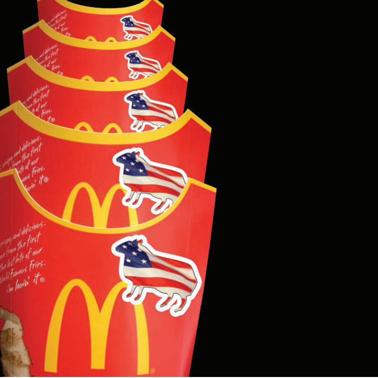
I decided to interpret the no-sheep brief through exploring individuality
within a social context. I believe our culture has been heavily influenced
through the materialist nature of our society. The market is dominated
through multi-national corporations and super brands such as Tesco and
McDonalds. They can monopolise the market in such a way that it may only
be possible to be a sheep.
During a previous project, we were encouraged to think about future
trends, I concluded that eventually we might experience the end of trends.
This could be a reaction to the fast turnover of fashion and design trends,
which over saturate the creative sector. We may all wish to follow our
individual creativity and express our individuality through returning to
traditional methods such as drawing, painting and customising.
Through the image, I wanted to represent caution of loosing individuality
through stamping the no-sheep logo on the packaging of a recognizable
corporation such as McDonalds. I believe this concept of encouraging
individuality expresses the core values behind the BA Design Futures
degree and in turn the no-sheep ethos.
Maria Hills
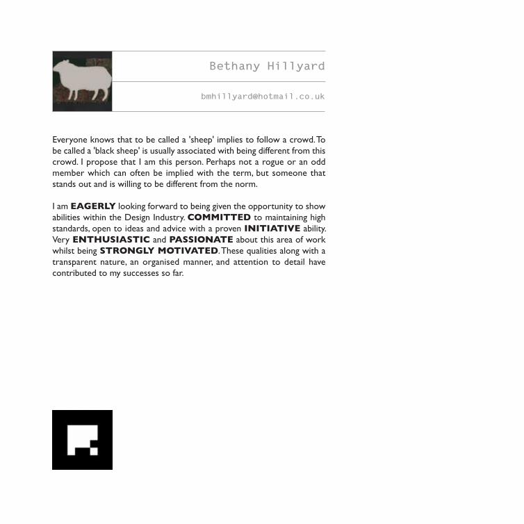
Everyone knows that to be called a 'sheep' implies to follow a crowd. To
be called a 'black sheep' is usually associated with being different from this
crowd. I propose that I am this person. Perhaps not a rogue or an odd
member which can often be implied with the term, but someone that
stands out and is willing to be different from the norm.
I am EAGERLY looking forward to being given the opportunity to show
abilities within the Design Industry. COMMITTED to maintaining high
standards, open to ideas and advice with a proven INITIATIVE ability.
Very ENTHUSIASTIC and PASSIONATE about this area of work
whilst being STRONGLY MOTIVATED. These qualities along with a
transparent nature, an organised manner, and attention to detail have
contributed to my successes so far.
Bethany Hillyard
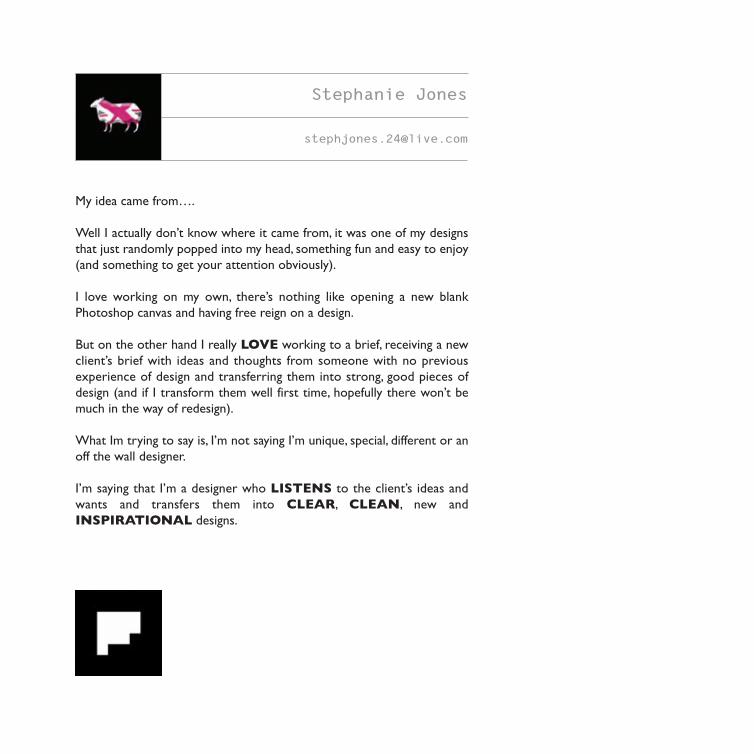
My idea came from….
Well I actually don’t know where it came from, it was one of my designs
that just randomly popped into my head, something fun and easy to enjoy
(and something to get your attention obviously).
I love working on my own, there’s nothing like opening a new blank
Photoshop canvas and having free reign on a design.
But on the other hand I really LOVE working to a brief, receiving a new
client’s brief with ideas and thoughts from someone with no previous
experience of design and transferring them into strong, good pieces of
design (and if I transform them well first time, hopefully there won’t be
much in the way of redesign).
What Im trying to say is, I’m not saying I’m unique, special, different or an
off the wall designer.
I’m saying that I’m a designer who LISTENS to the client’s ideas and
wants and transfers them into CLEAR, CLEAN, new and
INSPIRATIONAL designs.
Stephanie Jones
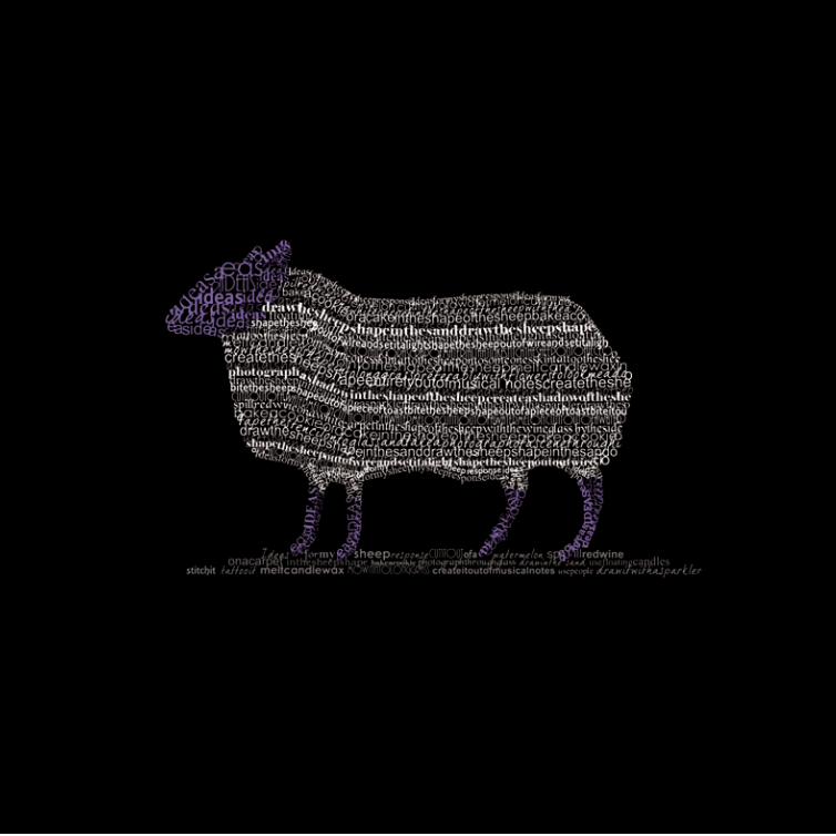
My typographical response to this brief developed from many initial ideas
of how I could approach this challenge. The text that I have used to create
the sheep shape contains a selection of the ideas that I considered before
I decided on my final design.
The Design Futures programme has helped me to be more open-minded
and consider all materials as a tool for design. I have chosen to create my
response digitally, but pride myself on my ability to combine
different materials and mediums to create the best possible outcome.
Being on this course has helped me hone a vast range of skills from
working digitally and developing my knowledge of a range of computer
programmes to understanding usability and how to apply it in design. I have
had the chance to work academically; discussing and analysing issues in
design, as well as developing my management, organisational and design
skills.
Amy Joynes
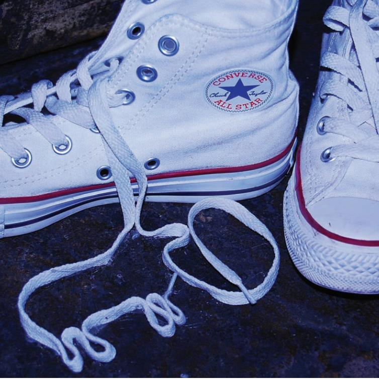
NO SHEEP….
Throughout this project my team and I (branding and identity) have
undertaken and developed the visual and conceptual identity for our whole
year group. With this idea each individual can develop visuals to represent
themselves in response to the same brief.
Random or researched, whatever the final outcome the process is
something that isn’t exactly obvious and is unique to everyone. My image
is representative of the idea of looking at something from the obscure, not
the obvious. Showing that some of the best designs are not always what
they first seem.
I have chosen Converse trainers within the image, as their brand and all that
they represent is very similar to what we are trying to communicate with
this project; “It’s not how old you are, but how good you are” and “being
independent enough not to follow”.
Robyn Kelly
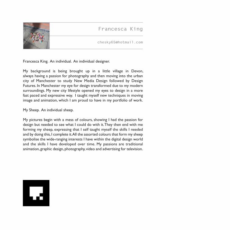
Francesca King
Francesca King. An individual. An individual designer.
My background is being brought up in a little village in Devon,
always having a passion for photography and then moving into the urban
city of Manchester to study New Media Design followed by Design
Futures. In Manchester my eye for design transformed due to my modern
surroundings. My new city lifestyle opened my eyes to design in a more
fast paced and expressive way. I taught myself new techniques in moving
image and animation, which I am proud to have in my portfolio of work.
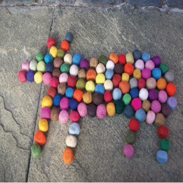
My Sheep. An individual sheep.
My pictures begin with a mess of colours, showing I had the passion for
design but needed to see what I could do with it. They then end with me
forming my sheep, expressing that I self taught myself the skills I needed
and by doing this, I complete it. All the assorted colours that form my sheep
symbolise the wide-ranging interests I have within the digital design world
and the skills I have developed over time. My passions are traditional
animation, graphic design, photography, video and advertising for television.
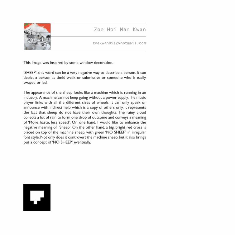
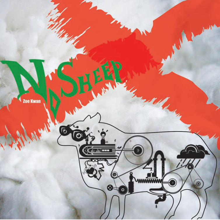
This image was inspired by some window decoration.
‘SHEEP’; this word can be a very negative way to describe a person. It can
depict a person as timid weak or submissive or someone who is easily
swayed or led.
The appearance of the sheep looks like a machine which is running in an
industry. A machine cannot keep going without a power supply. The music
player links with all the different sizes of wheels. It can only speak or
announce with indirect help which is a copy of others only. It represents
the fact that sheep do not have their own thoughts. The rainy cloud
collects a lot of rain to form one drop of outcome and conveys a meaning
of ‘More haste, less speed’. On one hand, I would like to enhance the
negative meaning of ‘Sheep’. On the other hand, a big, bright red cross is
placed on top of the machine sheep, with green ‘NO SHEEP’ in irregular
font style. Not only does it controvert the machine sheep, but it also brings
out a concept of ‘NO SHEEP’ eventually.
Zoe Hoi Man Kwan
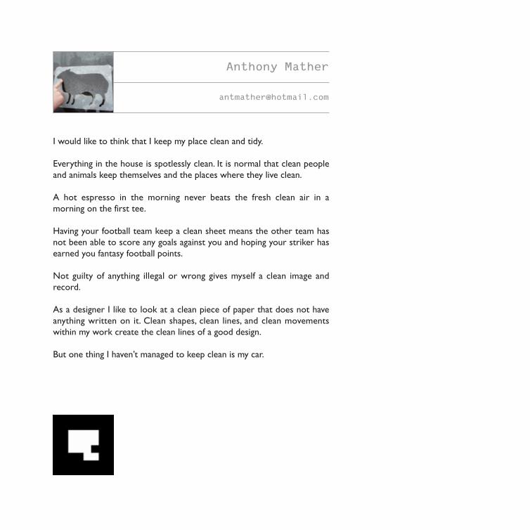
I would like to think that I keep my place clean and tidy.
Everything in the house is spotlessly clean. It is normal that clean people
and animals keep themselves and the places where they live clean.
A hot espresso in the morning never beats the fresh clean air in a
morning on the first tee.
Having your football team keep a clean sheet means the other team has
not been able to score any goals against you and hoping your striker has
earned you fantasy football points.
Not guilty of anything illegal or wrong gives myself a clean image and
record.
As a designer I like to look at a clean piece of paper that does not have
anything written on it. Clean shapes, clean lines, and clean movements
within my work create the clean lines of a good design.
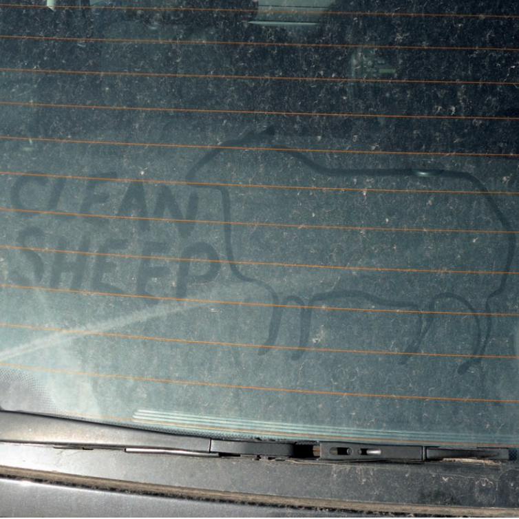
But one thing I haven’t managed to keep clean is my car.
Anthony Mather
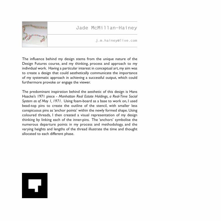
The influence behind my design stems from the unique nature of the
Design Futures course, and my thinking, process and approach to my
individual work. Having a particular interest in conceptual art, my aim was
to create a design that could aesthetically communicate the importance
of my systematic approach in achieving a successful output, which could
furthermore provoke or engage the viewer.
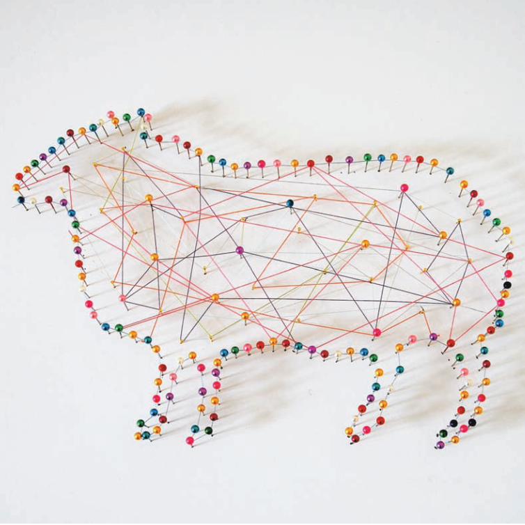
The predominant inspiration behind the aesthetic of this design is Hans
Haacke’s 1971 piece - Manhattan Real Estate Holdings, a Real-Time Social
System as of May 1, 1971. Using foam-board as a base to work on, I used
bead-top pins to create the outline of the stencil, with smaller less
conspicuous pins as ‘anchor points’ within the newly formed shape. Using
coloured threads, I then created a visual representation of my design
thinking by linking each of the inner-pins. The ‘anchors’ symbolise the
numerous departure points in my process and methodology, and the
varying heights and lengths of the thread illustrate the time and thought
allocated to each different phase.
Jade McMillan-Hainey
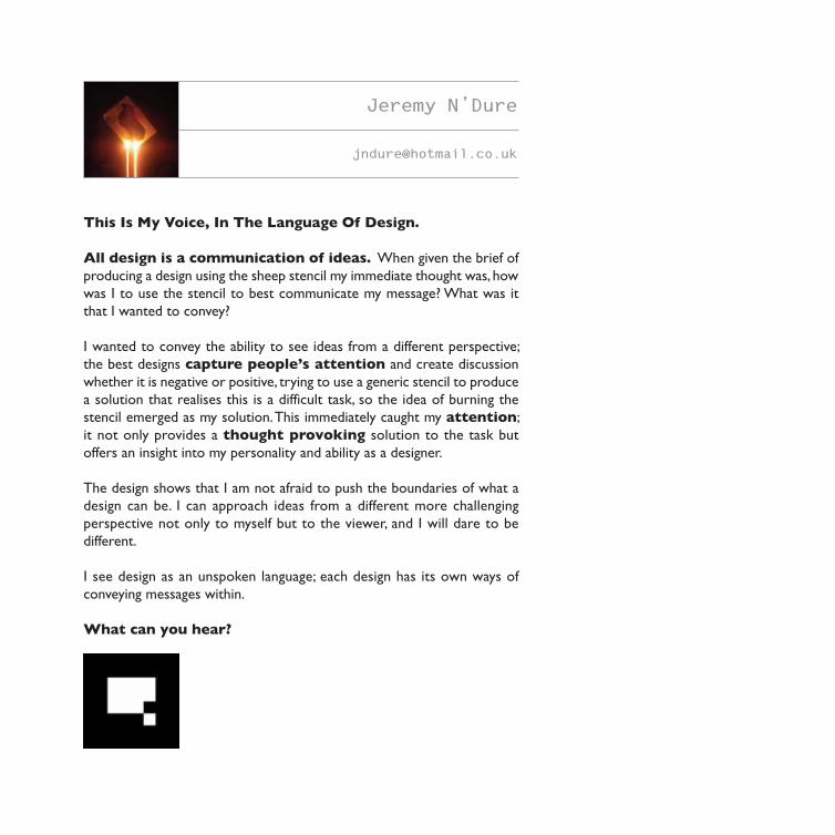
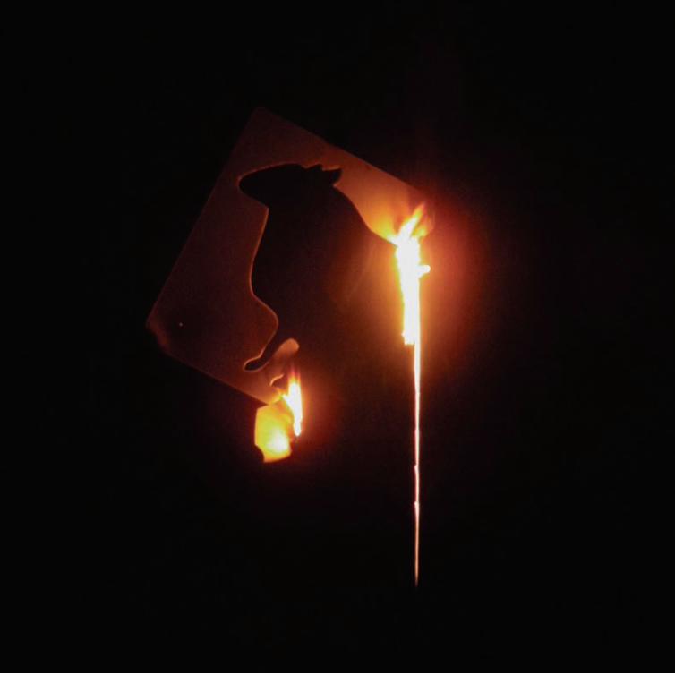
This Is My Voice, In The Language Of Design.
All design is a communication of ideas. When given the brief of
producing a design using the sheep stencil my immediate thought was, how
was I to use the stencil to best communicate my message? What was it
that I wanted to convey?
I wanted to convey the ability to see ideas from a different perspective;
the best designs capture people’s attention and create discussion
whether it is negative or positive, trying to use a generic stencil to produce
a solution that realises this is a difficult task, so the idea of burning the
stencil emerged as my solution. This immediately caught my attention;
it not only provides a thought provoking solution to the task but
offers an insight into my personality and ability as a designer.
The design shows that I am not afraid to push the boundaries of what a
design can be. I can approach ideas from a different more challenging
perspective not only to myself but to the viewer, and I will dare to be
different.
I see design as an unspoken language; each design has its own ways of
conveying messages within.
What can you hear?
Jeremy N’Dure
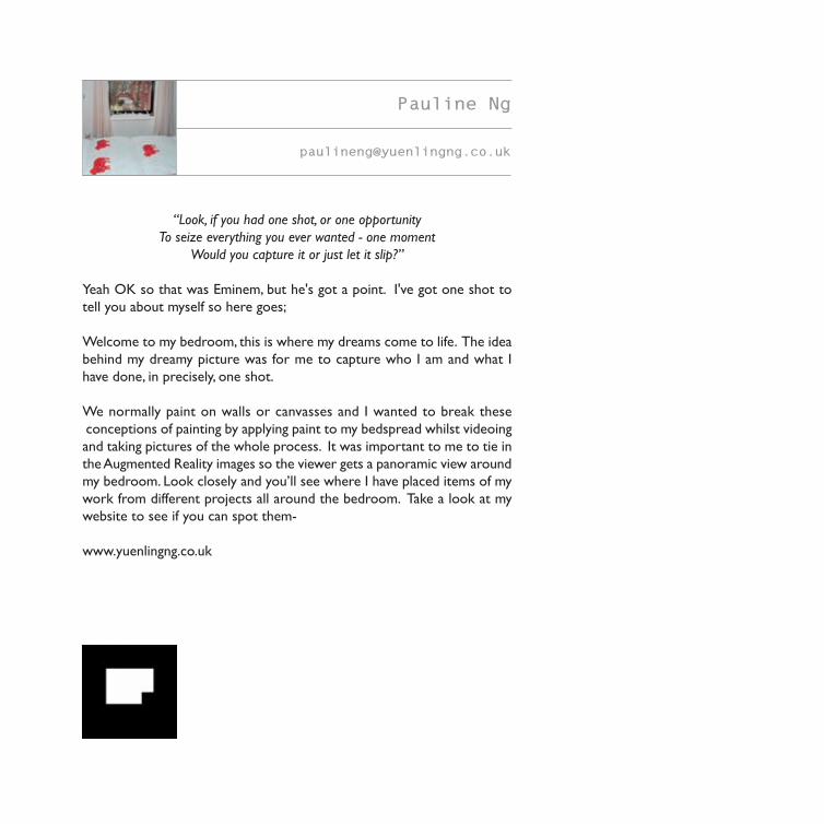
“Look, if you had one shot, or one opportunity
To seize everything you ever wanted - one moment
Would you capture it or just let it slip?”
Yeah OK so that was Eminem, but he's got a point. I've got one shot to
tell you about myself so here goes;
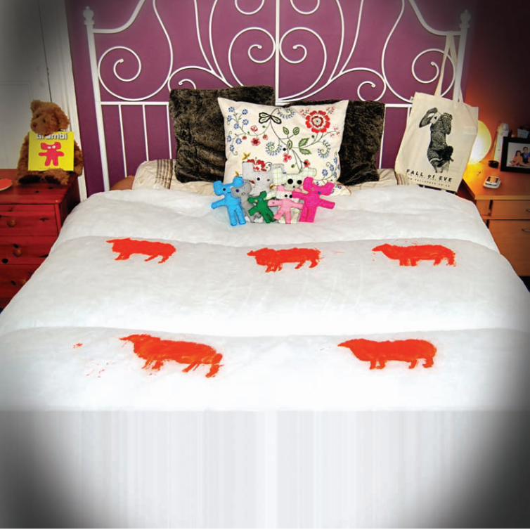
Welcome to my bedroom, this is where my dreams come to life. The idea
behind my dreamy picture was for me to capture who I am and what I
have done, in precisely, one shot.
We normally paint on walls or canvasses and I wanted to break these
conceptions of painting by applying paint to my bedspread whilst videoing
and taking pictures of the whole process. It was important to me to tie in
the Augmented Reality images so the viewer gets a panoramic view around
my bedroom. Look closely and you’ll see where I have placed items of my
work from different projects all around the bedroom. Take a look at my
website to see if you can spot them-
www.yuenlingng.co.uk
Pauline Ng
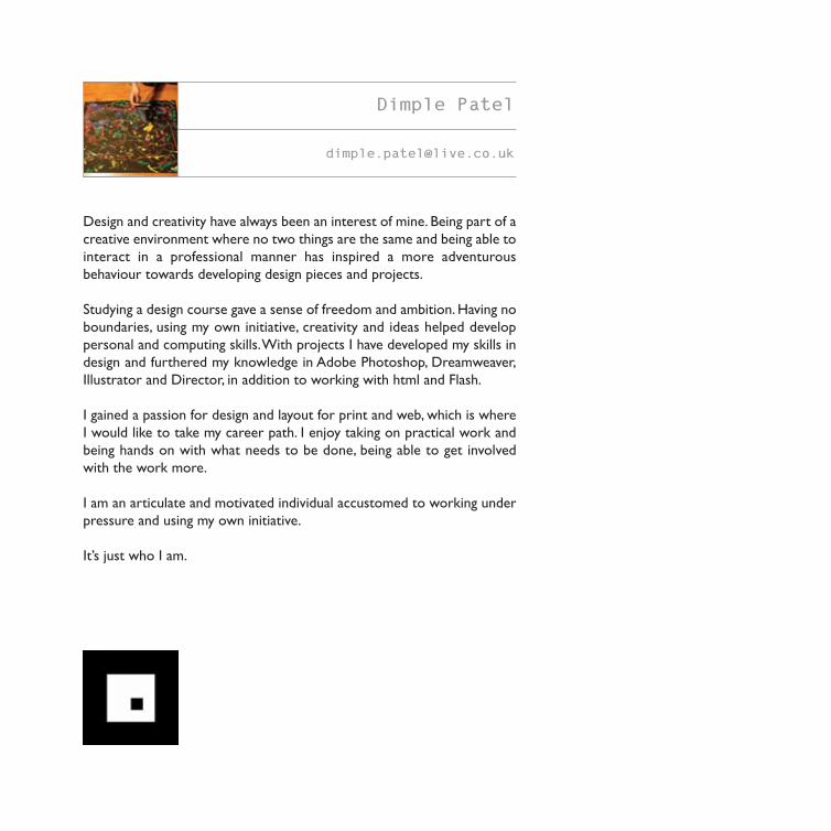
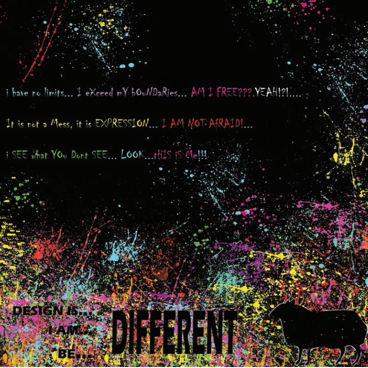
Design and creativity have always been an interest of mine. Being part of a
creative environment where no two things are the same and being able to
interact in a professional manner has inspired a more adventurous
behaviour towards developing design pieces and projects.
Studying a design course gave a sense of freedom and ambition. Having no
boundaries, using my own initiative, creativity and ideas helped develop
personal and computing skills. With projects I have developed my skills in
design and furthered my knowledge in Adobe Photoshop, Dreamweaver,
Illustrator and Director, in addition to working with html and Flash.
I gained a passion for design and layout for print and web, which is where
I would like to take my career path. I enjoy taking on practical work and
being hands on with what needs to be done, being able to get involved
with the work more.
I am an articulate and motivated individual accustomed to working under
pressure and using my own initiative.
It’s just who I am.
Dimple Patel
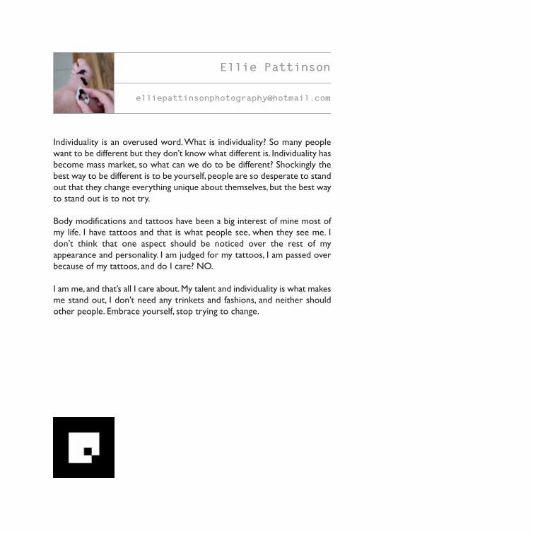
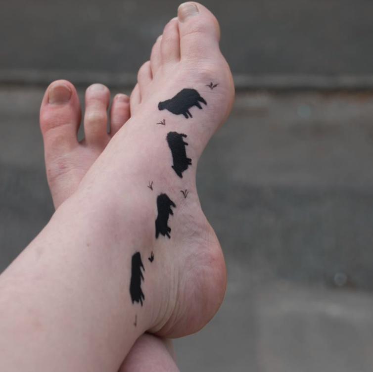
Individuality is an overused word. What is individuality? So many people
want to be different but they don’t know what different is. Individuality has
become mass market, so what can we do to be different? Shockingly the
best way to be different is to be yourself, people are so desperate to stand
out that they change everything unique about themselves, but the best way
to stand out is to not try.
Body modifications and tattoos have been a big interest of mine most of
my life. I have tattoos and that is what people see, when they see me. I
don’t think that one aspect should be noticed over the rest of my
appearance and personality. I am judged for my tattoos, I am passed over
because of my tattoos, and do I care? NO.
I am me, and that’s all I care about. My talent and individuality is what makes
me stand out, I don’t need any trinkets and fashions, and neither should
other people. Embrace yourself, stop trying to change.
Ellie Pattinson

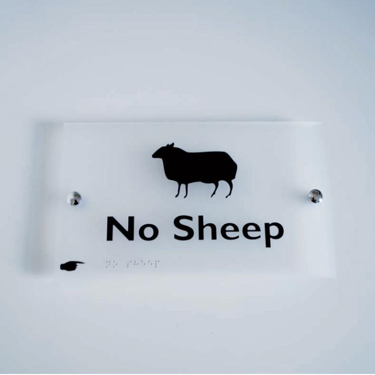
To respond to this brief Christian decided to bastardise some corporate
signage. He juxtaposed the ‘No Sheep’ metaphor (be unique) by
incorporating it into a sterile office sign - the purpose of which is to tell
people exactly what direction to take. With this playfully conflicting visual
outcome, Christian wanted to challenge people to open their eyes and use
their brains, so they understand what it is they are actually seeing.
Christian Shields is a design student who is about to graduate from the
University of Salford. He does not usually talk about himself in third
person.
Christian Shields
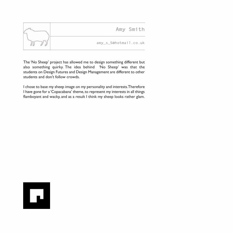
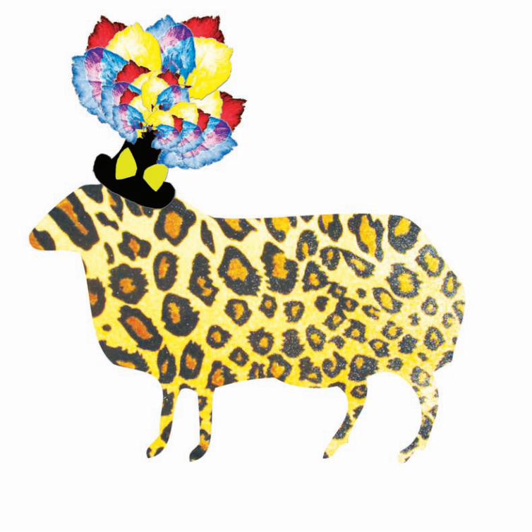
The ‘No Sheep’ project has allowed me to design something different but
also something quirky. The idea behind ‘No Sheep’ was that the
students on Design Futures and Design Management are different to other
students and don’t follow crowds.
I chose to base my sheep image on my personality and interests. Therefore
I have gone for a ‘Copacabana’ theme, to represent my interests in all things
flamboyant and wacky, and as a result I think my sheep looks rather glam.
Amy Smith

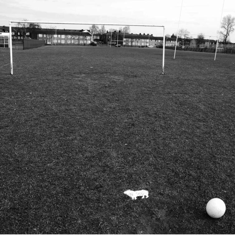
The concept of no-sheep intends to represent the precipitous range of
skills and personalities on our course, at the same time symbolising the
individuality of each student. When asked to come up with our own take
on the sheep I decided to take this opportunity to make use of my stencil
in a way that portrays my personality as well as my opinion of what design
is about.
A football pitch is a place where people work as a team with the objective
to achieve goals, not unlike a design studio. Each player on the pitch is given
a role, and must work together with the rest of the team to achieve
success. I compare my role of Project Manager of this project to that of a
midfielder on the pitch. A strong midfielder can control the game and
looks for opening whilst strategically playing the ball to create new
opportunities for the strikers and wingers. At the same time, the
midfielder need to be available to support the defenders when necessary.
Oliver Taylor
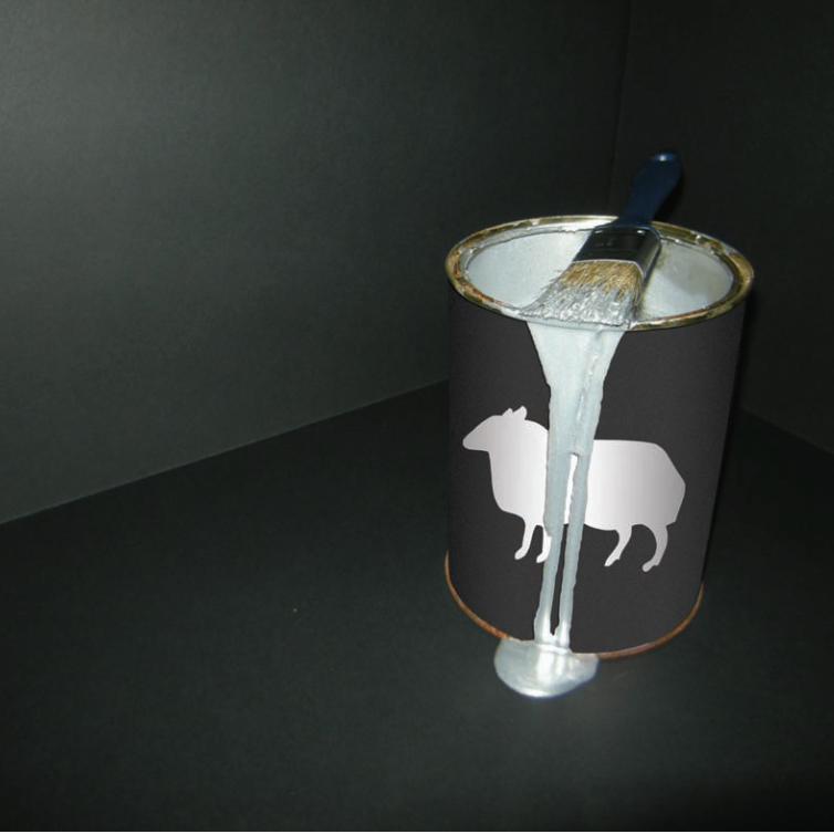
Being part of the Branding Team involved creating an identity for the whole
project. This helped me gain a strong understanding of the concept of the
project. Due to this I feel that my representation of the sheep works well
in terms of representing myself as an individual and the Design Futures
course.
This was created using a mixture of hands on practical work and
development in Photoshop, combined with photography. I feel that this
format not only represents the contrast between my working styles but it
also enabled me to highlight just how easily I can adapt or combine
different mediums.
Scott Walker
Craig Weighman
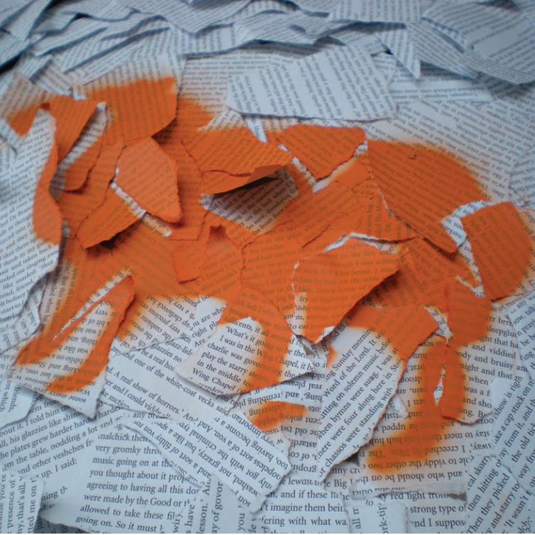
‘What’s it going to be then, eh?’
There was me, that is Craig, and the other like chellovecks and devotchkas
of the cluster, made to slooshy some merzky slovo from the starry veck in
the vonny dickiwicki-bow.
‘Time to privodeet the old rasoodock real polezny for the like pretty polly.’
Viddy this, O my brothers, your Humble Narrator, molodoy, gloopy and
nadmenny as was, ittying the bolshy outside all oddy-knocky with the like
luscious glory and shining zoobies cheested real horrorshow.
Act skorry on the soviets I slooshied, and ookadeet to that southern mesto
of platties for a like jeezny of sharps and chepooka. Such a poogly veshch,
square the pletchos and peet one more to Bog And All His Holy Angels.
A choodessny messel paints the rot real wide and turns the like guttiwuts
all radosty. Make the Em and Pee govoreet dobby from the sladky litso.
Sneeties will sloochat in the lubbilubbing, sheeny glazzies.
And I had a malenky smeck smeck smeck at that. *
* With apologies to “A Clockwork Orange” !
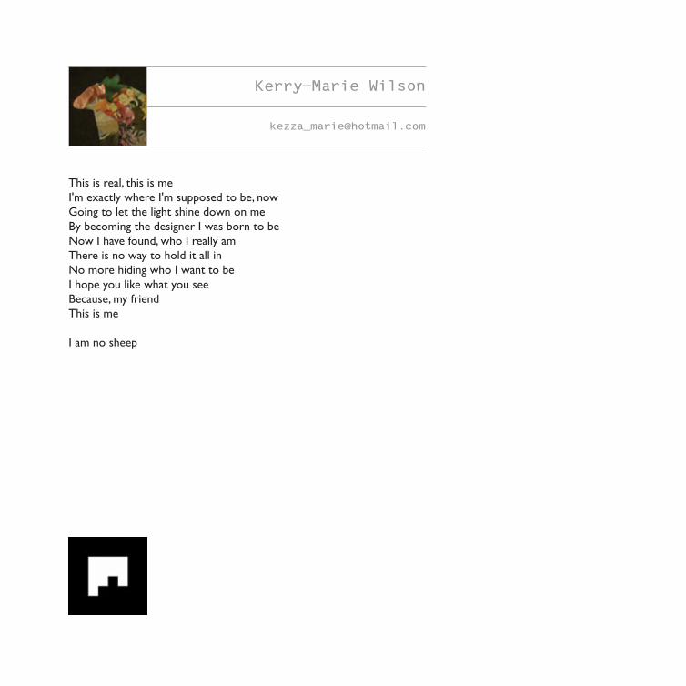
This is real, this is me
I'm exactly where I'm supposed to be, now
Going to let the light shine down on me
By becoming the designer I was born to be
Now I have found, who I really am
There is no way to hold it all in
No more hiding who I want to be
I hope you like what you see
Because, my friend
This is me
I am no sheep
Kerry-Marie Wilson
Design Futures
University of Salford
School of Arts & Design
Peru Street
SALFORD
M3 6EQ
T +44 (0)161 295 6163
www.no-sheep.co.uk
Copyright © The University of Salford 2010, all rights reserved.
The right of all artists, writers and photographers to be identified as the author of the work has been asserted
by them in accordance with sections 77 and 78 of the Copyright, Design and Patents Act 1988. No part of this
publication may be reproduced, stored in a retrieval system or transmitted in any form or by any means
electrical, mechanical or otherwise, without first seeking the written permission of the copyright owners.
With thanks to our industry partners
Getting Started.
On the left hand side pages of the book you will find an augmented
reality marker, it’s positioned on the bottom left hand corner. To
experience our Augmented Reality go to www.no-sheep.co.uk and
click on the Augmented Reality page. Hold the markers in front of a
webcam to see the 3D images for the No-Sheep project.
Make sure your webcam is turned on. If Adobe Flash settings asks to
access your camera, click allow. Don't worry you will not be recorded.
Hold your marker in full view of your webcam until the 3D image appears.
Augmented Reality Explanation
www.no-sheep.co.uk
To have a look at the No-Sheep exhibition trailer use
this marker.