Embed Size (px)
Citation preview
Geographic Information Systems:
A Personal Roadmap & Accomplishments Guide
Brandon Deusenberry
University of West Florida
GIS Certificate Program Graduate
**Insert Professional Address Here
Linked In
2 | P a g e
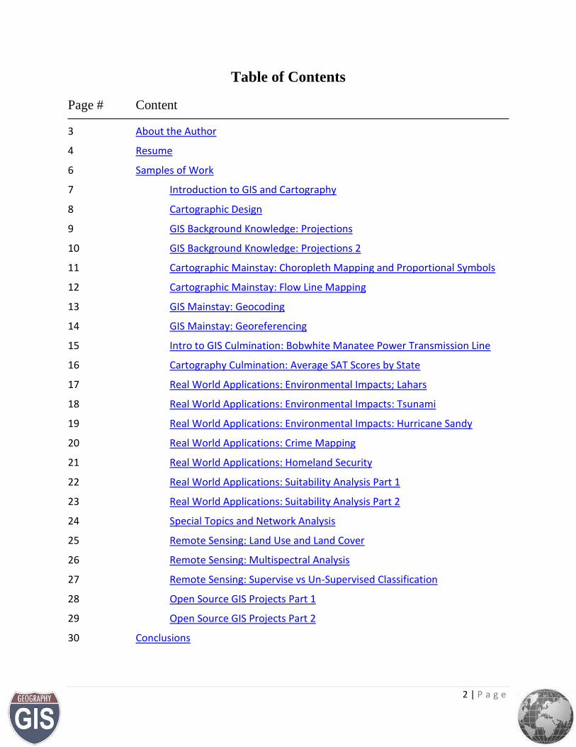
Table of Contents
Page # Content
3 About the Author
4 Resume
6 Samples of Work
7 Introduction to GIS and Cartography
8 Cartographic Design
9 GIS Background Knowledge: Projections
10 GIS Background Knowledge: Projections 2
11 Cartographic Mainstay: Choropleth Mapping and Proportional Symbols
12 Cartographic Mainstay: Flow Line Mapping
13 GIS Mainstay: Geocoding
14 GIS Mainstay: Georeferencing
15 Intro to GIS Culmination: Bobwhite Manatee Power Transmission Line
16 Cartography Culmination: Average SAT Scores by State
17 Real World Applications: Environmental Impacts; Lahars
18 Real World Applications: Environmental Impacts: Tsunami
19 Real World Applications: Environmental Impacts: Hurricane Sandy
20 Real World Applications: Crime Mapping
21 Real World Applications: Homeland Security
22 Real World Applications: Suitability Analysis Part 1
23 Real World Applications: Suitability Analysis Part 2
24 Special Topics and Network Analysis
25 Remote Sensing: Land Use and Land Cover
26 Remote Sensing: Multispectral Analysis
27 Remote Sensing: Supervise vs Un-Supervised Classification
28 Open Source GIS Projects Part 1
29 Open Source GIS Projects Part 2
30 Conclusions
3 | P a g e
About the Author
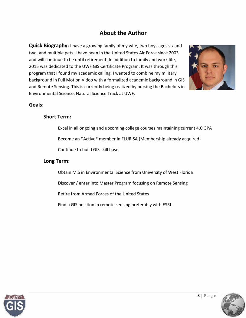
Quick Biography: I have a growing family of my wife, two boys ages six and
two, and multiple pets. I have been in the United States Air Force since 2003
and will continue to be until retirement. In addition to family and work life,
2015 was dedicated to the UWF GIS Certificate Program. It was through this
program that I found my academic calling. I wanted to combine my military
background in Full Motion Video with a formalized academic background in GIS
and Remote Sensing. This is currently being realized by pursing the Bachelors in
Environmental Science, Natural Science Track at UWF.
Goals:
Short Term:
Excel in all ongoing and upcoming college courses maintaining current 4.0 GPA
Become an *Active* member in FLURISA (Membership already acquired)
Continue to build GIS skill base
Long Term:
Obtain M.S in Environmental Science from University of West Florida
Discover / enter into Master Program focusing on Remote Sensing
Retire from Armed Forces of the United States
Find a GIS position in remote sensing preferably with ESRI.
4 | P a g e
Resume
Brandon C. Deusenberry
2212 Calle De Marbella, Navarre, FL 32566 [email protected] • 760.218.1743
SUMMARY OBJECTIVE A position focused on the integration, dissemination, or exploitation of full-motion video (FMV) or remotely sensed imagery analysis and utilization within a Geographic Information System (GIS). Spatial and spectral analyses of which ideally involves leading a team of analysts providing high quality, technically precise visual and cartographic products for end user benefit.
SKILL HIGHLIGHTS
EO/IR FMV Systems (Q-39, Q-26, MX-15Di, StarSAFIRE III)
ESRI ArcGIS 10.2 / 10.3 Desktop (1.5 Years)
ArcEditor data creation
U.S. Census data
U.S. Geological Survey data
Cartographic production w/ Corel Draw x7 and Adobe Illustrator CC 2015
Geodatabase design and creation
Technical Instruction
Data Editing
Projections
GIS analysis
Geoprocessing
Metadata implementation
Google Earth
Model builder
Active TS/SCI clearance
EXPERIENCE Air Force Special Operations Command (AFSOC) Tactician and Action Officer July 2015 to Present, USAF, Hurlburt Field, Fl.
Team lead integrating Tactics’ Techniques, and Procedural documents across seven USAF airborne platforms
Project Management Action Officer responsible for liaising between acquisitions and applications branches of Headquarters AFSOC.
Developer for concepts of operations for aircraft systems and equipment being fielded across AFSOC spectrum of operations.
Managed individual data and application development projects under limited supervision
Technical Specialized Skills Aide January 2016 to May 2016, University of West Florida, Pensacola, Fl.
Developed and tested cartographic skills deliverables utilizing Adobe Illustrator CC 2015 for instructional accuracy, data integrity, and software interoperability
Crafted cartographic deliverables for baseline instruction and guidance of 45 graduate and undergraduate students
Acted as a teaching assistant for GIS 3015/L Cartographic Skills course. Duties include working through
assignments, ensuring course content is complete and accurate on the course site and e-Desktop, grading
5 | P a g e
lab assignments and providing constructive feedback, and supporting the instructor of record and
students.
Scheduled and maintained weekly office hours to be available for students immediate questions, feedback and assignment assistance
AC-130U / PC-12 Evaluator Sensor Operator March 2008 to Present, USAF, Hurlburt Field, Fl.
Electro-Optical airborne sensor systems operator, instructor, and evaluator culminating in 2,500 operational hours.
Planned and executed intentional and dynamic sensor tasking’s involving airborne interdiction, persistent intelligence, surveillance, and reconnaissance (ISR), and battle damage assessment (BDA)
Designed, developed, tested formal courseware for qualification as an AC-130U FMV operator.
Exploited visual, Near-Infrared, Mid-Wave Infrared, Long-Wave Infrared, and Radar portions of the electromagnetic spectrum utilizing full motion, high resolution video
Instructor Air Surveillance Technician January 2004 – July 2007, Tinker Air Force Base Oklahoma, Ok.
Detected, Identified, and tracked air and waterborne targets of interest using E-3B/C AWACS surveillance radar
Recorded and transmitted track data to national command authorities or overseas equivalents
Oversaw coordination with joint/coalition air and ground forces to ensure airborne de-confliction and protection of airborne assets
Instructed junior and requalifying members in the operations of E-3 surveillance systems
EDUCATION
Bachelor of Science, Environmental Science (anticipated 2017), University of West Florida, Pensacola, Florida (GPA: 4.0)
Undergraduate Certificate in Geographic Information Systems (anticipated Apr. 2016), University of West Florida, Pensacola, Florida Relevant Courses: GIS Programming, Applications in GIS, Special Topics in GIS, GIS Internship
Applied Associate of Science, Instructor of Technology and Military Science, Community College of the Air Force, 2013 Associated Certification: CCAF Certified Instructor Level 1 & 2 (2014)
Applied Associated of Science, Air and Space Operations Technology, Community College of the Air Force, 2009
COMMUNITY INVOLVEMENT AND AWARDS
Air Force Special Operations Command Sensor Operator of the Year 2014
Member Florida Urban and Regional Information Systems Association (FLURISA)
University of West Florida, Presidents Honor Roll
Emerald Coast Regional Science Fair Judge
6 | P a g e
Samples of Work
The examples that follow are derived from personal coursework completed throughout the
following courses at the University of West Florida, Undergraduate of Geographic Information
Systems Certificate program. Descriptions below stem from the UWF course overviews. The
primary software utilized for the work are ESRI’s ArcMAP, ArcGlobe, ArcScene, Corel Draw x7,
Adobe Illustrator CC 2015, Google Earth, ERDAS Imagine 2014 and later QGIS.
GIS 4043 Introduction to GIS
Introductory course balancing the “how to” and “why” of GIS by explaining the roles GIS
technology plays in analyzing local and regional problems.
GIS 3015 Cartographic Skills
Provides the basic understanding of thematic mapping methods and design.
GIS 4048 Applications in GIS
This course builds upon the intro to GIS foundations focusing on applications in geohazards,
natural disasters, urban planning, homeland security, health and marketing decisions.
GIS 4102 GIS Programming
An introduction to the Python programming language as it applies to fundamental spatial tasks
such as geoprocessing, editing, database management, projecting data, and map creation.
GIS 4035 Remote Sensing & Photo Interpretation
Course for the familiarization of fundamental remote sensing and air photo interpretation
concepts exploring aerial and satellite photograph for real word applications.
GIS 4930, Special Topics in GIS
Advanced course building on previous GIS fundamentals and application involving analysis
techniques, methods, outputs and uncertainties as they relate to specific problem sets.
GIS 4944 Internship
Culmination of the certificate program considered a supervised application of GIS in n available
field with advanced look at business, government, non profit use, educational and other
applicable GIS uses.
7 | P a g e
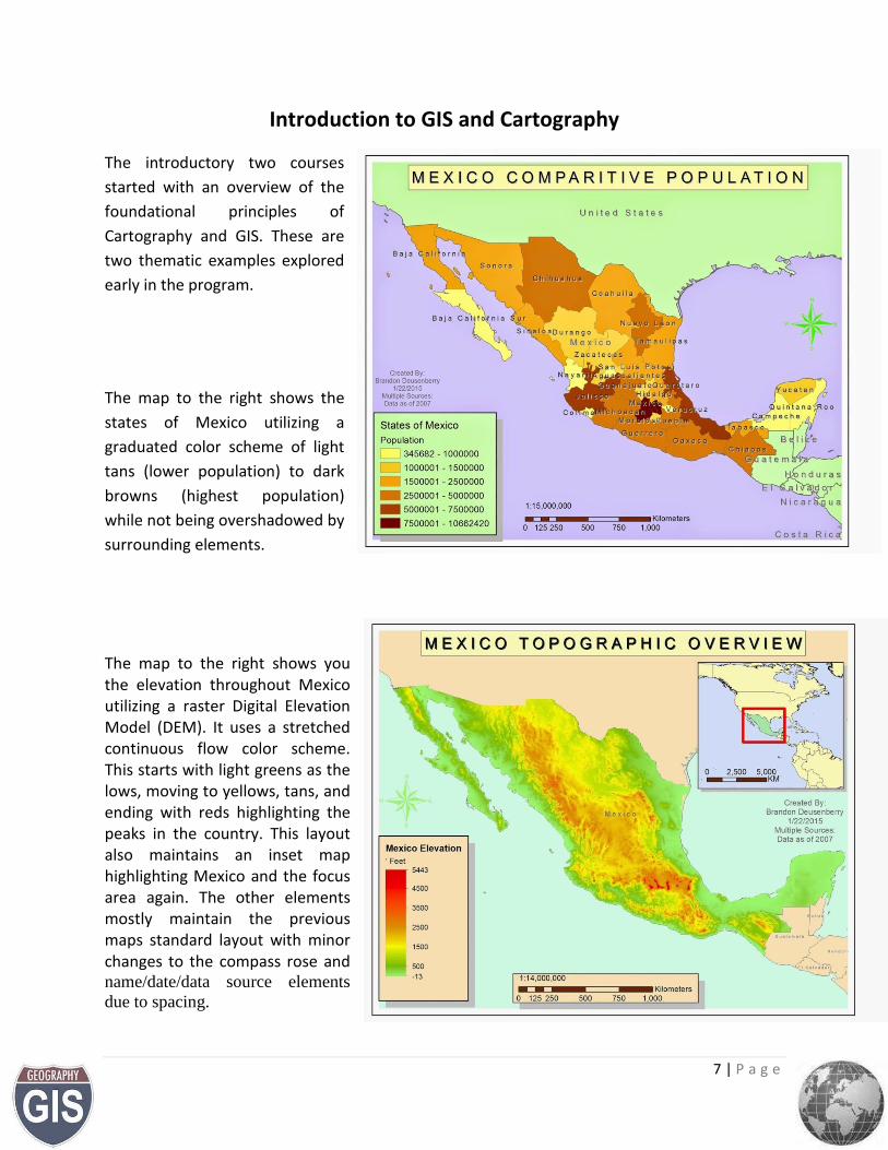
Introduction to GIS and Cartography
The introductory two courses
started with an overview of the
foundational principles of
Cartography and GIS. These are
two thematic examples explored
early in the program.
The map to the right shows the
states of Mexico utilizing a
graduated color scheme of light
tans (lower population) to dark
browns (highest population)
while not being overshadowed by
surrounding elements.
The map to the right shows you the elevation throughout Mexico utilizing a raster Digital Elevation Model (DEM). It uses a stretched continuous flow color scheme. This starts with light greens as the lows, moving to yellows, tans, and ending with reds highlighting the peaks in the country. This layout also maintains an inset map highlighting Mexico and the focus area again. The other elements mostly maintain the previous maps standard layout with minor changes to the compass rose and
name/date/data source elements
due to spacing.
8 | P a g e
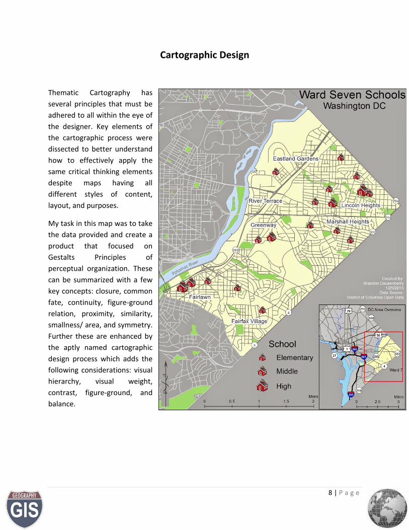
Cartographic Design
Thematic Cartography has
several principles that must be
adhered to all within the eye of
the designer. Key elements of
the cartographic process were
dissected to better understand
how to effectively apply the
same critical thinking elements
despite maps having all
different styles of content,
layout, and purposes.
My task in this map was to take
the data provided and create a
product that focused on
Gestalts Principles of
perceptual organization. These
can be summarized with a few
key concepts: closure, common
fate, continuity, figure-ground
relation, proximity, similarity,
smallness/ area, and symmetry.
Further these are enhanced by
the aptly named cartographic
design process which adds the
following considerations: visual
hierarchy, visual weight,
contrast, figure-ground, and
balance.
9 | P a g e
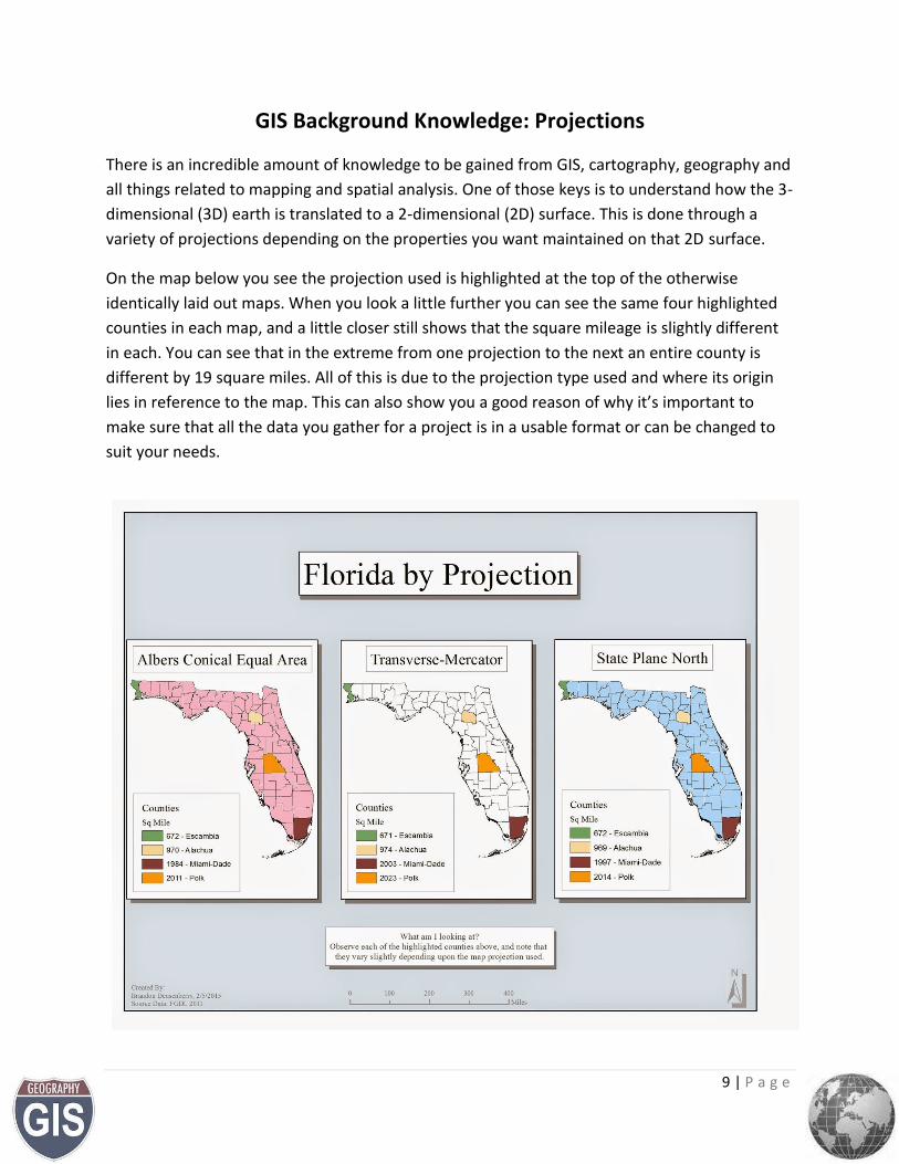
GIS Background Knowledge: Projections
There is an incredible amount of knowledge to be gained from GIS, cartography, geography and
all things related to mapping and spatial analysis. One of those keys is to understand how the 3-
dimensional (3D) earth is translated to a 2-dimensional (2D) surface. This is done through a
variety of projections depending on the properties you want maintained on that 2D surface.
On the map below you see the projection used is highlighted at the top of the otherwise
identically laid out maps. When you look a little further you can see the same four highlighted
counties in each map, and a little closer still shows that the square mileage is slightly different
in each. You can see that in the extreme from one projection to the next an entire county is
different by 19 square miles. All of this is due to the projection type used and where its origin
lies in reference to the map. This can also show you a good reason of why it’s important to
make sure that all the data you gather for a project is in a usable format or can be changed to
suit your needs.
10 | P a g e
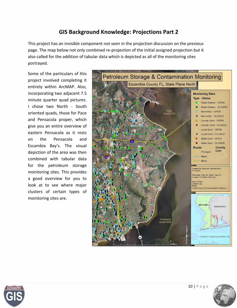
GIS Background Knowledge: Projections Part 2
This project has an invisible component not seen in the projection discussion on the previous
page. The map below not only combined re-projection of the initial assigned projection but it
also called for the addition of tabular data which is depicted as all of the monitoring sites
portrayed.
Some of the particulars of this
project involved completing it
entirely within ArcMAP. Also,
incorporating two adjacent 7.5
minute quarter quad pictures.
I chose two North - South
oriented quads, those for Pace
and Pensacola proper, which
give you an entire overview of
eastern Pensacola as it rests
on the Pensacola and
Escambia Bay's. The visual
depiction of the area was then
combined with tabular data
for the petroleum storage
monitoring sites. This provides
a good overview for you to
look at to see where major
clusters of certain types of
monitoring sites are.
11 | P a g e
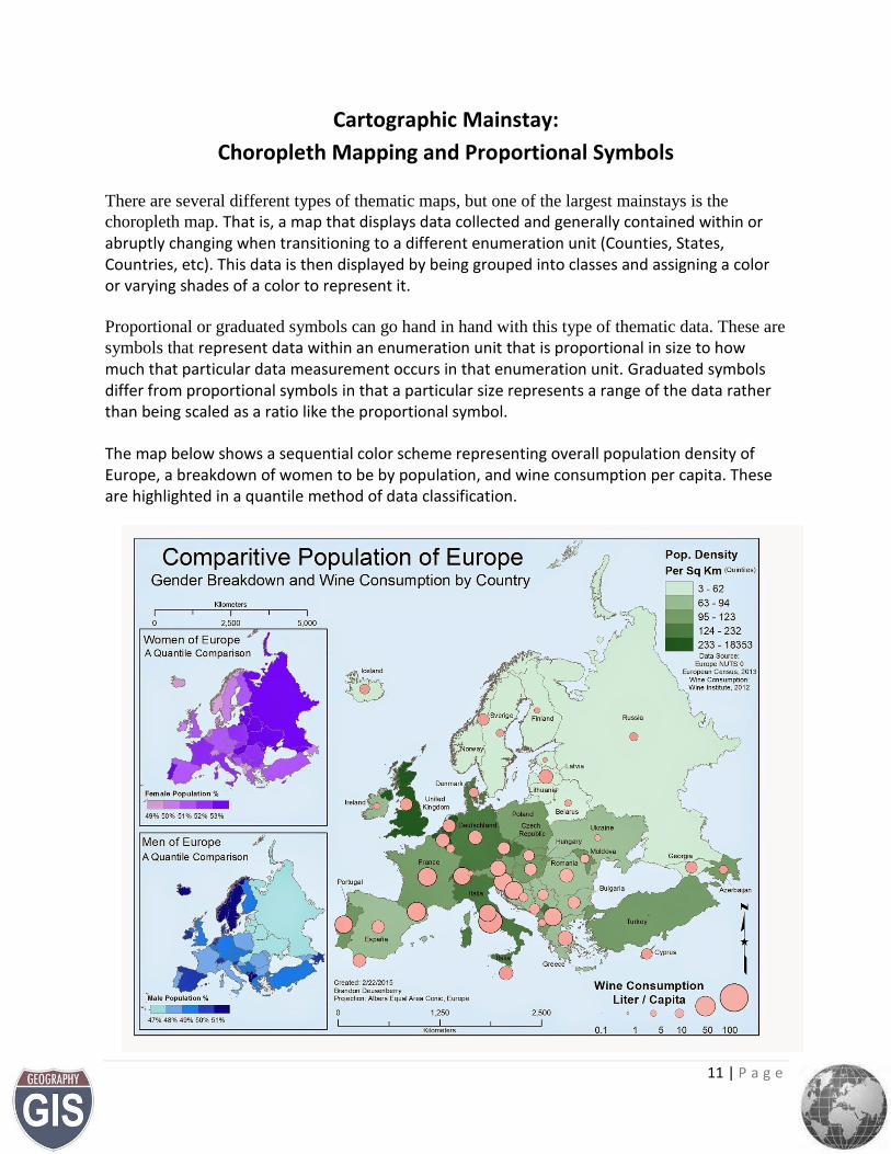
Cartographic Mainstay:
Choropleth Mapping and Proportional Symbols
There are several different types of thematic maps, but one of the largest mainstays is the
choropleth map. That is, a map that displays data collected and generally contained within or abruptly changing when transitioning to a different enumeration unit (Counties, States, Countries, etc). This data is then displayed by being grouped into classes and assigning a color or varying shades of a color to represent it.
Proportional or graduated symbols can go hand in hand with this type of thematic data. These are
symbols that represent data within an enumeration unit that is proportional in size to how much that particular data measurement occurs in that enumeration unit. Graduated symbols differ from proportional symbols in that a particular size represents a range of the data rather than being scaled as a ratio like the proportional symbol.
The map below shows a sequential color scheme representing overall population density of Europe, a breakdown of women to be by population, and wine consumption per capita. These are highlighted in a quantile method of data classification.
12 | P a g e
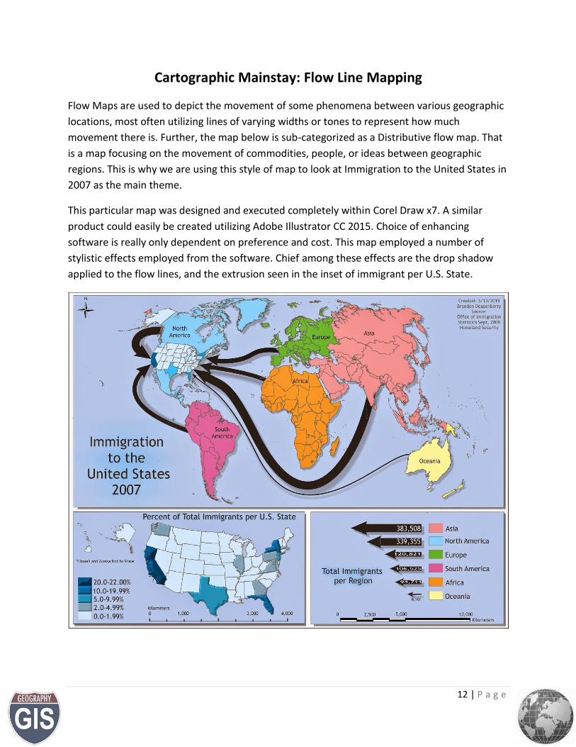
Cartographic Mainstay: Flow Line Mapping
Flow Maps are used to depict the movement of some phenomena between various geographic
locations, most often utilizing lines of varying widths or tones to represent how much
movement there is. Further, the map below is sub-categorized as a Distributive flow map. That
is a map focusing on the movement of commodities, people, or ideas between geographic
regions. This is why we are using this style of map to look at Immigration to the United States in
2007 as the main theme.
This particular map was designed and executed completely within Corel Draw x7. A similar
product could easily be created utilizing Adobe Illustrator CC 2015. Choice of enhancing
software is really only dependent on preference and cost. This map employed a number of
stylistic effects employed from the software. Chief among these effects are the drop shadow
applied to the flow lines, and the extrusion seen in the inset of immigrant per U.S. State.
13 | P a g e
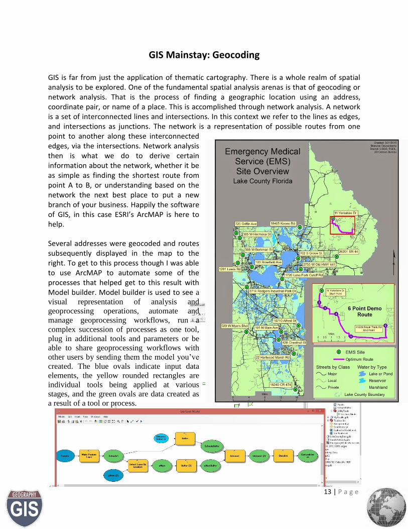
GIS Mainstay: Geocoding
GIS is far from just the application of thematic cartography. There is a whole realm of spatial analysis to be explored. One of the fundamental spatial analysis arenas is that of geocoding or network analysis. That is the process of finding a geographic location using an address, coordinate pair, or name of a place. This is accomplished through network analysis. A network is a set of interconnected lines and intersections. In this context we refer to the lines as edges, and intersections as junctions. The network is a representation of possible routes from one point to another along these interconnected edges, via the intersections. Network analysis then is what we do to derive certain information about the network, whether it be as simple as finding the shortest route from point A to B, or understanding based on the network the next best place to put a new branch of your business. Happily the software of GIS, in this case ESRI’s ArcMAP is here to help.
Several addresses were geocoded and routes subsequently displayed in the map to the right. To get to this process though I was able to use ArcMAP to automate some of the processes that helped get to this result with Model builder. Model builder is used to see a
visual representation of analysis and
geoprocessing operations, automate and
manage geoprocessing workflows, run a
complex succession of processes as one tool,
plug in additional tools and parameters or be
able to share geoprocessing workflows with
other users by sending them the model you’ve
created. The blue ovals indicate input data
elements, the yellow rounded rectangles are
individual tools being applied at various
stages, and the green ovals are data created as
a result of a tool or process.
14 | P a g e
GIS Mainstay: Georeferencing
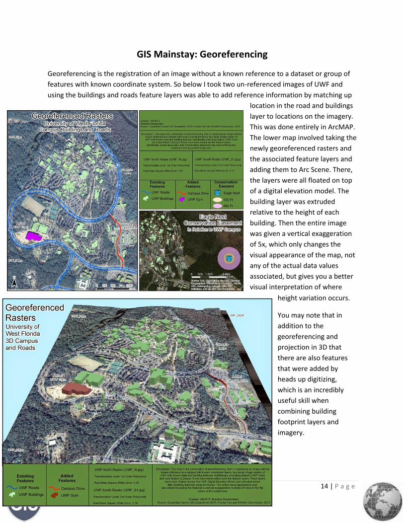
Georeferencing is the registration of an image without a known reference to a dataset or group of
features with known coordinate system. So below I took two un-referenced images of UWF and
using the buildings and roads feature layers was able to add reference information by matching up
location in the road and buildings
layer to locations on the imagery.
This was done entirely in ArcMAP.
The lower map involved taking the
newly georeferenced rasters and
the associated feature layers and
adding them to Arc Scene. There,
the layers were all floated on top
of a digital elevation model. The
building layer was extruded
relative to the height of each
building. Then the entire image
was given a vertical exaggeration
of 5x, which only changes the
visual appearance of the map, not
any of the actual data values
associated, but gives you a better
visual interpretation of where
height variation occurs.
You may note that in
addition to the
georeferencing and
projection in 3D that
there are also features
that were added by
heads up digitizing,
which is an incredibly
useful skill when
combining building
footprint layers and
imagery.
15 | P a g e
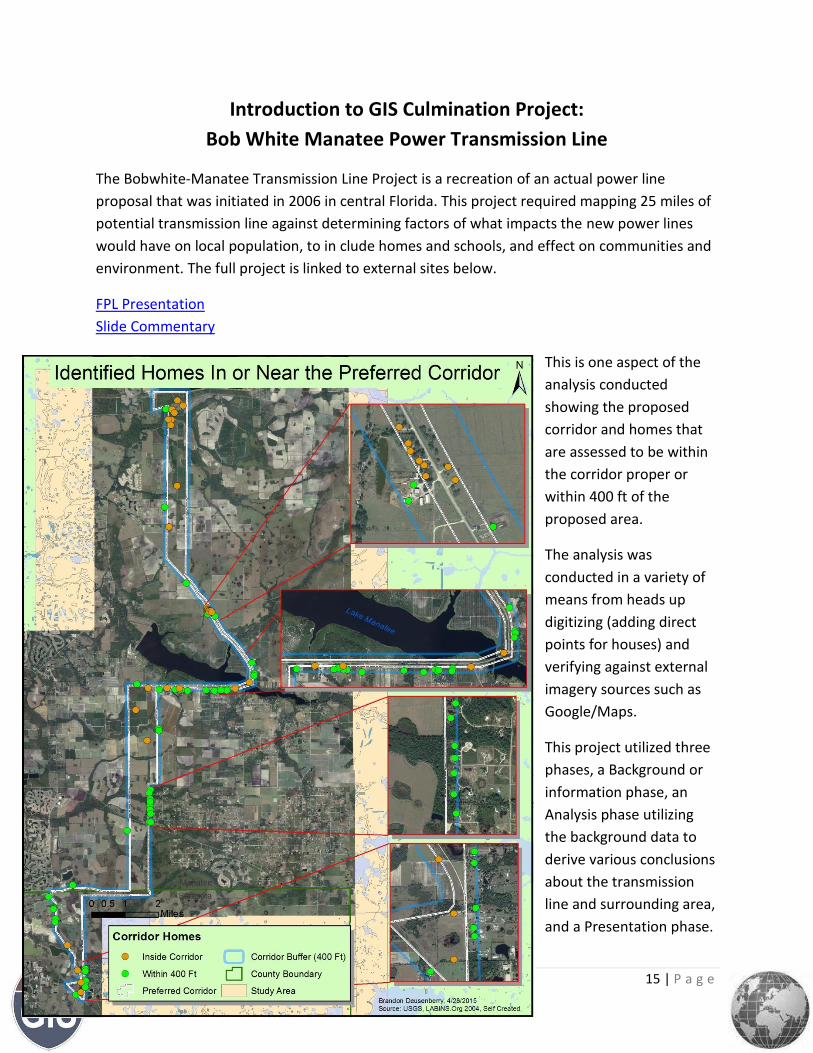
Introduction to GIS Culmination Project:
Bob White Manatee Power Transmission Line
The Bobwhite-Manatee Transmission Line Project is a recreation of an actual power line
proposal that was initiated in 2006 in central Florida. This project required mapping 25 miles of
potential transmission line against determining factors of what impacts the new power lines
would have on local population, to in clude homes and schools, and effect on communities and
environment. The full project is linked to external sites below.
FPL Presentation
Slide Commentary
This is one aspect of the
analysis conducted
showing the proposed
corridor and homes that
are assessed to be within
the corridor proper or
within 400 ft of the
proposed area.
The analysis was
conducted in a variety of
means from heads up
digitizing (adding direct
points for houses) and
verifying against external
imagery sources such as
Google/Maps.
This project utilized three
phases, a Background or
information phase, an
Analysis phase utilizing
the background data to
derive various conclusions
about the transmission
line and surrounding area,
and a Presentation phase.
16 | P a g e
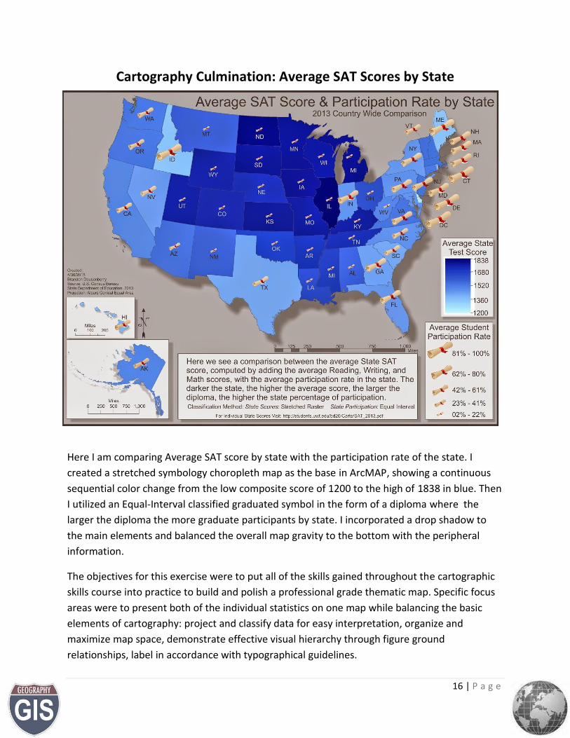
Cartography Culmination: Average SAT Scores by State
Here I am comparing Average SAT score by state with the participation rate of the state. I
created a stretched symbology choropleth map as the base in ArcMAP, showing a continuous
sequential color change from the low composite score of 1200 to the high of 1838 in blue. Then
I utilized an Equal-Interval classified graduated symbol in the form of a diploma where the
larger the diploma the more graduate participants by state. I incorporated a drop shadow to
the main elements and balanced the overall map gravity to the bottom with the peripheral
information.
The objectives for this exercise were to put all of the skills gained throughout the cartographic
skills course into practice to build and polish a professional grade thematic map. Specific focus
areas were to present both of the individual statistics on one map while balancing the basic
elements of cartography: project and classify data for easy interpretation, organize and
maximize map space, demonstrate effective visual hierarchy through figure ground
relationships, label in accordance with typographical guidelines.
17 | P a g e
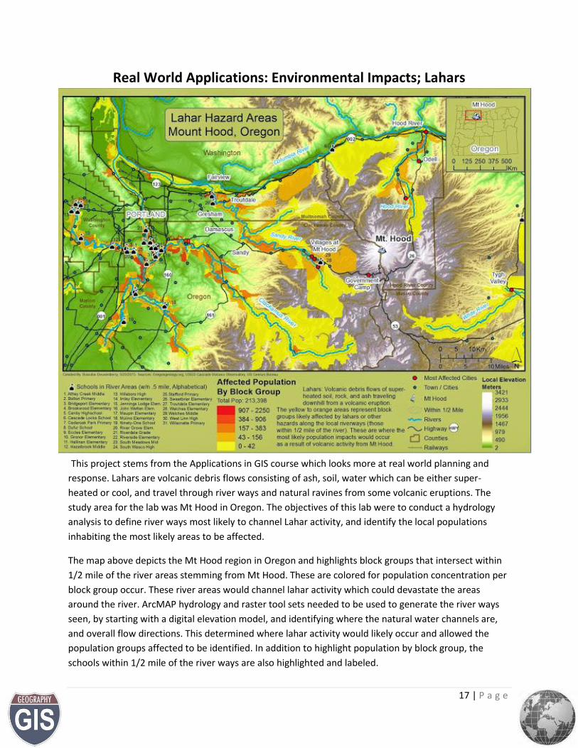
Real World Applications: Environmental Impacts; Lahars
This project stems from the Applications in GIS course which looks more at real world planning and
response. Lahars are volcanic debris flows consisting of ash, soil, water which can be either super-
heated or cool, and travel through river ways and natural ravines from some volcanic eruptions. The
study area for the lab was Mt Hood in Oregon. The objectives of this lab were to conduct a hydrology
analysis to define river ways most likely to channel Lahar activity, and identify the local populations
inhabiting the most likely areas to be affected.
The map above depicts the Mt Hood region in Oregon and highlights block groups that intersect within
1/2 mile of the river areas stemming from Mt Hood. These are colored for population concentration per
block group occur. These river areas would channel lahar activity which could devastate the areas
around the river. ArcMAP hydrology and raster tool sets needed to be used to generate the river ways
seen, by starting with a digital elevation model, and identifying where the natural water channels are,
and overall flow directions. This determined where lahar activity would likely occur and allowed the
population groups affected to be identified. In addition to highlight population by block group, the
schools within 1/2 mile of the river ways are also highlighted and labeled.
18 | P a g e
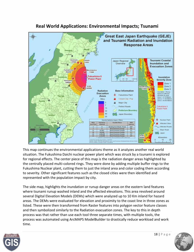
Real World Applications: Environmental Impacts; Tsunami
This map continues the environmental applications theme as it analyzes another real world situation. The Fukushima Daichi nuclear power plant which was struck by a tsunami is explored for regional effects. The center piece of this map is the radiation danger areas highlighted by the centrally placed multi-colored rings. They were done by adding multiple buffer rings to the Fukushima Nuclear plant, cutting them to just the inland area and color coding them according to severity. Other significant features such as the closed cities were then identified and represented with the population impact by city.
The side map, highlights the inundation or runup danger areas on the eastern land features where tsunami runup washed inland and the affected elevations. This area revolved around several Digital Elevation Models (DEMs) which were analyzed up to 10 Km inland for hazard areas. The DEMs were evaluated for elevation and proximity to the coast line in three zones as listed. These were then transformed from Raster features into polygon vector feature classes and then symbolized similarly to the Radiation evacuation zones. The key to this in depth process was that rather than use each tool three separate times, with multiple tools, the process was automated using ArcMAPS ModelBuilder to drastically reduce workload and work time.
19 | P a g e
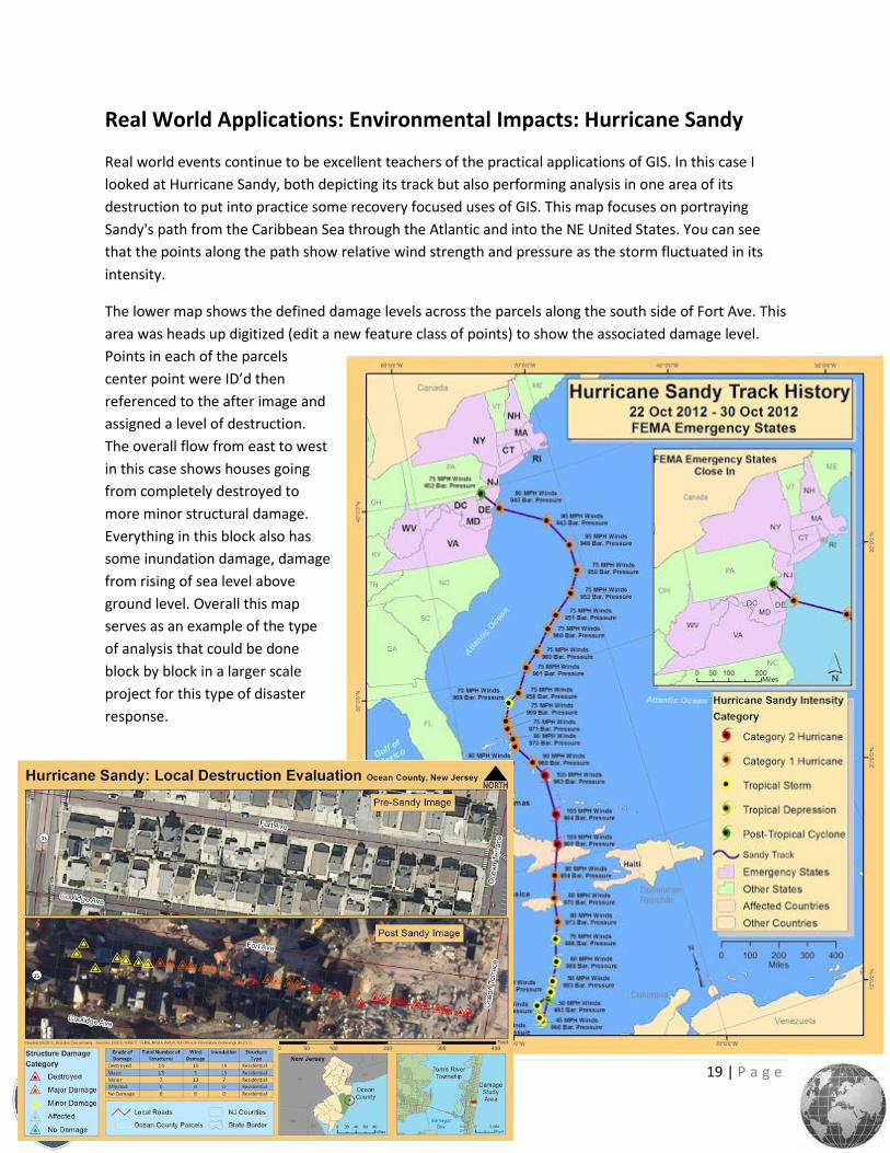
Real World Applications: Environmental Impacts: Hurricane Sandy
Real world events continue to be excellent teachers of the practical applications of GIS. In this case I
looked at Hurricane Sandy, both depicting its track but also performing analysis in one area of its
destruction to put into practice some recovery focused uses of GIS. This map focuses on portraying
Sandy's path from the Caribbean Sea through the Atlantic and into the NE United States. You can see
that the points along the path show relative wind strength and pressure as the storm fluctuated in its
intensity.
The lower map shows the defined damage levels across the parcels along the south side of Fort Ave. This
area was heads up digitized (edit a new feature class of points) to show the associated damage level.
Points in each of the parcels
center point were ID’d then
referenced to the after image and
assigned a level of destruction.
The overall flow from east to west
in this case shows houses going
from completely destroyed to
more minor structural damage.
Everything in this block also has
some inundation damage, damage
from rising of sea level above
ground level. Overall this map
serves as an example of the type
of analysis that could be done
block by block in a larger scale
project for this type of disaster
response.
20 | P a g e
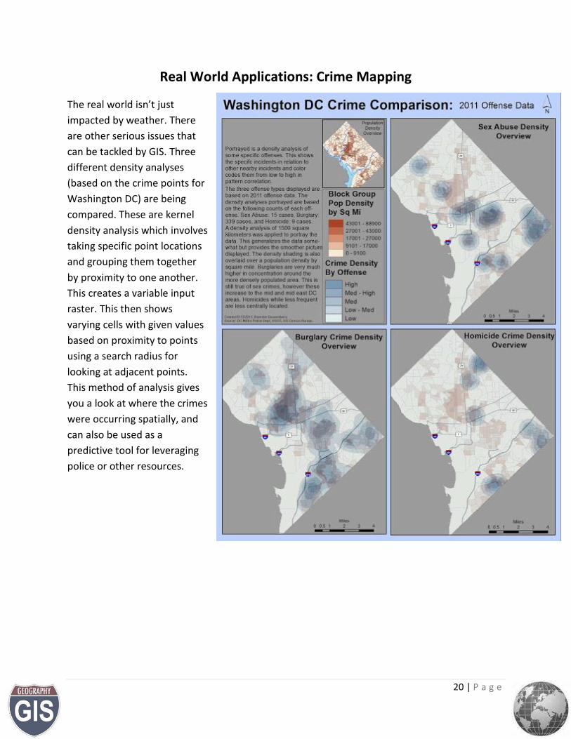
Real World Applications: Crime Mapping
The real world isn’t just
impacted by weather. There
are other serious issues that
can be tackled by GIS. Three
different density analyses
(based on the crime points for
Washington DC) are being
compared. These are kernel
density analysis which involves
taking specific point locations
and grouping them together
by proximity to one another.
This creates a variable input
raster. This then shows
varying cells with given values
based on proximity to points
using a search radius for
looking at adjacent points.
This method of analysis gives
you a look at where the crimes
were occurring spatially, and
can also be used as a
predictive tool for leveraging
police or other resources.
21 | P a g e
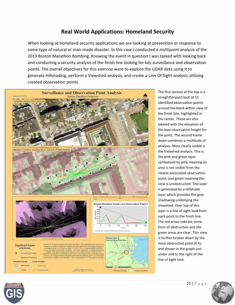
Real World Applications: Homeland Security
When looking at homeland security applications we are looking at prevention or response to
some type of natural or man-made disaster. In this case I conducted a multipoint analysis of the
2013 Boston Marathon Bombing. Knowing the event in question I was tasked with looking back
and conducting a security analysis of the finish line looking for key surveillance and observation
points. The overall objectives for this exercise were to explore the LiDAR data using it to
generate Hillshading, perform a Viewshed analysis, and create a Line Of Sight analysis utilizing
created observation points.
The first section at the top is a
straightforward look at 15
identified observation points
around the block within view of
the finish line, highlighted in
the center. These are also
labeled with the elevation of
the best observation height for
the point. The second frame
down combines a multitude of
analysis. Most clearly visible is
the Viewshed analysis. This is
the pink and green layer
symbolized by pink meaning an
area is not visible from the
closest associated observation
point, and green meaning the
view is unobstructed. This layer
is generated by a Hillshade
layer which provides the gray
shadowing underlying the
Viewshed. Over top of this
layer is a line of sight look from
each point to the finish line.
The red areas indicate some
form of obstruction and the
green areas are clear. This view
is further broken down by the
most obstructed point (# 4),
and shown in the graph just
under and to the right of the
line of sight look.
22 | P a g e
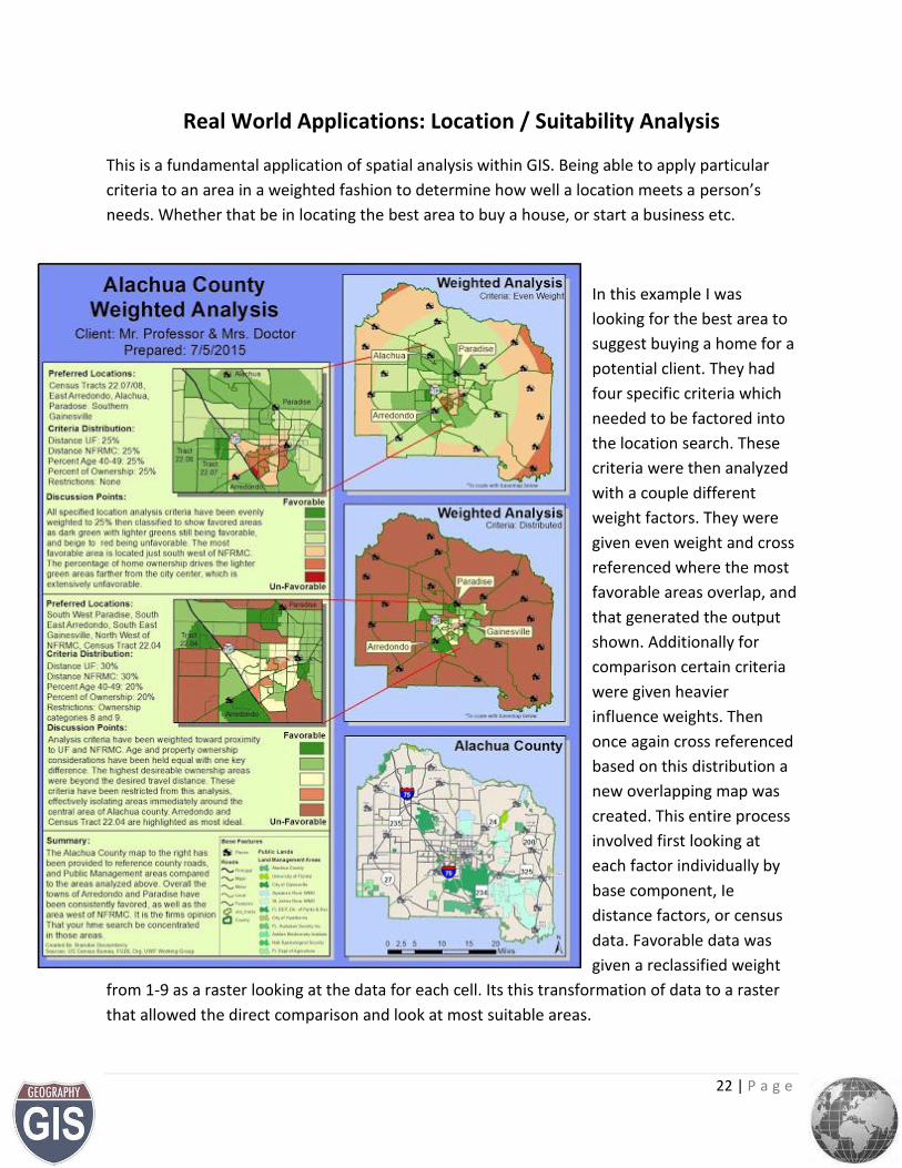
Real World Applications: Location / Suitability Analysis
This is a fundamental application of spatial analysis within GIS. Being able to apply particular
criteria to an area in a weighted fashion to determine how well a location meets a person’s
needs. Whether that be in locating the best area to buy a house, or start a business etc.
In this example I was
looking for the best area to
suggest buying a home for a
potential client. They had
four specific criteria which
needed to be factored into
the location search. These
criteria were then analyzed
with a couple different
weight factors. They were
given even weight and cross
referenced where the most
favorable areas overlap, and
that generated the output
shown. Additionally for
comparison certain criteria
were given heavier
influence weights. Then
once again cross referenced
based on this distribution a
new overlapping map was
created. This entire process
involved first looking at
each factor individually by
base component, Ie
distance factors, or census
data. Favorable data was
given a reclassified weight
from 1-9 as a raster looking at the data for each cell. Its this transformation of data to a raster
that allowed the direct comparison and look at most suitable areas.
23 | P a g e
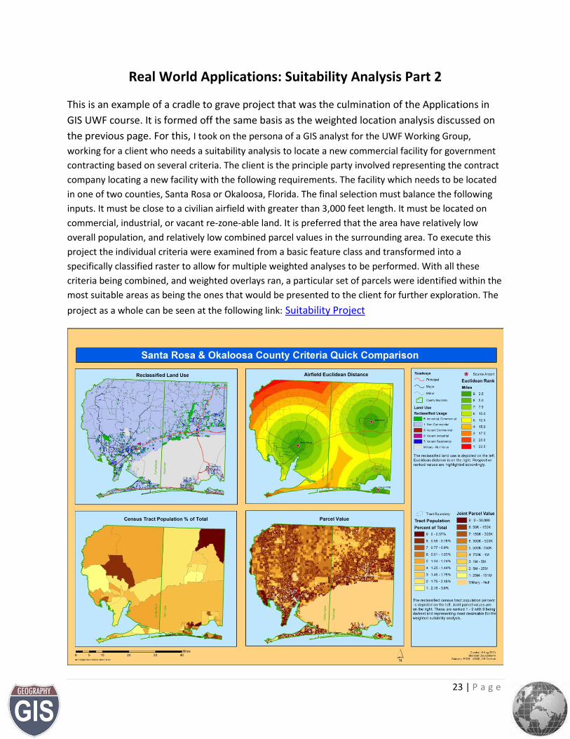
Real World Applications: Suitability Analysis Part 2
This is an example of a cradle to grave project that was the culmination of the Applications in
GIS UWF course. It is formed off the same basis as the weighted location analysis discussed on
the previous page. For this, I took on the persona of a GIS analyst for the UWF Working Group,
working for a client who needs a suitability analysis to locate a new commercial facility for government
contracting based on several criteria. The client is the principle party involved representing the contract
company locating a new facility with the following requirements. The facility which needs to be located
in one of two counties, Santa Rosa or Okaloosa, Florida. The final selection must balance the following
inputs. It must be close to a civilian airfield with greater than 3,000 feet length. It must be located on
commercial, industrial, or vacant re-zone-able land. It is preferred that the area have relatively low
overall population, and relatively low combined parcel values in the surrounding area. To execute this
project the individual criteria were examined from a basic feature class and transformed into a
specifically classified raster to allow for multiple weighted analyses to be performed. With all these
criteria being combined, and weighted overlays ran, a particular set of parcels were identified within the
most suitable areas as being the ones that would be presented to the client for further exploration. The
project as a whole can be seen at the following link: Suitability Project
24 | P a g e
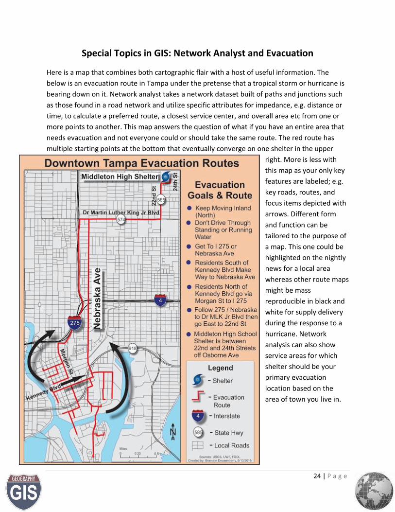
Special Topics in GIS: Network Analyst and Evacuation
Here is a map that combines both cartographic flair with a host of useful information. The
below is an evacuation route in Tampa under the pretense that a tropical storm or hurricane is
bearing down on it. Network analyst takes a network dataset built of paths and junctions such
as those found in a road network and utilize specific attributes for impedance, e.g. distance or
time, to calculate a preferred route, a closest service center, and overall area etc from one or
more points to another. This map answers the question of what if you have an entire area that
needs evacuation and not everyone could or should take the same route. The red route has
multiple starting points at the bottom that eventually converge on one shelter in the upper
right. More is less with
this map as your only key
features are labeled; e.g.
key roads, routes, and
focus items depicted with
arrows. Different form
and function can be
tailored to the purpose of
a map. This one could be
highlighted on the nightly
news for a local area
whereas other route maps
might be mass
reproducible in black and
white for supply delivery
during the response to a
hurricane. Network
analysis can also show
service areas for which
shelter should be your
primary evacuation
location based on the
area of town you live in.
25 | P a g e
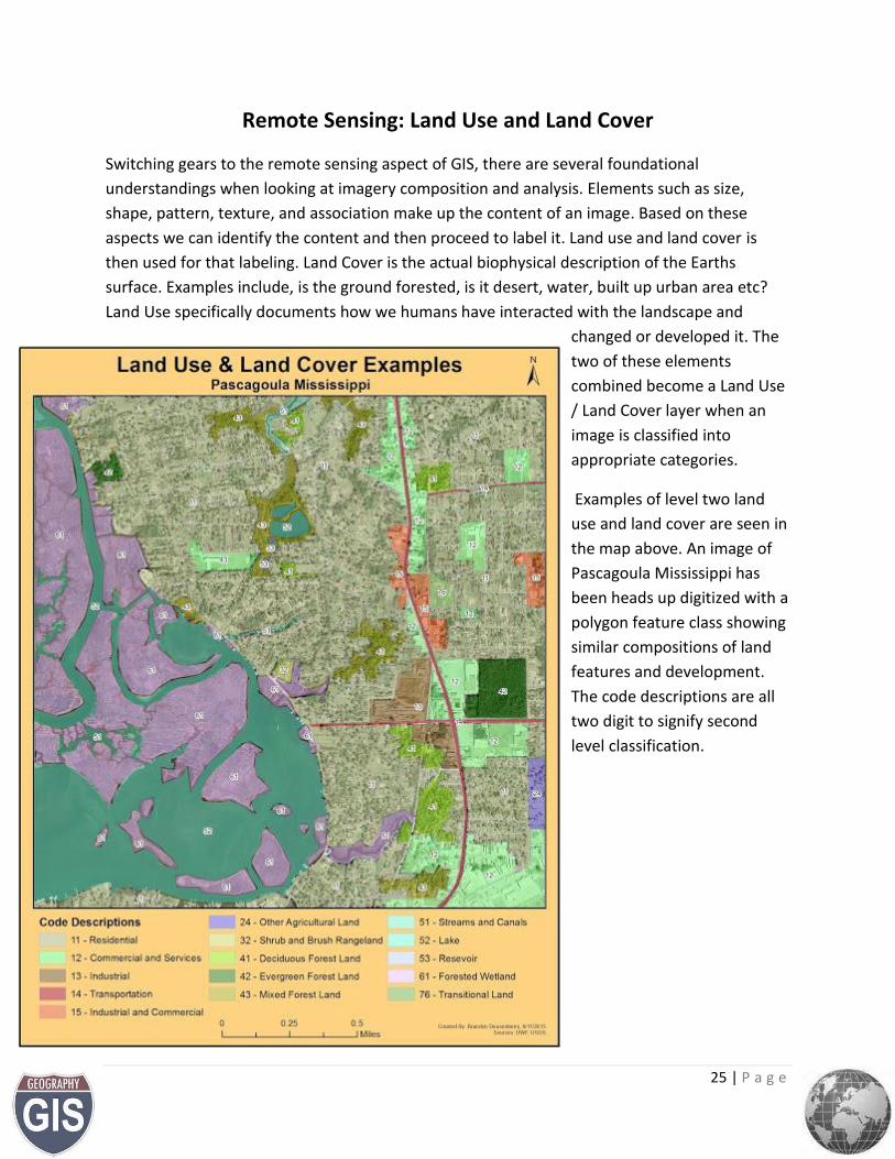
Remote Sensing: Land Use and Land Cover
Switching gears to the remote sensing aspect of GIS, there are several foundational
understandings when looking at imagery composition and analysis. Elements such as size,
shape, pattern, texture, and association make up the content of an image. Based on these
aspects we can identify the content and then proceed to label it. Land use and land cover is
then used for that labeling. Land Cover is the actual biophysical description of the Earths
surface. Examples include, is the ground forested, is it desert, water, built up urban area etc?
Land Use specifically documents how we humans have interacted with the landscape and
changed or developed it. The
two of these elements
combined become a Land Use
/ Land Cover layer when an
image is classified into
appropriate categories.
Examples of level two land
use and land cover are seen in
the map above. An image of
Pascagoula Mississippi has
been heads up digitized with a
polygon feature class showing
similar compositions of land
features and development.
The code descriptions are all
two digit to signify second
level classification.
26 | P a g e
Remote Sensing: Multispectral Analysis
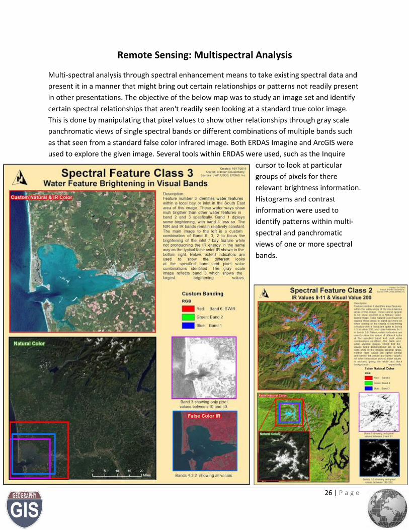
Multi-spectral analysis through spectral enhancement means to take existing spectral data and
present it in a manner that might bring out certain relationships or patterns not readily present
in other presentations. The objective of the below map was to study an image set and identify
certain spectral relationships that aren't readily seen looking at a standard true color image.
This is done by manipulating that pixel values to show other relationships through gray scale
panchromatic views of single spectral bands or different combinations of multiple bands such
as that seen from a standard false color infrared image. Both ERDAS Imagine and ArcGIS were
used to explore the given image. Several tools within ERDAS were used, such as the Inquire
cursor to look at particular
groups of pixels for there
relevant brightness information.
Histograms and contrast
information were used to
identify patterns within multi-
spectral and panchromatic
views of one or more spectral
bands.
27 | P a g e
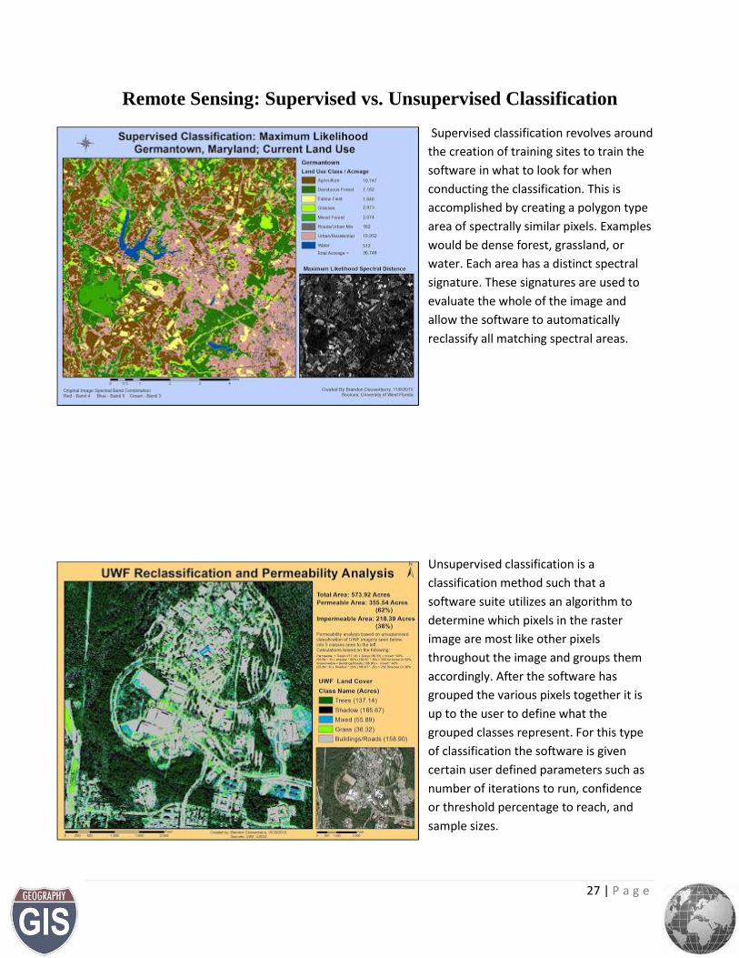
Remote Sensing: Supervised vs. Unsupervised Classification
Supervised classification revolves around
the creation of training sites to train the
software in what to look for when
conducting the classification. This is
accomplished by creating a polygon type
area of spectrally similar pixels. Examples
would be dense forest, grassland, or
water. Each area has a distinct spectral
signature. These signatures are used to
evaluate the whole of the image and
allow the software to automatically
reclassify all matching spectral areas.
Unsupervised classification is a
classification method such that a
software suite utilizes an algorithm to
determine which pixels in the raster
image are most like other pixels
throughout the image and groups them
accordingly. After the software has
grouped the various pixels together it is
up to the user to define what the
grouped classes represent. For this type
of classification the software is given
certain user defined parameters such as
number of iterations to run, confidence
or threshold percentage to reach, and
sample sizes.
28 | P a g e
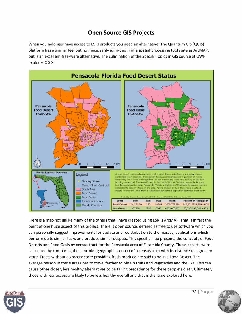
Open Source GIS Projects
When you nolonger have access to ESRI products you need an alternative. The Quantum GIS (QGIS)
platform has a similar feel but not necessarily as in-depth of a spatial processing tool suite as ArcMAP,
but is an excellent free-ware alternative. The culmination of the Special Topics in GIS course at UWF
explores QGIS.
Here is a map not unlike many of the others that I have created using ESRI's ArcMAP. That is in fact the
point of one huge aspect of this project. There is open source, defined as free to use software which you
can personally suggest improvements for update and redistribution to the masses, applications which
perform quite similar tasks and produce similar outputs. This specific map presents the concepts of Food
Deserts and Food Oasis by census tract for the Pensacola area of Escambia County. These deserts were
calculated by comparing the centroid (geographic center) of a census tract with its distance to a grocery
store. Tracts without a grocery store providing fresh produce are said to be in a Food Desert. The
average person in these areas has to travel farther to obtain fruits and vegetables and the like. This can
cause other closer, less healthy alternatives to be taking precedence for these people’s diets. Ultimately
those with less access are likely to be less healthy overall and that is the issue explored here.
29 | P a g e
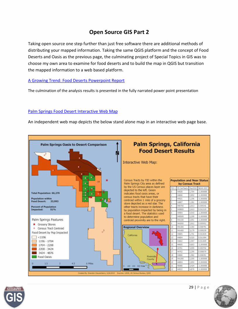
Open Source GIS Part 2
Taking open source one step further than just free software there are additional methods of
distributing your mapped information. Taking the same QGIS platform and the concept of Food
Deserts and Oasis as the previous page, the culminating project of Special Topics in GIS was to
choose my own area to examine for food deserts and to build the map in QGIS but transition
the mapped information to a web based platform.
A Growing Trend: Food Deserts Powerpoint Report
The culmination of the analysis results is presented in the fully narrated power point presentation
Palm Springs Food Desert Interactive Web Map
An independent web map depicts the below stand alone map in an interactive web page base.
30 | P a g e
Conclusions
This portfolio is not an all-inclusive look at the work I have completed. It is a representative
sampling of several fundamental tasks introduced throughout the UWF GIS Certificate program.
Since this program ended I have continued toward the endeavors of continuing my degree
program in natural science and geography with GIS at the forefront of my thought and ongoing
motivation.
I have become a member of the Florida Urban and Regional Information Systems Association
(FLURISA) which is an organization dedicated to education, collaboration, innovation and
professional advancement in the geospatial industry.
Please don’t hesitate to contact me with the information below for questions, comments, or
additional information.
v/r
Brandon Deusenberry
Other Email Here
Phone Number here