Embed Size (px)
DESCRIPTION
cc
Citation preview

7/17/2019 DTTest
http://slidepdf.com/reader/full/dttest 1/19
This tutorial is part of a set. Find out more about data access with ASP.NET in the Working with Data in ASP.NET 2.0 section of the ASP.NET site at http://www.asp.net/learn/dataaccess/default.aspx.
Working with Data in ASP.NET 2.0 :: DisplayingData with the DataList and Repeater Controls
Introduction In all of the examples throughout the past 28 tutorials, if we needed to display multiple records from a data sourcewe turned to the GridView control. The GridView renders a row for each record in the data source, displaying therecord’s data fields in columns. While the GridView makes it a snap to display, page through, sort, edit, and deletedata, its appearance is a bit boxy. Moreover, the markup responsible for the GridView’s structure is fixed — itincludes an HTML <table> with a table row (<tr>) for each record and a table cell (<td>) for each field.
To provide a greater degree of customization in the appearance and rendered markup when displaying multiplerecords, ASP.NET 2.0 offers the DataList and Repeater controls (both of which were also available in ASP.NETversion 1.x). The DataList and Repeater controls render their content using templates rather than BoundFields,
CheckBoxFields, ButtonFields, and so on. Like the GridView, the DataList renders as an HTML <table>, butallows for multiple data source records to be displayed per table row. The Repeater, on the other hand, renders noadditional markup than what you explicitly specify, and is an ideal candidate when you need precise control overthe markup emitted.
Over the next dozen or so tutorials, we’ll look at building common reporting patterns with the DataList andRepeater controls, starting with the basics of displaying data with these controls’ templates. We’ll see how toformat these controls, how to alter the layout of data source records in the DataList, common master/detailsscenarios, ways to edit and delete data, how to page through records, and so on.
Step 1: Adding the DataList and Repeater TutorialWeb Pages
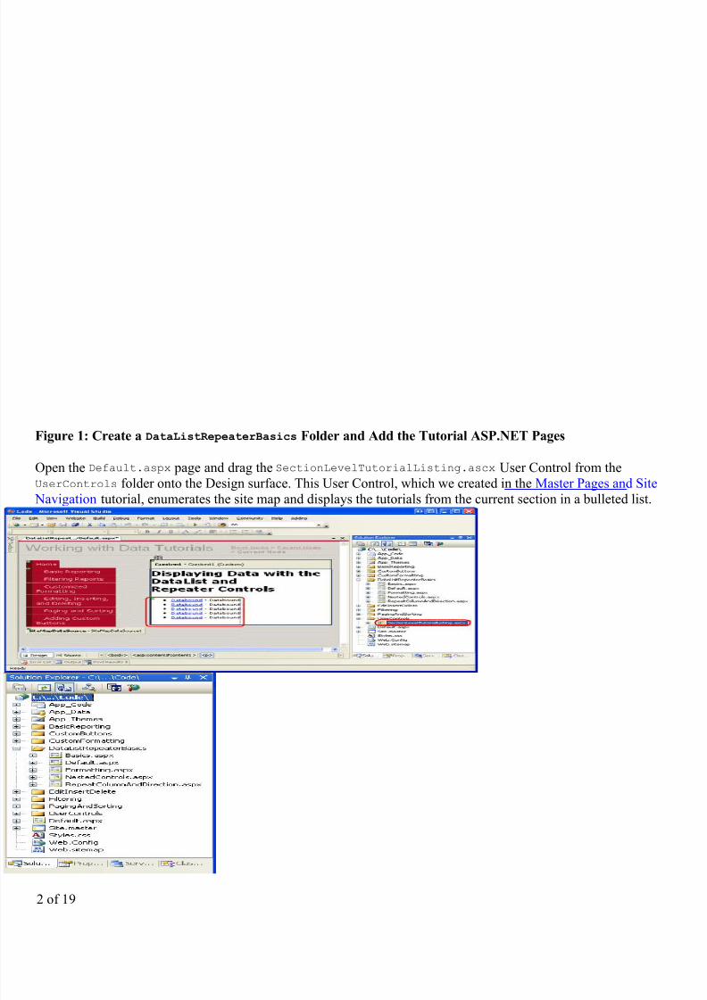
Before we start this tutorial, let’s first take a moment to add the ASP.NET pages we’ll need for this tutorial and thnext few tutorials dealing with displaying data using the DataList and Repeater. Start by creating a new folder inthe project named DataListRepeaterBasics . Next, add the following five ASP.NET pages to this folder, havingall of them configured to use the master page Site.master:
l Default.aspx
l Basics.aspx
l Formatting.aspx
l RepeatColumnAndDirection.aspx
l NestedControls.aspx
1 of 19
7/17/2019 DTTest
http://slidepdf.com/reader/full/dttest 2/19
Figure 1: Create a DataListRepeaterBasics Folder and Add the Tutorial ASP.NET Pages
Open the Default.aspx page and drag the SectionLevelTutorialListing.ascx User Control from theUserControls folder onto the Design surface. This User Control, which we created in the Master Pages and Site
Navigation tutorial, enumerates the site map and displays the tutorials from the current section in a bulleted list.
2 of 19

7/17/2019 DTTest
http://slidepdf.com/reader/full/dttest 3/19
Figure 2: Add the SectionLevelTutorialListing.ascx User Control to Default.aspx
In order to have the bulleted list display the DataList and Repeater tutorials we’ll be creating, we need to add themto the site map. Open the Web.sitemap file and add the following markup after the “Adding Custom Buttons” site
map node markup:
<siteMapNode title="Displaying Data with the DataList and Repeater" description="Samples of Reports that Use the DataList and Repeater Controls"
url="~/DataListRepeaterBasics/Default.aspx" > <siteMapNode
title="Basic Examples" description="Examines the basics for displaying data using the DataList and Repeater controls." url="~/DataListRepeaterBasics/Basics.aspx" />
<siteMapNodetitle="Formatting"description="Learn how to format the DataList and the Web controls within
the DataList and Repeater's templates." url="~/DataListRepeaterBasics/Formatting.aspx" />
<siteMapNodetitle="Adjusting the DataList's Layout"
description="Illustrates how to alter the DataList's layout, showing multiple data source records per table row." url="~/DataListRepeaterBasics/RepeatColumnAndDirection.aspx" />
<siteMapNodetitle="Nesting a Repeater within a DataList"
description="Learn how to nest a Repeater within the template of a DataList." url="~/DataListRepeaterBasics/NestedControls.aspx" /> </siteMapNode>
3 of 19

7/17/2019 DTTest
http://slidepdf.com/reader/full/dttest 4/19
Figure 3: Update the Site Map to Include the New ASP.NET Pages
Step 2: Displaying Product Information with theDataList
Similar to the FormView, the DataList control’s rendered output depends upon templates rather than BoundFieldsCheckBoxFields, and so on. Unlike the FormView, the DataList is designed to display a set of records rather than
solitary one. Let’s begin this tutorial with a look at binding product information to a DataList. Start by opening theBasics.aspx page in the DataListRepeaterBasics folder. Next, drag a DataList from the Toolbox onto theDesigner. As Figure 4 illustrates, before specifying the DataList’s templates, the Designer displays it as a gray box
Figure 4: Drag the DataList From the Toolbox Onto the Designer
From the DataList’s smart tag, add a new ObjectDataSource and configure it to use the ProductsBLL class’sGetProducts method. Since we’re creating a read-only DataList in this tutorial, set the drop-down list to (None) ithe wizard’s INSERT, UPDATE, and DELETE tabs.
4 of 19

7/17/2019 DTTest
http://slidepdf.com/reader/full/dttest 5/19
Figure 5: Opt to Create a New ObjectDataSource
Figure 6: Configure the ObjectDataSource to Use the ProductsBLL Class
5 of 19

7/17/2019 DTTest
http://slidepdf.com/reader/full/dttest 6/19
Figure 7: Retrieve Information About All of the Products Using the GetProducts Method
After configuring the ObjectDataSource and associating it with the DataList through its smart tag, Visual Studiowill automatically create an ItemTemplate in the DataList that displays the name and value of each data fieldreturned by the data source (see the markup below). This default ItemTemplate’s appearance is identical to that othe templates automatically created when binding a data source to the FormView through the Designer.
<asp:DataList ID="DataList1" runat="server" DataKeyField="ProductID" DataSourceID="ObjectDataSource1" EnableViewState="False"> <ItemTemplate> ProductID: <asp:Label ID="ProductIDLabel" runat="server" Text='<%# Eval("ProductID") %>' /><br /> ProductName: <asp:Label ID="ProductNameLabel" runat="server" Text='<%# Eval("ProductName") %>' /><br /> SupplierID: <asp:Label ID="SupplierIDLabel" runat="server" Text='<%# Eval("SupplierID") %>' /><br /> CategoryID: <asp:Label ID="CategoryIDLabel" runat="server" Text='<%# Eval("CategoryID") %>'/><br /> QuantityPerUnit: <asp:Label ID="QuantityPerUnitLabel" runat="server" Text='<%# Eval("QuantityPerUnit") %>' /><br /> UnitPrice: <asp:Label ID="UnitPriceLabel" runat="server" Text='<%# Eval("UnitPrice") %>' /><br /> UnitsInStock: <asp:Label ID="UnitsInStockLabel" runat="server" Text='<%# Eval("UnitsInStock") %>' /><br /> UnitsOnOrder: <asp:Label ID="UnitsOnOrderLabel" runat="server" Text='<%# Eval("UnitsOnOrder") %>' /><br /> ReorderLevel: <asp:Label ID="ReorderLevelLabel" runat="server" Text='<%# Eval("ReorderLevel") %>' /><br /> Discontinued: <asp:Label ID="DiscontinuedLabel" runat="server" Text='<%# Eval("Discontinued") %>' /><br /> CategoryName: <asp:Label ID="CategoryNameLabel" runat="server" Text='<%# Eval("CategoryName") %>' /><br /> SupplierName: <asp:Label ID="SupplierNameLabel" runat="server" Text='<%# Eval("SupplierName") %>' /><br />
6 of 19

7/17/2019 DTTest
http://slidepdf.com/reader/full/dttest 7/19
<br /> </ItemTemplate></asp:DataList><asp:ObjectDataSource ID="ObjectDataSource1" runat="server" OldValuesParameterFormatString="original_0" SelectMethod="GetProducts" TypeName="ProductsBLL"></asp:ObjectDataSource>
Note: Recall that when binding a data source to a FormView control through the FormView’s smart tag, VisualStudio created an ItemTemplate, InsertItemTemplate, and EditItemTemplate. With the DataList, however,
only an ItemTemplate is created. This is because the DataList does not have the same built-in editing and insertinsupport offered by the FormView. The DataList does contain edit- and delete-related events, and editing anddeleting support can be added with a bit of code, but there’s no simple out-of-the-box support as with theFormView. We’ll see how to include editing and deleting support with the DataList in a future tutorial.
Let’s take a moment to improve the appearance of this template. Rather than displaying all of the data fields, let’sonly display the product’s name, supplier, category, quantity per unit, and unit price. Moreover, let’s display thename in an <h4> heading and lay out the remaining fields using a <table> beneath the heading.
To make these changes you can either use the template editing features in the Designer — from the DataList’ssmart tag click on the Edit Templates link — or you can modify the template manually through the page’s
declarative syntax. If you use the Edit Templates option in the Designer, your resulting markup may not match thefollowing markup exactly, but when viewed through a browser should look very similar to the screen shot shown iFigure 8.
<asp:DataList ID="DataList1" runat="server" DataKeyField="ProductID" DataSourceID="ObjectDataSource1" EnableViewState="False"> <ItemTemplate> <h4><asp:Label ID="ProductNameLabel" runat="server" Text='<%# Eval("ProductName") %>' /></h4> <table border="0"> <tr> <td class="ProductPropertyLabel">Category:</td> <td><asp:Label ID="CategoryNameLabel" runat="server" Text='<%# Eval("CategoryName") %>' /></td> <td class="ProductPropertyLabel">Supplier:</td> <td><asp:Label ID="SupplierNameLabel" runat="server" Text='<%# Eval("SupplierName") %>' /></td> </tr> <tr> <td class="ProductPropertyLabel">Qty/Unit:</td> <td><asp:Label ID="QuantityPerUnitLabel" runat="server" Text='<%# Eval("QuantityPerUnit") %>' /></td> <td class="ProductPropertyLabel">Price:</td> <td><asp:Label ID="UnitPriceLabel" runat="server" Text='<%# Eval("UnitPrice", "0:C") %>' /></td> </tr> </table> </ItemTemplate>
</asp:DataList>
Note: The example above uses Label Web controls whose Text property is assigned the value of the databindingsyntax. Alternatively, we could have omitted the Labels altogether, typing in just the databinding syntax. That is,instead of using <asp:Label ID="CategoryNameLabel" runat="server" Text='<%# Eval("CategoryName"
%>' /> we could have instead used the declarative syntax <%# Eval("CategoryName") %>.
Leaving in the Label Web controls, however, offer two advantages. First, it provides an easier means for formattinthe data based on the data, as we’ll see in the next tutorial. Second, the Edit Templates option in the Designerdoesn’t display declarative databinding syntax that appears outside of some Web control. Instead, the Edit
7 of 19

7/17/2019 DTTest
http://slidepdf.com/reader/full/dttest 8/19
Templates interface is designed to facilitate working with static markup and Web controls and assumes that anydatabinding will be done through the Edit DataBindings dialog box, which is accessible from the Web controls’smart tags.
Therefore, when working with the DataList, which provides the option of editing the templates through theDesigner, I prefer to use Label Web controls so that the content is accessible through the Edit Templates interfaceAs we’ll see shortly, the Repeater requires that the template’s contents be edited from the Source view.Consequently, when crafting the Repeater’s templates I’ll often omit the Label Web controls unless I know I’llneed to format the appearance of the data bound text based on programmatic logic.
Figure 8: Each Product’s Output is Rendered Using the DataList’s ItemTemplate
Step 3: Improving the Appearance of the DataList
Like the GridView, the DataList offers a number of style-related properties, such asFont
,ForeColor
,BackColor
CssClass, ItemStyle, AlternatingItemStyle, SelectedItemStyle, and so on. When working with theGridView and DetailsView controls, we created Skin files in the DataWebControls Theme that pre-defined theCssClass properties for these two controls and the CssClass property for several of their subproperties(RowStyle, HeaderStyle, and so on). Let’s do the same for the DataList.
As discussed in the Displaying Data With the ObjectDataSource tutorial, a Skin file specifies the defaultappearance-related properties for a Web control; a Theme is a collection of Skin, CSS, image, and JavaScript filesthat define a particular look and feel for a website. In the Displaying Data With the ObjectDataSource tutorial, wecreated a DataWebControls Theme (which is implemented as a folder within the App_Themes folder) that has,currently, two Skin files - GridView.skin and DetailsView.skin. Let’s add a third Skin file to specify the pre-
8 of 19

7/17/2019 DTTest
http://slidepdf.com/reader/full/dttest 9/19
defined style settings for the DataList.
To add a Skin file, right-click on the App_Themes/DataWebControls folder, choose Add a New Item, and selectthe Skin File option from the list. Name the file DataList.skin.
Figure 9: Create a New Skin File Named DataList.skin
Use the following markup for the DataList.skin file:
<asp:DataList runat="server" CssClass="DataWebControlStyle">
<AlternatingItemStyle CssClass="AlternatingRowStyle" /> <ItemStyle CssClass="RowStyle" /> <HeaderStyle CssClass="HeaderStyle" /> <FooterStyle CssClass="FooterStyle" /> <SelectedItemStyle CssClass="SelectedRowStyle" /></asp:DataList>
These settings assign the same CSS classes to the appropriate DataList properties as were used with the GridViewand DetailsView controls. The CSS classes used here — DataWebControlStyle, AlternatingRowStyle,RowStyle, and so on — are defined in the Styles.css file and were added in previous tutorials.
With the addition of this Skin file, the DataList’s appearance is updated in the Designer (you may need to refresh
the Designer view to see the effects of the new Skin file; from the View menu, choose Refresh). As Figure 10shows, each alternating product has a light pink background color.
9 of 19

7/17/2019 DTTest
http://slidepdf.com/reader/full/dttest 10/19
Figure 10: Create a New Skin File Named DataList.skin
Step 4: Exploring the DataList’s Other Templates
In addition to the ItemTemplate, the DataList supports six other optional templates:
l HeaderTemplate — if provided, adds a header row to the output and is used to render this rowl AlternatingItemTemplate — used to render alternating itemsl SelectedItemTemplate — used to render the selected item; the selected item is the item whose index
corresponds to the DataList’s SelectedIndex propertyl EditItemTemplate — used to render the item being editedl SeparatorTemplate — if provided, adds a separator between each item and is used to render this separatorl FooterTemplate - if provided, adds a footer row to the output and is used to render this row
10 of 19
7/17/2019 DTTest
http://slidepdf.com/reader/full/dttest 11/19
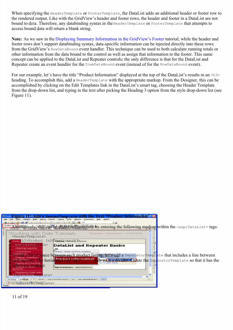
When specifying the HeaderTemplate or FooterTemplate, the DataList adds an additional header or footer row tthe rendered output. Like with the GridView’s header and footer rows, the header and footer in a DataList are not
bound to data. Therefore, any databinding syntax in the HeaderTemplate or FooterTemplate that attempts toaccess bound data will return a blank string.
Note: As we saw in the Displaying Summary Information in the GridView’s Footer tutorial, while the header andfooter rows don’t support databinding syntax, data-specific information can be injected directly into these rowsfrom the GridView’s RowDataBound event handler. This technique can be used to both calculate running totals orother information from the data bound to the control as well as assign that information to the footer. This same
concept can be applied to the DataList and Repeater controls; the only difference is that for the DataList andRepeater create an event handler for the ItemDataBound event (instead of for the RowDataBound event).
For our example, let’s have the title “Product Information” displayed at the top of the DataList’s results in an <h3
heading. To accomplish this, add a HeaderTemplate with the appropriate markup. From the Designer, this can beaccomplished by clicking on the Edit Templates link in the DataList’s smart tag, choosing the Header Templatefrom the drop-down list, and typing in the text after picking the Heading 3 option from the style drop-down list (seFigure 11).
Figure 11: Add a HeaderTemplate with the Text “Product Information”
Alternatively, this can be added declaratively by entering the following markup within the <asp:DataList> tags:
<HeaderTemplate> <h3>Product Information</h3></HeaderTemplate>
To add a bit of space between each product listing, let’s add a SeparatorTemplate that includes a line betweeneach section. The horizontal rule tag (<hr>), adds such a divider. Create the SeparatorTemplate so that it has thefollowing markup:
<SeparatorTemplate> <hr /></SeparatorTemplate>
11 of 19

7/17/2019 DTTest
http://slidepdf.com/reader/full/dttest 12/19
Note: Like the HeaderTemplate and FooterTemplates, the SeparatorTemplate is not bound to any record fromthe data source and therefore cannot directly access the data source records bound to the DataList.
After making this addition, when viewing the page through a browser it should look similar to Figure 12. Note theheader row and the line between each product listing.
Figure 12: The DataList Includes a Header Row and a Horizontal Rule Between Each Product Listing
Step 5: Rendering Specific Markup with the RepeaterControl
If you do a View/Source from your browser when visiting the DataList example from Figure 12, you’ll see that th
DataList emits an HTML <table> that contains a table row (<tr>) with a single table cell (<td>) for each item bound to the DataList. This output, in fact, is identical to what would be emitted from a GridView with a singleTemplateField. As we’ll see in a future tutorial, the DataList does allow further customization of the output,enabling us to display multiple data source records per table row.
What if you don’t want to emit an HTML <table>, though? For total and complete control over the markupgenerated by a data Web control, we must use the Repeater control. Like the DataList, the Repeater is constructed
based upon templates. The Repeater, however, only offers the following five templates:
l HeaderTemplate — if provided, adds the specified markup before the itemsl ItemTemplate — used to render items
12 of 19

7/17/2019 DTTest
http://slidepdf.com/reader/full/dttest 13/19
l AlternatingItemTemplate — if provided, used to render alternating itemsl SeparatorTemplate — if provided, adds the specified markup between each iteml FooterTemplate - if provided, adds the specified markup after the items
In ASP.NET 1.x, the Repeater control was commonly used to display a bulleted list whose data came from somedata source. In such a case, the HeaderTemplate and FooterTemplates would contain the opening and closing<ul> tags, respectively, while the ItemTemplate would contain <li> elements with databinding syntax. Thisapproach can still be used in ASP.NET 2.0 as we saw in two examples in the Master Pages and Site Navigationtutorial:
l In the Site.master master page, a Repeater was used to display a bulleted list of the top-level site mapcontents (Basic Reporting, Filtering Reports, Customized Formatting, and so on); another, nested Repeaterwas used to display the children sections of the top-level sections
l In SectionLevelTutorialListing.ascx , a Repeater was used to display a bulleted list of the childrensections of the current site map section
Note: ASP.NET 2.0 introduces the new BulletedList control, which can be bound to a data source control in orderto display a simple bulleted list. With the BulletedList control we do not need to specify any of the list-relatedHTML; instead, we simply indicate the data field to display as the text for each list item.
The Repeater serves as a “catch all” data Web control. If there is not an existing control that generates the neededmarkup, the Repeater control can be used. To illustrate using the Repeater, let’s have the list of categoriesdisplayed above the Product Information DataList created in Step 2. In particular, let’s have the categoriesdisplayed in a single-row HTML <table> with each category displayed as a column in the table.
To accomplish this, start by dragging a Repeater control from the Toolbox onto the Designer, above the ProductInformation DataList. As with the DataList, the Repeater initially displays as a gray box until its templates have
been defined.
13 of 19

7/17/2019 DTTest
http://slidepdf.com/reader/full/dttest 14/19
Figure 13: Add a Repeater to the Designer
There’s only one option in the Repeater’s smart tag: Choose Data Source. Opt to create a new ObjectDataSourceand configure it to use the CategoriesBLL class’s GetCategories method.
14 of 19

7/17/2019 DTTest
http://slidepdf.com/reader/full/dttest 15/19
Figure 14: Create a New ObjectDataSource
Figure 15: Configure the ObjectDataSource to Use the CategoriesBLL Class
15 of 19
7/17/2019 DTTest
http://slidepdf.com/reader/full/dttest 16/19
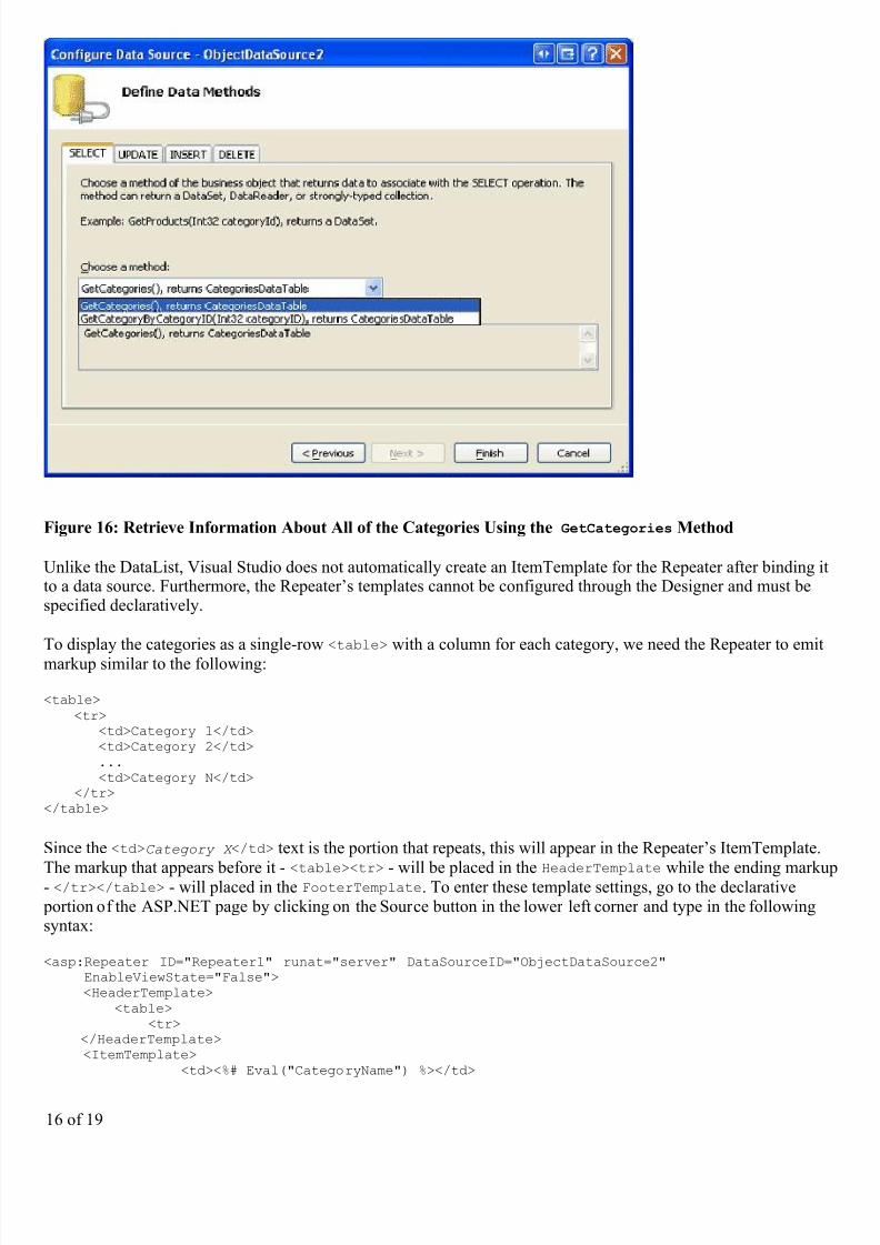
Figure 16: Retrieve Information About All of the Categories Using the GetCategories Method
Unlike the DataList, Visual Studio does not automatically create an ItemTemplate for the Repeater after binding itto a data source. Furthermore, the Repeater’s templates cannot be configured through the Designer and must bespecified declaratively.
To display the categories as a single-row <table> with a column for each category, we need the Repeater to emitmarkup similar to the following:
<table> <tr> <td>Category 1</td> <td>Category 2</td> ... <td>Category N</td> </tr></table>
Since the <td>Category X </td> text is the portion that repeats, this will appear in the Repeater’s ItemTemplate.
The markup that appears before it - <table><tr> - will be placed in the HeaderTemplate while the ending marku- </tr></table> - will placed in the FooterTemplate. To enter these template settings, go to the declarative portion of the ASP.NET page by clicking on the Source button in the lower left corner and type in the followingsyntax:
<asp:Repeater ID="Repeater1" runat="server" DataSourceID="ObjectDataSource2" EnableViewState="False"> <HeaderTemplate> <table> <tr> </HeaderTemplate> <ItemTemplate> <td><%# Eval("CategoryName") %></td>
16 of 19

7/17/2019 DTTest
http://slidepdf.com/reader/full/dttest 17/19
</ItemTemplate> <FooterTemplate> </tr> </table> </FooterTemplate></asp:Repeater>
The Repeater emits the precise markup as specified by its templates, nothing more, nothing less. Figure 17 showsthe Repeater’s output when viewed through a browser.
Figure 17: A Single-Row HTML <table> Lists Each Category in a Separate Column
Step 6: Improving the Appearance of the Repeater
Since the Repeater emits precisely the markup specified by its templates, it should come as no surprise that thereare no style-related properties for the Repeater. To alter the appearance of the content generated by the Repeater,
we must manually add the needed HTML or CSS content directly to the Repeater’s templates.
For our example, let’s have the category columns alternate background colors, like with the alternating rows in theDataList. To accomplish this, we need to assign the RowStyle CSS class to each Repeater item and theAlternatingRowStyle CSS class to each alternating Repeater item through the ItemTemplate andAlternatingItemTemplate templates, like so:
<ItemTemplate> <td class="RowStyle"><%# Eval("CategoryName") %></td></ItemTemplate><AlternatingItemTemplate> <td class="AlternatingRowStyle"><%# Eval("CategoryName") %></td>
</AlternatingItemTemplate>
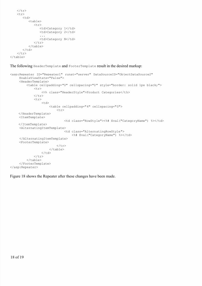
Let’s also add a header row to the output with the text “Product Categories”. Since we don’t know how manycolumns our resulting <table> will be comprised of, the simplest way to generate a header row that is guaranteedto span all columns is to use two <table>s. The first <table> will contain two rows — the header row and a rowthat will contain the second, single-row <table> that has a column for each category in the system. That is, wewant to emit the following markup:
<table> <tr> <th>Product Categories</th>
17 of 19
7/17/2019 DTTest
http://slidepdf.com/reader/full/dttest 18/19
</tr> <tr> <td> <table> <tr> <td>Category 1</td> <td>Category 2</td> ... <td>Category N</td> </tr> </table>
</td> </tr></table>
The following HeaderTemplate and FooterTemplate result in the desired markup:
<asp:Repeater ID="Repeater1" runat="server" DataSourceID="ObjectDataSource2" EnableViewState="False"> <HeaderTemplate> <table cellpadding="0" cellspacing="0" style="border: solid 1px black;"> <tr> <th class="HeaderStyle">Product Categories</th> </tr>
<tr> <td> <table cellpadding="4" cellspacing="0"> <tr> </HeaderTemplate> <ItemTemplate> <td class="RowStyle"><%# Eval("CategoryName") %></td> </ItemTemplate> <AlternatingItemTemplate> <td class="AlternatingRowStyle"> <%# Eval("CategoryName") %></td> </AlternatingItemTemplate> <FooterTemplate> </tr>
</table> </td> </tr> </table> </FooterTemplate></asp:Repeater>
Figure 18 shows the Repeater after these changes have been made.
18 of 19

7/17/2019 DTTest
http://slidepdf.com/reader/full/dttest 19/19
Figure 18: The Category Columns Alternate in Background Color and Includes a Header Row
Summary
While the GridView control makes it easy to display, edit, delete, sort, and page through data, the appearance isvery boxy and grid-like. For more control over the appearance, we need to turn to either the DataList or Repeatercontrols. Both of these controls display a set of records using templates instead of BoundFields, CheckBoxFields,and so on.
The DataList renders as an HTML <table> that, by default, displays each data source record in a single table rowust like a GridView with a single TemplateField. As we will see in a future tutorial, however, the DataList does
permit multiple records to be displayed per table row. The Repeater, on the other hand, strictly emits the markupspecified in its templates; it does not add any additional markup and therefore is commonly used to display data inHTML elements other than a <table> (such as in a bulleted list).
While the DataList and Repeater offer more flexibility in their rendered output, they lack many of the built-infeatures found in the GridView. As we’ll examine in upcoming tutorials, some of these features can be plugged
back in without too much effort, but do keep in mind that using the DataList or Repeater in lieu of the GridViewdoes limit the features you can use without having to implement those features yourself.
Happy Programming!
About the Author
Scott Mitchell, author of six ASP/ASP.NET books and founder of 4GuysFromRolla.com, has been working withMicrosoft Web technologies since 1998. Scott works as an independent consultant, trainer, and writer, recentlycompleting his latest book, Sams Teach Yourself ASP.NET 2.0 in 24 Hours. He can be reached [email protected] or via his blog, which can be found at ScottOnWriting.NET.
Special Thanks To…
This tutorial series was reviewed by many helpful reviewers. Lead reviewers for this tutorial include Yaakov EllisLiz Shulok, Randy Schmidt, and Stacy Park. Interested in reviewing my upcoming articles? If so, drop me a line [email protected].