Embed Size (px)
DESCRIPTION
A compilation book about the process of font making for Starbuck's 40th anniversary event.
Citation preview
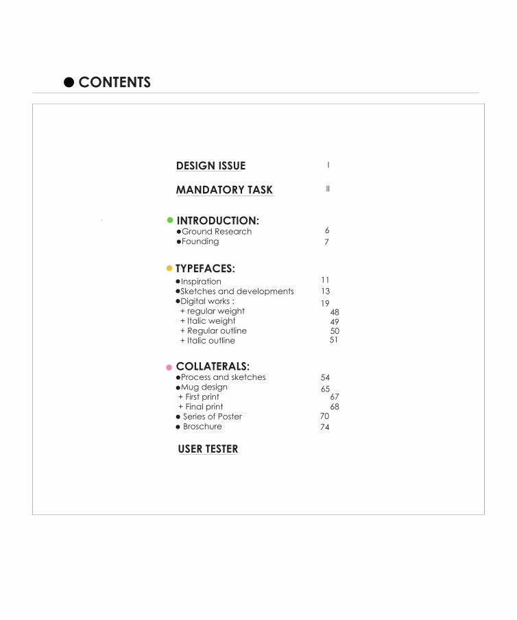
CONTENTS
INTRODUCTION:- Ground Research- Founding
TYPEFACES:- Inspiration- Sketches and developments- Digital works : + regular weight + Italic weight + Regular outline + Italic outline
COLLATERALS:- Process and sketches- Mug design + First print + Final print - Series of Poster- Broschure
DESIGN ISSUE
MANDATORY TASK
USER TESTER
67
1113
1948495051
5465
6768
7074
II
I
To take this 40 th anniversary as a chance to renew the branding style into more graphic.
DESIGN ISSUE
I
Develop a complete font set, including its family that best represents the establishment. A complete set of 26 alphabets and 10 numerals. It has to represent the values and unique characteristics of the chosen establishment, whilst being original and creatively sound. An adequate and thorough research of the chosen establishment, including its identity, history,
values and ethos is necessary as part of a creative process. These will serve as inspirations for the design of the font.
MANDATORY TASK
II
3
- Ground researches- Founding
INTRODUCTION
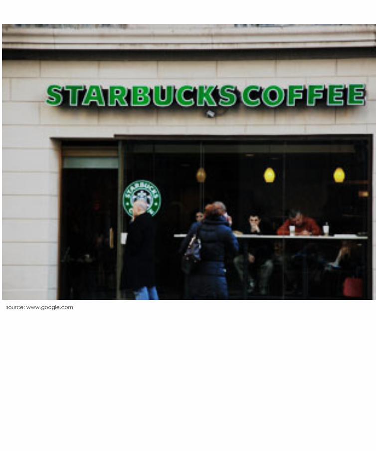
source: www.google.com
Ground researches
Starbucks Corporation is an international coffee and coffeehouse chain based in Seattle, Washington. Starbucks is the largest coffeehouse company in the world, with 17,009 stores in 50 countries, including over 11,000 in the United States, over 1000 in Canada, and over 700 in the UK. Starbucks sells drip brewed coffee, espresso-based hot drinks, other hot and cold drinks, coffee beans, salads, hot and cold sandwiches and panini, pastries, snacks, and items such as mugs and tumblers. Through the Starbucks Entertainment division and Hear Music brand, the company also markets books, music, and film. Many of the company’s products are seasonal or specific to the locality of the store. Starbucks-brand ice cream and coffee are also offered at grocery stores.
6
Founding
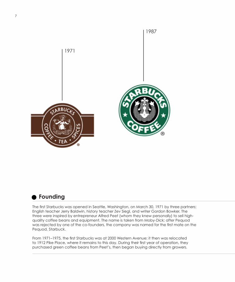
The first Starbucks was opened in Seattle, Washington, on March 30, 1971 by three partners: English teacher Jerry Baldwin, history teacher Zev Siegl, and writer Gordon Bowker. The three were inspired by entrepreneur Alfred Peet (whom they knew personally) to sell high-quality coffee beans and equipment. The name is taken from Moby-Dick; after Pequod was rejected by one of the co-founders, the company was named for the first mate on the Pequod, Starbuck.
From 1971–1975, the first Starbucks was at 2000 Western Avenue; it then was relocated to 1912 Pike Place, where it remains to this day. During their first year of operation, they purchased green coffee beans from Peet’s, then began buying directly from growers.
7
1971
1987
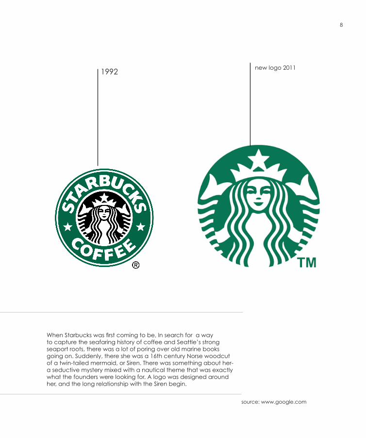
When Starbucks was first coming to be, In search for a way to capture the seafaring history of coffee and Seattle’s strong seaport roots, there was a lot of poring over old marine books going on. Suddenly, there she was a 16th century Norse woodcut of a twin-tailed mermaid, or Siren. There was something about her- a seductive mystery mixed with a nautical theme that was exactly what the founders were looking for. A logo was designed around her, and the long relationship with the Siren begin.
new logo 20111992
8
source: www.google.com
- Inspiration- Sketches and developments- Digital works : + regular weight + Italic weight + Regular outline + Italic outline
THE TYPEFACE
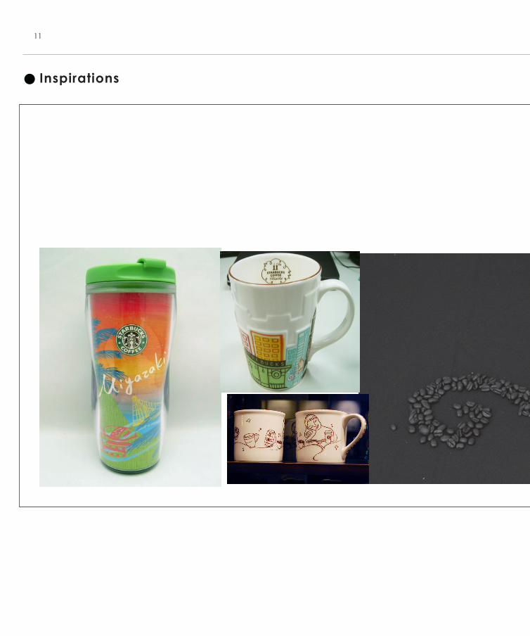
Inspirations
11
12
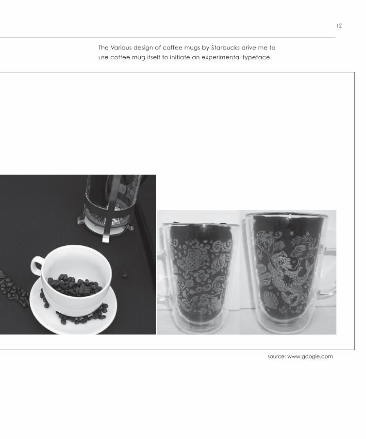
The Various design of coffee mugs by Starbucks drive me to
use coffee mug itself to initiate an experimental typeface.
source: www.google.com
Sketches and Development
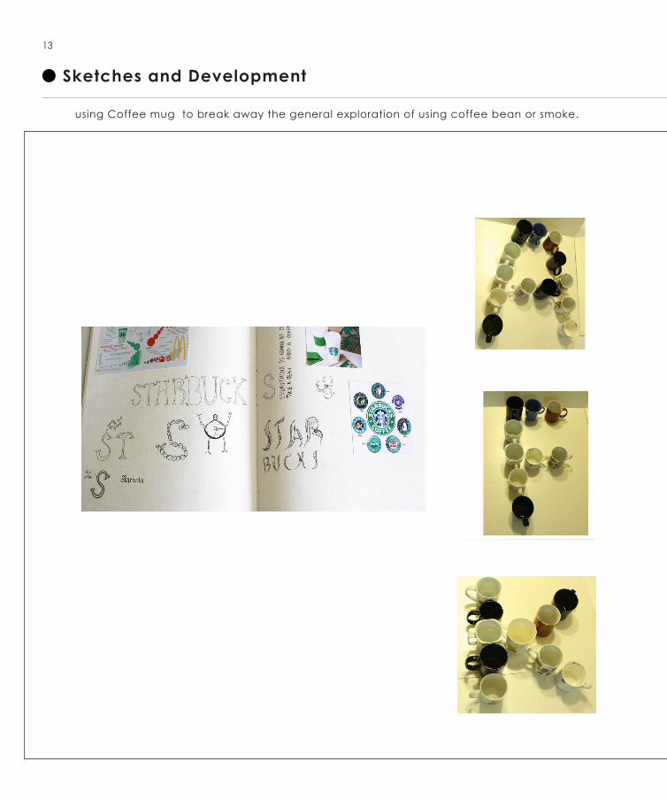
13
using Coffee mug to break away the general exploration of using coffee bean or smoke.
14
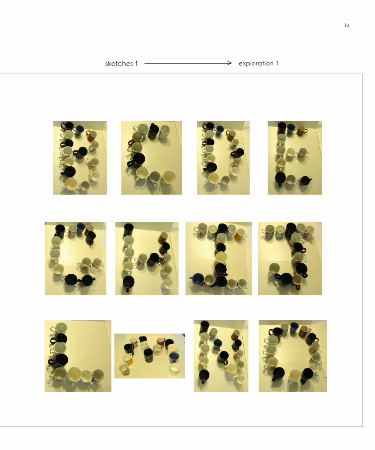
exploration 1sketches 1 >
15
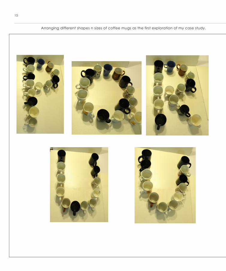
Arranging different shapes n sizes of coffee mugs as the first exploration of my case study.
16
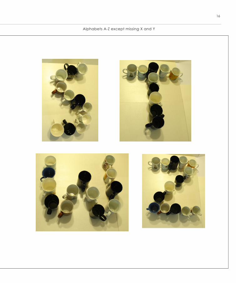
Alphabets A-Z except missing X and Y
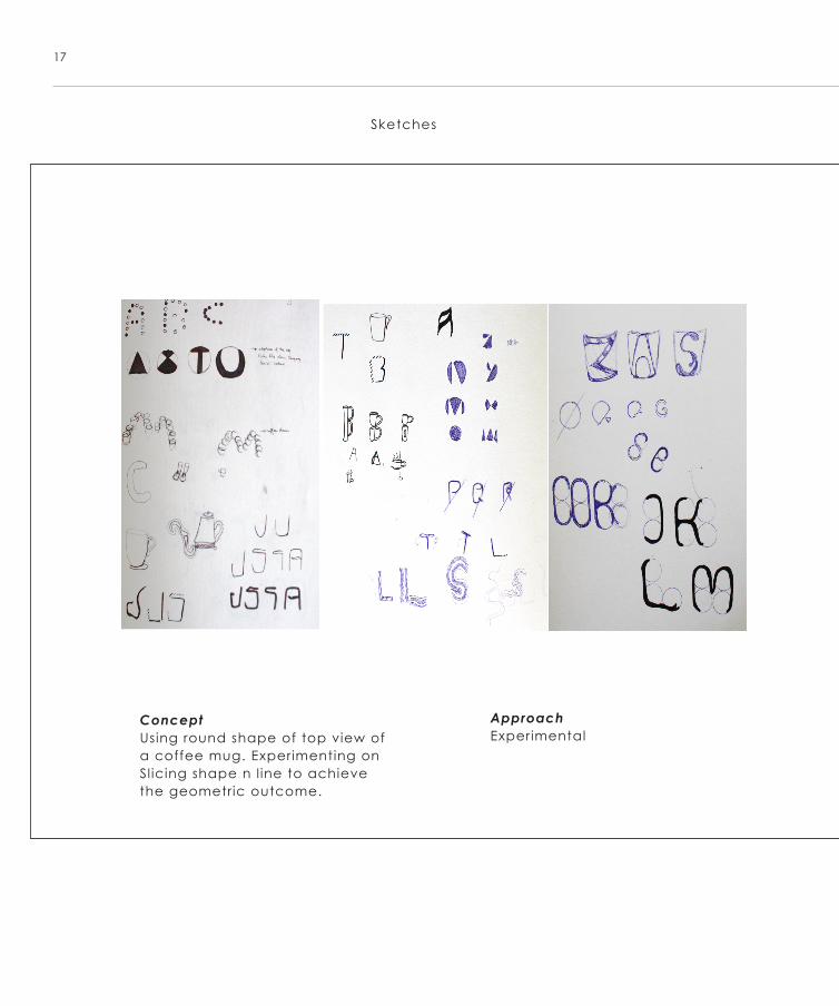
17
ConceptUsing round shape of top view of a coffee mug. Experimenting on Sl icing shape n l ine to achieve the geometric outcome.
ApproachExperimental
Sketches
18
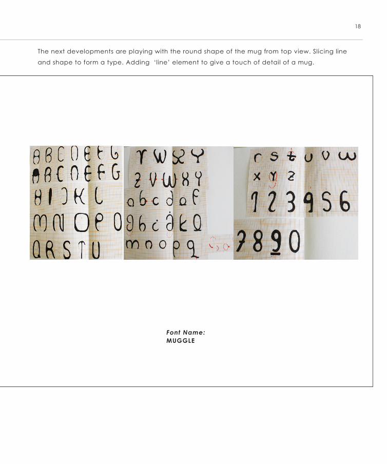
The next developments are playing with the round shape of the mug from top view. Slicing line
and shape to form a type. Adding ‘line’ element to give a touch of detail of a mug.
Font Name: MUGGLE
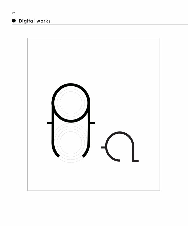
Digital works
19
20
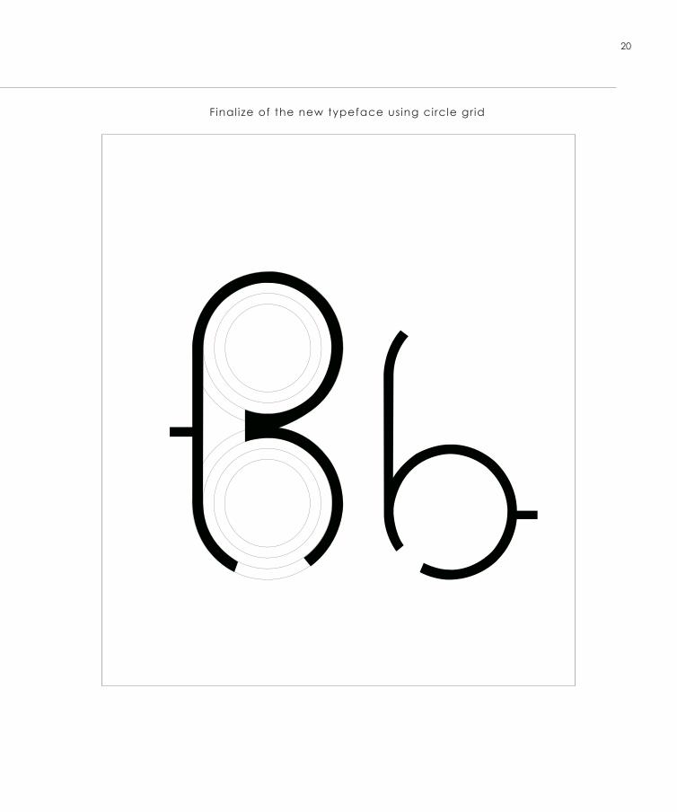
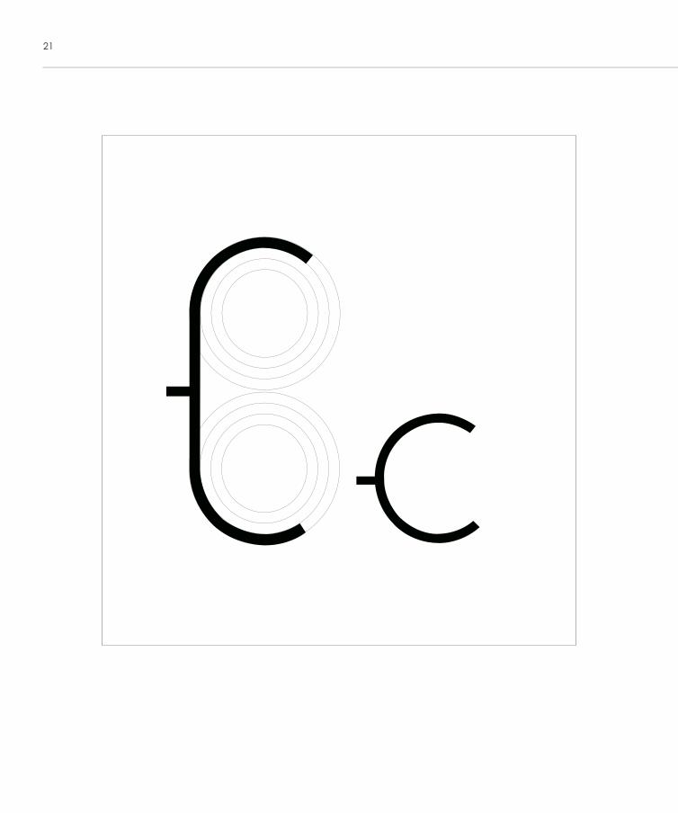
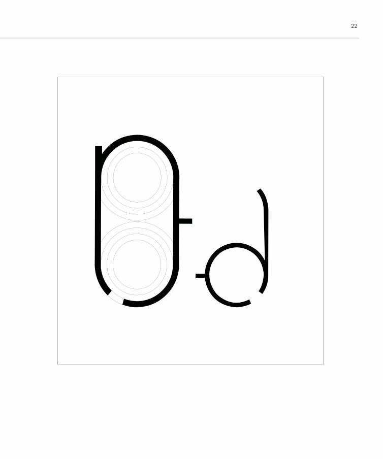
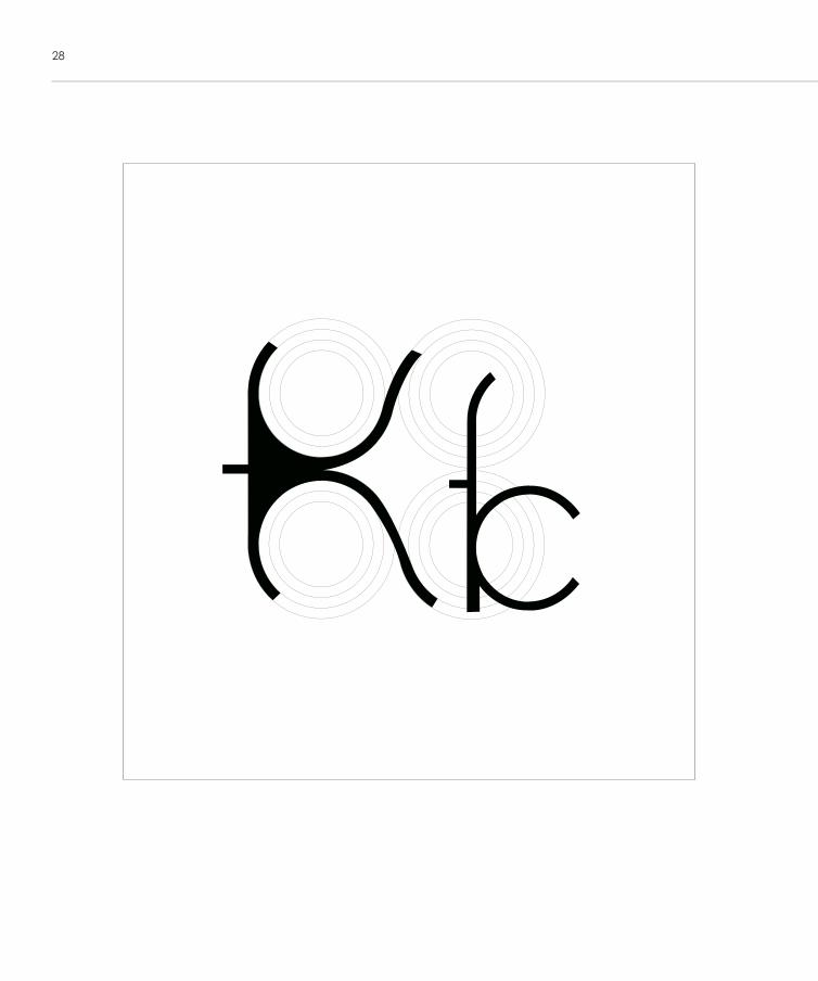
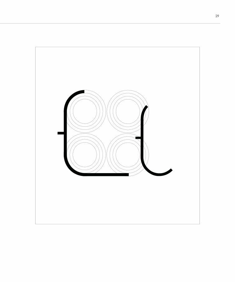
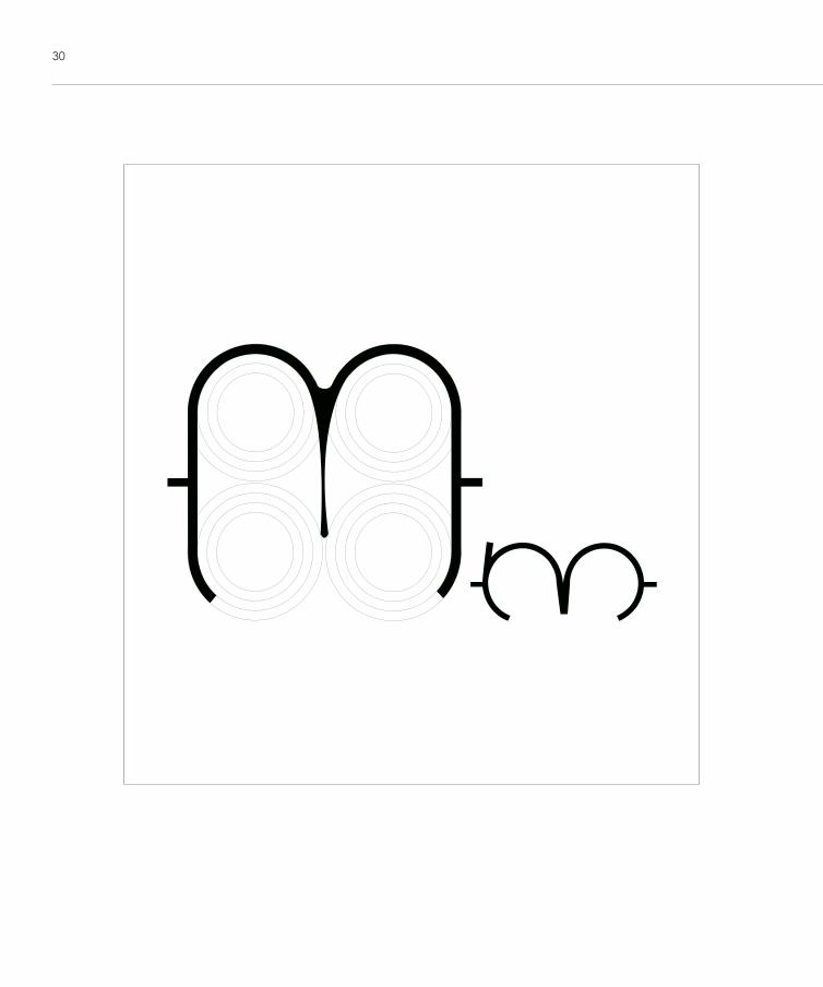
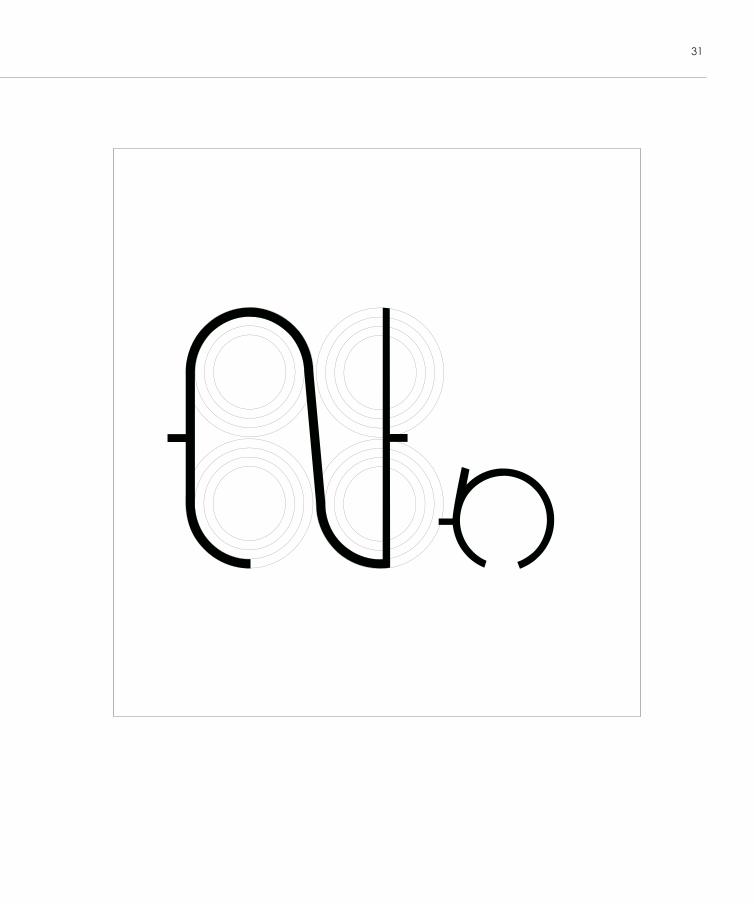
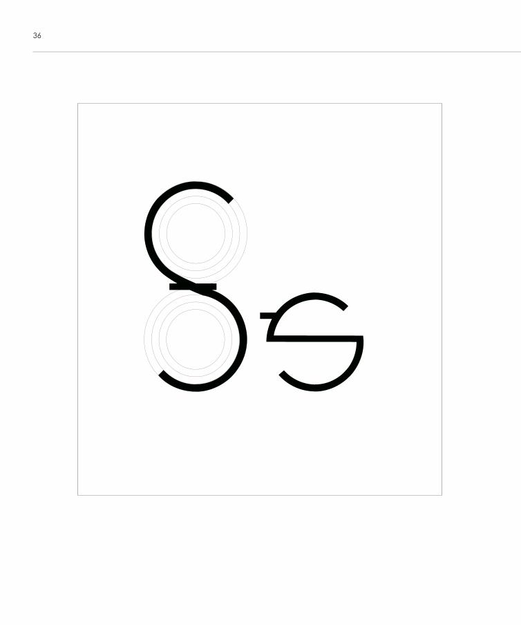
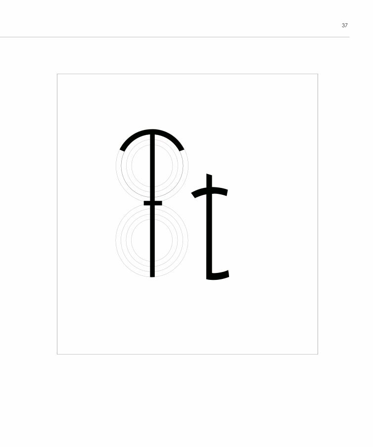
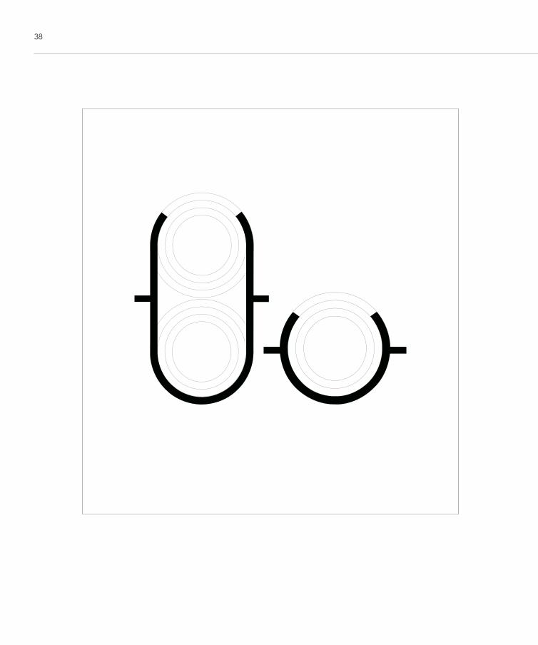
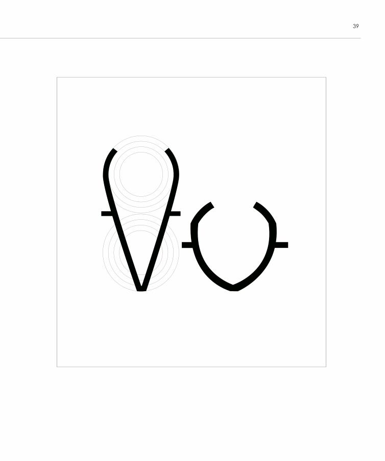
Final ize of the new typeface using circle grid
21
22
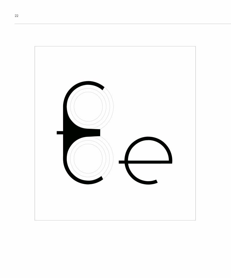
22
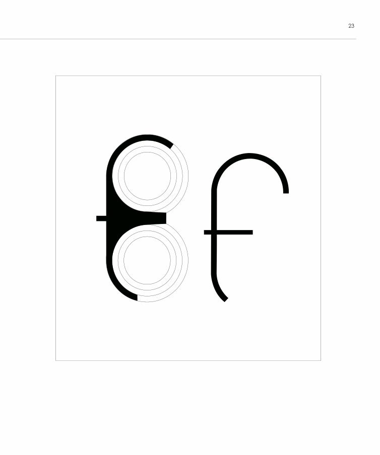
23
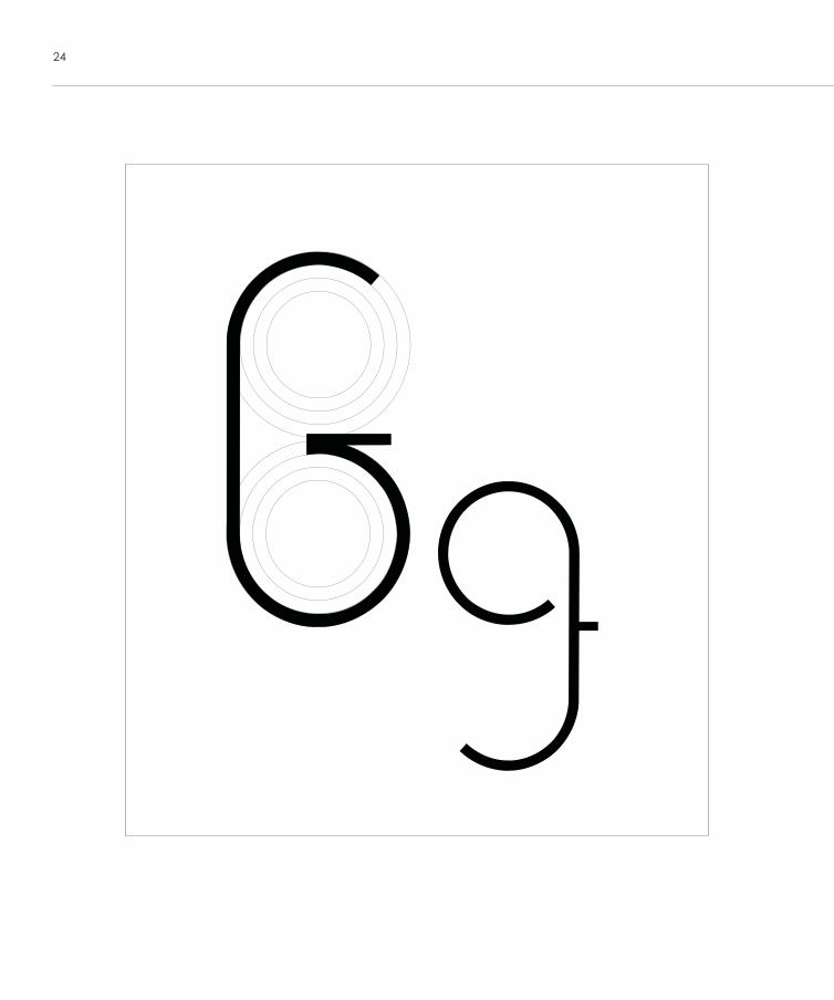
24
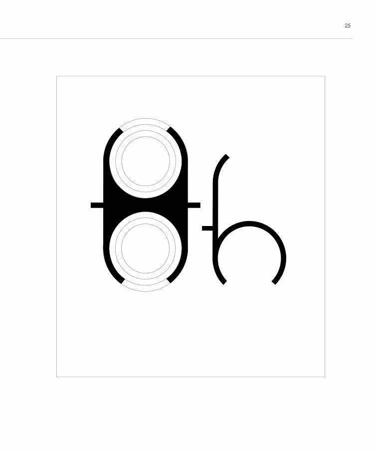
25
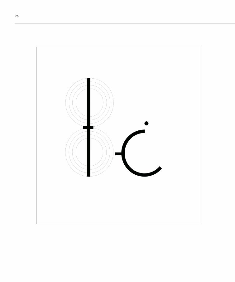
26
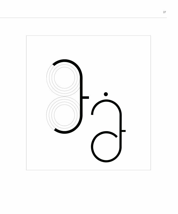
27
28
29
30
31
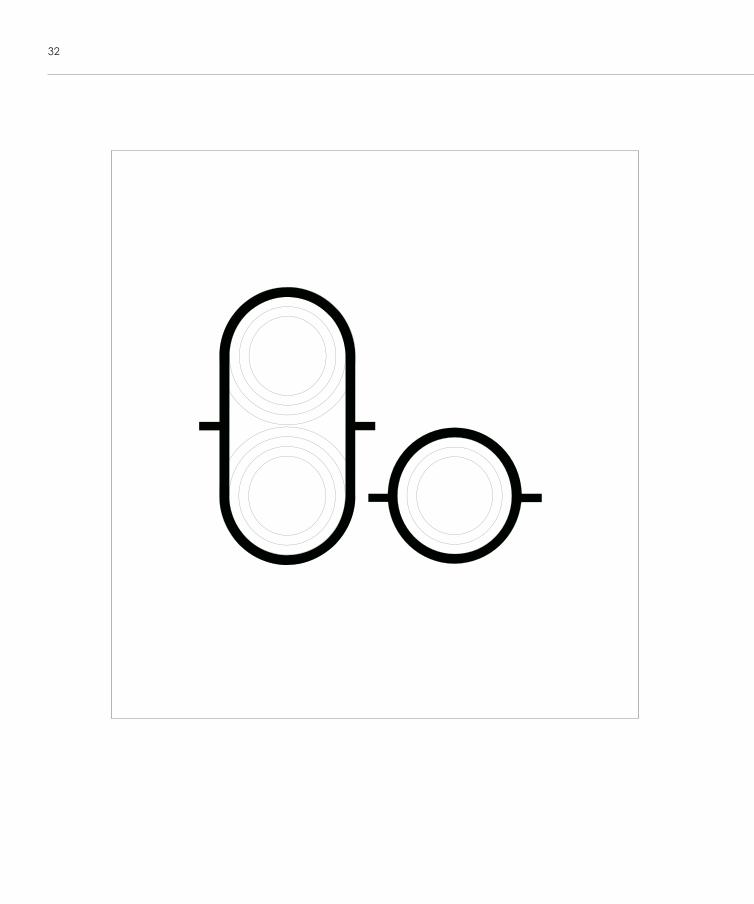
32
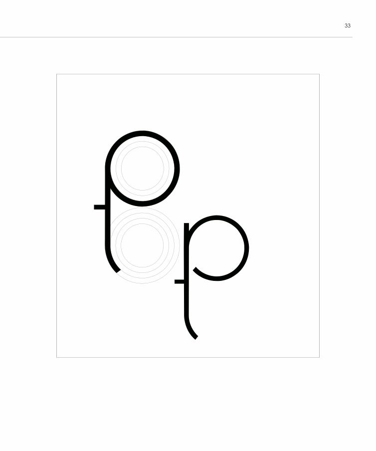
33
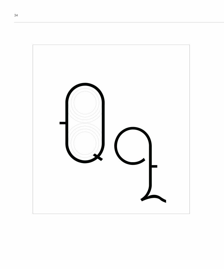
34
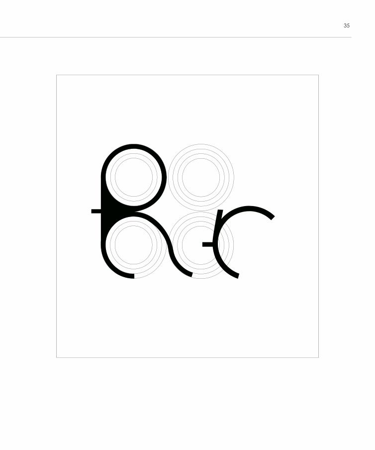
35
36
37
38
39
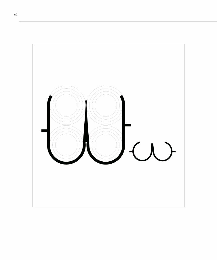
40
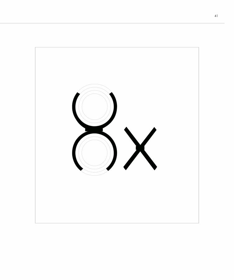
41
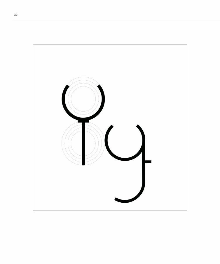
42
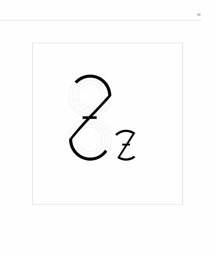
43
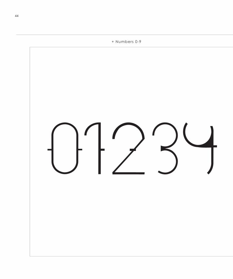
44
+ Numbers 0-9
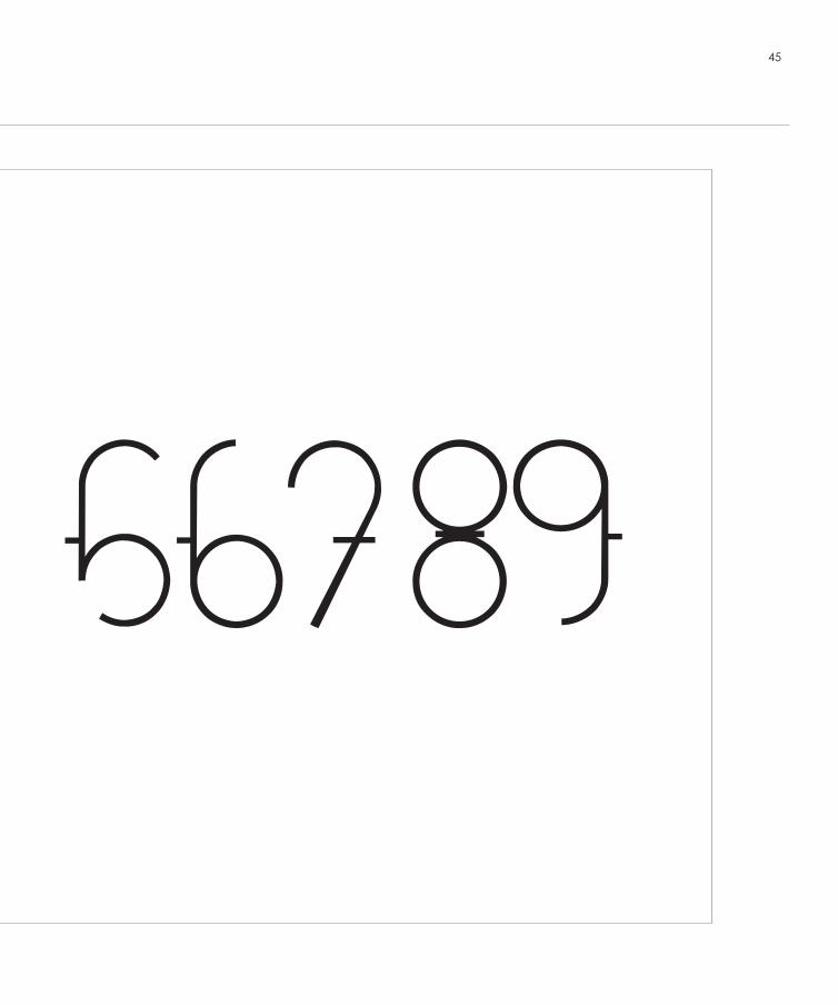
45
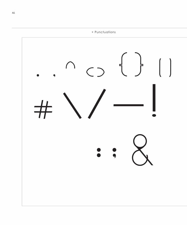
46
+ Punctuations
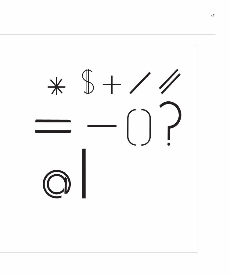
47
48
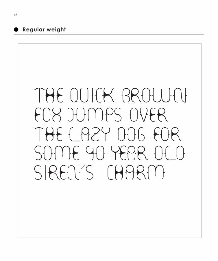
Regular weight
49
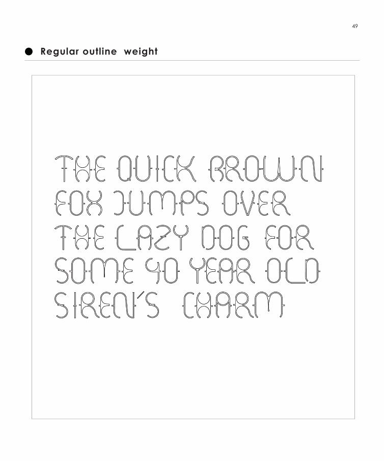
Regular outline weight
50
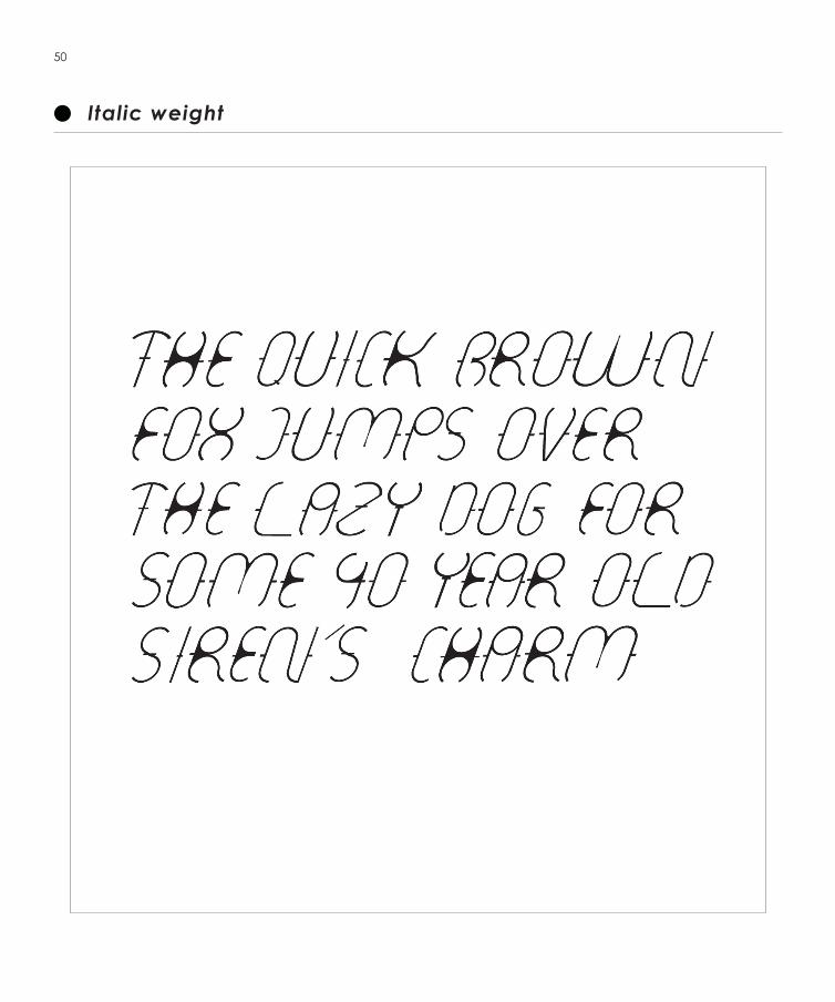
Italic weight
51
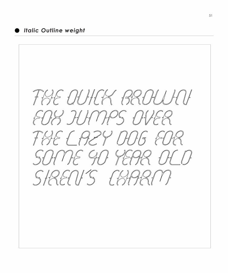
Italic Outline weight
- Process and sketches- Mug design + First print + Final print - Series of Poster- Broschure
COLLATERALS
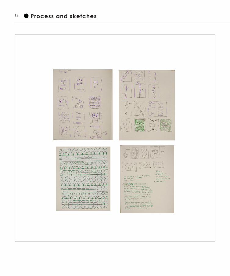
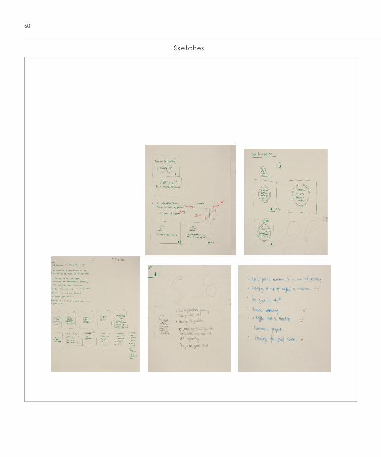
54 Process and sketches
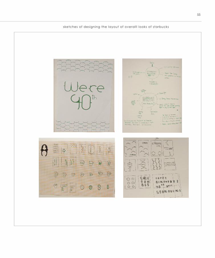
55
sketches of designing the layout of overal l l looks of starbucks
56
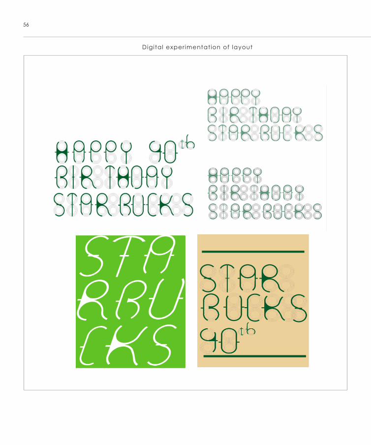
Digital experimentation of layout
57
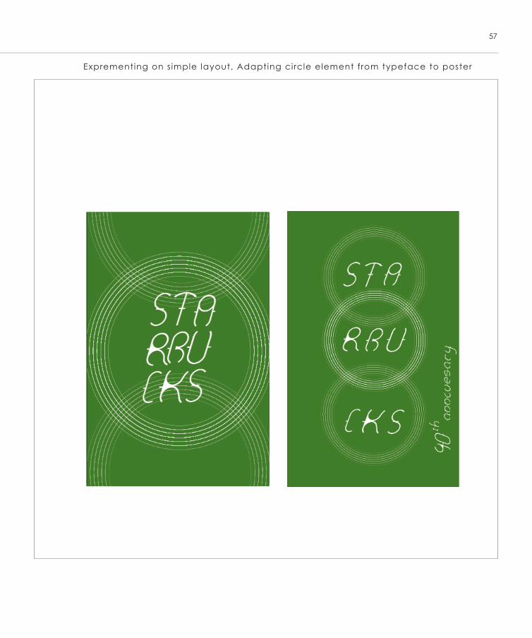
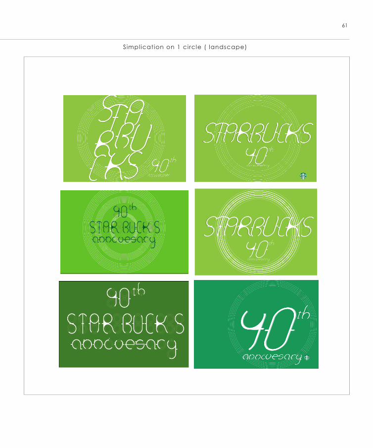
Exprementing on simple layout, Adapting circle element from typeface to poster
58
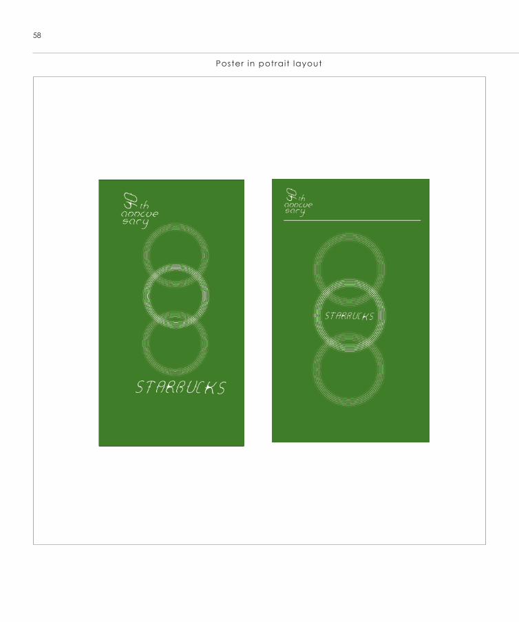
Poster in potrait layout
59
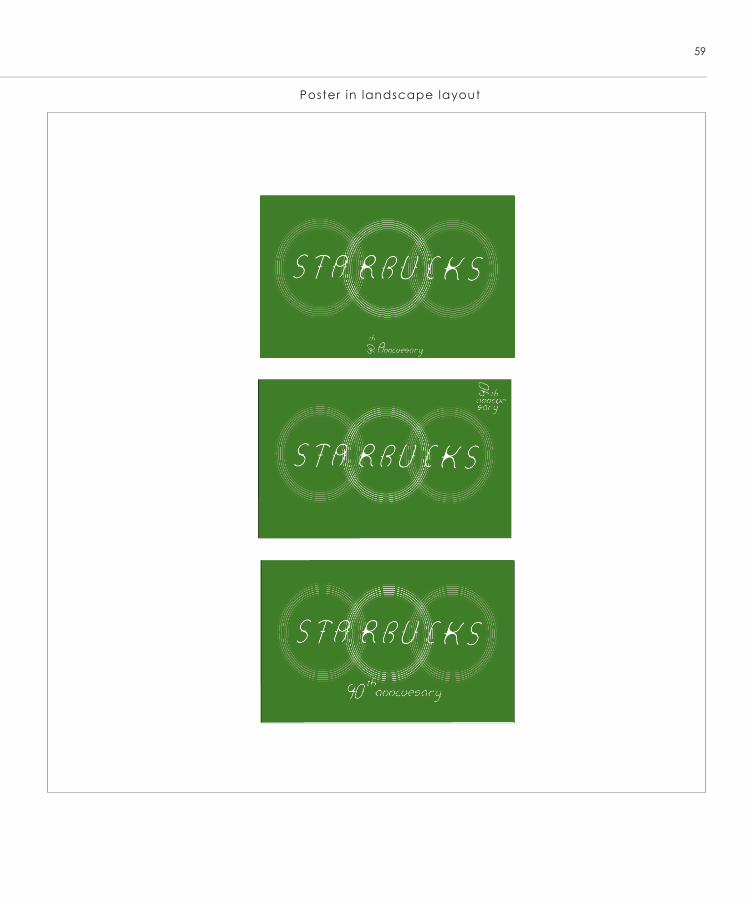
Poster in landscape layout
60
Sketches
61
Simplication on 1 circle ( landscape)
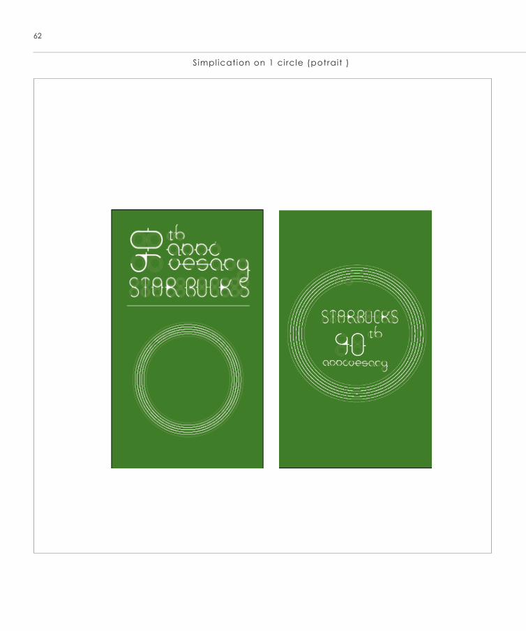
Simplication on 1 circle (potrait )
62
63
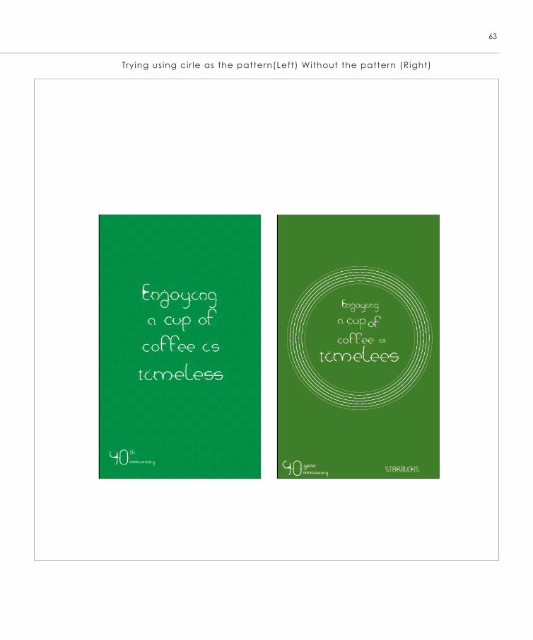
Trying using cir le as the pattern(Left) Without the pattern (Right)
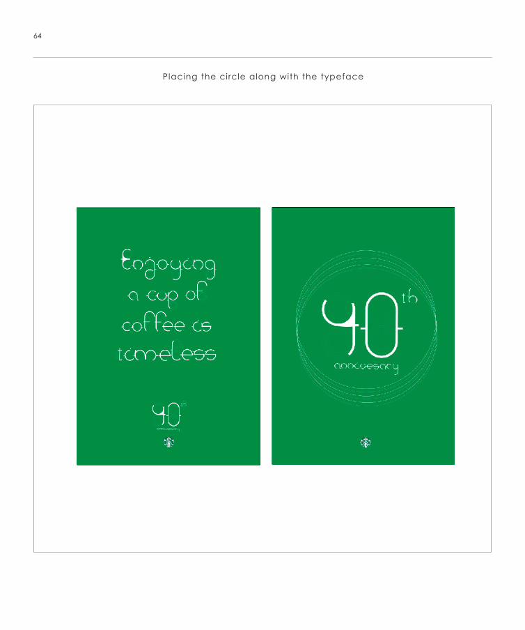
Placing the circle along with the typeface
64
65
Mug Design
66
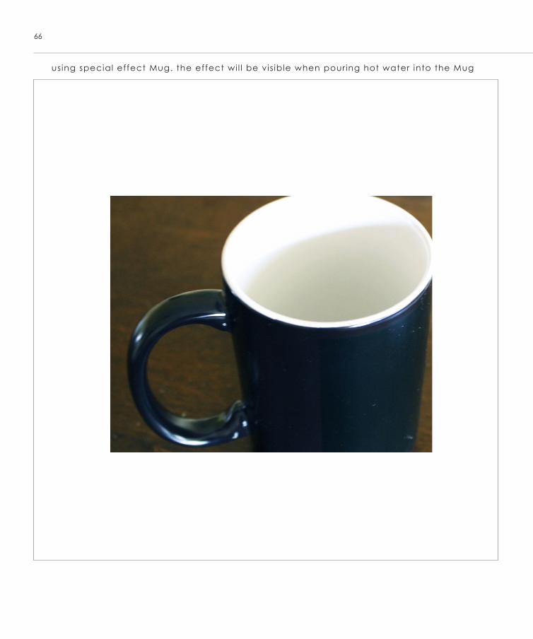
using special effect Mug. the effect wi l l be vis ible when pouring hot water into the Mug
67
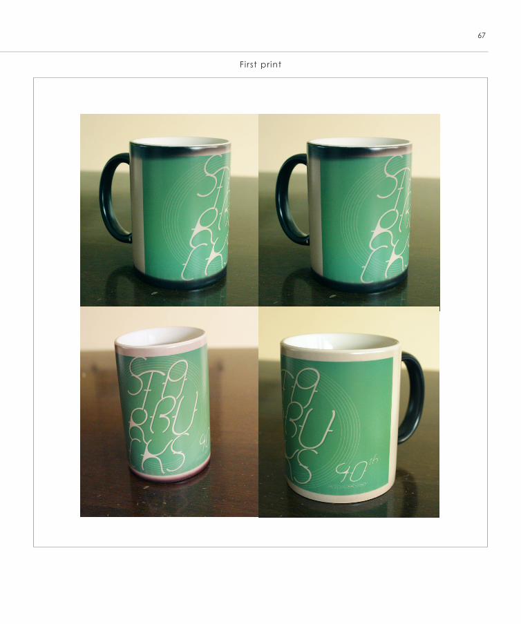
First pr int
68
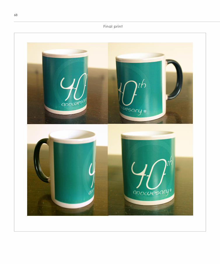
Final print
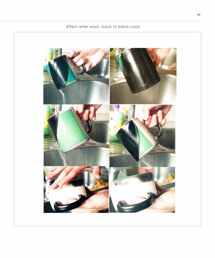
Effect after wash, back to black color
69
Series of poster
70
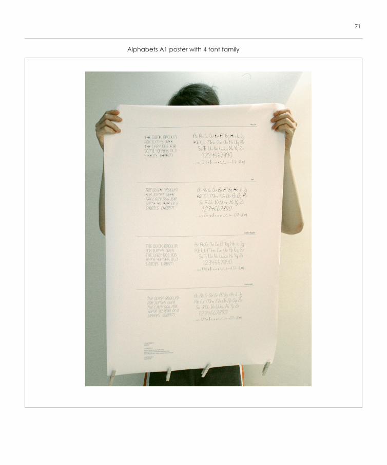
Alphabets A1 poster with 4 font family
71
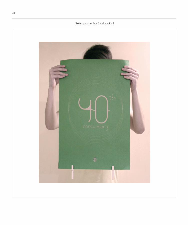
Seies poster for Starbucks 1
72
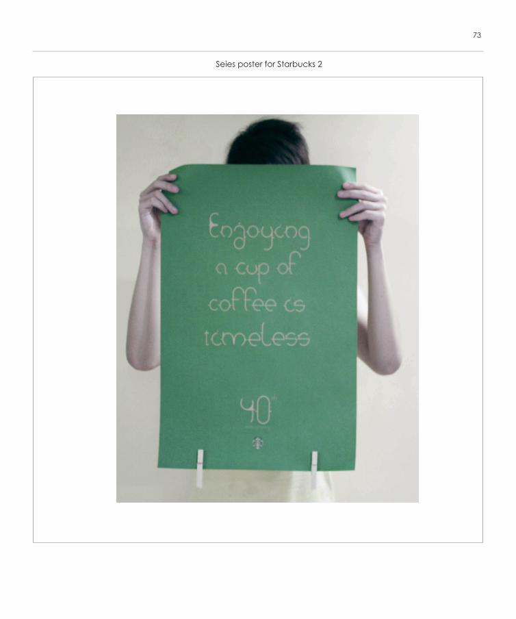
Seies poster for Starbucks 2
73
Broshure
74
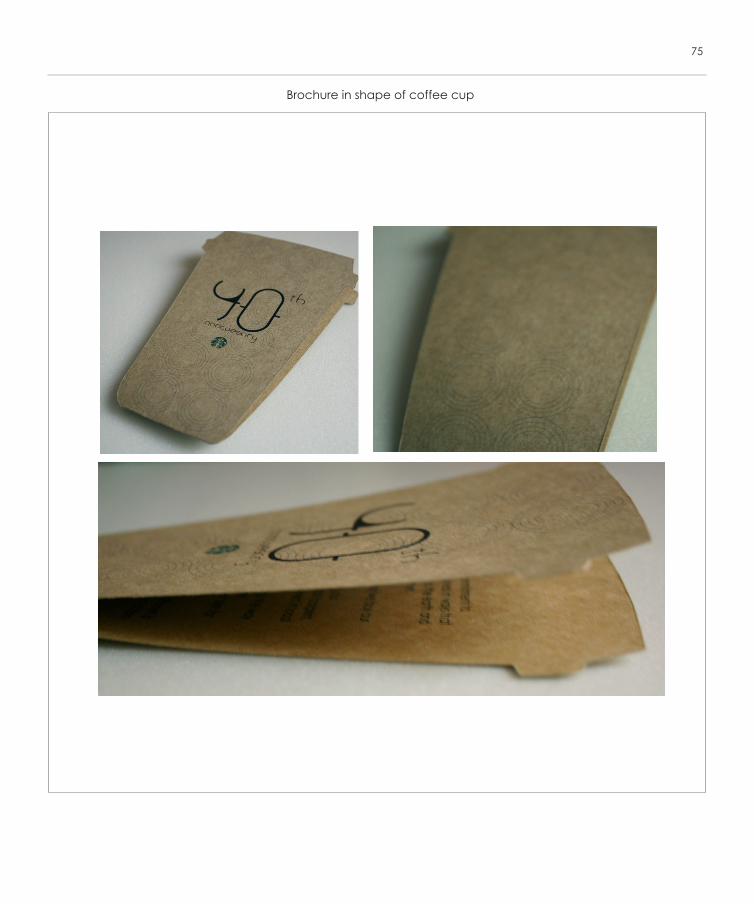
Brochure in shape of coffee cup
75
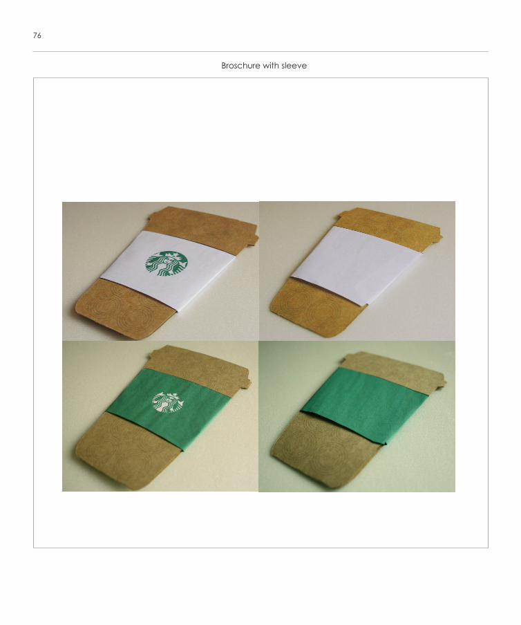
Broschure with sleeve
76
THE END
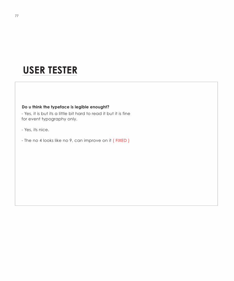
USER TESTER
Do u think the typeface is legible enought?
- Yes, it is but its a little bit hard to read it but it is fine for event typography only.
- Yes, its nice.
- The no 4 looks like no 9, can improve on it ( FIXED )
77