Embed Size (px)
Citation preview

Further Maths Hello 2014
Univariate Data

What is data?
Data is another word for information. By studying data, we are able to display the information in meaningful ways and draw conclusions from it. We are also able to predict what might happen in the future

Univariate dataThe things that we record information about are
called variables. We may record the heights of a class of students or the voting preference of a nation at an election (ballot). The heights and voting preferences are examples of variables.
Variables that represent qualities are called categorical. Examples of categorical data are eye colour, survey responses (strongly agree, agree, etc) and voting preferences.
Variables that represent quantities are called numerical. Examples of numerical data are height, weight, number of family members.

Classifying dataNumerical data can be split into two further types:
discrete and continuous. Discrete is any data that is counted; continuous is any data that is measured.
Consider a carton containing packets of M&Ms. Many types of data can be examined:
Categorical: the M&Ms could be grouped according to their colours (yellow, red, brown etc)
Discrete numerical: the number of M&Ms in each packet could be recorded (discrete because we are counting)
Continuous numerical: the weight of each packet could be recorded (continuous because we are measuring)

Displaying Categorical dataA frequency table is an easy way to display
how often (frequently) each value occurs in the data set.
The table lists the different categories or values in one column and the frequency in another column. A third column for percentage is often displayed also.
To calculate percentage, use the following:100%frequency total
frequencypercentage

ExampleA class of 23 students have their eye colour
recorded and put into one of four categories (Br: brown, Bl: blue, G: Green, O: other). The results are shown below:
Br Bl Bl Br O G G BlBl
Bl Bl Br G Br Bl BrO G
Bl Br Br G Bl

The frequency table for the data looks as follows:
Eye colour Frequency Percentage
Blue 9 9/23 x 100 = 39.1%
Brown 7 7/23 x 100 = 30.4%
Green 5 5/23 x 100 = 21.7%
Other 2 2/23 x 100 = 8.7%
Total 23 100%

Once a frequency table has been completed, the information can be displayed visually using a bar chart.
The categories or values are displayed along the horizontal axis (in this case: blue, brown, green, other)
The frequency is displayed along the vertical axis
All graphs and charts in this subject need to be accurately drawn, labelled and scaled. This includes giving the chart a title.


The bar chart can also be used to display percentages:
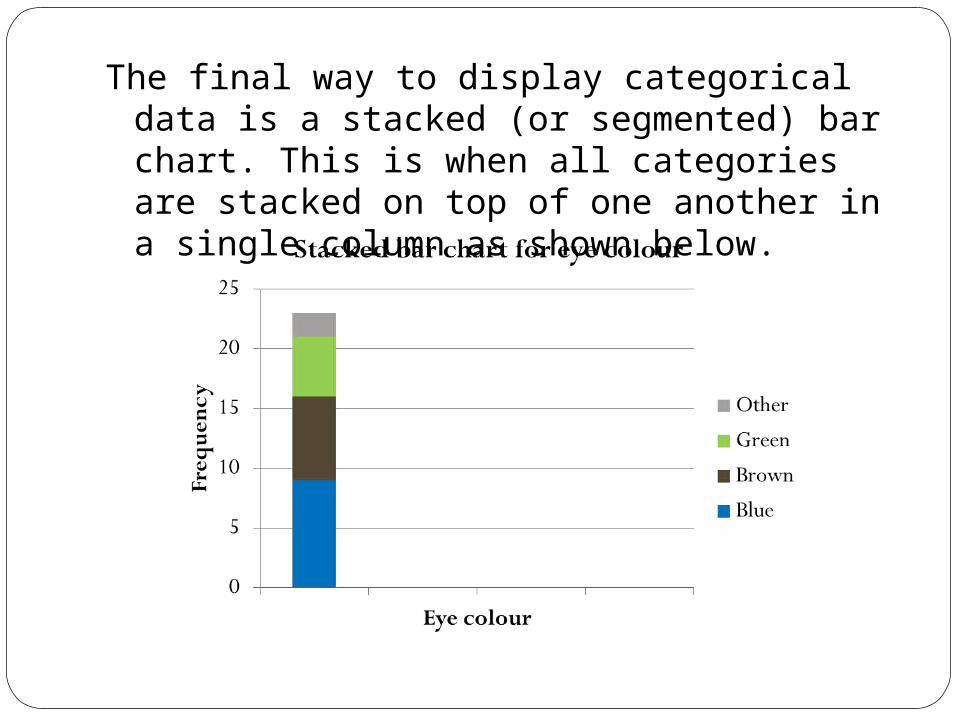
The final way to display categorical data is a stacked (or segmented) bar chart. This is when all categories are stacked on top of one another in a single column as shown below.

Lastly the percentages can be displayed in a stacked bar chart as shown:
Stacked charts are usually used when two or more data sets are being compared

Displaying Numerical DataJust as bar charts are used to display
categorical data, histograms are used to display numerical data.
They can be used for discrete (counted) or continuous (measured) data.
ExampleA class of 25 students received the following
marks in a test out of 20 marks:15 20 8 12 14 16 16 20 510 12 19 16 13 17 17 8 915 18 20 10 4 15 17

To construct a histogram using the CAS, open a lists&spreadsheets page:
The white square at the top of the column if for the heading (marks). Then enter the 25 values down the column as shown.

Open a data&statistics page:
Move the cursor to the bottom of the screen and select the variable “marks”

The following should be displayed:
To change display to a histogram, press menu > plot type > histogram

The histogram should now be displayed. You can see the frequency of each mark. The highest columns are for 15, 16, 17 and 20 marks. Each had four students. You can see that no student scored less than 4, and no students scored 6, 7 or 11 marks on the test. Most students passed.

Histograms can also be used for continuous data (data that is measured). An example would be the heights (cm) of a netball squad of 15 players:
185.6 181.0 182.3 186.9178.3 171.4 175.7 182.8 168.5
172.3 194.2 179.0 180.6187.9 170.4
A frequency table would be split into class intervals (appropriate height ranges). In this case, class intervals of 5cm would be suitable, starting at 165cm and going up to 195cm. The frequency table is shown on the next slide:

Class Interval (cm) Frequency
165 – <170 1
170 – <175 3
175 – <180 3
180 – <185 4
185 – <190 3
190 – <195 1
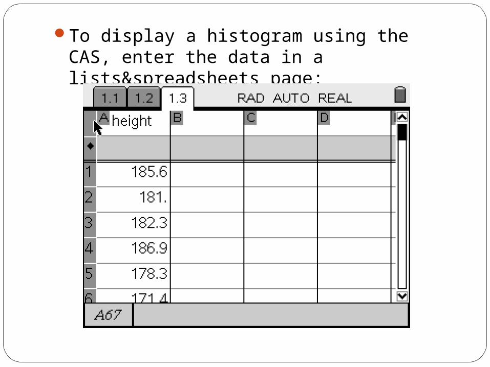
To display a histogram using the CAS, enter the data in a lists&spreadsheets page:

In a data&statistics page, choose “height” for variable
Then select menu > plot type > histogram

The histogram displayed does not have the correct class intervals.

Click /b and select bin settings. Choose a width of 5 (class interval range) and alignment (starting value) of 165. Press OK.

The correct histogram is now displayed. You may need to select zoom > zoomstat for the graph to be displayed correctly.

Describing a HistogramHistograms are useful for gaining an overall view of a frequency distribution of a numerical variable.
In describing a histogram , we focus on three things:
Shape and Outliers (values in the data set that appear to stand out from the rest)
Centre
Spread