Embed Size (px)
Citation preview
COMPUTING PRACTICES
Edgar H. Sibley Panel Editor
A survey of seventy-seven highly motivated industrial designers and programmers indicates that the iden Mica tion of specific, potential problems in a human-computer dialogue design is difficult.
Improving a H&man- Computer Dialogue
Rolf Molich and Jakob Nielsen
Any system designed for people to use should be easy to learn and remember, effective, and pleasant to use. Over the years there has been a considerable increase in designing interfaces that score highly on these issues. This experience has been documented in a number of guidelines for constructing good human-computer in- terfaces [5, lo]. Following these guidelines is commonly considered a necessary but insufficient condition for constructing good human-computer interfaces.
Most often, following such guidelines during the de- sign phase imposes little extra effort on a development project. Guideline reports, however, are often lengthy. Documents of more i.han 400 pages are not uncommon. The mere size of a guideline report often means that it is not consulted during design or design review simply because the work of locating relevant guidelines is not considered worth the effort.
This article describes a survey that we undertook to investigate whether industrial data processing profes- sionals would be able to recognize serious interface problems in simple but realistic dialogues. Seventy- seven designers and programmers from industry and academia participated. Fifty-one were from industry, 10 were teachers or students from universities or high schools, and 16 had occupations that were not speci- fied. Many of them were designers and programmers of administrative systems-the people who design, write, and maintain our daily programs.
This article consists of four parts. We first present the survey and a number of conclusions from it. The sec- ond part of the article presents the exercise used in the survey-a dialogue that we asked the participants to evaluate as expressed in Appendix 1. The third part contains our annotated solution as shown in Appendix 2 and a suggestion for an improved design as character- ized in Appendix 3.
FACTS ABOUT THE SURVEY
The Exercise We constructed an exercise in evaluating a simple
01990 ACMOOOI-0782/90/0300-0338 $1.50
BANALITIES?
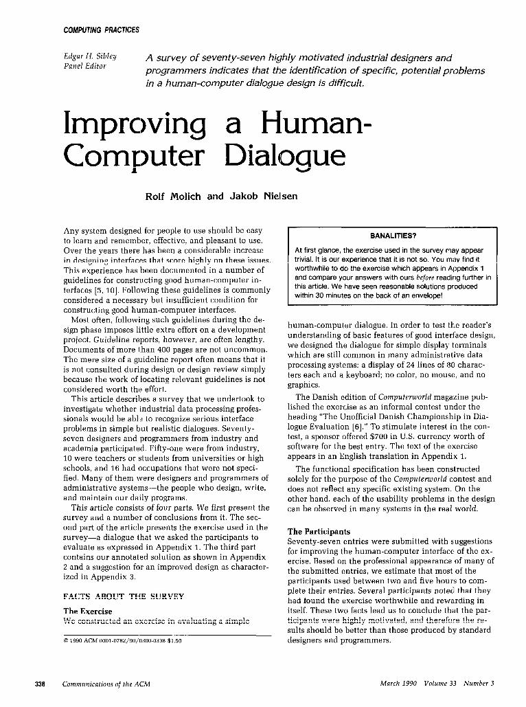
At first glance, the exercise used in the survey may appear trivial. It is our experience that it is not so. You may find it worthwhile to do the exercise which appears in Appendix 1 and compare your answers with ours before reading further in this article. We have seen reasonable solutions produced within 30 minutes on the back of an envelope!
human-computer dialogue. In order to test the reader’s understanding of basic features of good interface design, we designed the dialogue for simple display terminals which are still common in many administrative data processing systems: a display of 24 lines of 130 charac- ters each and a keyboard; no color, no mouse, and no graphics.
The Danish edition of Computemorld magazine pub- lished the exercise as an informal contest under the heading “The Unofficial Danish Championship in Dia- logue Evaluation [6].” To stimulate interest in the con- test, a sponsor offered $700 in U.S. currency worth of software for the best entry. The text of the exercise appears in an English translation in Appendix 1.
The functional specification has been constructed solely for the purpose of the Computeworld contest and does not reflect any specific existing system. On the other hand, each of the usability problems in the design can be observed in many systems in the real world.
The Participants Seventy-seven entries were submitted with suggestions for improving the human-computer interface of the ex- ercise. Based on the professional appearance of many of the submitted entries, we estimate that most of the participants used between two and five hours to com- plete their entries. Several participants noted that they had found the exercise worthwhile and revvarding in itself. These two facts lead us to conclude that the par- ticipants were highly motivated, and therefo-re the re- sults should be better than those produced b:y standard designers and programmers.
338 Communications of the ACM March 1990 Volume 33 Number 3
Computing Practices
PROBLEM CLASSIFICATION We classified the usability problems in the dialogue in accordance with a short checklist of usability consider- ations in a good dialogue. This checklist reflects our personal experience. The principles correspond to simi- lar principles described by others [l]. Almost all usabil- ity problems fit well into one of the categories.
Simple and Natural Dialogue Dialogues should not contain irrelevant or rarely needed information. Every extraneous unit of informa- tion in a dialogue competes with the relevant units of information and diminishes their relative visibility. All information should appear in a natural and logical order.
Speak the User’s Language The dialogue should be expressed clearly in words, phrases, and concepts familiar to the user rather than in system-oriented terms.
Minimize the User’s Memory Load The user’s short-term memory is limited. The user should not have to remember information from one part of the dialogue to another. Instructions for use of the system should be visible or easily retrievable when- ever appropriate. Complicated instructions should be simplified.
Be Consistent Users should not have to wonder whether different words, situations, or actions mean the same thing. A particular system action-when appropriate-should always be achievable by one particular user action. Consistency also means coordination between subsys- tems and between major independent systems with common user populations [7].
Provide Feedback The system should always keep the user informed about what is going on by providing him or her with appropriate feedback within reasonable time.
Provide Clearly Marked Exits A system should never capture users in situations that have no visible escape. Users often choose system func- tions by mistake and will need a clearly marked “emer- gency exit” to leave the unwanted state without having to go through an extended dialogue.
Provide Shortcuts The features that make a system easy to learn-such as verbous dialogues and few entry fields on each dis- play-are often cumbersome to the experienced user. Clever shortcuts-unseen by the novice user-may often be included in a system such that the system caters to both inexperienced and experienced users.
Provide Good Error Messages Good error messages are defensive, precise, and con- structive [9]. Defensive error messages blame the prob- lem on system deficiencies and never criticize the user. Precise error messages provide the user with exact in- formation about the cause of the problem. Constructive error messages provide meaningful suggestions to the user about what to do next.
Error Prevention Even better than good error messages is a careful design that prevents a problem from occurring in the first place.
EVALUATION PROCEDURE All entries were initially evaluated by one person. The 13 best entries were subsequently reevaluated by two other judges. All three judges then jointly selected the winner. There were only minor differences between the results of the initial evaluation and the reevalu- ations.
Grading was very liberal. We gave credit for even the simplest item that related to one of our problems. In many cases, a point was awarded for a correct reformu- lation of a message even if the general principle (for instance, keep the user informed by providing appropri- ate feedback within reasonable time) did not appear. An example: Problem 18 concerns the lack of feedback during 30-second database searches (problem numbers refer to the detailed solution in Appendix 2). Here, we awarded a full point for the suggestion, ltlform the user that it may take as long as 30 seconds before the reply appears, while no point was awarded for the statement A response time of 30 seconds is simply unacceptable, be- cause the statement does not indicate why the response time is unacceptable or what could be done to alleviate the problem.
COMMENTS ON OUR SOLUTION Our solution was constructed by carefully applying the nine principles in the usability checklist presented ear- lier in this article. The submitted entries caused us to revise our original solution. We had overlooked two problems: problem 14 (“Questions must be expressed from the user’s point of view”) and problem 17 (“Coor- dinate placement of error messages with the rest of the system”). Problem 27 (” ‘Try again’ is meaningless”) was expressed more precisely by a number of participants.
It is possible that our solution includes some bad points or that we have overlooked some problems. The MANTEL system has not been subjected to empirical tests to indicate how real users would use it.
Problem 20 (“There may be no emergency exit from the initial prompt”) and problem 22 (“It may not be possible to edit input in the initial prompt”) have a somewhat special character since many of the possible tools for implementing the Telephone Index system would automatically offer the user these facilities. Since some tools do not provide such facilities, how-
March 1990 Volume 33 Number 3 Communications of the ACM 339
Computing Practices
ever, we need to have this requirement stated explic- itly in the system specification.
Comments from the Participants After our solution to the exercise was published, we spoke to several people who wondered if we had over- looked their solutions. These people had compared their solution with our published solution and felt that they had discovered more than 18 problems (the num- ber of problems that the winner detected). In each case, we were able to convince the participant that our as-
are too vague”), but the author also expected credit for problem 29 (“Accept other common forms of telephone number as input”) and problem 31 (“Show (an example of a telephone number in the initial prompt”).
We think that this indicates that the problems appear insultingly simple when you read our solution but that many of them are hard to express precisely. We have little doubt that before the survey several elf the partici- pants overestimated their abilities in the hurnan factors area. There is a marked difference between actual and alleged knowledge of the elements of user friendly dia- logues. The strength of our survey is that it demon- strates actual knowledge.
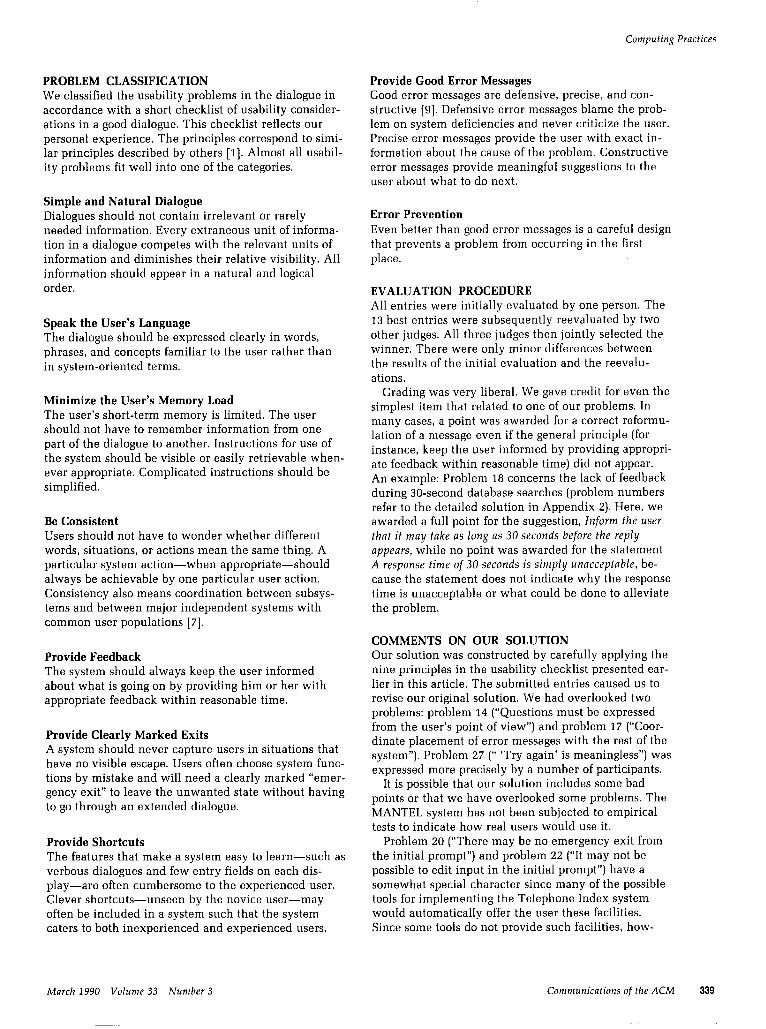
WHAT SYSTEM DESIGNERS AND PROGRAMMERS ACTUALLY KNOW The results of the survey are summarized in Table I and Figure 1. The average number of problems men- tioned was 11.2 out of 30 problems (37 percent). The
sessment of their solution was reasonable. An example: One of the solutions stated: ILLEGAL
NUMBER-Nonsense, of course, and also unfriendly. It should say “The number cannot be correct,” but if would be better to indicate what is wrong. Even more important: the input field can be constructed in such a way that the error will almost never OCCMY. For this observation we gave credit for problem 23 (“The word ILLEGAL may intimi- date the user”) and problem 24 (“The error messages
Mentimed PlVbklll by% IIIMIIY
IJercr~tbn
95 92 92 77 74 73 64 64 62 58
2; 38 32 29 27 18 17 16 14 13 12 12 12
; 8
t 1
15 9
10 4
18 5 8
24 19 3
2; 11 12
5; 31 6
14 25 16 13 17 27
2; 29 20 21 22
Serious
Serious
Serious Serious
Serious
Serious Serious
Serious
Re-display input (telephone number) with subscriber information Avoid the use of English terms if a Danish term exists Use the Danish national characters wherever possible Remove unnecessary information Inform the user if it may take 30 seconds before a reply appears Avoid mysterious characters (>); consider using field labels The function keys should be listed in some natural order The error messages are too vague The options available to the user should be displayed Avoid spelling errors The first name should be written before the last name The error messages should be more constructive Do not distort information (username) entered by the user Clarify or remove information that is difficult to understand The word ILLEGAL may intimidate the user “Enter number and RETURN” may be taken literally Show an example of a telephone number in the initial prompt Interspersed blank lines reduce the readability of an address Questions must be expressed from the user’s point of view The system should tell how it has interpreted the user’s input 3 different terms are used for “Telephone number” The meaning of the notation PFl=HELP is not clear to novices Coordinate placement of errolr messages with the rest of the system The request “Try again” in an error message is meaningless Avoid the use of abbreviations Allow lower case L and the letter 0 instead of digits 1 and 0 Accept parentheses, spaces aind hyphen in telephone number There may be no emergency exit from the initial prompt There is no emergency exit during a long retrieval It may not be possible to edit input in the initial prompt
TABLE 1 Summary of 77 entries submitted in a contest for evaluating a human-computer dialogue. For each problem the table shows the percentage of the entries that identified the problem. Problem 1 does not appear, since it was described in an example in the text of the exercise. The problem numbers refer to the detailed solution in Appendix 2. Some of the problems may prevent some users from using the system in a meaningful way. These problems are Imarked “Serious” in the table.
340 Communications of the ACM March 1990 Volume 3.3 Number 3
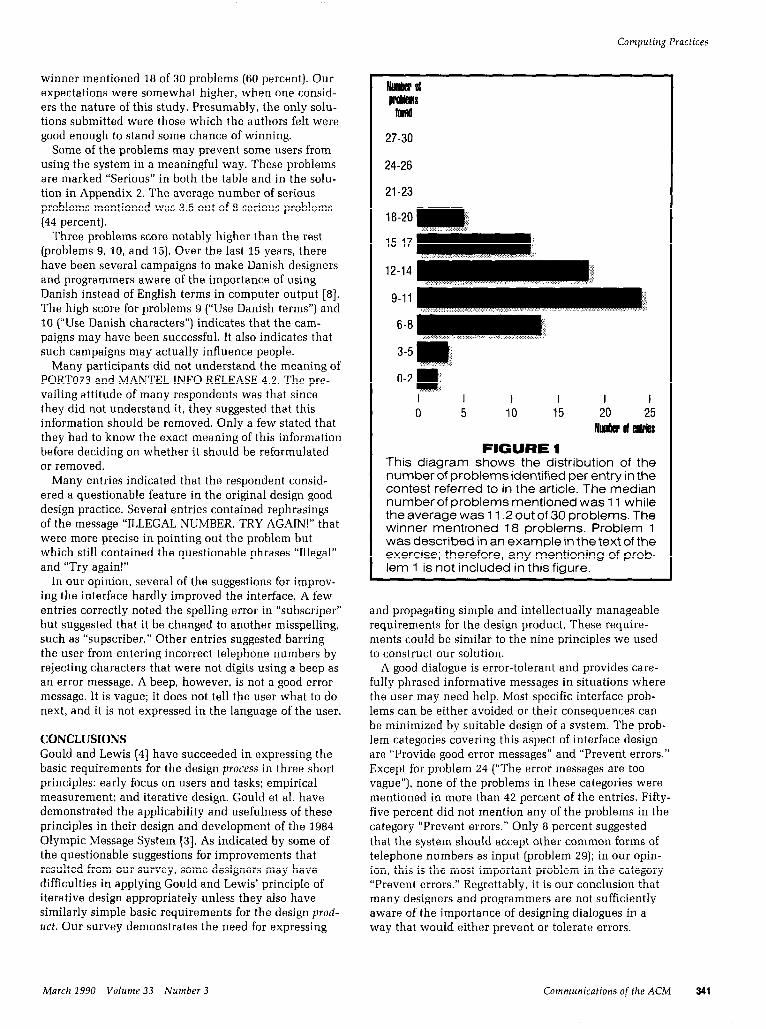
winner mentioned 18 of 30 problems (60 percent). Our expectations were somewhat higher, when one consid- ers the nature of this study. Presumably, the only solu- tions submitted were those which the authors felt were good enough to stand some chance of winning.
Some of the problems may prevent some users from using the system in a meaningful way. These problems are marked “Serious” in both the table and in the solu- tion in Appendix 2. The average number of serious problems mentioned was 3.5 out of 8 serious problems (44 percent).
Three problems score notably higher than the rest (problems 9, 10, and 15). Over the last 15 years, there have been several campaigns to make Danish designers and programmers aware of the importance of using Danish instead of English terms in computer output [8]. The high score for problems 9 (“Use Danish terms”) and 10 (“Use Danish characters”) indicates that the cam- paigns may have been successful. It also indicates that such campaigns may actually influence people.
Many participants did not understand the meaning of PORT073 and MANTEL INFO RELEASE 4.2. The pre- vailing attitude of many respondents was that since they did not understand it, they suggested that this information should be removed. Only a few stated that they had to know the exact meaning of this information before deciding on whether it should be reformulated or removed.
Many entries indicated that the respondent consid- ered a questionable feature in the original design good design practice. Several entries contained rephrasings of the message “ILLEGAL NUMBER. TRY AGAIN!” that were more precise in pointing out the problem but which still contained the questionable phrases “Illegal” and “Try again!”
In our opinion, several of the suggestions for improv- ing the interface hardly improved the interface. A few entries correctly noted the spelling error in “subscriper” but suggested that it be changed to another misspelling, such as “supscriber.” Other entries suggested barring the user from entering incorrect telephone numbers by rejecting characters that were not digits using a beep as an error message. A beep, however, is not a good error message. It is vague; it does not tell the user what to do next, and it is not expressed in the language of the user.
CONCLUSIONS Gould and Lewis [4] have succeeded in expressing the basic requirements for the design process in three short principles: early focus on users and tasks; empirical measurement; and iterative design. Gould et al. have demonstrated the applicability and usefulness of these principles in their design and development of the 1984 Olympic Message System [3]. As indicated by some of the questionable suggestions for improvements that resulted from our survey, some designers may have difficulties in applying Gould and Lewis’ principle of iterative design appropriately unless they also have similarly simple basic requirements for the design prod- uct. Our survey demonstrates the need for expressing
Computing Practices
27-30
24-26
21-23
1 E-20 -1
12-14
9-11 ,’
6-Bimj’ ‘< ‘~
3-5m ”
O-2 & “’ I I I I I I 0 5 10 15 20 25
Nuder ol atries
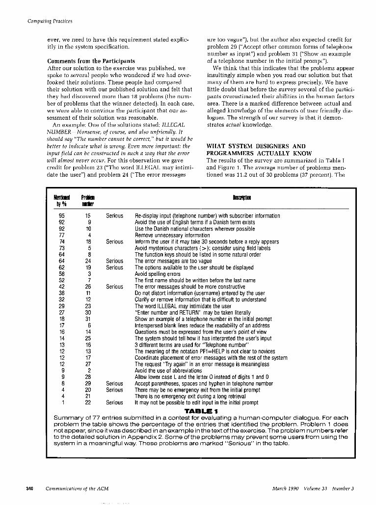
FIGURE 1 This diagram shows the distribution of the number of problems identified per entry in the contest referred to in the article. The median number of problems mentioned was 11 while the average was 11.2 out of 30 problems. The winner mentioned 18 problems. Problem 1 was described in an example in the text of the exercise; therefore, any mentioning of prob- lem 1 is not included in this figure.
and propagating simple and intellectually manageable requirements for the design product. These require- ments could be similar to the nine principles we used to construct our solution.
A good dialogue is error-tolerant and provides care- fully phrased informative messages in situations where the user may need help. Most specific interface prob- lems can be either avoided or their consequences can be minimized by suitable design of a system. The prob- lem categories covering this aspect of interface design are “Provide good error messages” and “Prevent errors.” Except for problem 24 (“The error messages are too vague”), none of the problems in these categories were mentioned in more than 42 percent of the entries. Fifty- five percent did not mention any of the problems in the category “Prevent errors.” Only 8 percent suggested that the system should accept other common forms of telephone numbers as input (problem 29); in our opin- ion, this is the most important problem in the category “Prevent errors.” Regrettably, it is our conclusion that many designers and programmers are not sufficiently aware of the importance of designing dialogues in a way that would either prevent or tolerate errors.
March 1990 Volume 33 Number 3 Communications of the ACM 341
Computing Practices
A recent study of intelligent help systems [Z] con- cluded that ‘I. . .[The authors] are less confident that the state of the art in user interfaces is clean enough to provide the kind of testbed we wanted.” Our study seems to support this point. We have demonstrated that industrial designers and programmers have considera- ble difficulty in recognizing potential problems in the review of a simple human-computer dialogue.
What can we do to to solve this problem? The first and most difficult step is to realize that we are indeed facing a serious problem. Human-computer dialogue construction appears deceptively simple, yet it is full of subtle pitfalls as we have demonstrated. Second, some intellectually manageable set of dialogue principles should be proposed and its usability demonstrated, in a similar way to Gould and Lewis’ three principles for the design process. Third, designers should be made
aware of the necessity for extensive review of human- computer interfaces. As our own experience with the MANTEL system shows, the more people that look at the interface, the more problems are detected.
Computer systems are hard for most people to learn and use today. We believe that if human-computer dia- logues were designed by people who understand and apply basic dialogue principles, they would achieve much higher usability marks. The results ‘of our survey indicate that many of these principles are neither com- mon knowledge nor intuitive.
Acknowledgments. The authors would like to thank Peter Carstensen, Jan Clausen, Anker Hel:ms Jorgensen, and Bodil Schroder for valuable comments on earlier versions of this article.
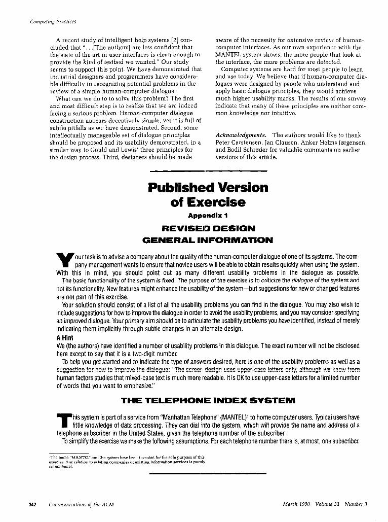
Published Version of Exercise
Appendix 1
REVISED DESIGN
GENERAL INFORMATION
V our task is to advise a company about the quality of the human-computer dialogue of one of its systems. The com- pany management wants to ensure that novice users will be able to obtain results quickly when using the system.
With this in mind, you should point out as many (different usability problems in the dialogue as possible. The basic functionality of the system is fixed. The purpose of the exercise is to criticize the dialogue of the system and
not its functionality New features might enhance the usability of the system-but suggestions for new or changed features are not part of this exercise.
Your solution should consist of a list of all the usability problems you can find in the dialogue. You may also wish to include suggestions for how to improve the dialogue in order to avoid the usability problems, and you may consider specifying an improved dialogue. Your primary aim should be to articulate the usability problems you have identified, instea.d of merely indicating them implicitly through subtle changes in an alternate design. A Hint We (the authors) have identified a number of usability problems in this dialogue. The exact number will not be disclosed here except to say that it is a two-digit number.
To help you get started and to indicate the type of answers desired, here is one of the usability problems as well as a suggestion for how to improve the dialogue: “The screerl design uses upper-case letters only, although we know from human factors studies that mixed-case text is much more readable. It is OK to use upper-case letters for a lirnited number of words that you want to emphasize.”
T his system is part of a service from “Manhattan Telelahone” (MANTEL)’ to home computer users. Typica,l users have little knowledge of data processing. They can dial into the system, which will provide the name ancl address of a
telephone subscriber in the United States, given the telephone number of the subscriber. To simplify the exercise we make the following assumptions. For each telephone number there is, at most, one subscriber.
‘The name “MANTEL” and the system have been invented for the sole purpose of this exercise. Any relation to existing companies or existing information services is purr:ly coincidental.
342 Communications of the ACM March 1990 Volwne 33 Number 3
Computing Practices
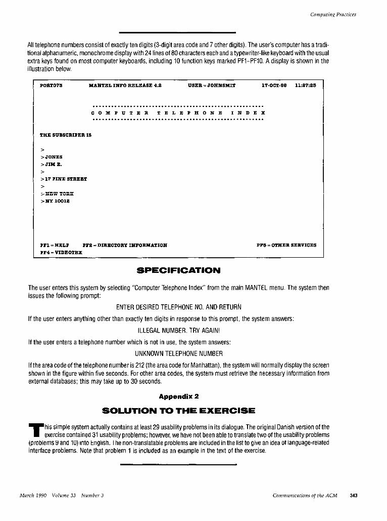
All telephone numbers consist of exactly ten digits (3-digit area code and 7 other digits). The users computer has a tradi- tional alphanumeric, monochrome display with 24 lines of 80 characters each and a typewriter-like keyboard with the usual extra keys found on most computer keyboards, including 10 function keys marked PFI-PFIO. A display is shown in the illustration below.
PORT073 MANTELINFORELEASE4.a USER=JOHNSMIT 17-OCT-88 11:a7:a3
**..**~~~**.*********.~*~*****.***..**.**************** COMPUTER TELEPHONE INDEX ***.*****...***********..********************~**.******
THESUBSCRIPERIS
> >JONES >JIME.
> >lTPINESTREET >
>NEWYORX
>NYlOOl8
PFl=HELP PF2=DIRECTORYINFORMATION PFQ=VIDEOTEX
PFB=OTHERSERVICES
SPECIFICATION
The user enters this system by selecting “Computer Telephone Index” from the main MANTEL menu. The system then issues the following prompt:
ENTER DESIRED TELEPHONE NO. AND RETURN
If the user enters anything other than exactly ten digits in response to this prompt, the system answers:
ILLEGAL NUMBER. TRY AGAIN!
If the user enters a telephone number which is not in use, the system answers:
UNKNOWN TELEPHONE NUMBER
If the area code of the telephone number is 212 (the area code for Manhattan), the system will normally display the screen shown in the figure within five seconds. For other area codes, the system must retrieve the necessary information from external databases; this may take up to 30 seconds.
Appendix 2
T his simple system actually contains at least 29 usability problems in its dialogue. The original Danish version of the exercise contained 31 usability problems; however, we have not been able to translate two of the usability problems
(problems 9 and 10) into English. The non-translatable problems are included in the list to give an idea of language-related interface problems. Note that problem 1 is included as an example in the text of the exercise.
March 1990 Volume 33 Number 3 Communications of the ACM 343
Some of the problems may prevent some users from using the system in a meaningful way. These problems are marked “Serious.”
SIMPLE AND NATURAL DIALOGUE PROBLEM 7. The screen design uses upper-case letters only, although we know from human factors studies that mixed- case text is much more readable. It is OK to use upper-case letters for a limited number of words that you want to emphasize.
PRoBLEM2. If there is room, you should write out the entire word instead of using abbreviations. Thus, “October” is preferable over “Oct.”
PROBLEM3 Spelling error: “SUBSCRIPER” should be “subscriber.” Spelling errors distract users and make them suspect a generally poor quality of the system.
PROBLEM4 The USERNAME is unnecessary information since it must be assumed that users know who they are, even without being told by the system. In an information system for telephone numbers, the date and time are also unnecessary bits of information. See problem 12.
PROBLEM 5. The characters “ >” are mysterious-especially at the blank lines. An alternative might be to show the field labels instead. This would also make it clear why some of the fields are not filled in. In the case of name and address, however, the meaning of the fields will be obvious to any user if we remove the “ >” and change the order of the fields as discussed in problem 7.
PRoBLEM6. The blank lines in the middle of the information reduce the readability and may confuse the user. Therefore, we should restructure these fields so that lines without information are suppressed rather than output to the user as blanks. In the example in this exercise, this means that we should skip the fields for c/o address, etc.
PROBLEM 7. The first name should be written before the last name since this is the natural ordering. Furthermore, the system should present the user with a single-merged name field instead of two separate fields for first name and last name. It is of no interest to the user of this system how the database is structured internally. The same goes for the city name, state, and zip code.
PRoBLEM8. The function keys should be listed in some logical order, e.g., numerically. The blank space between PF2 and PF5 should be eliminated.
SPEAK THE USER’S LANGUAGE PROBLEM 9. This problem does not appear in the English translation of the exercise. Avoid the use of English terms if a proper Danish term exists. Use the Danish abbreviation “Okt.” instead of OCT. Replace HELP with the Danish term “Hjaelp” or “Forklar” (Explain).
PROBLEM 10. This problem does notappearin the English translation of the exercise. Use the Danish national characters a? and 0 instead of the Swedish or German equivalents a and a.
PROBLEM 11. From the USERNAME in the example it appears that the system truncates the user’s name to eight characters. In general, computer systems should allow users to enter user and file names of any reasonable length. Other- wise, the system will either force users to use unnatural abbreviations or distort the information entered by the user by only making use of the first N characters.
PROBLEM 12. The information PORT073 and MANTEL INFO RELEASE 4.2 may be difficult to understand for many users. Since this information will rarely be needed by ordinary users, it may be either deleted or moved to a separate display where it may be explained in more depth. In distinguishing between problems 4 and 12, the keywords that we looked for were “unnecessary” for problem 4 and “difficult to understand” for problem 12.
PROBLEM 73. The system uses the notation “PFl=HELP” to explain the use of the function keys. The meaning of this notation-in particular the use of the equals sign-is not clear to novice users. On the other hand, it is easy to understand for users who know about function keys and who have seen the notation in other systems. It is a compact notation which is an advantage in systems which must display much more information on each screen than is the case in this system. It is not obvious which solution to suggest since the need to explain things in detail for the novice user contrasts with the need to be consistent with the notation known by experienced users from other systems. Because of the specific em- phasis on usability for novice users in this system, we prefer the solution which is better for novices.
PROBLEM 74. Questions to the user must be expressed from the user’s point of view and not from the system’s point of view. The initial question should not be “Enter desired telephone number.. .‘I, since the user does not want the telephone number but rather name and address. The initial question should be something like “Enter telephone number for which you want name and address.”
MINIMIZE THE USER’S MEMORY LOAD PROBLEM 15. (serious). The telephone number entered by the user should be displayed together with the subscriber information. The telephone number should appear in a format that is well-known by the user and accepted as input by the system.
BE CONSISTENT PROBLEM 16. Several different terms are used for the same concept: Number, Telephone No., and Telephone number.
PROBLEM 7Z The specification does not state where error messages are displayed on the display. It should be em- phasized that all error messages should be displayed in the same location. Since the current system appears to be a sub- system of some general information system, the format and placement of error messages should be coordinated with the rest of the system. Similar coordination considerations apply to the general screen layout, function key assignment, and wording.
PROVIDE FEEDBACK
PROBLEM 78. (serious) A response time of 30 seconds to a command from the user is unacceptable. For technical reasons it may take the system as long as 30 seconds to retrieve the requested information from external databases. To tell the user what is going on and to show that the system is active, however, the system should display a message like “Telephone number (203) 456-7890 is outside the 212 area code so it may take up to 30 seconds to retrieve the informa- tion.” Every five seconds the system should also display some indication that it is still working on the command.
PROBLEM 19. (serious) The screen contains no information about what users should do once they have read the infor- mation and want to continue.
PROVIDE CLEARLY MARKED EXITS PROBLEM29 (serious) There is no indication of how users may exit from the system without answering the intitial prompt to enter a telephone number. PROBLEM21. When users request information about a telephone number outside the 212 area code, the system may take up to 30 seconds to answer. The system should provide a facility for aborting the information retrieval.
PRoBLEM22. (serious) The system specification does not indicate whether the user can edit a partially entered telephone number. It is an essential “emergency exit” to allow users to use the BACKSPACE key, for example, to correct errors in a text they have typed.
PROVIDE SHORTCUTS (In the English version it would be reasonable to accept user input consisting of only seven digits with a 212-area-code default for the expected large number of local requests. Because of the structure of Danish telephone numbers, a similar suggestion would not be appropriate for the original exercise.)
PROVIDE GOOD ERROR MESSAGES PRoBLEM23. The system should not use the word “ILLEGAL” in an error message. Users do not break the law because they enter a wrong number. In any situation, the system should not intimidate the user by suggesting that he or she must be stupid to make such a mistake.
PRoBLEM24. (serious) The error messages are too vague. The system should inform the user as exactly as possible about what it knows about the problem-for example, if the area code is missing.
PRoBLEM25. The system should report back to the user how it has interpreted his or her input. An example: “The system cannot understand the telephone number W3 QV.” This is especially important in this system which is accessed by users via a modem and possibly noisy telephone lines. Users have a right to know whether a problem is due to a transmission error or a user mistake.
Computing Practices
PRoBLEM26. (serious) The error messages are not constructive since they do not tell the user how to colmct the er- ror. For example, one could supplement the error message $rst mentioned by “Enter telephone number as ten digits with the area code as the first three.”
PRoBLEM27. It is meaningless to ask the user to “Try again!” in an error message since the computer will give exactly the same result the next time. A better message is “Try again with another telephone number,” but the best is probably to drop this altogether.
PREVENT ERRORS PRoBLEM26. This system is to be used by some people who may be totally new to computers. Therefore, it is likely that some users are not used to the sharp distinction in computer systems between the letters “I” (lower case L) and “o”/“O” (lower or upper-case 0) on the one hand and the digits “1” (one) and “0” (zero) on the other hand. If the system encounters one of these letters where it expects a digit, it should provide a helpful message or simply replace the letter by the cor- responding digit.
PROBLEM29. (serious) Instead of having error message.s for input with parentheses around the area code or with ex- tra spaces, the system could just accept these common ways of entering telephone numbers.
f666LEM36. Experience shows that some novice users take the prompt “Enter number and RETURN” quite literally and type R-E-T-U-R-N. It is better to write “. .and press the RETURN key.”
fftOBLEM31. The communication from the system to the user should not be kept in abstract or theoretical terms but should be supplemented by concrete examples, which often increase the users’ understanding considerably. In the prompt “Enter telephone number and press the RETURN key:,” an example of a telephone number in the simplest form accepted as input by the systems should be added-even if this form is different from the output format used by the system to in- crease readability (see problem 15). The telephone number used in the example should either not be in use or it should be a number of the Manhattan Telephone Operator.
Appelndix 3
TELEPHONE INDEX .*******************.*.~*..*.**.************
Telephone number (515) 345-5759 has the following sulbscriber:
Jim E. Jones 17 Pine Street
New York, NY 10012
Press: RETURN to be able to enter a new telephone number
ESC to leave the Telephone Index PFl to get Help about how to use this system PF5 to go to the Directory Information system PF4 to go to the general Videotex service PFS to get a list of Other Services available
346 Communications of the ACM March 1990 Volume 33 Number 3
Computing Practices
SPEClFlCATlON
The user enters this system by selecting “Telephone Index” from the main MANTEL menu as shown. The system then issues the following prompt:
Enter telephone number and press the RETURN key: Example of a telephone number which the system understands: 212 456 7890 You can stop this system at any time by pressing the ESC-key
Characters entered by the user are displayed immediately to the right of the colon after “RETURN key” in the above message. As long as the user has not pressed RETURN, the latest character which has been entered but not yet deleted may be deleted by pressing the BACKSPACE key.
Anywhere in this system where the user may press the RETURN key, he or she may choose to press ESC instead. Immediately after ESC has been pressed, the system will leave the “Telephone Index” without further processing of previous user input.
Analysis of input starts when the user presses RETURN. This analysis does the following:
l The system ignores space characters. l The system ignores a hyphen between the third and fourth digit and between the sixth and seventh digit. l The system ignores correctly matched parentheses around the first three out of ten digits (the area code). l The system replaces any occurrence of the letters o or 0 (lower or upper-case 0) by the digit 0 (zero). l The system replaces any occurrence of the letter I (lower-case L) by the digit 1 (one).
If the telephone number entered by the user consists of exactly seven digits, the system will assume that the user wants information about the given telephone number in the 212 area and that the user has omitted the area code 212.
If the telephone number entered by the user contains syntax errors after completion of the above analysis, the system will reply with the message:
The system cannot understand the telephone number W3 OV Enter telephone number as ten digits with the area code as the first three. Example: 212 456 7890 Press the RETURN key to continue
In this example we have assumed that the user entered the characters W3 QV as a telephone number. If the user enters a telephone number which is not in use, the system replies with the message:
The telephone number (212) 456-7890 is not in use Press the RETURN key to continue
If the area code of the telephone number is 212 (the area code for Manhattan), the system will normally display the screen shown in the figure within five seconds. For numbers within other area codes, the system retrieves information from ex- ternal databases and may take up to 30 seconds to display the screen. When the user has entered RETURN, the system will display the following message on the screen:
Telephone number (203) 456-7890 is outside the 212 area code so it may take up to 30 seconds to retrieve the information. Press the ESC-key if you want to STOP the search for this information
Every fifth second the system will add an extra period (.) to the right of the last period to the right of “to retrieve the infor- mation.”
The messages described in this specification are output starting from line 19. Before outputting a message, the system blanks lines 18-24 completely. When the user presses RETURN or ESC, or when a search is complete, the message disap- pears and the system restores the previous contents of lines 18-24. After a user error, the system then returns to its initial state and continues by outputting the initial prompt.
March 1990 Volume 33 Number 3 Communications of the ACM 347
Conrptrtirrg Practices
- AROUT THE AIJTIIORS:
ROLF MOLICH works for the Ballica Insurance Company in Copenhagen. thn~nark. ~vhere he is manager of and-user rcla- lions al Lhe Dcvclopnicnt Scrvicc Center. He also leaches hu- man-c:ompulcr interaction at the Technical Universily ol’ JICII-
mark. Author’s Prescnl Address: Baltica A/S. 41ail Code B22. Klausclalsbro\wj f3)l. DK-2750 Ballerup. Denmark.
JACOB NIELSEN is an assistanl professor at the Technical I!nirersitv of Denmark. Iiis current rcscarch interests are usa- bility engineering and hypcrtcxt. Author’s Prcscnt Address: Department of Computer Science. Building 3.1-1. Technical I:ni- versity of Denmark. I)K-2800 Lyngby. Denmark. DATJh@NEI!\‘Ml .BITNET.
CR Categories and Subject Descriptors: D.2.2 [Software Engineer- ing]: Tools and Tcchniqucs: H.1.2 [Information Systems]: User hlachiuc Systems
General Terms: Design. Human Factors Additional Key Words and Phrases: Consistcncv. dialogue design.
ACM SPECIAL INTEREST GROUPS AREYOURTECHNICAL
INTERESTSHERE? SIGCAPH Newsletter. Cassette Edition
SIGCAPH Newsletter. Print and Cassctto
SIGMICRO Newsletter (Xlicroprogramming)
Editions SIGMOD Record (hlanagemcnt of Data]
The ACM Special Interest Groups further the ad- vancement of computer science and practice in
SIGCAS Sewsletter (Computers and SIGSUM Newsletter (Numerical
many specialized areas. Members of each SIG Society) Mathematics)
receive as one of their benefits a periodical SIGCHI Bulletin (Computer and Human SIGOIS Newsletter (Office Information
exclusively devoted to the special interest. The Interaction) Syslems)
following are the publications that are avail- able-through membership or special
SIGCOMM Computer Communication
subscription. Review (Data Communication)
SIGOPS Operating Systems Review (Operating SystemsJ
SIGCPR Newsletter (Computer Pcrso~mzl Kesearch)
SIGPLAS Notices (Programming Languages)
SIGACT NEWS (Automata and Computability Theory)
SIGAPL C !uote Quad (APL)
SIGARCH Computer Architecture News (Architcct& of Computer Systems)
SIGART Newsletter (Artificial Intelligence)
SIGCSE Bulletin (Computer Science Education1
_. -
SIGPLAN FORTRAN FORUM (FORTRAN)
SIGCUE Bulletin (Computer Uses in Education)
___--. _. . SIWJA Sewsletter (IJes ‘- ign Automation)
SIGSAC Sewsletter (Security. Audit. and Control)
SIGSAM Bulletin (Symbolic and Algebraic lvianipulation)
SIGDOC Asterisk (Systems Documentation)
SIGFORTH Newsletter (FORTH)
SIGSIM Simuletter (Simulation and \,foclcling)
SIGSMALL/PC Newsletter (Small and SIGBDP DATABASE (Business Data
Processin::) SIGGRAPH Computer Graphics
(Computer Graphics]
Personal Computing Systems and Applications)
SIGBIO Newsletter (Biomedical Computing)
SIGIR Forum (Information Retrieval)
SIGMETRICS Performance Evaluation
SIGSOFT Software Engineering Notes (Software Engineering)
SIGCAPH Newsletter (Computers and the Physically Handicapped) Print Edition
Review (1leasurement and Evaluation)
SIGUCCS Sewsletter (University and College Computing Services)
See the ACM membership application in this issue for additional information.