Embed Size (px)
Citation preview
Integrated Food Security Phase Classification
User Guide
Version 1.0
Integrated Food Security Phase Classification (IPC) in the Central and
Eastern Africa Region Project
Integrated Food Security Phase Classification
User Guide
Version 1.0 Prepared by the IPC in the Central and Eastern Africa Region Project
Updates of this user guide are available at: www.ipcinfo.org
The Food and Agriculture Organization of the United Nations. Nairobi. October 2008
c
Forward
This User Guide is intended to provide step-by-step guidance on how to use the IPC tool in a typical
country environment. While it can be used as a stand-alone document, it is best used as a practical
complement to the IPC Technical Guide.
The IPC is a relatively new tool and its application is not set in stone. Because of its use outside of the
unique context of Somalia and the involvement of more partners, the tool is being developed and
refined further in many areas. This has naturally inspired many interesting and constructive debates
on different aspects of the IPC. This version of the Guide points out the areas that are currently being
debated – mostly as footnotes –, and will be updated on an ‘as need basis’ to reflect changes as they
occur. It should therefore be considered a living document rather than a static reference. While
changes are both inevitable and positive, the guide was received very well during initial testing at
workshops and trainings. Including feedback from these events and from other partners, this first
version is regarded as a useful contribution for practical application of the IPC.
The Guide is an output of FAO’s Regional IPC Project (OSRO/RAF/709/CAN, OSRO/RAF/711/UK and
OSRO/RAF/712/EC), that targeted five countries in the East and Central Africa region during 2007/8 –
Kenya, Burundi, Uganda, Tanzania and the Democratic Republic of Congo – with the aim of
introducing the tool and learning from the experience.
FAO is grateful to the donors of the project: the Canadian International Development Agency (CIDA),
The UK’s Department for International Development (DFID) and the European Commission
Humanitarian Office (ECHO).
Acknowledgements
The principle author of the IPC User Guide was Calum McLean (FAO IPC Regional Training
Coordinator). Substantive writing and editorial work was provided by John Anderson (FAO Regional
Emergency Food Security Consultant) and Jonathon Brass (IPC NGO Focal Point), and overall
guidance provided by Francesco Del Re (FAO Emergency Food Security Advisor). Comments were
kindly provided by World Food Programme, FAO Head Quarters and the FAO Somalia FSAU. The
drafters would also like to thank the participants at the: National IPC Analysis Workshops in Uganda
and Kenya; Training of Trainers events; and at the Regional IPC Technical Workshop in Nairobi, for
providing feedback on the guide and making very helpful suggestions for improvements.
d
The Food and Agriculture Organization of the United Nations. Nairobi. October 2008
i
Table of Contents
LIST OF ACRONYMS AND GLOSSARY iii
INTRODUCTION
Getting Started: Purpose of the Guide and Relation to the Technical Manual
A. Why the IPC?
B. What It Is and Added Value
C. What It Isn’t
D. IPC Components
o Reference Table
o Evidence Template Protocols
o Cartographic Protocols
o Population Table Protocols
MODULE 1: BUILDING YOUR EVIDENCE
1.1 Objective of the Module and What You Will Be Able to Do When You Have Completed It
1.2 What You Need
1.3 Before You Start...
1.4 Step 1: Things to Think About Before Entering Your Data
1.4.1 Review your data and hazards, and decide how the analysis should be done
1.4.2 General guidelines
1.5 Step 2: Filling out the First Column of Evidence Template 1: An Indicator by Indicator Guide
MODULE 2: DOING THE PHASE CLASSIFICATION
2.1 Objective of the Module and What You Will Be Able to Do When You Have Completed It
2.2 What You Need
2.3 Before You Start...
2.4 Step 1: Classifying Each Indicator in Turn
2.5 Step 2: Convergence of Evidence and Overall Classification
MODULE 3: RISK ANALYSIS
3.1 Objective of the Module and What You Will Be Able to Do When You Have Completed It
3.2 What You Need
3.3 Before You Start...
3.4 Step 1: Developing a Risk Analysis Matrix
3.5 Step 2: Making the Prediction on Risk
MODULE 4: THE NUMBERS GAME - ESTIMATING POPULATIONS IN EACH PHASE
4.1 Objective of the Module and What You Will Be Able to Do When You Have Completed It
4.2 What You Need
4.3 Before You Start...
4.4 Step 1: Estimating Populations in Each Phase
4.5 Step 2: Validation and Peer Review
MODULE 5: IMPACT ANALYSIS AND WHAT TO DO ABOUT IT
5.1 Objective of the Module and What You Will Be Able to Do When You Have Completed It
5.2 What You Need
5.3 Before You Start...
ii
5.4 Step 1: Filling out the Evidence Template Part 2
5.5 Step 2: Filling out the Evidence Template Part 3
MODULE 6: DEVELOPING YOUR MAP – INFORMATION THAT YOU NEED TO GIVE TO YOUR GIS
TECHNICIAN
6.1 Objective of the Module and What You Will Be Able to Do When You Have Completed It
6.2 What You Need
6.3 Before You Start…
6.4 Step 1: Phase Classifications of the Spatial Analysis (LZ; Admin Zones Etc) Together
With the Risk Analysis
6.5 Step 2: Develop Call out Boxes for Emergency Phases (3-5) or Other Phases that You
Want to Make Particular Reference to [includes population estimates and the stacked bar]
6.6 Step 3: Develop a Clear Title for the Map Including the Period of Validity
MODULE 7: HOW DO YOU KNOW YOU GOT IT RIGHT? THE PEER REVIEW PROCESS
7.1 Objective of the Module and What You Will Be Able to Do When You Have Completed It
7.2 What You Need
7.3 General Description
7.4 Step 1: Reviewing the Phase Classification for Different Areas/ Livelihood Zones in Your
Country (or Part of Your Country)
7.5 Step 2: Finalising Any Revisions and Preparing the Final Map and Summary Statements
7.6 Step 3: Disseminating the Outputs
MODULE 8: HOW TO ESTABLISH AN IPC IN YOUR COUNTRY
8.1 Objective of the Module and What You Will Be Able to Do When You Have Completed It
8.2 What You Need
8.3 Before You Start...
8.4 Step 1: Giving Your IPC A Home – Institutional Considerations
8.4.1 Finding a home for the IPC: institutional mapping
8.4.2 Getting acceptance and buy-in: awareness raising; importance of national governmental
ownership and leadership
8.4.3 Getting the right people around the table
8.5 Step 2: Learn From Using the IPC in Your Country with Your Data
8.5.1 Using the IPC as part of ongoing processes of assessment/analysis
8.5.2 Learning from the process
8.5.3 Data issues: mapping and meta-data analysis
8.5.4 Adaptation of the tool without changing the core
8.6 Step 3: Building Capacity and Decentralisation
8.6.1 Building a national IPC team
8.6.2 Training of trainers
8.6.3 Decentralisation: maintaining rigour, objectivity, checks and balances, peer review
Annex 1: Types and Sources of Data 1
Annex 2: Glossary of Terms: English - French 5
Annex 3: FSAU Method for Calculating Population Estimates for AFLC and HE IPC Phases 9
iii
LIST OF ACRONYMS AND GLOSSARY
AFLC Acute Food and Livelihood Crisis (IPC Phase 3)
ALRMP Arid Lands Resource Management Project (Kenya)
ASAL Arid and Semi-Arid Lands
CAP Consolidated Appeals Process
CARE International NGO and Global IPC Partner
CFSAM Crop and Food Supply Assessment Mission (FAO/WFP)
CFSVA Comprehensive Food Security and Vulnerability Assessment (WFP)
CMR Crude Mortality Rate
COF Climate Outlook Forum (convened by ICPAC)
CSI Coping Strategies Index
Deyr Somali term for the October to December rainy season
DDI Dietary Diversity Index
DFID UK Department for International Development
DHS Demographic and Health Surveys
EC European Commission
FANTA USAID Food and Nutrition Technical Assistance
FAO Food and Agriculture Organization of the United Nations and Global IPC Partner
FEWS NET Famine Early Warning Systems Network and Global IPC Partner
FHC Famine/Humanitarian Catastrophe (IPC Phase 5)
FSAU Food Security Analysis Unit – Somalia
GAM Global Acute Malnutrition
GFS Generally Food Secure (IPC Phase 1)
GIEWS Global Information Early Warning System
GIS Geographic Information Systems
Gu Somali term for the March to July rainy season
h/a Height for Age (anthropometric measure of stunting)
HE Humanitarian Emergency (IPC Phase 4)
HEA Household Economy Approach
HFIAS Household Food Insecurity Access Scale
HDDS Household Dietary Diversity Score
HNTS Health and Nutrition Tracking Service
HPG Humanitarian Policy Group
IASC UN Inter-agency Standing Committee
ICPAC IGAD Climate Prediction and Application Centre
ICRC International Committee of the Red Cross
IDPs Internally Displaced Persons
IPC Integrated Food Security and Phase Classification
Kcal Kilo calories
LEWS Livestock Early Warning System (managed by Texas A&M)
LTM Long Term Mean
LRRD Linking Relief, Recovery and Development
LZ Livelihood Zone
M/BFI Moderate/Borderline Food Insecure (IPC Phase 2)
MoA Ministry of Agriculture
MoH Ministry of Health
MT Metric Tonne
MUAC Mid-Upper Arm Circumference
NAF Needs Analysis Framework
NGO Non-Governmental Organization
OP Office of the President
OPM Office of the Prime Minister
iv
OXFAM (GB) International NGO and Global IPC Partner
PWA Post War Average (used in Somalia as recent long-term average for crops production …etc)
SAM Severe Acute Malnutrition
SCUK Save the Children – United Kingdom, and Global IPC Partner
SCN - UN Standing Committee on Nutrition
SENAC Strengthening Emergency Needs Assessment Capacity
Shoats Abbreviation for ‘sheep and goats’
SLA Sustainable Livelihoods Approach
SMART Standardized Monitoring and Assessment of Relief and Transitions
U5MR Under-5 Mortality Rate
UN United Nations
UN-OCHA United Nations Office for the Coordination of Humanitarian Affairs
UNAIDS The Joint United Nations Programme on HIV/AIDS
UNDP United Nations Development Programme
UNHCR United Nations High Commissioner for Refugees
UNICEF United Nations Children’s Fund
USAID United States Agency for International Development
VAM The Vulnerability Analysis Mapping office of WFP
w/h Weight for Height (anthropometric measure of acute malnutrition)
WHO World Health Organisation of the United Nations
WFP United Nations World Food Programme and Global IPC Partner

INTRODUCTION
0-1
0 INTRODUCTION
Getting Started: Purpose of the Guide and Relation to the Technical Manual
Welcome to the Users Guide for the Integrated Food Security Phase Classification (IPC). The purpose
of this guide is to provide you with a practical step-by-step explanation of how to actually implement
the IPC, a process and set of tools to guide and communicate food security situation analysis. The
guide is designed for food security practitioners that are using the IPC in conducting food security
assessments and analysis, and can be used either as preparatory reading in headquarters or as a
reference guide in the field.
This Users Guide is one of several products that have been developed to support the use of the IPC,
the latest versions of which can be found at the IPC website: www.ipcinfo.org. Two other main
products include:
• The Integrated Food Security Phase Classification Technical Manual, which provides detailed
technical guidance on the use of the IPC for food security analysis. This manual discusses the
rationale for developing the IPC, the analytical logic of the IPC, and the details of the various
indicators and tools that form the basis of the IPC analysis. The Technical Manual should be
considered the primary source of information about the IPC, and will be referenced many
times in this User Guide.
• IPC training courses and presentations, including distance-learning modules and courses to
be delivered in-person by a trainer. These courses not only present the rationale for
developing the IPC, its analytical logic, and the details of its various indicators and tools, but
also include exercises and questions for the users, as they are designed to educate
practitioners about the IPC. These courses serve as preparatory training before practitioners
begin to use the IPC.
The IPC User Guide complements these other products, walking you through the step-by-step ‘how
to’ of implementing the IPC in the field. Ideally, users will have already completed an IPC training
course, and will have the IPC Technical Manual on hand for reference while using this guide.
However, even on its own this IPC Users Guide will be a valuable tool for food security practitioners
to simplify the process of conducting an IPC analysis.
The guide is divided into one introductory section that includes the Getting Started and Overview of
the IPC subsections, and eight modules that go through the step-by-step process of how to do an IPC
analysis. The introductory overview of the IPC includes subsections on ‘Why the IPC?’, ‘What It Is and
Added Value’; ‘What It Isn’t’; and a basic description of the four main components of the IPC (the
Reference Table, Evidence Templates, Cartographic Protocols, and Population Tables). Following the
brief overview the modules on how to do an IPC analysis are introduced: Module 1: building your
evidence; Module 2: doing the phase classification; Module 3: risk analysis; Module 4: the number
game: estimating populations in each phase; Module 5: impact analysis and what to do about it;
Module 6: developing your map- information that you need to give to you GIS technician; Module 7:
how do you know you got it right? the peer review process; and Module 8: how to establish an IPC in
your country.
Please note that the fundamental purpose of this guide is to make the use of IPC easier for food
security practitioners like you. As such, this guide will be regularly updated based on user feedback.
0-2
Please feel free to send any comments or suggestions on how the guide could be improved to:
A. Why the IPC?
In the food security community, there has been a lack of clarity and common definitions for
classifying various food security situations in terms of varying severity and implications for action.
This lack of clarity is problematic for several reasons:
• The way a situation is classified determines not only the type of response, but also the source
of funding, scale, planning timeframe, and organizational roles of different stakeholders.
• Without commonly accepted standards for classifying the nature and severity of food security
situations, the design and targeting of interventions can be open to personal, government,
agency, and donor biases.
These problems can lead to imprecise or gross misallocations of scarce resources, and in the worst-
case scenario, even loss of lives.
As a result, there have been increasingly strong calls for improved analysis within the cross-cutting
field of food security, including:
• greater comparability of results from one place to another
• increased rigour
• greater transparency of evidence to support findings
• increased relevance to strategic decision making
• stronger linkages between information and action
Improving analysis along these lines would enable food security interventions to be more needs-
based, strategic, and timely, and there is an urgent practical and operational need for a food security
classification system that is broadly accepted by the wide range of stakeholders. Put simply: “We, the
food security community, need a common currency (language and analytical procedures) for
describing the nature and severity of food security situations.”
B. What It Is and Added Value
The IPC is designed to fill this critical gap in food security analysis. It provides a common classification
system (a ‘common currency’) that draws from the strengths of existing classification systems and
integrates them with supporting tools for analysis and communication.
Specifically, the IPC is a means to classify varying phases of current food security situations based on
outcomes on human lives and livelihoods. The IPC includes five levels of food security (called
‘phases’): Generally Food Secure, Moderately/Borderline Food Insecure, Acute Food and Livelihood
Crisis, Humanitarian Emergency, and Famine/Humanitarian Catastrophe. Additionally, the IPC
considers the risk that conditions will deteriorate (called the ‘Risk of Worsening Phase’), including
three levels: Watch, Moderate Risk, and High Risk.
The approach of the IPC is to draw together all available food security information (or ‘evidence’),
ranging from production figures to livestock prices to civil insecurity to malnutrition rates, to make a
Phase Classification and/or Risk of Worsening Phase statement. The IPC relies on, and indeed
encourages, multiple data sources and methods. The IPC then provides a ‘convergence of evidence’
0-3
approach and a set of tools to arrive at a ‘big picture’ analysis, or meta-analysis, of the overall food
security situation. The outcomes of the process are several communication tools – specifically a map
and population tables – that convey the key messages about the severity and magnitude of food
insecurity.
The IPC focuses on situation analysis in its analysis and communication. Situation analysis is a
distinct yet often overlooked or assumed stage in the analysis, planning, and response process,
demonstrated here with the ‘Analysis-Response Continuum’ (Figure B.1):
Figure B.1: The ‘Analysis-Response Continuum’
Through its focus on situation analysis, key aspects of the IPC analytical process include:
• Severity of the situation: How severe is the situation with regards to impacts on human lives
and livelihoods?
• Geographic extent: What is the approximate geographic area in crisis? This can include
livelihood zones, administrative boundaries, agro-ecological zones, etc.
• Magnitude: What is the estimated number of people experiencing various severity levels of
food insecurity?
• Immediate causes: What are the direct causes of the crisis?
• Underlying causes: What are the underlying or structural causes of the crisis?
• Identification of general needs: What basic human needs and aspects of livelihood systems
require support?
• Distinction of transitory or chronic situations: Is the underlying nature of an acute crisis
generally food secure or chronically food insecure?
• Criteria for social targeting: What are the key criteria for targeting interventions?
• Projected trend: Are conditions in the area expected to improve, to worsen, or stay the same
for the foreseeable future?
• Confidence level of analysis: How confident are the analysts in the outcome of their analysis,
based on the estimated reliability of the available evidence?
The IPC does provide strong linkages to response analysis. However, response analysis is kept as a
separate analytical stage to ensure greater technical neutrality of the analysis. Discussions about
response options can be biased by the agendas of different organizations and groups, and the IPC
insulates the situation analysis from such biases to keep it as technically neutral as possible.
In addition to the maps and population tables that are produced to communicate the outcomes of
the food security analysis, the actual process of conducting IPC analysis is equally important to
Situation Analysis
Intervention Analysis
Intervention Planning
Intervention Implementation
Monitoring / Evaluation
0-4
applying the technical tools correctly. Figure B.2 illustrates the general process including the six main
steps of using the IPC.
Figure B.2: The main steps in IPC analysis
The modules that follow in this Users Guide cover these steps, but are presented in a different order
based on the expected needs of most users. Module 1 which covers Step #3 is likely the starting point
for most users of this guide. Modules 2 - 6 cover the various dimensions of Step #4, and Module 7
corresponds to Step #5. For countries where the IPC is just beginning, Module 8 goes through the
process of establishing a technical working group and familiarizing analysis with IPC concepts and
practice (Step #1 and Step #2). Steps 6– communicating the outputs to the decision makers and the
public – follows the completion of the IPC analytical process, and is not covered by this guide.
These steps are the core of the IPC process. By following them, users are able to benefit from the
added value of the IPC, which includes:
• Comparability over space: The IPC uses commonly adopted criteria, which enables comparison of
the severity of situations from one place to another. Decision makers can then direct resources to
the people most in need.
• Comparability over time: The common IPC criteria also enable comparison over time in terms of
how a situation is worsening or improving. Decision makers can then increase, decrease, or
change the strategic focus of the response as well as identify exit criteria.
• Transparency and accountability: Analysts should be fully transparent in how conclusions are
made, and decision makers should demand evidence to support findings. The IPC process takes
an evidence-based approach that links specific reference criteria to the phase classification. This
provides a transparent justification for the analytical conclusions, and also enforces
accountability from the people responsible for the analysis.
Establish technical
working group with broad
stakeholder participation
and sector-specific technical
expertise
Familiarize analysts with
the IPC concepts and
practice.
Collect and draw
together all relevant
data to evidence for Phase
Classification (from various
methods and sources).
Complete Evidence Templates
Evaluate/interpret/
analyze evidence to make
a composite analytical
statement on a Phase
Classification and/or Risk of
Worsening Phase based on
a convergence of evidence.
Subject the classification
statement to technical
peer review, and make
technically substantiated
revisions as necessary.
1 2 3
5 4
Communicate Phase
Classification analysis to
decision makers and public
with clear text, map, and
population estimate tables.
6
0-5
• Clear early warning: Decision makers need to know the future potential severity, likelihood, and
timing of a pending crisis. By providing a common understanding for describing crises, the IPC
enables early warning messages to be clear, comparable, and actionable.
• More strategic response: Depending on the specific severity level of a given food security or
humanitarian situation, there is a need for fundamentally different emphases in strategic
response. The specificity, clarity, and comparability provided by the IPC enable decision makers
to be strategic in their response to food insecurity.
C. What It Isn’t
In addition to explaining what the IPC is, it is also important to highlight what it is not. First and
foremost, the IPC is not a panacea for all the existing challenges in food security analysis. There
remain numerous challenges, including with data collection, livelihoods analysis, and interpreting
early warning signals, among others. The IPC facilitates and supports one aspect of food security
analysis – situation analysis – although that aspect is an overarching one. Indeed, in many ways the
IPC can serve as a ‘window’ into addressing the numerous other challenges associated with food
security, and will hopefully draw attention to those and lead to more commitment to developing
viable solutions.
More specifically, the IPC is not:
• A methodology. The IPC draws from numerous methods and data sources to analyze the
situation. Methods and data can be quantitative or qualitative, and can come from field
assessments, satellite imagery, or other secondary data. Indeed, the IPC encourages multiple
methods of gathering and examining information; the more methods and data sources, the
greater the ability for triangulation and likelihood of getting the analysis right.
• An information system. The IPC is designed to be adaptable to a wide variety of information
systems and analytical approaches. In most countries that experience chronic food insecurity or
recurrent humanitarian crises, an information system of some type typically exists. The IPC is
designed to build from existing information systems in any given country and help make the most
rigorous, consistent, and meaningful use of that data and analysis. As such, the IPC can be equally
applicable in ‘data rich’ and ‘data poor’ settings.
• Response analysis. The IPC focuses on situation analysis. It also provides linkages to response
analysis, but does not conduct this stage per se. By limiting itself to situation analysis, the IPC can
remain technically neutral and avoid biases based on specific government/agency/ donor
interests in one particular response or another.
The IPC is also not considered a final product. As it has been developed and implemented in new
countries, various improvements and clarifications have been made. While the IPC is already useful
in its present form, it is expected that further refinements will be made as the IPC is rolled out in new
food security and livelihood contexts. Rather than waiting for the perfect tool to improve our
analysis, the IPC roll-out approach is to ‘learn-by-doing’. As such, as with this Users Guide, any input
and feedback from users are welcome.
0-6
D. IPC Components
The sections above provided you with an overview of the general purpose, focus, and added value of
the IPC. There are also four specific main ‘components’ of the IPC – the Reference Table, Evidence
Templates, Cartographic Protocols, and Population Table. These serve as a suite of tools that are
integrated together in the IPC process to enable the analysis and communicate the results. These
main components will be referred to numerous times throughout the modules in the rest of this
guide, and this section provides an initial overview of the components and how they relate to the
overall IPC process.
The Reference Table presents the overarching framework for the IPC analysis. As its name suggests,
it is purely for reference: it provides users with a quick but complete picture of the different phases
of food insecurity and how they relate to the main indicators and strategic response options. Users
do not have to fill out the table at all, but it will serve as a key resource throughout the whole IPC
process. The Reference Table is first mentioned in this Users Guide at the very beginning of Module
1: Building your Evidence.
Specifically, the Reference Table defines the five phases of food security classification (from
Generally Food Secure to Famine/Humanitarian Catastrophe) by the thresholds or characteristics of
the main indicators (called ‘Key Reference Outcomes’1, as they generally focus on actual outcomes of
conditions on lives and livelihoods, such as acute malnutrition or mortality.
Some indicators are more process oriented, and indirectly relate to an eventual outcome, such as
coping strategies or water availability and access. This enables analysts to consider how different
pieces of evidence relate to each other and to a particular phase classification for a given geographic
area. The different phases are also linked to the Strategic Response Framework. The Reference Table
provides a similar definition for the different levels of Risk of Worsening Phase, including the
different probabilities of the different levels of risk and the indicators that analysts should look for.
The Evidence Template is the tool that you will use to actually record your data in a manner that
helps with the phase classification. The template is a blank table that includes space for users to
write in the evidence/data and then the main outcomes of the analysis. One template will be filled in
with data for each geographic area being considered in the analysis.
The templates are divided into three main parts. Part 1 (explained in Modules 1, 2, and 3) is the
template in which you record your evidence (current and early warning) that enables you to do the
actual classification. Parts 2 and 3 help you analyse the impacts of immediate hazards and underlying
causes on livelihoods and consider potential strategic response options (explained in Module 5).
The next two components of the IPC are communication tools that you can use once the analysis is
complete to share the results with others.
Once the Evidence Templates have been filled out and the analysis of different phase classifications
has been completed, the key information is presented to a GIS expert. He or she then inputs the
information into geographic information software and produces the IPC map, which is a primary way
to communicate the IPC analysis. The Cartographic Protocols are basically an explanation of the
1 N.B.: The IPC’s use of ‘outcome’ indicators allows standardization and the ability compare food security conditions over time and
space. However, process indicators are frequently used to support more direct outcome evidence, and when measures of outcome
indicators are not available.
0-7
‘official way’ to make an IPC map. They explain issues such as what types of information should be
included in the map and how to distinguish between different phases and risk levels. Module 6
provides an overview of the Cartographic Protocols, although additional support may be needed for
the more technical GIS issues (the basics of using a particular GIS computer software package,
different ways of storing geographic IPC data, etc).
The second communication tool and fourth main component of the IPC is the Population Table. The
basic purpose of this table is to simply communicate the number of people who fall into each phase
classification. This can be done either at the local level (i.e. how many people are Generally Food
Secure, Moderately/Borderline Food Insecure, etc in a particular region of the country) or at the
national level (by adding up the number of people in the five phases in each local geographic area of
the country). Module 4 presents different ways of gathering and calculating this type of population
data and explains how to communicate the information through a standardized table and in the IPC
map.
Ready to start…
You now have a full understanding of the basic purpose, focus, and components of the IPC, and are
ready to start an actual IPC analysis. If there is already a technical food security working group in
place in your country utilizing the IPC and you are ready to start compiling evidence, you should
begin with Module 1: Building your Evidence. If you are just starting the IPC in your country, Module
8 will give you an overview of process and institutional considerations to take into account when first
rolling out the IPC.

MODULE 1
1-1
1 MODULE 1: BUILDING YOUR EVIDENCE
1.1 Objective of the Module and What You Will Be Able to Do When You Have Completed It
• Objective: to guide you in filling out the evidence template part 1, column one
• You will be able to:
o Decide the best geographic unit to base your analysis depending upon the kind of
hazard and the way your data is aggregated
o Present your evidence on the template in a clear and effective way
o Distinguish between direct and indirect evidence
o Enter and interpret your data with regard to the reference outcomes used by the
IPC
1.2 What You Need:
� Your data
� The reference table, with a focus on the phases and reference outcome indicators (see
page 4 of the Technical Manual)
Figure 1.1: An extract of the reference table Crude Mortality Rate < 0.5 / 10,000 / day Acute Malnutrition <3 % (w/h <-2 z-scores)
Stunting <20% (h/age <-2 z-scores)
Food Access/ Availability usually adequate (> 2,100 kcal ppp day), stable Dietary Diversity consistent quality and quantity of diversity
Water Access/Avail. usually adequate (> 15 litres ppp day), stable
Hazards moderate to low probability and vulnerability Civil Security prevailing and structural peace
Livelihood Assets generally sustainable utilization (of 6 capitals)
Generally Food Secure
Crude Mortality Rate <0.5/10,000/day; U5MR<1/10,000/day
Acute Malnutrition >3% but <10 % (w/h <-2 z-score), usual range, stable
Stunting >20% (h/age <-2 z-scores)
Food Access/ Availability borderline adequate (2,100 kcal ppp day); unstable
Dietary Diversity chronic dietary diversity deficit
Water Access/Avail. borderline adequate (15 litres ppp day); unstable
Hazards recurrent, with high livelihood vulnerability
Civil Security Unstable; disruptive tension
Coping ‘insurance strategies’
Livelihood Assets stressed and unsustainable utilization (of 6 capitals)
Moderately/ Borderline Food Insecure
Structural Pronounced underlying hindrances to food security
� A blank evidence template Part 1, with a focus on columns 1 and 2
Figure 1.2: Columns 1 and 2 of a blank evidence template (Part 1) Area of Analysis (Region, District, or Livelihood Zone):
Reference Outcomes
(As defined by IPC Reference Table)
Direct and Indirect Evidence For Phase in Given Time Period
• List direct and indirect (e.g., process or proxy indicators) evidence of outcomes (note direct evidence in bold)
• Note source of evidence
• Note evidence Reliability Score (1=very reliable, 2=somewhat reliable
3=unconfirmed)
• Identify indicative Phase for each piece of evidence
• Note ‘Not Applicable’ or ‘Not Available’ if necessary
Crude mortality rate •
Acute malnutrition •
Disease •
Food Access/Availability •
Dietary diversity •
Water access/availability •
Destitution/Displacement •
Civil Security •
Coping •
Structural Issues •
Hazards •
Livelihood Assets (5 capitals)
•
1-2
1.3 Before You Start...
The evidence templates are simply a tool for enabling you to record your data in a manner that helps
with the phase classification. The templates also make it easy for others to see your evidence and
thereby why you decided on a particular phase classification. In this way, the templates both serve
you as the analyst to store and show your data, and provide the basis for the IPC’s transparency and
accountability with the wider food security and humanitarian community.
The templates are divided into three main parts. Part 1 (dealt with in this module and in modules 2
and 3) is the template in which you record your evidence (current and early warning) which enables
you to do the classification. Part 2 helps you analyse the impact of immediate hazards on livelihoods
and leads to developing immediate response options. Part 3 is similar, but focuses on underlying
causes, their effects on livelihoods and longer term response opportunities.
1.4 Step 1: Things to Think About Before Entering Your Data
1.4.1 Review your data and hazards, and decide how the analysis should be done
The first step in filling out Part 1 of the template is to decide the area to be analysed and
classified (row 1). Generally speaking, it is best to select areas on the basis of livelihood zones
because populations tend to be relatively homogeneous and affected in similar ways to a hazard
or shock. For example, pastoralists may be affected by a drought in ways that are quite different
to sedentary crop agriculturalists: their livelihood base is different (livestock rather than crops)
and they are likely to adjust livelihood strategies in different ways (pastoralists are likely to move
with their livestock to available pasture; agriculturalists may seek casual labour for example).
Having said this, administrative areas are frequently used as a unit of analysis, usually because
data tends to be aggregated by these administrative units by government line ministries (and
others) and may not be available for livelihood zones. Some countries have not developed spatial
definitions of livelihood zones. In many cases, a mixture of administrative and livelihood zones
are used: for example in Kenya several districts are clustered together and then the analysis is
done by LZ within each cluster; a similar approach is followed in Southern Sudan with the State,
or clusters of 2-3 states being the primary analysis unit and then LZ are analysed within the
cluster. When thinking about using LZs or another unit, it is important to consider whether
vulnerability varies more within the population of a given LZ or more between LZs, relative to the
hazard that they are exposed to. For example, very poor people may be at equal risk across LZs
rather than different wealth categories within a particular LZ – in this case poor people would be
a better unit of analysis rather than LZs.
In some cases, the way that the hazard or shock is known to have affected a population will
determine the way the analysis is conducted and the number of templates filled out. For
example, in the 2008 post-election violence in Kenya, there were two distinctly different
populations that were affected in different ways: the Internally Displaced People (IDPs) and the
non-displaced farmers who were still on their land, but affected in different ways. In this case,
two templates would be filled out. Another example may be the impact of flooding on different
groups depending upon their proximity to the flooded areas. Again in this case two templates are
likely to be appropriate: one for those directly affected by the flooding and one for those
indirectly affected.
However your country decides to operate or is able to disaggregate the data and analysis, a
separate template will be filled out for each area accordingly (administrative, livelihood zone or
1-3
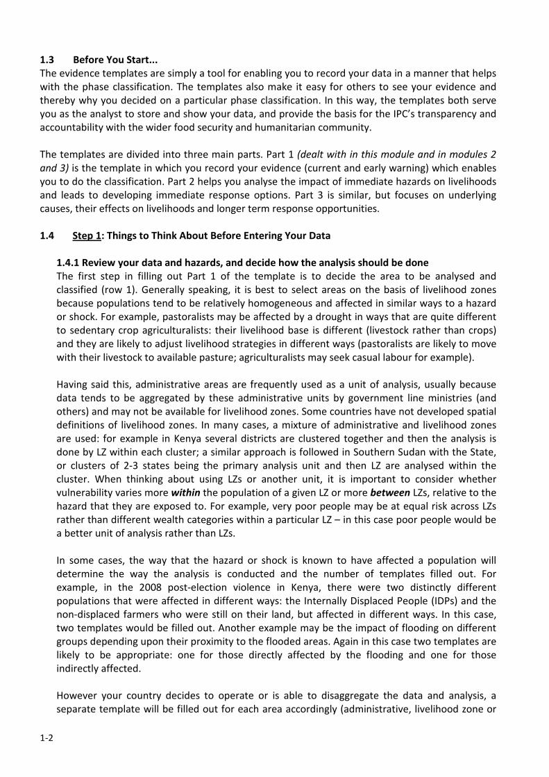
other unit). So for example, in north west Kenya pastoral cluster (Turkana, Marsabit, Moyale and
Samburu Districts) the pastoral and agro-pastoral LZs would be analysed by two separate
templates, with formal employment being left out completely (see Figure 1.3).
Figure 1.3: Livelihood Zones of
Kenya’s Northern Pastoral Cluster
1.4.2 General guidelines
Column two of the template is the main area in which you can record your data for further
analysis. The easiest way to fill in this part of the template is to go down the list from indicator to
indicator and add all the available data you have under each. It is important that you include all
the data you have in as much detail as possible.
Summary statements on data that is analysed elsewhere, (such as in a report), is not usually
considered to be sufficient evidence for making a classification or for accountability purposes. For
example, a statement like “maize harvests were below normal” does not tell us very much; but a
table showing actual production in an area with a long term average and actual/ percentage
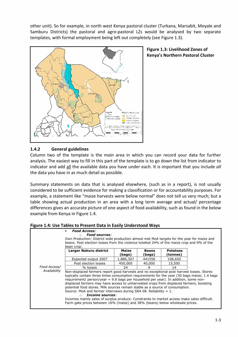
differences gives an accurate picture of one aspect of food availability, such as found in the below
example from Kenya in Figure 1.4.
Figure 1.4: Use Tables to Present Data in Easily Understood Ways
Food Access/ Availability
• Food Access: o Food sources:
Own Production: District wide production almost met MoA targets for the year for maize and beans. Post election losses from the violence totalled 24% of the maize crop and 9% of the bean crop:
Larger Nakuru district Maize (bags)
Beans (bags)
Potatoes (tonnes)
Expected output 2007 1,886,307 441556 108,650
Post election losses 450,000 40,000 15,500
% losses 24 9 14
Non-displaced farmers report good harvests and no exceptional post harvest losses. Stores typically contain three times consumption requirements for the year (30 bags maize; 1.4 bags requirement/ person/year = 9.8 bags per household per year). In addition, some non-displaced farmers may have access to unharvested crops from displaced farmers, boosting potential food stores. Milk sources remain stable as a source of consumption. Source: MoA and farmer interviews during SRA 08. Reliability = 1.
o Income sources: Incomes mainly sales of surplus produce. Constraints to market access make sales difficult. Farm gate prices between 16% (maize) and 38% (beans) below wholesale prices.
1-4
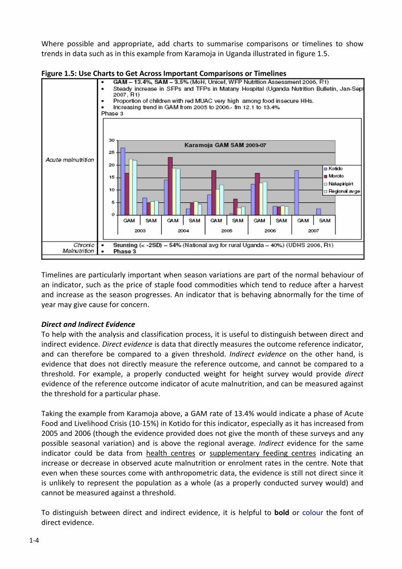
Where possible and appropriate, add charts to summarise comparisons or timelines to show
trends in data such as in this example from Karamoja in Uganda illustrated in figure 1.5.
Figure 1.5: Use Charts to Get Across Important Comparisons or Timelines
Timelines are particularly important when season variations are part of the normal behaviour of
an indicator, such as the price of staple food commodities which tend to reduce after a harvest
and increase as the season progresses. An indicator that is behaving abnormally for the time of
year may give cause for concern.
Direct and Indirect Evidence
To help with the analysis and classification process, it is useful to distinguish between direct and
indirect evidence. Direct evidence is data that directly measures the outcome reference indicator,
and can therefore be compared to a given threshold. Indirect evidence on the other hand, is
evidence that does not directly measure the reference outcome, and cannot be compared to a
threshold. For example, a properly conducted weight for height survey would provide direct
evidence of the reference outcome indicator of acute malnutrition, and can be measured against
the threshold for a particular phase.
Taking the example from Karamoja above, a GAM rate of 13.4% would indicate a phase of Acute
Food and Livelihood Crisis (10-15%) in Kotido for this indicator, especially as it has increased from
2005 and 2006 (though the evidence provided does not give the month of these surveys and any
possible seasonal variation) and is above the regional average. Indirect evidence for the same
indicator could be data from health centres or supplementary feeding centres indicating an
increase or decrease in observed acute malnutrition or enrolment rates in the centre. Note that
even when these sources come with anthropometric data, the evidence is still not direct since it
is unlikely to represent the population as a whole (as a properly conducted survey would) and
cannot be measured against a threshold.
To distinguish between direct and indirect evidence, it is helpful to bold or colour the font of
direct evidence.
1-5
Source of Information
For the sake of transparency and also as an indication of reliability, it is important to state the
source of the data presented in the evidence templates. The date of the information is also
important, especially for some indicators that have a short ‘shelf life’.
Reliability
This is currently a rather subjective score from 1 = very reliable; 2 = somewhat reliable; to 3 =
unconfirmed. The two main things to keep in mind are: a) the quality of the data in terms of
source; method of collection; whether it is supported by other data or contradicted by it; and b)
the validity of the data especially in terms of how old it is. The latter will depend upon the nature
of the indicator. There is as yet no fixed guidance on the temporal validity of any of the
indicators. However, it should be obvious that a nutrition survey measuring acute malnutrition
(to continue with the previous example) even when properly conducted, is not going to be very
useful if it has been done more than 6 months previously, apart from for comparative analysis
with updated data. Indeed, in areas where nutritional status changes significantly between
seasons even in ‘normal’ years, the shelf life of the data may be considerably shorter. At the end
of the day, it is up to the analysts doing the classification to make a judgement on the reliability
of the data.
Availability/Non-Availability of Data
If data is not available for an indicator (either direct or indirect) it is good practice to state that
there is ‘no available data’ rather than just leaving the space blank and therefore ambiguous to
others.
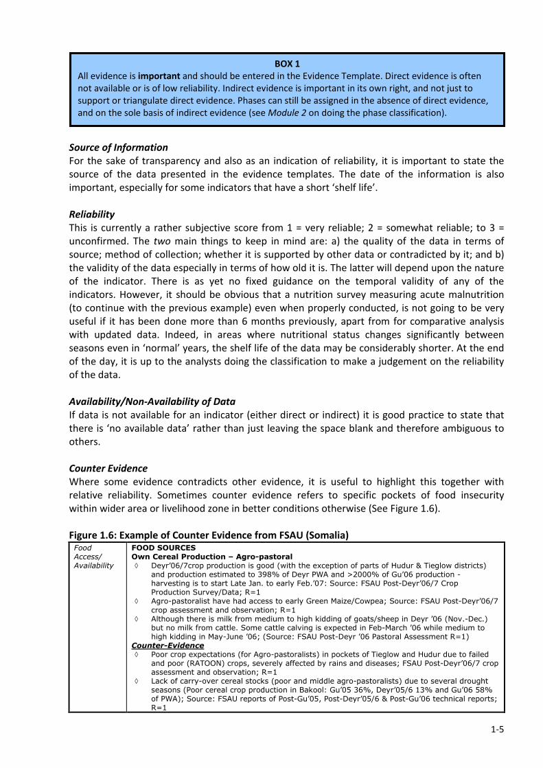
Counter Evidence
Where some evidence contradicts other evidence, it is useful to highlight this together with
relative reliability. Sometimes counter evidence refers to specific pockets of food insecurity
within wider area or livelihood zone in better conditions otherwise (See Figure 1.6).
Figure 1.6: Example of Counter Evidence from FSAU (Somalia) Food Access/ Availability
FOOD SOURCES Own Cereal Production – Agro-pastoral ◊ Deyr’06/7crop production is good (with the exception of parts of Hudur & Tieglow districts)
and production estimated to 398% of Deyr PWA and >2000% of Gu’06 production - harvesting is to start Late Jan. to early Feb.’07: Source: FSAU Post-Deyr’06/7 Crop Production Survey/Data; R=1
◊ Agro-pastoralist have had access to early Green Maize/Cowpea; Source: FSAU Post-Deyr’06/7
crop assessment and observation; R=1 ◊ Although there is milk from medium to high kidding of goats/sheep in Deyr ’06 (Nov.-Dec.)
but no milk from cattle. Some cattle calving is expected in Feb-March ’06 while medium to high kidding in May-June ’06; (Source: FSAU Post-Deyr ’06 Pastoral Assessment R=1)
Counter-Evidence ◊ Poor crop expectations (for Agro-pastoralists) in pockets of Tieglow and Hudur due to failed
and poor (RATOON) crops, severely affected by rains and diseases; FSAU Post-Deyr’06/7 crop assessment and observation; R=1
◊ Lack of carry-over cereal stocks (poor and middle agro-pastoralists) due to several drought seasons (Poor cereal crop production in Bakool: Gu’05 36%, Deyr’05/6 13% and Gu’06 58% of PWA); Source: FSAU reports of Post-Gu’05, Post-Deyr’05/6 & Post-Gu’06 technical reports; R=1
BOX 1
All evidence is important and should be entered in the Evidence Template. Direct evidence is often
not available or is of low reliability. Indirect evidence is important in its own right, and not just to
support or triangulate direct evidence. Phases can still be assigned in the absence of direct evidence,
and on the sole basis of indirect evidence (see Module 2 on doing the phase classification).
1-6
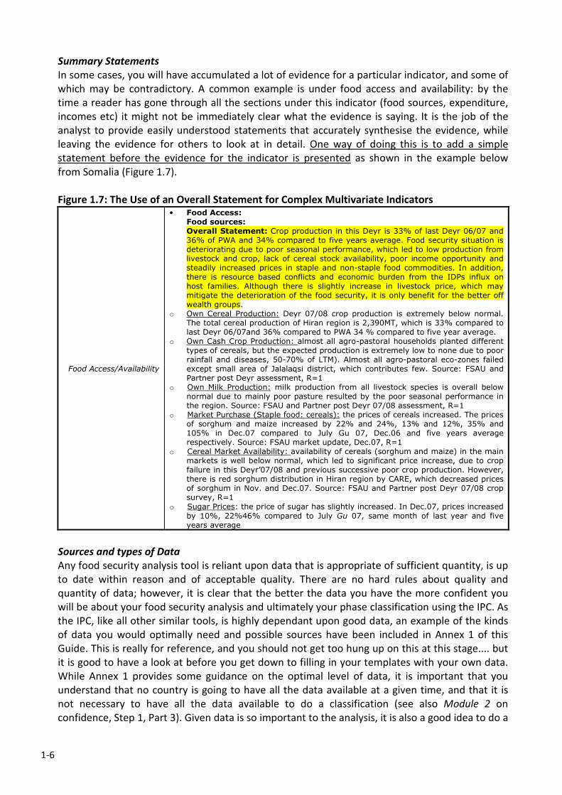
Summary Statements
In some cases, you will have accumulated a lot of evidence for a particular indicator, and some of
which may be contradictory. A common example is under food access and availability: by the
time a reader has gone through all the sections under this indicator (food sources, expenditure,
incomes etc) it might not be immediately clear what the evidence is saying. It is the job of the
analyst to provide easily understood statements that accurately synthesise the evidence, while
leaving the evidence for others to look at in detail. One way of doing this is to add a simple
statement before the evidence for the indicator is presented as shown in the example below
from Somalia (Figure 1.7).
Figure 1.7: The Use of an Overall Statement for Complex Multivariate Indicators
Food Access/Availability
• Food Access: Food sources: Overall Statement: Crop production in this Deyr is 33% of last Deyr 06/07 and 36% of PWA and 34% compared to five years average. Food security situation is deteriorating due to poor seasonal performance, which led to low production from livestock and crop, lack of cereal stock availability, poor income opportunity and steadily increased prices in staple and non-staple food commodities. In addition, there is resource based conflicts and economic burden from the IDPs influx on host families. Although there is slightly increase in livestock price, which may mitigate the deterioration of the food security, it is only benefit for the better off wealth groups.
o Own Cereal Production: Deyr 07/08 crop production is extremely below normal. The total cereal production of Hiran region is 2,390MT, which is 33% compared to last Deyr 06/07and 36% compared to PWA 34 % compared to five year average.
o Own Cash Crop Production: almost all agro-pastoral households planted different types of cereals, but the expected production is extremely low to none due to poor rainfall and diseases, 50-70% of LTM). Almost all agro-pastoral eco-zones failed except small area of Jalalaqsi district, which contributes few. Source: FSAU and Partner post Deyr assessment, R=1
o Own Milk Production: milk production from all livestock species is overall below normal due to mainly poor pasture resulted by the poor seasonal performance in the region. Source: FSAU and Partner post Deyr 07/08 assessment, R=1
o Market Purchase (Staple food: cereals): the prices of cereals increased. The prices of sorghum and maize increased by 22% and 24%, 13% and 12%, 35% and 105% in Dec.07 compared to July Gu 07, Dec.06 and five years average respectively. Source: FSAU market update, Dec.07, R=1
o Cereal Market Availability: availability of cereals (sorghum and maize) in the main markets is well below normal, which led to significant price increase, due to crop failure in this Deyr’07/08 and previous successive poor crop production. However, there is red sorghum distribution in Hiran region by CARE, which decreased prices of sorghum in Nov. and Dec.07. Source: FSAU and Partner post Deyr 07/08 crop survey, R=1
o Sugar Prices: the price of sugar has slightly increased. In Dec.07, prices increased
by 10%, 22%46% compared to July Gu 07, same month of last year and five years average
Sources and types of Data
Any food security analysis tool is reliant upon data that is appropriate of sufficient quantity, is up
to date within reason and of acceptable quality. There are no hard rules about quality and
quantity of data; however, it is clear that the better the data you have the more confident you
will be about your food security analysis and ultimately your phase classification using the IPC. As
the IPC, like all other similar tools, is highly dependant upon good data, an example of the kinds
of data you would optimally need and possible sources have been included in Annex 1 of this
Guide. This is really for reference, and you should not get too hung up on this at this stage.... but
it is good to have a look at before you get down to filling in your templates with your own data.
While Annex 1 provides some guidance on the optimal level of data, it is important that you
understand that no country is going to have all the data available at a given time, and that it is
not necessary to have all the data available to do a classification (see also Module 2 on
confidence, Step 1, Part 3). Given data is so important to the analysis, it is also a good idea to do a
1-7
data mapping exercise to identify the sources and availability of data in your country. This is
described in Module 8, Step 2, Part b, and again Annex 1 may help you with this process.
1.5 Step 2: Filling out the First Column of Evidence Template 1: An Indicator by Indicator Guide
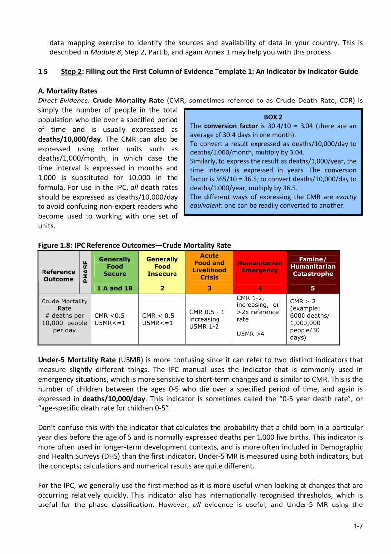
A. Mortality Rates
Direct Evidence: Crude Mortality Rate (CMR, sometimes referred to as Crude Death Rate, CDR) is
simply the number of people in the total
population who die over a specified period
of time and is usually expressed as
deaths/10,000/day. The CMR can also be
expressed using other units such as
deaths/1,000/month, in which case the
time interval is expressed in months and
1,000 is substituted for 10,000 in the
formula. For use in the IPC, all death rates
should be expressed as deaths/10,000/day
to avoid confusing non-expert readers who
become used to working with one set of
units.
Figure 1.8: IPC Reference Outcomes—Crude Mortality Rate
Generally
Food
Secure
Generally
Food
Insecure
Acute
Food and
Livelihood
Crisis
Humanitarian
Emergency
Famine/
Humanitarian
Catastrophe
Reference
Outcome PHASE
1 A and 1B 2 3 4 5
Crude Mortality
Rate
# deaths per
10,000 people
per day
CMR <0.5
U5MR<=1
CMR < 0.5
U5MR<=1
CMR 0.5 - 1
increasing
U5MR 1-2
CMR 1-2,
increasing, or
>2x reference
rate
U5MR >4
CMR > 2
(example:
6000 deaths/
1,000,000
people/30
days)
Under-5 Mortality Rate (U5MR) is more confusing since it can refer to two distinct indicators that
measure slightly different things. The IPC manual uses the indicator that is commonly used in
emergency situations, which is more sensitive to short-term changes and is similar to CMR. This is the
number of children between the ages 0-5 who die over a specified period of time, and again is
expressed in deaths/10,000/day. This indicator is sometimes called the “0-5 year death rate”, or
“age-specific death rate for children 0-5”.
Don’t confuse this with the indicator that calculates the probability that a child born in a particular
year dies before the age of 5 and is normally expressed deaths per 1,000 live births. This indicator is
more often used in longer-term development contexts, and is more often included in Demographic
and Health Surveys (DHS) than the first indicator. Under-5 MR is measured using both indicators, but
the concepts; calculations and numerical results are quite different.
For the IPC, we generally use the first method as it is more useful when looking at changes that are
occurring relatively quickly. This indicator also has internationally recognised thresholds, which is
useful for the phase classification. However, all evidence is useful, and Under-5 MR using the
BOX 2
The conversion factor is 30.4/10 = 3.04 (there are an
average of 30.4 days in one month).
To convert a result expressed as deaths/10,000/day to
deaths/1,000/month, multiply by 3.04.
Similarly, to express the result as deaths/1,000/year, the
time interval is expressed in years. The conversion
factor is 365/10 = 36.5; to convert deaths/10,000/day to
deaths/1,000/year, multiply by 36.5.
The different ways of expressing the CMR are exactly
equivalent: one can be readily converted to another.
1-8
‘deaths/1,000 live births’ is still useful indirect information. As rule of thumb, the latter measure is
approximately five times higher than the equivalent using the deaths/10,000/day measure, though
you cannot calculate one from the other.
Indirect evidence: information on both CMR and Under 5 MR may come from sources that are not
representative of the population as a whole, and cannot therefore be included as direct evidence.
Examples would include health information systems with data from health facilities; supplementary
or therapeutic feeding centres; or even more anecdotal information coming from key informants. All
of these data are useful, but may have different levels of reliability.
B. Acute Malnutrition
When people become malnourished over the short term, this is referred to as acute malnutrition,
and is characterised by ‘thinness’ or wasting (i.e. people lose weight but do not change other
measurements such as height which has more to do with chronic malnutrition – see stunting below).
Figure 1.9: IPC Reference Outcomes—Acute Malnutrition
Generally
Food
Secure
Generally
Food
Insecure
Acute
Food and
Livelihood
Crisis
Humanitarian
Emergency
Famine/
Humanitarian
Catastrophe
Reference
Outcome PHASE
1A and 1B 2 3 4 5
Acute
Malnutrition
(w/h < -2 z –
scores)
<3%
>3%
but < 10%,
usual range,
stable
10-15%,
> usual,
increasing
>15%,
> usual,
increasing
>30%
Direct evidence: The standard measurement for acute malnutrition is weight for height (w/h), and is
expressed as Z-scores, which are standard deviations from the median. Older methods use % of
children falling under 80% of median w/h: this is acceptable as an approximation, but generally IPC
practitioners are encouraged to use z-scores to promote comparability (note that you can convert to
z-scores if you have the raw datasets for the survey). To be used as direct evidence, data must be
representative of the population being considered in the sample frame, which normally means that
data will be coming from properly conducted nutrition surveys using a standardised methodology.
Note that w/h surveys capture the nutritional status of children 6 to 59 months old as they are more
sensitive to wasting. The findings are used as a proxy for the rest of the population.
Indirect evidence: A good measure of wasting is Mid-Upper Arm Circumference (MUAC). But it
cannot be directly compared to w/h. MUAC is commonly used for screening and sentinel site
monitoring. In some cases, MUAC data is available for large areas of a country on a regular basis (as it
is much cheaper to do than w/h surveys) and can be a very useful indicator of acute malnutrition
with the added value of being able to analyse trends over time. An example of this comes from
Kenya, where MUAC is measured from sentinel sites on a monthly basis in all the ASAL districts,
which means that changes over time can be monitored and compared with long-term seasonal
averages, as is shown in Figure 1.10.
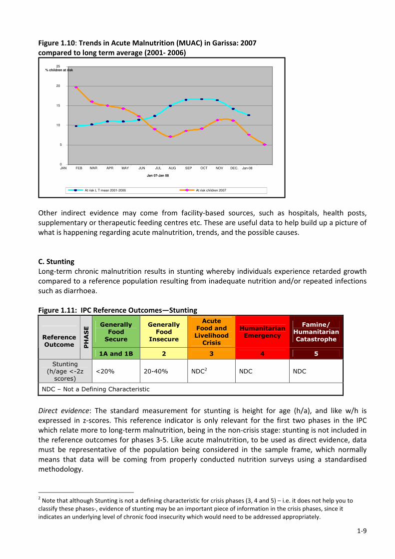
1-9
Figure 1.10: Trends in Acute Malnutrition (MUAC) in Garissa: 2007
compared to long term average (2001- 2006)
Other indirect evidence may come from facility-based sources, such as hospitals, health posts,
supplementary or therapeutic feeding centres etc. These are useful data to help build up a picture of
what is happening regarding acute malnutrition, trends, and the possible causes.
C. Stunting
Long-term chronic malnutrition results in stunting whereby individuals experience retarded growth
compared to a reference population resulting from inadequate nutrition and/or repeated infections
such as diarrhoea.
Figure 1.11: IPC Reference Outcomes—Stunting
Generally
Food
Secure
Generally
Food
Insecure
Acute
Food and
Livelihood
Crisis
Humanitarian
Emergency
Famine/
Humanitarian
Catastrophe
Reference
Outcome PHASE
1A and 1B 2 3 4 5
Stunting
(h/age <-2z
scores)
<20% 20-40% NDC2 NDC NDC
NDC – Not a Defining Characteristic
Direct evidence: The standard measurement for stunting is height for age (h/a), and like w/h is
expressed in z-scores. This reference indicator is only relevant for the first two phases in the IPC
which relate more to long-term malnutrition, being in the non-crisis stage: stunting is not included in
the reference outcomes for phases 3-5. Like acute malnutrition, to be used as direct evidence, data
must be representative of the population being considered in the sample frame, which normally
means that data will be coming from properly conducted nutrition surveys using a standardised
methodology.
2 Note that although Stunting is not a defining characteristic for crisis phases (3, 4 and 5) – i.e. it does not help you to
classify these phases-, evidence of stunting may be an important piece of information in the crisis phases, since it
indicates an underlying level of chronic food insecurity which would need to be addressed appropriately.
0
5
10
15
20
25
JAN FEB MAR APR MAY JUN JUL AUG SEP OCT NOV DEC. Jan-08
Jan 07-Jan 08
% children at risk
At risk L T mean 2001-2006 At risk children 2007
1-10
Indirect evidence: h/a data is commonly collected as part of growth monitoring systems run by health
facilities in rural and urban centres, and as such is relatively available through health information
systems in many countries. Being facility-based however, means that it is generally not
representative of the population as a whole, and should therefore be considered as useful indirect
evidence. Time series analysis could be a useful exercise with this kind of data, rather using it for
point-in-time purposes.
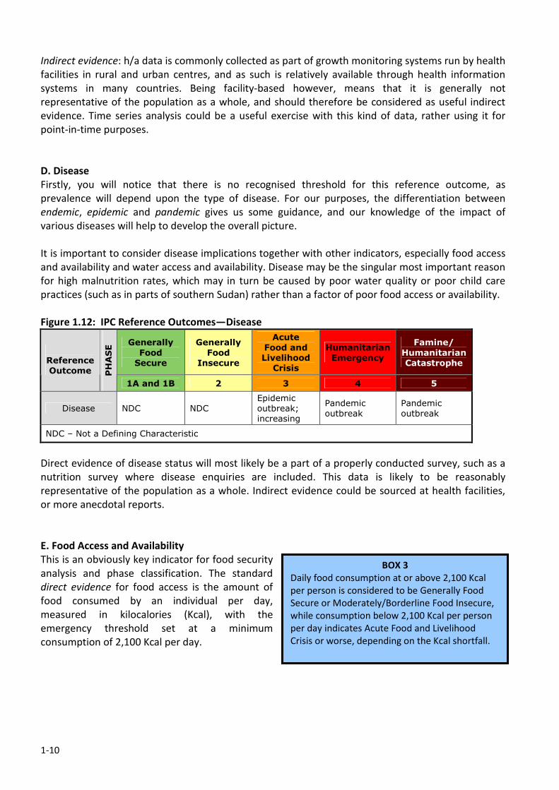
D. Disease
Firstly, you will notice that there is no recognised threshold for this reference outcome, as
prevalence will depend upon the type of disease. For our purposes, the differentiation between
endemic, epidemic and pandemic gives us some guidance, and our knowledge of the impact of
various diseases will help to develop the overall picture.
It is important to consider disease implications together with other indicators, especially food access
and availability and water access and availability. Disease may be the singular most important reason
for high malnutrition rates, which may in turn be caused by poor water quality or poor child care
practices (such as in parts of southern Sudan) rather than a factor of poor food access or availability.
Figure 1.12: IPC Reference Outcomes—Disease
Generally
Food
Secure
Generally
Food
Insecure
Acute
Food and
Livelihood
Crisis
Humanitarian
Emergency
Famine/
Humanitarian
Catastrophe
Reference
Outcome PHASE
1A and 1B 2 3 4 5
Disease NDC NDC
Epidemic
outbreak;
increasing
Pandemic
outbreak
Pandemic
outbreak
NDC – Not a Defining Characteristic
Direct evidence of disease status will most likely be a part of a properly conducted survey, such as a
nutrition survey where disease enquiries are included. This data is likely to be reasonably
representative of the population as a whole. Indirect evidence could be sourced at health facilities,
or more anecdotal reports.
E. Food Access and Availability
This is an obviously key indicator for food security
analysis and phase classification. The standard
direct evidence for food access is the amount of
food consumed by an individual per day,
measured in kilocalories (Kcal), with the
emergency threshold set at a minimum
consumption of 2,100 Kcal per day.
BOX 3
Daily food consumption at or above 2,100 Kcal
per person is considered to be Generally Food
Secure or Moderately/Borderline Food Insecure,
while consumption below 2,100 Kcal per person
per day indicates Acute Food and Livelihood
Crisis or worse, depending on the Kcal shortfall.
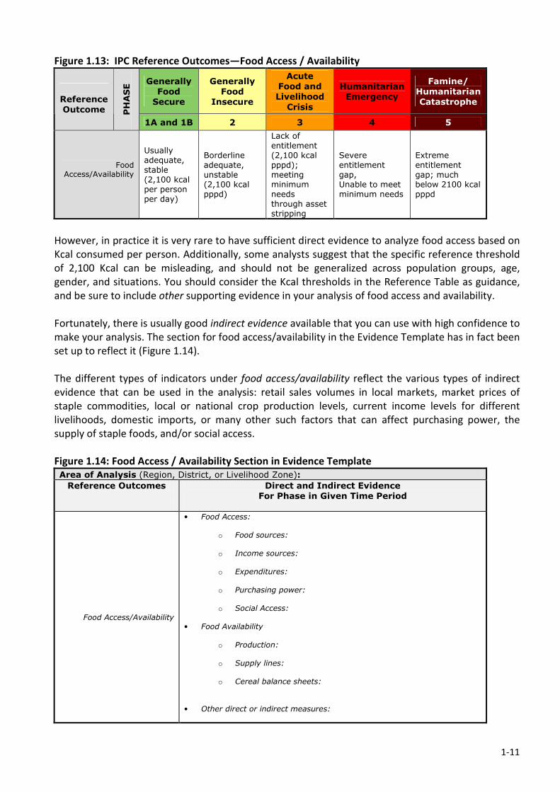
1-11
Figure 1.13: IPC Reference Outcomes—Food Access / Availability
Generally
Food
Secure
Generally
Food
Insecure
Acute
Food and
Livelihood
Crisis
Humanitarian
Emergency
Famine/
Humanitarian
Catastrophe
Reference
Outcome PHASE
1A and 1B 2 3 4 5
Food Access/Availability
Usually adequate, stable (2,100 kcal per person per day)
Borderline adequate, unstable (2,100 kcal pppd)
Lack of entitlement (2,100 kcal pppd); meeting minimum needs through asset stripping
Severe entitlement gap, Unable to meet minimum needs
Extreme entitlement gap; much below 2100 kcal pppd
However, in practice it is very rare to have sufficient direct evidence to analyze food access based on
Kcal consumed per person. Additionally, some analysts suggest that the specific reference threshold
of 2,100 Kcal can be misleading, and should not be generalized across population groups, age,
gender, and situations. You should consider the Kcal thresholds in the Reference Table as guidance,
and be sure to include other supporting evidence in your analysis of food access and availability.
Fortunately, there is usually good indirect evidence available that you can use with high confidence to
make your analysis. The section for food access/availability in the Evidence Template has in fact been
set up to reflect it (Figure 1.14).
The different types of indicators under food access/availability reflect the various types of indirect
evidence that can be used in the analysis: retail sales volumes in local markets, market prices of
staple commodities, local or national crop production levels, current income levels for different
livelihoods, domestic imports, or many other such factors that can affect purchasing power, the
supply of staple foods, and/or social access.
Figure 1.14: Food Access / Availability Section in Evidence Template
Area of Analysis (Region, District, or Livelihood Zone):
Reference Outcomes
Direct and Indirect Evidence
For Phase in Given Time Period
Food Access/Availability
• Food Access:
o Food sources: o Income sources:
o Expenditures:
o Purchasing power:
o Social Access:
• Food Availability
o Production: o Supply lines:
o Cereal balance sheets:
• Other direct or indirect measures:
1-12
The key in using such information is to consider what the implications are in terms of actual food
consumption compared to normal for the particular time of year, and whether the evidence
available indicates abnormal stress.
For example, market price data in the particular area being analyzed may indicate that the prices of
staple cereals are rising. This does not necessarily indicate that food access is poor. It needs further
clarification pertaining to:
• How cereal prices normally behave at that particular time of year;
• Whether they usually increase seasonally at that particular time (before a harvest, for
example), and if so, whether the current price rises are above or below normal;
• Since prices are not the only factor influencing food access; what the current levels of
household income are compared to normal;
• Whether livestock prices are increasing or decreasing for pastoralists, and how those price
changes relate to the rise in cereal prices in terms of purchasing power;
• Whether the previous harvest was good enough for agricultural households to make them
benefit from increasing prices by selling their stocks.
You will notice that the analysis will tend to focus on a population group, which may include wealth
groups, social groups, or livelihood groups, instead of focusing on an individual. This is important
given the complex interaction of the multiple variables related to food access and availability.
It is best to consider how the sources of food, sources of income, expenditure patterns, and coping
strategies all merge together to affect food access, and this often easiest by looking at a particular
livelihood system. By taking all of the indirect evidence that is available and asking what it likely
implies in terms of food consumption relative to normal conditions for a particular livelihood group,
you will be able to make a confident analysis of food access/availability.
You will recall that the IPC is not a methodology for food security analysis, and it in fact welcomes
and encourages multiple ways of gathering and examining data. There may be a particular method
already in use in your country for monitoring food access and availability that uses the indirect
evidence that is available. If so, you should certainly take advantage of that method and incorporate
it into the IPC analysis. One such method is the Household Economy Approach (HEA). HEA has
worked well to analyze food access and availability in numerous locations (including Somalia where
the IPC was initially developed), and is in many ways an ideal way to complete the food
access/availability section of the Evidence Template. However, other methodologies can also be used
with confidence, and you should consider what approach makes the most sense for your country.
Most livelihoods-based analysis methods (E.g. Household Economy, Household Basket approaches
…etc) are founded on the idea that a household’s risk of becoming food insecure is based on two
things: the occurrence of some event or shock (such as a drought, a conflict or a sudden rise in fuel
prices), and the household’s vulnerability to such a shock (which is based on its particular livelihood
strategies, such as its sources of income and food and coping strategies, and on its assets). Ideally, an
analysis starts with significant baseline data about the livelihood assets and strategies in a particular
livelihood zone. The potential impact of a particular shock and its severity on the livelihood of
households in the zone can then be analysed, and usually includes an elasticity function to
incorporate how they are likely to cope in terms of changing consumption or expenditure patterns.
Where good data and baselines exist, an estimated deficit can then be calculated in relation to the
households’ normal consumption, either in terms of food (Kcal) or another unit such as cash, which is
the exact piece of indirect evidence that enables the phase classification in the IPC analysis.
1-13
For example, a 20 percent increase in cereal prices might cause a poor pastoralist household to sell
an extra animal to increase its income (thereby reducing its assets), decrease its consumption of
cereals relative to normal, and increase the collection of firewood for sale (moving household
members away from livestock and the main source of milk). HEA would estimate the specific
decrease in food access that would result, which would then enable a phase classification based on
food access/availability for that livelihood group. An example of how HEA can be used to complete
this section of the Evidence Template from Somalia follows (Figure 1.15).
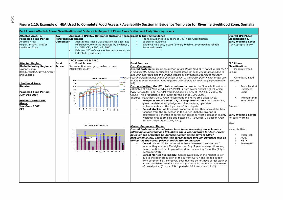
1-14
Figure 1.15: Example of HEA Used to Complete Food Access / Availability Section in Evidence Template for Riverine Livelihood Zone, Somalia
Part 1: Area Affected, Phase Classification, and Evidence in Support of Phase Classification and Early Warning Levels
Affected Area, &
Projected Time Period
Affected Area:
Region, District, and/or
Livelihood Zone
Key
Reference
Outcomes
Applicable IPC Key Reference Outcome Phase
Statement
• Identify the Phase Classification for each key
reference outcome as indicated by evidence ,
i.e. GFS, CFI, AFLC, HE, F/HC)
• Relevant IPC reference outcome statement as
indicated by evidence
Direct & Indirect Evidence
• Indirect Evidence in support of IPC Phase Classification
• Source of Evidence
• Evidence Reliability Score (1=very reliable, 2=somewhat reliable
3=unconfirmed)
Overall IPC Phase
Classification &
Early Warning Level
Tick Appropriate Box
Affected Region:
Shabelle Valley Regions:
Jowhar,Marka
Balad,Qoriole,Afgoye,K/warey
and Sablaale
Livelihood Zone: Riverine
Projected Time Period:
July-Dec.2007
Previous Period IPC
Phase:
Jan.-June 2007
CFI
Food
Access
IPC Phase: HE & AFLC
• Food Access:
Severe entitlement gap; unable to meet
2100kcal/ppp/day.
Food Sources
Own Production
Overall Statement: Maize production (main stable food of riverine) in this Gu 07
is significantly below normal and no cereal stock for poor wealth groups due to
less land cultivated and the limited income of agriculture labor from the poor
seasonal performance and high influx of IDP,s, therefore, poor wealth group are
unable to meet minimum food required over coming six months (July-December
‘07). Own production: Gu ‘07 total cereal production for the Shabelle Riverine is
estimated at 35,270Mt of which 27,295Mt is from Lower Shabelle (41% of Gu
PWA, 58%Gu06) and 7,975Mt from M/Shabelle (43% of PWA 1995-2006, 46
Gu06). This production is the lowest for the period 1995-2006).
(Source: FSAU post-Gu‘07 Crop Assessment and FSAU crop data; R=1).
• Prospects for the Deyr ‘07/08 crop production is also uncertain,
given the deteriorating irrigation infrastructure, open river
embankments and the high cost of farm inputs.
• Cereal stocks: While overall production is less than normal the total
tonnage from the Gu season in the Lower Shabelle Riverine is equivalent to 6 months of cereal per person for that population mainly
wealthier groups (middle and better off). (Source: Gu Season Crop
Survey, July/August 2007, R=1).
Market Purchase - Staple:
Overall Statement: Cereal prices have been increasing since January
following usual trend and 9% above the 5 year average for July. Prices
however are projected to increase further as the current GU’07
production is low. Therefore, the cereal access through purchase will be difficult as the cereal price is anticipated to increase.
• Cereal prices: While maize prices have increased over the last 6
months they are only 9% higher than July 5 year average. However,
there is anticipation of upward trend for the coming 6 months (July –
December 2007).
• Cereal Market Availability: Cereal availability in the market is low
due to the poor production of the current Gu ‘07 and limited supply
from sorghum belt. Moreover, poor riverine do not have cereal stock at
all and available cereal are not easily accessible due to sharp increase
of cereal price. (Source: FSAU post-Gu ’07 Assessment; R=2)
IPC Phase
Classification:
Generally Food
Secure
Chronically Food
Insecure
� Acute Food &
Livelihood
Crisis
� Humanitarian
Emergency
Famine
Early Warning Level:
No Early Warning
Alert
Moderate Risk
� High Risk
o ACFL o HE (X)
o Famine/HC
1-15
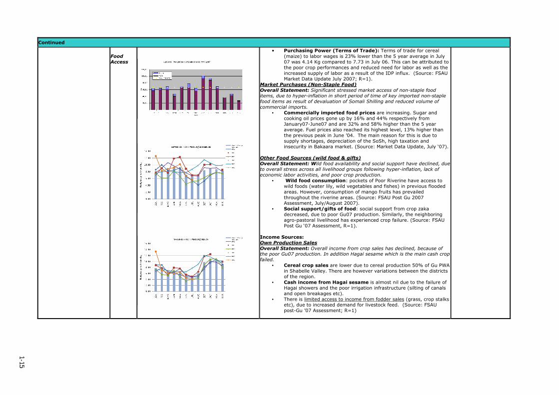
Continued
Food
Access
• Purchasing Power (Terms of Trade): Terms of trade for cereal
(maize) to labor wages is 23% lower than the 5 year average in July
07 was 4.14 Kg compared to 7.73 in July 06. This can be attributed to
the poor crop performances and reduced need for labor as well as the
increased supply of labor as a result of the IDP influx. (Source: FSAU
Market Data Update July 2007; R=1).
Market Purchases (Non-Staple Food)
Overall Statement: Significant stressed market access of non-staple food items, due to hyper-inflation in short period of time of key imported non-staple
food items as result of devaluation of Somali Shilling and reduced volume of
commercial imports.
• Commercially imported food prices are increasing. Sugar and
cooking oil prices gone up by 16% and 44% respectively from
January07-June07 and are 32% and 58% higher than the 5 year
average. Fuel prices also reached its highest level, 13% higher than
the previous peak in June ’04. The main reason for this is due to
supply shortages, depreciation of the SoSh, high taxation and insecurity in Bakaara market. (Source: Market Data Update, July ‘07).
Other Food Sources (wild food & gifts)
Overall Statement: Wild food availability and social support have declined, due
to overall stress across all livelihood groups following hyper-inflation, lack of
economic labor activities, and poor crop production.
• Wild food consumption: pockets of Poor Riverine have access to
wild foods (water lily, wild vegetables and fishes) in previous flooded
areas. However, consumption of mango fruits has prevailed
throughout the riverine areas. (Source: FSAU Post Gu 2007 Assessment, July/August 2007).
• Social support/gifts of food: social support from crop zaka
decreased, due to poor Gu07 production. Similarly, the neighboring
agro-pastoral livelihood has experienced crop failure. (Source: FSAU
Post Gu ‘07 Assessment, R=1).
Income Sources:
Own Production Sales
Overall Statement: Overall income from crop sales has declined, because of the poor Gu07 production. In addition Hagai sesame which is the main cash crop
failed.
• Cereal crop sales are lower due to cereal production 50% of Gu PWA
in Shabelle Valley. There are however variations between the districts
of the region.
• Cash income from Hagai sesame is almost nil due to the failure of
Hagai showers and the poor irrigation infrastructure (silting of canals
and open breakages etc).
• There is limited access to income from fodder sales (grass, crop stalks etc), due to increased demand for livestock feed. (Source: FSAU
post-Gu ’07 Assessment; R=1)
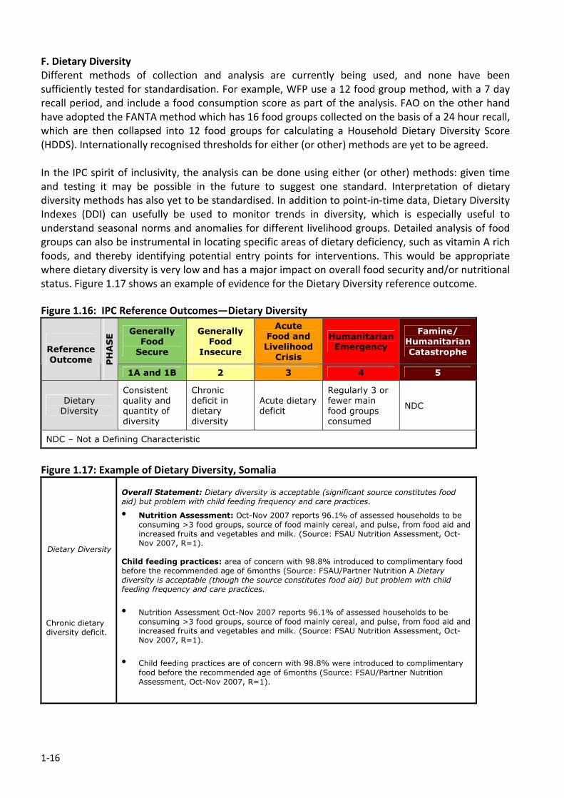
1-16
F. Dietary Diversity
Different methods of collection and analysis are currently being used, and none have been
sufficiently tested for standardisation. For example, WFP use a 12 food group method, with a 7 day
recall period, and include a food consumption score as part of the analysis. FAO on the other hand
have adopted the FANTA method which has 16 food groups collected on the basis of a 24 hour recall,
which are then collapsed into 12 food groups for calculating a Household Dietary Diversity Score
(HDDS). Internationally recognised thresholds for either (or other) methods are yet to be agreed.
In the IPC spirit of inclusivity, the analysis can be done using either (or other) methods: given time
and testing it may be possible in the future to suggest one standard. Interpretation of dietary
diversity methods has also yet to be standardised. In addition to point-in-time data, Dietary Diversity
Indexes (DDI) can usefully be used to monitor trends in diversity, which is especially useful to
understand seasonal norms and anomalies for different livelihood groups. Detailed analysis of food
groups can also be instrumental in locating specific areas of dietary deficiency, such as vitamin A rich
foods, and thereby identifying potential entry points for interventions. This would be appropriate
where dietary diversity is very low and has a major impact on overall food security and/or nutritional
status. Figure 1.17 shows an example of evidence for the Dietary Diversity reference outcome.
Figure 1.16: IPC Reference Outcomes—Dietary Diversity
Generally
Food
Secure
Generally
Food
Insecure
Acute
Food and
Livelihood
Crisis
Humanitarian
Emergency
Famine/
Humanitarian
Catastrophe
Reference
Outcome PHASE
1A and 1B 2 3 4 5
Dietary
Diversity
Consistent
quality and
quantity of
diversity
Chronic
deficit in
dietary
diversity
Acute dietary
deficit
Regularly 3 or
fewer main
food groups
consumed
NDC
NDC – Not a Defining Characteristic
Figure 1.17: Example of Dietary Diversity, Somalia
Dietary Diversity Chronic dietary diversity deficit.
Overall Statement: Dietary diversity is acceptable (significant source constitutes food aid) but problem with child feeding frequency and care practices.
• Nutrition Assessment: Oct-Nov 2007 reports 96.1% of assessed households to be
consuming >3 food groups, source of food mainly cereal, and pulse, from food aid and increased fruits and vegetables and milk. (Source: FSAU Nutrition Assessment, Oct-Nov 2007, R=1).
Child feeding practices: area of concern with 98.8% introduced to complimentary food before the recommended age of 6months (Source: FSAU/Partner Nutrition A Dietary diversity is acceptable (though the source constitutes food aid) but problem with child feeding frequency and care practices.
• Nutrition Assessment Oct-Nov 2007 reports 96.1% of assessed households to be
consuming >3 food groups, source of food mainly cereal, and pulse, from food aid and increased fruits and vegetables and milk. (Source: FSAU Nutrition Assessment, Oct-Nov 2007, R=1).
• Child feeding practices are of concern with 98.8% were introduced to complimentary
food before the recommended age of 6months (Source: FSAU/Partner Nutrition Assessment, Oct-Nov 2007, R=1).
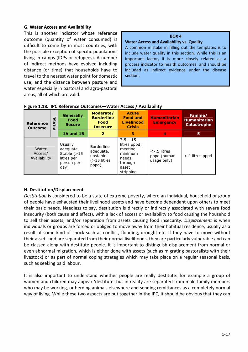
1-17
G. Water Access and Availability
This is another indicator whose reference
outcome (quantity of water consumed) is
difficult to come by in most countries, with
the possible exception of specific populations
living in camps (IDPs or refugees). A number
of indirect methods have evolved including
distance (or time) that households have to
travel to the nearest water point for domestic
use; and the distance between pasture and
water especially in pastoral and agro-pastoral
areas, all of which are valid.
Figure 1.18: IPC Reference Outcomes—Water Access / Availability
Generally
Food
Secure
Moderate/
Borderline
Food
Insecure
Acute
Food and
Livelihood
Crisis
Humanitarian
Emergency
Famine/
Humanitarian
Catastrophe
Reference
Outcome PHASE
1A and 1B 2 3 4 5
Water
Access/
Availability
Usually
adequate,
Stable (>15
litres per
person per
day)
Borderline
adequate,
unstable
(>15 litres
pppd)
7.5 – 15
litres pppd;
meeting
minimum
needs
through
asset
stripping
<7.5 litres
pppd (human
usage only)
< 4 litres pppd
H. Destitution/Displacement
Destitution is considered to be a state of extreme poverty, where an individual, household or group
of people have exhausted their livelihood assets and have become dependant upon others to meet
their basic needs. Needless to say, destitution is directly or indirectly associated with severe food
insecurity (both cause and effect), with a lack of access or availability to food causing the household
to sell their assets; and/or separation from assets causing food insecurity. Displacement is when
individuals or groups are forced or obliged to move away from their habitual residence, usually as a
result of some kind of shock such as conflict, flooding, drought etc. If they have to move without
their assets and are separated from their normal livelihoods, they are particularly vulnerable and can
be classed along with destitute people. It is important to distinguish displacement from normal or
even abnormal migration, which is either done with assets (such as migrating pastoralists with their
livestock) or as part of normal coping strategies which may take place on a regular seasonal basis,
such as seeking paid labour.
It is also important to understand whether people are really destitute: for example a group of
women and children may appear ‘destitute’ but in reality are separated from male family members
who may be working, or herding animals elsewhere and sending remittances as a completely normal
way of living. While these two aspects are put together in the IPC, it should be obvious that they can
BOX 4
Water Access and Availability vs. Quality
A common mistake in filling out the templates is to
include water quality in this section. While this is an
important factor, it is more closely related as a
process indicator to health outcomes, and should be
included as indirect evidence under the disease
section.
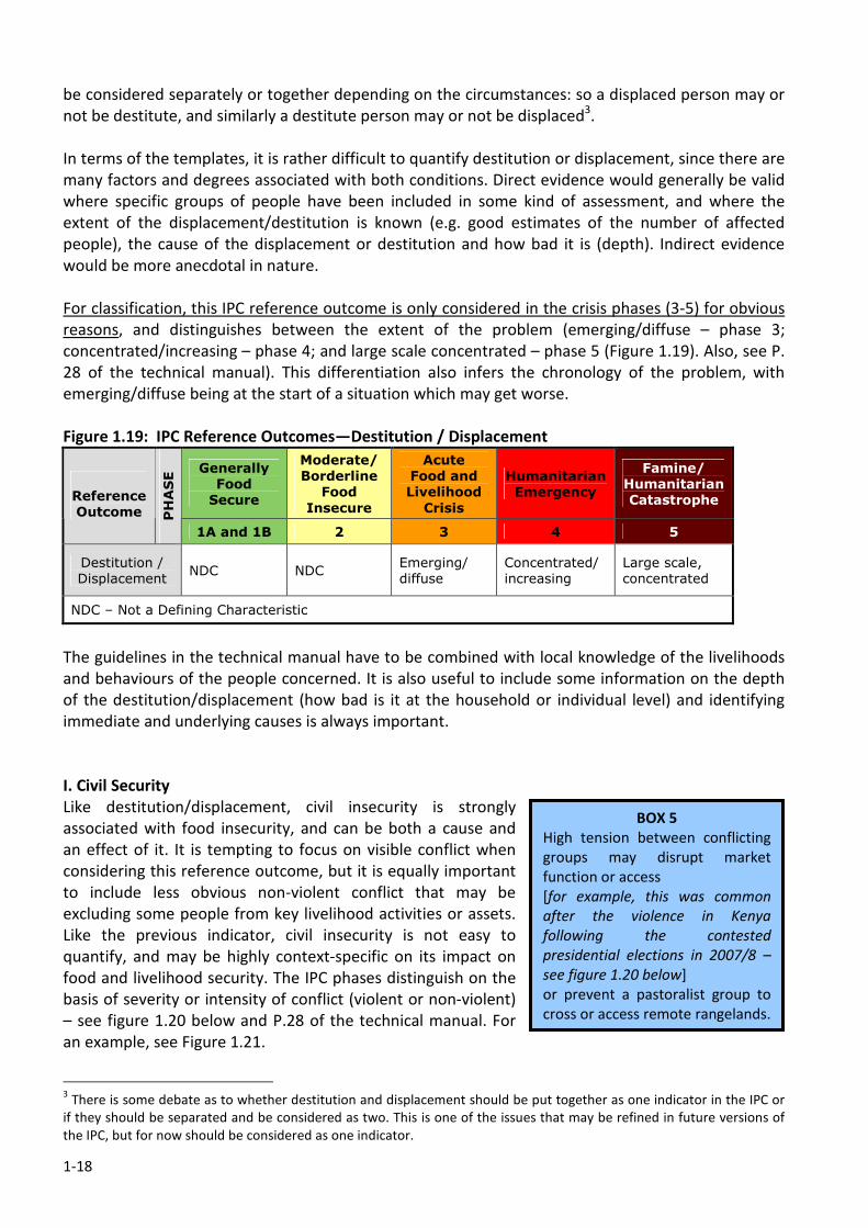
1-18
be considered separately or together depending on the circumstances: so a displaced person may or
not be destitute, and similarly a destitute person may or not be displaced3.
In terms of the templates, it is rather difficult to quantify destitution or displacement, since there are
many factors and degrees associated with both conditions. Direct evidence would generally be valid
where specific groups of people have been included in some kind of assessment, and where the
extent of the displacement/destitution is known (e.g. good estimates of the number of affected
people), the cause of the displacement or destitution and how bad it is (depth). Indirect evidence
would be more anecdotal in nature.
For classification, this IPC reference outcome is only considered in the crisis phases (3-5) for obvious
reasons, and distinguishes between the extent of the problem (emerging/diffuse – phase 3;
concentrated/increasing – phase 4; and large scale concentrated – phase 5 (Figure 1.19). Also, see P.
28 of the technical manual). This differentiation also infers the chronology of the problem, with
emerging/diffuse being at the start of a situation which may get worse.
Figure 1.19: IPC Reference Outcomes—Destitution / Displacement
Generally
Food
Secure
Moderate/
Borderline
Food
Insecure
Acute
Food and
Livelihood
Crisis
Humanitarian
Emergency
Famine/
Humanitarian
Catastrophe
Reference
Outcome PHASE
1A and 1B 2 3 4 5
Destitution /
Displacement NDC NDC
Emerging/
diffuse
Concentrated/
increasing
Large scale,
concentrated
NDC – Not a Defining Characteristic
The guidelines in the technical manual have to be combined with local knowledge of the livelihoods
and behaviours of the people concerned. It is also useful to include some information on the depth
of the destitution/displacement (how bad is it at the household or individual level) and identifying
immediate and underlying causes is always important.
I. Civil Security
Like destitution/displacement, civil insecurity is strongly
associated with food insecurity, and can be both a cause and
an effect of it. It is tempting to focus on visible conflict when
considering this reference outcome, but it is equally important
to include less obvious non-violent conflict that may be
excluding some people from key livelihood activities or assets.
Like the previous indicator, civil insecurity is not easy to
quantify, and may be highly context-specific on its impact on
food and livelihood security. The IPC phases distinguish on the
basis of severity or intensity of conflict (violent or non-violent)
– see figure 1.20 below and P.28 of the technical manual. For
an example, see Figure 1.21.
3 There is some debate as to whether destitution and displacement should be put together as one indicator in the IPC or
if they should be separated and be considered as two. This is one of the issues that may be refined in future versions of
the IPC, but for now should be considered as one indicator.
BOX 5
High tension between conflicting
groups may disrupt market
function or access
[for example, this was common
after the violence in Kenya
following the contested
presidential elections in 2007/8 –
see figure 1.20 below]
or prevent a pastoralist group to
cross or access remote rangelands.
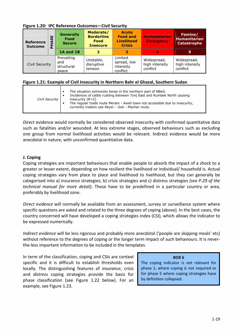
1-19
Figure 1.20: IPC Reference Outcomes—Civil Security
Generally
Food
Secure
Moderate/
Borderline
Food
Insecure
Acute
Food and
Livelihood
Crisis
Humanitarian
Emergency
Famine/
Humanitarian
Catastrophe
Reference
Outcome PHASE
1A and 1B 2 3 4 5
Civil Security
Prevailing
and
structural
peace
Unstable,
disruptive
tension
Limited
spread, low
intensity
conflict
Widespread,
high intensity
conflict
Widespread,
high intensity
conflict
Figure 1.21: Example of Civil Insecurity in Northern Bahr el Ghazal, Southern Sudan
Civil Security
• The situation extremely tense in the northern part of NBeG. • Incidences of cattle rustling between Tonj East and Rumbek North causing
insecurity [R=2] • The regular trade route Meram - Aweil town not accessible due to insecurity,
currently traders use Abyei – Gok - Machar route.
Direct evidence would normally be considered observed insecurity with confirmed quantitative data
such as fatalities and/or wounded. At less extreme stages, observed behaviours such as excluding
one group from normal livelihood activities would be relevant. Indirect evidence would be more
anecdotal in nature, with unconfirmed quantitative data.
J. Coping
Coping strategies are important behaviours that enable people to absorb the impact of a shock to a
greater or lesser extent, depending on how resilient the livelihood or individual/ household is. Actual
coping strategies vary from place to place and livelihood to livelihood, but they can generally be
categorised into a) insurance strategies; b) crisis strategies and c) distress strategies (see P.29 of the
technical manual for more detail). These have to be predefined in a particular country or area,
preferably by livelihood zone.
Direct evidence will normally be available from an assessment, survey or surveillance system where
specific questions are asked and related to the three degrees of coping (above). In the best cases, the
country concerned will have developed a coping strategies index (CSI), which allows the indicator to
be expressed numerically.
Indirect evidence will be less rigorous and probably more anecdotal (‘people are skipping meals’ etc)
without reference to the degrees of coping or the longer term impact of such behaviours. It is never-
the-less important information to be included in the templates.
In term of the classification, coping and CSIs are context
specific and it is difficult to establish thresholds even
locally. The distinguishing features of insurance, crisis
and distress coping strategies provide the basis for
phase classification (see Figure 1.22 below). For an
example, see Figure 1.23.
BOX 6
The coping indicator is not relevant for
phase 1, where coping is not required or
for phase 5 where coping strategies have
by definition collapsed.
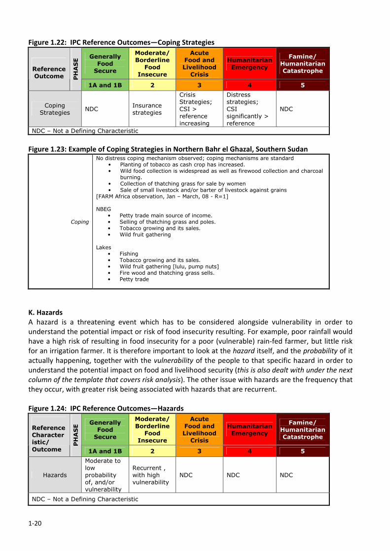
1-20
Figure 1.22: IPC Reference Outcomes—Coping Strategies
Generally
Food
Secure
Moderate/
Borderline
Food
Insecure
Acute
Food and
Livelihood
Crisis
Humanitarian
Emergency
Famine/
Humanitarian
Catastrophe
Reference
Outcome PHASE
1A and 1B 2 3 4 5
Coping
Strategies NDC
Insurance
strategies
Crisis
Strategies;
CSI >
reference
increasing
Distress
strategies;
CSI
significantly >
reference
NDC
NDC – Not a Defining Characteristic
Figure 1.23: Example of Coping Strategies in Northern Bahr el Ghazal, Southern Sudan
Coping
No distress coping mechanism observed; coping mechanisms are standard • Planting of tobacco as cash crop has increased. • Wild food collection is widespread as well as firewood collection and charcoal
burning. • Collection of thatching grass for sale by women • Sale of small livestock and/or barter of livestock against grains
[FARM Africa observation, Jan – March, 08 - R=1] NBEG
• Petty trade main source of income. • Selling of thatching grass and poles. • Tobacco growing and its sales. • Wild fruit gathering
Lakes • Fishing • Tobacco growing and its sales. • Wild fruit gathering [lulu, pump nuts] • Fire wood and thatching grass sells. • Petty trade
K. Hazards
A hazard is a threatening event which has to be considered alongside vulnerability in order to
understand the potential impact or risk of food insecurity resulting. For example, poor rainfall would
have a high risk of resulting in food insecurity for a poor (vulnerable) rain-fed farmer, but little risk
for an irrigation farmer. It is therefore important to look at the hazard itself, and the probability of it
actually happening, together with the vulnerability of the people to that specific hazard in order to
understand the potential impact on food and livelihood security (this is also dealt with under the next
column of the template that covers risk analysis). The other issue with hazards are the frequency that
they occur, with greater risk being associated with hazards that are recurrent.
Figure 1.24: IPC Reference Outcomes—Hazards
Generally
Food
Secure
Moderate/
Borderline
Food
Insecure
Acute
Food and
Livelihood
Crisis
Humanitarian
Emergency
Famine/
Humanitarian
Catastrophe
Reference
Character
istic/
Outcome
PHASE
1A and 1B 2 3 4 5
Hazards
Moderate to
low
probability
of, and/or
vulnerability
Recurrent ,
with high
vulnerability
NDC NDC NDC
NDC – Not a Defining Characteristic
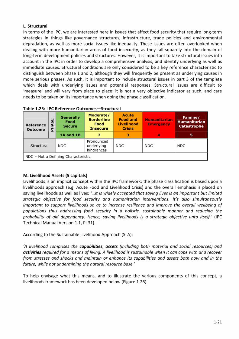
1-21
L. Structural
In terms of the IPC, we are interested here in issues that affect food security that require long-term
strategies in things like governance structures, infrastructure, trade policies and environmental
degradation, as well as more social issues like inequality. These issues are often overlooked when
dealing with more humanitarian areas of food insecurity, as they fall squarely into the domain of
long-term development policies and structures. However, it is important to take structural issues into
account in the IPC in order to develop a comprehensive analysis, and identify underlying as well as
immediate causes. Structural conditions are only considered to be a key reference characteristic to
distinguish between phase 1 and 2, although they will frequently be present as underlying causes in
more serious phases. As such, it is important to include structural issues in part 3 of the template
which deals with underlying issues and potential responses. Structural issues are difficult to
‘measure’ and will vary from place to place: it is not a very objective indicator as such, and care
needs to be taken on its importance when doing the phase classification.
Table 1.25: IPC Reference Outcomes—Structural
Generally
Food
Secure
Moderate/
Borderline
Food
Insecure
Acute
Food and
Livelihood
Crisis
Humanitarian
Emergency
Famine/
Humanitarian
Catastrophe
Reference
Outcome PHASE
1A and 1B 2 3 4 5
Structural NDC
Pronounced
underlying
hindrances
NDC NDC NDC
NDC – Not a Defining Characteristic
M. Livelihood Assets (5 capitals)
Livelihoods is an implicit concept within the IPC framework: the phase classification is based upon a
livelihoods approach (e.g. Acute Food and Livelihood Crisis) and the overall emphasis is placed on
saving livelihoods as well as lives: ‘…it is widely accepted that saving lives is an important but limited
strategic objective for food security and humanitarian interventions. It’s also simultaneously
important to support livelihoods so as to increase resilience and improve the overall wellbeing of
populations thus addressing food security in a holistic, sustainable manner and reducing the
probability of aid dependency. Hence, saving livelihoods is a strategic objective unto itself.’ (IPC
Technical Manual Version 1.1, P. 31).
According to the Sustainable Livelihood Approach (SLA):
‘A livelihood comprises the capabilities, assets (including both material and social resources) and
activities required for a means of living. A livelihood is sustainable when it can cope with and recover
from stresses and shocks and maintain or enhance its capabilities and assets both now and in the
future, while not undermining the natural resource base.’
To help envisage what this means, and to illustrate the various components of this concept, a
livelihoods framework has been developed below (Figure 1.26).
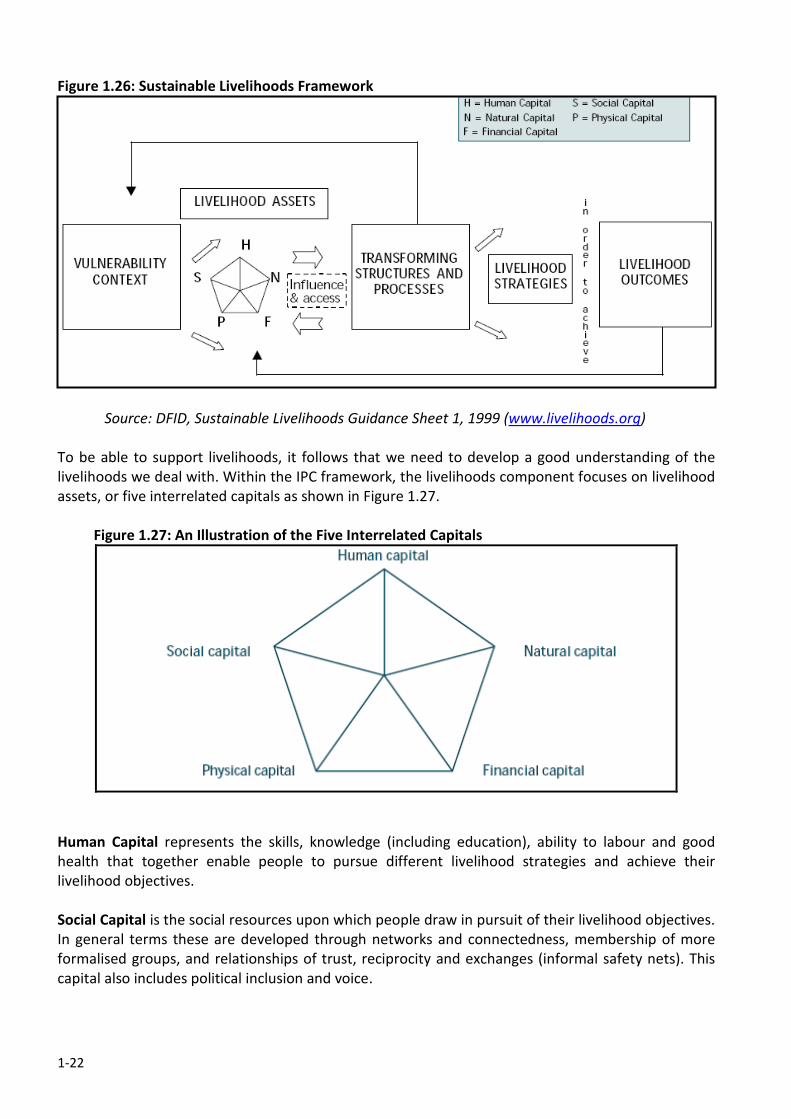
1-22
Figure 1.26: Sustainable Livelihoods Framework
Source: DFID, Sustainable Livelihoods Guidance Sheet 1, 1999 (www.livelihoods.org)
To be able to support livelihoods, it follows that we need to develop a good understanding of the
livelihoods we deal with. Within the IPC framework, the livelihoods component focuses on livelihood
assets, or five interrelated capitals as shown in Figure 1.27.
Figure 1.27: An Illustration of the Five Interrelated Capitals
Human Capital represents the skills, knowledge (including education), ability to labour and good
health that together enable people to pursue different livelihood strategies and achieve their
livelihood objectives.
Social Capital is the social resources upon which people draw in pursuit of their livelihood objectives.
In general terms these are developed through networks and connectedness, membership of more
formalised groups, and relationships of trust, reciprocity and exchanges (informal safety nets). This
capital also includes political inclusion and voice.
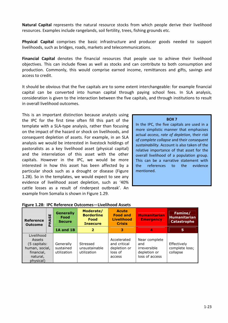
1-23
Natural Capital represents the natural resource stocks from which people derive their livelihood
resources. Examples include rangelands, soil fertility, trees, fishing grounds etc.
Physical Capital comprises the basic infrastructure and producer goods needed to support
livelihoods, such as bridges, roads, markets and telecommunications.
Financial Capital denotes the financial resources that people use to achieve their livelihood
objectives. This can include flows as well as stocks and can contribute to both consumption and
production. Commonly, this would comprise earned income, remittances and gifts, savings and
access to credit.
It should be obvious that the five capitals are to some extent interchangeable: for example financial
capital can be converted into human capital through paying school fees. In SLA analysis,
consideration is given to the interaction between the five capitals, and through institutions to result
in overall livelihood outcomes.
This is an important distinction because analysts using
the IPC for the first time often fill this part of the
template with a SLA-type analysis, rather than focusing
on the impact of the hazard or shock on livelihoods, and
consequent depletion of assets. For example, in an SLA
analysis we would be interested in livestock holdings of
pastoralists as a key livelihood asset (physical capital)
and the interrelation of this asset with the other
capitals. However in the IPC, we would be more
interested in how this asset has been affected by a
particular shock such as a drought or disease (Figure
1.28). So in the templates, we would expect to see any
evidence of livelihood asset depletion, such as ‘40%
cattle losses as a result of rinderpest outbreak’. An
example from Somalia is shown in Figure 1.29.
Figure 1.28: IPC Reference Outcomes—Livelihood Assets
Generally
Food
Secure
Moderate/
Borderline
Food
Insecure
Acute
Food and
Livelihood
Crisis
Humanitarian
Emergency
Famine/
Humanitarian
Catastrophe
Reference
Outcome PHASE
1A and 1B 2 3 4 5
Livelihood
Assets
(5 capitals:
human, social,
financial,
natural,
physical)
Generally
sustained
utilization
Stressed
unsustainable
utilization
Accelerated
and critical
depletion or
loss of
access
Near complete
and
irreversible
depletion or
loss of access
Effectively
complete loss;
collapse
BOX 7
In the IPC, the five capitals are used in a
more simplistic manner that emphasises
actual access, rate of depletion, their risk
of complete collapse and their consequent
sustainability. Account is also taken of the
relative importance of that asset for the
overall livelihood of a population group.
This can be a narrative statement with
the references to the evidence
mentioned.
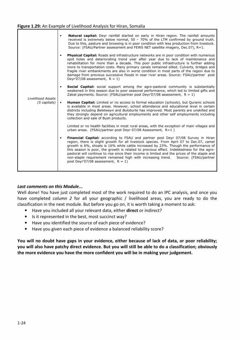
1-24
Figure 1.29: An Example of Livelihood Analysis for Hiran, Somalia
Livelihood Assets (5 capitals)
• Natural capital: Deyr rainfall started on early in Hiran region. The rainfall amounts
received is extremely below normal, 50 – 70% of the LTM confirmed by ground truth. Due to this, pasture and browsing is in poor condition with less production from livestock. Source: (FSAU/Partner assessment and FEWS NET satellite imagery, Dec.07), R=1.
• Physical Capital: Roads and infrastructure networks are in poor condition with numerous spot holes and deteriorating trend year after year due to lack of maintenance and rehabilitation for more than a decade. This poor public infrastructure is further adding more to transportation costs. Many primary canals remained silted. Culverts, bridges and fragile river embankments are also in worst condition in most parts of the region due to damage from previous successive floods in near river areas. Source: FSAU/partner post Deyr’07/08 assessment, R = 1)
• Social Capital: social support among the agro-pastoral community is substantially weakened in this season due to poor seasonal performance, which led to limited gifts and Zakat payments. Source: (FSAU/partner post Deyr’07/08 assessment, R = 1)
• Human Capital: Limited or no access to formal education (schools), but Quranic schools is available in most areas. However, school attendance and educational level in certain
districts including Beletweyn and Buloburte has improved. Most parents are unskilled and they strongly depend on agricultural employments and other self employments including collection and sale of Bush products. Limited or no health facilities in most rural areas, with the exception of main villages and urban areas. (FSAU/partner post Deyr 07/08 Assessment, R=1 )
• Financial Capital: according to FSAU and partner post Deyr 07/08 Survey in Hiran
region, there is slight growth for all livestock species. From April 07 to Dec.07, camel growth is 6%, shoats is 16% while cattle increased by 23%. Though the performance of this season is poor, the growth is related to previous effect. Indebtedness for the agro-pastoral will continue to rise since their income is limited and the prices of the staple and non-staple requirement remained high with increasing trend. Source: (FSAU/partner post Deyr’07/08 assessment, R = 1)
Last comments on this Module...
Well done! You have just completed most of the work required to do an IPC analysis, and once you
have completed column 2 for all your geographic / livelihood areas, you are ready to do the
classification in the next module. But before you go on, it is worth taking a moment to ask:
• Have you included all your relevant data, either direct or indirect?
• Is it represented in the best, most succinct way?
• Have you identified the source of each piece of evidence?
• Have you given each piece of evidence a balanced reliability score?
You will no doubt have gaps in your evidence, either because of lack of data, or poor reliability;
you will also have patchy direct evidence. But you will still be able to do a classification; obviously
the more evidence you have the more confident you will be in making your judgement.
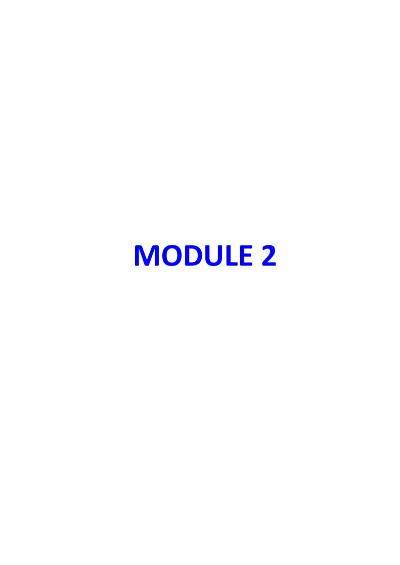
MODULE 2
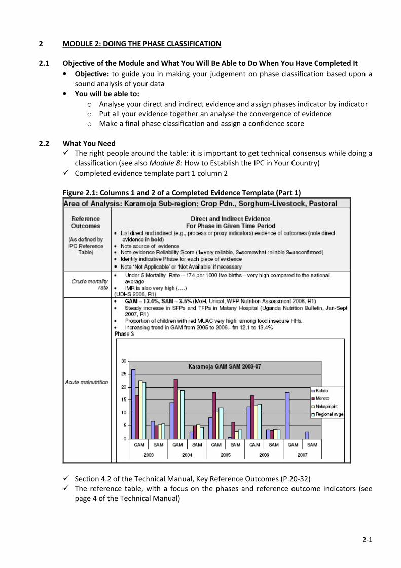
2-1
2 MODULE 2: DOING THE PHASE CLASSIFICATION
2.1 Objective of the Module and What You Will Be Able to Do When You Have Completed It
• Objective: to guide you in making your judgement on phase classification based upon a
sound analysis of your data
• You will be able to:
o Analyse your direct and indirect evidence and assign phases indicator by indicator
o Put all your evidence together an analyse the convergence of evidence
o Make a final phase classification and assign a confidence score
2.2 What You Need
� The right people around the table: it is important to get technical consensus while doing a
classification (see also Module 8: How to Establish the IPC in Your Country)
� Completed evidence template part 1 column 2
Figure 2.1: Columns 1 and 2 of a Completed Evidence Template (Part 1)
� Section 4.2 of the Technical Manual, Key Reference Outcomes (P.20-32)
� The reference table, with a focus on the phases and reference outcome indicators (see
page 4 of the Technical Manual)
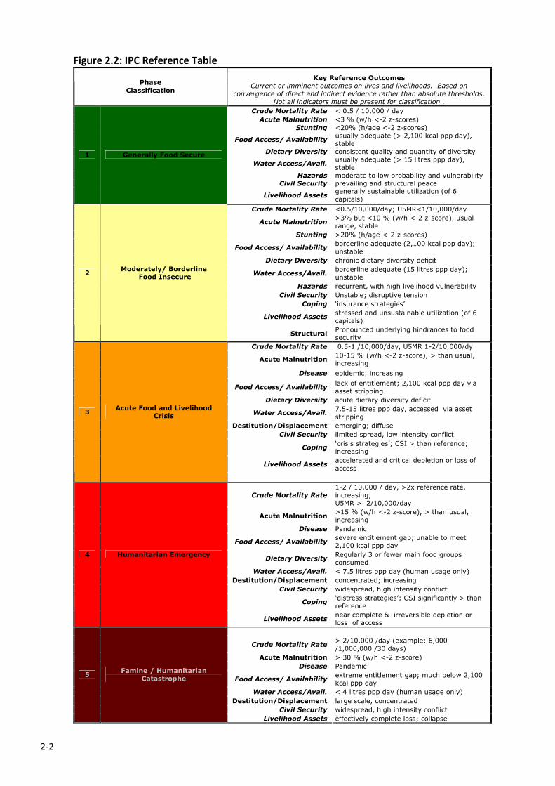
2-2
Figure 2.2: IPC Reference Table
Key Reference Outcomes Phase
Classification Current or imminent outcomes on lives and livelihoods. Based on
convergence of direct and indirect evidence rather than absolute thresholds.
Not all indicators must be present for classification..
Crude Mortality Rate < 0.5 / 10,000 / day
Acute Malnutrition <3 % (w/h <-2 z-scores)
Stunting <20% (h/age <-2 z-scores)
Food Access/ Availability usually adequate (> 2,100 kcal ppp day),
stable
Dietary Diversity consistent quality and quantity of diversity
Water Access/Avail. usually adequate (> 15 litres ppp day),
stable
Hazards moderate to low probability and vulnerability
Civil Security prevailing and structural peace
Livelihood Assets generally sustainable utilization (of 6
capitals)
1 Generally Food Secure
Crude Mortality Rate <0.5/10,000/day; U5MR<1/10,000/day
Acute Malnutrition >3% but <10 % (w/h <-2 z-score), usual
range, stable
Stunting >20% (h/age <-2 z-scores)
Food Access/ Availability borderline adequate (2,100 kcal ppp day);
unstable
Dietary Diversity chronic dietary diversity deficit
Water Access/Avail. borderline adequate (15 litres ppp day);
unstable
Hazards recurrent, with high livelihood vulnerability
Civil Security Unstable; disruptive tension
Coping ‘insurance strategies’
Livelihood Assets stressed and unsustainable utilization (of 6
capitals)
2 Moderately/ Borderline
Food Insecure
Structural Pronounced underlying hindrances to food
security
Crude Mortality Rate 0.5-1 /10,000/day, U5MR 1-2/10,000/dy
Acute Malnutrition 10-15 % (w/h <-2 z-score), > than usual,
increasing
Disease epidemic; increasing
Food Access/ Availability lack of entitlement; 2,100 kcal ppp day via
asset stripping
Dietary Diversity acute dietary diversity deficit
Water Access/Avail. 7.5-15 litres ppp day, accessed via asset
stripping
Destitution/Displacement emerging; diffuse
Civil Security limited spread, low intensity conflict
Coping ‘crisis strategies’; CSI > than reference;
increasing
Livelihood Assets accelerated and critical depletion or loss of
access
3 Acute Food and Livelihood
Crisis
Crude Mortality Rate
1-2 / 10,000 / day, >2x reference rate,
increasing;
U5MR > 2/10,000/day
Acute Malnutrition >15 % (w/h <-2 z-score), > than usual,
increasing
Disease Pandemic
Food Access/ Availability severe entitlement gap; unable to meet
2,100 kcal ppp day
Dietary Diversity Regularly 3 or fewer main food groups
consumed
Water Access/Avail. < 7.5 litres ppp day (human usage only)
Destitution/Displacement concentrated; increasing
Civil Security widespread, high intensity conflict
Coping ‘distress strategies’; CSI significantly > than
reference
4 Humanitarian Emergency
Livelihood Assets near complete & irreversible depletion or
loss of access
Crude Mortality Rate > 2/10,000 /day (example: 6,000
/1,000,000 /30 days)
Acute Malnutrition > 30 % (w/h <-2 z-score)
Disease Pandemic
Food Access/ Availability extreme entitlement gap; much below 2,100
kcal ppp day
Water Access/Avail. < 4 litres ppp day (human usage only)
Destitution/Displacement large scale, concentrated
Civil Security widespread, high intensity conflict
5 Famine / Humanitarian
Catastrophe
Livelihood Assets effectively complete loss; collapse
2-3
2.3 Before You Start...
Once you have entered all of your data and evidence into column 2 of the Part 1 template, you are
ready to do the phase classification. The key to this is the concept of ‘convergence of evidence’
whereby the classification is done on the basis of all the available evidence, using the reference
outcomes as a guide, and not considering any one indicator or piece of evidence as more important
than an other. This is really important, because you are dealing with a situation that is highly complex
with a bewildering number of variables, which means that your local knowledge is also very
important.
“Essentially what we are doing here is making a best judgement of the situation based upon the
available data in combination with our understanding of the context.”
This sounds difficult, but in practice is rarely problematic because generally speaking our evidence
tends to point in the same direction and leads us to make conclusions that are self-evident. One
thing that can happen is that one particular indicator will be out of synch with the others leading us
to question either the reliability of the data, or the possible reasons why that piece of information
seems to be telling a different story to the rest.
A good example of this comes from Southern Sudan, where persistent high levels of acute
malnutrition (w/h) are recorded in areas where other food security indicators suggest that the
situation is reasonable good (usually phase 2). Debate on this quickly unearths that the cause of the
high malnutrition is not directly related to food access or availability, but rather is an outcome of
poor water quality combined with poor child care practices.
The point here is that the one reference outcome (acute malnutrition in this case) should not be the
sole evidence that is used to classify the area, even if it is reliable and above an emergency threshold.
In this particular case, our southern Sudanese colleagues classified the area as phase 2 as all the
other evidence supported this phase, but flagged the issue of high malnutrition and its causes in the
text statements describing the situation analysis. Note also here that this is a good example of the
kind of debate that the IPC process encourages.
Another key issue to explain before you go on with your classification is known as ‘masking’. This is
where humanitarian aid is having a positive impact on the outcome indictors, and in a sense,
obscuring the underlying situation. The effect of humanitarian assistance is most easily measured in
a controlled situation such as a camp, where accurate data is available on relief items such as food
aid, water, health facilities etc and the camp population have little or no access to other resource.
This becomes increasingly difficult to measure in large populations who are not displaced, and
particularly when relief assistance becomes less significant, making it impossible to project the
underlying IPC phase.
A good example of this comes from Darfur, where people displaced from conflict are almost entirely
dependant upon relief supplies. Even in cases like this, your classification should be done on what
evidence is available; otherwise the whole essence of the IPC will be undermined. This is a bit
controversial, because if you classify a situation in a non-crisis phase it might send the message to
humanitarian decision makers that the relief is no longer needed, when we know that the situation is
very likely to become a crisis if that happened. So, while it is important to base the classification on
the evidence, it is also essential to send the right message to decision makers: in this example, “the
relief effort has been successful in improving most outcome indicators to non-crisis levels, however,
the IDPs are wholly dependant upon relief supplies, which must continue if the affected population
2-4
are not to slide into either IPC phase 3, 4 or 5.” In addition, the presence of relief assistance should
be recorded and accounted for in your evidence template; for example, food aid would be
documented under food access and availability. Keep in mind that assistance can be an important
part of the overall food security picture. At the moment, masking is not adequately covered with the
mapping protocols, making written statements very important. However, this issue has been
recognised and there are efforts being made at regional and global levels to develop a new mapping
symbol to illustrate where masking is having an effect.
2.4 Step 1: Classifying Each Indicator in Turn
There is no one way of doing the classification, but it is first best to classify the phases of each
individual reference outcome/evidence in order to be able to see any convergence of evidence
clearly. It is important here to refer to Section 4.2 Key Reference Outcomes in the Technical Manual
to classify each outcome – there is a lot of information and guidance for assigning phases here, and it
is not the purpose of this user guide to replicate. When doing the classification of each indicator
there are a few things to remember which may help the process:
1. Phases should be current or imminent, and have a period of validity. This is important, because
we generally want to provide ‘decision makers’ with a situation analysis that is dynamic and
forward looking, rather than be static and stuck in time. As mentioned in the previous module,
the IPC outcome should have a clearly defined period of validity. So, while you are classifying
each indicator, you need to be thinking about it in the present ‘what is going on now’, as well as
what is foreseeable within the validity period of the analysis ‘what I am sure is going to happen’.
The period of validity will vary from country to country as it is usually tied in with agro-climatic
seasons and the associated agricultural calendar. Typically an IPC analysis will take place at or
near the end of a rainy season, and its validity will extend to a similar stage in the next rainy
season. In some cases it may be appropriate to do a mid-season outlook, which may not be a
‘full’ IPC analysis, but has value in providing decision makers with an early warning of the
season’s performance (more on this in Step 2).
2. Direct and Indirect Evidence: As mentioned in the previous module, you will have a mixture of
direct and indirect evidence, and in most cases due to scarceness of data, you will most likely
have much more indirect than direct evidence. This is not a problem, but you have to think about
the way you interpret each kind of data. The simplest kinds of data to classify in the IPC are
reliable quantitative data that directly relate to an outcome indicator that has a recognised
threshold. Indicators like acute malnutrition and mortality would fall into this group. Other direct
evidence may not be quantitative or do not have a threshold, and are classified on the basis of a
description that is as specific as possible. Examples of these kinds of evidence would include civil
security, disease, destitution/displacement and livelihood assets. While these may be imprecise
to a greater or lesser extent, the evidence still describes the situation directly.
Indirect evidence describes a given reference outcome through proxy or process indicators that
are, by definition, indirect. Because of this, it is for you to make the appropriate association
between your indirect evidence and a particular reference outcome, taking into account the
livelihood context and relationships with other factors. Therefore, it is really important to
interpret each piece of indirect evidence with a good understanding of how it relates to the
outcome for specific livelihoods/ communities.
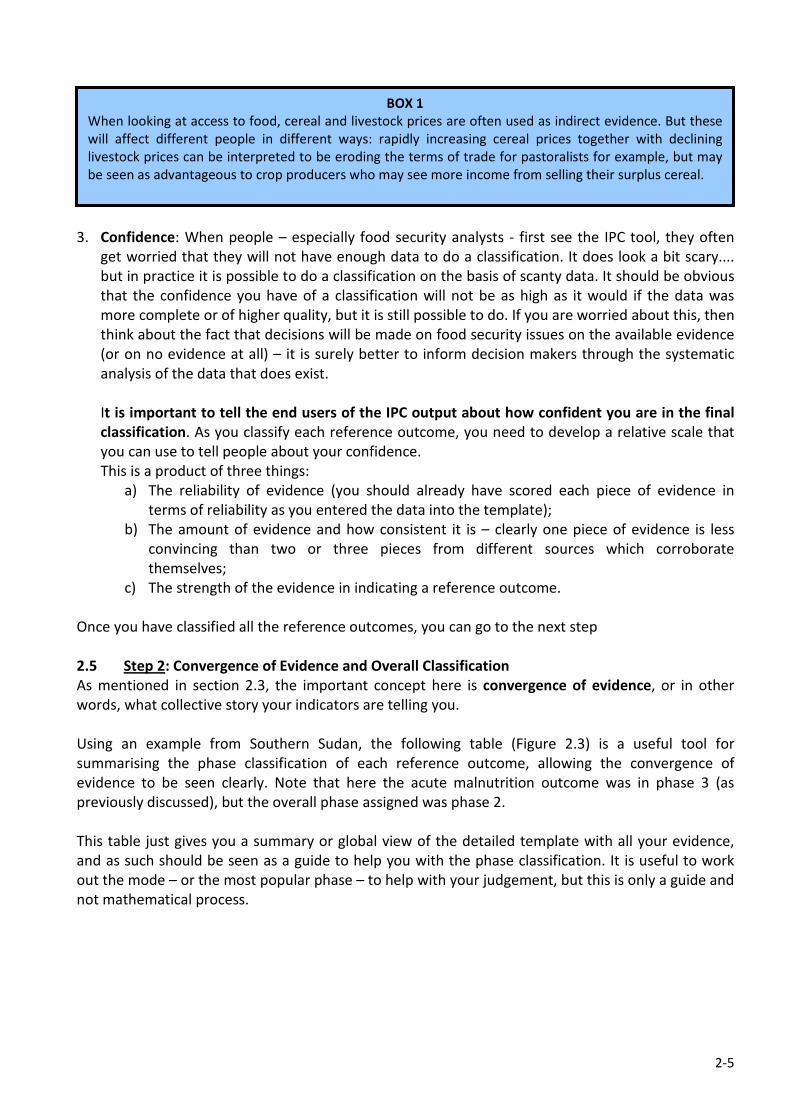
2-5
3. Confidence: When people – especially food security analysts - first see the IPC tool, they often
get worried that they will not have enough data to do a classification. It does look a bit scary....
but in practice it is possible to do a classification on the basis of scanty data. It should be obvious
that the confidence you have of a classification will not be as high as it would if the data was
more complete or of higher quality, but it is still possible to do. If you are worried about this, then
think about the fact that decisions will be made on food security issues on the available evidence
(or on no evidence at all) – it is surely better to inform decision makers through the systematic
analysis of the data that does exist.
It is important to tell the end users of the IPC output about how confident you are in the final
classification. As you classify each reference outcome, you need to develop a relative scale that
you can use to tell people about your confidence.
This is a product of three things:
a) The reliability of evidence (you should already have scored each piece of evidence in
terms of reliability as you entered the data into the template);
b) The amount of evidence and how consistent it is – clearly one piece of evidence is less
convincing than two or three pieces from different sources which corroborate
themselves;
c) The strength of the evidence in indicating a reference outcome.
Once you have classified all the reference outcomes, you can go to the next step
2.5 Step 2: Convergence of Evidence and Overall Classification
As mentioned in section 2.3, the important concept here is convergence of evidence, or in other
words, what collective story your indicators are telling you.
Using an example from Southern Sudan, the following table (Figure 2.3) is a useful tool for
summarising the phase classification of each reference outcome, allowing the convergence of
evidence to be seen clearly. Note that here the acute malnutrition outcome was in phase 3 (as
previously discussed), but the overall phase assigned was phase 2.
This table just gives you a summary or global view of the detailed template with all your evidence,
and as such should be seen as a guide to help you with the phase classification. It is useful to work
out the mode – or the most popular phase – to help with your judgement, but this is only a guide and
not mathematical process.
BOX 1
When looking at access to food, cereal and livestock prices are often used as indirect evidence. But these
will affect different people in different ways: rapidly increasing cereal prices together with declining
livestock prices can be interpreted to be eroding the terms of trade for pastoralists for example, but may
be seen as advantageous to crop producers who may see more income from selling their surplus cereal.
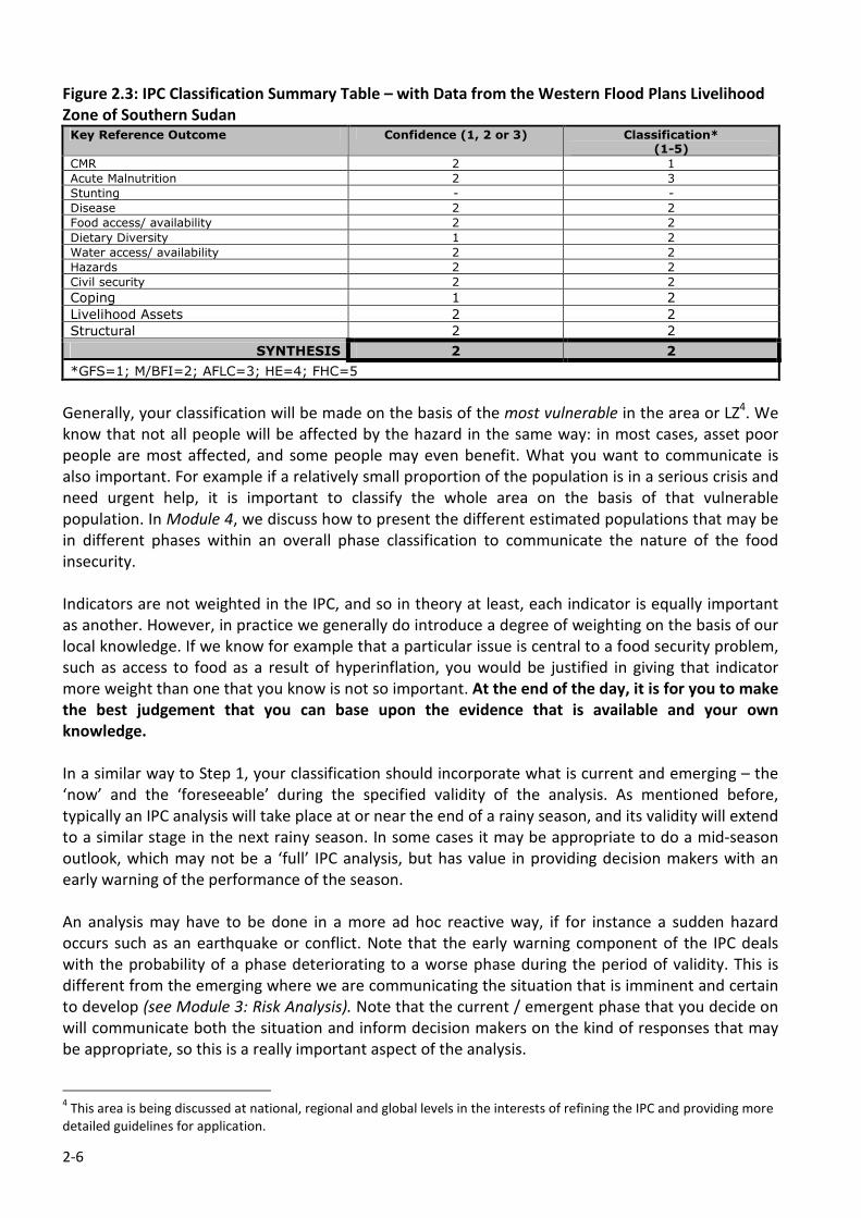
2-6
Figure 2.3: IPC Classification Summary Table – with Data from the Western Flood Plans Livelihood
Zone of Southern Sudan Key Reference Outcome Confidence (1, 2 or 3) Classification*
(1-5)
CMR 2 1
Acute Malnutrition 2 3
Stunting - -
Disease 2 2
Food access/ availability 2 2
Dietary Diversity 1 2
Water access/ availability 2 2
Hazards 2 2
Civil security 2 2
Coping 1 2
Livelihood Assets 2 2
Structural 2 2
SYNTHESIS 2 2
*GFS=1; M/BFI=2; AFLC=3; HE=4; FHC=5
Generally, your classification will be made on the basis of the most vulnerable in the area or LZ4. We
know that not all people will be affected by the hazard in the same way: in most cases, asset poor
people are most affected, and some people may even benefit. What you want to communicate is
also important. For example if a relatively small proportion of the population is in a serious crisis and
need urgent help, it is important to classify the whole area on the basis of that vulnerable
population. In Module 4, we discuss how to present the different estimated populations that may be
in different phases within an overall phase classification to communicate the nature of the food
insecurity.
Indicators are not weighted in the IPC, and so in theory at least, each indicator is equally important
as another. However, in practice we generally do introduce a degree of weighting on the basis of our
local knowledge. If we know for example that a particular issue is central to a food security problem,
such as access to food as a result of hyperinflation, you would be justified in giving that indicator
more weight than one that you know is not so important. At the end of the day, it is for you to make
the best judgement that you can base upon the evidence that is available and your own
knowledge.
In a similar way to Step 1, your classification should incorporate what is current and emerging – the
‘now’ and the ‘foreseeable’ during the specified validity of the analysis. As mentioned before,
typically an IPC analysis will take place at or near the end of a rainy season, and its validity will extend
to a similar stage in the next rainy season. In some cases it may be appropriate to do a mid-season
outlook, which may not be a ‘full’ IPC analysis, but has value in providing decision makers with an
early warning of the performance of the season.
An analysis may have to be done in a more ad hoc reactive way, if for instance a sudden hazard
occurs such as an earthquake or conflict. Note that the early warning component of the IPC deals
with the probability of a phase deteriorating to a worse phase during the period of validity. This is
different from the emerging where we are communicating the situation that is imminent and certain
to develop (see Module 3: Risk Analysis). Note that the current / emergent phase that you decide on
will communicate both the situation and inform decision makers on the kind of responses that may
be appropriate, so this is a really important aspect of the analysis.
4 This area is being discussed at national, regional and global levels in the interests of refining the IPC and providing more
detailed guidelines for application.
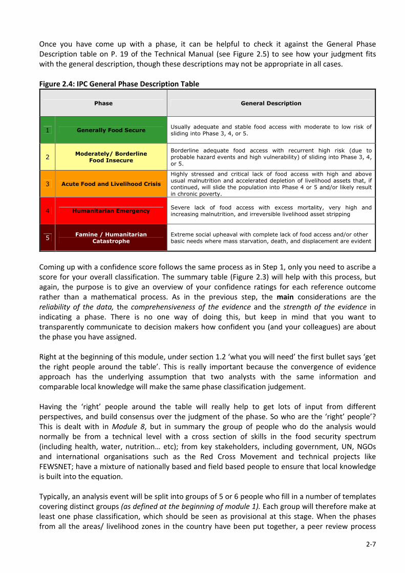
2-7
Once you have come up with a phase, it can be helpful to check it against the General Phase
Description table on P. 19 of the Technical Manual (see Figure 2.5) to see how your judgment fits
with the general description, though these descriptions may not be appropriate in all cases.
Figure 2.4: IPC General Phase Description Table
Phase General Description
1 Generally Food Secure Usually adequate and stable food access with moderate to low risk of sliding into Phase 3, 4, or 5.
2 Moderately/ Borderline
Food Insecure
Borderline adequate food access with recurrent high risk (due to probable hazard events and high vulnerability) of sliding into Phase 3, 4, or 5.
3 Acute Food and Livelihood Crisis
Highly stressed and critical lack of food access with high and above usual malnutrition and accelerated depletion of livelihood assets that, if continued, will slide the population into Phase 4 or 5 and/or likely result in chronic poverty.
4 Humanitarian Emergency Severe lack of food access with excess mortality, very high and increasing malnutrition, and irreversible livelihood asset stripping
5 Famine / Humanitarian
Catastrophe Extreme social upheaval with complete lack of food access and/or other basic needs where mass starvation, death, and displacement are evident
Coming up with a confidence score follows the same process as in Step 1, only you need to ascribe a
score for your overall classification. The summary table (Figure 2.3) will help with this process, but
again, the purpose is to give an overview of your confidence ratings for each reference outcome
rather than a mathematical process. As in the previous step, the main considerations are the
reliability of the data, the comprehensiveness of the evidence and the strength of the evidence in
indicating a phase. There is no one way of doing this, but keep in mind that you want to
transparently communicate to decision makers how confident you (and your colleagues) are about
the phase you have assigned.
Right at the beginning of this module, under section 1.2 ‘what you will need’ the first bullet says ‘get
the right people around the table’. This is really important because the convergence of evidence
approach has the underlying assumption that two analysts with the same information and
comparable local knowledge will make the same phase classification judgement.
Having the ‘right’ people around the table will really help to get lots of input from different
perspectives, and build consensus over the judgment of the phase. So who are the ‘right’ people’?
This is dealt with in Module 8, but in summary the group of people who do the analysis would
normally be from a technical level with a cross section of skills in the food security spectrum
(including health, water, nutrition… etc); from key stakeholders, including government, UN, NGOs
and international organisations such as the Red Cross Movement and technical projects like
FEWSNET; have a mixture of nationally based and field based people to ensure that local knowledge
is built into the equation.
Typically, an analysis event will be split into groups of 5 or 6 people who fill in a number of templates
covering distinct groups (as defined at the beginning of module 1). Each group will therefore make at
least one phase classification, which should be seen as provisional at this stage. When the phases
from all the areas/ livelihood zones in the country have been put together, a peer review process
2-8
should be done to build a wider consensus on your classification, and make changes as required (see
Module 7: How Do You Know You Got It Right? The Peer Review Process).
Once you have followed the two step process described here and have come up with phase
classification judgements for all the templates you are analysing, you can go to the next module on
Risk Analysis.

MODULE 3
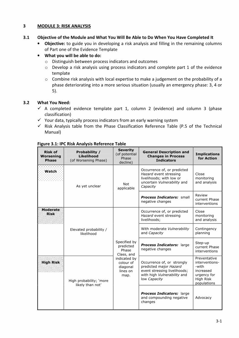
3-1
3 MODULE 3: RISK ANALYSIS
3.1 Objective of the Module and What You Will Be Able to Do When You Have Completed It
• Objective: to guide you in developing a risk analysis and filling in the remaining columns
of Part one of the Evidence Template
• What you will be able to do:
o Distinguish between process indicators and outcomes
o Develop a risk analysis using process indicators and complete part 1 of the evidence
template
o Combine risk analysis with local expertise to make a judgement on the probability of a
phase deteriorating into a more serious situation (usually an emergency phase: 3, 4 or
5).
3.2 What You Need:
� A completed evidence template part 1, column 2 (evidence) and column 3 (phase
classification)
� Your data, typically process indicators from an early warning system
� Risk Analysis table from the Phase Classification Reference Table (P.5 of the Technical
Manual)
Figure 3.1: IPC Risk Analysis Reference Table
Risk of Worsening Phase
Probability / Likelihood
(of Worsening Phase)
Severity (of potential
Phase decline)
General Description and Changes in Process
Indicators
Implications for Action
Occurrence of, or predicted Hazard event stressing livelihoods; with low or uncertain Vulnerability and Capacity
Close monitoring and analysis
Watch
As yet unclear Not
applicable
Process Indicators: small
negative changes
Review
current Phase interventions
Occurrence of, or predicted Hazard event stressing livelihoods;
Close monitoring and analysis
With moderate Vulnerability and Capacity
Contingency planning
Moderate Risk
Elevated probability / likelihood
Process Indicators: large negative changes
Step-up current Phase interventions
Occurrence of, or strongly predicted major Hazard event stressing livelihoods; with high Vulnerability and low Capacity
Preventative interventions--with increased urgency for
High Risk populations
High Risk
High probability; ‘more likely than not’
Specified by predicted Phase
Class, and indicated by colour of diagonal lines on
map.
Process Indicators: large and compounding negative changes
Advocacy
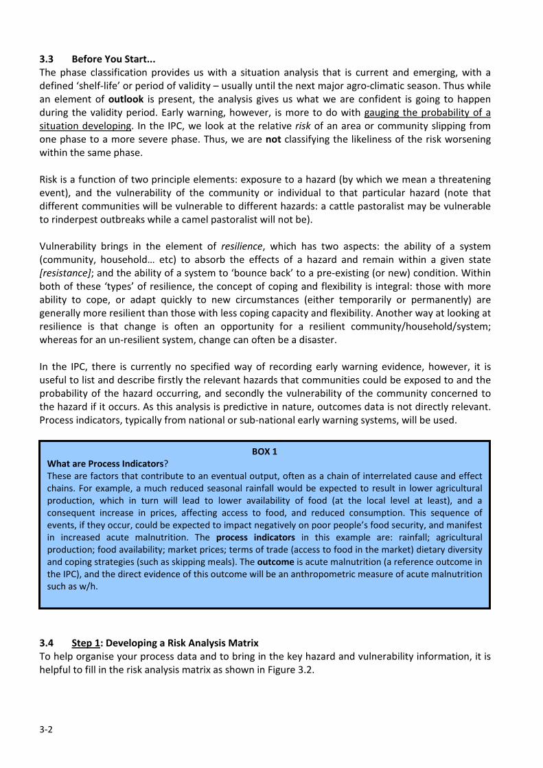
3-2
3.3 Before You Start...
The phase classification provides us with a situation analysis that is current and emerging, with a
defined ‘shelf-life’ or period of validity – usually until the next major agro-climatic season. Thus while
an element of outlook is present, the analysis gives us what we are confident is going to happen
during the validity period. Early warning, however, is more to do with gauging the probability of a
situation developing. In the IPC, we look at the relative risk of an area or community slipping from
one phase to a more severe phase. Thus, we are not classifying the likeliness of the risk worsening
within the same phase.
Risk is a function of two principle elements: exposure to a hazard (by which we mean a threatening
event), and the vulnerability of the community or individual to that particular hazard (note that
different communities will be vulnerable to different hazards: a cattle pastoralist may be vulnerable
to rinderpest outbreaks while a camel pastoralist will not be).
Vulnerability brings in the element of resilience, which has two aspects: the ability of a system
(community, household… etc) to absorb the effects of a hazard and remain within a given state
[resistance]; and the ability of a system to ‘bounce back’ to a pre-existing (or new) condition. Within
both of these ‘types’ of resilience, the concept of coping and flexibility is integral: those with more
ability to cope, or adapt quickly to new circumstances (either temporarily or permanently) are
generally more resilient than those with less coping capacity and flexibility. Another way at looking at
resilience is that change is often an opportunity for a resilient community/household/system;
whereas for an un-resilient system, change can often be a disaster.
In the IPC, there is currently no specified way of recording early warning evidence, however, it is
useful to list and describe firstly the relevant hazards that communities could be exposed to and the
probability of the hazard occurring, and secondly the vulnerability of the community concerned to
the hazard if it occurs. As this analysis is predictive in nature, outcomes data is not directly relevant.
Process indicators, typically from national or sub-national early warning systems, will be used.
3.4 Step 1: Developing a Risk Analysis Matrix
To help organise your process data and to bring in the key hazard and vulnerability information, it is
helpful to fill in the risk analysis matrix as shown in Figure 3.2.
BOX 1
What are Process Indicators?
These are factors that contribute to an eventual output, often as a chain of interrelated cause and effect
chains. For example, a much reduced seasonal rainfall would be expected to result in lower agricultural
production, which in turn will lead to lower availability of food (at the local level at least), and a
consequent increase in prices, affecting access to food, and reduced consumption. This sequence of
events, if they occur, could be expected to impact negatively on poor people’s food security, and manifest
in increased acute malnutrition. The process indicators in this example are: rainfall; agricultural
production; food availability; market prices; terms of trade (access to food in the market) dietary diversity
and coping strategies (such as skipping meals). The outcome is acute malnutrition (a reference outcome in
the IPC), and the direct evidence of this outcome will be an anthropometric measure of acute malnutrition
such as w/h.
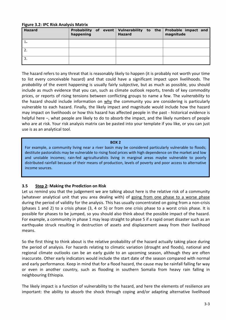
3-3
Figure 3.2: IPC Risk Analysis Matrix
Hazard Probability of event
happening
Vulnerability to the
Hazard
Probable impact and
magnitude
1.
2.
3.
The hazard refers to any threat that is reasonably likely to happen (it is probably not worth your time
to list every conceivable hazard) and that could have a significant impact upon livelihoods. The
probability of the event happening is usually fairly subjective, but as much as possible, you should
include as much evidence that you can, such as climate outlook reports, trends of key commodity
prices, or reports of rising tensions between conflicting groups to name a few. The vulnerability to
the hazard should include information on why the community you are considering is particularly
vulnerable to each hazard. Finally, the likely impact and magnitude would include how the hazard
may impact on livelihoods or how this hazard has affected people in the past - historical evidence is
helpful here –, what people are likely to do to absorb the impact, and the likely numbers of people
who are at risk. Your risk analysis matrix can be pasted into your template if you like, or you can just
use is as an analytical tool.
3.5 Step 2: Making the Prediction on Risk
Let us remind you that the judgement we are talking about here is the relative risk of a community
(whatever analytical unit that you area dealing with) of going from one phase to a worse phase
during the period of validity for the analysis. This has usually concentrated on going from a non-crisis
(phases 1 and 2) to a crisis phase (3, 4 or 5) or from one crisis phase to a worst crisis phase. It is
possible for phases to be jumped, so you should also think about the possible impact of the hazard.
For example, a community in phase 1 may leap straight to phase 5 if a rapid onset disaster such as an
earthquake struck resulting in destruction of assets and displacement away from their livelihood
means.
So the first thing to think about is the relative probability of the hazard actually taking place during
the period of analysis. For hazards relating to climatic variation (drought and floods), national and
regional climate outlooks can be an early guide to an upcoming season, although they are often
inaccurate. Other early indicators would include the start date of the season compared with normal
and early performance. Keep in mind that for a flood hazard, the cause may be rainfall falling far way
or even in another country, such as flooding in southern Somalia from heavy rain falling in
neighbouring Ethiopia.
The likely impact is a function of vulnerability to the hazard, and here the elements of resilience are
important: the ability to absorb the shock through coping and/or adapting alternative livelihood
BOX 2
For example, a community living near a river basin may be considered particularly vulnerable to floods;
destitute pastoralists may be vulnerable to rising food prices with high dependence on the market and low
and unstable incomes; rain-fed agriculturalists living in marginal areas maybe vulnerable to poorly
distributed rainfall because of their means of production, levels of poverty and poor access to alternative
income sources.
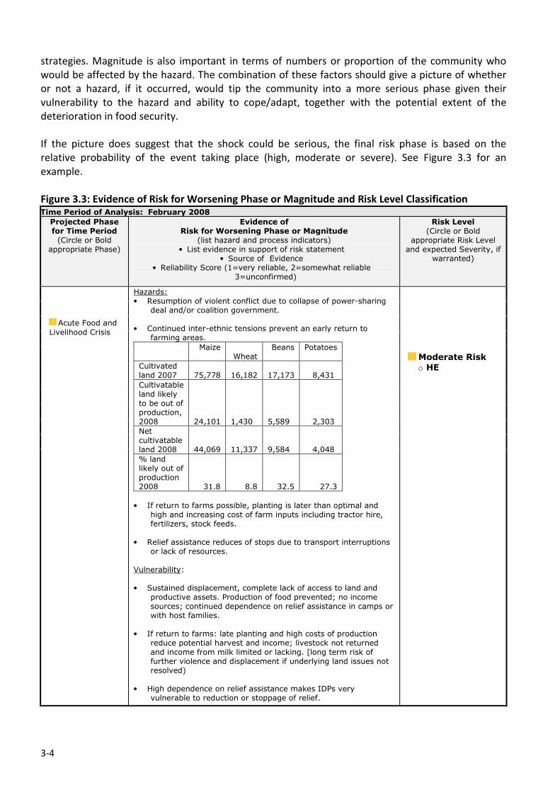
3-4
strategies. Magnitude is also important in terms of numbers or proportion of the community who
would be affected by the hazard. The combination of these factors should give a picture of whether
or not a hazard, if it occurred, would tip the community into a more serious phase given their
vulnerability to the hazard and ability to cope/adapt, together with the potential extent of the
deterioration in food security.
If the picture does suggest that the shock could be serious, the final risk phase is based on the
relative probability of the event taking place (high, moderate or severe). See Figure 3.3 for an
example.
Figure 3.3: Evidence of Risk for Worsening Phase or Magnitude and Risk Level Classification Time Period of Analysis: February 2008
Projected Phase for Time Period (Circle or Bold
appropriate Phase)
Evidence of Risk for Worsening Phase or Magnitude
(list hazard and process indicators) • List evidence in support of risk statement
• Source of Evidence • Reliability Score (1=very reliable, 2=somewhat reliable
3=unconfirmed)
Risk Level (Circle or Bold
appropriate Risk Level and expected Severity, if
warranted)
Acute Food and Livelihood Crisis
Hazards: • Resumption of violent conflict due to collapse of power-sharing
deal and/or coalition government. • Continued inter-ethnic tensions prevent an early return to
farming areas.
Maize Wheat
Beans Potatoes
Cultivated land 2007
75,778
16,182 17,173 8,431
Cultivatable land likely to be out of production, 2008
24,101
1,430
5,589 2,303
Net cultivatable land 2008
44,069
11,337
9,584 4,048
% land likely out of production 2008 31.8 8.8 32.5 27.3
• If return to farms possible, planting is later than optimal and
high and increasing cost of farm inputs including tractor hire, fertilizers, stock feeds.
• Relief assistance reduces of stops due to transport interruptions
or lack of resources. Vulnerability: • Sustained displacement, complete lack of access to land and
productive assets. Production of food prevented; no income sources; continued dependence on relief assistance in camps or with host families.
• If return to farms: late planting and high costs of production
reduce potential harvest and income; livestock not returned and income from milk limited or lacking. [long term risk of further violence and displacement if underlying land issues not resolved)
• High dependence on relief assistance makes IDPs very
vulnerable to reduction or stoppage of relief.
Moderate Risk o HE

MODULE 4
4-1
4 MODULE 4: THE NUMBERS GAME – ESTIMATING POPULATIONS IN EACH PHASE
4.1 Objective of the Module and What You Will Be Able to Do When You Have Completed It
• Objective: to guide you in estimating populations affected by different severity levels of
food insecurity
• You will be able to:
o Develop a population table and ascribe estimated populations in each
classification phase
o Justify your judgements on the magnitude of a food security problem
o Distinguish between estimates of populations facing food insecurity and
estimations of beneficiary numbers, typically calculated for specific interventions
such as food aid
4.2 What You Need:
� The right people around the table: it is important to get technical consensus while
estimating population tables. Care should be taken to avoid participant seeing this
exercise as a direct means to come up with beneficiary numbers, though this may be done
as an important aspect of response analysis and planning;
� Data from your country to an appropriate level of disaggregation on population, and
wealth ranking or similar means to estimate vulnerability on the basis of assets or
poverty; other data depending upon the hazard (for example, population living in flood-
prone areas).
� Section 5.3 of the Technical Guide ‘Standardised Population Tables’ (See Figure 4.1);
Figure 4.1: Table of Estimated Population by Region in Humanitarian Emergency and Acute
Food and Livelihood Crisis
4-2
� Defining Attributes legend (new amended version) from the mapping protocols (Figure
4.2).
Figure 4.2: Defining Attributes Legend
4.3 Before You Start...
In any situation analysis it is important to include the severity of the situation (phase classification),
the geographic spread and scale in terms of numbers of people, in addition to other things like
causes. We have dealt with the first two of these in the first 3 modules as part of the phase
classification process. It is really important to estimate the scale of the situation (especially in the
crisis phases) in order to convey to decision makers the seriousness of the situation and the scale of a
response that would have to be put into action.
This part of the IPC process can sometimes be quite difficult to do, both technically and, more
importantly, as a result of possible influence from elements who may want to see a situation seem
better or worse than it is. Part of the reason for this is due to assessments conventionally combining
situation analysis with response planning, and particularly with estimating populations in need of
something (typically food aid, seeds and tools or other types of relief). The response planning process
is nearly always a more political one than situation analysis, since the allocation of resources is
central. So it is vitally important to get some things very clear to be able to do a population estimate
free from these kind of influences and to maintain the objective quality of our situation analysis.
BOX 1: Estimating what population and for what purpose? A clarification
The IPC tool is used to develop a situation analysis that should be as objective and transparent as
possible. When estimating population numbers we are interested in the number of people that
are estimated to be in each IPC crisis phase (3, 4 or 5). This means that when an area has been
attributed with a crisis phase, we estimate the number of people living in that geographical area
that are in different phases, because we know that not all the people in the area will be affected
by the hazard in the same way: some will be in a less severe phase, while others may even
benefit from the situation. By doing this we are providing our decision makers with a picture, not
only of the overall phase of an area or LZ, but also of the depth and severity of the problem in
terms of food security. This estimation is done without any judgement regarding the possible
needs or response options at this stage. Not getting into a response analysis or planning helps to
maintain the objectivity of the situation analysis. The population estimates are presented in two
ways on the map: firstly the estimated number of people in the area in crisis that are in the most
severe (classified) phase is indicated at the top of the call-out box; and secondly the estimated
population in each phase as a percentage indicated by the stacked bar next to the call-out box.
See the example in Figure 4.3.
4-3
Figure 4.3: Population Estimates as
Presented on the Map
There is no set way to do the population estimates and it
is necessary for countries to develop their own methods
that follow the same general principles. Note that it is
important to develop a method that allows you to
estimate populations in the same way over time (i.e. over
future analysis cycles) and space. This means that you will
be making the estimates in the same way each time, and
can communicate to your users about how you do it in a
transparent way
General Principles for estimating populations:
1. Populations are estimated without any judgement concerning any types of assistance that
people may or may not need.
2. Populations are estimated in terms of the degree or severity of food insecurity they are
experiencing.
3. Within a crisis phase, there will be people who are more or less seriously affected, and
therefore not all the population living within a crisis phase will be facing the same degree of
food insecurity. It follows that some people may be experiencing a ‘Humanitarian Crisis’ level
of food insecurity in an area classified as phase 4, but that others may be facing less severe
phases – this allow us to develop the staked bar in the call-out boxes (e.g. above).
4. In order to differentiate between these groups and to estimate proportions in the population
as a whole, information about peoples’ known vulnerability in the area is needed. This may be
a proxy such as wealth ranking or poverty level (on the assumption that poor people are
generally more vulnerable to hazards).
5. Differentiation between groups within the phase will be a factor of several elements including
the degree of homogeneity (sameness) within the area or LZ, and the effect of the hazard: in
some cases such as an earthquake, the entire population in the epicentre may be affected.
6. Population estimates are estimates – not exact figures. They provide an indication of the
magnitude of the food insecurity problem for decision makers, but are usually not sufficiently
accurate to base or target responses, which may require more detailed assessments.5
5 Note that while these principles reflect the current thinking on estimating populations. This area of the IPC is being considered a
priority for regional and global steering groups to review and possibly revise.
BOX 2
It is worth emphasising that it is important to develop a good analysis of the shock and vulnerability
within your analysis area/LZ, rather than mechanically estimate populations based solely on your
wealth ranking groups or poverty levels. It is also really important to explain your methodology so
that others understand the basis of your estimates, which is essential to maintain the credibility of
your overall situation analysis. Remember that although you are estimating population in each phase,
some people will be thinking in terms of beneficiary numbers, so it is important to explain fully how
you estimated your population figures.
4-4
4.4 Step 1: Estimating Populations in Each Phase
The first thing to do is to organise your population data in the most appropriate way that you can
given your analysis framework. This is generally reasonably straight forward if you are doing your
analysis on the basis of administrative zones as most population figures follow these. If you are
dealing with a livelihood zone, however, you may need to calculate or estimate the population of
that livelihood zone. Similarly, you will need to estimate populations that are specifically at risk of a
hazard such as a flood on the basis of where they live and their proximity to flood-prone areas.
The next stage is to look at your baseline wealth ranking or poverty data that relates as much as
possible to your population figures and the unit of analysis. Your knowledge of the area, livelihood
dynamics and vulnerability will be essential here to then make a judgement on the numbers of
people that fall into each phase. Generally speaking, if an area/LZ has been classified as a
humanitarian emergency, you would expect your ‘poor’ (and ‘very poor’) wealth groups to be
included in phase 4. If you don’t have wealth ranking data available, most countries have poverty
data which may also help: people considered to be ‘hard core’ poor will usually be equivalent to the
poor or very poor in wealth ranking approaches; middle wealth groups, or ‘relative poverty’
populations (from poverty surveys) might fall into phase 3 depending upon a good analysis of the
hazard and possible impact on these groups; and the ‘wealthy’ or ‘non-poor’ may fall into phase 1 or
2. This kind of analysis will allow you to estimate proportions of the overall population in a given
area that will fall into different phases within an overall phase, which can then be related to actual
estimated numbers of people:
D1 * X1 * X2 = total number of people affected by phase in overall phase area,
where:
D1 = District (or equivalent administrative area);
X1 = percentage of population in particular livelihood zone or other analytical unit (e.g. low
lying areas in floods);
X2 = Percentage of poor group (wealth group or from poverty survey) living within the LZ or
other analytical unit.
A further refinement would be a judgement on whether all or a portion of a particular wealth group
or poverty group fall into the same phase. For example, in a drought hazard, if the rainfall has been
good in one area, the estimated population in a crisis phase may exclude this good rainfall area.
This would add another ‘X’ to the formula:
D1*X1*X2*X3 = total number of people affected by phase in overall phase area,
where:
X3 = is the percent of poor wealth group in a crisis phase (i.e. that would exclude the percent
of the poor wealth group that are not considered to be in crisis from the analysis: such as
because of rainfall distribution)
If you have more than one livelihood zone within the district, you just have to repeat the process for
the other livelihood zones and add up the final figures. An example of how FSAU estimate their
populations is included in Annex 3.
4.5 Step 2: Validation and Peer Review
As this is an important and potentially contentious part of the analysis, it is important that you have
the right people around the table to discuss and gain consensus on the population estimates. It is
4-5
suggested that you fill in the population estimates in an easily understood manner (using the
population tables in the Technical Manual) and present to your wider group.
During the peer review process (see Module 7) when the entire analysis is reviewed by the wider
team (and if possible a panel of ‘outside experts’), particular attention needs to be placed on the
population estimates in each phase.
The last thing to do when consensus is attained, is to develop the stacked bar proportions and input
the estimates into the mapping protocols.

MODULE 5
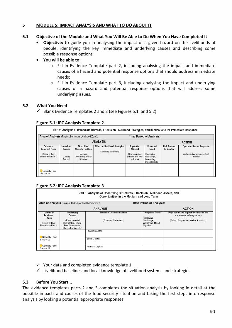
5-1
5 MODULE 5: IMPACT ANALYSIS AND WHAT TO DO ABOUT IT
5.1 Objective of the Module and What You Will Be Able to Do When You Have Completed It
• Objective: to guide you in analysing the impact of a given hazard on the livelihoods of
people, identifying the key immediate and underlying causes and describing some
possible response options
• You will be able to:
o Fill in Evidence Template part 2, including analysing the impact and immediate
causes of a hazard and potential response options that should address immediate
needs;
o Fill in Evidence Template part 3, including analysing the impact and underlying
causes of a hazard and potential response options that will address some
underlying issues.
5.2 What You Need
� Blank Evidence Templates 2 and 3 (see Figures 5.1. and 5.2)
Figure 5.1: IPC Analysis Template 2
Figure 5.2: IPC Analysis Template 3
� Your data and completed evidence template 1
� Livelihood baselines and local knowledge of livelihood systems and strategies
5.3 Before You Start...
The evidence templates parts 2 and 3 completes the situation analysis by looking in detail at the
possible impacts and causes of the food security situation and taking the first steps into response
analysis by looking a potential appropriate responses.
5-2
It should be noted here that there is a distinction between response analysis and response planning:
the former is an analysis of potential responses based upon the situation analysis, without
consideration of resources, capacity on the ground or any political aspects – in this regard it is ‘blue
sky thinking’ and should be done by food security analysts, with some inputs from operational
people. In contrast, response planning is the process whereby responses are developed as an
operational plan, and therefore issues around resources and capacity are as important as
appropriateness of the response; it is also an inherently political process since it involves resource
allocation (For the ‘Analysis-Response Continuum’ see Figure A in the Introduction section of this
Users Guide).
It is for this last reason that the IPC stops at impact analysis, since the process of response planning
has more potential to influence the situation analysis – to make the situation look worse or better
than it actually is; or to lead decision makers towards a particular type of intervention that might suit
a particular agency mandate or political imperative. As much as possible we need to insulate our
situation analysis from these kinds of pressures in order to provide decision makers with a balanced,
objective and transparent analysis, and to maintain credibility.
Having said this, it is obviously very important to make the link between the situation analysis and
the response that is put in place, and that is what we do with parts 2 and 3 of the template. It is also
worth noting that this part of the process is often missed or done rather badly. Assessments may
produce good situation analyses and the government and agencies use the information to develop
responses based upon ‘what they’ve always done’ or their comparative advantage/ capacity, rather
than based on an analysis of the needs. This part of the IPC analysis is your opportunity to identify
the causes and needs (both immediate and underlying) and make recommendations on what should
be done, rather than what habitually gets done.
5.4 Step 1: Filling out the Evidence Template Part 2
Part 2 is divided into two overall sections: analysis and action. It goes without saying that the analysis
part should be filled in first with the action section being done on the basis of the analysis.
The Analysis Section:
Parts of the analysis components of this template can be taken
directly from Part 1, including the first column which is merely
to record the Phase Classification. The second column lists the
direct hazards, which you should have available from your risk
analysis while filling out Part 1 (see also Module 3). The next
column looks at the effect of the hazard on livelihood strategies
in the area of analysis, with a focus on loss of or loss of access
to key livelihood assets such as production, income, access to
land or pasture, access to health facilities and so on. Note that
this relates to the effect of the hazard on livelihoods rather
than general statements on livelihood capitals, and it should
also include what people are doing about it.
Estimated populations affected by the hazard or each hazard if there are more than one should be
included in the next column. Work done on estimating populations affected by a given crisis phase
will be helpful here, but more analysis may need to be done to look at each hazard in a multiple
hazard scenario. Finally the projected trend for each hazard completes this section of the template
(improving, no change, worsening, or mixed signals). It is helpful here to indicate rate of change as
BOX 1: Remember to focus on
loss of or loss of access to key
livelihood assets!
For example, if production is very
low, people may adjust their
livelihood strategies (at least
temporarily) such as by seeking
off-farm labour, or engaging in
petty trade. Information about
peoples’ coping strategies is
helpful here.
5-3
well as the direction, for example, ‘rapidly worsening’ provides a sense of urgency that would be
missing if you just state that the situation is worsening. Mixed messages refer to situations where the
signals are not clear or are contradictory.
The Action Section:
The first column directs actions in terms of monitoring key risk factors. These would be things that, if
happened, would lead to a worsening of the situation. For example, return of IDPs after the planting
season; or critical water levels in a river threatening to flood; or road blocks established that would
restrict access to markets; or rainfall at a critical stage of crop development… etc. The following
column requires a good level of analysis of the situation in order to identify appropriate responses
that might improve immediate access to food. The analysis should take into consideration things like:
o The immediate causes and needs: this is your first consideration to develop possible
response options that address immediate needs and causes.
o Market function: As a general principle, it is best to avoid distorting or undermining markets,
though stabilisation may be an option involving direct engagement with markets, especially
to maintain the terms of trade of vulnerable people. If markets are functioning well and food
is available, it is usually better to recommend a cash-based response over a food-based one
to avoid distorting and undermining markets and producers; if food availability is the
problem, a cash-based response can cause local inflation, again distorting markets;
o The characteristics of the predominant livelihood: what would be the appropriate
response(s) that would help to protect or rebuild livelihood assets?
o The stage in a crisis cycle: different responses may be required at the beginning, middle or
end of a crisis, such as livestock de-stocking as an early response, and restocking as a recovery
intervention.
o Existing responses: avoid duplication, but rather identify gaps in geographical coverage and
sectors
o Local Priorities: What are the priorities of households and communities and of the local
agencies (especially government)?
The actions here should be discussed with the wider group doing the analysis during the peer review
process, and as much as possible, developed into a comprehensive response framework at the
national level. To reiterate: this is a response analysis which identifies the most appropriate
responses, based upon the situation analysis. It does not represent a response plan in which
resources, capacity, logistics and other elements would be considered.
The following example from Kenya (Figure 5.3) gives some guidance on how Part 2 of the template
looks into a Humanitarian Emergency among IDPs displaced by post-election violence in early 2008.
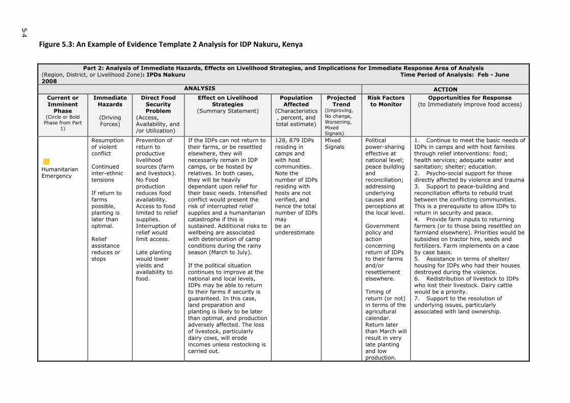
5-4
Figure 5.3: An Example of Evidence Template 2 Analysis for IDP Nakuru, Kenya
Part 2: Analysis of Immediate Hazards, Effects on Livelihood Strategies, and Implications for Immediate Response Area of Analysis (Region, District, or Livelihood Zone): IPDs Nakuru Time Period of Analysis: Feb - June 2008
ANALYSIS ACTION
Current or Imminent Phase
(Circle or Bold
Phase from Part
1)
Immediate Hazards
(Driving Forces)
Direct Food Security Problem
(Access, Availability, and /or Utilization)
Effect on Livelihood Strategies
(Summary Statement)
Population Affected
(Characteristics, percent, and total estimate)
Projected Trend
(Improving,
No change,
Worsening,
Mixed Signals)
Risk Factors to Monitor
Opportunities for Response (to Immediately improve food access)
Humanitarian Emergency
Resumption of violent conflict Continued inter-ethnic tensions If return to farms possible, planting is later than optimal. Relief assistance reduces or stops
Prevention of return to productive livelihood sources (farm and livestock). No Food production reduces food availability. Access to food limited to relief supplies. Interruption of relief would limit access. Late planting would lower yields and availability to food.
If the IDPs can not return to their farms, or be resettled elsewhere, they will necessarily remain in IDP camps, or be hosted by relatives. In both cases, they will be heavily dependant upon relief for their basic needs. Intensified conflict would present the risk of interrupted relief supplies and a humanitarian catastrophe if this is sustained. Additional risks to wellbeing are associated with deterioration of camp conditions during the rainy season (March to July). If the political situation continues to improve at the national and local levels, IDPs may be able to return to their farms if security is guaranteed. In this case, land preparation and planting is likely to be later than optimal, and production adversely affected. The loss of livestock, particularly dairy cows, will erode incomes unless restocking is carried out.
128, 879 IDPs residing in camps and with host communities. Note the number of IDPs residing with hosts are not verified, and hence the total number of IDPs may be an underestimate
Mixed Signals
Political power-sharing effective at national level; peace building and reconciliation; addressing underlying causes and perceptions at the local level. Government policy and action concerning return of IDPs to their farms and/or resettlement elsewhere. Timing of return (or not) in terms of the agricultural calendar. Return later than March will result in very late planting and low production.
1. Continue to meet the basic needs of IDPs in camps and with host families through relief interventions: food; health services; adequate water and sanitation; shelter; education. 2. Psycho-social support for those directly affected by violence and trauma 3. Support to peace-building and reconciliation efforts to rebuild trust between the conflicting communities. This is a prerequisite to allow IDPs to return in security and peace. 4. Provide farm inputs to returning farmers (or to those being resettled on farmland elsewhere). Priorities would be subsidies on tractor hire, seeds and fertilizers. Farm implements on a case by case basis. 5. Assistance in terms of shelter/ housing for IDPs who had their houses destroyed during the violence. 6. Redistribution of livestock to IDPs who lost their livestock. Dairy cattle would be a priority. 7. Support to the resolution of underlying issues, particularly associated with land ownership.
5-5
5.5 Step 2: Filling out the Evidence Template Part 3
Part 3 of the template is similar to Part 2 that you have just completed, but it focuses on the
underlying causes of food insecurity. It has the same two sections for ‘Analysis’ and ‘Action’.
The Analysis Section:
As for step 1, the first column is just to record the phase that your analysis area/LZ is in. The second
column looks at the underlying cause(s) of food insecurity such as climatic variability; long-standing
political exclusion; economic marginalisation; environmental degradation etc. The third column is for
you to write summary statements on the impact of the underlying causes on each of the livelihood
capitals. You will see that the template has six capitals rather than the more conventional five, with
‘Local Political Capital’ as an additional one. Depending on the context in your country, political
capital can be looked at individually (if it is particularly important) or integrated with Social Capital.
The forth column is to indicate the direction of change as in part 2.
The Action Section:
This is similar to part 2, but you should identify actions and
interventions that address the underlying causes that you
have already included in the analysis section. In many
instances, you will have the same subject or sector in both
parts 2 and 3, but the response options will probably be
different. For example, an acute water shortage may have
immediate and underlying causes. The immediate cause may
be a critical shortage of water caused by a breakdown in the
nearby borehole. The immediate response may be to fix the
borehole pump (if that is easily done) or truck in emergency
water supplies. The underlying cause maybe poor borehole
maintenance, or not enough boreholes in the area, in which
case the recommended action may be to establish water
management committees, or drill more boreholes in the area.
This is a simple example, and you are most likely to be faced with much more complex immediate
and long term causes. For example in Southern Sudan very high malnutrition rates appear to be
caused by a complex set of factors including hygiene, poor water quality, poor access to health
facilities and poor care practices. The immediate action may be to provide supplementary feeding to
malnourished children to save lives, but this will clearly not solve the underlying problem that will
need a much longer term and multi-sectoral approach.
Let’s stay with the example from Kenya used above and show you how Part 3 was completed.
BOX 2: Avoid ‘shopping’ lists of
recommendations!
Note that it is not a requirement to
make recommendations for all of
the causes – there may be no
obvious actions to take, or so
general that they may not be useful.
It is generally best to avoid
‘shopping’ lists of recommendations,
and instead look for priority actions
that have a good chance on being acted on.
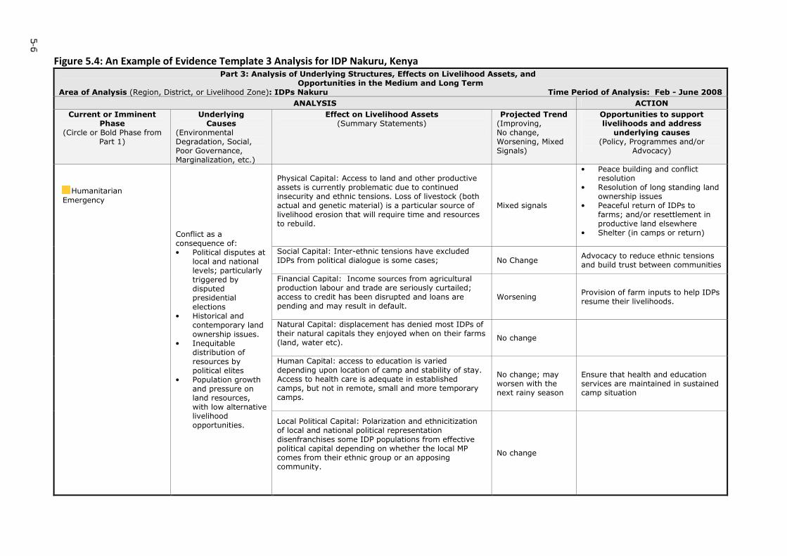
5-6
Figure 5.4: An Example of Evidence Template 3 Analysis for IDP Nakuru, Kenya Part 3: Analysis of Underlying Structures, Effects on Livelihood Assets, and
Opportunities in the Medium and Long Term Area of Analysis (Region, District, or Livelihood Zone): IDPs Nakuru Time Period of Analysis: Feb - June 2008
ANALYSIS ACTION
Current or Imminent Phase
(Circle or Bold Phase from Part 1)
Underlying Causes
(Environmental Degradation, Social, Poor Governance, Marginalization, etc.)
Effect on Livelihood Assets (Summary Statements)
Projected Trend (Improving, No change, Worsening, Mixed Signals)
Opportunities to support livelihoods and address
underlying causes (Policy, Programmes and/or
Advocacy)
Physical Capital: Access to land and other productive assets is currently problematic due to continued insecurity and ethnic tensions. Loss of livestock (both actual and genetic material) is a particular source of livelihood erosion that will require time and resources to rebuild.
Mixed signals
• Peace building and conflict resolution
• Resolution of long standing land ownership issues
• Peaceful return of IDPs to farms; and/or resettlement in productive land elsewhere
• Shelter (in camps or return)
Social Capital: Inter-ethnic tensions have excluded IDPs from political dialogue is some cases;
No Change Advocacy to reduce ethnic tensions and build trust between communities
Financial Capital: Income sources from agricultural production labour and trade are seriously curtailed; access to credit has been disrupted and loans are pending and may result in default.
Worsening Provision of farm inputs to help IDPs resume their livelihoods.
Natural Capital: displacement has denied most IDPs of their natural capitals they enjoyed when on their farms (land, water etc).
No change
Human Capital: access to education is varied depending upon location of camp and stability of stay. Access to health care is adequate in established camps, but not in remote, small and more temporary camps.
No change; may worsen with the next rainy season
Ensure that health and education services are maintained in sustained camp situation
Humanitarian Emergency
Conflict as a consequence of: • Political disputes at
local and national levels; particularly triggered by disputed presidential elections
• Historical and contemporary land
ownership issues. • Inequitable
distribution of resources by political elites
• Population growth and pressure on land resources, with low alternative livelihood opportunities.
Local Political Capital: Polarization and ethnicitization of local and national political representation disenfranchises some IDP populations from effective political capital depending on whether the local MP comes from their ethnic group or an apposing community.
No change

MODULE 6
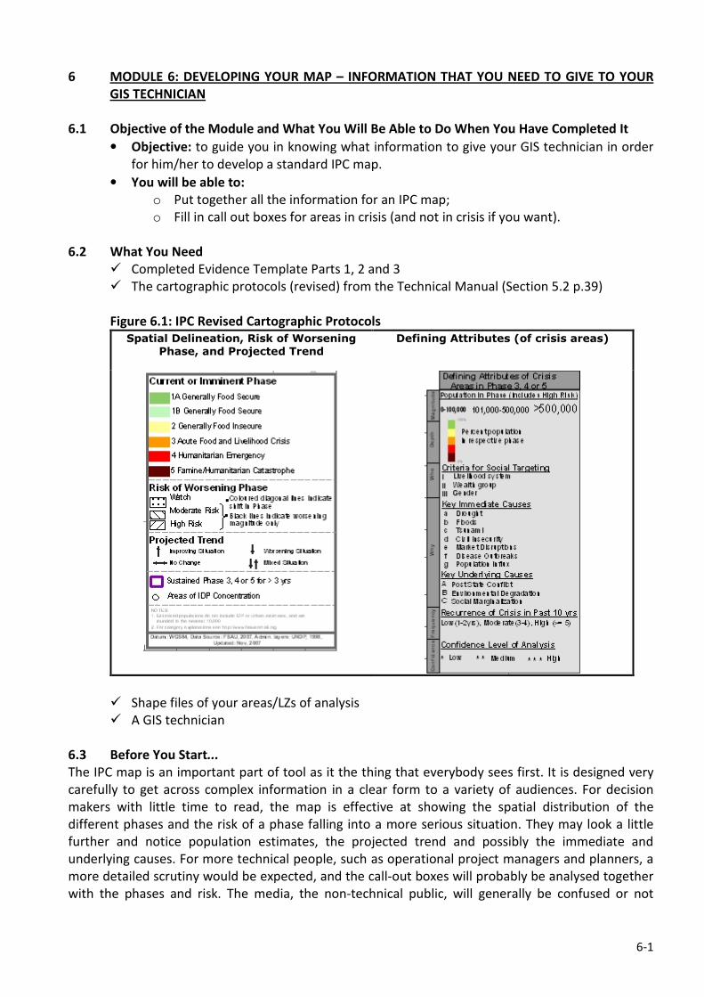
6-1
6 MODULE 6: DEVELOPING YOUR MAP – INFORMATION THAT YOU NEED TO GIVE TO YOUR
GIS TECHNICIAN
6.1 Objective of the Module and What You Will Be Able to Do When You Have Completed It
• Objective: to guide you in knowing what information to give your GIS technician in order
for him/her to develop a standard IPC map.
• You will be able to:
o Put together all the information for an IPC map;
o Fill in call out boxes for areas in crisis (and not in crisis if you want).
6.2 What You Need
� Completed Evidence Template Parts 1, 2 and 3
� The cartographic protocols (revised) from the Technical Manual (Section 5.2 p.39)
Figure 6.1: IPC Revised Cartographic Protocols
Spatial Delineation, Risk of Worsening
Phase, and Projected Trend
Defining Attributes (of crisis areas)
� Shape files of your areas/LZs of analysis
� A GIS technician
6.3 Before You Start...
The IPC map is an important part of tool as it the thing that everybody sees first. It is designed very
carefully to get across complex information in a clear form to a variety of audiences. For decision
makers with little time to read, the map is effective at showing the spatial distribution of the
different phases and the risk of a phase falling into a more serious situation. They may look a little
further and notice population estimates, the projected trend and possibly the immediate and
underlying causes. For more technical people, such as operational project managers and planners, a
more detailed scrutiny would be expected, and the call-out boxes will probably be analysed together
with the phases and risk. The media, the non-technical public, will generally be confused or not
6-2
interested in the detail, and it is worth considering for them a simplified map without the call-out
boxes, and possibly without the risk analysis.
While the map has been proved to be very effective as a way to get across the main messages from
an IPC analysis, it does have inherent limitations. Firstly, it is very difficult to represent mobile
populations on a static map, so where there are significant population movements occurring there is
no way to point this out on the IPC map. It is also difficult to represent small pockets of a particular
phase, for example IDPs in a humanitarian emergency who are spread around an area that is
otherwise generally food secure (they may be living with host families). One way to represent this is
to apply with red (or another phase colour) dots on top of the other phase, but this can get confused
on first view with the alert/watch level of risk (black dots).
Clearly the map on its own is good at getting across the main messages, but needs to be combined
with a narrative description of the different phases that gives more explanation. The statements can
also bring ‘hidden’ things to the attention of decision makers that might not be clear from the map.
For example, if malnutrition rates are high (say phase 4), but all the other outcome indicators are
showing a good situation (say phase 2), then the overall convergence of evidence will lead you to
classify the area as phase 2. However, unacceptably high malnutrition rates should be flagged as an
issue to be dealt with in the statement, and you may have evidence to explain why the rates are high
and what should be done in the immediate and longer term.
6.4 Step 1: Phase Classification of the Spatial Analysis (LZ; Admin Zones…etc) Together with the
Risk Analysis
The first step is simply to provide the phase classifications and risk analysis to your GIS person.
However, in order to represent your phases spatially, your GIS person needs to have the shape files
available for your geographical area or livelihood zone (LZ). If you are doing the analysis by
administrative area, this is usually not a problem as most countries will have digitised files of sub-
national administrative units to a localised level. If you are doing your classification by LZ or other
geographic areas (such as low lying riverine areas in the case of floods), this may pose more of a
problem when you come to mapping, unless the shape files are available for these units. One
common compromise is to link your area of analysis to the lowest administrative level. So for
example, a particular livelihood that is predominant in the lowest administrative unit can be
considered as wholly that livelihood zone, and can be linked with other administrative units that also
have the same LZ to give you larger livelihood zones that cut across larger/higher administrative units
when combined. This might take quite a bit of work to build up, and if possible should be done in
advance of the IPC analysis event.
In addition to the phases and risk, you need to provide information on the projected trend
(improving, worsening, no change or mixed signals) that you should be able to take from Parts 2 and
3 of the evidence templates; and whether the area has been in a sustained crisis phase for over 3
years (this will be indicated by a purple border on the map). Locations of IDP concentrations should
also be provided and their phase so that the map will include a circle with the colour of the phase
inside in the location of the IDP camp (s). Other local issues may also need to be explained such as
when you have IDP populations scattered among a host community.
6.5 Step 2: Develop Call out Boxes for Emergency Phases (3-5) Or Other Phases That You Want
to Make Particular Reference to [Includes population estimates and the stacked bar]
The call-out boxes follow the defining attributes legend (see Figure 6.1 above) and have
conventionally been used to provide more detail for areas that are in a crisis phase (phase 3, 4 or 5).
6-3
However, there is no reason why you should not develop call-out boxes for non-crisis phases
especially if you want to call the attention of decision makers to particular areas or issues.
The call-out boxes include information on population estimates in the phase that you can get from
your population tables exercise. This is represented as a number (small font if 0-100,000 people
affected; medium font if 101,000-500,000 people and large font if over 500,000 people.); and a
stacked bar giving the proportion of population in each phase within the overall phase (See Module 4
for more details).
Criteria for social targeting are coded using I, II, III… etc to refer to the unit of targeting
recommended. The ‘default setting’ for this is I=livelihood system; II=wealth group; and III= gender:
these can be changed depending upon your particular context and analysis of the food security
problem6. The point here is to get across to decision makers the best way of targeting resources in
accordance with the most affected population group to ensure that limited resources have greatest
impact. You will need to tell your GIS person what your criteria are so that he can change the
defining attributes box as required.
The key immediate and underlying causes should be available from your evidence templates parts 2
and 3. These are coded alphabetically and again can be adjusted to fit your context: you need to tell
your GIS technician which codes you want to use for each cause so that he can change the attributes
box.
Recurrence of the crisis in the last 10 years is useful to indicate the frequency of crisis in the analysis
area which gives an indication of the exposure of the area to risk and the likely state of the
livelihoods: generally speaking, you would expect a livelihood with frequent exposure to hazards to
be in poorer shape. The frequency of crisis in the past 10 years can be low (1-2 years of crisis),
moderate (3-4 years) or high (over 5 years). With time, you can use the definition of ‘crisis’ in the IPC
sense of being in phases 3, 4 or 5. As you are introducing the IPC to your country now, you will have
to use previous descriptions of the area from assessments in the past that roughly conform to the IPC
crisis phases.
The confidence level of the analysis, the judgement on the overall confidence in the analysis should
have been completed as part of the phase classification exercise. Refer to the summary matrix which
you developed in Module 2 (Figure 2.3) to help you do the classification.
6.6 Step 3: Develop a Clear Title for the Map Including the Period of Validity
The period of validity is usually the period between the analysis and the next major agricultural
season; however it could be a shorter period depending on the nature of the hazard. For example, a
flood hazard may only impact on livelihoods for a short period, as with a livestock disease if action is
taken. In conflict situations, it may be necessary to update IPC products more frequently, in which
case the validity of the analysis may be quite short. The rule of thumb is to decide on the period of
validity before you start doing the analysis on the basis of how confident you are that your analysis
will still be valid after a certain period of time. The title of the map is a matter for communicating
what you are trying to get across: it might be a general food security situation analysis of a country,
or focussing on a particular hazard, or perhaps a mid-season outlook with an emphasis on risk.
6 Criteria for social targeting provide broad guidelines for decision makers. Note that additional assessments may need to
be conducted to gain a more detailed profile of different for groups and to define targeting criteria, especially in a multi-
response scenario.

MODULE 7
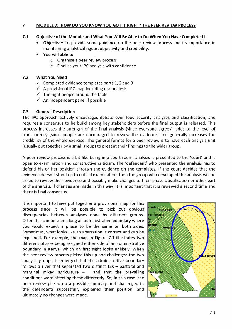
7-1
7 MODULE 7: HOW DO YOU KNOW YOU GOT IT RIGHT? THE PEER REVIEW PROCESS
7.1 Objective of the Module and What You Will Be Able to Do When You Have Completed It
• Objective: To provide some guidance on the peer review process and its importance in
maintaining analytical rigour, objectivity and credibility.
• You will able to:
o Organise a peer review process
o Finalise your IPC analysis with confidence
7.2 What You Need
� Completed evidence templates parts 1, 2 and 3
� A provisional IPC map including risk analysis
� The right people around the table
� An independent panel if possible
7.3 General Description
The IPC approach actively encourages debate over food security analyses and classification, and
requires a consensus to be build among key stakeholders before the final output is released. This
process increases the strength of the final analysis (since everyone agrees), adds to the level of
transparency (since people are encouraged to review the evidence) and generally increases the
credibility of the whole exercise. The general format for a peer review is to have each analysis unit
(usually put together by a small group) to present their findings to the wider group.
A peer review process is a bit like being in a court room: analysis is presented to the ‘court’ and is
open to examination and constructive criticism. The ‘defendant’ who presented the analysis has to
defend his or her position through the evidence on the templates. If the court decides that the
evidence doesn’t stand up to critical examination, then the group who developed the analysis will be
asked to review their evidence and possibly make changes to their phase classification or other part
of the analysis. If changes are made in this way, it is important that it is reviewed a second time and
there is final consensus.
It is important to have put together a provisional map for this
process since it will be possible to pick out obvious
discrepancies between analyses done by different groups.
Often this can be seen along an administrative boundary where
you would expect a phase to be the same on both sides.
Sometimes, what looks like an aberration is correct and can be
explained. For example, the map in Figure 7.1 illustrates two
different phases being assigned either side of an administrative
boundary in Kenya, which on first sight looks unlikely. When
the peer review process picked this up and challenged the two
analysis groups, it emerged that the administrative boundary
follows a river that separated two distinct LZs – pastoral and
marginal mixed agriculture – , and that the prevailing
conditions were affecting these differently. So, in this case, the
peer review picked up a possible anomaly and challenged it,
the defendants successfully explained their position, and
ultimately no changes were made.
7-2
The importance of having the right people around the table to do the peer review should be obvious
by now. If the analysis is being carried out at national level, it would be normal to have the group
that developed the analysis (probably your core technical team) do the peer review. If you have a
more decentralised system, it is a good idea to conduct a series of peer reviews: at the sub-national
level in which a particular classification refers to; at a higher sub-national level handling more than
one analysis; and then at the national level when the whole country is being reviewed. No matter
how many stages of peer review you have, it is worth considering setting up an ‘independent panel
review’ made up of food security experts – preferably with IPC experience – who have not been part
of the analysis process. This is not always possible and is not a requirement - just ‘icing on the cake’
and a way of increasing the credibility of the exercise.
7.4 Step 1: Reviewing the Phase Classification for Different Areas/ Livelihood Zones in Your
Country (Or Part of Your Country)
As already mentioned, this is normally accomplished by having a series of group presentations
carried out by the analysts to the wider group, interspersed with critical analysis. If a review of
evidence and changes are required, they should be reviewed a second time (probably all the changes
together at the end of the review) and consensus developed.
7.5 Step 2: Finalising Any Revisions and Preparing the Final Map and Summary Statements
Once the review has agreed on the analysis and changes required the final revised version of the
map should be shown to the group for finalisation. At this point the smaller cluster groups can also
finalise call-out boxes (see Module 6) and draft descriptive statements for each phase.
7.6 Step 3: Disseminating the Outputs
Having completed the peer review process you are now ready to combine your maps and statements
into a report or bulletin and present this to the wider food security community. Keep in mind that in
the interests of transparency, you should make your Evidence Templates available to the wider
community. This may be done by posting them on a website, or distributing by email or on CDs.
A couple of things to remember:
• Establish a ground rule that criticism should be constructive and should not degenerate into
negative arguments or personal attacks – things can get hot, but should always be
professional.
• Make sure everyone has access to the evidence that is being presented – to save paper and
money you can project templates onto a wall from a laptop.
• Ensure that you have got consensus on the final outputs and have the group’s go-ahead to
publish the findings to the wider community and in the public domain.
MODULE 8
8-1
8 MODULE 8: HOW TO ESTABLISH AN IPC IN YOUR COUNTRY
8.1 Objective of the Module and What You Will Be Able to Do When You Have Completed It
• Objective: Provide some guidance and experience from other countries that will help you
to establish and roll out an IPC in your country in a sustainable way.
• You will be able to:
o Identify the most appropriate institutional home for your IPC and related food
security information requirements
o Develop a process and work plan that will help you to run your first round of IPC
analysis, and set the targets for future cycles
o Develop plans to build capacity at the national and sub-national levels, and for
decentralisation as needed.
8.2 What You Need:
� Operating Principles: A set of principles were put together by the global IPC partnership
(FAO, FEWS NET, WFP, CARE, SCUK and OXFAM (GB)) , which aim to give some guidance
about what an IPC system would look and function like in any given country. Of course,
these are not rules but rather a useful set of things to think about and put in place when
you establish an IPC in your country. The principles are listed in Box 1.
� Mapping of Institution: Generally speaking, the IPC should be established within existing
food security institutions or coordination mechanisms. It is very useful to have analysed
and mapped the various institutions relevant to food security and their relationships in
information flows before deciding where your IPC system should be placed.
BOX 1: Draft Working Principles for Operating within a Country in the Framework of a
Common Interagency Approach
(For a Full IPC System)
1. IPC should be a consensus process facilitated by a broad interagency working group,
including government and key constituencies
2. All efforts made to engage and build capacity of government and promote ownership and
strengthen the institutional process
3. Timing of analysis linked to events/critical seasons that affect food security situation. The
entry point might be a multi agency planning event.
4. Commitment by members of interagency working group to multi year process
5. Demand driven by government to initiate an IPC process
6. IPC can be started regardless of data availability. The initial situation analysis will be useful
and improved as the process proceeds
7. Any data used should contain confidence ranking
8. IPC process should comprise a mechanism to build an institutional commitment from
government
9. Transparency of results made available to the public in a timely manner
10. IPC analysis would be done with technical neutrality through having a broad membership
of the interagency group and through a transparent process of consensus building and
ensuring group members participate in their technical capacity
11. IPC are subject to an external peer review process to check quality and maintain standards
of IPC
12. The process should be used for lesson learning to improve the IPC tool
8-2
8.3 Before You Start...
It is really important to set off on the right foot when starting the IPC (as with other projects)
because it can take a lot of time and effort to correct early mistakes later on. While there is no one
‘correct’ way to start an IPC process, selected experience from other countries which might help
have been included in this module. As a general principle, the IPC should be seen as an add-on to
existing food security analysis and coordination systems, not as something that is going to replace
anything that is currently working, or that requires additional committees.
8.4 Step 1: Giving your IPC a Home – Institutional Considerations
8.4.1 Finding a home for the IPC: institutional mapping
Just like finding a home for yourself, it is important to look around before deciding where to
place the IPC institutionally. Mapping is a useful way of doing this: listing all the institutions that
are in some way engaged in food security, within and outside of government, and understanding
the relationships with each other is the first step. An analysis of the food security coordination
mechanisms in your country is just as important, as these tend to be multi-agency in nature. As
well as the interrelationships between institutions it is also useful to map the information flows:
this is important to understand the way food security information is made available to and used
by decision makers so that the IPC can be placed in a good position for action to be taken. As a
general principle, it is better to place the IPC in an existing functioning coordination mechanism
rather than start new groups, although sometimes a working group that reports to an existing
group or cluster is required to get things moving. For example in Uganda, the IPC is established
first in the Office of the Prime Minister which coordinates the “Food Security and Agricultural
Livelihood Cluster” co-chaired by FAO and WFP, but it was felt necessary to form a smaller and
more specialised IPC Technical Working Group within the cluster to help establish the IPC.
8.4.2 Getting acceptance and buy-in: awareness raising; importance of national governmental
ownership and leadership
Once you have worked out where the IPC should be established, you will need to do a lot of work
to raise awareness with the right people inside and outside of government so that people
understand what the IPC is all about. First though, it is usually necessary to have the relevant
parts of government endorse the use of the IPC in your country. This would normally be required
from the chair of the food security coordination mechanism, often within the Office of the
President/Prime Minister (OP/OPM), as the organ of government that usually coordinates
humanitarian/food security in the country. An alternative might be the Ministry of Agriculture. It
is helpful if this level of government has already been exposed to the IPC in another country or as
part of a regional training event. Alternatively it may be a good idea to bring an expert from
another country that is using the IPC to start the awareness raising process. Keep in mind that
although the IPC will be applied by technical level personnel in government and other agencies, it
is their supervisors who normally make the decisions. It is essential that senior management also
understand the IPC so that they can support their technical level staff involved in its application
and also be in a better position to take informed decisions based on IPC products.
8.4.3 Getting the right people around the table
When doing food security analysis and developing an IPC phase classification, it is important that
you have the right people around the table. Again there is no rule about who, but experience in
other countries suggests that strong engagement form line ministries together with UN and key
NGOs in a multi-agency environment where every one can express themselves. From a technical
perspective, you will want to have a good cross section of expertise including nutrition, health,
8-3
water, agriculture, livestock, and education as well as more general food security people. In
terms of government institutions, it would be normal to have technical officers from the line
ministries responsible for the above sectors, together with the coordinating authority (OP, OPM).
Keep in mind that ministries are typically divided into divisions and that it may be important to
include officers from each: for example, the nutrition division as well as a more general health
division from the MoH; Livestock production as well as Veterinary Services from the Ministry of
Livestock/Agriculture. UN agencies would normally include WFP (VAM office if you have one),
FAO, UNICEF, WHO and possibly UNDP. It is important to ensure that key NGOs are also involved,
especially those with good knowledge of the areas of concern, and/or particular expertise in a
sector such as nutrition. Examples would include Oxfam, Save the Children, MSF family, VSF
family, CARE … etc. The Red Cross/Crescent movement as well as technical projects such as FEWS
NET would also be important. Remember that together with data and information that agencies
bring to the analysis, and their own technical contribution, it is also vital to have a good cross-
section of stakeholders to get consensus on the outputs. This helps to build the IPC’s credibility,
especially in the early analysis cycles.
8.5 Step 2: Learn From Using the IPC in Your Country with Your Data
8.5.1 Using the IPC as part of ongoing processes of assessment/analysis.
As mentioned earlier, it is important to make sure that everyone concerned understands that the
IPC is an add-on to existing food security data gathering and analysis systems that are already in
place in your country. Usually, some kind of data collection/assessment and analysis takes place
at the national level after each main agricultural season in the year, to which the IPC can be a
useful addition. It may be necessary to include other sources of data than are normally used
before the IPC was applied (the IPC seeks to integrate different information in the analysis), but
these are normally available without having to collect data specifically for the IPC.
8.5.2 Learning from the process
The best way to learn how to do an IPC analysis is to go through the process with data from your
own country sources and with your colleagues. It is advisable to have an IPC practitioner to take
your country team through the whole process the first time at least, and it is suggested that you
hold a lessons learned workshop after the event to review the process and start planning the
next cycle.
8.5.3 Data issues: mapping and meta-data analysis.
A common concern that people have when starting an IPC system is ‘lack of data’. It is possible to
do a classification on the basis of sub-optimal data availability, but obviously the better your data
(either in terms of quantity or quality) the greater your confidence will be with the outcome. As
mentioned above, the IPC tries to integrate different sources of data into an overall food security
analysis, and this often means looking for data and information that are not part of the normal
assessment and analysis process. If, for example, your assessment tends to be based upon crop
production, you will now be looking to include price data, nutrition, health, water and so on into
your analysis. This can be a bit scary, but a process of data mapping will often result in revealing
data that you didn’t know existed. Data mapping is the process of listing the data needs against
sources of data, and expanding this to take account of access, reliability, format and so on. The
following matrix shown in Figure 8.1 is an example from a data mapping exercise in Kenya.
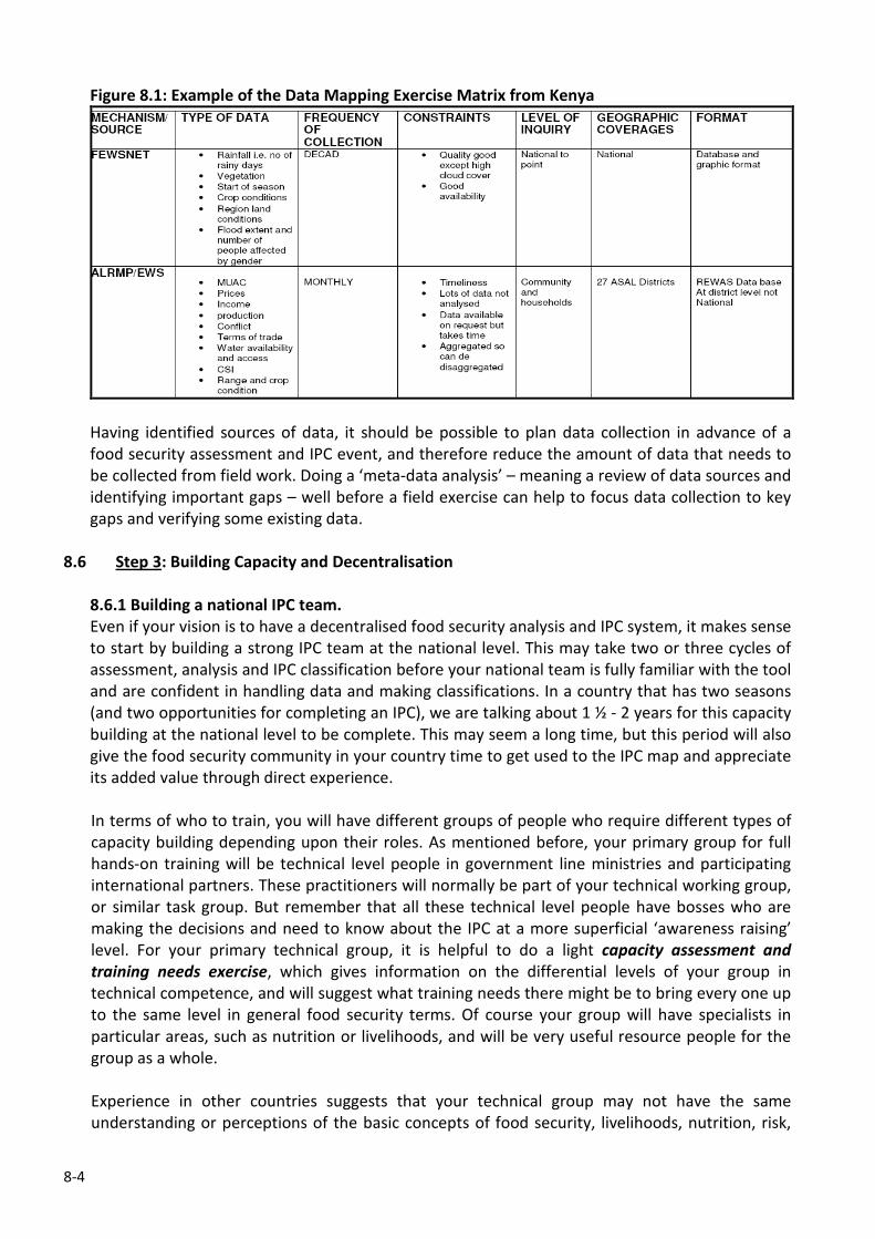
8-4
Figure 8.1: Example of the Data Mapping Exercise Matrix from Kenya
Having identified sources of data, it should be possible to plan data collection in advance of a
food security assessment and IPC event, and therefore reduce the amount of data that needs to
be collected from field work. Doing a ‘meta-data analysis’ – meaning a review of data sources and
identifying important gaps – well before a field exercise can help to focus data collection to key
gaps and verifying some existing data.
8.6 Step 3: Building Capacity and Decentralisation
8.6.1 Building a national IPC team.
Even if your vision is to have a decentralised food security analysis and IPC system, it makes sense
to start by building a strong IPC team at the national level. This may take two or three cycles of
assessment, analysis and IPC classification before your national team is fully familiar with the tool
and are confident in handling data and making classifications. In a country that has two seasons
(and two opportunities for completing an IPC), we are talking about 1 ½ - 2 years for this capacity
building at the national level to be complete. This may seem a long time, but this period will also
give the food security community in your country time to get used to the IPC map and appreciate
its added value through direct experience.
In terms of who to train, you will have different groups of people who require different types of
capacity building depending upon their roles. As mentioned before, your primary group for full
hands-on training will be technical level people in government line ministries and participating
international partners. These practitioners will normally be part of your technical working group,
or similar task group. But remember that all these technical level people have bosses who are
making the decisions and need to know about the IPC at a more superficial ‘awareness raising’
level. For your primary technical group, it is helpful to do a light capacity assessment and
training needs exercise, which gives information on the differential levels of your group in
technical competence, and will suggest what training needs there might be to bring every one up
to the same level in general food security terms. Of course your group will have specialists in
particular areas, such as nutrition or livelihoods, and will be very useful resource people for the
group as a whole.
Experience in other countries suggests that your technical group may not have the same
understanding or perceptions of the basic concepts of food security, livelihoods, nutrition, risk,
8-5
vulnerability and resilience, and particularly the interlinkages between the different concepts. For
example, a health specialist may see nutrition from a disease point of view (you get sick and
become malnourished); while an agricultural expert would tend to view nutrition from a food
availability perspective (you have not produced enough food, so you go hungry and become
malnourished); and an economist may see it from a food access angle (you don’t have enough
money to buy your food, so you go hungry and become malnourished). All of these perspectives
are of course completely reasonable and valid, but what we are trying to do is integrate the
different perspectives into a holistic understanding of food security. Certainly, it is worth
considering doing a basic or foundation course on food security, nutrition and livelihoods for your
technical group, before getting into detailed IPC training.
8.6.2 IPC Capacity Building: Training of Trainers approach
The best way to learn about the IPC is to do it with some guidance from an experienced
practitioner. Using your own country data from your usual assessment and analysis process is the
obvious way, but there may be other ways such as using secondary data may be available
through line ministries and other partners. Generally speaking, you will want your core technical
group to be able both to do the IPC analysis and then to be able to teach others, perhaps at
decentralised levels. So it is important that your technical groups goes through the whole process
of entering data into the templates, doing the phase classification, estimating populations in each
phase, the risk analysis, response analysis, drafting statements and call-out boxes, preparing
information for the mapping, and finally the peer review process. Only by going through the
entire exercise 2-3 times can you really expect people to be able to train others.
8.6.3 Decentralisation issues
There is a general move to decentralise food security assessment and analysis (and IPC) to sub-
national administrative levels in the interests of capacity building, local knowledge and cost-
effectiveness. There is no reason why decentralisation should not take place with regard to the
IPC, but there are a number of issues that need to be considered.
♦ Capacity Building: decentralisation means a great deal of work over at least 2 years to build
the capacity of sub-national level people to the required level in order to do food security and
IPC analysis confidently. In turn this means that your core technical team is fully trained and
have the time to dedicate to training sub-national practitioners.
♦ Resources: in the long-term, decentralised systems will tend to be cheaper to run than if they
are centralised, especially if field assessments remain an important part of your data
collection. However, the investment of time and funds to build the required capacity is
considerable, and needs to be assured before any decentralised process is started.
♦ Rigour, objectivity and credibility: Maintaining analytical and technical rigour and objectivity
in the situation analysis is perhaps the most challenging issue when thinking about
decentralisation, and is critical for the credibility of the overall system. It is reasonable to
expect that pressures to distort the situation analysis will be greater the closer you get to
potential beneficiaries of aid. And despite all the explaining you might do, people will still see
the phase classification and population estimates as directly affecting their access to aid
resources. In some countries, this plays into established practices of political patronage, and
so the potential for interference has both economic and political interests and can get very
messy indeed. The transparency of the evidence templates is an important aspect of keeping
the objectivity of the phase classification, both from the point of view of your technical
8-6
people being able to defend their position, and to make the data available to the wider food
security and humanitarian community. However, templates be altered, and perhaps the best
way to maintain objectivity and credibility is through well established peer review processes
that take place a sub-national and national levels (See Module 7: How do you know you got it
right: the peer review process). Remember that reputations are slow to build and quick to
destroy: your entire IPC analysis in your country can lose its credibility very quickly if
objectivity is lost to political or economic influences.
Useful Websites for IPC Training Materials
www.ipcinfo.org – a general website for all your IPC needs, including some training materials and links to
country IPC/food security sites.
www.foodsecinfoaction.org - the website of the EC/FAO Food Security Information for Action project,
which contains useful online e-learning courses on food security information systems and networks
www.fsausomali.org – FSAU’s website with useful information on methodological issues around food
security and nutrition and the IPC.
ANNEX 1 - 3
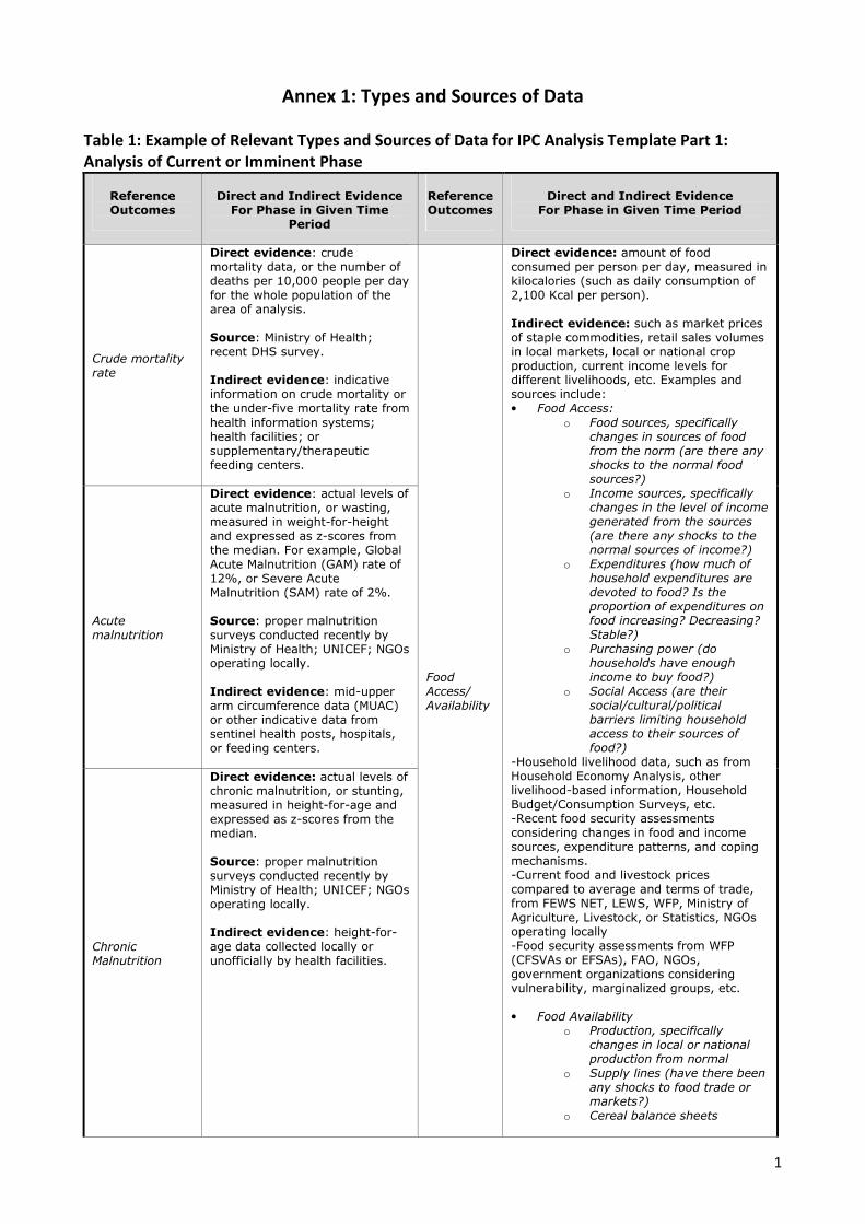
1
Annex 1: Types and Sources of Data
Table 1: Example of Relevant Types and Sources of Data for IPC Analysis Template Part 1:
Analysis of Current or Imminent Phase
Reference Outcomes
Direct and Indirect Evidence For Phase in Given Time
Period
Reference Outcomes
Direct and Indirect Evidence
For Phase in Given Time Period
Crude mortality rate
Direct evidence: crude mortality data, or the number of deaths per 10,000 people per day for the whole population of the area of analysis. Source: Ministry of Health; recent DHS survey. Indirect evidence: indicative information on crude mortality or the under-five mortality rate from
health information systems; health facilities; or supplementary/therapeutic feeding centers.
Acute malnutrition
Direct evidence: actual levels of acute malnutrition, or wasting, measured in weight-for-height and expressed as z-scores from the median. For example, Global Acute Malnutrition (GAM) rate of 12%, or Severe Acute Malnutrition (SAM) rate of 2%. Source: proper malnutrition surveys conducted recently by Ministry of Health; UNICEF; NGOs operating locally. Indirect evidence: mid-upper arm circumference data (MUAC) or other indicative data from sentinel health posts, hospitals, or feeding centers.
Chronic Malnutrition
Direct evidence: actual levels of chronic malnutrition, or stunting, measured in height-for-age and expressed as z-scores from the median. Source: proper malnutrition surveys conducted recently by Ministry of Health; UNICEF; NGOs operating locally. Indirect evidence: height-for-age data collected locally or
unofficially by health facilities.
Food Access/ Availability
Direct evidence: amount of food consumed per person per day, measured in kilocalories (such as daily consumption of 2,100 Kcal per person). Indirect evidence: such as market prices of staple commodities, retail sales volumes in local markets, local or national crop production, current income levels for different livelihoods, etc. Examples and sources include: • Food Access:
o Food sources, specifically changes in sources of food from the norm (are there any shocks to the normal food sources?)
o Income sources, specifically changes in the level of income generated from the sources (are there any shocks to the normal sources of income?)
o Expenditures (how much of household expenditures are devoted to food? Is the proportion of expenditures on food increasing? Decreasing? Stable?)
o Purchasing power (do households have enough income to buy food?)
o Social Access (are their social/cultural/political barriers limiting household access to their sources of food?)
-Household livelihood data, such as from Household Economy Analysis, other livelihood-based information, Household Budget/Consumption Surveys, etc. -Recent food security assessments considering changes in food and income sources, expenditure patterns, and coping mechanisms. -Current food and livestock prices compared to average and terms of trade, from FEWS NET, LEWS, WFP, Ministry of Agriculture, Livestock, or Statistics, NGOs operating locally -Food security assessments from WFP (CFSVAs or EFSAs), FAO, NGOs, government organizations considering vulnerability, marginalized groups, etc. • Food Availability
o Production, specifically changes in local or national production from normal
o Supply lines (have there been any shocks to food trade or markets?)
o Cereal balance sheets
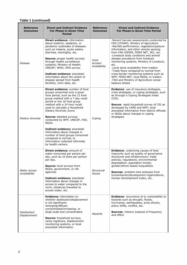
2
Table 1 (continued)
Reference Outcomes
Direct and Indirect Evidence For Phase in Given Time
Period
Reference Outcomes
Direct and Indirect Evidence
For Phase in Given Time Period
Disease
Direct evidence: information about endemic, epidemic, or pandemic outbreaks of diseases such as malaria, acute watery diarrhea, meningitis, etc. Source: proper health surveys through health surveillance systems; Ministry of Health; UNICEF; WHO; DHS survey. Indirect evidence: anecdotal information about the extent of disease spread from health facilities, clinic data, etc.
Food Access/ Availability
-Recent harvest assessments conducted by FAO (CFSAM), Ministry of Agriculture -Rainfall performance, vegetation/pasture information, and other remote sensing from FAO GIEWS, FEWS NET, JRC, etc. -Livestock body conditions and animal disease prevalence from livestock monitoring systems, Ministry of Livestock, etc. -Local stock availability from traders -Trade flows compared to normal from cross-border monitoring systems such as WFP, FEWS NET, local NGOs, or traders -FAO and Ministry of Agriculture cereal balance sheets
Dietary diversity
Direct evidence: number of food groups consumed over a given time period, such as the 12 food group method with a 7 day recall period or the 16 food group method with a 24 hour recall used to calculate a Household Dietary Diversity Score. Source: detailed surveys conducted by WFP, UNICEF, FAO, NGOs. Indirect evidence: anecdotal
information about changes in number of food groups consumed compared to normal, or information collected informally by health centers.
Coping
Evidence: use of insurance strategies, crisis strategies, or coping strategies, such as through a Coping Strategies Index (CSI). Source: rapid household survey of CSI as developed by CARE and WFP; local anecdotal information from district officials or NGOs about changes in coping strategies.
Water access /availability
Direct evidence: amount of water consumed per person per day, such as 10 liters per person per day. Source: local surveys from NGOs, government, or UN agencies Indirect evidence: anecdotal information about changes in access to water compared to the norm, distances travelled to access water, etc.
Structural Issues
Evidence: underlying causes of food insecurity such as quality of governance structures and infrastructure; trade policies; regulations; environmental degradation; population trends; gender/ethnic-based inequalities. Sources: problem-tree analyses from humanitarian/development organizations, Human Development Index, etc.
Destitution/ Displacement
Evidence: information on whether destitution/displacement is not significant; emerging/diffuse; concentrated/increasing; or large-scale and concentrated. Source: household surveys, camp registrars, displacement monitoring systems, or local anecdotal information.
Hazards
Evidence: recurrence of or vulnerability to hazards such as drought, floods, hurricanes, earthquakes, price shocks, policy shifts, conflict, etc. Sources: Historic analysis of frequency and effect
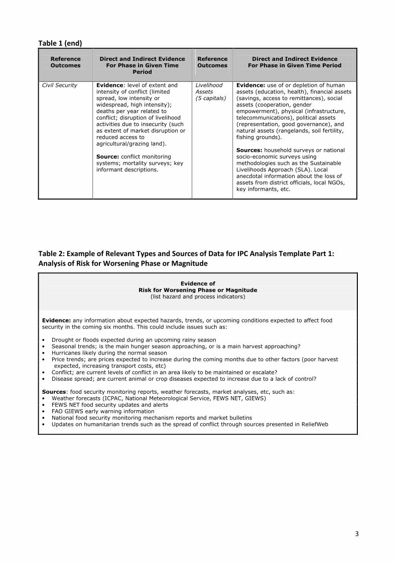
3
Table 1 (end)
Reference Outcomes
Direct and Indirect Evidence For Phase in Given Time
Period
Reference Outcomes
Direct and Indirect Evidence
For Phase in Given Time Period
Civil Security Evidence: level of extent and intensity of conflict (limited spread, low intensity or widespread, high intensity); deaths per year related to conflict; disruption of livelihood activities due to insecurity (such as extent of market disruption or reduced access to agricultural/grazing land). Source: conflict monitoring systems; mortality surveys; key informant descriptions.
Livelihood Assets (5 capitals)
Evidence: use of or depletion of human assets (education, health), financial assets (savings, access to remittances), social assets (cooperation, gender empowerment), physical (infrastructure, telecommunications), political assets (representation, good governance), and natural assets (rangelands, soil fertility, fishing grounds). Sources: household surveys or national socio-economic surveys using methodologies such as the Sustainable Livelihoods Approach (SLA). Local anecdotal information about the loss of assets from district officials, local NGOs, key informants, etc.
Table 2: Example of Relevant Types and Sources of Data for IPC Analysis Template Part 1:
Analysis of Risk for Worsening Phase or Magnitude
Evidence of
Risk for Worsening Phase or Magnitude (list hazard and process indicators)
Evidence: any information about expected hazards, trends, or upcoming conditions expected to affect food security in the coming six months. This could include issues such as: • Drought or floods expected during an upcoming rainy season • Seasonal trends; is the main hunger season approaching, or is a main harvest approaching? • Hurricanes likely during the normal season • Price trends; are prices expected to increase during the coming months due to other factors (poor harvest
expected, increasing transport costs, etc) • Conflict; are current levels of conflict in an area likely to be maintained or escalate? • Disease spread; are current animal or crop diseases expected to increase due to a lack of control? Sources: food security monitoring reports, weather forecasts, market analyses, etc, such as: • Weather forecasts (ICPAC, National Meteorological Service, FEWS NET, GIEWS) • FEWS NET food security updates and alerts • FAO GIEWS early warning information • National food security monitoring mechanism reports and market bulletins • Updates on humanitarian trends such as the spread of conflict through sources presented in ReliefWeb

4
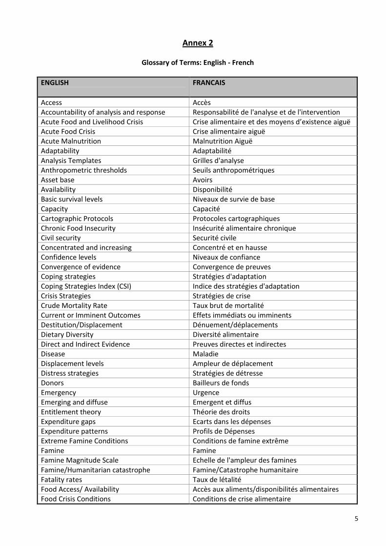
5
Annex 2
Glossary of Terms: English - French
ENGLISH
FRANCAIS
Access Accès
Accountability of analysis and response Responsabilité de l'analyse et de l'intervention
Acute Food and Livelihood Crisis Crise alimentaire et des moyens d’existence aiguë
Acute Food Crisis Crise alimentaire aiguë
Acute Malnutrition Malnutrition Aiguë
Adaptability Adaptabilité
Analysis Templates Grilles d'analyse
Anthropometric thresholds Seuils anthropométriques
Asset base Avoirs
Availability Disponibilité
Basic survival levels Niveaux de survie de base
Capacity Capacité
Cartographic Protocols Protocoles cartographiques
Chronic Food Insecurity Insécurité alimentaire chronique
Civil security Securité civile
Concentrated and increasing Concentré et en hausse
Confidence levels Niveaux de confiance
Convergence of evidence Convergence de preuves
Coping strategies Stratégies d'adaptation
Coping Strategies Index (CSI) Indice des stratégies d'adaptation
Crisis Strategies Stratégies de crise
Crude Mortality Rate Taux brut de mortalité
Current or Imminent Outcomes Effets immédiats ou imminents
Destitution/Displacement Dénuement/déplacements
Dietary Diversity Diversité alimentaire
Direct and Indirect Evidence Preuves directes et indirectes
Disease Maladie
Displacement levels Ampleur de déplacement
Distress strategies Stratégies de détresse
Donors Bailleurs de fonds
Emergency Urgence
Emerging and diffuse Emergent et diffus
Entitlement theory Théorie des droits
Expenditure gaps Ecarts dans les dépenses
Expenditure patterns Profils de Dépenses
Extreme Famine Conditions Conditions de famine extrême
Famine Famine
Famine Magnitude Scale Echelle de l'ampleur des famines
Famine/Humanitarian catastrophe Famine/Catastrophe humanitaire
Fatality rates Taux de létalité
Food Access/ Availability Accès aux aliments/disponibilités alimentaires
Food Crisis Conditions Conditions de crise alimentaire
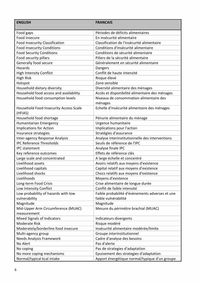
6
ENGLISH
FRANCAIS
Food gaps Périodes de déficits alimentaires
Food insecure En insécurité alimentaire
Food Insecurity Classification Classification de l'insécurité alimentaire
Food Insecurity Conditions Conditions d'insécurité alimentaire
Food Security Conditions Conditions de sécurité alimentaire
Food security pillars Piliers de la sécurité alimentaire
Generally food secure Généralement en sécurité alimentaire
Hazards Dangers
High Intensity Conflict Conflit de haute intensité
High Risk Risque élevé
Hotspot Zone sensible
Household dietary diversity Diversité alimentaire des ménages
Household food access and availability Accès et disponibilité alimentaire des ménages
Household food consumption levels Niveaux de consommation alimentaire des
ménages
Household Food Insecurity Access Scale
(HFIAS)
Echelle d'insécurité alimentaire des ménages
Household food shortage Pénurie alimentaire du ménage
Humanitarian Emergency Urgence humanitaire
Implications for Action Implications pour l'action
Insurance strategies Stratégies d'assurance
Inter-agency Response Analysis Analyse interinstitutionnelle des interventions
IPC Reference Thresholds Seuils de référence de l'IPC
IPC statement Analyse finale IPC
Key reference outcomes Effets de référence clés
Large scale and concentrated A large échelle et concentré
Livelihood assets Avoirs relatifs aux moyens d'existence
Livelihood capitals Capital relatif aux moyens d'existence
Livelihood shocks Chocs relatifs aux moyens d'existence
Livelihoods Moyens d'existence
Long-term Food Crisis Crise alimentaire de longue durée
Low Intensity Conflict Conflit de faible intensité
Low probability of hazards with low
vulnerability
Faible probabilité d'évènements adverses et une
faible vulnérabilité
Magnitude Magnitude
Mid-Upper Arm Circumference (MUAC)
measurement
Mesure du périmètre brachial (MUAC)
Mixed Signals of Indicators Indicateurs divergents
Moderate Risk Risque modéré
Moderately/borderline food insecure Insécurité alimentaire modérée/limite
Multi-agency group Groupe interinstitutionnel
Needs Analysis Framework Cadre d'analyse des besoins
No Alert Pas d'alerte
No coping Pas de strategies d'adaptation
No more coping mechanisms Epuisement des strategies d'adaptation
Normal/typical kcal intake Apport énergétique normal/typique d'un groupe
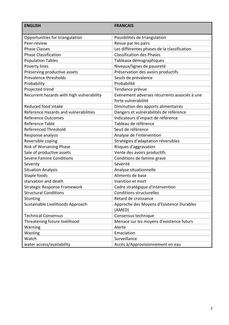
7
ENGLISH
FRANCAIS
Opportunities for triangulation Possibilités de triangulation
Peer-review Revue par les pairs
Phase Classes Les différentes phases de la classification
Phase Classification Classification des Phases
Population Tables Tableaux démographiques
Poverty lines Niveaux/lignes de pauvreté
Preserving productive assets Préservation des avoirs productifs
Prevalence thresholds Seuils de prévalence
Probability Probabilité
Projected trend Tendance prévue
Recurrent hazards with high vulnerability Evénement adverses récurrents associés à une
forte vulnérabilité
Reduced food intake Diminution des apports alimentaires
Reference Hazards and vulnerabilities Dangers et vulnérabilités de référence
Reference Outcomes Indicateurs d'impact de référence
Reference Table Tableau de référence
Referenced Threshold Seuil de référence
Response analysis Analyse de l’intervention
Reversible coping Stratégies d'adaptation réversibles
Risk of Worsening Phase Risques d'aggravation
Sale of productive assets Vente des avoirs productifs
Severe Famine Conditions Conditions de famine grave
Severity Sévérité
Situation Analysis Analyse situationnelle
Staple foods Aliments de base
starvation and death Inanition et mort
Strategic Response Framework Cadre stratégique d'intervention
Structural Conditions Conditions structurelles
Stunting Retard de croissance
Sustainable Livelihoods Approach Approche des Moyens d'Existence Durables
(AMED)
Technical Consensus Consensus technique
Threatening future livelihood Menace sur les moyens d'existence futurs
Warning Alerte
Wasting Emaciation
Watch Surveillance
water access/availability Accès à/Approvisionnement en eau

8
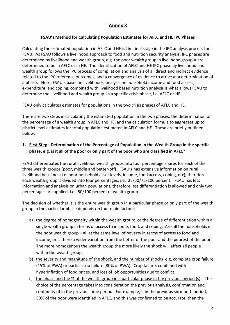
9
Annex 3
FSAU’s Method for Calculating Population Estimates for AFLC and HE IPC Phases
Calculating the estimated population in AFLC and HE is the final stage in the IPC analysis process for
FSAU. As FSAU follows a livelihood approach to food and nutrition security analysis, IPC phases are
determined by livelihood and wealth group, e.g. the poor wealth group in livelihood group A are
determined to be in AFLC or in HE. The identification of AFLC and HE IPC phase by livelihood and
wealth group follows the IPC process of compilation and analysis of all direct and indirect evidence
related to the IPC reference outcomes, and a convergence of evidence to arrive at a determination of
a phase. Note, FSAU’s baseline livelihoods analysis on household income and food access,
expenditure, and coping, combined with livelihood based nutrition analysis is what allows FSAU to
determine the livelihood and wealth group in a specific crisis phase, i.e. AFLC or HE.
FSAU only calculates estimates for populations in the two crisis phases of AFLC and HE.
There are two steps in calculating the estimated population in the two phases, the determination of
the percentage of a wealth group in AFLC and HE, and the calculation formula to aggregate up to
district level estimates for total population estimated in AFLC and HE. These are briefly outlined
below.
1. First Step: Determination of the Percentage of Population in the Wealth Group in the specific
phase, e.g. is it all of the poor or only part of the poor who are classified in AFLC?
FSAU differentiates the rural livelihood wealth groups into four percentage shares for each of the
three wealth groups (poor, middle and better-off). FSAU’s has extensive information on rural
livelihood baselines (i.e. poor household asset levels, income, food access, coping, etc); therefore
each wealth group is divided into four percentages, i.e. 25/50/75/100 percent. FSAU has less
information and analysis on urban populations, therefore less differentiation is allowed and only two
percentages are applied, i.e. 50/100 percent of wealth group
The decision of whether it is the entire wealth group in a particular phase or only part of the wealth
group in the particular phase depends on four main factors:
a) the degree of homogeneity within the wealth group: or the degree of differentiation within a
single wealth group in terms of access to income, food, and coping. Are all the households in
the poor wealth group – all at the same level of poverty in terms of access to food and
income, or is there a wider variation from the better of the poor and the poorest of the poor.
The more homogenous the wealth group the more likely the shock will affect all people
within the wealth group.
b) the severity and magnitude of the shock, and the number of shocks e.g. complete crop failure
(15% of PWA) or partial crop failure (80% of PWA). Crop failure, combined with
hyperinflation of food prices, and loss of job opportunities due to conflict.
c) the phase and the % of the wealth group in a particular phase in the previous period (s). The
choice of the percentage takes into consideration the previous analysis, confirmation and
continuity of in the previous time period. For example, if in the previous six month period,
50% of the poor were identified in AFLC, and this was confirmed to be accurate, then the
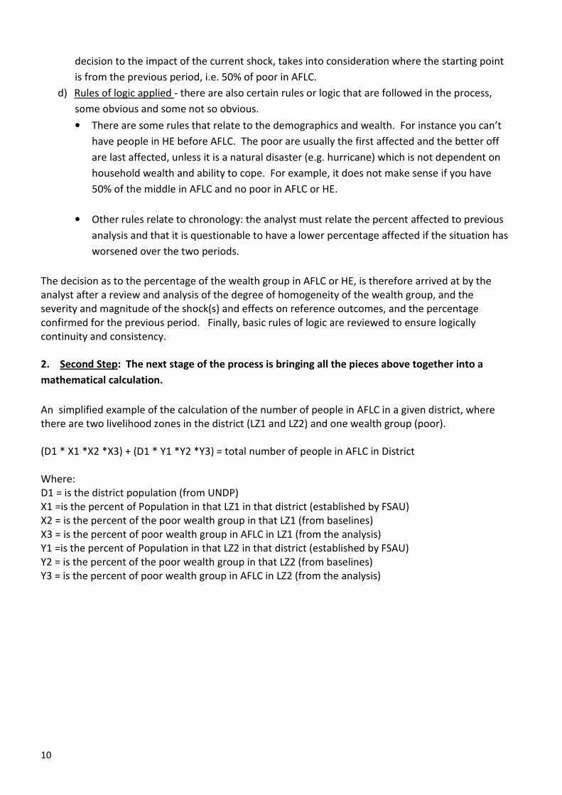
10
decision to the impact of the current shock, takes into consideration where the starting point
is from the previous period, i.e. 50% of poor in AFLC.
d) Rules of logic applied - there are also certain rules or logic that are followed in the process,
some obvious and some not so obvious.
• There are some rules that relate to the demographics and wealth. For instance you can’t
have people in HE before AFLC. The poor are usually the first affected and the better off
are last affected, unless it is a natural disaster (e.g. hurricane) which is not dependent on
household wealth and ability to cope. For example, it does not make sense if you have
50% of the middle in AFLC and no poor in AFLC or HE.
• Other rules relate to chronology: the analyst must relate the percent affected to previous
analysis and that it is questionable to have a lower percentage affected if the situation has
worsened over the two periods.
The decision as to the percentage of the wealth group in AFLC or HE, is therefore arrived at by the
analyst after a review and analysis of the degree of homogeneity of the wealth group, and the
severity and magnitude of the shock(s) and effects on reference outcomes, and the percentage
confirmed for the previous period. Finally, basic rules of logic are reviewed to ensure logically
continuity and consistency.
2. Second Step: The next stage of the process is bringing all the pieces above together into a
mathematical calculation.
An simplified example of the calculation of the number of people in AFLC in a given district, where
there are two livelihood zones in the district (LZ1 and LZ2) and one wealth group (poor).
(D1 * X1 *X2 *X3) + (D1 * Y1 *Y2 *Y3) = total number of people in AFLC in District
Where:
D1 = is the district population (from UNDP)
X1 =is the percent of Population in that LZ1 in that district (established by FSAU)
X2 = is the percent of the poor wealth group in that LZ1 (from baselines)
X3 = is the percent of poor wealth group in AFLC in LZ1 (from the analysis)
Y1 =is the percent of Population in that LZ2 in that district (established by FSAU)
Y2 = is the percent of the poor wealth group in that LZ2 (from baselines)
Y3 = is the percent of poor wealth group in AFLC in LZ2 (from the analysis)

e
f
The Food and Agriculture Organization of the United Nations. Nairobi. October 2008