Embed Size (px)
DESCRIPTION
The James Herriot brand
Citation preview

Jame Herriot Brand standereds.


This identity is not just a logo.
It is a series of elements composed to come together and createa unique look and feel thatwill increase the endearment of the James Herriot Brand and make itinstantly recognisable.
The following pages guideyou through the elements.They will assist you in designingand producing compellingcommunications with a highdegree of creative flexibility.

Content

1 23456789
Logo
The Herriot Heart
Lock-up
Grid
Colour.
Typeface
Typography
Photography
Tone of voice

Logo. Introduction.

The logo is the most visible and valuable element of our identity.A universal signature across all James Herriot communications, because the logo is such a recognisable and highly visible brand asset, it is vital that it is always applied consistently wherever it appears.
The two r’s are rotated to create a heart, this heart has a Celtic feel to resinate his Scottish roots, it also in place to communicate and highlight endearment to the James Herriot brand.

Logo. Positioning.

Keep it clear and uncluttered.An exclusion zone is in place to make sure that other graphic material or type does not interfere or detract from the identity. This exclusion zone should also be the minimum when positioning the identity close to the edge of a page or trim area. The zone equates to a space that uses the width or height of ‘e’ – as shown left.
This is the recommended minimum area, wherever possible allow more space.

Logo. Size.
14mm minimum
14mm 8mm 5mm 3mm

Size matters.To ensure the logo has maximum impact it should never go bellow 14mm height, under which “The World of ” becomes to small, and illegible. When sizing the logo always constrain its proportions, it is not designed to be stretched or manipulated.
Under 14mm the heart should be used as a stand alone logotype, as it still gives maximum impact, and maintains a clear delivery.

Logo. Variations.
1.
2.

3.
The full logo has three variations,
1. The standard logo for general use where there is normal space and the message is portrayed simply and clearly.
2. The variation is intended for use in posers where there is an abundance of space, it portrays an element of fun. “The World of ” has been rotated 180 degrees for ease of reading.
3. For use where there is a need for width, such as banners and flyers.(Use with caution as this variation overlooks the heart element)

Logo. Mono.
1.
2.
3.

The Herriot logo can also be created out of one colour, in special instances where the print process is restricted.
1. Full black.2.Using tints (50% black)3. Reversing out white on black

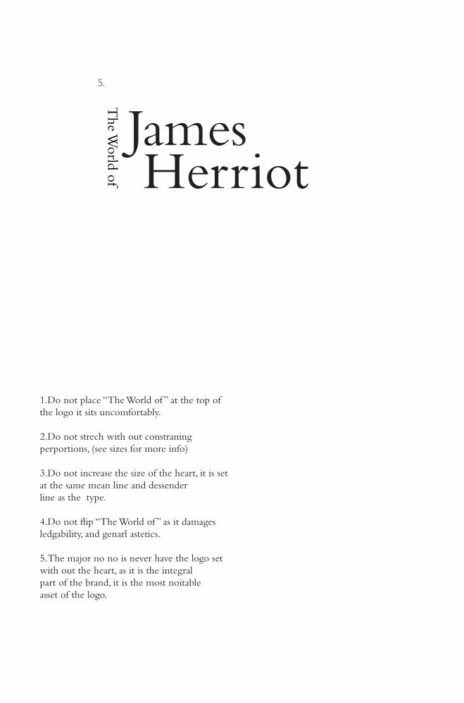
Logo. No no’s!
1.
2.
3.
4.
James Herriot
5.
1.Do not place “The World of ” at the top of the logo it sits uncomfortably.
2.Do not strech with out constraning perportions, (see sizes for more info)
3.Do not increase the size of the heart, it is set at the same mean line and dessender line as the type.
4.Do not flip “The World of ” as it damages ledgability, and genarl astetics.
5.The major no no is never have the logo set with out the heart, as it is the integral part of the brand, it is the most noitable asset of the logo.

Heart. Introduction.

The Herriot Heart is created by taking the two r’s in herriot cut from the typeface Clarendon, flipping one, then rotating each 45 degrees.
We can also use the heart device as a graphic element. The heart is a unique representation of the world wide endearment James Herriot receives, and is designed to further develop the endearment to the brand. However, this device is NOT the logo for The World of James Herriot so it should be used in conjunction with the main logo where ever possible.
Love Herriot.

Heart. Messages.
James Herriot.
Yorkshire.
Country Side.
Darrowby.

All Creature Great and Small.
Veterinary.
Thirsk.
Tea and Talks.
The Heart logotype can be used in conjunction with a tag line, such as (Love) All Creatures Great and Small, this is intendeed for marketing the brand, and to drum up the love for Thirsk, the Countryside and most importently James Herriot.
The way the Heart is set next to theses tag lines is covered in the Grid and lock up section of this book.
Bembo bold is used to deliver theses snap shot messages, as it links to the main logo. For more information on the type, see the typography section.

Heart. Introduction.
I
All Creatures Great and Small.

I
Gods Own Country.
The Heart logotype is also designed to be used for branding merchandise, this format can also be used in posters to drive new business to the museum.

Lock-up. Introduction.
The Herriot Timeline Path.
The Herriot Timeline Path.
23 Krikgate museum.
Open: Mon-Sat 9-4
01845 522413.

Essential information about The World of James Herriot and tag lines accompany the logo. The relationship between these elements and the logo is known as the lock-up. It provides the means for consistent style, look and presentation across all media.
The lock-up is a fixed relationship that should not change. This is with the exception of special marketing campaigns that may arises in the future.
Lock-up.

Lock-up. Details.
The Herriot Timeline Path.
The Herriot Timeline Path.
23 Krikgate museum.
Open: Mon-Sat 9-4
01845 522413.

The Herriot Timeline Path.
The Herriot Timeline Path.
23 Krikgate museum.
Open: Mon-Sat 9-4
01845 522413.
This is where the exclusion zone comes into play, as shown here using the ‘e’ from herriotensuring the logo has room to breath.
Accompanying information is set in Gill San Light, as this does not distract form the bolder logotype.
The logo is set on the designed six column grid a3.9mm gutter and a 13pt baseline grid. More information can be found in the grid section of this booklet.

James Herriot.
James Herriot.
Lock-up. Heart.

Following on from the main logo lock-up, the Heart and taglines follow in the same suit. There is always a 3.9mm gutter bettween type and logo, to maintain clarity.
The logo is set on the designed six column grid for The World of James Herriot, which relies on 3.9mm gutter and a 13pt baseline grid. More information can be found in the grid section of this booklet.

Lock-up. Partner Branding 1.

The James Herriot logo must always be in the foreground when next to other sponsors and partners to ensure maximum impact.
Here it is ranged on the left, and is a column larger then all others logos.

Lock-up. Partner Branding 2.

The alternative is to have the James Herriot logo at the top left to give it priority and the partners logos one column smaller and descending from the top.

Grid. Introduction.

The Herriot grid system maintains a consistent visual identity for The World of James Herriot brand. It is fundamental to the overall design scheme, creating a common link between all printed literature and web design. All grids work on 13pt leading, and baseline gird, however leading can change if it is absolutely necessary, see typography for more information.
Grids bring order to the page; they are the structural foundation for the consistent organisation of all graphic, text and photographic elements.
Grid system.

Grid. Lock-up.

The grid sets accommodate the logo and lock up information and provide a consistent designframework across all formats and applications.
Formats are divided into a number of verticalunits of 3.9mm width, providing the framework for positioning the logo and lock-up information.

Grid. Columns and Guildes

The column grid is the underlying grid divided intosix columns. It creates the ideal framework for marketing literature. The gutter bettween each grid column is 3.9mm, this realtes to the 13pt baseline grid, which inturn effects the leading of the type.See typography for more on type.

Grid. Colours - For Print.
PANTONE371C
PANTONE371U
C43 M0 Y100 K56
Primary colours
PANTONE Coated
PANTONE Uncoated
Process CMYK
Secondary colours
PANTONE1807C
PANTONE1807U
C0 M100 Y96 K28
PANTONEDS198-5C
PANTONEDS198-5U
C60 M40 Y0 K15
PANTONE251C
PANTONE251U
C13 M39 Y0 K0
PANTONEDS290-3C
PANTONEDS290-3U
C40 M0 Y70 K0
PANTONE317C
PANTONE317U
C18 M0 Y8 K0

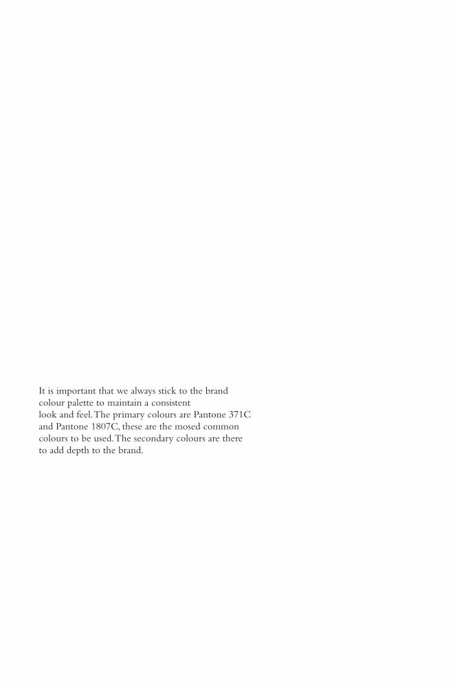
It is important that we always stick to the brand colour palette to maintain a consistent look and feel. The primary colours are Pantone 371C and Pantone 1807C, these are the mosed common colours to be used. The secondary colours are there to add depth to the brand.

Grid. Colours - For Web.
R80 G111 B51
Primary colours
RGB
Secondary colours
R179 G32 B37
R95 G123 B175
R215 G166 B204
R161 G208 B120
R206 G235 B234
It is important that we always stick to the brand colour palette to maintain a consistent look and feel. The primary colours are Pantone 371C and Pantone 1807C, these are the mosed common colours to be used. The secondary colours are there to add depth to the brand.

Type. Introduction.
&

The Primary Typeface used by The World of James Herriot is Bembo, It is at the heart ofthe Herriot identity and is the foundation for all Herriot branding.
The typeface Bembo seen today is a revival designed under the direction of Stanley Morison for the Monotype Corporation in 1929. It is considered a good choice for expressing classic beauty or formal tradition in typographical design and is a popular font for book publishing.
Typography.&

BemboBemboBemboBemboBemboBemboBemboBemboBemboBembo
BemboBemboBembo
108PT
96PT
84PT
72PT
60PT
48PT
36PT
30PT
24PT
18PT
14PT12PT10PT
Type. Sizes.

Bembo is a versatile font, it can be used in a large variety of situations and sizes, type should be set to the 13PT baseline grid to maintain a consistent look. Bembo is used for ALL body copy and literature.

Type. Variations.
BemboBemboBemboBembo
Regular.
Small Caps & Oldstyle Figures.
Italic.
Semibold Oldstyle Figures.

BemboBemboBemboBembo
Bold Italic
Bold
Extra Bold
Extra Bold Italic Oldstyle Figures

ABCDEFGHIJKLMNOPQRSTUVWXYZabcdefghijklmnopqrstuvwxyz1234567890
ABCDEFGHIJKLMNOPQRSTUVWXYZabcdefghijklmnopqrstuvwxyz1234567890
ABCDEFGHIJKLMNOPQRSTUVWXYZabcdefghijklmnopqrstuvwxyz1234567890
Clarendon Light
Clarendon Roman
Clarendon Bold
Type. Secondary Typefaces.
Clarendon is one of the first and most defining Slab serifs, perfect for small and larger lettering needs, with The James Herriot brand it is intended for headlines and bold points.

ABCDEFGHIJKLMNOPQRSTUVWXYZabcdefghijklmnopqrstuvwxyz1234567890
ABCDEFGHIJKLMNOPQRSTUVWXYZabcdefghijklmnopqrstuvwxyz1234567890
ABCDEFGHIJKLMNOPQRSTUVWXYZabcdefghijklmnopqrstuvwxyz1234567890
Gill Sans Light
Gill Sans Regular
Gill Sans Bold
Gill Sans light as seen above, is to be used for accompanying text and lockups, as it has a high contrast with the Bembo body copy. Other veriations of Gill Sans can be used for headlines and poster campagins which require the use of a Sans-serif font.

Type. Leading & Spacing.

Herriot typography is always ranged left. This provides the eye with a constant starting point for each line, making text easier to read.Line spacing has a major effect on legibility and influences the look of the final piece. It should be carefully considered and well executed to achieve a clean result.
The baseline grid for this documant is 13pt, creating a consistent look and feel amongst large and small text.
Line spacing (also called leading) refers to the spacesbetween lines of type. It is set in points and sometimeshalf points. If space is neither added nor deleted the type is said to be set solid. The Herriot leading is usually setto fit a 13pt baseline.
Leading

Type. Hierachy of Type.
Title 55PTSupporting title22PTBody Copy 11PTCaption/Credits 7PT
Title 55PTSupporting title22PTBody Copy 11PTCaption/Credits7PT

Title 55PTSupporting title22PTBody Copy 11PTCaption/Credits 7PT
Title 55PTSupporting title22PTBody Copy 11PTCaption/Credits7PT
When a variety of type sizes and weights are used,the differences between them must be clearly recognisable. The contrast creates clear, strong and consistent designs. The examples on the left are a guide only. Each job needs analysing individually.

Tone of Voice. Introduction.
“Na then, Mr wight! Ah ‘ave a beast wi’ a waart i’ ya pap”

Our identity is made up of two main elements our visual identity, or the way we look, and our verbal identity, or the way we sound.These two elements work closely together to form The World of James Herriot brand.It is the public face of our meuseum, and it is the first our consumers see of us and it is the grounds on which they will judge us.For this reason, it’s vital we have a strong identity that represents who we are and what we do, but most of all that we understand how to use it.
Tone of Voice

Tone of Voice. break down.
A good ol’ natter.
Tea &Talks.

The tone of voice for TheWorld of James Herriots covers two areas; What we represent and our personality. The meusum celebrates James Herriot as an icon in literature and a great vet. Brand personality is the way achieve this, in a friendly and engaging manner, thus increasing the brands overall endearment.
There are five main personality traits that guide how we talk and write about The World of James Herriot are:
• Clear• Friendly• Confident• Engaging• Fun
These five points are the launch pad for The World of James Herriots tone of voice. These points should also be used in thoughts and ideas on how to express our personality through words when you’re writing and speaking on the museums behalf.

Tone of Voice. Clear.
We
All Creatures Great &Small.
and a ‘reet lot more.

By clear we mean, Simple, to the point, relevant and easy to understand. Less is more often then not, more.
This doesn’t mean a Dumbed down, patronising,piece of communication that lacks in substance.
How does ‘clear’ sound?
Avoid using jargon or business speak, instead use language that people understand and like to read. The World of James Herriot is in the Heart of yorkshire and locals to the area are blessed with a beautiful dialect, use it. This is especially important on leaflets, posters and direct communications. In general you have 3 seconds to sell from a poster, people don’t have time to wade through pointless and irrelevant information, the key is to keep it clear and concise.

When we say friendly we mean, a combination of Warm, welcoming and down-to-earth.The last thing we mean is a half hearted, Soft and unprofessional tone that is over familiar with costumers.
We are in the Heart of yorkshire and our friendliness is just like our straight-talking, down to earth attitude. This mean’s we talk in our local dialect, but only to a level that is endearing, understandable and not annoying.
We speak clearly and honestly, at all times.
Tone of Voice. Friendly/Confident.

Confident means we speak in an informed, trustworthy and approachable way.In know way does this mean in a over confident, Know-it-all, and cocky manner.
The World of James Herriot is proud of the achievements of Alf Wight and we should not be ashamed to tell people this.Our museum is based around the stories of his life and the career he loved, we must have confidence to tell people these’s stories to create a unique relationship with them.

By been engaging we speak to our customers directly, in a fresh, exciting and thought provoking manner. This does not give licence to be brash, over-the-top, and over powering.Our customers have read the book, and have therefore engaged with James Herriot on a personal level, to get the most out of the new identity we must utilise this fact and use quotes and tales from Herriots life.
Tone of Voice. Engaging/Fun.

Fun is simple, we want to provoke a laugh, that warm felling that resonates from everyone who is local to Thirsk and Yorkshire as a whole. We do not point fun at any one, and we try not to take the fun out of are selves.
James Herriot books and the TV series that followed where humours and light hearted, to push the brand on we must capture this key element.

Thank You.


![Steamboat transportation on the Red River / [Marion H. Herriot]](https://img.pdfslide.net/doc/110x75/5868f5ab1a28abb9568beb17/steamboat-transportation-on-the-red-river-marion-h-herriot.jpg)