Embed Size (px)
Citation preview
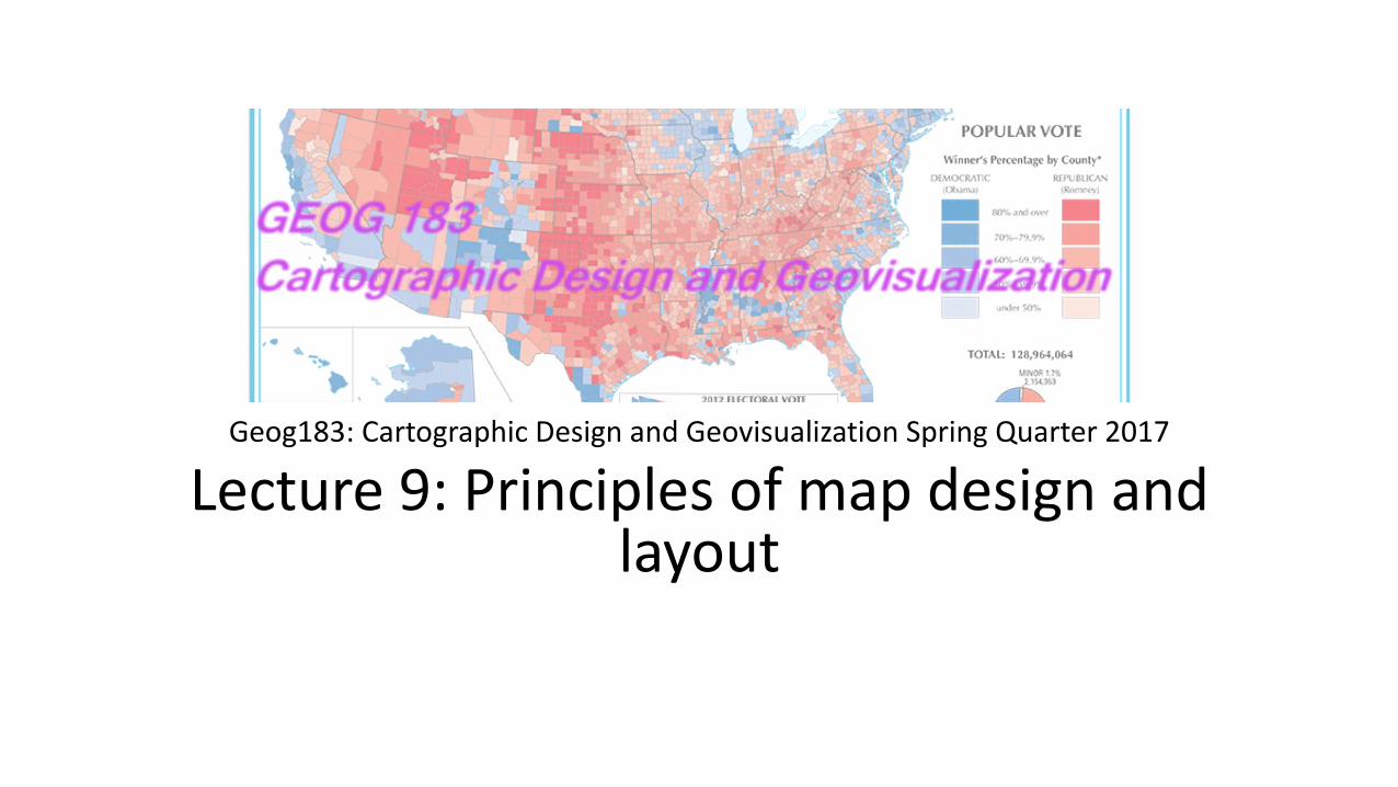
Geog183: Cartographic Design and Geovisualization Spring Quarter 2017
Lecture 9: Principles of map design and layout
Cartographic Design
• Mental and physical map creation process • Design relates to appearance, effectiveness in information
communication • Base level: follow rules, guidelines and conventions • Increasing body of research on how maps work • Even so, many maps can be created to solve a task, is there an
optimum? • Artistic element “guided less by experiment and more by intuition
and critical examination” • Significant overlap with graphic design more generally, e.g. text
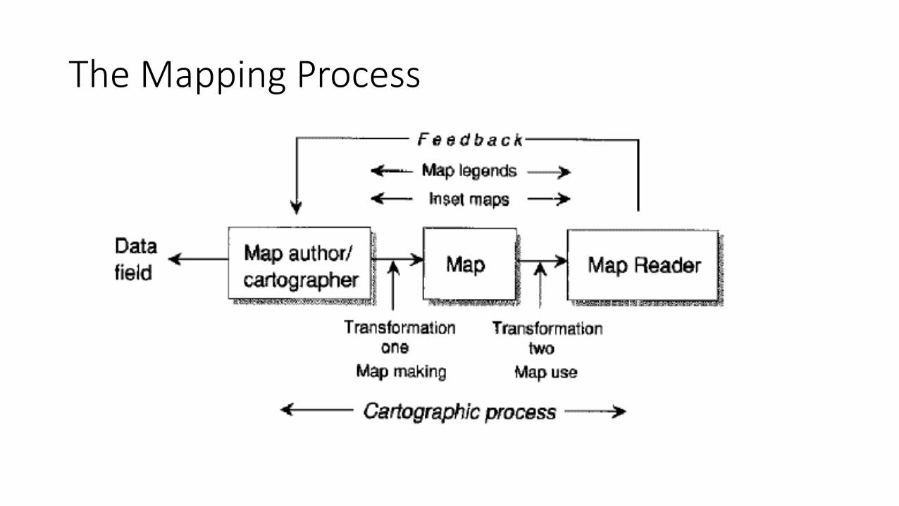
The Mapping Process
Slocum’s Map Elements
• Frame and neat line • Mapped area (figure) • Inset • Title and subtitle • Legend • Data source • Scale • Orientation
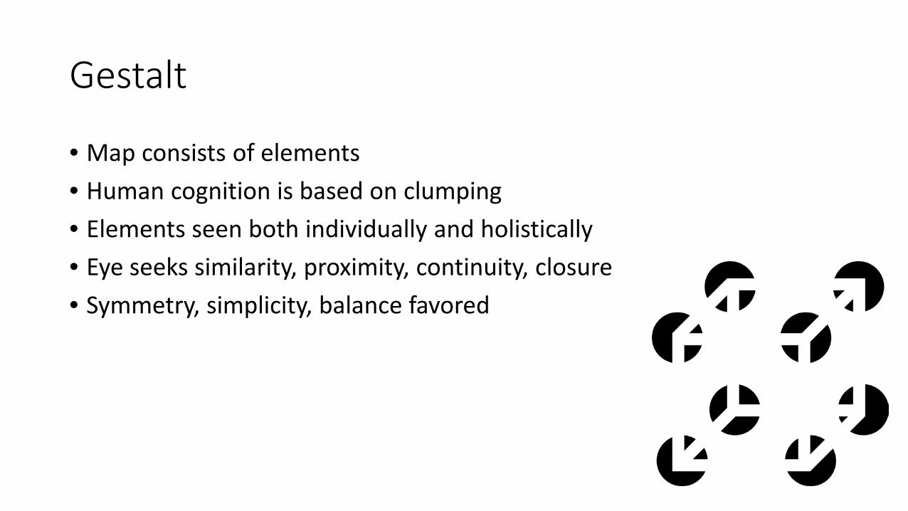
Gestalt
• Map consists of elements • Human cognition is based on clumping • Elements seen both individually and holistically • Eye seeks similarity, proximity, continuity, closure • Symmetry, simplicity, balance favored
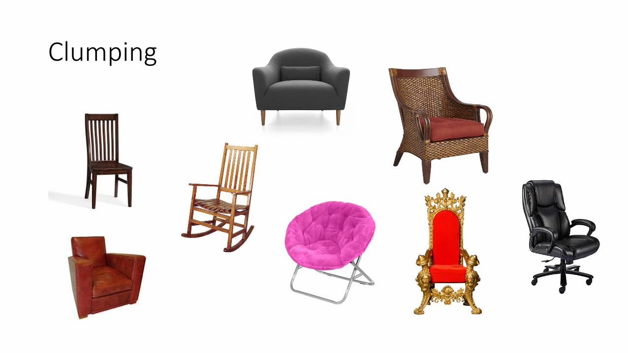
Clumping
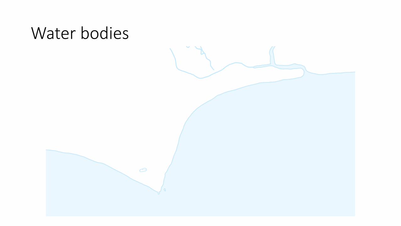
Water bodies
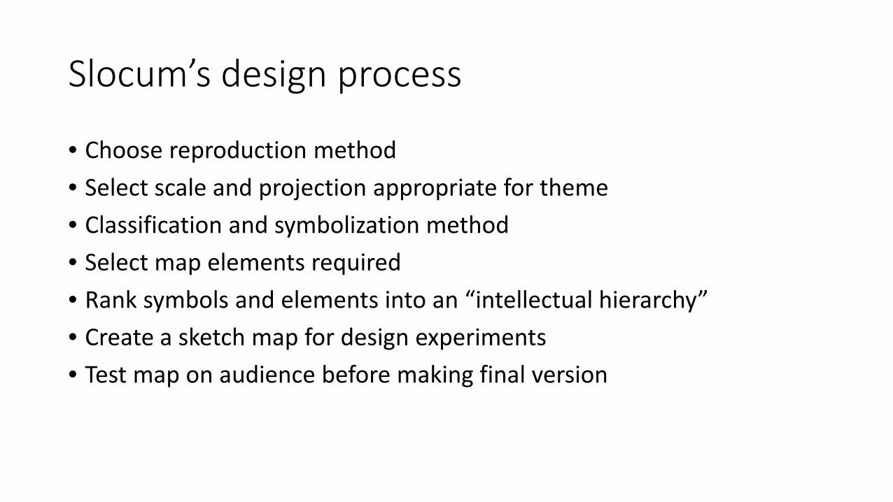
Slocum’s design process
• Choose reproduction method • Select scale and projection appropriate for theme • Classification and symbolization method • Select map elements required • Rank symbols and elements into an “intellectual hierarchy” • Create a sketch map for design experiments • Test map on audience before making final version

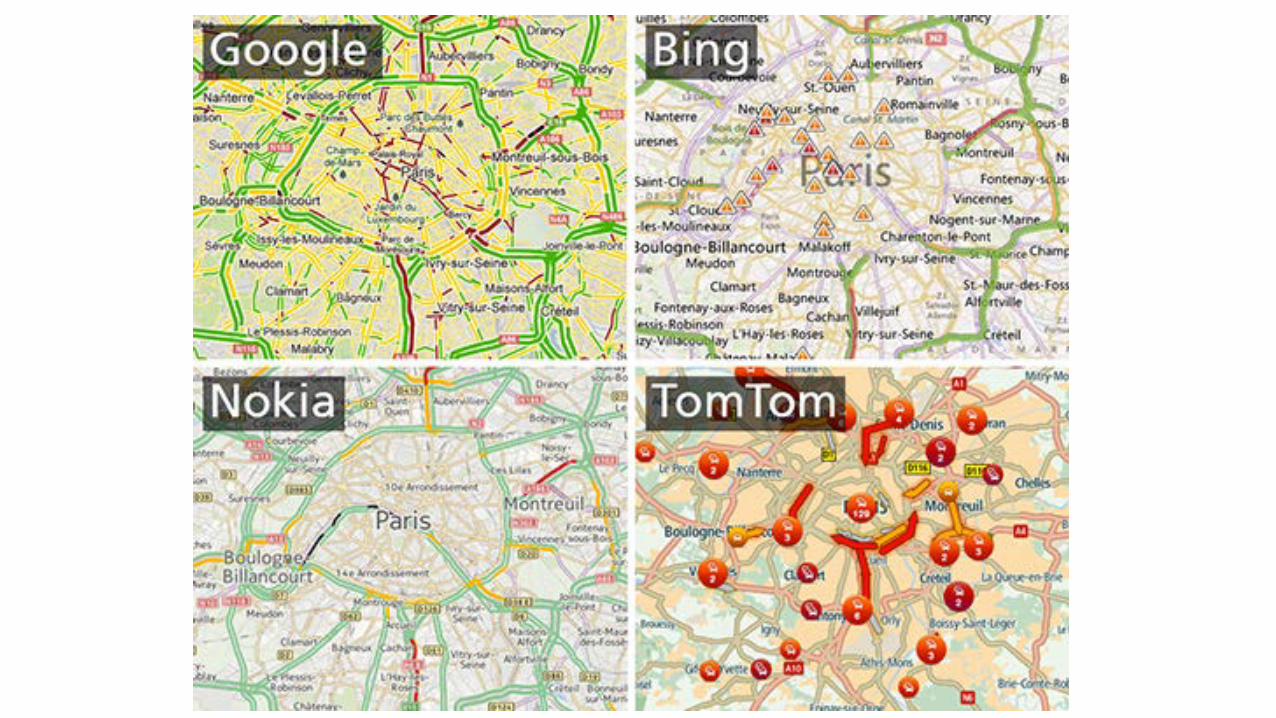
Visual hierarchy
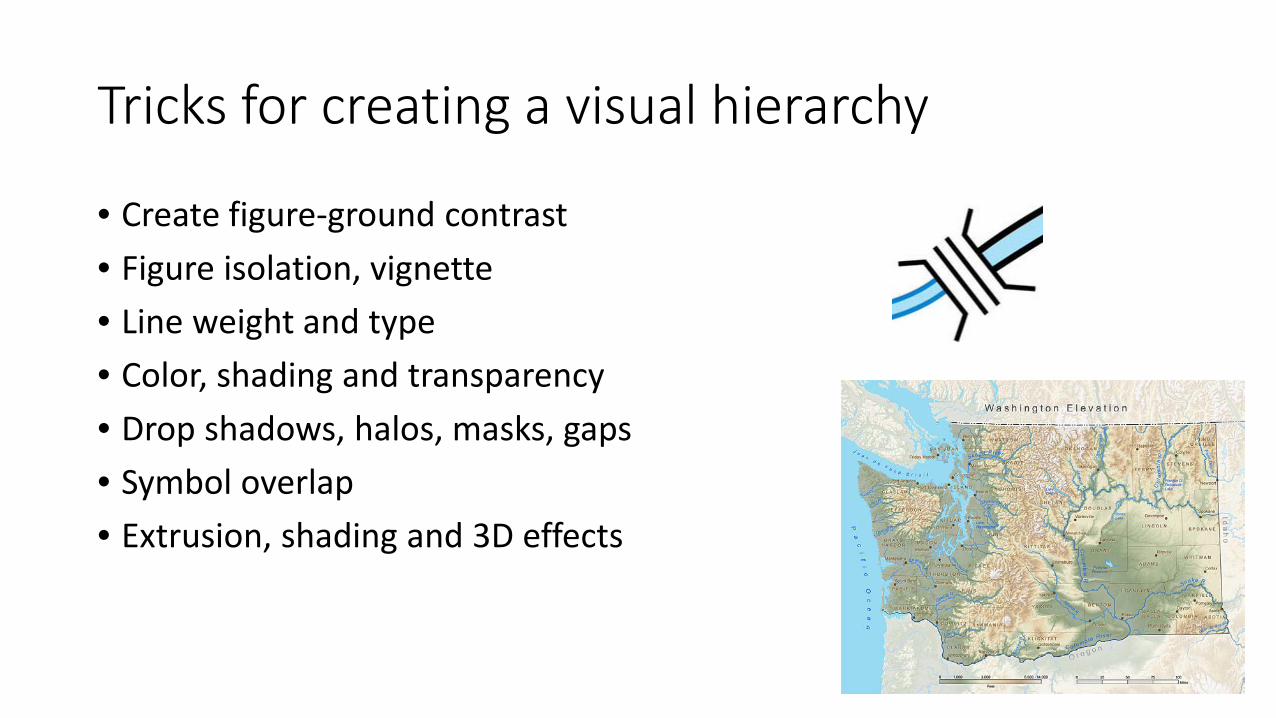
Tricks for creating a visual hierarchy
• Create figure-ground contrast • Figure isolation, vignette • Line weight and type • Color, shading and transparency • Drop shadows, halos, masks, gaps • Symbol overlap • Extrusion, shading and 3D effects
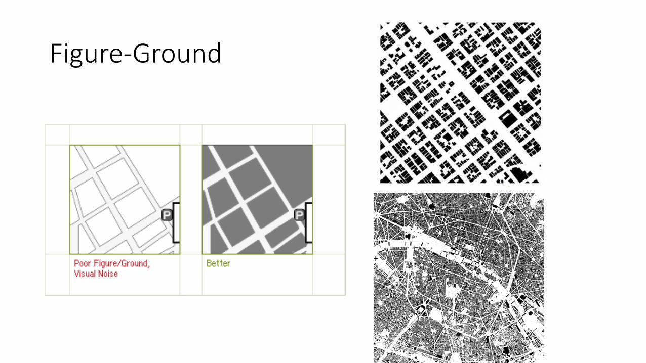
Figure-Ground
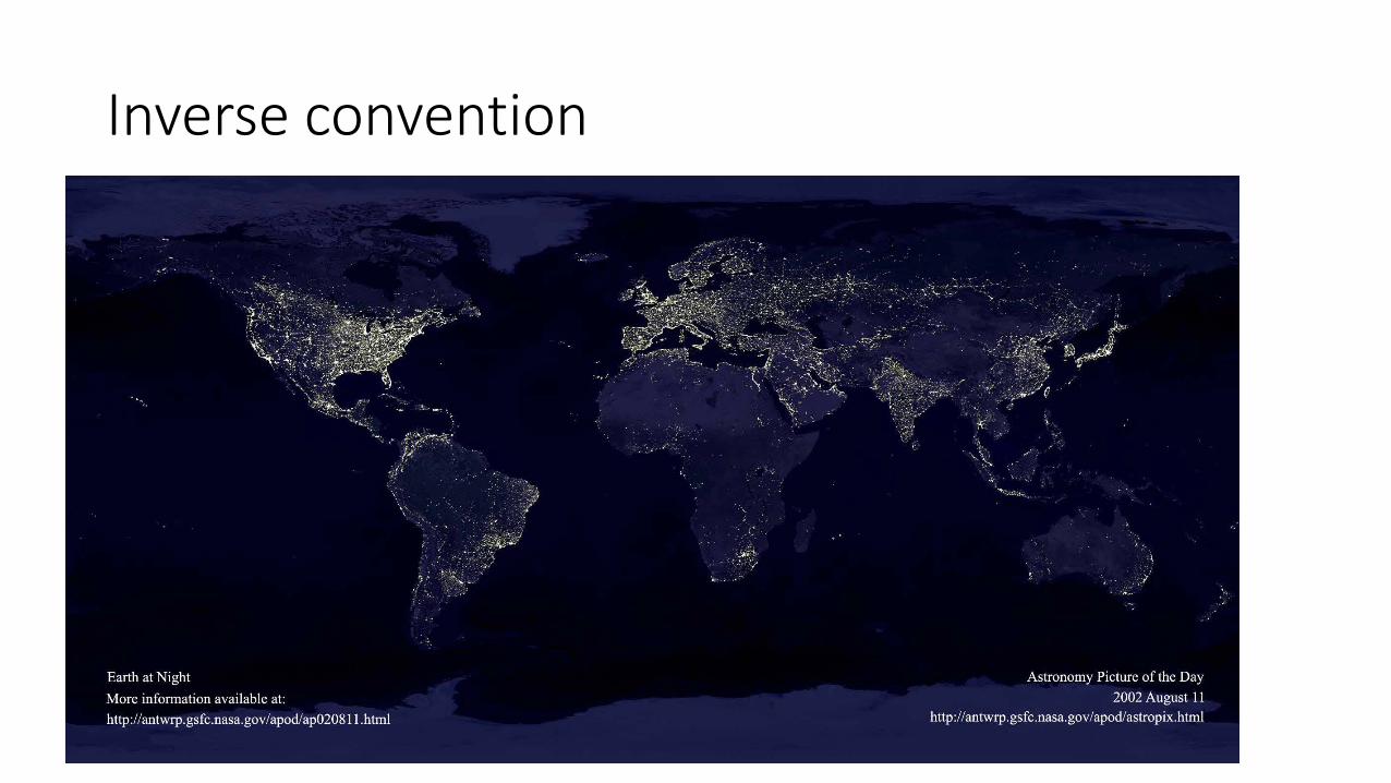
Inverse convention
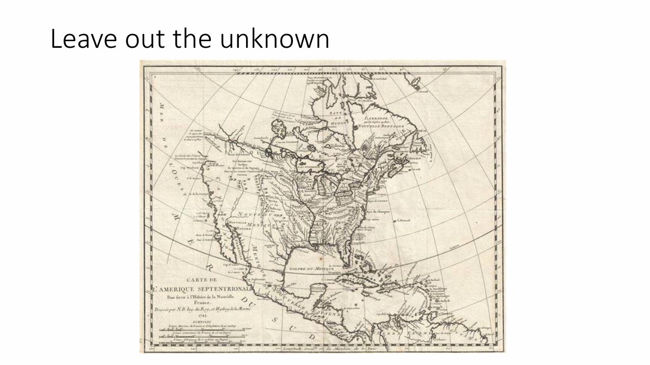
Leave out the unknown

View, perspective, color scheme, unanticipated elements
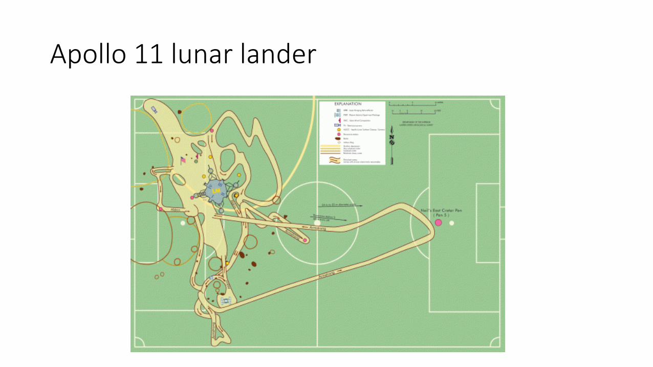
Apollo 11 lunar lander

Perspective
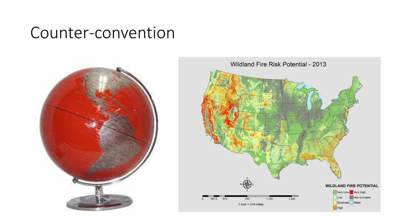
Counter-convention
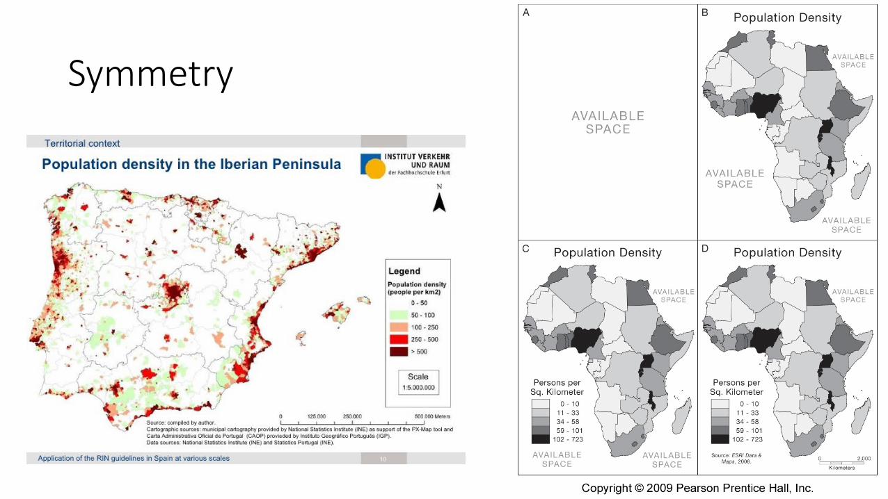
Symmetry
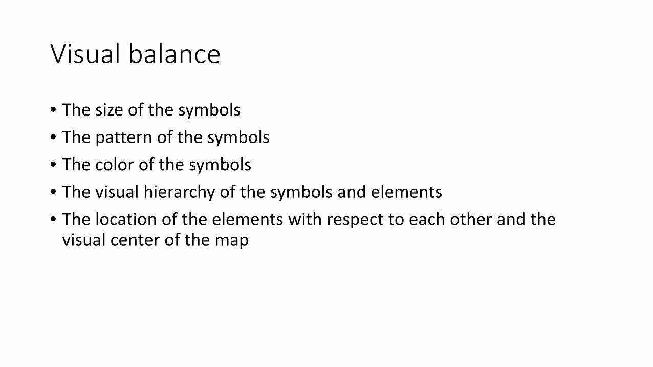
Visual balance
• The size of the symbols • The pattern of the symbols • The color of the symbols • The visual hierarchy of the symbols and elements • The location of the elements with respect to each other and the
visual center of the map

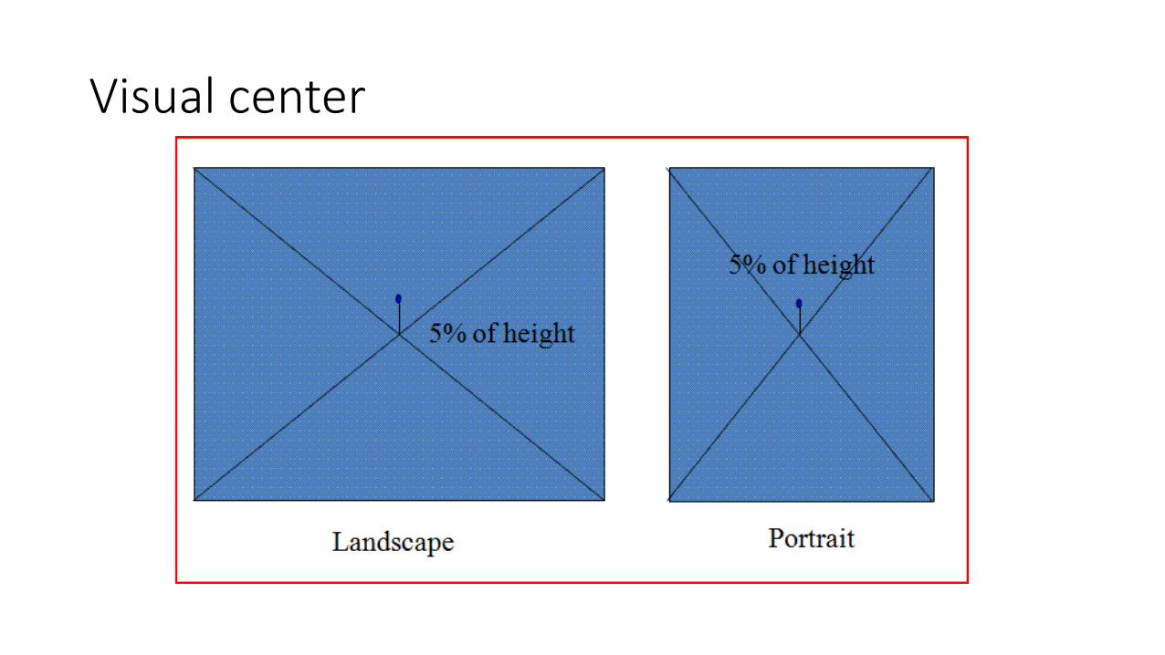
Visual center
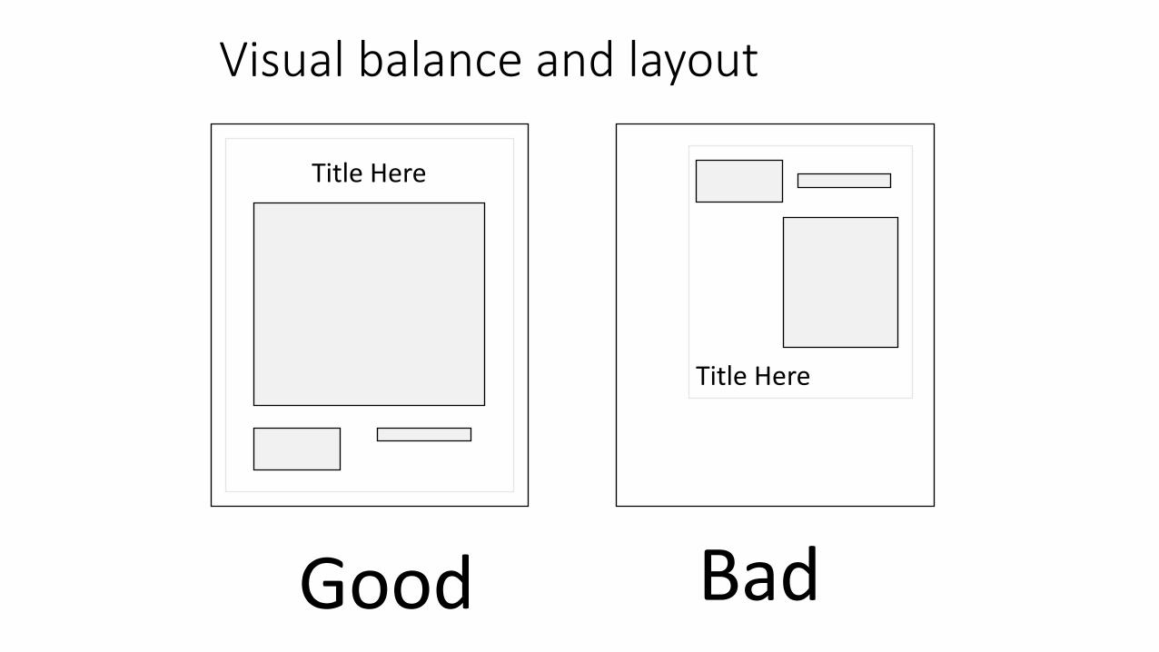
Visual balance and layout
Title Here
Title Here
Eye expects (1) balance and (2) alignment Good Bad
Visual balance
• Left right • Top down • Several smaller objects can counter one larger • Sensitive to alignment • Text and legend can be used to fill spaces • Including graticule or unmapped area to neat line can work well
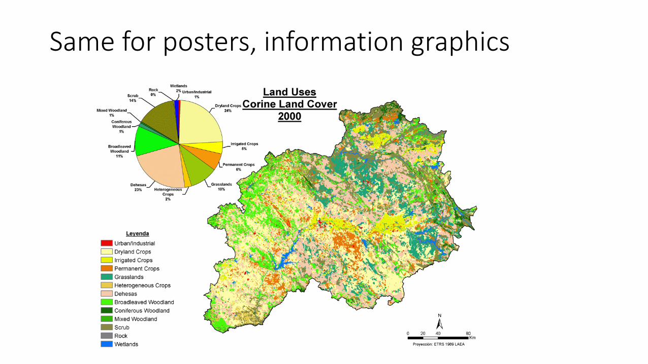
Same for posters, information graphics
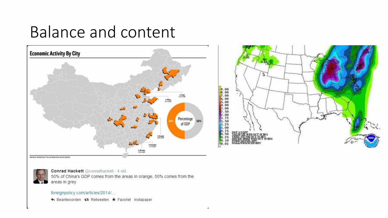
Balance and content
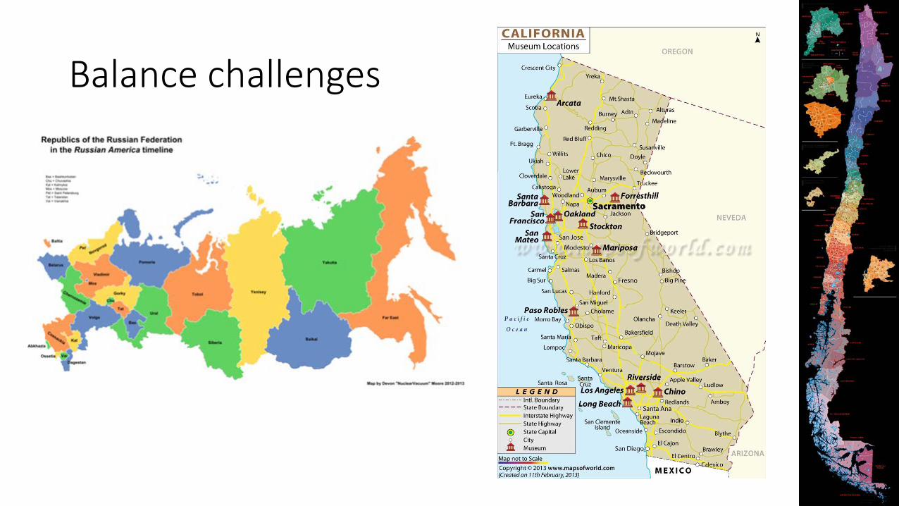
Balance challenges
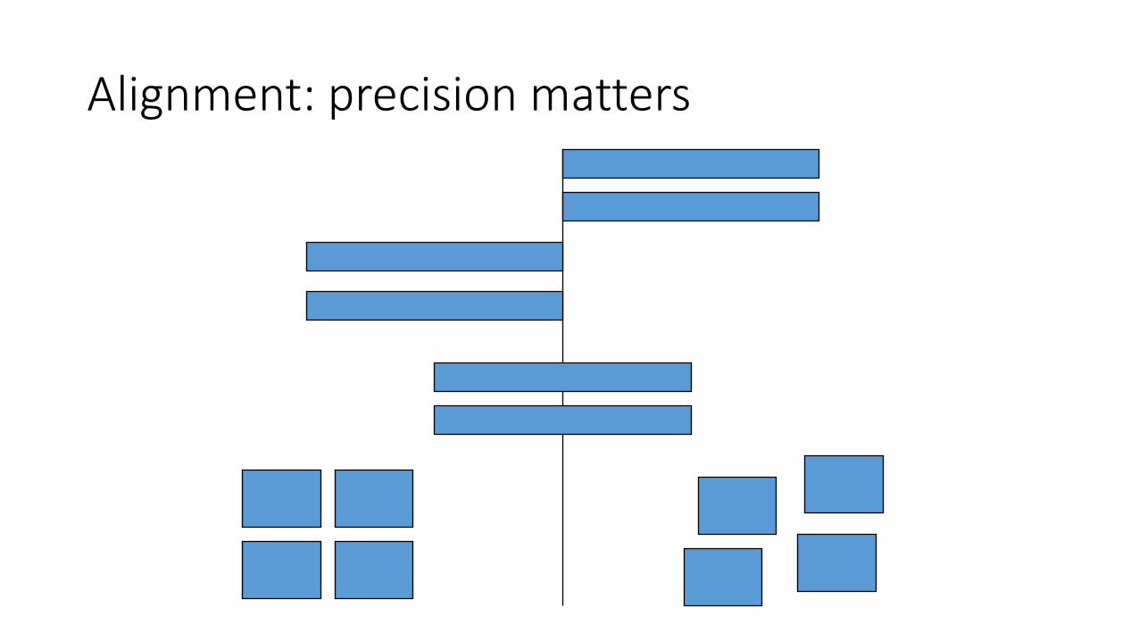
Alignment: precision matters

Select and group Align and distribute Snap
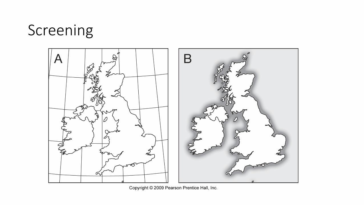
Screening
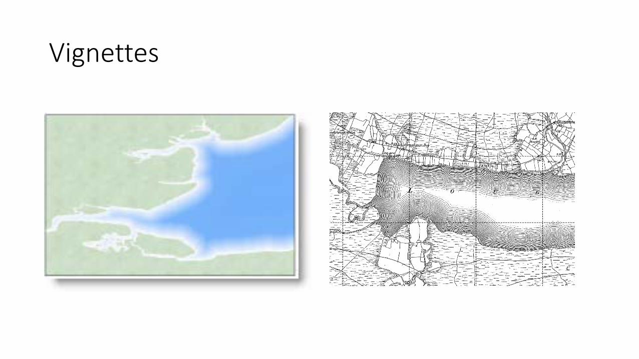
Vignettes
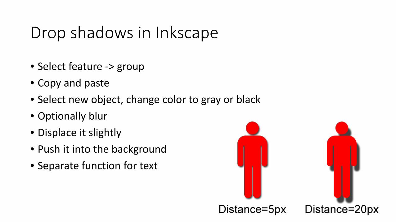
Drop shadows in Inkscape
• Select feature -> group • Copy and paste • Select new object, change color to gray or black • Optionally blur • Displace it slightly • Push it into the background • Separate function for text
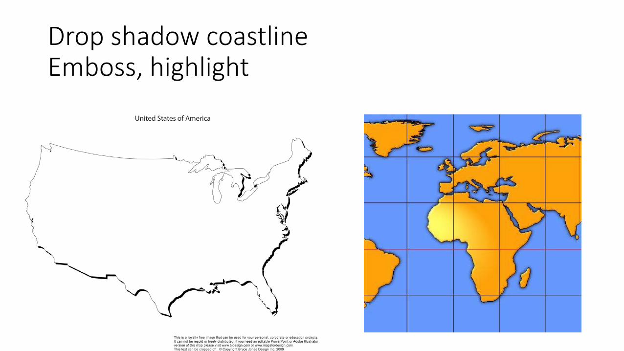
Drop shadow coastline Emboss, highlight
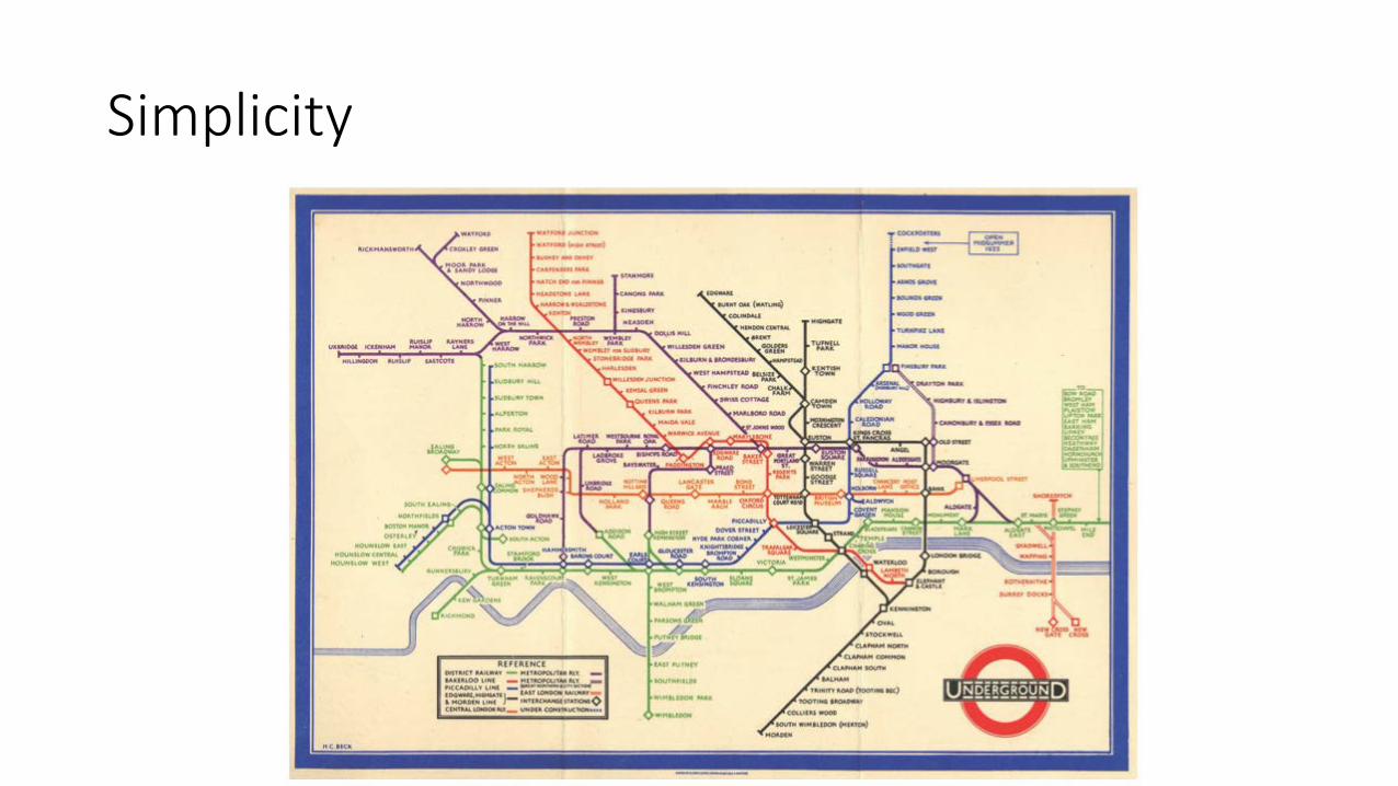
Simplicity
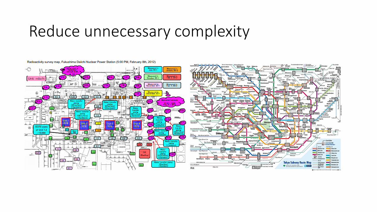
Reduce unnecessary complexity
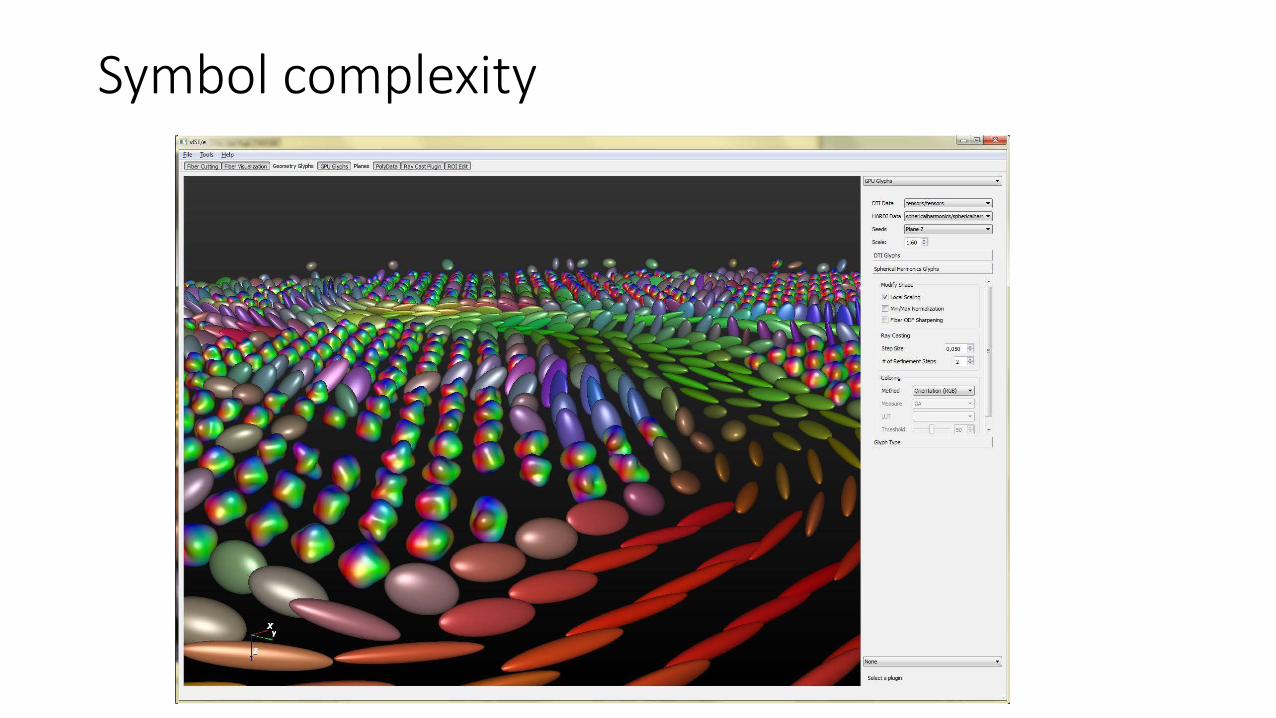
Symbol complexity
Summary
• Good design makes map more effective and interpretable • Eye seeks similarity, proximity, continuity, closure • Symmetry, simplicity, balance favored • Figure—ground • Alignment, balanced layout • Follow convention, except when you want to emphasize or challenge • When in doubt, reduce complexity