Embed Size (px)
DESCRIPTION
Monarques My Imaginary Move (Schedule Two) What did you want people to take away from the design? I was a young designer at the time — I was actually just finishing school when that CD was being made — so I don’t think I thought too deeply about what I wanted others to take away from it, honestly. I was having too much fun designing something real (not just a school project) and riffing off this idea of what an “imaginary move” could be to really think beyond that.
Citation preview
Matthew RezacMonarques
My Imaginary Move (Schedule Two)
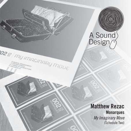
Were there any other ideas you had for the My Imaginary Move artwork? How did you come up with the design, the idea of the sheet of stamps, and change of address form?The design was done almost 10 years ago, so I don’t know that I can trust my memory. To the best of my knowledge there was this one general idea that became the final artwork. The title track of the EP was all about an “imaginary move” and that seemed like an interesting idea to play around with since there was so much existing design in the world to play off of: postcards, traveling, postage stamps, luggage labels, etc. Once that general idea of riffing off vernacular designs was set, I can say with some confidence it was probably Nate (singer/guitarist) who suggested making a sheet of stamps. He was always interested in making very tactile post-ers and fliers — we even made a CD sleeve out of denim for our demo. The change of address form was my idea. I had a real one sitting in my pile of research for the project and it seemed to make sense for underneath a CD tray. I don’t have one handy, but I remember having fun playing around with the language on the form — maybe more so than the replication of the form design.
What did you want people to take away from the design?I was a young designer at the time — I was actually just finishing school when that CD was being made — so I don’t think I thought too deeply about what I wanted others to take away from it, honestly. I was having too much fun designing something real (not just a school project) and riffing off this idea of what an “imaginary move” could be to really think beyond that.
The artwork is fairly simple but it has a big impact, why do you think that is?Well, I’m a firm believer in less is more when it comes to design. I think restraint tends to win out over wild, busy designs more often than not. There’s so much clutter in the visual world that something quiet and considered can actually command one’s attention more than some loud/blinking/moving/flashy thing.
At the time of the design, you were in the band. Did any other of the band members have input into the design and what did they think of it?Outside of Nate’s idea for the actual stamp sheet, I was sort of left to my own devices. And I spent an ungodly amount of time on it — especially considering just how little there is. When I first shared it with the rest of the band it had been toiled over and perfected for hours on end. I think they saw that and appreciated it. From what I remember there was little to no discussion about revisions or anything — everyone loved it and we went for it.
Does the artwork reflect the band’s music on that album?It’s hard for me to say it retrospect. I think that band names and artwork become associated with the music over time simply by being attached to one another, so 10 years on of course it reflects the music — it’s so engrained at this point how could it not. At the time … I don’t know, maybe? I feel like the vibe of the artwork fits the melancholy and mystery of the title track at least.
Were the stamps actual mailable stamps? Were they perforated by hand or were they perforated at the time of printing?They were printed on actual adhesive paper (that you had to moisten, like old school stamps) and the printer perforated them at the time of printing. You could put them on an envelope if you wanted to, but they weren’t worth anything in the eyes of the post office. I think the band had a discussion about whether or not it would be considered counterfeiting if someone tried to mail a letter with them. To my knowledge no one got any visits from the FBI or IRS or whoever would look into mail fraud.
Looking back on the design, how do you think it’s held up in the 9 years and is there anything you would change about it now?I think it’s held up pretty well. It wasn’t designed to follow any trends at the time, and with the exception of the ornate font on the cover, the type is all Helvetica (to mimic the piles of post office forms I had collected) so it ended up being a bit timeless — even though I wasn’t con-sciously trying to achieve that at the time. Surprisingly there’s very little I would change. Which isn’t something I can normally say about projects I have worked on… but I think I owe that to the ridiculous amount of time I spent on it.
Matthew Rezacmatthewrezac.org
Special Thanks to Schedule Two
for providing copies of My Imaginary Move.
scheduletwo.com
Photo: Chris Pernula