Embed Size (px)
Citation preview

This is a repository copy of PETMiner - A visual analysis tool for petrophysical properties of core sample data.
White Rose Research Online URL for this paper:http://eprints.whiterose.ac.uk/113580/
Version: Accepted Version
Article:
Harrison, DG, Efford, ND, Fisher, QJ orcid.org/0000-0002-2881-7018 et al. (1 more author)(2018) PETMiner - A visual analysis tool for petrophysical properties of core sample data. IEEE Transactions on Visualization and Computer Graphics, 24 (5). pp. 1728-1741. ISSN 1077-2626
https://doi.org/10.1109/TVCG.2017.2682865
© 2017 IEEE. Personal use of this material is permitted. Permission from IEEE must be obtained for all other users, including reprinting/ republishing this material for advertising orpromotional purposes, creating new collective works for resale or redistribution to servers or lists, or reuse of any copyrighted components of this work in other works.
[email protected]://eprints.whiterose.ac.uk/
Reuse
Items deposited in White Rose Research Online are protected by copyright, with all rights reserved unless indicated otherwise. They may be downloaded and/or printed for private study, or other acts as permitted by national copyright laws. The publisher or other rights holders may allow further reproduction and re-use of the full text version. This is indicated by the licence information on the White Rose Research Online record for the item.
Takedown
If you consider content in White Rose Research Online to be in breach of UK law, please notify us by emailing [email protected] including the URL of the record and the reason for the withdrawal request.
IEEE TRANSACTIONS ON VISUALIZATION AND COMPUTER GRAPHICS, VOL. X, NO. Y, JUNE 2016 1
PETMiner – A Visual Analysis Tool forPetrophysical Properties of Core Sample Data
Dave G. Harrison, Nick D. Efford, Quentin J. Fisher, Roy A. Ruddle
Abstract—The aim of the PETMiner software is to reduce the time and monetary cost of analysing petrophysical data that is obtained
from reservoir sample cores. Analysis of these data requires tacit knowledge to fill ’gaps’ so that predictions can be made for
incomplete data. Through discussions with 30 industry and academic specialists, we identified three analysis use cases that
exemplified the limitations of current petrophysics analysis tools. We used those use cases to develop nine core requirements for
PETMiner, which is innovative because of its ability to display detailed images of the samples as data points, directly plot multiple
sample properties and derived measures for comparison, and substantially reduce interaction cost. An 11-month evaluation
demonstrated benefits across all three use cases by allowing a consultant to: (1) generate more accurate reservoir flow models, (2)
discover a previously unknown relationship between one easy-to-measure property and another that is costly, and (3) make a 100-fold
reduction in the time required to produce plots for a report.
Index Terms—Visualization Systems and Software, Information Visualization, Design Study
F
1 INTRODUCTION
THIS paper addresses a class of problem where thesparseness of the data and the subjectivity of some
aspects of its interpretation make analysis difficult, but thepotential benefits are high-value. The specific focus of ourwork is on petrophysics, and the analysis of core samplesextracted from tight gas sandstone reservoirs.
A joint industry project (PETGAS) was established withthe following objectives: (i) create a high quality dataset ofmeasurements of the properties of tight gas sandstones; (ii)improve the understanding of key controls on the petro-physical properties of tight gas sandstones; (iii) identifyrelationships between different petrophysical properties.
Rock cores are recovered from subsurface reservoirs,then samples are selected for laboratory testing. Analysisof such data requires considerable expertise to extrapolatefindings from tested samples to the material in untestedregions of the core or reservoirs. This difficulty is increasedbecause of the excessive interaction cost and cognitive loadthat is placed on users by current analysis tools (e.g., Excel[1], Spotfire [2] and Interactive Petrophysics [3]).
These difficulties led us to develop a novel visualizationtool called PETMiner, which transforms the ease with whichsparse petrophysics data may be analysed. Our work takesthe form of a design study [4], and in the following sectionsof this paper describe key use cases that are difficult toachieve with current analysis tools, leading to the derivationof important requirements that need to be satisfied. Then,after reviewing related work in commercial tools and visu-alization research, we describe the design of PETMiner andits evaluation with an expert end-user.
The primary contributions of the research are: (1) thesteps we took to avoid pitfalls that can occur at the Winnow,Design and Deploy stages of a design study [4], (2) aconcept called image-based data points, which helps usersto interpret subjective and objective aspects of the samplestogether, and (3) a wholesale reduction in interaction cost bycarefully assessing the deficiencies of current visualization
tools.
2 DATA AND TASK ABSTRACTION
This section explains how the PETGAS data was acquiredand the process we applied to understand the tasks thatpetrophysicists perform during data analysis.
To understand the analysis context, workflow and chal-lenges (e.g., those posed by sample damage), we metwith end-users experienced in the analysis of core sam-ples on more than 10 occasions over a 1.5 year period.These sessions tended to include two to eight users with arange of backgrounds including geology, petrophysics andpetroleum engineering. In total we met with more than 30users, most of whom worked for the project’s industrialsponsors. The majority of the meetings included an aca-demic consultant who, due to the complexity and subtletyof important features in the data, is one of a very limitednumber of people with the expertise necessary to conductanalyses using current tools.
Initially these sessions involved the users describingtheir aims and workflows during analysis in order to ob-tain typical use cases and requirements. This led to thedevelopment of a prototype system. Subsequent sessionsgenerally took two forms. In the first, prototype function-ality was demonstrated to sponsors who then suggestedkey functionality that could be added to make the softwaremore useful in their day-to-day workflows. In the second,development versions of PETMiner were used to estimatethe petrophysical properties of recently drilled wells thatwere performing badly in terms of low production rates.Although the primary focus of these sessions was to usePETMiner to solve actual problems, they also resulted in sig-nificant discussion regarding new functionality that wouldimprove data analysis.
The meetings were complemented with interviews, ob-servation and video of the academic consultant performing
IEEE TRANSACTIONS ON VISUALIZATION AND COMPUTER GRAPHICS, VOL. X, NO. Y, JUNE 2016 2
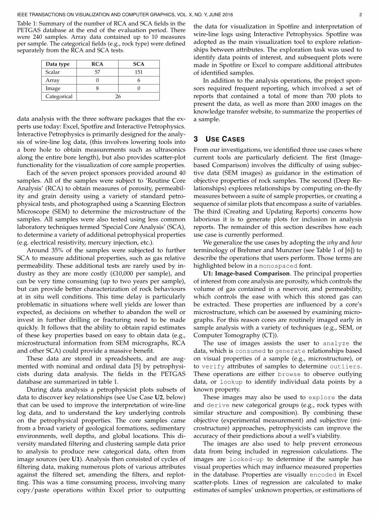
Table 1: Summary of the number of RCA and SCA fields in thePETGAS database at the end of the evaluation period. Therewere 240 samples. Array data contained up to 10 measuresper sample. The categorical fields (e.g., rock type) were definedseparately from the RCA and SCA tests.
Data type RCA SCA
Scalar 57 151
Array 0 6
Image 8 0
Categorical 26
data analysis with the three software packages that the ex-perts use today: Excel, Spotfire and Interactive Petrophysics.Interactive Petrophysics is primarily designed for the analy-sis of wire-line log data, (this involves lowering tools intoa bore hole to obtain measurements such as ultrasonicsalong the entire bore length), but also provides scatter-plotfunctionality for the visualization of core sample properties.
Each of the seven project sponsors provided around 40samples. All of the samples were subject to ‘Routine CoreAnalysis’ (RCA) to obtain measures of porosity, permeabil-ity and grain density using a variety of standard petro-physical tests, and photographed using a Scanning ElectronMicroscope (SEM) to determine the microstructure of thesamples. All samples were also tested using less commonlaboratory techniques termed ‘Special Core Analysis’ (SCA),to determine a variety of additional petrophysical properties(e.g. electrical resistivity, mercury injection, etc.).
Around 35% of the samples were subjected to furtherSCA to measure additional properties, such as gas relativepermeability. These additional tests are rarely used by in-dustry as they are more costly (£10,000 per sample), andcan be very time consuming (up to two years per sample),but can provide better characterization of rock behavioursat in situ well conditions. This time delay is particularlyproblematic in situations where well yields are lower thanexpected, as decisions on whether to abandon the well orinvest in further drilling or fracturing need to be madequickly. It follows that the ability to obtain rapid estimatesof these key properties based on easy to obtain data (e.g.,microstructural information from SEM micrographs, RCAand other SCA) could provide a massive benefit.
These data are stored in spreadsheets, and are aug-mented with nominal and ordinal data [5] by petrophysi-cists during data analysis. The fields in the PETGASdatabase are summarized in table 1.
During data analysis a petrophysicist plots subsets ofdata to discover key relationships (see Use Case U2, below)that can be used to improve the interpretation of wire-linelog data, and to understand the key underlying controlson the petrophysical properties. The core samples camefrom a broad variety of geological formations, sedimentaryenvironments, well depths, and global locations. This di-versity mandated filtering and clustering sample data priorto analysis to produce new categorical data, often fromimage sources (see U1). Analysis then consisted of cycles offiltering data, making numerous plots of various attributesagainst the filtered set, amending the filters, and replot-ting. This was a time consuming process, involving manycopy/paste operations within Excel prior to outputting
the data for visualization in Spotfire and interpretation ofwire-line logs using Interactive Petrophysics. Spotfire wasadopted as the main visualization tool to explore relation-ships between attributes. The exploration task was used toidentify data points of interest, and subsequent plots weremade in Spotfire or Excel to compare additional attributesof identified samples.
In addition to the analysis operations, the project spon-sors required frequent reporting, which involved a set ofreports that contained a total of more than 700 plots topresent the data, as well as more than 2000 images on theknowledge transfer website, to summarize the properties ofa sample.
3 USE CASES
From our investigations, we identified three use cases wherecurrent tools are particularly deficient. The first (Image-based Comparison) involves the difficulty of using subjec-tive data (SEM images) as guidance in the estimation ofobjective properties of rock samples. The second (Deep Re-lationships) explores relationships by computing on-the-flymeasures between a suite of sample properties, or creating asequence of similar plots that encompass a suite of variables.The third (Creating and Updating Reports) concerns howlaborious it is to generate plots for inclusion in analysisreports. The remainder of this section describes how eachuse case is currently performed.
We generalize the use cases by adopting the why and howterminology of Brehmer and Munzner (see Table 1 of [6]) todescribe the operations that users perform. Those terms arehighlighted below in a monospaced font.
U1: Image-based Comparison. The principal propertiesof interest from core analysis are porosity, which controls thevolume of gas contained in a reservoir, and permeability,which controls the ease with which this stored gas canbe extracted. These properties are influenced by a core’smicrostructure, which can be assessed by examining micro-graphs. For this reason cores are routinely imaged early insample analysis with a variety of techniques (e.g., SEM, orComputer Tomography (CT)).
The use of images assists the user to analyze thedata, which is consumed to generate relationships basedon visual properties of a sample (e.g., microstructure), orto verify attributes of samples to determine outliers.These operations are either browse to observe outlyingdata, or lookup to identify individual data points by aknown property.
These images may also be used to explore the dataand derive new categorical groups (e.g., rock types withsimilar structure and composition). By combining theseobjective (experimental measurement) and subjective (mi-crostructure) approaches, petrophysicists can improve theaccuracy of their predictions about a well’s viability.
The images are also used to help prevent erroneousdata from being included in regression calculations. Theimages are looked-up to determine if the sample hasvisual properties which may influence measured propertiesin the database. Properties are visually encoded in Excelscatter-plots. Lines of regression are calculated to makeestimates of samples’ unknown properties, or estimations of
IEEE TRANSACTIONS ON VISUALIZATION AND COMPUTER GRAPHICS, VOL. X, NO. Y, JUNE 2016 3
well properties. The images allow outliers to be determined,leading to improved regression equations and more accurateestimations of trends. This process is currently achieved bymatching plotted samples’ identifiers with their associatedimages. The user then manually selects images whichprovide valid robust reasons for the exclusion of the outlierfrom the regression (e.g., the presence of fractures), andthe relevant sample is filtered from the existing plot.Again, this is a manual, error-prone process which must berepeated for each plot.
U2: Deep Relationships. This use case describes howthe user explores the data to compare attributes anddiscover distributions and correlations. Theanalysis produces equations of models derived fromthe visual analysis. The generated models are then usedin external tools to forecast well production rates, and toverify new measures as being within the distributionof attributes of existing samples.
Controls on properties are often evaluated through theuse of multiple similar plots, where one axis is varied.For example, varying the colour axis (changing the vi-sual encoding) when plotting porosity against permeabilityshowed electrical resistivity measurements can provide anindication of sample damage. Sometimes the results ofone analysis can expose underlying relationships betweenderived measures and known sample properties. For exam-ple, the presence of delicate clays in some of the samplesproduced large errors in the residuals of calculated modelsof capillary threshold pressure and permeability. This ledthe analyst to conclude that threshold pressure is a poorindicator of permeability when the sample contains delicateclays.
These types of relationships are currently investigatedas follows. First a pair of properties is encoded as ascatter-plot in Excel, and the equation of the fitted curveis derived. A new data column is added to calculatethe residual between the model and the actual data. Thefitting equation is manually entered into this new column bycopying from the plot, and then adjusted to read in valuesfor the dependent and independent properties to calculatethe residual. A new plot is then created of this residualagainst the independent property.
The above process makes explicit deep relationships inthe data, rather than only hinting at them implicitly. How-ever, the manual nature of the process inhibits users in theirinvestigations. Also, the residual is calculated across all ofthe data, and could be refined by restricting the calculationto only include similar samples as detailed in U1.
U3: Creating and Updating Reports. The project spon-sors required frequent reports to be produced whichrecord measured experimental properties and discoveredtrends and features. Even though each sponsor’s reporthas a similar format, data confidentiality means that theinformation presented in plots must often be filtered ac-cording to the report’s destination and intellectual property.Overall, the general and sponsor-specific reports containover 700 plots, all of which need to be updated when newdata are added, or errors in measurement are identified.This involves pasting the relevant data into a master Excelspreadsheet and importing the data to each plot as anew data series, taking care to manually select appropriate
display properties for the new data. Finally the plots areexported for inclusion into the updated reports. It typicallytakes five minutes to create each plot, which is excessivelylaborious, and the effort coupled with the many cut, pasteand other manual operations means that the whole processis prone to user error.
4 REQUIREMENTS ANALYSIS
The use cases helped us characterize the ways in whichcurrent tools do not meet users’ requirements, which werefined during several of the many meetings we had withacademic specialists and industrial partners (see Section2). This led to the following core requirements for a newvisual analysis tool. R1-4 are general requirements, andR5-9 are requirements for specific aspects of comparativedata exploration. The mapping between the uses cases andrequirements is summarized in Table 2.
R1: Run from a local folder. The software should beable to be run from a local folder, without installation oradministrator rights. This is necessary to allow geoscientistsfrom the project sponsors to evaluate versions of PETMinerduring our iterative development process, without the soft-ware having to first undergo a lengthy validation processby each company’s IT department.
R2: Dynamic Multimodal Data Entities. The tool needsto allow users to store and analyse point, series and imagedata for samples, and allow new data and properties to beadded as they become available.
R3: Ordinary and 4k displays. Petrophysics users travelconsiderably and, therefore, need to be able to analyse dataon the go using ordinary computers (e.g., a laptop). How-ever, the data are complex and so, when office-based, userswould benefit from being able to use larger displays so thatscrolling is reduced and multiple plots may be comparedwith the glance of an eye. This led to the requirement forPETMiner to run on both ordinary and 4k displays (3840 x2160 pixels; ultra-high-definition).
R4: Reduce Interaction Cost. A primary driver for ourresearch is to substantially reduce the effort of conductingdata analysis. To achieve this, users should be able tocreate and modify plots with a minimal number of actions.The plots should automatically update when new data areavailable (e.g., to create a new report).
R5: Image Data Points. To allow objective data to beinterpreted in the context of other, subjective information(e.g. the effect of microfractures in a core sample on electricalresistivity) it should be possible to replace the data points inplots with images. The images may be created from scans(e.g., SEM images) or previously saved plots. Users shouldbe able to adjust the images’ positions and sizes to avoidocclusion, and drill down by clicking to display additionaldata. Some properties which determine petrophysical prop-erties are very fine, so users need to be able to zoom in tothe images.
R6: Comparative Plotting. Users should be able to com-pare multiple property relationships at the glance of aneye, with one example being porosity vs. permeability datapoints and Nuclear Magnetic Resonance (NMR) signals.Users also need to be able to subdivide plots by category(e.g., sedimentary environment), so that curve fitting and
IEEE TRANSACTIONS ON VISUALIZATION AND COMPUTER GRAPHICS, VOL. X, NO. Y, JUNE 2016 4
residual calculations may be performed on homogeneoussubsets of the data, and interact to change the filters andformatting of individual plots, rows/columns of plots, orall plots together.
R7: Flexible Filtering. Users should be able to filter thedata displayed in a given plot with any quantitative orcategorical (nominal) variable in the dataset, and use tacitreasoning to filter individual data points. This fosters thediscovery of patterns by allowing users to remove outliersand clutter from plots.
R8: Derived Measures. Users need to be able to calculatenew measures by binning quantitative measures (on bothlinear and logarithmic scales), grouping categorical proper-ties, and calculating the curve fitting residual of data pointsso that subsequent plotting may reveal deep relationshipsin the data. A selection of curve types should be supported,including linear, quadratic, logarithmic, exponential, andpower law relationships. Both the correlation coefficient(R2) and equation should be displayed.
R9: Contextual Data. Each plot needs to be capable ofdisplaying three types of contextual data: data points thathave been filtered out (see R7), data shown in other plotsof the same properties (i.e., where plots are partitioned bycategory; see R6), and third party reference data. Each typeof contextual data should be distinguishable from the othersand the main (non-contextual) data that is shown in a givenplot.
5 RELATED WORK
This section is divided into two parts. First we assess thecapabilities of commercial tools against the requirementsthat were described in the previous section. Then we reviewresearch that is related to those requirements.
5.1 Commercial Tools
The primary tool used for the analysis and visualizationof core data among geoscientists, including all of the in-dustrial and academic partners of the PETGAS project, isMicrosoft Excel [1]. The next most commonly used softwarepackage for interpretation and visualization is Spotfire [2].In addition, all of the companies interpret wire-line logdata using tools such as Interactive Petrophysics [3]. Thissection assesses the capabilities of these commercial tools,and the well-known visualization tool Tableau [7] fromTableau Software, against our users’ requirements (see Table2).
As is the norm for commercial tools, they are designed tobe installed and maintained by an organization’s IT depart-ment, rather than running as a local, uninstalled application(see Requirement R1). Data confidentiality may often ruleout the usage of a petrophysics tool running on third partyCloud infrastructure.
Supporting dynamic multimodal entities (R2) requires ameans to import new or updated data and properties intothe software. Tableau, Spotfire and Excel offer extensive con-nectivity options to ingest data from external data sources.These include flat files, Excel files and numerous databases(via Open Database Connectivity (ODBC)). Database tablescan be ingested directly, but the user must specify the
linkage between tables manually. Interactive Petrophysicsallows data to be loaded from a number of widely usedpetrophysics file formats, and links to a number of pro-prietary third party application databases, e.g., PETCOMPowerlog (Petcom Inc, Dallas, TX), without users needingto define relationships.
None of the tools allow images to be used as data points(R5), but both Tableau and Spotfire allow images to be dis-played for a point on mouse-over. However, this approachonly displays a single image at a time. This inhibits the userfrom making comparisons between images for different datapoints simultaneously.
One of our users’ key requirements is the ability todisplay multiple plots to make comparisons across differentdata relationships and between categories of samples (R6).Interactive Petrophysics only allows one plot to be created ata time, although users may then manually layout multipleplot windows. Spotfire allows multiple plots to be createdat once as a trellis [8], [9], and in Tableau users can createmultiple plots by dragging a categorical dimension onto aplot to create multiple rows. Spotfire and Tableau have atwo-stage approach to comparative plotting, allowing usersto create visualizations on a worksheet and then arrangeworksheets on a dashboard. A dashboard would have to beused to display the multiple relationships (e.g., x1 vs. y1 andx2 vs. y2 for different sedimentary environments) that ourusers require. It is possible to create dashboards with Excelthrough scripting but, due to the complexity of scripting,users typically only ever create one plot at a time.
All four tools allow users to filter (R7) the data that isdisplayed in a plot with quantitative or categorical vari-ables. Spotfire and Tableau achieve this in a straightforwardmanner: users drag dimensions and measures onto theFilters shelf and choose appropriate values from the exposedwidget (e.g. range sliders, or checkboxes). Additionally,points may be filtered directly from a plot by selecting themand choosing to exclude them from a context menu. Excelrequires users to either apply filters to the data used by allplots or copy/paste subsets of the data for a given plot, butthe user can also create widgets prior to plotting to filterdata. Interactive Petrophysics allows filtering during plotcreation via calculation.
All of the tools have the capability to derive newmeasures, group data into bins, and provide curve fittingfunctionality. Each tool allows calculation of new data usingfunctions that can be entered by a user and so provide thecapability to create additional plots against the residuals(R8) from the equation of curves fitted to the plotted data.With Excel, users create additional spreadsheet columnsto hold the residual data calculated from the equation ofthe fitted curve. In Interactive Petrophysics, Spotfire, andTableau users create a calculated data field and enter thefitting equation by hand, in order to calculate the residualand expose it as new data. However, none of the toolsallow a plot to be created directly against the residual ofan existing plot.
Despite the filtering functionality that is describedabove, none of the tools allow additional third party con-textual data to be easily shown in a plot (R9). In Excel,contextual data could be added as a new data series, andInteractive Petrophysics can add an external data source
IEEE TRANSACTIONS ON VISUALIZATION AND COMPUTER GRAPHICS, VOL. X, NO. Y, JUNE 2016 5
Table 2: Commercial software compared with PETMiner’s requirements. ◦ - good support, • - somewhat supported, • - notsupported
Requirement Use Cases Excel Spotfire Tableau Interactive Petrophysics
R1: Run from a Local Folder U1, U2, U3 Requires system installation
R2: Dynamic Multimodal Entities U1, U2, U3 Many data formats; ODBC databases, but tables manu-ally linked
As other tools, plus propri-etary databases and petro-physics file formats
R3: Ordinary and 4k Displays U1, U2, U3 Acceptable use on all screen sizes with manual font size changes
R4: Reduce Interaction Cost U2 Click heavy; cut andpaste
Plots adjusted after creation Plot properties set by dialogbox
R5: Image Data Points U1, U2, U3 Not possible Single image via mouse-over Not possible
R6: Comparative Plotting U1, U2, U3 Two stage (worksheet; dashboard) Manual plot layout
R7: Flexible Filtering U1, U2 Via data and widgets Via widgets and plot At plot creation
R8: Derived Measures U1, U2 Allow calculation, binning and fitting, but not direct creation of residual plots
R9: Contextual Data U2 Large effort and sep-arate data
Not possible Additional data source
for contextual data, or bring in data from unrelated wells.However, Tableau and Spotfire do not allow third party datato be added, as they require the data source to be joined tothe existing data.
With all four tools, interaction for some key tasks isinefficient (R4). For example, certain important choices areonly possible after a plot has been created (e.g., choosing alogarithmic axis in Excel or Tableau), or involve having toposition the cursor precisely (e.g., to select a specific datapoint for curve-fitting in Excel). Another example is thatwith a large number of properties, the user must searcha list of all properties, rather than the properties beinggrouped in a meaningful way to the analyst. This causes thefiltering process to be scroll- and search-heavy. InteractivePetrophysics presents all plot options to the user at plotcreation via a tabbed dialog box. This dialog is complicatedby additional functionality to link properties to wire-line logdata, additional wells and depth ranges, because wire-linelog analysis is Interactive Petrophysics’ main focus.
For complex or repetitive operations Excel has a richscripting environment, but the level of expertise that isneeded limits its suitability for our users, making tasks suchas report-generation particularly laborious (e.g., see UseCase U3). Spotfire, Interactive Petrophysics and Tableau arealso poorly suited for creating reports because of the sheernumber of clicks that would be required to create each plot.However, in fairness, these tools are primarily designed fordata analysis rather than report generation.
5.2 Previous Research
This section reviews visualization research from a perspec-tive of the cost of user interaction, using the frameworkprovided by Lam [10], as Requirement R4 specifically ad-dresses reducing interaction costs. That framework dividesinteraction costs into seven categories, four of which (De-cision costs to form goals; Physical-motion costs to executesequences; View-change costs to interpret perception; State-change costs to evaluate interpretation) relate directly to thepresent paper and are used to structure this review.
5.2.1 Decision costs to form goals
This category discusses the costs associated with choosinga subset of data to display. One way of reducing such costs
is to provide flexible ways of filtering data (RequirementR7), and a second is trellis layouts [8], [9]. These techniquesreduce clutter in individual plots by separating subsets ofdata into their own plots and is some of the key functionalitythat underpins Requirement R6. Research tools such asPolaris [11] showed how trellis layouts may be achievedby simple drag-and-drop actions, which have the addedadvantage of encouraging users to try alternative “what if”subsets, and this is now a feature of commercial tools suchas Tableau.
Guided visualization techniques reduce decision costsby suggesting combinations of variables that are likely to beinformative to a user. The choice of candidate dimensionsto visualize may be guided by statistics of the underlyingdataset (e.g., obtained from principal component analysis),and perhaps weighted by the user [12]. The candidatevisualizations are provided to the user as a starting pointfor visual analysis [13], with subsequent visualizations sug-gested in response to user interaction [14], [15], [16], [17].
Another cost is deciding which visual encoding to usefor each variable. The Polaris system [11] developed theVizQL specification language to automatically select visualencodings for the plots, a concept that was widened byShow Me to include alternative encodings [18] and incor-porated into Tableau. A similar capability is provided by anopen source project called Vega-Lite [17].
5.2.2 Physical-motion costs to execute sequences
Lam discusses the costs associated in terms of physicalmotion and accumulated motions [10]. Physical motion in-volves the distance and precision with which a cursor needsto be moved, and has been used widely in studying human-computer interaction tasks using Fitts’ Law (e.g., [19], [20],[21]).
Accumulated motions may be reduced by allowing plotsto be fully defined at the time of creation, rather than onlyallowing users to specify certain formatting (e.g., changingan axis to log scale) after the plot has been created, as isthe case with tools such as Spotfire, Excel and Tableau. Themulti-stage approach to plot creation that is employed bythese tools increases the cumulative cost of moving andpositioning the mouse, and particularly affects Use CasesU2 and U3.
IEEE TRANSACTIONS ON VISUALIZATION AND COMPUTER GRAPHICS, VOL. X, NO. Y, JUNE 2016 6
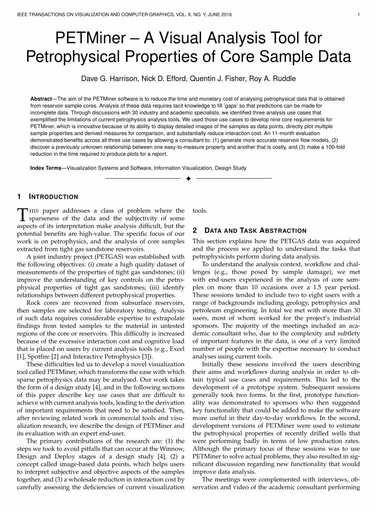
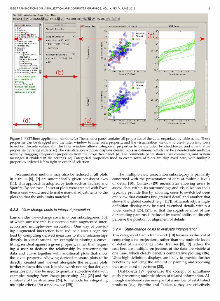
Figure 1: PETMiner application window. (a) The schema panel contains all properties of the data, organized by table name. Theseproperties can be dragged into the filter window to filter on a property, and the visualization window to break plots into rowsbased on discrete values. (b) The filter window allows categorical properties to be excluded by checkboxes, and quantitativeproperties by range sliders. (c) The visualization window displays created plots as columns, which can be extended into multiplerows by dragging categorical properties from the properties panel. (d) The comments panel shows user comments, and systemmessages if enabled in the settings. (e) Categorical properties used to create rows of plots are displayed here, with multipleproperties ordered left to right in order of selection.
Accumulated motions may also be reduced if all plotsin a trellis [8], [9] are automatically given consistent axes[11]. This approach is adopted by tools such as Tableau andSpotfire. By contrast, if a set of plots were created with Excelthen a user would need to make manual adjustments to theplots so that the axis limits matched.
5.2.3 View-change costs to interpret perception
Lam divides view-change costs into four subcategories [10],of which our research is concerned with augmented inter-action and multiple-view association. One way of provid-ing augmented interaction is to reduce a user’s cognitiveload by computing derived measures to show relationshipsdirectly in visualizations. An example is plotting a curve-fitting residual against a given property, rather than requir-ing a user to deduce the relationship by presenting thedata and curve together with additional plots that showthe given property. Allowing derived measure plots to bedirectly created and viewed alongside the original plotsfurther reduces this cost. It is also worth noting that derivedmeasures may also be used to quantify subjective data withexamples ranging from image processing [22], [23] and thesimilarity of tree structures [24], to methods for integratingmultiple criteria (for a review, see [25]).
The multiple-view association subcategory is primarilyconcerned with the presentation of data at multiple levelsof detail [10]. Context (R9) necessitates allowing users toassess data within its surroundings,and visualization toolstypically provide this by allowing users to switch betweenone view that contains fine-grained detail and another thatshows the global context (e.g., [17]). Alternatively, a high-definition display may be used to embed details within awider context [26], [27], so that the cognitive effort of un-derstanding patterns is reduced by users’ ability to directlyperceive the position or alignment of details.
5.2.4 State-change costs to evaluate interpretation
This category of Lam’s framework [10] focuses on the cost ofcomparing data projections, rather than the multiple levelsof detail of view-change costs. Trellises [8], [9] reduce thecost because multiple projections of the data are visible atone time, which clearly benefits comparative plotting (R6).Ultra-high-definition displays are likely to provide furtherbenefits by reducing the amount of panning and zoomingthat users need to perform [28].
Dashboards [29] generalize the concept of simultane-ously presenting multiple pieces of related information. Al-though dashboards are now part of a number of establishedproducts (e.g., Spotfire and Tableau), they are effectively
IEEE TRANSACTIONS ON VISUALIZATION AND COMPUTER GRAPHICS, VOL. X, NO. Y, JUNE 2016 7
second class citizens since they are assembled from othervisualizations rather than being created from the underlyingvariables in a dataset. This limitation is partly addressed byVoyager [17], which allows each plot to show different vari-ables and helps users to associate information by placingplots with shared axes in close proximity.
Context (R9) necessitates allowing users to assess datawithin its surroundings. It is common for visualizationtools to provide multiple levels of detail so that users mayinterpret fine-grained detail in a global context simply byswitching attention between views (e.g., [17]). Alternatively,a high-definition display may be used to embed detailswithin a wider context [26], [27], so that the cognitive effortof understanding patterns is reduced by users’ ability todirectly perceive the position or alignment of details.
Data analysis often involves the combination of objectiveand subjective judgements. For example, understandingspatial patterns in quantitative data that is shown in ascientific visualization, or changes that take place from onestage of an analysis to another [30]. Our requirement forimages as data points (R5), however, is to allow users toleverage subjective data (e.g., SEM images) in their analysisof quantitative data (e.g., permeability). For this we char-acterize previous research according to the relationship be-tween images and data points (one-to-one vs. one-to-many)and the method of visualization (integrated vs. separated).
Several examples of previous research use images to rep-resent clusters of outputs from computations (i.e., a one-to-many relationship). These include parametrically generatedgeometry, classifications from data mining, and graphics an-imations that are embedded as examples into scatter-plots,network visualizations or parallel coordinates [31], [32], [33],[34]. Other examples use images of specific data records (aone-to-one relationship). These examples either display asmall selection of those records as images that are integratedinto scatter-plots or network visualizations [11], [35], [36],or images of a larger number of records in a visualizationthat is separate from the ones that show the associatedquantitative data [23]. Our requirement combines both typesof examples, because of the need to show images for tens orhundreds of data records, integrated with visualizations thatare showing quantitative data.
6 PETMINER
PETMiner is implemented in Python, uses Matplotlib for vi-sualization, and SQLAlchemy for database access. Python’sintrospection capabilities have allowed a novel use ofSQLAlchemy’s object-relational mapping to provide a userdefined backend database schema, which can by amendedby the user during usage of the application. SQLAlchemyprovides a degree of database agnosticism, and allows thesoftware to switch to other relational database managers ifrequired.
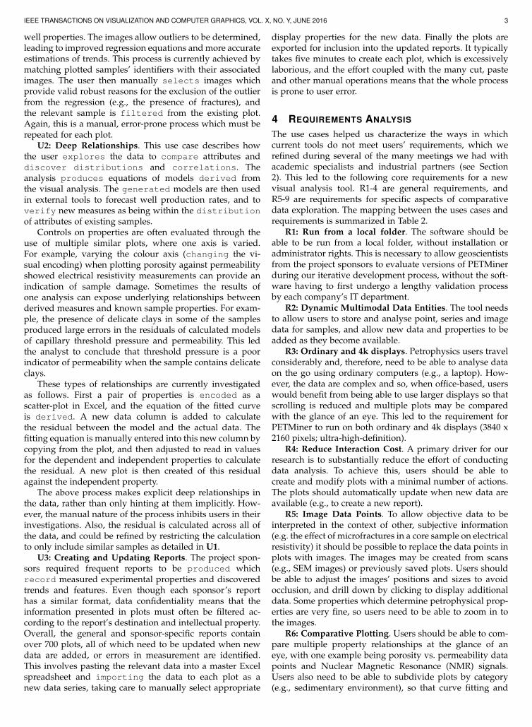
The user interface is written using Qt, and operatedvia the Python binding provided by PySide. The interfacecomprises three columns as shown in Fig. 1: The schemapanel (a), containing a list of properties organized by tableinto logical structures, and a panel to show user commentsand system messages (d); a drag and drop filter panel (b);and a visualization area (c) to display created plots and
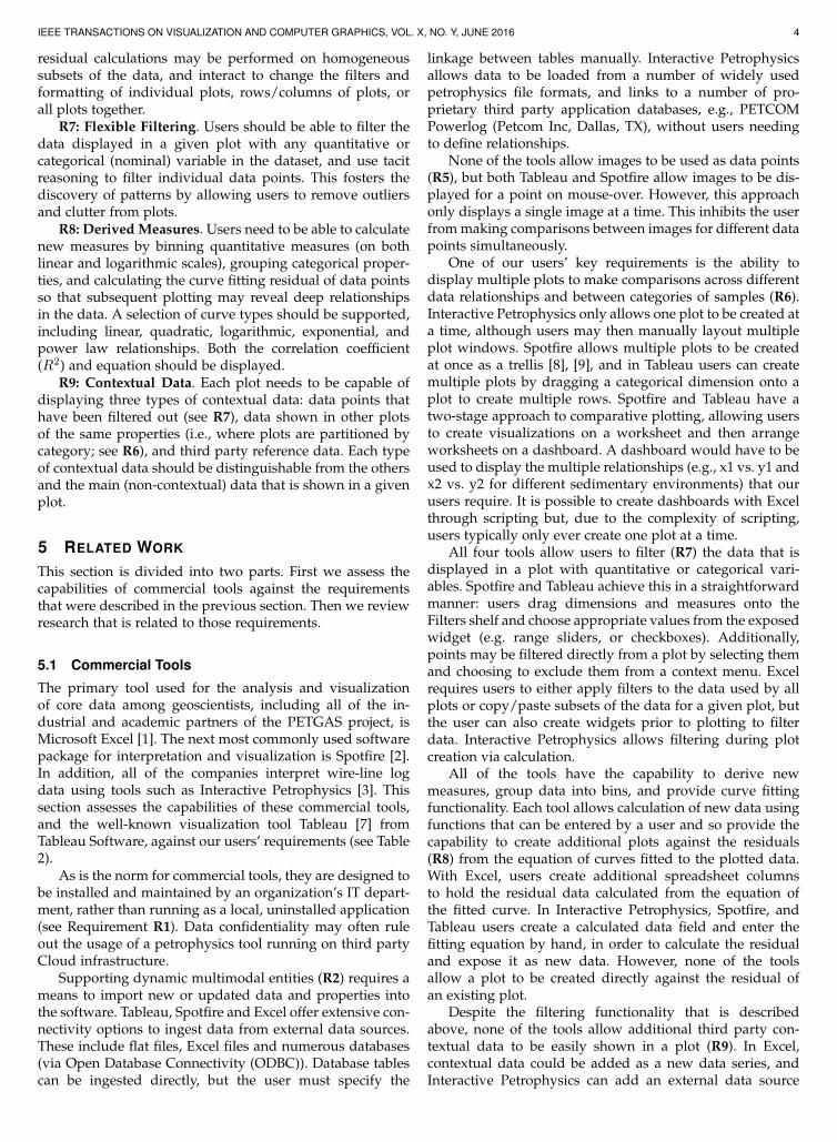
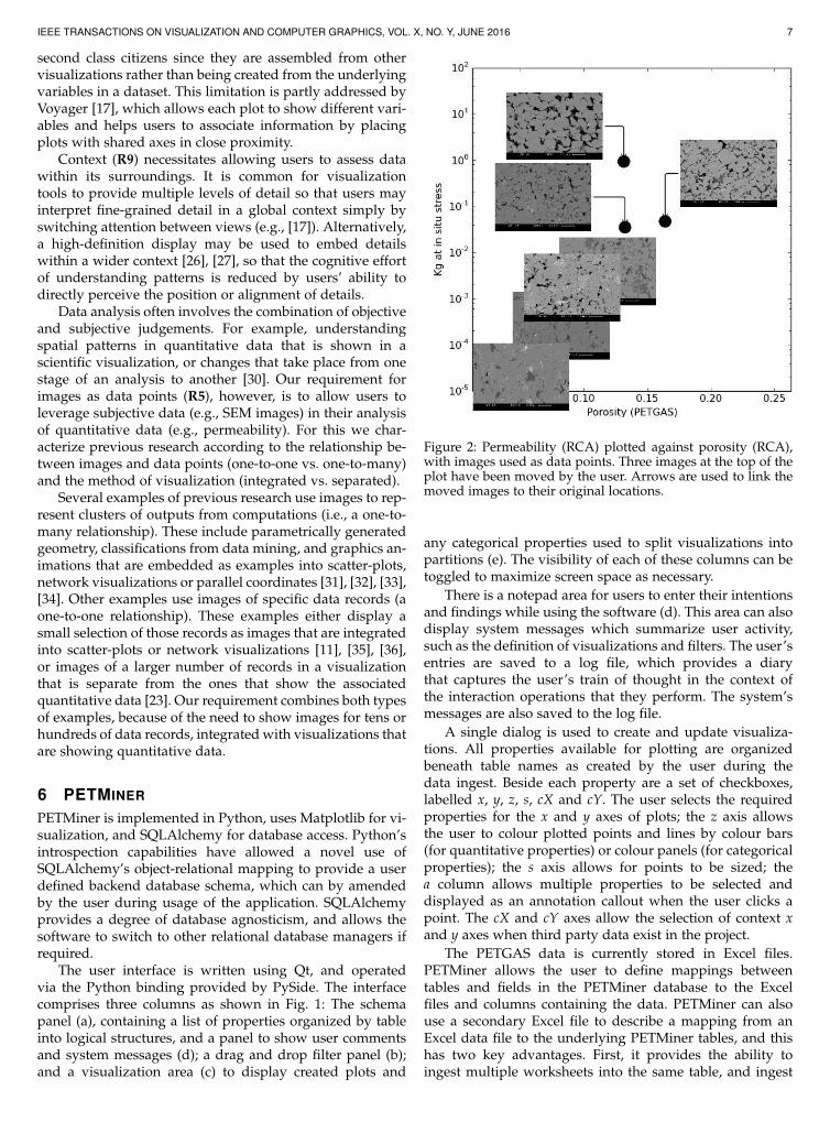
Figure 2: Permeability (RCA) plotted against porosity (RCA),with images used as data points. Three images at the top of theplot have been moved by the user. Arrows are used to link themoved images to their original locations.
any categorical properties used to split visualizations intopartitions (e). The visibility of each of these columns can betoggled to maximize screen space as necessary.
There is a notepad area for users to enter their intentionsand findings while using the software (d). This area can alsodisplay system messages which summarize user activity,such as the definition of visualizations and filters. The user’sentries are saved to a log file, which provides a diarythat captures the user’s train of thought in the context ofthe interaction operations that they perform. The system’smessages are also saved to the log file.
A single dialog is used to create and update visualiza-tions. All properties available for plotting are organizedbeneath table names as created by the user during thedata ingest. Beside each property are a set of checkboxes,labelled x, y, z, s, cX and cY. The user selects the requiredproperties for the x and y axes of plots; the z axis allowsthe user to colour plotted points and lines by colour bars(for quantitative properties) or colour panels (for categoricalproperties); the s axis allows for points to be sized; thea column allows multiple properties to be selected anddisplayed as an annotation callout when the user clicks apoint. The cX and cY axes allow the selection of context xand y axes when third party data exist in the project.
The PETGAS data is currently stored in Excel files.PETMiner allows the user to define mappings betweentables and fields in the PETMiner database to the Excelfiles and columns containing the data. PETMiner can alsouse a secondary Excel file to describe a mapping from anExcel data file to the underlying PETMiner tables, and thishas two key advantages. First, it provides the ability toingest multiple worksheets into the same table, and ingest
IEEE TRANSACTIONS ON VISUALIZATION AND COMPUTER GRAPHICS, VOL. X, NO. Y, JUNE 2016 8
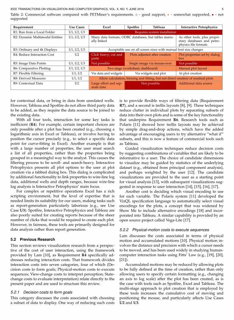
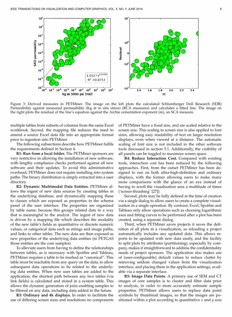
Figure 3: Derived measures in PETMiner. The image on the left plots the calculated Schlumberger Doll Research (SDR)Permeability against measured permeability (Kg at in situ stress) (RCA measures) and calculates a fitted line. The image onthe right plots the residual of the line’s equation against the Archie cementation exponent (m), an SCA measure.
multiple tables from subsets of columns from the same Excelworkbook. Second, the mapping file reduces the need toamend a source Excel data file into an appropriate formatprior to ingestion into PETMiner.
The following subsections describe how PETMiner fulfilsthe requirements defined in Section 4.
R1: Run from a local folder. The PETMiner sponsors arevery restrictive in allowing the installation of new software,with lengthy compliance checks performed against all newsoftware and their updates. To avoid this administrativeoverhead, PETMiner does not require installing into systempaths. The binary distribution is simply extracted into a userdirectory.
R2: Dynamic Multimodal Data Entities. PETMiner al-lows the ingest of new data sources by creating tables inthe underlying database, and dynamically mapping theseto classes which are exposed as properties in the schemapanel of the user interface. The properties are organizedby table name, because this groups related data in a waythat is meaningful to the analyst. The ingest of new datais driven by a mapping file which describes the modalityof the new table’s fields as quantitative or discrete numericvalues, or categorical data such as strings and image paths,and links to other tables. The new data are then exposed asnew properties of the underlying data entities (in PETGASthose entities are the core samples).
To alleviate users from having to define the relationshipsbetween tables, as is necessary with Spotfire and Tableau,PETMiner requires a table to be marked as “canonical”. Thistable must be reachable from any query on the data, to allowsubsequent data operations to be related to the underly-ing data entities. When new user tables are added to theapplication, the shortest path between any two tables (vialink fields) is calculated and stored in a system table. Thisallows the dynamic generation of joins enabling samples tobe filtered on any data, including data added in the future.
R3: Ordinary and 4k displays. In order to facilitate theuse of differing screen sizes and resolutions no components
of PETMiner have a fixed size, and are scaled relative to thescreen size. This scaling to screen size is also applied to fontsizes, allowing easy readability of text on larger resolutiondisplays, even when viewed at a distance. The automaticscaling of font size is not included in the other softwaretools discussed in section 5.1. Additionally, the visibility ofall panels can be toggled to maximize screen space.
R4: Reduce Interaction Cost. Compared with existingtools, interaction cost has been reduced by the followingapproaches. First, from the outset PETMiner has been de-signed to run on both ultra-high-definition and ordinarydisplays, with the former allowing users to make manymore comparisons with the glance of an eye instead ofhaving to scroll the visualization area a multitude of times(‘screen-thrashing’ [27]).
Second, plots may be fully defined at the time of creationvia a single dialog to allow users to create a complete visual-ization in a single operation. By contrast, Excel, Spotfire andTableau only allow operations such as choosing logarithmicaxes and fitting curves to be performed after a plot has beencreated, using a separate dialog.
Third, when PETMiner saves projects it saves the defi-nition of all plots in a visualization, so reloading a projectautomatically includes any updated data. This allows re-ports to be updated with new data easily, and the facilityto split plots by attributes (partitioning), especially by com-pany, makes it straightforward to address the confidentialityneeds of project sponsors. The application also makes useof (user-configurable) default values to reduce clutter byremoving seldom changed values from the visualizationinterface, and placing them in the application settings, avail-able via a separate interface.
R5: Image Data Points. A primary use of SEM and CTimages of core samples is to cluster and filter data priorto analysis, in order to more accurately estimate sampleproperties. PETMiner allows users to replace data pointsymbols by thumbnail images, so that the images are po-sitioned within a plot according to quantitative x and y axis
IEEE TRANSACTIONS ON VISUALIZATION AND COMPUTER GRAPHICS, VOL. X, NO. Y, JUNE 2016 9
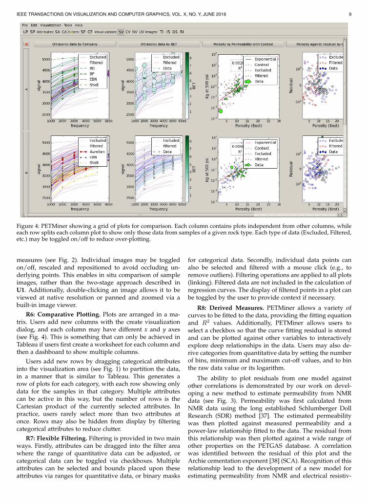
Figure 4: PETMiner showing a grid of plots for comparison. Each column contains plots independent from other columns, whileeach row splits each column plot to show only those data from samples of a given rock type. Each type of data (Excluded, Filtered,etc.) may be toggled on/off to reduce over-plotting.
measures (see Fig. 2). Individual images may be toggledon/off, rescaled and repositioned to avoid occluding un-derlying points. This enables in situ comparison of sampleimages, rather than the two-stage approach described inU1. Additionally, double-clicking an image allows it to beviewed at native resolution or panned and zoomed via abuilt-in image viewer.
R6: Comparative Plotting. Plots are arranged in a ma-trix. Users add new columns with the create visualizationdialog, and each column may have different x and y axes(see Fig. 4). This is something that can only be achieved inTableau if users first create a worksheet for each column andthen a dashboard to show multiple columns.
Users add new rows by dragging categorical attributesinto the visualization area (see Fig. 1) to partition the data,in a manner that is similar to Tableau. This generates arow of plots for each category, with each row showing onlydata for the samples in that category. Multiple attributescan be active in this way, but the number of rows is theCartesian product of the currently selected attributes. Inpractice, users rarely select more than two attributes atonce. Rows may also be hidden from display by filteringcategorical attributes to reduce clutter.
R7: Flexible Filtering. Filtering is provided in two mainways. Firstly, attributes can be dragged into the filter areawhere the range of quantitative data can be adjusted, orcategorical data can be toggled via checkboxes. Multipleattributes can be selected and bounds placed upon theseattributes via ranges for quantitative data, or binary masks
for categorical data. Secondly, individual data points canalso be selected and filtered with a mouse click (e.g., toremove outliers). Filtering operations are applied to all plots(linking). Filtered data are not included in the calculation ofregression curves. The display of filtered points in a plot canbe toggled by the user to provide context if necessary.
R8: Derived Measures. PETMiner allows a variety ofcurves to be fitted to the data, providing the fitting equationand R
2 values. Additionally, PETMiner allows users toselect a checkbox so that the curve fitting residual is storedand can be plotted against other variables to interactivelyexplore deep relationships in the data. Users may also de-rive categories from quantitative data by setting the numberof bins, minimum and maximum cut-off values, and to binthe raw data value or its logarithm.
The ability to plot residuals from one model againstother correlations is demonstrated by our work on devel-oping a new method to estimate permeability from NMRdata (see Fig. 3). Permeability was first calculated fromNMR data using the long established Schlumberger DollResearch (SDR) method [37]. The estimated permeabilitywas then plotted against measured permeability and apower-law relationship fitted to the data. The residual fromthis relationship was then plotted against a wide range ofother properties on the PETGAS database. A correlationwas identified between the residual of this plot and theArchie cementation exponent [38] (SCA). Recognition of thisrelationship lead to the development of a new model forestimating permeability from NMR and electrical resistiv-
IEEE TRANSACTIONS ON VISUALIZATION AND COMPUTER GRAPHICS, VOL. X, NO. Y, JUNE 2016 10
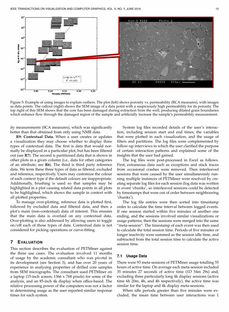
Figure 5: Example of using images to explain outliers. The plot (left) shows porosity vs. permeability (RCA measures), with imagesas data points. The callout (right) shows the SEM image of a data point with a suspiciously high permeability for its porosity. Thetop right of this SEM shows that the core has been damaged during extraction from the well, producing dilated grain boundarieswhich enhance flow through the damaged region of the sample and artificially increase the sample’s permeability measurement.
ity measurements (SCA measures), which was significantlybetter than that obtained from only using NMR data.
R9: Contextual Data. When a user creates or updatesa visualization they may choose whether to display threetypes of contextual data. The first is data that would nor-mally be displayed in a particular plot, but has been filteredout (see R7). The second is partitioned data that is shown inother plots in a given column (i.e., data for other categoriesof an attribute; see R6). The third is third party referencedata. We term these three types of data as filtered, excludedand reference, respectively. Users may customize the colourof each context type if the default colours are inappropriate.Additionally, brushing is used so that samples may behighlighted in a plot causing related data points in all plotsto be highlighted, which shows the sample in context withall plotted properties.
To manage over-plotting, reference data is plotted first,followed by excluded data and filtered data, and then aplot’s main (non-contextual) data of interest. This ensuresthat the main data is overlaid on any contextual data.Over-plotting is also addressed by allowing users to toggleon/off each of those types of data. Contextual data is notconsidered for picking operations or curve-fitting.
7 EVALUATION
This section describes the evaluation of PETMiner againstthe three use cases. The evaluation involved 11 monthsof usage by the academic consultant who was pivotal inits development (see Section 3), and has over 20 years ofexperience in analysing properties of drilled core samplesfrom SEM micrographs. The consultant used PETMiner ona laptop (15-inch screen; 1366 x 768 pixels) for some of theanalysis, and an 85-inch 4k display when office-based. Therelative processing power of the computers was not a factorin determining usage as the user reported similar responsetimes for each system.
System log files recorded details of the user’s interac-tion, including session start and end times, the variablesthat were plotted in each visualization, and the usage offilters and partitions. The log files were complemented byfollow-up interviews in which the user clarified the purposeof certain interaction patterns and explained some of theinsights that the user had gained.
The log files were post-processed in Excel as follows.First, extraneous data such as exceptions and stack tracesfrom occasional crashes were removed. Then interleavedsessions that were caused by the user simultaneously run-ning multiple instances of PETMiner were resolved by cre-ating separate log files for each session (log data was writtenin event ‘chunks’, so interleaved sessions could be detectedby timestamps that were out of order between neighbouring’chunks’).
The log file entries were then sorted into timestamporder to calculate the time interval between logged events.If one session started within five minutes of another oneending, and the sessions involved similar visualizations orusage patterns, then the sessions were merged into the same“meta-session”. The timestamp of each event was then usedto calculate the total session time. Periods of five minutes orlonger inactivity were summed as the session idle time, andsubtracted from the total session time to calculate the activesession time.
7.1 Usage Data
There were 93 meta-sessions of PETMiner usage totalling 55hours of active time. On average each meta-session included35 minutes 27 seconds of active time (SD 54m 29s) and,excluding three particularly long 4k display sessions (activetime 6h 20m, 4h, and 4h respectively), the active time wassimilar for the laptop and 4k display meta-sessions.
When idle periods greater than five minutes were ex-cluded, the mean time between user interactions was 1
IEEE TRANSACTIONS ON VISUALIZATION AND COMPUTER GRAPHICS, VOL. X, NO. Y, JUNE 2016 11
(i)
(a)
(iii)
(ii)
(b) (c)
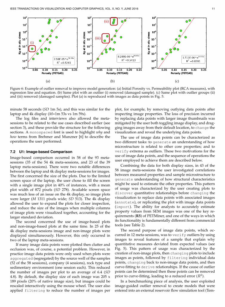
Figure 6: Example of outlier removal to improve model generation: (a) Initial Porosity vs. Permeability plot (RCA measures), withregression line and equation. (b) Same plot with an outlier (i) removed (damaged sample). (c) Same plot with outlier groups (ii)and (iii) removed (damaged samples). Plot (a) is reproduced with images as data points in Fig. 5.
minute 58 seconds (SD 1m 5s), and this was similar for thelaptop and 4k display (M=1m 53s vs 1m 59s).
The log files and interviews also allowed the meta-sessions to be related to the use cases described earlier (seesection 3), and these provide the structure for the followingsections. A monospaced font is used to highlight why andhow terms from Brehmer and Munzner [6] to describe theoperations the user performed.
7.2 U1: Image-based Comparison
Image-based comparison occurred in 58 of the 93 meta-sessions (35 of the 54 4k meta-sessions, and 23 of the 39laptop meta-sessions). There were two notable differencesbetween the laptop and 4k display meta-sessions for images.The first concerned the size of the plots. Due to the limitedscreen space of the laptop, the user chose to fill the screenwith a single image plot in 40% of instances, with a meanplot width of 872 pixels (SD 278). Available screen spacewas much less of an issue on the 4k display, so image plotswere larger (M 1311 pixels wide; SD 513). The 4k displayallowed the user to expand the plots for closer inspection,and reduce the size of the images when multiple columnsof image plots were visualized together, accounting for thelarger standard deviation.
The second concerned the use of image-based plotsand non-image-based plots at the same time. In 25 of the4k display meta-sessions image and non-image plots weredisplayed simultaneously. However, this only occurred intwo of the laptop meta-sessions.
If many image data points were plotted then clutter andocclusion was, of course, a potential problem. However, inpractice image data points were only used when plots wereaggregated (segregated) by the source well of the samples(52 of the 58 sessions), company (4 sessions), rock type andsedimentary environment (one session each). This reducedthe number of images per plot to an average of 6.4 (SD4.8). By default, the display size of each image was 205 x189 pixels (20% of native image size), but images could berescaled interactively using the mouse wheel. The user alsoapplied filtering to reduce the number of images per
plot, for example, by removing outlying data points afterinspecting image properties. The loss of precision incurredby replacing data points with larger image thumbnails wasmitigated by the user both toggling image display, and drag-ging images away from their default location, to change thevisualization and reveal the underlying data points.
The use of image data points can be characterized astwo different tasks: to generate an understanding of howmicrostructure is related to other core properties; and toverify extrema as outliers. These two motivations for theuse of image data points, and the sequence of operations theuser employed to achieve them are described below.
Combining the data for both display sizes, in 43 of the58 image meta-sessions the user investigated correlationsbetween measured properties and sample microstructure togenerate understanding of how structural characteristicsmight be used to estimate the other properties. This patternof usage was characterized by the user creating plots todiscover quantitative relationships before changing thevisualization to replace data points with associated images(annotate), or replicating the plot with image data points(import). The ability for analysts to accurately estimateproperty values from SEM images was one of the key re-quirements (R5) of PETMiner, and one of the ways in whichits functionality is fundamentally different from commercialtools (see Table 2).
The second purpose of image data points, which oc-curred in 12 meta-sessions, was to verify outliers by usingimages to reveal features of a sample that explain whyquantitative measures deviated from expected values (seeFig. 5). This pattern of usage was characterized by thecreation of non-image plots, then changing plots to includeimages as points, followed by filtering individual datapoints, changing back to non-image data points, and thencurve-fitting to derive relationships. If the cause of outlierpoints can be determined then these points can be removedprior to curve-fitting, leading to a reduced error (R2).
In a benchmarking piece of analysis, the user exploitedimage-guided outlier removal to create models that wereentered into an external reservoir flow simulation tool (Tem-
IEEE TRANSACTIONS ON VISUALIZATION AND COMPUTER GRAPHICS, VOL. X, NO. Y, JUNE 2016 12
pest Reservoir Engineering, by Emerson Process Manage-ment). Using images to guide the removal of three groupsof outliers from permeability/porosity plots (see Fig. 6),resulted in models that reduced the error of the Tempestflow rate estimate from 40% to only 10%, compared to aground-truth that was provided by the actual experimentalmeasurement.
PETMiner’s ability to generate models that accuratelyestimate flow rates will allow better prediction of yields fornew resource plays. This will affect real world production byallowing reservoir engineers and managers to make fasterand cheaper predictions.
Finally, in three meta-sessions, image plots were cre-ated (or loaded from previously saved sessions) to bepresented for the purpose of discussion among analysts.These sessions were distinguished from the outlier determi-nation scenario above by a lack of filtering and fitting.
7.3 U2: Deep Relationships
The user investigated deep relationships between propertiesby displaying multiple plots simultaneously, fitting thenfiltering data to reduce the error, or plotting residu-als from previously derived regression equations. Thesecomparative meta-sessions allowed the user to understandthe controls on given properties and observe correlations.We classified 50 meta-sessions as deep relationship ses-sions, with 38 meta-sessions being multi-column (includingresidual plots in eight meta-sessions), and 12 meta-sessionsinvolving iterative fitting and filtering with a single col-umn of plots. Exploring deep relationships accounted for72% of meta-sessions over 10 minutes in duration. Threerequirements were central to the user’s investigation of deeprelationships: comparative plotting (R6), derived measures(R8), and a general reduction in interaction cost (R4) thatencouraged the user to investigate “what if” possibilities.
When exploring deep relationships, the user commonly(34 out of 38 multi-column meta-sessions, and 8 of 12 single-column meta-sessions) partitioned (aggregate) plots intorows for either company or well, as there is less variance ofrock type for a given company or well in the PETGAS dataset. Partitioning plots also reduced clutter by lowering thenumber of points per plot, allowing the analyst to observerelationships more clearly. PETMiner applies the partitionsto all new and existing plots, avoiding the need to repeat thepartition operation for each plot, as required by Tableau.
In 31 of the 50 deep relationship meta-sessions, multi-ple plots were created with the same x and y axes andarranged in columns. The plots differed by varying thecolour or size of data points to reveal controls on therelationship between the main x and y axis properties. Thesingle operation required to create a complete plot and haveexisting filters and data partitions applied via linking, issimpler than the multi-stage approach to plot creation takenby Tableau, Spotfire and Excel (i.e., having to change an axisto log scale post-creation).
A particularly notable insight was achieved by a userby performing the following operations: First, dry rockpermeability and porosity (RCA measures) were encoded
as scatter-plots, and coloured by rock type (categorical data).This identified a relationship with rock type. The plots
were then aggregated (segregated) by partitioning thedata on rock type. Outlier points where identified andfiltered, before an exponential was derived from theplotted data. Data for brine saturated permeability (anSCA measure) was then plotted against porosity and thederived exponential relationship was observed to be sim-ilar to the dry rock permeability. Additional permeabilitydata for the rocks at different brine saturations (SCA mea-sures) were then imported and arranged as additionalcolumns (five columns and three rows of scatter-plots in to-tal). By visual comparison of the plots in different columns,it was observed that the gradient of the fitted exponentialswas a function of the brine saturation, with a differentrelationship observed across each microstructural rock type(rows). Brushing was used to select individual data pointsto check their ordering was consistent in each plot. Using thederived equations a previously unknown mathematicalrelationship between the relative permeability of the rockat different brine saturations to the dry rock permeabilityfor each microstructural rock type was formulated.
A relative permeability measurement is significantlymore costly and takes between a month and six months toperform. To put this into perspective, obtaining this rela-tive permeability data for the PETGAS dataset (60 samplesanalysed) required three years of laboratory time and cost£150,000. By contrast, a dry rock permeability measurementonly takes a few hours, which clearly offers the opportunityfor petroleum companies to make substantial savings.
Performing operations for the above analysis requires75 mouse clicks in PETMiner. Recreating the analysis, weestimate that Tableau requires 70% more clicks, and Excelrequires more than five times as many (129 and 402 mouseclicks, respectively). Key reasons for PETMiner’s efficiencyare allowing plots to be fully defined via a single dialograther than retrospectively modified (e.g., to change an axisto log scale), and allowing bulk operations on plots (allplots, or particular rows or columns).
7.4 U3: Creating and Updating Reports
The user exported plots in six out of the 93 meta-sessions.The most notable of these was a meta-session during whichthe user produced 153 plots while making only 30 visual-ization changes. The 20 minutes 42 seconds that the userspent generating these plots with PETMiner would havetaken approximately one week with Excel, because of thenumber of clicks that would have been required (see usecase U3). This time-saving was achieved through the easewith which large numbers of partitioned plots could becreated and updated in a single operation, and the bulkprinting of plots to a directory with names generated froma combination of partition name and plot title.
Although plots were only exported in six meta-sessions,PETMiner provided major benefit to the user in terms ofsaved time. This is best summed up by one comment theuser made, which was that they had “achieved somethingin minutes which would have previously taken days”.
IEEE TRANSACTIONS ON VISUALIZATION AND COMPUTER GRAPHICS, VOL. X, NO. Y, JUNE 2016 13
8 CONCLUSION
In this paper, we describe a novel interactive visualizationapplication for analysing the petrophysical properties ofcore samples. We relate our work to the commercial tools,and previous research in human-computer interaction andinformation visualization. We held interviews with geo-physicists from six multi-national petroleum corporationsand academic geoscientists to understand the process ofcore analysis. These interviews informed three difficult ortime-consuming data analysis use cases, and led to nineimportant user requirements. Our novel solution addressingthese requirements was a visualization tool called PET-Miner, which was evaluated over an 11 month period onboth a 4k display and a laptop.
The present research makes three main contributions.The first concerns the ways in which we avoided the manypitfalls that design studies can have [4], and leads to arecommendation for each of three stages in such studies.In the “Winnow” stage it is important to nurture the re-search idea but have patience. From meeting a promisingcollaborator (the academic consultant), it took us two yearsto identify a suitable project (PETGAS), and another twoyears before that project needed a novel visual analysistool. During that time we created a giant (3 x 1.5 meter)paper mockup that could be taken to sponsors’ sites to bringto life our ideas for PETMiner. In the “Design” stage onecannot overemphasize the importance of spending time tounderstand what users want to do. We met many times withend-users, and observed and videoed them analyzing theirdata to gain both a high- (the use cases U1-3) and low-levelunderstanding of their work (why current tools are deficientand how interaction cost could be reduced). Lastly, startingthe ‘Deploy’ stage early helped us to produce quick wins.That enthused our users, which in turn extended the projectfunding by more than two years.
The second contribution was image-based data points,which extended previous work [31], [32], [33], [34], [11],[35], [36], [23] to integrate image data about every datapoint into users’ primary (scatter-plot) visualizations. Over-plotting was not a major issue because PETMiner allowedusers to toggle the images on and off, present image-basedand conventional plots in adjacent columns, and adjustindividual images. Image-based data points help users tocombine subjective and objective information during anal-ysis (this was one of six output requirements in [39]), andwere particularly effective on a 4k display (see Challenge 5in [39]). As our evaluation showed, for U1 image data pointsallowed the user to generate substantially more accuratereservoir flow models, which would improve companies’ability to make predictions about new resource deposits.
The third contribution was the set of design principlesthat we adopted to reduce the interaction cost substantiallybelow that of specialist visualization software (Tableau) andgeneral-purpose analysis software (Excel). One principlewas that users could fully define a plot at the time ofcreation, rather than having to first create a plot using theTableau or Excel defaults and then modify components suchas an axis (e.g., set it to logarithmic). A second principle wasto minimize the depth of the menu/dialog box interface,by providing one dialog for the whole plot rather than one
per component (X axis, Y axis, etc.). A third principle wasto allow each column of plots in a trellis to have differentX and Y axes, bypassing the need to create a dashboardafter creating worksheets. The fourth and final principle wasto export plots in a folder and file structure that matcheda user’s requirements. Allowing low-cost investigation ofthe relationships between properties helped the user tomake a number of break-through findings (e.g., for dry rockvs. brine permeability; U2) and allowed the plots for thePETGAS reports to be generated in a few minutes ratherthan several days (U3).
We plan to continue development of PETMiner to in-clude statistical, clustering and image analysis techniquesfor data mining. Our initial investigations have showncomputer vision techniques are ill-suited to the analysis ofcore SEM images as the important features are subtle, andmasked by macro-structures in an image. The new function-ality will enable users to more accurately infer missing RCAand SCA values for new samples using the rich databasealready acquired by the parent PETGAS project. We alsoplan further evaluation as we deploy PETMiner to morepetrophysicists.
9 ACKNOWLEDGEMENTS
We wish to thank our sponsors for supporting the PET-Miner project: British Gas, BP, EBN, GDF Suez, Shell andWintershall. Aurelian provided core samples, but did notparticipate in the PETMiner project.
REFERENCES
[1] (2016) Microsoft Excel homepage. Microsoft. [Online]. Available:https://products.office.com/en-us/excel
[2] (2016) Spotfire homepage. TIBCO. [Online]. Available:http://spotfire.tibco.com/
[3] (2016) Interactive Petrophyics homepage. LR Senergy. [Online].Available: http://www.lr-senergy.com/software/interactive-petrophysics
[4] M. Sedlmair, M. Meyer, and T. Munzner, “Design study method-ology: Reflections from the trenches and the stacks,” IEEE Trans-actions on Visualization and Computer Graphics, vol. 18, no. 12, pp.2431–2440, 2012.
[5] T. Munzner and E. Maguire, Visualization analysis and design, ser.AK Peters visualization series. Boca Raton, FL: CRC Press, 2015.[Online]. Available: https://cds.cern.ch/record/2001992
[6] M. Brehmer and T. Munzner, “A multi-level typology of abstractvisualization tasks,” IEEE Transactions on Visualization and Com-puter Graphics, vol. 19, no. 12, pp. 2376–2385, 2013.
[7] (2016) Tableau homepage. Tableau Software. [Online]. Available:http://www.tableausoftware.com/
[8] R. Becker, W. Cleveland, and M. J. Shyu, “The visual design andcontrol of trellis display,” Journal of Computation and GraphicalStatistics, vol. 5, no. 2, pp. 123–155, 1996.
[9] E. R. Tufte, The Visual Display of Quantitative Information. Cheshire,CT, USA: Graphics Press, 1986.
[10] H. Lam, “A framework of interaction costs in information visual-ization,” IEEE Transactions on Visualization and Computer Graphics,vol. 14, no. 6, pp. 1149–1156, 2008.
[11] C. Stolte, D. Tang, and P. Hanrahan, “Polaris: A system forquery, analysis, and visualization of multidimensional relationaldatabases,” IEEE Transactions on Visualization and Computer Graph-ics, vol. 8, no. 1, pp. 52–65, 2002.
[12] S. Johansson and J. Johansson, “Interactive dimensionality reduc-tion through user-defined combinations of quality metrics,” IEEETransactions on Visualization and Computer Graphics, vol. 15, no. 6,pp. 993–1000, 2009.
IEEE TRANSACTIONS ON VISUALIZATION AND COMPUTER GRAPHICS, VOL. X, NO. Y, JUNE 2016 14
[13] D. Asimov, “The grand tour: A tool for viewing multidimensionaldata,” SIAM Journal on Scientific and Statistical Computing,vol. 6, no. 1, pp. 128–143, Jan. 1985. [Online]. Available:http://dx.doi.org/10.1137/0906011
[14] J. Seo and B. Shneiderman, “A rank-by-feature framework for un-supervised multidimensional data exploration using low dimen-sional projections,” in IEEE Symposium on Information Visualization,2004. INFOVIS 2004, 2004, pp. 65–72.
[15] A. Artero, M. de Oliveira, and H. Levkowitz, “Enhanced highdimensional data visualization through dimension reduction andattribute arrangement,” in Tenth International Conference on Infor-mation Visualization, 2006. IV 2006., July 2006, pp. 707–712.
[16] S. Johansson Fernstad, J. Shaw, and J. Johansson, “Quality-basedguidance for exploratory dimensionality reduction,” InformationVisualization, vol. 12, no. 1, pp. 44–64, 1 2013.
[17] K. Wongsuphasawat, D. Moritz, A. Anand, J. Mackinlay, B. Howe,and J. Heer, “Voyager: Exploratory analysis via faceted browsingof visualization recommendations,” IEEE Transactions on Visualiza-tion and Computer Graphics, vol. 22, no. 1, pp. 649–658, 2016.
[18] J. D. Mackinlay, P. Hanrahan, and C. Stolte, “Show Me: Automaticpresentation for visual analysis,” IEEE Transactions on Visualizationand Computer Graphics, vol. 13, no. 6, pp. 1137–1144, 2007.
[19] S. K. Card, W. K. English, and B. J. Burr, “Evaluation of mouse,rate-controlled isometric joystick, step keys, and text keys for textselection on a CRT,” Ergonomics, vol. 21, no. 8, pp. 601–613, 1978.
[20] A. Goguey, M. Nancel, G. Casiez, and D. Vogel, “The performanceand preference of different fingers and chords for pointing, drag-ging, and object transformation,” in Proceedings of the 2016 CHIConference on Human Factors in Computing Systems. ACM, 2016,pp. 4250–4261.
[21] T. Isenberg, P. Isenberg, J. Chen, M. Sedlmair, and T. Moller, “Asystematic review on the practice of evaluating visualization,”IEEE Transactions on Visualization and Computer Graphics, vol. 19,no. 12, pp. 2818–2827, 2013.
[22] S. Steger, N. Bozoglu, A. Kuijper, and S. Wesarg, “Applicationof radial ray based segmentation to cervical lymph nodes in CTimages,” IEEE Transactions on Medical Imaging, vol. 32, no. 5, pp.888–900, 2013.
[23] A. J. Pretorius, Y. Zhou, and R. A. Ruddle, “Visual parameter op-timisation for biomedical image processing,” BMC bioinformatics,vol. 16, no. Suppl 11, p. S9, 2015.
[24] M. Hess, S. Bremm, S. Weissgraeber, K. Hamacher, M. Goesele,J. Wiemeyer, and T. von Landesberger, “Visual exploration of pa-rameter influence on phylogenetic trees,” IEEE Computer Graphicsand Applications, vol. 34, no. 2, pp. 48–56, 2014.
[25] I. B. Huang, J. Keisler, and I. Linkov, “Multi-criteria decisionanalysis in environmental sciences: ten years of applications andtrends,” Science of the total environment, vol. 409, no. 19, pp. 3578–3594, 2011.
[26] B. Yost, Y. Haciahmetoglu, and C. North, “Beyond visual acuity:the perceptual scalability of information visualizations for largedisplays,” in Proceedings of the SIGCHI conference on Human factorsin computing systems. ACM, 2007, pp. 101–110.
[27] R. A. Ruddle, W. Fateen, D. Treanor, P. Sondergeld, P. Quirke et al.,“Leveraging wall-sized high-resolution displays for comparativegenomics analyses of copy number variation,” in 2013 IEEE Sym-posium on Biological Data Visualization (BioVis). IEEE, 2013, pp.89–96.
[28] R. A. Ruddle, R. G. Thomas, R. S. Randell, P. Quirke, andD. Treanor, “Performance and interaction behaviour during visualsearch on large, high-resolution displays,” Information Visualiza-tion, vol. 14, no. 2, pp. 137–147, 2015.
[29] M. A. Smith and A. T. Fiore, “Visualization components forpersistent conversations,” in Proceedings of the SIGCHI conferenceon Human factors in computing systems. ACM, 2001, pp. 136–143.
[30] J. T. Morisette, C. S. Jarnevich, T. R. Holcombe, C. B. Talbert,D. Ignizio, M. K. Talbert, C. Silva, D. Koop, A. Swanson, andN. E. Young, “VisTrails SAHM: visualization and workflow man-agement for species habitat modeling,” Ecography, vol. 36, no. 2,pp. 129–135, 2013.
[31] M. Beham, W. Herzner, M. E. Gröller, and J. Kehrer, “Cupid:Cluster-based exploration of geometry generators with parallelcoordinates and radial trees,” IEEE Transactions on Visualization andComputer Graphics, vol. 20, no. 12, pp. 1693–1702, 2014.
[32] S. Bruckner and T. Möller, “Result-driven exploration of simula-tion parameter spaces for visual effects design,” IEEE Transactions
on Visualization and Computer Graphics, vol. 16, no. 6, pp. 1468–1476,2010.
[33] J. Marks, B. Andalman, P. A. Beardsley, W. Freeman, S. Gib-son, J. Hodgins, T. Kang, B. Mirtich, H. Pfister, W. Ruml et al.,“Design galleries: A general approach to setting parameters forcomputer graphics and animation,” in Proceedings of the 24th annualconference on Computer graphics and interactive techniques. ACMPress/Addison-Wesley Publishing Co., 1997, pp. 389–400.
[34] C. Seifert and E. Lex, “A novel visualization approach for data-mining-related classification,” in Information Visualisation, 200913th International Conference. IEEE, 2009, pp. 490–495.
[35] T. Torsney-Weir, A. Saad, T. Möller, H.-C. Hege, B. Weber, J.-M.Verbavatz, and S. Bergner, “Tuner: Principled parameter findingfor image segmentation algorithms using visual response sur-face exploration,” IEEE Transactions on Visualization and ComputerGraphics, vol. 17, no. 12, pp. 1892–1901, 2011.
[36] J. Waser, R. Fuchs, H. Ribicic, B. Schindler, G. Blöschl, and M. E.Gröller, “World lines,” IEEE Transactions on Visualization and Com-puter Graphics, vol. 16, no. 6, pp. 1458–1467, 2010.
[37] W. E. Kenyon, P. I. Day, C. Straley, and J. F. Willemsen, “A three-part study of NMR longitudinal relaxation properties of water-saturated sandstones,” SPE Formation Evaluation, vol. 3, pp. 622–636, 1988.
[38] G. Archie, “The electrical resistivity log as an aid in determiningsome reservoir characteristics,” Petroleum Transactions of AIME,vol. 146, pp. 54–62, 1942.
[39] T. von Landesberger, D. Fellner, and R. A. Ruddle, “Visualizationsystem requirements for data processing pipeline design and opti-mization,” IEEE Transactions on Visualization and Computer Graphics,in press.
Dave Harrison received a BSc in Computer Sci-ence in 2007, and a PhD in Computing in 2012,both from the University of Leeds. He worked asa software engineer for 15 years, before return-ing to university. His research interests includedata analytics and machine learning, and haspreviously worked on an open-science portal fordigital archaeology. He is currently a researchfellow in the Computational Science and Engi-neering group at the University of Leeds.
Nick Efford graduated from Imperial Collegewith a BSc in Physics, before completing a PhDin planetary remote sensing at Lancaster Univer-sity. He has spent 15 years at the University ofLeeds researching image analysis and computervision.
Quentin Fisher is Professor of Petroleum Geo-engineering at the University of Leeds. He hasmore than 20 years’ experience works as a con-sultant and researcher for the petroleum indus-try. He spent 15 years working for Rock Defor-mation Research Ltd where he led the collectionof the world’s most extensive database of faultproperties. In the last 8 years, he has becomemore involved in characterizing the petrophysicalproperties of unconventional reservoirs.
Roy Ruddle is Professor of Computing at theUniversity of Leeds. He has a multidisciplinarybackground, combining research and develop-ment in the software industry with a PhD inpsychology. He conducts basic and applied re-search at the interface of computer graphicsand human-computer interaction. His current re-search focuses on ultra-high-definition displaysand visual analytic tools.