Embed Size (px)
Citation preview
Mumina Chowdhury
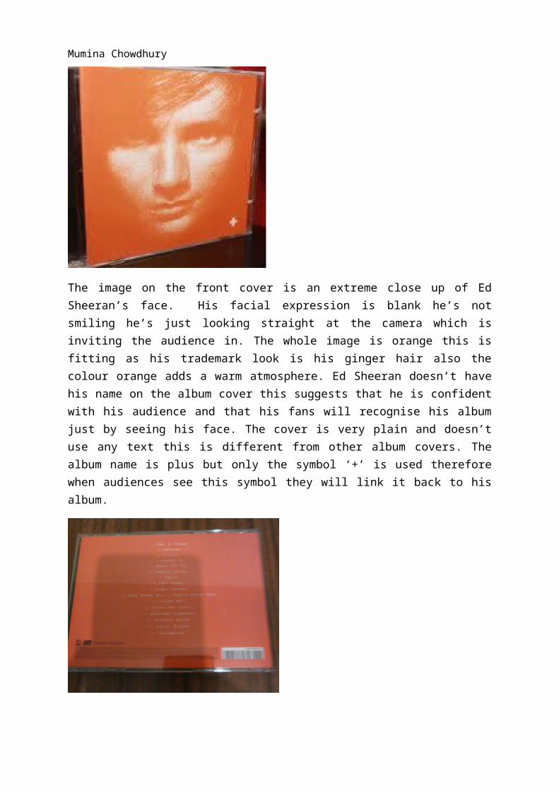
The image on the front cover is an extreme close up of Ed Sheeran’s face. His facial expression is blank he’s not smiling he’s just looking straight at the camera which is inviting the audience in. The whole image is orange this is fitting as his trademark look is his ginger hair also the colour orange adds a warm atmosphere. Ed Sheeran doesn’t have his name on the album cover this suggests that he is confident with his audience and that his fans will recognise his album just by seeing his face. The cover is very plain and doesn’t use any text this is different from other album covers. The album name is plus but only the symbol ‘+’ is used therefore when audiences see this symbol they will link it back to his album.
The back of the album is consistent in terms of colour scheme which is orange black and white. The list of songs is in white which continues the colour scheme. The record labels logo is at the bottom, this is promoting the record label. The production credits is also placed at the bottom of the back cover in small black font, this includes copyright. There are no images of him on the back this may be to show that Ed Sheeran is about just the music rather than his look unlike other current artists. The barcode is placed at the bottom; this is following conventions as most albums also have the bar code placed in the same place.
Mumina Chowdhury
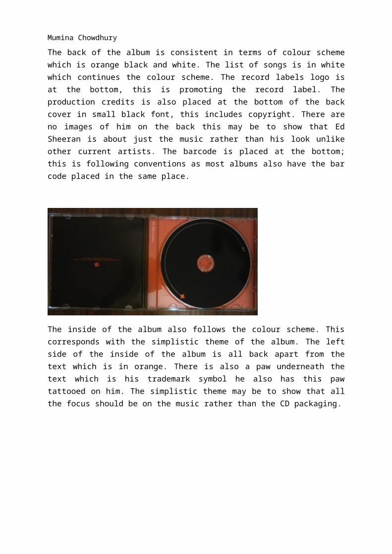
The inside of the album also follows the colour scheme. This corresponds with the simplistic theme of the album. The left side of the inside of the album is all back apart from the text which is in orange. There is also a paw underneath the text which is his trademark symbol he also has this paw tattooed on him. The simplistic theme may be to show that all the focus should be on the music rather than the CD packaging.
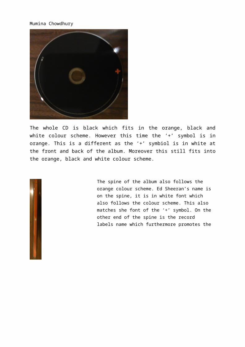
The whole CD is black which fits in the orange, black and white colour scheme. However this time the ‘+’ symbol is in orange. This is a different as the ‘+’ symbiol is in white at the front and back of the album. Moreover this still fits into the orange, black and white colour scheme.
Mumina Chowdhury
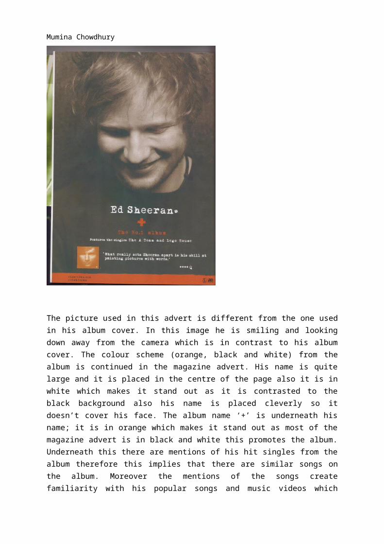
The picture used in this advert is different from the one used in his album cover. In this image he is smiling and looking down away from the camera which is in contrast to his album cover. The colour scheme (orange, black and white) from the album is continued in the magazine advert. His name is quite large and it is placed in the centre of the page also it
The spine of the album also follows the orange colour scheme. Ed Sheeran’s name is on the spine, it is in white font which also follows the colour scheme. This also matches she font of the ‘+’ symbol. On the other end of the spine is the record labels name which furthermore promotes the record label.
Mumina Chowdhury
is in white which makes it stand out as it is contrasted to the black background also his name is placed cleverly so it doesn’t cover his face. The album name ‘+’ is underneath his name; it is in orange which makes it stand out as most of the magazine advert is in black and white this promotes the album. Underneath this there are mentions of his hit singles from the album therefore this implies that there are similar songs on the album. Moreover the mentions of the songs create familiarity with his popular songs and music videos which furthermore promotes the album. There is an image of his album at the bottom of the page this also promotes his album likewise it creates a visual link to the actual album. Additionally there is a quote from Q magazine placed at the bottom of the magazine advert. This brings status to his album as Q is a very popular and famous magazine. Moreover at the bottom advert there is an orange boarder. This continues with the colour scheme also his website and the labels name is placed in the boarder which furthermore promotes the artist and the label.
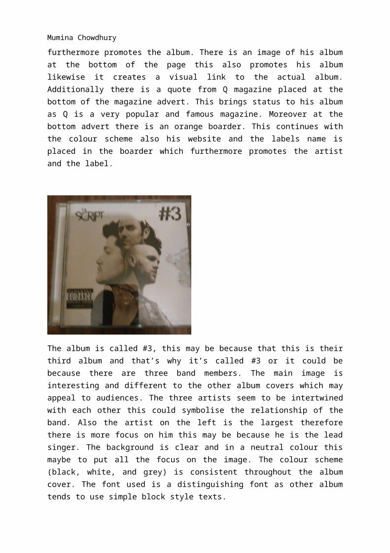
The album is called #3, this may be because that this is their third album and that’s why it’s called #3 or it could be because there are three band members. The main image is interesting and different to the other album covers which may appeal to audiences. The three artists seem to be intertwined with each other this could symbolise the relationship of the band. Also the artist on the left is the largest therefore there is more focus on him this may be because he is the lead singer. The background is clear and in a neutral colour this maybe to put all the focus on the image. The colour scheme (black, white, and grey) is consistent throughout the album cover. The font used is a distinguishing font as other album tends to use simple block style texts.
Mumina Chowdhury
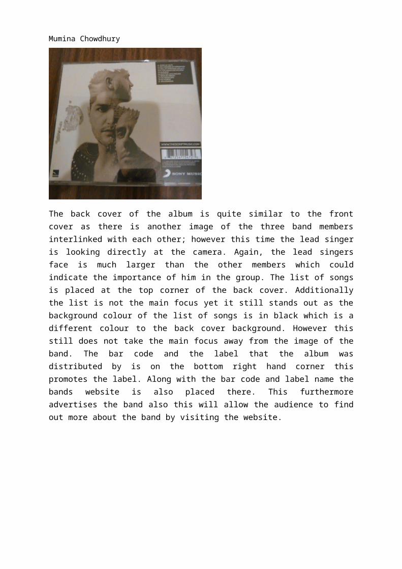
The back cover of the album is quite similar to the front cover as there is another image of the three band members interlinked with each other; however this time the lead singer is looking directly at the camera. Again, the lead singers face is much larger than the other members which could indicate the importance of him in the group. The list of songs is placed at the top corner of the back cover. Additionally the list is not the main focus yet it still stands out as the background colour of the list of songs is in black which is a different colour to the back cover background. However this still does not take the main focus away from the image of the band. The bar code and the label that the album was distributed by is on the bottom right hand corner this promotes the label. Along with the bar code and label name the bands website is also placed there. This furthermore advertises the band also this will allow the audience to find out more about the band by visiting the website.
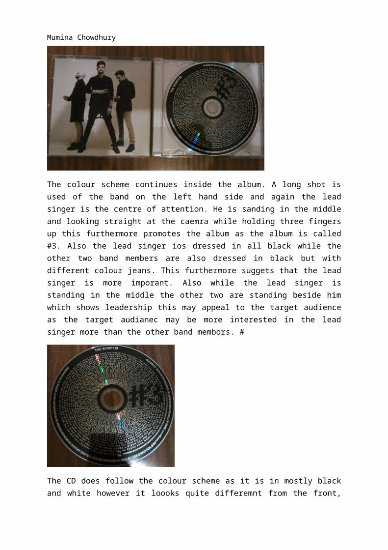
The colour scheme continues inside the album. A long shot is used of the band on the left hand side and again the lead singer is the centre of attention. He is sanding in the middle
Mumina Chowdhury
and looking straight at the caemra while holding three fingers up this furthermore promotes the album as the album is called #3. Also the lead singer ios dressed in all black while the other two band members are also dressed in black but with different colour jeans. This furthermore suggets that the lead singer is more imporant. Also while the lead singer is standing in the middle the other two are standing beside him which shows leadership this may appeal to the target audience as the target audianec may be more interested in the lead singer more than the other band membors. #
The CD does follow the colour scheme as it is in mostly black and white however it loooks quite differemnt from the front, back cover and the inside of the album. It may look different as the covers background is nuetral colour which is in contrast to the CD as the CD is in all black with the text in white. The lyrics of some songs seem to be all over the CD. Also the album name is is in black over the writing this familarises the album name.
The spine of the album is similar to the actual CD as the background is black with white writing. The band’s name is on one end of the spine white the album name ‘#3’ next to it this furthermore promotes the album and the band.
Mumina Chowdhury
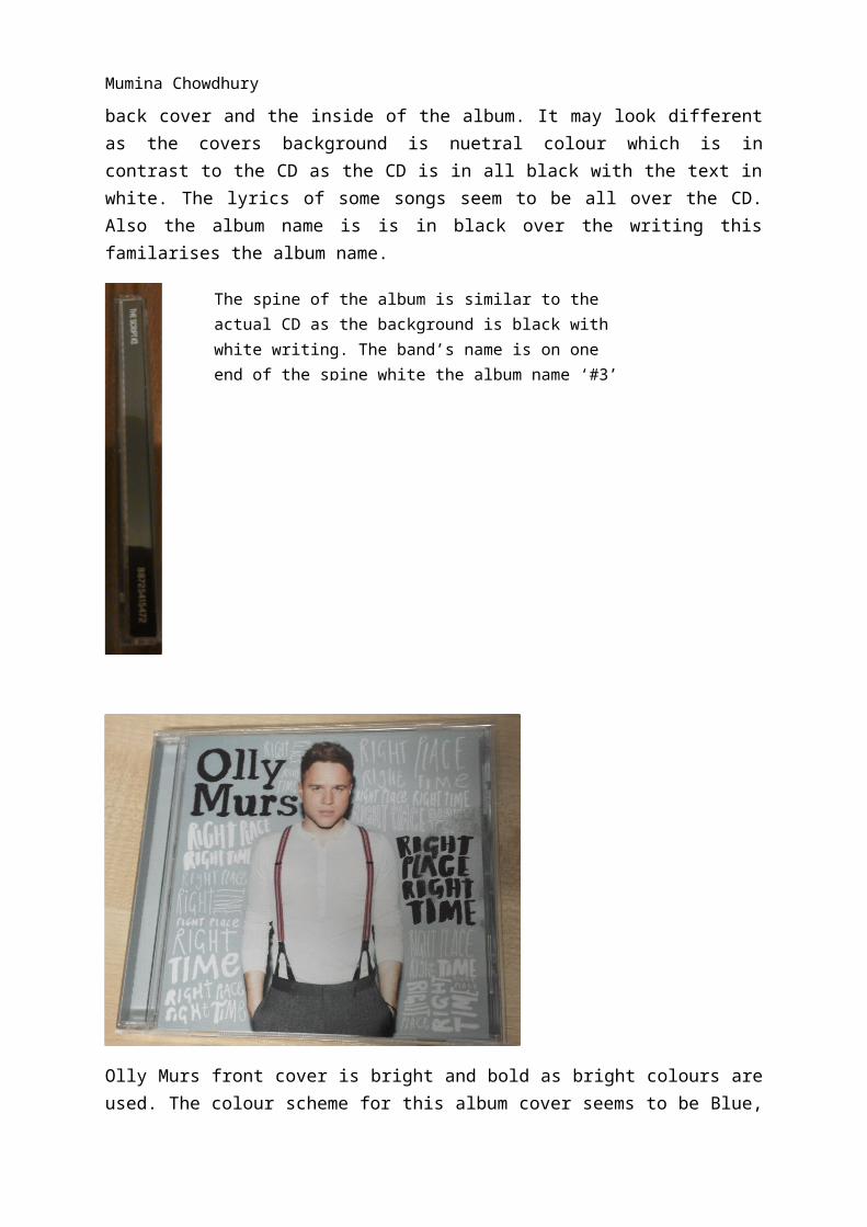
Olly Murs front cover is bright and bold as bright colours are used. The colour scheme for this album cover seems to be Blue, Black and White. A mid shot is used of Olly, which shows his clothes. He is dressed smart and flashy which is his trademark look, therefore this will attract his usual audience as they will be familiar with this. He is looking straight at the camera which invites the audience in. Around the image of Olly the front cover is filled with the albums name which is the ‘right place, right time’ this familiarises the audience with the albums name as it is repeated several times. The text is in either black or white which continues the colour scheme.
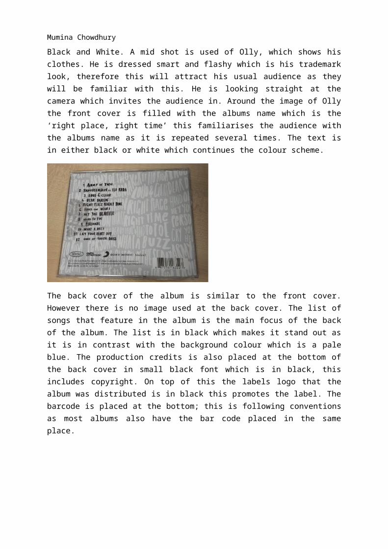
The back cover of the album is similar to the front cover. However there is no image used at the back cover. The list of songs that feature in the album is the main focus of the back of the album. The list is in black which makes it stand out as it is in contrast with the background colour which is a pale blue. The production credits is also placed at the bottom of the back cover in small black font which is in black, this includes copyright. On top of this
Mumina Chowdhury
the labels logo that the album was distributed is in black this promotes the label. The barcode is placed at the bottom; this is following conventions as most albums also have the bar code placed in the same place.
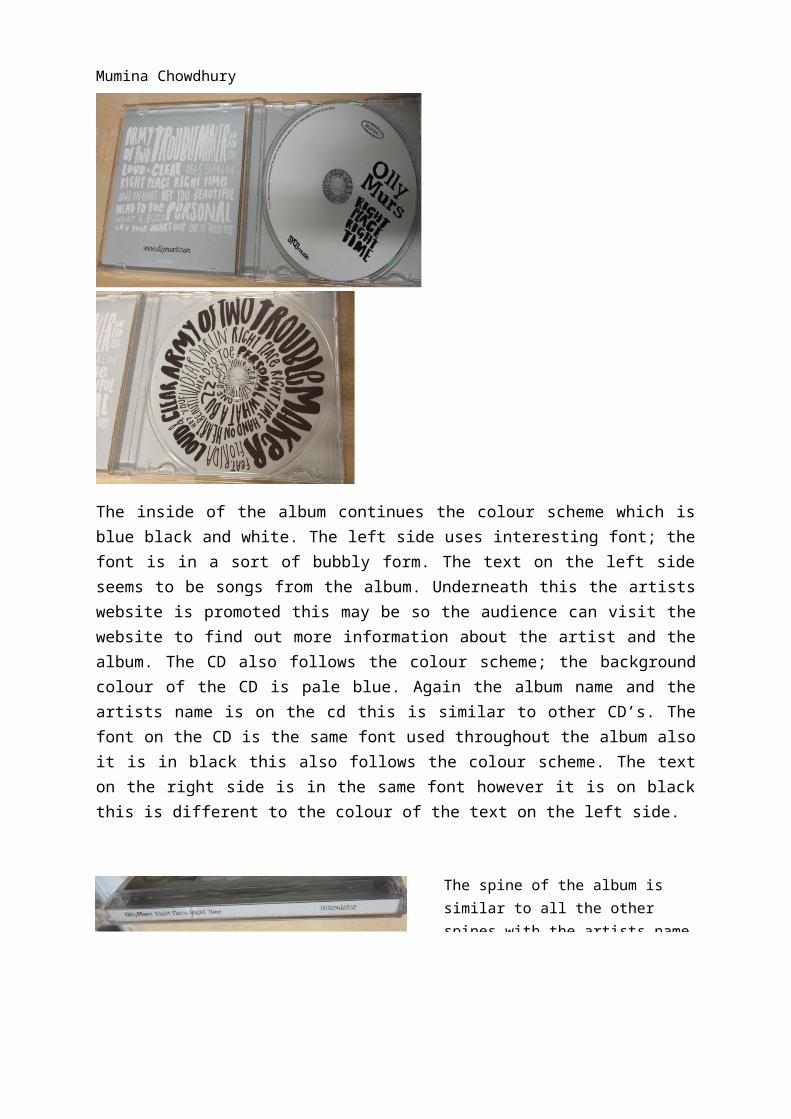
The inside of the album continues the colour scheme which is blue black and white. The left side uses interesting font; the font is in a sort of bubbly form. The text on the left side seems to be songs from the album. Underneath this the artists website is promoted this may be so the audience can visit the website to find out more information about the artist and the album. The CD also follows the colour scheme; the background colour of the CD is pale blue. Again the album name and the artists name is on the cd this is similar to other CD’s. The font on the CD is the same font used throughout the album also it is in black this also follows the colour scheme. The text on the right side is in the same font however it is on black this is different to the colour of the text on the left side.
The spine of the album is similar to all the other spines with the artists name and album name at the top end.
Mumina Chowdhury
This advert of the album is very bold and vibrant, mainly because of the colour scheme which is red, black and white. The artists name is placed at the top of the advert and is very large this is so the audience will automatically know who the advert is about. The image used is an interesting one. A long shot is used moreover in the image shows Olly doing six different poses. This is different from other magazine adverts. Also the image of Olly is mainly black which contrasts with the white background; the artist sounds out more.
Mumina Chowdhury
This magazine advert is for Ellie Goulding’s first album. The image used is a close up of the artist; she is looking way from the camera. Also in this image the artist doesn’t have heavy make up like other female artist this suggests that she kept it simple to show that it’s all about the music. The artist’s hair is gold and shiny this links to the song ‘Starry Eyed’ which is from this album. The artists name is really big this may be because that was her first album therefore audiences may not have been familiar with her name or who she is at that time. Also her name and the album name are in gold which all fits in with the colour scheme which is Gold, Black and White. Additionally at the bottom of the album advert there are four stars next to ‘independent’ and ‘Q magazine’ this suggests that these magazine rated the album four stars, this promotes the album as those magazines are popular magazines which rated the album good.