Embed Size (px)
Citation preview

With Quarterly Executive Letter
Volume 1, Issue 12
December 2012

© 2012 CoreLogic Proprietary and confidential. This material may not be reproduced in any form without express written permission.
ii
December 12, 2012
Gathering Steam
We launched The MarketPulse last January on an upbeat note. At that time, our Chief Economist Mark Fleming
wrote that both “the broad economy and the housing market are moving toward positive growth in 2012.” Now,
almost a year later, we see continued signs of economic improvement. And while not yet fully recovered, the
housing market gathered steam through the summer and into the fourth quarter. But will it heat up enough to
help power the general economic engine in the year ahead?
Improved fundamentals
CoreLogic® data demonstrate that home prices are stabilizing in response to improved market fundamentals
like reduced inventories and improved buyer demand. Notably, 2012 was the first year of significant price
appreciation since 2006. Year-to-date, the CoreLogic Home Price Index is up 8 percent nationally—
welcome news for borrowers, especially those saddled with negative equity.
Government efforts, too, seem to be making some difference. The Federal Reserve held the federal funds rate
target at zero this year. Continued low interest rates boosted refinancing opportunities for many homeowners,
thus benefiting the balance sheets of those who could qualify. For other borrowers, struggling to pay their
mortgages, the Home Affordable Modification Program helped reduce their monthly payment to a sustainable
level. The Federal Reserve also continued to use non-traditional monetary tools, such as quantitative easing.
As part of implementing a third round of this easing last summer, the government renewed its commitment to
purchase mortgage securities. In turn, these purchases helped keep interest rates low.
With credit remaining tight, one of the more vexing problems facing policymakers has been finding ways to
help borrowers who lack sufficient equity to qualify for a traditional refinance gain access at lower interest
rates. The expanded Home Affordable Refinance Program—HARP 2.0—gave more borrowers this access
in 2012. Since 2009, HARP programs have helped more than 1.5 million borrowers refinance under more
favorable terms.
Lenders and investors have also allowed more homeowners to pursue short sales as an alternative to foreclosure.
The continuing downward trend in both delinquency rates and foreclosures as well as a gradual clearing of the
shadow inventory are signs of stabilization in the housing market. While we’re still far from pre-crisis levels, the
trend is firmly in the right direction.
Beyond these factors, we are encouraged by strengthening consumer confidence, the mending of consumer
credit, increasing household formation and greater home affordability. Taken together, we see a brightening
outlook for mortgage production in the coming year.
From the CEO

© 2012 CoreLogic Proprietary and confidential. This material may not be reproduced in any form without express written permission.
iii
Building confidence
Despite this promise, the emerging recovery, in our view, is still a fragile one. Ongoing uncertainty in the overall
business climate brings into question whether the economy can fire on all cylinders. The lack of a workable plan
to resolve the fiscal cliff so close to deadline has impacted the confidence of business leaders. The ongoing,
unresolved problems related to the European debt crisis also weigh down confidence.
In the lead article in this month’s issue of The MarketPulse, our economists share their observations on the
difference between economic uncertainty and risk. We strongly believe, in the face of such an uncertain
environment, the best way to increase your confidence level when making decisions and taking action is access
to the right information at the right time. It is at the center of smart business planning and can help your teams
not only manage business uncertainty but also mitigate risk. At CoreLogic, we are prepared to work with you to
deliver expert analysis and innovative, tailored solutions that can help you capitalize on growth opportunities,
even in challenging markets.
On behalf of the entire CoreLogic team, best wishes for a happy holiday season. We look forward to the year
ahead and collaborating with you toward your ongoing business success.
Sincerely,
Anand Nallathambi
President and CEO

© 2012 CoreLogic Proprietary and confidential. This material may not be reproduced in any form without express written permission.
iv
The MarketPulse – Volume 1, Issue 12
The Authors
Anand K. NallathambiPresident and Chief Executive Officer
Anand K. Nallathambi is the president and chief executive officer of CoreLogic, a leading provider of consumer, financial and property information, analytics and services to business and government. Nallathambi is responsible for all aspects of the CoreLogic business.
Dr. Mark Fleming Chief Economist
Dr. Mark Fleming is the chief economist for CoreLogic. He leads the economics team responsible for analysis, commentary, and forecasting trends in the real estate and mortgage markets.
Sam KhaterDeputy Chief Economist
Sam Khater is deputy chief economist for CoreLogic. He is responsible for providing in-depth economic, mortgage market and real estate analysis.
Aurora BristorSenior Research Analyst
Aurora Bristor is a senior research analyst for CoreLogic in the Office of the Chief Economist. She develops and delivers mortgage market and real estate analytics in support of CoreLogic and the CoreLogic Academic Research Council.
Table of ContentsFrom the CEO ............................................................... ii
The Authors ................................................................... iv
Media Contacts ........................................................... iv
The MarketPulse...........................................................1
Economic Risk Versus Uncertainty.........................1
Impact of Residential Investment on Economic Growth ...................................................1
Recessions and the Residential Investment Cycle .....................................................1
Moving Toward Regulatory Certainty ............2
Follow the Money: Investing in Single-Family Rentals .................................................3
Rental Income Isn’t Just for Investors ............3
Trends in Rental Income for Owners, Tenants and Free Riders ...........................................3
It’s Good to Be an Investor In Single-Family Rental Properties .......................4
Follow the Money ...................................................5
Multifamily Rentals Rise Above the Flood ........6
In the News .....................................................................6
National Summary October 2012 .....................7
Largest 25 CBSA Summary October 2012 ...........................................................7
State Summary October 2012 ...........................8
Home Prices .............................................................9
Mortgage Performance ...................................... 10
Home Sales .............................................................. 11
Variable Descriptions .......................................... 12Media ContactsFor real estate industry and trade media:
Bill Campbell [email protected] (212) 995.8057 (office) (917) 328.6539 (mobile)
For general news media:
Lori Guyton [email protected] (901) 277.6066
The MarketPulse
1© 2012 CoreLogic Proprietary and confidential. This material may not be reproduced in any form without express written permission.
n “Risk, Uncertainty and Profit,” the economist Frank Knight distinguishes between economic risk and uncertainty.
Economic risk occurs when potential outcomes are unknown, but have well defined probability distributions. Uncertainty occurs when the outcomes are completely unknown and unquantifiable.
Over the past year, the current economic and regulatory landscape facing real estate and the mortgage markets has been characterized as uncertain. The conclusion of the recent election cycle provided some clarification, since we now know regulators are likely to pursue similar policies to the ones they’ve pursued over the last two years. The road to economic certainty is also aided by a strong comeback in residential investment. This is important because, while historically residential investment has averaged only 5 percent of GDP, its contribution to GDP growth during expansions is much higher.
Impact of Residential Investment on Economic Growth
Over the last four quarters, residential investment has added 0.3 percentage
points to GDP. While the level is low, it is contributing 12 percent of the overall low GDP growth rate. This is on par with how residential investment contributed in prior recoveries immediately after recession. It took a full two years, but residential investment is now providing the post-recession boost it normally does.
During the third quarter, the economy grew 2.7 percent, up from 1.3 percent in the second quarter. Growth in the third quarter, if not revised downward, is in line with an expected long-run trend level of about 2.5 percent. While there were some anomalies in the third-quarter report which reveal that growth is not as strong as it appears on the surface, one thing is certain: The real estate cycle is now contributing to economic growth. This is good news because residential investment is the most important cyclical component of the economy.
Recessions and the Residential Investment Cycle
Since 1970, there have been six recessions. In each of the four quarters prior to those recessions, growth averaged 3 percent. However, while economic growth was
Economic Risk Versus UncertaintyBy Sam Khater and Mark Fleming
Housing Statistics (October 2012)
HPI YOY Chg . . . . . . . . . . . . . . .6.3%
HPI YOY Chg XD . . . . . . . . . . .5.8%
NegEq Share (Q2 2012) . . . .22.3%
Shadow Inventory (07/2012) . . .2.3m
Distressed Discount. . . . . . . .34.7%
New Sales (ths, ann.) . . . . . . . . . 270
Existing Sales (ths, ann.) . . . . 2,715
Average Sales Price . . . . . . $234,990
HPI SFC Peak-to-Current. . . -26.9%
Foreclosure Inventory Peak-to-Current . . . . . . . . . . -15.8%
Volume 1, Issue 12
December 12th, 2012
Data as of October 2012
I
Cont...
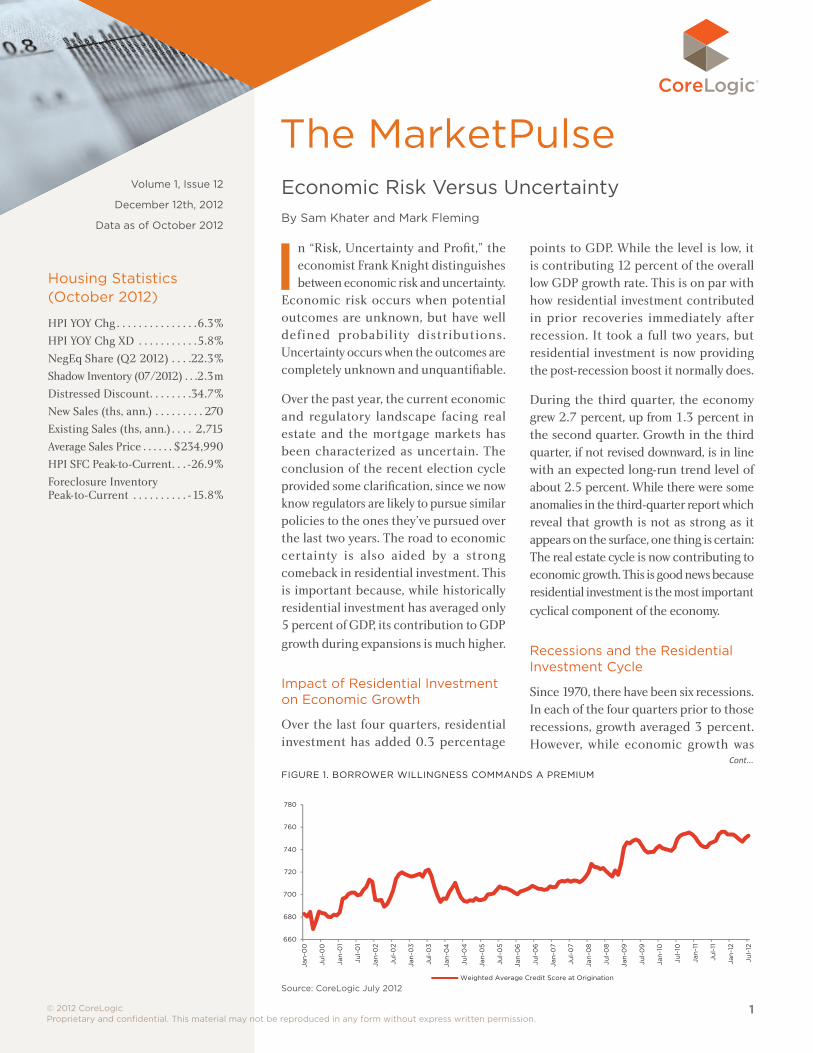
FIGURE 1. BORROWER WILLINGNESS COMMANDS A PREMIUM
660
680
700
720
740
760
780
Jan
-00
Jul-
00
Jan
-01
Jul-
01
Jan
-02
Jul-
02
Jan
-03
Jul-
03
Jan
-04
Jul-
04
Jan
-05
Jul-
05
Jan
-06
Jul-
06
Jan
-07
Jul-
07
Jan
-08
Jul-
08
Jan
-09
Jul-
09
Jan
-10
Jul-
10
Jan
-11
Jul-
11
Jan
-12
Jul-
12
Weighted Average Credit Score at Origination
Fig 1 borrower willingness commands a premium 120612
Change in YOY PricesChange in YOY REO Share
Source: CoreLogic July 2012
© 2012 CoreLogic Proprietary and confidential. This material may not be reproduced in any form without express written permission.
2
The MarketPulse – Volume 1, Issue 12
positive prior to the recession, residential investment was already flashing a warning sign and subtracting 0.2 percentage points from growth. Then, during the recession, residential investment was responsible for nearly two-thirds (0.9 percentage points) of the average overall decline of 1.4 percent per quarter. In the four quarters after the recession, residential investment contributed 13 percent (0.6 percentage points) of the overall economic growth of 4.2 percent.
The pattern was different during the most recent recession (Q4 2007 to Q2 2009). The collapse in residential investment preceded the start of the recession earlier than in prior recessions. Residential investment began to subtract from GDP growth in Q1 2006, a full seven quarters before the recession began. Moreover, during the four quarters prior to the beginning of the recession, residential investment was subtracting a full percentage point of growth from GDP. This is similar to the magnitude of movement during prior recessions—but in this case it was prior to the recession’s start. Residential investment remained weak after the recession ended during Q2 2009, contributing only 0.1 percentage points to GDP.
Moving Toward Regulatory Certainty
On the horizon are regulatory policies that require further clarification. “Qualified mortgage” and “qualified residential mortgage” will become the standards for the “credit box” within which mortgage originations
will be defined and provide regulatory preference. Two of the most important and frequently discussed dimensions of the “credit box” are credit scores and debt-to-income (DTI) ratios. The two together provide insight into a borrower’s willingness and capacity to pay.
Weighted average credit scores (Figure 1), using CoreLogic loan servicing data1, show modestly improving scores as home prices were rising in the middle of the decade. This trend may have been driven by the increased pace of refinancing, particularly prevalent
in sub-prime loans, causing successful loan repayment to “inflate” credit scores. The sudden shift to a higher credit score requirement can be seen in late 2008. Since that time, average origination credit scores have trended between 740 and 760, significantly higher than the pre-crisis average of approximately 700. Lenders today are requiring borrowers
to show a greater willingness to pay their mortgage.
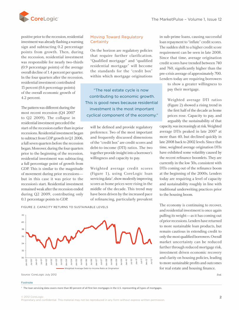
Weighted average DTI ratios (Figure 2) showed a rising trend in the first half of the decade as home prices rose. Capacity to pay, and arguably the sustainability of that
capacity, was increasingly at risk. Weighted average DTIs peaked in late 2007 at more than 40, but declined quickly in late 2008 back to 2002 levels. Since that time, weighted average origination DTIs have exhibited some volatility caused by the recent refinance boomlets. They are currently in the low 30s, consistent with DTIs coming out of the refinance boom at the beginning of the 2000s. Lenders today are requiring a level of capacity and sustainability roughly in line with traditional underwriting practices prior to the housing boom.
The economy is continuing to recover, and residential investment is once again pulling its weight—as it has coming out of prior recessions. Lenders have returned to more sustainable loan products, but remain cautious in extending credit to only the most qualified borrowers. Overall market uncertainty can be reduced further through reduced mortgage risk, investment driven economic recovery and clarity on housing policies, leading to more sustainable profits and outcomes for real estate and housing finance.
“The real estate cycle is now
contributing to economic growth.
This is good news because residential
investment is the most important
cyclical component of the economy.”
End.
Footnote
1 The loan servicing data covers more than 80 percent of all first lien mortgages in the U.S. representing all types of mortgages.
FIGURE 2. CAPACITy RETURNS TO SUSTAINABLE LEVELS
30
32
34
36
38
40
42
Jan
-00
Jul-
00
Jan
-01
Jul-
01
Jan
-02
Jul-
02
Jan
-03
Jul-
03
Jan
-04
Jul-
04
Jan
-05
Jul-
05
Jan
-06
Jul-
06
Jan
-07
Jul-
07
Jan
-08
Jul-
08
Jan
-09
Jul-
09
Jan
-10
Jul-
10
Jan
-11
Jul-
11
Jan
-12
Jul-
12
Weighted Average Debt-to-Income Ratio at Origination
Fig 2 capacity returns to sustainable levels 121112
Change in YOY PricesChange in YOY REO Share
Source: CoreLogic July 2012
© 2012 CoreLogic Proprietary and confidential. This material may not be reproduced in any form without express written permission.
3
The MarketPulse – Volume 1, Issue 12
Follow the Money: Investing in Single-Family RentalsBy Sam Khater
Footnote
2 It excludes rental income by corporations or entities.
Cont...
ore than three years into the economic recovery, incomes continue to stagnate. As of
September 2012, per capita disposable income increased only 1 percent from a year earlier. While there are many factors behind both the short-term and long-term stagnation in incomes, there are some segments of personal income that are rapidly rising.
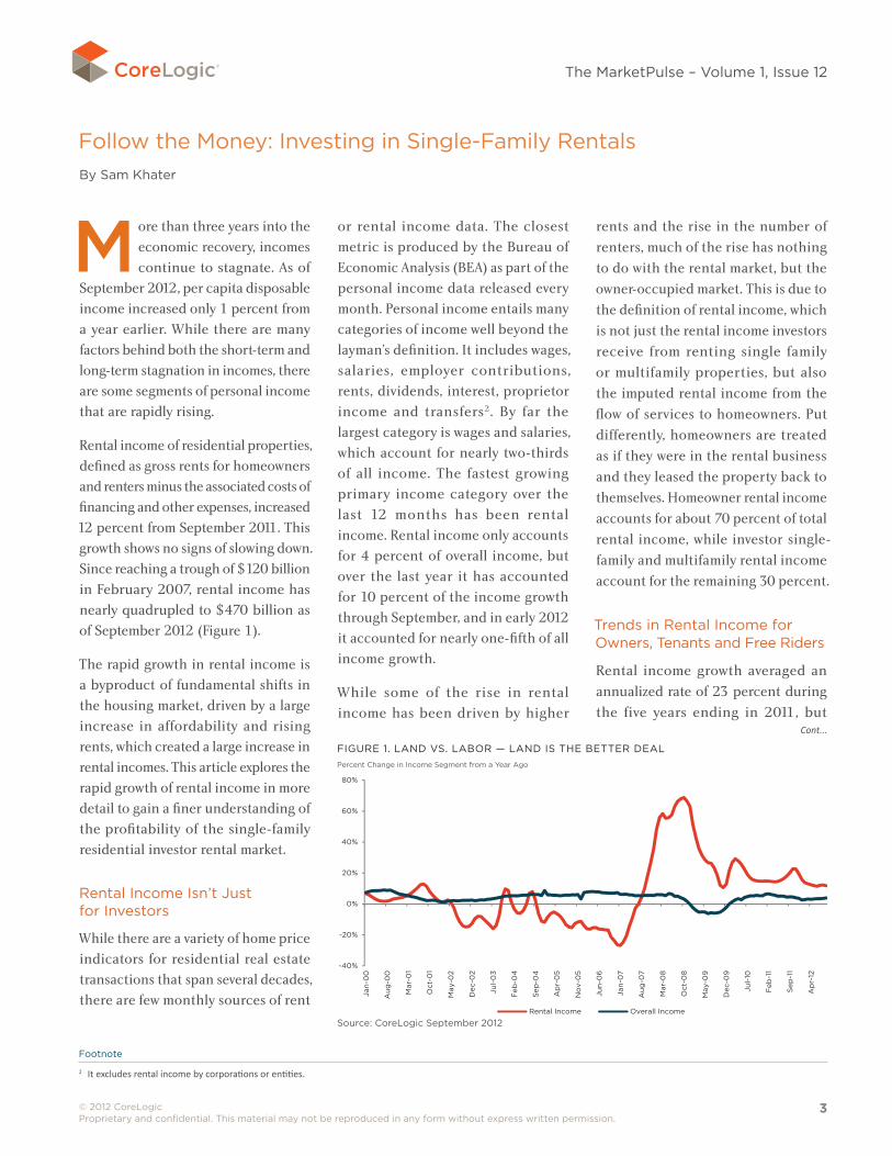
Rental income of residential properties, defined as gross rents for homeowners and renters minus the associated costs of financing and other expenses, increased 12 percent from September 2011. This growth shows no signs of slowing down. Since reaching a trough of $120 billion in February 2007, rental income has nearly quadrupled to $470 billion as of September 2012 (Figure 1).
The rapid growth in rental income is a byproduct of fundamental shifts in the housing market, driven by a large increase in affordability and rising rents, which created a large increase in rental incomes. This article explores the rapid growth of rental income in more detail to gain a finer understanding of the profitability of the single-family residential investor rental market.
Rental Income Isn’t Just for Investors
While there are a variety of home price indicators for residential real estate transactions that span several decades, there are few monthly sources of rent
or rental income data. The closest metric is produced by the Bureau of Economic Analysis (BEA) as part of the personal income data released every month. Personal income entails many categories of income well beyond the layman’s definition. It includes wages, salaries, employer contributions, rents, dividends, interest, proprietor income and transfers2. By far the largest category is wages and salaries, which account for nearly two-thirds of all income. The fastest growing primary income category over the last 12 months has been rental income. Rental income only accounts for 4 percent of overall income, but over the last year it has accounted for 10 percent of the income growth through September, and in early 2012 it accounted for nearly one-fifth of all income growth.
While some of the rise in rental income has been driven by higher
rents and the rise in the number of
renters, much of the rise has nothing
to do with the rental market, but the
owner-occupied market. This is due to
the definition of rental income, which
is not just the rental income investors
receive from renting single family
or multifamily properties, but also
the imputed rental income from the
flow of services to homeowners. Put
differently, homeowners are treated
as if they were in the rental business
and they leased the property back to
themselves. Homeowner rental income
accounts for about 70 percent of total
rental income, while investor single-
family and multifamily rental income
account for the remaining 30 percent.
Trends in Rental Income for Owners, Tenants and Free Riders
Rental income growth averaged an
annualized rate of 23 percent during
the five years ending in 2011, but
M
FIGURE 1. LAND VS. LABOR — LAND IS THE BETTER DEALPercent Change in Income Segment from a year Ago
-40%
-20%
0%
20%
40%
60%
80%
Jan
-00
Aug
-00
Mar
-01
Oct
-01
May
-02
Dec
-02
Jul-
03
Feb
-04
Sep
-04
Ap
r-0
5
No
v-0
5
Jun
-06
Jan
-07
Aug
-07
Mar
-08
Oct
-08
May
-09
Dec
-09
Jul-
10
Feb
-11
Sep
-11
Ap
r-12
Rental Income Overall Income
Khater: fig 1 land vs labor 120612
Source: CoreLogic September 2012
© 2012 CoreLogic Proprietary and confidential. This material may not be reproduced in any form without express written permission.
4
The MarketPulse – Volume 1, Issue 12
there are wide disparities by tenure.
Homeowner rental income rose at
an annualized rate of 28 percent,
compared to 15 percent a year for
investor rental income. In the first
half of the 2000s, homeowner rental
income fell from a high of $162 billion
to a low of $66 billion. Over that
same time period, investor rental
income typically ranged from $60 to
$70 billion. Homeowner rental income
in 2011 was $257 billion, and investor
rental income was $126 billion.
Both segments are exhibiting rapid
growth, but the overall rise in
rental income is driven more by the
increase in homeowner rental income
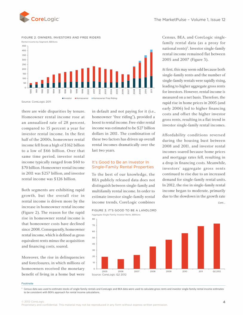
(Figure 2). The reason for the rapid
rise in homeowner rental income is
that homeowner costs have declined
since 2008. Consequently, homeowner
rental income, which is defined as gross
equivalent rents minus the acquisition
and financing costs, soared.
Moreover, the rise in delinquencies
and foreclosures, in which millions of
homeowners received the monetary
benefit of living in a home but were
in default and not paying for it (i.e., homeowner “free riding”), provided a boost to rental income. Free-rider rental income was estimated to be $27 billion dollars in 2011. The combination of these two factors has driven up overall rental incomes dramatically over the last two years.
It’s Good to Be an Investor In Single-Family Rental Properties
To the best of our knowledge, the BEA publicly released data does not distinguish between single-family and multifamily rental income. In order to estimate investor single-family rental income trends, CoreLogic combines
Census, BEA, and CoreLogic single-family rental data (as a proxy for national rents)3. Investor single-family rental income remained flat between 2005 and 2007 (Figure 3).
At first, this may seem odd because both single-family rents and the number of single-family rentals were rapidly rising, leading to higher aggregate gross rents for investors. However, rental income is measured on a net basis. Therefore, the rapid rise in home prices in 2005 (and early 2006) led to higher financing costs and offset the higher investor gross rents, resulting in a flat trend in investor single-family rental incomes.
Affordability conditions reversed during the housing bust between 2008 and 2011, and investor rental incomes soared because home prices and mortgage rates fell, resulting in a drop in financing costs. Meanwhile, investors’ aggregate gross rents continued to rise due to an increased demand for single-family rental units. In 2012, the rise in single-family rental income began to moderate, primarily due to the slowdown in the growth rate
Cont...
FIGURE 2. OWNERS, INVESTORS AND FREE RIDERSRental Income by Segment, $Billions
0
50
100
150
200
250
300
350
400
450
199
0
199
1
199
2
199
3
199
4
199
5
199
6
199
7
199
8
199
9
200
0
200
1
200
2
200
3
200
4
200
5
200
6
200
7
200
8
200
9
2010
2011
Investor Homeowner Homeowner Free Riding
Khater: fig 2 owners, investors, free riders 120612
Source: CoreLogic 2011
Footnote
3 Census data was used to estimate stocks of single-family rentals and CoreLogic and BEA data were used to calculate gross rents and investor single-family rental income estimates to be consistent with BEA’s approach for rental income calculations.
FIGURE 3. IT'S GOOD TO BE A LANDLORDAggregate Single-Family Investor Rents, $Billions
0
10
20
30
40
50
60
70
80
2005 2006 2007 2008 2009 2010 2011 Q2 2012
Khater: fig 3 its good to be landlord 120612
Source: CoreLogic Q2 2012
© 2012 CoreLogic Proprietary and confidential. This material may not be reproduced in any form without express written permission.
5
The MarketPulse – Volume 1, Issue 12
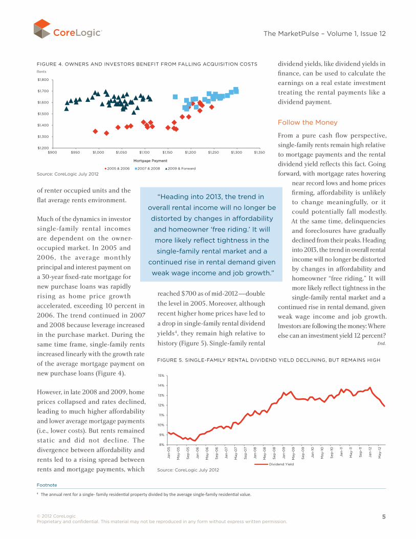
of renter occupied units and the
flat average rents environment.
Much of the dynamics in investor
single-family rental incomes
are dependent on the owner-
occupied market. In 2005 and
2006, the average monthly
principal and interest payment on
a 30-year fixed-rate mortgage for
new purchase loans was rapidly
rising as home price growth
accelerated, exceeding 10 percent in
2006. The trend continued in 2007
and 2008 because leverage increased
in the purchase market. During the
same time frame, single-family rents
increased linearly with the growth rate
of the average mortgage payment on
new purchase loans (Figure 4).
However, in late 2008 and 2009, home
prices collapsed and rates declined,
leading to much higher affordability
and lower average mortgage payments
(i.e., lower costs). But rents remained
static and did not decline. The
divergence between affordability and
rents led to a rising spread between
rents and mortgage payments, which
reached $700 as of mid-2012—double
the level in 2005. Moreover, although
recent higher home prices have led to
a drop in single-family rental dividend
yields4, they remain high relative to
history (Figure 5). Single-family rental
dividend yields, like dividend yields in finance, can be used to calculate the earnings on a real estate investment treating the rental payments like a dividend payment.
Follow the Money
From a pure cash flow perspective, single-family rents remain high relative to mortgage payments and the rental dividend yield reflects this fact. Going forward, with mortgage rates hovering
near record lows and home prices firming, affordability is unlikely to change meaningfully, or it could potentially fall modestly. At the same time, delinquencies and foreclosures have gradually declined from their peaks. Heading into 2013, the trend in overall rental income will no longer be distorted by changes in affordability and homeowner “free riding.” It will more likely reflect tightness in the single-family rental market and a
continued rise in rental demand, given weak wage income and job growth. Investors are following the money: Where else can an investment yield 12 percent?
End.
FIGURE 4. OWNERS AND INVESTORS BENEFIT FROM FALLING ACQUISITION COSTSRents
$1,200
$1,300
$1,400
$1,500
$1,600
$1,700
$1,800
$900 $950 $1,000 $1,050 $1,100 $1,150 $1,200 $1,250 $1,300 $1,350
Mortgage Payment
2005 & 2006 2007 & 2008 2009 & Forward
Khater: fig 4 owners and investors benefit 120612
Source: CoreLogic July 2012
FIGURE 5. SINGLE-FAMILy RENTAL DIVIDEND yIELD DECLINING, BUT REMAINS HIGH
8%
9%
10%
11%
12%
13%
14%
15%
Jan
-05
May
-05
Sep
-05
Jan
-06
May
-06
Sep
-06
Jan
-07
May
-07
Sep
-07
Jan
-08
May
-08
Sep
-08
Jan
-09
May
-09
Sep
-09
Jan
-10
May
-10
Sep
-10
Jan
-11
May
-11
Sep
-11
Jan
-12
May
-12
Dividend Yield
Khater: fig 5 single family rental dividend yield 120612
Source: CoreLogic July 2012
“Heading into 2013, the trend in
overall rental income will no longer be
distorted by changes in affordability
and homeowner ‘free riding.’ It will
more likely reflect tightness in the
single-family rental market and a
continued rise in rental demand given
weak wage income and job growth.”
Footnote
4 The annual rent for a single- family residential property divided by the average single-family residential value.
© 2012 CoreLogic Proprietary and confidential. This material may not be reproduced in any form without express written permission.
6
The MarketPulse – Volume 1, Issue 12
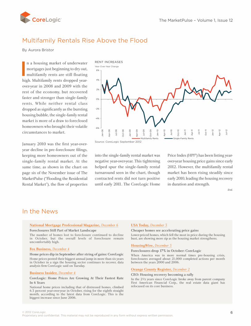
Multifamily Rentals Rise Above the Flood By Aurora Bristor
In a housing market of underwater mortgages just beginning to dry out, multifamily rents are still floating
high. Multifamily rents dropped year-over-year in 2008 and 2009 with the rest of the economy, but recovered faster and stronger than single-family rents. While neither rental class dropped as significantly as the bursting housing bubble, the single-family rental market is more of a draw to foreclosed homeowners who brought their volatile circumstances to market.
January 2010 was the first year-over-year decline in pre-foreclosure filings, keeping more homeowners out of the single-family rental market. At the same time, as shown in the chart on page six of the November issue of The MarketPulse (“Flooding the Residential Rental Market”), the flow of properties
into the single-family rental market was negative year-over-year. This tightening helped spur the single-family rental turnaround seen in the chart, though contracted rents did not turn positive until early 2011. The CoreLogic Home
Price Index (HPI®) has been listing year-over-year housing price gains since early 2012. However, the multifamily rental market has been rising steadily since early 2010, leading the housing recovery in duration and strength.
National Mortgage Professional Magazine, December 6Foreclosures Still Part of Market LandscapeThe number of homes lost to foreclosure continued to decline in October, but the overall levels of foreclosure remain uncomfortably high.
Fox Business, December 4Home prices dip in September after string of gains: CoreLogicHome prices posted their biggest annual jump in more than six years in October in a sign the housing sector continues to recover, data analysis firm CoreLogic said on Tuesday.
Business Insider, December 4CoreLogic: Home Prices Are Growing At Their Fastest Rate In 6 YearsNational home prices including that of distressed homes, climbed 6.3 percent year-over-year in October, rising for the eighth straight month, according to the latest data from CoreLogic. This is the biggest increase since June 2006.
USA Today, December 3Cheaper homes see accelerating price gainsLower-priced homes, which fell the most in price during the housing bust, are showing more zip as the housing market strengthens.
HousingWire, December 3Foreclosures drop 17% in October: CoreLogicWhen America was in more normal times pre-housing crisis, foreclosures averaged about 21,000 completed actions per month between the years 2000 and 2006.
Orange County Register, December 2CEO: Housing recovery becoming a rallyIn the 2½ years since CoreLogic broke away from parent company First American Financial Corp., the real estate data giant has refocused on its core business.
In the News
RENT INCREASESyear-Over-year Change
-6%
-4%
-2%
0%
2%
4%
6%
Jan
-08
Ap
r-0
8
Jul-
08
Oct
-08
Jan
-09
Ap
r-0
9
Jul-
09
Oct
-09
Jan
-10
Ap
r-10
Jul-
10
Oct
-10
Jan
-11
Ap
r-11
Jul-
11
Oct
-11
Jan
-12
Ap
r-12
Jul-
12
Multifamily Rents Single-Family Rents
COTM rental increases 121112
Source: CoreLogic September 2012
End.
© 2012 CoreLogic Proprietary and confidential. This material may not be reproduced in any form without express written permission.
7
The MarketPulse – Volume 1, Issue 12
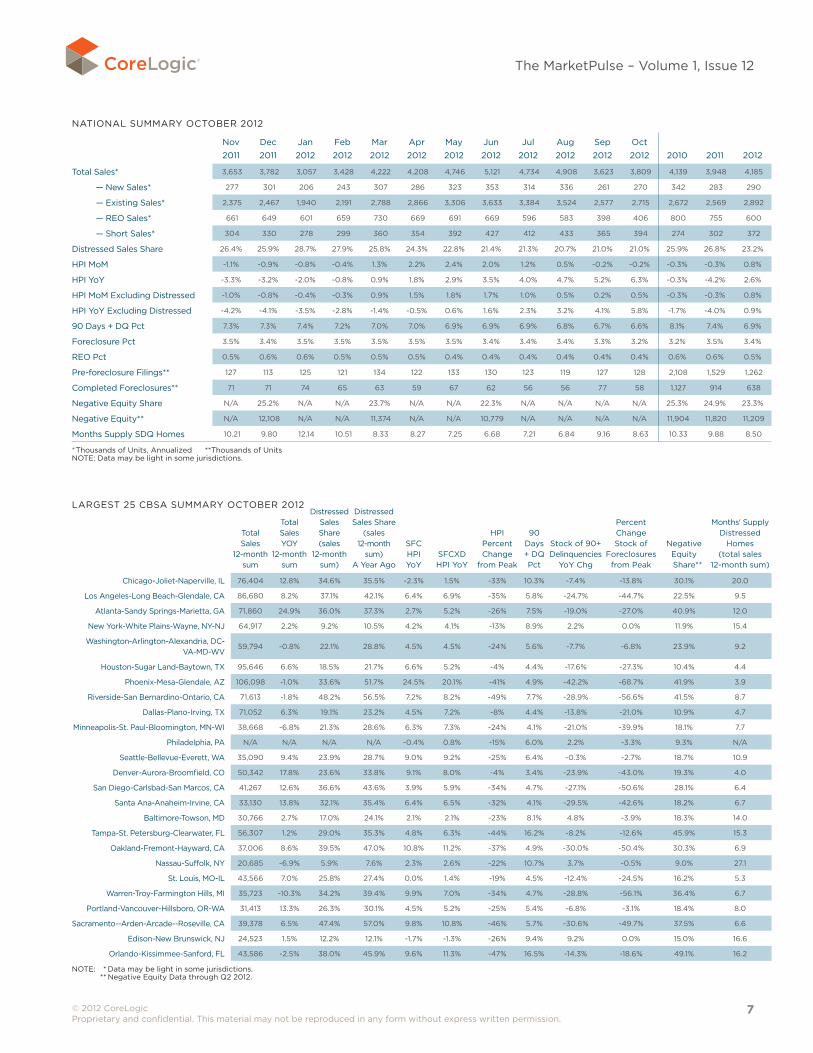
NATIONAL SUMMARy OCTOBER 2012
Nov 2011
Dec 2011
Jan 2012
Feb 2012
Mar 2012
Apr 2012
May 2012
Jun 2012
Jul 2012
Aug 2012
Sep 2012
Oct 2012 2010 2011 2012
Total Sales* 3,653 3,782 3,057 3,428 4,222 4,208 4,746 5,121 4,734 4,908 3,623 3,809 4,139 3,948 4,185
— New Sales* 277 301 206 243 307 286 323 353 314 336 261 270 342 283 290
— Existing Sales* 2,375 2,467 1,940 2,191 2,788 2,866 3,306 3,633 3,384 3,524 2,577 2,715 2,672 2,569 2,892
— REO Sales* 661 649 601 659 730 669 691 669 596 583 398 406 800 755 600
— Short Sales* 304 330 278 299 360 354 392 427 412 433 365 394 274 302 372
Distressed Sales Share 26.4% 25.9% 28.7% 27.9% 25.8% 24.3% 22.8% 21.4% 21.3% 20.7% 21.0% 21.0% 25.9% 26.8% 23.2%
HPI MoM -1.1% -0.9% -0.8% -0.4% 1.3% 2.2% 2.4% 2.0% 1.2% 0.5% -0.2% -0.2% -0.3% -0.3% 0.8%
HPI yoy -3.3% -3.2% -2.0% -0.8% 0.9% 1.8% 2.9% 3.5% 4.0% 4.7% 5.2% 6.3% -0.3% -4.2% 2.6%
HPI MoM Excluding Distressed -1.0% -0.8% -0.4% -0.3% 0.9% 1.5% 1.8% 1.7% 1.0% 0.5% 0.2% 0.5% -0.3% -0.3% 0.8%
HPI yoy Excluding Distressed -4.2% -4.1% -3.5% -2.8% -1.4% -0.5% 0.6% 1.6% 2.3% 3.2% 4.1% 5.8% -1.7% -4.0% 0.9%
90 Days + DQ Pct 7.3% 7.3% 7.4% 7.2% 7.0% 7.0% 6.9% 6.9% 6.9% 6.8% 6.7% 6.6% 8.1% 7.4% 6.9%
Foreclosure Pct 3.5% 3.4% 3.5% 3.5% 3.5% 3.5% 3.5% 3.4% 3.4% 3.4% 3.3% 3.2% 3.2% 3.5% 3.4%
REO Pct 0.5% 0.6% 0.6% 0.5% 0.5% 0.5% 0.4% 0.4% 0.4% 0.4% 0.4% 0.4% 0.6% 0.6% 0.5%
Pre-foreclosure Filings** 127 113 125 121 134 122 133 130 123 119 127 128 2,108 1,529 1,262
Completed Foreclosures** 71 71 74 65 63 59 67 62 56 56 77 58 1,127 914 638
Negative Equity Share N/A 25.2% N/A N/A 23.7% N/A N/A 22.3% N/A N/A N/A N/A 25.3% 24.9% 23.3%
Negative Equity** N/A 12,108 N/A N/A 11,374 N/A N/A 10,779 N/A N/A N/A N/A 11,904 11,820 11,209
Months Supply SDQ Homes 10.21 9.80 12.14 10.51 8.33 8.27 7.25 6.68 7.21 6.84 9.16 8.63 10.33 9.88 8.50
* Thousands of Units, Annualized **Thousands of Units NOTE: Data may be light in some jurisdictions.
LARGEST 25 CBSA SUMMARy OCTOBER 2012
Total Sales
12-month sum
Total Sales yOy
12-month sum
Distressed Sales Share (sales
12-month sum)
Distressed Sales Share
(sales 12-month
sum) A year Ago
SFC HPI yoy
SFCXD HPI yoy
HPI Percent Change
from Peak
90 Days + DQ Pct
Stock of 90+ Delinquencies
yoy Chg
Percent Change Stock of
Foreclosures from Peak
Negative Equity
Share**
Months' Supply Distressed
Homes (total sales
12-month sum)
Chicago-Joliet-Naperville, IL 76,404 12.8% 34.6% 35.5% -2.3% 1.5% -33% 10.3% -7.4% -13.8% 30.1% 20.0
Los Angeles-Long Beach-Glendale, CA 86,680 8.2% 37.1% 42.1% 6.4% 6.9% -35% 5.8% -24.7% -44.7% 22.5% 9.5
Atlanta-Sandy Springs-Marietta, GA 71,860 24.9% 36.0% 37.3% 2.7% 5.2% -26% 7.5% -19.0% -27.0% 40.9% 12.0
New york-White Plains-Wayne, Ny-NJ 64,917 2.2% 9.2% 10.5% 4.2% 4.1% -13% 8.9% 2.2% 0.0% 11.9% 15.4
Washington-Arlington-Alexandria, DC-VA-MD-WV
59,794 -0.8% 22.1% 28.8% 4.5% 4.5% -24% 5.6% -7.7% -6.8% 23.9% 9.2
Houston-Sugar Land-Baytown, TX 95,646 6.6% 18.5% 21.7% 6.6% 5.2% -4% 4.4% -17.6% -27.3% 10.4% 4.4
Phoenix-Mesa-Glendale, AZ 106,098 -1.0% 33.6% 51.7% 24.5% 20.1% -41% 4.9% -42.2% -68.7% 41.9% 3.9
Riverside-San Bernardino-Ontario, CA 71,613 -1.8% 48.2% 56.5% 7.2% 8.2% -49% 7.7% -28.9% -56.6% 41.5% 8.7
Dallas-Plano-Irving, TX 71,052 6.3% 19.1% 23.2% 4.5% 7.2% -8% 4.4% -13.8% -21.0% 10.9% 4.7
Minneapolis-St. Paul-Bloomington, MN-WI 38,668 -6.8% 21.3% 28.6% 6.3% 7.3% -24% 4.1% -21.0% -39.9% 18.1% 7.7
Philadelphia, PA N/A N/A N/A N/A -0.4% 0.8% -15% 6.0% 2.2% -3.3% 9.3% N/A
Seattle-Bellevue-Everett, WA 35,090 9.4% 23.9% 28.7% 9.0% 9.2% -25% 6.4% -0.3% -2.7% 18.7% 10.9
Denver-Aurora-Broomfield, CO 50,342 17.8% 23.6% 33.8% 9.1% 8.0% -4% 3.4% -23.9% -43.0% 19.3% 4.0
San Diego-Carlsbad-San Marcos, CA 41,267 12.6% 36.6% 43.6% 3.9% 5.9% -34% 4.7% -27.1% -50.6% 28.1% 6.4
Santa Ana-Anaheim-Irvine, CA 33,130 13.8% 32.1% 35.4% 6.4% 6.5% -32% 4.1% -29.5% -42.6% 18.2% 6.7
Baltimore-Towson, MD 30,766 2.7% 17.0% 24.1% 2.1% 2.1% -23% 8.1% 4.8% -3.9% 18.3% 14.0
Tampa-St. Petersburg-Clearwater, FL 56,307 1.2% 29.0% 35.3% 4.8% 6.3% -44% 16.2% -8.2% -12.6% 45.9% 15.3
Oakland-Fremont-Hayward, CA 37,006 8.6% 39.5% 47.0% 10.8% 11.2% -37% 4.9% -30.0% -50.4% 30.3% 6.9
Nassau-Suffolk, Ny 20,685 -6.9% 5.9% 7.6% 2.3% 2.6% -22% 10.7% 3.7% -0.5% 9.0% 27.1
St. Louis, MO-IL 43,566 7.0% 25.8% 27.4% 0.0% 1.4% -19% 4.5% -12.4% -24.5% 16.2% 5.3
Warren-Troy-Farmington Hills, MI 35,723 -10.3% 34.2% 39.4% 9.9% 7.0% -34% 4.7% -28.8% -56.1% 36.4% 6.7
Portland-Vancouver-Hillsboro, OR-WA 31,413 13.3% 26.3% 30.1% 4.5% 5.2% -25% 5.4% -6.8% -3.1% 18.4% 8.0
Sacramento--Arden-Arcade--Roseville, CA 39,378 6.5% 47.4% 57.0% 9.8% 10.8% -46% 5.7% -30.6% -49.7% 37.5% 6.6
Edison-New Brunswick, NJ 24,523 1.5% 12.2% 12.1% -1.7% -1.3% -26% 9.4% 9.2% 0.0% 15.0% 16.6
Orlando-Kissimmee-Sanford, FL 43,586 -2.5% 38.0% 45.9% 9.6% 11.3% -47% 16.5% -14.3% -18.6% 49.1% 16.2
NOTE: * Data may be light in some jurisdictions. ** Negative Equity Data through Q2 2012.
© 2012 CoreLogic Proprietary and confidential. This material may not be reproduced in any form without express written permission.
8
The MarketPulse – Volume 1, Issue 12
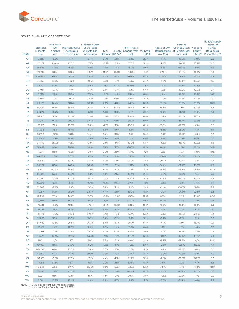
STATE SUMMARy OCTOBER 2012
State
Total Sales 12-month
sum
Total Sales yOy
12-month sum
Distressed Sales Share (sales
12-month sum)
Distressed Sales Share (sales
12-month sum) A year Ago
SFC HPI yoy
SFCXD HPI yoy
HPI Percent Change from
Peak90 Days +
DQ Pct
Stock of 90+ Delinquencies
yoy Chg
Percent Change Stock
of Foreclosures from Peak
Negative Equity
Share**
Months' Supply Distressed
Homes (total sales
12-month sum)
AK 9,835 -5.2% 11.1% 13.4% 3.7% 3.8% -3.4% 2.2% -1.4% -19.9% 5.0% 2.2
AL 27,971 -25.0% 16.3% 17.2% -0.3% -1.5% -17.8% 5.5% -4.0% -24.1% 13.7% 12.9
AR 36,055 -11.6% 9.0% 9.3% 1.2% 1.2% -4.0% 5.6% 9.1% -14.2% 11.6% 5.4
AZ 143,781 0.5% 33.3% 48.7% 21.2% 16.6% -40.2% 4.8% -37.8% -64.4% 39.7% 4.2
CA 473,290 6.8% 40.2% 47.5% 9.0% 9.7% -36.6% 5.4% -27.9% -48.6% 29.0% 7.4
CO 97,458 12.6% 24.2% 31.1% 7.3% 6.1% -6.3% 3.4% -21.5% -40.0% 18.2% 3.8
CT 36,301 10.1% 19.1% 18.8% 0.6% 0.2% -23.6% 7.4% 2.0% -4.5% 13.7% 11.8
DC 6,748 -0.7% 7.9% 13.7% 6.0% 5.7% -0.4% 5.8% 1.8% -19.2% 10.5% 9.7
DE 8,673 2.2% 23.0% 17.6% -2.7% -2.1% -23.2% 6.8% 2.8% -18.0% 16.2% 14.7
FL 412,117 1.0% 29.7% 36.1% 7.3% 6.0% -44.5% 16.0% -12.7% -17.2% 42.7% 13.7
GA 119,728 17.5% 30.6% 30.8% 2.2% 4.8% -24.7% 6.9% -16.9% -26.0% 35.8% 10.0
HI 15,206 -6.1% 16.7% 20.2% 13.2% 12.5% -18.7% 6.5% -2.9% -2.6% 10.2% 8.8
IA 33,276 -31.3% 9.9% 9.7% 1.0% 0.6% -1.4% 3.8% -10.3% -14.4% 9.4% 4.8
ID 33,515 5.3% 22.0% 32.4% 12.4% 9.7% -29.2% 4.6% -16.7% -20.2% 22.5% 3.8
IL 131,116 9.3% 28.3% 27.4% -2.7% 0.8% -29.7% 8.9% -7.2% -13.7% 25.8% 14.9
IN 108,971 7.9% 18.3% 18.8% 4.1% 3.3% -10.3% 6.2% -10.5% -18.0% 9.5% 5.8
KS 30,136 7.8% 15.7% 18.3% 3.9% 5.6% -6.5% 4.2% -8.6% -23.2% 8.3% 5.1
Ky 35,180 -21.1% 15.1% 14.4% 0.6% 3.3% -7.5% 5.4% -6.9% -16.4% 9.5% 8.0
LA 45,146 -14.5% 15.5% 12.5% 6.5% 7.9% -2.1% 5.9% -4.6% -22.5% 14.8% 7.1
MA 93,749 26.7% 11.2% 13.8% 3.6% 4.6% -19.6% 5.5% -4.8% -13.7% 15.6% 6.1
MD 66,645 0.0% 20.9% 28.9% 3.8% 3.7% -26.7% 8.2% 0.9% -4.5% 23.2% 14.8
ME 11,974 8.8% 9.6% 10.0% 2.3% 2.9% -17.7% 7.2% 1.8% -3.3% 8.0% 10.6
MI 144,889 2.3% 36.1% 39.1% 7.8% 5.9% -35.3% 5.2% -25.4% -51.8% 32.8% 5.8
MN 59,649 -9.5% 18.2% 23.7% 5.2% 5.9% -21.9% 3.8% -20.3% -40.0% 17.1% 6.7
MO 83,722 8.5% 24.2% 26.9% 1.3% 2.2% -19.1% 4.1% -14.4% -31.4% 15.6% 4.6
MS 6,527 -33.4% 16.3% 11.3% 5.7% 5.7% -11.3% 7.2% -5.8% -26.4% 26.5% 30.5
MT 13,909 6.3% 15.0% 15.8% 4.6% 2.6% -15.4% 2.7% -15.6% -32.8% 7.4% 2.9
NC 117,343 10.8% 15.6% 16.2% 1.8% 1.8% -10.5% 5.5% -6.8% -15.0% 13.8% 7.3
ND 13,608 12.1% 3.6% 4.4% 10.4% 9.5% 0.0% 1.5% -9.3% -18.1% 5.5% 0.7
NE 27,602 -3.4% 9.9% 10.3% 3.8% 3.2% -2.0% 2.8% -4.1% -28.1% 11.6% 2.7
NH 17,957 14.1% 25.0% 24.7% 4.4% 5.8% -16.0% 4.2% -10.9% -24.6% 20.8% 5.3
NJ 81,016 2.9% 14.2% 15.5% -0.6% -0.2% -25.9% 11.3% 8.2% 0.0% 18.2% 20.6
NM 21,897 -1.4% 18.0% 19.3% 3.1% 4.1% -21.0% 5.6% -2.7% -7.2% 13.1% 7.8
NV 70,131 -3.5% 49.0% 57.2% 12.4% 10.8% -53.5% 11.6% -19.3% -49.0% 58.6% 9.0
Ny 157,388 3.6% 6.0% 7.2% 5.4% 5.3% -10.4% 8.4% 5.7% 0.0% 8.1% 12.1
OH 137,778 -2.5% 24.7% 27.6% 1.4% 1.0% -17.4% 6.6% -9.8% -18.0% 24.1% 8.3
OK 65,025 3.3% 10.5% 10.7% 0.6% 0.2% -2.6% 5.2% -3.3% -2.1% 8.1% 3.7
OR 54,662 12.6% 26.8% 30.3% 5.6% 5.7% -25.0% 5.4% -7.4% -2.9% 18.7% 7.3
PA 130,415 1.4% 12.5% 12.9% 0.7% 1.4% -11.8% 6.0% 1.2% -2.7% 9.4% 8.0
RI 11,939 10.8% 23.8% 24.3% -0.5% 0.7% -34.4% 7.5% -3.1% -16.7% 22.6% 9.7
SC 65,476 12.3% 22.0% 24.4% 7.1% 6.1% -13.9% 6.2% -10.1% -15.4% 16.5% 7.0
SD N/A N/A N/A N/A 5.5% 6.1% -1.0% 2.5% -8.3% -28.5% N/A N/A
TN 107,085 11.6% 21.0% 21.2% 1.6% 3.1% -11.2% 5.6% -12.5% -32.1% 16.8% 4.7
TX 404,800 4.6% 16.0% 18.6% 5.5% 5.5% -5.7% 4.1% -14.2% -21.9% 8.8% 3.6
UT 47,866 6.4% 21.7% 29.9% 9.2% 7.7% -23.6% 4.3% -15.6% -47.3% 18.1% 4.6
VA 93,531 -3.6% 22.3% 25.1% 4.4% 4.3% -21.2% 3.9% -7.7% -21.8% 20.1% 6.3
VT 11,065 32.1% N/A N/A 2.2% 2.5% -10.3% 4.2% 3.9% 0.0% N/A 3.6
WA 83,086 3.6% 23.1% 26.3% 6.2% 6.3% -24.3% 6.6% 4.0% 0.0% 19.1% 10.9
WI 67,500 2.6% 16.0% 15.9% 1.8% 2.0% -14.4% 4.2% -12.3% -26.8% 15.5% 5.6
WV 6,291 11.9% 6.8% N/A 4.8% 2.1% -20.3% 3.8% -11.3% -29.0% 7.1% 9.0
Wy 6,061 10.3% 12.4% 14.8% 6.9% 4.7% -8.4% 2.1% -17.6% -54.9% 9.4% 2.9
NOTE: * Data may be light in some jurisdictions. ** Negative Equity Data through Q2 2012.
© 2012 CoreLogic Proprietary and confidential. This material may not be reproduced in any form without express written permission.
9
The MarketPulse – Volume 1, Issue 12
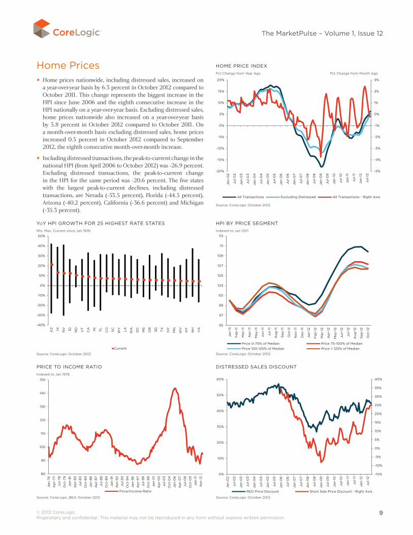
Home Prices ► Home prices nationwide, including distressed sales, increased on a year-over-year basis by 6.3 percent in October 2012 compared to October 2011. This change represents the biggest increase in the HPI since June 2006 and the eighth consecutive increase in the HPI nationally on a year-over-year basis. Excluding distressed sales, home prices nationwide also increased on a year-over-year basis by 5.8 percent in October 2012 compared to October 2011. On a month-over-month basis excluding distressed sales, home prices increased 0.5 percent in October 2012 compared to September 2012, the eighth consecutive month-over-month increase.
► Including distressed transactions, the peak-to-current change in the national HPI (from April 2006 to October 2012) was -26.9 percent. Excluding distressed transactions, the peak-to-current change in the HPI for the same period was -20.6 percent. The five states with the largest peak-to-current declines, including distressed transactions, are Nevada (-53.5 percent), Florida (-44.5 percent), Arizona (-40.2 percent), California (-36.6 percent) and Michigan (-35.3 percent).
yoy HPI GROWTH FOR 25 HIGHEST RATE STATES Min, Max, Current since Jan 1976
-40%
-30%
-20%
-10%
0%
10%
20%
30%
40%
50%
AZ HI
NV ID ND
UT
CA MI
FL
CO SC
WY
LA
WA
DC
MS
OR
SD TX
NY
MN
WV
MT
NH
VA
Current
2.6x3.57 5pt gothamPrices: yoy hpi growth for 25 lowest rate states oct 2012
Source: CoreLogic October 2012
HPI By PRICE SEGMENT Indexed to Jan 2011
95
97
99
101
103
105
107
109
111
113
Jan
-11
Feb
-11
Mar
-11
Ap
r-11
May
-11
Jun
-11
Jul-
11
Aug
-11
Sep
-11
Oct
-11
No
v-11
Dec
-11
Jan
-12
Feb
-12
Mar
-12
Ap
r-12
May
-12
Jun
-12
Jul-
12
Aug
-12
Sep
-12
Oct
-12
Price 0-75% of Median Price 75-100% of MedianPrice 100-125% of Median Price > 125% of Median
2.6x3.57 5pt gothamPrices: hpi by price segment oct 2012
Source: CoreLogic October 2012
HOME PRICE INDEXPct Change from year Ago Pct Change from Month Ago
-5%
-4%
-3%
-2%
-1%
0%
1%
2%
3%
-20%
-15%
-10%
-5%
0%
5%
10%
15%
20%
Jan
-02
Jul-
02
Jan
-03
Jul-
03
Jan
-04
Jul-
04
Jan
-05
Jul-
05
Jan
-06
Jul-
06
Jan
-07
Jul-
07
Jan
-08
Jul-
08
Jan
-09
Jul-
09
Jan
-10
Jul-
10
Jan
-11
Jul-
11
Jan
-12
Jul-
12
All Transactions Excluding Distressed All Transactions - Right Axis
2.75x3.66 5pt gotham bookPrices: home price index oct 2012
Source: CoreLogic October 2012
PRICE TO INCOME RATIO Indexed to Jan 1976
80
90
100
110
120
130
140
150
Jan
-76
Ap
r-77
Jul-
78
Oct
-79
Jan
-81
Ap
r-8
2
Jul-
83
Oct
-84
Jan
-86
Ap
r-8
7
Jul-
88
Oct
-89
Jan
-91
Ap
r-9
2
Jul-
93
Oct
-94
Jan
-96
Ap
r-9
7
Jul-
98
Oct
-99
Jan
-01
Ap
r-0
2
Jul-
03
Oct
-04
Jan
-06
Ap
r-0
7
Jul-
08
Oct
-09
Jan
-11
Ap
r-12
Price/Income Ratio
2.49x3.39Prices: price to income ratio oct 2012
Source: CoreLogic, BEA October 2012
DISTRESSED SALES DISCOUNT
-15%
-10%
-5%
0%
5%
10%
15%
20%
25%
30%
35%
40%
0%
10%
20%
30%
40%
50%
60%
Jan
-02
Jul-
02
Jan
-03
Jul-
03
Jan
-04
Jul-
04
Jan
-05
Jul-
05
Jan
-06
Jul-
06
Jan
-07
Jul-
07
Jan
-08
Jul-
08
Jan
-09
Jul-
09
Jan
-10
Jul-
10
Jan
-11
Jul-
11
Jan
-12
Jul-
12
REO Price Discount Short Sale Price Discount - Right Axis
2.49x3.39Prices: distressed sales discount oct 2012
Source: CoreLogic October 2012
© 2012 CoreLogic Proprietary and confidential. This material may not be reproduced in any form without express written permission.
10
The MarketPulse – Volume 1, Issue 12
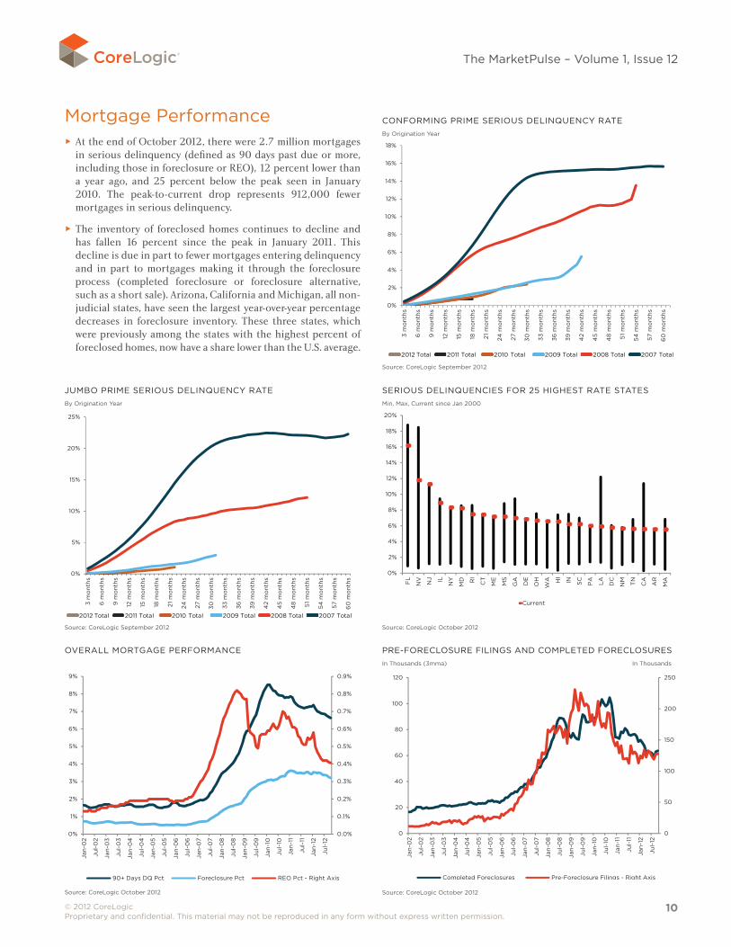
Mortgage Performance ► At the end of October 2012, there were 2.7 million mortgages in serious delinquency (defined as 90 days past due or more, including those in foreclosure or REO), 12 percent lower than a year ago, and 25 percent below the peak seen in January 2010. The peak-to-current drop represents 912,000 fewer mortgages in serious delinquency.
► The inventory of foreclosed homes continues to decline and has fallen 16 percent since the peak in January 2011. This decline is due in part to fewer mortgages entering delinquency and in part to mortgages making it through the foreclosure process (completed foreclosure or foreclosure alternative, such as a short sale). Arizona, California and Michigan, all non-judicial states, have seen the largest year-over-year percentage decreases in foreclosure inventory. These three states, which were previously among the states with the highest percent of foreclosed homes, now have a share lower than the U.S. average.
CONFORMING PRIME SERIOUS DELINQUENCy RATEBy Origination year
0%
2%
4%
6%
8%
10%
12%
14%
16%
18%
3 m
on
ths
6 m
ont
hs
9 m
ont
hs
12 m
ont
hs
15 m
ont
hs
18 m
on
ths
21 m
ont
hs
24 m
ont
hs
27 m
ont
hs
30 m
ont
hs
33 m
on
ths
36 m
ont
hs
39 m
ont
hs
42
mo
nths
45
mo
nths
48
mo
nths
51 m
ont
hs
54 m
ont
hs
57 m
ont
hs
60
mo
nths
2012 Total 2011 Total 2010 Total
2009 Total 2008 Total 2007 Total
3.08x3.45Performance: conforming prime serious del rate sep 2012
Source: CoreLogic September 2012
2012 Total 2011 Total 2010 Total 2009 Total 2008 Total 2007 Total
JUMBO PRIME SERIOUS DELINQUENCy RATEBy Origination year
0%
5%
10%
15%
20%
25%
3 m
on
ths
6 m
ont
hs
9 m
ont
hs
12 m
ont
hs
15 m
ont
hs
18 m
on
ths
21 m
ont
hs
24 m
ont
hs
27 m
ont
hs
30 m
ont
hs
33 m
on
ths
36 m
ont
hs
39 m
ont
hs
42
mo
nths
45
mo
nths
48
mo
nths
51 m
ont
hs
54 m
ont
hs
57 m
ont
hs
60
mo
nths
2012 Total 2011 Total 2010 Total
2009 Total 2008 Total 2007 Total
3.1x3.42Performance: jumbo prime serious del rate oct 2012
Source: CoreLogic September 2012
2012 Total 2011 Total 2010 Total 2009 Total 2008 Total 2007 Total
SERIOUS DELINQUENCIES FOR 25 HIGHEST RATE STATESMin, Max, Current since Jan 2000
0%
2%
4%
6%
8%
10%
12%
14%
16%
18%
20%F
L
NV NJ IL NY
MD RI
CT
ME
MS
GA
DE
OH
WA HI
IN SC
PA
LA
DC
NM TN
CA
AR
MA
Current
2.5x3.57Performance: serious del for 25 highest rate states oct 2012
Source: CoreLogic October 2012
OVERALL MORTGAGE PERFORMANCE
0.0%
0.1%
0.2%
0.3%
0.4%
0.5%
0.6%
0.7%
0.8%
0.9%
0%
1%
2%
3%
4%
5%
6%
7%
8%
9%
Jan
-02
Jul-
02
Jan
-03
Jul-
03
Jan
-04
Jul-
04
Jan
-05
Jul-
05
Jan
-06
Jul-
06
Jan
-07
Jul-
07
Jan
-08
Jul-
08
Jan
-09
Jul-
09
Jan
-10
Jul-
10
Jan
-11
Jul-
11
Jan
-12
Jul-
12
90+ Days DQ Pct Foreclosure Pct REO Pct - Right Axis
2.53x3.42Performance: overall mortgage performance oct 2012
Source: CoreLogic October 2012
PRE-FORECLOSURE FILINGS AND COMPLETED FORECLOSURESIn Thousands (3mma) In Thousands
0
50
100
150
200
250
0
20
40
60
80
100
120
Jan
-02
Jul-
02
Jan
-03
Jul-
03
Jan
-04
Jul-
04
Jan
-05
Jul-
05
Jan
-06
Jul-
06
Jan
-07
Jul-
07
Jan
-08
Jul-
08
Jan
-09
Jul-
09
Jan
-10
Jul-
10
Jan
-11
Jul-
11
Jan
-12
Jul-
12
Completed Foreclosures Pre-Foreclosure Filings - Right Axis
2.69x3.45Performance: pre foreclosure filings and completed
foreclosures oct 2012
Source: CoreLogic October 2012
© 2012 CoreLogic Proprietary and confidential. This material may not be reproduced in any form without express written permission.
11
The MarketPulse – Volume 1, Issue 12
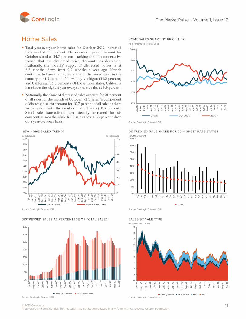
Home Sales ► Total year-over-year home sales for October 2012 increased by a modest 1.3 percent. The distressed price discount for October stood at 34.7 percent, marking the fifth consecutive month that the distressed price discount has decreased. Nationally, the months' supply of distressed homes is at 8.6 months, down from 9.9 months a year ago. Nevada continues to have the highest share of distressed sales in the country at 41.9 percent, followed by Michigan (35.2 percent) and California (33.8 percent). Of those three states, California has shown the highest year-over-year home sales at 6.9 percent.
► Nationally, the share of distressed sales account for 21 percent of all sales for the month of October. REO sales (a component of distressed sales) account for 10.7 percent of all sales and are virtually even with the number of short sales (10.3 percent). Short sale transactions have steadily increased for six consecutive months while REO sales show a 38 percent drop on a year-over-year basis.
HOME SALES SHARE By PRICE TIERAs a Percentage of Total Sales
10%
20%
30%
40%
50%
60%
Jan
-00
Jul-
00
Jan
-01
Jul-
01
Jan
-02
Jul-
02
Jan
-03
Jul-
03
Jan
-04
Jul-
04
Jan
-05
Jul-
05
Jan
-06
Jul-
06
Jan
-07
Jul-
07
Jan
-08
Jul-
08
Jan
-09
Jul-
09
Jan
-10
Jul-
10
Jan
-11
Jul-
11
Jan
-12
Jul-
12
0-100K 100K-200K 200K +
2.46x3.43Sales: home sales vol by price tier oct 2012
Source: CoreLogic October 2012
NEW HOME SALES TRENDSIn Thousands In Thousands
0
20
40
60
80
100
120
140
170
180
190
200
210
220
230
240
250
260
270
Jan
-02
Jun
-02
No
v-0
2
Ap
r-0
3
Sep
-03
Feb
-04
Jul-
04
Dec
-04
May
-05
Oct
-05
Mar
-06
Aug
-06
Jan
-07
Jun
-07
No
v-0
7
Ap
r-0
8
Sep
-08
Feb
-09
Jul-
09
Dec
-09
May
-10
Oct
-10
Mar
-11
Aug
-11
Jan
-12
Jun
-12
Median Price Volume - Right Axis
2.65x3.62Sales: new home sales trends oct 2012
Feb
-12
Source: CoreLogic October 2012
DISTRESSED SALE SHARE FOR 25 HIGHEST RATE STATESMin, Max, Current
0%
10%
20%
30%
40%
50%
60%
70%
80%N
V MI
CA FL
DE
AZ
GA
NH IL
OH
OR RI
MO
VA SC
TN CT
CO
WA
MD
NM
MS
UT
KY
NC
Current
2.33x3.48Sales: distressed sale share for 25 highest rate states oct 2012
Source: CoreLogic October 2012
DISTRESSED SALES AS PERCENTAGE OF TOTAL SALES
0%
5%
10%
15%
20%
25%
30%
35%
Jan
-06
May
-06
Sep
-06
Jan
-07
May
-07
Sep
-07
Jan
-08
May
-08
Sep
-08
Jan
-09
May
-09
Sep
-09
Jan
-10
May
-10
Sep
-10
Jan
-11
May
-11
Sep
-11
Jan
-12
May
-12
Sep
-12
Short Sales Share REO Sales Share
2.62x3.64Sales: distressed sales as % of total sales oct 2012
Source: CoreLogic October 2012
SALES By SALE TyPEAnnualized In Millions
2.65x3.61Sales: sales by sale type oct 2012
0
1
2
3
4
5
6
7
8
9
Jan
-06
May
-06
Sep
-06
Jan
-07
May
-07
Sep
-07
Jan
-08
May
-08
Sep
-08
Jan
-09
May
-09
Sep
-09
Jan
-10
May
-10
Sep
-10
Jan
-11
May
-11
Sep
-11
Jan
-12
May
-12
Sep
-12
Existing Home New Home REO ShortSource: CoreLogic October 2012
corelogic.com
© 2012 CoreLogic, Inc. All rights reserved.
CoreLogic, the CoreLogic logo, and HPI are trademarks of CoreLogic, Inc. and/or its subsidiaries.
17-MKTPLSEQTR-1212-00
Source: CoreLogicThe data provided is for use only by the primary recipient or the primary recipient's publication or broadcast. This data may not be re-sold, republished or licensed to any other source, including publications and sources owned by the primary recipient's parent company without prior written permission from CoreLogic. Any CoreLogic data used for publication or broadcast, in whole or in part, must be sourced as coming from CoreLogic, a data and analytics company. For use with broadcast or web content, the citation must directly accompany first reference of the data. If the data is illustrated with maps, charts, graphs or other visual elements, the CoreLogic logo must be included on screen or website. For questions, analysis or interpretation of the data, contact CoreLogic at [email protected]. Data provided may not be modified without the prior written permission of CoreLogic. Do not use the data in any unlawful manner. This data is compiled from public records, contributory databases and proprietary analytics, and its accuracy is dependent upon these sources.
FOR MORE INFORMATION PLEASE CALL 1-415-536-3500The MarketPulse is a newsletter published by CoreLogic, Inc. ("CoreLogic"). This information is made available for informational purposes only and is not intended to provide specific commercial, financial or investment advice. CoreLogic disclaims all express or implied representations, warranties and guaranties, including implied warranties of merchantability, fitness for a particular purpose, title, or non-infringement. Neither CoreLogic nor its licensors make any representations, warranties or guaranties as to the quality, reliability, suitability, truth, accuracy, timeliness or completeness of the information contained in this newsletter. CoreLogic shall not be held responsible for any errors, inaccuracies, omissions or losses resulting directly or indirectly from your reliance on the information contained in this newsletter.
This newsletter contains links to third-party websites that are not controlled by CoreLogic. CoreLogic is not responsible for the content of third-party websites. The use of third-party website and its content is governed by the terms and conditions set forth on the third-party’s site and CoreLogic assumes no responsibility for your use of or activities on the site.
VARIABLE DESCRIPTIONS
Variable Definition
Total Sales The total number of all home-sale transactions during the month.
New Sales The total number of newly constructed residential housing units sold during the month.
Existing SalesThe number of previously constructed homes that were sold to an unaffiliated third party. DOES NOT INCLUDE REO AND SHORT SALES.
REO Sales Number of bank-owned properties that were sold to an unaffiliated third party.
Short SalesThe number of short sales. A short sale is a sale of real estate in which the sale proceeds fall short of the balance owed on the property's loan.
Distressed Sales Share The percentage of the total sales that were a distressed sale (REO or short sale).
HPI MoM Percent increase or decrease in HPI single family combined series over a month ago.
HPI yoy Percent increase or decrease in HPI single family combined series over a year ago.
HPI MoM Excluding Distressed Percent increase or decrease in HPI single family combined excluding distressed series over a month ago.
HPI yoy Excluding Distressed Percent increase or decrease in HPI single family combined excluding distressed series over a year ago.
90 Days + DQ Pct The percentage of the overall loan count that are 90 or more days delinquent as of the reporting period. This percentage includes loans that are in foreclosure or REO.
Foreclosure Pct The percentage of the overall loan count that is currently in foreclosure as of the reporting period.
REO Pct The count of loans in REO as a percentage of the overall count of loans for the reporting period.
Pre-foreclosure FilingsThe number of mortgages where the lender has initiated foreclosure proceedings and it has been made known through public notice (NOD).
Completed ForeclosuresA completed foreclosure occurs when a property is auctioned and results in either the purchase of the home at auction or the property is taken by the lender as part of their Real Estate Owned (REO) inventory.
Negative Equity ShareThe percentage of mortgages in negative equity. The denominator for the negative equity percent is based on the number of mortgages from the public record.
Negative EquityThe number of mortgages in negative equity. Negative equity is calculated as the difference between the current value of the property and the estimated unpaid principal balance. If the mortgage debt is greater than the current value, the property is considered to be in a negative equity position.
Months' Supply Distressed HomesThe number of months it would take to sell all homes currently in distress of 90 days past due or more based on the current sales pace.
Total Sales yoy Change 12-month sum Percent increase or decrease in current 12 months of total sales over prior 12 months of total sales.
Price/Income Ratio CoreLogic HPI divided by Nominal Personal Income provided by the Bureau of Economic Analysis.