Embed Size (px)
Citation preview

1
Transmedia MPE Visual isat ion Tool V i s u a l i s i n g a n d M a n i p u l a t i n g M P E I m p a c t D a t a
Prepared by: Deb Polson and Cassie Selin
+61 7 31385928
Queensland University of Technology
Kelvin Grove, QLD, 4079
For: Anthony Mullins and Lara Murray
+61 7 3871 2555
Hoodlum
6/19 Lang Parade, Milton Qld 4064 Australia

2
Table of Contents
MPE VISUALISATION TOOL DESIGN CONCEPTS .............................................................................. 3
TIMELINE CONCEPT ........................................................................................................................ 3
SOLAR SYSTEM CONCEPT: .............................................................................................................. 7
Initial Interface Prototypes ............................................................................................................ 7
SOLAR SYSTEM PROTOTYPE: ........................................................................................................ 10
HISTORIC, CURRENT AND PREDICTIVE STATES .............................................................................. 13
POTENTIALS OF DATA VISUALISATION TOOLS .............................................................................. 13
LIMITATIONS OF EXISTING DATA ANALYTICS TOOLS .................................................................... 13
Benefits to Hoodlum and the wider industry ............................................................................... 14

3
We estimate that a retailer embracing big data has the potential to increase its operating margin by more than 60 percent. Mckinsey Global Institute Report, 2011.
MPE Visualisation Tool Design Concepts
This section outlines the initial interface concepts for accessing and manipulating an MPE project data. The interfaces
represent the organisation of data based on the analysis of Hoodlum projects, workflows, media components, user and
platform data and visualisation best practice analysis.
Two main concepts were realised:
1. Timeline Interface
2. Solar System Interface
Timeline Concept
This visualisation tool concept creates a big picture of engagement by enabling the client to explore relationships
between aspects of multiplatform development and online user behaviour. Aggregated data will be represented on
timelines that track the following elements:
− Absolute unique users
− Acquisition and loyalty
− Referrals
− Engagement (pages per visit, dwell time, page depth, completion of activities)
− Orbiting fansites
− Production beats (upload schedules, resource investment, goals, backstories of production)
− Narrative beats (relationship between show content and site content)
− External beats (media coverage, advertising, fan motivation)

4
The tool is designed to aid comparative analysis by highlighting key beats, comparing them across time, identifying
un/successful content and statistical layering.
A fully customisable interface offers the options to:
− View multiple timelines simultaneously or isolate individual tracks
− Drag timelines up or down to illuminate specific relationships
− Superimpose timeslines to facilitate comparison
− Adjust the scale and scroll through the timeline

5
− Add new timelines for content types (e.g. videos, graphic novels), content items (e.g. one video, one game)
and metrics (views, completes, etc.)
− Minimise timelines to just descriptors
− Linking between models for visualisation options
− Isolate/manage data views
o Slide-‐and-‐lock timelines
o Rollover for pop-‐up stats
o Click and drag to highlight/soom on a specific section of the timeline

6
o Toggle on/off indicators of broadcast dates, content release dates, and significant marketing events
o Cross-‐timeline metric comparisons
o One-‐click data summary of what was happening across all the platforms was happening
simultaneously on a specific day
7
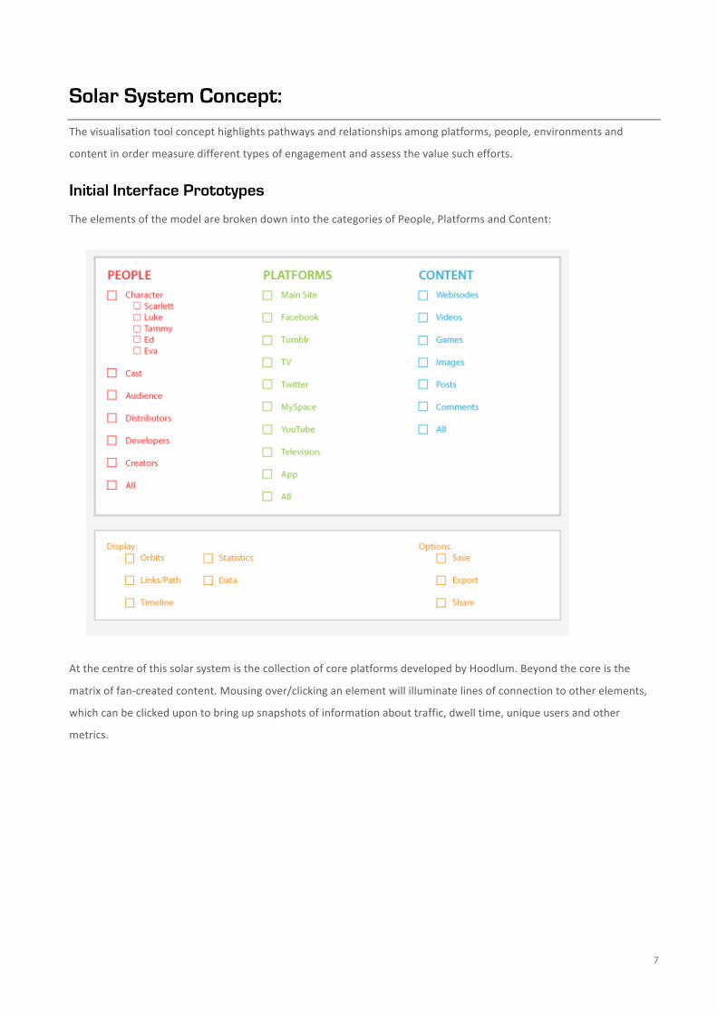
Solar System Concept:
The visualisation tool concept highlights pathways and relationships among platforms, people, environments and
content in order measure different types of engagement and assess the value such efforts.
Initial Interface Prototypes
The elements of the model are broken down into the categories of People, Platforms and Content:
At the centre of this solar system is the collection of core platforms developed by Hoodlum. Beyond the core is the
matrix of fan-‐created content. Mousing over/clicking an element will illuminate lines of connection to other elements,
which can be clicked upon to bring up snapshots of information about traffic, dwell time, unique users and other
metrics.

8
The relationship among all of these elements can be presented as either a system-‐wide overview (above) or a closeup of
a specific orbit (below).
The control interface creates custom reporting that has the capability to:
− Isolate and track relationships between specific elements of interest (e.g. user activity around a specific
character and their webisodes on the main site and You Tube)
− Show at a glance the directions and frequency of traffic and the most popular content

9
− Assess the impact of a particular element by modeling how its elimination would affect the whole system
− Display and share data

10
Solar System Prototype:
The solar System visualisation allows users to explore the relationship between entitities in a transmedia campaign.
Entities fall into three categories – people (characters, actors, developers), content (videos, posts, comics) and
platforms (Television, Facebok, tumblr).
Users can select from these entities to visualise their relatinoships. A central entity can be selected as the basis of the
visualisation (in this example, the character, Scarlett.)
The following are screen images of the final interface prototype that offer a simple example of the interaction
possibilities of such a system, though the interface design is only a rough rendering to describe the concept.
Users can select which people, platforms and content they would like to be displayed. In this example, they have
selected the Twitter and Tumblr platforms, and te character, Scarlett, as their focal point.

11
The system will then display the relationships between these entities. In this example, Scarlett has both a Tumblr and a
Twitter, and so those are shown, along with relevant information about people (in red) and content (in blue).
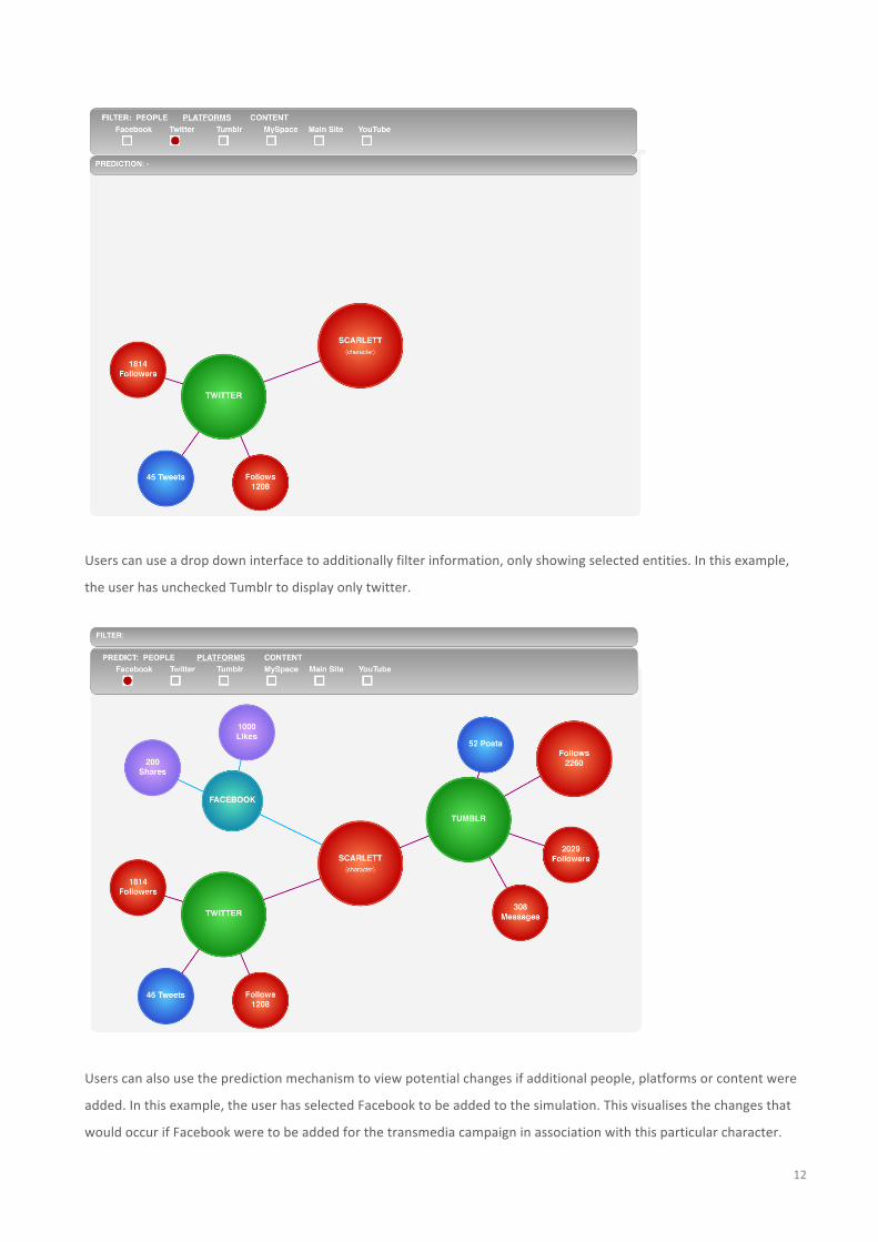
12
Users can use a drop down interface to additionally filter information, only showing selected entities. In this example,
the user has unchecked Tumblr to display only twitter.
Users can also use the prediction mechanism to view potential changes if additional people, platforms or content were
added. In this example, the user has selected Facebook to be added to the simulation. This visualises the changes that
would occur if Facebook were to be added for the transmedia campaign in association with this particular character.

13
Historic, Current and Predictive States
As a repository of data that can visualise custom data sets on demand, this tool will enable
− Historic views of user behaviour around previous shows
− Current views of user engagement with shows being broadcast
− Predictive views that forecast how users might interact with new multiplatform that producers may wish
to develop in the future
− Curatorial interface to facilitate data sharing across projects and creative teams
Potentials Of Data Visualisation Tools
Mckinsey Global Institute (2011) identified five broadly applicable ways to leverage data that offer transformational
potential to create value for organisations:
− Creating transparency: making relevant data more readily accessible
− Enabling experimentation to discover needs, expose variability, and improve performance: IT enables
organisations to instrument processes and then set up controlled experiments.
− Segmenting populations to customise actions: allows organisations to create highly specific segmentations
and to tailor products and services precisely to meet those needs.
− Replacing/supporting human decision making with automated algorithms: sophisticated analytics can
substantially improve decision-‐making, minimise risks, and unearth valuable insights that would otherwise
remain hidden.
− Innovating new business models, products, and services: intelligently processed data enables companies to
create new products and services, enhance existing ones, and invent entirely new business models
Several issues will have to be addressed to capture the full potential for Data Visualisation
− Technology and techniques: To capture value from data, organisations will have to deploy new
technologies and techniques for accessing, processing and communicating the data.
− Organisational change and talent: Many organisations do not have the talent in place to derive insights
from the data they may or may not already be collecting.
− Access to data: To enable transformative opportunities, companies will increasingly need to integrate
information from multiple data sources.
Limitations of Existing Data Analytics Tools
Working with SLiDE data to produce the report has exposed the limitations of existing analytic tools. Moving between
multiple tools that are not ideally suited to the job, assessing the accuracy of data and collating it into a useful

14
visualisation model is a difficult, time-‐intensive and costly exercise—especially if it needs to be repeated for each new
project Hoodlum undertakes.
Google Analytics has the capacity to collect important information about user and their behaviour in terms of:
− Demographics (location, language)
− Users (unique, new, returning)
− Page views
− Frequency and recency of usage
− Dwell time and page depth
− Technology (browser, network, mobile device)
− Visitor flows
Google Analytics cannot offer a complete picture of multiplatform user engagement:
− Single platform focus prevents cross-‐platform comparative analysis without running multiple reports and
manually crunching the numbers
− No visualisation of pathways and volume of traffic between platforms
− No basis for measuring qualitative data and its relationship to quantitative stats
− No explanatory powers to shed light on factors that influence viewer behaviour
− Limited customisation capabilities for tracking discrete components of the multiplatform experience
(characters, actors, platforms, etc.)
− Data is historic or current; no capacity to predict future user behaviour
− Limited options for visualisation models (pie charts, line charts, pivot tables, bar graphs)
Benefits to Hoodlum and the wider industry
− Provides a more accurate and comprehensive representation of data and its implications
− Moves beyond metric of simple exposure to measure actual weight/impact and reach of user engagement
across core and orbiting platforms
− Identifies most strategic use of resources by highlighting impact and performance of each component of the
online experience
− Customisation capability gives Hoodlum agency over the manipulation and presentation of data
− Offers a presentation tool for communicating the value of multiplatform production and user engagement
to stakeholders
− Predicts the potential for success of future projects
Establishes a framework for sharing data in a way that allows production companies to reap the rewards of knowledge-‐
exchange without sacrificing competitive edge