Embed Size (px)
Citation preview
User Interfaces in C#:Windows Forms andCustom Controls
MATTHEW MACDONALD
*0457_ch00_CMP3 8/28/02 3:52 PM Page i
User Interfaces in C#: Windows Forms and Custom Controls
Copyright ©2002 by Matthew MacDonald
All rights reserved. No part of this work may be reproduced or transmitted in any form or by any means, electronic or mechanical, including photocopying, recording, or by any informationstorage or retrieval system, without the prior written permission of the copyright owner and thepublisher.
ISBN (pbk): 1-59059-045-7
Printed and bound in the United States of America 12345678910
Trademarked names may appear in this book. Rather than use a trademark symbol with everyoccurrence of a trademarked name, we use the names only in an editorial fashion and to thebenefit of the trademark owner, with no intention of infringement of the trademark.
Technical Reviewer: Gordon Henshaw
Editorial Directors: Dan Appleman, Gary Cornell, Jason Gilmore, Simon Hayes, Karen Watterson, John Zukowski
Managing Editor: Grace Wong
Copy Editor: Anne Friedman
Production Editor: Kari Brooks
Project Manager: Sofia Marchant
Compositor: Diana Van Winkle, Van Winkle Design
Artist: Kurt Krames
Indexer: Nancy A. Guenther
Cover Designer: Kurt Krames
Manufacturing Manager: Tom Debolski
Marketing Manager: Stephanie Rodriguez
Distributed to the book trade in the United States by Springer-Verlag New York, Inc., 175 FifthAvenue, New York, NY, 10010 and outside the United States by Springer-Verlag GmbH & Co. KG,Tiergartenstr. 17, 69112 Heidelberg, Germany.
In the United States, phone 1-800-SPRINGER, email [email protected], or visithttp://www.springer-ny.com.
Outside the United States, fax +49 6221 345229, email [email protected], or visithttp://www.springer.de.
For information on translations, please contact Apress directly at 2560 9th Street, Suite 219,Berkeley, CA 94710.
Phone 510-549-5930, fax: 510-549-5939, email [email protected], or visit http://www.apress.com.
The information in this book is distributed on an “as is” basis, without warranty. Although everyprecaution has been taken in the preparation of this work, neither the author nor Apress shallhave any liability to any person or entity with respect to any loss or damage caused or alleged tobe caused directly or indirectly by the information contained in this work.
The source code for this book is available to readers at http://www.apress.com in the Downloadssection.
*0457_ch00_CMP3 8/28/02 3:52 PM Page ii
CHAPTER 7
Custom Controls
Custom controls are a key theme in .NET development. They can help yourprogramming style by improving encapsulation, simplifying a programmingmodel, and making user interface more “pluggable” (i.e., making it easier to swapout one control and replace it with a completely different one without rewritingyour form code). Of course, custom controls can have other benefits, including theability to transform a generic window into a state-of-the-art modern interface.Generally, developers tackle custom control development for one of three reasons:
• To create controls that abstract away unimportant details and are tailoredfor a specific type of data. You saw this model in Chapter 6 with customListView and TreeView examples.
• To create controls that provide entirely new functionality, or just combineexisting UI elements in a unique way. An example of this is the directorybrowser control developed in this chapter.
• To create controls with a distinct original look, or ones that mimic popularcontrols in professional applications (like Microsoft’s Outlook bar) thataren’t available to the masses. This topic is considered briefly in this chapter,and returned to in Chapter 13, with GDI+.
Creating custom controls in .NET is far easier than it has been in languageslike C++ or VB, where you typically need to embrace the ActiveX model to create atruly shareable component. As most developers have found, ActiveX controls canbe difficult to distribute because every version needs to be registered. CreatingActiveX controls also requires a bit of wizardry, with special care taken to handleproperty pages, design-time versus runtime appearance, and state management.
In .NET, creating a custom control is as easy as creating an ordinary class. Yousimply inherit from the best possible ancestor and add the specific features you need.Best of all, you can create a custom control class as part of an existing project, andthen decide later to place it in a separate assembly that can be shared with otherprogrammers.
This chapter introduces the different types of custom controls, and the types of problems they can solve. You will look at several key examples, including a thumbnail image viewer and a masked text box, and consider advanced
259
*0457_ch07_CMP4 8/21/02 1:05 PM Page 259
techniques like creating multithreaded controls. However, you won’t learn how tomake these controls behave happily in Visual Studio .NET. That topic, as well otherissues like control distribution and licensing, are picked up in the next chapter.
Types of Custom Controls
Developers often make a distinction between three or four types of controls:
• User controls are the simplest type of control. They inherit from theSystem.Windows.Forms.UserControl class, and follow a model of compo-sition. Usually, user controls combine more than one control in a logicalunit (like a group of text boxes for entering address information).
• Inherited controls are generally more powerful and flexible. With an inher-ited control, you choose the existing .NET control that is closest to what youwant to provide. Then, you derive a custom class that overrides or addsproperties and methods. The examples you’ve looked at so far in this book,including the custom TreeViews and ListViews, have all been inheritedcontrols.
• Owner-drawn controls generally use GDI+ drawing routines to generatetheir interfaces from scratch. Because of this, they tend to inherit from abase class like System.Windows.Forms.Control. Owner-drawn controlsrequire the most work and provide the most customizable user interface.You’ll see them in Chapter 13.
• Additionally, in this chapter you consider extender providers, which aren’tnecessarily controls at all. These components add features to other controlson a form, and provide a remarkable way to implement extensible userinterface.
The distinction above is slightly exaggerated. For example, you can create auser control that uses GDI+ drawing with other contained controls. Similarly,instead of inheriting from Control, UserControl, or a full-fledged .NET class, youcan inherit from one of the intermediary classes to get a different level of support.For example, a control that contains other controls but handles its own outputcould inherit from ContainerControl, while a control that needs to providescrolling might inherit from ScrollableControl.
Chapter 7
260
*0457_ch07_CMP4 8/21/02 1:05 PM Page 260
Control Projects
When designing a custom control, you could create the control class directly inyour application project. In this case, you’ll need to manually create the controland add it to the Controls collection of a Form in code. However, to add flexibility,reuse your control, and add design-time support, you need to create a dedicatedproject for your custom controls. Every project that needs to use the control thenneeds to add a reference to the compiled DLL assembly that contains the controlclasses.
The Class Library Project
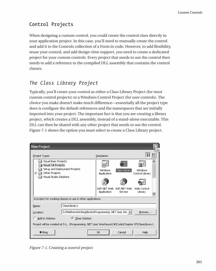
Typically, you’ll create your control as either a Class Library Project (for mostcustom control projects) or a Windows Control Project (for user controls). Thechoice you make doesn’t make much difference—essentially all the project typedoes is configure the default references and the namespaces that are initiallyimported into your project. The important fact is that you are creating a libraryproject, which creates a DLL assembly, instead of a stand-alone executable. ThisDLL can then be shared with any other project that needs to use the control.Figure 7-1 shows the option you must select to create a Class Library project.
Figure 7-1. Creating a control project
Custom Controls
261
*0457_ch07_CMP4 8/21/02 1:05 PM Page 261
When you begin your control project, you will probably find that you need toadd a few assembly references and import some namespaces. If you try to use astandard type and you receive an error, the problem is probably a missing reference.
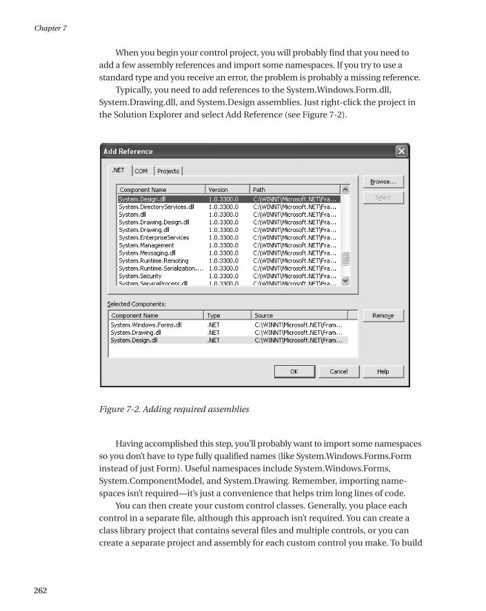
Typically, you need to add references to the System.Windows.Form.dll,System.Drawing.dll, and System.Design assemblies. Just right-click the project inthe Solution Explorer and select Add Reference (see Figure 7-2).
Figure 7-2. Adding required assemblies
Having accomplished this step, you’ll probably want to import some namespacesso you don’t have to type fully qualified names (like System.Windows.Forms.Forminstead of just Form). Useful namespaces include System.Windows.Forms,System.ComponentModel, and System.Drawing. Remember, importing name-spaces isn’t required—it’s just a convenience that helps trim long lines of code.
You can then create your custom control classes. Generally, you place eachcontrol in a separate file, although this approach isn’t required. You can create aclass library project that contains several files and multiple controls, or you cancreate a separate project and assembly for each custom control you make. To build
Chapter 7
262
*0457_ch07_CMP4 8/21/02 1:05 PM Page 262
your project at any time, right-click it in the Solution Explorer and choose Build.The DLL file will be placed in the bin subdirectory of your project directory.
Referencing a Custom Control
For other projects to use your control, they need a reference to the compiledassembly. When you add a reference, Visual Studio .NET stores the location of thefile. Every time you rebuild your client project, Visual Studio copies the latestversion of the dependent assembly from its source directory into the clientproject’s bin directory, where the client executable resides. This ensures that youare always testing against the most recent build of a control.
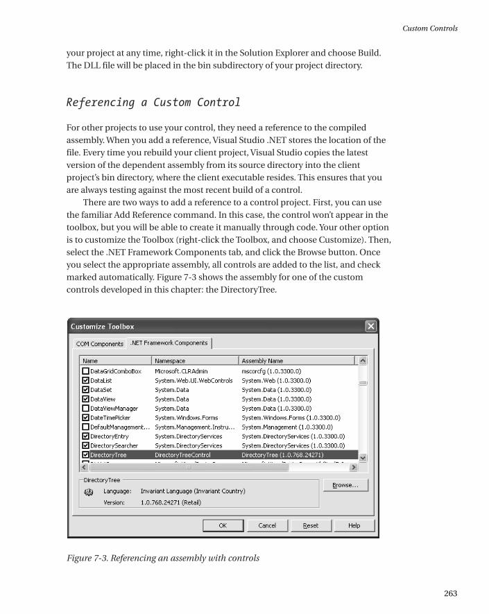
There are two ways to add a reference to a control project. First, you can usethe familiar Add Reference command. In this case, the control won’t appear in thetoolbox, but you will be able to create it manually through code. Your other optionis to customize the Toolbox (right-click the Toolbox, and choose Customize). Then,select the .NET Framework Components tab, and click the Browse button. Onceyou select the appropriate assembly, all controls are added to the list, and checkmarked automatically. Figure 7-3 shows the assembly for one of the customcontrols developed in this chapter: the DirectoryTree.
Figure 7-3. Referencing an assembly with controls
Custom Controls
263
*0457_ch07_CMP4 8/21/02 1:05 PM Page 263
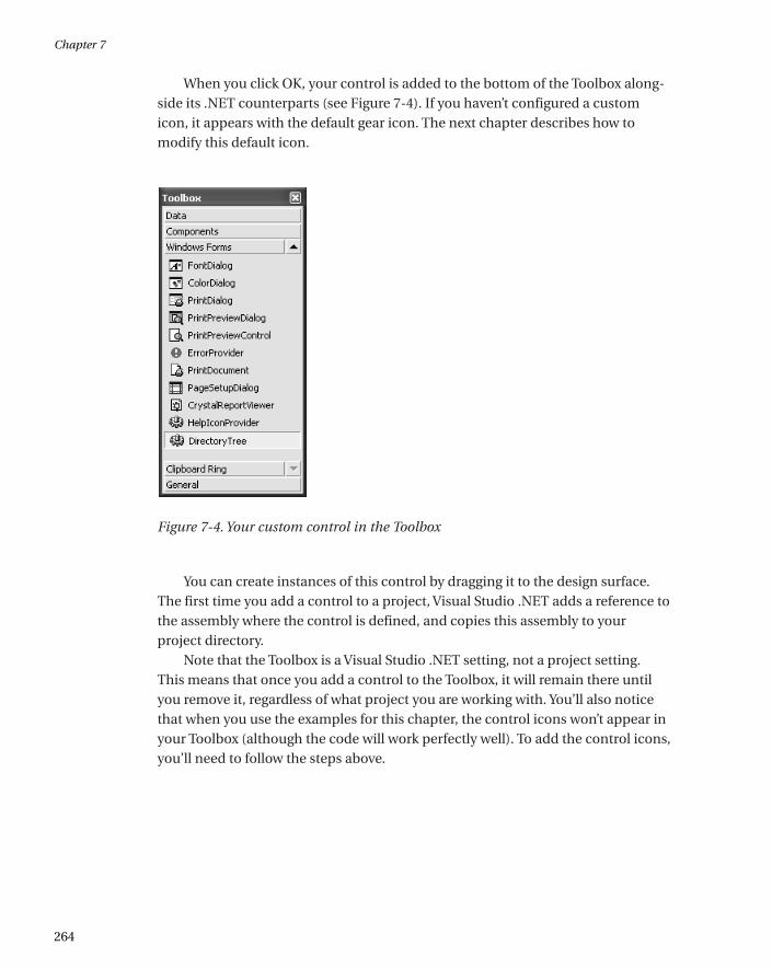
When you click OK, your control is added to the bottom of the Toolbox along-side its .NET counterparts (see Figure 7-4). If you haven’t configured a customicon, it appears with the default gear icon. The next chapter describes how tomodify this default icon.
Figure 7-4. Your custom control in the Toolbox
You can create instances of this control by dragging it to the design surface.The first time you add a control to a project, Visual Studio .NET adds a reference tothe assembly where the control is defined, and copies this assembly to yourproject directory.
Note that the Toolbox is a Visual Studio .NET setting, not a project setting. This means that once you add a control to the Toolbox, it will remain there untilyou remove it, regardless of what project you are working with. You’ll also noticethat when you use the examples for this chapter, the control icons won’t appear inyour Toolbox (although the code will work perfectly well). To add the control icons,you’ll need to follow the steps above.
Chapter 7
264
*0457_ch07_CMP4 8/21/02 1:05 PM Page 264
When you actually deploy an application that uses a custom control, all youneed to do is ensure that the required control DLL is in the same directory as theapplication executable. When you copy these files to another computer, you donot need to worry about registering them or performing additional steps. This isthe infamous zero-touch deployment that is heavily hyped with .NET.
TIP User controls are slightly more convenient because you don’t need to addthem to the Toolbox. Instead, the user controls in the current solution will appearthere automatically. However, you will need to manually add a project referenceto the assembly where the user control is defined before you can drop the usercontrol onto a form.
The GAC
If multiple applications need to use the same control, you can copy the appro-priate assembly to each application directory. This gives you the freedom toupdate some applications with additional functionality without worrying aboutbackward compatibility. It also only requires a minuscule amount of disk space,and is thus the favored approach.
Another option is to install your component to the Global Assembly Cache(the same repository that contains the core .NET assemblies). The GlobalAssembly Cache (or GAC) allows multiple versions of a component to be installedside-by-side. The GAC also ensures that every application uses the version of acontrol that it was compiled with, which almost completely eliminates versioningheadaches. The only disadvantage to using the GAC is that you need to sign yourversioned assembly using a private key to ensure that it has a unique identifier(and can’t conflict with other components), and to ensure that no other organiza-tion can release a new control that claims to be your own. This process is the samefor any shared component, whether it is a control or a business object.
Many factors that required a central repository for components in the oldworld of COM don’t apply with .NET. If you just want to share a control betweenspecific applications, you probably don’t need the additional complexity of theGAC. On the other hand, if you are a tool vendor who creates, sells, and distributescustom controls, you will almost certainly want to use it. This process is well docu-mented in the MSDN reference, but the essential steps are explained in thefollowing three sections.
Custom Controls
265
*0457_ch07_CMP4 8/21/02 1:05 PM Page 265
TIP You don’t need to install your control to the GAC to use licensing (which isdescribed at the end of the next chapter). In fact, I recommend that you don’tplace the controls developed in this chapter into the GAC, unless you have a clearidea of its advantages.
Creating a key
The first step for installing a control into the GAC is to use the sn.exe command-line utility included with the .NET framework. To create a key, you use the –kparameter, and specify the name for your key:
sn -k MyKey.snk
Each .snk file contains a private and a public key. Private and public keysprovide a special, time-honored form of encryption (called asymmetricencryption). Anything encrypted with a private key can be read only with thecorresponding public key. Conversely, anything encrypted with a public key canonly be read with the corresponding private key. The public key is typically madeavailable to the world. The private key is carefully guarded. Public and private keyencryption is sometimes used with email. If you want to create a message that isonly decipherable by a specific user, you would use that individual’s public key toencrypt the message. If you want to create a message that anyone can read, but noone can impersonate, you would use your own private key. Thus, asymmetricencryption can protect data and your identity.
In .NET, the private key is used to compile the assembly, and the public key is embedded inside the assembly. When an application uses your control, theCommon Language Runtime uses the public key to decode information from the manifest. Thus, no one else can create an update to your assembly becausethey need to have your original private key to encode it successfully.
Applying a key to a control
To add the key to a control project, you need to add an Assembly attribute to theAssemblyInfo.vb file that identifies the file.
[Assembly: AssemblyKeyFile("c:\KeyFiles\MyKey.snk")]
Chapter 7
266
*0457_ch07_CMP4 8/21/02 1:05 PM Page 266
The next time you compile the project, the key information is added to theassembly. .NET also supports delayed assembly signing, which allows you to addthe strong name just before shipping the control. This is useful in a large organiz-ation, because it allows you to debug the control without requiring the private key.The assembly can then be signed just before it is released by the individual whoguards the private key. Delayed assembly assignment requires a little more grunt-work, and is described in the MSDN reference.
Installing a control to the GAC
Now that your control is signed, you can install it to the GAC using a dedicatedsetup program or the GACUtil.exe utility. You can event drag-and-drop theassembly to the C:\[WindowsDir]\Assembly directory in Windows Explorer, whichinstalls it automatically. At this point, life couldn’t be easier.
If you install later versions of the same assembly in the GAC, the originalversion remains. Clients automatically use the latest assembly that shares thesame major and minor and version number as the one they were compiled with.In other words, if you compile an application that uses version 1.2.0.0 of yourcontrol, the application automatically upgrades itself to version 1.2.1.0 if it existsin the GAC. However, it won’t support version 1.3.0.0.
When dealing with assemblies, you have many more options for configuringversion policies. You should consult the MSDN reference or a book about .NETfundamentals for more information.
Now that you’ve digested the basics of creating, compiling, and consuming acontrol, let’s look at some practical examples. All of these custom controls areincluded with the code download for this chapter. The control projects havenames that end with “Control” (as in DirectoryTreeControl), while the WindowsForms projects that test the controls have names that end with “Host” (as in DirectoryTreeHost). The test project directory also contains a solution file that willopen both projects at once in the IDE. Figure 7-5 shows the arrangement for theProgress user control.
Custom Controls
267
*0457_ch07_CMP4 8/21/02 1:05 PM Page 267
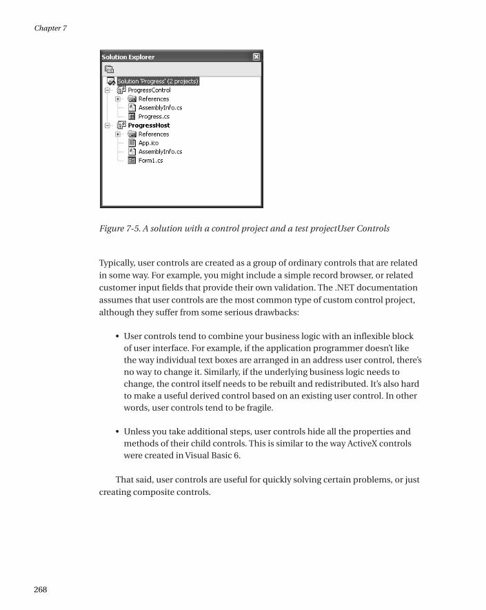
Figure 7-5. A solution with a control project and a test projectUser Controls
Typically, user controls are created as a group of ordinary controls that are relatedin some way. For example, you might include a simple record browser, or relatedcustomer input fields that provide their own validation. The .NET documentationassumes that user controls are the most common type of custom control project,although they suffer from some serious drawbacks:
• User controls tend to combine your business logic with an inflexible blockof user interface. For example, if the application programmer doesn’t likethe way individual text boxes are arranged in an address user control, there’sno way to change it. Similarly, if the underlying business logic needs tochange, the control itself needs to be rebuilt and redistributed. It’s also hardto make a useful derived control based on an existing user control. In otherwords, user controls tend to be fragile.
• Unless you take additional steps, user controls hide all the properties andmethods of their child controls. This is similar to the way ActiveX controlswere created in Visual Basic 6.
That said, user controls are useful for quickly solving certain problems, or justcreating composite controls.
Chapter 7
268
*0457_ch07_CMP4 8/21/02 1:05 PM Page 268
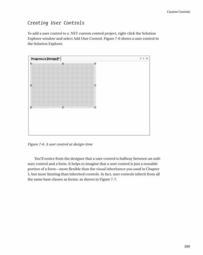
Creating User Controls
To add a user control to a .NET custom control project, right-click the SolutionExplorer window and select Add User Control. Figure 7-6 shows a user control inthe Solution Explorer.
Figure 7-6. A user control at design-time
You’ll notice from the designer that a user control is halfway between an ordi-nary control and a form. It helps to imagine that a user control is just a reusableportion of a form—more flexible than the visual inheritance you used in Chapter5, but more limiting than inherited controls. In fact, user controls inherit from allthe same base classes as forms, as shown in Figure 7-7.
Custom Controls
269
*0457_ch07_CMP4 8/21/02 1:05 PM Page 269
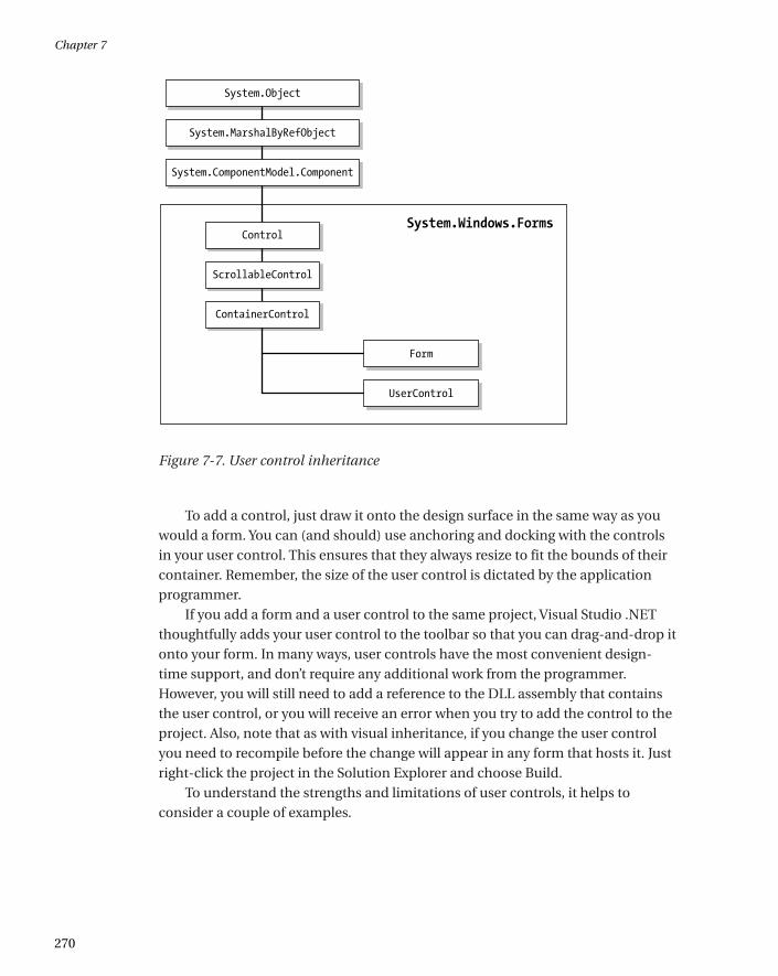
Figure 7-7. User control inheritance
To add a control, just draw it onto the design surface in the same way as youwould a form. You can (and should) use anchoring and docking with the controlsin your user control. This ensures that they always resize to fit the bounds of theircontainer. Remember, the size of the user control is dictated by the applicationprogrammer.
If you add a form and a user control to the same project, Visual Studio .NETthoughtfully adds your user control to the toolbar so that you can drag-and-drop itonto your form. In many ways, user controls have the most convenient design-time support, and don’t require any additional work from the programmer.However, you will still need to add a reference to the DLL assembly that containsthe user control, or you will receive an error when you try to add the control to theproject. Also, note that as with visual inheritance, if you change the user controlyou need to recompile before the change will appear in any form that hosts it. Justright-click the project in the Solution Explorer and choose Build.
To understand the strengths and limitations of user controls, it helps toconsider a couple of examples.
Chapter 7
270
*0457_ch07_CMP4 8/21/02 1:05 PM Page 270
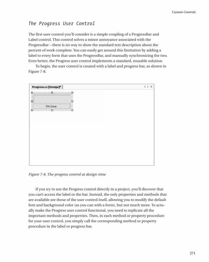
The Progress User Control
The first user control you’ll consider is a simple coupling of a ProgressBar andLabel control. This control solves a minor annoyance associated with theProgressBar—there is no way to show the standard text description about thepercent of work complete. You can easily get around this limitation by adding alabel to every form that uses the ProgressBar, and manually synchronizing the two.Even better, the Progress user control implements a standard, reusable solution.
To begin, the user control is created with a label and progress bar, as shown inFigure 7-8.
Figure 7-8. The progress control at design-time
If you try to use the Progress control directly in a project, you’ll discover thatyou can’t access the label or the bar. Instead, the only properties and methods thatare available are those of the user control itself, allowing you to modify the defaultfont and background color (as you can with a form), but not much more. To actu-ally make the Progress user control functional, you need to replicate all theimportant methods and properties. Then, in each method or property procedurefor your user control, you simply call the corresponding method or propertyprocedure in the label or progress bar.
Custom Controls
271
*0457_ch07_CMP4 8/21/02 1:05 PM Page 271
This delegation pattern can add up to a lot of extra code for an advancedcontrol! Fortunately, when you create a user control you will usually restrict andsimplify the interface so that it is more consistent and targeted for a specific use.In the Progress user control, for example, don’t worry about allowing the user toset a font or background color for the label control.
TIP If your user control contains several controls with the same properties (likeFont), you need to decide whether to provide individual user control properties(NameFont, AddressFont, etc.) or set them all at once in a single property proce-dure. The UserControl class makes your job a little easier. It defines Font andForeColor properties that are automatically applied to all the composite controls unless they specify otherwise. (This is similar to how a form works.) The UserControl class also provides BackColor and BackImage properties thatconfigure the actual user control drawing surface.
The Progress user control provides access to three properties from theProgressBar control (Value, Maximum, and Step), and one method (PerformStep).
public class Progress : System.Windows.Forms.UserControl
{
internal System.Windows.Forms.Label lblProgress;
internal System.Windows.Forms.ProgressBar Bar;
// (Designer code omitted.)
public int Value
{
get
{
return Bar.Value;
}
set
{
Bar.Value = value;
UpdateLabel();
}
}
Chapter 7
272
*0457_ch07_CMP4 8/21/02 1:05 PM Page 272
public int Maximum
{
get
{
return Bar.Maximum;
}
set
{
Bar.Maximum = value;
}
}
public int Step
{
get
{
return Bar.Step;
}
set
{
Bar.Step = value;
}
}
public void PerformStep()
{
Bar.PerformStep();
UpdateLabel();
}
private void UpdateLabel()
{
lblProgress.Text = (Math.Round((decimal)(Bar.Value * 100) /
Bar.Maximum)).ToString();
lblProgress.Text += "% Done";
}
}
Custom Controls
273
*0457_ch07_CMP4 8/21/02 1:05 PM Page 273
Every time the progress bar changes (either by modifying the Value orinvoking the PerformStep() method), the code calls a special private method,UpdateLabel. This ensures that the label always remains completely synchronized.
Testing this control is easy. All you need is a simple form that hosts the Progressuser control, and increments its value. In this case, a timer is used for this purpose.Each time the timer fires, the PerformStep() method increments the counter by itsStep value.
private void tmrIncrementBar_Tick(object sender, System.EventArgs e)
{
status.PerformStep();
if (status.Maximum == status.Value)
{
tmrIncrementBar.Enabled = false;
}
}
The timer itself is enabled in response to a button click, which also configuresthe user control’s initial settings:
private void cmdStart_Click(object sender, System.EventArgs e)
{
tmrIncrementBar.Enabled = false;
status.Value = 0;
status.Maximum = 20;
status.Step = 1;
tmrIncrementBar.Enabled = true;
}
Figure 7-9 shows the Progress control in the test application. Remember,though the Progress control will appear in the Toolbox automatically, you stillneed to add a reference to the appropriate project. Follow these steps if you areexperiencing any trouble:
1. Compile the Progress control.
2. Create a new test project to the solution.
3. In the test project, add a reference to the compiled Progress DLLassembly.
Chapter 7
274
*0457_ch07_CMP4 8/21/02 1:05 PM Page 274
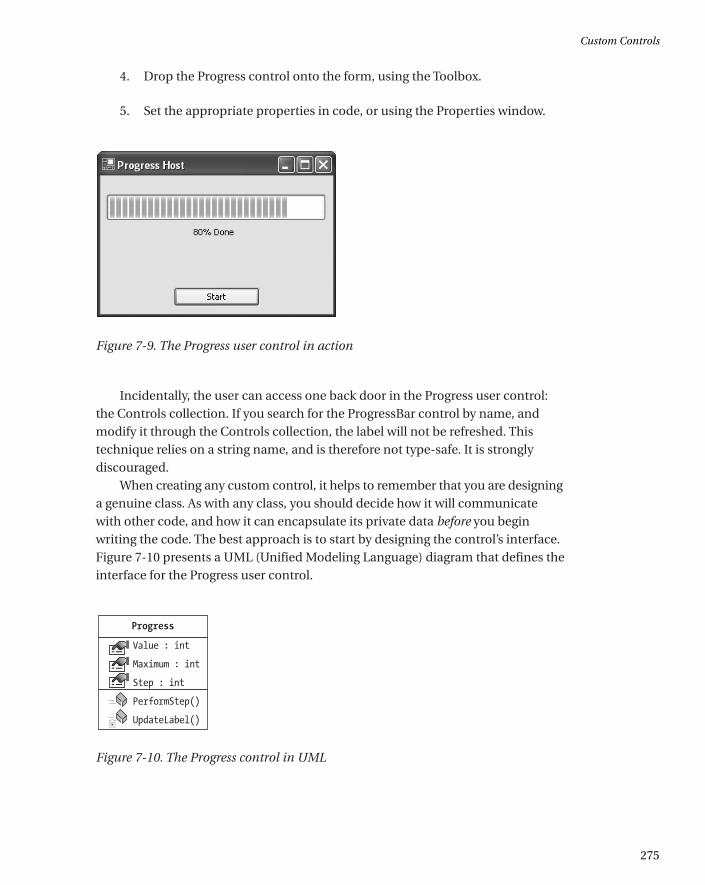
4. Drop the Progress control onto the form, using the Toolbox.
5. Set the appropriate properties in code, or using the Properties window.
Figure 7-9. The Progress user control in action
Incidentally, the user can access one back door in the Progress user control:the Controls collection. If you search for the ProgressBar control by name, andmodify it through the Controls collection, the label will not be refreshed. Thistechnique relies on a string name, and is therefore not type-safe. It is stronglydiscouraged.
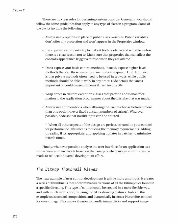
When creating any custom control, it helps to remember that you are designinga genuine class. As with any class, you should decide how it will communicatewith other code, and how it can encapsulate its private data before you beginwriting the code. The best approach is to start by designing the control’s interface.Figure 7-10 presents a UML (Unified Modeling Language) diagram that defines theinterface for the Progress user control.
Figure 7-10. The Progress control in UML
Custom Controls
275
*0457_ch07_CMP4 8/21/02 1:05 PM Page 275
There are no clear rules for designing custom controls. Generally, you shouldfollow the same guidelines that apply to any type of class in a program. Some ofthe basics include the following:
• Always use properties in place of public class variables. Public variablesdon’t offer any protection and won’t appear in the Properties window.
• If you provide a property, try to make it both readable and writable, unlessthere is a clear reason not to. Make sure that properties that can affect thecontrol’s appearance trigger a refresh when they are altered.
• Don’t expose your basic control methods. Instead, expose higher-levelmethods that call these lower-level methods as required. One difference is that private methods often need to be used in set ways, while publicmethods should be able to work in any order. Hide details that aren’t important or could cause problems if used incorrectly.
• Wrap errors in custom exception classes that provide additional infor-mation to the application programmer about the mistake that was made.
• Always use enumerations when allowing the user to choose between morethan one option (never fixed constant numbers of strings). Whereverpossible, code so that invalid input can’t be entered.
* When all other aspects of the design are perfect, streamline your controlfor performance. This means reducing the memory requirements, addingthreading if it’s appropriate, and applying updates in batches to minimizerefresh times.
Finally, whenever possible analyze the user interface for an application as awhole. You can then decide based on that analysis what custom controls can bemade to reduce the overall development effort.
The Bitmap Thumbnail Viewer
The next example of user control development is a little more ambitious. It createsa series of thumbnails that show miniature versions of all the bitmap files found ina specific directory. This type of control could be created in a more flexible way,and with much more code, by using the GDI+ drawing features. Instead, thisexample uses control composition, and dynamically inserts a PictureBox controlfor every image. This makes it easier to handle image clicks and support image
Chapter 7
276
*0457_ch07_CMP4 8/21/02 1:05 PM Page 276
selection. It also previews the techniques you’ll see in Chapter 11, where userinterface is generated out of controls dynamically at runtime.
Possibly the best aspect of the BitmapViewer user control is that it communi-cates with your program in both directions. You can tailor the appearance of theBitmapViewer by setting properties, and the BitmapViewer notifies your codewhen a picture is selected by raising an event.
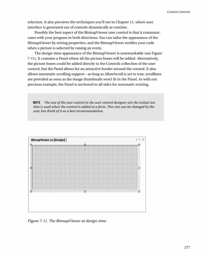
The design-time appearance of the BitmapViewer is unremarkable (see Figure7-11). It contains a Panel where all the picture boxes will be added. Alternatively,the picture boxes could be added directly to the Controls collection of the usercontrol, but the Panel allows for an attractive border around the control. It alsoallows automatic scrolling support—as long as AllowScroll is set to true, scrollbarsare provided as soon as the image thumbnails won’t fit in the Panel. As with ourprevious example, the Panel is anchored to all sides for automatic resizing.
NOTE The size of the user control in the user control designer sets the initial sizethat is used when the control is added to a form. This size can be changed by theuser, but think of it as a best recommendation.
Figure 7-11. The BitmapViewer at design-time
Custom Controls
277
*0457_ch07_CMP4 8/21/02 1:05 PM Page 277
Unlike the Progress control, the BitmapViewer cannot just hand off its prop-erty procedures and methods to members in one of the composite controls.Instead, it needs to retain a fair bit of its own information. The following codeshows the key private variables:
// The directory that will be scanned for image.
private string directory = "";
// Each picture box will be a square of dimension X dimension pixels.
private int dimension;
// The space between the images and the top, left, and right sides.
private int border = 5;
// The space between each image.
private int spacing;
// The images that were found in the selected directory.
private ArrayList images = new ArrayList();
Some of the values are user configurable, while some are not. For example, the collection of images is drawn from the referenced directory. The propertyprocedures for the modifiable values are shown here:
public string Directory
{
get
{
return directory;
}
set
{
directory = value;
GetImages();
UpdateDisplay();
}
}
Chapter 7
278
*0457_ch07_CMP4 8/21/02 1:05 PM Page 278
public int Dimension
{
get
{
return dimension;
}
set
{
dimension = value;
UpdateDisplay();
}
}
public int Spacing
{
get
{
return spacing;
}
set
{
spacing = value;
UpdateDisplay();
}
}
NOTE For simplicity’s sake, this code doesn’t provide any error-handling logic.For example, all the integer properties in the BitmapViewer should be restrictedto positive numbers. Ideally, the property procedure code should refuse negativenumbers and raise an error to alert the control user.
Notice that every time a value is modified, the display is automatically regen-erated by calling the UpdateDisplay() method. A more sophisticated approachmight make this logic depend on a property like AutoRefresh. That way, the usercould temporarily turn off the refresh, make several changes at once, and then re-enable it.
Custom Controls
279
*0457_ch07_CMP4 8/21/02 1:05 PM Page 279
The set procedure for the Directory property also calls a special GetImages()method, which inspects the directory, and populates the Images collection. Youmight expect that the Images collection contains Image objects, but this is not thecase. To provide useful event information, the BitmapViewer actually tracks the file name of every image it displays. To do this, a special NamedImage class is defined:
private class NamedImage
{
public Image Image;
public string FileName;
public NamedImage(Image image, string fileName)
{
this.Image = image;
this.FileName = fileName;
}
}
The NamedImage class is a private class nested inside the BitmapViewer con-trol class. This means that NamedImage is used exclusively by the BitmapViewer, andnot made available to the application using the BitmapViewer control.
The GetImages() method uses the standard .NET file and directory classes toretrieve a list of bitmaps. For each bitmap, a NamedImage object is created, andadded to the Images collection.
private void GetImages()
{
images.Clear();
if (this.Directory != "")
{
DirectoryInfo dir = new DirectoryInfo(Directory);
foreach (FileInfo file in dir.GetFiles("*.bmp"))
{
images.Add(new NamedImage(Bitmap.FromFile(file.FullName), file.Name));
}
}
}
This code stores the entire Image object in memory. To save memory, espe-cially with large directories, it's more practical to store only the thumbnail-sizedimage. To do so, use the Bitmap.GetThumbnailImage() method, and then add theresulting Bitmap object to the collection. The online code samples demonstrate thistechnique.
Chapter 7
280
*0457_ch07_CMP4 8/21/02 1:05 PM Page 280
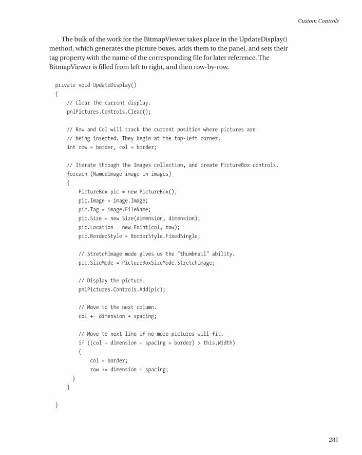
The bulk of the work for the BitmapViewer takes place in the UpdateDisplay()method, which generates the picture boxes, adds them to the panel, and sets theirtag property with the name of the corresponding file for later reference. TheBitmapViewer is filled from left to right, and then row-by-row.
private void UpdateDisplay()
{
// Clear the current display.
pnlPictures.Controls.Clear();
// Row and Col will track the current position where pictures are
// being inserted. They begin at the top-left corner.
int row = border, col = border;
// Iterate through the Images collection, and create PictureBox controls.
foreach (NamedImage image in images)
{
PictureBox pic = new PictureBox();
pic.Image = image.Image;
pic.Tag = image.FileName;
pic.Size = new Size(dimension, dimension);
pic.Location = new Point(col, row);
pic.BorderStyle = BorderStyle.FixedSingle;
// StretchImage mode gives us the "thumbnail" ability.
pic.SizeMode = PictureBoxSizeMode.StretchImage;
// Display the picture.
pnlPictures.Controls.Add(pic);
// Move to the next column.
col += dimension + spacing;
// Move to next line if no more pictures will fit.
if ((col + dimension + spacing + border) > this.Width)
{
col = border;
row += dimension + spacing;
}
}
}
Custom Controls
281
*0457_ch07_CMP4 8/21/02 1:05 PM Page 281
TIP This code could be optimized for speed. For example, all the picture boxescould be created and then added to the Panel control using theControls.AddRange() method, ensuring that the control won’t be updated andrefreshed after each new picture is inserted.
This code is also provided to the user through the public RefreshImages()method. This allows the user to trigger a refresh without needing to modify a property if the directory contents have changed.
public void RefreshImages()
{
GetImages();
UpdateDisplay();
}
The OnSizeChanged() method is also overriden to ensure that the pictures are redrawn when the user control size changes. This ensures that the pictures are automatically adjusted (in rows and columns) to best fit the new size.
protected override void OnSizeChanged(System.EventArgs e)
{
UpdateDisplay();
base.OnSizeChanged(e);
}
Figure 7-12 shows a stripped-down UML diagram for the BitmapViewercontrol, in keeping with my philosophy of clearly defining the interfaces forcustom controls. This diagram omits private members and members that have been inherited. It also shows two other class dependencies: the privateNamedImage class and the PictureSelectedEventArgs class, which is introducedshortly as a means of passing event data to the application that hosts theBitmapViewer.
Chapter 7
282
*0457_ch07_CMP4 8/21/02 1:05 PM Page 282
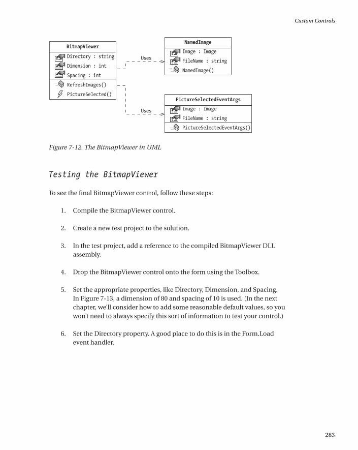
Figure 7-12. The BitmapViewer in UML
Testing the BitmapViewer
To see the final BitmapViewer control, follow these steps:
1. Compile the BitmapViewer control.
2. Create a new test project to the solution.
3. In the test project, add a reference to the compiled BitmapViewer DLLassembly.
4. Drop the BitmapViewer control onto the form using the Toolbox.
5. Set the appropriate properties, like Directory, Dimension, and Spacing. In Figure 7-13, a dimension of 80 and spacing of 10 is used. (In the nextchapter, we’ll consider how to add some reasonable default values, so youwon’t need to always specify this sort of information to test your control.)
6. Set the Directory property. A good place to do this is in the Form.Loadevent handler.
Custom Controls
283
*0457_ch07_CMP4 8/21/02 1:05 PM Page 283
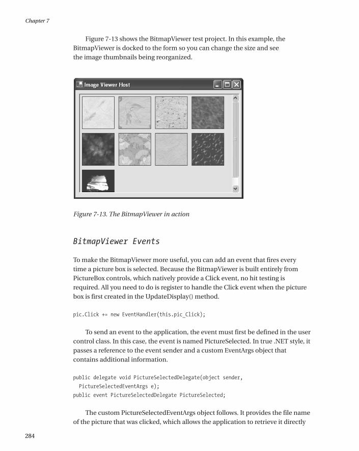
Figure 7-13 shows the BitmapViewer test project. In this example, theBitmapViewer is docked to the form so you can change the size and see the image thumbnails being reorganized.
Figure 7-13. The BitmapViewer in action
BitmapViewer Events
To make the BitmapViewer more useful, you can add an event that fires every time a picture box is selected. Because the BitmapViewer is built entirely fromPictureBox controls, which natively provide a Click event, no hit testing isrequired. All you need to do is register to handle the Click event when the picturebox is first created in the UpdateDisplay() method.
pic.Click += new EventHandler(this.pic_Click);
To send an event to the application, the event must first be defined in the usercontrol class. In this case, the event is named PictureSelected. In true .NET style, itpasses a reference to the event sender and a custom EventArgs object thatcontains additional information.
public delegate void PictureSelectedDelegate(object sender,
PictureSelectedEventArgs e);
public event PictureSelectedDelegate PictureSelected;
The custom PictureSelectedEventArgs object follows. It provides the file nameof the picture that was clicked, which allows the application to retrieve it directly
Chapter 7
284
*0457_ch07_CMP4 8/21/02 1:05 PM Page 284
for editing or some other task. Note that this class should not be private, as theclient must use it to retrieve the event information.
public class PictureSelectedEventArgs : EventArgs
{
public string FileName;
public Image Image;
public PictureSelectedEventArgs(String fileName, Image image)
{
this.FileName = fileName;
this.Image = image;
}
}
The PictureBox.Click event handler changes the border style of the clickedpicture box to make it appear “selected.” If you were using GDI+, you could draw amore flexible focus cue, like a brightly colored outline rectangle. The PictureBox.Clickevent handler then fires the event, with the required information.
private PictureBox picSelected;
private void pic_Click(object sender, System.EventArgs e)
{
// Clear the border style from the last selected picture box.
if (picSelected != null)
{
picSelected.BorderStyle = BorderStyle.FixedSingle;
}
// Get the new selection.
picSelected = (PictureBox)sender;
picSelected.BorderStyle = BorderStyle.Fixed3D;
// Fire the selection event.
PictureSelectedEventArgs args = new
PictureSelectedEventArgs((string)picSelected.Tag, picSelected.Image);
if (PictureSelected != nul)
{
PictureSelected(this, args);
}
}
Custom Controls
285
*0457_ch07_CMP4 8/21/02 1:05 PM Page 285
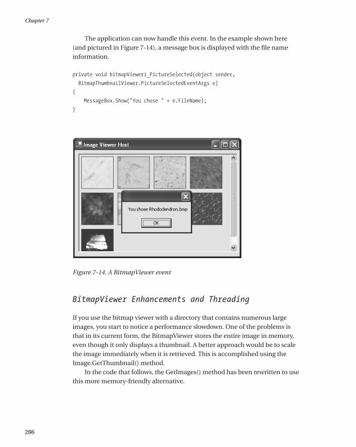
The application can now handle this event. In the example shown here (and pictured in Figure 7-14), a message box is displayed with the file name information.
private void bitmapViewer1_PictureSelected(object sender,
BitmapThumbnailViewer.PictureSelectedEventArgs e)
{
MessageBox.Show("You chose " + e.FileName);
}
Figure 7-14. A BitmapViewer event
BitmapViewer Enhancements and Threading
If you use the bitmap viewer with a directory that contains numerous largeimages, you start to notice a performance slowdown. One of the problems is that in its current form, the BitmapViewer stores the entire image in memory, even though it only displays a thumbnail. A better approach would be to scale the image immediately when it is retrieved. This is accomplished using theImage.GetThumbnail() method.
In the code that follows, the GetImages() method has been rewritten to usethis more memory-friendly alternative.
Chapter 7
286
*0457_ch07_CMP4 8/21/02 1:05 PM Page 286
private void GetImages()
{
if (Directory != "")
{
Image thumbnail;
DirectoryInfo dir = new DirectoryInfo(Directory);
foreach (FileInfo file in dir.GetFiles("*.bmp"))
{
thumbnail = Bitmap.FromFile(file.Name).GetThumbnailImage(
Dimension, Dimension, null, null);
Images.Add(new NamedImage(thumbnail, file.Name));
}
}
}
This technique also frees you up to use a simpler control than the PictureBoxto contain the Image (or even draw it directly on the form surface), because thecontrol no longer has to perform the scaling. However, it also means that you needto update the Dimension property procedure to call the GetImages() method—otherwise, the image objects won’t be the correct size.
public int Dimension
{
get
{
return dimension;
}
set
{
dimension = value;
GetImages();
UpdateDisplay();
}
}
Assuming that the GetImages() method takes a significant amount of time,you might want to change the BitmapViewer to use multithreading. With thisdesign, the GetImages() code runs on a separate thread, and then automaticallycalls the UpdateDisplay() method when it is completed. That way, the user inter-face wouldn’t be tied up in the meantime. The remainder of this section walks youthrough the process.
Custom Controls
287
*0457_ch07_CMP4 8/21/02 1:05 PM Page 287
First, change every property procedure that calls GetImages() so that it doesn’tcall UpdateDisplay(). An example is shown here with the Dimension() property.
public int Dimension
{
get
{
return dimension;
}
set
{
dimension = value;
GetImages();
UpdateDisplay();
}
}
Next, modify the GetImages() method so it actually starts the realReadImagesFromFile() method on a separate thread.
private void GetImages()
{
Threading.Thread getThread = new Threading.Thread(new
ThreadStart(this.ReadImagesFromFile));
getThread.Start();
}
Finally, modify the file reading code and place it in the ReadImagesFromFile()method:
private void ReadImagesFromFile()
{
lock (Images)
{
if (Directory != "")
{
Image thumbnail;
DirectoryInfo dir = new DirectoryInfo(Directory);
foreach (FileInfo file in dir.GetFiles("*.bmp"))
{
ThumbNail = Bitmap.FromFile(file.Name).GetThumbnailImage(
Dimension, Dimension, null, null);
Chapter 7
288
*0457_ch07_CMP4 8/21/02 1:05 PM Page 288
Images.Add(new NamedImage(thumbnail, file.Name));
}
}
}
// Update the display on the UI thread.
pnlpictures.Invoke(new MethodInvoker(this.UpdateDisplay));
}
Threading introduces numerous potential pitfalls and isn’t recommended unlessyou really need it. When implementing the preceding example, you have to becareful that the UpdateDisplay() method happens on the user interface thread,not the ReadImagesFromFile() thread. Otherwise, a strange conflict could emergein real-world use. Similarly, the lock statement is required to make sure that noother part of the control code attempts to modify the Images collection while theReadImagesFromFile() method is in progress.
Inherited Controls
Inherited controls are an ideal way to take functionality from the .NET baseclasses, and extend it. An inherited control can be dramatically different than itspredecessor, or it may just add a few refinements. The .NET class library is filledwith examples of inherited controls. For example, LinkLabel derives from Labeland CheckedListBox derives from ListBox.
Unlike user controls, there is no design-time support for creating an inheritedcontrol. You simply create a class that derives from your selected control type andadd the features you need. You’ll also find that inherited controls are awkward touse in Visual Studio .NET. For example, it’s difficult to add inherited controls to aform except through code. You overcome these difficulties in the next chapter bycreating custom designers.
Inherited controls are generally more powerful than user controls, and morelikely to be used across applications (and even organizations, if you are a toolvendor), not just between different windows in the same program. Some of thereasons that programmers develop inherited controls are to set defaults (forexample, a control that automatically configures its appearance in its constructor)or to add features.
So far in this book, you’ve seen the following examples of inherited controls:
• In Chapter 2, you saw how to make an inherited text box that only acceptsnumeric input.
Custom Controls
289
*0457_ch07_CMP4 8/21/02 1:05 PM Page 289
• In Chapter 4, you saw an inherited menu control that handles its owndrawing to allow custom fonts and embedded thumbnail images.
• In Chapter 5, you saw inherited Form controls with visual inheritance.
• In Chapter 6, you saw custom ListView and TreeView examples that supportspecific types of data.
In this chapter, I’ll present two more advanced inherited control examples.
Inherited Controls or User Controls?
So, how do you know when to create a user control, and when you need a full-fledged inherited control? It’s not always an easy question to answer, becausemost problems can be solved with either approach. However, here are a fewpointers that you should consider before embarking on a custom control project:
• User controls are easier and faster to program. If you don’t anticipatereusing the control frequently in different scenarios and different programs,a user control may suffice.
• If your control closely resembles an existing .NET control, it’s probably bestto create an inherited control. With a user control, you may need to spend afair amount of effort creating new properties and methods to allow accessto the members of the original control.
• Inherited controls provide a fine-grained level of reuse. User controls typi-cally provide only a few members, and thus are not as configurable. Toolvendors who wish to sell their controls will always use inherited controls.
• User controls are well suited if you want to ensure that a block of interface isrecreated exactly in more than one situation. Because a user control usuallyprovides less flexible configuration, it guarantees a more standardizedappearance.
If you want to integrate more than one control, you have two choices: you canuse composition with a user control, or you can develop two separate inheritedcontrols. The latter approach gives you the freedom to link controls (like a TreeViewand ListView), but make the links optional. The application programmer can thenuse them separately or together, and has complete freedom about how to inte-grate them into a user interface. With user controls, however, the applicationprogrammer can only control the size taken by the full user control.
Chapter 7
290
*0457_ch07_CMP4 8/21/02 1:05 PM Page 290
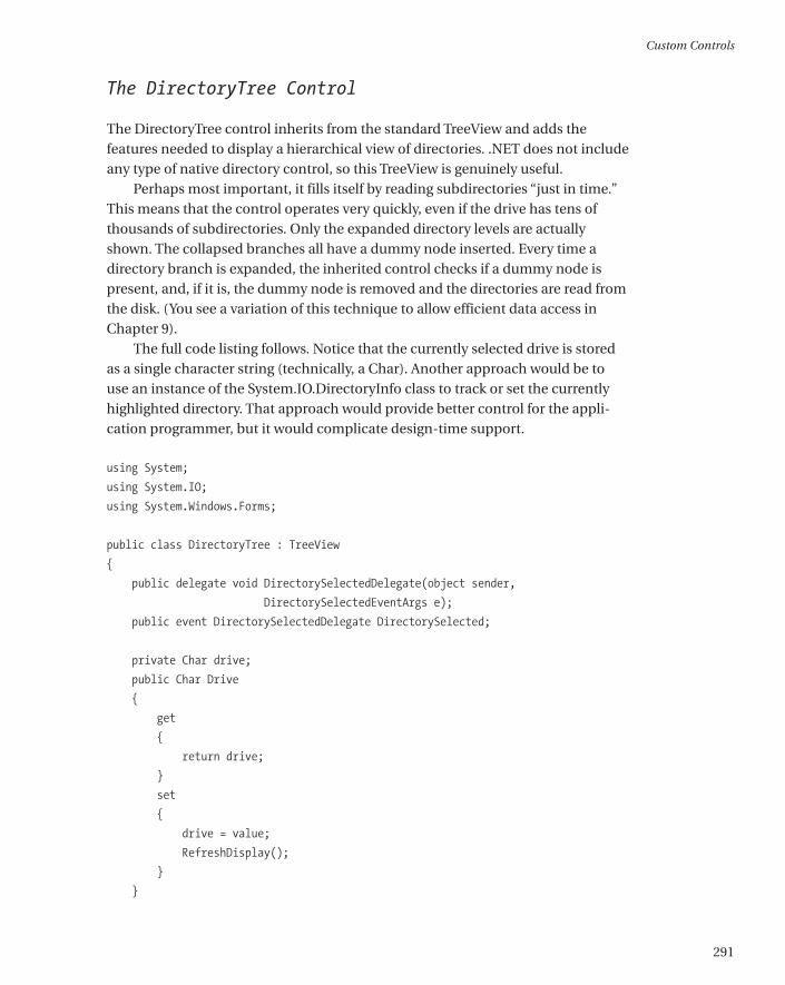
The DirectoryTree Control
The DirectoryTree control inherits from the standard TreeView and adds thefeatures needed to display a hierarchical view of directories. .NET does not includeany type of native directory control, so this TreeView is genuinely useful.
Perhaps most important, it fills itself by reading subdirectories “just in time.”This means that the control operates very quickly, even if the drive has tens ofthousands of subdirectories. Only the expanded directory levels are actuallyshown. The collapsed branches all have a dummy node inserted. Every time adirectory branch is expanded, the inherited control checks if a dummy node ispresent, and, if it is, the dummy node is removed and the directories are read fromthe disk. (You see a variation of this technique to allow efficient data access inChapter 9).
The full code listing follows. Notice that the currently selected drive is storedas a single character string (technically, a Char). Another approach would be touse an instance of the System.IO.DirectoryInfo class to track or set the currentlyhighlighted directory. That approach would provide better control for the appli-cation programmer, but it would complicate design-time support.
using System;
using System.IO;
using System.Windows.Forms;
public class DirectoryTree : TreeView
{
public delegate void DirectorySelectedDelegate(object sender,
DirectorySelectedEventArgs e);
public event DirectorySelectedDelegate DirectorySelected;
private Char drive;
public Char Drive
{
get
{
return drive;
}
set
{
drive = value;
RefreshDisplay();
}
}
Custom Controls
291
*0457_ch07_CMP4 8/21/02 1:05 PM Page 291
// This is public so a Refresh can be triggered manually.
public void RefreshDisplay()
{
// Erase the existing tree.
this.Nodes.Clear();
// Set the first node.
TreeNode rootNode = new TreeNode(drive + ":\\");
this.Nodes.Add(rootNode);
// Fill the first level and expand it.
Fill(rootNode);
this.Nodes[0].Expand();
}
private void Fill(TreeNode dirNode)
{
DirectoryInfo dir = new DirectoryInfo(dirNode.FullPath);
// An exception could be thrown in this code if you don't
// have sufficient security permissions for a file or directory.
// You can catch and then ignore this exception.
foreach (DirectoryInfo dirItem in dir.GetDirectories())
{
// Add node for the directory.
TreeNode newNode = new TreeNode(dirItem.Name);
dirNode.Nodes.Add(newNode);
newNode.Nodes.Add("*");
}
}
protected override void OnBeforeExpand(TreeViewCancelEventArgs e)
{
base.OnBeforeExpand(e);
// If a dummy node is found, remove it and read the real directory list.
if (e.Node.Nodes[0].Text == "*")
{
e.Node.Nodes.Clear();
Fill(e.Node);
}
}
Chapter 7
292
*0457_ch07_CMP4 8/21/02 1:05 PM Page 292
protected override void OnAfterSelect(TreeViewEventArgs e)
{
base.OnAfterSelect(e);
// Raise the DirectorySelected event.
if (DirectorySelected != null)
{
DirectorySelected(this,
new DirectorySelectedEventArgs(e.Node.FullPath));
}
}
}
The base class events are handled by overriding the corresponding method (the recommended approach). The OnAfterSelect event is turned into a more useful DirectorySelected event, which provides a custom DirectorySelectedEventArgs class.
public class DirectorySelectedEventArgs : EventArgs
{
public string DirectoryName;
public DirectorySelectedEventArgs(string directoryName)
{
this.DirectoryName = directoryName;
}
}
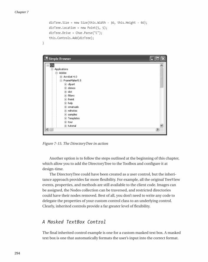
Testing the DirectoryTree
To test the DirectoryTree, you can add it to the Toolbox, or you can add a projectreference and programmatically add it to a form, which is the approach oursimple test form will take. Make sure that you set the initial drive when using thecontrol, or the display will be blank.
The following code snippet creates, configures, and displays the DirectoryTreecontrol on a form. Figure 7-15 shows the results.
private void Form1_Load(object sender, System.EventArgs e)
{
DirectoryTreeControl.DirectoryTree dirTree = new
DirectoryTreeControl.DirectoryTree();
Custom Controls
293
*0457_ch07_CMP4 8/21/02 1:05 PM Page 293
dirTree.Size = new Size(this.Width - 30, this.Height - 60);
dirTree.Location = new Point(5, 5);
dirTree.Drive = Char.Parse("C");
this.Controls.Add(dirTree);
}
Figure 7-15. The DirectoryTree in action
Another option is to follow the steps outlined at the beginning of this chapter,which allow you to add the DirectoryTree to the Toolbox and configure it atdesign-time.
The DirectoryTree could have been created as a user control, but the inheri-tance approach provides far more flexibility. For example, all the original TreeViewevents, properties, and methods are still available to the client code. Images canbe assigned, the Nodes collection can be traversed, and restricted directoriescould have their nodes removed. Best of all, you don’t need to write any code todelegate the properties of your custom control class to an underlying control.Clearly, inherited controls provide a far greater level of flexibility.
A Masked TextBox Control
The final inherited control example is one for a custom masked text box. A maskedtext box is one that automatically formats the user’s input into the correct format.
Chapter 7
294
*0457_ch07_CMP4 8/21/02 1:05 PM Page 294
For example, it may add dashes or brackets to make sure it looks like a phonenumber. This task is notoriously difficult. One useful tool is Microsoft’s maskededit text box, which is provided as an ActiveX control with previous versions ofVisual Studio.
The example of a masked text box is important because it demonstrates howfeatures (rather than data) might be added to an existing control by subclassing.The example I provide is still quite limited—notably, it restricts deletions and theuse of the arrow keys. Tracking the cursor position, which is required to allowinline masked edits, results in a good deal of tedious code that only obscures thepoint.
Here’s the full class code for the masked text box:
using System;
using System.Windows.Forms;
public class MaskedTextBox : TextBox
{
private string mask;
public string Mask
{
get
{
return mask;
}
set
{
mask = value;
this.Text = "";
}
}
protected override void OnKeyPress(KeyPressEventArgs e)
{
if (Mask != "")
{
// Suppress the typed character.
e.Handled = true;
string newText = this.Text;
// Loop through the mask, adding fixed characters as needed.
// If the next allowed character matches what the user has
Custom Controls
295
*0457_ch07_CMP4 8/21/02 1:05 PM Page 295
// typed in (a number or letter), that is added to the end.
bool finished = false;
for (int i = this.SelectionStart; i < mask.Length; i++)
{
switch (mask[i].ToString())
{
case "#" :
// Allow the keypress as long as it is a number.
if (Char.IsDigit(e.KeyChar))
{
newText += e.KeyChar.ToString();
finished = true;
break;
}
else
{
// Invalid entry; exit and don't change the text.
return;
}
case "." :
// Allow the keypress as long as it is a letter.
if (Char.IsLetter(e.KeyChar))
{
newText += e.KeyChar.ToString();
finished = true;
break;
}
else
{
// Invalid entry; exit and don't change the text.
return;
}
default :
// Insert the mask character.
newText += mask[i];
break;
}
if (finished)
{ break; }
}
// Update the text.
this.Text = newText;
Chapter 7
296
*0457_ch07_CMP4 8/21/02 1:05 PM Page 296
this.SelectionStart = this.Text.Length;
}
}
protected override void OnKeyDown(KeyEventArgs e)
{
// Stop special characters.
e.Handled = true;
}
}
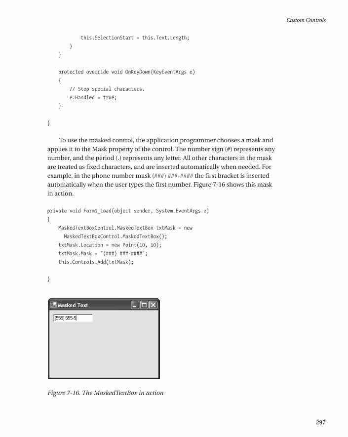
To use the masked control, the application programmer chooses a mask andapplies it to the Mask property of the control. The number sign (#) represents anynumber, and the period (.) represents any letter. All other characters in the maskare treated as fixed characters, and are inserted automatically when needed. Forexample, in the phone number mask (###) ###-#### the first bracket is insertedautomatically when the user types the first number. Figure 7-16 shows this maskin action.
private void Form1_Load(object sender, System.EventArgs e)
{
MaskedTextBoxControl.MaskedTextBox txtMask = new
MaskedTextBoxControl.MaskedTextBox();
txtMask.Location = new Point(10, 10);
txtMask.Mask = "(###) ###-####";
this.Controls.Add(txtMask);
}
Figure 7-16. The MaskedTextBox in action
Custom Controls
297
*0457_ch07_CMP4 8/21/02 1:05 PM Page 297
Custom Extender Providers
Extender providers were first introduced in Chapter 4 as interesting componentsthat extend other controls. Examples are the ToolTipProvider, which displays atooltip next to other controls; the ErrorProvider, which displays an error icon; andthe HelpProvider, which invokes context-sensitive Help on a control’s behalf whenthe F1 key is pressed. Providers tend to be specialized solutions, and you maydesign dozens of custom controls before even contemplating a custom provider.
Nonetheless, custom providers can achieve some remarkable tricks. In thissection, I demonstrate two extender providers, one that mimics the old-fashionedMFC behavior of menu Help text, and another that displays a clickable Help icon. Both of these classes are found in the ExtenderProviderControls projectprovided with the online samples. The test applications can be found in the ExtenderProviderHost project.
TIP To create an extender provider, it’s easiest to create the custom provider classin a class library project, compile it into a DLL file, and then reference the DLL filefrom another project by choosing Customize Toolbox. (In fact, this approach isgenerally the easiest way to integrate inherited controls.) When you add the refer-ence to the extender provider assembly, any associated extender controlautomatically appears in the ToolBox.
The Menu Text Provider
The MenuTextProvider extends ordinary menus by associating each item with a unique Help string. When the user hovers over a menu item, the MenuTextProvider displays the appropriate Help string. This is a common user interface convention I’ve mentioned before, and while it’s not very useful for the average user, it does provide a good introduction to extender providers.
Choosing a base class
The first step when creating an extender provider is to create a class that imple-ments the IExtenderProvider interface and uses the ProvideProperty attribute(both of these types are found in the System.ComponentModel interface). Thiscan be any type of class, including a user control, inherited control, or just a basic
Chapter 7
298
*0457_ch07_CMP4 8/21/02 1:05 PM Page 298
Component class that doesn’t derive from any control. The type of class dependson the type of provider you are creating.
A control-based provider, like the MenuTextProvider, uses a dedicated control to display information in a specific location on a form. In this example, the MenuTextProvider inherits from the StatusBar class. This means you can add the MenuTextProvider to any form, and it will act as an ordinary status barand update its display to provide the appropriate text automatically. Anotherpossible approach would be to derive the provider from the StatusBarPanel class.You could then add it to an existing status bar.
Choosing the object to extend
Once you’ve decided what type of provider you are creating, your next decision isto determine the type of object that you are extending. Many providers extend anytype of Windows control, while some are limited to specific classes. To specify theappropriate type of object, you need to handle the IExtenderProvider.CanExtend()method. In this method, you look at the supplied type of object, and then make adecision about whether or not it can be extended by your provider. To make thisdecision you can evaluate any information about the target, including the type(the most common criteria), whether it is hosted in another control or on a form,and even its name. You return true if the object can be extended.
The MenuTextProvider only extends the MenuItem object. Here’s the codethat enforces this restriction:
public class MenuTextProvider : StatusBar, IExtenderProvider
{
public bool CanExtend(object extendee)
{
if (extendee.GetType() == typeof(MenuItem))
{
return true;
}
else
{
return false;
}
}
}
Custom Controls
299
*0457_ch07_CMP4 8/21/02 1:05 PM Page 299
Providing an extended property
The next step is to identify the property that will be assigned to all extendedcontrols. You do this by adding a ProvideProperty attribute just before your classdeclaration. The ProvideProperty attribute identifies the property name and thedata type.
[ProvideProperty("HelpText", typeof(string))]
public class MenuTextProvider : StatusBar, IExtenderProvider
Once you’ve specified a property in this fashion, you need to provide corre-sponding Get and Set methods that perform the actual work when the property ischanged. These members are preceded with “Get” or “Set” and use the same nameyou identified in the ProvidePoperty attribute. These methods must be public.
public void SetHelpText(object extendee, string value)
{
// (Code omitted.)
}
public string GetHelpText(object extendee) As String
{
// (Code omitted.)
}
Note that the GetProperty() method accepts a reference to the target and theSetProperty() method accepts a reference to the target and a value for the prop-erty. Keep in mind that a single instance of your extender can be reused to extenddozens of controls (and, conversely, two similar providers can extend the samecontrol). This means that you need to keep track of all the extended controls in acollection. Our examples use the Hashtable class for this purpose, because itallows the object reference to be used as a key. (Remember, MenuItem objects arenot controls, and do not have a unique Name property that can be used as a key).
The completed provider
To complete the MenuTextProvider, create a collection to store the Help textvalues for every extended control, and add the implementation logic for theSetHelpText() and GetHelpText() methods.
Chapter 7
300
*0457_ch07_CMP4 8/21/02 1:05 PM Page 300
When the Help text is set, the provider registers to receive the Select eventfrom the MenuItem and stores the Help text in the collection under the name ofthe control. When the Select event occurs, the Help text is retrieved and displayedin the status bar panel. We could just as easily monitor different events (like keypresses, as the HelpProvider control does).
Here’s the complete code:
using System;
using System.Windows.Forms;
using System.ComponentModel;
using System.Collections;
[ProvideProperty("HelpText", typeof(string))]
public class MenuTextProvider : StatusBar, IExtenderProvider
{
public bool CanExtend(object extendee)
{
if (extendee.GetType() == typeof(MenuItem))
{
return true;
}
else
{
return false;
}
}
private Hashtable helpText = new Hashtable();
public void SetHelpText(object extendee, string value)
{
// Specifying an empty value removes the extension.
if (value == "")
{
helpText.Remove(extendee);
MenuItem mnu = (MenuItem)extendee;
mnu.Select -= new EventHandler(MenuSelect);
}
else
{
Custom Controls
301
*0457_ch07_CMP4 8/21/02 1:05 PM Page 301
helpText[extendee] = value;
MenuItem mnu = (MenuItem)extendee;
mnu.Select += new EventHandler(MenuSelect);
}
}
public string GetHelpText(object extendee)
{
if (helpText[extendee] != null)
{
return helpText[extendee].ToString();
}
else
{
return string.Empty;
}
}
private void MenuSelect(object sender, System.EventArgs e)
{
this.Text = helpText[sender].ToString();
}
}
NOTE With extender providers, calling a Set method with an empty string isassumed to mean removing the extension. In the preceding example, this callcauses the MenuHelpProvider to detach its event handler.
You can set the Help text for a menu item with the SetHelpText() method (seeFigure 7-17):
menuTextProvider1.SetHelpText(mnuNew,
" Create a new document and abandon the current one.");
Chapter 7
302
*0457_ch07_CMP4 8/21/02 1:05 PM Page 302
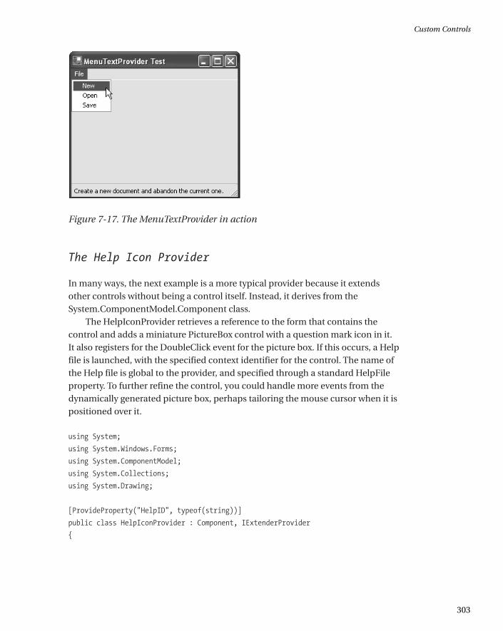
Figure 7-17. The MenuTextProvider in action
The Help Icon Provider
In many ways, the next example is a more typical provider because it extendsother controls without being a control itself. Instead, it derives from theSystem.ComponentModel.Component class.
The HelpIconProvider retrieves a reference to the form that contains thecontrol and adds a miniature PictureBox control with a question mark icon in it. It also registers for the DoubleClick event for the picture box. If this occurs, a Helpfile is launched, with the specified context identifier for the control. The name ofthe Help file is global to the provider, and specified through a standard HelpFileproperty. To further refine the control, you could handle more events from thedynamically generated picture box, perhaps tailoring the mouse cursor when it ispositioned over it.
using System;
using System.Windows.Forms;
using System.ComponentModel;
using System.Collections;
using System.Drawing;
[ProvideProperty("HelpID", typeof(string))]
public class HelpIconProvider : Component, IExtenderProvider
{
Custom Controls
303
*0457_ch07_CMP4 8/21/02 1:05 PM Page 303
private Hashtable contextID = new Hashtable();
private Hashtable pictures = new Hashtable();
private string helpFile;
public bool CanExtend(object extendee)
{
if (extendee.GetType() == typeof(Control))
{
// Ensure the control is attached to a form.
if (((Control)extendee).FindForm() == null)
{
return false;
}
else
{
return true;
}
}
else
{
return false;
}
}
public string HelpFile
{
get
{
return helpFile;
}
set
{
helpFile = value;
}
}
public void SetHelpID(object extendee, string value)
{
Control ctrl = (Control)extendee;
Chapter 7
304
*0457_ch07_CMP4 8/21/02 1:05 PM Page 304
// Specifying an empty value removes the extension.
if (value == "")
{
contextID.Remove(extendee);
// Remove the picture.
PictureBox pic = (PictureBox)pictures[extendee];
pic.DoubleClick -= new EventHandler(PicDoubleClick);
pic.Parent.Controls.Remove(pic);
pictures.Remove(extendee);
}
else
{
contextID[extendee] = value;
// Create new icon.
PictureBox pic = new PictureBox();
pic.Image = Image.FromFile("Help.gif");
// Store a reference to the related control in the PictureBox.
pic.Tag = extendee;
pic.Size = new Size(16, 16);
pic.Location = new Point(ctrl.Right + 10, ctrl.Top);
ctrl.Parent.Controls.Add(pic);
// Register for DoubleClick event.
pic.DoubleClick += new EventHandler(PicDoubleClick);
// Store a reference to the help icon so we can remove it later.
pictures[extendee] = pic;
}
}
Custom Controls
305
*0457_ch07_CMP4 8/21/02 1:05 PM Page 305
public string GetHelpID(object extendee)
{
if (contextID[extendee] != null)
{
return contextID[extendee].ToString();
}
else
{
return String.Empty;
}
}
public void PicDoubleClick(object sender, EventArgs e)
{
// Invoke help for control.
Control ctrlRelated = (Control)((Control)sender).Tag;
Help.ShowHelp(ctrlRelated, helpFile, HelpNavigator.Topic,
contextID[ctrlRelated].ToString());
}
}
It’s important to note that if you don’t have a valid Help file and context identi-fier, nothing will happen when you click the Help icon. For this reason, the codedownload for this sample includes a message box that pops up to let you know theevent has been detected. You will find out much more about the Help class thiscontrol uses to invoke the Help engine in Chapter 14.
To invoke this control, just specify a global Help file for the provider and set aHelp context ID for a specific control. Figure 7-18 shows the HelpIconProvider inaction.
private void HelpIconHost_Load(object sender, System.EventArgs e)
{
helpIconProvider1.HelpFile = "myhelp.hlp";
helpIconProvider1.SetHelpID(TextBox1, "10001");
helpIconProvider1.SetHelpID(TextBox2, "10002");
}
Chapter 7
306
*0457_ch07_CMP4 8/21/02 1:05 PM Page 306
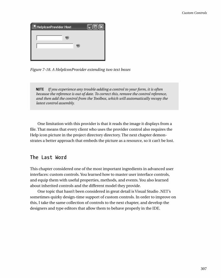
Figure 7-18. A HelpIconProvider extending two text boxes
NOTE If you experience any trouble adding a control to your form, it is oftenbecause the reference is out of date. To correct this, remove the control reference,and then add the control from the Toolbox, which will automatically recopy thelatest control assembly.
One limitation with this provider is that it reads the image it displays from afile. That means that every client who uses the provider control also requires theHelp icon picture in the project directory directory. The next chapter demon-strates a better approach that embeds the picture as a resource, so it can’t be lost.
The Last Word
This chapter considered one of the most important ingredients in advanced userinterfaces: custom controls. You learned how to master user interface controls,and equip them with useful properties, methods, and events. You also learnedabout inherited controls and the different model they provide.
One topic that hasn’t been considered in great detail is Visual Studio .NET’ssometimes quirky design-time support of custom controls. In order to improve onthis, I take the same collection of controls to the next chapter, and develop thedesigners and type editors that allow them to behave properly in the IDE.
Custom Controls
307
*0457_ch07_CMP4 8/21/02 1:05 PM Page 307
http://www.springer.com/978-1-59059-045-4


![interoperability.blob.core.windows.netinteroperability.blob.core.windows.net/files/MS-CUSTOM… · Web view[MSDN-CUICT/Word] Microsoft Corporation, ... All custom controls MUST](https://img.pdfslide.net/doc/110x75/5aa79cca7f8b9a54748c49ac/web-viewmsdn-cuictword-microsoft-corporation-all-custom-controls-must.jpg)