Embed Size (px)
DESCRIPTION
Designer: Vanessa de Souza Esser Australian Catholic University Arts 227 - April 2012 Task 2A: choose one business (real or not) of our own interest and create a website proposal. In my case, I chose a Brazilian Restaurant that is placed here in Melbourne and I redesign their website and also created a new visual identity. Trabalho 2A: Escolher uma empresa qualquer de nosso interesse, podendo esta ser real ou não, e criar uma proposta de website para ela. No meu caso, eu escolhi um restaurante brasileiro que existe aqui em Melbourne e fiz um redesign do site deles e também de toda a identidade visual.
Citation preview
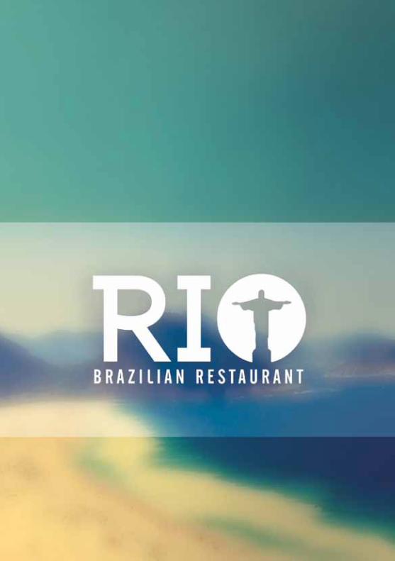
Established in Melbourne since 2010, in a residential area at Richmond suburb, R i O is more than a simple Brazilian restaurant. Is a little part of Brazil here in Australia. There we can find the traditional Brazilian food and music, accomplished by drinks and dances. During the whole year they have many special events and a large variety of entertainment, which make R i O one of the best place to have good and unforgettable time with family, friends or even alone.
Their target audience are people in theirs mid-twenties, that already appreciate the South American culture or even those who want to know more about Brazil, enjoy a good food and a fun time.
So, they really need a web site that represents the Brazilian style and gives more information about them, a complete list of food and drinks, gallery of images, contact information, maps and bookings. The audience should be motivated to go the restaurant and know more about Brazilian culture through all this website
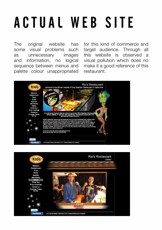
A c t u A l W e b S i t eThe original website has some visual problems such as unnecessary images and information, no logical sequence between menus and palette colour unappropriated
for this kind of commerce and target audience. Through all this website is observed a visual pollution which does no make it a good reference of this restaurant.
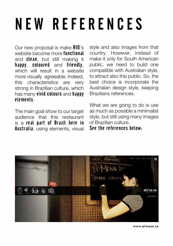
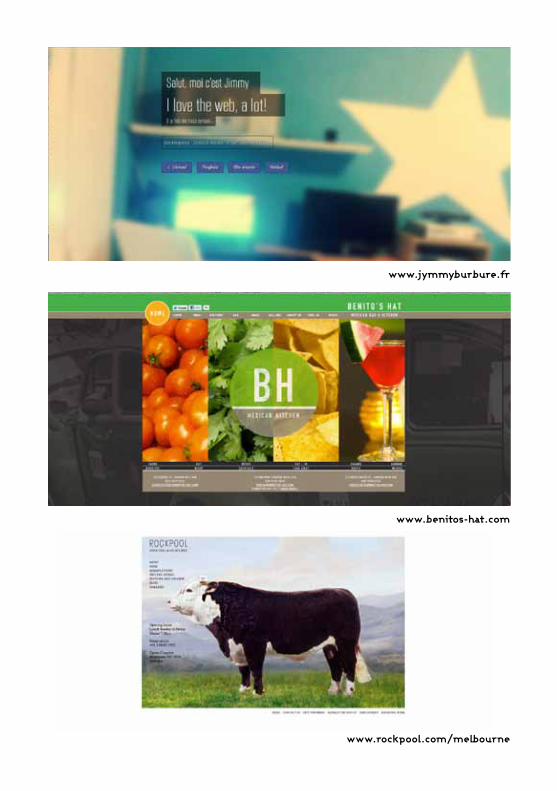
N e W R e f e R e N c e SOur new proposal is make RiO’s website become more functional and clean, but still making it happy, coloured and friendly, which will result in a website more visually agreeable. Indeed, this characteristics are very strong in Brazilian culture, which has many vivid colours and happy elements.
The main goal show to our target audience that this restaurant is a real part of brazil here in Australia, using elements, visual
style and also images from that country. However, instead of make it only for South American public, we need to build one compatible with Australian style, to attract also this public. So, the best choice is incorporate the Australian design style, keeping Brazilians references.
What we are going to do is use as much as possible a minimalist style, but still using many images of Brazilian culture.See the references below:
www.pizzaza.ca
www.benitos-hat.com
www.jymmyburbure.fr
www.rockpool.com/melbourne
b R A N D -N e W P R O P O S A l
O l D v i S u A l i D e N t i t y : N e W v i S u A l i D e N t i t y :
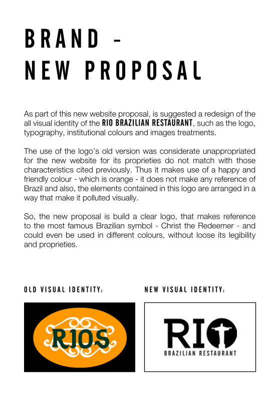
As part of this new website proposal, is suggested a redesign of the all visual identity of the RiO bRAZiliAN ReStAuRANt, such as the logo, typography, institutional colours and images treatments.
The use of the logo’s old version was considerate unappropriated for the new website for its proprieties do not match with those characteristics cited previously. Thus it makes use of a happy and friendly colour - which is orange - it does not make any reference of Brazil and also, the elements contained in this logo are arranged in a way that make it polluted visually.
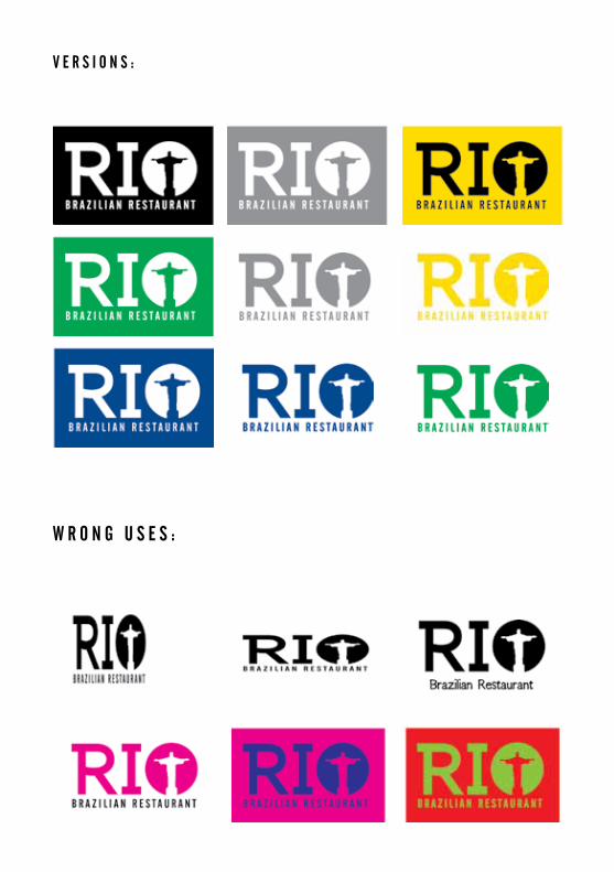
So, the new proposal is build a clear logo, that makes reference to the most famous Brazilian symbol - Christ the Redeemer - and could even be used in different colours, without loose its legibility and proprieties.
W R O N g u S e S :
v e R S i O N S :
t y P O g R A P h y :
i N S t i t u t i O N A l c O l O u R S :
black
yellow
green
blue
CMYK = 0 / 0 / 0 / 100
CMYK = 0 / 10 / 100 / 0
CMYK = 100 / 0 / 100 / 0
CMYK = 100 / 70 / 0 / 20
RGB = 0 / 0 / 0
RGB = 255 / 220 / 0
RGB = 0 / 144 / 55
RGB = 0 / 69 / 136
WEB = #000000
WEB = #ffdd00
WEB = #00a651
WEB = #004a8f
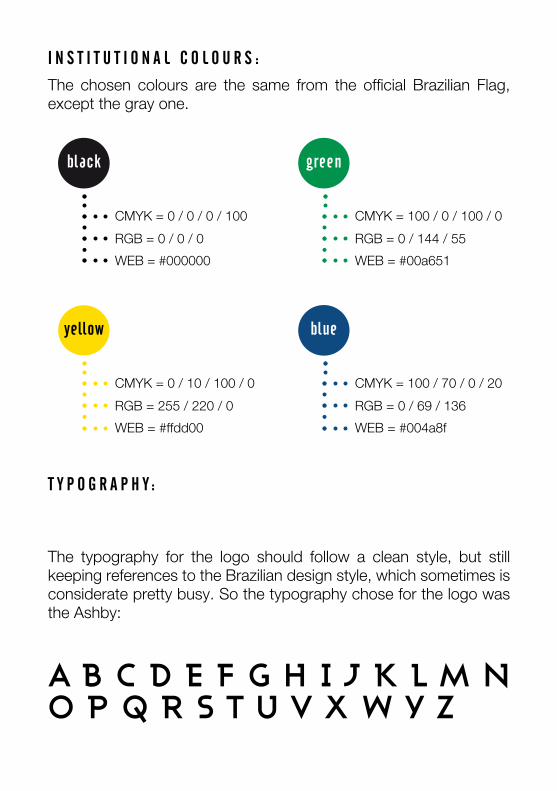
The typography for the logo should follow a clean style, but still keeping references to the Brazilian design style, which sometimes is considerate pretty busy. So the typography chose for the logo was the Ashby:
The chosen colours are the same from the official Brazilian Flag, except the gray one.
a b c d e f g h i j k l m n o p q r s t u v x w y z
Font: Angelina | Size: 36 | Kerning: 0 | Leading: 30 | Normal Case
Quotes
Aa Bb Cc Dd Ee Ff Gg Hh Ii Jj K k Ll Mm Nn Oo Pp Qq Rr Ss Tt Uu Vv Xx Ww Y y Zz
Font: Cafeta | Size: 40 | Kerning: 170 | Leading: 36 | Uppercase
title / heading 1
A b c D e f g h i j k l m N O P Q R S t u v x W y Z
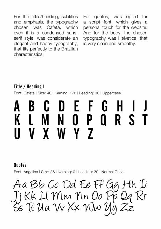
For the titles/heading, subtitles and emphasis, the typography chosen was Cafeta, which even it is a condensed sans-serif style, was considerate an elegant and happy typography, that fits perfectly to the Brazilian characteristics.
For quotes, was opted for a script font, which gives a personal touch for the website. And for the body, the chosen typography was Helvetica, that is very clean and smoothy.
Font: Ashby | Size: 8 | Kerning: 10 | Leading: 10 | Normal Case
captions
aa bb cc dd ee ff gg hh ii jj kk ll mm nn oo pp qq rr ss tt uu vv xx ww yy zz
Font: Cafeta | Size: 14 | Kerning: 170 | Leading: 14 | Uppercase
Font: Cafeta | Size: 14 | Kerning: 170 | Leading: 14 | Normal Case
Subtitles / heading 2
emphasis
A b c D e f g h i j k l m N O P Q R S t u v x W y Z
Aa bb cc Dd ee ff gg hh ii jj kk ll mm Nn Oo Pp Qq Rr Ss tt uu vv xx Ww yy Zz
Font: HelveticaNeue | Size: 12 | Kerning: 10 | Leading: 14 | Normal Case
Font: HelveticaNeue | Size: 14 | Kerning: 10 | Leading: 14 | Normal Case
body 2
body 1
Aa Bb Cc Dd Ee Ff Gg Hh Ii Jj Kk Ll Mm Nn Oo Pp Qq Rr Ss Tt Uu Vv Xx Ww Yy Zz
Aa Bb Cc Dd Ee Ff Gg Hh Ii Jj Kk Ll Mm Nn Oo Pp Qq Rr Ss Tt Uu Vv Xx Ww Yy Zz
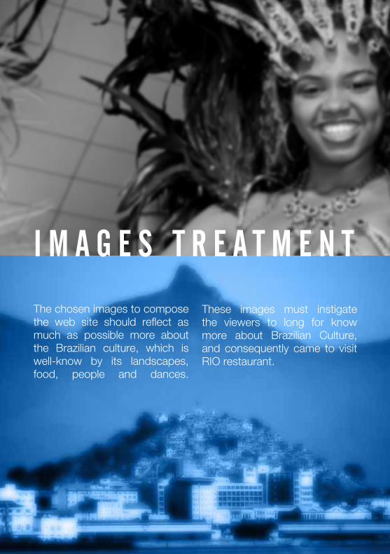
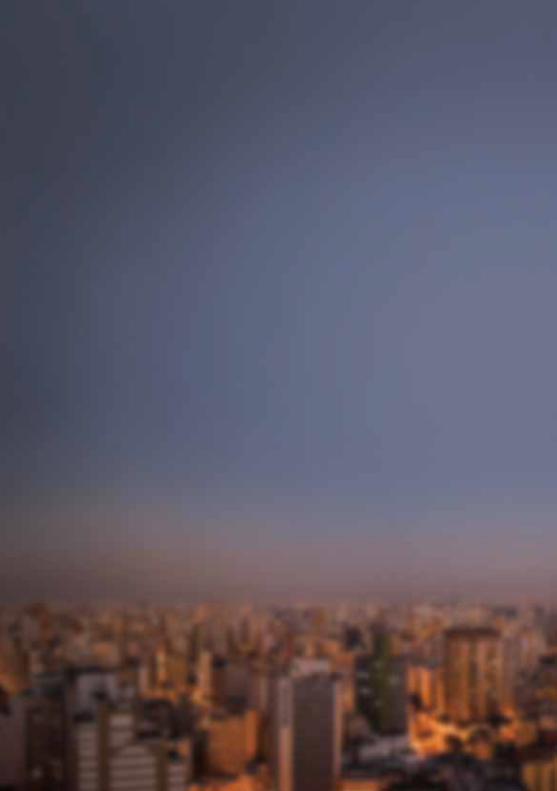
The chosen images to compose the web site should reflect as much as possible more about the Brazilian culture, which is well-know by its landscapes, food, people and dances.
i m A g e S t R e A t m e N t
These images must instigate the viewers to long for know more about Brazilian Culture, and consequently came to visit RIO restaurant.
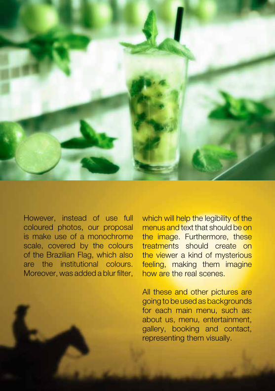
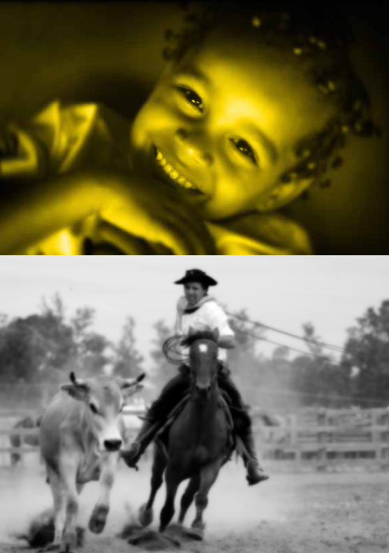
However, instead of use full coloured photos, our proposal is make use of a monochrome scale, covered by the colours of the Brazilian Flag, which also are the institutional colours. Moreover, was added a blur filter,
which will help the legibility of the menus and text that should be on the image. Furthermore, these treatments should create on the viewer a kind of mysterious feeling, making them imagine how are the real scenes.
All these and other pictures are going to be used as backgrounds for each main menu, such as: about us, menu, entertainment, gallery, booking and contact, representing them visually.
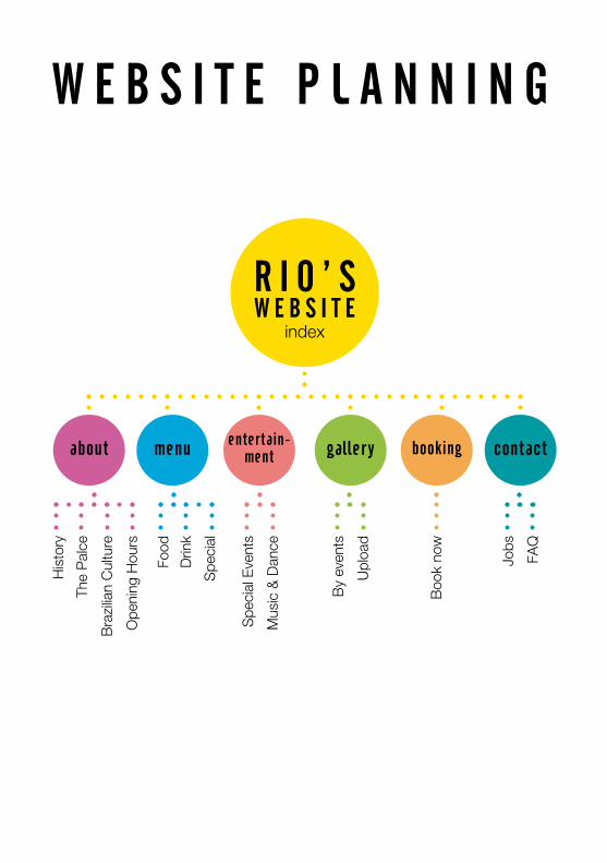
W e b S i t e P l A N N i N g
R i O ’ SW e b S i t e
index
about contactbookinggalleryentertain-mentmenu
His
tory
Food
Spe
cial
Eve
nts
Jobs
By
even
ts
Boo
k no
w
The
Pal
ce
Drin
k
Mus
ic &
Dan
ce
FAQ
Upl
oad
Ope
ning
Hou
rs
Bra
zilia
n C
ultu
re
Spe
cial
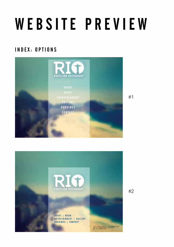
W e b S i t e P R e v i e Wi N D e x : O P t i O N S
#2
#1
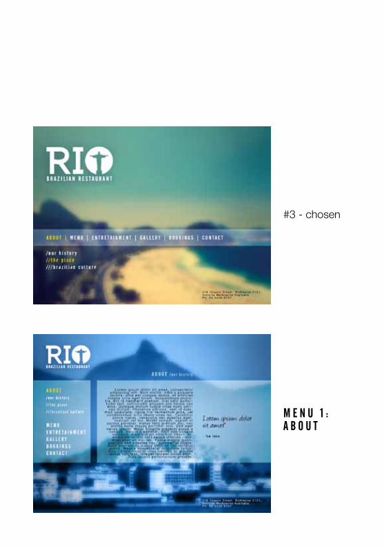
#3 - chosen
m e N u 1 : A b O u t
D e v e l O P e D b y :
vanessa de Souza esserAustralian Catholic University
Arts 227 | Abril 2012