Embed Size (px)
Citation preview
What is inequality and how we measure it
Milanovic, “Global inequality and its implications”
Lectures 1 & 2
Absolute vs. relative
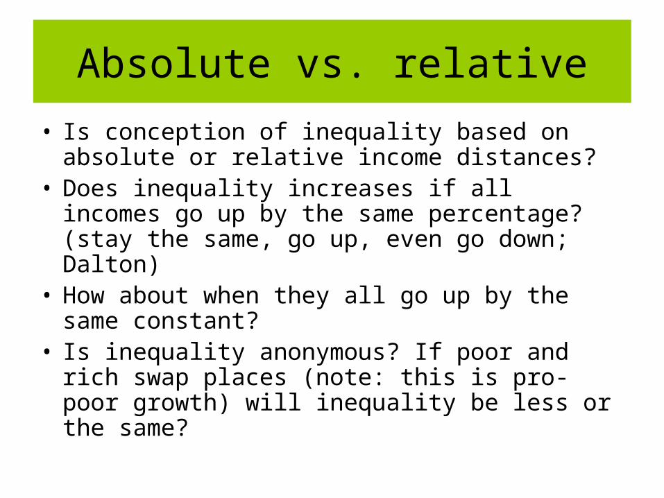
Absolute vs. relative
• Is conception of inequality based on absolute or relative income distances?
• Does inequality increases if all incomes go up by the same percentage? (stay the same, go up, even go down; Dalton)
• How about when they all go up by the same constant?
• Is inequality anonymous? If poor and rich swap places (note: this is pro-poor growth) will inequality be less or the same?
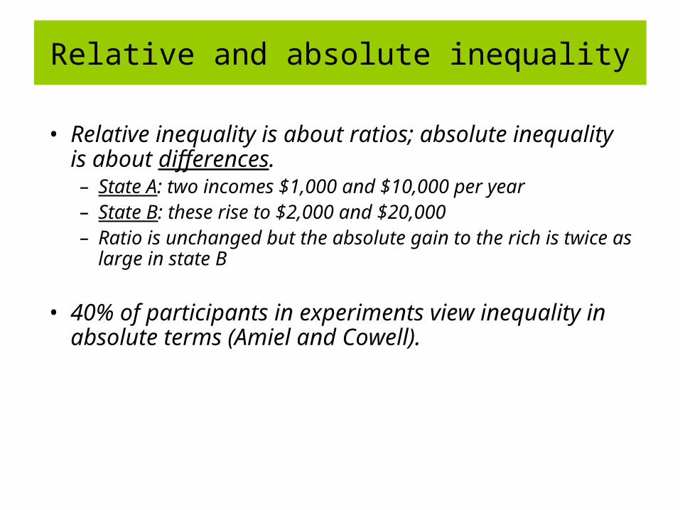
• Relative inequality is about ratios; absolute inequality is about differences.– State A: two incomes $1,000 and $10,000 per year– State B: these rise to $2,000 and $20,000 – Ratio is unchanged but the absolute gain to the rich is twice
as large in state B
• 40% of participants in experiments view inequality in absolute terms (Amiel and Cowell).
Relative and absolute inequality
-15
-10
-5
0
5
10
15
-0.2 -0.1 0.0 0.1 0.2
Annualized change in log mean
Annualiz
ed c
hange in a
bsolu
te G
ini in
dex
-10
-5
0
5
10
-0.2 -0.1 0.0 0.1 0.2
Annualized change in log mean
Annualiz
ed c
hange in
rela
tive G
ini i
ndex
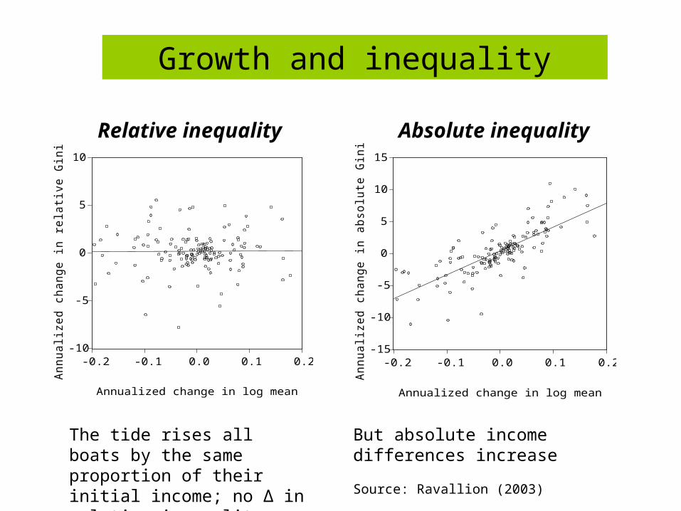
Absolute inequality
Relative inequality
Growth and inequality
The tide rises all boats by the same proportion of their initial income; no Δ in relative inequality
But absolute income differences increase
Source: Ravallion (2003)
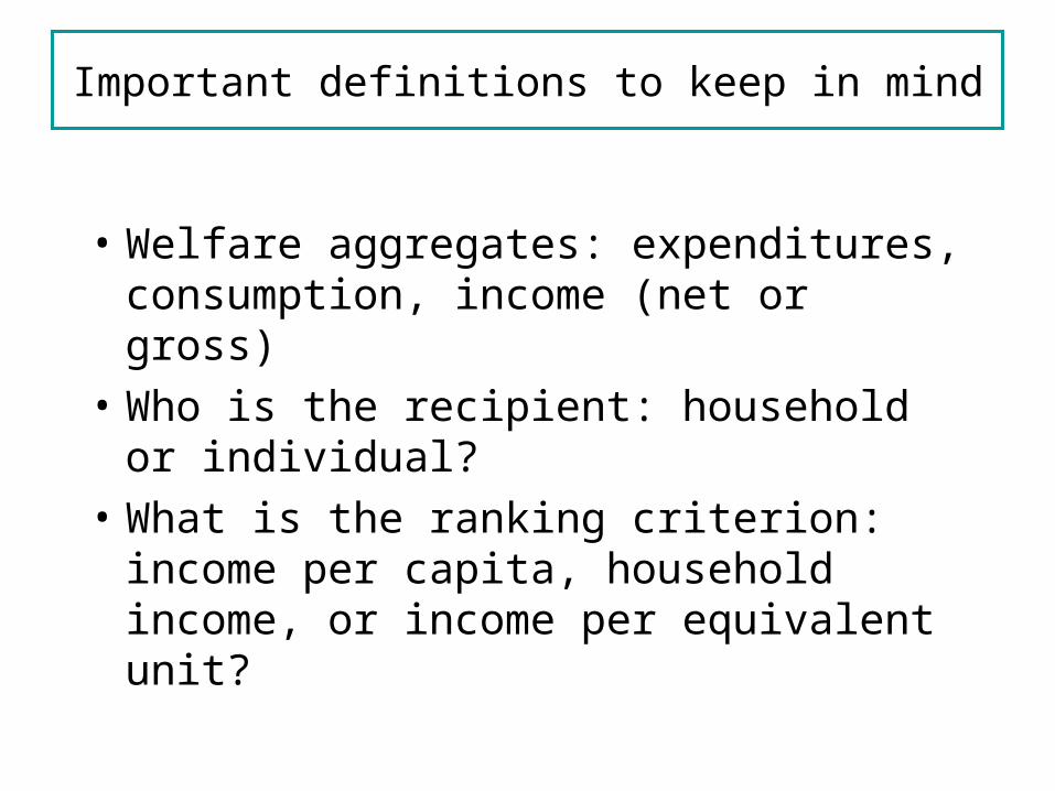
Important definitions to keep in mind
• Welfare aggregates: expenditures, consumption, income (net or gross)
• Who is the recipient: household or individual?
• What is the ranking criterion: income per capita, household income, or income per equivalent unit?
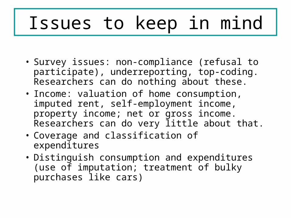
Issues to keep in mind
• Survey issues: non-compliance (refusal to participate), underreporting, top-coding. Researchers can do nothing about these.
• Income: valuation of home consumption, imputed rent, self-employment income, property income; net or gross income. Researchers can do very little about that.
• Coverage and classification of expenditures• Distinguish consumption and expenditures
(use of imputation; treatment of bulky purchases like cars)
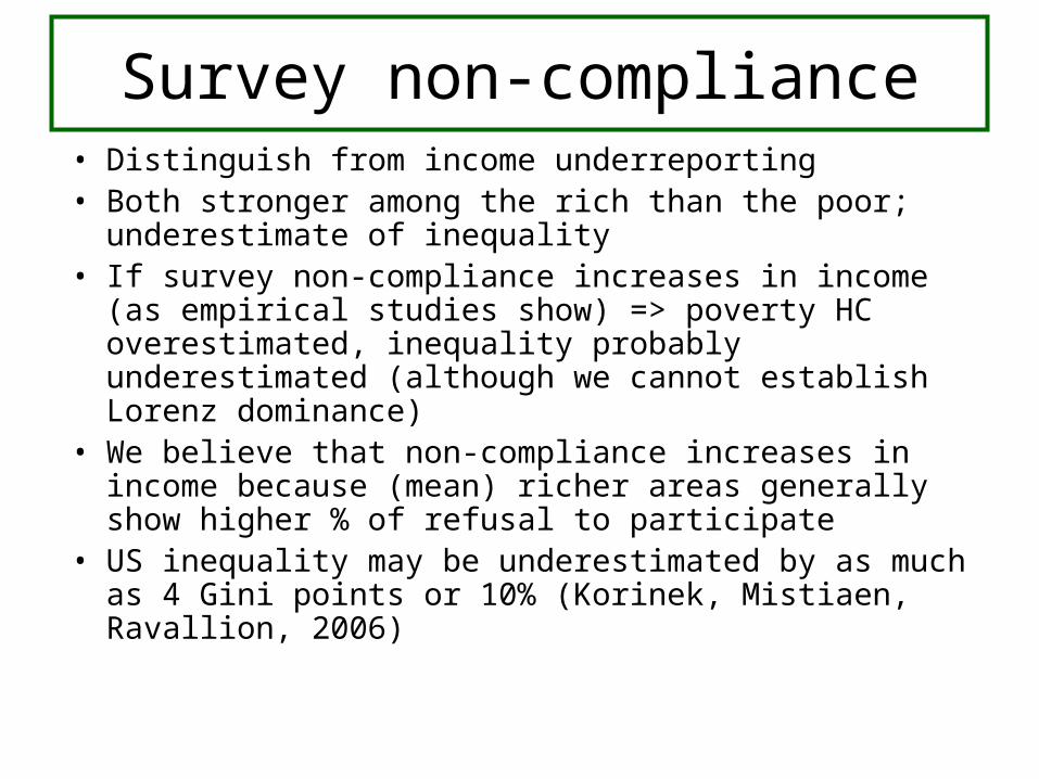
Survey non-compliance• Distinguish from income underreporting• Both stronger among the rich than the poor;
underestimate of inequality• If survey non-compliance increases in income (as
empirical studies show) => poverty HC overestimated, inequality probably underestimated (although we cannot establish Lorenz dominance)
• We believe that non-compliance increases in income because (mean) richer areas generally show higher % of refusal to participate
• US inequality may be underestimated by as much as 4 Gini points or 10% (Korinek, Mistiaen, Ravallion, 2006)
Income vs. expenditures
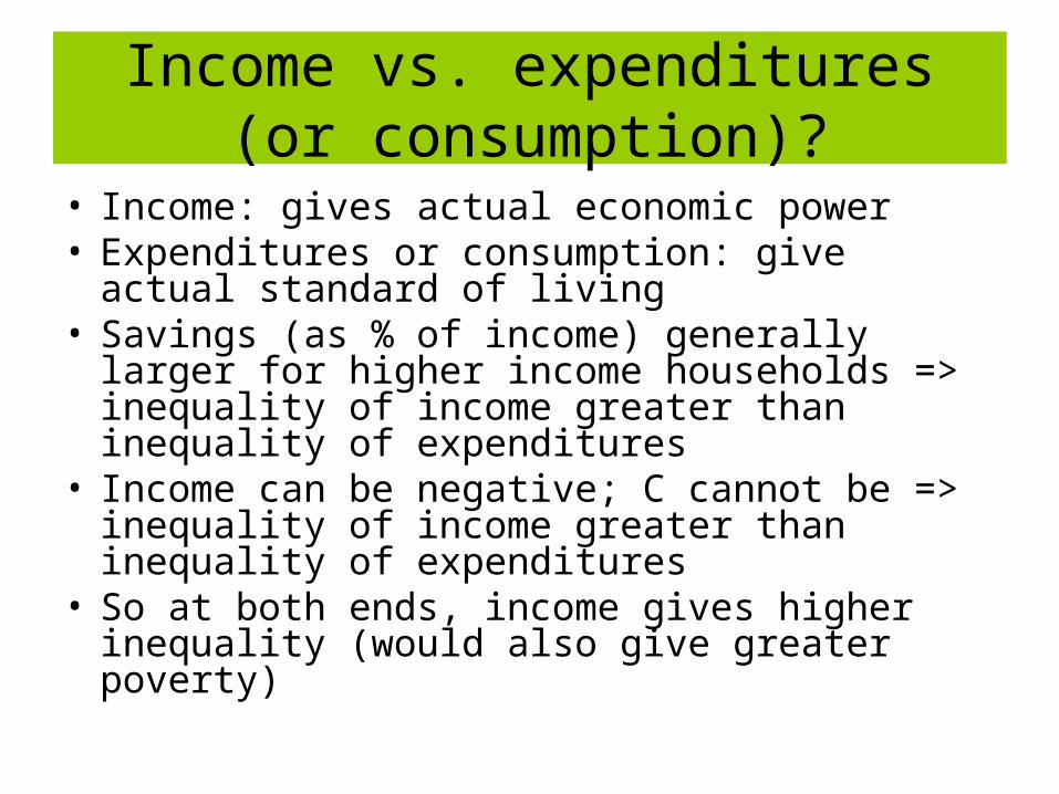
Income vs. expenditures (or consumption)?
• Income: gives actual economic power• Expenditures or consumption: give actual
standard of living• Savings (as % of income) generally larger for
higher income households => inequality of income greater than inequality of expenditures
• Income can be negative; C cannot be => inequality of income greater than inequality of expenditures
• So at both ends, income gives higher inequality (would also give greater poverty)
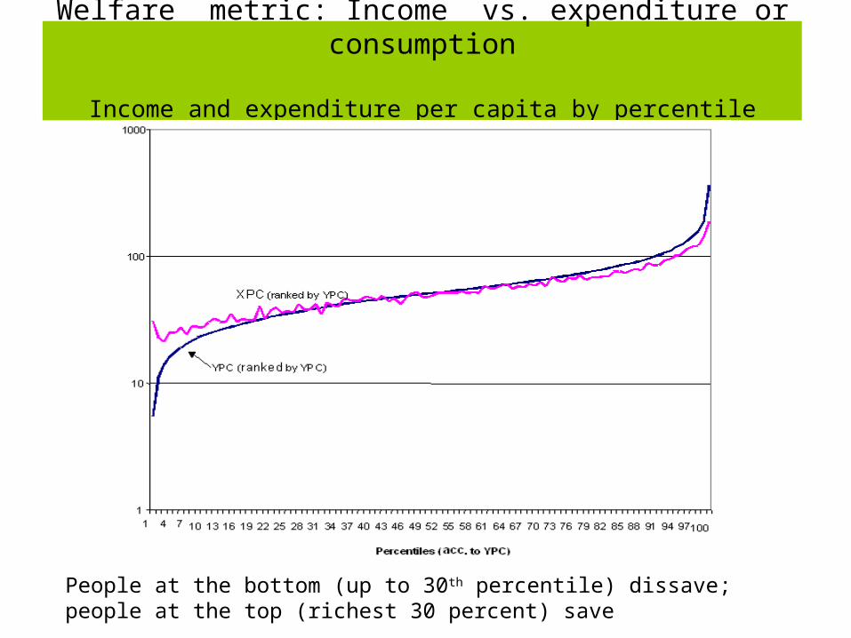
Welfare metric: Income vs. expenditure or consumption
Income and expenditure per capita by percentile (people ranked by YPC)
People at the bottom (up to 30th percentile) dissave; people at the top (richest 30 percent) save
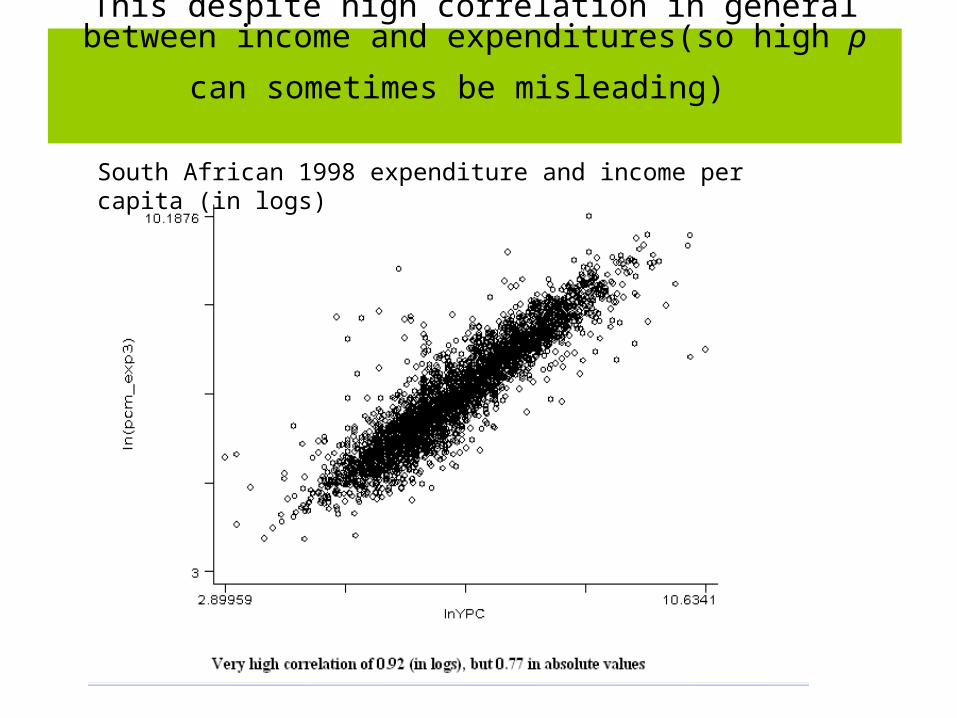
This despite high correlation in general between income
and expenditures(so high ρ can sometimes be misleading)
South African 1998 expenditure and income per capita (in logs)
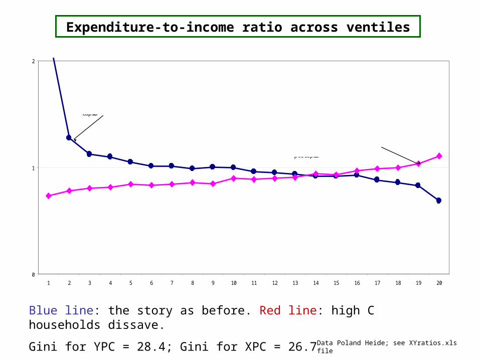
Blue line: the story as before. Red line: high C households dissave.
Gini for YPC = 28.4; Gini for XPC = 26.7
0
1
2
1 2 3 4 5 6 7 8 9 10 11 12 13 14 15 16 17 18 19 20
Ranking according to income per capita
Ranking according to expenditure per capita
Average X/Y=0.93
Expenditure-to-income ratio across ventiles
Data Poland Heide; see XYratios.xls file
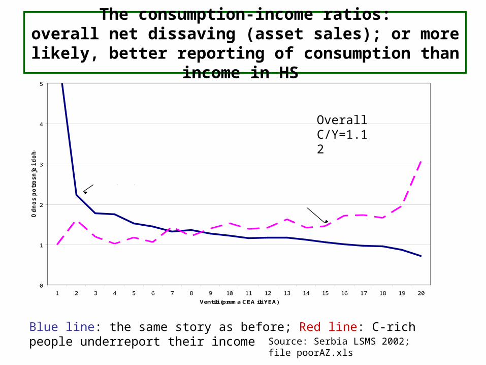
The consumption-income ratios:overall net dissaving (asset sales); or more likely, better
reporting of consumption than income in HS
Blue line: the same story as before; Red line: C-rich people underreport their income Source: Serbia LSMS 2002; file
poorAZ.xls
Overall C/Y ratio = 1.09
0
1
2
3
4
5
1 2 3 4 5 6 7 8 9 10 11 12 13 14 15 16 17 18 19 20
Ventili (prema CEA ili YEA)
Od
no
s p
otr
osn
je i
do
ho
tka
Ranking acc. to income per capita
Ranking acc. to consumption per capita
Overall C/Y=1.12
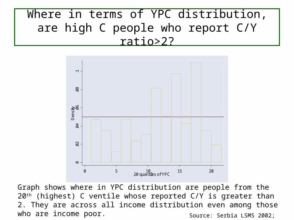
Where in terms of YPC distribution, are high C people who report C/Y ratio>2?
0.0
2.0
4.0
6.0
8.1
Den
sity
0 5 10 15 2020 quantiles of YPC
Graph shows where in YPC distribution are people from the 20th (highest) C ventile whose reported C/Y is greater than 2. They are across all income distribution even among those who are income poor.
Source: Serbia LSMS 2002;
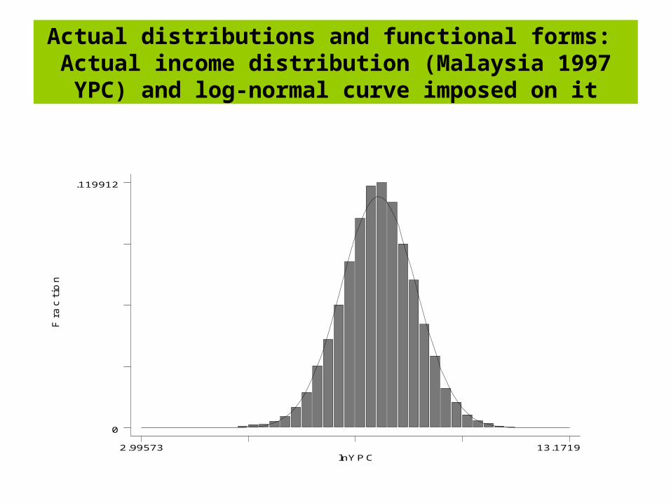
Actual distributions and functional forms: Actual income distribution (Malaysia 1997 YPC) and log-
normal curve imposed on it
Fra
cti
on
lnYPC2.99573 13.1719
0
.119912
Individuals vs. households
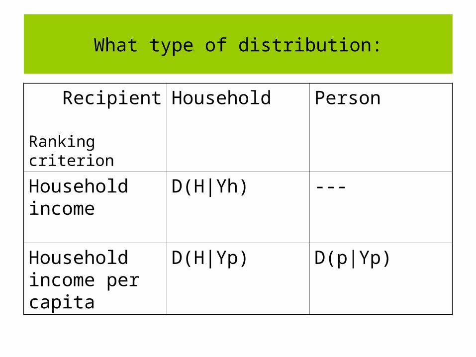
What type of distribution:
Recipient
Ranking criterion
Household Person
Household income
D(H|Yh) ---
Household income per capita
D(H|Yp) D(p|Yp)
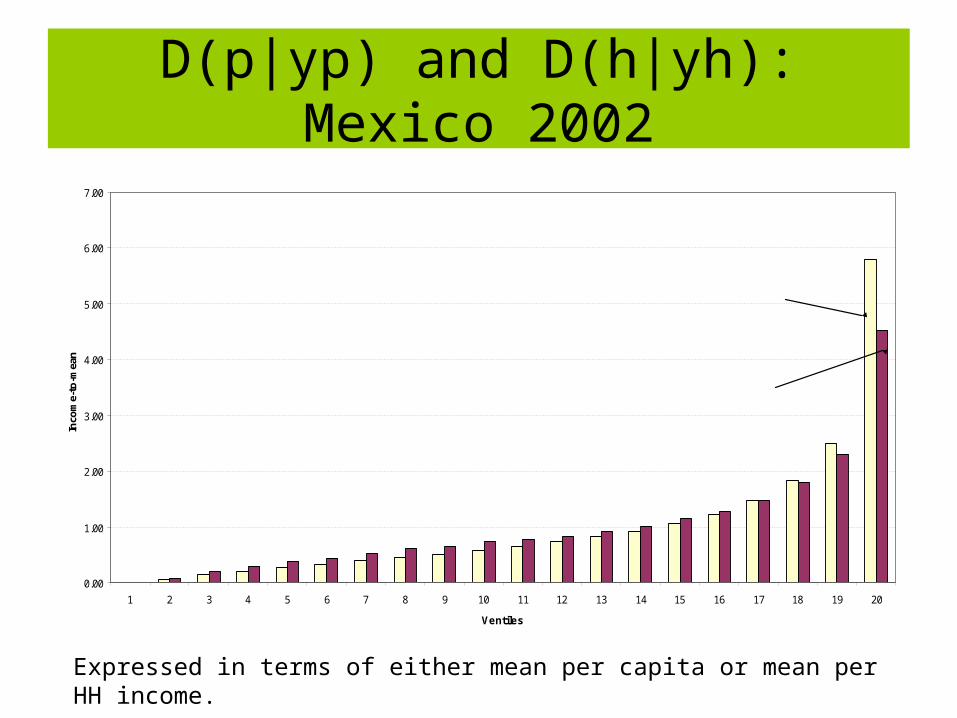
D(p|yp) and D(h|yh):Mexico 2002
Expressed in terms of either mean per capita or mean per HH income.
0.00
1.00
2.00
3.00
4.00
5.00
6.00
7.00
1 2 3 4 5 6 7 8 9 10 11 12 13 14 15 16 17 18 19 20
Ventiles
Inco
me-
to-m
ean
per capita
per householdGini:per capita 54.5per household 53.3
Difference between D(p|Yp) and D(H|Yh)
Greece 98-99
0.00
0.50
1.00
1.50
2.00
2.50
3.00
1 2 3 4 5 6 7 8 9 10
Per capita Per HH
Indonesia rural 1996
0.00
0.50
1.00
1.50
2.00
2.50
3.00
1 2 3 4 5 6 7 8 9 10
Per capita Per HH
Cote d'lvoire 1998
0.00
1.00
2.00
3.00
4.00
5.00
6.00
1 2 3 4 5 6 7 8 9 10
Per capita Per HH
Mexico 2000
0.00
1.00
2.00
3.00
4.00
5.00
6.00
7.00
1 2 3 4 5 6 7 8 9 10
Per capita Per HH
Equivalence scales (economies
of size)
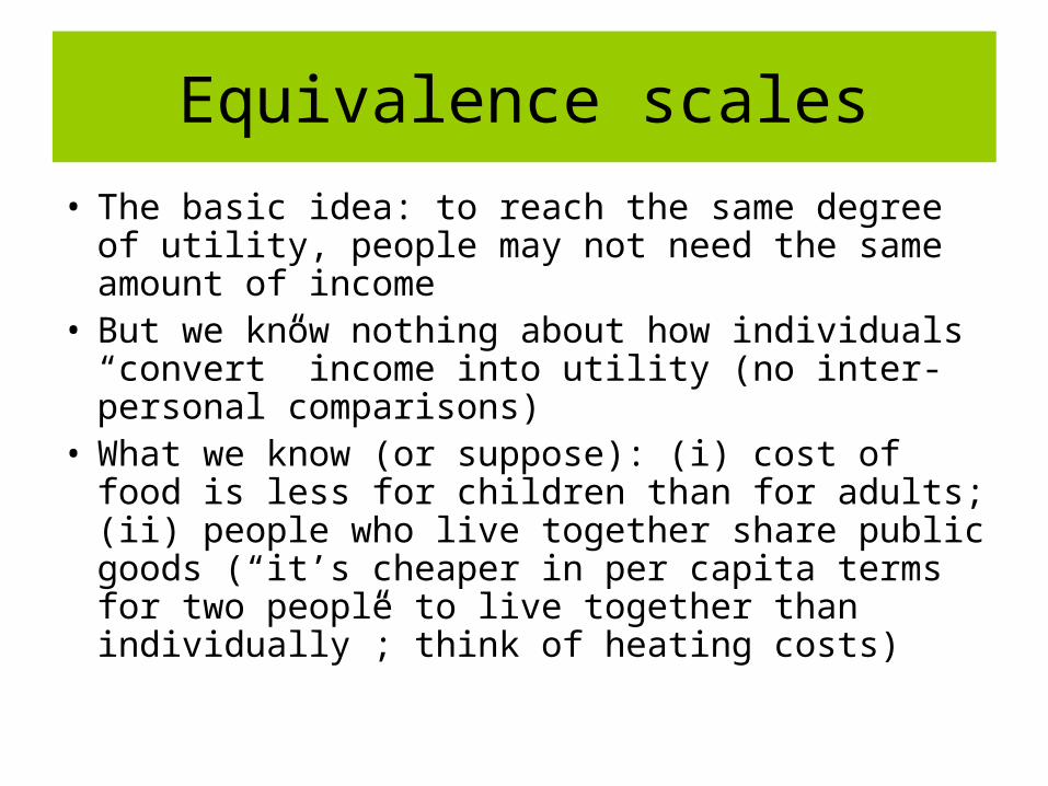
Equivalence scales
• The basic idea: to reach the same degree of utility, people may not need the same amount of income
• But we know nothing about how individuals “convert” income into utility (no inter-personal comparisons)
• What we know (or suppose): (i) cost of food is less for children than for adults; (ii) people who live together share public goods (“it’s cheaper in per capita terms for two people to live together than individually”; think of heating costs)
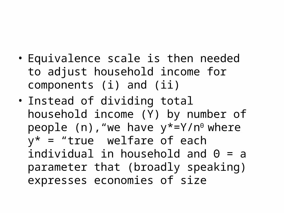
• Equivalence scale is then needed to adjust household income for components (i) and (ii)
• Instead of dividing total household income (Y) by number of people (n), we have y*=Y/nΘ
where y* = “true” welfare of each individual in household and Θ = a parameter that (broadly speaking) expresses economies of size
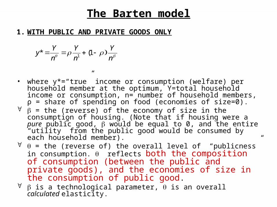
The Barten model
1. WITH PUBLIC AND PRIVATE GOODS ONLY
• where y*=“true” income or consumption (welfare) per household member at the optimum, Y=total household income or consumption, n= number of household members, ρ = share of spending on food (economies of size=0).
= the (reverse) of the economy of size in the consumption of housing. (Note that if housing were a pure public good, would be equal to 0, and the entire “utility” from the public good would be consumed by each household member).
= the (reverse of) the overall level of “publicness” in consumption. reflects both the composition of consumption (between the public and private goods), and the economies of size in the consumption of public good.
is a technological parameter, is an overall calculated elasticity.
n
Y
n
Y
n
Yy 1(*
1
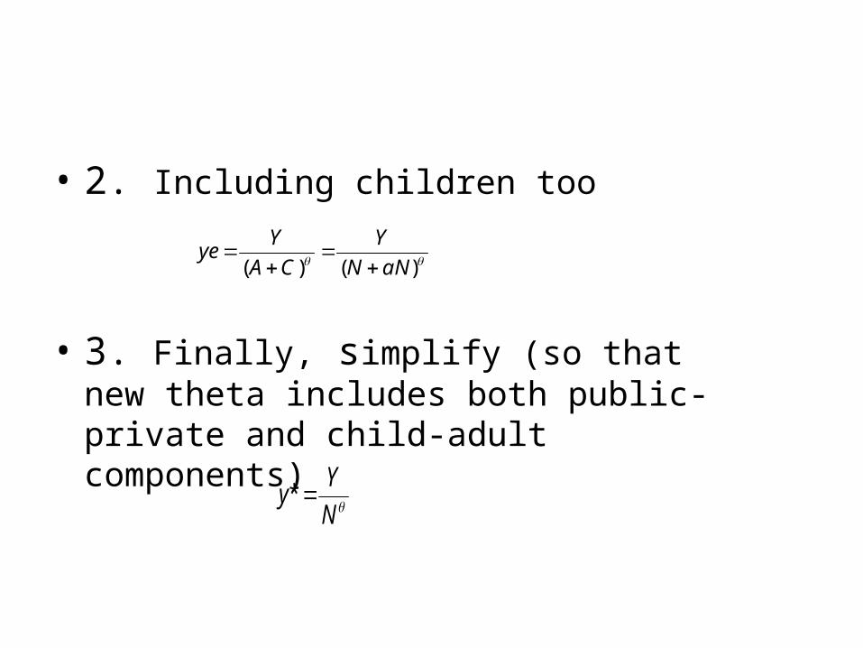
• 2. Including children too
• 3. Finally, simplify (so that new theta includes both public-private and child-adult components)
N
Yy *
)()( aNN
Y
CA
Yye
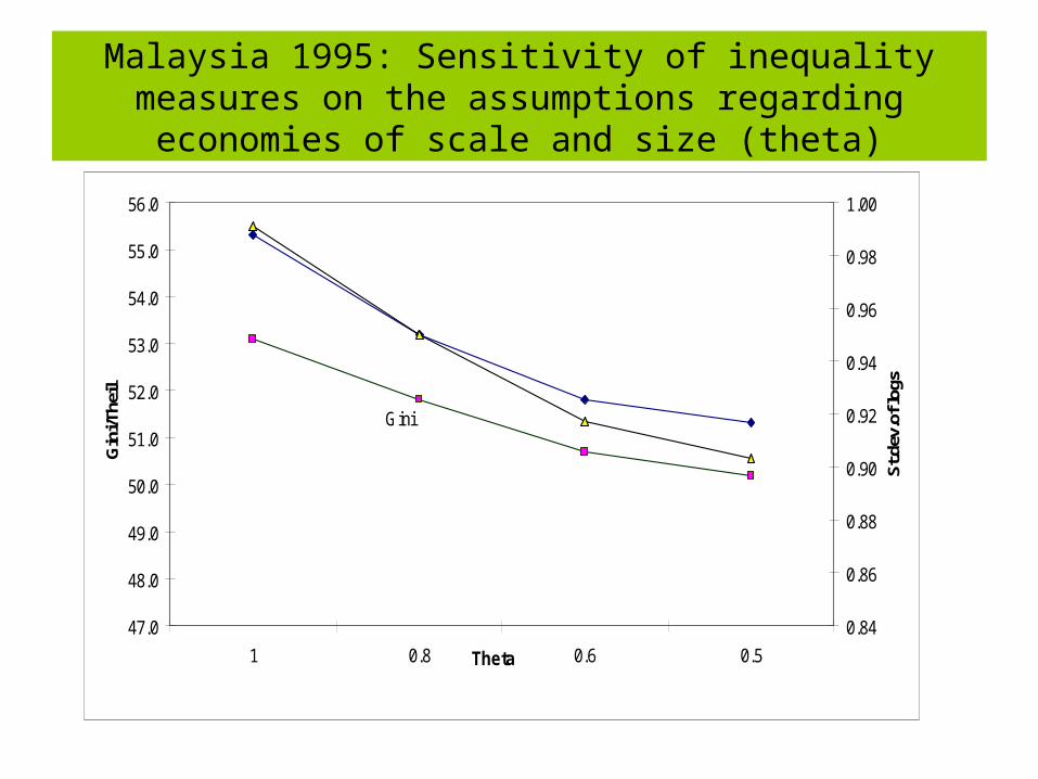
Malaysia 1995: Sensitivity of inequality measures on the assumptions regarding economies of scale and size (theta)
47.0
48.0
49.0
50.0
51.0
52.0
53.0
54.0
55.0
56.0
1 0.8 0.6 0.5Theta
Gin
i/The
il
0.84
0.86
0.88
0.90
0.92
0.94
0.96
0.98
1.00
St.d
ev.o
f log
s
Gini St.dev.of logs
Theil
Combine equivalence scales and welfare concept
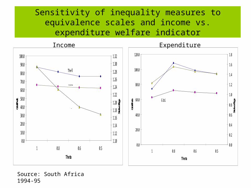
Sensitivity of inequality measures to equivalence scales and income vs. expenditure welfare indicator
0.0
10.0
20.0
30.0
40.0
50.0
60.0
70.0
80.0
90.0
100.0
1 0.8 0.6 0.5
Theta
Gini/Th
eil
1.10
1.12
1.14
1.16
1.18
1.20
1.22
1.24
1.26
1.28
1.30
1.32
St.dev.
of logs
Theil
Gini
St.dev.of logs
0.0
20.0
40.0
60.0
80.0
100.0
120.0
1 0.8 0.6 0.5
Theta
Gini/T
heta
0.0
0.2
0.4
0.6
0.8
1.0
1.2
1.4
1.6
1.8
St.de
v.of lo
gsGini
Theil
St.dev.of logs
Income Expenditure
Source: South Africa 1994-95
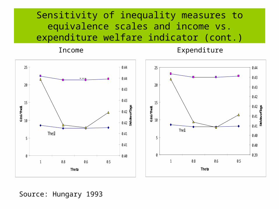
Sensitivity of inequality measures to equivalence scales and income vs. expenditure welfare indicator (cont.)
Income Expenditure
Source: Hungary 1993
0
5
10
15
20
25
1 0.8 0.6 0.5
Theta
Gin
i / T
heil
0.39
0.40
0.40
0.41
0.41
0.42
0.42
0.43
0.43
0.44
Std.
dev.
of lo
gs
Theil
Gini
Std.dev.of logs
0
5
10
15
20
25
1 0.8 0.6 0.5
Theta
Gin
i / T
heil
0.40
0.41
0.41
0.42
0.42
0.43
0.43
0.44
0.44
Std.
dev.
of lo
gsTheil
Gini
Std.dev.of logs
• Generally, Gini (and other inequality measures) go down as equivalence scales increase (means that larger households “gain” some utility because of economies of size, and also probably because they have more children)
• But this is not always the case as illustrated on the examples of South Africa and Hungary
• If YPC does not fall much with HH size, then Gini might not change much as equivalence scales increase
Measures of inequality
Welfarist approach (Dalton) to inequality vs. measurement only (Gini)
The methods of Italian writers…are not…comparable to his [Dalton’s] own, inasmuch as their purpose is to estimate, not the inequality of economic welfare, but the inequality of incomes and wealth, independently of all hypotheses as to the functional relations between these quantities and economic welfare or as to the additive character of the economic welfare of individuals.
Corrado Gini, Measurement of Inequality of Incomes, Economic Journal, March 1921.
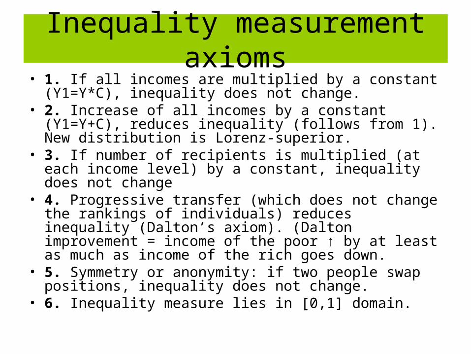
Inequality measurement axioms• 1. If all incomes are multiplied by a constant (Y1=Y*C),
inequality does not change.• 2. Increase of all incomes by a constant (Y1=Y+C),
reduces inequality (follows from 1). New distribution is Lorenz-superior.
• 3. If number of recipients is multiplied (at each income level) by a constant, inequality does not change
• 4. Progressive transfer (which does not change the rankings of individuals) reduces inequality (Dalton’s axiom). (Dalton improvement = income of the poor ↑ by at least as much as income of the rich goes down.
• 5. Symmetry or anonymity: if two people swap positions, inequality does not change.
• 6. Inequality measure lies in [0,1] domain.
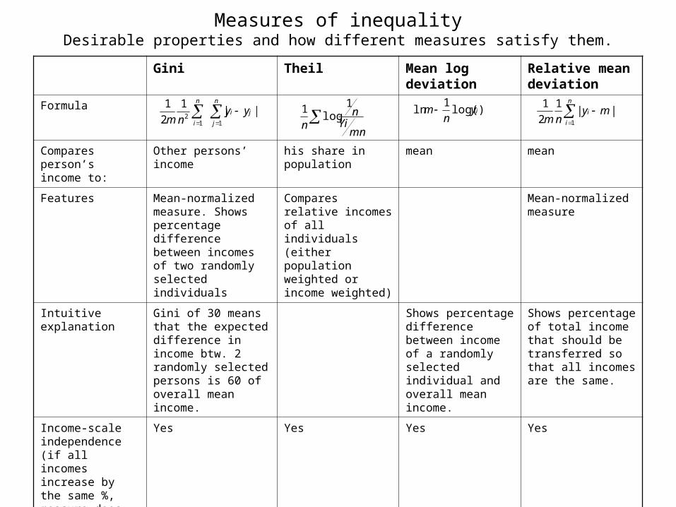
Measures of inequalityDesirable properties and how different measures satisfy them.
Gini Theil Mean log deviation
Relative mean deviation
Formula
Compares person’s income to:
Other persons’ income his share in population
mean mean
Features Mean-normalized measure. Shows percentage difference between incomes of two randomly selected individuals
Compares relative incomes of all individuals (either population weighted or income weighted)
Mean-normalized measure
Intuitive explanation
Gini of 30 means that the expected difference in income btw. 2 randomly selected persons is 60 of overall mean income.
Shows percentage difference between income of a randomly selected individual and overall mean income.
Shows percentage of total income that should be transferred so that all incomes are the same.
Income-scale independence (if all incomes increase by the same %, measure does not change)
Yes Yes Yes Yes
||1
2
1
112
ji
n
j
n
i
yynm
mnYi
nn
1log
1 )log(1
ln iyn
m
n
i
i mynm 1
||1
2
1
Gini Theil Mean log deviation
Relative mean deviation
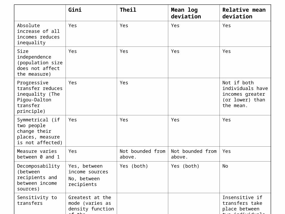
Absolute increase of all incomes reduces inequality
Yes Yes Yes Yes
Size independence (population size does not affect the measure)
Yes Yes Yes Yes
Progressive transfer reduces inequality (The Pigou-Dalton transfer principle)
Yes Yes Not if both individuals have incomes greater (or lower) than the mean.
Symmetrical (if two people change their places, measure is not affected)
Yes Yes Yes Yes
Measure varies between 0 and 1
Yes Not bounded from above.
Not bounded from above.
Yes
Decomposability (between recipients and between income sources)
Yes, between income sources
No, between recipients
Yes (both) Yes (both) No
Sensitivity to transfers
Greatest at the mode (varies as density function of the distribution)
Insensitive if transfers take place between two individuals with income greater (or lower) than the mean.
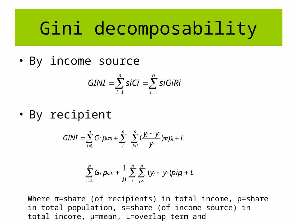
Gini decomposability
• By income source
• By recipient
n
i
n
i
siGiRisiCiGINI11
Lpy
yypGGINI j
n
ij
ii
ijn
i
n
i
iii
)1
LpipyypG j
n
i
n
ij
ij
n
i
iii
)(1
1
Where π=share (of recipients) in total income, p=share in total population, s=share (of income source) in total income, μ=mean, L=overlap term and Ri=cov(xi,r(y))/cov(xi,r(xi) source correlation coefficient with total income
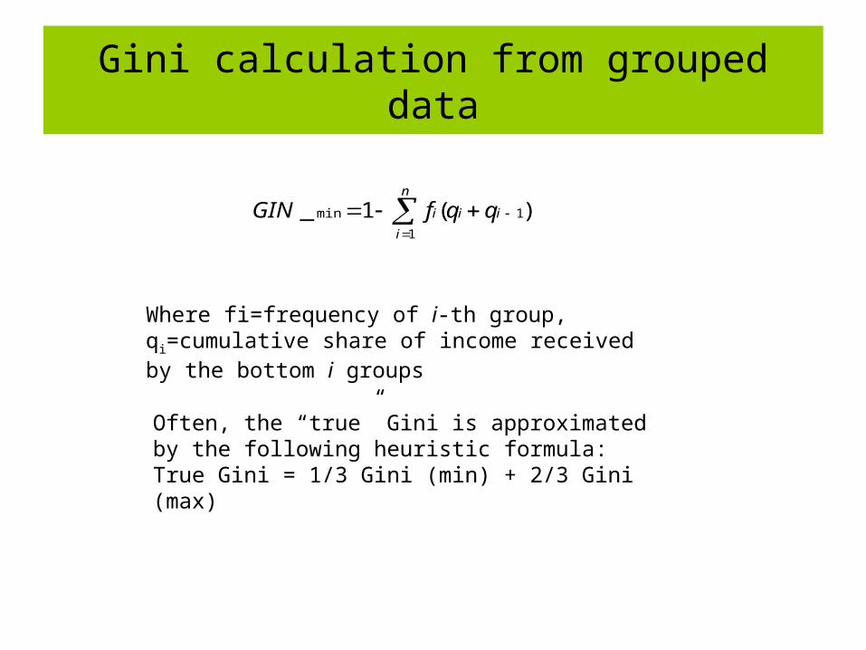
Gini calculation from grouped data
n
i
iii qqfGIN1
1min )(1_
Often, the “true” Gini is approximated by the following heuristic formula:True Gini = 1/3 Gini (min) + 2/3 Gini (max)
Where fi=frequency of i-th group, qi=cumulative share of income received by the bottom i groups
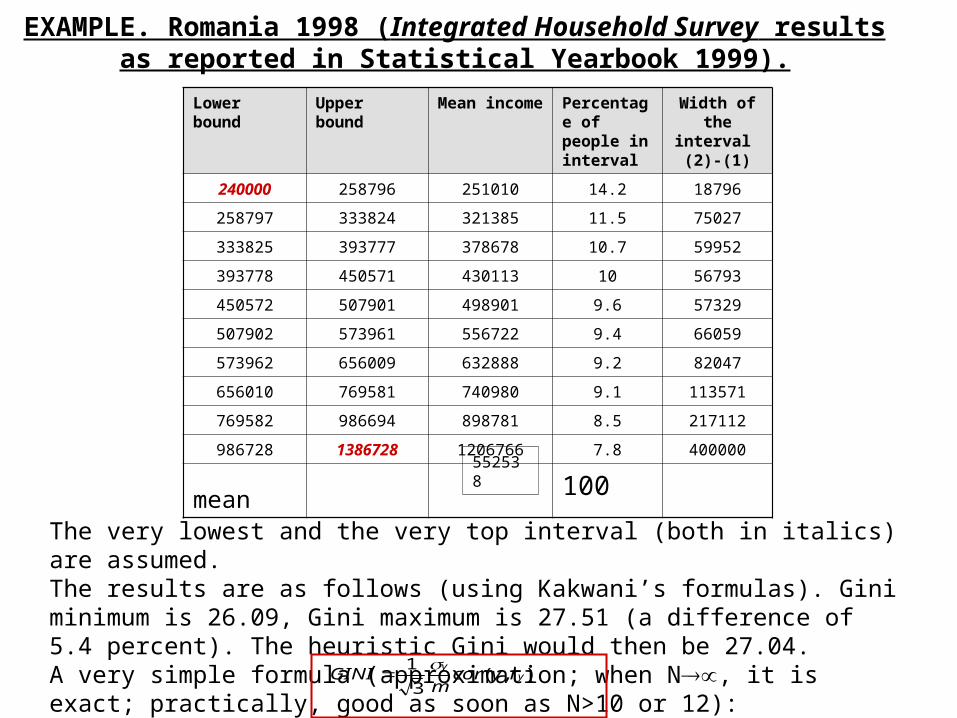
EXAMPLE. Romania 1998 (Integrated Household Survey results as reported in Statistical Yearbook 1999).
Lower bound Upper bound Mean income Percentage of people in interval
Width of the interval (2)-(1)
240000 258796 251010 14.2 18796
258797 333824 321385 11.5 75027
333825 393777 378678 10.7 59952
393778 450571 430113 10 56793
450572 507901 498901 9.6 57329
507902 573961 556722 9.4 66059
573962 656009 632888 9.2 82047
656010 769581 740980 9.1 113571
769582 986694 898781 8.5 217112
986728 1386728 1206766 7.8 400000
mean 100552538
The very lowest and the very top interval (both in italics) are assumed. The results are as follows (using Kakwani’s formulas). Gini minimum is 26.09, Gini maximum is 27.51 (a difference of 5.4 percent). The heuristic Gini would then be 27.04. A very simple formula (approximation; when N, it is exact; practically, good as soon as N>10 or 12): ),(
3
1y
yrycor
mGINI
Lorenz- and first-and second-order dominance
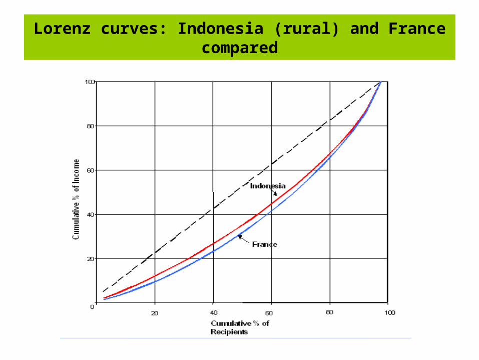
Lorenz curves: Indonesia (rural) and France compared
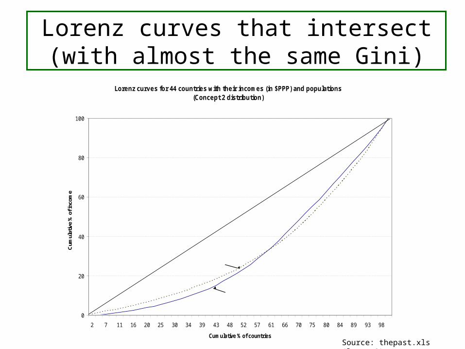
Lorenz curves that intersect (with almost the same Gini)
Lorenz curves for 44 countries with their incomes (in $PPP) and populations(Concept 2 distribution)
0
20
40
60
80
100
2 7 11 16 20 25 30 34 39 43 48 52 57 61 66 70 75 80 84 89 93 98
Cumulative % of countries
Cum
ulat
ive
% o
f inc
ome
1998
1913
Gini 1918 = 35.6Gini 1998 = 34.7
Source: thepast.xls (lorenz2)
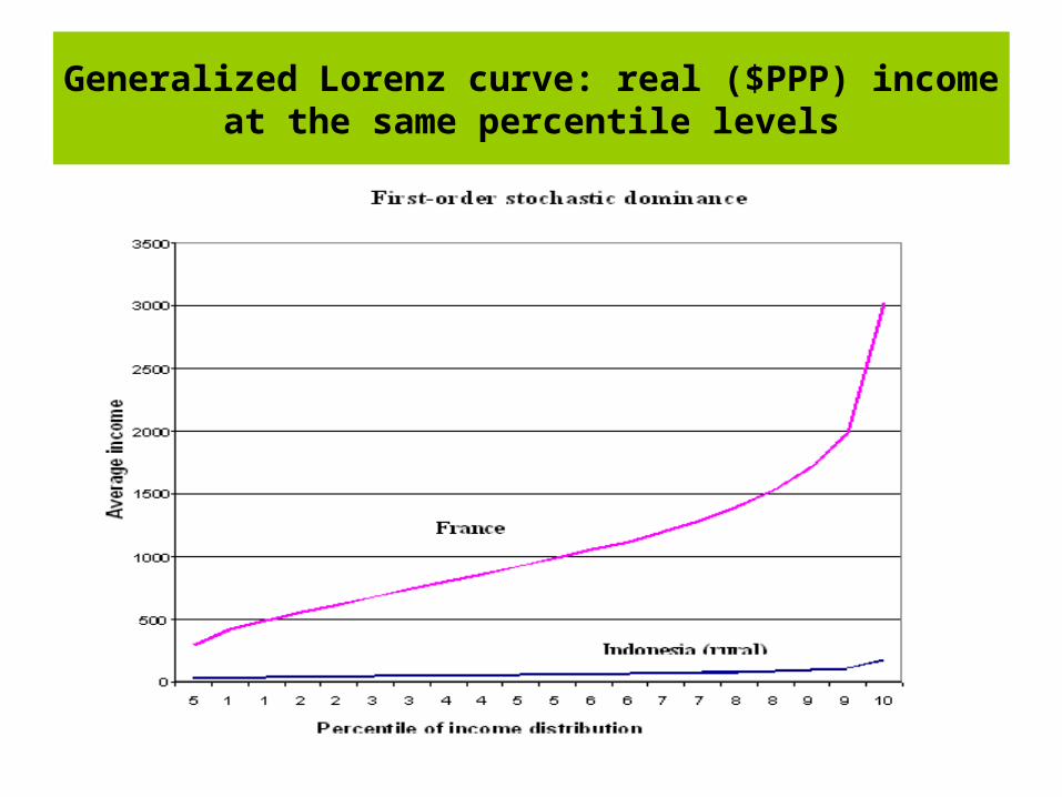
Generalized Lorenz curve: real ($PPP) income at the same percentile levels
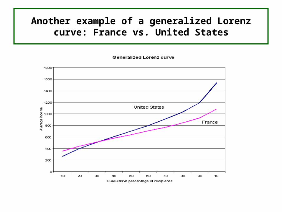
Another example of a generalized Lorenz curve: France vs. United States
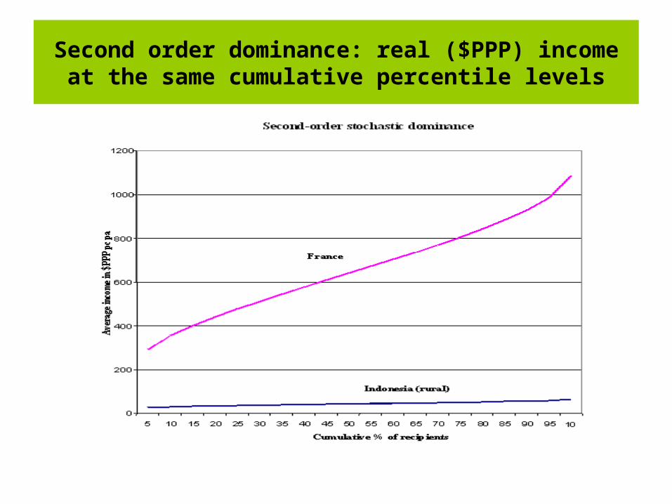
Second order dominance: real ($PPP) income at the same cumulative percentile levels
Empirical and probability
income distributions
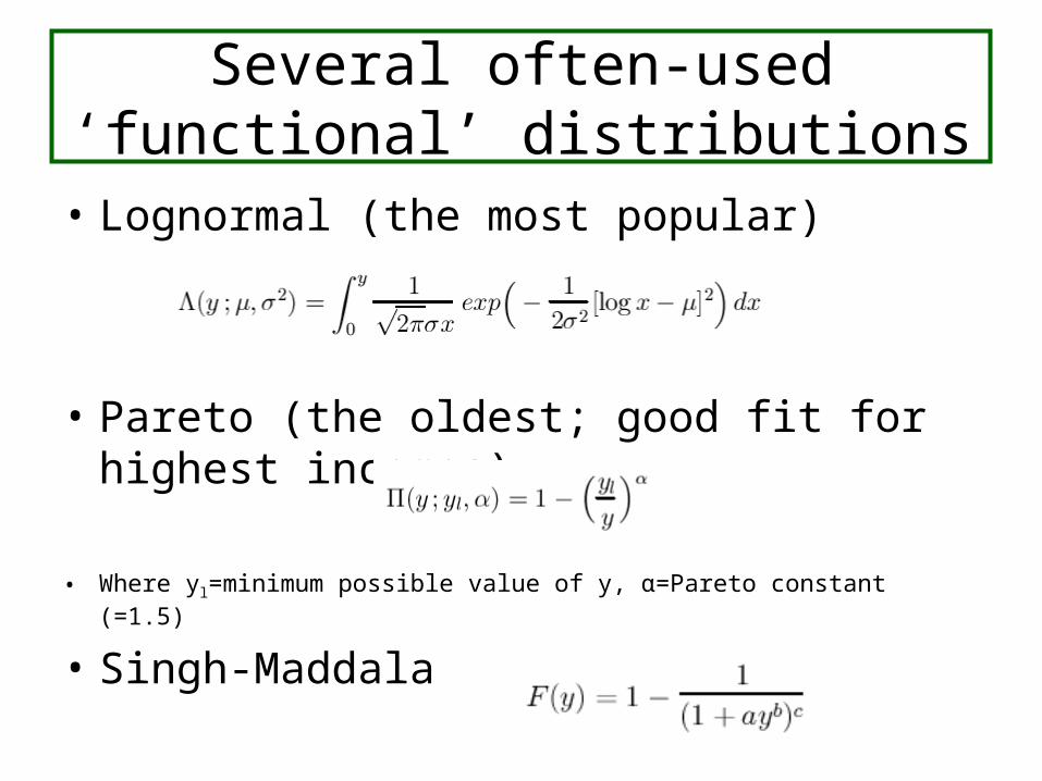
Several often-used ‘functional’ distributions
• Lognormal (the most popular)
• Pareto (the oldest; good fit for highest incomes)
• Where yl=minimum possible value of y, α=Pareto constant (=1.5)
• Singh-Maddala
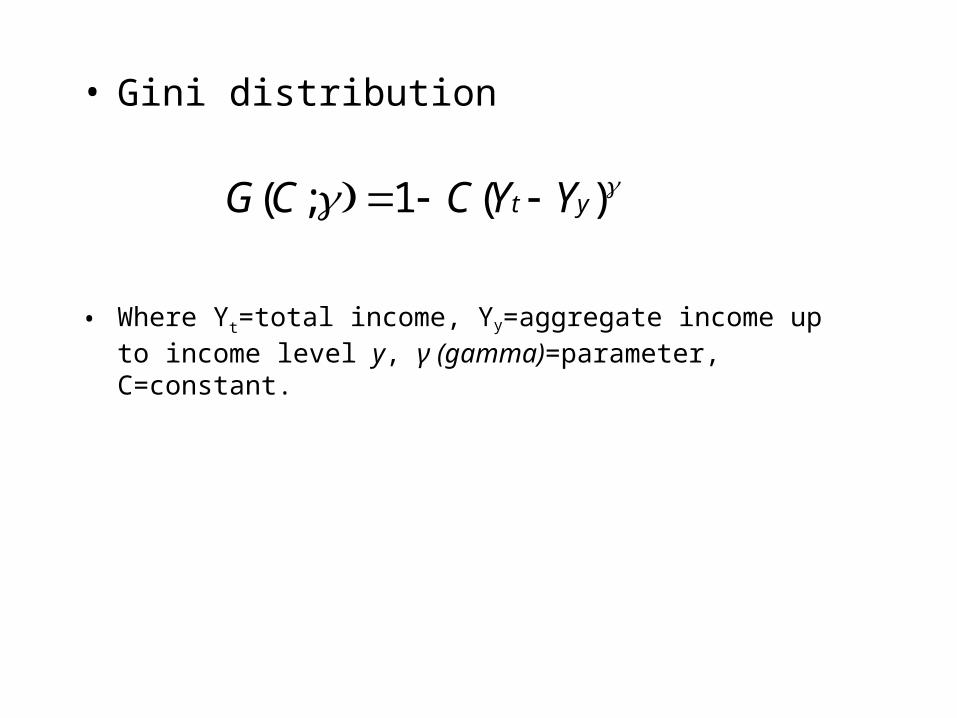
• Gini distribution
• Where Yt=total income, Yy=aggregate income up to income level y, γ (gamma)=parameter, C=constant.
)(1;( yt YYCCG
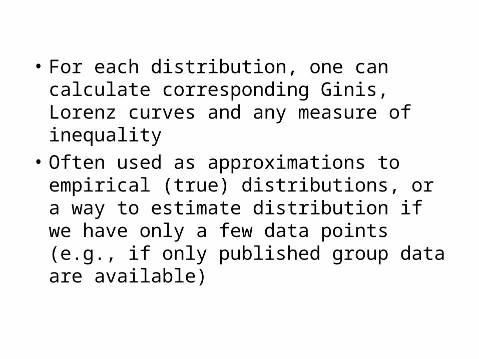
• For each distribution, one can calculate corresponding Ginis, Lorenz curves and any measure of inequality
• Often used as approximations to empirical (true) distributions, or a way to estimate distribution if we have only a few data points (e.g., if only published group data are available)

Data sources
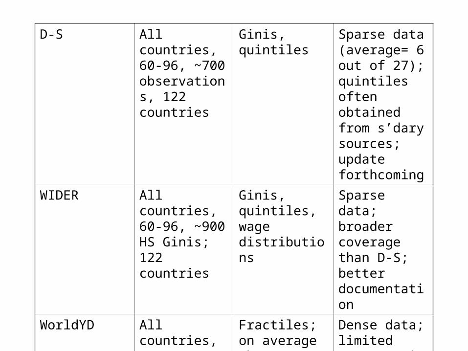
D-S All countries, 60-96, ~700 observations, 122 countries
Ginis, quintiles Sparse data (average= 6 out of 27); quintiles often obtained from s’dary sources; update forthcoming
WIDER All countries, 60-96, ~900 HS Ginis; 122 countries
Ginis, quintiles, wage distributions
Sparse data; broader coverage than D-S; better documentation
WorldYD All countries, 1988-1998, ~350 surveys
Fractiles; on average about 13-14 (mostly deciles, ventiles)
Dense data; limited coverage in time; panel: 90 countries
EEurope 27 countries, 1995-2002
Deciles Medium density of data
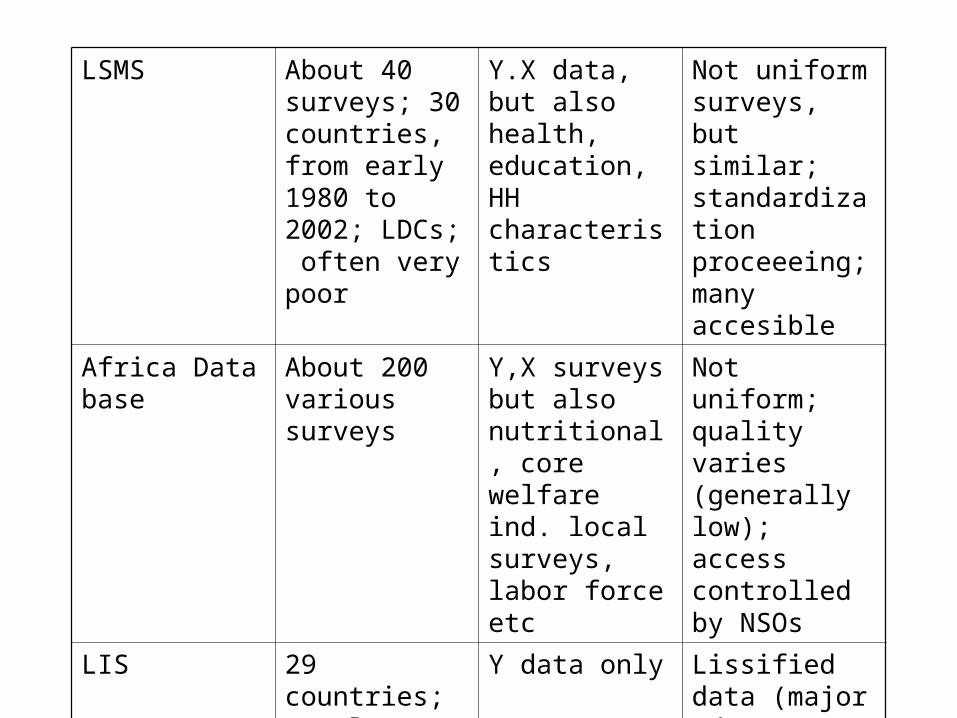
LSMS About 40 surveys; 30 countries, from early 1980 to 2002; LDCs; often very poor
Y.X data, but also health, education, HH characteristics
Not uniform surveys, but similar; standardization proceeeing; many accesible
Africa Data base About 200 various surveys
Y,X surveys but also nutritional, core welfare ind. local surveys, labor force etc
Not uniform; quality varies (generally low); access controlled by NSOs
LIS 29 countries; mostly OECD
Y data only Lissified data (major advantage); all accessible
HEIDE 8 countries in EEurope/FSU, early 1990’s
X, Y data Standardized data; all accessible

Where to access the data
• D-S: http://www.worldbank.org/research/growth/dddeisqu.htm.
• WorldYD: http://www.worldbank.org/research/inequality/data.htm
• WIDER: http://www.wider.unu.edu/wiid/wiid.htm• Eeuropean data: http://
www.worldbank.org/research/inequality/data.htm• Texas Inequality Project (sectoral distribution of wages;
approximates distribution of wages) http://utip.gov.utexas.edu/.

How to access the data
• D-S: http://www.worldbank.org/research/growth/dddeisqu.htm.
• WorldYD: http://www.worldbank.org/research/inequality/data.htm
• WIDER: http://www.wider.unu.edu/wiid/wiid.htm• Eeuropean data: http://
www.worldbank.org/research/inequality/data.htm• Texas Inequality Project (sectoral distribution of wages;
approximates distribution of wages) http://utip.gov.utexas.edu/.
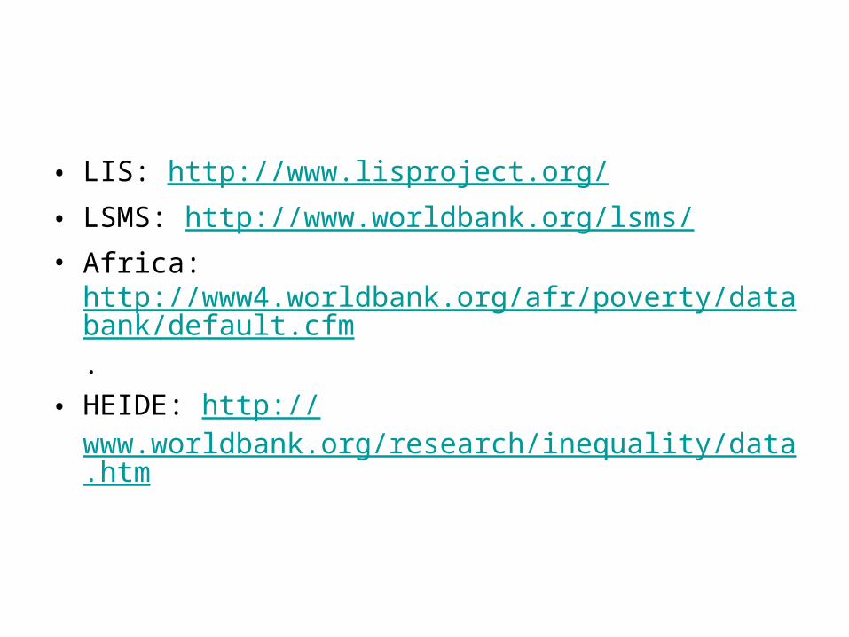
• LIS: http://www.lisproject.org/• LSMS: http://www.worldbank.org/lsms/• Africa:
http://www4.worldbank.org/afr/poverty/databank/default.cfm.
• HEIDE: http://www.worldbank.org/research/inequality/data.htm
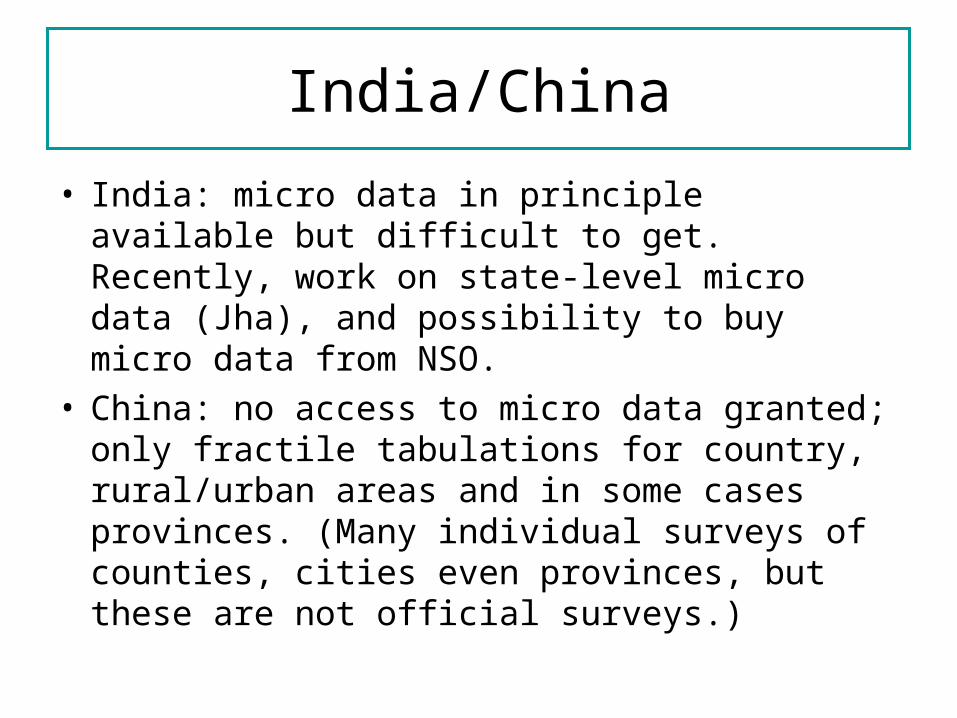
India/China
• India: micro data in principle available but difficult to get. Recently, work on state-level micro data (Jha), and possibility to buy micro data from NSO.
• China: no access to micro data granted; only fractile tabulations for country, rural/urban areas and in some cases provinces. (Many individual surveys of counties, cities even provinces, but these are not official surveys.)
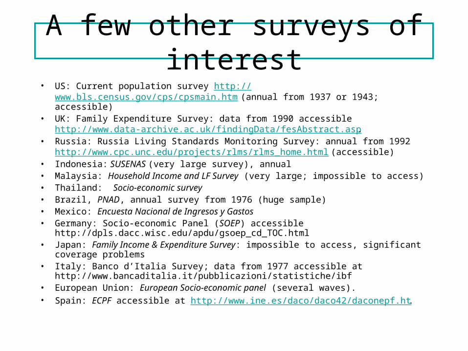
A few other surveys of interest• US: Current population survey http://www.bls.census.gov/cps/cpsmain.htm (annual
from 1937 or 1943; accessible)• UK: Family Expenditure Survey: data from 1990 accessible
http://www.data-archive.ac.uk/findingData/fesAbstract.asp. • Russia: Russia Living Standards Monitoring Survey: annual from 1992 http://
www.cpc.unc.edu/projects/rlms/rlms_home.html (accessible)• Indonesia: SUSENAS (very large survey), annual• Malaysia: Household Income and LF Survey (very large; impossible to access)• Thailand: Socio-economic survey• Brazil, PNAD, annual survey from 1976 (huge sample)• Mexico: Encuesta Nacional de Ingresos y Gastos• Germany: Socio-economic Panel (SOEP) accessible
http://dpls.dacc.wisc.edu/apdu/gsoep_cd_TOC.html• Japan: Family Income & Expenditure Survey: impossible to access, significant
coverage problems• Italy: Banco d’Italia Survey; data from 1977 accessible at
http://www.bancaditalia.it/pubblicazioni/statistiche/ibf • European Union: European Socio-economic panel (several waves).• Spain: ECPF accessible at http://www.ine.es/daco/daco42/daconepf.ht.
![Milanovic Global Inequality.sg1[1] - World Bank€¦ · Global inequality and the global inequality extraction ratio: The story of the past two centuries Branko Milanovic1 World Bank](https://img.pdfslide.net/doc/110x75/5af38f967f8b9a5b1e8b4c87/milanovic-global-1-world-bank-global-inequality-and-the-global-inequality.jpg)