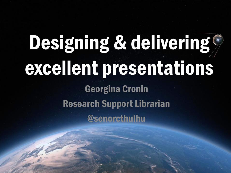
Designing & delivering
excellent presentations Georgina Cronin
Research Support Librarian
@senorcthulhu
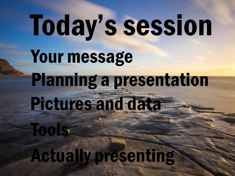
Session overview Today’s session Your message
Planning a presentation
Pictures and data
Tools
Actually presenting

But before we get ahead of ourselves, let’s take minute to stop and think.
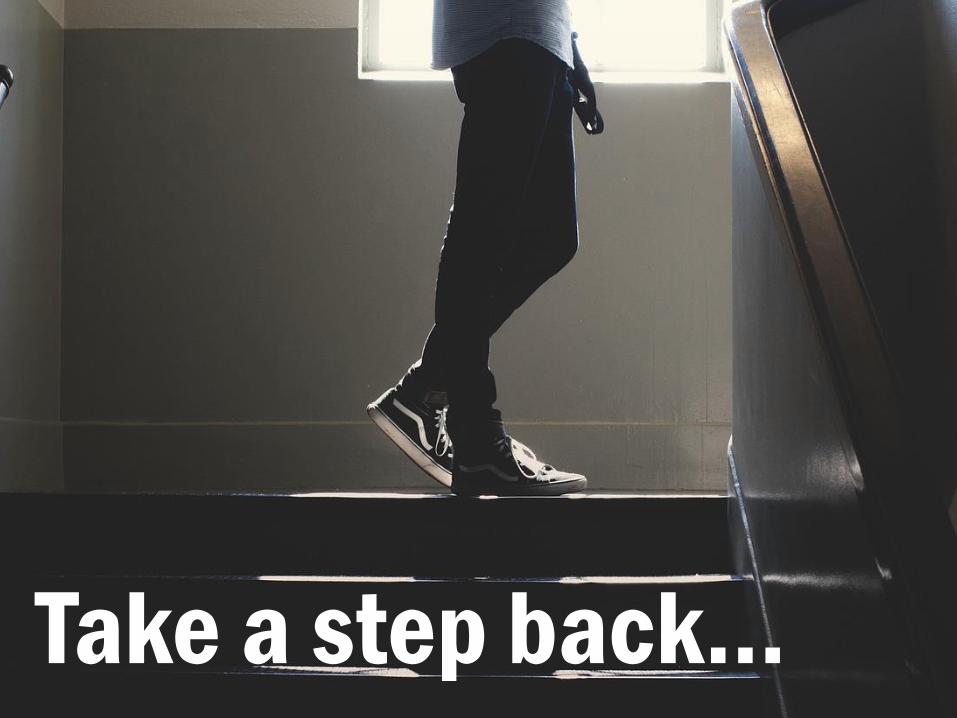
Take a step back…
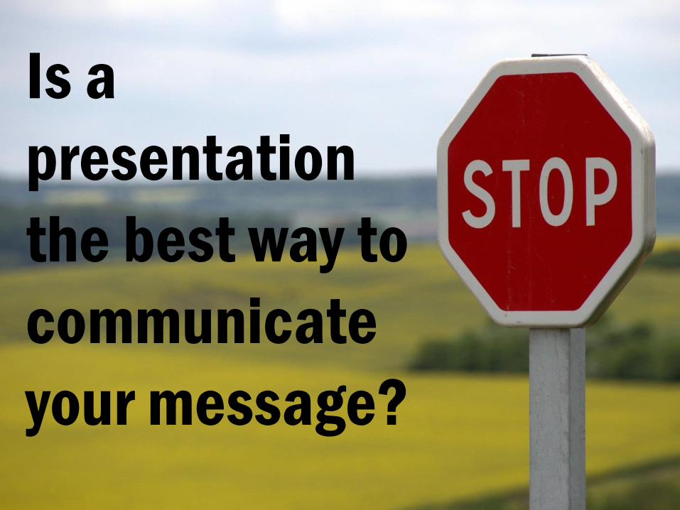
Is a
presentation
the best way to
communicate
your message?
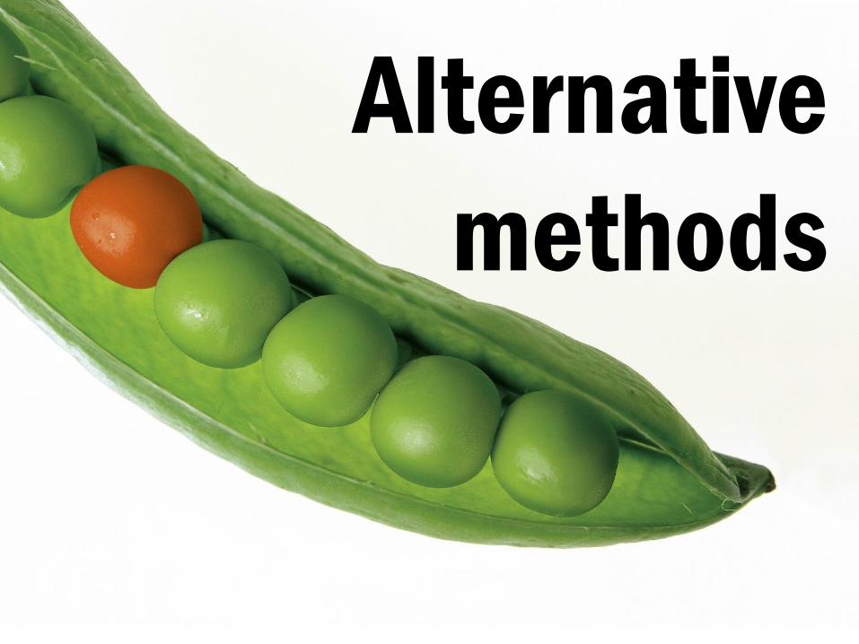
Are there alternative ways of presenting your message that don’t involve a traditional talk?
Alternative
methods
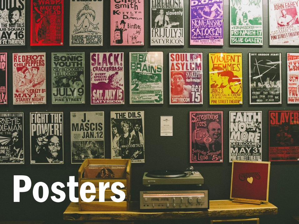
Posters
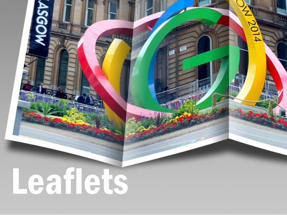
Leaflets

Maybe add a story to a departmental website, or blog about it.
Website
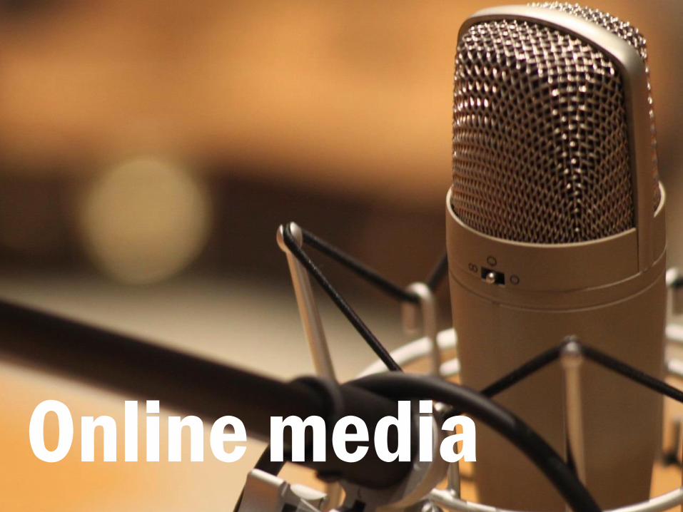
Or you could record a podcast or make a video about it?
Online media
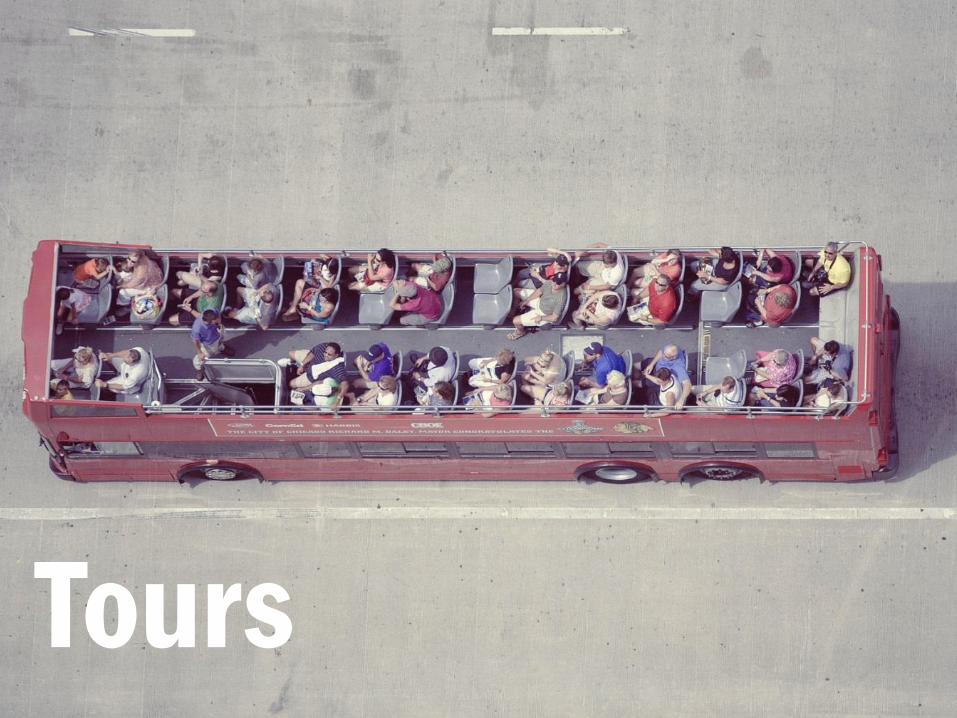
Maybe a tour would work better, such as around a lab or similar sort of space?
Tours
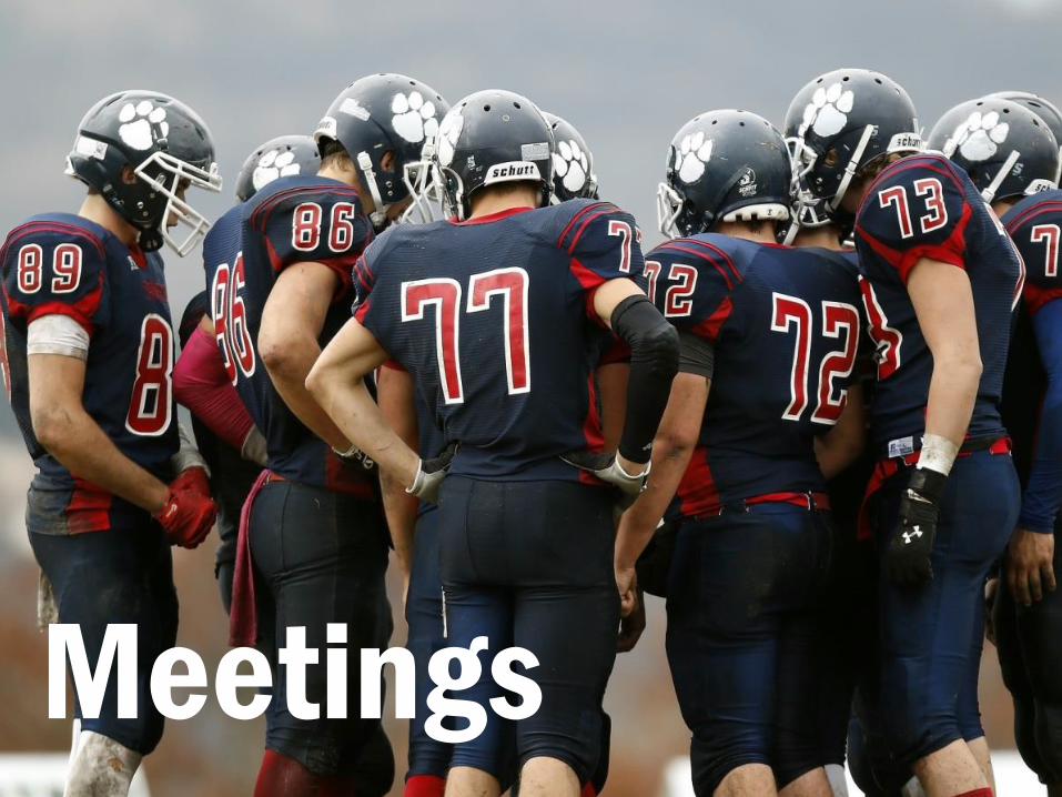
Or just an informal meeting with colleagues to share ideas.
Meetings

You could even write up your work in a report or other such document.
Documents

At least you’ve taken the time to have a good think about it and now you
know that a presentation is the way to go, you can start planning.
Reflection
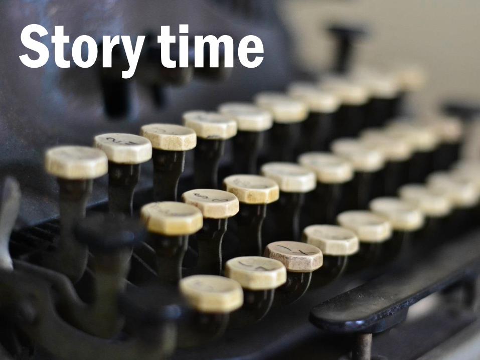
All good stories have a beginning, a middle and an end. So should your
presentation.
Story time
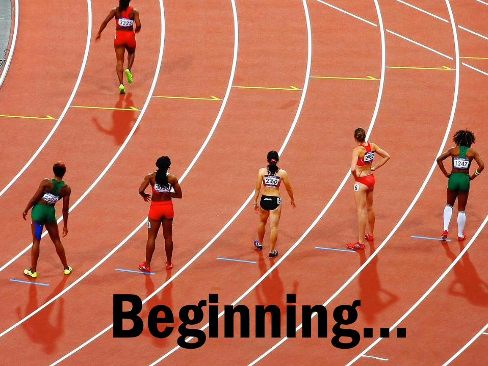
Beginning…
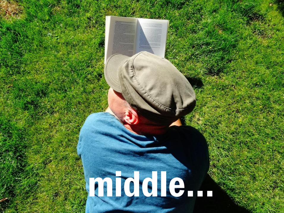
middle…
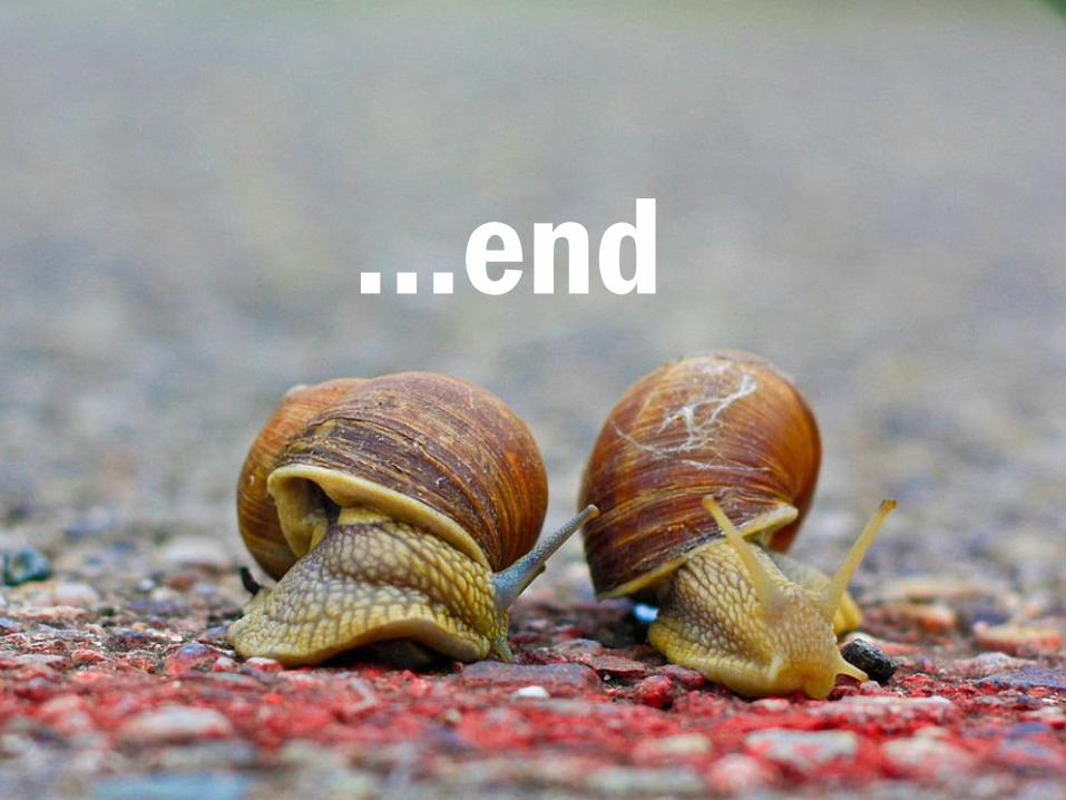
…end
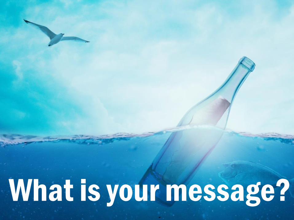
So what is your message? What are you trying to say?
What is your message?

Or more to the point, why should anyone care about your presentation? This might sound harsh but what is it that people have come to hear?
Why should anyone care?
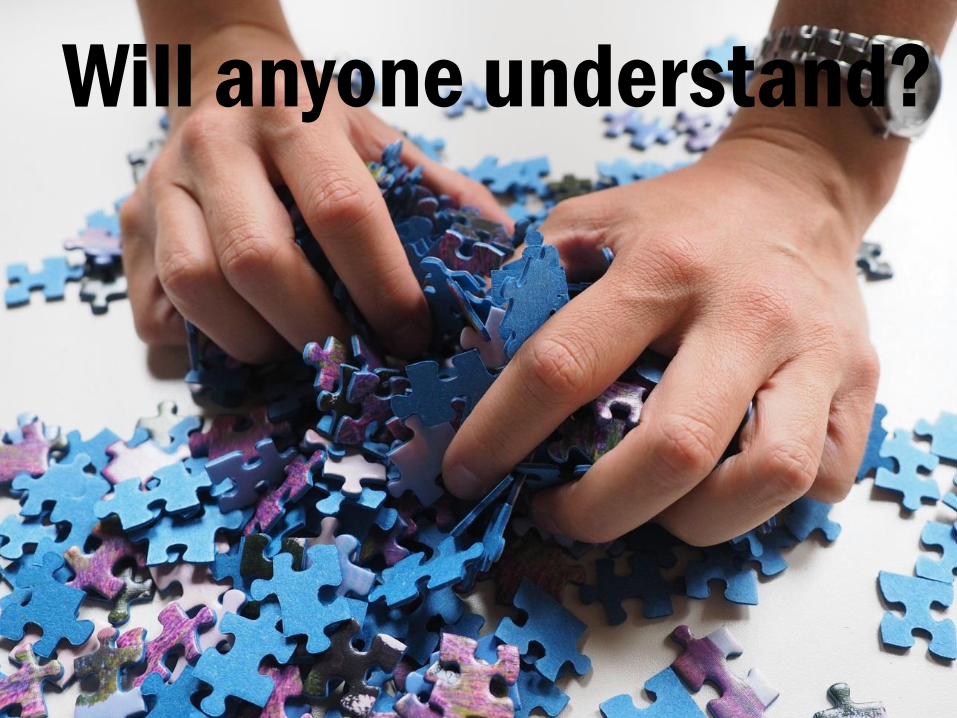
Have you thought about your audience? If you’re working on something really specialist, will people understand what you’re trying to communicate to them? Take some time to break down any technical jargon so non-experts can understand what you’re talking about, or just leave some space in your presentation for explanations. We all do it. We all have terms and acronyms that we work with every day, so much so that they become a second language and we often forget that others might have no idea what we’re talking about.
Will anyone understand?
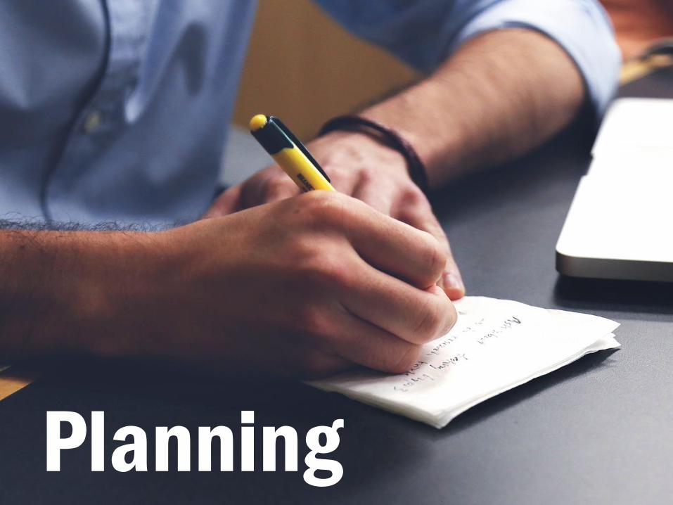
Planning your presentation is key to making sure your message sticks. You can do this one paper or you can use other tools.
Planning
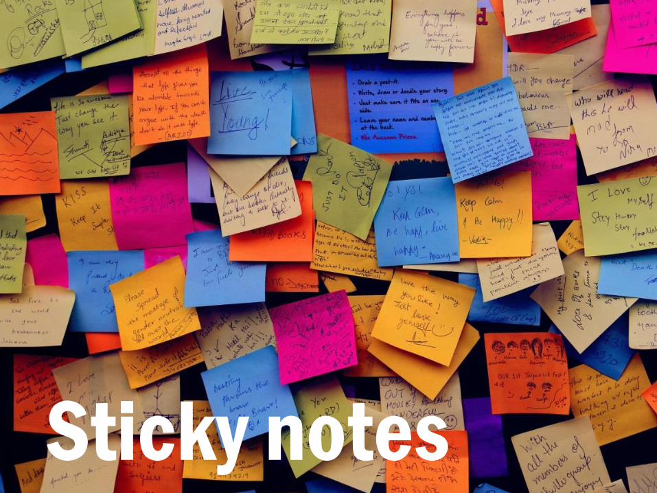
Sticky notes are a great way of planning any presentation as you can write out the key points you want to make and then rearrange them to get a good flow throughout your presentation. Try doing this on a table, take a photo on your phone and use it as a reference when putting stuff into your presentation software. Sticky notes
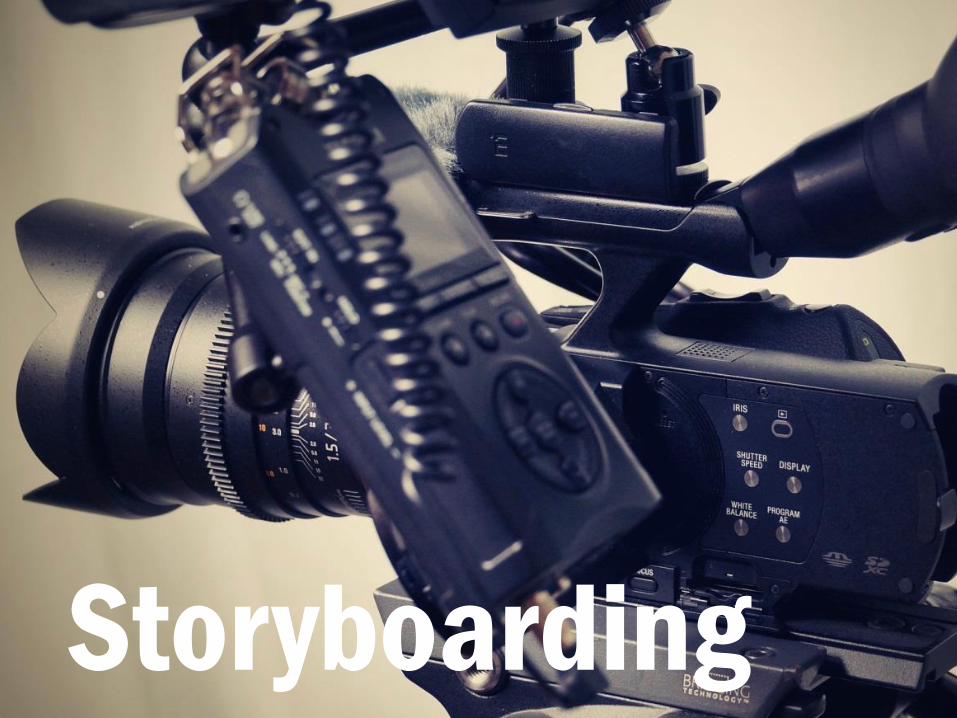
Or you can take inspiration from the film industry and try storyboarding your presentation. Storyboarding allows filmmakers to plan out the various shots that they want to communicate their message on film and a set of presentation slides isn’t entirely different.
Storyboarding
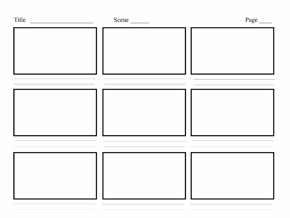
You can download storyboard templates from Google quickly and easily and then use them to doodle out your overall structure, plus notes on things like what images you might want to include.
You might have noticed that we’ve not even spoken about doing anything with presentation software and this is no accident. Planning and getting your ideas prepared is crucial and should always be done before opening any presentation software. Today I’m presenting in PowerPoint and that’s what I’m going to talk about.
Software
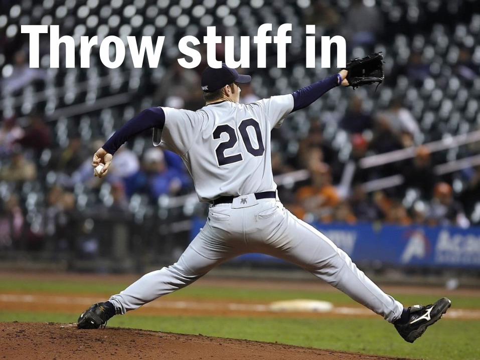
Start by chucking some stuff in to PowerPoint. Literally just create blank slides, chuck in the general wording that you want to go with each slide and start building your structure based on your sticky notes or other outline.
Throw stuff in
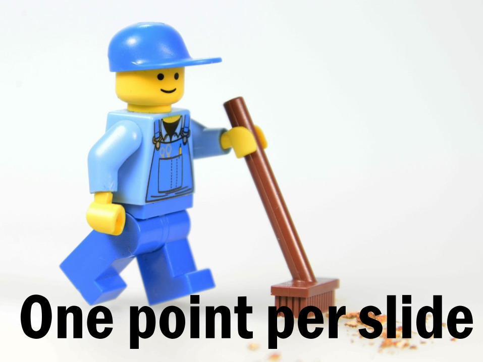
Keep things clean and try to limit yourself to one point per slide.
One point per slide
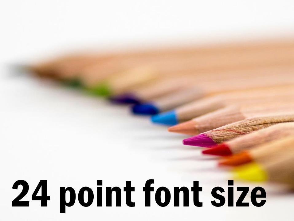
Have a minimum of 24 point in your font size. Any smaller and it is
unreadable as well as you cramming too much into one space. Also be
selective with your fonts and choose one or two that are legible.
24 point font size
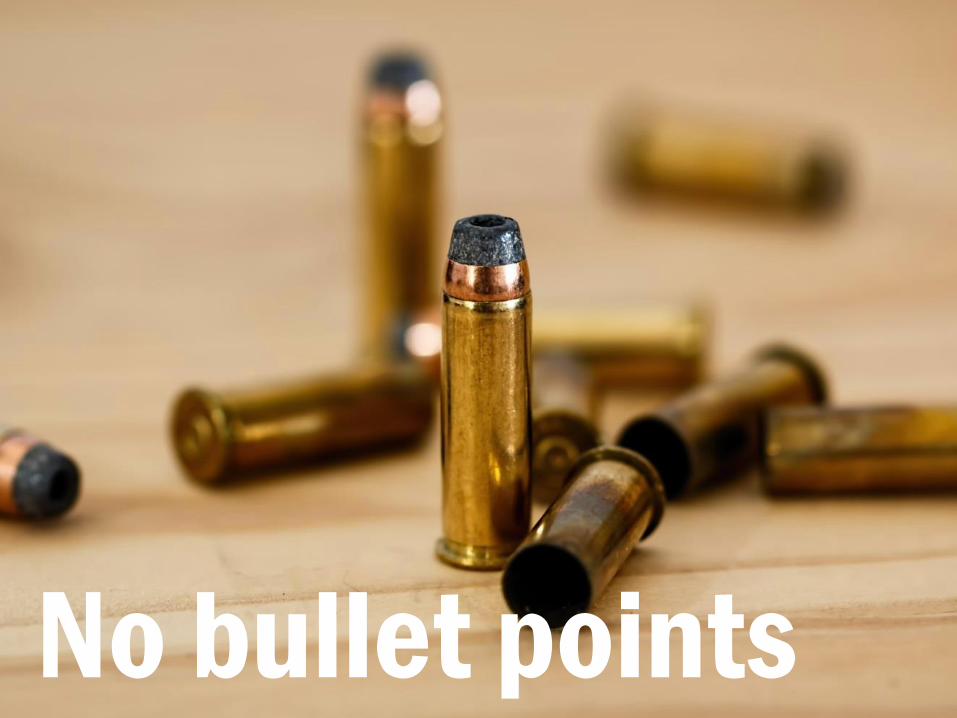
No bullet points
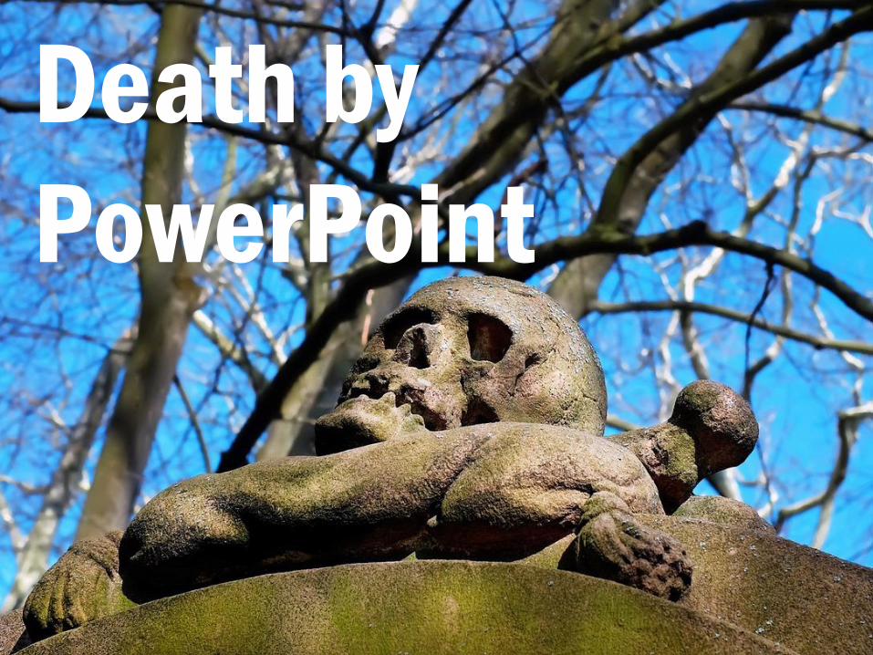
Avoid inflicting the dreaded Death by PowerPoint on your audience!
Death by
PowerPoint
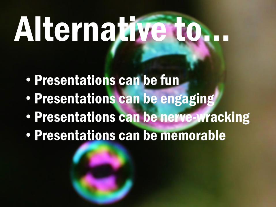
Alternative to…
• Presentations can be fun
• Presentations can be engaging
• Presentations can be nerve-wracking
• Presentations can be memorable
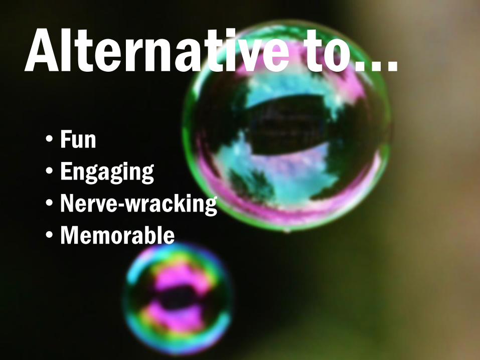
To reducing your bullet points. Remember, you are speaking so you can say stuff around each point. But now this slide looks a bit redundant so you can switch to the one-point-per-slide rule.
Alternative to…
• Fun
• Engaging
• Nerve-wracking
• Memorable

fun
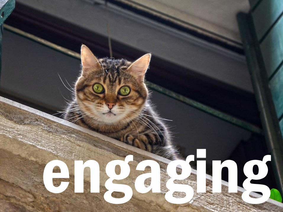
engaging
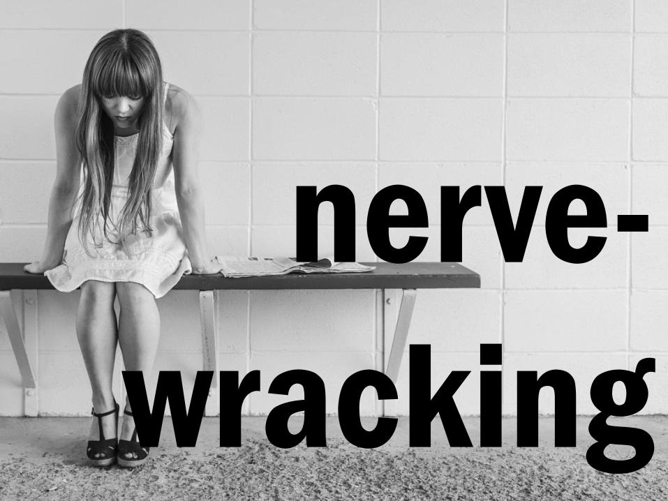
nerve-
wracking

memorable
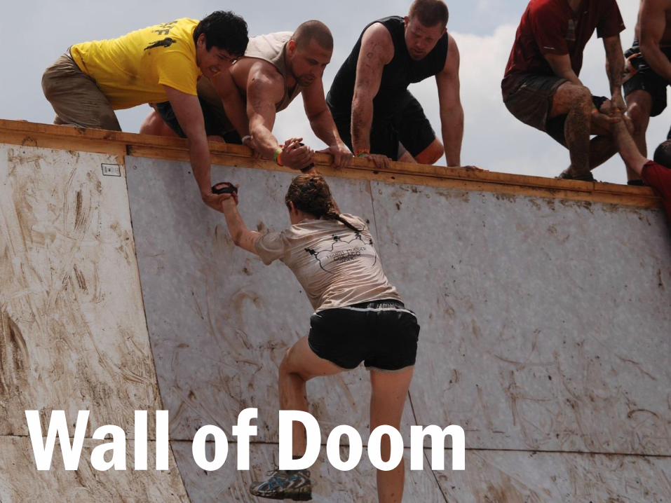
Another thing to avoid is the Wall of Text, or as I call it, the Wall of Doom!
Wall of Doom
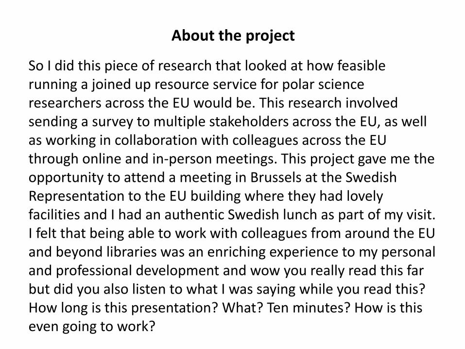
About the project
So I did this piece of research that looked at how feasible running a joined up resource service for polar science researchers across the EU would be. This research involved sending a survey to multiple stakeholders across the EU, as well as working in collaboration with colleagues across the EU through online and in-person meetings. This project gave me the opportunity to attend a meeting in Brussels at the Swedish Representation to the EU building where they had lovely facilities and I had an authentic Swedish lunch as part of my visit. I felt that being able to work with colleagues from around the EU and beyond libraries was an enriching experience to my personal and professional development and wow you really read this far but did you also listen to what I was saying while you read this? How long is this presentation? What? Ten minutes? How is this even going to work?

Disapproval owl disapproves. Why? Well first of all, you should never get your audience to read something in silence. It breaks the flow of your presentation, it gets them to work rather than listen to you doing all the work and half the time most people won’t be able to see the slide properly anyway.
Owl of disapproval
Now consider having that slide up and reading it out, or talking about it while people try to read it at the same time. It just won’t work. You’ve potentially lost your audience or just completely overloaded their brains. Not cool.
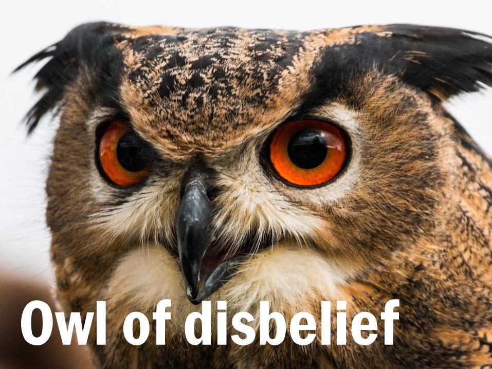
Owl of disbelief

In your average audience, most people will be affected by the Pictorial Superiority Effect which essentially means that vision almost always dominates when it comes to receiving information and because of this, large parts of the brain are devoted to visual processing. I said ‘most people’ here because there may well be individuals within an audience who process information differently due to having an impairment or simply because we are all unique in the way we engage with the world. Because of vision being so important, as well as accessibility of a presentation, you should remember that the presentation is actually all about you. You are the person that people will be focusing on and what you say is what they will be paying attention to. You don’t want them to be distracted from you and your message by distracting slides whether that’s jarring graphics or a wall of text that they’re struggling to read while also listening to you at the same time. Working memory can only handle so much and really well designed slides can help lighten the load.
Pictorial Superiority
Effect
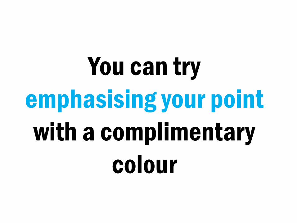
You can try
emphasising your point
with a complimentary
colour
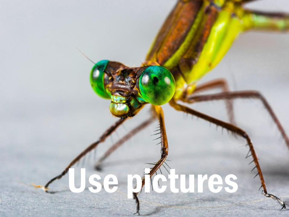
You’ve probably noticed that I’m a fan of big and beautiful pictures to
emphasise my points. You can be too! There are lots of free, good quality
images out there to use in your presentations.
Use pictures
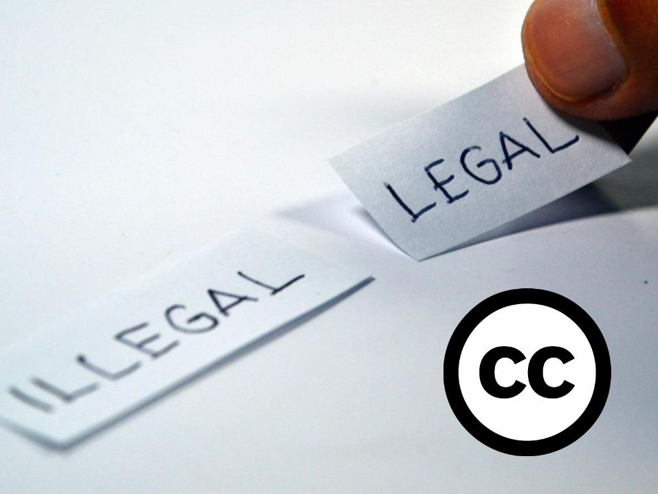
Attribution rules: “If supplied, you must provide the name of the creator
and attribution parties, a copyright notice, a license notice, a disclaimer notice, and a link to the material. CC
licenses prior to Version 4.0 also require you to provide the title of the
material if supplied, and may have other slight differences.”

Providing a link to the original resource is the bare minimum you can do but doesn’t really give a name, title or details of the licence. I used to do
this until I researched Creative Commons in more depth and realised
it wasn’t quite enough. Oops!
https://www.flickr.com/photos/75487768@N04/14012783868/

Here I’ve given the name of the image, the creator’s name, where I got it from
(Flickr) with a direct link, plus info about the licence.
‘Landscape’ by barnyz via Flickr CC BY NC ND

If you want to be really thorough, you can also link through to the licence
too.
‘Landscape’ by barnyz via Flickr CC BY NC ND

But it is a shame to cram all that text onto a nice image, especially if it is tiny and you can’t really see it all that well. So you can always do a credit slide at
the very end of your presentation with all the info of the various stuff you
used too.
Image credits
‘Landscape’ by barnyz via Flickr CC BY NC ND
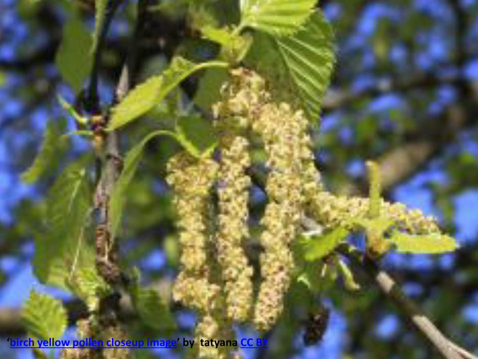
Use high quality images that are appropriate for the dimensions of your presentation
Quality
‘birch yellow pollen closeup image’ by tatyana CC BY

Don’t do this either.

Use interesting images to create space to
include your text and other information. Also if
you have a face, human or otherwise, make
sure it is facing the text. Eye gaze is a
powerful thing and anything facing away from
your text will create a jarring overall image.
Use
interesting
images to
create space
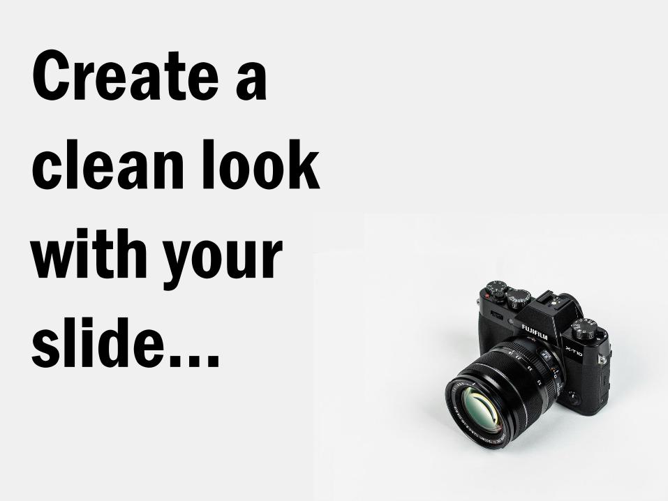
Create a
clean look
with your
slide…
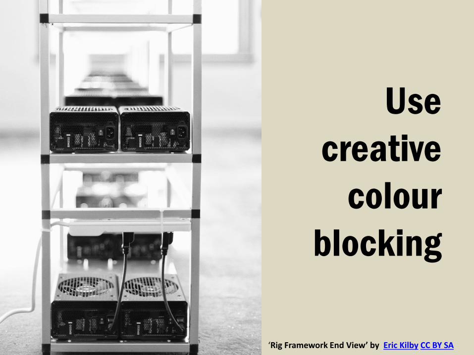
Use
creative
colour
blocking
‘Rig Framework End View’ by Eric Kilby CC BY SA
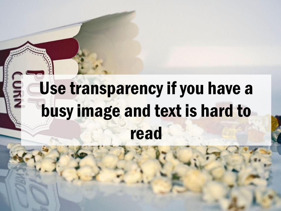
Use transparency if you have a
busy image and text is hard to
read
When searching, use synonyms. Finding good pictures can be tricky depending on how people have described them. Something like an emotion is harder to search for than something like a lamp. Think about what word associations there might be for the message you’re trying to convey and use those to look for good stuff.
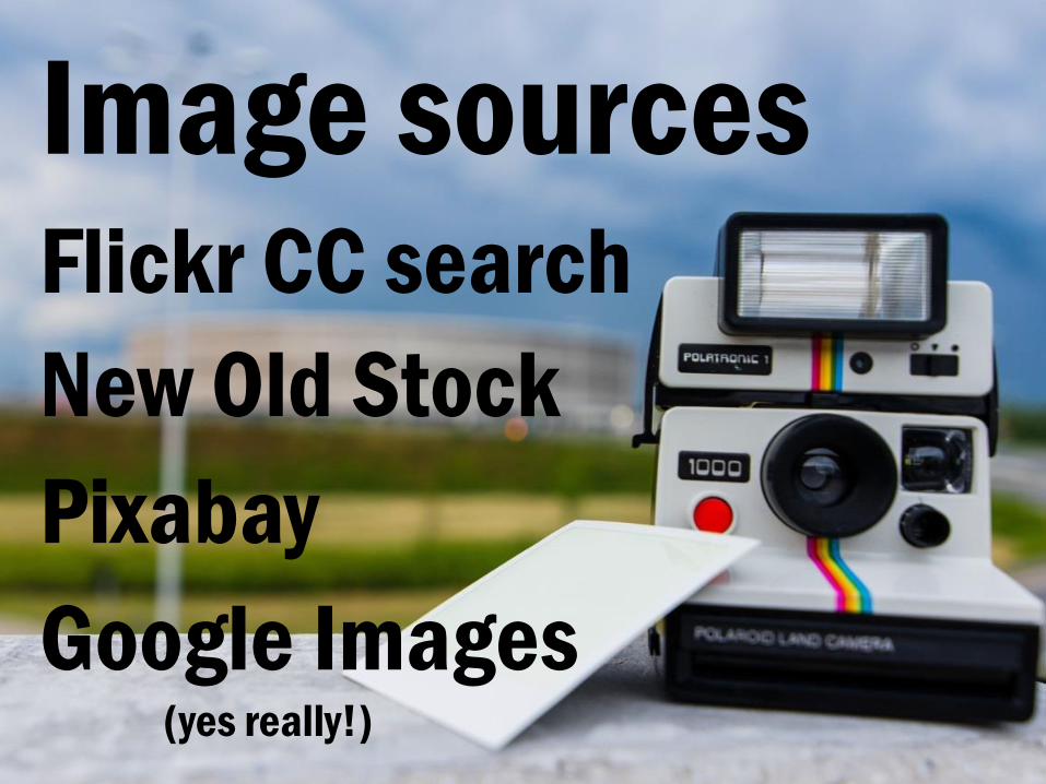
Flickr is a great site for all things images and they have a dedicated Creative Commons search so you can find stuff according to particular licences. New Old Stock specialises in public domain archival images but do check each individual image’s licence before using it Pixabay is what I’ve used for pretty much everything in this presentation and it gives people access to CC0 content with is Creative Commons material with no strings attached, not even attribution. Google Images can be used to find images as they have a Creative Commons filter that you can use once you’ve searched for your keyword so use it wisely.
Image sources Flickr CC search
New Old Stock
Pixabay
Google Images (yes really!)
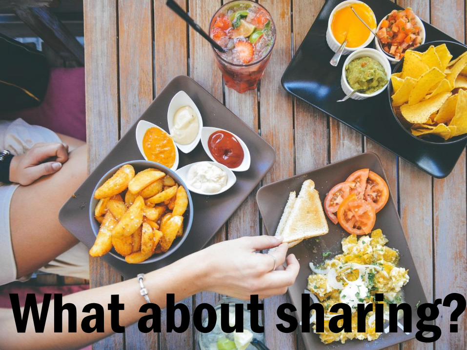
But what about sharing. You might want people to have your slides so they can take them away for reference after your talk but you’ve stripped out all of the useful information that you might have bombarded them with through all of those bullet points. While having slides as a handy representation of your talk is appealing, it also isn’t really what a presentation is about and you can’t cram everything together without it all falling apart. If you want to put all that information in there, you’re going to have an overwhelming presentation. If you want to share information beyond your talk, you need to step away from the presentation and think of alternatives. What about sharing?
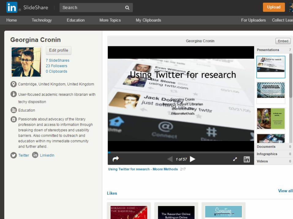
There are lots of services out there to share presentations, with one of the better ones being SlideShare. Owned by LinkedIn, it allows you to upload slides and then share and embed them with anyone you want. If you want to write up your talk on a blog for example, you can do that and embed the slides along with your writing. SlideShare automatically grabs whatever text there is on each slide and lists it beneath your uploaded slides. But of course, we just simplified all of our slides so how can we take advantage of this function?
Uploading to Slideshare, fine.
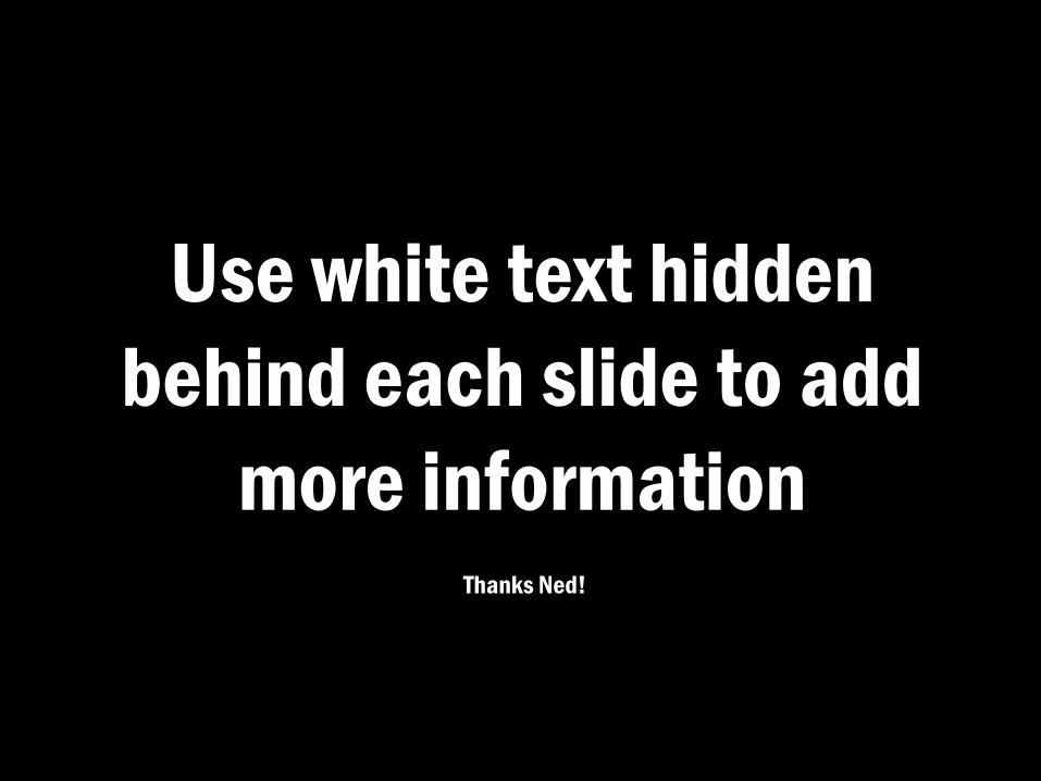
I learnt this amazing trick from Ned Potter, a fellow librarian and someone who is really really good at presentation design. He’s got a website so go check it out. When I upload these slides to SlideShare, I will test out the white text technique myself so you can see what it looks like. Use white text hidden
behind each slide to add
more information Thanks Ned!
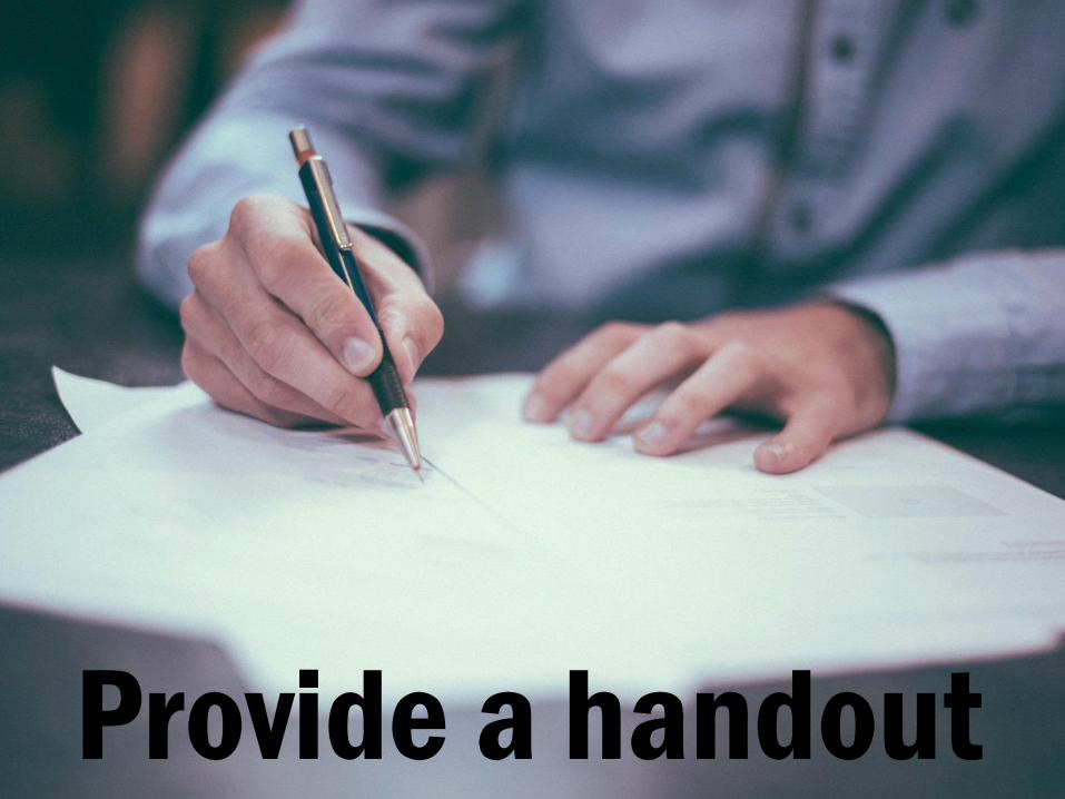
Give people a handout with information, references and
everything else you want them to be able to take away. This can be in a paper format or it can be hosted online on somewhere like Google
Drive. Just make sure you can email it out to people or tweet it if you’re at a
conference and there’s a handy hashtag to tie it to. There are lots of
options out there so use them.
Provide a handout
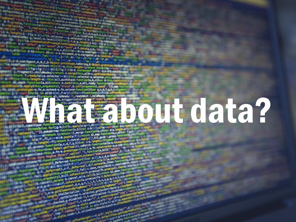
I’ve spoken a lot so far about pictures and words but what about data? How
do you present that effectively?
What about data?

First of all, Excel is not presentation software. Let’s just get that out of the
way first. It can create graphs and other things for presentation purposes but never ever show a spreadsheet as
a slide. Ever. It’s akin to the reading text out to people who are listening to
you. They won’t see the cells, they don’t want to see the cells, stop showing them your cells already.

One of the worst presentation sins you can ever commit is uttering the words ‘Now you probably can’t see this but…’. I’ve said it in the past but that was mostly due to back technology fails but it is a horrible feeling and you can just feel the room roll their eyes.
Data taken from Open University teaching materials used by presenter

Select a good graph or chart to represent your data. If you can avoid
having tables and just having a picture that is the most ideal presentation
approach. Again, tables no matter how simplified still have to be read but
sometimes you can’t get away from them so keep them simple.
Select a good graph
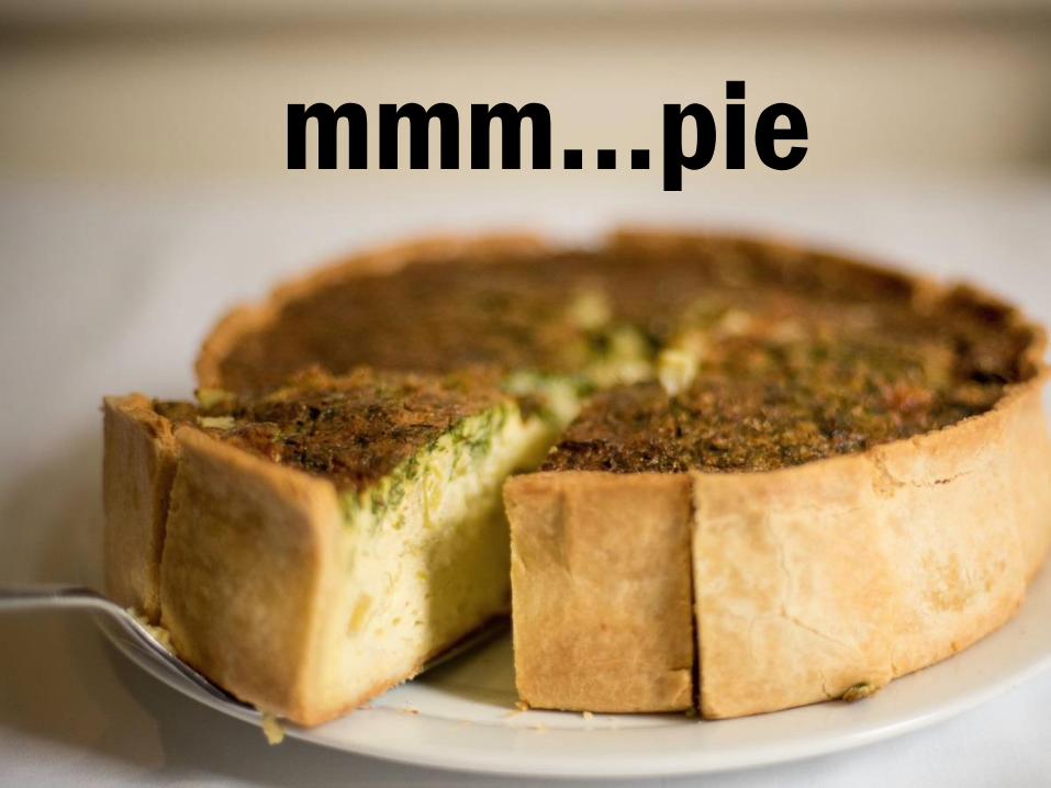
Pie charts are awesome but people are quite bad at judging area so depending on what you’re trying to show, they could be perfect or the worst choice ever. Select a good graph
mmm…pie
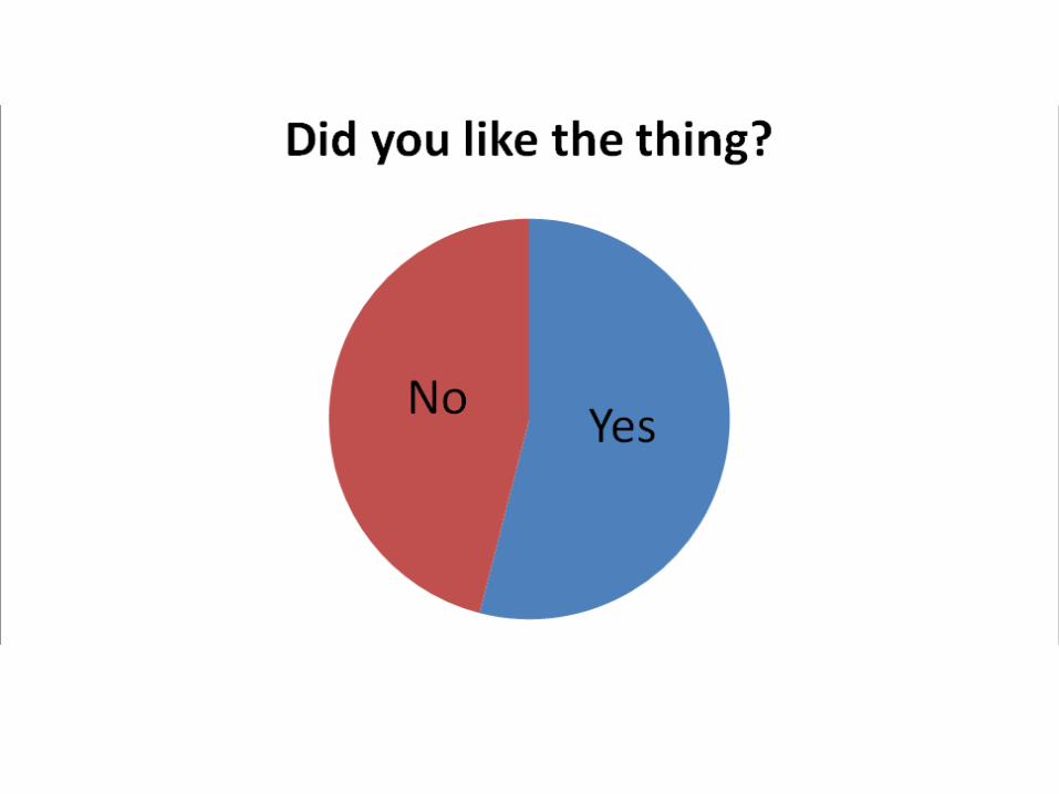
Select a good graph
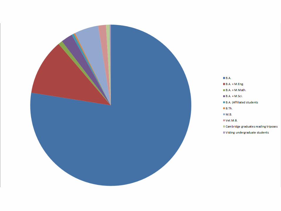
Select a good graph

Remember you are giving a presentation. You are not delivering an
article. Your audience are not taking the time, or necessarily have the
inclination to take the time, to read your careful labels and really nicely
analysed statistics. This is not
an article
Strip it
down to
simple
data
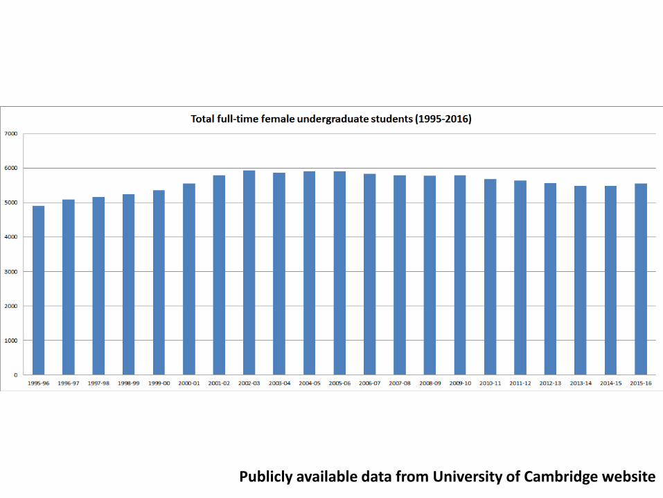
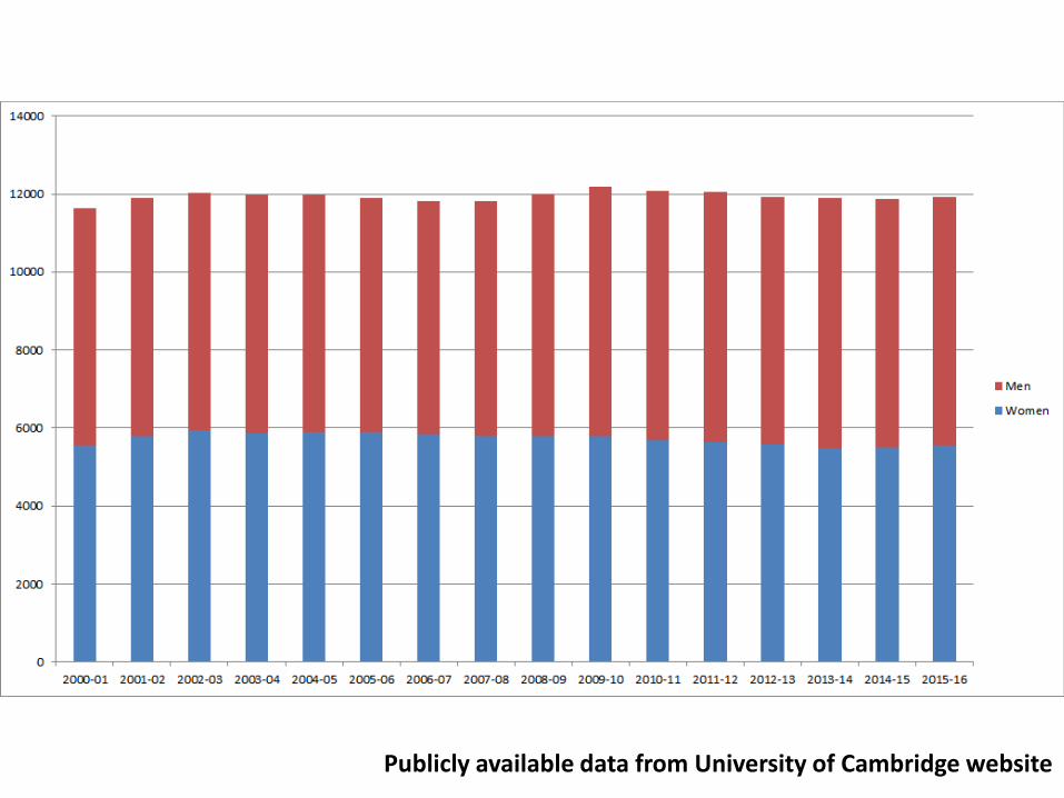
This bar chart about female undergraduate students at Cambridge
is pretty busy.
Publicly available data from University of Cambridge website
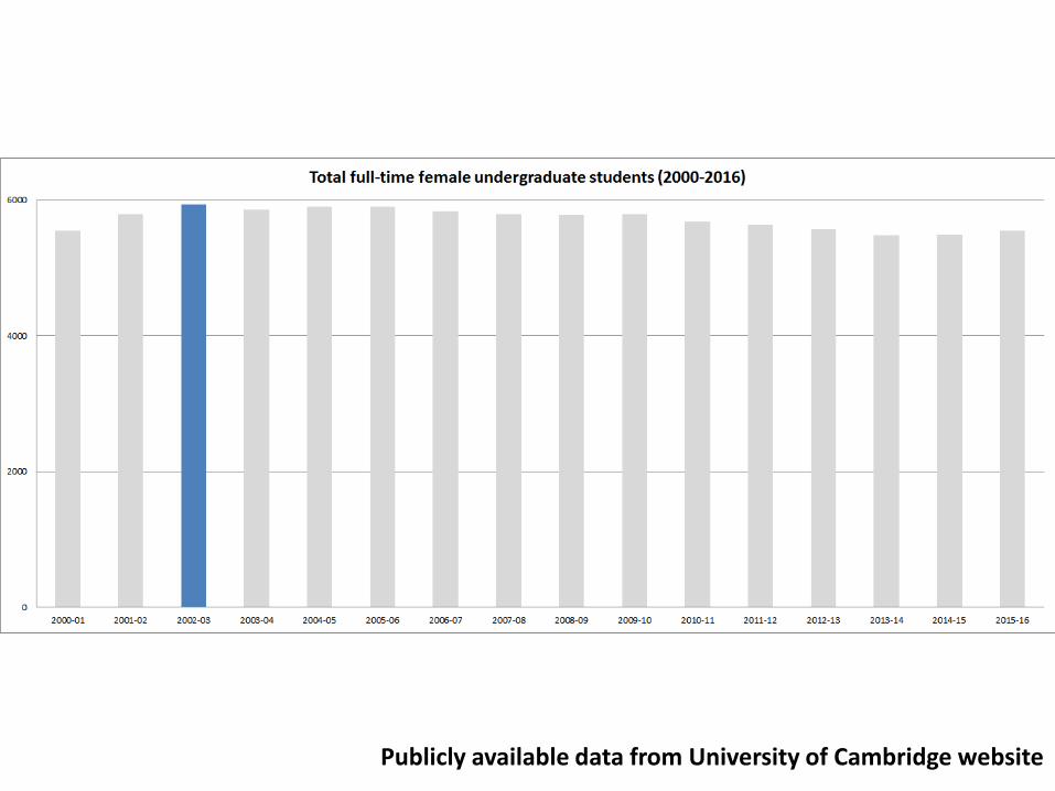
If you’re highlighting one stat, grey everything else out and use a bold colour to draw attention. With this
chart, I probably could have simplified it even more by eliminating later years.
Publicly available data from University of Cambridge website
Or if you need to compare data points, use alternative options like stacked
charts.
Publicly available data from University of Cambridge website
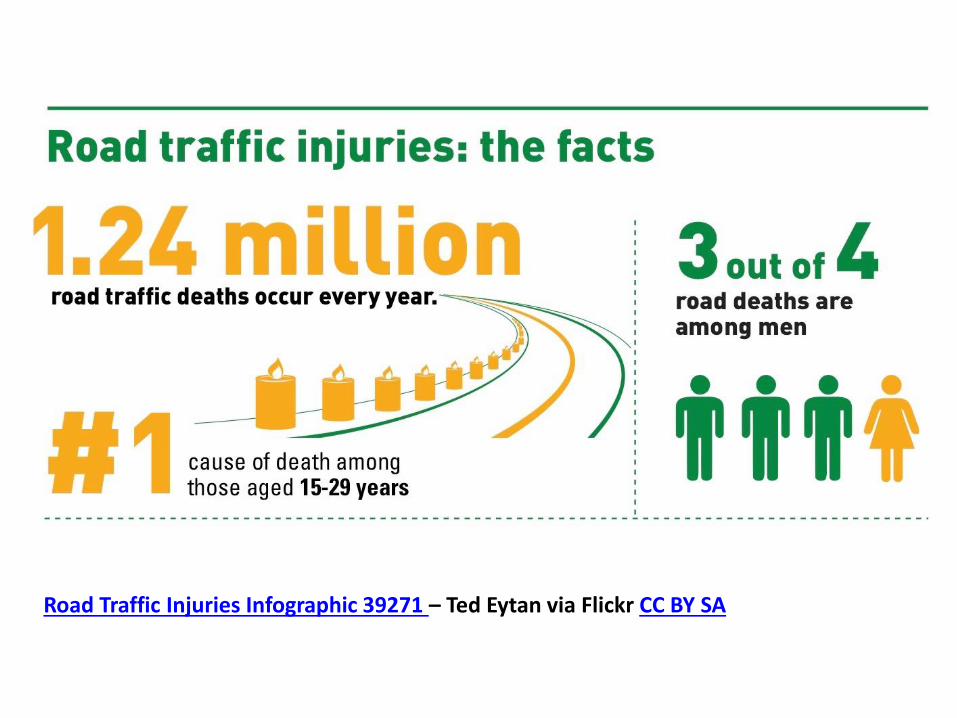
Or you can use an infographic to make your point. I took this infographic about road traffic injuries and chopped it up to fit over several slides…
Road Traffic Injuries Infographic 39271 – Ted Eytan via Flickr CC BY SA
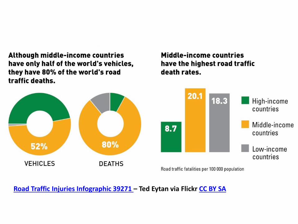
Road Traffic Injuries Infographic 39271 – Ted Eytan via Flickr CC BY SA
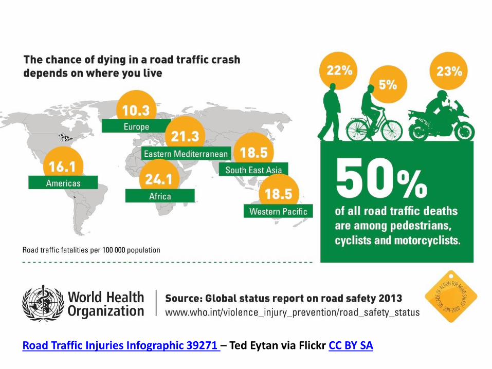
There are lots of free tools out there to make infographics quickly and easily. They’re great for presentations and also for dropping in to reports and other written work, plus for sharing on social media.
Road Traffic Injuries Infographic 39271 – Ted Eytan via Flickr CC BY SA
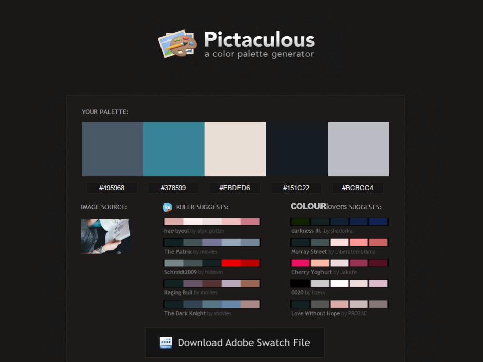
Pictaculous allows you to upload an image, maybe one that you’re basing the overall aesthetic of your presentation around, and then it selects the key colours in that image so you have swatches to work from. Here’s one based on an image I used a few slides ago. It also mentions other services such as Kuler, from Adobe, which does much the same thing. If you’re working with Photoshop, you can also download swatch files.
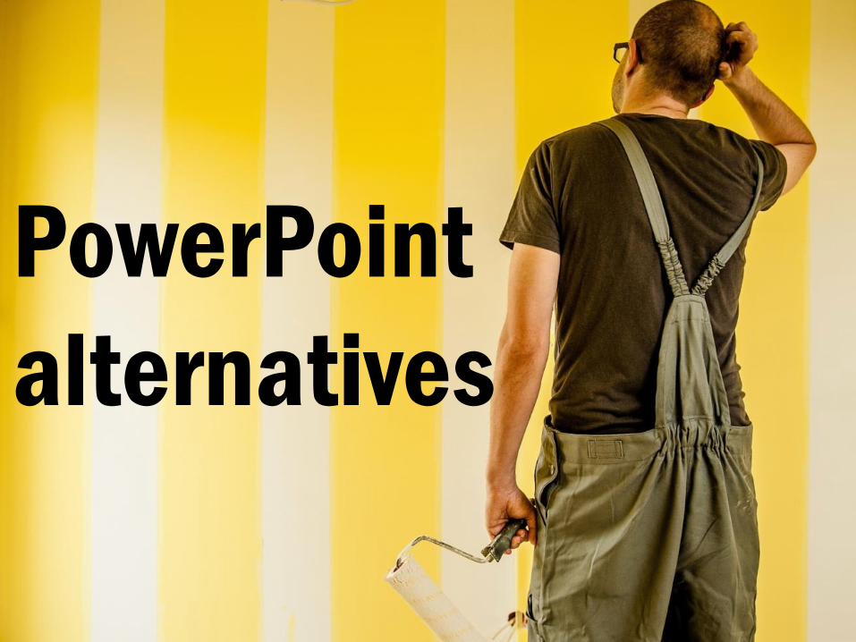
What if you don’t want to use PowerPoint? Never fear, there are
alternatives.
PowerPoint
alternatives

Haiku Deck is tapped in to the Creative Commons world and gives you templates and image searching all in one place. When you use an image from Haiku Deck’s collection, it add the CC information on the slide automatically. It is limited on editing styles but for something quick and simple, it is really good. If you want something a bit more animated with fun zooming and flying around, use Prezi. It allows you to build your presentation across one whole page and you then set zoom and pan points to go in and out of key points when you need to. Use it with care otherwise your audience might feel like they’re on a roller coaster. Canva is a design tool and you can use it to create lovely slides as well as really nifty infographics. It’s great for other stuff too like posters. Google Slides are part of the Google Drive package so if you do a lot of work with Google products, you might have already used Google Slides without even realising it. Its similar to PowerPoint but as it is cloud based, like all of the other tools, you can work on your presentation and access it on the move.
Haiku Deck
Prezi
Canva
Google Slides
Presenting
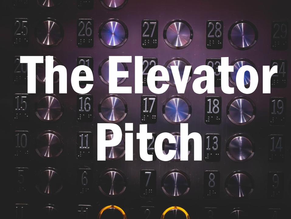
First an exercise. You might have heard of the Elevator Pitch concept. Imagine you are in a lift, or elevator depending on your preference, and a person you really want to talk to about your work
just got on. You have about 30 seconds before the lift reaches the top floor, or
the destination of your Important Person. How do you tell them about you and your work in 30 seconds?
The Elevator
Pitch
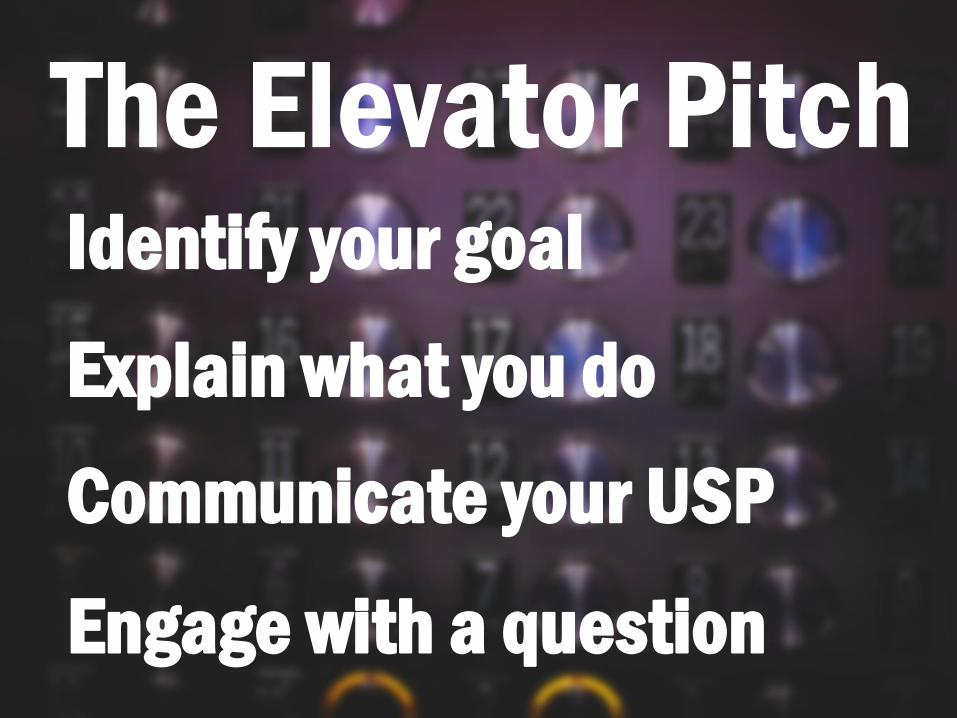
Never undersell yourself. 1. Identify your goal – what do you want to
persuade people to do with this pitch? Much like key message in your presentation, the content of your pitch should be geared towards this.
2. Explain what you do – what do you want the person to remember most about you? Describe what you do in ways that make it sound exciting. Think about what you can offer the person you’re talking to – how can you solve their problem?
3. Communicate your USP (unique selling point) – what is the one thing you can offer that no one else can?
4. Engage with a question – follow up with am open ended question e.g. So how does your company handle that?
This is a really good exercise for honing down your presentation’s key message but it is also a good skill to practice for when you’re at conferences or other events where you might just have a moment or two over coffee to talk to someone about what you do. It’s also a great chance to practice being concise at interviews.
The Elevator Pitch Identify your goal
Explain what you do
Communicate your USP
Engage with a question

So who get’s nervous before a presentation? Are you nervous about
one that you have to do?
nervous?

It’s ok. Everything will be fine and everyone gets nervous, it’s completely normal. You can help yourself by being
prepared (so no last minute slide changes unless you really have to),
taking some time to relax even if that means taking ten seconds to breathe
before starting, and if it’s the first time you’re presenting these slides maybe
get a willing victim to practice on. That will help you work through the
presentation and get some feedback before going public. Also, the audience
isn’t out to trick you. They want to hear what you have to say so, go for it!
it’ll be fine

Think about your body language. You might be terrified inside but try not to show it on the outside. Don’t fold your arms as it is a defensive position and will close you off to your audience,
whether you mean to or not. If presenting from a podium, you can use
it to hide your shaking knees to start with but don’t be afraid to move
around either.
body
language

Keep your body language open and smile. If you find a friendly face in the
audience, present to them or even better, find a few spots in the audience (left, centre, right) and move between
looking at those points throughout your presentation. Does someone have a cool hair colour? Are they
wearing an interesting top? Whatever it is, use those points to keep engaging
with your audience and don’t spend too long looking at your notes or at
your own slides.
stay
open

Who here would be comfortable presenting without a script? Now this
is entirely a personal choice but it comes back to that eye contact and
engagement with your audience. If you are buried in your notes and don’t look
up at all then you’ve lost your audience before you’ve even begun.
You can have notes on your slides and see them in presenter mode and other things to help but I would recommend
that you try to present without a script, or even notes, wherever you
can. That way your speech is more free and you are able to use your hands to
gesture and be more natural when presenting. It is scary but you can do it with practice and a good knowledge of
your subject matter.
To script or not
to script?
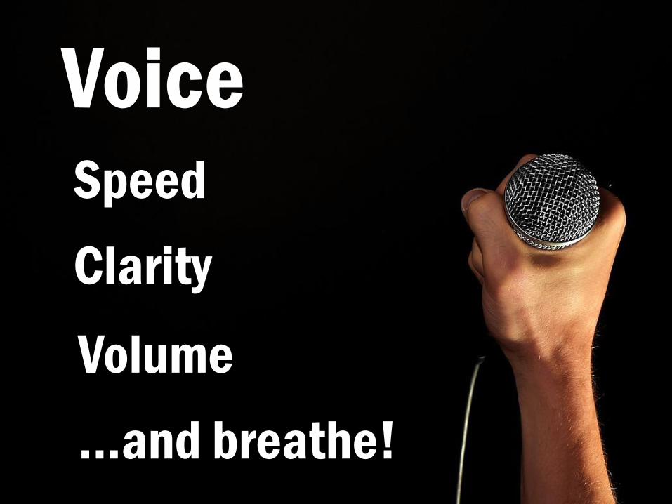
Voice Speed
Clarity
Volume
…and breathe!

So you’ve given your presentation and now you’ve opened yourself up to take questions.
Questions
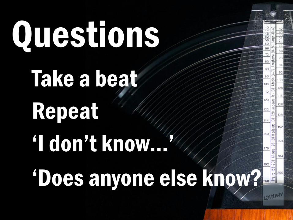
Sometimes people don’t ask questions and that’s ok. But they often do. When presented with a question, take a beat. Don’t launch straight into your answer. Repeat the question back. This is helpful for people who might not have heard the speaker and it also gives you a chance to confirm that you understand what they’ve asked, especially if it’s one of those rambling questions…we’ve all heard them. It is ok to say I don’t know sometimes. You might not know but you can always follow up with the person afterwards or share your answer on social media. Depending on where you are, it can also be helpful to open the question up to anyone else in the audience. We all have different experiences and expertise and others might be able to offer their take on things.
Questions Take a beat
Repeat
‘I don’t know…’
‘Does anyone else know?
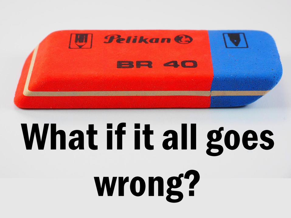
But what if it all goes wrong? Well it depends on your definition of wrong.
What if it all goes
wrong?
Tech failures happen to us all and you can help yourself with things like saving your PowerPoint as a PDF so you don’t lose any of the editing or fonts that you’ve used. Opening a presentation on a new PC is a terrifying thing and if you can’t present from the same laptop that you created your presentation on, always save a PDF backup. Always. If you need to give a live demonstration of a tool, get screengrabs lined up just in case. Again, I’ve had to demonstrate a tool without an internet connection which meant it didn’t work. I’ve had websites go down for maintenance or the entire University having access blocked to a service on the same afternoon that I needed to demonstrate it to around 300 students. Stuff happens but you can prepare for the emergency that hopefully won’t actually happen. You might have an epic tech fail and have to present without slides. This might happen and it has to me on a fair few times and this is where being prepared comes in really useful and not relying on your slides to push lots of information at people. Have a copy of your slides with you so you can at least use them as a reminder of what you meant to talk about.
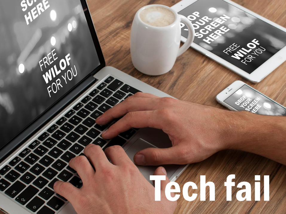
Tech fail
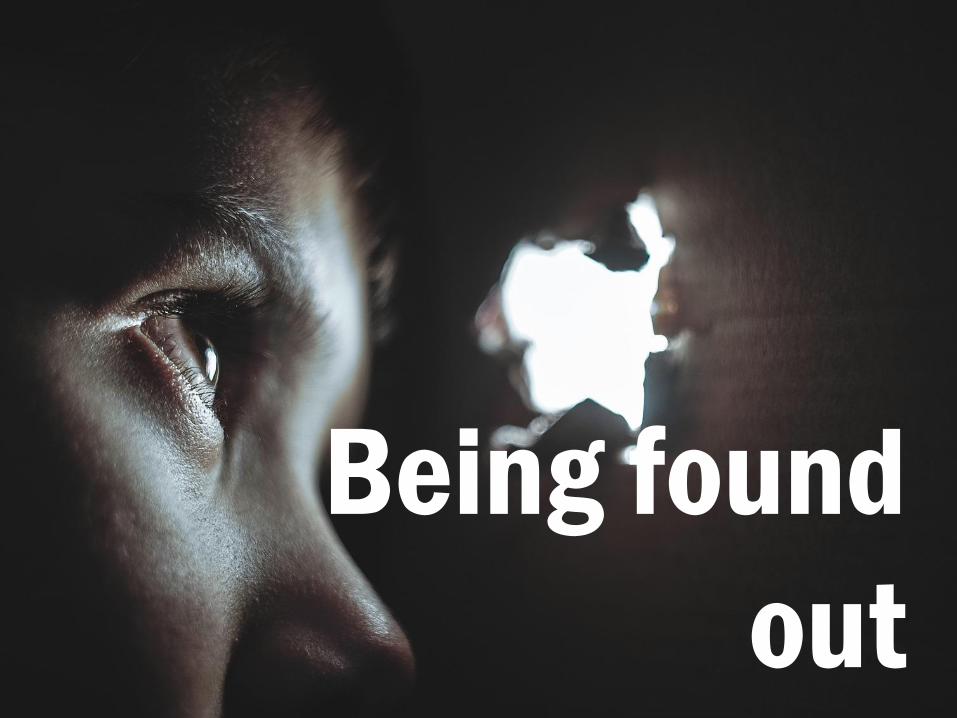
Or you might worry about flubbing your presentation or forgetting to say something. Don’t. Worry. You might know what you meant to say or do but your audience doesn’t and if something does go wrong with your presentation, I can almost guarantee you that they probably won’t notice because they didn’t know to expect that cat picture to appear at that precise moment that it didn’t. Just ride through it and keep going.
Being found
out
So to sum up, remember your message throughout your presentation.
Message

Remember to be clear, both in what you present but also how you present
it.
Clarity

And apart from anything else, have fun! This is your chance to show off what you do, or what you’re researching so enjoy it!
Have fun!
The end Thanks to Claire Sewell and Ned Potter for
inspiring parts of this talk
All images CC0 from Pixabay unless otherwise
credited
Recommended