Embed Size (px)
Citation preview
Digipak/Poster AnalysisHere I shall begin to assess a digipack and poster from a similar media product to my chosen song. Thus will allow me to assess how it is composed in the hopes to attract my target audience effectively when I go to create my own…
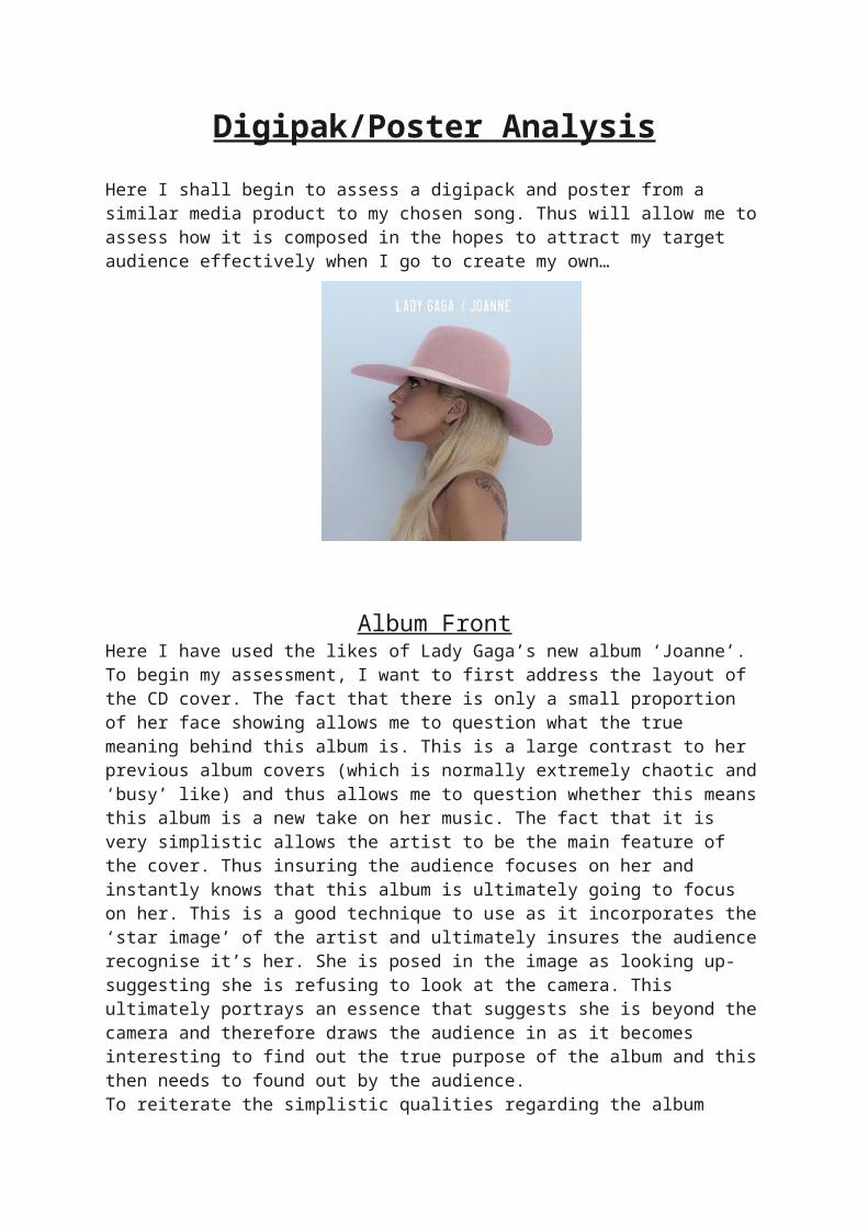
Album FrontHere I have used the likes of Lady Gaga’s new album ‘Joanne’. To begin my assessment, I want to first address the layout of the CD cover. The fact that there is only a small proportion of her face showing allows me to question what the true meaning behind this album is. This is a large contrast to her previous album covers (which is normally extremely chaotic and ‘busy’ like) and thus allows me to question whether this means this album is a new take on her music. The fact that it is very simplistic allows the artist to be the main feature of the cover. Thus insuring the audience focuses on her and instantly knows that this album is ultimately going to focus on her. This is a good technique to use as it incorporates the ‘star image’ of the artist and ultimately insures the audience recognise it’s her. She is posed in the image as looking up- suggesting she is refusing to look at the camera. This ultimately portrays an essence that suggests she is beyond the camera and therefore draws the audience in as it becomes interesting to find out the true purpose of the album and this then needs to found out by the audience. To reiterate the simplistic qualities regarding the album cover only emphasis the focus on her and only her. Her name and album name is actually framed in extremely light font. This again suggests that she is not telling the media to ‘look at her’ but rather to perhaps focus on the music itself rather than her star image. The use of the pink hat is the only evidence of imitate colour within the image and therefore is a key element of the album cover. This is still a very bland colour and compliments the pale blue background well. This element to the image could suggest a motif and ultimately can therefore be applied to the audience as perhaps a tease for a new genre within her music genre. Lady Gaga ultimately states ‘I just wanted to bring happiness to everyone today and I think a pink hat makes every day happy’. Overall this an extremely simple but effective music CD album cover. It allows the audience to see the artists without anything too fancy which has been heavily apparent within previous work by Lady Gaga.

Album Back
Above is an example of the back of her CD cover. This ultimately matches and compliments the first half of her CD cover. It is very simple and uses the likes of light font and colouring to aid the creation of the album. The only unique elements to the back is the third song. This is in a different colour and font completely. This therefore suggests that this in some respect is more important and therefore could be the key song of the album. The font used here is extremely interesting as it completely contrasts with the other key song names. This allows the audience to be more drawn to this and therefore begin to question its importance and why it is important… There is a bar code on the top right of the image which is presented within all CD covers and thus suggests that this CD cover is created to include the bare minimum needed within a CD covers.
Both front and back of this music CD cover has a key concept and therefore presents to the audience the specific genre to the audience. This allows the audience to completely understand the purpose and therefore the genre/why the artist wants the artist to present their key image.

Promotional Poster
Above is an example of Lady Gaga’s promotional poster in which was released to promote the release of her new album. This runs within the same format as her album cover. Additional lighter colours have been used here and thus runs with the same theme which matches the pop/electric pop genre. The use of colour here is extremely apparent that there isn’t too much emphasis on costume but rather on the artist herself. The fact that she is clothed in a white t-shirt supports this idea. She is holding a set of headphones which imply this new album is worth listening to (if she is listening to it herself) and ultimately creates a better image to attract the audiences. The background is a combination of purple and light leaks. This could perhaps suggest that this new album is a different style to what her usual music is like.
The use of ‘IT WASN’T LOVE IT WAS A PERFECT ILLUSION’ is added to the poster as a tease and ultimately is added to the poster to draw the audience in and make it more appealing. To finalise the poster, there is of course adverts aiding the audience to listen to the new album on the different music players. This suggests and implies that the music will be well distributed therefore encouraging the audience to listen to it themselves.
Within all of these album covers/adverts the image of Lady Gaga could be perhaps associated as clashing with her previous album covers. She is usually known for her

flamboyant appearance and thus is not shown within her appearance here. This illustrates a new and developed images of herself, most definitely done on purpose to represent a new genre of music and compliment her new image.