Embed Size (px)
Citation preview
Creative Illustration
By Jade Delaney &
Emily Cooper
ContentsIntroduction
Work-Shop Exercises
Creative Project
Research Project
MODULE ASSESSMENT
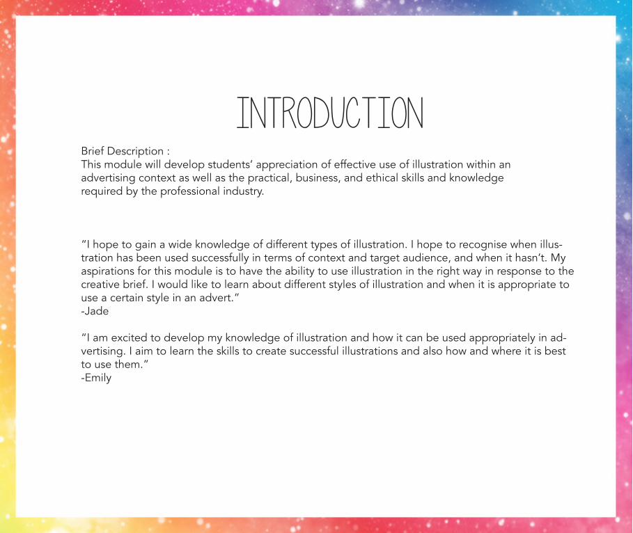
IntroductionBrief Description :This module will develop students’ appreciation of effective use of illustration within an advertising context as well as the practical, business, and ethical skills and knowledge required by the professional industry.
“I hope to gain a wide knowledge of different types of illustration. I hope to recognise when illus-tration has been used successfully in terms of context and target audience, and when it hasn’t. My aspirations for this module is to have the ability to use illustration in the right way in response to the creative brief. I would like to learn about different styles of illustration and when it is appropriate to use a certain style in an advert.”-Jade
“I am excited to develop my knowledge of illustration and how it can be used appropriately in ad-vertising. I aim to learn the skills to create successful illustrations and also how and where it is best to use them.”-Emily
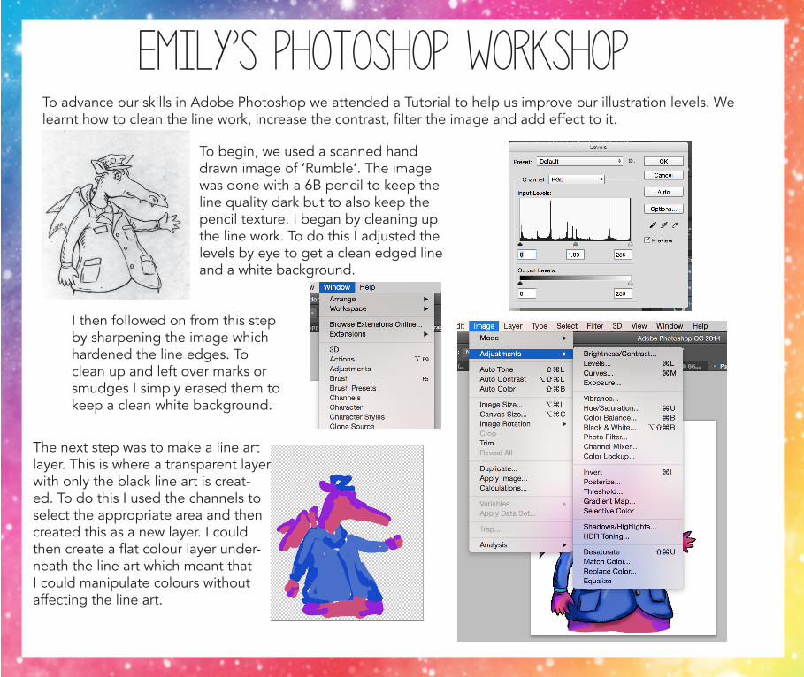
Emily’s Photoshop WorkshopTo advance our skills in Adobe Photoshop we attended a Tutorial to help us improve our illustration levels. We learnt how to clean the line work, increase the contrast, filter the image and add effect to it.
To begin, we used a scanned hand drawn image of ‘Rumble’. The image was done with a 6B pencil to keep the line quality dark but to also keep the pencil texture. I began by cleaning up the line work. To do this I adjusted the levels by eye to get a clean edged line and a white background.
I then followed on from this step by sharpening the image which hardened the line edges. To clean up and left over marks or smudges I simply erased them to keep a clean white background.
The next step was to make a line art layer. This is where a transparent layer with only the black line art is creat-ed. To do this I used the channels to select the appropriate area and then created this as a new layer. I could then create a flat colour layer under-neath the line art which meant that I could manipulate colours without affecting the line art.
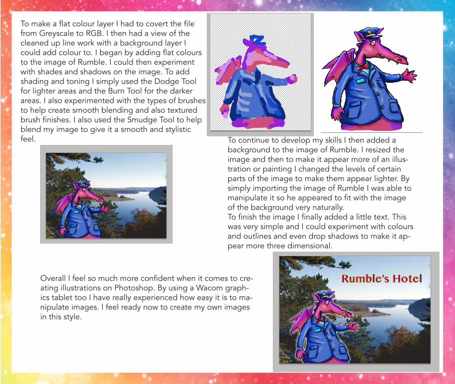
To make a flat colour layer I had to covert the file from Greyscale to RGB. I then had a view of the cleaned up line work with a background layer I could add colour to. I began by adding flat colours to the image of Rumble. I could then experiment with shades and shadows on the image. To add shading and toning I simply used the Dodge Tool for lighter areas and the Burn Tool for the darker areas. I also experimented with the types of brushes to help create smooth blending and also textured brush finishes. I also used the Smudge Tool to help blend my image to give it a smooth and stylistic feel.
Overall I feel so much more confident when it comes to cre-ating illustrations on Photoshop. By using a Wacom graph-ics tablet too I have really experienced how easy it is to ma-nipulate images. I feel ready now to create my own images in this style.
To continue to develop my skills I then added a background to the image of Rumble. I resized the image and then to make it appear more of an illus-tration or painting I changed the levels of certain parts of the image to make them appear lighter. By simply importing the image of Rumble I was able to manipulate it so he appeared to fit with the image of the background very naturally. To finish the image I finally added a little text. This was very simple and I could experiment with colours and outlines and even drop shadows to make it ap-pear more three dimensional.
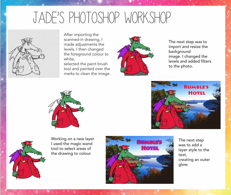
Jade’s Photoshop WorkshopAfter importing the scanned-in drawing, I made adjustments the levels. I then changed the foreground colour to white, selected the paint brush tool and painted over the marks to clean the image.
Working on a new layer I used the magic wand tool to select areas of the drawing to colour.
The next step was to import and resize the background image. I changed the levels and added filters to the photo.
The next step was to add a layer style to the text, creating an outer glow.
ILLUSTRATION VS PHOTOGRAPHY
Illustration is a clever technique used to extend a brand, by using illustration rather than photography you can incorporate brand colours and this can help create a cohesive brand message across all materials. The illustra-tions have the ability to be distinctive and original.When photography is used, the images are universally understood whereas illustration allows designers to be abstract and creative. Images can be created that just wouldn’t work with photography.Photographs are much more direct and this can be a huge benefit when it comes to advertising. They are easy to understand in visual terms because the viewers can envisage themselves in the photograph. But with the use of Illustration, we are able to be abstract and conceptual, breaking the rules of representation. It is also helpful when dealing with the unpalatable, images they may appear shocking or disturbing if in a photograph. Illustration is often used when dealing with sensitive or controversial subjects.Illustration allows creativity to flow as images can be manipulated easily. The visual styling allows certain groups to be targeted as they find distinctive visual associations. Some images just work better as illustrations rather than photographs
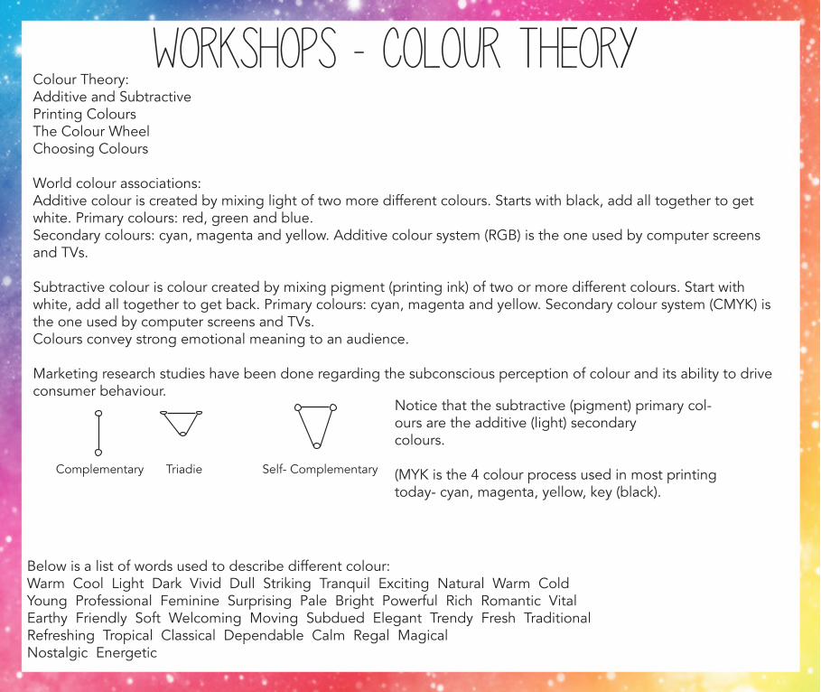
Workshops - Colour TheoryColour Theory: Additive and SubtractivePrinting ColoursThe Colour WheelChoosing Colours
World colour associations:Additive colour is created by mixing light of two more different colours. Starts with black, add all together to get white. Primary colours: red, green and blue. Secondary colours: cyan, magenta and yellow. Additive colour system (RGB) is the one used by computer screens and TVs.
Subtractive colour is colour created by mixing pigment (printing ink) of two or more different colours. Start with white, add all together to get back. Primary colours: cyan, magenta and yellow. Secondary colour system (CMYK) is the one used by computer screens and TVs. Colours convey strong emotional meaning to an audience.
Marketing research studies have been done regarding the subconscious perception of colour and its ability to drive consumer behaviour.
Notice that the subtractive (pigment) primary col-ours are the additive (light) secondarycolours.
(MYK is the 4 colour process used in most printing today- cyan, magenta, yellow, key (black).
Complementary Self- ComplementaryTriadie
Below is a list of words used to describe different colour:Warm Cool Light Dark Vivid Dull Striking Tranquil Exciting Natural Warm Cold Young Professional Feminine Surprising Pale Bright Powerful Rich Romantic Vital Earthy Friendly Soft Welcoming Moving Subdued Elegant Trendy Fresh Traditional Refreshing Tropical Classical Dependable Calm Regal Magical Nostalgic Energetic
Red, yellow and green have shown to increase hunger and impulse purchases, frequently used by fast food chains and manufacturers of junk food items in retail packaging.
Blue is reliable, conservative and dependable.
Yellow is cheerful & playful (fun, energy & vitality).
Orange is vitality, energy and fun. Most visible colour in the spectrum (safety & construction, de-mand attention).
Green is freshness, growth and renewal.Light green is tranquil (hospitals & prisons).
Red is energy, love and vitality or with vice, danger and lust.
Purple is mystery.Darker shades are associated with royalty and wealth. Its a feminine colour.
Brown suggests stability, reliability and comfort.
Grey is refinement and sophistication.
White is pure & innocent & cleanliness & sterility.
Black is mystery, fear & danger.
The Munsell colour wheel system is a colour space that specifies colour based on threedimensions: hue (colour), value (lightness), and choroma (colour purity and saturation). It is essentially the colour wheel in three dimensions.HSL & HSV
Creative BriefTo be able to solve an advertising brief using illustration in an informed and appropriate manner. Worth 50% of the marks.
-Evidence of investigation into advertising, illustration and related issues especially in relation to the brief.-Good appliance of advertising/illustrative principles.-Creative, innovative, evocative and appropriate as a creative solution.-Professionally presented.
The brief:
Design a way to make healthy eating appealing to young people. Poor diets are a major issue. Not enough fruit and veg is eaten. Foods with high levels of sugar and fat are being consumed more. More than 1in 3 children aged 11-15 are overweight or obese. Sugar levels in particular are too high.
-Replace an unhealthy meal with one that is low in sugar, fat and salt.-Eat more portions of vegetables.-Drink fewer sugary drinks, replacing these with water or sugar free options.
It is not about educating people it is about exploring approaches that lead to actions.
It could include:-A new or reimagined consumer brand or product-A service which facilitates healthy eating-A redesigned building or public space that encourages eating healthy.Target market: children aged 11-15
Tone of voice: fun, cool and aspirational. Not preachy or educational.
Mandatory Inclusions:-Illustrations (rather than photography)-Adshell poster as part of a potentially wider reaching campaign-A PDF workbook that contains all work completed
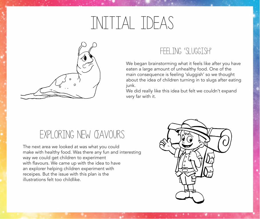
initial Ideas
Feeling ‘sluggish’We began brainstorming what it feels like after you haveeaten a large amount of unhealthy food. One of the main consequence is feeling ‘sluggish’ so we thought about the idea of children turning in to slugs after eatingjunk. We did really like this idea but felt we couldn’t expand very far with it.
Exploring new œavoursThe next area we looked at was what you could make with healthy food. Was there any fun and interesting way we could get children to experimentwith flavours. We came up with the idea to havean explorer helping children experiment with receipes. But the issue with this plan is the illustrations felt too childlike.
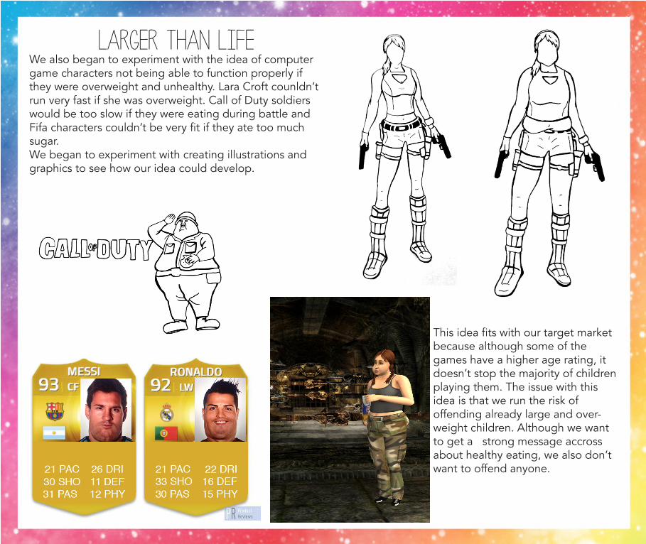
Larger than lifeWe also began to experiment with the idea of computergame characters not being able to function properly if they were overweight and unhealthy. Lara Croft counldn’trun very fast if she was overweight. Call of Duty soldiers would be too slow if they were eating during battle and Fifa characters couldn’t be very fit if they ate too much sugar. We began to experiment with creating illustrations and graphics to see how our idea could develop.
This idea fits with our target market because although some of the games have a higher age rating, it doesn’t stop the majority of childrenplaying them. The issue with this idea is that we run the risk of offending already large and over-weight children. Although we want to get a strong message accross about healthy eating, we also don’t want to offend anyone.
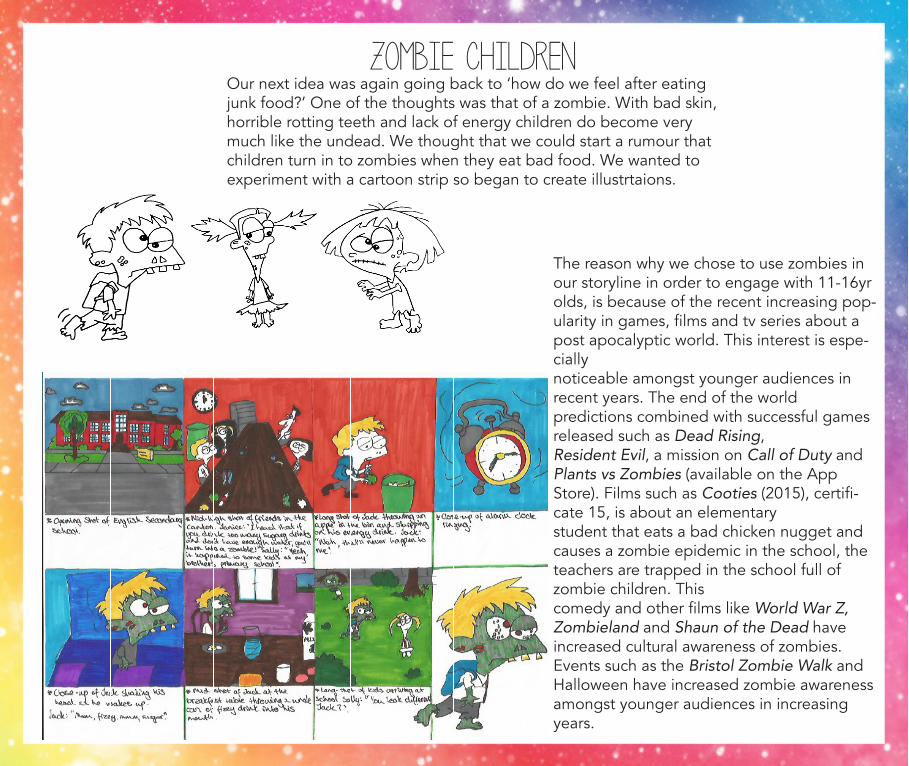
Zombie childrenOur next idea was again going back to ‘how do we feel after eating junk food?’ One of the thoughts was that of a zombie. With bad skin, horrible rotting teeth and lack of energy children do become very much like the undead. We thought that we could start a rumour that children turn in to zombies when they eat bad food. We wanted to experiment with a cartoon strip so began to create illustrtaions.
The reason why we chose to use zombies in our storyline in order to engage with 11-16yr olds, is because of the recent increasing pop-ularity in games, films and tv series about a post apocalyptic world. This interest is espe-cially noticeable amongst younger audiences in recent years. The end of the world predictions combined with successful games released such as Dead Rising, Resident Evil, a mission on Call of Duty and Plants vs Zombies (available on the App Store). Films such as Cooties (2015), certifi-cate 15, is about an elementary student that eats a bad chicken nugget and causes a zombie epidemic in the school, the teachers are trapped in the school full of zombie children. Thiscomedy and other films like World War Z, Zombieland and Shaun of the Dead have increased cultural awareness of zombies. Events such as the Bristol Zombie Walk and Halloween have increased zombie awareness amongst younger audiences in increasing years.
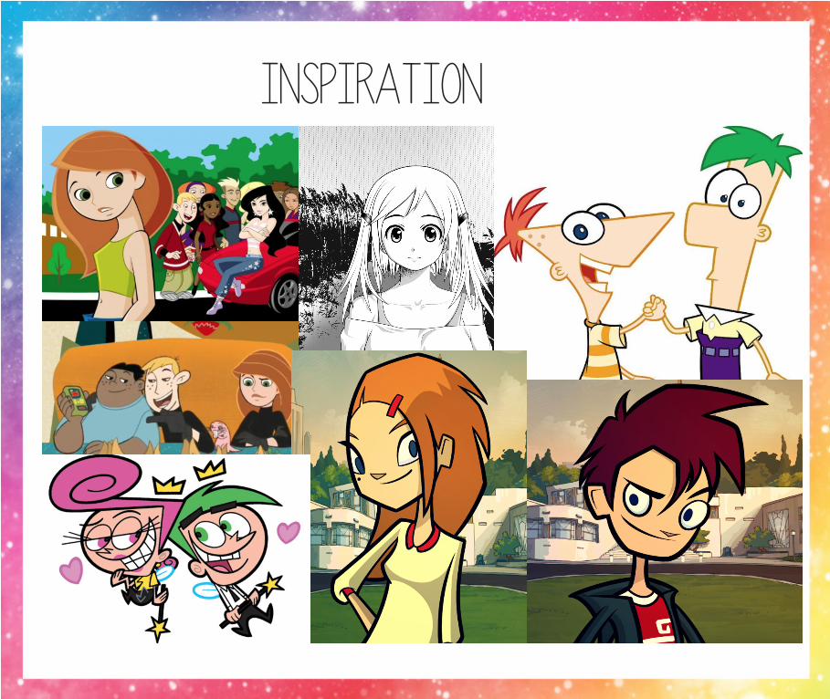
inspiration
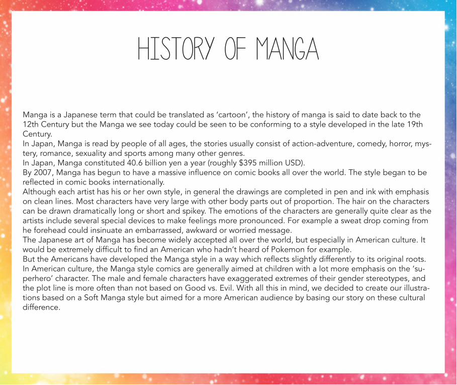
History of Manga
Manga is a Japanese term that could be translated as ‘cartoon’, the history of manga is said to date back to the 12th Century but the Manga we see today could be seen to be conforming to a style developed in the late 19th Century. In Japan, Manga is read by people of all ages, the stories usually consist of action-adventure, comedy, horror, mys-tery, romance, sexuality and sports among many other genres. In Japan, Manga constituted 40.6 billion yen a year (roughly $395 million USD).By 2007, Manga has begun to have a massive influence on comic books all over the world. The style began to be reflected in comic books internationally.Although each artist has his or her own style, in general the drawings are completed in pen and ink with emphasis on clean lines. Most characters have very large with other body parts out of proportion. The hair on the characters can be drawn dramatically long or short and spikey. The emotions of the characters are generally quite clear as the artists include several special devices to make feelings more pronounced. For example a sweat drop coming from he forehead could insinuate an embarrassed, awkward or worried message. The Japanese art of Manga has become widely accepted all over the world, but especially in American culture. It would be extremely difficult to find an American who hadn’t heard of Pokemon for example. But the Americans have developed the Manga style in a way which reflects slightly differently to its original roots.In American culture, the Manga style comics are generally aimed at children with a lot more emphasis on the ‘su-perhero’ character. The male and female characters have exaggerated extremes of their gender stereotypes, and the plot line is more often than not based on Good vs. Evil. With all this in mind, we decided to create our illustra-tions based on a Soft Manga style but aimed for a more American audience by basing our story on these cultural difference.
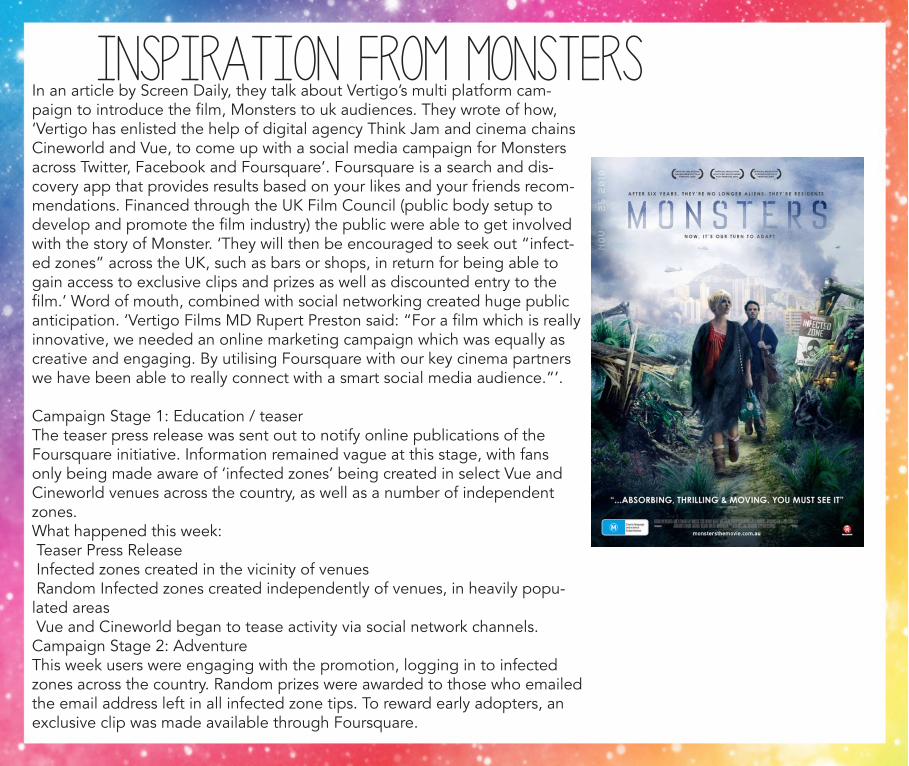
In an article by Screen Daily, they talk about Vertigo’s multi platform cam-paign to introduce the film, Monsters to uk audiences. They wrote of how, ‘Vertigo has enlisted the help of digital agency Think Jam and cinema chains Cineworld and Vue, to come up with a social media campaign for Monsters across Twitter, Facebook and Foursquare’. Foursquare is a search and dis-covery app that provides results based on your likes and your friends recom-mendations. Financed through the UK Film Council (public body setup to develop and promote the film industry) the public were able to get involved with the story of Monster. ‘They will then be encouraged to seek out “infect-ed zones” across the UK, such as bars or shops, in return for being able to gain access to exclusive clips and prizes as well as discounted entry to the film.’ Word of mouth, combined with social networking created huge public anticipation. ‘Vertigo Films MD Rupert Preston said: “For a film which is really innovative, we needed an online marketing campaign which was equally as creative and engaging. By utilising Foursquare with our key cinema partners we have been able to really connect with a smart social media audience.”’.
Campaign Stage 1: Education / teaserThe teaser press release was sent out to notify online publications of the Foursquare initiative. Information remained vague at this stage, with fans only being made aware of ‘infected zones’ being created in select Vue and Cineworld venues across the country, as well as a number of independent zones.What happened this week: Teaser Press Release Infected zones created in the vicinity of venues Random Infected zones created independently of venues, in heavily popu-lated areas Vue and Cineworld began to tease activity via social network channels.Campaign Stage 2: AdventureThis week users were engaging with the promotion, logging in to infected zones across the country. Random prizes were awarded to those who emailed the email address left in all infected zone tips. To reward early adopters, an exclusive clip was made available through Foursquare.
inspiration from monsters
The exclusive clip also warranted a second press release which helped entice publications to push to the Four- square profile for readers to catch a sneak peak.What happened in this week: Exclusive clip breaks exclusively on Foursquare The exclusive clip generated a second press release from Thinkjam Consistent press pushes for news on foursquare activity More in-depth tweets from Vue and Cineworld
Campaign Stage 3: The Big RevealFor the week before release, the 10 swarm sites that would be giving users the discount code were revealed. This was done via the full trade press release as well as a general PR release which generated further news stories. Trade press release Full PR press release Seeding across key forums e.g. Money Saving Expert, Specific student forums
Campaign Stage 4: Swarm!For the week of release, the campaign unleashed limited infected zones that, when checking in as part of a group or ‘Swarm’ and unlocking a badge, allowed bulk discount on tickets. All PR messaging included links and information of the Foursquare presence. The activity was covered by select press invited down to Vue Westfield.What happened in this week: Continued Press PushesTips left in all venues across the country, urging users to visit the swarm sites Local locations will also be left tips, letting people know of the one-off event To encourage press involvement, infected zones would be created in local areas e.g. Blue Fin Building (also capitalis-es on Southbank location) Dec 3rd - Photo opportunity at swarm sites
ConclusionThe learnings of working with Foursquare have been very positive and it was an innovative way to engage with a smart, up-market audience, such as that for Monsters.For future films, if they were to replicate a similar film campaign Vertigo may choose to use Facebook Places (a com-peting system that was announced after work on the campaign had begun). Due to its integration with Facebook, Places has wider awareness.
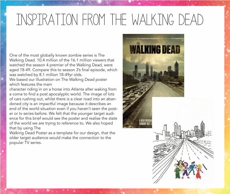
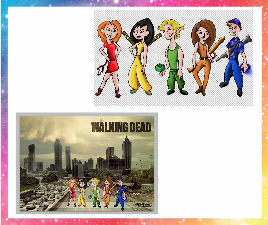
One of the most globally known zombie series is The Walking Dead. 10.4 million of the 16.1 million viewers that watched the season 4 premier of the Walking Dead, were aged 18-49. Compare this to season 3’s final episode, which was watched by 8.1 million 18-49yr olds. We based our illustration on The Walking Dead poster which features the main character riding in on a horse into Atlanta after waking from a coma to find a post apocalyptic world. The image of lots of cars rushing out, whilst there is a clear road into an aban-doned city is an impactful image because it describes an end of the world situation even if you haven’t seen the post-er or tv series before. We felt that the younger target audi-ence for this brief would see the poster and realise the state of the world we are trying to reference to. We also hoped that by using The Walking Dead Poster as a template for our design, that the older target audience would make the connection to the popular TV series.
INSPIRATION FROM THE WALKING DEAD
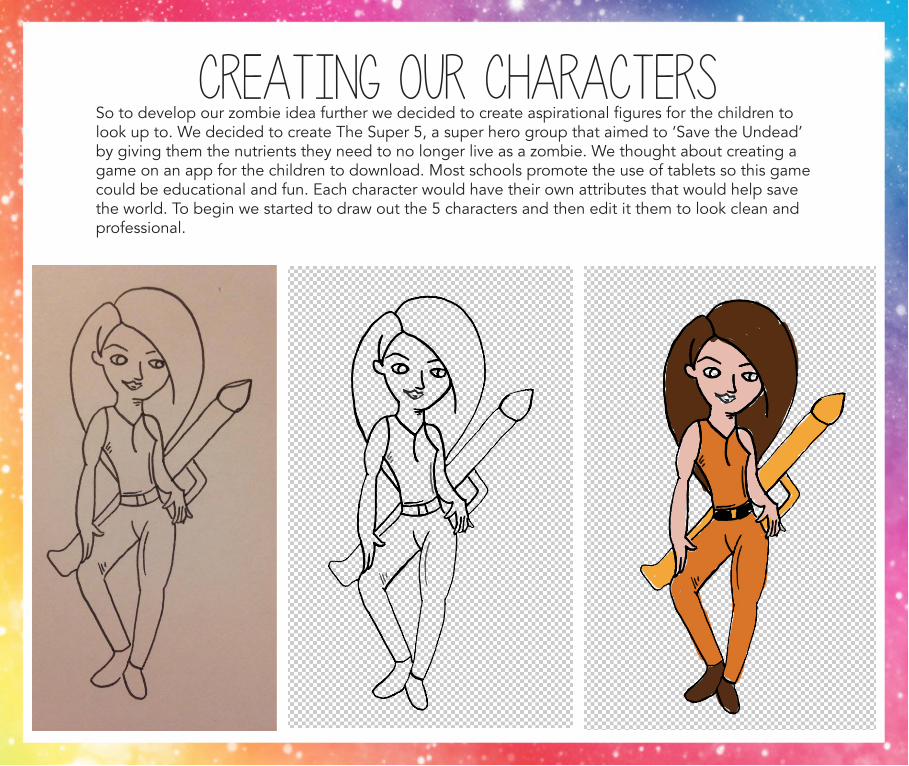
Creating our charactersSo to develop our zombie idea further we decided to create aspirational figures for the children to look up to. We decided to create The Super 5, a super hero group that aimed to ‘Save the Undead’ by giving them the nutrients they need to no longer live as a zombie. We thought about creating a game on an app for the children to download. Most schools promote the use of tablets so this game could be educational and fun. Each character would have their own attributes that would help save the world. To begin we started to draw out the 5 characters and then edit it them to look clean and professional.
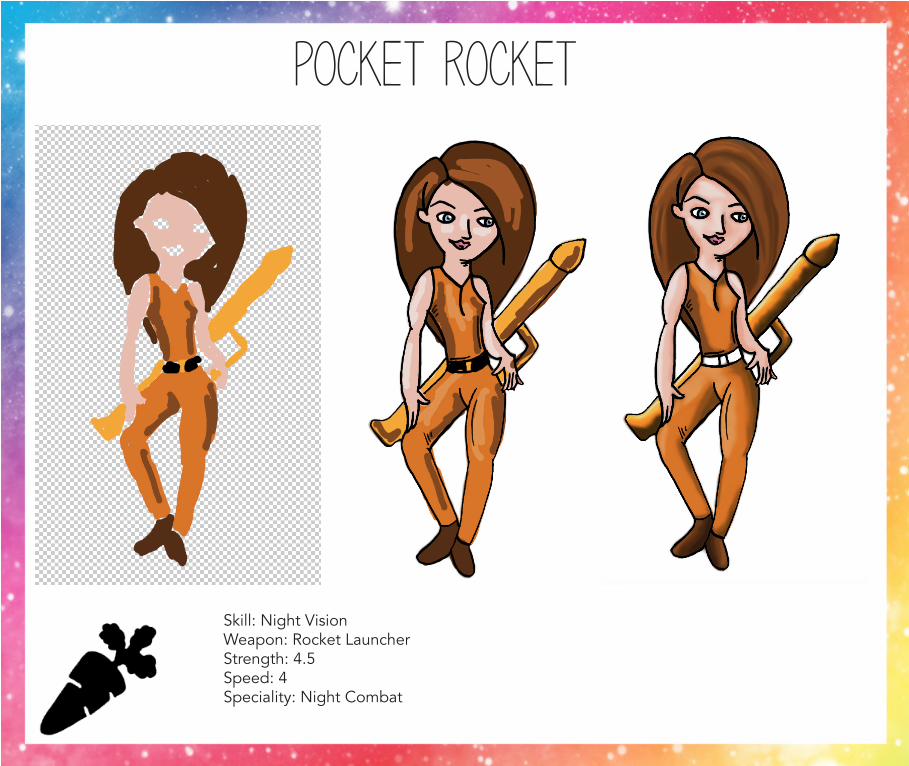
pocket rocket
Skill: Night VisionWeapon: Rocket LauncherStrength: 4.5Speed: 4Speciality: Night Combat
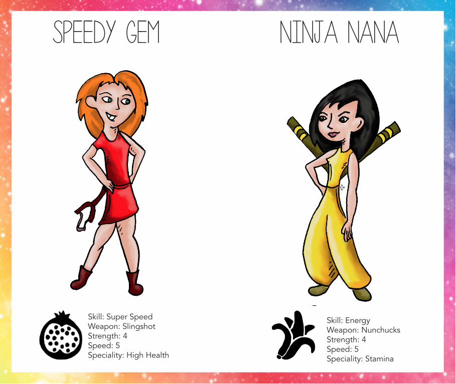
speedy gem ninja nana
Skill: Super SpeedWeapon: Slingshot Strength: 4Speed: 5Speciality: High Health
Skill: EnergyWeapon: Nunchucks Strength: 4Speed: 5Speciality: Stamina
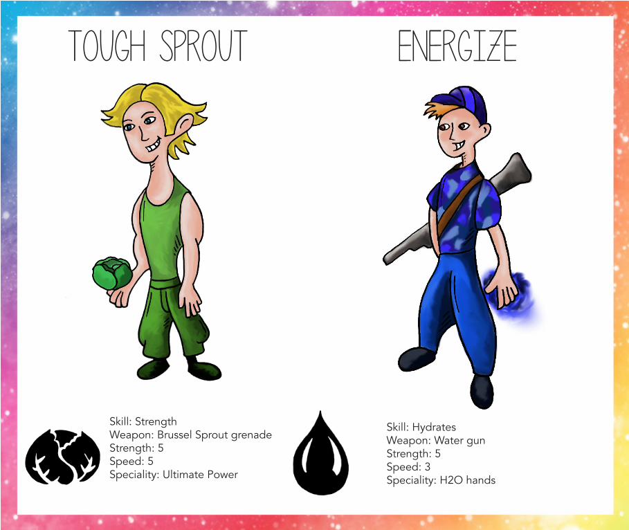
tough sprout energize
Skill: StrengthWeapon: Brussel Sprout grenadeStrength: 5Speed: 5Speciality: Ultimate Power
Skill: HydratesWeapon: Water gunStrength: 5Speed: 3Speciality: H2O hands
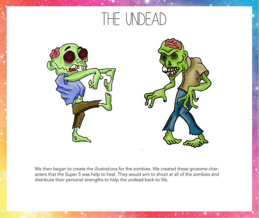
the undead
We then began to create the illustrations for the zombies. We created these grusome char-acters that the Super 5 was help to heal. They would aim to shoot at all of the zombies and distribute their personal strengths to help the undead back to life.
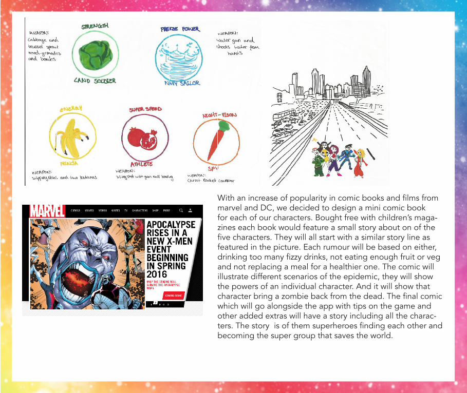
With an increase of popularity in comic books and films from marvel and DC, we decided to design a mini comic book for each of our characters. Bought free with children’s maga-zines each book would feature a small story about on of the five characters. They will all start with a similar story line as featured in the picture. Each rumour will be based on either, drinking too many fizzy drinks, not eating enough fruit or veg and not replacing a meal for a healthier one. The comic will illustrate different scenarios of the epidemic, they will show the powers of an individual character. And it will show that character bring a zombie back from the dead. The final comic which will go alongside the app with tips on the game and other added extras will have a story including all the charac-ters. The story is of them superheroes finding each other and becoming the super group that saves the world.
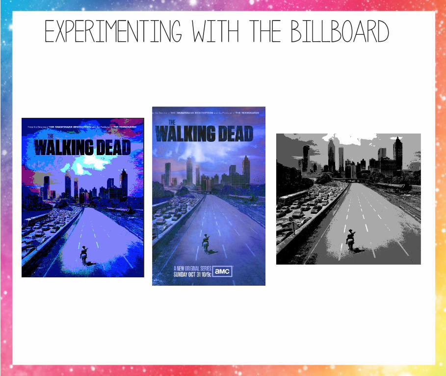
experimenting with the billboard
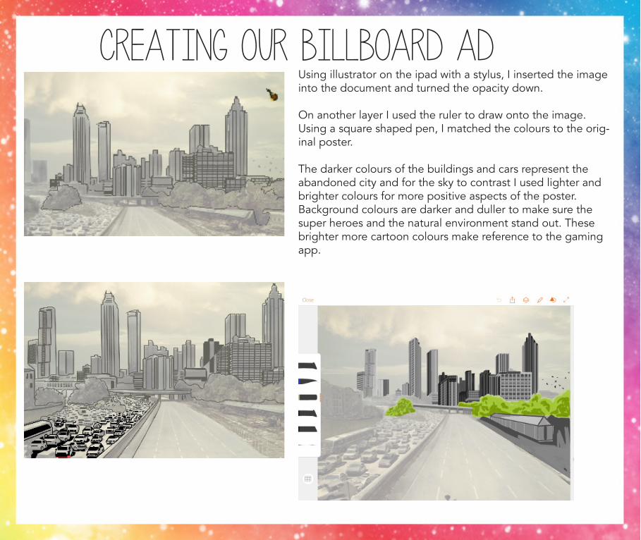
Using illustrator on the ipad with a stylus, I inserted the image into the document and turned the opacity down.
On another layer I used the ruler to draw onto the image. Using a square shaped pen, I matched the colours to the orig-inal poster.
The darker colours of the buildings and cars represent the abandoned city and for the sky to contrast I used lighter and brighter colours for more positive aspects of the poster. Background colours are darker and duller to make sure the super heroes and the natural environment stand out. These brighter more cartoon colours make reference to the gaming app.
creating our billboard ad
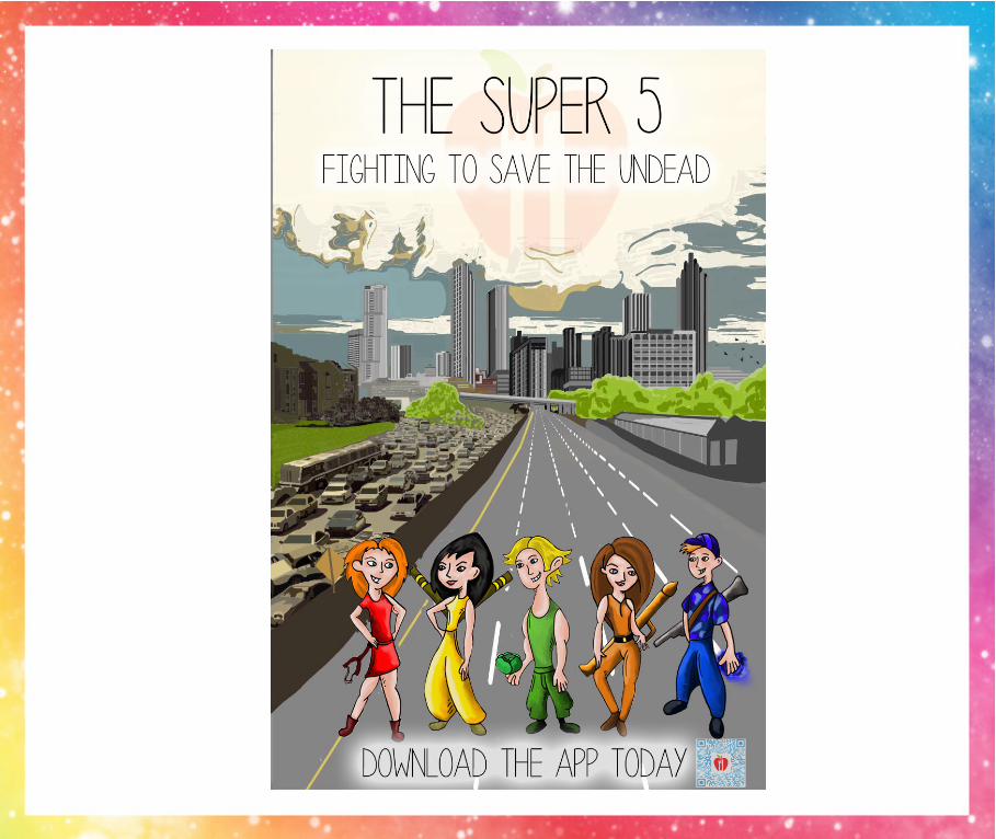
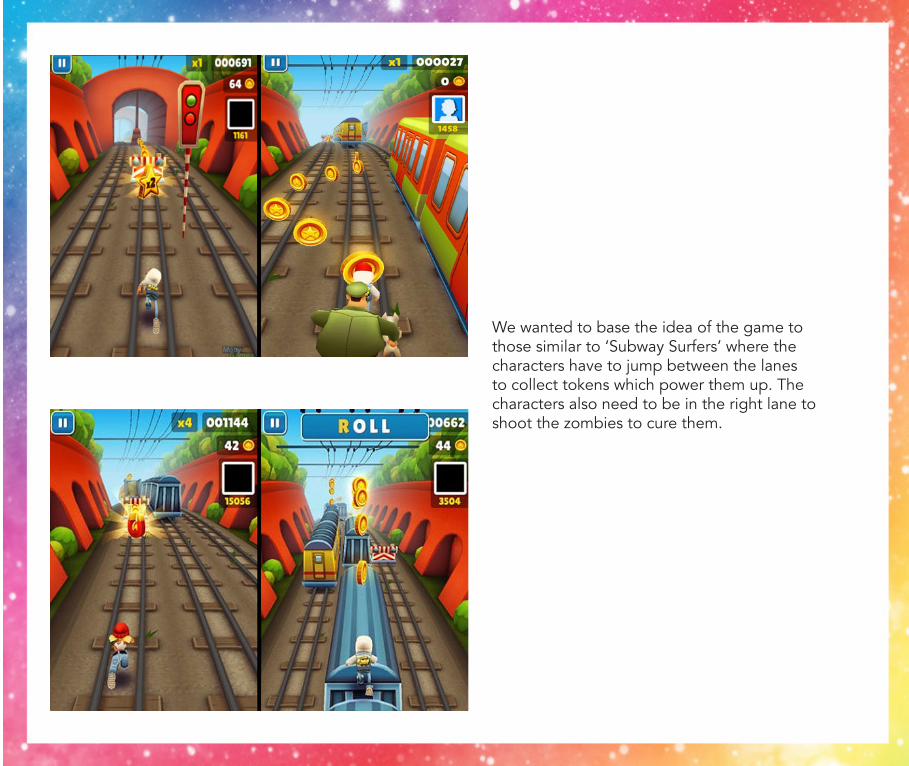
We wanted to base the idea of the game to those similar to ‘Subway Surfers’ where the characters have to jump between the lanes to collect tokens which power them up. The characters also need to be in the right lane to shoot the zombies to cure them.
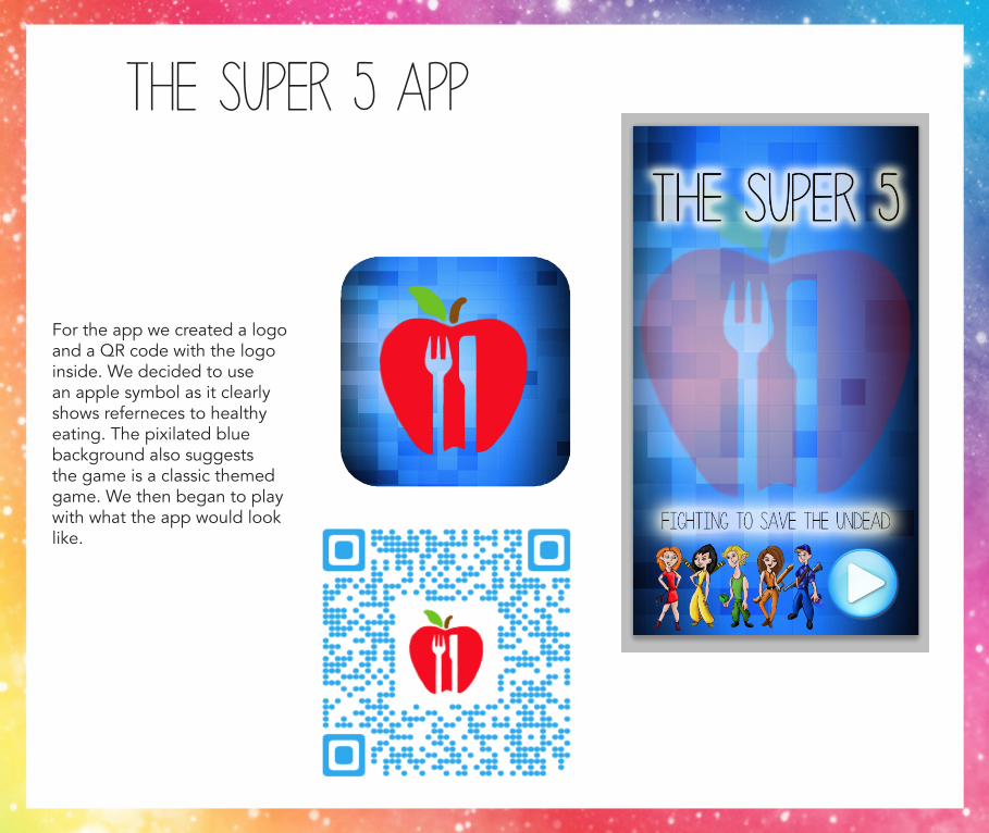
The Super 5 app
For the app we created a logo and a QR code with the logo inside. We decided to use an apple symbol as it clearly shows referneces to healthy eating. The pixilated blue background also suggests the game is a classic themed game. We then began to play with what the app would look like.
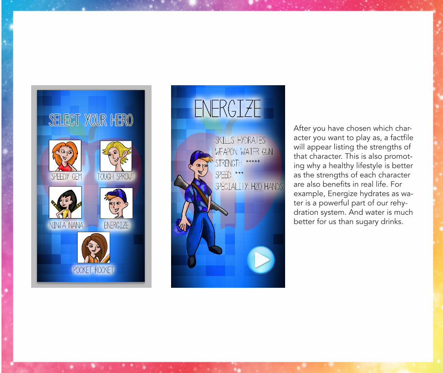
After you have chosen which char-acter you want to play as, a factfile will appear listing the strengths of that character. This is also promot-ing why a healthy lifestyle is better as the strengths of each character are also benefits in real life. For example, Energize hydrates as wa-ter is a powerful part of our rehy-dration system. And water is much better for us than sugary drinks.
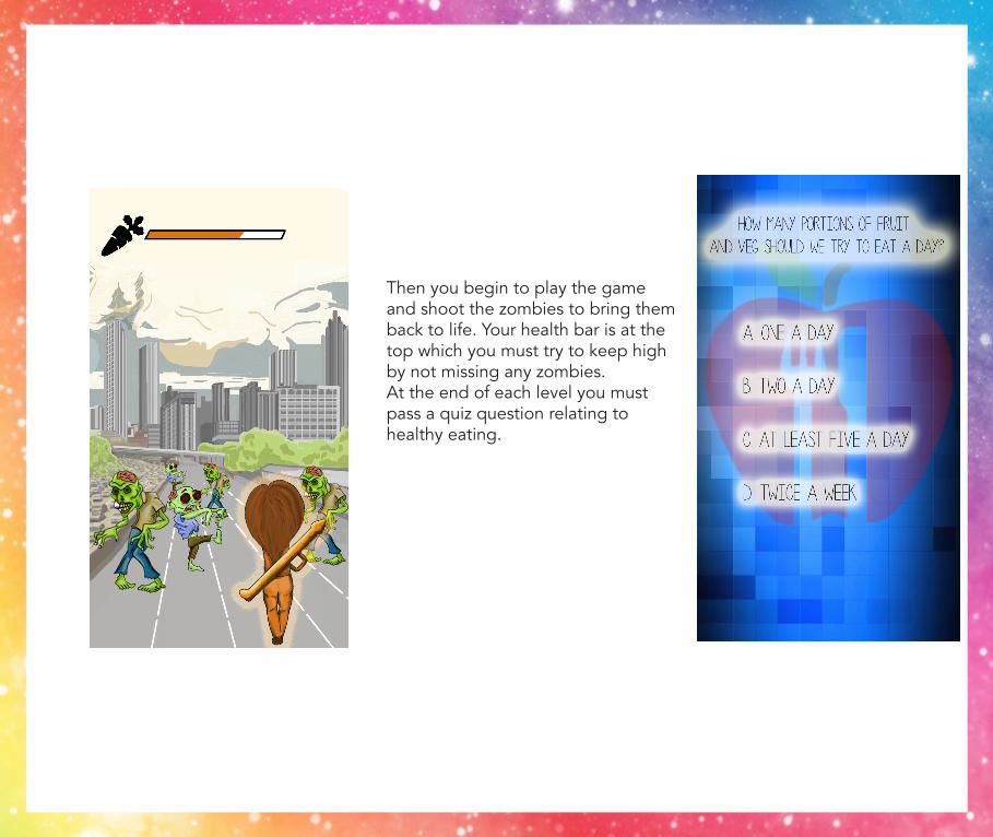
Then you begin to play the game and shoot the zombies to bring them back to life. Your health bar is at the top which you must try to keep high by not missing any zombies. At the end of each level you must pass a quiz question relating to healthy eating.
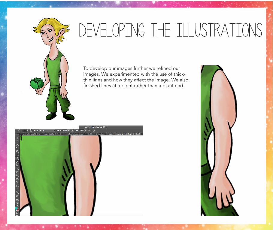
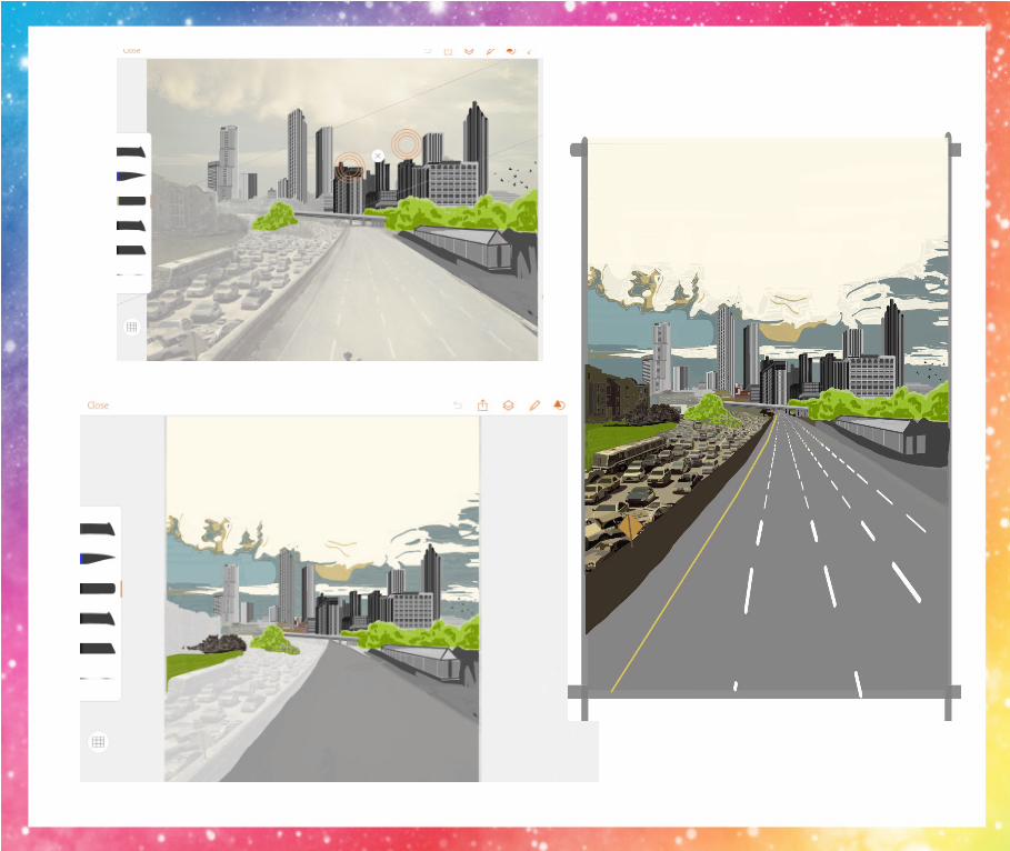
developing the illustrations
To develop our images further we refined our images. We experimented with the use of thick-thin lines and how they affect the image. We also finished lines at a point rather than a blunt end.
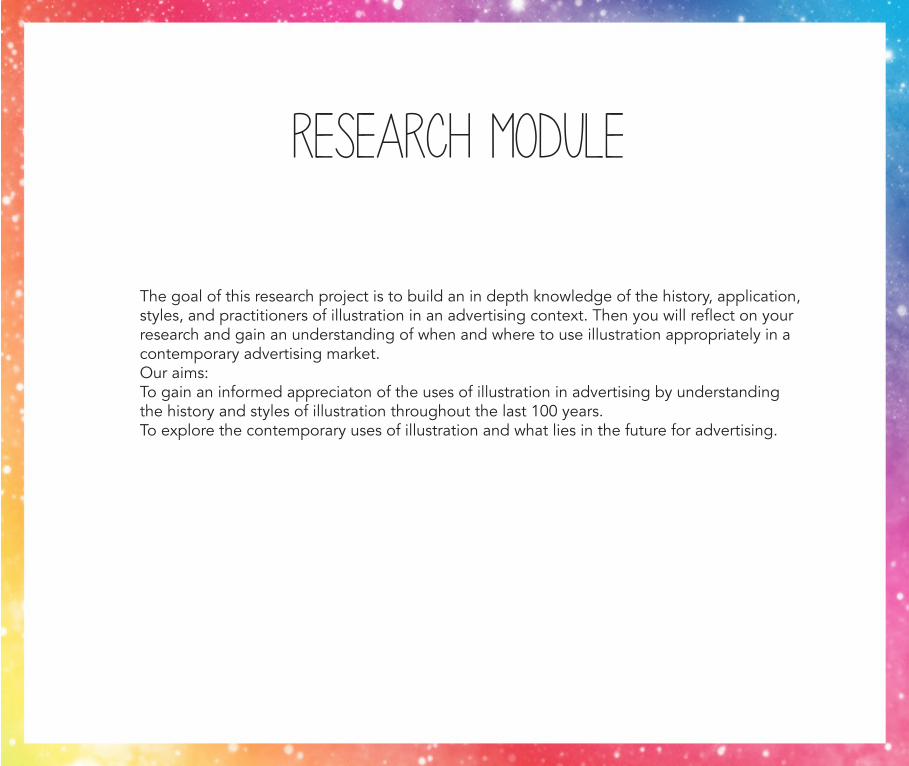
Research Module
The goal of this research project is to build an in depth knowledge of the history, application, styles, and practitioners of illustration in an advertising context. Then you will reflect on your research and gain an understanding of when and where to use illustration appropriately in a contemporary advertising market.Our aims:To gain an informed appreciaton of the uses of illustration in advertising by understanding the history and styles of illustration throughout the last 100 years.To explore the contemporary uses of illustration and what lies in the future for advertising.
1920s
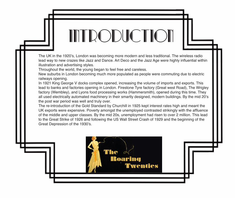
iNTRODUCTIONThe UK in the 1920’s, London was becoming more modern and less traditional. The wireless radio lead way to new crazes like Jazz and Dance. Art Deco and the Jazz Age were highly influential within illustration and advertising styles. Throughout the world, the young began to feel free and careless.New suburbs in London becoming much more populated as people were commuting due to electric railways opening. In 1921 King George V docks complex opened, increasing the volume of imports and exports. This lead to banks and factories opening in London. Firestone Tyre factory (Great west Road), The Wrigley factory (Wembley), and Lyons food processing works (Hammersmith), opened during this time. They all used electrically automated machinery in their smartly designed, modern buildings. By the mid 20’s the post war period was well and truly over. The re-introduction of the Gold Standard by Churchill in 1925 kept interest rates high and meant the UK exports were expensive. Poverty amongst the unemployed contrasted strikingly with the affluence of the middle and upper classes. By the mid 20s, unemployment had risen to over 2 million. This lead to the Great Strike of 1926 and following the US Wall Street Crash of 1929 and the beginning of the Great Depression of the 1930’s.
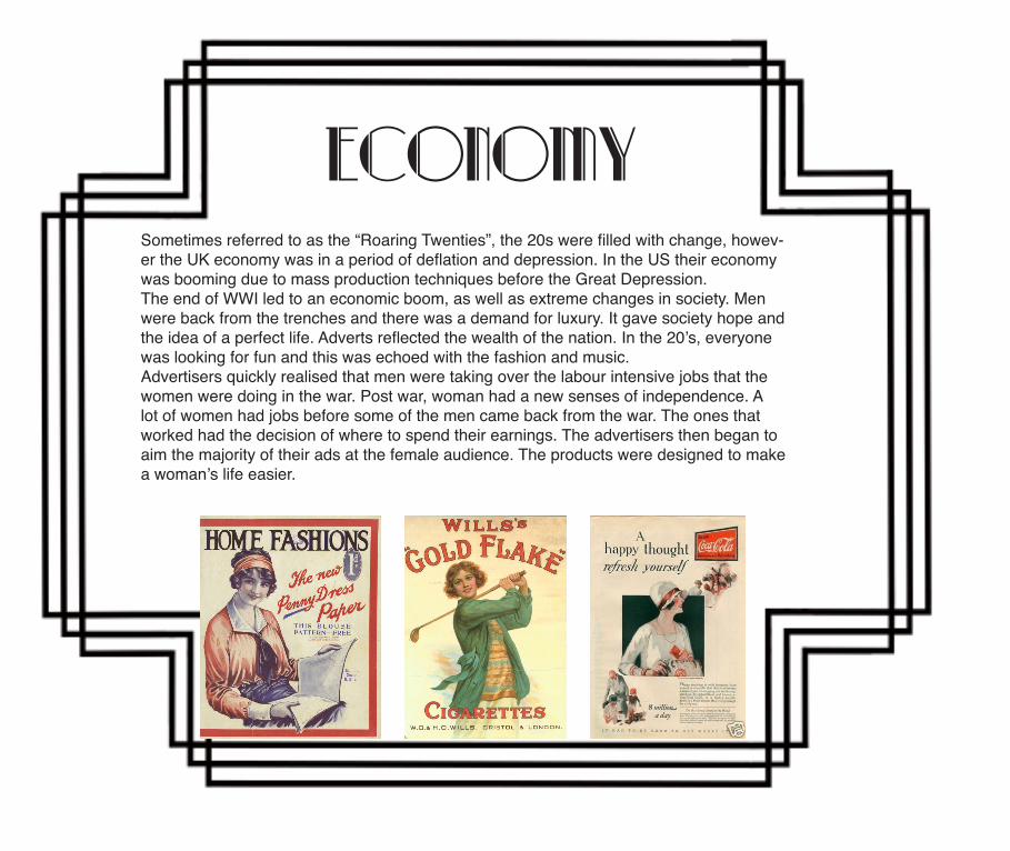
ECONOMYSometimes referred to as the “Roaring Twenties”, the 20s were filled with change, howev-er the UK economy was in a period of deflation and depression. In the US their economy was booming due to mass production techniques before the Great Depression. The end of WWI led to an economic boom, as well as extreme changes in society. Men were back from the trenches and there was a demand for luxury. It gave society hope and the idea of a perfect life. Adverts reflected the wealth of the nation. In the 20’s, everyone was looking for fun and this was echoed with the fashion and music. Advertisers quickly realised that men were taking over the labour intensive jobs that the women were doing in the war. Post war, woman had a new senses of independence. A lot of women had jobs before some of the men came back from the war. The ones that worked had the decision of where to spend their earnings. The advertisers then began to aim the majority of their ads at the female audience. The products were designed to make a woman’s life easier.
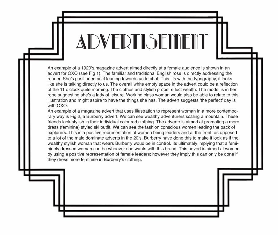
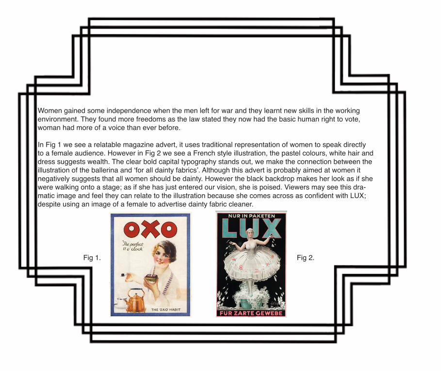
AdvertisementAn example of a 1920’s magazine advert aimed directly at a female audience is shown in an advert for OXO (see Fig 1). The familiar and traditional English rose is directly addressing the reader. She’s positioned as if leaning towards us to chat. This fits with the typography, it looks like she is talking directly to us. The overall white empty space in the advert could be a reflection of the 11 o’clock quite morning. The clothes and stylish props reflect wealth. The model is in her robe suggesting she’s a lady of leisure. Working class woman would also be able to relate to this illustration and might aspire to have the things she has. The advert suggests ‘the perfect’ day is with OXO.An example of a magazine advert that uses illustration to represent woman in a more contempo-rary way is Fig 2, a Burberry advert. We can see wealthy adventurers scaling a mountain. These friends look stylish in their individual coloured clothing. The adverte is aimed at promoting a more dress (feminine) styled ski outfit. We can see the fashion conscious women leading the pack of explorers. This is a positive representation of women being leaders and at the front, as opposed to a lot of the male dominate adverts in the 20’s. Burberry have done this to make it look as if the wealthy stylish woman that wears Burberry woud be in control. Its ultimately implying that a femi-ninely dressed woman can be whoever she wants with this brand. This advert is aimed at women by using a positive representation of female leaders; however they imply this can only be done if they dress more feminine in Burberry’s clothing.
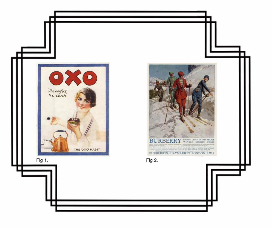
Fig 1. Fig 2.
movementFor the first time more Americans lived in cities rather than farms. The nations total wealth more than doubled between 1920-1929. People from coast to coast bought the same goods (thanks to nation-wide advertising and chain stores). They even listened to the same music and did the same dances.The easy access to automobiles gave young people the ability to go where they wanted. It was the fashion for many young people to do dance: The Charleston, The Cake Walk, Black Bottom, The Flea Hop. Young people were starting to differentiate themselves from generations before them through the evolution of technology and therefore style. They loved their new freedom of individuality.The new music and dances were fast paced and energetic, like the optimistic 20’s themselves. They were an escape from the horror of war. Whilst the new dances appealed to the youth they were not so popular with the older, more conservative generation. The invention of wireless radio and easy access to photograph records meant they were selling in the tens of millions. This introduced jazz to people living in even the most remote locations. The 20s saw a variety of entertainment variations develop and become a part of society. The 20’s movie goers experience was largely dominated by silent movies but saw the introduction of synchro-nised sound. The movie stars were receiving huge salaries and subsequently receiving bigger pub-licity than before. The famous stars were starting to have an impression on society. The silent movies were usually accompanied by live piano. By the 1927 Hollywood had become the centre of movie making. Good weather and a wide range of scenic locations were factors in its success. An average of 800 films were produced annually.
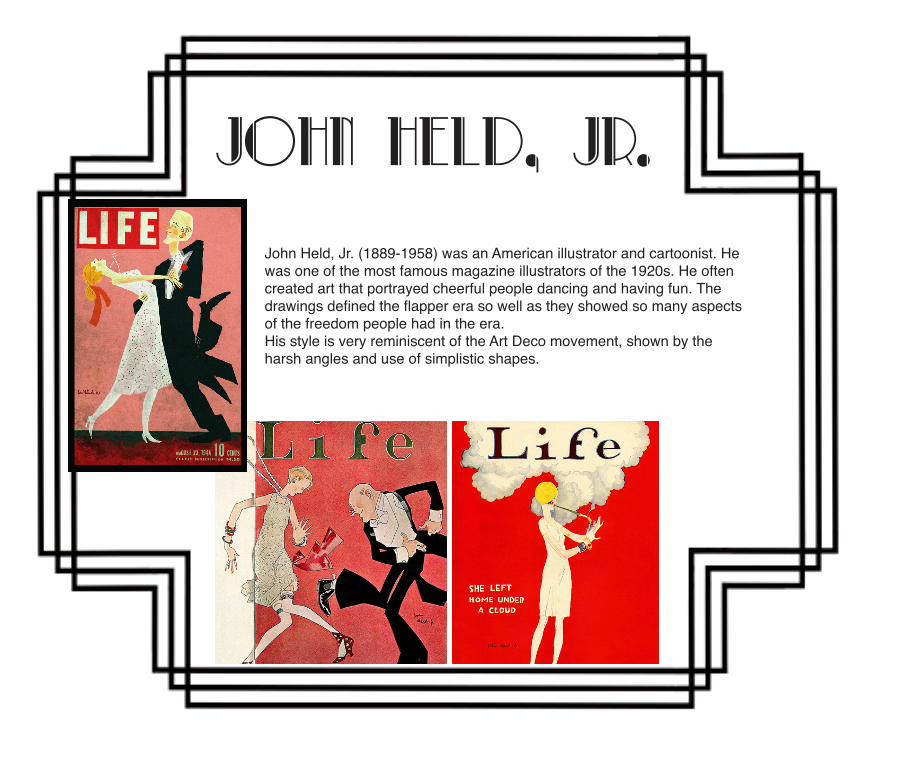
John Held, Jr.
John Held, Jr. (1889-1958) was an American illustrator and cartoonist. He was one of the most famous magazine illustrators of the 1920s. He often created art that portrayed cheerful people dancing and having fun. The drawings defined the flapper era so well as they showed so many aspects of the freedom people had in the era.His style is very reminiscent of the Art Deco movement, shown by the harsh angles and use of simplistic shapes.
Politics and gender
Whilst some freedoms were expanded, others were curtailed in America. The 18th Amendment to the con-stitution (1919) had banned the manufacture and sale of “intoxicating liquors”. This was due to Temperance woman rights movement. Women were feeling the consequences of post war men drinking. Women fought for a change in society that protected women. Although prohibition was introduced to stop drinking, in the early 20’s, the liquor trade wasn’t driven underground; people just simply went to illegal speakeasies instead of ordinary bars. Millions of Americans continued to make and drink illegal alcohol. This resulted high levels of violence against notorious gangsters like Al Capone. Prohibition was repealed in 1932.Women’s rights were also changing drastically. In 1921 liberal leader David Lloyd George was prime minister, under war time coalition government. After the Eligibility of Women Act was passed in 1918 (allowing wom-en to be elected into Parliament) the Representation of the People Act was passed in 1928. This meant that women over the age of 21 received the vote.In this modernising urban culture, women found new freedoms from two of the greatest women’s movements (temperance and suffrage) of the 19th century. Young women were exposed to new goods and styles as mass-production consumer economy expanded. The most familiar symbol of the twenties is probably the “flapper” - a young woman with bobbed hair, short skirts who smoked and drank too much.Women pushed traditional limits and began to challenge the gender norms with drinking, dancing and smok-ing at Jazz clubs. In reality most women in the 20’s were not like this, many worked in white-collar jobs.There was also more access to birth control so women could choose to have fewer children.
Women gained some independence when the men left for war and they learnt new skills in the working environment. They found more freedoms as the law stated they now had the basic human right to vote, woman had more of a voice than ever before.
In Fig 1 we see a relatable magazine advert, it uses traditional representation of women to speak directly to a female audience. However in Fig 2 we see a French style illustration, the pastel colours, white hair and dress suggests wealth. The clear bold capital typography stands out, we make the connection between the illustration of the ballerina and ‘for all dainty fabrics’. Although this advert is probably aimed at women it negatively suggests that all women should be dainty. However the black backdrop makes her look as if she were walking onto a stage; as if she has just entered our vision, she is poised. Viewers may see this dra-matic image and feel they can relate to the illustration because she comes across as confident with LUX; despite using an image of a female to advertise dainty fabric cleaner.
Fig 1. Fig 2.
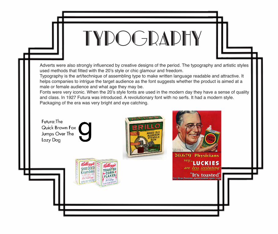
typography Adverts were also strongly influenced by creative designs of the period. The typography and artistic styles used methods that fitted with the 20’s style or chic glamour and freedom.Typography is the art/technique of assembling type to make written language readable and attractive. It helps companies to intrigue the target audience as the font suggests whether the product is aimed at a male or female audience and what age they may be.Fonts were very iconic. When the 20’s style fonts are used in the modern day they have a sense of quality and class. In 1927 Futura was introduced. A revolutionary font with no serfs. It had a modern style. Packaging of the era was very bright and eye catching.
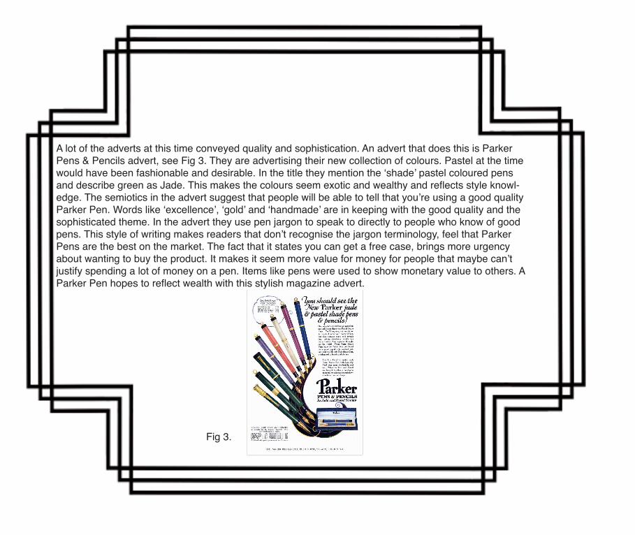
A lot of the adverts at this time conveyed quality and sophistication. An advert that does this is Parker Pens & Pencils advert, see Fig 3. They are advertising their new collection of colours. Pastel at the time would have been fashionable and desirable. In the title they mention the ‘shade’ pastel coloured pens and describe green as Jade. This makes the colours seem exotic and wealthy and reflects style knowl-edge. The semiotics in the advert suggest that people will be able to tell that you’re using a good quality Parker Pen. Words like ‘excellence’, ‘gold’ and ‘handmade’ are in keeping with the good quality and the sophisticated theme. In the advert they use pen jargon to speak to directly to people who know of good pens. This style of writing makes readers that don’t recognise the jargon terminology, feel that Parker Pens are the best on the market. The fact that it states you can get a free case, brings more urgency about wanting to buy the product. It makes it seem more value for money for people that maybe can’t justify spending a lot of money on a pen. Items like pens were used to show monetary value to others. A Parker Pen hopes to reflect wealth with this stylish magazine advert.
Fig 3.
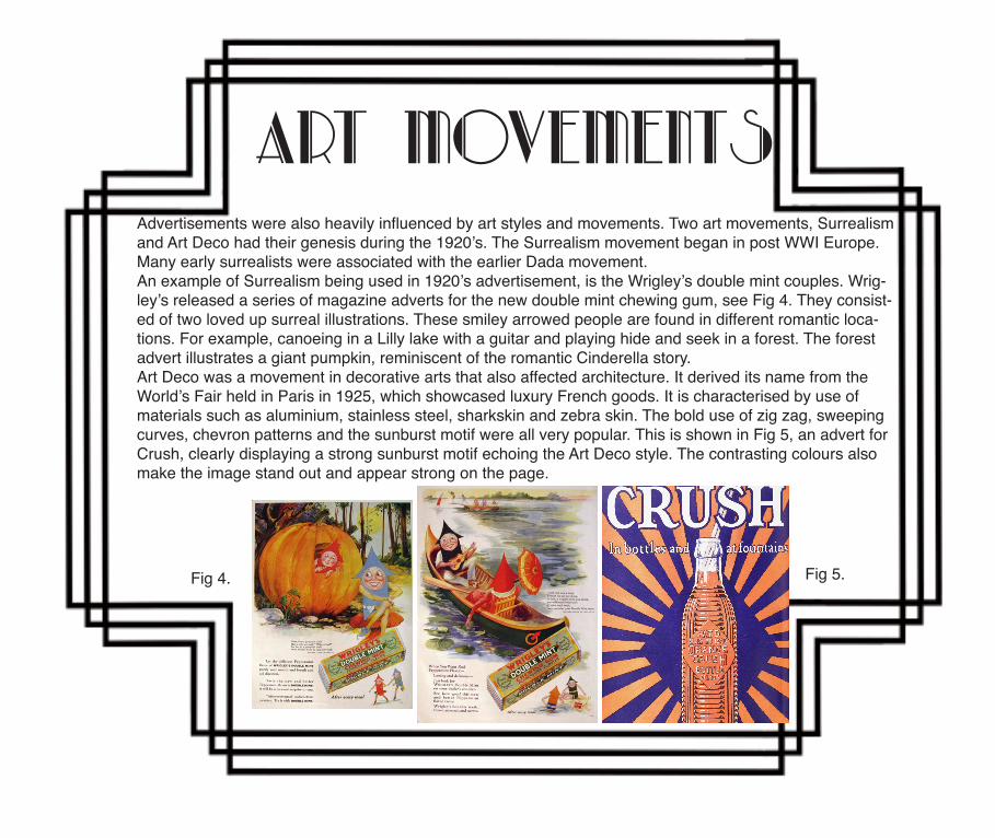
Art movementsAdvertisements were also heavily influenced by art styles and movements. Two art movements, Surrealism and Art Deco had their genesis during the 1920’s. The Surrealism movement began in post WWI Europe. Many early surrealists were associated with the earlier Dada movement. An example of Surrealism being used in 1920’s advertisement, is the Wrigley’s double mint couples. Wrig-ley’s released a series of magazine adverts for the new double mint chewing gum, see Fig 4. They consist-ed of two loved up surreal illustrations. These smiley arrowed people are found in different romantic loca-tions. For example, canoeing in a Lilly lake with a guitar and playing hide and seek in a forest. The forest advert illustrates a giant pumpkin, reminiscent of the romantic Cinderella story.Art Deco was a movement in decorative arts that also affected architecture. It derived its name from the World’s Fair held in Paris in 1925, which showcased luxury French goods. It is characterised by use of materials such as aluminium, stainless steel, sharkskin and zebra skin. The bold use of zig zag, sweeping curves, chevron patterns and the sunburst motif were all very popular. This is shown in Fig 5, an advert for Crush, clearly displaying a strong sunburst motif echoing the Art Deco style. The contrasting colours also make the image stand out and appear strong on the page.
Fig 4. Fig 5.
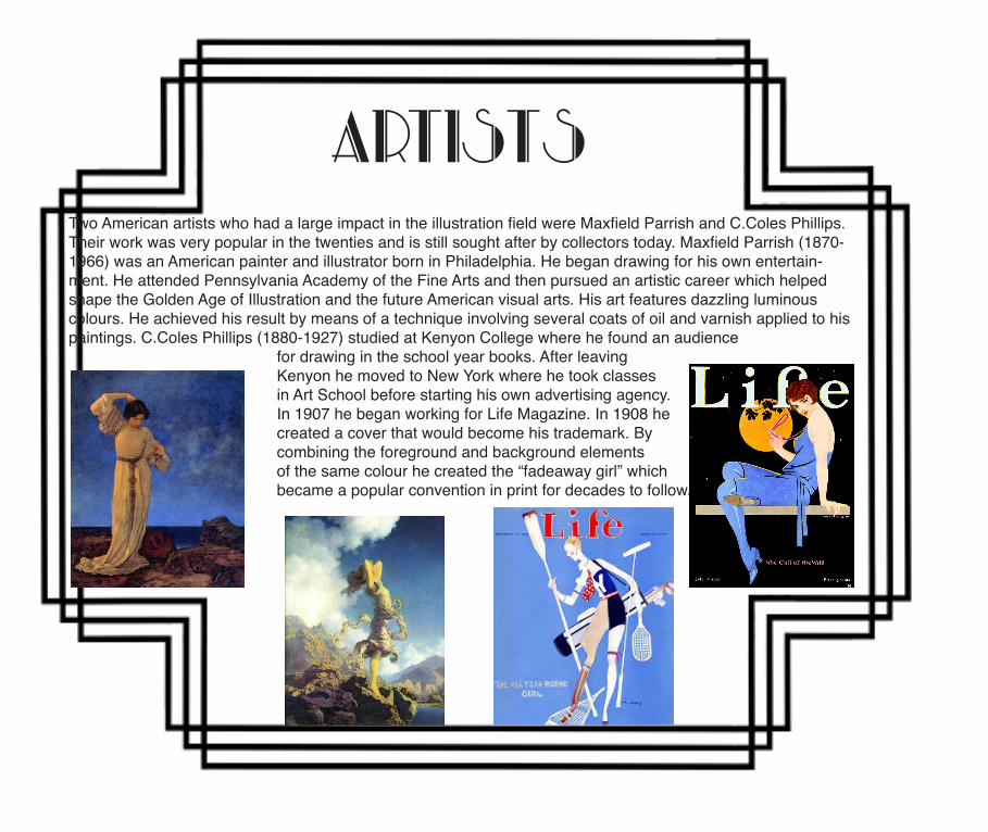
Two American artists who had a large impact in the illustration field were Maxfield Parrish and C.Coles Phillips. Their work was very popular in the twenties and is still sought after by collectors today. Maxfield Parrish (1870-1966) was an American painter and illustrator born in Philadelphia. He began drawing for his own entertain-ment. He attended Pennsylvania Academy of the Fine Arts and then pursued an artistic career which helped shape the Golden Age of Illustration and the future American visual arts. His art features dazzling luminous colours. He achieved his result by means of a technique involving several coats of oil and varnish applied to his paintings. C.Coles Phillips (1880-1927) studied at Kenyon College where he found an audience for drawing in the school year books. After leaving Kenyon he moved to New York where he took classes in Art School before starting his own advertising agency. In 1907 he began working for Life Magazine. In 1908 he created a cover that would become his trademark. By combining the foreground and background elements of the same colour he created the “fadeaway girl” which became a popular convention in print for decades to follow.
Artists
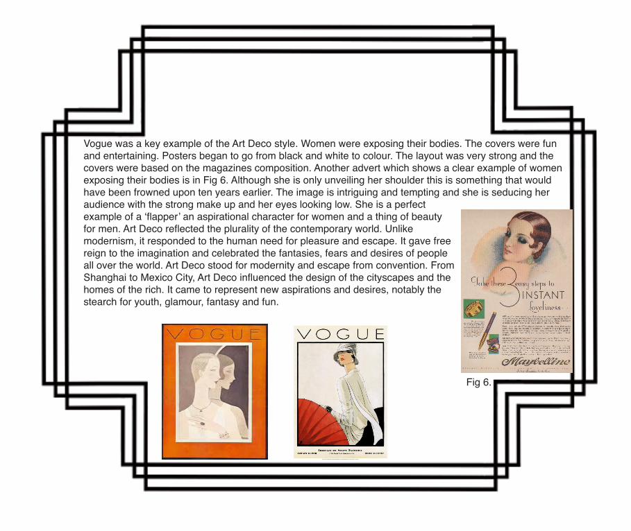
Vogue was a key example of the Art Deco style. Women were exposing their bodies. The covers were fun and entertaining. Posters began to go from black and white to colour. The layout was very strong and the covers were based on the magazines composition. Another advert which shows a clear example of women exposing their bodies is in Fig 6. Although she is only unveiling her shoulder this is something that would have been frowned upon ten years earlier. The image is intriguing and tempting and she is seducing her audience with the strong make up and her eyes looking low. She is a perfect example of a ‘flapper’ an aspirational character for women and a thing of beauty for men. Art Deco reflected the plurality of the contemporary world. Unlikemodernism, it responded to the human need for pleasure and escape. It gave free reign to the imagination and celebrated the fantasies, fears and desires of people all over the world. Art Deco stood for modernity and escape from convention. From Shanghai to Mexico City, Art Deco influenced the design of the cityscapes and the homes of the rich. It came to represent new aspirations and desires, notably the stearch for youth, glamour, fantasy and fun.
Fig 6.
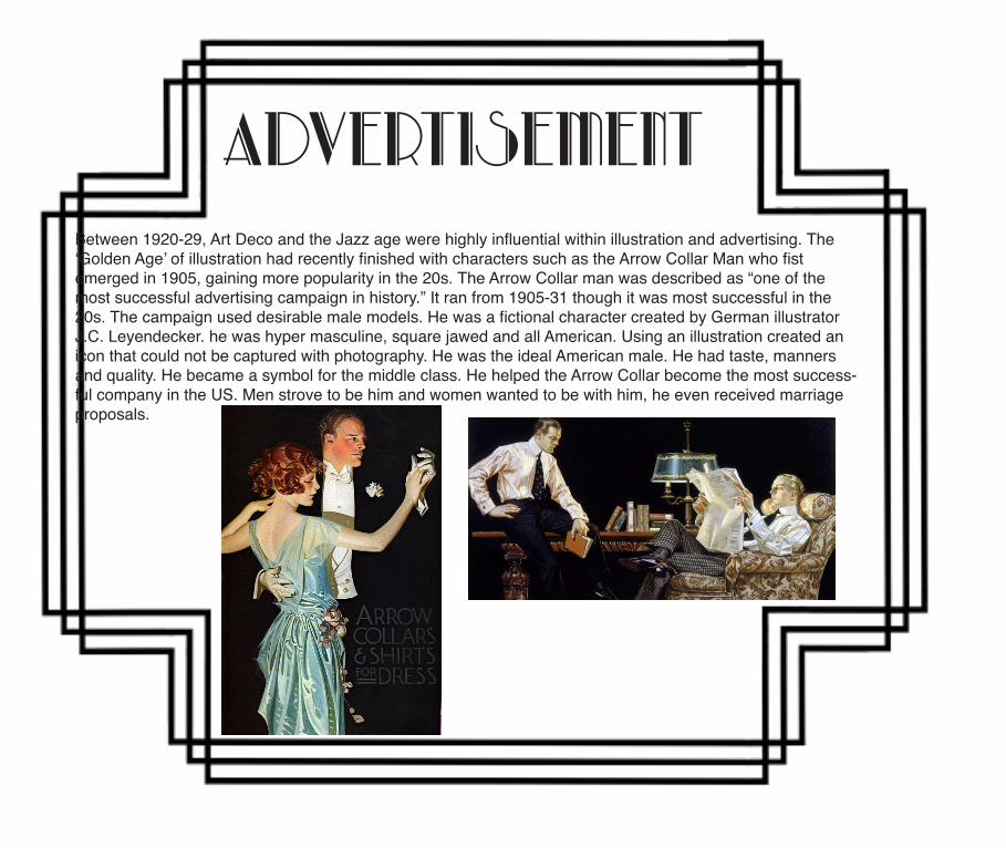
AdvertisementBetween 1920-29, Art Deco and the Jazz age were highly influential within illustration and advertising. The ‘Golden Age’ of illustration had recently finished with characters such as the Arrow Collar Man who fist emerged in 1905, gaining more popularity in the 20s. The Arrow Collar man was described as “one of the most successful advertising campaign in history.” It ran from 1905-31 though it was most successful in the 20s. The campaign used desirable male models. He was a fictional character created by German illustrator J.C. Leyendecker. he was hyper masculine, square jawed and all American. Using an illustration created an icon that could not be captured with photography. He was the ideal American male. He had taste, manners and quality. He became a symbol for the middle class. He helped the Arrow Collar become the most success-ful company in the US. Men strove to be him and women wanted to be with him, he even received marriage proposals.
Conclusion
In the 1920’s, advertisement were reinforcing a consumer culture. Mass produced products, technolog-ical advancements, the war, politics and the Great Depression were all factors in advertisers efforts to keep people spending. Advertisers used the nostalgic and aesthetically pleasing illustrations to depict the ‘perfect lifestyle’ to their audience. The illustrations created were sanitised and slightly fantastical to show products and people in the best way. Advertisers were trying to keep the positive spending of consumers, alive. However with gender equality on the rise, in order to keep women feeling as if they were not com-pletely satisfied, advertisers chose to use traditional representations of gender. In the 20’s although there were more adverts aimed at females, it doesn’t reflect the great changes in independence for woman at the time. After the war and then eventually the Great Depression in America, adverts made it seem as if materialistic things were important to lifestyle happiness. In order to do this they depicted affluent people in equally as nice environments in their colourful illustrations. They used descriptive writing to explain quality and monetary value of products alongside bold and colourful adverts.
As a person with a passion for both Art and History, I found this research project on the history of illustration in ad-vertising particularly interesting. It allowed us to explore how much art, society, politics and history itself are influ-enced in advertising. The styles of illustration often reflect the mood of the time and this was an intriguing aspect when researching illustration.The 1880s saw the birth of modern advertising, big department stores began to make a breakthrough and with new technologies saw new illustration styles. Adverts of the time were heavily copy based, suggesting that advertisers had to work hard to try to describe the product. But with this brought the idea of using emotion to sell a product. Moving on to the turn of the century we saw iconic Coca-Cola being advertised for the first time, adopting a paint-ed style to their illustrations. The images appeared familiar, friendly and you may aspire to be like these people. The images often included people with beaming smiles and rosy cheeks. The rosy realism effect that appeared better as an illustration as oppose to a photograph as their expressions could be exaggerated to help create that fell good feeling.With the industrial revolution saw new inventions, new arts and literatures. People’s knowledge of the world was expanded and with this came new art movements. Art Nouveau was a movement that had a dreamy stylistic effect, this style was vary naturalistic and floral and would later influence many other forms of art.I especially enjoyed researching the 1920s, an era filled with music, dance and new found freedom.After visiting New York in the summer I have really developed my appreciation for the Art Deco style and its presence in advertis-ing.During the 20s the economy was booming and with new found technologies like the first Model T Car, people were able to experience things they hadn’t before, mainly travel. With travel came new opportunities as new music and dance styles could be introduced to new towns and cities. Cities like New York were buzzing with people and only growing bigger. With Prohibition introduced to cut alcohol consumption, the speakeasy was born. A secret bar or night club where illegal liquor was sold along with jazz music and dancing girls. Art Deco depicted glamour and modernism and this was echoed in architecture of the time. Harsh lines and geome-try were used to create the styles. The Arrow Collar man, an icon of illustration in advertising was introduced. A man like no other, displaying exactly what it meant to be a man in the 20s. A man of class and taste who men wanted to be and who women wanted to be with. This is an example of how illustration was used more successfully than photography. The Arrow Collar man was able to be kept the same for over 25 years helping the brand stay strong and helping them to create an iconic figure.With the issues of war came propaganda. The propaganda again used the familiar rosy realism to try to persuade the world that they should fight in the war. Over in America, they were not afraid to use bright and bold colours to attract attention. They even introduced fictional characters like Uncle Sam to help personify their country and per-suade more soldiers to join.This style was empowering and confident and did help with he war effort.
Emily’s report
As we move on to the 40s and 50s we had emerged from the war triumphant but economically exhausted. The world had to rebuild its economy. Food and drink companies struggled due to the end of rationing but this led to the first high use of children in advertising. Using children really helped to make people feel young and carefree again. The 50s was the era of housewives. As men took over from the women who stayed home during the war, the women fo-cused on keeping a happy and healthy home. With the introduction of buying on ‘credit’ people had more allowance to buy new technologies that made life in the home easier. This era was also when the Pin Up Girl became a figure in our society. An international sex symbol which helped sell hundred of products. Vargas was one of the first artists to shoe the Pin Up Girl to the world, she was an everyday woman with a sexual side. The female equivalent to the Arrow Collar Man.As the world entered in to the swinging 60s the introduction of Pop Art was hugely influential on advertising. This iconic style was influenced by the psychedelic music and drugs of the time. Bright contrasting colours and repetition gave images a free spirit. People were rejecting materialism and the crazy freedoms were unleashed. After the Vietnam War ended, a backlash came on to the 60s style. Experimentation and rebellion were rising and the bright colours were taken over by more natural browns and greens with heavy textures. This era was based heavily on music with bands like Pink Floyd expressing the illustration styles on their album covers.The 80s began with Neo-Expressionism, an abstract art type again influenced by drug use but also by the new digi-tal technologies that were being developed. Video games in particular were becoming huge, things such as PacMan were sweeping the nation. Andy Warhol influenced many artists during the 80s as his style was repeated in this era by artists such as David Bowie. With so many developments of digital technology we have now have the ability to create different stylistic effects with ease. Illustration has become much more graphic and digital but there are still often recycled styles dating back to the beginning of the century. The nostalgic feel helps sell products as they are so reminiscent of a style or era. Although digital photography is so advanced, the use of illustration is still best when creating an image and a feel to add to the image which you can’t always achieve with photography. Thinking about how far technology has come in the past 100 years can leave us only guessing as to the future of illustration in advertising. I really don’t think it will die away just be-cause we have more access to better cameras and digital manipulation. I think that the love for illustration will contin-ue with the recycling of past ideas and styles. The styles were so iconic and successful and as many have already been repeated, I think they will just continue to be recycled and altered in the future. I will definitely be using illustration as an advertising creative. I love using illustration and traditional art techniques when I can, especially for child related products or perhaps something aimed at 40+ year olds as I can incorporate familiar styles that were found on album covers at the time.Writing and researching the book was very interesting, I enjoyed researching the 20s and learning about the art move-ments throughout the eras. Doing it collaboratively was helpful as each era had so much to cover that it was nice to be able to split the eras in to different sections so we could each research a different aspect. But also by doing it collaboratively meant that we had to rely on other groups to work hard so the book was to the highest quality. When working in a large team a lot of trust is placed in each other and when it is abused it becomes difficult.
Jade’s reportIn 1880-1899, advertising was starting to play a more an essential roll in promoting consumer spending. Department stores where opening in big cities, and products featured in adverts to get people spending in store. Technological ad-vancements in mass produced goods meant there was a variation of preserved products on sale. The lithography method for printing, allowed artists to create adverts that differentiated new products from each other. The most common adverts consisted of an illustration, often characters were created to advertise products and their brand. By depicting real people and using the product, it encouraged consumers to associate themselves with it. Batik is a process of waxing and dyeing that creates elaborate floral designs popular in this century. The golden age of illustration formed in 1880, influencing art-ists like Walter Crane. The reproduction of art and public demand for graphic art caused an influx of book and magazine illustrations.The 1900-1909 was a time for inventions, it saw art and literature grow. Advertising, relying on economy and cultural interest, started to use more copy in adverts. Advertising agencies were opening and billboard spaces were becoming more valuable. Cubism rapidly gained popularity in this century, with works from impressionable artists like Pablo Picasso and George Braque. 1899-1908 saw Fauvism inspired by artists like Vincent Van Gogh and expressionism in 1905-1933. Art nouveau in 1890-1905 bonded historical styles and moved towards Modernism. In 1901 technology brought a new art form, Photography. Posters at the time consisted of hand-illustrated drawings, simplicity, characters and copy were used in adverts for the public. By 1903 photography was increasingly used in adverts of this century.1910-1919’s advertisement widely consisted of propaganda for the First world War in 1914. Illustration in advertising was popular in this era and it reflected the sophisticated Art Deco movement seen in illustrations which filled the magazines. This art influence brought elegance to adverting. Packaging was changed and experimented with, some cigarette pack-aging had illustrations drawn on the front. This era saw the continuation of cubism and expressionism which lead the way for experimentation in Typography and the development of new typefaces.The 1920’s was an era of change. Technological advancements including electric railways and more advanced factories opening meant that mass produced products were more accessible. The invention of the wireless radio and sound intro-duced into film meant that by 1927 celebrity culture was forming. Actors and actresses were getting paid more and the public started to fall in love with their iconic stars. After the war, women had more freedom as they had and were contin-uing to have jobs, working for money. Women’s rights movements in the US and UK, such as Temperance and Suffrage allowed women to have more of a voice in society. As a result advertisers started to advertise their products more directly to women. In this era different techniques such as depicting art movements had connotations, and advertisers were able to reflect theses references when advertising products.During 1930-1939 illustration in advertisement depicted a lifestyle, this created an emotive selling point for products. Adverts were starting to support and promote brand image in this decade. Artists like Haddon Sundblom influenced advertising with their style of pin up girls. This kind of illustration was popular during and after times of war. Photography wouldn’t have been able to create the flawless, charismatic, and icon style of the pin up girl. In 1933 the ‘Petty Girl’ was created in an airbrushed elegant style. This styling matched what audiences where looking for at the time, as vibrant
illustrations were popular. Logos were also influenced by cold colour e.g. Martini. The art deco movement was visible in travel posters and influenced the design of fashion illustration. In 1940-49 the people living in the UK had to ration until 1954. This didn’t leave much room for extra spending on consumer goods. However as children lived through the war, parents felt they wanted to give as much as they could to their children. Birds Custard is an example of advertisement using images of children playing and having fun to sell the product to parents. By using emotive images, advertisers were able to engage with its audience on an emotional level. Humour was also used in advertising in this era. After the war, communities were strong and people felt patriotic. Advertisers created illustrations in the style of surrealism for the outcome of light-hearted adverts that were humorous. The 40’s came with technological advancements in airbrushing, this allowed artists to create attractive illustrations of the ‘perfect girl’, the pin up girl. This era also saw the continuation of propaganda, however the most noticeable trend in advertising was the use of emotion provoking images. These illustration depicted an ideal or dream lifestyle that promoted the product as more than just a materialistic thing and created brand awareness.In 1950-1959 celebrities were becoming more immersed in popular culture. Actors/Actresses and singers were public icons for people. People aspired to be like their role model, more specifically to have the lifestyle they had. This encouraged public spending. With the So-viet satellite Sputnik, released into orbit, the space age was upon the public. And after the war people started to dream big. Advertising reflected societies move towards consumer culture, with illustrations advertising products on multiple platforms. Advertising in magazines and TV adverts were not only trying to locate male and female audiences but now also took age into consideration. Advertisers saw the potential to influence everyone with advertising.
1960-69 was a period of change, the world saw man walk on the moon for the first time. New movements in music and in art allowed people to express how they felt. After WW2 people felt they had enough of fighting and hippies brought acceptance and diversity. Experimentation in design was reflected by push pin style. Made in an expressionistic way, the old and new were transformed into a brand new style. Typefaces based on the handwritten style of the Victorian era and Art Nouveau combined with public-domain old images, created the new psychedelic style. Artists like Victor Mos-coso’s illustrations fitted into this surrealist style of repetition in pattern, bold bright colours and text. In this era, the re-invention of previous art created in the psychedelic style was very popular. Artist Andy Warhol was influential to the Pop Art movement of this time. Pop Art reflected societies interest in comic book art. Advertising in this era, like DKNY and Ray Ban reference to comic books, and Pop Art reflecting the popularity in new art at this time. The 1970’s was a fol-low on from sixties new age thinking, design and art influenced advertising. Technology helped in the advancement of illustration in advertisement as computers improved. Due to this, designs were more elaborate in layout. As designers become familiar with technology, the design was more refined and set out be different from sixties psychedelic design.
n 1980-1990 similar to the seventies design tried to be very different from the previous century. With advancements in computers, advertisers were able to reuse and redesign illustration from the past and created completely new de-signs. As films influenced design in the seventies, games influenced product design in the 80’s; for example Pac Man food packaging. As people became more knowledgable about global warming, brands latched onto art movements before it. Inspired by recycling, art was recycled like Andy Warhol’s pop art which influence Pepsi’s illustrated cam-paign. Other art movements such as memphis (art deco, pop art and post-modernism) and Neo-Expressionism borrowed elements from movements before, creating new exciting designs. Hyperrealism was popular in illustration adverting as it counteracted popularity of photography by real real looking images with a perception twist.90’s advertisement changed to fit popularity in TV and the availability of the World Wide Web. Music and film were now imbedded in popular culture. This had an impression on fashion and advertising. Advertisers used vivid colours combined with airbrushing to create realistic glossy illustrations. The internet let audiences interact with sources of information advertising provided. This lead to advertisers having to adapt to what consumers wanted. By giving con-sumers more choices and thereby more control, the media grew increasingly sophisticated. This meant the industry was worth a lot of money, it was now a lucrative industry however expensive for the public if they wanted to create an advert.
From 2000 till today advertising is influenced by other forms of media. Gaming influences illustration style. This cubic style reflects the pixels obvious in gaming. Other illustration in advertising is more flexible. Illustrator Patrick Morgan’s work is a reflection of this, as his colours drip out of the line. This sketching style fits contemporary brands as it isn’t in the lines. Recent advertising has come from previous illustrations. Like the vegas girl used in Virgin Atlantic advert, old images are recycled. One art movement that has continually influenced advertising is Pop Art. Graffiti uses styles from pop art (e.g. OBEY) which then reflects in campaigns like the 2008 US presidential election; Shepard Fairey created the ‘Hope’ poster for Barack Obama. Brands like Soap & Glory use nostalgic imagery from the 50’s to create retro, Art Nouveau, adverts. As a change from previous adverts, simplistic styling in recent adverts have been used to communicate a simple message clearly. Illustration and animation is hugely influenced by evolving technology. As technology advances there are no limitations to new design. Illustration is becoming more life-like as technology provides this format for detail.
Illustration in advertising has the potential to make hyper-realistic images look more believable than photography. Illustration adds nostalgia to emotive imagery that can’t always be replicated in photography. Through this module I have learnt about the evolution of illustration in each century and how it has evolved due to advertising. Illustration in advertising reflects art movements of the time and technological advancements. It also reflects what people wanted at the time and how advertising aided in creating a climate for consumer culture. Illustration is original, and looking at the examples in the book, photography wouldn’t have been able to reference the emotions in the nostalgic format like illustration has done and continues to do so.
By emily cooperand
Jade Delaney