Embed Size (px)
Citation preview
Unit 57: Photography and Photographic Practice
Selection of final images & review (P4, M4, D4)
Image No:
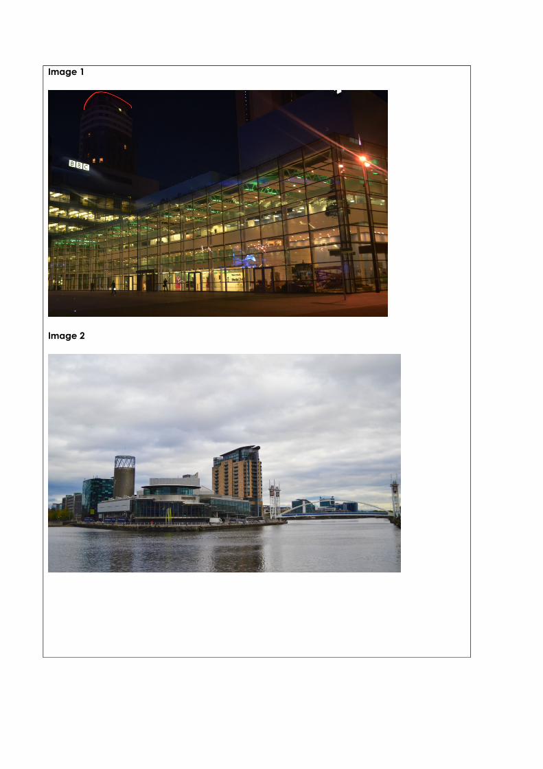
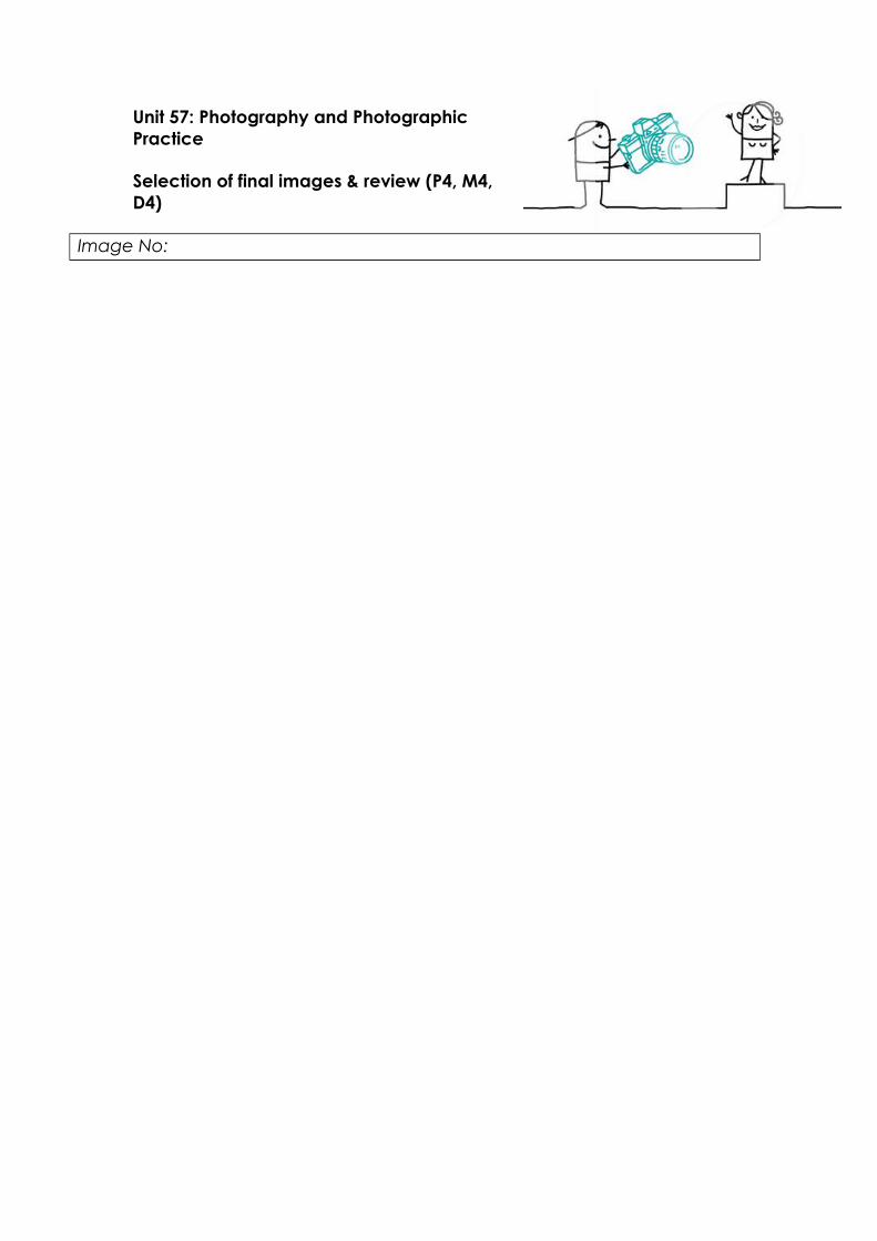
Image 1
Image 2
Image 3
Image 4
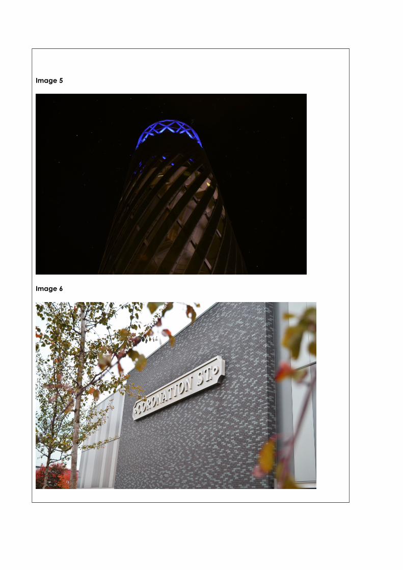
Image 5
Image 6
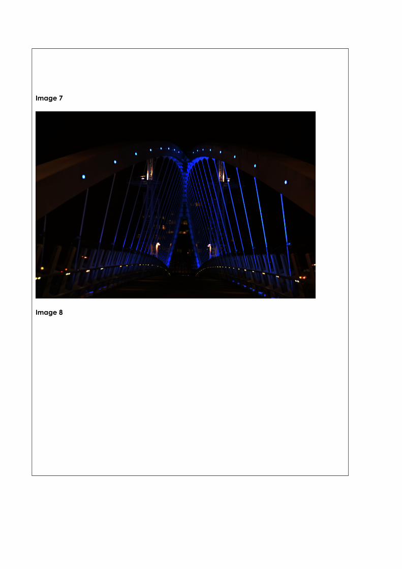
Image 7
Image 8
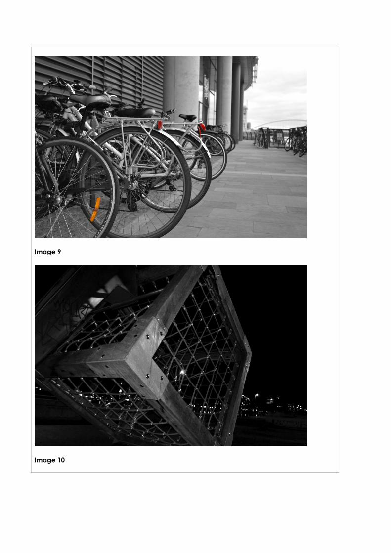
Image 9
Image 10
Theme or focus of image & reasons for choiceImage 1 – I took this image to show Media City at night time, how all the buildings look when they’re lit up. The main focus of this image is the BBC building; I did this to show how nice
Salford Quays looks when it is lit up by the colourful lights from the buildings.
Image 2 – The theme of this image is to capture the whole of the Lowry and its surroundings. The focus of is just below the middle of the image, it’s quite simple but a lot is going on in that specific section. I chose to take this image to show all of the different buildings and bridges around the Quays.
Image 3 – I took this image because I liked how all the locations printed on the signs were visible. The focus of this is the sign that is directly in the centre of the image. I chose to take this image to show all the different locations available to visit around the Quays.
Image 4 – The theme for this image to show specific buildings at night time, this building is the Lowry theatre. The focus of the image is the Lowry theatre building which is in the centre of the image. I chose to take this image to show other buildings other than the BBC, ITV and Lowry Outlet Mall where the public can enjoy a day or night out in the theatre.
Image 5 - The theme for this image is also to show this building at night time with its lights shining bright at the top. The focus of this image is the cylindrical building; this is the only focus in the image as it is the only thing inside the frame. I chose to take this because it is simple and I liked how everything was dark but the top of the building was lit up.
Image 6 – For this image the theme is to capture the acclaimed Coronation Street sign where ITV are now based. The focus of this image is the sign on the wall; the branches of the trees are all mostly out of focus. I chose to take this image to show the famous Coronation Street sign; this would grab people’s attention because it is a well-known TV programme.
Image 7 - Theme for this was to show around the Quays at night time. The focus of this image is the trail of along the bridge. I chose to take this because it shows the bridge is a completely different way than in sunlight, it’s much better to look at because of the bright colour coming from the lights. At the end of the bridge you can also see another building that is slightly lit up but it doesn’t take the focus from the bridge.
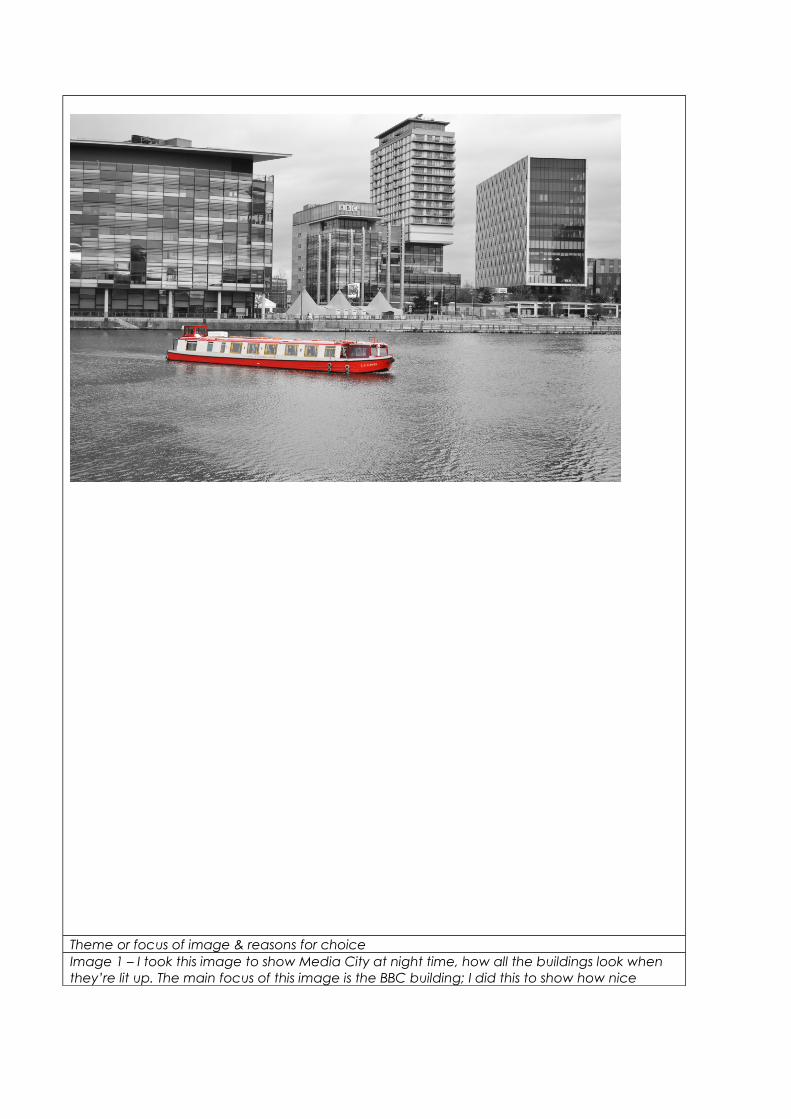
Image 8 – I took this image to show the all the bikes, I took it at a low angle to get as much filled in the photo at once. The focus of this image are the tires on the all the bikes. I chose to take this image because I liked how it shows that people still enjoy bike rides and still eco-friendly, not everyone takes public transport around Salford Quays. I also liked how the bikes looked together and you can see bikes dotted around in the background.
Image 9 – I took this image to show the activities, in this case it is a climbing frame. I thought it looked better at night when the lights all lit up around the Quays. The focus of this image is the corner of the cubed climbing frame which is the main focus point. I took this image at this angle because it allows us to see al 3 intersecting lines.
Image 10 – I took this I image to show the different buildings around the Quays. The focus of this image is the canal boat sailing down the canal. I wanted the boat to be the main focus in this image because it breaks up the rest of the image. I like this as it shows the BBC but also shows use of the Quays.
Techniques used
With images 1, 4, 5, 7, 9, I had to change the shutter speed and f stop quite dramatically compared to the day time images. The for each of these images there was also slight changes for example, the area where I captured the images 5 and 9 didn’t have much light so this meant changing the shutter speed slightly to ensure it looked brighter and had a much better quality. I had to take f stop into consideration because I didn’t want to let too much light it but I didn’t want them to be too dark. This also affected the focus of the image. For image 1 the shutter speed was set at 1/20’s with the f stop being 5.6. The shutter speed for the images 5 and 9 was set at 1/10’s with the f stop at 4. All 3 of these images were taken at night but the setting was changed because image 1 had more light from the surrounding buildings.
Images 2, 3, 6, 8 and 10 were all taken in sun light so the shutter speed and f stop were completely different than the previous images. The shutter speed ranged from 1/320’s to 1/4000’s with the f stop between 3 and 5. A faster shutter speed is used when the lighting is brighter, so the f stop was set around 5 to ensure enough light was let into lens.
When taking these images I took rule of thirds into consideration for example with image 3, 4, 5 and 7 I wanted the focus of the image to be directly in the centre of the frame. However, in images 8 and 9 I positioned the focus to the left of the frame. By using the rule of thirds grid this helped my images to be well balanced.
Depth of field was used in images 6, the Coronation Street sign is in focus, this was also used in image 9 and the main focus was on the corner of the cubed climbing frame, this is because the f stop was set quite low which made the background very blurred.
Strengths & suggested improvementsI think a few of my strengths definitely show in these pictures, mostly from the angle. Out of my images I think 3, 7, 8 and 9 are the best. They are all positioned well within the frame and the focus is very clear. Also edited well, not too dull or too vibrant, I think they advertise Salford Quays in a positive way.
I do think there could be improvements, especially with the focus of the images being clear because some are a bit blurred than I would like them to be. For example with image 1 and 4, they’re not in focus too the standards I would like. Also in image 1 there is a lens flare, so if I got the chance do this shoot again I would ensure to take more care and focus on the settings more to get the best outcome.
Editing detailsImage 1 – For this image I used the colour balance to change the orange colour of the lights in the building. I then changed the brightness and contrast slightly. Also I added a darker starry sky in the background so the colours of the lights in the buildings stood out a little bit more. I did this by using the polygonal lasso tool to draw around the buildings and delete parts of the image so just the sky was covered.
Image 2 – In this image I changed the brightness and the contrast so the sky didn’t look so dull. I also pushed the saturation up slightly so the buildings around the Quays would stand out from the canal and sky.
Image 3 – For this image didn’t edit is as much as the previous images as the colours were how I wanted them to be. The only thing I did was add a bright sky into the background. I did this by using the polygonal lasso tool to draw around the outside of the buildings and delete parts of the image covering the buildings and sign, so just the sky was covered.
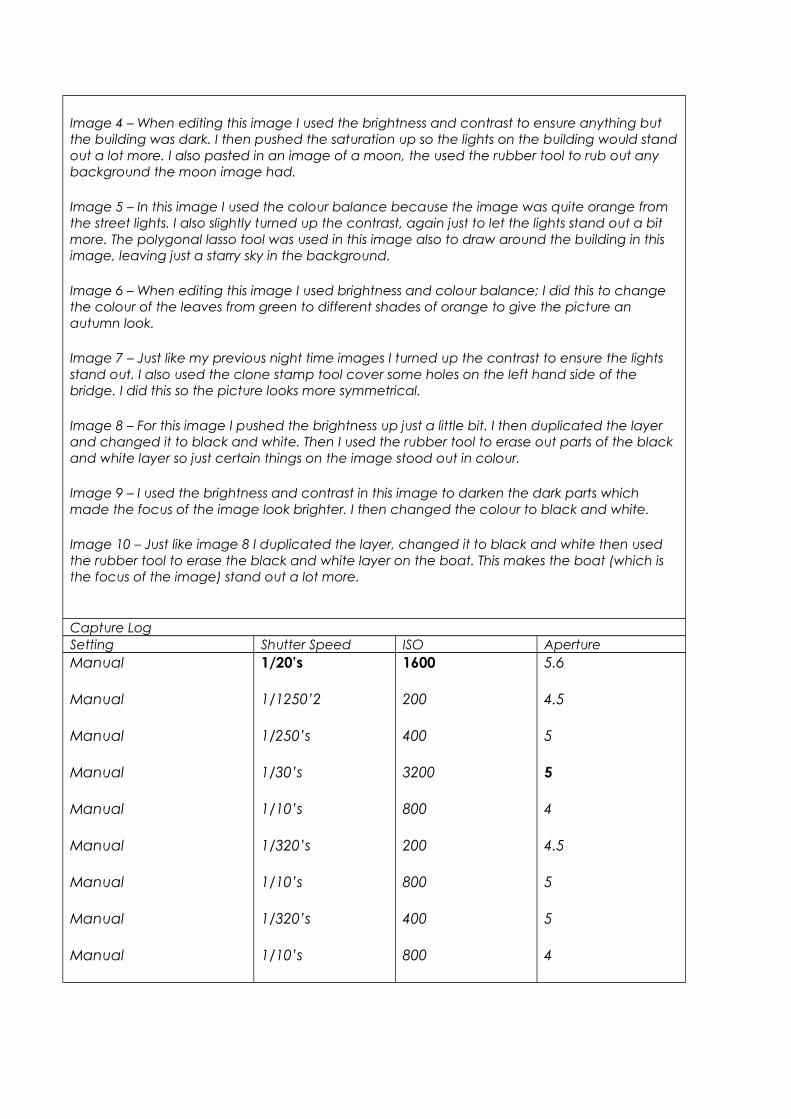
Image 4 – When editing this image I used the brightness and contrast to ensure anything but the building was dark. I then pushed the saturation up so the lights on the building would stand out a lot more. I also pasted in an image of a moon, the used the rubber tool to rub out any background the moon image had.
Image 5 – In this image I used the colour balance because the image was quite orange from the street lights. I also slightly turned up the contrast, again just to let the lights stand out a bit more. The polygonal lasso tool was used in this image also to draw around the building in this image, leaving just a starry sky in the background.
Image 6 – When editing this image I used brightness and colour balance; I did this to change the colour of the leaves from green to different shades of orange to give the picture an autumn look.
Image 7 – Just like my previous night time images I turned up the contrast to ensure the lights stand out. I also used the clone stamp tool cover some holes on the left hand side of the bridge. I did this so the picture looks more symmetrical.
Image 8 – For this image I pushed the brightness up just a little bit. I then duplicated the layer and changed it to black and white. Then I used the rubber tool to erase out parts of the black and white layer so just certain things on the image stood out in colour.
Image 9 – I used the brightness and contrast in this image to darken the dark parts which made the focus of the image look brighter. I then changed the colour to black and white.
Image 10 – Just like image 8 I duplicated the layer, changed it to black and white then used the rubber tool to erase the black and white layer on the boat. This makes the boat (which is the focus of the image) stand out a lot more.
Capture LogSetting Shutter Speed ISO ApertureManual
Manual
Manual
Manual
Manual
Manual
Manual
Manual
Manual
1/20’s
1/1250’2
1/250’s
1/30’s
1/10’s
1/320’s
1/10’s
1/320’s
1/10’s
1600
200
400
3200
800
200
800
400
800
5.6
4.5
5
5
4
4.5
5
5
4
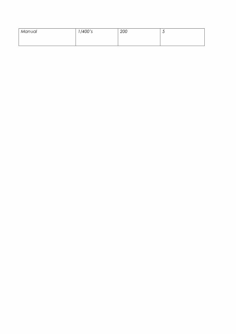
Manual 1/400’s 200 5